How Conversion Funnels Create a Better Customer Journey + How to Optimize Yours
Conversion funnels are a fundamental concept in sales. Personally, I like to visualize the funnel as that big scary slide you wanted to try as a kid. You saw your friends whizzing down, which sparked your interest. You watched how much fun they were having, doing your research. And then the benefits of having fun outweighed your fear, so you climbed up and flew down.
Customers take a similar journey through your company’s conversion funnel when evaluating whether or not to buy from you. You have to pique their interest, build trust, and encourage them to take action.
While the customer journey is more complex than my slide analogy, understanding how conversion funnels work can improve this flow. It can help you optimize your funnel, attract more leads, convert them to customers, and boost your bottom line. But all that requires reducing as much friction as possible. (Think: sliding down with slippery clothes instead of bare skin).
In this post, I’ll explain what conversion funnels are and how they impact your customer journey. Then, you’ll learn how to optimize your funnel to increase the number of people who make it to your conversion point at the bottom.
All leads begin at the top of the funnel. As they learn more about your business, they move down and get closer to purchasing your product or service. This conversion process is called a funnel because companies often have more leads than they do customers, making the top of the funnel a larger pool of people than the bottom.
Understanding how people flow through your conversion funnel is essential to being an effective marketer or salesperson because it helps you engage leads, answer questions about your business, and address concerns. It also lets you organize leads into categories and create customer touchpoints that can entice each group to convert.
That’s why every funnel should be designed for how your customers buy, not how you sell. The focus is on providing such a great experience within the customer journey that you convince them to convert.
Before diving into the details of how to analyze and optimize your funnel, we need to talk about an important aspect of this process: the customer journey.
Customer Journey
The customer journey complements the conversion funnel, but it’s not the same thing. Unlike the generalized, linear conversion funnel, customer journey maps show the individual and circuitous paths people take from the moment they discover your brand to the time they make a purchase.
Let’s say you’re a food blogger who sells cookbooks. Here’s how your customers’ journeys can differ.
- Customer A sees and clicks on your banner ad, visits your blog, reads an article, signs up for your newsletter, gets a discount email, and purchases a cookbook.
- Customer B sees your cookbook in a bookshop, buys it, makes the recipes, visits your blog, and subscribes to your newsletter.
The outcomes for Customer A and B are essentially the same, but the journeys and touchpoints are different. So if you know the different ways people enter your funnel, you can optimize for those entry points. That way, you can meet potential buyers where they are and entice them to convert.
That said, most funnels have similar points that ultimately lead to conversion. So let’s look at an example to get a mental picture of this process.
Conversion Funnel Visualization
The top-middle-bottom funnel is a classic model used by sales teams, which focuses on sparking interest, informing potential customers, convincing them to purchase, and building loyalty so they become repeat buyers.
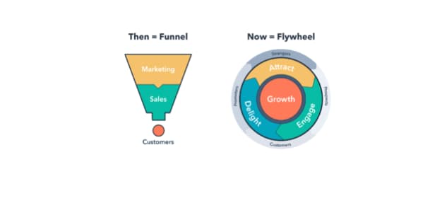
HubSpot has transitioned to thinking of the customer journey as less of a funnel and more of a flywheel — building more momentum as customers move through. Here’s a comparison of a tradition funnel next to a more updated flywheel approach to conversion:
Need a bit more of an explanation? Check out this video introduction to the flywheel below:
But let’s get back to talking about tradition conversion funnels:
- Top of the funnel (TOFU): This is the awareness phase. A potential customer enters the TOFU when they engage with your brand, oftentimes through your website, an ad, an email, or social media.
- Middle of the funnel (MOFU): This is the consideration phase. The potential customer knows about your brand and engages with it in order to learn more. They may sign up for your email newsletter, follow you on social media, or download guides and templates.
- Bottom of the funnel (BOFU): This is the conversion phase. A prospect is here right before they purchase, which means you’ve given them good information and relevant touchpoints. Help them convert by making it easy to purchase, offering a trial, outlining pricing, or sending a discount for their abandoned shopping cart.
While some conversion funnels are simple, others can be incredibly complex. The detail of your funnel depends on your sales process — the longer your sales cycle, the more complex your funnel. If you have a short sales cycle, your funnel tends to be simpler.
Think about how long it takes to sell $2,000 B2B software versus a $20 t-shirt. The software purchase usually requires months of sales calls, marketing materials, FAQs, and demos. Each of those is a specific point in your conversion funnel. But potential buyers may only need five minutes to figure out that the t-shirt is the right color and fit before purchasing. The touchpoints required here are taking it off the rack and trying it on.
To figure out how complex your funnel is, you can look at the data and perform an analysis. This will help you flush out each part of your customer journey to create a unique visual representation of your funnel.
Conversion Funnel Analysis
Funnels are full of barriers and friction. Analyzing your funnel helps you visualize the flow of potential customers across each point.
You can see key traffic sources and high-exit pages to get a feel for how people end up in each stage of the funnel.
It’s also a way to notice barriers that cause people to leave a page before they convert. If you see a high drop-off rate on one page, for example, you’ll know to prioritize that as you work toward optimizing your funnel.
To understand your funnel, follow these steps for in-depth analysis:
1. Look for high-traffic pages with high drop-off and conversion rates.
High-traffic pages hold a plethora of useful information. Not only are these the pages people see the most, but they’re also where people decide to stay or go. Look at the pages where people drop off (aka leave) and where they convert (take your intended action). Some metrics to collect are:
- Cost Per Acquisition (CPA)
- Customer Lifetime Value (CLV)
- Drop-Off Rate
- Conversion Rate
- Number of Marketing Qualified Leads (MQLs)
- MQLs to Customer Conversion Rate
- Conversion Rate Per Channel (i.e., social, email, and paid search)
2. Discover where your best customers come from.
Not all leads are the same. Some people drop off near the top of the funnel while others make it all the way down. That’s why tracking leads is so important. When you know where your high-quality leads come from, you can analyze that touchpoint or channel to see what you’re doing right. Ask yourself:
- How is this touchpoint different from other touchpoints?
- What information is resonating with people?
- What are the barriers or friction (if any)?
- How many steps do people have to go through before converting?
Identifying what you’re doing right in your funnel is just as important as figuring out what you’re doing wrong. If you need help digging into the data, check out these sales funnel tools or look into heatmap and session recording tools for information on how people navigate your pages.
3. Create an optimization plan.
After you figure out where people are dropping off and converting, it’s time to make an optimization plan. This should include the goals you want to focus on (i.e., more leads, newsletter signups, demos, or software purchases).
Goals let you determine what you want from each touchpoint within your funnel so you can measure whether it’s working or not.
After your funnel analysis, you’ll have a list of priority touchpoints that need to be optimized. Make sure to focus on the areas with the biggest drop-off rates first.
Conversion Funnel Optimization
Every part of your conversion funnel can be optimized to increase the number of people who turn into customers. Think of conversation funnel optimization as finding out what motivates, blocks, and persuades people so you can give them the best experience possible on their unique journey.
To optimize effectively, you need to think about how to give each customer what they want at each phase of the funnel. Using the phases outlined above, here’s what to consider at each step along the customer journey.
1. TOFU: Awareness
Issues at the top of your funnel? Take a look at how you attract new leads. Compare every channel that brings in customers (i.e., social media, search engines, your blog, and paid ads) to see which attracts the most people.
If you’re unsure how customers found you, send out a survey to ask. Look for trends in how people find new brands and put more effort in your best channels. Just make sure you’re attracting the people in your target audience.
2. MOFU: Consideration
Potential customers made it to the middle of your funnel, but it’s your job to keep them moving toward the bottom.
If you’re having trouble with this phase, look at how people learn about your business and engage with your site. Is it easy for people to navigate your site? Or sign up for your email list? Do you have relevant, rich content? Do you offer pricing and product information? Is it easy to get questions answered?
Depending on your barriers, consider these ideas for improvement:
- Product videos and photos
- FAQ page
- Whitepapers, case studies, or blog posts
- Filters and search options
- Newsletter capture
- Discounts
- Check pages for loading speed and broken elements
3. BOFU: Conversion
As the final stop for potential buyers, this is the phase to turn them into customers. You should remove as much friction as possible and encourage people to take the final steps to convert.
Some ways to optimize this final part of your funnel is to make sure product or service pages are fully built out with interesting descriptions, videos, and photos. Consider your checkout process to see if people have issues with payments or abandoned carts. Make it simple for people to compare pricing and clearly outline all product features. You can also send specific BOFU emails or create ads to remind people of their desire to convert.
Think your job is done once a customer converts? Wrong. While you may have pulled a customer through your conversion funnel, there are plenty of opportunities to re-engage them. Not only is customer retention essential for growing your business, but it’s five to 25 times more expensive to acquire a new customer than to retain a current customer.
So, once your customers make it through the funnel, invite them to sign up for a new webinar series, download additional templates, send promotions, join a loyalty club, or follow you on social media.
Find what makes sense for your particular sales cycle and use your existing content and channels to stay in touch. Make sure they value your business and want to come back because you never know who they’ll introduce to the top of that funnel.

The Catchiest Webinar Titles We’ve Seen, Plus How to Make Your Own
Webinar titles are a lot like blog post titles – they have to catch your eye, yet provide enough context to make you click.
Titles can’t be too short or too long. And because webinars are meant to inform or educate viewers, it’s best to let people know what they’ll get from handing over an hour of their time.
With 42% of marketers planning to host or join a webinar this year, there’s no better time to work these online events into your marketing strategy. That’s because webinars are one of the most effective ways to engage with your audience. In 2020, a whopping 91% of webinar marketers said their events were a success.
While webinars may not be as sexy as social media campaigns or the latest members-only app, they’re key to marketing in an increasingly remote world. Some companies have no plans to return to the office. Others have begun to adopt a hybrid model that combines remote and office work.
Webinars are great for both models because updating knowledge and learning can be done remotely without losing productivity.
The downside: competition. Businesses replacing live events with virtual meetings and conferences are saturating the market. The digital hosting platform ON24 reported a 167% increase in webinar activities from April 219 to April 2020.
Coming up with an amazing webinar title is an important step in standing out, attracting leads, and engaging customers. So let’s walk through the steps to create catchy titles.
Your title is the first thing people see, so it needs to grab their attention. It’s your chance to draw in your target audience and turn people from passive viewers into engaged leads. Here’s a breakdown of each to inform your webinar titles.
1. Relevant Keywords
Keywords are terms you enter into search engines like Google to find information (i.e., how to cook pasta).
For webinar titles, aim to incorporate keywords that are relevant to your content and target audience. If you run a food blog and your webinar is about how to make classic Italian dishes, it may make sense to work “cook pasta” or “delicious pasta recipes” into your title.
Start by researching keywords if you’re unsure what terms your audience looks for. Having this list on hand will help inform your content strategy, improve SEO, and make it easier for people to find the webinar.
2. Descriptive Copy
A HubSpot survey found that people sign up for webinars to learn about a hobby or passion, to be entertained, and to understand something about their career or industry. Your attendees want to know what they can get out of your event. Share the goods with a succinct, descriptive title.
Truthfully, there’s no perfect title length. Some claim the best headlines are six to eight words, six to 13 words, or more than 14 words. The point is, research varies. Instead of worrying over one word, make your webinar titles informative, interesting, and ideal for your preferred channel.
- For organic and paid search, make sure your title falls in the 50-60 character range so it shows the entire headline in results.
- For email promotions, consider what subject lines work best for your brand. Somewhere around 50-60 characters are optimal for a good mobile experience.
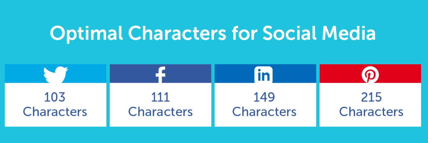
- For social media, play around with fun, emotional, and engaging titles. CoSchedule recommends the following title character counts for popular platforms.
3. A challenge, problem, or goal
Research shows the most engaging webinar format is a presentation that teaches people how to do something specific. The key: specificity.
Look to your company’s value proposition to figure out what topics you should cover. Where do you provide the most value? What are you an expert on? How can you help your sales team convert potential buyers? If you’re great at bringing in prospects for small businesses, you could host a webinar like “Actionable Lead Generation Tips for Startups and Entrepreneurs.”
Once you know what you’re good at, work it into your webinar title. Addressing a specific goal or problem will also make it easier to choose the format, content, and speakers.
4. On-brand messaging
As a writer and brand consultant, I always preach the importance of maintaining cohesive brand messaging throughout every marketing touchpoint.
That’s because research shows a consistent brand presentation can boost revenue by as much as 23%, and nearly 74% of people become loyal to brands through content. If your webinar messaging is off-brand, people can get mixed messages about what your company stands for and your values.
Check out how these webinar titles stay true to the brand’s voice.
- An Educator’s Guide to Teaching over Zoom (Zoom)
- Managing the Trickiest Parts of a Family Business (Harvard Business Review)
- Product Go-To-Market Tips from Google Cloud Product Leader (Product School)
- Newsroom: 100 days of Biden’s presidency (The Guardian)
- Career Path Design | The Future of Work & How to Prepare (General Assembly)
- Everyday Instagram Hacks for any Business (HubSpot)
Now that you know what makes a good webinar title, try creating 3-5 solid working titles on your own. From there, workshop with other people on your team or get feedback from your customers to see which one resonates the most. If you’re still searching for inspiration, check out some of the best titles I could find below.
Catchy Webinar Titles
It’s tough for companies to convince people to pop in their contact information and sit down with their screen for an hour. But these catchy webinar titles capture attention (and likely attendees) at first glance.
- Breaking into Tech at any Age or Career Stage (WorkWell)
- Skill Up with IBM: Get the job you want (Open P-TECH)
- Ensuring a thriving ocean economy for everyone (Stockholm Resilience Centre)
- Making the Product Strategy Effective by Spotify Sr PM (Product School)
- The Art of Public Speaking: Increase Your Confidence and Build Your Skills (Podium Perfect)
- Making Innovation an Everyday Habit in Your Organization (Harvard Business Review)
- How to Turn Your Customers Into Your Best Marketing Channel (General Assembly)
- M&A Bootcamp: The Ultimate Guide to Mergers & Acquisitions for Start-Ups (Nasdaq Entrepreneurial Center)
- 2021 Battle of the Pitch Decks (VIATEC)
- How to Become a 10x PM Without Burning Out (Becca Camp Executive & Career Coaching)
- Six Strategies for Moving the Needle on Gender Equity (Harvard Business Review)
- Hitchcock’s Composer and the Sound of Suspense (Royal Borough of Kensington and Chelsea Libraries)
- The Fundamentals of Power Networking (Small Business Expo)
- Amaryllis to ZZ: Unearthing the Science of Houseplant Care (MIT Museum)
- How to Turn Your Ph.D. into a Netflix Series (The Center for Science and Society)
- Trash Cocktails for Conservation: Virtual Sustainable Mixology Class (Lincoln Park Zoo)
- The Bear Necessities with Nat Geo Explorer Dr. Rae Wynn-Grant (Cary Institute of Ecosystem Studies)
An eye-catching webinar title pulls people in for the next important step: signing up. Once you have a list of attendees, use the contact information they shared to send updates and instructions for joining the webinar.
After the event, nurture people down your conversion funnel by inviting them to learn more about your company, sign up for a future webinar, or join your email list. You’ve reeled them in with a catchy title – just remember to plan a great webinar and get them excited to learn more.

What Editors Want from Guest Contributors in 2021 [New Data]
Few industries escaped 2020 unchanged, and digital media was no different.
At Influence & Co., our proprietary content marketing software and our process of working with hundreds of contributors, editors, and journalists offered us courtside seats to watch the industry evolve — and we compiled our most relevant digital media research for marketers and content creators into our latest “State of Digital Media” report.
Wondering how to make guest posts stand out? Our third digital media survey combines the opinions of experts with our own exhaustive content analysis, and the result is a tool that can be used to hone your content in order to gain more success in 2021.
One of the biggest findings? Guest-contributed content isn’t going anywhere. In fact, 93% of editors see themselves publishing the same number of guest posts or even more this year.
An increase in guest-contributed content is good news for prospective contributors. But just because more guest post slots are becoming available doesn’t mean guest contributors can afford to send lackluster pitches.
Publication editors haven’t lowered their standards and aren’t likely to, so read on to find out what publications want so you can give your pitches the best shot at hitting the mark and achieving acceptance.
(Note: All of the following statistics are taken from our 2021 State of Digital Media report.)

How to Make Guest Posts Stand Out
The publication editors we surveyed receive pitches day in and day out. Although they might sometimes wish for one, there’s no “unsubscribe” button they can hit to pare down this deluge of requests. That constant barrage on publication editors’ inboxes is why it’s critical to make sure your content is worth reading.
For a guest post to break through the noise, it needs to check these four boxes:
1. A pitch that is on-topic and non-promotional.
Editors receive lots of pitches that are little more than subtle ads — or, in some cases, not so subtle — for an author’s product or service.
Other pitches avoid promotion, which is great, but they also fail to fit the scope of the publication. Or the pitch might offer an opinion or perspective that readers could get from a host of other outlets.
Perhaps the best thing you can do to get an editor’s attention is to write a balanced pitch that’s on-topic, non-promotional, and fresh. And be mindful of how many other pitches editors work through each day. The path to an editor’s heart is short, so keep your pitch brief.
“I‘m more likely to read a pitch on a strong topic that is pertinent to our audience and is not blatantly self-serving.“ — Paul Nolan, Editor at Sales & Marketing Management
“I‘m more likely to read a pitch if it‘s clear that the person knows what I cover, reads our publication, and has relevant and high-level executives who are willing to chat on record.“ — Allison Schiff, Senior Editor at AdExchanger
2. Multimedia content.
Given that 20% of editors are looking to publish podcasts in 2021, it could be worth pitching yourself as a potential podcast guest for publications that have podcasts. If you go this route, include any experience you might have that demonstrates your ability to hold up your end of a compelling and insightful conversation.
Another 20% of editors plan to publish infographics, so make sure you have that graphic designer on speed dial. And 33% will make space for videos, so start building a library of video assets that could help fulfill this need.
3. Expert opinions with fresh perspectives.
The articles you submit to publications need to push ahead of trends, and you should be able to speak with authority on cutting-edge insights in your industry. In terms of content, if a trend is already being covered by some media outlets, you’re probably too late to the party.
For your pitch about a much-discussed topic to have even a slim chance of acceptance, you’ll need to offer a unique opinion or insight that readers won’t find anywhere else.
“Guest posts must be ahead of the trends. By the time we get article offers on a hot topic, we have already known about that topic and published articles on it.“ — Jim Davis, Editor at HR Daily Advisor
4. A “Goldilocks” word count.
We analyzed thousands of pieces of content published during the second half of 2020 and found that the most-shared content was an average of 986 words long. This represents an increase from previous years.
It’s always imperative to follow the guidelines of the specific publication you’re targeting, but if there’s any wiggle room in terms of word count, landing in the 900- to 1,000-word range can help you create shareable content — which is a result all editors and contributors want.
Guest posting is an incredible opportunity to gain exposure, boost your credibility, and speak directly to your ideal audience, but editors are understandably protective of their publications when they’re handing the mic to a stranger.
To improve the likelihood that your pitch is accepted, you need to know how the digital media industry is changing, and what publishers want. Hopefully, the four steps identified above will help get you started.

5 Lessons We Learned from These Famous Rebrands
It can be difficult (if not impossible) to create a brand that remains fresh, relevant, and inspiring years — or even decades — post-creation.
Just consider Dunkin’ Donuts: the brand, first established in 1973, recently shifted its focus to coffee — and, to demonstrate the shift, dropped the ‘Donuts’ in the name.
The rebrand makes sense. Dunkin’s consumers’ preferences, tastes, and style have likely changed quite a bit in the roughly 50 years since the first Dunkin’ was introduced. Dunkin’ needed a rebrand to ensure its business could grow with its consumers, or risk falling behind.
A rebrand can successfully re-establish your brand in an industry, help expand your product offerings, or attract new consumers. But it’s not as simple as copying-and-pasting a fresh logo onto your homepage.
A good rebrand demands redefining your company’s vision and values, re-establishing your brand’s audience, and rebuilding your brand identity from the ground up.
Fortunately, if your business is considering a rebrand, you’re in luck. Here, we’ve compiled five successful examples of rebrands to help inspire your own efforts. Use these examples to kickstart your own rebrand in 2021.

Five Successful Examples of Rebrands
1. Petco
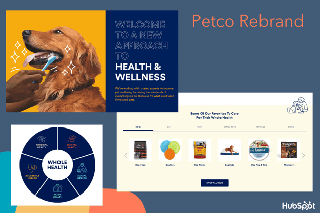
In October 2020, Petco released an announcement declaring it would no longer sell electronic “shock” collars. The announcement was used to highlight the company’s rebranding efforts — the pet store, which is over 50 years old, was officially rebranding itself as a health and wellness company for pets.
The pet store redesigned Petco’s homepage, as well as the Petco app, to focus on their new initiatives — including health and wellness resources for pet parents, a “Right Food Finder” tool to help parents identify the healthiest foods for their pets, and an extended range of pet healthcare and insurance offerings.
The company also redesigned their logo, opting for a simple blue-and-white design over their previously-signature red and blue cat and dog (to mixed reviews).
Nowadays, many American pet owners treat their animals as members of the family — so Petco’s rebranding makes a lot of sense. The company aims to use the new branding to re-establish itself as the leading health and wellness brand for animals.
The new design better reflects the brand’s more holistic approach to animal wellness — including a dedicated landing page that outlines how to take care of your pet’s mental, physical, and social health, with a tagline, “We’re working with trusted experts to improve pet wellbeing by raising the standards of everything we do. Because it’s what we’d want if we were pets.”
Overall, this was an extremely successful rebrand as it focused on a shift in consumers’ lifestyle and preferences, and ensured the company’s refreshed vision reflected those priorities.
2. Adobe Creative Cloud
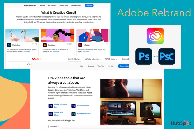
In May 2020, Adobe released a blog post titled, simply, “Evolving Our Brand Identity“. The article dives into the decisions behind Adobe Creative Cloud’s rebranding, and states, “We’re making these branding changes to ensure our portfolio continues to be easy for our customers to navigate and understand, as well as maintain a fresh look and feel.”
Among other things, Adobe Creative Cloud redesigned:
- Its company logo. The company redesigned the logo to an all-red logo with warmer hues.
- Its Creative Cloud logo. The new logo uses a colorful, rainbow-esque gradient to represent “the importance of creativity”. The colors in the logo are pulled together from various Adobe products, as well as the new Adobe red logo.
- Its product logos. The company is adding 3-letter mnemonics to help viewers determine product families — i.e. Adobe Photoshop (Ps) and Adobe Photoshop Camera (PsC). The designers also used colors to organize products into categories.
- The corners of all logos. The corners are now rounded to fit across a variety of devices and operating systems.
These redesigns successfully highlighted and organized the many product offerings of Adobe Creative Cloud. For instance, when you navigate to the “Video” product page on Adobe’s website, you’ll see all apps within the Video category are similar shades of blues and purples.
While some designers have expressed frustration over the new logo color similarities, it makes sense that the brand felt it necessary to organize their products better — with a catalog of over 50 products, it can feel overwhelming to choose the right ones for your needs. The updated logos should help make it easier to pick-and-choose.
3. Starbucks
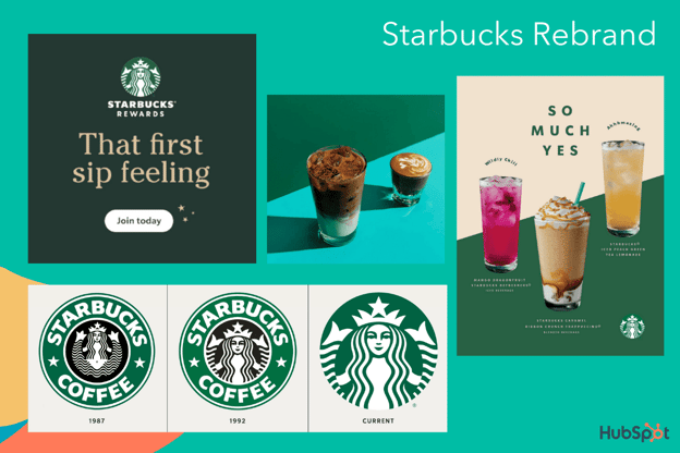
Over the years, Starbucks — one of the most valuable brands in the world — has proven the true power of a good brand. And one of the telltale signs of a good brand is the ability to consistently innovate and push the boundaries, rather than settling for what’s already working.
In 2020, Starbucks released its “Starbucks Creative Expression” brand expression guide. Among other things, the site focuses on Starbucks’ defined voice, typography, and logo in an effort to create consistency across channels and Starbucks locations.
In a few words, Starbucks aims to create a brand that is open, creative, carefree, and modern. On the Voice page, for instance, it reads, “We’re confidently turning down the volume of competing messages to elevate experience, removing obstacles in the way of people finding exactly what they seek at Starbucks.”
“By using both functional and expressive voices, we’ll create more space for brand relevance, connection and joy.”
The guideline adds, “When we have the space, we tell a passionate coffee story. But even with just a few words, our copy can make you smile.”
Similarly, Starbucks recently rebranded its logo to the simple Siren logo without the “Starbucks Coffee” wordmark wrapped around it. The company notes, “The preferred approach is to use the Siren logo by itself, unlocked from the wordmark. This allows flexibility to present the Siren with greater prominence while maintaining a considered, open and modern presentation.”
Ultimately, this most recent Starbucks rebrand is simple and effective. Rather than moving too far in the opposite direction of the brand’s roots, the company sticks to its fundamental company vision while making slight alterations to continue serving the needs and preferences of its consumers.
4. GoDaddy
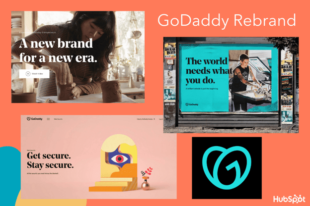
A web hosting service founded back in 1997, GoDaddy was in need of an upgrade. In early 2020, they did just that, creating a brand-new logo, refreshing their website design, and creating new marketing campaigns to match the new look. Their design page reads, “A new brand for a new era” and focuses on how GoDaddy’s users — the everyday entrepreneurs — inspired the new look.
One of GoDaddy’s most striking changes is the new logo, named the GO. GoDaddy believes the GO represents “the indomitable spirit of everyday entrepreneurs … joy that entrepreneurs everywhere experience … and [a] continuous, overlapping stroke [which] symbolizes the connection all entrepreneurs share.”
GoDaddy’s new design uses bold, colorful visuals, hand-drawn illustrations, and a bold, serif font evokes a sense of inspiration and joy. GoDaddy’s brand voice, depicted in recent campaigns, aims to be casual, human, and friendly.
While some brands might need less of a full makeover, GoDaddy’s older image felt outdated and less cohesive. Their rebranding reflects the modern tastes, personalities, and needs of the GoDaddy’s user in 2020.
5. Pottery Barn
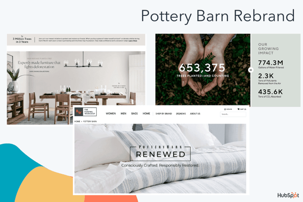
This last example is a subtler, more internal rebrand than the others in this list, but equally important. Pottery Barn, a roughly 70-year-old home furnishing company, has now put sustainability as the central focus of their brand, promising consumers that what they purchase will be worthwhile — both in terms of quality, and in terms of environmental impact.
Pottery Barn, named the most sustainable home furnishings retailer, has focused its efforts on sustainability with a dedicated landing page outlining its commitments.
Among other things, Pottery Barn promises to:
- Plant a tree (with the Arbor Day Foundation) every time a consumer purchases a piece of indoor wood furniture.
- Reach 100% responsibly-sourced cotton by the end of 2021.
- Keep products out of landfills by restoring items with a new Pottery Barn “Renewed” line.
- Contribute money for communities to invest in health clinics, water filtration systems, and more (the brand has currently contributed $3 million).
While this focus on sustainability isn’t brand-new for Pottery Barn, its recent efforts are more hyper-focused on it than ever. Consider, for instance, how this detailed Fast Company article about Pottery Barn’s style, published in 2003, doesn’t mention sustainability once.
The article also highlights how, more than 20 years ago, Pottery Barn used to purchase merchandise from outside vendors and assemble into a collection — this lack of ownership likely made it difficult to ensure sustainable products. Additionally, Pottery Barn announced its partnership with the Renewal Workshop in September 2020.
Ultimately, as your brand grows with your consumers, it’s important to take into account what matters to them today. Pottery Barn has done an excellent job identifying a sweet-spot in the furniture marketplace: Sustainability. As consumers continue to use this value as a guiding light in their purchasing decisions, it makes sense for Pottery Barn to ensure all their updated marketing materials reflects this mission.
Rebranding Takeaways for Marketers
When you take a look at the examples listed above, it can be easy to spot some similarities that made them all strong contenders for best rebrands.
If you’re considering a rebrand for your own business, here are a few takeaways:
- Keep your audience at the forefront of your plans. What tastes and preferences do they have? What inspires or excites them? How would they want your website designed?
- Use your consumers’ outside preferences to shape your rebranding. What passions do your consumers have beyond your products or services, and what do they care most about — can you weave those into your brand story, similar to how Petco focused on animal wellness and Pottery Barn focused on sustainability?
- A rebrand is more than just a logo change. To properly rebrand, you’ll want to conduct a content audit and analyze all your existing content to ensure each webpage, graphic, and advertisement is updated to fit your new image.
- A brand guideline page is critical for cohesion. Most examples in this list have a dedicated brand guideline page for ensuring each employee is empowered with the right tools to create content that fits the new look. Both GoDaddy and Starbucks, for instance, outline how the voice should sound, what fonts to use, and even what colors to include in any public-facing marketing materials.
Ultimately, a rebranding strategy can be an exciting and effective opportunity to delight existing customers while attracting new ones. Use the takeaways listed above, as well as inspiration from examples in this list, to get started with your own fresh look for 2021 and beyond.


How to Track Clicks on a Link in Google Analytics 4
If you’re a marketer, you’ve undoubtedly asked yourself, “How can I track clicks on a link in Google Analytics?”
Tracking clicks can help you understand where your audience is going from one page to another. It’ll also let you know what links they’re interested in, what CTAs they’re clicking, and more.
With the new Google Analytics 4, link click tracking happens automatically. This is great, because previous versions of Google Analytics haven’t been able to do it automatically. You used to have to set up custom event tracking, which can be confusing.
But we’re here to help. If you haven’t set up Google Analytics 4 yet and you aren’t sure how to get started with tracking clicks on a link, keep reading.

1. Add a Google Analytics 4 property to your site.
In Google Analytics 4, you can automatically track links. While GA4 rolled out in October 2020, your site won’t automatically switch to GA4. You need to set it up.
To do this, click “Admin” on the bottom left of your Google Analytics home page. Then, ensure the right account is selected, and in the “Property” column you’ll see a GA4 setup assistant. Go through the process (takes a minute or so), and then click “Create Property.”
You should be all done now and you’ll have GA4 set up.
2. Click “See your GA4 property.”
Once you’re done setting up GA4, you should be able to click “See your GA4 property.” This will give you all the information on your property that you need.
Before you continue, it’s a good idea to explore around and see what’s new in GA4.
3. Click “Data Streams.”
Now that you’ve explored and set up your GA4 property, you’ll want to click “Data Streams” in the left column.
This will give you detailed information about what GA4 is tracking for your site.
4. Click your site.
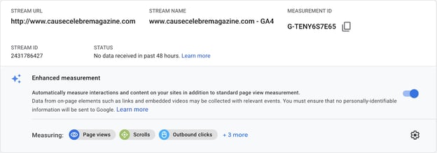
Lastly, you just need to click on your site, and you should see the enhanced measurement. It should automatically be toggled on.
This feature automatically tracks events such as page views, scrolls, outbound link clicks, site search, video engagement, and file downloads.
To see this information, your GA homepage should have an area now called “Events” where you can see outbound link clicks.
This is what it looks like when you see enhanced measurements:
5. Set up custom link clicks.
Now you’ve officially set up certain link tracking in the future. While this feature will help you track a number of events, you might want to track certain links clicks specifically. In this case, you’ll want to set up custom link clicks.
You can do this through Google Tags Manager. If you don’t already have an account, create an account for your site and connect to your GA4 property.
You can learn more about event editing in GA4 by watching this video:
Essentially, you’ll need to create a trigger to distinguish between the custom links you want to track and the page views and outbound clicks that the enhanced measurement feature is tracking.
Go to your Google Tags Manager and add a new trigger. Then, you’ll have to connect this trigger to your events tracking.
Watch this video to learn how to set up Google Tags Manager with your GA4 property.
While this is all great if you’re converting your current analytics account to GA4, it will only track these link clicks going forward. It’s not retroactive.
Now, let’s discuss how to track Google Analytics click events if you aren’t using GA4.
How to Track Clicks in Older Versions of Google Analytics
If you aren’t using GA4, then you’ll need to use Google Tags Manager. We have an in-depth guide to help you navigate the tags manager, because it can be confusing.
Without GA4, the process is the same as setting up custom events. Google Analytics didn’t have the capability to automatically track link clicks before GA4.
While it does now, you might not be using GA4, and still want to track those links.
That’s okay. You can read our in-depth guide, watch the videos in step 5, and review how to set up custom link click tracking through the Google Tags Manager.
While it might seem confusing to set up, there are numerous resources available from Google to help you set up custom event tracking. And it’s worth it. Knowing where your customers are clicking and being able to attribute a certain amount of clicks from one blog post to another is invaluable information.

How to Use the Rule of Thirds in Web Design [Quick Tip]
To understand the “rule of thirds” as it relates to web design, let’s start with an example.
Consider this image of a bull in a field:

Not too interesting, right? As the center of the image, the bull image feels a little bland and predictable. I’m willing to bet if you saw this image on a website, you wouldn’t dwell on it too long.
Now, consider what changes when we use the rule of thirds to place the bull away from the center:

A little more interesting, right?
The rule of thirds can help make your designs feel less predictable and more intriguing. And, ultimately, it has the power to capture the viewer’s attention for longer — which is critical when you’re trying to capture new audiences and convert those audiences into leads for your brand.
Of course, there are exceptions to every rule. Perhaps you’ll decide your designs are more compelling when they’re symmetrical. Still, you can only make the intentional decision for your own website after you’ve explored your options.
Here, we’ll learn how to use the rule of thirds in design and UI design to take your images to the next level.

How to Use the Rule of Thirds in Design
Simply put, the rule of thirds posits that designs are more interesting and visually appealing when you place the main object(s) of your design on one of the four intersections of a rule of thirds grid, or in one of the thirds sections.
It’s no secret that art is more than just guesswork. Dating back to Ancient Roman times, geometry has always had a place in significant artwork.
To understand the rule of thirds, let’s look at an example.
The rule of thirds draws two lines perpendicular to a page, and two lines horizontal to a page, to create a grid of nine boxes.
This divides your page into three one-third sections, regardless of whether you’re slicing the image horizontally or vertically:

Next, to use the rule of thirds in design, you’ll simply want to place your object(s) off-center by putting them into one of the thirds sections:

… Or on one of the intersecting points:

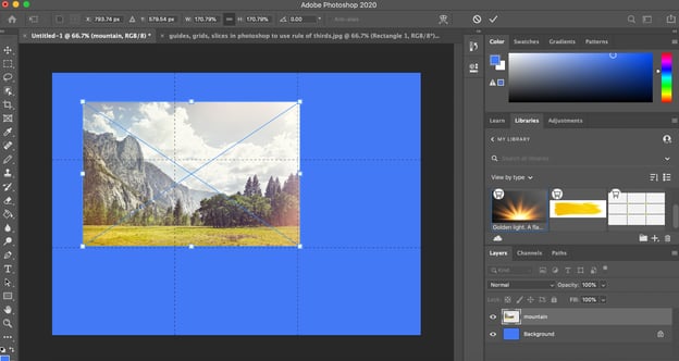
In the example shown above, the main focal point — the mountain top — is off to the left-side of the center of the image, in the first-third of the photo.
Fortunately, it’s easy enough to use the rule of thirds in your own images using a design tool like Photoshop, which offers a grid feature so you can ensure you’re accurately using the rule of thirds to create a more harmonious, interesting design.
Let’s dive into how you can create the rule of thirds grid in Photoshop in four quick steps, next.
How to Create Rule of Thirds in Photoshop
1. To use Photoshop’s rule of thirds tool, simply open a blank page in Photoshop and click “View” → “Show” → “Grid”:
guides, grid, and slices.” src=”https://ift.tt/2RglsF9″ style=”margin-left: auto; margin-right: auto; display: block;” title=””>
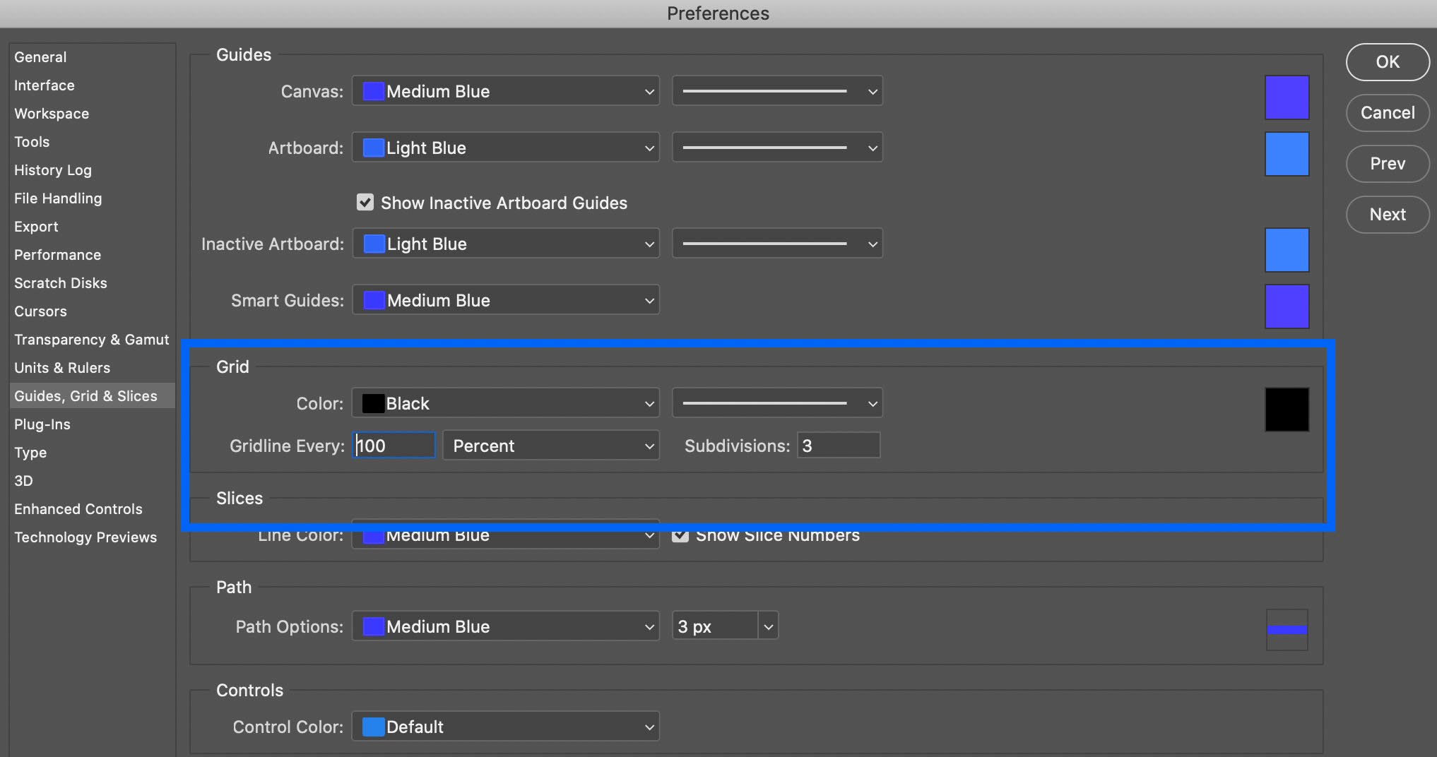
3. Next, choose the color of the grid lines, along with the solid line. Then, change “Gridline Every” to “100 Percent”, with Subdivisions of “3”. When you’re done, click “OK”.
 4. And there you have it! You now have a rule of thirds grid. To add your image, simply drag-and-drop the image onto the existing layered grid, expand it to fill the grid, and then move your focal object until it’s either in one of the thirds sections, or on one of the four intersecting points.
Examples of Rule of Thirds in UI Design
To consider the power of rule of thirds in user interface design, let’s take a look at some website examples, with a particular focus on which websites use the rule of thirds.
1. Soulful Vibes Co.
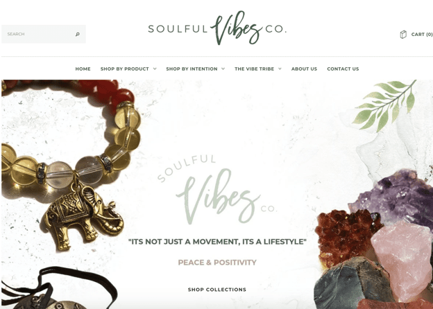
Here, the designer puts the main focus — on the crystal rocks, and the beaded bracelet with an elephant — on the left and right thirds sections, ensuring the visitor’s focus is on the center text itself: “It’s not just a movement, it’s a lifestyle.”
The designer uses the rule of thirds to create a peaceful, harmonious, casual aesthetic that looks more open and welcoming than it would if both objects were front-and-center on the page, which would likely feel more crowded and hectic.
2. HubSpot
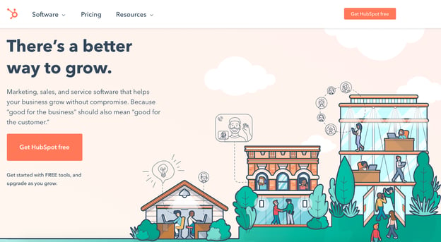
HubSpot uses rule of thirds to draw immediate attention to its slogan and “Get HubSpot free” CTA on the homepage, as most visitors’ attention will start on the left side of your website. Then, the cartoon images are placed on the right thirds section, to balance out the page. This helps create a user flow — from left to right — which would be more difficult to achieve with a symmetrical design.
3. Frans Hals Museum
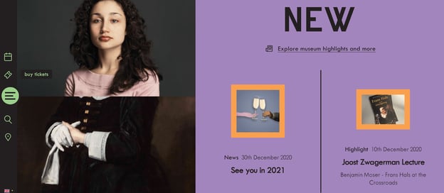
This Netherlands museum website uses the rule of thirds to draw attention to the photo of the woman, located in the left-thirds section. The page is unique, engaging, and cohesive, and uses counter-images to balance the asymmetrical structure of the page — for instance, while the larger image of the woman is towards the left of the screen, there’s texts and additional images to the right to balance it out.
When to Break the Rules (of Thirds)
It’s important to note — in design and art, there are no strict rules you need to follow, and there are exceptions to every design rule or trend.
Once you understand the rule of thirds and how it can impact a user’s experience, you can break that rule when you see fit.
For instance, you might find it’s more compelling to keep your images at the center of your screen, like shown on Tone Dermatology’s homepage:

Here, the center focus on the woman is compelling and bold, particularly since she’s looking towards the left of the screen, so it’s still an asymmetrical image (you only see her eyes and nose on the left, and you only see her hair on the right).
This design layout works well to draw the visitor’s attention in — and likely wouldn’t have been as powerful if the designer had used the rule of thirds to place the woman towards the left or right side of the screen.
Ultimately, you’ll want to choose design elements that work best for your own brand’s needs. When in doubt, experiment with both more symmetrical designs and rule of third designs, and consider A/B testing to figure out which performs best with your audience.

What Does HTTP Error 503 (Service Unavailable) Mean & How To Fix It?
Imagine someone searches for a topic and finds your website on page one of Google. When they click through to your website, though, their eyes land on a bland webpage that says “Service Unavailable”.
What do you think they’ll do when they find your website on Google again? Odds are, they’ll skip over it and click on the next link. If visitors are looking for answers and you’re promising them those answers, but you can’t deliver because something’s wrong with your website, they’ll lose trust in your brand.
Unfortunately, if your website experiences a 503 Service Unavailable Error, there’s no silver bullet solution. You have to investigate what’s actually causing the issue, because even though these types of errors indicate what happened to your website, they don’t tell you why it happened.
To help you fix your 503 Service Unavailable Error and avoid losing potential customers, check out our guide on what exactly the issue is and its most common solutions.
When your website is experiencing a 503 Service Unavailable Error, your site’s visitors will land on an error page. Fortunately, there are five common solutions for troubleshooting most 503 Service Unavailable Errors.
1. Restart your server.
Sometimes, there will be congestion in the server chain that hosts your website. One of the most effective ways to open up and refresh it is to simply restart your web server. If your website is hosted on multiple servers, make sure you restart all of them to get it running again.
2. Check to see if your web server is going through maintenance.
Most web servers shut down when they’re going through maintenance. If you can access your server’s administration settings, check the configuration options to see when automatic maintenance sessions are scheduled. If you’d rather have complete control over your server’s maintenance, you can disable these automatic updates in the configuration options, too.
3. Fix faulty firewall configurations.
Your firewall is your website’s gatekeeper, protecting your site from malicious visitors or distributed denial-of-service (DDoS) attacks. Sometimes, a faulty firewall configuration will cause your firewall to deem requests from a content delivery network as an attack on your server and reject them, resulting in a 503 Service Unavailable Error. Check your firewall configuration to pinpoint and fix the issue.
4. Sift through your server-side logs.
There are two types of server-side logs — applications logs and server logs. Application logs recount your website’s entire history, letting you see the web pages requested by visitors and the servers it connected to. Server logs provide information about the hardware running your server, revealing details about its health and status. Sift through both types of server-side logs to uncover any alarming information about your server or website.
5. Comb through your website’s code to find bugs.
If there’s a mistake in your website’s code, your web server might not be able to correctly answer requests from a content delivery network. Comb through your code to find bugs or copy your code into a development machine. It’ll perform a thorough debug process that will simulate the exact situation your 503 Service Unavailable Error occurred in and allow you to find the exact moment things went wrong.
Any time there’s an error on your site, it’s important to fix it as soon as you can. If customers get errors, they probably won’t come back to your page.
Editor’s note: This post was originally published in January 2019 and has been updated for comprehensiveness.

How to Map Your Ecommerce Customer Journey [Template Included]
We’ve talked a lot about the customer journey — how it impacts sales, service, and marketers.
But one segment that feels a little different is the ecommerce customer journey. The customer journey is different from service based companies, because it can be much quicker (buying from Amazon or an Instagram ad).
However, if you work at an ecommerce company, it’s important to understand the customer journey: all the touch points and stages.
Below, let’s learn how to map your ecommerce company’s customer journey. Plus, you can download some templates to help you get started.

Touch points can include when someone sees a social media ad, when a friend tags them in a post online, when they come across your website, when they read a blog of yours, when your product shows up on Google, when they search on Amazon, etc.
The journey from when they first come in contact with you to when they purchase your product to if they reach out for a return is included in the ecommerce customer journey.
Writing down these touch points might make you realize that the journey on your website isn’t ideal. If that happens, you can look for solutions to help you, like WooCommerce (a WordPress plug in).
Now, let’s explore the various stages of the ecommerce journey.
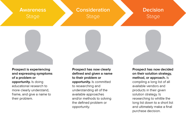
1. Awareness
The first stage of the ecommerce customer journey is awareness. During this stage, a potential customer is experiencing a problem and is doing research to understand their problem.
During this stage, customers are researching the issue they’re having, seeing if it has solutions, overcoming misconceptions, and prioritizing solutions.
2. Consideration
In the consideration stage, potential customers are researching products and methods to solve their problem.
For example, let’s say that I want to start a morning routine. I do some research on Google and see a few ads on social media and realize I want a morning routine journal.
Now that I know what I want to buy and how to fix my problem, it’s time to research solutions. I’ll go to Google and Amazon and see what morning routine journals are available and which ones have the best reviews.
3. Decision
During this stage, potential customers are now narrowing down their list to the top products they want to buy.
This is when they’re learning what makes your product stand out from the competition, and why your product is the one they need. During this stage, it’s important to understand the various touch points so you can communicate what makes your product unique.
4. Retention
For ecommerce, I decided to add one more stage to the customer journey. That stage is retention. After a customer buys your product, their experience and decision to buy from you again relies solely on the quality of your product and customer service.
Let’s say the package was missing, delivered to the wrong address, or they want to return the product. If that experience doesn’t go well, they won’t buy from you again. If it does go well, they’ll probably consider leaving a positive review.
Additionally, during the retention stage is when you can consider retargeting marketing and social media ads so more of your products show up for them online.
Once you’ve delighted your customers, they start to see you show up online, and want to engage with you, they’ll buy from you again and again.
To learn more about ecommerce marketing, you can check out HubSpot Academy’s free ecommerce marketing course.
Now that we understand the ecommerce customer journey, let’s visualize it with a customer journey map.
Essentially, this map will be a visualization of the start-to-finish customer journey. The point of creating this map is to not only understand the customer journey, but also to plan how you’re going to improve the customer experience at every touch point.
For example, HubSpot customer, CODE41, was able to optimize their ecommerce customer journey through HubSpot’s Marketing Hub, Sales Hub, and Service Hub.
With Marketing Hub, CODE41 sends millions of emails (yes, millions) to their lists. With Sales Hub, they have the customer support team automate reminders to minimize the customer support failures: not following up on client requests, not forgetting to check payment status, etc.
Lastly, the company uses Service Hub to generate reports for how many tickets they have that were returned, complaints, repairs, etc. This helps them improve their customer experience and retention in the process.
If you want to get started with your own ecommerce customer journey map, you can use HubSpot’s customer journey map template, where you’ll brainstorm what the customer is thinking or feeling, what their actions are, what they’re researching, and how they go from consideration to decision.
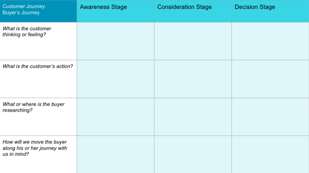
For more information, you can check out this post on customer journey thinking, and watch the video below to learn more:
Now, you might be wondering, “How do I create an ecommerce customer journey map?”
Well, first you’ll create your buyer personas, and then envision what your ideal customer goes through when they’re seeking your product.
Once you do that, take HubSpot’s ecommerce marketing course, and download our templates, then you can just fill out the template and brainstorm how to improve the journey at every touch point.
Ecommerce customer journey mapping is an essential part of understanding your target audience and improving the customer experience. Focusing on providing the best customer experience will help retain customers and drive more leads and sales.

What Is Last Click Attribution and How to Use It
For your team’s marketing efforts to be effective, you need to know which marketing channels and touchpoints are resonating with your audience most — you must understand which channels and touchpoints are so successful at whatever it is they do that they make leads want to convert.
Last click attribution can help you with this — it assists in identifying which marketing touchpoint prompted a conversion in the final part of the buyer’s journey.

Last Click Attribution Model
In this blog post, we’ll cover all things last click attribution including how it’s defined, what makes it unique, how your marketing team can use it, and more.
Pros and Cons of Last Click Attribution
Last click attribution is helpful if you want to know which of your marketing channels and touchpoints have the most influence in the final stage of the buyer’s journey.
While this is helpful information, it doesn’t account for the numerous other channels and touchpoints that impacted a customer from the very start of the buyer’s journey. This is important to note since there are a variety of touchpoints, across numerous channels, that impact a lead throughout the buyer’s journey — which is why most marketers today refrain from only using last click attribution. Rather, they’ll use multi-touch attribution or include last-click as part of their other marketing attribution efforts.
For instance, say a lead received an email from your email campaign, clicked through to your website, read a blog post, and then decided they wanted to buy your product. Well, last click attribution would only account for that last touchpoint — the blog post. Meanwhile, the other touchpoints throughout the buyer’s journey that contributed to this lead’s decision are dismissed.
That’s why multi-touch attribution has become such a popular attribution model among today’s marketers. Multi-touch attribution accounts for all of these touchpoints and channels and assigns them credit based on their influence.
In addition to last click and multi-touch attribution, you may have heard of first click attribution.
First Click vs. Last Click Attribution
FIrst click attribution differs from last click attribution because it assigns all of the credit for a conversion to the first touchpoint or channel (e.g. interaction on your website or with a marketing campaign) that a customer had before a conversion.
First click attribution is helpful if you want to know which of your marketing efforts are generating initial traffic in the awareness stage of the buyer’s journey.
Similar to last click attribution, this is a helpful attribution method on a small scale — combining it with other attribution methods is recommended in order to get a clear picture of your marketing attribution efforts.
Now, let’s talk about how your marketing team can use last click attribution.
How to Create a Last Click Attribution Report
If you choose to create a standalone last click attribution report, you’ll likely find yourself using an attribution tool.
If you already use an attribution tool, there’s a chance it has a specific report that focuses solely on the last click. There’s also a chance that it offers customizable attribution reports which would also allow you to create a last click report.
Either way, here are a few available options for your consideration as you look to create marketing attribution reports of your own.
1. HubSpot Ads Attribution
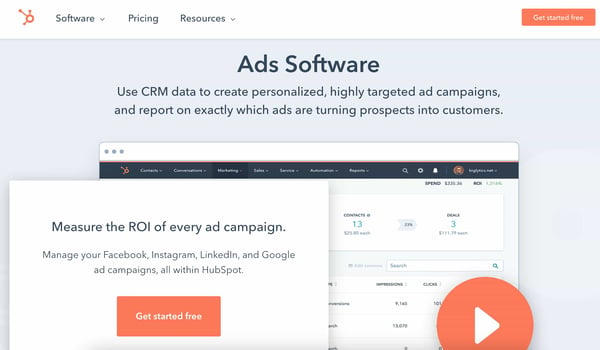
HubSpot Ads Software offers five attribution models — you can filter your ad campaigns by attribution report to determine how your ads influence contacts throughout buyer’s journey, all from within HubSpot.
If you create a custom multi-touch attribution report, you can hone in on last click/ last interaction data — you can also customize the group of contacts you want to report on, the status of your campaign (“active,” “paused,” or “deleted), and the date range.
2. Google Ads Attribution
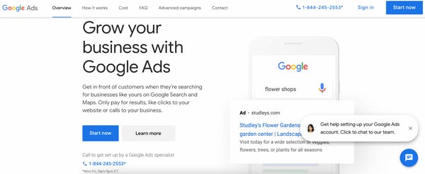
Google Ads Attribution gives insight into cross-channel attribution so you have a solid understanding of how your Google Ads perform among your audience — this insight allows you to improve all marketing interactions and touchpoints throughout the buyer’s journey.
Google Ads offers six attribution models, one of which is last click — it gives all of the credit for a conversion to the last event/ last-clicked Google ad and its corresponding keyword.
3. Facebook Attribution
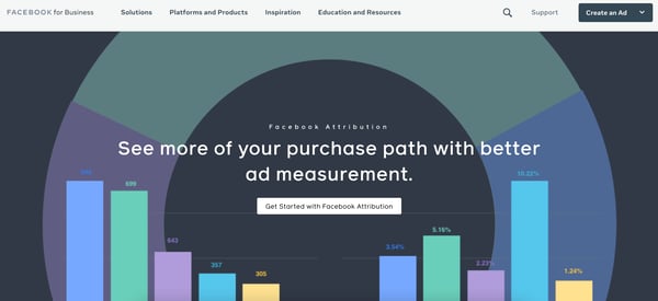
Facebook Attribution gives you a complete look at how prospects and customers are interacting with your business throughout the buyer’s journey via Facebook (including the final stage of the buyer’s journey, when the last click occurs).
Facebook manages giving all of the credit for a conversion to the last click for you — no impressions or earlier touchpoints are credited. If a click occurs within 60 seconds of a visit, Facebook will credit the click.
Get Started With Last Click Attribution
Last click is a great addition to your attribution strategy. By determining what the last customer touchpoint in the buyer’s journey is prior to a conversion, you’re able to understand which interactions and content are likely to heavily influence your customers.

How Apple’s iOS 14.5 Release Could Impact Advertisers
Imagine this: You run a successful online store and have a sleek app that makes shopping a breeze.
Most of your sales come from paid ads on Facebook and Instagram, and your usual process involves retargeting customers who open your app but leave without purchasing anything.
The more app installs you get, the more sales you log. This process is seamless because you’re able to track user activity across apps and optimize your ad spend as you see what works and what doesn’t.
But, with this week’s release of IOS14.5, the data you collect from Apple mobile devices will change. Here’s how.

Apple’s New Privacy Policy
Apple has confirmed that along with the launch of iOS14.5, there is also a change coming to Apple’s AppTrackingTransparency (ATT) Framework, which is essentially its data sharing and privacy policies.
Apple will now require that all mobile app advertisers gain opt-in from users to track their web and app activity.
While this provides consumers with the ultimate privacy, security, and control over the ads they see across their web and mobile devices, it’s expected that not all users will accept this prompt to opt-in. This could make it more difficult for businesses to reach their target audience, and deliver relevant ads.
From now on, whenever an Apple user downloads your app, they’ll be shown a prompt, asking if it’s okay for the app to track them. Additionally, with limited app user data, companies like Google report that ads could show poorer performance and returns than before the change.
While Apple’s pivot might seem shocking, it is not the first major tech giant to take action when it comes to data privacy. Just in the last year, Google, another major player in the advertising world, announced that it will phase out third-party cookies on Chrome and will be offering replacement tracking tools, such as its Privacy Sandbox, after 2022. You can read more about that news here.
What will happen to Apple’s IDFA (Identification for Advertisers)?
To better understand what’s happening with Apple’s new update, let’s take a moment to learn about Apple’s identifier for advertisers (also known as IDFA). IDFA is tied to each Apple device and is used by advertisers to identify users.
Typically, the IDFA code is visible to advertisers, and it enables them to retarget consumers. Now, it will only be provided to advertisers if users give them the go-ahead and permission to track their usage across apps.
To prepare app owners, Apple has laid out the instructions for gaining proper tracking permissions on its website:
“You must also include a purpose string in the system prompt that explains why you’d like to track the user. Unless you receive permission from the user to enable tracking, the device’s advertising identifier value will be all zeros and you may not track them,” Apple explains.
How this Affects MMPs (Mobile Measurement Partners)
Traditionally, MMPs have been able to pull data from mobile apps and serve up data such as installs, views, and ad clicks, in an organized and insightful fashion. They provide advertisers an understanding of where their consumers come from, and what the results of a mobile campaign are, within their platform. With the changes coming to ATT, their ability to have access to all this could be diminished.
However, some MMPs, like AppsFlyer, are leaning into Apple’s SKadNetwork to glean insights for their mobile advertisers.
The SKadNetwork is a secure way for MMPs and advertisers to understand app installs and campaigns, without connecting those installs to specific user identities. Apple coordinates this attribution, and while using the SKadNetwork is a good alternative, it does not take into account view-through attribution and only provides data 24 to 28 hours after the first launch.
The Early Response to Apple’s Privacy Pivot
As you can imagine, this new update has caused ripples across the mobile advertising ecosystem, and brands like Facebook have already responded.
“Apple’s policy will prohibit certain data collection and sharing unless people opt into tracking on iOS 14 devices via the prompt. As more people opt-out of tracking on iOS 14 devices, ad personalization and performance reporting will be limited for both app and web conversion events,” says a Facebook for Business statement.
Meanwhile, Google, which has also been taking on its own privacy initiatives, provided information for developers and advertisers about how the change will impact them while also reminding readers of the importance of user privacy:
“At Google, we’ve always put users and their privacy first. Transparency, choice and control form the bedrock of our commitment to users, and advertising is no different. We remain committed to preserving a vibrant and open app ecosystem where people can access a broad range of ad-supported content with confidence that their privacy and choices are respected,” the Google post explains. “That’s why we’ll continue to invest in privacy-preserving technology ― including aggregated and on-device solutions ― like what we’re developing for the web, along with ecosystem partners, in the Privacy Sandbox.”
Quick Tips for Navigating Apple’s Privacy Changes
While this change will likely impact your current ad campaigns, and the size of its impact is still somewhat uncertain, there are a few areas you can still lean into and optimize your content for the right audiences:
- Don’t forget about Android campaigns: the iOS 14.5 update only affects Apple devices and users, so you can still segment your audiences by Android users and target them.
- Turn to your website: Use your website’s tracking capabilities or analytics tools to understand where your visitors are coming from, and create audiences based on those visitors.
- Amp up organic efforts: take a closer look at your organic social media and content strategy. Then use that data to strengthen your brand.
While the times ahead are uncertain and may not seem as ideal for marketers and advertisers, the industry is likely to evolve and find ways to reach prospective customers. As Apple rolls out this update, we’ll be paying close attention to how advertisers respond and will continue to update this post in the future.
Disclaimer: This blog post is not legal advice for your company to use in complying with data privacy laws like the GDPR. Instead, it provides background information to help you better understand current privacy shifts. The tips provided are not the same as legal advice, where an attorney applies the law to your specific circumstances, so we insist that you consult an attorney if you’d like advice on your interpretation of this information or its accuracy.
In a nutshell, you may not rely on this as legal advice, or as a recommendation of any particular legal understanding.