The Ultimate Guide to Nonprofit Fundraising
Nonprofit fundraising is exciting. It’s the lifeblood of charitable organizations and can serve as a way to raise awareness of a cause and drum up interest among donors.
Fundraising is also a massive undertaking. Because it’s likely your primary means of income as a charitable organization, raising money can be a burdensome, never-ending effort. It can even seem scary.
But it shouldn’t. Great fundraising can (and should!) be learned and mastered. Building a nonprofit fundraising plan is the best way to equip your volunteers, avoid fundraising pitfalls, and create a sustainable organization.

That’s why we built this guide. Below, you’ll read about the legalities of nonprofit fundraising, the different ways to raise money, and how to build a simple fundraising strategy. Keep reading to get started or use the chapter links to jump ahead.
Nonprofit organizations can be philanthropic, religious, educational, artistic, or scientific in nature. Some churches and universities qualify as nonprofit organizations as they don’t keep a profit — any money received is spent on its cause or on maintaining the organization itself.
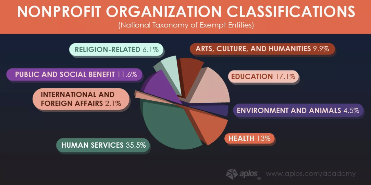
Fundraising is often the primary means of revenue for these organizations. That’s one reason why nonprofits and charitable organizations dedicate so many resources to it.
The other reason is to meet the requirements of the public support test, among other nonprofit fundraising rules.
To qualify as a 501(c)(3) tax-exempt organization (meaning, donations are tax-deductible with a donation receipt), a nonprofit organization has to receive a “substantial portion of its income” from the public … hence the public support test. Non-exempt organizations can still raise money, but their donors won’t be able to write off their donations as a tax deduction.
Nonprofit fundraising is heavily regulated by state law. This holds organizations accountable for how they approach and treat donors, and it ensures donors are giving money to the proper parties.
Before soliciting any donations, organizations must register with the state government in whichever state they’re operating. If the organization goes to another state to fundraise, they’ve got to register there, too. Also, if an organization hires a fundraising consultant or grant writer, he or she must also register with the state. (TL;DR: Fundraising requires lots of registration.)
Cause-related marketing, also known as commercial co-ventures, are also regulated by law. Commercial co-ventures exist when a nonprofit organization makes an arrangement with a business to receive a percentage of sales. This also refers to when two charitable nonprofits that agree to sell something together and jointly benefit from profits. We talk more about these below.
Overall, all nonprofit organizations should follow ethical fundraising practices. The IRS doesn’t enforce specific structural policies, but it highly encourages certain management and operational practices so organizations can better “obey the tax laws, safeguard charitable assets, and serve charitable interests”.
Note: This legal information is not the same as legal advice, where an attorney applies the law to your specific circumstances, so we insist that you consult an attorney if you’d like advice on your interpretation of this information or its accuracy. In a nutshell, you may not rely on this as legal advice, or as a recommendation of any particular legal understanding.
Understanding the legalities of nonprofit fundraising can help you navigate the wide variety of fundraising methods — which ones you can and can’t do, and which ones are best for your charitable organization and donors.
Nonprofit Fundraising Ideas
There are many options when it comes to raising money for a nonprofit — however, there are two major ways to raise money: individual fundraising or company and corporation fundraising.
As you review these types of fundraising — and the different ideas behind how to raise money within both categories — don’t be afraid to combine some of the methods, or use the multi-channel fundraising approach.
By using this multi-channel approach, you diversify your fundraising methods so donors have more ways to contribute. Also, donors might be motivated by one method but submit their donation via another method (such as seeing a direct mail piece but donating via text).
Note: Many of the following fundraising ideas can be used for both individual or corporate fundraising — we’ve placed them in the category they’re most frequently used in. For example, you’ll notice we have events listed under both individual and corporate fundraising below.
Also, before you implement any of these ideas, don’t forget to review the fundraising guidelines from the IRS.
1. Individual Fundraising
Individuals account for about two-thirds of all donations made to nonprofits.
With individual fundraising — also known as personal fundraising — you can ask people within your network, such as friends, family, or colleagues, to donate to your cause. The process allows you to share your story and ask these people to help and support your cause (or whoever/ whatever you’re raising money for).
Why use individual fundraising tactics?
A few reasons why you may implement individual fundraising tactics include the need to raise money for an emergency or natural disaster, trips, life events, education, or medical expenses.
Here are some ideas for how you can implement individual fundraising tactics within your nonprofit:
Direct Mail Donations
Direct mail is a tried-and-true fundraising tactic. It’s cheap, quick, and can be repeated time and time again. The key? Writing a great fundraising letter.
In today’s world, direct mail should only be one of many fundraising tactics you use due to the fact so much content is digital. So, don’t forget to provide a way for your mail recipients to donate online, too (versus mailing in a check … which seems a bit old school these days, doesn’t it?).
Online Donations
Online donations refer to any donations made online — through your website, social media, or on a crowdfunding site.
Online giving is pretty straightforward. It also serves as the primary donation method for most other fundraising tactics. And even if your donors don’t hear about your fundraiser online first, there’s still a large chance they’ll end up visiting your website to learn more and make their donation online.
Social Media Donations
Social media has become a booming, online fundraising tactic due to the sheer number of people on various platforms — over 3.5 billion people globally, to be exact.
For example, Facebook allows individuals to run fundraisers on their news feed and for their birthdays. The platform has also released a “Donate Now” button for organization’s Pages. On Instagram, you can share a URL in your Bio that takes your followers directly to your fundraising site/ web page — you can even write a short description of your nonprofit, cause, or fundraiser in your bio to pair it with the URL.
Lastly, no matter the platform, social media makes it very easy to share content about your cause, why you’re fundraising, and who’s already involved to get others excited to become involved.
Mobile Donations
These days, people are rarely without their phones — and charitable organizations know it. Nowadays there are multiple ways to donate using your mobile device.
Some charities have apps through which you can give. Apps like Charity Miles, Feedie, and Walk for a Dog allow people to give back while doing everyday activities like running, walking their dog, or posting their food on social media. Companies can sign up to sponsor nonprofits through these apps.
Let’s not forget about texting, the most popular way to give using your smartphone. In 2018, almost 50% of donations came from a text link. You can send out links via text or encourage your donors to give through a text message.
Individual Event Donations
Events are a popular way to raise money. Events are a common individual and peer-to-peer (p2p) fundraising method — meaning your supporters (not volunteers) are encouraged to raise money on your behalf. Examples of these events include silent auctions, charity dinners, craft sales, and talent shows.
Note: Remember: corporations can also raise money through events, too.
2. Company and Corporation Fundraising
About $5 billion dollars are raised through workplace giving annually. You can use company and corporation fundraising if you’re looking to raise money from businesses that are willing to partner with your nonprofit.
Why use corporate fundraising tactics?
A few reasons why businesses may be looking to partner with a nonprofit include supporting or fulfilling their corporate social responsibility, reputation, and public relations.
Here are some ideas for ways you can implement corporate fundraising for your nonprofit:
Matching Gifts
The process of matching gifts is when a company matches employee donations. 90% of companies offer some kind of matching gift program. This is because these programs help companies give back while helping donors give twice as much. If you’re interested in matching gifts, consider using a tool like Double the Donation to make these programs easy to market and implement.
Volunteer and Corporate Grants
Companies give volunteer grants when their employees have volunteered a certain number of hours. This encourages employees to donate their time and holds businesses accountable for charitable giving. Volunteering can serve as a great team (or company) outing, too.
Corporate grants are sums of money that companies and corporations give to nonprofit organizations. Companies can either give these grants directly to an organization or choose from a pool of grant applicants. Nonprofits should look out for grant opportunities and ways to apply for corporate funding.
In-Kind Donations
In-kind donations describe non-monetary items given to nonprofits from companies and businesses. They usually include food, drinks, or supplies for an event, free professional services like accounting or legal services, or equipment for a construction project. In-kind donations are typically accepted from businesses with which a nonprofit already has a relationship.
Note: In-kind donations are often used as part of fundraising events, like silent auctions.
Commercial Co-Venture Donations
Commercial co-ventures, or cause-related marketing, is when a nonprofit organization partners with a business to raise money. Examples of commercial co-venture are when a restaurant donates a portion of its proceeds for an evening, or when a retail store gives a percentage their sales, to a nonprofit.
5K Walk and Run Race
Host a 5K race for employees (and community members) to participate in. To raise money, charge a race entry fee. You can also give participants the option of getting sponsorships and/ or fundraising themselves to participate in the race.
Corporate Cookbook
Ask employees to provide one of their favorite recipes to create a corporate cookbook. You can charge the employees who submit their recipes a small fee — then, once the book is printed, you can see the books to the employees as well as local community members.
Employee Events
Give employees a reason to bond, have fun, and raise money for a good cause. Accept donations throughout the night and charge an entry fee — you can also organize a raffle. You might even encourage employees to bring their family and/or friends depending on the type of event you choose.
Here are some employee event ideas for you:
- Bowling
- Karaoke
- Art show
- Wine tasting (partner with a local winery)
- Golf outing
- Silent auction
Creating a nonprofit fundraising plan or strategy for your next campaign will help you focus your efforts and guide your day-to-day fundraising efforts when things get tough. It’ll also ensure your fundraising team is aligned on certain tactics or events that may be part of your strategy.
Walk through the steps below to start piecing together your nonprofit fundraising strategy.
1. Set your fundraising goals, mission, and story.
Start with the end in mind. What’s your fundraising campaign goal? Better yet, what’s your overall goal for this year? For the next three years?
This number should be rooted in the needs of your organization. To figure out those needs, return to your mission statement. If your fundraising goal answers the question of “How much money do you need?”, your mission answers “What do you need the money for?”
Defining your mission statement will guide your fundraising “asks”. What do you plan to do with the money from your fundraiser? How will it contribute to your organization’s mission and purpose? Donors will ask these questions, so outline the answers now.
A recent study found that transparency among charities could increase donations by 50%. Also, two-thirds of donors say that understanding the impact of their donation would encourage them to give more. If you’re open about how you spend your funds, people may give more to your cause.
Lastly, don’t be afraid to tell your organization’s story, as well as the stories of those whom you help. A 2010 study found that “charitable choices are largely driven by the donor’s own inclinations and preferences, a desire to help people they feel some affinity with, and a partiality for certain causes as a result of personal experiences.” A donor’s similarity to your cause or people you help can also motivate them to give.
Also, 62% of donors research charities before they give. Be sure to publish your story on your website for donors to read and connect with.
2. Identify your fundraising team or specialist.
Fundraising campaigns involve a lot of moving parts. Even if your entire organization will be involved in the campaign, it’s best to appoint an individual or small team to manage the fundraising efforts.
These folks will be in charge of tasks like:
- promoting the fundraiser
- organizing fundraising-specific events
- training and leading any volunteers
- managing and analyzing the funds received
- measuring the fundraiser’s performance and looking for ways to improve
Some nonprofit organizations hire a fundraiser specialist to help with these tasks, too.
All of HubSpot’s nonprofit content, in one place. Check out HubSpot’s free nonprofit content today.
3. Build your prospect list.
Who are you targeting for your fundraiser? What communities, companies, organizations, neighborhoods, and groups of people will you approach for donations? Can your volunteers, board members, and beneficiaries of your organization help you compile a list of potential donors?
This list will guide your campaign promotion. Whether you decide to fundraise via direct mail, social media, crowdfunding, events, sponsorships, in-kind donations or all of the above, having a prospect list will help you know exactly who to target.
4. Create a fundraising campaign plan.
This is your most actionable step and will define precisely how you’ll raise money. First, define which tactics you’ll use for your fundraising. (We cover these in the previous section.) Remember, providing a variety of ways to donate will likely increase the number of donations you receive.
Next, decide how you’ll promote your fundraising campaign as a whole. How will you market your organization and its drive to raise money? How will people hear about your events, sponsorships, commercial co-ventures, and more?
Note: How you receive your funds (fundraising tactics) and how you promote your fundraiser (fundraising marketing) are two separate things. This step of your nonprofit fundraising strategy helps you define both.
Lastly, consider how to establish recurring donations so that your organization doesn’t have to fundraise so actively and so often. Almost 50% of donors are enrolled in a monthly giving program, like this one for Charity: Water. Providing a recurring donation option can actually help you raise more money — the average monthly online donation is $52 ($624 per year) compared to the average one-time gift of $128.
5. Say thank you.
Regardless of how you choose to raise money for your nonprofit, always remember to say thank you. Sending a thank-you note and donation receipt is good practice per the IRS, but it’s also beneficial to build relationships with your donors and supporters.
Donor loyalty is just as important as customer loyalty. Fostering relationships by maintaining transparency can alleviate the pressures of non-stop fundraising. Put your donors first (alongside the people helped by your organization), and your nonprofit will see long-term success.
Over to You
Nonprofit fundraising is critical for charitable organizations. By researching tactics and building a nonprofit fundraising strategy, organizations can set themselves up for long-term fundraising success — and impact.

Are Seasonality & the Economy Impacting Marketers in Q4? [Traffic & Conversion Data from 150K+ Companies]
This time each year, nature – as well as marketing – slows down as we head into colder seasons.
As we enter Q4, marketing departments are preparing for a slowdown in business that comes as people tune out towards the end of the year.
But, while seasonal change is expected and inevitable, this year’s economic shifts might cause some marketers to worry that this year could bring a flurry of poor numbers.
As you see dips or bumps in early Q4, you might wonder, “Is my marketing department experiencing seasonality or an impact of outside events, or are our numbers solely based on the work we’ve been doing?”
To help you gather evidence that proves or disproves the possibility of outside impacts in Q4, here’s a look at how businesses across industries entered the first month of it in October.
About this Data: These insights are based on data aggregated from 158,000+ HubSpot customers globally between July 2021 and October 2022. Because the data is aggregated from HubSpot customers’ businesses, please keep in mind that the performance of individual businesses, including HubSpot’s, might differ based on their markets, customer base, industry, geography, stage, and/or other factors.

How Marketing Metrics Are Shifting (or Staying the Same) in Early Q4
To learn how metrics were shifting, we looked at data from sample sizes of 120,000+ businesses.
Overall, we’re seeing that most inbound marketing metrics are down year-over-year. Luckily, the good news is that one major, hard-to-win metric, website conversion rate, is trending upward.
When looking month-over-month, numbers seem to be flatter with a mixed bag of small increases and decreases, which could hint that we’re heading into a seasonal time of slow growth, or starting to see some sluggishness due to the economic climate.
Below, I’ll break down each key marketing metric and walk through what we’ve seen across industries in Q4 so far.
Q4 Web Traffic So Far
Month-over-month, we see that fall and winter seasonality hasn’t harmed websites quite yet with most industries seeing flat, low-change in traffic. Only Technology, Information and Media (up 2% MoM) as well as Trade, Transportation and Utilities (up nearly 3%) saw any real change.
While seasonality might not be impacting the industries below, year-over-year data shows significant dips in traffic across industries (a theme we’ve seen throughout the last few months). Professional and Business Services (down 10%) saw the most significant annual loss, while Leisure and Hospitality saw the reverse with a nearly 7% YoY increase.
|
Industry |
MoM |
YoY |
Sample size |
|
All |
1.30% |
-10.80% |
145,150 |
|
Construction |
-1.21% |
-5.39% |
1,405 |
|
Education and Health Services |
-0.42% |
-3.74% |
3,659 |
|
Financial Activities |
1.32% |
-11.12% |
4,084 |
|
Leisure and Hospitality |
-1.31% |
6.99% |
1,114 |
|
Manufacturing |
-0.19% |
-6.43% |
4,463 |
|
Professional and Business Services |
-0.55% |
-9.65% |
12,999 |
|
Technology, Information and Media |
2.32% |
-4.62% |
14,934 |
|
Trade, Transportation and Utilities |
2.92% |
-5.58% |
3,480 |
Why is this happening? Are we continuing to see solid annual traffic drops? We can’t be certain, but a few things that could be causing impacts are:
- More and more, audiences spend time discovering and even shopping for products on social media directly – no longer relying on standalone company sites.
- In 2021, many regions were still at least partially quarantined due to COVID-19. While the pandemic continues, most of the world’s lightened precautions, enabling economies to re-open and allowing more people to go out and spend less time surfing the web.
- Search engines get more and more competitive daily as hundreds of sites aim to rank for the same keywords as their competitors. More competition directly impacts search traffic and, today, search result pages are more saturated than ever..
Website Conversions Grow Despite Traffic Dips
While traffic seems to be a tad sluggish in October, we’re seeing significant YoY gains (+10.95%) overall with Technology, Information and Media leading the pack (+22.1%) and only Trade, Transportation and Utilities, and Construction seeing decreases.
Across the board, we’re seeing a very slight MoM decrease overall, except for Technology, Information and Media which saw a large increase and Trade which saw the greatest decrease (aligning with slow tech business growth reports we’ve seen all over the news.)
|
Industry |
MoM |
YoY |
Sample size |
|
All |
-1.76% |
10.95% |
124,836 |
|
Construction |
-5.36% |
-5.36% |
1,166 |
|
Education and Health Services |
2.26% |
19.35% |
3,316 |
|
Financial Activities |
-4.59% |
7.47% |
3,542 |
|
Leisure and Hospitality |
5.00% |
9.70% |
939 |
|
Manufacturing |
-6.27% |
12.95% |
3,905 |
|
Professional and Business Services |
0.31% |
15.41% |
11,451 |
|
Technology, Information and Media |
17.27% |
22.10% |
13,504 |
|
Trade, Transportation and Utilities |
-8.41% |
-4.39% |
2,984 |
Inbound Leads Stay Fairly Flat… Except in a Few Key Industries
In October, Inbound Leads were a mixed bag. However, the evidence of both positive and negative seasonality patterns become more obvious when looking at this metric.
Month-over-month, inbound leads remained flat with an overall 0.65% decrease. Manufacturing (-6.48%), as well as Transportation and Utilities (-5.6%), saw the biggest dips. Meanwhile, Construction (-8.75%) and Trade, Transportation and Utilities (9.82%) saw significant YoY losses.
Where did inbound leads grow? Technology, Information and Media saw a sizable MoM and YoY increase of 5.22% each. Additionally, inbound leads overall saw a small annual increase with Education and Health Services (16.76%) and Leisure and Hospitality (17.15%) seeing the greatest gains. These boosts contributed to year-over-year growth of 1.63% for overall industries.
|
Industry |
MoM |
YoY |
Sample size |
|
All |
-0.65% |
1.63% |
132,820 |
|
Construction |
-4.48% |
-8.75% |
1,345 |
|
Education and Health Services |
1.70% |
16.76% |
3,636 |
|
Financial Activities |
-2.80% |
-1.97% |
3,876 |
|
Leisure and Hospitality |
2.74% |
17.15% |
1,031 |
|
Manufacturing |
-6.48% |
4.31% |
4,287 |
|
Professional and Business Services |
0.15% |
8.02% |
12,648 |
|
Technology, Information and Media |
5.22% |
5.22% |
14,592 |
|
Trade, Transportation and Utilities |
-5.61% |
-9.82% |
3,251 |
What can we make of this data?
While we can expect year-over-year conversion rate growth with web traffic going down annually, some of the substantial losses and gains are due to more than just web traffic. A few potential impacts could be:
- Products or services sold within manufacturing, trade, transportation, and utilities can be quite expensive or impacted by inflation. As people tighten their budgets with conflicting economic news, high-priced industries could be seeing some sluggish lead generation as people might only be focusing on just the products or services they need.
- Seasonality is likely beginning to take effect as people begin to focus more on experiences driven by education, media, and holiday travel, while putting other industries on the back burner.
- As we keep seeing news of career changes, recession-based company shifts, and the continuing pandemic, people might be more fixated on Education and Health Services industries than in previous quarters, leading to nearly-17% annual lead growth.
Are Marketing Emails Struggling to Be Seen?
In our previous reports, we noted that while marketers have been sending fewer emails – likely to meet the needs of today’s subscribers with heavily cluttered inboxes – they’re still seeing opens and open rates dip.
It’s tricky to guess what the problem could be, but as the HubSpot Blog’s former email manager, one suspicion I have is that email inboxes are far too saturated and competitive these days.
|
Metric |
MoM |
YoY |
Sample size |
|
Email sends |
1.42% |
-1.97% |
141,791 |
|
Email opens |
-1.14% |
-15.85% |
141,791 |
|
Email open rate |
-2.19% |
-13.71% |
141,769 |
Ultimately, if your email isn’t seen in an inbox no one will open it. And, if you’re sending emails with great content, but non-competitive, non-eye-catching subject lines, your readers might not click into them.
Odds are, your subscriber subscribes to many other emails related to your industry. And, because of this, they compare you to competitors sending similar content with similar goals each day. This is why it’s so important for your brand’s emails to seem as interesting, unique, and eye-catching as possible – without looking too desperate.
To learn more about how to boost your open rate and opens, check out this helpful post.
Further Reading
When it comes to key marketing metrics, keeping a pulse on how the business world and your industry are doing can help you determine when and how to get ahead of competition.
For even more helpful data, check out our previous reports, plus a few additional research studies, as you plan your strategies for Q4 and beyond.
- The Top Traffic, Conversion & Lead Trends in Q3: Data & Takeaways from 120,000 Businesses
- Your Guide to Summer Web Traffic, Conversion & Lead Performance Across Industries
- A Crisis of Disconnection: 3 Business Trends Stifling Business Growth in 2022
Lastly, be sure to check out our free, downloadable 2022 State of Marketing Report below – with data and tips from experts across the global marketing industry.


10 Events and Conferences for LGBTQ+ Entrepreneurs
Welcome to Breaking the Blueprint — a blog series that dives into the unique business challenges and opportunities of underrepresented business owners and entrepreneurs. Learn how they’ve grown or scaled their businesses, explored entrepreneurial ventures within their companies, or created side hustles, and how their stories can inspire and inform your own success.
LGBTQ+ people often face higher rates of isolation and discrimination, meaning that this community can especially benefit from gatherings that foster support and connection.
This is especially true for LGBTQ+ entrepreneurs and professionals, as finding opportunities to learn from people who share similar life experiences can be challenging.
In this post, we’ve curated a list of annual events and conferences for LGBTQ+ entrepreneurs and professionals. Whether you’re seeking mentorship, training from experts, or just some old-fashioned socializing with like-minded business owners, these events are made for you. While most have already taken place for 2022, keep your eyes peeled for the 2023 dates.
Events and Conferences for LGBTQ+ Professionals
1. Lesbians Who Tech & Allies Summit
Despite the name, the annual Lesbians Who Tech & Allies Summit is inclusive of all techies, centering LGBTQ women, women of color, and non-binary leaders. The ninth summit was in October in San Francisco, with in-person and virtual options.
Their summits feature networking and mentorship opportunities, career fairs, leaders and celebrity speeches, parties, and educational sessions. While much of the content is geared toward the tech world, many sessions focus on broader topics like leadership, diversity, politics, and advocacy, which may appeal to any LGBTQ entrepreneur.
2. Out & Equal Summit
The Out & Equal Summit has been held for over 20 years, creating a place for LGBTQ+ professionals and allies to learn how to create more inclusive workspaces. The latest was in October 2022 in Las Vegas, with a digital livestream option.
This conference is intended for any professional interested in LGBTQ+ workplace equality — especially executives, HR and DEI experts, Employee Resource Group leaders and members, and more. In addition to hosting learning sessions and keynote speeches, this event provides attendees with networking opportunities, workshops, and social events.
3. NLGCC International Business & Leadership Conference
The NLGCC, or the National LGBT Chamber of Commerce, is the only organization that offers a certification for LGBTQ-owned businesses (Certified LGBT Business Enterprise®).
It also provides business owners with networking and business opportunities year-round — and at their annual conference. Despite being U.S.-based, their International Business & Leadership Conference claims to be “the largest LGBT business event on the planet.”
In addition to networking and keynote speeches, attendees get access to leadership programming, speeches, B2B bootcamps, expos, matchmaker meetings between suppliers and companies, and more. The 2022 event was in Las Vegas in August.
4. Out Leadership Summit
This organization aims to drive equality and advocate for inclusion in business. They have several talent development programs for emerging leaders, women, and board-level executives.
Out Leadership also hosts yearly summits worldwide to unite leaders and business owners. The 2023 US summit will be on May 15 in New York in partnership with Lambda Legal.
5. StartOut Chapter Events or National Awards
StartOut exists to support LGBTQ entrepreneurs and accelerate their businesses. The organization has chapters in several major cities, such as Austin, Chicago, San Francisco, and New York, where local LGBTQ+ business owners can connect and attend frequent educational and social events.
StartOut also puts on a national gala, the StartOut Awards, which celebrates LGBTQ entrepreneurs and is an ideal opportunity to socialize and network with peers. The 2022 event took place in October in New York City.
6. The ROMBA Conference
Reaching Out MBA’s annual ROMBA Conference is a massive event for LGBTQ+ business students and post-MBA professionals.
The conference features social receptions, career fairs, panels, workshops, and competitions. LGBTQ+ entrepreneurs with business backgrounds can utilize this event for professional development, networking, and recruiting talent. The 2022 conference was in October in Washington, D.C.
7. Out Professionals Events
This organization for LGBTQ+ professionals hosts virtual events, but if you’re fortunate enough to live in a city with a chapter, you can attend local events and connect with other entrepreneurs.
Cities such as Houston, Philadelphia, San Diego, and Washington, D.C. have Out Professionals chapters and host monthly in-person events to help LGBTQ+ people build their careers and network. The organization is expanding and seeking more cities where people want to start chapters.
Industry-Specific LGBTQ+ Conferences
We included Lesbians Who Tech & Allies in this general list since technology touches nearly everything these days, and its sessions appeal to a broad range of professionals.
However, there are also many smaller, industry-specific LGBTQ+ events and conferences. If you want to network, socialize, and learn with your peers in your field, see if your industry has something specifically for LGBTQ people. Here are just a few of the ones out there:
- The NLGJA (The Association of LGBTQ Journalists) annual convention for those in journalism
- The Midwest LGBTQ+ Health Symposium for those in medicine and healthcare
- NAGLREP’s yearly convention for LGBTQ real estate professionals
Local LGBTQ Events
Chamber of Commerce
Some cities, regions, and states have their own LGBTQ chambers of commerce, where LGBTQ-owned businesses and allies can become members.
This not only links LGBTQ entrepreneurs with an affirming local business community, but it makes them visible to those seeking to patronize LGBTQ-friendly businesses. These local chambers frequently host community events, from social and networking opportunities to business training sessions. The NLGCC has a list of local affiliated chambers nationwide; check to see if there’s one in your area, and scope out their website for upcoming events.
Local Pride Festivals
Every year, more cities, counties, and regions host annual Pride celebrations. While you’ll typically find parades and marches, many Pride events also feature festivals with booths for rent. Entrepreneurs often use this opportunity to sell goods, create a local presence, or promote their business with freebies or giveaways. If your area has a Pride celebration, consider renting a booth.
Get Ready to Mingle
LGBTQ+ professionals have many opportunities available to connect with and learn from other entrepreneurs at events. All of the summits on this list are valuable opportunities to learn and grow — select one that speaks most to your needs and get ready to mingle.

YouTube Analytics: The 15 Metrics That Actually Matter
Some of us marketers have an unhealthy obsession with YouTube analytics — we track too many of them. Maybe we think we can prove any video marketing campaign is producing results if there’s an eye-catching percentage by its name. But, deep down, we all know that some metrics are more revealing than others.
There are a ton of KPIs we can look at that provide minimal insights. Fortunately, though, we created this guide to help you navigate YouTube Analytics and measure the metrics that actually matter. It’ll save you from drowning in the sea of analytics that most marketers only have a lifebuoy in, helping you not only stay afloat but swim safely to land.

Read on to learn about the YouTube metrics that actually matter, and how they’ll enhance your video strategy.
YouTube Analytics: The 15 Metrics That Actually Matter
1. Watch Time
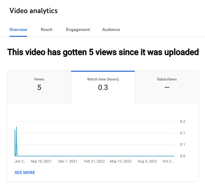
Watch time is the total amount of minutes viewers have spent watching your videos. It’s a key metric because YouTube elevates videos and channels with higher watch times in their search results and recommendations section. YouTube does this because the more watch time a video has, the more engaging their algorithm presumes it is.
In the Watch time report, you can see the amount of watch time your videos have accumulated. You can also rank each of your videos by watch time and group your videos by themes, styles, and lengths to determine your most engaging types of videos.
How to find Watch time in YouTube Studio:
Analytics > Overview > Watch Time
2. Average Percentage Viewed
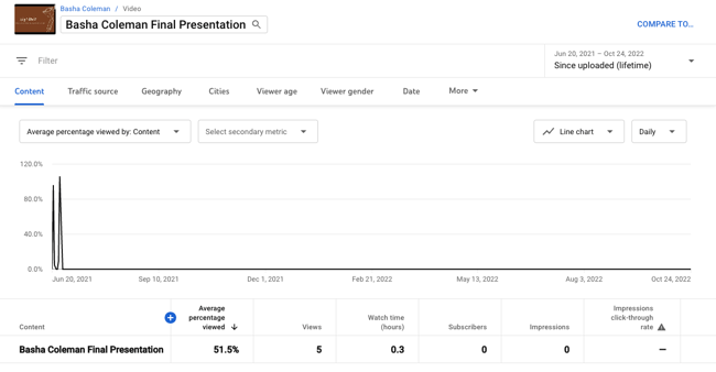
Average percentage viewed is the percent of each video the average viewer watched. It measures your video’s ability to hold viewers’ attention for its entirety. And when YouTube realizes your videos can hold people’s attention, they’ll reward it with higher search and recommendation rankings. You can find this metric in your watch time report.
How to find Average Percentage Viewed in YouTube Studio:
Analytics > Overview > Watch time > See More > Content > Watch time > More Metrics > Overview > Average percentage viewed
3. Average View Duration
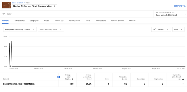
Average view duration is the total watch time of your video divided by the total number of video plays, including replays. This metric measures your video’s ability to engage viewers. If your video can’t engage viewers, they’ll bounce from your video quickly, leaving you with an unimpressive average view duration. But if your video can engage viewers, your average view duration and total watch time will increase at the same time, boosting your search and recommendations rankings. You can also find this metric in your watch time report.
How to find Average View Duration in YouTube Studio:
Analytics > See More > Watch time > More Metrics > Overview > Average view duration
4. Audience Retention
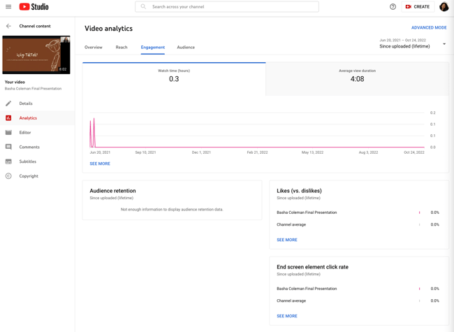
Audience retention shows you the percentage of viewers who watch and leave your video at every single moment of the video. YouTube elevates videos with high audience retention in their search rankings and suggestions because these videos can effectively capture viewers’ attention.
Audience retention can also inform your future video strategy. The most engaging parts of your video could be your next best video topics. And watching your video during steep dips of engagement will tell you what might be boring your viewers, allowing you to scrap those elements from current and future videos.
When you have enough data to generate YouTube’s audience retention report, there will be two graphs: the absolute retention curve and the relative retention curve. The absolute retention curve shows you how well your videos retain viewers. And the relative retention shows you how well one of your videos retains viewers compared to all other YouTube videos of similar length.

How to find Audience Retention in YouTube Studio:
Analytics > Engagement > Audience retention
5. Re-watches
Re-watches are the amount of times viewers re-watch certain parts of your video. If a lot of people are re-watching a specific part of your video, then they’re probably interested in the topic your video is covering during that moment. These topics can be fodder for your future video strategy. You can find this data in the absolute audience retention graph. Re-watches are usually indicated by rising curves in the graph.

How to find Rewatches in YouTube Studio:
Analytics > Engagement > Audience retention > Absolute audience retention
6. Engagement
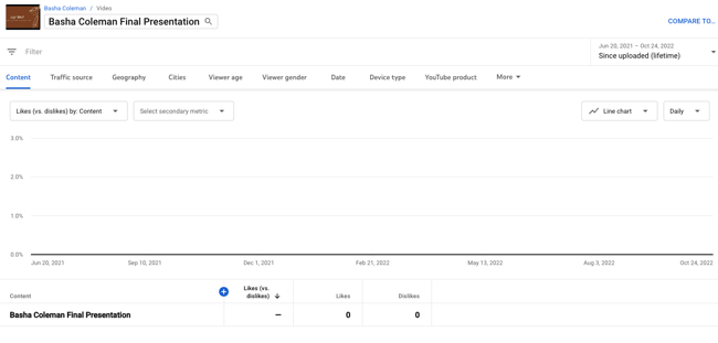
Comments, shares, likes, and dislikes provide marketers with a lot of valuable qualitative data.
Comments can paint a clear picture of your video’s emotional effect on viewers. Shares can gauge how much viewers value your content and brand — since people share content that confirms their ideal self-persona, people who share your video are publicly displaying that they trust and support your brand. Likes and dislikes can help you determine what video topics work best with your particular audience. You can find your videos’ engagement metrics in YouTube’s Interactions Report.
How to find Engagement in YouTube Studio:
Analytics > Engagement > Likes (vs. dislikes) > See More
7. Impressions Click-Through Rate
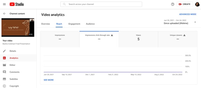
Impressions click-through rate measures your video’s ability to prompt people to watch your video after seeing it on their homepage, recommendation section, or trending section. A high click-through rate means your title was compelling and your video’s topic resonates with a lot of relevant audiences on YouTube.
A common trend for impression click-through rates is that they usually spike immediately after you release your video — your subscribers will see the video at the top of their home page and probably click on it. But once your video spreads beyond your core audience, your click-through rate will decline and then stay at a stable rate.
You can also couple this metric with average percentage viewed and average view duration to see if people actually watch your video after they click on it. A high click-through rate is great, but if people are leaving right at the beginning of your video, your title or thumbnail could be misleading. Preparing viewers for what’s to come is crucial because if your title or thumbnail is inaccurate, they’ll feel deceived and lose trust in your brand.
A low click-through rate but high engagement could mean that the video has a small yet specific audience that is enamored by the content.
How to find Engagement in YouTube Studio:
Analytics > Reach > Impressions click-through rate

8. Card Clicks
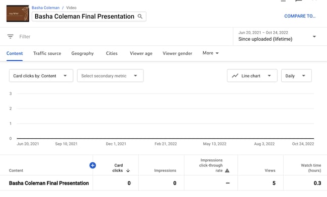
Cards are slide-in panels that encourage people to take a desired action during a video like watch another video, subscribe to a channel, or click through to a different website. Each of your cards’ click-through rate tells you which action your viewers prefer to take while watching your videos. This can help you place the most engaging card in each of your videos, potentially boosting your watch time, subscriber growth, or website traffic.
Analyzing card clicks can also help you uncover the optimal timing, placement, and duration of your cards in future videos.
How to find Card Clicks in YouTube Studio:
Analytics > Reach > See More > Impressions by: Content > More Metrics > Cards > Card Clicks
9. Playlist Engagement
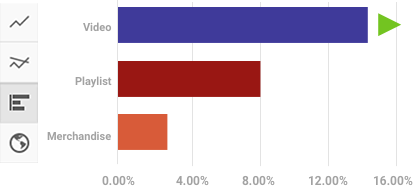
Playlists are a great way to organize your videos in a digestible way. It helps your viewers easily consume videos about their favorite topics and prompts them to keep watching, which racks up watch time for your channel.
You can uncover your playlist engagement by analyzing two metrics in YouTube’s Playlist Report: views per playlist start and average time in playlist. Views per playlist start is the average number of video views your playlists gather, and average time in playlist is the average amount of time that viewers viewed the videos in your playlist. If these two metrics are underperforming, try starting your playlist with videos that have the highest retention rate.
How to find Playlist Engagement in YouTube Studio:
Analytics > Engagement > See More > Watch Time > More Metrics > Playlists
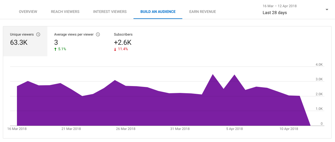
10. Unique Viewers
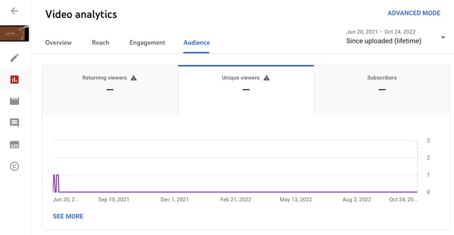
Unique viewers is the estimated number of individuals who watch your videos over a certain period of time. This metric really helps you understand the actual size of your audience.
You can also use this metric to gauge your subscriber’s engagement with your videos. If your unique viewers are lower than your subscriber count, then your subscribers aren’t watching as much of your video as they could be. To get them to be more active, ask them to set up notifications for your new videos. You can find this metric under the Reach Views and Audience tab in YouTube Studio.
How to find Playlist Unique Viewers in YouTube Studio:
Analytics > Audience > Unique viewers
11. Views Per Unique Viewers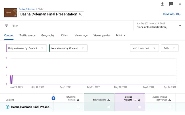
Views per unique viewers is the amount of times the average viewer watches your video. This metric tells you if people can’t get enough of your video and keep rewatching it. Video topics with a lot of views per unique viewers could also be your most popular content topics, and if you cover them more, you could generate more views, watch time, and subscribers.
How to find Playlist Unique Viewers in YouTube Studio:
Analytics > Audience > Unique viewers > See More > Average views per viewer
12. Who’s Watching Your Videos
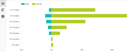
In YouTube’s demographics report, you can see the different types of people who watch your videos, segmented by age, gender, and geography. This data tells you who your most engaged audience is and who your target audience should actually be. You can take the opposite approach with this data too. If you’re not reaching the audience you want, try pivoting your video strategy and cover topics that would attract them.
How to find Demographics in YouTube Studio:
Analytics > Audience > Age and Gender
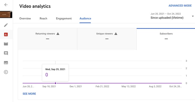
13. Subscriber Growth
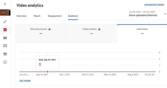
Subscribers are your most loyal fans. They’ve made a public commitment to your brand, content, and values. And they’re most likely to be your evangelists too. Subscribers are also important to your channel because YouTube will send them notifications about your new videos and feature them on their homepage. This means they’ll see your videos more frequently, which will help generate more views. Subscribers also watch twice as much video as non-subscribers, so the more subscribers you have, the more watch time your videos will collect.
YouTube’s Subscribers Report will show you which videos, locations, and time periods gain and lose subscribers. This data will tell you what video topics resonate with your subscribers and where to target new subscribers. And by prioritizing your subscribers’ needs, you’ll create videos that they crave, increase your watch time, and boost your search rankings.
How to find Subscribers in YouTube Studio:
Analytics > Audience > Subscribers
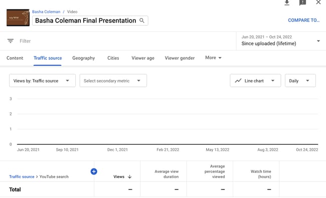
14. Traffic Sources
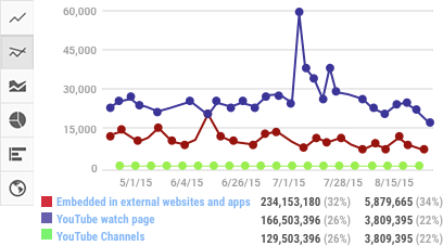
External referrals like social media or sites that embed your videos and YouTube referrals like search, the recommended section, and the homepage are all traffic sources. The Traffic Sources report shows you how viewers found your videos and what sources rack up the most views and watch time. You can use this data to better optimize your video promotion strategy.
How to find Traffic Sources in YouTube Studio:
Analytics > Audience > Subscribers > See More > Traffic Source
15. Keywords
In YouTube’s Reach Report, which is under the Traffic Sources Report, you can see the most popular queries guiding viewers to your videos. If these queries are slightly different from your video’s topic, consider updating your video to fill these content gaps and add the keywords to your metadata. If there’s a stark difference, consider making a new video about these popular queries.
How to find Keywords in YouTube Studio:
Analytics > Reach > YouTube Search terms
Editor’s note: This post was originally published in July 2018 and has been updated for comprehensiveness.

What HubSpot’s Highest Performing Blog Posts Have in Common & Why These Elements Work
Wondering what elements make up a successful blog post? We reviewed our top 8 blog posts on the Marketing Blog in 2022.
Traffic-wise, each of these posts has received over 500,000 organic views since publishing and earns at least 40,000 views monthly.

Let’s see what they have in common and what marketers can learn from them.
- 445 Best Instagram Captions for 2022: Good, Cool, Funny, & Cute
- 12 Incredible Answers to “What Is Your Greatest Weakness?” — That Aren’t “Perfectionism”
- 70 Fun (Not Cheesy) Ice Breaker Games & Activities Your Employees Will Enjoy in 2022
- 45 Quotes That Celebrate Teamwork, Hard Work, and Collaboration
- 20 of the Best Professional Bio Examples We’ve Ever Seen [+ Templates]
- 27 Mission and Vision Statement Examples That Will Inspire Your Buyers
- How to Type the Shrug Emoji ¯\_(ツ)_/¯ in 2 Seconds Flat
- The 11 Best Free (and Private) Email Accounts and Service Providers of 2022
1. Eye-Catching Headlines
What you’ll notice with all of our top-performing posts is that they have an attention-grabbing headline.
Some of the components of an eye-catching headline are:
- Numbers
- Action verbs
- Descriptive adjectives
In 2013, Moz ran a study that found that articles with numbers in the headlines outperformed those that didn’t. Our data suggests that the same is still true nearly a decade later.
All but one of our top-performing posts features numbers, at the beginning of the headline. One reason why numbers are effective is that they set expectations. Blog posts can be a bit overwhelming and when you add a number in your post, it removes some uncertainty and lets the reader know exactly what they’ll get.
2. Descriptive Intros
When a user lands on your blog post, the first thing they’ll likely read is your introduction.
Your intro should cover three areas:
- Who this article is for or about
- What will be covered in the article
- Why the reader should care
Your intro can also be a good place to present a new piece of data or an anecdote that leads into your topic. You can also present a situation or a question that invites the reader to keep reading.
For instance, the 20 of the Best Professional Bio Examples We’ve Ever Seen [+ Templates] post starts by posing a question: “Be honest, does your professional bio make a statement?”
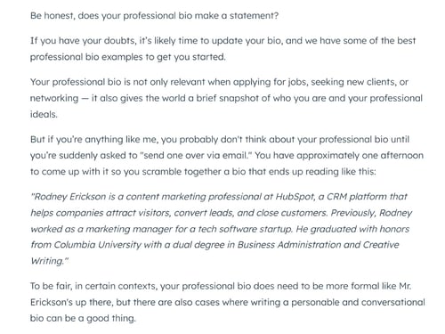
From there, the writer outlines a common challenge that many readers have likely experienced and then highlights the importance of a professional bio.
There are so many ways to approach an intro but as long as it covers those three Ws and has an empathetic lens, it will surely keep your readers engaged.
3. Comprehensive Listicles
In 2020, a study by one blogger found that 41% of the top Medium articles in 2020 were listicles. Similarly, our top 8 performing blog posts from this year are also listicles.
Listicles are great because they are inherently scannable. The reader can quickly navigate to the section(s) they’re most interested in.
These listicles are also very comprehensive, serving as a detailed guide that readers can bookmark for future use.
Take the “445 Best Instagram Captions for 2022: Good, Cool, Funny, & Cute” blog post. When it was originally published, the article did not feature 445 examples. However, with every update, we consider the SERPs and how they will fare against competitors.
From there, we decide what content updates will be most valuable for readers. For this post, in particular, that meant adding more captions to make the post more comprehensive.
4. Table of Content
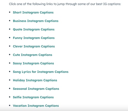
When you have a lengthy blog post, one of the best elements you can add to the page is a table of contents with jump links. A jump link is a link that, when clicked, will take the user straight to a section on the page.
However, a table of content can be just as valuable as a short post for readers who are looking for specific information.
In the 445 Best Instagram Captions for 2022: Good, Cool, Funny, & Cute article, the table of contents section is broken down by category.
5. Featured Snippets
A featured snippet is a Google search feature in which an excerpt from a website is shown at the top of the SERP if it matches the search query.
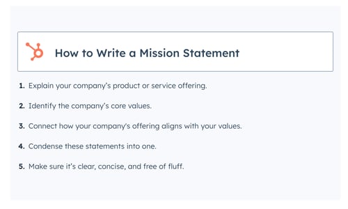
Because a featured snippet will appear at the top of the page, it leads to more clicks – making it a coveted feature that every website wants. But to gain a featured snippet for a particular query, your webpage has to be optimized and beat out other web pages.
Although this can happen organically, bloggers can optimize sections on their page to increase their chances, such as:
- Schema markup
- Headings and paragraph tags
- Paragraphs that are 50 to 60 words long
6. Scannable Sections
Another common element in all of our top-performing posts is an emphasis on scannability.
Every post features short paragraphs and bullet points – and that’s not by chance, it’s by design.
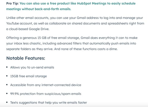
We know readers often scan blog posts to find the most relevant information. Large text blocks can be visually intimidating and lead to high bounce rates. To prevent this, we opt for bite-size paragraphs that work on both desktop and mobile.
7. Visual and Interactive Elements
With so many distractions at our fingertips, it’s not enough to have a blog post with just words. The more interactive and visually rich elements you can add to your post, the more engaged your readers will be.
This can range from video embeds, jump links, and images to quizzes and polls.
In addition to increasing engagement, these elements also help to break up the visual monotony of written text. They give the readers something new to see, read, and engage with.
There you have it – seven elements that have contributed to the success of our top-performing posts. Although every reader is different, these are universal elements that will provide a better user experience and higher engagement rate.


Multicultural Marketing: What It Is and How to Do It The Right Way [According to Experts]
Growing up as a first-generation Asian American, I lived between two cultures. One was the East-Asian culture my parents brought from Taiwan, which prioritizes the needs and desires of the family and emphasizes academic excellence. The other was the Western culture that surrounded me outside the house, which prioritizes the needs and desires of the individual and emphasizes extracurricular activities.
Needless to say, these two cultures clashed, and I spent the early part of my childhood confused about my identity. My parents taught me certain values and principles to help guide me through life, just like their parents did, but whenever I hung out with my friends, they would show me a completely different way of living. At the end of the day, I didn’t really know which group to side with. But once puberty hit, I did what every other hormone-filled tween would do — I rebelled against my parents and followed my friends.
From the beginning of middle school to the end of high school, I mostly identified as an American not just because the vast majority of my friends were American, but because I realized I was different. And I didn’t like that.
Desperate to fit in, I tried my hardest to blend in with my peers. I immersed myself in football and baseball, deriving all my value in being a jock — the opposite of your typical Asian American. Sadly, I also looked down on other Asian kids who weren’t as American as me, sparingly ate Chinese food, and didn’t like inviting my friends over because I was scared they’d think my house smelled weird. In a nutshell, I was embarrassed to be Asian.

This mentality bled over to college, where I studied economics and business, played baseball, and joined a fraternity — all of which a typical Asian American wouldn’t do. As a senior, I decided to study abroad in Scotland, and my goal was to befriend as many lads and lasses from across the pond. But by the end of the semester, barely any of my friends were European. And none of them were American. Most of them were actually asian.
One of the biggest reasons why I loved studying abroad, in addition to traveling the world and never going to class, was that I befriended a group of Asian guys who were extremely proud of our ethnicity and culture. And it taught me how important it is to be proud of my own identity. Before I studied abroad, I’d never met an Asian person who claimed they were proud of who they were, and I didn’t really take pride in it either. But after meeting my asian friends in Scotland, who were from Asian countries, like Singapore, Malaysia, The Philippines, Bhutan, and India, I was inspired to flip my mentality.
When I returned home from Scotland, my parents were both shocked and thrilled at how Asian cuisine had become my favorite type of food and how much pride I took in being Asian. In my mom and dad’s eyes, I could see the joy in their hearts. I’d finally done something they’d always wanted me to do — be proud of who I truly am.
Even though the world is a melting pot today, most brands market in a way that only appeals to a country’s majority ethnicity or culture. That means there’s a huge pool of people that brands aren’t resonating with.
However, generating more sales shouldn’t be the only reason you market to minority groups. Acknowledging their ethnicities and cultures should be another huge driving factor.
Because, ultimately, letting minority groups know that it’s not only okay to be different, but it’s also amazing that they bring such different perspectives to the places they immigrate to, will move society forward and help immigrant children like me be proud of who they truly are.
How to Do Multicultural Marketing The Right Way
Hire a diverse multicultural marketing team.
If your brand truly wants to practice empathy, then your employees need to actually know what it’s like to be in your customers’ shoes. Otherwise, if you don’t have someone on your team who can contextualize your marketing campaign to a specific ethnicity or culture, your content might seem it was created with an ulterior motive.
So whichever minority group you target during your multicultural marketing campaign, just make sure someone on your team has the practical knowledge and life experience to vet it for accuracy.
Interview people from minority groups that aren’t represented on your multicultural marketing team.
If you’re not able to hire a person who can represent the minority group your multicultural marketing campaign targets, your next best option is to interview people who can. To do so, reach out to people in your network, social circle, or family and ask them some questions about the challenges they face as a minority.
Triple-check your multicultural marketing campaign’s accuracy and authenticity.
There’s nothing worse than a self-serving marketing campaign masquerading as social justice (I’m looking at you Kendall Jenner). Even if you have the right intentions, poor execution can turn your campaign into an SNL Cheetos’ commercial.
So before you green light your multicultural marketing campaign, run the creative and distribution strategy by some colleagues or friends who represent the minority group your campaign is targeting and see if they can poke holes through it.
Acknowledging Diversity Matters More Than Ever Today
As an Asian American, Mulan, Jeremy Lin, and Jon Cho are my heroes because even though Asians are grossly underrepresented and misrepresented in pop culture, these three overcame that adversity and put themselves in a positive light, which greatly benefited the Asian American community.
With this in mind, if your multicultural marketing campaign can shed light on the challenges a minority group faces and highlight their benefit to society, you’ll not only grow the group’s loyalty for your brand, but you’ll also make them feel like they have a genuine, empathetic ally.
Photo by Omar Lopez on Unsplash

The 7 Best Practices for Building Fantastic Lead-Capture Forms
So you’ve created the perfect offer and built a web page to promote it. You now need a lead-capture form to collect information. So, what is a lead capture form?
In this post, you’ll learn the benefits of lead capture forms, as well as seven best practices that will help you attract prospects. This guide includes the following:
A lead-capture form helps you generate prospects who download resources from your landing page. These forms are common when promoting ebooks, case studies, research reports, and webinars.
Customers see a clear value in the offering. This value proposition compels them to trade their personal information for access.
Seven Best Practices for Building Lead Capture Forms
While lead-capture forms have many use cases, the best forms include the same components. See the seven elements your form must have and best practices for generating results.
1. Choose the right position on your landing page.
There’s no hard and fast rule on where to place your lead-capture form. Regardless, you’ll always want to keep your form above the fold. This means the form is prevalent and easy to spot without scrolling. Visitors then know the intent of your landing page immediately.
To ensure your lead-capture resource is the primary appeal of your landing page, consider using these four form positions.
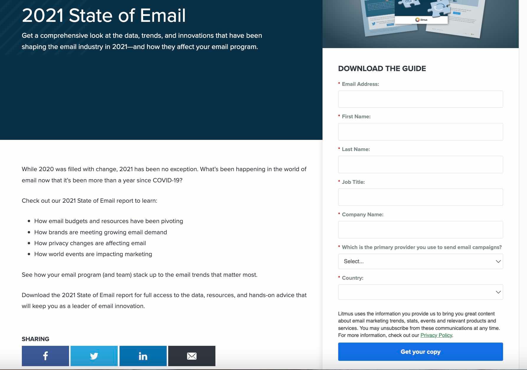
Beside the Landing Page Offer
The form below is an example of one that’s above the fold. However, it’s not the most eye-catching element on the page — the content is.
Putting the form beside the landing page copy is a brilliant way to remind users of the valuable resource they’ll receive if they submit their basic information.
Within the Landing Page
If you have a lengthy landing page, including your form in at least three positions is ideal. We see this at play in this report, which contains over 1,000 words of content.
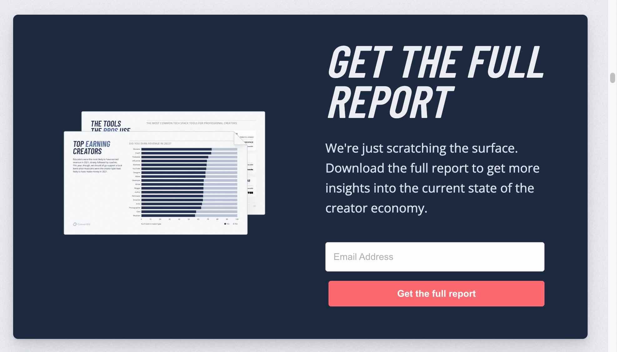
Pro Tip: As a rule of thumb, include a lead-capture form after every 350 words on your landing page.
In a Chatbot
Besides using chatbots to automate responses and communicate with your visitors, you can use them to share your lead-capture form. For instance, when you click “Get Report” on the landing page below, the form pop-ups, requesting your email to “Download the Full Report.”
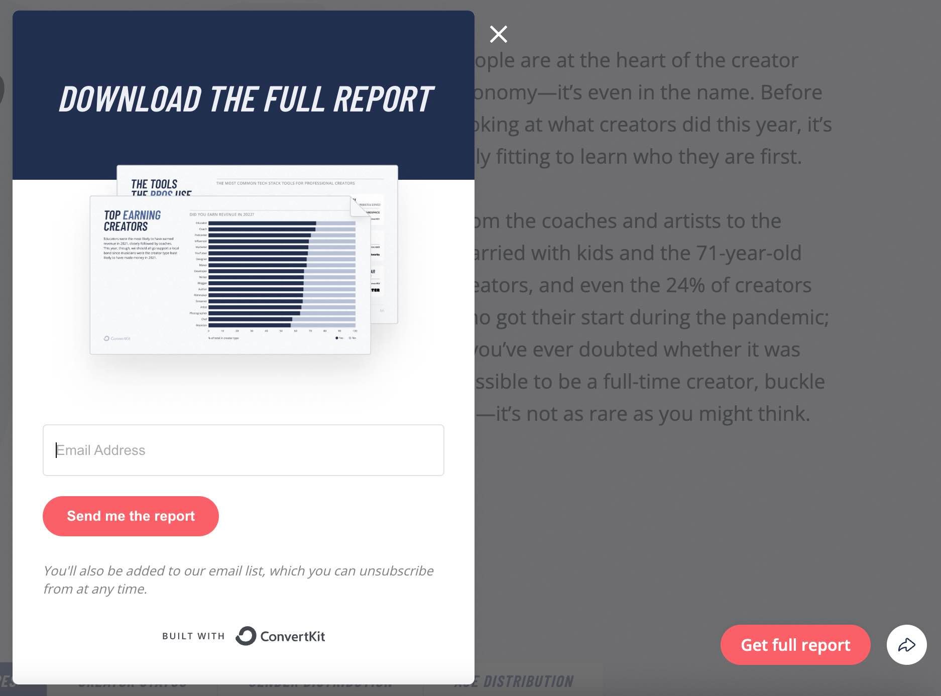
At the Bottom of an Auto-Scroll Landing Page
Placing a lead-capture form at the bottom of your landing page offers one more chance to acquire a visitor’s information. This position also allows your content to take center stage, allowing visitors to determine if it’s worth downloading.
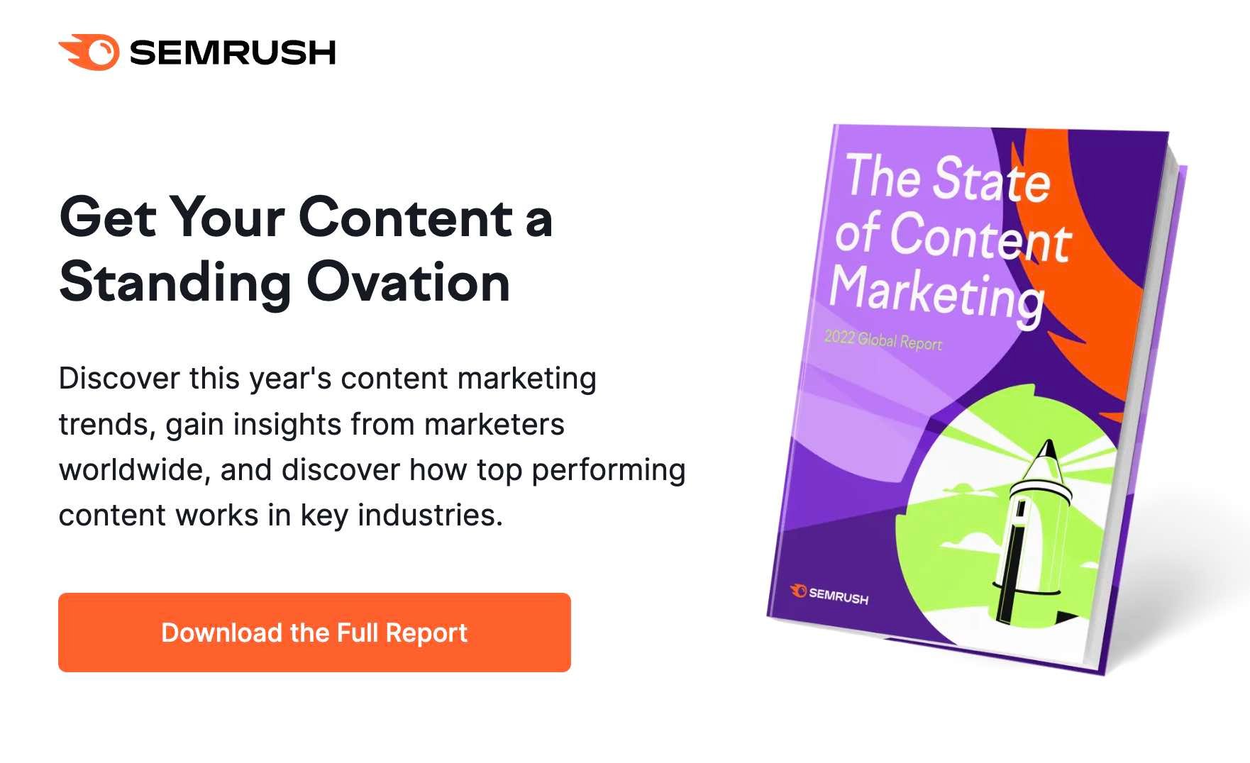
If visitors decide they want the content, clicking the “Download the Full Report” button automatically scrolls them down to a brief form at the bottom of the page.
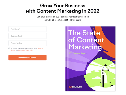
Once they fill out the form, they can confirm their download and retrieve their content.
2. Determine the right length for your lead-capture form.
The next — and probably biggest — concern when designing your forms is the length. The number of form fields you use creates a tradeoff between the quantity and quality of leads you get.
Shorter forms usually generate more leads since people can fill them quickly. However, your leads from short forms vary widely in quality.
Longer forms require that visitors provide more details of their needs, meaning they show a better purchasing intent. So you may get fewer leads, but they’ll be of better quality.
When creating your form, find a good balance between collecting enough information and not asking for excess information that your visitors are reluctant to give.
Pro Tip: Prospects tune off when they see a long lead-capture form. To get around this, use a progressive lead-capture form that includes steps. This gives visitors a mental picture of how quickly they can complete the form and download your resource.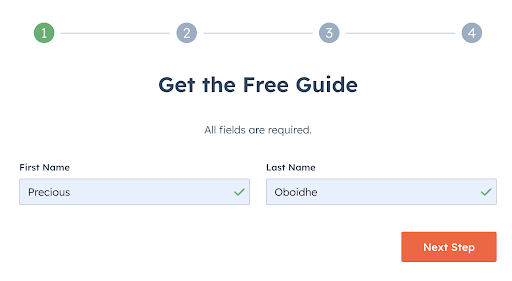
3. Choose relevant form fields.
Irrespective of your preference for short or long forms, it’s best practice to only ask essential questions that’ll help you contact and qualify your lead.
For instance, if you spend over $10,000 to create a marketing report, you’ll want to generate high-intent leads from this resource. Meaning you’ll have to go beyond the name and email of those who want to download the report.
You may need to know their company, website, role, and number of employees. Asking these questions allows you to assess their fit for your company, gauge their need for your product, and know their likelihood of purchasing your product. With this info, you can decide whether to add a lead to your sales flywheel.
Pro Tip: Ask as few questions as possible with your lead-capture form. This will significantly increase your conversion rates. You can also ask more questions after the lead enters your funnel.
4. Include your privacy policy.
Laws in the United States, European Union, Canada, and Australia you must include a privacy policy when collecting “personally identifiable information” (PII). PII covers sensitive information like the full name and mailing address of your visitors. It also encompasses non-sensitive information, like zip code, race, date of birth, etc.
Irrespective of a form’s location on your website, you should place your privacy policy where it’s easily noticeable. This puts prospects at ease if they are skeptical about sharing their information.
For example, our lead-capture forms show a privacy policy preview right above the download button.
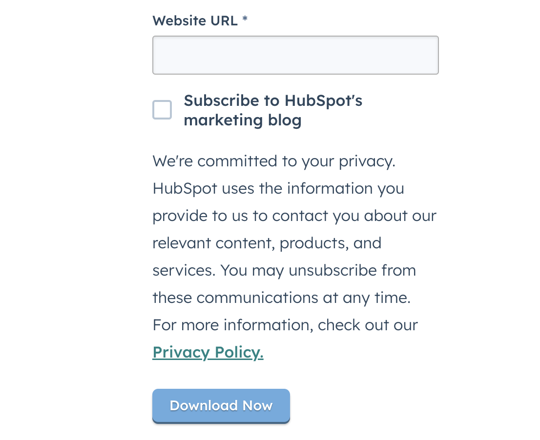
Pro Tip: Have client testimonials, authority endorsement, third-party security certification, or a guarantee seal beside your privacy policy. This helps reduce the objections of visitors who are concerned about filling out your form.
5. Change the text in your submission button.
The last major component of your lead-capture form is the submission button. The default text for this button is “submit.” However, this isn’t the best messaging.
How do we know? Well, we studied the landing pages of over 40,000 HubSpot customers. What did we find? Buttons labeled “submit” had lower conversion rates.
The top-performing variations in this study were “click here” and “go,” which had 5% to 12% more conversions than “submit.”
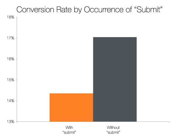
Pro Tip: Besides the text in your button, further research shows you can get amazing results by tweaking the color of your button. This is where A/B testing shines.
6. A/B test your lead-capture form.
Conducting A/B tests is a brilliant way to identify the most effective variation of your form’s design, copy, and calls-to-action. Put another way, A/B tests allow you to get better conversions.
When testing your form, ensure you test one element at a time. For instance, if you’re testing the color, shape, or size of your submission button, don’t simultaneously test the form length.
7. Automatically email visitors after they submit your form.
Whether people are applying for a role in a company, downloading a free resource, or contacting you about your services, they want a response once they hit your submit button.
This is where autoresponders come in handy. Many form builders have this functionality, so take advantage of it. Besides providing an excellent experience, having an autoresponder in place helps you begin your relationship with prospects on the right foot.

How to Network Effectively: 15 Tips You Can Start Using Today
“Networking” is a buzzword that many of us have a serious love/hate relationship with.
Whether you’re trying to develop your personal career or forge new business relationships, making offline, personal connections has become even more critical as online social networking becomes the norm.
This guide will help you navigate those uncomfortable face-to-face networking situations, so the next time you step into a room of potential connections, you’ll feel ready to dive right into relationship-building conversations.
- Network before job searching.
- Come prepared with a clear goal in mind.
- Have some conversation starters ready.
- Introduce yourself to someone more experienced.
- Ask people about themselves.
- Practice active listening.
- Write notes after each meaningful conversation.
- Ask for what you want.
- Exit a conversation gracefully.
- Follow up every time.

1. Network before job searching.
As anyone who has ever looked for a job can attest, the process can be daunting. Knowing who to reach out to can make all the difference.
One way to make the process a little easier is to start networking with people before you even begin looking for a job. That way, when the time comes, you will already have contacts to leverage.
Building relationships with people in your industry can help you to get your foot in the door, and it can also give you an inside look at what companies are hiring.
In addition, you can identify mentors who can provide guidance and support throughout your career.
2. Come prepared with a clear goal in mind.
Next time you’re going to an event, ask yourself: “Who do I want to meet, and why?”
Certain event registration platforms will share attendee lists on the registration page. If a guest list like this is available, take a moment to scan it.
You might discover potential clients, mentors, or employees you want to connect with.
For instance, let’s say you’re the CMO of a successful lawn-mowing business and your goal is to leave the event with 10 leads.
Having a specific goal in mind will allow you to prepare effectively and keep you focused during networking events.
It will make your conversations less ambiguous and lead to better alignment with your connections.
3. Have some conversation starters ready.
Approaching a big or small group can be intimidating. With the right approach, you can join an existing conversation or start your own successfully.
Ease into the evening by introducing yourself to one person who is also flying solo and looking for someone to talk to.
Ahead of time, read up on industry news and trends so you’ll be prepared to spark conversation and ask for other people’s thoughts on topics that are interesting to both of you.
Other great conversation starters include:
- What do you do for work?
- What brought you to this event?
- What do you think about the event so far?
- Are you familiar with any of the speakers?
Your first connection at an event is your gateway to meeting more people. Maybe they came with friends they can introduce you to, or maybe you’ll decide to break into bigger groups together.
Whoever you approach first, relieve some of the awkwardness with informed, relevant conversation starters to get in the swing of things together.
Once your first conversation goes smoothly, it’ll give you the confidence to interact with others.
4. Introduce yourself to someone more experienced.
We sometimes walk into networking events with high hopes of meeting the CEO of a company we admire, or the author of a book that kickstarted our career.
We’re so thrilled to be in the same place as them, but suddenly, you spot them across the room and become nervous, awkward, and maybe a little bit sweaty.
So how can you successfully strike up a conversation?
First and foremost, make sure you have a purpose. Butting into their conversation to tell them you love their work or admire their approach will not invite stimulating conversation. It’s more likely to evoke a simple “thank you.”
Consider what it is about this person that resonated with you, and tie it into your work, projects, or philosophy.
Approach them with confidence, and introduce yourself not as a fan, but as an equal – because you are – and say something thought-provoking that they can relate to.
Like this: “Your application of inbound marketing for nonprofits was helpful for me at my last job, but I’m transitioning into a job in the pharmaceutical industry. Would you change your inbound marketing approach if you were me?“
Remember that you admire this person because you respect their thought leadership. Give them a chance to admire you, too, by sparking an interesting and relevant conversation.
5. Ask people questions about themselves.
Often, we meet someone and exchange our names, company, job title, and where we grew up in about three minutes. Then we smile, look at the ground, and say something like “I love your shirt.”
When the small talk is up, it’s easy for the conversation to go south.
I’ve learned to avoid this by making them the topic of conversation.
You may be thinking, how can I make connections if we just talk about them the whole time? Well, showing genuine interest in another person can say more about you than talking about yourself could.
Besides, if a person doesn’t reciprocate the behavior and encourage you to tell them about yourself afterward, then they probably weren’t a valuable connection to begin with.
Next time a conversation is flailing, ask for them to elaborate or tell you more about themselves and you’ll find talking points you’ll be able to expand on.
6. Practice active listening.
One of the biggest challenges of networking is learning how to actively listen to others.
When we’re networking, we’re often so focused on sharing that we might not take the time to really listen to the other person.
This is essential for building strong relationships – it shows that we’re interested in what the other person has to say and that we’re paying attention.
One way to practice active listening is to paraphrase the other person’s statement. This signals to the other person that we understand them and shows that we’re engaged in the conversation.
Another technique is asking questions, which shows a genuine interest in others and invites them to keep engaging in conversation.
Active listening is a key skill for networking and will build the foundation for strong and productive relationships.
7. Write notes after each meaningful conversation.
Have you ever been in a situation where you meet someone new, have a great conversation, and then forget their name when you go to follow up?
It happens to the best of us, but there is a solution: write a personal note after each meaningful conversation.
This doesn’t have to be anything formal, just a few quick sentences about who the person is and what you talked about. That way, when you go to follow up, you’ll have all the information you need right at your fingertips.
Not only will this make you look more professional, but it will also help you build stronger relationships with the people you meet.
8. Ask for what you want.
The highlight of networking events we all fantasize about is leaving with a concrete exchange that will move our business or career forward. Maybe it’s a job offer, getting an investor on board, locking down a recommendation letter, or landing a client you’ve been after for months.
Whatever the highlight, it isn’t going to fall in our lap. We can play all the right cards to set us up for the big moment, but a time will come when we need to put ourselves out there and firmly express what we want.
The question is, how should you do this without coming across as aggressive?
Consider your answer to the classic job interview question “Why should we hire you over the other candidates?” You come up with a true, succinct, humble, and exemplary answer of why you’re the right person for the job.
Your approach to getting what you want from networking isn’t all that different, except it’s important to express your flexibility.
This combination of flexibility and confidence in getting the job done is a brilliant way to frame your next big ask: Be firm on what you want, but present it in a way that highlights the benefits for your listener.
9. Exit a conversation gracefully.
It’s important to remember that networking isn’t like speed-dating. The goal isn’t to meet as many people as you can – it’s to make valuable connections.
While it’s important not to rush through conversations for this reason, there are times when we need to jump ship. Whether you’re chatting with someone who won’t let you get a word in, or someone who is wasting time whining about their boss, you should still be polite when ending the conversation.
If there’s a lull in the conversation, say “Please let me know how that project goes, I’d love to see it and hear how it turns out.” This will show you were engaged, and though it ends the conversation in the moment, they won’t feel offended.
Alternatively, consider asking them “Have you seen anyone from [company name] tonight? I’ve been meaning to chat with them.” This will kindly express that it’s important to you to expand your network.
10. Follow up every time.
Networking can be a great way to make professional connections, but it’s only effective if you follow up. After all, exchanging business cards is only the first step in building a relationship.
If you want to make a lasting impression, you need to take the time to follow up with the people you meet.
So how do you follow up effectively? First, send a personalized email or LinkedIn message within 24 hours of meeting someone. This shows that you’re interested in keeping in touch.
Second, invite the person you met to coffee or lunch so you can further connect. After that, it’s just a matter of staying in touch by sending occasional emails, reaching out via social media, or meeting up.
Plan on attending a networking event soon? Leave awkwardness at the door by walking in with full confidence. Use the tips and remember: The outcome of the evening is up to you.
Editor’s Note: This post was originally published in Aug. 2019 and has been updated for comprehensiveness.

Google Ad Grants: Everything You Need to Know (+ 10 Helpful Tips)
If you’re a nonprofit, you should be a member of Google for Nonprofits, a program that includes a free membership and access to various products. One product that should be on your radar is Google Ad Grants.
With Google Ad Grants, qualifying nonprofits have access to up to $10,000 per month in search ads shown on Google.com. Nonprofits like DonorsChoose, Days for Girls, and We Care Animal Rescue all use Google Grants in their campaigns and drive more traffic through organic search.
You can use Google Grants to:
- Reach donors, volunteers, and consumers when they’re searching keywords relevant to your nonprofit
- Raise awareness by choosing relevant keywords and creating unique ads to highlight your work
- Track online donations, newsletter sign-ups, and volunteer registrations
- Promote your organization’s website on Google with in-kind AdWords advertising
According to Google Support, there are a few limitations to Google Ad Grants, including a $2.00 max cost per click — but that can be circumvented by using the Maximize conversions strategy. Another rule is that your ads will be shown below paying AdWords advertisers.
Many Google Ad Grant members under-spend their budget, with an average recipient spending approximately $330 a month (out of $10,000). To help you get the most out of Google Ad Grants, here is what you need to know about eligibility, plus 10 helpful tips.
Who is eligible for Google Ad Grants?
Tip #1: Create a campaign for every organizational goal or project.
Tip #2: Use keyword research tools to expand your list of core words.
Tip #3: Use all three match-type options when creating your keyword list.
Tip #4: Write compelling and succinct copy.
Tip #5: Drop users on the most relevant page within your website.
Tip #6: Keep subscription and contact forms as short as possible.
Tip #7: Direct traffic to a targeted landing page instead of your homepage.
Tip #8: Use statistics to introduce the problem.
Tip #9: Share information that potential supporters want.
Tip #10: Keep forms as short as possible.

Who is eligible for Google Ad Grants?
To be eligible for Google Ad Grants, a nonprofit must:
- Be registered as a charitable organization in a country where Google for Nonprofits is available.
- Meet the requirements in its country
- Agree to the Google for Nonprofits Additional Terms of Service
A nonprofit is ineligible if:
- It is a government entity or organization
- A hospital or healthcare organization but charitable arms or foundations associated with healthcare organizations are eligible.
- A school, academic institution, or university, but philanthropic arms of educational organizations are eligible.
Now that you know who’s eligible, here are some tips to keep in mind:
Tip #1: Create a campaign for every organizational goal or project.
Your ad groups should have 15-30 similar keywords that align with a specific page on the website. The more focused the ad group, the better the ad targeting. To get the right traffic to your website, here are a few do’s and don’ts when developing your keyword lists for your campaign(s):
- Do: Create a robust keyword list. You never know what users will respond to.
- Don’t:Start with a small keyword list and wait to expand.
- Do: Leverage all variations of the brand, product, and service terms as keywords.
- Don’t: Assume target users are familiar with your brand.
- Do: Include problem- and solution-oriented keywords.
- Don’t: Assume all target users have the same search tendencies.
Tip #2: Use keyword research tools to expand your list of core words.
Your keywords should be particular to the content on the website or landing page to which you’re sending your visitors. Using a keyword research tool will allow you to pinpoint the keywords that will give you the best results and higher ranking in Google. Get a good mix of short- and long-tail keywords to help capitalize on the traffic that’s difficult to rank for and highly qualified traffic that will help your conversions.
Tip #3: Use all three match-type options when creating your keyword list.
Use broad match, phrase match, and exact match to find keywords with higher search volume. Different match types for your keywords will trigger your ad for a potential visitor’s search in different ways. It’s a good idea to use these three match types so you can attract a variety of audiences.
Tip #4: Write compelling and succinct copy.
Do not assume that all of your target audience will respond to the same creative language. Ads with high-level language should be tested alongside ads with language geared toward more savvy users. Test 3-4 variations targeted to different types of audiences and see which performs the best.
Tip #5: Drop users on the most relevant page within your website.
Before creating your ads, consider all your organization’s assets — blog articles, landing pages, and annual reports. Provide the information your visitor is looking for when they click your ad by dropping them on the most relevant page. This will increase your landing page conversion rate and reduce your AdWords campaigns’ bounce rate.
The bounce rate is the rate at which visitors leave your site without clicking on another page on your website.
Tip #6: Keep subscription and contact forms as short as possible.
For a newsletter or blog subscription form, asking for just an email address is enough. Contact Us forms should ask for the person’s full name, email, phone number, and possibly where they live, if necessary. But before you add more fields to your forms, ask yourself, “Do I need this information at this point in the relationship?” Don’t require fields unless it’s for a good reason, as it can negatively impact your submission rate.
Tip #7: Direct traffic to a targeted landing page instead of your homepage.
Ensure the page you’re sending visitors to is relevant to the ad. Nonprofit Futures Without Violence’s homepage conversion rate was 0%. However, its ad that led to a targeted landing page resulted in a conversion rate of 12.59% for that page — getting the nonprofit 1,000 new email addresses.
Tip #8: Use statistics to introduce the problem.
Since targeted landing pages have a higher conversion rate for email acquisition, you should focus on optimizing them for your ad campaigns. Statistics make a significant impact and are digestible pieces of content that will help visitors understand a bit more about your cause and what you’re trying to accomplish. They are also attention grabbers that draw new visitors in to learn more.
Tip #9: Share information that potential supporters want.
Your AdWords campaigns aim to bring in new traffic, so providing basic information about your cause and organization is a great way to educate your new audience. Also, ensure that the information provided on the landing page is relevant to the headline of your ad. If you’re offering a fact sheet about your organization, make sure the landing page you send the visitor to is where the fact sheet is located.
Tip #10: Keep forms as short as possible.
When providing educational information in the form of a download, requiring more than an email address can drastically impact your conversion rate when working with PPC ads. But, if you are planning to nurture individuals who download your content via email, ensure you collect their first name, last name, and email address. Four form fields are a reasonable maximum for your landing page forms for new visitors from PPC.
Google Ad Grants is only available to Google for Nonprofit members. Signing up as a Google for Nonprofits member is free, with some restrictions that you can review online before applying. There are other products to take advantage of, including Google’s new mobile application One Today. You can also see all the organizations using Google Grants in the Google for Nonprofits community.
How has your organization used Google Grants?

Nostalgic Websites: What 32 Popular Sites Used to Look Like
It’s no secret that website design trends (and best practices) have changed dramatically since the internet’s debut. Reflecting on nostalgic websites and comparing them to their present-day counterparts is an excellent way to understand why updating your site is so necessary.

With the help of the Wayback Machine, we can see what our favorite websites looked like in years past. Whether you’re planning a website redesign and could use some inspiration, or you’d enjoy reflecting on nostalgic websites, we’ve rounded up 32 sites to peruse.
1) Google

While Google essentially maintains its branding with its colorful logo and whitespace on the homepage, there are other aspects of the site that look entirely different today. In the 1990s, Google had unique offerings underneath the search bar. Today, the company leans into creating a personalized homepage for users by bookmarking their frequently visited websites.
2) Apple
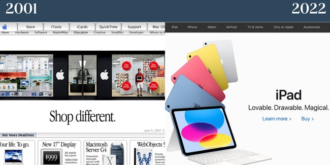
Apple always takes a product-centric approach to its homepage. Even in 2001, you’ll notice that the company’s items were the website’s primary focus. In 2022, Apple chooses to keep branding minimal yet distinctive. It features just one product to make the center focus of the homepage. The current homepage is also a testament to compelling copy; in just three adjectives, Apple paints a complete picture of why you should get an iPad.
3) Microsoft
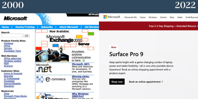
In 2000, Microsoft’s website was clunky and over-complicated. The abundance of words on the website and lack of whitespace made for an overwhelming user experience. Today, Microsoft’s site takes a cue from Apple and centers on its products. The site, as a result, is less dizzying and more digestible for visitors.
4) Mashable
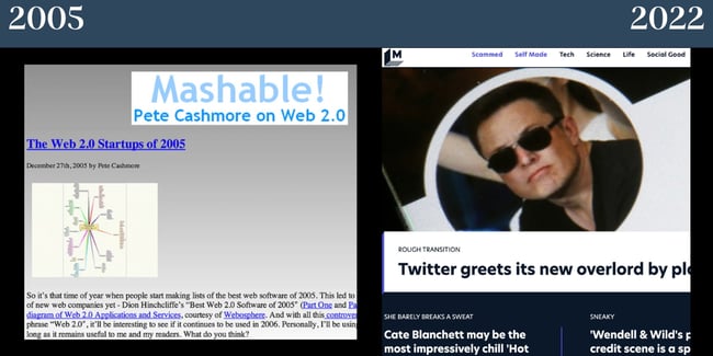
Once upon a time, Mashable had a gradient background — not to mention a serious lack of imagery. Now, the site balances visuals with text. The company branding also no longer takes center stage and focuses on featured stories.
5) HubSpot
In 2006, the tech and marketing world was focused heavily on surviving and succeeding in a web 2.0 world. Small businesses were popping up worldwide, and HubSpot’s website was focused on showing how the product could add value for these companies. Today, HubSpot still caters to small businesses but also medium and enterprise corporations. Now, our website focuses more on the product and features a lot more color than it initially did.
6) BuzzFeed
BuzzFeed was created to help users find their favorite things, including movies, music, fashion, ideas, and technology. The site still achieves this with a more visual and interactive approach. Today, the website balances images and text more seamlessly, but the site’s overall feel is still intact.
7) The White House
In 2000, Bill Clinton was the President of the United States, Al Gore was Vice President, and the White House’s website had a very different look and feel. Then, the website featured a Declaration of Independence-esque script font and didn’t emphasize imagery — or storytelling, considering the text just welcomed visitors to the page. When you visit the site today, you’ll notice a large image and copy that focuses on current initiatives. We also love how the refreshed site focuses on accessibility with options to change the text contrast and size.
8) TED
Though TED’s 2003 website still looks outdated by today’s standards, it was ahead of its time, with most of the homepage featuring visual content. In 2022, their site still features various images but also balances copy — and there’s only one main image above the fold. The site’s overall feel today is less cramped and overwhelming than it was in years past.
9) Skype
In the early 2000s, Skype’s homepage featured several colors and lacked hierarchy. (And who knew the video call platform once had a red logo?) Today, Microsoft owns Skype, and the latter takes a cue from the larger organization’s look and feel. The site features whitespace, excellent visual hierarchy, and offers a compelling image of the product in action.
10) AOL
In 2000, AOL’s site had a variety of colors that weren’t cohesive, ultimately making the site appear messy. Today, the site features enough whitespace to balance the amount of copy and imagery it has. We’re also fond of the site’s new font, as it’s visually appealing and easy to read.
11) Ask
Ask Jeeves rebranded as Ask. In 2000, the site lacked whitespace and featured a character — part of the site’s unique branding. Since dropping the second half of the name, there’s no longer a character on the site’s homepage. Today, the site looks much more like a news or publication site than a platform to ask questions and get quick answers.
12) Blockbuster
Remember the good old days of going to Blockbuster to pick out your movie and grab a few snacks? We sure do. What Blockbuster’s 1996 site lacked in hierarchy, it made up for in personality. Today, Blockbuster’s site is out of commission — and features a cheeky note that the company is working on rewinding your movie.
13) Coca-Cola
We’ll give it to Coca-Cola: Their branding is timeless. Coca-Cola’s website from 2000 doesn’t look too shabby compared to many of the outdated websites on this list. The brand understood the importance of visual content and simplicity in 2000, and they still do today. In 2022, their site focuses more on imagery and features less red than in the past, but it still feels cohesive with the rest of their branding.
14) Pepsi
Pepsi’s site in 2000 was cluttered, lacked visual hierarchy, and had too much going on. Today, we’re huge fans of Pepsi’s nostalgic homepage. It features a font that’s easy to read, plus the site doesn’t feel too cluttered. The company has also since moved its menu to the top of the page and cut back on how many tabs there are which is much better from a user experience standpoint.
15) Macy’s
While Macy’s 2000 website doesn’t conform to today’s standards, we appreciate how cohesive the colors are. Interestingly, products aren’t at the forefront of Macy’s nostalgic site. Today, however, the Macy’s website tells an extremely different story. The website has a neatly organized menu and excellent visual hierarchy.
16) Amazon
In 1999, Amazon’s website was highly text-heavy, making it dizzying to look at. The vertical menu was also cluttered and difficult to digest. Today, Amazon’s menu appears on the top of the page, and the site seems significantly less overwhelming despite the fact that it still advertises various products.
17) Yahoo
In 1999, Yahoo’s website focused mainly on text and featured no imagery. Today, a very different story is told when you visit the platform’s site. Because Yahoo is a news site, there are images to accompany every story, plus a summary of what you can expect when you read the piece. We’re also a fan of the trending column on the right side of the site, as it makes it easy for users to understand what’s in the news at a glance.
18) Tumblr
In its infancy, Tumblr referred to blogs as Tumblelogs and had a text-centric website. Today, if you visit Tumblr while not logged in, you’ll see a mock dashboard that shows visitors what theirs could look like if they create an account. Today’s Tumblr site is also significantly more image-focused.
19) Pinterest
Remember when Pinterest was invite-only? As you can see from the screengrab of the 2010 Pinterest site, the platform had a completely different logo and a less sleek appearance. If you visit Pinterest today, you can create an account instantly — no request necessary. In addition, the platform features a live image that changes yet loads quickly. The copy is simple yet compelling.
20) Reddit
In 2005, Reddit was all about text. Reddit is still more text-focused than most modern sites. However, it does feature a balance of images. We like how the font Reddit uses today is still semi-nostalgic but is easier to read than it has been in the past. The site is also more visually compelling as it appears more like a news site.
21) Barnes & Noble
You’re probably starting to notice a theme at this point: The websites of years past were text-focused. Barnes & Noble is no exception. In 2000, the bookseller had a dense, visually unappealing vertical menu. The images took a long time to load — if they did. There’s also a lack of visual hierarchy, so it’s difficult for visitors to decide where to look. Today, the company’s site is significantly more digestible. It balances whitespace with imagery and text, and the designers cleaned the menu up.
22) Dunkin’

We’ll hand it to Dunkin’: They’ve stayed true to their signature color scheme for decades. This screengrab from their site in the 2000s is one of our favorites on this list. It’s shockingly minimalistic and features an image that wasn’t standard for the time. Today, Dunkin’ has plenty of whitespace, features cohesive branding, and balances graphics with the copy. The website also has an easy-to-follow menu and includes the company’s striking pink and orange colors.
23) Starbucks

In 2000, Starbucks got a few things right: Their menu is straightforward, and they featured images on their site, though they didn’t load. (Psst: These plugins can help ensure your content loads quickly if you have a “heavy” page so your website avoids a similar fate.) You’ll also notice their consistent logo. In 2022, Starbucks effortlessly offers a pop of color on its site without overwhelming visitors. The site features Starbucks’ signature font and includes an image promoting a recent collaboration with another company. The image itself also feels on-brand. We also want to call out Starbucks’ sparse yet effective navigation at the top of the page.
24) Walmart
For its time, Walmart’s site in 2002 was quite successful. It featured images and text which still dominate the website today. In addition, it had a better visual hierarchy than some of the other examples we’ve investigated. Similar to Dunkin’, one thing that Walmart does incredibly well is translating its famous color scheme to its site. In 2022, Walmart’s website has plenty of imagery and concise copy that enhances the graphics.
25) Target
There are also plenty of things Target got right in 2004. For one, the brand used its well-known color scheme. The site features images, too, and its branding is still largely the same. In 2022, Target’s site puts a much larger emphasis on visuals than it does on text. The branding is minimal yet effective, and the site features a simple menu that expands when visitors click on it.
26) The New York Times
We’re impressed: While New York Times has reworked its website since 2000, the website is remarkably similar. Even in 2000, figuring out where to direct attention was easy. The New York Times scores major points because its 2022 website resembles a newspaper. It features visual hierarchy, balances images with copy well, and we like how the font is distinctive yet easy to read.
27) Lay’s
In 2008, Lay’s website was green and featured very poor text color contrast. This makes it difficult for people to read the copy. Luckily, Lay’s has since reworked its site. Today, it’s still colorful but features better contrast. You’ll also notice the site has plenty of Lay’s illustrious yellow. The 2022 site seems far more on-brand than it has in the past.
28) McDonald’s
In 2001, McDonald’s website featured a red background and yellow text, which wasn’t exactly optimal for readers. Now, McDonald’s site is minimalist. It features few colors aside from the brand’s distinct yellow and offers a variety of options for visitors to select from on the menu section. However, the menu isn’t overwhelming because the rest of the website is so straightforward. The brand also taps its signature font for the 2022 website.
29) Sephora
Sephora’s website in the early 2000s featured a balance of images and text. For its time, it was an example of a compelling website design. Today, the site adheres to modern web design trends. It has large images that are visually appealing and includes straightforward copy.
30) Netflix
In 2005, Netflix featured an image-focused homepage, which is quite different from today. In 2022, copy is the star of the show on Netflix’s homepage. The company also cleverly places a call to action at the center, so you’ll provide your email address and get started. In both 2004 and 2022, the main focus of the homepage was a call to action, which is noteworthy. We like the image in the background, which the text overlays as it features shows and movies you can enjoy with a Netflix subscription.
31) eBay
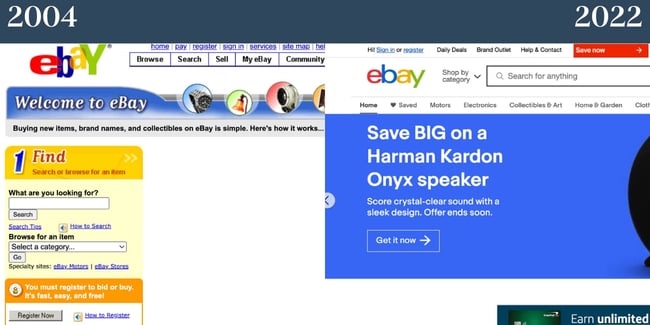
In the early 2000s, there was a lack of hierarchy on eBay’s site, which made it tricky for visitors to understand where to begin. This is also detrimental from a user experience standpoint. That has since changed, however. In 2022, eBay has a carousel above the fold on its site. It features a few products and promotions the company is currently offering. The site also features more whitespace than in the past, and the menu is paired back by comparison.
32) Burger King
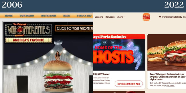
In 2006, Burger King did feature a primary image on their site. The menu was also at the top of the site, but the font was difficult to read. In 2022, Today, Burger King features a neutral background and keeps the focus on its imagery. Copy is sparse yet effective. In addition, the company uses a font that offers a pop of personality yet is readable.
Take Site Redesign Inspiration from These Nostalgic Websites
If you’re seeking inspiration for your site redesign, look at these nostalgic websites to get an idea of how you can rework your landing page. These nostalgic websites prove that by using your unique branding, balancing images and text, and including a clear visual hierarchy, your site will look great for years to come.
Editor’s note: This post was originally published in April 2014 and has been updated for comprehensiveness.