
How to Turn a Case Study into a Customer Success Story
Expression, passion, style, persuasion, authenticity.
These five elements encompass a customer success story — a transformation from a regular case study to an enticing piece of content that encourages a reader to explore what your company has to offer.
When people think about writing a case study, they might feel a daunting rise of tediousness, or perhaps writer’s block. This article omits both by showing you exactly how to turn a case study into a customer success story through an authentic writing style.
Case studies are more than proving your company’s achievements. Through eloquence and thoughtfulness, you can demonstrate your product or service’s power by telling a real story.
Think about it: Real customers use your product. Real employees deliver successful projects. Real customers, real professionals, real people.
What does it mean to be human in digital form? It means delivering a story with facts and emotions. It’s educating a prospect through a thoughtful perspective, and answering the following questions: How did the client feel at the beginning, and how did they feel at the end? What struggles did the project manager face, and how did they feel when they overcame them?
These questions are part of what encompasses a customer success story.
So how do you make a case study passionate, motivating, and authentic?
Along with the five elements that shape a success story, there are five criteria for forming the facts.
Here, we’ll dive into each step you need to take to create an engaging customer success story and convert leads.
1. Find the right client.
First thing’s first: finding the right client.
Ask your project management or sales team about their latest projects and which one stood out. You’re looking for a client with a uniquely knotty problem, one that your company was able to solve. The more complex the project, the more you can show off your company’s skills.
If most of the projects seem standard, pick the client that was the most hands-on and the most responsive. The more involved the client, the more likely they are to give you more information in their interview.
Send an Enticing Email
Before you begin, get permission from the client and inquire about their interest in participating in a case study. You can incentivize them through social media publication, tagging their company on all social platforms, and including a link to their website at the end of the case study.
Here’s an example from Trujay that you can use to write an enticing email to your client:
Hi [Name],
My name is [Your Name], I’m a [Job Title/Position] here at [Company Name]. I’m so pleased to hear your experience with us was worth it! We’re glad we could make all the needs of your project happen and hope you continue to enjoy the results.
Since your project was such a success, I wondered if you would be interested in participating in a case study. We like to inquire about this opportunity to only a few select customers because we find some projects have a compelling story. Yours happens to be a particularly special project, and we’d love to promote your brand by showcasing the results.
All you would have to do is answer six questions about your experience of working with us. You may answer them directly in response to this email, or we can have a phone or video call. Whatever way you’d prefer! Most of our clients like to copy and paste the questions in response and simply fill in the answers.
If you would like to interview over [Zoom, Google Meet, Skype, Other], let me know a good time and date that works for you. The call shouldn’t take more than 30 minutes.
I’ve attached a few examples of previous success stories to get a feel for the final product. We also conduct a social media campaign so you and your company can get as much exposure as possible.
We thank you for using our services and wish you the best of luck in your future endeavors! Should you ever need our services again, know that [Company Name’s] got your back. We hope you find interest in participating and look forward to hearing from you.
Warmest,
[Email Signature]
Once you have permission, let your project management or services team know that a case study is underway.
2. Create interview questions for both project manager and client.
You’ll want to create two sets of questions — one for the project manager, and one for the client. These questions will give way to both sides of the story, enlightening you on the experience from both ends.
Client Questions: The Background
The formatting of the client interview questions is essential. You want to get as much detail as you can without overwhelming the client with loaded questions.
Client interview questions are straightforward and relate to a customer’s company, goals, passions, and plans. You want to find out how your company solved a significant problem through the clients’ perspective. What did the project management team accomplish, in their eyes?
First, get four pieces of standard information:
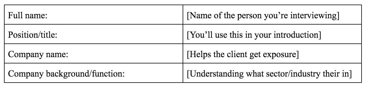
Here’s an example of how you’ll use this information in your introductory piece and throughout the success story:
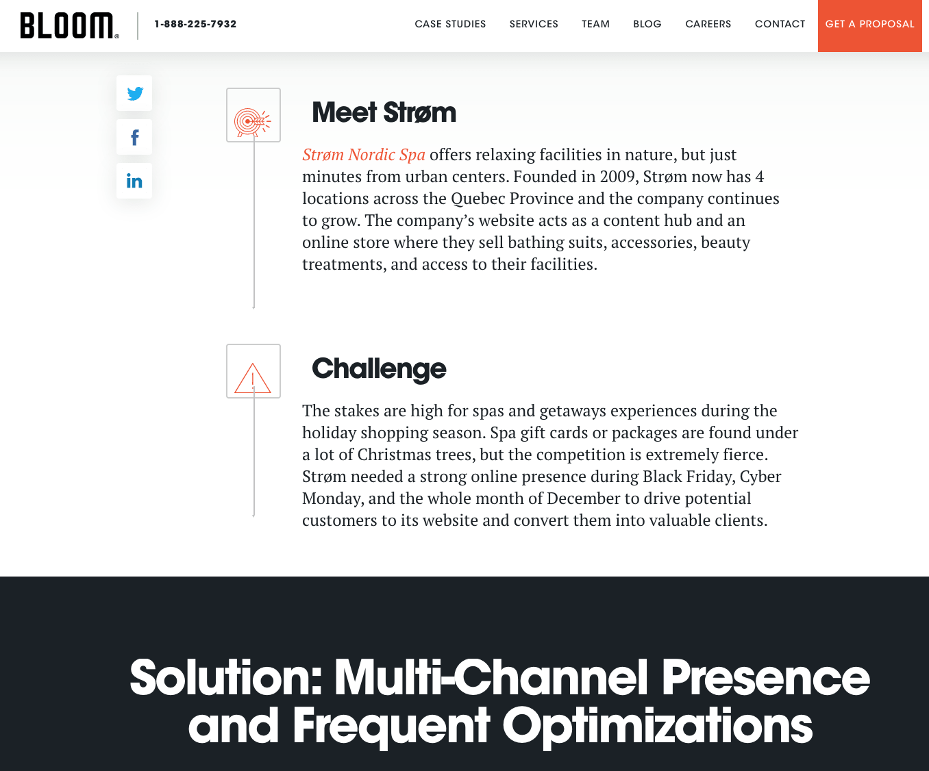
Once you introduce the interviewee and their company clearly and thoughtfully, the client interview questions will shape the rest of your story.
Client Questions: The Real Story
First, you want the client to describe what their previous experience was. What didn’t they like about it? What did it do to cause friction in their business process? And most importantly, how was their previous experience not serving their company’s needs?
Next, you want to get the facts. What was the name of their previous service provider, and what made them switch? How did they find your company? Was it a referral, a Google search, or something else?
By knowing how the client found your company, you’ll know which of your marketing efforts are working and which need improvement. For example, if the client found your company through a keyword search, that means your SEO strategy is working. Alternatively, if the client found your company by referral, that means your reputation is credible by word-of-mouth.
Below are six questions you can ask your clients:
- What company and/or product were you previously using, and what were the issues?
- What special requirements did you have that the previous company lacked in delivering?
- Which solution did you switch to, and what made you choose it?
- How did you find the new company/solution?
- What was your experience throughout the project? (Orientation, beginning stages, experience with your account manager, understanding the tech if applicable, etc.)
- How were you satisfied with the results, and what was your favorite part? (Could be anything from communication to a more technical logic.)
Project Manager Questions
The project manager questions should inform you of the entire technical and onboarding process. These questions aim to prove technical savviness and expertise, showing the reader that your product or service works excellently.
Below are four interview questions you could ask the project manager or technician in charge of the account:
- What were the challenges the client was facing? Is there a main one in particular? Be as detailed as possible over what problems the client had, including but not limited to their project experience, current issues, and dislikes.
- What were the biggest challenges of this project, and what did you find most challenging in solving the problem? Were there complications you have or have not seen before? Be descriptive.
- What did you recommend, and how did you know to suggest that plan? Was there anything peculiar about their use case, or was it pretty standard? How do you know what actions to take for a specific project, precisely the one in question?
- What was the execution plan, and how did you use it to satisfy the client’s needs?
Make sure you’re interviewing the team leader of the project and other colleagues who worked on it. You’ll want to do this to make sure you get the whole story and the perspectives of everyone involved. The more information you have, the easier it will be to write the story.
When interviewing the project management team, analyze their responses in a marketable way. What about their answers gives appeal, and where is the sweet spot for authenticity?
Every project is unique, even if there is a standard method in place. It’s the client’s problem that makes the project unique, and how the services team solved that very problem to the fullest extent.
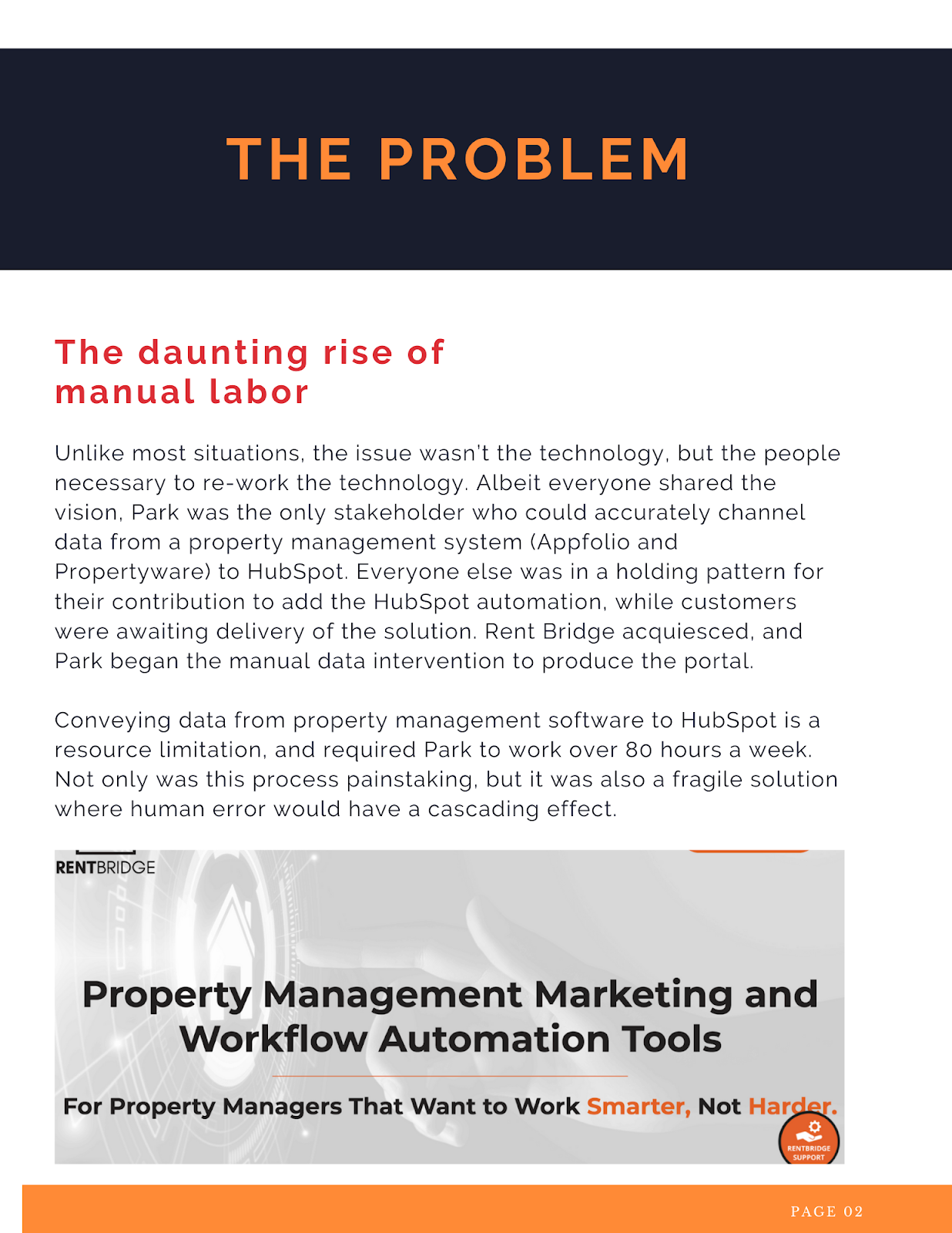
Below is an example of how you can integrate the project manager responses into a well-written overview of the problem and its challenges:

3. Tell the story using a standard outline.
The responses to your interview questions don’t necessarily need to be in a particular order. You can either start with the project manager or client questions.
Let’s say you get the client’s responses first. What are you looking for, exactly?
You’re looking for the message behind their words. Some call it reading between the lines. I call it the sweet spot of authenticity. What about their responses jumps out at you? Here is an excellent place to know your buyer personas and identify what kind of client they are.
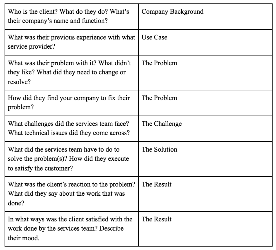
After reviewing both sets of interview responses, try telling the story to yourself from beginning to end using the questions below. In your own words, speak the story out loud. Doing so will turn fact into fiction and organize your written outline.
Place Quotes in Your Outline
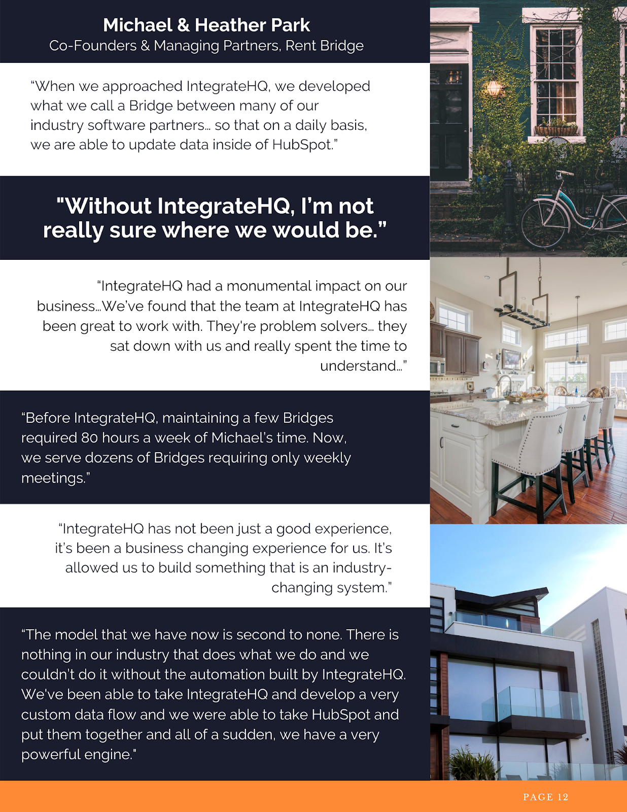
Quotes from the client are paramount. Words that come directly from the source are vital to proving your company can achieve results and make customers feel cared for. The more quotes you have, the better you can showcase your customer’s achievements.
Quotes of high-quality give prospects significant confidence in choosing your services — almost as much as referrals. The quotes should never be modified unless using proper quotation rules.
Below are examples of strong quotes:
Ask for Video Testimonials
If and when possible, getting video testimonials from your client can make your story go above-and-beyond. If the video content editing is just right, you can move your readers in a heartfelt way. That might sound odd, so take a look at the video below. It could very well be the beacon of your success story and the element that sets it apart, like this example from HubSpot, below:
Testimonials of this kind of caliber make your success story real. Additionally, consider placing quotes in various and relevant areas of your success story — you can have a quote for each one of the aspects that make up a standard, outlined case study.
4. Use concise, clear language to tell a story.
You don’t need to use fancy jargon to create a compelling customer success story — in fact, it’s preferred that you don’t. You’ll want to make it so the reader can clearly understand how your company helped solve a client’s problem, which doesn’t require superfluous language.
Here’s an excerpt that’s written clearly, and without jargon:
James felt that [company 1] had way more “bells and whistles,” which can be extremely healthy for some companies. In James’s case, however, he was only using a fraction of the features. Sometimes, too much of anything is never a good thing. Just because a system has more features doesn’t mean it will serve a specific company to its highest degree. Sometimes, less is more, and for James, “it was time to change.”
5. Design your story for visual appeal.
Ultimately, visuals are powerful opportunities to support and strengthen your story.
If you want to persuade prospects that your company is the right choice for them, you’ll want to have a well-written story, but you’ll also want to create visually-appealing materials to help support the story.
Design applications like Canva are great for combining text with imagery. Create beautiful and eye-catching case study e-book covers, or create designs to highlight quotes throughout the piece. Alternatively, consider using images related to the client and company — with permission, you might even consider using clients’ LinkedIn photos to put a face to the text.
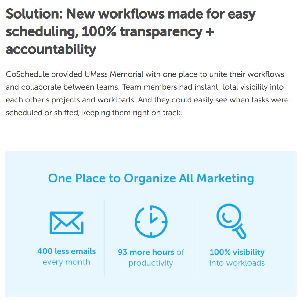
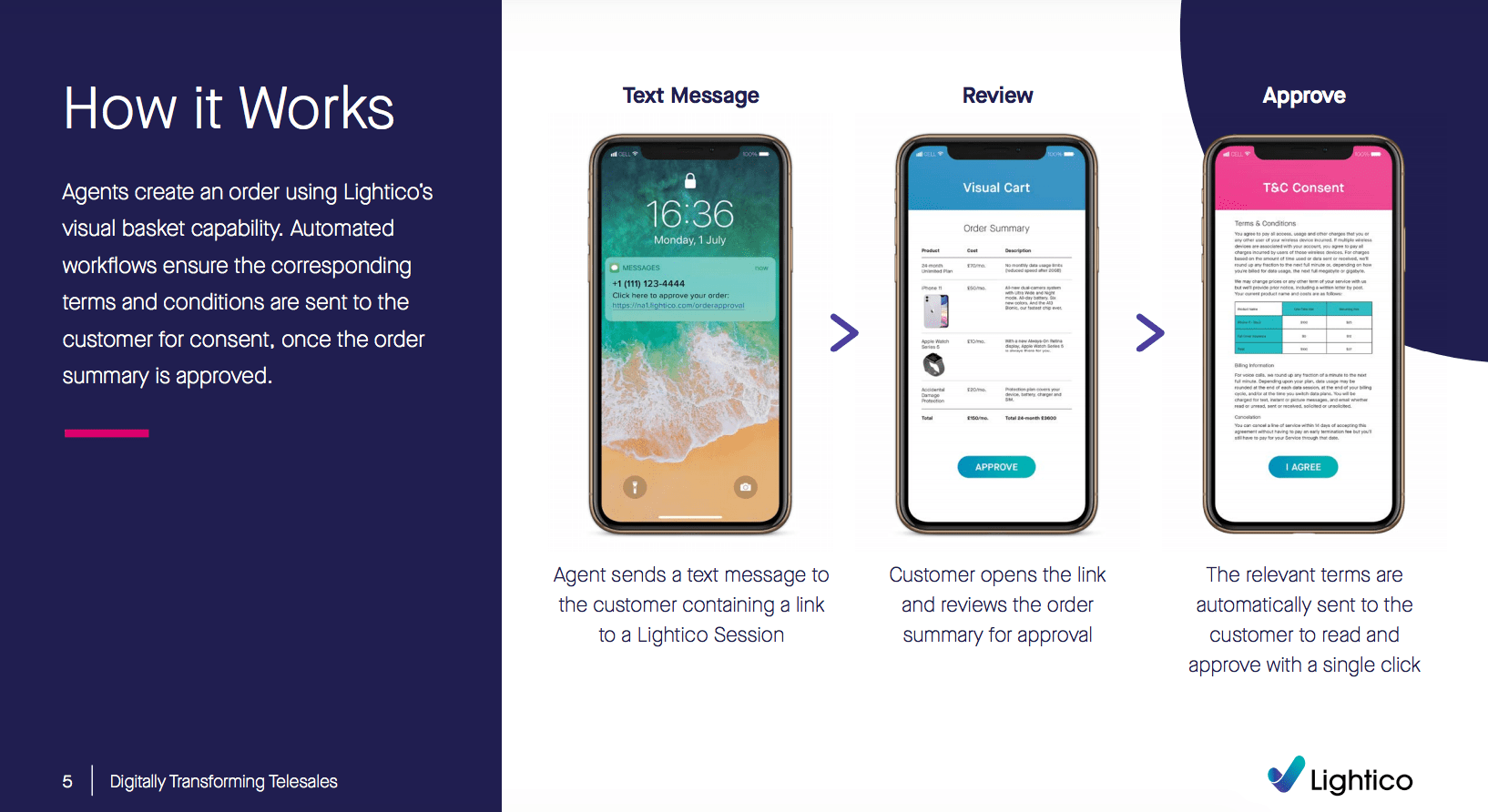
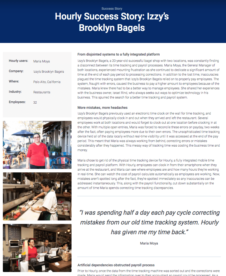
Here are some examples of customer success stories with a design for visual appeal:
1. CoSchedule Customer Success Story: UMass Memorial Health Care
2. Lightico Customer Success Story: A1 Comms
3. Hourly.io Customer Success Story: Izzy’s Brooklyn Bagels
Case studies work to showcase a company’s function to the fullest degree. They represent the facts of what happened, who was involved, and what the outcome was.
The main goal of a case study is to earn prospective customers’ trust and motivate them to choose you over your competitors.
Turning a case study into a customer success story is done through a meticulous and investigative process.
Now that you have everything you need to get started, design a visually appealing piece of content that gives the reader more than just words, but sparks their imagination of what it would be like to work with your company. They’ll want to reap the benefits of your services — and may even become the star of your next customer success story.

13 Examples of Facebook Ads That Actually Work (And Why)
On average, Facebook is home to 3 billion users — from CEOs to students to consumers. And while the community is clearly there, connecting with them from a marketing standpoint isn’t always easy.
For brands, posting on Facebook alone isn’t enough anymore — especially for ones just starting out. Sure, you can throw money at your efforts to drive people to your Facebook Page and send them to your website, but that only works if you’re smart about it.
One way to do just that is to create optimized Facebook Ads targeted at the right audience. Optimized ads can help you spend your PPC budget wisely and see a positive return on your investment.
So, what does optimized Facebook advertising actually look like? If you’re looking for best practices for a successful ad along with examples for inspiration, you’re in the right place.
Components of Successful Facebook Ads
1. It has a clear objective.
Facebook advertising is an excellent tactic to use in your marketing strategy, but it isn’t as simple as paying Facebook and expecting customers and revenue in return. Instead, you must craft a clear ad strategy, knowing exactly how each ad functions in support of your marketing goals.
By doing this, you’ll be better able to measure success by tracking the metrics that matter, and you’ll even be able to craft better ads by choosing the most effective Facebook ads setup, including which Facebook ads objective to use.
2. It’s visual.
Visual content is not only treated more favorably in the Facebook algorithm, but it’s also more likely to be shared and remembered than written content. The lesson for Facebook marketers? No matter what type of ad you create, your image needs to be visually appealing.
3. It’s not text-heavy.
If you’re running a Facebook ad with a photo, ensure that the textual elements cover less than 20% of the image. Otherwise, your ad will fail to perform. Consider using a text overlay tool to check the ratio before setting your ads live.
4. It’s relevant.
Relevance is critical for success when using Facebook advertising. Remember, you are spending money when someone views or clicks on your ad (depending on the settings you use). If you’re showing ads that aren’t relevant to your target audience, you’re wasting your time and money and will likely not see success with any kind of advertising.
Back in February 2015, Facebook launched a feature in the Facebook advertising platform that rates your ads and gives you a relevance score, similar to Ad Rank in Google Ads. The more relevant your ad image, ad copy, and destination page is to your audience, the higher your score is — and the more favorably Facebook will treat your ads.
5. It includes an enticing value proposition.
A value proposition tells the reader why they should click on your ad to learn more about your product. How is your product or service different from any other? Why should the viewer click on your ad to see your website?
Your value proposition should be believable. For example, saying you have the greatest sandwiches in the world will not make people come to your business’s Page, but maybe offering 20% off will. Or, perhaps adding social proof will help — something like, “Sandwiches loved by over one million people every year! Come try yours today and get 20% off your order with this coupon.”
6. It has a clear call-to-action.
A beautiful and relevant ad is great, but without a call-to-action (CTA), your viewer might not know what to do next. Add a CTA like “Buy now and save X%,” or “Offer ends soon” and add a sense of urgency to your viewer. Your CTA should encourage people to click on your ad now.
The 3 Primary Formats for Facebook Ads (With Examples)
Format 1: The Right Column Ad
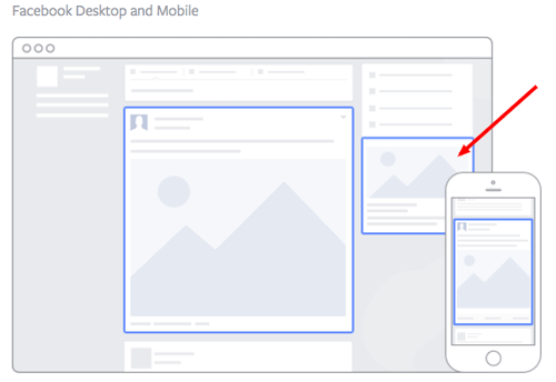
Source: Facebook
This type of ad is the most traditional on Facebook, it appears on the right side of a user’s Facebook News Feed. This is the first type of advertising Facebook had, and it still exists today.
Although ads in the News Feed are likely to get higher engagement metrics due to its native advertising features, right column ads shouldn’t be forgotten. We often see less expensive clicks and conversions when using these ads. In order for a right column ad to be successful, it needs to be relevant, have a value proposition, a good visual, and have a call-to-action. Let’s look at an example below from Winc (formerly known as Club W):
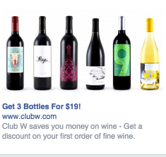
Here’s what makes this ad great:
- It’s visual. The visual is clear, simple, and appealing to all types of wine-lovers.
- It’s relevant. This came up in my wine-obssesed colleague’s News Feed. Need I say more? Two thumbs up on relevance.
- It includes an enticing value prop. Three bottles for $19? What a steal. They also pull the viewer in with an additional value: a discount on their first order of wine.
- It has a strong call-to-action. The word “get” is strong call-to-action language, and it’s used twice here. A time limit on this offer would have made it even stronger.
Format 2: The Desktop News Feed Ad
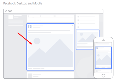
Source: Facebook
This type of ad appears directly in a user’s News Feed when they access Facebook on a desktop computer, and it looks more like native advertising. In our experience, these ads have a higher engagement rate than right column ads, but they can also be more expensive. These ads must follow organic Facebook posts best practices and be both engaging and visual.
This is how an ad from Amazon looks in the News Feed on a desktop:
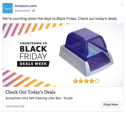
Here’s what makes this ad great:
- It’s visual. Not only is this image larger than the right column ad display, but it also uses warm colors, white space, and directional lines which drew my eye towards the featured product.
- It’s relevant. As a cat mom, this offer is clearly tailored to my consumer needs.
- It includes an enticing value prop. Amazon has advertised a self-cleaning litter box here, which is of tremendous value for any cat owner. Additionally, it shared the strong customer ratings below an image of the product. (Social proof, anyone?)
- It has a clear call-to-action. Amazon instructs me to click on its ad today, after which point the deal for the litter box will presumably disappear. “Now” is strong CTA language that compels clicks.
Format 3: The Mobile News Feed Ad
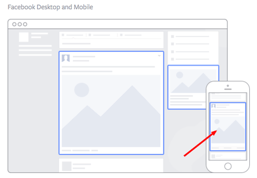
Source: Facebook
Like the desktop News Feed ad, this type of ad appears in the user’s mobile News Feed and displays like an organic posts from people and Pages that they follow.
This is what a mobile News Feed ad for The New York Times looks like:
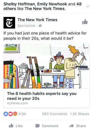
Here’s what makes this ad great:
- It’s visual. The quirky cartoon drew my eye as I scrolled on my mobile News Feed through lots of text and photography. The nontraditional illustration pulled me in for a closer look at the content.
- It’s relevant. I’m a person in my 20s, and I used to write about health care. This is an article I would definitely be interested in reading, and it helps that the ad appears like a native post promoting an article in my New Feed.
- It includes an enticing value prop. The ad shows me which of my Facebook friends also like, and presumably read, The New York Times. This social proof makes me more likely to click and read the article.
- It has a clear call-to-action. This ad is dedicated to increasing the page’s Likes, and by asking a question in the ad, the call-to-action makes me want to click the article to learn more.
Types of Facebook Advertising & Some of the Best Facebook Ad Examples
Now that we’ve covered the three main ad formats, let’s dig into a sampling of the wide variety of post types you can use.
1. The Facebook Video Ad
Video ads appear fairly large in the user’s New Feed and offer more engaging content than static posts. And with billions of videos being watched on Facebook every day, it serves as an interesting — and potentially profitable — ad type for marketers to try out.
Need some inspiration? Check out this example from Key Jewlers below:

Why this works:
- It’s visual. Even though this is a video, I have a general idea of what I will be watching, thanks to the screen capture it started with. Additionally, I can understand the gist of this ad without playing with the sound on, which is important given that 83% of videos on Facebook are now viewed without sound.
- It’s relevant. It’s relevant to me because I was recently scouring jewelry websites, specifically for necklaces like the one in the ad.
- It’s valuable. Kay shows potential customers the value of purchasing with the help of the happy reaction from the woman receiving the gift in the ad. Plus, who doesn’t love dogs?
- It has a solid call-to-action. This ad is set up to drive Page Likes, which is an easy, one-click way for me to get more relevant content served up to me.
How can you create your own video ad? First, understand Facebook video ad requirements including length and video size. We suggest keeping your video as short as possible, even though Facebook allows you to upload a much larger video.
2. The Photo Ad
Another type of rich media advertising on Facebook is a post of an image. This is one of the most popular types of ads ever since Facebook began favoring visual content. The optimal size for News Feed photo ads is 1200×628 pixels, otherwise your image will get cropped. Adjust your image based on the target audience’s needs and by what will appeal to them the most.
Here’s an example of a photo ad from NatureBox:
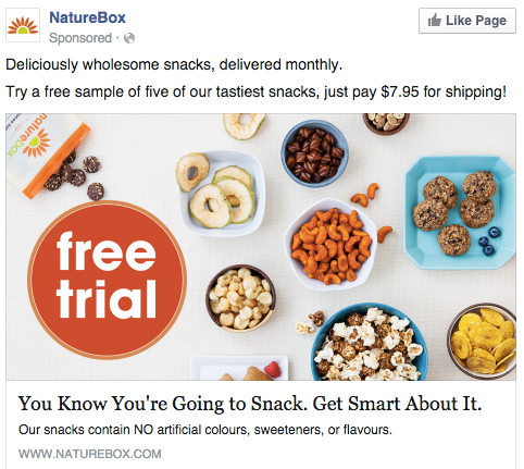
Why this works:
- It’s visual. The image shows you exactly what you’re getting, and it calls out the “free sample” CTA well.
- It’s relevant. Everyone likes to snack. In all seriousness, the person who saw this is a fan of several lifestyle subscription companies, which is what NatureBox is.
- It’s valuable. This ad is full of value. First, the “free trial” callout is the first thing your eyes go to when looking at the image. Second, it clearly mentions the healthy aspects of the goodies in its product.
- It has a clear call-to-action. Nature Box is asking you to try its free sample. It couldn’t be easier to know your next step.
3. The Link Click Ad
One of the most common ad objectives is driving traffic to an external (off-Facebook) website. You can do that using a link click ad.
By including a call to action button on the ad, you’ll be able to generate link clicks to a destination that you specify, often a landing page on your website. Paired with a compelling offer and interesting imagery, you can get lower cost per click (CPC) than other types of advertising along with a great click-through rate.
Here’s an example of a link click ad from Fragrant Jewels:

Why this works:
- It’s visual. While it’s technically a link click ad, Fragrant Jewels used a video to show off the product and then make the offer (click below to crack the egg). The video included captivating imagery, including this attention-grabbing dragon egg in dynamic blues.
- It’s compelling. The egg itself presents a sense of mystery. What’s inside?
- It has a clear call-to-action. Fragrant Jewels uses the image to present drama and intrigue but also clearly guide the audience to click the button. The audience will happily “learn more” to crack the egg.
- It’s valuable. In addition to the egg gimmick, the ad also presents an offer: 26% off and free shipping. If the products in the video are of interest to the audience, this offer provides more inertia to the video’s theme and the action it’s asking them to take.
4. The Multi-Product Ad
Multi-product ads allow advertisers to showcase multiple products within one ad. Viewers can scroll through the images and click on individual links to each product. You can promote multiple of anything, not just products — like different blog posts, ebooks, or webinars.
Here’s an example of a multi-product ad from Shutterfly, along with the additional images that are used in the ad. Each image has a different offer, to appeal to many different demographics in one ad.
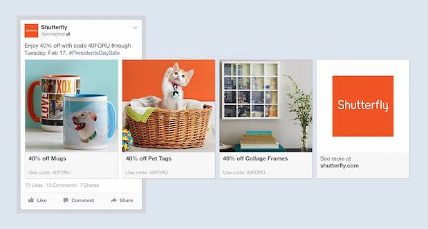
Why this works:
- It’s visual. This series of images is displayed on a consistent color pallette, making it feel both cohesive and on brand. (Having a cute cat doesn’t hurt either.)
- It’s relevant. The person who saw this loves taking photos and creating sentimental gifts. Spot on, right?
- It’s valuable. There is a very clear value for the user, 40% off each of the products being advertised. The code and sale end date are also clear in the ad description. This ad also has an added level of value, it is showing the many different ways people can use Shutterfly, in ways many may not be aware of.
- It has a clear call-to-action. I know I need to use this before February 17th when this deal expires, so I would be encouraged to take action right away.
5. The Local Ad
Local ads on Facebook only work if your business has a physical location that you are trying to drive real foot traffic to. If you fall into this category, then locally targeted Facebook ads may be a great fit for you, as you can hyper-target on Facebook down to the mile.
If your business has an offer or event going on at your store, set up a few Facebook ads that appear only to people within a short distance of your store. Have these ads appear a few days prior to the event and on mobile devices while the event is happening. You may want to reach some people the day of the event who happen to be in the area and checking their Facebook account on their smartphones.
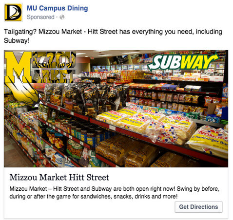
Take this ad for example from Mizzou Campus Dining:
Why this works:
- It’s visual. This image has college pride, a variety of salty and sweet treats, and a well-known logo to attract hungry college students.
- It’s relevant. This ad is likely only being shown to students on campus who are in its target audience. It also mentions the sports game that was going on at the time, and plays to the student’s current needs: snacks and Subway sandwiches.
- It’s valuable. Mizzou Market is telling hungry college students that it has everything students need for the big game.
- It has a clear call-to-action. This ad has the option to show directions, making it extremely easy for a college student on the go to follow the walking directions to this market.
6. The Offer Ad
An offer ad is a newer form of Facebook advertising where a business can promote a discount on a product or service that can be redeemed on Facebook. The benefit of this? It eliminates one step in the buyer’s journey, which ultimately increases sales.
The offer ad has many benefits. First, it drives the user directly to the offer. The user claims it directly on Facebook, removing any added friction of needing to to go to your website for the offer. You also can reach any type of audience that you want, as all the Facebook targeting options are possible.
Finally, you can include all the information needed for the user to decide if they want it or not, including the time period it is usable, the number of people who has already claimed it, and the exact amount the offer is. This will eliminate any unqualified clicks, which cost you money.
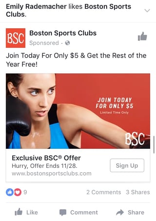
Here’s an example of an offer ad Boston Sports Club:
Why this works:
- It’s visual. The featured photo uses bold colors and clear typography to draw my attention to the details of the offer, and the woman exercising gives me an idea of what I could gain from purchasing the offer.
- It’s relevant. I recently moved to Boston and have been searching for gyms in my area online, so this ad is highly relevant to my recent Facebook and search activity.
- It’s valuable. Paying $5 for a monthly gym membership is a great deal. Even though the price may increase in the future, the low price definitely makes me want to click.
- It has a clear call-to-action. The CTA emphasizes that the discount offer is limited and should be claimed quickly using the word “hurry” and telling me when the offer expires.
7. The Event Ad
Event ads promote a specific event. The CTA on these ads usually send users directly to the ticket purchase page, wherever that happens to be hosted.
Using this type of ad will help drive a targeted group of people to attend your event. These will show up in the News Feed of the specific audience you’ve chosen. Events are a big part of most businesses, but getting people to attend even a small event, can be tricky. Promoting your event to a targeted specific audience on Facebook can help drive the right kind of attendees.
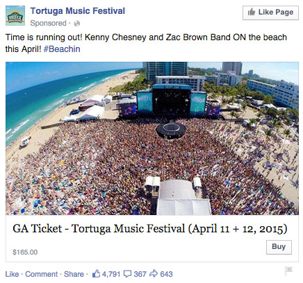
A good ad in this format will clearly show the benefit of attending the event: The price, dates, and a clear CTA to purchase a ticket. The events ad below for the Tortuga Music Festival displays the date and time and the bands playing:
Why this works:
- It’s visual. The picture alone is worth a thousand words about how much fun this concert would be. Not only is it on the beach, it was also taken on a gorgeous day and the stage looks amazing. Also, it clearly represents what to expect during the event, and it catches the eye as someone scrolls through their News Feed. (The beautiful ocean water definitely helps.)
- It’s relevant. The person who saw this ad is a fan of Kenny Chesney and has been to his concerts before. They’re also originally from Florida, which is where this event takes place.
- It’s valuable. Since the image was taken on a beautiful day, it looks like an ideal place to be — especially to those of us viewing it from our office desks. It also clearly tells you the cost of the ticket so you know before you click. (This is also good for the advertiser: By including the price, the ad allows users to self-select based on whether they can afford the ticket. If they can’t afford it, they won’t click through, thus saving the advertiser money on unqualified clicks.)
- It has a clear call-to-action. The CTA is clear: “Buy.” The advertisers also add urgent wording with the title “Time is running out!”, encouraging you to purchase your ticket now before it’s too late.
8. The Retargeting Ad
A retargeting ad promotes an ad to a specific list of previously identified people. Have you ever seen ads follow you across the internet after visiting a certain website? Then you’ve seen a retargeting ad.
Facebook has the same capability. An advertiser can advertise to a list of leads or customers by uploading a list of email addresses it already has to make a custom audience. A good retargeting ad acknowledges that the brand knows you’re already interested in its product. (Because, let’s face it … retargeting can be a little creepy.)
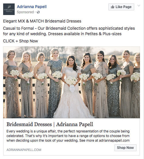
Last week, I started shopping around for a bridesmaid dress for an upcoming wedding. Today, this ad appeared in my News Feed:
Why this works:
- It’s visual. The image gives me a good idea of what to expect from the designer’s website, and it definitely helps that the gowns are both unique and stunning. Talk about a showstopper.
- It’s relevant. The ad called out that I was already shopping for bridesmaid dresses, and what’s more, I had previously looked at dresses on this exact website, so this ad is highly relevant to my search.
- It’s valuable. The variety of dresses in the ad’s image and in the description make this website worth a visit for someone trying to find the perfect gown out of thousands of options.
- It has a clear call-to-action. The CTA is “Shop Now,” which encourages me to click to purchase the beautiful dresses in the ad’s image.
9. The Dynamic Product Ad
Speaking of retargeting ads that seem to “follow you around,” dynamic product ads do this at another level. Have you ever visited a product page and then thought, “Well, now’s not the right time?” and then left? Fact of the matter is that we’re not going to win every buyer on their first impression with us, so the key is to stay top of mind until they time is actually right.
Dynamic product ads are a form of the multi-product ad… with a twist: The ad will auto-populate items based on the audience’s past interactions with your website. This may include things they left in the cart or even items of a similar type. For example, here’s an ad from Etsy advertising products based on my browsing preferences:
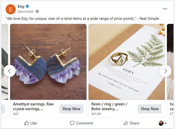
Why this works:
- It’s relevant. Etsy is saying “We know your taste, and you can find products that match it here.”
- It’s valuable. The prices are clearly displayed, and the ad even alludes that there’s more to be found “at a wide range of price points” if the ones on this ad aren’t compelling.
- It’s visual. All items in the carousel have professional photography and a similar color scheme. The uniqueness of the items also draws the eye.
- It has a clear call-to-action. “Shop Now” is an invitation to find out what products they have in their marketplace, and it’s not an overly salesy CTA. After all, who doesn’t love to shop?
10. The Boosted Post
A boosted post is an organic Facebook post that was originally on the homepage of a company’s Facebook, and that later was boosted with advertising money.
This is different from the above ads because it’s not created in the Facebook Ads Manager. You can include more in the description, as there is no limit to word count on boosted posts like there is in ads. You can also have a link in the copy.
The cons? Boosted posts leave you fewer options for bidding, targeting, and pricing. You also cannot run any types of A/B tests because you’re promoting a post that’s already been creating, not creating one from scratch.
Here’s an example of a boosted post from Bustle, who promoted one of its articles on Facebook:
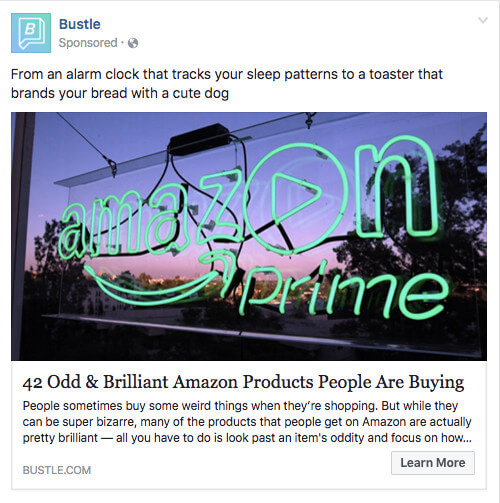
Why this works:
- It’s visual. Lots of people are familiar with the Amazon Prime logo, but not in neon lights in a window display. It made me do a double-take while scrolling through Facebook.
- It’s relevant. As we’ve already learned from earlier examples, I like shopping on Amazon and also read Bustle, so this article is a combination of those two behaviors.
- It’s valuable. “Brilliant” is a strong adjective to describe products, which makes me curious to learn more about purchasing them.
- It has a clear call-to-action. The ad entices me with information about useful and “brilliant” gadgets I can get delivered to my door within two days, which I’m happy to click to learn more about.
Getting Started
There you have it: A list of all the different types of Facebook posts and a few examples of awesome ones from all different brands. The Facebook Ads Manager platform will walk you through how to set these up with simple, step-by-step instructions — so don’t feel overwhelmed.
Editor’s Note: This post was originally published in June 2012 and has been updated for freshness, accuracy, and comprehensiveness.

17 of the Most Creative ‘Meet the Team’ Pages We’ve Ever Seen
To a prospect seeking out a new service provider, it can all be a little overwhelming. It’s easy to wonder: Who are the real people behind all the smoke and mirrors?
Adding a “Meet the Team” page or section to your website is an easy, effective way to give your business a accessible face. It gives prospects an idea of who exactly they’ll be working with, and shows potential employees that you’re proud of the people on your team.
For some inspiration, see how these companies introduce visitors to their most important creative assets: their people.
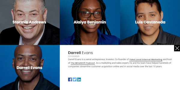
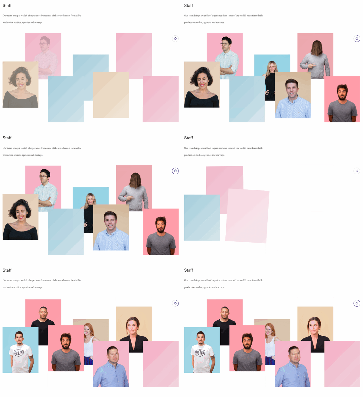
1. Yokel Local
Yokel Local is a Platinum HubSpot Agency Partner who positions themselves as an extension of their clients’ marketing teams. For that reason, they showcase the people on their staff to highlight the humans behind the brand.
What’s pleasing about this particular ‘meet the team’ page is the matching blue backgrounds and cool palette. The grid design provides a modern feel, and if you click on one of the faces, a box will open with more information about the team member, including their bio, credentials, and social profiles.
2. Digital Marmelade
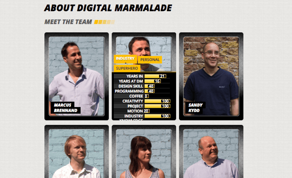
Since most employee bios read a lot like a list of stats (“10 years in the industry … 4 years at the company … Managed 80 website redesign projects … “) the folks at Digital Marmelade decided to have a little fun with the format.
Each employee at the London-based marketing agency has a trading card-style profile detailing their actual marketing accomplishments and personal facts, as well as their fictional superhero abilities.
It’s a quirky twist that gives visitors a colorful snapshot of the agency’s team, highlighting both their impressive experience and friendly culture.
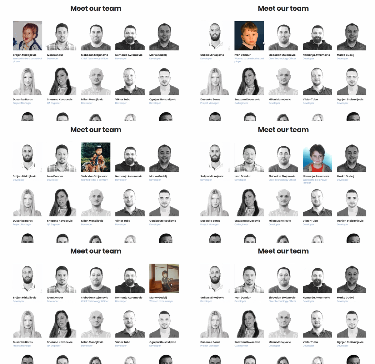
3. CloudHorizon
CloudHorizon is a mobile product development company. On their about page, they say, “Some of the more rewarding projects we have had the honour to be involved in, started with simple ideas and grew profitable businesses from the ground up.”
With this in mind, their ‘meet our team’ section is a great way to illustrate that idea. When you hover over an image of a team member, their thumbnail flips over to reveal a photo from their childhood with a small caption of what they wanted to be when they grew up. The idea being that it takes time and innovation to become great things.
4. Bolden
Bolden’s team bios are more conventional than some of the others on this list, but what they lack in invention they more than make up for with style.
Hovering over each team member’s picture produces a colorful stacked card effect, revealing brief employee bios in coordinated fonts. This is a great example of a minimal, accessible “Meet the Team” page that manages to look cool and introduce the faces behind the agency without going over the top.

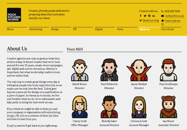
5. Rock Kitchen Harris
Rock Kitchen Harris, a full-service agency, decided to skip the photos altogether and showcase the cartoon versions of their employees instead.
Each employee at the English agency had a custom caricature drawn up, and every single one has a different personality. While some employees opted for representations reminiscent of LinkedIn profile pictures, others got a little creative with it, dressing their cartoon selves up as Ewoks and other characters.
6. FCINQ
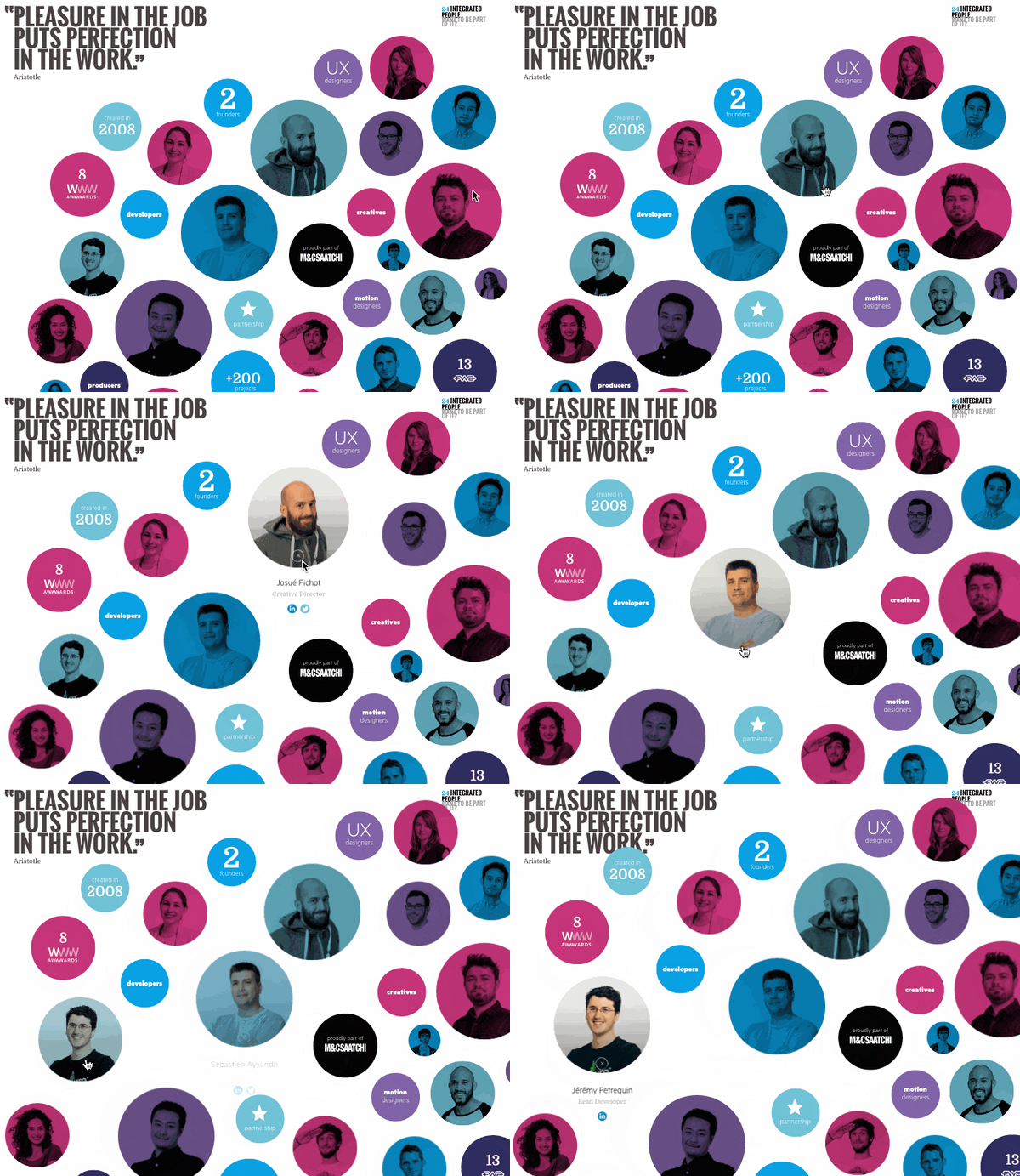
FCINQ, a creative studio, introduces us to their team with a collage of colorful bubbles.
Hovering over an employee’s individual circle produces a zoomed-in effect, and clicking expands their headshot with their name and social profiles. The splashy set up is a stylish alternative to the expected rows of team photos and names.
7. Zulu Alpha Kilo
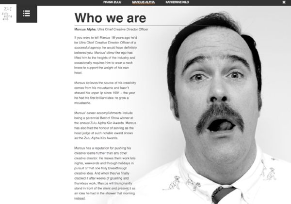
This Canadian agency presents their founding team with refreshing comedic flair. While many agency leaders choose to represent themselves with stoic business portraits, the three leaders of Zulu Alpha Kilo opted for playful photos and cheeky bios.
Here’s an excerpt from the bio of Marcus Alpha — the agency’s “Ultra Chief Creative Director Officer”:
Marcus has a reputation for pushing his creative teams further than any other creative director. He makes them work late nights, weekends and through holidays in pursuit of that one truly breakthrough creative idea. And when they’ve finally cracked it after weeks of gruelling and thankless work, Marcus will triumphantly stand in front of the client and present it as an idea he had in the shower that morning instead.
8. Stink Digital
We love this expertly color-coordinated slideshow of team members form Stink Digital.
This creative agency has offices in five major cities around the world — including New York, Paris, and Berlin — but having a personable “Meet the Team” section helps give their business an accessible edge. They don’t call themselves “a global company with a local feel” for nothing.
9. Drexler
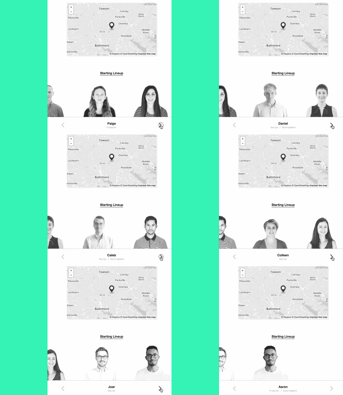
This “Meet the Team” section from Drexler is perfect proof that you don’t necessarily need a whole page devoted to introducing your employees — just a small section can do the trick.
This simple but polished team member marquee appears at the bottom of the Baltimore, Maryland-based agency’s “About” page, and adds a welcome personal touch to their website.
10. Matchstic
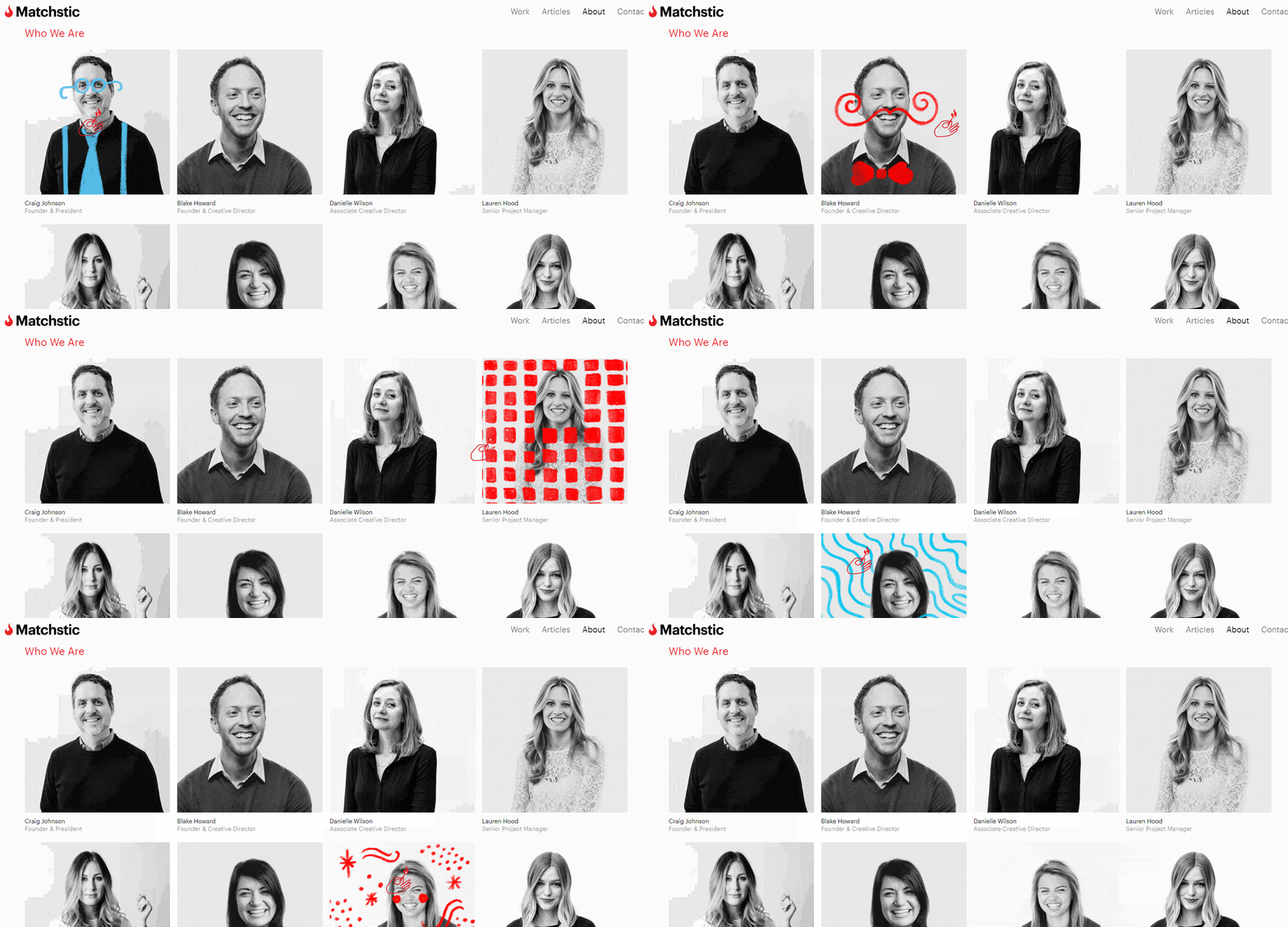
As a branding agency, Matchstic knows the importance of identity, creativity, and individuality.
Not only does their ‘who we are’ section on their About page provide that identity by highlighting the human element of their brand, but it also shows their creative side. When you hover over each thumbnail, a goofy illustration is overlaid onto the photo.
In addition, the custom cursor, which only shows up on the About page, is a strong callback to the Matchstic brand, implying a kinetic energy that starts with the lighting of a match.
11. LiveChat
LiveChat, an AI customer service and chatbot solution, approached their “meet the team” page in a completely different way. Instead of just listing out each team member’s roles and experience, they created a photo for each team member that illustrates who they are in a conceptual, fun, and metaphorical way.
This is extremely effective for showcasing the uniqueness of their team, and it compels the website visitor to take the team to look at each picture and read each bio, which results in longer time on page, an important engagement metric.

12. Etsy
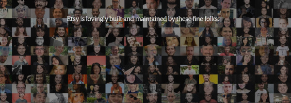
Many large companies forgo the “meet the team” page because there are so many team members that it doesn’t make sense to display them all.
At Etsy, though, they acknowledge all the people that make the popular online marketplace possible with a tiled “people board” that scrolls for days.
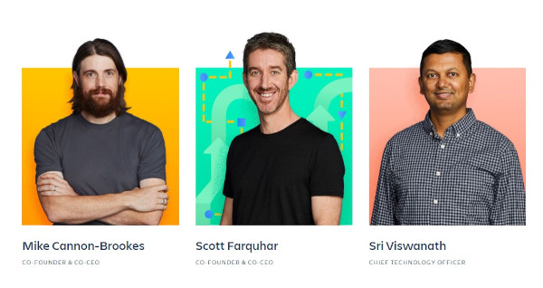
13. Atlassian
Atlassian, a company behind many of the software solutions used in businesses worldwide, highlights photos of their team on their “people” page, interacting at the office and hard at work.
Below, they showcase their leadership team with colorful headshots that break out of colorful background boxes. When you hover over them, attractive vector graphics appear relating to the individual’s unique role. In addition, a popup appears on click with social icons and a bio. What’s particularly interesting is that there’s also the ability to download their headshot, making the “People” page have extra utility for media professionals.
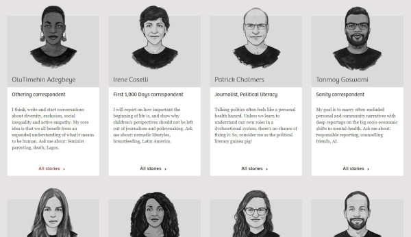
14. The Correspondent
The Correspondent is an organization that offers news without fear-mongering or financial gain. In true journalistic style, the site features each team member in a beautifully rendered cartoon style, providing an artistic feel to the page.
Clicking on each thumbnail leads the website visitor to a place where they can subscribe to that particular writer and view a feed of their pieces. Best of all, the individual’s mission is displayed across the top and contact information in the sidebar.
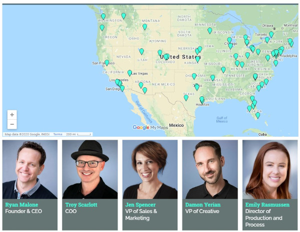
15. SmartBug Media
SmartBug is a HubSpot Agency Partner with a distributed team across the U.S. They demonstrate their embrace of remote work by including an interactive map with the locations of all their employees.
You can also browse through their team below, clicking on each headshot to get expanded bios that include 2 fun facts about each team member.
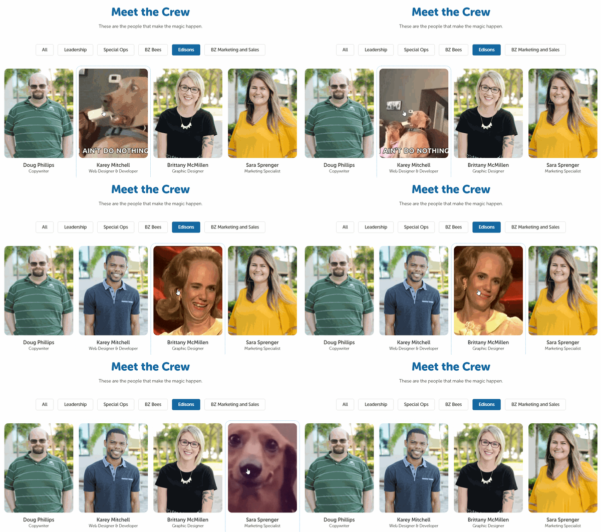
16. Bluleadz
What better way to convey the personality of your team than to display their favorite gifs on mouse hover? That’s what digital marketing agency Bluleadz does. You can almost imagine these folks in the scenarios their gifs represent.
Another unique feature of this “meet the crew” page is the ability to filter Bluleadz employees by function. Each button at the bottom corresponds to a team and brings up the individuals who “make the magic happen” in that area of the business.
17. Media Junction
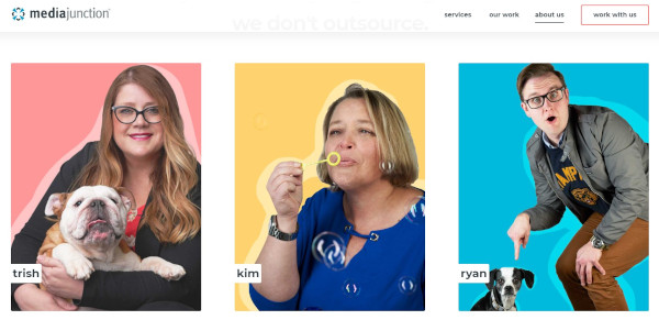
Bold blocky pops of color? Yes please. HubSpot Elite Agency Partner Media Junction displays their team thumbnails on solid backgrounds with vector shadows. Each photo is a little silly, and many of them bring their furry friends into the picture with them.
In addition, their leadership team’s thumbnails are clickable so that you can read more about them and even send them a message for more information.
“Meet the team” pages resonate because people like to buy from real people, not faceless brands. Best practice is to determine what your brand stands for and create a “meet the team” and About page that conveys that in the strongest possible way.
Editor’s note: This post was originally published in December 2016 and has been updated for comprehensiveness.

How To Optimize Your TikTok Bio 5 Easy Steps [+ Examples]
TikTok is quickly becoming the next big thing in social media, both for individuals and for brands.
Fortunately, the dance and lip-sync app can be a lot more than that if your brand uses it strategically. And the first place to start with that strategy is in your TikTok bio.
As it is on any social media platform, your bio is your chance to introduce yourself and your brand to every potential follower.
You don’t have the time to re-introduce yourself in every video you create, so your bio gives you the chance to do just that. This is your chance to tell your potential followers who you are and why they should follow you.
Here, we’ll cover how you can optimize your TikTok bio to increase followers and, ultimately, attract more qualified leads for your business.
5 Steps To Optimizing Your TikTok Bio
Creating a converting TikTok bio doesn’t have to be difficult. In fact, you only have to follow five steps to create a bio that is sure to help you grow your following. Let’s dig deeper into each of these five steps.
1. Describe your account or brand.
Tell your followers who you are and what you do. They might be able to put together some idea of what your profile is all about based on your videos, but you don’t want to rely on that.
What if you decide to create a video that’s important to you but has nothing to do with your brand? Your visitors need to have another way to learn what your business is about.
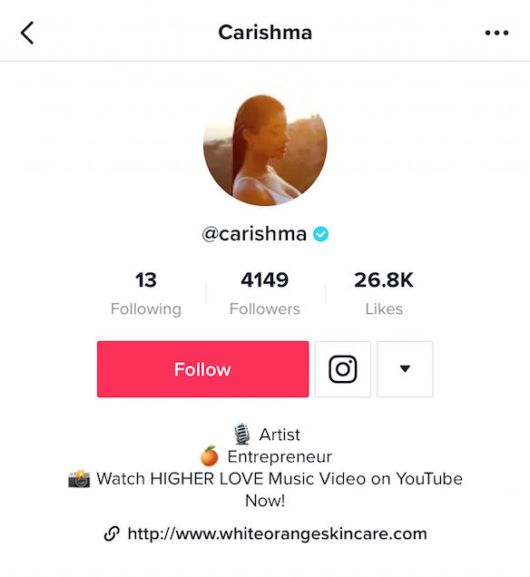
This only needs to be a few words, so make sure you boil down exactly what you want people to know before they decide whether or not they’re going to follow you. Make sure your language is engaging, compelling, and gets across your brand’s value or purpose efficiently.
2. Add emojis.
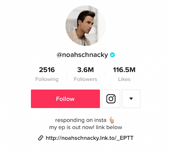
Almost every TikTok bio has an emoji in it. An emoji helps you further emphasize your brand’s personality — additionally, it can help you showcase your brand’s products or services without taking up too much space in your bio.
For instance, if you work for an ecommerce brand that sells clothing, you might include a t-shirt emoji (👕). Alternatively, if your company sells video tools, you might include a video camera emoji (📹).
You can also add emojis to tell people what to do. If you want them to click the link below or hit the follow button above, you could add arrows to express that without using extra characters to ask your visitors to take action.
3. Add a CTA.
Like any good social media bio, you should have a call-to-action in your bio. This tells your visitors exactly what to do next so they know how best to interact with you. For instance, you might include a CTA to direct followers to a blog post link, an ecommerce website, or another social channel like Instagram or YouTube.
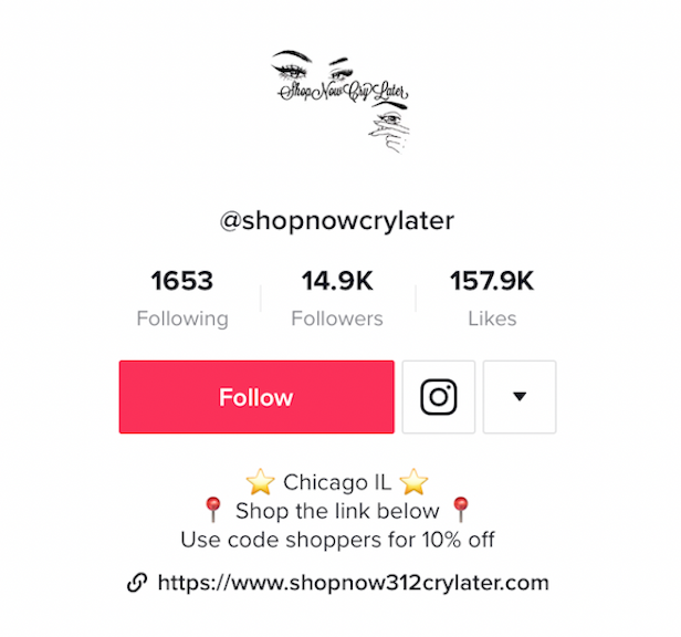
At the very least, ask your visitors to follow you on TikTok. You want to get in the habit of adding a call-to-action to almost every single piece of content or communication you share with your followers. This way they’ll be more enticed to take action immediately after viewing your content.
4. Don’t exceed the character limit.
Of course, TikTok has a character limit for their bio, and it isn’t very big. You only have 80 characters to communicate your entire bio. That’s just over half of the limit you have on Instagram, which can already feel tight!
This is one of the reasons emojis are so useful. You want to be able to save your characters and use them wisely to be able to fully communicate your brand quickly to your audience. Pick out the most important aspects of your brand and highlight those in your bio.
5. Add a link in your TikTok bio.
TikTok gives you space for a link, so if it’s currently available to you, you should definitely use it. This is a valuable way to direct traffic from TikTok off the platform to other pages you want to promote.
From there, you might direct followers to a relevant e-book or landing page to capture their contact information and add them to your email list, or you can share the sales page for the most recent product you touted in your video.
There are a couple of different ways you can optimize the link in your bio, and there are a couple of things you should be aware of before you try to add one yourself. Let’s dive into those, next.
URL Options
First, when you’re putting a link in your bio, you have the option to send traffic to only a single URL. You can pick your most recent blog post, your homepage, a dedicated landing page, social media profile, or any other page you’d like.
The other option is to promote multiple links through a link in bio service. With this kind of service, you can drive people to a web page that has a collection of page links they can visit.
You could include links to your blog, affiliate links, products, or even your other social media sites. Using a link in bio service for your TikTok allows you to give your visitors more options of where to go and connect with you outside of TikTok. This also saves you the hassle of needing to edit your link every time you upload a new video promoting a different product or service.
Accessing the Link in Bio on TikTok
However, there is a caveat to the link in bio option: not everyone has the ability to add a link to their bio yet. It seems like most, if not all, Android users have this option, while some iOS TikTok users are still waiting on their capability. If you want to check to see if you have this option:
1. Go to “Edit your profile”
2. Check to see if you have an option that says “Website” underneath the section where you can edit your bio
If you don’t have that ability yet, don’t worry. There’s another way you can add a link to your bio, even if you don’t see that option in your app. You can join the TikTok Testers program.
To join the program, you need to download a separate app called Testflight through the app store.
Next, open your existing TikTok app and go to the three dots in the upper right hand corner of your profile page to access “Settings”. Then, scroll to the bottom and click “Join TikTok Testers.”
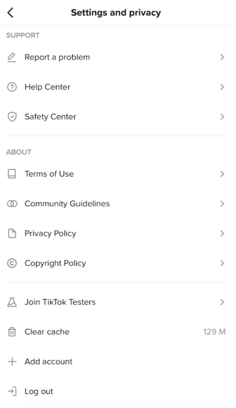
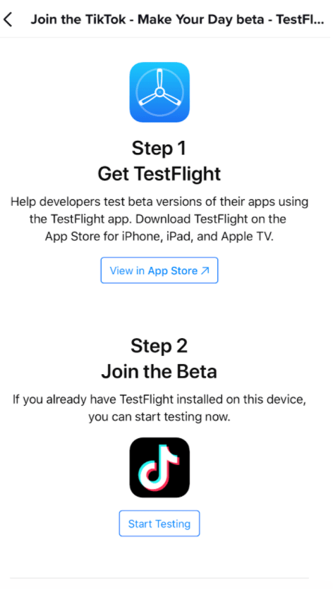
Follow the instructions from there, and you’ll be able to access the various Beta versions of TikTok as they release them. TikTok offers this program to ensure that only the best features make it to the primary app, and it helps keep the app as bug-free as possible.
TikTok Bio Examples
So now that you know all the elements you need for a fully-optimized TikTok bio, let’s take a look at some excellent examples so you can see these strategies in action.
1. Fashion
There is no shortage of fashion influencers, accounts and people who just love fashion on TikTok.
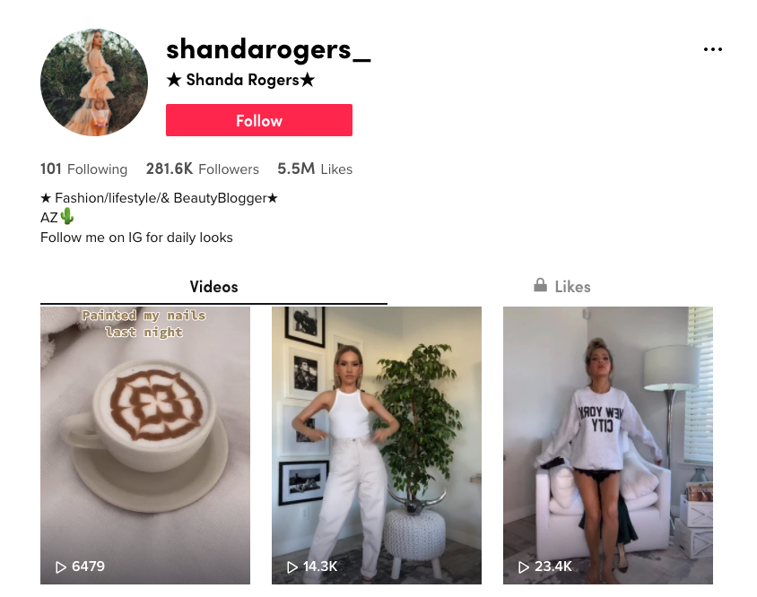
Here, Shanda Rogers uses her bio to share that she’s a fashion, lifestyle, and beauty blogger. She has emojis and her location, and she also has a link in her bio to her website.
2. Travel
Travel might be almost as popular as fashion on TikTok. Whether you’re documenting your own travels or sharing interesting things about your hometown for people who may visit, there are plenty of ways to showcase travel images and videos on TikTok.
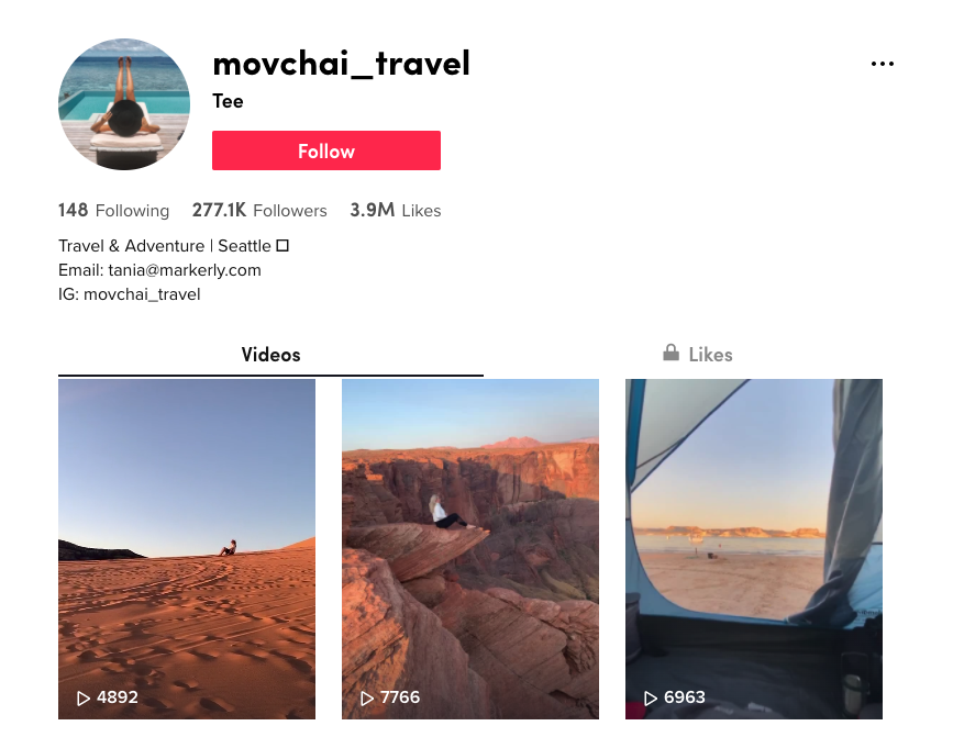
This account, @movchai_travel, has a great bio that includes a brief description, location, emoji and then two different ways to reach out and either contact them, or peruse their Instagram profile instead.
3. Sports
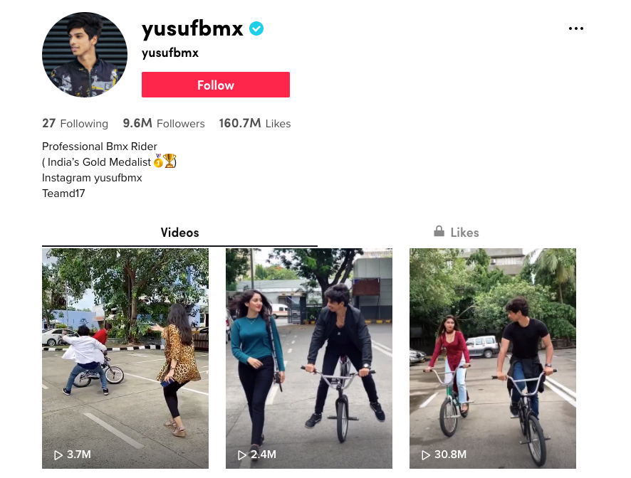
People are interested in all kinds of sports, so if you have a sports-based account, make it easy for people to find you and check out your videos. BMX bike rider @yusufbmx has a well-optimized bio.
He shares what he’s known for — including being India’s Gold Medalist — uses emojis, and has a link to his Instagram where people can see more.
4. Food
Food: something almost everyone loves to see. We’ve seen on Facebook the popularity of food videos like those made by Buzzfeed’s Tasty brand.
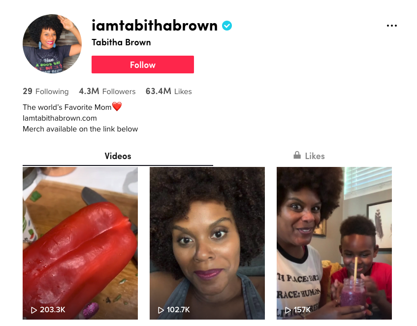
It makes sense that TikTok users would love to see the same sort of thing. Perhaps one of the internet’s favorite and most loveable vegan’s, @iamtabithabrown, has made quite a name for herself on TikTok.
She shares delicious-looking vegan recipes, and she does it with a lot of love. You can see that her bio is well-optimized, with a brief description of who she is, an emoji, a link to her website, and even a call-to-action encouraging visitors to purchase merchandise on her website.
Putting Your TikTok Bio Together
By combining these five elements of a great TikTok bio, and with the inspiration of these four different accounts, you should have a pretty good idea of the changes you might need to make to yours.
Before you open up TikTok, take out a piece of paper and write out the few words you would use to describe your brand or profile, and also decide on your call-to-action.
Then, you can get into the app and work on the wording until you have your bio looking just the way you want. Don’t forget to add emojis, and a link if you can!
For more inspiration, take a look at How 7 Brands are Using TikTok.

How to Create an Ecommerce Checkout Experience Shoppers Don’t Hate
Four-night trip to New Orleans, flight and hotel included, for $499? Awesome! Buy now!
…It wants my login information? I’ve never even been on this site before.
Oh, apparently I have, and I set up a username and password. Well, I don’t remember them, so I’ll just check out as a guest.
There’s no guest checkout? I just want to go to New Orleans! Whatever, I probably can’t get off work that week anyway.
Does this sound familiar? If so, you’ve been the victim of a terrible, horrible, no good, very bad online checkout experience. We’ve written about how to design your website to entice browsers to turn into shoppers, and we’ve covered how to nurture shoppers who abandon their carts. But we haven’t told you how to design a seamless, efficient checkout experience that ensures customers complete their purchases the first time they’re in your shopping cart.
It all boils down to simplicity. The more options, barriers, and annoyances you put in front of an online shopper, the less likely they are to complete a purchase. In this post, I’ll show you how to set up the perfect ecommerce checkout experience for your customers, and help you enjoy better shopping cart conversion rates as a result.
But first, let’s review the basics.
Seems straightforward enough, especially if you’re using an ecommerce platform like WooCommerce or Shopify to help you. In reality, however, there’s a lot of room here for both frustration and optimization. You’ve done so much work to get the user to this point, why drop the ball now?
So, let’s now review 12 best practices for ecommerce checkout that will increase delight and reduce friction for your customers:
1. Don’t require registration or login.
I already gave this one away, but it’s so important that it’s worth reiterating.
When someone is excited about a purchase, they want it, and they want it now. What a bummer to think you’re minutes away from completing an order, only to find out you have an additional few minutes of required registration ahead of you.
Or worse, you’ve already been through the registration process and you can’t remember your login information, so you have to go through the rigamarole of confirming your high school math teacher’s last name to retrieve your login credentials.
While it is more convenient for your lead nurturing to establish a login, this is a significant barrier to purchase and will deter a good chunk of potential first-time customers. A guest checkout option ensures you won’t lose a customer and revenue today.
Instead, give the option to register after the customer has received a purchase confirmation. Now that you’ve secured the purchase, this puts less pressure on the buyer and presents an opportunity to expedite future purchases from your site. You can also use this information to track shoppers’ interactions using an integrated CRM like HubSpot for WooCommerce.
2. Let shoppers save personal information.
On the flip side, shoppers that do choose to register with your site before completing their purchase should be able to reap the benefits of a faster checkout. That means you’ve saved certain pieces of personal information with their permission, like name, address, and credit card information.
On the sites I visit and purchase from often, I like to create a login and save my information for future purchases. And let me tell you, it feels great to complete an order with a click.
3. Make it short and simple.
Even if your checkout experience seems quick and easy to you, it might not feel that way to a shopper. Fortunately, there are a couple of tricks you can employ to keep visitors from becoming overwhelmed.
First, break up the checkout experience into steps across multiple pages or page sections. You might start with just basic information, like name and email address, then encourage the shopper to click through to the address step, then the payment step, etc. Working in phases like this not only helps a shopper feel closer to their purchase — it also lets you capture lead information that, should the shopper abandon their shopping cart, enables you to recover the sale through automated email offers.
Note that this isn’t a license to add as many steps as possible. Only include the essential stages of your buying process to limit distractions and barriers along the way.
Also, the fewer fields a visitor needs to fill out, the better. Like your landing page forms, only ask for information you absolutely need. You can also eliminate steps by offering shortcuts like a checkbox that lets them indicate that their shipping and billing addresses are the same.
4. Give indicators of progress.
A multi-step checkout approach does have some pitfalls when not executed well. If a shopper has no idea how many steps are involved, they’ll assume that they’re so far from the end they can’t even see the finish line.
Instead, take a cue from clothing e-retailer ModCloth, which breaks up its checkout into four steps:

Each step is clearly numbered and labeled, but the current step is highlighted to reinforce progress. Plus, the Continue button is designed like a good call-to-action: A bright, contrasting color signals what to do next, and gives shoppers a feeling of control over the process.
Other design elements, like an accordion or a progress bar, can achieve the same effect, as long as the current step and number of remaining steps are evident.
5. Make complementary product recommendations.
You might think of cross-selling and upselling as opportunities because they drive more revenue. You’re right, but it also makes for a happier customer if they choose to take advantage of your recommendation.
Just look at what Amazon recommends I purchase based on my addition of decorating bags to my shopping cart:

Good call, Amazon. Buying a ton of decorating bags wouldn’t be that useful if I didn’t have the tips to go with them. Or, maybe I already have the tips at home, but after decorating a bunch of cakes I’ve realized how annoying it is to keep switching between multiple icing bags. Good thing they have that handy dandy decorating bag holder!
If I don’t purchase any of these additional items, that’s okay. It didn’t hinder my checkout experience in any way to see the recommendations. But if you recommend complementary products so I can enjoy my purchase more, I’ll be a happy camper…and you will be too once you’re rolling in all that dough (baking pun intended).
6. Set up forms in a logical flow.
Most shoppers come to their carts prepared to divulge a lot of information, but their willingness to complete the process weighs on whether you collect the information in a logical way. Online shoppers are accustomed to a certain checkout flow, something like you see in the ModCloth example above:
- Contact information including name, email address, and phone number
- Shipping information, or the physical address to which the order will be shipped
- Billing information, typically your credit card information and an affirmation that the contact information and address provided before are associated with that card
There are more steps involved in most other checkout processes, but this is the basic information any ecommerce site will require, presented in the order that most of us expect. Don’t start off asking for credit card information, then move to phone number, then ask for their billing address, and then, well, you get the picture.
Also, remember that this flow should go both ways with the help of a “back” button. If a user needs to undo a step, make it obvious how to do it. A user shouldn’t need to restart the entire process if they punch in the wrong credit card info.
7. Offer rush processing and shipping.
When you offer rush processing and multiple shipping options, you’re providing another win-win for you and your customer. If necessary, they get their order processed and shipped quickly, and you get the benefit of earning a little extra money from their purchase.
But, importantly: This only works if you’re clear about the additional cost associated with these services before the customer opts-in.
Imagine you found a great deal for that trip to New Orleans on a site that had a smooth checkout, and then decided to go shopping for a new bathing. You found one you love, added it to your cart, and saw the e-retailer offered rush shipping. You think to yourself, “Self, I should probably get this rush shipped in case it doesn’t look good, and I need to return it and order a new one before the trip.”
You select the rush shipping option, which offers no indication that it costs more than the regular shipping option. You click to review and complete, and…hold on, rush shipping costs $35?! You decide you’d rather spend $35 on Bourbon Street, and cancel your order.
Long story short, tell shoppers the cost of your rush processing and shipping costs up-front so they don’t suffer sticker shock and abandon the whole purchase.
8. Keep your contact information handy.
This is a basic, yet oft-overlooked change to your checkout process. Include customer service contact information in every stage of your checkout, so shoppers can contact someone for help if necessary. The alternative is confused or reticent shoppers abandoning their shopping carts before completing a purchase.
This information could take the form of a phone number, email address, contact form, and/or live chat directly to a support team member. If possible, avoid sending the user off to a different web page, as this distracts from their goal.
9. Call attention to mistakes quickly and clearly.
When filling out the required fields, many shoppers will mistype information. It happens, we’re all human. Do your part as an awesome ecommerce business by alerting them (nonjudgmentally) as soon as possible.
For example, if someone enters only 9 digits for their phone number, they probably just slipped up. But don’t wait until the end of the checkout process to flag the error — tell them right away!
Even worse, don’t make it impossible to find and understand the mistake. Warnings should be in big, bright, bold letters with explanatory text so shoppers don’t have to troll through all of the fields to find and correct the problem. For instance:

10. Let customers review and modify their order before placing.
Too many shoppers have been burned by ecommerce companies that tack on surprise taxes, shipping costs, or other surcharges unannounced. Some of those companies don’t even provide a chance to review your purchase before it is submitted, which means a shopper will pay more than they intended.
I’m sure you’re not going to pull a fast one on your customers on purpose. But, this review screen helps them ensure all the little details are correct, like shipping address, order quantities, and credit card information. If a change needs to be made, like a product removal or swap, make this possible on the same screen. Also, product info and photos help them review their order at a glance.
A quick final review will make customers more likely to return, and decrease the need for returns and customer service attention.
11. Reassure buyers that you’re secure.
People are increasingly wary of providing personal information, and there’s a good reason for this. In 2018, over $20 billion was stolen due to credit card fraud, and this number is climbing year over year. Thousands of ecommerce transactions occur every second, and each one is an act of trust between buyer and seller.
First — and this is essential — acquire an SSL certificate for your entire website if you haven’t already. An SSL certificate means your site conforms to HTTPS protocol (the “S” means “secure”), which is the secure connection standard for modern websites. If you don’t have one, browsers like Google Chrome might warn your visitors — this will obviously deter some from finishing.

Next, assuage your customers’ concerns by placing visible indicators of security in your checkout. Don’t overdo it — a single third-party trust seal in each step will do the job, and consider placing a link to your privacy policy for those extra-scrupulous shoppers. Also, a well-designed website overall will instill more trust in your business, and therefore your security.
12. Make it mobile-friendly.
It’s official: More people are conducting their online shopping on mobile devices than desktop. A quick glance at Google Analytics or another reporting tool might even confirm this on your own website.
This probably doesn’t come as a surprise. However, it does mean every page of your site, including your checkout pages, must be responsive in its design. Essentially, your pages should detect the size of the viewing screen and display elements appropriately.
Of course, all of the practices in this guide also apply to the mobile checkout experience. But if a user can’t conveniently navigate from page to page and enter their info with ease, you’re going to see a lot of abandoned carts. So, accommodate for eyes and thumbs. Larger buttons and text, greater spacing between page elements, and intuitive navigability all impact your user experience and conversion rate.
Don’t Zone Out at Checkout
If you’re just starting a business, just getting visitors to the buying stage is the hardest part, and it’s a huge accomplishment! Now, all you need to do is streamline the experience and get them to the “Place order” button as smoothly and safely as possible.
As you implement more recommendations from our checkout checklist, keep a close eye on how these changes affect your purchases, abandoned carts, and any requests or common problems among your customers. Every business is different, so whether you’re selling clothing, cake decor, or a New Orleans vacation, it’s crucial to listen to your customers and see how to best implement these practices on your unique site.

How to Increase Your Instagram Engagement Rate
debut prompted 25,000 downloads in just one day. Two years later, Facebook purchased the app for $1 billion.
In 2020, the app has grown larger than expected, with 500 million daily users. Its popularity has led it to become a source of income for content creators and brands worldwide, many using the app as their sole source of income.
Since the potential to make money, connect with your audience, and build a reputable brand on Instagram is so high, understanding how to use it is essential. While there are various ways to market yourself or your business on Instagram, it’s impossible to do so without first understanding your Instagram engagement rate.
Why does Instagram engagement rate matter?
Instagram engagement rates are significant because they measure an audience’s interest, brand relevance, and social authority.
Audience Interest
If your content appeals to your target audience, your engagement rate will be higher. If you take the time to review your best performing content, i.e., posts with the most likes, shares, saves, and comments, you’ll get a feel for what your users want to see. It’s important to note high impressions may indicate that your content has been viewed a lot, but engagement is typically defined as concrete interactions with your posts.
Relevance
If you have a high engagement rate, it’s likely your audience sees you as a relevant source of information. They may favor your content over competitors because your content sets you apart. However, if you have a high engagement rate now, will it stay the same in three months? Is it higher than it was last year? If you aren’t monitoring your engagement rate and using it as a benchmark for relevance, your score can decline.
Social Authority
While you’ve probably already identified your target instagram audience, it’s never bad to add new followers and fans to the list. These new users will take notice of your engagement — your followers, likes, comments, etc. — to decide whether or not to follow you. They’re likely to move on to your competitors if they notice your brand’s engagement, a.k.a. social authority is not strong.
What is the average Instagram engagement rate?
There is no one-size-fits-all definition of a “good” engagement rate. They vary by industry and depending on your strategic goals.
However, Instagram does have higher engagement rates than other social media networks. According to the HubSpot Instagram Engagement Report, posts on the platform generate 23% more engagement than Facebook, even though Facebook has 2x more monthly users.
If you want a numerical value to compare your score to, Rival IQ found that the average engagement rate across all industries is 1.22%. Specific sectors have higher rates, like higher education with 3.57%, sports teams with 2.33%, and influencers with 1.67%.
Because of this, it’s safe to assume that an engagement rate of around 1% is a good engagement rate.
If you’ve already run the numbers and found that your engagement rate is significantly lower than average, don’t fret. There’s room for improvement — but maintain a healthy perspective. Assess how your engagement rate has changed over time and begin devising strategies to raise your score. Start this process by calculating your engagement rate.
How To Calculate Your Engagement Rate On Instagram
There is debate among marketers on the best way to calculate your Instagram engagement rate, as different industries define success in different ways. Your preferred method depends on your goals as a brand or influencer.
Calculating Instagram engagement rate for brands
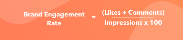
Business Profiles to see impressions.
Calculating Instagram engagement rate for influencers
Since sponsors often recruit influencers on Instagram based on their likes and follower count, their engagement rates incorporate these two factors. Since this metric doesn’t require any personal data, it’s possible to compare your engagement rates to competitors.
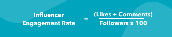
No matter your engagement rate, there are always steps to be taken to raise your score.
1. Maintain consistent branding.
Maintaining consistency with your content is extremely important, and there are a variety of actions you can take to do so.
Firstly, your username should be similar or the same to your other social media usernames. For example, if your twitter handle is @greenbookworm, your Instagram handle should be the same if it’s available (or something very similar).
You should also make sure that your content is visually consistent as well, and you should have a format that you use for all of your posts. Take a look at Nike’s Instagram, for example. 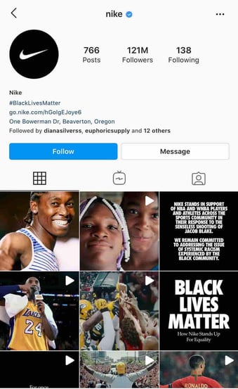
Whenever they post content that includes typography, they use the same backgrounds and font. When they post photos, they’re high quality and use the same filter.
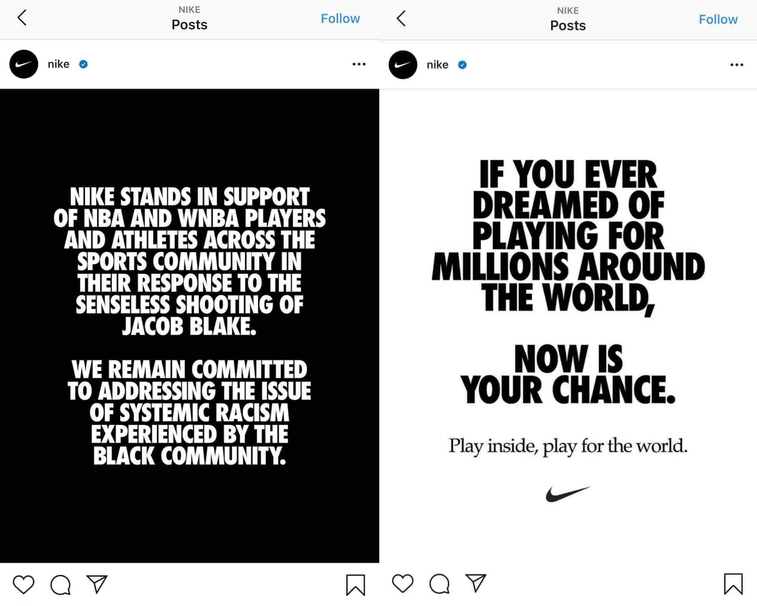
There’s data to back this up — WebDam found that 60% of the best-performing brands on Instagram used the same filter every time they post.
2. Understand your audience.
You can’t begin creating content without knowing your intended audience. Developing Instagram personas is a helpful tool for increasing your engagement rate. If you know who your followers are, creating content that they want makes them more likely to engage with you. Take the time to monitor your audience statistics, and update your personas accordingly.
You can use Instagram insights to get a demographic understanding of your followers. If you have an Instagram business account, navigate to the audience tab from the Insights menu.
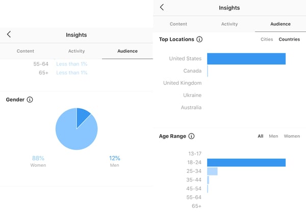
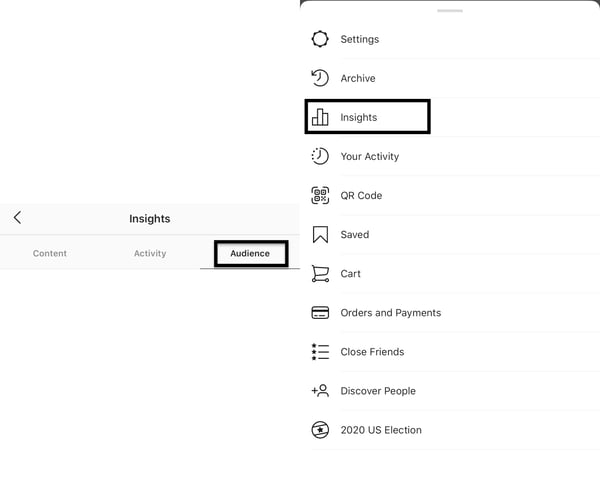 From here, you can see the top locations your users are in, your users’ age ranges, and their gender. All this information will give you an understanding of your users.
 If you’re a HubSpot user, you can utilize the Social Reports data to find these same insights.
Regardless of your target audience, your content needs to be accessible. Utilizing Instagram’s accessibility tools is crucial, and you can use it to add image alt text, subtitles, and captions to your content.
3. Post regularly.
Once you know your target audience, post content they’ll enjoy and do it regularly. In 2018, 60% of Instagram users reported visiting the site daily, and 38% of those users visited multiple times a day.
The number of times you post depends on your marketing strategy, but the average brand posts 1.5 times per day. Again, this metric is an average, and it may not work for everyone. Posting too much content can overwhelm your users, and they won’t hesitate to unfollow if their feed is clogged.
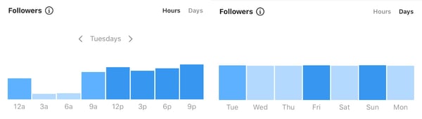
It’s also important to know the best times to post for your followers. Instagram insights will also tell you the best days and hours to post.
4. Create better captions.
Unless you’re @world_record_egg, who posted a photo of an egg with no caption that has generated over 12 million likes, you need to focus on your captions. Use the brand voice you’ve developed to sound consistent and keep your intended audience in mind. You can create short captions that are serious or light-hearted.
You can also create longer captions that tell stories and take your users on a journey. Take the instagram account @humansofny as an example. They regularly feature the personal stories of people around the world.

Hand-in-hand with writing better captions is using quality hashtags — Instagram was built on them, after all. It’s still the algorithm’s primary method of filtering through content. If you’re unfamiliar with hashtags, here’s a summary.
Captions can hold up to 30 hashtags per post, but there must be a balance. Hashtag dumping, which is similar to keyword stuffing, may make the algorithm think you’re spamming for engagement, and you can be shadowbanned. The goal is to figure out what works for you and stick to it.
Your hashtags should be a mix of popular and specific, long-tailed keywords. For example, if you’re running an Instagram for your hotel, you’ll want to use common hashtags like #hotel and #travel. However, those are also very broad, as a search for the #hotel tag has 31 million posts. Be more specific and targeted towards your needs, and maybe say #hotel, #travel, and #hotel + your hotel name + the name of the city you’re in. So, for example, #hotellisamiami.
You can discover the best hashtags to use by doing keyword research and categorizing those that work best for you and your brand. You may also want to consider coming up with a brand-specific hashtag that users can recognize as yours.
5. Engage with your followers.
After you post, engage with your followers. While Instagram has the ‘Turn off comments’ feature, opt to keep them on.
Reply to comments that your followers make. Maybe they’re asking questions or proclaiming their excitement for your product. Paula’s Choice, a beauty brand, is an excellent example of this.
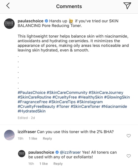
They regularly host Instagram Q&A’s, where users ask questions and they answer them on their Instagram stories.
They’re taking actions that they know will entice their audience into interacting with their Instagram content, which factors into engagement rates.
Engaging with your followers also entails sharing their content on your site, known as user-generated content (UGC). Surfing through your brand-specific hashtags can help you find users that are posting about you. You can screenshot their content to share on your story, and even post on your feed.
Your followers will be excited that you interact with them, as engagement may signify a personal relationship with your brand. Here’s an example of Paula’s Choice posting UGC.

6. Engage with similar accounts.
There wouldn’t be a point to using Instagram if you’re not following and interacting with other accounts.
Using the platform to engage with accounts similar to yours is extremely important. If you’re a brand, this can mean partnering with influencers in the same industry. If you share products with them, they’ll post content wearing your brands. If they tag you, their followers will see your account, and many may follow you—all of these metrics factor into your engagement rate.
Emma Chamberlain is a popular YouTuber, holding almost 10.4 million Instagram followers at only 19-years-old. She regularly posts sponsored content, and her sponsors post her. She entices her followers to interact with those brands, and vice versa.
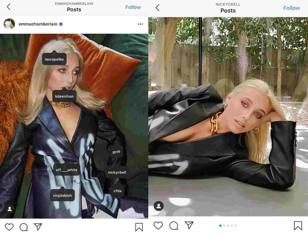
7. Create mixed content.
When the app was first launched, all you could do was post photos. Now, there are five types of content posts supported on Instagram: photos, videos, Instagram TV (IGTV), Instagram Reels, and Instagram Stories.
It’s no longer enough to just post photos; you need to do all of it.
Videos
Zenith Media estimated that the average person would spend 84 minutes a day watching videos in 2020. That’s a significant amount of time spent watching videos, so use it to your advantage.
There are five video options within Instagram: Reels, IGTV, Story videos, Instagram Live, and video posts. You’ll need to decide which method is best for you, but a well-rounded Instagram strategy will include all. If people are watching content on your page, they’re spending more time on your site, factoring into your impressions rate.
If you’re a sports brand, post enticing videos of recognized athletes using your equipment to practice their sport.
Stories
Instagram Stories are essentially the same as Snapchat stories. HubSpot’s Instagram engagement report found 22% of users watched branded content Stories from a company, business, or brand more than once a week, and 36% liked, commented, or shared branded Stores.
You can take advantage of these numbers and use this feature to draw attention to your new posts by sharing them on your Story or simply posting Story exclusive content.
This feature can also be used to engage with your audience. Post quizzes and questions and make them shareable for other users. Stories can also be used to get feedback from customers, asking them to submit experiences with your products and services.
Circling back to influencer sponsorships, having them go live on your account via Instagram Live is a great strategy. Instagram Live’s can also be saved to your account, so new users can watch them even if they occurred three months before.
8. Use calls-to-action (CTAs).
A CTA is an image, line of text, hashtag, or swipe-up-link that is meant to entice your audience to take action — hence the call-to-action.
The specific action you’re asking users to take should be decided based on your brand, service, or influencers’ needs. This may mean notifying them of a sale by including a swipe up link in your Instagram story, asking them to tag a friend in the comment section, or sharing links to partner-posted content.
While links to other sites don’t directly impact your Instagram engagement rate, they still require users to spend more time on your profile, and you can convert them into leads on other platforms. Here’s an example of National Geographic advertising a new product on their story using a swipe-up CTA.

9. Track your statistics.
Why would you bother taking action to improve your engagement rate if you’re not taking the time to understand if it’s working? Tracking your progress is extremely important, and it should be something you focus on.
Trial and error is expected, and it should be used to inform your current and future strategies. Use your preferred CRM to find your most effective posts or pieces of content, and use the strategy employed in those for your next content posts.
After you’ve calculated your engagement rate for the first time, you should devise a timeline in which you’ll recalculate it again. Maybe you’ll set a goal of raising your score by .10% in a year, so you may plan to re-calculate the numbers every three months. This can also help you understand what isn’t working — if your numbers haven’t budged, something needs to change.
All in all, Instagram engagement rate is a measure of how your audience interacts with your content. Your rate is an indication of your Instagram profiles’ social authority, relevancy, and audience interest.
If your content is good and your followers are engaging, your engagement rate will demonstrate that. When you spend time working on your engagement rate, you collect valuable data to inform your entire Instagram marketing strategy.
You should see your engagement rate as a benchmark for customer loyalty and satisfaction.
If your users like you, it’ll show.

What You Need to Know About Commercial Use
As marketers, we’re often tasked with designing, producing, and creating a variety of content to use across social channels, blog posts, and email.
This often includes the use of a wide variety of design tools — including Adobe Photoshop, Canva, and even Getty Images.
And yet, we often don’t pause to consider: Can I actually use this software for business purposes?
More than likely, your team has already ensured you have a commercial license to use the products you design for business purposes.
But, despite it being a legal term, it’s still critical your familiar with the concept of “commercial use” as a marketer, so you can ensure you’re following the law when it comes to creating and distributing content.
Here, let’s dive into the differences between commercial use and non-commercial use.
Simply put, any activity you conduct at your company would be considered for “commercial use”, since the ultimate goal of that activity is to increase sales.
As such, you’ll need to purchase the appropriate commercial licensing agreement with any design software or third-party tools you use to complete your project.
Commercial use extends to offline activities, as well. For instance, let’s say you use Adobe to design a billboard sign, and FontCreator to edit the font you’ll use for that billboard. In this case, you’re using the billboard for business purposes with the desire to earn financial gain as a result of your ad — which means it’s for commercial use.
Before creating your billboard, you’ll want to ensure you have a commercial licensing agreement with both Adobe and FontCreator. Otherwise, these companies could take legal action against you.
You can figure out whether you’re allowed to use software for commercial purposes in the “Terms of Use” section on the software’s website. If it’s stated that the software is unintended for commercial use, you’ll need to either upgrade to the business-version of the software, or find another solution entirely.
For instance, in Adobe’s General Terms of Use, they’ve stated the following regarding their NFR (non-functional requirement) licenses: “You may install and use the NFR Version only for the period and purposes stated when we provide the NFR Version. You must not use any materials you produce with the NFR Version for any commercial purposes.”
This means, if you’ve purchased the NFR version of Adobe, you can only use the software for non-commercial purposes. But what does non-commercial use mean, anyway? Let’s explore that, next.
Non-commercial use involves any activity you’ll conduct that you don’t plan on marketing or selling for-profit. Common examples of non-commercial use are often related to education. For instance, let’s say you use the same Adobe and FontCreator design software, listed above — except this time, it’s used to create a presentation for your college history class.
Since you won’t make money off your presentation, it falls under non-commercial use, and is fair game.
Additionally, people often use certain software or even brand logos when designing gifts for loved ones. If your little brother is obsessed with Disney, you might make him a homemade Disney-themed blanket, and use the Disney logo. Since you aren’t selling that blanket for-profit, this is allowed.
However, you wouldn’t be allowed to sell that same blanket on Etsy, since you don’t have a commercial license to use Disney’s logo, and you’d be expecting money in exchange for your design.
The final definition we should cover is “limited commercial use”, which falls into a gray area in-between commercial and non-commercial use.
Simply put, limited commercial use means you can use the software, design, logo, or tool on products you intend to sell — but only for a limited amount. For instance, let’s say you have a Getty Image agreement which states you can use an image for limited commercial use up to 5,000 times.
This means you won’t want to use that image if you intend to distribute the design to an audience bigger than 5,000. However, if you’re planning on designing materials that will only be sent to 100 of your top customers, it’s acceptable to use that image on those materials.
Of course, when in doubt, you’ll want to confer with your legal team to ensure you’re following legal requirements when it comes to creating any marketing materials you’re hoping to use at your company.

What is Real-Time Marketing? (In 300 Words or Less)
While it might seem like people use delayed media (like streaming services or podcasts) more often, real-time media hasn’t come to a halt.
Real-time marketing is still a great way to get in front of and convert your audience.
As marketers, those stats are impossible to ignore.
Below, let’s learn more about real-time marketing, and then we’ll see what it looks like in action.
This type of marketing occurs when your company reacts, instead of planning or strategizing a marketing plan for months. That’s not to say that you won’t have a real-time marketing plan, but it’ll be a quicker turnaround.
The objective? To connect with your audience and communicate your brand position.
You might be able to plan real-time marketing if there’s an event or ongoing trend. For example, if you strategize an ad around a current fad, your company might become more appealing to your audience because you understand them.
Real-time marketing helps you provide relevant messaging that is tailored to your audience’s wants, interests, and needs.
One way for marketers to implement a real-time marketing strategy is to have an active social media presence.
Your social media team will often be the first people to know about a current fad or trend if they’re implementing social listening (which they should be).
Additionally, you can learn more about your audience and their current interests by looking at your own data.
For instance, you can look at your website or social media analytics to discover the most popular topics of conversation. You can also learn what questions your audience is asking through social listening tools.
Having a team actively look at this information every day can be helpful in planning and strategizing a real-time marketing plan.
When you want to implement a paid real-time marketing ad, you can use social media and search engine targeting tools to ensure you reach the right audience. That type of personalization in marketing has elevated real-time marketing efforts.
Ultimately, to effectively implement a real-time marketing plan, you should always listen to your audience, monitor industry trends, and know where the conversation is taking place.
Then, you need to react. Respond to your audience on social media and create assets to discuss what’s going on.
Before you implement a real-time marketing campaign, think about your audience and what you want to achieve with your reaction. Once you know the goal, you can create your message, whether it’s a social media comment, an email, or an ad.
Now that we know more about real-time marketing, let’s review some examples.
Real-Time Marketing Examples
1. ALS Ice Bucket Challenge
One of the greatest lessons in real-time marketing is the ice bucket challenge from 2014. This phenomenon went around the globe and every company or celebrity who took part in the challenge was participating in real-time marketing.
Taking part in the challenge was a way to raise awareness and money for ALS. But since it was a current event and trend, companies were able to increase brand sentiment and awareness by participating.
2. INBOUND
Every year, INBOUND attracts thousands of business professionals from almost every industry to learn more about marketing, sales, and customer service.
During this three-day event, businesses and professionals are active on social media and commenting on the live events, such as HubSpot product updates and the keynote speech.
All of these social media posts and comments about the live breakout sessions or speeches are real-time marketing in action.
3. Taco Bell
Taco Bell has built a reputation as a great company to follow on social media through their crafted brand messaging.
The reason? On social media, Taco Bell’s strategy is to take part in enthusiastic real-time marketing. They respond to messages on Twitter almost twice an hour every day.
The company has made it a priority to listen to their customers online and to interact and connect with them, no matter what is happening that day.
Real-time marketing is a great strategy to connect with your customers right now. However, to implement this type of marketing, it’s important to measure conversations and sentiment to determine how real-time programs will develop. To get started, you can use free monitoring tools, or invest in one of the many paid social media monitoring technologies.

Why Overworking Is Bad For Your Health (and Your Career)
There’s no doubt that technology has simplified the way we carry out our day-to-day routines. Computers help us do things faster, emails and text messages let us always be in touch, and the internet makes it easy to find the answer to any question with just a quick Google search.
While being constantly plugged in can make us feel safe, connected, and in-the-know — both at work and at home — it also means we never really clock out.
It’s one thing to pull a long day every once in a while to finish a project or deal with a crisis, but it’s another to routinely stay late at the office or work into the night. That’s chronic overwork — and it can have extremely negative impacts on your health, happiness, and overall quality of life.
But working overtime has become the norm for most people. And, now that multiple offices have embraced remote work, the lines between the end of the work day and the start of personal time can get even blurrier.
It’s one of those things everyone knows is bad for us, but no one really listens. Trouble is, failure to prioritize a healthy balance isn’t just bad for the employees — it’s actually bad for employers, too.
There are numerous research studies out there showing how overwork — and its resulting stress — can lead to many health problems. But, it also impacts your brand’s bigger business too. Read on to learn exactly why it’s bad for health and our performance at work.
Why Overworking is Bad For Your Health
1. It prevents sleep.
Study after study shows that working too much or too late in the day can negatively impact your sleep — whether it’s the resulting stress, the staring at the computer screen, or just not having enough time to unwind before hitting the hay.
Avoiding sleep can cause us to build up “sleep debt.” Essentially, it feels like your energy is overdrawn for days at a time until you get a proper eight hours of sleep.
Chronic sleep debt raises the risk of obesity, heart disease, stroke, and diabetes. In the short-term, lack of sleep can have significant effects on the hippocampus, an area of the brain involved in memory creation and consolidation.
Think you’re one of those “lucky people” who can get by fine with only five or six hours of sleep? You probably aren’t. While researchers have found genes in people that enable them to be well rested after less than eight hours of sleep, they also say incidence of either is incredibly rare.
2. Overworking gets in the way of good habits.
Working too much can take a toll on the body and brain in two ways — by boosting stress and by getting in the way of exercise, healthy eating, and other good habits.
For example, when you’re overtired, you rely more on caffeine to get you through the day, you tend to make unhealthy food choices and working out becomes a thing of the past.
Cleveland Clinic reports that stress due to overworking or lack of sleep can cause you to overreat or make poor diet choices. But how does this happen?
First, overworking and lack of sleep slows activity in the areas of our brains responsible for ranking different foods based on what we want and need.
Second, little sleep also causes an increase in the brain’s amygdala, which is responsible for controlling the salience of food. Over time, poor food choices can lead to weight gain and even obesity.
3. Overworking is bad for your heart.
A long-running study of more than 10,000 civil servants in London found that white-collar workers who worked three or more hours longer than a normal, seven-hour day had a 60% higher risk of heart-related problems than white-collar workers who didn’t work overtime. Examples of heart-related problems included death due to heart disease, non-fatal heart attacks, and angina, a condition caused by low blood supply to the heart.
A follow-up study of over 22,000 participants found that people who worked long hours were 40% more likely to suffer from coronary heart disease than those who worked standard hours.
And even after that, reports from health sites like WebMD still tell stories of people who developed heart conditions through overworking.
What about overworking might be causing heart disease, specifically?
The link between overworking and heart disease might have something to do with your personality. In fact, the “Type A vs. Type B” personality test was originally aimed to determine how likely it was that a person would develop coronary heart disease. Considering Type A folks tend to be more competitive, tense, time-oriented, and stressed out — which is often intensified by overworking — their personality type is often associated with a higher risk.
4. It leads to bad habits.
Aside from health risks, research done in the last decade has shown how overworking links to bad habits that are also unhealthy.
Even back in 2015, the Finish Institute of Occupational Health published the largest ever study of the correlation between working patterns and alcohol consumption. In the study, a group of researchers put together a dataset of over 330,000 workers across 14 different countries.
They found that 48 hours of work per week was the magic number: When people worked more than 48 hours per week, they were more likely to engage in “increased risky alcohol use.” Risky alcohol use was defined as more than 14 drinks per week for women and more than 21 drinks per week for men.
Aside from alcohol consumption, researchers have also found that long hours link to bad smoking habits.
And a 2018 paper from Welltory added to the list of bad habits by showing that overworking can also lead to more social media consumption, which can danger your level of stress recover when you’re not working.
5. It causes higher risks for low-income workers.
Way back in 2015, a group of researchers investigated the role of long working hours as a risk factor for type 2 diabetes. They found that the link between longer working hours and type 2 diabetes is apparent in individuals in the low socioeconomic status groups. This was true regardless of age, sex, obesity, and physical activity, and remained even when they excluded shift workers from the analysis. Shortly after, another study showed an association between long hours and type 2 diabetes in low-income workers.
Overall, these findings show how strong of a relationship a person’s mental state can have on physical health.
Why Overworking is Bad for Business
If better health and happiness isn’t enough of an incentive to do something about chronic overwork, it turns out overworking can have a legitimately negative impact on a business’ bottom line. Sarah Green Carmichael of Harvard Business Review calls the story of overwork “the story of diminishing returns”: keep overworking, and you’ll keep making avoidable mistakes and getting lost in the weeds — all while not actually producing more.
6. More input doesn’t necessarily mean more output.
Do longer work hours equate to more work getting done? From time to time, yes — but not when “overtime” becomes “all the time.”
Research by the Business Roundtable found employees saw short-term gains when they pushed their workweek to 60 or 70 hours for a few weeks at a time if, for example, they needed to meet a critical production deadline. But increasing the number of hours worked in the office from 40 to 60 hours doesn’t result in more output: “In fact, the numbers may typically be something closer to 25–30% more work in 50% more time,” writes Sara Robinson for Salon.
Why? Robinson explains that most people do their best work between hours two and six of working in a given day. By the end of an eight-hour day, their best work tends to be behind them — and by hour nine, fatigue begins to set in and productivity levels drop. They won’t be able to deliver to their full potential — especially if they aren’t invigorated by something like a rare, critical deadline — and they’ll end the day completely exhausted.
Interestingly, one study out of Boston University’s Questrom School of Business found that managers actually couldn’t tell the difference between employees who actually worked 80 hours per week and those who just pretended to. What’s more, managers tended to punish employees who were transparent about working less — but there was no evidence that those employees actually accomplished less, nor were there any signs that the overworking employees accomplished more.
7. You’re more likely to make mistakes.
Speaking of exhaustion, researchers have found that overwork — and the resulting stress and exhaustion — can make it far more difficult to do everything that a modern office requires, including interpersonal communication, making judgment calls, reading people, or managing one’s own emotional reactions. Aside from small office slip ups, research from NCBI even shows that overworking can lead to physical injuries in the workplace.
8. You lose sight of the bigger picture.
Have you ever worked on a project so long that you began to obsess over it and forget about everything else related to your role or personal life? Many marketers have been there.
The breaks we take to recharge, eat meals, or spend time with the people we love help us step back from our work and stay mindful of how our work contributes to our goals.
9. Overworking hinders creativity.
As marketers, we’re sought after for our creative and colorful ideas, messaging, and content. But, this type of work takes a lot of time, energy, and open-mindedness.
Unfortunately, lack of sleep, stress, and other issues caused by overworking can drain your energy, motivation, and, ultimately, your level of creativity.
If you want to stay fresh and creative, it’s important to limit your work hours, get a good night’s sleep, and take time off when you feel like your mind is being drained of creative thoughts.
When you do take time off, be sure to keep a notepad or a phone recording app nearby. Sometimes, creative ideas can strike when you’re most relaxed — and you’ll want to take them down somewhere.
10. It makes multitasking harder.
As we mentioned above, overworking raises the risk of making silly mistakes. This risk gets even higher when you’re working on multiple projects all at once.
Multitasking is one of the commodities of a modern marketing role. Each day, we might send out an email, update social media, write a long-form blog post, attend multiple video meetings, and monitor the analytics of what we’re doing.
When you’re tired, low on energy, and not primed to pay attention to detail, it will be harder to complete all of your tasks correctly — let alone one of them.
Who’s to Blame?
Chronically overworking isn’t fun. It doesn’t feelgood;to realize you have to work through yet another family dinner or relaxing weekend.
So why do people do it? Is it because our bosses told us to? Or because we want to make more money? Or do we have some deep-seated psychological need? In her article for Harvard Business Review, Carmichael asks, “who’s to blame?”
Over-ambitious managers?
In many cultures, bosses want and expect employees to put in long days, make themselves available on email 24/7, and work nights, weekends, and during vacation without protest. In this version, writes Carmichael, we overwork because we’re told to.
This is especially evident in the three countries in which employees work the longest hours of all advanced countries in the world: America, South Korea, and Japan.
… Or ourselves?
Some of us overwork even when our managers don’t want us too, And, truthfully, most of us can’t put all the blame on others.
More often than not, working long hours is a way for us to prove something to ourselves. Maybe working late makes us feel ambitious or important. Maybe it’s because we think it’s the only way to get a promotion, make more money, or avoid falling behind. Maybe we straight up feel guilty when we get up and leave at 5 P.M. Several studies have even shown some of us consider work a safe haven — a place in which we feel confident and in control as compared with stresses outside the office.
And who could blame us? More and more, working beyond normal business hours has become something people brag about. In some cases, it becomes an addiction.
“We live in a competitive society,” writes Laura Vanderkam for The Wall Street Journal, “and so by lamenting our overwork and sleep deprivation — even if that requires workweek inflation and claiming our worst nights are typical — we show that we are dedicated to our jobs and our families.”
Know When It’s Time to Log Off
Sometimes, working long hours can feel rewarding — even invigorating. Other times, especially when we make a habit out of it, it can make us feel stressed, mad, lonely, and generally unhealthy.
The key is paying attention to how it makes you feel. If it’s interfering with your mental, physical, or emotional help, it may be time to reprioritize.
Editor’s Note: This blog post was originally published in June 2016, but was updated for comprehensiveness and freshness in October 2020.

Account-Based Marketing vs. Inbound Marketing: What’s the Difference?
Think about how much easier marketing is when you know exactly what companies to target and what marketing messages would best resonate with them. That’s the dream, right?
While we don’t live in a perfect world, we do live in a world where inbound marketing and account-based marketing (ABM) exist. And, when these two strategies work together, this dream can become a reality.
You may be pretty familiar with inbound marketing — creating content that attracts, converts, and delights customers.
You may also know a thing or two about account-based marketing: aligning marketing and sales to deliver a consistent, personalized buying experience for prospects. But, because of their definitions, perhaps you think you have to choose between the two.
Fortunately, you don’t have to choose. In fact, instead of thinking “ABM versus inbound,” you should be thinking “ABM and inbound.”
To clarify, let’s define the two and offer some tactics around how to work these strategies into your existing marketing campaign.
What is account-based marketing?
Account-based marketing is a highly-targeted, focused growth strategy. It works by aligning marketing and sales functions to create a personalized experience for accounts, rather than an individual buyer.
Instead of treating each of those buyers as an individual entity, ABM is a strategy that says, “Let’s make sure we plan how to market and sell to all of those buyers as one account.”
This starts with aligning Sales and Marketing to mutually choose a select set of accounts. Then, together they create marketing and sales strategies that target each account. This saves time for marketing and sales and delivers a far more consistent buying experience for the customers within each account.
Businesses that are typically a good fit for using an ABM strategy are those that sell high-value products or services to other businesses, like B2Bs.
The alignment of Sales and Marketing when using an ABM strategy helps you make more streamlined business decisions. It eliminates the time you would spend trying to sort out the best accounts to target, and instead, speeds up the process of delighting those prospects.
ABM treats accounts as if they’re individual buyers, and because of this, you’ll be able to delight the key decision-makers with a personalized content strategy.
So, ABM is a go-to strategy for shortening sales cycles, increasing ROI, and effectively selling to your highest value accounts in the way they each prefer to buy — but how is it comparable to inbound marketing? Let’s talk about that next.
Account-Based Marketing and Inbound Marketing
ABM allows you to delight high-value accounts with a focused approach. Inbound marketing lets you attract customers through the creation of valuable, SEO-optimized content — it provides audiences with the information that’s important to them in an organic manner.
But what do they have in common?
Both strategies require a deep understanding of your target buyer to inform what type of content you’re creating & how you choose to deliver it. This increases discoverability by that target.
According to HubSpot’s ABM Product Marketer, Ryan Batter, “Every growth story begins with the same foundational elements of inbound marketing — building great content, crafting a publishing strategy, optimizing search presence to enable discovery of your brand and generate leads.”
You can repurpose content and use the same channels for ABM as you’ve already put into place with inbound. ABM is often just taking that foundational content and personalizing it even more.
Both inbound and ABM are focused on delivering a great buying experience across the entire flywheel. ABM helps accelerate the flywheel once inbound foundation is in place.
Additionally, the two strategies focus on targeted, personalized content. ABM hones in on delighting the right customers through content that is specifically created to cater to their challenges, an essential function of inbound marketing.
Finally, the two help with the happiness and retention of your customers. Because an ABM strategy focuses on a set of specific accounts, you’ll have more opportunity to focus on the happiness and retention of those clients, which is another essential part of the inbound marketing flywheel.
That’s not all, though — you can also use the two in a partnership to elevate your entire strategy.
“For some stories, companies benefit immensely by complementing their inbound foundation with account-based strategies that provide more personalized, tailored buying experiences for a subset of high-value leads,” Batter says.
Put another way: inbound marketing helps you attract the right customers. Then, account-based marketing uses marketing and sales to speed up the process of the flywheel and provide a valuable customer experience. In the end, both strategies enable you to win those target accounts.
It’s critical you approach your account-based marketing, the inbound way: provide valuable content and customer experiences to those high-value accounts.
Using the two together helps you offer a more robust strategy. Plus, software, like the HubSpot CMS, allows you to experiment with the creation of campaigns that align with your businesses’ goals.
How to Do Account-Based Marketing
To ensure you keep customers at the center of your account-based marketing strategy, stick to the principles. Make your account-based marketing strategy center around tailoring the way you communicate with your target company.
There are five primary stages to account-based marketing that work hand-in-hand with inbound marketing. Let’s walk through each and detail how you can conduct ABM in a human-friendly way.
1. Identify
Account-based marketing begins with sales and marketing identifying and selecting relevant accounts. When beginning this selection process, data, such as company size, number of employees, location, and annual revenue, can give you an understanding of accounts you may want to target.
Similar to inbound marketing, you can also use buyer personas to understand the day-to-day lives and challenges of your target buyers, then determine content and channels to approach them.
2. Expand
In sales where ABM is typically used, buying decisions are generally made by numerous individuals within a company. ABM helps establish a relationship with each potential buyer and engages them in the purchase decision.
At the expand stage, creating unique, company-specific content that interests each potential buyer within the organization is important. Whether your product is for marketers, operations leaders, or anyone else, ensuring that you identify and engage with everyone in the buying decision is crucial to winning a customer.
Consider the challenges each of your stakeholders faces in order to create compelling content. For example, Finance may be concerned with pricing, while Operations might be focused on user access, ease of use, and security. With this context, you can create targeted content and interactions that match each individual’s concerns and challenges.
3. Engage
Here’s where sales and marketing come together and join the party to engage with stakeholders across various channels. For example, if one of your stakeholders prefers email, then equipping salespeople to reach out to that person with a helpful and relevant message can get a conversation started. This stage is largely about developing relationships with and getting to know all the buyers who will make the final decision.
4. Advocate
Next, you want to nurture bonds with a few stakeholders who can serve as advocates within the organization. The modern buyer can tune out information they don’t want to hear. So it’s up to both marketing and sales here to provide value — and talk about the product when and where necessary.
5. Measure
Finally, reporting at the account level can give you data on what’s working, what’s not, and how to improve over time. With HubSpot ABM software, you can report on company growth, revenue, job titles, engagement levels, and much more — all at the account level.
For more information about how to align ABM with inbound, as well as some tactics for stellar account-based marketing tactics, be sure to check out this ultimate guide.
If you’re a company that sells into a smaller addressable market and has its sights on a handful of highly critical accounts, you can learn more about building an ABM strategy without abandoning your inbound philosophy in this webinar.
Editor’s note: This post was originally published in May 2020 and has been updated for comprehensiveness.
