Inflation-Based Price Changes? Here’s How & How Not to Address it in Your Messaging
Inflation has been a big topic of conversation in recent months, with the cost of just about everything going up. From gas to groceries to household goods.

As a result, many companies are notifying customers of price increases. If that sounds like your company, keep reading to learn how to address price changes and key things to avoid.
How to Address Price Changes
1. Be truthful.
A 2022 survey by Gartner revealed that nearly 40% of consumers want detailed and honest explanations for price hikes.
Specifically, they want clarity – no jargon, blame, or redirection.
In recent years, consumers have asked for more transparency from brands. Back in 2017, a report by Nosto (formerly Stackla) revealed that authenticity is one of the main factors impacting consumers’ purchasing decisions.
This authenticity builds trust, which is key to maintaining customer loyalty. In fact, a 2022 Edelman report shows that trust ranks above product quality, convenience, and reputation. Brand trust is even more important than consumers’ interest in the product.
With this in mind, being truthful about the reasons for the price changes is key in preserve that delicate customer relationship.
2. Share proactive steps to manage pricing.
In the same Gartner study, respondents revealed that they want brands to share the practical steps they’re taking to minimize the pressure on customers and avoid future price hikes.
This can look like reexamining packaging strategies, adjusting to smaller profit margins, and offering more sales and discounts.
According to the study, nearly 40% believe companies should be absorbing some or all of the inflation-induced costs instead of passing them to customers through price increases.
The more active the company seems in remedying this situation, the more loyal customers will be.
3. Personalize your message.
Receiving notification of a price increase is difficult news to get. Brands should soften that delivery by personalizing their message.
This means no mass email. Instead, send an email to each customer that addresses them by name. For both small and large businesses, this is easy to accomplish using personalization tokens available on email marketing platforms.
Another way to personalize this message is by making the sender a representative from the company, instead of a generic email address like “info@yourcompany.com.”
Seeing a message signed by the CEO or someone from the executive team will add a personal touch that shows care to the customers.
4. Notify as early as possible.
The earlier you can notify your customers of a price increase, the better.
Think about it from this perspective: If you were renting a home, how would you feel knowing that in a couple of days, your rent was going up? That would probably be jarring and make you question renewing your lease.
A general rule of thumb is to notify them at least one month in advance. This way, they can take advantage of current prices or make the proper adjustments.
However, how early you notify your customers will vary greatly on the type of product or service you offer.
What to Avoid During Price Increase Notifications
1. Sending generic emails.
While it’s always important to personalize all communications with your customers, it’s crucial when delivering not-so-great news like this.
If you’re a very small business, perhaps notifying your customers by phone is a manageable approach. For larger companies, a personalized email is a way to go.
No one wants to feel like a number. So, take the time to add those special touches that will make your customers feel valued.
2. Not offering follow-up options.
When announcing a price change, you may have a few customers who have questions and concerns.
It’s important to prepare for this and have a plan in place to address them. Your customer service team should know how these changes will impact the customers, when the changes go into effect, and any other relevant details.
In addition, give your customers a way to reach out to your brand. Perhaps it’s a dedicated phone line, email address, or chat.
3. Not notifying your employees.
Once the price change has been confirmed, it’s important that you first notify your employees.
This is especially important for customer-facing roles, as they should have the most updated information on your products and/or services. You wouldn’t want any miscommunication surrounding price, which could greatly impact your relationship with a customer.
Prioritize notifying your customer-facing employees and working your way internally before notifying your customers. This will ensure that everyone is on the same page and knows how to proceed during customer interactions.
Price Change Notification Structure
Here’s a breakdown of the structure to use when announcing a price increase:
- Announce the price increase.
- Provide the context and reason for the increase.
- Emphasize the continued value you plan on providing.
- Thank the customer for their support.
- Offer next steps for follow-up questions and concerns.
Want to see this in a template?
Dear [Customer Name],
We are reaching out to let you know that starting [effective date], the cost of [product or service] will increase [new price or percentage].
We have been working hard to avoid any pricing changes. However, due to inflation, [reason #2], and [reason #3], we’ve had to increase our prices to keep up with the quality of service we strive to provide.
We thank you for your continued support and look forward to keeping your business.
Please reach out to us via [contact information] if you have any questions or concerns regarding this update.
Thank you,
[name]
As many brands grapple with inflation, this playbook will you With notifying your customers in a way that shows care and transparency.

Is the Potential Recession Already Impacting Consumer Spending Habits? [New Data + Takeaways for Marketers]
If you’ve watched the news recently, it seems that the possibility of a recession has captured everyone’s attention.
Americans have already seen signs like the inflation of rent, gas prices, groceries, and other necessities that pre-existing wages can’t meet. But, still, some experts say that we could still avert a recession – and if we don’t – a recession might not last as long as 2008’s.
With all these changes and newsbites in mind, business decision-makers might wonder how their potential customers are reacting. And, if their spending habits could be changing in the near future as a result?

While we don’t know if we’ll head into a recession, this post aims to help brands and marketers prepare to continue to meet consumers where they are – even in uncertain times.
To give readers insight on how spending behaviors are or could be shifting, we surveyed more than 200 U.S. consumers across all age groups.
Before we dive in, we’ll briefly explain the concept of a recession:
Recessions are a normal part of the business cycle and can be induced by global economic shocks, changes in consumer confidence, and other large-scale economic changes.
But this year, in particular, there are a select few factors that have spurred concern about a potential recession, although one still hasn’t been declared or confirmed.
For more on the cause of recessions and why some are concerned about them happening in the near future, check out this helpful post from our partners at The Hustle.
How Consumer Spending Habits Could be Changing
We conducted a Glimpse survey of U.S. consumers to understand how they spend their money and how financial uncertainties like recession could affect them. Here’s how they responded to our questions:
1. How has the news of a potential US recession impacted your spending habits?
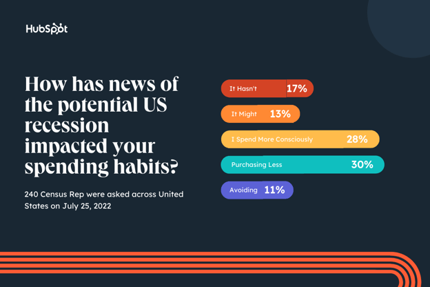
Although a recession is not yet certain, most respondents are purchasing less and spending money more concisely than they were in previous months.
Rising costs of goods and services often cause consumers to become more cautious in frivolous spending, and we’re sure Americans are feeling the effects arise quickly.
As a marketer or brand leader, now might be a good time to consider discounts, sales, deals, or freemium marketing. While people are potentially tightening their wallets, they still might purchase items, services or experiences that are affordable or provide bang for their buck.
How Spending Could Change In a Recession
When thinking about consumer spending behavior, it’s often contingent on outside factors, and news of immense changes in the economy is worth looking into. Below is the distribution of varying consumer decisions and how they’d respond to financial uncertainty or a potential recession in the future.
2. If a recession is declared, how will your home budget change in the first three months of this new financial era?
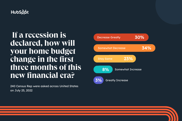
Unsurprisingly, most consumers polled (64%) say they’d decrease or continue to decrease their home budget if a recession was declared.
As of June, inflation hit 9.1%, a historic new peak by the Federal Reserve. But, wages aren’t moving to match these increasingly fast changes. Naturally, the public is already looking for ways to avoid breaking the bank — by reducing their budgets.
If you market B2C brands, or products that would be used specifically in the home, this is important to keep in mind if financial uncertainty continues. While you shouldn’t panic and change your whole marketing strategy over just one small survey, you might want to consider strategies like marketing your most affordable, discounted, or essential products over higher-priced or luxury items.
3. During uncertain financial times, what did you spend the most money on?
We also asked consumers to reflect on their purchasing behavior in previous economic eras with the question, “During uncertain financial times (such as past recessions or during the COVID-19 pandemic), what did you spend the most money on?”
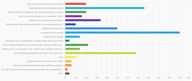
When surveyed, the most prominent goods consumers have bought in uncertain times are typically considered basic necessities.
- Essential Groceries and Food
- Rent, Mortgage, Housing Bills
- Essential Personal Care Products
- Medication and Healthcare
The data reflects a shift to self-preservation and less on shopping for pleasure or taking on risks comes as no surprise. By eliminating costs for leisure or entertainment, people can ensure their families are taken care of before taking their dollar to do things like start a business, take a stroll to the movies, or invest in an unpredictable market.
The good news? This doesn’t necessarily mean there will be a complete pause in retail, entertainment, or other non-essential services. More than 10% still plan to invest in digital or online entertainment, around 7% would still invest in restaurants and bar outings – as well as education and academics, and over 16% would invest in clothing and apparel, So, unlike the pandemic, we probably won’t see entire economies close up completely for months at a time.
How an Upcoming Recession Could Differ from 2008
There are a few key differences between this recession and that of 2008, mainly in the factors that caused it and its projected duration.
According to Morgan Stanley, the possible recession would be largely pandemic-induced and credit-driven.
COVID-related fiscal and monetary stimulus contributed to inflation and drove speculation in financial assets. This is very different from the Great Recession of 2008.
The 2008 recession was due to debt-related excesses built up in housing infrastructure, which took the economy nearly a decade to absorb. By contrast, excess liquidity, not debt, is the most likely catalyst for a recession today.
Due to the difference in causes, experts at IMF predict a new recession could be short and shallow.
Key Takeaways for Businesses in 2022
As marketers, we’re not experts in financial markets and shouldn’t be seen as a source for investment, HR, and legal advice. And, no one ever knows for certain if or when there will be a recession.
It’s also to keep in mind that, while the results above can certainly help you navigate how to market your brand, they’re just a portion of one small survey and a brief look into the eyes of consumers. Before making any major decisions about your marketing department, spend, or business, you absolutely should do your research, analyze multiple data points, and consult experts in your industry.
While your decisions should be based on a deep dive of data, the survey results above do show that marketers should be cautious about how their efforts might need to pivot with changing consumer needs or trends.
Here are a few takeaways to keep in mind.
- A recession today might not be the same as 2008. While consumers likely will tighten budgets and look for products that offer the most value or necessity for their dollar, they might not be in detrimental financial conditions. They could still be persuaded to buy a great product that’s marketed to them in the coming months.
- Market your product’s affordability, value, and/or necessity: As consumers and businesses tighten their budgets, making sales, retaining customers, and persuading people to buy non-essential products will be more difficult. Make sure you are marketing that your product has added value or importance, other than being flashy, trendy, or cool.
- Marketers might want to explore more cost-effective strategies. (Think reducing excess ad spend and focusing on organic social, SEO, or email marketing instead.)
Remember, financial uncertainties – and even recessions – are common. And while it might become more challenging to win customers in the coming months, business and consumers will still keep moving (and making purchases) even as we wait for the cycle to run its course.

9 Common Mistakes Marketers Make on TikTok & How to Avoid Them
Are you finally giving TikTok a shot? If you’re new to the app, there are a few mistakes you’ll want to avoid at all costs.

While some can apply to any social media platform, most are specific to TikTok and its audience.
1. You’re not joining trends.
When I think of TikTok, trending sounds and challenges immediately come to mind. That’s what the platform’s known for, after all.
In fact, many see TikTok as the fun, unfiltered, uninhibited friend to the more uptight, polished Instagram.
With this in mind, succeeding on the platform does mean using special effects, dubbing trending sounds, adding popular music, and taking part in challenges and dances.
Of course, it’s essential that you set brand guardrails to ensure you don’t participate in anything that may hurt your credibility. In addition, not every trend will align with your messaging or brand values – in that case, skip it.
There’s another trend coming right around the corner.
2. You’re not watching TikTok videos.
How can you thrive in an environment you don’t understand? The TikTok space has a very specific energy to it and to step into it, you should take time ingesting first.
Once you get a sense of what’s successful on the platform, you can start playing around with your own content – experimenting with topics and styles to see what your target audience responds to.
However, the work doesn’t stop there. You should always be scrolling on TikTok as long as you’re on the platform. It’s how you:
- Get inspiration for future videos.
- Discover trends.
- Gain insights from competitors.
3. You’re not getting to the point.
There’s nothing worse than watching a video, waiting for the hook, and it never comes.
On TikTok, your video can only be up to three minutes. However, you only have a few seconds to convince viewers to stop scrolling and watch your content.
Here are a few ways to maximize your video:
- Start talking immediately – The first few seconds are key, don’t let them go by without any sound or movement happening.
- Have an engaging caption – This will give viewers a clear understanding of what your video’s about and what they can gain from watching it.
- Use a trending sound – If a sound is going viral, you won’t have to work as hard to maintain your audience’s attention. They already know what to expect and are anticipating what your unique take is.
4. You’re uploading landscape videos.
Similar to Instagram, TikTok is a vertical-first app.
This means that to show up correctly, videos should be 1080 by 1920 pixels. If your video is landscape, its size will be reduced and bordered with thick, black lines that are not aesthetically pleasing.
This not only hurts the quality of your video but also how viewers perceive it.
5. You’re ignoring your comment section.
Social media is all about building a community. That’s no different on TikTok.
Your comment section is currently one of the only ways to engage your audience, as the platform still offers limited community-building features.
As a result, your comment section is where your audience will likely ask questions, share their thoughts on your videos, and tag their friends. Take that opportunity to connect with them, start conversations, and encourage them to take the desired action.
6. You’re using a business account.
If this were any other social platform, not having a business account would be a huge mistake. On TikTok, there are actually some downsides to having a business account – specifically for small businesses.
The main one is that you may not have access to trending music and sounds, which is an important component of increasing your brand reach.
While the business account does offer data insights, the inability to use trending sounds is a major roadblock toward success on the platform.
As a result, small businesses should focus on building and testing on a personal account before transitioning to a business account.
7. Your content is inaccessible.
In 2019, a Verizon study found that most mobile viewers watch videos without sound. Without captions, your videos are missing a key part of the story.
However, the most important reason to have content is to make it accessible to all users, including those who are deaf or hard of hearing.
Placing captions is a simple but effective way to ensure you not only increase viewership but also ensure inclusivity.
8. You’re overselling and undersharing.
This may be a symptom of taking yourself too seriously on a notoriously unserious platform. Or rather of not understanding the platform you’re on.
Regardless of the core reason, posting sale-heavy content is unlikely to draw in your audience on TikTok. This audience is known for wanting relatable content that appeals to them and their daily life.
While the occasional promotion is definitely welcome, making it the core of your content is not the best strategy. Instead, pivot to creating content that highlights the lifestyle of your target user.
Be inspired by their challenges, pain points, and interactions. Then use that to feed your creativity. You’ll find that your content will be more aligned with your audience and will likely perform better.
9. You’re posting sporadically.
If you want to build momentum on any social platform, you have to follow a consistent publishing schedule.
This is key for several reasons:
- When viewers land on your profile, they can explore your content and have a clear idea of what your brand is about.
- The more you post, the more insights you can gain from your viewers.
- A regular publishing schedule can build a strong follower base, as they know what to expect from you and the type of content you’ll share.

Personalized Experiences: Why We Love Them + Brand Examples
According to a 2021 McKinsey report, 76% of consumers get frustrated when they can’t find a personalized experience with a brand.
With personalization becoming more valuable to stand out from the competition, a look at some great examples can serve as inspiration for your own strategy.
Discover brands that are killing it at personalization and get a peek into how impactful it can be.
Why do we prefer personalized experiences?
Twilio’s 2022 State of Personalization report found that 49% of consumers say they will likely become repeat buyers after a personalized shopping experience with a retail brand.
Businesses also report that consumers spend more when they have a personalized experience. In fact, 80% of business leaders surveyed in Twilio’s report say that consumers spend an average of 34% more with a personalized experience.
Conversely, all it takes is one bad experience to deter a customer. One 2021 Zendesk CX report found that 50% of consumers will switch to a competitor following a negative brand interaction.

So, the question is, why is that? What is it about this type of experience that attracts consumers and why is it so fragile? One study may have the answer.
According to a study from the University of Texas, we can attribute our preference for personalized experiences to two key factors: desire for control and information overload. Let’s tackle “desire for control” first.
So, we know that a personalized experience – by its very nature – is in some way different from the status quo. You’re not just getting what everyone else is getting with personalization. Instead, you’re getting something tailored to you. And because of that, it makes you feel more in control.
Even if this sense of control is an illusion, it’s still powerful, and can have a positive effect on your psyche.
Now, let’s turn to the second factor mentioned in the University of Texas study: information overload. According to the study, personalization can help reduce this perception.
For example, when you know that the content being displayed on a website is tailored to you, it provides a more manageable framework for engagement. With personalization, you aren’t presented with thousands of resources to sort through and consume.
Instead, you are presented with exactly the information you were looking for. Hence, you never feel overloaded with information.
Now that you know the psychology behind personalized experiences and how effective they can be, let’s dive into some real-world examples.
Personalized Marketing Experiences
Personalization covers a wide range of strategies leveraged by brands both online and offline. Some brands take an omnichannel approach while others focus their efforts on specific channels.
To get a sense of what’s possible, here are a few examples of personalization:
- Names in email subject lines and email content.
- Location-based push notifications.
- Welcome back messages on a website homepage.
- Cart abandonment notifications.
- CTAs based on buying cycle.
- Product recommendations based on purchase and/or search history.
- Customer loyalty programs.
According to the same McKinsey & Company report referenced earlier, the top five personalization actions consumers want are: easier online and in-store navigation, personalized product or service recs, tailored messages, relevant promotions, and personal milestone celebrations.

Let’s see those strategies applied by brands.
1. Sephora
When it comes to personalization, Sephora is one brand everyone looks to.
Over the years, the beauty retailer continues to optimize its omnichannel personalization strategy, ranking consistently among the top winners in Sailthru’s Retail Personalization Index for the past five years.
At the center of Sephora’s personalization is its mobile app. One of the first things you notice about the app is its ability to turn customer data (collected through quizzes and user behavior) into recommendations using predictive analytics.
The app houses data on in-store purchases, browsing history, purchases, and in-store interactions.
Where the brand really shines is in its ability to combine online and in-store to create a seamless, frictionless experience for shoppers.
The app invites users to find products in-store and book in-person consultations. Once in-store, customers will receive a log-in for the app to create a profile that includes the products they used. This way, they can always find the information they need for a future purchase.
In addition, Sephora has a loyalty program in which it offers exclusive access to products, events, and services based on their tier. At every touchpoint, users can track their loyalty points and get custom recommendations.
2. Netflix
Everyone’s Netflix account looks different when you log in.
That’s because the streaming service has made it a priority to personalize the user experience as they navigate the platform.
The first display of this is the large banner ad that displays when you first land on the app. It’s usually a trailer for a newly added show or movie – the difference is the selection is different for everyone.
For me, that might be the newly released season of Peaky Blinders since I’ve seen all previous seasons. For another, it might be something else.
As you scroll through the app, you’ll see two more personalized sections: “Because you watched” and “Picked for you.”


Through AI and machine learning, Netflix’s algorithm is programmed to suggest shows and movies based on a user’s watching history, including watch time and review.
What you end up with is a programming list with elements from content you’ve enjoyed in the past, making it easier to pick something new. Plus, it keeps you coming back for more.
That’s the beauty of the app – you know that everything is curated just for you based on your personal interests.
3. Amazon
If you currently oversee an ecommerce store, Amazon is a great model to get inspiration from.
This retailer has created an interface that offers relevant recommendations based on browsing and purchasing history.
When you first land on the homepage, you’ll have the option to navigate to the following sections:
- Keep shopping for
- Pick up where you left off
- Buy it again
- You might also like
- Inspired by your wish list
- Recommended for you
Every single one of these sections is personalized to the user based on their behavior on the site.
In addition to inferring information about its customers, Amazon will occasionally survey its users.
For instance, shortly after purchasing a product for my cat, the following question popped up on my homepage: “Do you own a dog or cat?” They explained that this information would be used to offer more personalized recommendations.
A key takeaway here is to fill in gaps in your data by reaching out to your users. This will be especially important if you’re using AI-powered software and need to feed it information to guide its algorithm.
Personalized experiences are the way of the now and the future. The earlier you jump on, the easier it will be to keep up with consumer behavior.
Editor’s Note: This post was originally published in Nov. 2014 and has been updated for comprehensiveness.

21 of the Best Landing Page Design Examples You Need to See in 2022
How do you convince visitors your website is worth their time? There are so many elements that a top-notch landing page needs, and making those elements the “best” they can be often depends on what your landing page goals are.

If you’re looking to up your landing page game, it’s helpful to know what goes into a great one. We’ve compiled a list of landing pages we love so you can see these impressive designs in action and implement their tactics into your own landing pages.
Jump to the type of landing page you want to see below:
Sign-Up Landing Pages
1. Shopify
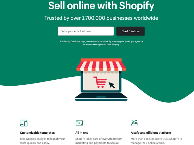
Like many of the other landing pages in this post, Shopify’s trial landing page for sellers keeps it simple. It’s not too text-heavy, but still manages to persuade users by noting a few key points about its top-notch product. Visitors come away knowing that Shopify is an all-in-one platform that is easy to use and trusted by many.
Why This Landing Page Works:
- Clean Interface: The user-oriented headline is just a few words, for example, and the page relies on simple graphics and short paragraphs to communicate the trial’s details and benefits.
- Concise CTA: There are only a few fields you need to fill out before you get started. All of this makes it easier for you to quickly get started selling online with their tool.
What Could Be Improved:
- Emphasize Security: The last column states that the platform is safe, but doesn’t explain why. Instead, it mentions that over a million businesses use it. A few words that speak to site security would improve this section since the number of vendors is already stated at the top of the page. Additionally, it would eliminate friction for visitors with security concerns.
2. Great Jones
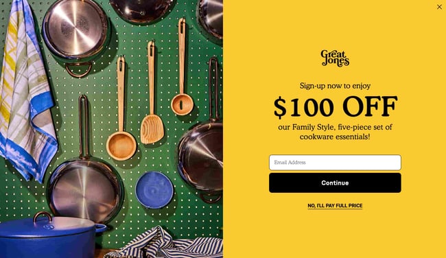
Many of us have been doing a lot more cooking during the pandemic and looking to upgrade our gear. Great Jones offers up a landing page that’s as beautiful as its Dutch Ovens. It’s very aspirational and taps into all of our ideal kitchen dreams.
Why This Landing Page Works:
- Use of Color: Great Jones’ site is colorful just like its cookware. The use of bold colors quickly draws visitors in and makes the cookware stand out.
- Prominent CTA: You can’t miss this giant yellow CTA and bold font $100 Off coupon. Who wouldn’t want $100 off these gorgeous pots?
What Could Be Improved:
- Rollover Descriptions: With so many pans and utensils pictured at once, it would be great if users had the ability to view the name of the item. That way they could find it easier on the site when they’re ready to buy.
3. Muzzle
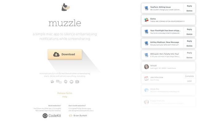
Muzzle, a Mac app that silences on-screen notifications, fully embraces this show don’t tell mentality on their otherwise minimal landing page. Landing pages help users decide whether or not your product or service is actually worth their precious time and energy. What better way to clearly and straightforwardly communicate your value proposition than by confronting visitors with the very problem your app solves?
Why This Landing Page Works:
- Show Rather Than Tell: Visitors to the page are greeted with a rapid-fire onslaught of embarrassing notifications in the upper left of the screen. Not only is the animation hilarious, it also manages to compellingly convey the app’s usefulness without lengthy descriptions.
- Cohesive Visual Experience: Even the text on the page is a muted gray color, mirroring the function of the product.
What Could Be Improved:
- Could Be Difficult to Read: While the light gray text on white background is great at mimicking the product’s function, it may be harder to read for some.
4. DoorDash
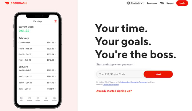
Takeout enthusiasts are no doubt familiar with DoorDash, the app that lets you order food from a variety of restaurants from your phone. Well, instead of customers, this landing page is geared towards recruiting Dashers who make the deliveries.
Why This Landing Page Works:
- Emphasizes Dasher Autonomy: This landing page really plays up that Dashers are independent and free to work when they want.
- Highlights Potential Earnings: While there’s no way to prove these earnings are typical, they are certainly enticing for anyone who wants to make extra cash on the side.
What Could Be Improved:
- Advantage Over Competitors: DoorDash is not the only delivery game in town. They could highlight what sets them apart from a competitor like UberEats.
5. Wise
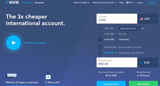
Wise allows you to send or receive money in different currencies and countries, and its landing page separates customers into two categories of either Business or Personal so you’re not distracted by options that don’t apply to you. There’s even a short video to show visitors how the service works before they try it. Since they’re dealing with money, it’s important to get the customer experience right the first time.
Why This Landing Page Works:
- Highlights Safety: The security information is out front and center on this page, helping to ease any hesitancy a potential customer might have and assures them that Wise is a safe service to use to send money and receive .
- Emphasizes Value: In several places on the page, in both text and video, Wise reiterates that it’s less expensive than transferring money through a traditional bank.
What Could Be Improved:
- Interface is a Little Busy: While it’s great that customers have access to a wealth of information about the service, there’s a lot going on. There’s video, menus that appear when you scroll and multiple buttons — all within the top half of the page.
6. Airbnb
 To help convert visitors into hosts, Airbnb offers some enticing personalization: an estimated weekly average earnings projection based on your location and home size. You can enter additional information about your potential accommodations into the fields to get an even more customized estimation.
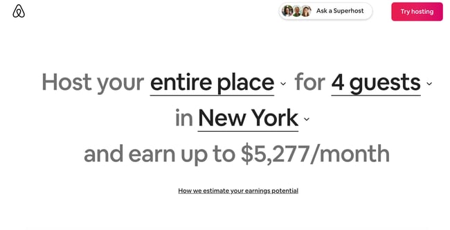 If you visit the page already convinced, the clear call-to-action at the top of the page makes it easy to convert on the spot.
Why This Landing Page Works:
- Personalization: Airbnb shows you right at the start what you could potentially earn based on your area and the size of your home. This is useful for potential new hosts who may still be figuring out how much they should charge and what they can expect to earn.
- Leverages Community: Further down on the page, those curious about hosting have the option to contact a seasoned Superhost to answer any questions they may have.
What Could Be Improved:
- Nothing: The page is clear, concise, reassures potential hosts Airbnb is safe to use, and offers a personalized experience.
7. Wag!
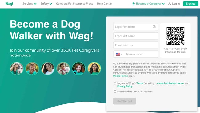
Wag! is a service that connects dog owners with dog walkers and sitters. This page gets right to the point with a large font encouraging prospects to join, and puts the sign-up form prominently on the right half of the page. The green background color makes the white font and other elements on the page pop. The addition of a QR code on the form is also a nice touch, enabling visitors to scan it, quickly download the app, and sign-up.
Why This Landing Page Works:
- Efficient Form: Leaving the form field open on the page means visitors don’t even have to click on a CTA to access it. The QR code further expedites the process.
- Emphasizes Credibility: Including caretaker photos and that more than 351,000 caretakers currently use the service nationwide makes Wag more trustworthy.
What Could Be Improved:
- It’s Not Compelling: Unlike DoorDash mentioned earlier, Wag! makes no mention of why people should join. What are the perks? Are the hours flexible?
8. Wistia
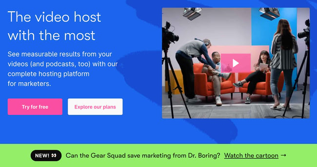
Right off the bat, you notice the blue background with the pop of pink in the form of a “Try for free” button. The page gets right into the action with a video showcasing all the cool content you can create. If you’re having doubts, you can always scroll below to read testimonials from some of Wistia’s 375,000 happy customers.
Why This Landing Page Works:
- Ease of Use: The form itself allows users to quickly fill it out by linking to their Google account. Doing so enables the autofill feature, which cuts down on friction for the user.
- Capitalizes on Visuals: As a video host, Wista does a great job of showcasing its capabilities using a variety of mediums. There’s colorful graphics, videos and even a link to marketing focused cartoons.
What Could Be Improved:
- Include an FAQ: Testimonials are great, but sometimes customers have a few concerns that could be answered quickly with an FAQ section. That way they can decide whether or not to sign up without having to leave the page to search for answers.
9. Webflow
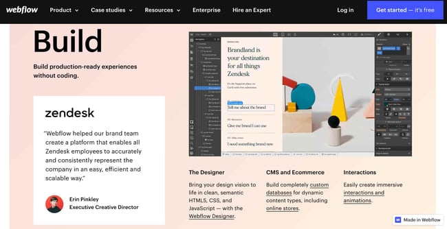 Webflow, a design tool for web developers, packs a lot of information into just one GIF. As with Muzzle, Webflow also gets right to the point and demonstrates what their tool can do, rather than just talking about it. The animated GIF is visible in the same frame on the website, so users can see how the product works and sign up without scrolling.
Why This Landing Page Works:
- Show Rather Than Tell: Being able to view Webflow’s tool in action gives potential customers a clear idea of not only what it does, but how their user experience will be.
- Removes Risk: In several places on the landing page, visitors are reminded that the service is free. There’s no trial to sign up for. They can build their site for free and decide whether or not to sign up for a plan when they’re ready to launch.
What Could Be Improved:
- Nothing: This landing page is the perfect balance of information, usability, and visuals.
10. Talkspace
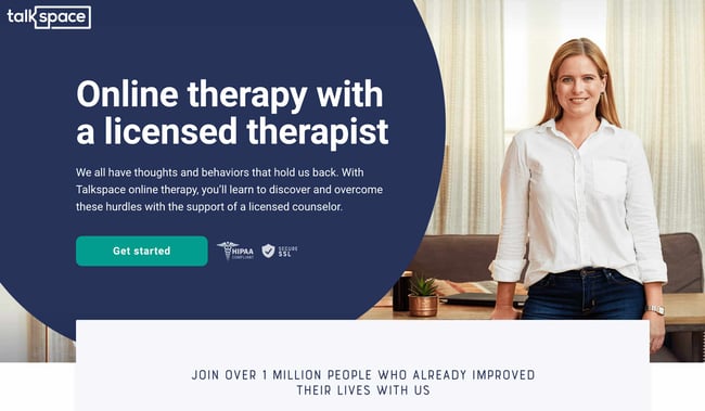
Talkspace, an online therapy service, really focuses on trustworthiness with this landing page. All of the information on this page emphasizes that customers will have access to licensed therapists, and drives home that the service is secure and confidential. It’s a great way to reassure those who may be hesitant to participate. The use of shapes is also a clever idea. Pages are often filled with squares and boxes, so putting the CTA inside a large circle immediately draws the viewer in. Overall, the layout is clean, inviting, and informative.
Why This Landing Page Works:
- Builds Trust: The focus on customer security works in their favor, especially noting that they are HIPPA compliant.
- Provides Value: In addition to providing details about how Talkspace works, this page also provides several mental health resources and articles.
What Could Be Improved:
Nothing: This page has a great user interface and serves as a great starting point for mental health resources.
Ebook Landing Pages
11. Nauto
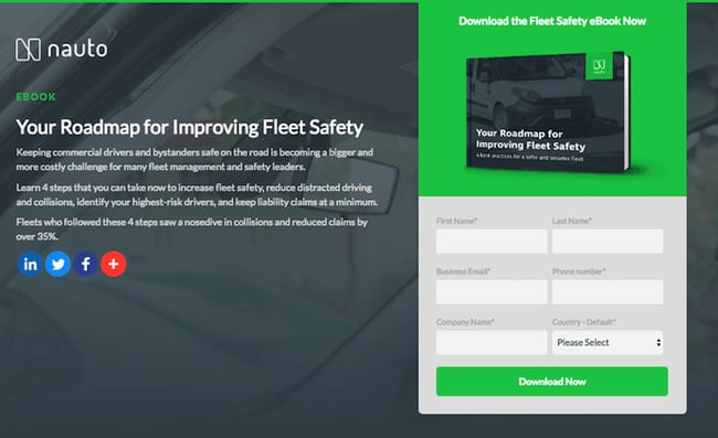
Nauto, a data platform for self-driving cars, helps make autonomous driving safer for companies who manage fleets of self-driving vehicles. Naturally, its customers would need all kinds of information to sell them on this platform. Nauto has it, packaged into a super-simple ebook whose landing page gives you both a brief contact form and some preview statistics to prove why this resource is so important.
At the top of the page, shown above, a warm photo of a car’s exterior r hugs the lead-capture form. The green “Download Now” button might’ve even been on purpose (on the road, green means go, after all).
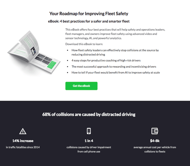
Scroll down, and you’ll see another “Get the eBook” CTA to remind users what’s waiting for them. You’ll also see three jarring statistics about car accidents to entice users to learn more. Check it out below.
Why This Landing Page Works:
- Simplicity: There’s no distractions on this landing page, which is perfect given the company’s focus on safe, self-driving vehicles.
- Great Use of Comparison: Further down the page, Nauto offers up side by side footage of a distracted driver vs. a self-driving vehicle. It’s an excellent way to drive the point home that A.I. is a safer bet.
What Could Be Improved:
- Graphics: The warm photo at the top is really difficult to see. Slightly more definition would have helped visitors easily recognize the image as cars.
12. Industrial Strength Marketing
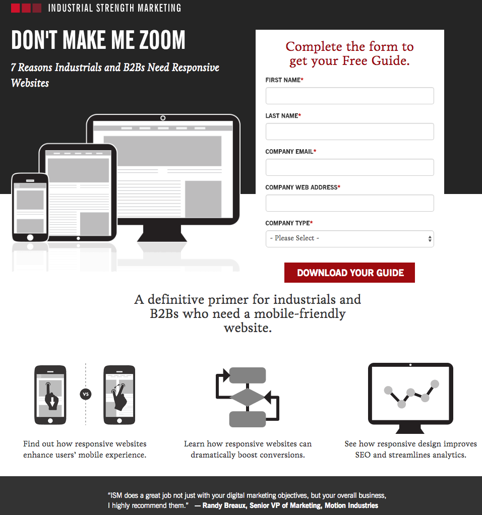
Right off the bat, this landing page pulls me in with a compelling, punchy header: “Don’t Make Me Zoom.” It directly speaks to a common experience most of us have had when we’re browsing on our phones or tablets — and it’s a little sassy, too.
But that’s not the only thing keeping me interested in this landing page. Notice how the color red is strategically placed: It’s right at the top and bottom of the form, drawing you even closer to the conversion event.
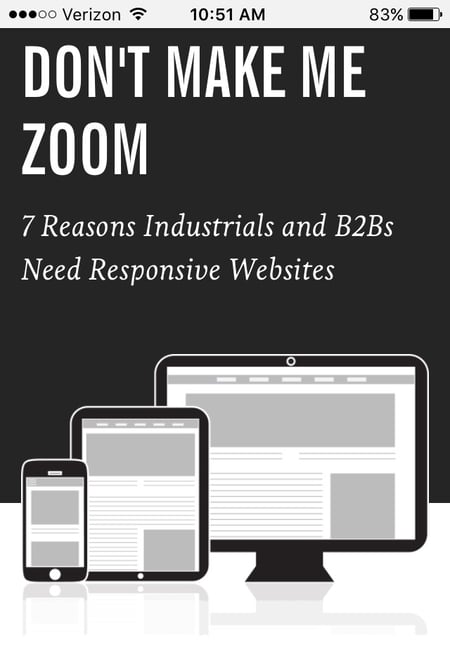
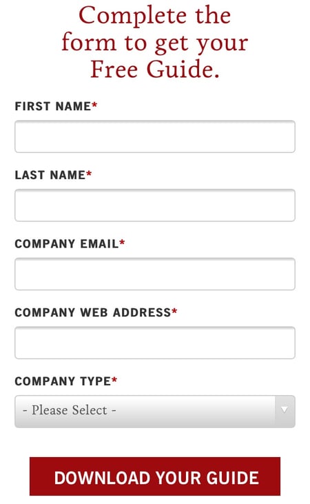
Plus, this design is meta to boot: It looks and works great on mobile, too (pictured above) Keep in mind that a lot of visitors will be accessing your landing pages on their smartphones or tablets, and if the design of your website doesn’t work well for them, they might give up and leave your page.
The folks at Industrial Strength Marketing made the fonts and form field big enough so that visitors don’t have to pinch-to-zoom to read and interact with the content, for example.
Why This Landing Page Works:
- Voice: The language is punchy and relatable, quickly drawing the reader in.
- Minimalist: The black and white color scheme with just a few pops of red really make the sign up sheet stand out. Additionally the minimalist design works beautifully on mobile and desktop, no pinching required.
What Could Be Improved:
Nothing: Both the mobile and desktop versions illustrate the perfect execution of a
13. Inbound Emotion
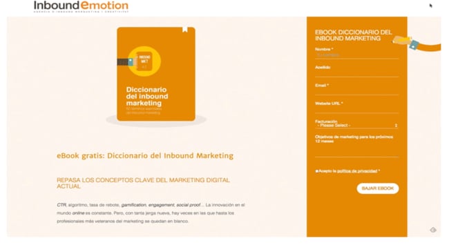
Even if you don’t speak Spanish, you can still appreciate the conversion capabilities of this HubSpot partner site. My favorite feature of the page? The form stays in a fixed, prominent position as you scroll through the site. I also love the simple layout and warm colors.
Why This Landing Page Works:
- Fixed Form: Having access to the form while scrolling provides a better user experience. No need to scroll back up to the top of the page to find it.
- Simple Interface: The layout is simple, but effective. The use of only two shades of orange give a monochrome feel and keeps the focus on the benefits of the ebook.
What Could Be Improved:
- Make the Form Brief: There were six items to fill out, not including the check boxes option at the end. Longer forms could be a turnoff for some visitors.
14. IMPACT Branding & Design
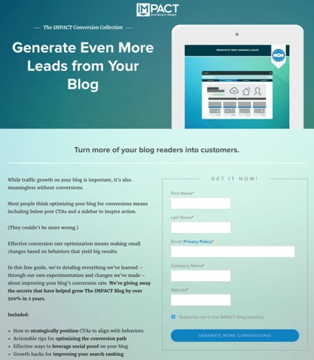
Full disclosure: IMPACT is a HubSpot partner — but that’s not why they’re included here. IMPACT’s landing pages have long been a source of design inspiration. I love the simple layout of the page, from the large headline copy and detailed featured image, to the outline that surrounds the form, to the colors and fonts that are very pleasing to the eye.
The free guide IMPACT is offering for download here also doesn’t emphasize the download itself in the blue button that allows you to submit your filled-out form. Rather, IMPACT is inviting you to “generate more conversions” — putting the focus on what you stand to gain as a result of reading the guide.
Why This Landing Page Works:
- Clever Messaging: You’re not downloading an ebook, you’re learning how to “generate more conversations.” This rephrasing is far more enticing than simply putting a regular download button.
- Simple Use of Color and Fonts: The blue tones work really well on this landing page, giving it variety while keeping the look cohesive. Since there’s lots of text on the page, a simple font is perfect.
What Could Be Improved:
- Nothing: This page encourages downloads in a clever way using a simple layout and colors.
Landing Pages to Learn More
15. Unbounce
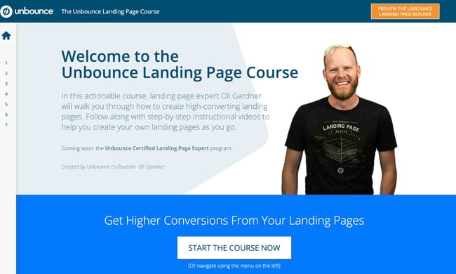
It’s no surprise Unbounce made this list —they’ve actually written the book on creating high-converting landing pages. Although there are lots of amazing things about this landing page, the two that I absolutely love are: the multiple ways to access the course, and additional industry-specific report offerings. Unbounce is really skilled at providing visitors the information they need, but also what they didn’t know they needed until they landed on the site.
Why This Landing Page Works:
- Gives Visitors Options: When it comes to accessing the course, users can either click the main button above the upper half of the page, or if they’ve been scrolling, click on the course from the sidebar on the left. Eliminating the need to scroll back up to the top of the page.
- Sometimes More is More: In addition to the course, Unbounce provides visitors with industry-specific reports and answers to other landing page-related topics. Providing even more useful information sets Unbounce up as a trusted authority in their field.
What Could Be Improved:
- Descriptions: The course offers several modules and it would be helpful if some offered a brief description. The sidebar menu offers a course list, but a short sentence summarizing what visitors can expect to learn would be helpful.
16. Bills.com
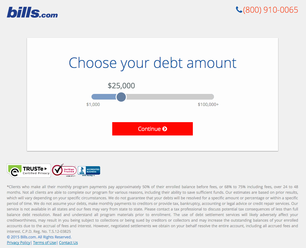
Often, people think landing pages are static pages on your website. But with the right tools, you can make them interactive and personalized.
Take the example above from Bills.com. To see if you’d benefit from their consultation, you answer three questions before you are shown a form.
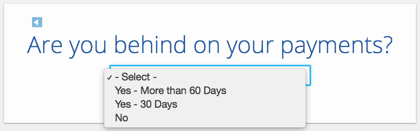
Then, you answer two more questions, like the one below:
And here’s the final landing page form where you fill out your information:
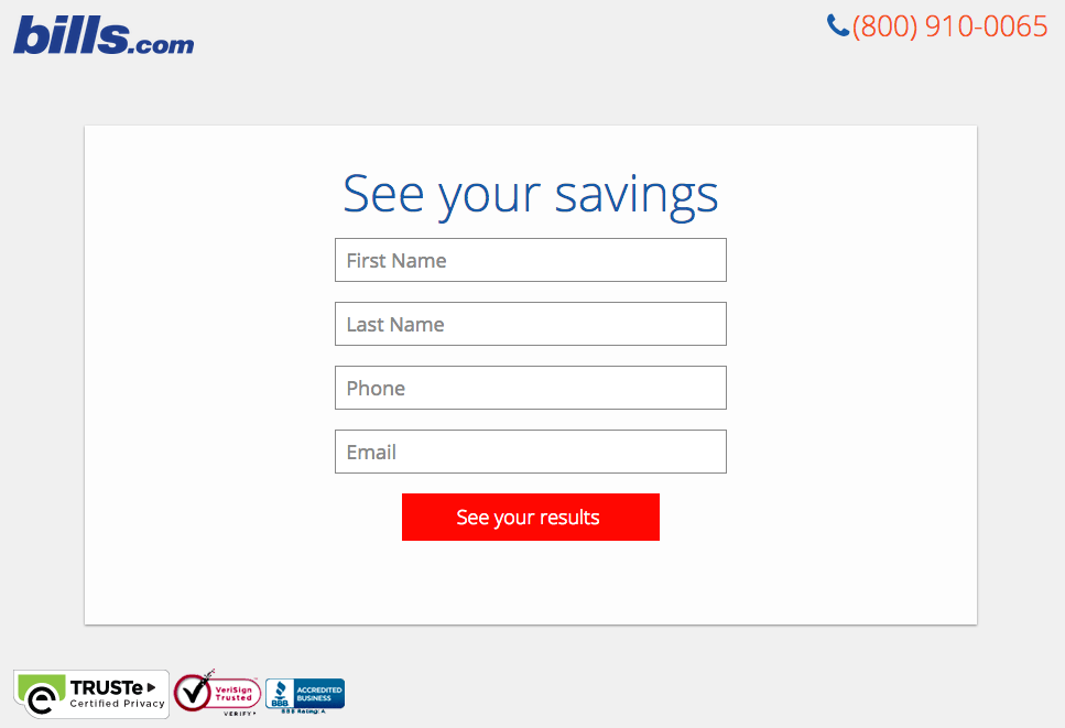
I’m not sure how the algorithm works (or if there’s one at all), but while I was filling it out, I had some anxiety about not qualifying. Once I found out I did, I was excited to fill out the form, which I’m sure most people who are in debt and using this tool are. By making this offer seem more exclusive before the form appeared on the landing page, I’d bet that Bills.com increased conversions pretty significantly.
Why This Landing Page Works:
- Exclusivity: Everyone likes to feel special, which is why exclusivity works so well. The page gives the impression that the offer isn’t given to just anyone, you have to qualify first.
- Interactivity: Anytime you can get users to interact with the page, even if it’s something as simple as using a form with a sliding bar question.
What Could Be Improved:
- More Color: While the site is geared to not so fun topics like bills and debt, it doesn’t mean it has to be boring. The gray leaves much to be desired.
17. Zillow
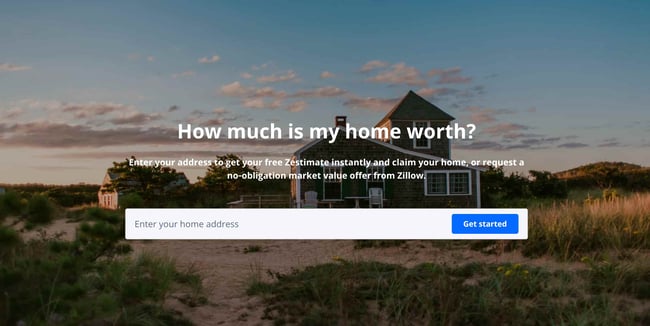
Zillow did something very similar to Bills.com with their landing page. It starts with a simple form asking for “your home address” ( sounds creepy, but don’t worry. This form field is set on top of a hero image featuring a quaint home at dusk followed by a handy FAQ section.
Of course, the address itself won’t be enough to get a true appraisal value of a home. It just denotes the home’s neighborhood. It’s a bit like playing The Price is Right. You can guess how much homes in the area are worth and then type in an address to see how close you got. If you want to learn more info about a property, Zillow then prompts users to sign-up to continue.
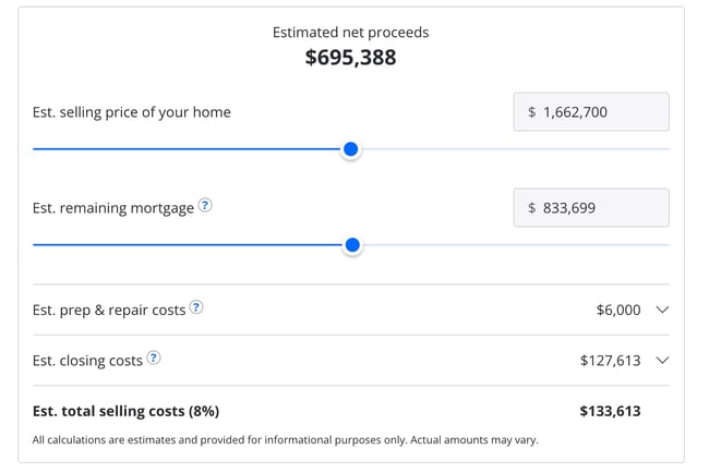 Once you hand over your email, you’ll have access to more data like comparable homes in the area, mortgage tools, and the estimated net profits should you decide to sell.
Why This Landing Page Works:
- Games are Fun: Anytime you can make filling out a form feel like a game, it’s a win.
- Establishes Authority on the Topic: Zillow has access to so much housing and neighborhood data, it’s no wonder they are one of the top home search sites in the nation.
What Could Be Improved:
- Nothing: The Zestimate page is simple, but effective. Those with concerns about what a Zestimate is and how it’s calculated have easy access to the homebuying FAQ on the second half of the page.
18. Landbot
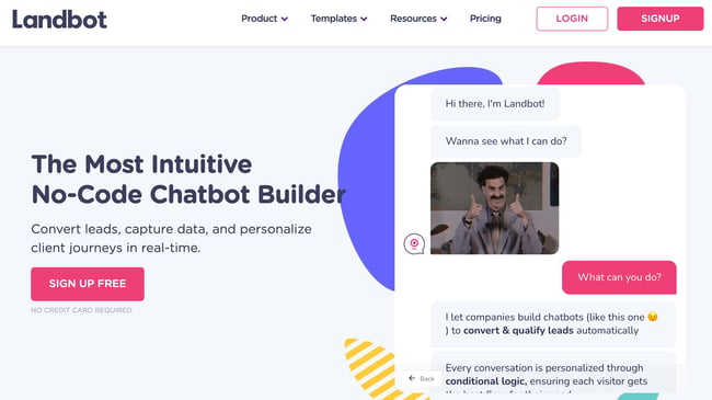
Landbot, a service that creates chatbot-based landing pages, puts their own product front and center on their chat-fueled landing page. Visitors are greeted by a friendly bot —complete with emojis and GIFs —who encourages them to provide information in a conversational format instead of via a traditional form.
Why This Landing Page Works:
- It’s Fun: From the bright colors to the GIFs, this page keeps visitors engaged and entertained.
- Show, Not Tell: By having the chatbot right on the page, doing its thing, potential customers can see exactly what they’re getting. The whole experience simulates what it’s like to use Landbot’s product.
What Could Be Improved:
- Nothing: Landbot’s use of a live demo, testimonials, highlighted integration features and detailed breakdown of how the product works leaves new customers ready to sign up at first glance.
19. Webprofits
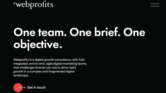
Like Industrial Strength Marketing mentioned earlier, Webprofits also makes great use of a predominantly black, white and red color scheme. The result is a clean layout that makes great use of the pops of color on the page. It’s a testament to the organization’s expertise in digital marketing and UX design.
The rollover description feature throughout the “What We Do” section, while black and white, uses movement to draw the reader’s attention to the content. Each section changes color and rolls down like a shade to reveal more in depth features.
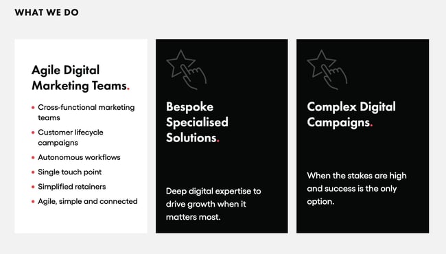
They also make it easy for you to figure out what Webprofits actually does. The rest of the page offers detailed information about what you’ll get when you give over your information. Plus, it includes strategic CTAs throughout, like “Get in Touch”
Why This Landing Page Works:
- Informative, But Not Overwhelming: There’s a lot of information and text on this page, but the use of well-placed graphics and videos help break things up.
- Multiple CTAs: Placing the same CTA throughout the page makes it so visitors don’t have to scroll all the way to the top to “Get in Touch.”
What Could Be Improved:
- Nothing: Webprofit makes great use of the long landing page format, packing in all the pertinent information visitors would need in one place with a visually appealing experience.
20. Native Poppy
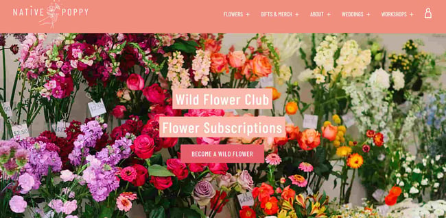
Sometimes, you’ve just got to stop and admire a landing page for being beautiful. Using high-resolution photography and lots of white space, Native Poppy’s landing page is a pleasure to look at.
Aside from its beauty, the page has some great elements: a clear and delightfully pink CTA, an informative “How It Works” section, plus an FAQ at the bottom. Best of all, it plays with language, ditching the phrase “become a subscriber” for “become a wild flower.” I don’t know about you, but I’d much rather be a “wild flower” over a subscriber any day.
Why This Landing Page Works:
- Captures Brand Voice: The layout of Wild Poppy mirrors the whimsical vibe of the brand. From the photos, font choice, and “wild flower” subscription, all the messaging works in harmony.
- Persuasive: By highlighting all the perks and discounts of being part of the subscription program, it entices customers to join.
What Could Be Improved:
- Form Visibility: While there are multiple CTAs, it would have been nice to have the form fields on the page for faster sign-up, or as a pop up after clicking, instead of having to click the CTA and then be taken to another series of prompts.
21. Conversion Lab
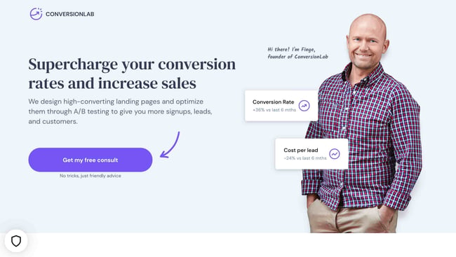
While I wouldn’t typically include an example of a homepage with a form on it in a post about landing pages, this website is special. The homepage is the entire website — the navigation links just take you to the information below.
When you click “Get My Free Consult,” the entire page darkens to highlight the form. See what it looks like before you click in the photo above.
And, when you click that CTA, check out how the form appears:
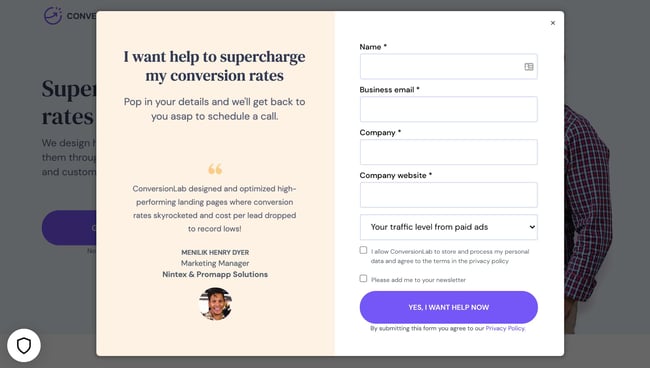
It’s a similar function when clicking on any of the headings on the page. Instead of taking you to a different page, it simply jumps to the corresponding section on the homepage.
I love how you don’t have to leave the page to fill out the form, or view any of the features, creating a seamless user experience.
Why This Landing Page Works:
- Creative: Having a homepage that also functions as various landing pages makes Conversion Lab unique. Best of all, it still provides a pleasant user experience.
- Organized Layout: Despite having the homepage and landing pages as one, the page doesn’t feel cluttered or busy at all.
What Could Be Improved:
- Form Placement: It would be nice if the form maybe opened up on one side so visitors could still read the content on the rest of the page.
Landing Page Ideas
A well-optimized landing page can transform prospects into leads by gathering information that can help you better understand, market to, and delight visitors. Since landing pages are crucial for conversions, it’s important to make sure they’re well planned, designed, and executed.
Here are a few things to keep in mind when creating landing pages:
- Appealing aesthetics: Giving your landing page color and a clean UI can only help. Visitors will want to learn more about your products and see evidence of the value you’re offering. Take a look at #18 on our list — Landbot for a great example of a stunning web page.
- Less is more: Let the offer or images do most of the talking, but be sure to include any and all descriptive headlines and supporting text to make your landing page clear and compelling. This goes for just about all the components on the page: try white space, simple copy, and shorter forms.
- Keep visitors on the page: By removing the main navigation or any distracting backlinks, it’s less likely there will be any lead generation friction that could cause visitors to abandon your page.
- Social Sharing: A simple way of getting visitors to engage with your landing page is including social media sharing buttons so that they can spread your content to their social followings. After all, customers are the center of your marketing flywheel.
- A/B testing: Landing pages are important to get right, and since consumer psychology can sometimes be surprising, it’s always better to experiment with different versions of your pages to see which has the highest conversion rate (CVR). Test the positioning of the offer, kinds of CTAs, or even the color scheme.
- Call-To-Action: The CTA is where the meat of the landing page is, or the tipping point where prospects become contacts. CTAs could ask visitors to subscribe, download, fill out a form, share on social media, and more — but, overall, CTAs are necessary for getting your audiences more engaged with your offering. To generate leads, CTAs should be bold and eye-catching, but most importantly, they need to effectively communicate value.
Creating Landing Pages That Shine
Landing pages aid in growing your customer base and increasing conversions. Create a page that delights customers with a user interface so great, they continue to come back for more.
This article was originally published April 2, 2020 and has been updated for comprehensiveness.

9 Marketing Automation Best Practices
As a marketer, you know that time is valuable. Therefore, you likely know marketing automation helps save time by relieving you of tedious analytical and marketing tasks. But in order to reap its benefits, you must follow marketing automation best practices.
Fortunately, I put together nine marketing automation best practices that will keep your company on track to meet its marketing goals, generate leads, and increase revenue.
Marketing Automation Best Practices
Keep marketing analysis and lead scoring simple.
Effectively capture leads by limiting distractions and avoiding lengthy processes.
Make sure your marketing automation system integrates well with your CRM.

1. Keep marketing analysis and lead scoring simple.
Having a lead scoring system that’s too complicated and extensive, you have a problem. You don’t want to rely on a team of interns just to pull all of the information together in Excel.
Keep everything simple so that you can create a clear foundation for performance expectations — one that can be adjusted based on feedback later down the line. Having a simple and streamlined process is key to optimizing marketing campaigns as close to real time as possible.
If you are running your marketing analysis like a big ship that takes forever to turn, then you’re going to miss out on incremental opportunities.
2. Map your lead flow.
Mapping your lead flow is the key to creating a simple process that doesn’t require a large team to manage.. Have a clear path to converting website visitors to leads that will boost your company’s revenue. Create a flow that is simple, includes all the right trigger points that affect lead routing, and is used by everyone who visits your website.
3. Know the buyer’s journey.
For your marketing automation tools to be effective, you first have to know your target audience’s buyer’s journey. What kind of questions are they asking? What online avenues are they using in the awareness, consideration, and decision stages? And how can you deliver effective marketing at every stage? Once you answer these questions, you’ll be able to map out a workflow that delights at every stage.
4. Create buyer personas.
Create buyer personas to ensure you’re reaching your target audience. Buyer personas are imaginary profiles of your typical customer base.
Buyer personas help you analyze the demographics, challenges, needs, and interests of your customers. These personas will help you create marketing campaigns that deliver value to the correct audience and convert leads into customers.
5. Create engaging content.
Consumers are being bombarded with information from countless brands and companies every day — so you have to create engaging content that cuts through the noise. This could be in the form of a blog, polls, quizzes, webinars, interactive videos, live streams, social media posts, and more.
Engaging content, such as videos, have proven to be a successful strategy for many marketers. In fact, a recent survey by Wyzowl found that 81% of marketers say video has helped them to increase sales.
6. Consider email reputability.
The last place you want your automated marketing emails to end up is the spam folder. To ensure your emails are reaching your consumers’ inbox, know your audience (Remember those buyer personas we talked about?).
Create compelling and valuable content that your audience would want to keep receiving from you. We recently ran a survey regarding email marketing benchmarks and of the U.S.-based marketers we surveyed, 40.2% said providing through email their marketing emails was most effective in reaching their email marketing goals.
 Also, provide clear subscription management options to your leads, and clean your database so that only your opted-in and non-spam emails are used.
7. Effectively capture leads by limiting distractions and avoiding lengthy processes.
You want to delight your customers every step of the way, so make sure to have compelling landing pages with easy-to-fill out forms that make visitors want to provide their information. In our 2021 State of Marketing Report, we found email collection forms were the most successful at converting viewers, with a 15% conversion rate in 2020.
Don’t assume every lead wants to make a purchase immediately. Instead, provide avenues if they want to be contacted about a product or service. And remember, distractions can stop conversions — so only focus on one call-to-action, such as a registration to an event or the opportunity to download an eBook.
8. Make sure your marketing automation system integrates well with your CRM.
A marketing automation system is supposed to make marketing easier, and a CRM is supposed to make managing leads and customers easier. If they can’t talk to each other, you’ll wind up making a lot more work for yourself. Before deciding on marketing automation and CRM platforms, make sure they can integrate with one another — and make sure you have the budget to make it happen. You will thank me later for this one.
9. Build a non-linear nurture.
Nurture programs must be dynamic to bring value to individuals coming in contact with your business. Every visitor to your business’ website may be at a different stage of their buyer journey, so make sure your lead nurtures aren’t linear.
For example, if a lead is already looking at pricing information, they should be routed immediately to where that information is available. If a lead tuned in to a webinar, they should receive a follow-up email with additional information.
Marketing automation is meant to make marketing to your target audience easier and less time consuming. To get the best results, follow the above marketing best practices. If your marketing automation tactics are missing some key points, you now have the information you need to improve your system.

10 Common Copywriting Templates to Use in Marketing
Ask any marketer responsible for copywriting about their writing process. You’ll quickly find out there’s no specific process to follow and little to no copywriting templates to guide you.
Additionally, copywriting varies depending on your audience, purpose, and format. Copywriting for an Instagram post, for instance, is entirely different from copywriting for a blog post.

At HubSpot, we know the struggle. Copywriting demands creativity, inspiration, and hard work, and it can be difficult to find all three, day-in and day-out.
To help with writer’s block, we’ve put together a list of copywriting templates you might use for any of your marketing efforts, including blogging, social media, email marketing, and even internal memos.
Let’s dive in.
10 Copywriting Templates to Use in Marketing
1. Email Marketing
First, you’ll need to determine what type of email you’re writing to ensure you’re speaking to the right audience. Coordinate with your team to see if this is a one-off marketing email like a monthly newsletter or if you’re being asked to write for a series of emails, like a nurturing campaign.
As you’re drafting your copy, consider how your email will encourage the reader to take the desired action, like clicking a link to purchase or scheduling a call with a sales rep to learn more about your services.
You may not be aiming for the reader to take a specific action and instead just want to send a general update, like a company announcement. You’ll want the copy to easily and clearly communicate the core of your message to your reader.
Here’s an example of a template you might use to welcome new subscribers to your newsletter:
Hi [First Name],
Thank you for signing up for [include what someone just signed up for, like a blog subscription, newsletter subscription, company services, etc.]
At [Company Name], we’re working to [list a few of your company’s core goals or include your mission statement]. We highly encourage you to check out [suggest a few recommendations so the reader can continue learning more about your company].
If you ever have any questions, please feel free to contact us at [Contact information].
Thank you,
[Company Name, or individual sender’s name]
Featured Resource: 15 Email Templates for Marketing and Sales
We’ve considered the types of emails marketers and salespeople are likely to send repeatedly and crafted templates that can help eliminate that time.
2. Blogging
Blogs give copywriters a chance to dive deeper into topics in a way that isn’t captured through emails, ads, or social media posts. There are so many different types of blogs you might write, so be sure to develop your blog strategy to keep a close eye on what types of blog posts and topics perform best for your business.
Since blogs tend to be longer than other types of copy, you want to make sure you’re keeping your audience engaged. Consider what your readers may want from your post, and focus on answering the topic-related questions they’ll most likely ask.
This blog post template is an example of a product or service review.
Title
Introduction
[Introduce the product/service you’re reviewing and relevant background information about the company and the product/service. Clearly state what the reader will gain from reading the post.]
Subheading
[Write a brief using keywords. Use headings throughout the post to break up the key sections of your post]
Body
[A few paragraphs will cover the bulk of the review here. If there are multiple features to the product/service, section them separately as you review. Be detailed and answer the questions you think your audience may have about the product or service.]
- How much did it cost?
- What is the functionality?
- How was the customer service?
- Are you recommending the product/service?
- Who would benefit from using the product/service?
Conclusion
[Wrap up your post with final thoughts and a CTA if you want readers to check out the product/service.]
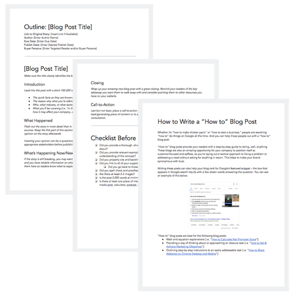
Featured Resource: 6 Free Blog Post Templates
We’ve put together six essential blog post templates every marketer needs — from how-to posts to listicles.
3. Social Media
Writing copy for social media depends on the social platform. If you’re writing for Twitter, you have a strict character count, so the copy has to be brief but still appealing enough to get the attention of someone scrolling.
Similar to Twitter, Instagram is known for catchy captions. Character count isn’t as much of a concern on Instagram. However, since the social media powerhouse is visually oriented, you’ll want to write a caption that echoes the image or video in a post.
Overall, the primary goal when copywriting for social media is to thoroughly understand the key differences among the social media platforms. Here’s an example of an outreach template you could use for another major social media platform, LinkedIn.
Hi [First Name
], I just finished [reading/watching your post, reading/watching a post you shared, reading a comment you left on a post, etc.]. I found it interesting that [include a few brief vital points you found interesting, or anything that you feel showcases some common ground]. I also noticed that we share a few mutual connections, like [list mutual connections].
Let’s connect and keep sharing great content with each other!
Featured Resource: Social Media Templates
4. Website Copy
Copywriting for websites is about staying true to the business’ overall brand while making it easy for users to navigate the site. The copy that makes it to a site plays a huge role in setting the tone for a brand’s voice. When writing website copy, then, it’s critical you collaborate with key decision-makers for feedback to ensure your copy is on-brand.
There are so many different website components, so start with clarifying what type of page you’re writing for on the site. This may include, but is not limited to, the following:
- Home page
- About Us page
- Contact page
- Product or Service category page(s)
- FAQ page
- Blog page
Let’s take a look at one of the most necessary pages to include on your site, the About Us page:
[Company name] was founded in [Year] by [Founder’s name]. When [Founder’s name] began building [Company name] [he/she/they was/were] determined to [help, build, create] a company that offers [include the solution that the company problem solves for].
[Include as much or as little about the founders of your company. Sharing personable stories about how your company was founded is a great way to connect with readers and provide more insight into the people behind your brand.]
[Company name] helps people with [identified pain points of your buyer persona(s)]. To give our customers the best [product or service] we focus on [value proposition #1], [value proposition #2], and [value proposition #3].
[Company name] takes pride in working with people like you to provide quality [product/s or service/s] and exceptional customer service. We look forward to having you as a valued customer.
[Closing Signature]
Featured Resource: About Us Pages Guide + Lookbook
Get inspired by these awesome About Us page examples and learn how to make yours great, too.
5. Ebooks
Ebooks are one of the most common types of content copywriters can create. Since they are meant to contain extensive information, it’s best to take the drafting process one section at a time.
Here’s an example of a general ebook template.
Cover/Title Page
[In addition to including the title of your ebook, you’ll also include your cover image. If this is a company resource, also add your company’s logo. If it’s a resource coming directly from an individual contributor, include the author’s name.]
Table of Contents
[The table of contents should clearly include a list of all the chapters or sections in the ebook, with the corresponding page numbers.]
Introduction
[Introduce the ebook topic with relevant background information and clearly state what the reader will gain from reading the ebook.]
Chapter/Section Pages
[This is the best part of your ebook because it’s where the core of your information will be for your readers. Break the writing into digestible paragraphs for better readability, and include relevant images to help break up the copy and fill excessive white space.]
Conclusion Page
[This is the closing of your ebook. The goal of your conclusion should emphasize what the reader has gained and any actionable steps they can use to put their new knowledge to good use.]
Optional pages may include:
About the Author Page
[This page helps readers learn more about the author. The background information can vary depending on the author’s level of comfort, but overall the tone should be personable. This is also an opportunity to speak to the author’s credibility of the ebook topic.]
Interactive Pages
[Interactive pages can help keep your readers engaged. These pages may include quizzes, worksheets, checklists, etc. Including an interactive page in each chapter or section can help your reader feel they’re actively learning as they read.]
Resources Page
[You’ve most likely referenced tons of sources to help you get the final version of your ebook. Include the most important resources on this page for readers that may want to do further exploration on their own.]
Featured Resource: Ebook Templates
Let us take care of the design for you. We’ve created six free ebook design templates — available for PowerPoint, Google Slides, and InDesign — for a total of 18 templates.
6. Crisis Communications
If you’ve been tasked with writing for a crisis, you’ll need to be especially attentive, since this type of content usually addresses serious or sensitive matters.
Developing clear messaging for crisis communications requires a special level of detail. You’ll want to convey an empathetic tone that appropriately addresses the crisis. It’s a good idea to collaborate with team members to ensure the overall message is properly aligned with your company’s brand.
You may end up creating several pieces of content for a crisis, including blog posts, social media posts, emails, an announcement from the CEO, a newsletter, etc. The following template is an overview of what to address:
An Overview of the Crisis
[Clearly identify the crisis and share detailed background information on what has occurred. If you’re addressing something that includes individuals, use discretion. Check with your company’s legal team to ensure all documents follow proper protocol.]
Plan of Action and Timeline
[Create a plan that includes a timeline of how the events have developed and how your team will be addressing the issue(s) at hand. Consider the types of questions media outlets could ask and write prepared statements the company, leadership, and general team members can use to respond.]
Contact Information
[Share the best contact information people can use to learn more about what’s happening and ask any additional questions. This could be your company’s PR team or agency or an internal customer service or support team.]
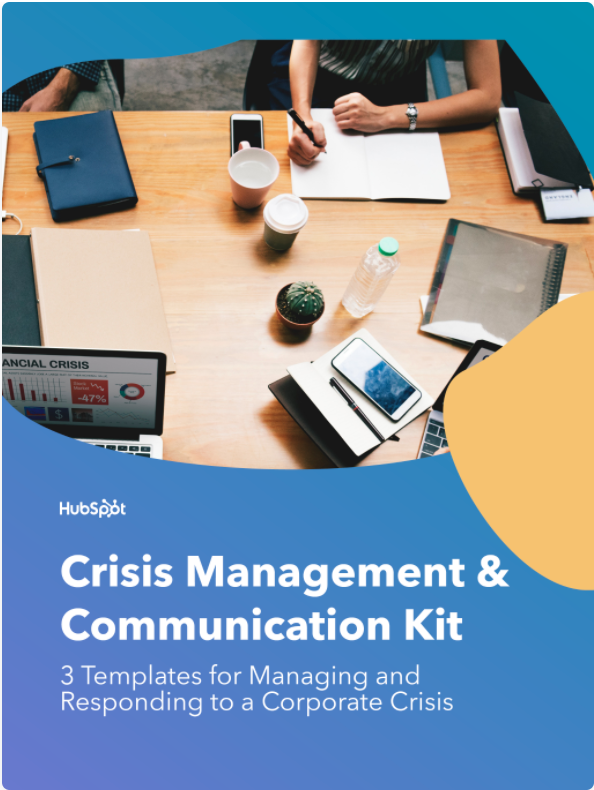
Featured Resource: Crisis Management and Communication Kit
The templates in this crisis communication kit will help your management team prepare for how to handle a crisis and respond to the media during a difficult time. Having clear lanes allows your team to operate effectively during times of crisis.
7. Customer Communications
Customer service is an essential part of any business. Writing to better understand and communicate with your customers is necessary to foster stronger connections. Creating buyer personas is one of the best ways to better understand your customers. Buyer personas are semi-fictional representations of your ideal customers based on data and research.
Use this template outline to begin developing your buyer personas.
Background
[Create a background for your persona that best exemplifies the types of customers you have. This can include their job title, career path, and family life.]
Demographics
[Include age, gender, salary range, location, and anything else that best represents your customer persona.]
Identifiers
[Identifiers can include your persona’s general demeanor or communication preferences. This type of information is vital because it helps businesses build a more curated approach for their customers.]
Featured Resource: 17 Templates to Help You Put the Customer First
To help you foster better relationships with delighted customers, we put together this collection of templates — buyer persona templates, email templates, and survey templates — that put the customer first.
8. Case Studies
Potential customers often turn to case studies when researching a product or service they’re interested in buying. Case studies provide evidence of how a product or service has helped customers by identifying a pain point and providing a solution. They’re great resources for copywriters to show off their interview skills and boast strong statistics.
The key components of a case study are listed in the following template:
Executive Summary
[Provide a mini headline to grab your reader’s attention. Then, underneath this headline, write two to four sentences (under 50 words) summarizing the whole story, making sure to include the most relevant points of the case study.]
About the Client
[Share a brief description of the company you’re featuring in the case study. This should include the company’s name, when the company was founded, what the company does, and any other relevant information you think would be helpful for readers.]
The Challenges
[Write two to three short paragraphs describing the pain points your client was experiencing before they bought from you, the challenges this presented, and/or the goals you were trying to achieve.]
The Solution
[Write two to three
short paragraphs describing how your company worked with your customer to find a solution to their challenges and implement a winning strategy. Use this space to describe how they are now using your product or service to solve their challenges from the previous section.]
Results
[Write a two- to three-paragraph conclusion to prove that your product/service impacted the customer’s business and helped them achieve their goals, especially if they’ve been able to quantify or speak to the ROI of their investment.]
Call-to-Action
[Use your CTA to lead your prospect to a landing page or a contact form. This will give you more information on who’s reading your case study and who’s interested in your company.]
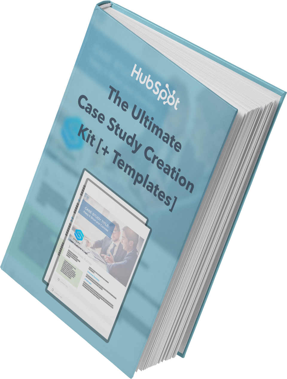
Featured Resource: Case Study Template
Need help getting your first case study off the ground? Look no further. We’ve put together a comprehensive guide, complete with templates, designed to make the process a whole lot easier.
9. Call to Action
A call to action (CTA) is an image or line of text that’s included in different types of content to encourage leads and customers to take action. In short, you want someone to click your CTA to carry out the desired action.
Add CTAs to blogs, emails, ebooks, and anywhere else you want a lead to complete a certain action to push them to the next stage of the buyer’s journey.
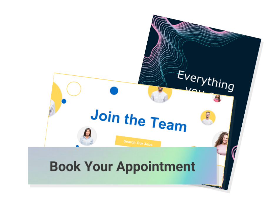
Featured Resource: CTA Templates
These resources will empower you to create an impressive CTA strategy by helping you understand how they work across different mediums, while also providing you with the means to create them for your own website.
10. Memos
A memorandum, or memo, is used to address internal communications within an organization. Think about the type of message you want to communicate. A memo is likely a good idea if you’re sharing minutes from a meeting, detailing new policies and procedures, or communicating anything people may need to reference.
Memos tend to be longer and more formal than emails (although you may attach a memo to an announcement ema
il) and may be formatted according to your company’s style guidelines.
Use this general memo template to get started.
Memo: [Memo Title]
Date: [Date of sending]
Memo To: [Individual(s), Department(s), or Organization(s) the memo is being sent to]
From: [Your Name, or the Name of the Department on whose behalf the memo is being sent]
Subject: [Enter a brief, 5-to-10-word subject line to describe the purpose’s memo]
Introduction
Provide an executive summary of this memo in one to two paragraphs, highlighting the change that’s happening, when it’s effective, and what the key takeaways are for the memo recipient.
Background
Explain the background for this organizational change in one-two paragraphs. Some questions to answer in this section might be:
- Why was this idea pursued in the first place?
- What data, research, or background information informed this decision?
- What are the intended results of this organizational change?
Overview and Timeline
Describe the organizational change in clear, direct language. Specify the following:
- What will be changing?
- Who will be responsible for driving the change?
- When will the changes go into effect?
Closing
Close things out with a final note on:
- Why employees should feel excited and motivated about this change.
- Where and when employees should submit questions, comments, and/or concerns.
Featured Resource: 4 Free Memo Templates
We’ve drafted up four free memo templates for general, organizational, financial, and problem-solving updates. We’ve also included a best practices checklist for you to review before sending your memo out.
Adding these templates to your marketing arsenal can help you save time during your drafting process. Copywriters are shifting gears from blogs to case studies to emails all the time.
Should you use copywriting templates?
When you’re a copywriter, it’s your job to find the most compelling way to present information. This information might be seen in an email, on a webpage, or as an article headline. Often, you might find that you’re sharing the same information, but how do you share it without sounding repetitive?
Copywriting templates and formulas are an effective tool for writing equally effective copy. These templates enable you to create direct, appealing messages for readers. While the goal is the same, the way you get there changes.
Not only do copywriting templates give you the tools to share information in a fresh way, but they allow you to save time. With easy formulas to follow, you can quickly edit each template to work for your purpose. However, it is crucial to customize them and make them your own to avoid sounding like you’re following a formula, even though you are. Don’t worry — we won’t tell.
Best Copywriting Templates
Imagine a slide. You’re sitting at the top, and once you push off, there’s no stopping. This is how copywriting is described — like a slippery slope. Assume every potential reader is sitting at the top of the slide, and it’s your job to get them down. This likely starts with the first line of copy meant to gain their attention or interest. While the first step is often the same, there are many ways to get them to the final destination in copywriting.
Below, you will find four of the best copywriting templates for creating any piece of content.
BAB Formula
In copywriting, the BAB formula is a popular tool. The acronym stands for before-after-bridge. It’s a device used to appeal to the wants and needs of your audience. While this tactic is particularly effective in email marketing, it has its place in every avenue of copywriting.
To start, you want to focus on the before. This section is typically used to highlight problems or pain points for your audience. Your goal is to make them see themselves in the scenario. Immediately following this, you want to highlight the after. Use this section to craft what life will look and feel like once you resolve their issue.
Lastly, introduce the bridge. You’ve shown your audience a problem. You’ve demonstrated what it will look like when it’s fixed. Now, how will you get there? The bridge should merge your before and after. Typically, this is when a company would introduce its products or services. However, if you’re focused on creating a piece of content, you might use this section to propose an idea or advice.
AIDA Formula
Another popular formula used by copywriters and marketers is AIDA. The acronym is for: Attention, Interest, Desire, Action.
First, you want to get your a
udience’s attention. This will typically be done with a headline. Make a compelling statement. “What Never to Eat on an Airplane” and “Why You’ll Never Be a Millionaire” are two examples.
Once you get their attention, you have to keep their interest. Goldfish are said to have an attention span of nine seconds — pretend you’re writing for a goldfish. In this section, you might start by describing an interesting story. As you build out the copy, make sure this section is easily digestible for the high percentage of readers who will scan the information instead of reading it word-for-word.
Next in the AIDA formula is desire. This section is all about the details. Focus on the pain points of your reader. Are they missing a product or service to make their lives easier? Are they missing the information they need? As you develop desire in your reader, include any features for a product or service. Mention benefits or a solution if you create a blog post or article. It would also be beneficial to add any testimonials if available. Your copy should emphasize how your reader’s life will positively change with this product or information.
Lastly, the AIDA formula wants to drive your reader to act. It calls for you to end your copy with a CTA. Common CTAs are “BUY NOW” or “SIGN UP HERE!” For a blog post, your CTA might direct them to comment on the post or share it with their peers.
PAS Formula
You’ve likely heard the quote, “When life hands you lemons, make lemonade.” Now, imagine the lemons bringing a swarm of fruit flies because you have nowhere to store them. After, you learn you can make lemonade. That’s what the PAS copywriting formula is.
PAS stands for Problem, Agitation, Solution. First, present the problem. During this step, you want to empat
hize with your reader. Put yourself in their position and present the issue as if you’re experiencing it yourself. Once they are aware of it, make it worse.
Step two of the PAS formula is to agitate the problem. Think of how your reader’s problem could worsen, and tell them. Make it so they want to solve the situation now before it gets worse.
The final step in this formula is to present the solution. Give them a way out. This is when you introduce your products, services, or advice.
The 4Ps Formula
In this approach, you’ll have to promise, picture, prove, and push. This method calls you to grab your reader’s attention by making them a promise. You could easily alienate your target audience by making false claims, so ensure your promise is accurate. It is a promise you will have to keep.
Once you give the promise, paint a picture. You might want to throw a million adjectives around, but descriptions have different meanings to different individuals. “Exceptional craftsmanship” might mean one thing to you and another to me. Instead, use specific details that demonstrate the craftsmanship. Using details and examples helps create a clearer image for your audience.
Now, it’s time to prove yourself. You made a promise and created an image in your reader’s head. How do they know it’s true? In this section of the 4Ps formula, present your evidence. When selling a product or service, show customer testimonials or before-and-after images. For other content types, include data and statistics to bolster your claim. Once you’ve painted the picture in your reader’s head, the proof will solidify it.
At this stage, you’re ready to introduce your reader to your CTA. Tell them exactly what you want them to do. Download this PDF. Sign up for a free trial. Once you have made a promise, painted a picture, and proved your claim, push your reader to act.
“A” plus “B” equals copywriting.
Copywriting is more than a little complex. If you’re responsible for writing amazing copy for different types of content, you have the never-ending task of discovering new ways to present the same information. Luckily, copywriting templates and formulas make the job a little easier. When you can’t get your creative juices flowing, use this article as a resource to get your process going.
Editor’s note: This post was originally published in December 2020 and has been updated for comprehensiveness.

The Ultimate Guide to Content Marketing in 2022
Your customers, leads, and audience members want valuable content from your business. And that content needs to reach audience members in a way that feels natural and organic versus being disruptive. Content marketing helps businesses do this, and it describes the process of attracting, engaging with, and delighting your target markets.
By honing in on effective content marketing, you can do just that — and as a result, increase conversions, improve brand awareness, boost revenue, establish yourself as an industry leader, and more.

Whether you’re just starting to devise a strategy or you’re refreshing your existing one, it never hurts to re-assess your process and come up with new ways to create and share the content your audiences want. In this guide, we’ll give you a birds-eye-view of content marketing, types of content marketing, content marketing examples, and how to get a strategy going.
Content Marketing
The definition of content marketing is simple: It’s the process of publishing written and visual material online with the purpose of attracting more leads to your business. These can include blog posts, pages, ebooks, infographics, videos, and more.
However, content marketing is not just publishing a thin piece of content and hoping people will find it. It’s about purposefully tailoring your pages, videos, ebooks, and posts to your target audience so that they find you the inbound way rather than the outbound way.
Today, outbound marketing strategies (or anything that interrupts your audience members) aren’t as effective at resonating with and converting audience members as they once were.
Today, your content needs to reach your audience in a way that feels natural (a.k.a. inbound). A common way of doing this is by creating a narrative for your content — or telling a story. In doing so, your content will feel more authentic, engaging, and tailored to your audience.
So, what defines content marketing anyway?
Why is content marketing important?
- Educate your leads and prospects about the products and services you offer
- Boost conversions
- Build relationships between your customers and business that result in increased loyalty
- Show your audience how your products and services solve their challenges
- Create a sense of community around your brand
Now let’s look at the various types of content marketing.
Types of Content Marketing
There are many types of content marketing that you may choose to incorporate in your strategy — here are some of the most common:
1. Online Content Marketing

Online content marketing refers to any material you publish online, but more specifically, it refers to your web pages. A strong online content marketing strategy will help you rank higher in the search engine results pages (SERPs) and get you in front of the right people at the right time.
HubSpot’s home page is one example, immediately engaging visitors with specific content about our products.
2. Social Media Content Marketing
With over 4.2 billion global social media users, it’s easy to understand why so many businesses invest in social media marketing. There are a number of platforms (e.g. Facebook, Instagram, Pinterest, LinkedIn, Snapchat) to work with and several ways you can create and share content on each of them (e.g. photos, live videos, pre-recorded videos, stories).
Featured Resource: Social Media Content Calendar
3. Infographic Content Marketing
Infographics display content, information, and data in an easy-to-understand, graphic format. With a mix of simple wording, short statements, and clear images, infographics are a great way to effectively communicate your content. They work well if you’re trying to distill an educational and/ or complex topic down so all audience members can understand it.
Featured Resource: 15 Free Infographic Templates
4. Blog Content Marketing
Blogs are a powerful type of inbound content and allow for a lot of creativity in terms of their purpose and topic. With a blog, you can do things like promote other internal and external content and blog articles via links, add social share buttons, and incorporate product information.
Featured Resource:Start a Successful Blog
5. Podcast Content Marketing
More than 60 million people listen to podcasts across the Spotify and Apple Podcasts platforms. For this reason, many businesses and media outlets have begun creating and sharing their own podcasts.
Podcasts allow for a lot of creativity as they can be about any topic of choice. Additionally, you determine other factors related to the podcast such as cadence of episodes, who’s on the podcast, where you advertise the podcast, and how long episodes are.
Featured Resource: How to Start a Podcast
6. Video Content Marketing
According to Wyzowl research, 73% of consumers say they prefer to learn about a brand’s product or service through video. Additionally, video marketing can boost conversions, improve ROI, and help you build relationships with audience members. You may choose to share your video content on social media platforms, landing pages, or on a co-marketer’s website.
Featured Resource: The Ultimate Video Marketing Starter Pack
6. Paid Ad Content Marketing
Paid ads can help you reach a broad audience and allow you to position yourself in all of the places you want to be seen — paid ads are especially beneficial when paired with inbound marketing. There are many places you can share paid ads including on social media, landing pages, banners, and sponsored content.
Featured Resource: The Ultimate Google Ads PPC Kit
Next, let’s look at some content marketing examples that are associated with those types of content marketing we just reviewed.
Content Marketing Examples
The following examples will give you a better understanding of how you can incorporate content in your greater marketing strategy.
1. Example of Instagram Content Marketing

Lush Cosmetics’ Instagram account is on-brand and complements the rest of their marketing content — if the page didn’t say “Lush Cosmetics” anywhere on the profile, customers would likely still know the profile belongs to Lush.
The Instagram page shares the Lush product line, displays different color and scent options for the products, and shows the various ways each product can be used. The profile feels and looks colorful and uniquely Lush, and depicts members of their wide customer base.
2. Example of Infographic Content Marketing
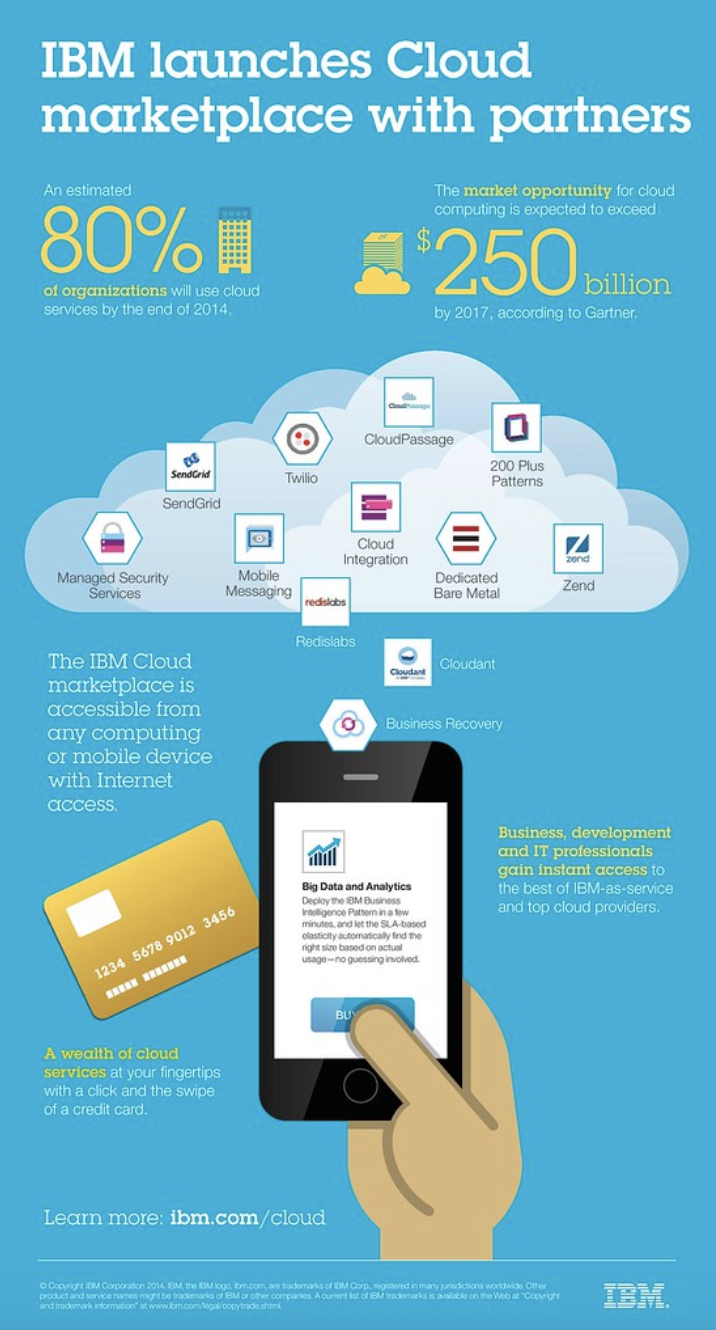
IBM created an infographic when they launched their Cloud marketplace. Their infographic is on-brand, well-organized, and easy to read. It clearly explains what they’re doing with their Cloud marketplace and how customers can benefit from it. It also tells audience members how they can access the marketplace and get started using it.
3. Example of Blog Content Marketing

Expedia has a blog called “[Out There Starts Here]” that shares travel-related information including hotel recommendations, great places to visit, and travel-related activities you can take part in around the globe.
Expedia regularly publishes their blog content to keep readers interested and engaged. It includes a wide range of topics related to any type of trip you could imagine.
The blog is on-brand and all articles relate to the travel technology company’s goal and mission of gaining customers and boosting brand awareness. They do this by linking to their services and writing about customers who have already had positive experiences with the company.
4. Example of Podcast Content Marketing

Harvard Business Review (HBR) has a weekly podcast called HBR IdeaCast which features industry leaders in both business and management. You can either subscribe to consistently receive their hundreds of podcasts or pick and choose which ones you want to listen to.
The podcast is on-brand and complements the rest of HBRs published content. It also serves as a great way for HBR to connect with their target audience, enhance brand awareness, and gain a following of audience members through a medium that differs from their typical work (e.g. podcast versus HBR article).
5. Example of Video Content Marketing
Much of Dollar Shave Club’s video content has gone viral. Their marketing efforts are on-brand, humorous, and entertaining. By establishing a name for themselves via online video content, Dollar Shave Club has experienced impressive growth and brand recognition.
6. Example of Paid Ad Content Marketing

Revolve — a clothing and accessories company — uses paid and sponsored ads on social media (like this one on Facebook) to reach their target audience while they browse their news feeds.
The content ads feature some of their products as well as details about their free shipping and return policy to drive target audience members to their site (and, hopefully, convert them into paying customers).
Lastly, let’s cover your content marketing strategy. By implementing a strategy, your content marketing efforts will be impactful and effective in converting leads and reaching your target audience.
7. Example of Twitter Content Marketing

HubSpot uses Twitter to market software as well as create a community among customers, target audience members, and industry leaders and experts.
HubSpot shared product information, relevant tips, industry knowledge, and original research on Twitter. HubSpot also interacts with users and ensures anyone in need of customer support knows exactly where to go for help.
8. Example of TikTok Content Marketing

Chipotle is a very active brand on TikTok — the company uses the platform to reach and engage their customers and target audience members. In addition to reacting to others’ Chipotle-related TikTok content, the brand posts TikToks of their menu items, recipes, people enjoying their food, their restaurants, and more. They have over 1.6 million followers and over 30 million likes.
9. Example of Viral Content Marketing

This viral content marketing example was one that came from a TikTok video — Nathan Apodaca’s original TikTok video included him sipping Ocean Spray cranberry juice while skateboarding and listening to “Dreams” by Fleetwood Mac.
As a result of the viral video, TikTok used part of Apodaca’s video in their ads, Ocean Spray used Apodaca in their ads, Ocean Spray saw a bump in sales and brand awareness, Fleetwood Mac’s “Dreams” was number one on iTunes, and there were thousands of videos posted by other TikTok users who bought the cranberry juice and recreated Apodaca’s original video.
You can think about your content marketing strategy as you would your content marketing plan — let’s dive into the steps you’ll want to work through in order to develop an effective strategy.
1. Set SMART goals.
The first part of your content marketing strategy is to set SMART goals. These should be specific to your business — they’ll likely complement your broader marketing and company goals.
Here are some SMART goal examples:
- Improve brand awareness
- Boost revenue
- Increase conversions
- Improve brand loyalty
- Increase customer engagement
- Build rapport and trust among prospects and customers
- Attract strategic partners
2. Determine your KPIs.
Next, set key performance indicators (KPIs) for your SMART goals. KPIs are quantifiable data points you can use to measure your actual performance against your goal.
| smart goal | related kpi |
| Brand awareness | Site traffic, social media followers, subscription sign-ups, mentions (by customers and partners) |
| Revenue | Daily sales, site traffic |
| Conversions | Conversion rate, shopping cart abandonment rate, associated shipping rate trends, competitive price trends |
| Brand loyalty | Returning customers, promoters, product reviews, referrals |
| Customer engagement | Likes, shares, follows, mentions, backlinks |
| Rapport and trust | Returning customers, promoters, followers, mentions |
| Strategic partners | New partnerships, mentions, backlinks |
3. Decide on the type of content.
Next, choose the type of content you’ll create. To do this, start by thinking about your target audience and buyer personas.
Answer the following questions about your target audience to help you narrow down the right types of content for them:
- What do they need from you?
- What challenges are they looking to overcome?
- Why do they need your product or service?
- How can you help them succeed?
- Where do they spend their time?
Then, take a look back at the various types of content we reviewed earlier to decide which types of content you’ll create.
4. Choose your content channels.
Once you’ve decided on the type of content you’ll market with, it’s time to choose your specific content channels. Where will you share your content? Where will it live and be shared from?
For some of the content types, the channel you need to work with will be obvious. For example, if you’re creating Facebook content, your channel will be the social platform itself.
5. Set a budget.
Now, set your budget. Think about the type of content you’re creating and which channels you’re marketing that content on.
Then, ask yourself the following questions to determine your budget:
- Do you need to purchase any software or technology to create the content (such as graphic design software like Adobe Photoshop, a subscription to Canva, a camera to take high-quality photos and videos)?
- Do you need to hire any content marketers or designers (such as artists, writers, editors, designers)?
- Do you need to pay for ad space?
- Do you need access to specific tools or resources to enhance or measure your specific type of content?
Make note of how your responses impact your budget — whether that’s an increase or decrease in what you may have already estimated.
6. Create and distribute the content.
Create and distribute your content so your audience members can consume it — and possibly convert. To ensure you’re consistently producing content and sharing it among your prospects and customers, use a social media calendar or an editorial content calendar.
This will help your team stay on top of all of the content being created as well as allow you to schedule it ahead of time.
7. Analyze and measure results.
Lastly, analyze and measure your results so you can make any necessary changes to enhance your content marketing efforts and reach more audience members.
Look at your SMART goals and KPIs to determine the success of your content marketing strategy. Did you achieve your goals and KPIs? Were you close to reaching them, or were you off in your estimations?
Here are some tools to help you with your content marketing strategy analytics and results:
- HubSpot Marketing Analytics Software
- HubSpot Social Media Management Software
- Mention
- SharedCount
- Sprout Social
- Google Analytics
Now, how can you ensure your strategy will be effective? Let’s find out.
Traits of Effective Content Marketing
With so many companies creating and publishing content online, it’s essential to go beyond your standard industry fare. A secret? HubSpot strives to meet the following criteria to ensure all of our content meets your and other readers’ needs. The result? Millions of visits to our blog posts and web pages per month.
You can achieve similar results for your company if your content:
1. Provides value beyond your product offerings.
Content marketing isn’t just about sharing your products’ virtues to get readers to become a customer. It’s important to provide value that empowers your customers to do something more efficiently, such as making their businesses more profitable or shortening their morning routine.
Whatever the case may be, strive to create content that provides a solution for your customer’s most urgent needs. Your product may be a solution, but if you’re not explicitly writing a product page, you should only incorporate product mentions if they make sense.
In the blog post below, hair care brand Curlsmith helps readers understand how to reach the right balance between high-protein and high-moisture products. It doesn’t mention its products until the very end, instead educating the reader first.

2. Targets readers’ specific buying journey stage.
Providing value and answering customer’s needs is only a part of the story. In each piece of content, you should also target your customers’ specific buyer’s journey stage.
Generally, there are three stages of the buyer’s journey: Awareness, consideration, and decision. In the awareness stage, buyers are still researching their issue. In the consideration stage, they’re researching solutions. In the decision stage, they’re about to pick a provider.
If you’re writing a “What is [X]?” post, then the person who’s reading that article is likely not ready to make a decision about their provider. They are still in the awareness stage, completing research so that they can find out who offers a solution.
Conversely, if you’re writing a product page, then the reader who visits that page has already researched potential products and found you as a possible provider. That means you should pitch your product at every turn, reiterating your value proposition and differentiating yourself from the competition. You shouldn’t be shy about your products’ most valuable features.
3. Demonstrates a consistent brand voice and image.

No matter if you’re creating a blog post, web page, or ebook, your visitors should be able to tell who you are immediately upon consuming your content. Your brand shouldn’t sound as if ten different people are writing for you, even if that may be the case.
That’s why it’s critical to create both a writing style guide and a brand style guide. Both of these documents will ensure that:
- Your brand visuals look the same across all platforms and devices.
- Your brand tone and voice sounds the same across all written communications.
Once you create both of these, disseminate them to both your content writers and your freelance or in-house designers. Your content marketing publications will be much more cohesive and consistent, which will keep readers coming back to you as a resource and make you look more polished and professional.
4. Is timely and engaging.
Do your customers typically plan their financials at the start of the year? If you’re a finance startup, you might publish a blog post in January about budgeting quarter-over-quarter to prevent clerical errors and avoid overspending.
At the end of the post, you might include a prompt to check out your software, or lead users to a template they can download after providing their email.
This is one example of content marketing that is timely and engaging. If you know your customer’s behavioral and spending patterns throughout the year, it’s critical to capitalize on that. Publish blog posts and offers that capture them at the right time and answers their immediate needs. You’ll be ahead of the companies that publish similar content later on — and oftentimes, being first is all you need to win a customer over.
Now that we’ve seen the top traits of effective content marketing, let’s dive into the best resources you can use to learn more about it.
There are hundreds of thousands of tools available today that qualify as excellent content marketing resources. For the sake of this article, we’re going to keep things simple by providing a handful of our favorite options today.
- HubSpot Academy for free education on how to become an effective content marketer.
- HubSpot’s Free Content Creation Resources for access to resources that will propel your content marketing strategy towards success.
- Content Marketing Institute for access to some of the best content marketing online education, print, and events available today.
- Blog articles on content marketing, trends, strategies, and tips by industry experts (like HubSpot).
- Podcasts about content marketing, such as This Old Marketing, or business trends, such as HBR IdeaCast, to inspire your content marketing strategy.
- Google Trends, which allows you to search for trends across broad topics like content marketing or for niche topics within content marketing.
- Ebooks and case studies about content marketing or content marketing strategies, like this one by Mention.
- Latest content marketing statistics by a reputable database source like Statista.
- Easy to use visual content and design software, such as Canva.
- Free or paid social media management tools, such as HubSpot, Buffer, or Sprout Social, to help you create and share your social content.
- Free or paid content and project management tools, like Trello or Asana, to plan and organize your content marketing strategy.
- Free or paid marketing software to connect your content marketing team, plan, strategy, and results to your greater marketing plan (and even your CRM).
- Free or paid email marketing software, like HubSpot or Mailchimp, to handle all aspects of your email campaigns and content.
- Your network, on platforms like Twitter or LinkedIn, where you can connect with those in your industry to discuss relevant trends, answer each other’s questions, and provide or ask for feedback.
And speaking of tapping into your networks on sites like Twitter and LinkedIn, here’s some inspiration from a few of the greatest content marketers to follow on both platforms today.
3 Marketers to Follow on LinkedIn
1. LinkedIn: Luvvie Ajayi Jones

Luvvie Ajayi Jones is a best-selling author, digital strategist, podcast host, and speaker. She’s known for combining humor with her experiences and background in marketing, communications, and new media. Her LinkedIn is sure to inspire you whether you’re thinking about/working on culture, authenticity, leadership, content, marketing strategy, and more.
2. Zontee Hou

Zontee Hou is a digital marketer and strategist, speaker, and consultant. She works with scaling companies to help them establish effective marketing strategies that work for their unique goals and audiences. On her LinkedIn profile, Hou shares her expertise in content marketing, social media marketing, marketing analytics, and digital marketing.
3. A. Lee Judge

A. Lee Judge is a co-founder and digital marketing strategist at Content Monsta. He’s also a podcast and video producer, speaker, and rev ops practitioner. On his LinkedIn profile, he covers a wide range of topics related to lead generation, social media marketing, how to apply marketing analytics and data, digital experiences, multi-channel marketing, the importance of sales and marketing alignment, and more.
3 Marketers to Follow on Twitter
4. Ann Handley

Ann Handley, Head of Content at MarketingProfs, is a bestselling author and speaker. She provides education and training around marketing that businesses can learn from and apply. She offers in-person and virtual trainings for companies on content marketing, storytelling, lead generation, and branding – all of which are topics she alson talks about, and shares content about, on her Twitter page.
5. Neil Patel

Neil Patel is a bestselling author, marketing expert, speaker, and website and SEO consultant. He’s a thought leader and industry expert in content and digital marketing. His Twitter page includes information about his trainings and services, industry trends, marketing strategy tips and resources, and questions/conversational topics meant to engage followers and other industry experts.
6. Guy Kawasaki

Guy Kawasaki is a marketing strategist, author, entrepreneur, venture capitalist, podcast host, and the chief evangelist of Canva. On his Twitter account, Kawasaki asks followers thought-provoking business questions as well as provides links to, and information about, new podcast episodes, industry trends, marketing strategy tips, and insights based on his experiences.
Engage Your Target Audience With Content Marketing
With effective content marketing, you can reach your target audience and increase conversions. There are several ways to market with content to boost revenue, grow your brand awareness and recognition, and build relationships with your prospects and customers.
And don’t forget to extract more value from every piece of content you create.
To get started, determine which type of content works best for your business and audience, and develop a content marketing strategy to begin boosting your bottom line today.
Editor’s note: This post was originally published in August, 2019 and has been updated for comprehensiveness.

Influencer Marketing Strategy Checklist & Template
If you’re a marketer looking to reach new audiences, partnering with influencers can be a great way to do that.
Influencer marketing is an incredibly effective strategy. Nearly 3.96 million of the world’s population is using social media, and researchers say that number might reach 4.41 million by 2025.

As a result, influencer marketing has naturally become one of the most popular marketing methods. As target markets become younger and more digitally connected, influencers can help organizations connect with consumers where they are – online.
By building influencer relationships, brands can leverage an influencer’s reach to achieve their marketing goals.
But if you’re considering hiring an influencer for your brand, where do you even begin? It can be tricky to narrow down your goals, what type of influencer you want, and what goals you hope to meet with an influencer strategy.
To help you narrow your search and ensure your influencer marketing strategy is as effective as possible, we’ve created a template and guidelines to help get you started.

Follow Along With Our Free Influencer Guide + Templates
Influencer Collaboration
Influencer collaboration is a marketing strategy that involves paying individuals with a large social media following to advertise your brand to their followers. The influencer can demand compensation in monetary value or complimentary products and services in exchange for their recommendation.
According to Influencer Marketing Hub, 90% of marketers will allocate a budget to influencer marketing, with 62% increasing their existing budget. The same study also cites that most brands that have worked with influencers are pleased with their results based on conversion rates and sales they received as part of the collaboration.
The good news is even companies that hired micro-influencers (that is, influencers with 15K followers and fewer) still got impressive results.
According to Convince and Convert, the top 13% of marketers are getting great returns from influencer collaboration regarding quantifiable results.
In fact, for every $1 spent on influencer marketing, they’re getting $20 or more. This explains why marketers are increasing their influencer marketing budgets.
Here are six steps to help you create and implement an influencer marketing strategy:
1. Define your goals.
By clearly defining the end goal of your strategy, you can work your way backward to determine the steps needed to get there. Using your goals as guiding lights will also define your strategy’s metrics for success. These will help keep your campaign on track.
Are you trying to increase brand awareness or drive engagement? Do you want to spruce up your lead generation method, or do you want to build on the loyalty and goodwill of your existing audience?
Dunkin Donuts is an excellent example of how defining your goals can influence your results. They hired Charli D’amelio to advertise their products to increase their app downloads.
After her video went viral, they launched a drink named after her, “The Charli,” and her 143 million Tiktok followers were more than willing to join in the trend. As a result, the app’s download increased by 57% when Dunkin Donuts released the drink.
2. Identify and define your audience.
Properly segmenting and identifying your audience can determine the effectiveness and success of your influencer campaign. It’ll be easier to identify which audiences would best help your marketing goals once you define them.
Depending on your organization’s target personas or ideal buyer, you should group consumers by demographics, psychographics, buyer lifecycle stage, or preferred channel.
Tinder is an excellent example of how your target audience can influence your campaign. Most of their app users are 18-25 years old, so they hired influencers in this age bracket to promote their app.
Tayler Holder was one of the influencers who participated in the campaign, and one of his posts has over 500k likes. It’s just a photo of him wearing a Tinder-branded shirt and a short caption, “Swipe right and come find us on @tinder.”
3. Define your budget.
Defining your budget is essential s because it guides your content creation and distribution options.For example, if you’re on a limited budget, you may opt to use an independent influencer instead of an agency.
This is also a good time to decide how you compensate your influencers. Some influencers are okay with being paid using free products and services.
Every influencer marketing campaign is different depending on the means of payment and the resources required for the campaign. Here is an example of how you can break down your marketing campaign budget:

4. Choose a type of campaign.
The way you promote your brand through an influencer depends on your goals and the target audience’s preferences.
Guest posting, sponsored content, re-targeting, co-creation, competitions, mentions on social, discount codes, and more are terrific examples of influencer marketing campaigns.
For example, Audible partnered with best-selling author Tim Ferriss on his podcast, where his listeners could use his custom link to get a discount on Audible content. This partnership delivered a relevant offer to the target audience, benefitting Audible, Tim Ferriss, and his podcast listeners.
5. Decide on the social media platform you want to use.
One good thing that happened during the pandemic is that the usage of all social media platforms went on the rise. Marketers’ most used social media platform as of last year is Facebook, and the least used is Snapchat.
That being said, the best platform is based on your target market and the kind of content you’re promoting.
For example, if you’re promoting something for teens, Snapchat would still be your best platform. This chart from WordStream will give you more clarity.
6. Create content for your campaign.
Once you’ve decided on the medium and campaign type, it’s time to create compelling content. Even if you have the most exciting campaign or best product-market fit, consumers will lose interest if your messaging or content doesn’t captivate them.
Make it as easy as possible for your influencer to share your message. The better your messaging fits with their audience, the easier it is for your influencer to push your brand out to their audience.
For example, Fitplan targets people working out from home who might need professional training to reach their body goals. To increase their app sign-up, they work with influencers already sharing fitness content with their audience, like Michele Win.
In return, when their followers sign up for the app, the influencers get to train them and earn money from the app. This strategy works because the content aligns with the users’ needs, and they can see what to expect. It’s also easy for the influencers to push this message because they simply share the same message with their followers.
7. Find your brand influencers.
The right influencer should understand and connect with your audience, your brand, and the content you’re promoting. For example, if you’re promoting supplements, you have a better chance with influencers who are into health and fitness than influencers who are mainly interested in new fashion trends.
You can get influencers in your niche by using hashtags on social media platforms. For example, by simply searching #fitness on IG, you get over 1 million posts from different fitness influencers.
Sometimes, you don’t have to work with an influencer in your niche but rather someone who is trending. Your marketing team can help identify the best influencers for your brand by staying on top of their social media game.
8. Promote your campaign.
Once you’ve successfully identified your target market, found your ideal influencer, and created compelling content, all that’s left is promoting your new partnership!
Go to your favorite social channels or draft a blog post to generate some buzz.
For example, Fitplan shares short workout advice videos by their influencers on their IG page. This is a good way to encourage viewers to sign up by giving them a glimpse of what happens in their program. Sharing the content on their page also helps reach the people who might not be following their influencers.
9. Track your success.
It’s critical to track the performance of your partnership to ensure all expectations are met and determine the success of the campaign.
Track website traffic, engagement, conversions, or other metrics you decided on when you determined your marketing goals. You can agree to check the data weekly, monthly or quarterly depending on the nature of your campaign. Check in with your original goals to analyze your success and how to repeat them.
There’s a lot of potential for high return on investment (ROI) from influencer partnerships. Therefore, tracking if and how your influencer content performs better than your non-influencer content is essential.

The Influencer Contract Checklist
An influencer contract is a document that contains the details of the agreement between the influencer and a business. For example, the contract includes the terms of content creation, legal protection for both parties, and compensation received, among other details.
It’s important to have a contract to keep the influencers you’re working with accountable, and it’s always a brilliant idea to have a legal document where money is involved.
1. The Basics
This includes the date your contract begins and both parties’ official names. It’s important to ensure the names that appear in the contract are official and acceptable in a court of law.
Use simple language to describe everything in this section to avoid any kind of misinterpretation in the future.
2. The Expiry Date
How long will you be working with the influencer for this particular campaign? However short or long it may be, stating the dates is essential.
This section should state whether it’s a one-time campaign and, if not, the terms of renewing the contract. For example, you can set your influencer’s contract to one year, with the option of renewing it based on the parties’ agreement.
3. The Mode of Compensation
What will you be offering the influencer in exchange for their services? It could be monetary or a free product or service.
Regardless of what you’ll offer, ensure you state it clearly. How much will you be offering if it’s money and after how long?
For example, your terms could state that you’ll pay the contractor 30 days after sending their invoice.
The payment structure will vary from one agreement to another. For example, if it’s a one-time campaign, you could agree on paying half the money before the campaign and the rest after the influencer hits their key performance indicator (KPI).
4. Your Inclusion in the Campaign
Content distribution is just one of the main parts of an influencer marketing campaign. There are other vital parts, like creating content and deciding on the best tone for the campaign.
An influencer better understands the kind of content that resonates with their audience and creative ways to present it.
Therefore, it’s good to include the influencer in the creative briefing sessions. In this case, you’ll need to state how many meetings they’ll be expected to attend and for how long.
5. The Type of Content
What kind of content are you expecting from the influencer? Is it a guest post, a vlog, or a reel? State the expectations clearly.
If you’re expecting multiple content formats, mention exactly how they should be delivered. For example, you could state you need four reels and four social media posts twice a week.
7. The Approval Process
As we mentioned, a marketing influencer campaign works best when the influencer collaborates with the marketing team. This helps with quality control by ensuring the influencer adheres to company values.
In some instances, the marketing team may have some suggestions for or edits to the content before posting. Ensure you mention how many revision rounds the influencer should expect to make and if revisions guarantee extra pay.
8. The Promotion Requirements
How much do you want the influencer to be involved in the marketing process? For example, do you want them to share the content on their personal pages? If yes, what platforms and how often?
State these expectations, including how much they should engage with the audience to avoid any conflicts in the future.
9. The Content Copyright
If you want the right to edit or modify the influencer’s content, it’s important to include content copyright in the contract. Your copyright terms should also allow you to use their images or logo when posting related content.
On the other hand, the influencer might want access to the content they edit. If this is the case, be sure to mention how long they’re allowed to access the content. When can they access the content and do they retain the copyright forever?
10. The Publication Agreement
A publication agreement details when the influencer will publish the content. Do you publish once, twice a week, or several times a day?
Ensure you capture all these details on your contract and include any penalties the influencer will face if they don’t comply.
Include other additions the influencer must make to the content when uploading it. These may consist of promo codes, hashtags, or tracking links.
11. A Restrictive Covenant
A restrictive covenant is an agreement on the length of time an influencer isn’t allowed to work with a competitor after the campaign. So first, define your competitors and include them in the contract.
Additionally, ask the influencer to confirm that they have no written contracts with your competitors.
12. A Sunset Clause
A sunset clause dictates the length of time your sponsored content should appear on the influencer’s pages. Without a definite period, many influencers can delete the sponsored content once they’ve been paid or after a short period.
Be clear on how long the content should stay on the influencer’s page before they can delete it.
13. A Cancellation Clause
What happens if the influencer feels you’re no longer a good fit for their audience? Or they break the agreement, and you can no longer continue working with them?
Prepare for these scenarios by having a cancellation clause in place. It should cover any penalties or repayment.
14. Image Authenticity
Image manipulation isn’t a new concept– especially with the editing apps and filters available on the market. Ensure you have a clause that protects you from image manipulation.
While you want your products to appear appealing, you also want to ensure customers don’t feel cheated when they receive your product.
Image manipulation may also trigger publishers to flag your ad for false advertising. Publishers could then remove your content or your ad campaign from their platform.
15. A Morality Clause
You can’t control what an influencer does, but you can protect yourself with a morality clause. Remember, how they conduct themselves during the campaign can damage your brand’s reputation by association.
Therefore, some guidelines can protect you, like discontinuing the contract when they conduct themselves in any way that puts your brand at risk.
Once you have an influencer marketing strategy and a contract, you’ll need to create an influencer proposal to send to potential collaborators.
Here’s a short influencer proposal checklist:
1. State your goals.
What do you want to achieve with this influencer marketing campaign? It could be better brand awareness, increased subscription rates, high traffic, or high engagement.
Whatever your goal is, it should be stated clearly in your presentation.
2. Show visual examples.
Influencer marketing is mainly about visuals. So, before you meet with an influencer, research and take screenshots of the campaigns you like.
These resources will give your influencer an idea of what kind of content you’re looking for.
3. Simplify the numbers.
If you love data, chances are your proposal will be full of figures. This is boring, and most influencers will not pay attention to this presentation. Provide only the necessary data based on the influencer’s preference to avoid overcomplicating the proposal. The metrics you share will depend on the media platform you’re working on. For example, if you’re promoting IG content, your influencer will need to see the content interactions, profile activity, and the accounts your posts are reaching. This information is important when setting future goals and negotiating prices.
Also, try to replace the data and tables with graphics that appeal to them based on their interests and the nature of their career. Keep in mind that successful influencers are heavily booked and you also need to wow them to work with you.
4. State the responsibilities of the influencers.
State all of the influencer’s responsibilities. How should the influencers participate in the marketing campaign?
Responsibilities can include creating content, developing hashtags, editing images, or sharing content on their page.
5. Give examples of influencers you’d like to work with.
If you don’t have specific names in mind, you can create a buyer’s persona to represent the kind of people you want to collaborate with. You can boost this persona with success metrics like followers, engagement, and likes.
Coming up with this persona will help your potential influencers know your priorities in this campaign.
6. Don’t be too detailed.
Although you want to ensure your collaborators understand your expectations , you don’t want to micromanage them.
Instead, include a brief. This allows the influencer to share ideas on how to reach your goals.
Download the Influencer Strategy Template
Are you ready to try these influencer marketing strategies with your organization? Download our free influencer strategy template and achieve your marketing goals today.
Editor’s note: This post was originally published in August 2019 and has been updated for comprehensiveness.

37 of the Best Website Designs to Inspire You in 2022
Your website inspiration journey starts here.
Deciding to create a web presence is a big decision, but the best websites are a culmination of many small decisions. But one major decision that takes time, diligence, and a great deal of inspiration is the design of your website.

In this article, we’re sharing a few dozen of the best website designs we’ve seen. Click the links below to jump to explore website designs that crushed it in the last several years. We’ve also included a bonus section of designs that are just plain cool — so check them out, too!
- Best Website Designs to Inspire You in 2022
- Best Website Designs from 2022
- Best Website Designs from 2021
- Best Website Designs from 2020
- Best Website Designs from 2019
- Best Website Designs from 2018
- Best Website Designs from 2017
- Best Website Designs from 2016
- Best Website Designs from 2015 – 2014
- Where to Get Your Design Inspiration
- Website Design Inspiration Sources
- Website Design Ideas
From familiar corporations to small businesses, to international organizations, the following sites push the status quo on the web. Whether it’s the design aesthetic, usability, interactivity, sound design, or value that the site provides, each one is a masterpiece in its respective industry and something to aspire to.
Not surprisingly, many organizations exist to highlight these sites and the contributions they make to the web. To help surface some of the most inspirational designs, I gathered several award-winners that have made their way through several key awards organizations — including Red Dot, Awwwards, UX Awards, The Webby Awards, SiteInspire, Best Website Gallery, and FWA.
As you browse through the list, know that each site excels in its own way and seeks to serve a unique purpose. While one site may be an excellent example of visual design, another may be an excellent example of interactivity.
This means that not all of these sites may be “conversion machines” or blueprint ideas that you can easily copy over to your site. Rather, they’re great ways to gain some website design inspiration and see the cutting-edge marketing that’s happening in the different corners of the web.
Keep in mind that web designs are fluid and change often. Some of the designs in this list have changed since they were awarded, but we do our best to keep them up-to-date. We’re confident you’ll find a design here that sparks your creativity.
Read More: 77 Examples of Incredible Website Design
Download this free guide to see even more examples of website blog, homepage, and landing page designs.
Beautiful Award-Winning Websites
Best Website Designs from 2022
Hyer
Award: Website of the Month (2022), CSS Design Awards
Want to make a strong impression on your website visitors? Take a page out of Hyer’s book.
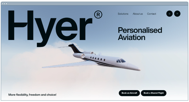
This striking illustration of the airplane, as it slowly moves across the screen, is sure to grab website visitors’ attention.
This page has everything you need in an effective homepage: An image that tells a story but isn’t too distracting, use of white space, easy nav bar, a tagline or slogan, and a clear CTA.
It’s a clean design that’s free of any distractions and invites visitors to learn more about the brand.
Mubasic
Award: Website of the Day, August 10, 2022, Awwwards
Mubasic’s site isn’t just visually compelling, it’s dynamic. Mubasic is a catalog of high-quality music for children, and the website’s design decisions help it achieve a light-hearted, easygoing feel. The poppy color scheme and effective visual hierarchy contribute to this site’s design success, however, the real reason it shines is because of how the design feels authentic to the brand’s mission.
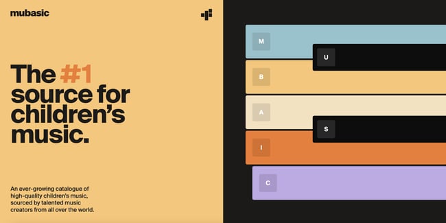
The homepage easily allows you to explore the company’s offerings, and even features a Q&A section set up in a unique format. Images pop up as you scroll down the page, and toward the bottom, there’s the opportunity to get in touch with contact information and a new customer form template.
When you reach the bottom of the home page, there’s a menu that features anchors to allow you to jump to wherever on the page the information you’re seeking lives.
Digital Cover
Award: Website of the Day, July 31, 2022, Awwwards
Everything from the loading screen to the homepage of this France-based digital agency’s website is a visual homerun. When you arrive on this homepage, you’re immediately swept into the world of Digital Cover. This is achieved by a graphic that appears nearly three-dimensional popping up and welcoming you into the company’s orbit.
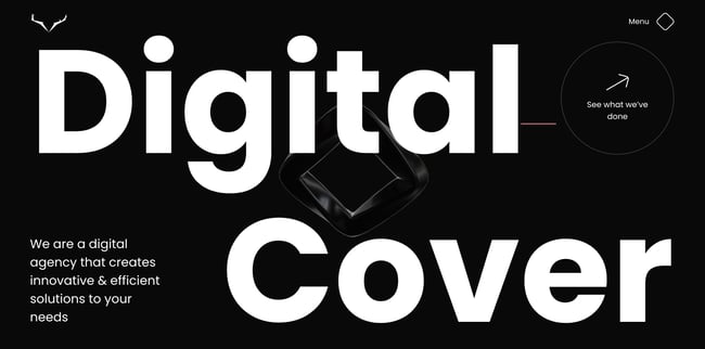
Similar to the previous site, the animated nature of Digital Cover’s homepage adds intrigue and establishes this site as a candidate for best website design. With a simple swipe of a mouse pad you’re led to the company’s projects, or you can navigate to the clearly labeled menu in the top left corner. When you do, several options pop up.
From there, you are escorted to the page of your selection. The white lettering against the black background allows for the copy to pop. If you scroll to the bottom of any menu page, you’ll find contact information to get in touch with the agency, which is another strength of the design’s.
Best Website Designs from 2021
IBM’s The Harmonic State
Award: Site of the Month (July 2021), Awwwards
When you land on this IBM web page, it’s clear to see why the design won an award.
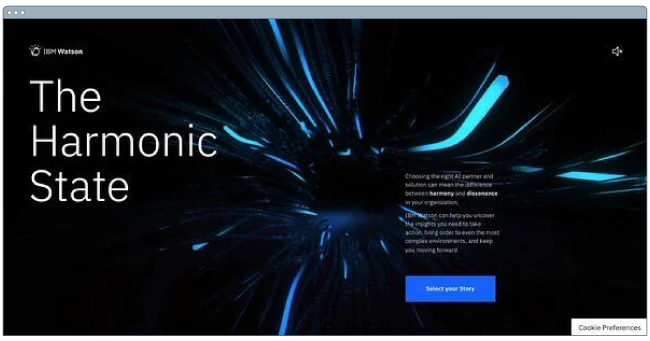
The best way to describe the website is as an immersive experience. In fact, IBM uses both visual and auditory elements to draw the visitor in and keep them engaged.
When you first land on the web page, you’re prompted to put on headphones to get the full experience. Even if you skip this step, you’re drawn in by the interactive background that reacts as your mouse navigates on the page.
In addition, the page is well balanced with a large title that grabs your attention across from a small description with a bold blue CTA.
With a topic as complex as AI, IBM then uses visual storytelling to explain how its Watson tool works in the real world. Visitors can explore three stories through video game-like functions and learn more about the tool.
It’s a fun and effective way to get users engaged in a topic that can be complicated and dry.
Superlist
Award: Site of the Month (April 2021), Awwwards
Superlist is a productivity app that helps teams and individuals change the way they work.
Too often, you land on a website and have to figure out what the brand is about. With Superlist, you know exactly what to expect as soon as you get to the homepage.

The interactive homepage shows common work accessories, like headphones and keyboard with clear, to-the-point copy.
Superlist effectively uses white space to keep the focus on its copy. However, to facilitate navigation, they include a small button with an arrow icon to indicate that there’s more to see on the page once you scroll.
From there, the fun visuals continue – keeping you engaged as you learn more about the brand.
Best Website Designs from 2020
Swab the World
Award: Site of the Day (2020), Awwwards
Parallax, bold colors, and negative space shape the design and experience of Swab the World’s website. The organization brings awareness to stem cell donations. Their mission is to “Make sure every single patient finds their match. Period.” Photos of couples exhibiting love and emotions bring a human element to a historically complex and scientific process.
From a technical perspective, the design makes moving down the page feel natural, ensuring the readers reach each point of copy and every CTA on the homepage.
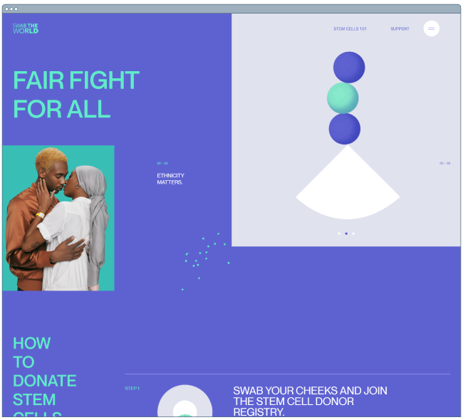
Newest Americans
Award: Honorable Mention (2020), Awwwards
An organization with a responsibility as large as honoring past, present, and future migrating identities needs a beautiful and functional website to help spread the word. Newest Americans champion immigrant experiences in cities across the state of New Jersey. The website uses beautiful imagery of people, places, and items that represent this experience in a way that flows cohesively down the homepage, telling the story of this group of America’s newest citizens.
The website is both visually appealing and functional with a simple navigation menu, stories organized by photos, and a clean press page that puts the most recent articles front and center.
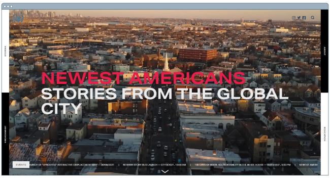
Spotify Design
Award: Honorable Mention (2020), Awwwards
Spotify is known for its fair share of amazing feats, and its latest iteration of Spotify.Design is no different. Serving as the hub for all things visual and creative for Spotify, the music and podcast streaming giant gives listeners a look into the who, what, why, and how of what makes the app so sensational.
Bright colors, drop shadows, and smooth animations give this website character and depth. The flat geometric designs with abstract accents make albums and artists practically jump off of the screen.

Andy Warhol
Award: Honorable Mention (2020), Awwwards
Artist, film director, and producer Andy Warhol’s life is encapsulated in this splendidly designed website that captures his art style in a digital format. As you peruse the page, your cursor becomes a spotlight that converts every image you hover over into a negative image or inverses the colors of the text you’re reading.
The big, bold text makes a statement and emphasizes just how important copy is to website design. Subtle animations help pace the site and set the tone for each section as you peruse the home page.
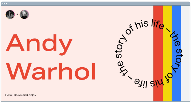
Human Interaction Company
Award: Corporate Website (2020), Red Dot
To see video done right, look no further than the Human Interaction Company. From the moment you click on the site, the experience is lightning fast. You’re dropped directly into the action — the why, what, and how of Human Interaction and exactly what the team does.
This Red Dot Design Award winner aims to bring the study of human interaction to the masses, and in the process, show us just how engaging it can be to learn about it. Don’t get discouraged by their award status though — none of the photos on this site are photoshopped, so it’s a practical example of building quality with the resources you have available.
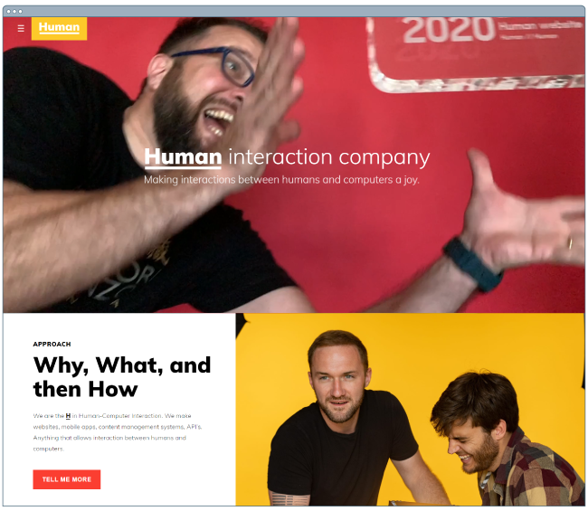
Garoa Skincare
Award: Site of the Day (2020), Awwwards
How do you transform the feeling of luxury and practicality into a website? Garoa Skincare provides a blueprint. Whether your product costs half the price of your closest competitor or twice the price, your site can bring a sense of extravagance to just about any product you sell.
High-quality visuals, typefaces that complement each other, and a balance of negative space with useful copy can bring a simplistic elegance to your website.
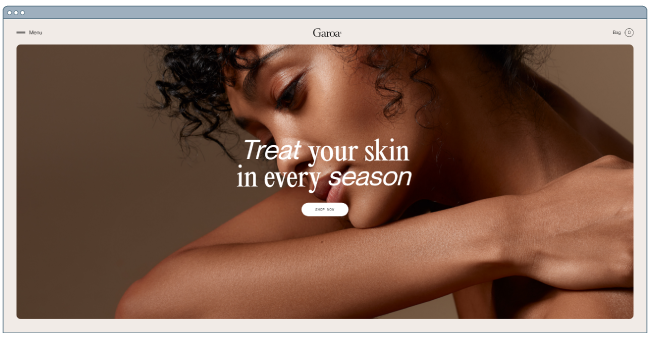
Best Website Designs from 2019
1917: In the Trenches
Award: Awwwards’ Best Website of the Day (2019)
This website, made to promote the film 1917, lets you walk around the trenches and perform the same mission that the characters did in the film. You can also see their maps or access other tools.
This is a great example of a site that went above and beyond with interactivity as well as a site that leverages its content and prewritten storyline to market its film. This website won Site of the Day byAwwwards, which allows designers to vote and nominate great websites they see daily.
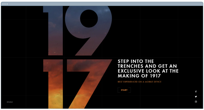
Image Source
The Octopus: A design blog by IDEO
Award: Business Blog/Website 2019 Webby award
IDEO, a global design company, won the Business Blog/Website 2019 Webby award for its Octopus blog, and for good reason. The blog features a sleek, black-and-white Octopus drawing as its homepage design, and uses yellow, black, and white to create a cohesive theme as you scroll.
If you hover over a blog post, the title is highlighted in yellow. If you hover over an image, the image is pulled towards you — two small features that make a big difference in terms of creating a unique and engaging user experience.
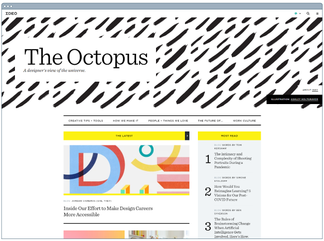
Nomadic Tribe
Award: Awwwards’ Site of the Year nomination (2019)
This site, which was nominated for Awwards’ Site of the Year, is one of the more engaging sites I’ve seen.
The homepage immediately begins playing a stunning video featuring a man walking across a desert, followed by gorgeous landscape scenes and text like, “Are you lucky enough to call yourself an adventurer?”
The text throughout the website is playful, with colorful pinks and oranges and yellows, and the homepage is logically designed, with CTAs placed throughout that range in commitment-level from “Read More” to “Watch Now” and, finally, “Download the App”.
Ultimately, the website is beautifully designed with strong attention to detail, and tells a compelling story throughout.

Image Source
Diana Danieli
Award: Webby 2019
This 2019 Webby-winning site shows off imagery of art and architecture with either high contrast or heavy exposure. As a website visitor, you can click and drag your mouse to change the photos and variations. Each image shows a piece of work that highlights the artist who owns the website.
A cool plus about this website is its incorporation of audio and music. Clicking on certain buttons on the screenplays a piano note and truly immerses you in the Diana Danieli experience.
George Nakashima Woodworkers
Award: Webby 2019
This woodworking website emphasizes nature and care for the woodworking trade. It’s essentially a slideshow of beautiful forestry and farming images. As a new image comes on the screen, a new quote related to wood or trees also appears.
This is incredibly relaxing to the visitor and shows that the woodworkers recognize the beauty of trees and the environment. This website also won a Webbie in 2019.
Best Website Designs from 2018
crypton.trading
Award: Site of the Day (4/3/2018), Awwwards
Meet crypton.trading, your robot accountant.
Crypton.trading is a trading hub for cryptocurrencies such as Bitcoin, using artificial intelligence to predict changes in a currency’s value and identify key buying and selling opportunities. The website was rated high for its development and design, as it gradually explains more of the developer’s methods the further down visitors scroll.
This website makes tech-savvy visitors feel right at home the moment Crypton’s greeting appears across the homepage, one letter at a time.
 Image Source
Southwest: Heart of Travel
Award: Best Visual Design – Aesthetic, 2018 Webby Awards
When Southwest Airlines wanted to prove that its customers were “more than just a dollar sign,” the company created a website where the design was assembled using the shapes of their customers’ flight paths.
The website, called Heart of Travel, even allows visitors to create their own artwork out of a trip they might plan on taking. In this way, Southwest’s website is a product of their most loyal passengers.
 Image Source
Overflow
Award: Site of the Day (3/20/2018), Best Website Gallery
Overflow is a design tool that allows people and businesses to create story-like flow diagrams of their ideas so they’re easier for others to understand. Aside from this being just a good service, the Overflow website practices what it preaches: Along with vibrant red call-to-action buttons for downloading the tool, this website promotes its product the best way it knows how — using a flow diagram.
The website delivers this flow diagram in the form of a video. While embedded videos can look clunky sitting in the middle of a website’s other design elements, Overflow’s is perfectly placed and exactly what you’d want to see when landing on the site for the first time.
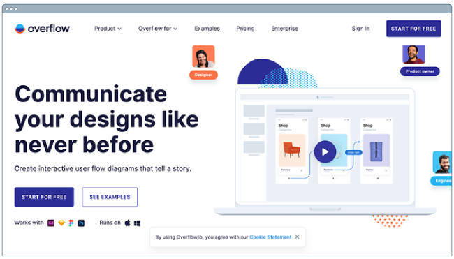
Frans Hals Museum
Award: Site of the Year (2018), Awwwards
It can be tough for a museum to present all of its artwork together on a cohesive website. That’s what makes the website of the Frans Hals Museum so impressive.
Located in the Netherlands, this museum has created a website that uses a combination of digital design elements and its own exhibits. This mixture helps visitors understand what they’ll see, when they can see it, and where else they can get a taste of what this museum has to offer.
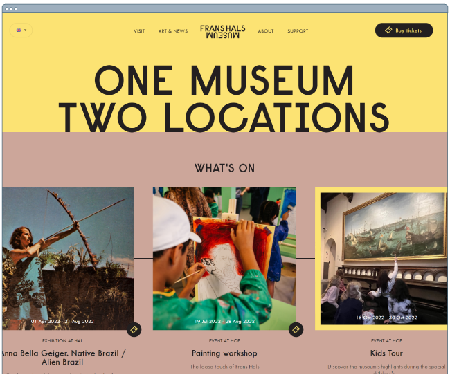
Best Website Designs from 2017
Simply Chocolate
Award: Site of the Year (2017), Awwwards
You’ll get a craving for chocolate just looking at this website — and in a way, that’s Simply Chocolate‘s website working as designed.
This appetizing website is that of a Denmark chocolate maker Simply Chocolate. Its website uses a variety of colors (and creative product names) to promote each chocolate bar. And as you scroll from one product to the next, they all seem to remain consistent in brand.
The three-dimensional appearance of each chocolate bar makes you feel like you can grab it off of your computer screen, while the “Add to Box” CTA to the top-left is ideally placed for users to select the products they want while browsing.
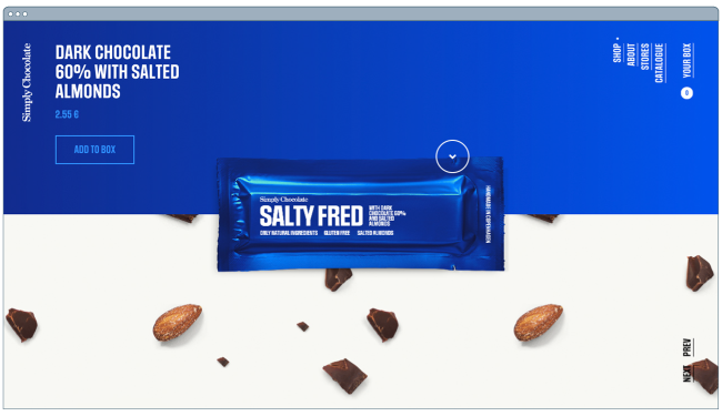
NOWNESS
Award: Best Cultural Blog/Website, 2017 Webby Awards
NOWNESS is perhaps the coolest crowdsourced video blog on the internet. That was a mouthful…what does it all mean?
NOWNESS‘ crowdsourcing is part of what makes it an award-winner. This means most of its content comes from independent creatives — an increasingly popular way for businesses to publish content.
NOWNESS is also a video channel, meaning all of its blog content is in video format. Together, these qualities help make Nowness a captivating hub for the stories that brands everywhere strive to tell.
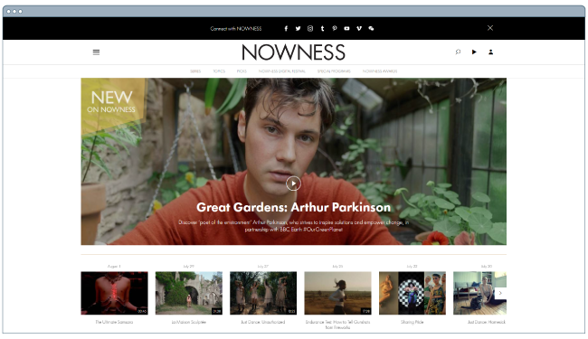 Image Source
Best Website Designs from 2016
Rainforest Guardians
Award: Best Activism Website, 2016 Webby Awards
Rainforest Guardians was one of the most immersive nonprofit websites of 2016. Seeking to build awareness around deforestation, the site allows users to “visit” the various villages, natives, and waterways that make up the Amazon Rainforest.
The site puts interactivity at the center of its user experience — a wise choice if your goal is to get people to connect with your cause and convert into volunteers.
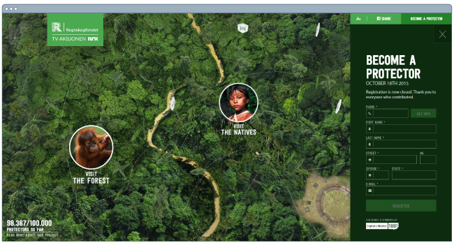
Protest Sportswear
Award: Site of the Year (2016), Awwwards
The Awwwards calls Protest Sportswear a “shoppable lookbook,” and that’s exactly what this site is. As a clothing outfitter, this company has reinvented the way they market its product: Rather than promoting garments of clothing, Protest Sportswear promotes “looks.”
This makes the company’s product the most appealing part of the website itself, using a collage of styles to design a homepage that changes as often as its customer’s styles do.
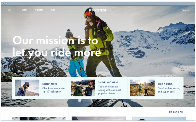
The Teacher’s Guild
Award: Best Association Website, 2016 Webby Awards
The Teacher’s Guild is a professional community of educators that addresses some of the most critical challenges in education. What makes this website award-winning is how it balances diverse content types — programs, solutions, approaches, and collaborations — without overwhelming visitors.
Not only are the background visuals prominently placed, but they also use white space to emphasize the written calls to action at the center, as shown in the screenshot below.
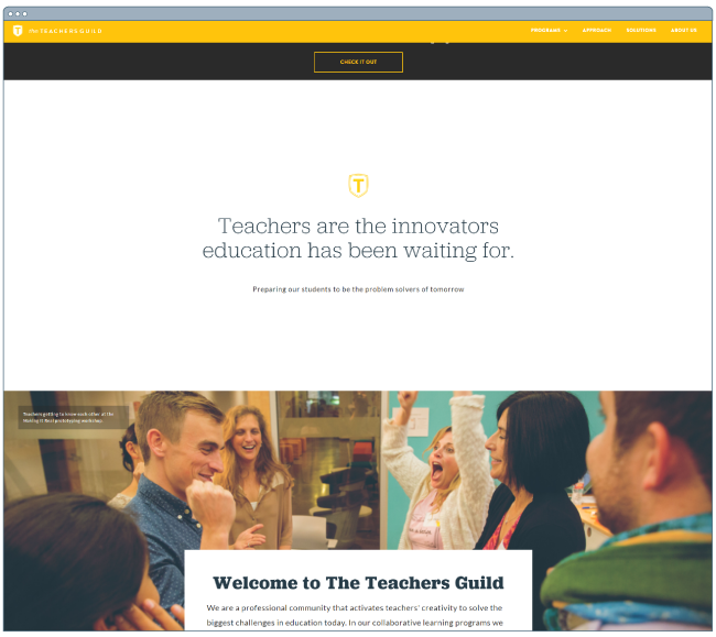
Best Website Designs from 2015 – 2014
Virgin America
Award: Most Significant Industry Evolution, 2014 UX Awards
In a world where airline websites are known to be riddled with major usability issues, Virgin America has one of the best websites that pushes usability, accessibility, and responsive design forward.
 Image Source
Feed
Award: Site of the Day (6/6/2015), Awwwards
Not only is Feed an interesting concept, but it also has a stunning execution that challenges our understanding of what is possible on the web. Through a creative blend of animation and video, the site immerses users in an engaging experience.
As an atypical site, it contains several unique usability elements, including navigation that doubles as a scroll progress bar.
 Image Source
ETQ
Award: Site of the Day (5/19/2015), Awwwards
ETQ takes a minimalist approach to ecommerce. Big, compelling visuals of their product lay against simple, flat backgrounds accompanied by strong typography that keeps the focus on exactly what the user came there to see: shoes.
Mikiya Kobayashi
Award: Site of the Day (7/4/2015), Awwwards
Mikiya is a Product Designer with a minimalistic portfolio that showcases his work through strong photography and subtle animations. His full site was originally created in Japanese and then translated into English, helping demonstrate the international scalability of his design.
Woven Magazine
Award: Site of the Day (4/4/2015), Best Website Gallery
Woven is an online publication that celebrates artists, crafters, and creators alike. Its website confirms that publications can (and should) have beautiful, engaging visuals with easy-to-read content. Free of distractions like pop-ups and intrusive ads, this site is all about the experience of the content itself.
JOHO’s Bean
Award: FWA of the Day (8/7/2015), Favorite Website Awards
The website for JOHO’s Bean has incredible imagery, interactivity, storytelling, visual design, and most of all, sound engineering. These all come together to create a compelling, emotional, and engaging site that tells the story of a coffee bean’s journey.
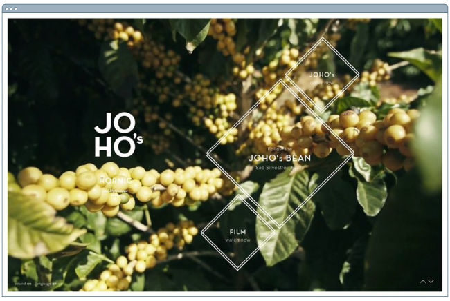 Image Source
World of SWISS
Award: Best User Interface, 2015 Webby Awards
Another airline? Yep. SWISS airlines built an incredibly immersive site that tells the story of what it’s like to fly with them — and they did too great of a job to be ignored. Strong visuals and animations introduce the user to different sections of the site that are packed with information beyond the usual sales and marketing pitch.
 Image Source
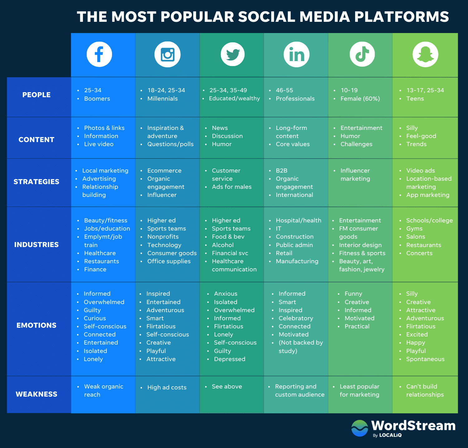
Other Cool Website Designs
Guillaume Tomasi
As a Photographer in Montreal, Guillaume Tomasi has built a portfolio that’s truly fit to house his unique and awe-inspiring photography. His surreal photo style is juxtaposed by his simple, flat, empty, and minimalistic portfolio design that places all of the focus on the work itself.
His unique series navigation coupled with art-gallery-inspired work introductions and perfect scrolling interactions yield an experience reminiscent of that of a real gallery.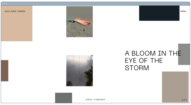
Image Source
The District
This branding agency takes its imagery seriously, and it should — it handles all channels of media for its clients. The District’s website alone is a journey through some of the most beautiful artwork and photography you’ve ever seen.
These provocative tiles change rapidly as you explore the website, and the wackier they seem, the more interested you become in learning about their past work.
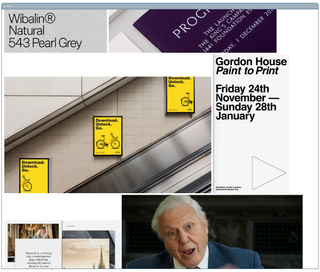
Image Source
Tej Chauhan
Tej Chauhan has turned impressionist artwork into a business model with this intriguing website. Each image on this product developer’s homepage slides out to cover the previous image, offering little context around the object you now see in front of you. But it’s that lack of context that makes you want to learn more.
Plus, the tagline, “Souvenirs of The Near Future,” suggests these objects are a part of their product line — and an opportunity for you to bring these innovative objects into your life.

Image Source
Want a similar look for your website? Check out the new CMS Hub theme collection on the Envato marketplace.
Amanda Martocchio Architecture
An architecture firm might not specialize in web development, but its website should still demonstrate its commitment to visually pleasing design. Amanda Martocchio took that to heart with this gorgeous website.
It’s no secret that Amanda Martocchio Architecture loves its work — each picture on the homepage of its website is an enchanting shot of the houses the company designs. The website labels every house you scroll through with the type of design that was intended, along with numerous angles to each building.

Where to Get Your Design Inspiration
If you want some design inspo, the good news is that you can find it just about everywhere.
One of the best ways to get inspiration for design is through travel. When you visit new places, you’re forced to get out of your comfort zone and experience something foreign.
What makes design so interesting is that everyone sees it differently and so, there’s always more to discover.
Another way to get design inspiration IRL is through the media. Every day, we are inundated with visual content. We make decisions about what we like, what we don’t like, and continue on our day.
But what if you were more intentional about how you viewed those interactions? You could come out of it with valuable insights.
You also can’t forget to leverage design communities. From design conferences to Reddit forums, there are hundreds of groups out there that can offer inspiration as well as advice.
Now that we’ve covered some IRL design inspiration sources, let’s cover the digital ones.
Website Design Inspiration Sources
1. HubSpot’s Website Themes & Templates Marketplace
HubSpot’s Website Themes & Templates Marketplace (previously HubSpot Asset Marketplace) houses hundreds of website templates that you can sift through to get inspired for your own website.
The best part of the marketplace is that you can narrow down by industry and feature, allowing you to see the templates that are most relevant.
Once you find a template you like, you can view a live preview of the site to get a full experience then download it if you decide to use it.
2. Dribble
Dribble is where designers go to get inspired and to share their work. The website has everything from animation and branding to illustration and mobile.
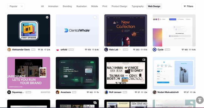
Once you navigate to the “Web Design” tab on the homepage, you can filter results by color scheme, editing software, timeframe, and tags.
Furthermore, if you find a designer whose work you like, you can save the design for future reference and follow their work to see other designs on their profile.
This is an incredible resource to use whether you’re starting from scratch or already have a solid plan in mind.
3. Bēhance
This is another digital platform full of creative inspiration to leverage ahead of your website design project.
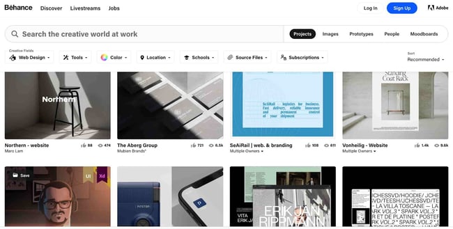
One of the best features on this site is the ability to filter by location. This allows you to see how designers in different regions differ in technique and style.
This can be particularly helpful if you are designing a website for a foreign, unfamiliar market. You can gain interesting insights by evaluating the decisions made by Behance designers.
4. Pttrns
Want to focus on mobile web design? Pttrns is the place to go.
This subscription-based platform allows you to gain access to thousands of mobile design templates and get advice from top designers all over the world.
Additional features on this platform include:
- A favorites and collections folder to store your favorite designs.
- A studio to interact with other designers and get advice.
- A design guide to understand the strategy behind the designs.
Website Design Ideas
Now that you’ve seen a number of beautifully designed and award-winning platforms, keep these potential ideas in mind as you create your own. Here are a few suggestions we have to help you can create a site that could appear on our best website design inspiration list.
- Consider ways that you can make your website interactive, like the 1917 example.
- Make a website that emphasizes the mobile experience, even while it still has a good UX on desktops.
- Create a website that tells a story about your brand with photos, text, or video.
- If you can’t create a heavily interactive site, consider drawing in eyes with a site that presents a slideshow of your photos.
- Ensure your call-to-actions are easy to see and encourage visitors to continue exploring your site
- Keep navigation clean. Ensure your visitors always know how to get back to the homepage.
- Integrate your social media sites via social embed buttons, so site visitors can easily follow you on your various social channels.
- Keep each of your web pages consistent in design — including font, colors, images, and messaging.
- Test your website’s usability with a heat map, which will show you on which web pages your visitors are most likely to bounce.
- Include a live chat or chatbot to give visitors the option to engage with you directly on your website if they prefer live chat to phone calls. Live chat can automate functions for your sales and service reps and create a better communication experience for the customer.
- Get an SSL certificate to ensure your website is secure. SSL is part of Google’s search ranking algorithm, so an SSL certificate can help you rank higher in search.
Build a Beautiful Website for your Business
Now that you’ve perused our best website design inspiration, it’s time to get started creating your own site. You’d be surprised how easy designing a site is once you have a look and feel in mind.
Once you’re ready to start coding or dragging and dropping, you’ll have a beautiful website that your visitors will enjoy.
Editor’s note: This post was originally published in January 2021 and has been updated for comprehensiveness.