
17 Clever Print Ad Examples To Complement Your Digital Campaign
You would think print advertising is void of innovation today, but that’s actually not the case.
In fact, many brands are finding new ways to merge the digital and physical world through magazine and newspaper ads.
To give you a sense of how businesses today are incorporating print ads into their digital strategy, we’ve collected 17 print ads that’ll make you rethink the word “traditional.”
Click here to download more examples of exceptional advertising campaigns.
17 Interactive Print Advertisements That Are Still Innovative Today
1. Glacial
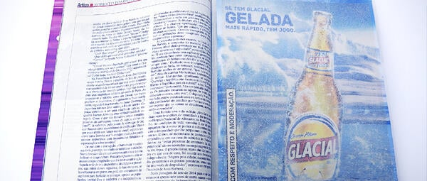
If you’ve ever wanted to speed up the beer-cooling process, you’ll understand the allure of this print ad from Glacial. You soak the ad in water, wrap it around the bottle, and put it in the freezer. The print ad was made with salt particles, which reduce the freezing point of water.
2. Nivea
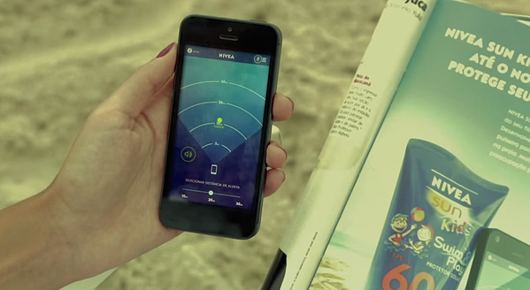
This print ad won the Mobile Grand Prix at Cannes in 2014. The ad includes a wristband you could attach to your children as they run around the beach. The app lets you set a distance and receive alerts if your children wander beyond the limit.
3. UTEC
UTEC, an engineering and technology university, wanted to recruit more students. Instead of placing the smiling faces of young graduates on a billboard, it created an ad that pulled moisture out of the air in Lima, Peru, which sees very little rain each year.
4. Motorola
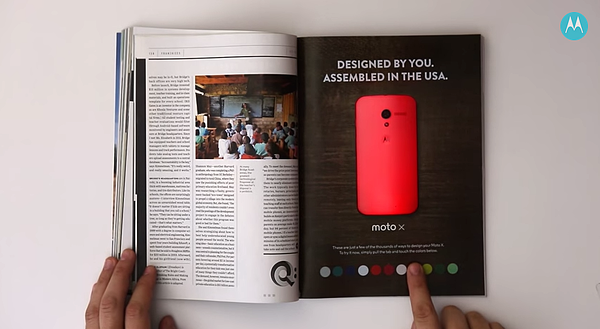
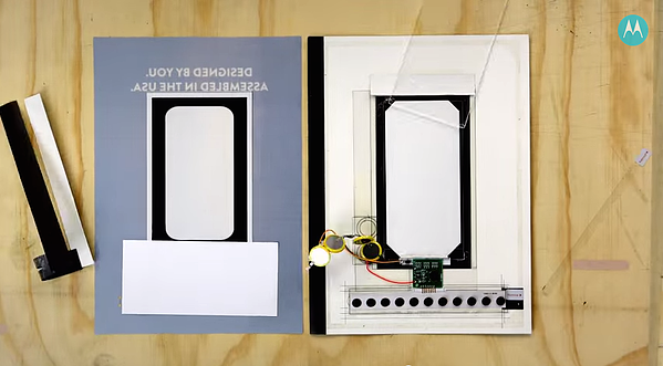
The brand teamed up with Wired to promote the Moto X’s customization. People could change the color of the phone by pushing buttons.
5. Kontor Records
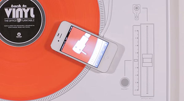
Kontor Records wanted to get the attention of creative advertising professionals. Instead of mailing out the latest CD, it sent a vinyl record via email to its mailing list with a paper turntable that could be played with an iPhone.
6. Peugot
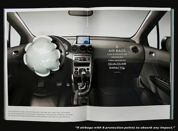
This print ad for the car brand features a one-page interactive print ad with a front view of the car that asked people to hit the ad. The spread following it included a mini air bag that inflated when hit.
7. Lexus
In 2013, Lexus released an ad that, when placed over an iPad, revealed the car in action with different backgrounds and music.
8. Lladro Lighting
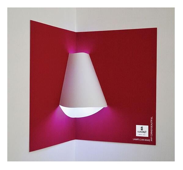
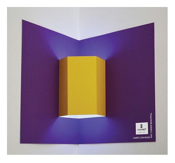
Why advertise lamps when you can give people an ad that transforms into a lamp? Lladro print ads act like a pop-up book, allowing people to create their own lamp shape by mounting the paper in a corner.
9. Reporters Without Borders
While freedom of the press is guaranteed in countries like Norway, Sweden, and the United States, not all countries make the same promise to its reporters.
That’s why Reporters Without Borders, a non-profit organization, created an interactive print ad to discuss the importance of the freedom of the press.
The campaign featured large portraits of three controversial world leaders against the freedom of the press. To interact with it, readers could scan the QR codes placed at the bottom of the ad. Once activated, journalists began talking about the dangers of being a reporter.
10. Volkswagon
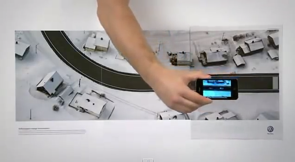
Volkswagon published a three-page spread so readers could take a test drive. You could download an app and can try out different features, including the “Lane Assist” mode that would cause the phone to vibrate when it got too close to one side of the road.
11. Sonera
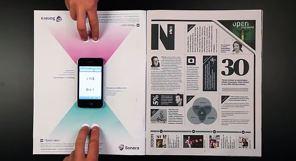
The telecommunications company highlighted its 4G wireless speed with a print ad that served as the game board for an iPhone game.
12. C&A
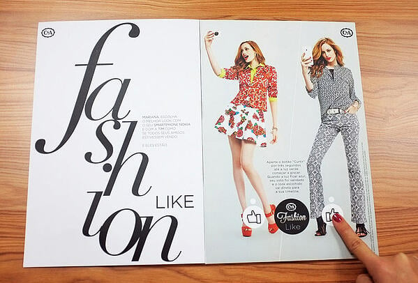
Fashion retailer C&A published a print ad in customized magazine editions that were linked to a person’s Facebook account. Readers could Like their favorite looks on Facebook by pressing the button in the ad. The data was then sent to a leaderboard in the store.
13. Nivea
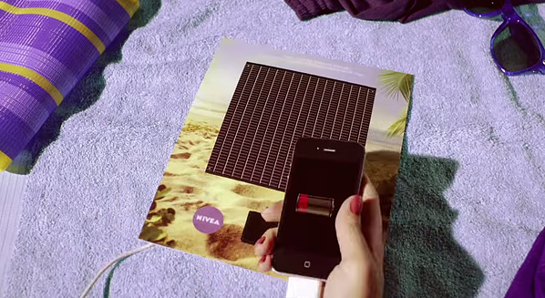
To promote its sunscreen products, Nivea created a print ad with a solar panel that could charge a cell phone.
14. Shikun & Binui Solaria
An Israeli energy company launched this print ad to promote green energy. The print ad just seems like a simple black-and-white drawing. However, when you hold it up to sunlight, vibrant colors appear.
15. CW Network
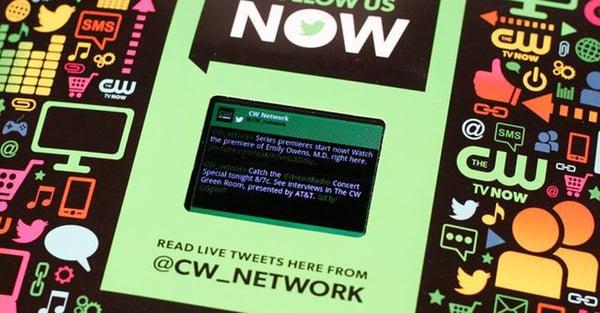
The CW published this print ad in Entertainment Weekly in 2012. The ad featured a LCD screen that is updated with videos from the network and a stream of live tweets.
16. Lipton
When tourists and locals are walking around in the heat of the summer, they probably want to cool down. Lipton took advantage of that in its interactive print ad at a bus stop.
Lipton’s ad, known as the “Cool Down Stop,” had a button that passersby could press. Once pressed, users were lightly misted with cold water — a nice break from the heat.
This print ad cleverly associated a refreshing mist with Lipton drinks.
17. KFC
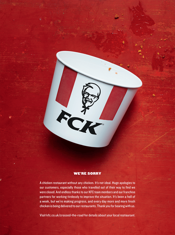
When Kentucky Fried Chicken ran out chicken to serve at its restaurants — a PR nightmare — the company had to apologize to the public.
Instead of posting an apology on social media, its media and marketing agencies decided to focus on a print ad that worked in conjunction with a website page online where readers could get more information.
The print ad was a genius move, using humor and humility to relate to its customers with its apology.
Digital content has been the strategy of choice for marketers for more than a decade now, but that doesn’t mean print ads are extinct. It just means brands must be much more creative with the stories they tell on paper.
Ready to revamp your approach to advertising? Try HubSpot’s ad product for free below.
Editor’s note: This post was originally published in March 2015 and has been updated for comprehensiveness.

Super Bowl Ads Were Short This Year: Here’s Why That Worked
Each year, it seems like most of the Super Bowl is consumed by ads.
But this year, when the Super Bowl ended before 10:30 PM EST, some big-game party-goers wondered, “Were there fewer ads this year?”
In reality, the game ended at a decent hour because the Kansas City Chiefs smoothly took down the San Francisco 49ers without entering overtime. Additionally, with over 50 commercials, this year’s Super Bowl aired more ads than the 2019 game — which only hosted 42 ads.
However, in recent years, ads of 30-seconds or less have become the norm. So, although there were more ads this year, many of them were on the extremely-short side.
This isn’t shocking. Each year, Super Bowl ad slots get more and more expensive. This year, advertisers paid $5.6 million for 30-second slots. This increased from roughly $5.1 million in 2019.
Although keeping an ad under half a minute obviously saved companies millions of dollars, this time limit posed unique challenges for brands that purchased shorter slots.
To be considered successful, these short ads would need to grab attention from audiences in 30 seconds or less. These brands also had to create content that would memorably stand out in a chaotic stream of other insanely high-priced ads.
If you’re a video marketer, you’ve probably had to deal with similar time-crunches when creating content on a smaller scale.
For example, when it comes to in-stream or digital video advertising, the shorter your video is, the cheaper it will be.
Even if you’re highly skilled in creating videos that are 30-seconds or less, you might also worry about the research-backed fact that the average viewer only pays attention to online content for eight to 12 seconds.
This year, while many brands that bought Super Bowl ad slots of 30 seconds or less relied on quick celebrity cameos, extreme stunts, nonsensical humor, and insanely expensive special effects to grab attention, some companies actually delivered bite-sized commercials that boosted brand awareness with clever, informative, or incredibly memorable storylines.
So, how did they do it?
To help inspire you as you build a short-form video advertising strategy, here’s a list of some of the best 2020 Super Bowl ads that were 30-seconds or less.
7 Effective Super Bowl Ads That Were 30 Seconds or Less
1. Hulu: “Tom Brady’s Big Announcement”
In a classic example of newsjacking, Hulu enlisted the help of the New England Patriots Quarterback Tom Brady, to highlight some of the platform’s newest features. Aside from presenting the benefits of a Hulu subscription, the commercial also aims to intrigue viewers who wonder, “Will Tom Brady return to the Patriots next season?”
Since Tom Brady and the Patriots lost the playoffs, rumors have swirled about whether or not the long-time quarterback would return to the team now that his contract is up. Some have also suggested that Brady, one of the oldest NFL quarterbacks ever, would soon retire.
Although Brady doesn’t give any specific announcements about his future in the Hulu ad, he gives a speech that makes viewers suspect that he will be returning to the NFL in some way next season.
The commercial begins with Brady somberly walking on to a dark football field to the sad musical overlay of the piano.
“They say all good things must come to end, so to my teammates, my family, and my friends — you deserve to hear this from me,” a narration says as you begin to think Brady will announce something important having to do with his career.
Suddenly, the music shifts to a peppy hip-hop style as Brady shockingly says, “Hulu doesn’t just have sports.”
“According to the script they just gave me, Hulu has your favorite cable channels, plus the greatest shows, movies, and originals of all time. So it’s time to say goodbye to TV as you know it,” he adds.
Just when you think that this is just a Hulu commercial, Brady looks at the camera and says, “But me? I’m not going anywhere.”
This is a great example of how Hulu leverages a news topic that rumors had been swirling around. Although Hulu didn’t have Brady make a specific announcement, the brand reinvigorates the questions and excitement around the news topic while still highlighting its product’s best features.
2. Mountain Dew: “As Good As The Original?”
While Hulu’s ad leverages news topics, Mountain Dew’s Super Bowl ad plays up nostalgia with a 30-second comedic spoof of the 1980 horror film, The Shining.
In the spoof, Breaking Bad‘s Bryan Cranston plays the crazed character Jack, a role famously held by Jack Nicholson. Meanwhile, Tracee Ellis Ross of Black-ish plays Jack’s terrified wife.
In the scene which is spoofed, Jack walks down a hallway into a bedroom looking for his wife while armed with an ax. He then creepily approaches an ensuite bathroom that his wife’s hiding in, pleasantly knocks on the door, then smashes a hole in the wood. He iconically sticks his face through the hole, stares at his wife with crazy eyes, and says, “Here’s Johnny!”
In the spoof, Bryan Cranston walks towards the bathroom door and says, “Come out, come out wherever you are, I’ve got Mountain Dew Zero Sugar, with the same refreshing taste as the original.”
As Cranston smashes the door, you see an overdramatic Tracee Ellis Ross screaming in the bathroom as Cranston looks at her and says, “Here’s Mountain Dew Zero!”
Ellis Ross suddenly stops screaming, grabs the drink, and says, “Well, I am thirsty.”
The commercial ends with text saying, “As good as the original. Maybe even better?”
This commercial is a great use of how brands can leverage metaphors and nostalgia to tell the story of their products. Both the spoof and Mountain Dew Zero aim to be “As good as the original.” This type of ad shows a skeptic viewer that a new product or brand extension is as good or better than a product they’ve come to know and love, similarly to how they appreciate a classic horror film.
3. Olay: “#MakeSpaceForWomen”
Olay used it’s 30-second time slot to tell a space-themed story aimed at empowering women and poking fun at today’s outdated gender stereotypes.
The commercial, which depicts three women known for their achievements, views on equality, and activism suiting up to go to space. On the spaceship for, “Mission Make Space for Women,” sits comedian and A Little Late with Lilly Singh host Lily Singh, best-selling author and former Busy Tonight host Busy Philipps, and retired astronaut Nicole Stott.
Meanwhile, Taraji P. Henson, star of the NASA biopic Hidden Figures, monitors the flight from Mission Control.
Although the commercial is peppy and empowering, it begins by acknowledging how the news still discusses female success in an outdated way. The ad opens with award-winning journalist Katie Couric reading, “Is there enough space for women in space?” off of a prompter. She then turns to the camera crew and says, “Who wrote that? Are people still asking that question?”
As MIssion Make Space for Women lifts off, Henson says, “When we make space for women, we make space for everyone.”
From the spaceship, Singh and Philipps announce that for each tweet with the hashtag #MakeSpaceForWomen, Olay will donate $1 to Girls Who Code, a non-profit that aims to empower women in STEM.
When a company, like Olay, targets an audience of a certain gender or demographic, creating ad content and philanthropic campaigns that empower the demographic adds credibility behind the company’s mission. While some viewers might have just known Olay as a women’s skincare line, they might watch this ad and recognize that the company cares about and wants to empower its female customers.
If your brand’s target audience includes subgroups or genders that could be under or misrepresented, take a note from Olay, and identify inclusive marketing strategies that acknowledge your audience’s strengths and unique qualities. Not only will this give viewers the idea that you care about your customers, but it will also help people in different groups relate more emotionally to your content.
4. Cheetos: “MC Hammer: Where it All Began”
Like Mountain Dew, Cheetos also plays up nostalgia in its short and sweet Super Bowl ad. But, instead of mimicking something that already happened, Cheetos interjected its product into an unseen moment in pop culture history.
How did Cheetos do this? In the ad, MC Hammer gets the idea for the “U Can’t Touch This” melody while eating a handful of Cheetos. He starts humming it, reaches out to play it on piano, sees the cheesy Cheeto crumbs all over his fingers, and simply says, “Wait. I can’t touch this.”
Suddenly, he gasps and his eyes open wide with inspiration as he’s stumbled upon the chorus to his now-iconic song, “U Can’t Touch This.”
Yes. Recreating MC Hammer’s life will be impossible without the budget to hire the artist himself. But, aside from the great celebrity cameo more brilliantly tells a short fictional story.
Storytelling is a great tactic that allows your viewer to get intrigued and engaged by memorable content. While you probably can’t afford to tell a story with a celebrity star in it, take a note from Cheetos and use your content to tell an interesting story that centers around your product. To learn more about storytelling, check out this helpful guide.
5. WeatherTech: “Lucky Dog”
As surprising as this sound, an advertisement doesn’t always need to discuss exactly what your product does. In fact, you can use your prized slot to tell a story about something your company, brand, or leadership is passionate about. While this type of ad won’t highlight your product directly, it shows audiences another side of your company and makes your brand look like it’s run by actual humans, rather than emotionless executives fueled by power or money.
One great example of this strategy was the below ad from WeatherTech.
After the CEO of WeatherTech’s dog was diagnosed and treated for a near-lethal form of cancer, WeatherTech used its Super Bowl slot to highlight the University of Wisconsin Veterinary Hospital, the organization that saved the dog.
The commercial, which is narrated from the perspective of the dog is incredibly heartwarming and makes both the organization and WeatherTech look like companies that care about their clients.
“Hi. I’m Scout, and I’m a lucky dog. It’s not because I have this big stick or because I was on the WeatherTech Super Bowl commercial last year. It’s because I beat cancer,” says the dog at the opening of the commercial. “I’m alive thanks to cutting edge technology at the University of Wisconsin’s Veterinary School of Medicine.
As the ad ends, it shows a video clip of Scout frolicking on the beach as another narrator concludes with, “Pets make a difference in our lives. You can make a difference in theirs. Donate now at WeatherTech.com/donate.”
6. Pop-Tarts Fixes the Pretzel Commercial
While most of the ads on this list tell a narrative story, Pop-Tarts’ aired an ad that humorously overemphasizes aspects of traditional TV commercials. This goofy ad spoof was positions their new Pretzel Pop-Tart as an innovation to traditional pretzels.
To add over-embellishments, Pop-Tarts enlisted Queer Eye’s outgoing stylist Johnathan Van Ness to host the commercial.
Like traditional infomercials, the ad highlights a pain point and shows how the new Pretzel Pop-Tart serves as a solution — but in an incredibly eccentric way.
The commercial opens in black and white as a woman struggles to eat ginormous pretzels. Van Ness begins a narration that asks, “Are you tired of your pretzels not being Pop-Tarts Toaster Pastries? Are you strugs [struggling] to snack?”
The commercial shifts from black and white to color as Van Ness appears on screen to help the woman who’s struggling to eat pretzels. He says, “Pop-Tarts fixed that for you,” in reference to her pretzel dilemma. Then, he starts highlighting the new Pop-Tarts Pretzel flavor.
Although every Super Bowl is filled with innovative ads that aim to be memorable with a deep storyline, Pop-Tarts chose to be unique by revitalizing a traditional ad style.
With this goofy Pop-Tarts commercial, the brand demonstrates that it can’t hurt to still leverage the traditional “problem/solution” ad format — as long as the content is still interesting, humorous, or eye-catching to viewers.
7. Planters: “Baby Nut”
When it came to Planters, the nut brand decided to attract attention with a bizarre two-part series of 30-second ads that culminated during the Super Bowl.
In the first ad, which circulated days before the sporting event, Planters’ 104-year-old top-hatted mascot — Mr. Peanut — finds himself hanging off a cliff branch with two men. The men fight over who will let go to save Mr. Peanut. But, Mr. Peanut shockingly and heroically jumps off the branch to save them. He falls to his death and explodes on impact.
Odd right? The ad series only got weirder. In the Super Bowl commercial, friends of Mr. Peanut cry as he’s buried during a funeral. As the Kool-Aid Man sheds tears over the grave, the dirt pile turns into plants as a reincarnated “Baby Nut” emerges in a tophat. With the same grown man’s voice as Mr. Peanut, Baby Nut says, “I’m back,” before asking for his monocle.
This is pretty bizarre, but the commercial isn’t that far off from rebranding trends we’ve seen recently in the media. For example, bloggers have called Baby Nut a “Baby Yoda rip off,” referencing how The Mandalorian revamped the Star Wars franchise when one character discovered “The Child” — a baby member of Yoda’s species.
While the Baby Nut announcement did gain some online scrutiny, the commercial is still effective because its bizarreness makes it memorable. Even though some criticized the ad, many viewers enjoyed the weirdness. In fact, some publications report that it “divided” social media.
Ultimately, when we look back on past Super Bowl ads, we won’t just remember the ads that followed a standard format or fit into a narrative norm. We’ll also remember the weirder ads and the brands that created them.
How to Capture Viewers in 30-Seconds or Less
Drawing attention from audiences in just seconds might seem like a daunting task, but the brands above have proven that it certainly is possible.
And, although you can’t put all your ad dollars into special effects and celebrity cameos, there are scalable strategies that you can learn from. Here are just a few:
- Make a statement: WeatherTech and Olay used their ad slots to discuss causes that their brands were passionate about. This makes your brand look more relatable and like it cares about its customers.
- Don’t be afraid of traditional formats: As Pop-Tarts showed us, there’s no harm in creating a traditional ad format that shows a problem and how your product can solve it.
- Embrace emotions: Whether it’s laughter, empowerment, or even confusion, ensure that your content leaves viewers with some sort of feelings. This will help them connect more emotionally to your content, product, and brand.
Want to learn more about how you can affordably leverage some of the most common Super Bowl ad strategies, check out this blog post.

500 Atlassians Worked Remotely for a Week — Here’s What We Learned
Like most companies, Atlassian has a mixture of people who are working from home full-time (like me) and those who grab an ad-hoc day when the plumber is coming or they can’t stop sneezing. But our collective WFH muscles got a major workout recently when 500 of us went remote during the week-long gap between moving out of one office space and into another.
I talked to colleagues in several departments at Atlassian and dug into my own bag of tricks to bring you this collection of tips for working from home. And because working from home came with a few surprises, I’ll also share some little-known facts and a classic blooper – don’t miss these if you’re thinking of transitioning to full-time remote work.
Working From Home Tips
1. Dedicate a work space and make it your own.
Yes, this tip is at the top of every other list of working from home tips you’ve ever read. There’s a reason for that. When you work from an office, your commute helps your brain shift into “work mode”. At home, you can create that same mental shift by dedicating a spot for working.
“I have a separate desk at home that is pretty much only used for work,” says Miles, a marketing manager. “This helps me focus because I think of that area as a mini office.” If you’re short on space and have to use your couch or kitchen table, no worries. Just be consistent.

Trick out your home office space on the cheap, with the help of flea markets and a bit of DIY ingenuity.
Don’t just stop once you’ve acquired a desk, though. Give your space some personality with wall art, framed photos, a desk lamp to die for, or an essential oil diffuser if that’s your jam.
2. Pace yourself.
Y’know how running to the office kitchen to refill your coffee “real quick-like” typically results in a 10-minute hallway convo about your big new project? I didn’t understand the value of interludes like that until I went remote. At first, I would blast through my tasks for the week in about three days because there were so few interruptions. Sounds great, except I’d be completely out of gas by Thursday. And Fridays were, umm, less than productive.
Your work week is a marathon – not a sprint. I quickly learned to sprinkle a few 5-10 minute pace breaks throughout the day, away from my desk if possible. For my teammate Claire, her furry friend makes all the difference. “I take my dog for a walk before I start work, at lunch, early afternoon, and after I’m done for the day. It’s a great mental break.” Not to mention healthy.
Do ten push-ups or hold yourself in plank pose. Pick up your guitar. Make your grocery list. Your stamina (and your team) will thank you.
3. Be brutally self-aware.
While some people (me included) absolutely love working from home, others love the idea of working from home… only to find the reality doesn’t suit them. And that’s ok. “It’s tough to get started, and it’s tough to set things aside when I’m done for the day,” says Jim, a developer on the Bitbucket team. “I also feel isolated from the rest of the team.” That’s a common sentiment, so don’t be afraid to own it.
If transferring back into an office isn’t an option, self-awareness will help you find your WFH groove. Develop some strategies for staying connected to your team and understand what will help you focus vs. what will distract you. Have an open, on-going dialog with your team and check in with yourself regularly. Conversely, if you love working from home, take the time to reflect on why and make the most of those aspects.
4. Stock your kitchen with food you can be proud of.
For those of us who’ve been spoiled by posh perks like company-provided meals, providing your own coffee and breakfast and lunch and snacks is quite an adjustment. A few days into his week of remote work, customer support analyst Orpheus (who is every bit as cool as his name suggests) lamented his lack of grab n’ go gnoshables: “Folks who work from home need a snack food budget.”
Regardless of who pays, the logistics are on you. If your lunch game involves anything more complicated than warming up last night’s leftovers, you’ll need to build prep and clean-up time into your workday routine. For maximum efficiency, pick up a full week’s worth of supplies each Monday morning (unless a daily walk to the store is your pace break of choice). Choose brain-boosting superfoods like almonds, broccoli, berries, beans, eggs, and salmon. Remember, working from home tends to be more sedentary than office-based work, so skip the Oreos.
5. Dress as if you were going to the office (almost).
Full-blown business attire probably isn’t necessary, but do make yourself presentable. You’re going to end up on a lot of video calls, for one thing (more on that later). More importantly, getting dressed is another important part of the mental shift into work mode. But don’t stop there. Establish a morning routine that is as close as possible to your routine when you’re going into an office. Here’s mine:
- 6:00 – Wake up, brush teeth, exercise.
- 7:00 – Get kids up, brew coffee, shower, get dressed (including hair and make-up), unload the dishwasher, help my daughter do her hair, curse at the stray Legos I inevitably step on.
- 8:00 – Take my son to preschool.
- 8:30 – Start work.
Rituals allow us to make transitions with minimal mental and emotional turbulence. Yours might be totally mundane like mine, or you might mix it up by working for an hour before you shower and dress. The important thing is to find a routine that works for you and step through it consistently. “The routine of physically getting ready for work is one of the most important things I did to make my week of working from home productive”, says Cameron, who leads an engineering group of more 250 people.
6. Get over your hang-ups around video conferencing.
Many of us have scars from struggling with video calls in years past – the struggle was real. That may explain why people new to working from home, and their teammates in the office, are often skittish about vid chat. The good news is that now you can jump into a video call in a matter of seconds using Skype, Google Hangouts, Zoom, BlueJeans, or similar services.
“Being comfortable with quick video chats saves a lot of time compared to trading emails or instant messages,” says dev tools marketer Alyss. That face-to-face interaction also does wonders in terms of building relationships with co-workers. However, be prepared to coach your co-workers a little as they learn to embrace the impromptu video call. Their instinct will be to go find an empty conference room, which just wastes time.
If you walked over to their desk in person, you’d have the conversation right there and been done in under a minute. Nobody would think twice about distracting people at neighboring desks because ambient noise is just part of being in an office. Video calls should be treated the same way. Once my teammates got accustomed to that idea, it made working as a distributed team a lot easier.
And while we all want to present an aura of perfect professionalism, I encourage you not to stress about it overly much. There will be a time when the doorbell rings or your cat walks across your laptop, right in front of your camera. My kids sometimes pop into view on evening calls with people across the Pacific and I allow it because they seem to enjoy the extra glimpse into my world. (Your mileage may vary, of course, but we can all thank “the BBC guy” for breaking some serious ground on our behalf.)
And now, a few surprising things about working from home full-time …
Although I felt I’d done my homework before going remote, there was still a lot to learn. If you’re considering going fully remote, take these tidbits into account.
There’s a good chance your boss would rather keep you on as a remote worker than replace you.
Recruiting, interviewing, and on-boarding new employees is a lot of overhead. Many managers feel having an established teammate go remote is far less disruptive on the whole – especially if you’re crushing it lately.
Supporting remote employees is not trivial from an HR and tax perspective.
In the U.S., a company must have a tax entity set up in every state in which they have a full-time employee. For this reason, many companies restrict full-time remote work to states where they already have offices. Benefits administration gets complicated because many insurance carriers operate regionally instead of nationally. And it’s just good business sense to adjust remote employees’ salaries to be in line with where they’re living.
Figuring all this out takes time away from work HR could be doing that might benefit more people. So if you meet resistance from your employer about going remote, don’t assume they’re trying to be evil. They’re just trying to be practical.
There are hidden costs to remote work.
You’ll need the fastest, strongest internet connection money can buy. You’ll be paying for (and taking the time to procure) all your coffee, snacks, and meals. Your utility bill will go up because you’re no longer tuning the heat and/or air conditioning down during the day and you’re keeping more lights on. For most people, however, these new costs will be offset by the fact that you’re not gassing up the car or paying bus fare as often.
Sharing a workspace with a roommate or partner feels less isolated, but has its own challenges.
My husband works remotely too, and when we moved, we made sure to buy a home with an office we can share. It was a great way to start the transition to remote work. Soon, however, he was working almost exclusively from his recliner.
We could never agree on what temperature the room should be, and we both tend to be vocal participants in meetings. So now we work in separate rooms and send chat messages to each other even though we’re 50 feet apart. Which is kind of pathetic, but there it is.
Extroverts actually do quite well as remote workers.
The key to staying in the loop and feeling connected when you’re the one remote member of your team is initiating communication. ABC, baby – always be communicating. We extroverts tend to do this instinctively anyway. Interpersonal interaction is our default setting. So we get a “two birds, one stone” synergy bonus.
Getting everyone to take the meeting via video is kind of awesome.
When only one person joins remotely, it’s easy to (unintentionally) leave them out of the discussion and harder for them to contribute. But when everyone dials in, even if it’s from their desk at the office, we’re all in the same boat and on our best behavior. We raise our hands to speak. We wait until the other person is done talking before chiming in. We’re less likely to let one person dominate the conversation.

All-remote meetings + Halloween = good times.
Besides: you know who enjoys being the one giant head on the TV during meetings? Nobody.
This working from home thing isn’t for everybody.
Although I’d love to tell you the WFH week was universally loved, it wasn’t. Max from marketing said it was “only the best week ever”, while Mary, a product owner, missed the higher level of social interaction and felt like the week was something she “just had to get through”. For others, it was a big empathy-builder. “Be mindful of our remote colleagues and how easy it is for them to feel (or be) left out,” says Adam from technical account management.
Your experience working from home will involve plenty of twists, turns, fails, and wins. Be patient as you and your team adjust, expect the unexpected, and just roll with it. At least you can rest easy knowing you won’t be the first remote worker whose toddler makes an unplanned cameo on international television.
This article was originally published on Atlassian.com and republished with permission.

Event Invitation Emails: How to Create One that Rocks
Running a successful event can be stressful, especially when you have so much to coordinate, including the agenda, the venue, and the speakers
Email event invitations, however, shouldn’t be stressful.
If you’re struggling when deciding what to include in your email event invitation, consider what you’d like to see in an invite — probably information about the agenda, venue, and speakers, right?
Answering the questions your audience will have about your event is a great place to start when writing an email invitation. The rest comes easily, as long as you consider good look at design, inclusive language, and personalization depending on your recipients.
Event invitation emails are helpful because they inspire interest for the event, makes emails personalized, streamlines the process of messaging.
If you’re looking for ideas about how to write an amazing event invitation, keep reading.
How to Write an Email Invitation For an Event
Remember, not all event invitations need to be snazzy, high-budget, high-time investment productions. In fact, effective email invitations can be made in about 20 minutes.
Use this section as a base-level cheat sheet for ideas to implement in your next email campaign.
Before you hit “Schedule,” or “Send,” think about if you can answer the “So what?” question audiences will ask after seeing your invitation in their inbox.
To create a stellar email invite, you have to make sure it’s personalized to the reader, instills curiosity, and effectively communicates what the event will entail.
1. Answer the 5 “W’s”.
First thing’s first, tell your audience what’s happening. In school, some of us learned about the 5 W’s — who, what, when, where, and why.
This is a good rule of thumb when writing an email invite. If you can point to your email and identify all five, you’re off to a great start.
Take this email, for example:
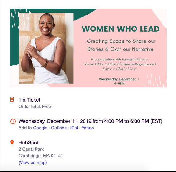
This is a wonderful event email because it answers the five questions:
Who: Vanessa De Luca
What: A seminar called “Women Who Lead”
When: December 11th, 4-6 PM
Where: HubSpot
Why: To have a conversation that emphasizes creating space for women to share and own their narratives.
By reading this email, I wouldn’t have any follow-up questions about event logistics. I know exactly when and where I need to be, and what the event will be about. Notice how this email isn’t the flashiest or most animated, but it gets the job done and still has personality.
2. Remember that less is more.
You need to cover all your bases in email invites, but remember not to crowd your email with details. If you find yourself struggling to fit the time of the event in your email, you probably have too much other information.
You don’t want to make it confusing to read, which might turns readers away from your event. I wouldn’t want to attend an event that comes with a poorly organized email — since I’d assume the event could be poorly organized, as well.
To consider the “less is more” sentiment, take a look at this email from Starbucks about their Happy Hour, which are special times where Starbucks Rewards members can enjoy specialty drinks at lower prices:
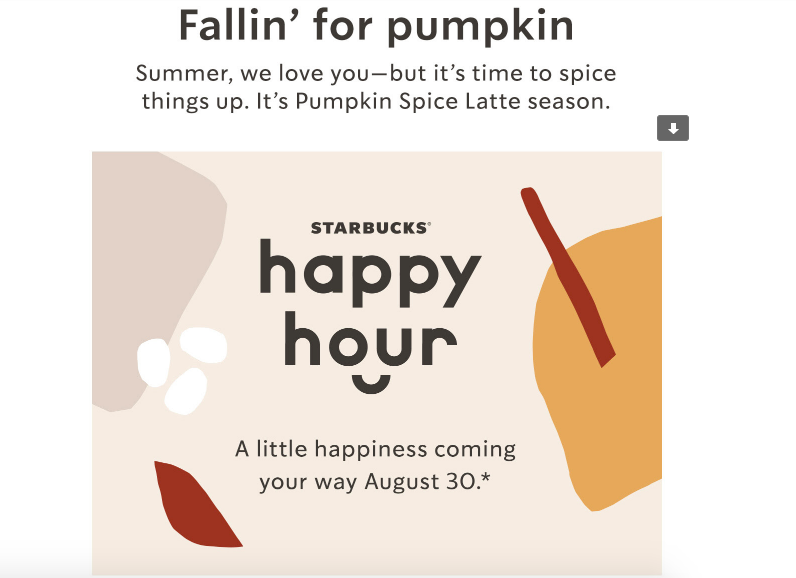
This email still answers all base questions without needing paragraphs to explain. So if your event is a recurring one or something low-key, forego the extra words and set up the email as more of a reminder to RSVP.
3. Don’t forget a CTA.
I’m not sure what we were doing before adding calls-to-action (CTAs) to event invitation emails, but it’s a good thing we’re not in that world anymore. Take this sample email I made using HubSpot’s email software:
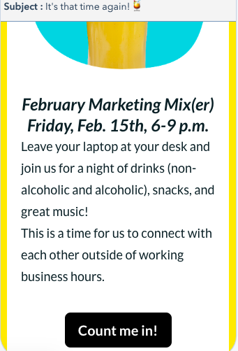
As a consumer who forgets nearly everything that’s not on her calendar, I need a CTA that automatically adds an event to my calendar. Additionally, it makes it easy to RSVP, since all it takes is a click of a button
As a marketer who cares about click-to-open-rates and tracking those who clicked on the CTA, it means being able to measure those results in a content management system to think about ways to improve for the next event email.
Including a CTA is a win for both sides — as a marketer, it gives you metrics to track click-through rates, and consumers will appreciate the delightful user experience.
4. Make the design enjoyable.
Before you finalize your email, think about whether you’d attend the event based solely on the design. If the answer is no, you probably need to put more effort into the aesthetic of your email.
You might be pulling a blank on how to design a beautiful email, and that’s okay. Keep these guidelines in mind:
- Stick with your branding — Start by choosing the colors that match your brand and incorporate them into your email. Colors go a longer way than traditional black and white text.
- Choose a template — As someone who knows little about coding and equally as little about design, templates have become a lifesaver. Websites like Canva or Mailchimp have an array of templates you can use to create your email, like this template from Canva:
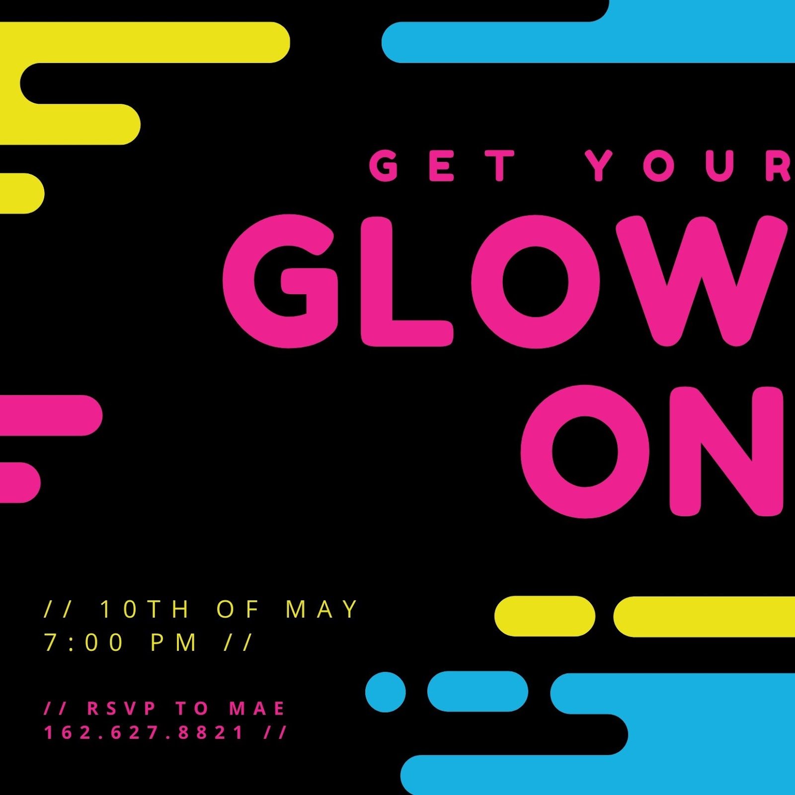
- Play with simple elements — Simple things, like shapes and sizes, really help an email’s design. Refer to the image above and how it uses circles and cylinders to fill negative space in an interesting way.
Thinking of elements like these can brighten up an email, as well as experimenting with sizes of text. If you’ve found you want to take up more space in your email, make the font sizes bigger and incorporate shapes or designs like stripes running across the header.
5. Consider your language.
Always, always check the language of your email. Think about the vibe your message sends, and if it’s the right one you want to convey. You’re communicating your event details, but you’re also conveying your brand.
Double-check elements like your CTA: Is it more inviting than the standard, “Learn more!” that has become routine in emails? What about your text? Does it drop playful language where applicable?
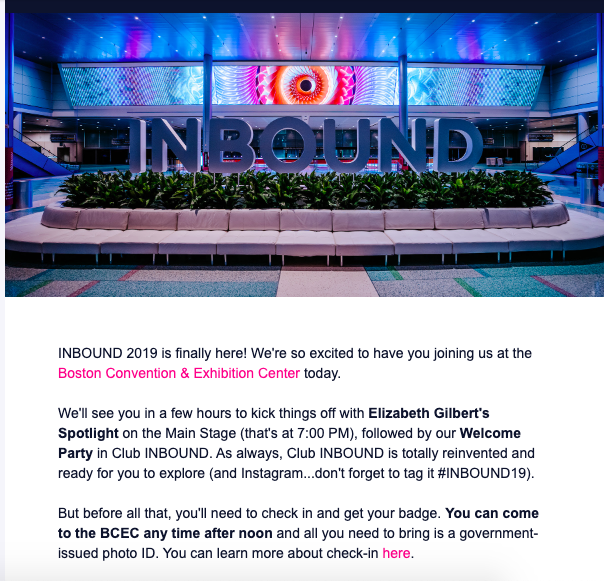
For instance, this INBOUND email is a great example of laid-back language. The language is more conversational than formal.
When you use conversational language, the reader feels more connected to your invite, like you already know them.
6. Think about the details.
When you’re done designing your email, think about little details that will delight your invitees. Have you created a thank you or follow up email? Have you made the subject line something that will captivate subscribers?
Little details like subject lines can be more emotionally engaging to your audience. Ultimately, audiences will be delighted if you show in your invite that you had them in mind. Some people open emails based on the subject line, so it can also make or break your email performance.
If your event location is difficult to find, consider including directions in the bottom of the invite. An event that includes some kind of map or directions in the invite tells me that the sender took people’s commutes into consideration, like this one:
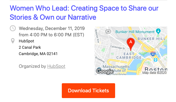
You can include directions by adding a Google Maps screenshot into your email, or using email marketing software to embed a Maps feature into your template.
Your event is set to go off without a hitch, and your email event invitation should, too. If you use online software to create an email, you can pull off a professional, flawless design in less time than you think.
By focusing on the important information, honing in on simple yet effective design elements, and making the language pop, your email invite will set itself apart from others in a way that’s inviting and delightful for readers.
Don’t forget to scroll through your own inbox for inspiration, too!

15 Ads That Prove Nostalgia Is a Powerful Marketing Tactic
Nostalgia marketing is the advertising equivalent of comfort food.
In a time when most marketing focuses heavily on the future, it transports us back to a simpler place where our current problems don’t matter and the hustle and bustle of modernity just melts away. Instead of anticipating the next great thing, nostalgia marketing urges us to focus on the things we already know are great.
We know at a gut level that nostalgia gives our lives a feeling of meaning and continuity, but you may be surprised to learn it can also make us looser with our wallets. A study published in the Journal of Consumer Research found that nostalgic feelings made participants more willing to spend money on consumer goods and services.
It would appear that advertisers have caught on. Over the past five years, nostalgic ads have been popping up left and right — with millennials as their main target.
Although these ads are getting more common, marketers have known that millennials would be a nostalgia-fueled generation for some time now.
Even in 2015, when many millennials were still young adults, nostalgia was a hot topic in publications like Digiday.
“Millennials are coming of age in an age of economic turmoil — a difficult job market,” Cassandra McIntosh, a senior insights analyst at Exponential, told Digiday. “Therefore, they end up romanticizing simpler times much more — even those times they weren’t around for.”
To give you inspiration for your own nostalgic campaigns, we selected 15 examples of advertisements that use nostalgia marketing. Watch them and see if you get the telltale bittersweet pangs associated with nostalgic feelings.
Examples of Nostalgic Ads
1. Motorola Razr
In the early 2000s, prior to smartphones, one of Motorola’s most popular cellphones was a tiny, flat flip phone called the Razr. Despite its number-based keyboard and a small screen, people loved it for it’s design and simplicity.
In 2019, Motorola gained buzz when it re-introduced a new and improved Razr which featured a folding touchscreen when opened.
In the commercial announcement, you see an old-school Razr lifting off of a table and flying through the air as its old layers peel off to reveal a new design. The phone then opens to reveal the Android-like touch screen.
2. Nintendo
Many children of the ’80s and ’90s remember playing Nintendo-based video games with their siblings. But, for the children growing up with siblings, many also remember the sad feelings related to growing apart or drifting away from a relative. This commercial highlights both of those memories by telling the story of two Nintendo-loving brothers who grow apart, argue as teenagers, and then happily reunite as adults to play the new Nintendo Switch together.
This commercial not only reminds people of what it was like to grow up with siblings, but it also reminds you of the great fun you had playing video games as a child. Then, because the brothers connect and chat virtually as the play Switch games at the end, it shows how Nintendo’s technology has evolved to connect old friends and relatives all around the world.
3. Australia Tourism Board
Instead of promoting a traditional ad that simply showed off Australia’s most beautiful destinations, Australia decided to disguise a tourism ad as a star-studded trailer for a fictional reboot to the ’80s film, Crocodile Dundee.
As those who watched the original Dundee series get excited by clips from the film, starring Chris Hemsworth and Jason Sudeikis, its revealed that Hemsworth tricked Sudeikis into a tourism ad. Despite the trickery, Hemsworth and Sudeikis still both agree that their trip to Australia was still the best vacation they’d ever taken.
This was a clever way to embrace the television and movie reboot trend of 2018 and 2019, while still highlighting the best Australia has to offer for tourism. Because it features actors who are popular in the present day, it’s also hilarious for both people who followed the Dundee films or either of the main characters in the fake reboot.
4. Spotify
In 2016, music-streaming service Spotify unveiled a new spokesperson — er, spokes-dragon — in a 30-second ad produced by Wieden + Kennedy New York.
Falkor and his boy companion Atreyu (now a heavily bearded 44-year-old man) are both characters from the beloved 1984 fantasy film The NeverEnding Story. W+K even got the original actors to reprise their roles (Noah Hathaway as Atreyu and Alan Oppenheimer as the voice of Falkor).
The pair appear just as the film left them over 20 years ago: gliding through the clouds while the movie’s dramatic theme song plays in the background. “I can’t believe people still listen to this song!” Atreyu exclaims. His dragon agrees, they share a laugh, and the two speed off into a grainy, ’80s quality CG sky.
5. Freia
The tagline of Freia, a Norweigan chocolate company, is “Et lite stykke Norge” (A little piece of Norway). This spot for the company produced by SMFB Oslo fully encapsulates the sentiment in a simple, joyful way.
The plot follows a Norweigan expat in New York navigating a hectic life as a fashion stylist. When he returns home to his apartment one evening, he finds a half-eaten bar of Freia chocolate in his otherwise empty fridge. After just one bite, he’s inspired to hop on a plane back to Norway to visit his father and soak up the majestic landscape of his homeland. The ad ends with the stylist discovering a modest hair salon for sale in what is presumably his hometown.
The message is clear: A taste of Freia chocolate is inherently connected to Norway, no matter where in the world you may be.
6. Adobe
Bob Ross — the beloved ’80s painting guru who passed away in 1995 — experienced an unexpected resurgence in popularity in 2016. After Netflix added his classic TV show, The Joy of Painting, to its streaming lineup, Ross became a trending topic on Instagram. Adobe took notice, and decided to pay homage to the late painter in a series of tutorial videos promoting their new Adobe Photoshop Sketch for the iPad Pro.
Authenticity was central to this nostalgic campaign. Adobe and agency Lekker Media collaborated with Bob Ross Inc. to make sure every detail was accurate, right down to the brand of clothing Ross wore on his show. Children’s book illustrator Chad Cameron, who plays Ross in the series, channels the artist’s relaxed, unpretentious demeanor perfectly.
“Bob’s wish was to inspire as many people as possible to be creative and to share it with others,” Joan Kowalski, media director at Bob Ross Inc., told Adweek. “Adobe’s ‘Joy of Sketching’ series reminds us that a company as big as Adobe shares in that hope.”
7. Oikos
Although it originally aired from 1987-1995, Full House has become a nostalgic childhood symbol to multiple generations thanks to syndication. But before Netflix revived the show with a 2016 reboot, Dannon reunited a few of the show’s stars in an ad for Oikos, the company’s line of Greek yogurts.
John Stamos is joined by his former cast members Bob Saget and Dave Coulier in this Y&R Vinizius-produced spot. The trio doesn’t explicitly reprise their Full House roles, but the dynamic is undeniably reminiscent of their days on the sitcom.
8. Nike
In 1973, Billie Jean King won a tennis match against male player Bobby Riggs, which was coined “The Battle of the Sexes.” The historic tennis game was the first time a female tennis player was matched against a male.
In and before the late 1950s, men were seen as superior athletes and breadwinners in society. Prior to the tennis match with King, who was only 25, even Riggs said that he could beat a woman at his age of 55.
King’s tennis match win proved Riggs wrong. It also proved that men and women could compete equally on the tennis field and in other sports. On a bigger scale, it further empowered women, who were often stereotyped as wives, homemakers, or secretaries at the time. With King’s win, it became harder to ignore that gender stereotypes were false and that women could win and even lead amongst men.
During the match, King wore an iconic pair of blue Adidas tennis shoes. Years later, to celebrate the 45th anniversary of King’s win, Adidas launched a limited edition line of BJK shoes with the female tennis legend’s face and initials on each pair.
To announce the shoe line, Adidas launched a series of simple commercials showing Billie Jean King spray-painting piles of shoes blue. Here’s an example of one of the ads:
To further promote the line, Adidas also had booths at the U.S. Open tennis match where fans could bring any brand of shoes and have an artist paint them blue with Adidas’ special BJK logo.
According to Adidas, the overall campaign led to a 20% boost in tennis shoe sales. And, now that the campaign is over, people are auctioning off these limited edition shoes on eBay for upwards of $1,000.
9. Tesco
Nothing screams nostalgia like old home movies. In this extended holiday ad from British grocery chain Tesco, we watch a family grow and age over the years through the lens of their Christmas home videos. Set to a poignant theme, the ad is intended to stir up fond holiday memories for viewers.
“We wanted to show what a real Christmas is all about — not a perfect, airbrushed one — but the ones we recognize from our own lives,” David Wood, Tesco’s U.K. marketing director, told Adweek. The ad was produced by Wieden + Kennedy, London.
10. Microsoft
Although Microsoft’s Internet Explorer is no more, this 2013 spot for the web browser earned viral recognition and a Webby Award nomination.
“You might not remember us,” the ad’s narrator begins, “but we met in the ’90s.” The commercial goes on to highlight all things ’90s — fanny packs, Tamagotchi, bowl haircuts — even the Oregon Trail PC game makes an appearance.
Column Five Media, the creative agency behind the ad, set out to create a nostalgia-driven viral ad that would reintroduce Internet Explorer to ’90s kids. “The idea of a brand like Internet Explorer being forward-thinking enough to make such a story-focused, Gen Y-centered commercial was pretty newsworthy,” the agency wrote in a behind-the-scenes blog post. “Focusing that story on ’90s nostalgia, which we knew was popular with Gen Y and not yet fully realized in video form, is what made [the ad] shareworthy.”
11. Chili’s
Chili’s ads are usually characterized by close-up shots of glistening hamburgers, sizzling bacon, and french fries still glowing with fryer oil. So this 2016 ad produced by Boston-based agency Hill Holliday was a departure from the casual dining chain’s typical go-to formula.
The commercial depicts the Chili’s origin story through a series of retro vignettes. We see the laid-back founders playing ring toss, lounging on the hood of their car, and — of course — flipping classic Chili’s burgers in their first restaurant. The ad taps into traditional Americana — a form of nostalgia for small town American life, middle class values, and neighborhood restaurants where everyone knows your name.
12. Apple
Apple regularly features celebrities in their advertising, but they made a notably nostalgic casting decision for this iPhone 6s spot. Everyone’s favorite sweet-toothed Muppet, Cookie Monster, might have switched to a more balanced diet, but he appears whipping up a batch of his favorite chocolate chip cookies in this ad.
TBWA/Media Arts Lab is the agency behind the ad, and they even released a series of “bloopers” featuring the beloved childhood character.
13. Target
The nostalgic force is strong in this Target video promoting Star Wars: The Force Awakens merchandise. As part of a larger campaign to encourage fans to share their Star Wars memories online, Deutsch LA produced this two-minute compilation of Star Wars fans’ home movies.
In the video, young fans dressed as little Princess Leias, Luke Skywalkers, and Han Solos brandish lightsabers and give their best Chewbacca impressions, all while the classic Star Wars theme plays in the background. The result is an endearing campaign that’s sure to resonate with longtime fans and new converts alike.
14. Bacardi
For their 150th anniversary back in 2012, Bacardi released a series of print and television ads showcasing the brand’s party-starting heritage. The trip down memory lane was intended to give the company a shot of authenticity, reminding consumers that Bacardi has stood the test of time.
The goal according to Leo Premutico, co-founder of WPP agency Johannes Leonardo, the agency behind the ad, was “to depict a moment in time that lives in history” and offer “an eye to what’s next, an exciting future.”
15. McDonald’s
When McDonald’s removed antibiotics and artificial preservatives from their chicken this year, they wanted an ad campaign that not only informed consumers about these changes, but also tapped into nostalgia surrounding their famous nuggets.
“There’s an undeniable level of nostalgia tied to the McDonald’s brand and its food,” Britt Nolan, Leo Burnett USA‘s chief creative officer, told Adweek. “We set out to capture that relationship in a sincere, simple way that today’s parents can relate to and feel good about sharing with their own kids.”
How to Nail Nostalgia
The key to nailing nostalgia is to understand what motivates your audiences, how they were raised, and where their deepest interests lie. To do this, do a little research or develop buyer persona’s that grew up in certain generations to learn what makes them think.
To learn more about building and analyzing your buyer persona, check out this helpful guide. For more great advertising inspiration, here’s a roster of 2019 Clio Gold-winning ads.
Editor’s Note: This blog post was originally published in September 2016, but was updated for comprehensiveness and freshness in February 2020.

Subdomain or Subdirectory? What They Are & How They Affect SEO
One of the most heated debates that I’ve been apart of is when I was arguing with my best friend that Taylor Swift is a good dancer.
The first thing you should know about me is that Taylor Swift is my favorite artist, so you’d have a hard time convincing me she’s bad at anything (because she isn’t).
That’s how I imagine the debate is between two search engine optimizers who debate whether subdomains or subdirectories are better for SEO.
As a marketer, that debate can cause confusion.
Below, let’s review the differences between a subdomain and subdirectory and how they affect SEO.
Essentially, it’s all about site hierarchy.
A subdomain can be used if portions of your site are extensive enough that they need a separate hierarchy. When it comes to a subdirectory, though, all portions of your site branch off of the main domain.
So, how can a company use a subdomain? Below are the most common ways:
1. Support: Sometimes it doesn’t make sense to have your customer support on your main site. For instance, Google uses support.google.com instead of google.com/support. The main reason is probably because of the site structure. Since Google is a search engine, it wouldn’t make sense to have its support as a subdirectory.
2. Different Regions: If you serve multiple regions, whether nationally or internationally, using a subdomain would be a good idea. If you had a site in German and one in English, it wouldn’t make sense to list those as subdirectories. For instance, Craigslist uses subdomains for the different regions it serves. Here are two of its subdomain sites: orangecounty.craigslist.org/ or stgeorge.craigslist.org/.
3. Blog: Many companies choose to have their blog as a subdomain. In fact, that’s what HubSpot does. If you’ll notice, the page you’re on right now is a blog.hubspot.com page. However, this specific article is in the Marketing subdirectory of the blog.hubspot.com subdomain. Sites choose to have their blog as a subdomain if they want to create a distinction between the blog and the rest of the site. Additionally, a subdomain is useful for a blog if you want to create a niche authority.
4. Ecommerce Store: For companies that sell merchandise, in addition to their regular product or service, they can put their ecommerce store on a subdomain. For instance, that’s what HubSpot does. Besides the main products, merchandise is available at shop.hubspot.com.
5. Events: If your company hosts events, it might be a good idea to partition that section of your site into a subdomain. Again, this is helpful when you want to distinguish a section of your site from your regular product or service. Microsoft does this with its events.microsoft.com.
Ultimately, subdomains are still a part of a website, but when a search engine goes to index those pages, they’re considered a separate entity. Below, let’s dive into how these affect SEO.
How do Subdomains and Subdirectories Affect SEO?
Some SEO experts believe that Google’s crawlers could confuse a subdomain for an entirely different website from the main domain. However, Google says its crawlers can recognize subdomains as extensions of parent domains.
According to Google, the site crawls, indexes, and ranks subdomains and subdirectories the same.
In the video below, Google Webmasters Trends Analyst John Mueller says, subdomains generally don’t hurt a site’s rankings. In fact, he says Google is smart enough to see your main domain and subdomain as being tied to the same website.
However, plenty of SEO experts still disagree with using subdomains.
Critics argue that subdomains will steal links from and hurt the organic reach of your main site. For instance, the theory is that since subdomains are considered a separate entity, inbound links to your subdomain won’t provide any value to your site.
Additionally, if you’re optimizing pages for the same keywords on your main site and subdomain, you could be competing against yourself.
On the other hand, supports of subdomains argue that subdomains make it easier to navigate your site. Ultimately, this leads to a better user experience, which could result in better engagement rates, therefore improving your SEO.
Additionally, subdomains can be beneficial if you have a large corporation and your subdomains serve a different purpose and essentially function as a separate business.
For example, Disney has subdomains such as cars.disney.com, shop.disney.com, and movies.disney.com.
Since these subdomains serve very different purposes, it doesn’t matter whether the critics are right, because they probably aren’t targeting the same keywords.
According to supporters, another benefit is that subdomains can help build niche authority. For instance, you might want your blog to be considered a separate entity from your product or service.
Conversely, if your site doesn’t have any extensive verticals on your navigation, then you might not need to use a subdomain because you want as many links going back to your main site as possible. If you don’t have a compelling reason to use subdomains, then subdirectories work just fine.
Although this topic can often be confusing, ultimately the decision depends on your website’s needs. Subdomains can provide organization and structure to your site for complicated site hierarchies. If you don’t have the need, then using a subdirectory can help bring all the “link juice” to your main domain.

20 Nerdy Valentine’s Day Gifts for the Marketer in Your Life
Roses are red, violets are blue, Valentine’s Day is coming … and you didn’t think this one through.
If you’re shopping for a marketer, picking out a gift can be even more intimidating. We love trends, creativity, but also practicality! So, do you go the creative and funny route, by us something that can help us in the office, or embrace a pop culture trend we’ve been raving about.
With everyone’s favorite “Hallmark holiday” right around the corner, we had a hunch that some of you might have forgotten to pick up something special for a friend, family member, or special someone who works in the marketing world.
Rather than letting you default to a box of chocolates, we’ve come up with a list of creative, useful gifts that are sure to impress. Now, we’ll be the first to admit that some of them are kind of nerdy … but aren’t we all a little nerdy, after all?
We’ve accounted for all types of budgets by listing the gifts in ascending order by price. All the following items might not ship in time for the big day, but you can still use the following list as inspiration for a last-minute in-person shopping trip.
Top 5 Nerdy Valentine’s Day Gifts:
- Catnip Chocolate Covered Strawberries
- Plant-o-Gram
- Spicy Honey
- Bluetooth Beanie
- Potato Parcels
- Mini Photo Printer
- Smart Ring
20 Nerdy Valentine’s Day Gifts for That Special Someone
1. The Gift of Nothing
Price: $1+ (from various websites)
Just started a fling with someone and think a gag gift would be appropriate? Maybe you should give your special someone the gift of — well — nothing. Yes, this is an actual prop you can buy. There’s even multiple video unboxings online. Check this one out:
The best part? If this product actually does “something,” you can return it for a full refund.
2. Heart Headphone Splitter
Price: $5.00
This festive headphone splitter allows you to plug your headphones into one of the dual aux inputs, leaving the other open for a friend or special someone. The best part? It comes on a handy keychain so you can bring it with you everywhere.

3. Catnip Chocolate Covered Strawberries
Price: $6.00+
Now, I’m a dog person … but I work closely enough with a few hardcore cat ladies to know that in order to win them over, you’ve got to win over their cat first. And these catnip chocolate-covered strawberries are sure to do the trick.

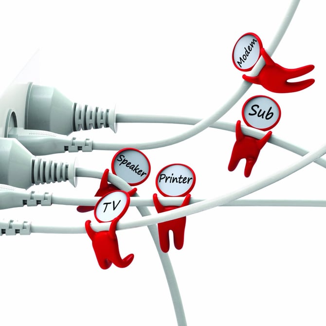
4. Cable Labels
Price: $9.99
Give the gift of organization this Valentine’s Day with these adorable little “cord huggers.” They cling onto wires to make it easy to sort through that tangled mess behind monitor or under your desk.
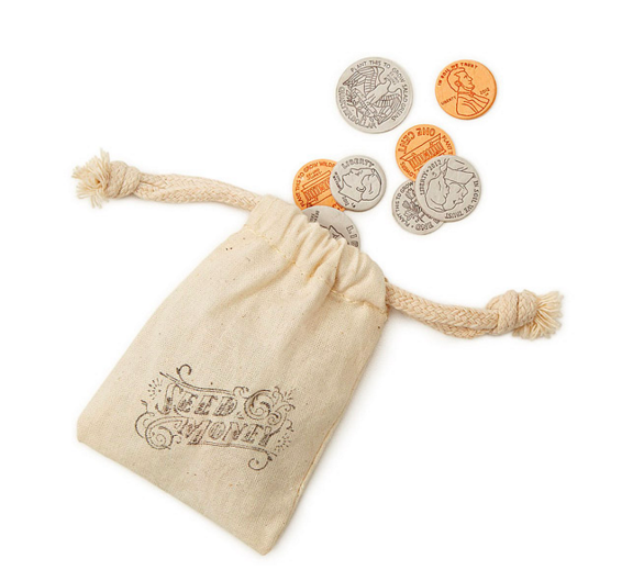
5. Seed Money
Price: $9.99
For the pun-lover, I present to you: seed money. Cleverly disguised as change, these coins are minted from handmade paper embedded with seeds. Plant them, water them, and watch your investment grow. (Get it?)
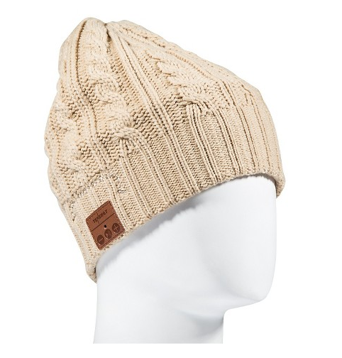
6. Bluetooth Beanie
Price: $12.91
This beanie will keep your head warm while keeping your ears happy. Thanks to the built-in microphone, your special someone can talk hands free for up to six hours. Pretty cool, right?
7. Snapchat Bitmoji Merchandise
Price: Varies
If you’re friends with a millennial marketer, they’ve probably used Snapchat or at least have created a Bitmoji. If so, you can visit the merch store on the Snapchat app and purchase shirts, cups, or other products with you and your friend’s Bitmojis on them.
To do this, all you have to do is go into your Snapchat app, tap your face icon in the corner to get to your profile, then scroll down and press the “Shop Bitmoji Merch” button to see the avialable merch. Once you click on an item, you can select your friends emoji to have a picture of both of you appear on an item.

8. Chili Herb Infuser
Price: $13.70
Enhance the flavor of your favorite soup or stew with this chili-shaped herb infuser. This reusable pepper holds all of your herbs together so that you don’t have to worry about having a pesky piece of green stuff between your teeth.

9. Plant-o-Gram
Price: $13.99
Flowers are great, but why not opt for the gift that keeps on giving? Long after the petals on that overpriced bouquet of roses have shriveled up, this unique air plant will still be thriving. Plus, it comes in a festive package with a personalized message of up to 100 words.

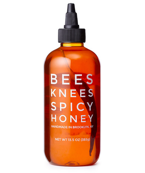
10. Spicy Honey
Price: $15.00
Serving as the perfect blend of raw honey from independent beekeepers in the Hudson Valley and specially selected chili peppers, this sweet and spicy treat is sure to delight your valentine.
11. Sushi Slippers
Price: $15.99
Nothing says I love you quite like faux fish for your feet. In all seriousness, this is the perfect gift for the sushi-lover in your life. And it’s guaranteed to make them feel all warm and fuzzy … at least from the ankle down.
12. Heart Beat Camera Strap
Price: $19.95
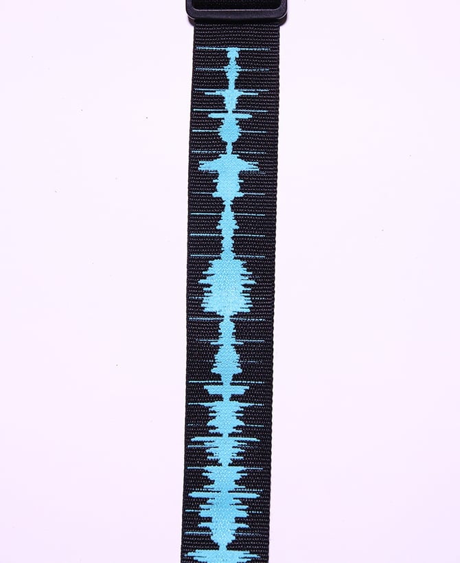
Help your valentine keep their camera close to heart with this unique camera strap. Embroidered with a healthy heart rate design, this strap will remind your valentine just how much you care.
13. Potato Parcels
Price: $20-$40
Does your special someone love potatoes and weird gifts? There are a few services, one being Potato Parcel, that will allow you to put a message or an image of your face on a potato and send it to someone. While the price varies based on the content printed on the potato and the distance you send it, this is sure to be a memorably weird gift.

Source: Potato Parcel
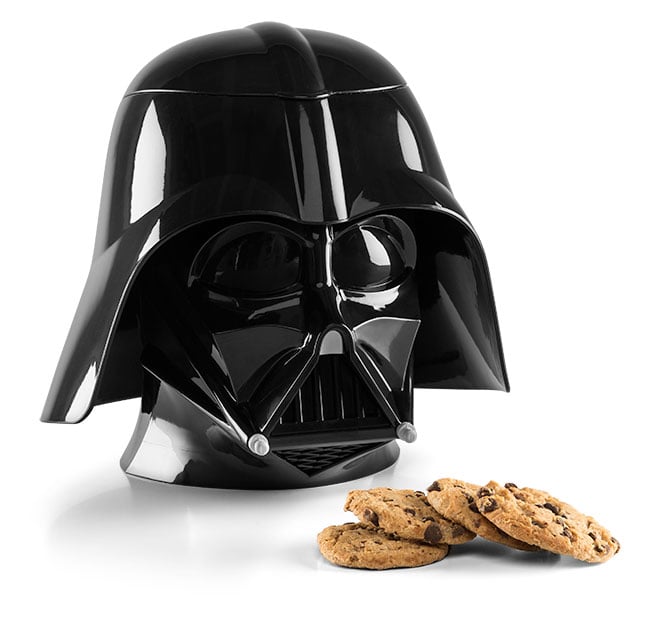
14. Star Wars Cookie Jar
Price: $24.99
Step 1: Buy the cookie jar.
Step 2: Bake cookies.
Step 3: Place cookies in the cookie jar.
That’s it.
 15. LED Globe-Shaped
Price: $34.99
This awesome speaker proves that there’s more than one way to gift a cool rock on Valentine’s Day. Perfect for the office or the great at parties, this gadget allows you to bring your favorite tunes wherever you find yourself.
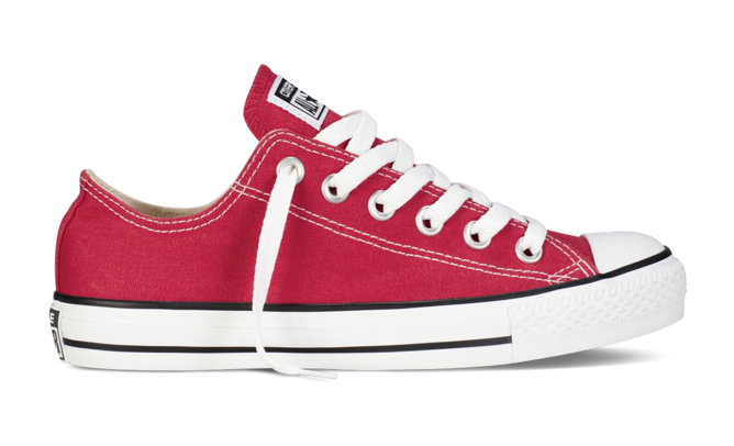
16. Red Converse Sneakers
Price: $35.00
These iconic sneakers make the perfect gift for both men and women. Not only are they comfortable and durable, but the festive pop of color will add a little somethin’ somethin’ to any outfit.
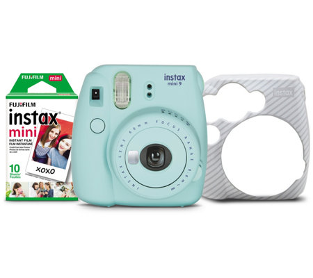
17. FujiFulm Mini Instant Film Camera
Price: $49.96
Give the gift of nostalgia with this instant color film camera. Simply point, shoot, and shake it like a Polaroid picture to preserve memories with your special someone.
18. Smart Water Bottle
Price: $60.00
Show your valentine how much you care by keeping them hydrated … in a cool way. This Bluetooth water bottle from Hidrate Spark pairs with an app on your phone to track your water intake. The bottle will glow to remind you to drink more in order to hit your goal.

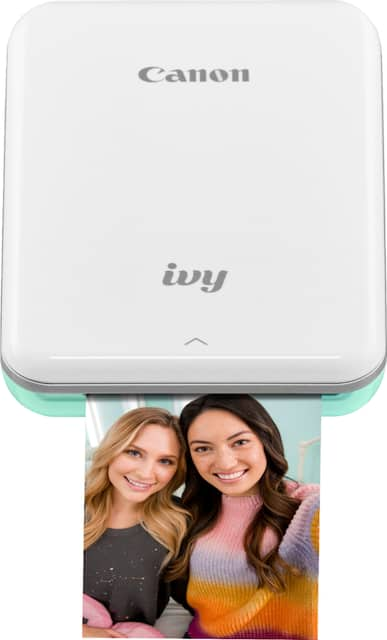
19. Canon Ivy Mini Photo Printer
Price: $99.99
The days of taking photos with filmed cameras and getting them developed in a dark room have come and gone. But our digital lifestyle doesn’t mean we have to give up on print photography. In fact, there are a number of photo printers that allow you to connect your smartphone and print photos from your device.
And, if you’re shopping for a digital marketer, especially in the millennial generation, they probably have plenty of photos that they’d love to print out and treasure — even after the endorphins of Instagram Likes have worn off.
20. Smart Ring
Price: $125-$195
Believe it or not, this fancy ring doubles as a really cool piece of technology. Integrated with over 80 apps on iOS and Android, users can set custom color and vibration patterns via the corresponding app to receive notifications through the ring.

Think Like a Marketer When Buying For One
As marketers, we love to create campaigns around buyer personas. We research out target prospect, what they’re interested in, and create content that attempts to engage or delight them. If you’re buying something for friend or loved one, think like a marketer.
Take note of their interests, hobbies, and what you have in common to determine which gifts will be the most appropriate and interesting to them.
Editor’s note; This blog post was first published in February 2018, but was updated February, 2020 for comprehensiveness and freshness.

21 Brand Style Guide Examples for Visual Inspiration
When it comes to building a memorable brand, it’s all about consistency.
When you’re shopping for your favorite cereal or coffee at the grocery store, you want to be able to spot it from a mile away.
The best brands stick in our brains because their presence is defined by the repetition of the same logo, fonts, colors, and images.
Once we see them enough, they become instantly recognizable, bringing us a clear sense of reliability and security.
Developing a consistent brand starts with creating a brand style guide. These branding rule books help graphic designers, marketers, web developers, community managers, and even product packaging departments all stay on the same page, and present a unified vision of the brand to the public.
We’ve compiled a list of some awesome brand style guides to use as inspiration for your next branding project or website redesign. Check them out below.
What are brand guidelines?
Brand guidelines, also known as a brand style guide, govern the composition, design, and general look-and-feel of a company’s branding. Brand guidelines can dictate the content of a logo, blog, website, advertisement, and similar marketing collateral.
Picture the most recognizable brands you can think of. Chances are, you’ve learned to recognize them because of the consistency across the messaging — written or visual — these brands broadcast. The same brand colors are reflected across them. The language sounds familiar. It’s all very organized and, while not rigid, it’s cohesive.
Here are a few types of guidelines you’d find in a brand style guide and which parts of a brand they can influence.
Mission Statement
By reputation, you might think a mission statement is in its own category of importance to a business. And it is. But your business’s mission statement is also compass for your brand style guide. A mission statement ensures every piece of content you create for your brand is working toward the same goal — and, ideally, strives to solve the same problem for your customer.
Your mission statement can guide your:
- Blog content.
- Paid/sponsored content
- Ad copy.
- Visual media.
- Slogan or tagline.
Buyer Persona
By definition, a buyer persona is a fictional representation of your ideal customer. It can include details related to your customer’s age, gender, job title, and professional challenges. For this reason, your buyer persona should also appear in your brand style guide. Your buyer persona is your target audience, and therefore stipulates for whom your brand publishes content.
Your buyer persona can guide your:
- Blog content.
- Ad copy.
- Visual media.
Color Palette
A color palette is a group of colors a company uses to design its brand, and it guides every piece of visual content the brand creates. Your color palette can be as simple or as elaborate as you want, so long as your brand doesn’t deviate from the colors you choose to include.
Color palettes that feature multiple colors often dedicate specific colors to specific types of marketing content. While the first two colors of your color palette might govern your logo, for example, the next two colors might support your website and blog design. Another two or three colors might be the basis for all your printed branding material.
No matter what colors you use for your color palette, make sure you identify their HEX or RGB color codes. These codes consist of numbers and letters to help you recall the exact shade, brightness, contrast, and hue you want associated with your brand, so your colors don’t gradually drift in appearance as you create new content. You can find color codes using most photo-editing or design software that comes standard on your computer. Learn more about finding and committing to color codes in this blog post.
Your color palette can guide your:
- Logo.
- Website design.
- Printed advertisings.
- Event collateral.
Editorial Style Guide
Nowadays, an editorial style guide is the bread and butter of an authoritative brand. This component of your brand style guide can have strong implications for your PR team, as well as the people who write articles, scripts, blog posts, and website copy for your company.
An editorial style guide’s main job is to commit to an editorial stylebook (such as Associated Press or Chicago), how to phrase certain products, topics the brand can and cannot write about, and even other companies the brand can and cannot mention. However, a brand’s editorial style guide can also go into much deeper detail about your buyer persona: what they like to read about, where they read it, their general reading level, etc.
Your editorial style guide can guide your:
- Blog content.
- Video scripts.
- Website copy.
- Landing page copy.
- Public relations talking points.
- A knowledge base supported by your customer service team.
- Paid/sponsored content.
Typography
Typography is another visual element of your brand style guide, but it isn’t just the font you use in your company logo. Typographic guidelines can support your blog design — which font you publish articles in — the links and copy on your website, and even a tagline to go with your company logo.
As you can see, the purpose of the brand style guide is to form and maintain all of the various elements of a company that, when combined, spell out the entire brand as it’s recognized.
Intrigued? Check out 21 of the best ones we could find.
Style Guide Examples
- Medium
- Wolf Circus Jewelry
- Ollo
- Skype
- Barre & Soul
- Spotify
- Jamie Oliver
- Herban Kitchen
- Urban Outfitters
- Love to Ride
- Barbican
- I Love New York
- Cisco
- University of the Arts Helsinki
- NJORD
- Espacio Cultural
- Alienware
- Netflix
- Scrimshaw Coffee
- NASA
- New York City Transit Authority
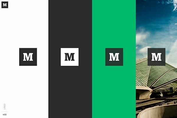
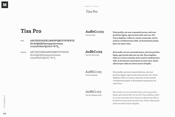
1. Medium
Medium emphasizes both typography and color in its brand style guide. Its guide also include details related to the company’s “Purpose” and “Product Principles.”
See the full brand guide here.
Source: Behance
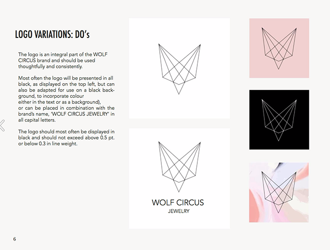
2. Wolf Circus Jewelry
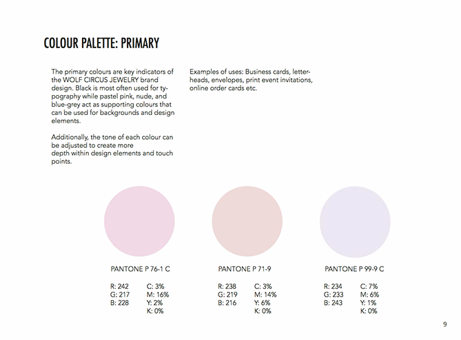
Wolf Circus Jewelry’s product is all about appearance. Naturally, the company’s style guide is too. The brand’s style guide includes the company’s mission statement, product details, typeface, logo variations, a color palette, and a separate set of guidelines just for advertisements.
See the full brand guide here.
Source: Issuu
3. Ollo
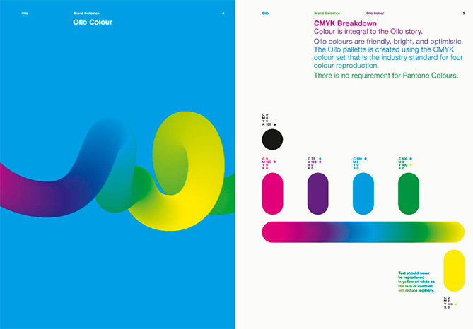
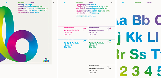
Ollo is so into color and typography, it turned its style guide into a game. Click the link below to see how much you can manipulate the brand. It’s the perfect way to show content creators how creative they can get but also still adhere to Ollo’s specific typeface and color codes.
See the full brand guide here.
Source: Bibliothèque Design
4. Skype
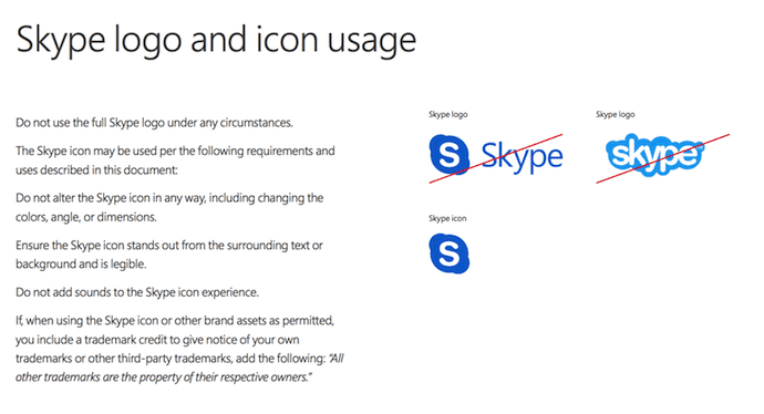
Everyone’s favorite video chat platform also has a squeaky-clean style guide for its brand. Skype, now owned by Microsoft, focuses primarily on its product phrasing and logo placement.
See the full brand guide here.
Source: Microsoft
5. Barre & Soul
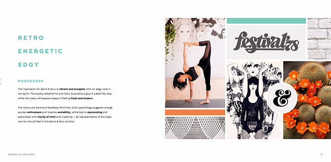
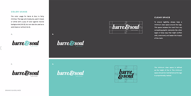
Barre & Soul’s brand style guide includes variations of its logo, logo spacing, secondary logos, supporting imagery, and a five-color color palette.
See the full brand guide here.
Source: Issuu
6. Spotify
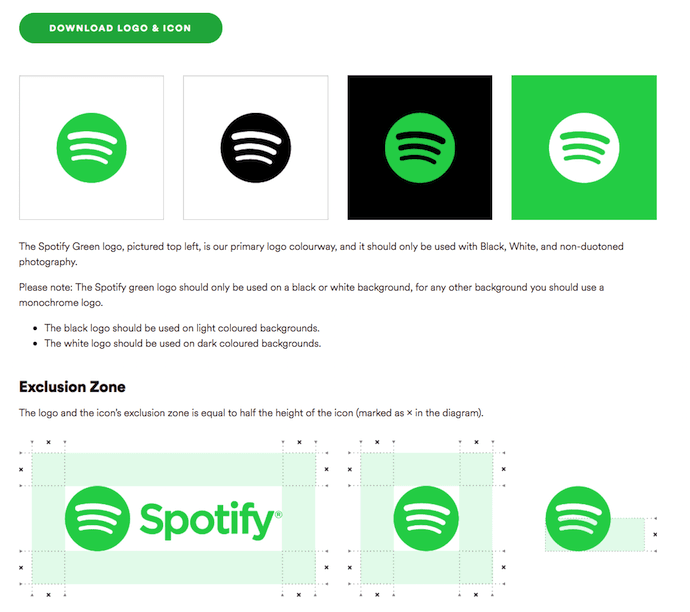
Spotify’s style guide might appear simple and green, but there’s more to the brand than just a lime green circle. Spotify’s color palette includes three color codes, while the rest of the company’s branding guidelines focus heavily on logo variation and album artwork. The style guide even allows you to download an icon version of its logo, making it easier to represent the company without manually recreating it.
See the full brand guide here.
Source: Spotify
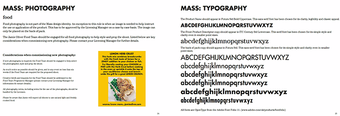
7. Jamie Oliver
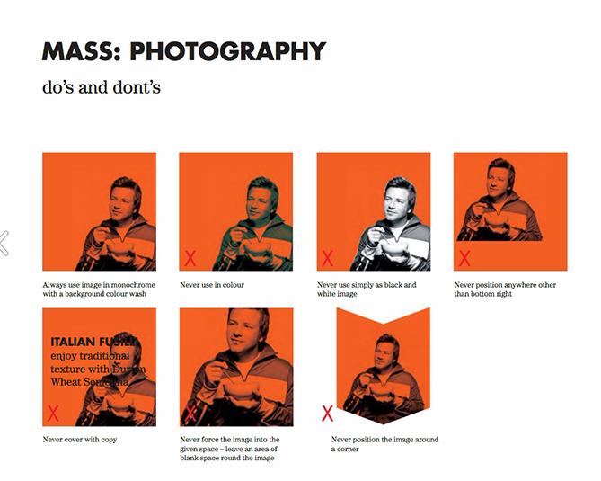
Jamie Oliver has an extremely thorough brand style guide, covering logo placement across all of its kitchenware products. The company also includes a large color palette with each color sorted by the product it should be shown on.
See the full brand guide here.
Source: Issuu
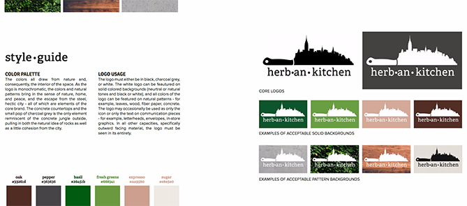
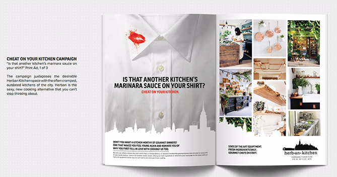
8. Herban Kitchen
Herban Kitchen has both a color and texture palette in its style guide. These guidelines help to show not just how the brand’s logo will appear, but how the company’s various storefronts will look from the outside to potential customers.
See the full brand guide here.
Source: Issuu
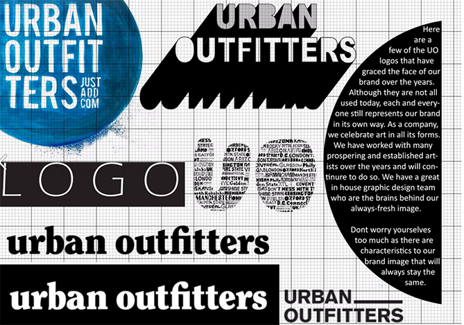
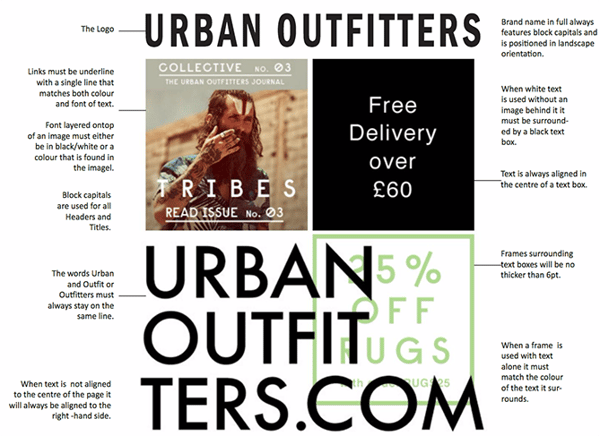
9. Urban Outfitters
Photography, color, and even tone of voice appear in Urban Outfitters’ California-inspired brand guidelines. However, the company isn’t shy to include information about its ideal consumer and what the brand believes in, as well.
See the full brand guide here.
Source: Issuu
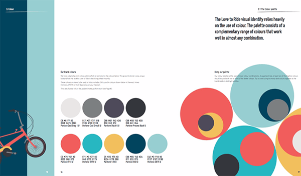
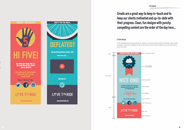
10. Love to Ride
Love to Ride, a cycling company, is all about color variety in its visually pleasing style guide. The company’s brand guidelines include nine color codes and tons of detail about its secondary logos and imagery.
See the full brand guide here.
Source: Issuu
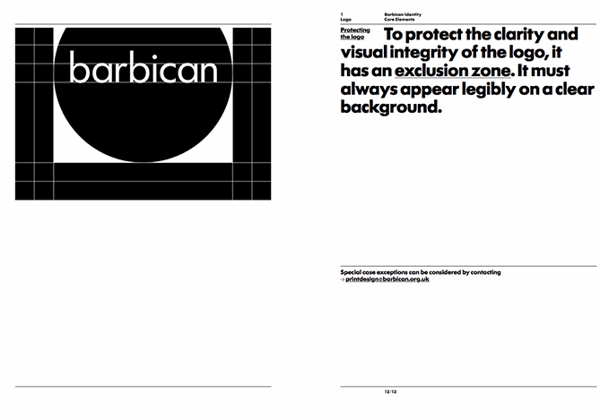
11. Barbican
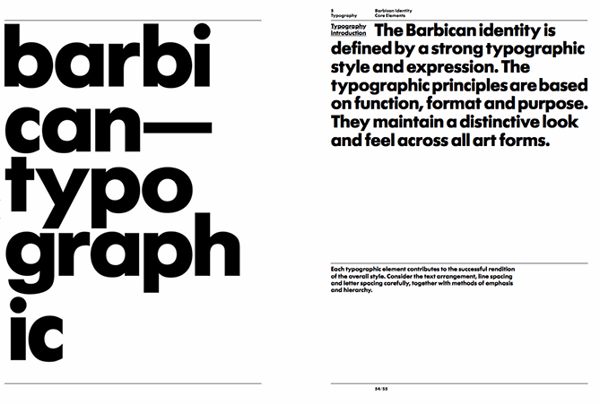
Barbican, an art and learning center in the United Kingdom, sports a loud yet simple style guide focusing heavily on its logo and supporting typefaces.
See the full brand guide here.
Source: Issuu
12. I Love New York
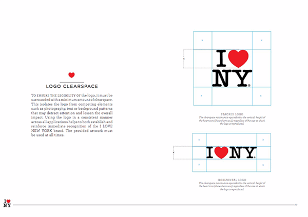
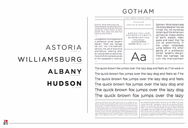
Despite its famously simple t-shirts, I Love New York has a brand style guide. The company begins its guidelines with a thorough explanation of its mission, vision, story, target audience, and tone of voice. Only then does the style guide delve into its logo positioning on various merchandise.
See the full brand guide here.
Source: Issuu
13. Cisco
Cisco’s style guide isn’t just a guide — it’s an interactive brand book. The company takes website visitors page by page through its brand’s vision, mission, strategy, and even its promise before showing users their logo and allowing them to actually type using their proprietary typeface, “CiscoSans.” Where’s Cisco’s color palette, you ask? The business has a separate webpage for just that.
See the full brand guide here.
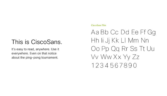
Source: Cisco
14. University of the Arts Helsinki
The style guide of the University of the Arts Helsinki is more of a creative branding album than a traditional marketing guide. It shows you dozens of contexts in which you’d see this school’s provocative logo, including animations.
See the full brand guide here.
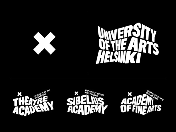
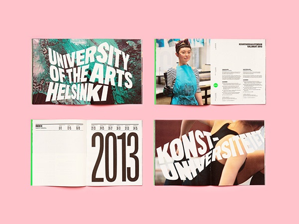
Source: Behance
15. NJORD
NJORD’s minimalist style guide gives you everything you’d need to know to design using the brand’s logo and color palette for both web and print.
See the full brand guide here.
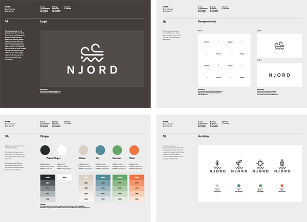
Source: Behance
16. Espacio Cultural
This cultural center in Argentina has a color palette that’s as elaborate as the artistic workshops it hosts. Nonetheless, the brand does a fantastic job of breaking down every last color code and logo placement you can find — from the building itself to the advertisements promoting it.
See the full brand guide here.
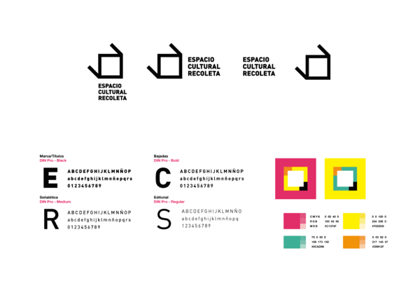
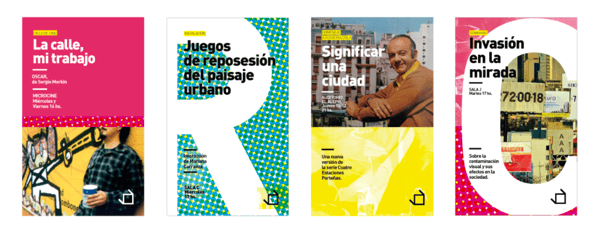
Source: Behance
17. Alienware
Video gamers know Alienware from its game-friendly computers, but the rest of the world knows it by the brand’s sleek aesthetic. The company organizes its brand style guide into four basic parts: voice, design, photography, and partner. The latter describes (and shows) how the brand interacts with partner brands, such as Star Wars.
See the full brand guide here.
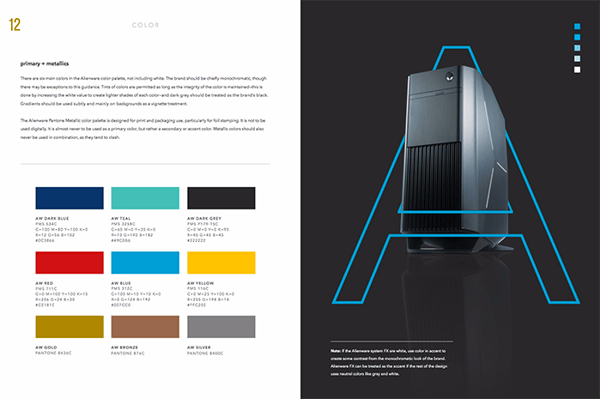
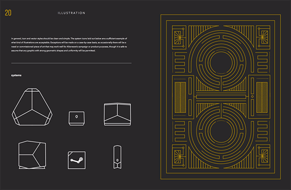
Source: Issuu
18. Netflix
As far as its public brand assets are concerned, Netflix is focused primarily on the treatment of its logo. The company offers a simple set of rules governing the size, spacing, and placement of its famous capitalized typeface, as well as a single color code for its classic red logo.
See the full brand guide here.
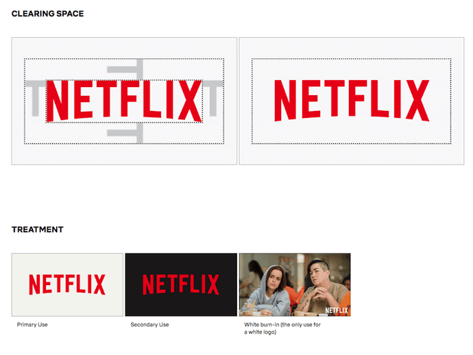
Source: Netflix
19. Scrimshaw Coffee
Featuring a five-code color palette, this “laid back,” “friendly,” and “modern” brand has a number of secondary logos it embraces in various situations.
See the full brand guide here.
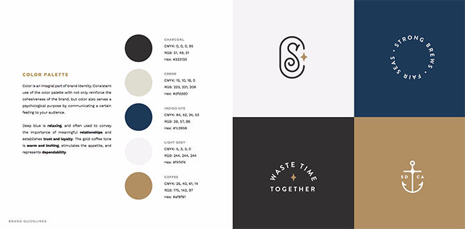
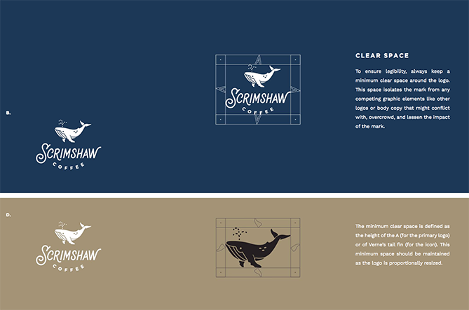
Source: Issuu
20. NASA
NASA’s “Graphics Standards Manual” is as official and complex as you think it is. At 220 pages, the guide describes countless logo placements, color uses, and supporting designs. And yes, NASA’s space shuttles have their own branding rules.
See the full brand guide here.
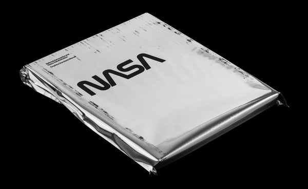
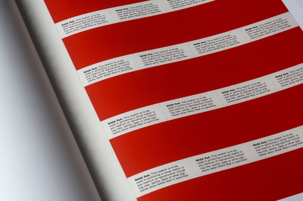
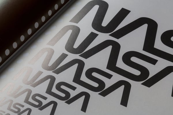
Source: Standards Manual
21. New York City Transit Authority
Like NASA, the NYCTA has its own Graphics Standards Manual, and it includes some fascinating typography rules for the numbers, arrows, and public transit symbols the average commuter takes for granted every day.
See the full brand guide here.
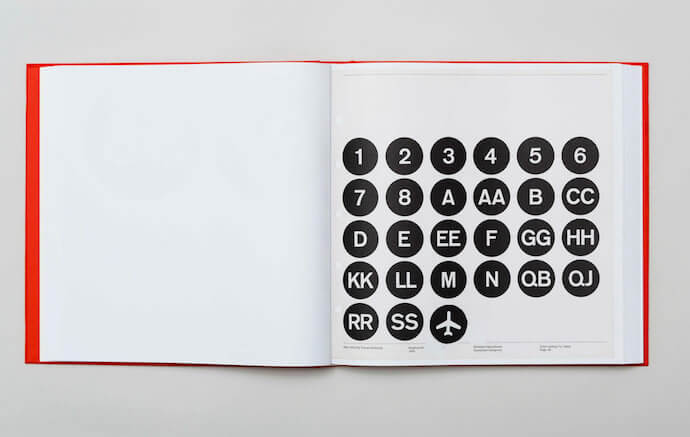
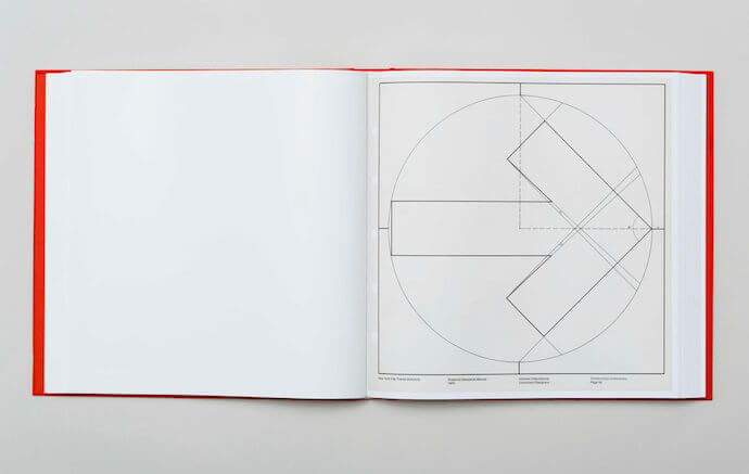
Source: Standards Manual
Want more? Read How to Create a Writing Style Guide Built for the Web [Free Template].

15 of the Best ‘About Us’ & ‘About Me’ Pages and How to Make Your Own
Building a website is, in many ways, an exercise of willpower. It’s tempting to get distracted by the bells and whistles of the design process, and forget all about creating compelling content.
It’s that compelling content that’s crucial to making inbound marketing work for your business.
So how do you balance your remarkable content creation with your web design needs? It all starts with the “About Us” page.
For a remarkable about page, all you need to do is figure out your company’s unique identity, and then share it with the world. Easy, right? Of course not. Your “About Us” page is one of the most important pages on your website, and it needs to be well crafted. This profile also happens to be one of the most commonly overlooked pages, which is why you should make it stand out.
The good news? It can be done. In fact, there are some companies out there with remarkable “About Us” pages, the elements of which you can emulate on your own website.
By the end of this post, you’ll know what makes some of today’s best “About Us” and “About Me” pages so great, and how to make your own about page that shares your company’s greatness.
Best About Us Page Examples
- Yellow Leaf Hammocks
- Eight Hour Day
- Joe Payton
- Apptopia
- Moz
- Aja Frost
- Cultivated Wit
- Kero One
- Nike
- Refinery29
- Sara Dietschy
- Marie Catribs
- Marc Ensign
- Bulldog Skincare
- Doomtree
1. Yellow Leaf Hammocks
Why the “About Us” Page Rocks: It tells us a story.
When you have a great story about how your product or service was built to change lives, share it. The “About Us” page is a great place for it to live, too. Good stories humanize your brand, providing context and meaning for your product. What’s more, good stories are sticky — which means people are more likely to connect with them and pass them on.
Yellow Leaf Hammocks tells users about its product by describing how the hammocks empower artisan weavers and their families. The company breaks down different pieces of the story into sections that combine words and easily digestible graphics, painting a picture instead of big chunks of text. They’re clear about why they’re different: “Not a Charity,” the page reads. And then: “This is the basis for a brighter future, built on a hand up, not a handout.”
Every company has a story to tell, so break out your storytelling skills from that random English class you took years ago and put them to work on your “About Us” page. Using descriptive and emotive copy and gorgeous graphics, an “About Us” page with a story works harder for your business than a generic one.
2. Eight Hour Day
Why the “About Us” Page Rocks: It’s human.
People tend to think that “About Us” pages have to sound formal to gain credibility and trust. But most people find it easier to trust real human beings, rather than a description that sounds like it came from an automaton. Trying to sound too professional on your “About Us” page results in stiff, “safe” copy and design — the perfect way to make sure your company blends in with the masses.
Instead, Eight Hour Day showcases the people behind the company and humanizes its brand. Introducing the founders by name and featuring the photos of them on the “About Us” page drives home the point that Nathan and Katie are — as they so astutely put it — “two individuals with a passion for creativity — creativity makes us happy.”
When you’re designing your “About Us” page,avoid industry jargon and replace it with an authentic voice — yours — to describe your product or service. Sure, it needs to be polished and free of errors, but it should always sound friendly and real.
3. Joe Payton
Why the “About Me” Page Rocks: It’s confident, creative, and easy to skim.
“About Us” pages might encompass the values of more than one person or entity, but they’re no more important to the image of a business than your personal about page. Take Joe Payton’s “About Me” page, below.
Not only does Joe’s illustrative self-portrait give him a personal brand that customers will remember, but it also demonstrates his expertise as a designer and animator. His website visitors can learn not just what he does, but why he does it, in an easily digestible way. Being able to express his values as a creative professional in such a well-organized page is something to be desired by anyone creating their own about page.
4. Apptopia
Why the “About Us” Page Rocks: It skips the business babble.
We know — no industry jargon. If you think it makes you sound super smart on your “About Us” page, think again. People want and appreciate straight talk about what your business does. After all, if people can’t figure out what you do, how will they know they need your product or service?
So, skip the industry lingo — that’s what Apptopia does on its “About Us” page. The startup’s simple but polished language effectively communicates the company’s offering while still allowing the Average Joe to understand it.
The moral of the story: Try to get rid of jargon on your “About Us” page whenever possible. Use short and punchy sentences to explain complex products and ideas in a way that isn’t patronizing, but rather, is empathetic.
5. Moz
Why the “About Us” Page Rocks: It’s humble.
Instead of following the classic “About Us” script and writing a few paragraphs about the company’s mission and origins, try something different — there are plenty of ways to make your brand more compelling to someone who doesn’t know about you.
Take Moz, for example. A lot has happened since it was founded in 2004, so the company chose to share those milestones using a fun and clean design that incorporates clear headers, concise blurbs, and little graphics to break up the text.
We especially love the humble references to how Moz received funding, how it switched its brand positioning — and most importantly, how it switched back to its original model. This speaks volumes to the value honesty and humbleness can play to your customers. Don’t be afraid to talk about your ups and downs; your customers will trust what you say that much more.
6. Aja Frost
Why the “About Me” Page Rocks: It’s data-driven.
Alright, we might be biased in highlighting this professional, as Aja is our very own SEO strategist at HubSpot. Nonetheless, the ingenuity she brings to the company isn’t lost on her website’s “About Me” page.
Being a data-driven professional, Aja knows her own clients as a freelance writer and strategist don’t just want to see what she’s written — they want to see how her content has performed. With that in mind, her “About Me” page tells a story of her career growth, which peaks — no pun intended — at an impressive line graph showing the result of an SEO strategy she implemented for the HubSpot Blog. (The graph’s sharp decline at September simply indicates when she stopped collecting data.)
Following the impressive chart, Aja closes out her about page with a personal note on what she does in her spare time — always a good way to humanize yourself in the eyes of your potential customers.
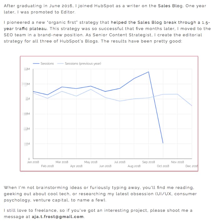
7. Cultivated Wit
Why the “About Us” Page Rocks: It breaks the mold.
Yes, this post is about, well, “About Us” pages. But sometimes, you don’t always need to wait for users to get there in order to make a statement. That’s part of breaking the mold to showcase your company’s personality.
That’s exactly what Cultivated Wit — a creative agency and media company — does, with both an edgy name and an incredibly fun story told through video and parallax scrolling … right on its homepage.

Below is the actual “About Us” page, which is a gem once you get there. But it’s great to see a company embrace its own brand of quirk throughout the site.
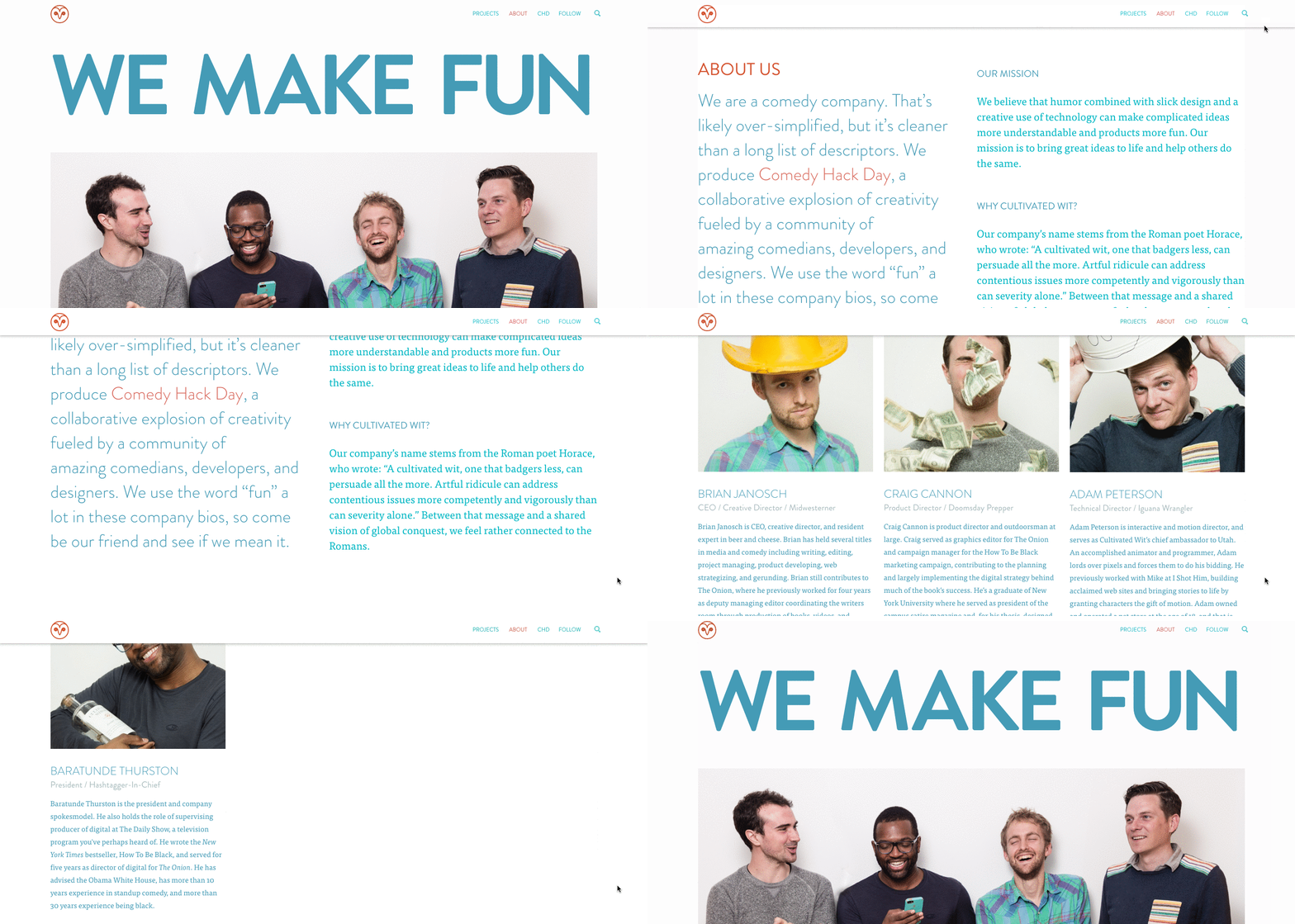
Even if you have a dedicated “About Us” page, there are plenty of ways to creatively showcase your company’s personality throughout your entire website. And yeah, that’s harder than filling a stock “About Us” template — but it can have a significant payoff for your brand.
8. Kero One
Why the “About Me” Page Rocks: It’s multilingual.
Kero One is a hip-hop artist and DJ from San Francisco, and his “About Me” page carries a valuable lesson to personal brands who cater to more than one audience — especially if those audiences speak different languages.
Kero One’s story starts at his childhood, when he was six years old and first discovered a passion for hip-hop. Knowing how old and genuine his love for the genre is adds tremendous value to his own music in the eyes of his listeners.
While this entrepreneur’s childhood interests help to deepen his audience, the second screenshot below helps Kero One widen it. His “About Me” page first tells his story in English, then in Japanese, then in Korean, then in Chinese. Accommodating these Southeast Asian audiences makes his brand more inclusive of all the audiences he identifies with.
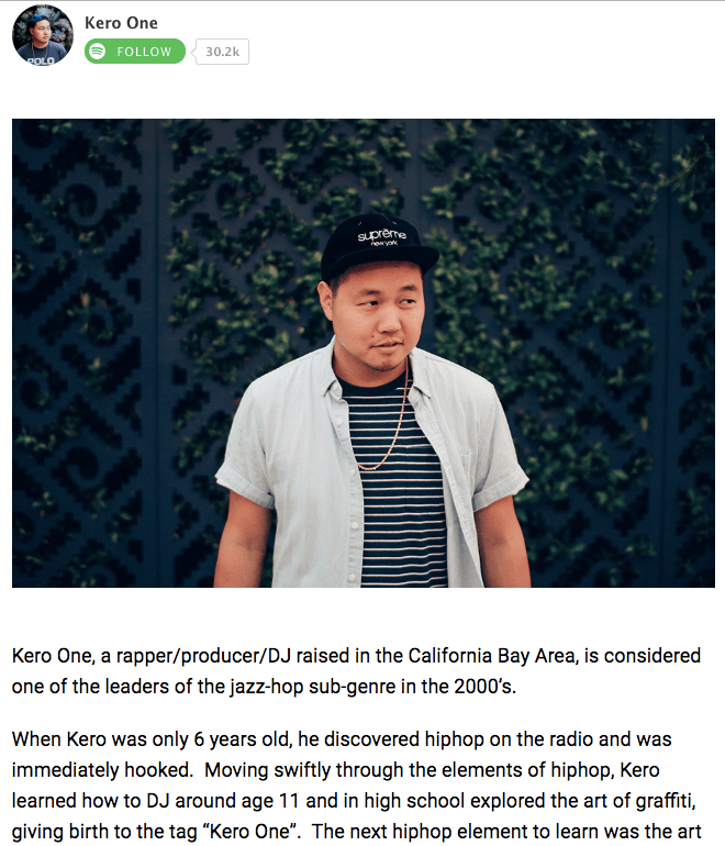
…
9. Nike
Why the About Us Page Rocks: It knows its audience.
Nike might seem like a company that’s too big to inspire smaller businesses. You might even wonder if Nike even still has an “About Us” page. As a matter of fact, it does, and it hasn’t forgotten the company’s roots.
Nike began on the campus of the University of Oregon by the hand of the college’s track coach, Bill Bowerman. And even though he no longer works at the company, one of his beloved quotes still brands the bottom of Nike’s “About Us” page below: “If you have a body, you are an athlete.”
This bold sentence, referenced by the asterisked “Athlete” in the words right above it, sheds important light on Nike’s audience. The brand may be big today, but Nike is all about the rising stars — who Nike depends on to, according to the rest of its “About Us” page, “expand human potential.”
The takeaway for marketers? Know your audience, and make it obvious to that audience the instant they read about you on your website.
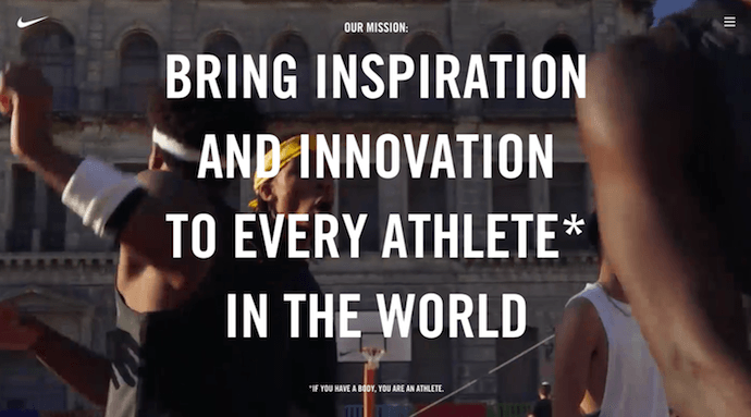
10. Refinery29
Why the “About Us” Page Rocks: It tells you what’s most important.
Here’s another instance where any area of your website — not just the “About Us” page — is an opportunity to break the mold.
Many companies add just a simple mission statement or company profile, but people often don’t want to ready a wall of text explaining what you do. So, Refinery29 broke it down to convey the intangible qualities that are tough to include in a basic “About Us” page.
Although Refinery29 does introduce its page with a description of its business, its goes out on a bang — four bangs, to be exact. The organization is on a “mission,” sure, but there’s also an “essence” of Refinery29, a “promise” it keeps, and a “vibe” it gives off.
These aren’t company traits you’d think to include when starting out, but they’re what your customers often make gut decisions on when buying.
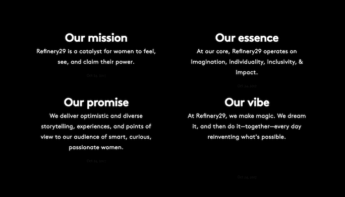
11. Sara Dietschy
Why the “About Me” Page Rocks: It has variety but still aligns with her personal brand.
This professional YouTube content creator has an eclectic collection of videos related to technology and culture, and expresses that diversity all over her “About Me” page.
In addition to the vibrant self-portrait at the top of the page, Sara’s first sentence tells you just how many people subscribe to her channel: 350,000. This is an important number to know for her potential video advertisers and collaborators who want to know how much exposure they’d get by working with her or advertising on her channel.
The colored tiles lining the page — starting with the red one, as shown below — also do a terrific job segmenting her work by the types of projects she takes up and for whom she’s done them. That Intel logo in the second photo of Sara, below, is sure to turn some visitors’ heads as they’re perusing her website.
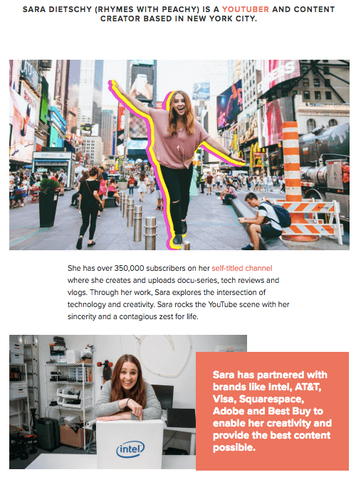
12. Marie Catribs
Why the “About Us” Page Rocks: It’s unexpected.
There’s a reason why these examples are exceptional — “About Us” pages aren’t always the most riveting parts of a company’s website. In fact, they often look like an afterthought. But even if you don’t have budget for juicy graphics, video, or parallax scrolling, there are other ways to make your “About Us” page unexpected with the copy alone.
Marie Catrib’s is a restaurant, so you might think their “About Us” page would be your typical “here’s how we started, here’s what we believe in, and here’s our food” story. Marie Catrib’s “About Us” page does tells us that — but it does so in an unconventional way. Immediately, the user’s eyes are drawn to a header that says, “It’s okay to make a mess, experiments can lead to beautiful things.” Quite philosophical, for a place to have dinner.
But next comes the story about the owner, which starts in an unexpected way — “It’s hard to imagine, but at one time Marie was banned from the family kitchen.” A line like that draws in the audience, because we know it’s not going to be typical.
So, how will you use copy to really draw readers in? It’s amazing what impression you can make on site visitors just by creatively telling your story with words alone.
13. Marc Ensign
Why the “About Me” Page Rocks: It’s funny but professional.
This branding expert does two things super well on his about page: He takes his work seriously, but doesn’t take himself too seriously. Marketers know there’s value to keeping a casual tone in the content they create, but in order to attract customers, you need to prove you have discipline and integrity. That’s a tough balance to get right.
Marc Ensign nails that balance between friendly and formal with a confident opening statement, followed by an amusing smiley photo of himself to set an inviting tone.
14. Bulldog Skincare
Why the “About Us” Page Rocks: It’s lovable and memorable.
What’s the difference between “average” marketing and lovable marketing? It’s the difference between creating generic webpages that provide great information, but in a straightforward, black-and-white kind of way — versus creating webpages that provide great information and are infused with color, personality, and stay true to a company’s unique brand voice. When you create lovable marketing, you can start a movement of brand evangelists and advocates who will help you grow.
Where does this fit into a company’s “About Us” page? The folks at Bulldog, a men’s skincare company that was named for the colloquial “man’s best friend” — a dog — could have typed up a few paragraphs about where the brand came from and how they were one of the first in the space to redefine and eliminate stereotypes around men’s grooming. But that text alone would have been a bit, well, average.
Instead, the “About Us” page is pithy, colorful, and leads with the lovable mug of an adorable bulldog — fitting the name and the brand. And it states the purpose of the products — to help customers from waking up with the (admittedly adorable) wrinkly face you see when you visit Bulldog’s website.
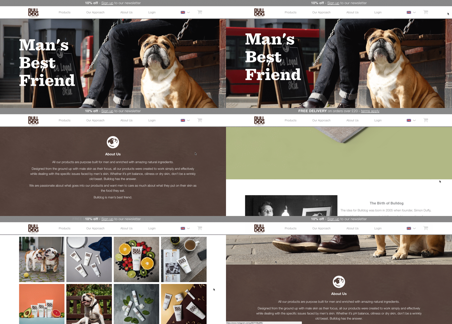
Play on your own words — it’s okay to have fun and pun with your brand, as it helps to inject personality and humor into your “About Us” page. It primes visitors for a story in a way that makes them immediately feel something. That’s how you create memorable, lovable marketing.
15. Doomtree
Why the “About Us” Page Rocks: Its shows, tells, and has a soundtrack.
One minute of video is worth 1.8 million words, according to Forrester Research’s Dr. James McQuivey. But what about audio and visual, too, all combined with a really cool story? Well, that’s one way to tell your story in an engaging way — through multimedia.
Doomtree is built on a bit of an innovative concept: That a group of talented artists can each have thriving solo careers, but can still come together on a regular basis to create great music. It’s not a band — it’s a crew. It’s an unconventional concept with an equally interesting backstory that “started as a mess of friends in Minneapolis, fooling around after school, trying to make music without reading the manual.” And as soon as you arrive on Doomtree’s ‘About Us’ page, you’re greeted with big, bold photos of those friends.
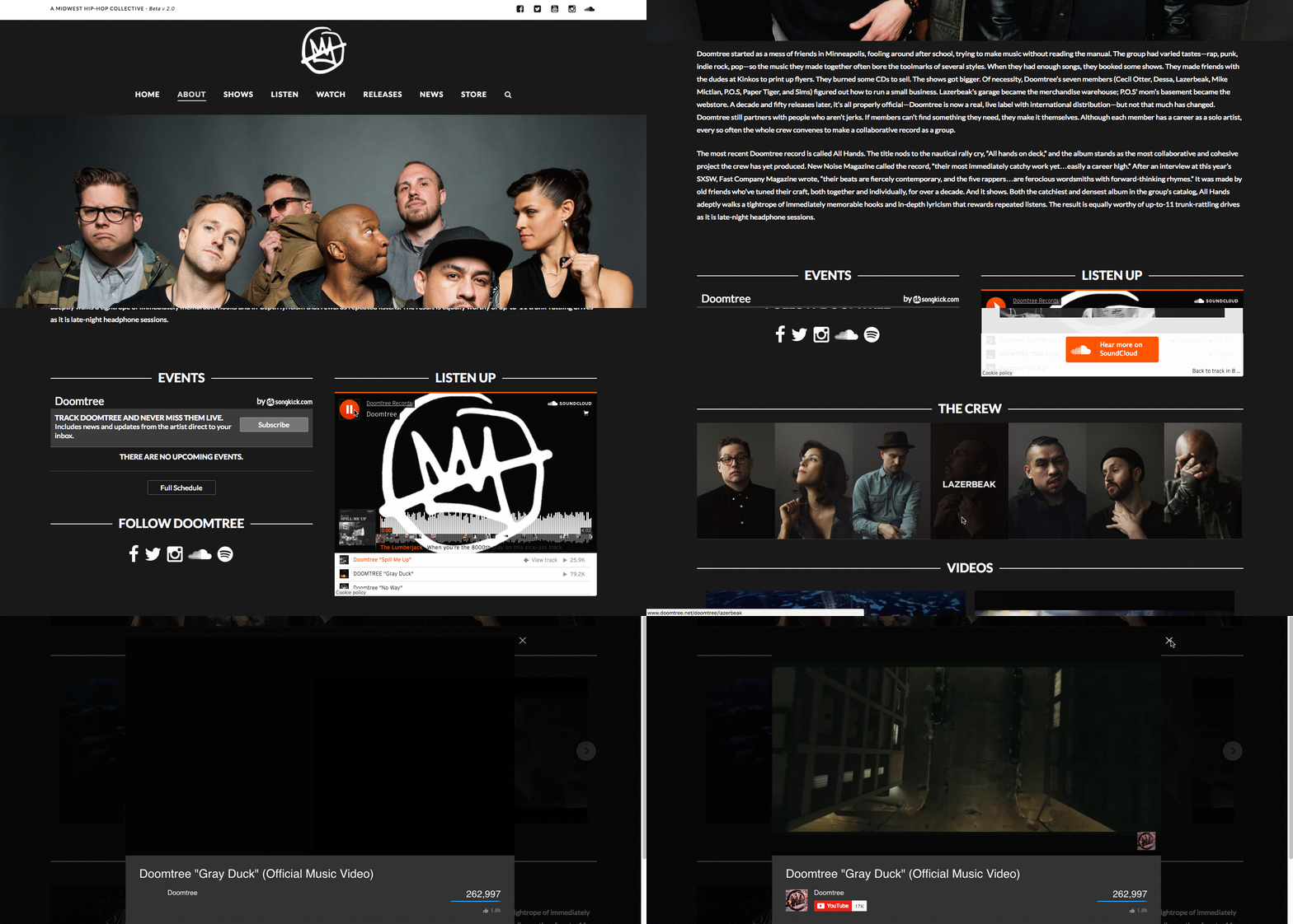
As you scroll down, users are treated to even more interaction with the crew’s tracks and music videos. That makes sense, because it gives visitors an instant sample of Doomtree’s product. What’s more, the entire “About Us” page is responsive, including the video. That’s important — not only because it offers site visitors a great mobile experience, but also for Google search ranking — especially now that such mobile usage has surpassed desktop.
How to Write an About Page
- Establish a mission statement.
- Outline our company story.
- Reveal how you’ve evolved.
- State your “aha!” moment.
- Explain who you serve.
- Explain what you’re offering them.
- Cite examples of who you’ve served.
- Describe your values.
It’s tough to establish one all-encompassing template for your “About Us” page — there are just so many ways you can go about telling your company story. But, per the real “About Us” pages we’ve just highlighted, there are some steps you should keep in mind when getting started.
Here are five steps to writing an “About Us” page based on some of the things that impressed us about the examples above.
1. Establish a mission statement.
Your “About Us” page can and will be much longer than a single mission statement, but in order to draw people in, you need to succinctly state your goal in the industry up front. What are you here to do? Why should your website visitors care?
2. Outline your company story.
You might not have a long history of changes and growth your company has endured (yet), but it’s a nice touch to talk about where you came from in your “About Us” page. So, isolate the milestones prior your company’s founding, and use them to give readers some backstory on your current venture.
3. Reveal how you’ve evolved.
Even if you’re a young company, there’s no shame in admitting your business strategy — or even personal way of thinking — has changed since you began. In fact, in about pages, these evolutions can improve the story you tell to website visitors.
About pages are perfect spaces to talk about where you started, how you’ve grown, and the ideals that have helped your organization mature. Use these moments to further your company story and show people that you’re always ready to change and adapt to the needs of your industry.
4. State your “aha!” moment.
Every good company was founded on an idea — something the current marketplace might not yet offer. What was your idea? Use this “Aha!” moment as a pivot point when telling your company story. What was a challenge you faced while developing your company? How did this challenge or discovery shape what you are today?
5. Explain who you serve.
As much as you want as many eyeballs on your “About Us” page as possible, you won’t do business with every single one of them. That’s why it’s crucial that you identify and mention your core customer. Who should care you exist? Which eyeballs are you here to serve?
6. Explain what you’re offering them.
As you’re explaining who you serve, make it clear what it is you’re offering. Too often companies generalize their product or service in the language of their website, making it hard to understand what it is the customer is actually paying for. They’re afraid literal explanations of their products aren’t interesting enough, or will sound unappealing in writing. And that’s a fair concern.
However, by investing just a sentence or two into telling your potential customers exactly what they’ll receive can keep them on your website for longer and interested in learning more.
7. Cite examples of who you’ve served.
Got some loyal customers in your portfolio? Use your about page to let the world know who already trusts and benefits from your work.
Knowing about your company’s past successes can influence the purchasing decision of up to 90% of today’s B2B customers, according to Dimensional Research. Even if you don’t yet have case studies to expand on the problems you’ve helped buyers solve, it’s in your interest to briefly mention who you’ve done this for. And your about page is the perfect platform for it.
8. Describe your values.
Customers want to be treated like human beings. For that to happen, they need to feel that they’re being treated by human beings. When finishing your “About Us” page, describe who you are as a person or a team, and what your personal values are. What’s your company culture like? What bigger picture in life drives your business?
An LED lightbulb maker might sell 10 different lamp styles, for example, but that might not be the most important characteristic to its primary audience. Maybe this lightbulb developer was founded on a commitment to environmental protection, and every bulb the company makes was built by people who are dedicated to making the world more energy-efficient.
Keep in mind a secondary audience of your company’s “About Us” page consists of your future employees. This is another reason describing your personal values is a good idea — the key to your job candidates’ hearts is to show them you have one too.
At this point, we hope that creating an “About Us” page doesn’t seem like a daunting task — rather, we hope you’re ready to have some fun with it. With a good story to tell, creative copy, humility, and digestible visuals, you’re on your way to an eye-catching user experience.
Even better? You’re becoming part of the exception — and standing out from a sea of “About Us” pages. What makes you different? We’re eager to learn more … about you.
Want more inspiration? Check out 16 inspiring examples of beautiful blog design.

How to Choose the Right Marketing Automation Platform for Your Ecommerce Business [Checklist]
So you’ve decided you’re ready to take your marketing to the next level by investing in a marketing automation tool — congrats!
But as you start your research, you soon discover there are 7,000+ marketing automation solutions available as of 2019. How will you know which is the right platform for your ecommerce business?
Like with every tricky business question, the answer is: it depends.
In this post, I’ll cover seven factors to consider when comparing different marketing automation platforms. These factors will ultimately help you make a more confident and informed decision about the future of your tech stack.
But first, let’s discuss why ecommerce businesses should always use some kind of marketing automation platform.
Why Use Marketing Automation for Ecommerce?
Marketing automation uses online software to automatically execute your marketing tasks, like sending emails, growing your database, and collecting data to help drive your strategy. Although it’s commonly known for making the lives of digital marketers easier (which I can completely attest to), it also helps your ecommerce business scale.
At Campaign Creators, we help ecommerce brands leverage the power of marketing automation. Here’s a list of some of the immediate benefits we’ve seen our clients reap after implementation:
- Reduced customer acquisition costs
- Increased average order value (AOV) of customers
- Conversion of one-time buyers into repeat, loyal customers
- Increased frequency of purchases
- Improved conversion rates with automated emails (i.e. abandoned cart emails)
Ecommerce Marketing Automation Platforms to Consider
With thousands of marketing automation solutions available, it can be difficult to choose the right one for your company. Because the buyers journey and sales cycle differ between ecommerce and other types of businesses, some platforms may lack the tools and features you need to manage the customer lifecycle.
Start your research by examining marketing automation tools that have a specific solution for ecommerce businesses, including:
Then, use the following seven factors to guide your evaluation process and help you make the best purchase decision.
7 Factors to Consider When Choosing the Right Marketing Automation System
1. User Interface
First, consider how simple or overwhelming the platform’s user interface is designed. Many, if not all, platforms will claim they have an intuitive and easy-to-use platform — but this isn’t always the case.
To determine whether the platform’s user interface will be easy for you to learn, ask for a demo of the platform. When testing each platform, ask yourself:
- Is there clear navigation? Try creating an email or accessing the analytics, and see if these simple tasks are difficult to complete.
- Is there contextual information? If titles are vague or confusing, some platforms will provide contextual information below or when you hover over the title.
- Did you have to jump through multiple hoops to complete a simple task? If so, this can hinder your efficiency in the long run.
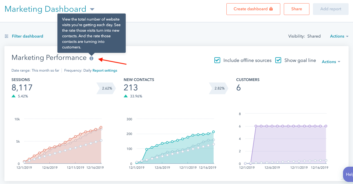
A learning curve often exists when jumping onto a new platform. As an ecommerce business, you’ll likely have other priorities such as fulfilling online orders or launching other campaigns. So, make sure you’re able to test the user interface of the platform to determine how quickly you’ll be able to get up to speed — and get to work.
2. Features & Native Integrations
Each marketing automation platform will offer different features, so make sure you’re choosing a platform that has the capabilities you need. Also, consider the existing technology you already have. You may have existing technology you want to integrate with your new platform.
When comparing platforms, ask yourself:
- Does the platform have the features you need? Making a list of features you need prior to doing research can help you stay focused on choosing the right platform.
- Does the system natively integrate with your existing technologies? This will make it easier to connect and transfer data across your existing platforms.
- Does the system have an open API? This can be essential to consider if you plan to have a developer create custom assets.
As an ecommerce company, you may have your online shop on a different platform, such as Shopify. If this is the case, it’s essential to make sure your shop natively integrates with your new marketing automation platform. This will make it easier to set up your automated lead nurturing campaigns that are based on your contact’s website activity.
3. Customer Support
When jumping on a new and unfamiliar system, you’ll want to receive the best help possible. It’s important to recognize that technology isn’t perfect and that things may break — so having that extra help to resolve your unique issue can be critical.
When purchasing a new marketing automation platform, some kind of technical support is usually provided, however, the type of support available can differ.
Ask yourself:
- What kind of customer support is available? The most common is provided through phone support, email, or live chat. Being able to connect with an actual human (rather than a chatbot) can help you resolve unique issues.
- How immediate can you receive an answer? Sometimes support is available 24/7, and sometimes you may have to wait 24 hours.
- If customer support is not available, are there other resources you can utilize? It’s possible customer support isn’t an option, that it may require an extra fee you can’t afford, or just isn’t available 24/7. For those cases, community forums or online documentation can fill those gaps.
Especially if you don’t have the time or extra help to figure out an issue, customer support can be an essential factor to prioritize when comparing different marketing automation platforms.
4. Learning Resources
When purchasing a new marketing automation tool, having online resources available can help you get the most out of your new system. Some platforms have guides, how-to videos, or even webinars that can help you learn how to use the tool.
For instance, the HubSpot Academy is a great online learning resource. Within the Academy, you’ll find all kinds of how-to videos that teach you how to become an advanced HubSpot user.
When choosing a platform and researching their learning resources, ask yourself:
- What will these resources teach you? Some may be quick video walk-throughs of how to get started with the platform, or some may have comprehensive learning modules that provide certifications.
- How can you access these resources? Most are free and easily accessible online, but this may not always be the case.
- Are these resources up-to-date? You want to make sure your resources are relevant to the marketing automation platform you’re purchasing at the time.
5. Userbase & Reviews
Although choosing the right platform for your ecommerce business really depends on your company’s personal needs and goals, you’ll want to understand how other users of the tool are making the most of it.
Look for case studies or video testimonials that have existing customers speaking about their experience with the tool. To get a more authentic review of the platform, use outside review sites such as G2’s Marketing Automation Software Comparison. G2 is a trustworthy source that encourages peer reviews and star ratings of business products. Check out their grid below, which ranks the top marketing automation software products.
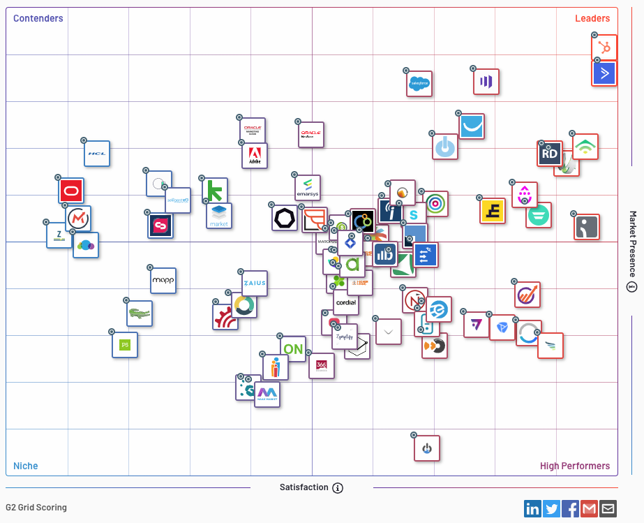
When researching each platform, ask yourself:
- How many users and companies are on this platform? The size of the system’s userbase can indicate its popularity.
- Is the platform used mostly by B2B or B2C/Ecommerce companies? Some platforms are clearly for B2B companies and may lack essential ecommerce features.
- What are others saying about the platform? Reading reviews from an outside source can provide a more authentic view.
6. Pricing
Pricing structures can differ from platform to platform, but most will have a certain price per number of contacts. When researching pricing for different platforms, ask yourself:
- What is the base price of the platform and how many contacts can you have? Because ecommerce companies tend to have larger databases, make sure you’re aware of how much you may pay.
- How quickly could your contact database scale? Use past data to see how fast your database has grown. This can give you insight into how much you might need to pay in the future.
- What features or benefits impact the pricing? You may be able to get a cheaper price or cheaper version of the platform if you don’t need certain features.
As a rule of thumb, the simpler and more transparent a company is about their pricing structure — the better. Jumping on a call with a sales rep can also be an easier way to figure out exactly what the price will be based on the size of your database, the features you need, and the goals you’ve set for your company.
7. Set-up & Onboarding
Once you’ve purchased your new marketing automation platform, there’s no doubt you’ll need some kind of assistance getting up and running. However, the assistance offered varies between platforms.
When researching about a platform’s set-up and onboarding process, ask yourself:
- Is there a set-up and onboarding fee, and if so, how much is it? Some platforms charge a fee that can range from hundreds to thousands of dollars just to get set-up.
- Does the process happen remotely, or will someone be physically there to guide you?
- Are you migrating from one system to another? If so, extra support may be necessary to ensure all contact data is transferred over correctly.
Ultimately, ecommerce companies tend to have larger databases that scale quickly, so make sure you’re considering a platform that will benefit you in the future, as well.
To make life easier for you, take a look at Campaign Creators’ Marketing Automation Comparison Guide. While research can be tedious, this chart will make it easier for you to digest and compare multiple platforms at once. The more you know prior to choosing a platform, the easier it will be to choose the right marketing automation system for your company’s needs.
