
11 Creative (But 100% White Hat!) Ways to Earn Backlinks in 2019
Earning high-quality backlinks is probably the most challenging part of SEO.
That’s because a link to another website is more than just a link — it’s a vote of confidence, a recommendation, a way for publishers to say to their readers: “Here’s a source I trust. Go check it out yourself.”
It’s incredibly difficult to get that kind of endorsement, especially for small businesses or startups. But if you want to boost your SEO performance, you need to make sure you consistently earn high-quality backlinks to your website, better and faster than your competition.
In fact, while there are 200 known Google ranking factors, backlinks counts as one of the top eight most important ranking factors for Google search.
As an SEO strategist specifically focusing on link building at HubSpot, I’m no stranger to the challenge of finding high-quality sources that will link back to your site. To help you improve your company’s SEO ranking, I’ve cultivated this list of 11 creative and unique ways to earn backlinks in 2019.
1. Reclaim Unlinked Mentions
Reclaiming unlinked brand mentions is probably the easiest, quickest way to build high-quality backlinks.
All you need to do is keep an eye on who is mentioning your brand, on blogs or in the news. You can do that using something as simple (and free) as Google Alerts. If you want more insights into your mentions, like the number of shares or the domain authority of the website where the mention comes from, you can opt for tools like BuzzSumo, Ahrefs Content Explorer or Mention.

Oftentimes, you’ll notice the author hasn’t included a link back to your website when they mention your brand, product, or service. That’s when you can send them a quick note, asking for a proper link attribution. This also allows the publisher to give their readers a better experience, letting them click through and learn more about the brand mentioned. It’s a win, win.
The creative part of this tactic is that you can use the same method to reclaim links for other mentions that are related to your brand — including events you organize, employees names, research reports, etc.
For example, you can keep a lookout for interviews that feature your company’s executives and ask for a link back to their profile page on your website. Or, you can look for mentions of reports or statistics you’ve published, and ask for a proper link attribution to the original source.
2. Get Contextual Links
Have you noticed how some articles feature additional resources, either recommended in text or inside a “Read more” section?
Here’s an example of a “read more” section from SEJ, where they link to a related piece:

These links embedded in the text of an article are called contextual links. Search engines see contextual links as stronger “recommendations” than a link found elsewhere on the page.
Ultimately, getting featured in “Read more” sections is incredibly valuable for your SEO performance.
The key to getting contextual links is to find the right link prospect to reach out to. You can find them by researching articles that are related to the content you’re promoting and already have a “Read more” section.
For instance, let’s say you have a new study on email marketing. Try looking for articles that speak about marketing trends and recommend other articles.
Here’s how to find them using search engines like Google:
- marketing trends inurl:blog intext:”Read more”
- marketing trends inurl:blog intext:”Recommended articles”
- marketing trends inurl:blog intext:”Recommended reading”
When you reach out to the author to pitch your study, don’t forget to mention why your content is worth getting featured. A persuasive boilerplate and a personalized email will go a long way.
3. Get “Best X” List Mentions
Today’s consumers look for all available options before making a purchasing decision. They often use comparison websites or articles, like “The 9 Best Free Email Marketing Tools in 2019” to see what others recommend.
To get a sense of how popular these Best X articles are in your industry, use a keyword research tool and check for monthly search volume. For instance, there are more than 4,800 searches per month for the query “best CRM for small businesses” (according to data from Ahrefs).
Getting mentioned on articles that list the best products like the one you offer is a fantastic way to reinforce your brand, get more people to try out your product and, of course, earn high-quality backlinks.
Alex Birkett, Senior Growth Marketing Manager at HubSpot, explains why getting featured on these lists is so important for your business: “If you look at these search results in terms of pure click-through rate, there’s an upper limit on how much traffic you can bring to your own product page by ranking on your own site’s listicle.”
Birkett continues to say — “As Nick Eubanks has mentioned, if you can broaden your view from trying to rank #1 to trying to monopolize all of the sites on the first page of a search query, you can multiply the amount of click-throughs to your site, your website traffic, and, down the line, your sales volume. And that’s not even factoring in the less trackable aspects, such as social proof and brand awareness.”
“In other words, this tactic goes beyond just link building and taps into acquisition and brand awareness potential, too.”
To get your product or service included in a list round-up, start with a simple Google search to find high-ranking blogs that write about your product or industry.
Here are some useful search terms to help you find relevant prospects:
- Best [X]
- Best [X] for [Y] e.g. Best CRM for entrepreneurs
- Top [X]
- Top [X] for [Y] e.g. Top 10 CRM for small businesses
Collect the most relevant prospects in a list and prioritize them based on domain authority (or Domain Rating if you’re using Ahrefs), backlink profile, ranking, and referral traffic potential.
Once your final list is ready, write a short pitch for the author to show them why your product or service deserves to be included in their list.
As per any outreach campaign, a short, persuasive pitch and a customized email will help you stand out.
4. Become a Source for Other Publishers
By using your expertise and unique data, you can become a source for other bloggers and journalists.
Every time someone quotes you, you’ll earn a backlink. But high-domain authority backlinks aren’t the only benefit of this tactic (although they are a huge benefit on their own). By becoming a trusted source, you’ll also increase your brand awareness and drive referral traffic to your website.
Best of all, it isn’t as difficult as you may think.
To start, simply subscribe to HARO (Help A Reporter Out). This is a free service that connects expert sources (like yourself) with bloggers and journalists who are looking for contributors.
Here’s how it works — every day, HARO will send you an email with queries from writers in your industry. You can pick the ones that resonate with your business and respond via email, including your credentials.
Speed is very important here, as most of these writers get many submissions. If you’re among the first to respond, you have a bigger chance to be seen and selected for the final piece. If you’re selected, you’ll likely receive an email from a journalist or blogger letting you know the article is live.
For instance, here’s an email I got a few days after I submitted a quote on HARO:

From my experience with HARO, it takes about four weeks for an article to get published after you send your response. Even if you don’t receive a follow-up email from the writer, keep an eye on the publication to see if your quote ends up making it into the piece.
I found that, on average, two out of 10 answers get picked up. That isn’t too bad, but if you’re like me, you don’t want to waste those eight other answers that don’t get to be published.
To ensure you still use those quotes elsewhere, I suggest you create a backlog of content and use it to answer similar questions on Quora, LinkedIn, or even your own blog or social channels.
5. Reach Out to Journalists
Oftentimes, bloggers and journalists are bombarded with emails pitching them information that is too promotional and doesn’t add value to their readers. That’s why many outreach emails don’t get any responses.
However, there are effective methods to make your pitch stand out. Paddy Moogan, from Aira, explains how his team uses this tactic successfully to earn high-quality backlinks for their clients:
“We take an individual from a client’s company, usually the founder, Managing Director, or CEO (although it can be anyone, really) and get them to provide us with their views and opinions on a set of topics.
These topics should be a sweet spot between what their company is credible to talk about, and general newsworthy topics. Classic examples at the moment are things such as what Brexit means for the X industry or what the future of X industry is in the world of AI or automation.
These broader topics are being talked about a lot in the press, so tying it to a topic that your client can talk about allows you to approach journalists and offer their comments for any upcoming articles. They often link to you because of this, and will also often link to profile pages on your client’s website, as well.”
6. Update Old Content
If you find an article or a research report that hasn’t been updated in a while, check how many backlinks the piece has. If there are many publications referencing that content, then you found yourself a real gem.
You can simply go ahead and create a better, fresh piece, with more relevant data.
Once the content is live, you can then reach out to bloggers or journalists who’ve linked to the old content to let them know about your updated version.
Oftentimes, you’ll see the results of your outreach in a matter of days or weeks in the form of backlinks or social media shares. But there are also other benefits that come out of building that relationship in the first place. For instance, you might end up collaborating on other projects that can help you grow your brand, and your traffic.
Ultimately, when building your email outreach list, have a long-term benefit in mind and try building a relationship — instead of just focusing on the backlink.
7. Build Free Tools
Creating free tools, like calculators or template generators, is an effective method for earning links and even generating new leads.
In a nutshell, here’s how to get started:
- Start with keyword research and see what comes up for “templates”, “tools”, or “generator” in your industry.
- Check out what tools appear in Top 10 search results for those keywords.
- Try to figure out which tool or generator receives the most backlinks right now.
- Build something similar but way better, e.g. better design, more customizable options etc.
For example, take HubSpot’s Email Signature Generator. There are over 25,000 searches for “signature generator” on any given month on Google, and our tool offers a very simple, aesthetically-pleasing solution.
Since we launched it, it’s been highly used and recommended, having earned over 1,700 backlinks from 670 referring domains.
8. Publish Ultimate Guides
An Ultimate Guide is a piece of content designed to be the best, most comprehensive resource on a given topic. It covers enough information that you don’t need to go elsewhere to learn more about that subject.
Here are two examples from our own blog:
The reason why these Ultimate Guides attract inbound backlinks is because they help bloggers and journalists reference a concept they mention.
For instance, if someone writes an article titled “How to get started with SEO”, they can focus on a few tips and tactics without explaining, in-depth, what SEO is — instead, they can simply link to an SEO Ultimate Guide, if their readers have further questions.
Here’s an example:

Alex Birkett, Senior Growth Marketing Manager at HubSpot, use this approach with his personal blog, as well. Here’s how he explains it: “An Ultimate Guide doesn’t have to explicitly tell you it is an Ultimate Guide. It simply has to go above-and-beyond in its utility or perceived value.”
“For example,” Birkett continues, “I recently wrote a 6,500 word guide on A/B testing. It ranges from beginner issues all the way through advanced topics and fringe cases. Basically, it’s a bookmarkable article for anyone who runs A/B tests. Not only did it get a really solid initial spike of traffic from social shares, but it consistently gains organic links month-by-month.”

9. Use Images to Earn Links & Mentions
Infographics are probably the most common visual asset used to earn backlinks. It’s always good to experiment with them, if you haven’t done it before.
However, if you feel infographics don’t work well for your brand, here are a few other visuals you might consider creating:
- Charts and graphs with original data
- Diagrams to visually explain complex concepts
- One-page templates
- Free photo galleries for others to use
To give you an idea of how other brands use free photo galleries, check out this creative campaign from LinkedIn: The Real Face of Sales. The brand has created a free downloadable library of photos that feature real, non-cliche salespeople.
The photos are also available on Unsplash and Pexels (where they got over 35 million views), which helped with distribution.

10. Use Directories (yes, Directories!)
Despite what you may have heard, directories aren’t dead. In fact, they are probably one of the best ways to improve your local SEO and help potential customers find your business.
Of course, I’m not talking about spammy directories that are there just for the sake of links. Those are more likely to harm your SEO performance than anything else.
The directories you need to be on are the ones people actually use — like Google My Business, Yelp, and TripAdvisor. Beyond these famous ones, there are many other general and niche directories that can help your rankings and traffic.
Here are a few resources to help you find relevant directories:
- 21 Web Directories That Still Have Value in 2019 (Search Engine Journal)
- 1,000+ Niche Citation Sites in 43 Business Categories (BrightLocal)
- The Ultimate List: 57 Online Local Business Directories (HubSpot)
11. Use the Broken Link Building Method
This tactic involves reaching out to a website that has a broken outbound link (a link to an external source) and suggest they update it with a link to one of your pages. Of course, your page has to be a good resource on the topic to which they were originally linking, so it makes sense to swap the broken link with yours.
The reason this tactic works so well is because it’s adding a ton of value to the webmasters — it helps them fix an error on their website and it improves the experience for their readers.
The challenge with this tactic is, of course, finding these broken links.
You have a couple of options here:
- You can look for websites with broken links and find relevant resources on your website that you might suggest in its place.
- You can look for one dead page (404) that used to get a ton of links, recreate that article or offer with better, more relevant content, and then reach out to those who linked to the initial piece.
Either way, you’ll need a good SEO tool to help you identify broken links. You can try Siteliner, which is free if you have under 250 pages to review, or Ahrefs, which also published a guide on how to use the broken link building method using their tool.
Once you identify the target websites and have your content ready, you can start working on your outreach. Make sure to keep your email short and sweet and focus on being helpful, rather than just getting a backlink.
Make Sure You Have The Right Backlink Checkers in Your SEO Toolbox
Now that you have a list of tactics to try out in your next link building campaign, it’s time to make sure you also have the tools you need to succeed.
Because there are so many options out there, I thought I’d end this article with a list of my top free, tried-and-tested backlinks checkers.
To make it easier for you to pick the right tool for your next project, I went ahead and tested each tool to see how many backlinks they can find, as well as other unique features they each offer.
I used our domain (www.hubspot.com) to test the capabilities of each tool and here’s what I found:
1. Ahrefs Backlink Checker
Backlinks: 96,269,064
Referring domains: 164,206
Aside from the total numbers above, in the free version of the tool, Ahrefs also shows you Top 100 backlinks, Top 5 anchors and Top 5 pages. That’s enough to get a birds-eye view of your website’s backlinks.
If you’d like to get into more details, the paid version offers far more extensive data and access to other tools that might be useful in a link building campaign, like Content Explorer or Broken Outbound links, to name a few.
2. Backlinks by Neil Patel
Backlinks: 11,652,446
Referring domains: 79,883
It may not pick up as many backlinks or referring domains as Ahrefs, but this tool gives a lot of value in the free version. For one, you can export to CSV up to 5,000 backlinks and see the Source Page Title, URL, and anchor text. You can also filter the view by including or excluding domains, anchors or zones (.es, .de etc.). All in all, I’d definitely recommend checking out this free tool.
3. MonitorBacklinks
Backlinks: 64,300,000
Referring domains: 121,500
MonitorBacklinks picks up almost as many referring domains as Ahrefs. Additionally, what’s unique about MonitorBacklinks is that it offers details on the top 300 backlinks that you can see based on Trust Flow or Citation Flow. However, to access more of their database, you need to switch to their paid version.
4. OpenLinkProfiler
Backlinks: 439,377
Referring domains: 39,170
OpenLinkProfiler is a great tool for analyzing your backlink profile. The downside is that their database of links is fairly limited compared to Ahrefs or MonitorBacklinks. Still, there’s a lot of insights you can gain (for free) by filtering the available backlinks by categories such as industry, TLDs, anchors, or LIS (Link Influence Score). That’s something I haven’t seen in other free tools.
This tool also provides charts to show you which pages get the most links, or which countries link most to your website.
5. RankWatch
Backlinks: 66,710,000
Referring domains: N/A
RankWatch has a great Dashboard feature where you can visualize your backlink profile. Among other things, you can see your link acquisition trend for the past three months, referring domains acquisition, and anchor distribution. The overall summary charts are available for free. However, if you want to see the exact list of backlinks or referring domains you’ve earned, you need to switch to the paid version.
6. CognitiveSEO
Backlinks: 66,160,000
Referring domains: 126,182
CognitiveSEO is great for getting a birds-eye view of the total backlinks and referring domains — and, most importantly, checking your link velocity. You can see the link acquisition trend for the past 14 days for free, even without creating an account. Another interesting visual report is the Top 5 website pages, where you can see how your website performs by backlinks or referral domains.
All of the above tools provide valuable insights that can help you get started with link building. They all give a birds-eye view on your backlink profile, but each one comes with different additional information. Try them out and see which one is best for you.

How to Create an Email Newsletter People Actually Read
For most marketers, this will sound familiar. You’re sitting around a conference room, trying to figure out how to best engage your leads and customers, sell more products, or just “stay top-of-mind” for your target audience, and someone decides there’s a solution that can solve all of those problems at once: an email newsletter!
Suddenly you’re “volunteered” to do it. And you’ve got make sure that open and clickthrough rates don’t dip. Oh, and the first one needs to go out tomorrow.
That sound good?
I’ve been in that situation before, and I was terrified. Even though e-newsletters are one of the most common types of emails to send, they are actually some of the hardest to do right.
Want to ace your new email newsletter project, or rejuvenate an old one? Below are 10 things you need to make sure to do. And if you’re looking for some inspiration, here are some awesome email newsletter examples you can check out.
1. Evaluate whether or not you need an email newsletter.
I know it can be kind of scary pushing back on your boss about a project you’ve been handed, but if an email newsletter isn’t right for your marketing, you shouldn’t waste your time working on one.
To figure out what you need to do, first do some research. In your industry, are there successful email newsletters that people like to subscribe to? What’s in them? With the resources you have available to you — budget, time, and internal support — could you be successful?
Then, re-examine your business’ goals. Are they trying to increase the number of leads? Better qualify leads to speak with salespeople? Close more deals? Retain more customers?
If your industry isn’t really interested in email newsletters, or if your goals don’t line up with what a newsletter could accomplish, your time might be better spent creating something else like a lead nurturing email workflow or content for your blog.
So gather some data, create a plan-of-action (either for a successful newsletter or another activity), and go chat with your superior. Even if you disagree with his or her vision in doing an email newsletter, your boss will be glad you came prepared with a plan for success.
Okay, let’s say you’ve found that you should do an email newsletter. What next?
2. Figure out what kind of newsletter you want to send.
One of the biggest problems with email newsletters is that they’re often cluttered and unfocused because they’re supporting every aspect of your business. Product news goes right next to PR stories, blog posts go next to a random event week … it’s kind of a mess. Email — whether it’s a newsletter or not — needs one common thread to hold it together.
One way to help reduce the randomness of an email newsletter is by keeping it to one very specific topic. So instead of it being about your company in general, maybe it’s dedicated to one vertical.
An example of a great, topic-based email newsletter is BuzzFeed’s “This Week in Cats” newsletter. (Don’t judge … I recently adopted a kitten and I’ve become full-on obsessed with cats.) Though BuzzFeed writes about pretty much everything under the sun, they offer up one specific newsletter for people who love reading about cats. Because the niche is aligned with a specific interest, the articles have an opportunity to get way more engagement than they would in a newsletter featuring content from all over the website.

3. Balance your newsletter content to be 90% educational and 10% promotional.
Chances are, your email newsletter subscribers don’t want to hear about your products and services 100% of the time. While they may love you and want to hear from you, there’s only so much shilling you can do before they tune out.
Case in point: I have a thing for shoes, and I especially love this one shoe site. I willingly opted in to the company’s email list, but it now sends me emails 2-3 times a day to buy, buy, buy … and when I see it’s sender name pop up in my inbox, I want to scream. If they sent me educational content — maybe about the latest styles of shoes, or how to pair certain styles with certain outfits — I might be more inclined to buy from them, or at least start opening their emails again.
Don’t be that company. In your email newsletters, get rid of the self-promotion (most of the time) and focus on sending your subscribers educational, relevant, timely information. Unless you actually have an exciting, big piece of news about your product, service, or company, leave out the promotional parts.
4. Set expectations on your “Subscribe” page.
Once you’ve figured out your newsletter’s focus and content balance, make sure you’re properly communicating about them on your subscribe landing page.
Get specific. Tell potential subscribers exactly what will be in the newsletter as well as how often they should expect to hear from you. Take a page out of SmartBrief’s book: On the subscribe landing page, it says what’ll be in the newsletter and gives potential subscribers a preview link. Check it out:
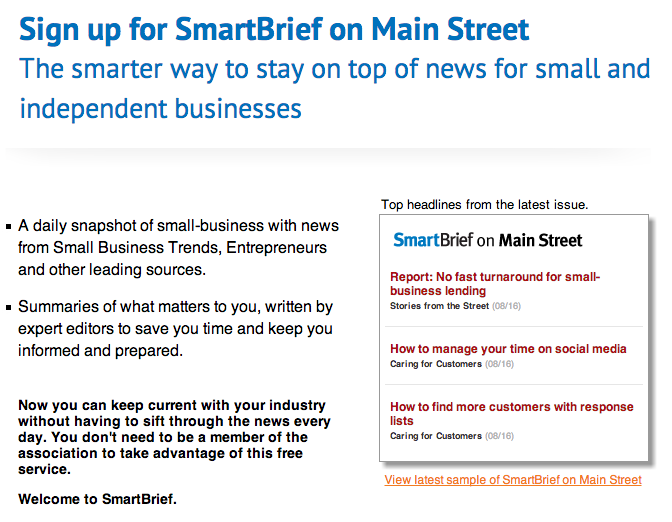
As a subscriber, wouldn’t that be awesome? You’d go in with open eyes knowing exactly who you’ll be receiving email from, what they’ll be sending you, and how often they’ll be sending it. As a marketer, having this information up front will help diminish your unsubscribe and spam rates as well.
5. Get creative with email subject lines.
Even if your subscribers sign up for your emails, there’s no guarantee that they will open your emails once they get them in their inbox. Many marketers try increasing familiarity with their subscribers by keeping the subject line the same each day, week, or month that they send it.
But let’s face it, those subject lines get old for subscribers — and fast. Why? Because there’s no incentive from the subject line to click on that specific email right this instant. A better approach would be to try to have a different, creative, engaging subject line for each newsletter you send.
One company who does this really well is Thrillist. Here’s a collection of email newsletters I’ve received recently:
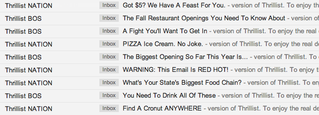
I’ve opened every single one of these because of the company’s subject lines. Even though I know that these emails are coming in my inbox every morning, the subject lines are what entice me to click.
If you need help with your email newsletter subject lines, check out this recipe.
6. Pick one primary call-to-action.
Okay, part of what makes a newsletter a newsletter is that you’re featuring multiple pieces of content with multiple calls-to-action (CTAs). But, that doesn’t mean you should let those CTAs share equal prominence.
Instead, let there be one head honcho CTA — just one main thing that you would like your subscribers to do. The rest of the CTAs should be “in-case-you-have-time” options. Whether it’s simply to click through to see a blog post or just to forward the email to a friend, make it super simple for your subscribers to know what you want them to do.
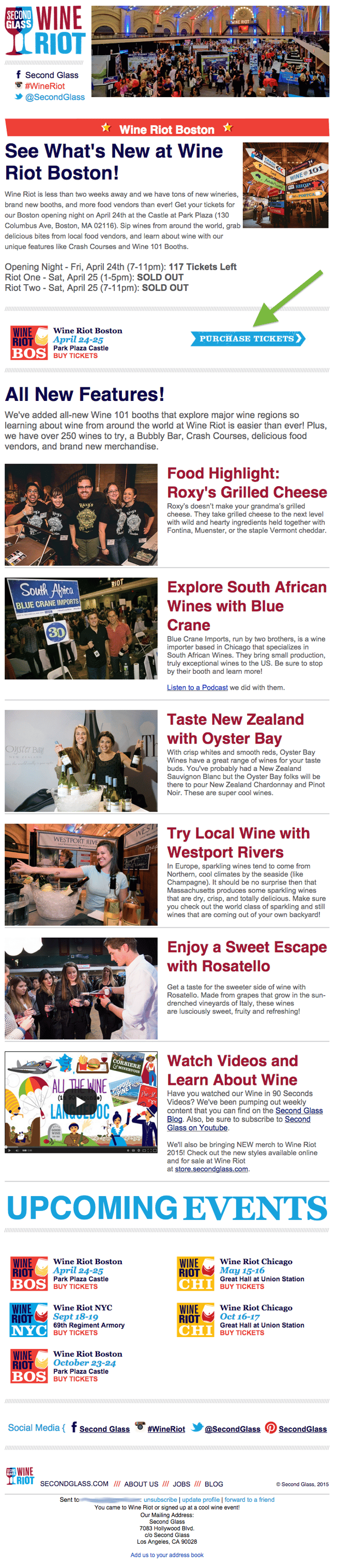
Check out Second Glass‘ email newsletter below, which was promoting their most recent Wine Riot event in Boston. It’s colorful and chock-full of information … but it’s also pretty obvious what they want you to do: purchase tickets for the event. By placing this CTA above all the other pieces of information, Second Glass increases the chance that their email recipients will click on it.
7. Keep design and copy minimal.
Like we said before, a newsletter can easily feel cluttered because of its nature. The trick for email marketers to look uncluttered revolves around two things: concise copy and enough white space in the design.
Concise copy is key — because you don’t actually want to have your subscribers hang out and read your email all day. You want to send them elsewhere (your website or blog, for instance) to actually consume the whole piece of content. Concise copy gives your subscribers a taste of your content — just enough that they want to click and learn more.
White space is key in email newsletters because it helps visually alleviate the cluttered feel, and on mobile, makes it much easier for people to click the right link.
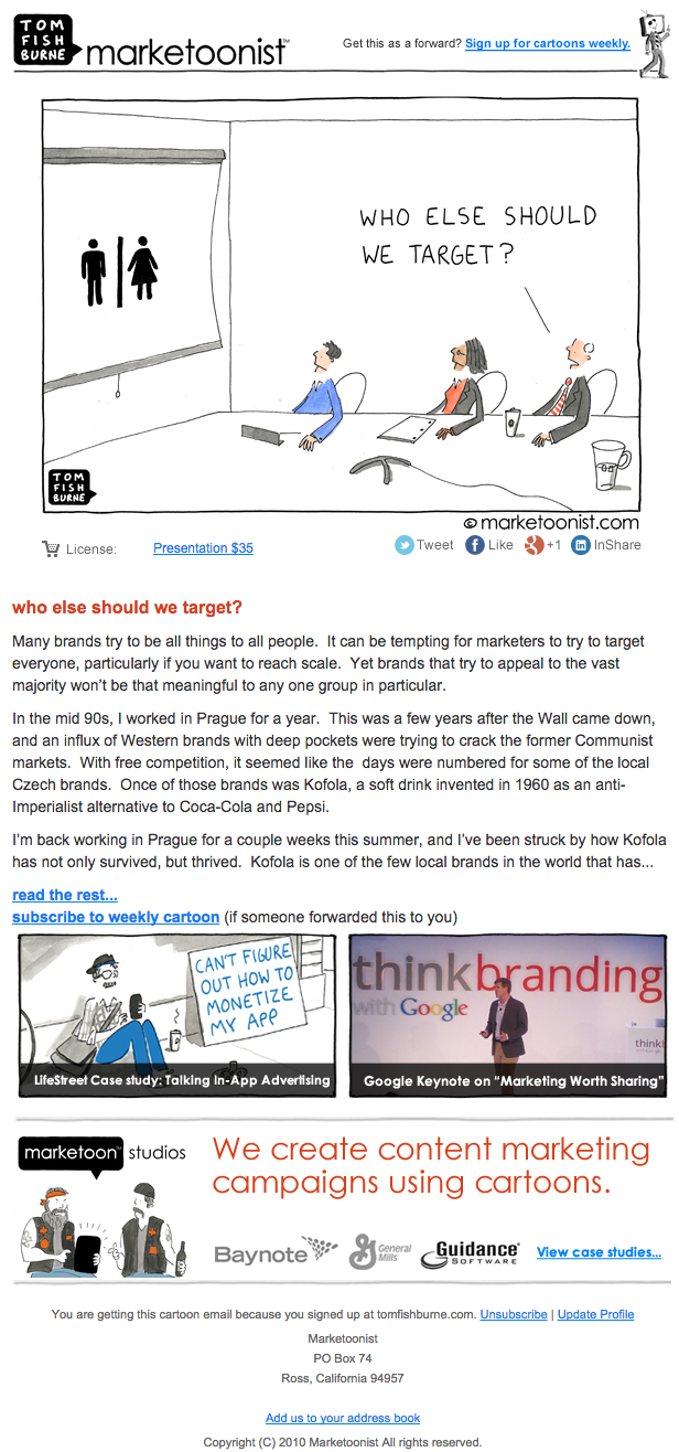
Look to Tom Fishburne’s blog post newsletters to see how this should be done. The main blog post has one large comic, a few small paragraphs of introduction, and a link. The rest of the newsletter components are smaller and more visual, making the whole design feel uncluttered an easy to read.
8. Make sure images have alt text.
Given that visual content is incredibly important to the rest of your marketing activities, it’d make sense that you’d want to include them in your emails … right?
Right. But email’s a little bit trickier. Most of the time, people won’t have images enabled, so you’ve got to make sure your images have one essential component: alt text. Alt text is the alternative text that appears when images aren’t loaded in an email. This is especially important if your CTAs are images — you want to make sure people are clicking even without the image enabled.
Each email marketing program is different, but here is one tutorial for adding alt text to email.
9. Make it easy for people to unsubscribe.
This seems kinda counter-intuitive, but it’s key if you want to maintain an active, engaged subscriber list. Don’t use weird language like “Alter your communication with us.” Don’t hide an unsubscribe button behind an image without alt text. Besides keeping your list healthy, having a clear unsubscribe process will help ensure your email isn’t marked SPAM before it hits the rest of your list’s inbox.
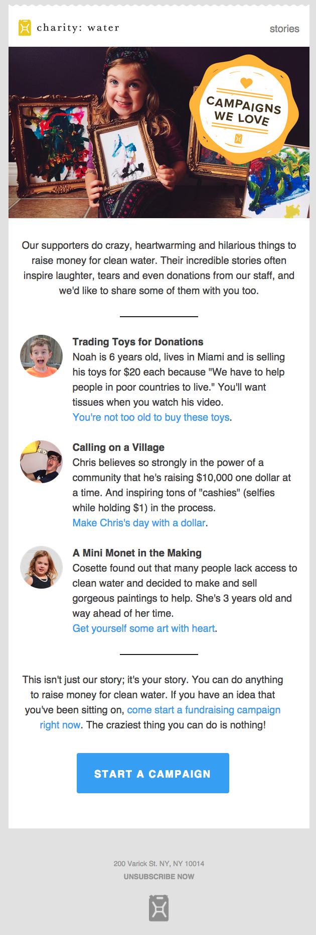
Take a look at charity: water’s newsletter below to see how to do this right. The link to unsubscribe is bolded and capitalized, making it really easy for you to take action on it (if you wanted). No footer hunting required to uncover where the heck you can change your email settings.
10. Test, test, test.
I know I just listed out nine things you should do to make sure you’re doing email newsletters right, but you’ve also got to find out what works for your company and your list. Just like different cultures of people prefer different things, different groups of email subscribers prefer different things.
So use these email newsletter best practices as a jumping off point … and then experiment to find your secret sauce. Here are a few things you can try:
Short, Funny Subject Lines
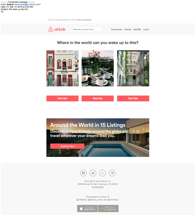
All of your subject lines should be on the short side. (They work better that way.) But have you ever tried infusing a little humor into your copy? It could put a smile on your recipients’ faces — and potentially improve your open and clickthrough rates. Below’s a really cute subject line example from Airbnb:
CTA Copy & Design
Maybe your readers like loud, bright colors on your CTA — or maybe drab, bland ones are the way to go. Maybe they prefer really fun, excitable, action-oriented copy — or maybe a simple “click here” works. Definitely test out your CTA language and copy to see what resonates.
As a good example to follow, Litmus has a ton of CTAs in their email newsletter, but the way that they use color and copy makes them seem very natural and easy-to-read.

No Images
Most of the emails featured in this post have lots of gorgeous, compelling images … but that doesn’t mean you need them in your emails. Try stripping away images in favor of seriously well-written copy.
Below is a great example of a plain text email with excellent copy from Maple Jeans. I especially love the P.S. bits toward the end. They increase the spacing between the different CTAs, making it even easier to click on mobile and giving the whole email a less promotional feel. 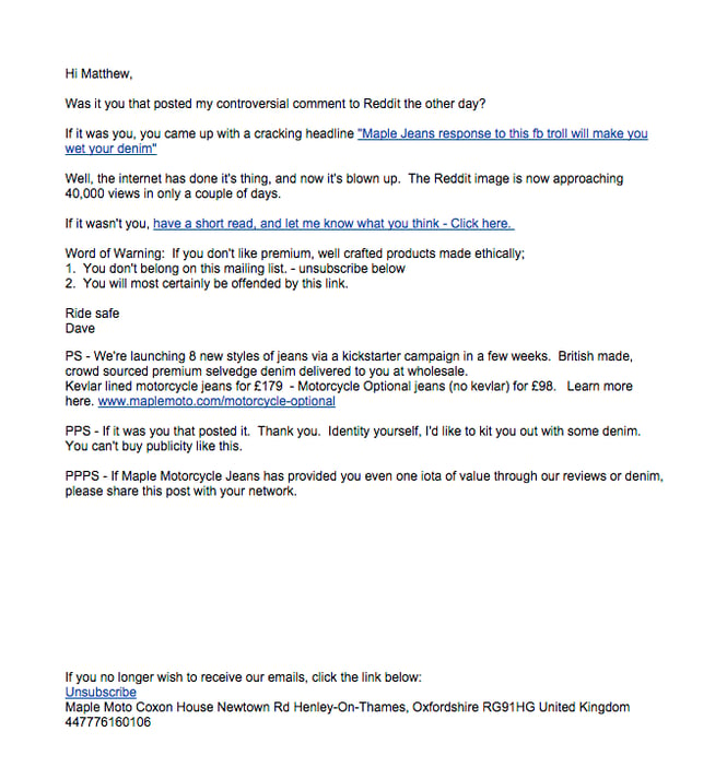
Source: ReallyGoodEmails
Mobile Version
More and more people are surfing the web and checking their emails on mobile devices, so you should make sure that whatever design you work with is both visually pleasing and functional. This will ensure that your mobile email is engaging to both desktop and mobile users.
Want to learn more about this? Here’s a detailed guide that walks you through how to optimize your email for mobile devices.
Sender Name
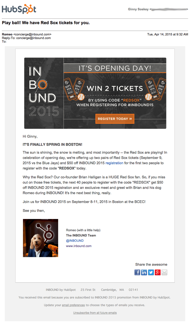
Last but certainly not least is an example from my colleagues running our INBOUND conference. Recently, to alert INBOUND attendees of a special ticket sale, they sent an email from Romeo, our CEO’s dog, in honor of the Boston Red Sox’s season home opener. And it worked: the email received 7% more opens and 2% more clicks than typical INBOUND emails sent. Even if your CEO doesn’t have a dog, running a sender name test could be very worthwhile.
Putting Together Your Newsletter
Once you’re ready to put together your newsletter, be sure to follow the above steps. You should also keep a few major things in mind, regardless of your newsletter’s formatting:
- Keep things short and sweet. Don’t overwhelm people with too much text or imagery. Level things out. Even if you choose a photo-less newsletter, keep your message quick and to the point so the email cuts to the chase and grabs attention the whole time.
- Make your content valuable. No one wants to open an email with a bunch of advertisements in it. So, include gems of wisdom, tips, and helpful blog posts along the way so the reader feels like they’re actually learning something. This will make the subscription feel much more valuable to them.
- Always test your emails. It’s embarrassing when a link doesn’t work or a design aspect looks wonky. So be sure to send test emails to yourself and a colleague who can give you helpful feedback. Check them on both a computer and a smartphone inbox so you can confirm that both the mobile and desktop designs look good.
Want to start designing but aren’t sure how? Use a template! Check out our long list of effective email templates that are free or very affordable.

The Best Editing Apps for Photos
By now, it’s clear that creating great visual content is critical for marketers — and that’s especially true on social media.
As of 2017, Instagram has doubled its monthly active user base in the last two years, which means a lot more people are viewing and sharing photos in 2018. Plus, visual content is 40X more likely to get shared on social media than other types.
In other words, people like to be shown, not told — and in turn, they share.
For that reason, it’s important for marketers to know how to create compelling photos for their business’ social networks and blogs. And while it can be worth putting the investment of time and money into photo editing software on your computer, many of us are using our phones to take pictures and could stand to edit them without uploading them to a desktop. That’s especially true when you’re posting in real time, like at an event.
Luckily, there are numerous great inexpensive and free photo editing apps out there for mobile devices — some of them even cost just a few bucks. But which apps are the best?
Check out our short list of 12 apps below — organized by apps that are compatible with both iOS and Android, apps offered just for the iPhone, and apps designed to edit face-focused photos.
Best Photo Editing Apps for Android
1. Afterlight
$0.99 | iOS | Android | Windows
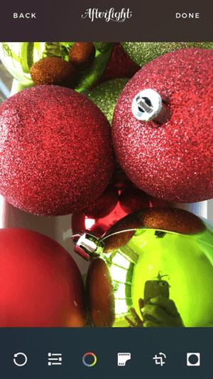
There was a time when I was a bit more old-school in my photo editing. I counted on Instagram tools alone, sometimes combining them with the “enhance” feature on my phone’s Photos app. Then, I learned about Afterlight — a somewhat rudimentary tool, but one that has all the features you need to do a basic photo edit.
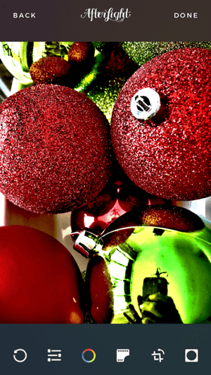
From controlling the color tones, to adjusting exposure and brightness, to rotating and straightening a photo, it has everything you need for lighting or color fixes. It also contains 74 filters, including a Fusion feature that lets you mix tools, filters, and textures to create your own personal look. Into frames? Afterlight has a whopping 128 to choose from, boasting a perfect pairing with Instagram.
My favorite tools, though, have to be the ones for Brightness and Shadows. Some pictures do well with a decrease in shadows and increase in brightness for cleaner, fresher look. But flipping those around can also create a more mysterious, nighttime feel — That’s what I did with this photo of tree ornaments.
2. VSCO Cam
Free | iOS | Android
Over the past few years, VSCO Cam has become a highly popular photo editing app for mobile. While it does boast a wider set of editing tools than most other editing apps, its main claim to fame is its filters.
These filters have a softer, more authentic look that resembles real film, compared to the over-saturated looks of many Instagram filters. Plus, it’s great for when you need to edit a photo on the fly. Simply upload the photo to VSCO Cam, slap on one of the great filters — I used C1 below — and call it a day. (There are more filters available for purchase, too.)


3. Photoshop Express
Free | iOS | Android
Believe it or not, Adobe Photoshop isn’t just for your computer. Adobe Photoshop Express puts most of what people love about Adobe’s popular photo editing program in their pockets — lighting, color, and sharpness options included.
Photoshop Express is especially useful for making photo collages — something the app’s developers likely highlighted for mobile users who want to share many photos at once on Facebook or Instagram. The app’s “Decorate” setting even allows you to annotate your photo with digital stickers before saving and posting directly on social media.
Although this photo editor makes Photoshop’s best features easily accessible, keep in mind it does carry the natural limitations of a mobile app. Specifically, you can only upload JPG files smaller than 16 megapixels (MP).
Nonetheless, what it does on a smaller platform is still super impressive. You should also try similar Adobe photo editing apps such as Adobe Lightroom and Adobe Capture.
Here’s how Photoshop Express helps you choose different collage orientations for multiple photos:

4. Snapseed
Free | iOS | Android
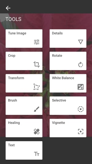
Snapseed is another app that’s great for basic image enhancements. It’s got all the classic adjustment tools, such as tuning, cropping, and straightening. Plus, its sharpening tool is one of the best we’ve seen — it really does enhance a photo’s detail, without making it look grainy, like many other photo sharpening adjusters out there.
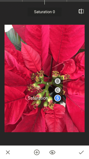
But what makes this tool particularly unique is its “Selective Adjust” tool. It allows you to pinpoint an area in a photo and adjust the brightness, contrast, and saturation of that single point. So if you want viewers to focus on a certain part of your photo — say, the buds in the center of a plant — then you can make the buds more vivid.
Want more help with Snapseed? Google, the maker of the app, created a dedicated support page with tips and instructions.
5. SKRWT
$0.99 | iOS | Android
Ever taken a picture of something straight-on — a doorway, a building, your food — and found the perspective was just a little bit askew or tilted? The SKRWT app lets you adjust the perspective of your photos to make the lines look clean and square.
Have a look at what I was able to do with a simple window shot.
Before:

After:

At first, the “before” image doesn’t look that skewed, but seeing the “after” version really shows what a difference symmetry can make. If it bugs you to see a photo that’s slightly at an angle, then this app is well worth the dollar.
6. Live Collage
Free | iOS | Android
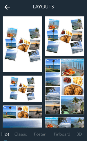
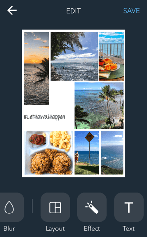
Collages made on Photoshop Express can be great, whether it’s to show a comparison (like a before-and-after series), or to highlight multiple photos from the same event or theme. But our favorite photo collage app is Live Collage, mostly because of its wide variety of layouts. It contains several options for photo organization, both classic and fun, with interesting and colorful backgrounds. Plus, you can add customized text in different fonts, colors, and sizes.
If you’re strapped for time, there are basic photo editing options within the app, too, making it a handy one-stop shop.
7. Foodie
Free | iOS | Android
If you’re anything like I am, your personal social media feeds are loaded with images of food. It’s no wonder that food-specific apps are coming out of the woodwork to make photos look even more delectable.
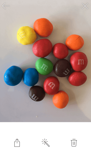
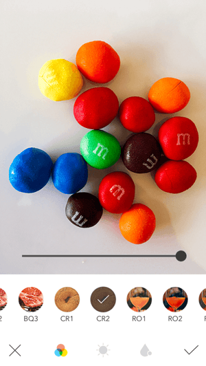
Called out by Bustle for taking “food pictures to some next level gorgeous,” Foodie uses more than 30 filters and other editing features to turn what might otherwise be a humdrum snack into a visual feast.
When I applied the CR2 filter to a photo of chocolate candy, this was the result:
Best Photo Editing Apps for iPhone
8. Camera+
$2.99 | iOS only
With the highest price tag on the list, you have to wonder what makes Camera+ so special. When it was first released, Lifehacker called it “The Best Camera App for iPhone,” with TIME writing, “If the iPhone’s standard camera is like a digital point-and-shoot, the Camera+ app is like a high-quality SLR lens.”
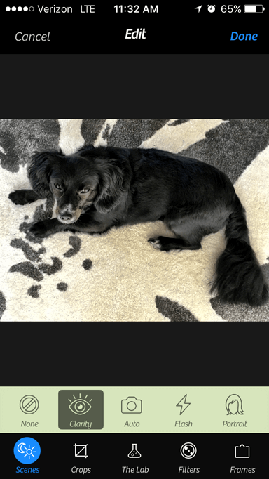
While the app has many of the classic photo editing tools like color tints, retro effects, and crops, there are a few gems that make it unique. First is its image stabilizer, which helps you capture the sharpest photos possible before you even take a picture. It also lets you zoom in up to 6X, which can really up the quality of your shot if you’re trying to hone in on something far away.
Finally, its Clarity filter is what The Wall Street Journal‘s Kevin Sintumuang calls its “secret sauce — it adds pro-camera crispness to almost any shot.” I’d have to agree — just check out how it enhanced this photo of my dog.

9. Mextures
$0.99 | iOS only
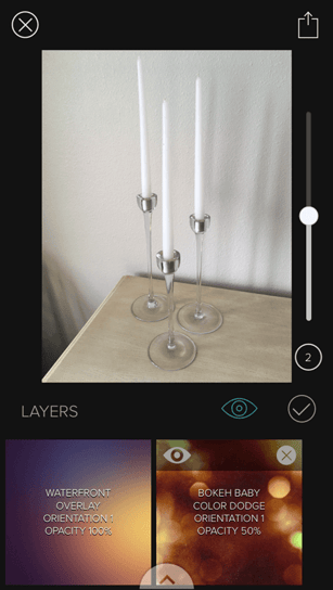
Mextures is one of the more advanced apps on this list — and its crown jewel is layer-based editing. That allows users to stack different adjustment layers on top of each other, moving and editing them individually, allowing for nearly limitless creativity. You can also apply multiple filters, textures, and blending models to the same photo to create a really unique look. If you find an editing formula you really like, you can save it to apply to other photos later, or even share it with your friends.
Here’s what happened when I took a simple photo of candlesticks on a white background only and applied three enhancements — Waterfront overlay, Bokeh Baby Overlay, and the Color Dodge blending mode.

10. Enlight
$3.99 | iOS only
I’ll just say how I feel: This app is incredible.
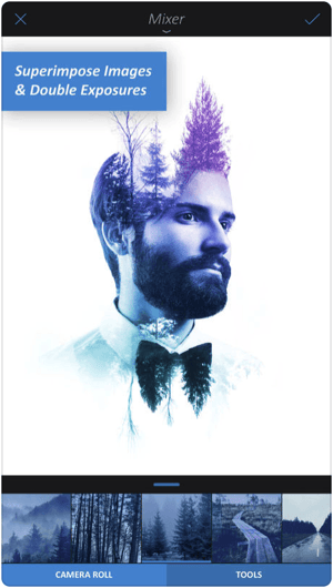
Winner of the Apple Design Award in 2017, Enlight will change the way you see even the most ordinary picture the next time you open your iPhone camera. Among its 10 different photo editing features, the app’s Photo Mixer allows you to blend multiple photos together — or combine a photo with text — for a super artistic result.
According to Les Shu of Digital Trends, Enlight is “a powerful Photoshop-like app, minus the steep learning curve.”
Check out a stunning example of what the app’s Photo Mixer can do below.
Best Face Editing Apps
11. Facetune
$3.99 on iOS | $5.99 on Android
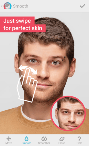
Never take a selfie you don’t like again. Facetune is considered the top photo app in more than 120 countries, allowing you to make up for unflattering mobile photos with professional-level corrections to numerous facial features.
The app offers eight different types of corrections and enhancements to a person’s face in a given photo — including to the hair, eyes, skin, and smile. Taking a new professional headshot? I highly recommend you touch it up in the Facetune app before adding the photo to your LinkedIn profile (not that I don’t think you’re beautiful already).
Here’s just one example of a skin tone correction done with Facetune, making all the difference:
12. Visage Makeup Editor
Free | iOS | Android
Disclaimer: There’s absolutely nothing wrong with under-eye circles. We all have them, and we sometimes wear them like medals. (We do, however, take issue with and don’t recommend a lack of sleep.)
That said, when it comes to sharing photos of ourselves on social media, vanity sometimes enters the picture. Sound familiar? There’s an app for that.
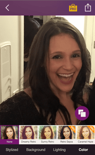
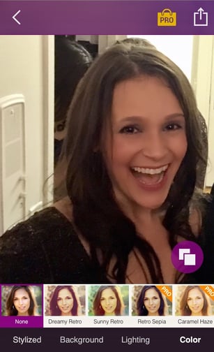
We like the Visage makeup editor, which instantly retouches photos and lets you add some special effects, like a “Pop Art Style” filter that can make your selfie look slightly Warhol-esque. The app comes equipped with some interesting backgrounds, as well as lighting and color features, with more available for purchase.
The only drawback? The free version is a bit ad-heavy, and unless you upgrade to pro, your finished product will be stuck with a branded hashtag at the bottom.
GIMP
GIMP stands for “generic image manipulation program.” It’s available for download on both Mac and PC and has an incredibly similar interface to Photoshop — just slightly less intuitive. This is a great alternative for someone who wants to do some detailed photo editing that involves layers, color manipulation, and other more advanced design strategies.
Here’s a quick beginner’s guide:
While Photoshop will give you the quickest, smoothest editing experience, GIMP will get the job done if you need to do a more intricate edit of a photo but don’t have the resources for a subscription. This could be great for beginner photographers, marketing or journalism students, or people in a role where they’ll need to do light editing without a software budget.
Photos from Apple
Apple’s Photos app is free to those who have an Apple computer. In fact, its pre-downloaded on to all Apple computers.
This software’s interface is really easy to understand, however it is very basic. While you can add filters, crop, remove blemishes, whiten teeth, and use other basic tools that are common to most free photo editing apps, you won’t be able to do anything fancy.
If you’re a nature, architecture, or portrait photographer that just wants to add an extra touch or refinement to your photos, this software will be more than suitable. But, if you want to do special effects or something out of the ordinary, you’ll want to consider software that’s more advanced, like GIMP, or a paid Photoshop subscription.
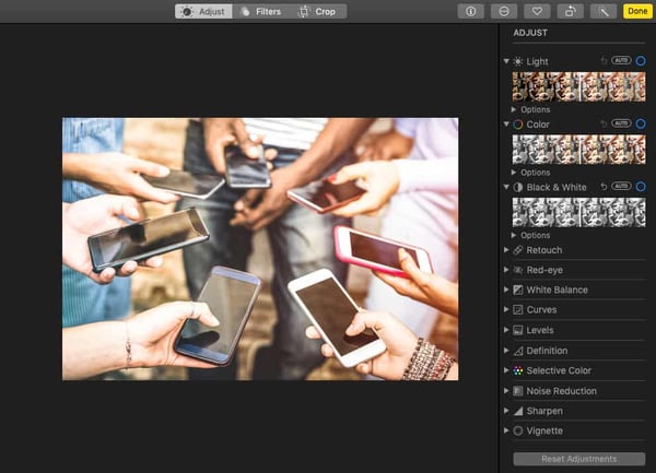 If you have Photos and want to use it, simply click into the app and press File > Import to import your images. Once they’re in, double click on the photo to expand it. Then, click Edit in the top right corner.
If you just want to do a quick color correction, you can also click the Enhance wand next to the Edit button.
Pixlr
For those who don’t want to download a program, such as GIMP, you could also try Pixlr. This editing software has a very similar interface and editing toolset to GIMP. The key difference? It’s all online.
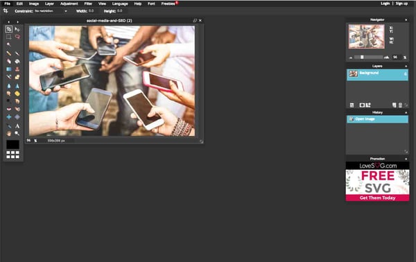
You don’t even need a membership to start editing your first photo. All you have to do is go to Pixlr’s website and click the CTA on its homepage that says “Use Pixlr Editor.” Once you do that, you’ll be instructed to choose a photo or make a canvas.
Then, you’ll be sent to the editing page. Again, it’s very similar to GIMP. The tools are all pretty similar, but the interface is a little brighter and the icons are a little bigger. This might make a detailed editing process a bit easier on the eyes.
Fotor
Like Pixlr, Fotor is a slightly-more basic free online photo editor. It includes many of the editing tools you’d need for light editing. For those who don’t know what image editing symbols look like, you might enjoy Fotor because they replace those with buttons that simply say want each feature does.
Here’s a quick image of what the basic interface looks like. Users who want more features can also upgrade to a plan which is $3.99 per month.
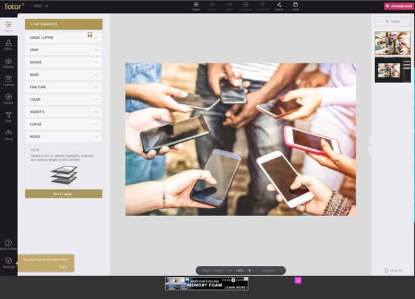
If you want to see the product in action, here’s a tutorial the Fotor shows new users:
Now Comes the Fun Part
See how easy it is to create and share visual content? Of course, mastering these apps will require a bit of practice, but if you’re unsure where to start, just look around you — that’s what we did when we tried each of them.
Think about your marketing goals for this year. Then, ask yourself what kind of photos will help you accomplish them. From there, you can pick and choose the best apps from this list.
So start getting visual. We can’t wait to see what you create.
Want to learn more about video editing? Check out 10 Easy-to-Use Tools for Creating Animated Images and Videos.

How 19 Brands are Using Instagram Stories
According to Instagram, one-third of the platform’s most-viewed Stories are from businesses.
Why could this be? As people are increasingly using social media to research prospective purchases, Instagram Stories serves as an outlet for brands to creatively show their products, services, or happy customers in action.
Branded Instagram Stories also enable audiences to learn more about topics related to your brand’s industry. Helpful and valuable content might also allow prospective buyers to trust your brand more.
And as video marketing becomes more and more prominent, the same benefits could exist for visual storytellers on platforms like Instagram.
If you’re not a natural storyteller and haven’t done any visual marketing before, the idea of this creative strategy can seem intimidating or tricky.
Luckily, Instagram, which is booming with brand activity, has a helpful and easy-to-use Stories feature that allows influencers, individuals, and brands to easily tell stories with images, videos, interactive elements, and basic effects. Because the platform is so fast-paced, engaging stories don’t even have to be that long or time-consuming.
If you’ve been on Instagram for a while now, you’re probably more than familiar with its Stories feature. But if you’re new to the platform, here’s a quick explanation of Stories:
While an individual might use a Story to show photos or videos from a vacation, work, or other aspects of their daily life, brands often use this feature to highlight photo or video content about their product, brand, or a topic related to their industry. By doing this, the brand might entertain and gain awareness from Instagrammers who enjoy tapping through random Stories.
To make your content even more interesting, you can also add GIF stickers, text overlays, filters, and interactive features — like polls and quizzes — to Stories after you upload or shoot them. You can also optimize your Story by adding text overlays with relevant hashtags or by adding handles of users that are affiliated with the content.
Whether you’re new to the app or a pro, you might be wondering where to start when it comes to using this feature for your brand. You might also worry that this strategy could be expensive, time-consuming, or require graphic design skills.
The truth is, creating Instagram Stories can actually be pretty simple and fun for your social media managers. Because Instagram offers a variety of unique effects and features, you can also do a lot of your story editing in the app itself.
To help you plan your Instagram Story strategy, we’ve compiled a list of 19 brands that have mastered the app feature. Although the brands on this list are larger companies, all of them have strategies that could be easily scaled to fit the marketing budget of smaller companies.
19 Brands Using Instagram Stories
LEGO
While LEGO commercials and other branding material might be more targeted to children, its Instagram approach is targeted to older audiences that will buy the product. These audiences could include young adults that love puzzle projects, or parents that might buy a set for their children.
LEGO’s Instagram primarily highlights works of art made with their products. While this might be interesting for younger people on Instagram, it could also be fascinating to older people who used to play with LEGOs and might want to buy them for their children.
LEGO adds to these Stories with interactive polls and quizzes. In a recent Story celebrating Harley Davidson, they showed a LEGO replica of a motorcycle and included a quiz that asked, “How many LEGO elements are in this life-size Harley?” This is a great example of how a brand can use a relevant quiz to engage people in an interesting way.

LEGO’s Instagram is a great example of how a brand that sells a product primarily to one age group can adjust its content for social platforms that host audiences from other generations. While they’re still on brand and hone in on LEGO nostalgia, they do a great job of creating interactive content specifically for the young adults on the platform.
NASA
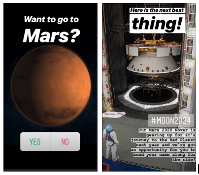
NASA leverages beautiful space imagery, pictures of cool gadgets they work with, and interesting space discovery news to create Stories that speak to science lovers. On any given day, you might see a Story about a new planet, polls related to space travel, or quick historical fun facts.
NASA’s style is surprisingly casual and easy to comprehend. Although the organization’s content discusses complex topics like space, science, and technology, its Stories do a great job at cutting to the chase by explaining what’s interesting or newsworthy in a way that’s understandable to those without science degrees.
To pull in viewers, NASA begins Stories with an interactive element or text that summarizes the topic they’ll discuss. Here are two pages they used to kick off different Story editions:
Takeaways
NASA’s strategy of grabbing audiences with quick, understandable, and interesting information can be key on many fast-paced social media platforms where people merely glance at a post or tap quickly through a Story before moving on to the next interesting piece of content.
When it comes to their overall approach, NASA does a great job at leveraging the strong content and information it has readily available to create unique Stories about space. While some brands might need to get super creative and brainstorm Story content from scratch, NASA recognized that its photo and video content would align well with Instagram Stories.
If you’re part of a smaller brand that has highly visual products or content, you might want to prioritize visual social platforms like NASA has done. Not only will it be easier for you to leverage visual content that you’re already creating, but you’ll have a leg up on brands that aren’t as visual.
Additionally, while some people might be intimidated by scientific discussions, they might still follow NASA because the brand publishes jargon-free stories that simply explain need-to-know details about complex topics. if you have a highly technical or complicated product or service, take a page from NASA’s book and use Stories as a chance to be more accessible to your audience.
MIT Technology Review
MIT Technology Review’s Instagram content isn’t only for academics and science experts. The publication actually does a great job of creating and telling stories most of the Instagram’s audiences can understand.
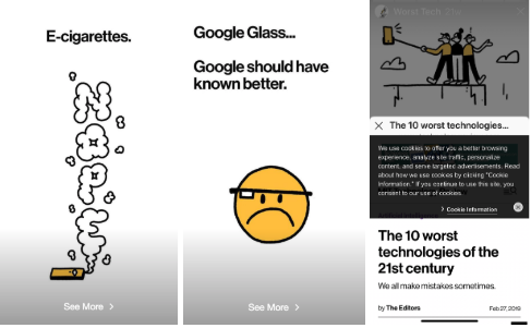
One of the publication’s Instagram Story strategies involves taking long-form pieces of content and abridging them for the platform. Because MIT Tech Review is verified with over 10,000 followers, it’s able to include “swipe ups” in Stories. A swipe up is a CTA that says something like, “Swipe up” or “Read more.” When a viewer sees it, they can swipe their finger upward to see a page or article from the publisher’s website.
If you can include swipe ups, this tactic is both creative and might be helpful for boosting traffic to full stories. Users might read an interesting, but short, Story — like the one below about 2019 technology fails — and want to swipe up to see a full long-form article.
Takeaways
While NASA leverages its exclusive visuals, MIT Tech Review similarly leverages its readily available editorial content. Rather than writing seperate news content for Instagram Stories, they adapt pre-written articles that they think will be interesting to Instagram readers.
This abridged-content strategy could be excellent for publishers or brands that regularly blog. If a brand can’t link Stories to their website just yet, they could still create a shortened version of a blog post and alternatively include a page that says the article’s link can be found in the Instagram account’s bio.
Harvard Business Review
The Harvard Business Review often centers Stories around management, professionalism, and career-life. Like the MIT Tech Review, it uses a casual tone of voice and similarly adapts long-form content into abridged Stories. However, one key difference is that HBR is a bit more interactive.
While HBR embraces Instagram’s poll, quiz, and other interactive Story features, it also gets creative by adding its own spin on interactivity to a story. In the example before, the publication shows users a burn-out checklist which they can screenshot and check off. The story then gives you advice for what to do if you checked any of the boxes.
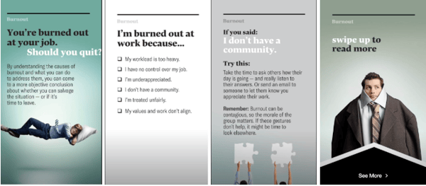
For readers that want to know more, they offer a swipe up to a long-form article on their website.
Takeaways
Although the name “Harvard” can sound intimidating, the publication’s Stories are easy for any reader to follow. This is a great example of how a brand can succeed by talking directly to the young, more casual audience of Instagram.
On top of an understandable and relatable tone, interactive elements like checklists, polls, and quizzes might make readers think more deeply about a topic than they had before. This might pull them into content because they want to learn more or dive deeper into a topic they were asked to vote on.
Even if you aren’t a publisher, doing something similar could be equally as beneficial to your content.
For example, if you’re running an Instagram account for an extermination company, you might start a story with a poll saying, “Do you know where bed bugs come from?” Then, you could tell a story of where they come from, how to prevent them, and how they can call an exterminator if their preventative measures don’t work.
People might tap through after taking the poll to see if they’re right about bed bug origins or because the question made them realize how worried they are about bed bugs.
America’s Test Kitchen
Like NASA, America’s Test Kitchen, a website and video blog with recipe content, doesn’t go too far off-brand with its Instagram Stories. While many of America’s Test Kitchen’s videos on other platforms show you how to make a recipe, the brand publishes behind-the-scenes kitchen videos and shots of ingredients to amp up audiences for upcoming recipe videos.
In a recent story, the Test Kitchen showed photographs and videos of bacon as chefs were testing out bacon recipes. The Story then offered up a poll that asked viewers how crispy they like their bacon.
The Test Kitchen doesn’t swipe up to its website yet, but because they’re posting behind the scenes videos while cooking new recipes, users can get an idea of what’s going live on the website.

Takeaways
If you’re not verified or are just starting to grow your following, this is a good example of how you can still promote your content without using a link to direct traffic to your site.
While America’s Test Kitchen’s Story strategy is perfect for food publications, it could also be helpful for restaurants as well. When someone sees a video of a restaurant’s chef cooking a new dish, it might make them crave that meal and go to the restaurant to order it. Additionally, as prospective customers see chefs cooking thoroughly and with care, they might also trust that their food will be prepared well
Museum of Fine Arts, Boston
The Museum of Fine Arts, Boston uses Instagram Stories bring its current statues and paintings to life. While you might think that looking at pictures of 17th-century art might bore you, the MFA zests things up by partnering them with funny quotes, meme references, and polls.
For example, they recently presented multiple pictures of horse-related art accompanied with lyrics from the highly-memed song, “Old Town Road.”

Takeaways
While the MFA is known for being prestigious and academic, it uses Instagram Stories like this to show that the brand can still be both humorous and hip.
This is an example of how a brand that could’ve been considered “dry” on Instagram thought outside the box to show off their product in a whole new way. While it can be beneficial to stay on brand if you align well with a platform, some companies or organizations, like museums or national parks, might want to experiment with odd new content strategies on fast-paced platforms like Instagram.
National Geographic
Aside from Instagram’s own account, National Geographic is the most-followed brand on the platform. Like its standard photo posts, the publisher experiments with a variety of different content styles.
While NatGeo’s Stories usually highlight mini-documentaries, they also occasionally include polls or quizzes. This is a good example of how mixing things up and experimenting with different content styles can keep your audiences on the edge wondering what type of content they might see next.
Like MIT and Harvard, National Geographic also occasionally abridges long-form content in order to promote an article or video that a viewer can swipe up to. In the example screenshotted below, they promote a video that discusses the history of NASA’s Apollo mission, while tagging NASA for some added Story optimization.

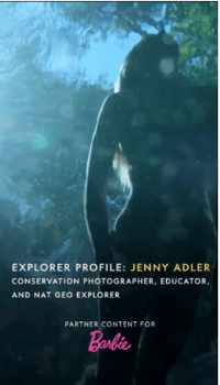
The brand has also dabbled with sponsored content. In one edition, sponsored by Barbie, they told the story of a female conservation photographer. This was an interesting example of a sponsorship which allowed National Geographic to tell a beautifully shot story about nature, while aligning with Barbie’s mission to encourage female empowerment.
Takeaways
Like MIT Tech Review and NASA, National Geographic leverages the beautiful and exclusive imagery it already has to adapt interesting on-brand content for Instagram. This allows the company to use their resources in an economic way while also promoting long-form content that goes into more detail than the Story does.
While NatGeo does a great job of adapting content, it also experiments with partner content. When even small brands partner with other companies to create content, production can be more affordable, and launching the content could help both brands gain fans from the other’s base.
Outback Steakhouse
Like America’s Test Kitchen, the restaurant chain Outback Steakhouse leverages images of delicious food and polls to engage its Instagram Story audiences.
While some Stories feel like ads by discussing promos and deals, others feel more interactive and creative.
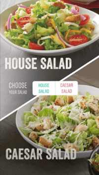
For example, in one recent Story, users were shown multiple Outback menu items for each dinner course, then they were asked to vote on which meal they wanted for each course. At the end of the Story, Outback noted a multicourse dinner deal they were offering. This is a great way of highlighting multiple products at once without making your audiences feel overwhelmed.
Takeaways
If you can’t think of an idea for a Story with a more traditional plot and narrative, Outback proves that you can still pull people through a series of images in a way that feels more like an interactive experience than an ad.
A variety of different brands could take on a similar strategy. For example, if you were a marketer for a shoe company could post a Story that allows people to vote on the shoe styles that they’d wear for different occasions. This type of story would allow your audiences to see and weigh in on two different styles of your products at once.
Later, when they can’t figure out which shoes they want to wear to an outing, they might remember your Story and go to your shoe outlet knowing you have a bunch of different options.
Nike
Nike’s Instagram Stories feature interviews with prominent athletes who use Nike products. During the interviews, the athletes talk about their career accomplishments, rather than focusing on Nike products.
In the example below, soccer player Alex Morgan told the story about how she realized she wanted a different career path than her sister.

Although this has nothing to do with shoes, the content aims to motivate athletes who might want to purchase shoes worn by other successful people in the sporting industry.
Takeaways
Leveraging relevant influencers, like Nike, allows you to create content that aligns with your brand without purely focusing on your product.
People might watch these Stories to learn more about the famous athletes being interviewed. Then, they might trust Nike’s brand more because these successful athletes also trust its products.
While a small company might not be able to hire or film a famous athlete or influencer, they could still experiment with a similar strategy by interviewing smaller influencers or experts within their industry.
For example, if a gym owner wants to gain more clients, they could interview a local athlete about their goals, accomplishments, and what motivates them. People interested in the local athlete might watch the video to learn more about the person, but then consider a gym membership if they want to have similar athletic accomplishments.
Airbnb
Stories are a major part of the travel company’s Instagram strategy. In fact, they have a few different styles of Stories. For example, which gives short profiles of Airbnb customers is called “Experiences, while another — called “Adventures” combines curated and Airbnb-recorded content to show documentaries of unique vacations around the world.
Here’s an example of one of Airbnb’s Experience pieces which centers around a customer who regularly stays in Brooklyn. Aside from explaining what the customer does, AIrbnb also uses polls and quizzes related to her job to get people interested in the history she researches:
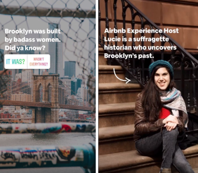
While Airbnb creates a lot of high-quality video and animated content for its stories, they also don’t shy away from sharing high definition customer videos while crediting and tagging them.
Here’s another screenshot from one of the brand’s Adventure Stories where they included videos of an Airbnb customer swimming with sharks and credited them with their account handle:

Takeaways
One of the best ways to gain brand trust is by telling or presenting stories from happy customers. Airbnb’s Instagram team recognizes this and centers its storytelling strategy around that.
While they film and present their own beautiful footage and documentaries, they also are wise to share user curated videos and images.
While curation can obviously save you time and money on creating content, it also gives happy customers a new way to interact with the brand. Not to mention, it gives the brand a great opportunity to show its fans how pleased customers were with their trips.
If a prospective customer worries that a startup ro non-traditional company is untrustworthy, videos from customers could ease their nerves or give them a sense of FOMO (or fear of missing out) that makes them want to book a flight.
Although this customer experience strategy works well for Airbnb, it could work for a variety of other companies, especially if they are still building up their customer base or selling a disruptive product that no one’s used before.
For example, if a new ride-share company had a few happy customers but wanted to boost its marketing strategy, it might create Stories where customers talk about interesting places that their shared ride brought them to, or maybe they’d discuss an interesting driver they met on a long ride. They could earn trust when prospective customers see how happy and safe customers felt when using the ride-share service.
Starbucks
Starbucks uses Stories to share customer testimonies, new product launches, and other interactive content. Although some a lot of the brand’s content revolves around its drinks, the Stories don’t feel like advertisements because they embrace fun facts and interactive polls and quizzes.
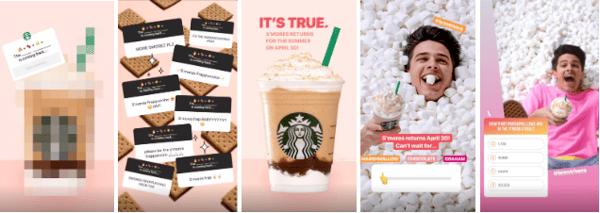
In one example, Starbucks asks viewers to guess which drink is coming back. It then shares the best answers and reveals the S’mores Frap and image. To add some extra interactivity, viewers can vote on what type of S’mores Frap they prefer and guess how many s’mores are shown in a video.
Takeaways
Even if they center specifically around a product rather than a narrative or plotline, Stories like these can still be fun from beginning to end. Starbucks does a great job of using interactive features to engage viewers.
By offering open ended questions and quizzes, they might engage with people who don’t like a specific beverage, but want to guess anyway. With the polls, they can gain similar engagement, while also possibly learning more about what drinks and flavors their audience prefers.
Yes. Obviously Instagram is excellent at posting Stories on its own platform. But, even though the brand is giant, they still rely on their fanbase for most of the content.
Almost all of Instagram’s Stories are filled with photos or videos submitted by users. This allows Instagram to show off some of the most beautiful imagery and the most interesting videos on the platform. Because they tag and credit users who submitted content, they also give those accounts some great promotion. This, in turn, makes Instagram look like they care about their community and how people are using the app.
Here’s a screenshot from a motivational story created by an Instagram user:

Takeaways
Whether you’re marketing a small business or large business, you always want to be picking “low hanging fruit.” For those that don’t know this common startup saying, it means that if you see a huge opportunity in front of you, you should grab it. Just like you would grab a delicious-looking apple that was hanging low to the ground off of a tall tree.
By sourcing and republishing interesting content from some of its most engaging users, Instagram grabs its low hanging fruit and makes a delicious juice out of it.
Odds are, you’re not Instagram’s size — and you probably don’t have your own thriving social platform to pull content from. But, this doesn’t mean you can’t curate content from your customers in a more scalable way.
Like Airbnb, Instagram benefits greatly from highlighting content that was already created by its fans. If you’re a small business that regularly gets some type of content from your customers or fans, you can create a sense of trust and community by sharing it and acknowledging those individuals.
For example, if you run marketing for a clothing outlet and keep getting pictures of people wearing the dresses it sells, you could make a Story that shows photos from customers who wore those outfits to different outings. Like Instagram, you could tag those customers so they or their followers might see the Story.
In another scenario, say you’re running a local art studio. You might want to publish a Story that includes photos, sculptures, and paintings from your students. This allows your students to feel like you care about their success and want to share it, while also showing prospective students how much they could learn if they took your classes.
NBA
The NBA regularly posts behind-the-scenes styled Instagram Stories which might highlight post-game celebrations, interviews, and other off-the-court happenings.
For example, a recent Story followed the Toronto Raptors parade in Ontario, Canada and showed clips of players with family members and posing for photo ops with the Canadian rapper, Drake.

Takeaways
When you show the people behind a company or brand, it makes it feel more relatable or trustworthy. With the NBA, we often see players looking serious and tough as they play basketball. But, when you see them off the court, you realize that they’re human, just like you.
Although someone might not be a sports fan, they might still watch behind-the-scenes stories like this to learn more about the faces behind the brand or to get insight on how the world of sports works.
In other industries, people might also respond well to behind-the-scenes video. For example, if you’re marketing for a school or gym where professors and trainers might seem intimidating to prospects, showing Instagram Stories that follow them in their daily lives might make prospects less apprehensive about signing up for a course or membership.
Wayfair
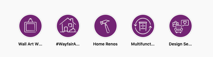
Wayfair, an online furniture and home-decor company, publishes Stories that fall into five home-related categories: Wall Art Wednesday, #WayfairAtHome, Home Renos, Multifunctional, and Design Services.
When you visit its account page, instead of featuring multiple individual stories, they show you icons for each category. Once you click in, you’ll see multiple Stories that relate to each group.
Regardless of which category the Story falls into, Wayfair is always creatively weaving product shots into it in either a humorous or creative way.
Here’s a screenshot from a Story where the brand uses humor to show off wall art:

In another example, they give valuable tips for home renovation that acknowledge Wayfair products:
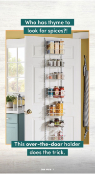
Wayfair includes a “See more.” swipe up call to action in every page of its Stories which allows viewers to swipe directly to a product immediately after its shown.
Takeaways
If you’re working at an ecommerce company, or want to highlight and sell products quickly, Wayfair’s strategy could be beneficial. These Stories allow possible customers to see products in action and used in real-life scenarios, which might make them want to make a purchase.
If you can’t link your website to your Story, you could alternatively stick a product line link in your Instagram bio, then create a Story highlighting products that will be shown on that webpage. At the end of it, rather than including a linked call to action, you could direct viewers to your bio.
If you end up creating a bunch of Stories that fit into just a few categories, you might also want to consider presenting them as featured Stories like Wayfair does on its profile. That way, if someone is interested in one product category over another, they’ll know where to click to see relevant content.
Caffe Nero
The New England-based Italian coffee chain, Caffe Nero, uses its Instagram Stories to highlight new products, menu items, and it’s baristas. Recently, the company posted a Story about its “Barista of the Year” competition and award which highlighted the winner as well as eight baristas who were named as finalists.

Takeaways
Whether you’re marketing for a local business or a chain, Stories can be a helpful way to highlight unique aspects of your brand — especially devoted and friendly staff.
By highlighting nine highly-skilled baristas and showing an award ceremony, Caffe Nero shows prospective customers that its employees are pleasant, want to help customers, are good at making coffee, and enjoy their jobs. It also makes Caffe Nero look like a brand that cares about both its staff and good customer experiences.
If someone has to pick between a huge restaurant chain with unhappy staff and a smaller chain with staff that cares about customer happiness, odds are, they’ll probably choose the second option because their experience might be smoother and more pleasant.
New York University
NYU’s Stories center around topics that you might see in a student newspaper. In any given story edition, you might find student profiles, historical fun facts about NYU, graduation speeches, and university-related newsbites.
In one Story, published on Valentine’s Day, NYU discussed alumni who fell in love:

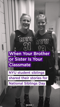
In the same Story, they also highlighted instances of sibling students
And just recently, NYU published footage of its Pride Parade:
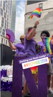
Takeaways
Because Gen-Z and millennials flock to Instagram, this type of student-friendly content seems very well targeted. While many in Gen-Z are starting to enroll in college programs, some millennials might still be thinking about getting a first or second degree.
When prospective students are preparing to make a huge investment in college, they want to choose a school that cares about its students. With the strategy of telling interesting student stories and covering campus events, NYU gives possible students an idea of what going to the school might be like. These Stories might also show them how fun and diverse NYU could be.
If you’re part of a business that requires students or customers to pay large annual fees, one great way of showing them it’s worth it is by highlighting current customers or students. Emotionally, prospects might connect with people in their situation who are happy with a big investment that they made.
While this strategy works well for colleges and universities, it might also benefit other programs, such as a networking organization. For example, if you’re trying to market a group where members pay to attend networking events, workshops, or other career training, you might post Stories that talk about members who found jobs after joining, or use the platform to show videos of current members at an interesting networking workshop.
Planet Fitness
Planet Fitness leverages its diverse customer base by promoting gym triumphs in its Instagram Stories. Its featured Story includes one customer triumph or success story on each page with teaser language encouraging viewers to swipe up to the Planet Fitness website.
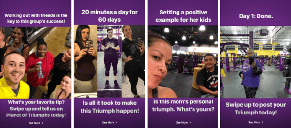
The best thing about this Story is that it shows successes from a wide range of people at different ages and fitness levels. While you might see a highlight about an athlete preparing for a marathon one day, you’ll also regularly see moms going to the gym to lose baby-weight, friends working out together to keep each other accountable, or other testimonials about customer weight-loss or wellness milestones.
Takeaways
While some gyms might promote their most athletic, body-building members to show how successful they are, Planet Fitness continues to define itself as a “judgement-free zone” by showing realistic accomplishments by every-day people.
Those who want to go to the gym, but feel intimidated or worried that athletes will be judging their fitness level might see these stories and feel like Planet Fitness is a realistic and welcoming place for them to start working out.
Furthermore, when they see a success story about someone losing just a few pounds or inches, they might trust that Planet Fitness is a more realistic gym with staff that will help them reach healthy and achievable goals, rather than pressure them to overwork themselves.
Every-day person success Stories can be a great way to lighten up your brand image if you think prospects are too nervous to come to you. Aside from gyms, this could be an approach for other businesses or brands that might be intimidating to customers.
For example, because people can get nervous around lawyers, a law firm might want to use Stories to post video testimonials from clients who won their court cases with help from the organization. In another scenario, a nutritionist might have patients volunteer to talk about their wellness success. Viewers who are worried that they’ll have to change their whole diet with a nutritionist might be comforted by seeing that expert advice can help them be healthier.
The Jimmy Fund
The non-profit organization which raises money for cancer research and treatments regularly keeps Instagram followers up to date with the projects its funding, cancer-survivor testimonials, and updates on its annual 5K Fun Runs.
Although cancer is a tough topic, The Jimmy Fund’s Stories are optimistic and promote the charity’s successes.
In one Story, the organization toured a state of the art cancer treatment center that they had helped fund:
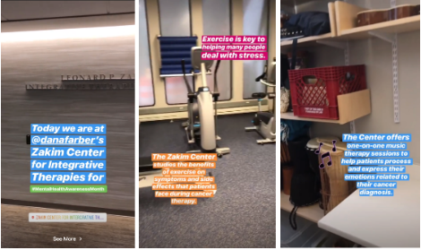
In another, a cancer survivor gives five tips for living with the disease:
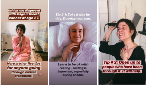
Takeaways
If you’re a marketer for an organization that asks for donations or funding, you might already know that you’ll need to gain trust from your following in order to get the money you need. One of the best ways to show that someone’s donation will be put to good use is to promote how the funds are effectively being used to help others.
By using the Stories feature to present funded projects, like new cancer treatment centers, viewers can literally see what their money could go toward.
If you’re just getting a philanthropic organization or fund off of the ground, another way to earn trust could be by creating content that is valuable to the group you’re trying to help.
For example, along with noting what the charity has been funding, The Jimmy Fund also posts advice for cancer patients and cancer survivors. While those living with cancer can benefit from this, those who aren’t will see that the organization genuinely cares about the group it says it supports.
Lowe’s
The home-improvement store uses a variety of different story styles to show off its products. While most are created by Lowe’s, other [1]stories are curated from customers.
In one curated story, viewers can watch a woman refloor her bathroom with tiles she bought at Lowe’s:

In a story created by Lowe’s, the brand takes a similar approach as Outback Steakhouse by allowing viewers to vote on which type of paint color they preferred in a specific room:

Takeaways
While home-improvement might be nerve-wracking to someone who hasn’t done it before, Lowe’s uses colorful imagery and creative stories to show how fun and creative it can be. Because Lowe’s shows its own tools in these stories, novices who don’t want to be overwhelmed by product choices might just buy the exact same supplies so they can replicate what they’ve already seen.
If your company offers DIY products, whether they relate to home-making, cooking, art, or other activities, showing them in action can be a really great way to encourage purchases. How-tos and demonstrations can excite prospective customers and show them how easy it can be to do a home project. Because of this, they might run straight to your store to buy similar supplies or ask your staff to show them other products for another DIY project.
Tips for Creating an Instagram Story
If this list has inspired you to create a branded Instagram Story, here are a few key takeaways to remember as you begin to brainstorm your first edition.
- Identify and leverage content that might already align well with the platform. Do you have great customers that you can interview on camera? Or photos or videos of your product or service in action? While you’ll still want to adapt imagery or Story lengths to fit the platform, don’t be afraid to publish Stories with curated or pre-created content that you think will engage Instagrammers and prospective customers.
- Create content specifically for the platform’s audience. Whether you’re adapting content or creating it from scratch, make sure you’re posting about topics that younger and more-visual Instagram audiences will engage with.
- Use interactive features like questions, polls, and quizzes. These add depth to a story and might enable users to think about each topic more seriously.
- Keep stories quick and to the point. Don’t overwhelm your audiences with too much text or too many pages. This might cause them to tap out of your story.
- Add a swipe up if you can. These can be a great way to gain traffic through Instagram. Don’t have the swipe up feature yet? Here’s how you can get it.
Stories can be a great way to add some unique and engaging content to your Instagram strategy. If you’re ready to make one, but feel overwhelmed by all the app’s features, you can check out this detailed how-to guide.
If you’re looking to up your Instagram game even more, click here to learn more about the strategies of its most-followed brands and individuals. You can also check out our Ultimate Guide to Instagram Marketing.

How to Use Instagram Carousel Posts: 10 Tips
When opening Instagram, how often do you “swipe left to see more?” Maybe it’s to see that a blog post from your favorite media site was uploaded. Or to watch the entire trailer for the latest season of “Stranger Things” (guilty).
Whether you double-tapped on a “Throwback Thursday” post or commented on how helpful that newsletter on managing spreadsheets was, these engagements are an excellent use of Instagram’s Carousel feature, an expansive tool that fits into countless marketing campaigns.
Instagram Carousel Ads
Instagram’s Carousels allow an account to use multiple media (images or video) in one post. This is indicated by a post having the icon of two squares in the upper-right corner.
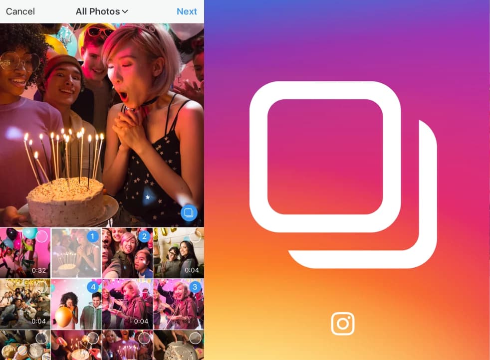 Image source: TechCrunch
Businesses are using the Carousel feature on Instagram to serve their current customers and generate new leads. As the number one social network for organic engagement, it’s a cost-effective, succinct, and engaging way to communicate your marketing message.
Carousels don’t necessarily have to be ads. In order to create a Carousel Ad, there are two requirements: switching to an Instagram Business account and having a connected Facebook Business page. That way, you can create Instagram Carousels from your Facebook page.
Here’s a step-by-step guide to creating a Carousel Ad:
- Open Facebook’s Power Editor.
- Select the campaign you want to be in the ad, click “Create Ad Set.”
- Fill out the information requested, including targeting and placements options.
- In the placements stage, make sure only Instagram is selected.
- Proceed with Facebook’s instructions and click “Create.”
- Your Carousel ad will then be published on Instagram, in either a Story or on your main feed.
Instagram offers two types of Carousel Ads for Stories that cater to your objective, assets, and target audiences: Native Stories and Expandable Stories.
For Native Stories, all of the cards are automatically displayed, meaning viewers won’t have to “swipe to see more,” the ad will autoplay. Because these cards are automatic, there’s a max number of three for each ad.
A Native Story is an effective Carousel Ad for a full-length commercial or demonstration. Think of them as commercial breaks as viewers tap through their stories.
Expandable Stories are more traditional. Viewers can tap to keep watching and can tap through a max of 10 cards. Expandable Stories are great for mixed media ads and audiences who usually buy on mobile.
Both Story formats support mixed media and allow one CTA per ad. If any card, or all the cards, are seen by the same viewer, only one impression is counted. Finally, these ads can either have different web destinations per card or one destination for the entire ad.
New to the Carousel feature? We’ve put together 10 ways you can start using Carousels to promote your business.
10 Ways to Use Instagram Carousels
1. Product launch
Instagram is a perfect way to tease your followers with your next product launch. Use the Carousel to include pictures, specs, and even a first look, like Audio-Technica did below with their new headphones.
Since Instagram is known for business engagement, (about 80% of Instagram users follow a business), this is a great chance to answer questions and build hype. For instance, if a customer asked, “Are these headphones available for purchase?” Audio-Technica could mention them in a reply comment so others with the same question can see the answer.
Image source: Audio-Technica
2. Full-length videos/images
Have a full-length commercial or photo that’s too big for Instagram? Give it the Carousel treatment. TechCrunch highlights a packing robot from Amazon in the two-video Carousel featured below. Sometimes full videos can do what a commercial or quick clip can’t.
Image source: TechCrunch
3. Before and after
One of the first questions asked when releasing a new product – or marketing an existing one – is “How does it work?” The Container Store uses Carousels to answer that question. Visually showing the benefits of your product gives your target audience the chance to see how your product fits into their lives.
Image source: The Container Store
4. Recap
If your business hosts events, and you’d like to boost attendance and thank attendees, consider using Carousels to recap those events. Followers can swipe through and reminisce on that rooftop dinner or RSVP for the next one. Take this example, from INBOUND:
Image source: INBOUND
5. Blog content
A secret weapon to promoting blog content? Teasing it on Instagram. IBM does this well by using the Carousel to tease their blog posts without giving the message away – a throwback theme for a throwback post.
Image source: IBM
6. Brand personality
Instagram is the perfect place to build your brand and company culture. Show the people behind the screen and highlight those who make your business what it is. Check out how Boston-based coffee company Pavement does this by spotlighting their employees and their favorite coffee blend.
Image source: Pavement Coffeehouse
7. Customer testimonials
Ecommerce giant Shopify uses Carousels to promote its customer reviews in a weekly podcast. This is a great way to generate more leads and maintain existing customer relationships.
Image source: Shopify
8. Group themed images
Who doesn’t love dogs? Social media management platform Hootsuite sure does. They posted a Carousel of everyone’s best friend in incredible costumes. Not only does this showcase company culture, but it shows how using Carousel themes brings vibrancy to a business’s page.
Image source: Hootsuite
9. Storytelling
Carousels can do more than announce a product. They can also tell the story of a potential customer. Pepsi recently posted a comic-book style Carousel about a sixth sense: Pepsi style. They released it right around the time “Spiderman: Far From Home” was released, and it shows how Carousels can build suspense.
Image source: Pepsi
10. Process demonstration
Orangetheory Fitness has Carousels on their Instagram page to demonstrate how fitness helps the body in more ways than on the scale. Demonstrating a process is a great way of engaging potential customers who might be on the fence about buying a product. If your business offers long-term results, Carousels can be used to show the progression of the benefits your customers will enjoy.
Image source: Orangetheory Fitness
Instagram users are currently limited to adding 10 photos/videos per Carousel post. Use those 10 to your benefit, but don’t commit information overload. Images keep the content light and ultimately drive traffic to your website. Instagram is an aid, not the main event.
Don’t limit yourself to only photos or videos. Mix it up. Including a snippet of an interview as well as a promotional image is a smart way to show customers and leads what you’re all about.
Adding a consistent theme to your account makes it stand out and adds brand personality. Use carousels to post what you normally wouldn’t on your website. For more tips on how to wield Instagram marketing, check out our ultimate guide.

How to Use TikTok: A Step-by-Step Guide
With more than 500 million monthly active users, TikTok is taking app stores by storm and serving as a worthy competitor to apps like Snapchat and Instagram.
While Gen-Z has flocked to the app, brands like Chipotle and The Washington Post are also starting to experiment with TikTok’s video marketing opportunities.
The best way to learn more about the app, its user base, and the type of content that engages audiences is to start producing your own posts on a personal or business account.
However, if you’re a marketer that’s never used a niche social platform before, TikTok can be pretty hard to navigate. Even I — a social media-obsessed millennial blogger — had trouble figuring out how the heck it worked when I first logged on last year.
If you identify with that struggle, don’t worry! I eventually figured it out — and you will too!
To help you conquer the app, I’ve put together a quick guide to show you how to use it.
Here’s a list instructions — with pictures — that will walk you through setting up your profile, filming your first video, adding special effects, and using challenges or duets to engage with other users.
Setting Up Your Account
1. Download the app and sign up.
Go to the App Store or Google Play and download TikTok. When you open it, TikTok makes it pretty easy to sign up. You can do an instant sign up with Facebook, Gmail, or Twitter, or add a standard username and password if you don’t want any of those accounts connected.
2. Set up your profile.
Once you’re logged in, you’ll instantly be brought to the feed of videos. I’ll show you how it works in step three. But first, tap the icon in the lower right that looks like a person’s outline to see and edit your profile.
Once you enter your profile, tap the Edit Profile button, then select a profile photo or video. You should also add your username and bio information. If you want to show off your other social media profiles, you can link up your Youtube and Instagram pages. If you’re a business, this could be a helpful way to advertise your other visual platforms.
Finding Videos and Engaging with Users
3. View the video feed,
Now that you’ve set up your profile, tap back to the first tab which shows you the video feed.

Think of this feed like Twitter’s, but where video is the primary content. If you don’t have any followers yet, the app will send you random trending videos. As you begin following and interacting with more people, your feed will become more personalized to your interests.
4. Like, comment, or share videos you enjoy.
When you find a video you like, you can tap the heart to like it or the speech bubble to comment on it. To share the video, press the forward sign underneath the comment symbol to see your sharing options. These symbols are all located on the right side of the video.

If you really like a video and want to see if the user has more posts you’ll enjoy, swipe left to toggle to their profile.
5. Search for videos.
Tap on the second tab, or magnifying glass, to enter the app’s search area. On this tab, you can either search out accounts or videos, or you can look below the search bar to see videos by trending topic.
6. Follow users via videos, search, and TikCode.
If you want to keep up with a great video creator, you can follow them by pressing the icon that includes their profile picture and a plus sign above the heart button on their video.
If you already know of a TikTok account or person that you want to follow, you can search for them in the search bar and then press the “Users” filter. You can also find them by scanning their TikCode. This can be helpful for brands or people that want to promote their TikTok channel on other websites or in the physical world. It can also be great if you run into a friend in-person who wants to add you.
To find your own TikCode, go to your profile and tap the icon with four squares in the top right.
To scan another TikCode, go to the search tab and tap the square scan button next to the search bar.
When the scan screen opens, hold it up to the TikCode you want to scan. The scanning process will begin instantly so you don’t have to press any other buttons. Within seconds of a successful scan, you’ll be sent to that person’s profile. If you have a screenshot of a code, you can also press “Photos” in the top corner of the scan page to upload and scan the code.
How to Post on TikTok
7. Set up your shot and pick out special effects.
Tap the center tab to enter camera mode. To face the camera in the right direction, tap the Flip icon in the top right. On the right side of the screen, you’ll also see icons for the following:
- Speed: Allows you to record your video in slow motion or sped up.
- Beauty: An AR filter that can hide blemishes and smooth out your skin.
- Filters: Lets you change the color filter of the camera.
- Timer: Allows you to set an auto-record countdown if you want to film hands-free.
- Flash
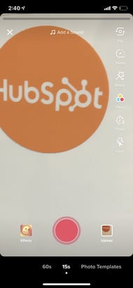
Music and Effects
On the top center of the camera screen, you’ll also see music notes with “Add a Sound” next to them. Tap this to choose the musical overlay or sound effect that you want to work with.
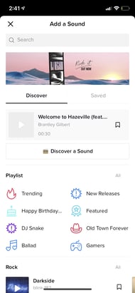
On the bottom of the camera, you’ll also see an Effects icon to the right and an upload button to the left — in case you want to record your videos outside of the app.
When you tap the Effects button, you’ll see a giant lineup of AR filters and other special effects that can augment your face or your surroundings. You can also pick out a video overlay-styled filter here.

In the black bar under the camera, you can set the time limit for your video or tap Photo Template to create a photo slideshow instead of a video.

8. Record the video.
Once you’re ready, press and hold the red record button. You can either record your video all at once or in pieces.

If you want to fit different shots in each video or record it in pieces, simply hold the record button for each segment, then let go, then press and hold it again when you’re ready for your next shot.
Don’t want to hold your record button the whole time? Before you enter record mode, you can also use the timer to give yourself enough time to prop up your phone and pose in front of it before it starts automatically recording.
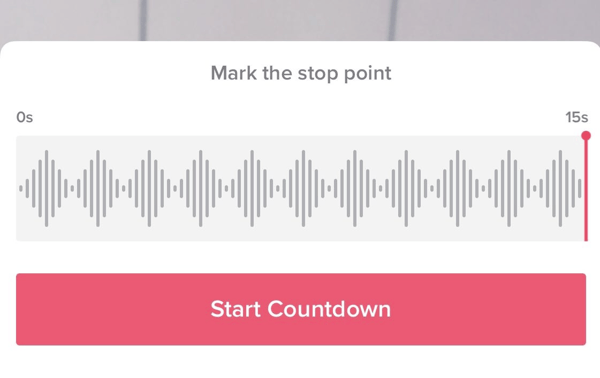
9. Make final edits and add a caption to the video.
When you’re done recording the video, you’ll still be able to add a musical overlay, filters, and other basic special effects. You can also add stickers and text overlays on top of the video.

When you’re done, press Next. You’ll be directed to a page similar to Instagram’s post page where you can add a caption, relevant hashtags, and account handles of others. You can also set the privacy of the video, turn comments on or off, allow duets or reactions, and tap “Save to Album” to download it to your smartphone’s photos.
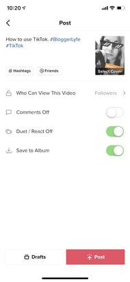
If you aren’t ready to post yet, just press the Drafts button at the bottom left to save it for later.
10. Duet with other users.
See a musical post that you love? Want to join in with the person who made it? TikTok allows you to reply with a Duet video. To use this former Musical.ly feature, find a video you want to duet with, press the Share button to see sharing options, then press the “Duet” option on the bottom row in the center.
Your camera screen will appear next to the video. From there, you can press record and sing along, dance, or do whatever you want to the music.
To show you what a finished product looks like, here’s one great example:
If you make a post and don’t want anyone to duet with you, you can tap the “Duet/React Off” button on your Post page before publishing.
11. Participate in a challenge.
Like other social media platforms, you’ll occasionally see videos with hashtags for “challenges.” A challenge is when a video post, company, or person encourages users to film themselves doing something oddly specific — like flipping the lid of a Chipotle to-go bowl with no hands. Participants then film themselves doing the action and hashtag the challenge name in their post captions.
There usually aren’t any winners in a TikTok challenge, but hashtagging it might help you get more followers or views as people find you when searching the hashtag.
To give you a quick idea of what participating in challenge entails, here’s a video of someone doing the above-mentioned #ChipotleLidFlip challenge:
A Few TikTok Takeaways
Yes, TikTok may seem like a pretty odd platform right now, but it might be a great tool for engaging and spreading awareness to your younger audiences later. Because it is only one year old, it is also a great place for early video experimentation.
As you’re brainstorming or filming your first videos, here are a few tips to help you create unique and engaging posts:
- Have fun with the special effects. There are a ton of ways to zest up your video, and audiences on TikTok expect it. So play around and experiment with them.
- Embrace the music. Most videos on the platform have some type of song or sound effect in the background.
- Film a few videos with multiple shots. This will make it feel more interesting and active.
- Don’t be afraid to show a lighter side or a sense of humor. People come to this platform to be entertained.
- Use trendy hashtags and try out a challenge video. Then, include relevant hashtags in your post caption so your video shows up when people search it.
- Look at what other brands are doing. While your company might not need to jump on TikTok just yet, videos posted by other brands could inspire some ideas for your own strategy.
Want to learn more about TikTok’s backstory and what it might mean for brands? Check out this post. If you’re interested in checking out other emerging platforms, we’ve also got this great guide for you.

14 Essential Tips for an Engaging Facebook Business Page
Whether you’re setting up a brand new Facebook Page for your brand, or you just want to make the most of your existing one, it’s probably a smart move — Facebook is home to nearly 2 billion monthly active users.
It should be easy enough, right? Just slap together a photo, a couple of posts, and expect the leads and customers to roll on in, right?
Wrong.
If you’re not creating a Facebook Page with a comprehensive strategy to get noticed, Liked, and engaged with, the chances of actually generating leads and customers from it are pretty slim.
For example, you can’t just choose any picture — you have to choose one that’s the right dimensions, high-resolution, and properly represents your brand.
But it doesn’t end there — so we compiled the tips below to make sure you’re creating an engaging page that takes full advantage of everything Facebook marketing has to offer.
Listen to an audio summary of this post:
14 Facebook Business Page Tips
Don't miss this live virtual event with Facebook and HubSpot on how to grow your business faster than ever with Facebook
1) Don’t create a personal profile for your business.
We’ve come across many well-meaning marketers and entrepreneurs who create personal profiles for their brands, instead of an actual Facebook Business Page. That puts you at a huge disadvantage — you’re missing out on all of the content creation tools, paid promotional opportunities, and analytics/insights that come with a Facebook Business Page. Plus, a personal profile would require people to send you a friend request in order to engage with you, and the last thing you want to do is make that more difficult for customers.
And while you’re at it — don’t create an additional public, “professional” profile associated with your business. For example, I already have a personal profile on Facebook that I largely keep private; the practice I’m talking about would be if I created a second, public one under the name “AmandaZW HubSpot,” or something along those lines. People usually do that to connect with professional contacts on Facebook, without letting them see personal photos or other posts. But the fact of the matter is that creating more than one personal account goes against Facebook’s terms of service.
2) Avoid publishing mishaps with Page roles.
We’ve all heard those horror stories about folks who accidentally published personal content to their employers’ social media channels — a marketer’s worst nightmare. So to avoid publishing mishaps like those, assign Facebook Business Page roles only to the employees who absolutely need it for the work they do each day. And before you do that, be sure to provide adequate training to those who are new to social media management, so they aren’t confused about when they should be hitting “publish,” what they should be posting, if something should be scheduled first, and who they should be posting it as.
To assign these, on your business page, click “Settings,” then click “Page Roles.”
Also, when sharing content on behalf of your brand, make sure you’re posting it as your brand, and not as yourself. You can check that by going into your settings and clicking “Page Attribution.”
3) Add a recognizable profile picture.
You’ll want to pick a profile picture that’s easy for your audience to recognize — anything from a company logo for a big brand, to a headshot of yourself if you’re a freelancer or consultant. Being recognizable is important to getting found and Liked, especially in Facebook Search. It’s what shows up in search results, pictured at the top of your Facebook Page, the thumbnail image that gets displayed next to your posts in people’s feeds … so choose wisely.
When choosing a photo, keep in mind that Facebook frequently changes its picture dimensions, which you can find at any given time here. As of publication, Page profile pictures display at 170×170 pixels on desktop, and 128×128 pixels on smartphones.
4) Choose an engaging cover photo.
Next, you’ll need to pick an attractive cover photo. Since your cover photo takes up the most real estate above the fold on your Facebook Page, make sure you’re choosing one that’s high-quality and engaging to your visitors, like this one from MYOB’s Facebook Page:
Keep in mind that, like profile images, Facebook Page cover photo dimensions also frequently change, so we advise keeping an eye on the official guidelines. As of publication, Page cover photos display at 820×312 pixels on computers, and 640×360 pixels on smartphones.
5) Add a call-to-action (CTA) button.
Since Facebook first launched the feature in December 2014, the options for brands to add call-to-action buttons to their Facebook Page’s have vastly expanded. These are things like “Watch Video,” “Sign Up,” or “Book Now” — and each can be customized with a destination URL or piece of content of their choosing.
It’s a great way for marketers to drive more traffic to their websites, or to get more eyeballs on the Facebook content they want to promote. This is a great way for marketers to drive traffic from their Facebook Business Page back to their website. Check out how Mandarin Oriental uses the “Book Now” button in this way, to make it easier for viewers to make reservations.

To add a call-to-action to your Page, click the blue “Add a Button” box.

You’ll then be able to choose which type of CTA you want to create, and which URL or existing content on your Facebook Page you want it to direct visitors to. To get data on how many people are clicking it, simply click the drop-down arrow on your button and select “View Insights.”
6) Fill out your ‘About’ section with basic information, and add company milestones.
We’ve arrived at one of the most important sections of your Facebook Page: the ‘About’ section.
Although visitors no longer see a preview of your “About” text when they land on your page — instead, they have to click on the “About” option on the left-hand column next to your content — it’s still one of the first places they’ll look when trying to get more information about your page.
Even within the “About” section, however, there are many options for copy to add. Consider optimizing the section that best aligns with your brand — a general description, a mission, company information, or your story — with brief, yet descriptive copy. By doing so, your audience can get a sense of what your Page represents before they decide to Like it.
You might also want to populate sections that allow you to record milestones and awards — like when you launched popular products and services — as well as the day/year your company was founded, or when you hosted major events.
7) Post photos and videos to your Timeline.
Visual content has pretty much become a requirement of any online presence, including social media channels. After all, it’s 40X more likely to get shared on social media than other types of content.
And while photos are a wonderful way to capture moments and an actual look at your brand, you should probably invest a good amount of time and other resources into video. The 2017 State of Inbound report cited video as the “main disruptor,” with 24% of marketers naming it as a top priority.
“Watch video” is one of the CTAs that Facebook allows brands to add to their Pages for a reason — because it’s becoming one of the most popular ways to consume content. But it’s not just pre-recording videos. According to the social media channel’s newsroom, “People spend more than 3x more time watching a Facebook Live video on average compared to a video that’s no longer live.” So don’t be afraid to give viewers an in-the-moment look at what your organization does, but do make sure you’re prepared.
Not sure what your videos should look like? Here’s a fun one that we put together on business lingo.
8) Determine the ideal timing and frequency for your posts.
An important consideration in your Facebook content strategy should be how frequently you post, and when. If you don’t post frequently enough, you won’t look as reliable or authentic — after all, how much faith do you put in a brand that hasn’t updated its Facebook Page for several months? Post too often, however, and people might get sick of having their feeds flooded with your content.
Here’s where a social media editorial calendar can be particularly helpful. Like any other online content, it can help you establish a schedule for when you share particular posts according to season or general popularity. You’ll probably have to adjust your calendar several times, especially in the earliest stages of setting up your Page, since you’ll want to check the performance of your updates in your Facebook Insights (which you can navigate to via the tab at the very top of your page). Once you’ve observed popular times and other analytics for your first several posts, you can tailor your posting frequency and strategy accordingly.
Wondering how to schedule posts? You can either use an external publishing tool like the Social Inbox within HubSpot software, or the Facebook interface itself. For the latter, click the arrow next to the “Publish” button and click “Schedule Post.”
9) Leverage Facebook’s targeting tools.
Facebook allows you to target certain audiences with specific updates — be it gender, relationship or educational status, age, location, language, or interests, you can segment individual page posts by these criteria.
Just click the small bullseye symbol on the bottom of the post you want to publish, and you can set metrics for both a preferred audience, and one you think might not want to see your content.
10) Pin important posts to the top of your page.
When you post new content to your Facebook Page, older posts get pushed farther down your Timeline. But sometimes, you might want a specific post to stay at the top of your page for longer — even after you publish new updates.
To solve for this, Facebook offers the ability to “pin” one post at a time to the top of your page. You can use pinned posts as a way to promote things like new lead-gen offers, upcoming events, or important product announcements.
To pin a post, click on the drop-down arrow in the top-right corner of a post on your page, and click ‘Pin to Top.’ It will then appear at the top of your page, flagged with a little bookmark. Just keep in mind that you can only have one pinned post at any given time.
11) Decide whether you want Facebook fans to message you privately.
If you want your Facebook fans to be able to privately message you directly through your page, definitely enable the messages feature. You can do so by going to your settings, clicking on “General” on the left-hand column, and then looking for “Messages” on the list of results.

We recommend enabling messaging on your page to make it as easy as possible for your fans to reach out to you — but only do so if you have the time to monitor and respond to your messages. Facebook Pages now have a section that indicates how quickly a brand responds to messages, so if you don’t want that section saying that you’re slow to answer, you might just want to skip enabling that feature.

12) Monitor and respond to comments on your page.
Speaking of monitoring the interactions your fans have with your page, don’t forget about comments. You can monitor and respond to comments via the ‘Notifications’ tab at the very top of your page. While it may not be necessary to respond to every single comment you receive, you should definitely monitor the conversations happening there (especially to stay on top of potential social media crises.
13) Promote your page to generate more followers.
Now that you’ve filled your page with content, it’s time to promote the heck out of it.
One of the first things you can do is to create an ad promoting your Page. To do that, click the three dots at the top menu bar above your posts and select “Create Ad.” From there, Facebook will let you start creating an ad from scratch based on your goals — things like reach, traffic, or general brand awareness. Choose yours, then scroll down and click “continue.”
After that, you can choose your targeted audience (similar to what you did with your promoted posts above), where on Facebook you want it to be placed, and your budget — you can learn more about paying for Facebook Ads here.
You’ll probably also be asked to add some creative assets or copy. Remember, you’re paying for this, so choose something that’s going to grab attention, but also has high quality and represents your brand well.
14) Finally, measure the success of your Facebook efforts.
There are a couple of ways to execute this step. You can use something like the social media reports tool in your HubSpot software, and you can dig into your Page’s Insights, which allow you to track Facebook-specific engagement metrics. Here, you’ll be able to analyze things like the demographics of your Page audience and, if you reach a certain threshold, the demographics of people engaging with your page and posts. As we mentioned earlier, the latter is especially helpful to modify your Facebook content strategy to publish more of what works, and less of what doesn’t. You can access your Facebook Page Insights via the tab at the top of your page.
How have you set up top-notch Facebook Pages? Let us know in the comments.

The Complicated Relationship Between Social Media and SEO
Inbound marketing is in the middle of an interesting evolution. Historically, search has been a major source of traffic and leads for businesses leveraging online marketing.
But, with the growth of social networks, social media marketing is even more heavily embraced today.
But, you might ask, which is more important?
The answer? Both can be key to your strategy.
Search is a huge source of customers, but slowly, social media is gradually increasing in importance as a marketing platform. The important distinction to make is that search and social are not competitive forces. Instead, these two facets of inbound marketing can work together to amplify the results of each other.
The key to understanding that search and social media marketing need to work together is to think about the problem both search and social solve: information discovery. People use Google to find an answer to a question. People use social media to discover answers to questions they haven’t yet thought of. However, the difference between search engines and social media platforms is blurring. For example, Facebook search is one of the network’s core features.
As a marketer, how can you integrate your efforts across both platforms?
Social Media SEO Strategy
1. Social Sharing Buttons on Your Website
It may seem simple, but search engines like Google are starting to use social media sharing data to influence search rankings. As a marketer, it is critically important to have social media sharing buttons on your blog and website to encourage visitors to share content in social media. These buttons will not only help to increase traffic from social media but will also play an important role today and in the future for ranking positions in search engines.
2. Integrated Keyword Strategy
As I mentioned earlier, the line between search engines and social media platforms is blurring. Take the keyword strategy you are using for your website and apply it to your social media engagement when appropriate. This doesn’t mean cramming tweets full of keywords. Instead, be aware of how you are wording social media messages. By incorporating keywords into social media content, you can increase the reach of your messages.
3. Include Links in Social Profiles
The links in social media messages such as tweets and Facebook status updates are traditionally no-follow links. This means they don’t pass any SEO authority to the site they’re linking to. While this is starting to change, it is important to understand that the URL in the actual bio of a social media account is a follow link. Keep this in mind, and make sure you are taking advantage of these extra links.
4. Incorporate Links Into Video and Presentation Content
Some of the most powerful social media platforms are those that facilitate content sharing, such as YouTube for video and SlideShare for presentations. When sharing content on these types of networks, be sure to share links to related blog posts or other content on your website. Yes, this will increase traffic to your website, but it will also help build new inbound links. When someone writes a blog post about your content, it is likely they will also include a link from the presentation, simply because it is the “easy” thing to do.
5. Optimize Social Profiles
Think of social media profile pages as extensions of your website. In the same way that you would optimize website pages for page titles and keywords, audit your social media profiles to ensure they mirror the search engine optimization strategy of your website.
6. Build Links and Social Media Reach
Search engine optimization has long been about inbound links to your website. While inbound links are still really important, a secondary metric for marketers looking to increase search traffic should be social media reach. As we talked about earlier, social media data is becoming a factor in search engine rankings. In order to get more people to share your content in social media, you need to increase the number of fans or followers of your account. By doing this through quality content creation and engagement, you will not only build social media reach but also inbound links.
7. Establish New Relationships
The web is now a social communications channel. Similar to sales, relationships are huge for driving inbound links and social media attention. Building relationships using social media can open opportunities for guest blog posts and other link-building opportunities.
How Social Media Effects SEO
As we mentioned above, leveraging both strategies will give you more chances for audiences to discover your brand. But, it might slightly help your search results page rankings indirectly.
When you get a lot of traffic to your website, search engines that crawl your the internet will notice and think your brand is credible. Then, they might place your search result higher than others. So, if you post interesting content on social media that is incredibly click-worthy, you might see a boost in traffic.
Furthermore, if people or credible brands see your posts on social and share your website’s link on their own blogs or websites, that could boost your page authority. This is something that might also move you up in rankings.
While this might not make a major dent in your rankings or total page authority score, especially when you’re starting out, social media marketing couldn’t hurt you.
If you’ve just focused purely on SEO and are ready to zone in on a complimenting social media strategy, check out our guide to social media marketing.

Everything You Need to Know About Landing Page Design
Whoever said “You never have a second chance to make a great first impression,” makes a valid point. You only get one opportunity to have your first interaction with another person … and the last thing you want is for that first interaction to be a bad one. After all, humans are known to remember negative experiences more vividly than positive ones.
Great first impressions matter when meeting someone, going to a new place, and even visiting a website.
In a world where virtually every business has a website, creating a positive first impression when your target audience members click on your site via the search engine results page (SERP) is critical. That’s because your landing page is your site’s “destination page”, or the first page that visitors land on when they open your site.
Also, to really put the pressure on, you only have about 7 seconds to make that great first impression with your website before the average visitor decides whether or not they’re going to stay or bounce elsewhere.
So, how do you ensure that first interaction your target audience has with your website is positive?
The answer: Great landing page design.
Landing Page Design
Landing page design is the process of creating an enticing site page for your target audience and website visitors. It should encourage them to convert from leads into subscribers or customers. Effective landing page design is on-brand, includes your product or service and company information, and incorporates relevant offers and calls-to-action (CTAs).
Responsive Design
You may have also heard about responsive design, or responsive web design, before.
A web page with responsive design automatically appears an optimized form on any device. This means a responsive web page or site reformats itself as needed to fit any screen or device you’re viewing it on (i.e. desktop, laptop, tablet, or smartphone).
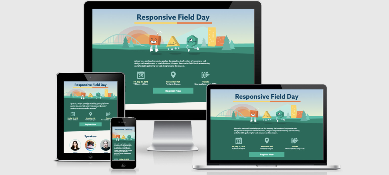
Since so many more people search the Internet from different devices and locations, responsive design is necessary to ensure visitors and customers have a pleasant experience on your site. Although it’s recommended that your entire website is responsive, it’s critical to at least have responsive landing page design — again, this is the first page every visitor interacts with and sees when they open your website, so outstanding user experience (UX) is crucial.
Web pages without responsive design can make for a frustrating experience for visitors — they’ll be dealing with images and text that don’t fit their screen. This can potentially cause visitors to abandon your site completely or even visit a competitor’s site instead.
Note: Depending on the landing page design software you choose to work with (we’ll cover some options shortly), responsive design might be an automatic feature for you. In this case, you won’t have to worry about responsive design — when you design your landing page, it’ll already be responsive.
In addition to having a responsive design, there are many other aspects of creating and designing a landing page that impact your ability to convert visitors into customers and enhance UX. So, let’s review some of the most common and important steps for you to take into consideration while designing your landing page.
1. Identify your target audience and their needs.
No matter which part of your business you’re working on, you should be thinking about who your target audience is and how you can resolve their pain points — and designing your landing page is no exception to this rule of thumb.
While planning your landing page design, think about what your target audience expects and needs to see when they open your site. Ask yourself the following questions to help you with this:
- What questions does the landing page immediately need to answer for your audience?
- How can you brand your landing page so your audience knows they’re in the correct place?
- What attention-grabbing headline, relevant content, and CTA can you include on your landing page to efficiently and effectively meet the needs of your audience?
- How can you ensure your landing page is unique in comparison to those of your competitors?
- How can you prove the value that your company, products, and services provide to your audience?
If you need additional help thinking about who your target audience is, try creating buyer personas for your business.
2. Ensure the landing page has a specific purpose.
For your landing page design to be successful, it needs a clear purpose. When visitors come to your landing page, they should immediately know why the page exists.
For example, you can use landing page design to clearly define the purpose of your page in the following ways:
- Increase conversions by sharing relevant CTAs
- Enhance brand awareness by including an email newsletter sign-up form
- Boost sales by displaying your top-selling product
- Develop greater interest in your product or service by incorporating information about how they solve your visitors’ pain points
Without a defined landing page purpose, your visitors may feel confused about what to do once they’ve landed on the page or uncertain about whether or not they’re in the right place. This may cause them to lose interest and abandon your page entirely. So, use your design to ensure your landing page has a clear purpose.
3. Choose a landing page design software.
There are dozens of software options made to help you with the design of your landing page. The key is finding one that works for you. Review the five software options we recommend below and the various features they each offer below.
Note: The landing page design software below automatically include responsive design. If you decide to go with another option, be sure to determine whether or not responsive design is a built-in feature.
4. Write enticing leading page headers.
The purpose of a header is to catch your visitors’ attention and/or make them want to do something — meaning, headers should be enticing, impactful, and action-oriented. This is most likely one of the very first (if not the first) things your website visitors will have read about your company. For this reason, your landing page headers should also complement the tone and copy everywhere else on your site (and your meta description).
When you use enticing and value-driven vocabulary in your landing page headers, you ensure your visitors know they’re going to get something worthwhile out of converting and spending time on your site.
For example, look at HubSpot’s Buyer Persona Generator landing page. The headline says, “Make My Persona … A Buyer Persona Generator From HubSpot.” Thanks to the header, visitors know where they are and what they’ll get out of visiting the landing page.
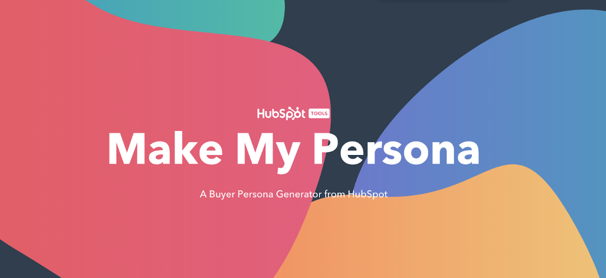
Visitors are then automatically directed to the second part of the landing page which also includes enticing and value-driven language.
The design includes two CTAs visitors can click based on their needs and interests. The headers on this landing page are useful, relevant, eye-catching, and on-brand
5. Make the landing page beautiful and helpful.
We’ve talked a lot about the fact your landing page is the first thing your website visitors are going to see when they open your website. So, in addition to compelling headers and language, you also want your page to be beautiful and helpful.
Make your landing page beautiful by:
- Incorporating consistent, on-brand colors and fonts
- Keeping your page organized
- Remembering less is more while designing
- Including aesthetically-pleasing visuals (images and/or videos)
- Designing obvious and exciting CTAs
Make your landing page helpful by:
- Incorporating content that pertains to your target audience’s needs and challenges
- Designing CTAs that provide visitors with value
- Including information that tells visitors why they should convert
- Making sure visitors know how to convert
- Ensuring visitors have easy access to your contact information
6. Publish and test your landing page design.
Once you have your design set, it’s time to publish and test it among your audience members. After your landing page is published, you can A/B test different design factors (colors, CTA buttons, phrases, font, etc.) to see which options lead to the highest number of conversions.
This way, you can ensure your landing page meets your audience’s needs while also guaranteeing you’re getting the best results that will impact your business’s bottom line.
In addition to keeping these landing page design steps in mind, consider these landing page best practices as well. You’ll notice some of these best practices are also directly tied to the specific steps we’ve just reviewed above.
Remember your audience throughout the design process.
As we reviewed above, the first part of designing your landing page is identifying your target audience. So, remember to keep them in mind throughout the design process. This way you’ll create a design and incorporate content that resonates with your audience. By doing so, you’ll have a larger chance of increasing conversions among site visitors.
Write a compelling and helpful headline.
Add a compelling headline to your landing page to immediately grab your visitors’ attention. A great landing page headline should be eye-catching and helpful.
For example, HubSpot’s landing page says, “There’s a better way to grow.” This headline gets visitors in the mindset of HubSpot being something they need to improve and expand their business.
Additionally, “grow better” is a saying HubSpot uses throughout all marketing materials. It’s something the company works to do every day — to help other businesses grow better. This makes the headline on-brand too (which is another best practice we’ll talk more about momentarily).
Include unique and engaging visuals.
Include engaging visual content on your landing page. Whether it’s a photo, video, or animation, you want your landing page design to somehow pique the interest of your visitors.
The HubSpot landing page’s visual content is unique to the company — the animated design and colors are on-brand. They also don’t take attention away from the written content on the page.
Keep it simple.
Although you want to include a headline, written content, CTA, and visual content on your landing page, that doesn’t mean you want your design to be too busy. In fact, you want the opposite.
Remember: Less is more when it comes to the design of your landing page (and your entire website for that matter). This keeps things clean, organized, and simple to understand and navigate for your visitors.
As you can see on HubSpot’s landing page, although the visual takes up a lot of the page, the headline, written content, and CTA are organized in a simplistic and aesthetically-pleasing way. The navigation at the top of the page is minimalist and the live chat box on the bottom right can collapse to make the landing page appear even cleaner for visitors.
Make sure it has a responsive design.
Remember, the chances of your website visitors, leads, and customers visiting your website via a mobile device or tablet is high. So, ensure your landing page has a responsive design that automatically changes format based on the device it’s being viewed on.
For example, here’s what HubSpot’s landing page looks like via my iPhone. As you can see, all of the content is the same and it includes the same CTA and visuals, but it’s organized and formatted in a way that fits my screen.
Keep it on-brand.
When a visitor comes to your landing page, they should automatically know it belongs to your business. Brand your landing page in a way that complements the rest of your marketing content, logo, and colors. Your visitors should be able to immediately know your landing page belongs to your business due to the branding you incorporate.
HubSpot’s landing page does this well — it adheres to the requirements found in HubSpot’s Brand Guidelines. The HubSpot logo lives at the top of the landing page. And as we mentioned, the message “grow better”, which is located on the page, is used throughout a large proportion of HubSpot’s marketing materials. The CTA button includes the HubSpot’s name, and the visual on the page matches the look and feel of all other visual content on HubSpot’s website.
Optimize your landing page with CTAs.
Your landing page should include at least one relevant CTA, located above the fold (meaning, visitors don’t have to scroll to get to the form because it’s in view as soon they hit the page), so visitors can come to your landing page and convert within seconds. This CTA might be used to learn more about your product or service, purchase your product, sign up for a special offer, or subscribe to your email newsletter.
HubSpot’s CTA button is one of the most obvious features on the landing page. The CTA button clearly states what visitors get out of converting (a free CRM). Since the CTA button has the word “free” in it, it becomes even more enticing … who doesn’t love free? Lastly, it’s located above the fold of the page, so it’s visible to everyone the moment they open it.
Add your contact information.
Your visitors may come directly to your site in search of your contact information or determine they want to contact you for assistance or support after spending some time on your page.
To avoid wasting their time and causing them any unnecessary frustration while trying to locate your contact information, place these details on your landing page. This keeps the process of contacting you as simple and straightforward as possible for your visitors.
HubSpot has contact information listed under the navigation bar at the top of the landing page. This is a great option if you’re looking to keep your landing page as minimalist as possible.
Include live chat on the landing page.
If possible, include a live chat function on your landing page. This way, visitors can get the immediate assistance they want and need from the moment they open your page.
HubSpot’s landing page has a live chat feature for easy access to immediate support. The location of the collapsible chat box keeps the page looking organized.
Use A/B testing to determine which design works best.
Once you’ve created your initial landing page design, don’t feel locked in — this is an iterative process. Meaning, test your designs among your target audience to determine which colors, CTA buttons, headlines, visuals, and written content resonate with them best and result in the highest number of conversions.
You can A/B test your designs and review your results. Then, once you’ve determined which design works best for your target audience and boosts conversions, stick with that design (until you have a new and improved design to share — then, start this process again).
Since we’ve covered how to create your landing page and the best design practices, let’s take a look at the software options you have to get your landing page up and running so you can begin converting more visitors into customers.
Landing Page Design Software
There are a plethora of landing page design software options to choose from, all of which can help you design your entire website (not just your landing page). The following five options simplify the design process and don’t require you to have any previous web or design experience.
1. HubSpot
HubSpot allows you to create multiple landing page designs. The software includes a built-in library of responsive landing page templates and an on-page editor for adding images and copy. You can also create personalized CTAs, content, and forms for visitors to help you boost conversions. HubSpot also provides you with the ability to test and analyze the performance of your landing page design so you can make improvements.
2. Instapage
Instapage allows you to design and publish custom post-click landing pages with a variety of template options. The page builder is easy to use and offers the ability to A/B test different designs to determine which works best for your audience. The software also helps you optimize your landing page with dynamic text replacement, which is a feature that allows you to automate the opt-in content on your page.
3. Unbounce
Unbounce has a landing page creator with over 100 templates to choose from so your design complements your brand and content. Templates are organized by business type and include options for SaaS companies, agencies, and ecommerce businesses. Unbounce landing pages are responsive and completely customizable.
4. Mailchimp
Mailchimp allows you to design your landing page in minutes, thanks to their drag-and-drop page builder. You can also set up your other website content to populate your landing page, further simplifying the design process. You can add custom CTA buttons to entice your target audience to convert or sign up. And, if you need help personalizing your landing page, you can review and reference the variety of tutorial videos Mailchimp automatically provides.
5. Leadpages
Leadpages is a landing page design software with a drag-and-drop builder that makes it easy to customize your landing page to suit your brand, and you can A/B test your designs with the software to efficiently determine which option converts the most visitors.
As you begin thinking about your landing page design and working through the details we’ve provided in this guide, you may feel as though you need additional design inspiration. If this is the case, check out our blog post on great landing page design.
Download dozens of free landing page examples to inspire your business’s design.
Begin Designing Your Landing Page
Your landing page is the first thing any visitor who comes to your website sees and experiences. That’s why great landing page design is so important — it’s every visitor’s first impression of your website … and possibly their first impression of your business as a whole.
A great landing page has the power to help you generate more leads, close more deals, enhance your website’s user experience, impress visitors, and ensure your site has a professional, on-brand feel. Work through these landing page design steps and best practices above to ensure your landing page accurately represents your business and makes your leads want to become customers.

Everything You Need to Know About Brand Management
If your business was a person, your brand would be its personality. It’d be how you introduce yourself to new friends (er, customers) and how you build a trusting relationship with them. Your brand is a living, breathing entity … and it’s your job to help it grow and improve.
This is what we call brand management.
Creating a brand is thrilling, but it’s not enough. As your business scales, grows, changes, and succeeds, your brand must follow suit. That’s why we created this guide — to cover the basics of brand management and equip you with the tools you need to manage and maintain a fantastic brand.
Shall we dive in?
What is brand management?
Brand management is the process of managing your brand reputation and improving your audience’s perception of your brand in a way that builds brand awareness, equity, and loyalty.
While branding is the process of building your brand, brand management is the process of monitoring and maintaining it.
Your brand is a living, breathing thing, which means it’s constantly changing. It’s also very susceptible to external factors like news, trends, and current events. In a world where journalists, influencers, and social media users (just to mention a few) influence virtually every narrative, brand management is how you can take control of your business’s story. It is using your branding and brand assets to communicate value and build loyal relationships with your followers, fans, and customers.
In short, your brand needs a manager to ensure its success. Don’t let your brand be like Kanye.

We’ve discussed in other blog posts how important word-of-mouth (WOM) marketing is in retaining and attracting new customers. While you can’t always control what others say about your brand, strategic brand management is the process of responding to them in a way that elevates your brand and remains true to your core brand values — all while remaining consistent across teams and channels.
As an example, read how Zappo’s used brand management to make the most of a $1.6 million mistake.
For that reason, brand management extends far beyond marketing. Brand management should be intertwined with sales, human resources, and customer service — basically, any department that “touches” your followers, customers, and even potential employees.
When done successfully, brand management can:
- Boost your brand awareness
- Allow you to charge more for your products or services
- Influence your audience’s purchase decisions
- Build customer loyalty
- Increase sales
- Create happy customers that become brand advocates
Principles of Brand Management
Brand management is comprised of both tangible and intangible components. We’ll discuss the tangibles in the following section.
The intangible components, however, include the principles that help you measure your brand management efforts and achieve those brand management success indicators that we discussed above.
You’ll also note that each of these principles can influence the others on this list. For example, heightened brand awareness can contribute to brand reputation, and increased brand loyalty can affect brand equity.
Brand Awareness
Brand awareness is how familiar the general public and your target audience is with your brand. Brand awareness is important because consumers can’t engage with or purchase products or services from your brand if they’re not aware of it.
Brand Equity
Brand equity is how consumers value your brand based on their experiences, perceptions, and associations. (This concept goes hand-in-hand with brand valuation, which is the commercial value of your brand as perceived by the market.) Brand equity is important because a valuable brand can support higher prices and increase your merit among investors, shareholders, and potential buyers.
Brand Loyalty
Brand loyalty refers to how consistently your customers and followers engage with and purchase from your brand. While your marketing can’t necessarily influence this, your customer service department can — focusing on satisfaction and relationship-building can bring customers back time and time again. Brand loyalty is important because it creates brand ambassadors who do your marketing for you.
Brand Recognition
Brand recognition is how well a consumer, ideally in your target audience, can recognize your brand — through your logo, tagline, packaging, etc. — without seeing your brand name. This concept goes hand-in-hand with brand recall, which is the ability to think of a brand without seeing or hearing any branding prompts. Brand recognition is important because, by recognizing and recalling your brand, consumers keep your brand top-of-mind and are more likely to choose your brand above the competition.
Brand Reputation
Brand reputation refers to how the general public and your target audience perceive the character, status, and quality of your brand. Your reputation can be influenced by internal factors (customer service, product quality, etc.) and external factors (customer reviews, WOM marketing, news mentions, etc.). Brand reputation is important because it can be some consumers’ first impression of your brand.
Brand Asset Management
Your brand assets are the tangible components of the brand management process, the parts of your branding that your audience can see, experience, and remember. Brand assets include any piece of your branding or marketing that is seen by the “outside world” — customers, employees, or the general public.
Brand asset management is the process of crafting and maintaining these tangible elements as well as keeping them consistent throughout your branding. This could look like:
- Organizing your brand assets (both digitally and physically)
- Creating an accessible digital and/or physical storage system for your brand assets, or implementing a tool that does this for you
- Instructing your team on how to access and use your brand assets
- Conducting routine checks for brand inconsistencies and correcting when necessary
What constitutes a brand asset? Let’s cover the assets you’re likely working with for your business.
Brand Name
Your brand name is the primary identity of your company. As your other brand assets evolve, your brand name likely won’t ever change. If you haven’t trademarked your brand name, we encourage you to do so.
By owning the rights to your brand name, you have better leverage over unauthorized use and any competitors who attempt to copy or steal your brand. Check out HubSpot’s trademarks and Trademark Usage Guidelines as an example.
Your brand name will also likely be reflected in your website domain and social media pages. Keeping these names, identities, and handles consistent will help customers discover and follow your business.
Logo and Color Palette
Your logo and color palette embody the creative representation of your brand. These assets are important parts of your branding as they tap into emotional marketing tactics. If designed properly, they can help you attract and convert customers.
Typography
Your typography refers to your fonts and text-based assets and how they’re used in your branding. These guidelines inform any branding or marketing asset that’s designed on behalf of your business, including your website, paid advertising, social media posts, and more — all the way down to the spacing between the letters.
Graphics
Your graphics include many different brand assets — basically anything specifically designed for your brand or marketing. These could be used on your digital marketing channels (which we’ll discuss next) or developed as standalone assets, such as external slide decks, letterheads, press releases, or even marketing videos.
Your brand graphics will likely be utilized by a wide variety of people (from designers to social media marketers to content writers), so they should be well-organized and have clear instructions on how to use them.
Digital Marketing Channels
Your website, social media, and paid advertising are a few of the most important iterations of your brand. Millions of people access the internet daily, and your digital channels are likely the branding assets the most viewed by potential customers. For this reason, they must reflect your branding, and they must be consistent.
Also included in this section is your employees’ and executives’ social media accounts, as these are a reflection of your brand and a fantastic marketing opportunity to give your audience an inside look at your company and the opportunity to connect with your brand on a personal level. If your employees desire to use their profiles to market your business, ensure their accounts reflect your brand assets and follow your style guide.
Note: If members of your leadership team also manage a personal brand, chat among your team about how to align (or separate completely) this brand with your business brand. If their brand is connected in any way to your company, it should complement yours.
Packaging
If your business sells a physical product, your packaging is a critical part of your branding. For some customers (if not most), your packaging might be their first impression of your brand. Also, one-third of customers say they make purchase decisions on the packaging itself.
Your packaging is also the most tangible, experiential way that customers interact with your brand. For that reason, your packaging should reflect your branding — in its design, colors, size, and feel.
Style Guide
Your style guide is a document that instructs employees, designers, and other businesses on how to use your branding. This is an important brand asset because it informs how all other brand assets should be utilized, designed, printed, and more — all the way down to what size your logo should be and what colors are and aren’t allowed in your marketing materials.
Not only does this help others create on-brand designs; but it also informs them of how to follow branding guidelines and legal/licensing restrictions. Take a look at HubSpot’s Brand Guidelines as an example.
Brand management can be a serious undertaking, especially when working with a large brand or perhaps a brand with multiple brand extensions. Also, if you’ve outsourced your branding to a creative agency or individual, it can be difficult to assume the task of managing it.
Check out these brand management companies and services that can help you maintain a successful brand.
Northeastern Region
1. Dirigo Design and Development
Dirigo Design and Development is a Maine-based marketing agency. The company offers various marketing services, including branding, strategy, and reputation management. Notable Dirigo clients include Dunkin’ Donuts, Harvard University, and The Wall Street Journal.
2. Jax Media Design Group
Jax Media Design Group is a D.C.-based agency focused on digital design and development. The company creates digital marketing assets using your brand guidelines and helps you implement them in campaigns. Notable Jax Media clients include Geico, AARP, and National Geographic.
3. RP3 Agency
RP3 Agency is a Maryland-based marketing agency. The company offers services for brand strategy and positioning, message strategy, and audience insights. Notable RP3 clients include Coca-Cola, Ripley’s Believe It or Not!, and Giant Food.
Midwestern Region
4. Hangar 12
Hangar 12 is a Chicago-based agency that specializes in consumer packaged goods (CPG) brands. The company focuses on marketing strategy and brand positioning, as well as digital and social media marketing. Notable Hangar 12 clients include Purdue, Conagra, and Hostess.
5. Brandgarten
Brandgarten is a Wisconsin-based agency focused on telling brand stories using customer insights. The company offers brand development and strategy services as well as brand training for your team. Notable Brandgarten clients include Johnson & Johnson, Alliant Energy, and Organic Valley.
6. DEKSIA
DEKSIA is a Michigan-based marketing agency. The company has cross-industry experience in marketing and brand development and management. Notable DEKSIA clients include Visa, Uber, and Twitter.
Southern Region
7. Matchstic
Matchstic is a Georgia-based brand identity agency. The company offers services that help you define, promote, and evolve your brand. Notable Matchstic clients include Chick-fil-A, Prudential, and Spanx.
8. Spire
Spire is a Dallas-based branding and marketing agency. The company specializes in B2B brands and offers brand audit, articulation, and integration services. Notable Spire clients include American Airlines, Texas Capital Bank, and Airbus.
9. Proof Branding
Proof Branding is a Nashville-based branding agency. The company offers services that distill, develop, and deploy brands. Notable Proof Branding clients include Vanderbilt University, Barista Parlor, and The Grand Ole Opry.
Western Region
10. BLVR
BLVR is a San Diego-based branding agency. The company works with customers on brand auditing, brand identity, brand development, and brand strategy. Notable BLVR clients include Andis, Tony Robbins, and World Vision.
11. BrandJuice
BrandJuice is a Denver-based branding agency. The company focuses on strategy, innovation, and design services. Notable BrandJuice clients include Denver International Airport, DISH Network, and Red Canary.
12. modern8
modern8 is a Salt Lake City-based design studio. The company offers services for brand strategy, identity design, and asset management. Notable modern8 clients include Yesco, Architecture Week, and School Improvement Network.
Pacific Northwest Region
13. Parliament
Parliament is a Portland-based brand-focused design studio. The company creates brands, products, and experiences for their customers. Notable Parliament clients include Olympia Beer, Nike, and Capital One.
14. States of Matter
States of Matter is a Seattle-based branding and design agency. The company helps you audit, develop, and deliver their customers’ brand assets. Notable States of Matter clients include Modbar, Dolly, and Blue Nile.
15. S’more Brands
S’more Brands is a Vancouver-based branding and marketing agency. The company offers a Brand Camp that helps businesses develop and manage their brands. Notable S’more Brands clients include Spring Lake Manor and Lemon Wing.
Brand Management Software
If you’d rather manage your brand in-house, there are plenty of tools available to help. These tools are either platform solutions or online software tools, and some provide free accounts or trials that allow you to test them out.
Canva
Canva is an online graphic design tool that helps you create simple, gorgeous designs. It’s helpful for brand management because, with a paid subscription, it allows you to upload your brand assets — your logo, colors, typography, and more — with which you can create designs. Regardless of how many team members you have working within Canva, you can be confident that they’re using the correct brand assets and creating on-brand designs.
Brandfolder
Brandfolder is a digital asset management platform that helps you collect, organize, and share your brand assets with your team. It allows your team to easily collaborate when creating brand assets, launching new products, or working on marketing campaigns.
BrandVerity
BrandVerity is a brand monitoring tool that helps you monitor for noncompliance and trademark infringement. You can customize the BrandVerity crawler to search for your specific guidelines and trademarks and use the tool’s email templates for easy remedying.
Bynder
Bynder is a digital marketing asset solution that provides access to your company’s branding depending on your role within your team. It keeps your branding consistent and helps you keep your team up-to-date with any new or upgraded branding assets.
Lucidpress
Lucidpress is a tool that offers multiple solutions — a design program, brand management platform, and marketing template library. Similar to Canva, you can upload your brand assets to Lucidpress and have your team create your brand and marketing materials within the software. From there, your team can re-use on-brand templates to ensure consistency in your branding.
TrustPilot
TrustPilot is a review software that can help you build your brand reputation, create brand equity, and build brand loyalty. Collect reviews from real customers and share them with followers and potential customers to harness the power of word-of-mouth marketing.
Wedia
Wedia is a marketing platform that allows you to manage your creative projects, create and store your digital assets, and distribute your marketing material across multiple channels. It acts as a central location for your team to access your brand assets and allows you to keep your team and creative projects aligned and consistent.
Brand Management Courses
If you’re interested in learning more about managing your brand, there are dozens of fantastic courses available online. We’ve collected some of the leading courses below.
- Measuring Brand Engagement and Emotional Connection by HubSpot Academy
- Design Foundations: Building Brand Guidelines and Consistency by HubSpot Academy
- Brand Management: Aligning Business, Brand and Behaviour by Coursera
- Strategic Brand Management by edX
- Brand Management: Build Successful Long Lasting Brands by Udemy
A Well-Managed Brand is a Successful One
Brand management, as auxiliary as it seems, does affect your bottom line.
Strong brands aren’t built by marketing or product alone but by constantly iterating on your customers’ brand experience. It’s easy to overlook the impact of consistent, intelligent brand experiences — and brand management can help you provide this for your followers, customers, and brand advocates.
