
11 Facebook Case Studies & Success Stories to Inspire You
Although Facebook is one of the older social media networks, it’s still a thriving platform for businesses who want to boost brand awareness.
With over 2.38 billion monthly active users, you can use the platform to spread the word about your business in a number of different ways — from photos or videos to paid advertisements.
Because there are so many marketing options and opportunities on Facebook, It can be hard to tell which strategy is actually best for your brand.
If you’re not sure where to start, you can read case studies to learn about strategies that marketing pros and similar businesses have tried in the past.
A case study will often go over a brand’s marketing challenge, goals, a campaign’s key details, and its results. This gives you a real-life glimpse at what led a marketing team to reach success on Facebook. Case studies also can help you avoid or navigate common challenges that other companies faced when implementing a new Facebook strategy.
To help you in choosing your next Facebook strategy, we’ve compiled a list of 11 great case studies that show how a number of different companies have succeeded on the platform.
Even if your company has a lower budget or sells a different product, we hope these case studies will inspire you and give you creative ideas for your own scalable Facebook strategy.
Facebook Brand Awareness Case Studies:
Pandora
During the 2017 holiday season, the jewelry company Pandora wanted to boost brand awareness in the German market. They also wanted to see if video ads could have the same success as their other Facebook ad formats.
They began this experiment by working with Facebook to adapt a successful TV commercial for the platform. Here’s a look at the original commercial:
The ad was cut down to a 15-second clip which shows a woman receiving a Pandora necklace from her partner. It was also cropped into a square size for mobile users. Pandora then ran the ad targeting German audiences between the ages of 18-50. It appeared in newsfeeds and as an in-stream video ad.
Results: According to the case study, the video campaign lifted brand sentiment during the holiday season, with a 10-point lift in favorability. While Pandora or the case study didn’t disclose how they measured their favorability score, they note that the lift means that more consumers favored Pandora over other jewelers because of the ad.
Financially, the campaign also provided ROI with a 61% lift in purchases and a 42% increase in new buyers.
Takeaways
Video can be memorable, emotional, and persuasive. While the case study notes that Pandora always had success with ads and purchases, the jeweler saw that a video format could boost brand awareness even further.
In just 15 seconds, Pandora was able to tell a short story that their target audience could identify with while also showing off their product. The increase in favorability shows that audiences who saw the ad connected with it and preferred the jeweler over other companies because of the marketing technique.
Part of Pandora’s success might also be due to the video’s platform adaptation. Although they didn’t create a specific video for the Facebook platform, they picked a commercial that had already resonated with TV audiences and tweaked it to grab attention of fast-paced Facebook users. This is a good example of how a company can be resourceful with the content it already has while still catering to their online audiences.
Rock & Roll Hall of Fame
The Rock & Roll Hall of Fame, a HubSpot customer, wanted to boost brand awareness and get more ticket purchases to their museum. Since they’d mainly used traditional customer outreach strategies in the past, they wanted to experiment with more ways of reaching audiences on social media.
Because the museum’s social media team recognized how often they personally used Facebook Messenger, they decided to implement a messaging strategy on the Hall of Fame’s official business page.
From the business page, users can click the Get Started button and open a chat with the Hall of Fame. Through the chat, social media managers were able to quickly reply to questions or comments from fans, followers, and prospective visitors. The reps would also send helpful links detailing venue pricing, events, other promotions, and activities in the surrounding area.
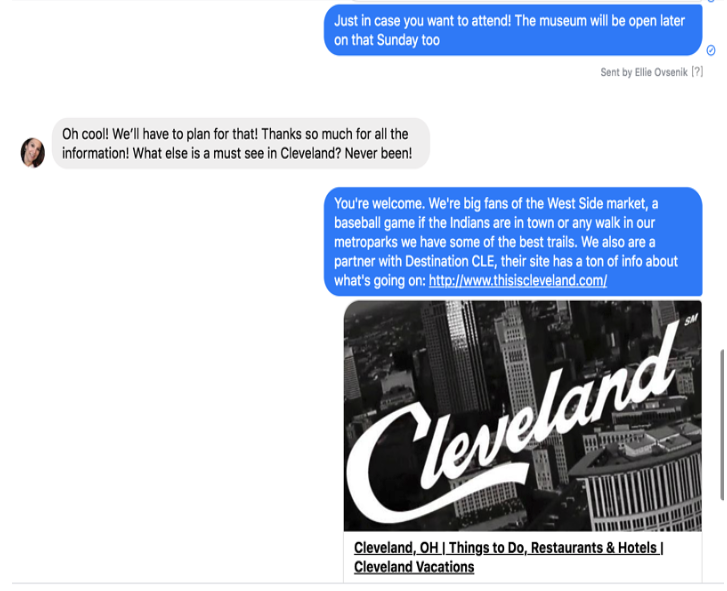
Since the Messenger launch, they claim to have raised their audience size by 81% and sales from prospects by 12%. The company claims that this feature was so successful that they even received 54 messages on an Easter Sunday.
Takeaway
Being available to connect with your audiences through Messenger can be beneficial to your business and your brand. While the Rock & Roll Hall of Fame boosted purchases, they also got to interact with their audiences on a personal level. Their availability might have made them look like a more trustworthy, friendly brand that was actually interested in their fanbase rather than just sales.
Facebook Reach Case Study:
Buffer
In early 2016, Buffer started to see a decline in their brand reach and engagement on Facebook due to algorithm changes that favored individuals rather than brands. In an effort to prevent their engagement and reach numbers from dropping even further.
The brand decided to cut their posting frequency by 50%. With less time focused on many posts, they could focus more time on creating fewer, better-quality posts that purely aimed at gaining engagement. For example, instead of posting standard links and quick captions, they began to experiment with different formats such as posts with multi-paragraph captions and videos. After starting the strategy in 2016, they continued it through 2018.
Here’s an example of one an interview that was produced and shared exclusively on Facebook.
The Results: By 2018, Buffer claimed that the average weekly reach nearly tripled from 44,000 at the beginning of the experiment to 120,000. The page’s average daily engagements also doubled from roughly 500 per day to around 1,000.
In 2018, Buffer claimed that their posts reached between 5,000 to 20,000 people, while posts from before the experiment reached less than 2,000.
Although Buffer began the experiment before major Facebook algorithm changes, they updated this case study in 2018 claiming that this strategy has endured platform shifts and is still providing them with high reach and engagement.
Takeaways
It can be easy to overpost on a social network and just hope it works. But constant posts that get no reach or engagement could be wasted your time and money. They might even make your page look desperate.
What Buffer found was that less is more. Rather than spending your time posting whatever you can, you should take time to brainstorm and schedule out interesting posts that speak directly to your customer.
Facebook Video Views Case Studies:
Tomcat
Gearing up for Halloween in 2016, Tomcat, a rodent extermination company, wanted to experiment with a puppet-filled, horror-themed, live video event. The narrative, which was created in part by their marketing agency, told the story of a few oblivious teenage mice that were vacationing in a haunted cabin in the woods. At peak points of the story, audiences were asked to use the comments to choose which mouse puppet would die next or how they would die.
Prior to the video event, Tomcat also rolled out movie posters with the event date, an image of the scared mouse puppets, and a headline saying, “Spoiler: They all die!”
Results: It turns out that a lot of people enjoy killing rodents. The live video got over 2.3 million unique views, and 21% of them actively participated. As an added bonus, the video also boosted Tomcat’s Facebook fanbase by 58% and earned them a Cyber Lion at the 2017 Cannes Lions awards.
Here’s a hilarious sizzle reel that shows a few clips from the video and a few key stats:
Takeaways
This example shows how creative content marketing can help even the most logistical businesses gain engagement. While pest control can be a dry topic for a video, the brand highlighted it in a creative and funny way.
This study also highlights how interactivity can provide huge bonuses when it comes to views and engagement. Even though many of the viewers knew all the rats would die, many still participated just because it was fun.
Not only might this peak brand interest from people who hadn’t thought that deeply about pest control, but interactivity can also help a video algorithmically. As more people comment, share, and react to a live video, there’s more likelihood that it will get prioritized and displayed in the feeds of others.
HubSpot
In 2017, HubSpot’s social media team embarked on an experiment where they pivoted their video goals from lead generation to audience engagement. Prior to this shift, HubSpot had regularly posted Facebook videos that were created to generate leads. As part of the new strategy, the team brainstormed a list of headlines and topics that they thought their social media audience would actually like, rather than just topics that would generate sales.
Along with this pivot, they also experimented with other video elements including video design, formatting, and size.
Results: After they started to launch the audience-friendly videos, they saw monthly video views jump from 50,000 to 1 million in mid-2017.
Takeaways
Creating content that caters to your fanbase’s interests and the social platform it’s posted on can be much more effective than content that seeks out leads.
While videos with the pure goal of selling a product can fall flat with views and engagement, creative videos that intrigue and inform your audiences about a topic they relate to can be a much more effective way to gain and keep your audience. Once the audience trusts you and consumes your content regularly, they might even trust and gain interest in your products.
Facebook App Installs Case Study:
FoxNext Games
FoxNext Games, a video game company owned by 20th Century Fox, wanted to improve the level of app installs for one of its newest releases, Marvel Strike Force. While FoxNext had previously advertised other games with Facebook video ads, they wanted to test out the swipe-able photo carousel post format. Each photo, designed like a playing card, highlighted a different element of the game.

The add offered a call-to-action button that said “Install Now” and lead to the app store where it could be downloaded. FoxNext launched it on both Facebook and Instagram. To see if the carousel was more efficient than video campaigns, they compared two ads that advertised the same game with each format.
Results: According to Facebook, the photo ads delivered a 6% higher return on ad spend, 14% more revenue, 61% more installs, and 33% lower cost per app install.
Takeaways
If your product is visual, a carousel can be a great way to show off different elements of it. This case study also shows how designing ads around your audience’s interest can help each post stand out to them. In this scenario, FoxNext needed to advertise a game about superheroes. They knew that their fanbase was interested in gaming, adventure, and comic books, so they created carousels that felt more like playing cards to expand on the game’s visual narrative.
Facebook Lead Gen Case Study:
Major Impact Media
In 2019, Major Impact Media released a case study about a real-estate client that wanted to generate more leads. Prior to working with Major Impact, the Minneapolis, Minnesota brokerage hired another firm to build out an online lead generation funnel that had garnered them no leads in the two months it was active. They turned to Major Impact looking for a process where they could regularly be generating online leads.
As part of the lead generation process, the marketing and brokerage firms made a series of Facebook ads with the lead generation objective set. Major Impact also helped the company build a CRM that could capture these leads as they came in.
Results: Within a day, they received eight leads for $2.45 each. In the next 90 days, the marketing firm claimed the ads generated over 370 local leads at the average cost of $6.77 each. Each lead gave the company their name, email, and phone number.
Although these results sound like a promising improvement, readers of this case study should keep in mind that no number of qualified leads or ROI was disclosed. While the study states that leads were gained, it’s unclear which of them lead to actual sales — if any.
Takeaways
This shows how Facebook ad targeting can be helpful when you’re seeking out leads from a specific audience in a local area. The Minneapolis brokerage’s original marketing and social media strategies weren’t succeeding because they were looking for a very specific audience of prospective buyers in the immediate area.
Ad targeting allowed their posts to be placed on the news feeds of people in the area who might be searching for real estate or have interests related to buying a home. This, in turn, might have caused them more success in gaining leads.
Facebook Engagement Case Study:
When the eyewear brand Hawkers partnered up with Spanish clothing brand El Ganso for a joint line of sunglasses, Hawkers’ marketing team wanted to see which Facebook ad format would garner the most engagement. Between March and April of 2017, they launched a combination of standard ads and collection ads on Facebook.
While their standard ads had a photo, a caption and a call-to-action linking to their site, the collection ads offered a header image or video, followed by smaller images of sunglasses from the line underneath.

Image from Digital Training Academy
To A/B test ad effectiveness of the different ad types, Hawkers showed half of its audience standard photo ads while the other half were presented with the collection format. The company also used Facebook’s Audience Lookalike feature to target the ads their audiences and similar users in Spain.
Results: The collection ad boosted engagement by 86%. The collection ads also saw a 51% higher rate of return than the other ads.
Takeaways
This study shows how an ad that shows off different elements of your product or service could be more engaging to your audience. With collection ads, audiences can see a bunch of products as well as a main image or video about the sunglass line. With a standard single photo or video, the number of products you show might be limited. While some users might not respond well to one image or video, they might engage if they see a number of different products or styles they like.
Facebook Conversion Case Study:
Femibion from Merck
Femibion, a German family-planning brand owned by Merck Consumer Health, wanted to generate leads by offering audiences a free baby planning book called “Femibion BabyPlanung.” The company worked with Facebook to launch a multistage campaign with a combination of traditional image and link ads with carousel ads.
The campaign began with a cheeky series of carousel ads that featured tasteful pictures of “baby-making places,” or locations where women might conceive a child. The later ads were a more standard format that displayed an image of the book and a call-to-action.
When the first ads launched in December 2016, they were targeted to female audiences in Germany. In 2017, during the later stages of the campaign, the standard ads were retargeted to women who had previously interacted with the carousel ads. With this strategy, people who already showed interest would see more ads for the free product offer. This could cause them to remember the offer or click when they saw it a second time.
Results: By the time the promotion ended in April 2017, ads saw a 35% increase in conversion rate. The company had also generated 10,000 leads and decreased their sample distribution cost by two times.
Takeaways
This case study shows how a company successfully brought leads through the funnel. By targeting women in Germany for their first series of creative “baby-making” ads, they gained attention from a broad audience. Then, by focusing their next round of ads on women who’d already shown some type of interest in their product, they reminded those audiences of the offer which may have enabled those people to convert to leads.
Facebook Product Sales Case Study
Samsung
In an effort to boost sales from its Latin American audiences, Samsung promoted the 2015 Argentina launch of the Galaxy S6 smartphone with a one-month Facebook campaign.
The campaign featured three videos that highlighted the phone’s design, camera, and long battery life respectively.
One video was released each week and all of them were targeted to men and women in Argentina. In the fourth week of the campaign, Samsung launched more traditional video and photo ads about the product. These ads were specifically targeted to people who’d engaged with the videos and their lookalike audiences.
Results: Samsung received 500% ROI from the month-long campaign and a 7% increase in new customers.
Takeaways
Like Femibion, Samsung tested a multiple ad strategy where the targeting got more specific as the promotions continued. They too saw the benefit of targeting ads to users who already showed interest in the first rounds of advertisements. This strategy definitely seems like one that could be effective when trying to gain more qualified leads.
Facebook Store Visits Case Study:
Church’s Chicken
The world’s third-largest chicken restaurant, Church’s Chicken, wanted to see if they could use Facebook to increase in-restaurant traffic. From February to October of 2017, the chain ran a series of ads with the “Store Traffic” ad objectives. Rather than giving customers a link to a purchasing or order page, these ads offer users a call-to-action that says “Get Directions.” The dynamic store-traffic ad also gives users the store information for the restaurant closest to them.
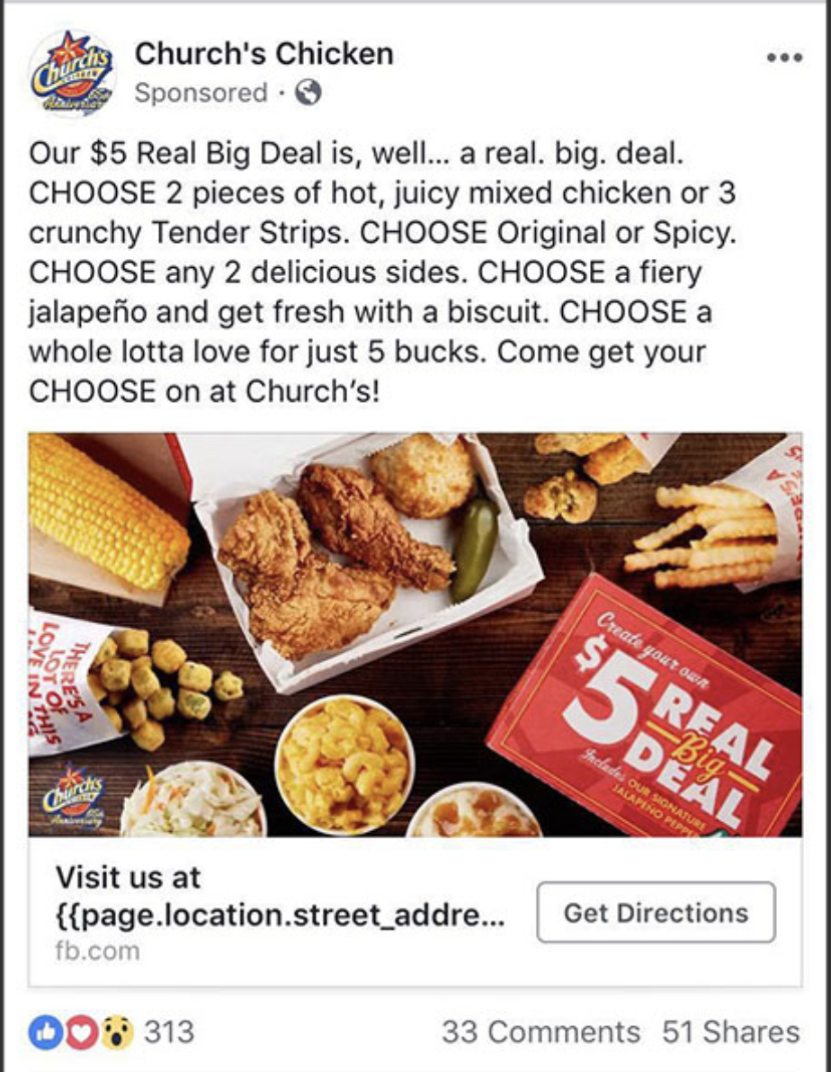
Image from Facebook
The ads ran on desktop and mobile newsfeeds and were targeted at people living near a Church’s Chicken who were also interested in “quick-serve restaurants.” The study also noted that third-party data was used to target customers who were “big spenders” at these types of restaurants.
To measure the results, the team compared data from Facebook’s store-reporting feature with data from all of its locations.
Results: The ads resulted in over 592,000 store visits with an 800% ROI. Each visit cost the company an average of $1.14. The ROI of the campaign was four times the team’s return goal.
Takeaways
If you don’t have an ecommerce business, Facebook ads can still be helpful for you if they’re strategized properly. In this example, Church’s ads targeted locals who like quick-serve restaurants and served them a dynamic ad with text that notified them of a restaurant in their direct area. This type of targeting and ad strategy could be helpful to small businesses or hyperlocal businesses that want to gain foot traffic or awareness from the prospective customers closest to them.
Navigating Case Studies
If you’re a marketer that wants to execute proven Facebook strategies, case studies will be incredibly helpful for you. If the case studies on the list above didn’t answer one of your burning Facebook questions, there are plenty of other resources and success stories online.
As you look for a great case study to model your next campaign strategy, look for stories that seem credible and don’t feel too vague. The best case studies will clearly go over a company’s mission, challenge or mission, process, and results.
Because many of the case studies you’ll find are from big businesses, you might also want to look at strategies that you can implement on a smaller scale. For example, while you may not be able to create a full commercial at the production quality of Pandora, you might still be able to make a lower-budget video that still conveys a strong message to your audience.
If you’re interested in starting a paid campaign, check out this helpful how-to post. If you just want to take advantage of free options, we also have some great information on Facebook Live and Facebook for Business.

How to Make a QR Code in 8 Easy Steps
“Really? We’re talking about QR codes?”
Fair reaction. For several years now, QR codes have been at the center of the popular “___ is dead” trope we marketers love to argue when talking technology. We’ve even debated it ourselves on this blog.
But if there’s one thing the QR code debate shows you, it’s that there sure isn’t a consensus — the efficacy of QR codes still hotly contested.
Nonetheless, there’s no denying the popularity and convenience of the QR code. Keep reading to learn how to create your own QR code, and how you can encourage your customers to scan them when they come across your content.
What Is a QR Code?
QR codes, short for “quick response” codes, are square-shaped black-and-white symbols that people can scan using a smartphone to learn more about a product.
These encrypted squares can hold links, coupons, event details, and other information that users might want to take with them for referring to later.
QR codes usually look something like this:

Although not every QR code is shaped like a perfect square, they’re most often found looking like the image above — with varying patterns displayed inside. You’ll often find them on direct mail, signage, billboards, and even commercials where you can quickly scan the code on the screen using your phone.
QR Codes vs. Barcodes
Does the rise of QR codes mean traditional barcodes are a thing of the past? Of course not. Traditional barcodes are still a common way for businesses to identify consumer packaged goods (CPGs) and manage their product inventory.


Images via Wikimedia Commons | Wikimedia Commons


However, there are a number of differences between barcodes and QR codes — both in their uses and their characteristics. Here are three important differences:
QR Codes Are Shaped Differently
Barcodes are typically rectangular in shape, requiring scanning devices to read the barcode’s data horizontally. QR codes are often square-shaped, displaying their data vertically or horizontally.
QR Codes Hold More Data
Due to a QR code’s square shape, it can hold much more data than a barcode. In fact, QR codes can hold hundreds of times more encrypted characters than a barcode.
QR Codes Hold Different Data
QR codes are often used differently than barcodes. Barcodes hold key product information at the point of sale, such as the price and name of the manufacturer. QR codes offer more passive and intangible information, such as location data and URLs to promotions and product landing pages.
How Do QR Codes Work?
Originally designed in Japan for the automotive industry, marketers adopted the barcodes because of their large storage capacity and ability to translate additional information to consumers beyond what creative and/or packaging could convey.
If a consumer sees a QR code somewhere, they can take out their mobile device, download a free QR code scanning app, and “scan” the barcode to gain access to additional information, like so:
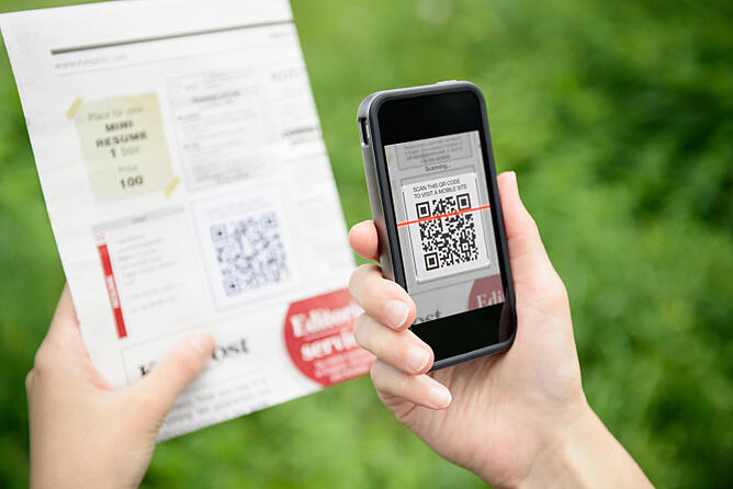
So if you wanted to create, say, a bus stop advertisement promoting your podcast, you could display a QR code on that printed ad that brings people right to your iTunes page when they scan it with their phones. Pretty simple, right?
How to Make a QR Code
The QR code creation process is pretty straightforward. Here’s how to get started.
Step 1: Select a QR code generator.
There are tons of QR code generators out there. The best ones give you many options for using your QR code, and compatibility with most mobile QR code reader apps.
Best QR Code Generators
- Kaywa
- GOQR.me
- Free QR Code Generator by Shopify
- Visualead
- The-qrcode-generator.com
- QR Stuff
- qr-code-generator.com
- QR Code Monkey
- Create QR Code by Google App Engine
Other things to look for when choosing a QR code generator are whether you can track and analyze performance, and if it allows you to design a code that’s unique to your brand.
Some QR codes, for example, display logos and other icons within the code that immediately tell people what information they’ll get from scanning it.
Step 2: Choose the type of content you’re promoting.
Let’s select one of the QR code generators above and do a walk-through together. I’ll select qr-code-generator.com, one of the eight preferred QR code generators above.
First, select what type of content you want your QR code to show the person after they scan it. You can choose from one of 10 types, as shown in the screenshot below. For our purposes, we’ll promote a URL that directs users to our podcast.

Step 3: Enter your data in the form that appears.
Once you select the type of content you’re promoting with this QR code, a field or form will appear where you can enter the information that corresponds with your campaign.
If you want your QR code to save contact information, for example, you’ll see a set of fields where you can enter your email address, subject line, and associated message.
To save a link to our podcast, we’ll simply enter the URL in the field that appears, like so:
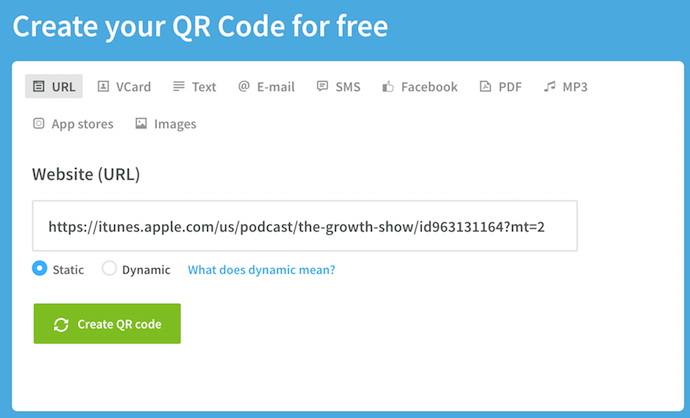
Step 4: Consider downloading a dynamic QR code.
See the option below for “dynamic”? One significant pitfall to making a QR code is that you can’t edit the data it contains once you print it. But with dynamic QR codes, you can edit this data.

With a free membership to QR code generators like qr-code-generator.com, you can print a dynamic QR code, scan it, and pull up an editable form where you can modify the data your visitors will receive when they scan the QR code themselves.
Step 5. Customize it.
The fun part of creating QR codes is customizing the design of the codes to your brand. Want your code to look like your logo? Go for it. Want it to reflect your website’s design scheme? No problem.
Using qr-code-generator.com, we can customize our QR code by clicking the button to the top-right, as shown in the screenshot below. Keep in mind not every QR code maker offers this design option — depending on the QR code you’re looking to generate, you might find some tools limited in their functionality.
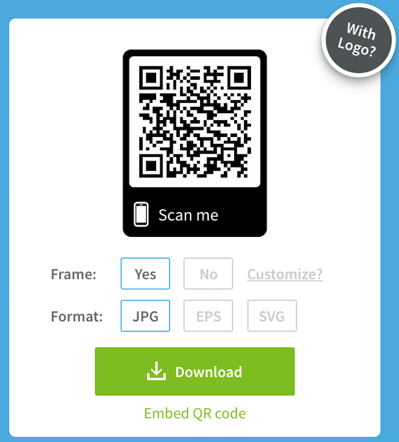
Of course, you can customize your QR code further — adjusting the colors, adding a logo, creating social options, and more.
Keep in mind, however, that some customizations can make it more difficult for QR code scanning apps to properly read the code. It’s a good idea to generate two versions of your QR code — one plain version and another with your preferred design.
Step 6: Test the QR code to make sure it scans.
Because a customized QR code can make it difficult for some mobile apps to “read,” don’t forget to check to see if the QR code reads correctly, and be sure to try more than just one reader. A good place to start is the free tool Google Goggles, which takes a picture and then tells you what link or item it “reads to.”
Another great free tool is QR Code Reader, which automatically takes you to whatever it “reads.” Apple’s Passbook also offers a built-in QR code reader on iOS 7, so you should test to make sure your code is readable there, as well.
Step 7: Share and distribute the QR code.
A QR code won’t be able to do its job unless its seen. So make sure you come up with a distribution plan for sharing the code. This could include displaying it on social media, in print ads, on clothing, or in physical locations where people will pick up there phones to scan it.
Along with sharing the code, you might also want to include text instructions in your various promotions that show less tech-savvy people how to scan it. This way there’s no friction if people want to scan the code but don’t know how to.
Scroll down for more tips on properly displaying a QR code.
Step 8: Track and analyze performance.
Just like any marketing campaign, you should follow up on any collateral or campaigns using QR codes to see whether they’re actually working. How much traffic comes from each specific code? Are people scanning your code but not redeeming their offer once they get to the landing page? Or are they not even compelled enough to scan your QR code?
Knowing this will help you troubleshoot and adjust your poorly performing QR codes to more closely mirror those that work well. I recommend you include a UTM tracking code on your URL so you can better measure performance — this is particularly important if you use closed-loop marketing analytics, and are used to more in-depth reporting on your campaigns.
How to Use QR Codes (And How Not to)
Now that you see how simple the QR code creation process can be, let’s talk about some best practices that’ll help increase the likelihood your QR code actually gets used.
Display your QR code where it’s convenient for people to scan.
Put QR codes in places where scanning is easy, and there’s enough time for the consumer to actually scan the code. While you may often see QR codes on billboards and TV commercials, they’re not exactly the most user-friendly locations. Think of places and mediums where consumers have the time to scan the code, and, ideally, a Wi-Fi connection as well.
Optimize the QR’s destination page for mobile devices.
Mobile-optimize the page to which you’re sending people. Consumers will be on their phone when scanning the QR code, so they should be brought to a page with a positive mobile experience.
Include a CTA that prompts people to scan your QR code.
Offer a call-to-action (CTA) with the code — that is to say, tell people what they’re supposed to do when they see the code, and what they’ll receive if they do it. Not everyone knows exactly what a QR code is, and those that do won’t be motivated to scan it unless they’re sure there’s something worthwhile on the other side.
Don’t limit your QR code to one mobile scanner.
Don’t require a special QR code scanner. Your QR code should be app-agnostic so anyone can scan your code with any reader. A lower barrier to entry makes success more likely for you and the user.
Use your QR code to make someone’s life easier.
Don’t use a QR code just for the sake of using one. For instance, it’s common for marketers to think, “How can I bridge the offline experience with the online experience? Uhhh … QR code!” That’s not wrong … but it’s not always right, either.
If you have content that makes sense to deliver to a mobile user, and you have an appropriate channel to do it (see use #1 at the beginning of this section), it’s more likely your QR code will drive results. For example, in South Korea, grocery store chain Tesco drove tremendous national business growth by using QR codes in subway stations (I guess they have mobile service in their subway stations) to let riders order their groceries while they wait. It’s a great example of using QR codes for the right end-goal, at the right place and time.
If after reading this you’re not convinced QR codes are the right move — or you just want some additional ways you can connect the offline world to the online world — consider also adding a short, memorable URL people can type in easily on their mobile phones in your creative.
The future of QR codes could also mean an evolution — augmented reality apps certainly stem from the same concept, after all. Consider the AR News App, which lets readers augment a newspaper story into a child-friendly article by downloading an app and hovering over stories with a special marker (sounds pretty close to a QR scanner, doesn’t it?).
It may be that QR codes aren’t quite dead, but just the first step in a long evolution.

Instagram Impressions, Explained in 100 Words or Less
If you’re using Instagram as part of your social media strategy, you’ve definitely come across the concept of impressions. But what exactly are impressions? How accurately do they indicate success? And how do they differ from reach, another very similar Instagram metric?
First things first: to understand what Instagram impressions are, you need to know how they relate to Instagram’s reach metric.
Here’s an easy way to distinguish impressions from reach.
Impressions measure the number of times your post or ad appears to users. This metric doesn’t take into account unique users — so, if your post or ad is shown 100 times to the same person, it would technically count as 100 impressions.
In contrast, reach measures the number of unique users who view your post or ad. So, if your post is shown 100 times to the same person, your impressions would be 100, but your reach would be one.
So, when should you prioritize impressions as a key performance indicator in your Instagram campaigns?
When you want to increase awareness among your target audience. Many marketers getting started with Instagram focus on reaching the most people possible — but in reality, it doesn’t matter if you reach 10,000 new people if none of those people are interested in what you’re selling. In some cases, it’s more valuable to your business to focus on cultivating deeper brand awareness among the audience you already have. Instagram Impressions can be a valuable KPI when you want to focus on increasing awareness among your target audience.
Consider your own Instagram scrolling habits: if you see an ad or a post just once, it likely isn’t going to have a big impact on you. But, if you start to notice more posts or ads from the same company, your familiarity of their brand is bound to increase. Even if you aren’t in the market for what they’re selling right now, your awareness of the brand might lead you to make a purchase down the line.
Since impressions on their own don’t take unique users into account, it isn’t the best stand-alone metric to use when you run an Instagram campaign focused on reaching the most people possible. But, it can be monitored alongside impressions to track how many times users are seeing posts or ads from you.
For a deeper dive on how to set up and start tracking impressions (and other metrics) in Instagram Analytics, check out this article we wrote.

8 of the Best A/B Testing Tools for 2019
In the marketing industry, we treat experts like they’re village elders, soaking up every tip and trick they have to offer so we can implement them into our own work, desperately hoping for similar results.
But, when you really think about it, marketing is always changing and experts often don’t have visibility into your unique context.
This naturally begs the questions — what should you do when you can’t find a solution to one of your problems on the internet? To find the answers to your unique problem, consider channeling your inner Sherlock Holmes and become an investigator. Investigators forage for information that’ll lead them to the answers of their own specific questions. And, as a marketer, one of the best investigative tools at your disposal is A/B testing.
Every company has a different set of customers, so there’s no one-size-fits-all formula for designing the most optimal website, crafting the most compelling copy, or building the most effective product. To figure out which website design, line of copy, or product feature will produce the best results for your company, you must discover what your unique set of customers prefer.
To help you do this, we’ve curated eight of the best A/B testing tools for 2019 that’ll help you optimize your website design, copy, product, and, most importantly, help you find the answers to your own specific situation.
1. HubSpot & Kissmetrics’ A/B Testing Kit [Featured Tool]
 Download a free kit with everything you need to run A/B testing – an A/B test tracking template, a how-to guide for instruction and inspiration, and a statistical significance calculator to see if your tests were wins, losses, or inconclusive.
This tool is ideal for businesses just getting started with A/B testing, or for businesses that need a way to track their existing tests. Download the kit for free to get started with A/B testing in your business.
2. VWO
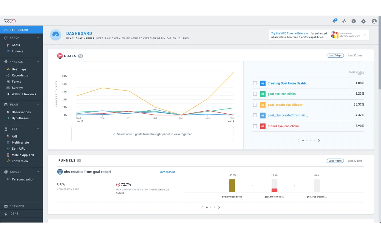
Image Credit: VWO
G2Crowd Rating: 4.2/5.0 (130 reviews)
Trusted by over 4,500 enterprise brands including eBay, Target, and Virgin Holidays, VWO is an A/B testing and conversion rate optimization platform tailored specifically for enterprise brands. In their suite, you can build A/B tests, Split URL tests, and multivariate tests with a drop-and-drop editor.
To gauge the performance of your tests, VWO offers a robust reporting dashboard. VWO also offers a SmartStats feature that leverages Bayesian statistics to help you run faster tests, give you more control of your tests, and reach more accurate conclusions.
3. Optimizely
G2Crowd Rating: 4.3/5.0 (104 reviews)
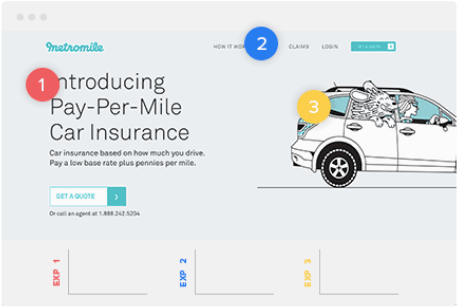
With 24 Fortune 100 companies as customers, Optimizely is a digital experimentation platform for enterprise marketing, product, and engineering teams. Using their powerful A/B and multi-page experimentation tool, you can run multiple experiments on one page at the same time, allowing you to test various variables of your web design.
Optimizely also offers testing on dynamic websites, various experiment dimensions like ad campaign, geography, and cookies, and various experiment segmentation parameters like device, browser, and campaign.
4. Omniconvert
G2Crowd Rating: 4.5/5.0 (47 reviews)
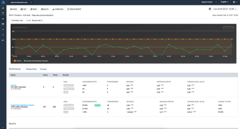
Omniconvert is a conversion rate optimization platform that offers an A/B testing tool, as well as survey, personalization, overlay, and segmentation tools. Using their A/B testing tool, you can run A/B tests on desktop, mobile, and tablet. Additionally, you can turn winning versions of an A/B test into the control for a future test and leverage Frequentist or Bayesian statistics to validate your tests.
Omniconvert also blends their segmentation tool with their A/B testing tool to let you test over 40 segmentation parameters, like geolocation, traffic source, and visitor behavior, to improve your website’s user experience, product features, and content’s ability to engage and convert. If you work for a medium-sized business, Omniconvert could be a great A/B testing solution.
5. Crazy Egg

Image Credit: Crazy Egg
G2Crowd Rating: 4.0/5.0 (28 reviews)
Crazy Egg is a website optimization software that offers A/B testing, heat mapping, and usability testing tools. Their A/B testing tool lets you test variations of every single page on your website by adding one snippet of code to the pages you want to experiment on.
Crazy Egg also lets you build A/B tests without any coding experience, sends more traffic to the optimal variant of your test once it recognizes it’s the winner, and offers intuitive conversion tracking and reporting tools. If you work for a small business, Crazy Egg is definitely a tool you should consider.
6. AB Tasty

Image Credit: AB Tasty
G2Crowd: 4.4/5.0 (25 reviews)
Trusted by brands like Sephora, Ugg, and Carrefour, AB Tasty is a conversion rate optimization software that offers A/B and multivariate testing, data insights, marketing, and personalization tools.
Using their experiments tool, you can build and run A/B tests, split tests, multivariate tests, and funnel tests with their visual editor. You can also leverage their advanced targeting to test based off various criteria like URL, geolocation, weather, and more. To help validate your tests, AB tasty offers reports that display your tests and their confidence levels in real time. If you work for a medium-sized business, AB Tasty could be best suited for you.
7. Freshmarketer

G2Crowd Rating: 4.5/5.0 (24 reviews)
Freshmarketer, which is the marketing arm of the business platform Freshworks, is a conversion rate optimization software that offers A/B testing and split URL testing. Their A/B testing tool can test, target, and validate your experiment, integrate with Google Analytics, and even track the amount of revenue your experiments have generated.
Freshmarketer’s Split URL testing tool can help you test multiple variations of URLs, turn winning test variations into real web pages, and grasp the effectiveness of your web design by offering heatmaps of every variation of your split URL test. Freshmarketer could be the A/B testing solution for you if you work for a small business.
8. Convert

Image Credit: Convert
G2Crowd Rating: 4.7/5.0 (21 Reviews)
Trusted by brands like Sony, Unicef, and Jabra, Convert is an A/B testing and web personalization software that offers A/B testing, split testing, multivariate testing, and multipage experiment tools. Convert also offers an advanced segmentation tool that allows you to segment users based off their historical behavior, cookies, and JavaScript events.
Additionally, Convert can gauge the performance of all your tests by reporting on a large mix of metrics, from your variations’ click-through-rate to its return-on-investment. If you want to use Convert in conjunction with your other tools, they offer a ton of integrations with third-party tools, like WordPress, Shopify, and HubSpot. Convert is best suited for small businesses.

The Ultimate Guide to Content Distribution
Year after year, hundreds of marketers report increased efforts and spending on their content marketing — or the intention to do so.
But great content is a waste if your audience doesn’t know it exists.
Content distribution is an integral, if not the most important, part of your content strategy.
In recent years, there’s been a rapid influx of content … met with dwindling demand. With almost 4.5 million blog posts published every day, there’s only so much content we can consume. Marketing influencer Mark Schaefer argues that, because of this “content shock,” content marketing may not be a sustainable strategy for every business.
While I won’t agree or disagree with this theory, I will equip you with the tools you need to distribute the content you create. By the end of this guide, you’ll be able to build a content distribution strategy that gets your content in front of — and consumed by — your audience.
Although the content distribution process happens after you create your content, it should be step one of your content marketing strategy. You should know where and how you’re going to publish and promote your content before you put the proverbial pen to paper — otherwise, your time and resources could go to waste.
Where should I publish my content, you ask? Through the various content distribution channels we discuss next.
Content Distribution Channels
Content distribution channels are the channels through which you share and promote the content you create. There are three types of content distribution channels: owned, earned, and paid. The channels you use to distribute your content will vary based on your audience and resources.
Owned Content Distribution
Owned channels are the content properties your company owns. You can control when and how content is published on your owned channels. These include your website and blog, your social media profiles, your email newsletter, or a mobile publishing app.
Earned Content Distribution
Earned channels (also known as “shared” channels)are when third parties promote or share your content. These third parties could include customers, journalists, bloggers, and anyone who shares your content for free — hence the name “earned”.
These channels include public relations, social shares and mentions, guest articles and roundups, and product reviews. They also include forums and communities like Reddit or Quora — while posting on these sites is free, the content is owned by these third parties and therefore falls under earned channels.
Paid Content Distribution
Paid channels refer to when your company pays to distribute your content on certain channels. This primarily includes pay-per-click (PPC), paid social advertisements, and paid influencer content.
The following diagram illustrates how these three content distribution channels overlap and how you can combine them to enhance their impact and reach.

If 70% of marketers lack a content strategy, how many do you think have a content distribution strategy? I’d bet not many.
Moreover, some marketers recommend that you spend 20% of your allotted content marketing time creating your content — and the other 80% promoting it. Sound like something you’re doing? If not, this is where a content distribution strategy comes in handy.
A content distribution strategy is important for a few reasons:
- It boosts your content impact past curation and creation. As I said above, great content is practically useless if nobody’s reading it. A content distribution strategy gets your gorgeous content in front of the right eyes.
- It aligns your team and the teams with which you collaborate to create and share the content. Depending on the size of your company, you may have several cooks in the content marketing kitchen. (I know we do at HubSpot.) A content distribution strategy aligns all these different parties and ensures you’re all collaborating efficiently.
- It sets goal benchmarks against which you can measure your distribution performance. Content distribution can be vague — a simple press of the “Publish” button, and you’re done. A content distribution strategy helps you set benchmarks and hard goals to chase while publishing and promoting your work.
Here’s how to build a content distribution strategy for yourself.
1. Research your target audience.
Content distribution is all about getting your content in front of your audience. You can’t do this properly if you don’t know where they are and what they like to read. Before you build your strategy any further, research your target audience so you know precisely who will be consuming your content.
Start by collecting demographic data from your website visitors, email subscribers, social media followers, and customers. Take a look at your audience’s gender, age, income, location, education, and related categories. You can pull this information from Google Analytics or your social media analytics tools.
Next, collect feedback directly from your customers, email subscribers, and social media followers. Ask them about their pain points and needs as well as how they feel about your current content and distribution efforts.
Use these two data points to create your buyer persona. Your buyer persona(s) act as models of your ideal customers and content consumers and represent their pain points, information preferences, and motivations as you build out the rest of your content distribution strategy.
2. Audit your content.
You may already have some published content out there, such as blog posts, videos, social media content, and more. While your new content distribution strategy doesn’t involve removing that content, you should perform an audit to understand if it’s helping or hurting your distribution efforts. Auditing your current content will also remind you of which topics you’ve already written about and which ones you can expand on.
A thorough content audit is comprised of three main parts:
- Logging your content. Logging your content can be done manually or with a tool. (We recommend the latter, especially if you’ve been publishing content on multiple properties and channels.) Tools like Screaming Frog can help you crawl and collect your content, listing each URL, title, and description in a spreadsheet. The free version crawls up to 500 URLs. If you opt for a manual content audit, follow the steps in our blog post here.
- Assessing your content impact. If you crawl your content with SEMRush, the tool will also list content length, social shares, and backlinks. This information can help you assess the impact of each piece of content, alerting you to anything that needs to be updated, rewritten, or erased.
- Identifying your content gaps. You can also identify gaps in your content using the Ahrefs Content Gap tool or by performing keyword research to discover new keywords or keyword phrases to add to your content, thus helping it rank higher and for more terms.
Check out this blog post for 30+ more content auditing tools.
3. Choose your content distribution channels.
Your content distribution channels are arguably more important than your content itself, hence why this step comes before content creation and after target audience research. Once you know your target audience, you’ll have a much better idea of how to get your content in front of your followers and customers.
Depending on your analysis, you may post on forums and communities like Reddit or Quora — and pay to promote your content on those sites, too. Alternatively, you may choose to exclusively share content on social media channels, or perhaps you find that traditional PR is your best route.
Regardless of which content distribution channels you choose, ensure they align with your audience’s preferences and behaviors.
Also, be sure to optimize your owned distribution channels — your blog, email newsletter, and social media profiles — as these are relatively inexpensive and in your control. Even if research shows that your audience prefers forums to social media or news sites to company blogs, never neglect your owned properties as these reflect on your brand and product.
As you work through this step, set aside time to optimize your blog-to-gain readership, brush up on how to send email newsletters (or start sending them), and learn about organic social media marketing.
4. Decide on your content types.
After you determine your distribution channels, consider what types of content you’d like (and have the resources) to create.
Many companies choose to publish all of their content on their blog and then repurpose and re-publish it. Blog posts are universally consumed, easy to repurpose and localize (i.e. translate into other languages), and simple to share — not to mention that almost 50% of buyers read a company’s blog while making purchase decisions. For these reasons, we recommend building a business blog and then expanding your content types from to share on other channels.
Consider these content types — and how you’ll repurpose and distribute them — as you create your blog posts:
- E-books
- Podcasts and interviews
- Videos
- Infographics
- Case studies
- White papers
- Testimonials
- Webinars
- Checklists and listicles
- Datasheets
5. Set your content distribution KPIs and goals.
Goals help us recognize where we’re going and what success might look like when we get there. Your content distribution strategy should involve setting goals for your content key performance indicators (KPIs) and their subsequent metrics:
| key performance indicators | related metrics |
| Traffic/reach | Unique page views by channel and source |
| Engagement | Bounce rate, average time on page |
| Top content (and falling content) | Top page views, top exits |
| Impact | Click-throughs, conversions, backlinks |
| Sentiment | Comments, social shares |
These metrics may vary based on your distribution channel (i.e. you can’t track comments on your email newsletter or top exists on your social media ads), so be sure to choose the metrics that correspond best to each channel. It might take a few months to establish a baseline for each channel, especially if you haven’t used it before.
Set SMART goals for your content using these metrics. Here’s an example:
- Specific: I want to increase our blog’s organic traffic by boosting backlinks from other reputable websites and blogs. This will increase our search engine ranking, thus bringing in more organic traffic.
- Measurable: I’d like 30 new backlinks to our blog.
- Attainable: We’re already generating 10 new backlinks each month without an intentional strategy, so I believe 30 new backlinks this month with our strategy is feasible.
- Relevant: This goal aligns with our broader organic content marketing strategy and could also boost our earned media as we get mentions from press outlets and third-party bloggers.
- Time-bound: I’d like to receive these backlinks within the next month.
6. Build an editorial calendar (and include distribution).
Content marketing and distribution require lots of planning to be successful. This is where an editorial content calendar can come in handy. You can create one in Excel or Google Sheets, or even use Google Calendar. Tools like CoSchedule, Asana, and Trello are helpful, too.
Your editorial calendar, like your content distribution strategy, helps your team stay aligned and work towards common goals. It also gives your writers and editors a roadmap for what they’ll be working on in the coming weeks and months.
Here’s what your editorial calendar may look like (using this post as an example):
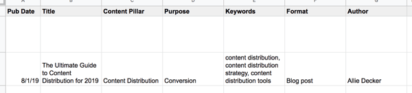
Your editorial calendar is the perfect place to include your content distribution plans and goals. Here’s what that may look like on your editorial calendar:

See how the right-hand columns now include categories like “Publish Destinations” and “Repurposing Plans”? Your editorial calendar should serve as your hub for all content creation and distribution plans.
Manage and plan your social media content with our free Social Media Content Calendar Template.
7. Create your content.
After you research your audience, audit your content, decide on your distribution channels and content types, and build your editorial calendar … it’s time to create your content. Content creation will vary based on your resources, team size, industry, and brand, so to get the most pointed, applicable advice, check out our Guide to Content Creation.
As you work on your new content, check out these tools:
- AnswerthePublic, which can help you flesh out topics and understand what your audience is searching for
- Canva, which can help you build gorgeous infographics and images
- Vidyard, which is a video hosting and publishing platform made for marketers
- Anchor, which is a free podcasting tool for beginners
We’ll talk more about content distribution tools in the next section.
8. Distribute and market your content.
You’ve created your content … now it’s time to put it out in the world. Following your editorial calendar and chosen distribution channels, publish and market your new content. As for any marketing channel, be sure you follow rules to optimize your posts on each channel.
For example, our team at HubSpot paid for ads on Reddit and found that it was helpful to organically engage with Redditors as well as pay for ad space. Alternatively, if you’re posting on (or paying for) social media, be sure to follow the guidelines for the best times to post and share content — the same goes for sending emails.
9. Measure and analyze your results.
As always, be sure to keep an eye on your content distribution results. Remember those KPIs, metrics, and SMART goals you established in step five? Time to pull those out.;
After you’ve published your content, take a look at Google Analytics, your social media analytics dashboards, and your blog performance — depending on where and how you distributed the content. Make sure you set a routine time to measure and analyze (weekly, monthly, or quarterly) so that you can establish a baseline and know which numbers you can beat the following week or month.
Whew! So, that’s what it takes to build a content distribution strategy. Be sure to iterate on this process; these guidelines may change as you expand your content efforts and scale your team. Now, let’s talk about the tools you need to get it done.
Content distribution can be an arduous process, but thankfully there are many content distribution tools out there to help you get your work discovered and consumed.
Content Tools
These tools help you publish your content on additional networks and forums to reach broader audiences.
Medium
Medium is a content platform that individuals and businesses alike use to publish content. You can use Medium in addition to or in lieu of your traditional blog. (We recommend in addition to your blog as this will give your content the broadest reach.)
Medium is where thousands of readers consume content. It’s a one-stop-shop platform for all kinds of content … kind of like Amazon is for products. For that reason, consider publishing to Medium to increase the number of people who see your content.
Price: Free and paid
LinkedIn Pulse
LinkedIn Pulse is similar to Medium except it lives on LinkedIn. While there isn’t a homepage that aggregates all the published content, it’s still a helpful tool for getting your written content in front of your followers (for free). You can publish on LinkedIn Pulse through your personal or company LinkedIn pages by simply clicking “Write an article”.
Note: LinkedIn Pulse is also a mobile application that you can download to receive daily headlines and trending news.
Read more about publishing on LinkedIn Pulse here.
Price: Free
PR Tools
These tools help connect you with journalists and publications to help expand your earned distribution channels and gain backlinks.
PR Newswire
PR Newswire is a press release distribution network. The platform helps you target and contact journalists and outlets by specific industries, geographic areas, and topics. It offers packages for state and local, regional, and national press.
Price: Paid
HARO
HARO stands for Help a Reporter Out, which is an online platform that connects journalists and sources. In this case, you’d be the source.
When you sign up for HARO, you’re sent daily emails with journalist queries. Respond to these queries to be potentially featured in an article. This is a reactive content distribution tool, but it’s helpful for getting press mentions and backlinks.
Price: Free and paid
Social Tools
These tools help distribute your content on social media and amplify your posts.
HubSpot
HubSpot is an all-in-one marketing software, meaning its useful for email marketing, analytics, and social amplification. I’ve placed it in the “Social Tools” section because its Social Inbox is incredibly helpful for content distribution.
From your Social Inbox, you can monitor, schedule, and post content to your social networks. You can also access information from your email marketing campaigns so you have the big picture of your readers and customers.
Price: Free and paid
ClickToTweet
ClickToTweet is a tool that equips your readers to share soundbites of your content on Twitter with a single click. You create your content soundbites, and ClickToTweet provides a link. When readers click that link, the tool opens their Twitter with the content soundbite already ready to post.
It also links to your Twitter account and content — allowing your readers to distribute your content for you.
Price: Free
GaggleAMP
GaggleAMP is a social amplification tool that allows you to aggregate your employee’s social networks and post company content directly to them. Employees have the option to review and improve content before it’s posted or allow it to go through automatically. This is a great alternative to constantly bugging your staff to post on about your business.
You can also use this tool to link to social networks from partners, customers, brand advocates, and more.
Price: Free and paid
AddThis
AddThis is an on-page social sharing tool. It allows your readers to share your content without bouncing from your page (and potentially getting distracted). You can also integrate AddThis share buttons into your email newsletter and other assets.
Price: Free
Analysis Tools
These tools help you measure and analyze the impact of your social posts and other distribution efforts.
Mention
Mention is a social media monitoring tool that provides social media listening, publishing, crisis management, and more. You can use Mention to monitor any mentions of your brand name, content, or social networks and respond accordingly. This is a great tool for measuring the impact of and engagement around your content and see who is promoting it for you.
Price: Free and paid
SharedCount
SharedCount is a tool that helps you measure the engagement of your social media posts. Simply input a URL, and SharedCount will report on its likes, shares, comments, and other engagement measures. While it can’t help you distribute your content, it can alert you to which pieces are performing well and which pieces may need to be updated or scrapped.
Price: Free and paid
Additional Tools
Outbrain
Outbrain is a paid amplification tool that aggregates your content at the bottom of other articles. You can set up content campaigns with an RSS feed or specific URL(s), and Outbrain will place them under related content, encouraging readers to click and read yours.
Outbrain works with an impressive network, including digital publications like NYT and Mashable.
Price: Pay-per-click
WiseStamp
WiseStamp is an email tool that allows you (and your employees) to share your latest content in your email signature. Your email signature is often a forgotten but important piece of digital real estate that practically everyone who opens your emails will see. WiseStamp helps you make the most of that space.
Price: Paid
Distribute Your Content to Grow Better
Amazing content is a waste if no one is consuming it. Content distribution is a critical piece of the content marketing puzzle. It’s is also the key to boosting your brand awareness, collecting loyal followers, and encouraging your readers to click, act, and become customers.
Put these content distribution tips and tools to get your content in front of your audience.

10 Simple Ways to Write Stronger Introductions
There’s a lot of material out there about writing great headlines. Hey, getting someone to click on your article is a critical part of your blogging strategy. But what about writing introductions?
Compelling readers to actually read the article is an art form in and of itself — and if you don’t do it well, then you’re denying yourself potential promoters, subscribers, leads, and even paying customers.
Take a look at the following graph from Schwartz to see what I mean. It shows where people stopped scrolling in an experiment covering many articles across the web.
Every time someone landed on an article, Chartbeat analyzed that visitor’s behavior on a second-by-second basis, including which portion of the page the person was currently viewing. Each bar represents the share of readers who got to a particular depth in the article.
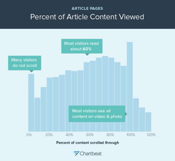
Image Credit: Slate
Of everyone who landed on an article, 10% never scroll down.
So how do you get more people to scroll? One way is by writing a powerful, compelling introduction.
So, let’s see about making it better now, shall we? In this post, I’ll share with you how to write powerful introductions that turn casual browsers into readers. Article introductions matter, and here’s how to make them count.
1. Keep your first sentence short.
I’m a big fan of short sentences. I love them because people can understand them easily. There’s an insane amount of value in short sentences that are readable, digestible, and punchy.
But often, writers get so caught up in the stress of their introduction that they come out with long, garbled sentences. The problem with long, garbled sentences is that it makes readers work hard. Readers don’t want to work hard to understand your article — especially at the beginning. Lead off your introduction with a bite-sized sentence or two.
2. Say something unusual.
You’ve probably heard advice like “create a hook” and “grab the reader’s attention.” But what kind of stuff actually grabs someone’s attention? I can think of a lot of things, actually, but they probably wouldn’t be appropriate for an introduction.
What these oft-repeated phrases boil down to is this: say something unusual. Something unexpected, even. If your very first sentence is odd enough to make people want to read the next one, then you’ve done a good job. If you start off with something boring or expected, you might lose potential readers.
3. Don’t repeat the title.
Assume that the reader already read the title. You don’t need to write it over again. Instead, take advantage of your chance to reinforce that title and to set the stage for the remainder of the article.
4. Keep the introduction brief.
There is no definitive answer for how long an introduction should be. But, like the Slate study told us, readers have short attention spans. They’re impatient to get to the meat of the article. Your readers are looking for information, so don’t bury it deep in your article. Cut to the chase.
5. Use the word “you” at least once.
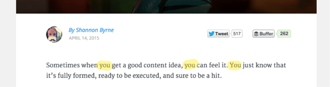
The word “you” is a powerful word. It tells the reader that you, the author, are writing the article with them in mind. You empathize with them, you care about them, and you want your piece to resonate with them. It’s a simple trick that establishes a crucial connection with your reader.
Here’s a great example from CloudPeeps’ Shannon Byrne:
6. Dedicate 1-2 sentences to articulating what the article covers.
Your English teacher would call this the “thesis.” This is where you tell the reader what the article is about. What will you be discussing, in order? What will the reader learn? Lay it out to help set the reader’s expectations and help her decide whether she wants to read the article in full, scroll to different parts, or not read it at all.
Don’t be afraid of writing, literally, “This article is about X” or “In this article, I’ll talk about Y.” Here are some variations on this theme to get you started:
- “You’re about to find out why sea turtles always lay their eggs on the beach.”
- “And, if you’ve ever wondered why sea turtles lay their eggs on the beach, here’s everything you need to know.”
- “This article explains the 17 reasons why these amazing creatures lay their eggs on beaches.”
- “Fascinating, funny, and shocking, these are the reasons why sea creatures lay their eggs on the beach.”
7. Dedicate 1-2 sentences to explaining why the article is important.
It may be obvious to you why the content of your article is important to your readers, but it may not be obvious to them. Let them know loud and clear why it’s important for them to know the information you cover in your article. You might compel readers who would otherwise have bounced to keep on reading.
In the introduction to this particular article, you’ll recall the following sentence:
If you don’t [write introductions] well, then you’re denying yourself potential promoters, subscribers, leads, and even paying customers.
My goal here was to connect the topic of blog post introductions to the broader issues of readers, customers, and revenue.
8. Refer to a concern or problem your readers might have.
If you can pull a pain point into the introduction, even better. Everyone in every field has their set of problems. You should have some listed already from when you created your buyer personas. Communicate your awareness of those problems in your introduction and you’re more likely to gain a sympathetic reader.
Here’s a great example from Buffer’s Alex Turnbull, whose intro here is a story format with a problem twist:
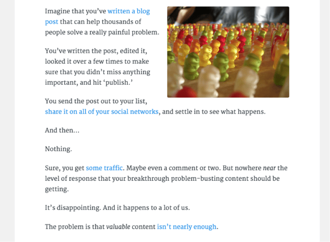
People want to solve their problems, and articles that explain how to do this will help you earn readership.
9. But … be careful telling stories.
A lot of people will tell you that you need to write a story in the introduction. Stories can work, as in the example above, but there are good and bad ways to tell stories in your intro.
Do use storytelling to spark the reader’s curiosity and empathize with her. But don’t get carried away and write a long-winded story that loses readers along the way. Remember the tip about keeping introductions short? That still applies when you’re telling a story.
Here’s an example from one of my own QuickSprout blog posts:
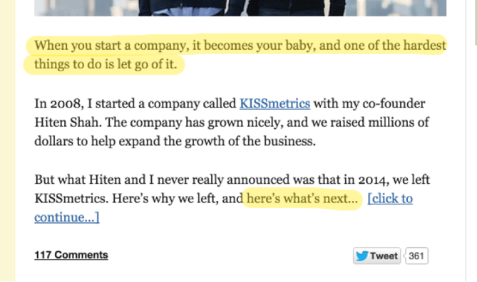
Notice that I highlighted the “empathy” section — the first sentence. Here, I helped form a connection with my readers. Then, I told a short story about my own experience. After that, I finished the introduction with “what’s next.”
If you do begin your article with a story, here’s a tip: Don’t reveal the conclusion until the reader is deeper into the article, or even until the very end.
10. Use a stat or a fact to convey importance.
When journalists begin a news story, they often give readers an eye catching stat or fact about what’s going on. As a blogger or any other type of writer, a really interesting stat or fact will draw your reader in and show them why your topic is really important.
For example, say you’re a plumber writing a blog post on pipe replacement. You might pull in more readers if you start a post by explaining how frequently old pipes burst in the winter. If readers see that this is a common annoyance that others face, they might keep reading to learn how they can avoid it.
Introduction Takeaways
The next time you write an article introduction, think about what kind of introduction would make you want to read the article.
Would a long, wordy first sentence make you want to read more? No. You might find yourself thinking, Yikes, is this what the rest of the article’s going to be like? and bounce from the page. What about a story or question that doesn’t really apply to you? No, probably not.
To compel you to read past the introduction of an article, you want to read something unique, fresh, and engaging. You want to hear about yourself and your problems. You want to be put in a position where the remainder of the article is a must-read experience that will help you solve those problems and change your life.
Introductions are hard, and writing effective ones take time and practice. Sometimes, you might find yourself having to re-write them several times before you’re satisfied. Remember, it’s all worth it if it means keeping the attention of a few more of your readers.

Recent Grad? Here’s How to Tackle Your First Month of Job Searching
Making the transition from academia to professional life is a milestone that our four-year undergraduate degrees often don’t prepare us for! If you’re getting ready to make the jump from backpack to briefcase, here is a week-by-week plan to help prepare you for your first month of job searching.
Week 1: Self-Reflection
Before diving into your job search and applications, it’s time to start reflecting about what you want your first career move to be. Until this point, it’s likely that your choices and variability have been limited, as academic curriculums can be restricted to your core courses and electives. This is a unique time to explore your life, network, and take the time to learn about yourself and your interests.
To do this, ask yourself the following questions:
In the last few years, what courses, projects, internships, or part-time jobs have “sparked joy”?
In the last few years, which of those same elements have I strongly disliked?
If time, money, and resources were not a barrier, what would I want to pursue?
What professionals, professors, or classmates inspire me? If I could emulate anything about them, what would it be?
Once you have those elements figured out, you can research which jobs exist that would create alignment between your work and your areas of interest. Start by listing out 10 jobs that might include key ingredients that excite you.
Building your career roadmap and vision early on will provide a guiding light as you transition from school to work.
Week 2: Informational Interviews
Once you’ve started exploring and have that list of 10 jobs, seeking out informational interviews will help you develop a better picture of what your desired profession could look like in real time.
If you want to reach beyond your network of professors, friends, family and classmates for informational interviews (which you should!), head to LinkedIn and get networking!
Speaking to people about their careers, and learning about how they got from A to Z will help you build your own roadmap, and expand your professional network. It will also give you a realistic idea of how to emulate certain careers or accomplishments.
If you find yourself getting excited about someone’s job or achievement, it might be because their values and interests align with those of your own. Listen to that inner voice when it’s excited as you start searching for your first job.
While going through this process, you should keep track of all the conversations you have. Mark down who you’ve spoken to, what the interaction was, and what the outcome was. This helps build meaningful relationships early on, fine tune your messaging, and serves as a journal for self-reflection.
You might find that many people are too busy to take your calls. This is to be expected, so challenge yourself to reach out to at least two to three new people a day, and make sure to follow up.
Week 3: Look Towards Your Own Network
Now that you’ve explored yourself, spoken to some professionals, and have some guidance about where you want to go, start going through your internal network.
Open up a new spreadsheet and build out a company list of 20 places you would want to work. Once you have that list, start talking to your friends, families, colleagues, alumni, professors, and anyone you’ve spoken to in step one and two, to see if you know anyone working in any of those organizations. See if any of your contacts, or any of your contact’s contacts know anyone that can put you in touch with the right people.
Get your name out there and tell your network you’re looking for a job! If people don’t know you’re looking, and don’t know what you’re looking for, they won’t know to refer you. Everyone has been where you’re starting out, and most people will be willing to help you land that first gig.
Week 4: Head to the Job Boards
Once you’ve moved through your network, it’s time to hit the Glassdoor’s job search.
Rather than sitting home hitting refresh on the job boards every five minutes, give yourself a schedule, and a routine that will help you build good habits and avoid any toxic behaviors. For example, you can say, “After 2:00 pm, I’m not applying for jobs anymore and instead I am going to spend the afternoon improving my French speaking skills”. Also, you should set up a Job Alert for the term or terms that may be contained in your ideal job. For example, if you’re on the hunt for a writing job, set up job alerts for the words “writer,” “editor,” “content,” “content creator.”
At this stage of your career, the focus should be to find a job that will give you skills, and experience to help you build your foundations. While you shouldn’t be too picky early on (ex: rejecting a good job because it’s not your dream job), you should try and only apply for jobs that you feel will help move you in the right direction professionally.
Give yourself benchmarks, and reward yourself along the way. For example, you might say, “if I get 5 really good applications done in the next 2 days, I’ll take myself for a pedicure”. Celebrate yourself!
While academia provides a linear framework for you to work within, you’ll have to get used to the ambiguity and uncertainty that exists when job searching and building your career. Finding the right job will not happen overnight, so keep calm, and remember your career will be a journey, and not a final destination!
This article was originally published on Glassdoor, one of the world’s largest job and recruiting sites. Glassdoor combines all the jobs with valuable data to make it easy for people to find a job that fits their life, while also helping employers hire quality talent at scale. Are you hiring? Post jobs for free with a 7-day trial.

9 Highly Effective Order Review Pages to Inspire Your Own
An order review page is almost always the final place a customer goes before they make a purchase.
At this point, they’ve probably done their research, considered competitor products, know the price and details related to your product, and are ready to buy. If the page is easy to understand and causes no confusion, odds are that your customer will press the “Make Purchase” button with no hesitation.
But, if the page feels vague, unprofessional, and doesn’t give full product details, the customer might pause and worry that they’re purchasing the wrong product or giving their money to a less-trustworthy company.
On the other end of the spectrum, if the page includes advertisements, excess images, a complex navigation bar, and other unnecessary elements, the customer might get distracted, click away from the order page, and take longer to make a purchase.
As you design your ecommerce site, you might wonder, “What do I need on this page to seal the deal?”
The truth is, you just need to keep it simple. Think of order reviews like landing pages. Instead of using the page to convert a customer to a lead, you just want them to click the purchase button.
To get them to click quickly, allow the customer to review their exact product selection, a photo of the product(s), delivery information, and accurate costs associated with the order. When this page focuses on the product information that’s important to the customer, they’ll trust that they’re purchasing the correct item and won’t get deterred from pressing the purchase button.
As you create a review page, make sure it includes these helpful elements:
- A headline, banner, or progress bar saying “Order Review,” “Review Order,” or something similar.
- The customer’s name, contact information, and shipping address.
- An image and basic product description for each product.
- A list of any extra specifications or customizations that the customer has designated.
- Accurate pricing information showing each product’s cost, a sub-total, total, tax, and delivery fee.
- Payment information or a payment form.
- A brightly colored button with a “Place Order” call to action.
To help you build an efficient order review page, here are nine examples of review pages from real companies.
Order Review Page Examples
Neiman Marcus
Neiman Marcus’ order review page allows the customer to make last-minute selections and changes to their shipping information. Then, they can use it to add payment details before making the purchase. On the right of the page, they show transparent pricing information, any gift wrapping designations made by the customer and product information.
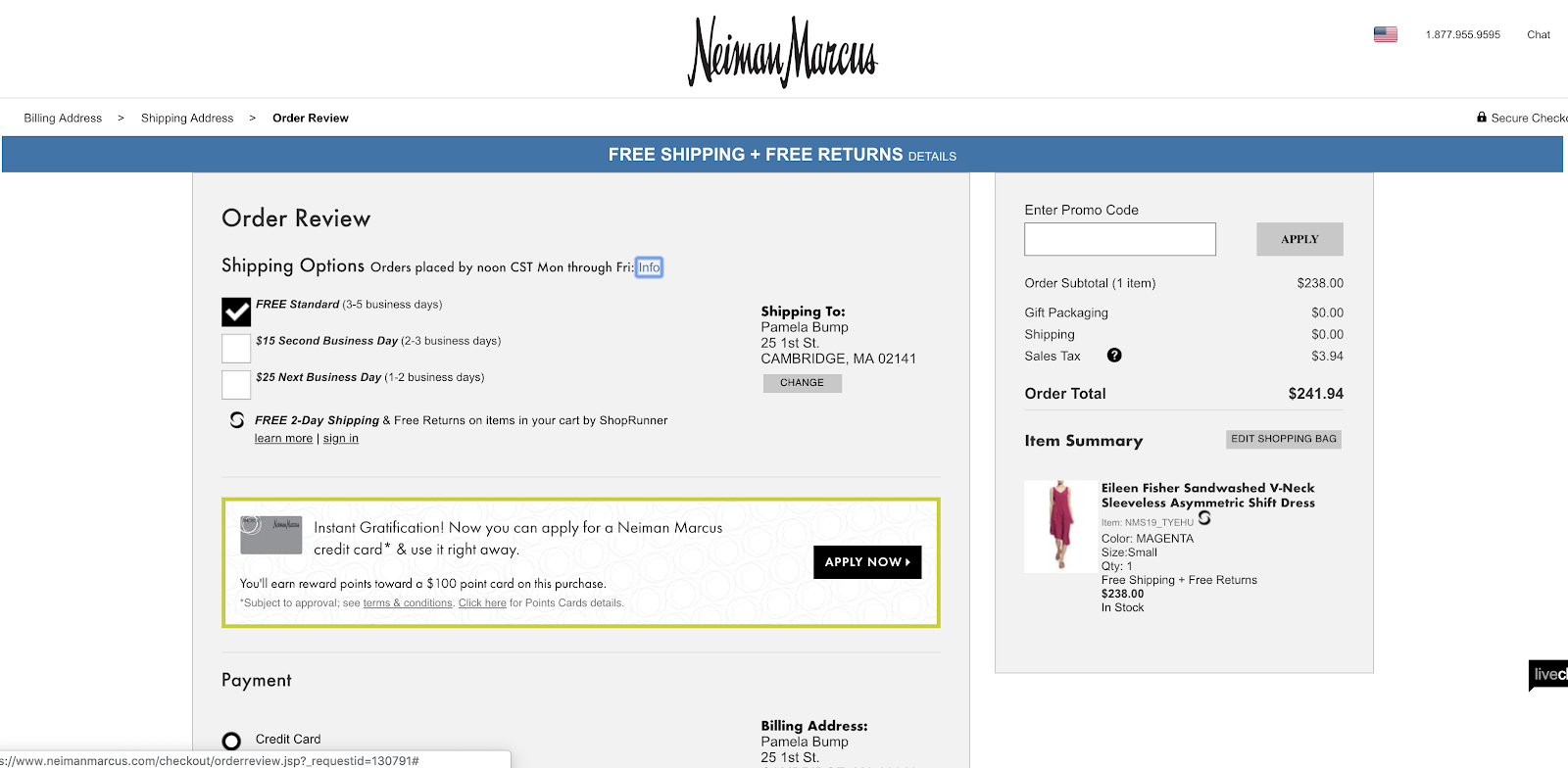
In the “Item Summary” area, a clear image of the product is shown alongside text that describes color, size, and quantity designations made by the customer. After reviewing this information, the customer will know they’re ordering the correct product and will be confident that the right information is on file when they click “Pay Now.
Neiman Marcus is also using a smart strategy of hiding the navigation bar. When you log into Neiman’s homepage, the bar is much more detailed and highlights different categories of products. On this page, the element is replaced by a progress bar that shows the customer where they are in the checkout process.
Without a navigation bar, there’s less risk that the customer could click off of this page to look at other products. It also focuses the customer on making the purchase at hand. Although Neiman wants customers to look at their products, they’ve removed the bar on this specific page because it could cause customers to get distracted, abandon their cart, or make slower purchases.
Nordstrom
Like Neiman Marcus’ page, this design is simple and shows off images and details related to each product so the customer trusts that they’re making the right purchase. On the top of the page, you see basic shipping information. Then, the bottom of the page goes into detailed specifics. There’s a bright blue “Place Order” button on both the top and bottom of the page.
This page’s organization allows shoppers with limited time to do a quick review and purchase. At the same time, the details and button at the bottom also cater to customers who want to review the more intricate details.


Like Neiman, this page also eliminates a navigation bar to ensure that customers are focused on making the purchase as quickly and smoothly as possible.
DoorDash
DoorDash, a HubSpot customer, uses its order review area to give consumers one last chance to edit to their meal delivery. It clearly designates the restaurant they’re ordering from as well as specific meal details.
It also shows the customer’s delivery instructions and allows them to make slight tweaks, such as adding delivery notes. Although there is a DoorDash logo and a “Back to Menu” button on the top of the page, the design also limits distraction that could lead to an abandoned order.
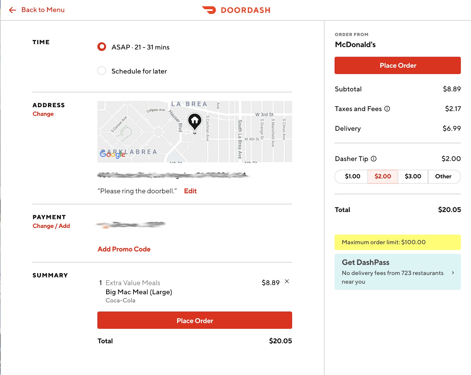
IKEA’s review page takes an extremely simple, but efficient approach. While the other pages on this list have a more branded design, this page looks more like a receipt. It displays a small photo of the product and a small IKEA logo. Then it includes very specific shipping, product, and pricing details in a basic font. Although some might call it bland, this makes the page incredibly understandable and straightforward.
Similarly to Nordstrom, IKEA also replaces its usual navigation bar with an order progress bar so the user can focus purely on the order.
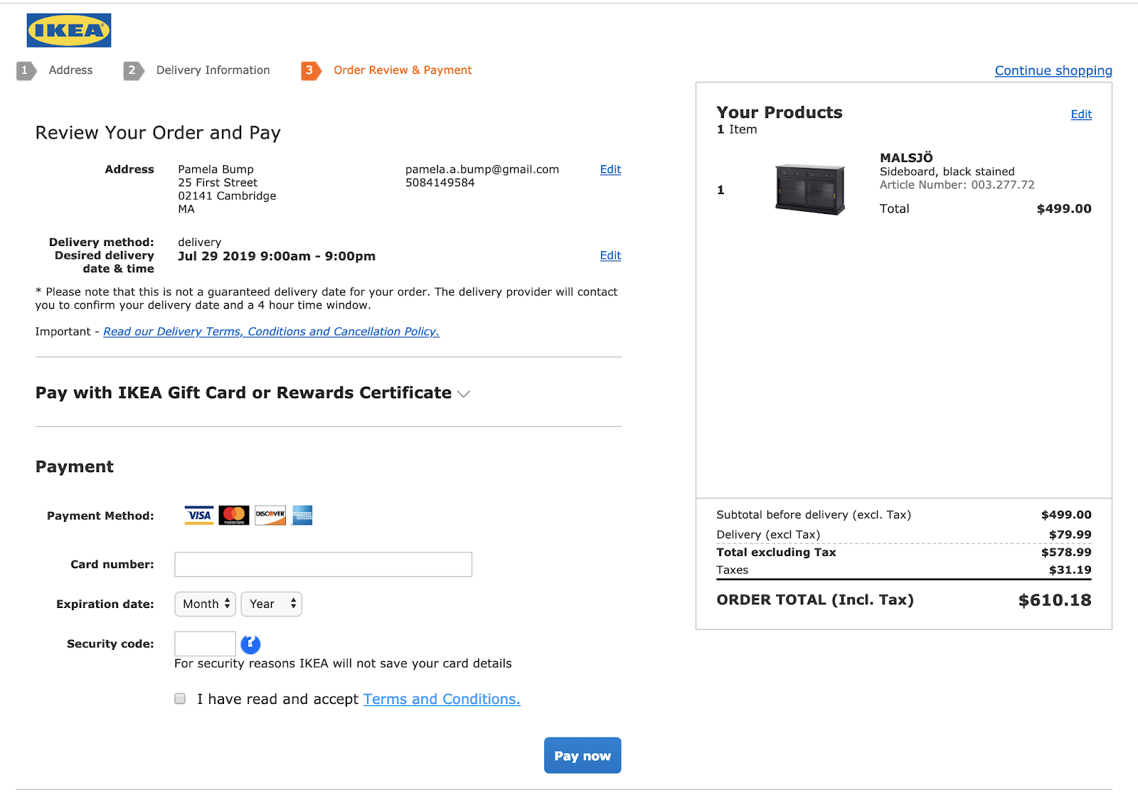
Purple
Purple, another HubSpot customer, similarly eliminates navigation and includes a progress bar on their order review page. With a sleek, clean design, a customer can easily see a photo of their product, item specifications, and shipping details. Like other pages on this list, there is also a box where you can enter your billing information before making the final purchase.
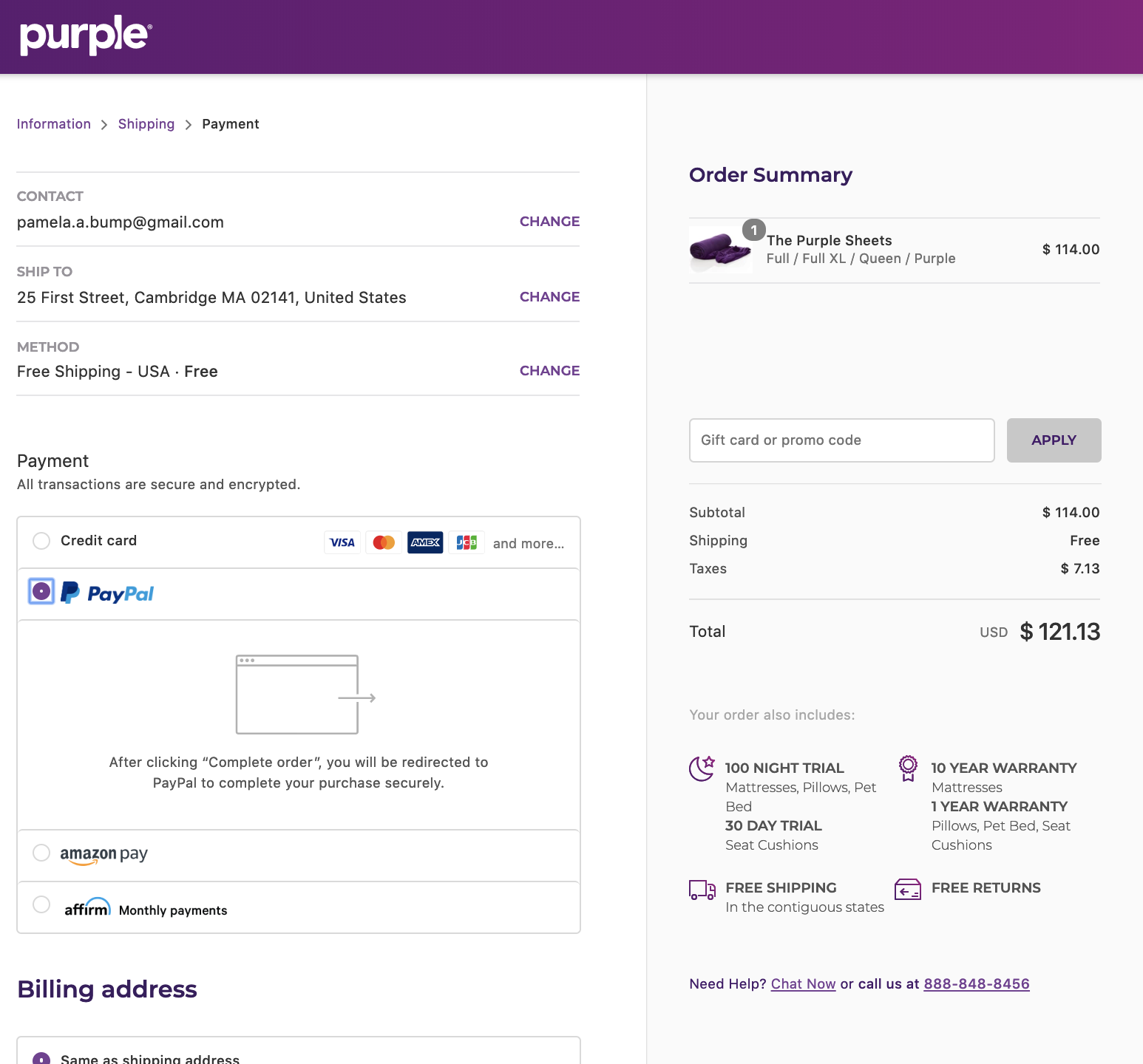
Chanel
The Chanel Review page is simple and straightforward. While they do still include the navigation bar, the pictures of the products and text about complimentary items might keep the customer focused on finishing the purchase.
This page allows customers to review delivery and product information while also filling out their billing information. It includes a “Complete the Purchase” button that allows them to pay directly after filling out the billing information.

Sock Club
Sock Club, which sells customs socks and offers “Sock of the Month” promotions, has a simple and easy-to-understand layout, despite the fact that they include custom sock details and specifications. The product information is on the right and includes an image of the basic sock and bulleted text that lists all customizations — such as size and sock design — made by the customer.

Similarly to the other examples, the page is a different design than its actual website as it removes navigation and replaces it with a progress bar.
Etsy
Etsy uses a more playful and colorful order review design. The page includes a fun headline that says “Double check your order details” to emphasize that this page is for a purchase review.
The page also encourages customers to place their order with a simple, but eye-catching tan box that says, “Almost done! Please click ‘Place your order’ to complete your purchase.” The place your order button is black which contrasts well with Etsy’s white design.

Customers can see detailed product information, a photo, seller information, and a transparent price. They can also add a note to the seller.
Like the other pages, Etsy ditches navigation and replaces it with a visual progress bar. This bar style might be fun and motivating for a customer who likes to visually see their progress. Each circle fills up when they complete a task within the checkout process, which might be satisfying to some shoppers.
Etsy also includes a “Secure Checkout” sign at the top of the page. Because Etsy allows users to buy products from third-party sellers, this might add a sense of trust that a customer’s billing and contact information is safe.
Airbnb
Although Airbnb sells vacation rentals and not goods, this “Confirm and Pay” page is pretty similar to the other pages on this list. It similarly includes a box to fill out payment information, no navigation bar, a photo of the vacation home, and text-based details about the reservation so the user is sure about their purchase and all of its related costs.
Prior to this page, the customer has already clicked through a page that requires them to agree with the house rules and acknowledge that they understand which amenities are and aren’t provided. Because they have already seen ample details, the product description is a little light on this page.
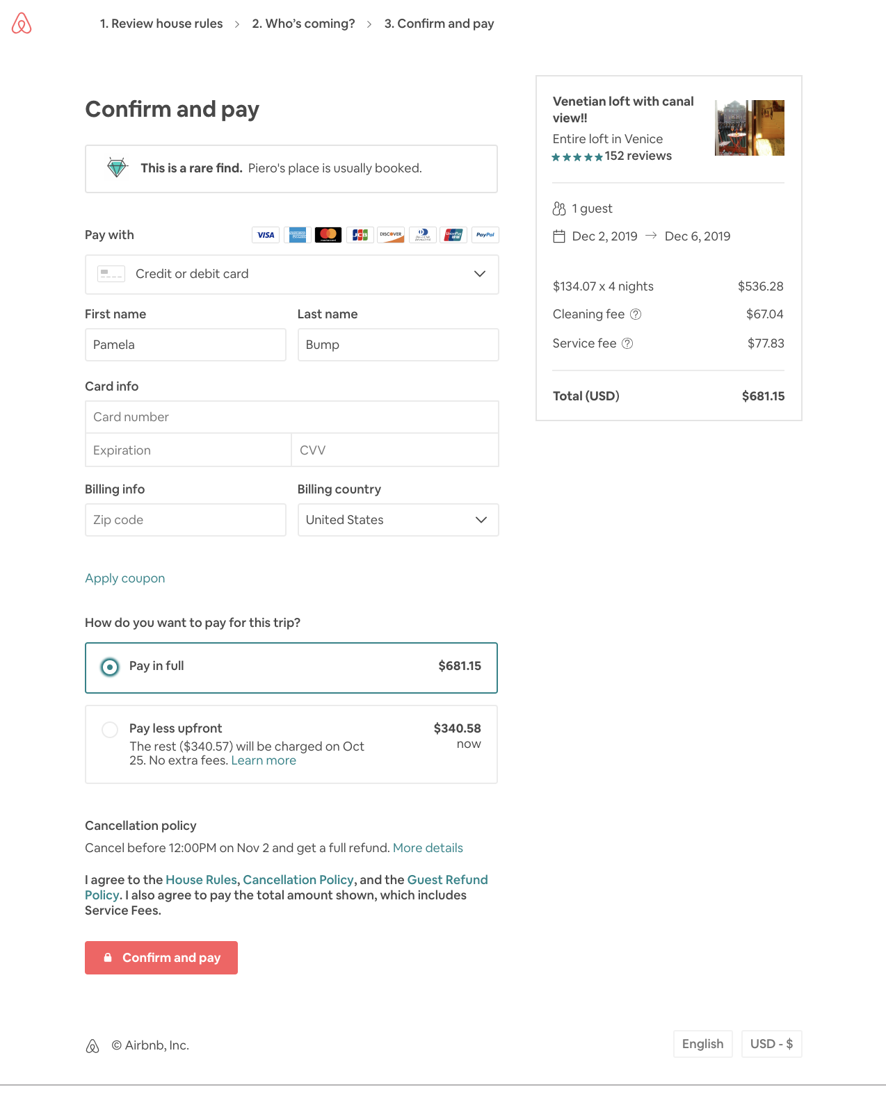
Along with the standard review page elements, there’s also a note saying that this vacation spot is a “rare find” because it is regularly booked out. This might give the customer added motivation to fill out their information and pay as quickly as possible incase they’re worried another vacationer might take those dates.
Remember. Keep it simple.
Your customer already knows they want to buy your product by the time they reach the order review page. So, you don’t need to put large amounts of detail and design time into it.
To create an efficient page, aim to balance simplicity with need-to-know information so the customer trusts your company and is confident that they’re making the right purchase.
Putting too much unnecessary information on an order review page can distract or slow the customer from making a final purchase. However, not enough information can have the customer worried that they might be ordering the wrong thing. So, focus on telling the customer exactly what they need to know, then encourage them to click “Purchase.”
Want to learn more about the ins and outs of selling ecommerce products? Check out our Ultimate Guide to Ecommerce Marketing. If you’d rather focus on generating leads than one-time online purchases, we’ve also put together a list of great landing page designs.

14 PowerPoint Presentation Tips to Make More Creative Slideshows [+ Templates]
I like to think of Microsoft PowerPoint as a test of basic marketing skills. To create a passing presentation, I need to demonstrate design skills, technical literacy, and a sense of personal style.
If the presentation has a problem (like an unintended font, a broken link, or unreadable text), then I’ve probably failed the test.
Even if my spoken presentation is well rehearsed, a bad visual experience can ruin it for the audience.
Expertise means nothing without a good presentation to back it up. For starters, grab your collection of free PowerPoint templates below, and use the tips that follow to perfect your next presentation.
No matter your topic, successful PowerPoints depend on three main factors: your command of PowerPoint’s design tools, your attention to presentation processes, and your devotion to consistent style. Here are some simple tips to help you start mastering each of those factors, and don’t forget to check out the additional resources at the bottom of this post.
PowerPoint Presentation Tips
- Don’t let PowerPoint decide how you use PowerPoint.
- Create custom slide sizes.
- Edit your slide template design.
- Write text with your audience in mind.
- Make sure all of your objects are properly aligned.
- Use “Format Menus” to better control your objects’ designs.
- Take advantage of PowerPoint’s shapes.
- Create custom shapes.
- Crop images into custom shapes.
- Present websites within PowerPoint.
- Try Using GIFs.
- Keep it simple.
- Embed your font files.
- Save your slides as JPEGs.
- Embed multimedia.
- Bring your own hardware.
- Use “Presenter View.”
PowerPoint Style
1. Don’t let PowerPoint decide how you use PowerPoint.
Microsoft wanted to provide PowerPoint users with a lot of tools. But this does not mean you should use them all. Here are some key things to look out for:
- Make sure that preset PPT themes complement your needs before you adopt them.
- Try to get away from using Microsoft Office’s default fonts, Calibri and Cambria. Using these two typefaces can make the presentation seem underwhelming.
- Professionals should never use PPT’s action sounds. (Please consider your audience above personal preference).
- PowerPoint makes bulleting automatic, but ask yourself: Are bullets actually appropriate for what you need to do? Sometimes they are, but not always.
- Recent PPT defaults include a small shadow on all shapes. Remove this shadow if it’s not actually needed. Also, don’t leave shapes in their default blue.
2. Create custom slide sizes.
While you usually can get away with the default slide size for most presentations, you may need to adjust it for larger presentations on weirdly sized displays. If you need to do that, here’s how.
- In the top-left corner, choose “File.”
- Select “Page Setup.”
- Type the height and width of the background you’d like, and click “OK.”
- A dialogue box will appear. Click “OK” again.
- Your background is resized!
Tip: Resize your slides before you add any objects to them or the dimensions of your objects will become skewed.
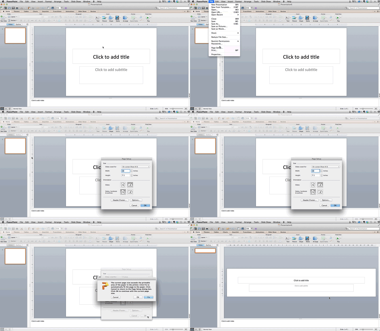
3. Edit your slide template design.
Often, it’s much easier to edit your PowerPoint template before you start — this way, you don’t have design each slide by hand. Here’s how you do that.
- Select “Themes” in the top navigation.
- In the far right, click “Edit Master,” then “Slide Master.”
- Make any changes you like, then click “Close Master.” All current and future slides in that presentation will use that template.
4. Write text with your audience in mind.
A significant part of a powerpoint’s content is text. Great copy can make or break your presentation, so evaluating your written work from a few different angles could make you seem more persuasive. Thinking about how your text is received differentiates good presenters from the best.
Typography:
Many people underestimate the influence of typeface, but choosing the right font is important — the perception of your font type could influence your audience’s impression of you. The right font is an opportunity to convey consistent brand personality and professionalism.
Some fonts are seen as clean and professional, but this doesn’t mean they’re boring. A common mistake is thinking your font isn’t “exciting” enough, which could lead you to choose a font that distracts from your overall message.
 Source: Workfront
That said, you can still use fun and eccentric fonts — in moderation. Offsetting a fun font or large letters with something more professional can create an engaging presentation. Above all, be sure you’re consistent so your presentation looks the same throughout each slide, so your audience doesn’t become distracted by too many disparate fonts.
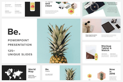 Source: Design Shack
5. Make sure all of your objects are properly aligned.
Having properly aligned objects on your slide is the key to making it look polished and professional. You can manually try to line up your images … but we all know how that typically works out. You’re trying to make sure all of your objects hang out in the middle of your slide, but when you drag them there, it still doesn’t look quite right. Get rid of your guessing game and let PowerPoint work its magic with this trick.
How to align multiple objects:
- Select all objects by holding down “Shift” and clicking on all of them.
- Select “Arrange” in the top options bar, then choose “Align or Distribute.”
- Choose the type of alignment you’d like.
How to align objects to the slide:
- Select all objects by holding down “Shift” and clicking on all of them.
- Select “Arrange” in the top options bar, then choose “Align or Distribute.”
- Select “Align to Slide.”
- Select “Arrange” in the top options bar again, then choose “Align or Distribute.”
- Choose the type of alignment you’d like.
PowerPoint Design
6. Use “Format Menus” to better control your objects’ designs.
Format menus allow you to do fine adjustments that otherwise seem impossible. To do this, right click on an object and select the “Format” option. Here, you can fine-tune shadows, adjust shape measurements, create reflections, and much more. The menu that will pop up looks like this:
Although the main options can be found on PowerPoint’s format toolbars, look for complete control in the format window menu. Other examples of options available include:
- Adjusting text inside a shape.
- Creating a natural perspective shadow behind an object.
- Recoloring photos manually and with automatic options.
7. Take advantage of PowerPoint’s shapes.
Many users don’t realize how flexible PowerPoint’s shape tools have become. In combination with the expanded format options released by Microsoft in 2010, the potential for good design with shapes is readily available. PowerPoint provides the user with a bunch of great shape options beyond the traditional rectangle, oval, and rounded rectangle patterns, unlike even professional design programs like Adobe Creative Suite or Quark.
Today’s shapes include a highly functional Smart Shapes function, which enables you to create diagrams and flow charts in no time. These tools are especially valuable when you consider that PowerPoint is a visual medium. Paragraphing and bullet lists are boring — you can use shapes to help express your message more clearly.
8. Create custom shapes.
When you create a shape, right click and press “Edit Points.” By editing points, you can create custom shapes that fit your specific need. For instance, you can reshape arrows to fit the dimensions you like.
Another option is to combine two shapes together. When selecting two shapes, right-click and go to the “Grouping” sub-menu to see a variety of options.
- Combine creates a custom shape that has overlapping portions of the two previous shapes cut out.
- Union makes one completely merged shape.
- Intersect builds a shape of only the overlapping sections of the two previous shapes.
- Subtract cuts out the overlapping portion of one shape from the other.
By using these tools rather than trying to edit points precisely, you can create accurately measured custom shapes.
9. Crop images into custom shapes.
Besides creating custom shapes in your presentation, you can also use PowerPoint to crop existing images into new shapes. Here’s how you do that:
- Click on the image and select “Format” in the options bar.
- Choose “Crop,” then “Mask to Shape,” and then choose your desired shape. Ta-da! Custom-shaped photos.

Learn more about creating images for your marketing channels in the video below.
10. Present websites within PowerPoint.
Tradition says that if you want to show a website in a PowerPoint, you should just create link to the page and prompt a browser to open. For PC users, there’s a better option.
Third party software that integrates fully into PowerPoint’s developer tab can be used to embed a website directly into your PowerPoint using a normal HTML iframe. One of the best tools is LiveWeb, a third-party software developed independently.
By using LiveWeb, you don’t have to interrupt your PowerPoint, and your presentation will remain fluid and natural. Whether you embed a whole webpage or just a YouTube video, this can be a high-quality third party improvement.
Unfortunately, Mac users don’t have a similar option. Agood second choice is to take screen shots of the website, link in through a browser, or embed media (such as a YouTube video) by downloading it directly to your computer.
11. Try Using GIFs.
GIFs are looped animated images used to communicate a mood, idea, information, and much more. Users add GIFs to Powerpoints to be funny or quickly demo a process. It’s easy to add GIFs to your slides. To do so, simply follow these steps:
- Download and save the GIF you want.
- Go to the slide you want the GIF on.
- Go to the “Home” tab, and click either “Insert” or “Picture”.
- From the “Picture” drop-down menu, choose “Picture from File”.
- Navigate to where you saved your GIF and select it. Then, choose “Insert”.
- To play the animated GIF, click the “Slide Show” tab and then “Play from Current Slide”.
PowerPoint Process
12. Keep it simple.
PowerPoint is an excellent tool to support your presentation with visual information, graphics, and supplemental points. This means that your powerpoint should not be your entire presentation. Your slides — no matter how creative and beautiful — shouldn’t be the star of the show. Keep your text and images clear and concise, using them only to supplement your message and authority.
If your slides have dense and cluttered information, it will both distract your audience and make it much more likely that you will lose their attention. Nothing in your slides should be superfluous! Keep your presentation persuasive by keeping it clean. There are a few ways to do this:
- Limit bullet points and text.
- Avoid paragraphs and long quotes.
- Maintain “white space” or “negative space”.
- Keep percentages, graphs, and data super basic.
13. Embed your font files.
One constant problem presenters have with PowerPoint is that fonts seem to change when presenters move from one computer to another. In reality, the fonts are not changing — the presentation computer just doesn’t have the same font files installed. If you’re using a PC and presenting on a PC, then there is a smooth work around for this issue. (When you involve Mac systems, the solution is a bit rougher. See Tip #11.)
Here’s the trick: When you save your PowerPoint file (only on a PC), you should click Save Options in the “Save As …” dialog window. Then, select the “Embed TrueType fonts” check box and press “OK.” Now, your presentation will keep the font file and your fonts will not change when you move computers (unless you give your presentation on a Mac).
14. Save your slides as JPEGs.
In PowerPoint for Mac 2011, there is no option to embed fonts within the presentation. So unless you use ubiquitous typefaces like Arial or Tahoma, your PPT is likely going to encounter font changeson different computers.
The most certain way of avoiding this is by saving your final presentation as JPEGs, and then inserting these JPEGs onto your slides. On a Mac, users can easily drag and drop the JPEGs into PPT with fast load time. If you do not use actions in your presentation, then this option works especially well.
If you want your presentation to appear “animated,” you’ll need to do a little tinkering. All you need to do is save JPEGs of each “frame” of the animation. Then, in your final presentation, you’ll just display those JPEGs in the order you’d like the animation to appear. While you’ll technically have several new slides in place of one original one, your audience won’t know the difference.
An important consideration: If your PPT includes a lot of JPEGs, then the file size will increase.
15. Embed multimedia.
PowerPoint allows you to either link to video/audio files externally or to embed the media directly in your presentation. You should embed these files if you can, but if you use a Mac, you cannot actually embed the video (see note below). For PCs, two great reasons for embedding are:
- Embedding allows you to play media directly in your presentation. It will look much more professional than switching between windows.
- Embedding also means that the file stays within the PowerPoint presentation, so it should play normally without extra work (except on a Mac).
Note: Mac OS users of PowerPoint should be extra careful about using multimedia files.
If you use PowerPoint for Mac, then you will always need to bring the video and/or audio file with you in the same folder as the PowerPoint presentation. It’s best to only insert video or audio files once the presentation and the containing folder have been saved on a portable drive in their permanent folder. Also, if the presentation will be played on a Windows computer, then Mac users need to make sure their multimedia files are in WMV format. This tip gets a bit complicated, so if you want to use PowerPoint effectively, consider using the same operating system for designing andpresenting, no matter what.
16. Bring your own hardware.
Between operating systems, PowerPoint is still a bit jumpy. Even between differing PPT versions, things can change. One way to fix these problems is to make sure that you have the right hardware — so just bring along your own laptop when you’re presenting.
17. Use “Presenter View.”
In most presentation situations, there will be both a presenter’s screen and the main projected display for your presentation. PowerPoint has a great tool called Presenter View, which can be found in the “Slide Show” tab of PowerPoint 2010 (or 2011 for Mac). Included in the Presenter View is an area for notes, a timer/clock, and a presentation display.

For many presenters, this tool can help unify their spoken presentation and their visual aid. You never want to make the PowerPoint seem like a stack of notes that you use a crutch. Use the Presenter View option to help create a more natural presentation.
Pro Tip: At the start of the presentation, you should also hit CTRL + H to make the cursor disappear. Hitting the “A” key will bring it back if you need it!
With style, design, and presentation processes under your belt, you can do a lot more with PowerPoint than just presentations for your clients. PowerPoint and similar slide applications are flexible tools that should not be forgotten.
Want more? Read 20 Great Examples of PowerPoint Presentation Design.

The Ultimate Guide to Platforms and How They Can Benefit Your Business
Once upon a time, the typical business tool belt was sprinkled with digital tools: email marketing software here, website CMS there, and perhaps software for accounting and tracking sales.
In the last decade or so, software has become more intelligent, consumers have become more engaged and easier to learn from … and business owners have become overwhelmed. What was once a manageable tool belt has become an overflowing tool box akin to what you’d find in a construction worker’s pick-up truck.
According to a recent marketing technology study, the average marketer is using around 12 software tools a day — with some using up to 31. And this doesn’t even consider any sales, support, HR, or finance tools those businesses are using, too.
Wow.
As versatile as technology can be, it doesn’t necessarily doesn’t solve the challenge of how to manage, connect, and align all of these different tools. With the sheer amount of software and technology on the market today, is it even possible to return to that convenient toolbelt our entrepreneurial forefathers once knew and loved?
Yes — with a platform. Platforms are the key to creating a centralized home base for all of your marketing technology and more.
We compiled this guide to teach you all about platforms, their various applications, and why your business should consider adopting one.
The concept of platforms isn’t new. In fact, platforms are practically as old as civilization itself — dating back to the marketplaces and bazaars of Ancient Rome. In more recent years, shopping malls and auction houses have taken over this brick-and-mortar representation.
Thanks to the rapid rise of technology, platforms have become mainly digital. Scott Brinker, HubSpot’s VP of Platform Ecosystem, defines this type of platform as “a hub, with spokes connecting other products to its center. The hub binds those disparate products together and orchestrates them in a common mission.”
A platform makes it possible to connect tools, teams, data, and processes under one digital roof — it creates that tool belt we discussed above. It’s the nucleus of all systems and allows you to connect all your favorite tools seamlessly using integrations.
Take a look at HubSpot’s Integrations and Applications Marketplace to see some of the integrations that work with your HubSpot software.
Keep reading to learn how platforms work and how they can benefit your business.
How Platforms Work
Traditional businesses follow a linear model of business, where they manufacture products or services and conduct transactions with other businesses or consumers. These businesses also own their inventory, and consumers access them to purchase their inventory.
Platform businesses, on the other hand, follow a circular model of business, where they enable and facilitate transactions between two parties without creating, manufacturing, or owning inventory. Consumers use platforms to purchase products or services from other platform users.
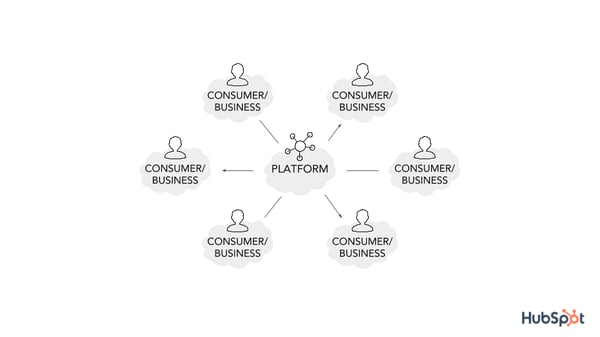
Platforms businesses have proven to be highly valuable — to consumers and investors alike. Did you know that six of the top 10 companies by market capitalization are platforms? That’s right: Apple, Microsoft, Amazon, Alphabet (Google), Facebook, and Alibaba.
It’s clear that in today’s economy, who a company connects with is more important than the product or service they own and sell.
Like we said above, platforms enable interactions and transactions between interdependent groups. These direct interactions inherently create supply (from a seller, service provider, or producer) and demand (from a buyer, service seeker, or consumer) — benefiting both parties.
While traditional businesses create value by creating products or services, platforms create value by enabling these transactions.
Here’s what that transaction typically looks like:
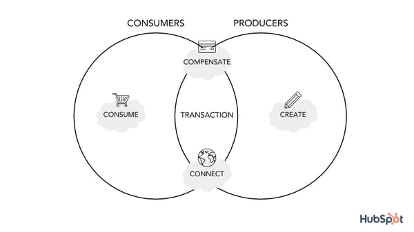
A platform’s success is dependent on more than these transactions, though. Platforms must also attract consumers and producers, enable matches between these two groups, and provide the right technology to aid a transaction — all while maintaining rules and standards that protect both parties as well as the platform itself.
Here’s what the cycle of these four functions typically looks like:
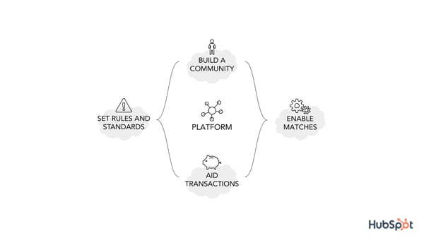
Platform Benefits
The platform business model has revolutionized business and technology as we know it. Here are a few reasons why.
Platform business models grow faster and scale better.
Platforms that follow the platform business model can grow or scale rapidly because they don’t own the resources that create the value, i.e. the applications, content, service providers, or products. Their growth isn’t contingent upon resources or capital.
Platform business models build a reciprocal, self-sufficient community.
Platforms that follow this business model enjoy “two-sided network effects,” meaning that demand is created from the supply of both buyers and sellers, providers and users, or creators and consumers.
This equates to fewer advertising dollars (to attract either buyers or sellers) and stronger word-of-mouth marketing. It also creates a “win-win” situation that allows both the platform business and service providers or sellers to profit from users.
Platforms solve for connection and efficiency issues.
As marketers (or salespeople or support representatives), we tap into dozens of tools each day. In fact, there are almost 7,000 marketing technology vendors globally. Platforms create a centralized location for the tools and applications we use to grow our businesses, reach our customers, and collaborate with our teams.
Time and energy are two things that businesses don’t have to spare. Platforms that follow the platform business model become a one-stop-shop for user’s day-to-day processes.
We’ve defined a platform, and we’ve talked about how platforms have important business ramifications. Next, we’ll cover some real-life platform business model examples, their impact, and how they’ve become successful.
Platform Business Model Examples
How do platforms play out in everyday life? Surprisingly, you’re regularly using more platforms than you realize. Let’s dive into some platform business model examples that will help round out your understanding of the topic.
Airbnb
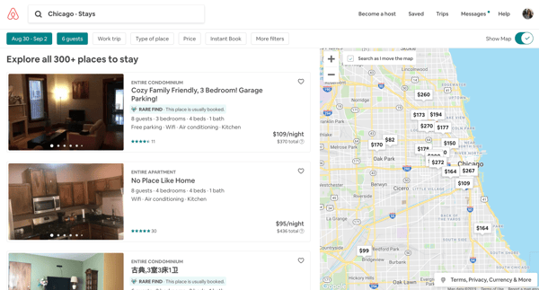
When planning a vacation and deciding where to stay, the first thing I do is hop on my Airbnb app. I could visit a website like Hotels.com or Google to search for places to stay (which are both platforms, too), but I always choose Airbnb. Why? Not only does it allow me to “live like a local” wherever I’m visiting, but it’s relatively affordable and provides me with a wide variety of lodging.
Airbnb has revolutionized the hospitality and lodging industry. For a company that owns no property, it has beat out some of the most popular hotel chains.
Airbnb has also become successful because of its suppliers — normal people like you and me. Airbnb buyers (guests) attract Airbnb suppliers (property owners), therefore fostering a reciprocal ecosystem that benefits both Airbnb and its users alike.
Uber
Similar to the way Airbnb doesn’t own any properties, Uber doesn’t own any cars … yet it’s given the taxi industry a run for its money. Sure, it’s almost always cheaper, but it also provides a much more modern and arguably safer experience. Riders can pay digitally, split the fare with other riders, and track their ride all the way to the destination.
Uber drivers also receive perks. They control their driving schedule, have access to frequent bonuses, and can find passengers wherever they are — without having to wait at a taxi stand or long queue.
The Uber platform supports both parties. By managing payment, ratings, and all dispute resolutions, Uber makes it easy to be both a driver and rider — and only takes a small percentage of earnings.
Chances are, you didn’t realize Facebook is a platform. Think about it: Facebook produces no original content and owns no media … yet, it collects data and brings in tons of advertising revenue. Talk about brilliant. In fact, you can consider almost every other social network to be the same.
By creating a fun, interactive place for people to connect and share content, Facebook has built one of today’s most influential platforms. Content created by Facebook users attracts other Facebook users who create more content … so on, and so forth. Facebook is a great example of a platform’s reciprocal network effects that create monetization opportunities for the platform itself.
Amazon
Amazon currently sells over 12 million products to over 310 million active users worldwide — and that product count doesn’t include books, wine, media, and services.
What’s even more fascinating? Amazon doesn’t own the vast majority of the products they sell. Sure, it owns warehouse space, advertising space, a handful of product lines, and now transportation fleets … but it primarily sells other companies’ inventory. It enables (easy, quick, and cheap) transactions between sellers and buyers.
On top of that, Amazon brings in billions from advertising, seller fees, and Prime membership subscriptions.
Medium
Medium rocked the online publishing world when it was released in 2012. Bloggers, writers, and journalists could publish content online (without cost) without having to worry about hosting a website or getting their work approved by editors. In fact, large news sources and companies — including Sports Illustrated and the White House — started publishing content on Medium, too.
It became a content free-for-all, and readers benefited all the same. Readers could visit Medium and access a variety of fresh content from thousands of writers. As a platform, Medium manages its website … and that’s about it. The corporation doesn’t publish any content of its own, nor does it employ any writers. It simply connects readers and writers to produce and consume great content.
HubSpot
Last year, HubSpot announced that it’s transitioning from an “all-in-one suite vs. all-on-one platform”. This means that it’s expanding to adopt hundreds of more integrations to benefit customers and help them easily expand their tool belt — instead of requiring them to add and master even more disparate systems.
In short, more disconnected software means more friction (and frustration) for customers. Folks are used to either using too many tools that don’t connect or using archaic platforms that don’t solve for today’s buyer (a.k.a. your customers). HubSpot plans to fix that.
The HubSpot platform will allow you to seamlessly connect your tools, teams, data, and processes so you can power frictionless experiences for your customers.
Grow Better With Platforms
Platforms business have revolutionized the economy and how other companies conduct business. Not only do they bring together consumers and producers and create a valuable network, but they also solve countless connection and efficiency issues.
If you’re juggling dozens of marketing tools, consider working with a platform to help streamline your tools, teams, data, and processes. In the meantime, keep an eye out for the platform businesses around you — you might be surprised by how many you already use on a daily basis.
