
15 Free Professionally-Designed Landing Page Templates
When it comes to turning web visitors into leads, 68% of B2B CEO’s use strategic landing pages as part of their strategy.
A strong landing page usually offers your website’s visitors a resource, such as a piece of content, in exchange for contact information. Sharing or hyperlinking to the URL of a landing page, rather than a homepage, also increases the likelihood of turning traffic into conversions.
While landing pages can play a vital role in lead generation, they don’t have to be complicated. In fact, you should aim for a page that’s concise and inviting, rather than complex and overwhelming. Rather than just placing a rigorous contact form on a page, it can be more productive to tease an interesting offer or a free resource in exchange for only a small amount of information.
Even when you know what you’re going to offer and what information you’d like to receive from a visitor, the idea of building a landing page can still feel daunting.
If you don’t have the bandwidth to build a page yourself, have little experience in design software, or have limited resources to hire a designer, using a pre-designed template could be the most efficient way to launch a professional looking page in a short amount of time.
We’ve put together a list of 15 free, easy-to-use templates that can guide you through the process of building your next landing page.

15 Free Professionally-Designed Landing Page Templates
1. Royce
Available on Squarespace
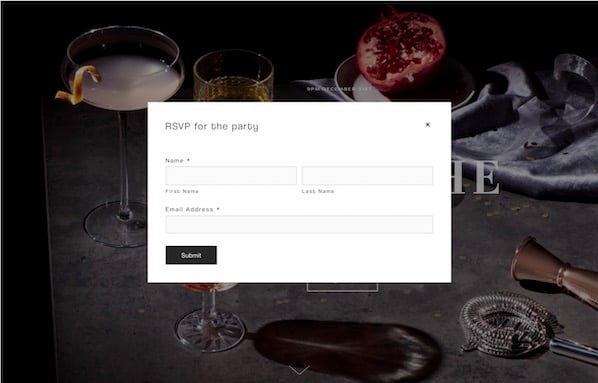
Royce is specialized for event reservations. There is no navigation bar, but the layout features a customizable background image, a headline, and a call-to-action button that says “RSVP.”

To fill out the form and reserve a spot, visitors can click the RSVP button to see a form appear, or scroll down below the fold to see a static reservation form. This is an interesting template because it amplifies visuals and keeps the layout simple while still offering visitors two ways to convert.
2. Invest
Available on HubSpot
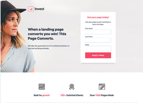
This design includes a photo, customizable text, no navigation (to keep visitors focused on your offer), and a short form. Users can also customize and add other elements such as the icons seen at the bottom of the image. Below the fold, users can also add more information about the offer or company.
3. Hubstrap
Available on HubSpot
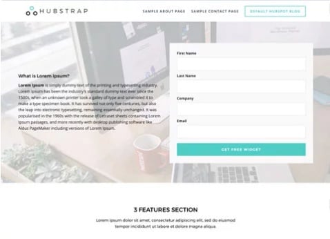
The Hubstrap template has a simplistic look and feel but devotes a bit more room to text. This might be a good option if your content offer has less imagery to go with it. For example, you might use this page to describe an offer or a long whitepaper on a topic related to your industry. Users can similarly personalize the design and add drag-and-drop sections to the page.
Unlike the above landing pages, this example does include navigation. However, it’s simple enough that it doesn’t detract from the offer.
4. Landing Form
Available on HubSpot
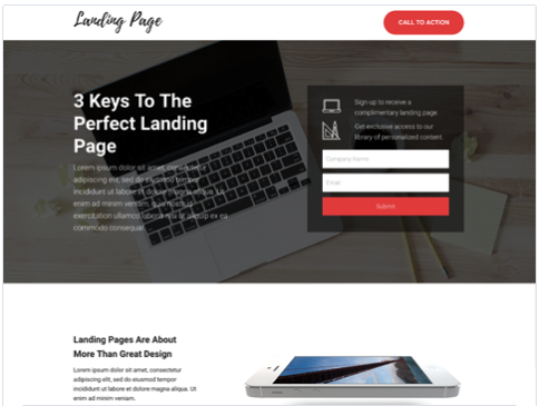
This template includes a background image with a dark overlay, a headline, text, bright call-to-action buttons, and a form. It eliminates the navigation bar but includes a button at the top of the page. The image also has a dark overlay to keep it visible, but less distracting. As you scroll below the fold, this template also includes spots for more imagery and details that could relate to the product or offer.
5. Gradient
Available on HubSpot
Gradient is sleekly designed for a content-based offer. It has a simple layout with a form, headline, description text, photo, and logo, but continues the theme of no navigation. Like the other HubSpot templates, users can add a photo or product shot, a background image that appears behind a gradient color, and descriptive text. They can also adjust or change the gradient background’s color.

6. University
Available on Wix
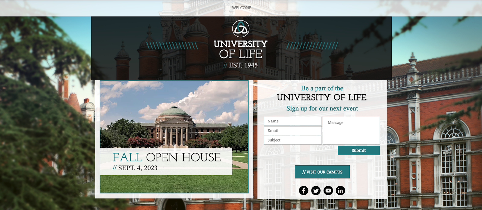
This layout may be useful for those seeking leads for an educational event, course, or a similar service. The form is more detailed, but the layout itself also allows room for more text and imagery. Above the fold, you can see a headline, supporting images, and a form. If you keep scrolling, there are additional sections where more text and imagery can be placed.
7. Skyline
Available on Wix
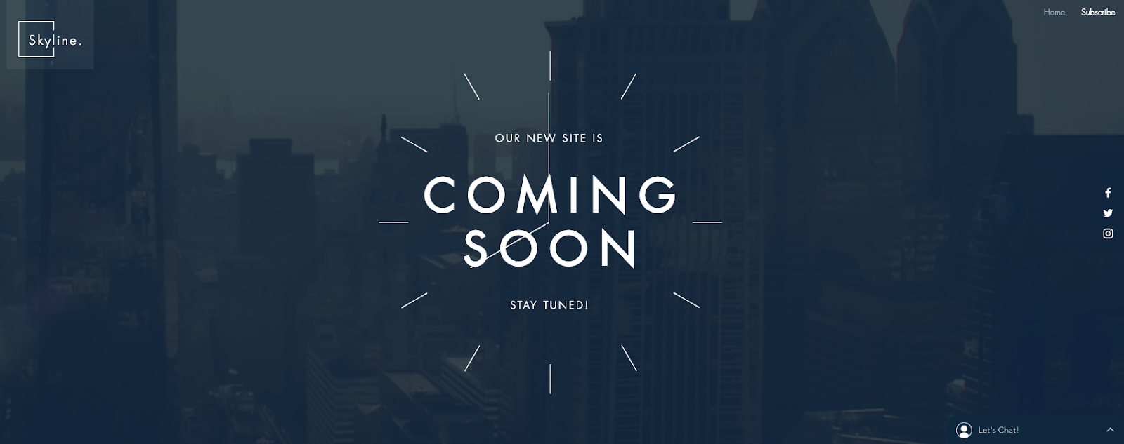
This template may be helpful to a company or individual that hasn’t yet launched a website or product but still wants to gain early leads in the meantime. Above the fold, there’s a giant headline area, where the template has “Coming Soon” printed.
When you scroll down, you can see a quick description of the company and a box where visitors can add their email. Users can also add a photo or video to the background.

8. Online Store Coming Soon
Available on Wix
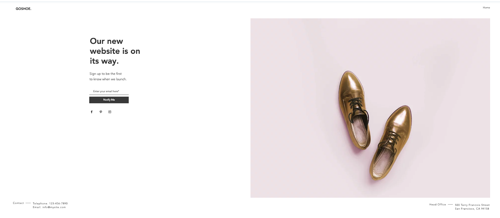
This template is very simple. Like the above “Coming Soon” template, the text could be edited to use this layout for a different purpose. There is no navigation and any information about the company is off to the corners. This layout allows space for a clear product shot, as seen with the shoes. Headline text, a small amount of descriptive text, an email box, and a button are pre-designed in the layout. Users can also link their social media accounts to the icons under the “Notify Me” button.
9. Lead-Gen Landing Page
Available on Wix
This template seems specialized for B2B products. It allows users to edit and customize the text and images through Wix. Users can also place background videos into the layout. The page is designed to be long, with the form and call-to-action above the fold followed by sections that detail different aspects of a company or firm, such as staff information.

10. Fagri
Available on WordPress.org
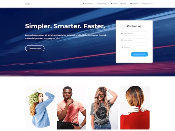
Fagri was designed broadly for multiple purposes and industries. According to its description, the theme’s widgets, such as the contact form are customizable. Users can also change the text and images. Although there is a navigation bar, the layout’s design still draws attention to the text, call-to-action buttons, and the contact form.
11. Real Estate Landing Page
Available on Wix
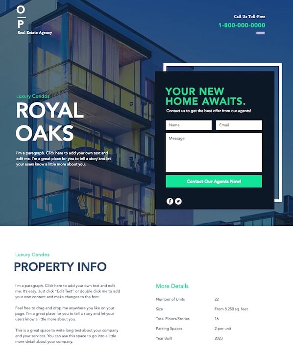
Although this template doesn’t offer a resource for information, it can be edited and customized to include an offer. As you scroll down the page, the background image can remain static. With the current page’s design, there is room to add company information below the fold. There is also a second form at the very bottom so visitors will have another chance to convert.
12. Construction and Lawyer Landing Pages
Both Available on WordPress.org
WordPress also offers two similar Lawyer Landing Page and Construction Landing Page templates. Although the original designs are targeted at the two job fields, they can be customized to fit other brands and industries. Both have a header image, overlaid text, and an arrow pointing to a decently sized form above the fold. They also both offer the visitor a free quote.
13. Gardenhouse
Available on MailChimp

This template does not include a navigation bar, which forces a visitor to focus on the given offer. Towards the bottom of the page, it can be customized to include logos or other company information. Like all MailChimp landing page themes, this layout is optimized for mobile and will automatically adjust to different screen sizes.
14. Bandmates
Available on MailChimp
This template is also pretty simple with room for customization. It similarly removes navigation and keeps the company logo, text description, and a subscribe form above the fold.
Users can also drag in more elements, like text or form boxes, into the design. Just below the form, users can include a product shot or another image. The blue background allows the form and call-to-action button to pop, but these colors can also be customized to fit your brand.

15. O-Book
Available on Unbounce
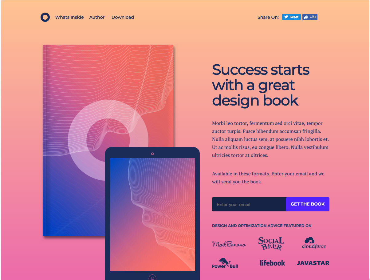
Unbounce layouts come with its subscription, but here’s one of the landing pages that you can test out with a free 14-day trial. This template is focused on book-specific lead generation. There is a clear spot for a product image, headlines, detailed description text, and a form box.
The top navigation is minimal, but it does include social media buttons. Since this layout is only free for a trial period, this might be a better option for a company that has already gained revenue from landing pages and is looking to test out a more detailed, but affordable design.
Landing Page Best Practices
The above templates already follow a number of landing page best practices. For example, many of them exclude a navigation bar, which may detract attention or clicks away from the offer on the page. Most of them also leave room for a photo or video. While photos offer a great product tease, videos have also been seen to increase conversions by 86%.
To learn about other landing-page best practices, check out this guide.

The 15 Best WordPress Booking Plugins in 2019
The more you can automate, the more you can focus on delivering value for your customers. However, it can be difficult to create automated processes without diminishing the customer experience.
Fortunately, certain tools are able to provide both efficiency for you and satisfaction for your customers — and one of those tools is a WordPress booking and scheduling plugin.
In fact, a myriad of WordPress booking plugins exist to help you save time while actually providing a smoother and more convenient experience for your customers.
Take a look at this list of WordPress booking plugins, which can help you free yourself up to focus on the more important aspects of your business by increasing your efficiency, eliminating stress, and providing clarity.

The 6 Characteristics of the Best WordPress Booking Plugins
How do you know which plugin is best for your business? Good WordPress booking plugins do the following:
- Provide customers with your work hours and availability.
- Allow them to choose a time.
- Encourage customer input.
- Save the input in a customer database.
- Automatically save your event to the calendar.
- Send confirmation notification to you and your customer, and tells you both if there are changes to your event.
If the tool does all of the above, you’ve got a keeper. However, each tool varies in their pricing structure, so make sure to find the one that best fits your needs.
1. HubSpot Meetings
Price: Plans range from free to $3,200 per year, based on your needs
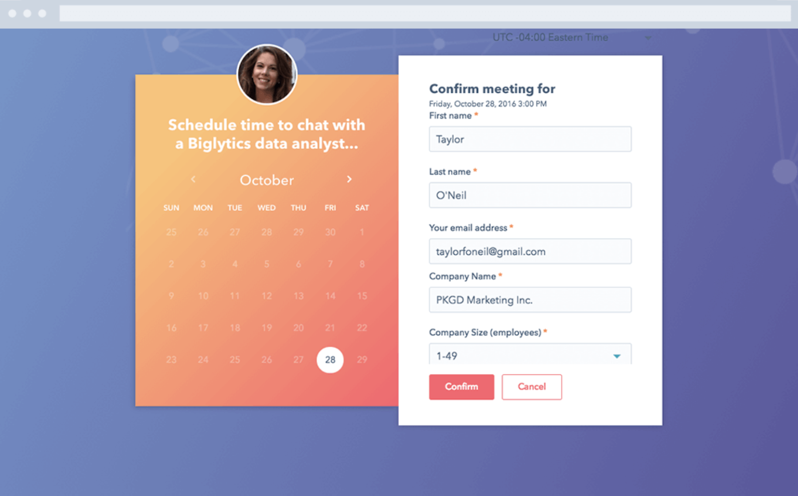
Hubspot Meetings is a simple yet powerful booking app that allows you to share your calendar and availability with anyone through a unique link.
It starts out for free, but on the paid tiers, you can also embed the calendar onto your site so clients can pick and choose bookings based on your availability, even if they don’t have access to your unique link.
The app integrates with the HubSpot WordPress plugin, and it also pipes all the data directly into the HubSpot free CRM, making this a winner on the data integration and organization front.
2. Bookly
Price: Free, or Pro for $89/month
Bookly is a WordPress plugin designed to smooth your scheduling system while simultaneously creating a customer database from the booked appointments.
The process is automated and is integrated with the WPML plugin to facilitate multilingual web pages. Optimized for mobile use, Bookly allows you to offer discounts and options for recurring payments and appointments.
Additionally, Bookly lets you do group bookings, so this service is perfect for companies offering appointment-based services such as tutoring, beauty appointments, massages, etc.
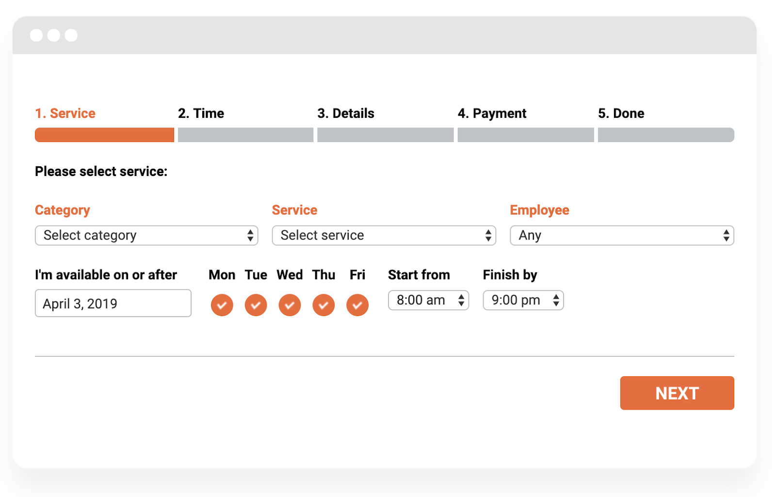
3. Booked
Price: $49
Booked is a frontend shortcode calendar for booking appointments with strong backend features to help you manage your bookings or appointments. This widget translates your calendars if needed, and enables you to customize the colors to match your branding.
You can show your availability as well as when you’re on vacation — additionally, you can build in buffers before and after every meeting, or for a certain amount of time after the present date to incorporate time to prepare.
The customer creates an account and selects their time, but you can manage your appointments from the backend and send out individualized notifications if needed. There’s also an option for your users to “Add to Google Calendar.”
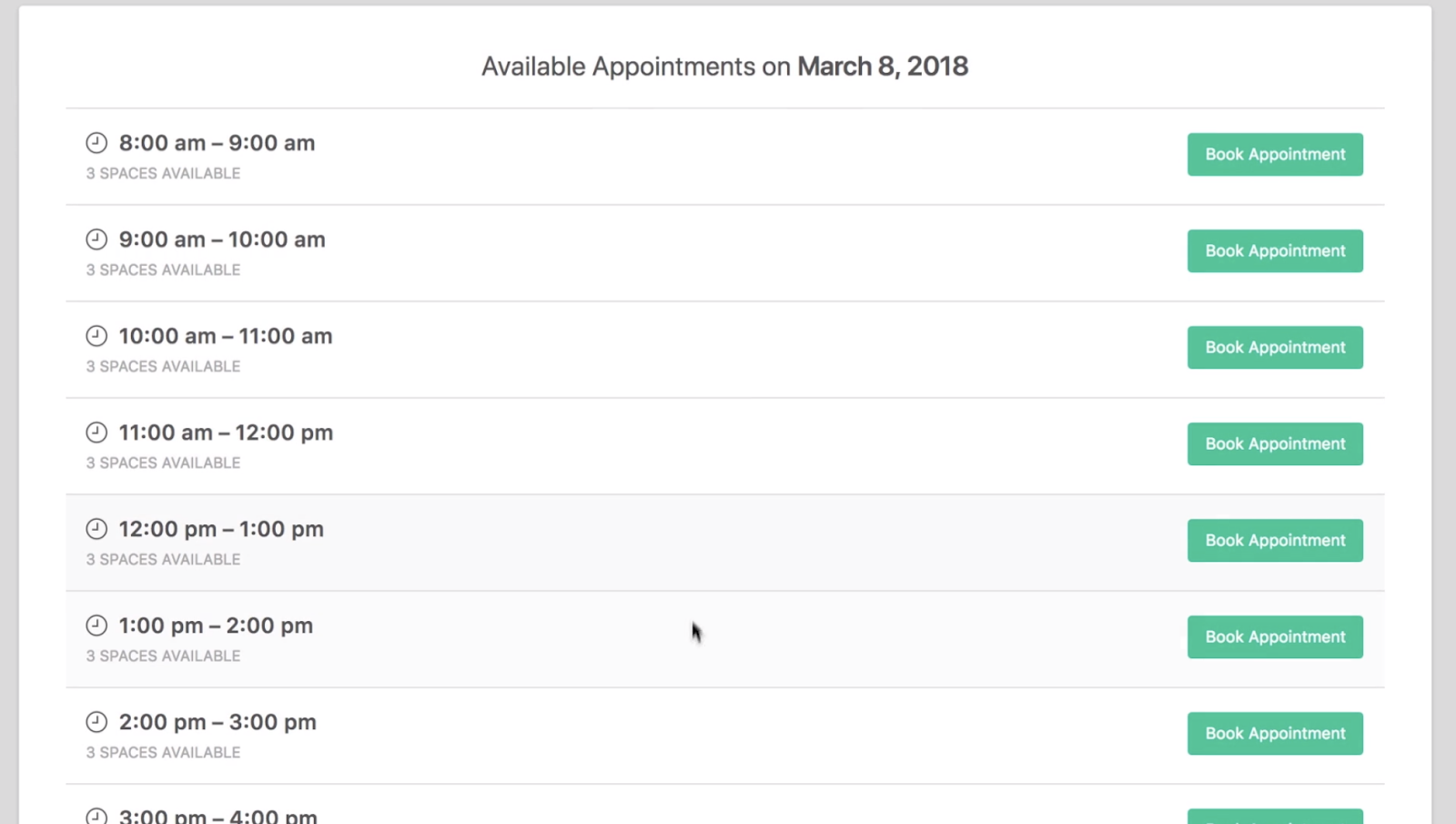
4. Team Booking
Price: Pricing starts at $28/month
Team Booking is a customizable booking app that integrates specifically with Google Calendar. It allows you to divide your availability by room, employees, time, or service offered.
Team Booking is a collaborative tool and comes with shortcodes on the frontend, so it’s user-friendly and easy to maintain a group calendar, as well as an individual one.
Calendar events are available times customers can book. Once the event is booked, notifications are sent to each party involved. Customers can pay directly with PayPal or Stripe, and once they book or fill out a reservation form, their information is saved in a customer database that you can download.
Team Booking is integrated with WPML and converts time zones to eliminate confusion with international companies or teams.

5. WooEvents
Price: Pricing starts at $39 per month
WooEvents is an event scheduler that lets customer sign up and schedule their own events based on availability, but also lets you sell tickets. It has a calendar function with email notifications for event changes, but also provides a mapping function for people to find the event location.
You can sell custom types of tickets, see your event status, and limit how many people can book. Once they’ve booked, their data is entered into a customer database.
WooEvents works with iCal and Google Calendar. You can manage all of your current events, delete past ones, and set up recurring events for the future.
Users can pay through the WooEvents widget as it boasts integrations with several companies like PayPal and Stripe, and it has short code for placing links on your site.

6. Booking Calendar
Price: Custom pricing based on your needs
Booking Calendar operates directly out of your WordPress site and allows you to manage reservations and bookings without leaving WordPress. Plus, it develops a client database once the booking is made.
Bookings are kept in your WP database, so there’s no need to have a database management tool. It’s optimized for mobile and can process payments through third-party services like Stripe or PayPal. It’s one of the most-installed WP plugins out there.
Available functionalities for Booking Calendar depend on your needs, number of clients, and budget, but the premium version offers tons of features that are easily customizable to your business needs.
It’s not just good for services, either — huge hotel chains, equipment rental companies, and doctor offices can use this plugin for appointments or resource scheduling.

7. WP Simple Booking Calendar
Price: Tiered pricing ranging from free to $139/month
WP Simple Booking Calendar is ideal for house or apartment rental companies. It’s aesthetically pleasing with a simple, user-friendly design. Additionally, shortcodes are provided for you to embed on your site.
Users can see the unbooked dates for properties they’re interested in, and managers can easily alter bookings from the backend as needed. WP Simple Booking Calendar allows for website translation, which is crucial if your website is booking international clients.
The free version should be more than enough for most people, but pricing goes up to $139 per month if you need more advanced services.

8. Advanced Booking Calendar
Price: The plugin is free, Pro is $56.10 USD for six months, or $72.93 USD for one year
Advanced Booking Calendar is an excellent mobile-optimized WordPress booking plugin, and works particularly well for hotels or B&B rental companies. It offers a calendar that displays availabilities, which allows you to adjust prices seasonally, per room, or for certain services.
It’s a little different from others in this list because it works with your Google Analytics account to monitor a user’s trajectory through your booking form. This enables you to identify warm leads and friction points.
Once a guest creates an event, every person involved receives a notification confirmation (email templates are provided) and customer data can be stored in the form of cookies.

9. WP Quick Booking Manager Pro
Price: Pricing starts at $26 per month
The WP Quick Booking Manager Pro plugin has a strong administrative backend feature that makes this tool appealing for those who want more power over their calendar. Here, administrators can edit, add, confirm, decline, or delete events, and change the CSS from the backend.
This is an excellent plugin if you run a hotel or are renting out apartments and B&Bs because it allows for photo galleries, and also boasts a PayPal integration.
Additionally, there’s no cap on the number of events or bookings created in the calendar, and you can book directly from the website, which shows your full calendar availability.
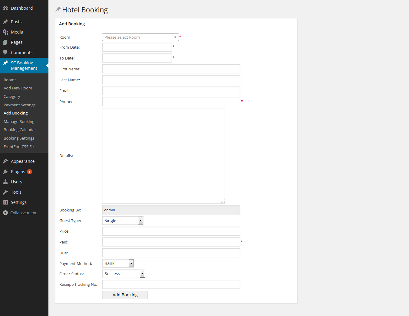
10. WooCommerce Easy Booking
Price: Custom pricing
WooCommerce Easy Booking has many of the features of the other calendar plugins and widgets here, but its pricing structure is really what sets it apart. You can rent WooCommerce as needed, from daily to annually, an option which other products don’t offer.
Visit the website and answer a few simple questions to calculate your individual price. The eCommerce toolkit works well with this, and both are optimized for the mobile experience.
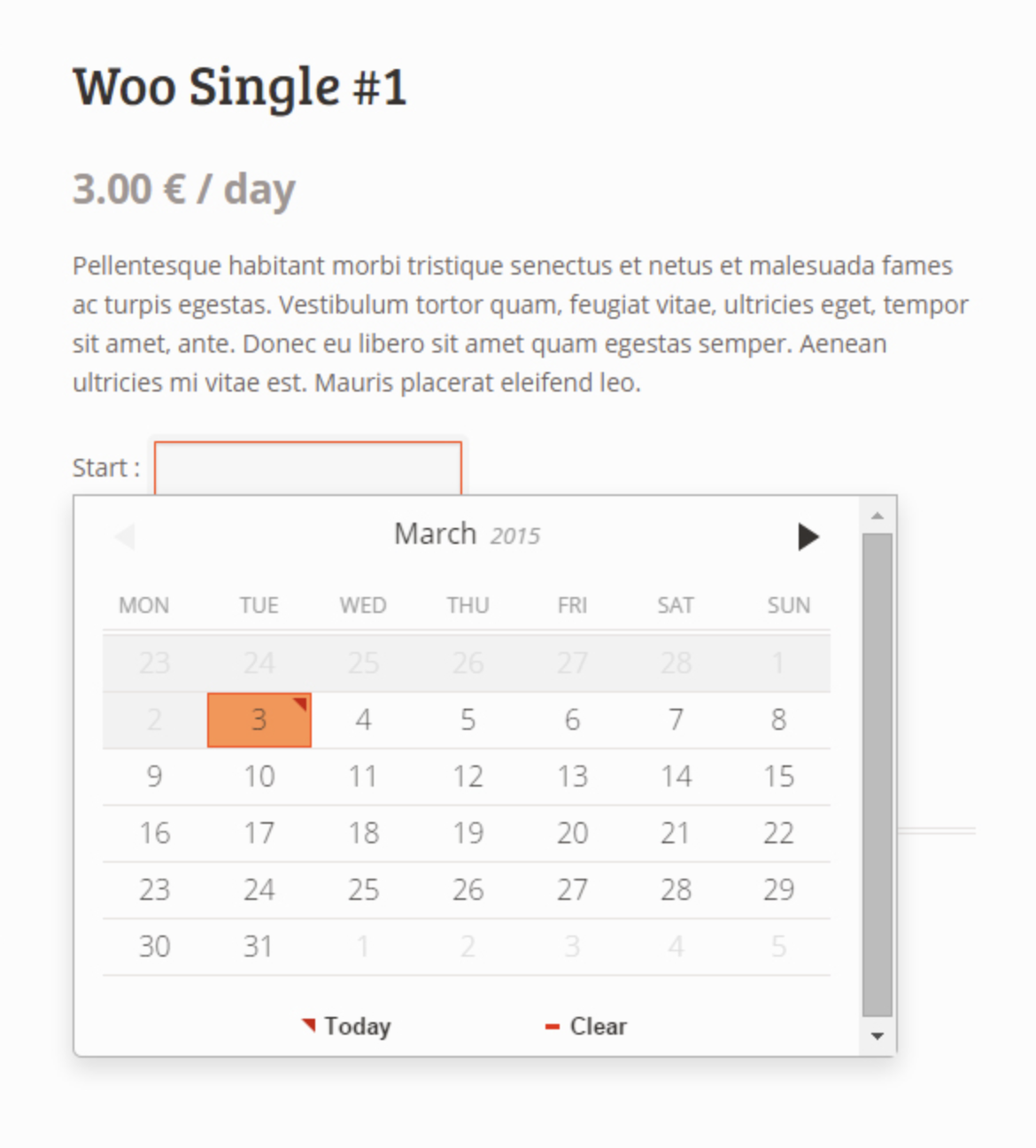
11. EDD Bookings
Price: Prices range from $80 per year to $250 per year
EDD Bookings makes the dream of single-page admin design a reality. Each calendar can be customized by category, color, and time zone to reflect the needs of users, all of which is optimized for mobile.
Emails notify involved parties once the customer creates an event or appointment, and there’s no cap on how many events can be generated. Events can be sorted by multiple filters, including length of session, price of service, etc., and activities can be assigned to certain employees.
On the backend, EDD Bookings provides an analytics dashboard and customer database, as well as accounting tools and payment integrations including PayPal.

12. Amelia
Price: $59
Amelia is a round-the-clock WordPress booking service with a minimal, intuitive design made to smooth your booking workflow. The plugin requires as little as 2-3 clicks per booking, and offers online payment options. It has a dashboard explaining crucial KPIs to monitor, and an analytics tool to provide that data.
Amelia is simplistic and can be customized to reflect your brand colors. It’s integrated with Google Calendar, WooCommerce, PayPal, and Stripe, and provides quick booking shortcodes for your web pages.
Your users can choose the time, date, place, service, employee, or other necessary filters to find the right time slot. Amelia sends SMS notifications to you and the customer, and you can manage appointments from the administrative dashboard if needed.
Amelia is unique in that it suggests demo sites with a WordPress theme for your site to emulate based off of your industry’s standards, so that you remain neck-and-neck with your competition is terms of mobile optimization, service, and user-friendliness.

13. Event Booking Pro
Price: $33 for six months, $170 for extended license over six months
Event Booking Pro is an exceptional WordPress booking plugin if you’re looking for a solution that provides ticket-selling software. It’s made with single-page bookings in mind to keep everything as simple as possible.
Shortcodes are given so you can embed your calendar or events on your website, which will display your calendar availability as well as which days you’re unavailable.
PayPal works through the site so you can sell tickets and send coupons. You can sell tickets with Event Booking Pro, and you can customize notification emails that get sent to any user who books with you.

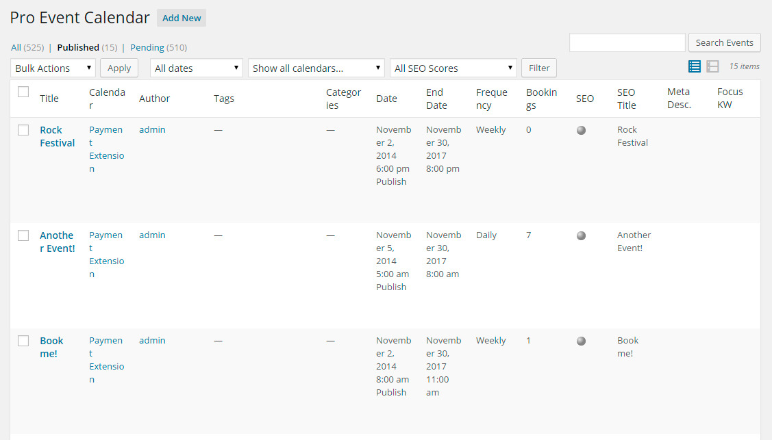
14. WordPress Pro Event Booking Calendar
Price: $33 for the regular license, $125 for the extended license
WordPress Pro Event Calendar operates similarly to the other booking plugins on this list, but stands out in some critical ways — one of which is the ability for customers to enter their individual events.
The plugin has an advanced filtering system that allows you to sort your customer database swiftly and efficiently. The event calendar plugin is integrated with Google Maps and Facebook, as well as in ICS format.
The plugin also enables you to embed calendars to your web pages and set up events on a recurring schedule. It also offers the ability to curate the events and edit as needed.
15. BirchPress
Price: Tiered pricing, ranging from free to $249 per year
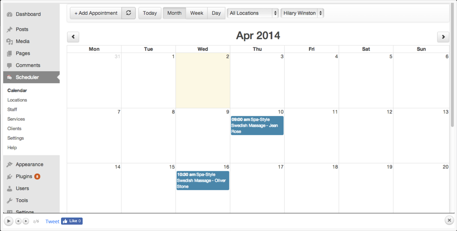
BirchPress is a booking plugin that allows you or your customers to create events in a calendar by inputting their information into a customized form.
The plugin allows you to send customized emails to your customers without needing to use a separate email marketing system, and makes it easy for them to pay online with WooCommerce or PayPal.
Additionally, the admin capabilities make it easy to manage bookings — whether they’re changed, canceled, or rescheduled. It integrates with iCal and Google Calendar, and is very user-friendly for developers.
These are just the most popular WordPress booking plugins in 2019. Whatever tool works best for you and your business workflow is the one you should go with, because when you’re running a business, time is money.
If you want a comprehensive booking tool that integrates with both WordPress and a free CRM, check out HubSpot Meetings.

How to Generate Quality Leads From Your PPC Campaigns
You’ve poured thousands of dollars into your Pay-Per-Click (PPC) search campaigns and have managed to generate a substantial number of leads. You’re rocking your conversion rates and your cost per lead is great.
What’s the problem?
It’s only when you start analyzing your results and dig a little deeper that you realize an overwhelming majority of these leads are in essence “junk leads.” Very few are turning into opportunities, let alone customers. The bottom line is, you’re just not seeing a healthy ROI.

In this post, we provide 10 proven strategies that you can use to generate better quality, bottom of the funnel leads from your B2B PPC campaigns. Let’s dive in.
PPC Lead Generation
1. Set up proper URL tracking.
To accurately measure the effectiveness of your campaigns, you need to make sure that you are able to track other important elements besides conversions. This data will allow you to determine which campaign and site a lead came from, the keyword they searched for, the device they were on, and so on.
One of the best ways to accomplish this is to use UTM Parameters and ValueTrack Parameters. These tags are data that you append to the end of your landing page URLs, and you’ve probably seen them when you clicked a link or ad. They look something like this
http://bit.ly/1UAGLGc
As a best practice, you should use the naming convention specified below and use at least these 6 parameters in your URLs:
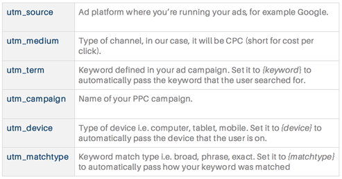
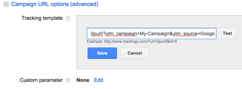
In Google Ads, the most efficient way to set up tracking parameters is in the “Campaign URL options (advanced)” section under campaign settings. Here, you can enter your parameters after “{lpurl}?” as shown below. The {lpurl} portion will be automatically replaced with the landing page URL that you have set up for each ad within your campaign.
2. Determine where your opportunities are coming from.
Once you have your tracking parameters, you need to capture them on your landing pages and store them — along with with other lead details — into the contacts database of your marketing platform. This is usually done by creating hidden fields in your landing page form. You’ll need one field for each UTM parameter that you have passed to your landing page:
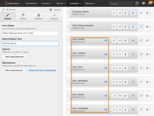
You might first need to create custom fields or properties in your contacts database before you map them to the new hidden fields in your form.
Next, you need to make sure that your contacts or leads data is synced with your CRM and that you’re able to view all opportunity data for your leads.
At a minimum, you should be able to view lead status or stage — whether they are a sales qualified lead, marketing qualified lead, opportunity, or customer — and the opportunity size or deal amount. If you have lead scoring data associated with each contact, this will be extremely beneficial as well.
Once you have all of the available data, you should create reports to isolate and segment it.
The most important data you want to extract are:
- The number of opportunities, opportunity amount, and customers won for each source, campaign, keyword, and device.
- The name, email, company, lead status/stage, lead score, opportunity amount, source, campaign, keyword and device for each lead.
You’ll then be able to determine which opportunities are being generated from a particular search engine, campaign, device and keyword.
When you combine this with the spend data from your ad platform, you’ll be able to get your true ROI.
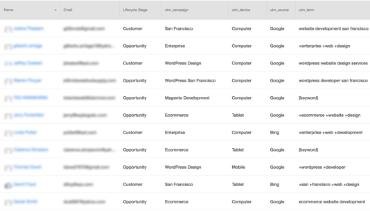
Next, isolate poor quality leads. If you use lead scoring, look at the leads with the lowest scores. Otherwise, look for leads that have provided invalid or junk data in the name, email and company fields. Then check to see what campaigns, devices or keywords these leads have in common.
3. Segment your campaigns into many groups.
Many companies make the mistake of setting up campaigns or ad groups for each product or service they have. They don’t dig deeper into the many different ways in which their target audience is searching for the solutions they offer.
You can address this by carefully planning your campaigns in order to segment your offer into as many groups as possible. You can segment by each main feature, benefit, sub category, target industry, or geographic location relevant to your product or service.
For example, let’s say you provide web design and development services. You can segment your campaigns as follows:
- Sub-category: Ecommerce website design, custom website design, responsive web design, etc.
- Feature: WordPress web design, Magento Development, PHP development
- Benefit: high end web design, agile web development, enterprise web development
- Target industry: real estate website design, restaurant web design, healthcare website design
- Geographic location: San Francisco web design, California web design, New York web design
Once you identify the segments you want to go after, you can set up each campaign with the necessary assets:
- Keywords: All keywords related to the associated segment
- Ads: Ad copy customized to that segment
- Landing Pages: Customized landing page that has content only about that segment
Setting up campaigns in this way allows you to focus your efforts, and will result in better quality leads and increased conversion rates.
4. Target relevant keywords.
Keywords are at the heart of every paid search campaign, and you need to go wide and deep to identify the best ones for your business.
The first step is identifying the most focused and relevant keywords. Segment your campaigns as described in the previous section and then search for keyword ideas within each segment. There are a lot of excellent keyword research tools that you can use to find the best keywords.
To attract the best quality leads at the bottom of the funnel, you have to target keywords with searcher intent in mind. For example, when someone searches for “WordPress website design services” you know that they’re looking for a company that provides WordPress services.
However, when someone just types in “WordPress website design,” you can’t be certain about their intent.
They could be looking for services or they could just be looking for a how-to design guide. Location-based searches also convey searcher intent adequately. For example, “San Francisco web design” indicates that the searcher is looking for a web design company in San Francisco.
Based on the volume of searches, you can also decide to further segment your campaigns to get even more focused. The more tailored your campaigns are—including keywords, ads and landing pages—the better your leads will be.
For example, you could create a new campaign that combines two of the segments we just discussed titled “San Francisco WordPress website design.” Some of the keywords in this campaign could be:
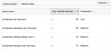
Another way to get more focused with the keywords you’re targeting is to find long-tail keywords — those that consist of four or more words. Searchers who type in these longer search terms have typically done their research and honed in on exactly what they are looking for, making them quality prospects.
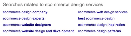
A good tool to find long-tail keywords is Übersuggest, but you can also source them directly from Google. After conducting a search, simply scroll down to the bottom of the page and look in the section “Searches related to…”
A search for “ecommerce design services,” for example, shows the following suggestions:
5. Filter out irrelevant keywords.
Targeting the kinds of keywords we discussed in the previous section, will go a long way in attracting high quality leads to your ads, but there are also steps you can take to proactively ward off less desirable clicks.
Look over your Search Terms Report to determine whether you are getting any irrelevant clicks to your ads. If you find any such clicks (or impressions), add those keywords to your negative keywords list — this tells Google or Bing not to show your ads for any of these keywords.
Going back to our earlier example of web design services, some negative keywords you would likely want to add are: cheap, free, themes, school, jobs etc. This will make sure you don’t waste your money on clicks from users searching for keywords like “San Francisco web design jobs” or “WordPress website design theme.”
If you followed our guidelines for tracking and opportunity attribution described in sections one and two, you’ll now have the ability to determine which keywords are leading to poor quality leads and which keywords are producing opportunities.
If you find that certain keywords are predominantly producing poor leads, you can add them to your negative keywords list to stop receiving traffic from these types of searches.
On the other hand, you’ll now have a list of keywords that have produced opportunities (and customers) for your business.
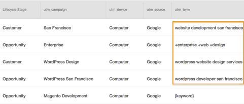
You can double down on these keywords in three ways:
- Increase their bids so your ads rank at the top of search results.
- Segment these keywords into a new group or campaign so you can have more customized ads and landing pages for them.
- Find other related keywords you may have missed the first time.
If you need help determining strong keywords and negative keywords, it can be helpful to use a template or build a keyword plan for your campaigns. Here’s a guide that walks through how to use our free PPC campaign management template.
6. Use ad copy to pre-qualify visitors.
Writing ad copy that focuses solely on increasing click-through rates is a mistake. You should write ads that pre-qualify visitors, so that the traffic you do get will be a lot more relevant and targeted to your business. Some of the best ways of doing this, are by adding the following elements to your ad copy.
Business size
If you target businesses of a certain size, reflect that in your ad copy. For example, if you want to target larger businesses, you can add “enterprise” to your ads and create copy such as, “enterprise class WordPress design.”
Industry
If you work with specific verticals, you can make that clear in your ads. For example, your ad could read: “WordPress design for healthcare.” This usually works best with segmented campaigns and keywords (see tips three and four).
Pricing
Many companies are uncomfortable adding pricing to their ad copy, but this is a good way to weed out prospects who may not have the budget for your solution. You can do this by adding text such as, “Starting at $499/month,” or “Packages starting at $10,000.”
Target Persona
Including your target persona in your ad copy is another excellent way of pre-qualifying your ad traffic and even personalizing your ads. You can do this with text such as “For small business owners” or “For discriminating marketing executives.”
It’s also important to consistently A/B test your ads to optimize their performance. As a general guideline, you should always have two ads running for each ad group in your campaigns.
You can then decide which ad is performing better by looking at the number of conversions and opportunities generated from each, in addition to the click-through rates.
7. Develop tailored landing pages for your ad groups.
Once a visitor gets to one of your landing pages you’ve already paid for the click. This means that measures such as adding extra form fields or validating for a business email address in an effort to reduce the number of poor-quality leads, are misguided. Instead, you should focus on maximizing the conversion rates of your landing pages by optimizing the elements below.
Tailor your landing pages to the needs, wants, and challenges of your ad groups with particular focus on the content you have above the fold.
It’s ideal to create unique landing pages for each ad group. But, sometimes this isn’t feasible — especially if you’re working with dozens of different ad groups.
Should this be the case, you can use dynamic headlines and subheadings on your pages. This will let you alter the content of your landing pages by passing in headlines and sub headings as parameters of your landing page URL.
It’s also important to follow key landing page best practices to nurture those who click into converting. These include no navigation, a content or coupon offer in exchange for information, and imagery or visuals that add more information about whatever is being offered on the page. Still not sure where to start? Use these great design examples for inspiration.
Determine which offers drive the most results.
Test multiple offers to see which get the most traction. Make sure you look beyond conversions to see which offers are producing the most opportunities. Some offers to test include: free trials, demo scheduling, free evaluations, consultation requests, proposal requests, and free assessments.
Test, test, test.
A/B test your landing pages to determine which variants are driving the most conversions, opportunities, customers, and ROI:
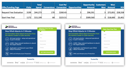
Always A/B test a single element at a time to isolate the effect of that element on performance. Also, test only two variants of the page at a time.
The most important elements you should run tests on are above the fold. These include:
- Headline: Test different versions of your main selling point, benefit, or offer.
- Call-to-Action (CTA): Try out different CTA copy, colors, sizes, and placements.
- Hero Shot or Background: Test different images or videos for your hero shot or background.
- Form: Test different lengths and placements for your lead generation form. You might display your form in the hero area, at the bottom of your page, or as a popup.
8. Use your competitors for keyword inspiration.
If your competitors are getting precious real estate on search engine result pages, look into their strategy. Try using similar keywords and calls to action without blatantly copying them.
While knowing what your competitors are up to can be beneficial for your strategy, you should be sure to avoid using their branded keywords in your ads. This might make you look less credible, and Google may penalize you. Learn more about that here.
9. Make adjustments based on mobile performance.
If you implemented device tracking as described in tips one and two, you’ll be able to determine which devices (computer, tablet, or smartphone) are driving opportunities. If you find that mobile leads are not converting into opportunities, you can stop running your campaigns on mobile devices or reduce bids so that computers and tablets receive the bulk of your traffic.
10. Create an ad schedule.
Even if you are running your ads 24/7, you should set up an ad schedule for your campaigns. You can add days of the week or break your schedule down further by adding hourly segments for each day. Once you schedule your ads, you’ll be able to track performance for each day or hourly segment that you define:
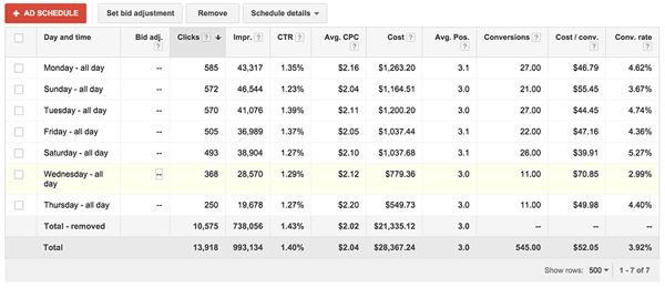
By combining opportunity data and your ad schedule, you can determine which days or hours produce the most opportunities. From there, you can adjust your bids for each segment or stop running your campaign for those segments.
You should typically look at this data over a longer period of time — at least one quarter. If you find that you’re not generating any opportunities on weeknights or weekends, you could stop running most of your campaigns during those times and move your budget over to regular business hours.
PPC campaigns are an effective way to attract B2B leads. However, many companies struggle at generating opportunities and driving a positive ROI from their campaigns. The 10 strategies above will help you create targeted campaigns optimized for high quality lead conversions. They might help to boost your bottom line.

12 Gantt Chart Examples You’ll Want to Copy
Gantt charts. Love ‘em, hate ‘em, or can’t live without ‘em, they’re a reality of a marketer’s life. But how do you make yours stand out from the rest?
I’ve gathered some of the best examples around, along with some free templates to get you started. Dive in below and find your favorite. But first …
What is a Gantt Chart?
Gantt charts provide a way to track and manage project timelines, progress, and deliverables. Vertical lines or bars are used to visualize each task, and each Gantt chart includes resources, milestones, tasks, and dependencies.
- Resources: Project managers must have insight into what resources are needed for tasks outlined in a Gantt chart, in order for each to be completed on time.
- Milestones: Along your timeline, there will likely be milestones, both small and large, that must be hit in order to keep your project on track. A milestone for a blog launch might be, “Blog post draft due on 5/30.”
- Tasks: There are specific things that need to be completed along the way of your project. In our blog post example, a task might be, “Edit blog post.”
- Dependencies: Tasks on your Gantt chart will be related to each other, for example, the editor won’t be able to complete her task of editing the blog post until the writer has met their milestone and submitted their draft on 5/30. These are dependencies and should be noted in your chart.
The main goal of a Gantt chart is to track the timeline and completion of a project. It’s especially helpful for project managers who need to keep team momentum going on campaigns with many moving parts, like product launches or marketing events.
You can create Gantt charts in Excel, PowerPoint, Google Sheets, and more, and this tracking method can be used in a variety of industries, from marketing to construction, and even design.
So, what does that look like? Let’s dive in with some beautiful Gantt chart examples, below. Prepare to geek out.
Gantt Chart Examples
1. Gantt Chart in PowerPoint
Want to include a Gantt chart in your next PowerPoint Presentation? Use this PowerPoint example as your guide. PowerPoint doesn’t have a built-in Gantt feature, but you can build and edit a chart inside of the platform using their “Stacked Bar” feature.
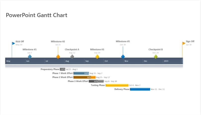 Image source: Office Timeline
2. Gantt Chart in Excel
Creating Gantt charts in Excel is a common practice and one you’ll likely come across in your work. Excel doesn’t have a predefined Gantt chart, but the “Stacked Bar” feature is your friend, once more, allowing you to show project progression. Here’s an example of an Excel Gantt chart. Download it free, here. 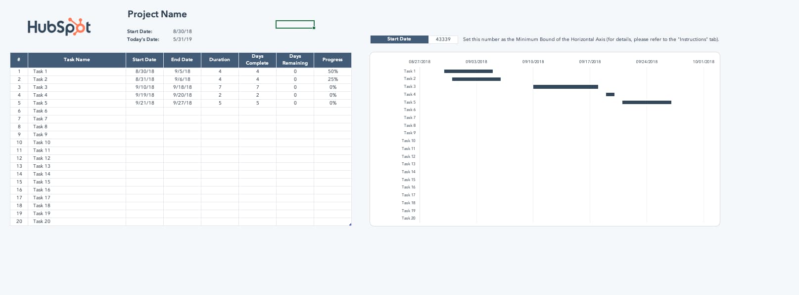
Image source: HubSpot
And here’s a helpful “how-to” video for the excel-challenged among us <raises hand>.
Image source: Smartsheet
3. Gantt Chart in Word
What’s that? You’re not familiar with Microsoft’s “Stacked Bar” feature yet? Well, if you’re getting friendly with Gantt charts, you’ll be using this go-to feature quite a bit.
If you’re creating a Gantt chart in Microsoft Word, you’ll stack bars once more. But if you’ll be updating and tweaking your Gantt chart regularly, Excel or PowerPoint may give you better flexibility. 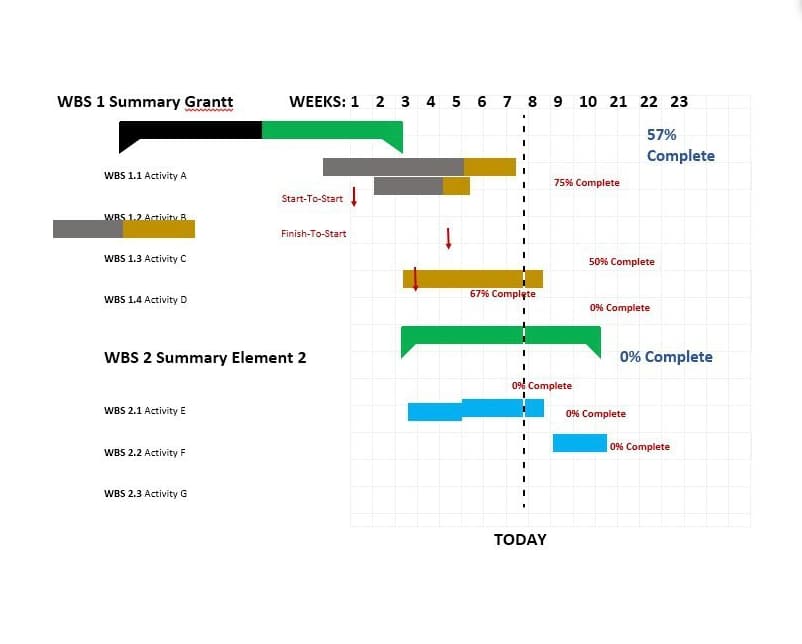
Image source: Template Lab
4. Gantt Chart in Google Sheets
If Google Sheets is where you spend most of your time, this is the Gantt chart for you. G-Sheets makes it easy to build customizable Gantt charts you can edit as needed — all using a few simple formulas.
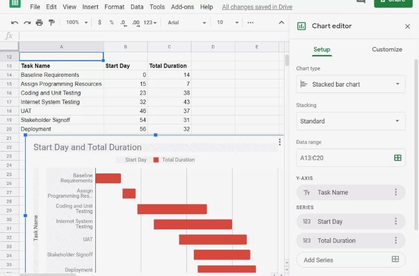 Image source: Lifewire
5. Gantt Chart in Google Docs
Want a Gantt Chart you can share and collaborate on with colleagues? Consider creating your chart in a Google Document. Save it to your Google Drive and share as normal. Google offers “Stacked chart” options in their “Chart Editor,” so getting started is a breeze.
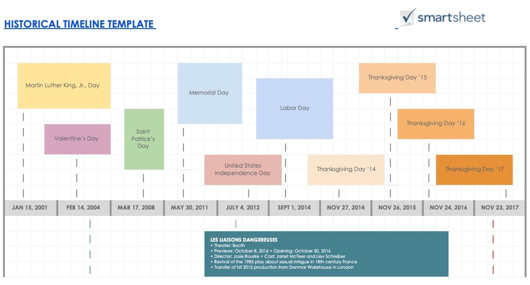 Image source: Smartsheet
6. Gantt Chart for Editorial Calendar
Take your editorial calendar up a notch with a Gantt chart. Include publication dates as your milestones, add subgroups for each phase of content creation, and add tasks to your chart.
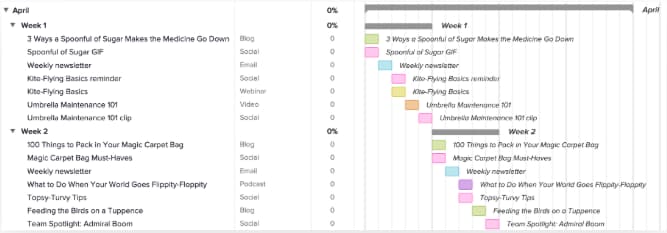 Image source: TeamGantt
7. Gantt Chart for Project Management
Project management is one of the most common verticals relying on Gantt charts. These charts help project managers identify the tasks involved in each project, create a timeline for each task, and assign dates, tools, and progress updates for each of the tasks within the project.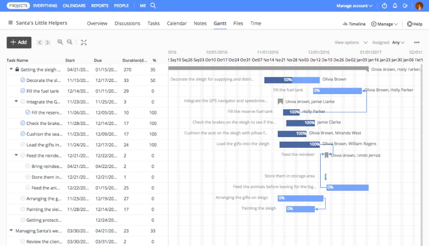 Image source: ProofHub
8. Gantt Chart for Marketing Campaign
There are many tools available that help marketers create Gantt charts especially for marketing campaigns. This example, from GanttPro offers ready-made campaign templates with predefined tasks, subtasks, and milestones. 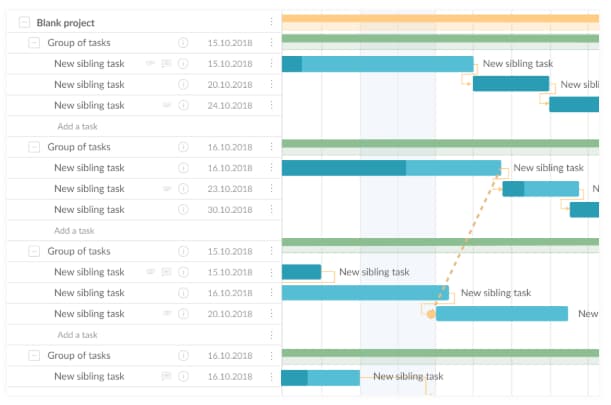 Image source: GanttPro
9. Gantt Chart for Design Projects
Designers, you can use Gantt charts, too. Plan design launches, track brainstorming, and share draft progress with a carefully organized chart, like the example below. 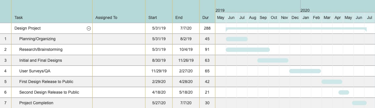
Image source: SmartDraw
10. Gantt Chart for Product Launch
Product launches have many moving parts. Keep track of research, budgets, team roles, and even risk assessment in a customizable Gantt chart like this one. You can even set dependencies and assign tasks to certain people.
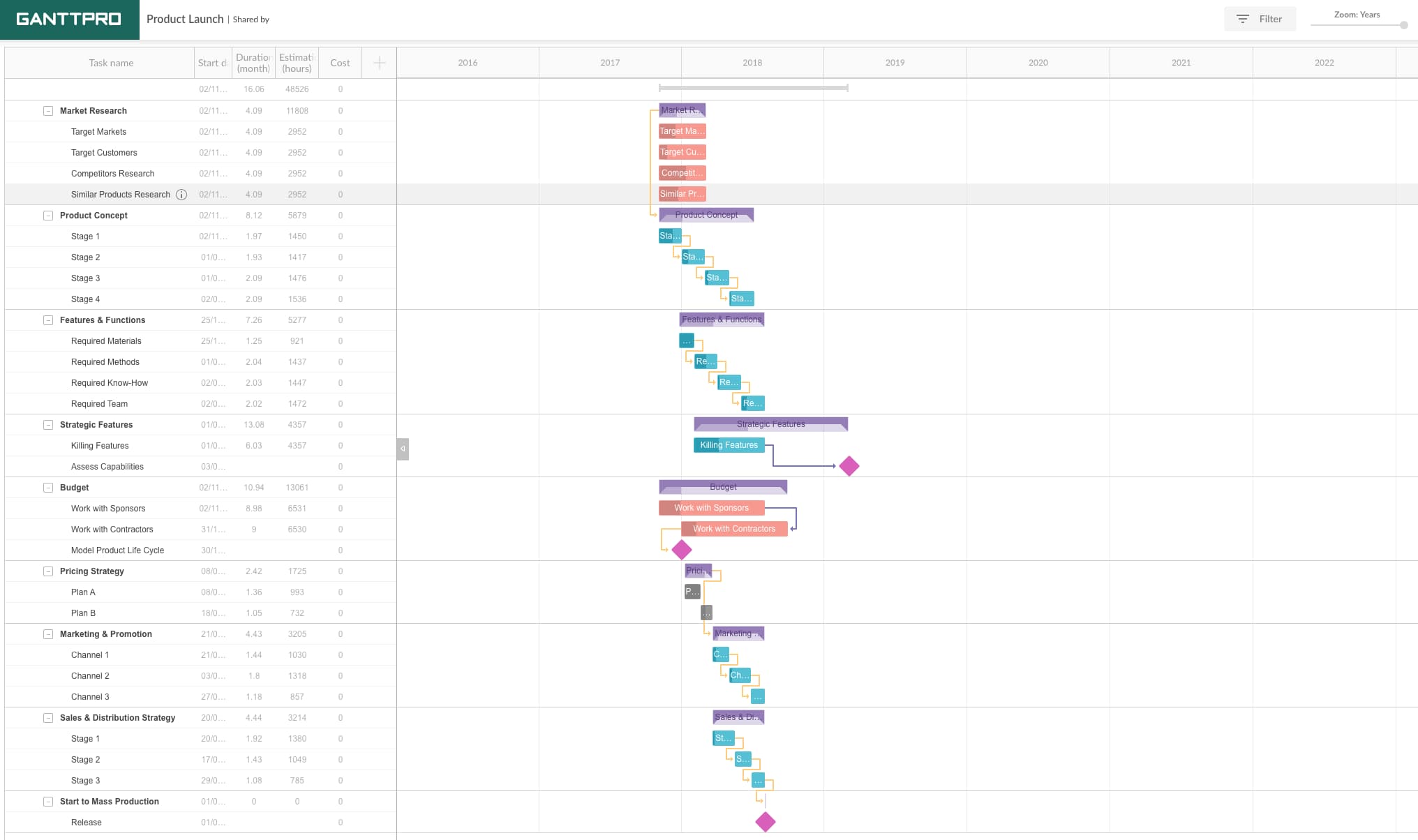 Image source: GanttPro
11. Gantt Chart for Social Media Campaign
When you’re mapping a social media marketing campaign using a Gantt chart, make sure to include the tools you’ll need, the content you’ll be sharing, and the assets used on each channel. We loved this example, from Fabrik. 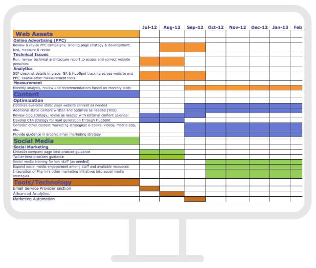
Image source: Fabrik
12. Gantt Chart for Event Marketing
From outreach prior to the event to “Thank you” emails once it’s over, planning an event requires high levels of organization. Use a Gantt chart like this one to keep track of your strategy, team progress, and key actions before, during, and after your event.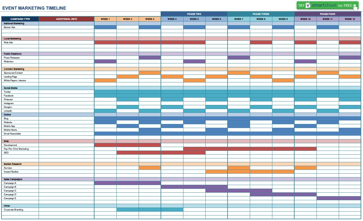
Image source: Smartsheet
Are Gantt charts only the beginning for you? Check out our guide packed full of the best marketing tools for every business and budget — customized for this year.

8 Social Media Tools You Need to Use in 2019
You already know how important social media is to increase brand awareness, generate more leads, and ultimately score more conversions. The world is on social media — 45 percent of it, at least — so if you want your product, service, and mission to reach the maximum amount of people, your business needs to be on social media, too.
Social media, however, can be extremely time-consuming. Additionally, it spans so many diverse tasks, ranging from number-based activities like tracking analytics, to creative jobs such as designing graphics.
It can be difficult to find the skills and manpower needed to execute a good social media strategy — which is why you need social media tools to help you out.
Here, we’ll cover the top eight social media tools you should be using in 2019 to help you save time, while getting more conversions than ever.

What Makes A Good Social Media Tool?
Although the term “social media tool” is very general and can apply to a wide range of services, there are a few key features each social media tool should have.
1. Saves You Time
The goal of a social media tool is to save you time while getting similar — or better — results than you could without it. Look for social media tools that automate a process, but make sure the process still happens correctly, since some shortcuts might be too fast and therefore won’t focus on quality.
2. Increases Brand Awareness
One of the biggest benefits of social media is its ability to increase your brand awareness, which is why each social media tool you select should perform its services with brand awareness in mind. Maybe your tool of choice is an editing platform such as Lightroom, which can help you create images to match the rest of your feed. Or, maybe it’s an Instagram scheduler so you can preview your profile before you post images. Whatever the case may be, social media tools should focus largely on brand awareness.
3. Easy to Use
Social media tools are only a time-saver if they’re easy and intuitive to learn how to use. Each tool you select should be super user-friendly so that your accounting team could edit photos if they needed too, and your creative, right-brained writers could still use the analytics function to track daily social metrics.
Many social media tools provide tutorials on their websites. Others, such as Kicksta, have top-notch customer service so you can get immediate expert advice if you need help getting off the ground.
4. Affordable
Social media tools should be affordable (and most of them are). Many high-quality social media tools are even free, such as the Unfold app, which is perfect for creating Instagram stories. With social media tools, there’s no need for you to go back and forth with the accounting department trying to get your budget approved. Most social media tools are already budget-friendly so all you need to do is sign up.
5. Focuses on Organization
One of the ways social media tools save you time is by keeping you organized, so make sure the social media tools you decide to use are efficient and tidy.
For example, HubSpot’s social inbox tool helps you prioritize your social media interactions, and graphic design website Canva saves your designs so you can go back and edit them later.
1. HubSpot’s Social Inbox Tool
Price: Starts at $800/month, included in the Marketing Hub Professional tier
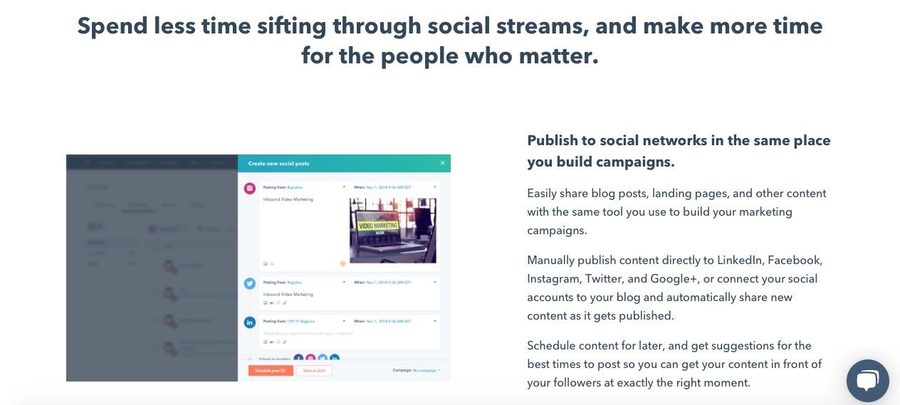
HubSpot’s social inbox tool saves you valuable time while still optimizing your social efforts. Schedule your posts, integrate your social networks with your blog, and monitor messages and mentions so you can nurture new leads.
HubSpot also integrates all of your marketing with your CRM, so it’s easy to figure out how many leads and customers you’re receiving directly from social media. “HubSpot Marketing Hub… puts the potential of corporate marketing within everyone’s reach,” one customer says.
2. Kicksta
Price: Starts at $49/month for individual creatives
Kicksta is an Instagram growth service that helps you get more organic followers on your Instagram business account. Using your company account, the growth service “likes” around 30,000 photos a month on carefully-targeted accounts. Those users — real people, not spam bots or fake accounts — will begin to follow your account, increasing your brand awareness.
Kicksta is a good fit for any industry and provides a friendly, responsive, and helpful customer success team. “Kicksta helps introduce new audiences to our brand while providing consistent organic Instagram growth,” says Ryan Beltran, CEO of watch company Original Grain. “It’s great for social proof too!”
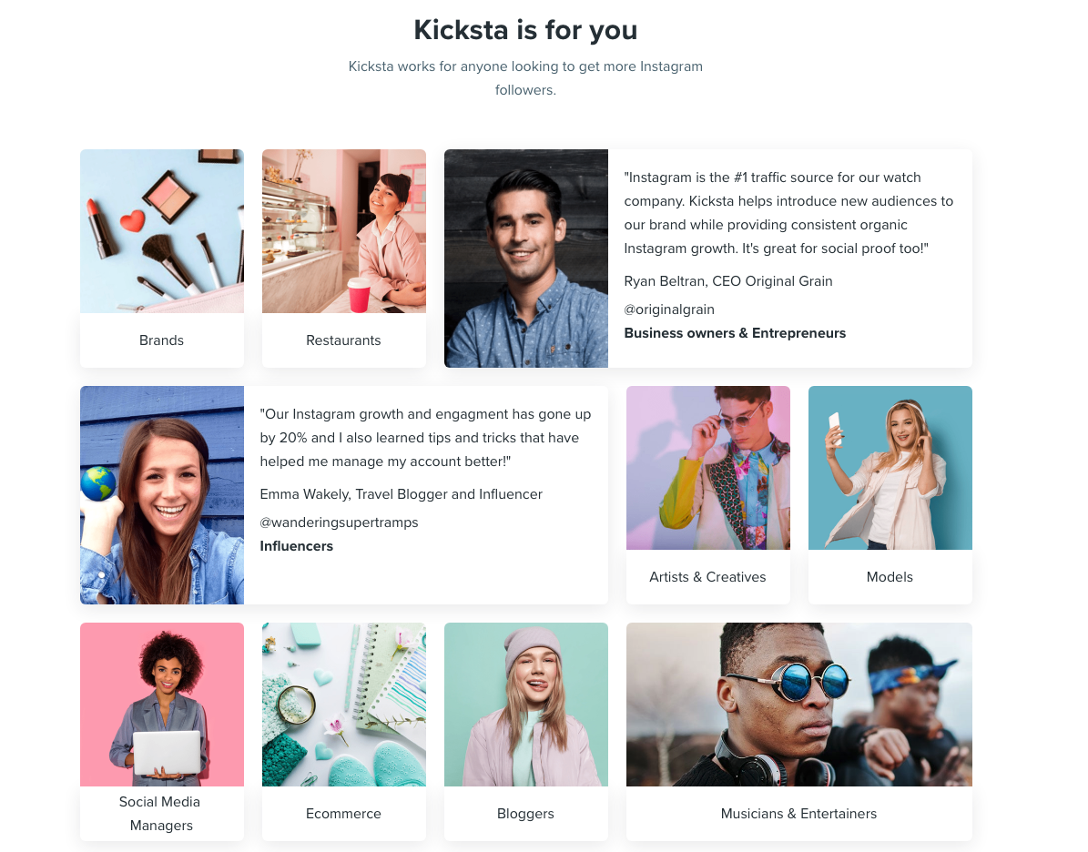
Image courtesy of kicksta.co
3. Later
Price: Starts at $9/month for solopreneurs
Social media marketing platform Later lets you plan and schedule your Instagram, Twitter, Facebook, and Pinterest posts. The drag-and-drop calendar makes it easy for you to map out your upcoming posts and see at a glance how your feed will look.
You can also track your analytics, which will help you figure out the best time of day to post, and the best hashtags to use. Additionally, the Linkin.Bio feature for Instagram helps your posts become instantly shoppable.
“I love that you can either use it via the website or app on-the-go,” one user remarks. “It is one of those apps that I could not live without … Later is [a] super easy tool to set up.”

Image courtesy of later.com
4. Lightroom
Price: Starts at $9.99/month
Adobe’s Lightroom product is a tool that lets you organize and edit photos. Since social media is all about visuals, it’s critical your business’s social media accounts showcase vibrant, on-brand photos.
Sliders, filters, and many other features make Lightroom a user-friendly tool to create beautiful photos even if you don’t have much editing experience. Lightroom is available for both mobile and desktop, and best of all, changes made on one device immediately apply to all devices.
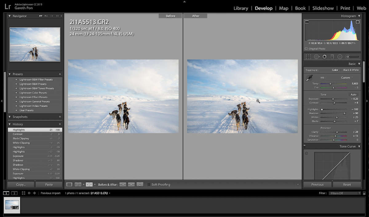
Image courtesy of adobe.com
5. Canva
Price: Free or $12.95 per team member per month
Canva is an easy-to-use graphic design website where you can create custom, on-brand graphics for your company’s social media accounts. The website has dozens of templates — everything from Facebook banners to Instagram stories to Twitter posts — so if starting from scratch to create social graphics seems intimidating, use a template instead.
One user said, “Canva has been a lifesaver to me and my business. No more hours sitting in front of the computer coming up with graphics for social media post[s] or Pinterest post[s].”
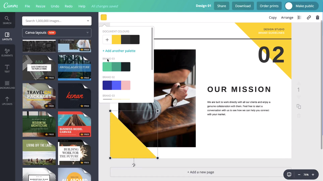
Image courtesy of canva.com
6. Unfold
Price: Free
Described as “a toolkit for storytellers”, Unfold is an iOS and Android app that helps you create beautiful templates for Instagram stories. Bringing your creative visions to life is the driving idea behind Unfold. It’s an ideal app for lifestyle brands who want to create stylish collages to keep their social media accounts on-brand and receive the maximum amount of engagement from followers.
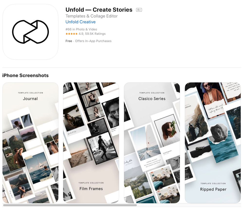
Image courtesy of Apple iTunes.
7. HypeAuditor
Price: Starts at $30/credit (one credit equals one Instagram report for one year)
You’ll never earn money from fake followers — they just make your engagement look bad (think millions of followers, but only a few hundred likes per photo) and ruin your reputation. That’s why HypeAuditor weeds out fake followers on your Instagram account to help you determine your organic reach.
Additionally, HypeAuditor analyzes your audience to figure out where they live, their age and gender, and which of your followers are ghosts.
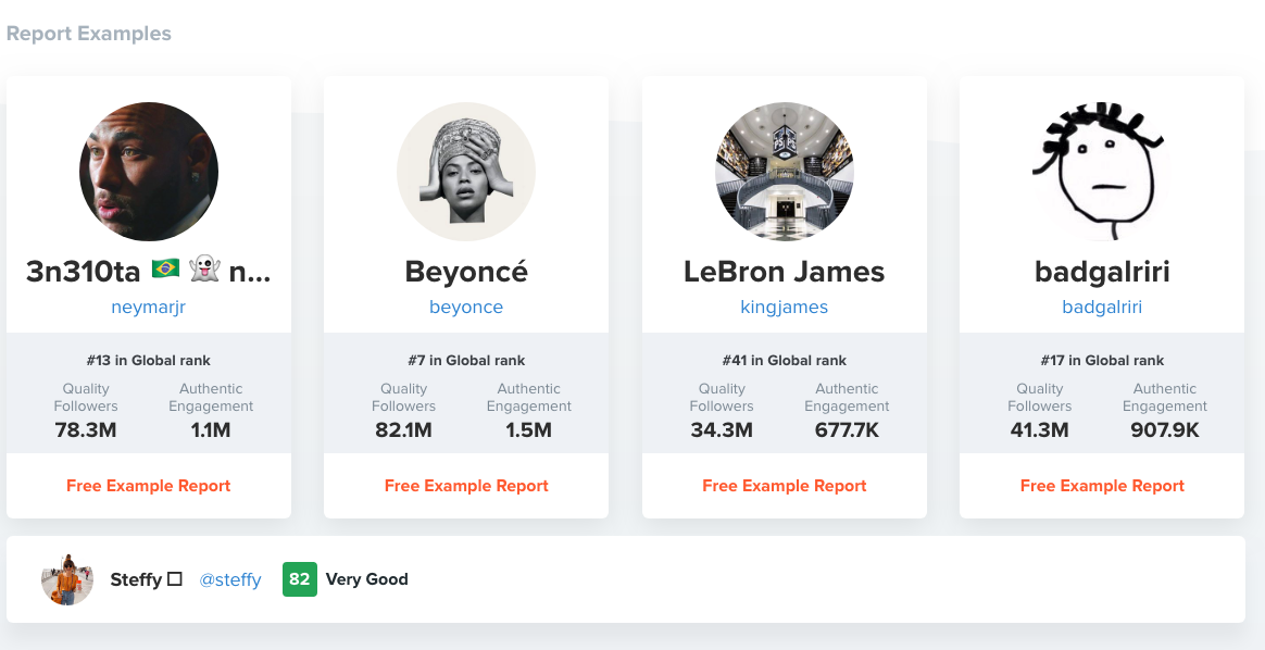
Image courtesy of hypeauditor.com
8. Retouchup
Price: Starts at $0.25 per image
The website Retouchup provides an easy way to edit photos for social media, from basic color correction to more advanced Photoshop-like features such as adding or removing people from a photo. With Retouchup, you don’t do the work yourself — instead, just submit a photo and the website’s experts will edit the photo for you within 24 hours.
“You’re making me look like an awesome photographer!” one user gushed. Retouchup can save you time during the editing stage, and make your images appear higher-quality and more compelling.
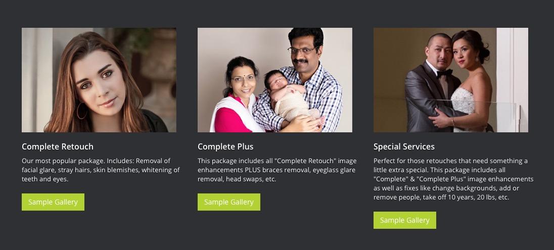
Image courtesy of retouchup.com
There are numerous choices out there for high-quality social media tools. Ultimately, it’s your job to decide which tool is the best fit for your needs, your budget, and your marketing goals.
Need a painless way to track your social interactions? Try HubSpot’s social inbox tool today.

The Ecommerce Marketer’s Guide to PPC Advertising
If you’re a PPC veteran, it’s tempting to devote all your time to the bigger picture and finding creative new ways to drive cheap, conversion-friendly clicks.
This is especially true for ecommerce businesses, which are playing in an incredibly complex and competitive space, particularly when using PPC.
Even small businesses are getting on the pay-per-click bandwagon. According to a 2018 study, 45% of businesses under 50 employees invest in PPC. That number jumps to 74% when it comes to small businesses with 50 employees or more.
Because of the complexity and constant competition, it’s quite common to overlook some of your low-hanging fruit.
Why is PPC so important to ecommerce businesses?
Unsurprisingly, online product searches — especially on Google — are booming. More and more ecommerce businesses are taking notice and buying into PPC. In Q4 of 2018, spend on Google Shopping ads rose by 43%.
Although Amazon is still the first stop for many customers’ product searches, Google isn’t far behind. According to Wordstream, the average customer buys a product within 20 days of searching it on Google and with 26 days of searching it on Amazon. They also report that 35% of users purchase a product within 5 days of the Google search.
Below is a list of five tips that ecommerce marketers can use to gain an edge on competition without overspending.
Ecommerce PPC
1. Balance out broad and ultra-specific keywords.
Imagine you sell tires and rims for a living. You just opened a location on the same street as a number of different auto dealerships. (I know, you’re an ecommerce marketer, but stay with me here).
You see customers walking in every day that are still in research mode and have no idea what brand they want or which size tire they even need.
You find that many of those walking into your store tend to talk with your employees for advice and end up leaving with you in mind, but clearly look elsewhere for better prices now that they’re more informed.
Now let’s say you came across a number of customers who knew exactly which tires they needed down to the specific model number.
These customers who are much further down the sales cycle are much more likely to purchase from you if they walk in your store first.
There is a very similar scenario being played out in the ecommerce space for those bidding on competitive terms. In this industry, for example, those might be, “cheap tires” or “tire deals online.”
Users may click on 4 to 5 different ads, use your site to do some research, and then purchase from whoever has the lowest price.
While you may never escape the vicious cycle of paying for expensive clicks on the more general and competitive keywords, you can begin to balance it out by targeting the specific end of the spectrum. To do this, you might try keywords like model numbers, part names, or UPC codes.
You’ll rarely see the same volume of users typing in queries with this level of granularity. But there are plenty of potential customers out there who know exactly what they want and just need to figure out the easiest way to get it.
Not only are the clicks significantly cheaper due to the low competition on model number keywords, but the conversion rates are much higher. This will help bring your overall CPA down.
Additionally, when someone clicks on your model number ad, you can send them directly to a product page which gives them everything they were looking for in one place.
2. Identify and expand on long-tail keywords.
There might also be customers who know a lot about what they’re looking for, but aren’t quite typing in a UPC code just yet. They likely be typing in long-tail keywords like, “red capri pants in petite,” or “Red Sox bleacher seats.”
In the Google Ads interface, take a peek in your Search Query Report. (If you’re having trouble finding it, look within a campaign under “Keyword Details.”) This report will show the exact searched keywords and phrases that triggered your ads.
Sort by the keywords that have resulted in conversions and try to identify long-tail keywords which may contain a few specific product details.
For example, imagine you’re bidding on the term “new rims” but learn that someone purchased a product on your site after searching the brand, size, and color of rims they wanted. Here, you could add that long-tail keyword to the appropriate ad group and bid on it aggressively since you know it converts well.
Think of your broad keywords as casting a wide net. They will catch a great deal of fish. But, in order to find gems, you’ll need to analyze data to see which keywords actually converted, and identify long-tail keywords that you’re missing.
3. Bid on keywords similar to your competitors’.
Now that you’ve covered those users searching for specific products, why leave out those searching to buy specifically from your competition? Plenty of searches come from those who’ve heard about a specific brand to buy from — but they’re not convinced yet. These searchers might be open to other options with better offers.
In the physical shopping world, someone might walk into a competitor’s store next door to yours if they have signs boasting better prices and bigger selections. This is why it can be helpful to create campaigns targeted to competitor keywords with simple ads making customers aware that you’re also an alternative, affordable option.
4. Don’t use a competitor’s branded keywords.
While targeted a competitor’s ad keywords, you should avoid targeting branded keywords. A few things might happen if you do this:
- You’ll be paying for less qualified traffic.
- When your competitor notices, they may drive up your costs dramatically by bidding just a little bit more themselves (because they have a higher quality score).
- Your competitors could complain to Google and you’ll get a slap on the wrist (or worse).
- You’ll look like a poor sport, or even a bit of a jerk.
None of those are too appealing. Instead of directly targeting branded keywords, take cues from your competitors’ PPC ads to help inform your own strategy.
For example, if a competitor is bidding on keywords that are important for your business, you might consider getting a paid presence for those terms, too.
Or, on the flip side, a couple competitors are winning organically for keywords that are important to you, but it’s going to take you months to edge them out. In the interim, using PPC to win some traffic for those terms is a great stopgap.
5. Include transparent pricing in your ads.
With the limited amount of characters we can use in text ads and the rising cost per click, it’s become increasingly important to qualify your traffic before your ad is actually clicked on.
Even when you target certain keywords, there’s only so much you can infer from a person who types in general terms. You can’t ask them how serious of a buyer they are, whether they’re still in research mode, or what their level of intent is.
However, you can screen out less qualified people by simply putting pricing information in your ads. If you let someone who is only willing to spend $40 on a product know beforehand that all your products are $75 and above, chances are they won’t click on your ad.
This saves your ad spend for those qualified leads who saw your prices, know what to expect, might not be scared away by price, and are much more likely to convert into a sale.
When it comes to optimizing PPC, this advice is just the tip of the iceberg. If you need further help planning out your next campaign, use this guided template to drill even further down on keywords, landing pages, and AdGroups.

Bing PPC Ads: How They Work (and Compare to Google Ads)
If Googling has ever let you down, you may have come across another search engine called Bing. This search engine is powered by Microsoft and strives to outdo Google at every turn. Bing wants to revolutionize digital search and rival the industry’s long-standing powerhouse.
It’s an ambitious goal, but one place where Bing differentiates itself is through its Pay Per Click ads or PPC. According to our guide. Pay Per Click ads are, “a form of search engine marketing (SEM) where the advertiser pays for clicks on an ad.” The advertiser has to pay the publisher whenever a visitor interacts with the ad. In exchange, the ad is added to the search engine’s database, which displays the ad whenever the content matches a visitor’s searched keyword.
While Google Ads offers a popular PPC feature, Bing’s has unique advantages that distinguish itself from the search engine giant. And, if you’re the owner of a small- to medium-sized business, you may be more interested in Bing’s PPC benefits than Google’s.
In this post, let’s break down how Bing PPC ads work, as well as how they compare to Google Ads.
Bing PPC
Bing PPC ads operate on Microsoft’s three popular search engines: Bing, Yahoo, and AOL. When you use Bing campaigns, your content is shared across all of these platforms at once. With over five billion monthly searches being made on the Microsoft network, this makes Bing PPC a notable marketing tool for paid ad campaigns.
In terms of functionality, Bing PPC ads work similarly to Google ads. You bid on keywords based on their traffic volume, then your ad is displayed when that keyword is searched, and finally, you pay Bing whenever a visitor clicks on your ad. Like Google, your ad’s copy can have up to 80 characters and Bing even has support tools that can help your team build a cost-effective keyword list, so you never waste money on ads that aren’t being displayed.
With Bing, you can also set up targeting filters that determine where and when an ad will be published. For example, if you want your ad to only appear on mobile devices, you can select the mobile traffic option. Or, if you want the ad to appear solely on Yahoo, you could filter it from Bing and AOL. This gives your team more flexibility and optimizes the effectiveness of your PPC campaign.
Bing PPC ads present a timely opportunity for marketing teams. It’s less competitive than Google AdWords, and its users shop online 36% more than any other search engine. While Google AdWords is still a very powerful tool, there are some advantages of Bing that makes it attractive for small- to medium-sized businesses. So, now that we’re familiar with how Bing PPC ads work, let’s discuss some of the key differences between Bing PPC and Google AdWords.
Bing PPC vs. Google Ads
Key Product Features
While both Bing PPC and Google AdWords allow you to filter your ad’s targeting, Bing’s software has a unique innovation that sets it apart from Google. With Bing, you can set age filters for your search ads, so only visitors of a certain age group will see them. Or, you can set up a location filter so visitors in a certain part of the world see your content. This way, you’ll ensure qualified leads are being exposed to your marketing campaigns.
Another key feature that Bing has an advantage in is its social extensions. Social extensions are a line of copy on your ad that tells the visitor how many social media followers your business has. On Bing, this feature shows your social following for Facebook, Twitter, and Instagram. Google AdWords, however, can only show you the number of Google+ followers.
Platform Reach
According to Microsoft, Bing represents more than 34% of the world’s desktop search engine marketplace. That means about one in every three people will use Bing over another search engine. And, more importantly, Bing’s PPC ads can reach 60 million users that Google AdWords cannot.
In terms of the largest audience, Google is the outright favorite. But, that doesn’t mean Bing isn’t worth your investment. Bing has over 137 million users who search roughly six billion times each month. These people tend to be older than Google’s users, and have an income of more than $100K. So, even though Google has a larger audience, Bing works with users who have substantial buying power.
Visitor Engagement
When tested by Blue Corona, Bing PPC experienced a 34% higher click-through rate than Google ads. Additionally, new research found that financial and shopping services have experienced the most success with Bing PPC. This is mostly attributed to MSN’s and Yahoo’s popular financial reporting, which yields more keywords related to online shopping and business reports.
Bing users tend to be more engaged with sites after ad clicks as well. In one industry, Bing ads had a 56% higher conversion rate than Google AdWords. That’s because Bing users typically have more interest in e-commerce and are willing to spend money online.
Ad Display and Positioning
Since there are fewer users on Bing, its ads tend to display higher on search results than Google AdWords. In fact, Bing ads appear 35% higher in search results than Google ads. Bing copies Google’s keyword auction technique, which favors its users because they don’t have to outbid Google’s massive user base. With Bing’s less-competitive market, you won’t have to bid as much on keywords to maintain your spot on the search results page.
Cost Per Click
With fewer competitors bidding on keywords, you can expect to spend less on your Bing ads. In fact, one business spent 35% less on Bing ads than it did on Google AdWords.
In terms of cost-per-click (CPC), ReportGarden found that the average CPC for Bing was $7.99 whereas Google’s was $20.08. Since there’s less overall traffic occurring on Bing, CPC is typically less expensive. This presents an opportunity to obtain a strong ROI if you can capitalize on the right keyword at the right time.
Business Value
If you’re choosing between Google AdWords and Bing PPC, both tools can be valuable assets to your marketing team. With Google, you have access to a massive audience with users from many demographics, and you can trust that your content will be displayed on the world’s preferred search engine. However, this space is highly competitive, and you’ll need to monitor your campaign diligently if you want to see a positive return on your investment. Your marketing team will need plenty of means and experience to make Google AdWords a reliable source of lead generation.
Bing PPC presents a lower-risk option for paid ad campaigns. You still have access to a large audience, but keyword bidding isn’t as competitive as Google. The tradeoff here is that Bing traffic is significantly lower than Google’s. So, while your ads may be positioned higher and cost less, they may not be seen by as many people. That limitation may be discouraging to larger companies that have bigger marketing budgets.
For more information about PPC ads, read these PPC campaign tips.

How to Improve Your Writing Skills and Escape Content Mediocrity (Infographic)
Delivering high-quality content is an undeniably critical component of any successful marketing strategy. Content creation can help your business rank highly in search engines for keywords related to your core products or services, increase your brand awareness, and allow you to engage more genuinely with an audience.
In fact, marketers who prioritize blogging efforts are 13x more likely to see positive ROI.
But ‘delivering high-quality content’ is much easier said than done, particularly when you’re on a tight deadline to turnaround blog posts or other written content for your business. And when you’re stressed, you might notice the quality of your writing starts to diminish.
You’ll never see the kinds of results you want to see — like an increase in brand awareness or a page one slot on Google — if your writing isn’t top-notch.
But how can you become a better writer — and, better yet, how can you become one quickly?
Fortunately, Henneke Duistermaat, founder of Enchanting Marketing, created this hand-drawn infographic to display 29 tips she believes will help you cultivate more deliberate, powerful content — and, best of all, avoid mediocrity. Take a look to learn how you can improve your writing skills today.


29 Ways to Improve Your Writing Skills and Escape Content Mediocrity, courtesy of Henneke at Enchanting Marketing.

The Secret History of the Google Logo
Roughly 3.5 million Google searches happen each day. With stats like this, it’s not unlikely that the average person might see the Google logo anywhere from one to 30 times per day.
Throughout the past two decades, the Google logo has been iconic and easy to recognize. And across all of its evolutions, it has stayed misleadingly simple.

What many don’t know is that there’s a fascinating backstory to the most well-known design on the internet. It all started in 1996.
Below is a full timeline of Google logos over the years.
Google Logo History
1996: The First Google Logo
The search engine’s very first logo actually predates the name “Google.” Larry Page and Sergey Brin originally called their web crawler “BackRub.” Brin and Page chose this name because the engine’s main function was to search through the internet’s back links.
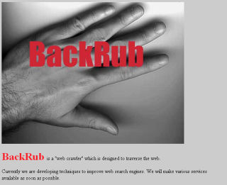
Luckily, by 1997 they’d changed the company’s name to the much less creepy “Google” — a misspelling of “googol” — a Latin term that literally means 10 to the 100th power (written out, that’s one followed by 100 zeros). The idea behind the name was that Google’s search engine could quickly provide users with large quantities, or googols, of results.
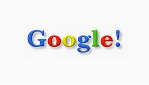
1998: First (real) Google logo
Some sources credit Page with the creation of the first Google logo, while others say Brin designed it with a free image editor called GIMP. Whomever it was, their design wasn’t exactly the most polished.
1999-2010: Ruth Kedar’s logo designs
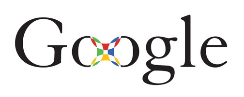
A mutual friend introduced Brin and Page to Stanford assistant professor Ruth Kedar. Because they weren’t in love with their logo, they asked Kedar if she’d design a few prototypes.
She started with a mostly black logo using the Adobe Garamond typeface. She also removed the exclamation point that was in the original logo.
Page and Brin like this logo because the mark in the middle looked like a Chinese finger trap, Kedar says.
The graphic designer’s next attempt used the Catull typeface (which should look familiar). The logo was meant to evoke accuracy, like a target.
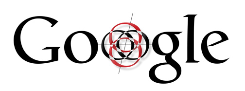
Then Kedar got a bit more playful, experimenting with color and interlocking Os. Those Os ended up becoming the basis for the Os at the bottom of every search engine results page.
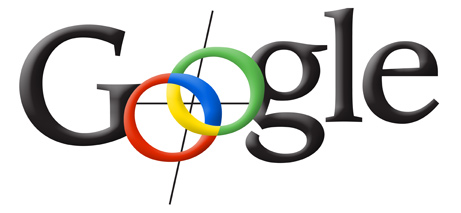
Between the crosshairs and the magnifying glass, Brin and Page thought this design was a little visually overwhelming.
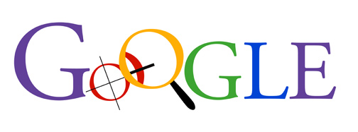
The next few iterations appear more like the Google logo we know and love today. These designs feel younger and less serious than their precedents.
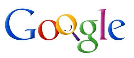
Kedar makes the letters pop off the page with shadowing and thicker lines.
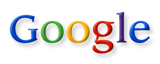
The eighth design was the simplest yet. Ultimately, Kedar wanted to show Google’s potential to become more than just a search engine (hence the removal of the magnifying glass). She also changed the traditional order of the primary colors to reemphasize how untraditional Google was.
This version’s colors and the slanted angling make it feel youthful and energetic.
The final design is one of the most minimal. It was Google’s official logo from 1999 to 2010.
On May 6, 2010, Google updated its logo, changing the “o” from yellow to orange and removing the drop shadowing.
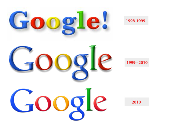
2015: A new logo for Google
In 2015, designers from across Google met in New York City for a week-long design sprint aimed at producing a new logo and branding.
Following the sprint, Google’s logo changed dramatically. The company preserved its distinctive blue-red-orange-blue-green-red pattern, but changed the typeface from Catull to the custom schoolbook-inspired Product Sans.
At the same time, Google also rolled out several variations on its logo, including the rainbow “G” that represents the smartphone app and the favicon for Google websites, and a microphone for voice search.
The new logo might look simple, but the transformation was significant. Catull — the former typeface — has serifs, the small lines that embellish the main vertical and horizontal strokes of some letters. Serif typefaces are less versatile than their sans-serif typefaces, since letters vary in weight.
 Product Sans is a sans-serif typeface. That means it’s easy for Google’s designers to manipulate and adapt the logo for different sizes — say, the face of an Android watch or the screen of your desktop computer. As Google’s product line becomes more and more diverse, an adaptable design becomes essential.
The logo is also meant to look young, fun, and unthreatening (read: “I’m not like other massive tech corporations, I’m a cool massive tech corporation.”) This was a prescient move — since Google unveiled this design in 2015, concerns about data privacy have reached a fever pitch.
A Dynamic Logo
Google’s logo is also now dynamic. When you begin a voice search on your phone or tablet, you’ll see the Google dots bouncing in anticipation of your query.
As you speak, those dots transform into an equalizer that responds to your voice. And once you’ve finished talking, the equalizer morphs back into dots that ripple as Google finds your results.
“A full range of expressions were developed including listening, thinking, replying, incomprehension, and confirmation,” explained a Google design team blog post. While their movements might seem spontaneous, their motion is rooted in consistent paths and timing, with the dots moving along geometric arcs and following a standard set of snappy easing curves.
Implementation and Growth of the Google Doodle
In 1998, Google started playing with the Google Doodle — a temporary modification of the traditional Google logo.
The first Google Doodle originated in 1998 — before the company was technically even a company. Page and Sergey were attending the Burning Man festival. As a kind of “out of office” message, they put a stick figure drawing behind the logo’s second O.
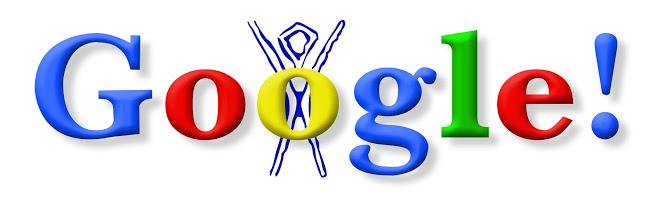
As the years progressed, so did the detail of the featured doodles.
In 2000, Brin and Sergey asked then-intern Dennis Hwang to come up with a doodle for Bastille Day. Users loved it so much that they appointed Dennis “chief doodler.”
Today, doodles are often used to commemorate holidays, special occasions, and birthdays of scientists, thinkers, artists, and other important people.
The first Doodles tended to mark well-known holidays, like Valentine’s Day, Halloween, and Indian Holi (in India). But as time has gone on, they’ve become more and more global and creative. For example, on September 1, 2017, this Doodle celebrated the first day of school (or mourned it, depending on who you ask.)

To decide which events, figures, or topics get doodles, a team gets together periodically to brainstorm. Doodle ideas can also come from Google users. After an idea or doodle pitch gets the green light, the actual doodles are designed by illustrators and engineers.
Google reported in 2015 that they’d launched more than 2,000 doodles for various homepages around the world. While Google hasn’t shared more recent stats on its doodles, PRI noted that they’d climbed over 4,000 by 2016.
Google has continued to embrace doodles with a verified Twitter account devoted to updating its audience about newly-published doodles. The account has over 127,000 followers.
Google also invites people to submit ideas for doodles at proposals@google.com.
There’s more than meets the eye to Google’s logo. As people and technology evolve, the design has too. At the rate things are changing, we’ll probably see a new version in a few years.


The 13 Types of Landing Pages & How to Pick One for a Campaign
You know them, you love them, you lay awake late at night thinking of them. Yes, marketers, we’re talking about landing pages. Those lovable lead drivers we optimize, tweak, update, and test.
Whether you’re a blogger, social media marketer, or paid marketer — you have a healthy relationship with the landing page. Sometimes, you might go through rough patches where you wonder why landing pages exist. But they’re always there for you, increasing conversions, netting new leads, and driving traffic to the offers you’ve worked so hard to create.

But, to be honest, there are a lot of different types of landing pages. It’s a little hard to keep track of them all. So, let’s round up the top types of landing pages and discuss how to pick the one that will make your next campaign successful.
1. Squeeze Page
79% of B2B marketers say email is the most effective channel for demand generation, so it’s not surprising that squeeze pages are one of the most important and effective landing pages out there.
A squeeze page is one in which the goal is to capture the user’s email address. Once you have the address, you can begin to nurture that lead with relevant content and other offers.
The most common type of squeeze page is gated content or a prompt to enter your email address to receive a newsletter, ebook, whitepaper, or other content offer.
Make sure your squeeze page is simple, your CTA is tempting enough to get your user to give up their email address, and you make it easy for users to click out of the page and onto the content that brought them to your site.
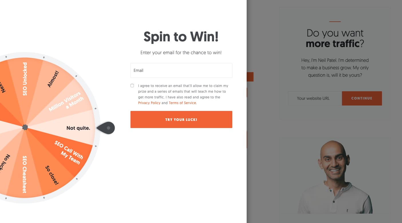
Image source: Neil Patel
2. Splash Page
A splash landing page doesn’t always have lead capture as the main goal. These pages are often used when someone clicks a social media or content link. Instead of being sent directly to the article or social media destination, the user is sent to an intermediary page: the splash page.
This page might share an announcement with the user, such as “We’ve just unveiled new dates for our 2019 marketing conference!” It might also ask your user for a language preference or to enter their age. The splash page might also present an ad, which the publisher benefits from, if the user clicks on the ad.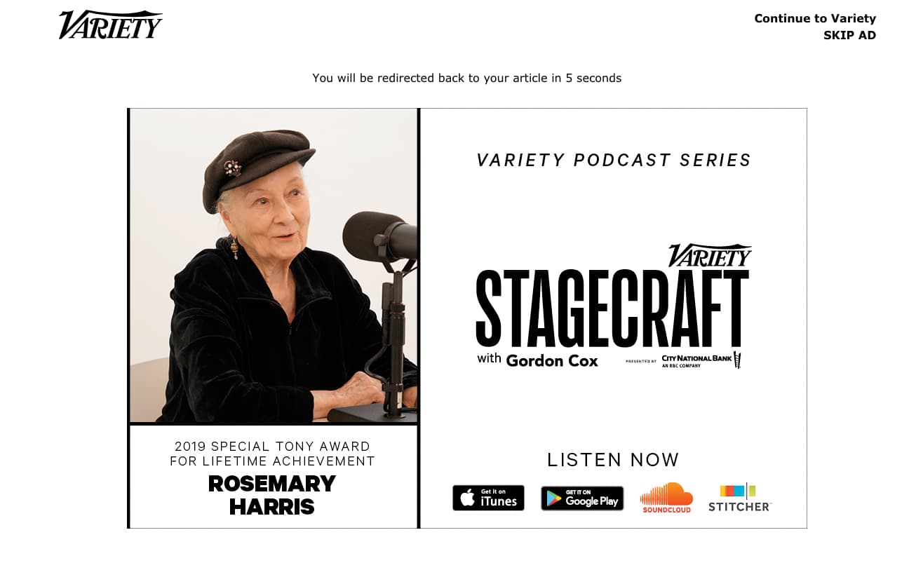
Image source: Variety
The splash page above does two things really well: First, it offers a countdown to the end of the ad and the ability to easily click to the article once the ad is done. Second, it serves a clear purpose — to show the user an ad.
3. Lead Capture Page
A lead capture page is similar to a squeeze page, but generally sources more information. Name, business name, email address, job title, and industry are just a few things these landing pages seek to earn.
The information you request depends on the goals for the page and those of your sales and marketing teams, as well as where the customer is in the funnel. If your lead capture page is top of the funnel, step away from the eight-lined form, please.
If, however, your customer is landing on your lead capture page after demonstrating real interest in your product/service (i.e., they downloaded two case studies) you should be able to ask for more information to help qualify and direct them. 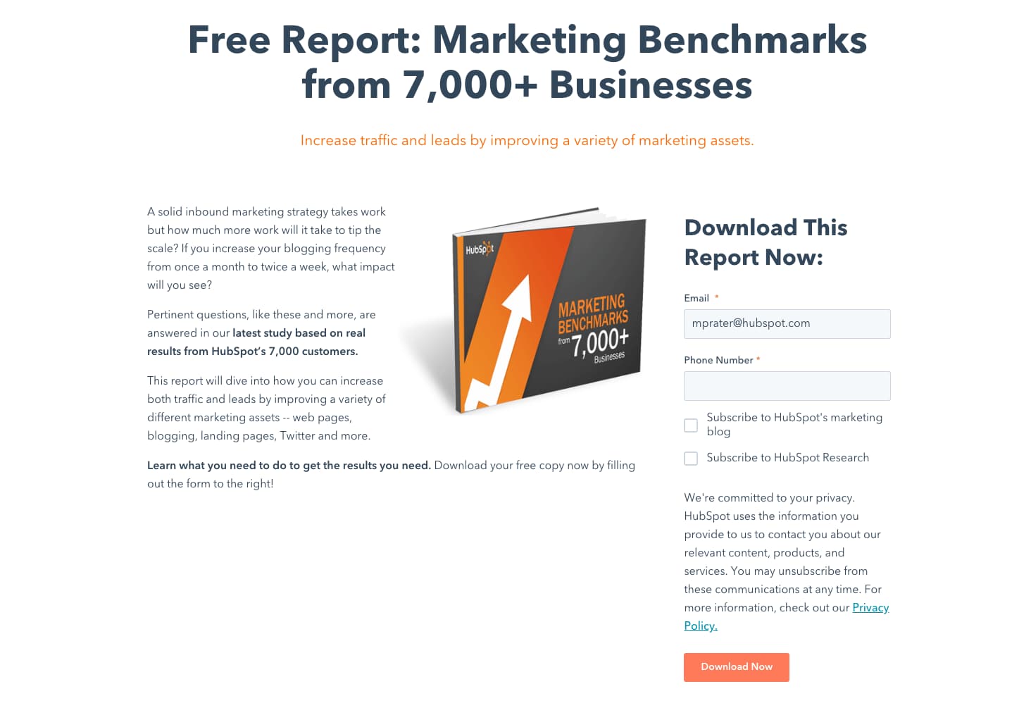
Image source: HubSpot
4. Click-Through Landing Page
Every marketer knows you must provide value to your customer before asking them for money. A click-through landing page provides that value without pummeling your customer with a “Buy Now” button before they’re ready.
Often, this looks like a landing page that shares the benefits and features of your product/service with a CTA button encouraging your customer to try a free trial. Once they click on that button, they’re taken to another landing page which provides pricing details and requires payment information to begin the trial.
By the time your customer lands on this page, however, they’re primed and educated on why they should move forward with the trial. In the examples below, you see the click-through landing page, and then the payment landing page customers are sent to when they decide to embark on a free trial.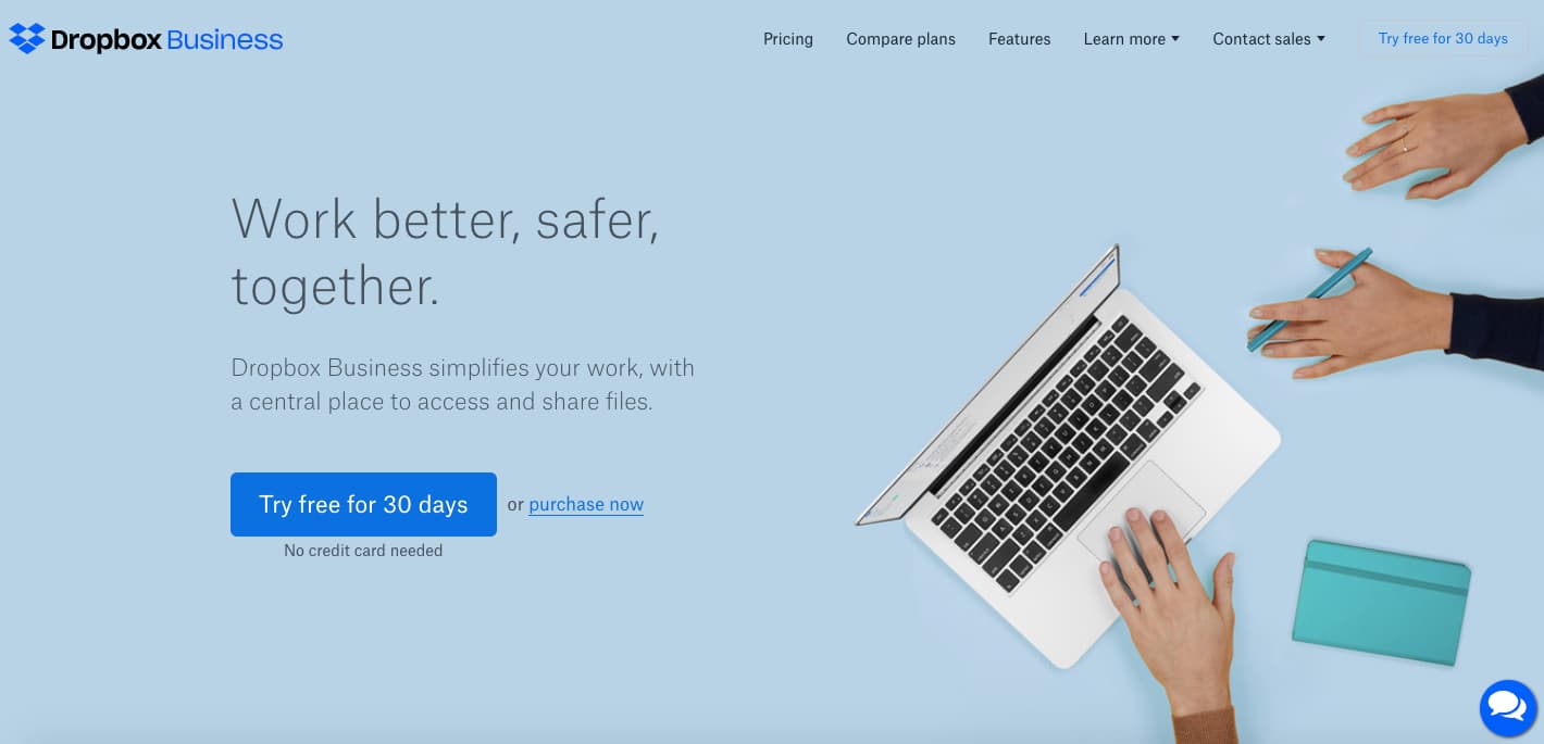
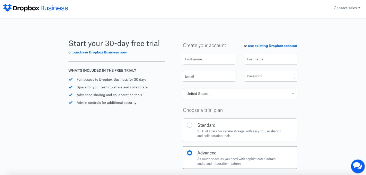 Image source: Dropbox Business
5. “Get Started” Landing Page
A “Get Started” landing page should lead with your offer above the fold. Take this page, from Mailchimp, which explains their overarching benefits: tools that turn audience data into insights that will guide campaigns.
Hooked already? Great, because a “Get Started” button awaits. Need more convincing? Well, the details follow as you scroll a feature- and benefit-laden landing page. 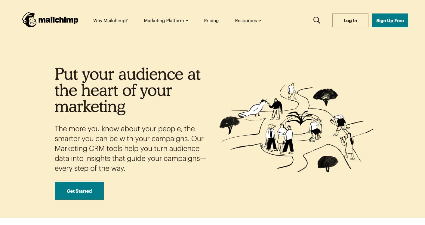
Image source: Mailchimp
6. “Unsubscribe” Landing Page
Obviously, you’re not going to build a campaign around your unsubscribe page, but it’s important not to neglect it. Make sure it successfully unsubscribes your users, offers them a chance to manage their preferences or adjust the cadence, and consider including links to other areas of your website, like this example from Whole Foods.
 Image source: Whole Foods
After all, just because they don’t want to receive your emails, doesn’t mean they might not want to browse your site. Consider adding a “second chance” button that prompts users to resubscribe, just in case they get cold feet.
7. Long-form Sales Landing Page
On a long-form sales landing page, brevity is not your friend. You want to think of every question your customer might have for you, every barrier to purchase they might face, and every benefit they’ll enjoy by making a purchase when they scroll to the bottom of the page.
Take this example, from Seth Godin’s altMBA. 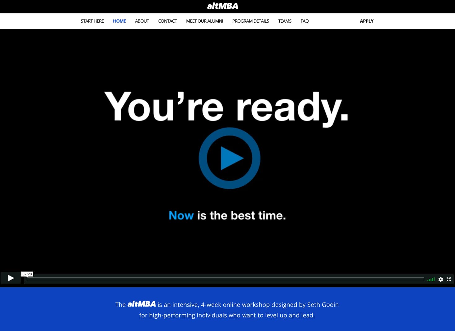
Image source: altMBA
It starts with an informative video that tells you why now is the right time to apply. Then you see the names of companies and pictures of students who have benefited from the course.
Quotes follow, along with links to join mailing lists, learn more about the program, and read testimonials. Finally, at the bottom of the page is a CTA button for the application, and program dates that add a sense of urgency.
A sales landing page should be detailed and lack the minimalism of, say, a squeeze page, simply because your goal for the page is to close business.
8. Paid Advertising Landing Page
If you’re not sending customers who click on your paid ads to the right landing page, you’re throwing money away. Generally, you want to generate leads from these ads — not necessarily sales.
For example, while scrolling through Facebook, I clicked on this ad from Airtable.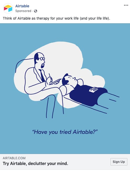
Image source: Airtable
When I clicked on the ad, I was taken to this squeeze page: 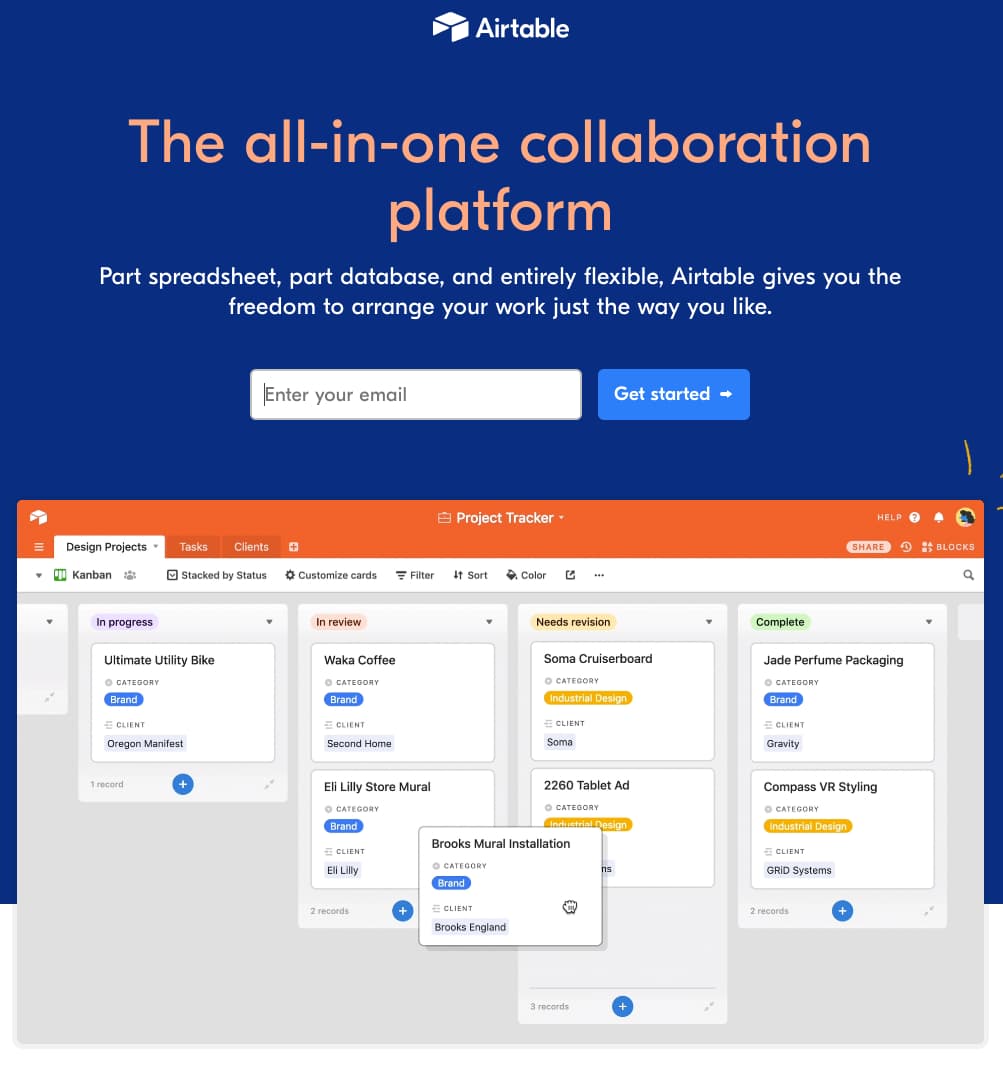
Image source: Airtable
The ad didn’t take me to a pricing or plan page, and it didn’t take me to a page packed with features and benefits. It landed me strategically on a page that asked for one thing: my email address.
It also featured a live demo of the project management tool that instantly grabs my attention and shows rather than tells me why Airtable is different and valuable.
9. 404 Landing Page
404s are never a good look, but it’s important you make them look as good as possible — and work for you a little as well. Get creative with 404s, using humor to offset the error, and always direct your audience back to your homepage or other neutral landing page.
Then, put your 404 landing page to work as a lead generation tool. Take our own 404 page, here at HubSpot. We offer the user three options: visit our blog, learn more about our software, or sign up for a free demo.
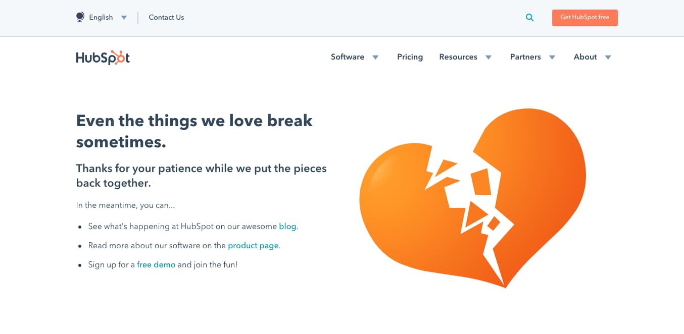 Image source: HubSpot
10. “About Us” Landing Page
Your “About Us” page doesn’t have to be a dead end. Make this landing page a lead generation page as well. Take this example from makeup company, Glossier.
They pack their “About Us” page with plenty of history, vision, and mission, but they also let the reader know how to move forward. The bottom of the page offers a reminder (and links) to shop, follow, email, and join the company, and an email subscription offer captures emails.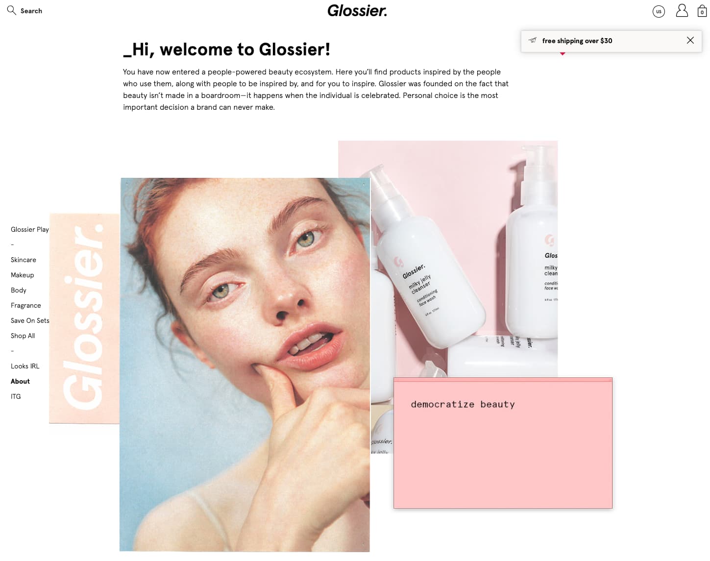
 Image source: Glossier
11. “Coming Soon” Page
Launching an exciting new product soon but aren’t quite ready to reveal the full offer — or the incomplete landing page? Set up a simple “Coming Soon” landing page instead.
Tease your offer, provide a launch date if you have one, and add a CTA that asks them for their email address in exchange for an email notification when your product or service is live.
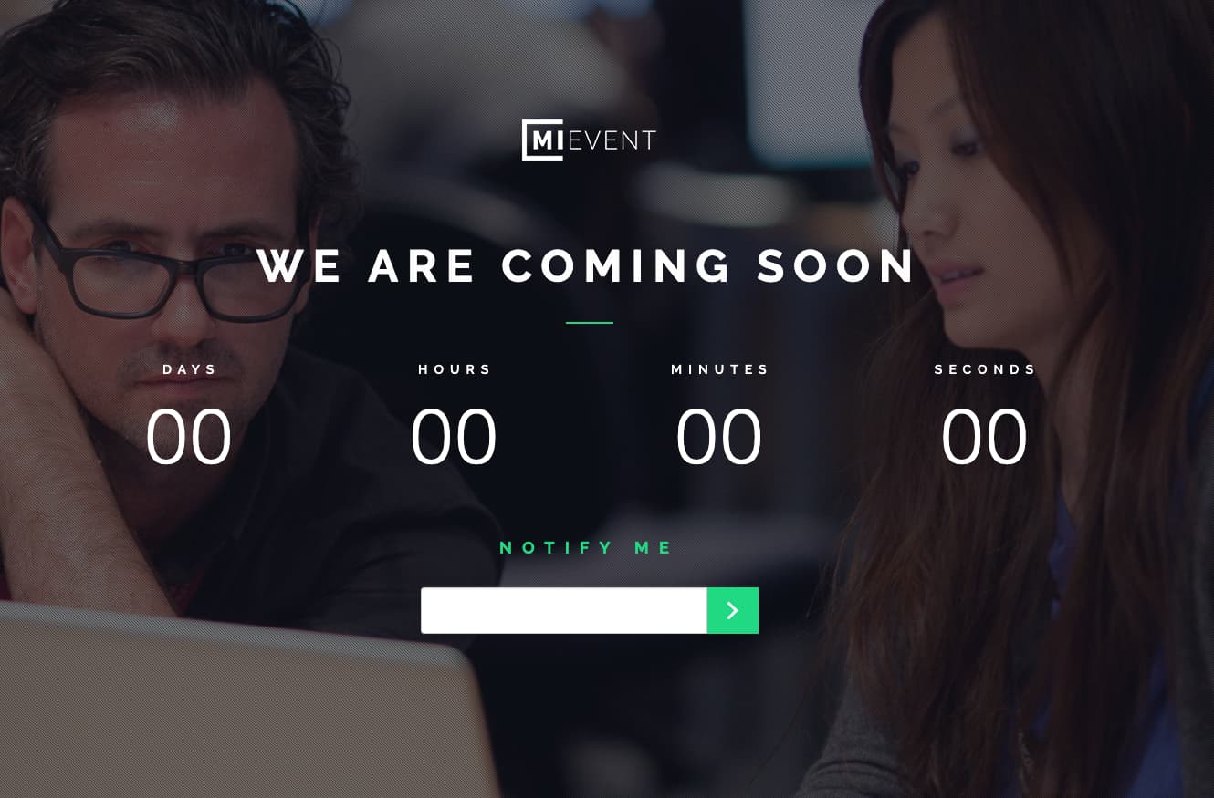 Image source: MiEvent
12. Pricing Page
If you’re unveiling new pricing or product tiers, you might consider pushing customers to your pricing landing page. Regardless, your pricing page should be one of the most heavily optimized pages on your site. Take this one, from Wistia, which clearly outlines their three tiered packages, with links to more information or to get started.
What I really love about their pricing page, however, are the two boxes right after a list of features and before a carousel of testimonials. They offer special callouts for interested parties who might not fall within the needs of one of the three boilerplate pricing templates.
And if even those additional CTAs don’t speak to your needs, scroll down to the bottom and find a CTA that offers customers the ability to “Choose your own adventure.”
 Image source: Wistia
13. “Thank You” Landing Page
Too often, a “Thank You” page serves no real purpose. It tells you what you already know, “You’ve downloaded the greatest whitepaper in the world! Access it here.” Put your “Thank You” page to work by including additional offers or gifts.
You’ve been given an incredible opportunity to provide more value to a highly motivated, already-interested customer. Don’t waste it.
Take this example — another one from HubSpot. I downloaded a guide on user-generated content, and the “Thank You” page provided me an additional offer to receive free advice on leveraging user-generated content.
The form I fill out to receive this advice asks for different, more detailed, information about my business needs, allowing HubSpot to better craft the next offer they send my way.
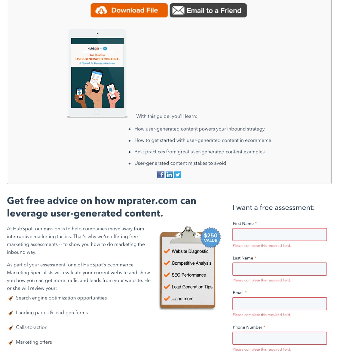 Image source: HubSpot
How to Choose the Right Landing Page for Your Campaign
Now that you understand the most common types of landing pages, the question remains: How do you pick the right one for your next campaign?
Begin by asking yourself these questions:
- “What are the business goals I’m trying to achieve with this landing page?“
- “How are my competitors achieving these goals?“
- “What are my audience’s goals when they land on this page?”
- “How did my audience get to this page (i.e., what action or motivation brought them here)?“
- “What do I want my audience to do when they leave this page?“
Once you understand the page’s goals, consider whether it should be a short- or long-form landing page.
Short-form landing pages lend themselves well to squeeze landing pages, “Thank You” landing pages, and “Unsubscribe” landing pages. These pages require a small ask or provide a small service to the customer.
Long-form landing pages are best reserved for sales landing pages, click-through landing pages, and pricing pages. If you have a big ask of your customer, you should probably design a long-form landing page.
So, what does this look like in practice? Let’s say I’m creating a brand-awareness campaign for my new startup that facilitates puppy snuggles for tired office workers (a girl can dream, right?). The business goals I have for this campaign are to capture new leads (email addresses) and drive impressions.
My competitors are running social media campaigns driving customers back to a sales landing page. But since impressions and leads are my goal (not purchases), I might choose to run social media ads featuring big images of snuggling puppies.
When customers click my ads, they’re wondering what these cute puppies are about, so I’ll take them to my “About Us” page to tell them more about SnugglePups Inc.. Because I’m also hoping to drive email signups, I’ll include a link to our weekly newsletter, which promises a roundup of the best puppy pics available.
Ready to put all of this knowledge to use? Check out this list of best landing page builders. And if it’s inspiration you’re looking for, look no further than this roundup of landing page examples you need to see.
