The Two-Step Process for Getting Genuine Reviews on Amazon
Ever since I started playing guitar in elementary school, the only online tablature I’ve trusted to teach me how to play my favorite songs have the highest quantity and quality of ratings. To me, a substantial amount of people vetting a certain tab for accuracy and giving it a five-star rating means that it’s the best tab out there. It also saves me a ton of time from having to compare every single tab’s accuracy to one other.
If you sell products on Amazon, the same principle applies. Reviews are crucial for driving sales on Amazon. Humans evolved to follow the crowd and assume that the majority is always right, so the more reviews you have and the better their ratings, the more credible and trustworthy customers will perceive your products to be.
However, according to analyses conducted by the Washington Post and Fakespot, a tool that leverages artificial intelligence to assess the trustworthiness of reviews left on Amazon, Yelp, TripAdvisor, Best Buy, Walmart, and more, over 60% of customer reviews in the electronics, beauty, sneakers, and supplements product categories on Amazon are fake or paid for.
The quantity and quality of your customer reviews have a huge impact on your rankings and ability to sell on the platform, so Amazon is starting to crack down on merchants who manufacture their products’ reviews. If they catch you manipulating your customer reviews, they can suspend your account, ban it, and even sue you.
To avoid Amazon’s wrath and start garnering the most organic reviews on the platform, we’ll show you a two-step process that can convince your customers to leave genuine reviews on your product pages. Read on to learn how to get Amazon reviews with integrity.
How to Get Reviews on Amazon
1. Sell a product that’s worth getting reviewed.
Today, we operate in a world where a lot of people prioritize gaming the system over providing the best brand experience possible. Fortunately, in regard to their customer review system, Amazon has caught on to this hollow tactic.
In 2016, Amazon banned incentivized reviews — which were customer reviews given to brands in exchange for a free or discounted product as long as the reviewers revealed they received an incentive for their feedback.
These incentives were artificially inflating brands’ average ratings, so Amazon decided to level the playing field. Like we mentioned before, if they catch you manipulating your customer reviews, they can suspend your account, ban it, and even sue you. In fact, they take their customer reviews’ integrity so seriously that they don’t even allow your family members to leave reviews on product pages.
With this in mind, don’t even think about incentivizing or selling a positive review on the eCommerce platform. Instead, to get the best reviews possible, focus on crafting a high-quality product and providing top-notch customer service. This is what will truly convince customers to leave genuine five-star reviews on your product pages.
2. Send follow-up emails to customers.
Amazon lets you send automated follow-up emails that ask for product reviews to customers after they order one of your products. However, Amazon also requires you to follow a strict set of guidelines when using follow up emails, which don’t allow you to include marketing messages, link to other websites, or ask for, demand, or incentivize positive reviews in these emails. So when you’re drafting your follow-up email, it’s best to just politely ask for a candid product review.
According to JumpSend, an Amazon email automation and coupon distribution tool, sending more than three emails per order will annoy your customers and lead to diminishing returns. At the most, JumpSend recommends sending a delivery confirmation email to get your customers excited about your product, an email two days after delivery that asks for an early review when the product is still fresh in your customers’ minds, and an email a week after delivery as a last ditch effort to convince your customers to leave a review if they haven’t already.
In marketing, integrity trumps all.
Nowadays, trust, not attention, is a marketer’s currency. You can attract all the eyeballs in the world, but if people don’t trust you, you’ll never sell anything. So even though our two-step process won’t help you garner the highest quantity of reviews or possibly even the highest quality of reviews, it’ll help you gather the most organic and genuine reviews. And in a world where only 4% of consumers believe marketers and advertisers practice integrity, being authentic isn’t only the right thing to do, it’s the best thing to do for your business.

The 9 Best Free Portfolio Websites for Creating an Impressive Digital Portfolio
Whether you’re a UX designer, freelance writer, or photographer, an impressive online portfolio is critical for impressing potential clients, and landing future jobs.
A digital portfolio enables you to cultivate and display your very best work — additionally, if you don’t have a ton of prior experience in the industry, a portfolio can help you display your skills and talent with mock projects.
But crafting a good digital portfolio can feel like a daunting task, especially when you aren’t even sure which website you should use to create one. Here, we’ve created a list of the nine best portfolio websites for designers, freelancers, and photographers, to ensure you’re able to showcase your best work in any industry.

Best Free Portfolio Websites for Freelance Writers
1. Journo Portfolio
On Journo Portfolio you can create a sleek, modern digital portfolio easily. The site offers six distinct themes, and adding an article is as easy as pasting a URL and clicking add — the site takes care of incorporating the title, publication, date, content, and image. Features include the ability to integrate with Google Analytics or use Journo’s built-in analytics tools to measure visitors. Additionally, your site is automatically mobile-ready.
You can also blog straight from the platform, which could be useful if you want to showcase freelance work and your current blog in one place. Journo lets you create multiple pages, so you can have a Contact Me or About Me page, as well as your freelance portfolio.
Note: It’s free for a name.journoportfolio.com URL (10 articles max), but for a custom domain URL and unlimited articles, you’ll need to pay for a Pro version ($5-$10 per month).
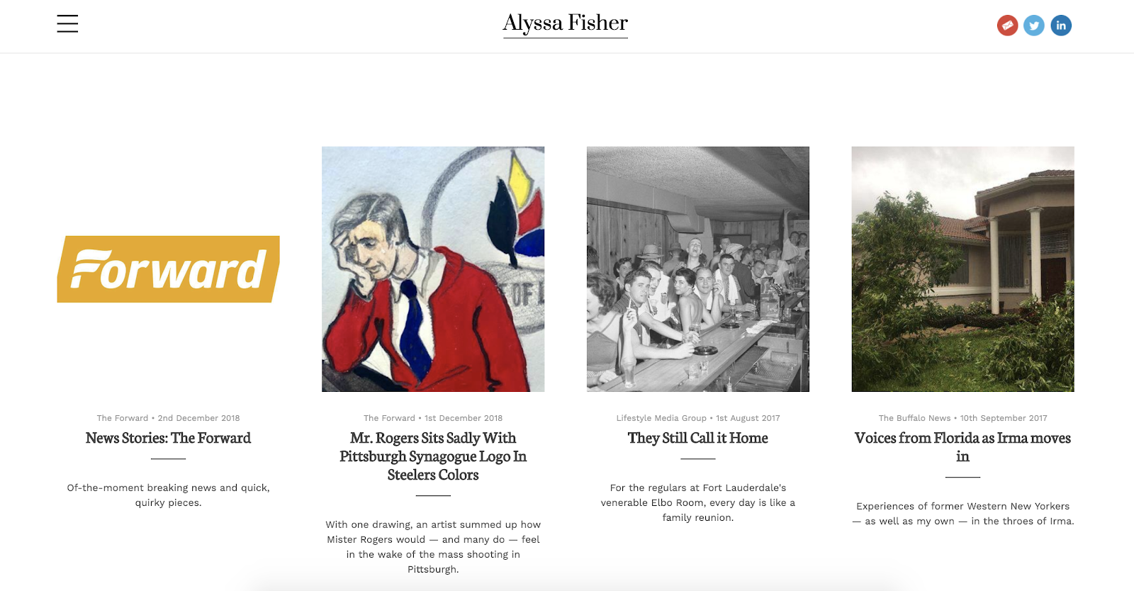
Image courtesy of Journo.
2. Muck Rack
Muck Rack is a free media database that helps connect journalists with PR professionals, so if you use the site, you’ll have good opportunities to network and receive PR pitches. You can even include specific topics you don’t want to cover, which will filter out unfit pitches.
Additionally, for true ease-of-use, Muck Rack creates and maintains your portfolio for you by automatically compiling articles and social media profiles. Once it’s finished, you have the option to customize your bio, or choose to spotlight certain pieces.
Muck Rack also offers a news alerts system, which enables you to track stories or tweets about a company, brand, or specific story angle. With their news alerts system, you can see when other journalists share information or publish stories related to your work, which will help you stay on-top of trends.
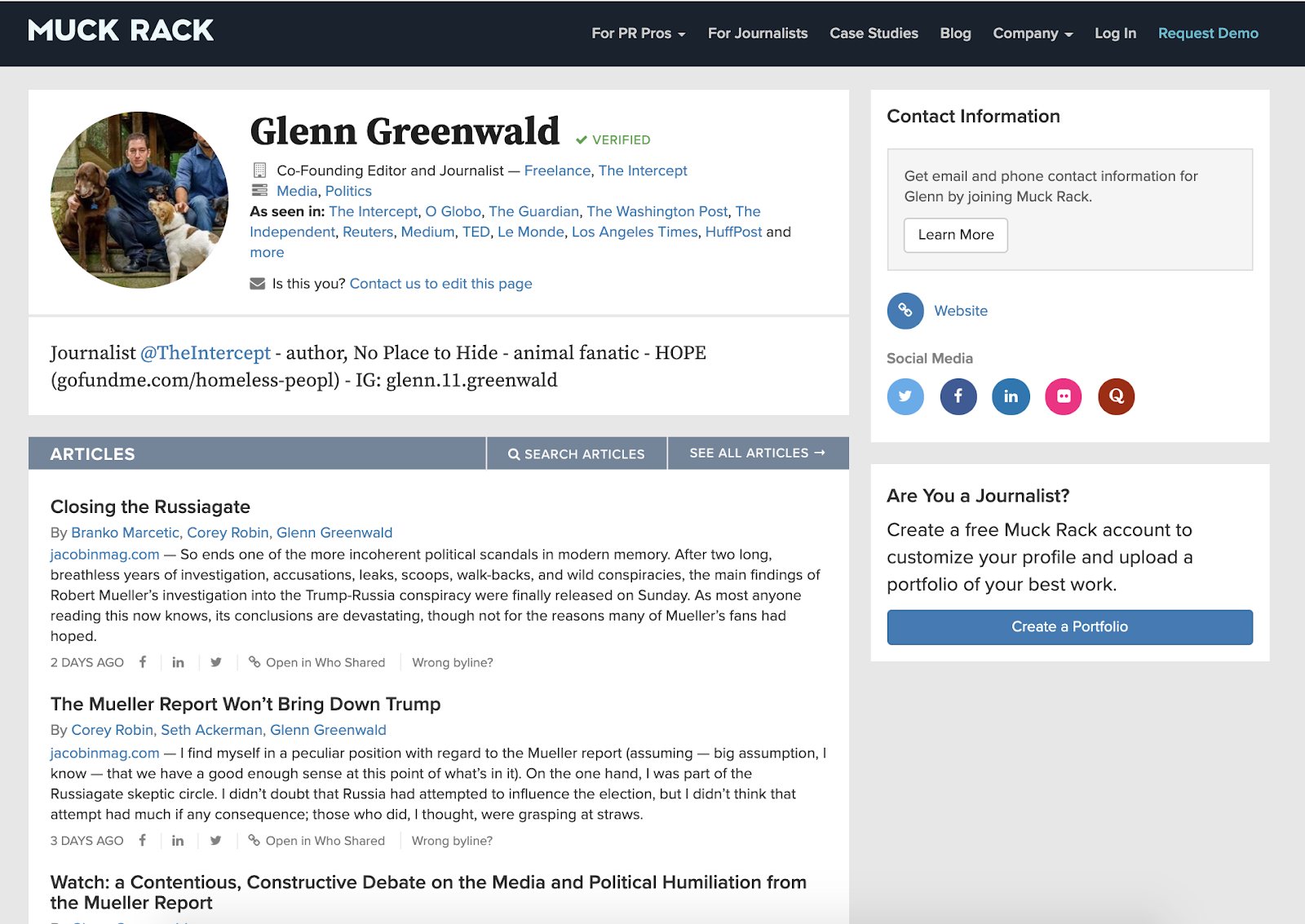
Image courtesy of Muckrack.com/ggreenwald.
3. WordPress
WordPress, a major content management platform, lets you create a blog on their platform for free. While not specifically geared towards freelance writers, WordPress offers plenty of impressive responsive themes to craft a unique blog and showcase your work. If you want complete creative control over your portfolio, this is a good option for you.
Additionally, you might choose to use WordPress if you want to showcase your writing along with other skills — if you want a page for Writing and a page for your photography, for instance, WordPress offers a variety of themes and is flexible enough to enable you to demonstrate various pieces of creative work.
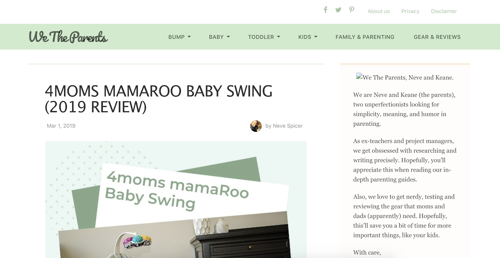
Image courtesy of Wetheparents.org.
Best Free Portfolio Websites for Designers
4. Behance
With millions of UX/UI designers, artists, and photographers on the site, Behance is one of the most widely-used online portfolio websites. It’s also extremely simple and easy to use — you can organize your work based on project, list projects under construction, and ask followers for feedback. Additionally, the site allows you to link your portfolio to your social media accounts.
Behance’s massive digital community makes it a good option to get your name out there, particularly since recruiters and interviewers peruse the site to find talent, as well. However, Behance displays the number of people who have viewed your work and liked it, making it riskier than a more straightforward website portfolio.
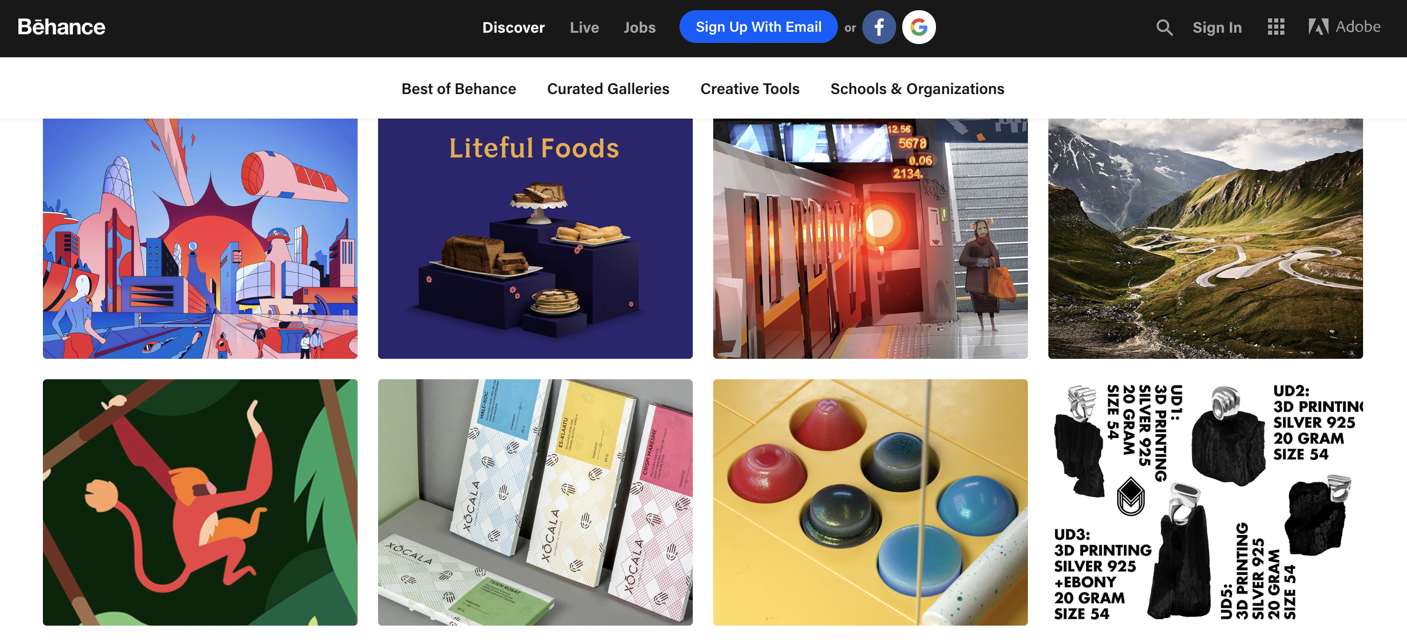 Image courtesy of Behance.
5. Adobe Portfolio
Adobe Portfolio offers options to create a single-page website, or a full gallery of your work. With Adobe Portfolio you’re able to set up a sleek and customized portfolio in minutes, and each of the platform’s themes are automatically optimized for any device.
Additionally, Adobe Portfolio offers users a free Creative Cloud subscription service as part of the package, as well as the ability to integrate with Behance to import your projects for greater visibility.
 Image courtesy of Garrett Byrum.
6. Crevado
One of the easiest free portfolio websites, Crevado lets you use a simple drag-and-drop tool to upload your projects and rearrange on the screen for true ease-of-use. The site is also automatically optimized for any device, so your portfolio can be viewed on a smartphone or tablet as well as a desktop. Best of all, you can customize your design to suit your preferences without writing any code.
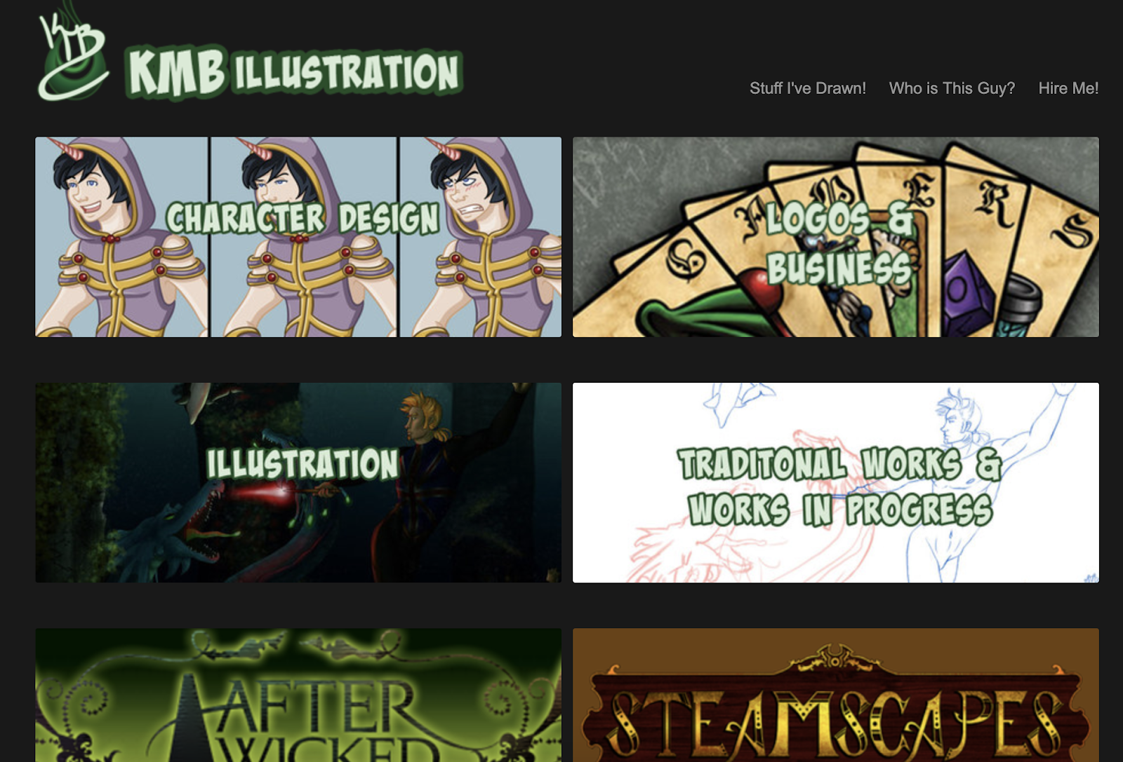
Image courtesy of Kmbillustration.com.
Best Free Portfolio Websites for Photographers
7. Flickr
Undoubtedly one of the most well-known portfolio sites with billions of photos and millions of members, Flickr is a good site to share your own work, connect with other photographers, and find inspiration for future projects.
However, Flickr’s community-oriented platform can make it difficult to showcase your best work and appear professional — particularly since the site is typically used to share images with friends and family. For this reason, many designers also suggest creating a more polished portfolio website, and then linking to that website from Flickr. 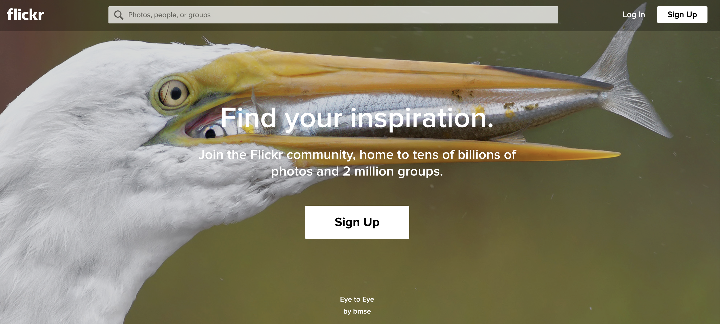
Image courtesy of Flickr.
8. Portfoliobox
Portfoliobox is a website builder specifically designed for photographers, and it’s a good option for crafting a professional-looking responsive gallery of your best work. Additionally, Portfoliobox offers an e-commerce link which allows you to sell your prints or other artwork directly from the site. With the free sign-up, you’ll receive a domain name, and a blog to further attract visitors to your site.
Best of all, Portfoliobox doesn’t make you use a standard theme — instead, you can integrate any style for any page to cultivate a unique, one-of-a-kind website. With more than one million users, it’s a good option for both professional and novice photographers.

Image courtesy of Mika Suutari.
9. YouPic
YouPic’s users include famous photographers like Joel Meyerowitz and Julia Fullerton-Batten. Another site specifically designed for photographers, YouPic enables you to craft a free stunning portfolio to showcase your work.
Additionally, the site offers trainings to improve your photography skills, as well as a Pinterest-style “Explore” page that lets you check out popular photographs, new artwork, and stories to inspire your own gallery. And, most interesting to note, YouPic allows users the opportunity to copyright their photos on the blockchain, and is the first decentralized photography platform.

Image courtesy of YouPic.
For further inspiration, check out 21 Memorable Photography Portfolio Websites to Inspire You or The 12 Best Graphic Design Portfolios We’ve Ever Seen, & How to Start Your Own.

27 of the Best Website Designs to Inspire You in 2019
Every once in a while, I’ll come across a website that really draws me in. So, I found 27 of them to show you.
These sites push the boundaries of what is known to be possible on the web. Whether it’s the design aesthetic, usability, interactivity, sound design, or value that the site provides, each one is a masterpiece in its respective industry, and something to be inspired by.
Not surprisingly, many organizations exist to highlight these sites and the contributions they make to the web. To help surface some of the most inspirational designs, I gathered 21 award-winners that have made their way through several key awards organizations — including Awwwards, UX Awards, The Webby Awards, SiteInspire, Best Website Gallery, and FWA.

Click the links below to jump to a group of website designs that crushed it in the last several years:
- Best Website Designs from 2014 – 2015
- Best Website Designs from 2016
- Best Website Designs from 2017
- Best Website Designs from 2018
Below this list, I also found six more websites whose homepage designs are just plain cool and worth learning from.
As you browse through the list, know that each site excels in its own way and seeks to serve a unique purpose. While one site may be an excellent example of visual design, another may be an excellent example of interactivity. This means that not all of these sites may be “conversion machines” or blueprint ideas that you can easily copy over to your site.
Rather, they’re great ways to gain some website design inspiration and see the cutting-edge marketing that’s happening in the different corners of the web.
Best Website Designs
- Virgin America
- Feed
- ETQ
- Mikiya Kobayashi
- The History of Climate Change
- Beagle
- Woven Magazine
- JOHO’s Bean
- World of SWISS
- Rainforest Guardians
- Protest Sportswear
- The Teacher’s Guild
- Inside Abbey Road
- Simply Chocolate
- NOWNESS
- Citrix: The New Mobile Workforce
- crypton.trading
- Southwest: Heart of Travel
- Reductress
- Overflow
- Frans Hals Museum
- Minimums
- MovieMark
- Guillaume Tomasi
- The District
- Tej Chauhan
- Amanda Martocchio Architecture
Beautiful Award-Winning Websites
And the awards go to …
Best Website Designs from 2014 – 2015
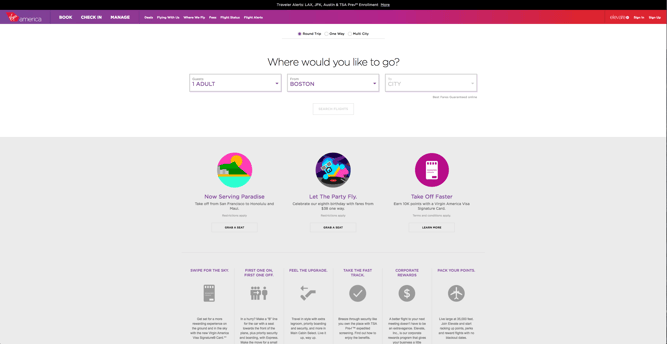
1. Virgin America
Award: Most Significant Industry Evolution, 2014 UX Awards
In a world where airline websites are known to be riddled with major usability issues, Virgin America has one of the best websites that pushes usability, accessibility, and responsive design forward. In fact, it’s been named as the first truly responsive airline website, a new precedent in the industry.
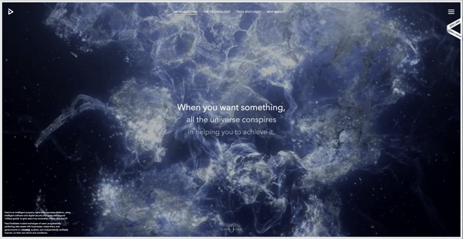
2. Feed
Award: Site of the Day (6/6/2015), Awwwards
Not only is Feed an interesting concept, but it also has a stunning execution that challenges our understanding of what is possible on the web. Through a creative blend of animation and video, the site immerses the user into a very engaging experience. As an atypical site, it contains several unique usability elements as well, including a navigation that doubles as a scroll progress bar.
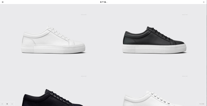
3. ETQ
Award: Site of the Day (5/19/2015), Awwwards
ETQ takes a very minimalistic approach to ecommerce with their stripped-down site with big, compelling visuals of their product. Simple, flat, color-based backgrounds accompanied by strong typography help to keep the focus on exactly what the user came there to see: shoes.
4. Mikiya Kobayashi
Award: Site of the Day (7/4/2015), Awwwards
Mikiya is a Product Designer with a minimalistic portfolio that showcases his work through strong photography and subtle animations. His full site was originally created in Japanese and then translated into English, helping demonstrate the international scalability of his design.

5. The History of Climate Change
Award: Site of the Day (6/23/2015), Awwwards
Follow the footsteps of Luc Jacquet as Wild-Touch takes you along this visual and educational journey about the history of global climate change. A mixture of historical media and unique animations help tell the story.

6. Beagle
Award: Site of the Day (4/19/2015), Best Website Gallery
Beagle does an exceptional job of visually and progressively telling the story of their product in a simple and easy-to-digest way. This is a major challenge for many startups, especially when they’re introducing new concepts to existing markets. People want to know, “What is your product? How does it work? Why do I care?” Beagle answers all those questions while simultaneously showing off their product and compelling the user to purchase. Plus, they’re one of few sites that actually implemented “scroll hijacking” correctly.
 Featured by Best Website Gallery
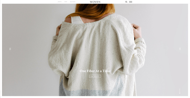
7. Woven Magazine
Award: Site of the Day (4/4/2015), Best Website Gallery
Woven is an online publication that celebrates artists, craftsmen, and makers alike. To me, they represent a confirmation that publications can (and should) have beautiful, engaging sites with easy-to-read content. Free of distractions like pop-ups and obtrusive ads, this site all about the experience of the content itself.
 Featured by Best Website Gallery
8. JOHO’s Bean
Award: FWA of the Day (8/7/2015), Favorite Website Awards
The website for JOHO’s Bean has incredible imagery, interactivity, story telling, visual design, and most of all, sound engineering. These all come together to create a compelling, emotional, and engaging site that tells the story of a coffee bean’s journey.

9. World of SWISS
Award: Best User Interface, 2015 Webby Awards
Another airline?! What is happening?! Yep, SWISS airlines built an incredibly immersive site that tells their story and describes what it’s like to fly with them — and they simply did too great of a job to be ignored. Strong visuals and animations introduce the user to different sections of the site that are packed with information beyond the usual sales and marketing pitch that is so common today.

Best Website Designs from 2016
10. Rainforest Guardians
Award: Best Activism Website, 2016 Webby Awards
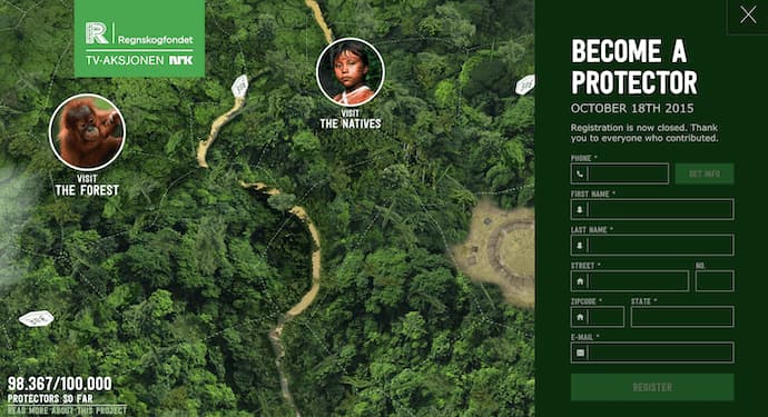
Rainforest Guardians became one of the most immersive nonprofit websites of 2016. Seeking to build awareness around deforestation, the site allows users to “visit” the various villages, natives, and waterways that make up the Amazon Rainforest. The site puts interactivity at the center of its user experience — a wise choice if your goal is to get people to connect with your cause and convert into volunteers.
11. Protest Sportswear
Award: Site of the Year (2016), Awwwards
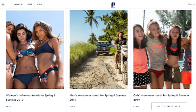
The Awwwards calls Protest Sportswear a “shoppable look book,” and that’s exactly what this site is. As a clothing outfitter, this website has reinvented the way they market their product: Rather than promoting garments of clothing, Protest Sportswear promotes “looks.” This makes the company’s product the most appealing part of the website itself, using a collage of styles to design a homepage that changes as often as its customer’s styles do.
12. The Teacher’s Guild
Award: Best Association Website, 2016 Webby Awards
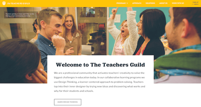
The Teacher’s Guild is a professional community of educators whose website publishes content that addresses today’s most critical challenges in education. What makes this website award-winning is how it balances diverse content types — programs, solutions, approaches, and collaborations — without overwhelming its visitors. Not only are its background visuals prominently placed, but they also use white space to emphasize the written calls to action at the center, as shown in the screenshot below.
13. Inside Abbey Road
Award: Best Music Website, 2016 Webby Awards
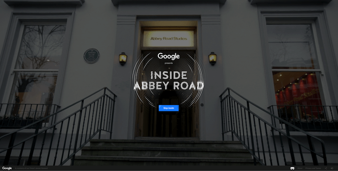
Google knocked it out of the park with this highly interactive site, which allows users to step into the Abbey Road Studios. Brilliant sound design, navigation mechanics, and visuals mixed with the usual “Google flair” all help draw visitors in to this well-made web property.
Best Website Designs from 2017
14. Simply Chocolate
Award: Site of the Year (2017), Awwwards
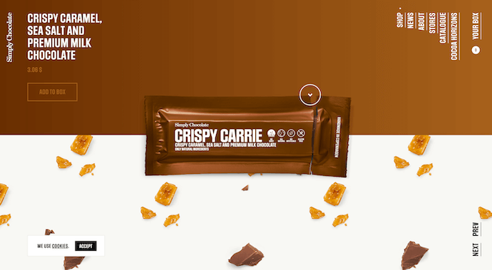
You’ll get a craving for chocolate just looking at this website — and in a way, that’s Simply Chocolate‘s website working as designed.
This appetizing website is that of a Denmark chocolate maker named Simply Chocolate. Its website uses a variety of colors (and creative product names) to promote each chocolate bar. And as you scroll from one product to the next, they all seem to remain consistent in brand. The three-dimensional appearance of each chocolate bar makes you feel like you can grab it off of your computer screen, while the “Add to Box” CTA to the top-left is ideally placed for users to select the products they want while browsing.
15. NOWNESS
Award: Best Cultural Blog/Website, 2017 Webby Awards
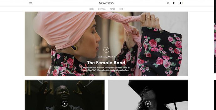
Nowness is perhaps the coolest crowdsourced video blog on the internet today. That was a mouthful … what does all that mean?
NOWNESS‘s “crowdsourced” nature is part of what makes it an award-winner. This means most of its content comes from independent creatives — an increasingly popular way for businesses to publish content. NOWNESS is also a video blog, meaning all of its blog content is in video format. Together, these qualities help make Nowness a captivating hub for the stories that brands everywhere strive to tell.
16. Citrix: The New Mobile Workforce
Award: Site of the Day (11/23/2017), Best Website Gallery
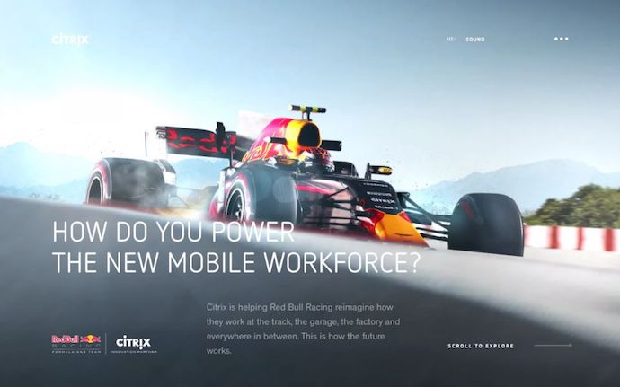
This website — dedicated to Red Bull’s partnership with Citrix, a cloud-based software company — is amazing.
The New Mobile Workforce, a site owned by Citrix, uses panoramic photography to show visitors how Citrix is supporting Red Bull Racing’s new race car. Even if you’re not a car-racing enthusiast, the website’s clever animations to explain a complicated automotive technology are hard to ignore.
 Featured by Best Website Gallery
Best Website Designs from 2018
17. crypton.trading
Award: Site of the Day (4/3/2018), Awwwards
Meet crypton.trading, your robot accountant.
Crypton.trading is a trading hub for cryptocurrencies such as Bitcoin, using artificial intelligence to predict changes in a currency’s value and identify key buying and selling opportunities. The website was rated high for its development and design, as it gradually explains more of the developer’s methods the further down visitors scroll.
This award-winning website makes tech-savvy visitors feel right at home the moment Crypton’s greeting appears across the homepage, one letter at a time.

18. Southwest: Heart of Travel
Award: Best Visual Design – Aesthetic, 2018 Webby Awards
When Southwest Airlines wanted to prove its customers were “more than just a dollar sign,” the company created a website whose design was assembled using the shapes of their customers’ flightpaths.
The website, called Heart of Travel, even allows visitors to create their own artwork out of a trip they might plan on taking. In this way, Southwest’s website is a product of their most loyal passengers.

19. Reductress
Award: Best Humor Website, 2018 Webby Awards
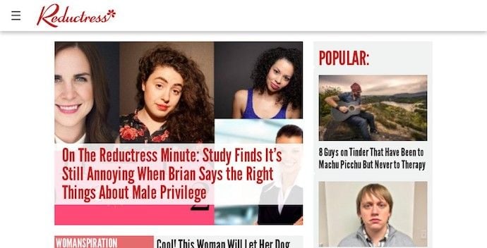
It’s not that hard to make someone laugh on the internet; so much of what we read and consume online is meant to be entertaining. But it is hard to do it consistently for a large audience. Reductress is a satirical magazine whose headlines and general reading experience are top-tier in the humor department — making the website itself a quality property.
 Featured by The Webby Awards
20. Overflow
Award: Site of the Day (3/20/2018), Best Website Gallery
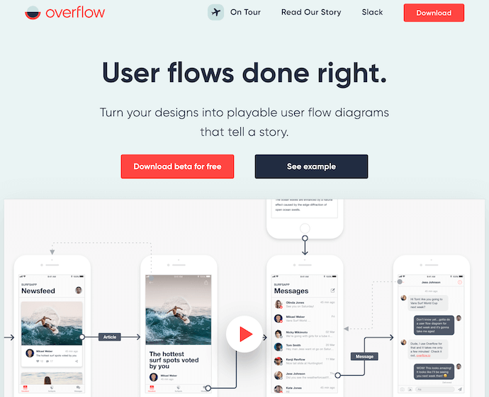
Overflow is a design tool that allows people and businesses to create story-like flow diagrams of their ideas so they’re easier for others to understand. Aside from this being just a good service, the Overflow website practices what it preaches: Along with vibrant red call-to-action buttons for downloading the tool, this website promotes its product the best way it knows how — using a flow diagram.
The website delivers this flow diagram in the form of a video. And while embedded videos can look rather clunky sitting in the middle of a website’s other design elements, Overflow’s is perfectly placed and exactly what you’d want to see when landing on the site for the first time.
Featured by Best Website Gallery
21. Frans Hals Museum
Award: Site of the Year (2018), Awwwards
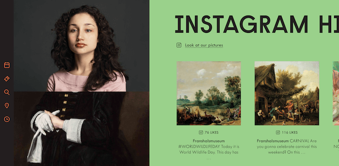
It can be tough for a museum, whose brand is predicated on a variety of incredible artwork, to bring it all together on a cohesive website. That’s what makes the website of the Frans Hals Museum so impressive.
Located in the Netherlands, this museum has created a website that uses a combination of digital design elements and its own exhibits. This mixture helps visitors understand what they’ll see, when they can see it, and where else they can get a taste of what this museum has to offer. Speaking of the latter, the museum promotes its Instagram account directly on its homepage — a brilliant move for a museum looking to expand its audience across its online channels.
Other Cool Website Designs
22. Minimums
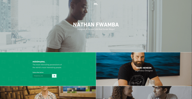
Minimums takes a very bold approach to the way that they display their content, leveraging a grid-based website design, big typography, and full-width, high-quality images. Their site serves as a really nice example for how to properly execute a grid structure while still maintaining a nice visual hierarchy in the design.
23. MovieMark
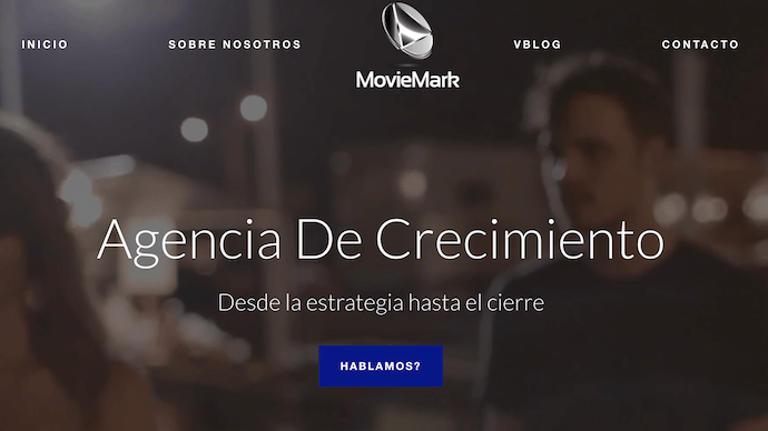
MovieMark is a growth marketing agency and HubSpot Partner, whose website is covered head to toe in the service it offers: digital storytelling. Located in Colombia, the agency makes video a core focus of its brand, so it’s only fitting that MovieMark‘s website follows this theme. And oh, how visually pleasing the videos on its website are …
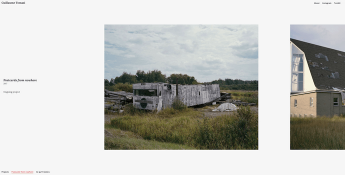
24. Guillaume Tomasi
As a Photographer in Montreal, Guillaume Tomasi has built a portfolio that’s truly fit to house his unique and awe-inspiring photography. His surreal photo style is juxtaposed by his simple, flat, empty, and minimalistic portfolio design that places all of the focus on the work itself.
His unique series navigation coupled with art-gallery-inspired work introductions and perfect scrolling interactions yield an experience reminiscent of that of a real gallery.
25. The District
This branding agency takes its imagery seriously, and it should — it handles all channels of media for their clients. The District’s website, alone, is a journey through some of the most beautiful artwork and photography you’ve ever seen.
These provocative tiles change rapidly as you explore the website, and the wackier they seem, the more interested you become in learning about their past work.

26. Tej Chauhan
Tej Chauhan has turned impressionist artwork into a business model with this intriguing website. Each image on this product developer’s homepage slides out to cover the previous image, offering little context around the object you now see in front of you.
But isn’t that lack of context exactly what makes you want to learn more? The tagline, “Souvenirs of The Near Future,” suggests these objects are a part of their product line — and an opportunity for you to get these innovative objects into your life.

27. Amanda Martocchio Architecture
An architecture firm might not specialize in web development, but its website should still demonstrate its commitment to visually pleasing design. Amanda Martocchio took that to heart with this gorgeous website.
It’s no secret that Amanda Martocchio Architecture loves its work — each picture on the homepage of its website is an enchanting shot of the houses the company designs. The website labels every house you scroll through with the type of design that was intended, along with numerous angles to each building.

Want more website design examples? Check out these amazing product pages you’ll want to copy immediately.


An Introduction to Brand Dilution, Extensions, and Cannibalization
You might know Cadbury for their high-end chocolate and candy, but did you know they sold instant mashed potatoes from the early 1960s to the mid 1980s?

Image Credit: Geek Goes Vintage
Smash, their instant mashed potato brand, surprisingly reached mainstream success. But, unfortunately, it was at the expense of lowering their flagship product’s perceived quality.
Cadbury is a premium confectionery company, so when they started producing low-end food products, like instant mashed potatoes, it’s not shocking to learn that their association with the finest chocolates weakened. Eventually, in 1986, Cadbury sold Smash, only 20 years after they introduced their instant mashed potatoes to the world.
Cadbury’s expansion into instant mashed potatoes created a new revenue stream and even generated more sales for them, but it damaged their brand as a whole. This phenomena is called brand dilution, and, below, we’ll dive into it, as well as other related concepts called brand extensions and brand cannibalization.
Brand Dilution
Brand dilution is when a company’s brand equity diminishes due to an unsuccessful brand extension, which is a new product the company develops in an industry that they don’t have any market share in, like Reese’s Puff Cereal or Gerber’s baby clothes.
Brand Extension
Companies leverage their existing brand awareness and equity to develop brand extensions that create new revenue streams. However, an unsuccessful brand extension, like Zippo’s perfume for women or Samsonite’s outerwear, can attach undesirable associations to their brand, weaken its existing associations, and hurt its established products’ perceived quality, which can all lead to brand dilution.
When does brand dilution occur?
According to two marketing professors from Dartmouth College and UCLA, brand dilution usually occurs when a company’s failed brand extension is closely related to their flagship product — consumers will start questioning the company’s expertise and dedication to quality within their main product category.
On the other hand, when a company develops a brand extension that’s unrelated to their flagship product, consumers will expect differences in the extension and distance it from the brand’s main product category, leading to significantly less brand dilution if the extension fails.
Amongst a company’s most loyal customers, however, an unrelated brand extension can lead to brand dilution because they have a deeper understanding of the company’s brand identity. So even if the unrelated brand extension is successful and attracts new customers, the company’s most loyal customers may feel like the unrelated extension is inauthentic, causing them to think less of the brand.
Brand Dilution Examples
Pillsbury’s Frozen Microwave Popcorn (Closely Related Brand Extension)

Image Credit: YouTube
Even though Pillsbury is known for producing foodstuffs, their frozen microwave popcorn couldn’t compete with Orville Redenbacher or General Mills’ Pop Secret because their product positioning of being “frozen for freshness” didn’t offer enough value. Sure, sticking your popcorn in the freezer is convenient (I guess), but that benefit pales in comparison to enjoying a better-tasting popcorn, and it diluted Pillsbury’s brand equity.
Levi’s Tailored Classics (Unrelated Brand Extension)

Image Credit: Pinterest
When Levi’s introduced their Tailored Classics in the early 1980s, they already owned a large share of their target market, so they wanted to enter some new markets to sustain their high growth rate.
One of these markets was men’s suits, but since their brand was heavily associated with a casual, rugged, and outdoorsy lifestyle, Levi’s new product line conflicted with their core identity and failed to catch on.
Consumers trusted Levi’s to produce durable clothing that could endure the wrath of mother nature, but, for that very reason, they didn’t trust them to produce high-end tailored suits, leading to a loss of trust in their brand as a whole.
Brand Cannibalization
Brand cannibalization is when a company develops a brand extension that competes with one of its established products and takes a portion of its market share. Even though brand cannibalization sounds like a counter-intuitive business strategy, companies do it because they think their new product’s sales will be greater than their older product’s loss in sales, leading to a boost in total revenue.
For instance, when Apple released the iPad, the original Macintosh’s sales decreased, but the iPad’s sales were greater than the Macintosh’s loss in sales, so Apple actually grew their total revenue. However, brand cannibalization can also backfire, prompting customers to purchase the new product instead of the older product, leading to a stagnation or decrease in the company’s total revenue.
Extending your brand can be a double-edged sword.
Every business wants to capture as much market share as possible. But before you start developing a brand extension, make sure you truly understand your brand’s core identity and, more importantly, make sure you stick to it. Because if you don’t, you could release a brand extension worse than Eva Longoria’s Steakhouse for Women, wreaking havoc on your brand as a whole and diminishing your total revenue.

What Is Semi-Structured Data?
To consider what semi-structured data is, let’s start with an analogy — interviewing.
Let’s say you’re conducting a semi-structured interview. This, as the name implies, falls somewhere in-between a structured and unstructured interview.
For context, a structured interview is one in which the questions being asked, as well as the order in which they are asked, is pre-determined by your HR team and consistent for each candidate. An unstructured interview, on the other hand, is one in which the questions, and the order in which they are asked, is up to the discretion of the interviewer — and could be entirely different for each candidate.
When you consider these two extremes, you can begin to see the benefits of semi-structured interviews, which are fairly consistent and quantitative (like a structured interview), but still provide the interviewer with a window for building rapport, and asking follow-up questions.
Semi-structured data is similar in nature to a semi-structured interview — it’s not as messy and uncontrolled as unstructured data, but not as rigid and readily quantifiable as structured data.

What Is Semi Structured Data
Semi-structured data is information that does not reside in a relational database or any other data table, but nonetheless has some organizational properties to make it easier to analyze, such as semantic tags. A good example of semi-structured data is HTML code, which doesn’t restrict the amount of information you want to collect in a document, but still enforces hierarchy via semantic elements.
Here, we’re going to explore the difference between structured, semi-structured, and unstructured data to ensure you have a good understanding of the terms.
Structured, Semi-Structured, and Unstructured Data
Structured data is known as quantitative data, and is objective facts and numbers that analytics software can collect — this type of data is easy to export, store, and organize in a database such as Excel or SQL. Structured data is valuable because you can gain insights into overarching trends by running the data through data analysis methods, such as regression analysis and pivot tables.
Here’s an example of structured data in an excel sheet:

Alternatively, semi-structured data does not conform to relational databases such as Excel or SQL, but nonetheless contains some level of organization through semantic elements like tags. For instance, consider HTML, which does not restrict the amount of information you can collect in a document, but enforces a certain hierarchy:
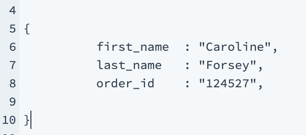
This is a good example of semi-structured data. As you can see, HTML is organized through code, but it’s not easily extractable into a database, and you can’t use traditional data analytics methods to gain insights.
Finally, unstructured data — otherwise known as qualitative data. When it comes to marketing, unstructured data is any opinion or comment you might collect about your brand. While what your consumers are saying is undeniably important, you can’t easily extract meaningful analytical data from those messages.
An example of unstructured data includes email responses, like this one:

Take a look at Unstructured Data Vs. Structured Data: A 3-Minute Rundown for more clarification on structured vs. unstructured data.
Semi Structured Data Examples
- CSV, XML and JSON documents
- NoSQL databases
- HTML
- Electronic data interchange (EDI)
- RDF

The Beginner’s Guide to Editing YouTube Videos
As a video marketer, editing might be the most important part of post-production. If you can’t seamlessly weave your shots together or get your cut to hit the right frame, your video will seem unpolished and disengage your viewers.
That said, if you’re operating on a shoestring budget, you might not be able to afford video editing software. So what’s a video marketer to do without editing software? Fortunately, YouTube offers a web-based video editor that is completely free and accessible through its platform.
YouTube’s video editor is an extremely basic editing tool, but it can still let you trim clips out of any part of your video, so read on to learn how to chop up your videos right in the video platform.
How to Use YouTube’s Video Editor
1. Sign in to YouTube Studio
2. On the left side bar, click “Videos”

3. In “Uploads”, click the thumbnail of the video you want to edit.
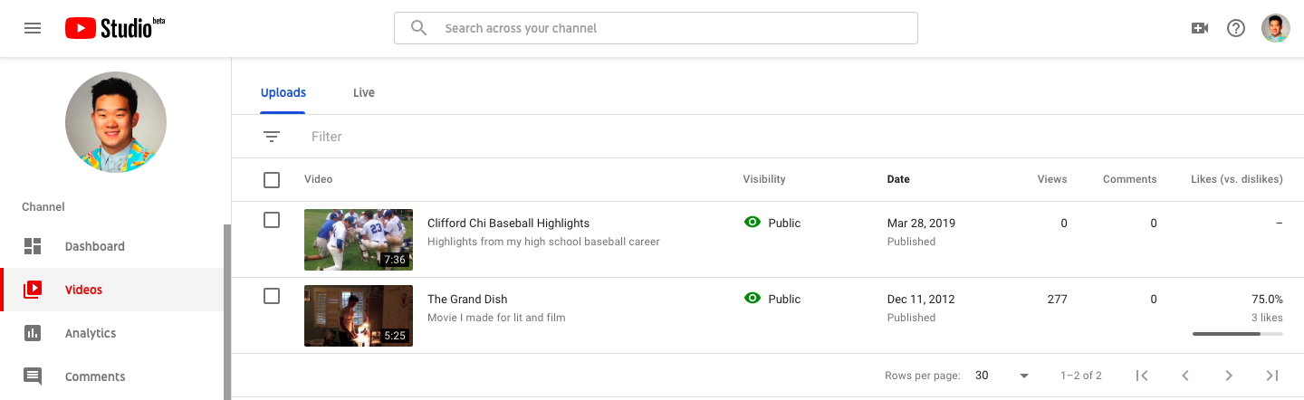 4. In the left sidebar, click “Editor”.

5. Trim the beginning or end of your video.
If you want to trim the beginning or end of your video, select “Trim”, which is right next to your video’s timer and right above your timeline panel.

Next, you’ll see a blue and white line on the sides of your timeline panel. Drag them to chop off parts of the beginning or end of your rough cut that you don’t want to include in your final version. Click “Preview” to view your edited video, and if it looks good, press “Save”.

6. Trim clips out of the middle of your video.
If you want to trim a certain clip out of the middle of your video, select “Trim”. Next,in your timeline panel, click the beginning of the clip that you’d like to trim out and press “Split”

Then, in your timeline panel, click the end of the clip that you’d like to trim out and press “Split” again.

Finally, click on the blue line at either the beginning or end of your clip and drag it to the other side to trim it out of your video. Click “Preview” to view your edited video, and if it looks good, press “Save”.

7. Add an End Screen to your video.
If you want to give your viewers the option to watch a related video, playlist, or subscribe to your channel at the end of your video, click “ADD AN END SCREEN” in your timeline panel.

You can either create an End Screen from scratch or choose from five End Screen templates.


7 Surefire Ways to Capture Email Leads in 2019 [+ Tools]
No matter what industry you’re in, email list building is still an important and high impact marketing activity.
Though you may see the occasional article proclaiming “email marketing is dead,” you can safely continue your campaigns, and know that “the money is in the list” (as they say).
Now, there are many ways to build an email list – tactics and tools beyond simple sidebar lead magnets and popup forms.
This article will cover 7 ways to capture email leads, and we’ll also outline 7 lead capture tools to help you do it.
7 Email Lead Capture Strategies in 2019
- Ask, “what’s in it for me?”
- Target the right segments of your audience
- Target your audience at the correct time
- Build a proper lead magnet (or several)
- Reduce friction where possible
- Match the intent of a blog post with the correct offer
- Choose the best lead capture tools for the job
1. Ask, “what’s in it for me?”
While every company in every industry may have a different tactical implementation to capture email leads, at the core of every strategy is this formula:
The value of your offer — the cost of giving you their email address = the probability of conversion
In other words, you need to make sure your offer is worth giving up in exchange for an email address (and for whatever information you’re asking). “What’s in it for me,” is such an underrated question in marketing.
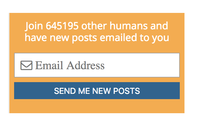
In some cases, the value exchange is extremely straightforward. Take, for example, WaitButWhy. The blog’s author, Tim Urban, writes an incredibly comprehensive and interesting article (more like a book) every few months. The posts are amazing. The quality is unquestionable. So it’s enough of a benefit to simply be notified when these works of art are published:
However, most business blogs can’t compete on that standard (it’s wildly time consuming and expensive to produce content like that).
Therefore, most of us rely on “lead magnets” – exchanges of value for information. These are things like ebooks, free email courses, webinars, etc. Essentially, it’s a piece of premium content you can use to entice someone to sign up for your list.
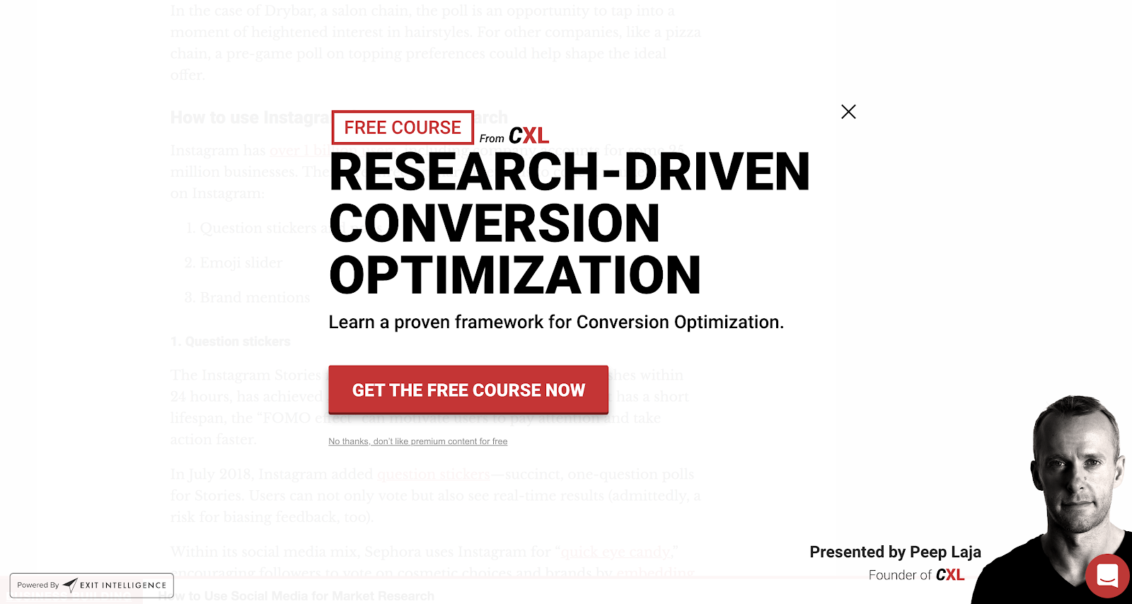
Here’s a good example of a lead magnet from ConversionXL:
Or here’s an ecommerce-focused example from J Crew:
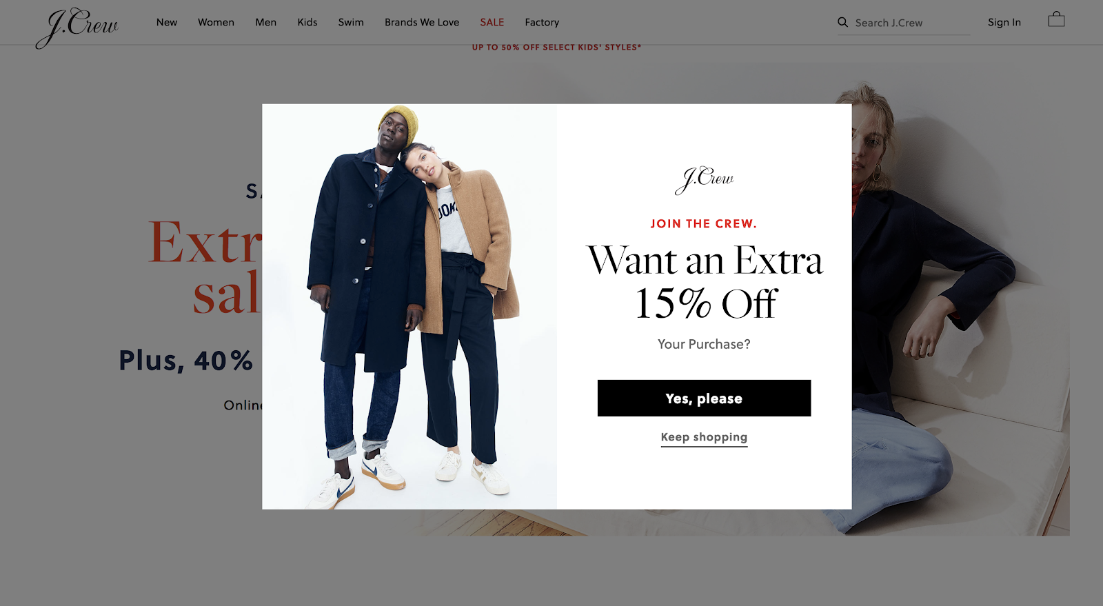
Both of these examples are great for their appropriate contexts. You can imagine the clear value given by offering a discount on a visitor’s first purchase in the case of J Crew, and with ConversionXL, that offer appeared on a blog post about conversion rate optimization. The value alignment is obvious.
2. Target the right segments of your audience
When first starting out, it’s probably okay to have one universal lead magnet or email subscription form for all of your visitors. This is particularly true if your traffic numbers are small and your visitors are relatively homogenous.
However, when you scale your content program and have many different articles with varying levels of intent and context, it becomes imperative to think about who you’re targeting.
For instance, our J Crew example above targets first time visitors, which makes a lot more sense than giving a 15% discount to a repeat buyer who was going to buy anyway.
Even simple, you can target visitors by which blog post they’re reading. If someone is reading a post on, say, writing case studies, a good offer might be “case study templates”:
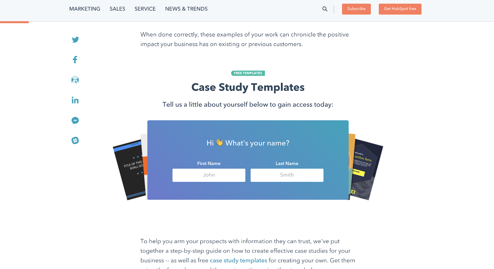
You should also consider the device someone is using. One of the biggest mistakes with lead capture is using the exact same tactics and design for mobile that you’re using for desktop. The context and user experience is just completely different, so it makes sense to test different thing on different devices.
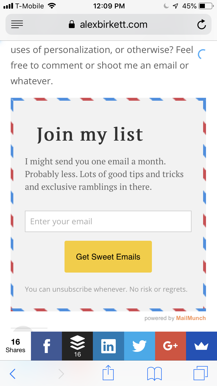
The point of this section isn’t to give you any specific, tactical suggestions for whom to target. It’s only to advise you to think about which portion of your audience sees which CTA. As a company and their content production capacity grows, it’s less and less effective to have a one-size-fits all approach.
3. Target your audience at the correct time
Who you target is very important, but when you target your audience is also important. For instance, with our J Crew first time visitors example, it certainly makes sense to deliver the discount as soon as possible (on arrival).
This person is probably comparison shopping, so you’re fighting for attention and want to hook them quickly. This is the case with many ecommerce lead capture messages, such as Ralph Lauren:
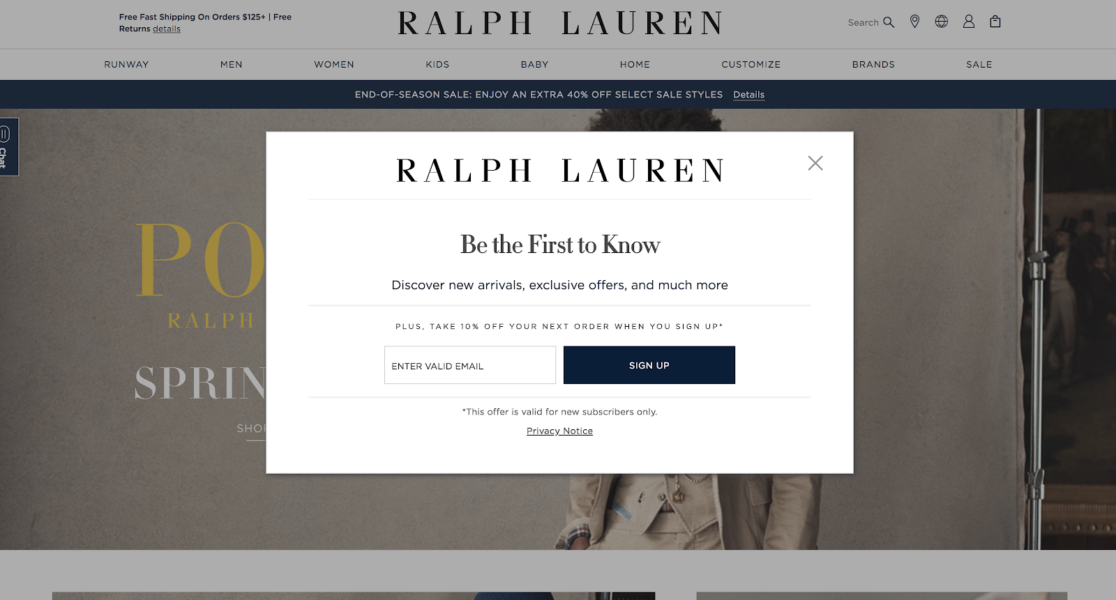
If you’re capturing emails on a blog post, however, you don’t want to interrupt the user experience before the reader even gets past the first paragraph.
That’s a good way to skyrocket your bounce rate. It’s also a common mistake I see with marketers who use “welcome mat” popups – those giant interstitials that completely take over your screen. Not a good way to entice a reader to continue with your content.
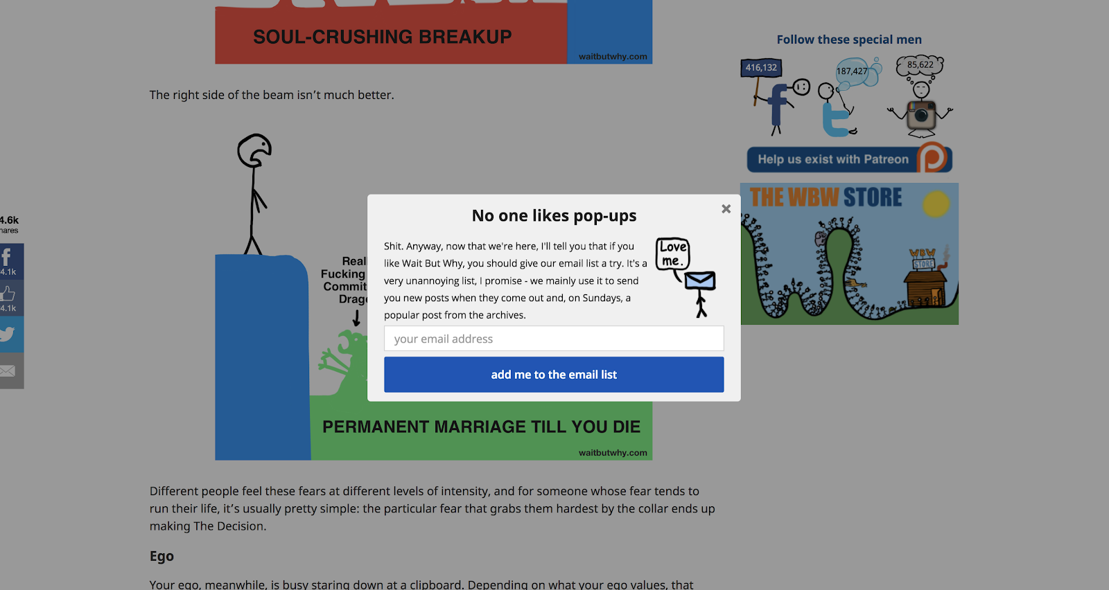
A better trigger for those pieces may be either a scroll-triggered popup or an exit intent popup. These are behaviorally triggered. The former shows up when someone scrolls past a certain point in the article, and the latter shows up when someone motions their mouse towards the corner of the screen, as if they were going to exit the window.
These are the types of popups I use on my own site, and we use them at HubSpot too. Here’s a great example of an exit intent popup from WaitButWhy (the copywriting is also great):
You can get creative with your time-based or behavior-based targeting as well. Does a behavioral event on your website imply intent or high interest in an offer? That’s a great time to trigger a CTA. An example is with templates. If you see someone is copying and pasting your templates, you can trigger a message that they’re also all available for download.
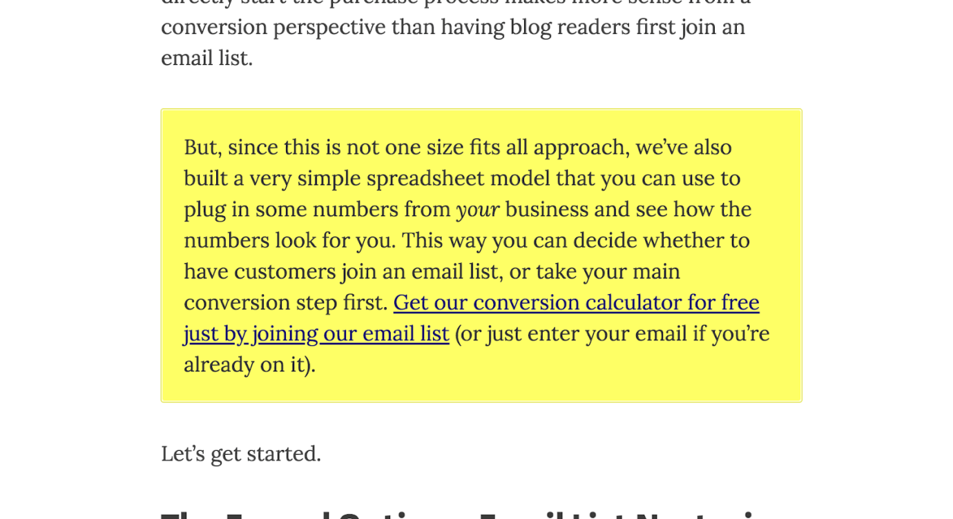
At a simpler level, you can leave a text link in your copy and use that as a signal of intent for trigger a form:
4. Build a proper lead magnet (or several)
We’ve already discussed the need to answer the question, “what’s in it for me,” and to create some sort of value exchange. But let’s dive deeper into the idea of a “lead magnet,” since it’s usually crucial to get this write (especially for B2B cases).
Stepping back, what’s a lead magnet anyway? A lead magnet is the free offer you deliver in exchange for a visitor’s information. This could be many things, but it usually looks like a long-form piece of content – an ebook, a webinar, a gated email course, a free tool, etc.
Here are several different lead magnet ideas and formats:
The ebook
The ebook is probably the most common form of a lead magnet, perhaps because it’s relatively easy to repurpose multiple blog posts into a giant ebook and get someone on Upwork to design it. Depending on the execution, though, they can be incredibly effective.
I find ebooks to be best suited for a few cases:
- The topic is complex and requires a lot of education
- The buyer is inquisitive and loves doing their own research into the topic
- It’s a sufficiently text-driven topic to form an engaging ebook
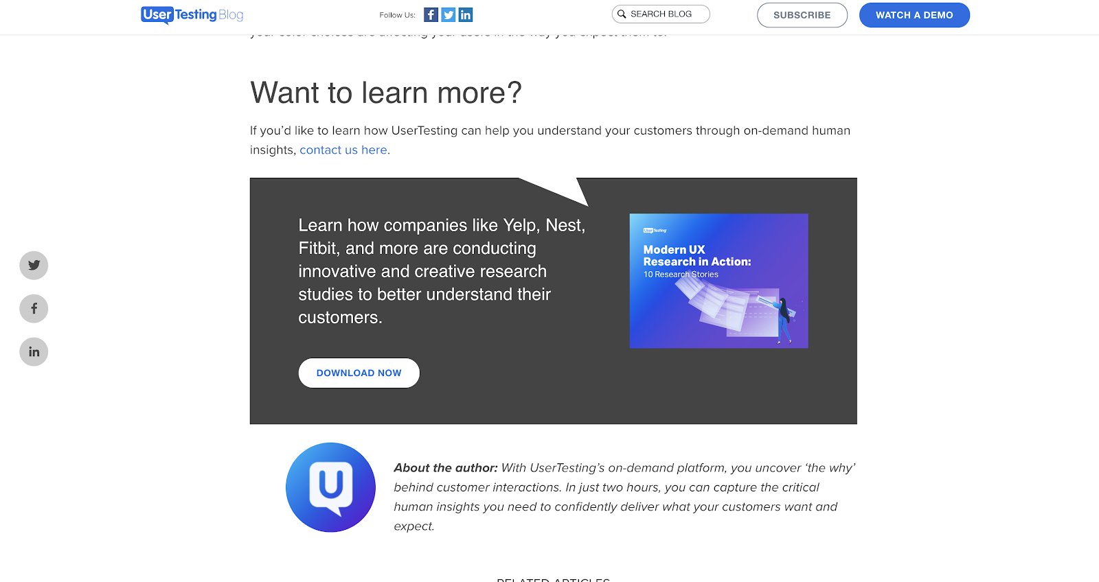
Topics like conversion rate optimization, user experience, or search engine optimization all make great ebooks because they fit the above criteria. Take, for example, this ebook from UserTesting on how to do proper user research:
The webinar
Webinars are probably the second most common lead magnet I see in the wild. They’re largely used by B2B businesses, and it’s especially a popular marketing tactic for SaaS companies.
Webinars tends to work well in a few environments:
- The topic is technical or needs to get quite granular
- You or your guest is charismatic on camera or well-known
- Your webinar topics can still be useful for those not using your product
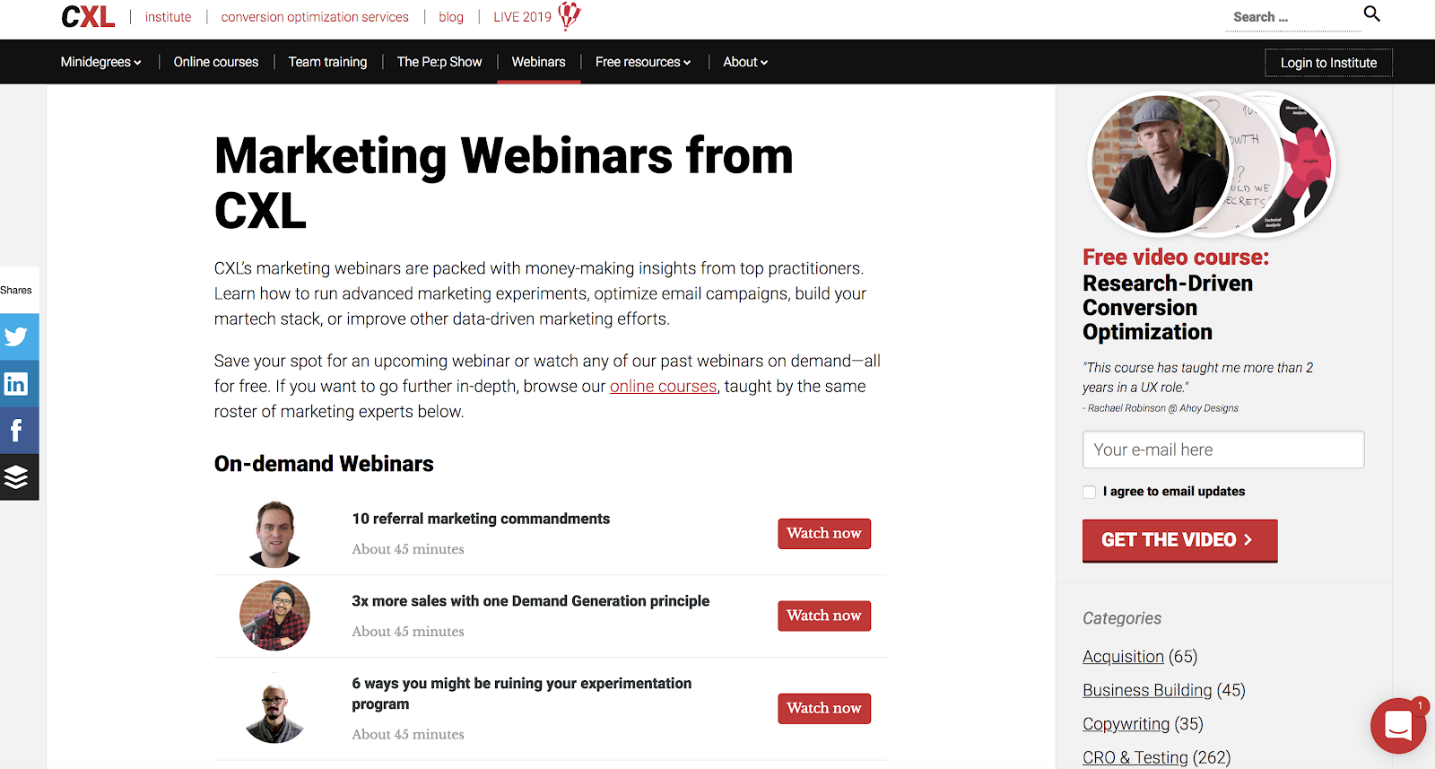
For example, Unbounce reported wonderful results from their webinars (35% increase in free trial signups). At CXL Institute, we hosted webinars with our course instructors (well-known and super experts in their fields), and regularly got thousands of signups (as well as many directly attributable conversions).
In my opinion, webinars are one of the highest potential lead magnets, but they’re usually the worst executed in reality. If you can get people to sign up for a webinar, that’s just the tip of the iceberg. The webinar needs to be entertaining as well as useful, which I can’t say about most webinars I’ve attended.
If you can do this and do this well (and at scale), you’ll surely be able to build an inbound lead generation machine with it.
The email course
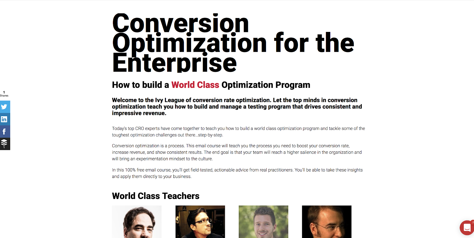
The email course is one of my favorite underutilized tactics. It’s essentially an ebook, but split into chapters and delivered via email. The best part is that you can normally get experts to write individual chapters, which not only distributes the effort required to produce the content, but if you choose your experts correctly, it also adds to the value for the subscriber.
This is another lead magnet we used at CXL Institute:
Invision also runs campaigns of this type:

In these lead magnets, your setup is the same: you’re promising informational value in exchange for an email address. The difference here is that you’re using email to deliver the core value, which perhaps leads to an increase in open rates and engagement with the actual email marketing.
It’s easy to set up on your side, as well. You just build an autoresponder for those enrolled in your email course. Simple, and in the long run, quite automated.
The free tool
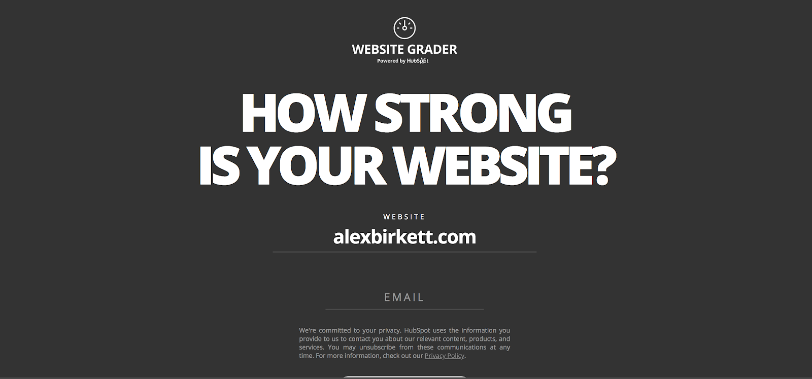
Free tools are also underrated, though tougher to create. Obviously, it requires resources to engineer a tool. However, if done right, it can really break through the noise. The best of example of this, of course, is HubSpot’s Website Grader:
The template/resource bundle
If the topic is the bait, then the lead magnet is the hook. If your topic interests someone, helping them accomplish what you talk about in the article can be a tremendously powerful hook.
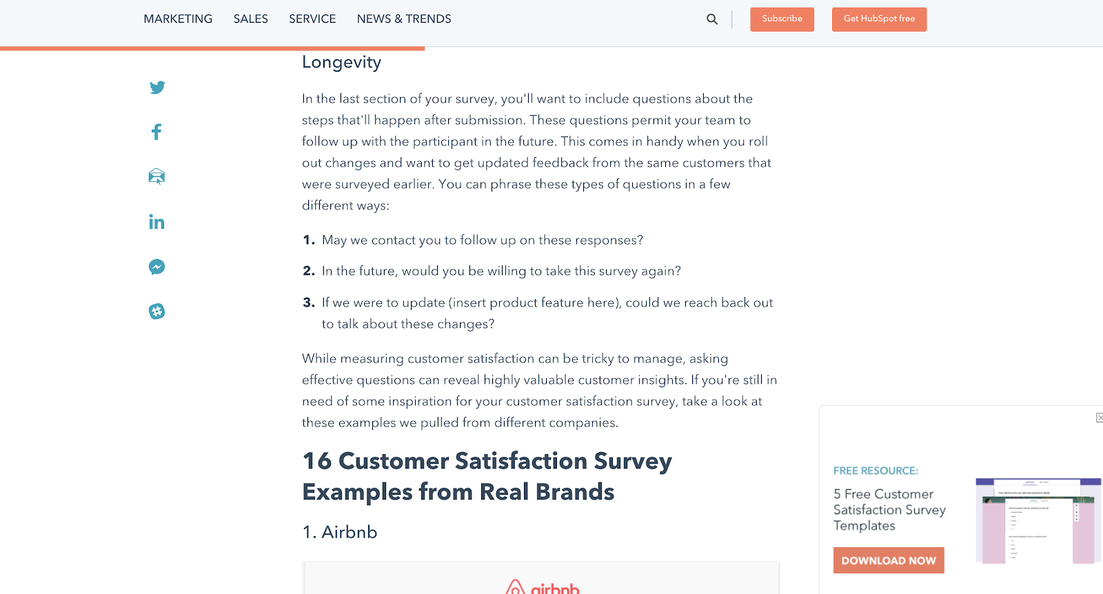
Normally, this is done with additional resources, templates, or tools designed to help the visitor implement whatever it is you’re talking about. A clear-cut example of this is with our feedback survey templates on posts related to feedback surveys:
The checklist
Similar to this is to offer a checklist. This is most appropriate for topics that are technically complex or at least require a lot of time and organization to accomplish.
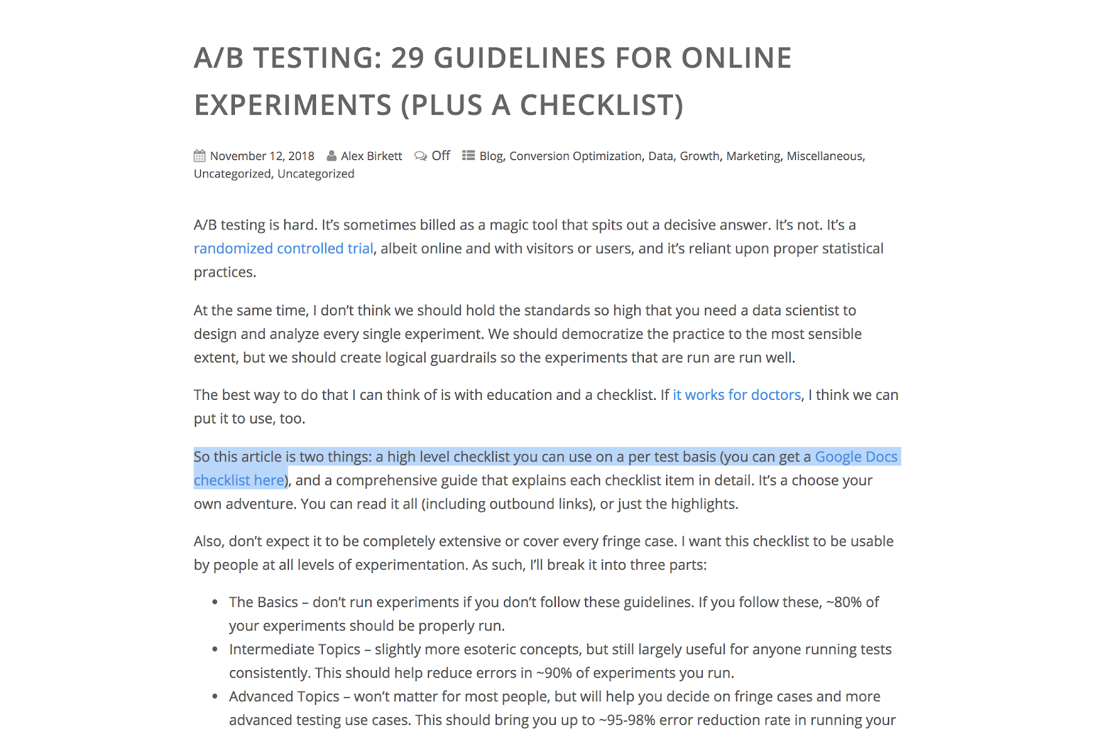
Something like A/B testing is the perfect topic to offer a checklist. That’s what I do in a post I wrote on A/B testing guidelines:
There are many more formats of lead magnets, but the above are some of my favorite types.
5. Reduce friction where possible
This is a good rule of thumb for all of marketing (nay, all of business): reduce friction.
Basically, if a visitors wants to sign up for your list, make it as easy as possible for them to do that. This is part of the premise behind the flywheel, but it makes a lot of sense when designing and optimizing web forms.
When designing forms, ask yourself questions such as:
- Do I need this piece of information I’m asking for? If so, can I ask for it later (a la progressive profiling) or enrich our data somehow?
- What form fields are causing the highest drop-off?
- Can we run some user tests to see where people are struggling with our forms?
- Do we have any basic usability or accessibility problems with our forms?
- Do our forms work on all browsers and devices?
You’d be surprised how much low hanging fruit you can find with a quick CRO audit on your forms.
6. Match the intent of a blog post with the correct offer
I’ve insinuating this above when talking about who you’re targeting, but a quick win for lead capture is to align the messaging on your lead magnet offer with the blog post it appears on.
You’d be surprised how often I see drastic mismatches. If your blog post is about “top marketing books of 2019,” it may not be prudent to offer an ebook on “The Ultimate Guide to Digital Analytics.” There’s a mismatch there. Some visitors may still convert, but it’s certainly not fully optimized.
Here’s a trick I like to use to align messaging properly. Go into Ahrefs and plug your blog post URL in the site explorer feature. Look at all the keywords it ranks for:
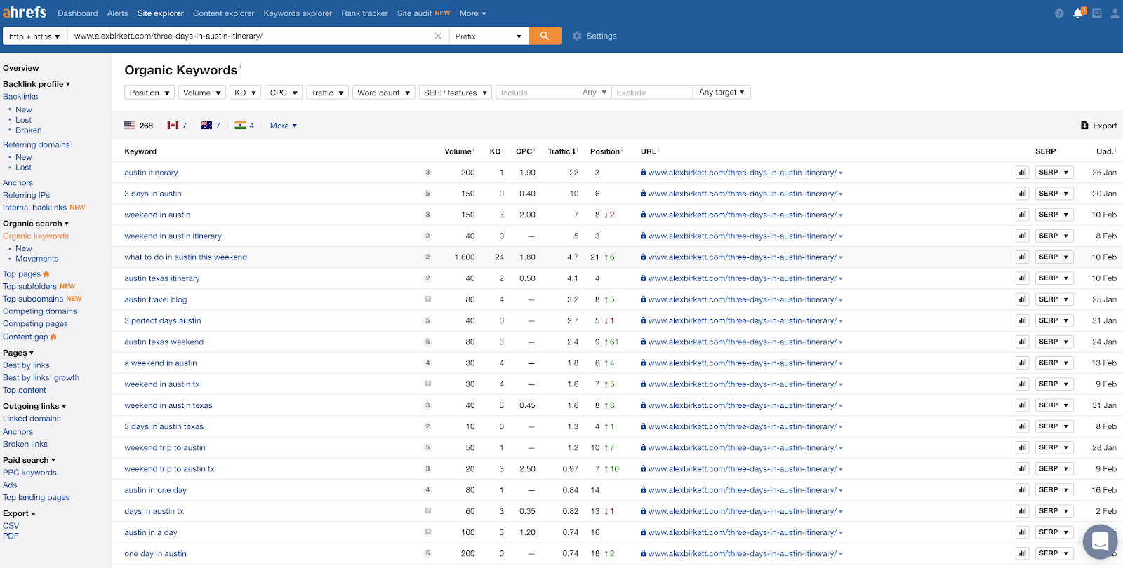
Your goal here is to understand broadly what your post ranks for, but also to try to find some “voice of customer” insights to steal for copywriting. For instance, this keyword “what to do in Austin this weekend,” might actually make a really good headline for an ebook or checklist I could offer.
7. Choose the best lead capture tools for the job
Finally, realize that you’re not stuck to only using web forms. You can use popups, surveys, live chat, and many more tools to capture leads.
Also realize that there’s no one tool that’s best for the job. We’ve seen all different kinds of successful approaches using different types of tools, different lead magnets, and different strategies in general. It’s only appropriate to choose the right tool for the job you want to accomplish, which is what the rest of this article is about.
7 Email Lead Capture Tools in 2019
- Web Forms
- Popup Forms
- Surveys and Quizzes
- Live Chat
- Chatbots
- Giveaways and Contests
- Content upgrades
1. Web Forms
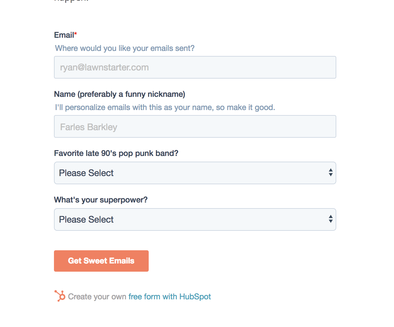
Web forms are still the gold standard of online lead capture. They’ve also come a long way since their early roots on the internet. Now we can easily design custom forms that can directly connect your CRM or email tool of choice using free tools like HubSpot Forms:
2. Popup Forms
Popups, once annoying an ill-designed, are now common and, when done correctly, are wildly effective and not at all a user experience hindrance.
When you can properly time and target the right audience at the right time, you can win at this method. At the very least, an exit intent form helps capture some would-be bouncers from your site. HubSpot Popup Forms is free and easy to set up for this.
3. Surveys and Quizzes
Surveys are, in my opinion, way underutilized. They’re engaging and entertaining, but in reality, you can collect the same visitor information with far less friction than traditional forms.
A great tool for this is Survey Anyplace. Here’s a great example from a customer of theirs who created a survey to engage attendees of a cycling event (using an iPad survey):
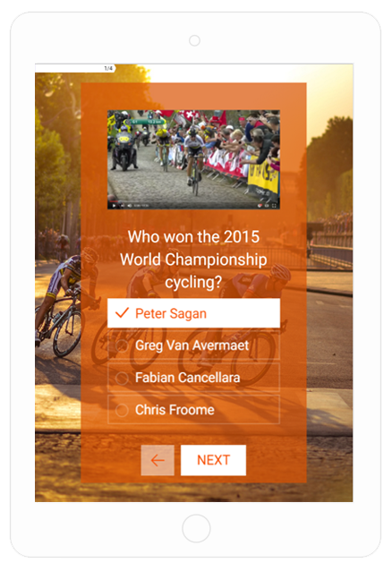
They put in their email and contact information to be entered into a contest at the end.
4. Live Chat
Live chat, sometimes viewed in the context of customer support and sometimes for sales, can also be used as a marketing tool.
Especially when you’re correctly targeting visitors, you can use live chat to engage heavy readers or people who have been to your site several times. CXL does this with visitors who come back frequently:
Though live chat is a less consistent way of collecting leads (it may be better at simply answering questions), you will find a few opportunities to engage visitors and collect their info.
5. Chatbots
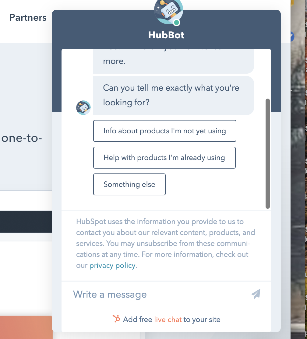
Chatbots are probably a better way to collect lead information. The fact that they’re automated saves you a lot of support rep time (opposed to running a live chat all the time), and you can often do better targeting and filtering as long as you design your bot the right way.
Chatbots are a technique that, in my opinion, is still in its infancy. Too many companies are still designing terrible bots and angering potential customers in the process.
With the right touch, however, I’ve seen chatbots skyrocket lead conversion rates.
6. Giveaways and Contests
Giveaways were very popular a few years ago. Though they’ve faded a little bit, I still see them all the time, particularly in B2C companies (and ultra-specifically, in travel or experience related industries).
Normally, you and several companies partner up, offer some sort of giveaway that is related to what all of your businesses do, and then promote the giveaways to your respective audiences. Then you share the email leads (presuming you’ve gotten proper opt-in permissions to do so).
This, while a good way to gather a large quantity of emails, has a big drawback: the quality of the emails probably isn’t very good. For two reasons:
- You’re sharing emails with a bunch of companies
- You’re relying on commercial incentives to get the email (in other words, they’re not interested in your company, they’re interested in winning that trip to Denmark).
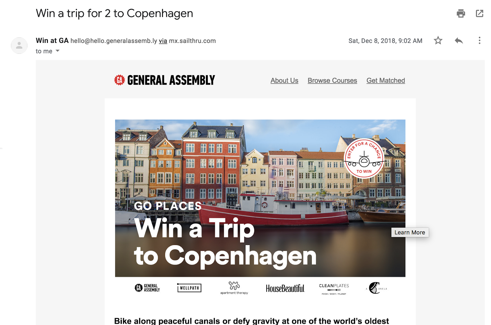
A good tool for this, if you want to try it, is KingSumo.
7. Content upgrades
Finally, we have content upgrades. This is really a popup form, but I wanted to add it separately, since it is a click-triggered and behaviorally contextual popup. Basically, when someone clicks a link that says “get the PDF of this” or “click here to get a checklist,” they can then opt-in with a very simple, dynamic form:
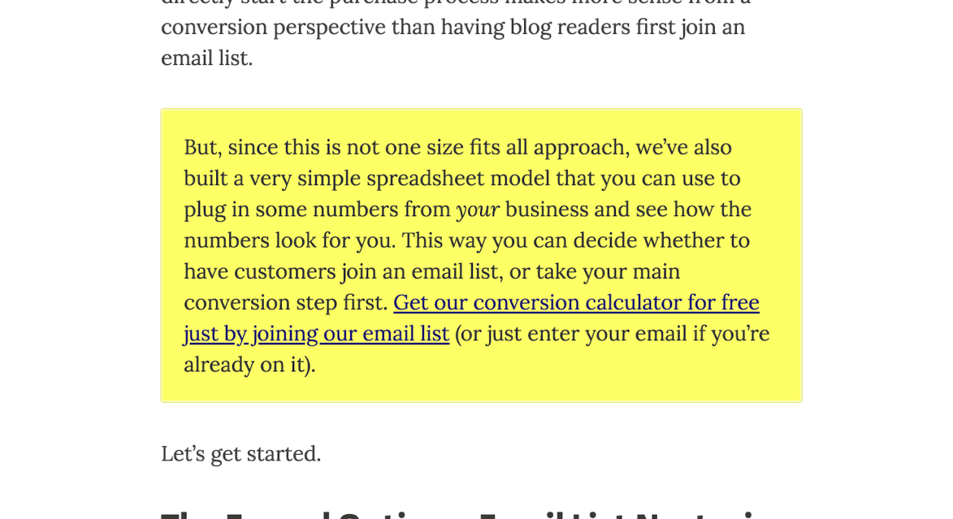
When you click the link, this comes up:
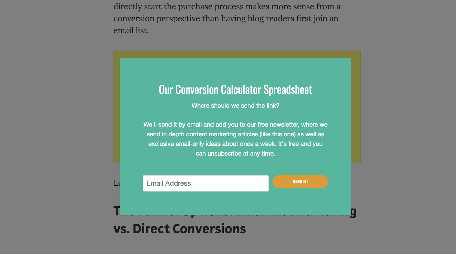
In terms of user experience, and all the strategies we went over above, content upgrades are some of the best ways to collect email leads. They’re relevant to the blog post, not a hindrance on user experience, and are only triggered to those who click on the link. I love content upgrades as lead capture method.
There are many ways and strategies to capture email leads.
This article gives a general outline as well as some ideas to do so; it also gives you some tools (most of them free) to accomplish the job.
As with anything, success requires some experimentation and tinkering. Try some of the above out, learn from it, and iterate to improve. Small wins compound and lead to greatness.
And if you want an easy way to implement some of these lead capture methods, check out HubSpot’s free lead generation tools.

The Ultimate Guide to Sales and Marketing
Peanut butter and jelly.
Puppies and the park.
Beach days and ice cream.
Some things just obviously go together — but what if I put sales and marketing together in that list? Would you still think they worked better as a pair?

More than likely, you haven’t quite considered your sales and marketing to be the “peanut butter and jelly” of your company. But, in 2019, alignment between those two teams is more critical than ever.
Simply put, alignment between marketing and sales is really about focusing on the customer — and, in 2019, the customer’s buying behavior has changed significantly.
Fortunately, the better you can align your sales and marketing teams, the more likely you are to delight a prospect. In fact, organizations with tightly aligned sales and marketing teams experience 36% higher customer retention rates.
Here, we’re going to explore why sales and marketing matter to a company — and, equally importantly, why they matter together.
Definition of Sales and Marketing
Marketing is the process of getting people interested in your company’s product or service, while sales encompasses any activities involved in selling that product or service to a consumer or business. One cannot exist without the other. You cannot sell without initially igniting interest in the consumer through marketing, and you cannot be a marketer without having a team prepared to sell the product once you’ve captured a consumer’s attention.
To start, let’s explore the advantages of both sales and marketing to your organization.
Sales is ultimately critical to your company’s bottom line. You cannot have scalable growth without an impressive sales team. At its most basic, your sales team’s goal is to first qualify prospects, reach out and build relationships with them, and ultimately, provide a solution that will benefit the prospect. When done well, a sales transaction results in a sale, a satisfied customer, and revenue for your company.
For sales teams to excel, your salespeople must be invested in the success of your customers. They must understand your prospects’ pain points and obstacles, and demonstrate how your product or service is a solution — the best solution — to those problems.
Alternatively, marketing is all about igniting interest in potential consumers, and telling the world your company, and its products or services, exists. Marketing uses both emotion and analytics to reach an audience, and convert curious viewers into qualified leads.
Here’s the thing, though — in 2019, a buyer isn’t following the traditional “marketing to sales to customer” funnel.
Instead, each individual prospect follows a unique path. One prospect might know they want to purchase your product before even speaking with a sales rep, because they’ve already been convinced by your Instagram account.
Alternatively, another prospect might speak with a sales rep first, and then require additional marketing in the form of webinars or blog posts, before closing the deal.
Your buyer has unlimited information at her fingertips — she can check out your Facebook page, blog posts, website, and customer product reviews before even speaking with a sales rep.
When a prospect who has already read thirteen customer reviews gets in touch with your sales rep, she’s going to require a different conversation than a prospect who’s only heard of your company from a Facebook ad.
That is why your marketing and sales teams need to be in tight alignment in 2019 — because your buyer needs to be communicated with, and sold to, wherever and whenever she wants. The traditional sales and marketing tactics no longer work. To find scalable growth, it’s critical your marketing team communicate all the information they have about a prospect to your sales team before a salesperson even gets on the phone.
Sales and Marketing Strategy
To truly delight your customer, it’s critical you reduce friction by implementing a strategy to align your sales and marketing teams. For instance, you might have your sales and marketing teams work together to craft a buyer persona, or document content gap’s along a buyer’s journey. While it might seem like the two teams have different measurements of success, they should ultimately share the goal of being customer-centric, even at the cost of their individual processes.
Sales and marketing alignment can help your company become 67% better at closing deals, and can help generate 209% more revenue from marketing.
Not aligning your sales and marketing teams isn’t just unhelpful for the customer — it’s also damaging to your bottom line.
But it’s easier said than done. Aligning sales and marketing, particularly when you have a growing company, can feel like an incredibly difficult process.
Fortunately, there are a few strategies you can implement to ensure a smoother relationship between the two teams, immediately.
1. Ask your marketing and sales team to create a buyer persona together.
Your marketers have a firm pulse on the consumer — they’ve conducted extensive research, they’ve engaged with prospects via social media and email, and they’ve held focus groups.
But, more than likely, your marketers haven’t spoken directly to these prospects. They might not fully understand your prospects biggest pain points, or the challenges they face that your product or service currently can’t solve. These insights can only be obtained from your sales team.
Ultimately, to get a full picture of your consumer, it’s critical that each team help craft the buyer persona. For instance, perhaps you have your marketing team create an initial buyer persona through research and brainstorming sessions — but then you gather input from salespeople to modify and refine that persona.
Getting initial input from salespeople, as well as asking for final approval on a buyer persona, is critical to ensure each team is working together with the same consumer in mind.
2. Document content gaps along a buyer’s journey.
Your sales and marketing teams should take the time to compile everything both teams have created to help solve for the customer — including white papers, infographics, e-books, case studies, and email streams.
Then, employees from each team should have a candid discussion about what’s missing. Maybe a sales rep notices your marketing team hasn’t created any e-books on an issue most of her prospects’ face. Alternatively, maybe your marketing team needs your sales team to provide input to craft a more useful customer case study.
Additionally, both teams should take the time to organize and understand what content works best for which stage of the buyer’s journey. While likely a tedious process, this will help both teams become more effective in their strategies over the long-term.
3. Keep track of every interaction your customer has with your company.
Nowadays, this is one of the most critical strategies you need to implement. It eliminates friction for the customer, and it also helps your sales reps close more deals.
For instance, consider how you’d feel if you spoke with a sales rep for the first time, and he already knew where you worked, how long you’d been there, which email newsletters you’d subscribed to, and which company networking events you’d attended. You’d likely be more impressed than if you spoke to a sales rep who’d never heard of you before, right?
It’s vital you find a way to keep track of each interaction your customer has with your company — a free CRM is incredibly useful for this.
4. Be customer-centric with your language.
All too often, marketers and salespeople use different language and rely on different analytics to measure success. For instance, a marketer’s measure of success might be based on blog traffic, Facebook likes, email subscriptions, or YouTube viewers.
Alternatively, a salesperson’s ultimate measure of success is revenue.
However, there is one goal both teams share — and that’s to be customer-centric.
To align both teams, it’s critical your salespeople and marketers consider, first and foremost, the customer. When a marketer emails a prospect, she should consider the person on the other end — and whether they want to receive that email, and how that email could be helpful for them.
Additionally, when a salesperson picks up the phone, she needs to remember the conversation isn’t about making a sale — it’s about solving a problem for a prospect.
With this in mind, your teams will have an easier time blurring the lines between their individual tasks and responsibilities, and recognizing their very unified desire to solve for the customer, even over their own processes.

5 Essential SEO Tips That Have Helped HubSpot Become an Organic Powerhouse
In 2017, we experienced something that has never happened to us before — our blog’s monthly traffic flattened. Even worse, it started to decline. So after months of stressing over the mysterious cause of our blog’s traffic plateau, we decided to sit down, chug a bunch of coffee, and find the culprit.
What we discovered is that our strategy of brainstorming topics and relying on our intuition to determine our audience’s content preferences wouldn’t suffice anymore. And coupled with almost every social media platforms’ disdain for sending users outside of their website and the ever-growing mountain of emails piling up in people’s inboxes, we knew we needed to overhaul our editorial strategy. So we decided to focus our energies on the channel that has consistently generated the majority of our blog’s traffic for its entire existence — organic search.
Today, almost a year after we implemented our organic-only strategy, we’ve exceeded the majority of our monthly traffic goals and even broke some monthly traffic records. Needless to say, we’re thrilled (and relieved) that our new organic-only strategy refueled our growth in traffic again and shattered the great traffic plateau of 2017. And we’d love to share the essential SEO tips that helped us devise our strategy.
SEO Tips
- Optimize your content for people before search engines.
- Leverage the pillar-cluster model.
- Develop a link-building strategy.
- Implement a historical optimization strategy.
- Compress your images.
1. Optimize your content for people before search engines.
Even though an algorithm dictates the order of Google’s search engine results pages, you must remember that Google designed its algorithm to reward the web publishers that craft the best content on the internet, not the web publishers that are the best at gaming their algorithm.
In fact, part of Google’s search algorithm ranks your content based off engagement metrics, like total traffic, organic traffic, direct traffic through Chrome, time on site, bounce rate, SERP CTR, brand mentions on authoritative sites, and return visits.
So, to boost your website’s engagement and domain authority and, in turn, generate even better results in the long-term, there’s really only one way to do it — you must attract and engage a loyal audience by creating high-quality content. Only then should you start optimizing it for search engines.
The first step we usually take when optimizing our content for people is understanding the intent behind a keyword we want to target. To do this, we analyze the keyword’s search engine results page and determine the problems users are trying to solve when searching for this query.
After that, we figure out how to effectively solve these problems by mining information from trusted sources, examining our own research, and asking HubSpot employees who experience similar problems how they solve them.
The final and most important step of our content creation process is crafting the most engaging content possible. To do this, we tell stories and relate to our audience’s problems in our introductions, write clear, concise, and compelling copy, highlight interesting findings, data, and quotes in our body text, and include vivid images and videos to provide a variety of stimuli. At the end of each blog post, we keep the momentum going and remind our audience of the thoughts and emotions they just experienced, which leaves them yearning for more content.
2. Leverage the pillar-cluster model.
Since people heavily rely on search engines to provide accurate and relevant answers for most of their questions today, search engines need to understand the intent and context behind every single search. To do this, search engines have evolved to recognize topical connections across users’ queries, look back at similar queries that users have searched for in the past, and surface the content that best answers them. As a result, search engines will deliver content that they deem the most authoritative on the topic.
To help search engines recognize our content as a trusted authority on certain topics, we decided to implement the pillar-cluster model on our blog. By creating a single pillar page that provides a high-level overview of a topic and hyperlinks to cluster pages that delve into the topic’s subtopics, we could signal to Google that our pillar page is an authority on the topic.
Since hyperlinking all of the cluster pages to the pillar page shares domain authority across the cluster, our cluster pages will also get an organic boost if our pillar page ranks higher, and they can even help our pillar page rank higher if they start ranking for the specific keyword they’re targeting.
Another benefit the pillar-cluster model supplies is cleaning up our site infrastructure and providing a better user experience for our website visitors. Before we implemented the pillar-cluster model, we spent most of our time writing blog posts designed to rank for specific, long-tail keywords. This resulted in thousands of blog posts that weren’t organized, and some were so similar that they competed with each other on the same search engine results pages. Here’s a visualization of what our site architecture used to look like:

But by organizing our blog into topic clusters, our site architecture currently looks like this:

Not only is it easier for Google to crawl our blog, identify semantic relationships between our content, and boost our search engine visibility now, but it’s also easier for our audience to search for the content topics they’re looking for, find related content, and spend more time on our blog.
To learn how to implement the pillar-cluster model on your blog, take a look at the steps we took to do it.
3. Develop a link-building strategy
Earning high-quality inbound links from websites and pages with high authority scores is crucial for boosting your domain authority. But, unfortunately, “If you write it, they will link to it,” is not a viable SEO tactic.
The main way we earn high-quality links is by networking with other websites that have a higher domain or page authority score to link to our top content. We also make sure our content is relevant to the referring website’s content.
Another way you can earn quality backlinks is by using Backlinko’s skyscraper method. The skyscraper method is an SEO strategy where you find content that ranks well for keywords you want to rank for and then create content that’s better than the top ranking posts. Then, you use SEO tools to find all the sites that have linked to your competitor’s content and ask the most relevant sites to replace your competitor’s link with a link to your improved content.
In 2016, Backlinko asked 160 websites to link to their post about Google’s 200 Ranking Factors and they earned 17 inbound links. You might be thinking that 17 backlinks doesn’t seem like much, but a lot of those referring websites had high domain authority scores, so the post’s organic traffic increased by 110% in only two weeks.
4. Implement a historical optimization strategy
In 2015, Pam Vaughn, the current Principal Marketing Manager of HubSpot’s Web Strategy Team and former Editor of HubSpot’s Marketing Blog, made a revolutionary discovery about HubSpot’s organic monthly blog traffic — the overwhelming majority of it came from posts published prior to that month. In fact, 76% of our monthly blog views came from these old posts.
Today, Pam’s groundbreaking revelation rings louder than ever — 89% of our monthly blog views currently come from posts that were published at least six months prior, and we’ve developed an entire strategy dedicated to refreshing and republishing these historical pieces of content.
We call these types of blog posts “updates”, and they comprise 35-40% of our editorial calendar. And by refreshing them with new information and SEO optimization and then republishing them, we can build upon their existing organic value that they’ve built by collecting backlinks and earning domain authority and double or even triple their traffic. This process also helps us optimize our blog for efficiency, decreasing the amount of new content we have to create while increasing our organic traffic and conversions.
Historical optimization isn’t for everyone, though. It’s a strategy catered for a blog that generates a significant amount of organic traffic, has a considerable amount of blog subscribers and social media followers who can supply a surge of traffic, shares, and backlinks to your updates, and owns a substantial repository of old posts that are worth refreshing and republishing.
However, if you have all three of these things, we definitely recommend implementing a historical optimization strategy. To learn about the types of historical content you should update and the exact process of updating them, check out this blog post written by one of historical optimization’s pioneers — Pam Vaughn.
5. Compress your images
When you think about optimizing your content for search engines, compressing your images’ file size doesn’t seem like it should be a top priority. But, according to Braden Becker, HubSpot’s Historical Optimization Lead, your images’ file size directly affects your website’s page load speed, which is one of the ten most important Google ranking factors.
“The bigger an image’s file size, the longer it takes your web browser to load that image, which increases your website’s loading time as a whole. And the longer your website’s loading time, the more likely Google will penalize you,” he says.
Compression blends similarly colored pixels into single pixels to reduce the image’s resolution, and in turn, file size. But since the human eye is more sensitive to light and dark detail than color detail, we’re not able to detect the color differences between an uncompressed and compressed image, so the perceived quality stays the same, just like the pictures below.
Uncompressed Image (236 KB)

Compressed Image (48 KB)

As you can see, the uncompressed image’s file size is almost four times bigger than the compressed image. Yet, the compressed image still has the same perceived quality as the uncompressed image, and it’ll load much faster.
To diminish our images’ file size as much as possible, boost your website’s page speed, and avoid risking a penalty from Google, we use Squoosh to compress individual images and TinyPNG to compress batches of images.
SEO is always adapting, and you should too.
Even though we uncovered five tactics that helped us devise an SEO strategy that shattered a year-long traffic plateau and broke monthly traffic records, it’s entirely possible that they could become obsolete one day.
The moral of our story isn’t to glom onto these SEO tactics for the rest of your content marketing career. It’s to keep adapting and never settle for the status-quo, no matter how well you’re performing. Because one day your once thriving work might stagnate and even diminish. And the only way to recover is to take a leap of faith and overhaul your entire strategy.

How to Edit Your Video Without YouTube’s Retired Video Editor
Prior to September 2017, YouTube provided a built-in tool that allowed you to edit your videos before publishing to the platform.
However, as of last September 20, 2017, YouTube’s Video Editor tool is no longer an option. On YouTube’s Help Forum, Community Manager Marissa explained, “We’ve seen limited usage of these features, so we’ve retired them to focus our efforts on building new tools and improving on other existing features.”
Ultimately, YouTube’s Video Editor tool was convenient, but only offered basic features — fortunately, there are plenty of alternative editing tools that enable you to create sleeker, more professional-looking videos for the world’s second largest search engine.
Here, we’ll explore all the alternative tools you might consider using to craft better, more engaging YouTube content.

The Best Editing Tools For YouTube Videos
1. Shotcut
Shotcut, a free open source video editor that is available for Windows, Mac, and Linux, offers a variety of impressive features comparable to Windows Movie Maker. For instance, the tool allows you to cut video footage to a certain length before converting it, and offers filters and effects to make your video look sleeker. Shotcut can handle streaming in a variety of formats, ranging from HTTP to RTSP and UDP.
While the interface looks relatively bare, the tool is actually very comprehensive, and all of its video and audio filters are fully customizable. Best of all, you can add, remove, or alter your changes at any time, since editing on Shotcut is non-linear.

Price: Free
Available for: Windows, Mac, and Linux
2. Wondershare Filmora9
Referred to as “a video editor for all creators”, this tool is incredibly easy-to-use whether you’re a novice video editor, or a professional. With Filmora9 you’re able to use filters, overlays, transitions, and custom titles to spruce up your content for YouTube, and engage an audience.
Additionally, the tool offers audio features for key-framing and background noise removal, as well as an audio equalizer. If you have multiple clips you’re hoping to combine into one cohesive video, this is a good tool for you — it allows you to import up to 100 layers of media, and offers features so you can layer your clips.

Image courtesy of Wondershare.
Price: Free trial, $59.99 one-time fee or $44.99 annually
Available for: Windows, Mac, or app version for iOS or Android
3. VSDC Free Video Editor
VSDC allows you to either import existing clips or record directly from your webcam, making it an excellent option for YouTube vloggers. The interface is simple and easy-to-use, and the tool provides options to apply “Instagram-like filters”, voiceovers, titles, shapes, and other impressive visual and audio effects. Additionally, VSDC lets you export straight to YouTube or another social network easily.
It’s important to note, if you want to export your videos from the free version, you’ll want to select the cog icon in the top right, click “Acceleration options” and then uncheck the box marked, “Use hardware acceleration for encoding video”.
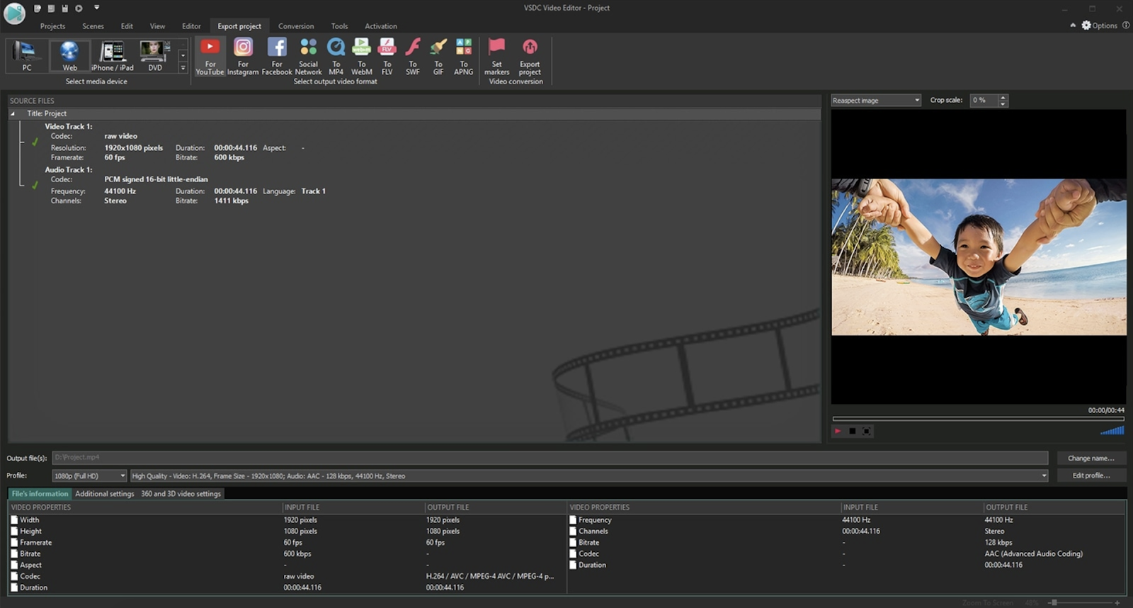
Image courtesy of VSDC.
Price: Free, or $19.99 for Pro Version
Available for: Windows
4. DaVinci Resolve 15
Matti Haapoja, a YouTuber with a channel that focuses on the filmmaking process, dedicated a video to this tool and compared it in quality to Final Cut Pro and Premiere Pro — except, unlike those programs, DaVinci Resolve 15 is completely free. DaVinci Resolve 15 provides tools for both offline and online editing, color correction, post-production audio effects, and visual effects. Additionally, the software lets you collaborate with others during the editing process, which could be particularly helpful if you have multiple video editors on your team.
Best of all, DaVinci Resolve 15 offers impressive features to help your video rank for SEO — for instance, you can use Smart Bins to automatically sort and display footage based on metadata criteria (you can also sort manually). Additionally, you’re able to enter custom keywords and tags.

Image courtesy of BlackMagicDesign.
Price: Free for DaVinci Resolve 15, or $299 for DaVinci Resolve 15 Studio
Available for: Windows, Linux, Mac
5. Premiere Pro
Last but certainly not least, Premiere Pro is one of the highest-quality video editor tools you’ll find. Used by Hollywood filmmakers, TV editors, and YouTubers, the software offers all the creative features you need to craft polished videos. Premiere Pro provides features for color grading, lets you create Motion Graphic visualizations of your data, and offers audio tools to remove background noise. Additionally, Premiere Pro now comes with Premiere Rush CC, which is an app you can use to edit footage on your phone, and then share directly to your social networks, including YouTube.
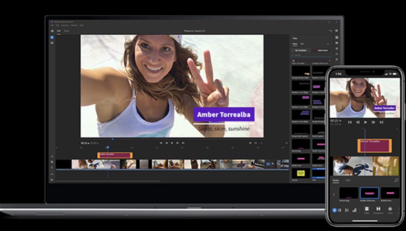
Price: As a standalone app, Premiere Pro is $239.88 per year
Available for: Mac, Windows
Additional Tools
I spoke with Leticia De Bortoli, a HubSpot Senior Video Editor, to gain insight into tools you might use to take your video editing process to the next level. She uses Premiere when editing her team’s videos, as well as Audition for sound, and DaVinci for color correction.
However, she also mentioned, ‘”You can attach a Zoom iQ6 mic directly to your phone, which is a great tool to get better sound. Additionally, I recommend purchasing a softbox kit for better lighting — both the Zoom iQ6 iOS Lightning X/Y Microphone, as well as the ESDDI 20’X28′ Softbox Photography Lighting Kit, are impressive options that are relatively cheap, as well.”
Additionally, David Guerrera, a HubSpot Senior Video Creator and Animator, mentioned the YouTube channel Film Riot for further inspiration. “They have some cool tutorial videos for special FX,” he said, “[and] they’re great for filmmakers who want to have high production quality, but on a lower budget.”
Ultimately, you’ll need to choose a process that works for your team and your budget — but creating high-quality YouTube videos doesn’t have to break the bank. In fact, plenty of the tools above are either free, or fall under $100.
Want to learn more about using video in your day-to-day? Check out these must-have video strategies for marketers from experts at Hubspot, Later, Uberflip, and Vidyard.