
6 Form Error Message Mistakes Almost Everyone Makes
Your visitors are bound to make the occasional mistake while completing your online forms. When it comes to shipping or registration forms, for example, there are a number of form fields a visitor is required to complete. And let’s face it, your visitor may not be thrilled about having to enter their address, credit card information, and more, and therefore, they may move through your form quickly. Chances are, some visitors will misspell something, type in an incorrect zip code, or miss a number in the credit card field.
You might be wondering how to ensure your visitors stay efficient and accurate so they aren’t wasting any of their own time trying to locate and correct their errors in your forms. You also may be wondering how to achieve this so you don’t waste any of your own time trying to work through incorrect or invalid information.
Enter: Error messages.
Why Are Error Messages Important?
Error messages play a large role in your visitors’ user experience. If someone is repeatedly unable to submit your form and has no idea why or what the issue is, there’s a large chance they’re going to feel frustrated, angry, or simply leave your site altogether.
By adding well-crafted error messages to your forms, your form will feel professional and thoughtful to your visitors. Most importantly, error messages will enhance your form’s user experience — and great user experience means you’re more likely to see a boost in conversions. It also means more happy customers who are likely to return to your site and become promoters for your business.
To achieve a fantastic user experience, you can’t simply implement any error message in your forms. In fact, there are plenty of forms out there that include error messages that aren’t thoughtful or effective. In this post, we’ll cover some of the most frequently made error message mistakes.
Error Message Design: 6 Mistakes to Avoid and Good Examples to Follow
Let’s review six common mistakes you’ll want to avoid while creating error messages for your web forms and six preferable examples you can implement instead.
1. Error Message Placement
The placement of your error message is crucial. If someone submits your form and then sees a red box with the message “Your form contains errors” they wouldn’t actually know where the errors are located. Instead, avoid making your visitors feel confused by placing the message next to the error itself.
Mistake: Poor error message placement

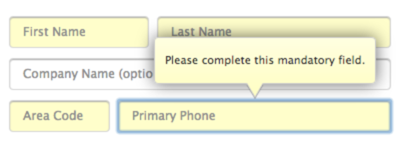
This is an example of unhelpful and vague error message placement. It would be exceptionally difficult for someone to automatically know the exact location of the error with such an unclear message located in a pop-up box.
Good example: Great error message placement
This is called inline error message placement — it’s located directly inline with the error so your visitors are able to clearly see the issue at hand and quickly fix it.
2. Blame the User
Ever heard that saying, “The customer’s always right”?
Well, that same message applies to your web forms and their error messages. You should avoid any negative language and refrain from blaming your visitors for the error — use positive phrases and don’t place the blame anyone or anything.
Mistake: Blame the User
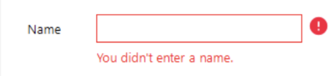
The last thing you want to do is target your visitor and make them feel bad or belittled. Don’t ever blame them for the error in the form (even if they really did cause the issue).
You should also avoid negative and vague phrases such as, “Oops!” or “Something went wrong.” Having to correct an error or two might be a frustrating process for a person in a rush or someone who has already worked through multiple other errors in the same form. And lets face it, negative language isn’t going to make your visitors excited about correcting their mistakes — it’s also simply not at all helpful.

Good example: Don’t blame anyone or anything
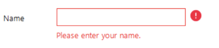
In your error messages, you want to sound positive, calm, and straightforward. You should also avoid blaming anyone or anything. Inserting polite words and phrases such as “please” is also a nice and professional way to ask your visitors to correct their errors while also making a good impression.
3. Error Message Copy
Your error message copy (what the error message actually says) matters. Otherwise, how would your visitor understand what the error actually is or how to fix it? Using clear and direct language will help your visitors understand what caused their error in the first place and how they should go about correcting it.
Mistake: Lack of clarity
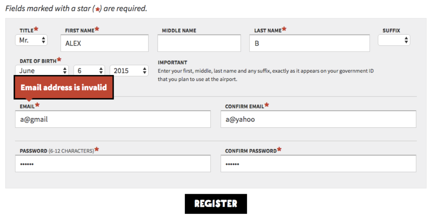
Although this error message is inline and shows the visitor there’s an issue with the email address they entered, simply saying the address is “invalid” isn’t helpful for visitors. In this scenario, how are visitors supposed to know if they misspelled their email address, if they need to try another email address, or if already have an account they forgot about (and need to head to the login page instead)?
Unclear and vague copy puts your visitors through a not-so-exciting and time-consuming guessing game.
Good example: Be clear and concise
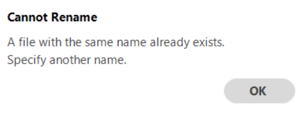
Your message copy should not only be clear, concise, and explain the issue at hand, but it should also give the visitor simple directions on how to fix the error. This way, they stay productive and both your company and form feel professional and thoughtful.
4. Error Message Clarity
Error message copy is a great lead-in to a similar, common mistake: lack of error message clarity. Your message should be so clear that an elementary school student could understand it and know how to fix the error.
To determine your error message’s level of clarity, you should take a look at your form field requirements. For example, if you have unclear requirements listed and an error message pops up on the form, your visitors are going to have a hard time understanding how they’re supposed to fix the issue .
Mistake: Not listing form field requirements
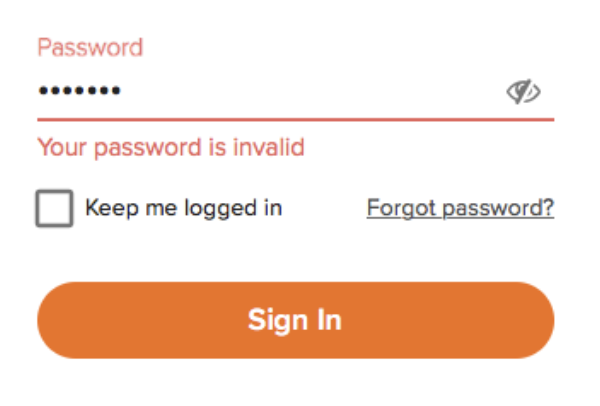
If your form has password requirements yet you don’t clearly list them out anywhere, your visitor will most likely find it difficult to create a valid password. They’ll have to use the process of elimination to create a password successfully which could take a lot of time. Again, talk about an agitating process that your visitors simply don’t have the time for.
Good example: List form field requirements
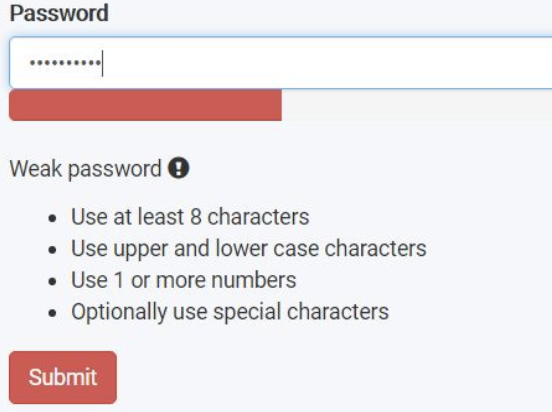
By clearly listing your form field requirements, such as your exact password requirements, you provide your visitors with a solution to avoid making any errors in your form. And if they do still make a mistake, they can quickly skim those requirements to learn how to amend the issue.
5. Concise Error Message Descriptions
While completing your form, it’s probably safe to assume your visitors aren’t going to want to sit around reading a long error message description. Reading wordy, long-winded descriptions about anything can feel confusing and tedious. To avoid this, your error message descriptions should briefly explain the precise actions your visitors can take to fix their mistake.
Mistake: Long, confusing error message descriptions

Long and confusing error message descriptions typically defeat the purpose of what you’re trying to do (which is help your visitor correct their error). In fact, they can make it significantly more difficult to uncover the real issue at hand and understand how to fix it.
Good example: Keep error messages straightforward
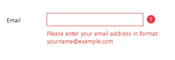
When you explain the reason for your visitor’s error, be as straightforward and short as possible. Use language that points the visitor directly to their mistake and briefly explains how to fix it so they can make the correction on their own without any hesitation or confusion in a timely manner.
6. Obvious Error Messages
Making your error messages pop so they’re easy to see and read is a simple way to enhance UX (user experience). Make your error messages bright, bold, and obvious so your visitors can quickly correct their mistake and move on with their submission. To create an obvious error message, consider things like size, color, font, and other factors that contribute to the message’s overall appearance.
Mistake: Make the error message hard to see

Typically, error messages and warning signs are the color red — this error message example is green … which is a color that often signals success. You can see how this might lead to some puzzled visitors.
Using narrow and light-colored font on a white background is also slightly difficult to read. Additionally, the message’s action button, “OK”, stands out more than the word “ERROR” at the top of the summary box. And “Error” is arguably the most important part of this message because it’s what actually tells visitors there’s an issue with their submission.
Good example: Make the error message easy to identify

When creating your error message, use intuitive, error-related cues (such as the color red) to bring the mistake to your visitor’s attention.
Some may say that a lot of bright red on a page could potentially overwhelm a visitor or make them feel targeted. But incorporating neutrals such as white or black, or even a faded or less-abrasive shade of red, helps bring balance to your message. This error message also uses warning signal icons that direct visitors to the locations in which errors exist, a readable font, and an easy-to-see action button that clearly states you can resubmit, or “Send”, your form again.
Back To You
Including well-crafted error messages in your web forms is a great way to enhance your user experience and, therefore, boost your conversions. There are a number of ways to avoid the most commonly made error message mistakes that may cause your visitors to feel frustrated, angry, or leave your site altogether.
By incorporating the quick fixes to these mistakes, your forms will feel professional and thoughtful, initiating a positive relationship with your visitors that will keep them coming back to your site. So get started crafting great error messages today with these easy-to-implement guidelines that will improve your UX and increase your number of leads and conversions.

How to Record Your Screen on a Mac and Windows 10
As a marketer, you need to record your computer screen more often than you’d think. Whether you’re teaching a new hire how to use a tool, explaining a complex project when an email just won’t do, or recording a personalized product demo, you need to know how to record your computer screen.
Fortunately, we’ve put together a quick and easy guide for recording your computer screen on a Mac and Windows 10. Read on to learn how to do so.
How to Record Your Screen on a Mac
Apple pre-installed QuickTime Player, an app that lets you record, edit, play, and share audio and video files, onto every Mac. You can use it to record your computer screen.
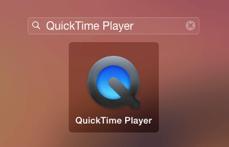
1. Open QuickTime Player by searching for it in Launchpad.
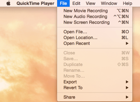
2. Once you’re in Quicktime, click “File” and select “New Screen Recording”.
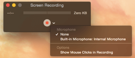
3. Press the downward facing arrow next to the “Record” button to choose the following recording options:
- Microphone: Choose “None” to record your screen with no sound. Choose “Built-in Microphone” to record your screen with sound.
- Options: Choose “Show Mouse Clicks in Recording” if you want your clicks to appear as a circle during your screen recording.
4. Click the “Record” button and choose one of the following recording types:
- Click your screen to record your entire computer screen.
- Drag a section of your screen that you want to record.

5. To finish recording, click the “Stop” button in the menu bar, which will be to the left of the “WiFi” button.

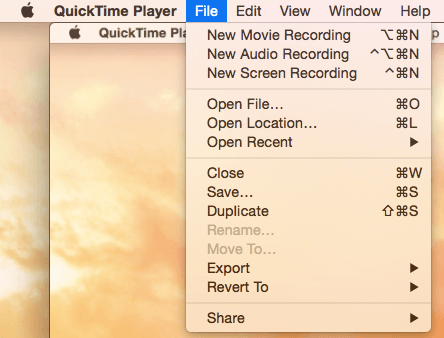
6. To save your recording, click “File”, press “Save”, and name your recording.
How to Record Your Screen on Windows 10
On Windows 10, Microsoft pre-installed the Xbox App, which has a built-in screen recorder that’s designed for recording video games on your computer. You can still use it to record your screen for marketing purposes, though.
1. Type “Xbox” into the search box and open up the app.
2. To open the Game Bar, which lets you record your screen, hold the “Windows” and “G” keys on your keyboard. Then, click “Yes, this is a game”.
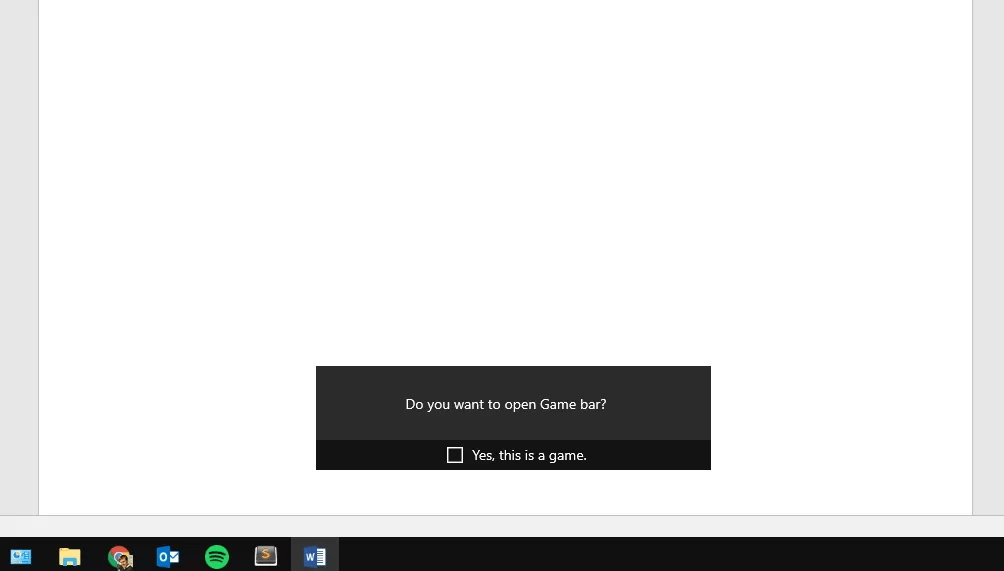
Image Credit: Lifewire
3. To choose your screen recording’s quality setting, determine whether or not you want to record audio, or set a maximum clip length, open the “Game DVR” options in the Xbox app.
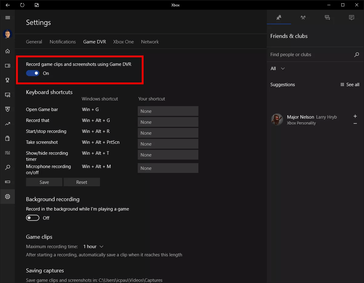
Image Credit: Lifewire
4. Click the “Record” button or hold the “Windows”, “Alt”, and “R” keys on your keyboard to start recording your computer screen.
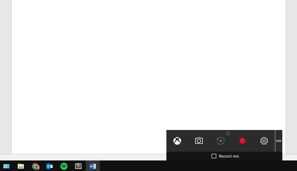
Image Credit: Lifewire
5. Click the “Stop” button when you’re finished recording. Your recorded video will be saved in your “Videos/Capture” folder.
5 of the Best Free Screen Recorders for Mac and Windows
If you’d like to record your screen with more advanced tools that are still free, check out these five screen recording tools that you can download or access online.
1. OBS Studio
OBS Studio is an open source software for video recording and live streaming. Designed for gamers to record and stream themselves playing video games, OBS Studio offers advanced post-production tools, like customizable transitions, muting or turning on audio sources, and editing, which allows you to tinker on almost every aspect of your recording or broadcast.

Image Credit: Tech Radar
2. Apowersoft Free Online Screen Recorder
Apowersoft is a web-based screen recorder, so you don’t have to download it. By just visiting their website, you can record your screen for however long you want, pick a certain part of your screen to record, insert your webcam into your screen to talk about what exactly you’re doing, capture video and audio at the same time, and make annotations while recording.
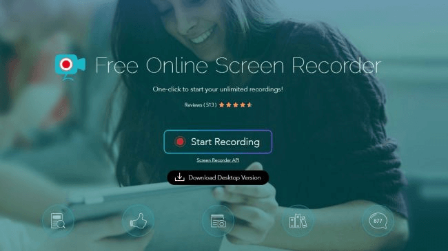
Image Credit: Tech Radar
3. Debut Video Capture
Currently in public beta, Debut Video Capture isn’t as sleek as the other tools on this list, but it still has a similar level of functionality. With the tool, you can spotlight your cursor during your recordings, add captions to your recordings, adjust your recordings’ color and video effects, and customize the size and frame rate of your recordings.
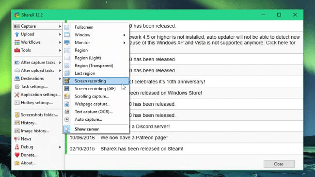
Image Credit: Tech Radar
4. Icecream Screen Recorder
With support for over 50 languages, Icecream Screen Recorder is one of the best screen recorders for global teams. You can also add your own watermark to your recordings, choose your recordings’ video quality, trim recordings, and set timers for each task you want to complete during your screen recordings.
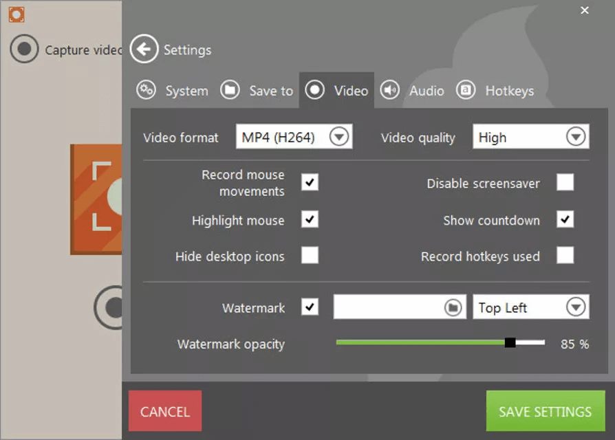
Image Credit: Lifewire
5. TinyTake
TinyTake is a more basic screen recorder, but you can still record your screen for up to two hours, email your screen recording to colleagues, and even create a shareable link of it.
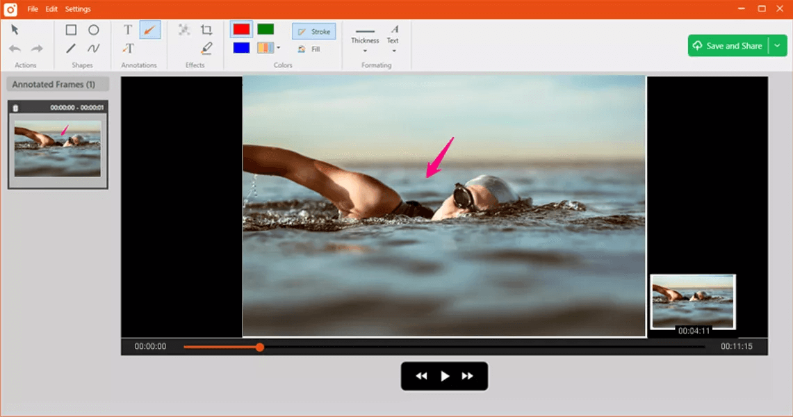
Image Credit: Lifewire

Here’s How to Write an Impressive Personal Mission Statement [Examples & Template]
Companies often need mission statements to define their values, and ensure they’re remaining focused on reaching their goals without getting side-tracked.
At its core, a good mission statement helps a company demonstrate who they are, and how they’re different from other businesses.
For instance, consider JetBlue’s mission statement — “To inspire humanity — both in the air and on the ground.”
Alternatively, take a look at IKEA’s mission statement — “To create a better everyday life for the many people.”
It’s obvious from these examples that a good mission statement doesn’t just state what a company does — it also represents what a company hopes to do, on a large scale.
An individual can reap similar benefits from creating a personal mission statement. A personal mission statement allows you to define your values and what success looks like to you, and articulate what matters most to you professionally. Additionally, a mission statement will help guide your professional decisions to ensure your career path aligns with your personal goals.
To ensure you’re able to create a truly inspiring and accurate personal mission statement, we’ve created templates and cultivated examples to help get you started.

What is a personal mission statement?
A personal mission statement is your chance to articulate your values, who you are, and how you define success. You can use a personal mission statement to guide your decisions, and ensure your professional career path remains aligned with your personal goals.
Personal Mission Statement Examples
Take a look at the following examples to help inspire your own personal mission statement.
1. “To serve as a leader, live a balanced life, and apply ethical principles to make a significant difference” — Denise Morrison, Campbell Soup Company
2. “If something is important enough you should try, even if the probable outcome is failure” — Elon Musk, CEO of Tesla
3. “My mission in life is not merely to survive, but to thrive; and to do so with some passion, some compassion, some humor, and some style” — Maya Angelou
4. “To use my gifts of intelligence, charisma, and serial optimism to cultivate the self-worth and net-worth of women around the world” — Amanda Steinberg, Dailyworth.com
5. “To make people happy” — Walt Disney, Founder of Walt Disney Productions
6. “To be a teacher. And to be known for inspiring my students to be more than they thought they could be” — Oprah Winfrey, Founder of OWN, The Oprah Winfrey Network
7. “I want to serve the people. And I want every girl, every child to be educated” — Malala Yousafzai, Nobel Prize laureate and activist
How to write a personal mission statement
- Begin by considering both who you are, and who you want to become
- Write down what is most important to you, what you want your legacy to be, and what you are most passionate about. If this is difficult, visualize what you hope your life will look like at the end of your career path
- Dream big and take time to articulate your biggest goals, rather than writing down restricting and short-term plans
- Ask peers or mentors what they consider your biggest strengths to be, and consider what makes you exceptional compared to others of similar expertise
- Consider what kind of mark you want to leave on the world, and how your skills can help you achieve that
- Keep it short. If necessary, try a writing exercise in which you write down only five words that describe you and your purpose, then two, then one. Use these words as inspiration for your mission statement
- Be true to yourself — make sure your mission statement accurately reflects your biggest passion and what you truly believe your long-term purpose to be
Personal Mission Statement Template
Your personal mission statement will be unique to you, and doesn’t need to follow any traditional format. However, the task can seem daunting, so we’ve created a few templates to inspire you and get you started.
1. To [what you want to do] by [how you’ll do it] so that [what impact you hope to make].
Example — “To serve as a leader by encouraging innovation and forward-thinking so that my employees can create technology that will improve the lives of those in developing countries.”
2. I value [one or multiple things you value] because [why it matters to you]. To do this, I will [how your professional path will align with these values].
Example — “I value education because I believe it can help women get involved in politics and become world leaders. To do this, I will teach women’s studies on policy and law.”
3. To use my [skills or expertise] to inspire/lead [group of people] so that [ultimate goal].
Example — “To use my skills as a journalist to inspire people, so that they are educated about the world around them and are energized to make change.”
Ultimately, it’s critical you take time to self-reflect and truly consider what energizes you, and what type of long-term legacy you hope to leave behind. If done correctly, a personal mission statement can ensure each decision you make leads you closer to a role in which you find both fulfillment and meaning.

The Bandwagon Effect: 5 Ways to Use the Power of the Crowd to Supercharge Your Conversions
Does the name Dan Rice ring a bell?
Probably not. There’s a reason he’s called “the most famous man you’ve never heard of.” Rice was a popular clown during the 19th century. An household name at the time, Rice was so popular that many terms he coined, such as “one horse show” and “greatest show,” quickly slipped into popular usage and are still in use today.
At the height of Rice’s popularity, he decided to travel the country campaigning for then-presidential candidate Zachary Taylor. During the campaign, he made his bandwagon a key part of his campaign and urged people at campaign events to “jump on the bandwagon” to show their support for Zachary Taylor.
The campaign was a massive success, and Zachary Taylor would later end up being the 12th president of the United States.
Dan Rice’s “bandwagon” wouldn’t end with Zachary Taylor’s campaign, however. Seeing the success of Rice’s campaign for Taylor, contemporary politicians started to use bandwagons in their campaigns, and the term “jump on the bandwagon” was coined to ask people to show their support for a cause.
The success of Dan Rice’s campaign for Zachary Taylor as well as subsequent attempts by other politicians to copy his approach led to the coining of the term, the “bandwagon effect.”
What is the Bandwagon Effect?
The bandwagon effect refers to people’s propensity to do something primarily because other people — especially a lot of other people — are doing it. This is regardless of whether what is being done aligns with their original beliefs.
The bandwagon effect has been shown to be so powerful that its effect has been observed in politics, public policy, and marketing. Studies have shown that the bandwagon effect influences people’s willingness to not only use an item but to also pay more fore it. Studies have also shown that the bandwagon effect influences people’s choice of movies to watch, particularly in instances where they are uncertain of the quality of movies. Studies have also found that the bandwagon effect can strongly influence undecided voters to vote in favor of the person “expected to win.”
How do you leverage the bandwagon effect to boost your conversions? Here are some ideas:
1. Feature Customer Testimonials, and Take it Up a Notch by Accompanying the Testimonials With the Customer Logo
We’ve established that people care a lot about what other people like them think; that’s the whole point of the bandwagon effect. So it goes without saying that featuring customer testimonials on your landing pages can go a long way to boost conversions.
There’s a catch, however: customer testimonials should be accompanied by customer logos.
Internet analytics company comScore wasn’t satisfied with conversions coming from their software product pages. The initial page featured vertically-aligned customer testimonials but didn’t include customer logos. comScore decided to create three variations of the original page and measure its results; variation one retained the vertically-aligned customer testimonial but added a logo, variation two used an horizontally-aligned testimonial format but included no logo, and variation three used an horizontally-aligned testimonial format with a logo:

The result of the test:

Variation one, that used a vertically-aligned testimonial accompanied by customer logo outperformed the original landing page (that had no logo) by 69 percent. Variation three, that used a horizontally-aligned testimonial accompanied by customer logo outperformed the original by 30.5 percent, while variation two that used a horizontally-aligned testimonial without customer logo was the least performing of all the variations.
As evidenced by the results of this experiment, using customer testimonials is most effective when the testimonials are accompanied by the logo of the customer.
2. Highlight Your Numbers, Especially if You Have Huge Numbers
One of the most effective ways to leverage the bandwagon effect to boost your conversions is by showcasing your numbers.
When you highlight the fact that a certain number of people use your product, you are tacitly establishing that that number of people endorse your product.
This is my favorite approach: for my project that has helped over 250,000 people create a website, by highlighting how many people have created a website by using my guide, I’m able to get significantly more people to trust me and follow my tutorials:

When a reader sees that 250,000 have launched a website using my tutorials, they instantly think, “I have to listen to this guy. 250,000 people can’t be wrong!”
3. Incorporate Customer Reviews into Key Pages
In a case study, Brian Kyed, the co-founder of Airtame — a product that successfully raised $1.3 million on Indiegogo in 2015 and won the “Best of CES” award — revealed that they were able to increase their monthly revenues by sixfold in just nine months, as indicated in the below chart, by focusing on reviews:

We can go on and on about the power of customer reviews, but I’d let the statistics do the talking:
- Displaying reviews can boost conversions by up to 270 percent.
- Displaying at least five reviews increases the likelihood of customers purchasing by up to four times.
- For high ticket products, displaying reviews can boost conversions by up to 380 percent.
As established by the above statistics, you can also leverage the power of the crowd by incorporating customer reviews into your sales page; we are social creatures by default and are very curious about what other people think. This extends to their thoughts about products we want to purchase; what do they really think about it? If they were to rate their experience, what will they rate it? Make this information available on your sales page and watch your conversions go through the roof.
4. Leverage Association With a Celebrity or Industry Thought Leader
One of the earliest examples of the power of celebrity endorsement comes from the 1760s: English potter and entrepreneur Josiah Wedgwood created a cream-colored tea set for Queen Charlotte. News about the elegance and sophistication of the tea set Wedgwood created for the queen quickly spread. Wedgwood was quickly appointed “potter to her majesty.”
Not only did Wedgwood make sure everybody knew that he was the queen’s potter, but he also convinced the queen to allow him brand his line of creamware “Queensware,” in order to leverage association with the queen to enhance the perception of his creamware. With more orders from the highest levels of British nobility, Wedgwood began to promote the association his pottery has with royalty in his marketing materials. By the time of his death, thanks to the success of his wares, he had accumulated a fortune worth about £500 million in today’s terms.
Having a celebrity directly endorse you is a difficult feat — but if you are able to pull it off, it can do wonders for your brand.
A notable example of a brand that directly leveraged the power of celebrity endorsement is Priceline: they leveraged association with Star Trek star William Shatner to enhance their brand. Shatner was paid in stocks, and many have speculated that at the height of Priceline’s success Shatner’s stock was worth as much as $600 million.
Another high-profile example of the power of celebrity endorsement that comes to mind is Oprah Winfrey’s endorsement of the T-Fal actifry:

By simply posting on social media that she uses the T-Fal actifry, T-Fal’s stock value increased so much that Oprah’s endorsement was said to be worth $150 million.
Celebrity endorsement doesn’t just impact businesses. It can also impact politics, too. According to a particular study, Oprah Winfrey’s endorsement of Barack Obama during the 2008 presidential elections was responsible for Obama gaining an additional 1 million votes.
Even if you can’t get a celebrity to directly endorse you, you can still leverage association with a celebrity or industry thought leader to draw the crowd to you. There are numerous ways to do this: you can highlight the fact that a celebrity uses your product, or you can highlight any other form of connection with a respected figure.
5. Showcase Real-Time Customer Activity
You can also leverage the bandwagon effect by showing people real-time customer activity on your site; this can be particularly effective if you run an ecommerce site that gets quite a lot of sales. You can show users a notification whenever new users make a purchase.
An example of an ecommerce site that does this really well is Treegear:

As shown in the above screenshot, Treegear displays regular notifications in the footer of pages on their showing visitors which products other people are buying on the site. This kind of notification not only draws attention to the products being sold, but it lets users know that there is activity on the site.

The Quick and Easy Guide to Resizing Images Online
On most stock image websites, the pictures you download are usually so big they can fill up your entire screen. Needless to say, blown-up images don’t usually enhance the aesthetics of your content. But manually resizing images with one of your computer’s built-in programs can be a tedious task. Fortunately, there are a number of free tools on the internet that can quickly resize your images — without making you download any new programs.
How to Resize Images Online
To resize images online, visit one of the free online tools below, upload your photo or photos to the tool, and resize them to your preferred dimensions.
5 Free Online Tools for Resizing Images Online
1. BeFunky
BeFunky is a sleek photo editor that lets you resize individual images from your computer. If you want to use a more sophisticated tool void of any banner ads, BeFunky is the tool for you.

2. ILoveImg
With ILoveImg’s resize image tool, you can resize up to 15 images from your computer at a time. If you sign up for a free account, you can resize up to 30 images at a time. ILoveImg is best for marketers who constantly need to resize images for blog posts and social posts.

3. ImageResize.org
ImageResize.org lets you resize individual images from your computer or the internet. If you need a simple tool that can help you resize photos on an ad-hoc basis, ImageResize.org is for you.

4. Photo Resizer
With Photo Resizer, you can resize, crop, rotate, flip, draw shapes, and add text to individual photos from your computer. If you prefer spending a little more time and effort polishing your photos, Photo Resizer is your best choice.

5. PicResize
PicResize lets you resize up to 100 images from your computer. If you need to quickly resize a large quantity of images, PicResize is the tool for you.


21 Memorable Photography Portfolio Websites to Inspire You
An online photography portfolio is often going to be the first introduction potential clients have to your work, so it’s critical you create a memorable and sleek website to display your content.
Additionally, many potential clients will use your photography portfolio as an opportunity to check out past clients with whom you’ve worked to get a gauge for how legitimate you are. If they can’t find you online, or they don’t feel particularly inspired by your portfolio, they won’t feel compelled to work with you.
No pressure, right?
Fortunately, there are plenty of impressive photography portfolio websites out there to use for inspiration. To avoid reinventing the wheel, take a look at our list of 21 most memorable photography portfolio websites.
Best Photography Portfolio Sites
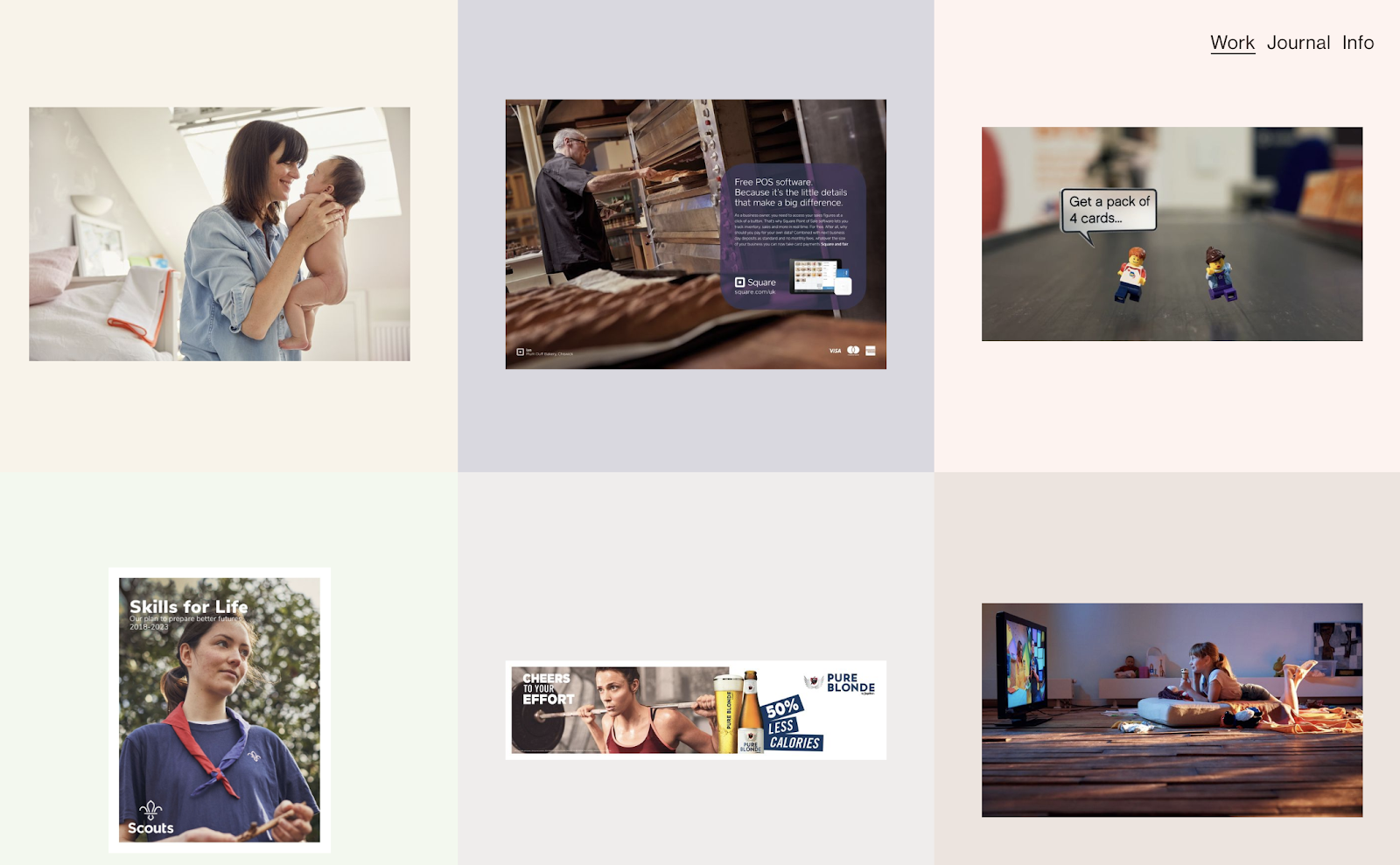
1. Tom Hull

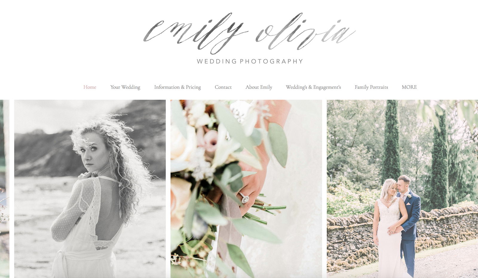
3. Emily Olivia
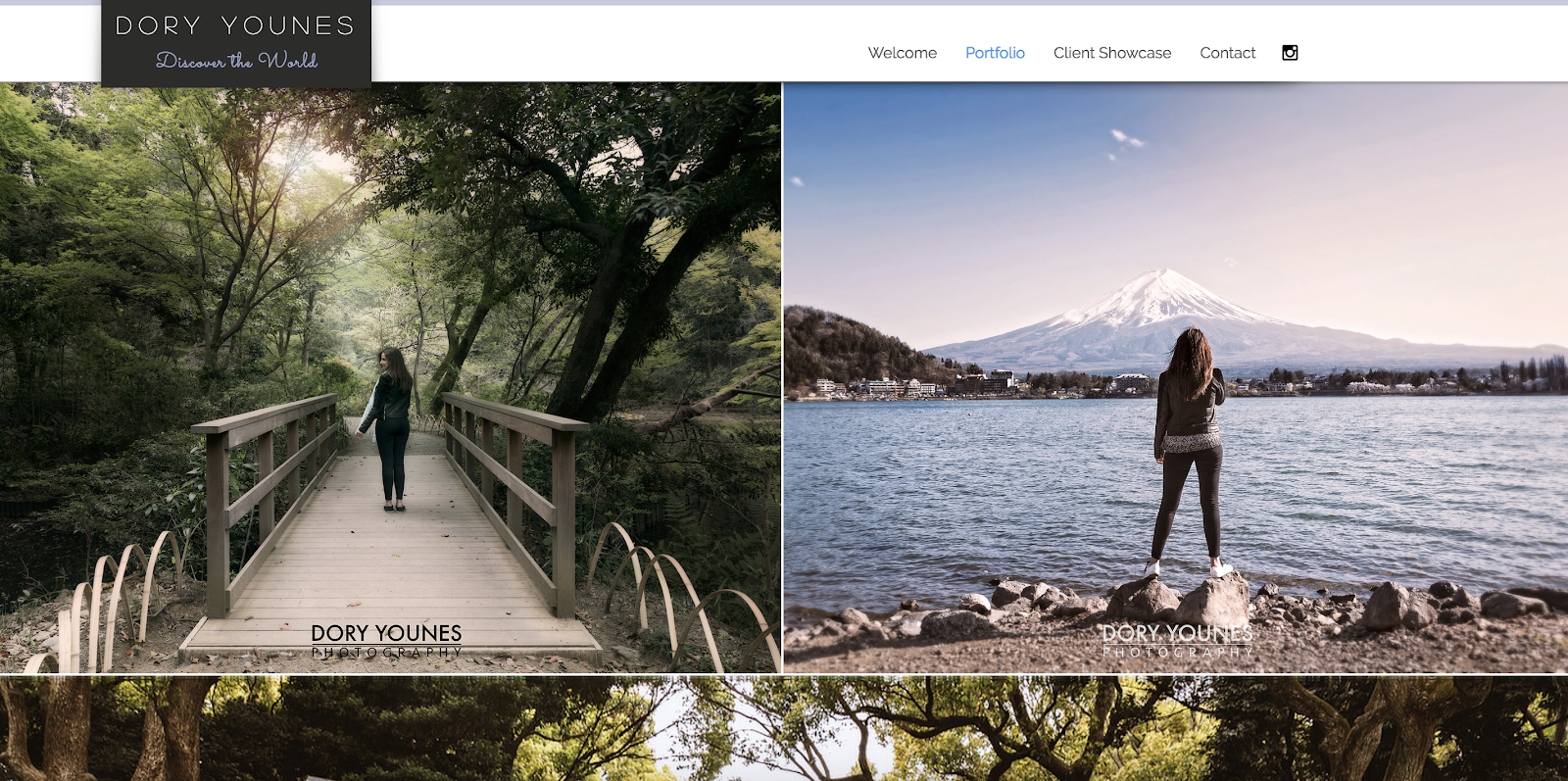
4. Dory Younes

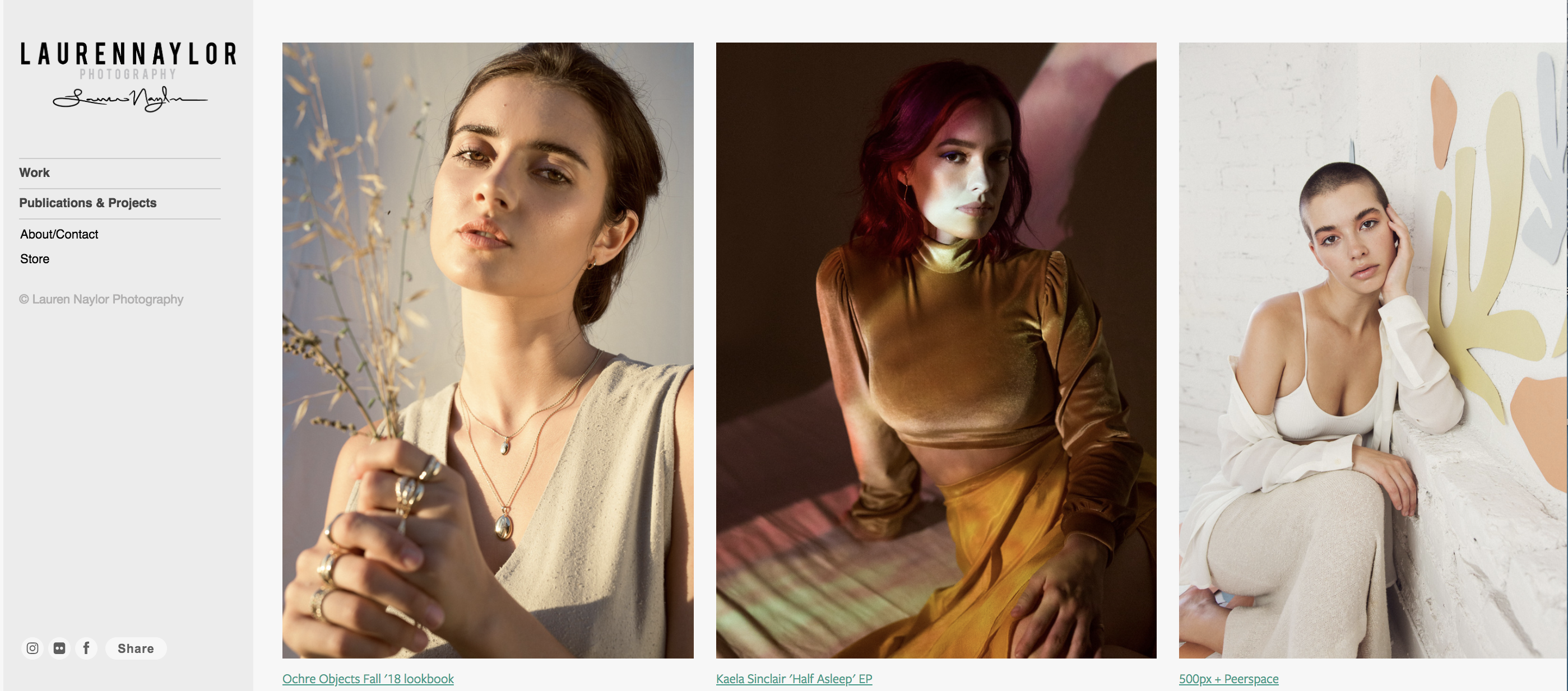

8. Gavin Gough

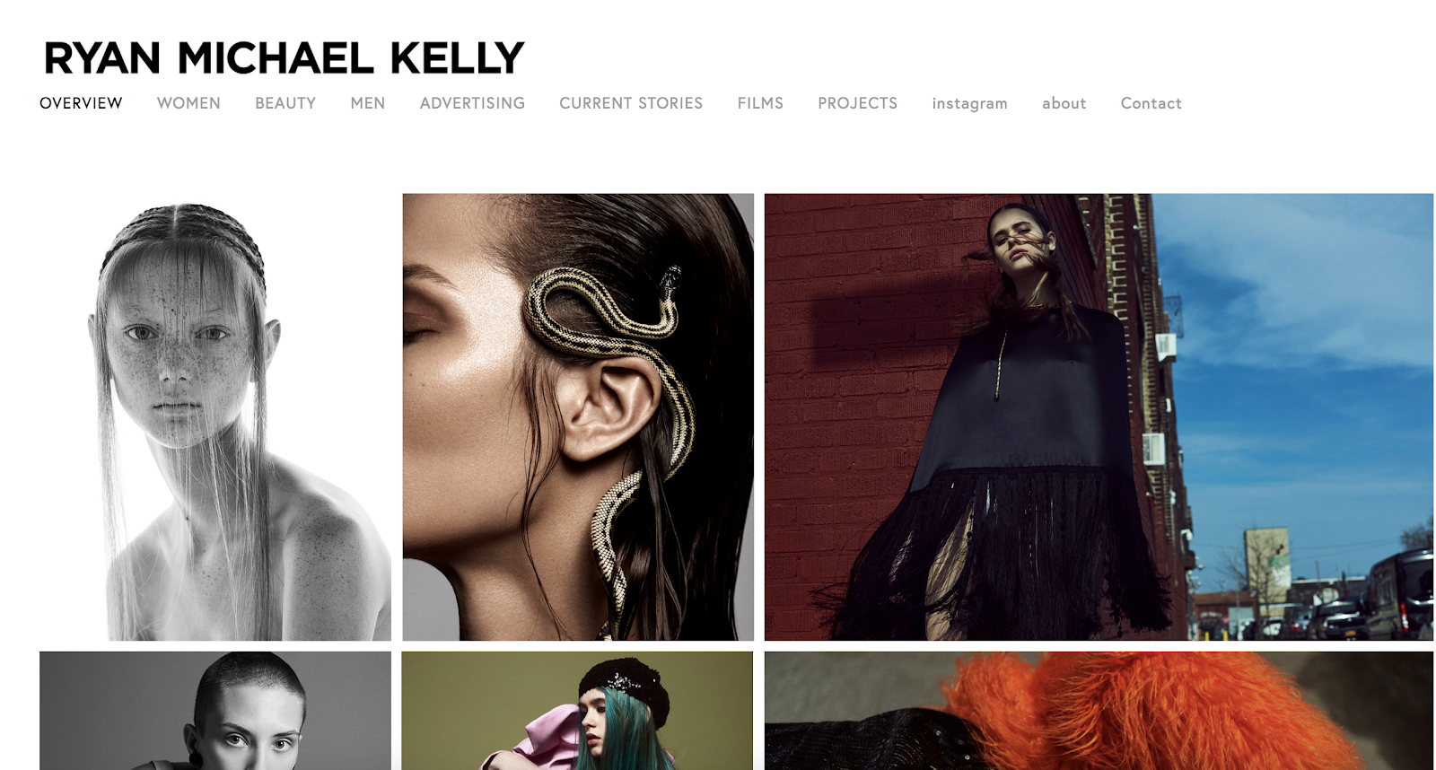
10. Chris Zielecki
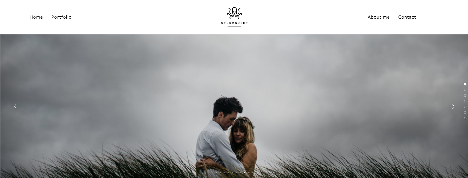

12. Nicholas La

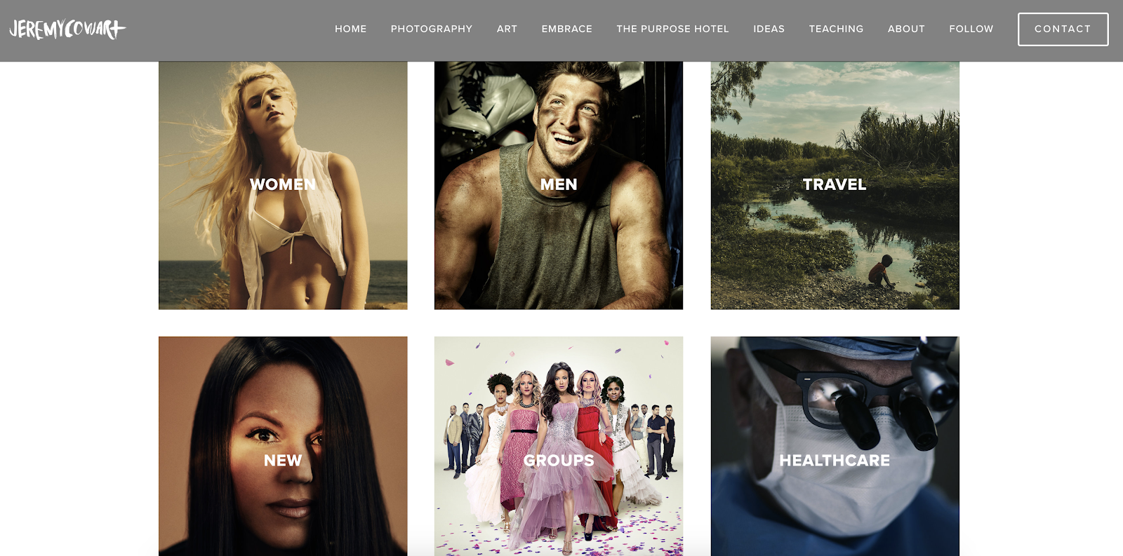
13. Jeremy Cowart
14. Nicolas Tarier

15. Evaan

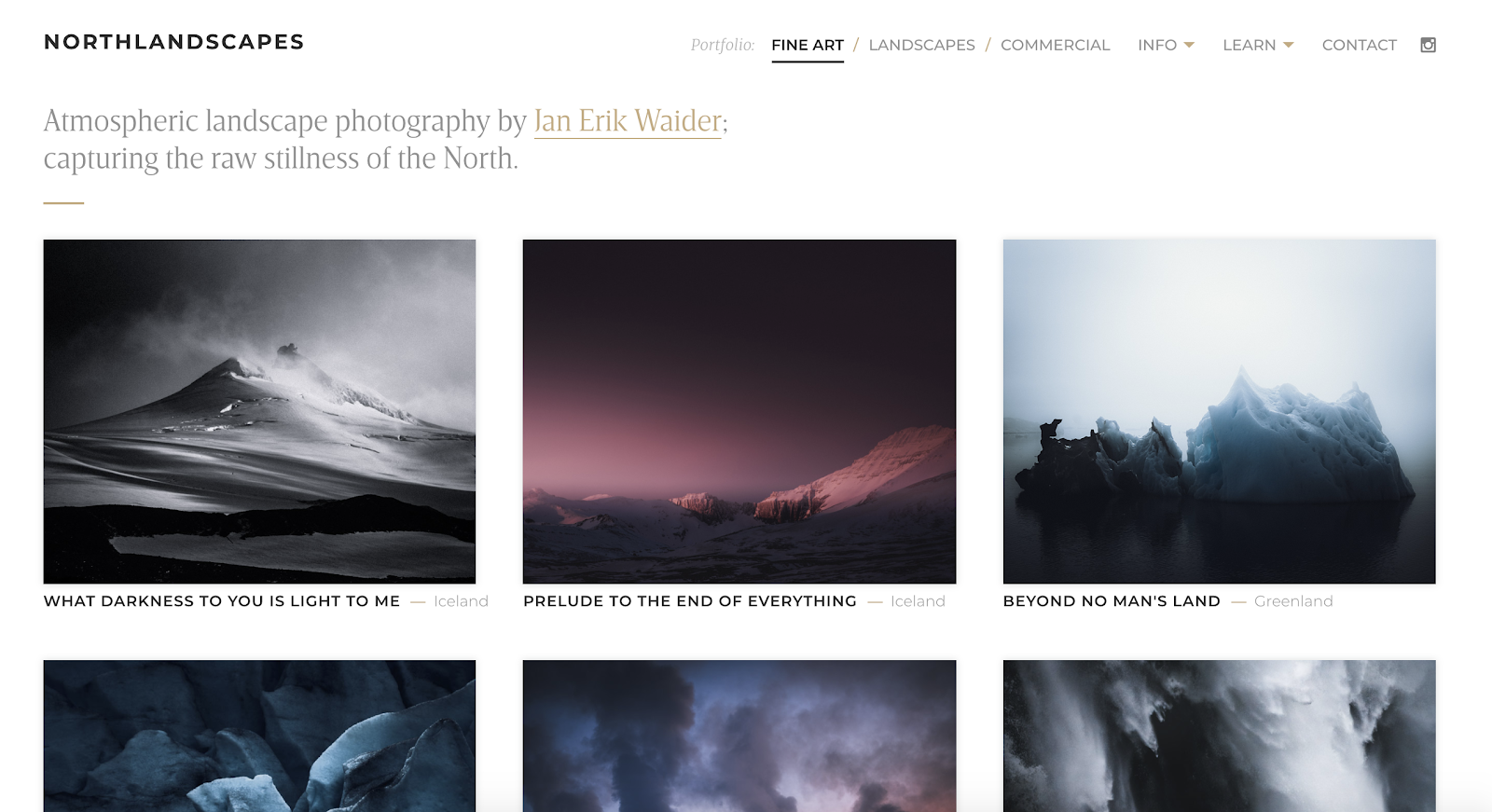
16. Northlandscapes
17. Dave Hill
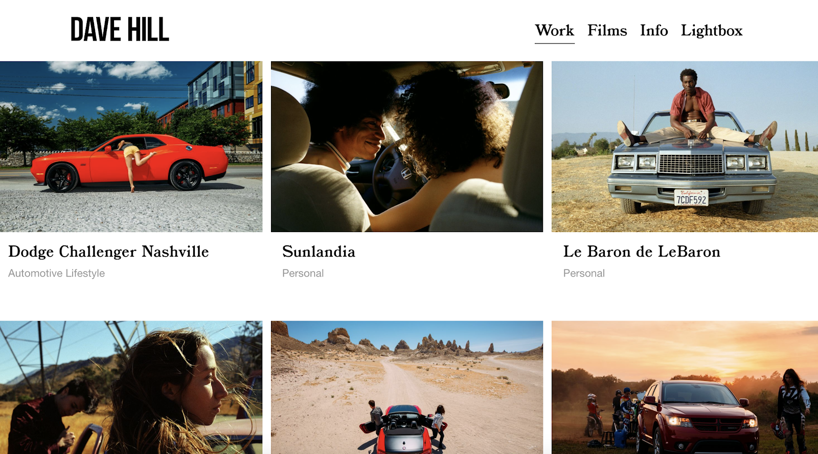

19. Lisa Bettany

20. Love + Water
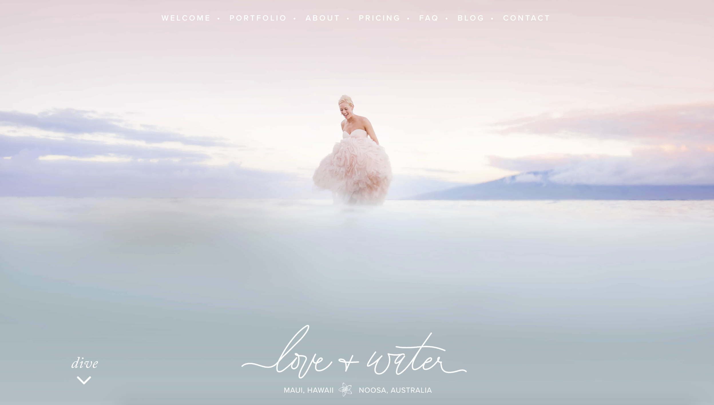


9 Reasons for Leaving Your Last Job That Hiring Managers Will Completely Understand
Out of all the questions hiring managers can potentially ask you during an interview, “Why did you leave your last job?” could be one of the hardest to answer.
To effectively answer this question, you need to frame your response in a way that shows hiring managers that you know what’s important to you and how to handle less than ideal situations. But you also don’t want to sound ungrateful for the opportunities you had in your previous role, or come off like you’re still bitter about how you left things with your last employer.

It can be challenging to explain why you decided to leave your last position without throwing your old company under the bus. But if answered thoughtfully, this question can help you highlight your flexibility and self-awareness.
To help you nail this question at your next interview, we rounded up nine reasons for leaving your last job that hiring managers will completely understand. And even if you’ve only worked in your current role for a short amount of time, these reasons can help you frame your decision to depart your last role in a way your potential new employer can truly respect.
9 Good Reasons For Leaving Your Job
- You’re looking to level up in your career, and your current company has limited opportunities for career growth.
- You don’t feel challenged or you’re not learning anything new at your current job.
- The nature of your work is not what was promised to you.
- You’re burnt out.
- You feel undervalued at your current job.
- You want to make a career change.
- You want a better work life balance.
- Your values don’t align with the company’s values.
- You had to leave the company due to family or personal reasons.
1. You’re looking to level up in your career, and your current company has limited opportunities for career growth.
Career stagnation can be incredibly frustrating. If you’ve worked hard at the same company for a few years, and you haven’t been promoted or even promised a promotion, you have every right to leave your current job. If you can communicate that you haven’t been able to climb the career ladder at your preferred pace during your interview, you’ll show hiring managers that you’re ambitious and goal-orientated.
2. You don’t feel challenged or fulfilled at your current job.
No job is perfect, but if you don’t feel any satisfaction at work, it’s definitely time for a change. Work becomes a chore if you don’t feel mentally stimulated or emotionally fulfilled. And hiring managers will completely understand why you’re leaving your current role, if this is the case. They’ll also be impressed with your internal need to be passionate about your job.
3. The nature of your work is not what was promised to you.
Did your current employer promise you a copywriting job, but now you somehow work in product marketing? If they’ve baited-and-switched you like this, wanting to leave the company is more than understandable. They promised you something, but failed to honor it — so why stay?
Leaving your job to find a new role that actually meets your expectations will also show hiring managers that you can stand up for yourself and pursue what you truly want in life.
4. You’re burnt out.
If your job’s heavy workload or endless stress make you hate going to work, it’s time for a fresh start somewhere else. Burnout can make work and, in turn, life miserable and most hiring managers have experienced it at least once in their careers, so if you need a new change of pace, they’ll definitely be able to empathize with you. They’ll also respect your willingness to take care of your mental and emotional health.
5. You feel undervalued at your current job.
When your current manager underestimates your potential or doesn’t know how to leverage your skill set to its full potential, work can become frustrating and dull. So why work for a company that doesn’t challenge you or allow you to make a impact?
If you can genuinely convey these frustrations and aspirations during your interview, hiring managers will perceive you as someone who truly wants to make a difference at their company — and that’ll only boost your chances of landing the job.
6. You want to make a career change.
In a world where most industries never stop changing, it’s common to leave a job to pursue a new career path. But even if you think your lack of experience in an industry is a vulnerability, you shouldn’t fret. Most hiring managers actually like hiring candidates from other industries because they can bring a fresh perspective to their team and company.
7. You want a better work life balance.
Sometimes employers forget that people work to live and don’t live to work. If your current job steals too many hours away from your personal life, it’s time to go. Life is for living, so if you can express your desire to work in a new role that provides a better work life balance, hiring managers will admire the respect you have for your own time.
8. Your values don’t align with the company’s values.
Whether you were never a good fit at your current company or a merger or acquisition altered its values, a moral conflict with an employer is totally a justifiable reason to leave. If you stand firmly behind your own beliefs, you shouldn’t have to compromise your ethics to drive results for a business you don’t support.
Hiring managers also want to hire people whose values align with their company’s, so clarifying that you both have similar principles will help you out tremendously during an interview.
9. You had to leave the company due to family or personal reasons.
Life happens. If you left your last job because you needed to take care of your family or nourish your physical or mental health, hiring managers won’t knock off any points during your interview. In fact, this reason will most likely bump up your score because you’ve proved that you can prioritize what’s truly important in life.

What Does Allyship Mean?
Research has shown more inclusive companies have a 2.3x higher cash flow per employee, and are 1.7 times more likely to be innovation leaders in their industry.
Increasing sales, while driving innovation — who doesn’t want that?
Undoubtedly, inclusion is critical for your company’s success and long-term growth. But inclusion can’t happen without allyship — and yet, many of us still aren’t sure what “allyship” means.
I have a sticker on my laptop that reads, “Ally is a verb”. I got it recently at an Allyship panel hosted here at HubSpot. It’s a daily reminder for me that being an ally is continuous action — not just a label.
To ensure a workplace culture in which employees feel included and valued, it’s critical you learn what allyship means, and how you can become an ally.
Allyship
Allyship is the lifelong process in which people with privilege and power work to develop empathy towards another marginalized group’s challenges or issues. The goal of allyship is to create a culture in which the marginalized group feels valued, supported, and heard. Being an ally is not a label — it is a verb.
What Does Allyship Mean?
Allyship is the continuous process in which someone with privilege and power seeks to first learn about the experiences of a marginalized group of people, and then ultimately empathize with their challenges and build relationships with that group of people.
The role of an ally includes:
- Being able to listen, and shine a spotlight on those whose voices are often unheard.
- Recognizing your own privilege and power, and using that privilege to lift others up.
- Being aware of implicit biases you might have.
- Supporting the group you’re allying by letting them speak for themselves whenever possible.
- Not expecting special recognition for being an ally, and not taking credit for the ideas of the marginalized group.
Additionally, Corey Ponder, who published How To Challenge Ourselves to Grow As Allies on Medium, writes, “Allies recognize their privilege and status within the in-crowd but support others that are outsiders or lack a voice in the in-crowd. This requires challenging accepted group dynamics and recognizing that being part of the in-crowd should not supersede the importance of supporting individuals that are outsiders or that lack a voice in the in-crowd.”
Ultimately, it’s critical you remember being an ally is not a part-time role.
For a complete list of resources on allyship, check out How to Be an Ally: 23 Resources That Can Help.

How to Do A/B Testing: A Checklist You’ll Want to Bookmark
When marketers like us create landing pages, write email copy, or design call-to-action buttons, it can be tempting to use our intuition to predict what will make people click and convert.
But basing marketing decisions off of a “feeling” can be pretty detrimental to results. Rather than relying on guesses or assumptions to make these decisions, you’re much better off running an A/B test — sometimes called a split test.
A/B testing can be valuable because different audiences behave, well, differently. Something that works for one company may not necessarily work for another. In fact, conversion rate optimization (CRO) experts hate the term “best practices” because it may not actually be the best practice for you.

But A/B tests can also be complex. If you’re not careful, you could make incorrect assumptions about what people like and what makes them click — decisions that could easily misinform other parts of your strategy.
Keep reading to learn how to do A/B testing before, during, and after data collection so you can make the best decisions from your results.
What is A/B testing?
A/B testing, also known as split testing, is a marketing experiment wherein you “split” your audience to test a number of variations of a campaign and determine which performs better. In other words, you can show version A of a piece of marketing content to one half of your audience, and version B to another.
To run an A/B test, you need to create two different versions of one piece of content, with changes to a single variable. Then, you’ll show these two versions to two similarly sized audiences and analyze which one performed better over a specific period of time (long enough to make accurate conclusions about your results).
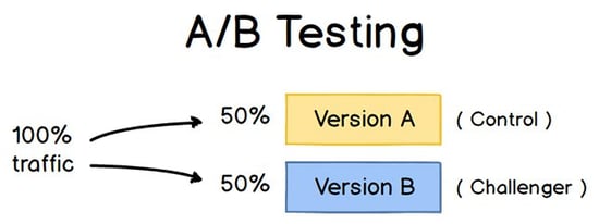
Image Credit: ConversionXL
A/B testing helps marketers observe how one version of a piece of marketing content performs alongside another. Here are two types of A/B tests you might conduct in an effort to increase your website’s conversion rate:
Example 1: User Experience Test
Perhaps you want to see if moving a certain call-to-action (CTA) button to the top of your homepage instead of keeping it in the sidebar will improve its clickthrough rate.
To A/B test this theory, you’d create another, alternative web page that reflected that CTA placement change. The existing design — or the “control” — is Version A. Version B is the “challenger.” Then, you’d test these two versions by showing each of them to a predetermined percentage of site visitors. Ideally, the percentage of visitors seeing either version is the same.
Learn how to easily A/B test a component of your website with HubSpot’s Marketing Hub.
Example 2: Design Test
Perhaps you want to find out if changing the color of your call-to-action (CTA) button can increase its clickthrough rate.
To A/B test this theory, you’d design an alternative CTA button with a different button color that leads to the same landing page as the control. If you usually use a red call-to-action button in your marketing content, and the green variation receives more clicks after your A/B test, this could merit changing the default color of your call-to-action buttons to green from now on.
To learn more about A/B testing, download our free introductory guide here.
The Benefits of A/B Testing
A/B testing has a multitude of benefits to a marketing team, depending on what it is you decide to test. Above all, though, these tests are valuable to a business because they’re low in cost but high in reward.
Let’s say you employ a content creator for $50,000/year. This content creator publishes five articles per week for the company blog, making 260 articles per year. If the average post on the company’s blog generates 10 leads, you could say it costs just over $192 to generate 10 leads for the business ($50,000 salary ÷ 260 articles = $192 per article). That’s a solid chunk of change.
Now, if you ask this content creator to spend two days developing an A/B test on one article, instead of writing two articles in that time period, you might burn $192 because you’re publishing one fewer article. But if that A/B test finds you can increase each article’s conversion rate from 10 to 20 leads, you just spent $192 to potentially double the number of customers your business gets from your blog.
If the test fails, of course, you lost $192 — but now you can make your next A/B test even more educated. If that second test succeeds in doubling your blog’s conversion rate, you ultimately spent $284 to potentially double your company’s revenue. No matter how many times your A/B test fails, its eventual success will almost always outweigh the cost to conduct it.
There are many types of split tests you can run to make the experiment worth it in the end. Here are some common goals marketers have for their business when A/B testing:
- Increased Website Traffic: Testing different blog post or webpage titles can change the number of people who click on that hyperlinked title to get to your website. This can increase website traffic as a result.
- Higher Conversion Rate: Testing different locations, colors, or even anchor text on your CTAs can change the number of people who click these CTAs to get to a landing page. This can increase the number of people who fill out forms on your website, submit their contact info to you, and “convert” into a lead.
- Lower Bounce Rate: If your website visitors leave (or “bounce”) quickly after visiting your website, testing different blog post introductions, fonts, or feature images can reduce this bounce rate and retain more visitors.
- Lower Cart Abandonment: Ecommerce businesses see 40 – 75% of customers leave their website with items in their shopping cart, according to MightyCall. This is known as “shopping cart abandonment.” Testing different product photos, check-out page designs, and even where shipping costs are displayed can lower this abandonment rate.
Now, let’s walk through the checklist for setting up, running, and measuring an A/B test.
How to Conduct A/B Testing
Before the A/B Test
1. Pick one variable to test.
As you optimize your web pages and emails, you might find there are a number of variables you want to test. But to evaluate how effective a change is, you’ll want to isolate one “independent variable” and measure its performance — otherwise, you can’t be sure which one was responsible for changes in performance.
You can test more than one variable for a single web page or email; just be sure you’re testing them one at a time.
Look at the various elements in your marketing resources and their possible alternatives for design, wording, and layout. Other things you might test include email subject lines, sender names, and different ways to personalize your emails.
Keep in mind that even simple changes, like changing the image in your email or the words on your call-to-action button, can drive big improvements. In fact, these sorts of changes are usually easier to measure than the bigger ones.
Note: There are some times when it makes more sense to test multiple variables rather than a single variable. This is a process called multivariate testing. If you’re wondering whether you should run an A/B test versus a multivariate test, here’s a helpful article from Optimizely that compares the two.
2. Identify your goal.
Although you’ll measure a number of metrics for every one test, choose a primary metric to focus on — before you run the test. In fact, do it before you even set up the second variation. This is your “dependent variable.”
Think about where you want this variable to be at the end of the split test. You might state an official hypothesis and examine your results based on this prediction.
If you wait until afterward to think about which metrics are important to you, what your goals are, and how the changes you’re proposing might affect user behavior, then you might not set up the test in the most effective way.
3. Create a ‘control’ and a ‘challenger.’
You now have your independent variable, your dependent variable, and your desired outcome. Use this information to set up the unaltered version of whatever you’re testing as your “control.” If you’re testing a web page, this is the unaltered web page as it exists already. If you’re testing a landing page, this would be the landing page design and copy you would normally use.
From there, build a variation, or a “challenger” — the website, landing page, or email you’ll test against your control. For example, if you’re wondering whether including a testimonial on a landing page would make a difference, set up your control page with no testimonials. Then, create your variation with a testimonial.
4. Split your sample groups equally and randomly.
For tests where you have more control over the audience — like with emails — you need to test with two or more audiences that are equal in order to have conclusive results.
How you do this will vary depending on the A/B testing tool you use. If you’re a HubSpot Enterprise customer conducting an A/B test on an email, for example, HubSpot will automatically split traffic to your variations so that each variation gets a random sampling of visitors.
5. Determine your sample size (if applicable).
How you determine your sample size will also vary depending on your A/B testing tool, as well as the type of A/B test you’re running.
If you’re A/B testing an email, you’ll probably want to send an A/B test to a smaller portion of your list to get statistically significant results. Eventually, you’ll pick a winner and send the winning variation on to the rest of the list. (See “The Science of Split Testing” ebook at the end of this article for more on calculating your sample size.)
If you’re a HubSpot Enterprise customer, you’ll have some help determining the size of your sample group using a slider. It’ll let you do a 50/50 A/B test of any sample size — although all other sample splits require a list of at least 1,000 recipients.
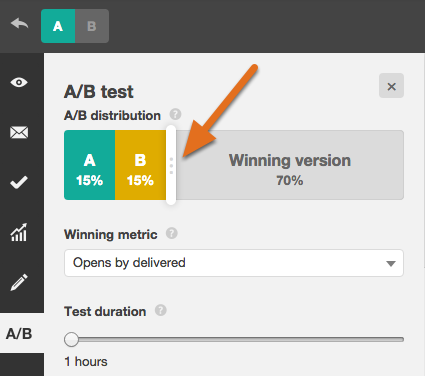
If you’re testing something that doesn’t have a finite audience, like a web page, then how long you keep your test running will directly affect your sample size. You’ll need to let your test run long enough to obtain a substantial number of views, otherwise it’ll be hard to tell whether there was a statistically significant difference between the two variations.
6. Decide how significant your results need to be.
Once you’ve picked your goal metric, think about how significant your results need to be to justify choosing one variation over another. Statistical significance is a super important part of A/B testing process that’s often misunderstood. If you need a refresher on statistical significance from a marketing standpoint, I recommend reading this blog post.
The higher the percentage of your confidence level, the more sure you can be about your results. In most cases, you’ll want a confidence level of 95% minimum — preferably even 98% — especially if it was a time-intensive experiment to set up. However, sometimes it makes sense to use a lower confidence rate if you don’t need the test to be as stringent.
Matt Rheault, a senior software engineer at HubSpot, likes to think of statistical significance like placing a bet. What odds are you comfortable placing a bet on? Saying “I’m 80% sure this is the right design and I’m willing to bet everything on it” is similar to running an A/B test to 80% significance and then declaring a winner.
Rheault also says you’ll likely want a higher confidence threshold when testing for something that only slightly improves conversation rate. Why? Because random variance is more likely to play a bigger role.
“An example where we could feel safer lowering our confidence threshold is an experiment that will likely improve conversion rate by 10% or more, such as a redesigned hero section,” he explained. “The takeaway here is that the more radical the change, the less scientific we need to be process-wise. The more specific the change (button color, micro copy, etc.), the more scientific we should be because the change is less likely to have a large and noticeable impact on conversion rate.”
7. Make sure you’re only running one test at a time on any campaign.
Testing more than one thing for a single campaign — even if it’s not on the same exact asset — can complicate your results. For example, if you A/B test an email campaign that directs to a landing page at the same time that you’re A/B testing that landing page … how can you know which change caused the increase in leads?
During the A/B Test
8. Use an A/B testing tool.
To do an A/B test on your website or in an email, you’ll need to use an A/B testing tool. If you’re a HubSpot Enterprise customer, the HubSpot software has features that let you A/B test emails (learn how here), calls-to-action (learn how here), and landing pages (learn how here).
For non-HubSpot Enterprise customers, other options include Google Analytics’ Experiments, which lets you A/B test up to 10 full versions of a single web page and compare their performance using a random sample of users.
9. Test both variations simultaneously.
Timing plays a significant role in your marketing campaign’s results, whether it’s time of day, day of the week, or month of the year. If you were to run Version A during one month and Version B a month later, how would you know whether the performance change was caused by the different design or the different month?
When you run A/B tests, you’ll need to run the two variations at the same time, otherwise you may be left second-guessing your results.
The only exception here is if you’re testing timing itself, like finding the optimal times for sending out emails. This is a great thing to test because depending on what your business offers and who your subscribers are, the optimal time for subscriber engagement can vary significantly by industry and target market.
10. Give the A/B test enough time to produce useful data.
Again, you’ll want to make sure that you let your test run long enough in order to obtain a substantial sample size. Otherwise, it’ll be hard to tell whether there was a statistically significant difference between the two variations.
How long is long enough? Depending on your company and how you execute the A/B test, getting statistically significant results could happen in hours … or days … or weeks. A big part of how long it takes to get statistically significant results is how much traffic you get — so if your business doesn’t get a lot of traffic to your website, it’ll take much longer for you to run an A/B test.
In theory, you shouldn’t restrict the time in which you’re gathering results. (Read this blog post to learn more about sample size and timing.)
11. Ask for feedback from real users.
A/B testing has a lot to do with quantitative data … but that won’t necessarily help you understand why people take certain actions over others. While you’re running your A/B test, why not collect qualitative feedback from real users?
One of the best ways to ask people for their opinions is through a survey or poll. You might add an exit survey on your site that asks visitors why they didn’t click on a certain CTA, or one on your thank-you pages that asks visitors why they clicked a button or filled out a form.
You might find, for example, that a lot of people clicked on a call-to-action leading them to an ebook, but once they saw the price, they didn’t convert. That kind of information will give you a lot of insight into why your users are behaving in certain ways.
After the A/B Test
12. Focus on your goal metric.
Again, although you’ll be measuring multiple metrics, keep your focus on that primary goal metric when you do your analysis.
For example, if you tested two variations of an email and chose leads as your primary metric, don’t get caught up on open rate or clickthrough rate. You might see a high clickthrough rate and poor conversion rates, in which case you might end up choosing the variation that had a lower clickthrough rate in the end.
13. Measure the significance of your results using our A/B testing calculator.
Now that you’ve determined which variation performs the best, it’s time to determine whether or not your results statistically significant. In other words, are they enough to justify a change?
To find out, you’ll need to conduct a test of statistical significance. You could do that manually … or you could just plug in the results from your experiment to our free A/B testing calculator. For each variation you tested, you’ll be prompted to input the total number of tries, like emails sent or impressions seen. Then, enter the number of goals it completed — generally you’ll look at clicks, but this could also be other types of conversions.

The calculator will spit out the confidence level your data produces for the winning variation. Then, measure that number against the value you chose to determine statistical significance.
14. Take action based on your results.
If one variation is statistically better than the other, you have a winner. Complete your test by disabling the losing variation in your A/B testing tool.
If neither variation is statistically better, you’ve just learned that the variable you tested didn’t impact results, and you’ll have to mark the test as inconclusive. In this case, stick with the original variation — or run another test. You can use the failed data to help you figure out a new iteration on your new test.
While A/B tests help you impact results on a case-by-case basis, you can also apply the lessons you learn from each test and apply it to future efforts. For example, if you’ve conducted A/B tests in your email marketing and have repeatedly found that using numbers in email subject lines generates better clickthrough rates, you might want to consider using that tactic in more of your emails.
15. Plan your next A/B test.
The A/B test you just finished may have helped you discover a new way to make your marketing content more effective — but don’t stop there. There’s always room for more optimization.
You can even try conducting an A/B test on another feature of the same web page or email you just did a test on. For example, if you just tested a headline on a landing page, why not do a new test on body copy? Or color scheme? Or images? Always keep an eye out for opportunities to increase conversion rates and leads.
Learn how to best carry out some of the steps above using the free ebook below.

What Does HTTP 302 Mean?
If you’ve spent any time on the internet at all, chances are you’ve encountered an HTTP status code.
In simple terms, HTTP status codes are essentially standard response codes used to show the relationship between all the things that go on in the background when you travel from web page to web page: things like the user agent (i.e., your web browser), the web page you’re trying to load, and any third-party web applications you might be running.
Because of the complexity of how all those things interact, there are a ton of possible HTTP status codes you can run up against. HTTP status codes can be used to identify and diagnose the particular blocker preventing you from loading a resource, or give you more information about the journey you took on the way to a page.
What Does HTTP 302 Mean?
One of the most common HTTP status codes is HTTP 302. This status occurs when a resource or page you’re attempting to load has been temporarily moved to a different location — via a 302 redirect.
As opposed to 301 redirects — which are used to permanently direct users from one location to another — 302 redirects are temporary. You usually won’t notice a 302 redirect if it’s set up correctly. The web server serving up the 302 redirect should immediately indicate the new location of the page to your browser, and should send you there right away.
If you want to see when you’ve encountered a 302 redirect (or any type of redirect), consider using an application or Chrome extension (like this one, Redirect Path). This type of tool will show you directly in your browser when you run into a redirect.
It’s important to note that an HTTP 302 status code is caused by the web server you’re attempting to reach. It’s not an issue with your web browser, or anything you can control on your end of things.
If you’re thinking about setting up 302 redirects on your own website, you should know that these types of temporary redirects aren’t appreciated by Google. Google’s crawler will follow and honor a permanent 301 redirect, but will ignore any temporary 302 redirects you set up. If you want to maintain your search ranking on a page you need to redirect to a new location, opt for a permanent 301 redirect instead.
