
The Ultimate Guide to Management
Whether you’re selling online products or a packaged service, efficient businesses have one thing in common: great managers.
Overseeing a specific project, area of the business or company in general, they’re critical to making sure things get delivered on time, every time.
That’s because managers have complete control of resources — including people, technology, and budgets.
But how exactly do you become an excellent manager, and make the most out of your resources?
Continue reading to find out, or click to jump to a specific section.
What Do Managers Do?
Whether you’re hoping to become a manager or intrigued about what one does, managers are typically responsible for a variety of tasks. We cover the main ones below.
Set Goals
No matter the industry you’re working in, goals are essential for success. After all, it’s how managers ensure their teams are meeting targets.
Managers set smaller goals for their team, which impact company-wide targets. For example, if a company-wide target was to “increase sales by 25% year-on-year,” a sales manager may set goals for each of their team members to deliver 20 software demos each week.
In short: managers set smaller, more achievable goals to help their team to meet bigger targets — and communicate this to all members of staff.
Plan and Organize
Similar to goals, solid plans are the foundation of any successful project. You can’t meet goals if you don’t have a plan to achieve them, right?
That’s also the job of a manager: to plan and organize how they’ll meet their goals — and delegate tasks to people who can make it happen.
Direct All Staff
Once a manager delegates tasks, they then give direction to all their team members.
People look up to their managers — acting as a positive role model in the workplace, managers provide support and direct their employees, so they meet goals and targets.
Monitor and Evaluate
If something in a project’s workflow is taking longer than expected or isn’t on-course to meet the deadline, managers will spot it.
That’s because managers continuously monitor and evaluate their workflows.
They ask staff for feedback and immerse themselves in the project. They also analyze what worked and didn’t work, noting this for next time they’re managing a similar project.
Build a High-Performance Team
Although there are several management styles, all of them have one thing in common: they build a solid team of high performers who get work done — on time, every time.
Managers do this by:
- Encouraging communication.
- Giving praise.
- Delegating tasks according to staff skills.
- Coaching all members of their team.
- Giving feedback.
- Solving collaboration problems.
- Defining roles, responsibilities, and timelines.
Hire New Staff
Since managers oversee projects, they need to have some input in the hiring process.
This helps managers hire people with skill sets their current team might be missing. Having the ability to pick new talent falls under resource management.
For that reason, managers are always recruiting and looking to hire top talent.
However, managers also have the unhappy responsibility of firing a staff member who’s not pulling their weight.
Common Leadership Styles
When you’re managing people and delegating tasks, managers often follow specific leadership styles. This helps staff know where they stand with their superiors and sets a precedent of the standard of work expected.
There are six main types of managers, including:
Directive and Commanding Managers
When you think of the word “manager,” you wouldn’t be alone if you thought they were demanding, threatening, and often arrogant.
This approach is called a “directive” leadership style — stereotypical managers, or micromanagers, who follow the “do as I say, not as I do” approach to managing resources.
Directive managers rarely do the work. Instead, they give demands for other people to do it — sometimes in a threatening manner.
This leadership style can work well in urgent situations and allows managers to understand where work stands.
However, staff might struggle to relate to this type of manager. Not only could this management style make them wary of voicing concerns and giving feedback, but directive managers might struggle to motivate their team and create a high-performance workforce.
Persuasive Managers
Similar to directive leadership styles, persuasive managers give demands and rarely ask for employee feedback.
However, managers try to persuade their employees to do things, rather than just telling them straight.
For example, a persuasive manager might say “if we get this done, I’ll treat you to lunch.”
Although this leadership style can help motivate employees, communication is still limited. Staff members don’t have the opportunity to voice their feedback, which could lead to poor quality work.
Consultive Managers
Consultive managers always ask for employee feedback and view their role as more of a team leader than a high-level manager.
Often having open door policies, this management style makes people feel like their more involved. This is useful if you’re managing a large team.
However, consultive managers might struggle to get work done. Since they’re always waiting for feedback from other people, they need to push harder to make progress.
Affiliative Managers
Focusing on teamwork and building relationships, affiliative leaders use personal connections to get work done faster and more effectively.
They’re likely to plan team-building days and find unique ways to encourage staff to work well together.
While this leadership style can help staff to be more accountable for their work, affiliative managers often struggle with conflict. Any conflict could impact the entire project, and impact staff’s focus.
Pacesetting Managers
This type of manager doesn’t let their team do all of the work — they get involved and do some themselves.
Setting a good example and expecting staff to follow it, pacesetting managers provide their team members with a positive role model. And their high energy and constant drive to do more can be a massive motivation for their staff.
On the other hand, pacesetting managers could have the opposite effect on people who take longer to digest information. What takes an experienced manager two minutes could take someone else 15, meaning they could feel discouraged if they’re not up to the same speed.
Laissez-Faire Managers
Typically, these leaders take on more of a coaching role than a manager.
That’s because laissez-faire managers aim to make staff happy, and focus more on company culture rather than meeting tight deadlines.
Laissez-faire managers often see less employee turnover because they’re always striving to keep staff happy.
However, with minimal pressure on staff to get work done, it could lead to low performance.
It’s possible to be a leader without managing staff directly, but managers should have leadership qualities if they want to maximize their team’s performance.
Qualities of great managers and leaders include:
- Honesty
- Empathy
- Creativity and versatility
- Focus and discipline
- Self-awareness
- Motivation
- Accountability
- Confidence
- Responsibility to build and manage relationships
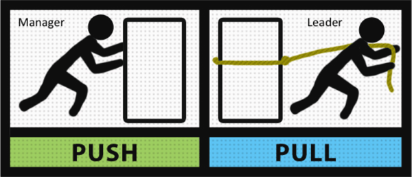
Leadership is all about setting vision, leading by example, and motivating your team to follow you … not to work for you.
How to Set Goals to Focus Your Team
Great managers know how to make the most out of their team. For managers to succeed, they need to set goals and make sure their staff is focused. This can be done by:
Using a Project Management Tool
When a project is active over an extended period, staff members might be unsure of where they are in the process, forget a deadline, or need someone else to do something before they can start on their next task.
A central tool or software to store this data can prevent this, and keep all members of the team up-to-speed with the whole project.
Delegating Tasks Wisely
Assigning tasks based on employee’s skills helps them to focus and meet targets.
So, if you know someone is great with numbers, give them a math-based task rather than a writing assignment.
Not only does delegating tasks help to motivate employees, it also helps save time. They already know what they’re doing!
Simplifying and Streamlining
If you have three smaller but similar tasks, you could boost employee performance by giving them to one person — rather than three individuals.
This helps people feel more in control of that specific project, which means they are usually quicker to meet deadlines.
Giving Staff Something to Aim For
When you’re aiming to focus your team and reach goals, think about what’s in it for them — other than their bi-weekly paycheck.
Give your staff something to aim for: Percentages of overall profit from the project they’re working on, team days out, or shares in the companycould be the extra push they need to complete their tasks on time.
Setting Check-in Meetings
If the project you’re working on is long or ongoing, your team’s output might start to dwindle.
This isn’t uncommon and can happen due to boredom, confusion, or being unsure of what they need to do next.
You can prevent this from impacting your deadlines by setting regular check-in meetings. Weekly or bi-weekly discussions can help get everyone back on track and give staff the opportunity to voice concerns that are restricting their output.
How Can Managers Be More Effective?
- Set SMART goals that people can realistically achieve.
- Delegate tasks according to employee skills.
- Encourage employees to give feedback through asking questions.
- Listen to your team.
- Recognize and reward staff achievements.
- Set a good example.
- Customize your leadership style for individuals, projects, and deadlines.
- Be transparent.
- Make your working environment fun and positive.
How to Motivate Your Employees
Good leaders and managers know how to get the most out of their team. However, there’s one small thing that makes this possible: motivation.
If employees aren’t motivated to work, they’re unlikely to meet deadlines — and achieve goals.
However, if your team is motivated and comes to the office ready to start working, it’ll lead to better performance and higher job satisfaction.
You can experience these benefits and motivate your staff through using these tactics:
Recognize and Reward
Because analyzing is part of a manager’s daily to-do list, they should be able to see how staff are performing.
Recognizing this, and rewarding their good behavior, can be a fantastic boost of motivation for your team. If their hard work is paying off, they’ll be sure to continue performing at a high level.
That’s why achievement and recognition have been found to lead to higher job satisfaction.
Be sure to reward members of your staff that are working outside of the box or helping other employees meet their targets.
Suitable rewards could be leading a project, gift vouchers to a free lunch, or a day off. Showing that you take notice of hard work, and appreciate it, is a surefire way to motivate staff.
Create a Positive Company Culture
Company culture is dependant on your work environment.
Since managers always want to boost their team’s performance, crafting a positive company culture could be the motivation boost they need to meet their goals.
Managers should make employees feel:
- Recognized.
- Valued for their thoughts and ideas.
- Encouraged to do their best work.
Creating a culture based on openness, communication, and appreciation of one another can help to achieve this.
Explain Impact
Instead of following the directive leadership style, managers can motivate their employees by explaining the impact they’re making.
One study saw a 7% improvement in productivity when a group of workers saw how their actions had a positive impact in the factory.
You could use this methodology to motivate staff by explaining:
- How their actions are impacting customers — i.e., “if we get this task done quickly, people in our local community can enjoy a hot meal.”
- How their actions are impacting the company — i.e., “if we can complete this project ahead of schedule, we’ll be able to charge an extra $5,000 — this could help us upgrade your old desktop computers.”
The tactic may sound obvious, but it’s often underused.
Help Your Team Meet Personal Goals
No matter where a member of staff falls in your organization’s hierarchy, they’re likely to have personal career goals.
That could be:
- To move into a different department.
- To earn a certain salary.
- To become the manager of a big project.
As a manager, you can motivate staff by understanding their personal goals — and by helping your team members reach them.
This can be done by regularly scheduling meetings and taking time to understand new members. Work together to create a long-term plan, and explain how their performance now affects the likelihood of meeting their personal goal.
Get to Know Everyone
Take some time out of your schedule and get to know everyone you’re managing.
Ask about their family, make friends with your team, and learn what makes them tick.
Remember: one size doesn’t fit all when it comes to managing. You might need to adapt your leadership style for different people on your team and push each person at their own pace.
Over To You
Now you’ve learned what it takes to become a great manager, and you can start building a solid team that helps you to produce fantastic work.
Remember: staff who connect with their managers enjoy their work —reducing employee turnover.
If you can build a leadership strategy that makes the workplace fun and boosts staff performance, you’re sure to have a high performing team.

7 VR Startups to Keep an Eye On In 2019
Last year, Augmented Reality (AR) and Virtual Reality (VR) startups raised over $3 billion in venture capital. Coupled with a 47% increase in active virtual reality users from 2017 to 2018, the VR market is set for some explosive growth in the near future.
For marketers, virtual reality’s ability to deeply engage people in immersive experiences and transport them to places they could only imagine going to makes it one of the most exciting emerging technologies in the industry.
But branded VR experiences are still in its infancy. Most marketing teams don’t know how to use the technology to its full potential.
To learn how to effectively leverage VR, we decided to make a list of the top VR startups and showcase how they’ve been able to use the technology to raise hundreds of millions of dollars in venture capital and build successful businesses.
If you want stay ahead of the VR curve in 2019 and beyond, check out these seven startups.
7 VR Startups to Keep an Eye On In 2019
1. Surgical Theater
The third highest cause of death isn’t a ravenous disease or motor vehicle accidents — it’s medical errors. These errors are usually due to the extreme difficulty of treating each unique patient with absolute precision, especially during surgery.
It’s even harder to mitigate this prevalent problem because the only way surgeons can prepare for an operation is usually by planning and practicing surgery on a generic two-dimensional model of the human body.
Fortunately, with Surgical Theater, a VR system that can combine a patient’s MRIs, CT scans, and angiograms to reconstruct a 3D model of their brain’s unique anatomy, neurosurgeons can explore each of their patient’s arteries, bones, and tissue, accurately plan the surgery, and even practice the upcoming brain surgery on the 3D model.
Brain surgeons also use Surgical Theater to walk patients through their brain’s anatomy and the entire process of their surgery, making patients feel more informed about the details of their procedure.
Neurosurgeons can train with Surgical Theater similar to the way fighter pilots train with flight simulators, and some of the country’s top academic hospitals, like UCLA, NYU, University Hospitals Case Medical Center, Mayo Clinic, Mount Sinai, and Stanford University, have implemented the technology to advance their neurosurgery efforts.
2. VirtualSpaces
Selling a property that hasn’t been constructed yet is one of the biggest challenges real estate professionals face today. Blueprints don’t do the potential property justice — it’s almost impossible for people to sense its scale, size, height and depth. The human imagination can only visualize so much.
On top of that, most people are too busy during the week to tour property, so a lot of real estate professionals heavily depend on the weekends to showcase their realty. Getting people to walk through properties that are far away is also another challenge for real estate professionals.
But with VirtualSpaces, a mobile VR technology that can build immersive, three-dimensional visualizations of properties with only a blueprint, real estate professionals can overcome these common challenges.
With VirtualSpaces, real estate professionals can send digital properties to their potential clients at any time, transport them to the property from the comfort of their own couch, and walk them through its entire concept. And this allows them to provide unprecedented convenience, get potential clients excited about the property’s potential, and expedite their sales cycle.
3. Avametric
Even though online shopping is more convenient than going to the mall, brick and mortar stores still have one huge advantage over their digital counterparts: dressing rooms.
Last year, Retail Dive surveyed over 1,400 consumers about why they chose to shop at stores rather than the internet. They discovered that 62% of shoppers want to touch, feel, and try out items before they buy them, which you can’t do at most ecommerce stores.
With Avametric, though, brands can build virtual dressing rooms, enabling customers to try on their clothes from their own home. All shoppers have to do is plug in their body measurements into the mobile app and it’ll project a 3D model of their body with the selected outfit on.
Avametric has built virtual dressing rooms for big retail brands like Gap, Ann Taylor, and Alternative Apparel, making it a VR startup with a ton of upside potential.
4. Virtual Speech
Practicing a speech without an audience can be helpful, but the experience doesn’t truly emulate the pressure of an evaluating crowd. You can nail a dry run ten times in a row on your own, but when you actually step on stage and see an ocean of people staring at you, the nerves can debilitate your public speaking abilities.
Fortunately, VirtualSpeech can help you hone your public speaking skills — the app places you on a virtual stage with a virtual crowd, where you can practice your speech or presentation in front of an audience that imitates the mannerisms and sounds of real people. Their movements and noises are fully customizable, so you can ramp up the distractions and virtual judgement as much as possible.
At the end of your virtual speeches, the app will analyze and score your verbal and nonverbal communication. You can also add your own slides into your virtual presentation, practice for job interviews, learn how to network, and sell in a wide range of sales situations too.
Virtual Speech offers soft skills training courses and packages for individuals, teams, and companies too.
5. Neurable
Mind control of everyday objects might seem like science fiction today, but with virtual reality, it’s already a proven concept.
Using Neurable’s wireless brain-computer interface platform, people can interact with virtual and augmented reality applications with only their brain activity, avoiding lag-prone technologies like eye-tracking and voice commands.
Neurable leverages machine learning and a non-invasive method of monitoring brain activity called electroencephalography or EEG to accurately and instantly detect what your brain wants to do. And since using your brain is faster and easier than using controllers, brain-computer interface platforms like Neurable could be the future of VR.
6. Vivid Vision
Most healthcare VR startups provide solutions for doctors and surgeons, but Vivid Vision focuses on the people who truly need help: patients. By designing VR games that treat lazy eye, Vivid Vision provides a non-invasive cure to a common eye issue people can suffer from for their entire lives.
Vivid Vision also partners with over 180 eye clinics around the world to provide their most advanced and personalized treatment for lazy eye. But if you just want to do their vision therapy at home, you can get a prescription from your doctor to buy their less complex treatment program.
7. Jaunt VR
Jaunt VR wants to make immersive storytelling the future of entertainment. The startup offers hundreds of 360-degree films, shows, documentaries, tours and concerts on their app, all in virtual reality.
When you slide on your headset, you’ll transport to a virtual room where you can choose from a massive collection of immersive experiences, segmented by 20 different channels. At the touch of a button, you can tour the awe-inspiring Redwood National Park, go through the San Francisco Giants pre-game routine and take the field with them during opening day, or sit back and enjoy Emmy winning documentaries.
Jaunt’s content is already engaging on its own, but in virtual reality, you’ll actually feel like you’re experiencing the events they’ve documented.

What You Need to Know About the Google+ Data Breach Right Now
The Wall Street Journal reported on Monday that a bug discovered in March may have granted access to the private data of nearly half a million Google+ users.
Google+ is search engine giant Google’s social network, which since its 2011 inception was often the butt of jokes for being a largely unused attempt to copy Facebook.
Out of fear for “immediate regulatory interest,” write the WSJ‘s Douglas MacMillan and Robert McMillan, Google chose not to reveal the data breach to the public.
What Happened
As part of its overarching Project Strobe third-party app developer data access review system, Google discovered (and reportedly fixed) in March a bug that mistakenly allowed these developers access to Google+ user profile information fields that had been marked as private.
These fields include name, email address, occupation, gender and age. According to Google’s official statement, the information potentially exposed “does not include any other data you may have posted or connected to Google+ or any other service, like Google+ posts, messages, Google account data, phone numbers or G Suite content.”
According to a memo reviewed by and two parties close to the incident who spoke with the WSJ, the bug has existed since 2015. In between that time and discovery of the bug this past March, 496,951 users shared this private profile information with a friend who could, in turn, have had it improperly obtained by a third-party developer.
As many as 438 applications could have used the API that would allow access to this profile data.
Google has asserted that it “found no evidence that any developer was aware of this bug, or abusing the API, and we found no evidence that any Profile data was misused.”
However, Google has also implied that it does not know the full extent of the data breach, noting that it “cannot confirm which users were impacted by this bug.”
Since Google only maintains activity logs related to this type of app activity for two weeks at a time — and since the bug has existed since 2015 but wasn’t discovered until nearly three years later — the full extent of the breach remains unclear. Google, says the WSJ, is still “unable to determine … what types of data may potentially have been improperly collected.”
What Comes Next
Google has said it will now sunset Google+, after years of seeming willfulness in doing so. Now, however, the company has emphasized what a low rate of usage was experienced by the app among personal account users.
dark comedy: google plus PR spent five years trying to dissuade writing about the network’s absymal usage numbers
now that it leaked everyone’s data, google can’t get enough of telling people how no one used it https://t.co/iGocHG7vpA
— rat king (@MikeIsaac)
October 8, 2018
Moving forward, Google said, it will pivot to rebuilding Google+ as an enterprise network, noting that “Google+ is better suited as an enterprise product where co-workers can engage in internal discussions on a secure corporate social network.”
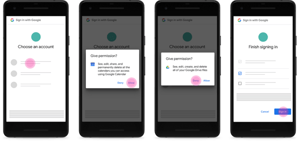
Perhaps in response to this breach, Google is also rolling out new security and privacy changes, namely the visuals seen by users when apps are requesting access to various parts of their Google accounts.
Instead of a single “sign in with Google screen,” each item to which the app is requesting access — e.g., Google docs, Google calendar, Gmail, et cetera. — will have its own permission dialog box.
Source: Google
Google CEO Sundar Pichai is expected to testify before Congress in November, where he will likely be questioned by U.S. lawmakers about both the breach itself, as well as the company’s decision not to disclose it to the public.
What Marketers Should Know
If your marketing efforts have at all focused on Google+, be aware that it will sunset over a period of ten months, and is predicted to shut down completely in August 2019.
However, in its pivot to rebuilding as an enterprise-level network, it is unclear what will become of branded pages and profiles that currently exist on Google+. The company has said that it will inform individual users of how to download and migrate their data, but has not indicated how business profiles will be impacted.
This story is developing and will be updated as more details emerge.

5 Retail Trends That Will Transform the Industry in 2019
Growing up, my town’s local shopping mall was a bustling hub of commerce, chock full of busy shops and pesky tweens. But today, half the place has been gutted — it looks like an empty morgue of stores now.
With the explosive growth of online shopping and a shift in consumer preferences for experiences over possessions, the retail apocalypse of 2017 was inevitable. Brick and mortar stores aren’t essential for consumers anymore.
But contrary to popular belief, the retail apocalypse isn’t the final nail in the coffin for retail brands. Consumer preferences might have changed, but recent technological advances have allowed retailers to adapt to them.
If brands truly want to rise from the ashes of the retail apocalypse, though, they must stay laser-focused on adapting to the evolution of this technology and their customers’ preferences. More specifically, they need to embrace change and prepare for the upcoming trends that will transform their industry in 2019.
5 Retail Trends That Will Transform the Industry in 2019
1. Brands will sell experiences at their stores, not just products.
Most people cherish experiences over material possessions. And while we can attach material items like our new iPhone or car to our identity, these objects eventually lose their allure, and we throw them away to replace them with the newest, trend-setting product. Material possessions can really never be apart of your true identity.
On the other hand, we’re the sum of our experiences, so they’re ingrained in our identity. Sharing experiences with people also has a special ability to forge close relationships. And even if experiences end like your relationships with material objects do, they’ll always be a part of your story, allowing you to bond with other people who’ve shared similar experiences.
For instance, who do you think you’ll connect with on a deeper level — someone who also studied abroad in Scotland during college or someone who wears the same Apple Watch as you?
By setting up special shops that only sell experiences, like Nordstrom or Sephora’s new stores that only provide styling, makeovers, and sampling services, retailers can pull customers into delightful, memorable experiences that make much more of an emotional impact than buying a product.
These experiences also make for a compelling story that consumers will always remember and be more than happy to share with one another.
2. The Internet of Things will make shopping easier, cheaper, and more convenient.
Since The Internet of Things connects over 11 billion everyday products, like home speakers, TVs, and cars, to the internet, retailers can collect hoards of data that provides context about their customers’ product usage. This allows them to send relevant marketing messages to their customers throughout every phase of the buyer journey.
For instance, if you run out of milk or it spoils, a smart refrigerator can recognize your need and display a message on its screen or your phone about the best deals on milk in town. You can even order a carton through one of these smart devices if the refrigerator company partners with a grocery store.
Amazon has also sold a similar device, called Dash Buttons, since 2015. Dash Buttons are physical pieces of hardware that you press to buy everyday products, like laundry detergent, dog food, and snacks. As of today, the ecommerce giant has partnered with over 200 brands to sell their products through Dash Buttons.
Macy’s has leveraged The Internet of Things to help customers save money, too. Since 2014, they’ve used beacons, which are Bluetooth devices that send alerts to people’s smartphones based on their proximity to one of their stores, to promote discounts to any customer who walks by one of their stores and has their app.
The app can also pinpoint your location in a store, so if you’re in the perfume section, the app will send you deals on the products and brands you liked online.
It’s clear that The Internet of Things makes shopping easier, cheaper, and more convenient. And since Gartner expects consumers to possess over twice as many smart devices in 2020 as they do today, it’s also clear that the technology could finally move beyond hype and enter reality in 2019.
3. Consumers will message brands’ Facebook bots more to vet and purchase their products.
With businesses and consumers exchanging over 8 billion Facebook messages with each other per month, and the retail industry exchanging the second highest number of those messages, Facebook Messenger is one of the most popular and convenient channels for consumers to research and purchase retail merchandise today.
53% of consumers also prefer to shop with businesses they can directly message on Facebook, so it’s crucial for retailers to set up Messenger bots that can handle moderately sophisticated interactions, like welcome conversations and product discovery conversations.
To drive even more sales with Facebook Messenger, retailers should also build bots that can send abandoned cart messages and let consumers place orders directly in the app.
Some of the top retail brands are already using Facebook Messenger bots to accelerate their buying process. With H&M’s bot, you can customize and buy your own outfits, and with 1-800-Flowers’ Messenger bot, you can order and ship flowers in under five minutes.
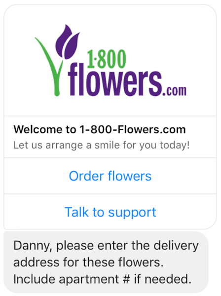
Image Credit: MarketingLand
4. Brands will leverage cognitive computing to provide better, faster customer service.
Cognitive computing is technology that can analyze enormous amounts of data in the same way humans think, reason, and remember, so people can naturally interact with the technology and extract data-backed recommendations from it
Brands who implement cognitive computing into their customer support technology are able to assemble two-pronged customer service teams that help provide better, faster customer service.
By setting up computers and robots in their stores that can actually understand natural language and accurately answer people’s routine questions, a retailer’s human employees can service more customers who have more pressing needs.
For instance, Hilton Hotels introduced their first ever concierge robot, Connie, in 2016, and she can help guests find the best attractions and restaurants in the area. Connie can even move and point her body to direct guests toward any spot in the hotel. All the guests have to do is ask her their question, and she can quickly help them out.
With Connie’s assistance, Hilton Hotel’s front desk employees can focus on more important tasks, like picking up phones and checking in guests.

Image Credit: USA Today
5. Brands will use augmented reality more to market their products.
The best furniture brands understand their customers’ decision to design a room is just like getting a tattoo. If they buy the wrong furniture, it could ruin the room’s entire aesthetic. On top of that, they’d have to deal with the embarrassment of living in an eyesore unless they shell out more money on some new furniture.
Without being able to picture how a store’s furniture would look in their own home, customers will either stall their decision to buy any furniture or get mad at the brand if they buy the wrong sofa.
To help customers avoid this situation, retailers like IKEA and Wayfair have developed augmented reality apps that can place fully rendered 3D models of their own furniture in their customers’ home. All the digital furniture is also resizable to fit a room’s dimensions and observable from any angle and in any light. Users can even save specific room designs for future reference.
By leveraging augmented reality, these retailers have made it a lot easier for customers to engage with their brand, pick the right furniture for their house, and, ultimately, buy more of their products.
Future proofing your retail store for 2019.
The retail industry has evolved at a breakneck speed, but hopefully, preparing for these five trends will arm you with the insights and skills to grow your retail store in 2019 and beyond.

12 Incredible Splash Pages to Help You Create Your Own
There’s a big difference between a splash page and a landing page.
A landing page is a standalone page created to fulfill a conversion goal. A splash page, on the other hand, is a screen that pops up when you first enter a site. A splash page is the introduction to your website, while a landing page won’t appear until after a user fills out a form.
Essentially, a splash page is your virtual business card.
But it’s more than that. A splash page can deliver critical information, like a promotion or upcoming event, and even evoke a sense of mystery or exclusivity.
In essence, a splash page is your doorman, leading users in the right direction.
What’s a splash page?
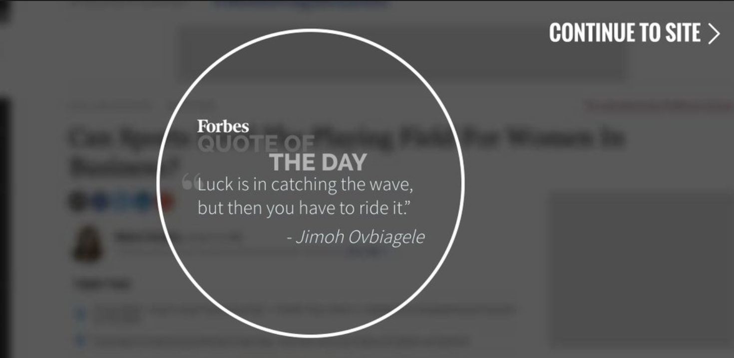
A splash page is a company’s introduction to their website. It’s not a landing page, but rather a large window that is used to promote a service or product, announce a promotion, or deliver necessary information, before a user is able to enter the site and view the rest of the site’s pages. It typically has a single message and an exit link.
For instance, consider Football.com’s splash page. Football.com uses a splash page to ask the user which game they care about — American, or World. When a user clicks American or World, they are directed to the first page of the site, but of course, that page depends on which option they choose.

Football.com’s splash page allows them to go the extra mile to provide an exceptional user experience for their site’s visitors.
To learn how to make a splash page, or to gain inspiration from splash page examples, keep reading.
How to Make a Splash Page
When you’re creating a splash page, you can either hire a third-party designer, or use a professional template to design one.
If you choose to use a template, rather than hiring a third-party designer, take a look at some of the template options from these website builders:
A short-form landing page template works best as a splash page. For this example, I chose to use Strikingly, but you can follow similar steps for another builder of your choice.
Once I chose to use Strikingly as my builder, here’s how I created a splash page:
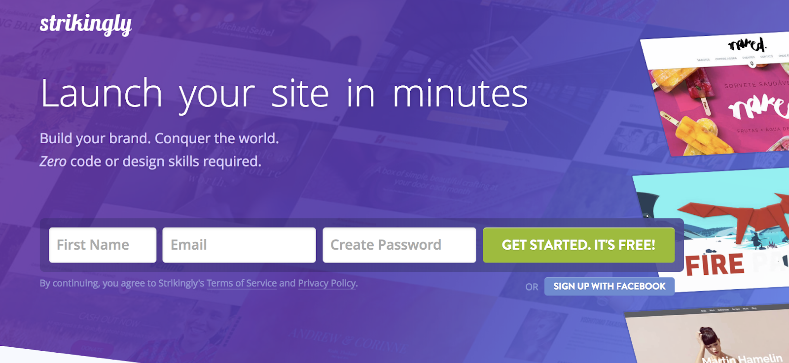
1. Sign up for a Strikingly free account.
2. Click the “Create New Site” button.

3. Select your preferred template. For my purposes, I chose the “Splash” template.

4. Within your template, click the green “Add New Section” button.

5. Scroll through the “Add A New Section” options, and click “Button”.

6. Now, click the “X” beside your other web pages to delete them. Ensure you only have a button left.

7. Beside “Button”, click the settings icon, and then un-check “Show in navigation”.

8. Now, click on your button to edit it.
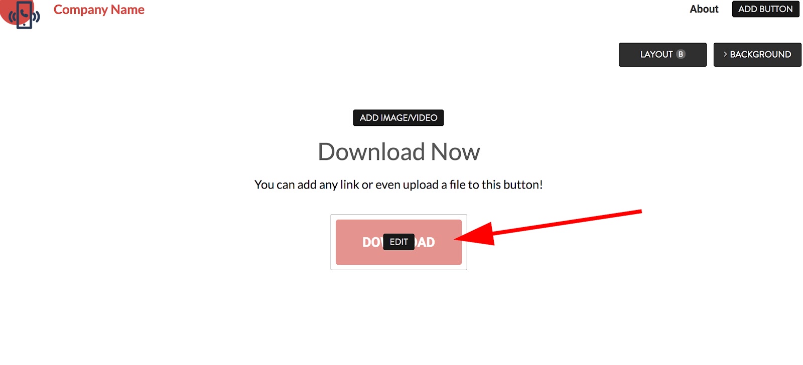
9. Copy and paste a link into the “Link URL” box, and then include text for the button. This is your splash page command.

10. Next, change your text to reflect whatever you want your splash page to say — in this case, I want my splash page to say “Caroline’s Portfolio”, with some information below. Then, I want my button to say “See Designs”.

11. If you want to change your background, click “Background” in the top right and select an image, or upload your own.

12. When you’re happy with the design, click “Publish” at the top left.

13. Include a URL for your splash page (in this case, mine is http://carolineforsey.strikingly.com/) and then click “Publish Now”.

14. And voila! You’ve officially created a splash page, which links to the rest of your site.

Splash page examples
- Zara
- Football.com
- Conversion Gods
- Urban Influence
- Femme Fatale Paris
- Mrcthms
- Resn
- Playtika
- Maaemo
- CoLofts
- Garrison Footwear
- Forbes
1. Zara

2. Football.com

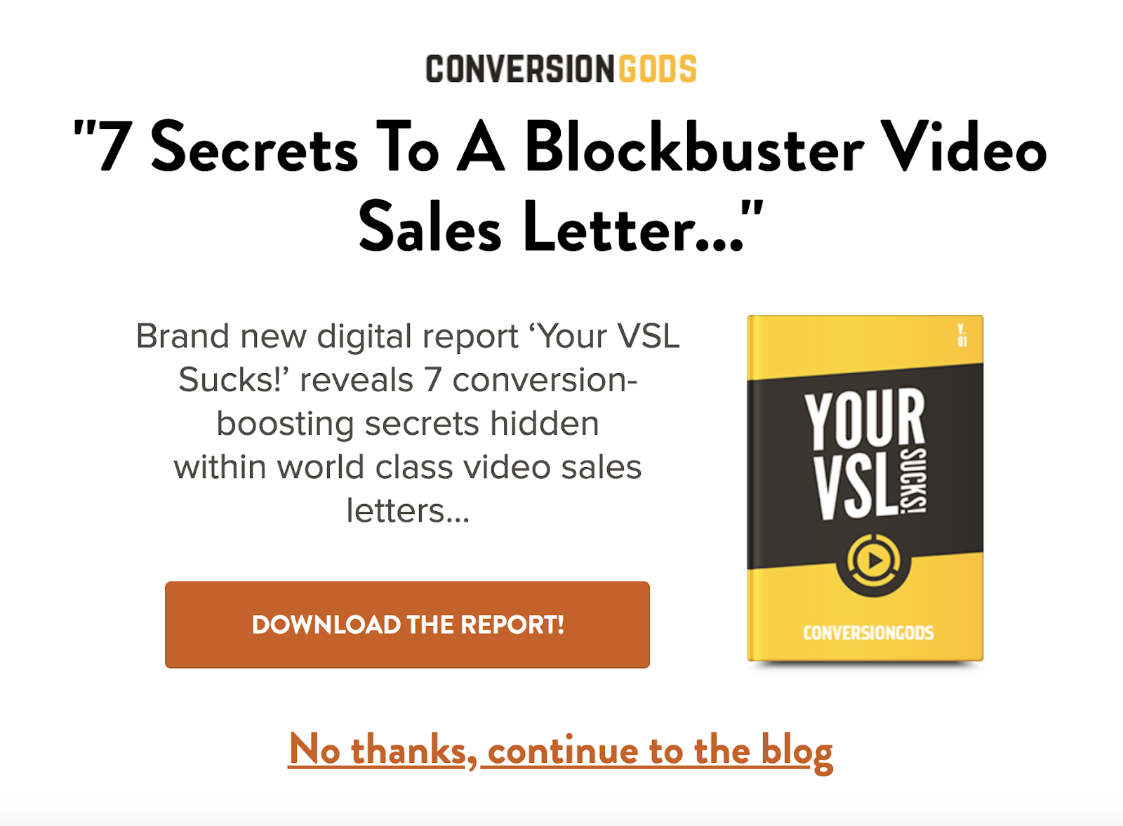
3. Conversion Gods
4. Urban Influence

5. Femme Fatale Paris

6. Mrcthms

7. Resn

8. Playtika

9. Maaemo

10. CoLofts

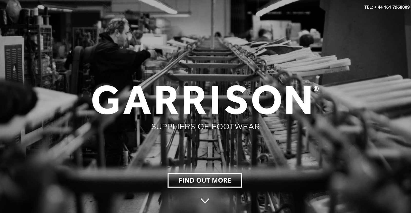
11. Garrison Footwear
12. Forbes

10 Great Examples of Welcome Emails to Inspire Your Own Strategy
We’ve all heard how important it is to make a good first impression. Show up late for a job interview? That’s a bad first impression. Eat a ton of garlic and forget to brush your teeth before a first date? Also a bad first impression.
It turns out that the “make a good first impression” principle holds true not only in face-to-face encounters, but in email interactions as well.

What is a welcome email?
A welcome email is the first impression a company makes with a new customer, blog subscriber, or newsletter subscriber via email. Welcome emails can deliver videos, special offers, a sign-up form, or just a friendly hello to establish a relationship with a new contact.
When you send a welcome email to a new blog or newsletter subscriber, or to a new customer, you’re making a first impression on behalf of your brand. To help ensure you’re making the best first impression possible, we’ve rounded up some examples of standout welcome emails from brands big and small.
As you’ll soon discover, each example below showcases different tactics and strategies for engaging new email subscribers. Let’s dive in.

10 Examples of Standout Welcome Emails
1. Virgin America
Type of welcome: Get Started
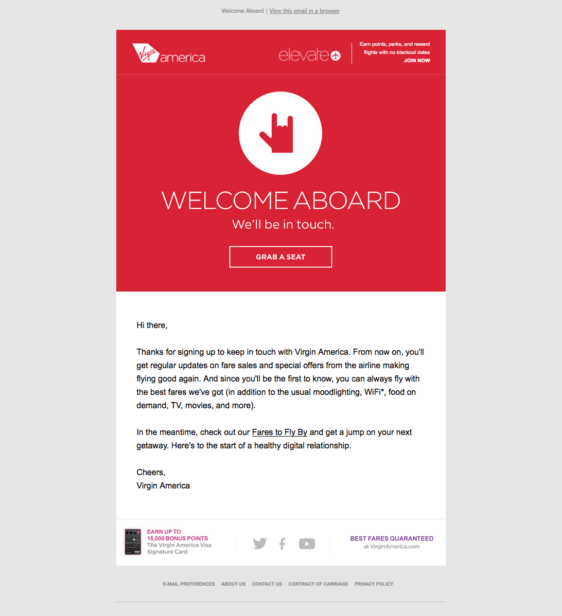
A welcome email is the perfect medium for introducing folks to the characteristics (and eccentricities) that make your brand unique.
For Virgin America, that means putting the “I love you” hand symbol front and center. This small gesture signals to the recipient that the folks atVirgin America really care about their customers. The playful accompanying copy, “Welcome aboard,” and casual call-to-action, “Grab a seat,” also help to position Virgin America as a hip, fun-loving brand right off the bat.
2. Food52
Type of welcome: Get Started
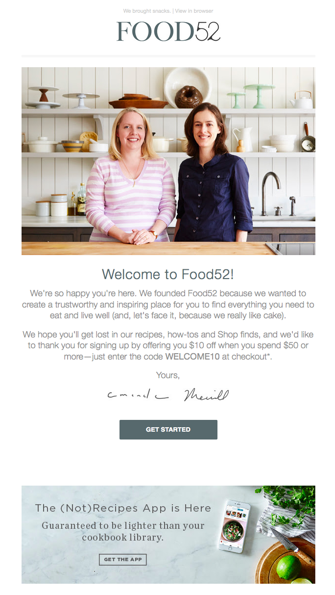
Sometimes the tiniest of elements in a welcome email can speak volumes about a brand. And when it comes to Food52’s welcome email, their preview text at the top of the email, “We brought snacks,” definitely accomplishes this.
Also known as a pre-header or snippet text, preview text is the copy that gets pulled in from the body of an email and displayed next to (or beneath) the subject line in someone’s inbox. So when you see Food52’s welcome email in your inbox, you get a taste of their brand’s personality before you even open it.

Food52’s welcome email also does a good job of building trust by putting a face (make that two faces) to their name. As soon as you open the email, you see a photograph of — and welcome message from — the company’s founders.
3. Monday.com
Type of welcome: Video
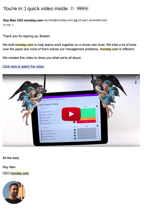
From the subject line to the conversational tone in the email body, the welcome email above keeps it friendly and simple so the focus stays on the introductory video inside.
Monday.com is a task management tool for teams and businesses, and the welcome email you get when you sign up makes you feel like the CEO, Roy Man, is talking directly to you. The email even personalizes the opening greeting by using the recipient’s first name — this is well known for increasing email click-through rates (especially if the name is in the subject line).
The closer you can get to making your email sound like a one-on-one conversation between you and your subscriber, the better. If you have just so many details you need to inform your new customer of, follow Monday.com’s lead and embed them in a video, rather than spelling them all out in the email itself.
4. Kate Spade
Type of welcome: Thank You
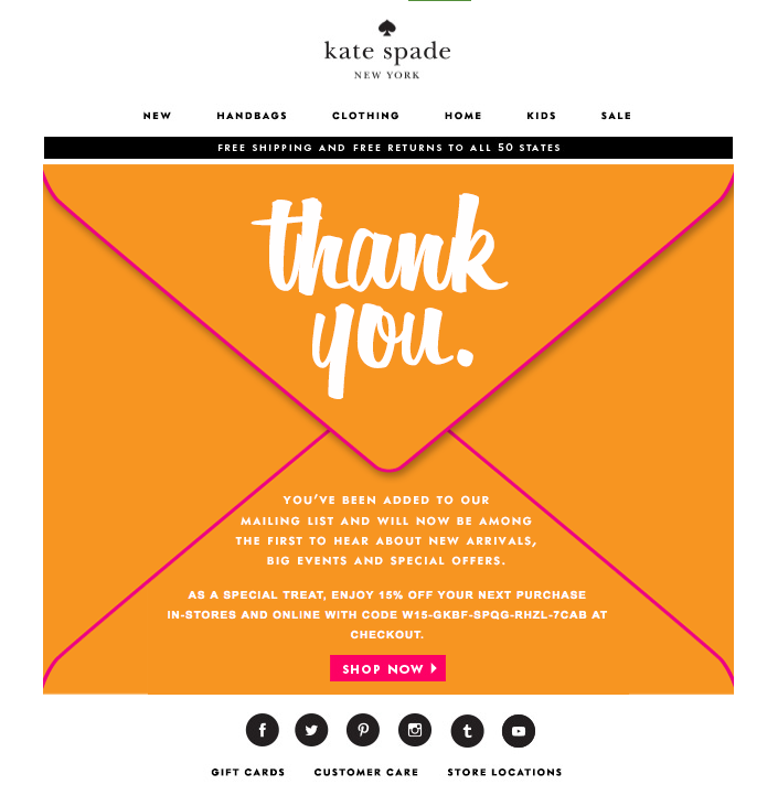
Let’s face it: We, the internet-using public, are constantly bombarded with prompts to sign up for and subscribe to all sorts of email communications. So as a brand, when someone takes the time to sift through all the chaos in order to intentionally sign up for your email communications, it’s a big deal.
In order to acknowledge how grateful they are to the folks who actually take the time to subscribe, Kate Spade uses a simple — but effective — tactic with their welcome emails: They say “Thank You” in big, bold lettering. And by placing that “Thank You” on an envelope, Kate Spade recreates the feeling of receiving an actual thank-you letter in the mail. (The 15% off discount code doesn’t hurt either.)
5. Lyft
Type of welcome: Get Started

If there’s an ideal “attitude” that welcome emails should give off, Lyft has got it.
The company’s simple but vibrant welcome email, shown above, focuses entirely on the look and feel of the app, delivering a design that’s as warm and smooth as the lifts that Lyft wants to give you. At the same time, the email’s branded pink call-to-action draws your eyes toward the center of the page to “Take a Ride” — inviting language that doesn’t make you feel pressured as a new user.
6. IKEA
Type of welcome: Offer
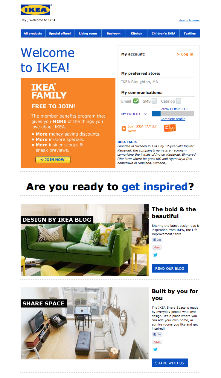
It might not be the most beautifully designed email on this list, but that doesn’t mean IKEA’s welcome email isn’t effective.
Instead of going for the hard sell (e.g., “By stuff now!”), or explaining what it is they do (which is something IKEA probably assumes most people already know), IKEA uses its welcome email to turn folks onto its other, lesser-known programs and content channels. For example, there’s a call-to-action right at the top that explains the value of its member benefits program. There are also prompts to visit their design blog and to contribute to their collaborative “Share Space” site.
Of course, if you’re not interested in any of that stuff, IKEA’s welcome email also makes it easy for you to simply log in and start shopping (there’s a login field right up top).
7. Michaels
Type of welcome: Offer
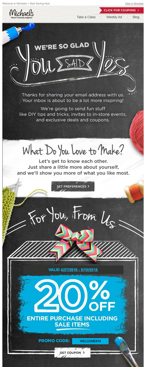
The Michaels approach to the welcome email borrows elements from both Kate Spade and Virgin America. In addition to expressing gratitude to the folks who took the time to sign up, Michaels uses its welcome email to showcase the brand. And the company does a great job: The lengthy email feels like one big arts and crafts project, complete with paint, yarn, and chalkboards.
Another standout feature of this welcome email is that Michaels makes it immediately clear what value its future email communications are going to provide. After thanking subscribers, there’s this nice bit of copy that sums it up:
“We’re going to send fun stuff like DIY tips and tricks, invites to in-store events, and exclusive deals and coupons.”
8. Sphero
Type of welcome: Hello

Sphero’s welcome email might in fact be the cutest one we’ve seen recently — and it was sent from a galaxy far, far away.
If you purchase a bluetooth-controlled BB-8, the friendly Droid from Star Wars, it was probably made by Sphero. And if it was, you’ll have an email similar to the one above waiting in your inbox when you activate your new rolling companion.
This email’s subject line is what qualifies it for this list — “A little Droid told us you wanted our emails.” By cleverly personifying the product, and being somewhat candid about its email marketing newsletters, Sphero develops a relationship with their recipients through the product you just bought from them.
Besides showing you how to use your new BB-8 Droid with your smartphone, all this welcome email wanted to do was say hi — just like BB-8 himself.
9. InVision
Type of welcome: Video
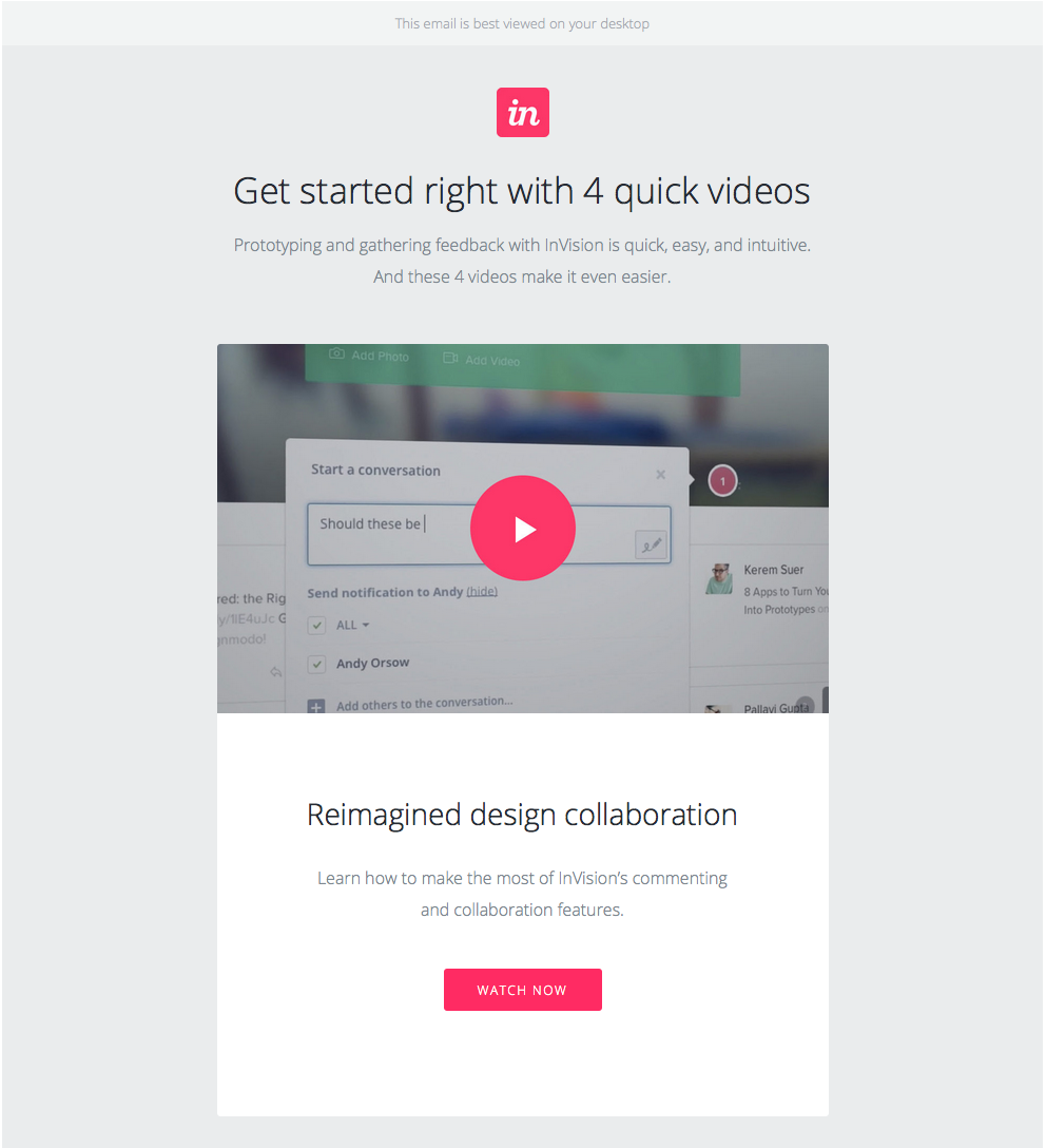
When you sign up for InVision’s free prototyping app, the welcome email makes it very clear what your next step should be: using the app.
To facilitate this action, InVision’s welcome email doesn’t simply list out what you need to do in order to get started. Instead, it shows you what you need to do with a series of quick videos. Given the visual, interactive nature of the product, this makes a lot of sense.
10. Drift
Type of welcome: Get Started
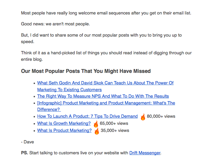
No fancy design work. No videos. No photos. The welcome email Drift sends out after signing up for their newsletter is a lesson in minimalism.
The email opens with a bit of candid commentary on the state of email. “Most people have really long welcome email sequences after you get on their email list,” Dave from Drift writes, before continuing: “Good news: we aren’t most people.” What follows is simply a bulleted list of the company’s most popular blog posts. And the only mention of the product comes in a brief post-script at the very end.
If you’re trying to craft a welcome email that’s non-interruptive, and that’s laser-focused on adding value vs. fluff, this is a great example to follow.

16 of the Best Shopify Stores to Inspire Your Own
Ecommerce is predicted to account for 17% of all U.S. retail sales by 2022. As ecommerce grows, so does competition, making it hard to differentiate your website from everyone else’s.
It isn’t enough to have a one-of-a-kind product: to attract your ideal audience — and more importantly, to turn that audience into passionate brand ambassadors — you need a one-of-a-kind website.
A sleek and captivating Shopify website can attract a large audience and even act as your start-to-finish marketing pitch.
But you need to know what makes one Shopify website better than the rest. Here, we’ve curated a list of 16 best of the best Shopify stores to inspire your own.
Whether you’re new to ecommerce and about to design your first website, or an ecommerce veteran considering a redesign to outshine your competitors in 2018, this list offers plenty of creative ideas.
Top Shopify Stores
- UgMonk
- Pipcorn
- Taylor Stitch
- Happiness Abscissa
- Skinny Teatox
- HELM Boots
- BioLite
- Pop Chart Lab
- Luca and Danni
- Harris Farm Markets
- So Worth Loving
- Great George Watches
- Choose Muse
- Brilliant
- Holstee
- Kylie Cosmetics
1. UgMonk
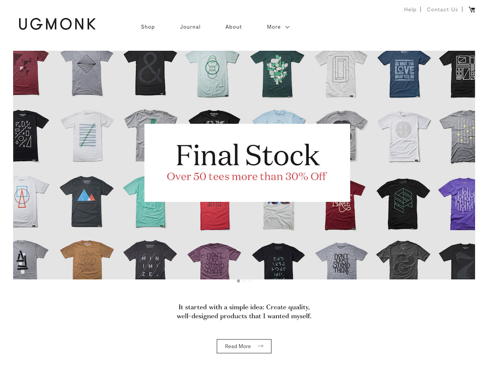
Jeff Sheldon starts the “About” section on his UgMonk website with a simple question: “Why was it so difficult to find fresh, high-quality, unique items in a modern aesthetic?” His Shopify site is simple and fresh, and exhibits UgMonk’s clothing, workplace items, bags, and prints in the same modern aesthetic style he sought while designing his unique products.
2. Pipcorn
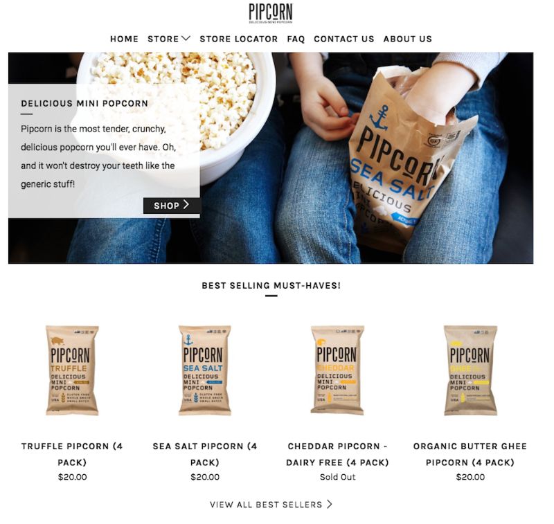
When you think about popcorn, I’m betting the first concern that comes to mind isn’t “is it healthy?” Pipcorn knows this, so their homepage features a simple slogan: “Most tender, crunchy, delicious popcorn … and it won’t destroy your teeth like the ‘generic’ stuff.” The best websites know their target audience’s primary concerns (in this case, the taste of popcorn and the kernels in teeth), and sell them on those solutions upfront.
If you look on their “About Us” page, you’ll find Pipcorn’s products are also non-GMO, vegan, gluten free, and whole grain. Even though this could have easily been incorporated into their slogan, they chose to exclude it in favor of tackling our bigger concern: Does it taste good?
3. Taylor Stitch
The inner child in me loves Taylor Stitch’s website because of the creative alternatives displayed when you hover over a product: a jacket, for instance, flips to an image of a model posing with the jacket on a motorcycle.
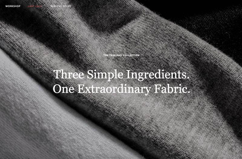
The Taylor Stitch website does something else really cool, too: it almost immediately calls more attention to its message than its products, with “Three Simple Ingredients” written across most of the images you see on the homepage. Taylor Stitch doesn’t just make high-quality clothing. It also aims to reduce waste and help the environment by creating clothing with recycled or 100% natural products.
On their website, you can’t miss their environmental efforts, and I’m betting this is a differentiating factor for most buyers when they come across the site.
4. Happiness Abscissa
Many of the websites I mention on this list have clean, straight lines. Happiness Abscissa is unique. It shows a playful side by displaying a layout with bright abstract images, and even products hanging from different angles.
The company’s logo, a crooked “Ha,” draws in the viewer’s attention, and then they use Ha in a sentence without defining the word, further stimulating viewers’ curiosity. You get the sense they don’t take themselves too seriously, affording the viewer a cheerful and fun experience.

5. Skinny Teatox
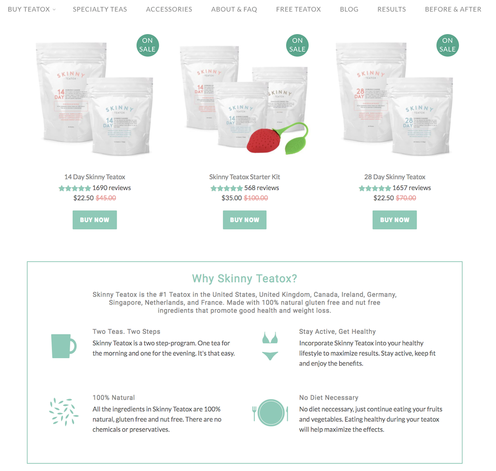
I myself was tempted to purchase the Teatox product when I checked out this site (in my defense, they were having a one-day flash sale I did not want to miss). The Skinny Teatox homepage immediately confronts your biggest concerns (“Is it natural? Yes. Will it work? Yes.”), and uses pastel colors and cute icons of bikinis and mugs to convey a fresh vibe.
As I’ve noticed with a few other Shopify websites, Skinny Teatox places its products on the homepage with an easy “buy now” call-to-action. For a company that isn’t too complex to figure out (“All Natural Detox Weight Loss Tea” is written beside the company name in search engines), I think it makes sense to offer the viewers what they want upfront.
6. HELM Boots
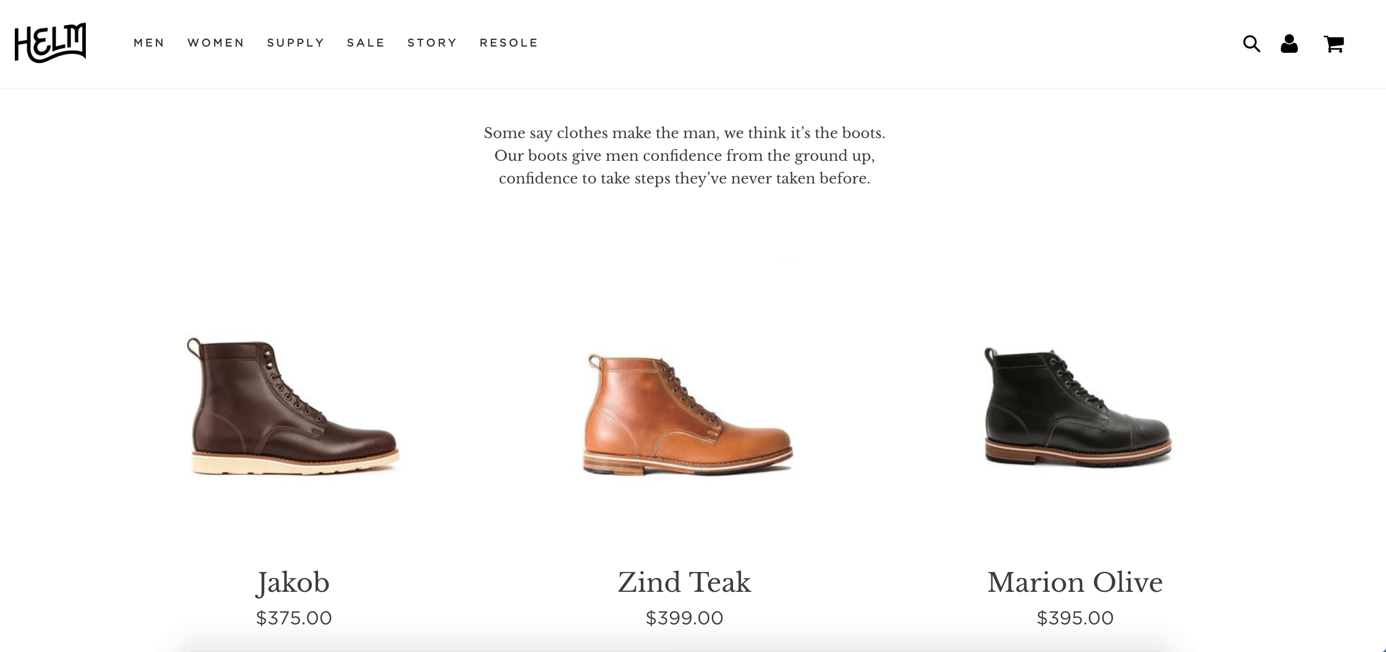
“Our boots give men confidence from the ground up, confidence to take steps they’ve never taken before.” Immediately, HELM incentivizes viewers through emotion: I might just be a guy looking to buy some boots, but yes, I’d definitely also like some confidence and bravery while I’m at it. The website looks elegant, and you can find everything from the homepage, which is designed to convert viewers at various stages of the buyer’s journey and assuage doubts as you scroll.
7. BioLite
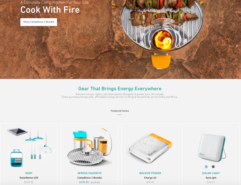
I might be a sucker for the little details, but the product images on BioLite’s website are enough to make me want to buy something (they look 3-D and illuminated, and some even look wet from rain!).
Since BioLite’s major selling point is its humanitarian impact (the products bring affordable energy access to places in India and Africa), the first thing on the homepage is their slogan, “Gear That Brings Energy Everywhere,” which will appeal to their target audience. The navigation bar at the top also has a clever twist: beside each product title, there are little black-and-white cartoon drawings of the product.
8. Pop Chart Lab
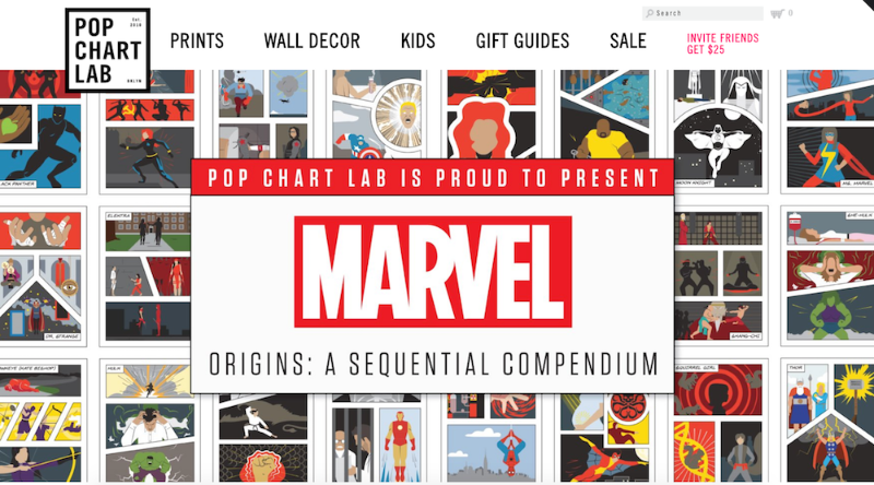
This site looks like one of the vintage and trendy prints they sell. It’s also organized in different categories depending on a viewer’s browsing preference.
First, Pop Chart Lab’s Shopify store has a scroll-down navigation with sub-categories ranging from, “NYC” to “Kids” to “Hip Hop” to “Wine.” They also have a carousel with some of their top prints on display. Below the carousel, they offer “wholesale,” “gift guides,” and “scratch-off” collections, for viewers who are having a difficult time discerning what they want. The shop manages to appear simple, despite its vast array of different print products, which is no easy feat.
9. Luca and Danni
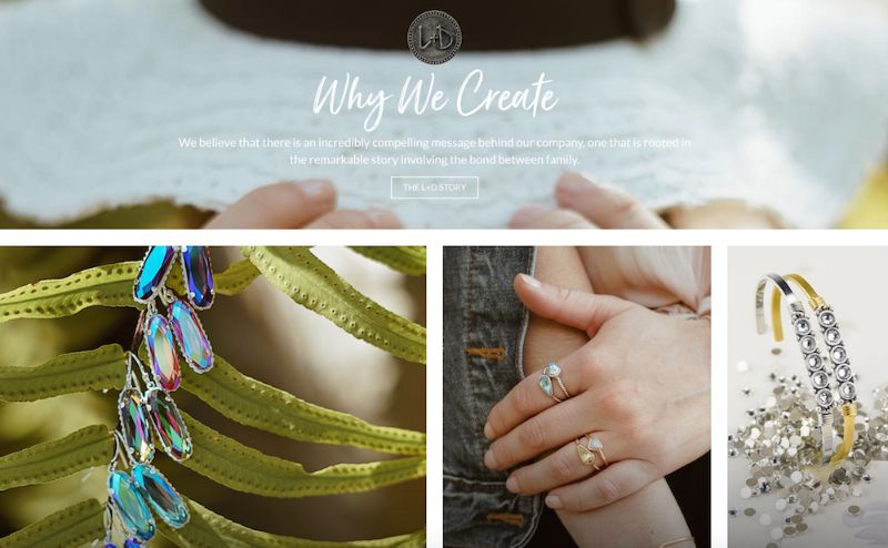
There’s something addictive about an ecommerce store that changes as you scroll. Luca and Danni’s page is highly interactive: as you scroll, some images get bigger and others get smaller, boxes of bracelets open up within images, and some images follow you down the page. It can be tricky to offer so much movement on a page while remaining coherent, but somehow, Luca and Danni accomplish this. There’s also a very zen vibe to the whole layout, with images of palm trees and cactuses, and calls-to-action with language like “brighter days: shop soil to sky,” and “find what speaks to you.”
10. Harris Farm Markets
This is a family-owned company, something you can’t miss from the homepage. It’s casual and playful, with text that looks like a child’s handwriting and colorful drawings of fruit (there’s even an adorable drawing of a bee with animated wings!). Even the calls-to-action sound laid-back, like “What’s nature been up to?” It’s so genuine, you can imagine a family building the site together.

11. So Worth Loving
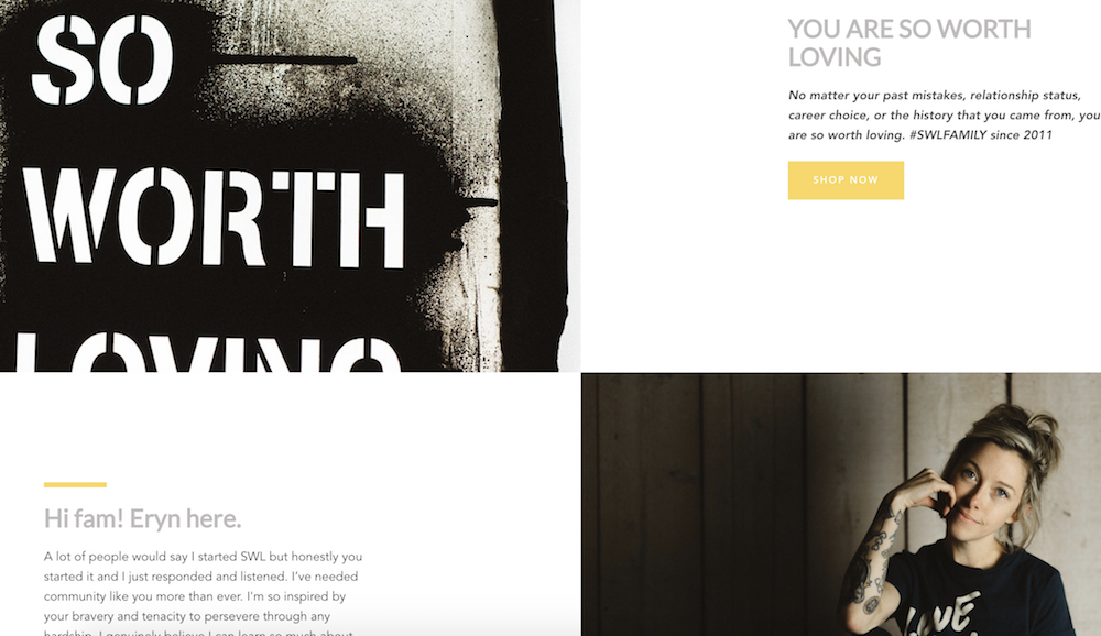
Sometimes, being evasive pays off. While it’s not always a good idea to hide your products from the viewer, it can be a very smart move if your product doesn’t make sense without understanding the backstory. With So Worth Loving’s site, you don’t even see the t-shirts for sale until a third of the way down the page. By that point, you’ve already read their slogan, a little bio from the founder, Eryn, and a full narrative about how the site began.
The site leans into personal touches, with handwritten-looking quotes scrawled across images and very normal looking images of people posing in t-shirts. This is a great example of knowing your audience enough to break the rules.
12. Great George Watches
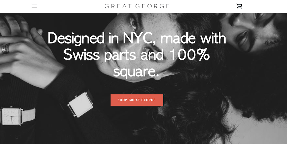
I’m not an experienced watch shopper, so when I first read, “Made with Swiss parts and 100% square,” on Great George Watches’ homepage, I thought maybe “square” was a fancy term I’d understand if I knew watches. But as I scrolled and read, “Think outside the circle,” I realized these terms were unique to Great George Watches, which are all square-faced.
By emphasizing what makes their product unique before even showing the produce, Great George Watches captivates the viewer. I love this shop because it has a refined and polished look, with black-and-white photos and an attention-grabbing red call-to-action button.
13. Choose Muse
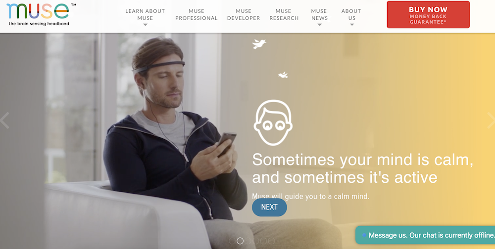
Choose Muse incorporates a full-display video of a man putting headphones on and using Choose Muse’s product right from the homepage. The video starts playing immediately (as opposed to offering a play button option), which is especially eye-catching. I usually think simple is better when it comes to design, but Choose Muse proves me wrong, incorporating compelling designs with a ton of images and text, while still retaining a clean and enjoyable viewer experience.
14. Brilliant
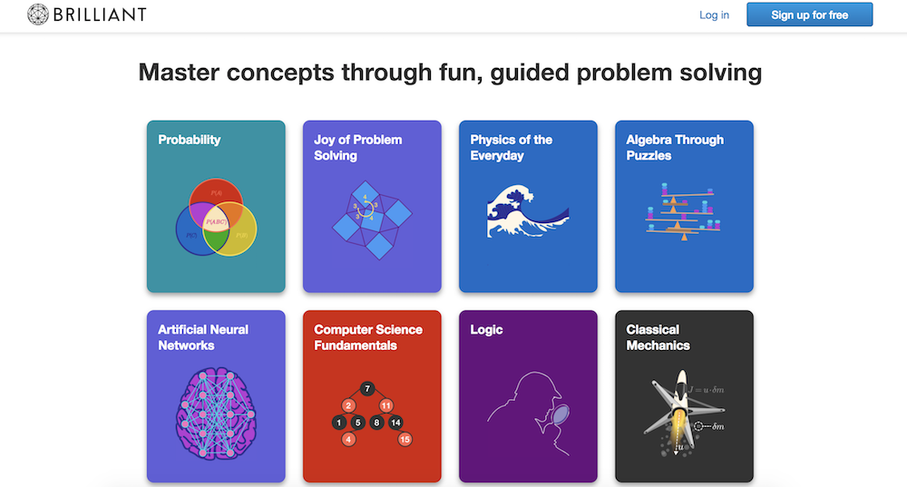
For a math and science website, Brilliant is surprisingly easy-to-navigate (even for someone like me, an English major … ), with big, colorful block buttons to choose the math concept you want to learn. This shop is also a fantastic example of using a call-to-action button wisely: there’s a big “sign up for free” button prominently displayed in the top right, and then another at the bottom of the page, after you’ve scrolled past the information you need.
The site doesn’t have a navigation bar, but instead uses the web page to answer all the questions a viewer might have.
15. Holstee
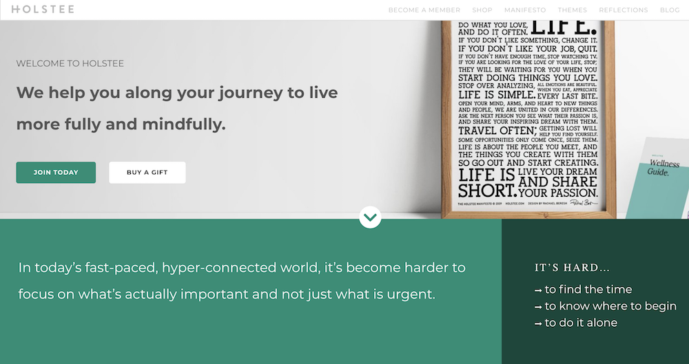
Holstee does a fantastic job of designing their site in tiers depending on a person’s initial level of interest in the product. For starters, you see the text, “We help you along your journey to live more fully and mindfully.” If you’re already convinced, you can click “Join today” right below the text. If not, you can continue to scroll down the homepage to find pain points this product reduces, read a “Holstee Manifesto,” see Membership benefits, check out testimonials, and find publications Holstee’s been featured in.
Throughout the page, there are various calls-to-action, like “Choose a plan that’s right for you,” and then, at the end, “Become a member today.” I love this site because it becomes increasingly convincing and in-depth as you scroll: it’s clear they use their homepage as a start-to-finish marketing pitch.
16. Kylie Cosmetics
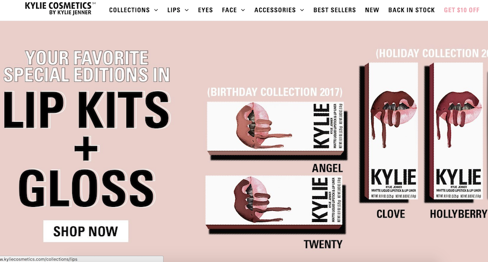
As one of the top 10 most followed accounts on Instagram, Kylie Jenner’s Cosmetic brand is one of the bigger brands using Shopify today. Her site has a very distinct girly-girl vibe, with a bubble-gum pink background showing off her lip kits and gloss.
Kylie’s site is also well-organized for her audience: the lip kits, her best-known items, are shown first on the homepage, with “top sellers” below that. I didn’t feel overwhelmed looking through the various cosmetic products like I thought I would, and what really stood out to me about Kylie’s site is the fun, colorful layout. It might not be everyone’s cup of tea, but I’m betting it appeals to her target audience.
See a store design above that you like? First, grab the guide below to find out how user-generated content can give your business the gusto it needs to attract and retain online shoppers.

7 Comma Rules Every Writer Should Know
In the beginning of 2018, one missing comma in a Maine state law cost Oakhurst Dairy five million dollars.
The absence of the Oxford comma made two overtime-exempt tasks, packing and distributing food products, read like one activity, so any worker who distributed but didn’t pack any food products or vice versa sued the dairy company for their unsettled overtime pay. The workers won the suit.
As you can see, commas might seem insignificant in the grand scheme of things, but one small error can cost you millions of dollars.
As a writer, correct comma usage is especially important because writing a piece packed full of comma errors could damage your professional reputation.
Commas are tiny yet potent details you must pay a laser-like attention to, so check out the seven comma rules every writer should know. Hopefully, re-learning how to correctly use commas will help you eliminate the chance of embarrassment from making these dangerous grammatical errors.
7 comma rules every writer should know
- You can only connect two complete sentences with a comma if there’s a coordinating conjunction (for, and, nor, but, or, yet, so), which are also called FANBOYS, between them.
- Use a comma to link an incomplete sentence with a complete sentence.
- Use the Oxford comma.
- Use a comma between two coordinate adjectives that describe the same noun.
- Use a comma to highlight additional, non-essential information about a noun.
- Make sure you place commas correctly in quotes.
- Put a comma before “while” to contrast two things.
1. You can only connect two complete sentences with a comma if there’s a coordinating conjunction (For, And, Nor, But, Or, Yet, So, or FANBOYS) between them.
A complete sentence has a subject, verb, expresses a complete thought, and it can be its own sentence. For example, “We found a lost dog.” and “We took her home.” are both complete sentences.
But, if you place a comma between the two, like in the sentence “We found a lost dog, we took her home.” you end up writing a comma splice.
To fix this, you need to insert a coordinating conjunction or one of the FANBOYS after the comma, like this: “We found a lost dog, so we took her home.” This is how you correctly use a comma to connect these two complete sentences.
2. Use a comma to link an incomplete sentence with a complete sentence.
An incomplete sentence can have a subject and verb, but it doesn’t express a complete thought, so it can’t be its own sentence. For instance, the sentence “Even though I tell my friends I hate Nickelback” doesn’t express a complete thought and can’t stand alone. Therefore, it’s an incomplete sentence.
To make it complete, you need to add a comma and a complete sentence to the clause, like “I went to their concert”. When you do this, you’ve used a comma to connect an incomplete sentence and a complete sentence together: “Even though I tell my friends I hate rock music, I went to Nickelback’s concert.”
It also doesn’t matter whether your incomplete or complete sentence comes first. For example, “I went to Nickelback’s concert, even though I tell my friends I hate rock music.” is also a correct use of a comma.
3. Use the Oxford comma.
The Oxford comma might be one of the most controversial topics in the history of grammar. For years, people have argued whether it’s necessary or not, but a lot of publications, including HubSpot’s blog, believe it’s crucial for clarifying sentences that separate items in a list.
For example, the sentence, “Today, I watched a documentary about Babe Ruth, a New York City mobster, and the founder of New York-Style pizza.”, expresses that I watched a documentary about three famous people who lived in New York City.
If you neglect the Oxford comma in this sentence, though, you end up with something like, “Today, I watched a documentary about Babe Ruth, a New York City mobster and the founder of New York-style Pizza.”
Unless Babe Ruth also lived a secret life of crime and thin-crust pizza, you can see how the absence of the Oxford comma in this sentence could confuse readers.
4. Use a comma between two coordinate adjectives that describe the same noun.
Adjectives are considered coordinate when your sentence still makes sense after swapping the adjectives and placing an “and” between the two.
For instance, you can rewrite “I saw a tiny, adorable puppy when I drove to the store” as “I saw a tiny and adorable puppy when I drove to the store”. Since the adjectives “tiny” and “adorable” are interchangeable and you can place an “and” between them without muddling the sentence’s meaning, the adjectives are coordinate, so you should place a comma between the two.
Sentences with non-coordinate adjectives, like “I just ate some pungent chicken soup.” don’t need a comma. In this example, “chicken” is an adjunct noun, which means it acts like an adjective describing the noun “soup”. But since it’s technically still a noun, you don’t need to put comma between “pungent” and “chicken”.
5. Use commas to highlight additional, non-essential information about a noun.
In the sentence, “I saw tons of Ospreys, also known as Sea Hawks, when I went to the Everglades.”, the words isolated by the commas give additional information about the noun, Ospreys, but they’re not essential for the sentence to make sense.
For example, you could write “I saw a ton of Ospreys when I went to the Everglades” and the sentence still makes sense. Consequently, including any additional, non-essential information about a noun requires you to isolate it from the rest of the sentence with commas.
If any additional, non-essential information is at the end of your sentence, you need to put a comma before it, like, “When I went to the Everglades, I saw a ton of Ospreys, also known as Sea Hawks.”
6. Make sure you place commas correctly in quotes.
When you write a sentence with a quote, the placement of a comma depends on whether the attribution is before or after the quote.
For instance, when the attribution is before the quote, like in the sentence “The cook said, ‘I need more cheese.’”, you need to place the comma outside of the quotation marks.
When the attribution is after the quote, like in the sentence “‘I need more cheese,’ said the cook.”, you need to place the comma inside the quotation marks.
7. Put a comma before “while” to contrast two things.
Putting a comma before “while” is the equivalent of saying “whereas”. So if you want to contrast two things, like “I like working on more analytical projects, while my brother likes working on more creative projects”, you need to put a comma before “while”.
Leaving the comma out before “while” will describe two events that occur simultaneously. In the sentence “I ran to the drug store to get ice while Greg drove to my house to get our cooler”, I’m expressing that Greg and I went to different locations to grab ice and a cooler at the same time.

How Many Hours Is Full-Time vs. Part-Time
In high school, I worked for Winfrey’s Candy Store. I worked three hours a night, on Monday, Wednesday, and Saturday.
Needless to say, I understood it was part-time.
But distinguishing the difference between full-time and part-time hours isn’t always easy. For instance, the Fair Labor Standards Act (FLSA) says, “This is a matter generally to be determined by the employer.”
If you’re an employee, it’s critical you know whether you’re working full-time or part-time. The classification has major implications, including your options for health insurance, how much paid time-off you get, and whether you’re eligible for childcare reimbursement.
It’s equally critical to distinguish the difference if you’re an employer — failing to properly label your employees as full-time or part-time could result in fines or penalties.
To learn how many hours full-time versus part-time is, keep reading.
How many hours is full-time?
Full-time typically ranges between 32 and 40 hours per week, but is ultimately up to your employer. If you work within this range, you should be eligible for the company’s full-time benefits. More specifically, the IRS defines a full-time employee as anyone who averages 30 hours per week, or 130 hours per month.
How many hours is part-time?
If you work less than 30 hours a week, you are likely classified as a part-time employee, although it’s up to your employer to determine the exact number of hours required to be part-time. If you are part-time, you are likely ineligible for any of the company’s benefits.

Web Forms: The Ultimate Guide
Have you ever ordered an item online?
Considering the fact that 1.66 billion people worldwide shopped online last year, there’s a good chance you answered “yes” to that question.
Whether you know it or not, you used a web form when you placed your online order. Not only are web forms necessary for you to receive the information, goods and services you’re interacting with or buying, but they’re also crucial for the businesses that create them and embed them on their sites.
Without web forms, marketers would have a tough time obtaining information on potential customers and tracking data regarding purchases, customer feedback, new leads and survey responses. In a highly digital world, it’s hard to think of a successful business that doesn’t have at least one web form on their site.
Marketers use web forms (such as contact forms, surveys, shipping forms, registration forms and quizzes) for a number of reasons — to complete an order, keep track of a customer’s personal information or collect lead information. Web forms also help businesses increase conversions by taking potential customers through the lead flow process.
This happens when a person visits your site and submits their information in return for something (such as a product, service or free trial). Once a web form is submitted by a lead, it’s then sent to a server for processing.
Web forms vary in length, format, content type and appearance — there’s no “one size fits all.” They should simply fit your business’s needs and help you gather the information you want from your leads. This also means there’s no single way to create a web form. We will review several tools and software programs that will help you create your forms later on, but first, let’s dive into why you should create web forms.
Why Should I Create Web Forms?
Web forms allow you to collect and manage information easily and efficiently. They’re embedded right into your website, which makes it easy for your leads to provide their information. Once a lead completes a form on your website, their information is stored until it’s ready for analysis. Web forms are crucial tools for businesses to obtain the information they need from their potential customers.
Use Cases for Web Forms
There are several instances in which web forms can be used. There are web forms that allow you to collect contact information, shipping information, survey your customers and more. They can really be used to easily get any information you need from your leads and keep it for analysis or manage it in any way you see fit.
We will talk about the various types of web forms below, which will give you a better idea of specific use cases and which forms would fit best in certain instances.
How To Make a Web Form
Let’s discuss how to build a web form. As you follow the steps below, think about what information you really need from your leads. If your web form doesn’t make sense to your leads —if it’s complicated or asks for too much information —potential leads may lose interest and leave your site. Consider how much the offer at the end of the form is worth and adjust your web form accordingly.
Creating a web form starts with determining its purpose.
Make the Purpose of Your Form Clear
It’s crucial to make the purpose of your web form clear. Your leads should know exactly what your web form is for and why they are completing it. Here are a couple of ways to do this.
Include straightforward headers
By including straightforward headers, your leads will know exactly how to complete your form. Headers help avoid confusion and ensure your leads spend the minimum required time on your form. Examples of straightforward headers include “Contact Us”, “First Name” and “Preferred Method of Contact”.
Provide clear instructions
Clearly communicate what information you need from your leads while using the fewest words possible. At the top of your form, include a sentence or two about what you’re going to ask from your leads. You can also include a short statement about why you need that information to remain transparent with your leads.
Consider the appearance of your form
By keeping your form organized and clean, you’ll also provide your leads with an easy end-to-end experience. Nobody wants to waste time reading long paragraphs of information just to find whatever it is they’re looking for. Additionally, cluttered text simply looks unprofessional. Within seconds, your leads will know whether or not you took the time to thoughtfully create your form.
Why should you improve web form usability?
- You create a simple transaction.
- You will build trust.
- You will appear more professional.
- You will increase conversions.
By clarifying your web form’s purpose, your visitors will know exactly which form they need to complete and why specific questions are being asked of them. Whether it’s a shipping form, a sign-up form, a survey or quiz, you want your visitor’s experience to be easy.
You should always state the purpose of your form fields. They could say something like, “This web form will be used to get some more information about you so we can tailor our newsletter content towards your background, experiences, and interests.” By ensuring your web form’s purpose is clear, you build credibility and trust between your business and lead.
When you visit another company’s website that’s designed in a way that screams “customer first,” you’re likely to feel that the business is professional and thoughtful. The same goes for web forms. Stating the purpose of your web form avoids confusion, shows that you’re a forward-thinking company, and communicates that you care about your visitors’ experience on your site.
By increasing web form usability and creating a positive overall web form user experience, your business will experience a greater number of conversions. By simply making your form easy to use, clear and visually pleasing, your leads will want to complete it and become customers. Fixing small issues related to user experience helps businesses experience an improvement in their conversion rates by 75%.
By improving your web form usability and prioritizing the design and context of your form, you’ll enhance user experience and get website visitors excited and about completing your form and converting.
Choose Your Web Form Type
The purpose of your web form informs what type you should use, as well as which questions to ask and how you should format your responses.
Here are some common types of web forms to consider. (We will review examples of each of these types of web forms shortly.)
Contact form
Contact forms are used for leads to ask your business a question, voice a concern or even explain their need for a refund. These web forms typically contain fields that require leads to list their name, contact information and order number. They may also have a drop-down or text-entry field for leads to explain their reason for reaching out and their preferred method of contact.
Lead generation form
These web forms convert your website visitors into leads. They typically require personal information, such as a name, company, email address, phone number and sometimes a username and password for return visits to the site.
Order form
Order forms do exactly what you’d expect them to do — they allow your website visitors to place orders. They also provide customers with a way to pay for items and have the products they have ordered sent directly to them (or to whomever the item is for). Order forms are detailed, as they often require a credit card, shipping and billing information, and your contact information.
Registration form
A registration web form is similar to the two forms listed above but is used for a different purpose. A lead would complete a registration web form if they were interested in signing up for your service. This is common on sites such as Craigslist, Ebates, and eBay. If a lead was looking to list an item on one of these sites, they would complete a registration form to create an account and then post the item.
Survey form
Survey web forms may include multiple choice, fill-in-the-blank and long-form responses. They are used to learn more about your customer’s experiences with your products and services. They also help you improve future interactions with your customers, as well as educate leads about the ways in which your business can help them.
Incorporate Your Form Fields
Think about what responses you need from your leads when you begin creating your form fields. By starting with the answers you need, you’ll be able to determine how to title your form fields, what questions to ask and which types of fields you actually need your visitors to complete. Regardless of what you’re asking your visitors, you should always require their basic contact information (such name and email address) so you can identify individual submissions.
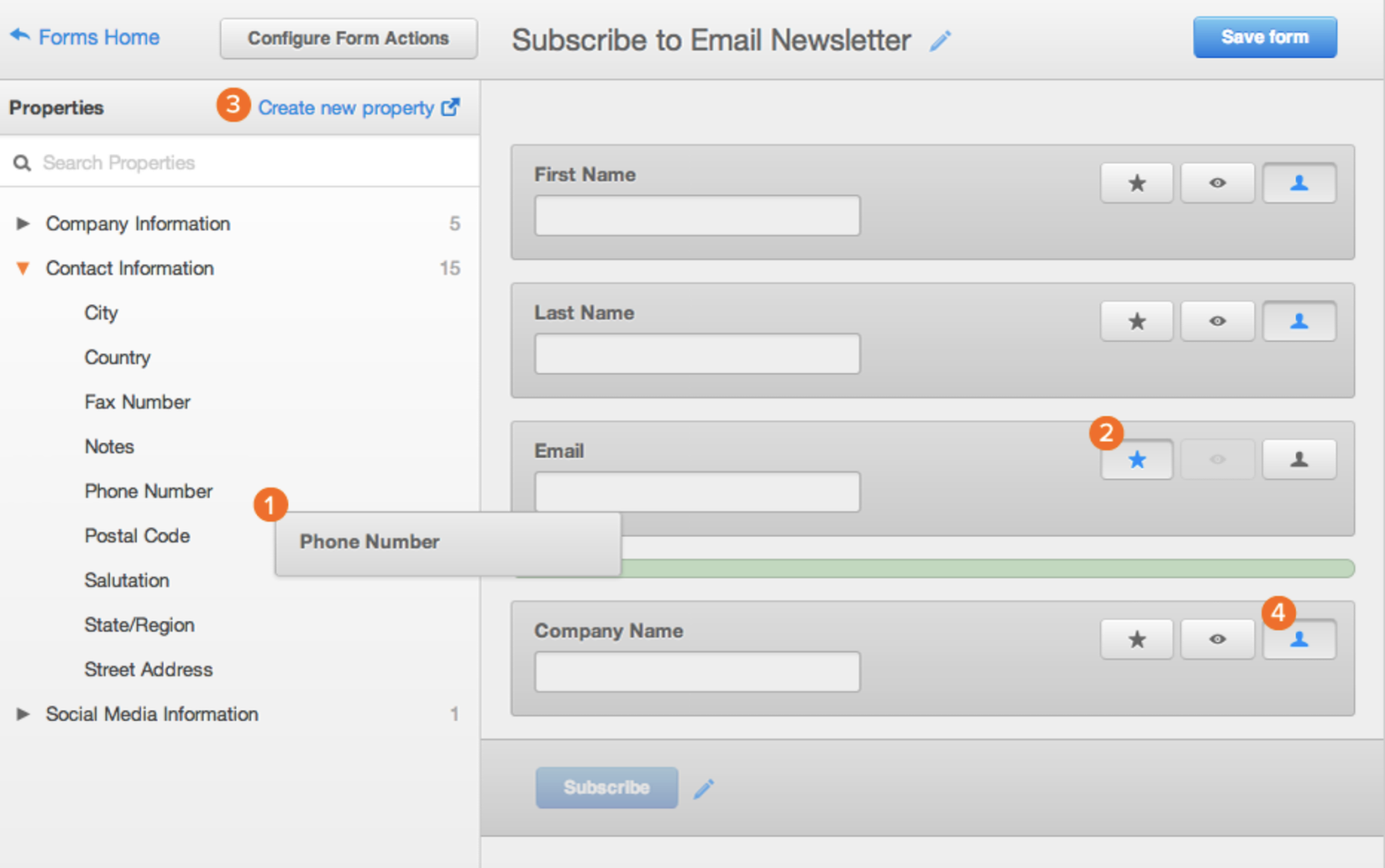
Form fields on a software like HubSpot are predefined, meaning you have several previously created options to pick from and add to your form. In HubSpot, drag-and-drop features allow you to easily build your form however you want. Once you determine which type of form you want, review the predefined form fields and begin creating your form.
Source: HubSpot
If you are asking your leads questions that require detailed answers, you can create short or long-text entry fields that accept one sentence up to a paragraph or two. There are also several other field-entry types for you to include in your forms such as multiple choice, drop-down menus, check boxes, radio buttons and more.
Embed Your Web Form On Your Website
Once you create your web form, it’s time to embed it on your website. This is how your website visitors will access your form. Start by determining where you want your form located on your website.
Decide where to embed your form
Determine which page of your website should include the web form. For example, do you want your email signup located on the bottom of your main landing page? If you have a contact form, is there a page on your website solely meant for visitors who want to contact you? And if someone purchases an item, do you have your web forms in an order that makes sense (first shipping, then billing and payment)?
Source: HubSpot
How to embed your form
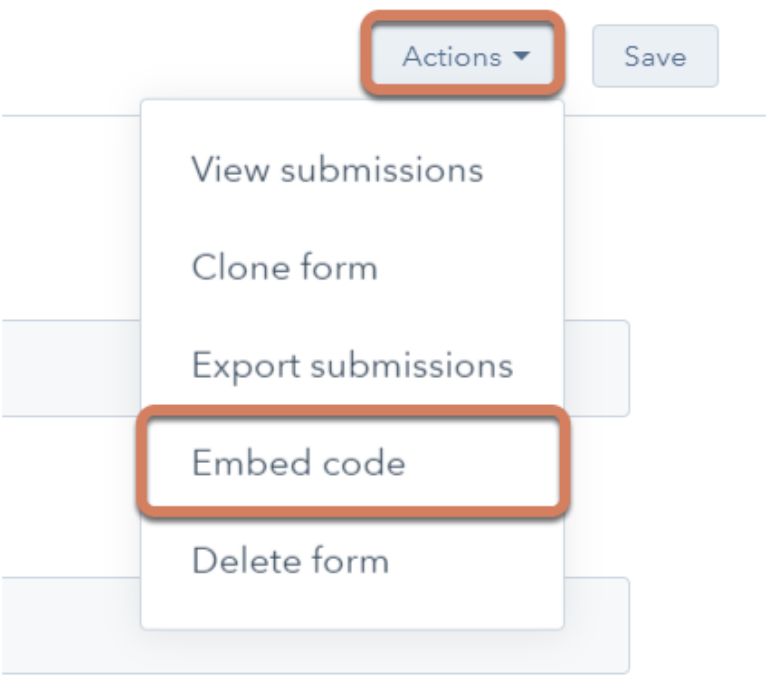
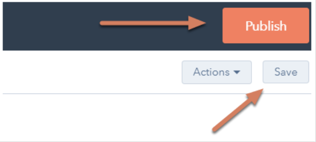
To embed your form, software programs like HubSpot simply require you to copy and paste the form’s code into the desired location on your site. When web forms are embedded published, website visitors can start the completion and submission process. You will then begin receiving data about your leads that will be crucial for maintaining a healthy business.
Source: HubSpot
If you are using a website creator or external website, you can still embed your code from HubSpot’s form builder into your site’s source code (the collection of code used to build your website).
How to Make Your Web Form Secure
Data protection has become a top priority for businesses and consumers alike. A secure web form that ensures your leads’ data is protected will result in more submissions. With HubSpot’s form builder, creating a secure form for both your business and your leads is easy.
The form builder stops spam submissions from coming through with an email address validation process. This ensures only real email addresses can be submitted in your web forms. HubSpot also allows people to add CAPTCHAs, which are the questions at the end of a form that require people to confirm they’re not a robot. These act as a second layer of protection against spam.
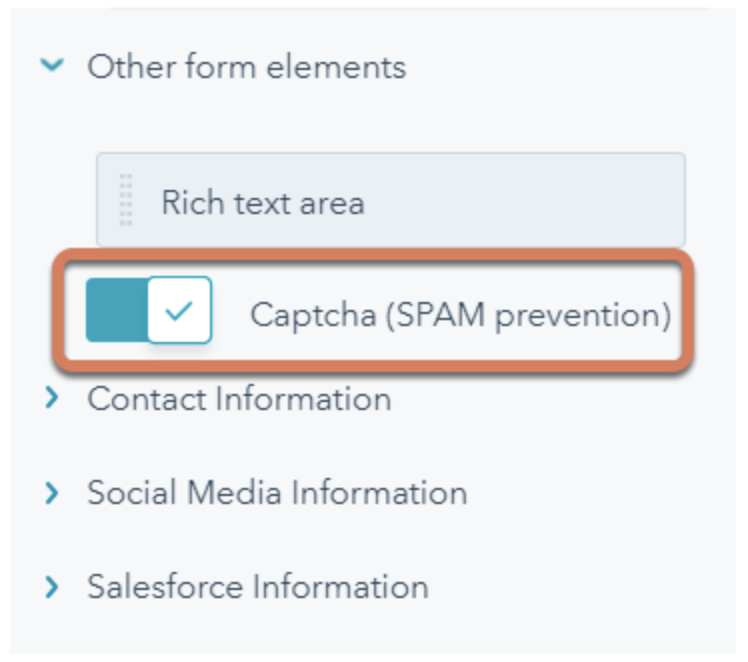
Source: HubSpot
Lastly, HubSpot allows you to block specific email providers and domains that you determine are unnecessary to receive submissions from.
Test Your Web Form and Analyze Your Results
Once you create your web form and embed it on your website, make sure it works! Think about things from your visitor’s point-of-view. Do they have enough space to respond to a question in the short-text entry field? If not, try switching over to the long-text entry field and see how their responses change.
If you receive the same feedback repeatedly from your website visitors, try altering the form or adding different form fields to improve the experience for your leads. Your customers and leads should be your top priority when it comes to all of your marketing tactics, including your web forms.
If you set up email notifications on your web form creator software, you should double check that these are working as well. You can do this by going to the web form on your website, completing it as a lead would and making sure you receive an email notification about the form being completed. If it doesn’t work, try working through the email notification set up again.
Congrats! You have just completed the creation of your web form. Now, let’s review some design tips that will enhance the user experience of your web form.
Web Form Design Tips
When creating and reviewing your web form, consider some of the following design tips that will make your form easy-to-use, effective and helpful for both your business and your leads.
Be Direct
By keeping your web form as direct as possible, you make the experience better for your leads. You will also avoid any possible confusion. To be more direct, you can create a web form header, use clear form field titles, place your web form in a location on your website that makes sense and remove non-essential wording.
Use Correct Form Fields
Use form fields that make sense to your leads and provide you with the answers you’re looking for. If your leads need to give you information in paragraph format, then include long-text entry fields. If they only need to write a few words or a sentence, include short-entry fields. For something like a survey, add multiple choice responses, and for any questions that could have several answers, use checkboxes or radio buttons.
Using input constraints
Consider using input constraints for specific form fields. For example, if you know you only need one sentence in your short-entry form field, add a constraint that ensures your lead can only provide you with one sentence. This will save time for your lead and the form reviewer.
Add a Form Submit Button
By adding a form “Submit” button, your website visitors will be able to complete the web form and send it to the server without any hesitation or confusion. It will also make them feel confident that you and your fellow employees will receive their submission and listen to whatever it is they have to say.
Organize Your Form
If you have a long and detailed web form, make it easy to read and complete for your leads by keeping everything in one column. The only time you’ll want to keep form fields on the same line is when it makes sense to the reader. For example, keep information such as a date (day, month and year) on one line. By keeping all other form fields in a single column, you’ll avoid your lead feeling overwhelmed or bombarded by questions.
Make Your Form Visually Appealing
As mentioned earlier, appearance matters when it comes to all of your marketing content. Did you know that it takes an average of 50 milliseconds for a website visitor to look at your website’s landing page and determine whether or not they want to stay?
Web form first impressions matter, too. Brand your forms to make them look professional from the moment a lead lands on your page. They should match your company’s aesthetic to ensure consistency and promote a polished look. Consider colors, text font and size, and layout. Keep things clean and organized to ensure a positive experience for your leads.
Use Smart Fields
Imagine you already have an account on a website and you are completing a different web form on that same site. If that form field asks you some of the same questions that a previous web form asked, wouldn’t you feel as though you are wasting your time?
Smart fields are a great feature to keep your leads from having to do any unnecessary work. HubSpot uses smart fields to remove form fields that a customer or lead has previously submitted. Smart fields make your business and website appear more professional by providing a smooth process for your leads or customers, and removing the frustration of filling out the same information multiple times.
Using smart defaults
Have you ever started completing a web form that automatically filled in your zip code based on your current location? That’s a smart default. This feature also speeds up the web form completion process and creates a seamless user experience.
Include Error Messages
When a lead is completing your web form, you should tell them whether or not they are doing it correctly. Include error messages if they accidentally provide you with an area code that doesn’t exist, add their state to the “Town” field or are exceeding the character limit.
Again, this not only saves time for your leads but it also keeps things simple when you need to review the submitted content. HubSpot’s form builder does this and even gives leads suggestions based on the information they submitted.

Source: HubSpot
Explain Why You Are Asking For Specific Content
Imagine you were completing a web form on another business’s website and you notice a question that asks for your credit card information … but you aren’t buying anything. You might find yourself thinking, “Well, this is sketchy … ” or “Am I going to be charged for something without even knowing it?”
This is an easy way to lose a lead or compromise your credibility.
To avoid this, include information on your web form that explains why you’re asking for specific information. By anticipating questions your leads may have, you will come off as professional, thoughtful and customer-oriented.
Web Form Examples
Examples are a great way to get inspired and improve your own marketing practices. Here are some examples that demonstrate each of the five web form categories mentioned above.
Sun Bum’s Contact Form
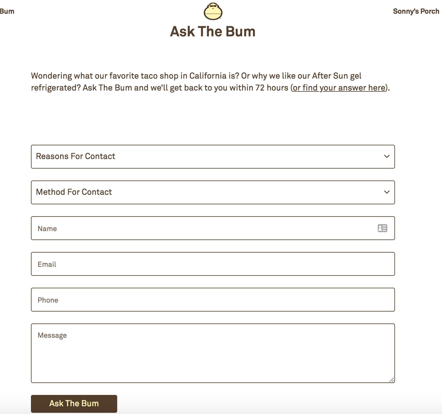
Source: Sun Bum
Sun Bum has a contact form on their website that enhances user experience. The form is on a contact landing page. The web form looks clean and organized, and the form fields make sense for the form’s purpose. Users are able to select the reason why they are contacting Sun Bum, how they want to be contacted by the company, provide their contact information and write the company a message (in a long-text entry form field).
Sun Bum even has a unique name for their contact form, “Ask the Bum,” that meshes with their brand and resonates with users. The submit button, or the “Ask the Bum” button, is easy to see and reminds users that they are interacting with a company that has personality.
Help Scout’s Lead Generation Form
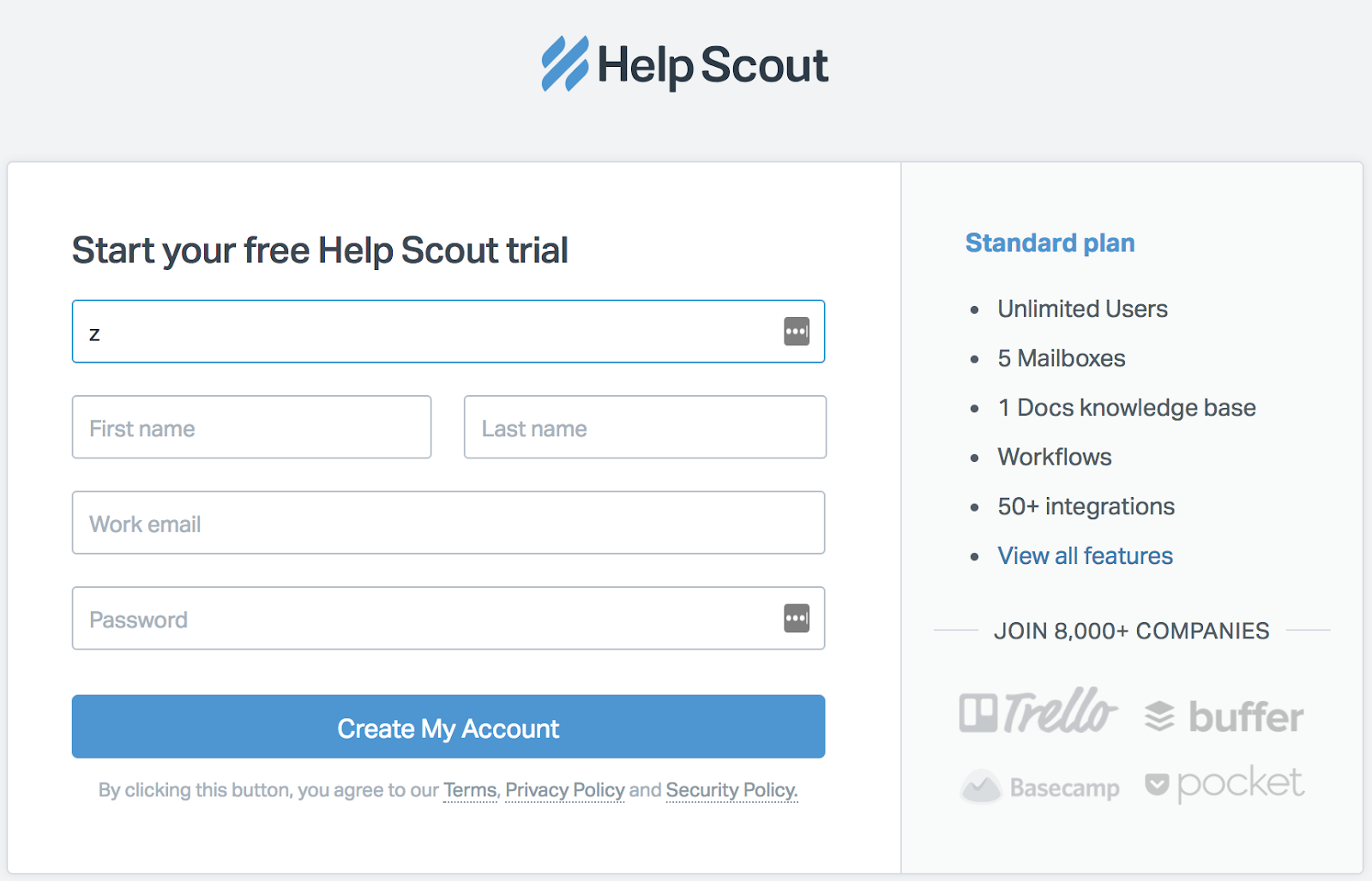
Source: Sun Bum
Help Scout has a lead generation form on their site that allows leads to quickly create an account. The web form has a header that states what the form is for and it only requires a few pieces of personal information (company, name and work email) to create an account.
This Help Scout web form has a nice layout for users and keeps all fields contained in a box. The layout of the form fields makes sense as well — the fields for a lead’s first and last name are side-by-side and the rest is in a column format, which helps visitors work through the form step-by-step.
Starbucks’ Order Form
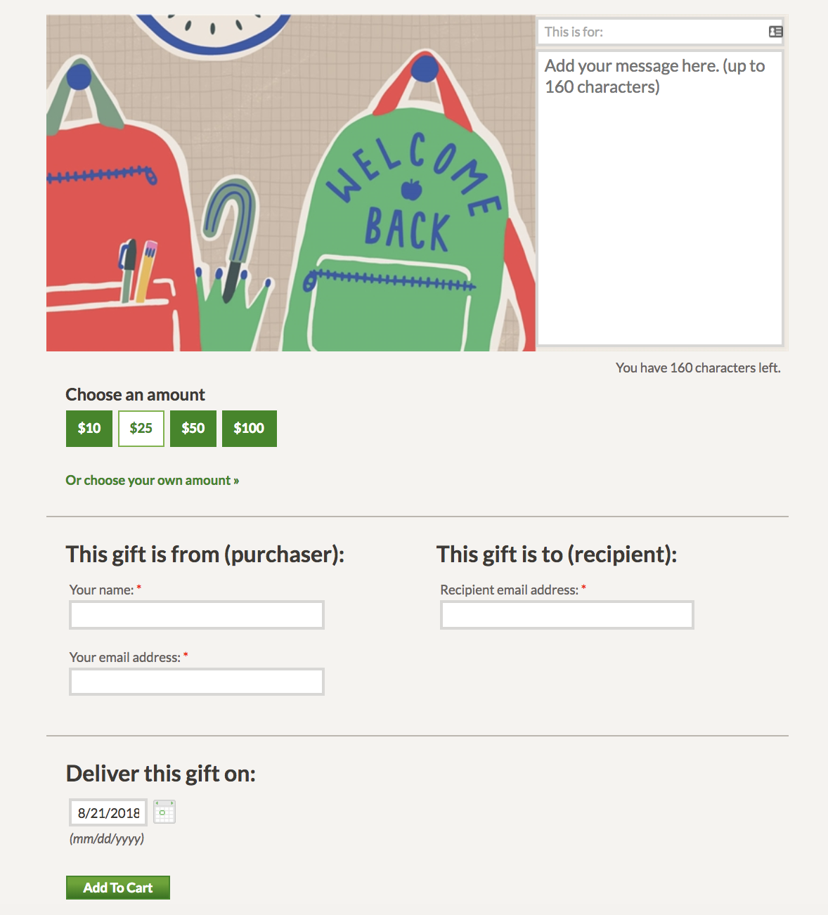
Source: Starbucks
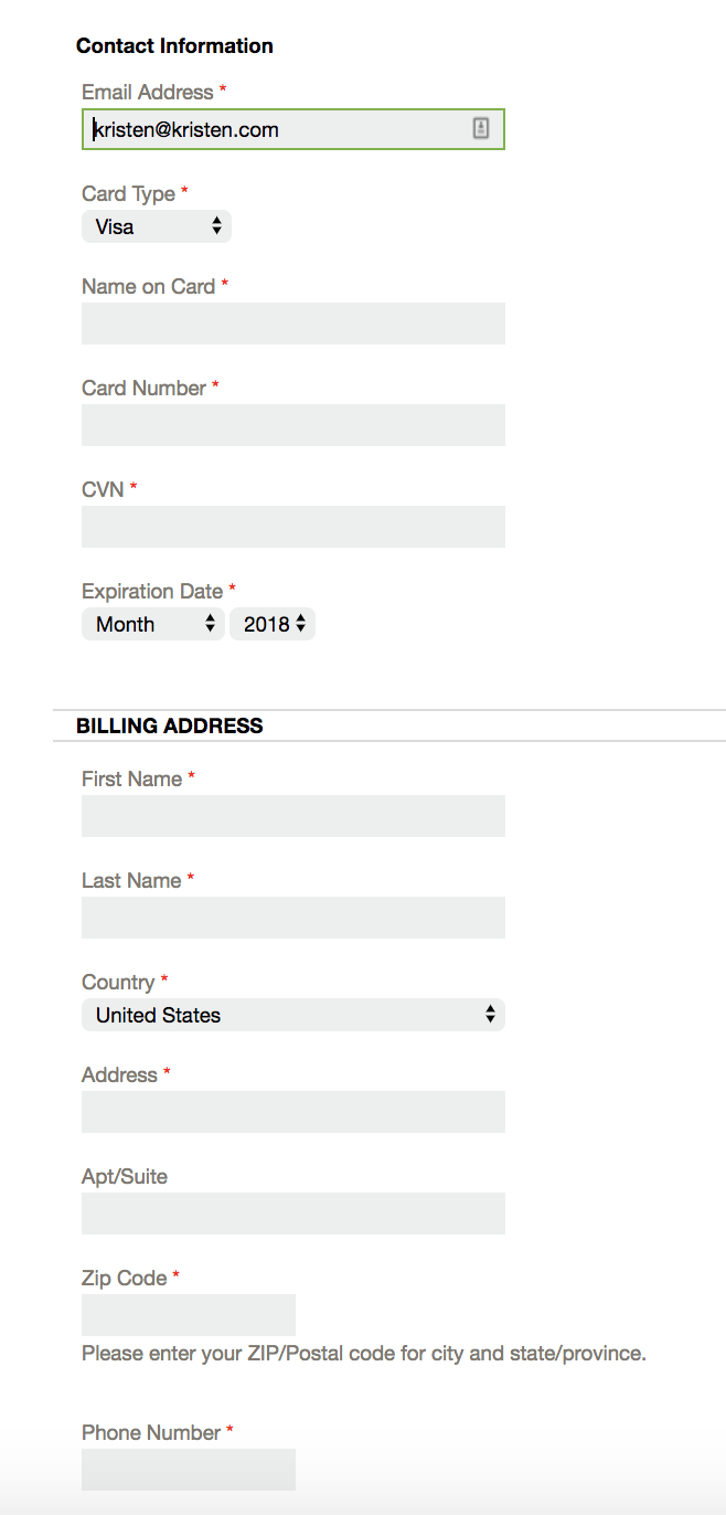
Source: Starbucks
Starbucks has two online order web forms that customers complete when they want to send a gift card. The first web form introduces the chosen gift card and includes a toggle button, a few fill in the blank short-text entry form fields and a calendar to select the date in which the gift card should be delivered.
Once that information is submitted, customers are brought to a second page with a detailed order form. This one includes form fields in a single column (except for the date fields which make more sense to be placed next to each other) and ask for the customer’s shipping and billing information.
The use of multiple web forms allows customers to take things one step at a time. They are straightforward, have clear headings and state why Starbucks needs certain information like the customer’s email and the recipient’s email. Although the second web form is long, customers can easily follow along.
Airbnb’s Registration Form
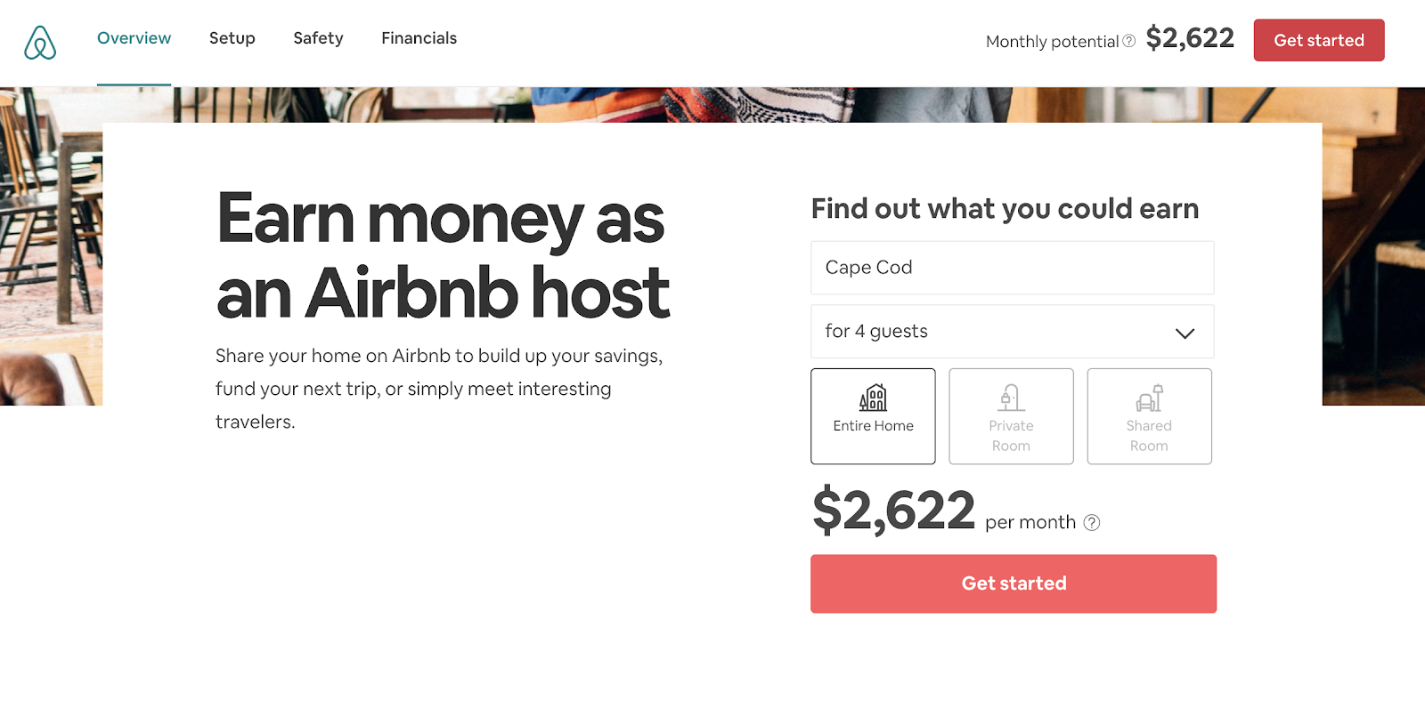
Source: Airbnb
When someone wants to list their home on Airbnb, they first need to register for an account. Airbnb has simple registration web forms that get hosts excited about listing their space on the site — allowing potential hosts to discover how much money they could make through their listing. Who wouldn’t want to make an extra $2,622 per month?
Airbnb takes their potential hosts through several web forms and allows them to work through the process at their own pace. The web forms are also visually pleasing and match the company’s look and style.
WebMD’s Survey Form
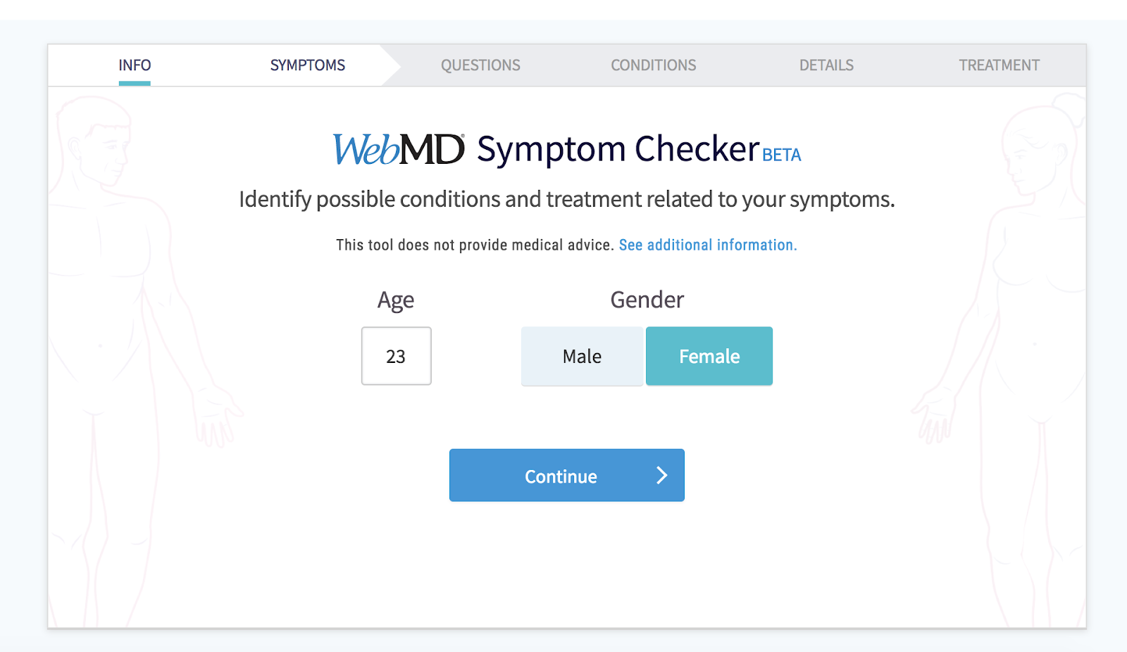
Source: WebMD
WebMD has a symptom survey that allows website visitors to self-diagnose through a series of questions. The survey includes several web forms with various form fields. The final web form submission takes patients to a landing page that includes a possible diagnosis. The web forms are an efficient and effective way for patients to get the answers they are looking for.
Now that we have reviewed the ways you can create your own web forms, as well as examples that you can learn from, let’s review some tools and programs that will help you build your desired forms.
Web Form Tools and Software Programs
There are a number of online form creators and software programs that businesses can use to get information from their leads. Some form builders are free, some require a subscription fee and some have features that work for different types of forms and businesses.
JotForm
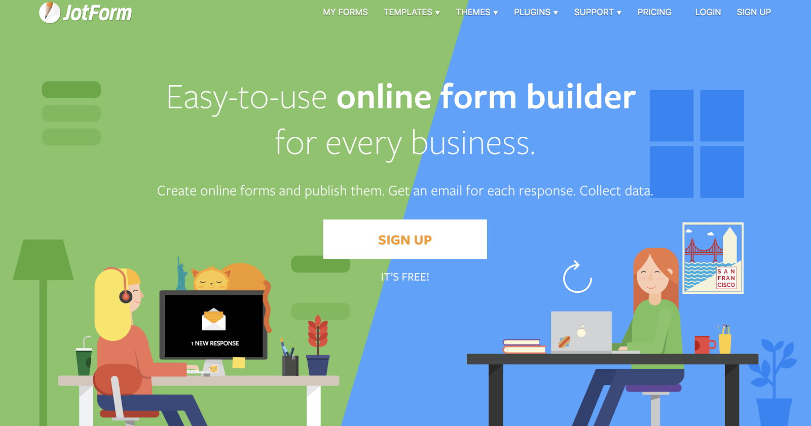
Source: JotForm
JotForm is an easy-to-use web form software. It’s is a free online form builder that allows businesses to not only create and embed their web forms but to also receive notifications via email whenever a form has been completed. With JotForm, anyone can create their desired, customized web forms in a matter of minutes.
Formstack
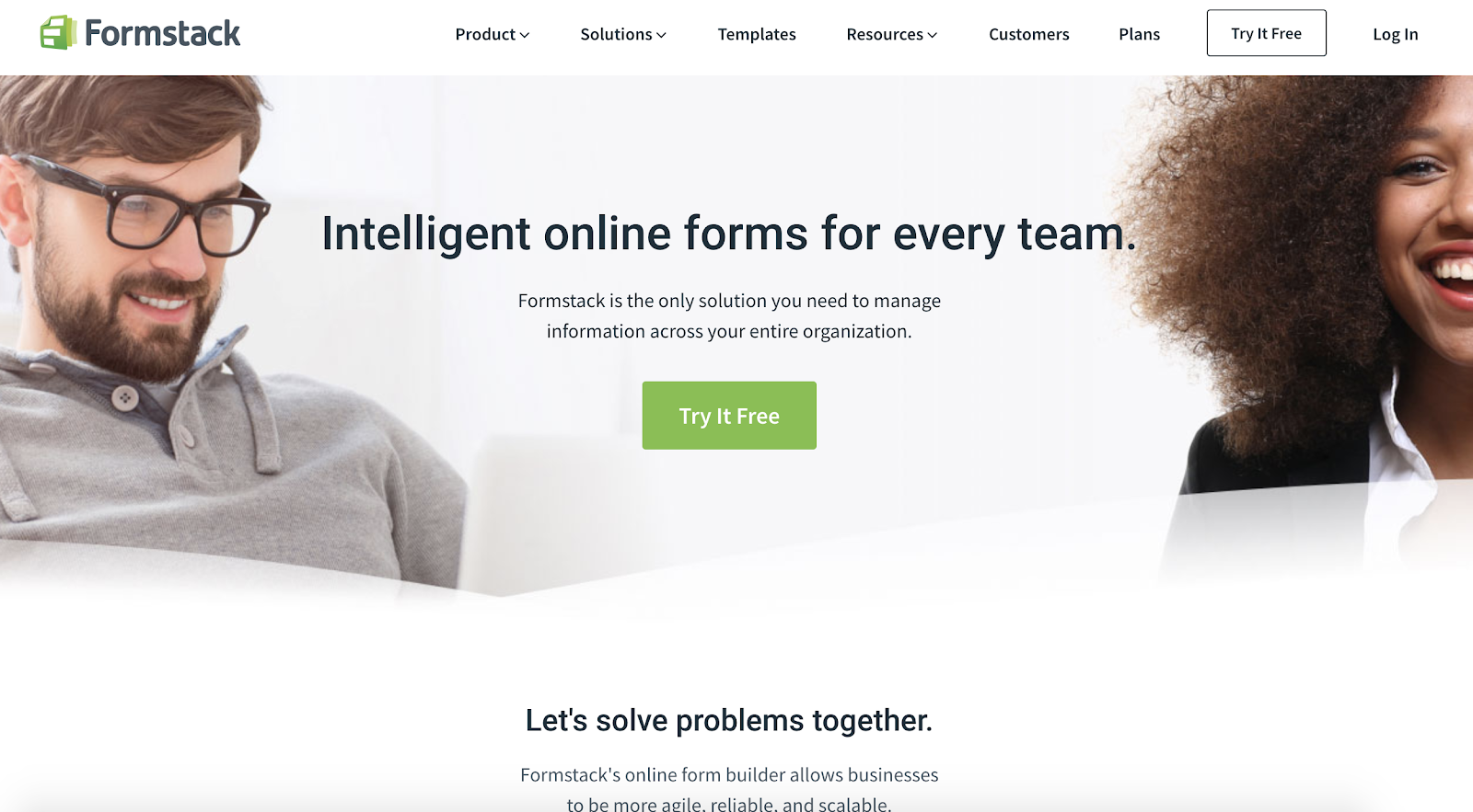
Source: Formstack
Formstack allows businesses to build their web forms, monitor them, and use conversion tools to analyze data received through the forms. Companies are able to brand their forms and integrate them with other apps they may be using to control their workflows (such as MailChimp, Google Sheets, PayPal or Hubspot).
WPForms

Source: WPForms
WPForms is the WordPress contact form plugin. This plugin has a drag-and-drop feature that easily moves your contact form from the plugin to your website in a matter of seconds, making it one of the most straightforward contact form builders available.
With multiple contact form templates to choose from, businesses can create a form that works for their needs. Additionally, the plugin notifies you when a lead completes your form, has a mobile-friendly design and integrates with a number of other apps.
Drupal

Source: Drupal
Drupal is an open source CMS (content management system) that contains a web form creator module called Webform. The module allows Drupal users to create surveys and forms and manage the results on a spreadsheet application. The module also has basic statistical review features so businesses can keep track of what is working and what needs to be modified.
Type Form
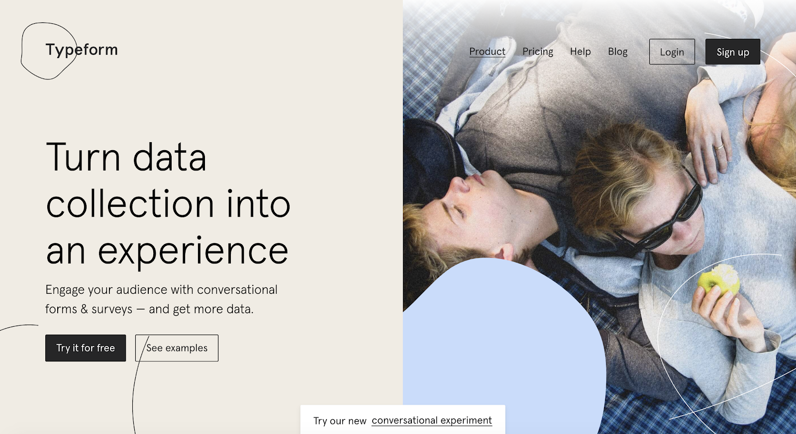
Source: Type Form
Type Form allows business to create forms, surveys, quizzes and more for their websites. The software also has a sophisticated way of keeping track of data and results from all forms across a given site. The web forms are not only easy to create, but they can be quickly embedded and are compatible on all devices.
HubSpot

Source: Type Form
HubSpot’s form builder has easy-to-use, drag and drop features that allow you to efficiently create, embed and publish your ideal form. One feature that is unique to HubSpot’s form builder is that it uses progressive profiling.

Source: HubSpot
Progressive profiling prevents anyone from having to complete the same form fields multiple times, ensures your business is not getting duplicate responses and keeps things as simple and professional as possible for both the lead and the business using the form builder.
Create Your Own Web Form
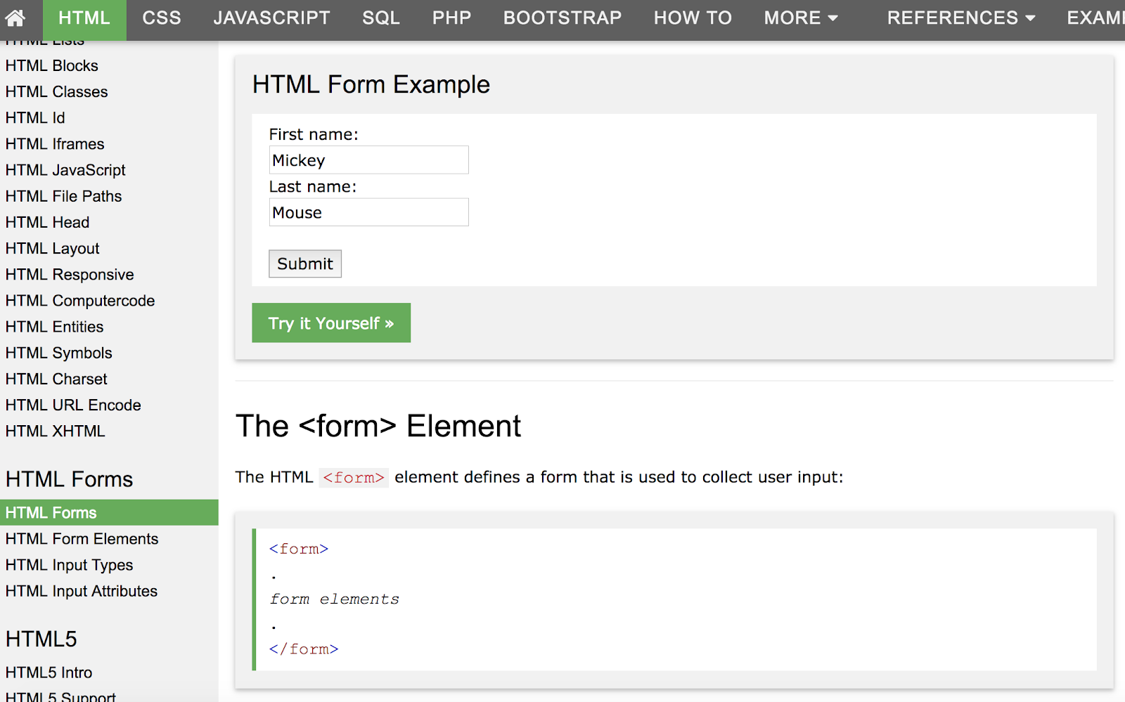
Source: W3Schools
You can also create your own web forms using HTML form, CSS form, Php form or Javascript form.
Conclusion
Web forms will help you track online leads, follow up with clients and potential customers, learn more about your buyer personas, enhance user experience and provide your leads with the information, services and products they are searching for. Your web forms should be straightforward, simple to use and visually pleasing. This is how your business will ensure a professional, user-friendly experience on your website.
A successful web form will lead to an increase in your number of leads and conversions. So, why not get started creating web forms that’ll help you grow your business and expand your network today?
