
21 Incredible Geometric Patterns Perfect for Your Next Design
There’s a certain psychology to shapes.
The square, for instance, evokes feelings of stability and formality — which makes sense, when we think about popular square-shaped items in our lives (houses, tables, computer screens). We often see this shape in logos when reliability is a critical component, like for Microsoft or American Express.
The triangle, meanwhile, can suggest action (road signs, mountains), but might also appear balanced and solid (Egyptian pyramids). We see this shape in logos when mobility is a necessary factor, like for Delta or Adidas.
A geometric pattern repeats or re-aligns shapes to create movement and freshness in a design. Knowing the importance of shapes to create meaning, it makes sense for businesses to consider using geometric patterns to inspire their audience.

Here, we’ve compiled some of the sleekest and most innovative geometric patterns businesses are using today. If you’re looking for inspiration for your next redesign, look no further.
1. Gallery and Co. Branding by Foreign Policy.
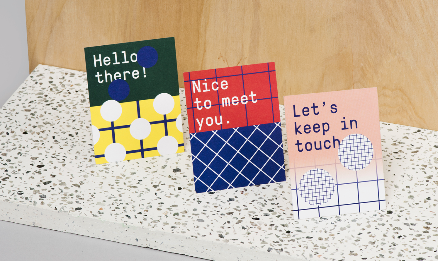
2. Sorry Colour by Alex Lorenzo.

3. NICFI by Tank Design, Daniel Brox Nordmo, and Ina Brantenberg.

4. Arq by Stitch Design Co.

5. BBC artwork by Liam Brazier.

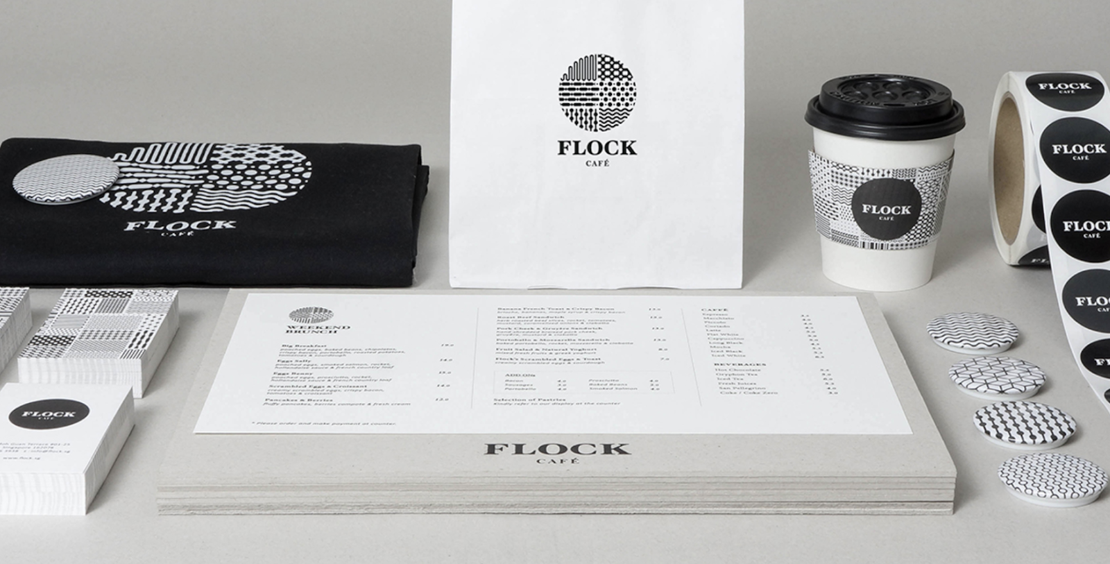
6. Flock Cafe by Kilo Studio.
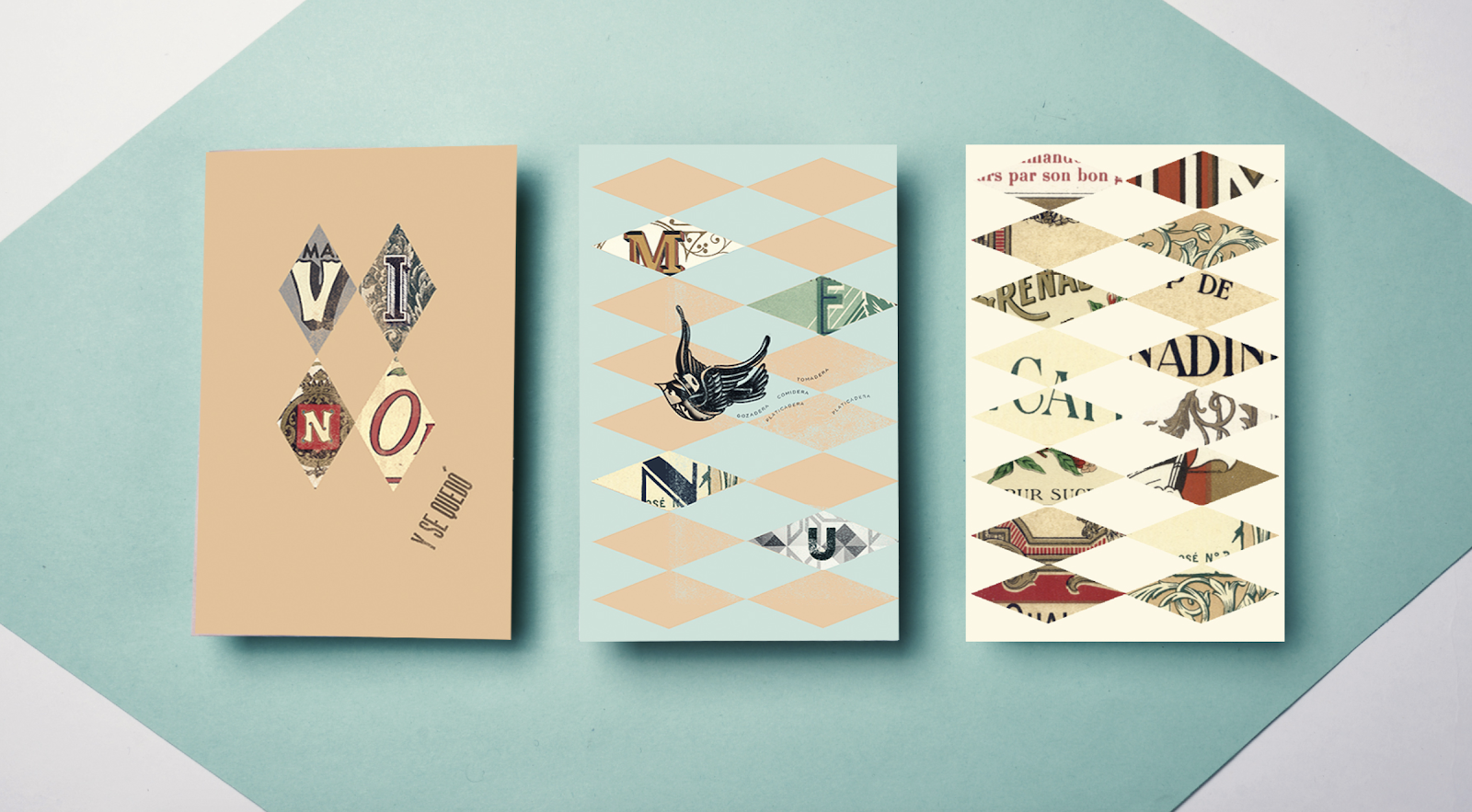
7. Ruiseñor by Yeye Design.
8. CareerTrackers by Garbett.

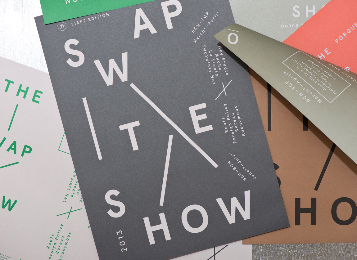
9. The Swap Show by Foreign Policy.
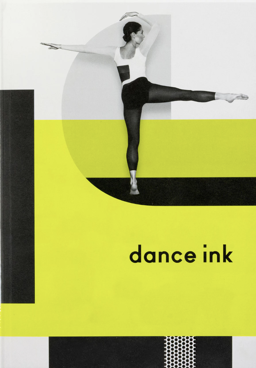
10. Dance Ink by Pentagram.
11. Gulf Air by Saffron Consultants.

12. Business Cards by Lucie Mcilroy.

13. Andrés Sandoval by A Practice for Everyday Life.

14. Dan Pearson Studio by Spin.

15. Beau Cacao by SocioDesign.

16. Comedy Feast by Only.
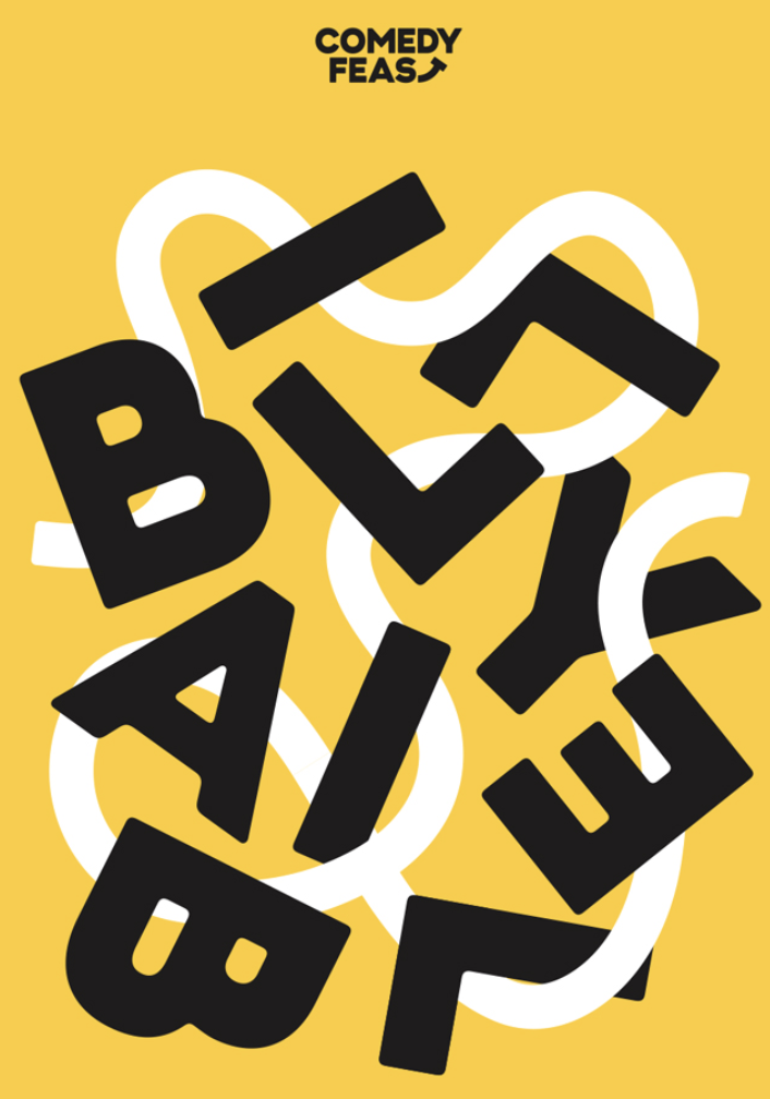
17. ICP by Aris Zenone.

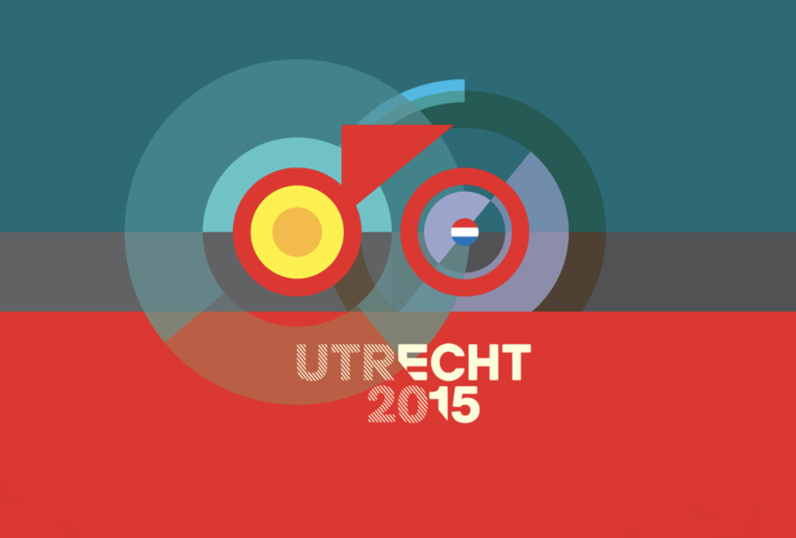
18. Utrecht by Total Identity Group.
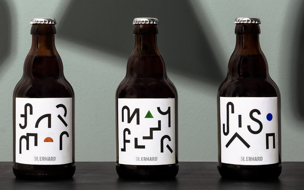
19. St. Erhard by Bedow.
20. Les Vitrines by Des Signes.

21. Moimio by Helen & Co.



6 Predictions for the Convergence of IoT and Digital Marketing
We’re on the cusp of a tectonic shift in digital marketing.
The boom in IoT (Internet of Things) technology will soon allow us to analyze, predict, and respond to consumer behavior in almost every market possible.
That sounds amazing … but what’s the Internet of Things?
The Internet of Things is the connection of everyday products like cars, alarm clocks, and lights to computing devices via the internet. It allows them to exchange data with each other, providing marketers with more context about their customers’ product usage. This enables marketers to deliver more relevant messages and leads to greater customer engagement.
For example, if you run out of milk or it spoils, a refrigerator connected to the internet could recognize your need and display a message on its screen or your phone about the best milk deals in town. You could even order a carton through one of those devices if the refrigerator company partnered with a grocery store.
Since IoT technology connects the internet with objects that are ubiquitous in our daily lives, marketers in almost every industry will be able to engage consumers throughout every phase of the customer journey.
The term “Big Data” is an understatement for the amount of data IoT devices will produce. According to the Ericsson Mobility Report, IoT devices and sensors will exceed mobile phones as the largest category of connected devices in 2018 and generate a staggering 400 zettabytes of data per year.
IoT’s surge will overjoy marketers because they can leverage these massive data sets to integrate consumer behavioral signals into their marketing stack. This will allow them to capture interactions, conversion metrics, and consumer behavior predictions and link them to purchase-intent data.
Access to this data is exciting, but it could also lead to confusion. Marketers might not know how to interpret this unprecedented influx of information. Changes to the digital marketing landscape are clearly on the horizon. So check out these six predictions of how IoT will influence digital marketing’s growth and evolution and how you can prepare for it.
1) New digital devices will emerge.
Since anything connected to the internet could be an avenue for consumer engagement, marketers will move beyond today’s digital devices like laptops, mobile, and tablets.
For instance, we could use things like car and refrigerator monitors as possible touch points. Amazon already leverages IoT with their Dash buttons, allowing consumers to order a product with the push of a wifi-connected button.
2) IoT data, attribution, and analytics will revolutionize contextual marketing.
IoT devices generate unprecedented amounts of data, so every customer interaction allows marketers to capture consumer intent, behavior, needs, and desires. This makes it possible to serve contextually relevant marketing messages at the most optimal place and time.
Understanding a consumer’s behavior, purchase patterns, and location also provides a level of attribution, analytics, and predictive capabilities that were previously unavailable. Based on signals from IoT devices, we’ll be able to push timely notifications to consumers when they need to purchase something rather than waiting for them to show interest.
These insights and the ability to accurately attribute every interaction throughout the customer journey will be groundbreaking.
3) Marketing technology platforms will treat IoT data like their first born.
Marketing platforms and technologies will be able to ingest and use IoT data similarly to how cookies and unique IDs (UIDs) are used today. These platforms will also use IoT signals to further evolve our current cross-device technologies.
Developing platforms and technologies capable of ingesting, analyzing, and acting on these vast data sets will be a very complex undertaking. But evolution in digital marketing AI and machine learning applications will produce marketing technology platforms that can process, interpret, and evaluate these data sets in near real-time.
In other words, expect many new entrants in the marketing technology space to tackle this challenge.
4) The agency’s role will evolve.
Along with the traditional responsibilities of agencies, they will start playing an increasingly technical, data-centric role as technology partners. Agencies will help build their client’s platforms, develop their internal systems, and manage the implementation of tagging elements.
The agency staff’s skill set must adapt to the evolution of their role, though. They’ll need to develop an agile approach to managing campaigns, marketing initiatives, pricing, and product development.
Keen understanding of the data packets IoT devices can produce will become commonplace, as well as knowing what the actionable endpoints within a customer journey are.
5) Marketers will be able to deliver timely, personalized messages that align with their customer’s lifecycle stage
The ability to deliver timely, personalized messages at the precise moment to the optimal device will transform digital marketing. For example, using data collected from a fitness wearable and proximity data collected from beacons, digital marketers could deliver fitness product messaging or emails when the user is near a relevant advertiser’s store, like a smoothie joint.
The possibilities for using a combination of these signals to provide highly relevant messaging at the optimal moment are unlimited.
IoT could also provide marketers with the information to improve customer experience and determine when they should send acquisition or retention marketing messages. One example is using offline purchases coupled with proximity data from IoT devices in a brick and mortar store to target recent purchasers with an upsell email or social campaigns asking for product feedback to send to their peers.
6) There will be increased scrutiny of privacy and security.
With great data, comes great responsibility. We can expect more privacy and security regulations and technologies focused on protecting both consumer and enterprise data.
Methods such as network segmentation, device-to-device authentication, and bolstered encryption techniques will likely emerge to prevent IoT devices from being compromised.
The data created by the Internet of Things will unleash considerable digital marketing potential. Predicting exactly how these changes will play out is not exact, but the evolution is already underway.
The only question is: will you be prepared for it?

Master Online Lead Generation by Reducing Friction
If you’re a marketer, you definitely know it’s no easy feat to convert visitors into leads. There are a ton of potential blockers that can either distract, prevent, or turn off potential leads from filling out your forms. So as a marketer, one of your goals should be to create a lead generation process that’s as frictionless as possible. To achieve this, you need to remove all of those distracting, annoying, and confusing obstacles that commonly prevent visitors from converting.
Want to ensure you’re creating as frictionless a conversion process as possible? Follow these 10 tips.
10 Guaranteed Ways to Create a Frictionless Conversion Process
1. Shorten Your Lead-Capture Forms: Think that 20-field form just might have something to do with the low quantity of leads you’re generating? We do. An uber-long lead-capture form is one of the quickest ways to scare potential leads away from your landing page and make them question, “Is this offer really worth it?” You probably don’t really need to know your lead’s favorite color, so ask only for the information you need to contact and adequately qualify your leads, and understand that there is a delicate balance between quantity and quality.
2. Create Targeted Landing Pages: The more targeted your landing pages are, the more aligned they’ll be to your specific visitors’ needs, making it much more likely they’ll be enticed to convert on your offer. If you’re promoting a landing page to a segment of your prospects that you’ve identified as having interest in a certain topic or having a specific need, tailor the landing page to speak to those needs and address those topics.
3. Remove Top/Side/Bottom Navigation: If prospects make their way to your landing page, don’t you want to keep them there? Streamline the conversion process by removing any other top/side/bottom website navigations from your landing pages to keep visitors from feeling compelled to leave and visit another page on your site. Once they convert, bring back the navigation and consider including a secondary call-to-action on your thank-you page to keep them engaged with your brand.
4. Get Rid of Other CTAs on Landing Pages: Just as you should remove navigation links from your landing pages, you also shouldn’t distract them from the offer you’re promoting there by showcasing other conflicting calls-to-action for other offers. Keep your page focused on that offer, and focus your efforts on convincing visitors to convert there rather than giving them a reason to go someplace else.
5. Create Clear and Optimized CTAs for Your Website/Blog: As a marketer, not only should you be creating landing pages for your offers, but you should also be optimizing your website and blog for conversion, too. The best way to do this is to place relevant calls-to-action on your web pages, blog, and individual blog articles. In fact, the only places you shouldn’t have CTAs are your landing pages, as we discussed earlier. Think of CTAs as ads for your offers. Align the language of your CTAs with the pages and content you place them on to create a more relevant and frictionless experience for visitors.
6. Share Landing Page Links in Social Media: Savvy inbound marketers understand that social media can be an effective tool for lead generation. But savvy inbound marketers also understand how to do it right. Because social media users aren’t yet on your website, you need to create as few steps as possible to convert them into a lead. Rather than promoting an offer and sending social media fans/followers to your website’s homepage, direct them to the unique landing page for that offer. That said, if you want to make a game out of it, you can send them to your homepage and make them guess where to go and what to do next to receive your offer. We just wouldn’t recommend it.
7. Stick to One CTA in Email Marketing: Just as your landing pages should only be honing in on one offer, so should your email messages. Focus your energy around communicating how valuable that one offer is rather than splitting your attention amongst two or more offers.
8. Put Landing Page Forms Above the Fold: ‘Above the fold’ simply means the visitor doesn’t have to scroll down to see the form. Make sure your form is easily visible, and the visitor understands that in order to receive the offer you’re providing, filling out the form is essential. Making your visitors scroll down is just another way to create friction.
9. Use Actionable Language: Tell visitors exactly what to do by using actionable, definitive language in your CTAs, on your landing pages, and in form ‘submit’ buttons. Examples of this include “Download Your Ebook Now” and “Register for the Webinar Today.” There should be no guesswork involved in understanding how visitors can obtain your offer.
10. Just Make it Easy: In general, just don’t make your visitors jump through all sorts of hoops in order to obtain your offer. Dumb it down, and make the process as easy as possible. If you wouldn’t fill out the form or wouldn’t even be able to figure out how to make your way to that landing page in the first place, it’s safe to assume your prospects won’t either.
In what other ways can you reduce friction in your lead generation process?
Image Credit: Emilian Robert Vicol

13 of the Best Facebook Ad Examples That Actually Work (And Why)
On average, Facebook is home to 1.45 billion daily active users — from CEOs, to students, to companies. And while the community is clearly there, connecting with them from a marketing standpoint isn’t always easy.
For brands, posting on Facebook alone isn’t enough anymore — especially for ones just starting out. Sure, you can throw money at your efforts to drive people to your Facebook Page and send them to your website, but that only works if you’re smart about it.
One way to do just that is to create optimized Facebook Ads targeted at the right audience. Optimized ads can help you spend your PPC budget wisely and see a positive return on your investment.
So, what does optimized Facebook advertising actually look like? If you’re looking for some great examples, you’ve come to the right place. In this post, we’ll quickly go over the following about the best Facebook ads:
- Facebook ads best practices
- Facebook ad formats
- Facebook ad templates
- Examples of the best, most effective Facebook ads we’ve ever seen (with some insights to apply to your own Facebook marketing)
Effective Facebook Ads
- Kay Jewelers
- Monday.com
- Amazon
- NatureBox
- Winc
- Shutterfly
- MU Campus Dining
- Boston Sports Clubs
- Allbirds
- The New York Times
- Tortuga Music Festival
- Adrianna Papell
- Bustle
Before we get to the Facebook ad examples outlined above, let’s discuss what makes a great Facebook Ad — regardless of the format and template the ad is using.
4 Facebook Ads Best Practices
1. It’s visual.
Don't miss this live virtual event with Facebook and HubSpot on how to grow your business faster than ever with Facebook
Visual content is not only treated more favorably in the Facebook algorithm, but it’s also more likely to be shared and remembered than written content. The lesson for Facebook marketers? No matter what type of ad you create, your image needs to be visually appealing.
Check out this blog post for a detailed guide to image sizes for various ad units on Facebook along with some tips on posting visual content.
2. It’s relevant.
Relevance is critical for success when using Facebook advertising. Remember, you are spending money when someone views or clicks on your ad (depending on the settings you use). If you’re showing ads that aren’t relevant to your target audience, you’re wasting your time and money and will likely not see success with any kind of advertising.
Back in February 2015, Facebook launched a feature in the Facebook advertising platform that rates your ads and gives you a relevance score, similar to Ad Rank in Google AdWords. The more relevant your ad image, ad copy, and destination page is to your audience, the higher your score is — and the more favorably Facebook will treat your ads.
3. It includes an enticing value proposition.
A value proposition tells the reader why they should click on your ad to learn more about your product. How is your product or service different from any other? Why should the viewer click on your ad to see your website?
Your value proposition should be believable. For example, saying you have the greatest sandwiches in the world will not make people come to your business’s Page, but maybe offering 20% off will. Or, perhaps adding social proof will help — something like, “Sandwiches loved by over one million people every year! Come try yours today and get 20% off your order with this coupon.”
4. It has a clear call-to-action.
A beautiful and relevant ad is great, but without a call-to-action (CTA), your viewer might not know what to do next. Add a CTA like “Buy now and save X%,” or “Offer ends soon” and add a sense of urgency to your viewer. Your CTA should encourage people to click on your ad now.
3 Primary Facebook Ad Formats
Format 1: The Right Column Ad
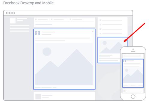
Image via Facebook
This type of ad is the most traditional on Facebook, it appears on the right side of a user’s Facebook News Feed. This is the first type of advertising Facebook had, and it still exists today.
Although ads in the News Feed are likely to get higher engagement metrics due to its native advertising features, right column ads shouldn’t be forgotten. We often see less expensive clicks and conversions when using these ads. In order for a right column ad to be successful, it needs to be relevant, have a value proposition, a good visual, and have a call-to-action.
Format 2: The Desktop News Feed Ad
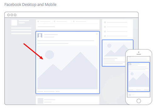
Image via Facebook
This type of ad appears directly in a user’s News Feed when they access Facebook on a desktop computer, and it looks more like native advertising. In our experience, these ads have a higher engagement rate than right column ads, but they can also be more expensive. These ads must follow organic Facebook posts best practices and be both engaging and visual.
Format 3: The Mobile News Feed Ad
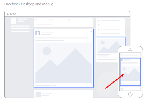
Image via Facebook
Like the desktop News Feed ad, this type of ad appears in the user’s mobile News Feed and displays like an organic post from the people and Pages they follow.
8 Facebook Ad Templates
Template 1: Video Ad
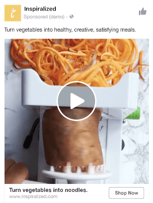
Image via Facebook
Video ads appear fairly large in the user’s New Feed and offer more engaging content than static posts. And with 8 billion videos being watched on Facebook every day, it serves as an interesting — and potentially profitable — ad type for marketers to try out.
How can you create your own video ad? First, understand Facebook video ad requirements including length and video size. We suggest keeping your video as short as possible, even though Facebook allows you to upload a much larger video. Create a video that displays your product or service, and upload directly to the Facebook ads manager by following these instructions.
Template 2: Photo Ad

Image via Facebook
Another type of rich media advertising on Facebook is a post of an image. This is one of the most popular types of ads ever since Facebook began favoring visual content. The optimal size for News Feed photo ads is 1200×628 pixels, otherwise your image will get cropped. Adjust your image based on the target audience’s needs and by what will appeal to them the most.
Template 3: Multi-product Ad
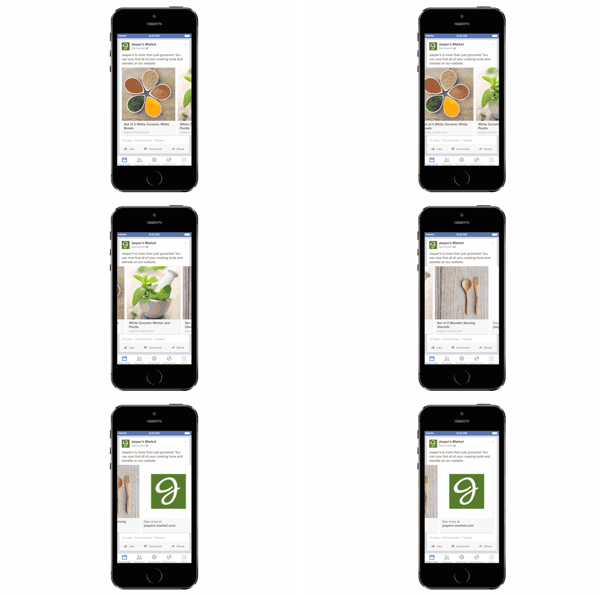
Image via Facebook
Multi-product ads allow advertisers to showcase multiple products within one ad. Viewers can scroll through the images and click on individual links to each product. You can promote multiple of anything, not just products — like different blog posts, ebooks, or webinars. These ads can be created in the Facebook Power Editor.
Template 4: Reach Ad
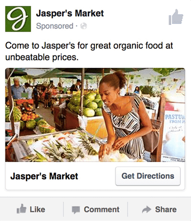 Image via Facebook
Reach ads on Facebook are designed for to grow your local awareness. They only work if your business has a physical location to which you’re trying to drive real foot traffic. If you fall into this category, locally targeted Facebook ads might be a great fit for you, as you can hyper-target on Facebook down to the mile.
If your business has an offer or event going on at your store, set up a few Facebook Reach ads that appear only to people within a short distance of your store. Have these ads appear a few days prior to the event and on mobile devices while the event is happening. You may want to reach some people the day of the event who happen to be in the area and checking their Facebook account on their smartphones.
Template 5: Offer Ad
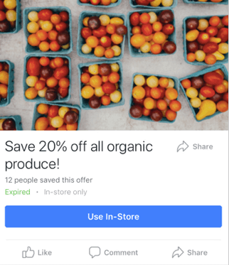 Image via Facebook
An offer ad is a form of Facebook advertising wherein a business can promote a discount on a product or service that can be redeemed on Facebook. The benefit of this? It eliminates one step in the buyer’s journey, which ultimately increases sales.
The offer ad has many benefits. First, it drives the user directly to the offer. The user claims it directly on Facebook, removing any added friction of needing to go to your website for the offer. You also can reach any type of audience that you want, as all the Facebook targeting options are possible.
Finally, you can include all the information needed for the user to decide if they want it or not, including the time period it is usable, the number of people who has already claimed it, and the exact amount the offer is. This will eliminate any unqualified clicks, which cost you money.
Template 6: Event Ad
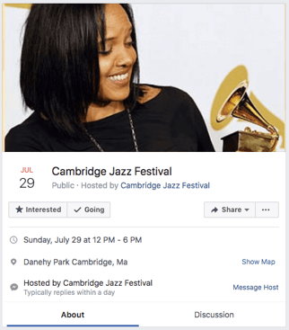
Event ads promote a specific event. The CTA on these ads usually send users directly to the ticket purchase page, wherever that happens to be hosted.
Using this type of ad will help drive a targeted group of people to attend your event. These will show up in the News Feed of the specific audience you’ve chosen. Events are a big part of most businesses, but getting people to attend even a small event, can be tricky. Promoting your event to a targeted specific audience on Facebook can help drive the right kind of attendees.
A good ad in this format will clearly show the benefit of attending the event: the price, dates, and a clear CTA to purchase a ticket.
Template 7: Boosted Ad
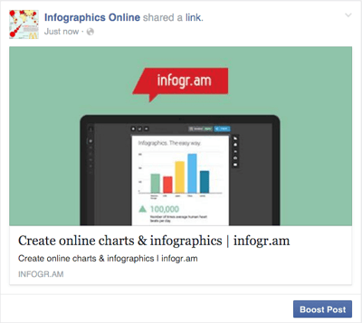 Image via Stealth Seminar
A boosted post is an organic Facebook post that was originally on the homepage of a company’s Facebook, and that later was boosted with advertising money.
This is different from the above ads because it’s not created in the Facebook Ads Manager. You can include more in the description, as there is no limit to word count on boosted posts like there is in ads. You can also have a link in the copy.
The cons? Boosted posts leave you fewer options for bidding, targeting, and pricing. You also cannot run any types of A/B tests because you’re promoting a post that has already been created; you’re not creating one from scratch.
Template 8: Retargeting Ad
A retargeting ad promotes an ad to a specific list of previously identified people. Have you ever seen ads follow you across the internet after visiting a certain website? Then you’ve seen a retargeting ad.
Facebook has the same capability. An advertiser can advertise to a list of leads or customers by uploading a list of email addresses it already has into the Power Editor to make a custom audience. A good retargeting ad acknowledges that the brand knows you’re already interested in its product. (Because, let’s face it … retargeting can be a little creepy.)
Now that we’ve covered the main ad best practices, formats, and templates, let’s dig into a sampling of the best Facebook ads that embrace the above guidelines.
13 of the Best Facebook Ad Examples
1. Kay Jewelers
Video Ad
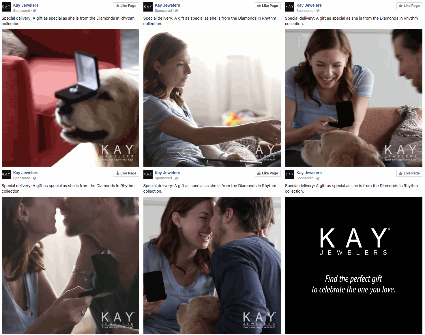
This Facebook video ad from Kay Jewelers tells a quick but moving story — something Kay Jewelers is well-known for — using just a few seconds of your time. You don’t even need the sound on in the video above to know what’s happening and the message Kay is sending.
If you’re advertising a product with sentimental value, like Kay Jewelers, video ads are the way to go. Just be sure your video has a clear (and happy) ending — people view videos more passively on Facebook than they would on YouTube, and don’t have time to interpret your ad if it’s too long or complex.
Why This Ad Works
- It’s visual. Even though this is a video, I have a general idea of what I will be watching, thanks to the screen capture it started with. Additionally, I can understand the gist of this ad without playing with the sound on, which is important given that 85% of videos on Facebook are now viewed without sound.
- It’s relevant. It’s relevant to me because I was recently scouring jewelry websites, specifically for necklaces like the one in the ad.
- It’s valuable. Kay shows potential customers the value of purchasing with the help of the happy reaction from the woman receiving the gift in the ad. Plus, who doesn’t love dogs?
- It has a solid call-to-action. This ad is set up to drive Page Likes, which is an easy, one-click way for me to get more relevant content served up to me.
2. Monday.com
Photo Ad
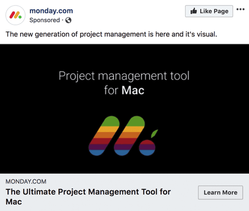
Monday.com is a task-management tool that caters to multiple operating systems, both desktop and mobile. But in the photo ad above, the company used its compatibility with Mac computers to remix its own logo in the original rainbow colors of the Apple brand.
For growing businesses like Monday.com, it’s a smart idea to pivot off the brand awareness of household names. By filling the Monday logo with Apple’s famous rainbow color-way, the ad above captures the attention of Mac users who’d recognize those vintage rainbow stripes anywhere (and could use a new task-management tool that works on their computer).
Why This Ad Works
- It’s visual. The rainbow colors filling the Monday logo are both eye-catching against the black background and familiar to any Mac user.
- It’s relevant. For Mac users, and those who need to organize their tasks on a regular basis, this ad is relevant to their lifestyle in more ways than one.
- It’s valuable. The ad calls attention to Monday’s compatibility with Mac computers, making the product’s user experience more valuable to Mac users as a result.
- It has a clear call-to-action. The “Learn More” CTA on the bottom-right of the ad is a clear invitation to find out more about this product’s usage on Apple hardware.
3. Amazon
Event Ad
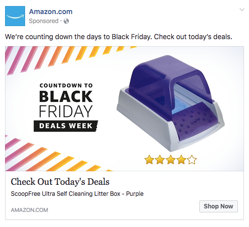
This is how an event ad from Amazon looks in the News Feed on a desktop. This ad works well on a few different levels: A sample product is clearly displayed, the ad shows an impressive (but honest) rating of that product, and you know which event Amazon is promoting right away — Black Friday.
Ecommerce companies like Amazon use event ads to boost sales at specific points during the year, and Facebook event ads make this easy. When investing in event advertising, build a list of the holidays, shows, conferences, and awareness months your business cares about. That way, you know exactly which marketing campaigns line up with these occurrences and when to promote it on your Facebook Business Page.
Why This Ad Works
- It’s visual. Not only is this image larger than the right column ad display, but it also uses warm colors, white space, and directional lines, which drew my eye towards the featured product.
- It’s relevant. As a cat mom, this offer is clearly tailored to my consumer needs.
- It includes an enticing value prop. Amazon has advertised a self-cleaning litter box here, which is of tremendous value for any cat owner. Additionally, it shared the strong customer ratings below an image of the product. (Social proof, anyone?)
- It has a clear call-to-action. Amazon instructs me to click on its ad today, after which point the deal for the litter box will presumably disappear. “Now” is strong CTA language that compels clicks.
4. NatureBox
Photo Ad
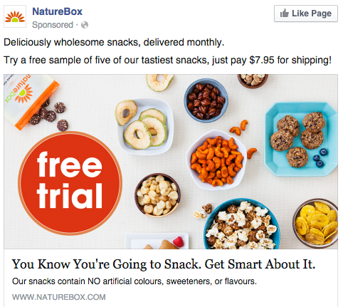
This photo ad by NatureBox features a creative point-of-view shot that is perfect for the angle at which you’d dive into the company’s various health snacks. The ad makes you imagine your next house party … I thought the peanuts spilling out onto the table was a nice touch.
In your next Facebook photo ad, play around with live-action photography and digital design in the same image. As you can see in the ad above, NatureBox was able to design a vibrant “free trial” icon right on top of an image that would’ve worked just as well on its own.
Why This Ad Works
- It’s visual. The image shows you exactly what you’re getting, and it calls out the “free trial” CTA well.
- It’s relevant. Everyone likes to snack. In all seriousness, the person who saw this is a fan of several lifestyle subscription companies, which is what NatureBox is.
- It’s valuable. This ad is full of value. First, the “free trial” callout is the first thing your eyes go to when looking at the image. Second, it clearly mentions the healthy aspects of the goodies in its product.
- It has a clear call-to-action. NatureBox is asking you to try its free sample. It couldn’t be easier to know your next step.
5. Winc
Retargeting Ad
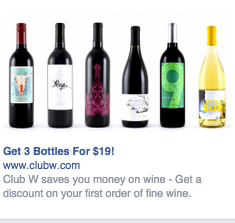
Here’s an example of a short and sweet (literally) retargeting ad from Winc (formerly known as Club W). This ad is displayed on the right column of Facebook specifically for users who browse wine-related content online. When your ad caters to people who you know would be interested, modeling the product the way Winc does above can be a home run for your brand.
Why This Ad Works
- It’s visual. The visual is clear, simple, and appealing to all types of wine-lovers.
- It’s relevant. This came up in my wine-obsessed colleague’s News Feed. Need I say more? Two thumbs up on relevance.
- It includes an enticing value prop. Three bottles for $19? What a steal. They also pull the viewer in with an additional value: a discount on their first order of wine.
- It has a strong call-to-action. The word “get” is strong call-to-action language, and it’s used twice here. A time limit on this offer would have made it even stronger.
6. Shutterfly
Multi-Product Ad
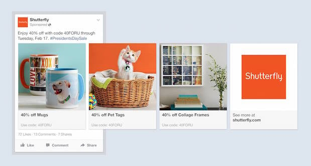
Here’s an example of a multi-product ad from Shutterfly, along with the additional images that are used in the ad. Each image has a different offer, to appeal to many different demographics in one ad.
In each image, the product being promoted is consistent in the look and feel of the Shutterfly brand — this an important quality of ads that showcase more than one item and picture.
Why This Ad Works
- It’s visual. This series of images leans on a consistent color palette, making it feel both cohesive and on brand. (Having a cute cat doesn’t hurt either.)
- It’s relevant. The person who saw this loves taking photos and creating sentimental gifts. Spot on, right?
- It’s valuable. There is a very clear value for the user, 40% off each of the products being advertised. The code and sale end date are also clear in the ad description. This ad also has an added level of value, it is showing the many different ways people can use Shutterfly, in ways many may not be aware of.
- It has a clear call-to-action. I know I need to use this before February 17th when this deal expires, so I would be encouraged to take action right away.
7. MU Campus Dining
Reach Ad
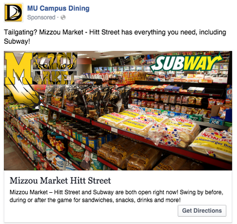
This Facebook reach ad from Mizzou Campus Dining promotes amenities at the University of Missouri, using two familiar logos and a marketplace that anyone on campus might recognize.
The ad copy beneath the image invites customers in “after the game” — a reference to campus life that helps Facebook users imagine when they might want to stop in for a sandwich.
Why This Ad Works
- It’s visual. This image has college pride, a variety of salty and sweet treats, and a well-known logo to attract hungry college students.
- It’s relevant. This ad is likely only being shown to students on campus who are in its target audience. It also mentions the sports game that was going on at the time, and plays to the student’s current needs: snacks and Subway sandwiches.
- It’s valuable. Mizzou Market is telling hungry college students that it has everything students need for the big game.
- It has a clear call-to-action. This ad has the option to show directions, making it extremely easy for a college student on the go to follow the walking directions to this market.
8. Boston Sports Clubs
Offer Ad
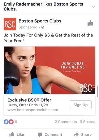
All consumers really need to see is the boxer pictured above to know what this ad by Boston Sports Clubs (BSC) is offering. The woman in the photo even looks like she’s staring at the text to her left, getting viewers to shift their attention to the promotion right away.
This Facebook offer ad makes it obvious what customers would be signing up for when they click the “Sign Up” CTA button below the picture. Offer ads can easily mislead viewers into pressing their CTA just to get them to click on it, but it ultimately doesn’t convert viewers into customers. BSC’s approach above is clear and upfront about what it’s offering throughout its conversion path.
Why This Ad Works
- It’s visual. The featured photo uses bold colors and clear typography to draw my attention to the details of the offer, and the woman exercising gives me an idea of what I could gain from purchasing the offer.
- It’s relevant. I recently moved to Boston and have been searching for gyms in my area online, so this ad is highly relevant to my recent Facebook and search activity.
- It’s valuable. Paying $5 for a monthly gym membership is a great deal. Even though the price may increase in the future, the low price definitely makes me want to click.
- It has a clear call-to-action. The CTA emphasizes that the discount offer is limited and should be claimed quickly using the word “hurry” and telling me when the offer expires.
9. Allbirds
Video Ad
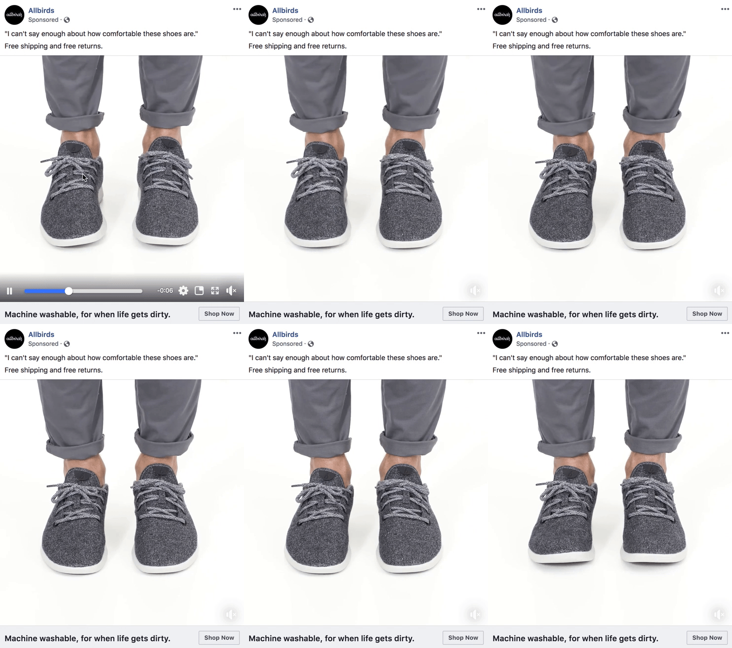
This video ad by Allbirds, a shoe maker, uses simplicity and whitespace to its advantage. The video only lasts nine seconds, but Allbirds demonstrates the product in a way that catches your attention and resonates with the individual wearer.
There’s a lot of ad content on Facebook, and when Facebook users scroll through their News Feeds, that content start to blend together. Sometimes your best chance at sticking out on Facebook is by using subtle movements and details — like Allbirds did, above. Let every other video on Facebook be quick and flashy, and yours will be a breath of fresh air to your audience.
Why This Ad Works
- It’s visual. The video has a clear focus on a subject, and that subject is engaging in a movement that means something: These shoes are comfy. I subconsciously started wiggling my own toes as I saw this ad for the first time.
- It’s relevant. I’m always interested in finding new shoes — I probably search or click on something related to footwear once a week. This ad feeds that interest in a unique way.
- It’s valuable. The opening quote above the video is reason enough for me to want to learn more about why these shoes are so comfortable. Allbirds also sweetens the deal with “free shipping,” “free returns,” and a note below the video that the product is “machine washable” — all without taking the focus away from the video itself.
- It has a clear call-to-action. If I want these shoes, there’s a “Shop Now” CTA button to the bottom-right of the ad, waiting for me take a closer look at them.
10. The New York Times
Photo Ad
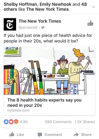
This photo ad by the The New York Times is driving traffic to a written article with an intriguing illustration. The drawing literally depicts the article’s ideal audience — millennials. For young readers who are even a little interested in health and fitness, this cartoon (along with the enticing headline) pokes just enough fun at them to get their attention.
When publishers advertise on Facebook, they need to be especially creative with their featured images — if their main product is a reading experience, the photo they choose has to complement their written content perfectly. The New York Times’ ad above is an example of photo ads done right.
Why This Ad Works
- It’s visual. The quirky cartoon drew my eye as I scrolled on my mobile News Feed through lots of text and photography. The nontraditional illustration pulled me in for a closer look at the content.
- It’s relevant. I’m a person in my 20s, and I used to write about health care. This is an article I would definitely be interested in reading, and it helps that the ad appears like a native post promoting an article in my New Feed.
- It includes an enticing value prop. The ad shows me which of my Facebook friends also like, and presumably read, The New York Times. This social proof makes me more likely to click and read the article.
- It has a clear call-to-action. This ad is dedicated to increasing the page’s Likes, and by asking a question in the ad, the call-to-action makes me want to click the article to learn more.
11. Tortuga Music Festival
Event Ad
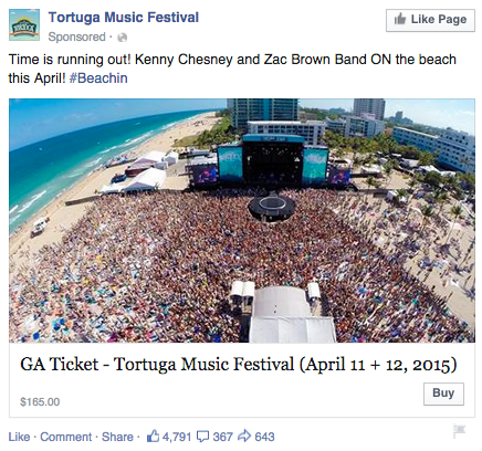
Successful event ads have at least two important qualities: the event’s schedule and something to justify why people should attend. The event ad above for the Tortuga Music Festival accomplishes both of those things — it displays the date and time and the bands playing, and shows you a picture of the amazing time you’ll have if you come.
Why This Ad Works
- It’s visual. The picture alone is worth a thousand words about how much fun this concert would be. Not only is it on the beach, it was also taken on a gorgeous day and the stage looks amazing. Also, it clearly represents what to expect during the event, and it catches the eye as someone scrolls through their News Feed. (The beautiful ocean water definitely helps.)
- It’s relevant. The person who saw this ad is a fan of Kenny Chesney and has been to his concerts before. They’re also originally from Florida, which is where this event takes place.
- It’s valuable. Since the image was taken on a beautiful day, it looks like an ideal place to be — especially to those of us viewing it from our office desks. It also clearly tells you the cost of the ticket so you know before you click. (This is also good for the advertiser: By including the price, the ad allows users to self-select based on whether they can afford the ticket. If they can’t afford it, they won’t click through, thus saving the advertiser money on unqualified clicks.)
- It has a clear call-to-action. The CTA is clear: “Buy.” The advertisers also add urgent wording with the title “Time is running out!”, encouraging you to purchase your ticket now before it’s too late.
12. Adrianna Papell
Retargeting Ad
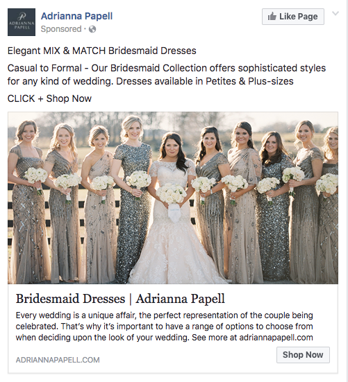
Last week, I started shopping around for a bridesmaid dress for an upcoming wedding I’ll be in. Today, the ad above appeared in my News Feed.
Retargeting ads enable you to get in front of those viewers who are already looking for what you’re offering. This retargeting ad by Adrianna Papell doesn’t just show me what I’m on the market for — it excites me about how beautiful our own wedding party pictures will look on my friend’s big day.
Why This Ad Works
- It’s visual. The image gives me a good idea of what to expect from the designer’s website, and it definitely helps that the gowns are both unique and stunning. Talk about a showstopper.
- It’s relevant. The ad called out that I was already shopping for bridesmaid dresses, and what’s more, I had previously looked at dresses on this exact website, so this ad is highly relevant to my search.
- It’s valuable. The variety of dresses in the ad’s image and in the description make this website worth a visit for someone trying to find the perfect gown out of thousands of options.
- It has a clear call-to-action. The CTA is “Shop Now,” which encourages me to click to purchase the beautiful dresses in the ad’s image.
13. Bustle
Boosted Post
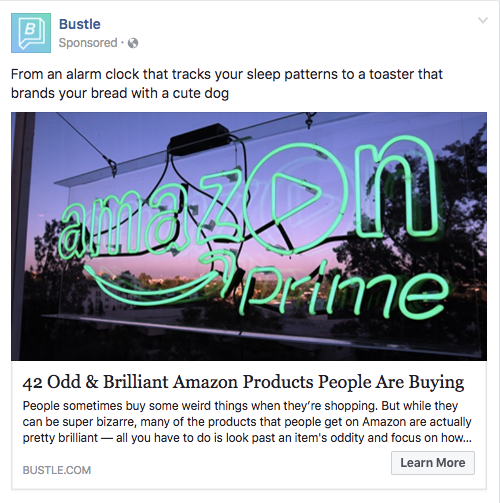
Here’s an example of a boosted post from Bustle, who promoted one of its articles on Facebook. Paying to “boost” a post you already posted organically to your Facebook Business Page can greatly benefit content that has mass appeal — versus a post that targets a specific segment of your audience. Bustle’s choice of boosted post here falls into that first category.
From Amazon’s vibrant neon sign in the photo, to the high number of examples included in the article (42, to be exact), Bustle’s boosted ad is sure to pique the interest of many Amazon and Bustle followers.
Why This Ad Works
- It’s visual. Lots of people are familiar with the Amazon Prime logo, but not in neon lights in a window display. It made me do a double-take while scrolling through Facebook.
- It’s relevant. As we’ve already learned from earlier examples, I like shopping on Amazon and also read Bustle, so this article is a combination of those two behaviors.
- It’s valuable. “Brilliant” is a strong adjective to describe products, which makes me curious to learn more about purchasing them.
- It has a clear call-to-action. The ad entices me with information about useful and “brilliant” gadgets I can get delivered to my door within two days, which I’m happy to click to learn more about.
There you have it: A list of all the different types of Facebook posts and a few examples of awesome ones from all different brands. The Facebook Ads Manager platform will walk you through how to set these up with simple, step-by-step instructions — so don’t feel overwhelmed. Or, watch this short video for tips on creating and optimizing Facebook ads.
You can
integrate Facebook Ads
reporting into the
HubSpot Ads
App to make reporting and analyzing your advertising ROI easier. You’ll be able to easily see which Facebook Ads generate leads and increase your ROI without having to analyze the data yourself. You can also use this integration to edit Facebook Ads from directly within your HubSpot portal. Customers can sign up to
test this integration here
.
Now, stop reading and start creating.
Want to see how HubSpot uses Facebook? Like our Facebook Page here.


The HubSpot Culture Code: Creating a Company We Love
Several years ago, we published a public beta of the HubSpot Culture Code slide deck. This deck started out as an internal document, and as a company who values transparency, we decided to share it with the world.
Like HubSpot, the Culture Code is a perpetual “work in progress,” so we’ll update it periodically. To date, we’ve updated it more than 25 times, and what you see below is our latest version. The presentation has been very well received, with more than 3.9 million views so far. (Thank you!)
HubSpot is growing. We have about 44,500 customers and more than 2,200 employees in the company now. We have more than $375 million in annual revenue. We are grateful to our customers and to the inbound community for the success we’ve had so far.
And we’re grateful to those of you who have hopped on for the ride. We thought it could be interesting and possibly even useful to offer up this inside look at HubSpot and the people behind it. What do we believe? What makes us tick?
The answers to those questions (and more!) are in the mega-slide-deck included above. The document has evolved and expanded over several years into this latest version. We hope you like it and will share it.
Download our free culture code guide here to learn how to create a company culture your own employees love.
HubSpot Culture
HubSpot culture is driven by a shared passion for our mission and metrics. It is a culture of amazing, growth-minded people who are all encouraged to use good judgment and solve for the customer. Employees who work at HubSpot have HEART: Humble, Empathetic, Adaptable, Remarkable, Transparent.
HubSpot Culture Code Highlights
- Culture is to recruiting as product is to marketing.
- Whether you like it or not, you’re going to have a culture. Why not make it one you love?
- Solve For The Customer — not just their happiness, but also their success.
- Power is now gained by sharing knowledge, not hoarding it.
- “Sunlight is the best disinfectant.” -Louis Brandeis
- HubSpot has a no-door policy, where everyone has access to anyone in the company.
- You shouldn’t penalize the many for the mistakes of the few.
- Results should matter more than when or where they are produced.
- Influence should be independent of hierarchy.
- Great people want direction on where they’re going — not directions on how to get there.
- “Better a diamond with a flaw than a pebble without.”
- We’d rather be failing frequently than never trying.
—
We hope you found the deck useful. If you’d like to reach out or provide feedback, you can do so in the comments below. Or, you can find me on twitter @dharmesh.

How to Write a LinkedIn Recommendation in 2018 [Quick Tip]
“Lisa has recommended you!”
Awww, she has?!
When I get a LinkedIn recommendation from someone I respect and admire professionally, I feel both honored and encouraged to return the favor. But for some reason, I always get writer’s block. I never know how to start or what to say — only that I like this person’s work and I want others to know it.
Unfortunately, simply writing “Lisa is the best!!!!” isn’t reflective of Lisa’s skills — plus it makes you look like a total goon.
Luckily, in the past few weeks I’ve written a couple of LinkedIn recommendations that I think turned out pretty well, and they reflected a pattern that’s easy to replicate in subsequent recommendations. I thought I’d share that pattern with others that suffer the same writer’s block.
Download our ultimate guide to LinkedIn here for more tips about how to use LinkedIn for professional networking.
Here’s a quick little “template” you can use that makes for a LinkedIn recommendation that’s specific, honest, succinct, and helpful for the person you’re recommending.
How to Write a LinkedIn Recommendation (in 6 Steps)
1. Explain the nature of your professional relationship.
That sounds really serious, but it’s simply a helpful piece of context that acts as an “intro” for your recommendation. Whether it’s a coworker you’ve worked closely with for years, a manager, a direct report, a point of contact at an agency, or something else entirely, it sets the stage for the reader to learn why you’re writing this recommendation.
For Example:
I’ve worked alongside Lisa for close to two years now.
2. Provide details of the position for which you’re recommending the person.
Are you recommending this person for their work in one position? Or are you writing about their work across multiple jobs they’ve held while you worked with them? Either way, a great next step is to explain some of the notable parts of their job(s). It may feel strange — kind of like you’re listing out their job description. But this is very helpful for anyone reading the recommendation, looking to get a feel for what precisely it is they did in their job.
Resist the urge to create a laundry list of their job duties. If they’ve really worn that many hats, I recommend contacting them to see if there’s a certain part of their role they’d like emphasized over others.
For Example:
In those two years, I’ve seen her not only excel at the core elements of her job — like copywriting and copyediting — but also learn other tasks that extend well beyond the scope of her role, like email marketing, event planning, and even championing our company’s internal communications.
3. Explain how they’ve grown at the company.
If this person reports (or once reported) to you, this aspect of a LinkedIn recommendation can go a long way. Explaining how a person has grown — either in their role or from one role to another — can demonstrate an ability to adapt as the organization expands.
Just be careful not to overstate any low points in their career that can dilute the value of the growth you’re trying to highlight.
For Example:
Lisa has grown as quickly as our business has, and her willingness to learn and take on these new responsibilities is something to be desired in any professional.
4. Indicate how their contribution helped grow the team or company.
This could be an explanation of how their performance helped hit hard metrics, or it could demonstrate a contribution toward more esoteric things, like leading their teammates or fostering new initiatives.
For Example:
Lisa’s mastery for both her core role, and the projects that extend beyond it, have been critical to the company’s growth. In fact, her taking on internal company communication aligned with a sharp increase in employee happiness.
5. Explain what these achievements reveal about that person.
By now, you’ve included some specifics — so let’s explain what those specifics mean for the larger theme of your recommendation. Do the examples you’ve detailed reveal that person is hard-working? Ambitious? Great for team morale? Connect their accomplishments with their attributes.
For Example:
This rare mix of productivity and ambition sets a great example for the rest of the team, and explains why everyone loves working with Lisa — no matter where they fall on the org chart.
6. End with a note about the personal aspect of working with him/her.
In this section, hit the message home with a mention of how you felt working with the person, your hopes for their career, or simply a prediction about their future.
For Example:
While Lisa’s work has continued to pay dividends long past her tenure here, I certainly miss working with her every day. I have only optimistic predictions for her career trajectory.
LinkedIn Recommendation Sample (for a Manager)
Now, writing a LinkedIn recommendation can seem easier said than done. What if the employee you’re recommending is your superior? This can make it more difficult to recommend the person — even if you’re saying stellar things about them.
To avoid sounding patronizing or tone deaf when addressing a higher-level professional, here’s a sample LinkedIn recommendation — written in full — that a manager would be proud to receive (notice how it embraces every step outlined above).
I’ve worked for Lisa for two years, and in those two years, I’ve seen her quickly take on new responsibilities while having the time to teach this information back into her employees. By inheriting tasks like campaign analytics and email A/B testing — both of which extend beyond the scope of our team — she’s made our department much more agile, and set me up for a promotion last month. Lisa is as great a person as she was a manager, and her next employer will be lucky to have her.
Now proofread, and hit send. Remember, the recipient has the opportunity to review and request changes to your recommendation, so if you’re concerned you haven’t written a recommendation in the most helpful way possible, they can still get in touch with edit requests.


Email Writing: How To Craft Effective Emails For International Teams
Are you a non-native English speaker who needs to regularly write emails to your international colleagues?
It can be a challenge to write effective, conversational emails when English isn’t your first language, but this article will provide some helpful tips to help you improve the overall quality of your emails and sound more like a native English speaker.
Being a non-native English speaker doesn’t mean you need to be limited by fear and insecurity every single time you hit the “send” button. Once you’ve applied these simple strategies to your writing, you should be able to confidently send emails to anyone (even those from native English-speaking countries like the US.)
Email Writing Tips for International Teams
Most people won’t tell you this, but crafting a good email begins even before you put down a single word. Writing a good email starts with your mindset.
When you’re in the correct frame of mind, you’ll be able to write effective emails that communicate and persuade.
Sounds logical … but how do you enter the “correct frame of mind”?
You internalize a few important email writing rules that you should apply to every single email you write. The best part is — these rules can also be applied to any form of communication, not just email.
Email Writing Rule #1: Imagine Receiving The Email You’re Writing
Have you ever received an email that it was so incoherent you couldn’t even finish reading it, let alone even consider replying? Or included a completely irrelevant proposition?
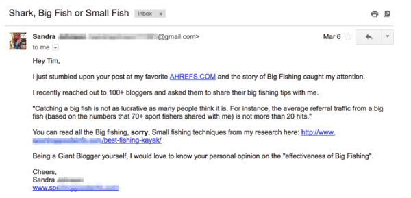
Ahrefs is an SEO tool, yet they received an email from a fishing company
One of the biggest problems when it comes to email writing is the lack of empathy for the recipient. Before even writing an email, most people won’t even consider whether their email will be well-received by the other party.
If you want your email taken seriously, you need to be able to empathize with your recipient before you even start writing. Think about the person you’re sending an email to:
- Why are you emailing this person?
- What does the person you’re emailing want?
- Is this the right person to contact, considering what I’m trying to achieve?
Of course, if you’re already close to this person, then these questions are not as necessary. You can probably dash off a quick email, and still get a reply.
But, if you’re sending an email to someone new, or unfamiliar, then take some time to reflect on these questions. Your answers will help you write a more thoughtful, coherent email.
Email Writing Rule #2: Write Like You Talk
If you’re not a native English speaker, it’s normal to feel like you should be more formal when it comes to your email writing.
However, this results in emails that are too formal, and come off as awkward or stiff. For example:
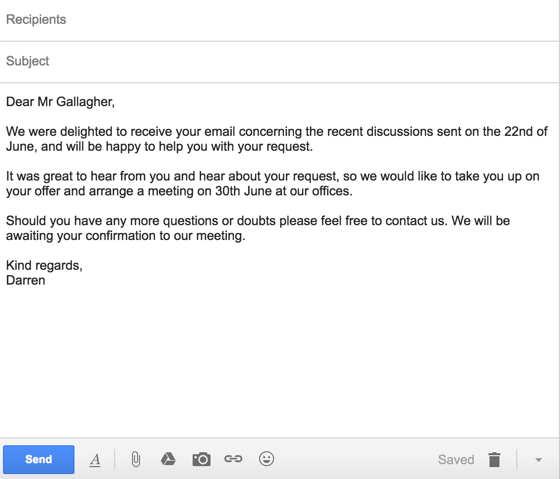
Native English speakers write more informally — their writing sounds like one person talking to another.
Here is a quick grammar tip that will always help you sound more native: Write in an active voice and avoid the passive voice.
An “active voice” shows that a subject is performing the verb’s action, e.g.: “Marilyn mailed the letter.”
In contrast, the “passive voice” shows that the verb is acted upon by the subject, e.g.: “The letter was mailed by Marilyn.”
Instead of writing “your feedback would be much appreciated”, try saying “I would appreciate your feedback.” Instead of writing “your request has been received”, try saying “I received your request.”
Notice how writing in an active voice sounds more human.
How To Write An Effective Email
1. The Subject Line
The subject line is usually the first thing someone reads before they decide to open your email. This also means that the subject line holds the key to whether your email is opened, ignored, or deleted.
Unfortunately, non-native English speakers don’t always know what to write in the subject line.
Take a look at this example:

This particular subject line (real-life example by the way) is vague, indirect and does not hint to me at all what the content of the email will be about.
The result? *Delete*.
Subject lines are especially important if you’re reaching out to someone for the first time. The recipient doesn’t know who you are, and can only judge you from your subject line.
Even if you’re sending emails internally at your company, it still pays to write a great subject line so your recipient has an idea of what to expect. Like any busy person, your teammates receives a ton of email every day, and would certainly appreciate the extra effort of a descriptive subject line.
So, how do you write a good subject line?
Be clear, direct and describe the content of your email. Don’t be afraid to take up the whole subject line. Go ahead and tell them what to expect.
As you can see, there’s no need to resort to sneaky tricks or clickbait titles just to induce an open. Remember – you don’t want people to be tricked into reading your email, you actually want them to read it and take some kind of action.
You want to associate positive feelings with your email, not anger and disappointment.

Here are some good examples of subject lines:
- I’m going to be in Town next Tues – are you available?
- Introduction to Kevin Bacon
- FAQ — will you take you 2 minutes — need answer today
- Susan suggested I reach out to you
2. Start with an appropriate greeting.
To kick off the email, you should begin with an appropriate greeting. There are two components to the greeting: the salutation and the opening sentence.
Most non-native English speakers, probably out of fear of offending someone, tend to stick to just one salutation — Dear [X]. No matter the context, non-native English speakers will use Dear [X] over and over again.
The appropriate salutation actually depends on the situation. If you’re writing a formal email to a bank or government institution, it would be better to start off with Dear [X].
If you’re sending an email to someone you know, or work in a casual environment, then it is perfectly fine to go with a Hi [name].
To help you out, here is a list of salutations you can open with in your emails:
- Dear [First Name]
- Dear Mr./Ms. [Last Name]
- [Name]
- Good morning/afternoon
- Hi
- Hey
- Hey/Hi there
Once you’ve gotten the salutation out of the way, it is time for an appropriate opening sentence. While the subject line determines whether your email is opened, your opening sentence determines whether your email is read till the end.
The best way to do this correctly is to research the person you’re writing to. Find out what your recipient is interested in. Look around their social media profiles (e.g Facebook, LinkedIn, etc.), and if they publish, read some of their blog posts.
Do a Google search on their name, and see if anything interesting comes up. Visit their company’s website, read their About Us page, and find out what they are working on or interested in collaborating on.
With this information, you can write an opening sentence that builds rapport. Show that you understand them, what they need, and how you can help them.
With this, you can also show that you’re different — that you’re interested in them, are willing to go the extra mile to find out more. Showing that you understand their challenges helps build trust.
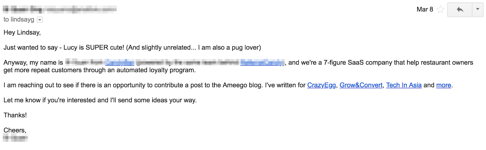
Of course, this is not necessary if you’re emailing a colleague or someone you know, but it is still important to establish some kind of context so that they know what’s happening.
3. Keep your message short and concise.
According to Statista, we send and receive roughly 269 billion emails a day.
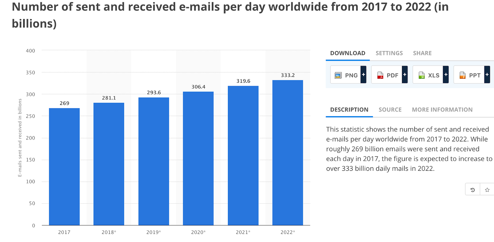
If we average out across everyone in the developed world (~4 billion people), every single person would receive about 68 emails/day!
This alarming statistic make one thing very clear: we spend a lot of time reading emails.
To write an email that is opened, read and acted upon is not easy. You have to put in the work upfront to ensure that the email is professional, empathetic, and easy to read.
You have to respect your readers’ time. While you may feel like you need to tell them everything in one email, don’t. No one is eagerly awaiting a three-page essay arriving in their inbox. Here’s one I received recently:
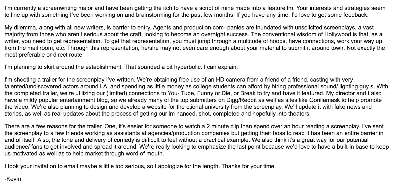
Ugh.
Instead, keep the email short, concise and to the point. Stick to essential and specific information.
Think about it this way: what’s the ONE thing you want to achieve after the person sees your email?
Make sure the email is written in such a way where it achieves the end result you want.
When you need to include a lot of information in an email, it’s probably better to suggest a phone call or a meeting instead.
Pro-Tip: Use this free meeting tool to schedule your meetings faster and avoid back-and-forth emails.
4. Use standard fonts.
If you’re using a non-English keyboard, your fonts may not show up properly on the other person’s device.
If you’re trying to look like a native speaker, use standard fonts. Some fonts for languages have their own “English font”, which are a dead giveaway that the person writing is a non-native speaker:
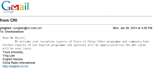
To prevent all kinds of tech issues from coming up, stick to what is safe. Use web-safe email fonts like:
- Arial
- Courier
- Georgia
- Helvetica
- Lucida Sans
- Tahoma
- Times New Roman
- Trebuchet MS
- Verdana
In fact, this is the exact list Gmail gives:
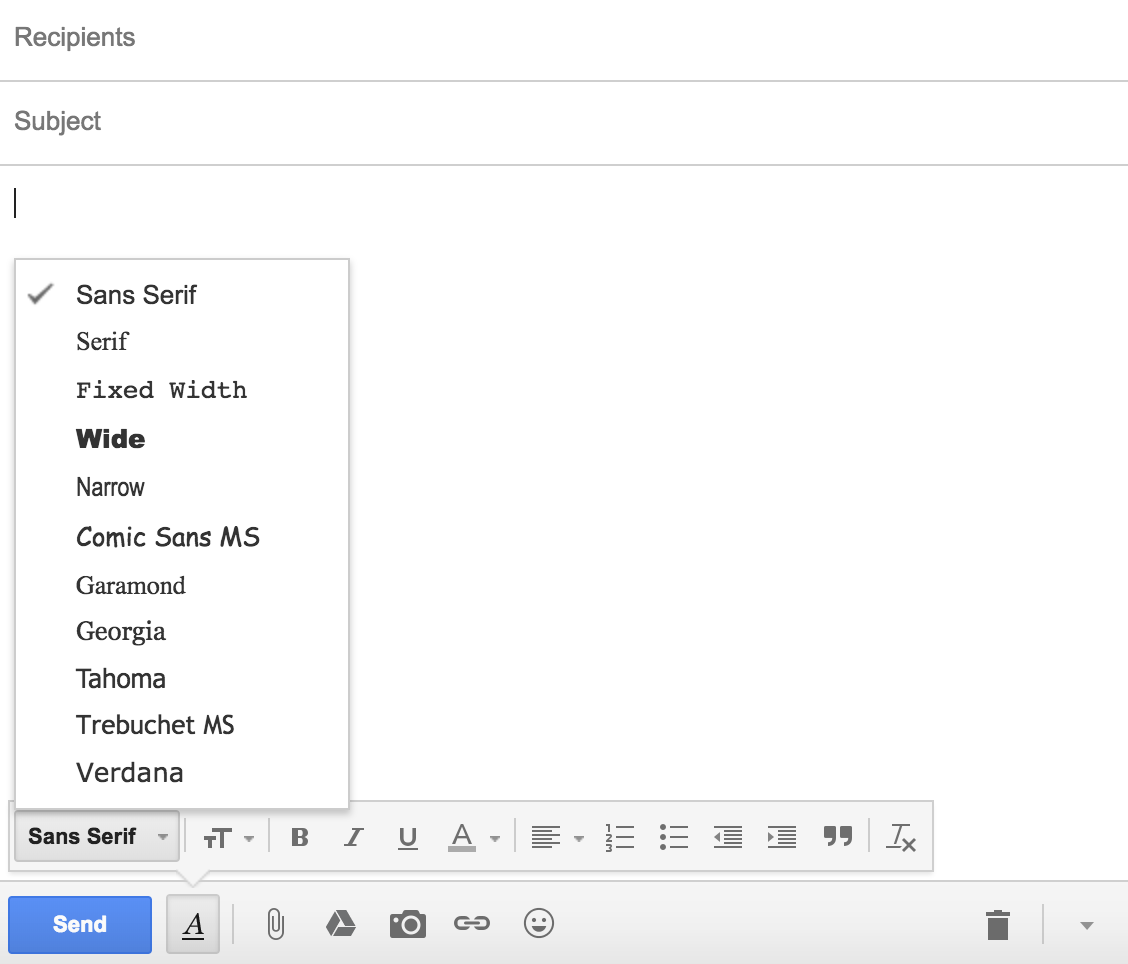
This will ensure that your recipient will receive your message in a normal font no matter what devices or operating system they are using.
5. Writing your closing.
Once you’re done with the content of your email, it’s time to close it off.
You don’t have to make it fancy — just keep your closing simple and straightforward.
So, nothing like this:

Instead, stick to the safe, proven closing lines — and you should be good.
You can choose from some of the most common closing lines below:
- Yours sincerely
- Yours truly
- Yours
- Sincerely
- Best regards
- Best
- Warm regards
- Warm wishes
- Kind regards
- Kind wishes
- Thank you
- Thanks
If you’re really looking for something out-of-the-ordinary and fancy, then take a look at this list of email sign-offs that you can try.
6. Schedule your emails.
Because you’re writing an international email, time zones matter.
Due to the influx of emails one receives, an email you sent early in the morning could be buried at the bottom of his inbox by the time your recipient checks it. This may also mean that all your hard work spent crafting the email would be wasted.
Instead, set yourself up for success.
Remember Rule #1? Put yourself in their shoes.
When would they be most receptive? When would their inbox be “emptier”?
It might be during lunch. It might be Sunday evening when they are preparing for the week ahead. It might even be Friday — they’re probably in a good mood because the weekend is coming.
Then, use our free email scheduling tool to ensure that your emails are sent at the right time to the recipient’s inbox.
7. Do a final spelling and grammar check.
Don’t fail at the last mile.
Don’t spend all your time crafting a perfect message, only to be ignored by the recipient because it’s riddled with spelling and grammar errors.
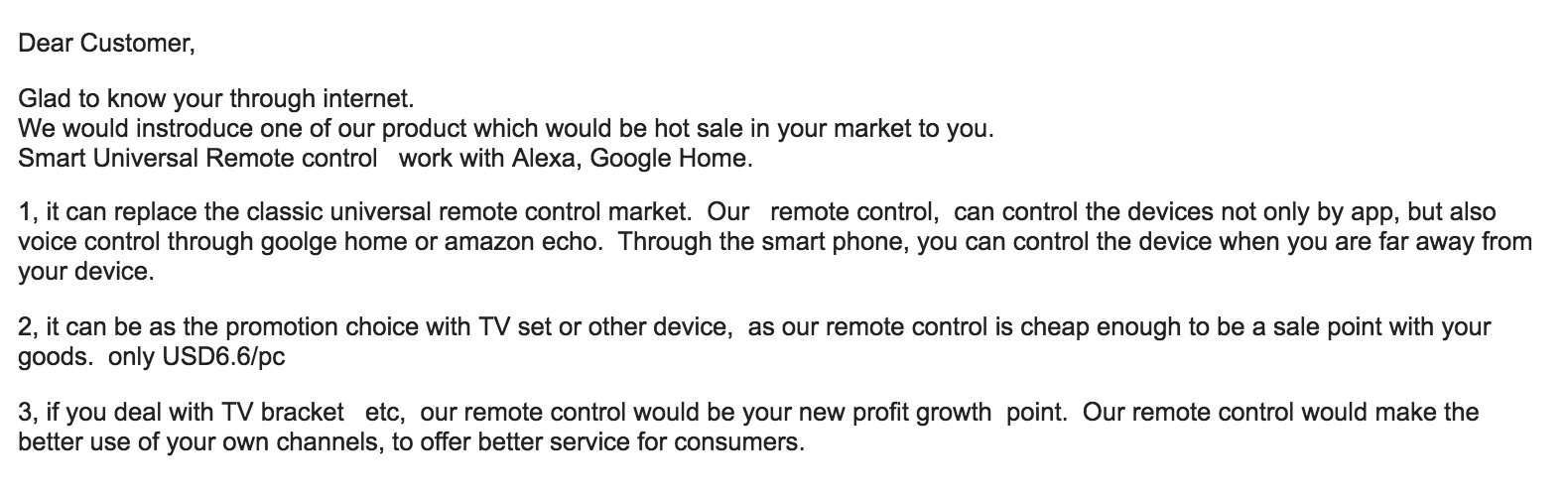
After you’ve finished drafting your email, copy and paste it into Microsoft Word or Google Docs to give it a quick grammar, phrasing, and spelling check. Alternatively, you can also use checkers like Grammarly to automate the process while you’re drafting.
Do a quick read-aloud to make sure that you’re not writing clunkily, or sound like a robot. You need your email copy to sound human.
Remember — help the reader focus on the message, not on your spelling errors.
[a]Source: http://shortwavedxer.blogspot.com/2013/01/china-tibet-broadcasting-voice-of-china.html[b]Couldn’t replicate what you wanted.. But I found this example.[c]Made the change

The Definition of Market Research in 100 Words or Less
In some circles, market research is a catch-all term for asking the industry what it wants. “Do we know what the demand is for this product? Who’s even looking for our services? Let me do some market research to find out,” someone might say.
Market research can answer various questions about the state of an industry, but it’s hardly a crystal ball that marketers can rely on for insights on their customers. Market researchers investigate several areas of the market, and it can take weeks or even months to paint an accurate picture of the business landscape.
However, researching just one of those areas can make you more intuitive to who your buyers are and how to deliver value that no other business is offering them right now.

Here’s a simple definition of market research that encompasses all the possible goals of this practice, in fewer than 100 words:
Market Research Definition
Market research is the process of examining an industry’s buyers, the product these buyers want, and where they’re currently getting it. By engaging the right people and data, a business can use this research to position itself in the market and predict where the market will go in the future.
To give you an idea of how extensive market research can get, consider that it can either be qualitative or quantitative in nature — depending on the studies you conduct and what you’re trying to learn about your industry. Qualitative research is concerned with public opinion, and explores how the market feels about the products currently available in that market. Quantitative research is concerned with data, and looks for relevant trends in the information that’s gathered from public records.
Let’s talk about four different types of market research studies you can conduct, a potential goal of each one, and how these studies help you better understand your market.
Interviews
Qualitative information
Interviews are the personal, one-on-one conversations you can have with the buyers in your industry. You can conduct interviews in person or over the phone.
Your interviewees can answer questions about themselves to help you design your buyer personas. These buyer personas describe your ideal customer’s age, family size, budget, job title, the challenges they face at work, and similar aspects of their lifestyle. Having this buyer profile in hand can shape your entire marketing strategy, from the features you add to your product to the content you publish on your website.
Focus Groups
Qualitative information
Focus groups are similar to interviews, but in this case, you’re assembling a large group of people for one shared interview. A focus group consists of people who have at least one element of your buyer persona in common — age or job title, for instance.
This type of market research can give you ideas for product differentiation, or the qualities of your product that make it unique in the marketplace. Consider asking your focus group questions about (and showing them examples of) your services, and ultimately use the group’s feedback to make these services better.
Surveys
Quantitative information
Surveys are a form of quantitative research, and you can distribute them over the phone, via email, or through an online survey. A survey could cater to people who’ve downloaded content from your website or interacted with a member of your business.
Enough completed surveys can help you determine your customer satisfaction level. This denotes how happy your customers are with what you’re selling them. You might include questions like, “How well did we solve your problem?” and “Would you recommend our product to a friend?”
Secondary Data
Quantitative information
The interviews, focus groups, and surveys are all sources of primary data. Secondary data, on the other hand, is the public information — online and offline — that characterizes your industry. This includes competitor websites, social media business pages, trade magazines, market reports, and even census data published by the government.
If you examine enough secondary data, you can learn how much brand awareness you have in the marketplace compared to the companies that provide the same product or service as you.
The market research you perform doesn’t have to include every source of information described above. What data you collect will depend on the needs of your business and what you might be most interested in at the moment. Ready to give market research a shot? Learn how to get started in this blog post.


What is the Deep Web? A 3-Minute Rundown
Most marketers say the best place to hide a dead body is on page two of Google. I disagree. There’s a darker digital graveyard. It’s called the deep web. A place where Google can’t find anything.
I’ll admit, that was a pretty grim description of the deep web. But it isn’t the sinister abyss of illegal and disturbing activity that the media clamors about. That place is called the dark web.
The terms “deep web” and “dark web” are often used interchangeably — they’re not the same thing, though. The dark web is technically a tiny sliver of the deep web, making up 0.01% of it, but the horror stories you hear about the dark web don’t actually happen on the deep web.
In fact, most of the content on the deep web is quite similar to the content that you can find on Google, which is called the surface web. And we use it everyday without even knowing it.
The deep web is just content you can’t find on a search engine, like your personal email account, social media accounts, online banking account, a brand’s gated pages, or a corporation’s private database.
The only difference between the deep web and the surface web is that a thin layer of security stonewalls the public from accessing content on the deep web, whereas anyone can access content on the surface web.
Over 96% of online content is on the deep web — most of the information we access on the internet requires authentication, like your online banking portal or email account. Imagine if anybody could access these accounts by just Googling your name. Your most personal information would be publicized to the entire world.
Websites don’t index these authentication-protected pages for Google to find for good reason — only certain people should have access to them, not everyone.
The deep web isn’t entirely without fault, though. While the dark web only makes up 0.01% of the deep web, this tiny sliver is arguably its most dangerous part.
You can’t access the dark web through a standard web browser like Google Chrome or Safari — you need to download an encryption software like Tor to do so. Tor anonymizes users’ identity, location, and data transfers, so there tends to be a lot of criminal activity on the dark web. According to a study by two cyber-intelligence threat experts, over half of sites on the dark web offer illegal products or services. And it’s virtually impossible to track any of these criminals or their activities.
But even though it’s nearly impossible for law enforcement to catch these criminals, the dark web’s anonymity is actually beneficial for its ethical users.
Since you can use the dark web to communicate online without leaving a digital footprint, political whistleblowers, activists, and journalists who live in oppressive countries that censor the internet or punish outspoken citizens can leverage the dark web to state their true opinions without revealing their identities.
The dark web has two stark spectrums. It can be a platform for the silenced or it can be a breeding ground for illegal activity. And that begs the question …
Is the Dark Web Illegal?
Accessing the dark web is not illegal. Even though people do illegal things on the dark web, using it to access hidden content isn’t against the law. In fact, Tor, the most popular software solution for accessing the dark web, was originally created by the U.S. Navy and is funded by the U.S. government today.
They support Tor because it protects the privacy of activists who are trying to upend their countries’ tyrannical regimes. These people’s survival and freedom depend on this technology.
The Deep Web: Unfairly Misunderstood?
The deep web is mistakenly associated with the dark web’s illegal activity all the time, and it’s also called the invisible or hidden web, which further mystifies its surprisingly normal uses.
The deep web isn’t just a marketplace for drugs and other illegal items — that description isn’t even remotely accurate. The deep web is mostly harmless and extremely important for protecting our personal information and privacy.
It’s essential for everyday life.

How to Block Websites on Chrome Desktop and Mobile
Let’s say you want to block certain websites, like Facebook or Pinterest, on your work computer to ensure those distractions aren’t inhibiting your productivity.
Or, maybe you just want to guarantee all Google searches aren’t available to your six-year-old.
Whatever the case, blocking a website on Chrome desktop or mobile is an easy and simple process. Best of all, it’s just as effortless to unblock those sites — so you can scroll through Pinterest, post-workday.
How to Block Websites on Chrome Desktop
How to Block Websites on Chrome Desktop
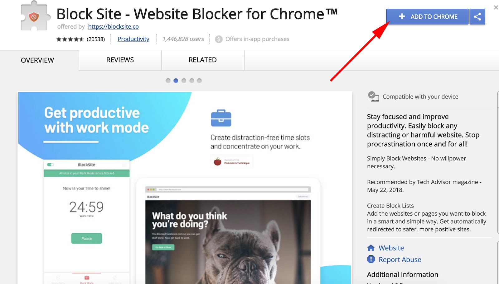
- Go to the Block Site extension, and click “Add to Chrome”.
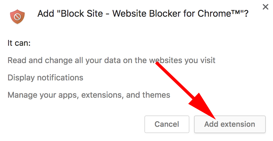
- Click “Add extension” in the pop-up box.
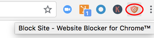
- Now, you’ll see an orange shield icon at the top right of your Chrome screen. On a website you want to block, click that icon, and then click “Block this site”.
- Go to the Block Site extension, and click “Add to Chrome”.
2. Click “Add extension” in the pop-up box.
3. You’ll see an icon at the top right of your Chrome screen — an orange shield with a circle and a diagonal line through the middle.
4. Let’s say you’re feeling a little bitter from a recent World Cup loss, and want to block sports’ sites for a while. Simply go to a website, click that orange shield icon in the top right, and click “Block this site”.
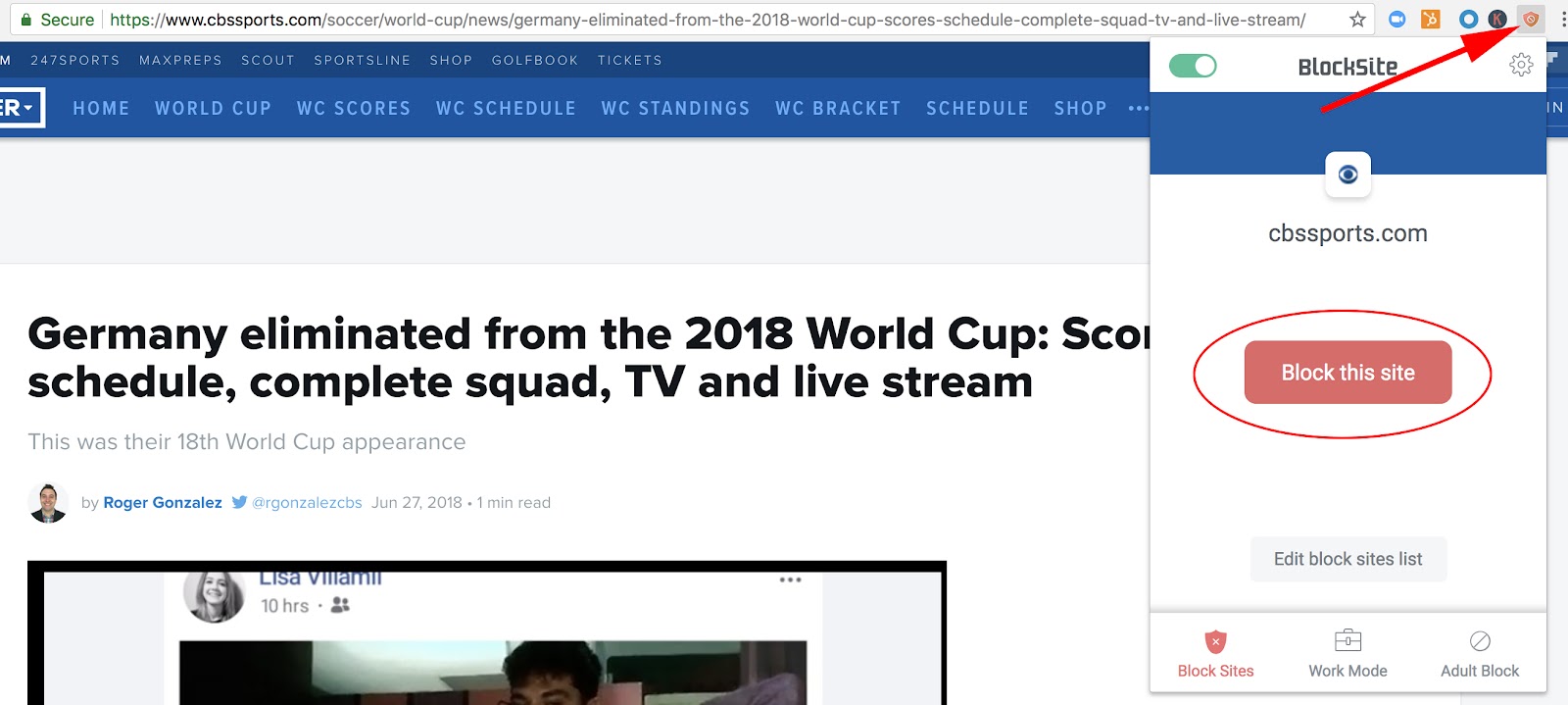
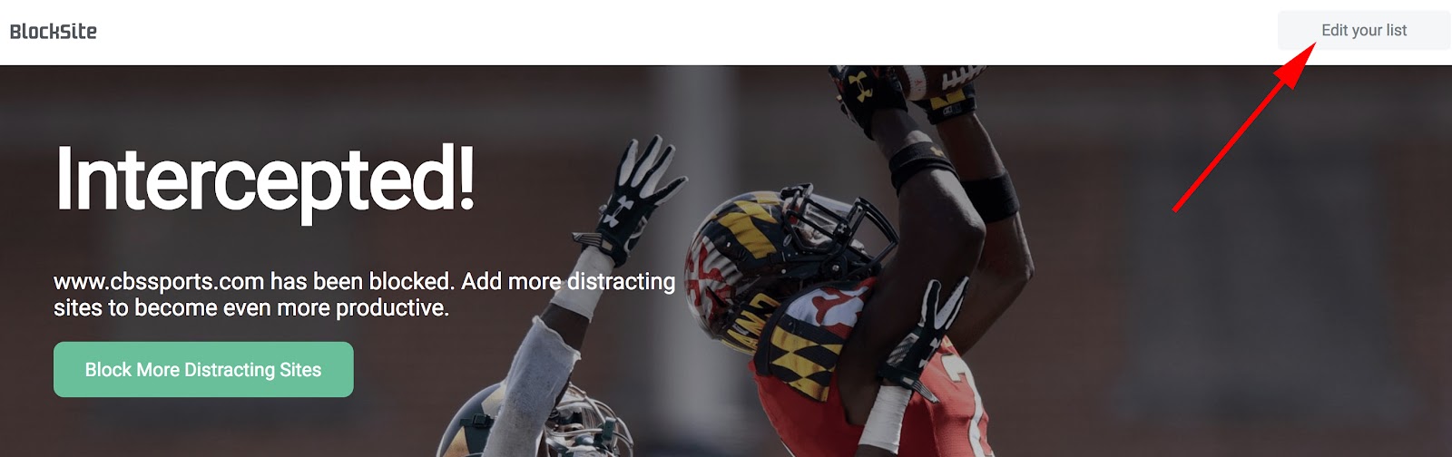
5. Now, you won’t be able to reach cbssports.com (or any other website you chose). You’ve successfully blocked it. To unblock the site, click “Edit your list” in the top right (or click the icon, and then click “Edit block sites list”).
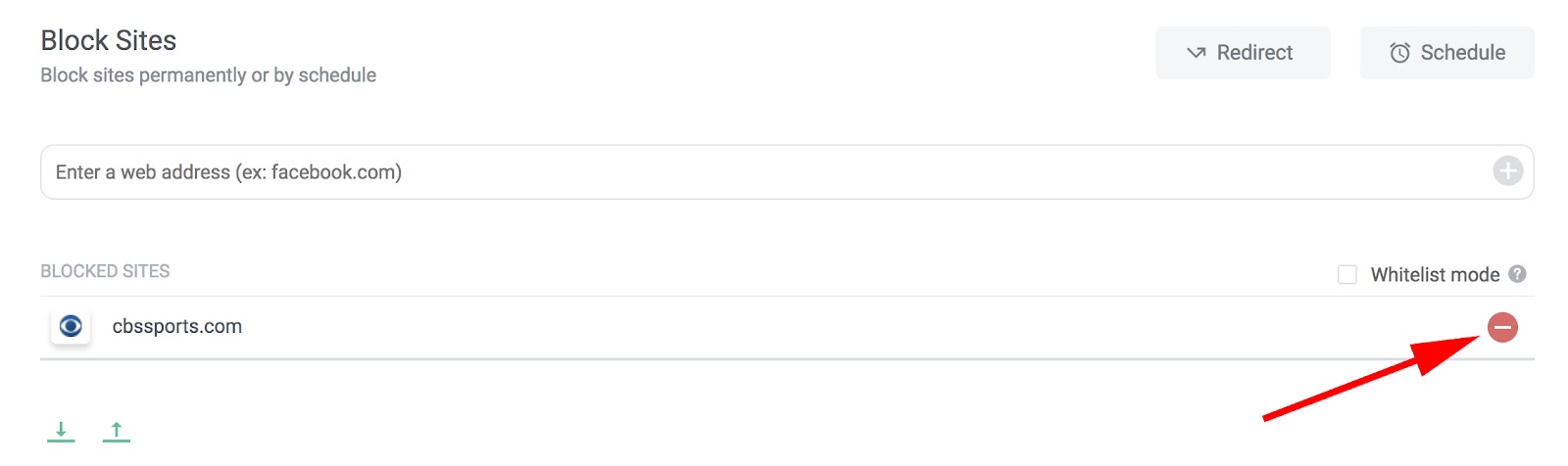
6. Each of your blocked websites will have a “minus” icon to the right — click that minus button, and your site will be unblocked.
How to Block Websites on Chrome Mobile (Android)
If you often surf the web via Chrome on your Android, you might need to block certain websites to ensure increased productivity at all times of day. Here are six easy steps to block websites on your Android Chrome browser (or any Android browser):
- Open Google Play Store and install the BlockSite app.
- Open the downloaded BlockSite app.
- Click “Enable” to allow the app to block websites.
- Click “Got it” — this will take you to your Accessibility settings.
- Select “BlockSite” and turn the switch from “OFF” to “ON”. Then click “OK” in the pop-up window.
- Click the “+” button in the bottom right.
- Enter any websites you want to block and click the check mark in the top right corner.
How to Block Websites on iOS Devices
There are a few apps in the app store that allow you to block websites on your iOS device. Here are two options with similar functions:
- Zero Willpower: This app is $1.99, and lets you create an easy list of all websites you want to block from Safari on your iPhone. Even better, there’s a timer, so you can block a website for a limited period of time.
- Site Blocker: Similar to Zero Willpower, Site Blocker lets you block distracting or unwanted websites on Safari on an iOS device, and includes a timer and suggestions as well. This app is free.
Now you’re all set to block distracting websites from your Chrome browser on desktop or Android. If you find you’re still struggling with productivity, take a look at our Ultimate Guide to the Best Productivity Apps.
