
13 Non-Technical Ways to Make Your Computer Run Faster
If your computer is constantly cursed by the spinning wheel of death, or you feel like you’re using a 90’s Netscape browser to surf the web, fear not — it doesn’t necessarily mean you need a new computer.
You can implement some simple fixes to make your computer run faster, and most of them only take a few minutes to complete. Let’s flesh them out below.
13 Non-Technical Ways to Make Your Computer Run Faster
- Check your hard disk space
- Categorize desktop icons into folders
- Save old pictures and videos to the cloud or an external hard drive
- Close unused tabs
- Uninstall unused programs
- Delete temporary files
- Stop programs from automatically launching when your computer turns on
- Remove unnecessary language resources
- Update your computer’s software
- If your computer is hot to the touch, let it cool down
- Shut down or restart your computer at least once a week
- Remove unused dashboard widgets or gadgets
- Delete browser extensions or plugins you don’t use
1. Check your hard disk space.
A common rule of thumb to keep your computer running fast is to have at least 15% of its hard disk space free. If your hard disk is almost full, you need to remove some programs and files to improve your computer’s speed. But if your disk has plenty of room, there could be something wrong with your operating system.
2. Organize desktop icons into folders.
Organizing desktop icons into folders cleans up your background, and it also cuts down your computer’s RAM usage. Your computer has to load each individual icon when you don’t organize your desktop, which takes up a lot of RAM space. If each icon is in a folder, then your computer only needs to load each folder.
3. Save old pictures and videos to the cloud or an external hard drive.
If you have old pictures and videos on your computer that you rarely look at but don’t want to delete, transfer them to the cloud or an external hard drive. You’ll save a ton of memory on your computer and improve its speed.
4. Close unused tabs.
Sometimes, you need to keep a bunch of tabs open to complete an important project — but if you’re done looking at a web page, it’s best to close it. Unused tabs on internet browsers hog a ton of memory and slow down your computer.
5. Uninstall unused programs.
Most computers have pre-installed programs that you’ll never use, but even though you’ve never opened them, they slow down your computer by using up memory, wasting a ton of disk space, and running background processes. Be careful not to remove any programs you don’t recognize, though. They could be crucial for the function of your computer or other applications.
6. Delete temporary files.
Temporary files like internet history, cookies, and caches take up a ton of space on your hard disk. Deleting them frees up valuable space on your hard disk and speeds up your computer.
On Mac OS X, you can download CCleaner to find and delete temporary files in your hard disk. To delete temporary files on Windows, you can run a disk cleanup, which you can access by clicking Start > All Programs > Accessories > System Tools > Disk Cleanup.
7. Stop programs from automatically launching when your computer turns on.
If you can’t justify Spotify launching every time you turn on your computer, consider stopping it from happening. Programs that automatically launch and keep running eat up a lot of your computer’s memory.
To remove the items that automatically launch on OS X, click the Apple icon, navigate to Systems Preferences, then to Users & Groups, and finally to Login Items. Here, you’ll see all the programs that automatically launch when your computer starts, and you can uncheck each one.
On Windows, click the Start menu, search for “msconfig”, and then click on the Startup tab. A list of programs will pop up, and you can uncheck the ones you don’t want automatically launching.
8. Remove unnecessary language resources.
Each default language on your computer uses a ton of resources and files that devours free space on your hard disk. To remove any unused languages on OS X, download Monolingual. To remove them on Windows, go to Settings > Time & Language > Region & Language, click on the languages you don’t use, and, finally, click Remove.
9. Update your computer’s software.
Updating your computer’s software can be a drag, but it’s definitely worth it: new software updates fix bugs and glitches that slow down your computer. To check if your current software is up-to-date on a Mac, go to Apps under the Apple icon menu and click on Updates. On Windows, click the Start Button > All Programs > Windows Update > Check for Updates.
10. If you can scramble an egg on your computer, give it a break.
A constantly overheated computer will eventually turn into a sluggish computer. If your laptop is hot to the touch, it’s working too hard and you need to let it cool down. To ventilate your computer, point a fan at it and use it on a flat surface, so air can properly flow underneath it.
11. Shut down or restart your computer at least once a week.
When you leave your computer on, background programs and applications hog its memory. Shutting down or restarting your computer refreshes your memory and prompts important tools to run maintenance on it. As a general guideline, shutting down or restarting your computer at least once a week will help speed it up.
12. Remove unused dashboard widgets or gadgets.
Dashboard Widgets on OS X and Gadgets on Windows devour RAM space because they run background updates, even when you’re not using them. You can use Widget Manager on OS X to delete these space-wasters. And on Windows, all you have to do is right click and uninstall the Gadgets you don’t use.
13. Delete browser extensions or plugins you don’t use.
Browser extensions and plugins are some of the most convenient applications on the internet. But installing too many can slow down your web browser’s speed — especially if you forgot about most of them. To help boost your browser’s speed, uninstall the extensions or plugins that you don’t use anymore.

UX vs. UI: What’s the Difference?
Understanding the difference between UX and UI can get confusing — the roles work closely together, and sometimes the terms are used too ambiguously to firmly understand either one.
To understand the difference between UX and UI, let’s start with an example: YouTube.
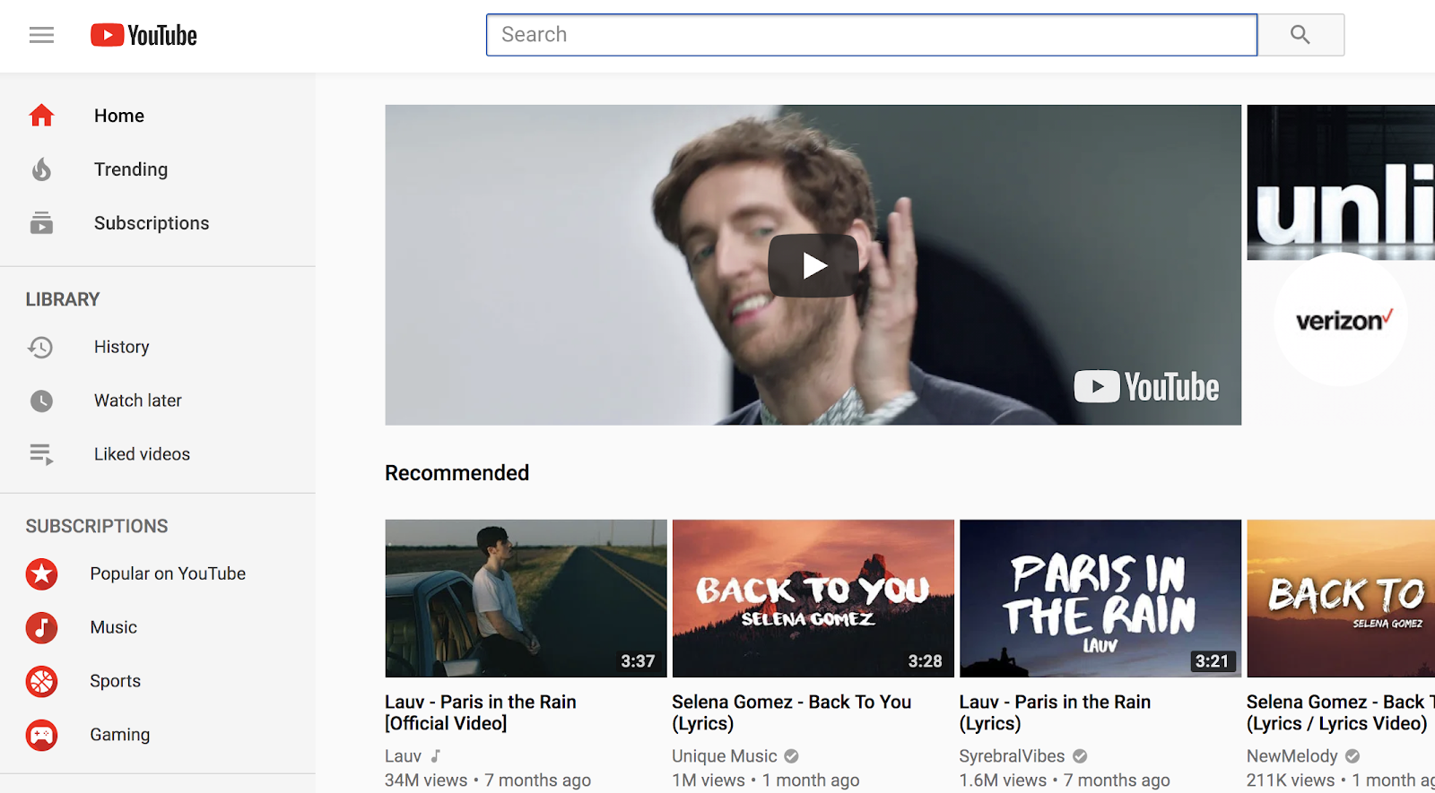
Take a look at the YouTube home screen. Everything you’re seeing — the search bar at the top, the “Trending” and “Subscriptions” and “History” categories on the left, the “Recommended” videos below — is all the work of a UI designer.
At its most basic level, UI is the presentation and interactivity of a product — where’s the sign-up button, is it easy to navigate, where’s the logo and if I click the logo where does it take me?
Now, imagine every YouTube video you click loads slowly. Imagine you search “cats” and nothing comes up. Imagine you can’t search account user’s by their username, so it’s hard for you to find that girl who sang an acoustic rendition of that Ed Sheeran song.
With those actions, you’re having a less-than-ideal user experience. You don’t enjoy engaging with the product, and it isn’t offering you what you want. Those problems are the responsibility of a UX designer.
Cognitive scientist Don Norman, who first coined the term UX in the 1990s, and Jakob Nielsen, co-founder of the Nielsen Norman Group, explain the difference of UX versus UI this way:
“Consider a website with movie reviews. Even if the UI for finding a film is perfect, the UX will be poor for a user who wants information about a small independent release if the underlying database only contains movies from the major studios.”
In this example, both UX and UI are critical components for the user to enjoy the product, but a user can’t appreciate the interface of a product if the product itself doesn’t deliver what the user wants.
Let’s define UX and UI in more detail now, to further clarify the difference between the two.
What’s UX?
UX, which stands for user experience, is the process of researching, developing, and refining all aspects of a user’s interaction with a company to ensure the company is meeting the user’s needs. A UX designer must ensure people find value when they interact with a company’s products or services.
A UX designer is responsible for all aspects of a user’s interaction — this means a UX designer is not solely responsible for the technology behind a product. They’re responsible for how a user interacts with a company both on and offline, including customer service and other facets.
Essentially, a UX designer must answer the question: “How can my company’s product best meet our user’s needs?”
Now, what’s left for a UI designer to do?
What’s UI?
A UI designer’s responsibilities are more cosmetic than a UX designer’s — a UI designer is responsible for the presentation of a product. But that doesn’t mean a UI designer just picks some pictures and a logo and calls it a day.
A UI designer is responsible for how everything on a page aligns in relation to each other. The visual elements you see on a page, such as buttons and icons, and the interactivity of a product, falls on the UI designer.
Have you ever visited a website and thought, “Wow, this company is really cool and has a great product, but what really sold me was their website’s intuitive and sleek layout?”
That’s largely due to their UI designer.
How do UX and UI work together?
Now that we’ve explored UX and UI separately, let’s see how they function collaboratively.
Let’s say your company wants to develop a running app, so your CEO hires a UX designer. The UX designer is first going to do some research into competitor’s apps and your user’s pain points.
With this information, she will decide the core features of the app (“must monitor heart rate and mileage”), and explore user personas in-depth to create a site map and initial prototype.
From there, a UX designer will create wireframes, test and refine them, and convert those wireframes into mockups. Then, the UX designer will conduct research and refine the product for the market. Throughout all stages, the UX designer is focused on the structure and value of the product and how that product is or isn’t meeting user’s needs.
Towards the end of development, a UI designer will then take control over the app’s appearance, including on-screen forms, images, buttons, links, and icons.
As you can see, the primary difference between UX and UI is goals: a UX designer is focused on the users’ experience, including anything that might motivate or frustrate them, why they would or wouldn’t enjoy the product, and what the product needs to include to delight the user.
A UI designer is given those constraints — she’s told what the app must include and exclude, and how it’s going to work. Using those constraints as a guideline, she works on the design and interactivity to ensure the user understands the product and enjoys the presentation of it.
You can’t create an exceptional product without both UX and UI. Without a UX designer, YouTube would appear beautiful and appealing but completely unusable. And, without a UI designer, YouTube would be a great idea in theory but would be difficult and confusing to navigate on the screen.

17 Inspiring Instagram Video Examples From Oreo, GoPro, BuzzFeed & More
Remember when Instagram first started allowing users to post videos back in 2013?
The first Instagram videos had to be recorded on your phone and could only be up to 15 seconds long. Those were the days that people compared Instagram video to its Twitter-owned counterpart, Vine.
Instagram has come a long way since then, and it’s blown Vine out of the water. Like most of the other popular social networks, the folks at Instagram have made changes to its platform that make it easier for people to post and share videos.
In late March 2016, Instagram announced they’d start rolling out the ability for Instagram users to upload 60-second videos. For iOS users, they added that users will soon be able to make videos out of multiple clips from your camera roll.
Thanks to these changes, marketers can use the Instagram app to relate with their fans and customers, to communicate their business’ personalities and brand stories, and to express artistic creativity.
There are a lot of brands who are posting great photos on social media. But what about videos? While brands have been slower to adapt to Instagram’s video platform, many of the ones that are experimenting with it are doing it really well. Check out the examples below.
17 of the Best Instagram Video Examples
Click anywhere on the videos to play them, and click again to pause them.
1. Oreo
Oreo is known for its simple, creative social media content — and its Instagram videos don’t disappoint. The video below is a great example of a fun, creative video that works perfectly for the platform.
While we love the sound quality in this video — how satisfying is the sound of pen on paper? — it doesn’t require sound to make sense. This is a really smart move because when you’re viewing any video on Instagram, you’ll hear sound only if your device’s volume is turned on. If your phone is set to silent or vibrate — which is the case for many people, especially when they’re perusing Instagram in public — then the video will play with the sound off.
Keep this in mind when you’re planning your next Instagram video: It should either be eye-catching enough to draw people to turn on the sound within the first few seconds, or it should be able to play without sound.
2. Burger King
Here’s another Instagram video that doesn’t require sound. In fact, it’s completely silent — and the reasoning is very clever. The Burger King (yes, that’s the name of their mascot) is famously silent.
But on the 199th anniversary of National American Sign Language (ASL) Day, he broke his silence both on Instagram with the video below, and on YouTube with a longer video — a great example of paring down a longer YouTube video to fit Instagram’s platform.
In the video, the Burger King calls on their deaf fans to ask what the official sign for their famous burger, the “Whopper,” should be. The video encourages fans to submit ideas via social media using the #WhopperSign hashtag.
When a winning hand sign was picked, here’s how they changed their logo to celebrate:

Image Credit: AdAge
3. GoPro
If you know anything about GoPro, you’re probably picturing the company’s Instagram account accurately: extreme sports shot from GoPro’s classic fish-eye lens. The video below is one of the few longer Instagram videos out there that you’re happy to watch all the way through. Right from the still image before you press play, you know what’s waiting for you.
The video’s first-person point of view gives you an intensely intimate experience that any business page desires to give to its followers.
4. Reebok
Inspiring content tends to do very well on social media, especially Instagram. This video is clearly the work of professionals, which not every brand has the resources for. But the message, which is part of a larger campaign shared across their website and other social networks, is both beautiful and shareable: You have 25,915 days: What will you do with them?
5. BuzzFeed Tasty
The videos BuzzFeed Tasty puts out on Instagram and Facebook are simply perfect for those two platforms: They’re visual, helpful, shareable, light-hearted … and, best of all, they’re simple. When I watch these videos, I want to save them somewhere so I can refer back to them when I want to make the recipe myself. (Plus, I love the music they use.)
“We want people to be able to watch the video and feel like they can pull it off at home,” Andrew Gauthier, creative director of BuzzFeed Motion Pictures, told CBS.
The folks at BuzzFeed have published more than 500 “Tasty” videos since last July, and they’ve been viewed 14 billion times, mostly on Facebook. But these videos are perfect for Instagram’s visual platform, too. Thanks to Instagram’s decision to extend video length to 60 seconds, BuzzFeed is able to post full recipe videos along with a caption explaining exactly how it’s done.
6. Livia Sala
Here’s another food- and recipe-related Instagram video that took a different approach than BuzzFeed Tasty. In this video, Milan-based food stylist Livia Sala captured the process of making ravioli on video, complete with cute “commentary” from some of the ingredients on the list.
Instead of using fluid video, Sala uses a series of still shots, one after another. This is called a “stop action video” from still photos, which you can create by taking still photos and uploading them to iMovie on your computer or phone. This is a great video because it’s delightful and fun — are you seeing the trend here? The post was a Shorty Award finalist for Best Instagram Video in 2013.
7. Allstate
Think insurance companies are limited to boring content? Allstate has always set themselves apart from the crowd with their entertaining commercials and social media presence.
But they don’t just put out the same videos on every one of their social outlets. Instead, they carefully cater their content to the platform they’re publishing on. (For example, this YouTube video of theirs looks like a normal commercial, but turns into a “choose your own adventure” type game.)
On Instagram, some of the videos they post are video memes — this is a meme format we haven’t seen many brands use. People love memes on Instagram because they’re funny and shareable, and folks tend to tag their friends in the comments, thereby expanding the post’s reach. That’s exactly what happens with Allstate’s video memes, like the one below.
8. Ikea
Here’s an example of a short, snackable video that showcases a product in a funny way. In this case, Ikea’s showing off its anti-slip mat with a scene of a dad chasing his son (who happens to be wearing a hilarious monster costume).
This video is great because it doesn’t just show what the product looks like. In fact, you barely see the product itself. Instead, it shows the product’s benefits — and in a way that lets viewers see the brand’s personality. Instagram users love seeing personality behind Instagram content, which is why it does so well for engagement. So the next time you want to showcase a new product, consider showing it off in a humorous way.
9. Camp Brand Goods
This Canadian outdoor adventure apparel company consistently posts great content on Instagram. Not only is their Instagram content always high quality, but they use it to showcase the lifestyle they build around their products, not just the products themselves.
“[On Instagram,] it’s less about the product than it is about sharing good times,” said Camp Brand Goods’ Leslie McNeilly. “We tend to post an even mix of scenery shots and product shots. We created our own hashtag [#keepitwild], and we award a T-shirt weekly to an Instagram user who is caught keeping it wild.”
While they haven’t done many videos, the one below is a great one. It has the same look and feel as their photos on Instagram, especially with that vintage, faded look, with perfectly matching music.
10. Ben & Jerry’s
Here’s an example of a great product announcement video on Instagram from Ben & Jerry’s. We love that the video shows a fictional way the product was made — as if it were as easy as putting cookie dough and Oreos in an empty pint and shaking it up. It’s another great way for a brand to show its personality using short videos.
The video’s playful tone is perfect for Instagram — and so is the length. Although Instagram is starting to allow longer videos, it’s important to remember that users are often scrolling through their feeds when they come upon a video, and many may not want to watch for more than ten or twenty seconds. This would’ve been a great video to share on Facebook, too, because of that playful tone and short length.
11. Wistia
How-to videos are a popular video format for many brands — but the key is making these videos interesting enough for the Instagram platform. The folks at Wistia did a great job of using cool angles along with text to capture viewers’ attention right away — without them needing to turn the sound on. (In fact, this video doesn’t have sound at all.)
Then, they used the caption to point viewers to the link in their bio for the full instructional video. (Note: When you ask people to follow a link in your Instagram bio, make sure you make that link trackable.)
12. CBRE
Nothing like a breathtaking time lapse to mesmerize your followers on Instagram. You might not think a commercial real estate and investment services firm like CBRE would have beautiful content to post, but it’s videos like this that have the ability to showcase the more visually pleasing sides of the industry.
Even if you work for a “boring” industry, you can come up with creative ideas that cater to what type of content your audience wants. One key thing to keep in mind — especially on Instagram’s platform — is to make your content relatable and approachable. In other words, make it human. No one who’s scrolling through their Instagram feed wants to see a cut-and-dry product update. They’ll scroll right past it and on to their friend’s video of his cat.
Instead, produce videos that help you form an emotional connection with your fans, as CBRE did with this stunning video, the beauty of which anyone can appreciate.
13. Califia Farms
Califia Farms is another brand that consistently creates awesome Instagram content. They tend to post a solid mix of photos and video content, including fun, playful videos and GIFs like the one below. Here, they’re announcing a new product with a sort of “slow reveal” — but one that’s visually compelling enough for users to stick around.
If you like the idea of posting animated videos to your own Instagram account, they aren’t actually all that difficult and expensive to create. Here’s a list of 10 easy-to-use tools for creating animated photos and videos to get you started.
14. Flixel Photos
Here’s a stunning image from Flixel Photos. … Or is it a video? It’s actually something called a “cinemagraph,” which is kind of a combination of the two. A cinemagraph is a file format used to create short, infinitely-looping animations for the web that look like images with a moving component. The effect is really cool: It’s like experiencing a living moment.
Creating a cinemagraph isn’t as hard as it looks. Here are seven tips from Flixel photos on making your cinemagraphs remarkable.
15. Dunkin’ Donuts
A video doesn’t have to be long to be successful. In fact, the video below from Dunkin’ Donuts is literally three still images put together into a video. This is another example of a “stop action video” from still photos, which you can create by taking still photos and uploading them to iMovie on your computer or phone.
While this video is super simple, what makes it great is its timeliness (in celebration of Mother’s Day) and that it’s funny, unexpected, and therefore shareable. Donuts given like flowers? Yes, please.
16. WeWork
Another great use case for Instagram? Showcasing your company culture. Instagram’s a great platform for positioning your brand as a friendly face and building a voice and personality to build a relationship with followers. It doesn’t hurt for recruitment, either.
Here’s a wonderful and whimsical video that cuts together short clips from WeWork’s company party. Kids breakdancing, someone dressed up as a snowman, employees talking and laughing … they did a great job of showcasing the employees’ personalities and making the party look really fun.
17. Saturday Night Live
The American TV show Saturday Night Live produces great video content by its very nature — but that’s not the only reason why their Instagram videos are so good. They have their Instagram promotion down to a science.
“It’s found a successful formula for extending each show way past the broadcast date, and for re-purposing TV content for the online generation, with micro-video playing a huge part of that,” writes Carla Marshall for ReelSEO.com. “Take the 2nd April show, which featured Game of Thrones actor Peter Dinklage, and singer Gwen Stefani. Both appeared in a very odd little sketch called ‘Space Shorts/Pants’ which SNL then uploaded to Facebook, and YouTube, and to Instagram, where it generated over 70K views. By using its social media presence, the brand was able to extend the buzz around the sketch for days, even weeks, after.”
Struggling to create short but sweet Instagram content that drives engagement with your business? Download some inspiring Instagram post and story templates below to improve your game.

29 Simple Ways to Grow Your Email List
I have some bad news: Your email marketing database degrades by about 22.5% every year.
Your contacts’ email addresses change as they move from one company to another, opt-out of your email communication, or abandon that old AOL address they only use to fill out forms on websites.
As a marketer, it’s your job to make sure you’re constantly adding fresh contacts to your email marketing campaigns so you can keep your numbers moving up and to the right. (But not by purchasing email lists — learn why you should never buy an email list in this post.)

What is an email list?
An email list is a collection of email addresses that a business can create by engaging with potential customers through lead-generating campaigns. Email lists can shrink as members opt out of email subscriptions, and grow as the business solicits contact information from website visitors.
If you’re not working on building your email list already, or you’ve run out of ideas to do so, here are 29 simple ways to grow that email list.
29 Creative List Building Techniques
Using Email
1. Create remarkable email content
Your content needs to be amazing if you want people to stay subscribed and forward your emails to their own network. If it’s entertaining enough, they’ll always look forward to your emails.
2. Encourage subscribers to share and forward your emails
Include social sharing buttons and an “Email to a Friend” button in your marketing emails. That way, you’ll gain access to their friends, colleagues, and networks and expand your contact list. At the bottom of your emails, include a “Subscribe” CTA as a simple text-based link so that the people receiving the forwarded emails can easily opt-in, too.
3. Segment your email lists by buyer persona
Use varying types of email subscriptions to send more targeted content to specific segments of your marketing personas. Email recipients are more likely to click through emails that cater to their specific interests, so if you create multiple, targeted subscription types, you’ll increase the chance that visitors will subscribe to one of them.
4. Reinvigorate a stale email list with an opt-in campaign
Do you have an older list that you suspect has mostly decayed? Create an engaging opt-in message and send it to your old list encouraging contacts who wish to re-opt-in — promising to remove all contacts who don’t respond. Though it might seem counterintuitive to remove folks from your email lists in order to grow them, emailing only engaged contacts could improve your deliverability and increase the odds of your email getting shared with those outside your current contacts database.
5. Add a link to your employees’ signatures
Hyperlinked email signatures can lead people to a landing page where they can sign up for your mailing list. Plus, if you’re already in a natural email conversation with them, subscribing to more emails can be a natural next step.
With New Content
6. Create a new lead-generation offer
Develop a free ebook or whitepaper and host it on a landing page that asks visitors to provide their email address in order to download it. This is called a “gated offer.” (Need ideas? This blog post lists 23 ways to create lead-generation content quickly and easily.)
7. Create a free online tool or resource
Free online tools make your users’ lives easier, and all they have to do is sign up with their email address. For example, we’ve created quite a few free tools, like Marketing Grader, to gather email addresses.
8. Create ‘Bonus’ Content
Not all gated content is worth it to a website visitor. In order to gain their interest, you need to give them free content first. Start with a blog post that offers beginner advice on a subject, then offer “bonus” content with more advanced tips that they can access by submitting their email address via a landing page.
Using Social Media
9. Promote an online contest
Use your social media accounts to host a free giveaway in exchange for contact information. Encourage entrants to click through to your website and sign up using their email address.
10. Promote one of your lead-gen offers on Twitter
Create a Twitter campaign to promote an ebook or a free resource to your followers that requires an email address to redeem.
11. Promote an offer through Facebook that requires an email address
Promote content on your Facebook Timeline that your followers can sign up to access. Be sure to add social sharing buttons to the landing pages and thank-you pages you send them to so you encourage your leads to share those offers with their own networks.
12. Add a call-to-action button to the top of your Facebook Business Page
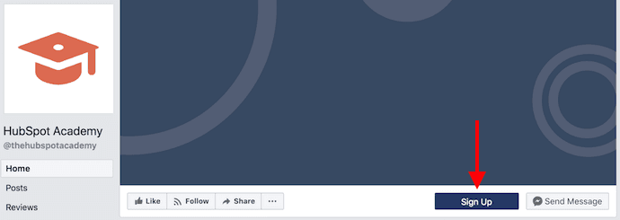
We added calls-to-action (CTAs) on our Facebook page for HubSpot Academy below. The value in this list building technique is in the destination: Link your Facebook page’s CTA button to a landing page that requires an email address for access to a special resource.
13. Publish links to gated offers via social media
Use your Facebook Business page or LinkedIn Company Page to post links to the same gated offers you might also host on your blog posts. You can also do this in appropriate and relevant LinkedIn group discussions — just be mindful of the topic being discussed to ensure your offer is a welcome addition to the conversation.
14. Use Pinterest to promote gated visual content
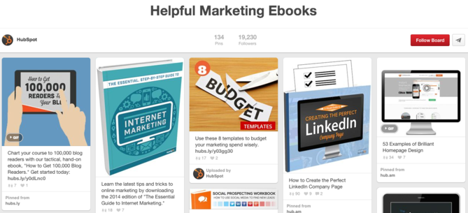
Pinterest can play host to visual content that encourages visitors to sign up to see more content. For example, HubSpot created a Pinterest board where we pin the well-designed covers of our marketing ebooks. From this board, we’ve been able to generate new leads and grow our email list.
15. Add engagement features to your YouTube channel
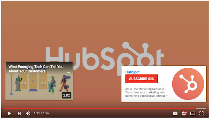
Add hyperlinked “end cards” to your YouTube videos that encourage people to subscribe to your channel via their email address. You can see an example of this below, to the bottom right of the video screen. You can also include links to relevant landing pages in your videos’ text captions below your published video.
On Your Website
16. Ask website visitors for feedback
People enjoy offering feedback on information that pertains to them. On certain pages of your website, include a form that asks visitors what questions they might have about your business. You might also create a live chat tool that invites questions and email addresses from people who have stayed on your website for a certain amount of time.
17. Shorten the length of your lead-capturing forms
It’s tempting to collect as much information on a user as possible right away, but adding too many fields to your landing pages and lead-capturing forms can actually scare people off. Reduce the length of your forms to just two to three fields — you can collect more information from them once you start a conversation.
18. Link to offers across your website that capture email signups
Don’t make people dig around your site to stumble across subscription options. Keep your offers up front, and include calls-to-action on multiple pages of your website. Some key places to consider include your website’s homepage, your ‘About Us’ page, and your ‘Contact Us’ page.
19. A/B test different campaign copy
You might be doing all the right things to generate leads — landing pages, gated content, contests, and more. The problem might be that the design or copy itself isn’t driving the engagement you need. A/B test (also known as “split test”) different aspects of your list-building campaigns with different versions of the same content. This includes the call-to-action text, the color of the gated offer, the time of day you’re posting to social media, and even where on your website these signup forms are placed. Sometimes a small change can drive hundreds more conversions.
20. Create a blog that readers can subscribe to
If you don’t already blog, you should! Blog posts help you increase your ranking on search engines like Google, and allow you collect blog subscribers that you can then upgrade to more actionable email campaigns over time.
21. Guest blog for other websites with a call-to-action
There are tons of websites and publishers out there that cater to your audience — and larger portions of it. Guest blogging for these websites helps you expand your contact list to this audience. When creating content as a guest blogger for another website, include a call-to-action, as well as a link in you author byline, for readers to subscribe to your site’s blog or email newsletter.
22. Include customer reviews on your website and landing pages
Customer reviews are the “social proof” that encourages people to join in on something. It’s one thing for you to tell people to sign up for a campaign, but it’s another thing for your happiest customers to say it too. Publish your best reviews from communities like Yelp right to your website. This adds genuine value to your landing pages when people are on the fence about submitting their contact information.
With a Partner
23. Run a promotion on a partner website or email newsletter
Similar to guest blogging, partner websites can allow you to target a new but appropriate audience with a campaign on your own website. Use this partner source to direct visitors back to your website — where you’re already collecting email addresses.
24. Host a co-marketing offer with a partner
Creating an ebook or webinar with a partner can split up the work of content creation and allow you to share the audience of a similar business. After you release your content, split the leads you generate with your partner.
With Traditional Marketing
25. Collect email addresses at a trade show
Offline events like trade shows are highly anticipated growth opportunities for professionals in your industry. Demo your latest product at an appropriate conference and collect signups in-person. Once you’re back at the office, import these signups into your contact database. Be sure to send these contacts a welcome email that confirms their opt-in to your list. (See #8 in this blog post for tips on sending welcome emails.)
26. Host your own offline, in-person events
Meetups, seminars, hackathons, educational panels, and even your own conferences put you front and center of a networking event, and those who attend are often more qualified to be contacted because they came to your event. Take the opportunity to collect email addresses in exchange for the info and demos you provide at the event.
27. Host an online webinar
Webinars are the perfect opportunity to talk about your industry and access the audience of thought leaders whom you might want to present with. The best part? Webinars are normally registered for via email, making your listeners more willing to be contacted afterward. Collect email addresses at registration.
28. Add QR codes to your display ads
Incorporate a QR code into your print marketing collateral that people can scan for more information on the printed content. Create the QR code such that it requires an email address to access the additional content. (There are many free QR code makers online that make this process easy.)
29. Collect emails in your store
If you have a brick-and-mortar presence where you interact with customers face-to-face, create an email campaign just for those walk-ins. Launch a store membership they can sign up for via email at the register. This is a smart way to keep in touch with repeat customers and reward their loyalty to your product.
These are all examples of things you can start doing today to increase your business’ email database. Many of them are not complicated or difficult to implement. The key is to attack email list-building from as many angles as possible.
As you grow your email list with fresh, opt-in contacts, you’ll be able to nurture them with middle-of-the-funnel offers that allow you to convert early-stage leads into sales-ready leads.

How to Actually Monetize Facebook Traffic with Messenger
For years, Facebook has been one of the best places to build and reach your audience. Over that same period of time, though, it’s become much more of a pay-to-play channel.
In the earlier days of Facebook, you could create a post and count on your audience seeing it. Now, you’re lucky if that content reaches even 4% of your fans. Even if you can cut through the noise and reach them, though, can you say with confidence how it helps your business? Valuing your Facebook audience has been a black hole for many marketers. It’s hard to tie that audience to activity further down the funnel.
Facebook wants businesses to keep their audience on Facebook properties. Posts that link out to external websites often see lower reach than those without.
Messenger might be the key to monetizing your Facebook audience in a delightful way. Using channels together make them work better together. In other words, Facebook + Messenger = $ is the same thing as 1 + 1 = 3.
With over 1.3 billion monthly active users, there’s a good chance your audience already uses Messenger. Facebook continues to invest in building new ways to reach your audience. One of those is “Comment-to-Messenger”. All a visitor has to do is comment a specific keyword on one of your Facebook posts. Then, a Messenger chat opens up, even if it’s the first time you’ve talked.
This is a powerful way to send automated, contextual follow-ups to your audience. There’s lots of potential here across Marketing, Sales, and Service. But if you’re trying to monetize your audience, you need to be using it for conversational marketing today.
Our Facebook audience loves watching videos on marketing-related topics, like SEO. And the only thing people love more on the internet than watching videos are taking quizzes. It’s one reason that BuzzFeed continues to dominate engagement.

For a video on SEO myths, the post description said to comment “SEO” to test your knowledge in Messenger. More than 2% of people who viewed the video commented that keyword on the post. That’s a good baseline to shoot for as you start running these tests.


Here’s my approach for creating great Messenger quizzes:
- Write for the channel.
- Messenger is a more personal channel than email. Use gifs, emojis, and shorter copy to make the experience feel more natural.
- Use progress markers.
- Use these throughout the quiz to let people know how far along they are. There’s nothing people hate more than a conversation with no end in sight. Once a user completes half of the questions, give them a “you’re doing great — we’re halfway there” to set expectations.
- Provide feedback.
- If someone’s taking a quiz, they want to see how much they know for themselves. When they answer, let them know in a contextual way if that was right or wrong.
- Keep it simple.
- Make users think about what the answer is to the question, not how to answer the question. If you can avoid it, don’t make users type in text responses. Use features of the Messenger platform like Quick Replies to give users an easy way to move forward.
Incorporating those guidelines helped create a quiz that users loved to take. In fact, 95.31% of people who started the quiz answered all 5 questions and got their score. That’s 86.88% higher than the average completion rate, according to AdEspresso.
After they finished the quiz, they received a contextual card with their score and a next step. Because they were already engaging with us on SEO, it was natural to ask them to download an ebook on the same topic.

We turned our traditional lead generation form into a one-to-one conversation. Instead of asking users to fill out eight fields at once, we asked them questions one at a time and made it feel more natural.
It was a much more delightful way to download an ebook. We met users on the channel where they spend their time. And we gave them an experience that felt natural and human-like.
68.89% of people who started downloading the ebook converted and filled out all the information. You don’t get conversion rates like that anywhere other than messaging.
Re-engagement was a big part of the success for both the quiz and the ebook. If someone started but didn’t finish, they got a message to come back in and finish getting their offer 24 hours later. This persistence of identity is invaluable compared to web traffic. With web forms, if someone only fills out a few pieces of information, you have no way to contact them again.
People went from viewing a Facebook video to becoming a lead in less than two minutes — without ever leaving Facebook. Growing an audience on Facebook will be a top priority for marketers for years to come. It’s more important than ever that you have a plan in place to monetize them over time. Messenger’s the key to doing that.

Unriddled: The Latest From Facebook, Announcements From (And About) Apple, and More Tech News You Need
Welcome one, welcome all to a very warm Wednesday. Not only have we reached the week’s halfway point, but we’re one day away from the official start of summer here in Boston.
This Wednesday also brings another edition of “Unriddled”: the HubSpot Marketing Blog’s mid-week digest of the tech news you need to know. We’ve sifted through the vast pool of tech news items to help you decrypt what’s happening.
It’s our Wednesday tech news roundup, and we’re breaking it down.
Unriddled: The Tech News You Need
1. A Big Departure and New Ads From Facebook
Last week, Facebook’s now former head of public policy and communications, Elliot Schrage, announced that he would be leaving the social media giant.
“Leading policy and communications for hyper growth technology companies is a joy,” Schrage wrote in his official statement, “but it’s also intense and leaves little room for much else.”
In his announcement, Schrage also said that he would stay on just long enough to find and assist with the on-boarding of a replacement. It comes after months of criticism toward Facebook — from lawmakers, consumers, and others — not only for the Cambridge Analytica crisis, but also, for how the company responded to it.
Schrage’s looming departure is followed by a recent announcement that Facebook will display ads in more places, the latest being Messenger. While ad space has been sold within Messenger for about a year and a half, users will now see autoplay video ads.
The changes provide another means of ad revenue for Facebook, but how well-received they are by all users remains to be seen. Read more about the new autoplay video ads from Recode‘s Kurt Wagner. Read full story >>
2. Aleksandr Kogan Appears Before Senate Sub-Committee
Aleksandr Kogan — the Cambridge University professor who developed the app blamed for improperly obtaining Facebook user data that would later be exploited by voter profiling firm Cambridge Analytica — appeared yesterday before the Senate Subcommittee on Consumer Protection, Product Safety, Insurance, and Data Security.
Very little new information emerged from the hearing, where Kogan was joined by witnesses John Battelle (CEO of NewCo) and Ashkan Soltani (former CTO of the FTC).
In his written testimony, Kogan discounted the effectiveness of any data obtained by his app in “a political campaign,” but did comment on what he sees as flaws in Facebook’s approach to terms and user consent, as well as what can be done to prevent similar events or crises. Alfred Ng of CNET writes more on today’s events and Kogan’s commentary. Read full story >>
3. Apple Closes the Data Transfer “Backdoor”
Apple is making it harder for law enforcement to hack iPhones, announcing a future software update that would disable the phone’s charging and data port — the port used by authorities to transfer the phone’s data to another device — if it’s been inactive for an hour since it was last locked.
The announcement comes after a 2016 high-profile disagreement between Apple and the FBI, when the former refused to provide what it called “backdoor” methods of accessing a locked iPhone. which it cited as potential violations of “basics of digital security.”
At the time, the FBI eventually enlisted a third-party that discovered a loophole — which is what Apple is seeking to close with this latest update. Jack Nicas of the New York Times has the full report. Read full story >>
4. Apple + Public Safety
Meanwhile, Apple has announced more consumer-friendly, public-safety-oriented features within the yet-to-be-released iOS 12. When an iPhone user makes a call to 911, the public emergency telephone number in North America, the device will automatically and securely share its location with first responders.
The feature addresses the growing number of emergency calls made from mobile devices — about 80%, Apple says — that previously could not be traced to a precise location. And while the FCC requires wireless carriers to locate 911 callers “within 50 meters at least 80% of the time by 2021,” Apple says that’s not soon enough — and wants to provide a more immediate solution. Read full announcement >>
5. The App Store and Antitrust
The U.S. Supreme Court has agreed to hear an appeal from Apple to a lower court’s ruling that would allow a class-action lawsuit by iPhone customers.
The plaintiffs seeking the suit claim that Apple has an unfair monopoly on mobile apps, which leads to prices that are more “inflated” than they would be if apps were available for purchase from other outlets. And while developers determine a price point for a given app, Apple charges them 30% commission for every purchase. Andrew Chung of Reuters explains more. Read full story >>
6. Login With Snapchat
Snapchat announced last week that it would launch a brand-new “Snap Kit” for developers, which contains — among other items — a “Login Kit” that allows users to log into certain sites with their Snapchat accounts.
The Snap Kit launch comes at a time when social networks, like Facebook, are dealing with particularly high scrutiny for the way these login APIs can be misused, such as the improper sharing of personal user data, even if unintentional. But Snapchat’s Login Kit shares far less information — only the user’s display name and Bitmoji avatar — with third parties than Facebook Login does. Read full announcement >>
That’s all for today. Until next week, feel free to weigh in on Twitter to ask us your tech news questions, or to let us know what kind of events and topics you’d like us to cover.

Design 101: Asymmetrical and Symmetrical Balance
Let’s take a look at one of the most famous buildings in the world — the Taj Mahal. While there are numerous reasons the Taj Mahal is aesthetically-pleasing, one reason is its symmetrical balance, which evokes a sense of traditionalism and stability.

Image courtesy of livescience.com.
Now, let’s take a look at another famous piece of artwork — The Starry Night by Vincent van Gogh. This painting, unlike the Taj Mahal, is asymmetrical in nature — and yet, it’s still balanced and strategic in design.

Image courtesy of Moma.org.
Looking at the Taj Mahal and The Starry Night, you can see the profound beauty of both types of balance in design. But for the purposes of every day design, which one should you use? What’s the real difference?
Here, we’ll define asymmetrical and symmetrical balance, and compare the two, so you can choose properly for your own creative purposes.
The Definition of Symmetrical Balance
Symmetrical balance occurs when you have two identical sides of a design with a central point of axis — so if you cut the design in half, the left and right are mirror images of each other. To be considered perfectly symmetrical, a design needs to have equally weighted visuals on either side.
Symmetrical design allows you to draw attention to all areas of an image equally. Since this form of design is usually very structured and rigid in nature, it’s referred to as formal balance. For marketers, symmetrical design is ideal for projects like event invitations or discount offers, but can seem boring if used on more creative pieces.
Let’s take a look at an (admittedly very basic) example of symmetrical balance:

Not quite the Taj Mahal, but it’ll do.
The Definition of Asymmetrical Balance
Asymmetrical balance occurs when you have different visual images on either side of a design, and yet the image still seems balanced. To be considered asymmetrical, a design needs to have unequal visual weight on either side, but those unequal visuals need to balance each other.
Asymmetrical designs can evoke feelings of movement and seem more modern than symmetrical designs, but it can be more difficult and less straightforward to create relationships between the design’s individual elements.
Let’s take a look at an example of asymmetrical balance:

It’s important to note asymmetrical balance is still strategic — placing shapes haphazardly around a page won’t create a compelling composition. To create a successful asymmetrical design, you still need to figure out how to balance out the image.
Vincent van Gogh’s The Starry Night, for instance, uses a notable visual, the sun, in the top right, and balances it out with a dark cypress tree in the bottom left. It would not be a successfully asymmetrical balance if van Gogh put both the sun and tree on the right side of the page.
Asymmetrical vs. symmetrical balance
Asymmetrical balance is when you have two dissimilar sides of a design and have positioned visual weight unequally, and yet you’ve still achieved a sense of balance. It evokes a sense of modernism and movement. Symmetrical balance, on the other hand, is when you have two identical sides of a design with equal weight on either side of a central point of axis. It evokes a sense of formality and structure.

13 Simple Tools for Creating Animated GIFs, Images, and Videos
Even if you create loads of visual content, it can be a struggle to hold your audience’s attention — especially when you’re trying to communicate complex, detailed, and abstract topics.
What’s a marketer to do?
One option that often gets overlooked is animated images or videos. They’re great because they can explain a point in a matter of seconds. They also grab attention and help convert viewers into leads and buyers.

An animated image, GIF, or video might sound difficult to create, but in reality, you don’t need to carve out a budget to add this type of visual content to your marketing strategy. Check out the following tools that let you easily create cool animated images and video.
Animated Flows
1. WhatFix
Price: Free
If you’re looking for a simple way to instruct someone on how to do something online, the following tool is super handy.
This tool is actually the one that has inspired the whole article. WhatFix lets you create quick flows showing steps users should take. You can embed the widget on your web page or send your users to the “live” version of the link that will play all the steps on your actual web page.
You can play with the widget below or on the WhatFix website.
You’ll need WhatFix’s extension for Firefox or Google Chrome to build those widgets, but other than that, the process is so easy. Just click the links on your page and type in the instructions for each link. The extension will record everything and immediately put together a widget for you.
It also creates YouTube videos on the fly, which is a great re-packaging option. Here’s an example of what that can look like.
WhatFix offers its basic features for free: You can go ahead and try creating those flows right now. It does have a business version that has an option to create private flows, export flows, and more.
Animated GIF Makers
Animated GIFs have remained a standard in basic online media over the years. Social media platforms like Tumblr thrive on them, and a single GIF reaching viral status can have a big impact on your social strategy and success. They are also great for creating animated instructions that will auto-play the steps on Twitter, Pinterest, and now Facebook.
Here are my favorite GIF image generators:
2. GIFBrewery
Price: $4.99 one time
Mac users can quickly convert sections of their videos into GIFs using GIFBrewery. You just purchase and download the app onto your Mac OSX, and use it from your computer as often as you’d like.
The steps are easy to follow, and the interface rather intuitive. You can edit the GIFs with overlay text and images, apply image filters, and more. It is a great tool for making preview animations for longer videos to post on Pinterest, your blog, Instagram, and beyond. It does cost $4.99, but it is well worth the price if you are planning on regularly making GIF files.
3. Gyazo
Price: Free
While it is technically a screen-capture tool, you can capture and save GIFs and videos now using Gyazo. It is a free tool available for Windows, Mac, and Linux. All captures can be quickly shared on multiple platforms, too.
This is a great, if somewhat casual, tool for anyone who takes screen captures and wants to show them off to others. With a bit of creativity, it could be used in other business-related capacities, though it may not have all the tools you are looking for.
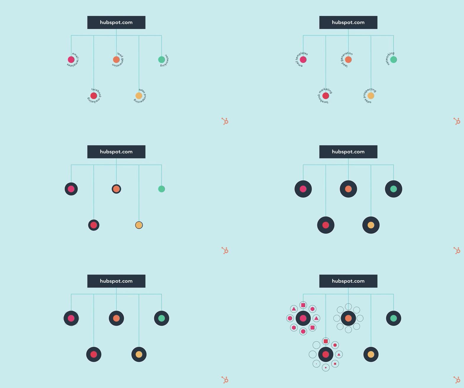
Here’s an example of a GIF made from HubSpot’s YouTube video on topic clusters:
Price: Free4. Recordit
Need to make a fast screencast, such as a simple demo? Recordit is specifically meant for quickie tutorials or examples, rather than those that require longer record times.
You simply drag the space you want to capture, hit record, and show viewers what they need to see before stopping the recording. It breaks these down into moving slides and converts the file into a GIF rather than a video recording. If this sounds like something you would like to integrate into an app, they now have an API, too.
Here’s an example that actually took me five seconds to create — it’s quite easy to explain your point:
5. GIFDeck
Price: Free
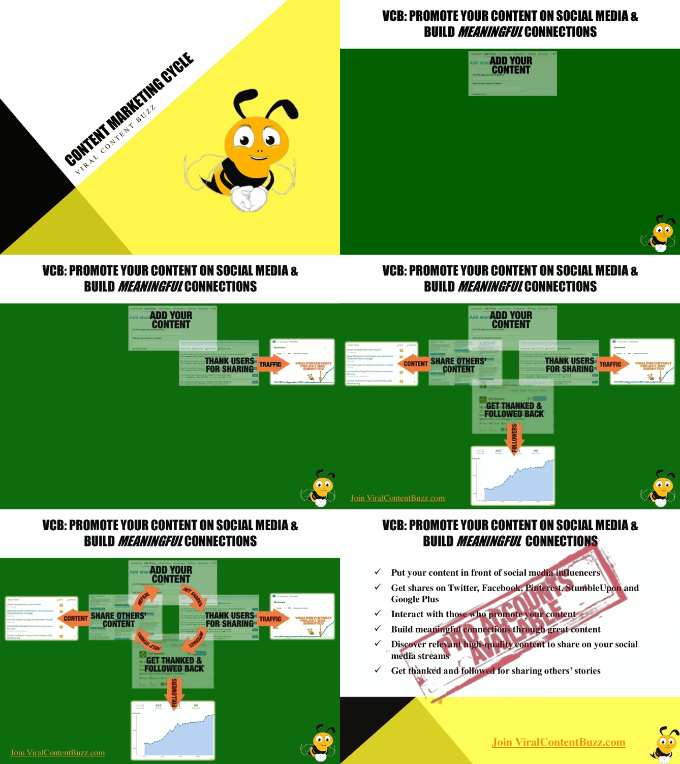
Do you share educational content on SlideShare? (Hint: You should!) GIFDeck a great way to turn your decks into GIFs. Here’s an example of one I created just recently:
6. Make a GIF
Price: Free
This is a more extensive GIF maker that allows you to choose from a couple of options to make your GIF. On Make a GIF, you can create from screenshots, YouTube videos, uploaded videos, or premade GIFs.
It is also a free image hosting site, so once the GIF has been made, you can link to it directly from the Make a GIF gallery. Accounts are free, and if you change your mind about a GIF, you can easily request that it be deleted.
Here’s a GIF I animated from two separate pictures of HubSpot’s tagline during Pride Month:

7. GIFYT
Price: Free
YouTube videos are a great source for screencasts. If your users create screencasts of how they use your product, turn those videos into animated GIFs to share with your community. That means original content for you and more exposure for your fans’ videos.
You can make GIFs from YouTube videos using GIFYT. Just paste in the URL, select the time period you want captured, and convert it to a GIF.
It is very easy to use, fast, and free. The only downside is that you have to be careful you don’t select too long a clip duration. Keep it short and relevant for the best quality GIFs.
Here’s a GIF I created using an animated video from HubSpot’s YouTube channel:

Video Animation Software
Then there are times when you want to make a full-fledged animation — audio, story, and all. Luckily, the tools at your disposal aren’t all that complicated.
The following tools are quite similar. I tried all of them and was satisfied. They are all easy to use, as well — you don’t need any video editing experience to put together animated video instructions. You do need to invest some time into a script and some visual elements to make these instructions appealing. The good news? You can then convert them into animated GIFs using the tools above.
None of these tools are free, but they all offer a free trial, so you can play with them all and choose the one you prefer.
8. PowToon
Price: $59/month; $19/month for at least a year
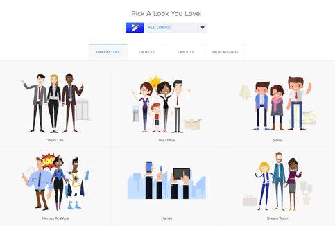
PowToon describes itself as an animated video and presentations creator that can be easily exported to YouTube. Simply “pick a look you like” from one of five animation themes, and piece together the characters, objects, layouts, and backgrounds you need to tell your story.
9. VideoScribe
Price: Free to try; $29.00/month; $16/month if you pay annually; $665 if you pay once
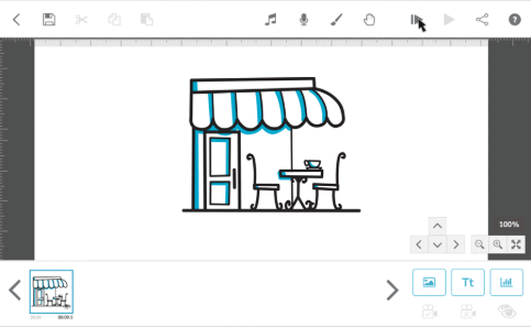
VideoScribe specializes in whiteboard videos, and it lets you create really nice video animations. It’s a downloadable piece of software that you can take offline if you pay for the PRO plan. It supports both Mac and PC, and also has mobile applications that I haven’t yet tried (but am definitely planning to).
10. Vyond
Price: $79/month or $599/year
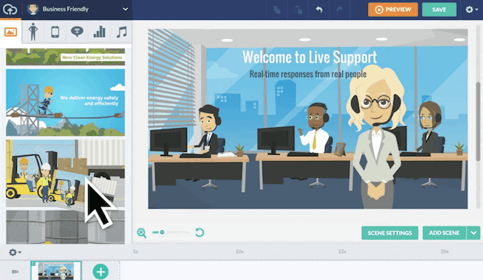 Image via G2 Crowd
Vyond, formerly GoAnimate, is a web application that can be used to create cartoon videos. It also has a collaboration feature, which comes in handy when you’re trying to coordinate with a larger team.
11. Animaker
Price: Free with limited features or $12/month
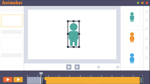
Animaker is a one-stop shop for 10 types of videos for every purpose and channel. From explainer videos to animated infographics, this tool breaks down the templates you’d need based on the specific purpose of your video.
12. Moovly
Price: Free to try; $24.92/month
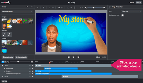
Moovly is a “drag, drop & animate” tool that allows you to create quick animated videos right in your internet browser. Like many animation tools, this product drafts explainer videos, whiteboard-style animations, advertisements, and more. Moovly also gives you more than 750,000 free video clips to work from.
13. Synfig
Price: Free

Synfig is surprisingly detailed for being a completely free platform, but it’s an easy downloadable tool that’s compatible with any computer. The product gives you a user-friendly menu of tools to edit your subjects’ shape, color, and movements one frame at a time.
These are just a few tools I’ve used to create animated images and videos — but there are plenty of other options out there.
Want to learn more about video editing? Check out 9 of the Best Free Video Editing Software to Try.


13 Amazing YouTube Pre-Roll Ads That Last Just Six Seconds
You technically can’t skip these ads. But you wouldn’t want to anyway.
In 2016, at Sundance, YouTube unveiled a new ad format to brands: the unskippable, six second “bumper” ad. To prove it was possible to cram a compelling story into such a short window, they recruited a handful of creative agencies to test drive the format — and the results were pretty convincing.
After that, huge brands like Under Armour and Anheuser-Busch adopted the new six-second ad format to tell quick but gripping stories that actually stuck with audiences.
In fact, according to Google, 90% of bumper ad campaigns boosted global ad recall by an average of 30%. That’s pretty impressive for taking up only six seconds of someone’s day.
It might seem like you can’t accomplish much in that amount of time, but with a little creativity, brands can use it to forge an emotional connection with their audience and implant a vivid memory of those feelings in their minds.

Why Six-Second Bumper Ads Work
Suffering through 15-, 30-, or even 60-second pre-roll ads prompted so many head shakes and back-button clicks that eventually, YouTube added a skip button to their ads in 2009. In theory, though, an ad’s first five seconds are enough to hook viewers and hold their attention for the rest of its duration.
But we all know this rarely happens. Whenever a YouTube ad pops up and shields you from your favorite video, what do you usually do? You immediately glue your eyes to the skip button’s countdown clock and wait … until those lingering seconds finally slug by.
Fortunately, the six-second pre-roll ad engages viewers without testing their patience. When YouTube plays such a short ad for them, it’s not as annoying as a full-length ad. And when brands craft these ads into fast, captivating stories, they can resonate well with audiences.
This lets YouTube sustain their ad business while helping brands create a more enjoyable and memorable user experience for its viewers.
So, if you’re running a six-second pre-roll ad on YouTube right now, hats off to you. If not, here are 13 examples to help you brainstorm the best way to delight your YouTube viewers without getting in the way of their chosen video.
13 Exceptional Six-Second Pre-Roll Ads on YouTube
1. YouTube
Campaign: YouTube Advertisers
To further promote their new ad format’s creative potential, YouTube challenged filmmakers and ad agencies to retell classic pieces of literature in just six seconds.
These are some of the most complex novels ever written. So creatives needed to convey each story’s core in a simple yet spellbinding way.
Rethink, a Canadian agency, did just that. Their rendition of Hamlet is clear and concise (we all know that everyone dies when modern day Claudius spams the buy button). But it’s also unexpected and funny because it gives us a glimpse of how Hamlet could’ve transpired in today’s digital age.
2. Bounce
Campaign: Dryer Sheets
Billy’s sneaky grin at the end of this bumper ad gets me every time.
Bounce didn’t reach for the stars with this short ad, but it’s topical humor was perfect for the time allotted. And what it promotes is appropriate given how easily forgettable dryer sheets can be when doing laundry. You’ll think about Bounce every time you fill the dryer (or get your son stuck on the back of your shirt) from now on.
3. Mom’s Touch
Campaign: Spicy Chicken Wings
Mom’s Touch is a chicken burger restaurant chain based in South Korea, and the language barrier in the YouTube ad above doesn’t stop you from loving it.
Google actually ranked this YouTube ad in the top 20 bumper ads in the world in 2017, and it’s only five seconds long. The company didn’t even take the additional second to squeeze more attention out of its customers. It featured just a sheep who shows you exactly how spicy their chicken wings really are.
4. Chipsmore
Campaign: #takeiteasy
I know you fell for it too.
When I first saw the red face of doom, disappointment started spilling over me. But, luckily for us, the Chipsmore’s Cookie Guy saved the day.
The thing is, we just wanted to watch the ad. Imagine how someone who wanted to watch a video after it must’ve felt.
They were probably frustrated at the initial sight of the “broken” video link, then surprised when the Cookie Guy appears, which grabbed their attention. And, finally, delighted when their favorite video starts.
This ad takes its viewers on an emotional roller coaster. And, honestly, who doesn’t have fun on those?
5. Road Lodge
Campaign: Relaxing Hotel Rooms
This is a prime example of insanely honest marketing.
Road Lodge sets the expectation that their hotel is best suited for relaxation. And not so much for partying.
You might think they’re deterring potential customers from their hotel — and you’re right — they are. But it’s actually a good thing because these people would never stay at their hotel in the first place.
And since their honesty signals confidence, builds trust, and shows that they value their customers’ experience more than short-term profits, their target market becomes more attracted to them.
Road Lodge knows that if you’re brutally honest about your product or service, then you won’t disappoint your customers. This makes it a lot easier to maintain their loyalty.
6. Under Armour
Campaign: It Comes From Below
When you play baseball, nothing matters more than your stats. They’re a direct measurement of your performance and can even define your value as a person.
Under Armour sought to uproot this belief.
In six short seconds, Droga5, Under Armour’s agency, works with Washington Nationals right fielder, Bryce Harper, to inject purpose into ball players everywhere. The pre-roll ad motivates viewers to place their value in their character instead of their numbers.
7. PG Tips
Campaign: Keep It Tea
This ad from a popular English tea brand was designed to hold your attention one second at a time. The pre-roll ad opens to show cloth hands, making you wonder what exactly is holding this mug of tea. Oh, it’s a puppet monkey. And it’s adorable.
The cuteness and simplicity behind this ad was intentional, as well. In its YouTube video’s caption, PG Tips delivers a note of solidarity against the “silly and ridiculous.” Sometimes the truest messages only need six seconds of your time.
8. Hefty Party Cups
Campaign: Office Party
Here’s another member of YouTube’s list of top 20 six-second ads in the world, and it comes to us from Hefty® — not just a garbage bag brand, according to this energetic ad.
Sometimes, you have to embrace the most extreme uses for your product to get your customers’ attention. Hefty® Party Cups took that to heart with six shameless seconds you won’t soon forget. And hey, maybe it’s the perfect reminder to pick some of those red cups up before that raging shindig you have planned …
9. Mercedes-Benz
Campaign: Mercedes-AMG GT S
Mercedes-Benz targets the Singapore market in this bumper ad for a new two-door sports car. The video uses swift video cuts and a roaring engine to engage their viewers’ senses. This way, its audience can actually see and hear the intensity of reaching 60 MPH in only 3.8 seconds.
10. Universal Pictures
Campaign: Jason Bourne
Universal Pictures used this pre-roll ad to promote the full Jason Bourne trailer, which garnered over 14 million views.
And since the ad is chock full of non-stop action, it piqued viewers’ interest and generated tremendous hype around its trailer release.
11. Burn
Campaign: Energy Drink
Burn’s pre-roll ad is so effective because it’s snappy and visually engaging. And since you can process visuals 60,000 times faster than text, a flaming fist across the face will definitely catch your eye.
The slow-mo effect also makes the ad seem longer, intensifying your viewing experience.
12. Airbnb
Campaign: Leave Loving Home Made
Family vacations are the best.
You get to explore incredible places and create timeless memories with your loved ones. Is there any other way you would want to bond with your family?
Airbnb agrees too. So their agency, TWBA, produced a charming ad that showcases the benefits of a family vacation: loads of fun and connection.
13. Geico
Campaign: Unskippable Elevator
The Martin Agency, Geico’s creative partner, deserves a lifetime supply of car insurance for this masterpiece. And although it isn’t just six seconds long, it’s a skippable ad you won’t want to skip.
“Unskippable” was so refreshingly original, it won AdAge’s 2016 Campaign of the Year. And for good reason too. It sympathizes with your annoyance of pre-roll ads, so it ends before you can skip it. But it’s also so unique and witty that you’ll actually watch the entire ad.
Geico says this ad is impossible to skip because it’s already over. But really, this ad is impossible to skip because it’s so clever.

The Ultimate Guide to Decision Making
Fruit loops or cheerios? Call or email? John Wayne or Clint Eastwood? To be, or not to be? If you’re like most reasonably decisive adults, you make 35,000 conscious decisions every day. That’s a heck of a lot, but most of them are straightforward or trivial. It’s the major ones — or even a series of smaller decisions — that need some strategic thinking.
The thing is, 98% of organizations aren’t very good at decision-making.
So what’s the problem?
Sometimes it’s a case of time pressure and relying only on impulse or off-base instinct. Other times, we don’t do all the prep work needed to make a smart decision, like identifying all our options and gathering enough evidence. Too much information can be just as bad. Whatever the case, Daniel Kahneman, who studies judgment and decision-making, says we think we’re more rational than we actually are — especially when we let cognitive biases derail our thoughts.
But we know you won’t make those mistakes anymore. Because you’re about to learn the time-tested decision-making techniques that will get results.
What is decision making?
Decision making is the process of identifying the logical choice among several available alternatives. To make a good decision, you should be able to predict and evaluate possible outcomes, weigh the positives and negatives of each, and come to a final conclusion. Experts think decisions result from two types of cognitive processes: intuitive and rational.
Key Decision-Making Skills
Now for what decision-making is not: a talent. It’s a skill you can practice and improve.
Rational decision-making requires specific skills as well as subject matter expertise. For most deliberations, you need to harness:
|
Must-haves: |
Nice-to-haves: |
Best for groups: |
|
Critical thinking |
Creative thinking |
Collaboration |
|
Logical reasoning |
Visualization |
Communication |
|
Data analysis |
Organization |
Negotiation |
|
Risk assessment |
Time management |
Leadership |
Helpful Decision-Making Models & Tools
As we mentioned earlier, decisions are best served part reason and part intuition. You won’t implement your decision effectively if it doesn’t feel right (we’ll leave that part up to you), but it’s important to weigh the facts. That’s where practical strategies can help.
Your decision won’t feel so complex if broken into manageable components, but a pros and cons list doesn’t always cut it. Here, we’ll go over three somewhat more complicated yet effective tools: the decision matrix, decision tree, and mental model.
The Decision Matrix
When you’re overwhelmed with options and variables, or you see no obvious choice out of several perfectly good ones, the decision matrix (also known as the decision-making grid or Pugh Method) works wonders.
Let’s say your company needs a CRM. You’ve shortlisted a few industry-leading solutions. Using the decision matrix, you can draw a complete, objective comparison of vendors based on the criteria most important to you, all in one neat little table.
Here’s how to make one:
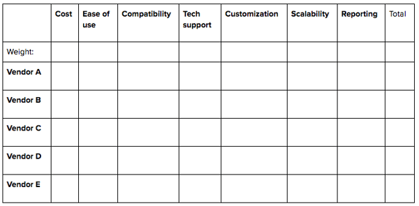
- List your decision options. In this case, your vendors. Arrange them in rows.
- List the factors affecting your decision. What are some key considerations when choosing software? Make these your columns.
- Add an extra row for weight, and an extra column for total.
Your table might look something like this:
- Score each option for each factor. How well does Vendor B satisfy ease of use, for example? Work your way down each column, scoring the vendors from 0 (poor) to 5 (rockstar). Be as objective as you can.
- Give each factor some weight. How important is the factor to your decision? Underneath, add a number from 0 (unimportant) to 5 (indispensable). (Not sure? Paired Comparison Analysis can help figure this out.)
For example:
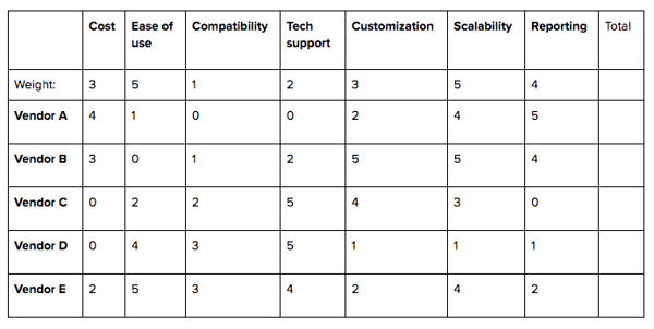
- Calculate your weighted scores. Multiply the scores from step 4 by the values in step 5 where they intersect. These are your weighted scores for each option/factor combination. Make them your new cell entries.
- Add up the weighted scores for each option. Pick the highest.
Using our example, Vendor E triumphs:
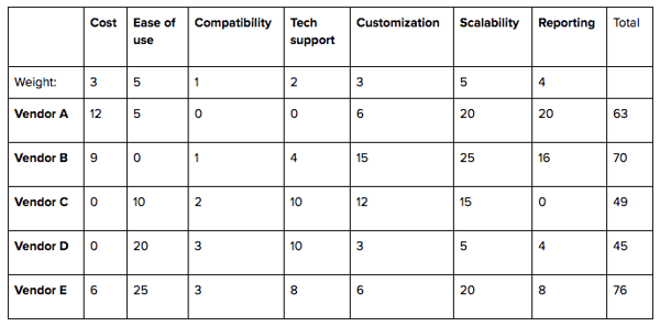
It’s easiest to move things around and swap out figures using a Word or Excel template. You’ll find plenty of free templates and examples online, but these should get you started:
The Decision Tree
A decision tree is 1) a sort of pattern used in machine learning and data mining to map out algorithms, and 2) a flowchart any organization can use to map out the costs, benefits, and probabilities of every possible outcome at multiple stages of every decision within a decision.
Don’t worry. It isn’t as complicated as it sounds. We’ll use our CRM software example to illustrate.
The tree starts with a single square, the decision node, representing the decision to be made (source the world’s best CRM). The decision node branches off into possible actions or solutions (your CRM vendors).
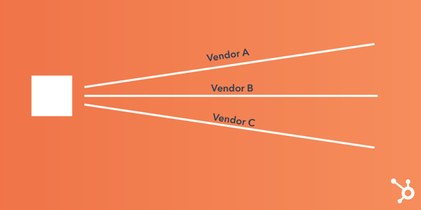
The next nodes depend on results. If the outcome of choosing a vendor is uncertain, its branch ends with a circle, the chance node. If the vendor brings up another decision, its branch ends with a square and starts over.
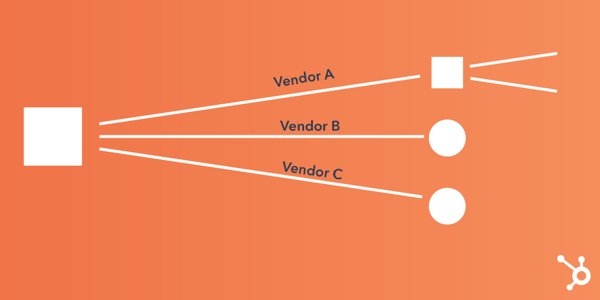
Chance nodes branch into possible outcomes of each solution. Using customer satisfaction as an example metric, you might have a branch for “good” and “poor.”
On each branch, add the probability of each outcome as a percentage. At the end of the branch, add a cash value or score based on how much the outcome is worth. Use your best guess if you don’t have hard data.
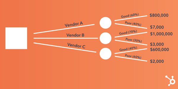
Continue to expand your tree until every line reaches an end node (a triangle), meaning you’ve considered every possible outcome and decision that could come from the original decision.
Supposing we’re done with outcomes for this example, the result would look something like this:
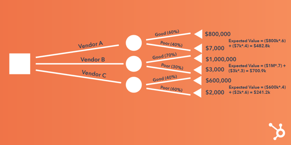
Now you’re ready to begin calculating the value of each node. Working backward:
- Calculate the value of uncertain outcomes (circles) by multiplying their cash value by their good/poor probability. Jot down the total for each vendor. For Vendor A, that would be ($800,000 x 0.6) + ($7,000 x 0.4) = $482,800.
- Calculate the value of decisions (squares), first by noting the cost of each option. Subtract that cost from the value of the uncertain outcome. The result represents the benefit of the decision. Say Vendor A cost $100,000, its benefit would be $382,800.
- Go for the vendor with the biggest benefit, i.e., the largest number.
Take advantage of free trials from dedicated decision tree makers like Lucidchart, SmartDraw, or Zingtree before buying a plan. On a smaller budget, you can make basic flowcharts in Word.
Mental Models
A mental model is a framework or theory about how the world works. We use mental models to guide our everyday perception and behavior, but also as tools to see problems more rationally so we can take appropriate action.
The key, since you can’t explain every problem with one worldview, is to learn (and use a combination of) as many mental models as possible.
Experts say expanding your set of mental models is the best way to improve your analytical and decision-making skills. And chances are, you’ve already used one without knowing it had a name. Common models include:
- Confirmation bias: the human tendency to interpret signs in ways that confirm what we already believe.
- Inversion mental model: considering outcomes you want to avoid rather than pursue.
- Opportunity costs: recognizing that every choice comes at the cost of another.
The Farnam Street Latticework of Mental Models details more than 100 of these frameworks, but according to James Clear, you need only master a few dozen to become a world-class thinker. This guide explores 14 of the most common.
The Decision-Making Process
The secret to efficient decision making? A structured, step-by-step approach. Various psychologists recommend anywhere between five and seven steps (think back to high school processes like GOFER and DECIDE) to an informed conclusion. Since this is the ultimate guide, you get an eight-step mishmash of them all.
Steps for decision making
- Identify a problem, opportunity, or goal. Recognize it exists and whether it’s worth addressing. Then make the conscious decision to do so.
Gather information. What do you need to know to make the right decision? Seek out the data and people who can help. - Gather information. What do you need to know to make the right decision? Seek out the data and people who can help.
- Consider your options. As many as you can think of. The more, the better your chances of finding one that ticks all your boxes.
- Brainstorm possible outcomes. Create a pros and cons list, cost-benefit analysis, or one of the models above to understand the risks involved.
- Make your choice. You’ll probably want the option with the highest chances of success.
- Take action. Allocate the resources and onboard the stakeholders needed to make the magic happen.
- Assess the impact. An overlooked but super important step: building a feedback loop into your decision-making process. What went well? What would work better next time?
- Beware of cognitive biases. Like mental models, they’re established frameworks for how our mind works and can be effective. But they can also cloud our judgment. Discovered something new that suddenly crops up everywhere? That’s the Baader-Meinhof Phenomenon, and it can trick you into disregarding potential options.
Group Decision Making: How to Get a Team Involved
You can’t make every decision as an individual, of course. At some point, you’re going to need buy-in for an idea, or ideas from others.
Open discussions make great discussions, but in the wrong setting, they’re floodgates to conflicting opinions or inefficient brainstorming. The above process works well in teams, but can only go so far without using group (AKA collaborative) decision-making techniques as a basis.
You might already be familiar with a few formal approaches to group decision making, such as:
- Consensus: Negotiating the decision until all group members understand and support it to some degree (not necessarily unanimously).
- Voting: Making a decision by majority, by negative minority, or by ranking.
- Decision by authority: Consulting the group for ideas and advice but making the final decision as an individual.
However, there’s no correct method for each team. Different situations call for different levels of participation.
Before the meeting, you have your own decisions to make. Which method will leave your team feeling best about the solution? Have you invited only the people who need to be involved? Here comes another decision tree: the Vroom-Yetton Decision Model. Based on seven qualifying questions (which, incidentally, can help determine whether you need to involve a group at all), the model will guide you to the most efficient decision-making style for your situation.
Decision-making quotes
- “Solving a problem simply means representing it so as to make the solution transparent.” – Herbert A. Simon
- “In many cases, the problem isn’t about having or noticing insights; it is about acting on them.” – Gary Klein
- “One of the major biases in risky decision-making is optimism. Optimism is a source of high-risk thinking.” – Daniel Kahneman
- “Certainty is a cruel mindset. It hardens our minds against possibility.” – Ellen J. Langer
- “Hard choices are hard not because of us or our ignorance; they’re hard because there is no best option.” – Ruth Chang
- “Good collective decisions require two components: deliberation and diversity of opinions.” – Mariano Sigman
- “Intuition has its place in decision making … but anyone who thinks that intuition is a substitute for reason is indulging in a risky delusion.” – Eric Bonabeau
- “In order for people to understand the differences between the choices, they have to be able to understand the consequences associated with each choice.” – Sheena Iyengar
- “Don’t fall in love with your decisions. Everything’s fluid. You have to constantly, subtly make and adjust your decisions.” – Robert Pittman
Conclusion
By now you know that wise decisions rely on a lot more than instinct. But it’s not enough to memorize a bunch of techniques either. Hopefully, this guide has left you with a sense of what tool to apply to what problem.
A few final rules for mature and ethical decision-making:
- Overconfidence is not your friend.
- Don’t overthink it.
- Don’t be afraid to use competitors’ experiences as benchmarks.
- Always be optimizing.
And if your decision turns out to be the wrong one, you probably need to generate more information or options. Keep calm, use that feedback loop, and think of your decision more as a journey than a destination.
