5 SMART Goal Examples That’ll Make You a Better Marketer
When I was 14, my dream was to play college baseball. But I had one small problem: I only weighed 100 pounds. And even though I still had four years to bulk up and improve my skills, I knew I had a long way to go. Fortunately, my coach always knew how to keep my drive alive.
After a grueling practice or workout, he would harp on how the long-term is just a series of short-terms. And to hammer that mentality into our heads, he would make us write down our off-season training goals every year. But he didn’t just accept the first draft of your goal sheet. He never did. He would make you edit it until you knew exactly what your goals were and how you were going to achieve them.
Setting a goal like “improve upper body strength” and planning to lift weights three times a week wasn’t enough. You had to write down how much you would improve your bench press by and how many times you would work out your upper body per week.
Every year, I set concrete off-season training goals, and since I had a plan and clear direction, I always achieved them. By the time I was a senior in high school, I had gained 70 pounds of muscle and earned a baseball scholarship.
When I first learned about SMART goals, I had an epiphany. I realized the reason why I could keep improving my athleticism in high school was because my coach made me set SMART goals. And the reason why successful marketing teams always hit their numbers is because they also set SMART goals.
The thing I love about sports is the life lessons you learn playing them directly apply to your career. Setting SMART goals not only helps you get better at baseball, but it also makes you a better marketer.
Read on to learn exactly what a SMART goal is and how you can set one today.
What is a SMART Goal?
SMART goals are concrete targets that you can easily aim for. They’re realistic, quantifiable, and focused, so you know exactly how to accomplish them.
If you’re wondering what SMART means, it’s an acronym that helps you clearly define these goals, pushing you to produce real results. Check out the framework below.
Specific – In terms of marketing, you should choose the particular metric you want to improve, like visitors, leads, or customers. You should also identify the team members working towards the goal, the resources they’ll have, and their plan of action.
Measurable – If you want to gauge your team’s progress, you need to quantify your goals, like achieving an X percentage increase in visitors, leads, or customers.
Attainable – Make sure that X-percentage increase is rooted in reality. If your blog traffic increased by 5% last month, try to increase it by 8-10% this month, not 25%. It’s crucial to base your goals off of your own analytics, not industry benchmarks, or else you might bite off more than you can chew and burn out.
Relevant – Your goal needs to relate to your company’s overall goal and account for current trends in your industry. For instance, will growing your Facebook following lead to more revenue? And is it actually possible for you to significantly boost your organic reach on Facebook after their most recent algorithm change? If you’re aware of these factors, you’ll be more likely to set goals that are realistic, achievable, and beneficial to your company.
Time-bound – Attaching deadlines to your goals puts pressure on your team to accomplish them. And this helps you make consistent and significant progress in the long-term. If you don’t give yourself a deadline, accomplishing your goal will take too long to achieve long-term success. For example, what would you prefer? Increasing leads by 5% every month, leading to a 30-35% increase in half a year? Or trying to increase leads by 15% with no deadline and achieving that goal in the same time frame?
If you want a more concrete understanding of SMART goals, check out the examples below. You can always revisit this blog post and reference them when it’s time to set your goals.
5 SMART Goal Examples That’ll Make You a Better Marketer
1. Blog Traffic Goal Example
Specific: I want to boost our blog’s traffic by increasing our weekly publishing frequency from 5 to 8 times a week. Our two bloggers will increase their workload from writing 2 posts a week to 3 posts a week, and our editor will increase her workload from writing 1 post a week to 2 posts a week.
Measureable: An 8% increase is our goal.
Attainable: Our blog traffic increased by 5% last month when we increased our weekly publishing frequency from 3 to 5 times a week.
Relevant: By increasing blog traffic, we’ll boost brand awareness and generate more leads, giving sales more opportunities to close.
Time-Bound: End of this month
SMART Goal: At the end of this month, our blog will see an 8% lift in traffic by increasing our weekly publishing frequency from 5 posts per week to 8 post per week.
2. Facebook Video Views Goal Example
Specific: I want to boost our average views per native video by cutting our video content mix from 8 topics to our 5 most popular topics.
Measurable: A 25% increase is our goal.
Attainable: When we cut down our video content mix on Facebook from 10 topics to our 8 most popular topics six months ago, our average views per native video increased by 20%.
Relevant: By increasing average views per native video on Facebook, we’ll boost our social media following and brand awareness, reaching more potential customers with our video content.
Time-Bound: In 6 months.
SMART Goal: In 6 months, we’ll see a 25% increase in average video views per native video on Facebook by cutting our video content mix from 8 topics to our 5 most popular topics.
3. Email Subscription Goal Example
Specific: I want to boost the number of our email blog subscribers by increasing our Facebook advertising budget on blog posts that historically acquire the most email subscribers.
Measurable: A 50% increase is our goal.
Attainable: Since we started using this tactic three months ago, our email blog subscriptions have increased by 40%.
Relevant: By increasing the number of our email blog subscribers, our blog will drive more traffic, boost brand awareness, and drive more leads to our sales team.
Time-Bound: In 3 months.
SMART Goal: In 3 months, we’ll see a 50% increase in the number of our email blog subscribers by increasing our Facebook advertising budget on posts that historically acquire the most blog subscribers.
4. Webinar Sign-up Goal Example
Specific: I want to increase the number of sign-ups for our Facebook Messenger webinar by promoting it through social, email, our blog, and Facebook Messenger.
Measurable: A 15% increase is our goal.
Attainable: Our last Facebook messenger webinar saw a 10% increase in sign-ups when we only promoted it through social, email, and our blog.
Relevant: When our webinars generate more leads, sales has more opportunities to close.
Time-Bound: By April 10, the day of the webinar.
SMART Goal: By April 10, the day of our webinar, we’ll see a 15% increase in sign-ups by promoting it through social, email, our blog, and Facebook messenger.
5. Landing Page Performance Goal Example
Specific: I want our landing pages to generate more leads by switching from a one column form to a two column form.
Measurable: A 30% increase is our goal.
Attainable: When we A/B tested our traditional one column form vs. a two column form on our highest traffic landing pages, we discovered that two column forms convert 27% better than our traditional one column forms, at a 99% significance level.
Relevant: If we generate more content leads, sales can close more customers.
Time-Bound: One year from now.
SMART Goal: One year from now, our landing pages will generate 30% more leads by switching their forms from one-column to two columns.

Facebook Is Rolling out New Background Information Tools for News Feed Content
Facebook announced today that it will be rolling out new features to provide greater context around stories that appear in the News Feed.
The news follows tests that the company has been running since last year in the U.S. to determine how much background information on publishers and stories should appear alongside this content. Now, according to a written statement, the feature will be available to all U.S. Facebook users.
The details will include such information as any “official” Wikipedia entry on the publisher of the story, in addition to related articles on the same topic. It will also display the number of times that story (from that publisher) has been shared on Facebook and where, with a call-to-action to follow the publisher’s Page, if the user so desires.
And if the publisher doesn’t have a Wikipedia page, that information will also be displayed — which the statement says can add “helpful context.”
Facebook isn’t the first Big Tech company to announce the use of Wikipedia pages to supplement content on its site with additional information. Last month, YouTube CEO Susan Wojcicki announced at a SXSW panel that the video-sharing platform would be adding details from Wikipedia pages to conspiracy-related content: information that Wikipedia itself was unaware of at the time of the announcement. As of this post’s publication, it is unclear if Wikipedia is aware of Facebook’s plan to use information from the site in a similar manner.
“Facebook is interested in reversing the spread of misinformation and fake news,” says Henry Franco, HubSpot’s social campaign strategy associate. “This is one of the first times a feature like this has appeared natively in the Facebook app, and it’ll be interesting to see whether it has any effect on people’s interpretation of their News Feeds.”
The new tools will also include a “More From This Publisher” feature, allowing users to see what other stories the publisher has recently posted, as well as “Shared By Friends,” which will list anyone in the user’s personal network who have also shared the article.
The news comes on the heel’s of Facebook’s four-pronged outline unveiled last week to help protect election security on its site, one pillar of which was “reducing the spread of false news.” And while that outline didn’t delve into tremendous detail on plans to provide greater context around news items appearing in the News Feed, previous announcements from Facebook have alluded to this change.
“We’ll continue to look for opportunities to improve this experience,” the statement said, “and help give people more context about the news they see on Facebook.”

Instagram Has Limited (or Cut off) API Data Available to Developers. Here’s What That Means.
Late last week, it was discovered that Instagram had lowered the rate limit for its Platform API for some developers and completely removing access to it for others — without warning.
While these changes remain unconfirmed by Instagram, it appears that the visual content-sharing app has somewhat drastically decreased the frequency with which developers can use the Platform API to collect information from Instagram.
If that makes very little sense, don’t worry — you’re not alone.
But marketers should pay attention to this development and what it means. I had our own developers and engineers weigh in on how and why this happened, as well as the implications it could have for the rest of us.
Our Experts Weigh In: Instagram Has Limited (or Cut Off) API Data Available to Developers
What’s Instagram Doing?
To get a better understanding of how API (which stands for application program interface) works and what these changes from Instagram mean, I turned to Sam Mallikarjunan, HubSpot’s Marketing Fellow, who used this analogy:
“Think of API as two parties, or two software systems, on opposite sides of the planet. The API is the cellular network that allows them to talk to each other. What Instagram has done here is lower the number of minutes included with your cellular plan.”
Here’s how that applies here: Prior to these changes, Instagram had a “rate limit” (the minutes analogy Mallikarjunan used) of 5,000 calls per hour, which are essentially requests for data on someone’s activity on the app — such as Likes and comments. On Friday, that rate limit was abruptly lowered to 200 calls per hour for some developers, and for others, access to the API was revoked completely.
According to Recode, very few, if any, developers were alerted to this change — and when I tried to access Instagram’s limits documentation, I was met with this result — suggesting that the app could be in the process of updating its written policies.
Source: Instagram
So, while Instagram has changed the frequency with which third parties, like developers, can ping the app to gather information, it hasn’t changed the type or amount of information that can be collected — unless, of course, that developer is part of the group whose access to the API Platform has been revoked completely.
Which is interesting, considering that many believe this move was just the latest by Facebook — which owns Instagram — to put protective protocols in place in the wake of alleged misuse of personal user data by analytics and profiling firm Cambridge Analytica. It’s what Dmitry Shamis, HubSpot’s director of web development, calls “very reactive, instead of proactive.”
What Do These Changes Mean?
To further understand the impact of changes to Instagram’s Platform API, I once again turned to Mallikarjunan to explain how developers or other third parties might use it.
“Text messages also work as a metaphor, if anyone remembers a time before SMS was unlimited,” he said. Whereas one could text Instagram 5,000 times per hour to ask a question about someone using it, now, “I can text Instagram 200 times per hour.”
Of course, that’s only if these users have opted-in. Think of sites that give you the option of logging in with Facebook or Google, rather than using your email address and filling in several fields with information like your name, location, et cetera. Some sites also use Instagram in this way, perhaps not as frequently.
As a developer, Mallikarjunan explained, “the things I might ask about are, ‘When is Amanda’s birthday?’. That’s one API call. Or, ‘Who has posted a photo with the hashtag #SamRocks?’ That would be a second API call.”
And as long as the users from which the developer is seeking this information has given permission for the third party to ask these questions, they’ll be answered. “But once I ask too many questions within a short period of time,” Mallikarjunan says, Instagram may cut you off.
Source: Instagram
“For the standard everyday marketer, the impact won’t be huge,” says Shamis, since a volume of 5,000 calls per hour likely isn’t necessary for most. In fact, he explains, at that rate, “Something funky is probably going on.”
That may have been what was going on with Cambridge Analytica when personal user data was alleged misued, says HubSpot Senior Systems Engineer Ben Becker, when a professor and app developer introduced an app for people to install via Facebook, granting the app developer permission to access and use that data. What the developer wasn’t supposed to was transfer that information to Cambridge Analytica.
To get an idea of how a high API rate limit might be (ab)used in a situation like that one, Becker says to apply the numbers to that context. “Person A installs the professor’s app, giving the professor access to Person A’s information,” he explains. “At the time, Facebook allowed Person A’s information to also include data from his or her friends who Liked the Page or developer behind the app, which allowed the professor to also scrape their data.”
Now, Becker says, imagine a developer doing this to 50 million people — the estimated number of users for whom Cambridge Analytica obtained personal data — at 5,000 calls per hour. It could require less than 10,000 hours, or just over 417 days (less than a year and a half) to collect that amount of data.
Why Is Instagram Doing This, and What Does It Mean for Marketers?
“Right now, Facebook is in panic mode,” says Becker — which could explain the reactive nature of these changes, as Shamis described them. “I think this Facebook over-adjusting.”
But one has to wonder how good actors — as opposed to those pinging the API Platform for less-than-savory reasons — could be impacted by them.
First, developers whose permissions were completely revoked likely faced that outcome because they were “probably bad actors, or reasonably assumed to be a bad actor,” Becker says. “If you’re a good person, there’s nothing to worry about.”
But in terms of how the “good person” is impacted here, says Mallikarjunan, it might force them to be more selective about the data they want to gather using Instagram’s API Platform, seeing as they likely won’t be able to obtain as much info in a single timespan as they once were.
However, he suspects that could change, and wouldn’t be surprised if Instagram will allow higher rate limits to those who pay for them, perhaps “\under the pretense of privacy audits.”
So, why make limit these changes (for now) to Instagram, and not to Facebook at large? While Facebook did announce last week that it would be shutting down Partner Categories — the product that allows third-party data providers to supplement advertisers with targeting information directly through the social network — we haven’t heard anything yet about restrictions being made to its API access.
Mallikarjunan believes it might have something to do with what is likely a significantly smaller subset of users who log into sites using Instagram — especially considering the limited number of sites that even offer it as a login option. (Personally speaking, I’ve barely ever come across it, but will certainly be keeping an eye out for it moving forward.)
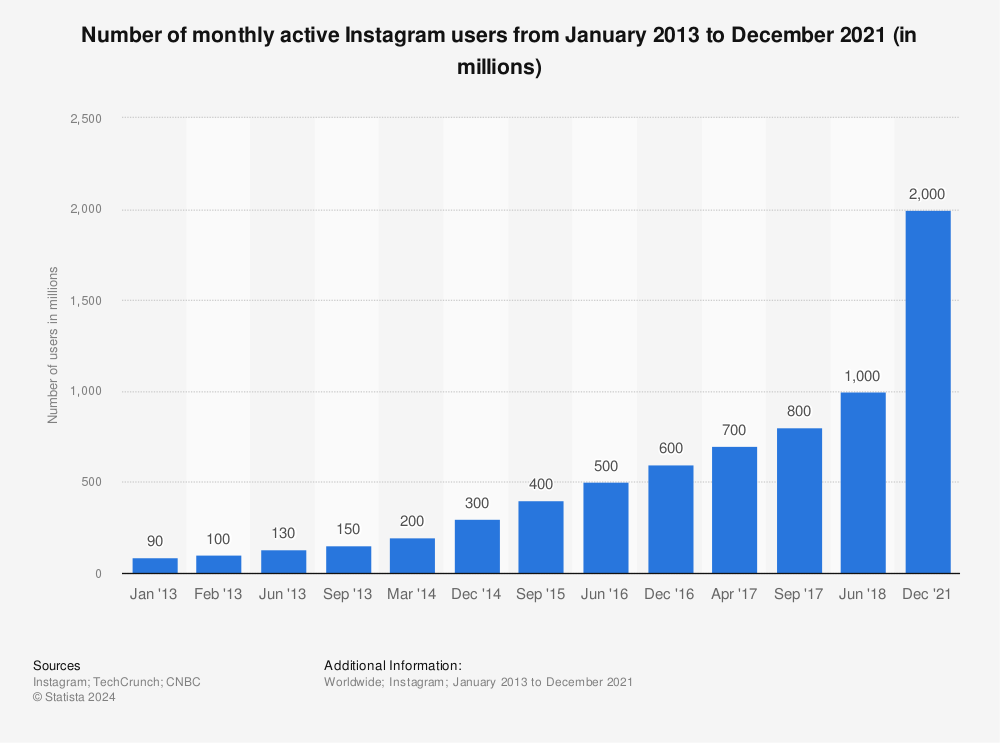
Instagram has a “smaller user base,” he points out — 800 million monthly active users as of September 2017, compared to Facebook’s 2.13 billion, “and less data you can pull,” making it a convenient place to experiment with API restrictions.
Source: Statista
But as that suspected experiment progresses, we could see further restrictions made on both Instagram and Facebook, especially with the General Data Protection Regulation (GDPR) coming into force next month.
But all of these events — starting with the alleged weaponization of Facebook by foreign agents to spread misinformation and influence the 2016 U.S. presidential election — and the resulting fallout from them is leading to pivotal moment for social networks, and the way they collect or leverage user data.
And out of these social networks, “Facebook is the biggest, and it’s getting the brunt of the focus,” says Becker.
We’ll see how it plays out — and which other networks follow suit.
Featured image credit: Instagram

31% of Tech Workers Say They Would #DeleteFacebook [New Data]
If you work in tech and haven’t yet downloaded the app Blind — well, you’re missing out.
Blind calls itself “an anonymous community app for the workplace,” where employees of various tech companies gather to namelessly ask questions, leave feedback, or start discussions about everything ranging from salary to industry gossip.
So when Blind surveyed its user base to find out how many tech workers planned to delete their Facebook accounts — inquiring minds had to know what the results were.
What’s #DeleteFacebook?
The survey came in light of a recent scandal around Facebook, when it was revealed that analysis and profiling firm Cambridge Analytica may have abused personal user data, which allegedly should never have been in its possession in the first place.
Among other responses to the allegations — which included outrage, criticism, and the occasional lack of surprise among some — the hashtag #deletefacebook began trending on Twitter, reflecting the widespread sentiment and desire to delete the app and one’s account on it for good.
Blind decided to run a survey of its users to find out how much the #deletefacebook trend resonated among tech workers, collecting a total of over 2,600 responses between March 20 and March 24 of this year.
The Survey Results
Overall, 31% of respondents answered “yes,” whereas 69% answered “no.”
The responses were especially intriguing when broken down among Blind’s top five tech companies, which were determined based on the highest volume of responses. Facebook’s own employee responses were accounted for, with 2% of that base reporting it would delete the app.

It’s worth noting that the second-highest company responding “yes” to #deletefacebook is Snap Inc.: the parent company of Facebook’s rival app, Snapchat, which the former has been trying to emulate by way of new features and capabilities for many years.
That began after Facebook’s failed attempt in 2013 to acquire Snapchat — and it’s worth noting that Facebook also owns Instagram, which is arguably the most similar property to Snapchat.
Notice that ride-hailing app Uber ranks third — reminding me of the 2017 trend to #deleteuber that came after a series of PR crises for the company. One of them was a business move that many interpreted to be Uber’s capitalization on a U.S. executive order calling for a travel ban from certain countries.
Scores of people are deleting Uber after the company serviced rides at JFK airport while taxis were striking against muslim ban #deleteuber pic.twitter.com/D8cJMlxOxQ
— Josh Butler (@JoshButler)
January 29, 2017
It’s also interesting to note that 38% of respondents from Google said they would delete Facebook, seeing as the company has faced its own backlash and negative headlines pertaining to user data in recent weeks, as well. In fact, when Facebook CEO was called upon Congress to testify on these events, he was invited to do so by some committees alongside Google CEO Sundar Pichai and Twitter CEO Jack Dorsey.
Note that Twitter is absent from the above graphic — suggesting that response rates from that company weren’t high enough to include in the top five.
Blind has informed us that Amazon had the highest response rate, with employees from that company accounting for roughly 11% of the survey’s total base. Within that segment, 34% of Amazon employees said they would delete Facebook.
What Do These Survey Results Mean?
For those who don’t work in tech — just how seriously should these results be taken?
Not very, says HubSpot Product Marketing Manager Marcus Andrews.
“There is a precedent for this sort of thing. Facebook makes a change or does something that is received negatively, and there is a lot of backlash in the press and among individuals,” Andrews says. “I personally will not delete Facebook. It’s at the forefront of technology and innovation, and I afford them some slack.”
Henry Franco, HubSpot’s social campaign strategy associate, also encourages taking the survey results with a grain of salt, largely due to the audience surveyed.
“This survey involved a tech-savvy audience that seeks anonymity so it can air its grievances about tech companies — an audience that might be predisposed to dislike Facebook,” Franco explains. “Tech workers are probably more likely to want to delete Facebook than the general population for similar reasons.”
It’s an interesting point. Similar to Andrews, I also chose not to delete Facebook, though I have deactivated on more than one occasion to take a break, prior to the Cambridge Analytica crisis.
HubSpot’s Co-founder and CTO Dharmesh Shah also recently shared his thoughts and insights on the matter.
“I know I’m likely in the minority of my tech circle friends, but I have no plans to delete Facebook from my life.”
– Dharmesh Shah
And while seeing my full Facebook data file — which may be in the possession of parties of which I’m not aware — was weird, I’m inclined to believe my decision not to delete my account is largely because I work in tech. After all, I spend my days reading, reporting, and analyzing news like this, which could be one reason I wasn’t entirely shocked by the Cambridge Analytica news (call me “jaded” or “cynical,” if you must).
Plus, I’ll return to my earlier note about Facebook’s ownership of Instagram — as well as Messenger and WhatsApp. As Andrews pointed out, the survey didn’t measure was how many of the people who said “yes” to deleting Facebook would also plan to delete its three umbrella apps.
For that reason, he says, “It’s just hard for me to take people seriously when they say they’ll delete Facebook.”
But as Franco notes, we won’t know for sure just how much stock to put into these survey responses until Facebook itself releases data and metrics on its user numbers, which he says the company traditionally does on occasions like earnings calls.
“The fact is, there are a ton of reasons not to delete your account, as Facebook has a strong product with a deep moat,” he explains. “Doing so might ultimately be more of a burden to the user, considering their data are also being collected by a number of other tech companies.”
And when that earnings call takes place — we’ll let you know what we find out.

16 of the Best Shopify Stores to Inspire Your Own
Ecommerce is predicted to account for 17% of all U.S. retail sales by 2022. As ecommerce grows, so does competition, making it hard to differentiate your website from everyone else’s.
It isn’t enough to have a one-of-a-kind product: to attract your ideal audience — and more importantly, to turn that audience into passionate brand ambassadors — you need a one-of-a-kind website.
A sleek and captivating Shopify website can attract a large audience and even act as your start-to-finish marketing pitch.
But you need to know what makes one Shopify website better than the rest. Here, we’ve curated a list of 16 best of the best Shopify stores to inspire your own.
Whether you’re new to ecommerce and about to design your first website, or an ecommerce veteran considering a redesign to outshine your competitors in 2018, this list offers plenty of creative ideas.
1. UgMonk
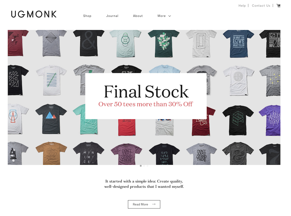
Jeff Sheldon starts the “About” section on his UgMonk website with a simple question: “Why was it so difficult to find fresh, high-quality, unique items in a modern aesthetic?” His Shopify site is simple and fresh, and exhibits UgMonk’s clothing, workplace items, bags, and prints in the same modern aesthetic style he sought while designing his unique products.
2. Pipcorn
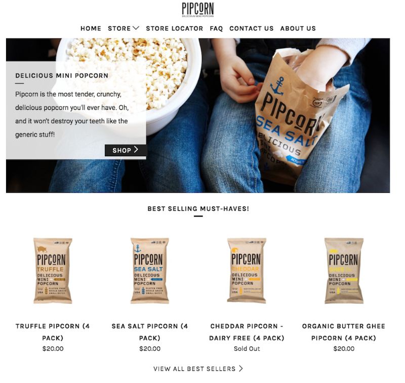
When you think about popcorn, I’m betting the first concern that comes to mind isn’t “is it healthy?” Pipcorn knows this, so their homepage features a simple slogan: “Most tender, crunchy, delicious popcorn … and it won’t destroy your teeth like the ‘generic’ stuff.” The best websites know their target audience’s primary concerns (in this case, the taste of popcorn and the kernels in teeth), and sell them on those solutions upfront. If you look on their “About Us” page, you’ll find Pipcorn’s products are also non-GMO, vegan, gluten free, and whole grain. Even though this could have easily been incorporated into their slogan, they chose to exclude it in favor of tackling our bigger concern: Does it taste good?
3. Taylor Stitch
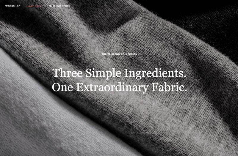
The inner child in me loves Taylor Stitch’s website because of the creative alternatives displayed when you hover over a product: a jacket, for instance, flips to an image of a model posing with the jacket on a motorcycle. The Taylor Stitch website does something else really cool, too — it almost immediately calls more attention to its message than its products, with “Three Simple Ingredients” written across most of the images you see on the homepage. Taylor Stitch doesn’t just make high-quality clothing. It also aims to reduce waste and help the environment by creating clothing with recycled or 100% natural products. On their website, you can’t miss their environmental efforts, and I’m betting this is a differentiating factor for most buyers when they come across the site.
4. Happiness Abscissa
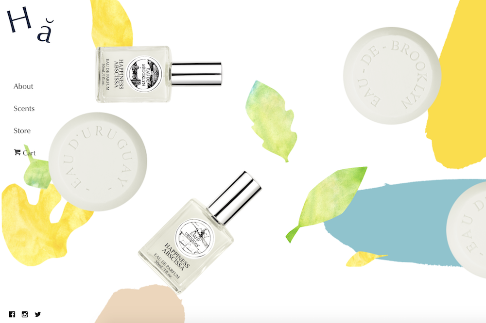
Many of the websites I mention on this list have clean, straight lines. Happiness Abscissa is unique. It shows a playful side by displaying a layout with bright abstract images, and even products hanging from different angles. Their logo, a crooked Ha, draws in the viewer’s attention, and then they use Ha in a sentence without defining the word, further stimulating viewers’ curiosity. You get the sense they don’t take themselves too seriously, affording the viewer a cheerful and fun experience.
5. Skinny Teatox
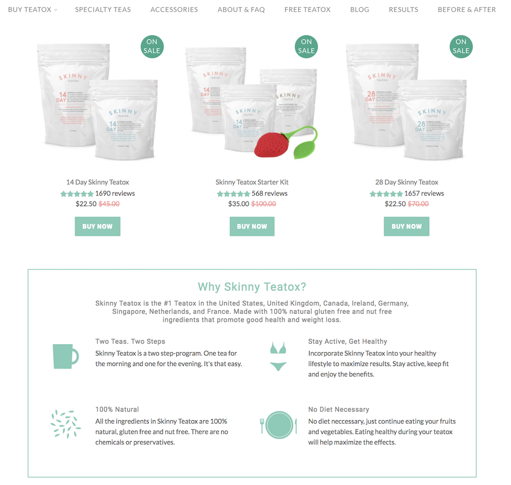
I myself was tempted to purchase the Teatox product when I checked out this site (in my defense, they were having a one-day flash sale I did not want to miss). The Skinny Teatox homepage immediately confronts your biggest concerns (“Is it natural? Yes. Will it work? Yes.”), and uses pastel colors and cute icons of bikinis and mugs to convey a fresh vibe. As I’ve noticed with a few other Shopify websites, Skinny Teatox places its products on the homepage with an easy “buy now” call-to-action. For a company that isn’t too complex to figure out (“All Natural Detox Weight Loss Tea” is written beside the company name in search engines), I think it makes sense to offer the viewers what they want upfront.
6. HELM Boots
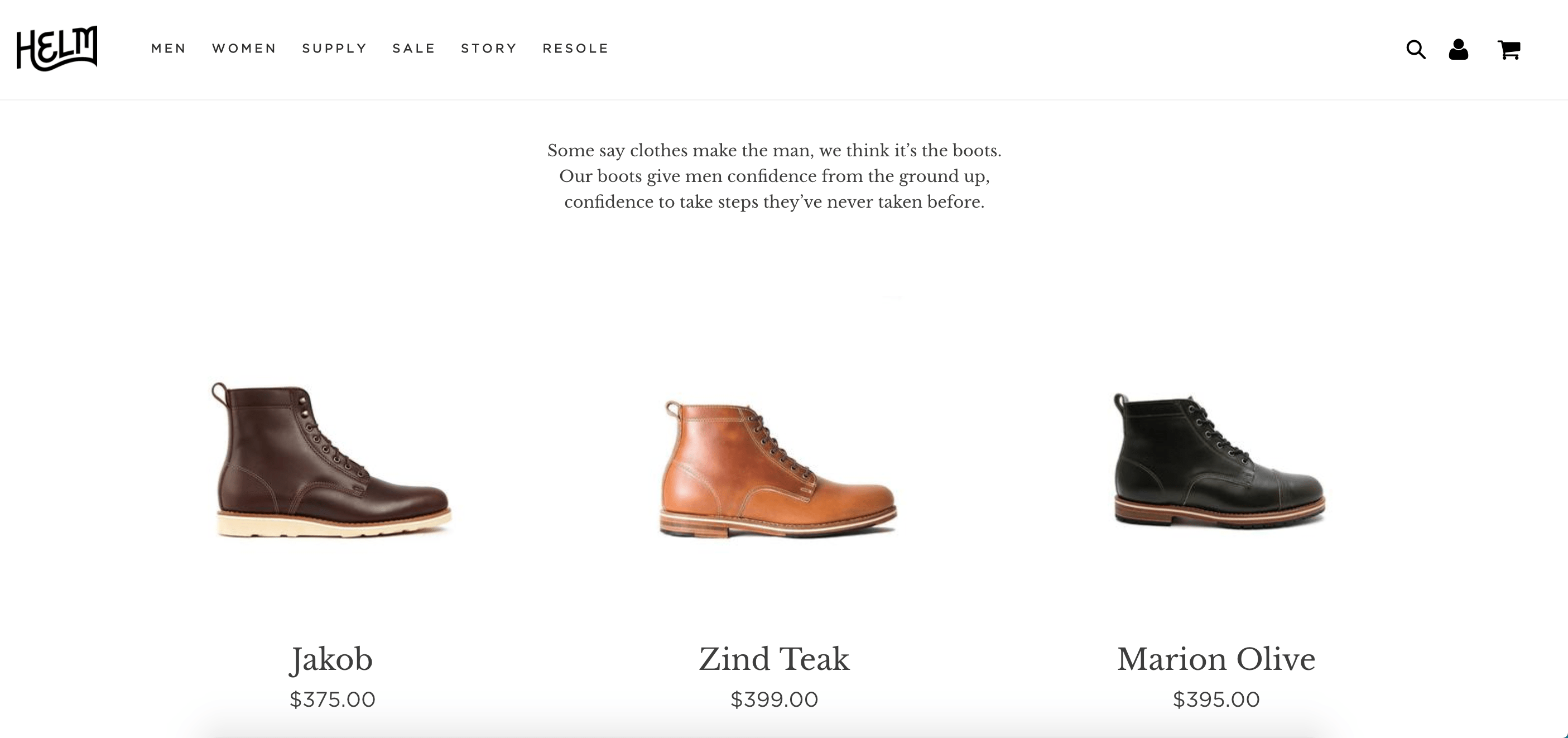
“Our boots give men confidence from the ground up, confidence to take steps they’ve never taken before.” Immediately, HELM incentivizes viewers through emotion: I might just be a guy looking to buy some boots, but yes, I’d definitely also like some confidence and bravery while I’m at it. The website looks elegant, and you can find everything from the homepage, which is designed to convert viewers at various stages of the buyer’s journey and assuage doubts as you scroll.
7. BioLite
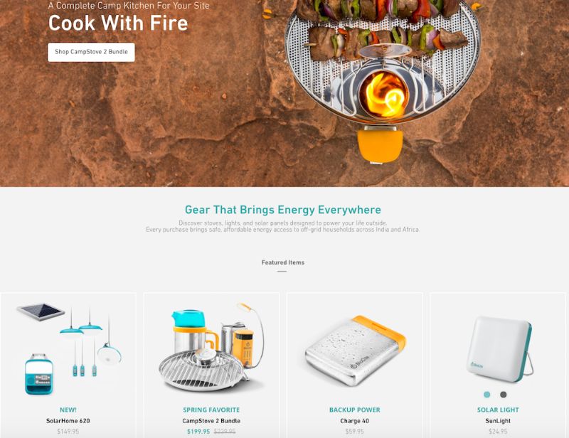
I might be a sucker for the little details, but the product images on BioLite’s website are enough to make me want to buy something (they look 3-D and illuminated, and some even look wet from rain!). Since BioLite’s major selling point is its humanitarian impact (the products bring affordable energy access to places in India and Africa), the first thing on the homepage is their slogan, “Gear That Brings Energy Everywhere,” which will appeal to their target audience. The navigation bar at the top also has a clever twist: beside each product title, there are little black-and-white cartoon drawings of the product.
8. Pop Chart Lab
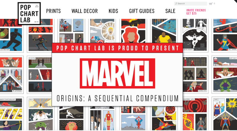
This site looks like one of the vintage and trendy prints they sell. It’s also organized in different categories depending on a viewer’s browsing preference. First, they have a scroll-down navigation with sub-categories ranging from, “NYC” to “Kids” to “Hip Hop” to “Wine.” They also have a carousel with some of their top prints on display. Below the carousel, they offer “wholesale,” “gift guides,” and “scratch-off” collections, for viewers who are having a difficult time discerning what they want. The shop manages to appear simple, despite its vast array of different print products, which is no easy feat.
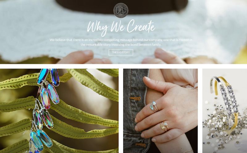
9. Luca and Danni
There’s something addictive about an ecommerce store that changes as you scroll. Luca and Danni’s page is highly interactive: as you scroll, some images get bigger and others get smaller, boxes of bracelets open up within images, and some images follow you down the page. It can be tricky to offer so much movement on a page while remaining coherent, but somehow, Luca and Danni accomplish this. There’s also a very zen vibe to the whole layout, with images of palm trees and cactuses, and calls-to-action with language like “brighter days: shop soil to sky,” and “find what speaks to you.”
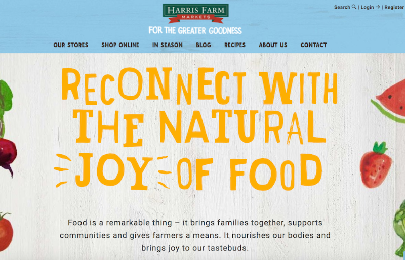
10. Harris Farm Markets
This is a family-owned company, something you can’t miss from the homepage. It’s casual and playful, with text that looks like a child’s handwriting and colorful drawings of fruit (there’s even an adorable drawing of a bee with animated wings!). Even the calls-to-action sound laid-back, like “What’s nature been up to?” It’s so genuine, you can imagine a family building the site together.
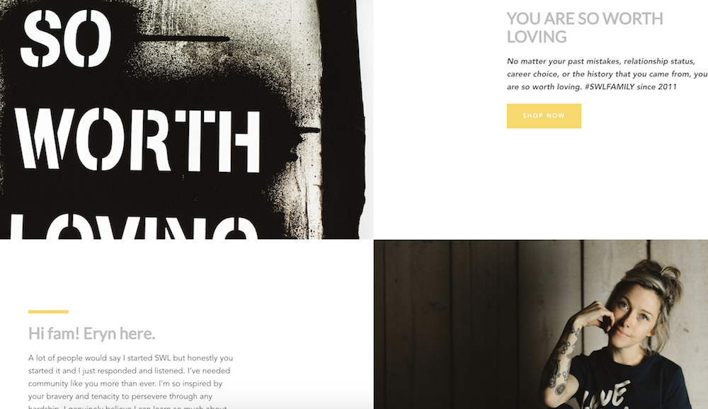
11. So Worth Loving
Sometimes, being evasive pays off. While it’s not always a good idea to hide your products from the viewer, it can be a very smart move if your product doesn’t make sense without understanding the backstory. With So Worth Loving’s site, you don’t even see the t-shirts for sale until a third of the way down the page. By that point, you’ve already read their slogan, a little bio from the founder, Eryn, and a full narrative about how the site began. The site leans into personal touches, with handwritten-looking quotes scrawled across images and very normal looking images of people posing in t-shirts. This is a great example of knowing your audience enough to break the rules.
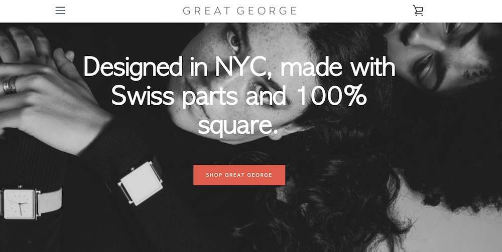
12. Great George Watches
I’m not an experienced watch shopper, so when I first read, “Made with Swiss parts and 100% square,” on Great George Watches’ homepage, I thought maybe “square” was a fancy term I’d understand if I knew watches. But as I scrolled and read, “Think outside the circle,” I realized these terms were unique to Great George Watches, which are all square-faced. By emphasizing what makes their product unique before even showing the produce, Great George Watches captivates the viewer. I love this shop because it has a refined and polished look, with black-and-white photos and an attention-grabbing red call-to-action button.
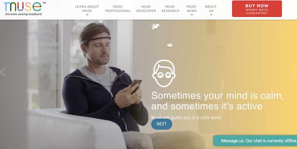
13. Choose Muse
Choose Muse incorporates a full-display video of a man putting headphones on and using Choose Muse’s product right from the homepage. The video starts playing immediately (as opposed to offering a play button option), which is especially eye-catching. I usually think simple is better when it comes to design, but Choose Muse proves me wrong, incorporating compelling designs with a ton of images and text, while still retaining a clean and enjoyable viewer experience.
14. Brilliant
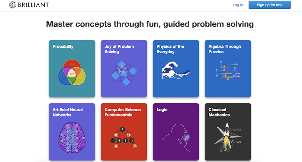
For a math and science website, Brilliant is surprisingly easy-to-navigate (even for someone like me, an English major … ), with big, colorful block buttons to choose the math concept you want to learn. This shop is also a fantastic example of using a call-to-action button wisely: there’s a big “sign up for free” button prominently displayed in the top right, and then another at the bottom of the page, after you’ve scrolled past the information you need. The site doesn’t have a navigation bar, but instead uses the web page to answer all the questions a viewer might have.
15. Holstee
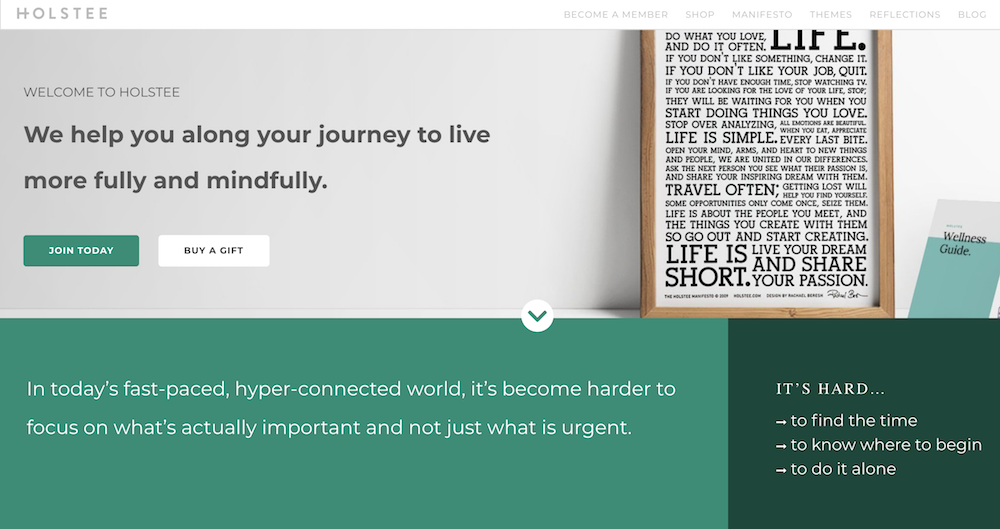
Holstee does a fantastic job of designing their site in tiers depending on a person’s initial level of interest in the product. For starters, you see the text, “We help you along your journey to live more fully and mindfully.” If you’re already convinced, you can click “Join today” right below the text. If not, you can continue to scroll down the homepage to find pain points this product reduces, read a “Holstee Manifesto,” see Membership benefits, check out testimonials, and find publications Holstee’s been featured in. Throughout the page, there are various calls-to-action, like “Choose a plan that’s right for you,” and then, at the end, “Become a member today.” I love this site because it becomes increasingly convincing and in-depth as you scroll: it’s clear they use their homepage as a start-to-finish marketing pitch.
16. Kylie Cosmetics
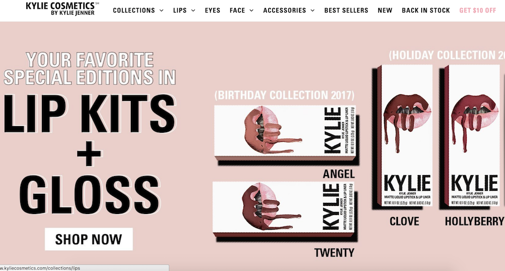
As one of the top 10 most followed accounts on Instagram, Kylie Jenner’s Cosmetic brand is one of the bigger brands using Shopify today. Her site has a very distinct girly-girl vibe, with a bubble-gum pink background showing off her lip kits and gloss. Her site is well-organized for her audience: the lip kits, her best-known items, are shown first on the homepage, with “top sellers” below that. I didn’t feel overwhelmed looking through the various cosmetic products like I thought I would, and what really stood out to me about Kylie’s site is the fun, colorful layout. It might not be everyone’s cup of tea, but I’m betting it appeals to her target audience.

How to Create an SEO Strategy for 2018 [Template Included]
Here’s a cliche among digital marketers: Search engine optimization (SEO) isn’t what it used to be.
Here’s a true statement you don’t hear as often: Your SEO strategy for 2018 shouldn’t focus on keywords.
These days, most businesses understand the basic concepts of SEO and why it’s important. However, when it comes to developing and executing a sound SEO strategy for your business, just creating content for the keywords your customers are searching for is both arduous and, well, wrong.
What Is SEO Strategy?
Modern SEO strategy is the process of organizing a website’s content by topic, which helps search engines like Google understand a user’s intent when searching. By optimizing a web page around topics first, you can rank well for long-tail keywords related to that topic.
Here are eight steps you can take to make sure all of your SEO bases are covered in 2018. Then, grab your free planning template to master on-page SEO.

Step 1: Make a List of Topics
Keywords are at the heart of SEO, but they’re actually not your first step to an organic growth play anymore. Your first step is to make a list of topics you’d like to cover from one month to the next.
To start, compile a list of about 10 short words and terms associated with your product or service. Use Google’s Keyword Tool to identify their search volume and come up with variations that make sense for your business.
You are associating these topics with popular short-tail keywords, as you can tell, but you’re not dedicating individual blog posts to these keywords. These short-tail keywords are simply too competitive to rank highly for on Google if you’re just starting to optimize your website for search. We’ll go over how to use these topics in just a minute.
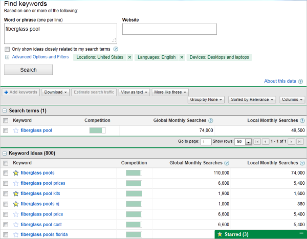
Using search volume and competition as your measure, narrow down your list to 10-15 short-tail keywords that are important to you. Then rank this list in order of priority or relevance to your business.
Each of these keywords is called a “pillar,” and it serves as the primary support for a larger “cluster” of long-tail keywords, which is what brings us to our next Step …
Step 2: Make a List of Long-Tail Keywords Based on These Topics
Here’s where you’ll start optimizing your pages for specific keywords. For each pillar you’ve identified, use your keyword tool to identify five to 10 long-tail keywords that dig deeper into the original topic keyword.
For example, we regularly create content on the topic of “SEO,” but it’s still very difficult to rank well on Google for such a popular topic on this acronym alone. You also risk competing with your own content by creating multiple pages that are all targeting the exact same keyword — and potentially the same search engine results page (SERP). Therefore, we also create content on conducting keyword research, optimizing images for search engines, creating an SEO strategy (which you’re reading right now), and other subtopics within SEO.
Use subtopics to come up with blog post or webpage ideas that explain a specific concept within each larger topic you identified in Step 1. Plug these subtopics into your keyword research tool to identify long-tail keywords on which to base each blog post.
Together, these subtopics create a cluster. So, if you have 10 pillar topics, they should each be prepared to support one cluster of five to 10 subtopics. This SEO model is called a “topic cluster,” and modern search engine algorithms depend on them to connect users with the information they’re looking for.
Here’s a short video on this concept:
Think of it this way: The more specific your content, the more specific the needs of your audience are — and the more likely you’ll convert this traffic into leads. This is how Google finds value in the websites it crawls; the pages that dig into the interworkings of a general topic are seen as the best answer to a person’s query, and will rank higher.
Step 3: Build Pages for Each Topic
When it comes to websites and ranking in search engines, trying to get one page to rank for a handful of keywords can be next to impossible. But here’s where the rubber meets the road:
Take the 10 pillar topics you came up with in Step 1 and create a web page for each one that outlines the topic at a high level — using the long-tail keywords you came up with for each cluster in Step 2. A pillar page on SEO, for example, can describe SEO in brief sections that introduce keyword research, image optimization, SEO strategy, and other subtopics as they are identified. Think of each pillar page as a table of contents, where you’re briefing your readers on subtopics you’ll elaborate on in blog posts.
Use your keyword list to determine how many different pillar pages you should create. Ultimately, the number of topics for which you create pillar pages should coincide with how many different products, offerings, and locations your business has. This will make it much easier for your prospects and customers to find you in search engines no matter what keywords they use.
Each web page needs to include relevant content for your prospects and customers and should include pictures and links to pages on your site to enhance the user experience. We’ll talk about those links in Step 4.
Step 4: Set Up a Blog
Blogging can be an incredible way to rank for keywords and engage your website’s users. After all, every blog post is a new web page that gives you another chance to rank in search engines. If your business does not already have a blog, set one up. This is where you’ll elaborate on each subtopic and actually start showing up on Google.
As you write each blog post and fill up your clusters, you should do three things:
- First, don’t include your long-tail keyword more than three or four times throughout the page. Google doesn’t consider exact keyword matches as often as it used to. In fact, too many instances of your keyword can be a red flag to search engines that you’re “keyword stuffing.” This can penalize your website and drop your rank.
- Second, link out to the pillar page you created on this topic. You can do this in the form of tags in your content management system (CMS), or as basic anchor text in the body of the article.
- Once you publish each blog post, link into it from the pillar page that supports this subtopic. Find the point in your pillar page that introduces this blog’s subtopic, and link it here.
By connecting both the pillar and the cluster in this way, you’re telling Google there’s a relationship between the long-tail keyword and the overarching topic you’re trying to rank for.
Step 5: Blog Every Week to Develop Page Authority
Not every blog post or web page you write needs to belong to a topic cluster. There’s also value in writing about tangential topics you’re customers care about in order to give your website authority in the eyes of Google. This will cue Google to pay extra attention your domain as you add content to your primary topics.
With that in mind, make a point to blog at least once a week. Remember, you are blogging primarily for your audience, not the search engines. Write about things your audience and/or prospects are interested in, make sure you’re including relevant keywords where appropriate, and your audience will slowly start to notice and click.
Keep in mind that each topic won’t be equal in importance, and as your clusters get off the ground, you’ll need to prioritize based on your company’s needs. So, create a list of all the different web pages you would like to create and rank them. Then, develop a schedule and devise a plan of attack to get those pages built.
Keep your list updated and prioritized by what web pages will help you to best achieve your business goals.
Step 6: Create a Link-Building Plan
The topic cluster model is your way forward in SEO this year, but it’s not the only way to get your website content to rank higher once it’s been created.
Our first five steps were dedicated to on-page SEO tactics. Link-building is the primary objective of off-page SEO, and is also a huge factor in how search engines rank your web pages. What is link-building? Glad you asked.
Link-building is the process of attracting inbound links (also called “backlinks”) to your website from elsewhere on the web. As a general rule, the more page authority the origin website has, the bigger affect it will have on the rank of the web page to which it is linking.
Dedicate some time to brainstorm all the different ways you can attract inbound links to your website. Start small –- maybe share your links with other local businesses in exchange for links to their sites. Write a few blog posts and share them on Twitter, Facebook, Google+, and LinkedIn. Consider approaching other bloggers for guest blogging opportunities through which you can link back to your website.
Another great way to attract inbound links is to use your blog to post articles related to current events or news. That way, you have shot of getting linked to from an industry influencer or other bloggers in your industry.
Step 7: Stay Current on SEO News & Practices
Like the overall marketing landscape, the search engine space is ever-evolving. Staying on top of current trends and best practices is a difficult task, but there are multiple online resources that can make it easy for you to stay on top of SEO news and changes that may impact your website and your SEO strategy.
Here are a few resources to check out:
Step 8: Measure and Track Your SEO Success
SEO can take a lot of time and effort. What good is spending all this time and effort if you can’t see the fruits of your labor? There are many metrics you can track on a daily, weekly, or monthly basis to keep your SEO plan on track and measure your success.
Because the metric you care about is organic traffic (traffic that comes from a given search engine), seek out a tool that allows you to track both your overall organic traffic number and how your pages are ranking for each long-tail keyword you’re trying to rank for. SEMrush is a great reporting tool for just this purpose.
Create a monthly dashboard using Excel, Google Sheets, or a web analytics package so you can monitor how much traffic comes to your website from organic search.
Also, tracking indexed pages, leads, ROI, inbound links, keywords, and your actual ranking on SERPs (search engine results pages) can help you recognize your success as well as identify areas of opportunity.

People Often Ask:
What is domain authority in SEO?
Domain Authority in SEO is a rank that measures how popular and trustworthy search engines see your website. It is calculated based on how websites link to each other on the world wide web.
What are SEO’s?
Search Engine Optimizers (SEO’s) are people who optimize websites to make them show up higher on search engines and gain more website visitors.
What Does a SEO Specialist Do?
An SEO Specialist is someone who is an expert on the topic of search engine optimization. They specialize in the optimization of websites to increase the number of visits they gain from search engines.
What Does a SEO Executive Do?
An SEO Executive optimizes websites to make them show up higher on search engines and gain more website visitors. They work on off-page and on-page SEO.
What Is a SEO Content Writer?
An SEO Content Writer is someone who writes content for the purpose of having it show up on search engines and gain website visitors. They are generally knowledgeable in the are of both SEO and content marketing.
What Is the Job of a SEO?
The job of an SEO is to manage the optimization of websites to ensure they gain website traffic from search engines such as Google & Bing.
How Do I Become an SEO Specialist?
To become an SEO specialist you can study marketing in university or online and/or gain practical experience in optimizing websites.

Facebook Cover Photo Do’s and Don’ts [+Cover Photo Templates]
Facebook Cover Photo Size
Optimize your cover photo for the right dimensions: 851 pixels wide and 315 pixels tall for desktop, 640 pixels wide by 360 pixels tall for mobile. If your uploaded image is smaller than these dimensions, Facebook will stretch it to fit — making it look blurry.
When people arrive at your Facebook Page, where do you think they first look?
I’ll give you some hints. It’s a visual piece of content that sits at the top of your Page. Its dimensions are 851 pixels wide by 315 pixels tall. It takes up almost a quarter of the screen on most desktop browsers.
That’s right — it’s your Facebook cover photo.
Sometimes called your Facebook banner, this graphic is one of the most noticeable parts of your Page. It’s therefore crucial that you follow Facebook cover photo best practices.
Whether you’re using Facebook to generate leads, close your next sale, or create a customer community, knowing how to make and optimize your cover photo is very important. Read on to learn what you should (and shouldn’t) do in your cover photo, and grab some social media performance tracking templates at the bottom of the page.

(You’ll also get cover photo templates for Twitter, LinkedIn, YouTube, and Google+ with your cover photo template download!)

11 Best Practices for Your Facebook Cover Image
1. Do abide by Facebook’s cover photo guidelines.
It seems like a no-brainer, but obeying Facebook guidelines is crucial to your Facebook Page existing in the first place. I’d highly suggest reading through the full Page Guidelines, but here are a few important things to keep in mind for your Facebook banner:
- Your cover is public.
- Covers can’t be deceptive, misleading, or infringe on anyone else’s copyright.
- You can’t encourage people to upload your cover to their personal timelines.
If you get caught violating the above terms, Facebook could take action against your Page. And while Facebook doesn’t explicitly say what will happen if you violate their Page guidelines, it’s probably not smart to get your Facebook Page taken down over a cover photo infraction, so read the guidelines in full and adhere to them.
2. Do make sure your Facebook cover photo size is right.
As stated at the beginning of this article, the best Facebook banner size is 851 pixels wide by 315 pixels tall for computers, and 640 pixels wide by 360 pixels tall on mobile devices.
You don’t want to spend all this time designing a cover photo only to have it look weird when you upload it to Facebook.
If you upload an image smaller than those dimensions, Facebook will stretch it to fit the right size, as long as it’s at least 399 pixels wide and 150 pixels tall.
If you want a no-hassle way to make sure your cover photos are the right size, download our pre-sized template for Facebook cover photos here.
3. Don’t worry about the old ‘20% text’ rule, but still try to stay visual.
Back in 2013, Facebook removed any reference to the 20% rule on text in cover photos … but that doesn’t mean you should go wild with using text in your cover photo. The previous rule said that only 20% of your cover photo could be text. Personally, I thought that was way too restrictive for marketers, but the sentiment behind the rule was a good one.
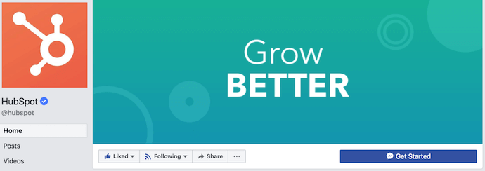
If you’re going to use text in your cover photo, keep that text concise. Your photo will be much more informative and engaging. You can see how we’ve tried to strike that balance on HubSpot’s Facebook Page below.
4. Do give your cover image a focal point and colors that match your brand.
Think of your cover photo as the portion of your Page that’s “above the fold.” If it’s distracting or confusing, people will be more likely to click off the Page.
Many of the best Facebook cover photos include a centerpiece to focus visitors’ attention, along with a color scheme that aligns with the rest of their brand. Remember, your social media accounts are extensions of your business, and should give that impression to visitors right away.
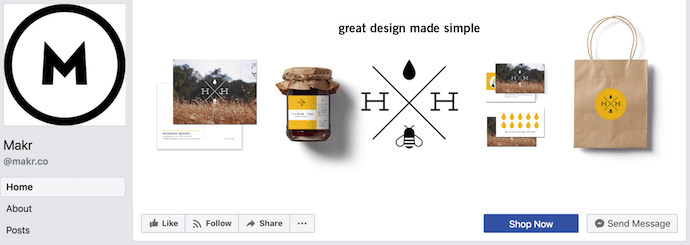
They also use negative white (i.e., empty) space as an advantage to make the subject, any copy on there, and other elements unique to Facebook (like the CTA button on Facebook business Pages) stand out even more.
Here’s an example from Makr:
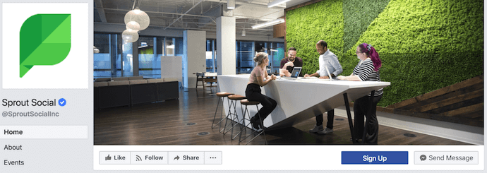
And one from social media management platform Sprout Social:
5. Do consider publishing a Facebook cover video.
You read that right. Facebook Business Pages now have the option to add a video in lieu of a static cover photo, provided they meet certain requirements — which we dug up for you:
How to Make a Video Your Cover Photo on Facebook
Post a Facebook cover video by saving a video file at 820 pixels wide by 426 pixels tall to your desktop. Open your Facebook Business page, click “Change Cover” at the top-left of your cover photo, and select “Upload Photo/Video” to format and publish the desktop file to your Facebook page.
Facebook currently supports cover videos that are between 20 and 90 seconds long, and a minimum of 820 pixels wide by 320 pixels tall.
Once you pull the file from your desktop, you’ll click “Next” where you’ll be asked to select from 10 thumbnail versions of your video. The thumbnail you choose will display for users who hover their cursor over your profile photo before visiting your full Business Page.
Cover videos are a terrific option for the video-inclined, and brands across numerous industries have already taken advantage of it to hold their visitors’ attention. Brooks Running, Brightcove, and the New England Aquarium all have great cover videos to inspire you.
As you can see from these examples, your video should be just as simple as a cover photo. Keep in mind the same guidelines outlined in best practice #1 apply to cover videos as well.
6. Don’t try to blend the contents of your cover photo with your profile picture.
With some clever design tweaks, you used to be able to manipulate your profile picture and cover photo so they appear as if they’re two parts of the same canvas. You can still do this on your personal profile, but Facebook no longer sets up Business Pages this way.
One of Paris’ former cover photos did this nicely:
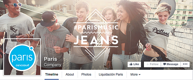
Now, as shown in the examples earlier in this article, the profile picture is completely separate from the cover photo.
We admire your creativity, but don’t prepare your design this way if you haven’t yet launched a Business Page — you’ll be disappointed.
7. Do draw attention to the action buttons on the bottom right.
You might’ve noticed in a few of the cover photo examples above that their primary call-to-action (CTA) buttons were different. Makr’s says “Shop Now,” while Sprout Social’s says “Sign Up.”
Depending on your business, you can launch a Page on Facebook with a unique CTA button to the bottom right of your cover photo. Take this button into consideration when designing your cover photo, and make it clear in the photo that this is a visitor’s next step.
Hotel Urbano does this is a charming way below, using the girl in goggles to draw your eyes toward the buttons she seems to be swimming toward …
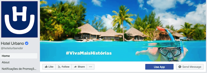
Note: While it might seem like a good idea to add directional cues like an arrow to get people to click on the CTA buttons, note that those CTA buttons don’t appear the same way on the mobile app. In other words, it might be confusing to mobile users if you directly integrate the cover photo design with the buttons.
I’ll show you how Business Pages look on mobile devices in just a minute.
8. Do right-align the objects in your cover photo.
Since your profile picture is on left, you want to add some balance to your Facebook cover photo design by having the focus of the image be on the right.
Take a look at these cover photos. Which one looks more aesthetically pleasing?
Right-aligned focus:
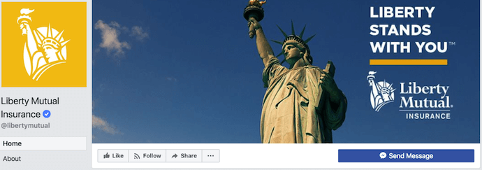
Left-aligned focus:
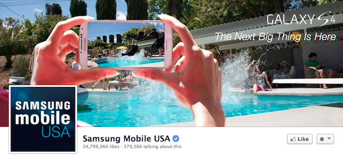
Doesn’t the right-aligned cover photo look better? The biggest design elements (the profile picture, the text, and the Statue of Liberty) are evenly spaced. In Samsung’s old cover photo, your attention goes immediately to the left side of the page, completely missing the name of the product on the upper-right side.
Not only is adding balance a crucial element of design, but it also allows for your cover photos to be more visually effective on mobile. Which brings me to my next point …
9. Do keep mobile users in mind.
In April 2016, Facebook reported that over half of its user base (54.2%) access the social network exclusively from mobile devices. That’s huge — and it’s exactly why it’s so important to keep mobile users top-of-mind when designing your Facebook cover photo.
On mobile, a much larger portion of your cover photo is blocked out because the profile picture and the Page name are on top of the cover photo.
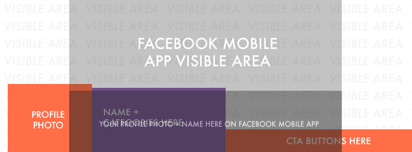 Image Credit: Twelveskip
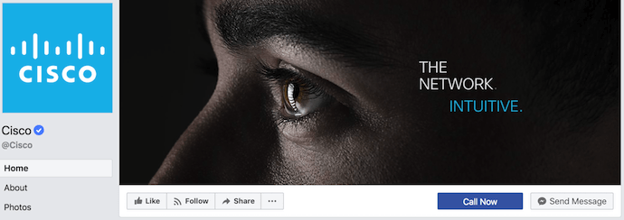
Let’s take a look at a real-life example. Below, take a look at what Cisco’s Facebook Page looks like in a desktop browser versus on Facebook’s mobile app.
Desktop:
Mobile:
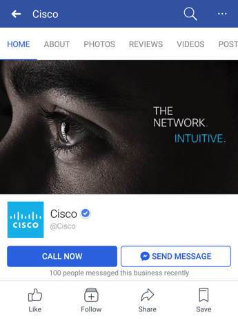
Notice that the sides of the photo are cut off on mobile. Whereas your cover photo displays at 851 pixels wide by 315 pixels tall on desktop, it displays only the center 640 pixels wide by 360 pixels tall on smartphones. Take a look at this Facebook help document for more information.
Notice, by the way, how the text in Adobe’s cover photo is cut off on the right-hand side. While it looks best to right-align your visual elements, be careful not to put important content so far to the right that it gets cut off on mobile.
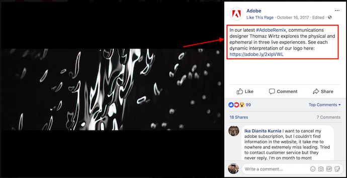
10. Do include a shortened link in your cover photo description that aligns with your page CTA.
If you want to use your cover photo to support a Page CTA, make sure your cover photo description also includes a text CTA and link to the same offer. This way, any time people view your cover photo directly, they can access the download link.
Here’s this practice in action on Adobe’s Facebook Page:
Make sure you shorten your links and add UTM codes so you can track clicks on them. Shortening and tracking features are available in the HubSpot Marketing Platform and in tools like bitly.
(If you want to learn more about how to write effective call-to-action copy for your cover photo description, click here to download our free ebook on creating compelling CTAs.)
11. Do pin a related post right below your Facebook cover image.
Have you ever “pinned” a post to your Facebook Page’s Timeline? Basically, pinning a post allows you to highlight a typical Facebook post on the top of your Timeline for seven days. It’s signified by a small blue push pin on the top right of the post, like on Fashion Nova’s Page below:
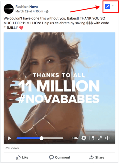
How does this relate to optimizing your Facebook cover photo? Well, if you’re spending time aligning your Facebook Page CTA, your cover photo design, and your cover photo description copy, you should also make sure to post about the same thing directly to your page, and pin that post to the top of your Timeline.
That way, you’re giving people one very clear call-to-action when they arrive to your page (albeit in several different locations) — which should help conversions.
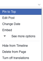
To pin a Facebook post: Simply publish the post to Facebook, then click the three dots on the top right corner of the post and choose “Pin to Top.”
Want to see how HubSpot uses Facebook? Like our Facebook Page here.

The 17 Best Advertisements of All Time
I’ve always been a little leery of proclaiming anything “the best.” I never declared anyone my best friend as a kid because I was afraid my other friends might assume I thought less of them.
So it was a little difficult for me to come up with just one “best” advertisement of all time — which is why there are 17 in this post instead.
Why are these campaigns some of the best ads of all time?
Because of the impact they had on the growth of the brand, and because they manage to hit on some universal truth that allows us to remember these campaigns years after they first began. In fact, some of us might not have even been alive when these campaigns first aired.
But first …
How to Create an Advertisement
- Describe your ad’s audience using demographics and psychographics.
- Determine where this audience consumes content.
- Establish how your brand/product will be positioned.
- Set company goals for this advertisement.
- Identify the advertisement’s channel and format.
- Write the ad’s primary text copy.
- Incorporate persuasive messaging into your ad copy.
- Add a natural call to action and/or callback to your logo.
- Adapt the design for your brand, ad channel, and ad format.
And now, without further do, here they are, in no particular order (but feel free to let us know which one is your favorite in the comments): 17 of the best advertisements of all time, and the lessons we can learn from them.

The 17 Best Advertisement Examples (And What Made Them Successful)
1. Nike: Just Do It.
 Source: brandchannel
Did you know that, once upon a time, Nike’s product catered almost exclusively to marathon runners? Then, a fitness craze emerged — and the folks in Nike’s marketing department knew they needed to take advantage of it to surpass their main competitor, Reebok. (At the time, Reebok was selling more shoes than Nike). And so, in the late 1980s, Nike created the “Just Do It.” campaign.
It was a hit.
In 1988, Nike sales were at $800 million; by 1998, sales exceeded $9.2 billion. “Just Do It.” was short and sweet, yet encapsulated everything people felt when they were exercising — and people still feel that feeling today. Don’t want to run five miles? Just Do It. Don’t want walk up four flights of stairs? Just Do It. It’s a slogan we can all relate to: the drive to push ourselves beyond our limits.
The Lesson
When you’re trying to decide the best way to present your brand, ask yourself: What problem are you solving for your customers? What solution does your product or service provide? By hitting on that core issue in all of your messaging, you’ll connect with consumers on an emotional level that is hard to ignore.
2. Coke: Share a Coke
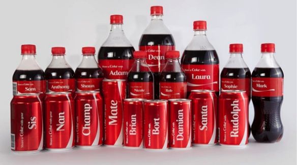
Big brands are often hard-pressed to do something ground-breaking when they’re already so big. So, what did Coca-Cola do to appeal to the masses? They appealed to individuals — by putting their names on each bottle.
The Share a Coke campaign began in Australia in 2011, when Coca-Cola personalized each bottle with the 150 most popular names in the country. Since then, the U.S. has followed suit, printing first names across the front of its bottles and cans in Coke’s branded font. You can even order custom bottles on Coke’s website to request things like nicknames and college logos.
It was a breaking story across the marketing and advertising industry. Many consumers were enchanted by it, while others were confused by it — why make a temporary item so personal? Pepsi even released counter-ads shortly after the campaign launched.
Nonetheless, Coke received immediate attention for it.
The Lesson
Coke fans are regular buyers, and the company leaned into that sense of individual ownership with full force. Wondering what name you’ll get out of the vending machine was a fun thrill in and of itself — even if it isn’t yours, it encourages you to “share a Coke” with whomever’s name is on the front.
3. Absolut Vodka: The Absolut Bottle

Source: Burning Through Journey Blog
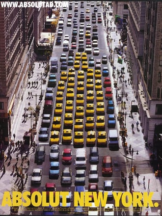
Despite having no distinct shape, Absolut made its bottle the most recognizable bottle in the world. Its campaign, which featured print ads showing bottles “in the wild,” was so successful that they didn’t stop running it for 25 years. It’s the longest uninterrupted ad campaign ever and comprises over 1,500 separate ads. I guess if it ain’t broke, don’t fix it.
When the campaign started, Absolut had a measly 2.5% of the vodka market. When it ended in the late 2000s, Absolut was importing 4.5 million cases per year, or half of all imported vodka in the U.S.
The Lesson
No matter how boring your product looks, it doesn’t mean you can’t tell your story in an interesting way. Let me repeat: Absolut created 1500 ads of one bottle. Be determined and differentiate your product in the same way.
4. Anheuser-Busch: Whassup
When’s the last time an advertisement literally changed the way we talk to one another? Allow me to answer that question with another question: “Whassup?!”
This series of commercials, which first appeared in late 1999, features a group of friends connecting on a group phone call (we don’t do those much anymore, do we?) while drinking beer and “watching the game” on TV.
It starts gently: “What are you doin’?” Someone asks. “Watching the game, havin’ a Bud” (a Budweiser), someone replies. As more friends pick up the phone, the hilarity ensues: “WHASSUP!?” is yelled back and forth, becoming a classic catchphrase and an icon of beer-drinking culture that ran constantly on sports networks over the next few years.
The Lesson
The ad took pop culture by storm during the Super Bowl in 2000, and you can still hear its echoes today. Why? Anheuser-Busch showed us just how silly and informal an ad can be without ruffling feathers or going off-brand. Dare to celebrate your audience’s absurdities. The more genuine your ad is, the more valuable your product is.
5. Miller Lite: Great Taste, Less Filling
Source: BuildingPharmaBrands blog
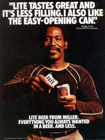
Think it’s easy to create a whole new market for your product? The Miller Brewing Company (now MillerCoors) did just that with the light beer market — and dominated it. The goal of the “Great Taste, Less Filling” campaign was getting “real men” to drink light beer, but they were battling the common misconception that light beer can never actually taste good.
Taking the debate head-on, Miller featured masculine models drinking their light beer and declaring it great tasting.
The Lesson
For decades after this campaign aired, Miller Lite dominated the light beer market it had essentially created. What’s the lesson marketers can learn? Strive to be different. If people tell you there isn’t room for a product, create your own category so you can quickly become the leader.
6. Always: #LikeaGirl
My eyes are still wet while writing this blurb.
The Always brand hit a home run with this advertisement, not because it went viral after the commercial ran in the 2015 Super Bowl, but because it was a groundbreaking message that hundreds of millions of people repeated long after the campaign was over.
The campaign began as a commercial explaining the stigma behind playing sports “like a girl” — implying that the boy’s way is better or correct. By the end of the ad, the message is both clear and inspiring: Girls are just as fit and capable as boys are, particularly during puberty — a stage of life that is extremely important to Always and its women’s products.
The message is now a holistic initiative by Always you can learn about here, and a hashtag that’s still used on social media today.
The Lesson
Acknowledge not just your audience, but the challenges they face — especially the ones that reflect your time or culture. Not every societal issue is off limits to marketers and advertisers. Take a stand on the ones you know your audience supports, and you’ll access a customer base that identifies with your passion.
7. Volkswagen: Think Small
Source: design shack
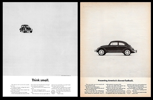
Many marketing and advertising professionals like to call Volkswagen’s “Think Small” campaign the gold standard. Created in 1960 by a legendary advertising group at Doyle Dane & Bernbach (DDB), the campaign set out to answer one question: How do you change peoples’ perceptions not only about a product, but also about an entire group of people?
See, Americans always had a propensity to buy big American cars — and even 15 years after WWII ended, most Americans were still not buying small German cars. So what did this Volkswagen advertisement do? It played right into the audience’s expectations. You think I’m small? Yeah, I am. They never tried to be something they were not.
The Lesson
That’s the most important takeaway from this campaign: Don’t try to sell your company, product, or service as something it’s not. Consumers recognize and appreciate honesty.
8. Google: Year in Search
This isn’t the oldest or most well-known advertisement on our list, but it’s become the most powerful over its nine-year (and still going) existence. So powerful and so true, you forget it’s an advertisement.
Year in Search began in 2009 as “Zeitgeist,” a written report of the public’s most common Google searches over the previous 12 months. The following year, Google adapted it for a three-minute video. Since then, it’s been a bold, yearly reminder of how much we depend on Google for information on the news and events that give the entire world pause. Check out the company’s latest video from 2017 above.
The Lesson
Remind your customers how much you care that they care. These stories elicit a variety of emotions, but ultimately unite everyone — no matter what Google products they might like — through an uplifting message of how our usage of the company reflects the best in all of us.
9. Dos Equis: The Most Interesting Man in the World

Source: The Open Field
You know who he is. He smokes Cuban cigars, is always surrounded by beautiful women, and — most importantly — he drinks Dos Equis beer.
A key component of a strong campaign for an indulgent vice — like beer, desserts, or luxury items — is to make it cool. And when it comes to The Most Interesting Man in the World, he’s one of the coolest commercial guys there is.
And at the end of every commercial, he says: “I don’t always drink beer, but when I do, I prefer Dos Equis. Stay thirsty my friends.”
The Lesson
The hilarious hyperbole employed in this campaign makes it memorable the next time viewers head out to buy some beer. And even though Dos Equis recently replaced The Most Interesting Man with a new actor, he is forever immortalized in meme culture and in liquor stores due to this short, sweet, and memorable tagline — and the cool dude vibe it makes viewers harken back to.
10. California Milk Processor Board: Got Milk?
Source: Broward Palm Beach New Times
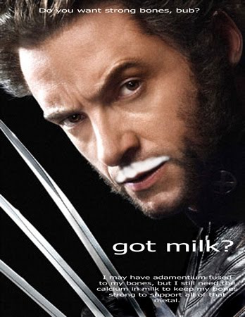
Thanks to the California Milk Processor Board’s “Got Milk?” campaign, milk sales in California rose 7% in just one year. But the impact ran across state borders, and to this day, you still can’t escape the millions of “Got [Fill-in-the-Blank]?” parodies.
Note, though, that the ad didn’t target people who weren’t drinking milk; it instead focused on the consumers who already were.
The Lesson
It’s not always about getting a brand new audience to use your products or services — sometimes, it’s about getting your current audience to appreciate and use your product more often. Turn your audience into advocates, and use marketing and ad content to tell them why they should continue to enjoy the product or service you are already providing for them.
11. Metro Trains: Dumb Ways to Die
Yes, you read that right: Dumb Ways to Die.
In Melbourne, Australia, Metro Trains wanted to get across a simple message: No horsing around near train tracks. Disorderly conduct could lead to injuries, or even death, but instead of typical warning signs or announcements inside train stations, Metro Trains came up with Dumb Ways to Die, a song that has garnered 157 million YouTube views since it debuted in 2012.
The song is about dumb ways to die — for example, by poking a grizzly bear with a stick, or taking your helmet off in outer space — and it features a catchy little chorus you won’t be able to stop humming to yourself (because singing it is a little morbid): “Dumb ways to die, so many dumb ways to die.”
At the end of the video, after you’ve watched adorable cartoon characters dying in the dumbest of ways, you get to the moral of the story: There are many dumb ways to die, but the dumbest possible way would be if you died while standing on the edge of a train platform, drove through a railroad sign, or tried to cross over a train track.
The Lesson
This beloved, now-famous campaign communicates a simple idea in a creative and memorable way — and you don’t feel like you’re being nagged, the way some public service announcements do. If your subject matter is grim or boring, consider using creativity to get your message across.
12. Apple: Get a Mac
While there have been many great Apple campaigns, this one takes the cake. The video above is just one of a series of iterations of this campaign, and the Mac vs. PC debate ended up being one of the most successful campaigns ever for Apple. The company experienced 42% market share growth in its first year with its help. These commercials tell Mac’s audience everything they need to know about the product without being overt — and in a clever way.
The Lesson
Just because your product does some pretty amazing things doesn’t mean you need to hit your audience over the head with it. Instead, explain your product’s benefits in a relatable way so consumers are able to see themselves using it.
13. Clairol: Does She or Doesn’t She?
Source: Current360
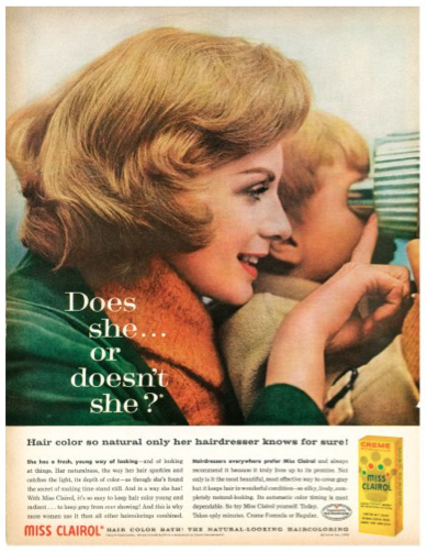
The first time Clairol asked this question in 1957, the answer was 1 to 15 — as in, only 1 in 15 people were using artificial hair color. Just 11 years later, the answer was 1 of 2, according to TIME Magazine. The campaign was apparently so successful that some states stopped requiring women to denote hair color on their driver’s license. When your ad campaign starts changing things at the DMV, you know you’ve hit a nerve.
Clairol did the opposite of what most marketers would do: They didn’t want every woman on the street running around saying they were using their product. They wanted women to understand that their product was so good that people wouldn’t be able to tell if they were using it or not.
The Lesson
Sometimes, simply conveying how and why your product works is enough for consumers. Showing becomes more effective than telling.
14. De Beers: A Diamond is Forever
Source: BBC News
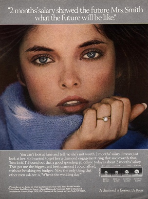
In 1999, AdAge declared De Beers’ “A Diamond is Forever” the most memorable slogan of the twentieth century. But the campaign, which proposed (pun very much intended) the idea that no marriage would be complete without a diamond ring, wasn’t just riding on the coattails of an existing industry. De Beers actually built the industry; it presented the idea that a diamond ring was a necessary luxury.
According to the New York Times, N.W. Ayer’s game plan was to “create a situation where almost every person pledging marriage feels compelled to acquire a diamond engagement ring.”
The Lesson
Advertising can make a relatively inexpensive product seem luxurious and essential.
15. Old Spice: The Man Your Man Could Smell Like
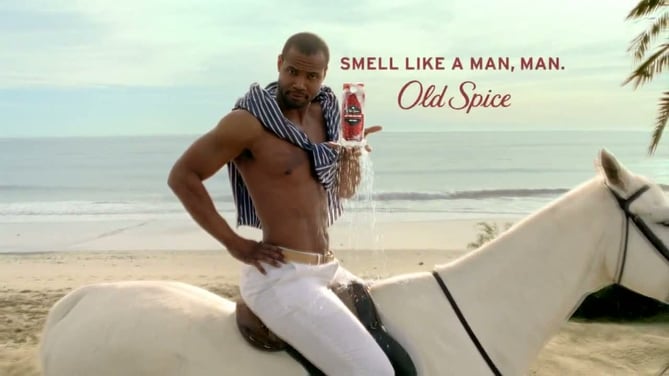
Source: Coloribus
The very first part of Old Spice’s “The Man Your Man Could Smell Like” campaign, created by Wieden + Kennedy and launched in February 2010, was the following commercial. It became a viral success practically overnight:
That video has over 51 million views as of this writing. Several months later, in June 2010, Old Spice followed up with a second commercial featuring the same actor, Isaiah Mustafa. Mustafa quickly became “Old Spice Guy,” a nickname Wieden + Kennedy capitalized on with an interactive video campaign in which Mustafa responded to fans’ comments on Facebook, Twitter, and other social media websites with short, personalized videos.
In about two days, the company had churned out 186 personalized, scripted, and quite funny video responses featuring Mustafa responding to fans online. According to Inc, these videos saw almost 11 million views, and Old Spice gained about 29,000 Facebook fans and 58,000 new Twitter followers.
“We were creating and sending miniature TV commercials back to individual consumers that were personalized, and we were doing it on a rapid-fire basis,” Jason Bagley, creative director at Wieden + Kennedy and a writer for the campaign, told Inc. “No one expects to ask a question and then be responded to. I think that’s where we broke through.”
The Lesson
If you find your campaign’s gained momentum with your fans and followers, do everything you can to keep them engaged while keeping your messaging true to your brand’s voice and image.
16. Wendy’s: Where’s the Beef?

Source: AdSoft Direct
Is it enough to say this campaign was successful because it featured a giant hamburger bun and a cute set of old ladies? No? I didn’t think so.
Wendy’s took a more gutsy approach in this advertising campaign: It targeted its competitors. The simple phrase “Where’s the beef?” was used to point out the lack of beef in competitors’ burgers — and it quickly became a catchphrase that encapsulated all that was missing in their audience’s lives.
While you can’t predict when a catchphrase will catch on and when it won’t, Wendy’s (wisely) didn’t over-promote their hit phrase. The campaign only ran for a year, and allowed it to gently run its course.
The Lesson
Be careful with your campaigns’ success and failures. Just because you find something that works doesn’t mean you should keep doing it over and over to the point it’s played out. Allow your company to change and grow, and you may find that you can have even greater success in the future by trying something new.
17. Procter & Gamble: Thank You, Mom
I’ll give you a minute to dry your eyes after that one.
Seriously — you wouldn’t expect a household and cleaning products company commercial to pull at the heartstrings like that, would you? Lately, though, Procter & Gamble (P&G) has launched some of the best ads we’ve ever seen from the consumer goods industry.
That’s because P&G identified the story behind the story of Olympic athletes — the stories of the supportive moms who pushed these world-class athletes throughout their entire lives leading up to that crowning moment. And yes, they probably had to do a lot of laundry and cleanup along the way — presumably using P&G products.
The Lesson
Make your audience cry (just kidding). The season or time period of your ad is important. But even if you run an ad during the Olympic Games, like P&G did, make sure it has longevity, and a message that can influence people no matter when or where they see it.
Emotional and nostalgia marketing are powerful tactics to get people to make buying choices, so if there’s a bigger, more universal story behind your product or story, tap into it — and showcase it front-and-center.

This Company Has a Perfect Ecommerce Website Design for Inbound Marketing
There’s more to ecommerce website design than you might think. Everyone gets it sort of right, but not every site out there does it all — except perhaps ModCloth.
I may not shop there personally, but I’m a huge fan of the ModCloth ecommerce inbound marketing model. When breaking down the anatomy of an amazing ecommerce site, ModCloth seems to have it all, from an elegant and intuitive design, to pre-transactional educational content, to email marketing that rarely relies on coupons.
As marketers, we have to get beyond the echo-chamber of sites we personally shop with to find great examples of inbound marketing for ecommerce in action. I don’t normally shop ModCloth, but many others do, and they’ve been highly successful. Let’s take a look at what makes ModCloth such an inbound marketing powerhouse.
Homepage Design
Okay, so saying they do everything well is a bit of a cop out. However, if we look at the welcome banner visitors see upon visiting the page, we see how easy various components of a great ecommerce site are to find.

In one place, we see the page identity, the personalized welcome, a link for customer service, a search bar, special offers, the shopping bag, and an easy-to-understand menu. Wow. That’s a lot of stuff in one space, and yet nothing is crammed or hard to see.
Blog Design
ModCloth must know that business sites with a blog get 55% more visits than sites without. Of course, as you can see by the menu image above, the blog must be part of the main ecommerce site for those visits to be counted in ModCloth’s metrics.
ModCloth uses their blog to move potential buyers through the marketing and sales funnel, just as it’s designed to do. The blog features products, how-to videos, images from customers, and general lifestyle information. In addition to working hard for the business, the blog is also a great way for people to spend a few minutes of downtime.
Their great strength in blogging is that they’re targeting the lifestyle, or psychographic dimensions, of their buyer personas. They’re not just churning out keyword rich content to rank in search engines; they’re building an audience of relevant consumers that they can nurture toward a purchase.
Filtering Options
In addition to the search bar at the top right corner, ModCloth also offers a very intuitive filtering process for every item. Users can search by size, price, designer, and popularity. The easy-click buttons leave little room for error, so customers can quickly narrow down options to find exactly what they need.
As a bonus — and this shouldn’t be a bonus so much as a way of life — the filtering options really do return only relevant search results.
Customer Service
While ModCloth customer service does offer an email option, the company also make employees available through a live chat option or by phone for those buyers wanting immediate service. These options can all be found in one spot, too, by simply clicking on their Customer Care link.
But ModCloth doesn’t stop there. Not only can you find someone to talk to about the questions or problems you might have, but you can also reach out to a stylist to receive personalized suggestions and recommendations.
Secure Checkout
Buyers love ModCloth’s checkout process because it’s clear and linear. You can see from the progress bar at the top of the page that you’ll be taken through each step in the process with no links back to previous pages or unnecessary paths toward other pages.

They also make sure to show their security certificates with large icons so they’re visible. This gives buyers the warm and fuzzies, letting them know personal information will be protected at all costs.

Finally, they also offer alternative payment methods so buyers don’t need to share credit card information if they don’t want to. The ability to purchase through PayPal is just one more way ModCloth makes buyers more comfortable.
Up-Front Info
One of the biggest reasons buyers abandon shopping carts before finishing the purchase is because the cost of shipping is a surprise. Well, ModCloth makes sure buyers get up-front info about shipping. As you can see, buyers willing to wait a bit for their new threads can also take advantage of free shipping. Cha-ching.
Fun Product Descriptions
It’s easy enough (and conducive for search engine optimization) to simply list the basic stats, but ModCloth gives whimsical descriptions that still manage to convey the most necessary information. Sometimes, it’s fun to just read about the products even if you can’t afford to buy them all.
Again, the key factor here is the customization of the website experience to the psychographic dimensions of their buyer personas. They’re not cold, clinical recitations of the manufacturer specs, they’re written with the tone and information that their best customers want to read.
Social Media Integration
This company does a great job of including and engaging with followers and friends on social media. As you can see, visitors have several chances to connect with various social platforms during the shopping experience.
The first time comes on the main page, where all the different accounts are listed. Next, buyers have a chance to Tweet or Pin the items they’re about to buy or just recently purchased. In addition to bragging rights for the customers, it’s also good press for ModCloth.
Finally, the company does a great job of keeping social outlets current. Facebook includes images contributed by users and not just those posted by the company. Twitter asks random questions throughout the day to boost engagement and make followers feel included.
Instagram features heavily on the site as both a user-generated style guide and a place where customers can share videos with their thoughts on the products and the brand.
Pinterest is used for various reasons, but perhaps most importantly as a secondary product catalog. Whoa. These guys are busy.
Customer Voice
Various social media channels aren’t the only ways customers get to share their experiences. Located on each product page is a list of reviews for that particular item.
ModCloth doesn’t censor, either. For each less-than-stellar review, the customer service team reaches out with offers of assistance. Not only do the buyers get a chance to say exactly what they think, but ModCloth also uses that opportunity to improve customer delight.
Smart Email Marketing
Sure, ModCloth sends out discounts for their most loyal customers, but they don’t simply rely on coupons to keep their email marketing on track. Check out this particular email that simply informs users of new features coming soon. What a great way to keep building a relationship between buyer and seller.
Email follow-ups for abandoned carts are just as effective. Images are used to remind the user what they almost purchased, and a fun subject line prompts a smile instead of a growl. Well done, ModCloth.
Responsive Design
Because so many purchases are made on mobile devices, responsive design is a must. Fortunately, my favorite commerce site also makes shopping on smartphones easy.
First, the menu is very easy to read, and there’s plenty of white space around the links to make clicking easy for thumbs.
The images are quite large, and adding them to your cart just takes one click.
Even the filtering options are easy to use, meaning you can drill right down to the very thing you want to buy right there on your phone instead of having to wait until your laptop is in reach.
So, yeah. ModCloth’s ecommerce site is a veritable treasure trove of must-haves, and I’m not just talking about the cool clothes. If you’re looking for a role model, you could do much worse.

Resume Format Tips You Need to Know in 2018 [Sample Formats Included]
Think of a really good print advertisement you’ve seen lately. What did you like about it? Chances are that while the content of that ad was important, the design played a big role in drawing you in.
It’s important to think of your resume like an advertisement to job recruiters. Writing a standout resume goes beyond the content you put in there — the format plays an important role, too. To recruiters, it speaks volumes about how you collect your thoughts and organize your ideas. So you’ll want to make sure it’s easy to read, easy to understand, and easy to digest. That means choosing the right sizing for your headers, picking the right fonts, bolding and italicizing where appropriate, and so on.
Get 10 free marketing resume templates right now.
To learn how to format a resume properly, check out the infographic below from Resume Templates 101. Then, under this infographic, see an example list of things a great resume format includes to truly stand out from the other candidates.

The Best Resume Format
There’s no such thing as a perfect resume. But depending on your industry, you can pick the right assortment of attributes above and create something the hiring manager won’t soon forget.
Here’s an example of a resume for an entry-level graphic designer — a role that some say faces the highest standards for resume format, given the expected skills of the applicant.
Font Type: Century Gothic
This font is a more wide-set sans-serif typeface. Modern design is all about clean typography, making tail-less fonts ideal. The wide-set appearance helps entry-level applicants make good use of empty space when they don’t have much experience to report on.
Font Size: 12pt
Anything bigger than 12pt body text in Century Gothic can risk looking a bit unprofessional. This size works well for those who have limited content, and continues to work well as his or her career grows.
Font Style: Bold Name and Job Title
Between underlines, boldface, and italics, boldface is this applicant’s best bet for the font type they’re using. Italicized Century Gothic isn’t distinguished enough from standard Century Gothic to use both in the same document, and underlines can dilute the clean appearance you get with this font type.
Bolding the first and last name at the top — and every job title, skill, and field of study beneath it — establishes a clean but obvious hierarchy from the top of the resume to the bottom.
Header Style: Standard, 15pt
Headers over Education, Experience, Skills, and similar resume sections should be visibly bigger than the body text, but not overpowering. A standard (unstylized) header in 15pt font governs each section of the resume nicely and doesn’t clash with the boldfaced skills and job titles beneath it.
Name Style: Standard, 17pt
The first and last name should be at least another 2 points larger than each header. No matter what your industry or experience level, it’s important that your name is the biggest text on your resume. Hiring managers look at a lot of these things every day, and you need them to remember your name — if nothing else.
Why standard and not bold? I happen to think Century Gothic looks best as is, especially as the font size increases.
Resume Layout
As for the resume’s layout, consider this order: Name, Contact Info, Education, Skills, Experience, and Awards. New professionals need to front-load their education because it’s the most relevant item on their resume, while their “Skills” section showcases the editing software and equipment that is critical to their qualifications for any job opening.
Even if you’re not an entry-level designer, the above infographic — and following example — is a model for how you can highlight the parts of your background that are most important to your employer. Now, get to writing!