
17 Tips & Best Practices for Writing Catchy Email Subject Lines
No matter what they say, people do judge emails by their subject lines.
In fact, 33% of email recipients decide whether or not to open an email based on subject line alone. That’s why it’s so important to craft subject lines that are compelling enough to get people to click through.
While they may seem like a small part of your message, they’re one of the very first impressions you have on your email recipients. And they’re a marketer’s ticket for standing out in a crowded inbox.
Do you want your email content opened, read, and clicked? It all starts with the subject line. Here are 17 tips to help jazz them up and boost engagement.
How to Write Email Marketing Subject Lines People Actually Click
1) Keep it short and sweet.
Email subject lines will get cut off if they’re too long, particularly on mobile devices. And with 40% of emails being opened on mobile first, we recommend using subject lines with fewer than 50 characters to make sure the people scanning your emails read the entire subject line.
If you’re struggling to keep your subject lines short, think about which words matter less and where you can remove a frivolous detail. For example, if you’re sending an order confirmation, doesn’t “Your order is being processed” look better than “Order #9435893458358 is being processed”? Same goes with your regular emails: Do you really have to include the word “update” or “newsletter” in there? (Actually, a study from Adestra found that emails including the word “newsletter” in the subject line saw an 18.7% decrease in open rates.)
2) Use a familiar sender name.
“If the from name doesn’t sound like it’s from someone you want to hear from, it doesn’t matter what the subject line is,” explains Copy Hacker’s Joanna Wiebe.
Thanks to the amount of spam email people get these days, most people hesitate to open email from unfamiliar senders. No one likes talking to a robot. Think about when you call a company and can’t get a hold of an actual person. It’s frustrating, right? This goes for email, as well.
Never use “noreply@company.com.” I repeat: Never use this email address. Not only does it make it look less personable, it also stops people from adding your email to their address book.
Instead, avoid using a generic email address and send the email from a real person. For instance, HubSpot found that emails sent from “Maggie Georgieva, HubSpot” performed better in terms of opens and clickthrough rate than emails sent from just “HubSpot.” (HubSpot customers: Learn how to personalize the “From” name and email address here.)
3) Use personalization tokens.
Using personalization tokens like name or location in the subject line adds a feeling of rapport — especially when it’s a name. Everyone loves the sound of their own name. Plus, it increases clickthrough rate: According to the Science of Email Marketing, emails that included the first name of the recipient in their subject line had higher clickthrough rates than emails that did not.
Affix it to your subject line by saying things like: “John Doe, we really wanted to share this…” Or, do what Rent the Runway did with their subject line: “Happy Birthday Lindsay – Surprise Inside!” Not only did it address the recipient by their first name, but it was also sent close to the recipient’s birthday. That’s great personalization and great timing.
Another personalization tactic that works is to tailor subject lines to their location. Uber does a great job with this: They send me location-specific emails, like lists of my city’s best outdoor bars and restaurants. Groupon does this well, too. Location-specific offers or news could increase your open rates.
Just don’t go overboard with the personalization here. That can be a little creepy. But little personalized touches here and there show that you know more about your recipients than just their email address. However, if you can’t (or don’t want to) use personalization tokens in the subject line, use “you” or “your” so it still sounds like you’re addressing them directly.
4) Segment your lists.
While email blasts that go out to your entire list might be relevant and helpful to some people, it won’t be to others — and could cause confusion or frustration. Why is this restaurant sending me a list of the best local steakhouses when I’m a vegetarian? Why is this company sending me case studies when I just signed up for their email list yesterday?
Personalize the experience using information from the actions your customer has already taken — from which forms they’ve filled out, to which industries they’re in, to what their personal preferences are. In email marketing, you can personalize your recipients’ experience using a little thing called list segmentation.
How you segment your lists depends on your business and your goals, but you can read this blog post for 27 ideas for how to slice and dice your email lists for better segmentation.
5) Don’t make false promises.
Your email subject line is making a promise to your reader about what you will deliver in your message. Make sure that you make good on that commitment — and do not try to get your email opened by making false promises. This will irk your audience, and they’ll learn not to trust your subject lines, resulting in a lower open rate and a higher unsubscribe rate.
6) Do tell them what’s inside.
Speaking of making promises, if your visitor has downloaded an offer and you’re delivering it via email, it’s a great idea to use a subject line that says something like, “your new ebook inside!” or “your guide awaits!” This works better than a simple “thank you” in the subject line because it makes it clear that something is waiting inside the email.
7) Time it right.
Sending an email at the right time with the right subject line can make a huge difference in open and clickthrough rate. A prime example? Eater Boston sent an email at 6:45 P.M. on a Wednesday evening that said, “Where to Drink Beer Right Now.” Just in time for happy hour. Nailed it.
Another favorite example of mine is an email from Warby Parker with the subject line, “Uh-oh, your prescription is expiring.” It was sent two weeks before the recipient needed to renew his prescription. By sending an email at the right time, Warby Parker increased the chances of their email getting opened — and included a relevant call-to-action about getting a glasses upgrade, too.
8) Use concise language.
Keep in mind that people scan their inbox very quickly — so the more clear and concise your subject line is, the better. It’s usually a lot better to be concise than it is to use complex and flowery language — unless you’re going for an elusive subject tone to entice your recipients.
When you’re going for a concise subject line, think first about how your email will benefit your recipients. You’ll want to make that benefit very clear. For example, “Increase your open rates by 50% today” is more appealing than “How to increase open rates.”
9) Start with action-oriented verbs.
Subject lines are similar to calls-to-action, in that you want the language to inspire people to click. Subject lines that begin with action verbs tend to be a lot more enticing, and your emails could be drastically more clickable by adding a vibrant verb at the beginning.
Actionable subject lines will inspire people to click on your email by instilling urgency and excitement. For example, in an email inviting people to a hockey legend dinner, the email subject line might read, “Dine with Bruins legend Bobby Orr,” rather than a more generic (and less actionable) “Local Boston Sports Legend Meal.” The former email uses “Dine” to help the reader envision themselves at a dinner table.
10) Make people feel special.
The psychology of exclusivity is a powerful thing. When people feel like they’re on the inside, it gives them a sense of belonging that could build loyalty and compel them to convert better on your emails.
The right phrasing can make your recipients feel special — and the effect can be magical. A few ideas for phrasing include:
- “For our beloved customers only”
- “An exclusive offer for you”
- “My gift to you”
- “You’re invited!”
- “Private invite”
11) Create a sense of urgency.
One effective subject line style that will stop readers in their tracks: urgency. Subject lines that create a sense of urgency and exclusivity can give a 22% higher open rate. Using deadlines like “today only” or “24-hour giveaway” will encourage your reader to act now instead of putting it off until later, when there’s a chance of them forgetting it.
But urgency is just one of the psychological principles that can help get people to open and click through your emails. Other principles include scarcity and social proof — both great ways to increase your conversion rates.
12) Use numbers.
A lot of businesses send emails with vague statements in their subject lines — which is why using data and numbers is a great way to get your emails noticed, demonstrate a clear and straightforward message about your offer, and set the right expectations.
Just like with blog titles, using numbers in your subject line is an effective email marketing best practice. You might use numbers to refer to the title of your listicle, the page length of the offer you’re sending, a specific discount, or the numerical benefit of a particular resource you’re providing — like “Join more than 750 others at this event!”
13) Pose a compelling question.
Asking a question in your subject line can also draw readers in — especially if you’re asking a question you know is relevant to your recipients’ buyer persona. For example, you might try the following: “Are you making these SEO mistakes?” or “Do you know what your website is doing wrong?”
Zillow sent an email with the subject line, “What Can You Afford?” that linked to a website showing apartments for rent. A subject line like this is both encouraging and a touch competitive: While it gives hope that there are apartments out there that’ll fit within your budget, it also pits your cash against what the market offers.
Another example comes from DocuSign. They sent an email late in the lead nurturing process, with the subject line, “What are your customers saying?” The body of the email contained a bunch of case studies that were meant to help the recipient move closer to actually purchasing DocuSign. This was a smart move: Folks who are further down the funnel are likely more receptive to hearing customer testimonials.
14) Don’t be afraid to get punny.
Most people love a good pun. It’s a great way to delight your recipients and spice up your emails. Some of the best punny email subject lines come from JetBlue, with subject lines like “Land wander-ful low fares now!” Quirky — a community-led invention platform –worded one of their email subject lines like this: “Abra-cord-abra! Yeah, we said it.” That second part is conversational and self-referential — and exactly what most people would say after making a really cheesy joke in real life.
If you’re the least bit punny, think about small ways you can slip them into your emails when it’s appropriate. Just don’t overdo it.
And remember the rule: When in doubt, ask a coworker.
(Get inspired by checking out these witty grammar jokes and puns.)
15) DON’T USE ALL CAPS or overuse exclamation points!!!
A subject line that says, “OPEN NOW AND RECEIVE A FREE TRIAL” or “50% off coupon today only!!!!!!!!” isn’t going to get you an email open. In fact, it’ll probably get your email ignored. People don’t like to get yelled at, and using all caps and/or a lot of exclamation points can really rub people the wrong way. In fact, according to a study by the Radicati Group, more than 85% of respondents prefer an all-lowercase subject line to one in all caps.
Not only are these tactics disruptive, but they look spammy. When 69% of email recipients report email as spam based solely on the subject line, you’ll want to stay away from triggers like this as much as you can.
Instead of using disruptive tactics like these to stand out in people’s inboxes, try personalizing your emails, establishing relevancy, and using catchy and delightful language.
16) Don’t forget to add preview text.
While preview text isn’t technically part of your subject line, it does appear right near the subject line — and it certainly deserves your attention. Preview text provides recipients with a peek at the content inside your email, which email clients like the iPhone Mail app, Gmail, and Outlook will display alongside the subject line. (The exact amount of text shown depends on the email client and user settings.)
When you don’t set the preview text yourself, the email client will automatically pull from the body of your email. This can look messy depending on your email content, and it’s also a wasted opportunity to engage your audience. (HubSpot customers: Click here to learn how to set the preview text of your emails.)
17) A/B test your subject lines.
Although these tips and best practices are a great place to start, what works best for some companies may not work as well for others. It’s all about figuring out what works best for your specific audience. That’s where A/B testing comes in.
While it can be tempting to use your intuition to predict what subject line language will make people click on your emails, you should constantly be A/B testing your subject lines and tweaking wording according to your results. What works best for your audience: Long or short subject lines? Including numbers or not including numbers? Questions or statements?
Read this blog post for an A/B testing checklist you can bookmark the next time you want to run one on your emails. (HubSpot Enterprise customers: Learn how to A/B test emails in HubSpot here.)
At the end of the day, if your emails aren’t getting opened, they’re not getting seen. You have awesome content to share, you just have to prove it in your subject line.
Good luck!
What are your best tips and tricks for improving email subject lines? Share them below.
Editor’s Note: This post was originally published in January 2015 and has been updated for freshness, accuracy, and comprehensiveness.
How to Become a More Productive Writer: 7 Helpful Tips
The simple dream of most writers is being able to write more. And it’s not only writing more, it’s writing effortlessly.
But it’s not just authors or professional writers who dream of this. These days, a lot of marketing roles will require you to dust of your writing skills at one point or another. And there’s nothing worse than simply not being able to write — especially when the pressure of a deadline is looming over your head.
Yes, we’ve all been there.
That’s why this past January I decided that I was done with crawling over the finish line with my work in hand. I was done with the pressure. I knew there was a better way to write.
So I set out to find some answers. Here’s what I learned in the process …
How to Become a More Productive Writer: 7 Helpful Tips
1) Find the right tools.
My immediate goal was to help shape my productivity and measure my writing. To do so, I started to treat my computer like a toolbox. Every application that I called on had the ability to influence my performance — both for better and for worse.
To measure my productivity, I started using a time management tool called RescueTime.
I do all of my writing in Google Docs and RescueTime gives me a weekly report of the amount of hours I’ve spent using Google Docs. Simply put, the more time spent in Google Docs, the more words I am likely to write.
The tool also makes it easy to set goals, track your progress, and understand your productivity patterns — which proved helpful during this process.
Similar to RescueTime, Grammarly— a writing-enhancement platform — will give you a report detailing the number of words you’ve written in a given week. For this reason, I started using the tool to measure my progress.
Here’s a sample of the data I collected on my journey to improve my writing:
When I was feeling like I couldn’t write another word, I pulled up this data to remind myself of how far I’d come. I could write another word. In fact, I could probably write a couple thousand more words if I pushed myself.
2) Find your biological prime time.
Brainpicking’s “writer’s timetable” clearly illustrates the correlation between writers’ wake-up times and their level of productivity. After checking this out, I decided that I wanted to capture something similar: a set time of the day to focus on writing.
To do this, I knew that I needed to first figure out when my optimum output would be — in terms of both quality and quantity. For instance, it’s no good waking up early to write something if your best work comes out a night — or vice versa.
So how do you figure out where you stand? Quite simply, you just run some productivity tests on yourself. To do so, I picked up some tips from productivity expert Chris Bailey. In this blog post, Bailey outlines a process for finding your “biological prime time” — a term coined by Sam Carpenter in his book Work the System.
He explains how he kept track of his energy, focus, and motivation levels for 21 days straight. Here’s a look at what he saw:
Image Credit: A Life of Productivity
After about a month of duplicating this type of testing on myself, I found that my productivity arch would run from 9 a.m. to 3 p.m., and my best work would normally come out between 10:00 a.m. – 12:00. p.m.
Now that I had this information, I could use this daily window to focus on my writing when it mattered most. Additionally, knowing this helped me stop feeling so guilty when I found myself unable to produce anything meaningful after 3 p.m. because I knew it just wasn’t the right time for me to get work done.
3) Experiment with journaling.
Tim Ferriss has an insightful post on his morning journal that got me thinking. Almost every morning Ferriss sits down with a cup of tea and takes time to write in The Artist’s Way: Morning Pages Journal, a book by Julia Cameron. He uses this as a daily practice of production.
Here’s an excerpt from one of his entries:
Image Credit: Tim Ferriss
This was the exact remedy I was looking for. I realized that writing perfectly wasn’t the goal … it was to just get writing.
So I began my way to a better morning routine.
This was an easy prescription: I bought a cheap notebook and I kept it in my bag. I’d write in it every weekday while on the train heading into the office.
When I was writing, I’d focus on two areas:
- What’s worrying me in my personal life.
- What’s worrying me in my working life.
To round off the journaling and get myself in a positive frame of mind, I’d write three things that I was grateful for that day — a trick stolen from The Five-Minute Journal.
(Check out this post for more on the power of morning freewriting.)
4) Work offline to avoid problems.
We’re in a world dominated by notifications, and that little red dot can be seductive to us at our weakest moments.
Avoiding the temptation to browse around online — whether it’s Slack channels, social media sites, or your inbox — can be really tough. For me, it was especially hard to avoid Slack, as the company I work for, Kayako, is spread across the globe with remote workers and two main offices in England and India.
So while I had to use Slack for internal communication purposes, it was serving as a big distraction. With people pulling me in numerous directions all day long, there was a lot of task switching going on. And all that task switching has a dramatic impact on the quality and quantity of work you produce.
In fact, research shows that multitaskers:
- Experience a 40% drop in productivity
- Take 50% longer to accomplish a single task
- Make up to 50% more errors
Not to mention, task switching reduces our chances of finding our flow. And as writers, finding your flow is necessary: Did you know it takes around 23 minutes to return to a task after you’re interrupted?
So while you don’t have to go as far as Samuel Huelick — who wrote this “break up letter” to Slack — clearly stating to your team you’re going offline for a couple of hours can help you regain control and focus. Give it a try.
5) Set deadlines.
Almost everyone procrastinates — especially when it comes to things that have no deadline. You know, things you’ve always wanted to do, but never had to do — like traveling, or starting a business, or getting in shape, or writing a book.
Don’t believe in the power of deadlines? I’d encourage you to allow Tim Urban’s comical (yet drilling) TED Talk about procrastination sink in before you make that call …
During my journey to become a better writer, the importance of deadlines became even clearer to me. And while there is research out there that suggests self-imposed deadlines don’t cut it, this practice has helped me push through work and hit goals time and time again. After all, Parkinson’s Law states that “work expands so as to fill the time available for it’s completion.”
I put my deadline rule to the rest when I found out my company was hiring a content marketing manager — a role I knew I was interested in. To declare my interest in the job, I set up a couple of meetings and worked directly with our director of marketing to come up with a goal-oriented checklist of things to achieve to secure the role.
One task on that list? Producing an ebook on customer service team hiring … which I gave myself one week to draft.
And guess what? I got it done.
Would I have been able to write the ebook if I hadn’t publicly held myself accountable? Probably not — in fact, it could have easily taken me a month.
Dan Ariely, author of Predictably Irrational, explains that publicly committing to a time frame for completion can be an incredibly powerful motivator. When you tell others that you’re going to do X by Y time, your reputation is on the line.
“It’s a good way to keep score,” he told The New York Times.
6) Structure your work accordingly.
One habit I’ve managed to overcome when writing blog posts is omitting structure. Before I used to wait for inspiration to kick in on a subject and charge full speed ahead into my writing until I’d hit the inevitable roadblock and couldn’t write any more.
Now I commit to creating a blog post structure before I even write my first word. I designate 20-30 minutes to plan, and focus my structure on capturing three essential parts:
- The audience and their view/perspective.
- Best practices powered by research and supporting material.
- The actionable takeaway.
Of course, there are different ways to approach this type of structural outline — for example, Copyblogger recommends the MAP technique or the S.P.E.E.D. approach — but I’ll leave that up to you. The important thing is that you’re putting a plan in place before you get started, as this extra step can do wonders for your productivity.
7) Get feedback throughout the process.
As a writer, having someone else look over your blog can be one of the most helpful things when you’re starting to feel stuck. A fresh set of eyes can help you identify gaps in your post that you’d likely overlook, and getting this type of feedback early on could mean the difference between putting out something impressive and having to trash your post entirely.
At Kayako, we use a three-step editing process that works particularly well for putting out high quality content:
- First round of edits: Structural.
- Second round of edits: Core content and insight.
- Third round of edits: Spelling and grammar.
But before we dive into that process, we review articles as a team in a weekly editor’s meeting to screen for quality, identify opportunities for improvement, and so on.
If it sounds like a lot … that’s because it is. But it’s that level of detail that makes it easier for our writer’s to complete a piece that they’re proud of — without spending a lifetime on it.
Remember: It’s easy to get lost in a post that you’ve been working on for a while. Rather than wasting time trying to determine what’s missing on your own, ask for that feedback upfront. Trust me, it’s worth it.
Ready to Get More Writing Done?
Getting better at writing doesn’t have to happen right at once. I’ve been optimizing my writing by experimenting with an array of different techniques over the past six months — it’s only now that I feel like I am near my best.
You can start with any of these techniques listed above and incorporate them into your day to make you more efficient as a writer. There is no set methodology. Just try a few strategies out until you find what works best for you.
It’s Not About The Release Anymore. PR is Now Social PR.
Ten years ago my answer to the cocktail party question, “What do you do?” was as easy as two letters: PR.
These days that answer is: I help companies in the design and build industry connect with their targets through social media, content marketing, public relations and strategic partnerships. (Say that after two cocktails.)The PR job has changed dramatically in the last decade. The press release, once king of the PR world, has ceded the throne to the much younger, much more persuasive heir social media and her loyal advisor the brand ambassador. 2016 PR is social PR.
PR has always been about building relationships (with media and industry) but the scope has changed: The tools are better (thank you inbound). The audiences bigger. And the opportunity for connections, dizzying. Now at my agency Marketing Rival, the bulk of my work focuses on using the content we produce for clients to connect with and nurture leads with brand ambassadors, and I do it almost exclusively on social media. And it’s a lot more fun.
In this post I’ll use an example from one of our clients to show you how you can find and make meaningful connections with potential brand ambassadors to establish strategic brand partnerships.
Polycor is a mid-sized company which owns and operates natural stone quarries in the US and Canada Their customers are stone distributors, but to drive demand we spend most of our time talking to designers and architects who spec their material.
When we look for a brand ambassador slash strategic marketing partner we’re usually looking for a person (but sometimes a small brand like a boutique appliance company) to incorporate our material into their design and share it with their audience as part of a native ad or with the media (like a designer who frequently writes for Houzz or Dwell).
When I look for a brand ambassador I’ve got more in mind than follower counts. I want authentic coverage for my client that hits on a personal note with actual people. An ambassador for my clients (usually a design blogger) must write, curate and share content that’s: relatable, emotional, personal. The right brand ambassador for my client is one that’s just as concerned about delivering the content right for her audience as she is about doing good work for my client (and getting the check).
It’s not just about search and increasing web traffic. Brand ambassador relationships are about sales, and you increase sales when you connect with a person. I choose a media partner or brand ambassador based on their natural connection to my client’s product, in this case natural stone, like US marble.
I’m not just looking for a tear sheet of my client’s stone; I want coverage that’s woven into the partner’s life. (Don’t get me wrong, these are native ads, not free spotlights, but I want the blogger’s connection to my brand to be so personal that she might have done it for free.) In other words, we don’t want to force the content.
Instagram is the top channel for designers, and my team and I spend a lot of time there following and engaging with designers about their work and their stone choices. That’s where I spotted designer Melinda McCoy from House 214, and her concrete kitchen counters. The dark color and texture reminded me of my client’s soapstone so I struck up a conversation with her.
As the relationship developed I got to know her style better and could see that she was actually a better fit for marble. I sent her a photograph of Polycor’s domestic marble called White Cherokee. This was her response: “I am excited to discuss a possible collaboration. I have been thinking of placing a slab of marble on my dining room table for over a year now, but haven’t found the right fit. When you sent the picture of that kitchen I thought that is it!”
We look for someone who loves natural stone, wants to feature Polycor prominently in one of their designs, and considers the value of the materials we give as a sizable part of the project fee. Generally this is a design savvy blogger who loves natural materials, has a chic well written site, and a following.
Our client is an established company but newer to marketing, so we’re open to bloggers with smaller followings and smaller rates because it allows us to grow together. A designer like this has a built-in audience of like minded shoppers and we can count on them to provide beautiful images, great copy and good traffic back to our site.
We won’t work with someone who favors manmade materials like quartz and porcelain over natural stone. And we won’t pursue a relationship with a blogger who’s writing only about food or pets or fashion. Our native advertising must make sense with the platform – an interior home design blog for instance – and be appealing to the audience – who wants to read about design trends and materials.
Read more about what makes for sensible native advertising collab here in Joline Buscemi’s review of the NY Times/Orange Is The New Black relationship.
The most effective way to attract loyal, connected brand ambassadors is to employ those solid inbound principals you’re already following: write great targeted content, publish and engage on social media, qualify and nurture leads.
When you cultivate an audience of people who genuinely love what you’re doing you’re building a pool of loyal, engaged brand ambassadors who will stick with you not just because you’ve contracted with them, but because they truly feel connected to your product and are honored to be associated with the brand.
Looking for some practical examples on finding and connecting with your ideal brand partner? Download the ebook: A Social PR Expert’s Guide to Attracting (And Qualifying) Loyal Brand Ambassadors With Social PR
Blog SEO: How to Search Engine Optimize Your Blog Content
Search engine optimization is incredibly important for marketers. When you optimize your web pages — including your blog posts — you’re making your website more visible to people who are looking for keywords associated with your brand, product, or service via search engines like Google.
But it can be a pretty tricky tactic to master with Google’s copious algorithm updates.
How do you know what matters and what doesn’t? What are today’s blog SEO best practices, and what’s considered “old-school”? How on earth can you keep it all straight?
We understand confusion is a common issue facing inbound marketers — and we want to help. In this post, we’ll cover how to optimize your blog posts for the keywords you care about, along with a few other optimization tactics you should keep in mind.
Note that this list doesn’t cover every single SEO tactic under the sun. Rather, these tips are meant to get you started with improving SEO for your blog in particular.
HubSpot customers: If you want to see specific SEO optimization tips for your individual blog posts, click the chart icon on the far left side of the blog editor when you’re working on the post to access the SEO Optimization screen.
If you’re not a customer, you can use these tips as a sort of checklist as you blog.
How to Search Engine Optimize Your Blog Content
1) Focus on 1–2 long-tail keywords.
Optimizing your blog posts for keywords is not about incorporating as many keywords into your posts as possible. Turns out that’ll actually hurt your SEO because search engines will think you’re keyword stuffing (i.e., including your keywords as much as possible with the sole purpose of gaining ranking in organic search).
But that’s not cool with search engines, nor does it make for a very good reader experience. Instead, you should use keywords in your content in a way that doesn’t feel unnatural or forced.
A good rule of thumb is to focus on one or two keywords per blog post. This’ll help keep you focused on a goal for your post. While you can use more than one keyword in a single post, keep the focus of the post narrow enough to allow you to spend time actually optimizing for just one or two keywords.
Using long-tail keywords may be more efficient to this end, since website visitors searching long-tail terms will often be more qualified. In other words, you’ll bring in the right type of traffic — visitors who convert — by using long-tail keywords.
How do you know which keywords to use? My colleague Rachel Sprung wrote this great blog post on how to do keyword research, which lays out a keyword research process you can follow to help come up with and narrow down a list of terms you should be targeting.
2) Include these 1–2 keywords in specific parts of your post.
Now that you’ve got your one or two keywords, it’s time to incorporate them into your blog post. Where are the best parts of your posts to include these terms so you rank high in search results?
There are four essential places where you should try to include your keywords: headline, headers and body, URL, and meta description.
a) Title
The title (i.e., headline) of your blog post will be a search engine’s and reader’s first step in determining the relevancy of your content, so including a keyword here is vital.
Be sure to include your keyword within the first 65 characters of your headline, which is just about where Google cuts it off on search engine results pages (SERPs). Technically, Google measures by pixel width, not character count, and it recently increased the pixel width for organic search results from approximately 500 pixels to approximately 600 pixels, which translates into around 65 characters.
Long title? When you have a lengthy headline, it’s a good idea to get your keyword in the beginning since it might be cut off in SERPs towards the end, which can take a toll on your post’s perceived relevancy. In the example below, we had a long title that went over 65 characters, so we front-loaded it with the keyword we were trying to rank for: “on-page SEO.”
b) Headers & Body
Mention your keyword at a normal cadence throughout the body of your post and in the headers. That means including your keywords in your copy, but only in a natural, reader-friendly way. Don’t go overboard at the risk of being penalized for keyword stuffing. Before you start writing a new blog post, you’ll probably think about how to incorporate your keywords into your post. That’s a smart idea, but it shouldn’t be your only focus, nor even your primary focus.
Whenever you create content, your primary focus should be on what matters to your audience, not how many times you can include a keyword or keyword phrase in that content. Focus on being helpful and answering whatever question your customer might have asked to arrive on your post. Do that, and you’ll usually find you naturally optimize for important keywords, anyway.
c) URL
Search engines also look to your URL to figure out what your post is about, and it’s one of the first things it’ll crawl on a page. You have a huge opportunity to optimize your URLs on every post you publish, as every post lives on its own unique URL — so make sure you include your one to two keywords in it.
In the example below, we created the URL using the long-tail keyword we were trying to rank for: “email marketing examples.”
d) Meta Description
Later in this post, we’ll dive into explaining meta descriptions. Your meta description is meant to give search engines and readers information about your blog post’s content — so be certain to use your long-tail term so Google and your audience are clear on your post’s content. At the same time, keep in mind that the copy matters a great deal for click rates — the more engaging, the better.
3) Make sure your blog is mobile-friendly.
It’s been over a year since Google revealed that more people use the search engine on their mobile phones than on desktop. And for all those valuable search queries being done on mobile, Google displays the mobile-friendly results first. This is yet another example of Google heavily favoring mobile-friendly websites, which has been true ever since the algorithm updates of April 2015 and March 2016.
Notice how the mobile-friendly examples are listed first when I search for the best restaurants in Fort Myers on my phone. In fact, there are zero search results that aren’t mobile-friendly on the first page of my search results.
While responsive design and mobile-friendly websites have always been important for user experience, they’re becoming more and more important for SEO as well. So if you haven’t been focusing on improving your mobile experience, you’d better prioritize it now, or your search rankings could suffer.
(HubSpot customers: Breathe easy. All content created on HubSpot’s platform is automatically responsive to mobile devices.)
If your website uses responsive design, your blog pages will only have one URL instead of two different ones — for desktop and mobile, respectively. This helps your post’s SEO because any inbound links that come back to your site won’t be divided between the separate URLs. Any SEO power you gain from these links will be centralized, helping Google more easily recognize your post’s value and rank it accordingly.
Pro tip: What search engines value is constantly changing. Be sure you’re keeping on top of these changes by subscribing to Google’s official blog.
4) Optimize the meta description.
To review, a meta description is the additional text that appears in SERPs that lets readers know what the link is about. The meta description gives searchers information they need to determine whether or not your content is what they’re looking for, and ultimately helps them decide if they’ll click or not.
In addition to being reader-friendly (compelling and relevant), your meta description should include the long-tail keyword you are trying to rank for, because if we’re doing blogging right, that keyword is representative of the contents of your post.
In the example above, I searched for “newsletter examples.” The term is bolded in the meta description — helping readers make the connection between their search term and the result — and the copy “get inspired” catches attention and compels clicks.
Note: Nowadays, it’s not guaranteed that your meta description is always pulled into SERPs as it once was. More and more, Google has been pulling in other parts of your blog post that includes the keywords searched, presumably to give searchers optimal context around how the result matches their specific query.
Let me show you what I mean. Below is an example of two different search queries delivering two different snippets of text on Google SERPs. The first is a result of the query “no index no follow,” and pulls in the original meta description:
The second is a result of the query “noindex nofollow,” and pulls in the first instance of these specific keywords coming up in the body of the blog post:
While there’s not much you can do to influence what text gets pulled in, you should continue to optimize your post for readability (see above). By creating reader-friendly content with natural keyword inclusion, you’ll make it easier for Google to prove your post’s relevancy in SERPs for you.
5) Optimize your images.
Blog posts shouldn’t only contain text — you should also include images that help explain your content. But search engines don’t just look for images. Rather, they look for images with alt text.
Because search engines can’t “see” images the same way humans can, an image’s alt text tells them what an image is about — which ultimately helps those images be found in search. Alt text also makes for a better user experience, as it’ll display inside the image container when an image can’t be found or displayed, and can also improve accessibility for people with poor vision who are using screen readers.
Technically, alt text is an attribute that can be added to an image tag in HTML. Here’s what a complete image tag might look like (bolding added for emphasis):
<img class=”alignCenter shadow” src=”image.jpg” alt=”image-description” title=”image tooltip”>
Adding keywords to your alt text may seem minor — and it isn’t going to impact your search rankings as much as other things on this list. But it is worth the extra minute it takes to change the name from “IMG23940” to something accurate and descriptive, like “puppies-playing-in-basket:”
Read this blog post to learn more on-page SEO tips for keyword optimizing the most critical parts of your website.
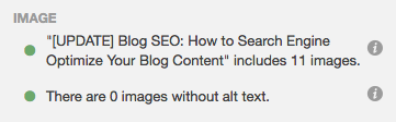
HubSpot customers: The SEO Panel will recognize whether or not you have optimized your images. Though these elements are not as important as some other optimizations, they’re still necessary (not to mention easy to add).
6) Don’t use too many similar topic tags.
Topic tags can help organize your blog content, but if you overuse them, they can actually be harmful. If you have too many similar tags, you may get penalized by search engines for having duplicate content.
Think of it this way: When you create a topic tag, you also create a new site page where the content from those topic tags will appear. If you use too many similar tags for the same content, it then appears to search engines as if you’re showing the content multiple times throughout your website. For example, topic tags like “blogging,” “blog,” and “blog posts” are too similar to one another to be used on the same post.
If you’re worried that your current blog posts have too many similar tags, take some time in the near future to clear them up. Choose about 15–25 topic tags that you think are important to your blog and that aren’t too similar to each other, and then only tag your posts with those keywords. That way, you won’t have to worry about duplicate content.
7) Use URL structures that help your visitors.
The URL structure of your web pages (which are different from the specific URLs of your posts) should make it easy for your visitors to understand the structure of your website and the content they’re about to see. Search engines favor web page URLs that make it easier for them and website visitors to understand the content on the page.
For instance, let’s take a look at HubSpot’s main blog page, which lives at http://ift.tt/n37HpG. When you look at the site itself, you’ll see there are two blog sections — Marketing and Sales — each containing many different blog posts.
This visual differentiation is also baked into the blog’s URL structure. If I decided to go to the Marketing section from this main page, I would be taken to the URL http://ift.tt/19PNGaV. If we want to read the Sales section, all we have to do is change where it says “marketing” in the URL to “sales”: http://ift.tt/19WtlCB. This URL structure helps me understand that “/marketing” and “/sales” are smaller sections within the larger blog.
What if there’s a specific article we want to read — perhaps “How to Do Keyword Research: A Beginner’s Guide”? Its URL structure — http://ift.tt/1l5bKLb — denotes that it’s an article from the Marketing section of the blog.
In this way, URL structure acts as a categorization system for readers, letting them know where they are on the website and how to access new site pages. Search engines appreciate this, as it makes it easier for them to identify exactly what information searchers will access on different parts of your blog or website.
Get more best practices for URL structure from Moz here.
8) Link internally when possible.
Inbound links to your content help show search engines the validity or relevancy of your content. The same goes for linking internally to other pages on your website. If you’ve written about a topic that’s mentioned in your blog post on another blog post, ebook, or web page, it’s a best practice to link to that page.
You might’ve noticed that I’ve been doing that from time to time throughout this blog post when I think it’s helpful for our readers. Not only will internal linking help keep visitors on your website, but it also surfaces your other relevant and authoritative pages to search engines.
HubSpot customers: The SEO Panel automatically suggests linking to other internal resources on your website. Think of it as solving for your SEO while also helping your visitors get more information from your content.
If you’re looking for more internal links to add to your post but aren’t sure which would be relevant, you can click “Explore some internal links you might use in this post” for a list of recommendations.
9) Use Google’s Search Console.
Google’s free Search Console contains a section called the Search Analytics Report. This report helps you analyze clicks from Google Search, and it’s useful to determine which keywords people are using to find your blog content. Learn how to use it by reading this blog post written by my colleague Matthew Barby and by reading Google’s official support page here.
If you’re interested in optimizing your best-performing older blog posts for traffic and leads like we’ve been doing since 2015, this tool can help identify low-hanging fruit.
A lot of content marketers struggle with optimizing their blog posts for search. The truth is, your blog posts won’t start ranking immediately. It takes time to build up search authority. But when you publish blog posts frequently and consistently optimize them for search while maintaining a reader-friendly experience, you’ll reap the rewards in the form of traffic and leads long-term.
What tips do you know that can help make blog posts SEO-friendly? Share your advice below.
Editor’s Note: This post was originally published in February 2014 and has been updated for freshness, accuracy, and comprehensiveness.
The Essential Cheat Sheet of Cover Photo Dimensions for Facebook, Twitter & More [+ Templates]
Having a social media profile without a cover photo is like having a brick-and-mortar business without a store sign. Although brands could technically do without either, I wouldn’t recommend it.
Social media cover photos are great for communicating brand values, highlighting a current campaign, or conveying what your company has to offer. But if you’re a social media marketing manager who doesn’t also happen to be a designer, creating cover photos for your social accounts like Facebook, Twitter, and LinkedIn is probably easier said than done.
You either have to struggle to design a professional-looking cover photo for each social network on your own, get a more design-savvy colleague to do it for you, or outsource the work to a freelancer or agency.
Click here to download our pre-sized cover photo templates for Facebook, Twitter, LinkedIn, Google+, and YouTube.
And considering social media cover photos are likely something you’ll want to update regularly to align with new campaigns, cover photo design can be an ongoing process — not to mention how frequently social networks redesign their layouts, inevitably affecting cover photo sizes by cropping, warping, and mucking up your existing design.
This is definitely not ideal for brands looking to put their best foot forward in social media. So what’s a poor marketer to do when the only scalable option is to take graphic design into their own hands?
The Solution: The Essential Cheat Sheet for Social Media Cover Photo Dimensions [+ PowerPoint Templates]
To make things easier on social media managers and non-designers doing design, we created an essential cheat sheet containing the most up-to-date social media cover photo dimensions — something you can bookmark and reference when you’re ready to create or re-create a cover photo for Facebook, Twitter, LinkedIn, YouTube, or Google+.
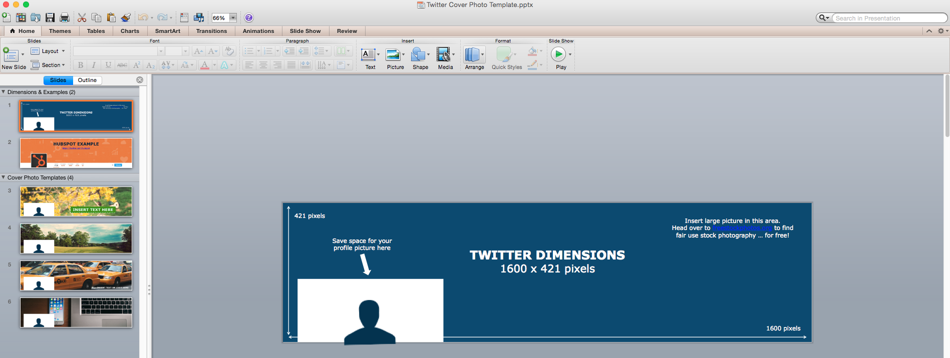
We also created free, downloadable PowerPoint templates that are already pre-sized for each channel’s specific cover photo dimensions so you can easily customize them for your own business. Just add your creative, save it as an image file, and upload it to your social media business page.
Cover Photo Sizes for Facebook, Twitter, LinkedIn, Google+, and YouTube
- Facebook: 851 px wide x 315 px tall
- Twitter: 1,500 px wide by 500 px tall
- LinkedIn: 646 px wide x 220 px tall
- Google+: 1,080 px wide x 608 px tall
- YouTube: 2,560 px wide x 1,440 px tall | Desktop Banner: 2,560 px wide x 423 px tall
You can download your free cover photo templates in PowerPoint here (template example pictured below) for each of these five social networks.
And if you need some help with your DIY design skills before you start creating cover photos, check out our free ebook: Design it Yourself: The Marketer’s Crash Course in Visual Content Creation. It’ll walk you through everything you need to know to start designing visual content yourself — no previous design experience required.
Happy designing!
Editor’s Note: This post was originally published in December 2014 and has been updated to reflect the latest social media cover photo dimensions for 2016.
6 Overlooked Ways to Win More New Clients
Every agency professional knows that sinking feeling — you pursued what you thought was a warm lead for weeks, only to have them pass on your services. You don’t understand where it all went wrong. Your agency has a lot to offer, so why aren’t any of your prospects taking the bait?
It’s time to stop getting your hopes up and start incorporating these strategies into your agency’s business development plan.
6 Strategies for Winning More Clients
1) Make sure they’re worth it.
It’s easy to get excited when a lead starts to warm up, but hold yourself back from jumping into a contract before you’ve determined they’re a good fit. The last thing you want is a new client that your agency can’t entirely accommodate or who isn’t actually prepared to invest the necessary time and money in your services.
Start by writing up your ideal client profile — a list of qualities that your agency can use to determine if a prospect will be a sustainable and profitable client down the line. As a starting point, look to your past or current accounts that have resulted in rewarding business relationships, and think about exactly what made them work so well. This will enable your team to more selectively seek out and nurture leads that fit your ideal profile, leading to a pool of prospects who are more likely to close as valuable new accounts.
Once you know exactly what to look for, make an effort to get to know your prospects. Remember: Qualifying a new lead shouldn’t feel like swiping left or right on a dating app. You need more than a fleeting first impression to make an informed decision. Learn to ask smart qualifying questions that help you understand your prospective client’s motivations, goals, challenges, and resources. In turn, your prospect gets to see that your agency is thoughtful and deliberate about pursuing serious contracts — it’s a win-win.
At any point in the qualification process, don’t be afraid to be picky. If leads don’t meet your agency’s criteria — or if you don’t think you can fully get behind their product or service — disqualify them and move on.
2) Don’t let your leads go cold.
Cultivating a productive lead generation campaign is important — but it’s only one component of winning more clients for your agency. Before you can close the deal, you need to spin up an effective lead nurturing program.
Leads don’t have a long shelf life, leaving you with a limited window of time to engage with them. But unfortunately, when it comes to business development, many agencies simply fail to actively prioritize a nurturing strategy, resulting in cold leads and missed opportunities. And we get it — you’re pressed for time, and at the end of the day, your current clients are your absolute top priority. Just keep in mind that 73% of all B2B leads are not sales-ready. You need a strategy for moving them closer to the point of purchase.
So what’s an agency to do? This is where targeted lead nurturing comes in. And it doesn’t have to be complicated and time consuming. With email automation, you can set up nurturing workflows to engage with potential clients, familiarize them with your services, and personalize content to fit their stage in the marketing funnel. Leads don’t warm up on their own — convince them to invest in you.
3) Gain trust by selling quick win projects.
The best way for your agency to prove value to a lead is to start demonstrating value as soon as possible. Consider offering hot prospects an initial project that gives them a sampling of your team’s expertise. Create a simplified version of what your agency would usually offer new clients at the beginning of a contract, such as keyword research, buyer persona development, an educational workshop, or even a brief brand audit.
Keep it relevant to what the potential client is looking for, and keep it short. Nobody — absolutely nobody — wants to read a 25-page proposal. Focus on big bullet points and quick wins for the prospect. This is not a big project proposal. It’s an enticing sample of what your agency is capable of.
4) Avoid fights you can’t win.
Nurturing a lead, generating a proposal, selling your agency’s services — these things all take time, and it’s realistically not worth putting in the hours if there’s only a slim chance of a prospect converting. A big company showing interest in your agency is exciting, but don’t drop everything and spend hundreds of hours to create a pitch and even spec work if your chances of winning are slim. In a fight that big, nobody has great odds, and you’ll have to work harder to really get noticed.
You should also be wary of businesses who are prematurely looking for a marketing agency. Maybe they can’t afford to pay an agency yet, or they’re still under contract with another agency. Either way, pitching them isn’t likely to result in actual paid work, so don’t waste your team’s time.
To generate more business for your agency, focus primarily on the safe bets — bids where your agency has a realistic chance of closing the deal.
5) Narrow your sights on a niche.
Take a look at some of your past clients and ask yourself: Is there a pattern here? If the answer is “yes,” you may already be on your way to becoming a niche agency. There are definitely benefits to tailoring your offerings to appeal to a single business type or industry — there’s a less crowded playing field, you can gaining a strong reputation with a targeted audience, and there are more opportunities for referral generation.
Not to mention you’ll reap major SEO benefits. Try searching for “marketing agency boston” and your search yields 56,500,000 results. Now try “marketing agency for law firms boston.” You get a pared-down 1,210,000 results. When potential clients search for agencies online, they use specific, long tail keywords, not broad terms.
If you focus on a niche, you tap into a pool of clients who have similar goals and challenges — and you can become an expert at meeting them. If a law firm in Boston is seeking out a new marketing agency, and they see that you’ve worked with several other law firms, you’re going to be at the top of their list. There are many more opportunities to get discovered when you concentrate your efforts on an individual area.
6) Build your brand to increase credibility.
It’s your job to make other businesses look good — but don’t forget about yourself. The way your agency presents itself — from your website down to your email signatures — really matters to prospective clients. You don’t want anyone to ask you, “If your agency is so good, why does your website look like it hasn’t been updated since 2006?”
Your brand should be reflection of all that you’re capable of, so think of yourself as your most experimental and creative client. Try out your best ideas on yourself, and don’t be afraid to experiemnt. Remember that prospects seeking out a new agency are sifting through tons of agency websites that look the same and all claim the same things. It pays in a big way to differentiate yourself.
28 of the Best Instagrams to Follow for Design Inspiration
What if I told you you could visit an art gallery … from the comfort of your own home? Or from a bus seat on your commute to work? Or while you’re taking a break for lunch?
If you follow the right people, that’s what Instagram can do for you. There are a lot of really talented artists and designers out there who use Instagram as a sort of mini art gallery — a social portfolio, if you will.
And it’s a jackpot for people who love browsing gorgeous design work.
To help you narrow your search, I’ve carefully curated some of the best Instagrams to follow for design inspiration. I did my best to place them in categories — illustration, graphic design, pop art and installation, color palettes, street art, photography, typography, and calligraphy — although you’ll notice some of their work could fall into a number of different lists.
Whether you’re a designer looking for inspiration, or you simply harbor an appreciation for art and design, you’ll want to check out (and follow) these accounts.
28 Designers You Have to Follow on Instagram
Click on a category below to jump to that section:
- Illustration
- Graphic Design
- Pop Art & Installation
- Color Palettes
- Street Art
- Photography
- Typography
- Calligraphy
Illustration
1) Steve Harrington: @s_harrington
Steve Harrington is a Los Angeles-based designer who describes his own style as having a “psychedelic-pop aesthetic.” His Instagram is full of his brightly colored, playful illustrations, many of which he’s created for brands — most notably Nike, for which he’s designed sportswear, including shoes.
2) Rachel Ryle: @rachelryle
Rachel Ryle is an illustrator, an animator, and a storyteller — and she combines all three on her Instagram account. Most of her posts are beautiful, clever, and often super cute stop-motion videos like the one below. She told Mashable that each animation takes 15–20 hours from the beginning concept to final editing, on average. If you like her work, Instagram is the place to follow her: It’s her most dedicated channel for showcasing her work.
3) Mikey Burton: @mikeyburton
Mikey Burton, based out of Chicago, calls himself a “designy illustrator” — his way of saying he works part time in both. Burton has done work for clients like Converse, ESPN, Target, The New York Times, TIME Magazine, and Esquire. He’s been working on a lot of editorial pieces lately, which he posts proudly on his Instagram — along with other, often-whimsical illustrations both as sketches and as final, published projects.
4) Jamel Saliba: @melsysillustrations
Jamel Saliba, a.k.a. Melsy, is equal parts artist and entrepreneur, having quit her job in her mid-twenties to become a successful, full-time fashion illustrator. Her sketches are beautifully done and cover themes like fashion, friendship, and love — all in the style of contemporary chic. Since her initial success on Etsy caught the eye of consumers and brands alike, Melsy’s done client work for Hallmark, T.J.Maxx, and Home Goods.
On Instagram, she posts a combination of illustrations added to her portfolio, as well as those celebrating events or holidays, like the illustration she posted for Mother’s Day (third image below).
Graphic Design
5) Neil A. Stevens: @neil_a_stevens
Neil A. Stevens specializes in poster design, and he’s particularly good at creating sharp, dynamic pieces like the ones below. For example, the first image below is a map he designed for the Italian post office. He’s created posters for many cities and countries around the globe, including a handful for the Tour de France.
6) Hey Studio: @heystudio
Hey Studio is made up of three designers: Ricardo Jorge, Veronica Fuerte, and Mikel Romero — and is one of Spain’s most popular graphic design studios. A lot of their work features stunning geometric shapes, which they post to their Instagram account in combination with pictures of their team during the creation process (and when they’re just fooling around).
7) Luke Choice: @velvetspectrum
Luke Choice is an Australian living in New York whose work covers graphic design, illustration, and typography. His style is very colorful and very unique — I especially love the 3D illustration work he does, some of which are crazy cool animations. Check out his Instagram feed to see his latest work, from his own personal projects to collaborations with brands like Nike.
Pop Art & Installation
8) Jessica Walsh: @jessicawalsh
I’m so inspired by Jessica Walsh, both as a designer and as an entrepreneur. She joined the design firm Sagmeister & Walsh, Inc. at age 23 — back when it was just Sagmeister, Inc. Two years later, the firm’s founder Stefan Sagmeister took her on as a partner when she was only 25, and the firm eventually became Sagmeister & Walsh. They’ve designed work for very high-profile clients, such as Levi’s and HBO.
Walsh’s Instagram account is a gorgeous display of her own work, the firm’s, and design inspiration from others.
9) Daniel Aristizábal: @darias88
Colombian Digital Artist Daniel Aristizábal’s talent is transforming regular, everyday objects into surreal, colorful renditions that are full of character. His work is “saturated with science references, retro hues, strange imagery, bold geometric patterns, and a playful sense of the absurd,” reads his SkillShare bio.
Follow him on Instagram for a peek into how he sees the world, including the collaborations he’s worked on with clients like Toy Nail Polish and Refinery29.
10) Dschwen LLC: @dschwen
Dschwen LLC is a creative studio based in Minneapolis that employs collaborative designers throughout the United States. Their design projects are created mainly for brands — including some big names like Amazon, Apple, Juicy Couture, General Electric, Uber, Twitter, and more.
They’ve won a plethora of awards, including a Design Gold at Cannes Creativity Festival for the second image below, “traffic cone in disguise,” which they created for Twitter and Niche. Their Instagram page is chock full of creative, surprising, and clever designs — including some sweet animations.
11) Leta Obierajski: @letasobierajski
Leta Obierajski is a New York-based art director and graphic designer with an eye for bright colors, angles, and curves. What I like about her Instagram account in particular is that she writes descriptive Instagram captions that give her followers a behind-the-scenes look at her thoughts and processes, making for an incredibly interesting read.
For example, in her caption for the last image below, she describes her collaboration with a fellow designer on this installation for local restaurant Le Turtle:
Taking notes from psychedelic symbology and visual occult, @wadejeffree and I sighted references such as The Holy Mountain by Alejandro Jodorowsky, the paintings of Victor Vasarely, the architectural notes of Carlo Scarpa, and Sol Lewitt in order to help us realize our vision for Le Turtle. We put a strong emphasis on raw materials as well as angles and curves to create a distinct brand language for the restaurant. We developed a bespoke typeface for Le Turtle to use on all printed materials as well as an iconography set for web and print.
Color Palettes
12) Design Seeds: @designseeds
The folks behind Design Seeds’ Instagram account do a wonderful job of showing their followers just how important color schemes are to beautiful design. They use Instagram to create color palettes inspired by images submitted to them on Instagram using the #SeedsColor hashtag. This is a fun way to share their passion for nature’s beauty while encouraging engagement.
13) Canva: @Canva
As a design tool, it makes sense that Canva’s Instagram account would be centered around design. Not only do they post gorgeous photos and design work, but I especially love their color palette series, where they create color palettes based on photos, much like Design Seeds.
As an added bonus, they include the names and hex codes of each color and prompt their followers to punch the hex codes into their Canva color wheel to use them in their own designs.
Street Art
14) Jaime Rojo: @bkstreetart
Jaime Rojo isn’t a street artist; he’s a photographer of street art. One of his goals, which he articulates on his website, is to photograph new public art, street art, graffiti, and urban art as they’re created, not just in Brooklyn, but all over the world (thanks to a partnership with Urban Nation Berlin). He keeps an eye on developing trends and strives to lead a worldwide conversation about how these trends affect popular and art culture. His Instagram is a live collection of his photographs, in which he credits and tags the artist when known.
15) Biafra Inc.: @biafrainc
Biafra Inc. is an anonymous Minneapolis-based street artist who creates his work via spray paint, screen printing, stencils, stickers, and posters. As he tells it, his work is often “a visual retelling of stories that are apart of his life.” As a self-proclaimed news junkie, he also incorporates socio-political themes in his work from time to time. His Instagram account is an inspirational showcase of his work in a variety of urban environments all over the Midwest.
16) Fumeroism: @fumeroism
“My art is an extension of my character, bold and uninhibited, assertive and unorthodox.” That’s how anonymous street artist Fumeroism describes his colorful, expressive, contemporary street art. His designs are often caricatures of real subjects, like his portrait of fellow street artist Sebastien Waknine in Barcelona in the third image below. Follow Fumeroism on Instagram for colorful, bold, and energetic street art in locations all over the world.
17) Banksy: @banksy
Unsurprisingly, the famous British street artist Banksy doesn’t post to his Instagram account very often. (Yes, it is his official account — Banksy’s publicist Jo Brooks confirmed it in a tweet.) But when he does, it’s not something you’ll want to miss.
For example, in February 2015, after almost a year and a half of nothing new on Instagram, Banksy posted a caption-less photo to his Instagram account of a brand new, never-before-seen piece of street art that Paste Magazine theorized appeared to be “done over a door. The location has not been discovered or revealed as of yet.” Follow his account to scroll through some of his great work and to stay in the loop in case a new piece appears.
Photography
18) VuThéara Kham: @vutheara
When it comes to beautiful photography, there are a whole lot of Instagrammers to choose from. One of my favorites is Paris-based photographer VuThéara Kham, who actually started his career on Instagram and became quite popular in the Instagram community. Follow his Instagram account for gorgeously framed photos of Paris’ landscapes and people.
19) Hiroaki Fukuda: @hirozzzz
Instagram is actually the basis of Hiroaki Fukuda’s photography career, which is why his posts on there are so darn good. Like Kham, Fukuda started as an Instagram hobbyist in Tokyo and ended up gaining a huge following.
When big brands caught wind of his talent and began hiring him for different projects, he became a full-time Instagrammer (yes, these do exist). Now, he travels all over the world taking photos for companies like Nike and Christian Dior. Side note: He told CNN in an interview that he likes when people comment on his photos … so comment away!
20) Dirk Bakker: @macenzo
Although Dirk Bakker is an Amsterdam-based graphic designer, he likes to take photographs of art, design, and architecture — and post it to his Instagram account. He has a keen eye for taking something “normal” — like cranes or a staircase — and transforming it into a stunning image with a great sense of depth. He’s especially talented at capturing repetitive patterns like lines, geometric shapes, forms, and colors, making for striking images with strong visual impacts.
21) Max Wanger: @maxwanger
Max Wanger is a Los Angeles-based photographer who specializes in portraits, including wedding photos. His Instagram posts are a combination of his personal photography and the work he’s done for clients. What I love about his photos is that they have a romantic, personal touch, and often make beautiful use of negative space.
Typography
22) Erik Marinovich: @erikmarinovich
Erik Marinovich is a lettering artist and designer and an entrepreneur. In addition to drawing letters, logos, and type for big brands like Nike, Target, Google, Facebook, Sonos, and Sharpie, Marinovich has also co-founded Friends of Type, a collaborative blog and shop, and Title Case, a creative work space that runs workshops and lectures. His Instagram account is a great showcase of his impressive lettering work, from branded design work to impressively cool doodles.
23) Ahda: @misterdoodle
Ahda, the man behind the Mister Doodle pseudonym, is a hand letterer who’s done design work for big brands like Element Skateboards, The Sunday Times U.K., Citizen Apparel, and more. His specialty is incorporating his beautiful, curvy hand lettering into shapes and illustrations. Check out his Instagram for photographs of his lettering work, including t-shirt designs and creative showcases of his projects alongside relevant props.
24) Cyril Vouilloz: @rylsee
Cyril Vouilloz, a.k.a. Rylsee, is a Berlin-based designer with a fun and experimental take on typography. His unique hand-drawn lettering work plays with lines and dimensions — and what makes his Instagram posts so cool is that many of them show his fingers “interacting” with his illustrations, enhancing the optical illusions in a way that’ll blow your mind a little bit. Browse through his crazy cool work on Instagram, and follow him to see what original artwork and distortions he comes up with next.
25) Arabic Typography: @arabictypography
Beautiful typography doesn’t just mean Latin letters. In fact, some of the most beautiful typography in the world comes from Arabic script. There are many features that make Arabic lettering so aesthetic: It’s written from right to left, it can include accents and dots or lines, and its letters can vary in shape depending on their position in a word.
The Arabic Typography Instagram account, run by Egypt-based Noha Zayed, is a collection of beautiful Arabic typography — from signage to street art to tattoos — that’s crowdsourced from all over the world.
Calligraphy
26) Seb Lester: @seblester
Artist and Designer Seb Lester is one of the most famous calligraphy artists on Instagram, with over one million followers (as of this posting). The vast majority of his posts are actually videos — and for good reason.
“So much of calligraphy is about movement and rhythm, and a short video can capture the beauty and the magic of calligraphy in a very Internet-friendly format,” he told The New Yorker. “Recurring words in people’s comments are ‘mesmerizing,’ ‘hypnotic,’ and ‘satisfying.’ For reasons I don’t fully understand, people clearly enjoy watching the process of something perceived as ‘perfect’ being made from start to finish.”
Here’s another cool video from his Instagram feed:
27) Lindsay Oshida: @lindsayoshida
Lindsay Oshida is a Los Angeles-based graphic designer who posts beautiful calligraphy work to her Instagram account. She gained a lot of attention on Instagram for her “Game of Thrones” quotes, which she posted once per day during the ten days leading up to the 2015 season premiere.
For example, she did her piece “Kill the crows” (the first image below) in black letter with walnut ink, according to The New Yorker, and the black crows were sketched using a crow-quill nib — “a calligrapher in-joke.” She’s since posted quotes both from “Game of Thrones” and other popular TV shows, and claims other calligraphers have followed her lead.
28) Calligraphy Videos: @calligraphyvideos
If you can’t get enough of those mesmerizing calligraphy videos, here’s another account that makes great use of video on Instagram. It’s a collection of crowdsourced videos of people creating beautiful calligraphy in all different styles — and the artists are cited in the captions in case you’re looking for more calligraphers to follow. Prepare to be hypnotized.
Here’s another video from their collection:
We hope this list helped you find some new designers to follow. May your Instagram feed be much more beautiful for it!
Which accounts are your favorites? Whom else should be added to this list? Share your thoughts with us in the comments.
10 Handy Gmail Tips That’ll Help You Stay Organized & Productive [Infographic]
Gmail is one of the most popular email clients for webmail right now — and with good reason. It’s one of the most powerful and reliable email clients available, and makes checking and organizing email easy. (And dare I say fun?)
But there are a whole lot of cool things you can do in Gmail that not a lot of people know about.
For example, did you know that you can automatically categorize some of your incoming emails so they’re labeled, archived, deleted, or forwarded — without ever having to see them in your inbox? Or that you can save and send canned emails so you’re not typing out the same response to different folks over and over and over again?
Check out the infographic below from NeoMam Studios to learn 10 tips to help you become a Gmail power user. You’ll find yourself spending a lot less time looking through email — and more time doing the things that actually matter. (And read this blog post to learn how to get to inbox zero in Gmail, once and for all.)
What other tips do you have for being a Gmail power user? Share with us in the comments.
15 Oh-So-Sweet Examples of Chocolate Packaging Designs
Design agencies have developed a major sweet tooth for packaging.
The once humble chocolate bar has become the latest canvas for creatives to experiment with unexpected concepts and show off their design chops.
Since packaging actually has a real impact on how we perceive taste, these 15 examples of chocolate brands must be absolutely delicious. Check them all out below:
15 of the Best Chocolate Packaging Designs
1) Chocolate-Paint
Japanese designer Nendo took inspiration from childhood to craft these edible paint tubes for Seibu Department Store. The chocolate tubes are each filled with a unique flavored syrup and come packaged in a box styled after oil paint sets. And don’t worry about messy fingers — Nendo added minimal paper labels you can hold onto while you indulge.
Image Credit: Nendo
2) Fat Pig Chocolate
This organic chocolate brand has roots in design — it’s owned and operated by New York-based ad agency The Brooklyn Brothers, whose founders decided to give the chocolate business a chance as a way to better understand their clients’ business needs (although a love of chocolate was also involved).
Their package design entices chocolate-lovers to “pig out” with the following copy on the back of each bar: “Get your snout in this. Shove every single square in your face right now. And do it quick. Or some other fat pig might ask you for a piece. Oink, oink!”
Image Credit: Fat Pig Chocolate
3) LYRA
When this Slovakian bean-to-bar chocolate company launched a premium line of bars, they enlisted the help of designer Michal Slovák to create a design that was as “simple, playful and extraordinary” as the chocolate itself.
To emphasize the brand’s local charm in it’s native country, a paper-bag style base was used for the wrapper. Both varieties have a two-toned label — a warm brown for the dark chocolate and a robin’s egg blue for the milk chocolate. Celebrating the bar’s star ingredient, the design features a simple illustration of a cocoa pod. Small gold lettering in the center adds a hint of sophistication.
Image Credit: Michal Slovák
4) Fruene
Chocolate seems like a sweet way to honor the brave female pioneers of the world’s northernmost inhabited area — Svalbard, Norway. Norwegian graphic design firm Tank Design Tromsø worked closely with the Svalbard Museum and the Longyearbyen cafe (which happens to be the world’s northernmost chocolate producer) to create these unique chocolate bar designs.
Blending vintage images of women fishing, hunting, and trapping (all of which are traditionally male-dominated activities in Svalbard), with bold typography, the wrappers put the stories font and center. After all, the brand’s name — Fruene — literally translates to “ladies.”
Image Credit: Lovely Package
5) Chocolates with Attitude
“The Hero”, “The Seducer”, “The Innocent” — no, these aren’t characters in an epic drama.. They’re chocolates designed by Danish creative agency Bessermachen. The firm’s Chocolates with Attitude box was developed as a way to showcase different personalities in packaging design, with a different chocolate treat cast as each core archetype. Each of the 12 individual packages within the box are an exercise in how different color schemes and typography can truly define the identity of a brand.
Image Credit: Bessermachen
6) Lapp & Fao
What’s better than curling up with a good book? Eating a chocolate book, of course. German designers at Studio Chapeaux modeled these Lapp & Fao chocolate bar wrappers after old-fashioned travel journals, featuring custom illustrations reminiscent of Charles Darwin’s specimen sketches. Each “book” features a volume number on the spine and is meant to feel like a “delicious memento” of Lapp & Fao’s travels.
Image Credit: Studio Chapeaux
7) Chocolate Research Facility
Some design agencies would balk at the idea of designing individual packaging for over 100 different varieties of chocolate, but Singapore-based Asylum rose to the challenge. In a year-long project, the team created a collection of eclectic chocolate bar designs for Chocolate Research Facility that are perfectly cohesive in their eccentricity. Using bold graphics, bright patterns, and very limited text, no two flavors’ packing look alike.
Image Credit: Asylum
8) Filter Chocolate
Tasked with creating an Indian-inspired concept for retailer Filter, Mumbai-based Alok Nanda & Company took a decidedly alternative approach. This monochromatic packaging design is a departure from the modern, colorful wrappers dominating the chocolate world and from what was expected. “We decided to do away with the kitsch and colours generally associated with India,” the designer explained.
To keep the desaturated look central to India, the designer retained Indian motifs.
Image Credit: Filter
9) MAST Sea Salt Collection
A chocolate bar packaging roundup wouldn’t be complete without a nod to Mast Brothers Chocolate, a pair of Brooklyn-based and self-described “groundbreaking” chocolatiers who emerged on the gourmet chocolate scene in 2007.
Past controversies aside, the Mast Brothers know good design. Their recent collaboration with wallpaper company Calico stands out for its use of organic textures paired with Mast’s signature minimal typography. The process for these designs borrows elements from the sea salt chocolates themselves — salt granules were sprinkled over watercolor paintings before they finished drying, resulting in textures of an otherworldly quality.
Image Credit: Calico
10) Alice Chocolate
Sometimes great things come in small packages. With sliding packaging inspired by a matchbox, Alice Chocolate was created and designed by Swiss branding consultants Michael Felber and Steven Mark Klein after they noticed a lack of real Swiss chocolate brands on the market.
The package features a classic 18th-century style silhouette and modern sans-serif typography, centered on a white background to minimize distraction. The founders believe that they have something truly iconic on their hands with Alice.
In the brand introduction, it says,”If there was a list of the 100 classic brand icons: Chanel No 5, Patek Philippe Calatrava, Hermès Kelly Bag… the goal is to become the chocolate on that mythical list.”
Image Credit: Alice Chocolate
11) Bennetto
This chocolate bar design by ONE DESIGN teaches us that there is probably nothing fancier than a bird in a suit. The folks at the New Zealand design agency spun up the quirky, illustrated packaging after confections company Bennetto requested something contemporary, sophisticated, and out of the box for their organic drinking chocolate, which comes in bar form. The whimsical design features exotic Peruvian birds in tailored clothing — a nod to the chocolate’s South American origins. The packaging is also sure to please environmentalists. Bennetto’s website reads: “The grey cellulose wrapper we use on the twin packs is made from plant based renewable resources; use it on your worm farm if you like!”
Image Credit: Bennetto
12) Dallmayr
Combining tradition and modernity, German agency Factor Product designed this envelope-inspired branding and packaging for Dallmayr, a delicatessen franchise in Europe. The client wanted packaging that would signal to consumers that they were holding a high-quality, high-class chocolate bar in their hand, and the Munich based designers definitely delivered; each structured paper envelope is sealed with a branded Dallmayr sticker, and features detailed illustrations unique to each flavor.
Image Credit: Factor Product
13) Melt
Here’s a crazy idea: Why not feature chocolate on the chocolate bar label? JJAAKK Design did just that with their packaging concept for the fictional Melt chocolate company. Using raised ink, the team at JJAAKK covered the wrappers in an artful and realistic webbing of melted chocolate illustrations, “providing a tantalizing glimpse at the wonderfulness contained within.”
Image Credit: JJAAKK Design
14) Moonstruck
When Oregon-based Moonstruck Chocolate decided to start exploring national distribution for their premium single-origin chocolates, it came to brand design firm Sandstrom Partners for a look that would set the brand apart. The client wanted packaging that would “capture the imagination” and evoke an emotional response in chocolate lovers. The result was this enchanting series of wrappers, which use hand-cut paper illustration, embossing techniques, and multiple paper finishes for an elevated, “multi-sensory” experience.
Image Credit: Sandstrom Partners
15) Hippo Hyfryd
These luxury vegan truffles from Welsh company Hyppo Hyfryd manage to look sophisticated and adorable at the same time, thanks to this unique design by Kutchibok. The sleek black box is embellished with a simple line illustration of a hippo, and the company’s logo appears in handwritten font.
Image Credit: Kutchibok
How to Add Slide-In Calls-to-Action to Your Blog Posts [Tutorial]
Many blogs — including this one — end each post with a call-to-action that leads to a landing page.
But the question is … are readers noticing your blog’s CTAs?
The problem with static CTAs at the bottom of each blog post is that after a while, visitors learn to tune them out. This isn’t only a problem with your repeat visitors, either — since so many blogs implement this tactic, even your new visitors might be ignoring your “additional content” or “recommended next steps.”
To combat this, some blogs have started to implement something called a slide-in CTA. Ideally, this CTA will enter the screen below your sidebar content so it doesn’t cover it. If you don’t have a sidebar, it’ll simply slip right in on the right side once it’s triggered.
Pretty cool, right? If you’re interested in testing out this type of CTA on your blog, we’ll walk you through the instructions below. But first, let’s explore some numbers …
Do These Slide-In CTAs Actually Work?
When we first implemented slide-in CTAs on our blog, we decided to run some tests to find out if they we’re actually working.
Over the course of a month, we ran a test where we added these slide-in CTAs to ten of HubSpot’s highest-trafficked blog posts. We compared the slide-in CTA vs. the static CTA at the bottom of each post and looked at three data points:
- Clickthrough rate (CTR) – What percentage of blog post visitors clicked each CTA?
- Conversion rate (CVR) – What percentage of the people who clicked ultimately converted on the landing page form?
- Submissions – How many leads did each CTA ultimately generate?
In this test, the slide-in CTA had a 192% higher CTR and generated 27% more submissions. The number of submissions actually wasn’t higher, because the CVR on the slide-in CTAs was lower than the static CTAs. But the volume of clicks was so great that it was worth compromising on CVR.
Keep in mind that the success rate of any CTA will have a lot to do with your specific audience, so we encourage you to run some tests of your own to determine if slide-in CTAs are the right fit for your blog.
How to Install Slide-In CTAs on Your Blog Using Leadin
To install these slide-in CTAs on your blog, you’ll need:
- Access to either your WordPress account, or the ability to add a line of JavaScript to your company’s website.
- A free Leadin account (sign up here).
If you don’t have access to #1, email this article to your webmaster so he or she can setup Leadin. You can do the rest.
If this seems overwhelming, keep in mind that you’ll only need to do step one once. Once the JavaScript or WordPress plugin are added to your site, you can simply create new slide-in CTAs right from Leadin.
1) Install Leadin on your website via the WordPress plugin or standalone web app.
First, go to Leadin and create your account.
If you have WordPress, you’ll be prompted to install the plugin by following these instructions.
If you aren’t using WordPress, you’ll be asked to install a piece of JavaScript before the </body> tag in the HTML of your website. Here’s a guide on how to do that for most content management systems, including Joomla, Drupal, Wix, Weebly, and more.
If you use HubSpot to host your website, you can add Leadin as an add-on in Products & Add-ons by following these instructions. (Note: If you have an existing Leadin account, you’ll have to add the add-on, then delete your old account.)
2) Create a Lead Flow and choose “slide-in box” as the type.
Once you have Leadin all set up, you’ll want to start by creating a Lead Flow — an all-in-one conversion pop-up that allows you to target your audience with specific content.
To access the Lead Flows editor, click “Lead Flows” in the top navigation, then “Create Lead Flow.”
Once you’re there, you’ll have several customization options. First, you’ll need to choose your Lead Flow type. To achieve the slide-in CTA effect, you’ll want to select “slide-in box.” (Note: You can choose between a slide-in that appears on the right or left — it’s up to you.)
After that, it’s time to craft your actual “callout” or CTA. Your CTA provides an opportunity to grab your visitor’s attention with a brief description of what you’re offering via a title, description, image, and theme color.
In the callout step of the editor you can:
- Upload an image (also included in the form step).
- Set your callout text (the main header).
- Adjust the button text (also included in the form step).
- Set the theme color which will be included throughout the Lead Flow.
You will see a live update of the changes you make on the right-hand side of the editor. Here’s a closer look at what it might look like:
Still with us? Good. It’s time to build your form.
Within the form step, you can add additional fields to the form, change the language of the fields, and add a body to elaborate on the value you are providing with your Lead Flow.
Language allows you to change the language of the non-editable parts of the CTA, including the form field labels. Currently, it is possible to translate these parts of the form to French, Spanish, Japanese, German, and Brazilian Portuguese. (Looking for a language that’s not listed? Let us know.)
Lastly, create a thank-you message that your visitor will see after submitting your form.
In this step, you can also add a link to additional resources/downloads and include some lightly formatted text, like this:
3) Adjust your options.
Within the “Flow Options” section, you can adjust the location of your flow, the triggers that will cause it to appear for your user, and more.
First, you can adjust the internal name for your Lead Flow or unpublish it if needed. When naming your CTA, keep in mind that this is the name that will appear in your contact timeline and in internal email notifications.
Next up, configure which pages you’d like your flow to appear on. You’ll notice that the ‘exact match URL’ option in Leadin supports a wildcard option. For reference, a wildcard is a character like an asterisk that serves as a placeholder for a character or group of characters — for example: “http://ift.tt/2alzYFM”.
So if you’d like your CTA to appear on all pages on your blog, make sure you add that “*” at the end.
Following location, you can choose the action that will trigger the Lead Flow. Your trigger options will vary depending on the Lead Flow type you’re using, but the following options are available for slide-ins:
- Page scroll. This will trigger the moment your visitor scrolls 50% down your page.
- Elapsed time. This will trigger the moment X seconds have past (minimum of seven seconds).
Don’t want this Lead Flow to appear on mobile? You can disable it using the next option. (Note: Lead Flows are fully mobile optimized, so in most circumstances it’s recommended to include your Lead Flows on mobile.)
Lastly, you can enable/disable internal email notifications for new submissions on this Lead Flow. With notifications enabled, you’ll receive an email whenever a contact is captured.
You can also connect Leadin to an email provider (more on that here). If you have Leadin connected to a provider you can select which lists new contacts that submit this Lead Flow will be pushed into.
(HubSpot users: The Lead Flow is treated like a form. When someone fills it out, they enter the database as a form submission. From there, you can set up workflows or automated emails within HubSpot based on those form submissions.)
4) Preview & publish your CTA.
The Lead Flows editor provides an interactive preview where you can test each stage of your Lead Flow and see it in action. This preview offers the ability to view on desktop, tablet, and mobile.
When you’re ready to publish your Lead Flow, simply select the blue “Publish” button in the top right.
Need to unpublish it for some reason? Head into the “Options” tab and you’ll find an “Unpublish” option at the top. You can also unpublish right from the Lead Flows Dashboard.
Once you get your Lead Flow up and running, you can track views and conversions right from your Leadin dashboard. Here’s a little preview of what that’ll look like:
Whew, we’re finally done. You did it! Excellent work. Now let us know how it goes.
Have you experimented with slide-in CTAs? Share your tips and tricks in the comments below.
Editor’s Note: This post was originally published in April 2014 and has been updated for freshness, accuracy, and comprehensiveness.