
How to Use Video in Each Stage of the Buyer’s Journey [Free Interactive Guide]
Video has quickly become one of the most powerful mediums for sharing your message: 78% of people watch videos online every week. What’s more, 55% of people watch videos online every day.
But like any new marketing tactic, video needs to be done right to have an impact on your business. This means creating the right videos to be used at the right time to reach the right audience. How do you do this? Start by focusing on the buyer’s journey.
The buyer’s journey is the active research process a buyer goes through leading up to a purchase. It includes three main stages: awareness, consideration, and decision. There are several opportunities within each stage to use video, and by creating different videos for each stage, you’re more likely to connect with your customers and achieve higher engagement, brand activation, and trust.
In How to Use Video in Each Stage of the Buyer’s Journey, you’ll learn how to successfully incorporate video into your marketing to increase SEO and engagement, track where prospects are coming from, and ultimately grow your business as a whole.
You’ll also learn:
- A breakdown of the buyer’s journey and where your business can incorporate video
- How to create specific types of videos to be used in the awareness, consideration, and decision stages
- How to optimize your videos for each stage
- How to improve any video content you already have
- Examples from great video marketing from brands like BuzzFeed and Airbnb
- Much more about growing your business by using video in your marketing!
Click here to download the free interactive guide today.
A Simple Guide to Motivating People at Work [SlideShare]
Motivated employees aren’t just a joy to be around at work. They also perform better, are more productive, and contribute to higher morale. Disengaged employees, on the other hand, are costly — both in terms of pay and team morale.
But every leader knows that motivating their team is hard. In fact, 30% of executives say that motivating their employees is actually their toughest job.
While money is certainly a plus, there are other motivators out there that matter just as much — including autonomy, mastery, and purpose.
Check out the SlideShare below from WeekDone to learn six effective employee motivators and how exactly to implement them with your own team. (And if you’re the one who’s unmotivated, read this blog post for seven ways to get motivated at work again.)
What other tips do you have for motivating your team? Share with us in the comments.
The Pros & Cons of Facebook, Twitter, Instagram & Other Social Networks [Infographic]
Nowadays, social media is one of the main channels used by companies to reach their target audiences. But with so many different social networks available, how do you choose which will work best for you?
It’s not a one-size-fits-all solution.
For example, recent research has shown that teens and millennials are moving away from Facebook and into other social networks like Instagram and Snapchat. So if you’re primarily targeting teens, you may want to focus your resources on building a stronger presence on those networks.
To learn more about each social network’s strengths and weaknesses, check out the infographic below from Visage. It’ll cover the key stats, pros, and cons for Facebook, Twitter, Instagram, LinkedIn, Pinterest, and Snapchat. Acknowledging these can help you create and publish the most engaging content possible on the networks that work for you.

You Can Now Set Goals in Google Calendar: Here’s How to Set It Up
While setting and working towards personal goals is often hailed as a way to stay motivated and productive, the science behind goal-setting paints a different picture.
For starters, a study from the University of Liverpool revealed a connection between depression and setting generalized, abstract goals. It turns out that when we don’t have precise criteria for what it means to achieve a goal, it’s difficult to ever feel a sense of accomplishment. It’s like kicking a soccer ball toward a goal line, but the goal line keeps moving further and further backwards.
Couple that with the fact that, as psychologist Robert Cialdini explained in his best-selling book Influence, sticking to any goal you set is incredibly difficult — unless you take the time to write your goals down and/or share them publicly.
Fortunately for all of us who have been struggling with defining and sticking to our goals, Google has released a new feature for Google Calendar that can help. It’s called “Goals,” and it could be the solution to the goal setting problems I outlined above.
What are “Goals” in Google Calendar?
Google announced the addition of the “Goals” feature to its Google Calendar application on April 12, 2016. The feature lets you set clearly defined goals (e.g., “practice speaking French three times per week”) and then Google Calendar automatically schedules those goals based on when you have open slots in your calendar.
When you’re setting a goal, you also have control over how much time you want to dedicate to each session. Just like with a meeting, you can have a goal session last 15 minutes, 30 minutes, an hour, or however long you want. You can also specify what time of day — morning, afternoon, or evening — you’d prefer to work on your goals.
What happens if a new meeting pops up on your calendar in the spot where a goal session has been scheduled? No, you don’t get to use that meeting as an excuse (any more) for skipping out on your goals. Instead, Google Calendar automatically reschedules that goal session for you.
(Source: Google)
The same thing happens if you decide to defer a session. Instead of disappearing from your calendar, that session gets automatically rescheduled. And as you keep using the Goals feature, Google Calendar gets better at understanding your scheduling preferences, so it can provide more personalized scheduling.
One caveat here: You can only create goals using the Google Calendar application on an iPhone, iPad, or Android device. That being said, you can still view, edit, and — if needed — defer goal sessions using Google Calendar on a desktop or laptop.
Now that you have a basic understanding of what Google Calendar’s “Goals” feature is all about, let’s go through the steps of actually creating a goal.
How To Set a Goal in Google Calendar
1) Open the Google Calendar app and tap the red “create” icon.
2) Tap the blue Goal (flag) icon.
3) Choose the type of goal you want to set.
4) Get more specific.
5) Get even more specific.
6) Choose how often you want your goal to appear on your calendar.
7) Choose how long you want each goal session to last.
8) Choose the ideal time of day for when goal sessions should be scheduled.
9) You’re done! Here’s what the confirmation screen looks like:
Once your goal is set and you’ve landed on the confirmation screen (see above), you can fine-tune your goal settings by tapping that “More Options” link. From there you’ll be able to edit notifications, colors, and more.
When you’re finished, goal sessions will start appearing on your calendar and you’ll be off to the races (or off to French lessons, depending on your goal).
Have any tips or tricks for getting the most out of Google Calendar’s Goals feature? Tell us about them in the comments section below.
How to Retain Customers Using User-Generated Content [Free Guide]
What if you could have your current customers sell your products for you? With user-generated content (UGC) it’s possible! User-generated content deepens your relationship with your existing customers, while leveraging their networks to help you acquire new customers.
From reviews to social media, user-generated content brings a myriad of opportunities to engage with your customers. Once you’ve activated these customers, you’ll be able to tap into the social proof from their content and word of mouth marketing to their networks.
We’ve partnered with Yotpo to bring you How to Retain Customers Using User-Generated Content: The Guide for Ecommerce Marketers. It covers everything that you’ll need to get started with user-generated content for your ecommerce company, including:
- The “rules” of retention
- Why word of mouth matters
- How to leverage word of mouth marketing
- How to deal with negative reviews
- The right (and wrong) ways to ask for a review
- Best practices for building a base of brand advocates
Download How to Retain Customers Using User-Generated Content: A Guide for Ecommerce Marketers to leverage your exisiting customers for customer acquisition.
7 Great Examples of ‘Welcome’ Emails To Inspire Your Own Strategy
We’ve all heard how important it is to make a good first impression. Show up late for a job interview? That’s a bad first impression. Eat a ton of garlic and forget to brush your teeth right before a first date? Also a bad first impression. Go to meet your significant others’ parents for the first time dressed in Crocs and sweatpants? That might also result in a bad first impression (depending on prevailing fashion sensibilities).
It turns out that the “make a good first impression” principle holds true not only in face-to-face encounters, but in email interactions as well.
When you send off a welcome email to a new blog or newsletter subscriber, or to a new customer, you’re making a first impression on behalf of your brand.
To help ensure you’re making the best first impression possible, we’ve rounded up some examples of standout welcome emails from brands big and small. As you’ll soon discover, each example showcases different tactics and strategies for engaging new email subscribers. Let’s dive in …
7 Examples of Standout Welcome Emails
1) Kate Spade
Let’s face it: We, the internet-using public, are constantly bombarded with prompts to sign up for and subscribe to all sorts of email communications. So as a brand, when someone takes the time to sift through all the chaos in order to intentionally sign up for your email communications, it’s a big deal.
In order to acknowledge how grateful they are to the folks who actually take the time to subscribe, Kate Spade uses a simple — but effective — tactic with their welcome emails: They say “Thank You” in big, bold lettering. And by placing that “Thank You” on an envelope, Kate Spade recreates the feeling of receiving an actual thank-you letter in the mail. (The 15% off discount code doesn’t hurt either.)
2) Virgin America
A welcome email is the perfect medium for introducing folks to the characteristics (and eccentricities) that make your brand unique.
For Virgin America, that means putting the “sign of the horns” hand gesture, which loosely translates to “Rock and roll!”, front and center. The playful accompanying copy, “Welcome aboard,” and casual call-to-action, “Grab a seat,” also help to position Virgin America as a hip, fun-loving brand right off the bat.
3) Michaels
The Michaels approach to the welcome email borrows elements from both Kate Spade and Virgin America. In addition to expressing gratitude to the folks who took the time to sign up, Michaels uses their welcome email to showcase their brand. And they do a great job: the lengthy email feels like one big arts and crafts project, complete with paint, yarn, and chalkboards.
Another standout feature of this welcome email is that Michaels makes it immediately clear what value their future email communications are going to provide. After thanking subscribers, there’s this nice bit of copy that sums it up: “We’re going to send fun stuff like DIY tips and tricks, invites to in-store events, and exclusive deals and coupons.”
4) InVision
When you sign up for InVision’s free prototyping app, their welcome email makes it very clear what your next step should be: using the app.
To facilitate this action, InVision’s welcome email doesn’t simply list out what you need to do in order to get started. Instead, it shows you what you need to do with a series of quick videos. Given the visual, interactive nature of the product, this makes a lot of sense.
5) Food52
Sometimes the tiniest of elements in a welcome email can speak volumes about a brand. And when it comes to Food52’s welcome email, their preview text at the top of the email, “We brought snacks,” definitely accomplishes this.
Also known as a preheader or snippet text, preview text is the copy that gets pulled in from the body of an email and displayed next to (or beneath) the subject line in someone’s inbox. So when you see Food52’s welcome email in your inbox, you get a taste of their brand’s personality before you even open it.
Food52’s welcome email also does a good job of building trust by putting a face (make that two faces) to their name. As soon as you open the email, you see a photograph of — and welcome message from — the company’s founders.
6) IKEA
It might not be the most beautifully designed email on this list, but that doesn’t mean IKEA’s welcome email isn’t effective.
Instead of going for the hard sell (e.g., “By stuff now!”), or explaining what it is they do (which is something IKEA probably assumes most people already know), IKEA uses its welcome email to turn folks onto its other, lesser-known programs and content channels. For example, there’s a call-to-action right at the top that explains the value of its member benefits program. There are also prompts to visit their design blog and to contribute to their collaborative “Share Space” site.
Of course, if you’re not interested in any of that stuff, IKEA’s welcome email also makes it easy for you to simply log in and start shopping (there’s a login field right up top).
7) Drift
No fancy design work. No videos. No photos. The welcome email Drift sends out after signing up for their newsletter is a lesson in minimalism.
The email opens with a bit of candid commentary on the state of email. “Most people have really long welcome email sequences after you get on their email list,” Dave from Drift writes, before continuing: “Good news: we aren’t most people.” What follows is simply a bulleted list of the company’s most popular blog posts. And the only mention of the product comes in a brief post-script at the very end.
If you’re trying to craft a welcome email that’s non-interruptive, and that’s laser-focused on adding value vs. fluff, this is a great example to follow.
Know of any other standout examples of welcome emails? Share them in the comments section below!
Strategies to Drive Member Engagement
Over time, you’ve collected a wealth of data on your members. That’s because your members are engaged with your organizations for reasons that are beyond materialistic. They care about your mission and work. They’re regularly reading your content. They’re giving you donations to do what you do best and expect nothing but goodwill in return.
So why are you analyzing this data in a spreadsheet?
Engagement has so many interesting dimensions and can be eye-opening to a marketer who is looking to make the most out of a limited marketing judgement. Instead of letting your invaluable trends fall to the wayside with data that is going unanalyzed, take a look at the following tactics and strategies. With the right tools, processes, and systems, you can integrate your data into your high-level strategy.
Still need a way to engage your members? Check out our ebook, A Crash Course on Inbound Marketing for Nonprofits >>
Create Exclusive Groups on Social Media
Your most engaged members deserve special recognition because the offer the most value to your organization. Of your overall audience, they are likely the most engaged, likely to donate, and passionate about your work.
Imagine how fruitful it would be to have a direct, ongoing conversation channel into this audience where you could conduct research, ask for opinions, share content, and discover what’s on their minds.
One way to tackle this challenge is to create exclusive social media groups in your sector. These include groups on Facebook and LinkedIn and hashtag-based Twitter chats. If you’re feeling especially ambitious, you could launch your own niche online community. Keep these cohorts small so that you can keep the benefits exclusive and interaction alive.
Build an On-Site Personalization Strategy
If you’re tracking information about all your members in a central marketing or communications data, you’re in a strong position to create customer segments. Why not craft one that’s focused around your most valuable audiences?
Create personalized welcome screens, share interesting content, and offer custom resources for your most engaged members. Understand what appeals to them personally, and make sure that your messages aligns with their interests on an individual level.
Here are some resources that can help you get started:
- Here’s an introduction on how to use smart content to engage audiences with more relevant, personalized resources
- Here’s a strategic guide on how to use personalization with your content
- Here are some ways that you can automate the creation of smart text
Personalization has many moving parts, so make sure to do your research upfront. Spend time with your highest value members and donors in person so that you can continue to develop your most current and compelling messaging. Master this creative side, automate process, and devote as much time as you can to learning about your audience.
Send Personalized Emails
Email still remains as the best channel for communicating with audiences 1:1. It’s especially valuable for connecting with members who have a high personal stake in your organization. Think about it: they’re committing their time and money to your cause. It’s the ultimate form of brand engagement.
Why not make the most out of these touch points by increasing the value of your interactions? When you’re sending personalized emails to strangers or minimally engaged audiences, you risk wasting resources. But when you’re sending personal emails to audiences who are already engaged, your probability of having a successful outcome is high.
Think about it: if you’re sending member renewal emails, wouldn’t you want to give your long-timers a special thank you? The extra effort will only take a couple minutes of your time. If you’re looking for some ideas to get started, check out this list of example email templates.
Spend Time Together in Person
When it comes to engaging your members, nothing replaces an in-person interaction. Use your online strategy to help guide your strategy for setting up exclusive meetups in key geographies where your most engaged audiences are living.
Use your member database to identify potential hosts and speakers. Come up with a monthly schedule for longer and shorter events. You can even create a monthly meetup (at a venue like your office or a park), host a potluck, and invite members to spend time together. It’s a marketing program that you can build at almost no additional cost, while complementing your marketing funnel.
When you spend time together in person, you’ll come up with some great ideas for additional marketing initiatives, content to write, and campaigns to run. You’ll get feedback on your programs to date and figure out exactly how to iterate and make your processes better.
Final Thoughts
Data and personalization campaigns can help tie together many moving parts of your member engagement strategy. Focus on giving this group your best marketing experience: after all, they’re your most powerful advocates. Engagement fuels more engagement. Automate as much as possible so that you can focus on what you do best–building engagement.
14 Stress Management Apps to Relax Your Mind & Body
Stress and anxiety — to some degree — are natural parts of everyday life. Think about it: You get that feeling when a driver cuts you off on your way to work, or when you have a looming deadline, or when you spill coffee on your shirt.
These stressful moments can range from uncomfortable and annoying (even motivational) to completely debilitating. What’s worse, these negative feelings can build on themselves really quickly until they feel out of control.
That’s why it’s crucial to monitor our emotional health whether or not we have a diagnosed disorder. According to experts at the Mayo Clinic, unmanaged stress symptoms “can affect your body, your thoughts and feelings, and your behavior,” and can lead to some serious physical repercussions.
Self-help can be our biggest asset, and luckily for us, there are some great apps out there that can help you manage your stress and anxiety on a daily basis. Here’s a list of some of our favorites.
Note: These apps are not intended to be substitutes for medical advice — they’re for educational purposes only. Consult your healthcare professional before making any health, medical, or other decisions based on the data within these apps.
14 Stress Management Apps You Need to Try
1) Pacifica
Here’s a daily tool that’ll help you address stress and anxiety at a gradual pace. The folks who invented it based it on cognitive behavioral therapy combined with relaxation and wellness techniques.
The app itself is pretty low maintenance: The idea is to track your daily activities by writing or via audio. The app then helps you understand what activities might be triggering different moods and emotions, especially stress and anxiety. The goal here? To help you recognize what’s making you anxious or stressed so you can break the cycle. It also gives you goals to set and emotional homework. And, unlike many of the self-help apps out there, it’s refreshingly non-fluffy.
Image Credit: Bustle
2) My Mood Tracker
- Price: Free for lite, $4.99 for full version
- Available for: iOS (Android alternative: T2 Mood Tracker)
Here’s another app that lets you track your emotions and activities throughout the day, with the goal of helping you figure out what’s driving these emotions. Monitoring your mood in an app can help you find some useful correlations — for example, some folks find their mood changes depending on whether or not they worked out that day.
You can put in your sleeping times and sleep quality, medications taken, amount of exercise performed, stress levels, menstrual cycles, and more in here. It’s a pretty robust app, hence the $4.99 price tag — although you can download the lite version for free. The Android alternative, T2 Mood Tracker, is also free.
Image Credit: iTunes
3) GPS For the Soul
- Price: Free
- Available for: iOS
The GPS For the Soul app was created by Arianna Huffington and Deepak Chopra, both outspoken advocates for emotional well-being.
The app helps to connect you with “guides” that make it easier to manage your stress. Each guide includes a combination of things like pictures of nature, breathing exercises, meditation, and yoga. While there are many guides to choose from, you can also create your own by uploading photos of loved ones or by adding your own music or quotes. Once the guide has launched, a breathing pacer will help you measure your breathing.
Your feed will help you see what your friends are feeling and what’s helping them, too. The point here is to help you put things into perspective and remember all the things that you can be grateful for.
Image Credit: Bustle
4) Pay It Forward
Several bodies of research show simple acts of kindness make people feel good. And there may also be particular benefits to varying our acts of kindness, as novelty seems to be linked to happiness as well.
That’s why folks involved in the Pay It Forward movement created this app, which encourages users to do acts of kindness every single day. Each morning, it offers a short list of suggestions for what to do — stuff like pay for the next person’s cup of coffee, for example. It keeps track of your progress as you go and connects you with people to share recommendations with, including friends and family who have downloaded the app, too.
Don’t expect anything fancy from this app: The interface is as simple as the idea. But what a great reminder to give back in small ways every day. (And what a great thing to wake up to every morning.)
Image Credit: Google Play
5) Buddha Board
- Price: Free
- Available for: iOS
Buddha Board is an app inspired by the Zen concept of living in the moment. It lets you “paint” virtually, using your fingers, on the surface of your mobile device. Once you’ve “painted” your design, watch as it slowly disappears.
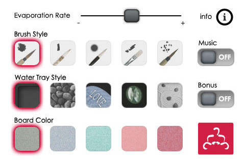
Image Credit: iTunes
Gradually, you’ll be left with a clean slate — and, theoretically, a clear mind to go with it. “Allow yourself to ‘let go’ and not be concerned with each outcome – live in the moment and enjoy,” reads the description on iTunes.
It’s simple, easy, and fun to use. But be warned: One iTunes reviewer complained that although you can use it on your iPad, the screen resolution is pretty poor on a larger screen. If you’re looking for something to use on your iPad, check out Zen Space. Instead of painting, Zen Space lets you create your own zen garden — accompanied by soothing music — and save your images if you want to look at your masterpieces later.
6) Self-Help Anxiety Management
Created by a university team of psychologists, computer scientists, and student users, the Self-Help Anxiety Management app (nicknamed SAM) helps you figure out what’s making you anxious or stressed while also suggesting ways to combat it.
It’s a great resource for external information, covering everything from information about anxiety to physical and mental relaxation techniques. Along with these resources comes guidance for putting these techniques into practice. Over time, you’ll be able to see a graph of your anxiety so you can self-monitor.
Image Credit: Bustle
7) Breathe2Relax
Has anyone ever told you to close your eyes and breathe when you’re having even the smallest of panic attacks? That’s because focusing on and controlling your breathing can really help calm a person down. In fact, diaphragmatic breathing (i.e., breathing from your stomach) has actually been proven to decrease stress.
The Department of Defense’s Center for Telehealth and Technology created this app to help soldiers and their families learn stress-relieving breathing techniques — but, of course, it works for everyone. It also offers some great information and resources on depression, anxiety, stress, and more. So the next time you feel like you’re getting super stressed, try letting this app guide you into some mindful breathing exercises.
Image Credit: Bustle
8) Happify
- Price: Free
- Available for: iOS
This app helps you improve your mood using positive-thinking activities. Their philosophy, based on scientific research, is this: We each have a genetic set point for happiness — but we also have the ability to offset it. In other words, we have more control over our happiness than we might realize.
By practicing certain exercises and interventions that promote positive emotional qualities (like kindness and mindfulness), we can choose our thoughts, behaviors, and actions. Over time, these choices will become habitual and will gradually increase our resilience and make us happier.
That’s exactly what the Happify app aims to do. It helps you set specific goals and offers tips for achieving those goals. The positive-thinking activities include games, posting about something you’re grateful for, or imagining what a situation would be like in someone else’s shoes. CNN named this app among the top apps to train your brain and better cope with stress.
Image Credit: Bustle
9) Personal Zen
- Price: Free
- Available for: iOS
If you’re a fan of playing games on your phone to relieve stress, try adding this one to your repertoire. The premise of the game is super simple: It takes place in a garden where two faces, one happy and one angry, drop into the ground. The happy face creates a trail of grass you have to quickly trace with your finger. The more you play, the more attuned you become to look for the happy face instead of the angry one. Imagine this setup set to soothing background music.
That’s literally it. And it works, according to science: It’s based on an emerging cognitive treatment for anxiety called attention-bias modification training (ABMT).
“Essentially, this treatment involves training patients to ignore a threatening stimulus (such as an angry face) and to focus instead on a non-threatening stimulus (such as a neutral or happy face),” writes Mihir Patkar for Lifehacker.org. “This type of training has been shown to reduce anxiety and stress among people suffering from high anxiety.”
All it takes is 25 minutes of play time to reap the positive benefits, according to a study published in the Clinical Psychological Science journal about the app.
Image Credit: iTunes
10) Relax Melodies
- Price: Free
- Available for: iOS
If stress or anxiety gets in the way of you falling asleep or staying asleep, you might want to try an app like Relax Melodies to help you relax before bedtime. The app lets you choose from 48 relaxing ambient and nature sounds — everything from ocean waves to white noise — as well as calming music and guided meditation sessions. You can customize these sounds into a mix, or choose just one.
You can also set a timer for them to stop playing after a certain amount of time, or set a time during the night or morning for them to wake you up.
Image Credit: Bustle
11) Headspace
- Price: 10 free, 10-minute sessions, with upgrade for $12.99/mo. or $94.99/yr.
- Available for: iOS | Android
Meditation is another great stress relief technique — and Headspace is one of the best apps out there for guided meditation sessions, especially if you’re a beginner. These guided sessions will teach you how to turn off that brain chatter and meditate effectively.
The free version includes access to Take10, a starter course including ten 10-minute meditation activities geared toward beginners. From there, you can pay a monthly subscription of $12.99 to receive more and longer meditation sessions, as well as sessions for specific purposes like less stress and conscious eating.
Image Credit: iTunes
12) The Worry Box
- Price: Free
- Available for: Android (iOS alternative: Worry Watch)
How great would it be if you could just take all your worries, put them in a box, and leave them in that box — instead of having to carry them with you wherever you go? That’s what The Worry Box is for.
It’s exactly what it sounds like: A virtual “box” where you can record all the things you’re stressing about and leave them behind — kind of like the “letting go” philosophy from the Buddha Board app. Then, the app lets you think them through. If the worry is controllable, it’ll help you list out some steps for managing it. If it’s not controllable, you can select from a list of coping statements to help you approach it from a different angle. It’s based entirely on cognitive behavioral therapy techniques that are proven to relieve and manage stress, anxiety, and depression.
Image Credit: Google Play
13) Acupressure: Heal Yourself
Here’s an app that’ll help you garner some physical release from your everyday stresses. Acupressure is an ancient healing art where you use your fingers to press on “pressure points” on the surface of your skin to stimulate the body’s natural, self-curative abilities. It’s totally safe to do — and pressing on these pressure points has both physical and mental benefits, including releasing nerve endings, easing tension in your body, and increasing blood flow.
The app itself helps you locate the pressure points that’ll help alleviate specific symptoms (which you can search for), and then teaches you how to actually alleviate that pressure.
Image Credit: iTunes
14) Gratitude Journal
- Price: $1.99
- Available for: iOS (Android alternative: Attitudes for Gratitude)
Sometimes, all it takes to alleviate some of that building stress is to reflect on what we’re grateful for. After all, there are many studies out there proving that keeping a gratitude journal can result in higher alertness, enthusiasm, determination, attentiveness, and energy.
Here’s a great gratitude journaling app that’ll prompt you to record the highlights of your day. You can even take pictures of those things to keep a visual reminder of what you’re grateful for.
Image Credit: iTunes
What are your favorite stress management apps? Share with us in the comments.
8 Guidelines for Exceptional Web Design, Usability, and User Experience
When it comes to designing or re-designing a website, it can be easy to get hung up on the aesthetics. “That shade of blue just doesn’t look right …. Wouldn’t it be cool to have the logo on the right side of the screen? …. How about we put a giant animated GIF in the middle of the page?”
However, if you’re truly trying to accomplish something with your website (e.g., brand awareness, lead generation, etc.), you’ll need to focus on more than just how your website looks.
In a world where folks have more than a billion websites they can potentially land on, you need to make sure your website’s design is optimized for usability (how easy your website is to use) and user experience (how enjoyable interacting with your website is for actual users).
Download our free guide to web design here for more tips on designing a user-friendly website.
Now, you could spend years studying the ins and outs of usability and UX, but for the sake of giving you a jumping off point, we’ve put together the following list of helpful guidelines to apply to your next web design project.
8 Website Design Guidelines for an Exceptional User Experience
1) Simplicity
While the look and feel of your website is important, most visitors aren’t coming to your site to evaluate how slick the design is. Instead, they’re coming to your site to complete some action, or to find some specific piece of information.
Adding unnecessary design elements (i.e., elements that serve no functional purpose) to your website will only make it harder for visitors to accomplish what they’re trying to accomplish.
From a usability and UX perspective, simplicity is your friend. And you can employ simplicity in a variety of different ways. Here are some examples:
- Colors. Don’t use too many. The Handbook of Computer-Human Interaction recommends using a maximum of five (plus or minus two) different colors in your website’s design.
- Typefaces. The typefaces you choose should be legible at the very least. And when it comes to colors, you shouldn’t use too many. A common recommendation is to use a maximum of three different typefaces in a maximum of three different sizes.
- Graphics. Only use them if they’ll help a user complete a task or perform a specific function (don’t just add graphics willy-nilly).
Here’s a great example of a simple homepage design from Rockaway Relief:
Strip away everything that doesn’t add value, then add some visual texture back in.
The great car designer Colin Chapman famously said, “Simplify, then add lightness.” This principle owes something to that mindset. Every element on a page must add value to the user or the business—and ideally, to both. Taken literally, the process of stripping away non-value-adding elements can produce a rather Spartan design. This is where adding some visual texture back into a page comes in. This approach means:
- The page focuses on the key content.
- The necessary visual texture and interest is present—supporting the aesthetic-usability effect—but not at the expense of the key page content.
– See more at: http://ift.tt/1WsxeWn
Strip away everything that doesn’t add value, then add some visual texture back in.
The great car designer Colin Chapman famously said, “Simplify, then add lightness.” This principle owes something to that mindset. Every element on a page must add value to the user or the business—and ideally, to both. Taken literally, the process of stripping away non-value-adding elements can produce a rather Spartan design. This is where adding some visual texture back into a page comes in. This approach means:
- The page focuses on the key content.
- The necessary visual texture and interest is present—supporting the aesthetic-usability effect—but not at the expense of the key page content.
– See more at: http://ift.tt/1WsxeWn
2) Visual Hierarchy
Closely tied to the principle of simplicity, visual hierarchy entails arranging and organizing website elements so that visitors naturally gravitate toward the most important elements first.
Remember, when it comes to optimizing for usability and UX, the goal is to lead visitors to complete a desired action, but in a way that feels natural and enjoyable. By adjusting the position, color, or size of certain elements, you can structure your site in such a way that visitors will be drawn to those elements first.
In the example below from Spotify, you can see that the “Get Spotify Free” call-to-action sits atop the visual hierarchy. For starters, it’s positioned on the left of the page (most visitors scan websites from left to right). What’s more, it’s the only element above the fold that uses that dark purple color, which naturally draws your attention.
3) Navigability
Having intuitive navigation on your site is crucial for ensuring visitors can find what they’re looking for. Ideally, a visitor should be able to arrive on your site and not have to think extensively about where they should click next — moving from point A to point B should be as pain-free as possible.
Here are a few tips for optimizing your site’s navigation:
- Keep the structure of your primary navigation simple (and near the top of your page).
- Include navigation in the footer of your site.
- Use breadcrumbs on every page (except for the homepage) so people are aware of their navigation trail.
- Include a search box near the top of your site so visitors can search by keywords.
- Don’t offer too many navigation options on a page.
- Don’t dig too deep. In most cases, it’s best to keep your navigation to no more than three levels deep. (Check out this article for more clarity around flat vs. deep navs.)
- Include links within your page copy, and make it clear where those links lead to.
Another pointer: Once you’ve settled on what your site’s main (top) navigation will be, keep it consistent. The labels and location of your navigation should remain the same on each and every page of your site. Here’s an example from the InVision website:
And this leads us to our next principle …
4) Consistency
In addition to keeping your site’s navigation consistent, the overall look and feel of your site should be consistent across all of your site’s pages. Backgrounds, color schemes, typefaces, and even the tone of your writing are all areas where being consistent can have a positive impact on usability and UX.
That’s not to say, however, that every page on your site should have the same exact layout. Instead, you should create different layouts for specific types of pages (e.g., a layout for landing pages, a layout for informational pages, etc.), and by using those layouts consistently, you’ll make it easier for visitors to understand what type of information they’re likely to find on a given page.
In the example below, you can see that Airbnb uses the same layout for all of its “Help” pages (a common practice). Just imagine what it would be like from a visitor’s perspective if every “Help” page had its own, unique layout. (It would likely result in a lot of shoulder shrugging.)
5) Accessibility
According to comScore, tablet internet consumption grew 30% between 2013 and 2015. Smartphone internet consumption, meanwhile, grew 78% during the same time period. The takeaway here: In order to provide a truly great user experience, your site needs to be compatible with the different devices (and operating systems, and browsers) that your visitors are using.
At a high-level, this means investing in a website structure that is highly flexible — like responsive design. With a responsive site, content is automatically resized and reshuffled to fit the dimensions of whichever device a visitor happens to be using. (HubSpot Marketing customers: Using built-in responsive design, HubSpot content built on the COS is automatically optimized for visitors from any device.)
At a lower level, improving accessibility can be as simple as adding alt-text to all of your images (so visitors who can’t see images in their browsers can still understand what’s on the page).
Ultimately, it’s more important that your website provides a great experience across different platforms as opposed to having to it look identical across those platforms. And that can mean adhering to platform-specific design conventions instead of trying to squeeze in unique elements that users of that platform might not be familiar with.
This leads us to our next principle …
6) Conventionality
There are certain web design conventions which, over the years, internet users have become increasingly familiar with. Such conventions include:
- Having the main navigation be at the top (or left side) of a page
- Having a logo at the top left (or center) of a page
- Having that logo be clickable so it always brings a visitor back to the homepage
- Having links change color/appearance when you hover over them
While it might be tempting to throw all such design conventions out the window for the sake of being completely original or unique, this would (likely) be a mistake. It’d be akin to putting a car’s steering wheel in the backseat, which is to say: it would confuse people.
In order to provide the best experience possible for your site’s visitors, take advantage of the fact that you already know what types of web experiences they’re familiar with. You can use this information to make your site easier for visitors to navigate.
One of the most common examples of conventionality in web design: Using a shopping cart icon on an ecommerce site:
In the image above, you can see (from left to right) shopping cart icons from Amazon, Wayfair, and Best Buy.
7) Credibility
Ultimately, using web design conventions — design elements and strategies that visitors are already familiar with — can help give your site more credibility. And if you’re striving to build a site that provides the best user experience possible, credibility (a.k.a. the amount of trust your site conveys) can go a long way.
One of the best ways to improve your site’s credibility is to be clear and honest about the product/service you’re selling on the site. Don’t make visitors have to dig through dozens of pages to find out what it is you actually do. Instead, be up front about it, and dedicate some real estate to explaining the value behind what you do.
Another credibility tip: Have a pricing page. While it can be tempting to force people to contact you in order for them to learn more about pricing, having prices listed clearly on your site can definitely make your business seem more trustworthy and legitimate. Here’s an example of a great pricing page from the Box website:
8) User-Centricity
At the end of the day, usability and user experience hinge on the preferences of the end users. (After all, if you’re not designing for them … who are you designing for?)
So while the principles detailed in this list are a great starting point, the real key to improving the design of your site is to conduct user testing, gather feedback, and make changes based on what you’ve learned.
Here are a few user testing tools to get you started:
- Crazy Egg. Use this tool to track multiple domains under one account and uncover insights about your site’s performance using four different intelligence tools — heat map, scroll map, overlay, and confetti.
- Loop11. Use this tool to easily create usability tests — even if you don’t have any HTML experience.
- The User Is Drunk. Pay Richard Littauer to get drunk and review your site. Don’t believe me? We tried it. Check it out.
(Read this for even more helpful tools.)
According to Vitamin T, 68% of visitors fail to convert because they don’t think you care about their experience. So as a final bit of usability/UX wisdom, start caring more! Put yourself into the shoes of your site’s visitors and keep them in mind every step of the way.
What other principles do you think make for exceptional website design and usability?
Editor’s Note: This post was originally published in January 2012 and has been updated for freshness, accuracy, and comprehensiveness.
Why Prospective Students Aren’t Opening Your Emails
Many schools send out blast emails. Any email address in their contact databases, no matter how the address got in there, receives every email the schools send out. In the early days of email (the ’90s), this was an awesome marketing tactic because it worked. No longer.
People want and expect personalized content. If you keep sending information about your criminal justice program to prospective students who’ve expressed an interest in your medical billing certification program – it’s no wonder they’re not opening your emails.
When we say “personalize”, we’re not talking about inserting someone’s first name in a field tag. The most effective personalized emails personalize the content they provide. That’s how you get the right messages and information in front of the right people at the right time.
Our own research revealed that targeting different emails to different personas resulted in a 16% increase in click through rates (CTRs). That’s the increase we saw merely from personalizing content at the persona level.
Persona targeting is only the top level of your personalization options. Segmenting your email database into a multitude of smaller lists is the true key to precision personalization.
A 2015 email benchmark report finds that open rates in North America remain steady at 32%. Of course, that’s the average open rate. And who wants to be average.
So there’s email marketing, and there’s email marketing well. If your school isn’t seeing open rates that get you into the top quarter of performers – take a look at how effectively (or not) you’re personalizing the content you email out.
Here’s our four-step process for improving your email personalization, and your open rates along with it.
Gather The Right Information
You can’t segment and personalize if you don’t know anything about the person behind the email address. Using online forms, surveys, and back-end data collection, you can learn a lot your digital visitors. This includes demographic, psychographic, and behavioral data.
As you collect more data, you can refine your lists. For example, let’s say you create a list for leads that meet this criteria:
- High school senior
- Lives in targeted state or zip code
- Downloaded report on studying abroad opportunities
That’s not a bad start. But as that visitor continues to engage with your content, you also learn that they nearly always access content via a mobile device and clicked on a Twitter link to get to your blog post introducing a visiting professor from France. Now you can add them to an email list targeting mobile users, who also use Twitter. So the next email they get is one optimized for mobile with Twitter-sized content for them to read and share.
The great thing about smart lists is that your leads automatically get added to the right lists once they meet the criteria. And there’s no limit to the number of lists an email address can be on.
Use this Data Collected to Determine a Lead’s Place in Their Enrollment Journey
The more a visitor interacts with your content, as well as they kind of content they’re focusing on, the better you can gauge where in their journey they are.
Define some content and behavior criteria that indicate to you where a prospect is. Use that criteria to create lists targeting different phases. Behavioral indicators can include more frequently engaging with your content; spending more time on your site, but narrowing their focus to certain pages; shifting their attention from content you tagged for one journey phase to another; they’ve graduated from online content to attending in-person events.
Align Your Email Content to the Lead’s Place in their Enrollment Journey
Where a lead is in their enrollment journey is a critical piece of intel for sending out the most relevant content. A parent downloads your guide on how to select an academy for their child. Is now the time to send them an application package? Not really.
Instead, you send them an email with a short, embedded video interview with a current parent at your school, who’s talking about what was important to them in their selection process. At the bottom, you have a call-to-action inviting them to click on a link to a virtual tour of your school. That’s an email a parent at the start of their discovery phase is more likely to open and engage with.
You can download 50 custonmizable call-to-action buttons here >>
And if they click on that link? That’s more intel for you to continue to refine the content this parent receives.
Monitor Email and List Performance
How prospective students and parents interact with past emails provides even more intelligence. Do they ignore emails about financial assistance issues, but always open emails relating to your school’s sports teams?
You can select content and email frequency based on whether a lead is opening most of your emails or none. A lead with a high level of engagement may be ready to get pushed into the decision phase. Instead of waiting for the lead to go through a typical, longer email drip process, you can set up a smart list to capture leads that open a specified high percentage of emails over a fixed period of time to cut short the nurturing cycle.
For the recipient who isn’t opening any of your emails: Are they an outlier in this, or are they on an underperforming list? If the list as a whole is underperforming, re-assess whether you’re sending the right content for the specified criteria. If the content does seem related, take a closer look at the criteria. Were just a random collection criteria grouped together because you could, but they don’t really create an actionable segment?
It’s Not Them — It’s You
People do like emails that send them relevant, interesting content. If your leads aren’t opening your emails, then you’re not sending the right emails. Or maybe you are, but your subject lines are snores.
Email marketing isn’t going away. Your competition is investing resources to succeed in email marketing, which raises the bar for your own efforts. Personalizing your email content is the smart way to increase your email marketing returns.