
7 Video Techniques For a Limited Budget
Who hasn’t heard the phrase “content is king”? It’s a mantra for marketing teams, but what type of content is the most effective?
Blogs are great at providing information for people who are digging deep to find the answers to their problems, but when there is a choice between reading a blog and watching a video, marketers are realizing that often times the video wins out.
But video marketing can quickly become an expensive project if a company does not know what it’s doing. Don’t let this thought dissuade you! These seven video techniques will make sure you don’t break the bank, but still end up with amazing video content.
1) Don’t Buy, Rent
First off, do not buy any video equipment. It’s just a waste of money and there are plenty of rental places that offer reasonable prices. The rental company you use depends on where you live, but make sure you choose one that offers equipment packages so you can rent in bulk.
The focus should be on the lighting equipment and the mics. They will enhance the quality of your film, especially if you have to settle for low-end cameras. It’s normal to rent three standup lights, but you can make do with two and a reflector.
For mics, don’t waste your money on booms. There are different kinds for different shots and putting money into all of the extra pieces that go with them will quickly add up. Instead, either use a zoom mic that attaches to the top of the camera for indoor shots or a small lavalier mic for both indoor and outdoor shots.
If you want to use an iPhone to save more money, you can still get professional quality film as long as you’re in control of the lighting. This is because there isn’t much outside of the automatic settings for phones. Just make sure the rental company has an iPhone specific tripod.
2) Develop The Story Yourself
Hiring a writer can get pricey and chances are there is a writer among your employees anyway. Sit down with your marketing team and determine what the outline of the story is going to be. Hit the points you want to cover and then assign someone to write it or storyboard it.
Storyboarding is more of an artistic approach than screenwriting because each scene requires a drawing, which can be very helpful with visuals. Start by drawing the opening scene and then draw the most important points of the video. Each drawing should be in sequential order. You can use free printable outline templates to organize the pictures.
If a person would rather write the script then there is no need to do a storyboard. Unlike with the pictures, the script must go through the details of each scene in order to be effective. This is much more helpful if the video requires a lot of dialogue.
If you’re worried the script or storyboard is not good enough you can send it to an editor for a few extra bucks. Marketing videos tend to be short and editors can be hired by the hour so this won’t break the bank. Beware of the overpriced editor though. They will take your money and run. Be specific with how much time you want spent on editing and hire accordingly.
3) Student and Amateur Actors
So you have the equipment and the story all ready to go. Now it’s time to hire the actors. If you’re thinking about using your employees instead of spending money on outside sources, think again! Unless you want really cheesy videos, you must hire people with experience.
This doesn’t mean you have to dig deep into your pockets and shovel out a large chunk of change. A lot of students and amateur actors will work for free to build up their resumes. All you have to do is provide snacks! You can find them on websites like Mandy, BackStage, and even Craigslist. If you live near a university see if there is a theater department. If there is, post flyers on their website or around their building.
Don’t worry, just because you aren’t offering a paying job doesn’t mean you can’t hold auditions. Set a day for an open casting in your workplace. Just be aware of any union actors that show up to the audition. They have specific needs that must be tended to or else you run the risk of being sued.
4) Use Free Editing Software
A lot of professionals use Adobe Premiere or Avid video editing software, but unless you want to spend endless amounts of hours learning how to use them and a lot of money buying them, the better software option is the one that’s already on your computer.
For Macs, iMovie is a great option and for PCs Windows Movie Maker is amazing. They’re specifically made to be user-friendly and have all the applications you need to cut together your film. If you are completely new to editing and don’t know one bit about the tools that the software provide, check out some quick and informative YouTube tutorials.
Some free editing software comes with free music as well. If you want options other than the ones that are on your computer, here is a list of the greatest free editing software for 2016. Before choosing one, make sure it allows you to manually export and resize your video. That way you can manage the video quality.
5) DIY Animation/ Video Scribe
Maybe you want your video to be animated or at least have a piece of it be animated. But won’t that cost a lot? Not for those who use software like GoAnimate and Sparkol. They aren’t free, but they are cheap and effective options.
GoAnimate allows the import of personal images and music. It’s more of a collaboration product. Sparkol allows for an entire animation board to be used. That way there is no need for any real human to be put in front of the camera.
But if you have very little faith in your team’s animation ability, TrueScribe will do it all for you. They have experts on call with no set price so there’s room for negotiation during the consultation.
6) Free Locations
Don’t think ‘film set’, think ‘on location’. Remember, it doesn’t cost anything to film outside. Maybe you’ll have to get a permit, but don’t worry they’re cheap. When picking an outdoor venue, it’s important to take noise levels into consideration. Don’t film in the busiest area of a city or the touristy part of a park. There are many locations that can provide the same backdrop with minimal interruptions.
If the video calls for an indoor location, a lot of store managers allow filming at certain hours for a small price. Make sure to ask politely and explain the lack of budget so they know they aren’t being ripped off. Don’t go during their busiest times though so stay away from dinner/lunch/breakfast hours. Mid-afternoon is best.
If you’re thinking about filming on public transportation, make sure to look up their policies before you make any attempts. Many trains and buses have rules against public filming because it can be a security threat and it would be a waste of money to spend half a workday lugging equipment to a train station only to find out you can’t film there.
7) Keep Crew Number To A Minimum
The amount of outside people hired for a video shoot can add up very quickly. To keep the numbers limited, hire people who wear multiple hats. For example, if you hire a director, make sure they are also a videographer. That way you get the most for the amount you’re spending.
This isn’t a Hollywood film so there is no need for a producer to keep track of things. Allocate different organizational jobs to your in-house team. The director/videographer will be able to instruct them on what they should do during the shoot.
If you’re intimidated by the idea of video marketing because you think you don’t have the funds, hopefully these 7 techniques will change your mind. Video marketing is an important part of content creation and can drive sales so don’t let money prevent you from staying in the game.
30 Call-to-Action Examples You Can’t Help But Click
Think about all the times you’ve signed up for things in your life. Did you once download Evernote? Dropbox? Spotify? Maybe you’ve even taken a class on General Assembly.
Each one of these signups is likely a result of an effective call-to-action.
And it’s really important to guide your visitors through the buying journey using strategic calls-to-action (CTAs). Think about it: If you hadn’t been drawn in by the copy or design of the CTA, or been guided so eloquently through your sign-up process, you would probably use a lot fewer apps and websites than you do now.
Download our full collection of 101 call-to-action examples here for even more CTA ideas.
To help you identify what’s effective and what’s not, we’ve listed out 30 examples of CTAs that totally rock. These call-to-action examples are broken out into three categories: simple and effective design, click-worthy copy, and balancing multiple CTAs on one page.
Full Disclosure: We don’t have data to know if these are all scientifically successful, but these examples all follow our best practices. If you decide to recreate these CTAs on your site, please remember to test to see if they work for your audience.
Simple & Effective Design Call-to-Action Buttons
1) Evernote
“Remember Everything.” Visitors can immediately understand that message the moment they land on this page. The design on Evernote’s website makes it super simple for users to see quick benefits of using the app and how to actually sign up to use it. Plus, the green color of the main and secondary CTA buttons is the same green as the headline and the Evernote logo, all of which jump off the page.
2) Dropbox
Dropbox has always embraced simple design with a lot of negative space. Even the graphics on their homepage are subtle and simple.
Thanks to that simple design and negative space, the blue “Sign up for free” call-to-action button stands out from everything else on the page. Since the CTA and the Dropbox logo are the same color, it’s easy for the visitor to interpret this CTA as “Sign up for Dropbox.” That’s one effective call-to-action.
3) OfficeVibe
Here’s a slide-in call-to-action that caught my attention from OfficeVibe. While scrolling through a post on their blog, a banner slid in from the bottom of the page with a call-to-action to subscribe to their blog. The best part? The copy on the slide-in told me I’d be getting tips about how to become a better manager — and the post it appeared on was a post about how to become a better manager. In other words, the offer was something I was already interested in.
Plus, I like how unobtrusive slide-in CTAs are — as opposed to what my colleague Rachel Sprung calls the “stop-everything-and-click-here-pop-up-CTA.” I find these CTAs offer a more lovable experience because they provide more information while still allowing me to continue reading the blog post. (Click here for a tutorial on how to add slide-in CTAs to your blog posts.)
4) Netflix
One big fear users have before committing to sign up for something? That it’ll be a pain to cancel their subscription if they end up not liking it. Netflix nips that fear in the bud with the “Cancel anytime” copy right above the “Join Free for a Month” CTA. I’d venture a guess that reassurance alone has boosted signups. Also, you’ll notice again that the red color of the primary and secondary CTAs here match Netflix’s logo color.
5) Square
To achieve effective CTA design, you need to consider more than just the button itself. It’s also super important to consider elements like background color, surrounding images, and surrounding text.
Mindful of these additional design components, the folks at Square used a single image to showcase the simplicity of using their product, where the hovering “Get Started” CTA awaits your click. If you look closely, the color of the credit card in the image and the color of the CTA button match, which helps the viewer connect the dots of what to expect if/when they click.
6) Prezi
The folks at Prezi are also into the minimalist design look on their website. Other than the green dinosaur and the dark brown coffee, the only other color accompanying the predominantly black-and-white design is a bright blue — the same blue from their main logo. That bright blue is strategically placed on the homepage: the main “Give Prezi a try” CTA, and the secondary “Get Started” CTA, both of which take users to the same pricing page.
7) Full Bundle
Full Bundle is another company that uses negative space to make their primary CTA pop. The white “Our Work” call-to-action stands out against the dark greys of the background. Their choice of CTA is strategic, too. Given that they primarily exist to build out clients’ online presences, it’s important for them to showcase their work — and that’s what most folks are going to their website for.
8) Panthera
The folks at Panthera are looking for users who really care about wild cats around the world and want to join a group of people who feel the same way. To target those people in particular, we love how they use language that would speak to big cat-lovers: “Join the pride today.” The page itself is super simple: an on-page form with two, simple fields, and a button asking folks to (again) “Join.”
CTA Buttons With Clickworthy Copy
9) Huemor
If you went to a website and saw a “Launch” CTA accompanied by the copy “Do Not Press” … what would you do? Let’s be honest: You’d be dying to press it. The use of harmless reverse psychology here is playful, which is very much in keeping with Huemor’s brand voice.
10) QuickSprout
No one wants to be wrong. That’s why a call-to-action button like QuickSprout’s slide-in CTA on their blog is so clickworthy. It asks the reader, “Are you doing your SEO wrong?” Well, am I? All I have to do is enter my URL to find out — seems easy enough. It’s language like that that can really entice visitors to click through.
Plus, having the CTA slide in mid-blog post is a great tactic for catching readers before they bounce off the page. Traditionally, many blogs have CTAs at the very bottom of each blog post, but research shows most readers only get 60% of the way through an article. (Click here to learn how to add slide-in CTAs to your blog posts.)
11) Grey Goose
Here’s a fun, unique call-to-action that can get people clicking. Whereas site visitors might have expected to be directed to product pages or press releases from the homepage, a CTA to “Discover a Cocktail Tailored to Your Taste” is a pleasantly surprising ask. People love personalization, and this CTA kind of feels like an enticing game. The play button icon next to the copy gives a hint that visitors will be taken to a video so they have a better idea of what to expect when they click.
12) Treehouse
A lot of company websites out there offer users the opportunity to start a free trial. But the CTA on Treehouse’s website doesn’t just say “Start a Free Trial”; it says “Claim Your Free Trial.” The difference in wording may seem subtle, but think about how much more personal “Claim Your Free Trial” is. Plus, the word “claim” suggests it may not be available for long, giving users a sense of urgency to get that free trial while they can.
13) OKCupid
OKCupid’s CTA doesn’t seem that impressive at first glance, but its brilliance is in the small details. The call-to-action button, which is bright green and stands out well on a dark blue background, says, “Continue,” which give hope that the signup process is short and does not take long. To me, this CTA feels more like I’m playing a fun game than filling out a boring form — pretty much all due to the copy.
14) Blogging.org
Nothing like a ticking timer to make someone want to take action. After spending a short amount of time on blogging.org’s homepage, new visitors are greeted with a pop-up CTA with a “limited time offer,” accompanied by a timer that counts down from two minutes. This is a classic use of a psychological tactic called scarcity, which causes us to assign more value to things we think are scarce. Limiting the time someone has to fill out a form makes people want to fill it out and claim their offer while they can.
Curious, what happens when time runs out? So was I. Hilariously, nothing happens. The pop-up CTA remains on the page when the timer gets to zero.
15) IMPACT Branding & Design
CTAs can feel really pushy and salesy if the wrong language is used. I like IMPACT’s educational approach, where they challenge visitors to learn what the company does before pushing them to take any further action. This calls-to-action is especially intriguing to me because they don’t even use an action verb, yet they still manage to entice people to click.
16) EPIC
The folks at the agency EPIC use their homepage primarily to showcase their work. When you arrive on the page, you’re greeted with animated videos showing some of the work they’ve done for clients, which rotate on a carousel. While there plenty of other places users might click on their site — including their clients’ websites — the main call-to-action stands out and always contrasts with the video that’s playing in the background. I love that it features friendly, inclusive language — “Let’s start a new project together” — which gives a hint to users looking for a creative partner that they’re an especially great team to work for.
17) APPSTEMPLATES.com
This website has a very unique call-to-action with copy that showcases the real value you’ll get after clicking. Not only does this button relay that you’ll get unlimited access for $89 (a $149 value), but also the supporting “join the club now” copy makes you feel like you’re missing out on something. This CTA also gets bonus points for having the arrow pointing to the CTA — it’s a perfect example of a proper directional cue.
18) Humboldt County
Humboldt County’s website is gorgeous on its own: It greets you with a full-screen video of shockingly beautiful footage. But what I really love is the unconventional call-to-action button placed in the bottom center, which features a bunny icon and the words “Follow the Magic.” It enhances the sort of fantastical feel of the footage, making you feel like you’re about to step into a fairytale.
What’s more, once you click into that CTA, the website turns into a sort of choose-your-own-adventure game, which is a fun call-to-action path for users and encourages them to spend more time on the site.
Balancing Multiple Call-to-Action Buttons
19) Uber
Uber’s looking for two, very distinct types of people to sign up on their website: riders and drivers. Both personas are looking for totally different things, and yet, the website ties them together really well with the large video playing in the background showing Uber riders and drivers having a good time in locations all over the world. I love the copy of the driver CTA at the top, too: It doesn’t get much more straightforward than, “Make money driving your car.” Now that’s speaking people’s language.
20) Spotify
As soon as you reach Spotify’s homepage, it’s pretty clear that their main goal is to attract customers who are willing to pay for a premium account, while the CTA for users to sign up for free is very much secondary. It’s not just the headline that gives this away: It’s also the coloring of their CTA buttons. The “Go Premium” CTA is lime green, making it pop off the page, while the “Play Free” CTA is plain white and blends in with the rest of the copy on the page. This contrast ensures that visitors are drawn to the premium CTA.
21) Ugmonk
Exit CTAs, also known as exit intent pop-ups, are different than normal pop-ups. They detect your users’ behavior and only appear when it seems as though they’re about to leave your site. By intervening in a timely way, these pop-ups serve as a fantastic way of getting your reader’s attention while offering them a reason to stay.
Ugmonk has a great exit CTA, offering two options for users as a final plea before they leave the site. First, they offer a 15% discount on their products, followed by two options: “Yes Please: Send me the coupon” and “No Thanks: I’m not interested.” It’s super helpful that each CTA clarifies what “Yes” and “No” actually mean, and I also like that they didn’t use guilt-tripping language like “No Thanks: I hate nature” like I’ve seen on other websites. Finally, notice that the “Yes Please” button is much brighter and inviting in color than the other option.
22) Pinterest
Want to sign up for Pinterest? You have a couple options: sign up via Facebook or via email. If you have a Facebook account, Pinterest wants you to do that first. How do I know? Aesthetically, I know because the blue Facebook CTA comes first and is much more prominent, colorful, and recognizable due to the branded logo and color. Logically, I know because if you log in through Facebook, Pinterest can pull in Facebook’s API data and get more information about you than if you log in through your email address.
Although this homepage is optimized to bring in new members, you’ll notice a very subtle CTA for folks with Pinterest accounts to log in on the top right.
23) Madewell
Madewell (owned by J.Crew) has always had standout website design, taking what could be a typical ecommerce website to the next level. Their use of CTAs on their homepage is no exception.
When you first arrive on the page, you’re greeted with the headline “I’m Looking For …” followed by a category, like “Clothes That’ll Travel Anywhere.” Below this copy are two options: “Yes, Take Me There” or “Hmm… What’s Next?” The user can choose between the two CTAs to either browse clothes that are good for travel, or be taken to the next type of clothing, where they can play again. This gamification is a great way to make your site more interesting for users who come across it without having a specific idea of where they want to look.
24) Instagram
Since Instagram is a mainly mobile app, you’ll see two black CTAs of equal size: one to download Instagram in Apple’s App Store, and another to download it on Google Play. The reason these CTAs are of equal caliber is because it doesn’t matter if someone downloads the app in the App Store or on Google Play … a download is a download, which is exactly what Instagram is optimizing for. If you already have Instagram, you can also click the CTA to “Log In” if you’d prefer that option, too.
25) Barkbox
The two CTAs on Barkbox’s homepage show that the team there knows their customers: While many people visiting their site are signing up for themselves, there are a lot of people out there who want to give Barkbox as a gift. To give those people an easy path to purchase, there are two, equally sized CTAs on the page: “Get Started” and “Give a Gift.”
As an added bonus, there’s an adorable, pop-up call-to-action on the right-hand side of the screen prompting users to leave a message if they’d like. Click into it, and a small dialogue box pops up that reads, “Woof! I’m afraid our pack is not online. Please leave us a message and we’ll bark at you as soon as pawsible.” Talk about delightful copy.
26) t.c. pharma
Turns out Red Bull isn’t its own parent company: It’s owned by Thailand-based t.c. pharma, a company that makes popular energy drinks, electrolyte beverages, and functional drinks and snacks. Their homepage features two call-to-action buttons of equal size: “Find out more” and “View products” — but it’s clear by the bright yellow color of the first button that they’d rather direct folks to “Find out more.”
27) General Assembly
As you scroll through the General Assembly website, you’ll see CTAs for various courses you may or may not want to sign up for. I’d like to point your attention to the CTA that slides in from the bottom of the page as you’re scrolling, though, which suggests that you subscribe to email updates.
Although this feels like a secondary CTA due to its location and manner, I actually think they try to sneak this in to become more of a primary CTA because it’s so much more colorful and noticeable than the CTAs for individual classes. When you create your own CTAs, try using bolder colors — even ones that clash with your regular stylings — to see if it’s effective at getting people’s attention. (Click here for a tutorial on how to add slide-in CTAs to your webpages.)
28) charity: water
Charity: water’s main goal is to get people to donate money for clean water — but they can’t assume that everyone wants to pay the same way. The CTAs featured on their homepage take a really unique approach to offering up different payment methods by pre-filling $60 into a single line form and including two equally important CTAs to pay via credit card or PayPal. Notice how both CTAs are the same size and design — this is because charity: water likely doesn’t care how you donate, as long as you’re donating.
29) Hipmunk
When you land on the Hipmunk site, your main option is to search flights. But notice there are four tabs you can flip through: flights, hotels, cars, and packages. When you click into one of these options, the form changes so you can fill out more information. To be 100% sure you know what you’re searching for, Hipmunk placed a bright orange CTA at the far right-hand side of the form. On this CTA, you’ll see a recognizable icon of a plane next to the word “Search,” so you know for sure that you’re searching for flights, not hotels. When you’re on the hotels tab, that icon changes to a hotel icon. Same goes with cars and packages.
30) MakeMyPersona
Here’s another example of a great pop-up with multiple calls-to-action — except in this case, you’ll notice the size, color, and design of the users’ two options are very different from one another. In this case, the folks at MakeMyPersona are making the “Grab the template!” CTA much more attractive and clickable than the “No, I’m OK for now, thanks” CTA — which doesn’t even look like a clickable button.
I also like how the “no” option uses polite language. I find brands that don’t guilt-trip users who don’t want to take action to be much, much more lovable.
There you have it. By now, we hope you can see just how important little CTA tweaks can be.
What other CTAs should be added to this list? Share your thoughts in the comments!
Editor’s Note: This post was originally published in June 2014 and has been updated and for freshness, accuracy, and comprehensiveness.
How to Use Personalization to Get More Value From Your Website [Webinar]
How many times have you come across a new website, only to be bombarded with pop-ups for newsletters and email updates before you even learn what the product is?
Annoying website distractions like these can cause bounce rates to skyrocket, which is why it’s important that you’re regularly reevaluating your strategy to ensure you’re getting the most value out of your site.
If you want to make a great first impression on those visitors instead of driving them away, personalization and optimization can be used to help you better engage them. Don’t know where to start? Well, HubSpot recently teamed up with AddThis for a live webinar to teach you how to get more out of your website by personalizing it for both old and new visitors.
On this webinar, you’ll learn:
- The signs of an interruptive website with too many distractions
- How to simplify your website and personalize content to increase conversions
- Tips for understanding your audience based on website behavior
- How to highlight your best content for new visitors and avoid the “Content Iceberg”
- Much more about getting more value from your website!
Click here to save your seat for this webinar!
Date: Tuesday, March 29th
Time: 2 p.m. ET | 11 a.m. PT
Duration: 60 minutes (including Q&A)
Hashtag: #WebsiteValueWebinar
The Loss of Content Distribution: What’s Happening and What Media Companies Can Do
Media companies are beginning to experience something that is akin to a hypothetical zombie apocalypse. As the Internet becomes more mainstream and global, with new populations and devices making their way online, web traffic is waning. There are many newcomers to the digital media market: brands are creating content to promote loyalty and engage their audiences. Independent writers are launching blogs and building their own followings. Audience fragmentation is the new norm, and media companies are struggling to hold on to their audiences.
Meanwhile, the loss of content distribution is inevitable. Technology ecosystems are becoming more mature, and digital audiences have more options than ever when determining where to invest their attention. Media companies shouldn’t fight these natural market forces: instead, they should prepare themselves for inevitable changes that are about to take place. Here’s how.
Come Up with a Long-Term Plan and Strategy
Whatever you do, don’t consider your company immune to the loss of content distribution. Keep in mind that a new, independent publisher may spring up at any time to sweep in and divert your audience’s attention.
Instead of trying to fight these market forces, figure out how you can build upon your approach to make improvements. Come up with a long-term plan and strategy for your business that covers the following areas:
- Alternative monetization streams that introduces your media company’s creative value proposition to new markets (i.e. maybe you’ll launch a creative consulting arm like T Brand Studio at The New York Times, which is the media leader’s internal agency).
- Content products that provide additional layers of monetization (Like HBR’s online store with books, case studies, tools, collections, and magazine issues).
- Events that bring together your most engaged audiences in an educational forum (like FastCompany’s Innovation Festival).
- Formal programs that improve community-building and loyalty (like Slate’s vibrant commenting platform).
As enticing as short-term traffic generations may seem, don’t let temptation get in the way of your better instincts. Understand that the long-term needs prioritization now, as the media ecosystem is only going to become more competitive. User behavior data, personalization, and segmentation are becoming increasingly important to publishers’ monetization equations.
Focus on Subtle Optimizations that Make an Immediate Impact
In addition to prioritizing the big picture, it’s important to focus on initiatives that will move the needle and start generating value
now. Media companies are under extreme pressure to carve out new revenue streams with the resources that they already have on hand: they may not have the flexibility to invest in experimental initiatives.
But there are a few low-hanging opportunities to generate a win. And these wins can ultimately fund new research and discovery efforts, giving your media company a lot more flexibility to generate new sources of value. Here are some steps to take:
Make more out of your email lists: Take the time to segment your lists, understand engagement patterns, and pinpoint your most loyal readers. Use this data to create new advertising offerings for your company. Double down on creating great email campaigns in the form of newsletters, exclusive offers, and interesting content.
Use smart calls to action (CTAs): When crafting CTAs, particularly for advertising campaigns, make sure that you focus the subtleties. In other words, you’ll want to reach the right audiences with the right messaging at the right time in their content consumption journeys. As you’re well-aware, this process is easier said than done. That’s why you’ll want to take the preliminary work that you’ve done with your email list to start crafting a segmentation strategy.
Increase on-site engagement: Find ways to keep audiences on your website, longer. A simple way to get started? Create a strong content recommendation system with related articles. Chances are that if someone is researching a topic, he or she will want to read more. Take advantage of the fact that you’ve piqued your audience’s interesting by continuing to deliver more relevant content and creating the most engaging experience possible. Along the way, you’ll create more value for your advertisers by identifying your most popular website elements, themes, and community features.
Uncover Alternative Sources of Revenue
Media companies need to diversify their revenue.
No matter how advanced you are in your strategy, now is an invaluable time to get started in your process. Pay attention to ways that other publishers are introducing new revenue streams. Consider offering courses, premium content, or subscription-only features. Offer sponsored webinars, native ads, and email newsletter offerings. Continuously find new ways to uncover alternative resource of revenue. The engagement-drivers outlined earlier in this article are a good starting point. Pay attention to the following:
- Organic activity
- Feature requests from audiences
- Popular themes and topics
- Strategic opportunities for advertisers
These four touch points will help you uncover ideas for new products and mechanisms to better engage your audiences. The key is to develop monetization streams around your most engaged audiences and their preferences. This way, you’ll ensure that your revenue streams have an instant customer base.
The Bottom Line
Stop focus on mass-market audiences. Instead, focus on making more out out of your existing audiences. Build products that they’re seeking out, and provide recommendations for more content. Stop fighting an uphill audience-building battle around casting your net wide and reaching mass-market audiences.
10 Little Ways to Make Your Data Far More Compelling
It’s that time again. You’ve spent countless hours creating and executing a campaign, and now you’re finally ready to present the results to your boss. You’ve rehearsed your presentation meticulously, and feel great about the whole deck … except that one slide that shows a report that doesn’t quite make sense.
Even though the rest of your data is compelling, you know your boss will somehow find a way to focus on the one chart that isn’t. And while you might not always like it, we’d argue that the most important part of any campaign comes after all the work has been done. In other words, that one chart really does matter.
Sure, it’s easy enough to make simple charts, but to really take your next reporting to the next level and present the true impact of your work, you need to be laser-focused on the details. To help make your next presentation even better, we’ve put together a list of 10 quick and easy reporting tweaks to get you started. More specifically, we’ll walk you through how to make these changes using both Excel and HubSpot’s Reporting Add-on below each example.
10 Ways to Make Your Data More Compelling
1) Change your chart type.
Not all marketing data is created equal, so it can’t all be presented in exactly the same way. If you want to compare values — for example, you want to determine whether your latest webinar or trade show generated more MQLs — you’ll want to use a column or bar graph. If you want to show your team trends in data over time, use a line or area graph.
Here’s an example of how choosing a different chart type can clarify your report.
Before: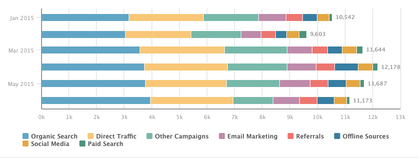
After:
While both reports show the same data — the number of MQLs generated over time, broken down by original source — the second variation, an area chart, gives the viewer a much better sense of how MQL flow has varied over time.
How do I make this change in Excel?
Follow these simple instructions to change your chart type in Excel. Not sure which chart type to choose? To get a sense of your options, take a look at this help document from Microsoft.
How do I make this change in HubSpot?
In HubSpot’s Reporting Add-on, start by selecting the report you want to edit. Then, use the toolbar on the right to choose your desired visualization.
2) Plot performance against your previous benchmarks.
Let’s say you just published an awesome new ebook. To your delight, your lead generation numbers spike as a result. Fantastic! However, your boss always asks the tough questions: Growing leads is good, but is it out of the ordinary?
How can you update your report to show your boss how your lead generation data compares to the norm? Add an additional data series to your report that shows the same metric over a previous timeframe.
In the example below, you’ll see contact growth over time — with and without the previous month’s data overlaid.
Before:
After:
Adding the additional context provides a better snapshot into how your performance compares to the recent past.
How do I make this change in Excel?
There are several ways to approach plotting previous benchmarks in Excel. However, it’s often easiest to add an additional column of data that represents past performance, and plot that alongside the current time period. Find out a bit more about that approach here.
How do I make this change in HubSpot?
In HubSpot’s Dashboard, use the filter at the top of the screen to plot any time period against a past benchmark. The tool defaults to this month vs. last month, but feel free to customize the data around your organization’s reporting cadence.
3) Change the order of your data.
Even if all the right data is included in your chart, it’s pivotal that it’s arranged in a logical and intuitive way. Order your categories alphabetically, sequentially, or by value.
In the example below, we chart the speed of our sales cycle, broken down by original marketing source. With this report, we’re seeking to understand which sources bring in the fastest-closing leads, as well as which source’s leads close the slowest.
Before:
After:
See the difference? If the data is randomly arranged, it’s much harder to glean strategic takeaways.
How do I make this change in Excel?
Excel makes it easy to change the order of your data. Follow Microsoft’s instructions here.
How do I make this change in HubSpot?
In HubSpot’s Reporting Add-on, start by selecting the report you want to edit. Then, use the section labeled “Order by” to customize the sequence of values or categories.
4) Show data markers.
If you’re plotting a trend over time, it’s often helpful to add line markers, which show the stepwise change in the data between intervals. In the example below, we’re plotting MQL growth over a specific week, broken down by original source. Adding markers helps to clarify the discrete jumps in the data between days, making it easier to draw conclusions about what worked over time.
Before:
After:
How do I make this change in Excel?
To add data markers to your line chart in Excel, use these instructions.
How do I make this change in HubSpot?
In HubSpot’s Reporting Add-on, start by selecting the report you want to edit. Then, uncheck the box labeled “Hide Line Markers” to make the change.
5) Display cumulative data.
If you’d like your chart to show aggregate growth, plot it cumulatively. In the example below, the takeaway from the first chart might be “we generated more MQLs in the second half of the date range.” In the second, the overall impact of MQL generation is more apparent: over 1,500 MQLs were generated, with accelerated growth over time.
Before:
After:
How do I make this change in Excel?
While there’s not a single solution to creating a cumulative chart in Excel, this article walks you through one way to tackle it.
How do I make this change in HubSpot?
In HubSpot’s Reporting Add-on, start by selecting the report you want to edit. Then, check the box labeled “Cumulative” to transform your chart.
6) Remove superfluous numbers.
Not all data is imperative to show. Remove unnecessary data points in situations where your properties aren’t as clean as you’d like, or where certain responses aren’t relevant to the questions your team is asking.
Just remember to be tactful in cleaning up your reports. Don’t remove data just because it doesn’t tell the story you’d like it to.
Before:
After:
How do I make this change in Excel?
To add and remove data from your charts in Excel, use these helpful tips from Office’s tutorials.
How do I make this change in HubSpot?
In HubSpot’s Reporting Add-on, start by selecting the report you want to edit. Then, click on the data categories beneath your chart to show or hide the data in your report.
7) Plot a goal line.
Raw data is great, but it doesn’t always tell the whole story. Let’s say you generated 500 MQLs this month. Nice work … but so what? How does that compare to what you had hoped to achieve? Adding a goal line helps your team drill into your performance compared to expectations.
Before:
After:
How do I make this change in Excel?
Similar to the second example, there are several ways to solve this problem. However, it’s most easily done with an extra column of data representing your company’s goal.
How do I make this change in HubSpot?
In HubSpot’s Reporting Add-on, start by selecting the report you want to edit. Then, select the “Include Monthly Goal” checkbox to add your goal line. Note that plotting a goal line is only possible when viewing a current date range in area and line charts.
8) Stack your data.
Too much data can be overwhelming. Stacked visualizations make it easier to spot trends in totals across categories, whereas grouped charts are better for comparing individual values within categories. Depending on the question you’re trying to answer, choose the type of report that makes the most sense.
Imagine you’re plotting your leads by month, broken down by their industry, and your goal is to compare industry lead generation within individual months. Here’s a question you might run into: Did we generate more leads from Higher Education or Biotechnology in April?
In a stacked bar chart, it would be hard to get a sense of the relationship between those two industries in a given month. In this case, it’s better to use a grouped bar chart, where the magnitude of individual values within the time periods are more apparent. On the other hand, if you wanted to focus on how individual industries contributed to overall lead generation (with an emphasis on total leads), a stacked chart would show aggregate totals much more clearly.
Before:
After:
How do I make this change in Excel?
Generate a stacked column chart in Excel with these easy instructions..
How do I make this change in HubSpot?
In HubSpot’s Reporting Add-on, start by selecting the report you want to edit. Then, select the “Stacked” checkbox to implement a stacked chart.
9) Change your color scheme.
Not all of us are artists. But most of us can tell when a color scheme just doesn’t work. If you’re presenting a set of data with several options, choose a color scheme that shows a clear distinction between the options. Otherwise, the data is rendered meaningless.
Not sure what makes for an effective color scheme? Find out all you need to know here.
Before:
After:
How do I make this change in Excel?
Excel makes it easy to change your color scheme. Follow these steps, and your colors will be popping in no time.
How do I make this change in HubSpot?
In HubSpot’s Reporting Add-on, start by selecting the report you want to edit. Then, make a selection from the “Colors” dropdown.
Pro Tip: Use different colors to differentiate between categories of reports on your dashboards. For example, you might make data relating to deals or opportunities green, while shading marketing-related reports blue or yellow.
10) Flip your axes.
Switching your X and Y axes can enable your chart tell an entirely different story. In the example below, we’ve plotted Original Source Type against Lifecycle Stage for a set of contacts.
In the “before” snapshot, a key takeaway might be that the majority of contacts generated through Offline Sources ended up as customers. However, it’s difficult to know what proportion of the Customer lifecycle stage came from Offline Sources.
Flipping the chart around enables us to drill into that additional context. The “after” image gives us a better understanding of how big of a role Offline Sources played in generating Customers. While both charts provide actionable takeaways, it’s important to consider the question you were hoping to answer to begin with. Often times, the opposite axis orientation might provide you with the best answer.
Before:
After:
How do I make this change in Excel?
Stack Overflow provides a quick and easy process for switching your axes without manually changing your data.
How do I make this change in HubSpot?
In HubSpot’s Reporting Add-on, start by selecting the report you want to edit. Then, swap the values of the report configuration dropdowns. For the above example, here’s how you’d make the change:
↓
Now you’re ready to make your data pop and take your reporting to the next level. Here’s hoping you’ll never again have to present a chart to your boss that doesn’t quite make sense!
Which tweak did we miss? Let us know in the comments below.
Take Your Online Store from Average to Elite with Retention Marketing
Gone are the days when you could simply set up an online store, run a few ads, and start watching the money roll in. Today’s ecommerce landscape is a battlefield and the majority of stores are slugging it out to be average. However, there are stores that have figured out how to rise from mediocrity and into the ecommerce elite. These stores know how to use retention marketing!
Today’s Average Store
Stores are different across industries, markets, and countries, so we’re going to work with averages from different studies to help create our baseline.
Average Ecommerce Store’s Order Value: $78.00
Recently, there has been a huge focus on growing an ecommerce store’s revenue. While this looks good on paper, you need to dig deeper than just revenue numbers. You need to look at the profit you are keeping from each sale. You may be saying “This is pretty obvious!” yet big companies fall into this trap of chasing revenue without regards to profit all the time.
Average Ecommerce Store’s Profit Margin: 35%
According to a study from MarketingSherpa, the average American ecommerce site has an average profit margin of 35%. In this benchmark situation, that means that the average store is profiting $27.30 per order. Not bad.
Average Profit Per Order: $27.30
However, there is one pesky cost that will always eat away at your profits. That is your customer acquisition cost. It is not cheap to attract someone to your online store (which you surely know!). One study has the median acquisition cost at $12.00. This seems a little low, but let’s use it for argument’s sake.
Average Cost to Acquire a Customer: $12.00
This is the thorn in the side of every ecommerce merchant, trying to keep profit margins up and acquisition costs down. And, the cost to acquire a customer is also on the rise. As acquisition costs rise, traditional thinking in ecommerce starts to become less sustainable.
Profit to the Merchant: $15.30
In the current landscape (our baseline) this ecommerce store would make $15.30 on every order. This number is after accounting for the price paid for acquisition. Again, this is a hypothetical situation, but this merchant has made $15.30 on a $78.00 order. That is 20% of the sale price, and you haven’t even shipped it yet!
Depending on your shipping costs, this scenario can get you caught in a rat race.
Growing Your Store
The above scenario is a bit like treading water. You’re likely doing OK and making a couple of dollars per order, but if your costs vary significantly, you could be losing money. Even so, no one wants to spend 90 cents to make a dollar.
Many stores make the mistake of continuing like this while they grow a following and customer base. The problem: many stores continue in this mindset forever and never truly scale. If you want to achieve real growth, you need your investment in acquisition to go further. If you want to be elite you need retention marketing.
Becoming Elite Through Retention
Attracting each new customer to your store is increasingly not easy, nor cheap. You want to get the most out of each acquisition investment you make. Retention marketing is a way to get more value out of each acquisition. It is how to make it in the ecommerce world.
In the average store scenario above our merchant is making $15.30 before shipping. Let’s say it is closer to $5.00 when it finally makes it to the customer’s door. This may seem lackluster at best. Where this becomes a viable strategy, is when you treat each new customer/order as the beginning of a longer relationship. This relationship is known as customer lifetime value.
Repeat Customers Spend 3X More Per Order
Customers that return for a repeat purchase are way more valuable to your store. A study by Adobe found that repeat purchases spend three times more than first time buyers. WOW! Let’s use our original example and turn that purchase into a repeat one. A $78.00 purchase would become a $234.00 one. This already is looking good, but it gets better.
Average Order Value From a Repeat Customer: $234.00
Remember that $12.00 acquisition cost? Well, you won’t need to pay that again for this purchase. With the right retention tools (email, support, loyalty programs, etc.) you will have a retention cost, rather than an acquisition one. The good news is that retaining a customer costs seven times less than acquiring one. That means our $12.00 is now $1.70.
Cost to Retain an Existing Customer: $1.70
With this increase in order value, and decrease in retention cost, you now have a much more profitable order. This second purchase creates $80.20 in profit.
Profit to Merchant: $80.20
If you want to seriously grow your store, you need to focus on getting customers to come back. Going after new customers is important, but you need to follow that up with an effort to retain them. If you are always hunting for new customers you will not be able to grow sustainably. It is that simple.
Retained Customers Get Even Better
If the above was not good enough, it get better. Here are a few other facts about repeat purchasers that you should know.
They Share Your Store More
Your repeat customers can easily become some of your best marketers. The more a customer shops at your store, the more people they refer to you. Basically the more invested in your store/brand they become, the more they want to tell their friends.
Bain & Company conducted a study that found as number of purchases increase, so does the amount of people referred. The story here is that looking after your existing customers can actually net you some new ones. A referral is also the most trusted form of advertising according to Nielsen.
They Spend More at Key Times
Repeat customer spend more in general, but they also spend more during the busiest times of the year. A study by Adobe found that repeat customers spend more during the holidays than first time purchasers.
While all shoppers spend more during the holidays (17% more), a store’s repeat customer base spends even more. If a shopper has made a purchase before the holiday season and comes back during it, they spend 25% more than normal.
The takeaway here is that you need to get your retention strategy together sooner rather than later, and well before the holidays approach.
15 Ways to Drive More Home Page Conversions Without Reinventing the Wheel
If you’re serious about generating leads through your website, you’ll probably have several landing pages set up for a variety of content offers, with multiple conversion paths for visitors to take. That’s great, but it’s surprising how many people miss relatively straightforward opportunities to drive conversions on their home page.
Think about it – your home page is almost certainly the most visited page on your site. But how many people arrive and bounce straight off? If you can keep them there and push that conversion rate up by just a couple of percentage points – that’s potentially a big increase in leads.
Many home pages underperform because people are reluctant to change them. The design, layout and content were probably settled on following hours of discussion involving multiple contributors during the initial website project. So there can be some anxiety about tweaking that formula. Understandably, because the home page is so important, some people just won’t want to mess around with it once it’s done.
However, there’s no need to treat your home page like a sacred text – and making changes doesn’t have to be a huge project. This list contains 15 things you can do to drive more conversions on your home page without reinventing the wheel. And by sharing the rationale for such changes with your colleagues, you should be able to ease any lingering doubts.
1) Put people on your home page
Think carefully about the images on your home page. If you don’t include images of people actually using your product or service (or looking like they need to), it could be difficult for others to imagine themselves doing so. Using images of people in industries and scenarios that your prospects will recognise and identify with is a simple way to add the human element to your business, and could be the simple prompt a visitor needs to click your ‘contact us’ button or another CTA.
2) Avoid poor stock photos
Putting people on the home page doesn’t mean using the first stock photo you find. Be careful about the images you select – many of those available in stock image libraries are bland and cheesy. A poorly chosen image will quickly send visitors away. You need images that relate to your target industries, will resonate with your prospects and most importantly inspire action.
3) Use emotional language on your home page
Don’t overdo it, but rewriting the copy on your home page to provoke an emotional response in your visitors is a good way to increase conversions. The first step is to think about your potential customers and identify their emotional needs. You can then write copy that taps into those emotions. HubSpot recently shared this list of emotional words that could help you to get started.
4) Show your product on your home page
It’s surprising how many businesses don’t show their product on their home page. If you’re a huge organization with a strong brand, you probably don’t need to. But if you’re struggling to convert people on the home page, this could be a reason for your problem.
Software firms are some of the worst offenders here. People want to know what your product looks like – can they see themselves or their colleagues using it? They shouldn’t have to delve further into your site to find out what it’s like. Including a few screenshots is a simple way to give people an initial idea of your user experience.
5) Get to your value proposition quickly
Research has shown that a large percentage of website visitors will leave between zero and eight seconds of landing on the page. You only have a few seconds to get your unique value proposition across, why people should do business with you and the benefit of it. You need to make this clear with a simple, punchy and jargon-free headline at the top of your home page.
6) Try different CTAs on your home page
Don’t be afraid to experiment with different calls to action on the home page. You don’t always have to offer content to generate leads. Sometimes you may instinctively feel that the home page is just too early on in the user journey to justify pushing your white papers and guides. But sticking to a generic ‘contact us’ or similar CTA probably won’t set your conversion rate alight.
Think about what your visitors are likely to respond to and experiment.
One of our software reseller customers recently boosted conversions by changing a home page CTA to ‘Request a demo’. Their prospects were clearly engaged by the prospect of signing up for a demo, rather than just making contact.
7) Use testimonials/social proof on your home page
Social proof and testimonials build trust. You need them on your home page, not tucked away in a corner of your site. Select a few of your best quotes from satisfied customers, with names and photographs if possible. You can also link through to full case studies if appropriate.
This kind of content can be particularly persuasive for prospects who shortlist your product alongside several others and are looking for a reason to make a decision. Putting it on the home page shows you can afford to be open and transparent about what existing customers think.
8) Keep your forms simple and short
Forms on the home page should be as short as possible. You can use a larger number of fields on your landing page forms for high-value content offers, but remember that many people arriving on the home page are engaging with your business for the first time. Don’t give them a reason to leave, which they almost definitely will if faced with a form that looks time-consuming.
Think carefully about what you really need on your forms and remove anything that is surplus to requirements.
9) Include a great content offer
Many people will want to find out more about you before they download some content, but there’s nothing to stop you from promoting a really great white paper or downloadable guide on the home page. Choose the content offer that best represents the current focus of the business and create an outstanding CTA to tempt visitors into downloading.
Don’t forget that your navigation also needs a clear link to a resources/download center, where people who aren’t yet ready to download can see the content you have to offer.
10) Add a video
Video can be a powerful conversion tool for your home page. According to Crazy Egg, people who watch a video of your product are as much as 85% more likely to buy.
For IT and software companies, demo and walkthrough videos are particularly effective. You can’t explain all the features of your software in text on your home page, and few people would take the time to read it anyway. A video can explain what your software does and why it’s better than the competitors all in less than a minute. Due to the abundance of screen capture and recording tools now available, making this kind of video is also relatively cheap and straightforward.
11) Don’t use a slider/carousel
The use of home page sliders, also known as carousels, was identified as “one of the most prevalent design flaws in B2B websites” by Search Engine Land in 2013. They were right, but there are still too many sites clinging on to this feature – and it can damage conversions.
Sliders are problematic from a number of different standpoints, including SEO (multiple slides means multiple H1 tags to dilute your keyword relevance) and website performance (slides featuring hi-res images typically increase page load times). The potential result is that either people don’t find your site in the first place, or they’ll get frustrated and leave before you even have a chance to convert them.
12) Optimize your home page for search
More traffic to your home page means more conversion opportunities, so don’t treat SEO as a separate job best left to your technical colleagues. Before you convert, you need to get found – so your home page has to be optimized for search.
Identify your main keyword, plus supporting keywords and phrases, and follow SEO best practices with the content on your home page. It’s important not to neglect any aspect of your page, from the meta description to the H1 tags and image alt tags.
13) Put CTAs above and below the fold
Placing a call to action below the fold (where visitors must scroll down to see it) can seem counter-intuitive. After all, you want people to see your CTA button and click it straight away to maximise conversions, right?
Of course that makes sense, but several tests including those highlighted here by Kissmetrics, show how some pages with CTAs placed below the fold have out-converted pages with a CTA right at the top. The key thing is not the placement of the CTA in itself, but where it is placed in relation to the copy on your page.
Do you need to explain the benefits of your product in more depth before asking your visitor to click? Or can you convince them with one or two lines of copy and a well-chosen image? These are the things you need to consider when placing CTAs on the home page.
14) Make it fast
You simply can’t afford a home page that doesn’t load quickly. The impact of a slow page on conversions can be huge. One Aberdeen Group survey found that a single second delay in page load time typically results in 11% fewer page views, a 16% customer satisfaction rate and a 7% loss in conversions.
15) Test everything
The final point goes back to one of my original recommendations. Unless your conversion rate is already sky-high, don’t treat your home page like it’s set in stone. Test different approaches, different headline copy, an alternative CTA placement, a new image style or form. Monitor your results. Keep working at it and you’ll see a much better return.
See, that wasn’t so bad, wasn’t it? The truth is that no homepage is perfect and you shouldn’t worry about trying new things, especially when the benefits far outweigh the risks. The trick is to understand that improving your homepage conversion rate doesn’t have to be a huge project.
All you have to do is start small and focus on a few of the areas above for some quick wins. Maybe add a video, hone your emotive language, try a couple of different CTAs, and then continue optimising from there. Pretty soon you’ll have a homepage that swaps bounce rates for greater user engagement and helps improves conversions across the board.
Women in the Workplace: 10 Smart Ways to Shatter the Glass Ceiling
When I was in the fourth grade, one of my teachers encouraged me to audition for a children’s news program that would provide a “young perspective” on current events and happenings around the city.
Shortly after I’d started to prepare for the audition, my parents got a call from one of the producers. As it turns out, they were actually looking for two boys to co-host the program, however, they’d still consider me for the field reporter role.
That’s when I remember my dad saying, “Katie, if you want the hosting job, go get it. Tell them why you want it and show them you deserve it — don’t just take third place because that’s what on the table.”
So I completed my audition, making it clear that I wanted to be considered as a co-host. In the end, the producers decided to have three young men and two young women rotate the hosting duties. I was one of them.
Why am I sharing this story about my short tenure hosting on public television in Vancouver, Canada?
Well, while the gig didn’t turn out to be a smashing success, it was my first ever exposure to the fact that the world is full of impressions about the types of people who “should” or “could” inherit certain roles. And in the spirit of International Women’s Day, it serves as a great reminder for women of all ages and in all places that glass ceiling of all sizes and shapes are meant to be broken.
Looking for more inspiration? Check out the ten tips below. From harnessing vulnerability to learning how to rebound, these strategies can be used to help you defy the odds and advance yourself both personally and professionally.
10 Smart Ways to Shatter the Glass Ceiling
1) Do great things before you’re ready.
One of the characteristics that helps young women succeed in school often holds us back when it comes to work: we want to feel certain we can do a great job before we sign up for a task.
On one hand, this is noble. However, on the other hand, it means we can be easily left behind — not as a result of aptitude, but rather attitude.
For wisdom on this topic, I look to the great philosopher Amy Poehler, who wrote:
Great people do things before they’re ready. They do things before they know they can do it. Doing what you’re afraid of, getting out of your comfort zone, taking risks like that –that’s what life is.”
So if you’ve been waiting to raise your hand, to ask for that promotion, to offer to lead a project, or to pitch your idea, don’t wait longer. The most remarkable people in the world don’t wait until the stars align to tackle things they scare them, so don’t be afraid of the deep end. Dive in.
2) Stop treating vulnerability like a weakness.
Early in my career I associated success with perfection. Never let them see you sweat was a constant refrain in my head, as was Steve Martin’s epic quote: “Be so good they can’t ignore you.”
The honest truth is that great entrepreneurs and great leaders guide teams that stumble and fail on occasion, and that your success as a leader is more defined by your response to those failures than their very existence. To that end, I think women and men can benefit significantly from following Brené Brown’s advice:
Believing that you’re enough is what gives you the courage to be authentic, vulnerable, and imperfect.”
Check your infallibility at the door and embrace imperfection in pursuit of excellence, not in spite of it. (Check out this post for even more awesome advice from Brené Brown.)
3) Believe there is enough sun for everyone.
Narrow views of company diversity and inclusion protocols suggest that there is a finite amount of power and achievement in the world and that efforts to expand opportunities for women come at the expense of men. In fact, research shows that teams with more women perform better and that companies with more diverse composition deliver higher returns.
With this in mind, take a look at this quote from actress Tracee Ellis Ross that I keep on my wall:
I cheer for people. I was raised to believe there is enough sunlight for everyone.”
The sooner we eliminate the notion that power is a limited resource, the faster we’ll create room for more diverse voices at the table — and for more women on board.
4) Check your assumptions at the door.
It’s sad to say in 2016, but our female engineers are still regularly bypassed for technical questions at external recruiting events. Not to mention, nearly every woman I have ever worked with who occupies a leadership position has been mistaken for an assistant at some point in her tenure.
Everyone has unconscious biases they bring to work, and it can be challenging to even notice them, let alone alter them. However, instead of denying them, it’s important that we consider how we can learn from these sources of un bias and indentify improvements as they relate to gender.
Maybe it’s in job descriptions you write, the candidates you choose to interview, or the assumptions you make about people at networking events. All of us have room for improvement, so take a hard look at one area that needs work and invest some time and energy each week to actively address it.
5) Set the bar high.
When I ask many young women what they want to achieve, they often mention an incremental next step to their current role — a stark contrast to young men, who typically share a stretch goal for a top job or leadership position. For this (and many other reasons), HubSpot is running a program specifically focused on educating and empowering women to consider board leadership roles and encouraging companies to identify and engage with female board members.
Regardless of how you choose to do this at your company, within your family, or on your team, share examples of women leading the way in the biggest ways possible. Doing so not only stretches women’s ambition and imagination, but it also encourages both men and women to think differently about what executive leadership at the highest level looks, sounds, and behaves like.
6) Learn how to rebound.
I’ve been lucky to have some really great moments in my career. But then again, I’ve also had some rough stretches ranging from a particularly challenging dynamic with an old boss to some really harsh feedback from a senior executive.
Most of the successful leaders I know can share war stories of career moments gone amuck, and yet when you’re in the eye of the storm, you feel like you’re the only one who has ever botched something so poorly.
If you’re feeling lost or in the middle of a challenging career stretch, my suggestion is to solicit perspective from someone you trust, objectively identify where the biggest holes are — whether they are team flaws, plan flaws, or personal flaws — and develop a plan to address them. People often ignore inflection points and instead wait for career boiling points. However, I think learning to take a hit and come back swinging builds not only your resilience, but your respect in an organization, too.
7) Build a network you can learn from.
The old expression that “your network is your net worth” is cliché, but studies show time and time again that individuals with large open networks succeed at a much higher rate than those with smaller, more closed networks.
While our busy schedules can make it difficult to find time to attend networking events, there’s no doubt that these opportunities are worth penciling in. When you consider that having a diverse and well-connected extended network can not just help you grow your brand, but also your business, your reach, and your potential opportunities down the line, it’s easier to prioritize.
Having trouble getting started? Approach your next event with a goal of building ten net new connections you can learn something from in the next six months — doing so will keep you focused on your personal growth while expanding your horizons.
(Check out this article for my best advice on how to network like a pro.)
8) Show your work.
Because women are more likely to be humble when it comes to accomplishments, we often deprioritize sharing exhibits of our work externally in meaningful ways. For example, if you’re a designer, when was the last time you updated your personal portfolio online? If you’re in marketing, when was the last time you published a blog post on your own experience or insights? It’s likely that these things have taken a backseat to other team priorities.
To combat this, block out a half hour each month to update your LinkedIn profile, post to Medium to share your own perspectives, or create and publish something you truly love. Doing so will make you easier to find for career opportunities and more easily identifiable both within and outside your organization as a force to be reckoned with.
9) Practice giving and receiving feedback.
Giving and receiving tough feedback can be a real hurdle to growth, both as a manager and as an individual contributor. However, the sooner you can master digesting constructive feedback and giving it out to your teammates, the faster you’ll grow personally and professionally.
Kim Scott describes candor in feedback more effectively than anyone I’ve seen, so spend time thinking about how you can optimize your own feedback channels and systems to maximize learning and collaboration and minimize drama and politics. Doing so will help you grow as a leader and get you much more comfortable delivering tough news, difficult feedback, and authoritative coaching, all of which are critical to senior leadership positions long-term.
(Check out this episode of The Growth Show for more insight from Kim Scott.)
10) Forget about “having it all.”
Many women I know strive for personal and professional success, amazing friendships, fulfilling relationships, close-knit families, rapidly growing career tracks, and of course an Oprah-like closet to boot. However, the concept is dangerous, not just for its elusiveness, but because it’s also one of the many reasons that women often waste time tearing down each other instead of building one another up.
When you’re convinced perfection is the primary goal, you become overly focused on elements of it that you’re missing. Instead of focusing on perfection, strive for growth on the things that matter most to you. What matters most to you may change over time, and that’s just fine. Spend less time focusing on getting into a specific lane or fitting someone else’s framework and more time investing in what feels authentic to you in terms of your goals and growth.
Women in the Workplace
I always advise women to rely on two senses when it comes to gender equality in the workplace: a sense of confidence and a sense of humor.
Confidence is imperative for knowing that you can and should resist people’s stereotypes of what you are capable of doing, and actively solicit people who help you question the status quo in that regard (thanks Mom and Dad!).
Humor is imperative for not letting those incidents where someone underestimates you get you down and make you bitter. So assume best intention, take things in stride, and create a network of people who help you stay positive — even when you’re underestimated or passed over. Doing these things will help you effectively to address it equality, while harnessing your energy positively.
Although the glass ceiling still exists — particularly in executive leadership roles — there are a whole lot more holes in it. One of the reasons I’m so energized by millennial women is that I truly believe this generation has the ability to continue the great work the generation before us did with regard to access and impact. I look forward to seeing some serious dents in the coming years based on your contributions.
What are your favorite tips for shattering the glass ceiling? Share them with us in the comments section below.
Quick Wins to Help Your School’s Website Convert Better
Your school’s website is your largest online asset. For most prospects, it’s their first stop along your digital highway. But it’s a two-way street. A place where prospective students and parents find all manner of valuable information about your school and application process. Don’t forget to make sure you’re getting valuable information about your website visitors in return.
The earlier you can get a website visitor to self-identify, the sooner you get them in your database. Your opportunities to interact with prospects, and nudge them along the enrollment journey, explode once you have them in your marketing system.
Do you need to get more prospects into your enrollment funnel? Here are some small ways that you can attract and convert more prospective students online.
Attract: Work those Keywords
Improving your keyword optimization is a time and cost-efficient way to improve the content on your site. You don’t need a web team to write a host of new content to benefit from this tip. Simply re-work some of your current content.
And, use an updated keyword strategy to grow organic traffic, and steer visitors to the right part of your site from the start.
Look at some of your pages with the highest engagement. You know — the ones you discovered people find valuable because visitors already spend a lot of time there. Clarify what message you’re trying to get across in each sub-page or blog post. Use these messages to build a working list of long-tail phrases (also called “long tail keywords” or “LTKs”).
Optimizing a page for an LTK increases your chance to improve the page’s rankings. First, Google keeps getting better at understanding how people actually talk. It recognizes that people are searching more often by the way they speak, so expect this trend to continue.
For example, “private high schools in Northern New Jersey” is certainly better than “private high schools,” but it’s still pretty generic. Does your academy have a debate team winning state competitions? How about “academies with winning debate teams”?
Once you’ve selected the LTK for a page, refresh the content and tags on that page with it. Here’s a quick on-page SEO guide you can use.
You should also take a look at your current keyword traffic. Which keywords can you let go? Go back to the pages using these LTKs and give them a keyword refresh as well. Which keywords should get more attention? Find current content on your site related to those keywords and optimize those pages with these successful keywords.
Convert: Don’t Be Shy – Ask!
How many conversion points do you have on your website? By this I mean, forms where prospects can give you their information. These are your calls-to-action (CTAs). What type of content are you offering in exchange for the details?
Increase the frequency and volume of your early conversion points. Would you go to a car website and just click buy-now? Of course not. So why would students or parents visit your blog and choose to apply or enroll site unseen? They won’t.
Don’t scare them away from sharing their contact information by having only big asks, e.g. “Get your application today!” Early conversion points should center on the content that answers prospects research phase questions. This type of content includes your program descriptions, sample syllabi, employment outlook for certain professions. Information that interests them and starts to establish your school as a trusted authority.
Include the CTAs on the pages intended for discovery phase prospects, such as along side relevant blog posts. Create landing pages to generate interest in high value, education content – no web team needed!
Gate the content with a simple form. Now that they’re in your database, you can use progressive profiling. Progressive profiling is the gentle way to collect more intelligence about your prospects over time. The more you know about a lead, the better you can personalize the content you deliver to them.
Personalization: Lead Nurturing Gold
Personalized content is the most relevant content you can deliver to a specific prospect. By strategically selecting offers and content to a person’s individual needs and situation, you can smoothly shuffle them down your enrollment funnel. HubSpot users do this with “smart content.”
Smart content is on-page content that changes based on the profile of the visitor. For visitors already in your database, a key content filter is which persona they fit. With smart content, students will see a different homepage than their parents when either visits your school’s website.
You can also customize the offers on a web page. A visitor tagged as showing interest in the nursing program will see an offer to download that nursing employment outlook report. A different visitor who previously downloaded a brochure about your graphic arts program will see an offer to attend an upcoming show of student work.
With the right tool, customizing content is easy and doesn’t require much technical support. Only an understanding of your prospects, personas, and what the data collected tells you.
Our own research shows that personalized CTAs convert 42% better than generic . That’s logical. If you can only show the CTA to download a report on nursing jobs, how many prospects looking at other programs are going to return to your site?
Quick Wins for High Return
The underlying theme here – don’t publish it and forget it. You always have more wins to find by intelligently refreshing your current content. If your team is pressed for content or technical resources, follow these steps to get more from your current content.
In fact, even if you’re not pressed for resources – it’s still a good idea to work these tips and get the highest possible return on all your digital assets.
How to Write a Resume in 7 Simple Steps [Infographic]
When you’re applying for a brand new job, simply adding a few lines to your old resume and calling it a day isn’t going to cut it.
First, you have to research your target job market — because once you get an idea of who’s gonna read your resume and what’s important to them, you can shape your message accordingly. Then, you’ve got to format your resume properly, structure and write your role descriptions in a compelling way, pick the interests that are relevant to the job and the company’s values, and so on and so forth.
Download our 10 free marketing resume templates here.
But wait … how many pages should my resume be again? What’s the best way to write those role descriptions? And what are the buzzwords I should be avoiding at all costs?
Don’t worry. The folks at StandoutCV have you covered. Check out their infographic below to learn how to write a standout resume in seven simple steps, including all sorts of helpful tips and tricks along the way.
