
10 Books Every Marketer Needs to Have in Their Library
In the fast-paced, ever-evolving world of inbound marketing, the key to success is to always be observing, adapting, and learning. You need to be a lifelong student of the industry and how it changes. And sometimes, like all great students, that means you need to hit the books.
There is a wealth of business and marketing books out there for new or even seasoned marketers to indulge in, but with so many options, it can be difficult to know which ones deserve the time of day.
In this article, I’ve shared a collection of ten must-reads that every marketer should have on their business bookshelf.
From growth hacking and copywriting to performance and PR, each title touches upon an essential part of the inbound methodology, in hopes that you’ll walk away with a well-rounded understanding of it as you turn the last page.
Don’t worry; there won’t be a pop quiz after this, but I can’t guarantee it won’t show up on the test during your next team meeting.
So, grab your Kindle (or if you’re like me, your old school bookmark), here are the 10 books every marketer needs to have in their library.
1) Purple Cow: Transform Your Business by Being Remarkable by Seth Godin
When I first started at IMPACT, this is all that anyone would talk about. I just sat there thinking “Dang, am I the only one who’s never seen a purple cow before?”
Ok, no. I never really thought that, but I would’ve considering how popular the book was in the office and throughout the industry.
In Purple Cow, world-renowned Marketer and Author, Seth Godin, urges businesses big and small to create remarkable products (or offer remarkable services); things that people in their industry would talk about and would ultimately market and sell themselves.
While the book offers a great deal of inspiration and noteworthy examples, it also ends with an actionable checklist for creating a remarkable product.
Overall, it is a must-read for any budding entrepreneur.
2) Inbound Marketing: Attract, Engage and Delight Customers Online by Brian Halligan and Dharmesh Shah
No one is more at the forefront of inbound marketing than HubSpot’s Brian Halligan and Dharmesh Shah. In this must-read, the technology giants outline the intricate Inbound Methodology in a way that is easy to understand and follow.
From using your website as a marketing hub to attract leads, right down the sales funnel, this read from Halligan and Shah is a wonderful introduction to the world of inbound marketing for any beginner.
3) All Marketers Are Liars by Seth Godin
Another page-turner from Seth Godin, All Marketers Are Liars talks about the importance of authentic storytelling as a brand and the role it plays in inbound marketing.
It is scientifically proven that human beings respond to stories. They make messages easier to remember and make a deeper emotional impact than standalone statements. It is because of this that Godin, contrary to his title, calls all great marketers storytellers, not liars.
He then goes on to use examples of organic products, the Goodyear Blimp, and even Cold Stone Creamery to illustrate the power of marketing an authentic story and how to do so effectively.
4) Blue Ocean Strategy by W. Chan Kim & Renée Mauborgne
In Blue Ocean Strategy, W. Chan Kim and Renee Mauborgne explore the idea that success lies in making your competition irrelevant. In other words, businesses need to create “clear waters”, free of competition, in order to corner their market and thrive.
As the team explains, this is achieved through offering unmatched value using these four principles:
- Creating uncontested market space by reconstructing market boundaries,
- Focusing on the big picture,
- Reaching beyond existing demand
- Getting the strategic sequence right
5) Growth Hacker Marketing by Ryan Holiday
Much like Purple Cow, Growth Hacker Marketing starts from the ground-up, arguing that great marketing starts with the product at hand. If you’re creating a product that people actually want and need, then half of your battle is already won; you won’t have to sell it to the masses, they’ll demand it.
With this strong product to begin with, Holiday teaches that businesses then need to think-outside of the traditional marketing avenues and make use of low-cost digital alternatives. He helps illustrate his point using examples from his own meteoric rise in marketing as well as stories from tech giants like Hotmail, Dropbox, and Instagram.
6) Marketing Performance Blueprint by Paul Roetzer
While in it, Paul Roetzer of PR 20/20 tackles inbound from more of an agency standpoint, Marketing Performance Blueprint has a number of valuable insights for marketers in general.
Aside from his personal research and experience, Roetzer shares the processes, tools, and strategies needed to build successful, performance-driven organizations, while also touching upon creating remarkable customer experiences and building a strong team.
7) The New Rules of Marketing & PR by David Meerman Scott
This addition to our collection is now in its fifth edition — so I think it’s safe to say that it’s just that good.
In this must-read, international best-selling author and marketer, David Meerman Scott, teaches traditional marketers how to use both new and old methods to reach modern buyers. From social media and blogs to press releases and online video, Scott lays out all of the basics for any marketer looking to balance the inbound and outbound worlds.
8) Everybody Writes by Ann Handley
I have to admit; I’m a bit of F-Ann Girl.
Inbound marketing success depends greatly on the quality of content that you produce, and quite frankly, no one produces more high-quality content than Ann Handley in my book.
In her baby, Everybody Writes, Ann teaches readers how to write more valuable, relatable copy that will truly resonate with their target audience and increase conversions. In addition to these content creation tips, Ann also includes a long list of resources that you can use to keep learning and get your message out to even more people.
(Not to mention, with her unique sense of humor and pop culture references this one’s full of tweet-worthy quotes.)
9) Youtility by Jay Baer
Are you helping or selling? That’s the question Jay Baer poses to businesses in this New York Times Best-Seller.
As he explains, Baer believes that if you sell a product to someone, you get a customer for today, but if you help that person through valuable content, a unique experience, and a high-quality product, you’ll have a customer for life.
With this in mind, his book teaches businesses how to be “genuinely and inherently useful” in order to stand out from their competition. In an age where everyone (and their mom) can create and share content, this is the only way your brand can stand out from the noise and Jay wants to make sure you do.
10) The 22 Immutable Laws of Marketing by Al Ries & Jack Trout
Last, but not least, The 22 Immutable Laws of Marketing strives to investigate the “science” behind marketing success. According to the authors, all successful marketing campaigns can attribute their accomplishments to the 22 laws outlined in their book.
Using examples from big brands like Nordstrom and Crest, Ries and Trout help prove their point and show you how to apply the 22 laws to any organization’s marketing.
How to Hire the Right Employees: 6 Qualities to Look For [Infographic]
Successfully recruiting new employees to your team is a grueling process. It can take months to find someone who’s the perfect fit for both the position and company culture — and sometimes, when the going’s really rough, it can be tempting to settle on someone who’s good … but not great.
But bad hiring decisions are not only frustrating for you and your team, they can also jeopardize the longevity of other valuable employees, slow down productivity, and cost your company money.
So what should hiring managers look for in candidates to ensure they aren’t setting themselves up for failure? Check out the infographic below from Rymax to learn more about the negative impact of a bad hire and the qualities to look for in job candidates. (And read this blog post for 10 of the best job interview questions to ask candidates, and what to look for in their answers.)

15 of the Best Product Page Design Examples We’ve Ever Seen
If you look at how product pages take shape from company to company, you’ll notice they truly run the gamut. Some go for the direct approach and put up an image of their product with short explanations of why visitors should want it. Other companies create elaborate pages with moving parts and fancy coded elements.
Of course, some companies fare better than others at creating awesome product pages. We prefer to focus on the positive, so here are 15 examples that we think are really admirable. They nail it with messaging, value propositions, and promoting their product features in a persona-friendly way.
After checking out these pages, why wouldn’t you want to buy their product?
Click here to download even more great website design examples.
15 Drool-worthy Product Landing Page Designs
1) Bellroy
Bellroy sells wallets that are thinner than your typical wallet. Now there’s definitely value to having a skinnier wallet, but how do you really get the consumer to understand the value of something like that?
To do that, they broke up their product page into three stages: understanding the problem, how to fix the problem, and how Bellroy can help you with the problem. There’s even an interactive section that shows how the skinny wallet will fill up in comparison to a different wallet: As users move a slider back and forth along a line, both of the wallets fill up with cards and cash, helping them see firsthand the problem Bellroy’s skinny wallet solves.
[Click here to see Bellroy’s full product page.]
2) Wistia
Wistia is a video hosting and analytics company that allows you to get detailed analytics about how your videos perform. When I first went to their product page, I seriously could not tear myself away. It’s engaging, entertaining, and has a dog in the featured video. (Seriously, what more could you want?)
Let’s dive into what really makes this product page stand apart. First, we’re presented with five, colorful graphics illustrating their tools’ value propositions, followed by two calls-to-action in case that’s all we needed to see. As we continue scrolling, we see the video along with information about Wistia’s capabilities for that video, including adding calls-to-action, email collectors, video heatmaps, and viewing trends.
The perfect way to explain a visual platform is to make a product page that demonstrates the abilities of that visual platform. The entire page lets users see all of Wistia’s features and how they’d fit into their day-to-day.
[Click here to see Wistia’s full product page.]
3) Square
Square is a mobile payments company that merchants can use to collect payments from their customers. Their product marketing challenge is showing the world why they’re an easier alternative than your typical cash register. Their product page clearly lays out those reasons in a very visual way.
The main headline of each section of this product page has bold, succinct copy: “Small credit card reader, big possibilities” — so that a visitor immediately knows what Square is.
The rest of the page is laid out really clearly with bold headlines (which kind of read like answers to frequently asked questions), lots of white space, succinct copy, and appropriate graphics or photos. Anyone digging deeper into each section can easily understand exactly how Square works from the time someone comes into a store and picks out something to purchase to the time payment is processed.
4) Rent the Runway
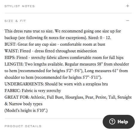
Some companies, especially ecommerce companies, have hundreds of thousands of product pages. The online dress rental company Rent the Runway is one such example. Each one of their product pages for individual dresses has everything you’d expect it to: images of the dresses, measurements, fabric, price, and reviews. So what makes them really different? The exceptional detail in their “Stylist Notes” and “Size & Fit” sections.
These sections go above and beyond with details that are clearly, carefully curated from stylists and reviewers. They don’t just explain what a dress is made of and how it looks; they cover details like exactly how it fits on every part of your body, which undergarments should be worn with it, and which body types it looks best on. Information like this not only delights customers and encourages their trust, but it also makes them more confident in their buying decision.
5) Coin
Coin is like a credit card, except it’s one card that holds the information of all your other credit cards. In other words, instead of filling your wallet with two credit cards, a debit card, three gift cards, and two rewards cards, you can fill your wallet with one card: Coin.
Whereas other product pages depend on text that highlights product differentiation, this page depends on a viewer taking in all of the visual elements. To start, there’s a video at the top that really does answer all of your questions about how Coin works. What about my rewards cards? Yes. What if I lose the card? It alerts you when it isn’t near your phone. And it goes on and on.
As you scroll down, you see the real magic of this page. Coin provides their product positioning and differentiation, but also shows you how it works by taking you through a visual journey of the Coin card.
6) Oreo
If you’ve seen any of Oreo’s marketing, you shouldn’t be surprised they’re on this list. But sometimes, being well known can actually make it harder to create a product page. Let’s see how they did it.
Oreo’s focus on their product page is showing how Oreos can help you unleash your imagination, dare to wonder, and become a generally happier person. It features a series of videos, one after another. In one about sharing Oreos with friends, the lyrics go, “If I gave ’em to my friend in the hallway, would he keep an optimistic outlook all day?” This page takes an out-of-the-box (pun intended) approach to marketing what could be thought of as just an ordinary cookie.
Oreo also has a unique approach to the design of this page. Even though Oreos are just black and white, the page is wonderfully colorful, from the videos to the backgrounds to the graphics.
[Click here to see Oreo’s full product page.]
7) Fitbit Charge
Before I started writing this post, I asked a few people for suggestions on their favorite product pages — and you’d be amazed how many people immediately recommended Fitbit. So I checked out their site … and they were right.
The page starts off with a value proposition, not a feature list. Specifically, it’s a hero image of people hiking a mountain, presumably wearing Fitbits, along with the copy, “Energize your day.” As you scroll down the page, it goes through four quick steps explaining how the product works (and why it’s valuable).
As an example, the feature is tracking everything you do from walking to running to sleeping. Why does it matter? So you can have this information at your fingertips and have something to beat. When users click on a feature explanation, the image to the right animates to show what you’d see on the screen on a Fitbit when activating that feature.
Aware that users will likely walk away from their page not remembering all of the specific features, Fitbit was sure to focus on conveying the difference each feature will make in their lives. Well played.
[Click here for Fitbit Charge’s full product page.]
8) Volkswagen
Volkswagen takes an interactive approach to their product marketing. Instead of listing out all of the features you can have in a car, they walk you through the process of actually building your car. As you go through that process, Volkswagen highlights the different features you could choose, then gives you a preview of what the car will look like and how that will affect the price.
(If you want to see a regular product page, they’ve got that, too.)
[Click here to see Volkwagen’s full product page.]
9) Seattle Cider
The folks at Seattle Cider claim their cider is “not your standard cider.” Well, neither is their product page. It’s a beautifully designed page that reads kind of like a story. It begins with attractive, up-close images of their cider selection, which happen to have really cool label designs. As you scroll, they explain what differentiates Seattle Cider’s product from other, similar products using descriptive words.
But my favorite part is what comes next: a really cool, interactive story of how the cider process works from start to finish, which plays for users as they scroll. This is an example of surprising and delightful user experience that goes above and beyond your typical product page by showing not only the products they sell, but how they’re actually made.
[Click here to see Seattle Cider’s full product page.]
10) OfficeSpace Software
OfficeSpace Software sells facility management software to help you manage your office space. Their product page is very clear and direct.
Each section of this product page is dedicated to a different feature. The headline explains the feature, and the subheadline explains why this feature is important as you evaluate different software. That makes it easy for prospects to quickly digest what the product offers, but also get into more detail about its value proposition if they choose to. There are also clear calls-to-action if someone wants to learn more about a particular feature.
[Click here to see OfficeSpace’s full product page.]
11) Orangina
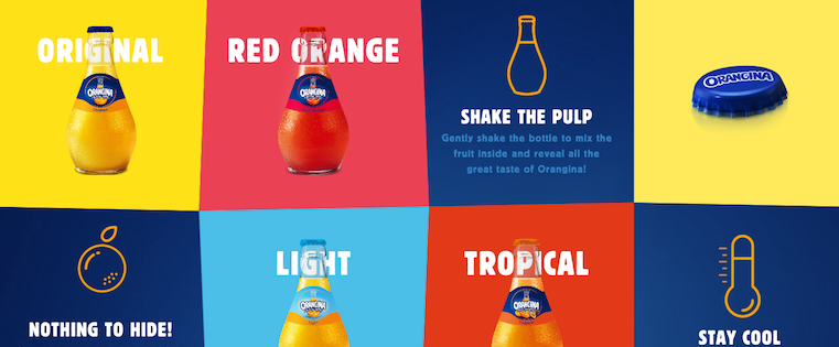
This carbonated citrus drink has been around since 1935, and it has exactly four products: original, red orange, light, and tropical. So how do they make their product page special?
For one, they made it a lot of fun to explore. When you hover your mouse over any of the blocks, the picture or icon will animate: the bottles dance around, the orange slices in half, and the thermometer drops. The animated images and bold colors fit in perfectly with the Orangina brand’s bold, fun personality.
Also, you might notice that some of the blocks are actual products, while the others are simply tips and details about their products. If you don’t have a lot of products to sell, consider interspersing them with tips and information about the products you do have available.
[Click here to see Orangina’s full product page.]
12) Roku
Roku sells a variety of digital media players that solve different problems. Their biggest challenge is clearly conveying to their potential customers which players do what. To combat this, Roku does a great job of laying out all the different player options in a clean, color-coded features matrix.
Some of the highlights: They organize the products by price, include pictures, and include “Add to cart” call-to-action buttons both at the top and the bottom of the matrix since anyone who scrolls to the bottom will lose the first CTA above the fold.
[Click here to see Roku’s full product page.]
13) Mango Languages
Mango Languages creates “lovable” language-learning experiences for libraries, schools, corporations, government agencies, and individuals. On their homepage, they have illustrated calls-to-action for each of these buyer personas — from public libraries to government offices to homeschool teachers. Each of those calls-to-action leads to a different product page that’s colorful, clearly written, and very comprehensive.
Take a look at the example for homeschool teachers below. Like every other part of their website, it exudes their friendly, approachable, and helpful brand personality. The video couldn’t be more delightful. (A mango in a top hat playing the guitar? Yes, please.) As you scroll, you’re greeted with clear value propositions that use playful language that’s true to brand — for example: “Keep a language-learning transcript to stay ready for your kiddo’s next step.” Everything about the page says easy, fun, and effective.
[Click here to see Mango’s full product page.]
14) PaletteApp
Like Volkwagen, PaletteApp took the interactive approach for their product page. They help make designers’ lives easier by leveraging the world’s largest digital database of architectural products and materials. They have a lot of products — from flooring to countertops — and the goal of their product pages is to make it easy for designers to find and collect the products they like.
Notice in the screenshot below how users can hover their mouse over each product to request a sample, add it to their library, or add it to their personal palette. They also make it easy for users to filter by application, price, product type, color, and manufacturer. With so many products available, PaletteApp does an impressive job of making it easy to whittle down your choices.
[Click here to see PaletteApp’s full product page.]
15) Minwax
To help users find what they’re looking for more quickly and easily, Minwax actually has a Product Finder module on their product page.
The Product Finder functions like a sort of quiz: It asks you a series of multiple-choice questions, like “What kind of project is it?” and “What are you looking to do?” Once you answer the questions, it’ll spit out recommended products. In addition, they include a “Don’t Forget” list that lists the tools you’ll need to do what you’re trying to do — like safety glasses, gloves, sandpaper, masking tape, and so on. Helpful tips like this go above and beyond a normal ecommerce product page.
[Click here to see Minwax’s full product page.]
What other great product pages have you seen, and what makes them great? Share with us in the comments.
Editor’s Note: This post was originally published in March 2014 and has been updated for accuracy and comprehensiveness.
>
6 Holiday Offers For Your Ecommerce Company That Don’t Include Discounts
When it comes to discounts and coupons during the holiday season, it seems like everyone is doing it. If retail giants are knocking a big percentage off their prices, a small ecommerce company like yours must do the same to keep up, right?
The problem with discounts and dollar savings is that your new lower prices might confuse buyers. See, if they get a great deal on your products now, they won’t want to pay the higher regular prices when they return. The value of your products will be firmly set at the lower amount. And that’s no good, is it? So, what can you do to keep up with the big box giants without offering discounts? Believe it or not, the options are endless.
Offer Choices
One reason a buyer may head over to a bigger ecommerce store is the sheer amount of choices. The smaller companies just can’t offer as many, can they? And choices don’t just end at the products you offer, either. You should definitely give them more to choose from, but then give them better payment options, shipping selections, and even customer service outlets.
Offer Easy Payment
Let’s talk about the payment options for a minute. Do you still accept only credit cards for your sales? If so, you’re probably losing a lot of customers at the checkout page. The more you can streamline payment, the more your buyers will complete the sales.
There are a few reasons for the incomplete sales at this point. The first is simply that people have become accustomed to instant gratification. If they can go to Amazon and click one button to make a purchase, then that’s what they’ll do. Then, of course, there are the mobile shoppers who really don’t want to enter their credit card info over and over on tiny screens with tiny buttons. As the number of mobile shoppers flies through the roof this holiday season, you can’t afford to miss out on those buyers.
Offer Free Shipping
Whether your offer for shipping lasts only through the holidays or sticks around all year, this is one of the biggest offers you can make to your buyer. See, they’re not just leaving your checkout page because you don’t offer enough payment options. They’re also running scared when they see the total price with shipping added. Maybe you can’t afford to ship everything for free, and that’s okay. By offering an option for free shipping with the purchase of a certain dollar amount, you might just increase your average order value, too.
Offer Multichannel Experiences
How can your buyers make purchases? How can they reach you? How do they receive information about your company and your holiday offers? The more avenues you offer into your business, the more people you’ll attract. Buyers should be able to reach you, to interact with your brand, and to make purchases whenever and wherever they choose. Social media, apps, email, phone, your blog, and most importantly your website—these are all channels through which your buyers will want to reach you.
Offer Information and Education
Many of the people shopping with your company during the holiday season are just there to buy something for loved ones. They don’t have any intention of coming back. Does that mean you should let them be? No way! Make sure they’re armed with all the information they need to make smart choices. Whether you do that through blogs, tutorial videos, or gift guides.
Offer Stunning Service
Through it all, what will really set you apart from the big box stores offering massive holiday sales is your service. You can afford to make the season bright for every last person who buys from you. That means you must have someone available at all times, ready to answer questions through phone calls, social media, and email. Your returns and exchanges should be hassle-free and delivered with a smile. Above all, keep the promises you make, listen to your customers, and be completely honest.
Now you’re ready to face the holiday season, and you won’t have to give a single discount to compete with the big box retailers.
How to Be a Better Marketer Through Mindfulness and Meditation
Let’s get this out into the open: I bite my nails. Or at least I did. (Kinda gross, right?)
But this past summer, I watched as my then three-year-old son chomped down on his fingernail. That was it. The final kick in the butt I needed to see to finally stop a decades-old bad habit. Little did I know that in my quest to stop biting my nails I’d unlock something much bigger for myself — both personally and professionally. It was mindfulness.
What’s that? According to the folks at U-Cal Berkeley’s Greater Good Science Center, mindfulness is about “maintaining a moment-by-moment awareness of our thoughts, feelings, bodily sensations, and surrounding environment.”
For me, it’s helped me make better decisions, listen more, and above all, be present. Amidst the chaos of our busy, multi-screen, let-me-bookmark-that-because-I-don’t-have-five-minutes-wait-what-was-I-doing? lives, mindfulness helps me return to a more centered self.
And more and more people are getting in on it — Oprah, Jerry Seinfeld, Katy Perry, Anderson Cooper, and even some companies, too. So what can you do to get in on the goodness? I’ll tell you. Here’s how I met mindfulness.
Meet Paul: My Meditation Guy
I knew that guided meditation and hypnosis was probably a good bet to kick the nail-biting habit. So, I reached out to Paul Gustafson, a Boston-area consulting hypnotist. Gustafson helps people — via guided meditation and hypnotic suggestion — with anything from quitting smoking to overcoming a fear of flying.
I sat down with him for three, 30-minute sessions where he talked me into a deep relaxation and then, as I reached a deep meditative state, he provided guidance and suggestions for me to figuratively cut the cord of my past nail-biting behavior. From there, I kept his guided meditation recording on repeat.
“The immediate benefit of guided meditation is profound relaxation,” Gustafson told me. “It’s impossible to be stressed or to worry while enjoying deep meditative bliss. One of the long-term benefits of meditation is that the relaxation becomes the rule rather than the exception. People who meditate are happier, less affected by the pace of day-to-day life. They’re healthier, and more productive.”
Paul has become an oft-invoked name at my house. My wife, also a marketer, has gone to see him and notes that it’s been entirely transformative in finding her chi, both in and out of work. (After all, anyone with small children can attest to the need for mindfulness.)
How Mindfulness Contributes to Better Marketing
Mindfulness is a terrific asset for today’s marketers … but you’re probably wondering where the data is, right?
Well, a recent study conducted by researchers at INSEAD and The Wharton School of the University of Pennsylvania found that 15 minutes of mindful meditation could help a person make better decisions. That same study shows that mindfulness “can reduce confirmation bias and overconfidence, allowing decision makers to better differentiate between relevant and irrelevant information.”
Considering the vast information available to marketers, having a filter for the superfluous can let you focus on what’s most important and make decisions accordingly.
Gustafson has helped patients deal with stress related to dealing with a boss, or co-worker, too. “I’ve had many clients come to me because of work-related stress. When someone repeats a stressful response to certain situations it becomes a pattern. Over time, patterns become rooted and people feel powerless to change the situation. Guided meditation offers access to this level of thought, enabling individuals to release and become free of unpleasant patterns,” he told me.
Some companies are getting on board the mindfulness train, too.
I’m lucky enough to work for a company that values its employees’ approach to work, rather than just the output. HubSpot’s received quite a bit of buzz around our amazing perks, but the one I take full advantage of is the Nap Room in our Cambridge office. For me, it’s a meditation chamber. Just 20 minutes of guided meditation — or slow, deep breathing as the hammock gently rocks back and forth — will clear the mind and bring a sense of focus that even the strongest cup of coffee can’t conjure.
A Recipe for Mindfulness: How to Get Started
So, what do you say? Want to give it a try? Here’s your (simple) recipe for mindfulness …
Ingredients:
- A quiet spot
- An open mind
- 20 minutes daily
Add to taste:
- Headphones, with guided sessions
- Popular apps for reminders or self-guided meditation
Some tips:
- Wake up earlier. Akin to the adage that a trip to the gym in the morning gives you more energy, a trip to mindfulness early in your day sets your mind up for success, too. You don’t even have to leave the comfort of your bed. Just put on the headphones as you awake.
- Let meditation tuck you in at night. At the other end of the day, it’s entirely acceptable and effective to fall asleep as you meditate. If you’re using a guided meditation track, whether you’re awake or asleep, your mind is taking in the information.
- Make a meeting out of it. Set up a recurring daily calendar item so that others don’t cut into your “mindfulness meeting.” My colleague Steve Haase has written quite a bit on meditation and mindfulness. Haase and other colleagues sit in silence for 20 minutes on Wednesday mornings to clear their minds for the day.
- Deep breathing. Sometimes the biggest rewards come from the smallest of actions. Deep breathing falls into that category. Take deep breaths throughout the day when you feel overwhelmed, overstimulated, or just need to top off the mindfulness tank.
- Resist temptation. For many of us, our instincts when idle — in line at the grocery store checkout, in the elevator, at the traffic light — are to fill the void with a few swipes of the screen. Don’t do it. In much the same way that good ideas sometimes arrive whilst in the shower, lying in bed, or even sleeping, simply being present can be the difference in finding clarity or that elusive good idea you’ve been chasing.
- Don’t expect perfection. Are you going to enter a state of deep bliss every time you sit down to meditate? Probably not. Your mind will wander. Just like some runs or workouts feel better than others, so too do meditation sessions. No two are alike.
Yields:
- Open to opportunities. If you expect a lot from yourself, you’ve probably experienced the anxiety of your expectations actually getting in the way of success. With mindfulness, you can open yourself up to the moment. You can focus less on the eventual outcome (though mindful of that goal) and instead be present to new ideas.
- Don’t sweat the small stuff. Do I get worked up still? Sure (ask my wife). But more often I can find myself navigating stressful situations with a bit more grace or awareness of solutions rather than focusing on frustrations.
- A planful approach. A less cluttered, focused mind tends to provide more room for planful thought. I’ve found myself able to pull together a thoughtful response or tidy plan in less time.
- Be here. Take it from Bill Murray. We do our best when we’re present. But it’s not easy.
Has meditation made you a better marketer? Do you have tips to share for being more mindful? Leave your thoughts in the comments section below (or find me on Twitter: @thaneberle).
9 Principles of Mobile Web Design
In case you missed it, we now live in a mobile-dominant world. This year, Google reported that 52% of search traffic and almost half of shopping traffic comes from mobile devices, so a compatible web design is no longer a luxury, but a necessity. In April of 2015, “Mobilegeddon” transformed the marketing world as we know it, putting responsive and mobile websites at the forefront of a marketer’s mind.
And with Google’s mobile-friendly algorithm in place, you’d expect all sites to be compatible in this day and age. But that’s simply not the case. Nearly half of marketers don’t have their websites optimized for mobile, despite the increase in search traffic and the effect on rankings.
So what gives? Has the algorithm’s impact not been significant enough to warrant a redesign? Are businesses not getting customers from mobile?
Despite the upward trend in mobile usage, it’s important that we don’t discount desktop users. Time on site and number of pages viewed are three times greater on desktop than on mobile devices, and desktop is the preferred technology for reading news and watching videos.
These figures are certainly too significant to ignore, and it sheds an important light on mobile user behavior as well. Due to smaller screen sizes and often being on the go when using a mobile device, consumers are coming to a website with a clear plan of action. If the site they visit can’t give them the information they need quickly, they’ll go find one that can. This means that you have to provide them with what they’re looking for right off the bat; there’s no time to waste.
With that in mind, many designers are building websites with a mobile-first mentality, ensuring that pages aren’t bogged down with long load times, too many graphics, or content that requires a user to zoom in and out to read. If your site isn’t mobile-friendly yet, don’t panic. Redesigning a website to fit a responsive design, or creating a separate mobile site altogether, isn’t as complicated as you might think! There are plenty of builders out there that can do the job, likely the one your current site is built in.
Whether your business has fully adopted a mobile strategy or you’re still figuring out the best route to take, make sure you keep these principles of mobile web design in mind.
1) Make Menus Simple and Concise
On a mobile device or tablet, you can’t expect users to scroll through a large menu or click through to multiple sub-menus. There just isn’t enough space on the screen to process it all. It’s important that menus contain a high-level overview of the products and services you offer to allow visitors to narrow down what they’re looking for. From there, they can click to a specific category or utilize the search feature to filter their results further.
The ideal menu has no more than 5-6 items, giving users just enough information to guide their search. There should also be no more than two sub-menus within the main menu, if they are necessary at all. In terms of style, the “hamburger” menu () has been widely adopted, so you don’t need to say “Menu” for users to know where it’s located. Other companies have added their own twist to the traditional menu, like Carrabba’s.
On their mobile site, they have a simple dropdown below their logo, which unfolds five options. Since the restaurant menu and location finder are already located in the header, they don’t need a place in the list. They’ve effectively kept their menu simple and featured the most important elements of their website front and center.
When you’re coming to a restaurant’s website, you’re likely looking to do one of a few things: check out their menu, find a location, or order online. Carrabba’s site allows you to accomplish all of these things quickly and easily, without bogging you down in sub-menus full of appetizers, pasta dishes, and happy hour specials.
2) Keep Forms Short and Sweet
When it comes to completing contact forms on mobile, users are not interested in filling out field after field of information. For those situations, they’ll likely opt for a desktop or laptop. That’s why it’s even more important that you only ask for information that is absolutely necessary to accomplish the task.
If your contact form is to sign up for a newsletter, you shouldn’t ask the user for more than a name and email address. Even for payment forms, try to keep the number of form fields to a minimum. Consumers understand that more information is necessary to make a purchase, but it’s important that you’re sensitive of their time, especially if you receive a lot of mobile traffic.
In order to determine the ideal number of form fields, A/B test by changing or removing one field at a time to assess the impact on completion rates. For example, people are more likely to fill out a form if you don’t require their phone number, so try testing your form with and without that field or compare it as a required vs. optional field to see how it performs. Then compare these results to the actual ROI earned through each method to determine whether or not you should include it.
MasterCard is a great example of a company that utilizes contact forms while being thoughtful of a mobile user’s time. To reach their support team, the only required fields are first name, last name, email address, topic, and comments. This gives them just enough information to look up your account and direct your inquiry to the right department, without being too time-consuming or invasive.
They also give you the option to provide more information like phone number, type of card, and financial institution, so that if you do want to include any or all of these details, you can. But if not, you can still have your question or need addressed. Consumers are especially protective of financial information, so giving them this freedom not only caters to their mobile needs, but helps build trust.
3) Simplify Form Fields
In addition to form length, the types of questions you ask shouldn’t require too much input from users. It’s important that you utilize different field types in your form, such as dropdowns, checkboxes, and calendars. These are especially useful when typing in payment or shipping information, as well as booking travel.
You also want to provide as much clarity as possible in your form, making it obvious which pieces of information are required and which are optional. To make things easier for returning customers, utilize autofill to expedite the purchasing process, and offer guest checkout to new customers who don’t want to make an account.
It’s essential that companies in the travel industry take advantage of simple forms to aid potential customers in the search process. Expedia is a perfect example of this, featuring easy-to-see buttons and requiring very few fields to conduct a search.
When searching for a flight, if you click on the “From” or “To” buttons, they will suggest locations as you type a city or airport code so you don’t have to type in the whole thing. They also make the calendar feature much easier than some other sites, allowing you to see the calendar and click your departure and arrival dates on the same screen.
4) Catch Your Visitor’s Eye with CTAs
Calls-to-action are an essential part of any web design, but they play an especially important role on mobile. Since, as opposed to their desktop counterparts, mobile users typically have more of an idea of what they’re looking for when they come to your site, make it as easy to find as possible with CTAs placed in the most valuablereal estate.
Ideally, they should be located above the fold, use contrasting colors or fonts to make them stand out (within reason, of course), and clearly state what the offer is for. The following steps should be laid out clearly so you don’t leave visitors wondering what they need to do next.
Papa John’s uses their homepage’s prime real estate to focus on a holiday promotion, which encourages visitors to pick up a gift for family or friends while they place an order online. The text is bold and stands out from the page, while still fitting with their color scheme and branding. And most importantly, you know what you’regetting if you click on the CTA. They don’t try to sugarcoat it with flowery language or fine print, so users can quickly get in, get out, and get their favorite pizza in a snap.
5) Bring Users the Search Results They Want
Site search is especially important to mobile users that come with a specific plan of action in mind. They’re less likely to dabble with vague menus or scroll through page after page of products. That’s why it’s all the more important that your search results provide exactly what the visitor is looking for on the first page. Once a user completes a search, provide filter options so that they can sort the results as it best pertains to them (e.g. price, relevance, top sellers, etc.).
It’s also important to feature an image, price, and short description with each item so that the results pages aren’t bogged down with text and the user doesn’t have to click on several products to find the right one. The images should be clickable and expand within the same window to help visitors get a better view of the product without having to go all the way to its individual page. Then when they do find what they’re looking for, they can click on that particular item to learn more and purchase.
In a search for “Hoodies” on Under Armour’s website, you’re presented with several filtering options to narrow down the 371 results. You canselect by department, filter by price or size,or sort the options to see the highest rated or lowest priced products at the top.
This is an area where consumers prefer having more options so they can have a more direct search path and only spend time looking at items that are most relevant to them. The page provides you with ample information to help you proceed with your search, and is presented in a way that’s clean and not overwhelming to a mobile screen.
6) Make It Easy to Contact You
With any ecommerce site, the ability to quickly contact a company is essential. If you have any questions or issues with an order, you want to make sure they can be answered or resolved in a timely manner. For mobile users, this means having a click-to-call feature prominently displayed on the website. This, along with a contact form or email address, will give visitors options so that they can contact you in the way that best fits their preferences and the urgency of their need.
It’s also helpful to have an FAQs page to give users the ability to seek answers to questions they have without requiring them to actually contact you. Most consumers would agree that if they can figure it out on their own, they would rather do so.
Another mobile-focused way to provide easy contact is by embedding a Google Map of your location onto your site. Allowing visitors to click on the map, zoom in and out, and search for directions from the Google Maps app will make sure that they have no trouble finding your brick-and-mortar location if you have one.
Online retailer Zappos understands the importance of being able to contact them quickly and easily to inquire about an order, returns, and promotions. That’s why they have a click-to-call customer service number displayed above the fold on the homepage. This way, customers that need immediate support can take one step to contact them directly without having to dig around the entire website to find the Contact Us page.
7) Design with Thumbs in Mind
By far the most common complaints users have about non mobile-friendly sites are that the buttons are too small to click on and text is hard to read. The foundation of responsive or mobile website design is that there is no need for zooming in and out to read content or click on a link. So when you’re designing your web pages, make sure that each button is large enough to be clicked on, and that they’re not spaced so close together that you might accidentally click on something you didn’t want to.
And don’t require visitors to pinch the screen to make text legible, just to have to zoom back out to click on another link or page. As a rule of thumb (no pun intended), the minimum tap area to accommodate a user’s thumbs should be 44px by 44px. It might be hard to adapt to every smartphone’s screen size, but it’s generally advised that you try to design your site with a few older models in mind, since older phones tend to have smaller screens. That way you can ensure that your content is easily visible across platforms.
The buttons on Southwest Airlines’ mobile site are easily clickable, and there’s no issue trying to read what the buttons have to say. Allowing them to take up (almost) the entire width of the screen makes it compatible to any user, and also provides them with a limited number of options to guide their search. You aren’t distracted by extra text or multiple CTAs so you can focus on why you came to the site in the first place: to search for a flight or manage current orders.
8) (Load) Time is Precious
As consumers, our patience is wearing thinner by the day. For mobile users, even more so. Since many are accessing your website on the go, it’s important that you don’t leave them waiting around for pages to load. Your site should be able to accommodate both WiFi and non-WiFi connections equally, ideally loading a page in less than four seconds.
Over half of mobile users expect a site to load in four seconds or less, and 80% are unhappy with the current browsing speed on smartphones. That’s a lot of potential customers bouncing from your website due to something that is almost entirely controllable (barring poor cell reception). Some goals to keep in mind for mobile web designers are to keep the entire site’s size under 1MB and use images and videos wisely. The more visual content you have, the slower your website will likely be.
For businesses in the news or publishing industries, they understand that consumers are looking to get the information they need quickly. The New York Times’ mobile site loads almost instantly, even without a WiFi connection. A lot of mobile users check their favorite news outlets when they only have a minute or two to spare, and just want to get caught up on the happenings of the day. The New York Times is able to deliver trending stories from a variety of categories, and they’re able to do so with a very swift load time.
9) Avoid Pop-Ups If You Can
In general, users aren’t huge fans of pop-up ads or surveys, let alone on a mobile device. Oftentimes, the box to close them out is so small that you have to zoom in to do so or you may accidentally click on an ad when you didn’t want to. Time is of the essence for mobile users, so using pop-ups simply gets in the way.
This is also an area where companies that feature publications or allow users to subscribe to content have to pay attention. It can be tempting to include a pop-up to encourage people to sign up for email alerts or a newsletter, but the reality is that most mobile users aren’t looking for that. If they want to sign up for something, they probably already know that they want to and will take the necessary steps on your website to find that form.
BuzzFeed’s site on both desktop and mobile features sponsored posts and ads, but they don’t use any pop-ups to try and get you to click through or sign up for one of their several newsletters (“Dog A Day” newsletter, anyone?).
In the screenshot below, you can see that their post “15 Tiny Ways to Take Yourself Less Seriously” is sponsored by Captain Morgan, but by clicking on the post you aren’t faced with an annoying pop-up. If you want to click on the hyperlink to Captain Morgan’s website, you can, but there’s no opting out necessary. BuzzFeed does the same with CTAs for its newsletters. They give users the ability to opt-in, but don’t force them to view content they don’t want to look at.
Does Your Web Design Fit the Mobile Mold?
With the prominence of mobile search and greater buyer intent on mobile devices, this is certainly a trend that you can’t afford to sit out on. Mobile’s influence on marketing and buyer behavior is on the rise, and there’s no sign of it slowing down. If you’ve decided to revamp your desktop site, you should prioritize compatibility across devices through responsive design or a separate mobile site. As marketers we must possess a mobile-first mentality, or risk having our business fall not only in search rankings, but in consumers’ minds.
7 Feel-Good Examples of ‘Joy Marketing’ Campaigns
In the world of marketing, there’s no shortage of new strategies designed to engage audiences and inspire purchases.
From scarcity marketing to viral marketing, there are a ton of different options for businesses to explore. But if there’s one thing we know for sure, it’s that emotions rule our decision-making.
Considering the relationship between our actions and emotions, it should come as no surprise that finding ways to incorporate joy into your marketing efforts can have a profound impact on the way people perceive your brand. It’s a concept called joy marketing, and it’s worked for a lot of big brands.
Want to learn more? Keep reading.
What’s Joy Marketing?
Joy marketing is a term used to describe campaigns that elicit a specific emotional response: joy. From sentimental adverts to inspiring quotes, this approach allows brands to connect with their audience on a deeper, more meaningful level.
The concept of using joy marketing as a tool for boosting sales has quickly gained strength following the surfacing of research by psychologist Sonja Lyubomirsky. Lyubomirsky’s research on behalf of ConAgra’s Reddi-wip found that 93% of Americans were on a quest to experience more joy in their lives.
What exactly does joy marketing look like? And how can you use it to boost business? We’ve got you covered with 7 noteworthy examples from brands like Coca-Cola and West Jet.
7 Examples of Joy Marketing From Top Brands
1) McDonald’s: #Imlovinit24
Following their worst sales results in over a decade, McDonald’s re-launched their “I’m lovin’ it” campaign … with a twist.
While the original campaign asked people to talk about their happiest moments in McDonald’s, the new campaign actually created memories. Taking shape over the course of one day, McDonald’s set out to bring “moments of joy” to 24 cities across the globe.
As a result, people associated feelings of happiness with the McDonald’s brand, creating an emotional connection built on joy.
Joy marketing at its finest, perhaps?
2) Johnnie Walker: Joy Will Take You Further
Another high-profile brand to get in on the science of joy was the world’s top-selling Scotch whisky brand, Johnnie Walker. The brand called up psychologist Matt Killingsworth — who studies human happiness — to create a campaign that embraced the notion that the emotion of joy is key to progress.
Armed with a new tagline, “Joy Will Take You Further,” the brand has created a set of joy-centric adverts which will appear in over 50 countries and be seen by over 270 million people.
3) Coca-Cola: I’d Like to Buy the World a Coke
Although joy marketing is a relatively new term, the concept is long-standing. In fact, this feel-good, joyful sentiment can be seen as far back as 1971, when Coca-Cola released this iconic advert.
The man responsible for the campaign, advertising executive Bill Backer, was clear about what he was trying to achieve:
“I began to see a bottle of Coca-Cola as more than a drink … [it was] a tiny bit of commonality between all peoples, a universally liked formula … I could see and hear a song that treated the whole world as if it were a person – a person the singer would like to help and get to know,” he explained.
Backer’s vision played out successfully and the ad went on to resonate with millions of people across the globe. Coca-Cola received over 100,000 letters praising the advert and thousands of requests for sheet music – spreading the joy certainly worked!
4) Reddi-wip: Unleash the Joy
ConAgra’s award-winning “Unleash the Joy” campaign was the 2013 predecessor to 2015’s “Share the Joy.” Designed with joy in mind, the ads aim to position Reddi-wip as a brand that helps people create lasting moments.
Launched in an effort to increase sales, the campaign not only resulted in higher monthly sales, but it ultimately helped the company exceed their goal by boosting sales by 3.1%.
5) West Jet: Christmas Miracle Campaign
One look at WestJet’s 2013 “Christmas Miracle” campaign – which sees the airline hand out personalized Christmas gifts to unsuspecting flyers – proves the worth of joy marketing instantly.
According to shortyawards.com, this ad was Canada’s most shared viral ad of 2013 and in the top five globally – the relatively unknown Canadian airline gained in excess of 40 million YouTube views of their advert and increased sales by 86% on the previous year. A very merry Christmas indeed.
To keep up with the tradition, West Jet released a 2015 variation of the campaign — “12,000 Mini Miracles” — in which they set out to perform 12,000 random acts of kindness in a 24-hour period.
6) John Lewis: Man on the Moon
John Lewis recently launched its eagerly anticipated Christmas ad for 2015 … and it’s pretty joyful.
After spotting an old, lonely man on the moon through her telescope, a young girl tries and fails to make contact with him. Eventually she manages to deliver him a present, just in time for Christmas, by attaching it to some helium balloons. When he receives the gift, the old man sheds a tear of (you guessed it) joy.
Within an hour of its launch the ad had generated over 16,000 mentions on Twitter and was well on track to smash the record set by the previous year’s #MontyThePenguin ad (97,257 mentions over the first 24 hours). Compare this with the 2013 #BearandHare campaign (just 6,826 mentions in the first 24 hours), and it’s easy to see just how beneficial adopting this marketing tactic has been for John Lewis.
7) Beringer: Better Beckons
The “Better Beckons” campaign by Beringer Vineyards was inspired by, and features, Russian Instagram sensations Murad and Nataly Osmann. The couple gained an Instagram following of over 3 million with carefully framed hand-holding shots of their world travels using the hashtag #FollowMeTo.
Beringer was quick to bottle their joy-inducing power by commissioning a photo series of their very own.
The result? Six simple images that scream love, joy, and adventure. One look at Beringer’s Instagram page and it’s clear to see the positive impact of the campaign on increasing interaction — on average, a typical post featuring the joyful couple generated significantly more likes than those without.
How to Create Your Own Joy Marketing Campaign
Want to give joy marketing a shot? Follow these four simple steps to creating your own winning campaign:
- Identify the joy. Identify the ways that joy is linked to your brand. Is your company ethos underpinned by a desire to create joy for both customers and staff? Does your product or service bring joy? Use this to underpin your entire campaign.
- Locate your audience. How can they be reached and communicated with? Some brands will exclusively use social media as a platform for their campaign while others branch out to television advertising, email marketing, or print media. Identify the right route for your business before creating your content.
- Plan and create your content. Would a documentary-style video best convey your message of joy? Will you opt for imagery? Animation? Look to the examples above when planning your content to stay inspired.
- Monitor your campaign’s success. Use analytics, social media listening tools, and surveys to gauge responses to your joy marketing efforts, learning as you go. Remember to focus on your ultimate goal and set KPIs.
What examples of joy marketing have you seen? Share them with us in the comments section below.
Confessions of a HubSpot Editor: 11 Editing Tips From the Trenches
When I first started editing pieces for HubSpot’s Marketing blog, I was really, really scared.
I had spent the previous months as a full-time writer, soaking up as much feedback as I could to write the best pieces possible. Then, the tables were turned. Suddenly, I had to be the expert on what we should be publishing, how to fix incoming pieces, and how to give feedback to people who had decades more experience than I in marketing.
I was terrified.
Two years later, I realize that I was right to be scared. Editing is one of the hardest parts of creating quality content and scaling that across your organization. You’re in charge of establishing and maintaining The Quality Bar — an oft-lauded but squishy, intangible concept that no one can actually define for you. And you better do that while growing your audience, training new writers to meet The Quality Bar, and getting buy-in for your content across your organization.
The good news is your fear goes away after a while. After editing hundreds of pieces, training two full-time writers, and making plenty of mistakes, I’ve uncovered a few tips that I’d recommend to any editor looking to up their game. And I want to share some of these hard-learned lessons with you, too.
How to Be a Better Editor: 11 Tips From the Trenches
1) Question every fact, stat, name, and example.
As The Defender of The Quality Bar, your job is to be the ultimate devil’s advocate. You need to wonder whether Oscar Wilde really said that quote … or it’s just another platitude someone stamped his name on. You need to see whether that stat you’re using to back up the crux of your piece really means what the writer said it means … or whether the original study said something different entirely. You need to second-guess whether your main source’s name is spelled properly … or you need an extra ‘n’ at the end.
The only way you’re going to uncover these mistakes is to question everything. So make it a habit.
2) Zoom in and zoom out to uncover adjacent ideas.
Even the best editors get stuck when thinking of new ideas. You block off time to fill out your editorial calendar for the next month, and then … nothing.
I’ve picked up a really handy trick that’ll help unlock lots of new ideas — I call it The Zoom In, Zoom Out Method. Here’s how it works:
- Think of one idea. Yes, just one. It doesn’t have to be good — it just has to be something concrete. I’ll use this as my idea for this example: “10 Tips for Writing Blog Posts Faster.”
- Then, zoom in on your idea. Are there sub-sections of your idea that you could turn into a whole post? Can you narrow your topic to make it more appealing to certain audiences? If I want to zoom in on “10 Tips for Writing Blog Posts Faster,” I can uncover lots of other topics, such as “10 Tips for Writing Titles Faster” or “10 Tips for Writing List Posts Faster.” In each of those titles, I’m just taking my first topic … and making my world a little smaller.
- Then you go the opposite way — zoom out from your topic. In this step, you’re increasing the scope of your post and focusing less on the very small details. For example, when I zoom out on “10 Tips for Writing Blog Posts Faster,” I could uncover “10 Tips for Writing and Designing Content Faster,” or “The Science of Being More Efficient.” Both of these latter titles are related to the initial idea, but they’re broader in scope.
- You can continue this process over and over and over until you build out a huge backlog of ideas.
So next time you think you can’t think of any new ideas, think again. Little tweaks can uncover a plethora of successful ideas.
3) Recognize your own boredom.
This advice is something I recently learned from an episode of the podcast Startup — but it’s probably one of the most important lessons I’ve learned in the past two years. In this episode, Alex Blumberg shares their entire process for creating some of the most compelling podcasts on the market today.
His biggest tip when working with producers to edit episodes? Recognize when you’re getting bored — it’s your brain telling you that some serious editing needs to happen.
So when you’re assessing a piece, keep part of your mind on the task at hand and part of your mind on your own emotions. If you find yourself pulling up your Facebook feed for the tenth time to escape from reading the piece, stop.
Look inward. Why are you bored? Is it the topic? Is the way the argument is presented? Is it the way the piece is designed?
Then, think about ways to solve those problems. Add formatting? Rewrite the intro? Design a supporting visual? Rework the thesis? Abandon the piece altogether?
Being more attuned to your emotions — especially once you’ve had a few months of editing under your belt — will help you better assess pieces and give feedback.
4) If you’re not sure what’s wrong with a piece, zoom into the details, and then zoom out to uncover larger themes.
I know what you’re thinking. What if you’re bored and you can’t figure out what the heck is wrong with the piece? I’ve got a solution for you, my friends.
When this happens to me, I like to dive into the details of the feedback. I’ll write up an email with suggestions like, “In this paragraph, add a sentence about XYZ to strengthen your point,” or “Can you add an image here?” But before I hit send, I take a second to zoom out of my feedback: Can I pull out any patterns within the specifics to speak to higher-level problems?
This reflection process allows me to get to the crux of the piece’s problem, even when there are lots of competing issues.
5) Know when your feedback should be super detailed — and when it shouldn’t.
It can be tempting to send writers feedback that includes line-by-line changes. In fact, it’s absolutely needed when a writer is brand new to your team and is learning the ropes about your brand’s voice, style, and Quality Bar.
But once they’ve progressed beyond the point where you need to tell them that yes, your style guide dictates “real-time” when used as an adjective and “real time” when it’s a noun, you need to change strategies. You want the writer to be able to uncover weak parts of their pieces without you having to spoon-feed them every time.
In that stage, your feedback should become less detailed. It should still be specific — i.e. “You tend to use passive voice,” not “Your writing sounds weak.” — but you shouldn’t be pointing out line-by-line changes. When you’re too specific with your feedback after your writers have achieved a certain level of expertise, they’ll by psyched that you spent time pointing out mistakes … but may not generalize those mistakes to other situations.
So don’t shy away from detailed feedback, but realize that specific, less-detailed feedback can also be useful when training writers.
6) Decide which mistakes are non-negotiable — and never make them.
When you’re the one upholding The Quality Bar, it can be easy to obsess over every. single. detail. to make sure you’re not making any mistakes.
The truth is, that obsession can be unhealthy. It can make you reread a post over and over and over, hoping and praying you haven’t missed anything. It can wake you up at 5:45 in the morning wondering if you actually misspelled the title of your morning’s blog post. It can paralyze you, make you afraid to hit publish.
And even when you’ve done everything you can possibly do, you’ll still have a commenter point out that you misspelled something in your introduction.
Your goal shouldn’t be to avoid making any mistake ever — it should be to never make mistakes that matter.
So that its/it’s mix-up in your sixth section? That’s an easily fixable mistake that doesn’t really have an impact on your overall piece’s success.
The typo in your title, however? That’s a non-negotiable mistake.
Figure out what mistakes you absolutely can’t make, and make sure every piece you edit and approve doesn’t make any of them. This will save you from many sleepless nights while also preserving your Quality Bar.
7) Keep a list of mistakes you make, and then “Find and Replace” them before publishing a piece.
Confession: One of my recent pet peeves when editing is using plural pronouns when referencing groups or companies … but it’s also one of the things I’m most guilty of when writing.
Knowing that, I make sure to do a “Find and Replace” before I publish a piece to make sure I have all of my pronouns straight.
Identify what writing and editing weaknesses you have, and then search for them in each post before you schedule it. It’s as simple as hitting Control + F on a PC or Command + F on a Mac, typing in your problem word or phrase, letting your browser take you to the word or phrase in your piece, and then swapping it out with the right thing.
This simple tip will help you polish pieces in just a few minutes.
8) “Find and Replace” HTML snippets to quickly clean up a post’s formatting.
This same tip works when you’re trying to clean up a post’s formatting. Instead of opening up your source code and manually stripping out problem areas, you can simply Find the problem code and leave the Replace box blank. Once you hit “All,” the problem code snippets will disappear completely. You can use this trick to swap out tags, too.
This tip really is about using technology to find shortcuts to time-consuming problems. It’ll free up your time to focus on more important matters.
9) Lean on Google and Word to prevent spelling and grammatical errors.
Even if you’re the most knowledgeable editor, it can be easy to forget if you need a comma in that sentence or if that word should be capitalized or not. When in doubt, don’t brush past your concerns — Google them. You will find an answer from folks who are way more experienced with writing and editing than you are (and learn more in the process).
I also recommend using Word to help you do a final spell and grammar check. While Word won’t catch all of your mistakes, it can help you catch any last glaring errors.
So before you schedule a post, make sure to copy all of your text and paste it in a Word document. And give the document a few extra seconds to process your piece once you’ve pasted it in there — Word takes a little longer to “read” your piece and uncover any mistakes. You’ll know it’s done when you see a little red X at the bottom of your document window:
10) Realize each piece shouldn’t sound like you wrote it.
There is such a thing as overediting.
If every piece you edit ends up sounding like you wrote it, you’ve overedited it.
Your job, as an editor, is to preserve the voice of your writer while making sure they are meeting your Quality Bar. So if they crack a joke that’s not funny, you have a right to take it out. But if the joke is cute and you’re just reworking it to sound like something you’d say, you’re taking it too far.
After you edit each section of a piece, make sure you look back and ask yourself the toughest questions of all: Did I really make that section better? Am I just saying what they said, but in my own voice? If so, you should go back and work their voice back in. Re-integrate some phrases they use. Keep that pun. Let one of their interesting word choices stand.
11) Make peace with not knowing everything.
Editing is filled with gray areas — gray areas you are not always going to know how to deal with.
Is that title really that much better than this title? Is that metaphor really the best way to explain a complex issue? Is this section really going to offend someone?
Even though you are The Defender of The Quality Bar, you don’t, can’t, and won’t know everything. Question everything — including yourself — and ask people for help when you need it.
Challenging your own knowledge and assumptions doesn’t mean you’re bad at your job. It just means you’re experienced enough to know you don’t know everything.
And when you get to this point, I promise you one thing: You won’t be scared of editing anymore.
What are your favorite editing tips? Share them in the comments section below.
How to Balance Innovation and Competition: Growth Secrets From Lyft’s CMO [Podcast]
If you’ve ever taken a Lyft, you know the ride’s been a little different than those with other ride-sharing apps.
Your car is adorned with a bright pink mustache. You sit right up front next to the driver. You may even give them a fist bump.
These quirks help differentiate Lyft as the friendly, human option in an uber-competitive industry … and it seems to be working.
The startup is one of the fastest-growing ride-sharing apps on the market.
Want to hear how Lyft’s been able to grow so fast?
Listen to this week’s episode of The Growth Show to hear from Lyft CMO Kira Wampler about surviving (and thriving) in an insanely competitive industry. Some episode highlights include:
- How Lyft thinks about the balance of innovation and competition
- Why Wampler loves to hire player-coaches
- How Lyft has scaled non-scalable parts of its culture
- How Wampler explains marketing to her kids
Click the play button below to listen to this episode in your browser, or subscribe on iTunes to download episodes directly to your phone:
Check out the latest recaps of The Growth Show episodes by clicking here.
Emails Looking Funny in Outlook? Try These 7 Tricks for Making Them More Presentable
If you experience both pain and relief when reading the title of this post, you’re in the right place.
As marketers, there’s a story that we know all too well. It starts with a meticulously planned email campaign, a carefully selected group of recipients, and a beloved email template to deliver your content exactly as you intended.
You do seemingly everything in your power to make sure every aspect of the email checks out okay, but when you send it to your boss for approval, you immediately receive a fiery response.
Unbeknownst to you, Outlook has managed to change your entire email. The HTML masterpiece that you slaved over has now been whitewashed — photos are missing, text-alignment is jumbled, and everything is 11-point Calibri.
What happened? How can you stop your other emails from following the same fate? Will anyone notice if you shed a few tears into an afternoon glass of wine at your desk?
This may be the part in the story when desperation kicks in, but don’t let it. Outlook doesn’t have to be the antagonist in our marketing stories. To help you better prepare your next email for Outlook, we’ve outlined a list of helpful tips below.
Protect Your Corkboard
Before we dive in, let’s start with an analogy …
Think of your email like a corkboard. Your corkboard has been beautifully crafted to hold all of your compelling photos (content), which are going to attract the eyes of many viewers.
How are you going to adhere those photos to your corkboard? Will you use nice stickers, embellishments, and decorative tacks (CSS & Styling) to keep all of the elements in place?
If you follow this plan, you will only realize that this corkboard won’t look the same on everyone’s wall. On Outlook’s wall, your content is stripped of its pins, tape, or sticky substances used to keep all of your pieces of content in place. You are instead left with a scattered pile of images, text with no styling, and a missed deadline. (For further clarification, Litmus has an extensive guide explaining these rendering differences.)
Alas, there is a solution to the madness. With the guidance of HubSpot’s Support Engineers, here is a list of tips and tricks to help prepare your emails for Outlook so you can “protect your corkboard.”
7 Tips & Tricks to Prepare Your Email for Outlook
1) Use tables.
For all of those familiar with code, you may have cringed as your eyes glazed over this paragraph. Hear me out: In the world of Outlook, tables are single-handedly the most important instrument in your toolbox. Using tables will ensure your email will render across email clients consistently from editor to inbox.
Outlook strips styles, such as positioning. Tables provide order and allow you to be more in control of your email’s layout. Are your pictures floating all over the place? Are they drifting above headers and below paragraphs of text? Putting your images and text in a table will tack those items in place and ensure they don’t float at their own will.
Email without table:
Email with table:
Make sure to specify the width of your table data (<td>), which shouldn’t collectively exceed the max-width of your overall email. An example of this in the source code would read, “<table style=”width: 400px;”>.”
We suggest avoiding lists and utilizing tables instead, as lists can be interpreted differently across clients. This way, you can achieve a similar visual while maintaining more consistent results.
Tables are also great when you see text pushed up against an image or another line of text. Because Outlook doesn’t always render spacing, inserting empty cells can act similarly to padding. You can utilize these cells and/or rows to achieve spacing vertically or horizontally.
What this looks like in the source code:
The highlighted code below is the empty cell between “Table” and “Test 1.”
The highlighted code below is the empty row between “Table” and “Test 2.”
HubSpot Customers: When inserting a table from the toolbar, simply insert an extra cell or row of cells and specify the width/height to achieve this spacing.
2) Specify line-height, font, font size, and color.
If you do not define line-height, font, font size, and text color, it is safe to assume that Outlook will make this decision for you and apply its default styling.
Define now or forever hold your peace.
Use your automated email service toolbar to define these elements. Once defined, the appropriate styling will be added to the source code and will look something like this:
Versus this:
HubSpot Customers: Highlight text and use the toolbar to specify line-height, font, text size, and color.
3) “Break” your text.
Text doesn’t wrap automatically in Outlook, so you should add styling to your “table” tag: <table style=”word-break: break-all;”>. This will achieve the break in text and prevent any text from extending past the recommended email width of 600px. If you don’t implement word wrapping for your content, it would “break” your email and impact its responsive design.
Text without break:
Text with break:
What this looks like in the source code:
4) Add ALT text to images.
Since Outlook is a known culprit of image blocking for HTML emails, it is important to include ALT text (alternative text), as this renders in place of the image. This is an attribute added to the “image” tag within the source code.
What this looks like in the source code:
All Outlook clients (including 2000 for Mac) display images from trusted senders. If your subscribers add your email address to their address book, images will display automatically. You can also have recipients add your email domain to the safe senders list in Outlook settings.
5) Use center tags.
Since Outlook doesn’t honor alignment that is written as an attribute of a tag (align=””), it will need to be specified in a style=””. To combat this, you will need to utilize “center” tags around the content you want centered or by adding this bit of HTML to the tag you are targeting: style=”text-align: center;”
What this looks like in the source code:
HubSpot Customers: Use the toolbar to “Align left,” “Align center,” or “Align right” for content used in your rich text modules.
6) Beware of background-images, padding, floats, and forms.
Outlook removes background-images, padding, floats, and forms.
Background-image
We suggest avoiding background images for emails. Instead, try utilizing a background color and incorporating your email’s images in other ways.
Padding and Floats
As a workaround for incorporating proper spacing and padding, you can either use the table method above or use vspace (vertical space) and hspace (horizontal space). This styling will serve as an attribute to the “image” tag and will add equal spacing on the sides of your images. Additionally, you can use table cells to define spacing, if preferred.
HubSpot Customers: Click here for detailed instructions from within the tool to apply vspace or hspace.
Forms
It is not a typically best practice to include a form within an email. Instead, a CTA button is helpful for bringing your viewer to a landing page with the correlated form. However, if you know your contacts are predominantly using Outlook and they have not added your email domain to their safe senders list, it is possible that your CTAs are being blocked when opened in Outlook.
Since CTA buttons are, in essence, an image, they would fall victim to Outlook’s notorious legacy of image blocking. To avoid this, you can use styled text that would create the same look and feel of a CTA button.
Below, you will find a snippet of example code that you are free to copy and use in your own emails. You’re free to change the font, size, or color of the text. You can also adjust the button color by replacing the background-color hex code. (And don’t forget to link it to your landing page!)
<center><table style=”height: 33px; background-color: #031b35 transparent;” width=”132″ cellspacing=”0″ cellpadding=”0″><tbody><tr><td style=”border-radius: 15px; text-align: center; background-color: #F89406; color: #ffffff; font-size: 20px; line-height: 30px;”>Click Here</td></tr></tbody></table></center><br><center><a style=”text-decoration: none; color: #ffffff;” href=”http://”>Click</a></center>
7) Preview and test emails.
It is vital that before pushing the final send, you preview your email in other inboxes. With whatever email marketing tool you’re using, it would be best to preview your email in the clients and on the devices you know your audience is using. It’s also recommended to do a test send to your own accounts — just make sure to remove other recipients from the list first.
HubSpot Customers: From within HubSpot you can preview emails from other clients/devices and do a test send.
Ready to Hit Send?
In the world of email marketing, not everything you see is what you get. Pins get pulled loose, text falls out of place, and images can disappear altogether. However, if you take the necessary steps to protect your corkboard, you can build something that can withstand anyone’s wall.