
24 Clever 404 Error Pages From Real Websites
Website uptime — the amount of time a business’ website is up and functioning — is an important metrics for marketers and IT professionals to track. But no matter how many resources you put into ensuring your website never, ever, ever goes down … there’s always the looming possibility that it might.
It’s a bummer, but a fact of life. And the reaction of visitors when they land on your temporarily unavailable website can run the gamut — from “taking it in stride” to “totally losing their minds.”
While there’s nothing you can do about the latter, you can make your website downtime a little less of a pain by having a creative error 404 message. This can do wonders to make your website visitors crack a smile in an otherwise frustrating situation.
To get your design juices flowing, this post will display some of our favorite website error pages. Hopefully you’ll be able to take away a few ideas to snazz up your own 404 message.
Click here to download 50 examples of beautiful website design for even more web design inspiration.
What is a 404 Error?
A 404 error is a standard HTTP error message code that means the website you were trying to reach couldn’t be found on the server. It’s a client-side error, meaning either the webpage was removed or moved and the URL wasn’t changed accordingly, or the person just typed in the URL incorrectly.
For the most part, you can configure your web server to create a customized 404 error page. (If you’re a HubSpot customer, click here to learn how to customize your 404 page in HubSpot.)
Some customized 404 error pages include a hero image, witty description, site map, search form, or basic contact information. Check out 24 of the most creative 404 error pages we’ve seen that are sure to delight anyone who comes across them.
Page Not Found: 24 Creative 404 Error Pages
1) Bluegg
If laughter is the best medicine, then Bluegg’s 404 error page might be the cure. It includes — on autoplay, and with sound — an embedded video of one of those goats that screams like a human. (You probably recognize them from these viral videos.) Let’s be honest … it never gets old.
2) Spotify
Every year, Spotify releases their “A Year in Music” microsite. The site allows visitors to browse the most popular music of the year from around the globe. But there’s a great Easter egg in there: The microsite’s 404 page is a nod to Justin Bieber’s 2015 hit song “Sorry,” making it both timely and hilarious.
3) Cloud Sigma
Check it out: Cloud Sigma’s letting us in on some behind-the-scenes action. Their 404 error page cleverly pretends to be a “junior developer’s homepage” — that junior developer being, well … a cat.
4) CSS Tricks
Ever ripped away a website’s wrapping to see what’s underneath? That’s the concept CSS Tricks was going for in their 404 error page. This is both clever and reminiscent of what their brand is all about: CSS.
5) Good Old Games (GOG)
For other websites, you unwrap and there’s … the galaxy. That’s actually a clever reference to GOG Galaxy, which is GOG’s native video game client. Thankfully, a little video game character is there to give visitors a place to go report an error if they want.
6) Magnt
In this funny error message, Magnt pokes fun at the fact that, yes, they could’ve broken something — or, you just can’t type. The visual serves as a quick way to illustrate their point for those unwilling to read the description.
7) Bitly
Remember Twitter’s fail whale? Similarly, Bitly integrates their mascot — the pufferfish — into their error message. The poor little guy is left floating belly-up.
8) Daniel Karcher Film Design Studios
When your business is film, why not make your 404 error page into something resembling a short movie? The folks at Daniel Karcher did a great job with the animation on this page, including clever references to things like the television series LOST. The ticker at the top flips to say “Please proceed to main level,” and when you click it, you’re taken back to the homepage.
9) NPR
Stylistically, NPR’s error page is nothing special. But keep reading and you’ll see how they cleverly link to some of their great stories about lost people, places, and things, like a piece on Amelia Earhart and one on Waldo. Hopefully this makes lost users feel a little less alone.
10) Blizzard Entertainment
Here’s a simple idea that ends up looking really cool: Blizzard Entertainment’s 404 page is a “broken” version of their regular homepage. The copy pokes fun at the user: “Grats. You broke it” followed by “This page doesn’t exist or some other horrible error has occurred.”
11) Tin Sanity
We couldn’t stop chuckling at the at the animation on Tin Sanity’s 404 page, which features an animated cup with bloodshot eyes yelling and “running” back and forth across the screen. The whole thing is set to an intense bass track, making it even funnier. Like many other 404 pages on this list, this brand is poking fun at the fact that getting a 404 error isn’t that big a deal.
12) OrangeCoat
If you’re going to give an error message, why not entertain the user for a few seconds while you help them out? Following a friendly greeting (“Dear happy internet traveler”), OrangeCoat offers a cool flowchart that actually helps users figure out why they reached an error page.
13) Astuteo
There’s no rhyme or reason for why web design and digital marketing firm Astuteo chose a Casablanca theme for their 404 page. But given the film’s popularity, it’s sure to resonate with and delight many of the users who end up reaching that page.
14) BrandCrowd
Not only is the illustration on this error page cool, the copy is clever, too. We love the reference to the Semisonic song “Closing Time”: “You can click anywhere else, but you can’t click here.”
15) Cooklet
Cooklet’s error page is simple and delightful in design and copy. Shoot, I wanted a piece!
16) GitHub
The line “These aren’t the droids you’re looking for,” refers to Obi-Wan Kenobi’s Jedi mind trick on Stormtroopers in Star Wars Episode IV — and it’s become a well-known phrase used to tell someone they’re pursuing the wrong course of action. GitHub plays on this famous line in their 404 error message.
17) Grant Burke
Freelance graphic designer Grant Burke shows off his design skills even on his 404 page. The graphic is simple and the concept — a missing link on a milk carton — is fun and clever.
18) Moveline
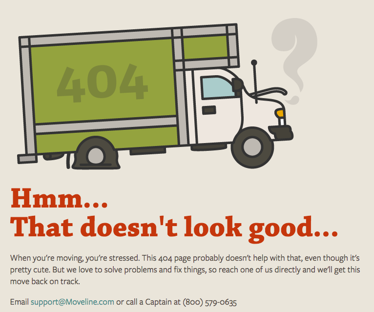
As if the graphic on Moveline’s 404 error page wasn’t cute enough, we love the copy below it even more. They empathize with users who might be stressed out by an error message when they’re already stressed out about moving. To ease their concerns, Moveline includes their contact information.
19) LEGO
No copy needed on LEGO’s 404 error page: They let their characters do the talking. Come on buddy, plug it back in!
20) Hoppermagic
Hoppermagic’s error page is similar to LEGO’s by showing a fictional reason for why the page is broken. This time, it’s rabbits nibbling the cables — a nod to their rabbit logo.
21) IconFinder
Don’t you hate it when webpages get lost in space? IconFinder’s error page is simple, but delightful. The animated emoji wearing a spacesuit appears to be catapulted further and further into space the longer you stay on the page.
22) Hot Dot Productions
Hot Dot’s error page stays true to their tagline, “the intersection of new technologies and design.” The page is animated by hundreds of tiny dots that change direction in response to where you move your cursor. It’s mesmerizing, cool, and a great showcase of their design capabilities.
23) HomeStarRunner.com
HomeStarRunner.com, home to a Flash-animated cartoon series, has had a series of hilarious 404 error pages over the years. The most recent features characters from the cartoon series in a scene that could’ve come straight out of one of their episodes. If you turn the sound on when you load the page, you’ll hear their character Strong Bad — known for yelling phrases out loud — saying, “404’d!”
24) HubSpot
It happens to us, too! This is the message we put up to tell our site visitors that there are some website issues. Our goal was to stay true to HubSpot’s brand voice by being as lovable, empathetic, and helpful as possible.
What other creative 404 error messages have you seen from companies? Share with us in the comments.
4 Tips for Competing with Mega Stores This Holiday Season
Would you believe that 15% of midsize businesses won’t spend any additional marketing money this holiday season? When you consider that many of the efforts made will place them up against some of the biggest names in ecommerce, it’s easy to see why they’d rather just go along with business as usual. To compete with the big guys, you’d have to have a mega budget for promotions. Or, you could try some of these tips and stay in the game.
Free Shipping
The all-time, number one reason for abandoned carts is the cost of shipping. If you’re offering great deals on all the products in your store, you may just get those customers in the door. What happens when they add everything to their shopping cart, click through to pay, and see that the cost of shipping nearly doubles their spend?
If you guess that they leave your site and go check Amazon to take advantage of the free shipping that comes with a Prime membership, you guessed right. Now, offering free shipping is a big commitment. It’s going to cost you. Consider offering shipping over a certain dollar threshold if you can’t afford to give it away.
Abandoned Cart Offers
If someone still abandons their shopping cart even after you’ve offered free shipping, you’ve really got a problem on your hands. What can you do when they walk away anyway? Well, if you’ve got a program in place to go after those cart abandoners, then you can still reel them back in.
See, many shoppers have every intention of buying… eventually. You may just need to give them a subtle reminder that their cart is waiting. An email letting them know they forgot to finish the purchase is a good first step. Make sure to include a picture of the item to really pique their interest. Add urgency by highlighting the limited supply or an upcoming shipping deadlines. If those buyers still don’t come back, then you may consider offering a special deal on those particular items just to get the buyer to make the purchase. In most cases, the initial reminder is all you need.
Loyalty Rewards
During the holiday season, people will buy left and right. What if you offered them the chance to accrue points for prizes or discounts? An easy-to-register rewards program could mean they’ll come back to you for their next purchase just to see their points balance increase.
Now, the important phrase here is “easy-to-register.” If you require massive amounts of information before the customer can enroll, then you’ll lose them all. If they’ve already entered their payment information, then you should have all the data you need. Don’t make them do it all over again, and you’ll see a spike in enrollment.
Discounts by Percentage or by Dollar
Whether you offer a percent off or a dollar amount off of purchases, the outcome is almost always the same: a purchase. During your regular marketing routine, you may wait until buyers are further along in the buying journey to offer a discount of any kind. During the holidays, however, there’s no time to waste. You have to show your hand right away.
Before you get too excited about offering discounts on your products, you have to consider a few things. First, if the customers who take advantage of the savings have never shopped with you before, will they equate the discount with the quality of your products? Worse, will they expect a discount every time they shop with you in the future? That’s why discounts should be a last resort, but when you’re competing with the big guys, you sometimes have to give in.
You can keep up with the big stores without spending piles of money, but you have to commit to the promotion. There are ways to compete without spending much at all, such as fine-tuning your SEO, creating and promoting plenty of content, and taking over social media platforms. When you do these things to hook a buyer, though, you may need something to reel them in.
[New Ebook] Sneak Peek: The Ultimate Guide to Inbound Marketing For Schools
Once upon a time, students applying to colleges waited for relevant materials to arrive in their inboxes. Schools sent out viewbooks, pamphlets, and newsletters to prospective students to drive applications and enrollment—and it worked.
Today, it doesn’t. To help you navigate the new word of marketing to students, we’ve compiled The Ultimate Guide to Inbound Marketing For Schools, an ebook that explains how to reach and engage students throughout their enrollment journey using content, personalization, and automation.
We’ve pulled out the first part of several chapters of the book to help you see exactly what you’ll learn in the full guide.
Sneak Peek: How Inbound Helps Schools
Attract More Prospective Students
“The first step of the Inbound Methodology is to attract the right people to your site. After all, you can’t nurture and convert prospective students into applicants unless you have a base of visitors to work with.
This seems like a daunting task. For smaller schools, specific programs within larger institutions, or trade and nontraditional institutions, it’s difficult to build traffic and get found when you’re competing with established schools that seem to dominate search engine traffic and have money to spend on paid ads.
Larger institutions, on the other hand, probably already have a certain volume of site traffic, but it’s not always clear whether it’s the right kind. Are the prospective students checking out your school finding the right information? Are they seriously interested in attending? Is there a specific school or program you’re trying to help them find? The bad news is that you can’t click your heels and instantly shoot to the top of search rankings or quadruple your traffic.
But there’s good news too: Inbound marketing levels the playing field. Regardless of your budget, you can use inbound to own your search engine ranking instead of paying to maintain it, build your online presence, and attract the right visitors…”
Download the full ebook to continue reading about personas, blogging, and SEO >>
Convert Strangers Into Opt-in Contacts
“Your website content is up and running, and you’re starting to gain more traffic. But who’s visiting your site? How do you connect with your audience? That’s where conversion comes in—the moment at which the unknown turns into the known.
Any place on your website where a visitor has to fill out his or her name, email address, and other information to access content is known as a conversion point. You probably already have conversion points on your website—forms website visitors fill out to sign up for an information session, register for a tour, or apply.
But these are all late-stage conversion points. Students who aren’t serious about applying yet most likely won’t take the time to attend an info session or visit campus. … Choosing a school is a big life decision, so don’t expect that students will be ready to make the commitment to applying or visiting campus after their first visit to their website.
Instead, capture their information as early as you can with smaller asks…”
Close More Prospective Students Into Applicants and Enrollments
“After a conversion, you have your visitors’ contact information! But to turn them from a visitor into an applicant and eventual student, you’ll need to do a little more work. It sounds like a gargantuan task to turn a random visitor into an enrolled student, but it’s actually a process that can be broken down into simple steps. You’ll have to use email lists to nurture students…
Marketers can use pre-planned workflows to nurture leads. Each workflow should be tailored to a specific lead’s needs, and are generally a series of email sends containing helpful content, offers, and CTAs.
Before you launch an email campaign, ask yourself:
- What action will a student have to take to be placed into a workflow?
- What kind of actions will a student have to take to “complete” a workflow (i.e. a student is asked to apply)?
- What content are you going to send?
The key to an effective workflow is to provide value at each stage of the enrollment cycle…”
Ready to get the full picture on how inbound marketing works for schools? There’s a lot more where this came from. Click on the button below to download your copy of the full ebook now.
10 Illustrations to Use in Your Team’s Chat Room When Words Alone Don’t Cut It
Team messaging tools such as Slack and HipChat do wonders to streamline our day-to-day communications at work. But what about those times when you know what you want to say, but words (and your standard arsenal of pictures and GIFs) fail you?
Trust me, we’ve been there too. Maybe you’re suffering from caffeine deprivation and can’t find the strength to type. Or, on a lighter note, perhaps you simply want to thank someone for doing you a favor, but can’t find the right words to express your gratitude.
For situations like these, we created this set of 10 responses that are guaranteed to improve your work chats, make you more popular, and lower your cholesterol by 50%. Well … maybe just the first one.
Want to download them all in one fell swoop? Click here.
10 Awesome Illustrations to Use in Your Team’s Chat Room
1) “Crushing it.”

Finished a project ahead of schedule? Big launch go better than planned? Dropped a cement block on a priceless Fabergé egg? You, my friend, are crushing it.
2) “Coffee break?”
Fight the physical & mental fatigue with the magic that is roasted beans and hot water.
3) “Let’s roll.”
There are places to go, people to see, and big things to do. Reserve this illustration for when you’re on a serious mission.
4) “It’s beer o’clock.”
You know what time it is.
5) “Meetings are good.”
“Welcome to the subcommittee meeting to determine the schedule of future subcommittee meetings.” Sound familiar?
6) “Case of the Mondays.”
For when things go terribly wrong. Houston, we’re gonna need a bigger boat.
7) “I have no idea what I’m doing.”
There’s nothing wrong with being honest — we all end up here at some point.
8) “Success.”
Aw yeah. True happiness is a grinning llama rocking a 36” chain … isn’t it?
9) “We’re experiencing technical difficulties.”
Something just went down? Use this illustration to alert your team that it should be back up and running shortly.
10) “Thank you!”
There’s never a bad time to express your gratitude.
What other illustrations do you wish you had to express yourself? Let us know what we missed in the comments section below.
Why You Should Use Your Vacation Time [Infographic]
“I can’t afford to take time off.” “I don’t want work to pile up.” “I don’t want to be seen as replaceable.” These excuses for not taking vacation are all too common — especially in the United States, where hundreds of millions of vacation days go unused each year.
But here’s the thing: Vacation is actually good for your productivity and performance at work. Almost nine out of ten American workers feel like time off increases their happiness — which, in turn, can do wonders for your productivity.
Even your boss thinks so: 91% of business leaders believe their employees return recharged and ready to work more effectively.
To learn more about the state of vacation in America today and the benefits of taking time off, check out the infographic below from CityPass.
Retarget Lost Customers During the Holiday Season to Drive Sales
This holiday season, you’re probably focused on reaching new customers and reeling them in with dazzling specials. Reaching out to holiday shoppers who need your help making good decisions on purchases for others is a great way to boost your bottom line, but what about all those shoppers who went before? What about the buyers you reached out to last holiday season but then never heard from again?
You can only bring in so many brand new buyers with each gift-giving season. If those consumers don’t stick around after the season’s end, how can you keep making money throughout the year? Well, with this holiday season, it’s time to start focusing on the lost customers. Wooing them back might just be easier than you think.
Go After Cart Abandoners
You probably already know that about 70% of your visitors will abandon their carts, at least on the first visit. Of that 70%, three-quarters of those visitors definitely want to come back later and finish the purchase. It’s just that life gets in the way, and suddenly it’s a year later and they never did buy that amazing gift for their special someone.
Well, now’s the time to bring them back. If you’re not already going after abandoned carts with an aggressive email campaign, start today. If you do already chase down potential customers, great! Now consider going back to last year’s almost-loyal customers and reminding them that they once loved your products, if only for a moment.
Retargeting Ads
These can be a little tricky, especially if you get too creepy with your messaging. Consumers aren’t crazy about feeling like they’re being watched, and you don’t want this holiday season to feel more like Halloween.
There are a few ways to retarget people who might just be interested in buying from you this season. The first would be ads that serve visitors to your site. Next, you want to target those who’ve searched online shops just like yours. Then there are those who engage with shops like yours on social media. Finally, you can target those who’ve seen your ads on other sites, whether or not they clicked those ads.
You can use the information you’ve gathered about this almost-customer to make sure they end up in the right place after clicking, too. If they’ve already searched products on your site, make sure the ad leads back to one of the items they loved. If they spend time searching prices for products like yours, make sure they get information about prices after clicking on your ad.
Again, it’s a difficult balance between delight and downright creepy, so you want to be smooth about it. Adding in a discount or other special offer can go a long way toward smoothing creeped-out feathers, so consider the lengths you’ll go to when convincing a buyer to click an ad. Then add some good copy, a strong CTA, and you’re set to bring back those long-lost customers.
Now you’re ready to reel in those past customers, whether they made a purchase before or not. Once you get them back, make keeping them a major priority. Imagine your bottom line if you could count on past customers, current customers, and new customers to make purchases at the same time. That’s what this holiday season could be for you.
11 of the Best Infographic Designs of 2015
Infographics that really stand out are far more than just a smattering of pictures and charts. They might tell an engaging story — one built around compelling data, graphics, or illustrations. Or perhaps they serve as a really helpful visual resource.
While great infographics come in a variety of forms, the common thread is that they’re visually pleasing and designed in a way that makes complex topics easy to understand whether you’re a novice in the subject or an expert.
Here are 11 brands from all different industries — from education to insurance — that totally nailed their infographics this year. Check ’em out and get inspired.
Download our 10 free infographic templates in PowerPoint here so you can create great infographics of your own.
11 Great Infographic Examples of 2015
1) Music Timeline, by Google
The best infographics communicate information in an intuitive and beautiful way. Google nailed it with their “Music Timeline” microsite, which visualizes music trends from 1950 to present, by popularity. The best part? The version on their site is interactive: When you click on one of the genres, you’ll get a more detailed visualization of that genre’s popularity along with a list of the most popular albums of the time in that genre.
2) The Daily Routines of Famous Creative People, by Podio
In this infographic, the folks at Podio took a simple concept and executed it fantastically. Using information from the book Daily Rituals by Mason Currey, it shows the daily schedules of famous creatives broken down by time and activity. Not only is this an example of engaging data, it’s also a fantastic editorial piece for a brand.
3) Men’s Dress Codes Made Simple, by Samuel Windsor
The visual elements of an infographic are the most important part — that’s why you made the content into an infographic in the first place, after all. When you have a topic that’s inherently visual, an infographic is a great way to go. The graphic below decoding men’s formalwear reads like a cheat sheet. The design is simple and intuitive — and the paisley design behind the title is a fun nod to the menswear industry. We also love how there’s no more copy on here than there needs to be — just a few simple titles and a handful of bullet points.
4) 10 Dinner Table Customs From Around the World, by Wimdu
Any time you’re writing about the “do” vs. “don’t do” dichotomy, you might consider making an infographic out of it. You can easily put each “do” and “don’t” beside one another in two columns for a great visual — just look at the example below of dinner table customers from around the world. Each section is a different country, inside of which is one important dinner table custom that readers may not know about if they’ve never been to that country. Capping the number of tips per country to one keeps the content from feeling overwhelming.
5) A Guide to Who’s Fighting Whom in Syria, by Slate
Mapping out the relationships between two or even three entities can be pretty simple. But what about when you have a lot of things to compare to one another? That’s where putting that information into infographic form can really help you educate your readers in a way they’ll understand. In Slate‘s case, they wanted to show the relationships among groups of people in the Middle East who are involved in the Syrian Civil War. By using a table format and familiar visuals and colors, the folks at Slate did a great job simplifying this data into a digestible format — and the version on their website is beautifully interactive.
6) How Music Affects Your Driving, by No Nonsense Insurance
Work in a “boring” industry? Believe it or not, you can still create interesting and exciting content — even if you’re not working with a “sexy” topic such as food, travel, or culture. Want proof? An insurance company created the infographic below on how music affects your driving. Not only are the graphics fun, but there’s a lot of helpful content in there, including facts and statistics paired with great visuals. Read this blog post for more tips on creating interesting content in a “boring” industry.
7) Our Dwindling Food Variety, by National Geographic
Infographics don’t have to be long to be great — it’s all about how well the data is conveyed visually. The infographic below from National Geographic is short but sweet: It shows how many varieties of different kinds of fruit and vegetable seeds we had a century ago in comparison to today. Instead of using a traditional bar chart, they chose to hit the point home by designing a chart that looks like a plant.
8) #GivingTuesday By the Numbers, by Classy
The look and feel of each infographic has a lot to do with brand personality. Here’s a great example of an infographic with a design that stays true to brand. It pairs fun fonts with cute, block-color graphics. For example, check out the first set of bar charts: They use tree graphics in place of classic bars to make it more visually interesting without sacrificing clarity.
9) Cost of Living Around the World, by MoveHub
Here’s another example of an infographic on an interesting topic that isn’t riddled with numbers — but this one’s even simpler. There are no bells and whistles here: no introduction, simple colors, and not a lot of copy. The only thing missing is a short explanation of where the data comes from. Although they include a link to the source at the end and also offer more details about the data in their own blog post’s introduction, it would have been helpful for others hoping to share the image or embed it on their site to have that information somewhere on the graphic. Still, we love the simplicity and straightforwardness of both the topic and design.

10) The Anatomy of a Perfect Checkout Page, by VWO
Here at HubSpot, we find that infographics on the “anatomy” of something typically do quite well. Here’s a great example of one from VWO. It takes the reader through an example of what the “perfect” version of a checkout page would look like. The graphic breaks the page down into manageable chunks that are easy to follow. At the same time, the design is fun and attractive, combining colorful graphics with screenshots of real checkout pages for reference.
11) How to Keep Fruits & Vegetables Fresh Longer, by Full Plate Living
Who knew that some fruits and vegetables “get along” better with others in storage? I certainly didn’t, and I found this infographic to be a wonderfully simple, yet comprehensive visual guide. The timelines are clear and readable, and each of the visuals is easy to skim so readers don’t even have to read the names under each piece of food (unless they aren’t sure what a plum look like).
Which infographics from this list was your favorite? What other top-notch infographics have you come across from 2015?
Editor’s Note: This post was originally published in July 2015 and has been updated for accuracy and comprehensiveness.
Newsletter Optimizations Your Publication Should Make
Even though the digital publishing industry is in flux, there’s one truth that remains steady: email is and will continue to be an important part of any future monetization plan. Here’s why.
Study after study says that email is one of the most valuable marketing channels out there. It’s also versatile. You can use email at all stages of the sales conversion funnel and target a wide range of buyer personas and purchase needs. Not to mention, email has a close tie to monetization: in addition to selling sponsored placements, publishers can leverage the channel to nurture audiences and drive engagement at all stages of the conversion funnel. For reference, take a look at HubSpot’s recent Digital Publishing Benchmarks Report.
Cliff notes:
- 34.3% of B2B and 14% of B2C publishers use email or subscriber lists to drive revenue
- 64.6% of B2B and 48% of B2C publishers rely on website banner ads or newsletter sponsorships for monetization
- A high proportion of media companies see alternative monetization streams like sponsored content (54.8%), events (34.5%), and paid subscriptions (15.8%).
The bottom line? Even when facing ambiguity about their long-term plans, publishers will need to invest in email. And sending better email is one of the only sure-fire ways to protect deliverability and guarantee you his the inbox, not the spam folder.
Optimization Opportunities That Your Publication Can’t Afford to Ignore
Here are some optimizations worth making–even before a company is ready to have a solidified, long-term revenue strategy in place:
1) Always A/B Test Headlines
Send multiple versions of the same email to see what performs best. A/B testing will allow you to iterate upon your messaging consistently and help you drive the most awareness and interest. Remember that audience attention spans are spread thin, and headlines represent the first point of connection for rapport-building. Make the most out of that touchpoint to ensure that you’re always delivering your best message.
For a comprehensive guide on how to utilize A/B testing in email, check out this guide from HubSpot Academy. Here are some additional ideas to help guide you:
- Use top headlines from your website as your headline
- Test consistently formatted subject lines, or pull some wild cards to surprise your audience (like The Skimm)
- Personalize your subject lines
- Test different value propositions
Chances are, if you’re dealing with a business question or having trouble making a judgment call, you should A/B test your idea.
2) Use Heatmaps to Study Scrolling and Reading Patterns
When you send an email, you’re dealing with a lot of wild cards: ultimately, you don’t know how the person on the other side of the computer screen will react and respond–or whether he or she is even paying attention. For instance, you may have a call-to-action (CTA) as a downloadable guide, text link, or button. Are your audiences noticing? When it comes to an email list, it can be very easy for your audience to lose attention, fast.
Heatmap technology can help you make more educated decisions about the placements of your CTAs. In a nutshell, this software allows you to track how audiences are browsing and scrolling. You can then aggregate subscriber browsing data to better understand where they’re likely to be clicking. Looking at data over time, you can improve the UX and design of your email newsletters.
3) Groom Your List
Names in your email database are perishable inventory. Over time, a bulk of your subscribers will stop engaging with your content–that’s just the way it goes.
The best step to take here is to stop dwelling over your list’s size. Instead, focus on quality by performing consistent quality upgrades. Here are some steps that you can take to keep your lists fresh and optimize your engagement rates as a result:
- Remove old subscribers who aren’t engaging with your emails
- Delete old subscribers who are no longer relevant to your core business
- Discontinue automated messages
Stop relying on purchased lists: they’re a definite way to reduce the shelf-life of a campaign and get instantly blocked, as these audiences didn’t opt into your list in the first place.
A groomed list will result in fewer spam complaints and higher engagement rates. Even if your subscriber count goes down, you’ll preserve the integrity of your subscriber base and IP. It pays to prioritize quality and relationships.
Don’t send unsolicited email. Make sure that your messages are well-received.
4) Refine Your Value Proposition
Publishers will often use their email newsletters to build top-of-funnel awareness. This tactic is especially strong for reaching new audiences and driving brand visibility. But far too often, publishers overlook a crucial missing ingredient: conversions.
Even when you’re driving top-of-funnel awareness, you can still share details about your company and brand. Make sure that you’re positioning your brand-building newsletter campaigns as a tool for driving valuable engagement on your website.
Challenge yourself to ensure every email newsletter has one mention of your media company, with a call-to-action (CTA) to your website. Rely on email to kick start your audience relationships.
The Toughest Step?
Be prepared for a little trial and error. Over time, as your revenue strategy matures, your newsletter strategy will change dramatically. Let your email marketing strategy evolve along the way, to maintain close alignment with your business and revenue goals.
How to Keep Your Computer’s Desktop Clean & Organized: 7 Helpful Tips
With 2016 quickly approaching, now seems like a better time than ever to rid your desktop of the ghosts of projects past.
You know what I’m talking about — all those forgotten documents and miscellaneous screenshots that have been slowly taking over your screen for weeks and months.
Hoarding files on your desktop not only makes it challenging to locate what you need when you need it, but it can also compromise the speed of your computer.
To help you keep your desktop tidy, we’ve come up with a few helpful tips. From creating a folder system to trying out a new desktop design, these suggestions are designed to help you unbury yourself and stay productive in the process.
7 Tips for Keeping Your Computer’s Desktop Clean & Organized
1) Create a folder system.
Be honest: How many files do you have on your desktop right now? 10? 20? 100? Have you lost count? If your desktop looks anything like the image below, you may want to start by moving everything into one folder to clear the air.
To create a new folder on a Mac, right-click on your desktop and select New Folder from the menu. The folder will appear on your desktop instantly. To change the folder’s name, right-click on it and select Get Info from the menu. Under the Name & Extension section you’ll see a text box where you can insert a new name.
To create new folders in Windows, right-click on your desktop and select New > Folder from the menu. To rename the folder, click on it, enter a new name, and then press Enter.
Once you have your folders created, you can begin to divvy up your files. How you choose to organize your folder system will be dependent on your specific role. For example, I frequently write blog posts that contain a lot of visual examples. To simplify the process and keep a record of what I’ve included in the past, I’ve created two folders: Current Examples and Example Archive.
When I’m rounding up examples for a new post from the web, I drop them in the Current Examples folder. This way, I can easily locate them when I go to write the post. Once the post is prepped and scheduled, I move the images to the Example Archive folder to make room for my next post.
2) Experiment with a sectioned wallpaper.
Want to take your folder organization a step further?
While your desktop wallpaper is a great place for you to display a photo of your dog or latest vacation, there are also a ton of wallpaper options available that can actually help you stay organized. These wallpaper designs — in combination with your folder system — make it easy to corral specific sections of your work. (It’s kind of like using iPhone folders … but for your desktop.)
To get you started, we’ve included a few options to choose from below.
[Download here via Moritz Fine Designs]
[Download here via Lifehacker]
[Download here via Moritz Fine Designs]
[Download here via Lifehacker]
3) Use this Chrome extension to pre-organize your screenshots.
Screenshots are one of the biggest contributors to desktop clutter. When you capture a screenshot on a Mac (Command + Shift + 3) or PC (Alt + Print Screen), the image saves directly to your desktop. And if screenshoting is something you find yourself doing a lot, you’ll notice that it doesn’t take very long for them to make a mess of things.
To avoid having your screenshots automatically save to your desktop, you can use a screen capture tool such as the Awesome Screenshot extension for Chrome. Not only does this tool provide you with more advanced screen capture capabilities — annotations, selective capture, delayed capture, etc. — but it also aims to simplify the way you store your shots.
With Awesome Screenshot, you have the option to manually choose where you’d like to save your file to, or you can create an account where you can save files to specific projects.
The latter will require you to sign up for a free account, but here’s how it works:
- Capture an image by clicking on the extension and selecting an option from the menu.
- Crop and annotate your screenshot as you see fit, and then hit Done.
- Select your desired option for saving from the menu on the right. If you’d like to save the image to a project’s folder on Awesome Screenshot, select Save on Awesome Screenshot at the top.
- Insert a name for your file and identify which project you’d like to save it to by selecting an option from the menu. To save it, hit Upload.
- To access your file at anytime, visit the appropriate project folder in your account dashboard.
- When you add screenshots to a project folder, you can then collaborate with other members of your team by sharing the folder, adding point-specific comments, further annotations, etc.
4) Get inspired by a motivational wallpaper.
Not a fan of the sectioned off wallpaper? No worries. There are other wallpaper options that can give you the motivation to stay organized.
According to psychologist and motivation expert Jonathan Fader, inspirational or motivational messages often serve as a powerful incentive for us to try harder. “There’s a little bit of implicit coaching that’s happening when you’re reading it. It’s building that self-efficacy in that kind of dialogue that you’re having with yourself,” he explains.
So if you’re looking for a little coaching to help you stay organized, adding an inspirational message to your desktop can serve as a friendly, daily reminder.
Want to create your own motivational wallpaper? Follow the instructions below to learn how using Canva.
- Click on “Use custom dimensions” in the top right-hand corner and add your dimensions. Some of the most common desktop wallpaper resolutions are: 1024 x 768, 1280 x 1024, and 1920 x 1080.
- To add a background image, click on Elements > Photos. You can also choose a plain color or pattern background by selecting Background.
- Select a photo and adjust the size using the resizing points around it.
- To add text, click on Text and choose a heading or template from the options listed. Adjust the template text by adding your quote of choice. (I chose a quote from Barbara Hemphill on clutter.)
- To save your creation, click on the Download button in the top right-hand corner and select Image: high quality (PNG).
To set this image as your wallpaper on a Mac or Windows computer, refer to the following tutorials:
5) Download a desktop customization tool.
Your computer desktop often functions as a hub for all of your work-related needs. To enhance the functionality of your workspace, there are a couple of really cool desktop customization tools available.
For Mac users with OS 10.6+, GeekTool is an application that allows users to display custom information on their desktop. The tool comes equipped with three plugins: file plugin, shell mode, and image mode. Each plugin serves a different purpose, from launching custom scripts to monitoring bandwidth usage. For extended display options — battery percentage, weather, Spotify info — users can explore and download different Geeklets.
Image Credit: Lifehacker
For Windows users, Rainmeter provides the free tools necessary to add important information — weather forecasts, calendar, to-do list, RSS feeds, etc.) right to your desktop. While it comes with a few starter “skins” or themes, there is a large community of users who are constantly creating and sharing new options. To check out some of their creations, visit this list.
Image Credit: InvincibleJelly
6) Invest in a storage solution.
If you’re constantly dealing with managing and organizing a lot of files, you may want to invest in an application like Dropbox to better manage your assets.
Dropbox is a file hosting service that offers cloud storage and file synchronization. Users can create a folder on their computers that syncs with the service, making it easy to access the content no matter what device you’re using. Rather than dragging everything onto your desktop, simply store it in Dropbox where you can quickly and easily search for it whenever you need it.
You can also share folders with other users to create a central space for all of your shared files. This helps to prevent any bottlenecking that might occur when others are forced to wait on you to locate a specific file.
Clean desktop. Organized files. It’s a win-win for everyone.
7) Schedule a weekly or monthly cleaning.
As shown by the example we used back in the first tip, it’s easy for your desktop to get kind of, well … scary.
To ensure that you’re keeping up with desktop maintenance on a regular basis, set a recurring event on your calendar to remind you to get rid of anything unnecessary. This can be a weekly or monthly event, depending on how much damage you typically do.
We also recommend scheduling this at the end of the day, as it serves as a great use of time when you’re starting to wrap up or lose focus.
How do you organize your desktop for productivity? Share your tips below.
The Anatomy of a Highly Shareable List Post [Infographic]
List posts, also called list-based posts or “listicles,” are one of the most popular blog post types out there. Not only do readers like list posts, but blog post authors like to write them too. Why? Because they tend to generate (on average) more clickthroughs, more engagement, more social sharing, more dwell time, more organic traffic, more conversions, more comments, and a lower bounce rate than other blog post types.
Whew! What’s not to love?
But writing a great list post isn’t as simple as it sounds. If you want your posts to perform really well, you’re going to need to make sure they include all the elements of an optimized and highly shareable list post.
For example, did you know headlines with odd numbers generate 20% more clicks than headlines with even numbers? Little tweaks like this can have a big impact on your post’s performance.
To help show you what an optimized list post looks like, the folks at Siege Media created the infographic below. Check it out to learn great tips for creating highly shareable list posts.