
10 Facebook Cover Photo Size & Design Best Practices [Templates]
When people arrive at your Facebook Page, where do you think they’ll look first?
I’ll give you a few hints. It’s a visual piece of content that sits at the top of your Page. Its dimensions are 820 pixels wide by 312 pixels tall. It takes up almost a quarter of the screen on most desktop browsers.
That’s right — it’s your Facebook cover photo.

A cover photo can transform your Facebook Business Page from a passive repository of your business’ activity to an inviting community. Whether you’re using Facebook to generate leads, close your next sale, or create a customer network, knowing how to create and optimize your Facebook cover photo will be essential to the success of your Page.
In this post, you’ll learn Facebook cover photo best practices with real-world examples of each tip we recommend. To get started, let’s dive into Facebook cover photo dimensions.
Sometimes called your Facebook banner, this graphic is one of the most noticeable parts of your Page. Facebook sets specific dimensions for cover photos in order to create a standard look across all Facebook Pages no matter what device they’re viewed on. Therefore, you’ll want to follow Facebook cover photo best practices and optimize your cover photo for the correct dimensions.
When you consider the Facebook cover photo dimensions above, it can be tough to balance creativity with the requirements of the platform. Mobile and desktop screens have different requirements and will display the same cover photo differently. Here’s what to look for when optimizing your cover photo for mobile and desktop devices.
How do Facebook cover photos appear on mobile screens vs. desktop screens?
It makes sense that mobile devices would display a smaller version of the cover photo than a desktop screen would, and the image below describes exactly why that happens. As you can see, there’s a lot of space around the perimeter of the photo that could be cut off when a visitor is viewing it on a mobile screen vs. a desktop screen if you’re not careful with your design.

Therefore, it’s best to place the important parts of your content in the green space. Doing this will make sure everyone can see your cover photo properly regardless of the device they’re using.
Need help getting started? Below, you’ll find Facebook cover photo templates and best practices to guide you when designing your brand’s cover photo artwork.
1. Abide by Facebook’s cover photo guidelines.
It seems like a no-brainer, but following Facebook’s cover photo guidelines is the first step to keeping your Facebook Page visible on the platform. I’d highly suggest reading through the full Page Guidelines, but here are a few important things to keep in mind for your Facebook cover photo:
- Your cover photo is public.
- Cover photos can’t be deceptive, misleading, or infringe on anyone else’s copyright.
- You can’t encourage people to upload your cover photo to their personal timelines.
If you get caught violating the above terms, Facebook could take action against your Page. And while Facebook doesn’t explicitly say what will happen if you violate their cover photo guidelines, it’ll be pretty inconvenient to have your Facebook Page removed because of a cover photo infraction.
2. Make sure your Facebook cover photo is the right size.
As I mentioned earlier, the Facebook cover photo size is 820 pixels wide by 312 pixels tall for desktop screens, and 640 pixels wide by 360 pixels tall on mobile screens.
After spending time designing the perfect cover photo, the last thing you’ll want your visitors to see is a truncated version of it. If you upload an image smaller than those dimensions, Facebook will stretch it to fit the space. That means Facebook may only display a third of the image you designed.
If you want a no-hassle way to make sure your cover photos are the right size, download our pre-sized template for Facebook cover photos.
Featured Resource: Facebook Cover Photo Templates

3. Don’t worry about the “20% text” rule.
Back in 2013, Facebook removed all references to the 20% rule on text in cover photos, but that doesn’t mean you should use a lot of text in your design. The previous rule stated that only 20% of a cover photo could display text. Although this rule might sound restrictive, the sentiment behind it had merit — you want your visitors engaged with visuals, not a wall of text.
If you’re going to use text in your cover photo, keep it concise and let the imagery speak for itself. You can see how we struck this balance on HubSpot’s Facebook Page below.
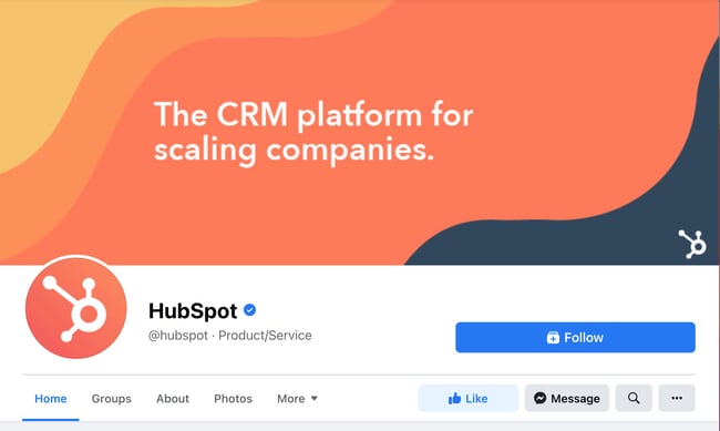 For more cover photo inspiration, check out our Facebook Page.
4. Give your cover image a focal point.
Think of your cover photo as the portion of your Page that’s “above the fold.” If it’s distracting or confusing, people will be more likely to click off the Page.
Many of the best Facebook cover photos include a focal point along with a color scheme that aligns with the rest of the brand. Remember, your social media accounts are extensions of your business and they should make a good first impression on visitors.
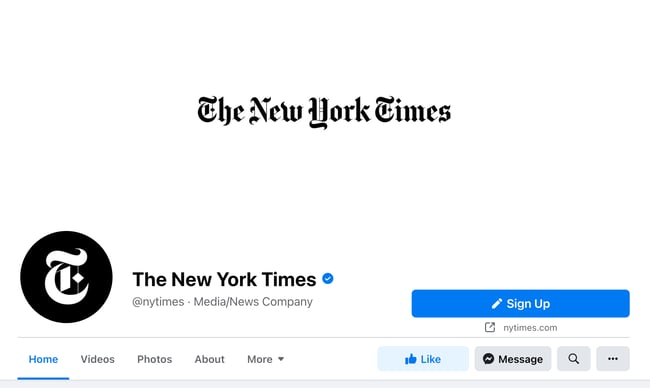
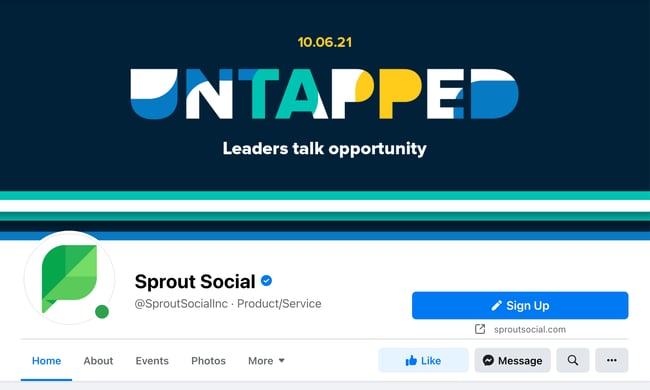
Great Facebook cover photos also have ample negative space to make the subject, the copy, and the elements unique to Facebook (like the CTA button on Facebook business Pages) stand out even more.
Here’s an example of a good use of negative space from The New York Times:
And here’s another example from social media management platform Sprout Social:
5. Avoid blending the contents of your cover photo with your profile picture.
With some clever design techniques, you could manipulate your profile picture and cover photo so they appear as if they’re two parts of the same canvas.
One of Paris’ old cover photos is a great example of this:

You can still do this on your personal profile, but Facebook no longer sets up Business Pages this way. Now, as shown in the examples earlier in this article, the profile picture is completely separate from the cover photo. So, instead of merging the two photos into one, have them complement each other with similar colors or contrasting patterns while still adhering to your brand guidelines.
6. Draw attention to the action buttons on the bottom right.
You may have noticed in a few of the cover photo examples above that the primary call-to-action (CTA) buttons were different. HubSpot’s CTA button says “Follow,” while Sprout Social’s says “Sign Up.”
Depending on your business, you can launch a Page on Facebook with a unique CTA button to the bottom right of your cover photo. Take the placement of this button into consideration when designing your cover photo.
LinkedIn Learning does this in a subtle way below, placing the graphic of a person on a laptop over the “Sign Up” button, drawing your eye to that blue CTA.

Note: While it might seem like a good idea to add directional cues like an arrow to get people to click on the CTA buttons, note that those CTA buttons don’t appear the same way on the mobile app. In other words, it might be confusing to mobile users if you directly integrate the cover photo design with the CTA buttons.
7. Right-align the objects in your cover photo.
Since your profile picture is on the left, you want to add some balance to your Facebook cover photo design by placing the focus of the image on the right.
Take a look at these cover photos. Which one looks more aesthetically pleasing?
Right-aligned focus:

Left-aligned focus:

Doesn’t the right-aligned cover photo look and feel a lot better? In Samsung’s new cover photo, the biggest design elements (the profile picture, the text, and the two phones) are evenly spaced. In Samsung’s old cover photo, your attention goes immediately to the left side of the Facebook Page, causing you to miss the name of the product on the upper-right side.
Not only is adding balance a crucial element of design, but it also allows your cover photos to be more visually effective on mobile. This brings me to my next point…
8. Keep mobile users in mind.
Statista reports that 98.5% of Facebook’s user base accesses the social network from mobile devices like smartphones and tablets. That’s huge — and it’s exactly why it’s so important to keep mobile users top-of-mind when designing your Facebook cover photo.
On mobile, a much smaller portion of the cover photo is visible. The right side is typically cut out entirely.
Let’s take a look at what Cisco’s Facebook Page looks like on a desktop browser versus on Facebook’s mobile app.
Desktop:

Mobile:

It’s important to note that the text in Cisco’s cover photo doesn’t appear. While right-aligned visual elements look great, be careful not to put important content so far to the right that it gets cut off when being viewed on a mobile device.
9. Include a shortened link in your cover photo description that aligns with your Page CTA.
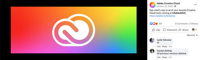
If you want to use your cover photo to support a Page CTA, make sure your cover photo description also includes a text CTA and links to the same offer. This way, any time people view your cover photo by itself, they can still access the link.
Here’s this practice in action on the Adobe Creative Cloud Facebook Page:
Pro tip: Shorten your links and add UTM codes to track the visitors who view your cover photo and click the link in the description. Shortening and tracking features are available in HubSpot’s Marketing Hub and with tools like Bitly.
(If you want to learn more about how to write effective call-to-action copy for your cover photo description, download our free ebook on creating compelling CTAs.)
10. Pin a related post right below your Facebook cover image.
Pinning a post allows you to highlight a typical Facebook post at the top of your Timeline. It’s signified by a PINNED POST title on the top right of the post, like on Behance’s Page below:
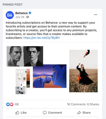
How does this relate to optimizing your Facebook cover photo? Well, if you’re spending time aligning your Facebook Page CTA, your cover photo design, and your cover photo description copy, you should also make sure to post about the same thing directly to your Page and pin that post to the top of your Timeline.
That way, your visitors have one very clear call-to-action when they land on your Page (albeit in several different locations) — which will give them more opportunities to convert.
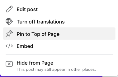
How to pin a Facebook post:Publish the post to Facebook, then click the three dots on the top right corner of the post and choose Pin to Top of Page.
Facebook Cover Photo Sizes that Work for Your Business
Choosing the right cover size for your Facebook Page may seem simple, but it can have a huge impact on users and prospects visiting your Page. An ill-fitting cover photo or video can look unprofessional and give the wrong impression about the quality of your products or services.
With the tips in this article, you have the information you need to create a Facebook cover photo that embodies your brand and engages users on the platform.
Editor’s note: This post was originally published in July 2020 and has been updated for comprehensiveness.

The Social Media Content Calendar Template Every Marketer Needs [Free Template]
“We have a 9 a.m. meeting? Hold on — let me scour the internet to find content for the morning tweet.”
Sound familiar?
Scrambling for social content is nothing new. We have meetings. We miss deadlines. Things come up. And it’s really hard to get any meaningful amount of work done when you have the next social media update looming over your head every 30, 60, or 90 minutes. Social media content moves so fast that you might occasionally feel thrown for a loop, which is why a pre-scheduled social media content calendar should be your new best friend.
To make social media content easier for companies to plan and schedule across the accounts they manage, we created a social media content calendar template. And because this field moves so quickly, we’re always updating this template with the latest social platform features to help you share your content strategy at a tactical level.

 Use the Above Template to Plan Out Your Social Media Holiday Posts
What’s in this social media content calendar template?
Every social media content calendar is different and should be customized to fit your unique social media strategy. In this one, you’ll find a schedule tab, your monthly planning calendar, a repository for website content, and updates for each of the top social media platforms:
The great thing about this template is that as new social media platforms become popular and part of your content strategy (looking at you Tik Tok and Clubhouse), you can simply copy the spreadsheet and repurpose it for that new channel.
This blog post will walk you through exactly how to use a social media content calendar template to stay on top of your social media content planning for each channel.
Pro Tip: HubSpot customers can also schedule content through HubSpot’s Social Media Management Software, or use this spreadsheet to organize and upload content. Detailed instructions for doing this can be found in the cover sheet of the template.
How to Create a Social Media Content Calendar Template
When you open the social media content calendar template, you’ll notice the bottom of the Excel spreadsheet has several different tabs, most of which are dedicated to a specific social network.

Since each social media network is a little different, you don’t want to craft a generic social media post and use it across LinkedIn, Facebook, Twitter, Instagram, and Pinterest. Instead, it’s best practice to create a different worksheet for each platform.
Why?
A few reasons. Image sizes vary across all platforms, the types of content that work well on Facebook might tank on Twitter, and external links are great for Twitter but nearly impossible to use effectively on Instagram.
You can certainly promote the same piece of content across those networks, but that doesn’t mean you’ll craft your update the same way for each of them. In fact, you may want to add additional tabs if you’re active on other networks, like Quora or YouTube.
How to Use this Template
The following subsections will show you how to fill out each of the tabs you see in this template — Twitter, Facebook, LinkedIn, Instagram, and Pinterest. But before we get to that, let’s start with the Monthly Social Calendar.
Monthly Planning Calendar
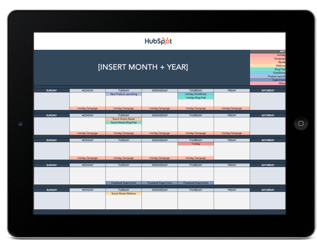
The tab Monthly Planning Calendar provides an overall snapshot of your monthly social media campaigns. It’ll help you coordinate with other stakeholders and keep all the moving parts in order. Here’s what it looks like:
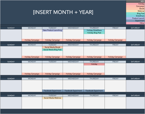
There are three sections to take note of when you edit this template. First, the color-coding key. Each color represents a type of content or campaign you might coordinate, like ebooks, webinars, blog posts, product launches, and so on. Though only some of these might be relevant to you, they’re just the beginning of what you may want to include here — so be sure to add and remove categories that align with your own types of content.
The other two sections you’ll need to edit are the Month and Year at the top of the calendar, as well as the cells below each day of the week. In those cells, you should enter the type of content you’ll be promoting that day and color-code it to align with the campaign it’s supporting.
Instead of deleting all the content in this spreadsheet each month, I recommend copying this worksheet twelve times over and creating a separate sheet for each month. (If that gets to be too overwhelming, you can always save those tabs as a separate workbook.)
Planning Your Social Media Content Calendar for Twitter
Alright, now let’s get to the social media content part of the calendar. This section will be the longest because all subsequent sections will draw on the instructions we go through here. If you only read one section in this whole post, make sure it’s this one.
Let’s say you want to add some tweets to your scheduling template. Scroll over to the Twitter Updates tab in the content calendar spreadsheet, where you’ll see this:
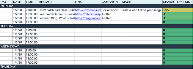
The first four columns, Day, Date, Time, and Date & Time are there for your convenience, and if you choose to use a third-party app for pre-scheduling your tweets (like HubSpot’s Social Media Management Software), then these columns will be useful. For now, just fill in the date for when you’ll publish updates to Twitter, and the time at which you’d like them to go out. The Date & Time column will automatically change based on what you type in the previous two columns.
Now, let’s move over to the Message column. Here, input the copy you’d like to appear in your tweet, bearing in mind you should cap it at 217 characters to allow enough room for a link. (Read this blog post for a full character count guide.) This spreadsheet will auto-calculate the number of characters you’ve entered to keep you on-point, turning yellow and eventually red as you approach 240 characters.
After you’ve composed your tweet, paste the URL you’d like to include in your tweet in the Link column. Be sure to include UTM parameters so you’ll know whether these tweets are driving traffic, leads, and customers. This is an important step to remember if you’d like to demonstrate ROI from social media. You can also use the Campaign column to add an associated campaign which helps with more detailed tracking and reporting.
Finally, in the Image column, attach the tweet’s image (if you have one). For Twitter, we recommend images that are 1200 x 670 pixels.
(Click here for a full cheat sheet of social media image sizes.)
If you’re having trouble attaching your image to the spreadsheet, follow these steps:
Step 1: Click on the cell where you’d like to place your image.
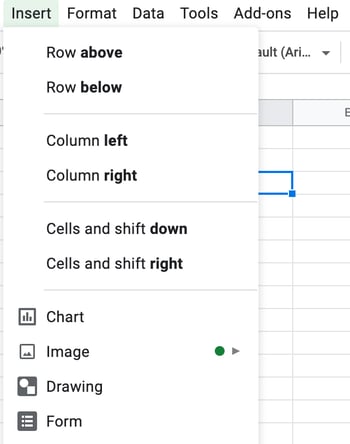
Step 2: Click Insert in the top row, then click the Image button, and finally, click Image in cell to choose your image.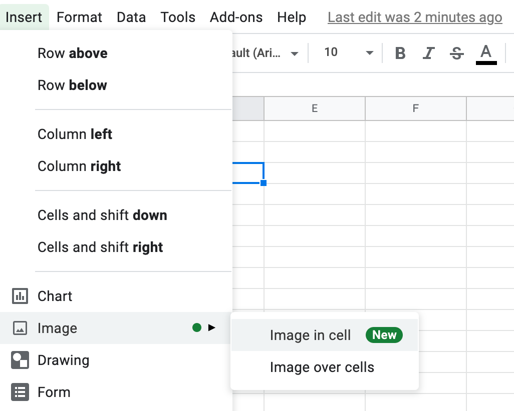
Step 3: In the Insert image window, choose the option your photo will come from. In this example, we uploaded an image from our computer.
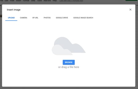
Step 4: You’ll now see the image appear in the cell.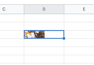
Pro Tip: This process is just for organizational purposes. If you decide to upload the spreadsheet to your social media publishing software, it will not attach — you’ll have to do that manually. If you’re a HubSpot customer, details for how to bulk upload your Twitter content to the HubSpot Social PublishingTool can be found within the downloaded template.
Planning Your Social Media Content Calendar for Facebook
Now, let’s talk about how to plan your Facebook marketing content with this template. First, navigate to the tab in your template labeled Facebook Updates.

The first three columns, Day, Date, and Time are there for your convenience. Scroll over to the column labeled Message and input the copy you’d like to appear in your status update, corresponding to the days and times you’d like those updates to run. Then, move to the Link column and input the link that’ll be included in the update. (Don’t forget that UTM parameter.) If you’d like the update to be tagged to a certain campaign, include this in the Campaigns column. Finally, attach an image just like you did with your Twitter updates — if you’re using one. (These images should fit the dimensions of 1200 x 628 pixels.)
Planning Your Social Media Content Calendar for LinkedIn
LinkedIn Groups let you start conversations with your Group members and share company updates on your Company Page.
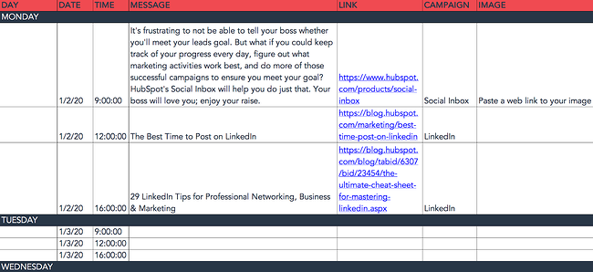
To begin, fill out the first column, Message, for every post you create, including those for a Company Page or a Group. Simply enter your copy into this column, and then navigate to the next two columns, Link and Campaign. Here, you’ll add your URL with a UTM parameter that you’ll use to track activity. Then add the campaign in the Campaign column, if you’re using one. If you’d like to use an image for an update, attach one using the instructions we shared earlier. We recommend uploading the image in the dimensions of 1200 x 1200 pixels for a clear, professional-looking post.
Planning Your Social Media Content Calendar for Instagram
Now, let’s move on to setting up your Instagram photos and videos. Scroll to the tab in your template labeled Instagram Updates.
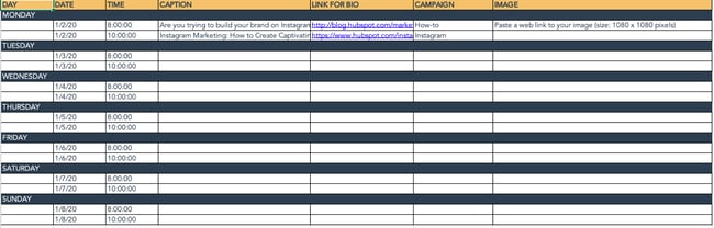
The first three columns, Day, Date, and Time are there for your convenience. Head on over to the column labeled Message, and input the copy you’d like to appear in your post’s caption, corresponding to the days and times you’d like those updates to run. Keep in mind that although Instagram captions can be up to 2,200 characters long, they cut off in users’ feeds after three lines of text. The exact length of these three lines depends on the length of your Instagram handle. (Read this blog post for a full character count guide.)
Next, move to the Link for Bio column and input whichever link you plan to put in the bio when you publish the accompanying Instagram post. Oh, and don’t forget the UTM parameter.
If you’d like the update to be tagged to a certain campaign, include this in the Campaigns column. Finally, attach an image just like you did with your other social media updates — we suggest you edit it to be 1080 x 1080 pixels. (Here’s the cheat sheet of social media image sizes.)
Pro Tip: Even though you can’t schedule Instagram stories automatically, you can still add them to your social media content calendar. Stories also support links once your account has over 10,000 followers, so you can include specific links for these types of posts in your content calendar. The dimensions for Instagram Story posts are 1080 x 1920 pixels.
Planning Your Social Media Content Calendar for Pinterest
Next, let’s go over how to set up your Pinterest Pins in advance with this template. Navigate over to the tab in your template labeled Pinterest Updates.
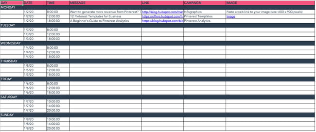
For your convenience, we’ve added Day, Date, and Time columns, but you can skip them if you don’t need them.
Next, go to the column labeled Message, and enter the information for the pin’s description. Then, scroll to the Link column and add the link you’ll be including in the update. (And seriously, don’t forget the URL Parameter.)
If you’d like the update to be tagged to a certain campaign, include this in the Campaigns column. Finally, attach an image the same way you did with your other social media updates — we suggest you edit it to fit the dimensions of 1000 x1500 pixels. This is the standard size, but Pinterest Pins can be much longer if your audience responds to longer content. Just make sure your Pin fits the aspect ratio of 2:3.
Content Repository (Or, Where to Source Social Media Content)
This template also provides you with a tab called Content Repository, which should help you keep track of all your content and maintain a healthy backlog of fodder to make sourcing social media content easier.

As you create more assets, you’ll likely want to resurface and re-promote those pieces down the line, too. To ensure you don’t lose track of all of that content, record it on this tab so you’re never at a loss for what to publish on social media. If the content you’re promoting isn’t evergreen, be sure to include an expiration date in the column marked Expiration so you don’t promote it after it’s out of date.
This tab will also help you maintain a healthy balance of content. Here you can include a mix of original content, curated content, various formats and types, and lead generation content vs. MQL-generating content.
Perfecting your social media content calendar doesn’t have to be a chore. With these essential components, you’ll have a foundation to organize your social media strategy at a tactical level.
Key
As you noticed in earlier sections, your stakeholders will appreciate having an easy-to-read key that they can use to understand the information in the calendar. We’ve color-coded our example here, but you don’t have to go that extra step if you have fewer channels and types of content to differentiate between. As long as your key is clear, just about anyone in your organization can view your social media content calendar and understand exactly what’s happening on all platforms.
URLs and UTM Parameters
We’ve harped on these UTM parameters throughout this post for good reason. They’re critical to tracking the success of your campaign. Without them, you won’t know what’s working and what isn’t.
URLs and UTM parameters are similar, but they’re not one and the same. URLs are the links you’ll want to share from your website (or even another website if you’re curating content) on your social media platforms.
On the other hand, a UTM parameter is an extension of your URL. It’s a string of tracking code that’s appended to the end of the URL and it helps social media marketers track how well their posts are driving traffic to their website. By tracking and analyzing UTM parameters, you’ll be able to see what content is meeting your conversion goals and what content is better for engagement on social media platforms.
Date and Time
If you have stakeholders or other teams that rely on your social media content, you’ll quickly see the benefit of including dates and times in your social media calendar. When teammates can view the calendar and identify exactly when a post was or will be scheduled, they’ll be able to quickly proceed with their workflow which is beneficial for you, too. That means you won’t be interrupted to give status updates about every Tweet on the docket for the day.
Message
Transparency and context are invaluable when it comes to social media content calendars. Giving a brief synopsis of the message or even sharing the caption for a post can go a long way in helping others within and outside your team understand what the intent of the post will be.
Pro tip: If you’re adding a video to your social media content calendar that isn’t finished, consider adding a short Loom video that gives an overview of what the video will be about.
Campaign
When it comes to tracking, it’s too late to start when the campaign is over. Start tracking your social media campaigns in your content calendar. You can make this prescriptive by having a dropdown list of predetermined campaign names, or if your campaigns are few and far between, simply copy and paste the names next to the corresponding content.
Pro tip: Align your campaign name with the campaign section of your UTM parameter for seamless tracking.
Image
Your social media content calendar will become just another spreadsheet without some imagery. Since much of your social media content will probably be visual, add a thumbnail-sized version of the image that will be included in the published post. Coupled with the message, stakeholders who view the calendar images will have a pretty good idea of what will be shared and when. To make editing your images for each platform easier, check out this cheat sheet for ideal image dimensions on each platform.
Don’t Forget to Interact With Your Followers
Whether you use this spreadsheet to plan your content or upload it to a third-party app, you’ll still need to supplement these updates with on-the-fly content. Breaking news hits? Whip up a quick update to share it with your network. Did someone in your network tweet something interesting? Give it a retweet with some commentary. Got a fascinating comment on one of your updates? Respond with a “thank you” for their interaction.
Coming up with and scheduling your social media content in advance is a huge time-saver, but it should go without saying that you still need to monitor and add to your social presence throughout the day.
Finally, we encourage you to experiment with your social media publishing. This template provides publishing dates and times for each social network, but you may find those are way too many updates for you to fill, or perhaps too infrequent for your booming social presence. If this is the case, you should adjust your social media publishing frequency as needed.
Now that you’ve got the ins and outs of a social media content calendar, download the one below for free and start planning your content.
Editor’s note: This post was originally published in January 2020 and has been updated for comprehensiveness.


Top 5 Reasons to Attend INBOUND 2021, According to HubSpot’s Global Events Team
INBOUND 2021 — hosted with love by HubSpot — is a fully immersive, online experience that gives you access to transformative business trends, proactive conversations, and key actionable takeaways that future you will appreciate.
INBOUND has been hosted by HubSpot for over ten years, and is one of the world’s largest marketing conferences, attracting more than 26,000 attendees from 110 countries.
But this year, INBOUND is especially unique — as it’s built with remote work in-mind, so you can learn from anywhere with audio sessions, meetups, and on-demand content.
Additionally, you’ll hear from Oprah Winfrey, Spike Lee, David Chang, and more.
Here, let’s explore five reasons you’ll want to attend INBOUND 2021, according to HubSpot’s Global Events team.

1. BLACK@INBOUND
Black@INBOUND is a global community that gathers Black professionals across industries to grow and network. HubSpot customer Devyn Bellamy first founded Black@INBOUND at INBOUND to find and connect with other Black professionals.
Since then, Black@INBOUND has grown into a dynamic and interactive meet-up for passionate HubSpot fans and INBOUND enthusiasts.
Don’t miss the Black@INBOUND events just for you — including our exclusive Meetup with the community at 3:45 PM EST on October 12. Join the virtual cookout and meet all the members of the Community. Then stay tuned for an amazing panel: Mentorship and Advocacy in Black Business Leadership.

Black@INBOUND is an inclusive community intended for Black business professionals as a space to gather, connect, and share resources.
Black HubSpot users, customers, or fans are welcome to join this space by creating a HubSpot Community profile.
2. The HubSpot Podcast Network
The HubSpot Podcast Network Live will be live at INBOUND 2021! Yes, we want you to step away from your computer screen, give your eyes a rest, head out for a walk and learn from anywhere.
HubSpot’s Podcast Network is the audio destination for business professionals who seek the best education and inspiration to best approach the ever-evolving business landscape.
We will feature exclusive episodes recorded specifically for INBOUND from Entrepreneurs on Fire, My First Million, The Salesman Podcast, and the MarTech Podcast at INBOUND 2021:
Entrepreneurs on Fire
Host John Lee Dumas delivers the inspiration and strategies you need to fire up your entrepreneurial journey and create the life you’ve always dreamed of.
My First Million
Host Sam Parr and Shaan Puri brainstorm new business ideas based on trends and opportunities in the market and share the stories of how companies made their first million.
MarTech Podcast
The MarTech Podcast tells stories of marketers who use technology to generate growth and achieve success. It unearths the successes and pitfalls of industry experts and teaches the tools and tips that they’ve learned along the way.
The Salesman Podcast
The Salesman Podcast is the world’s most downloaded B2B sales podcast. Host Will Barron helps sales professionals find buyers and win business in a modern, effective, and ethical way.

3. HubSpot at INBOUND
Join us at HubSpot’s Product announcement, where you can join Yamini Rangan, Brian Halligan, and Dharmesh Shah as they continue to push the boundaries at HubSpot. Explore some of HubSpot’s new and improved product offerings and how we are focusing on customer success to meet our goals.
This is Yamin Rangan’s first INBOUND as the CEO of HubSpot.
Of her new role, Yamini Rangan said, “It’s the honor of a lifetime to partner with our founders to write HubSpot’s next chapter. My goal is to make our customers, partners, employees, and investors proud — proud to grow their businesses, careers, and futures with HubSpot … I couldn’t be more excited for the future of HubSpot’s journey.”
4. Diverse Spotlight and Breakout Speakers
Oprah Winfrey will be headlining INBOUND 2021.
Oprah Winfrey is a global media leader, philanthropist, producer, and actress. She has created an unparalleled connection with people worldwide, making her one of the most respected and admired figures today.
For 25 years, Winfrey was host and producer of the award-winning talk show, The Oprah Winfrey Show. In her role as Chairman and CEO of OWN: Oprah Winfrey Network, she’s guiding her cable network to success. Winfrey is also the founder of O, The Oprah Magazine, and oversees Harpo Films.
Oprah Winfrey’s exclusive session at INBOUND 2021 is all about the lessons learned on the road to success. See how Oprah — and yourself — can transform failures into lessons.
Spike Lee will guide attendees through an exclusive session that helps you draw ambition out of themselves and others.
Hasan Minhaj takes attendees with him as he explores different ways for you to find your inner voice and follow your passions.
David Chang of Momofuku helps you turn those passions into a business, and he gives you his secret recipe on how he did just that.
Additionally, join lifelong advocate and internationally recognized leader Judith Huemann for an insightful discussion on what ableist privilege looks like and what it means for companies to truly support disabled employees as a prominent community in the DI&B ecosystem.
Experience over 100+ similar sessions at INBOUND 2021 with some of the smartest and innovative thought leaders.
5. The Agenda
INBOUND 2021 offers an immersive and interactive digital experience for all attendees. You will get the chance to create a personalized avatar, join sponsoring partner’s meetups, explore workshops for personal development, and network with a global audience from various backgrounds and industries.
The agenda this year is extraordinary. You can find educational sessions, workshops, Ask Me Anything, debates, and meetup networking sessions. You can customize your agenda by filtering out tracks for Marketing, Sales, Customer Success, HubSpot Academy, and RevOps. There’s something for everyone.
How to attend?
The great thing about INBOUND 2021 this year is that it’s a fully immersive digital experience. You can attend from the comfort of your couch, hop on over to your favorite cafe, listen to sessions while you’re working out. There are endless ways to attend and enjoy INBOUND this year.
You can go ahead and claim your free starter pass, which will allow you to attend our exciting spotlight speaker sessions. You can purchase our Powerhouse pass, which gives you full access to the INBOUND 2021 agenda and platform.


How To Use Hashtags on LinkedIn [Step-by-Step Guide]
Even though LinkedIn has been around since 2003, the platform didn’t allow the use of clickable hashtags until 2016.
Social media platforms like Twitter and Instagram have encouraged hashtag use for years as a way for users to connect with their communities. They even offer analytics, allowing content creators and influencers to gauge their impact.

Now that LinkedIn has fully embraced the use of hashtags, brands can too.
Let’s get into the basics of using hashtags on the platform and dive into how to find the top trending ones in your industry.
How To Use Hashtags on Your LinkedIn Status Update
There are a few ways to add hashtags to your status update.
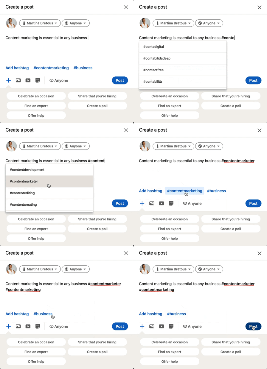
As the GIF illustrates, you can add a hashtag by:
- Typing out the pound sign followed by the word or phrase. As you type out your hashtag, LinkedIn will auto-generate hashtag suggestions based on what’s trending and popular.
- Clicking on the “Add Hashtag” button located on the bottom left of the box.
- Selecting one of the related hashtags next to the “Add Hashtag” button.
Pro-tip: Don’t add spaces or symbols in your hashtags, as they will no longer be clickable.
How To Use Hashtags on Your LinkedIn Article
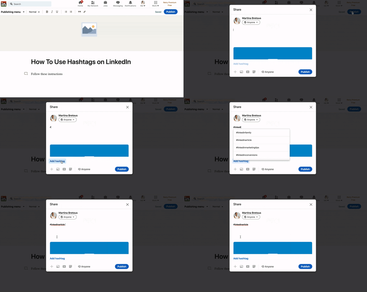
As it currently stands, users cannot add clickable hashtags in the body of their articles published on LinkedIn. However, they can make it discoverable by adding hashtags to the article description box.
How To Use Hashtags on Your Business Page
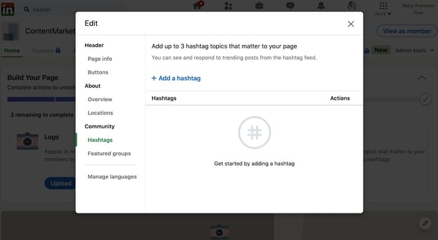
If you have a business page on LinkedIn, you can associate it with relevant hashtags. This will put you right in the center of conversations surrounding those hashtags and allow you to connect with relevant audiences. Here are the steps to add them:
-
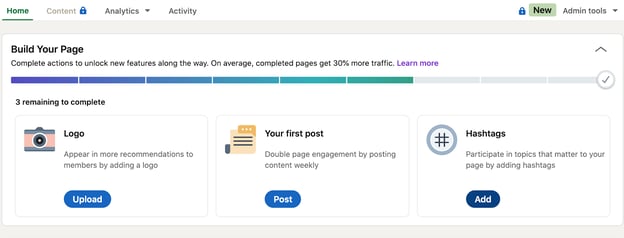
Start on your business page’s homepage.
-
Click on the “Add” button on the bottom right under “Hashtags.” A smaller page will open up.
-
Click “Add a hashtag” and select up to three hashtags.
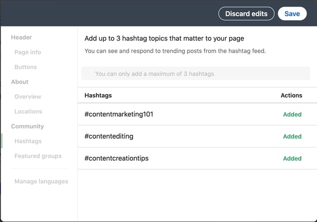 You’re all set.
Should I use hashtags on LinkedIn?
The short answer is yes, hashtags are a great way to reach audiences beyond your direct connections on LinkedIn.
Benefits of Using LinkedIn Hashtags
Let’s say you only have 200 connections on LinkedIn. You publish an article on SEO and don’t use any hashtags. For it to make a substantial impact, you’ll need a lot of post engagement from second-and third-degree connections.
Why place such limits on your content? By using hashtags, you maximize your post’s reach potential. If the SEO hashtag has 100,000K followers and you use it, your post engagement can easily triple what it was without hashtags.
Higher engagement can help you establish credibility and can facilitate meaningful connections with other LinkedIn users.
Now that you know why and how to use LinkedIn hashtags, let’s review some common hashtag mistakes you’ll want to steer clear of. Here are a few tips to keep in mind.
LinkedIn Hashtag Mistakes to Avoid
- Don’t go overboard – As mentioned above, LinkedIn’s former senior director of product management, Pete Davies, recommends sticking to three hashtags. That should be enough to target the main keywords without looking spammy.
- Hashtags don’t replace copy – Hashtags don’t provide context, they should only be used to improve your discoverability. You should still have descriptions in everything you post.
- Only using popular hashtags – When you only use popular hashtags, your content can get lost. If you go too niche, you may not reach enough people. Using a mix of niche and broad hashtags strikes the perfect balance.
Once you get comfortable with the use of hashtags, you can start identifying which ones are performing the best. You may find that some lead to higher engagement rates than others. If so, those are worth reusing.
LinkedIn Trending Hashtags
LinkedIn released data on the top trending hashtags for Q1 in 2020.
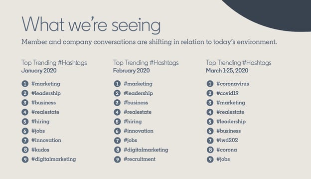
In January and February, the list was virtually identical. However, conversations shifted in March when the pandemic started. Searches for topics on remote working tripled and the #remotework hashtag also started trending.
The best way to optimize your hashtag use is by referring to your recommended hashtags and analyzing their performance on your posts.
Where do I find trending LinkedIn hashtags?
There are three types of hashtags that LinkedIn recommends to its users based on their network and industry: recommended, popular, trending. LinkedIn’s ‘Discover More’ page is the first – and best – place to look when considering which hashtags to use in your posts.
To access this page, follow these steps:
- Click on the “Discover More” button.
- On the mobile app, this will appear when you click on your profile picture on the top left corner of the page.
- On desktop view, it will be at the bottom of the left sidebar.
- On this page, you’ll see trending pages, recommended connections and pages, and hashtags toward the bottom of the page.
As a marketer, LinkedIn recommends me many marketing-related hashtags, such as #digitalmarketing, #seo, and #contentwriter. However, this list will vary from one user to the next.
How To Follow Hashtags on LinkedIn
Following hashtags will allow you to see what other content creators are posting, how users are responding, and get ideas for future posts.
- Head to the search bar and type the hashtag you want to follow.
- Select an option from the dropdown menu.
- That will take you to the hashtag’s feed where you can see all content published with this hashtag. Click “Follow” at the top of the page.
See the GIF below to see the steps in action.
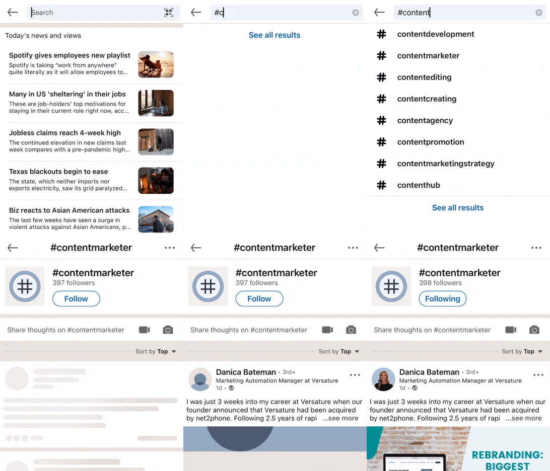
Now that you’re following the hashtag, you’ll see it on the left sidebar under “Followed Hashtags” when navigating on a computer. When using the LinkedIn mobile app, you can access the hashtags you’re following by clicking on your profile picture on the top left of the window and scrolling down to the “Followed Hashtags” dropdown menu.
Hashtags are integral to the success of your content. By relying on LinkedIn’s hashtag recommendations and your analytics, you can ensure your posts are reaching the right audience.
Editor’s note: This post was originally published in March 2021 and has been updated for comprehensiveness.

16 Web Design Trends to Watch in 2021
The landscape of web design is always evolving.
Something that looked modern and fresh yesterday can appear dated seemingly overnight, and trends once dismissed as irrevocably passé can unexpectedly cycle back in vogue.
Still, one thing remains constant: Websites are the most important marketing channel for many businesses, and the second most popular marketing channel among businesses according to HubSpot research.

Given the importance of websites to most businesses and the fact that half of consumers think website design is crucial to a business’s brand, it’s worth the effort to make your own website that matches today’s trends.
However, this doesn’t mean you need to scrap your site’s vision to engage visitors. There’s plenty of room for stylistic choices across the spectrum. As HubSpot Senior Product Designer Dan Hartshorn notes, “I’ve noticed lately many SaaS offerings go either monochromatic or black&white in their UI, or go the opposite direction, and just COVER their UI in color, shadows, gradients, skeuomorphic, etc.”
To help you prepare for wherever the web design tide takes us, we’ve put together a list of 16 trends to keep a close eye on. Check them out below, and get inspired to tackle your web design projects this year with style.
1. Bold Typography
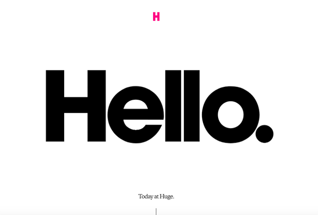
More and more companies are turning to big, bold typography to anchor their homepages. This style works best when the rest of the page is kept minimal and clean, like this example from Brooklyn-based agency Huge.
2. Cinemagraphs
Cinemagraphs — high-quality videos or GIFs that run on a smooth, continuous loop — have become a popular way to add movement and visual interest to otherwise static pages. Full-screen loops, like this example from French creative agency Social Brain, create immediate interest on an otherwise simple page.

3. Brutalism
To stand out in a sea of tidy, organized websites, some designers are opting for more eclectic, convention-defying structures. While it can seem jarring at first, many popular brands are now incorporating these aggressively alternative design elements into their sites, such as Bloomberg.
Brutalism emerged as a reaction to the increasing standardization of web design and is often characterized by stark, asymmetrical, nonconformist visuals, and a distinct lack of hierarchy and order. In other words, it’s hard to describe but you know it when you see it — like with the below example from Chrissie Abbott.

4. Saturated Gradients
Gradients have been all over the web for the past few years, and it doesn’t seem like they’re going anywhere just yet. Copywriting agency Monograph Communications illustrates a perfect example of how to make this effect look fresh and modern, with its full-screen, gradient-washed homepage.

5. Vivid Layers of Color
Staggered, stacked layers of color add depth and texture to a simple site layout, as seen in this stylish example from the snack food brand Pipcorn. A vibrant color palette like this one instantly distinguished itself from competing sites.

6. Text-Only
Some websites are cutting out images and prominent navigation sections altogether, relying on a few choice lines of straightforward text to inform visitors about their company.
Danish agency B14 uses their homepage real estate to simply describe their mission statement and provide links to samples of their work. It’s a modern, uncluttered approach to presenting information.

7. Illustration
More companies are turning to illustrators and graphic artists to create bespoke illustrations for their websites. After years dominated by flat design and straightforward minimalism, adding illustrated touches to your site is a great way to inject a little personality, as seen in this charming example from NewActon (designed by Australian digital agency ED).

8. Ultra-minimalism
Taking classic minimalism to the extreme, some designers are defying conventions of what a website needs to look like, displaying just the absolute bare necessities. The site from designer Mathieu Boulet is centered around a few choice links to their social profiles and information.

9. Mixing Horizontal and Vertical Text
Freeing text from its usual horizontal alignment and placing it vertically on a page adds some refreshing dimension. Take this example from action sports video producers Prime Park Sessions, which combines horizontal and vertical text alignments on a minimal page.

10. Geometric Shapes and Patterns
Whimsical patterns and shapes are popping up more frequently on websites, adding some flair in a landscape otherwise ruled by flat and material design. Canadian design studio MSDS uses daring, patterned letters on their homepage.

11. Serif Fonts
Due to screen resolution limitations and an overall lack of online font support, designers avoided serif fonts for years to keep websites legible and clean. With recent improvements, serif fonts are having a big moment in 2021 — and they’ve never looked more modern. As seen on The Sill, a serif headline adds a dose of sophistication and style. 
12. Overlapping Text and Images
Text that slightly overlaps accompanying images has become a popular effect for blogs and portfolios. Freelance art director and front-end developer Thibault Pailloux makes their overlapping text stand out with a colorful underline beneath each title.

13. Broken Grids
While grids remain one of the most common and efficient ways of displaying text and images on websites, broken grids continue to make their way into mainstream sites and offer a change-up from the norm. Check out the website for HealHaus, for example. Its homepage features images and text blocks that overlap.

14. Organic Shapes
Gone are the days of strict grid layouts and sharp edges — now it’s all about curved lines and soft, organic shapes. In the example below from Neobi, the borderline-cartoonish background adds a generous hit of personality and vivid color to the uncomplicated design.

15. Web Textures
Web textures are background images that visually resemble a three-dimensional surface. When done well, textures can immerse viewers in a website by engaging tactile senses, as demonstrated by Color Of Change — the background evokes a duct-tape-like texture.

16. Hand-Drawn Fonts
Custom, hand-drawn fonts have started cropping up more and more in recent months, and for good reason. These unique typefaces add character and charm, and help designers create a distinct look and feel without a complete overhaul. On the KIKK 2017 Festival website, a hand-drawn font provides a whimsical anchor for the homepage.

Design Trends You Can Use on Your Website
Of course, you don’t need to incorporate all of these trends to build an effective website — we doubt that’s even possible. However, even adding a couple as prominent components or subtler details can improve your site’s UX significantly, leading to higher engagement, more CTA clicks, and a better outcome for your online business.
Editor’s note: This post was originally published in January 2018 and has been updated for comprehensiveness.

What Is a Revenue Model?
Deciding how you’ll generate revenue is one of the most challenging decisions for a business to make, aside from coming up with what you’ll actually sell.
You want to ensure that you’re accounting for production costs, salaries for workers, what your consumers are willing to pay, and that you generate enough to continue business operations. You also want to make sure that your strategy fits with what you’re trying to sell.
Various revenue models will help you set your business on the right path. In this post, we’ll outline what they are and how to choose the right one for your company.

Revenue models are not to be confused with pricing models, which is when a business considers the products’ value and target audience to establish the best possible price for what they are selling to maximize profits. Once the pricing strategy is set, the revenue model will dictate how customers pay that price when they purchase.
RevOps teams also use pricing models to predict and forecast revenue for future business planning. Knowing where your money is coming from and how you’ll get it makes it easier to predict how often it will come in.
There are various revenue models that businesses use, and we’ll cover some below.
Types of Revenue Models
Recurring Revenue Model
Recurring revenue model, sometimes called the subscription revenue model, generates revenue by charging customers at specific intervals (monthly, quarterly, annually, etc.) for access to a product or service. Businesses using this model are guaranteed to receive payment at each interval so long as customers don’t cancel their plans.
Recurring Revenue Model Example
Businesses that benefit from recurring revenue models are service-based (like providing software), product-based (like subscription boxes), or content-based (like newspapers or streaming services). Businesses you may be familiar with that use this strategy are Spotify, Amazon, and Hello Fresh.
Affiliate Revenue Model
Businesses using affiliate revenue models generate revenue through commission, as they sell items from other retailers on their site or vice versa.
Sellers work with different businesses to advertise and sell their products, tracking transactions with an affiliate link. When someone makes a purchase, the unique link notes the responsible affiliate, and commission is paid.
Affiliate Revenue Model Example
Businesses you may be familiar with that use the affiliate revenue model include Amazon affiliate links and ticket promoting services. Influencers also use this model to advertise products from businesses and entice users to purchase them through custom links.
Advertising Revenue Model
The advertising revenue model involves selling advertising space to other businesses. This space is sought after because the advertiser (who is selling the space) has high traffic and large audiences that the buyer (who is purchasing the space) wants to benefit from to give their business, product, or service visibility.
Advertising Revenue Model Example
Various types of online businesses use this model, like YouTube and Google, and so do traditional outlets like newspapers and magazines.
Sales Revenue Model
The sales revenue model states that you make money by selling goods and services to consumers, online and in person. Therefore, any business that directly sells products and services uses this model.
Sales Revenue Model Example
Clothing stores that only sell their products in a storefront or business-specific retail website use the sales revenue model as they sell directly to consumers with no third-party involvement.
SaaS Revenue Model
The Software as a Service (SaaS) revenue model is similar to the recurring revenue model as users are charged on an interval basis to use software. Businesses using this model focus on customer retention, as revenue is only guaranteed if you keep your customers. The image below is the HubSpot Marketing Hub pricing page that uses the SaaS recurring subscription model pricing.
SaaS Revenue Model Example
Businesses using this revenue model include video conferencing tool Zoom, communication platform Slack, and Adobe Suite.
How to Choose a Revenue Model
Choosing a revenue model is entirely dependent on your specific business needs and your pricing strategy.
There is no one-size-fits-all solution, and some businesses have multiple revenue streams within their revenue model. For example, if you use a recurring revenue model, you still may sell advertising space on your website to other businesses because you have a high-traffic page.
There are some key factors to keep in mind, though:
1. Understand your audience.
When picking a revenue model, the most important thing to remember is the target market and audience your pricing strategy has identified. You want to understand their pain points and what model makes the most sense for charging them.
For example, if you’re a service that sells meal kits, your target audience is likely busy and wants the convenience of food that is set up and easy to make after a long day. Using the recurring revenue model makes sense, as you’ll automatically charge them on an interval basis, and they won’t have to remember to submit payment — speaking directly to their desire for convenience.
2. Understand your product or service.
It’s also essential to have an in-depth understanding of your product or service and how your audience will use it. For example, if you sell shoes, your audience likely won’t need a new pair every month, so it may make sense to go with the Sales Revenue Model. Instead, your customers can come to you directly every time they need a new pair.
Choose the Model That Best Fits Your Needs
Ultimately, choosing a revenue model is centered around understanding what makes the most sense for what you’re selling and what makes the most sense (and will be most convenient) for the audiences you’re targeting.
Take time to develop your pricing strategy, choose a revenue model aligned with it, and begin generating revenue.

The Leader’s Guide to Effective Change Management
We’re reminded daily about how change is coming, and to succeed in business, we must remain agile. That all makes sense in theory, but in practical application, to change how you operate or serve customers is no small feat.
At IMPACT, we’ve gone through quite a bit of change, going from a small core team to a good-sized agency. After struggling to implement a change to our client onboarding process, we decided to take a step back and re-evaluate our approach to change management.
Below, I’ll share with you the key change management models and tools we reviewed, and how you can avoid becoming another statistic.
Why is change management important?
A 2019 Gartner study revealed that most chief human resources officers are unhappy with the speed of change implementation in their organizations.
Why is that? Well, 80% of companies manage change from the top-down, according to the study. With this approach, leadership makes the calls, creates the plan, and sends instructions for company-wide rollout.
While it may seem like the quickest way to implement change, it’s not the best solution in the long term.
Many times, leadership blames employees for unsuccessful changes. However, the data suggests that most employees possess the skills and willingness to undergo organizational changes.
The issue lies in deciding who is part of the strategizing, decision-making, and implementation part of change management.
Today, companies are much more complex and for changes to be effective, they require more input across the organization. In other words, change management should be inclusive.
Change is constant, and developing a model that works for your business is the best way you can manage the people-side of change and set everyone up for success.
4 Common Change Management Models
1. Kurt Lewin’s Unfreeze-Change-Refreeze Model
Picture an ice cube.
Kurt Lewin’s Unfreeze-Change-Refreeze model is exactly what it sounds like.
In the unfreeze stage, you are essentially breaking down the current way of doing business and noting what needs to change. It’s crucial in this stage to obtain two-way feedback of what needs to change (vs. solely top-down).
After noting and communicating the need for change, gather the key stakeholders necessary to proactively implement what needs to be done.
Once everyone has bought in, “re-freeze” to institutionalize the change.
In our experience, this model focuses more on process than people. If you have a smaller team, this could be a good option.
2. The ADKAR® Model of Change
The ADKAR® model breaks down the human side of managing change.
The idea is you should work through each letter of the acronym, focusing heavily on the individuals within your company.
Awareness. Here, the goal is to learn the business reasons for change. At the end of this stage, everyone should be on board.
Desire. This focuses on getting everyone engaged and willingly participating in the change. Once you have full buy-in, the next stage is measuring if the individuals in your company want to help and become part of the process.
Knowledge. In this stage, you’re working toward understanding how to change. This can come in the form of formal training or simple one-on-one coaching so those affected by the change feel prepared to handle it.
Ability. Next, you must focus on how to implement the change at the required performance level. Knowing the required job skills is only the beginning – the people involved need to be supported in the early stages to ensure they can incorporate change.
Reinforcement. Lastly, you need to sustain the change. This final step is often the most missed. An organization needs to continually reinforce change to avoid employees from reverting back to the old way of doing things.
Unlike Lewin’s model, this focuses on the people-side of the stage. We like its idea of using reinforcement to make your changes stick and this model takes it a step further.
It’s a good approach to consider if you have a larger team or a more complex problem you’re trying to solve.
3. Kotter’s 8-Step Model of Change
In his 1995 book, Leading Change, Harvard Business School Professor John Kotter, lays out eight stages all companies must go through to see effective change management.
- Create urgency through open dialogue that leads others in the organization to want the change as much as you.
- Form a powerful coalition of change agents in your organization. This can go beyond leadership.
- Create a vision for change to reinforce the why behind it and the strategy to achieve the end result.
- Communicate the vision regularly to ease team anxiety and reinforce the “why.”
- Remove obstacles to pave the way for the needed changes to happen.
- Create short-term wins to keep up morale and show the team you’re moving in the right direction.
- Build on the change by analyzing what went well and didn’t go so well in your quick wins to keep pushing to the desired end result.
- Anchor the changes in corporate culture as a standard operating procedure, reinforce why change is necessary, and embrace it as part of your company culture.
If you have a more agile team, this model’s iterative process syncs nicely with the agile methodology.
4. Kim Scott’s Get Stuff Done Model
OK, so maybe this one isn’t as common yet, but it soon will be, so you might as well get ahead of the curve.
Kim Scott outlines the GSD model in her bestselling book, Radical Candor, the following process:
- Listen: Listen to your team’s ideas and create a culture where they listen to each other.
- Clarify: Make sure these ideas aren’t crushed before everyone has a chance to understand their potential usefulness.
- Debate: Create an environment where it’s OK to critique, debate, and improve ideas.
- Decide: Select the idea that will best solve the issue.
- Persuade: Since not everyone was involved in the listen-clarify-debate-decide stages, you have to effectively communicate why it was decided and why it’s a good idea.
- Execute: Implement the idea.
- Learn: Learn from the results, whether or not you did the right thing, and start the whole process over again.
We included this in our mix at IMPACT because of how much it focuses on obtaining ideas from the frontline. People buy into what they help create and Kim Scott’s GSD model provides a framework to make that happen.
There are many more models out there for change management and if you’re anything like us at IMPACT, you may take away something valuable from each model and find a combination that works best for your company.
Below is a real example of how my team approached a major change and the steps we took to ensure everyone was moving in the same direction.
1. Determine what needs to change and craft the message.
Over the course of three months, IMPACT completely restructured the agency-side of our organization. In March, our agency team looked like this:
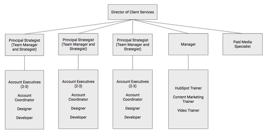
This structure worked for us before, but as we came into a new year with an even larger team, our quarterly team survey results told us a different story.
For the first time in several years, not everyone could see their future at IMPACT.
Some had no idea what was going on or why certain decisions had been made. And what stung the most is we had a few happiness scores below seven, which we haven’t had since 2015.
Ouch.
In our February leadership team meeting, we debated for hours why some in the company were feeling this way.
After several ideas, we all determined one area we should focus on was our structure.
We were setting our managers up for failure with competing responsibilities. In doing so, we made it extremely difficult for them to effectively communicate with their teams, coach them in their careers, and ensure they could see their future at IMPACT.
The ones who did better in this area suffered in others, like client results and retention.
It was a huge issue that needed to be solved immediately.
This leadership team meeting was the beginning of step 1 in our change management plan: Determine what needs to change and craft the message.
In our monthly all-hands meeting following that leadership team meeting, our CEO Bob Ruffolo explained the “why” behind our decision.
He explained the survey results, our thought process, and everything that led to the conversation.
Then, he explained that we had outgrown our current structure, placing too much responsibility on our current managers. We inadvertently set up our teams to fail and that wasn’t OK.
To improve this situation, we needed to create a structure that scales.
Planting the seed for a change is just the first step. After this meeting, we knew there would be fear and confusion, so we got to work on step two.
2. Identify your stakeholders and how to manage them.
We knew that a complete structure change would not go well if it was strictly a top-down initiative. We needed help and a core coalition to get it off the ground.
However, not every single person would need to know every single detail of what was going on.
While all teams were involved, most were focused on how they would personally be affected in their day-to-day responsibilities and cross-functional work.
To keep communication clear and ensure everyone a chance to enact Kim Scott’s debate stage, we had to identify stakeholders across the agency team.
In this case, our stakeholders were the team managers. We were essentially changing their job responsibility, so it was essential to include them in the conversation.
Although we created a committee of stakeholders, what we failed to do was take our communication a step further by managing the other agency team members more closely.
The matrix below outlines a way to segment your team and your communication with each segment so you can better communicate across the board.
We only had our managers involved, and we updated the rest of the team all at once in our monthly all-hands. Next time, we will definitely create a strong communication plan based on this matrix.
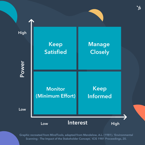
Once we identified our key stakeholders, we met with each one and some of their teams to get their feedback, pushback, concerns, and ideas about the structure change.
In full transparency, not all these meetings were fun.
There was high emotion and rigorous debate. However, we had not zeroed in on our exact plan at this point. So, they helped us understand the team’s concerns and ideate on the best way to structure for scale – together.
3. Systematically communicate.
This is an area we got wrong.
In step one, we announced at a company meeting a pretty earth-shattering idea. Our managers felt blindsided and not all the team members were convinced a structure change was needed.
We learned the hard way that surprising people in a company meeting was not the way to go.
Our intention was to be transparent about what was discussed in our leadership team meeting, but there was definitely a better way to do that.
After identifying key stakeholders, this is the path we believe is the best for disseminating information:
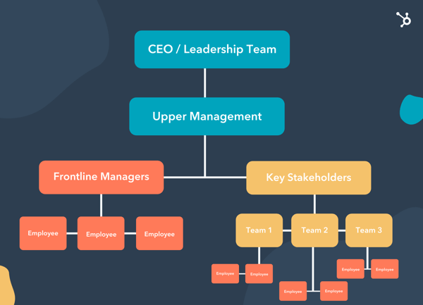
Managers can communicate to their own teams in a style that they know will resonate and create shared understanding. They can also help identify issues and concerns so we can all co-create a solution.
This eliminates groupthink and reduces the timeline to extinguish fear.
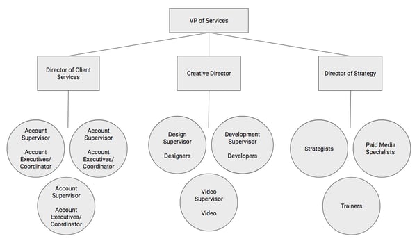
Although our path was a little messier here, once we received all team feedback, we all agreed to what our new agency structure should be:
Then, we moved on to step four.
4. Get organized with incremental steps.
At this stage, everyone knew a change was coming, but no one knew how we were going to make it happen.
This was the time to get organized and get buy-in on the “how” of change management.
Now that we knew what our new structure would be, we developed a project plan with the incremental steps to get us there by the end of the quarter.
We created a video explaining the structure and project plan for all teams to review in their weekly meetings.
Our managers and key stakeholders were involved and accountable for different parts of the plan, and in our all-hands meetings, we updated on the progress of the plan so everyone could stay informed.
In our plan, we also mapped out some “quick wins” in the first month so the team could feel major progress was happening.
In our case, this was selecting new team managers for the teams whose principal strategists moved over to another team.
We interviewed internally and selected our new managers within three weeks of rolling out our initiative. This was exciting for our new managers and the team to see we were already making huge steps.
5. Equip your managers to handle teams’ emotional responses to change.
It’s great to have good communication and a solid plan but at the end of the day, change is hard.
Everyone responds in their own way. What would have been helpful is knowing this concept of The Change Curve.
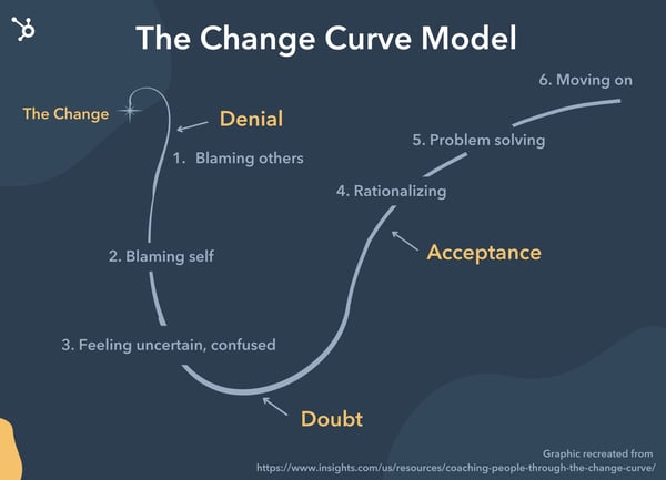
After our initial all-hands meeting, we had people all over the curve. We then, in essence, said, “Managers, figure it out!”
As we went through the process, we learned another lesson the hard way: We needed to adapt our communication and management style for each individual based on how they were responding to change.
The graphic below illustrates a concept by Expert Program Management, which shows how to change your response along The Change Curve to gain buy-in sooner and give better coaching to your managers.
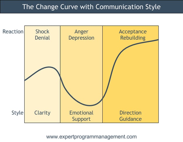
By meeting team members where they are at, our managers could adapt their communication style to coach each team member through the process, allowing for a more personalized, effective transition.
Keep in mind that this isn’t just advice for managers. Our teams operate in Scrum, and in their team retrospectives, a shared understanding of this tool could have facilitated stronger conversations and better problem-solving.
6. Manage by OKRs.
To stay focused throughout the quarter, we created an objective and corresponding key results (OKRs) for our structure change.
The objective was essentially “Make the structure change happen” and we measured by tracking the milestones from our project plan.
In every all-hands meeting, we updated the team on our efforts using a percentage chart so they could visualize our progress.
This was also a time for those working directly on the project plan to celebrate and give themselves a pat on the back. There was a ton of work involved, and they deserved to be recognized for crushing it.
By breaking down exactly what needed to happen, we were able to keep the team focused and motivated to reach our goal.
7. Continue to prioritize communication.
As I mentioned in step one, discussing the idea is seriously only the first step. To keep everyone motivated, organized, and informed, we had to communicate a lot.
We focused on three types of communication: motivational, informational, and two-way:
- Our motivational communication often came from our CEO to reinforce the “why” behind this major change.
- Informational communication came from updates on our OKRs in our all-hands meetings, as well as one-off videos from the team working on the project plan to update on progress.
- Two-way communication was (and is) arguably the most important one. We started off slow in this area, but after getting feedback in our Q2 team survey and from people on the team, we doubled down on this much more in the last month of the transition.
A regular cadence of two-way communication means your team understands what’s being shared, but you also learn and address if there’s underlying dissent or miscommunication.
Although I put this as the last step, it’s the most crucial.
Communication must happen throughout your entire initiative or you’ll risk falling short and potentially damaging company morale in the process.
If you focus on the three types of communication above, you will reach your goals faster with a happier team to boot.
Why is change management important?
There is rarely a beginning and a clear-cut end like the more traditional models. I’m sure we’ll discover more tweaks we need to get our structure right, and that’s OK.
As a leader, you can choose a model, or a mix of models like what we do at IMPACT, to help organize effective, lasting change in your organization.
By incorporating your team via the communication methods outlined above, you can empower and enable your team to take action – and have pride in the change they helped make.
Editor’s Note: This post was originally published in November 2018 and has been updated for comprehensiveness.

Quality Score: Why It Matters and 6 Steps to Improve It
Running an ad campaign is no small feat. From narrowing down your target audience to designing your landing page, there are many pieces to the puzzle.
Once you put in all that work, you want to make sure your ad is ready for bidding. Google Ads helps advertisers ensure their ad quality is high by assigning them a quality score.

Not sure what that is? Let’s cover what a Quality Score is, how to see it in your account, and how to improve it for your next campaign.
Google wants to match users to the most relevant ads because they only make money when users click the ad. So, if they consistently show low-quality ads, they won’t earn as much.
To determine an advertiser’s Quality Score, Google looks at how other advertisers have performed in the last 90 days for the exact same keywords. If there isn’t enough data gathered in that time frame, there will be no score displayed.
Does your Quality Score affect ad rank?
In the bidding process, your Quality Score is not considered by Google’s algorithm. Your Quality Score can signal how your ad will rank but it’s not a direct input in the auction.
However, there is a non-direct link between your Quality Score and your ad ranking. If you have a low Quality Score, that suggests that your ad doesn’t provide a good user experience. As a result, your ad may not rank well.
Think of the Quality Score as a diagnostic tool you can leverage to create a more relevant and useful ad for your target audience.
Now that you know how it works, let’s talk about the three components that make up your Quality Score.
Quality Score Components
In the past, the QS was a clickthrough rate (CTR) predictor. Before assigning Quality Scores, Google used CTR to weed out ads that were irrelevant or ads that should have a higher cost-per-click (CPC), according to the Search Engine Journal.
Today, the expected clickthrough rate is still one component of the Quality Score. It refers to the likelihood that your ad will be clicked once seen. Here are two additional factors that influence your Quality Score:
- Ad relevance – How relevant your ad is to the keyword or ad group based on the user’s intent.
- Landing page experience – How useful your landing page is once users click on your ad.
For each component, you’ll get a subscore: below average, average, or above average.
Despite popular belief, your Google Ads history also has no impact on your Quality Score. Here are additional factors that are not measured in your Quality Score:
- Devices used in search
- Time of day
- Ad extensions
- Location of user
Why Your Google Ads (formerly Adwords) Quality Score Matters
The biggest reason to pay attention to your Quality Score is cost: The higher your Quality Score, the less you’ll pay per click. And that comes straight from Google.
Even if there’s low competition for your keywords, you may still end up paying close to your maximum CPC if your ad quality is low.
With this in mind, it’s in your best interest to ensure your ad meets Google’s standard of quality.
From a value perspective, your Quality Score can help you optimize your ad for better performance.
Knowing where you fall in each component allows you to ensure users enjoy every stage of the ad experience, from seeing your ad to landing on your LP.
For instance, your Quality Score could reveal that ad relevance is above average but your landing page is below average. From there, you have clear direction on what to focus on to improve your ad quality.
If you want to see past Quality Score stats for a specific reporting period, you can select one of the following and click “Apply.”
- Quality Score (hist.)
- Landing Page Exper. (hist.)
- Ad Relevance (hist.)
- Exp. CTR. (hist.)
1. Review your Quality Score components.
The first place to look when attempting to increase your QS is your Google Ads account. Where do you fall in expected CTR, ad relevance, and landing page?
If you have “average” or “below average” listed for any category, those are the elements you want to tackle first.
While they all play a role in your score, working on your CTR or LP has twice the impact as working on your ad relevance, according to Search Engine Land.
But this doesn’t mean that you shouldn’t care about your ad relevance score, you may just want to focus on those two first and then tackle ad relevance.
2. Tweak your keywords.
If your ad relevance score is low, there are a few things you can do to improve it.
The first is making sure the keywords in your ad group are relevant and all follow the same intent.
For instance, say you have these two versions of an ad group:
- 1st – Puzzles, puzzle games, kids games, children’s puzzles, puzzles online, online puzzles to solve
- 2nd – Children’s puzzles, puzzles for kids, puzzles for 3-year-olds, puzzles for 5-year-olds
The first ad group is scattered – it has broad terms like puzzles as well as specific terms related to the type of puzzles as well as online puzzles.
The second group on the other hand keeps the ad group focused on puzzles for children. It’s likely that if a user searches any of these terms, the intent will be the same whereas, in the first group, the ad may not be relevant.
The second thing you’ll want to do is have a negative keywords list. This will prevent your ad from showing up for keywords that have a different intent than your ad.
3. Check your site speed.
Site speed can greatly affect user experience. If your page loading time is too high, users will get impatient and quickly leave your site.
If you’re already paid for a user to get to your landing page, the last thing you want is a slow load time to steer them away.
Here are a few ways to test your site speed:
- PageSpeed Insights – It offers a quick but thorough overview of your site’s mobile and desktop performance. You can test your website for free and there’s no login required.
- HubSpot’s Website Grader – Want to test everything on your landing page, including security, performance, and SEO? Use this tool.
- Google Analytics – If you already have an account, you can access site speed data by:
- Navigating to your view.
- Opening “Reports.”
- Selecting “Behavior” then “Site Speed.”
4. Align your ad to your landing page.
Ever go to a store and ask an attendant where something is? They point you to Aisle 7, you get there and it only takes a few seconds for you to get frustrated because you still can’t find what you’re looking for.
You don’t want your users to have that experience when they get to your landing page. It should always deliver on its promise.
For instance, say your ad is about puzzles for children. Your landing page shouldn’t include puzzles for adults, teenagers, etc. It should be specific to the ad so that the user gets exactly what they’re looking for.
If a consumer has to look around, as if they just landed on your homepage, they may just exit.
On that same note, don’t forget to check your URLs and ensure they’re working properly. A wrong forward or backslash, ampersand, hyphen, or parentheses can throw off your URL.
5. Test your copy and CTA.
When a user sees your ad on Google, you only have a few seconds to get their attention. What’s going to make them click on your ad instead of a competitor’s?
That’s what you should have in mind when crafting your copy and CTA.
Highlight a unique benefit that separates you from your competitors. Say you sell children’s puzzles and have won awards, that’s something you want to showcase. Or perhaps they’re sustainable and eco-friendly.
Leverage whatever details you believe will resonate best with your target audience.
In addition, use action verbs that have power and evoke emotion.
6. Optimize mobile experience.
Imagine running an ad to find out later that most clicks came from mobile users yet your landing page wasn’t designed for mobile shopping.
Today, the mobile experience is as important, if not more, to users when navigating the web.
As you design your landing page, make it responsive (i.e. mobile-friendly) to ensure it works well on all device types. Don’t just work on the LP, the entire shopping experience should be frictionless, including:
- Visiting product pages
- Checking out
You should also think about any pop-ups and other interstitial pages you may have that can impact the user experience.
Your quality score is a diagnostic tool that you should leverage to optimize your ads. With so many factors that can seem out of your control when it comes to ad performance, here’s something that you have the opportunity to control and improve.


The Key Difference Between Multivariate Testing & A/B Testing
There’s seemingly no end to what you can test in your marketing — conversion rates, offer placements, and even which titles perform better.
There’s also no end to the type of test you can run, but two players take center stage: A/B and multivariate testing. Is there a huge difference between them, though? And will my results be affected if I choose the wrong one?

Yes, there is a difference, and yes, your results will be affected. Not to fear, though; in this post, we’re going to break down the difference between A/B tests and multivariate tests and tell you exactly when to use each, so your tests run smoothly and your inbound marketing can go from working pretty well to amazingly well.
The critical difference is that A/B testing focuses on two variables, while multivariate is 2+ variables. As the difference between both tests can be seen visually, let’s go over an example.
Multivariate vs. A/B Testing Example
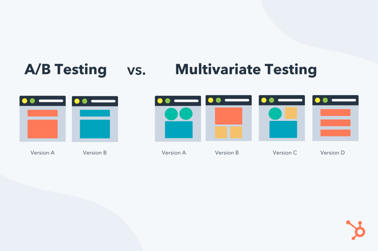
In the image above, the A/B test is simply two different versions of the same with minute changes, while the multivariate test looks at multiple different page elements (variables) in different positions on the page.
Given their differences, let’s learn more about each one and when to leverage each test in your marketing.
What Is an A/B Test?
When you perform an A/B test , you create two different versions of a web page, and split the traffic evenly to see which performs better. The image below is an example of an A/B test.
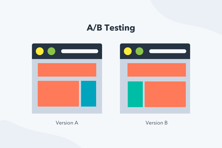
A/B testing is often done with two different variables, but there are A/B/C tests that test three different web page versions, an A/B/C/D test that tests four different web page versions, and well, you get the picture. In an A/B test, you can change any variable you want from page to page, and it is a testing best practiceto create two different pages for your test.
When to Use A/B Testing
Use A/B testing when you want to test two specific designs against each other, and you want meaningful results fast. It is also the correct method to choose if you don’t have a ton of traffic to your site as you’re only testing two variables, so significant data is not needed.
Advantages and Limitations of A/B Testing
| Advantages of a/b testing | limitations of a/b testing |
| Fewer variables so data is easier to track, and you can get a true sense of what works and what doesn’t. | The focus is on two single variables, so test results are hyper-focused and not generalizable. |
| You can obtain results quickly |
When you perform a multivariate test, you’re not simply testing a different version of a web page like you are with an A/B test. With this process, you’ll get an idea of which elements on a page play the most significant role in achieving a page’s objective.
The multivariate test is more complicated and best suited for more advanced marketing testers, as it tests multiple variables and how they interact with one another, giving far more possible combinations for the site visitor to experience.
When to Use Multivariate Testing
Only use a multivariate test if you have a significant amount of website traffic. If you do have a lot of site traffic, the following use case is if you have pages that contain several different elements, and you want to understand what would happen if you made significant changes to the features on the page, like their placement.
Advantages and Limitations of Multivariate Testing
| advantages of multivariate testing | limitations of multivariate testing |
| It helps you redesign site pages to have the most impact. | Requires significant site traffic since you need enough data to test all variables accurately, and not all businesses have this traffic. |
| Results are significant because multivariate testing requires considerable website traffic. | Is a rather advanced and involved marketing process. |
| You can extrapolate results because multiple variables are being tested, and you have significant data points. |
This is a tricky concept, and a visual usually helps clarify complicated ideas. The image below is an example of a multivariate test.
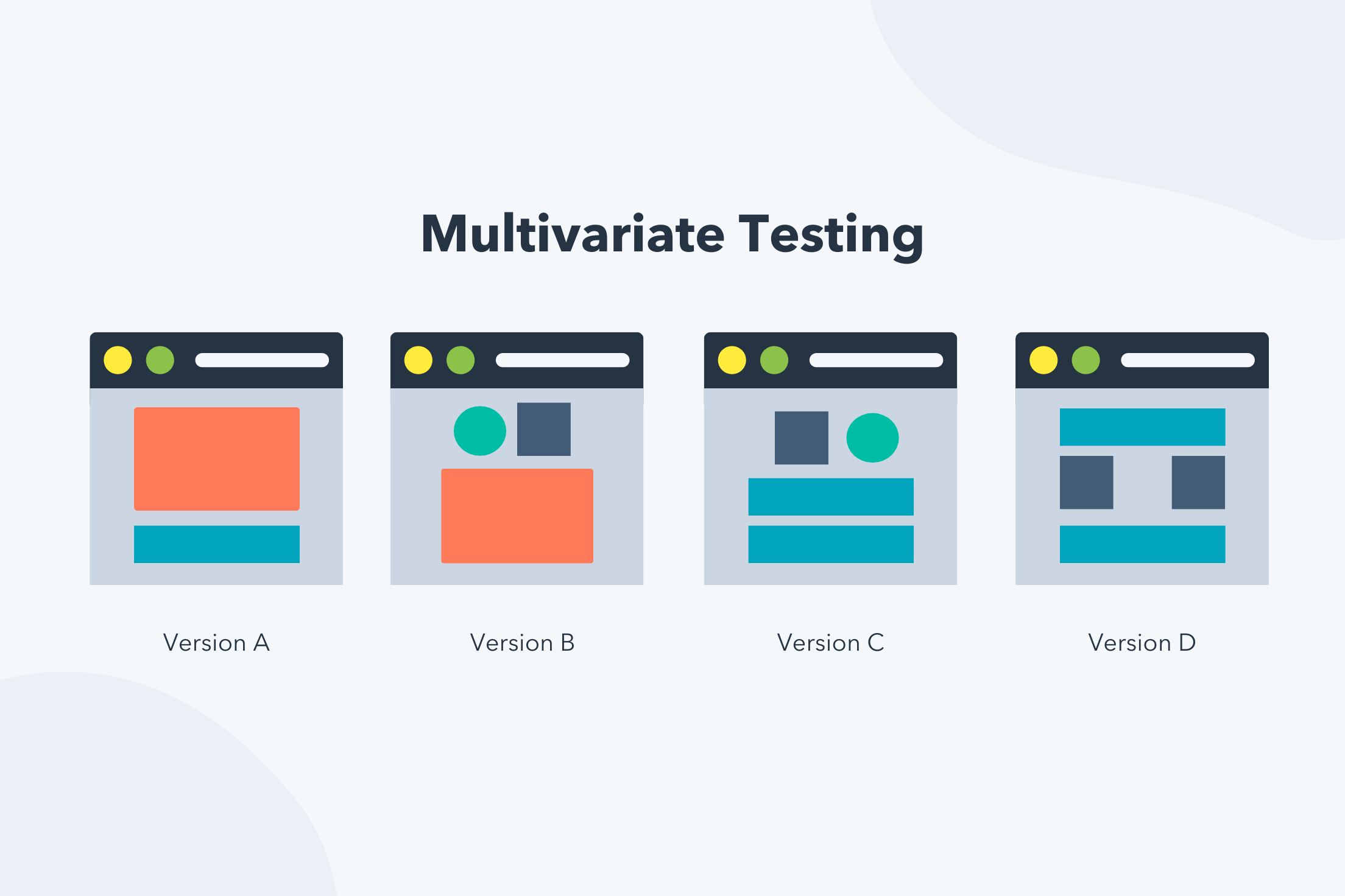
Just remember that for multivariate and A/B tests to give meaningful results, it’s not enough to have site traffic overall — the pages you’re testing also need to receive substantial traffic! So make sure you select pages that people can find and regularly visit so your test yields some data to analyze.

Why Every Company Needs an Operating Model [+ Steps to Build One]
If you are running a business, odds are, you’ve already figured out your business model.
It’s usually the first thing entrepreneurs build out, as it’s key to figuring out the value you’re bringing to the market and consumers.
But what about your people, processes, systems, and technology? Those are all key components of your business that should be outlined in your operational model.
Let’s dive into what an operational model is and how it compares to a business model, plus cover the steps to create one today.
Many people confuse business models with operating models. However, they outline different things and serve different purposes.
A business model outlines how a company captures and offers value through its products/services, value proposition, customer segments, key partners, etc. An operating model, on the other hand, lays out how a company will run in order to deliver that value.
So, in simple terms, a business model looks at the what. An operating model focuses on the how.
Let’s take the example of a fictional lifestyle business called EarthBound. Their business model will describe their sustainable and eco-friendly approach as their value proposition, outline their various product lines, lay out their customer channels through brick-and-mortar and ecommerce stores.
Their operating model will focus on how they source their products, the roles they need within the company, the systems they use in each business area, their data management plan, and more.
Unsure why you should design an operating model? Here are the benefits:
- It helps you identify the systems and structure necessary to serve your customers in a way that’s in line with your larger strategy.
- It’s a blueprint for how resources are organized and operated so, that serves as a baseline from which to scale your business.
Operating Model Template
When you build out your operating model, you focus on three key elements: process, people, and technology.
There are two approaches you can take: role-based or process-based.
When you take the role approach, you design your operating model based on hierarchy and the roles within your company. With a process approach, you focus instead on the journey to deliver value to your consumers.
The template you follow will depend on what makes the most sense for your business based on strategy. For instance, say you’re reviewing your operating model because you’re considering restructuring or reallocation of resources. In this case, a process-based approach may work best.
What You Need To Build Your Operating Model Design
You have to start by asking yourself: “How do we manage our resources to effectively run our business and deliver our services as intended while meeting our goals?”
As you start to think about that, focus on each area outline here.
1. Strategy
To build your operating model, you first need to be clear on your strategy.
This is because your strategy and core priorities will inform your operating model. Once you define it, the next step is creating a set of design principles.
Bain & Company, a global management consulting firm, suggests drafting a list of around seven statements that outline what your company must do to execute your strategy. This will serve as an anchor as you build out your model.
Anyone on your leadership team should be able to state these concisely and clearly using simple language. Here are a few examples:
- Standardize the customer experience across all regions.
- Reduce siloes and align the organization on key company priorities.
- Transition to digital-first approach.
2. Systems and processes.
For any company to run smoothly, they need systems and processes.
When creating or reviewing an operating model, you need to fully understand the inner workings of every business area.
What business systems are in place in X department? What hardware and software do they rely on?
As you think about these questions, make sure you consider both internal and external tools that your organization relies on.
This means knowing what every department needs to succeed in its roles. For instance, EarthBound’s finance department handles activities like invoicing, accounting, payroll, and billing. Going deeper, this means they may use software like Quickbooks.
The marketing team is likely responsible for lead generation and brand awareness through content, social media, paid advertisement, and more. As a result, they rely on tools like Casted to achieve their goals.
Once you know the systems and processes, you can figure out how it fits into your strategy and what changes can or should be made.
3. Organizational Structure
Over the years, new methodologies have been introduced that invite business leaders to revisit their organizational structure and make changes to their operational model.
One big shift in recent years has been how companies tackle projects. In the past, companies followed the waterfall methodology, which organized projects in linear, sequential phases. Today, many companies prefer the agile methodology, which is iterative and offers more flexibility.
Each framework is unique and comes with its own advantages and limitations. As such, it’s important for a business to know what direction they want to head in as they develop their operational model.
4. Talent Management
You can’t have a successful company without talent.
As you develop your operating model, one important question to answer is, “What do your teams look like?” and “What does success look like in every role?”
In this phase, you’ll want to understand the key roles and responsibilities needed to run the business and how those roles will evolve over X period of time.
Furthermore, you should also have a clear culture code that outlines the norms and behaviors you expect from your team and the values you celebrate.
These elements seep into other areas of your business and as a result, are incredibly important when working on your model.
5. Technology
As we’ve seen in recent months, the world is constantly changing.
More teams are remote than ever before and companies are investing in virtual tools like video conferencing and messaging. With this shift comes a need to have the technology to support growing global teams.
Beyond that, there is also the business technology needed to keep everyone in sync. Too often, companies suffer from siloes and have difficulty creating cross-functional teams. By understanding how you envision your team operating, you can seek out software that meets those needs.
Building your operating model is essential in maintaining the health of your company. Whether you’re just now creating one or revisiting an old one, doing so will help you better understand how to execute your strategy.
