
Welcome to My Blog
PopSockets introduces new ‘PopMount 2 Photo’ to help with iPhone photography

PopSockets has introduced a new PopMount 2 Photo accessory for iPhone users with PopGrips. The accessory is available to order today, and it’s designed to give PopGrip users an easy way to stabilize their iPhone for photography and video.
The post PopSockets introduces new ‘PopMount 2 Photo’ to help with iPhone photography appeared first on 9to5Mac.
‘Nudget’ budgeting app updated with all-new iPad app, iCloud syncing, Face ID, and more
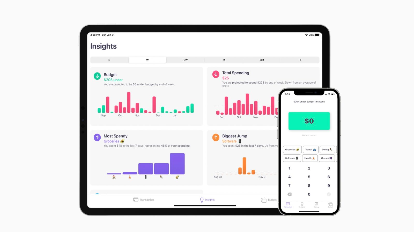
Nudget is a popular budgeting app for iPhone that launched last July, giving users a way to easily track expenses and insights. The app has received a major update this week, bringing it to version 2.0 with new features such as Face ID and Touch ID support, iCloud syncing, and an iPad app.
The post ‘Nudget’ budgeting app updated with all-new iPad app, iCloud syncing, Face ID, and more appeared first on 9to5Mac.
Chrome for iOS tests locking your Incognito tabs with Touch and Face ID

While Chrome for iOS hasn’t seen a stable release since November amid an ongoing pause in updates, Google continues work on the beta channel and is currently testing a way to lock Incognito tabs with Face or Touch ID.
The post Chrome for iOS tests locking your Incognito tabs with Touch and Face ID appeared first on 9to5Mac.
Apple urged to ‘improve the validity’ of its app privacy labels by US House Committee
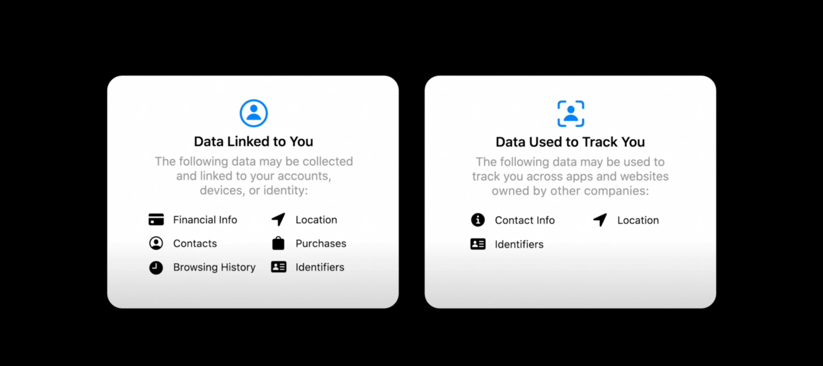
At the end of January, we saw a report from The Washington Post call attention to the recently launched app privacy labels for Apple’s App Store. The small-scale study showed more than half the third-party apps’ self-submitted privacy labels were completely false or at least misleading. Now the US House Committee on Energy & Commerce is urging Apple to “improve the validity of its App Privacy labels” along with asking for more specifics on the system.
The post Apple urged to ‘improve the validity’ of its app privacy labels by US House Committee appeared first on 9to5Mac.
Developer exposes multiple scam apps on the App Store, some bringing in millions of dollars in revenue

Over the last several weeks, developer Kosta Eleftheriou has been highlighting many apparent scam applications on the App Store. The formula for each scam application is virtually identical, and it centers on fake reviews and ratings paired with a deceptive weekly subscription.
Update February 11, 2021: Apple has given the following statement to The Verge regarding scam apps on the App Store.
We take feedback regarding fraudulent activity seriously, and investigate and take action on each report. The App Store is designed to be a safe and trusted place for users to get apps, and a great opportunity for developers to be successful.We do not tolerate fraudulent activity on the App Store, and have stringent rules against apps and developers who attempt to cheat the system. In 2020 alone, we terminated over half a million developer accounts for fraud, and removed over 60 million user reviews that were considered spam. As part of our ongoing efforts to maintain the integrity of our platform, our Discovery Fraud team actively works to remove these kinds of violations, and is constantly improving their process along the way.
The post Developer exposes multiple scam apps on the App Store, some bringing in millions of dollars in revenue appeared first on 9to5Mac.
The Presenter’s Guide to Nailing Your Next PowerPoint
Have a presentation coming up that involves PowerPoint slides? Creating the content and design for a new presentation can be a daunting task.
Between outlining, deciding on a design, filling it out, and finalizing the details, it’s not uncommon for a few questions to pop up.
Where’s the best place to start? Are some steps better to take before others? How can you make sure you aren’t missing anything? And how on earth do you master those essential — yet slightly technical — design tricks that can take a presentation from good to great?
![→ Free Download: 4 PowerPoint Presentation Templates [Access Now]](https://no-cache.hubspot.com/cta/default/53/2d0b5298-2daa-4812-b2d4-fa65cd354a8e.png)
We’re here to make the process a little easier for you. We’ve talked to some of the best presenters at HubSpot and have included their tips throughout this blog.
With the following tips in your arsenal, you’ll be able to navigate PowerPoint much more fluidly and give a standout presentation that’ll leave your audience wanting more.
How to Structure a Powerpoint Presentation
1. Decide on a working title and the main takeaways.
Beyond picking a topic, your first step should be coming up with a working title for your presentation. A working title is more specific than a topic: Think “How the Right Nutrition Can Strengthen Your Kids’ Bones” instead of “Raising Healthy Kids.” Keep in mind that a compelling presentation title is much like a compelling blog post title: short, accurate, and valuable.
Once you’ve got your working title, make a list of the main takeaways of your presentation to begin to give it some structure. This’ll help you stay focused when writing your outline and elaborating on those sections.
Aja Frost, the Head of English SEO at HubSpot, says, “I try to structure my presentations around a story. Not only does this make the presentation more memorable and engaging, it’s also easier to figure out which information is relevant.”
To do this, Frost says to pick a protagonist. She adds, “It might be your team, your audience, your customer…. Then, identify the rising action, problem, climax, and falling action. It’s just like grade school. This structure works whether you’re talking about an accomplishment, a challenge, a big question—anything, really.”
2. Create a short text outline with your audience in mind.
Once you have your main takeaways and your story in mind, it’s time to begin outlining the content of your presentation in more detail, while keeping your specific audience in mind. A presentation on any topic should sound different if you’re speaking to an audience of college students versus an audience of investors, for example. The tone, words, design, and delivery of your presentation should all cater to your specific audience for maximum impact.
Ask yourself: What do your audience members already know? What new information can you teach them? What are they expecting from your presentation? What’s going to be interesting to them? What will keep them focused and engaged? Then, make choices during every stage of the presentation process accordingly.
Justin Champion, a content professor at HubSpot, says, “Before diving into a presentation, I create an outline of how it’ll flow. I do this by creating an intro (what they’re going to learn), the body (what they’re learning), and finish with a conclusion (recap what they just learned) I use bullet point slide a lot for talking points I can expand on. Pro tip: use animations to guide the story. For example, instead of showing all the bullets at once, click through to each via animation.”
3. Formulate your content as a narrative, if possible.
This may not apply for more formal presentation that have rigid structures (like performance reports), but for presentations that have more flexibility, presenting your content as a narrative can be much more compelling.
Stories appeal to people’s emotional side in ways that information, facts, and figures can’t. They help you relate to your audience — and in turn, they’ll make you and your message far more interesting to your audience. They also help make complicated concepts more easily understandable to your audience, who may not share the same experience level or work in the same industry.
Kyle Jepson, a senior professor at HubSpot, says, “Since I’m an educator, I always structure my presentations around the learning outcomes I want to achieve. If there are three things I want my listeners to understand at the end of the presentation, I’ll have three sections. Whenever possible, I put some sort of interactive element at the end of each section to assess their understanding. In a virtual event, this might be a poll or a question for people to respond to in the chat. In an in-person setting, workshop activities or small-group discussions work well.”
4. Collect data and examples.
While sweeping statements can help you set the stage, supporting those statements with evidence will make your argument more interesting and credible. Data and examples give your argument content, and people will understand what you’re saying much better.
But don’t just slap random stats on your slides and expect to “wow” your audience. Be sure your data comes from a reputable source and that you’re presenting it in a way that’s easy to understand, like through accurate charts and graphs.
Finally, don’t overwhelm your audience with too much data. According to psychologist George Miller, we can only remember approximately five to nine bits of information in our short-term memory at any given time. Keep that in mind as you collect your evidence.
5. Engage with your audience.
During a presentation, it’s important to connect with your audience. But how can you do that when you’re just talking at them?
Anni Kim, an INBOUND professor at HubSpot, says, “Staying engaged during a virtual presentation is tough, so provide plenty of opportunities for participation. You should add a slide at the beginning that points out how people can take advantage of the chat and ask questions throughout the presentation.”
Once you’ve set the expectations, keep up on the chat and answer questions as they arise.
Now that you have a structure in mind, you’ll start to write the content. Below, we’ll give tips for how to start and end your presentation.
How to Start a Powerpoint Presentation
1. Start with a story.
Not to be repetitive, but storytelling is one of the best ways to capture your audience’s attention in general. Presentations are no different. Starting with a hook is a great way to get your audience invested in your content.
Champion says, “The best way to start a presentation is with an interesting story that connects to the content. A great way to keep you audience engaged is to make the content interesting.”
2. Be yourself.
On the other hand, while you want to tell a story, you also want your audience to connect with you as the presenter.
Jepson says, “During the introduction, I think one of the most important things to do is to set expectations for your style as a presenter. You don’t always need to start with a joke or a story. Start out by being you, and then keep being you for as long as you’re on stage.”
3. Include surprising or unusual information at the beginning.
While you’ll most likely use a standard approach with session title, presenter’s bio, and an agenda, you don’t want your audience to get bored.
Jepson adds “I think the standard approach (session title, presenter’s bio, agenda) is pretty effective except that it’s usually super boring. I try to include the standard information but sprinkle in things that are surprising or unusual.”
Some examples include:
- Adding a photo of your family on the About Me slide. “A lot of presenters put a picture of themselves on their About Me slide. But I think that’s silly because I’m standing right there,” Jepson says. “If people don’t know what I look like, they will by the end of the presentation! So I’ve started putting a picture of my wife and kids on that slide and saying something sweet or silly about that.”
- Asking people to use their phones. “A lot of in-person presentations start with a request to silence cell phones,” Jepson comments. “Sometimes I’ll do the opposite and say something like, ‘Before we get started, I want you all to pull out your phones. You probably think I’m going to ask you to silence them. But I’m not. I’m here from HubSpot, and I’m here to help you however I can. So if there’s anyone from your team who might have questions or need help from a HubSpotter, I want you to send them a message and tell them to send their questions to you before we get to the Q&A section of presentation. To give you time to do this, I’m going to send a text to my wife to let her know I made it here safely.’ And then I’ll literally pull out my phone and send a text message on stage.”
Now that you’ve structured your post and have ironed out the details of your introduction, it’s time to work on the end of the presentation.
How to End a Powerpoint Presentation
1. Recap what the audience has learned.
First and foremost, the end of your presentation should tie everything together.
Champion adds, “Recap what they just learned, explain next steps based on learnings, and offer any associated resources to continue learning.”
This will help people remember the content and give them resources to learn more or reach out if they have questions.
2. Q&A.
Another great way to end a presentation is with a Q&A.
Jepson remarks, “I always end with Q&A. The only tricky thing about that is knowing how to cut it off if you’re getting more questions than you have time to answer or if you aren’t getting any questions at all. In both of those situations, I do essentially the same: I cut it off and tell people to come talk to me individually.”
For in-person meetings, Jepson will tell the audience to come find him after the presentation to ask more questions. However, for virtual meetings, he’ll let people know how to reach him, whether that’s via LinkedIn or email.
3. Call to action.
Calls to action are an important component of any piece of content and presentations are no different. What do you want your audience to do with this information?
In your recap, include actionable ways for your audience to incorporate your information into their day-to-day (if applicable). You can also let people know to reach out to you with questions so they know the next steps in case they want to discuss the presentation further.
Now that you have an idea of what you’re going to be talking about and how you’ll be laying it out, it’s time to open up a new PowerPoint presentation and apply those basic design elements.
Outlining Your PowerPoint Design
1. Pick a color scheme.
Before you begin translating your text outline into PowerPoint, you’ll want to start by adding some very basic design elements to your PowerPoint slides. First, choose a color scheme — one that has enough contrast between colors to make colors stand out. Whether you decide to use two, three, or four different colors in your presentation is up to you, but certain color combinations go together better than others. Read the sections on creating color schemes in this blog post to figure out a good color combination.

2. Design your slide backgrounds.
In PowerPoint, less is more. You don’t ever want to let the design distract from your message. But at the same time, you want to get more creative than a plain, white background — even if you’re going for a very simple design.
The three main ways to add a background design to a PowerPoint presentation are: 1) to use a predesigned template from PowerPoint; 2) to create a custom background using a solid color; or 3) to create a custom background using an image. Here’s how to do each of those things.
(We also have a few general PowerPoint templates available for download here, which come with a series of videos to teach you some basic PowerPoint creation tips.)
How to Browse Predesigned Templates in PowerPoint
PowerPoint comes with a series of predesigned templates to choose from.
To browse these templates on a Mac: Click on the slide or slides you want to add the background to. Then, click the “Themes” tab at the top of the screen.
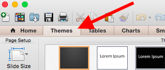
You can either scroll through your options up there, or you can access the themes gallery in a bigger window by hovering your mouse over the theme previews and clicking the dropdown arrow that appears below them.
Right-click the background style that you want. To apply the background style to the selected slides, click “Apply to Selected Slides.” To apply the background style to all of the slides in your presentation, click “Apply to All Slides.”
To browse these templates on a PC: Click on the slide or slides you want to add the background to. Then, click the “Design” tab at the top of the screen. In the “Background” group, click the arrow next to “Background Styles” to open up the theme gallery.

Right-click the background style that you want. To apply the background style to the selected slides, click “Apply to Selected Slides.” To apply the background style to all of the slides in your presentation, click “Apply to All Slides.”
Pro Tip: You can also apply any PowerPoint presentation or template you already have as a theme, even if it doesn’t show up in the theme gallery. To do that, click the “Browse Themes” option you’ll find at the bottom of the dropdown themes gallery, and navigate to wherever the given presentation, template, or theme is located on your computer. Then, click “Apply.”
How to Create a Custom Background Using a Solid Color
Want your slide background to be a simple, solid color? The steps to do this are almost identical on a Mac and a PC.
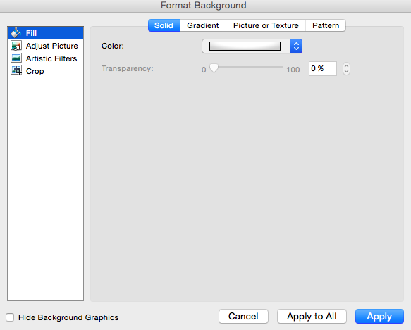
Simply right-click the slide(s) you want to add a background color to, then click “Format Background.” In the window that appears, click “Fill” and then “Solid.” Notice you can also adjust the gradient or make the background a pattern. Click “Apply” at the bottom to apply the changes.
How to Create a Custom Background Using an Image
Sometimes, making the slide background a high-definition image can really make that slide pop. It also encourages you to cut down on text so that only a few keywords complement the image. PowerPoint makes it easy to create a custom background using an image you own.

First, choose your image. Size matters here: Be sure it’s high resolution so that it can fill your slide without becoming blurry or distorted. Here are the 17 best free stock photo sites to help you find some large, great quality images.
To create a custom background using an image on a Mac: Click the slide that you want to add a background picture to. To select multiple slides, click a slide and then press and hold CTRL while you click the other slides.
Next, click the “Themes” tab at the top of your screen. In the “Theme Options” group, click “Background,” then “Format Background.”
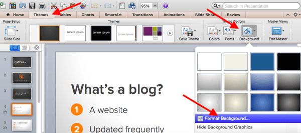
In the window that appears, click “Fill,” then “Picture or Texture.” To insert a picture from a file, click “Choose Picture…” and then locate and double-click the picture you want to insert. If you want to use this picture as a background for just the slides you selected, click “Apply.” If you want to use the picture as a background for all the slides in your presentation, click “Apply to All.”
To create a custom background using an image on a PC: Click the slide that you want to add a background picture to. To select multiple slides, click a slide and then press and hold CTRL while you click the other slides.
Next, click the “Design” tab at the top of your screen. In the “Background” group, click “Background Styles,” then “Format Background.”

In the window that appears, click “Fill,” then “Picture or texture fill.” To insert a picture from a file, click “File” and then locate and double-click the picture you want to insert. If you want to use this picture as a background for just the slides you selected, click “Close.” If you want to use the picture as a background for all the slides in your presentation, click “Apply to All.”
Filling In the Content
1. Fill in the text on your slides using concise language.
Your slides are there to support your speech, not replace it. If your slides contain too much information — like full sentences or (gasp) paragraphs — then your audience members won’t be able to help but read the slides instead of listening to you. Plus … that’s boring. Instead, use slides to enhance keywords and show visuals while you stand up there and do the real work: telling a story and describing your data.
When it comes to your slide text, focus on the main phrases of a bullet point, and cover details verbally. We recommend using up to three bullet points per slide and making any text as simple and concise as possible. A good rule of thumb is this: If you’re using more than two lines per slide or per idea, then you’ve used too much text. Depending on the type of presentation, two lines might even be a little text-heavy.
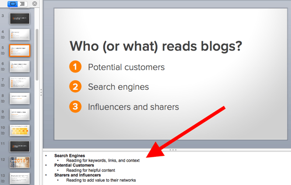
Are you planning on sending your slides to your audience afterward? If you’re concerned about putting enough information on the slides for people to understand your presentation when they go back to it later, you can always add little details into the slide notes in PowerPoint. You can find the Notes pane at the bottom of your PowerPoint screen, right below your slides. Click and drag the edge of the pane to make it larger or smaller.
2. Brainstorm your final title with someone else.
Once all your content is there, you’re ready to finalize your title. First, refine your working title as best you can on your own. Is it compelling and interesting enough to engage your audience from the very start? Does it accurately reflect your presentation?
Next — and this is important — connect with someone else to brainstorm the final title together. Read this blog post for a helpful walkthrough on writing a great title and title brainstorming with others.
Filling In Your PowerPoint Design
1. Choose a font that’s easy to read.
Choose either one font to use throughout your presentation, or two (one for your headers and one for your body text) that contrast each other well. Here’s a list of 35 beautiful fonts you can download for free to get you started.
If you decide on two fonts, your header font should be bold and eye-catching, and your body text font should be simple and easy to read. (For more guidance on what fonts work best together, take a look at this visual guide.)
2. Embed your font files.
Fonts changing from one computer to another is one of the most common problems PowerPoint presenters have — and it can really mess up your presentation and flow. What’s actually happening in this case is not that the fonts are changing; it’s that the presentation computer just doesn’t have the same font files installed.
If you’re using a PC and presenting on a PC, then there is a smooth workaround for this issue. When you involve Mac systems, the solution is a bit rougher.
On a PC: When you save your PowerPoint file, click “Save As” and then “Save Options.” Then, select the “Embed TrueType fonts” check box and press “OK.” Now, your presentation will keep the font file and your fonts will not change when you move computers (unless you give your presentation on a Mac).
On a Mac: In PowerPoint for Mac, there’s no option to embed fonts within the presentation. So unless you use ubiquitous typefaces like Arial or Tahoma, your PowerPoint is likely going to encounter font changes on different computers. The best way to avoid this is to save the final version of your presentation slides as JPEGs, and then insert those JPEGs onto your PowerPoint slides. In other words, make each slide a JPEG picture of your slide. (Note that the file size of your PowerPoint will increase if your presentation includes a lot of JPEGs.)
Mac users can easily drag and drop the JPEGs into PowerPoint. If you don’t use actions in your presentation, then this option works especially well.
If you want your presentation to appear “animated,” then you’ll need to do a little tinkering. All you need to do is save JPEGs of each “frame” of the animation. Then, in your final presentation, you’ll just display those JPEGs in the order you’d like the animation to appear. While you’ll technically have several new slides in place of one original one, your audience won’t know the difference.
If you’re a Mac user and want to use this option, then be sure to add this to your checklist as the final step.
3. Adjust the font sizes.
Once you’ve chosen your font, you can start playing around with font size. Carefully choose the font sizes for headers and text, and consistently use the same font face and sizes on all your slides to keep things clean and legible. Be sure your font is big enough so even the audience members in the way back of the room can read them.
4. Adjust line and character spacing.
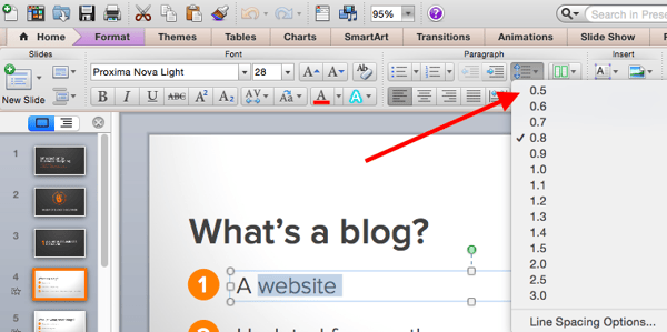
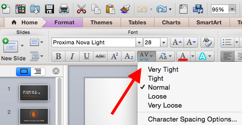
The biggest PowerPoint no-no is using too much text on a slide. The most effective slides use text sparingly and present it in a way that’s easy to read. One trick to make text more legible without changing the font size or layout is to increase or decrease the space between each line and each letter.
To adjust line spacing:
Select the text you’d like to adjust. On the “Home” tab, in the “Paragraph” group, click “Line Spacing” and choose “Line Spacing Options.” In the Paragraph dialog box’s “Spacing” section, click the “Line Spacing” dropdown list and choose “Exactly.” In the “At” text box, adjust the value accordingly. Click “OK” to save your changes.
To adjust character spacing:
Select the text you want to change. Then, on the “Home” tab, find and click the “Font” button.” Choose “Character Spacing Options” from the dropdown menu. Adjust spacing as needed.
5. Add images.
Great visual cues can have a huge impact on how well your audience understands your message. Using gorgeous images in a slide presentation is the perfect way to keep things interesting.
It’s important, though, that you don’t use images to decorate. This is a very common mistake. Remember: Images are meant to reinforce or complement your message, but they can be distracting. Focus on finding high resolution images so that they look good when expanded without becoming blurry or distorted.
If you don’t have your own images to use, check out our roundup of the 17 best free stock photo sites.
Pro Tip: If you’re finding that the background of an image is distracting, you can actually remove it before putting it into your presentation directly inside PowerPoint — no Photoshop required. Read this blog post for instructions.

6. Use multimedia, but sparingly.
Using multimedia in your presentation, like video and audio, can be an effective way to capture your audience’s attention and encourage retention of your message. In most cases, it’s best to avoid using more than one or two video or audio clips so you don’t detract from your talk or your message.
PowerPoint lets you either link to video/audio files externally, or embed the media directly in your presentation. You should embed these files if you can, but if you use a Mac, you cannot actually embed the video. We’ll get to that in a second.
PC users: Here are two great reasons to embed your multimedia:
- Embedding allows you to play media directly in your presentation. It’ll look much more professional than switching between windows.
- Embedding also means that the file stays within the PowerPoint presentation, so it should play normally without extra work (except on a Mac).
Mac users: You need to be extra careful about using multimedia files. You’ll always need to bring the video and/or audio file with you in the same folder as the PowerPoint presentation. It’s best to only insert video or audio files once the presentation and the containing folder have been saved on a portable drive in their permanent folder.
If your presentation is going to be played on a Windows computer, then Mac users need to make sure their multimedia files are in WMV format. That can get complicated, so if you want to use PowerPoint effectively, consider using the same operating system for designing and presenting no matter what (if that’s something you can control).
7. Design your title slide.
The title of your presentation is often the first impression it gives off — especially if it’s going to be on display as people file in to your presentation — so it’s important to put some time and careful thought into its design.
Here are 20 layout ideas for PowerPoint title slides from Chris Lema:
8. Add any consistent elements, like your company logo.
There’s a reason this is at the end. If you add things like your logo that you want to be in the same place on every slide, any adjustments you make to individual slides could slightly alter the alignment … and you’ll have to go back and adjust them all over again.
Preparing For the Presentation
1. Review and edit your slides.
Spend some time on your own flipping through your slides while practicing your talk. Make sure you can check all of the following off the list:
- Your slides flow well and align with your talk.
- Your slides are free of all grammatical, formatting, or design errors.
- Your multimedia files work.
- You’ve double-checked any mathematical calculations you made yourself.
- You’ve properly attributed any statistics, data, quotes, ideas, etc. to the original source.
- You’ve double-checked you’re actually allowed to use the photos/images you used. (Don’t skip this step. Here’s a cautionary tale about internet copyright law.)
- You’re sure nothing in your presentation could potentially harm any of your partners, stakeholders, audience members, or your company.
- You’ve checked with a friend that nothing in your presentation might offend certain people in your audience — or, if so, that it’s worth it.
2. Know your slides inside out.
The best presenters don’t read off your slides, so it’s important to prepare and practice your presentation ahead of time. You never want to be the person finalizing your talk or presentation half an hour before an event … that’s just poor planning. Plus, what if the projector fails and you have to give your talk without slides? It can happen, and if does, you’ll be incredibly happy you spent so much time preparing.
3. Practice using “presenter view.”
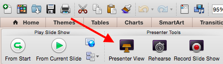
Depending on the venue, you might have a presenter’s screen available to you in addition to the main projected display that your audience can see. PowerPoint has a great tool called “Presenter View,” which includes an area for notes, a timer/clock, a presentation display, and a preview of the next slide.
Make sure “Presenter View” is turned on by selecting it in the “Slide Show” tab of your PowerPoint.
To practice using “Presenter View,” open the “Slide Show” tab within PowerPoint. In the “Presenter Tools” box, click “Presenter View.”
4. Bring your own laptop and a backup copy of your presentation.
This isn’t just a bonus step — it’s an essential one. Technology can mess up on you, and you need to be prepared. Between operating systems or even between different versions of Microsoft Office, PowerPoint can get a little wonky. One way to avoid problems is to ensure you have all the right hardware with you. Bring along your own laptop when you’re presenting, just in case.
Even if you bring your laptop, but especially if you for some reason cannot, bring a backup copy of your PowerPoint file on a flash drive.
What other tips do you have for nailing PowerPoint presentations?
Editor’s note: This post was originally published in October 2015 and has been updated for comprehensiveness.

First Apple TV+ AR app launches with ‘For All Mankind’ backstory through mixed reality

Apple’s rumored augmented reality experience for Apple TV+ has arrived in the form of For All Mankind: Time Capsule. The standalone iOS app is built using Apple’s ARKit framework and even includes exclusive experiences for the latest iPad Pro, iPhone 12 Pro, and iPhone 12 Pro Max.
The post First Apple TV+ AR app launches with ‘For All Mankind’ backstory through mixed reality appeared first on 9to5Mac.
16 Content Marketing Analytics Tools That Finally Do What You Need
To have a winning marketing strategy, you need to understand the analytics behind that strategy — analytics that highlight important things like: 1) the metrics you care about most, 2) how your current strategy is doing, 3) how close you are to reaching your goals, and 4) areas for improvement.

Content Marketing Analytics
There are a number of marketing analytics tools available with customizable metrics, a variety of visualizations and dashboards, and integrations to help you measure the impact of your marketing strategy. Let’s dive into 16 options.
1. HubSpot Marketing Analytics and Dashboard Software
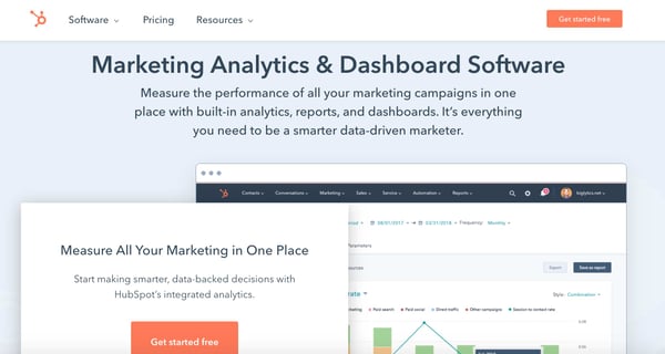
Today, the most effective marketing is powered by a combination of customer insights and data that show you what you’re doing well and what needs improvement. However, identifying these insights and data isn’t always a straightforward process.
Enter: HubSpot.
HubSpot’s Marketing Analytics and Dashboard Software makes it easy to access all data and insights from a single location in just seconds (no SQL required!).
With HubSpot…
-
Your marketing and CRM data are organized in one, central location.
-
There’s no code necessary to access or pull business insights.
-
It’s an exceptionally easy tool to use and navigate.
HubSpot’s Marketing Analytics and Dashboard Software also offers attribution reporting (including granular, contact, and revenue attribution reporting) so you can connect every customer interaction to the associated record and revenue generated.
Attribution reporting also pinpoints the channels that are hitting and surpassing goals as well as which ones need to be revisited or reconsidered — this provides the necessary insight to allocate your budget effectively.
HubSpot comes with pre-built, beautiful, and customizable dashboards to display your data (you’ll have access to different dashboards based on the Marketing Hub plan you select). These templates are easy to personalize thanks to the drag-and-drop editor.
The Custom Report Builder provides access to your data in one place including contact, company, deal, marketing email, landing page, and blog engagement data. Custom Objects capture data that’s unique to your business and combine it with your CRM, custom data (e.g. inventory data), and contact data so you can create segments and build custom reports, campaigns, and workflows.
Use Behavioral Events to trigger or schedule touchpoints, track custom interactions that are unique to your business, and indicate when a customer is ready for another stage of the buyer’s journey.
Lastly, use Account Based Marketing (ABM) — which bridges the gap between Marketing and Sales and helps close your target accounts — to identify highly-valuable accounts as the tool surfaces prospects that match your customer profile criteria.
Price
There are four Marketing Hub plans with different analytics features and flexibility rangingin price from free (forever) to $3,200 per month.
2. Buffer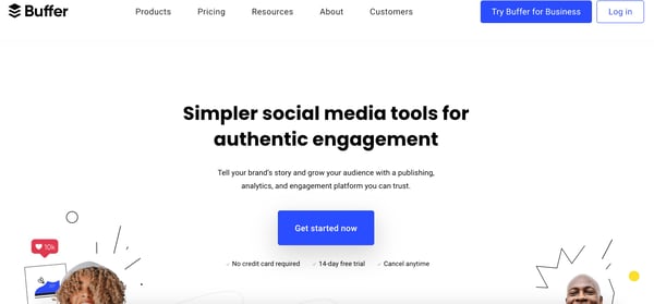
Buffer’s content marketing analytics offers the option to build reports according to your goals. Add or remove custom metrics about the performance of numerous social media accounts. You can export those reports to share them easily.
Reports are updated daily so you can be sure you’re receiving timely data. Buffer’s analytics are designed to help you see channel performance at a detailed level on one dashboard.
The software also offers engagement metrics for each account individually. This helps you gain an intricate understanding of how customers are interacting with social content. Measure stories, posts, and hashtag performance as well as access the demographics of your audience across channels.
Price
Buffer’s Marketing Analytics product, Analyze, has two payment options with different features and flexibility that cost $35 per month or $50 per month.
3. Google Analytics
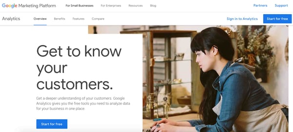
Google Analytics has an expansive system of tools for content marketing analysis. The intuitive interface is easy to navigate and can be used to understand the performance of your content across multiple platforms. The analytics tool integrates with Google’s array of business software so you can access all of your insights in one place.
Price
Google Analytics offers a free and a paid plan. The free plan is ideal for SMBs and you can get started using it immediately. Meanwhile, the paid plan, called Analytics 360, is ideal for enterprise-level companies and requires you to speak with a sales rep for a quote.
4. SimilarWeb

SimilarWeb provides traffic and engagement industry standards and tells you where your website stands among them. This information is useful for discovering how performance stacks up against the competition.
With SimilarWeb, break down your daily active users, sessions per user, use-time, and rank. Discover more information about your audience — such as repeated behaviors or interests — to improve your acquisition strategy.
Price
SimilarWeb offers two plans, one of which is free and another that’s meant for enterprise businesses and requires you to contact a rep for a consultation.
5. Moz
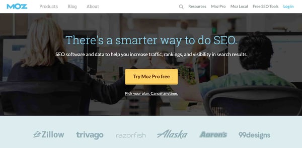
Moz measures the impact of your search-engine-optimized content. Gain insight into how your work is ranking among others in your industry and which keywords are the most effective to use in your strategy.
Moz’s software tracks your site’s keyword rank and how visible it is overtime to learn what is and isn’t performing well among audiences. Additionally, track how competitors rank on search engine results pages (SERPS) — this allows you to spot areas for improvement and the parts of your campaign you can use to target them. To help with this, use Moz’s detailed reports to see how your content is reaching audiences and what you can do to improve.
Price
There are two main Moz solutions, Local and Pro. Both Local and Pro have different plans ranging in features, flexibility, and price. Local ranges in price from $129-299 while Pro ranges in price from $99-599 per month.
6. Hotjar
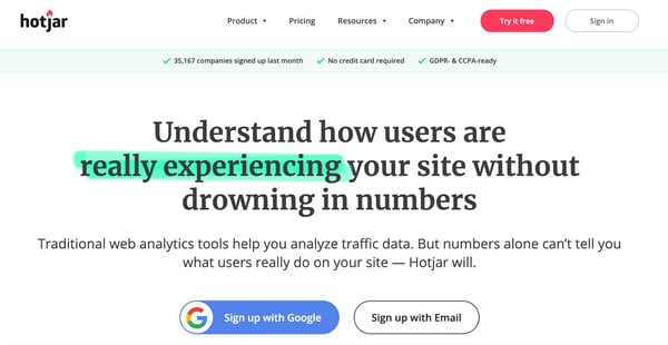
Use Hotjar to track sessions on your site. Hotjar provides heat maps about how and where customers spend their time while on your website. In fact, there are real-time videos that capture how visitors are navigating and using your website. This allows you to hone in on the content that’s catching your customer’s eye. You can also track conversions and make inferences about which stage of the buyer’s journey customers might be entering or leaving.
Price
Hotjar offers three types of plans. There are two options for those who want a Personal plan that are either free or $39 per month. These options are ideal for personal and low-traffic websites.
The Business plans range in price from $99-$989 per month depending on the number of sessions per day you receive. Lastly, the Agency plan requires you to contact a rep to chat about a plan for your team and clients.
7. Semrush
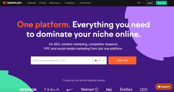
Semrush is used for search engine optimization (SEO) tracking and helps you track keyword performance in your content as well as monitor brand mentions cross-platform.
Additionally, the tool tracks Google rankings and which of your web pages receive the most traffic. This is helpful because discovering what drives visitors to your site allows you to adjust the content you’re presenting accordingly.
Price
Semrush offers three plans that range in price from $119 to $449 per month.
8. Quintly
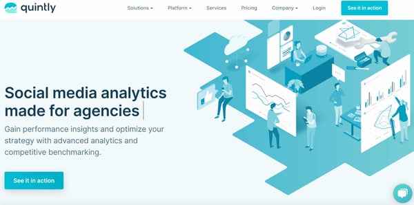
Quintly provides you with the insight necessary to analyze your content marketing campaigns. It also helps you make smarter decisions when it comes to social planning by equipping you with customizable metrics so you can better understand how your marketing strategy is working.
Quintly does a deep dive into all of your accounts to uncover metrics that matter to your teams and goals, and you can sort and share reports by team so everyone gets the information they need. Reports can also be automated and measured by impact using Quintly’s machine learning system. Users can access the API, integrate with popular software like Google Search, and overcome data silos.
Price
Quintly’s custom plans start at $300 per month.
9. BuzzSumo
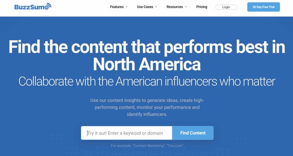
View and analyze marketing trends in real-time with BuzzSumo by topic so you’re able to create content that’s likely to be relevant to your audience. Trends can also be filtered by location — this way, you’ll have an understanding of what’s popular by region.
BuzzSumo lets you customize your feed so you can get the data that matters most to you. Identify relevant keywords to include in your campaigns, access examples of content proven to be successful on BuzzSumo’s site, and use the data you obtain through the tool to discover how you can drive the most traffic to your marketing content.
Price
BuzzSumo offers four plans that range in price from $99 to $499+ per month.
10. Kissmetrics
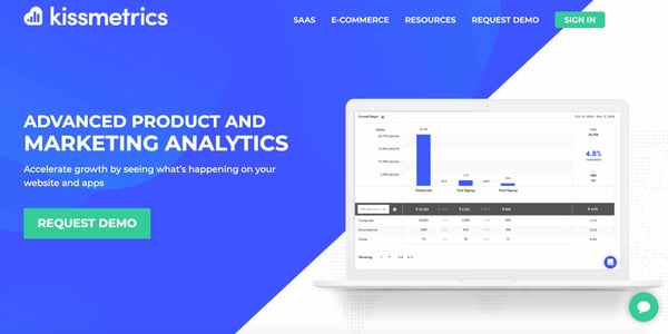
Kissmetrics allows you to spot a customer’s journey across multiple devices, analyze their behavior on your website, and review conversion metrics (e.g. bounce rate and time on-site).
Kissmetrics focuses on behavioral analytics which is helpful if you want to learn about how customers react to and interact with your content. This will also provide insight into what’s most valuable to users and how to keep visitors coming back.
Price
Request a Kissmetrics demo or check out the payment plans for their two main products, one of which is meant for SaaS and one for ecommerce. The SaaS plan comes with three payment options — those plans are $299, $499, or a custom price (based on your custom plan). Ecommerce also has three plans that cost $299, $499, or a custom price (based on your custom plan).
11. Databox
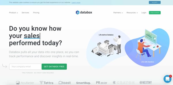
Databox is a business analytics and KPI dashboard platform that offers insight into the state of your business. The tool organizes all of your business data — from any source — into a single location for accessible performance tracking.
Over 70 available integrations make the process of bringing your data into the tool — as well as displaying, analyzing, and sharing it — simple. There are a number of metrics to choose from as well as custom views that you can apply to your data to display it in a way that works for your team.
The Goal Tracking feature allows you to track progress towards your targets by assigning and focusing on SMART goals within the tool. Scorecards are a feature that notifies you (daily, weekly or monthly) of any updates to your KPIs. There are also other alerts you can receive the moment your data is looking off so you can efficiently resolve the issue before it gets worse.
Price
Databox offers a regular version of their product and an Agency edition. The regular version costs anywhere from free to $248 per month. As for the Agency version of Databox, there’s a free plan but if you need more flexibility, contact a rep for billing details.
12. Supermetrics
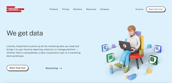
Supermetrics is a business analytics tool that you can use to pull marketing data (e.g. SEO, PPC, social media, and web analytics data) from any source and move it into Google Sheets, Google Data Studio, Microsoft Excel, Google BigQuery, or Snowflake. Use Supermetrics as a reporting, analytics, and data storage tool.
Bring your favorite metrics and dimensions into Supermetrics. Then, organize and filter your data within Supermetrics to analyze the success of your efforts and identify areas for improvement.
Price
Supermetrics offers multiple plans for all seven of their products, some of which require you to contact a rep and some of which list pricing on their unique web page.
13. Demand Sage
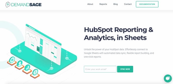
Demand Sage is a tool used to bring all of your HubSpot datainto Google Sheets. There are one-click, customizable reports to help you understand your marketing and sales success and which areas to focus your efforts. Demand Sage offers one-click data sync and one-click, flexible reports.
Within your spreadsheet, create granular, record-level reports and use the table builder to display your data with any view you’d like. Additionally, attribution and revenue reporting connects marketing and sales data in your reports for greater internal alignment and insight into how your pipeline is working as well as what’s driving revenue.
Price
Demand Sage is free.
14. Grow.com
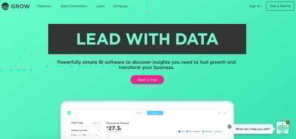
Grow.com is a business intelligence platform that allows you to import and transform your business’s data from a number of sources and create dashboards with the metrics that matter to you.
Once your data is imported into the platform, it keeps your most relevant data at your fingertips. Build custom metrics, bring disparate data sources together, and select from a number of chart types to visualize your data however you want to. You can also easily share metrics and dashboards with team members to ensure everyone knows where to focus their efforts.
Price
Get a free Grow.com demo and talk to a rep about the price of the right plan for your business.
15. Plecto
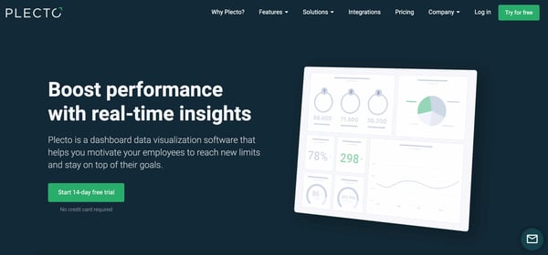
Plecto is a dashboard data visualization platform ideal for discovering real-time insights from an unlimited number of sources you pull your data from. Filter across the sources you integrate with Plecto and display data on your dashboards with different variables as needed.
Display data with pre-built KPI dashboards in Plecto or customize your own. There are also gamification features to increase employee engagement and motivation as well as keep team members focused on their goals.
Price
Plecto offers three payment options depending on which plan you choose ranging from $200 per month, $350 per month, or a custom price (based on your Enterprise plan).
16. Adverity
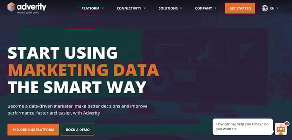
Adverity is an intelligent marketing data analytics platform ideal for data-driven marketing. The tool automates data integration from hundreds of different sources to give you a single view of marketing performance.
Adverity makes it easy to remove any data silos you may have and provide easy access to centrally-located marketing data so your team members can identify and analyze the information they need. Adverity comes with augmented analytics, meaning it uses AI to identify trends, areas for improvement, strengths, and new insights in your data. It also automates the process of creating marketing reports and data visualizations to save you time.
Contact Adverity to get a custom quote on the right plan for your business.
Editor’s note: This post was originally published in June 2020 and has been updated for comprehensiveness.


‘Exploding Kittens’ creator launches new iOS game combining Scrabble and Clash Royale

Matthew Inman – the developer behind the hit game “Exploding Kittens” – has launched an all-new free game today that’s a mix between Scrabble and Clash Royale. “Kitty Letter” looks like a super fun new twist on the genre of word games, check out all the details below.
The post ‘Exploding Kittens’ creator launches new iOS game combining Scrabble and Clash Royale appeared first on 9to5Mac.
Is CTR Dead? Why Email Marketers Are Tracking CTOR Instead
Ever since email marketing became a legitimate marketing channel in the 1990s, email marketers have largely measured their performance against two metrics: open rate and clickthrough rate.
The open rate measures the percentage of recipients who opened your email, which helps you gauge the performance of your subject line and preview. Your clickthrough rate (CTR) measures the percentage of recipients who clicked on the links in your email against the total number of subscribers who received the email.

This means that a low open rate can dilute your clickthrough rate, even if a large percentage of the recipients who opened your email clicked through to your website. With this in mind, your clickthrough rate may not be the best indicator of engagement.
So, how do you accurately measure your email campaigns’ true levels of engagement? Cue the click-to-open rate, or CTOR.
At HubSpot, our email marketing team measures their campaigns’ engagement against CTOR because it’s a clear indicator of resonance.
“CTOR helps us understand and measure how our email message and CTAs are resonating and performing with our audience,” says Ari Echt-Wilson, a Conversational Marketing Manager at HubSpot and former Experiment Head of HubSpot’s Global Messaging Team. “Since the only people who see the message are the ones that open the email, it makes sense for us to measure clicks based on those who opened the email.”
How To Calculate the CTOR
To calculate the click-to-open rate, the formula is simple: You start by dividing the number of unique clicks by the number of unique opens. Then, you multiply that number by 100. The answer is your CTOR.
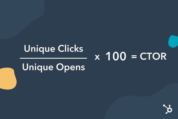
Let’s use an example: You send an email to 1,000 subscribers. Twenty subscribers open the email and there are a total of 15 clicks. Here’s how you find the CTOR: (15/20) x 100 = 75%. This would mean that your CTOR is very high, with the majority of subscribers who opened the email clicking on the links.
When using this formula, it’s important to only count unique opens and clicks. For instance, if one of your subscribers opens your email in the morning and clicks on a link. Then, later that night, they go back to the email and click on it again. You wouldn’t want that subscriber to be counted twice, as that would muddle the data. That’s why the CTOR must only account for unique opens and clicks.
Now that you know how to calculate the CTOR, you may want to set benchmarks for your own emails. A 2020 Campaign Monitor report found that the average click-to-open rate across all industries is 14.3%. Brands in real estate, design, and construction industries see the highest CTOR averages at 17.7%. The same report shows that food and beverage brands experience the lowest CTOR at 8.9%.
Use these numbers as benchmarks for your own campaigns.
CTR vs. CTOR: Which one is better?
According to Echt-Wilson, CTOR is arguably the best metric for measuring an email campaign’s resonance. But this rate can reveal even more insights about your email marketing, helping your team understand how to improve your campaigns.
“If an email is never opened, then it’s hard to grasp how we can move the needle in terms of engagement,” says Tova Miller, a Senior Marketing Manager and former Demand Generation Marketing Manager at HubSpot.
Clickthrough rate is still a valuable metric to track though, especially when you need a holistic view of your email’s performance.
“I look at clickthrough rate to get a high-level understanding of how my email performed overall,” says Jordan Pritikin, the Email and Growth Marketing Manager at HubSpot. “Since CTR accounts for deliverability, subject line performance, and how your email’s content performed, it’s a good metric to look at when I need a quick glance at how my email performed overall.”
How to Improve Your CTOR
Whether you’ve been tracking your CTOR for a while or plan to start, there will always be room for improvement. Here are a few steps to take to enhance your CTOR:
1. Use CTA buttons.
A great email has a few elements: engaging copy, enticing images, and compelling calls-to-action. And in an email full of text, button CTAs are great attention-catchers.
You can use text-based CTAs, like “Click here for more information.” However, some data reports suggest that buttons can lead to higher clickthrough rates. In one A/B test, Campaign Monitor saw a 28% increase in conversions by using a button instead of a text link.
Here are a few tips to keep in mind when using buttons:
- Keep the prompt short: one to three words.
- Use action-based verbs, like “learn,” “discover,” “find,” and “start.”
- Place your CTA after presenting the offer, not before.
Lastly, your CTA button should be prominent enough to stand out, but not so big that it hinders the overall user experience. If you’re not sure, do a squint test to make sure it’s just right.
2. Re-evaluate your offers.
One of the reasons why your click-to-open rate may be low is because your offers don’t align with your audience’s interests. You may find that subscribers are opening up your email but as they scroll, none of the links appeal to them.
There are a few ways to address this:
- Segment your email list – This will ensure you deliver emails that your subscribers are actually interested in. Your leads shouldn’t be receiving the same emails as your customers. They’re in different stages of the funnel and may have different motivations.
- Send a survey – If you’re not sure what offers your audience want to see, who better to ask than the source itself? You can also include link triggers in the email survey that can segment subscribers based on their answers.
3. Stick to one CTA.
There are a few tactics you can use when it comes to email CTAs. Some brands prefer to employ multiple CTAs in their emails, leaving it up to subscribers to click on the one they find most interesting. You’ll see this often in emails for retail offers. The idea is that more CTAs equals more opportunities to increase CTR.
One drawback of this approach is choice overload. It happens when consumers have difficulty making a decision because they are faced with too many options.
With this in mind, consider testing a single CTA. If there’s only one desired action, you may increase your CTOR by using this focused method.
However, keep in mind that this approach may not be appropriate for all campaigns. Experiment, A/B test, and adjust as needed.
Email Marketing Is Always Adapting
Email marketing might be one of the most established marketing channels in the digital era, but it’s always adapting. Clickthrough rate reigned as the superior engagement metric for most of email marketing’s history, but the click-to-open rate is proving to be a lot more revealing and insightful than its predecessor.

9to5Mac Happy Hour 316: iOS 14.5 Maps, Apple Glasses rumors, first TV+ AR app

This week Zac and Benjamin discuss Apple’s updated offer on the Developer Transition Kit, the stalled state of Apple Car talks, new features coming in iOS 14.5, Dan Riccio’s not so secret project at Apple, Apple’s first AR app for Apple TV+ shows, and more.
Sponsored by TextExpander: Visit textexpander.com/podcast and select 9to5Mac Happy Hour to save 20% off your first year!
Sponsored by LinkedIn Jobs: Go to LinkedIn.com/HAPPYHOUR and get $50 OFF toward your first job post!
Sponsored by ExpressVPN: Take back your Internet privacy today and get 3 months free with a 1-year package at ExpressVPN.com/HappyHour.
The post 9to5Mac Happy Hour 316: iOS 14.5 Maps, Apple Glasses rumors, first TV+ AR app appeared first on 9to5Mac.
How to use the ultra wide camera on iPhone 11 and 12

One of the great additions with the iPhone 11 and 12 lineups is an ultra wide camera that allows users to capture a much greater field of view without needing an external lens. Read on for how to use the ultra wide camera on the iPhone 11 and 12, including how to manually dial in your focal length.
The post How to use the ultra wide camera on iPhone 11 and 12 appeared first on 9to5Mac.
Microsoft To Do levels up with new home screen widgets for iPhone and iPad
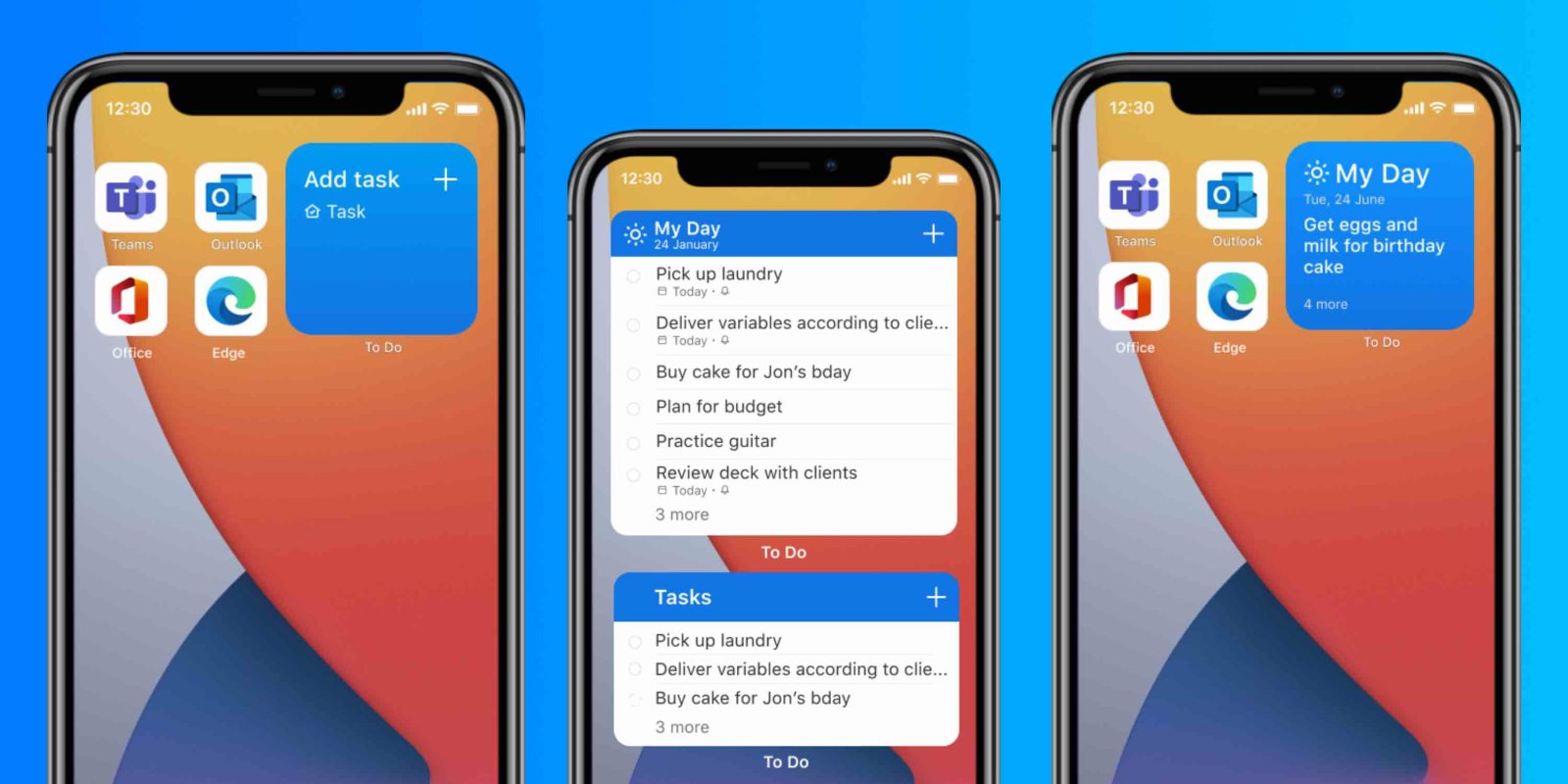
Microsoft has released an update today to its To Do app for iPhone and iPad. The big focus of the new build is the three new widgets that make it easier to manage your schedule and To Do list.
The post Microsoft To Do levels up with new home screen widgets for iPhone and iPad appeared first on 9to5Mac.
How HubSpot’s Customers Are Shaping the Next Normal
This week marked an important milestone for HubSpot. The company Dharmesh and I founded over 14 years ago welcomed its 100,000th customer and passed $1 billion in annual recurring revenue.
We’ve come a long way since we began banging the drum about inbound marketing, and yet, it feels like HubSpot is just getting started.
In many ways, it feels like the whole world is just getting started … or re-started.
The events of the past year have transformed entire industries, upended the way we work, and re-shaped human behavior en masse. The technologies we embraced and new habits we formed during the pandemic will not retreat when the coronavirus eventually does. Rather, they will come to define “the next normal.”
This represents one of the most profound outcomes of these times: that never before have companies, and the products and services they provide, had a greater capacity to influence human behavior.
When gyms re-open, people will still workout from home, facilitated by fitness apps. When offices re-open, people will still work from home, facilitated by work productivity and communications tools. When theatres re-open, people will still watch live concerts and new movies from home, facilitated by streaming services.
Without these products and services, many of which have gone from being novel to necessary in the past year, life during the pandemic would look very different. And it would be much more likely to snap back to the way it was in 2019.
Instead, we’ve witnessed countless companies urgently pivoting their plans to meet new customer needs. They’ve innovated, they’ve adapted, and they’ve re-shaped their products.
I’ve been inspired to see many of HubSpot’s 100,000 customers adapt and innovate in the face of uncertainty, and in doing so, play an instrumental role in defining the new ways in which we live, travel, work, and build a better future.
Mindfulness for the Masses
Take mindfulness apps, for example. One unequivocally positive outcome of these turbulent times has been the increased importance we all place on our mental wellness. Over the past year, HubSpot customers like Calm, Talkspace, and Headspace have gone from being helpful tools for people looking to practice mindfulness to vital services that millions of people use in their daily lives.
When Headspace was founded in 2010 — at a time when meditation was still largely the preserve of religious and spiritual organizations — the key question its founders asked was: “How do we put Headspace in places you wouldn’t expect to find it?” Now, 10 years later, it is a multi-media organization with a podcast division, a partnership with Sesame Street, and a recently announced Netflix series.
This progress would not have been possible without the level of scale the company has been able to achieve in the past 12 months. On the eve of the pandemic in February 2020, the app reached two million paid subscribers, and since then, its rate of downloads has increased by 20%. And when you look at data from the first few weeks of U.S. lockdowns, downloads increased by 100% against pre-pandemic levels.
Headspace was growing steadily prior to the pandemic, but when society was plunged into a period of unprecedented uncertainty, the need for its services surged. Thanks to a deep-rooted passion to serve its customers, the company was able to scale through 2020 and usher in a new era in which mindfulness is practiced by the masses.
New Tools for a New Way of Working
As the intertwined relationship between work and location continues to unravel, online productivity tools have gone from being a useful supplement to traditional workstyles to an indispensable part of the remote worker’s toolkit.
Numerous HubSpot customers have played a vital role in facilitating this shift: Trello has helped parents to manage their kids’ homeschooling schedules, SurveyMonkey has supported nearly a quarter of a million surveys about the coronavirus, and G2 has helped companies find new software solutions, seeing a 1,100% increase in searches for virtual classroom tools and a 550% increase in searches for webinar software in the weeks following the coronavirus outbreak.
Another HubSpot customer, Monday.com, had been growing rapidly in the years prior to the pandemic, announcing $120m in annual recurring revenue in February 2020 as its software helped thousands of scaling companies to collaborate more effectively. And then, as the ability to collaborate remotely became a critical need for all companies, the company changed its product roadmap to meet the sudden change in customer needs.
Among the new releases it prioritized were embedded Zoom calls, online whiteboards, and image annotations — all of which could add immediate value to customers. The impact of these changes was significant. Not only did Monday.com accelerate its hiring, increasing its headcount by 27% between April and June 2020, it also announced a new valuation of $2.7bn. Monday.com was even singled out for praise by Fast Company for its remarkably smooth transition to remote work.
The way we work has changed forever, and the impact of this change is still reverberating across multiple industries, affecting commercial real estate prices, triggering mass migrations, and reducing carbon footprints as commute times plummet.
At the heart of these major societal changes are companies like Monday.com, which initially sought to help scaling companies collaborate more effectively, and now finds itself providing an essential tool that is accelerating a once-in-a-generation shift in human behavior.
Destination: Anywhere
While the pandemic has forced entire populations to stay in one place, it has also dramatically changed the ways in which we move in the world. One HubSpot customer at the forefront of this shift is Airstream.
For decades, Airstream has been building its much-loved state-of-the-art travel trailers, and in doing so, has become one of the most iconic brands in the United States. As the pandemic unfolded, the company was quick to produce new, relevant resources about everything from how to exercise in small spaces, to how to learn and work remotely. As Airstream CEO Bob Wheeler put it, “these virtual products looked very different than the vehicles we’re used to producing.” But it was through this innovative adaptation to the new habits and interests of its customers that Airstream achieved a 45% year-on-year increase in sales in May, and a 100% increase in June.
The pandemic has made work less location-dependent and leisure less time-dependent. It is now possible for many to travel while working and adventure without taking large amounts of time off work. By recognizing this new dynamic and quickly adjusting its strategy, Airstream has gone from providing a means of travel between destinations to providing the destination itself.
Even after the pandemic has been brought under control, ongoing economic uncertainty and fears of a resurgent virus are likely to result in a continued reluctance to travel internationally. As a result, staycationing and domestic location-hopping are set to remain popular choices for years to come. By re-positioning its value proposition to suit the new habits of its customers, Airstream has further accelerated the shifts triggered by the pandemic, while also continuing to scale as a global business.
Scaling Better for Society
As the pandemic sent people indoors, racial injustice brought many out onto the streets to protest long-standing inequality in our society. Over the past year, customers have increasingly come to expect the companies they spend money with to be a force for good in the world.
Lemonade, the insurance provider and HubSpot customer, is an example of how companies can have the type of positive societal impact that now customers demand, while also scaling rapidly in the process.
Lemonade is a certified B-corp that gives all of its unclaimed premiums to non-profit organizations chosen by its customers. As the company’s website says, “Social good is baked into the core of our business model.”
When the pandemic hit, Lemonade allowed customers experiencing financial hardship to defer payments (and even in more normal times, it allows customers to cancel their policy at any time and receive a full refund). It also gave its customers the opportunity to switch their non-profit-of-choice to an organization directly involved in fighting the coronavirus outbreak — and tens of thousands of them took them up on the offer. And late last year, the company’s CEO, Daniel Schreiber, called on companies to encourage their employees to get vaccinated.
While using its influence to help in the fight against the coronavirus, Lemonade also showed its support for artists facing financial hardship during the pandemic by launching an Instagram campaign to highlight works of art it commissioned.
The insurance industry has not been immune to the downward economic pressures triggered by the pandemic, and yet, Lemonade was one of 2020’s most impressive growth stories. In December, after just four-and-a-half years in business, the company announced that it had passed 1 million clients. And just a few weeks after that, its stock hit an all-time high. The company achieved this level of scale while also racking up $1.1million to donate to nonprofits, including ACLU, March For Our Lives, and 350.org.
According to Edelman’s 2021 trust barometer, business is now the most trusted institution when compared to government, media, and NGOs. As Lemonade scales its business while simultaneously having a positive impact on the world, it represents the newly defined role companies are expected to play in society — where they are both for profit and for good.
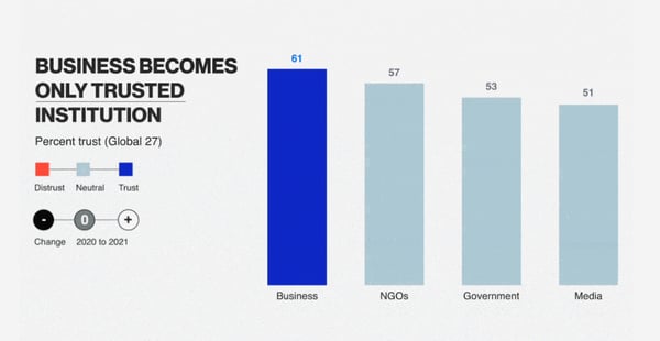
This new expectation of companies and their CEOs creates a responsibility and an opportunity for businesses to play an active role in building a better future for all in the next normal.
Preparing for the Next Normal
I’ve witnessed more change in the past 12 months than I did in the previous 12 years. But now, on the occasion of HubSpot welcoming its 100,000th customer and passing $1 billion, I’m not looking back as much as I’m looking forward.
The next normal won’t look anything like 2019, and it won’t look very similar to 2020 either. It will be an era unique in the trends it ushers in and the opportunities it presents. At HubSpot, it will be our job to help our future and existing customers take advantage of those opportunities, while also continuing to support the likes of Headspace, Monday.com, Airstream, and Lemonade as they scale and shape the behaviors that will define the next normal.
We plan on doing that first and foremost by listening to our customers, and by then using their feedback to provide a world-class CRM platform as unique as the times in which we live and capable of empowering scaling companies to thrive for years to come.
I want to thank every customer, partner, and employee for helping us get to where we are today. Without their passion, advocacy, trust, and feedback, the past 15 years would not have been as exciting, and the next 15 would not look as promising.
Our mission is to help millions of organizations grow better. This week, we reached an important milestone on that journey. But, just as the next normal is getting started, so too is HubSpot.

Apple invites select developers to new round of ‘Bring Your iPad App to Mac’ virtual workshops
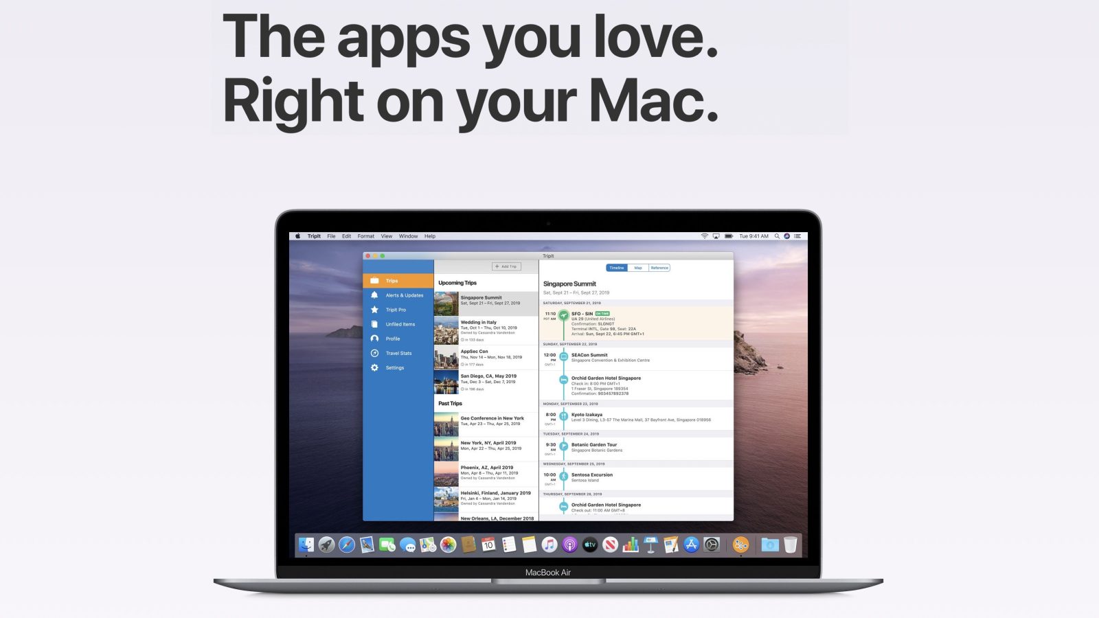
Apple is sending a new round of invitations to developers for online sessions focused on bringing iPad apps to the Mac. The email invites developers to sign up for the “Bring Your iPad App to Mac” online workshops throughout the rest of February and the first half of March.
The post Apple invites select developers to new round of ‘Bring Your iPad App to Mac’ virtual workshops appeared first on 9to5Mac.
Apple files M1 Macs in Bluetooth database, mysterious ‘B2002’ still listed

Apple has filed its latest M1 Macs in the Bluetooth SIG database this week. This includes the MacBook Air, Mac mini, and MacBook Pro — but a mysterious “B2002” device remains in the database, and it’s unclear what it could be.
The post Apple files M1 Macs in Bluetooth database, mysterious ‘B2002’ still listed appeared first on 9to5Mac.
Deals: Official iPhone 11/Pro/Max cases starting at $16, latest iPad Air $59 off, more

Update: AirPods Pro has hit lowest price of the year at $180 on Amazon
Today’s best deals are headlined by a collection of Apple’s official iPhone 11/Pro/Max cases from $16. That’s alongside Apple’s latest iPad Air at $59 off and Logitech’s solar-powered Mac Keyboard for $44. Hit the jump for all that and more in the latest 9to5Toys Lunch Break.
The post Deals: Official iPhone 11/Pro/Max cases starting at $16, latest iPad Air $59 off, more appeared first on 9to5Mac.
Intel, Qualcomm, more urge President Biden for major investment in US chip production [U]

US chipmakers sent a letter to President Biden this morning with an urgent request to make a serious investment for semiconductor manufacturing a part of his economic recovery plan. Intel and Qualcomm along with others made the case for the government to incentivize chip production in the US.
The post Intel, Qualcomm, more urge President Biden for major investment in US chip production [U] appeared first on 9to5Mac.