
Welcome to My Blog
A Comprehensive Guide to LinkedIn Sponsored Updates
When it comes to growing your brand and boosting your revenue, social media matters.
Here’s why: More than three billion people worldwide now have social media accounts, and 54% of those users leverage social media to research products.
The biggest challenge? Finding the right platform for your social media posts where you can connect with your ideal audience.
While many businesses leverage sites like Facebook, Instagram, and Twitter to promote their content and increase conversion rates, there’s also a case to be made for more business-focused frameworks like LinkedIn.
In this comprehensive guide to LinkedIn sponsored updates we’ll tackle the big questions — what are LinkedIn sponsored updates, how do they work and how much do they cost?
We’ll also offer a list of sponsored updates best practices to help your brand make the most of this social content solution.
What are LinkedIn Sponsored Updates?
Let’s start at the beginning: What exactly are LinkedIn sponsored updates?
Also called sponsored content, the official LinkedIn help page says a sponsored update is, “a LinkedIn Page update that is sponsored as an advertisement and is delivered to the LinkedIn feed of members beyond those who follow your company.”
In practice, LinkedIn sponsored updates are advertisements created by your company or marketing team which are then served to LinkedIn users who either follow your page or follow pages in a similar content space.
These ads are served as part of the native LinkedIn feed and typically include a combination of relevant text and contextual images or videos, in turn helping them blend in with similar user content rather than stand out as paid-for advertisements.
When designed and deployed well, LinkedIn sponsored updates can help drive organic interest in your brand from both current followers and a wider audience of LinkedIn members. Worth noting? While these posts are designed to follow the format of familiar user updates, they’re always labeled as “sponsored content” to ensure there’s no misleading users or confusion.
What Types of Sponsored Updates are Available?
Brands can create four types of direct sponsored updates:
Single Image Ads
Single image ads include one image and text that are displayed directly in targeted member LinkedIn feeds.
Carousel Image Ads
Carousel ads contain multiple images in succession that users can scroll through to get a better sense of your products or services.
Video Ads
Video ads offer a way to include multimedia marketing with in-feed videos that users can watch on-demand.
Single Job Ads
If you’re looking to expand your team, you can create single job ads for your targeted audience. They must promote a single job opportunity and be linked to an active job post on LinkedIn.
You can also create what’s known as “direct sponsored content”. These ads won’t display on your LinkedIn Page or Showcase Page before being served as advertisements.
As a result, they’re often used by companies to test several marketing approaches and see which one produces the best results and use it as the basis for more robust sponsored content updates.
How much do LinkedIn sponsored updates cost?
The short answer is that more resource-intensive ads — such as videos or carousels — will cost more than their single-image counterparts.
The long answer is slightly more complicated. First, it’s important to understand that LinkedIn uses a bidding model for sponsored ads; you select and create your ad type and then specify how much you’re willing to pay — a minimum price exists to ensure advertisers are fairly paid, but you’ll never be charged more than your maximum upper limit. Differing ad providers then bid on the service and the lowest price wins.
Ad price is also determined by your target audience and relevance score. If your target audience is in high demand, you’ll be charged more because there’s greater competition to capture user interest. You can also lower your ad costs by creating relevant ads. The more relevant and content-rich your ad, the less you’ll pay — because there’s a better chance of engaging LinkedIn users.
It’s also worth considering the best cost model for your ad: Cost-per-click (CPC) or cost-per-impression (CPM). CPC means you only pay when users click on your ad and visit your site, while CPM means you pay for every 1,000 views or “impressions” of your ad.
If your goal is generating brand awareness, opt for CPM. If you have an established audience and are looking to drive click-throughs and conversions, choose CPC.
LinkedIn Sponsored Updates Best Practices
Want to get the most from your LinkedIn sponsored updates? Keep these best practices in mind:
1. Follow LinkedIn sponsored update specs.
Each type of sponsored content comes with its own specifications.
Single image ads: Up to 255 characters for the ad name, 150 characters of intro text to avoid truncation, URLs with “http://” or “https://” and JPG, GIF or PNG files that are 5MB or smaller.
Carousel ads: Use a minimum of two cards and a maximum of ten. Each card has a maximum file size of 10MB and dimensions of 6012 x 6012px. Supported formats include JPG, PNG and non-animated GIFs.
Video ads: Video ads must be three to 30 seconds in length, between 75KB and 200MB and in MP4 format. They must also be less than 30 frames per second (FPS).
Single job ads: Single job ads should be concise, relevant, and clear and follow the same image guidelines as single image ads. They must also link to an active job posting on LinkedIn.
Failure to follow these guidelines may result in ads being rejected. If ads contain misleading or inappropriate content, LinkedIn may choose to remove the ads or terminate your LinkedIn account.
The service also makes it clear that “spam” posts are not permitted: According to their Best Practices for Sponsored Content page, “Businesses that post updates excessively are subject to review by LinkedIn and could risk having their LinkedIn Page deleted.”
2. Don’t overshare.
While targeted, relevant content can help drive user interest, too many ads too quickly can result in over-saturation.
LinkedIn recommends regularly tweaking your content strategy to deliver analysis rather than simply news, include curated content (with credit) from other sources, and repurpose older content where applicable.
3. Test, test, test.
As noted above, direct sponsored content is a great way to try out new advertising efforts and see what sticks.
With the social media market continually evolving, it’s worth evaluating ad performance every few weeks to see what’s working, what isn’t, and where specific changes can help.
4. Spend wisely.
Sponsored updates can get expensive as you incorporate new advertisements and use multiple ad types.
Here, it’s worth tracking your ad spend and switching from CPC to CPM models once click-through rates start to rise. If ads begin losing steam, consider moving back to CPM to generate increased awareness.
5. Find new markets.
While engaging your target market is critical, diversify ad objectives is also important to expand your overall impact. LinkedIn recommends using tools such as Lead Gen Forms to find better leads, assess ROI and manage your advertisements at scale.
LinkedIn’s sponsored update model offers a streamlined solution to help brands reach their target market, expand brand awareness, and boost ROI. Best bet? Start with direct sponsored content to see what sticks, then choose the cost model that makes the most sense — CPC or CPM — and adjust as needed to reach the largest LinkedIn audience.

How to Successfully Migrate a Website Without Harming SEO [Checklist]
An outdated website won’t represent your brand well.
Web design experts recommend a site redesign every 2-3 years to keep up with web standards and design trends. This can often be accomplished with a simple facelift or re-skin. However, in some cases, you may be up against a site migration.
The end result of a site migration may include a cleaner interface, a new or improved user experience, an easier editing experience, and more. However, the choice to migrate your website should not be taken lightly. If executed poorly, you could end up with status code errors, negatively impacted SEO performance, and even irritated website visitors.
Why might you migrate a website?
Here are the circumstances in which you might need a site migration over a simple redesign:
- You need to move your site’s location from one server to another.
- You are changing the CMS platform your site operates on.
- You are changing your domain name or URLs.
- You need to make major changes to your site’s architecture (not just aesthetics).
Website migrations can be done on your own or professionally. (For example, HubSpot offers migration services to customers switching to HubSpot’s CMS.)
If you’re considering a website migration, keep in mind that you must leave yourself time to prepare and execute. Migration specialists usually take about three weeks, so plan accordingly. Now, let’s get into the details of migrating a website.
Pre-Migration
1. Crawl the existing site.
A website crawler retrieves the URLs and markup on your site, “seeing” this information similarly to how Google would.
Performing a crawl gives you a starting point for your URL mapping (more on that later) as well as a list to refer to in case something gets lost in translation. You can crawl your website yourself with a third-party tool such as Screaming Frog.
2. Record your benchmarks.
In some cases, analytics data can get erased during a site migration, and this historical benchmarks can be valuable, so it’s best to retain it.
You should also take the time to review your analytics and ensure you know how visitors currently navigate the site and which pages are your most valuable. This context can help inform your redesign and site architecture decisions.
3. Map your URLs.
If you’re making major changes to the URLs on your site, you’ll need redirections in place to guide Google and your website users from your old URLs to your new URLs.
- From a usability standpoint, if a page no longer exists, you don’t want your users to get a 404 status code error. Instead, they should be guided to the page that has taken the old page’s place.
- Improper redirects can mean a big hit against your SEO. They tell search engines and visitors of your website that a page has changed, whether it’s been removed, or no longer exists. They also tell search engines what new pages have replaced old ones.
- From an SEO perspective, you don’t want to lose all of the history, backlinks, and (in essence) “authority” that the old page built up. A redirect tells Google where to attribute those signals instead.
To get redirects implemented, you must first strategize by mapping your URLs. This involves building a spreadsheet with two columns: one for the old URL and one for the corresponding new URL.
Don’t be concerned if there aren’t “perfect” replacements for every piece of content. Just do the best you can to direct your users based on their original intent.
If you have tons of pages, manual mapping probably isn’t in the cards for you, so to save time, look for patterns in your URLs that can be redirected in groups or sections.
Existing redirects should be migrated as well. Try to keep as many existing redirects as possible to lessen the workload, and make sure your URLs are mapped before you test redirects, to make sure you have backups if you lose them.
For more information on how to update URLs, check out this article.
4. Make sure you’re retaining titles, meta descriptions, and HTML markup.
Recall that website migrations help with website organization. As such, pages should be uniform and contain the same information as they did before. To illustrate, if the HubSpot Marketing Blog underwent a site migration, the content and descriptions for each blog post would be the same, just look different.
You can always update or rewrite titles, meta descriptions, and HTML markup, but you should still ensure that each page includes the proper information.
5. Try out the new build on a test server (aka sandbox).
Seeing mockups or testing in a local environment will not give you a full picture of the new site’s functionality and implementation. For a seamless transition, take it online for a test drive before the official migration.
6. Choose the right date for the migration.
Hiccups will happen no matter what, but you can minimize them by avoiding peak hours.
Day of Migration
7. Prepare to update your site’s DNS settings.
If you’re moving your site to a new server, part of the process will include “pointing” to the site’s new location. Coordinate with your web/IT team and/or your hosting providers (new and old) to accomplish this.
8. Launch.
Set up your forwarding redirects, unpublish, and implement.
If DNS changes were involved, the site may be down momentarily.
If you’re not switching servers or platforms, the migration should be nearly instantaneous.
9. Crawl the new site.
Once the new site is live, you can do a crawl to see if it has been migrated how you expected it to. One thing you want to look for is proper indexability and crawlability.
10. Identify and resolve missing and duplicate content.
Using the crawl report, see if you find any anomalies, including duplicate content or 404 errors and broken links. In addition, you should click around the new site and look for issues.
11. Check for redirect chains.
Now that your site has been migrated, you have a lot of new redirects on your hands. If redirects already existed, chains may have been created.
Here’s what I mean:
If you were already redirecting A to B, your migration may have added a redirect from B to C.
This creates a chain of redirects: A to B to C.
Redirect chains can slow your site down and impact performance. You can avoid this by breaking the chains, redirecting A to C and B to C.
12. Ensure Google Analytics and Google Search Console are implemented.
To avoid any gaps in data and reporting, these should be up and running the same day.
13. Mark the date in Analytics.
Google Analytics allows you to make “Annotations” of important dates or events. This can help you contextualize the data and measure performance pre-and post-migration (unless you opted for a new Analytics setup).
14. Submit sitemaps.
Once everything is up and running, ensure your XML site map has no errors. Then, you can submit the sitemap in Google Search Console to invite Google to crawl the new implementation.
Post-Migration
15. Monitor performance.
While temporary dips in traffic are common after a migration, you should still be keeping a pulse on your analytics to ensure nothing big was missed that could be affecting performance.
16. Run site audits.
Sometimes, third-party tools can find issues you didn’t know about. SEMrush’s site auditor is excellent in situations like this.
17. Update your platforms.
If you have ads running or other platforms that may be using old URLs, be sure to add fresh links.
18. Have publishers update backlinks.
If your redirects have been implemented correctly, you’ll still get traffic and authority from your backlinks. However, it’s still best practice to use the freshest URLs possible. With that in mind, reach out to the publishers of your highest value links to notify them of the swap.
Website migration can be a lengthy process, but it’s not impossible. With preparation, you can have a migration that’s successful and friendly with your existing SEO efforts.
Editor’s note: This post was originally published in December 2019 and has been updated for comprehensiveness.

How to Get a Google Ads Certification
Google Ads is one of the most effective advertising tools to get more traffic to your website, and generate more leads. In fact, most businesses see an average of 200% ROI on their Google Ad spend.
To create better, more powerful ads on Google, it can be helpful to receive a Google Ads certificate. Additionally, it’s a great resume booster.
If you’re looking to get a Google Ads certificate, you’ve come to the right place. Here, we’ve created a guide that will explain why a Google Ads certification through Google’s Skillshop is helpful, and how you can prepare and get certified.
What is Google Skillshop?
Google Skillshop is the home for all e-learning courses offered by Google product experts. This is where you’ll head to become Google product certified, including in Google Ads, Google Ad Manager, and Analytics Academy.
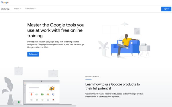
Whether you’re a beginner looking to dive into the world of Google products or an experienced marketing professional ready to up-level your skills, you’ll find what you need in Skillshop.
Increase your knowledge in Google Ads Display, Ads Video, Shopping Ads, or even Google Ads measurement. Not sure why you’d go deeper than a working understanding of Google’s product suite? Let’s talk the “why” of getting certified, below.
Why get a Google Ads certification?
Years ago when I was applying for work, I interviewed a couple dozen people who worked in the digital marketing industry to learn about their jobs and the application process. Many emphasized the importance of getting a Google Ads certification.
The truth is that many employers search for people with this certification on LinkedIn to find employees for their marketing team. LinkedIn generally offers a talent pool of higher-quality than standard job boards like Indeed. Plus, the demand for marketers skilled in Google Ads is high, while the supply of qualifying candidates is relatively low.
Thanks to the internet, it’s easier than ever before to apply for a job with little effort, so employers are swimming in low-quality choices.
To find qualified employees, then, many hiring managers use LinkedIn’s search engine to find anyone with a Google Ads certification because it’s one of the few defining qualifications that can show proven knowledge and skill. The certification shows the hiring manager that you’re somewhat savvy about the industry.
The good news is that a lot of fresh talent don’t have a certification on their LinkedIn profile or resume since they don’t know the value of it. In other words, you can easily stand out if you get certified.
Even if you don’t want a role in PPC, the certification is still helpful for any marketer. PPC advertising, especially through Google Ads, makes up the bulk of online advertising. If you understand the principles of Google Ads, you can translate those principles to other marketing efforts.
Additionally, having an understanding of neighboring areas of marketing helps with your communication among team members, and empathy. Ultimately, having that certification under your tool belt will only make you look better to employers.
How Applicable is the Certification in the Marketing Industry?
To be fair and objective, let’s acknowledge the case against getting certified.
First, in terms of actual skill and practice, a certification isn’t entirely applicable in a real marketing role. It’s possible to score well or even perfectly on this exam without having actual experience with the platform, especially when there are exam answers online.
The exam can, at times, teach you the best answer in theory, which isn’t close to the best answer
in practice.
Having been in the Google Ads platform myself, I know that a few questions are unnecessarily complicated, not applicable, or biased toward a response focused on spending as much money as possible on Google’s platform. Google makes money when you spend money on ads, regardless of whether the ad leads to a sale, so their intentions make sense.
With all that said, most of the questions are still valuable because they help you learn how to navigate the platform and make accurate calculations. You can grow a lot through preparing for this exam even if you initially have little to no knowledge of Google Ads.
You should take the test without cheating, learn from your incorrect answers, and retake it to improve. Otherwise, you may have a tough time with the platform later on, which can seem detailed and intimidating to beginners.
Here’s another huge reason why you should get certified and make sure you learn a lot during the preparation process, rather than speed through it — any decent marketing agency or department that you’d like to work for is going to test you on your understanding of terminology and pay-per-click reasoning during the application process. They’re going to find out whether you really know what you’re talking about.
Therefore, the knowledge that the exams offer does have some real-world value. That doesn’t mean you have to be a total whiz. But you should understand most of the concepts tested.
Treat the Google Ads exam as an opportunity to learn rather than a task to check-off a list. Your mindset shift will make all the difference because you’ll be learning from every question asked, while others rush through the exam just to finish it.
Topics and Exam Duration of the Google Ads Certifications
Google Ads Exam Topics
There are Google Ads certifications for different topics, including video, mobile, display, and shopping advertising. The most important version is the search advertising exam since that’s the area marketers use most often on the platform. The second most applicable Google Ads test for marketers is likely Google Ads display certification.
Google Ads Certification Exam Duration
Each exam has a different time limit, but it’s usually between 60 minutes and two hours. I’ve got a good sense for how long it actually takes since I’ve sat in a classroom with a dozen people taking the exam and have seen how quickly people finish. It usually takes 50–75% of the allotted time. A small percentage of people will use up to all the time if they’re new or focused on learning from each question.
Google Ads Certification Badges
Once you’ve passed the exam, you get a certification badge that you can show off on your LinkedIn profile. Adding this badge to your profile adds credibility and makes your profile more search-engine friendly. As mentioned, recruiters look for this certification and care about it, so you’ll be showing up more often when they search.
Google Ads Certification Training
The training resources that Google offers are a handy starting point. You can learn a lot about the testing format, style of questions, and concepts that’ll show up on the exam.
Additionally, one of the best ways to prepare for the exams is through YouTube tutorials, demonstrations, and tutorial articles. Most people are visual learners, and they will learn better when they see the platform itself with a video, rather than reading about it. That said, some blog posts have great screenshots throughout to help you better understand their tutorial.
It’s important to note — many of the resources online are overkill. It’s easy for beginners to feel overwhelmed by the details. However, try to focus on learning the fundamental principles — like what to tweak to make a big impact on performance.
If a tutorial article is 5,000 words long, then it’s covering every detail of the platform, which is too much for the certification exam.
Additionally, the exams themselves can be training tools. If you don’t pass the first time, you can learn from your incorrect answers and retake it. You can use your first attempt to get familiar with the format and duration. Reflect on why you got a question wrong so that you can remember the right answer for next time.
Some of the questions asked are recycled and randomized with different numbers. You can gain a lot of applicable math skills by learning the principles behind calculations. Unfortunately, many marketers skip learning from the exam itself and miss out on the bulk of where they can grow.
Take the exam with an attitude of learning, rather than completing.
Tips for When You’re Taking the Exam
1. Take notes.
Have printed notes on hand that you can consult quickly whenever you forget minor details here and there (don’t expect to rely on these for the entire exam, though). These notes are useful in case Google decides to implement restrictive browsing limits for exam takers in the future.
2. Plan for plenty of battery.
Make sure your computer is plugged in so it doesn’t run out of battery life while you’re taking the exam. This tip may seem obvious, but you don’t want to find yourself in that painful situation.
3. Pace yourself, while answering.
Take your time with each question. Most people end up with extra time. Remember — it’s a marathon, not a sprint. You’ll be answering multiple-choice questions for at least an hour.
4. Practice self-care, pre-test.
Hydrate. Get enough sleep. Some people overlook simple things, like making sure you have enough water and food before the exam, which can affect brain performance. Foods high in omega-3 are great for brain power.
Ultimately, getting a Google Ads certification is a worthwhile investment for your career growth. Digital marketing employers look for any valid evidence that you’re above entry-level applicants.
5. Don’t rush through without understanding the topics.
While it’s possible to pass the exam without understanding many of the principles, you’ll be doing yourself a disservice in the long run. Treat the exam as a learning process and an opportunity to shore up your knowledge and application of PPC terms and methodology because it’ll help you during the job interview, and in your career.
You don’t have to know everything about Google Ads since real-world experience can help you learn. But the knowledge you gain in preparing for this exam will give you a head start.

11 Stats That Make a Case for Landing Pages
A landing page is a standalone website page dedicated to a specific marketing campaign that is meant to convert site visitors into leads. Landing pages typically offer visitors something that they may be interested in, like an Ebook or a free trial, in exchange for contact information. Getting this information then gives businesses the tools they need to further nurture leads and urge them down the purchasing funnel.
Since landing pages are tailored to customer interests, using them in your marketing strategy can help you convert a significant number of qualified prospects since you can assume that they’re ending up on a landing page because its content interests them.
If you’ve yet to consider using them or you want to update your current landing page strategy, this piece will go over 11 stats that make a case for using landing pages as a means to increase your conversion rates and generate more leads.
11 Stats That Make a Case for Landing Pages
1. The average landing page conversion rate across all industries is 9.7%.
Given that 10% is a benchmark for a good conversion rate, taking the time to create a landing page that carefully considers the interests of your target audience will benefit your business. Whether you sell SaaS or clothing, a higher conversion rate from landing pages means a longer list of leads to nurture into paying customers.
2. Landing pages are the least popular type of sign-up form, but they have the highest conversion rate (23%), and 62.6% of leading landing pages already use them.
Using landing pages to obtain customer contact information for lead nurturing is likely to bring higher conversions. If you decide to use forms, the highest-converting number of fields is 3, with an average conversion rate of 10%. The most popular combinations use email address and name (7%) and email address and birthdate (5.7%).
3. Businesses using optimization software for their landing pages see an average conversion lift of 30%.
While optimization is always an essential factor for generating traffic, using optimization tools to perfect your landing page strategy is valuable for increasing conversions.
4. Addressing buyer fears on landing pages can increase conversion rates by 80%.
Marcus Sheridan, a keynote speaker at Inbound 2019, ran an experiment where he found that addressing customer fears, like email spam or personal date use, on his landing pages increased his form conversion rate. If you’ve found that your landing pages aren’t converting as you’d like them to, consider using Sheridan’s strategy to be upfront with consumers about what will come from completing forms on your landing pages.
5. Personalized CTAs convert 202% better than default versions.
Consumers prefer personalization because it ensures that they aren’t overloaded with irrelevant information that doesn’t pertain to their interests. Given this, using personalized and targeted CTAs in your landing pages will likely increase your conversion rates.
6. 48% of top landing pages ranked in Google Maps and organic search query results
Ensuring that your landing pages are SEO optimized for both regular search and Google Maps results increases the likelihood that they’ll show up in both types of search queries, increasing exposure and the possibility of generating more leads. If you also link landing page CTAs in email ads, you’re ensuring exposure and visibility from three different channels.
7. 65% of top landing pages have their business name in the title tag.
Since customers value transparency, using a recognizable brand name and logo shows them that you’re not running a scam or being deceitful. You’re claiming ownership of the CTAs and personal information you’re asking for. Therefore, Including your business name on your landing page is a simple step you can take that can help you increase conversions.
8. 30% of top landing pages use video content.
If you already use video as a part of your marketing, incorporating it into your landing page strategy can help you increase conversion rates. In fact, relevant embedded video content can increase conversions by 86%, and 80% of video marketers say that video has directly increased sales.
9. 36% of top landing pages have testimonials, 11% have reviews.
You likely already solicit reviews and testimonials from current customers. Repurposing them to use on your landing pages can increase customer trust and higher conversion rates, especially considering that 60% of consumers think that user-generated content (UGC), like reviews, are the most authentic form of content a brand can use.
10. 55% of top landing page submissions on the HubSpot blog came from Ebook offers.
If you have a blog or website that wants to distribute long-form instructional content, offering Ebooks in your landing pages can help increase your business conversion rates.
11. 49% of marketers report that increasing customer acquisition is their primary objective in 2020, and a top priority for marketers was generating leads.
If you fall into either of these categories, landing pages can be a valuable element of your marketing strategy to generate leads and increase customer acquisition.
Landing pages are a valuable piece of your marketing strategy.
Considering the above stats, we can see that marketers who create landing pages that build trust with page visitors, provide valuable information, and use different content types see higher conversion rates.
Whether you already use them and aren’t obtaining the results you desire or you’re new to landing pages in general, using them will likely help you draw in new customers and drive revenue.

How to Create a Stunning Presentation Cover Page [+ Examples]
When you’re focused on creating a meaningful, persuasive presentation, it’s easy to overlook the cover page. But giving that first page of your deck a little more love can actually go a long way towards grabbing your audience’s attention early on and setting the tone for the rest of your presentation.
A stunning presentation cover page can intrigue your audience into wanting to know more and increase engagement with the information you’re presenting. On the other hand, a lackluster slide, or even the lack of one, can dampen audience enthusiasm for your presentation, and maybe even your own.
You’ve put so much work into your presentation — why waste that valuable real estate on the first slide of your deck?
In this post, we’ll cover the basics of creating a presentation cover page that’s informative and attention-grabbing. Let’s dive in.
What’s included in a presentation cover page?
A good presentation cover page accomplishes three simple things:
- It introduces the topic with a straightforward title.
- It introduces you (and your organization, if applicable)
- It sets the tone of your presentation.
Title
We probably don’t need to tell you this one, but your presentation cover page should be centered around a title. And ideally, a title that’s straightforward, descriptive, and simple. If you’re finding it hard to keep your title short, add a subtitle (in smaller print) to clarify what you’ll be speaking about.
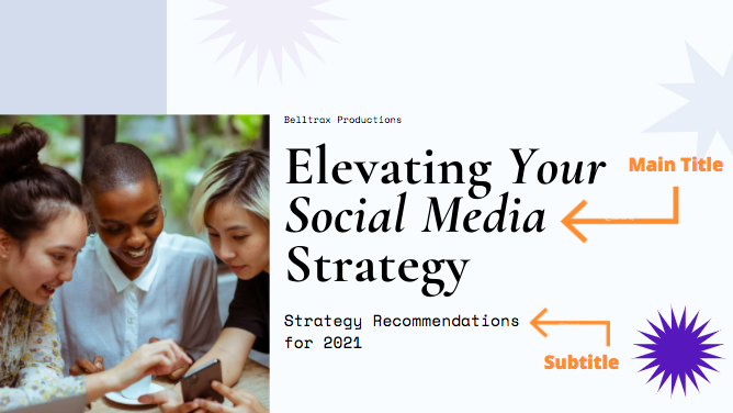
Speaker
Next, identify the person (or group) who will be giving the presentation. In some cases, this will be as simple as including your own name, and in others, you’ll want to include your company name, logo, department, or other identifying information. As a general guideline, you’ll need less identifying information if you’re giving an internal presentation.
If your audience is mainly folks outside of your company (or there are plans to distribute your deck externally) you’ll typically want to include more information to identify your company clearly.
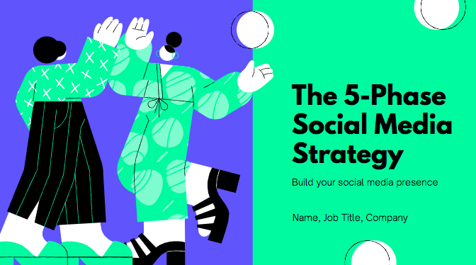
Tone
A successful cover page sets the “tone” of your deck — but what does that really mean? The colors, imagery, fonts, and placements of different elements on your cover page all create a specific visual style that the rest of your deck should follow.
A well-designed page conveys a sense of professionalism and preparedness that a simple monochrome text slide simply cannot. Even if you’re not a design expert, you need to pay attention to the aesthetics of your cover page. Fortunately, it’s easier than ever to find free, professional-looking presentation templates without needing a degree in graphic design. Whatever you choose, it’s important to remain relevant to your presentation (and, if applicable, your company’s branding).
We’ll explore a few examples of cover pages below so you can see how different elements converge to set the tone for a variety of different presentations.
Presentation Cover Page Examples
Below, we’ve compiled a number of presentation cover pages that succeed in different areas. Remember: there’s no single perfect format for a presentation cover page, but hopefully, you get some inspiration from this list.
Setting An Emotional Tone
The right presentation page can set an emotional tone as well as a visual one. This presentation cover page for a nonprofit conveys a mission-driven approach to protecting nature, with a well-selected, relevant image, and a call-to-action directly in the subtitle. (Photo by Andy Køgl on Unsplash)

Focusing on a Photo
You don’t need to overcomplicate the format of your cover page, especially if you have a great photo to use as a full background image. A simple stock photo here provides a clean backdrop for this presentation on remote work. Just make sure your title text is legible over any background photo you decide to use. (Photo by Corinne Kutz on Unsplash)

Leading With Your Brand
Even if you’re the central speaker for a presentation, it might make more sense to highlight your team or brand on your cover page, instead of including your own personal information (you can always include your own contact info at the end of your deck for follow-up questions). Context (if you’re speaking at a particular event or annual meeting) can be important to highlight as well on your cover page.
Go Minimal
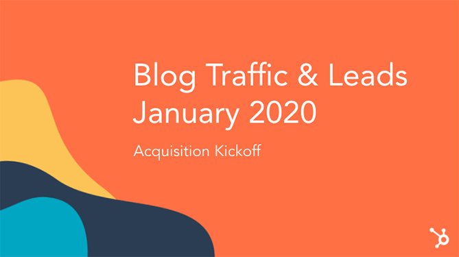
There’s a big difference between a cover slide you didn’t put much thought into and a slide that makes good use of whitespace and leans on strong copy. Sometimes, the best way to lead an audience into your presentation is to create space for a little mystery.
If you’re giving a more casual presentation or a pitch that doesn’t need to follow a particular format, consider going the minimal route and opening with a simple cover page slide that asks your audience a question (one that you of course plan to answer).

Set a Purpose
Many presentations include an agenda slide directly after your cover slide, but that doesn’t mean you can use your cover slide to set a clear purpose upfront. Consider using your subtitle to explain a more robust (but still simple!) description of what you’ll cover.
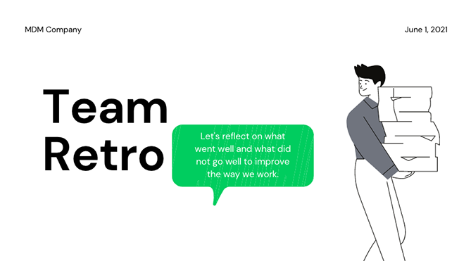
Presentation Cover Page Templates
Instead of creating your presentation cover page from scratch, using a template can take much of the work out of the process. Check out these websites for templates that you can use for your presentation or for inspiration to create your own designs.
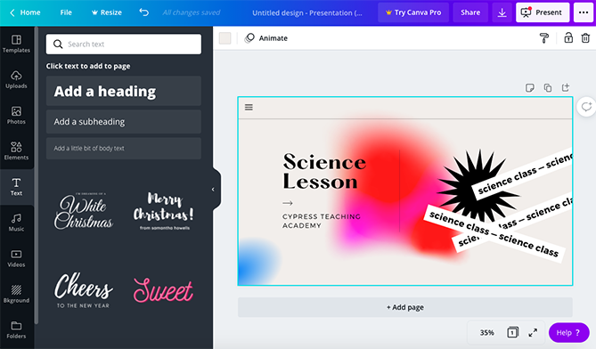
Canva
A tried-and-true favorite of many marketing teams, Canva offers up a wide selection of modern, drag-and-drop presentation templates with truly unique cover pages. If you’re on the hunt for a cover page that looks like you hired a graphic designer to create it just for you, Canva is a good place to start your search. Canva offers both free and paid options.
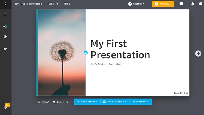
Beautiful.ai
Beautiful.ai has an intuitive, highly-customizable presentation builder that allows you to import your own visual elements directly from your computer or a Dropbox folder. Like Canva, they offer a number of free and paid template options (with great cover pages). Their biggest differentiating feature is their (frankly, very cool) adaptive AI technology, which intuits how you’re trying to design a slide and makes changes automatically to suit the direction of your project.
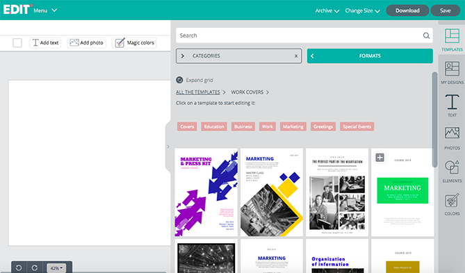
EDIT
For a completely free option with cover page starter template to suit a wide range of different projects across different formats, check out EDIT. Their online tool is specifically designed to create cover pages in a simple, easy-to-use interface.
Visme
Another highly-customizable template source is Visme, which gives users the ability to select a starting template from their (expansive) library and customize elements in a simple web editor.

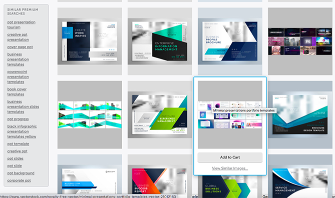
VectorStock®
VectorStock® has a massive selection of PowerPoint presentation cover page templates for purchase if you’re looking for something that’s ready to plug and go without the need for customization (beyond adding your own name and title, of course).
First Impressions Matter
For better or worse, audiences will judge a presentation by its cover page. Because of this, it’s vital that you give your cover page the care and attention that it deserves. Ultimately, a cover page isn’t simply a placeholder, it’s a vital component that can drum up interest for your presentation. The best part is that with the tools available online, you don’t have to be an artist to create a stunning presentation cover page.
The featured image on this post was created using a Canva template.

How to Easily Create a SlideShare Presentation
You know how hot visual content is, and you want to jump on board to enjoy the engagement, traffic, and leads that follow. But maybe you’re not keen on writing a blog post, and you don’t have the production resources to create videos. What to do? Create a SlideShare presentation.
I know, I know. You may have felt personally victimized by PowerPoint sometime in your career. When you open it up, you’re hit with stark black Calibri font on a white background, killing any creative spark you may have felt. It’s daunting enough to create a 10-slide deck to report your monthly marketing metrics — never mind putting together slides that can be seen by the large volume of SlideShare users.
Well, there’s good news: Creating a SlideShare presentation in PowerPoint doesn’t have to be that daunting. With the right templates and tools at your disposal, you could easily create an engaging, visual presentation — all without fancy design programs, huge budgets, or hiring contractors.
How to Create a Stunning SlideShare Presentation in PowerPoint
To help you make a SlideShare of your own, we’ve created some free PowerPoint presentation templates for making awesome SlideShares. That way, your presentations will look great and be a breeze to put together.
Download the free PowerPoint templates, scroll down, and we’ll walk through how to use them. When we’re done, you’ll know exactly how to create a sexy presentation that gets featured on SlideShare’s homepage. Ready? Let’s dive in.
1. Get a feel for the types of presentations you can find on SlideShare.
Just as you’d master any other medium, it helps to consume other content in that medium to get an idea of the format and what works. Go to SlideShare.net and discover SlideShares that interest you. You can view them on the platform or download them to your computer and peruse them on your local machine.
SlideShare Presentation Download
Here’s how to download a PowerPoint from SlideShare:
- Sign up for a SlideShare account.
- Navigate to the SlideShare presentation that you want to download.
- Click the button labeled “Download.”
- When asked if you want to clip the slide, click “Continue to download.”
- Click “Save File” and then confirm by clicking “OK.”
Some may not download as a .ppt file, and some may not be available to download at all. However, this method works in all other cases.
2. Decide on fonts and a color scheme.
Before you get too caught up in the specifics of your storyline, figure out which fonts and color scheme you want to use. (If you’re using our free templates, you can skip this part.)
When you’re choosing fonts, consider two different ones to use throughout your presentation — one for your headers and one for your body text. Your header font should be bold and eye-catching, and your body text font should be simple and easy to read. The contrast between the two will make it much easier for your SlideShare viewers to grasp your core messages.
For your color scheme, pick a scheme that will have enough contrast between colors to make colors stand out. Whether you decide to use two, three, or four different colors in your presentation is up to you — but certain color combinations go together better than others.
Below is an example of what certain fonts and color combinations can look like. Notice how the header fonts stand out much more than the body? You can also see what different color palettes might look like: The top is monochromatic, the middle is complementary, and the bottom is analogous.

3. Outline main takeaways and crucial sub-bullets.
Next up: Creating an outline for your SlideShare’s narrative. I like to treat SlideShare outlines just like I would blog posts — you decide on the working title and main takeaways first. Then, you elaborate on those sections with a few supporting points.
For each of those components (title, section headers, and a few supporting points), create a slide. Below is an example of what those slides might look like:
Title

Headers
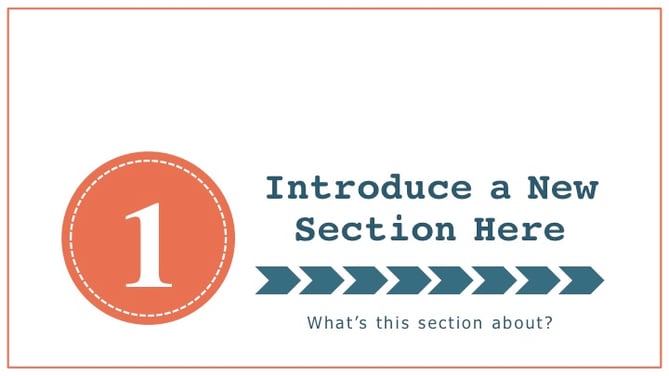
Supporting Points
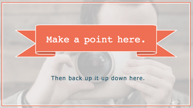
You’ll also want to create slide placeholders for the call-to-action and conclusion slides (you don’t need to elaborate on them just yet).
Keep in mind that these slides should not be complex — just a title and maybe a few details that you want to remember down the road. No paragraphs. No supporting images. Nothing that’s not built into your template already.
4. Fill out the body of your presentation.
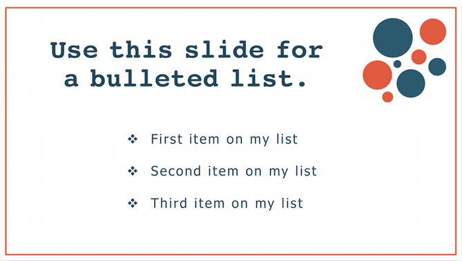
Then, fill in the meat of the content — all the slides between the headers. Just make sure you’re not relying too much on text. SlideShare is a primarily visual platform — people are used to breezing through presentations. So if your presentation reads like an ebook, you should edit down the text and rely more heavily on visual content.
Another thing to remember is to switch up your format from slide to slide. Try doing a checklist slide followed by, say, a quote slide — it keeps people on their toes as they flip through your presentation.

5. Add introduction slides.
After you’ve created the majority of your SlideShare presentation, head back to the start. Wonder why we didn’t begin here? It’ll be much easier to tee up the bulk of your content if you already know what that content is about. In this step, just introduce what you just wrote about — it’ll be a breeze.
6. Wrap up the conclusion.
Then, head to the end of your SlideShare and wrap it up in a slide or two. There is nothing more jarring than going from a body slide right to a CTA slide. You only need a slide or two to conclude your presentation, but it should naturally tee up the CTA that you will have next.
7. Add a call-to-action slide.
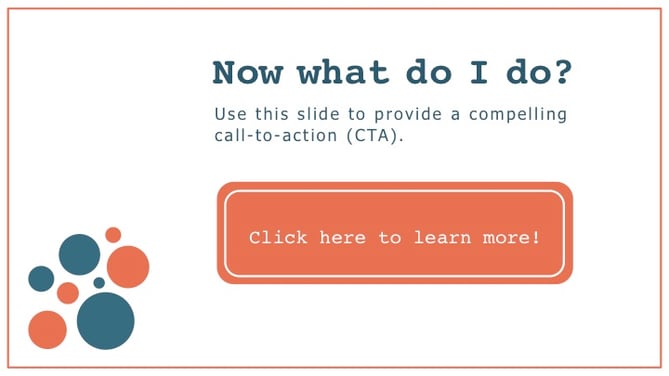
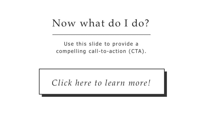
At the verrrrrry end of your SlideShare, you want to keep your viewers engaged by providing a call-to-action. The CTA could be about downloading an ebook, attending an event, or even just visiting your website — pretty much any CTA you’d like to include. Here are two CTA slide examples that we included in the SlideShare template:
8. Edit, edit, edit.
You’re almost there! Next, you need to go through and edit your copy and design components. Try to get another coworker — marketer or not — to give it a once over. If you need some direction, you can use our ultimate editing checklist to make sure you’re catching everything you can.
9. Add “animated slides” and clickable links.
Though it’s easy to create a presentation in PowerPoint and upload it immediately to SlideShare, not all of the same features will appear in both programs. As a result, there are two things you’ll need to add in: “animated slides” and clickable links.
As far as slide animation goes, SlideShare does not support PowerPoint animations. This means that all of those smooth entrances you planned for your text boxes and objects go out the window once you upload your presentation to SlideShare. But, it’s easy to manually introduce new elements on a series of slides to make it seem like it’s “animated.”
Once you’ve built in your animations, you’ll also need to make sure people can actually click on the CTAs in your presentation.
10. Upload your PDF to SlideShare.
After you’re finished with your clickable links, your presentation will be in a PDF format. At this point, you’re ready for the final step: uploading your PDF to SlideShare. When you do this, you have the option to add a description and tags, and even schedule the SlideShare to go live at a certain time. Once your SlideShare is live, you should spend some time promoting it on your blog and social media accounts, and to your email lists. (For more SlideShare promotion tips, check out this blog post.)
Just follow this process when you need to create a SlideShare presentation, and you won’t have to fear that blank PowerPoint template ever again.
Editor’s Note: This post was originally published in August 2013 and has been updated for freshness, accuracy, and comprehensiveness.

Predictive SEO: How HubSpot Saves Traffic We Haven’t Lost Yet
This post is a part of Made @ HubSpot, an internal thought leadership series through which we extract lessons from experiments conducted by our very own HubSpotters.
Have you ever tried to bring your clean laundry upstairs by hand, and things keep falling out of the giant blob of clothing you’re carrying? This is a lot like trying to grow organic website traffic.
Your content calendar is loaded with fresh ideas, but with every web page published, an older page drops in search engine ranking.
Getting SEO traffic is hard, but keeping SEO traffic is a whole other ball game. Content tends to “decay” over time due to new content created by competitors, constantly shifting search engine algorithms, or a myriad of other reasons.
You’re struggling to move the whole site forward, but things keep leaking traffic where you’re not paying attention.
Recently, the two of us (Alex Birkett and Braden Becker 👋) developed a way to find this traffic loss automatically, at scale, and before it even happens.
The Problem With Traffic Growth
At HubSpot, we grow our organic traffic by making two trips up from the laundry room instead of one.
The first trip is with new content, targeting new keywords we don’t rank for yet.
The second trip is with updated content, dedicating a portion of our editorial calendar to finding which content is losing the most traffic — and leads — and reinforcing it with new content and SEO-minded maneuvers that better serve certain keywords. It’s a concept we (and many marketers) have come to call “historical optimization.”
But, there’s a problem with this growth strategy.
As our website’s traffic grows, tracking every single page can be an unruly process. Selecting the right pages to update is even tougher.
Last year, we wondered if there was a way to find blog posts whose organic traffic is merely “at risk” of declining, to diversify our update choices and perhaps make traffic more stable as our blog gets bigger.
Restoring Traffic vs. Protecting Traffic
Before we talk about the absurdity of trying to restore traffic we haven’t lost yet, let’s look at the benefits.
When viewing the performance of one page, declining traffic is easy to spot. For most growth-minded marketers, the downward-pointing traffic trendline is hard to ignore, and there’s nothing quite as satisfying as seeing that trend recover.
But all traffic recovery comes at a cost: Because you can’t know where you’re losing traffic until you’ve lost it, the time between the traffic’s decline, and its recovery, is a sacrifice of leads, demos, free users, subscribers, or some similar metric of growth that comes from your most interested visitors.
You can see that visualized in the organic trend graph below, for an individual blog post. Even with traffic saved, you’ve missed out on opportunities to support your sales efforts downstream.
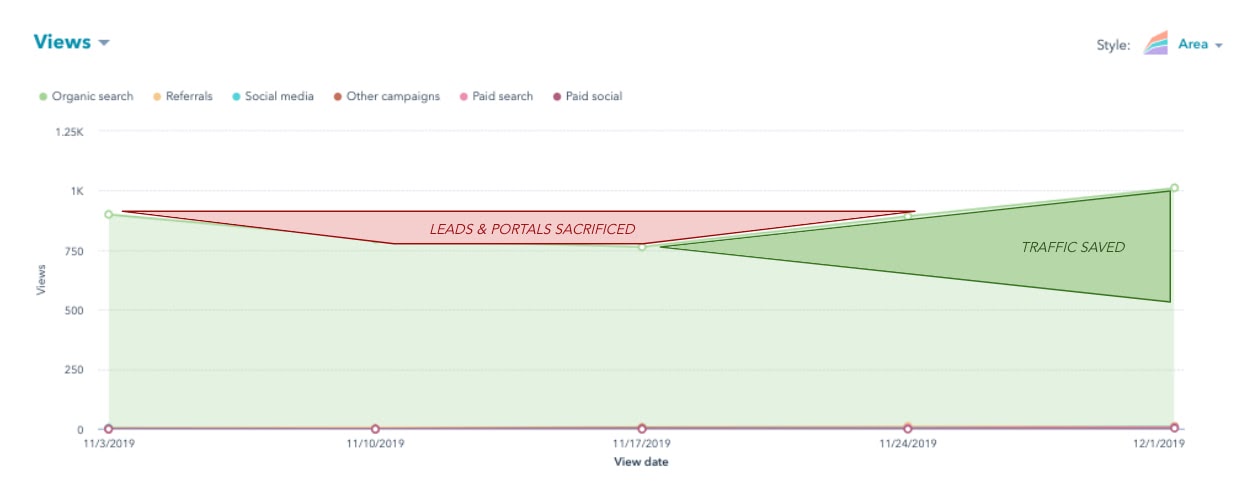
If you had a way to find and protect (or even increase) the page’s traffic before it needs to be restored, you wouldn’t have to make the sacrifice shown in the image above. The question is: how do we do that?
How to Predict Falling Traffic
To our delight, we didn’t need a crystal ball to predict traffic attrition. What we did need, however, was SEO data that suggests we could see traffic go bye-bye for particular blog posts if something were to continue. (We also needed to write a script that could extract this data for the whole website — more on that in a minute.)
High keyword rankings are what generate organic traffic for a website. Not only that, but the lion’s share of traffic goes to websites fortunate enough to rank on the first page. That traffic reward is all the greater for keywords that receive a particularly high number of searches per month.
If a blog post were to slip off Google’s first page, for that high-volume keyword, it’s toast.
Keeping in mind the relationship between keywords, keyword search volume, ranking position, and organic traffic, we knew this was where we’d see the prelude to a traffic loss.
And luckily, the SEO tools at our disposal can show us that ranking slippage over time:
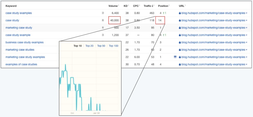
The image above shows a table of keywords for which one single blog post is ranking.
For one of those keywords, this blog post ranks in position 14 (page 1 of Google consists of positions 1-10). The red boxes show that ranking position, as well as the heavy volume of 40,000 monthly searches for this keyword.
Even sadder than this article’s position-14 ranking is how it got there.
As you can see in the teal trendline above, this blog post was once a high-ranking result, but consistently dropped over the next few weeks. The post’s traffic corroborated what we saw — a noticeable dip in organic page views shortly after this post dropped off of page 1 for this keyword.
You can see where this is going … we wanted to detect these ranking drops when they’re on the verge of leaving page 1, and in doing so, restore traffic we were “at risk” of losing. And we wanted to do this automatically, for dozens of blog posts at a time.
The “At Risk” Traffic Tool
The way the At Risk Tool works is actually somewhat simple. We thought of it in three parts:
- Where do we get our input data?
- How do we clean it?
- What are the outputs of that data that allow us to make better decisions when optimizing content?
First, where do we get the data?
1. Keyword Data from SEMRush
What we wanted was keyword research data on a property level. So we want to see all of the keywords that hubspot.com ranks for, particularly blog.hubspot.com, and all associated data that corresponds to those keywords.
Some fields that are valuable to us are our current search engine ranking, our past search engine ranking, the monthly search volume of that keyword, and, potentially, the value (estimated with keyword difficulty, or CPC) of that keyword.
To get this data, we used the SEMrush API (specifically, we use their “Domain Organic Search Keywords” report):
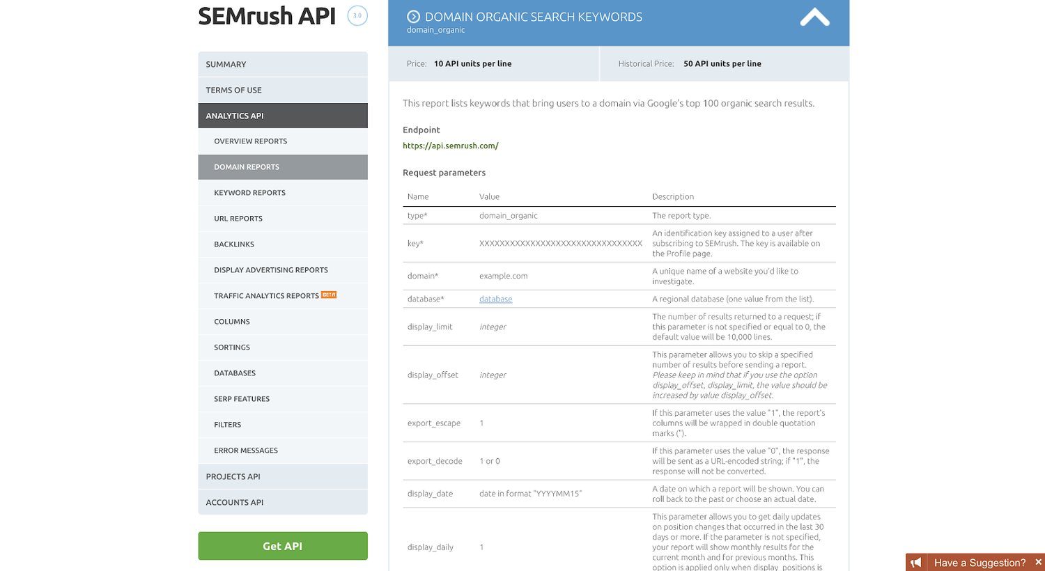
Using R, a popular programming language for statisticians and analytics as well as marketers (specifically, we use the ‘httr’ library to work with APIs), we then pulled the top 10,000 keywords that drive traffic to blog.hubspot.com (as well as our Spanish, German, French, and Portuguese properties). We currently do this once per quarter.
This is a lot of raw data, which is useless by itself. So we have to clean the data and warp it into a format that is useful for us.
Next, how do we actually clean the data and build formulas to give us some answers as to what content to update?
2. Cleaning the Data and Building the Formulas
We do most of the data cleaning in our R script as well. So before our data ever hits another data storage source (whether that be Sheets or a database data table), our data is, for the most part, cleaned and formatted how we want it to.
We do this with a few short lines of code:
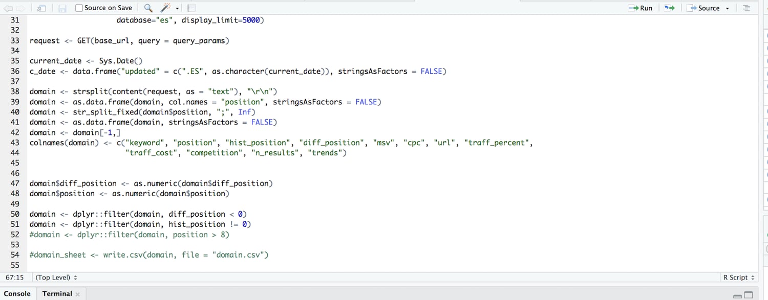
What we’re doing in the code above, after pulling 10,000 rows of keyword data, is parsing it from the API so it’s readable and then building it into a data table. We then subtract the current ranking from the past ranking to get the difference in ranking (so if we used to rank in position 4, and we now rank 9, the difference in ranking is -5).
We further filtered so we only surface those with a difference in ranking of negative value (so only keywords that we’ve lost rankings for, not those that we gained or that remained the same).
We then send this cleaned and filtered data table to Google Sheets where we apply tons of custom formulas and conditional formatting.
Finally, we needed to know: what are the outputs and how do we actually make decisions when optimizing content?
3. At Risk Content Tool Outputs: How We Make Decisions
Given the input columns (keyword, current position, historical position, the difference in position, and the monthly search volume), and the formulas above, we compute a categorical variable for an output.
A URL/row can be one of the following:
- “AT RISK”
- “VOLATILE”
- Blank (no value)
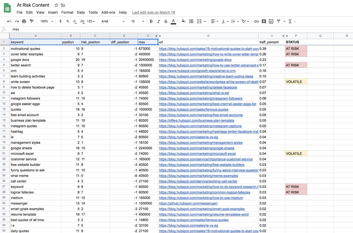
Blank outputs, or those rows with no value, mean that we can essentially ignore those URLs for now. They haven’t lost a significant amount of ranking, or they were already on page 2 of Google.
“Volatile” means the page is dropping in rank, but isn’t an old-enough blog post to warrant any action yet. New web pages jump around in rankings all the time as they get older. At a certain point, they generate enough “topic authority” to stay put for a while, generally speaking. For content supporting a product launch, or an otherwise critical marketing campaign, we might give these posts some TLC as they’re still maturing, so it is worth flagging them.
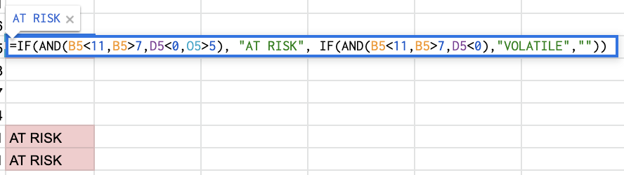
“At Risk” is mainly what we’re after — blog posts that were published more than six months ago, dropped in ranking, and are now ranking between positions 8 and 10 for a high-volume keyword. We see this as the “red zone” for failing content, where it’s fewer than 3 positions away from dropping from page 1 to page 2 of Google.
The spreadsheet formula for these three tags is below — basically a compound IF statement to find page-1 rankings, a negative ranking difference, and the publish date’s distance from the current day.
What We Learned
In short, it works! The tool described above has been a regular, if not frequent addition to our workflow. However, not all predictive updates save traffic right on time. In the example below, we saw a blog post fall off of page 1 after an update was made, then later return to a higher position.
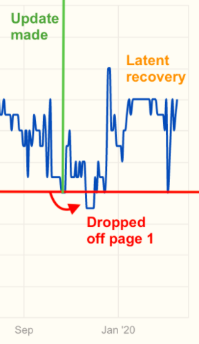
And that’s okay.
We don’t have control over when, and how often, Google decides to recrawl a page and re-rank it.
Of course, you can re-submit the URL to Google and ask them to recrawl (for critical or time-sensitive content, it may be worth this extra step). But the objective is to minimize the amount of time this content underperforms, and stop the bleeding — even if that means leaving the quickness of recovery to chance.
Although you’ll never truly know how many page views, leads, signups, or subscriptions you stand to lose on each page, the precautions you take now will save time you’d otherwise spend trying to pinpoint why your website’s total traffic took a dive last week.

5 Steps to Create an Outstanding Marketing Plan [Free Templates]
Do you take a good, hard look at your team’s marketing strategy every year?
You should. An annual marketing plan helps you set your marketing on the right course to make your company’s business goals a reality. Think of it as a high-level plan that guides the direction of your team’s campaigns, goals, and growth.
Without one, things can get messy — and it’s nearly impossible to put a number on the budget you’ll need to secure for the projects, hiring, and outsourcing you’ll encounter over the course of a year if you don’t have a plan.
Keep in mind there are variations to the marketing plan you need, depending on your industry and the goals of your marketing team. To make your plan’s creation easier, we’ve put together a list of what to include in your plan and a few different planning templates where you can easily fill in the blanks.
To start, let’s dive into how to create a marketing plan and then take a look at what a high-level marketing plan has inside.
In this article, we’re going to discuss:
- How to Create a Marketing Plan
- What a High-Level Marketing Plan Includes
- Marketing Plan Templates You Can Use
- Plus — Social Media Plan Templates
1. Conduct a situation analysis.
Before you can get started with your marketing plan, you have to know your current situation.
What are your strengths, weaknesses, opportunities, and threats? Conduct a basic SWOT analysis is the first step to creating a marketing plan.
Additionally, you should also have an understanding of the current market. How do you compare to your competitors? Doing a competitor analysis should help you with this step.
Think about how other products are better than yours. Plus, consider the gaps in a competitor’s approach. What are they missing? What can you offer that’ll give you a competitive advantage? Think about what sets you apart.
Answering questions like this should help you figure out what your customer wants, which brings us to step number two.
2. Define your target audience.
Once you have a better understanding of the market and your company’s situation, make sure you know who your target audience is.
If your company already has buyer personas, this step might just mean you have to refine your current personas.
If you don’t have a buyer persona, you should create one. To do this, you might have to conduct market research.
Your buyer persona should include demographic information such as age, gender, and income. However, it will also include psychographic information such as pain points and goals. What drives your audience? What problems do they have that your product or service can fix?
Once you have this information written out, it’ll help you define what your goals are, which brings us to step number three.
3. Write SMART goals.
My mother always used to tell me, “You can’t go somewhere unless you have a road map.” Now, for me, someone who’s geographically challenged, that was literal advice.
However, it can also be applied metaphorically to marketing. You can’t improve your ROI unless you know what your goals are.
After you’ve figured out your current situation and know your audience, you can begin to define your SMART goals.
SMART goals are specific, measurable, attainable, relevant, and time-bound. This means that all your goals should be specific and include a time frame for which you want to complete it.
For example, your goal could be to increase your Instagram followers by 15% in three months. Depending on your overall marketing goals, this should be relevant and attainable. Additionally, this goal is specific, measurable, and time-bound.
Before you start any tactic, you should write out your goals. Then, you can begin to analyze which tactics will help you achieve that goal. That brings us to step number four.
4. Analyze your tactics.
At this point, you’ve written down your goals based on your target audience and current situation.
Now, you have to figure out what tactics will help you achieve your goals. Plus, what are the right channels and action items to focus on.
For example, if your goal is to increase your Instagram followers by 15% in three months, your tactics might include hosting a giveaway, responding to every comment, and posting three times on Instagram per week.
Once you know your goals, brainstorming several tactics to achieve those goals should be easy.
However, while you’re writing your tactics, you have to keep your budget in mind, which brings us to step number five.
5. Set your budget.
Before you can begin implementing any of your ideas that you’ve come up with in the steps above, you have to know your budget.
For example, your tactics might include social media advertising. However, if you don’t have the budget for that, then you might not be able to achieve your goals.
While you’re writing out your tactics, be sure to note an estimated budget. You can include the time it’ll take to complete each tactic in addition to the assets you might need to purchase, such as ad space.
Now that you know how to create your marketing plan, let’s dive into the elements that a high-level marketing plan should include.
Marketing Plan Outline
Marketing plans can get quite granular to reflect the industry you’re in, whether you’re selling to consumers (B2C) or other businesses (B2B), and how big your digital presence is. Nonetheless, here are the elements every effective marketing plan includes:
1. Business Summary
In a marketing plan, your Business Summary is exactly what it sounds like: a summary of the organization. This includes:
- The company name
- Where it’s headquartered
- Its mission statement
2. Business Initiatives
The Business Initiatives element of a marketing plan helps you segment the various goals of your department. Be careful not to include big-picture company initiatives, which you’d normally find in a business plan. This section of your marketing plan should outline the projects that are specific to marketing. You’ll also describe the goals of those projects and how those goals will be measured.
3. Customer Analysis
Here’s where you’ll conduct some basic market research. If your company has already done a thorough market research study, this section of your marketing plan might be easier to put together.
Ultimately, this element of your marketing plan will help you describe the industry you’re selling to and your buyer persona. A buyer persona is a semi-fictional description of your ideal customer, focusing on traits like:
- Age
- Location
- Title
- Goals
- Personal challenges
- Pains
- Triggering events
4. Competitor Analysis
Your buyer persona has choices when it comes to solving their problems, choices in both the types of solutions they consider and the providers that can administer those solutions. In your market research, you should consider your competition, what they do well, and where the gaps are that you can potentially fill. This can include:
- Positioning
- Market share
- Offerings
- Pricing
5. SWOT Analysis
Your marketing plan’s Business Summary also includes a SWOT analysis, which stands for the business’s strengths, weaknesses, opportunities, and threats. Be patient with your business’s SWOT analysis; you’ll write most of it based on your market research from the sections above and your strategy below.
6. Market Strategy
Your Market Strategy uses the information included in the above sections to describe how your company should approach the market. What will your business offer your buyer personas that your competitors aren’t already offering them?
In a full-length marketing plan, this section can contain the “seven Ps of marketing”:
- Product
- Price
- Place
- Promotion
- People
- Process
- Physical Evidence
(You’ll learn more about these seven sub-components inside our free marketing plan template, which you can download below.)
7. Budget
Don’t mistake the Budget element of your marketing plan with your product’s price or other company financials. Your budget describes how much money the business has allotted the marketing team to pursue the initiatives and goals outlined in the elements above.
Depending on how many individual expenses you have, you should consider itemizing this budget by what specifically you’ll spend your budget on. Example marketing expenses include:
- Outsourcing costs to a marketing agency and/or other providers
- Marketing software
- Paid promotions
- Events (those you’ll host and/or attend)
8. Marketing Channels
Lastly, your marketing plan will include a list of your marketing channels. While your company might promote the product itself using certain ad space, your marketing channels are where you’ll publish the content that educates your buyers, generates leads, and spreads awareness of your brand.
If you publish (or intend to publish) on social media, this is the place to talk about it. Use the Marketing Channels section of your marketing plan to lay out which social networks you want to launch a business page on, what you’ll use this social network for, and how you’ll measure your success on this network. Part of this section’s purpose is to prove to your superiors, both inside and outside the marketing department, that these channels will serve to grow the business.
Businesses with extensive social media presences might even consider elaborating on their social strategy in a separate social media plan template.
9. Financial Projections
Knowing the budget and doing analysis on the marketing channels you want to invest in, you should be able to come up with a plan for how much budget to invest in which tactics based on expected ROI. From there, you’ll be able to come up with financial projections for the year. These won’t be 100% accurate but can help with executive planning.
Free Marketing Plan Template [Word]
Now that you know what to include in your marketing plan, it’s time to grab your marketing plan template and see how best to organize the six elements explained above. The following marketing plan template opens directly in Microsoft Word, so you can edit each section as you see fit:
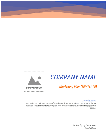
Download your marketing plan template here.
Social Media Marketing Plan Templates
As marketing departments grow, so will their presence on social media. And as as their social media presence grows, so will their need to measure, plan, and re-plan what types of content they want to publish across each network.
If you’re looking for a way to deepen your social media marketing strategy — even further than the marketing plan template above — the following collection of social media marketing plan templates is perfect for you:
Download 10 social media reporting templates here.
In the above collection of marketing plan templates, you’ll get to fill in the following contents (and more) to suit your company:
- Annual social media budget tracking
- Weekly social media themes
- Required social media image dimension key
- Pie chart on social media traffic sorted by platform
- Social media post calendar and publish time
Below, let’s review the social media reporting templates, and what you’ll find in each one.
1. Social Media Questions
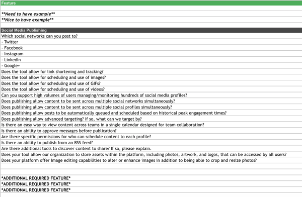
This template lists out questions to help you decide which social media management platform you should use.
Once you know what social media tactics you’re going to implement in your marketing plan, it’s time to figure out what channels are right for you. This template will help you do that.
2. Hashtag Holidays
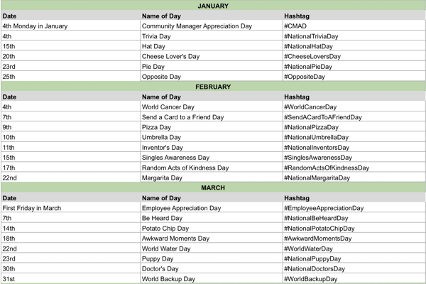
If you’re going to lean in to social media in your marketing plan, you can use hashtag holidays to generate ideas.
These holidays are a great way to fill out your social media publishing schedule. With this template, you’ll get a list of all the hashtag holidays for the year.
3. Facebook Live Schedule
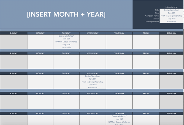
If Facebook live is one of the marketing tactics in your plan, this template will help you design an editorial calendar. With this template, you can organize what Facebook live’s you want to do and when.
4. Instagram Post Log
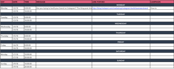
Are you going to begin using Instagram regularly? Do you want to increase your following? With this template, you can organize your Instagram posts, so everyone on your team knows what posts are going live and when.
Additionally, you can organize your assets and campaigns on this doc.
5. Paid Social Media Template
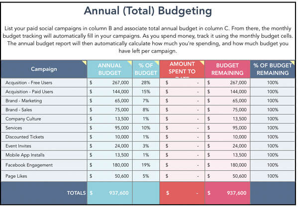
With this template, you can organize your annual and monthly budget for your paid social media calendar.
6. Social Media Audit
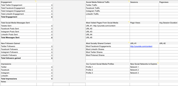
Conducting a social media audit? You can use this template to help you gather the right analytics.
7. Social Media Editorial Calendar
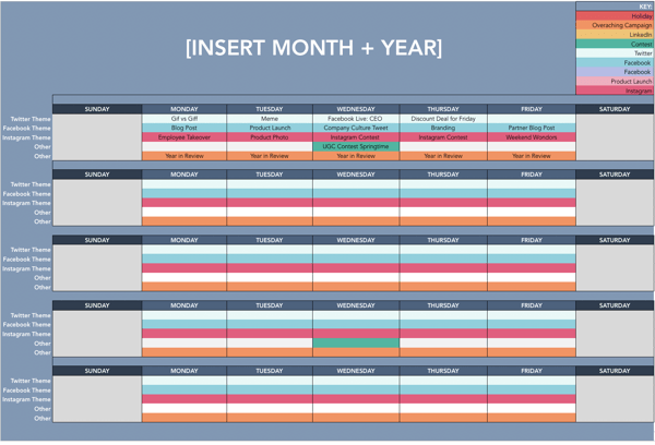
With this template, you can organize your social media editorial calendar. For example, you can include social media posts for each platform, so your team knows what’s going live on any given day.
8. Social Media Image Sizes
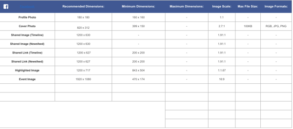
With this template, your team can have the latest social media image sizes handy. This template includes image sizes for all major social media platforms, including Facebook, Instagram, and Twitter.
9. Social Media Marketing Proposal
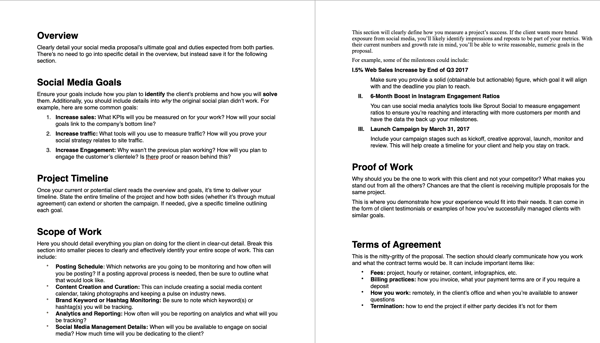
With this template, you can create an entire social media marketing proposal. This will outline the social media goals, scope of the work, and the tactics that you plan to implement.
10. Social Media Reporting Template
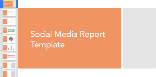
With this template, you’ll gain access to a slidedeck that includes templates for social media reporting. If you plan to implement social media in your marketing plan, these reporting templates can help you track your progress.
Simple Marketing Plan Template
Of course, this type of planning takes a lot of time and effort. So if you’re strapped for time before the holidays, give our new Marketing Plan Generator a try. This tool simplifies yearly planning and lays your strategies, initiatives, and goals out in a simple template so you can identify what’s most important for the coming year.
Try our free Marketing Plan Generator here.
Once you’ve filled in your information, you’ll come away with a plan that helps you:
- Outline your annual marketing strategy
- Identify your most important annual initiatives
- Nix the projects that won’t help you hit your goals
- Track the right metrics throughout the year
- Align your team through a common mission
Pro Tip: The best way to set up your marketing plan for the year is to start with quick wins first, that way you can ramp up fast and set yourself (and your team) up to hit more challenging goals and take on more sophisticated projects by Q4. So, what do you say? Are you ready to give it a spin?
Editor’s note: This post was originally published in December 2016 and has been updated for comprehensiveness.

What Is a Blog Category and Why Are They Important for Your Blog?
Do you read every post on a blog? If you’re like me, you visit sites for a specific reason — be it the New York Times crossword puzzle or the latest gear roundup from Outside. You know what you’re looking for when you click. That frame of mind is why blog categories help readers navigate your site.
But what categories should you choose? How do you name them? And what’s the difference between categories and tags?
Let’s cut the confusion with blog category best practices that keep readers combing through your content.
For example, imagine you run a food blog. You create recipes, write reviews for appliances, and share photography tips. These main topics (recipes, reviews, photography) are your blog categories. But within each topic fall a handful of sub-topics like bread and pastry recipes, small appliance and tool reviews, and low lighting and stop-motion photography tutorials.
If I’m visiting your site for dinner inspiration, I should be able to quickly click your recipes category to view all of the tasty options you have to offer.
No matter what kind of blog you run, the content you create needs to fall under one of your chosen categories.
Why Blog Categories Are Important
You put hours of work into each blog post, and you don’t want it to disappear into the black hole of your archives. Without defined blog categories, your content quickly sinks out of view — only to be found by endless scrolling. Preventing this from happening is only one benefit of categories.
1. Blog categories provide simple site navigation.
A visually appealing site is incredibly important for visitors. 90% of people have left a website due to poor design. Blog categories group content under a handful of topics, so people get to where they want to be, fast. Some website themes limit the number of categories you can create, so make sure to consider that before grouping your content.
2. Blog categories improve site SEO.
Categories give you a leg up in the blog SEO game by adding hierarchy to your pages. This helps search engines better understand what each page is about and rank accordingly.
If you create a category page, for instance, and continue adding and linking posts that are relevant to that category, it will become increasingly optimized. Search engines will recognize this and bump up the ranking, which makes it easier for people to find your site.
3. Blog categories make blog content strategy easier.
Planning an editorial calendar is no easy feat. But with well-defined blog categories, you have a guide for what to write about. Your strategy can touch on each category to avoid stacking one with all the content. This rounds out your blog and prevents you from falling into single-category chaos.
If that’s not enough to sway you, know that 65% of the most successful North American bloggers have a well-documented content marketing strategy. Among the least successful bloggers, 39% admit they don’t have any strategy and 14% actually write down a strategy.
Blog Category Examples
Every blog is unique, but it’s worthwhile to look at others for inspiration. Here are a few examples of how different sites sort their content into blog categories.
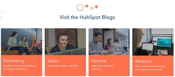
1. HubSpot
Since you’re already here, let’s take a look at how this blog is organized. The main categories are Marketing, Sales, Service, and Website. But within the Marketing category, for example, are sub-topics like social media, branding, SEO, and digital marketing.
2. Patagonia
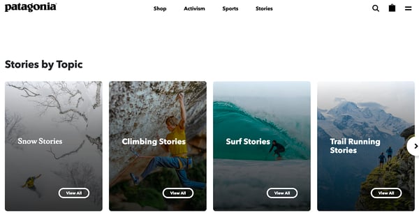
Outside of their product website, Patagonia runs a blog called The Cleanest Line. It’s broken down into the following categories: Stories, Films, Books, and Activism. You can search deeper by clicking on sub-topics organized by sports like kitesurfing, climbing, and trail running.
3. The New Yorker
Personally, I go for the cartoons. But The New Yorker has a lot to offer, which is why they sort content into 10 categories: News, Books & Culture, Fiction & Poetry, Humor & Cartoons, Magazine, Crossword, Video, Podcasts, Archive, Goings On.

4. Joy the Baker
I could scroll through this site all day, but it’s easy to navigate thanks to five categories: Recipes, Cookbooks, The BakeHouse, Drake on Cake, and Workshops. Joy infuses her personality into the names while still making it clear what she’s all about: delicious baked goods.

Blog Categories vs. Tags
Maybe you’ve grouped all your posts under one category and gone tag crazy to create some sort of structure. You’re not the only one. The world of tags and categories can be confusing. But now is the time to learn the difference between the two so you know when to use one versus the other.
While categories and tags help organize your site, you already know categories are the high-level topics to guide readers where they want to go. Categories usually make up your navigation bar or are displayed on a sidebar for people to see. The fewer categories you have, the better. This is especially important if you’re running a niche blog, because it helps you stand out from the other sites in the space.
There’s no hard and fast rule for the right number of categories, but most niche blogs have between three to five, while larger sites have around five to ten categories. The New York Times has 19 categories, but this is definitely too many for most businesses. The larger the number, the more difficult it is to stay organized.
On the other hand, a tag is an indicator of what a particular post is about. It’s one to three words that sort your post into a particular archive. It’s not typically shown on your site, but helps search engines find your posts.
For instance, this post falls under the Marketing category, but it’s also organized with a tag for Blogging so that you can easily navigate to other posts on the topic at the very bottom of this post. With tags like this, our post now pops up when you’re looking for information about naming blog categories.
Choosing tags is simple — start with the keywords you already plan to use for a post. If you’re using a pillar/cluster model like we do, you might even consider naming the tags after the pillar or cluster your piece(s) will sit under.
Or, simply use existing words people may type into search that relate to your post. Avoid tags with the same names as your categories to prevent overlap. Aim for less than 10 tags per post. And don’t make up words unless it’s a strategic part of your blog or brand strategy.
Now that you have a better understanding of tags and categories, it’s time for strategic fun: choosing category names.
Naming Your Blog Categories
1. Use analytics to help name your blog categories.
Choosing names for your categories starts with one major factor: analytics. Yes, really. Even if your site is whimsical or totally unique, creating strong categories requires data.
What articles are getting the most views, comments, likes, or shares? If you know what people love about your blog, you’ll have a better idea of where to focus. It also helps to look at what topics aren’t resonating with your readers, especially if you had considered them a priority in the past.
2. Narrow down the topics you cover.
It’s time to whittle down your topics. There’s no ideal number, but between three to five categories gives you enough breadth without being too overwhelming to manage. Some bloggers prefer five to eight categories, while news sites may have around eight to ten. The number is up to you. Just consider your content, your strategy, and your time. Blog categories are meant to make writing easier, not more complicated.
3. Get specific with your blog categories.
For some people, choosing names will be easy. Of course, food blogs always have a Recipes category. But this is the time to think about your unique brand and what you want to present to people.
For instance, the food blog Kitchn has categories for Recipes, Holidays, Meal Planning, Learn, Shop, and People. This site is mainly for an audience who cooks often, plans ahead, hosts holiday meals, invests in quality cooking tools, and is inspired by famous chefs. Know your readers, and cater to what they want. Just don’t get so creative that people have no idea what your content is about.
4. Be consistent in your blog category naming.
Be consistent in style and structure. Remember how bad design scares away readers? Inconsistent categories play a part in the overall look and feel of your blog, so keep them as similar as possible. This includes capitalization and use of nouns, verbs, or adjectives. Not every category has to be exactly the same, but you don’t want one to be a six-word question while another is a one-word noun.
If your blog has been around for a few years, you may have some serious organization to do. Blog categories are a great way to start sorting. Consider what categories your readers enjoy best, and get rid of any with only a few posts. Trimming down categories isn’t always easy. But it’s definitely worth the effort for a site that’s simple to navigate and build a strong content strategy around.

3 Short-Form Video Trends Online Marketers Should Watch in 2021
Let’s face it, we love videos.
Videos of cats, babies tasting lemons for the first time, food recipes — you name it, we love it. And when it comes to marketing, this still rings true. Recent data shows that video content is one of the most influential forms of marketing out there.
A 2020 study by Wyzowl reported that people share videos at twice the rate than any other form of content. It also found that 84% of people were convinced to buy a product or service based on the brand’s video.
More recently, short-form videos have taken over social media platforms.
So, how can you leverage short-form content to grow your business? And what are some trends to look for in 2021? See what HubSpot marketing experts are saying, below.
But there’s no universal number that everyone has agreed on. For instance, a short-form video on Twitter can be up to 2:20 minutes. On TikTok and Triller, it’s 60 seconds. On Instagram Reels, it’s even shorter: 30 seconds.
Brandon Sanders, a digital marketer for HubSpot Academy, highlights that what’s considered short-form can also depend on the platform.
“With the rise of platforms like TikTok, Reels, and Vine, short form video is actually getting shorter and lending itself more to 60-second to two-minute videos,” he said. “I think the perception of short-form content on platforms like YouTube is actually around that 10-minute sweet spot because content on YouTube tends to be more comprehensive and longer.”
So, when you’re thinking of short-form video, Youtube is the exception, whereas TikTok and other growing short-form videos are the rule.
How do short-form videos fit into your content strategy?
Aside from length, one thing that set short-form videos apart is the trend culture. TikTok, for instance, is run by dances, sounds and social challenges. So, to get on the “For You” page on TikTok — which is equal to the “Explore” page on Instagram — brands must often join in on the fun.
Sanders says short-form videos give creators an innovative way to showcase their content.
“The growth of social media is causing the human attention span to become shorter and shorter,” he said. “So, leveraging the power of short-form content will give you a leg up on your competition and help engage your audience.”
As with any new trend or platform, HubSpot Senior Content Strategist Amanda Zantal-Wiener says you should always consider your audience first.
“It all goes back to a very old question: Which channels are your audiences using and for what?” she said. “And therefore, for which channels does it make the most sense for your business to create this short-form content?”
This means that while short-form video is often known for its entertainment value, you can adapt it to align with your brand.
Short-Form Video Trends to Look Out For
1. More User-Generated Content (UGC)
Consumers generally love UGC. In fact, it influences their purchasing decisions more than brand- or influencer-generated content. Without using up too many resources, brands can publish videos that evoke emotion. Another benefit? It’s budget-friendly.
Short-Form Video Example: Chipotle
Out of this world delivery ha @cheekyboyos #chipotle #burrito #space #fyp
This is a great example of how you can leverage user-generated content in your strategy. In this instance, Chipotle collaborated with these content producers to create a fun, viral-worthy video.
One of Chipotle’s target audiences might be young, college students looking for inexpensive meals. This video features two creators who reflect the audience they may want to attract. Brands should keep this in mind when considering UGC and ask, “will my audience relate to this?” If the answer’s “yes,” move forward.
2. More Behind-the-Brand Videos
Consumers seek out authenticity and transparency in brands. With short-form video, you only have a few seconds to connect with your audience.
So, how do you do that? Well, there’s no exact science to it, but consumers tend to feel more connected to brands that show the people behind the brand. In one Sprout Social study, 70% of consumers said they felt more connected to brands whose CEO is active on social media platforms.
So, going into 2021, brands should pull back the curtain and engage with their audiences on a more personal level.
Short-Form Video Example: Sierra Nicole
Text letsgrow to 81257 for biz credit tips ☺️ #entrepreneur #businesstiktok
♬ Sean Kingston feat. Chris Brown & Wiz Khalifa- “Beat It” – TBT 24/7 🎵
Trendy? Check. Informative? Check. Prompts action? Check! This video works because it has all the ingredients for an effective short-form video.
It first grabs the viewer’s attention by including a popular song and dance. The content addresses pain points viewers may be facing. Then, the call-to-action (CTA) in the caption rounds out the video by turning viewers into potential leads.
3. More Explainer or Educational Videos
In 2021, brands will likely focus on educational content in their short-form videos. Think how-to’s, DIYs, and explainer videos. A 2020 Wyzowl report found that viewers want to see more of this video style from brands.
Educational videos are great added-value content because they help audiences in their day-to-day lives. Brands that make education a priority in their marketing strategy can improve lead generation and build stronger brand loyalty. Similarly, explainer videos target users who are at the decision-making stage of the buyer’s journey and, if done right, they can turn decision-makers into customers.
It’s a win-win situation: Brands get to address their audience’s pain points and offer solutions, which is (surprise!) them. Not sure what I mean? See the example below.
Short-Form Video Example: Soy Yo Candle
Soy Yo Candle used this formula to create this short-form video. Presumably, one of the biggest struggles of owning candles is making them last. In just a few seconds, the brand presented a problem, offered a solution, and promoted their product. It can be as simple as that.
Another highlight in this video is that it caters to viewers who may be discovering the brand and those who already know it. Because of the value it offers, the brand can reach a broader audience organically.
Takeaways for Video Marketers
Short-form video requires taking a more authentic, human, and creative approach to marketing. Kelsi Yamada, an associate marketing manager who works on HubSpot’s social media campaigns, says it’s a low-commitment and engaging way to connect with your audience.
“You can get a good laugh or learn something new in a minute or less on TikTok or Reels,” said Yamada. “On the flip side, it’s also relatively easy to create, which means there are more people who can share their humor or points of view. Because of this, brands should figure out what their unique point of view is, and how they can stand out in the noise.”
The desire to be on-trend is always tempting. But Yamada stresses that brands should be selective about which trends they partake in.
“Not every viral TikTok sound or meme format will align with your content strategy or brand, so don’t force it,” she said. “Focus on catering to your niche and staying authentic first. Don’t be afraid to make something completely from scratch – trends have to start somewhere!”
With this in mind, it’s all about finding the balance between what’s trending and what’s on-brand for your business.
1. TikTok
With 69% of its users between 13 and 24 years old, TikTok is definitely the platform of the Millennial and Gen Z population.

The TikTok homepage features a timeline of videos separated in two tabs. The “Following” tab with videos posted by the user’s followers, and the algorithm-driven “For You” page based on user behavior (what they like, comment on, scroll past etc.)
The “Discover” tab on TikTok highlights trending topics and hashtags, a great resource for marketers to generate new content ideas.
B2B marketers have been wary of using the platform, but it could be because success on the platform relies on emotional appeal. Yet, that emotional appeal may be exactly what they need.
According to a LinkedIn study, B2B strategies that appeal to emotions are seven times more effective for revenue generation than “rational messaging.”
So, it may be time to start practicing those dance moves.
2. Reels
Some call it TikTok 2.0, but Instagram Reels is proving to be its own beast.

The Reels tab on Instagram is a scrollable video timeline, similar to what users see on their Explore page. From this page, users can click on the music the account used to see what other Reels feature that sound.
With over 1 billion active monthly users, Instagram already had consumers’ attention. When they launched Reels back in August of 2020, it became another marketing tool for brands and a worthy opponent for TikTok.Instagram caters to a broader age demographic than TikTok. And when considering their other marketing features, Reels is another way for brands to expand their reach in 30 seconds or less..
3. Triller
Triller is Tiktok’s musical theater friend (or rival), the one who bursts into song anytime, anywhere without cause or notice.
Triller’s homepage looks similar to other short-form video platforms. However, They have made music a prominent feature on the app by making top and trending music a main tab.
The platform is popular among musical artists and allows users to edit 60-second videos within the app. This includes music, filters, effects, and transitions. Triller grew in popularity earlier this year when there was some uncertainty surrounding a TikTok ban in the United States.
The app reports having 13 million active monthly users who spend an average of 20 minutes a day on the app. With music playing a key role on the app, marketers should use music as a storytelling element in their videos.
For instance, the song “You Got It” by Vedo, a song about unlocking your potential, has been making its rounds on Triller. A recruiting firm could use that sound to create a short video targeting job seekers. The song would also work great as a backdrop for a business coaching company advertising its services. The limit does not exist.
4. Hippo Video
If you want to take short-form video content beyond social media, there’s Hippo Video. The video marketing platform gives brands a one-stop shop to produce, distribute, and analyze their video content. Users can also embed forms, CTAs, and annotations within the video, making conversions easier.
For example, let’s say a SaaS company is launching a new product and the marketing team is using Hippo Video for the email campaign.
On launch day, they can send a product teaser video to current customers and include a “Schedule a Demo” CTA, leading users to a meeting scheduling page. During the campaign, the team can track key metrics like total plays and average watch rate — taking video analytics to another level.
5. Magisto by Vimeo
Vimeo recently acquired Magisto, a video editing software that makes video marketing easy through artificial intelligence (AI).
The first step is uploading your videos. The software will then analyze the videos and put it together based on the video editing style you’re looking for. They have over 10 editing styles ranging from real estate and fitness to Facebook and YouTube ads.
Once you select the style you’re looking for and the video is complete, you can distribute it on social media platforms and track the analytics.
This platform is ideal for brands that don’t want to spend too much time or too many resources on video marketing. This app does it so you don’t have to.
There are hundreds of ways to incorporate short-form videos into your marketing strategy. But no matter which trends come and go, it will always come back to your audience. Try a few approaches, and listen to where the data tells you to go next.

User Engagement Is the New SEO: How to Boost Search Rank by Engaging Users
Many businesses aim for their websites to rank highly in search engines, but it’s a moving target.
Google, for instance, updated its algorithm 3,234 times in 2018 to meet user needs (emphasizing the “optimization” part of SEO).
You might remember when Google’s featured snippet addition disrupted the numbered ranking system of search pages. Because the snippet’s goal is to provide a simple answer from a strong piece of content, it might pull from the second or fourth website listed on the search engine result page instead of the first.
As a result, 34% of desktop users don’t even click on a webpage, since their questions are answered by a featured snippet on the search results page. This may seem like a cheap tactic to hoard traffic, but it’s not. By prioritizing the searcher’s experience over the hierarchy of web pages, Google ensures satisfied users.
Optimizing for search engines shouldn’t be your main focus anymore. The ongoing shift in Google’s algorithm over the past decade indicates a new market focus on meeting user expectations. In this post, I’ll do my best to pull back the curtain and show you how improving the user experience on your site will also improve your rankings and increase traffic.
Search Engine Engagement Metrics
Before we delve deeper into the metrics that will likely correlate with an increase in rankings in the age of user experience, it’s worth noting that no search engine is an open book. Google notifies the public when it updates its core algorithm, but it’s notoriously secretive about this proprietary information.
With this in mind, here are a few user engagement metrics that Google and other engines seem to value as priorities.
Mobile Optimization
In 2015, Google announced that mobile optimization would become a contributing factor to SEO rankings. Half of all searches originate on mobile devices, after all.
Google recommends a responsive web design that adapts to desktop computers, phones, and tablets, and it rewards mobile-optimized sites with higher rankings on SERPs.
This opens up into another potential benefit: placement in Google’s coveted “local pack.” The local pack is the set of three businesses featured on Google’s search results. Previously, Google featured seven businesses there, but the number has since been reduced to maintain a mobile-friendly layout.
 Semantic Search
We’ve already mentioned that Google’s algorithm has drastically changed, especially since the old days of keyword stuffing. The first change allowed Google to judge not only the use of keywords, but also the ways in which they are used. During this phase, keywords and phrases needed to appear naturally. If they detracted from the readability of a page, Google would penalize that page’s ranking.
After the 2013 Hummingbird update, the search engine’s algorithm considers overall meaning — it realizes a page is more than the sum of its keywords. For instance, if you searched for “What’s the fastest animal?” prior to Hummingbird, a page would have to use the keywords “fastest animal” in several places to communicate the topic to Google’s crawlers. Now, with semantic search, Google can compare search intent with a page’s content to provide a better search experience.
Most recently, Google has helped searchers by rolling out BERT. This technology was designed for users who increasingly search by posing questions. It considers search intent by analyzing how a word relates contextually to the words that precede and follow it. Most searches made via voice recognition are questions, so this advancement will probably benefit Google in the future (Comscore predicts that half of all search engine inquiries will be voice searches by 2020).
Dwell Time
The dwell time metric is determined by the amount of time a user spends on a page before navigating back to a search engine. Search engines use this metric to judge the relevance of a page to a user’s query. If a user stays on a page for a long time before bouncing back to the SERP, then that page is likely more valuable than others.
Browsers such as Google Chrome, which is used by 81% of W3School’s 50 million monthly visitors as of August 2020, know how long a visitor remains on a page. Dwell time is a significant indicator of relevancy and quality, so webpage designers should aim for visitors to remain on a website for as long as possible.
Unfortunately, dwell time is one of many metrics that only search engines have access to. However, you can still use other data to measure the user engagement on your own site. Tracking metrics like time on page, bounce rate, and conversions from your landing pages can provide crucial insights into the value your users get from their experiences with your website.
4 Ways to Boost User Engagement on Your Website
Realistically, it’s easy to understand how a great user interface has the potential to boost search rankings, but making it happen is another story. Let’s take a look at several UX SEO best practices.
1. Augmented Reality
In 2017, personal care and beauty store Sephora released the Visual Artist update on its app. Users can virtually try on lipsticks, eyeshadows, and other cosmetic products from the comfort of their homes. This small user experience-focused change resulted in a reported organic revenue growth of 14% parent company LVMH.
Augmented reality is increasingly accessible to smaller businesses. It is quite common to find eyeglass retail websites, for instance, boosting user engagement with AR features that allow shoppers to virtually try on glasses.
You can also use this technology to include customers in the experience of launching a product. Jordan Brand did just that with the release of its Air Jordan III Tinker sneakers. Sneaker fans could scan a Snapchat code, purchase through Shopify, and have the shoes delivered by local fulfillment centers within the day.
2. Interactive Tools
Increasing user engagement is as simple as finding ways to capture the attention of a website visitor. Interactive tools and activities that occupy a user’s time (and provide value) are essential when creating a top-notch search experience.
This could be something simple such as a mortgage cost calculator on a home lending website, a responsive chatbot, or live user survey feature on your landing page. Warby Parker, for example, has enhanced the online prescription glasses retail web experience by offering an online quiz for picking out the right frames. The simple quiz provides personalized fashion advice and leads visitors along their sales journeys.
 In fact, if you use a tool like SEMrush to identify the most trafficked pages of a popular website, you will often find that they are interactive. These tools keep users engaged. By installing event tracking within the tools, Google Analytics can report just how engaging they are.
3. Video Content
Many marketers fear that video content will slow down their pages and cause the bounce rate to skyrocket. This is a valid concern, but it also may be worth the risk. Video is easier for people to process, and it can encourage someone to stay 2.6 times longer on a webpage. Well-placed video enhances dwell time and boosts rankings.
For example, Toyota used video in its interactive “Choose Your Wild” campaign for its 4Runner vehicle. The video engages potential customers by letting them go virtually “off-road” in the vehicle and, at the same time, allows the company to collect customer preference information in a fun, unobtrusive way.
4. Lead Magnets
Surprisingly, some of the most effective ways to ensure you’re providing an exceptional user experience aren’t particularly innovative at all. Lead magnets with gated content aren’t a new tool in the digital marketing space, but you’ll find that you’ll command your audience well by understanding their needs and producing applicable content.
After all, the subtext of Google’s movement toward user-friendly webpages is really just ensuring that high-ranking pages are valuable content resources. You will be improving the user experience and prioritizing conversion optimization at the same time.
Bidsketch uses this approach: It offers a free sample proposal in exchange for a voluntarily disclosed customer email address. Content-heavy websites like The Oatmeal and BuzzFeed similarly capture email addresses by offering quizzes (which also enhance user engagement and dwell time). Try offering various free “goodies” as lead magnets such as spreadsheets, tutorials, generators, or calculators.
By keeping users engaged with valuable, meaningful content, you will not only create happier visitors (and maybe brand advocates), but you will also rank highly on Google.
Whether that engagement stems from augmented reality, interactivity, videos, lead magnets, or some other approach, it can make all the difference in the success of a company’s user experience and SEO efforts.

Marketing Trends to Watch in 2021, According to 21 Experts
Marketers are community-minded people. We collaborate across multiple departments in our own companies, while keeping track of competitive players and ensuring we’re deeply connected to the needs and goals of our customers.
So, to better understand what to expect or pay close attention to in 2021, I’ve connected with 20 marketing experts for their perspective.
While there is significant diversity of ideas and visions presented below, I love the common theme of how we’re working toward a better future together, which is why my prediction is this: Marketing in 2021 will be more empathetic than ever.
I continue to believe in my mantra that marketing is powerful and must be used for good, not evil. That might sound overly simplistic, but I do believe it’s paramount that marketers understand their influence and what a wonderful positive power it can be.
We are humans, serving humans. Whether B2B or B2C, customers are looking for brands they can trust to meet their needs and make their lives easier or more delightful. If we treat each person with loving kindness and respect, we’ll be making the positive impact I know we can while building a stronger, more loyal base.
Here’s what else 2021 has in store based on the predictions of this fabulous group of marketing leaders.
Virtual Events
1. Marketers will plan asynchronous events that plug into the funnel.
Latané Conant, Chief Market Officer at 6sense, predicts: “This year saw an explosion of virtual events as marketers adapted to a changing world. While I suspect a lot of us are feeling some virtual burnout right now, there will still be a place for these kinds of events, even after we resume in-person ones. Imagine a virtual event running 24/7.”
“Your prospects get triggered into the event as they proceed to the right steps in your funnel, and they engage with this event through multiple means, like Netflix meets Slack. There’s video content they watch on-demand, there’s a live stream playing on-site and there’s a community of users and fans who create a unique and engaging place to be. Prospects learn about your solutions and then, after watching videos and chatting with others, they get directed immediately to your product team. Now that sounds like a virtual event worth attending!”
2. Community marketing will replace event-based marketing.
Adam Masur, VP of Marketing at Credly, told me: “The era of anchoring marketing around a big, industry event is coming to a close. We’ve all seen the annual conference go virtual due to the impact of COVID-19. But I expect hosts to find that their audience’s appetite for the singular virtual gathering will wane, as well.”
“Look for more intimate, and more topical online get-togethers in 2021. Experts with verified digital credentials and a willingness to share will be highly valued virtual community leaders and influencers.”
“Companies should be ready to be active contributors and bring practical value to the conversation.”
3. Businesses will find new ways to encourage online connections.
Kevin Alansky, Chief Marketing Officer at Higher Logic, says: “The virtual and digital-first world will continue in 2021 and possibly beyond. Many organizations have shifted their annual event and tradeshow to a virtual one. Many organizations have not succeeded, however, because they tried to replicate the experience on an outdated model. This has led to a flood in the number of virtual events and many people facing ‘Zoom fatigue.'”
“Organizations are now wondering how to fight this overcrowded market and stand out against the rest. The answer is online communities — how do you engage before, during, and after your event? We need to find ways to better engage our audiences and build meaningful connections between our organizations and our customers. We are seeing the demand for engagement already this year and this will continue to be a big trend through 2021.”
4. The interactivity that’s been promised for decades is now a necessity for 2021.
Jake Milstein, CMO at CI Security, told me: “When the pandemic hit, there was a huge spike in registrations and attendance in virtual events that attempted to mimic in-person events. Attendance at those events lasted a month or two and then dropped off quickly. People are looking for more human interactions — something out of the norm. Webinars just don’t do it anymore.”
“People are now interested in discussions and panels in which they can ask questions, they can be part of the action, they can offer their own expertise. That’s not something you could do when watching someone on-stage, but we all know it’s something you can do online. The interactivity that’s been promised for decades is now a necessity for 2021.”
Brand Values
5. Customer-centricity will propel brands forward.
Natalie Severino, VP, Marketing at Chorus.ai, predicts: “Throughout the many challenges of 2020, revenue teams have been able to weather the storms and thrive by putting the customer at the center of every decision. This is only made possible through total alignment between sales, marketing, and customer teams, as all must rely on using the actual voice, pain points, and goals to create a winning partnership.”
“While conventional methods of relationship building, like in-person meetings, may not be possible today (or simply don’t scale quickly enough), entering 2021 provides us a paradigm shift for bringing relationships and shared business goals to the forefront of every opportunity.”
6. Brands will navigate an increasingly polarized social and political climate.
“One of the biggest trends to watch in 2021 will be how brands navigate an increasingly polarized social and political climate. Presidential politics, the response to navigating the global pandemic, and an increasingly siloed media and social media landscape is forcing brands to make hard decisions about how and where they align with their customers.”
“Every ad dollar spent, every choice of channel and platform, every social post, every inch of shelf space, and every conference or trade show will be evaluated through the lens of what a brand’s marketing decisions say about who they are and what they stand for,” says Tim Linberg, Chief Experience Officer at Verndale.
Revenue and Budget
7. A/B Testing will become a waste of time and budget.
R. J. Talyor, CEO and Founder at Pattern89, says: “The next decade will see the end of A/B testing. Marketers have long relied on validating their intuition with A/B tests to guide creative advertising and marketing decisions — however, the rise of AI makes this not only obsolete, but wasteful.”
“Once machine learning predicts the trends before they happen and provides clear guidance for marketers, why waste money to A/B test something that wouldn’t work as well? Soon, marketers will be able to go all-in on what will work best without having to test the theory.”
8. Digital marketing spend will continue to grow.
Bridget Perry, CMO at Contentful, predicts: “We’ve found a digital innovation gap between what customers demand and what brands are currently capable of delivering. That’s why digital leaders across industries tell us they plan to spend, on average, 25% more on digital in 2021. And 25% is just the average — some plan to spend significantly more. CMOs who aren’t scaling up their digital spending will soon be outpaced by competitors.”
9. Tech spending levels will return to normal over 2021 — but not all categories will benefit.
“Some companies will remain remote, others will move to hybrid offices, and some will — eventually — go back to business as usual. In 2020 we saw user searches jump on TrustRadius for software categories like e-signature, collaboration, video conferencing, endpoint security, antivirus, and of course telemedicine. Those categories will stay strong in 2021 and beyond, reflecting the new workplace. Other categories — event management and facilities management, for example — will radically reinvent themselves,” says Russ Somers, VP Marketing, TrustRadius.
10. Content marketing will start with conversations.
“The content marketing playbook we’ve been using is at least two decades old. Marketers are still focusing on keyword-heavy blog posts as the main tactic to captivate their audience. But it’s a strategy made for Google, not for people.”
“Today, your audience wants to have an authentic experience with your brand and the best way to do that is by leading with conversations.”
“As marketers aim to create a more human-centric experience, we will see more content pulled from actual conversations with people in the industry who can provide that genuine interaction today’s consumers are looking for,” Lindsay Tjepkema, CEO of Casted, told me.
11. Many companies will decrease their marketing budgets.
Melissa Sargeant, CMO of Litmus, says: “In the coming year, marketers will experience budget cuts and even smaller teams. But, by doing this, companies are setting themselves up for failure. During an economic downturn, companies that pull back and starve marketing efforts, do not perform well. And, when our consumerism-driven environment re-engages, those brands will be further behind than they were when they made those budget-conscious decisions.”
“Ultimately, the pandemic has accelerated trends in business. Look at digital transformation and work from home initiatives, for example. But, if there were cracks within a business’s model beforehand, the pandemic brought those to light so now is the time for them to fix it, not bury it. Businesses have to position themselves the best they can now in order to come out even stronger in the end. And, it requires a mature, advanced multi-channel strategy with experienced marketers.”
Teams and Collaboration
12. In 2021, it’s all about people, people, people.
Caroline Tien-Spalding, CMO at Aptology, says: “Marketing’s north star will be evolving in 2021. Marketing has always been about understanding people and acting on that knowledge. A key difference in 2021 is that marketers are able to know more than ever. It’s the rise of the psychologist, and the rise of the digital marketer.”
13. Many companies will implement a new Web Operations team.
Christy Marble, CMO at Pantheon Systems, predicts: “Marketers will require technology to enable real-time responsiveness to customer needs that span the customer lifecycle and each customer touchpoint. The events of 2020 taught us that we must demand the agility to transform on a moment’s notice to respond to customer needs. This forced an end to the era of lengthy multi-year brand and website re-builds.”
“In 2021 those will be figments of the past, replaced by cross-functional teams that collaborate through technology-enabled workflows to continuously test, learn, and evolve their digital customer experience. These WebOps teams will have a distinct advantage — especially those supported by artificial intelligence, machine learning, and automation.”
“The pace of change has accelerated, but one thing will remain constant: Marketers who focus on people — on customer experience — will be the ones who will keep pace with change. Focus your team on improving personalization, advancing your customer journey, and creating a truly authentic web experience that meets your customers where they are.”
Digital Transformation
14. Brands will unlock the key to orchestration.
Andrea Lechner-Becker, CMO at LeadMD, told me: “Data should be on every marketer’s mind as we enter 2021, but not in the way it usually is. B2B marketers must realize they’re generally strong with orchestrating their own data, but weak with third-party data — which must be a top area of focus. They can’t afford to depend on marketing automation or CRM platforms for this, but will need to strongly consider creating their own system, something along the lines of a CDP. If they do that? They’ve unlocked the key to orchestration and success with data in 2021.”
15. The ‘panic pivot’ will turn into more purposeful reinvention.
Laliv Hadar, VP Marketing, InVision Communications, says: “In 2020, out of pandemic-induced necessity, marketers have rapidly transformed face-to-face events into virtual ones, and developed innovative ways of connecting with audiences digitally. In 2021, this reactionary ‘panic pivot’ will turn to more purposeful reinvention of the ways we engage our core audiences. That reinvention will manifest in hybrid audience experiences that are wholly connected across the communications ecosystem. This integrated brand approach will be built on the premise that our audiences comprise real human beings, whose brand perceptions are shaped by their experiences, and now, more than ever, crave professional empathy and connection.”
Because while quarantines, social distancing and remote work will play a critical role in our eventual emergence from the COVID-19 pandemic, they also have had a significant side effect: Disengagement. 2021 will see marketers tapping into the human need for just the opposite: engagement.”
16. Brands will capitalize on change.
John Graff, Chief Marketing Officer at Sonim, predicts: “I believe 2021 will be a year that will provide significant opportunities for companies to grow/expand market share. Why? Because many companies will fall into the trap that there will be a post-2020 ‘return to normal.’ Marketing has already been experiencing constant change and evolution the last decade, and just because many people are ready to get past COVID times, does not mean the change will stop. In fact, for best of breed, it very much will accelerate. Everything has been changed, whether it’s work-from-home, education, online retail, and more.”
“The best marketers will look to capitalize further on those changes in 2021, while others unfortunately revert to the old pre-COVID playbooks. It’s a great time for marketers to further embrace change, and be the stewards of helping their companies grow and gain share in 2021!”
17. Marketers will continue to incorporate real, true personalization.
“Marketing automation should not be confused with personalization. Oftentimes, it’s just quicker batching and blasting. When marketers use intent data and data-based insights to fuel their automated communications, they can create remarkable brand experiences sophisticated consumers rely upon. In the year ahead, marketers will better incorporate real, true personalization.” says Nick Runyon, CMO of PFL.
18. Marketers will rely on deep data insights and machine learning to deliver value to prospects.
Richard Jones, CMO of Cheetah Digital, predicts: “The next generation of personalization is not about cookies or third-party data, it’s not about merchandising, and it’s not about guesswork. The next generation of personalization is about relying on deep data insights, first and zero-party data and using machine learning to derive not only the right content, not only the right offer, not only the right channel but, the right sequence of events that leads to an automated path to conversion.”
“The next generation of personalization is about providing a value exchange for consumers in the ‘moment’ when you have them on your mobile app, on your site, in your store. How can you provide them something that will generate trust and affinity with the brand?”
19. Cross-channel integrations will continue to grow.
Meg Scales, CMO of SlickText, told me: “Incorporating multiple channels within campaigns is much more effective than simply putting all your resources into one channel — even a versatile channel like SMS. It’s why we’ll see channels and varying tactics continue to cross-integrate in the coming year.”
“For example, channels will adopt services like loyalty programs to better connect brands with customers through a variety of strategies within just one platform. Also, a customer interaction in one channel could trigger a personalized, automated sequence in another, creating data- and behavior-driven campaigns many are unable to produce currently due to a lack of time, money and expertise.”
20. We’ll see an acceleration with the digital-first shift.
Auseh Britt, VP, Growth Marketing at Terminus “We saw an acceleration in the shift to digital in 2020, mainly due to the gap left by live events. Substitutes like virtual conferences lacked the ability to really engage audiences, making them glorified webinars, exacerbating the ‘Zoom’ fatigue.”
“I see this trend continuing in 2021 as we look for more creative ways to engage customers and prospects through hyper-personalized outreach, high impact direct mail, intimate and interactive virtual experiences, and relevant educational content.”

How to Make a Timeline Graphic in Google Docs, Word, Excel, Google Sheets, and PowerPoint
Infographics are a great way to capture user attention and communicate key concepts. Why? Because they combine relevant information with graphic impact to increase retention and engagement.
Data backs up this common-sense assertion: Research found that people retain 65% of the information they see — but only 10% of the information they hear — and spend 39% less time searching for the content they need when it’s displayed in infographic format.
One of the most compelling uses for this functional format? Timeline graphics. These date and data delivery vehicles offer a way to quickly communicate important information — from key dates in your company’s history to upcoming project milestones or predicted market trends.
Of course, it’s one thing to see the value in timeline graphics and another to actually create attractive and effective visuals. In this piece, we’ll tackle timeline tactics for familiar applications including Google Docs, Word, Excel, Google Sheets, and Powerpoint.
3…2…1…let’s go!
What is a timeline graphic?
While there’s no single format for timeline graphics, the most common composition uses four parts:
- Data
- Visual
- Header
- Description
Each timeline element contains all four parts, and elements are then arranged in left-to-right order of oldest-to-newest events. This format offers simplicity of form and function — elements are easy to read and identify, and the “flow” of time is simple to spot.
Let’s say you’re creating a timeline of key events in your corporate history using this framework. It might look something like this:
This (very basic) example was made in Google Docs and uses an arrow to denote the passage of time. Dates above the line are paired with brief details below. Some timelines will include both a header — such as merger — with a longer description below. How much information is worth including depends on the complexity of the topic at hand, who’s going to be using the chart, and its overall purpose. In this case, our graphic element is the line itself but you can also insert relevant images of people or places associated with the event to increase user engagement.
Another common graphic timeline format runs top-to-bottom with earlier dates at the top of the page and later dates further down. To maximize space many of these top-to-bottom templates alternate information left-and-right down the line.
How to Make a Timeline on Google Docs
So how do you make a timeline graphic?
1. Create a picture.
Head to “Insert”, then select “Drawing” and “+ New”. This will bring up a new window that looks like a checkerboard.
2. Start drawing.
Select the “Line” button from the top menu and choose “Arrow”. Then, draw a line across the screen. To make sure it’s straight, look at the left-hand side — if you only see one line, it’s level. If you see more than one, it’s at an angle.
3. Enter your text.
Click on the Text Box tool — represented as a T surrounded by a box — and create a box above or below your line to start adding details. You can either copy and paste multiple boxes to ensure consistent sizing and spacing or use a single, giant text box. While the latter option is quicker to create (we used it) the natural left-to-right format of the box means you’re limited in how information appears.
4. Save and close.
When you’ve entered all of your timeline data, click “Save and Close” and the image will be automatically added to your Google Doc.
How to Make a Timeline in Word
Maybe you don’t like Google Docs, maybe your company uses Microsoft Office exclusively, or maybe you don’t like the idea of potentially shared timelines. Whatever the case, it’s also possible to create a timeline graphic in Word.
1. Insert SmartArt
Open a new Word document and head to the “Insert” tab, then select “SmartArt”.
2. Find your timeline.
From the new menu that appears, select “Process”. This will bring up a host of potential timeline graphic options, everything from single, large arrows to connected text boxes to linked circles. The simplest option is the “Basic Timeline” which contains dots embedded in a large, transparent arrow.
3. Enter your data.
Use the text pane located on the left-hand side to enter your timeline data. Pressing “Enter” creates a new timeline entry — if you need to add more information to a specific timeline item, press Shift+Enter to create a line break.
4. Customize your timeline.
Customize your timeline dots and arrow with shapes or colors to achieve your desired look.
Word does not automatically calculate time between events; as a result, all items on your timeline will be equidistant from one another. If you need to communicate a larger span of time, you can drag events further apart manually, but this will eventually distort the graphic.
How to Make a Timeline in Excel
If you enjoy using Microsoft Office for creating timelines but want to make things more difficult for yourself, try building an Excel timeline. While the finished product offers easily-accessible data in a familiar format, the effort required is significantly more substantial.
1. Create a data table.
Create a three-column table in Excel that contains your timeline data. Use the first column for dates and the second for event titles. In the last column, enter a series of numbers — these numbers will determine the height of your timeline plots. You can set them all to the same height with the same number or different heights in a repeating pattern depending on your preference.
2. Insert a scatter chart.
Select “Insert” from the top Excel menu, then “Charts”, then select a Scatter chart.
3. Import your data.
Right-click the chart that appears and choose “Select Data Source.” Select the “Add” button in the “Legend Entries (Series)” menu that appears. Click on the small spreadsheet image that appears next to the “Series X values” box, then choose the column of dates you created.
Then, select the small spreadsheet next to the “Series Y values” box and choose the data in your timeline height column. Click “OK” and you’ll create a scatter chart with dates at the bottom and dots at varying heights.
4. Eliminate gridlines, add error bars.
Select your chart and find the “+” in the upper-right to bring up the Chart Elements menu. Uncheck “Chart Title” and “Gridlines”, then check “Data Labels” and “Error Bars”
5. Connect the dots.
Head to the “Error Bars” menu option and select “No Line” for your Series X Error Bars — this will remove the horizontal lines on each side of your data points. For your Series Y Error Bars, set the direction to “Minus” and the Error Amount to “100%”. This will create vertical lines between your dates and your data points.
6. Insert event titles.
In the “Format Axis” menu, select “Series 1 Data Labels”, uncheck “Y Value”, and select “Value from Cells.” Then, click the small spreadsheet icon. Select your event titles column and then click “OK”.
This should create a basic timeline with dates along the bottom and data points at varying height, each with a small description above. If desired, you can add extra formatting and color options from the Format Data Series menu.
How to Make a Timeline in Google Sheets
The polar opposite of Excel, Google Sheets makes it easy to create project timeline.
1. Create a new timeline.
Open Google Sheets and select the “Project Timeline” option.
2. Customize.
Edit your timeline. Change any text box, add colors, and modify dates as required. While customization is bounded by the basic format of this Gantt chart, Google Sheets offers one of the easiest ways to create and share a timeline.
How to Make a Timeline in PowerPoint
Making a timeline in PowerPoint is almost identical to the process used in Word.
1. Select your design.
Head to the “Design” tab and select your theme.
2. Insert SmartArt.
Click on “Insert”, then “SmartArt”.
3. Choose and fill your timeline graphic.
Select the timeline you prefer and it will be created with three elements. Add text to the elements directly, and use “Add Bullets” to add bullet points below. Select “Add Shape” to additional timeline sections.
Timing is Everything
Timeline graphics add convenient context to otherwise dry data points. From details about your company from inception to current interaction to in-depth project milestone markers, visual timelines in Google Docs or Sheets, or Microsoft Word, Excel, or PowerPoint offer a way to capture critical data while simultaneously boosting viewer interest and bolstering information retention.

6 Ways to Use Icons in Your Infographics [+ Where to Find Free Icons]
Whether it’s an explainer on solar panels or the farm-to-cup process of making your favorite coffee, infographics compress a world of information into one simple, digestible format.
But designing an infographic that successfully communicates a lot of information in a simple visual format requires more than a quick idea and a template.
Fortunately, there’s one design element that the best infographics all have in common, and it can help you build a professional infographic that gets your point across and looks good doing it.
Icons are the secret tool that designers use to take your eye from one point to another so that all that information comes to you in just the right order.
Icons form the secret language of infographics, and once you learn how to speak it, yours will be more effective and (hopefully) widely shared by your audience.
Why Do You Need Infographic Icons?
Infographics can be a great source of information when you’re introducing a complex topic to an unfamiliar audience. People love sharing them because they can communicate a vast quantity of information in an elegant, easy-to-digest format.
However, it’s easy to create an infographic that is overwhelming or which simply falls flat. Icons streamline the process of creating the infographic and ensure that it effectively communicates the information it’s meant to share.
Infographic icons give structure to your infographic and can be used to highlight key pieces of information. They can also efficiently explain what happens at important junctures of the process without relying on words. You have a limited amount of space on an infographic, and icons help you say more with fewer words.
6 Reasons To Use Icons in an Infographic
1. They help your audience focus.
A good infographic is a buffet for the eyes, and your readers could have trouble focusing on just one part of it at a time. Icons provide a much-needed sense of structure to the information in your infographic and create a guided experience for the viewer. Good icon placement makes navigating your infographic a more intuitive experience for your audience.
In the excerpt of an infographic from Infographic Journal that covers the entire history of currency from 9000 BC to the present, the author uses icons to mark key events and add interest to what could have easily been a boring timeline. Small (but important) arrow icons along the timeline also keep the reader moving along in the right direction.
2. They make the words you use count more.
Want to make your text stand out on your infographic? Try pairing it with an icon. It’s easy for your words to get lost among the visuals of your infographic.
Icons can bring attention to specific words or charts, and help the viewer leave with clearer, more memorable takeaways. They can also tip off the reader what to expect from each section, allowing them to focus on the subjects that interest them first.
In this excerpt of an infographic from Futurism.com, complex concepts (that could have each required a lot of text to explain) are accompanied by custom icons that help reinforce the titles of each section with fewer words.
You might not immediately know what “ingestible robots” means, but when you see the image of the robot popping out of a pill capsule, you get a better grasp on it immediately.
3. They make data easier to understand.
Graphs displaying complex information can be challenging for many people to grasp at first, but a simple icon can prime your audience to understand the data it presents and why it matters to them.
For complex graphs, multiple icons can break down individual sections and allow the audience to derive more value from it, making it more likely they share it with their networks. You can also use icons to represent amounts in a graph instead of raw numbers to make them easier for your audience to grasp.
In this excerpted screenshot of an infographic from USC Marshall School of business, icons are used to convey data in place of a more traditional graph:
4. They can help you say more with less.
Icons are an ideal medium for telling a simple story that hits on the main theme of your infographic. This can form a unifying message that allows your target audience to connect with the information presented.
Your infographic’s data tells a story, and icons can show it to your audience immediately. From cave paintings to fire exit signs, icons can be used to create powerful, engaging stories with the simplest of shapes.
You can get a feel for how icons can effectively communicate complex pieces of information in the except of an infographic from USC Rossier on the science of classroom design. Describing each of these classroom formats would have been cumbersome and required a lot of text, but with icons, a lot of information can be condensed in a simple visual.
5. They tap into shared meanings.
The best thing about icons is they often mean the same thing in every context they’re used. This allows you to introduce meaning into your infographic without having to explain it to your audience directly (and take up valuable space on your design). This ultimately makes your infographic more accessible and easier for your audience to understand.
In the infographic excerpt from Daily Infographic below, the designer makes excellent use of two instantly recognizable symbols — money and people — to explain the evolution of crowdfunding.
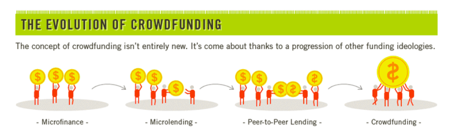
6. They contribute to your brand’s personality and voice.
The icons you choose can add personality to your infographic and are an excellent opportunity to showcase your branding.
What do cute, fun, icons, or hand-drawn ones say about your brand or the information you’re providing? What about sleek, polished ones? The aesthetic you choose for your icons is just as important as any other piece of information you choose to include in our infographic.
In the example below from Printsome, a company that specializes in printing and design, it makes sense that the creator chose to use a clean, consistent icon aesthetic that fits in neatly with the branding of their website.
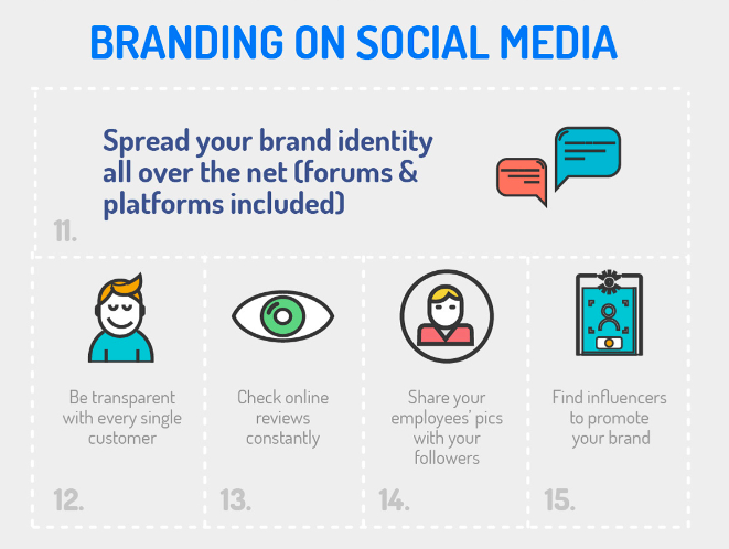
The Best Free (and Almost Free) Resources for Infographic Icons
There’s a wide variety of free and nearly-free sources for infographic icons and elements online. We’ve listed some of them here for your next project.
Flaticon
Looking for free vector icons created by a wide variety of designers? Flaticon is a great place to begin your search. With 3,641,000 (and growing) free vector icons available on the site, this site is a solid option if you have a specific design in mind and a limited budget.
Icons8
If you’re looking for a more curated selection of options, Icons8 offers free icons that are designed entirely by a single team. This is a great option if you have plans to create a series of infographics and want a consistent look between all of them, regardless of the subject matter.
Noun Project
Noun Project believes icons help create an important global language, and their unique (and extensive) collection includes more specific options — we’re talking everything from icons representing abstract artificial intelligence concepts to Beyoncé — that you likely won’t find anywhere else on the web.
DaFont
If you’ve ever sought out free fonts on the web, you’ve probably encountered DaFont — but did you know they also have a solid selection of icons? If you’d prefer to use icons in custom font format instead of downloading them as images, DaFont is a good free option.
Iconshock
Most of Iconshock’s library is free to use for noncommercial purposes. If your infographic is for commercial use, you’ll pay a one-time fee for most icons here, which is a budget-friendly option if you’re still testing out infographics as a marketing strategy.
Iconfinder
Iconfinder offers a nice balance of extensive options with some expert curation — which is a bonus if you’re not interested in filtering through hundreds of pages to find icons that fit your ideal aesthetic. Most icons featured here are available for free for personal use, while pricing plans are available if you plan on using any of the icons commercially.
Behance
Behance is a platform where designers around the world can showcase and sell their design work and connect with potential clients — but many generous designers also offer some design goodies for free. If you’re willing to spend some time searching, there are certainly some hidden gems on Behance that are worth the search.
Icons give your infographics shape.
Icons are vital tools that can bring meaning and structure to your infographic while enabling greater word economy in your overall design.
They can help to orient the viewer to the information and provide cues that indicate the flow of the infographic. Even if your viewer is completely unfamiliar with the information in your infographic, icons with a widely-recognized meaning can help to improve their understanding of it.
Ultimately, the icons you choose for your infographic and the way you use them can improve its overall utility for your viewer.

What is the 7×7 Rule in PowerPoint?
Despite its reputation for dry content delivery across virtual and in-person meetings alike, PowerPoint remains the go-to choice for many professionals, even as other options emerge that offer greater usability and flexibility outside of the Microsoft ecosystem.
Part of the presentation platform’s popularity stems from its familiarity — many organizations still run Microsoft-first IT software environments, making PowerPoint the obvious choice for straightforward presentation design. Simplicity provides the second part of this popularity permutation since creating a basic PowerPoint presentation on a single topic requires minimal time and effort.
The problem? “Simple” doesn’t always mean “effective”. Staff across markets, industries, and verticals worldwide have stories about unbearably long and boring PowerPoint presentations that were long on details but short on value. The 7×7 rule offers a framework to help boost PowerPoint form and function by reducing text volume and improving information impact.
In this piece, we’ll break down the 7×7 rule in PowerPoint, best practices, and offer some actionable examples of seven-by-seven solutions in-situ.
The PowerPoint Problem
To put it simply, most viewers don’t like PowerPoint. While the format has the benefit of speed and convenience — and can conceivably be used to communicate information quickly and concisely — many presentations are overlong and overwrought with bonanzas of bullet points that seem relevant but are really just digital hot air.
In most cases, the disconnect between appearance and action is boring at best and irritating at worst. As noted by the BBC, however, in extreme cases — such as NASA’s Challenger shuttle disaster — overlooked information in an overstuffed presentation can have significant real-world consequences.
Best bet? To avoid PowerPoint frustration and fatigue, it’s time for a new framework: The 7×7 rule.
What is the 7×7 rule in PowerPoint?
The 7×7 rule is simple: For every slide, use no more than seven lines of text — or seven bullet points — and no more than seven words per line. Slide titles aren’t included in the count.
There’s no specific data supporting the 7×7 model as the ideal; some PointPower proselytizers consider 8×8 good enough while others say 6×6 is more streamlined. The point here isn’t the hard-and-fast number but the underlying idea: Cut out extraneous information to improve presentation uptake.
Slides can still contain images — and should, wherever possible — but sticking to the 7×7 rule helps cut down on excess data that might be better-shared in follow-up emails or one-on-one discussions. In effect, the 7×7 rule is a way to reduce the amount of time staff spend pretending to care about PowerPoints and instead help them focus on slide information that’s relevant, contextual, and actionable.
Best Practices for the 7×7 Rule in PowerPoint
Building a typical PowerPoint slide is straightforward. Like any business practice, however, it can be improved with a standardized set of rules designed to limit waste and improve efficiency. And when it comes to most PowerPoint presentations, almost any change makes a positive impact.
Let’s break down some of the best practices for building PowerPoint slides with the 7×7 rule.
1. Single slide, single concept.
Each slide should address a single concept rather than trying to connect the dots across multiple data points, trends or ideas. While it’s fine to build on previous slide data as your presentation progresses the single slide, single concept approach helps focus presentation efforts from the word go.
2. Images increase impact.
As noted above images are a welcome addition to slides, so long as they’re relevant. If you find yourself adding unrelated stock photos just to add some color — don’t. Keep slides, text, and images on-track.
4. Forget the funny.
Almost everyone has a story about a “funny” PowerPoint joke that was nothing of the sort. In most cases, these heavy-handed humor efforts are shoehorned in ostensibly to help viewers better remember slide data. In fact, they shift the focus away from your primary objective.
5. Plan it out.
Before creating your presentation, create a basic outline that highlights your primary concept, how you plan to get it across, and how many slides in total it should take. Then, draft your slides. Take a break, review them, and cut back wherever possible.
6. Consider the 7x7x7.
If you really want to go all-in on the 7×7 rule, consider adding another 7 and aiming for no more than 7 words in each line, no more than 7 lines on each slide, and no more than 7 slides in total. It’s not easy — but offers a much better chance of getting your point across.
7×7 Rule in Powerpoint Examples
So what does the 7×7 rule look like in practice? It’s one thing to talk about building a better slide, but it’s easy to fall back into bad habits when it’s time to put together a presentation. It makes sense; content creators are often trying to convey a significant amount of information in a short period of time, and it’s easy to get sidetracked by the notion that every piece of data must be included to make the meeting a success.
Let’s start with a slide that’s substantially removed from the 7×7 rule:
There’s a lot to unpack here. We’re using too many lines and too many words per line. Lines are complex without saying much, and the attempt at humor doesn’t add anything.
Let’s try again:
This one is better — we’ve reduced the number of lines to 7 and lost the joke, but most of the lines still have more than 7 words and the text is overly convoluted.
Let’s try one more time:
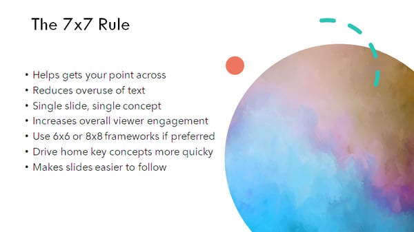
This slide is clear and concise, and most lines have less than 7 characters. It offers the same information as the first two versions — it’s just more effective and efficient.
The 7×7 Solution
While using 7 lines of text with 7 words or less isn’t a silver bullet for all PowerPoint-related problems, it’s a good place to begin if you’re looking to boost viewer engagement and limit fatigue.
Bottom line? PowerPoint isn’t always the ideal format for getting your point across, but if you need to create a quick-hitter presentation that lands well with your audience, start with the 7×7 solution.

What is Technographic Data? (And Why It Matters)
Digital transformation is more than just a buzzword — as noted by Forbes, 70% of companies have already deployed a strategy to improve digital service and solution uptake or are actively working on one.
And, in 2019 alone, enterprises spent more than 2 trillion dollars worldwide to help drive digital adoption and improve overall organizational performance.
For product and service providers in the technology industry, this presents an opportunity: If B2B sales teams can determine where enterprises are struggling with digital transformation initiatives, they can improve targeted marketing efforts and boost total sales.
But how do they bridge the gap between potential conversions and practical insight? Technographic data. In this piece, we’ll break down what technographic is (and isn’t), how companies can collect this data at scale, and why this data is important to help enhance B2B sales efforts.
Let’s get started.
What is Technographic Data?
Technographics is a portmanteau of the words “technology” and “demographics”, and refers to information that describes the use of technology solutions, their adoption rates, and the potential challenges they present for organizations.
The challenge? This technographics definition isn’t terribly useful without context.
First, let’s talk about what technographics isn’t:
Demographic data
Demographic data focuses on information about people — how many people are employed by a specific organization? What points of contact exist? How have companies’ sizes and staff configurations changed over time, and what’s on the horizon. This information is critical to help identify potential leads and develop initial marketing efforts but offers no insight about technology use.
Firmographic data
Firmographic data refers to information such as company size, product offerings, industries served, total revenues and even physical locations. This data is useful to help create targeted campaigns that drive B2B sales interest but doesn’t include technology metrics or measurements.
So what exactly is technographic data? Put simply, it’s the practical application of information about the technology stack used by a prospective customer — everything from the infrastructure and network tools they’re using to the applications they prefer and the adoption rate of these applications at scale.
Effectively used, technographic data can help companies align their product offerings with digital transformation needs and capture client interest.
Worth mentioning? There’s a distinction between pure technographic data and social technographic data. While technographic data speaks to the use of software, hardware, and networking technologies within an organization, social technographic data focuses on the consumption and use of social media technologies within an enterprise.
While this is useful for social marketing efforts, it doesn’t serve the same function as technographic data for B2B marketing efforts.
How to Collect Technographic Data
When it comes to collecting technographic data, three broad methods exist:
1. Surveys
The most direct method of collecting technographic data starts at the source: Staff at target companies. Using phone or email surveys, companies attempt to collect information about how technology is adopted, deployed and used to boost B2B efforts. The challenge? Most companies won’t respond to cold-call surveys, and many aren’t willing to provide specific usage data even via email response templates. While this method may provide some generalized use data, it’s often more trouble than it’s worth.
2. Website Scraping
Website scraping tools extract specific information from corporate websites about the apps and services used by enterprises. Although this may produce more accurate results than survey data and without the need to cold call companies, it requires technical expertise to ensure tools are collecting and reporting relevant data. In addition, security controls on websites may limit the type and amount of data that can be collected, and available information may be out-of-date.
3. Third-party Purchasing
The most straightforward way to obtain technographic data is by purchasing it from a reputable data collection provider. Thanks to the rapid uptake of cloud-based SaaS, PaaS, and IaaS solutions, both service providers and data analytics firms now have access to much more robust and reliable technographic data sets than can be purchased by interested parties.
While there are some limitations on this data collection — for example, personal data must be anonymized to ensure compliance with both local and global privacy legislation — enterprises can access massive amounts of usable technographic data with the right third-party provider.
It’s worth keeping in mind, however, that not every provider is created equal. Some promise massive datasets but can’t deliver, while others can’t offer real-time insight. Best bet? Do your research before contracting any technographic data supplier.
Why Technographic Data is Important
On its own, technographic data offers a window into company technology use. Combined with targeted marketing and sales efforts, meanwhile, this information provides a way to significantly improve conversion outcomes.
Four actionable benefits of technographic data include:
1. Improved Segmentation
With accurate data about the use and deployment of technologies within potential customer organizations, companies can better define granular customer segments based on current needs and ongoing priorities to ensure sales resources are used effectively.
2. Enhanced Specificity
Sales leads are often inundated with pitches for new technologies and services. Technographic data lets sales teams speak to specific problems faced by potential clients and quickly capture their interest.
3. Increased Prioritization
Not all leads have the same potential value to companies. But distinguishing lead priority is difficult, especially in an increasingly competitive technology market. Technographic data can help businesses quickly assess which leads are more likely to spend on new solutions and which need more time.
4. Reduced Lead Time
Speaking of time, news announcements about new technology solutions, mergers and acquisitions or product launches offer jumping-off points for successful sales discussions — but only if teams are equipped with relevant technographic data to help connect the dots between news releases and customer needs.
Tactical Technical Targeting
Technographic data makes it possible for marketing and sales teams to create tactical, targeted campaigns that speak to the real-life issues faced by organizations undergoing digital transformation.
By prioritizing in-situ issues and providing comprehensive solutions for emerging challenges using technographic data, B2B efforts can stand out from the crowd and help drive sustainable client conversion.

How to Password Protect a WordPress Page
Despite ongoing efforts to replace password protection with more robust and reliable security solutions — such as two-factor authentication or location-based access approval — recent research notes that “password authentication is still ubiquitous although alternatives have been developed to overcome its shortcomings”.
So why this continued passion for passwords despite their potential problems? It’s simple: Familiarity and ease of use. The mechanism for password protection is widely understood and easy to implement — and in many cases, more complex defense efforts can cause more problems than they solve.
Consider the use case of securing a WordPress website or blog. While site owners could invest substantive time and effort into in-depth security precautions, this popular content management system (CMS) offers built-in password functionality to help defend sites against unwanted access and editing.
In this piece, we’ll explore the pros and cons of password processes and provide an easy-to-follow framework for WordPress page and site password protection.
The Pros of Password Protection
Passwords remain the most common form of digital security because they offer a low bar to entry. If you know the password you’re granted access — if you don’t, you’re turned away.
They can also be easily combined with other security solutions to improve overall defense. For example, current-generation smartphones often leverage both biometric technologies — such as fingerprint or facial recognition sensors — and password-based backups.
And while passwords often get a bad reputation for regular compromise, much of this issue stems from poor password selection. If users select their preferred passwords carefully, don’t use them across multiple sites and adopt a policy of regular password change, it’s possible to significantly reduce digital risk.
Avoiding Password Pitfalls
Passwords aren’t perfect and for attackers looking to expend minimal malicious effort, they’re a potentially attractive prospect. In truth, however, the biggest risk comes not from external but internal factors — users who unintentionally stumble into three common pitfalls:
1. Poor Password Choice
No one wants to forget their password. As a result, it’s tempting to pick something simple and easy to remember — but this can rapidly get out of hand. Consider that in 2019, the three most common passwords were “12345”, “123456”, “123456789”. While these are easy for users to remember, they’re also simple for attackers to guess.
2. Defensive Duplication
The average user now has between 70 and 80 passwords — so it’s no surprise that password reuse and duplication is common. The problem? If attackers compromise one account or website using a duplicated password, they’ve potentially compromised dozens or more.
3. Static Security Practices
The sheer number of passwords required to navigate digital-first landscapes means that users are often reluctant to change login credentials Many also use physical media — such as sticky notes — to remind themselves of specific site or account passwords. In both cases, the existence of passwords that aren’t regularly updated creates a potential security issue.
How to Password Protect a WordPress Page
If you’re building a WordPress site, chances are you’re continually creating and evaluating new content to see which pages offer the biggest boost to user traffic and search engine optimization.
As a result, it’s critical to protect these posts — to ensure that unauthorized users can’t view, edit or delete data before you’re ready to publish pages or have the chance to make critical changes.
But how do you password protect a page? Thankfully, WordPress makes it easy with a quick and painless built-in tool.
Follow these six steps to quickly password protect a single page or post:
- Log in to your WordPress account
- Go to Posts, then All Posts
- Click Edit on a specific page or post
- Using the Publish menu, change the visibility to Password Protected
- Enter a password
- Publish your newly-protected page
1. Log in to your WordPress account.
Make sure to log in as an administrator or you won’t be able to make any changes to post visibility or security.
2. Go to “Posts”, then “All Posts”.
From your dashboard, click through to “Posts” and then “All Posts” to select the page or post you want.
3. Click “Edit” on a specific page or post.
Password protection is implemented on a per-post basis, so you’ll need to add security to individual pages as required.
4. Using the Publish menu, change the visibility to “Password Protected”.
By default, WordPress pages are set to Public — meaning anyone can view them. Private pages can only be accessed by designated Admins and Editors, and Password Protected offers the highest level of security.
5. Enter a password.
Choose your password. As noted by the official WordPress site, the maximum length is 20 characters.
6. Publish your newly-protected page
To apply any changes made, you must click the “Publish” button for unpublished pages or posts, or the “Update” button for already-posted content.
How to Password Protect a WordPress Site
If you’re looking for even more protection it’s possible to password protect your entire WordPress site. This is often a good idea if your site isn’t ready to go live yet or you’re in the middle of in-depth page and post development.
The caveat? WordPress doesn’t natively offer this feature, meaning you’ve got two options: Plugins and HTTP authentication. Let’s explore each in more detail.
Plugins
There are a host of free and for-pay WordPress plugins that make it possible to password protect your entire site. While the details differ from plugin to plugin, the basics are the same — you select a password for your site and specify any exceptions, such as visitors from specific IP addresses, then apply the changes. When users visit your site, they’ll see a WordPress login screen that requires a valid password for access.
HTTP Authentication
This type of password protection happens at the web hosting level; many web hosting providers now offer one-click HTTP authentication for your website, regardless of what CMS you’re running. Just like plugin-based password protection you select a password for your site along with any exceptions. Unlike plugin solutions, visitors won’t even see a WordPress logo when they arrive — they’ll simply see a text box asking them to log in.
Keep it Secret, Keep it Safe
Despite potential pitfalls, passwords offer substantive protective benefits — so long as users avoid common letter and number combinations, don’t duplicate these defenses and regularly update login credentials.
For WordPress website owners and administrators, meanwhile, the judicious use of passwords offers peace of mind by limiting access to reduce potential security risk.

Interesting Advertising Experiments HubSpot Tried in 2020 [+ Takeaways for Marketers]
The other day, I was on a run and listening to my trusty Spotify playlist. Lo and behold, in between two of my favorite pump-up jams, I hear a HubSpot audio advertisement trickle through my headphones.
It’s not uncommon for me to see HubSpot ads on social media or Google, but Spotify was a new one.
This experience made me curious about what other kinds of advertisements our team at HubSpot had tested out this year. So I sat down with a few folks on our advertising and editorial teams.
Below, they share some interesting lessons and takeaways regarding the different platforms and audiences they tested in 2020.
Advertising Experiments HubSpot Tried in 2020
“While HubSpot has traditionally been relatively direct response-focused (with software signups being the main acquisition goal), one of the biggest takeaways from our advertising in 2020 actually revolves around driving awareness through brand advertising,” shared Rex Gelb, Director, Acquisition Analytics & Paid Advertising at HubSpot.
In early 2020, the team realized they were reaching diminishing returns on many of their existing ad channels, namely search and social ads, and saw it as an opportunity to branch out.
They spearheaded this effort based on the guiding principle that the HubSpot audience is comprised of people with different media habits.
“What works for one person might not work for everyone, so we were likely only reaching a small segment of them through [direct response ads],” said Jillian Hope, Senior Marketing Manager, Brand Advertising at HubSpot. “But in reality, our audience is listening to podcasts, they’re reading articles in the New York Times or The Wall Street Journal,they’re watching Hulu, they’re doing all these different activities throughout the day.”
So, by expanding where they showed HubSpot ads, the team hypothesized they could reach a much larger segment of their audience and make new consumers aware of HubSpot.
As I chatted with these experts, a few key platforms stood out.
1. Audio Advertising
“In 2020, we started doubling down on [podcasts]. It started as more of an awareness play, but we’ve invested in this really neat tool called Podsights,” said Jillian. Podsights is a podcast attribution tool through which the team measures when someone hears a podcast ad and returns to the site, and becomes a lead.
(Can I plug an audio file in COS? https://ift.tt/3ocHuEk)
The team has tested a few direct buys with specific podcasts, like NPR’s How I Built This and Masters of Scale. They’ve also done some national radio buys on NPR and a few Spotify Audio Everywhere ads (for those Spotify users who don’t pay for premium).
2. Hulu Advertising
“[In addition to podcast advertising,] we’re diversifying into new channels and also looking for opportunities to really measure and hone in on what’s working even from a direct response standpoint, including Hulu,” Jillian shared.
That’s right — this year, consumers turned on their TV to see some of HubSpot’s first advertisements on streaming channels. The team found that Hulu has high completion rates (about 99%) because the network’s ads are unskippable. “This made it a great tactic for testing out more creative messaging and executions because our audience was tuning into the full ad,” shared Alicia Collins, Copywriting & Brand Strategy at HubSpot.
Alicia worked on much of HubSpot’s 2020 brand advertising campaigns, including the Hulu push.
3. YouTube Advertising
Video as a whole gave the team more room to deliver value through education, entertainment, and inspiration, especially compared to a display or static social advertisement.
“Because YouTube is a Google-owned property,” Jillian said, “we had the ability to target people who are actively searching for content related to our products, so our ads are relevant to their work.”
In fact, Rex shared one of the most successful tests they ran: YouTube’s “affinity audiences,” Affinity audiences are audiences that Google’s algorithm identifies as likely to be interested in your product(s).
“While the algorithm is a bit of a black box, trusting their data ultimately paid off for us, generating some of the most cost-efficient, high-quality impressions and video views, which in turn yielded a great brand lift (as reported by surveys), and a measurable increase in incremental Google searches,” reported Rex.
So, what does developing this brand advertising campaign creative look like?
According to Alicia: “When you’re thinking about brand awareness advertising, you have to think about who you’re coming in contact with.”
Most people who interact with HubSpot’s brand awareness advertisements have never heard of HubSpot — versus those who see the typical direct response advertising. “There’s a reason why people are getting targeted with [direct response] ads; they’ve seen our content, they’ve been on our website, and they’ve interacted with our posts.”
The same can’t be said for this new brand advertising push. Alicia and her team are trying to reach a completely new audience, meaning they have to create clear, direct ads that communicate what HubSpot is and who it’s for.
“[We’re aiming for] eye-catching and engaging, so people are either enticed to click-through to learn more or simply stop and take a second look,” Alicia shared.
Speaking of second looks, Alicia has learned just how different the brand advertising strategy can be. “[It’s a] bit different because, again, people don’t see one social ad and immediately remember your brand. It takes like seven or eight impressions for someone to start recalling.”
In her opinion, brand awareness work is unlike a lot of other bottom-of-the-funnel work. “It’s not that there’s only a science to it, but there’s also a bit of an art,” she shared. “It’s [all about] trying to find the right balance between solving for the data and the short-term results, and thinking about where you want to be in the long-term.”
She encourages those who want to invest in brand awareness plays to be patient. “It can take a long time to move [brand awareness] metrics; raising brand awareness can take years and millions of dollars,” said Alicia.
In her experience, people who want to invest in new channels and audiences tend to put their money in one place. But Alicia and her teammates have found that no one spends all their time on one channel.

For example, you might prefer to start your day listening to a podcast, read a few articles during lunch, and watch your favorite Hulu show to unwind after work. However, your coworker might like to start their day watching cable news, scroll through social media during lunch, and travel to the gym (passing multiple billboards) after work. “You’re just getting multiple touch points throughout the day and sharing your stories in new, unique ways,” said Alicia.
Jillian agreed: “What works for some won’t work for all. If we limit channels, we risk not reaching a large segment of our audience.”
And the more channels on which consumers can see HubSpot, the more likely they are to remember and return.
Read more about developing your own cross-channel or omnichannel advertising strategy on the HubSpot Blog.
