
Welcome to My Blog
How to stream The Golden Globes on iPhone, iPad, Apple TV, and Mac
The 75th annual Golden Globe Awards take place tonight, hosted by late night comedian Seth Myers. For the first time ever, the Globes will be available to stream through several different platforms.
How do you stream The Golden Globes on your iPhone, iPad, Mac, and Apple TV? Read on to find out…
DJI reveals new Osmo Mobile 2 and Ronin S gimbal stabilizers ahead of CES 2018
From DroneDJ:
Chinese drone manufacturer, DJI just released two new products right before the start of the Consumer Electronics Show (CES) in Las Vegas this year. The first is the redesigned Osmo Mobile 2 for smartphones, which will initially be exclusively for sale at the Apple store online. The second one is the all-new Ronin S stabilizer for mirrorless and DSLR cameras.
Watch Eddy Cue talk about Apple’s need for diversity, his 29 years at the company, more [Video]
A few months back, Eddy Cue visited Duke University to meet with Duke Technology Scholar. Cue, a Duke alum himself, took the opportunity to discuss what can be done to give women the same opportunities as men in technology fields, as well as his time at Apple and the company’s growing need for diversity.
While the actual event took place on September 29th, it flew largely under the radar, but it’s still worth a watch…
Panic says it will soon stop selling its Transmit file manager app for iOS
Panic is behind a host of popular Mac and iOS apps, including Coda, Transmit, and Prompt. Starting soon, though, the team is taking one of those apps off of the iOS App Store…
This week’s top stories: More info on iPhone battery replacements, Meltdown & Spectre, Apple Watch reboots, more
In this week’s top stories: Meltdown and Spectre CPU vulnerabilities, Apple offers more details on iPhone battery replacements, Apple Watch reboots caused by ICU equipment, and more. Read on for all of this week’s news… more…
Firm that won $450M iBooks pricing case against Apple files class action lawsuit over iPhone throttling
Despite its apology and cheaper battery replacement pricing, Apple is still facing scrutiny for how it slows down older iPhones in conjunction with battery wear. Joining the growing number of cases against Apple, consumer-rights law firm Hagens Berman has filed a class action suit against Apple for “secretly” installing a “feature to intentionally slow down” the iPhone.
If that law firm sounds familiar, it’s because Hagens Berman was the firm behind the infamous $450 million iBooks price fixing case against Apple…
Here’s how much special iMac Pro accessories are actually selling for
As the first iMac Pros shipped to customers last week, we also saw the first set of space gray accessories hit eBay at 50% of the cost of the base $5,000 machine itself. That listing ultimately proved to be unrealistic and didn’t quite fetch two and a half grand, but others are still selling for a hefty premium…
Belkin unveils new family of wireless chargers including dual pad, adjustable stand, more
Belkin is already the maker of one of two iPhone wireless charging pads carried by the Apple Store, and now the company is unveiling its expanded lineup of Qi charging pads at CES 2018.
The new Belkin Boost Up family of wireless chargers will include options in four colors, dual charging pads, adjustable upright stands, car friendly chargers, and commercial grade solutions.
Apple’s TV lineup will include a docuseries on ‘the world’s most extraordinary homes’
How to download new Trump exposé ‘Fire and Fury’ on iPhone, iPad, and Mac
The new Trump exposé Fire and Fury: Inside the Trump White House officially released today ahead of schedule despite opposition from the administration and others involved. It is now available via the Kindle app on iPad, iPhone and more at Amazon for $15. It is also available for purchase via iBooks as well.
9to5Toys Lunch Break: Beats Solo3 Headphones $197, iTunes Movie Bundles $20, HP AirPrint AiO Printer $35, more
Keep up with the best gear and deals on the web by signing up for the 9to5Toys Newsletter. Also, be sure to check us out on: Twitter, RSS Feed, Facebook, Google+ and Safari push notifications. more…
Spotify abruptly loses its chief content executive ahead of planned IPO
In a seemingly abrupt move, Spotify’s chief content officer has today announced that he will be leaving the music streaming service just ahead of its IPO.
Cosmetics company is making a $50 iPhone accessory to sell you more products
iPhone accessories can do some amazing things in the area of medical diagnosis. But if there’s one thing nobody needs it’s an accessory that shows you a 30x magnified view of your skin in order to sell you beauty products …
LG wins CES Best of Innovation award with ultra-bright, 150-inch 4K HDR projector
LG has won a CES Best of Innovation award with what looks like a stunning new 4K projector. Designed to project an image of 150-inches, it supports the HDR 10 standard for high dynamic range, with the company’s brightest ever image of 2,500 lumens …
How HubSpot’s Pricing Page Redesign Increased MQL Conversions by 165% & Free Sign-Ups by 89%
A few months ago during INBOUND 2017, we launched a complete redesign of HubSpot’s website pricing page. Not because it hadn’t been redesigned in a few years (it hadn’t), but because we saw a big conversion opportunity from a page that had a lot of untapped potential.
And boy, did it pay off. Not only did we increase the number of MQLs the page generated by 165%, but we also increased sign-ups for our free products by 89%.
It’s no small feat to increase free product sign-ups while also increasing the number of people who raise their hand and say they want to talk to our sales team about our premium products. But I’m not really here to brag about numbers (though I’d be lying if I said I wasn’t even a little bit proud). I’m here to talk about process.
A redesign of a website’s pricing page is typically a huge undertaking that involves a lot of company stakeholders. For us, those stakeholders were web strategy (my team), product marketing, sales operations, legal, pricing and packaging, and localization. And when you have that many opinions involved, it’s easy to cave in and make compromises that A) dilute the overall quality of the work you’re doing, and B) detract from the original goals of your redesign.
So keep reading if you want to learn more about our research behind the redesign, our goals, how we made sure we stuck to those goals during a months-long redesign process with multiple stakeholders, and why we changed what we did.
Before and After
You can check out how the old page looked via the Wayback Machine here, and you can find the new page here. Or just take a look at the quick snapshot below …
Before
After
The Goals of the Redesign
The pricing page has always stood out to my team as being rife with opportunity. Up until this redesign, it had been built primarily as a sales enablement tool. While that’s not necessarily a bad thing, it’s also important to note that the pricing page is the second most visited page on our website — second only to our homepage. As a result, the pricing page generates a lot of really broad traffic from visitors who, compared to the sales reps the page was originally optimized for, have much less knowledge of our products.
This meant we had been neglecting to optimize the page for its primary user: the website visitor. As a result, the pricing page was converting visitors at a poor rate, and given the hefty amount of traffic it generates every month, we hypothesized that we were leaving a whole lot of conversations on the table. So our goals were twofold.
- Optimize for conversions. Our pricing page should either drive visitors to sign up for a free product or contact our sales team.
- Create a positive user experience. Pricing should be presented in a way that is both transparent and easy for users to understand.
The Research Behind the Design
The new pricing page was launched near the end of September, but we started conducting research to lay the groundwork for the redesign way back in May, and let me tell you: It was extensive. In fact, pretty much every decision we made about every aspect of the redesign — the copy, the layout, the user experience, the design, the conversion events — all of it had roots in some aspect of our research.
Defining Guardrails and Omissions
We compiled our goals and the findings of our research into a slide deck that defined specific guardrails and omissions for the redesign based on the insights we uncovered through our research and discovery phase.
We shared this deck with all the page’s key stakeholders and asked them to sign off on the plan before we got started. This gave us a document to refer back to throughout the redesign process to ensure we were staying true to our goals and sticking to our guardrails.
Here’s a look at the different types of research we conducted and how its insights led to specific changes on the pricing page.
1. Qualitative Data
First, we analyzed the performance of the existing pricing page from a traffic and conversion perspective.
From this, we learned that people on the pricing page preferred to pick up the phone and give us a call, which led to our decision to feature the sales phone number more prominently in the new design.
We also learned that pricing page users were actively clicking between the pricing for our different products (the Marketing Hub, the Sales Hub, and HubSpot CRM), so we made the navigation between products even more prominent so users could move freely from one product’s pricing to another’s.
2. Pre-Testing of Calls-to-Action (CTAs)
In the months leading up to the redesign, we also did some A/B testing to inform our pricing page’s conversion strategy. Historically, the CTAs for the paid products on our pricing page had always linked to our contact sales landing page. But those CTAs had a really poor conversion rate, so we tested them against a demo CTA that led to our demo landing page instead.
While the demo CTAs generated a higher volume of conversions, the data showed that the contact sales CTAs would ultimately result in more customers (due to the higher close rate of contact sales conversions). This informed our decision to keep that contact sales conversion on the new page.
To inform our CTA copy decisions, we ran an additional CTA copy test (“Contact Sales” vs. “Talk to Sales”) and saw a 46% increase in clickthrough rate with the use of the “Talk to Sales” copy, which we therefore implemented in the redesign.
3. Chat Transcripts
We also reviewed transcripts of the chat conversations that were happening on the pricing page to determine the common questions users were asking while they were on the page.
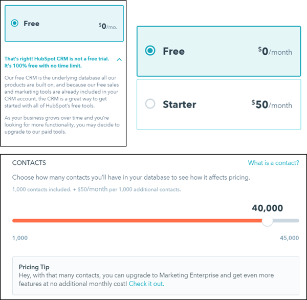
From this, we learned that people were often skeptical that the CRM was truly free, which led to our decision to incorporate copy on the CRM pricing page to directly address that concern.
We also learned that people were confused by the contact tier pricing for the Marketing Hub, so we incorporated a slider that shows users how purchasing additional contacts directly impacts their pricing, and also added a tooltip to explain to users what “contacts” are.
Lastly, we learned that because we had only been displaying pricing for our Marketing Basic, Professional, and Enterprise plans on our main pricing page (with pricing for our free and Starter plans living on an entirely separate, fairly hidden page), the $200 Marketing Basic price tag gave a lot of visitors sticker shock. This supported our decision to incorporate pricing for our free and Starter plans (and sign-up CTAs for our free marketing tools) into the core pricing page to prevent users from disqualifying themselves based on cost alone, and from getting scared away before getting started with our software.
4. Interviews With HubSpot Sales Managers & Reps
Knowing that the pricing page is still an important tool for our sales team, we interviewed sales managers and reps alike to gather their feedback on the old pricing page — what they liked and didn’t like, what was working for and against them, and what other opportunities they saw for the upcoming redesign.
From this, we learned that we weren’t putting enough emphasis on the customer support we have — and that customers see it as just as valuable as any other software feature. This led to our decision to include customer support in the page’s feature grid, and to dedicate an entire section of the page to highlighting our various customer support options for paying customers.
We also learned that pricing page users need help determining which particular plan is right for them, and that we should make pricing transparent enough for users to understand what they get with each plan, but also intricate enough that users need diagnostic and prescriptive help from a sales rep. So we updated the copy for the descriptions that go along with each plan to help users more easily self-identify which one is right for them. We also used the copy positioned next to the the sales phone number to communicate to users that the best way to determine the right plan is to talk to a salesperson directly.
5. Qualitative User Testing
Furthermore, we conducted user testing on the old pricing page to understand what was already working, and where it fell short.
In addition to further validating insights from some of our other forms of research (e.g. the sticker shock of the Marketing Hub, the confusing contact tier pricing, the oversight of not featuring our customer support services more prominently, users’ difficulty in determining which plan is right for them, and the need for the easy navigation between pricing for different products), we also learned about the elements of the old pricing page that were particularly important to users: transparent pricing, a pricing calculator component, and the ability to easily compare plans.
In addition, we learned that users were having a difficult time comparing the value between different plans, and we discovered that the page’s cognitive load was high. In other words, there was too much information on the page for users to process at once, and they were suffering from information overload.
This led to our decisions to use expandable modules on certain parts of the page to reduce cognitive load, and to redesign the feature comparison table into something that A) was simplified and more easily digestible, and B) made it easier for users to compare the value between plans — the feature grid we have today.
6. Competitive Analysis
Pulling primarily from the Montclare SAAS 250 list of the most successful SAAS companies, we also spent time gathering examples of other companies’ pricing pages, analyzed the pros and cons of each approach, and drew inspiration from the pieces we liked.
This helped us validate that the new SKU/plan navigation we were planning to implement (to enable users to easily toggle between pricing plans and compare the available features) was a smart direction.
7. Building for a Scalable Future
My team keeps testing road maps for many of the core, heavy-hitting pages on our website. Here, we document all the tests we’d like to run and the insights from research we’ve done to come up with those testing ideas — all organized into a timeline of what we should test first.
So as part of the redesign, we sat down with HubSpot Chief Strategy Officer Brad Coffey so we could design a pricing page that would easily scale with, adapt to, and align with our potential business strategy.
Evaluating the Results of the Redesign
After the redesigned page went live, we repeated a lot of the research above to check in on how the new page was performing.
We’ve already mentioned that the redesign led to 165% more hand-raisers and 89% more free users in the month after the redesign (9/27/17 – 10/24/17) compared to the month prior (8/29/17 – 9/25/17), but we also conducted user testing and solicited feedback from our sales team on the new design. Here’s a summary of the feedback we gathered and the ways we’re acting on it.
Feedback From User Testing
From user testing, we learned that the new pricing page design is strong — users intuitively use much of the design, and it’s easy for them to understand what they’d be getting from each pricing plan.
Users also commented that the conversion events on the page seemed well-balanced and not intrusive. They said the CTAs throughout the page to talk to Sales, call us, and chat with us weren’t overly aggressive; they were actually helpful!
We also identified some room for improvement, and learned that there were some small design and copy tweaks we could implement to improve the user experience even further still, which we’ve been following up on.
Feedback From the Sales Team
In addition to users, we also solicited feedback from our sales team, who identified a few updates we could make to the design to make our pricing even more transparent and user-friendly to prospects.
As a result, for example, we made the pricing page URL dynamic so it changes based on a user’s selections in the pricing calculator. This made it much easier for sales reps to share specific pricing configurations with prospects, who could in turn share those configurations with other decision-makers in their company.
Design Based on Insights
Our redesign wasn’t successful by chance, and none of the changes we made were made on a whim. All of the decisions we made (the copy, the layout, the user experience, the design, the conversion events) were strategic and deliberate, rooted in insights we learned from some aspect of our research.
The lesson is this: When you test and design based on insights you’ve learned from real research, that’s how you generate real results.
So if you’re considering a redesign, make sure there is a real, data-backed reason for doing it, and do your due diligence to identify which parts of your design are failing (and why) so you know exactly what to fix and how to fix it. Redesigns are a time-consuming, and often expensive, undertaking, so you’ll want to do your best to make sure the results were worth the effort.
Apple product delays have more than doubled under Tim Cook’s watch, says WSJ analysis
Delays between Apple announcing a product and shipping it to customers have more than doubled under Tim Cook’s watch, according to a WSJ analysis.
Of the 70-plus new and updated products launched during Mr. Cook’s tenure, five had a delay between announcement and shipping of three months or more, and nine had delays of between one and three months. Roughly the same number of products were launched during Mr. Jobs’ reign, but only one product was delayed by more than three months.
The averages bear out the paper’s claim, though also illustrate the rather small difference for a typical product launch …
Apple & others say ‘little to no performance hit’ from security mitigations for CPU flaw
Concerns about the performance hit of mitigating the security flaw in Intel, AMD and ARM processors appear to have been dramatically overblown.
The initial report in The Register suggested ‘a ballpark figure of 5-30% slow-down,’ but Intel now says that the performance impact ‘should not be significant,’ with Apple and others agreeing that this is the case …
What is Deep Learning? Here’s Everything Marketers Need to Know
The machines are here.
You may have heard rumors about artificial intelligence (AI) potentially taking over our jobs. And the question is: Should you be concerned?
In my opinion, we should be excited.
AI — especially “deep learning” technology — brings new opportunities and innovation in the way digital marketing, sales, and customer support are handled.
But what is deep learning? How does it work? And how can it be applied to marketing and sales in your company?
What Is Deep Learning?
Deep learning is a discipline within AI that uses algorithms mimicking the human brain. Deep learning algorithms use neural networks to learn a certain task. Neural networks consist of interconnected neurons that process data in both the human brain and computers.
Neural Networks in Advertising
Let’s assume we are an online car dealership, and we want to use real-time bidding (RTB) as a mechanism to buy ad space for our product on other websites — for retargeting purposes.
RTB is an automated process that takes place in a short time frame of under 100 milliseconds. When a user visits a website, an advertiser is alerted, and a series of actions determines whether or not that advertiser bids for an ad display. Have a look at the image below:
Source: Periscopix
In RTB, we use software to decide if we want to bid for a certain ad — the software will make a decision by predicting how likely the website visitor is to buy one of our products. We call that “buying propensity.”
In this instance, we’ll use deep learning to make this prediction. That means our RTB software will use a neural network to predict the buying propensity.
The neural network inside our RTB software consists of neurons and the connections between them. The neural network on the above image has only a handful of neurons. In reality, a digital neural network has thousands — or even millions — of neurons and connections.
In this scenario, we want to find out if a certain website visitor is likely to buy a car, and if we should pay for an ad to target her. The result will depend on the interests and actions of the website visitor.
To predict the buying propensity, we first choose several “features” that are key to defining this person’s digital behavior. In our example, those features will consists of which of the following four web pages were visited:
- Pricing.
- Car Configurator.
- Specifications.
- Financing.
Those features will influence the output of our neural network — or, essentially, our conclusion. That output can have one of two values:
- The website visitor is interested in the product, or “ready to buy.” Conclusion: We should display an ad.
- The website visitor is not interested in the product, or “not ready.” Conclusion: Do not show an ad.
How the Neural Network Functions
Let’s have a closer look:
For each input, we use “0” or “1”.
“1” means the user has visited the webpage. The neurons in the middle will add the values of their connected neurons using weights — or, more simply put, they define the importance of each visited webpage.
This process continues from left to right, until we reach the “output” neurons — “ready to buy” or “not ready,” as per our earlier list.
The higher the value of the output, the higher the probability that this output is the correct one — or the more accurately the network predicts the user’s behavior.
In this example, a website visitor looked at the Pricing and Car Configurator pages, but she skipped Specifications and Financing. Using the numerical system above, we get a “score” of 0.7, which means that there is a 70% chance this user is “ready to buy” our product.
So, if we look at our original formula, that score indicates the conclusion that we should buy the RTB ad placement.
Training of the Neural Network
Now that we know how a neural network functions, let’s have a look at how to make sure our output neurons are calculated correctly, in order to make the right decision.
The challenge is to come up with the correct “weight” factors for all the connections inside the neural network, which is why it needs to be trained.
In this context, “training” means that we feed the neural network data from multiple website visitors — things like visitor features (which web pages users have visited), as well as indicators of their eventual purchase decisions from us (which are labeled as “yes” or “no”).
The neural network processes all these data, adjusting the weights of each neuron until the neural network makes appropriate calculations for each person within the training data. Once that step is complete is done, the weights are fixed, and the neural network is can more accurately predict the outcome for new website visitors.
The Future of Deep Learning
Democratization of AI
AI is quickly finding its way into marketing tools that we use every day. Take, for example, the AI-powered Chatbot builder by Motion.ai (part of HubSpot), which allows you to easily create and publish your own chatbot.
Another example is Dialogflow, a platform from Google that lets you build a chatbot for your company or service.
It certainly doesn’t stop there. AI can assist with the setup of advertising campaigns, hyper-personalize emails, optimize lead scoring, categorize and escalate customer issues, and actually help you with anything that requires data processing or orchestration.
Deep learning can be applied in any area of digital marketing, provided that you have a sufficient amount of “training” data. The challenge is typically to extract data from your various marketing tools — that’s where data integration platforms like Blendr.io will be crucial in connecting your data silos when you start experimenting with deep learning and AI.
The Future: AI … That Builds New AI
Google explains that the process of designing neural networks often takes a significant amount of time for development and experimentation, because all of the neural network layers have to be crafted by people. That’s why Google invented AutoML: AI that can build new and better AI algorithms.
Imagine what that type of technology can bring to something like marketing automation, for example. The AI will be able to build additional, customized AI algorithms that will learn and automatically optimize nurturing campaigns, for example.
Though deep learning may sound complicated, it’s a process that, much of the time, boils down to math. Neural networks “learn” in a manner similar to humans: by viewing many examples, and discovering the commonalities among them.
Once the neural network is trained, it can perform complex tasks and a certain level of reasoning. Deep learning and AI can be integrated into many aspects of digital marketing and sales automation. The machines are not coming — they are already here.