
Welcome to My Blog
The Science Behind Design: 8 Psychology Principles to Apply to Your Next Project
When it comes down to it, design is all about making choices. Each color, shape, line, font, text, and graphic you use will ultimately influence the message you’re trying to get across.
I’ve often been in conversations with people who know they should get better at design, but they don’t feel they have a “natural sense” for creativity. However, I argue that learning to design well has as much to do with psychology and user behavior as it does creativity.
But learning the “psychology of design” doesn’t mean picking up a playbook that’ll tell you the right and wrong way to design something. That’s just not the way it works.
What brushing up on psychological principles (as they relate to design) will do is help you understand what goes into the creation of intuitive, intentional design experiences.
Want to learn more? We’ll dive into a handful of psychological principles below to help you get the wheels turning.
8 Psychological Principles That’ll Change the Way You Design
1) Mental Models
Computer scientists and UX designers think and talk a lot about mental models, because the process of designing something new — like a website layout or a new app — requires trying to uncover and act on what users might find to be intuitive.
Mental modeling is the process of mapping out what a person understands about the real world through experience and replicating those models in the design of something in the virtual space. This is all about trying to uncover your audience’s intuitive process.
Think of your computer files and folders. They’re based on the same old-school method of organizing hard files, so it’s easy for the user to understand — despite the visual looking rather different.
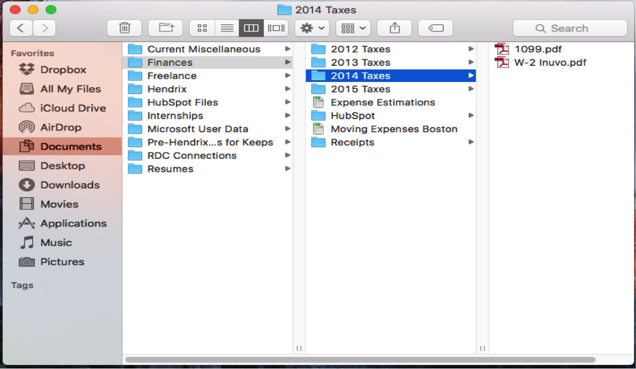
For designers, understanding what mental modeling is and why it’s important comes down to simply designing with your users’ experience in mind.
Throughout your design process, do an “intuitive check.” Are your visuals moving right to left, top to bottom? Is your message clear and easy to understand, or is it unintentionally hidden?
A gut check with a friend or coworker is a great way to keep an eye on whether your mental modeling is working well in your designs.
2) The Von Restorff Effect
The Von Restorff effect is, quite simply, the idea that the oddball out is the one that gets remembered.
When designing, sometimes you want your audience’s eye to be drawn to one spot –even if there are other design elements around it. This might mean using a different color, font, size, etc.
In this example, Target Jobs, a UK-based career and job-searching tool, used this image to illustrate how one might stand out from the crowd in the job market. By placing a group of similar elements next to one different element (the red shoes), this image uses the Von Restorff effect to show how it’s the different idea that really stands out to the viewer.
Image Credit: Target Jobs
While this example’s idea is fairly straightforward, you can also use the Von Restorff effect throughout your site pages to draw your users’ eyes to certain spots on a page.
For instance, in CTA creation, you can use the Von Restorff to create contrast on your page and draw your users’ attention, like this:
3) Gestalt Principles
Gestalt psychology explores how elements are perceived in relation to each other visually. The gestalt principles, or gestalt laws, focus specifically on how design elements are grouped together.
- Proximity: The idea that when objects are placed in close proximity to one another, those objects are seen as a group rather than seen individually. Although there are lots of shapes within the “U,” in the Unilever logo, the eye still recognizes those objects as a group making up the “U” figure.
Image Credit: Unilever
- Similarity: Objects that look similar will be perceived as one object or as a part of the same group. In the NBC logo, the similar cones are perceived as a group because they look similar to one another.
Image Credit: NBC
- Closure: Closure occurs when a shape is still perceived as a whole even when the object is not fully closed in reality. In the Girl Scout logo, the shapes and whitespace are used to create a perceived series of silhouettes even though only some of the shapes are actually enclosed.
Image Credit: Girl Scouts
- Continuity: Occurs as the eye moves naturally from one object to the other. This often happens through the creation of curved lines allowing the eye to flow with the line. In the Olympic logo, the eye can see that the objects are continuous as they link with each other, creating a grouped visual.
Image Credit: Olympics
- Figure & ground: When the eye notices an object as an object, it separates the object (figure) from the surrounding area (the ground). In this logo-tribute to Steve Jobs, the viewer either see the white space as the figure or the ground, depending on whether the eye looks at the apple or the silhouette of Steve Jobs.
Image Credit: Jonathan Mak Long (via The Next Web)
4) Visceral Reactions
Have you ever come across a website, picture, or anything visual that you just instinctively loved but couldn’t necessarily explain why? You probably had a visceral reaction — the kind of reaction that just comes from the gut.
Designing for visceral reactions is essentially designing to create a positive aesthetic impression. To some extent it takes just knowing what looks pleasing to people and what doesn’t.
Airbnb uses visceral designs to capture the beauty and exotic aesthetic of travel. Although most Airbnb’s for rental probably don’t have beachside views or colorful accommodations, Airbnb uses design to connect their audience with the excitement and possibility of traveling the world.
Designing for the visceral can be as a simple as using beautiful photography and colorful imagery to capture the attention of your audience.
5) The Psychology of Color
We often associate different colors with feelings or thoughts, so designers have done a lot of research to find out which colors humans associate with different moods.
For a more in-depth look at which colors are used for different moods, here’s a great infographic on the psychology of color. Otherwise, here’s the basic rundown:
Blue: Secure, calm, honest, trustworthy, strong, caring
Corporate businesses often use blue to convey a neutral sense of trustworthiness. Facebook’s blue color scheme, for example, helps convey to users that it’s a secure, strong social network. This helps users feel a sense of privacy and security even when sharing and displaying lots of personal information.
Red: Energy, love, exciting, action, bold, passionate
Coca-Cola is one of the classic examples of how a company has used red in its branding to communicate how exciting and energetic it is as a product.
Orange: Happy, sociable, friendly, affordable
At HubSpot, orange is our favorite color. And it’s no wonder why we love it so much — it communicates to our audience how happy we are to be helping our customers do better marketing.
Yellow: Logical, optimistic, forward-thinking, confidence, playful
Bzzy, an app that let’s you easily auto-reply your friends when you’re busy, uses a yellow color scheme to communicate its innovate style while still maintaining a sense of playfulness.
Purple: Imaginative, creative, nostalgic
Kaleidoscope’s purple color scheme helps communicate the imaginative, helpful nature of its app: an app that helps you do quick and easy file comparison when you need to merge changes across different versions.
Green: Growth, organic, natural, caring, fresh, earth
For companies, like Whole Foods, that want to highlight an obvious connection to nature and freshness, using green as a basis in their color scheme is a no brainer. Green helps communicate the natural, organic feeling that Whole Foods strives to tie into its branding.
Black: Sophistication, luxury, seductive, formal, authority
Want to travel in VIP style? 212 Supercars, a luxury car rental and driver service, uses a sleek black-and-white design to communicate it’s luxurious and exclusive branding.
Multi-color: Multi-channel, positive, playful, bold, boundless
Google, the classic example of a multi-channel, playful company communicates it effectively through its use of the multi-color scheme.
6) The Psychology of Shapes
Like colors, humans associate different shapes with certain emotions and characteristics.
Although less of a principle itself, the psychology of shapes boils down to studies that have shown which characteristics people match with certain shapes.
Circles, Ovals, and Ellipses: Positive emotional messages attached to community, friendship, love, relationships, unity, and femininity.
AT&T’s circular logo helps its brand communicate a universality feel. As a wireless network, this makes sense. The use of shape helps connect the audience with a recognizable pattern.
Image Credit: AT&T
Squares and Triangles: Stability and balance, strength, professionalism, efficiency, power, and masculinity.
Microsoft and Delta both use triangles and squares in their logos. This helps establish feelings of stability and efficiency when viewing the logo, which are positive feelings to associate with brands.
Image Credit: Microsoft
Image Credit: Delta
Vertical Lines: Masculinity, strength, and aggression.
While the basic cloud shape of SoundCloud’s logo might communicate emotions associated with dreaming and creativity, the vertical lines create a more aggressive feel. It’s the combination of the lines and the overall cloud shape that helps communicate the duality of the creative and the strength of SoundCloud as a tool.
Image Credit: SoundCloud
Horizontal Lines: Community, tranquility, and calm.
As a civil rights organization, the Human Rights Campaign is a great example to consider when thinking about building community and peace. And the horizontal lines/rectangles used in the logo really help to communicate both equality and tranquility.
Image Credit: Human Rights Campaign
7) Dual-Coding Theory
You’ve probably heard the statistic before that our brains process visual information 60,000X faster than text. Well, dual-coding theory is the idea that both visual and verbal cues can represent ideas, but using both can help the brain recall those ideas faster.
In other words, we need visual and verbal information to digest and remember information.
When designing, this means illustrating ideas as much as possible, while still using verbal messages to fully explain ideas.
In the example below, the graphic shows a visual, literal representation depicting primary, secondary, and tertiary colors. But to fully grasp the concepts, it’s necessary to pair the visual information with written (verbal) information. The dual-coding is what helps the reader truly understand the concept.
8) Cost-Benefit Analysis
Whether we consciously think it or not, every decision we make goes through a cost benefit analysis, which is simply the process of weighing the costs and the benefits of an action before we take it.
If the costs outweigh the benefits, we don’t take action.
As designers, our job is to make sure whatever we have designed has benefits that outweigh the costs. This means making our content as simple as possible for the audience while still fulfilling the goal of the content.
Think of a form submission on your landing pages. Say you want to offer your audience some top-of-the-funnel content like a template or high-level ebook.
When you strategize about getting users to fill out a form to claim this content, you have to remember to design your conversion process with your audience’ cost-benefit analysis in mind. In other words, don’t ask for more than you need.
How do you use psychology to inform your designs? Share you thoughts and ideas in the comments below.
Apple says it intentionally left the iOS 10 kernel unencrypted for better software optimization
Earlier today we reported that the kernel of the first developer preview of iOS 10 is unencrypted – a first for any iOS version. At the time, we weren’t entirely sure if Apple had deliberately done this or if was an error and would get reverted in the next beta of the operating system. Apple has confirmed to TechCrunch, however, that making the kernel unencrypted was an intentional move.
Filed under: Apple
iPhone 7 said to have slightly larger earpiece & relocated ambient light sensor
Earlier this week it was reported that Apple would be including standard 3.5mm EarPods plus an adapter with the iPhone 7, and now a few more minor details have emerged regarding the device. According to Macotakara, the iPhone 7 will feature a slightly larger earpiece, while the ambient light switcher will also be relocated.
Filed under: Apple
Opinion: Search Ads in the App Store introduce multiple new ways for developers to compete
Since iOS 10’s first beta hit last week, testers have been seeing signs of Apple’s Search Ads in the App Store. Officially announced a week earlier, Search Ads were marketed as being a way to help customers “discover or reengage” with an application. Something I wondered immediately after the original announcement was how Apple would regulate the Search Ads in a highly competitive market. After having used iOS 10 for over a week now, I’m not any less concerned.
Filed under: Apple
SanDisk’s Memory Case puts a Lightning flash drive in a sleek iPhone case w/ optional battery pack
When I reviewed SanDisk’s new Lightning to USB flash drive for iPhone back in April, I noted it was one of the best yet. Today the company is launching a new product that essentially offers the same functionality— extra storage for files that you can access from a companion iOS app— but in the form factor of a sleek iPhone 6/6s case.
Filed under: Apple
Dropbox app gets doc scanning & more, but now requires desktop app for free auto-camera uploads
Dropbox is getting some notable updates today for both the mobile apps and desktop that bring a number of new productivity tools and features to the service. It’s also changing its mobile camera uploads feature for basic users to require they have the desktop app installed or a paid Pro account.
Filed under: Apple
macOS Sierra Preview Roundup: Mac catching up with iPhone & iPad, but many iOS 10 features are missing
Apple announced macOS Sierra as the successor to OS X El Capitan last week at WWDC 2016, introducing new features like Siri for Mac, Apple Pay for Safari, Auto Unlock, Universal Clipboard, and new iCloud features that will ship to customers later this fall. After nine days with the first developer beta preview, more than a dozen publications have published an initial round of previews of macOS Sierra including some new details about Apple’s upcoming Mac software update.
Filed under: Apple
9to5Toys Lunch Break: PowerBeats2 Headphones $120, Seagate 4TB Portable HDD $110, Sony AirPlay Speaker $290, more
Keep up with the best gear and deals on the web by signing up for the 9to5Toys Newsletter. Also, be sure to check us out on: Twitter, RSS Feed, Facebook, Google+ and Safari push notifications.
TODAY’S CAN’T MISS DEALS:
Score PowerBeats2 Wireless Headphones for $120 (40% off) and maybe you’ll become an NBA champion too
Daily Deals: Seagate 4TB USB Portable Hard Drive $110, Duracell 8800mAh & 1850mAh Power Bank Set $23, more
Get the best of both worlds w/ Sony’s AirPlay and Bluetooth Speaker for $290 shipped (Reg. $350)
Grab Apple’s latest 13-inch Retina MacBook Pro on sale from $1,000 shipped w/ .edu ($300 savings)
Get an iPhone 5s 16GB (refurb) w/ a month of FreedomPop’s Unlimited for $160
Best Buy will give you an Apple Watch for $49 w/purchase of iPhone 6s/+ plan on AT&T/Verizon/Sprint ($250 off)
App Store Free App of the Week: TextGrabber + Translator goes free for the very first time (Reg. $5+)
Put your survival skills to the test as Don’t Starve for iOS drops to its lowest price yet: $1 (Reg. $5)
Yoga Studio: one of the best iOS yoga apps out there just went free for the first time in a year (Reg. $4)
All the iOS Grand Theft Auto titles just went on sale up to 60% off: Liberty City Stories $3 (Reg. $7), more
Rovio’s Bad Piggies for iPhone/iPad goes free for the first time in years (Reg. $1)
How-to: Put a USB Charging port just about anywhere, without AC power for as little as $50 (Solar+Battery)
Giotto’s $10 Rocket Air Blaster is the best way to keep your Mac clean for the money
Review: At just $24, this Leather Loop Band for Apple Watch looks great and won’t break the bank [Gallery]
MORE NEW GEAR FROM TODAY:
Smartphone Accessories: Aukey Waterproof Bluetooth Speaker $15 Prime shipped (Reg. $22), more
- Amazon’s $80 Kindle e-reader picked up Bluetooth capabilities, fresh colors, more this morning
- Games/Apps: Ratchet & Clank PS4 $27, Xbox One 4 game bundle w/ extra controller $299, more
- Adobe Photoshop & Premiere Elements 14 bundle: $75 (25% off)
- Go retro with the 1byone 3-Speed Portable Stereo Turntable for $40 Prime shipped (Reg. $77)
- You might have Amazon credit from Apple’s eBook settlement, find out how to check here
- Waves wants to bring 3D audio to any headphones using a new app & head tracker
- Ditch that silly adapter for a built-in Boss Bluetooth Car Audio Receiver from $45 (Orig. $65+)
MORE DEALS STILL ALIVE:
Anker launches sale on Amazon for a bunch of its iPhone accessories: Lightning cables $6, cases from $5, more
Protect your iPhone 6/s/Plus or 5/s/SE w/ a Ringke case for as little as $3 shipped
Filed under: Apple
Happy Hour Podcast 072 | iOS 10 dark mode, Apple’s Home app, iPhone 7 rumors, and more
This week Benjamin and Zac recap iOS 10, macOS Sierra, and watchOS 3, plus break down dark mode rumors, how Apple’s new Home app works, the latest iPhone 7 news, and much more. 9to5Mac’s Happy Hour podcast is available for download on iTunes and Apple’s Podcasts app, or through our dedicated RSS feed for Overcast and other podcast players.
Filed under: Apple
Dissecting the Most Commonly Used Agile PM Methods
The new catch word in the world of project managers is “agile”. But how exactly can agile project management be explained? It’s an attitude for managers who want to use approach with making quick alterations in an ever-changing environment. Agile Project management is all about a flexible process, embracing changes as they arise late in the development lifecycle, agile projects constantly change and evolve such as the practice itself.
The difference between the agile pm and the traditional management is mainly in the self-directed approach. The team members have the ability to bring decisions and work on their own as long as they are respect the agreed rule framework. They follow open communication techniques and tools which enable the employees to express their views and feedback openly and quickly. Using project viewer enables them to open the project from their cellphones, laptops and iPads and work from a “virtual office”.
Likewise, customer testing and user feedback are constantly implemented and they learn from the mistakes, implement feedback and evolve deliverables. This is used to avoid one final result.
The agile teams reduce complexity by implementing short-term deliveries by using a delivery cycle that ranges from one to four weeks generally known as “sprints”. Because of that the team can change direction at any time in the process to make sure that their product will meet changing needs.
Agile Project Management includes methods such as scrum, extreme programming (XP) and DSDM.
Scrum is known for its simplicity and flexibility as well as addressing to the many management issues that have plagued the IT development teams for decades. It represents a way of managing tasks within a team-based development setting. Scrum highlights feedback, team independence, and building tested product increments within short repetitions. Scrum has five meetings: Daily Scrum, Sprint Planning, the Sprint Review Meeting and Sprint Retrospective Meeting.
- The product owner represents important stakeholders and customers, and is in charge of arranging the project and business aspects of the project.
- The scrum master attends as the team’s instructor or coach, by helping the members work together. This person solves problems, supervises communication so that team members and stakeholders can communicate the progress that has been made.
- The team is the group of professionals that collaboratively decide which person should work on which task, the technical practices that are necessary to achieved goals etc.
XP (Extreme Programming) is a more far-reaching agile practice, concentrating on the software engineering procedure and emphasizing the analysis, development and test phases with fresh methods that make a considerable modification to the quality of the end product.
DSDM (Dynamic systems development method) is one of the agile methods, that emphases that a project must have distinct strategic goals and focus on timely delivery of real benefits to the business.
In an agile model, throughout the development lifecycle, it is usual to reexamine each part of development once every two weeks. When a team stops and re-evaluates the project track once every two weeks that gives time to navigate the project in another direction.
The outcome of this “check out-and-fit” method to review development significantly reduces development budgets as well as time to market. Instead of marketing a part of software that hasn’t even been written yet, agile allows teams to constantly reevaluate their announcement to enhance its value during development stages, empowering them to increase competitive advantage.
The post Dissecting the Most Commonly Used Agile PM Methods appeared first on Project-Management.com.
from Project Management Articles – Project-Management.com http://ift.tt/28MLRPy
via Project-Management.com
How Project Managers at AT&T Wireless, Paypal and PG&E Run Productive Meetings
We spoke to project managers who lead large teams accomplishing a diverse range of projects ranging from software, to finance to utilities, to understand how they manage meetings.
Here’s how they do it.
1. Establish ground rules
At the outset of your project, establish a set of meeting rules and expectations – don’t assume everyone is on the same page.
“It’s pretty important to set these up in advance” says Max Durazo, Director Construction & Engineering at AT&T Wireless. “I routinely lead meetings with 20 or more people. If attendees aren’t clear on the basics, meetings are far less productive.”
Depending on your leadership style and type of meeting, you should cover off:
- The use of phones/laptops and multi-tasking in meetings (is it OK?)
- Showing up or dialing in on time, and the implications for not doing so
- Adopting a silence denotes agreement policy
- Respect for everyone’s privacy and confidentiality
- Level and type of preparation participants are expected to do
- Expectations around participation and distractions during the meeting
- Separating the person from the issue
Adopting a common set of rules ensures that everyone on your team understands how work gets done in project meetings and sets your tone as a leader.
2. Understand the purpose of your meeting
Complex, lengthy projects are composed of a myriad of meeting types: Weekly Status Updates, Proposed Scope Changes, Risk Assessments, Budget Status, Staffing Review and more.
Each has its own purpose and expected outcome. Make sure, as the meeting leader, that you can articulate why you’re having the meeting and what you expect to achieve. As you build out your meeting agenda, you should be able to mentally align each topic, discussion and task with your stated purpose.
“Everyone you invite to your meeting should align to its purpose. If they don’t, they shouldn’t be there – return that hour to the company.” says Amit Raman, Program Manager at Paypal.
For ad-hoc or one off meetings, explicitly stating the purpose and expected outcome at the beginning gets everyone on the same page and aligned in their thinking. For recurring meetings, it’s useful to revisit the meeting’s purpose every other meeting to ensure everyone remembers why this meeting occurs.
3. Create a cadence around communication
For recurring project meetings, get participants used to a pattern of communication around them.
If your team meets weekly, send out an agenda for comments/updates at least a couple of days in advance. Use a collaboration tool like Google Docs or Trackmeet to permit shared Agenda editing and commenting.
Address issues that may be contentious or require additional explanation in advance of group discussion at your meeting. Use in-person or telephone conversations vs. email for these situations to fully explain the issue and gather input.
“People only like surprises on Christmas and birthdays. Over-communication with your stakeholders is never a bad thing” Amit adds.
Follow up after a meeting should be done within hours in order to maintain project and meeting momentum. Distribute notes, decisions, action items and if the technology permits, an audio or video recording of your meeting.
4. Set expectations around follow-up
In his project meetings, Amit uses a “contract” to set expectations around post meeting follow-up.
“I’ll ensure no one walks out of our meeting room until we write down who’s doing what, when. To do otherwise means we’ll meet again to talk about the same things. Nobody wants that” he says.
By explicitly capturing these tasks, you’re making it clear to your project team that you will be tracking them and indicates that you deem them important. What gets measured gets done.
5. Know when to listen and when to speak
In a group setting, you have an invaluable collection of wisdom and perspective from which to draw. Resist the urge to always be talking. Let a discussion wander if it needs to.
“Leaders who talk too much in meetings are doing their teams a disservice. Your team has first-hand knowledge of what’s happening on the ground, in the trenches – put away your ego and listen” councils Ron Olson, a project manager with Pacific Gas and Electric (PG&E).
A leader’s job here is to frame the discussion and articulate a vision to let the collective wisdom of her team come to the best conclusion. A fine line exists between being overbearing and guiding – observe this tendency and watch your team outperform!
Also, set the expectation that “silence denotes agreement”, so that when you do make a decision or state an assumption, the group assumes it to be true if no one offers additional input. This puts the burden of debate on your team and doesn’t have you searching for feedback.
The post How Project Managers at AT&T Wireless, Paypal and PG&E Run Productive Meetings appeared first on Project-Management.com.
from Project Management Articles – Project-Management.com http://ift.tt/28Pw3zF
via Project-Management.com
Be Careful Which Projects You Agree to Manage
Be Careful Which Projects You Agree to Manage
By James Young
I am bewildered when I encounter organizations wherein projects are created or bids won and then assigned to a Project Manager who has no prior knowledge of the project. Why would a Project Manager accept the responsibility for a project that he/she did not participate in […]
from Project Management Articles – PM Hut http://ift.tt/28NEauo
via pmhut.com
Waves wants to bring 3D audio to any headphones using a new app & head tracker
Waves is a heavyweight in the digital audio world with its audio plugins for recording, mixing and live sound being a staple among many pros. The company’s latest venture, however, is more of a consumer experience aimed at listening rather than creating music with a new desktop and mobile app that wants to bring 3D audio to any headphones using head tracking.
Filed under: Apple
72 new emoji are on the way, likely headed to iPhone and iPad with iOS 10
72 new emoji will be making their way to iPhone and iPad soon, likely with iOS 10. The Unicode standards body this week ‘released’ the latest round of new emoji characters, including sneezing face, drooling face, ‘selfie’, boxing glove and ‘face palm’. You can see what these will look like in the image above, which is a mockup by Emojipedia of the new emojis in Apple’s graphic style.
Filed under: Apple
The Chinese company alleging patent infringement by Apple is essentially defunct – WSJ
Shenzhen Baili, the Chinese company that last week managed to win a Beijing patent office ruling that the iPhone 6 copied its own Baili 100C smartphone, is effectively defunct, reports the WSJ.
[Parent company] Digione had collapsed, brought down by buggy products, mismanagement and fierce competition, according to former employees and investors. Digione has been absent from China’s mobile-phone market for at least a year and Baidu has accused it of squandering its investment.
When the WSJ attempted to track down the company behind the alleged patent, it found no signs that it was still operating …
Filed under: Apple
On-Page SEO 101: Tips for Keyword Optimizing the Most Critical Parts of Your Website
SEO can sometimes feel like it stands for “Something Extremely Obscure.”
As marketers, we’re responsible for staying on top of what can feel like endless Google algorithm updates. And if we fail to do so, we run the risk of not showing up in search for important target keywords.
But keeping pace with all of those changes isn’t easy. Thankfully, when it comes to achieving SEO success on your website, there’s one rule of thumb that remains a tried-and-tested technique: optimizing your website with relevant and targeted keywords.
By having a well-optimized site, you’ll start to see results like improved visitor quality, higher conversion rates, and in the end — more closed customers.
In this article, I’m going to cover how to add keywords to your website once you’ve already completed your keyword research. So before you dive in to this post, be sure to read this awesome blog post on how to do keyword research.
Got your keywords ready? Alright. Read on to learn what on-page SEO is, where to add those keywords to your website, and how to avoid search penalties.
What is On-Page SEO?
SEO, or search engine optimization, is all about creating content, optimizing it, and promoting it. When we talk about SEO, we often talk about “on-page SEO” and “off-page SEO.”
What’s the difference? In short:
- On-Page SEO is what a site “says to a search engine.”
- Off-Page SEO is what “other sites say” about a site.
On-page SEO, or “saying something to a search engine,” means optimizing individual web pages so that they rank higher on search engine results pages. The term covers both the content itself, as well as the HTML source code — both of which can be optimized for search.
Off-page SEO, on the other hand, refers to external ranking signals like links.
Improving your on-page SEO can help your inbound marketing efforts immensely by helping you attract the right visitors to your website. You want to optimize your pages for search engines so they can understand who you are, what you do, and what you’re writing about. Again, when you improve your on-page SEO, you’ll help increase the organic rank of your website on search engine results pages (SERPs).
(HubSpot customers: Click here to learn how to use HubSpot’s on-page SEO tool, which is built right into the software.)
On-Page SEO Tips to Help Your Webpages Rank Better in Search
1) Start with an SEO audit of your website.
Every time you add new site content, you’ll want to create that content with the specific keywords you’re targeting (1–2 per individual webpage) in mind. But if you already have a bunch of web pages published, then your first step will be performing an SEO audit on your current website.
An SEO audit will give you an idea of how SEO-friendly your website is overall. That way, you can update and optimize your current content for search starting with your highest-traffic web pages. The audit will also help surface any other issues you may have, like duplicate content, so you can address them immediately and start ranking better in search.
Watch this quick video series to learn how to perform an SEO site audit in detail. It’ll cover how to check whether your site is being blocked by search engines, make sure your XML sitemap is working, monitor and improve site performance, spot and remove internal duplicate content, and check your site’s popularity and trustworthiness.
In short, here’s what you’ll need to do:
- Export all of your site pages into an Excel spreadsheet.
- Sort by the most frequently visited pages. (Learn how to sort in Excel here.)
- Decide which keyword category each one falls into, and add that category into a column beside the page name.
- Add another column in your spreadsheet to add more specific keywords that you want to add to that page. Keep in mind that they must be relevant to the content on that page, as well as terms your target audience would be searching for.
Here’s an example of what this might look like:
Once you’ve completed this process for all of your pages (or, if you have a ton of pages, at least the most important ones), then you can jump in to your site to start adding keywords.
Here are a few other helpful resources for performing SEO audits:
- Moz: “How to Perform the World’s Greatest SEO Audit“
- Search Engine Journal: “How to Perform Your First SEO Audit“
- Search Engine Land: “How To Do Your Own 5-Minute SEO Audit“
2) Add keywords (naturally) to 5 critical places on your website.
In order to optimize your pages for keywords, you’ll need to, well … include those keywords on your site. But not every placement of a keyword is equal: There are certain places on your website that are more optimal than others for on-page SEO.
Here’s a list of some of the most important places to optimize for your chosen keywords on your site:
- Titles
- Descriptions
- Headings & Content
- Images Titles & Alt Text
- URLs
If you haven’t optimized these sections of your site in the past, you have some work to do — but it’s up-front work that will pay off big time in the long term. To get the most bang for your buck, start with the pages that get the most traffic. Then, as you create more pages in the future, be sure to optimize as you go.
(HubSpot customers: Click here to learn how to figure out which web pages are getting the most traffic using the “Sources” report.)
Titles
Titles are the HTML element used to describe the topic of a web page. You’ll find them in the title of a search engine result page (as shown below), and in the top bar of an internet browser.
Titles have a direct impact on both searcher clickthrough rates (CTRs) and search rankings. To make your title both search-friendly and click-friendly:
- Try to keep it below about 65 characters so it doesn’t get cut off on search engine results pages.
- Include one of your target keywords or phrases so it’s easier for searchers to identify that your results are relevant to other query — and position these keywords toward the front of the title to lower the risk of it getting cut off on SERPs.
Descriptions
Descriptions, also known as meta descriptions, are shown in search results below the title and URL, as shown below.
Descriptions can help increase CTR, but nowadays, they actually don’t have a direct impact on rankings. They’re there for humans, not search engine crawlers, and you should use them to tell searchers why they should click on your result. Use one of your target keywords or phrases in your meta description so they know your content is relevant to their query, but make it attractive to the viewer, too.
Bonus: You can use this cool tool from Dejan SEO to preview what your search result would look like before deciding which description to use.
Headings & Content
It’s important to use your keywords in your headings and content, as visitors are much more likely to stay on a page if they can see the terms they had searched for on it. Using keywords in your content is used by Google as a ranking factor, so doing this can help improve your SERP placement.
Just make sure you’re using these keywords naturally, since Google has gotten better and better at being able to tell when people are keyword-stuffing their content. Whenever you create content, focus on what matters to your audience, not how many times you can include a keyword or keyword phrase in that content. If you do that, you’ll usually find you naturally optimize for important keywords.
While it’s fine to use keywords in multiple locations on your site, don’t overdo it or Google will demote your web pages in search results. (And hey, no one wants to read content like that, anyway.)
Image Alt Text & Titles
You can also look at including keywords in a natural way in your image alt text and titles. Both alt text and titles are attributes that can be added to an image tag in HTML. Here’s what a complete image tag might look like:
<img class=”alignCenter shadow” src=”image.jpg” alt=”image-description” title=”image tooltip”/>
An image’s alt text tells search engine crawlers what an image is about, which helps it be found in search. It’ll display inside the image container when an image can’t be found, and it also improves accessibility for people with poor vision using screen readers.
An image title tag, on the other hand, is shown when a user hovers their mouse over the element — kind of like a “pop-up.” It won’t be shown to the user when an image can’t be displayed.
(HubSpot customers: Click here to learn how to add alt text and title text to your images in HubSpot.)
Adding keywords to these image attributes may seem minor, and truthfully, it isn’t going to impact your search rankings as much as other things on this list. But trust us, it’s worth the extra minute (if that) it takes to change the name from “IMG23940” to something accurate and descriptive.
For example, if you were to write alt text for the image below:
- Bad: alt=””
- Better: alt=”puppies”
- Best: alt=”golden-retriever-puppies-in-basket”
- Avoid: alt=”puppy-dog-baby-dog-pup-pups-puppies-doggies-litter-retriever-labrador-wolfhound-setter-pointer-basket-wicker-basket-box-container-straw-grass-green-nature”
URLs
It’s a good idea to include keywords in your URL if they accurately describe the page contents. This is particularly important for businesses that do a lot of blogging — there’s a huge opportunity to optimize your URLs on every post you publish, as every post lives on its own unique URL.
But beware: Search engines will penalize exact match domains that are keyword stuffed. So if you’re thinking of starting up arizonerealestaterealtorsinarizona.com, think again. Keep it to http://ift.tt/1h9hpzg, and you should be fine.
As always, keep reader-friendliness in mind when you’re creating your URLs. Overall, your URLs should make sense to humans and give them a good sense of where in your website they’ve landed. You should also separate words with hyphens and remove extra words (like “a” and “the”) in the page part of the URL slug.
3) Learn to avoid search penalties.
There are a couple of things you should also avoid when optimizing your site for keywords, so be careful of the following sketchy SEO practices some people (mind-bogglingly) still use.
Never hide keywords.
This includes using the same color background as you do for the text, hiding them behind images, or hiding them off to the side using CSS. (I know, I can’t believe I have to say it.) While this isn’t as easy to catch as other black hat tactics, today’s more sophisticated search engines can easily find instances of hidden keywords — and it can result in serious search penalties.
Avoid keyword stuffing
Keyword stuffing means repeating keywords over and over again in the text, whether it’s in titles, headings, descriptions, page content, URLs, or even at the bottom of a web page in very small text. Basically, when it looks like keywords have been added unnecessarily onto a web page, it’s probably keyword stuffed.
Keyword stuffing is the oldest trick in the book when it comes to SEO — and nowadays, search engines have been developed specifically to detect it. Not only does it look spammy, but it’s not approved by search engines and will result in penalties.
Don’t force keywords where they don’t belong.
This isn’t quite the same as stuffing a lot of keywords into a post. This is more about not forcing a keyword in — even if it’s just one — if it doesn’t belong, contextually speaking. If you can’t figure out a place to put a keyword in a piece of content, it’s often a sign the content isn’t that well-aligned with what your personas need, anyway.
Remember, SEO is not about incorporating as many keywords as possible. It’s much more about picking content topics relevant to your target audience.
4) Promote a good user experience.
The most important thing to consider is your visitor’s user experience. While optimizing your website for an algorithm sounds purely scientific, remember that the goal of search engines is the deliver the best experience possible to their end-users: searchers. If you keep that goal in mind with your SEO strategy, you’ll be more likely to make good choices. Think about humans first and search engines second, and you’ll be alright.
We know you’re a busy marketer with a lot of things on your plate. SEO need not fall to the bottom of your priority list because of lack of knowledge — or, worse, fear you’re doing it wrong. We hope this was a helpful starting-off point for your on-page SEO efforts. Happy optimizing!
Editor’s Note: This post was originally published in February 2014 and has been updated for accuracy and comprehensiveness.
iOS 10 kernel is unencrypted – possible mistake, but likely to be deliberate
Security experts cited by MIT Technology Review have found that the kernel of the first developer preview of iOS 10 is unencrypted, allowing anyone to examine the code. All previous iOS kernels have been encrypted by Apple.
The heart of an operating system is a component known as the kernel, which controls how programs can use a device’s hardware and enforces security. Apple has previously encrypted the kernel in iOS releases, hiding its exact workings and forcing researchers to find ways around or through it. But the kernel was left unobfuscated in the preview version of iOS 10 released to developers last week for the most recent Apple devices.
As the piece notes, this doesn’t compromise the security of iOS 10, and there are both pros & cons to making it available for inspection. Security researchers are unsure whether the move was intentional or a mistake …
Filed under: Apple
NASA app for Apple TV adds live streaming from ISS, on-demand video, 15k photos & more

Space fans with 4th-gen Apple TVs are in for a treat, as NASA has released its popular app on the platform. It was already available for iOS, Android and Fire OS, but this is the first time you’ve been able to access it directly on your Apple TV.
You get live streaming NASA TV, including a real-time view of the Earth from the International Space Station, as well as on-demand access to over 10,000 NASA videos and more than 15,000 photos, either individually or as a slideshow.
If you want to get more closely involved, the app has that covered too …
Filed under: Apple