
Welcome to My Blog
WWDC student scholarship winners get meet-and-greet with Tim Cook, and free AirPods

Alongside those developers who paid for their place at Apple’s 2018 Worldwide Developers Conference are some 350 or so students who won scholarships to attend …
Apple, Samsung, Microsoft and others given ‘deep access’ to Facebook user data

3 Reasons Why Facebook Is Removing the Trending Section: Our Experts Weigh In
Facebook announced on Friday that it would remove Trending: the section of its site, typically appearing to the right of the News Feed, that displays a list of the most popular news topics at a given moment.
“We’re removing Trending soon to make way for future news experiences on Facebook,” wrote Facebook Head of News Products Alex Hardiman in an official statement. “From research we found that over time people found the product to be less and less useful.”
Trending was first launched in 2014 “as a way to help people discover news topics that were popular across the Facebook community,” Hardiman wrote, but will now be phased out as Facebook introduces additional news-related products.
However, many suspect that there are other reasons for the removal of Trending from Facebook. To take a deep dive into them, I posed the question to my team: “What is this really about?”
Here’s how our experts weighed in on the matter.
Why Is Facebook Really Removing Trending?
1. Negative Stories About Facebook Often Appear in Trending
Trending, according to Facebook’s official description, aggregates the most popular news items among Facebook users “based on the number of publishers that are posting articles on Facebook about that subject and the engagement level of those articles.”
But Facebook has received a high degree of scrutiny and related news coverage over the past year, from a series of PR nightmares ranging from its role in election interference to the misuse of personal data by voter profiling firm Cambridge Analytica. Those stories have often taken a top position on the site’s Trending list.
When news broke that Trending would be phased out, for example — it, too, was discovered by many to take a top rank withing Trending.
Trending saying goodbye in the only way it knows how pic.twitter.com/8rqzQp69Wg
— Alex Kantrowitz (@Kantrowitz)
June 1, 2018
“It seems to me like it could also be a strategic move on the brand side, given how much of the ‘trending’ news over the past few months has been around the Cambridge Analytica controversy,” says Annabelle Nyst, a HubSpot content strategist. “If they’re committed to transparency, they can’t remove that content from the Trending section … but they can remove the section” itself.
2. Facebook Has Come Under Fire for Fake News Ranking on Trending
As Facebook has said itself, Trending aggregates news topics based on what’s being shared on Facebook by users the most. However, much of what is often most popularly shared consists of false content; e.g., a “live feed” of the supermoon cast in February of this year that actually turned out to be a continual broadcast of a still [stolen] image with sound effects playing over it, which received at least 16 million views.
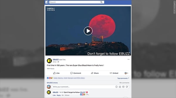
Source: CNN
Facebook has announced a number of features and efforts to curb the spread of such false content since it was first revealed that the site was weaponized by foreign actors to spread misinformation and influence the 2016 U.S. presidential election, largely through ad content.
However, despite Facebook’s claims that “our team is responsible for reviewing Trending topics to ensure that they reflect real world events,” news content that was often less-than-real sometimes slipped through the cracks and still made its way onto the Trending section. The company made several efforts to fix that prior to announcing the removal of the section, including ranking only topics that were covered by several news publishers.
“The idea was that coverage by just one outlet,” wrote The Guardian‘s Press Association, “could be a sign that the news is fake.”
The removal of Trending is just the latest in a series of moves by Facebook to slow to spread of false content, the efforts for which could be expected to ramp up in the months leading to the 2018 U.S. midterm elections.
In January, the company announced that it would sharply shift its News Feed algorithm to prioritize content from a user’s friends and family, and in April said it would apply more context about publishers and articles appearing there.
“I actually think it’s consistent with Facebook’s prior announcements that it’s going to focus more on local news versus global news outlets, or news outlets that get benefits for being big in Facebook’s current newsfeed algorithm,” says HubSpot Head of SEO Victor Pan, referring to Facebook’s announcement that news items within a certain geographic radius would be prioritized in a user’s News Feed. “Local publishers will benefit … global outlets, like Reuters, AP, AFP will get hit hardest.”
3. Authentic News Publishers Didn’t Benefit From Trending
Trending, wrote Hardiman in his statement, “was only available in five countries and accounted for less than 1.5% of clicks to news publishers on average.” For that reason, it seems, the lack of benefit to authentic news outlets is part of Facebook’s reasons for removing the section.
Given Facebook’s other recent efforts to prioritize more authentic content — sometimes by way of personalization and localization — from various news sources, HubSpot Social Media Editor Henry Franco says that this reasoning seems legitimate.
“It’s a low traffic avenue, and with the platform catering towards video and mobile, there isn’t much of a reason to keep it,” he says, pointing to Trending’s mainly desktop-experience nature. “It seems like Facebook is still prioritizing breaking and local news, so I’m not sure they’re really up to anything.”
Whether or not authentic news publishers will actually benefit from this change is another story — one that Franco doesn’t think is entirely likely.
“But since Facebook has all of the leverage here,” he says, “I don’t think that matters to them.”
Looking ahead, Facebook is addressing the mobile-first preference among users to consume news content that Hardiman says it’s observed.
“We’ve seen that the way people consume news on Facebook is changing to be primarily on mobile and increasingly through news video,” he wrote. “We’re exploring new ways to help people stay informed about timely, breaking news that matters to them, while making sure the news they see on Facebook is from trustworthy and quality sources.”
One of those methods, Hardiman says, is by applying a “Breaking News” label to news matching that descriptor. Facebook is currently testing that feature with 80 publishers across several countries — “North America, South America, Europe, India and Australia” — which allows the publishers to apply this label themselves.
The new features will also include a “Today In” section of the site, where Facebook users can view breaking news from local publishers as a community. If that sounds familiar, it might be due to Google’s recent announcement of a similar feature in its new Google News app.
Given the sum impact of all these factors, Nyst says, the time spent on Facebook could be an underlying motivator for this latest move.
“Who knows if that’s damaging user retention at all?” she asks. “But I can’t imagine it’s helping.”
Featured image source: Facebook

10 Web Form Examples You’ll Want to Copy Immediately
In recent years, I feel a bit spoiled when it comes to filling out online forms — typically, they’re able to auto-fill my information, and take less than a minute to get me what I need.
Forms used to require so much information, you’d have to really, really want something to dedicate the time to filling one out.
Now, we notice immediately if a form is cumbersome or time-consuming — because so many forms aren’t. If a form doesn’t almost instantaneously get us what we want, we ditch the page.
Here, we’ve collected some of the most impressive online forms so you can learn by example, and hopefully apply some of these methods to your own web forms moving forward.
1. Kickstarter
Kickstarter’s sign-up form is clean, with a basic white background, so you can focus on the form fields that matter. It also doesn’t ask for too much information, which is key for holding the attention of a busy audience.

2. House of Fraser
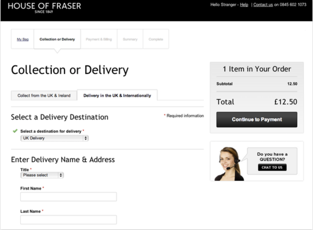
House of Fraser’s form is enticingly easy, with a pull-down menu to select delivery methods and columns like “collection or delivery” and “payment and billing”, so you can see where you are in the process. Best of all, the form incorporates the option for live chat. If a buyer is having concerns or doubts, it’s useful to have the ability to get clarification within the form itself without leaving the page.
3. Staples
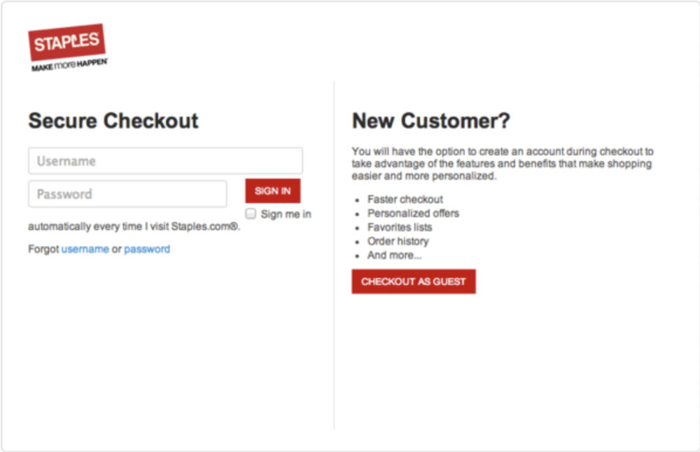
A guest checkout option is often imperative to ensure anyone can buy your product, with or without an account. If someone is in a rush, they might become frustrated by a lengthy “Create Account” form, and abandon their efforts. Staples understands the necessity of guest checkout, and finds a way to include it without losing too many new account owners to that option — underneath their “New Customer” field, they outline benefits to creating an account versus guest checkout. Creating an easier new customer sign-up is an effective way to convert more users into account owners.
4. Leadformly
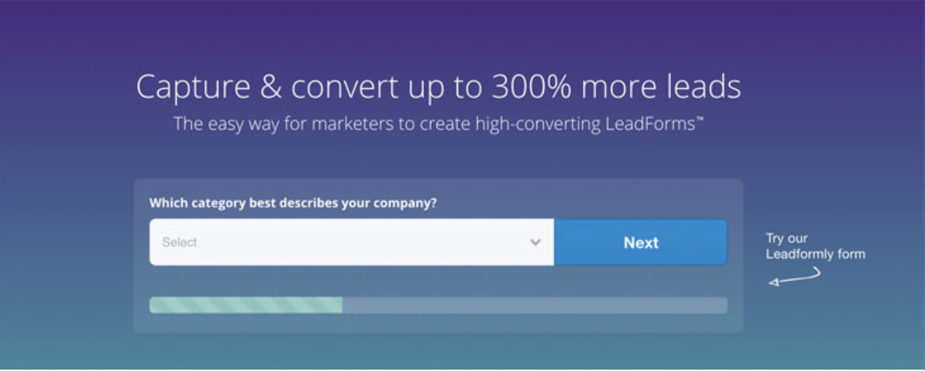
I’m willing to bet when you see only one question, you’re more willing to fill it out than if you were shown a long list. By keeping it to one field box at a time and creating a progress icon at the bottom, Leadformly likely mitigates the amount of users who leave the page before completion.
5. Class Pass
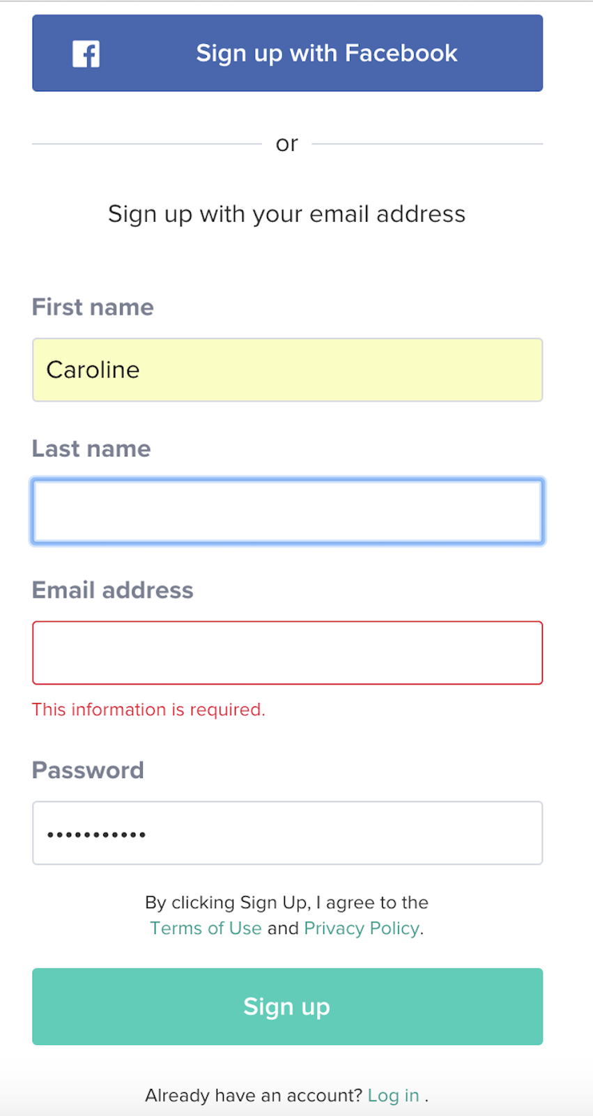
Allegedly, blue produces a calming effect, which is exactly how I felt checking out Class Pass’s landing page and immediately seeing a blue free trial button. Clearly, they know what I want. Their form is one of the easier ones in the list: it only requires your name, email, and password, or you can sign in via Facebook. Plus, when you fill out the form, you’re immediately gifted with a certain amount of credit, and a message that tells you the average amount of classes you can take in your city with those credits.
6. Toptal
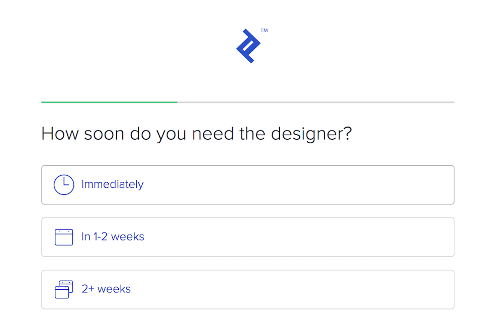
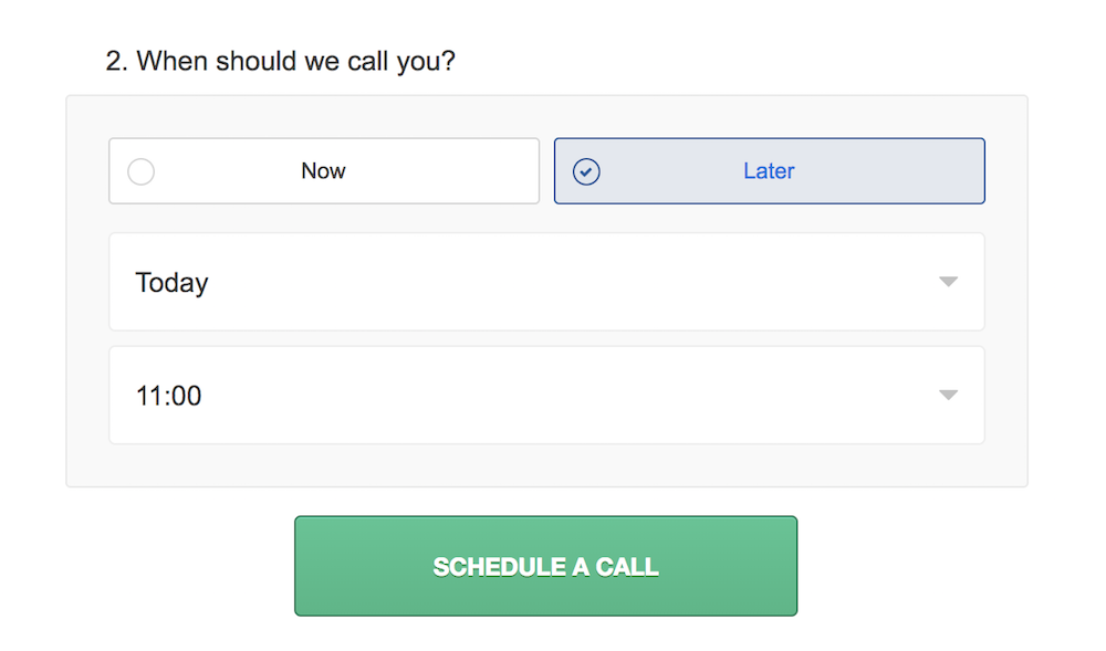
A form should still abide by quality customer service rules. How can your form be helpful to a potential consumer, without frustrating them with unnecessary questions? Toptal, which helps you find and hire elite independent freelancers, does an incredible job, first by displaying how far along a user is in their form submission (which encourages them to keep going), and second, by incorporating a phone conversation seamlessly into the process.
After answering a few questions, their form concludes with a question: When should we call you? You’re given the option of now or later, and once you’ve answered, the form offers to automatically integrate your scheduled phone call into your Google calendar or iCalendar. Toptal knows its value is better explained via phone, and their form proves they respect your time and don’t want to waste it.
7. UX Passion
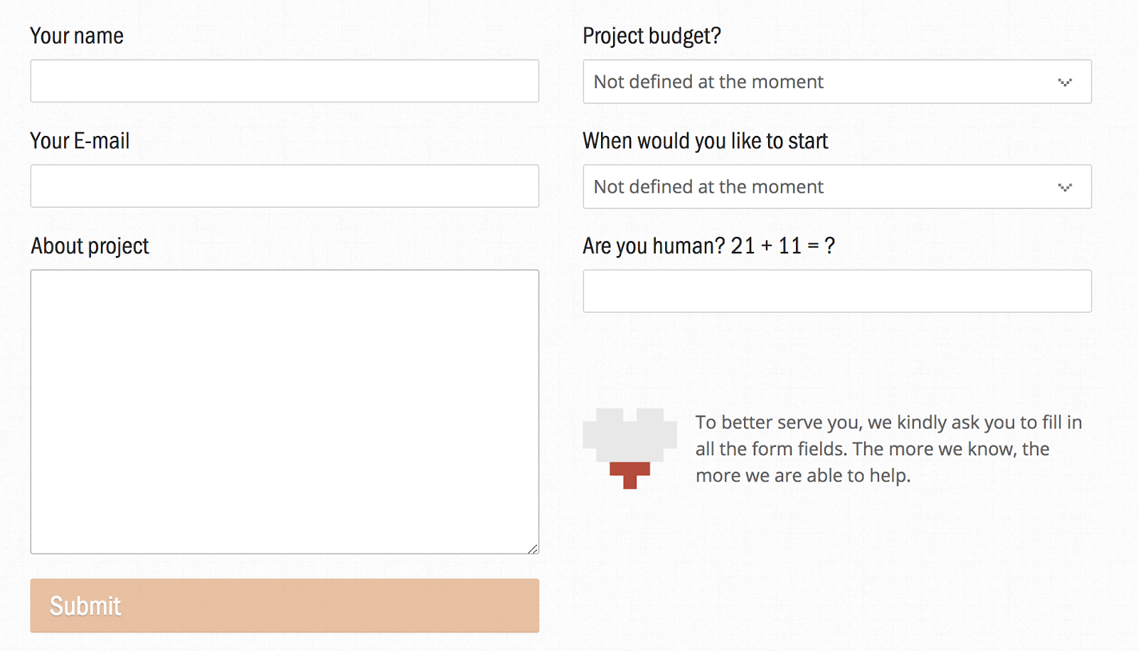
Sometimes you need to ask for more information than just name and email, which can frustrate a user. If you incorporate a message like UX Passion’s — “The more we know, the more we are able to help” — it could go a long way towards alleviating that frustration. Their message adds a human element, reminding you that the form fields were chosen as necessary elements to help you, not just to waste your time.
8. Basecamp Classic
As soon as you arrive at Basecamp Classic’s page, you’re greeted with a form. At the top, the form mentions how long it will take to fill out (60 seconds), and at the bottom, it highlights the benefits of the free plan and promises the trial won’t end. With those statements sandwiching the top and bottom of the form, it’s likely most visitors will fill it out because — well, why not?

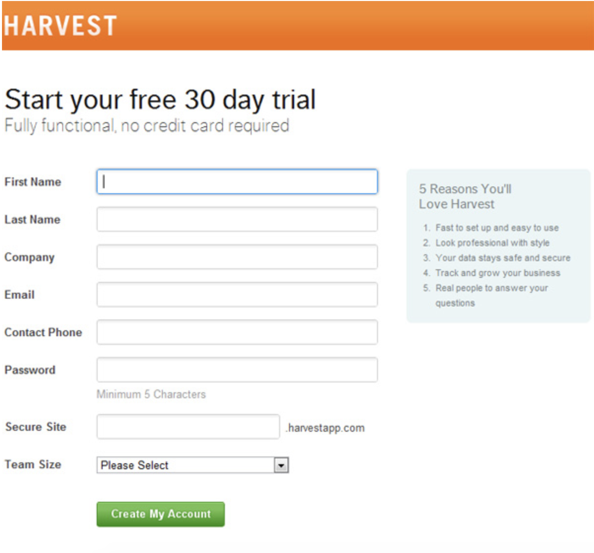
9. Harvest
There are two reasons I love this form by Harvest: first, it answers my primary concerns upfront — Will I have to supply a credit card and risk getting charged if I don’t cancel my account? And what am I missing out on with the free version?
The second reason I love the form is the “5 Reasons You’ll Love Harvest” box on the right. The rest of the form is neat and clean, so there’s no confusion about where or what to fill out, but if you begin to waiver, the box on the right is an extra step to ensure you remember why you’re signing up.
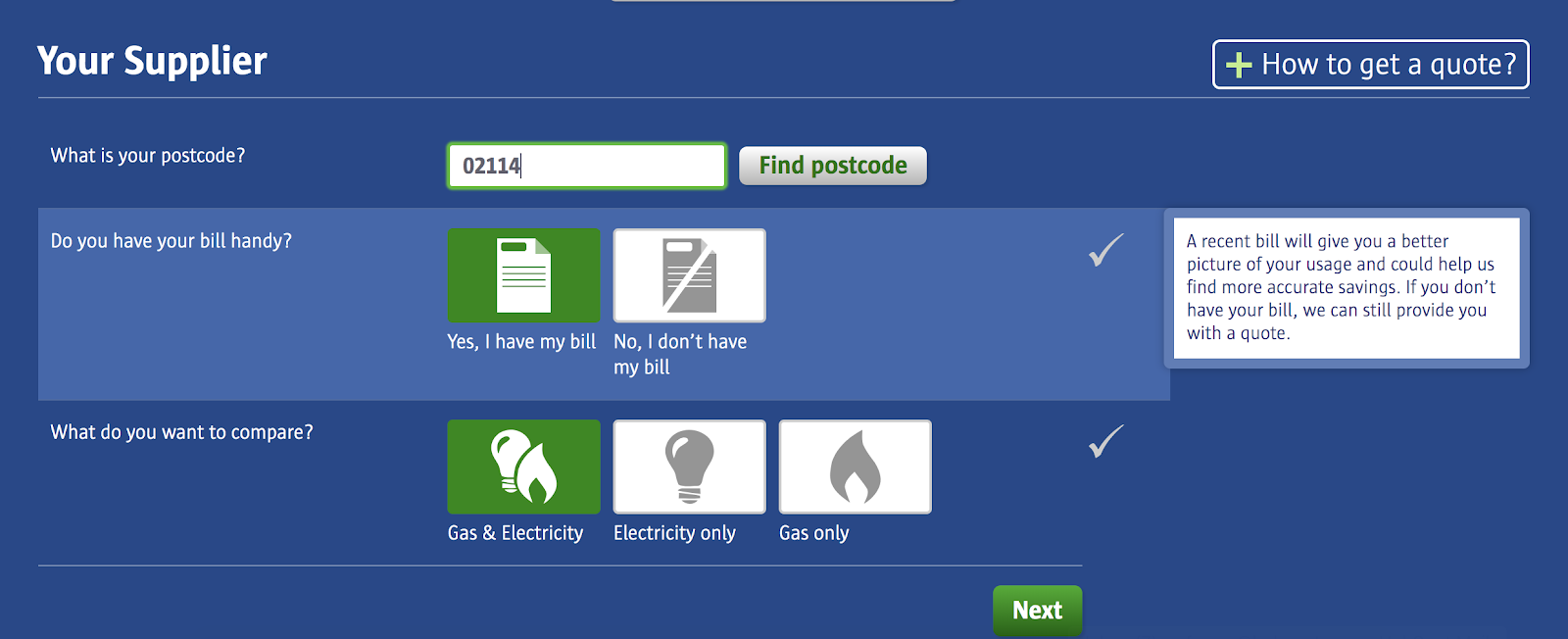
10. Compare the Market
This is one of the most user-friendly ones in the list, with icons you can hover over to choose A or B, rather than a text field. Best of all, when you hover over an icon like “Yes, I have my bill,” you’re offered an explanation regarding why it’s necessary, and whether you can proceed without it. Plus, the buttons are big and colorful, creating an engaging and visually appealing user experience.
If you’re still unsure which direction you need to take your online forms to make your buyer happiest, try A/B testing one of these elements at a time. Ultimately, your form is a method to interact with your customers, so it should be thoughtful, relatively easy, and a strong reflection of your brand.

6 Tools That Schedule Instagram Business Posts
Want to batch-process your Instagram updates? Looking for tools that schedule and publish content directly to Instagram? In this article, you’ll discover six social media tools that let business profiles schedule posts directly to Instagram. About Using Instagram Direct Posting To use any of the social media management and scheduling tools that can post directly […]
The post 6 Tools That Schedule Instagram Business Posts appeared first on .
from https://ift.tt/2HhE39l
via socialmediaexaminer
Report: Apple to tighten control on supply chain procurement, cutting manufacturers’ profits, starting with new MacBooks

Apple is looking to tighten its hold over the supply of parts that manufacturers use for its products, according to a new report from Digitimes citing supply chain sources. Right now, ‘non-key’ components like screws are sourced autonomously by third-party partners with Apple approving suppler lists and quality assurance at the end. The new report says Apple will directly set pricing and order volumes of downstream parts, in a move that gives Apple even more control over how its products are made and will likely squeeze the profitability of supply chain partners.
The news was reportedly disseminated to some of Apple’s Taiwanese manufacturers in May. The new policy is expected to come into effect later this year with Apple’s forthcoming MacBook updates.
11 Surprising, Funny & Cool Google Easter Eggs
Sometimes, it seems like the internet is full of tedium — waiting for a page to load, juggling different passwords, and trying to find the perfect GIF image to describe your mood. But luckily, it’s also full of really cool nuggets — specifically in Google products.
Thanks to the clever developers at Google — who make it their mission to put the fun back into our daily routines — there are numerous “Easter eggs” hidden across Google’s suite of apps and tools that remind you how important the “human” side is to our favorite products.
Easter eggs are hidden gems, features, or moments of surprise buried within software and throughout the internet. They’re designed to catch you off guard and make you smile — if you can find them.
But why would you hide these fun, delightful gems? And since Easter eggs typically don’t add much functionally to the software or website, why bother taking the time to code them in?
A few years ago, HubSpot’s VP of Marketing, Meghan Anderson, asked a few of our colleagues for their opinions on the matter. And while she found that you’ll get a different answer from every person you ask, most answers boil down to the same motive: “for the fun of it.”
Mike Champion, Tech Lead at HubSpot

“Adding an Easter egg can be a fun diversion when writing challenging code … and it’ll hopefully amuse some people, too.”
Eric Peters, Senior Growth Marketing Manager at HubSpot Academy

“Easter eggs are fun to build and fun to find, because they reward users that care enough to find and get excited about them. They create this feeling of being an insider with the application or company, which can be incredibly valuable in terms of brand loyalty and engagement.”
Laura Fitton, Inbound Marketing Evangelist at HubSpot

“I feel like Easter eggs are part of the ‘developer’ personality. These are very smart people who love solving puzzles, and the intricacies of their work isn’t ever fully appreciated by most of the customers using their product. So by hiding an Easter egg, they can reward the customers who do take that extra initiative to really dig in and appreciate the software — and what goes into making it.”
Sharing these gems feels a bit like revealing the secret to a magic trick. After all, half the fun surrounding Easter eggs comes from the hunt for them. So, if you prefer to be surprised, stop now and instead grab the guide below to see how interactive content can help your next marketing campaign:

11 Surprising Google Easter Eggs
Easter egg hunting is a little easier if you’ve got a map. With some help from co-workers, Reddit, Little Big Details, Quora, and other sites, I’ve compiled a starter map for you, complete with some of the best hidden features on Google right now.
1. <Blink>
It’s been a long time since Google was “just” a search engine. But for those who want to have a bit of fun with its search feature, you’re in luck — Google’s developers have a sense of humor.
To start, look at what happens when you enter the query, “<blink>”:
The word “blink” actually blinks in all of the search results. It’s a sneaky, cheap thrill for those of us who are easily amused.
2. Do a Barrel Roll
This is probably my favorite Easter egg on Google. Type in “do a barrel roll” into the Google search bar, and see what happens. I’ll wait.
All done? Here’s a snapshot of your journey to remember it by:
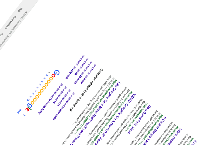
Now that you’re right-side up again, let’s reflect on your experience. This funny feature is one of the oldest Easter eggs hidden in Google’s programming, but it never seems to get old.
“Do a barrel roll” is just the tip of the iceberg, though. If you can believe it, there’s also a function that allows you to “do a barrel roll twice.” Type this command into Googe’s search bar and click the first result that appears. This webpage rolls you around twice for maximum dizziness and, as your reward, offers a series of other Easter eggs on Elgoog — Google’s mirror-image website (“Elgoog” being “Google” spelled backwards).
3. Google Maps
While it didn’t take long for this easter egg to become discovered (and widely talked about), it’s still a pretty cool online treat. For April Fool’s Day 2017, Google Maps allowed users to turn its maps platform into a game of Ms. PAC-MAN:
The feature may have been intended as an April Fool’s joke, but as of the following Monday, it was still present on Google Maps — and the top search results for “Google Maps Ms. PAC-MAN” mostly covered ways to remove it.
4. Google’s Dinosaur Game
Does this dinosaur look familiar?
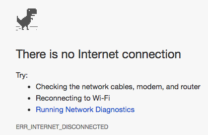
Chrome browser users might recognize him from a lack of internet connection. But now, there’s actually reason to rejoice when Chrome can’t connect. Even if you’re offline, when you land on that screen, watch what happens when you press the spacebar:
Well, I know what I’m doing next time the in-flight Wi-Fi isn’t working. And, good news for those who need more reason to procrastinate: Someone took the liberty to create the T-Rex Runner game page, so you can play any time. Plus, Android users can download the game here.
5. Bork, Bork, Bork!
If you’re familiar with the Muppets, chances are you’ve at least heard of the Swedish Chef character, who’s known to end his intro song with the words, “Bork, bork, bork!” Google has taken that phenomenon and incorporated it into its own language settings. Yes — “Bork, bork, bork!” is a language option.
To change your language settings, you must be logged into Google. Here are the steps to find this Easter egg:
- Once logged into Google, visit the Google Search homepage and click your profile picture on the top-right.
- Select “My Account,” and click “Language & Input Tools” in the Account preferences box on the menu that appears.
- Select the “Language” bar, and click the pencil icon on the next page to find “Bork, bork, bork!” as an available language.
- Select this as your default language and return to the Google Search homepage. (Don’t worry, you can return to English with a shortcut link below the search bar.)
Here’s what Google’s homepage looks like after selecting that as your preferred language:
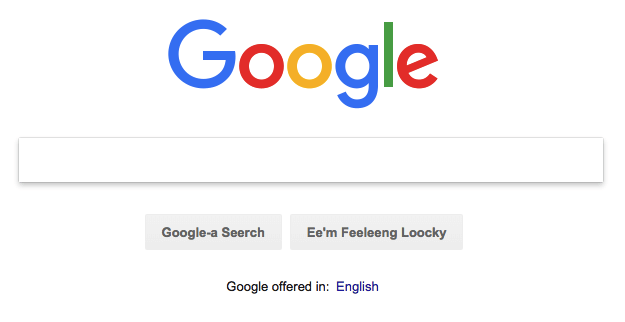
“Feeleeng loocky”? Excellent. Try your hand at Google’s other language options, which — like Facebook — include Pirate and Klingon.
6. ‘I’m Feeling…’
I’ll admit it — I’ve never really bothered by Google’s “I’m Feeling Lucky” button below the search bar because, well, I always seem to forget it’s there. But it looks like I’ve been missing out on a little trick.
If you hover your mouse over the button — without typing anything into the search box first — the text will spin like a slot machine into other options, like “I’m Feeling Hungry,” or “I’m Feeling Stellar.” Clicking on one will bring you to a topic-specific page:
7. Play Dreidel
Hanukkah season or not, this Google Easter egg is available year round at your command. Specifically, that command is the Google search, “play dreidel.”
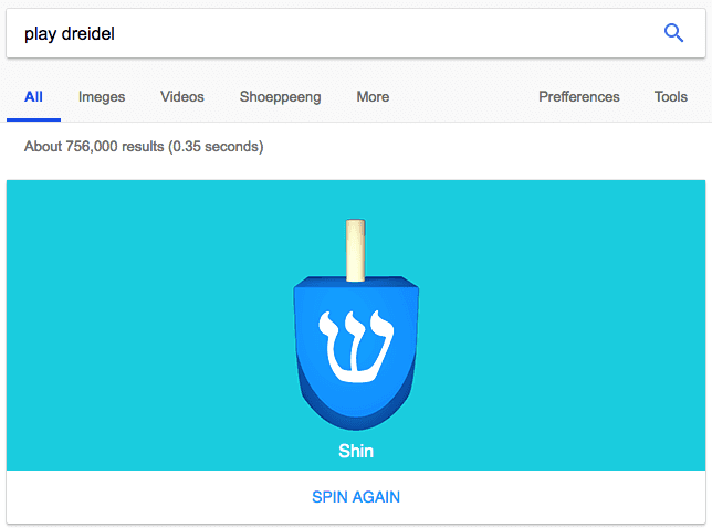
Type these words into the Google search bar to play an endless digital game of dreidel with Google. Just click “SPIN AGAIN” below the blue dreidel, and Google will randomly land on one of the four classic Hebrew characters after a three-second spin.
8. Tic Tac Toe
Here’s another crowd-pleaser for the tabletop gamer. Google creatively allows searchers to play tic tac toe right on the results page. Just type in “tic tac toe” into Google’s search bar. It’s a nice surprise if you were initially looking for a tic tac toe website or template.
The best part? You can play against a friend on the same computer — or against Google. That’s right, challenge the search giant itself to a game of Xs and Os.
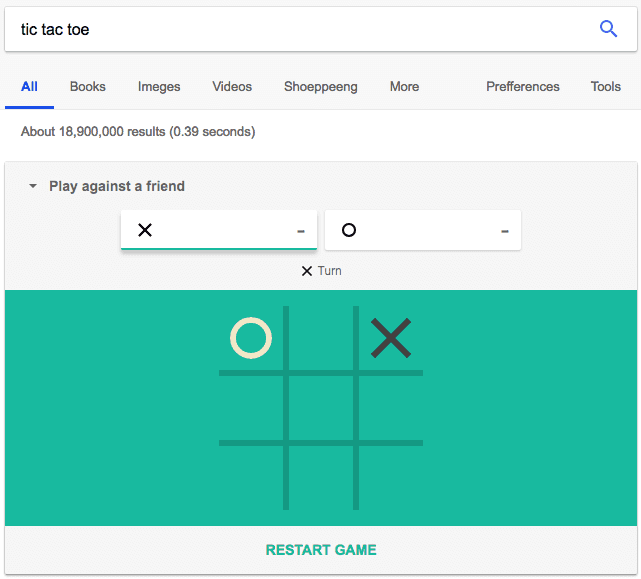
If you’re playing against Google, this Easter egg allows you to adjust the difficulty to “Easy,” “Medium,” or “Impossible.” Google has the gaul to skip right past Hard. One can only imagine the tactics it throws at you.
9. Askew
Looking for a definition of the word “askew”? Why tell you, when Google can show you. There’s something a little, well, askew about the page below, isn’t there?
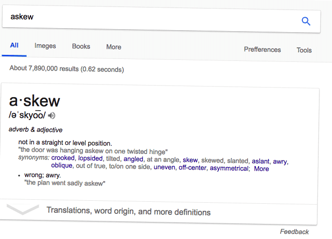
Type in “askew” into Google’s search bar and you’ll get both the word’s definition and a literally askew results page to really make sure the meaning sinks in. Who knows how many other visual demonstrations Google produces when expanding your vocabulary …
10. The Answer to Life
There are high expectations in this Easter egg, I know. But for fans of Douglas Adams’ book, “The Hitchhiker’s Guide to the Galaxy,” it’s worth this long entry into Google’s search bar. Type “the answer to life, the universe, and everything,” and you’ll get the charming and accurate result below:
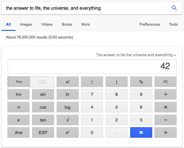
Followers of Adams’ “The Hitchhiker’s Guide to the Galaxy” will know “42” as the true meaning of life. For others, it’s an inspiration to read this terrific novel — and do some basic math on Google’s native calculator tool (which you can also access by simply typing “calculator”).
11. Atari Breakout
Last, but definitely not least, we have a callback to the classic video game console from the 1970s — and a favorite mobile game to this day. Type in “atari breakout” into Google Images and get your arrow keys ready. A game of “Breakout” breaks out on your computer screen.
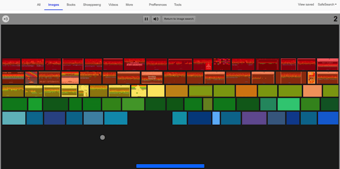
The colored blocks you see above are made up of all the image results for “atari breakout.” That means if I play my cards right, the picture above might in fact be part of your next round of this addicting game. When you’re done, simply click the “Return to image search” button next to the pause and volume icons.
For the sake of my productivity (and your own), I’ll stop there. But that’s hardly a comprehensive list of the internet’s Easter eggs, and all of them prove how entertaining your users is the key to their loyalty — no matter what product, solution, or information they’re looking for.
There are countless more out there to find, so we’ll leave the rest of the hunt up to you. Let the search begin.


9to5Rewards: Win Apple’s RED iPhone 8 + August Smart Lock bundle

9to5Rewards is teaming up with sponsor August Home for a huge give away with a chance to win both August’s Smart Lock Pro + Connect Wi-Fi Bridge and Apple’s latest 64GB (PRODUCT)RED iPhone 8. One reader will be selected to take home this $1000+ prize package in the coming weeks… Scroll down to sign up!
WWDC 2018 — live coverage from San Jose

9to5Mac is on the ground in San Jose, California for Apple’s 2018 Worldwide Developers Conference, and our news hub is collecting all of our coverage in one place.
We’re expecting iOS 12, macOS 10.14, watchOS 5, and tvOS 12 — and maybe a few surprises — so stay tuned to 9to5Mac for all the news from San Jose and live from the keynote on Monday 10 am PT/1 pm ET.
Best Buy launches pre-WWDC Apple sale w/ deals on latest iPads, MacBooks, iPhone, more

Ahead of WWDC kicking off in San Jose tomorrow, Best Buy has launched a new Apple-focused shopping event with deals on the latest iPads, MacBooks, iPhone X/8/Plus and more. Free shipping is available across the board, or you can opt for in-store pickup as usual. Our top picks are below.
June 03, 2018 at 12:42PM
Para GANAR más DINERO 💵 no debes trabajar, DEBES tener MEJORES IDEAS 💡..!!! #SteveJobs #Apple #businesswoman #lideres #influencer #influencia #negocios #estrategia #dinero #poder #trabajo https://ift.tt/2svdhpp
Woman found guilty of distracted driving despite claiming she was checking the time on her Apple Watch

A driver is being hit with districted driving charges in Canada due to her use of Apple Watch while behind the wheel. While the driver claims she was just checking the time, a judge ruled that using Apple Watch while driving is no different than using a smartphone…
Instagram explains how its feed algorithm works, and says it’s not considering a chronological option

Instagram is looking to dispel misconceptions about its algorithmic feed and offer more details on how exactly it works. As reported by TechCrunch, the company gathered a group of reporters this week to offer insights on the factors that affect what content you see, and in what order you see it…
Apple Music embeddable web player widget now lets users log in and listen to full songs in the browser

The Apple Music service has always provided an online tool to generate widgets, that can be used by artists to promote their music on their own websites and blogs. An eagle-eyed Reddit user has spotted that this widget has recently received an interface upgrade … and the ability to log in to your Apple Music account. Once signed in, you can play full songs, albums and playlists from within the web browser, no longer limited to just 30-90 second previews …
Mobile Safari is holding the iPad back

There has been much discussion recently about iPad vs. Macs vs. Chromebooks vs. Surface laptops in recent months. Chromebooks are coming in convertible formats. Microsoft is touting a touchscreen laptop. Apple even had a commercial with the tagline of “What’s a computer?” when talking about iPad.
Roundup: Everything to expect at WWDC 2018, including iOS 12, macOS 10.14, and more

After months of suspense, we’re finally just a few days away from the biggest week of the year for many Apple fans. The annual Worldwide Developer Conference officially kicks off on Monday at 10AM PT with Apple’s annual keynote address.
During that keynote address, we can expect Tim Cook and other Apple executives to unveil the future of the company’s software efforts and more. Read on for a full roundup of everything we expect to see when Apple graces the stage at the McEnery Convention Center in San Jose on Monday morning…
This week’s top stories: iOS 11.4, new HomePod features, last minute WWDC rumors, more

In this week’s top stories: WWDC details ahead of next week’s keynote, Apple releases iOS 11.4 with new HomePod features, we dig up a new Apple Watch face, and more. Read on for all of this week’s biggest stories…
Toshiba completes $18B sale of memory business to consortium including Apple

Toshiba’s long-winded sale of its memory chip business is finally completed. The company announced that the sale to a Bain Capital consortium, consisting of Apple and various other tech companies, has been finalized…