
Welcome to My Blog
Confirmed: Mark Zuckerberg Will Appear Before European Parliament
European Parliament President Antonio Tajani released a statement today confirming that Facebook CEO Mark Zuckerberg has accepted an invitation to appear before its Committee for Civil Liberties, Justice and Home Affairs (LIBE).
The announcement comes after weeks of speculation and rumors that Zuckerberg would make such an appearance. In a post published yesterday, HubSpot predicted that Facebook’s high volume of news releases and statements this week — compounded by a recent executive re-organization — could indicate that an international testimony from Zuckerberg was imminent.
Mark Zuckerberg, Facebook CEO and founder, has accepted our invitation. He will come to the European Parliament. My full statement ⤵️ pic.twitter.com/FdmuDPl8Wb
— Antonio Tajani (@EP_President)
May 16, 2018
While an official date has not been confirmed, Tajani’s statement does indicate the Committee hopes Zuckerberg will appear as soon as next week.
It is worth noting that pivotal EU data privacy laws — the General Data Privacy Regulation (GDPR) — come into force next week, on May 25.
According to Tajani’s statement, the Conference of Presidents — essentially, European Parliament’s governing body — will organize a hearing with both Facebook and “other parties,” with a focus on the role of the social network in European electoral policies.
The timing of the announcement is particularly interesting after Facebook’s U.K. Head of Public Policy Rebecca Stimson issued a letter earlier this week to members of UK Parliament indicating that “Mr. Zuckerberg has no plans to meet with the committee or travel to the UK at the present time.”
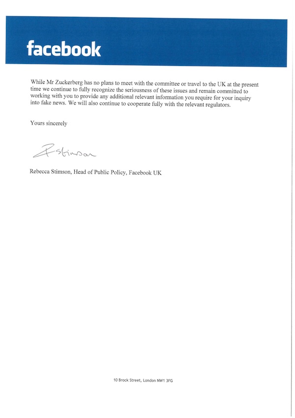
Source: UK Parliament
That letter was written in response to an earlier one from House of Commons Culture Committee chairman Damian Collins, in which he wrote that “the committee will resolve to issue a formal summons for [Zuckerberg] to appear when he is next in the UK.”
I have today written to @facebook requesting that Mark Zuckerberg appears in front of @CommonsCMS as part of our inquiry into fake news and disinformation. Read it here: https://t.co/jXZ5TjiZld pic.twitter.com/m0NU5Uyf2L
— Damian Collins (@DamianCollins)
May 1, 2018
As for how this latest slated appearance from Zuckerberg will ultimately impact Facebook — if at all — some remain skeptical. The company posted strong Q1 2018 earnings, as well as an enthusiastic response from the audience at F8, its annual developer conference.
“Zuckerberg’s U.S. testimony, and the entire situation at-large, didn’t seem to have much of a negative impact on user growth or financial data,” says HubSpot Social Media Editor Henry Franco. “I’m interested to see if this will play out in a similar fashion, or the same, especially in light of GDPR and an increased regulatory focus on how companies collect, store, and manage data.”
This is a developing story and we will provide updates as more information becomes available.

iPhone X luxury battery case with integrated solar panel hits market, but costs 4x phone price

High end Russian accessory maker, Caviar, has unveiled its latest custom iPhone X. Named iPhone X ‘Tesla’, it features an integrated solar panel and secondary battery among other design embellishments.
Renders claim to show new 18W Apple USB-C charger, will be bundled with 2018 iPhones

It looks like Apple will finally be adding a faster power brick in the box with the upcoming 2018 iPhones (iPhone X successor, a 6.5-inch ‘iPhone X Plus’, and a 6.1-inch LCD model). Backing up a report from earlier this month, ChargerLab has published renders of what it believes the new iPhone charger will look like.
Most notably, it features a USB-C port. This presumably means Apple will include a USB-C to Lightning cable in the box for the first time too.
Comment: Stop using AR as a gimmick and give us truly transformative experiences

I’m with Tim Cook in thinking that augmented reality (AR) is far more exciting and relevant than virtual reality (VR).
VR has its uses, of course, but the need to wear a headset is a significant limitation. To me, VR is something you use at a specific time for a specific purpose, whether it’s playing a game or looking around a virtual representation of a building.
AR, in contrast, is something I think could become a much more integrated part of our lives. But it only makes sense if AR transforms the experience. Too many AR apps are, in my view, just gimmicks …
Logi Circle 2 HomeKit camera now easier to mount with new magnetic base

Logitech already makes my go-to HomeKit camera with the Logi Circle 2 ($177.98, reg. $179.99), and today a new mounting option is being introduced to make positioning the camera in just the right spot much easier. Magnetic Mount ($19.99) works with both wired and wireless Circle 2 cameras and enables mounting on any flat metal surface indoors or outdoors without requiring tools.
Logitech Crayon now available to schools, earlier than expected

The Logitech Crayon, a lower-cost stylus using Apple Pencil technology, is now available for purchase by schools for $49.95 …
Apple Pay expands to over 30 more banks across the United States

Apple Pay continues to pick up new banks and credit unions every few weeks — and soon three new countries. These are the latest new banks and credit unions added in the US that let you pay with iPhone, iPad, Apple Watch, and Mac…
A virtual machine could be the solution to keeping 32-bit apps running in macOS

Apple last month started warning users of 32-bit apps that future versions of macOS would not run ‘without compromise.’
It was a vague warning, but suggests that Apple does have a plan to allow 32-bit apps to continue to run even after macOS has nominally switched to a 64-bit-only environment …
Microsoft reportedly planning cheaper Surface tablets to compete against $329 iPad

Apple launched a new version of the $329 iPad in March, with a faster processor and Apple Pencil stylus support. The $329 iPad has helped prop up iPad sales significantly since it was introduced last year. Apple has said that the 9.7-inch tablet is its most popular iPad.
Bloomberg reports that Microsoft is looking to compete in ths price range with some new Surface tablets that hit $400 price points. The products are expected to debut later this year.
Twitter crowdsourcing action against ‘unhealthy tweets’ which don’t violate policies

Twitter currently uses a combination of human review and AI to identify problematic tweets. Where a tweet violates the company’s policies, it is removed.
But the company is now aiming to use an innovative approach to dealing with tweets which don’t technically break the rules but are ‘unhealthy’ or detract from the conversation …
‘Multiple sources’ say Research Triangle Park tops Apple’s shortlist for new campus

Apple announced back in January that it was planning to grow its US operations with a new campus.
The company plans to establish an Apple campus in a new location, which will initially house technical support for customers. The location of this new facility will be announced later in the year.
Since then, there has been much speculation on where it might be located …
Unriddled: Google’s Mass Exodus, Another Snapchat Redesign, and More Tech News You Need
Welcome one, welcome all, to your unofficial midweek marker: HubSpot’s Wednesday weekly tech news roundup.
The industry has had a very, very busy week. But you’re short on time. We’re short on time. Everyone is short on time. And that’s why we’re bringing you Unriddled: a quick-and-dirty edition.
This week, we’re going to provide a very short rundown of each news item that grabbed our attention over the past few days. Whether you simply scan it or read more, we can all but guarantee that you’ll sound very informed at happy hour.
So, without further ado: Let’s break it all down. Here’s our Wednesday tech news roundup.
Unriddled: The Tech News You Need
1. Google Employees Are Resigning in Droves in Protest of Project Maven
Roughly three months ago, Google’s work on a hotly-contested military drone footage analysis program — Project Maven — became public. But many of the company’s (now former) employees have taken great issue with its participation in the project and are resigning in protest. Read more about their reasons and the project’s history from Gizmodo‘s Kate Conger. Read full story >>
2. Snapchat Rolls out Another Redesign
Recode‘s Kurt Wagner.
Read full story >>
3. We Looked Through the Russian-Bought Facebook Ads. Here’s What We Noticed.
The U.S. House Permanent Select Committee on Intelligence (HPSCI) Minority has released over 3,000 Russian-bought Facebook ads leading up to the 2016 U.S. presidential election. Here’s a look at some of them. Read HubSpot’s full story >>
4. Instagram Introduces an Emoji Slider
Last week, Instagram rolled out a new Emoji Slider sticker that can be added to Stories. As the name suggests, the sticker allows users to place an interactive sliding scale using an emoji of their choice to get feedback on questions like, “How 🌶 do you like your salsa? Read the official announcement >>
5. Facebook Has Suspended 200 Apps in Data Misuse Audit
As Facebook continues to investigate any apps with significant user information access, an announcement comes that it has suspended 200 apps for possible data misuse. Read HubSpot’s full story >>
6. Twitter Announces New Approach to Combat Platform Abuse
Twitter will begin evaluating different user and account behaviors to limit the visibility of abusive content. In a tweet from Tuesday afternoon, CEO Jack Dorsey announced plans to host a Periscope about this plan in the near future. “Our ultimate goal is to encourage more free and open conversation,” he wrote. “To do that we need to significantly reduce the ability to game and skew our systems. Looking at behavior, not content, is the best way to do that.” Read HubSpot’s full story >>
7. Facebook Removed 1.9 Million Pieces of Terrorist Propaganda Content in Q1 2018
Facebook released its first public-facing Community Standards Enforcement Report yesterday, indicating the volume and nature of violating content on its site. Read HubSpot’s full story >>
8. Uber Riders, Drivers and Employees Can Pursue Individual Claims of Assault in Open Court
Uber has reversed one of its highly controversial forced arbitration policies for riders, drivers, and employees. Any member of these parties with sexual assault claims against the company can sue Uber and pursue their cases in open court. Uber also recently announced that users can rate their drivers mid-ride, rather than having to wait until the ride has concluded. Read more about the arbitration reversal from Recode‘s Johana Bhuiyan. Read full story >>
9. Facebook Unveils Youth Portal to Help Teens Navigate the Network
Facebook has launched its Youth Portal to help teens use the network’s features, understand how their data is used, and decide what to share. Read HubSpot’s full story >>
That’s all for today. Until next week, feel free to weigh in on Twitter with your tech news questions or thoughts on what kind of events and topics you’d like covered here.

Here’s Why Editors Reject Your Guest Blog Pitches [New Research]
Inbound marketing: You know it’s all about using content to educate others and attract people to your brand. You create and distribute unique, valuable, educational content, and members of your audience take notice.
If you’re practicing inbound marketing, you probably also know that guest posting your content to outside publications is one of the most effective ways of reaching those people where they already are and drawing them directly to you.
When you do it well, guest posting can be a great addition to your content marketing strategy. You can reach new audiences, establish credibility, drive qualified site traffic, generate leads, and earn links that help you build a stronger organic presence.
And at a time when 55% of marketers say growing traffic is a top marketing priority and 61% say SEO is a top inbound priority, guest posting can be a seriously effective solution.
Unlike blogging on your own website, though, guest blogging requires you to earn placement. This means that you have to work alongside a publication editor to deliver content that fits.
For the second year in a row, my team at Influence & Co. has surveyed online publication editors across multiple industries to uncover trends in what they’re looking for in the guest posts they accept.
We asked them all kinds of questions: How much and what kind of guest content do they plan to publish? What do the best guest posts have in common? What’s the biggest problem with guest content? Are there certain times of year when more content is needed?
We’ve compiled the full findings from this survey — plus an analysis of more than 3.5 million pieces of published content — in “The State of Digital Media 2018” to help our fellow marketers produce, pitch, and publish guest content that better meets their company goals.
So, if you’ve ever wanted to know what’s going on inside the minds of the gatekeepers of your guest posts, this one’s for you. Check out the infographic below to learn more about what editors and their audiences are looking for — and how you can deliver it.


Berkshire Hathaway is now AAPL’s second-largest shareholder, passing BlackRock

Warren Buffett’s Berkshire Hathaway recently disclosed that it had increased its stake in AAPL to 240.3M shares, worth more than $42B at the time …
How to Move Your Social Traffic Into a Sales Funnel
Want more conversions from your organic social media traffic? Wondering how to set up a sales funnel for your social media visitors? In this article, you’ll learn how to convert more social media visitors using a sales funnel. Why Optimize Your Funnel? Social media marketing is one of the best methods for increasing organic traffic. […]
This post How to Move Your Social Traffic Into a Sales Funnel first appeared on Social Media Examiner.
from https://ift.tt/2KtLKuS
via socialmediaexaminer
How HubSpot Grew Online Customer Reviews By 157%
Nowadays, reviews matter more than ever. In fact, over 85% of U.S. adults say they trust online reviews as much as personal recommendations.
At HubSpot, we know reviews are important for driving leads to our product in the first place. But we’re starting to recognize the importance of reviews at the end of a buyer’s journey, as well.
Review websites rank super well on Google for purchase-intent software terms we care about, like “crm software”, “best crm software” and “crm systems”.
People searching for terms like these are ready to buy CRM software and as a result, are highly likely to turn into customers.
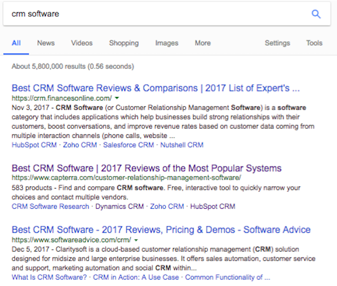
You can hardly blame Google for serving this content first. With over 500 providers of CRM software, it’s tough for customers to hop from vendor to vendor to choose the right CRM. They need a single resource that lists top CRM software. A number of sites have capitalized on this opportunity.
With these review sites dominating search for almost every CRM keyword with commercial intent, we needed to improve our presence on these websites and grow our customer reviews.
Here, we’ll walk you through our experience choosing the best channels to collect reviews, designing review request emails for optimal growth, and developing a strong review acquisition strategy that elevated our company to the top three on CRM software review sites.
The Best Channels for Review Collection
We tested out a number of different channels for collecting reviews. Ultimately, email, events, and triggering reviews based on product usage proved most effective.
1. Email
Email is a staple at HubSpot, and we often communicate with our customers via email. This seemed like the obvious channel for us to ask for customer reviews.
We were able to identify core groups of users who would be a great fit to ask for reviews.
The first group we emailed for reviews were our NPS promoters — a group of people who rate us highly when asked how likely they are to recommend us to a friend.
The second group we emailed for reviews were people who had recently experienced delight from using our product. For example, when someone closed a deal in our CRM (ding), that was a good time to ask them to write a review about us.
These two groups of people, and the channel of email, were critical to successfully collect reviews on an ongoing basis, since those people were deriving value from our products.
2. In App
Using your software to ask users to review your product in-app is another great way to gather reviews. You can test out asking people to review your product at different times based on their actions. At HubSpot, we asked people to review us on occasion after they closed a deal in HubSpot CRM. Instagram also does this occasionally after someone has posted a photo to boost reviews in places like the App Store.
3. Events
Events were another core channel we used to grow our reviews. Each year thousands of HubSpot customers attend our INBOUND event in Boston. We suspected this would be another great place for us to collect reviews, as there was a high amount of foot traffic from HubSpot customers.
125 Positive Reviews in Three Days
Leveraging our INBOUND event, where we have a ton of happy customers and partners, turned out to be a successful avenue for collecting reviews. We knew getting a lot of reviews in a couple of days would could close the gap between us and those we compete with within the CRM space.
During the course of three days, we collected customer reviews on Capterra and G2Crowd using iPads in an area of the event where HubSpot customers congregate.
As a result, we collected 125 reviews for HubSpot products. This enabled us to surpass Zoho and Nimble’s review numbers on Capterra.
We became the third most-reviewed CRM on Capterra, despite being much later to the CRM space than many of our competitors.
Three Things We Learned About Asking for Reviews
When asking for reviews, we didn’t just vary the channels we used to reach customers — we also varied the design and copy of our requests.
There are three critical lessons we learned from extensive A/B testing. As a result of our efforts, we saw an exceptional increase in the amount of people willing to write a review.
If you want to ask your customers for a review, you’ll want to take note of the following three lessons.
1. Rewarding people for leaving a review works wonders
We ran an A/B test via email to find out if rewards would make customers more likely to review us. For the enabled group, we offered a $10 Amazon gift voucher to the first ten people who reviewed us. For the control group, we used the same design and almost identical copy, but removed mentions of the reward.
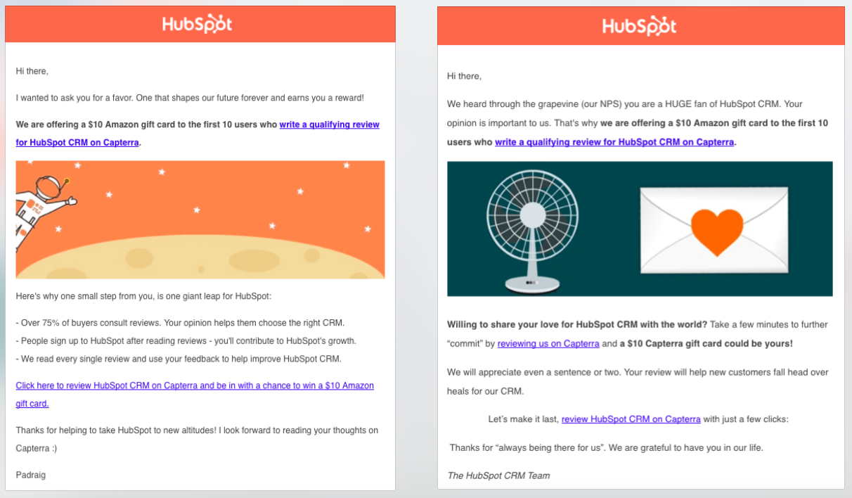
The chance of a small reward boosted our review numbers by a staggering +733%. Despite the huge increase in the quantity of reviews being left, the high quality of reviews being left did not change.
Normally, our conversation rate for review email sends stands at 3%, but when a reward was offered, it jumped to 25%. Mentioning the reward in the subject line did not peak people’s curiosity (open rates were the same).
Some rewards might resonate more with your customers than others and improve your results. We recommend testing out different rewards to see which ones gain the best results. Potential rewards include Amazon, iTunes, Panera, Target, or a Virtual Visa international gift card. Rybbon integrates with HubSpot to make this process seamless.
One thing to note is that many review sites don’t allow you to reward customers for providing a review. This is a controversial issue in the review space. Before offering customers a reward in exchange for reviewing your company, it’s best to check out the review guidelines provided by that particular review website.
2. The format of the ask matters
We wanted to find out what type of emails work best when asking customers to review us. To do this, we pitted multiple emails with fancy design and copy against each other.
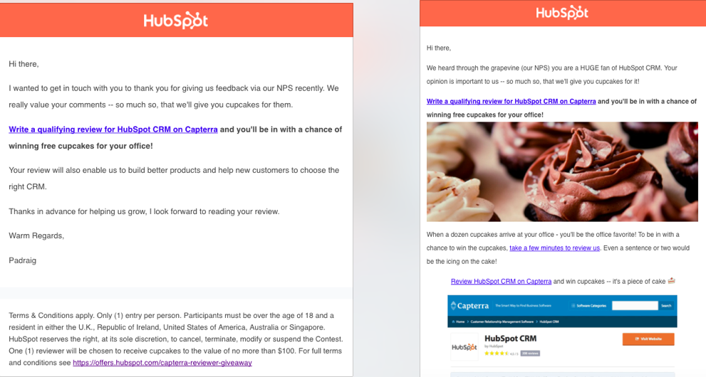
Despite our best efforts at copywriting and design, nothing worked as well as a plain and simple email without cheesy copy or attractive design. It was the plain text email (left) without design or extravagant copy that won the hearts of our customers.
3. You have to make it easy for people to review you
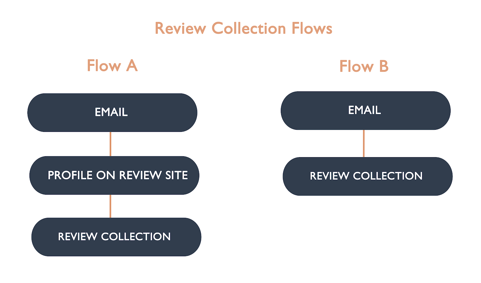
Bringing customers through the right flow for review collection is critical for a high conversion rate. Through A/B testing, we evaluated whether sending people to a profile page or review collection page would influence their likelihood to leave a review.
We brought one group of customers to our profile page on a review site (Flow A, below). Here, they had to click a call-to-action before being asked for their review of our software. We sent another group of customers right into the review collection process (Flow B, below). Once people clicked through from the email, they were able to leave their review right away.
We found having the least possible steps was most effective for review collection. The extra step in flow A lead to a drop-off rate in the region of 90%. It’s super important to make it easy for people to leave a review, otherwise they won’t do it.
We learned a lot about how we should collect customer reviews from running these experiments. The rewards one alone boosted our conversion rate from 3% to 25%. But, even with everything we learned from our experiments, we realized using email for growth wasn’t enough.
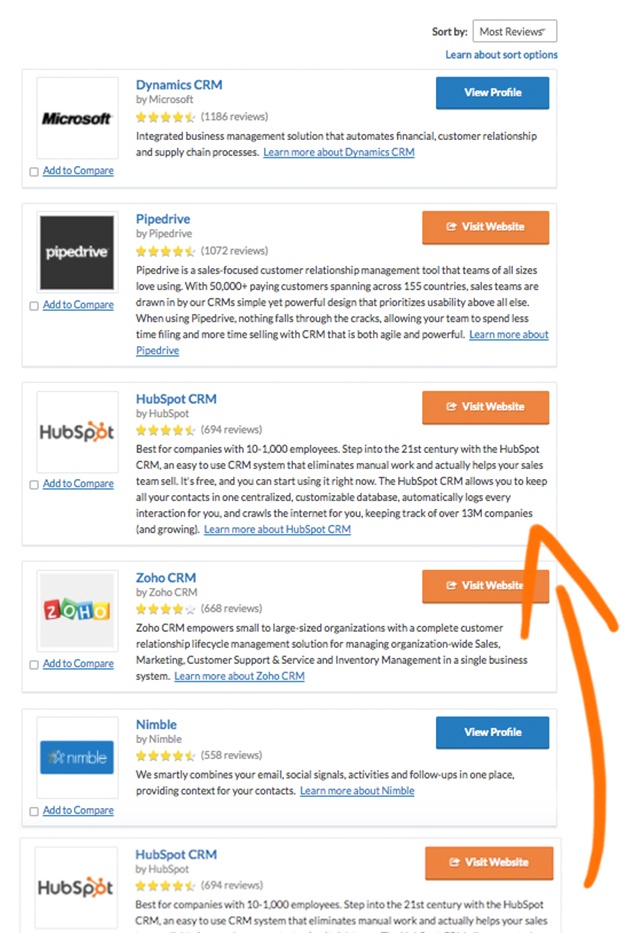
Having a freemium product worked to our advantage. We acquire a lot more users than many of our competitors because our CRM is a free product. This is very useful when it comes to collecting reviews, as you have a much bigger pool of users to ask.
Asking our customers to review us didn’t just contribute to customer acquisition, it also helped our sales team close more deals and grew our website traffic.
We ran an SEO experiment where we added review schema markup to our product pages, and this increased clicks to those pages by 10%.
Having a review acquisition strategy was hugely beneficial for us at HubSpot. Hopefully, you can use some of our learnings to boost your own customer reviews.

31 Call-to-Action Examples You Can’t Help But Click
Think about all the times you’ve signed up for things in your life. Did you once download Evernote? Dropbox? Spotify? Maybe you’ve even taken a class on General Assembly.
Each one of these signups is likely a result of an effective call-to-action (CTA).
And it’s really important to guide your visitors through the buying journey using strategic CTAs. Think about it: If you hadn’t been drawn in by the copy or design of the CTA, or been guided so eloquently through your sign-up process, you would probably use a lot fewer apps and websites than you do now.

To help you identify what’s effective and what’s not, we’ve listed out 31 examples of CTAs that totally rock. These call-to-action examples are broken out into three categories:
- Simple and effective CTAs
- CTAs with great call-to-action phrases
- CTAs that balancing multiple buttons on one page
Simple & Effective Call-to-Action Examples
1. Evernote
CTA Button: Sign Up
“Remember Everything.” Visitors can immediately understand that message the moment they land on this page. The design on Evernote’s website makes it super simple for users to see quick benefits of using the app and how to actually sign up to use it. Plus, the green color of the main and secondary CTA buttons is the same green as the headline and the Evernote logo, all of which jump off the page.

2. Dropbox
CTA Button: Sign up for free
Dropbox has always embraced simple design with a lot of negative space. Even the graphics on their homepage are subtle and simple.
Thanks to that simple design and negative space, the blue “Sign up for free” call-to-action button stands out from everything else on the page. Since the CTA and the Dropbox logo are the same color, it’s easy for the visitor to interpret this CTA as “Sign up for Dropbox.” That’s one effective call-to-action.

3. OfficeVibe
CTA Button: Subscribe
Here’s a slide-in call-to-action that caught my attention from OfficeVibe. While scrolling through a post on their blog, a banner slid in from the bottom of the page with a call-to-action to subscribe to their blog. The best part? The copy on the slide-in told me I’d be getting tips about how to become a better manager — and the post it appeared on was a post about how to become a better manager. In other words, the offer was something I was already interested in.

Plus, I like how unobtrusive slide-in CTAs are — as opposed to what my colleague Rachel Sprung calls the “stop-everything-and-click-here-pop-up-CTA.” I find these CTAs offer a more lovable experience because they provide more information while still allowing me to continue reading the blog post. (Click here for a tutorial on how to add slide-in CTAs to your blog posts.)
4. Netflix
CTA Button: Join Free for a Month
One big fear users have before committing to sign up for something? That it’ll be a pain to cancel their subscription if they end up not liking it. Netflix nips that fear in the bud with the “Cancel anytime” copy right above the “Join Free for a Month” CTA. I’d venture a guess that reassurance alone has boosted signups. Also, you’ll notice again that the red color of the primary and secondary CTAs here match Netflix’s logo color.

5. Square
CTA Button: Get Started
To achieve effective CTA design, you need to consider more than just the button itself. It’s also super important to consider elements like background color, surrounding images, and surrounding text.
Mindful of these additional design components, the folks at Square used a single image to showcase the simplicity of using their product, where the hovering “Get Started” CTA awaits your click. If you look closely, the color of the credit card in the image and the color of the CTA button match, which helps the viewer connect the dots of what to expect if/when they click.

6. Prezi
CTA Button: Give Prezi a try
The folks at Prezi are also into the minimalist design look on their website. Other than the green dinosaur and the dark brown coffee, the only other color accompanying the predominantly black-and-white design is a bright blue — the same blue from their main logo. That bright blue is strategically placed on the homepage: the main “Give Prezi a try” CTA, and the secondary “Get Started” CTA, both of which take users to the same pricing page.

7. Full Bundle
CTA Button: Our Work
Full Bundle is another company that uses negative space to make their primary CTA pop. The white “Our Work” call-to-action stands out against the dark greys of the background. Their choice of CTA is strategic, too. Given that they primarily exist to build out clients’ online presences, it’s important for them to showcase their work — and that’s what most folks are going to their website for.

8. Panthera
CTA Button: Join
The folks at Panthera are looking for users who really care about wild cats around the world and want to join a group of people who feel the same way. To target those people in particular, we love how they use language that would speak to big cat-lovers: “Join the pride today.” The page itself is super simple: an on-page form with two, simple fields, and a button asking folks to (again) “Join.”

CTAs With Creative Call to Action Phrases
9. Huemor
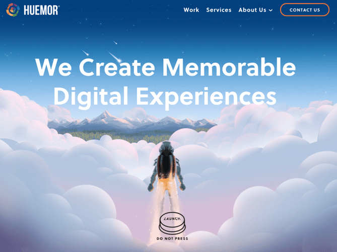
CTA Phrase: ‘Launch (Do Not Press)’
If you went to a website and saw a “Launch” CTA accompanied by the copy “Do Not Press” … what would you do? Let’s be honest: You’d be dying to press it. The use of harmless reverse psychology here is playful, which is very much in keeping with Huemor’s brand voice.
10. Aquaspresso
CTA Phrase: ‘Send Me Specials Now!’
The whole point of a call-to-action is to direct your site visitors to a desired course of action — and the best CTAs do so in a way that’s helpful to their visitors. The folks at coffee company Aquaspresso really nailed that balance here with the pop-up CTA on their main blog page.
Here, the desired course of action is for their blog readers to check out what they’re actually selling (and hopefully buy from them). There are many ways they could have done this, including putting out a CTA that urges people to “Check out our most popular products!” or something very direct. But we love what they’ve done instead: Their CTA offers blog readers something much more helpful and subtle — an offer for “today’s specials” in exchange for the reader’s email address.
Adding that the specials are for today only is a great example of a psychological tactic called scarcity, which causes us to assign more value to things we think are scarce. The fear that today’s specials are better than tomorrow’s might make people want to fill it out and claim their offer while they can.

(The call-to-action above was created using HubSpot’s free conversion tool, Leadin. Click here to learn how to easily create CTAs like this one using Leadin.)
11. QuickSprout
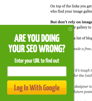
CTA Phrase: ‘Are you doing your SEO wrong? Enter your URL to find out’
No one wants to be wrong. That’s why a call-to-action button like QuickSprout’s slide-in CTA on their blog is so clickworthy. It asks the reader, “Are you doing your SEO wrong?” Well, am I? All I have to do is enter my URL to find out — seems easy enough. It’s language like that that can really entice visitors to click through.
Plus, having the CTA slide in mid-blog post is a great tactic for catching readers before they bounce off the page. Traditionally, many blogs have CTAs at the very bottom of each blog post, but research shows most readers only get 60% of the way through an article. (Click here to learn how to add slide-in CTAs to your blog posts.)
12. Grey Goose
CTA Phrase: ‘Discover a cocktail tailored to your taste’
Here’s a fun, unique call-to-action that can get people clicking. Whereas site visitors might have expected to be directed to product pages or press releases from the homepage, a CTA to “Discover a Cocktail Tailored to Your Taste” is a pleasantly surprising ask. People love personalization, and this CTA kind of feels like an enticing game. The play button icon next to the copy gives a hint that visitors will be taken to a video so they have a better idea of what to expect when they click.

13. Treehouse
CTA Phrase: ‘Claim Your Free Trial’
A lot of company websites out there offer users the opportunity to start a free trial. But the CTA on Treehouse’s website doesn’t just say “Start a Free Trial”; it says “Claim Your Free Trial.”
The difference in wording may seem subtle, but think about how much more personal “Claim Your Free Trial” is. Plus, the word “claim” suggests it may not be available for long, giving users a sense of urgency to get that free trial while they can.

14. OKCupid
CTA Phrase: ‘Continue’
OKCupid’s CTA doesn’t seem that impressive at first glance, but its brilliance is in the small details.
The call-to-action button, which is bright green and stands out well on a dark blue background, says, “Continue.” The simplicity of this term gives hope that the signup process is short and casual. To me, this CTA feels more like I’m playing a fun game than filling out a boring form or committing to something that might make me nervous. And it’s all due to the copy.

15. Blogging.org
CTA Phrase: Countdown Clock
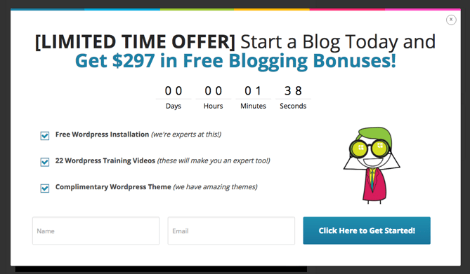
Nothing like a ticking timer to make someone want to take action. After spending a short amount of time on blogging.org’s homepage, new visitors are greeted with a pop-up CTA with a “limited time offer,” accompanied by a timer that counts down from two minutes.
As with Aquaspresso’s example in #10, this is a classic use of the psychological tactic called scarcity, which causes us to assign more value to things we think are scarce. Limiting the time someone has to fill out a form makes people want to fill it out and claim their offer while they can.
Curious, what happens when time runs out? So was I. Hilariously, nothing happens. The pop-up CTA remains on the page when the timer gets to zero.
16. IMPACT Branding & Design
CTA Phrase: ‘What We Do’
CTAs can feel really pushy and salesy if the wrong language is used. I like IMPACT’s educational approach, where they challenge visitors to learn what the company does before pushing them to take any further action. This calls-to-action is especially intriguing to me because they don’t even use an action verb, yet they still manage to entice people to click.

17. EPIC
CTA Phrase: ‘Let’s start a new project together’
The folks at the agency EPIC use their homepage primarily to showcase their work. When you arrive on the page, you’re greeted with animated videos showing some of the work they’ve done for clients, which rotate on a carousel. While there plenty of other places users might click on their site — including their clients’ websites — the main call-to-action stands out and always contrasts with the video that’s playing in the background.
I love that it features friendly, inclusive language — “Let’s start a new project together” — which gives a hint to users looking for a creative partner that they’re an especially great team to work for.

18. Brooks Running
CTA Phrase: ‘Find out when we have more’
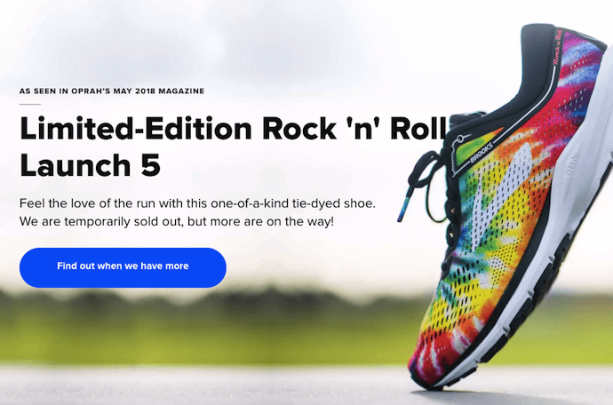
How many times have you hotly pursued a product you love, only to discover it’s sold out? Well, as you might know, it’s no picnic for the seller either. But just because you’ve run out of an item doesn’t mean you should stop promoting it.
Brooks Running uses a clever call to action to ensure their customers don’t bounce from their website just because their favorite shoe is out of stock. In the screenshot below, you can see Brooks touting an awesome-looking shoe with the CTA, “Find out when we have more.” I love how this button turns bad news into an opportunity to retain customers. Without it, Brooks’ customers would likely forget about the shoe and look elsewhere.
When you click on the blue CTA button depicted below, Brooks directs you to a page with a simple code you can text the company. This code prompts Brooks to automatically alert the visitor when the shoe they want is available again.
19. Humboldt County
CTA Phrase: ‘Follow the Magic’
Humboldt County’s website is gorgeous on its own: It greets you with a full-screen video of shockingly beautiful footage. But what I really love is the unconventional call-to-action button placed in the bottom center, which features a bunny icon and the words “Follow the Magic.”
It enhances the sort of fantastical feel of the footage, making you feel like you’re about to step into a fairytale.

What’s more, once you click into that CTA, the website turns into a sort of choose-your-own-adventure game, which is a fun call-to-action path for users and encourages them to spend more time on the site.

Balancing Multiple Call-to-Action Buttons
20. Uber
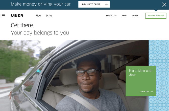
CTA Buttons: Sign up to drive | Start riding with Uber
Uber’s looking for two, very distinct types of people to sign up on their website: riders and drivers. Both personas are looking for totally different things, and yet, the website ties them together really well with the large video playing in the background showing Uber riders and drivers having a good time in locations all over the world.
I love the copy of the driver CTA at the top, too: It doesn’t get much more straightforward than, “Make money driving your car.” Now that’s speaking people’s language.
21. Spotify
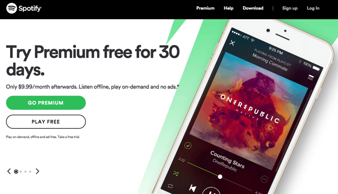
CTA Buttons: Go Premium | Play Free
As soon as you reach Spotify’s homepage, it’s pretty clear that their main goal is to attract customers who are willing to pay for a premium account, while the CTA for users to sign up for free is very much secondary.
It’s not just the headline that gives this away; it’s also the coloring of their CTA buttons. The “Go Premium” CTA is lime green, making it pop off the page, while the “Play Free” CTA is plain white and blends in with the rest of the copy on the page. This contrast ensures that visitors are drawn to the premium CTA.
22. Ugmonk
CTA Buttons: Send me the coupons | I’m not interested
Exit CTAs, also known as exit intent pop-ups, are different than normal pop-ups. They detect your users’ behavior and only appear when it seems as though they’re about to leave your site. By intervening in a timely way, these pop-ups serve as a fantastic way of getting your reader’s attention while offering them a reason to stay.
Ugmonk has a great exit CTA, offering two options for users as a final plea before they leave the site. First, they offer a 15% discount on their products, followed by two options: “Yes Please: Send me the coupon” and “No Thanks: I’m not interested.” It’s super helpful that each CTA clarifies what “Yes” and “No” actually mean, and I also like that they didn’t use guilt-tripping language like “No Thanks: I hate nature” like I’ve seen on other websites. Finally, notice that the “Yes Please” button is much brighter and inviting in color than the other option.

23. Pinterest
CTA Buttons: Continue with Facebook | Sign Up
Want to sign up for Pinterest? You have a couple of options: sign up via Facebook or via email. If you have a Facebook account, Pinterest wants you to do that first. How do I know? Aesthetically, I know because the blue Facebook CTA comes first and is much more prominent, colorful, and recognizable due to the branded logo and color. Logically, I know because if you log in through Facebook, Pinterest can pull in Facebook’s API data and get more information about you than if you log in through your email address.
Although this homepage is optimized to bring in new members, you’ll notice a very subtle CTA for folks with Pinterest accounts to log in on the top right.

24. Madewell
CTA Buttons: Take me there | What’s next?
Madewell (owned by J.Crew) has always had standout website design, taking what could be a typical ecommerce website to the next level. Their use of CTAs on their homepage is no exception.
When you first arrive on the page, you’re greeted with the headline “I’m Looking For …” followed by a category, like “Clothes That’ll Travel Anywhere.” Below this copy are two options: “Yes, Take Me There” or “Hmm… What’s Next?” The user can choose between the two CTAs to either browse clothes that are good for travel, or be taken to the next type of clothing, where they can play again.
This gamification is a great way to make your site more interesting for users who come across it without having a specific idea of where they want to look.

25. Instagram
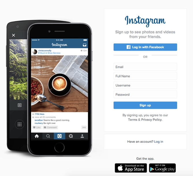
CTA Buttons: Download on the App Store | Get it on Google Play
Since Instagram is a mainly mobile app, you’ll see two black CTAs of equal size: one to download Instagram in Apple’s App Store, and another to download it on Google Play. The reason these CTAs are of equal caliber is because it doesn’t matter if someone downloads the app in the App Store or on Google Play … a download is a download, which is exactly what Instagram is optimizing for. If you already have Instagram, you can also click the CTA to “Log In” if you’d prefer that option, too.
26. Barkbox
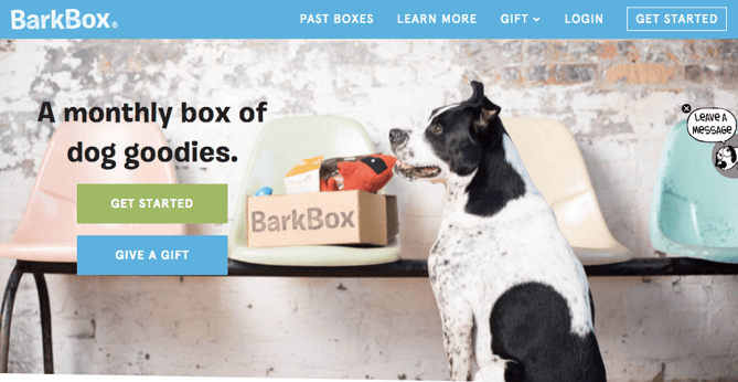
CTA Buttons: Get Started | Give a Gift
The two CTAs on Barkbox’s homepage show that the team there knows their customers: While many people visiting their site are signing up for themselves, there are a lot of people out there who want to give Barkbox as a gift. To give those people an easy path to purchase, there are two, equally sized CTAs on the page: “Get Started” and “Give a Gift.”
As an added bonus, there’s an adorable, pop-up call-to-action on the right-hand side of the screen prompting users to leave a message if they’d like. Click into it, and a small dialogue box pops up that reads, “Woof! I’m afraid our pack is not online. Please leave us a message and we’ll bark at you as soon as pawsible.” Talk about delightful copy.
27. t.c. pharma
CTA Buttons: Find out more | View products
Turns out Red Bull isn’t its own parent company: It’s owned by Thailand-based t.c. pharma, a company that makes popular energy drinks, electrolyte beverages, and functional drinks and snacks.
Its homepage features two call-to-action buttons of equal size: “Find out more” and “View products” — but it’s clear by the bright yellow color of the first button that they’d rather direct folks to “Find out more.”

28. General Assembly
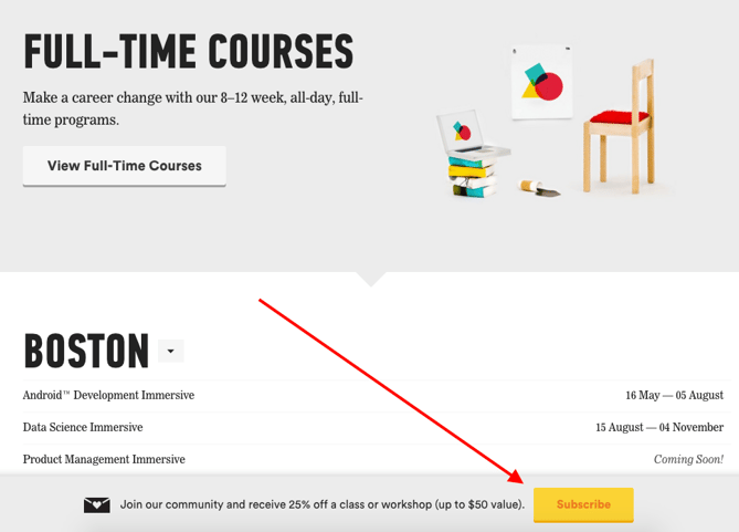
CTA Buttons: View Full-Time Courses | Subscribe
As you scroll through the General Assembly website, you’ll see CTAs for various courses you may or may not want to sign up for. I’d like to point your attention to the CTA that slides in from the bottom of the page as you’re scrolling, though, which suggests that you subscribe to email updates.
Although this feels like a secondary CTA due to its location and manner, I actually think they try to sneak this in to become more of a primary CTA because it’s so much more colorful and noticeable than the CTAs for individual classes. When you create your own CTAs, try using bolder colors — even ones that clash with your regular stylings — to see if it’s effective at getting people’s attention. (Click here for a tutorial on how to add slide-in CTAs to your webpages.)
29. charity: water
CTA Buttons: Give by Credit Card | Give by PayPal
Charity: water’s main goal is to get people to donate money for clean water — but they can’t assume that everyone wants to pay the same way.
The CTAs featured on their homepage take a really unique approach to offering up different payment methods by pre-filling $60 into a single line form and including two equally important CTAs to pay via credit card or PayPal. Notice how both CTAs are the same size and design — this is because charity: water likely doesn’t care how you donate, as long as you’re donating.

30. Hipmunk
CTA Buttons: Flights | Hotels | Cars | Packages
When you land on the Hipmunk site, your main option is to search flights. But notice there are four tabs you can flip through: flights, hotels, cars, and packages.
When you click into one of these options, the form changes so you can fill out more information. To be 100% sure you know what you’re searching for, Hipmunk placed a bright orange CTA at the far right-hand side of the form. On this CTA, you’ll see a recognizable icon of a plane next to the word “Search,” so you know for sure that you’re searching for flights, not hotels. When you’re on the hotels tab, that icon changes to a hotel icon. Same goes with cars and packages.

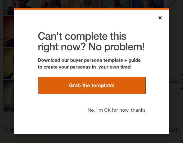
31. MakeMyPersona
CTA Buttons: Grab the template! | No thanks
Here’s another example of a great pop-up with multiple calls-to-action — except in this case, you’ll notice the size, color, and design of the users’ two options are very different from one another. In this case, the folks at MakeMyPersona are making the “Grab the template!” CTA much more attractive and clickable than the “No, I’m OK for now, thanks” CTA — which doesn’t even look like a clickable button.
I also like how the “no” option uses polite language. I find brands that don’t guilt-trip users who don’t want to take action to be much, much more lovable.
There you have it. By now, we hope you can see just how important little CTA tweaks can be.
Full Disclosure: We don’t have data to know if these are all scientifically successful, but these examples all follow our best practices. If you decide to recreate these CTAs on your site, please remember to test to see if they work for your audience.
Want more CTA design inspiration? Check out some of our favorite HubSpot call-to-action examples.

Google launches its AI-driven Apple News competitor ‘Google News’ for iPhone & iPad

Last week at its annual I/O developer conference, Google unveiled its new AI-powered “Google News” application. Replacing the neglected Newsstand service from Google, and seen as a direct competitor to the Apple News app, Google News is now available on the App Store…