
Welcome to My Blog
18 Core Company Values That Will Shape Your Culture & Inspire Your Employees
Consider one of American Express’s company values — “Customer Commitment”. Ideally, if you’ve had a positive experience with one of American Express’s customer service reps, you’ve seen this value displayed first-hand.
Alternatively, take a look at one of Google’s values — “Focus on the user and all else will follow.”
Any Google search will show you they stand by their purpose to serve the user. Undoubtedly, you find most answers to your common questions on page one of Google, and more recently, it’s likely separated in its own featured snippet, as well.
Having core company values can help you ensure each of your employees, from top leadership to entry-level, are working towards the same common goal, and share a bigger purpose.
Purpose is undeniably critical for employee satisfaction. In fact, an Imperative survey of LinkedIn members found 73% of purpose-oriented members are satisfied in their jobs, compared to 64% who are not purpose-oriented.
Plus, purpose doesn’t just improve employee satisfaction — it also increases your bottom line. The same Imperative survey found 58% of companies with a clearly articulated and understood purpose experienced growth of +10%, compared to just 42% of companies that don’t prioritize purpose.
Ultimately, core values are critical if you want to create a long-lasting, successful, and motivating place to work.
Whether you work for a new company in need of core-value inspiration, or an older company in need of a value revamp, you’re in luck — here, we’ve cultivated a list of some of the best company values. Additionally, we’ll examine how some companies truly honor their values.
Company Values
- Integrity
- Boldness
- Honesty
- Trust
- Accountability
- Commitment to Customers
- Passion
- Fun
- Humility
- Continuous Learning
- Ownership
- Constant Improvement
- Leadership
- Diversity
- Innovation
- Quality
- Teamwork
- Simplicity
Examples of Companies with Inspiring Core Values
1. American Express
- Customer Commitment: We develop relationships that make a positive difference in our customers’ lives.
- Quality: We provide outstanding products and unsurpassed service that, together, deliver premium value to our customers.
- Integrity: We uphold the highest standards of integrity in all of our actions.
- Teamwork: We work together, across boundaries, to meet the needs of our customers and to help our Company win.
- Respect for People: We value our people, encourage their development and reward their performance.
- Good Citizenship: We are good citizens in the communities in which we live and work.
- A Will to Win: We exhibit a strong will to win in the marketplace and in every aspect of our business.
- Personal Accountability: We are personally accountable for delivering on our commitments.
American Express doesn’t just hit the bare minimum when it comes to polite, helpful customer service — they go above-and-beyond to solve for their customers, even when there’s no protocol in place.
For instance, Raymond Joabar, the Executive Vice President at American Express, recently told this story in a Forbes interview: “One time, a hotel café manager [an Amex merchant] alerted my team that he had accidentally sold a display cake with harmful chemicals and needed to find the customers before they ate it. Obviously, there’s no procedure for that, but our team took ownership of the problem. They gathered all the information they could from the record of charge, identified 21 Card Members who used their cards at the café during that time frame, reviewed the accounts to find the right match, and then called the Card Member in time before they served the cake at an anniversary party.”
“The important point here,” Joabar noted, “other than that everybody ended up safe and sound — is that there isn’t a script for every situation, so we empower our care professionals to do what’s right for the customer. And we recognize what they do with this empowerment as well. We give awards to employees who go above and beyond to help customers and we share their stories across the company.”
This anecdote exemplifies American Express employees’ commitment to their customers even when it’s not easy, and demonstrates the company’s dedication to living by its values.
2. Google
- Focus on the user and all else will follow.
- It’s best to do one thing really, really well.
- Fast is better than slow.
- Democracy on the web works.
- You don’t need to be at your desk to need an answer.
- You can make money without doing evil.
- There’s always more information out there.
- The need for information crosses all borders.
- You can be serious without a suit.
- Great just isn’t good enough.
On Google’s philosophy page, they don’t just list their core values — they also provide examples.
For instance, consider their value, “You can make money without doing evil.” While many companies likely tout the benefits of integrity, Google references strategic efforts its made to avoid “evil” business, including — “We don’t allow ads to be displayed on our results pages unless they are relevant where they are shown … We don’t accept pop–up advertising, which interferes with your ability to see the content you’ve requested … [and] Advertising on Google is always clearly identified as a ‘Sponsored Link,’ so it does not compromise the integrity of our search results.”
Ultimately, a core value doesn’t have much power if your company can’t list intentional, calculated decisions it’s made to put values ahead of profit.
3. Coca Cola
- Leadership: The courage to shape a better future.
- Collaboration: Leverage collective genius.
- Integrity: Be real.
- Accountability: If it is to be, it’s up to me.
- Passion: Committed in heart and mind.
- Diversity: As inclusive as our brands.
- Quality: What we do, we do well.
Coca Cola demonstrates its diversity core value with its public Global Diversity Missionpage, which lists the company’s diversity-related efforts, such as, “[collecting employee] feedback through formal surveys and informally through their participation in our business resource groups, various diversity education programs and our Resolution Resources Program, where associates can work to resolve issues they face in our Company.”
Additionally, Coca Cola’s Global Diversity Mission page exemplifies their commitment to accountability, as well — they’ve publicly included pie charts with statistics regarding their global employee gender and race ratios. By acknowledging both their efforts and their shortcomings, Coca Cola is able to show their desire to live up to their values, while taking responsibility for any mis-match between their ideals and reality.
4.Whole Foods
- We Satisfy And Delight Our Customers — Our customers are the lifeblood of our business and our most important stakeholder. We strive to meet or exceed their expectations on every shopping experience.
- We Promote Team Member Growth And Happiness — Our success is dependent upon the collective energy, intelligence, and contributions of all of our Team Members.
- We Care About Our Communities And The Environment — We serve and support a local experience. The unique character of each store is a direct reflection of a community’s people, culture, and cuisine.
- We Practice Win-Win Partnerships With Our Suppliers — We view our trade partners as allies in serving our stakeholders. We treat them with respect, fairness and integrity – expecting the same in return.
Underneath each of its values on its core value page, Whole Foods provides a link, such as, “Learn more about how we care about our communities and the environment.”
Ultimately, their page demonstrates their ability to walk the walk. For instance, to exemplify their commitment to local communities, Whole Foods created a Local Producer Loan Program, in which they provide up to $25 million in low-interest loans to independent local farmers and food artisans.
Additionally, Whole Foods provides a list of environmentally-friendly efforts they’ve practiced since 1980, including “Printing and packaging using recycled paper and water- or vegetable-based, composting to decrease landfill waste, and no single-use plastic bags at checkout since 2008”.
If you’ve ever been to a Whole Foods, you know they’re serious about their efforts to reduce waste and help the local community. In fact, its part of the reason so many customers are brand loyalists — because they support those efforts, too.
Ultimately, good core values can help an audience identify with, and stay loyal to, your brand, rather than flipping between you and competitors. To ensure long-term success andlong-term employee retention, it’s critical you create — and live by — certain non-negotiable company values.

The Ultimate Guide to Marketing Interview Questions From HubSpot’s CMO
Alright, everyone: I’m about to let you in on a few of my best-kept interviewing secrets.
In this post, I’ll uncover real questions I use when interviewing candidates for inbound marketing positions and the answers I’m looking for.
These questions are meant to assess candidates not only for their marketing talent, but also for who they are as people.
Keep in mind that the best candidates aren’t just qualified to do the job you’re trying to hire them for. You want to look for people who are also passionate about marketing, fit with your culture, and show potential for growth at your company.
Here’s a quick look into my interview approach, followed by 14 excellent interview questions I recommend adapting for your industry and hiring needs.
My Interview Approach
During interviews, I put a lot of stake into each candidate as an individual. My goal is always to find someone amazing who also has great long-term potential, no matter where they are in their career.
To uncover this, I like to ask questions that get at the core of who they are, how they think about things specifically, and how they’ve gotten things done in the real world. I then balance these questions with case-style questions, which usually involve a hypothetical business situation, because they give the candidate an opportunity to show how they think about and work on problems.
Below is a list of 14 questions that make for an effective marketing job interview, the majority of which I’ve asked candidates with whom I’ve personally gotten to meet.
Keep in mind that I don’t ask all of these questions during a single interview. In fact, one case-style question can evolve into a discussion lasting anywhere from 10 to 30 minutes, so I often only have time to cover two or three questions during one session.
I also don’t limit these questions to the position levels you’ll see in each section below. This list is just one reasonable way to organize your job interviews based on the average experience of an intern, coordinator, manager, and director. Depending on the candidate and the needs of the role, a question to a marketing manager candidate might be a good question to ask a marketing coordinator candidate as well.
Before the interview starts, carefully choose the questions you want to use based on the person’s role and background. For an inbound marketing generalist, you could ask any or all of these questions. For someone with a more specific role on a larger inbound marketing team, like a blogger, you could focus only on the questions about blogging and content creation.
Learn more in the following video, and check out some of my favorite interview questions below.
14 Interview Questions to Ask Marketing Job Candidates
Case-Style Interview Questions
1. “Draw a funnel on the whiteboard showing 10,000 visitors, 500 leads, 50 opportunities, and 10 new customers (or any other numbers you think are interesting). Now, pretend you’re the CMO for the company, and you have to decide what your marketing team should do to improve on these metrics. Which areas of the funnel would you focus on, and what would you do differently to change these results?”
The Follow-Up: The follow-up here is simply pushing on the candidate’s answers. Typically, they’ll pick one part of the funnel to focus on. (And if they don’t, I like to push them to do just that.)
Once they pick one area, I ask them follow-up questions like: “Which tactics would you think about changing?,” “What have you done in your past role that’s worked?,” “Do you think our company has any unique advantages to get some leverage out of that stage of the funnel?” I don’t just want them to tell me to “improve the visitor to lead conversion rate” — they need to tell me how.
If I have time, I’ll tell them to pretend they’ve implemented their ideas, and I’ll ask them to go back through the whole funnel and explain how they think each of those initial metrics have changed.
What to Look For: Everyone on the marketing team needs to be able to understand how to think about and optimize the funnel. Here’s where you assess their thought process, whether they have an intuitive sense of what good and bad conversion rates are, and whether they understand how the funnel steps are connected.
You’ll also gain some insight into whether they understand which different tactics you can use at each step to improve that particular step. (For example, if they say the lead-to-opportunity conversion rate is bad, the right answer is not to write more blog articles.)
2. “We have two potential designs for the homepage of our website, but we don’t know which one to use. The CEO likes one, and the COO likes another. Half the company likes one, and the other half of the company likes the other. Which one should we use?”
The Follow-Up: This type of question should elicit a ton of questions from the candidate, like who the target audience for the homepage is. If it doesn’t, then they’re either making up their answer or don’t have enough knowledge to address the situation. Follow up by answering their questions with hypotheticals and seeing how they work through the problem.
If they do pick one side or the other and give you a reason, ask them what the goals are for the homepage. Then, ask them how they’d determine which homepage meets those goals best. From there, tell them that Homepage A performed well based on one of the criteria, and Homepage B performed well based on another one of the criteria. This way, you can assess how they make choices when it’s not possible to get data that’s 100% conclusive, and they have to choose between two, imperfect variations.
What to Look For: While it might seem like this question is all about design, what you’re really doing is understanding how candidates approach a conflict of interest. Do they care what each of these people think, or do they go to the data for their answers, such as through A/B testing, user testing, and customer interviews. The best candidates introduce logic and marketing methodology into their answers, while removing opinions. I also like when candidates say you should be constantly tweaking and improving the homepage, rather than always doing a complete redesign every nine or 18 months.
3. “Let’s say you have an Excel spreadsheet with 10,000 leads from a few months back — long enough that those leads’ sales cycle has passed. The file contains information about each lead, like their industry, title, company size, and what they did to become a lead (like downloading an ebook). Also in the file is whether they closed as a customer and how much their order was for. Can you use this information to create a lead score? How would you do it?”
Note: I often start this question by simply asking, “How should you create a lead score?” This is how I sort out the people who don’t take a data-driven approach. Folks who answer, “You create a lead score by talking to the sales team and then assigning five or ten points to each of the criteria they say they want” are actually wrong. That is not a data-driven approach to lead scoring, and it is way too simplistic to work effectively in most cases.
The Follow-Up: Most people will answer by talking about “looking at the data” and “sorting the data.” Push them to tell you how they’d do that in Excel (or another program if they prefer something else). It’s not practical to just “look” at the data when you have 10,000 rows — you need to use statistical analysis.
They also might zone in on one factor, perhaps industry, all alone. If they do that, you should ask them what they would say if the small companies in one industry are good leads, but the big companies in another industry are also good leads? Basically, just keep pushing them until they’re at a loss for what to do next.
What to Look For: This case-style question is meant to test a candidate’s quantitative abilities, and I’d only ask it for people applying for certain marketing roles (like operations). Here, I’m trying to figure out how the candidate thinks about analyzing data and what their sophistication level is around data.
Most people don’t get very far and are either unwilling or unable to look at more than one variable at a time, or understand how to analyze a lot of data in a simple way. At a minimum, you want to find candidates who:
- Look at the leads who closed in one group and compare them to the leads who did not close
- Look at multiple variables at a time
- Use statistical functions in Excel or another program to do that, like summary tables, pivot tables, and so on
If you find someone who starts making a coherent argument about why you might want to use logistic regression, factor or cluster analysis, actuarial science, or stochastic modeling to figure this out … refer them to me.
Marketing Internship Interview Questions
4. “What is one of your hobbies? How do you do it?”
This question will help you assess a candidate’s ability to explain a concept they know intimately to someone who isn’t as familiar with it. If their hobby is training for a marathon, ask them what advice they’d give you if you woke up one day deciding you wanted to train for a marathon. Are they able to communicate it clearly?
One candidate taught me how to make tagliatelle, which is hand-cut Italian pasta. She gave me the full run-down on how you make the noodles, how you form them and cut them, and which ingredients go into the sauce. She relayed the step-by-step process to me in a way that was very clear and understandable. I felt like I could’ve gone home and made tagliatelle myself. Not only did this tell me she knows how to convey information clearly, but it also gave me insight into her personality and interests.
5. “What brands do you like or follow on social media and why?”
This is another casual but useful question, as it can tell you both about a candidate’s personal interests and how they perceive marketing content on social media. The best answers go further than which companies a candidate likes buying from — they indicate why he or she trusts certain companies, what about their content strategy appeals to the candidate, and what specifically about those companies the candidate looks up to (and maybe wants to emulate in their own work).
If you need a candidate to elaborate, follow up by asking them to describe a post from a brand they like or follow, and what made that post so memorable to them.
Marketing Coordinator Interview Questions
6. “What do you read, and how do you consume information?”
Marketing is changing constantly at a rapid pace — so anyone in a marketing role needs to know how to stay on top of and adapt to these changes. Do they know where to look for industry news? Are they familiar with and subscribed to top marketing blogs? What do they do when they see a change has taken place, like when Google updates their algorithm?
7. “What’s an example of a lead-generating campaign you’d be excited to work on here?”
Not every marketing campaign you run generates the same type or quality of leads. This is what makes this question so interesting. It’s a chance for you to see how a marketing candidate thinks about the buyer’s journey and what that journey should look like in your company.
If you do pose this question to a candidate, don’t expect him or her to know exactly how your business generates its leads. The ideal answer simply demonstrates an awareness of your customer and perhaps some on-the-spot brainstorming the candidate might be asked to participate in while on the job.
Expect follow-up questions from the interviewee, too, especially if you pose this question to a more experienced candidate. For example, they might ask how qualified the leads should be, or how leads are scored as a result of this hypothetical campaign. The specific parameters matter less than the follow-up question itself — a positive sign of an analytical marketer.
8. “What are three components of a successful inbound or digital marketing strategy?”
There’s no “right” answer to this question — a digital marketing strategy thrives on more than three things — but certain answers show the candidate is up to date on how businesses attract and delight their customers today.
“A Facebook page,” for instance, isn’t a wrong answer, but it doesn’t give you context around how a business would use this page in their marketing strategy. Here are a few sample answers to this interview question that are on the right track:
- A blog with calls to action (CTAs), landing pages for website visitors to download more content, and a defined social media strategy.
- An SEO strategy, website chat, and an analytics tool to track campaign performance.
- Buyer personas, a Marketing and Sales Service Level Agreement, and a customer success strategy.
You won’t learn everything about a candidate from just these terms and phrases. But you should listen for them as the candidate responds — and expect more sophisticated answers if you pose this question to managers or directors.
Ultimately, the value you place on each of these inbound marketing components will depend on how important they are to your business and what the candidate would focus on as your employee. Before asking this question to anyone you interview, talk to your team and define your marketing strategy. Otherwise, you won’t have an accurate measure on which to evaluate a candidate’s answer.
Interview Questions for Marketing Manager
9. “Why do you love marketing?”
Or, “Which aspects of our business are you passionate about?” You want to hire someone who’s both qualified and has the desire to do the work. Otherwise, why would they work for you instead of the company next door?
Part of their answer will lie in their body language and enthusiasm. The other part will lie in how concrete their answer is. Get at the details by asking a follow-up question, like: “Let’s say you’re at home, kicking around, and doing something related to marketing. What is it that you’re doing?” Perhaps they’re reading their five favorite marketing sites, or analyzing traffic patterns of websites for fun, or writing in their personal blog, or optimizing their LinkedIn profile. Whatever it is, you want to be sure they’re deeply passionate about the subject matter you’d hire them for.
10. “Between videos, ebooks, blog articles, photos, podcasts, webinars, SlideShare, Facebook, Twitter, LinkedIn, and Pinterest … there’s a lot of potential content our team should produce for inbound marketing. How do we do it all?”
The wisest candidates know you should not do it all, but rather, you should start with the content that’s most important to your prospects and customers. They should also have a plan for talking to customers and prospects by way of interviews or surveys to figure out which social networks they use and which types of content they prefer.
11. “Let’s pretend we have very convincing data that shows none of our potential customers use social media. Should we still do it? Why?”
Look for candidates who understand that being successful in social media is important even if your customers aren’t there today. Here are a few reasons qualified candidates might cite:
- Your customers will be there in the future, so you should get started now.
- You’ll gain industry clout. After all, journalists and influencers in your industry are probably using social media — and it’s important for them to follow you even if they don’t ever become customers.
- Social media activity impacts your organic search presence, helping your content rank higher in search engines.
- You’ll have more control over your online presence.
- Your competitors are likely using social media.
- It may cost less to generate customers via social media.
Marketing Director Interview Questions
12. “We have a new product coming out in three months. What would you do to launch it?”
This’ll show you how well a candidate understands all the different tactics of inbound marketing and how to tie them together into a holistic plan. It’ll also give you insight into how creative they are and whether they can come up with new and interesting ways to do marketing.
13. “Our CEO wants you to evaluate our blog. What would you say?”
Before giving you an answer, the best candidates will come back and ask you about the blog’s metrics, how many leads and customers it generates, what the goals are for it, how much you’re investing in it, and so on. This is also a great way to test whether they actually prepared for the interview by reading your blog.
14. “What’s the main relationship between marketing and sales?”
The relationship between Marketing and Sales is known for its unrest (Sales wants better leads from Marketing, and Marketing wants Sales to close more, faster).
Similar to question #8, there’s no right answer here, but there are answers you should listen for. “Marketers are the lead generators and salespeople are the lead closers” isn’t necessarily wrong, but the candidate who ends his/her answer here might not be someone who can align both departments around a single, unified approach.
The best answers describe the responsibilities that Sales and Marketing have to each other, and the duties each commits to as part of this partnership. They have a plan for forging consensus on what makes leads marketing-qualified versus sales-qualified, creating a shared Service Level Agreement with agreed-upon metrics, and using content at different points in the marketing and sales funnel to turn strangers into customers.
The Candidate’s Follow-Up
Most candidates know to follow up with each of their interviewers in the form of a thank-you note or email. But part of my assessment is the depth at which candidates follow up with me.
The most impressive follow-ups are the thoughtful ones, where candidates call upon details of our discussion to show they’re really engaged in the interview process. Perhaps they did more concrete thinking about a specific question I asked, and they send a long email including research on a question they don’t think they nailed. Many times, they’ll send me a light strategy document with ideas and/or research on something we talked about. These candidates tend to stand out.
Well, the cat’s out of the bag. You’ll have to use these marketing interview questions as a basis to create your own, similar questions that are relevant to your industry and hiring needs. Good luck, and happy hiring!
Want more interview tips? Learn about some of the questions candidates should ask hiring managers.

The Ultimate Guide to Branding in 2020
Products are never just products, right?
Coca-Cola is more than a soda. Starbucks is more than a coffee. Ray-Ban is more than a pair of sunglasses. Glossier is more than a tube of concealer.
Interacting with these products provide experiences, and we buy them with that experience in mind. Better yet, the companies that create and market them know exactly the experience they want you to have when you make (or consider) a purchase. That’s why they create a brand.
From the language in their Instagram caption to the color palette on their latest billboard to the material used in their packaging, companies who create strong brands know that their brand needs to live everywhere. They know their names extend far beyond the label.
The result? These brands are known, loved, and chosen out of a long lineup of options.
Who doesn’t want that? I know I do. That’s why we built this guide — to equip you to create and manage a strong brand that’ll help your business be admired, remembered, and preferred.
Use the links below to jump ahead to sections of interest, and don’t forget to bookmark this guide for later.
What’s a brand?
Before I dive into the importance of branding and how to build a brand, let’s go back to basics: What is a brand?
A brand is a feature or set of features that distinguish one organization from another. A brand is typically comprised of a name, tagline, logo or symbol, design, brand voice, and more. It also refers to the overall experience a customer undergoes when interacting with a business — as a shopper, customer, social media follower, or mere passerby.
What is branding?
Branding is the process of researching, developing, and applying a distinctive feature or set of features to your organization so that consumers can begin to associate your brand with your products or services.
Branding is an iterative process and requires getting in touch with the heart of your customers and your business. It’s important for a variety of reasons — I dive into these next.
Branding can be the deciding factor for consumers when they make a purchase decision. In a 2015 global Nielsen survey, almost 60% of shoppers said they actively buy from brands they know, and 21% said they bought a product because they liked the brand.
Branding gives your business an identity beyond its product or service. It gives consumers something to relate to and connect with.
Branding makes your business memorable. It’s the face of your company and helps consumers distinguish your business across every medium (which I discuss later).
Branding supports your marketing and advertising efforts. It helps your promotion pack that extra punch with added recognition and impact.
Branding brings your employees pride. When you brand your company, you’re not only giving your business identity, you’re also creating a reputable, highly-regarded workplace. Strong branding brings in strong employees.
Branding Terms to Know
Here are some other brand-related buzzwords you should know. They further demonstrate the importance and value of branding your business.
Brand awareness
Brand awareness refers to how familiar the general public and your target audience is with your brand. High brand awareness leads to brands being referred to as “trending,” “buzzworthy, or “popular.” Brand awareness is important because consumers can’t consider purchasing from your brand if they’re not aware of it.
👉🏼 Strong branding makes your business known.
Brand extension
Brand extensions are when companies “extend” their brand to develop new products in new industries and markets. Consider Honda lawn mowers or Martha Stewart bedding. Brand extensions allow companies (or individuals) to leverage brand awareness and equity to create more revenue streams and diversify product lines.
👉🏼 Strong branding brings in more money.
Brand identity
Brand identity is the personality of your business and the promise you make to your customers. It’s what you want your customers to walk away with after they interact with your brand. Your brand identity is typically comprised of your values, how you communicate your product or service, and what you want people to feel when they interact with it.
👉🏼 Strong branding gives your business more than a name.
Brand management
Brand management refers to the process of creating and maintaining your brand. It includes managing the tangible elements of your brand (style guide, packaging, color palette) and the intangible elements (how it’s perceived by your target audience and customer base). Your brand is a living, breathing asset, and it should be managed as such.
👉🏼 Strong branding requires consistent upkeep.
Brand recognition
Brand recognition is how well a consumer (ideally in your target audience) can recognize and identify your brand without seeing your business name — through your logo, tagline, jingle, packaging, or advertising. This concept goes hand-in-hand with brand recall, which is the ability to think of a brand without any visual or auditory identifiers.
👉🏼 Strong branding keeps your business top-of-mind.
Real-life brand example: Want to test your brand knowledge? Take this Logo Quiz by Business Insider to see how well you know your corporate brands. This is brand recognition at work.

Brand trust
Brand trust refers to how strongly customers and consumers believe in your brand. Do you deliver on your marketing promises? Do your salespeople and customer service go above and beyond? These things can create trust among your customers, which is important in a world where a mere 25% of people feel confident in large businesses.
👉🏼 Strong branding builds trust with your customers.
Brand valuation
Brand valuation is the commercial valuation of your brand derived from consumer perception, recognition, and trust. This concept goes hand-in-hand with brand equity. A powerful brand can make your business invaluable to investors, shareholders, and potential buyers.
👉🏼 Strong branding increases your business’s value.
Want to build an effective, measurable brand? Download our free guide on How to Build a Brand in 2019.
Here’s how you can create a brand — or begin the process of rebranding your current one.
There’s a lot that goes into a brand, and there’s a lot to consider when building a strong one. So, grab a notebook and jot down ideas as you move through this section. Recognize that branding is an iterative process, so you might be repeating some of these steps as you brainstorm and build your brand.
1. Determine your target audience
Branding leads to awareness, recognition, trust, and revenue. We’ve talked about that. But let’s take a step back and understand where those stem from: consumers. And not just any consumers — your target audience and customers.
If your brand doesn’t resonate with your audience, it won’t lead to that awareness, recognition, trust, and revenue. That’s where target market research comes in.
Before pressing pen to paper (or cursor to digital document), you must understand to whom your branding will be speaking. Who does your product serve? Who is your ideal customer? Why did you create your business in the first place?
What you learn about your target market and buyer personas will influence your branding decisions down the line, so make this step your first priority.
Download our free Persona Templates to easily organize your target audience research and strengthen your marketing.
2. Establish your mission statement
Let’s return to a question I asked in the previous step: Why did you create your business? Answering this will help you build your mission statement, which defines your purpose and passion as an organization.
Before you can craft a brand that your audience recognizes, values, and trusts, you must be able to communicate the purpose that your business provides. Then, every part of your brand (logo, tagline, imagery, voice, and personality) can reflect that mission and vision.
Your mission statement is a building block of your brand manifesto, which encompasses why your organization exists and why people should care about your brand.
Download our free guide to Defining Inspiring Mission and Vision Statements and learn the ins-and-outs of two of the most valuable strategic planning elements for businesses.
3. Define your unique values, qualities, and benefits
There are probably lots of businesses in your industry and niche. It’s easy to focus on your competition (and there’s a time and place for competitive analysis), but, for now, let’s focus on you.
What’s one thing that your business has that no one else can mimic (er, legally)? Your brand.
Because of that, you must ensure that your brand is comprised of and inspired by elements that are solely yours: the values, benefits, and qualities that make your company unique.
Take a moment to jot down a list of what sets your business apart from others. I’m not talking about product features (like appearance, components, or capabilities); I’m referring to how your products or services improve lives and contribute to success.
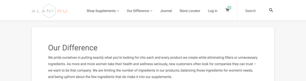
Real-life brand example: Alani Nutrition
You’ve probably never heard of Alani Nu; they’re a nutrition company based in my hometown of Louisville, Kentucky. I order their vitamins because 1) they’re proven to work, and 2) I trust and respect the brand (and it’s gorgeous!). On their website, they’ve clearly and simply outlined their unique values and benefits as part of their overall brand. Highlighting these makes it easy for customers like me to trust their products and choose them over competitors.
4. Create your visual assets
At this point, you should understand your target audience, your mission statement, and the unique qualities that make up your business.
If you can say with confidence that you’ve mastered these steps, it’s time to move onto one of the more exciting parts of branding — the visual design. We’re talking about your logo, color palette, typography (fonts), iconography, and other visual components.
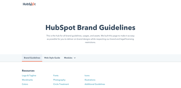
As you create these elements, build a set of brand guidelines (or a brand style guide) to govern the composition and use of your visual assets. This will ensure that whoever uses your new branding does so accurately and consistently. Check out HubSpot’s brand guidelines for reference.
Note: Design can be just as intimidating as it is exciting. Consider hiring a professional with logo and identity design experience or starting with a few helpful design templates.
5. Find your brand voice
Next, consider the auditory component of your brand. What would your brand sound like if you had a conversation with it, or if it texted you?
How you communicate with your target market is also considered part of your branding. You want to define a brand voice that connects and resonates with your audience — otherwise, they probably won’t pay attention. Because of that, don’t hesitate to return to step one to get familiar with to whom you’re speaking.
From your advertising campaigns and social media captions to your blog posts and brand story, ensure your tone is consistent throughout all of your written content. Give your audience a chance to get familiar with your brand and learn to recognize the sound of your voice. Better yet, master a fun, entertaining voice, and your customers will look forward to your social media and email updates.
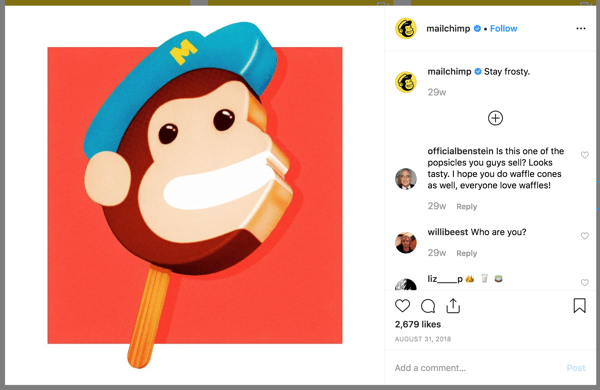
Real-life brand example: MailChimp
MailChimp is a great example of a brand that speaks with a clear, consistent tone. When I used their free plan for my small business, I always chuckled when receiving their emails and working in their interface. From its web copy to its email blasts and social media captions, MailChimp has established a brand voice and personality that is personable, fun, and accessible — it can be hard to explain the technical parts of a software product (like A/B testing), but MailChimp has mastered that, too.
6. Put your branding to work
Your brand only works if you do. Once you finish designing and creating your new brand (or rebrand) integrate it throughout every inch of your business. Pay extra attention to ensure it’s displayed anywhere your business touches customers. Here are a handful of tips for applying your brand across your organization.
Website
Splash your logo, color palette, and typography across your website. Don’t use anything but your predefined assets in your brand guidelines. Your website is a major part of your company identity — if it doesn’t reflect your brand, it will only provide a jarring customer experience. Also, be sure that all web copy, calls-to-action, and product descriptions reflect your brand voice.
Social media
All profile photos, cover art, and branded imagery should reflect your brand. Consider putting your logo as your profile photo — this will make it easier for customers to recognize your business. As with your website, be sure all profile information, posts, and captions reflect your brand voice.
Packaging
If you have a physical products business, your product is probably the most tangible way that customers interact with your brand. For that reason, your packaging should reflect your new branding — in its design, colors, size, and feel.
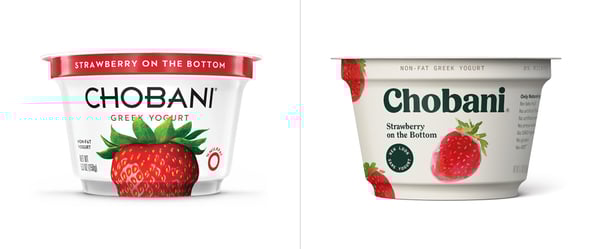
Real-life brand example: Chobani
I love Chobani yogurt (confession: I’m eating it right now). Their new branding immediately tells me that they produce authentic, healthy Greek yogurt. That’s one of the main reasons I buy Chobani. Recently, I realized that their yogurt packages are made with a very earthy, textured material — an intentional decision that supports the overall experience they’ve paired with purchasing and eating the Chobani brand.
Advertising
Because advertisements (digital and print) are often used to establish brand awareness and introduce consumers to your brand, it’s critical that they reflect your branding. In fact, your branding should make the ad creation process easier — with your brand style guide, you already know how your ads should appear and what type of copy to write.
Sales and customer service
A brand is only as powerful as the people behind it, and if your people aren’t putting your brand to work, it won’t work for you. Moreover, your brand applies to more than your marketing. Inform your sales and customer service folks of your brand guidelines and tell them to use it, especially when they engage directly with customers. Whether they are sharing a branded product demo or answering customer support inquiries, encourage them to use your logo, tagline, imagery, and brand voice.
Treat your brand as a person
To best wrap your head around the branding process, think of your brand as a person. Your brand should have an identity (who it is), personality (how it behaves), and experience (how it’s remembered).
Ask yourself these questions about your brand:
- How would your brand introduce itself? If it had to describe its appearance, how would it do so?
- How would your brand talk about your products or services? Would it be serious and professional, or would it be humorous and edgy?
- What would someone say about your brand after “meeting” it for the first time? What are a few sentences they’d use to describe it?
The purpose of branding is to create relationships with your customers. The easiest way to do this is to treat your brand as a person and understand that you want your customers to do the same.
Real-life brand example: Whiskey Riff
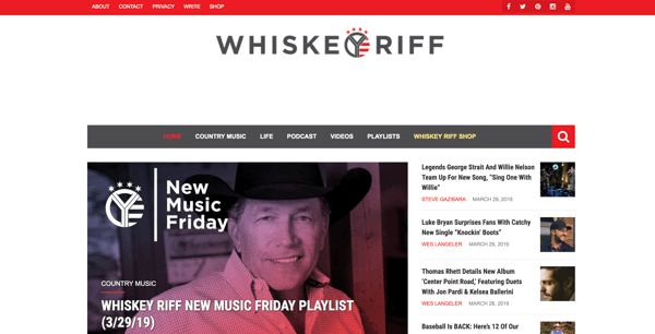
Whiskey Riff is another brand you’re probably not familiar with. It’s a two-man media company based here in Chicago that’s dubbed themselves “the most entertaining country music site ever”. I’m a fan because I love country music, enjoy their written and podcast content, and proudly wear some of their awesome apparel.
If Whiskey Riff was a person, here’s how I’d think it would answer the questions above:
- “Hey, I’m Whiskey Riff. I love country music and, you guessed it, Whiskey. My logo was inspired by the Y in the circle on the Chicago Theater marquee, and I’m adorned with horizontal red stripes and stars — which represent the American and Chicago flags.”
- “I publish in-your-face content about what’s going on in country music today. If you don’t like it, don’t read it. My podcast featured my founders interviewing country music artists and telling hilarious stories. Check out my apparel line; my t-shirts, tanks, hats, and accessories can be seen at country music festivals (and on stages) nationwide.”
- “Whiskey Riff is like that first shot of Jack Daniels — that much-needed, refreshing drink after a long day. Its a break from that cookie-cutter way of life, and you immediately appreciate — and trust — its candidness. There’s absolutely nothing like it in the industry.”
Prioritize consistency
Inconsistency is the number one branding mistake that companies make. Inconsistency undermines your brand and confuses your customers. Recognizable, valuable brands prioritize consistency — and they reap the benefits. When your brand is a unified presence across mediums and platforms, customers can easily get familiar with, recognize, and come to prefer your brand over time. Brand guidelines can help with this initiative.
Build and follow a brand strategy
A brand strategy is more than your brand guidelines; it’s a plan with specific, long-term goals that can be achieved as your brand evolves. These goals typically revolve around your brand’s purpose, emotion, flexibility, competitive awareness, and employee involvement.
Remember how I said that branding is a continuous process? There’s a lot that goes into it. A brand strategy can help you turn that process into a well-oiled practice that keeps your brand moving toward success and recognition.
Don’t let inspiration turn into imitation
Competitive analysis is important. Not only does it educate you on where your competition stands and how they are excelling, but it can also give you ideas on how you can improve or further set apart your brand.
However, be conscious to not fall into an imitation trap. Keep your competitive research limited and focus on what your organization brings to the table. Just because a competitor (or two) has branded their company in a certain way doesn’t mean that you have to follow suit. New, unique, provocative brands are memorable brands.
Use branding to hire
Strong branding makes your employees proud. I know I’m proud to be associated with HubSpot, much less work there. Leverage your branding to attract talented people. If hiring is a strong initiative for your organization, dedicate some of your resources to employer branding. Employer branding is how you market your company to job seekers and current employees. If you’re publically proud of your organization, others will be, too.
Ready, Set, Brand
Branding is your organization’s name, logo, color palette, voice, and imagery. It’s also more. It’s that intangible feeling your customers have when they interact with your brand. You know … that experience we talked about in the beginning.
That’s how powerhouse brands deviate from all the others. The tangible components contribute to this — a gorgeous logo, a clever tagline, an authentic manifesto, and a clear brand voice — but truly strong brands thrive when they focus on the big picture of their brand. Get to the heart and soul of your target audience and your organization, and a successful brand will follow.

The Ultimate Guide to Storytelling
An art.
Not a process, method, or technique. Storytelling is described as an art … the “art” of storytelling.
And — like art — it requires creativity, vision, skill, and practice. Storytelling isn’t something you can grasp in one sitting, after one course. It’s a trial-and-error process of mastery.
Sounds like a lot of work, right? It is, and rightfully so because storytelling has become a crucial component of the most successful marketing campaigns. It sets apart vibrant brands from simple businesses and loyal consumers from one-time, stop-in shoppers.
It’s also the heart of inbound marketing.
Storytelling is an incredibly valuable tool for you to add to your proverbial marketing tool belt. That’s why we’ve compiled this guide, to help you discover and master storytelling and weave gorgeous, compelling tales for your audience.
Pick up your pen, and let’s dive in.
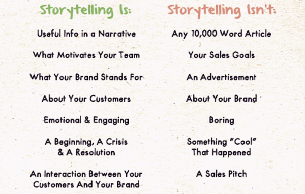
While this definition is pretty specific, stories actually resemble a variety of things. This graphic from ReferralCandy helps outline what stories are and are not.
Storytelling is an art form as old as time and has a place in every culture and society. Why? Because stories are a universal language that everyone — regardless of dialect, hometown, or heritage — can understand. Stories stimulate imagination and passion and create a sense of community among listeners and tellers alike.
Telling a story is like painting a picture with words. While everyone can tell a story, certain people fine-tune their storytelling skills and become a storyteller on behalf of their organization, brand, or business. You might’ve heard of these folks — we typically refer to them as marketers, content writers, or PR professionals.
Every member of an organization can tell a story. But before we get into the how, let’s talk about why we tell stories — as a society, culture, and economy.
Why Do We Tell Stories?
There are a variety of reasons to tell stories — to sell, entertain, educate or brag. We’ll talk about that below. Right now, I want to discuss why we choose storytelling over, say, a data-driven powerpoint or bulleted list. Why are stories our go-to way of sharing, explaining, and selling information?
Here’s why.
Stories solidify abstract concepts and simplify complex messages.
We’ve all experienced confusion when trying to understand a new idea. Stories provide a way around that. Think about times when stories have helped you better understand a concept … perhaps a teacher used a real-life example to explain a math problem, a preacher illustrated a situation during a sermon, or a speaker used a case study to convey complex data.
Stories help solidify abstract concepts and simplify complex messages. Taking a lofty, non-tangible concept and relating it using concrete ideas is one of the biggest strengths of storytelling in business.
Take Apple, for example. Computers and smartphones are a pretty complicated topic to describe to your typical consumer. Using real-life stories, they’ve been able to describe exactly how their products benefit users … instead of relying on technical jargon that very few customers would understand.
Stories bring people together.
Like I said above, stories are a universal language of sorts. We all understand the story of the hero, of the underdog, or of heartbreak. We all process emotions and can share feelings of elation, hope, despair, and anger. Sharing in a story gives even the most diverse people a sense of commonality and community.
In a world divided by a multitude of things, stories bring people together and create a sense of community. Despite our language, religion, political preferences, or ethnicity, stories connect us through the way we feel and respond to them … Stories make us human.
TOMS is a great example of this. By sharing stories of both customers and the people they serve through customer purchases, TOMS has effectively created a movement that has not only increased sales but also built a community.
Stories inspire and motivate.
Stories make us human, and the same goes for brands. When brands get transparent and authentic, it brings them down-to-earth and helps consumers connect with them and the people behind them.
Tapping into people’s emotions and baring both the good and bad is how stories inspire and motivate … and eventually, drive action. Stories also foster brand loyalty. Creating a narrative around your brand or product not only humanizes it but also inherently markets your business.
Few brands use inspiration as a selling tactic, but ModCloth does it well. By sharing the real story of their founder, ModCloth not only makes the brand relatable and worth purchasing, but it also inspires other founders and business owners.

Source: ModCloth
What makes a good story?
Words like “good” and “bad” are relative to user opinion. But there are a few non-negotiable components that make for a great storytelling experience, for both the reader and teller.
Good stories are …
- Entertaining: Good stories keep the reader engaged and interested in what’s coming next.
- Educational: Good stories spark curiosity and add to the reader’s knowledge bank.
- Universal: Good stories are relatable to all readers and tap into emotions and experiences that most people undergo.
- Organized: Good stories follow a succinct organization that helps convey the core message and helps readers absorb it.
- Memorable: Whether through inspiration, scandal, or humor, good stories stick in the reader’s mind.
According to HubSpot Academy’s free Power of Storytelling course, there are three components that make up a good story — regardless of the story you’re trying to tell.
- Characters. Every story features at least one character, and this character will be the key to relating your audience back to the story. This component is the bridge between you, the storyteller, and the audience. If your audience can put themselves in your character’s shoes, they’ll be more likely to follow through with your call-to-action.
- Conflict. The conflict is the lesson of how the character overcomes a challenge. Conflict in your story elicits emotions and connects the audience through relatable experiences. When telling stories, the power lies in what you’re conveying and teaching. If there’s no conflict in your story, it’s likely not a story.
- Resolution. Every good story has a closing, but it doesn’t always have to be a good one. Your story’s resolution should wrap up the story, provide context around the characters and conflict(s), and leave your audience with a call-to-action.
Now that you know what your story should contain, let’s talk about how to craft your story.
The Storytelling Process
We’ve confirmed storytelling is an art. Like art, storytelling requires creativity, vision, and skill. It also requires practice. Enter: The storytelling process.
Painters, sculptors, sketch artists, and potters all follow their own creative process when producing their art. It helps them know where to start, how to develop their vision, and how to perfect their practice over time. The same goes for storytelling … especially for businesses writing stories.
Why is this process important? Because, as an organization or brand, you likely have a ton of facts, figures, and messages to get across in one succinct story. How do you know where to begin? Well, start with the first step. You’ll know where to go (and how to get there) after that.
1. Know your audience.
Who wants to hear your story? Who will benefit and respond the strongest? In order to create a compelling story, you need to understand your readers and who will respond and take action.
Before you put a pen to paper (or cursor to word processor), do some research on your target market and define your buyer persona(s). This process will get you acquainted with who might be reading, viewing, or listening to your story. It will also provide crucial direction for the next few steps as you build out the foundation of your story.
2. Define your core message.
Whether your story is one page or twenty, ten minutes or sixty, it should have a core message. Like the foundation of a home, it must be established before moving forward.
Is your story selling a product or raising funds? Explaining a service or advocating for an issue? What is the point of your story? To help define this, try to summarize your story in six to ten words. If you can’t do that, you don’t have a core message.
3. Decide what kind of story you’re telling.
Not all stories are created equal. To determine what kind of story you’re telling, figure out how you want your audience to feel or react as they read.
This will help you determine how you’re going to weave your story and what objective you’re pursuing. If your objective is to …
- … incite action, your story should describe a how a successful action was completed in the past and explain how readers might be able to implement the same kind of change. Avoid excessive, exaggerated detail or changes in subject so your audience can focus on the action or change that your story encourages.
- … tell people about yourself, tell a story that features genuine, humanizing struggles, failures, and wins. Today’s consumer appreciates and connects to brands that market with authenticity and storytelling is no exception.
- … convey values, tell a story that taps into familiar emotions, characters, and situations so that readers can understand how the story applies to their own life. This is especially important when discussing values that some people might not agree with or understand.
- … foster community or collaboration, tell a story that moves readers to discuss and share your story with others. Use a situation or experience that others can relate to and say, “Me, too!” Keep situations and characters neutral to attract the widest variety of readers.
- … impart knowledge or educate, tell a story that features a trial-and-error experience, so that readers can learn about a problem and how a solution was discovered and applied. Discuss other alternative solutions, too.
4. Establish your call-to-action.
Your objective and call-to-action (CTA) are similar, but your CTA will establish the action you’d like your audience to take after reading.
What exactly do you want your readers to do after reading? Do you want them to donate money, subscribe to a newsletter, take a course, or buy a product? Outline this alongside your objective to make sure they line up.
For example, if your objective is to foster community or collaboration, your CTA might be to “Tap the share button below.”
5. Choose your story medium.
Stories can take many shapes and forms. Some stories are read, some are watched, and others are listened to. Your chosen story medium depends on your type of story as well as resources, like time and money.
Here are the different ways you can tell your story.
- A written story is told through articles, blog posts, or books. These are mostly text and may include some images. Written stories are by far the most affordable, attainable method of storytelling as it just requires a free word processor like Google Docs … or a pen and paper.
- A spoken story is told in person, like a presentation, pitch, or panel. TED talks are considered spoken stories. Because of their “live”, unedited nature, spoken stories typically require more practice and skill to convey messages and elicit emotions in others.
- An audio story is spoken aloud but recorded — that’s what sets it apart from the spoken story. Audio stories are usually in podcast form, and with today’s technology, creating an audio story is more affordable than ever. (For a great story-driven podcast, check out The Growth Show!)
- A digital story is told through a variety of media, such as video, animation, interactive stories, and even games. This option is by far the most effective for emotionally resonant stories as well as active, visual stories … which is why it’s also the most expensive. But don’t fret: video quality doesn’t matter as much as conveying a strong message.
6. Write!
Now it’s time to put pen to paper and start crafting your story.
With your core message, audience objective, and call-to-action already established, this step is simply about adding detail and creative flair to your story. Read more about our storytelling formula to help you with this step.
7. Share your story.
Don’t forget to share and promote your story! Like with any piece of content, creating it is only half the battle — sharing it is the other.
Depending on your chosen medium, you should definitely share your story on social media and email. In addition, written stories can be promoted on your blog, Medium, or through guest posting on other publications. Digital stories can be shared on YouTube and Vimeo. While spoken stories are best conveyed in person, consider recording a live performance to share later.
The more places you share your story, the more engagement you can expect from your audience.
Storytelling Resources
Storytelling is a trial-and-error process, and no one tells a story perfectly on the first try. That’s why we’ve collected these resources to help you fine-tune your storytelling skills and learn more about the different ways a story can be told.
For a Written Story
For a Spoken Story
For an Audio Story
For the Digital Story
Over To You
Storytelling is an art. It’s also a process worth mastering for both your business and your customers. Stories bring people together and inspire action and response. Also, today’s consumer doesn’t decide to buy based on what you’re selling, but rather why you’re selling it.
Storytelling helps you communicate that “why” in a creative, engaging way. Plus, isn’t storytelling more fun?

17 of the Best Examples of Beautiful Blog Design
According to a recent U.K. survey, bloggers have ranked as the third most trustworthy source of information, following only friends and family. That’s right — bloggers are trusted more than celebrities, journalists, brands, and politicians.
But how do you get people to fall in love with your blog in the first place? (Aside from remarkable content, of course.)
Well, just as your website homepage is like the front door to your business, your blog’s design — much like a welcome mat — is the front door to your business blog.
If you’re not attracting people visually, how will you get them to take the next steps to actually read (and, hopefully, subscribe to) your content? Once you’re done creating the quality content, you still have the challenge of presenting it in a way that clearly dictates what your blog is about. Images, text, and links need to be shown off just right — otherwise, readers might abandon your content, if it’s not showcased in a way that’s appealing, easy to follow, and generates more interest.
That’s why we’ve compiled some examples of blog homepages to get you on the right track to designing the perfect blog for your readers. Check ’em out, below.
Beautiful Blog Examples to Inspire You
17 Inspiring Examples of Beautiful Blog Homepage Design
1. Help Scout
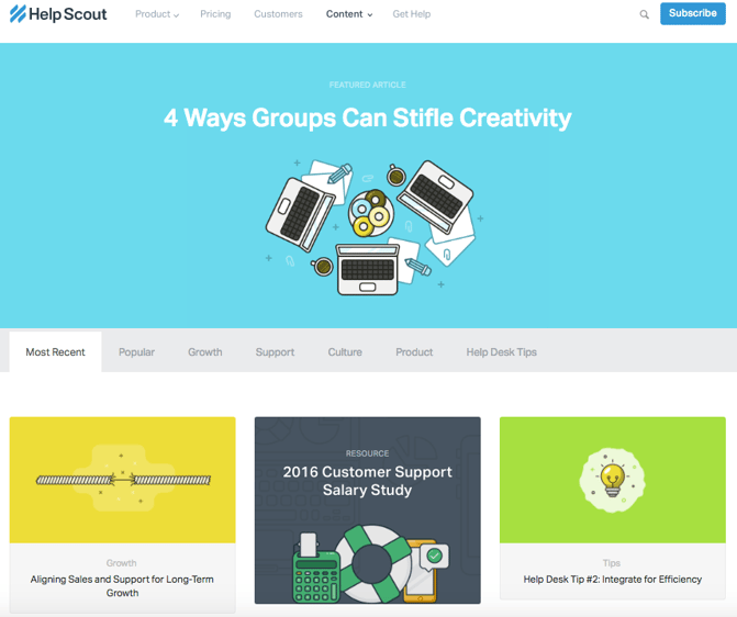
Sometimes, the best blog designs are also the simplest. Help Scout, makers of customer service software, uses a unique but minimalist design on its blog that we love — it limits the use of copy and visuals and embraces negative space.
What we particularly like about this blog is its use of featured images for all posts, including a banner one at the top that highlights a recent or particularly popular entry. These icons are set in front of bright, block colors that catch the readers’ eye and signal what the post is about. And it works — everything about this blog’s design says “clean” and “readable.”
2. Microsoft Stories
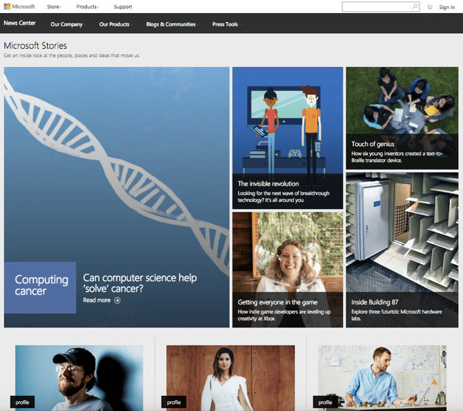
Full disclosure: We’ve totally gushed over Microsoft’s “Stories” microsite before. We can’t help it — what better way to revitalize an old-school brand than with a blog that boasts beautiful, interactive, and inspiring branded content? Plus, the square layout of these stories is reminiscent of the Microsoft logo, which achieves a valuable brand consistency.
Microsoft Stories is also a prime example of how a business blog can be a major asset for an overall rebrand. In recent years, Microsoft has worked to humanize its brand, largely in response to a rivalry with Apple. The “Stories” microsite has a simple tagline — “Get an inside look at the people, places and ideas that move us.” It’s the softer side of Microsoft, so to speak.
When you’re trying to convey a certain brand message, your blog can be used to communicate it — both aesthetically, and content-wise.
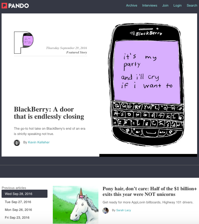
3. Pando
An important aspect of a well-designed blog is a consistent color scheme and style — after all, 80% of consumers say that color boosts their recognition of a brand.
It’s interesting to see how color consistency can unify the more diversified elements of design. Pando, a blog that explores the startup cycle, incorporates blue tones in several sections of its site — the background, highlight bars, and certain areas of text. But it also uses several different fonts — all of which manage to look seamless together, when tied together by a cohesive color scheme.
4. Design Milk
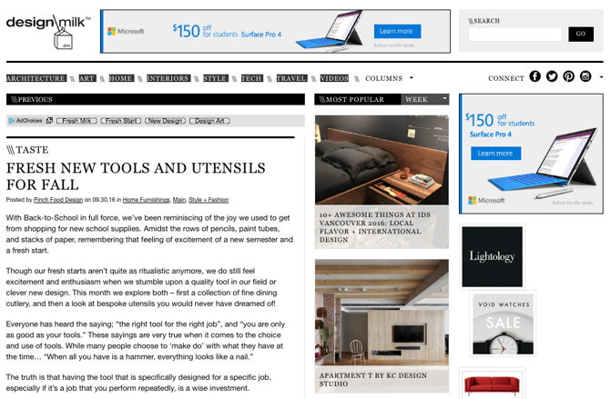
Design Milk, an online contemporary design outlet, uses a very simple layout to highlight its posts. The sidebar to the right — which remains visible when a blog post is opened to read — is perfect for showcasing thumbnail images for new articles. That’s an internal link strategy, which helps to encourage readers to remain on the site longer.
The social icons at the top are a pleasant addition to the overall look and feel of the site — they’re easy to spot, and make it easy to share Design Milk’s content. (And to learn more about adding social buttons to your blog, check out this post.)
5. Fubiz
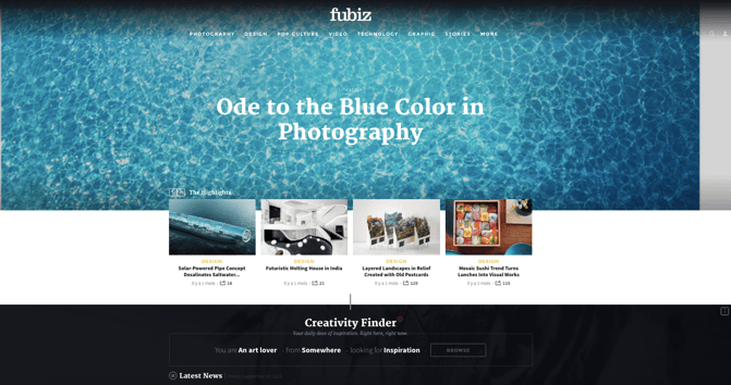
Fubiz, an art and design blog, is an example of a really sleek design that also includes some cool personalization.
Near the top of the blog’s homepage, readers can side-scroll through “highlighted” posts. Below that is the Creativity Finder, where visitors can select their chosen personas — from “Art Lover” to “Freelance” — location, and the type of content they’re looking for. From there, readers can browse content specifically catered to them.
We can’t help but love the header image, too. It uses something called “blue mind” psychology, which has found that the sight of open water can naturally draw us in. By using it in a design scheme, Fubiz is able to visually attract visitors to its content.
6. Webdesigner Depot
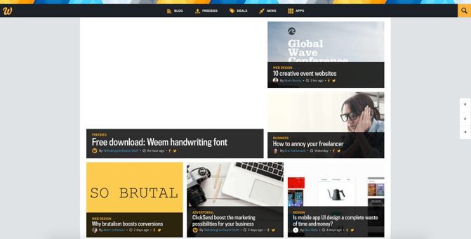
With a name like “Webdesigner Depot,” it’s no wonder that this design news site is visually appealing.
One thing that we particularly like is the way Webdesigner Depot has incorporated social sharing icons on each individual post. While we of course suggest actually reading each piece, having those links readily available helps visitors immediately share a headline they find interesting. And check out those navigation arrows on the right — never before has it been so easy to scroll to the top or bottom of a page.
What’s more, the color scheme, background, and fonts are all consistent — which keeps this blog looking professional, but still distinct from the basic blog templates we might be used to seeing.
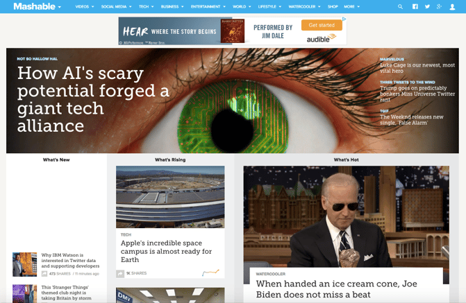
7. Mashable
I mean, just look at that header image. The bold colors, the wiring overlay, the gripping pupil and the contrasting text. It absolutely catches the reader’s eye — no pun intended.
Mashable breaks its content into three noticeable sections on the homepage: New posts are listed on the left in the smallest sized thumbnails. “What’s Rising” posts are displayed in the center column as large thumbnails, and the “What’s Hot” posts are shown to the right, also as large thumbnails. This three-pronged approach to displaying content can help readers decide which kind of news matters to them the most — the attention-grabbing top story, or other posts that are currently trending.
Plus, we like that the number of shares is displayed in each post preview — that’s a great form of social proof.
8. Brit + Co
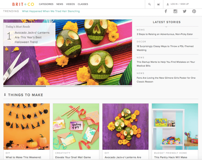
Everything about the Brit + Co homepage says “clean,” “warm,” and “welcoming.” It’s free of clutter, making the content more digestible, and the layout is extremely organized.
We dig the seasonality of the site, too. I mean, avocado jack-o’-lanterns on the dawn of October? Adorable, and replete with a colorful, fun photo to illustrate the story’s content.
The subtle “trending” header also serves as a nice way to promote popular content, without being too in-you-face about it. Plus, with such great visuals, we took note of the nod to Pinterest — that icon is important to include when your blog incorporates attractive imagery.
9. Tesco Living
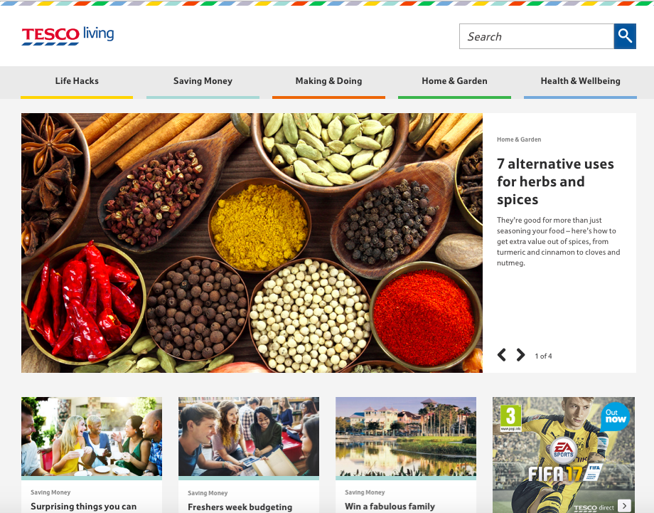
We love the colorful, consistent design of Tesco Living, the blog site of British grocery chain Tesco.
Remember how we keep harping away at brand consistency? Check out the rhombus-like designs in the top banner — that reflects the same ones that appear in Tesco’s logo.
What Tesco Living has achieved is a great balance of simplicity and boldness. The layout is extremely minimal, but it isn’t dull. Warm and welcoming shades underscore each content category, and the photos add dashes of colors throughout the site. It’s a great example of how the right imagery can achieve an appealing “less-is-more” appearance, especially if that fits in with your overall brand concept.
10. Crew
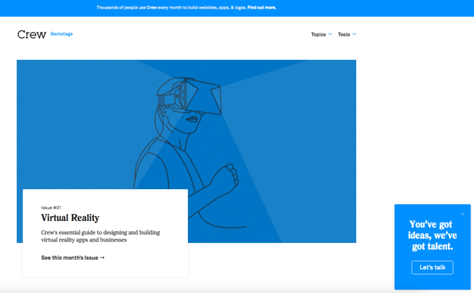
Crew Backstage, the blog of the Crew platform for designers and developers, has a fabulously minimalist blog design, but quiet a unique one.
Notice that, above the fold, it features one blog post with a large title, subtitle, and call-to-action to read more.
To the left, there’s an equally minimalist call-to-action that makes it easy for readers to connect with Crew, or learn more. Plus, there’s that consistency again — everything above the fold is the same shade of blue, which has been shown to invoke brand trust.
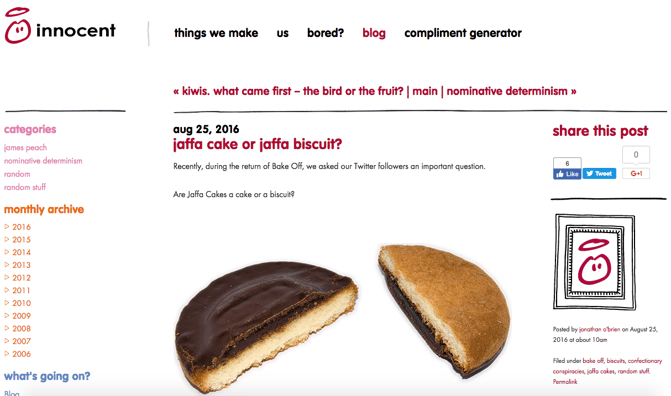
11. Innocent Drinks
Not only are the folks at Innocent Drinks great copywriters, but the design of its blog is also a great reminder that blog designs don’t have to get super fancy.
Notice how the logo — displayed in the upper left — is simple, cartoonish, and almost delightfully child-like. It works for Innocent Drinks (hint: childhood innocence), and that brand presence is maintained throughout the company’s blog.
The colorful fonts, for example, match the logo and stay in line with the brand’s casual, playful voice. We also like the easily-navigable archive links on the left, which are complemented by the geometric social sharing buttons on the right.
12. 500px
Much like Crew, the photography blog, 500px, leads with one featured article and a big, bold, high-definition photo to draw the reader in. That makes is pretty clear what the blog is about — it boasts valuable content on photography with gripping photography.
Plus, how cool is it that the social links are right there, obviously displayed above the fold? They keep readers engaged with the content, and make it easy to share the photography — and, content with images is up to three times as likely to be shared on social media.

13. Pixelgrade
14. BarkPost
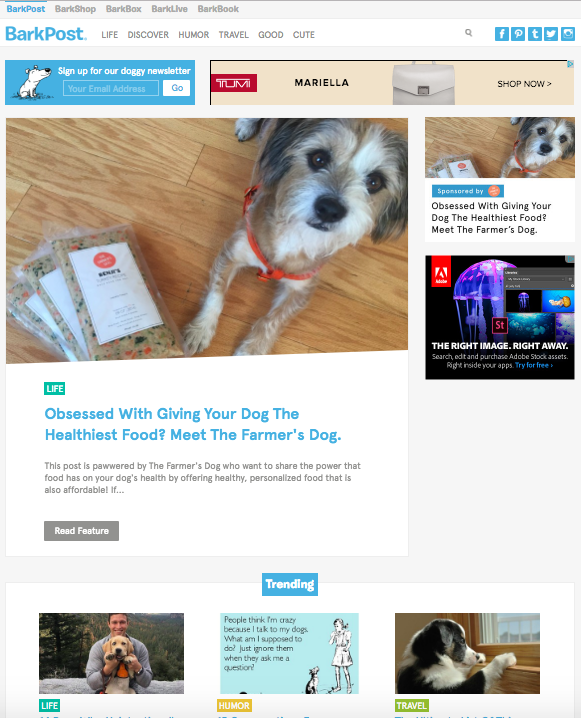
It’s no secret that we kind of like dogs here at HubSpot. So when a blog dedicated to life as a dog owner came across our radar, it got our attention.
BarkPost, the blog of canine subscription box company BarkBox, is a great example of design for a number of reasons. First, look how easy it is to subscribe — the call to action is right there, above the featured content. The social share icons are easily noticeable, too — and, of course, all in the brand-matching, trustworthy blue.
We also like that BarkPost draws attention to its sister companies, all of which are owned under the Bark & Co portfolio of brands. But at the same time, the blog doesn’t hock its own products — rather, it serves as an informational resource to dog parents and lovers alike.
15. Goodwill Industries International
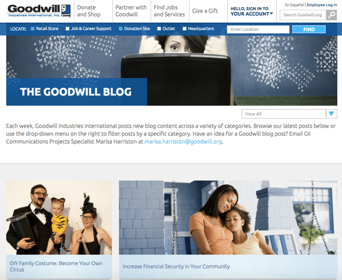
Who says nonprofit organizations can’t blog? Nay, they should — and Goodwill’s clean, colorful navigation (again — the trustworthy blue) draw the reader to the important elements of this blog.
The posts are also neatly positioned and easily accessible to readers. And, visitors can pick the type of information that matters to them the most by choosing a topic from the drop-down menu on the top right.
Finally, we love that there’s a collaborative call to action in the introductory text that invites readers to contribute content to the Goodwill blog. After all, the organizations services have reached 37 million people — here’s a way for them to share their stories, or invite donors to write about why they chose to support Goodwill.
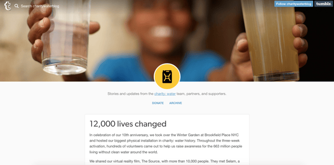
16. charity: water
Keeping the nonprofit blogging train going is charity: water, which makes excellent use of high-quality photography.
Recently, the organization redesigned its blog with a lengthy post dedicated to its 10-year anniversary. Using that opportunity to share its impact over the past decade, charity: water maintained a simplistic design with concise text and bright images from the anniversary event.
Plus, there’s a clear CTA to donate at the top of the page. Placing that above a story about charity: water’s impact is a double-edged sword, by both inspiring people to contribute to the cause while making it easy to do so.

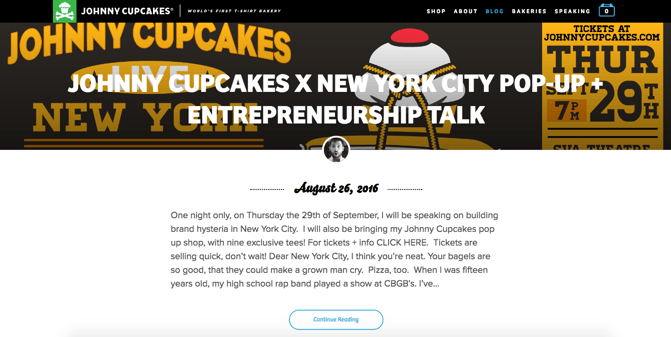
17. Johnny Cupcakes
To clear up any confusion, Johnny Cupcakes doesn’t actually make cupcakes. It makes clothing. But the company has done a great job of playing up its brand’s association with baked goods — its blog uses the subdomain “kitchen.”
Plus, the folks at Johnny Cupcakes know a thing or two about brand consistency across channels. Its blog’s simple color scheme and matching fonts help to create a unified user experience from the shop to general content, all the while throwing in bold, colorful images to catch readers’ attention.
Also, visit the website and have a scroll — we think it’s pretty cool how the background images vary, but stay positionally static for each entry.
Here are 15 more award-winning website design examples.

Brand Strategy 101: 7 Essentials for Strong Company Branding
Let’s say you’ve come to the difficult realization that quite frankly your brand — if you can even call it that — is all over the place. Or perhaps worse, you have a defined brand, but you’re noticing that it just doesn’t seem to mesh with who you really are and what you really do.
Don’t panic.
Before you get all hung up on what shade of green to use for your logo or what tone you’re going to use when engaging with people on Twitter, you need to step back and take a look at the big picture.
What is Brand Strategy?
Brand strategy is a plan that encompasses specific, long-term goals that can be achieved with the evolution of a successful brand — the combined components of your company’s character that make it identifiable.
(We’ll get into that more in a bit.)
A well-defined and executed brand strategy affects all aspects of a business and is directly connected to consumer needs, emotions, and competitive environments.
First, let’s clear up the biggest misconception about brand strategy: Your brand is not your product, your logo, your website, or your name.
In fact, your brand is much more than that — it’s the stuff that feels intangible. But it’s that hard-to-pin-down feeling that separates powerhouse and mediocre brands from each other.
So to help you rein in what many marketers consider more of an art and less of a science, we’ve broken down seven essential components of a comprehensive brand strategy that will help keep your company around for ages.
7 Components for a Comprehensive Branding Strategy
1) Purpose
“Every brand makes a promise. But in a marketplace in which consumer confidence is low and budgetary vigilance is high, it’s not just making a promise that separates one brand from another, but having a defining purpose,” explains Allen Adamson, chairman of the North America region of brand consulting and design firm Landor Associates.
While understanding what your business promises is necessary when defining your brand positioning, knowing why you wake up every day and go to work carries more weight. In other words, your purpose is more specific, in that it serves as a differentiator between you and your competitors.
How can you define your business’ purpose? According to Business Strategy Insider, purpose can be viewed in two ways:
- Functional: This concept focuses on the evaluations of success in terms of immediate and commercial reasons — i.e. the purpose of the business is to make money.
- Intentional: This concept focuses on success as it relates to the ability to make money and do good in the world.
While making money is important to almost every business, we admire brands that emphasize their willingness to achieve more than just profitability, like IKEA:
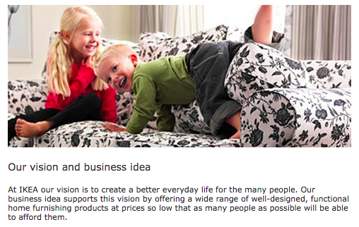
Source: IKEA
IKEA’s vision isn’t just to sell furniture, but rather, to “create a better everyday life.” This approach is appealing to potential customers, as it demonstrates their commitment to providing value beyond the point of sale.
When defining your business’ purpose, keep this example in mind. While making money is a priority, operating under that notion alone does little to set your brand apart from others in your industry.
Our advice? Dig a little deeper. If you need inspiration, check out the brands you admire, and see how they frame their mission and vision statements.
2) Consistency
The key to consistency is to avoid talking about things that don’t relate to or enhance your brand. Added a new photo to your business’ Facebook Page? What does it mean for your company? Does it align with your message, or was it just something funny that would, quite frankly, confuse your audience?
In an effort to give your brand a platform to stand on, you need to be sure that all of your messaging is cohesive. Ultimately, consistency contributes to brand recognition, which fuels customer loyalty. (No pressure, right?)
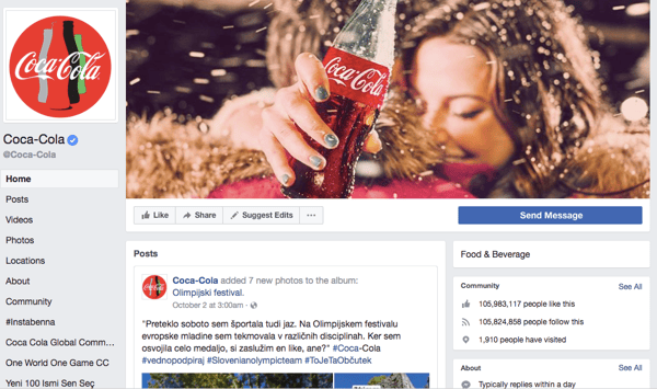
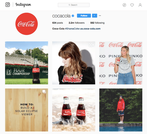
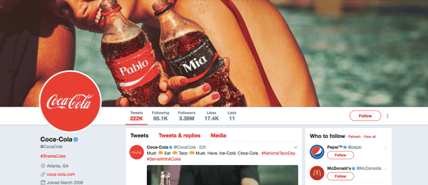
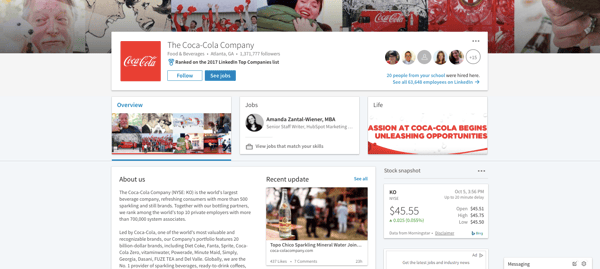
To see a great example of consistency, let’s look at Coca-Cola. As a result of its commitment to consistency, every element of the brand’s marketing works harmoniously together. This has helped it become one of the most recognizable brands in the world.
Even on the surface of its social media accounts, for example, the seamlessness of its brand is very apparent:
To avoid leaving potential customers struggling to put the disconnected pieces of your business together, consider the benefits of creating a style guide. A style guide can encompass everything from the tone of voice you’ll use to the color scheme you’ll employ to the way you’ll position certain products or services.
By taking the time to define and agree upon these considerations, your brand will benefit as a whole.
3) Emotion
Customers aren’t always rational.
How else do you explain the person who paid thousands of dollars more for a Harley rather than buying another cheaper, equally well-made bike? There was an emotional voice in there somewhere, whispering: “Buy a Harley.”
But why?
Harley Davidson uses emotional branding by creating a community around its brand. It began HOG — Harley Owners Group — to connect their customers with their brand (and each other).
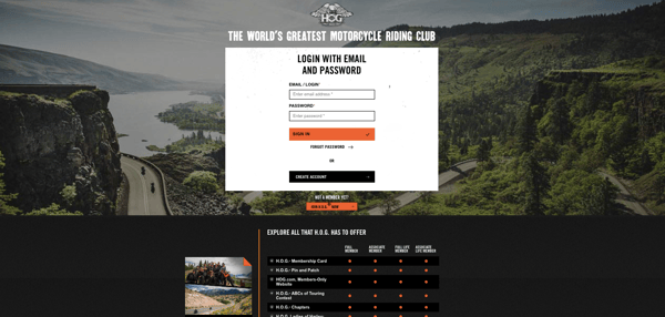
Source: HOG
By providing customers with an opportunity to feel like they’re part of a larger group that’s more tight-knit than just a bunch of motorcycle riders, Harley Davidson is able to position themselves as an obvious choice for someone looking to purchase a bike.
Why? People have an innate desire to build relationships. Research from psychologists Roy Baumeister and Mark Leary best describes this need in their “belongingness hypothesis,” which states: “People have a basic psychological need to feel closely connected to others, and that caring, affectionate bonds from close relationships are a major part of human behavior.”
Not to mention, belongingness — the need for love, affection, and being part of groups — falls directly in the middle of Maslow’s hierarchy of needs, which aims to categorize different human needs.
The lesson to be learned? Find a way to connect with your customers on a deeper, more emotional level. Do you give them peace of mind? Make them feel like part of the family? Do you make life easier? Use emotional triggers like these to strengthen your relationship and foster loyalty.
4) Flexibility
In this fast-changing world, marketers must remain flexible to stay relevant. On the plus side, this frees you to be creative with your campaigns.
You may be thinking, “Wait a minute, how am I supposed to remain consistent while also being flexible?”
Good question. While consistency aims to set the standard for your brand, flexibility enables you to make adjustments that build interest and distinguish your approach from that of your competition.
In other words, “effective identity programs require enough consistency to be identifiable, but enough variation to keep things fresh and human,” explains president of Peopledesign, Kevin Budelmann.
A great example of this type of strategic balance comes from Old Spice. These days, Old Spice is one of the best examples of successful marketing across the board. However, up until recently, wearing Old Spice was pretty much an unspoken requirement for dads everywhere. Today, it’s one of the most popular brands for men of all ages.
The secret? Flexibility.
Aware that it needed to do something to secure its place in the market, Old Spice teamed up with Wieden+Kennedy to position their brand for a new customer base.
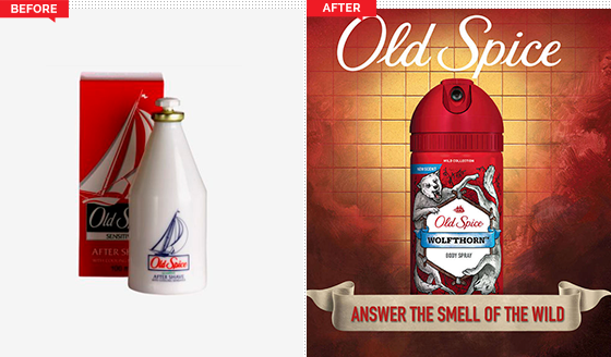
Source: Works Design Group
Between new commercials, a new website, new packaging, and new product names, Old Spice managed to attract the attention of a new, younger generation by making strategic enhancements to its already strong brand.
So if your old tactics aren’t working anymore, don’t be afraid to change. Just because it worked in the past doesn’t mean it’s working now.
Take the opportunity to engage your followers in fresh, new ways. Are there some out-of-the-box partnerships your brand can make? Are there attributes about your product you never highlighted? Use those to connect with new customers and remind your old ones why they love you.
5) Employee Involvement
As we mentioned before, achieving a sense of consistency is important if you wish to build brand recognition. And while a style guide can help you achieve a cohesive digital experience, it’s equally important for your employees to be well versed in the how they should be communicating with customers and representing the brand.
If your brand is playful and bubbly through Twitter engagements, then it wouldn’t make sense if a customer called in and was connected with a grumpy, monotone representative, right?
To avoid this type of mismatched experience, take note of Zappos’ approach.
If you’ve ever been on the line with a customer service representative from Zappos, you know what I’m talking about. If you haven’t, check out this SlideShare which details some of its most inspiring customer support stories.
Zappos is so committed to ensuring that not only its brand, but all brands, remain consistent across digital and human interactions that they’ve dedicated an entire department to the cause called Zappos Insights.
Come join us and learn the Zappos WOW approach to customer service! Learn more about the Zappos School of WOW: https://t.co/g3tU4179q9 pic.twitter.com/eRkpcfYAKD
— Zappos Insights (@ZapposInsights)
August 21, 2017
By holding all Zappos employees to its core values
and helping other companies implement the same approach, Zappos has built a strong reputation for solid, helpful, and human customer service.
6) Loyalty
If you already have people that love you, your company, and your brand, don’t just sit there. Reward them for that love.
These customers have gone out their way to write about you, to tell their friends about you, and to act as your brand ambassadors. Cultivating loyalty from these people early on will yield more returning customers — and more profit for your business.
Sometimes, just a thank you is all that’s needed. Other times, it’s better to go above and beyond. Write them a personalized letter. Sent them some special swag. Ask them to write a review, and feature them prominently on your website. (Or all of the above!)
When we reached 15,000 customers here at HubSpot, we wanted to say thank you in a big way, while remaining true to our brand … so we dropped 15,000 orange ping pong balls from our fourth-floor balcony and spelled out thank you in big metallic balloons:
And while it may have seemed a little out of the ordinary to some folks, for those who know our brand, the gesture made perfect sense.
Loyalty is a critical part of every brand strategy, especially if you’re looking to support your sales organization. At the end of the day, highlighting a positive relationship between you and your existing customers sets the tone for what potential customers can expect if they choose to do business with you.
7) Competitive Awareness
Take the competition as a challenge to improve your own strategy and create greater value in your overall brand. You are in the same business and going after the same customers, right? So watch what they do.
Do some of their tactics succeed? Do some fail? Tailor your brand positioning based on their experience to better your company.
A great example of how to improve your brand by learning from your competitors comes from Pizza Hut:
@TheRealElysium You know our vote. ^AB
— Pizza Hut (@pizzahut)
March 20, 2016
When a pizza lover posed this question to his Twitter following, Pizza Hut didn’t miss a beat, and playfully responded in minutes, before Domino’s had a chance to speak up.
If Domino’s is keeping an eye on the competitors, they’ll know to act fast the next time a situation like this arises.
For HubSpot customers, keeping tabs on your competitor’s social mentions is easy using the Social Monitoring App. Check out this article to learn more about how to set up custom social streams.
And while staying in tune with your competitor’s strategies is important if you want to enhance your brand, don’t let them dictate each and every move you make.
Sure, you probably sell a similar product or service as many other companies, but you’re in business because your brand is unique. By harping on every move your competitor makes, you lose that differentiation.

Data Visualization 101: How to Choose the Right Chart or Graph for Your Data
Types of Charts to Use for Your Data
- Column Chart
- Bar Graph
- Line Graph
- Dual Axis Chart
- Area Chart
- Stacked Bar Graph
- Mekko Chart
- Pie Chart
- Scatter Plot Chart
- Bubble Chart
- Waterfall Chart
- Funnel Chart
- Bullet Chart
- Heat Map
You and I sift through a lot of data for our jobs. Data about website performance, sales performance, product adoption, customer service, marketing campaign results … the list goes on.
When you manage multiple content assets, such as social media or a blog, with multiple sources of data, it can get overwhelming.What should you be tracking? What actually matters? How do you visualize and analyze the data so you can extract insights and actionable information?
More importantly, how can you make reporting more efficient when you’re busy working on multiple projects at once?
One of the struggles that slows down my own reporting and analysis is understanding what types of graphs to use — and why. That’s because choosing the wrong visual aid or simply defaulting to the most common type of data visualization could cause confusion with the viewer or lead to mistaken data interpretation.
To create charts that clarify and provide the right canvas for analysis, you should first understand the reasons why you might need a chart. In this post, I’ll cover five questions to ask yourself when choosing a chart for your data.
Then, I’ll give an overview of 14 different types of charts you have at your disposal.
5 Questions to Ask When Deciding Which Type of Chart to Use
1. Do you want to compare values?
Charts are perfect for comparing one or many value sets, and they can easily show the low and high values in the data sets. To create a comparison chart, use these types of graphs:
- Column
- Mekko
- Bar
- Pie
- Line
- Scatter Plot
- Bullet
2. Do you want to show the composition of something?
Use this type of chart to show how individual parts make up the whole of something, such as the device type used for mobile visitors to your website or total sales broken down by sales rep.
To show composition, use these charts:
- Pie
- Stacked Bar
- Mekko
- Stacked Column
- Area
- Waterfall
3. Do you want to understand the distribution of your data?
Distribution charts help you to understand outliers, the normal tendency, and the range of information in your values.
Use these charts to show distribution:
- Scatter Plot
- Mekko
- Line
- Column
- Bar
4. Are you interested in analyzing trends in your data set?
If you want to know more information about how a data set performed during a specific time period, there are specific chart types that do extremely well.
You should choose a:
- Line
- Dual-Axis Line
- Column
5. Do you want to better understand the relationship between value sets?
Relationship charts are suited to showing how one variable relates to one or numerous different variables. You could use this to show how something positively effects, has no effect, or negatively effects another variable.
When trying to establish the relationship between things, use these charts:
- Scatter Plot
- Bubble
- Line
14 Different Types of Graphs and Charts for Presenting Data
To better understand each chart and how they can be used, here’s an overview of each type of chart.
1. Column Chart
A column chart is used to show a comparison among different items, or it can show a comparison of items over time. You could use this format to see the revenue per landing page or customers by close date.
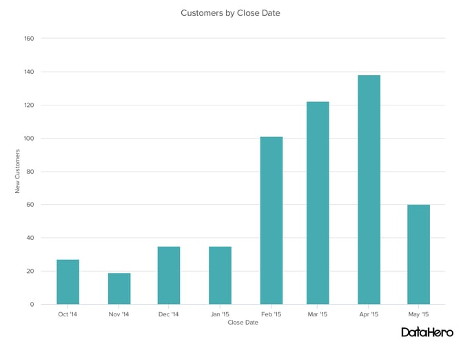
Design Best Practices for Column Charts:
- Use consistent colors throughout the chart, selecting accent colors to highlight meaningful data points or changes over time.
- Use horizontal labels to improve readability.
- Start the y-axis at 0 to appropriately reflect the values in your graph.
2. Bar Graph
A bar graph, basically a horizontal column chart, should be used to avoid clutter when one data label is long or if you have more than 10 items to compare. This type of visualization can also be used to display negative numbers.
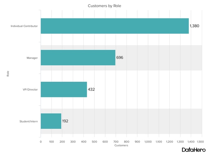
Design Best Practices for Bar Graphs:
- Use consistent colors throughout the chart, selecting accent colors to highlight meaningful data points or changes over time.
- Use horizontal labels to improve readability.
- Start the y-axis at 0 to appropriately reflect the values in your graph.
3. Line Graph
A line graph reveals trends or progress over time and can be used to show many different categories of data. You should use it when you chart a continuous data set.

Design Best Practices for Line Graphs:
- Use solid lines only.
- Don’t plot more than four lines to avoid visual distractions.
- Use the right height so the lines take up roughly 2/3 of the y-axis’ height.
4. Dual Axis Chart
A dual axis chart allows you to plot data using two y-axes and a shared x-axis. It’s used with three data sets, one of which is based on a continuous set of data and another which is better suited to being grouped by category. This should be used to visualize a correlation or the lack thereof between these three data sets.
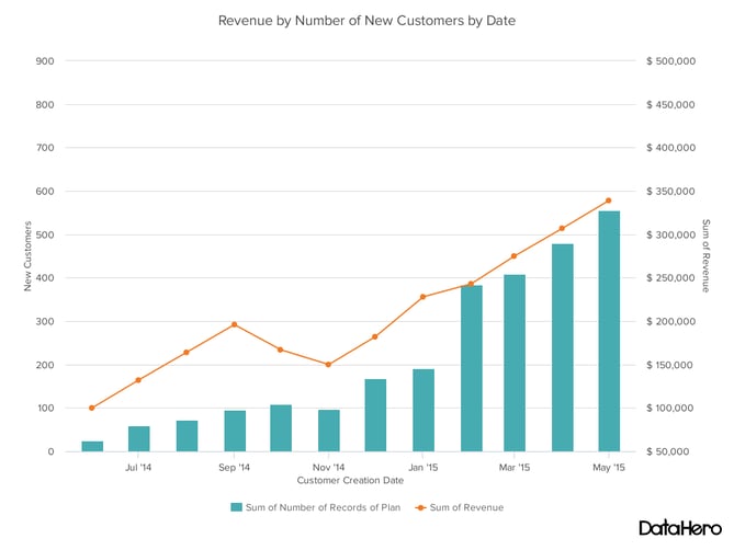
Design Best Practices for Dual Axis Charts:
- Use the y-axis on the left side for the primary variable because brains are naturally inclined to look left first.
- Use different graphing styles to illustrate the two data sets, as illustrated above.
- Choose contrasting colors for the two data sets.
5. Area Chart
An area chart is basically a line chart, but the space between the x-axis and the line is filled with a color or pattern. It is useful for showing part-to-whole relations, such as showing individual sales reps’ contribution to total sales for a year. It helps you analyze both overall and individual trend information.
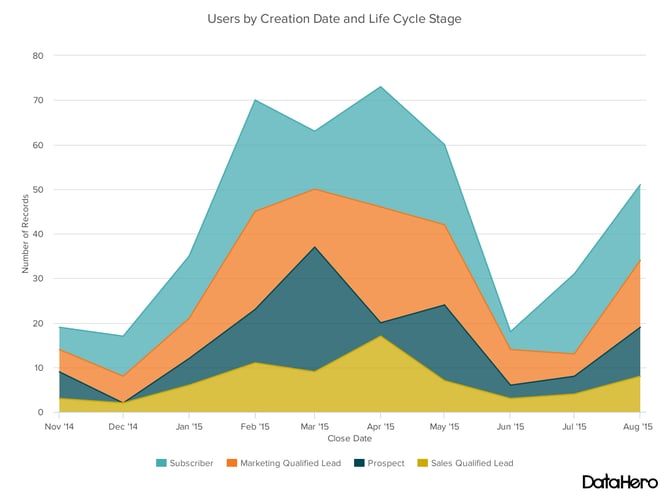
Design Best Practices for Area Charts:
- Use transparent colors so information isn’t obscured in the background.
- Don’t display more than four categories to avoid clutter.
- Organize highly variable data at the top of the chart to make it easy to read.
6. Stacked Bar Chart
This should be used to compare many different items and show the composition of each item being compared.
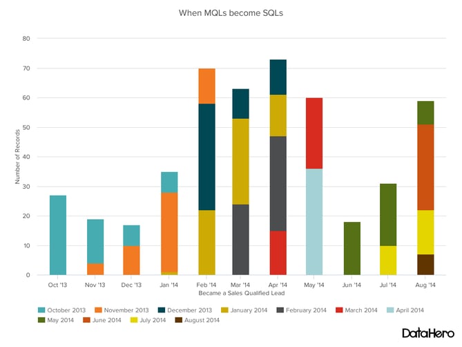
Design Best Practices for Stacked Bar Graphs:
- Best used to illustrate part-to-whole relationships.
- Use contrasting colors for greater clarity.
- Make chart scale large enough to view group sizes in relation to one another.
7. Mekko Chart
Also known as a marimekko chart, this type of graph can compare values, measure each one’s composition, and show how your data is distributed across each one.
It’s similar to a stacked bar, except the mekko’s x-axis is used to capture another dimension of your values — rather than time progression, like column charts often do. In the graphic below, the x-axis compares each city to one another.
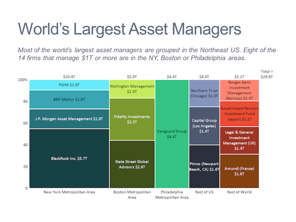
Image via Mekko Graphics
Design Best Practices for Mekko Charts:
- Vary you bar heights if the portion size is an important point of comparison.
- Don’t include too many composite values within each bar. you might want to reevaluate how to present your data if you have a lot.
- Order your bars from left to right in such a way that exposes a relevant trend or message.
8. Pie Chart
A pie chart shows a static number and how categories represent part of a whole — the composition of something. A pie chart represents numbers in percentages, and the total sum of all segments needs to equal 100%.
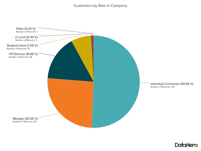
Design Best Practices for Pie Charts:
- Don’t illustrate too many categories to ensure differentiation between slices.
- Ensure that the slice values add up to 100%.
- Order slices according to their size.
9. Scatter Plot Chart
A scatter plot or scattergram chart will show the relationship between two different variables or it can reveal the distribution trends. It should be used when there are many different data points, and you want to highlight similarities in the data set. This is useful when looking for outliers or for understanding the distribution of your data.
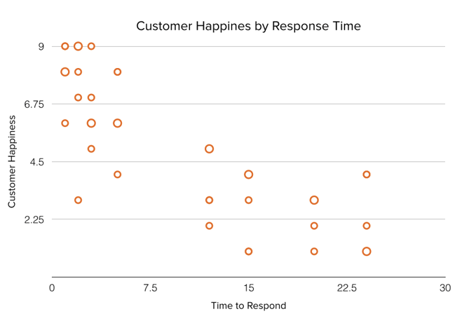
Design Best Practices for Scatter Plots:
- Include more variables, such as different sizes, to incorporate more data.
- Start y-axis at 0 to represent data accurately.
- If you use trend lines, only use a maximum of two to make your plot easy to understand.
10. Bubble Chart
A bubble chart is similar to a scatter plot in that it can show distribution or relationship. There is a third data set, which is indicated by the size of the bubble or circle.
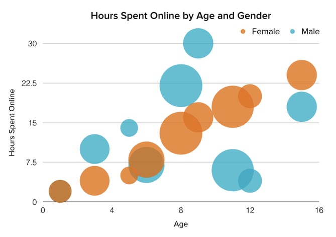
Design Best Practices for Bubble Charts:
- Scale bubbles according to area, not diameter.
- Make sure labels are clear and visible.
- Use circular shapes only.
11. Waterfall Chart
A waterfall chart should be used to show how an initial value is affected by intermediate values — either positive or negative — and resulted in a final value. This should be used to reveal the composition of a number. An example of this would be to showcase how overall company revenue is influenced by different departments and leads to a specific profit number.
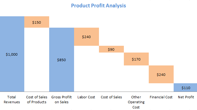
Chart via Baans Consulting
Design Best Practices for Waterfall Charts:
- Use contrasting colors to highlight differences in data sets.
- Choose warm colors to indicate increases and cool colors to indicate decreases.
12. Funnel Chart
A funnel chart shows a series of steps and the completion rate for each step. This can be used to track the sales process or the conversion rate across a series of pages or steps.
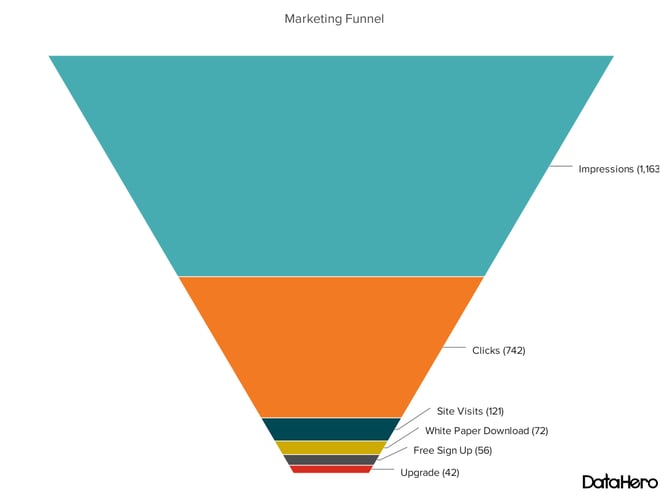
Design Best Practices for Funnel Charts:
- Scale the size of each section to accurately reflect the size of the data set.
- Use contrasting colors or one color in gradating hues, from darkest to lightest as the size of the funnel decreases.
13. Bullet Graph
A bullet graph reveals progress toward a goal, compares this to another measure, and provides context in the form of a rating or performance.
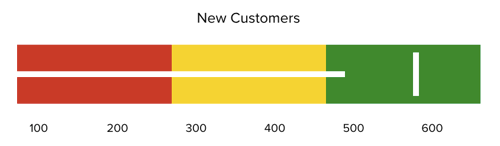
Design Best Practices for Bullet Graphs:
- Use contrasting colors to highlight how the data is progressing.
- Use one color in different shades to gauge progress.
14. Heat Map
A heat map shows the relationship between two items and provides rating information, such as high to low or poor to excellent. The rating information is displayed using varying colors or saturation.
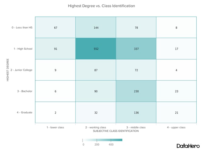
Design Best Practices for Heat Map:
- Use a basic and clear map outline to avoid distracting from the data.
- Use a single color in varying shades to show changes in data.
- Avoid using multiple patterns.

9 Types of Organizational Structure Every Company Should Consider
Choosing the best organizational structure for your company, division, or team is a lot like picking out a new car.
At the most basic level, you’re always looking for something road-worthy — something that can take you (and your passengers) from point A to point B without a hitch.But beyond that, there are a lot of options to consider. Automatic or manual? Four-wheel drive or two? Built-in GPS? Leather interior? Flux capacitor? (Only if you’re going back in time, of course.)
In the world of organizational structures, the options you have to choose from include things like chain of command (long or short?), span of control (wide or narrow?), and centralization (centralized or decentralized decision-making?), just to name a few.
Organizational Structure
An organizational structure is a visual diagram of a company that describes what employees do, whom they report to, and how decisions are made across the business. Organizational structures can use functions, markets, products, geographies, or processes as their guide, and cater to businesses of specific sizes and industries.
What’s the point of an organizational structure? As a business leader, do you even need one? As I said, org structures help you define at least three key elements of how your business is going to run.
As your company gets bigger, an organizational structure can also be helpful for new employees as they learn who manages what processes at your company.
Then, if you need to pivot or shift your leadership, you can visualize how the work flows would work by adjusting your organizational structure diagrams.
To put it simply, this chart like a map that simply explains how your company works and how its roles are organized.
Here’s what each of those elements means to an organization:
Chain of Command
Your chain of command is how tasks are delegated and work is approved. An org structure allows you to define how many “rungs of the ladder” a particular department or business line should have. In other words, who tells whom to do what? And how are issues, requests, and proposals communicated up and down that ladder?
Span of Control
Your span of control can represent two things: who falls under a manager’s, well, management … and which tasks fall under a department’s responsibility.
Centralization
Centralization describes where decisions are ultimately made. Once you’ve established your chain of command, you’ll need to consider which people and departments have a say in each decision. A business can lean toward centralized, where final decisions are made by just one or two entities; or decentralized, where final decisions are made within the team or department in charge of carrying out that decision.
You might not need an org structure right away, but the more products you develop and people you hire, the harder it’ll be to lead your company without this crucial diagram.
(To dive deeper into what all of these different organizational structure components are, check out my earlier post, “The 6 Building Blocks of Organizational Structure.”)
In this post, we’ll explore how you can combine those components to form different types of organizational structures. We’ll also highlight the benefits and drawbacks of different structure types so you can evaluate which is the best option for your company, division, or team. Let’s dive in.
Mechanistic vs. Organic Organizational Structures
Organizational structures fall on a spectrum, with “mechanistic” at one end and
“organic” at the other.
Take a look at the diagram below. As you’ll probably be able to tell, the mechanistic structure represents the traditional, top-down approach to organizational structure, whereas the organic structure represents a more collaborative, flexible approach.
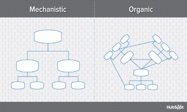
Here’s a breakdown of both ends of the structural spectrum, their advantages and disadvantages, and which types of businesses are suited for them.
Mechanistic Structure
Mechanistic structures, also called bureaucratic structures, are known for having narrow spans of control, as well as high centralization, specialization, and formalization. They’re also quite rigid in what specific departments are designed and permitted to do for the company.
This organizational structure is much more formal than organic structure, using specific standards and practices to govern every decision the business makes. And while this model does hold staff more accountable for their work, it can become a hindrance to the creativity and agility the organization needs to keep up with random changes in its market.
As daunting and inflexible as mechanistic structure sounds, the chain of command, whether long or short, is always clear under this model. As a company grows, it needs to make sure everyone (and every team) knows what’s expected of them. Teams collaborating with other teams as needed might help get a business off the ground in its early stages, but sustaining that growth — with more people and projects to keep track of — will eventually require some policymaking. In other words, keep mechanistic structure in your back pocket … you never know when you’ll need it.
Organic Structure
Organic structures (also known as “flat” structures) are known for their wide spans of control, decentralization, low specialization, and loose departmentalization. What’s that all mean? This model might have multiple teams answering to one person and taking on projects based on their importance and what the team is capable of — rather than what the team is designed to do.
As you can probably tell, this organizational structure is much less formal than mechanistic, and takes a bit of an ad-hoc approach to business needs. This can sometimes make the chain of command, whether long or short, difficult to decipher. And as a result, leaders might give certain projects the green light more quickly but cause confusion in a project’s division of labor.
Nonetheless, the flexibility that an organic structure allows for can be extremely helpful to a business that’s navigating a fast-moving industry, or simply trying to stabilize itself after a rough quarter. It also empowers employees to try new things and develop as professionals, making the organization’s workforce more powerful in the long run. Bottom line? Startups are often perfect for organic structure, since they’re simply trying to gain brand recognition and get their wheels off the ground.
Now, let’s uncover more specific types of organizational structures, most of which fall on the more traditional, mechanistic side of the spectrum.
Types of Organizational Structure
- Functional Organizational Structure
- Product-Based Divisional Structure
- Market-Based Divisional Structure
- Geographical Divisional Structure
- Process-Based Structure
- Matrix Structure
- Circular Structure
- Flat Structure
- Network Structure
1. Functional Organizational Structure
One of the most common types of organizational structures, the functional structure departmentalizes an organization based on common job functions.
An organization with a functional org structure, for instance, would group all of the marketers together in one department, group all of the salespeople together in a separate department, and group all of the customer service people together in a third department.
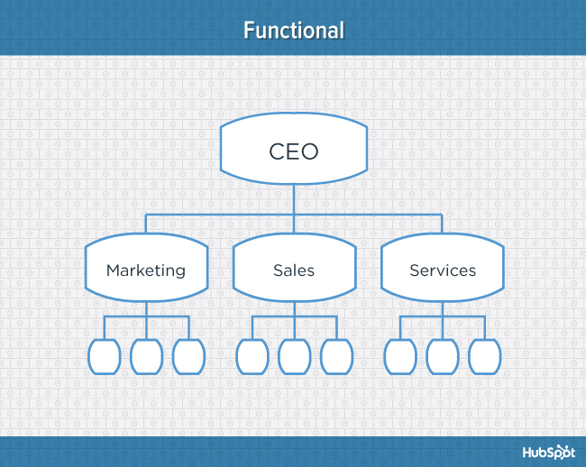
The functional structure allows for a high degree of specialization for employees, and is easily scalable should the organization grow. Also this structure is mechanistic in nature — which has the potential to inhibit an employee’s growth — putting staff in skill-based departments can still allow them to delve deep into their field and find out what they’re good at.
Disadvantages
Functional structure also has the potential to create barriers between different functions — and it can be inefficient if the organization has a variety of different products or target markets. The barriers created between departments can also limit peoples’ knowledge of and communication with other departments, especially those that depend on other departments to succeed.
2. Product-Based Divisional Structure
A divisional organizational structure is comprised of multiple, smaller functional structures (i.e. each division within a divisional structure can have its own marketing team, its own sales team, and so on). In this case — a product-based divisional structure — each division within the organization is dedicated to a particular product line.
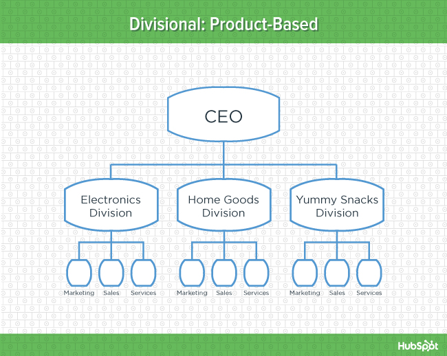
This type of structure is ideal for organizations with multiple products and can help shorten product development cycles. This allows small businesses to go to market with new offerings fast.
Disadvantages
It can be difficult to scale under a product-based divisional structure, and the organization could end up with duplicate resources as different divisions strive to develop new offerings.
3. Market-Based Divisional Structure
Another variety of the divisional organizational structure is the market-based structure, wherein the divisions of an organization are based around markets, industries, or customer types.
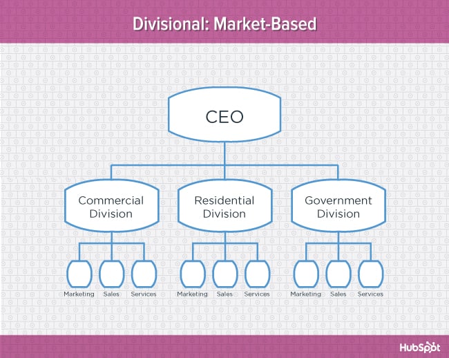
The market-based structure is ideal for an organization that has products or services that are unique to specific market segments, and is particularly effective if that organization has advanced knowledge of those segments. This organizational structure also keeps the business constantly aware of demand changes among its different audience segments.
Disadvantages
Too much autonomy within each market-based team can lead to divisions developing systems that are incompatible with one another. Divisions might also end up inadvertently duplicating activities that other divisions are already handling.
4. Geographical Divisional Structure
The geographical organizational structure establishes its divisions based on — you guessed it — geography. More specifically, the divisions of a geographical structure can include territories, regions, or districts.
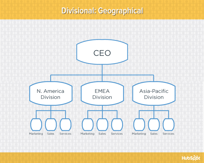
This type of structure is best-suited to organizations that need to be near sources of supply and/or customers (e.g. for deliveries or for on-site support). It also brings together many forms of business expertise, allowing each geographical division to make decisions from more diverse points of view.
Disadvantages
The main downside of a geographical org structure: It can be easy for decision- making to become decentralized, as geographic divisions (which can be hundreds, if not thousands of miles away from corporate headquarters) often have a great deal of autonomy. And when you have more than one marketing department — one for each region — you run the risk of creating campaigns that compete with (and weaken) other divisions across your digital channels.
5. Process-Based Structure
Process-based organizational structures are designed around the end-to-end flow of different processes, such as “Research & Development,” “Customer Acquisition,” and “Order Fulfillment.” Unlike a strictly functional structure, a process-based structure considers not only the activities employees perform, but also how those different activities interact with one another.
In order to fully understand the diagram below, you need to look at it from left to right: The customer acquisition process can’t start until you have a fully developed product to sell. By the same token, the order fulfillment process can’t start until customers have been acquired and there are product orders to fill.
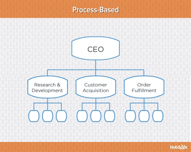
Process-based organizational structure is ideal for improving the speed and efficiency of a business, and is best-suited for those in rapidly changing industries, as it is easily adaptable.
Disadvantages
Similar to a few other structures on this list, process-based structure can erect barriers between the different process groups. This leads to problems communicating and handing off work to other teams and employees.
6. Matrix Structure
Unlike the other structures we’ve looked at so far, a matrix organizational structure doesn’t follow the traditional, hierarchical model. Instead, all employees (represented by the green boxes) have dual reporting relationships. Typically, there is a functional reporting line (shown in blue) as well as a product- based reporting line (shown in yellow).
When looking at a matrix structure org chart, solid lines represent strong, direct-reporting relationships, whereas dotted lines indicate that the relationship is secondary, or not as strong. In our example below, it’s clear that functional reporting takes precedence over product-based reporting.
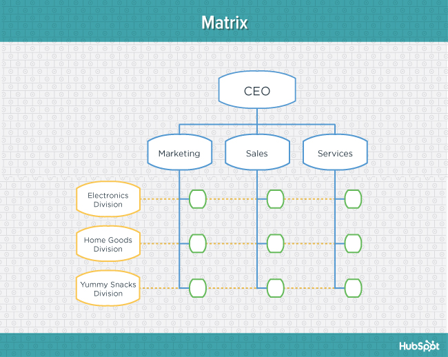
The main appeal of the matrix structure is that it can provide both flexibility and more balanced decision-making (as there are two chains of command instead of just one). Having a single project overseen by more than one business line also creates opportunities for these business lines to share resources and communicate more openly with each other — things they might not otherwise be able to do regularly.
Disadvantages
The primary pitfall of the matrix organizational structure? Complexity. The more layers of approval employees have to go through, the more confused they can be about who they’re supposed to answer to. This confusion can ultimately cause frustration over who has authority over which decisions and products — and who’s responsible for those decisions when things go wrong.
7. Circular Structure
While it might appear drastically different from the other organizational structures highlighted in this section, the circular structure still relies on hierarchy, with higher-level employees occupying the inner rings of the circle and lower-level employees occupying the outer rings.
That being said, the leaders or executives in a circular organization aren’t seen as sitting atop the organization, sending directives down the chain of command. Instead, they’re at the center of the organization, spreading their vision outward.
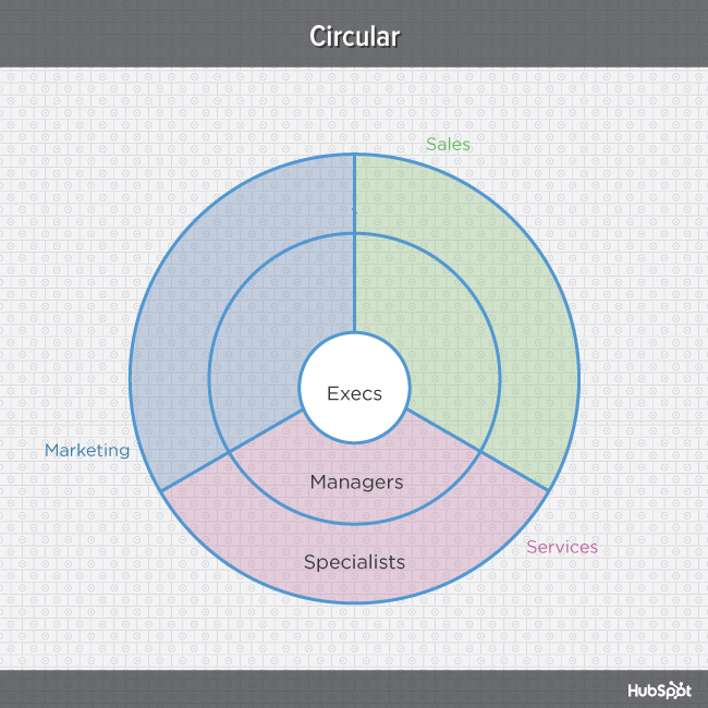
From an ideological perspective, a circular structure is meant to promote communication and the free flow of information between different parts of the organization. Whereas a traditional structure shows different departments or divisions as occupying individual, semi-autonomous branches, the circular structure depicts all divisions as being part of the same whole.
Disadvantages
From a practical perspective, the circular structure can be confusing, especially for new employees. Unlike with a more traditional, top-down structure, a circular structure can make it difficult for employees to figure out who they report to and how they’re meant to fit into the organization.
8. Flat Structure
While a more traditional organizational structure might look more like a pyramid — with multiple tiers of supervisors, managers and directors between staff and leadership, the flat structure limits the levels of management so all staff are only a few steps away from leadership. It also might not always take the form or a pyramid, or any shape for that matter. As we mentioned earlier, It’s also a form of the “Organic Structure” we noted above.
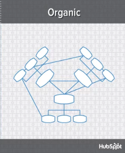 This structure is probably one of the most detailed, It’s also thought that employees can be more productive in an environment where there’s less hierarchy-related pressures. This structure might also make staff feel like the managers they do have are more like equals or team members rather than intimidating superiors.
Disadvantages
If there’s a time when teams in a flat organization disagree on something, such as a project, it can be hard to get aligned and back on track without executive decisions from a leader or manager. Because of how complicated the structure’s design is, it can be tricky to determine which manager an employee should go to if they need approval or an executive decision for something. So if you do choose to have a flat organization, you should have a clearly marked tier of management or path that employers can refer to when they run into these scenarios.
9. Network Structure
A network structure is often created when one company works with another to share resources — or if your company has multiple locations with different functions and leadership. You might also use this structure to explain your company workflows if much of your staffing or services is outsourced to freelancers or multiple other businesses.
The structure looks nearly the same as the Divisional Structure, shown above. However, instead of offices, it might list outsourced services or satellite locations outside of the office.
If your company doesn’t do everything under one roof, this is a great way to show employees or stakeholders how outsourcing of off-site processes work. For example, if an employee needs help from a web developer for a blogging project and the company’s web developers are outsourced, the could look at this type of chart and know which office or which person to contact outside of their own work location.
Disadvantages
The shape of the chart can vary based on how many companies or locations you’re working with. If it’s not kept simple and clear, there may be a lot of confusion if multiple offices or freelancers do similar things. If you do outsource or have multiple office locations, make sure your org chart clearly states where each specific role and job function lies so someone can easily understand your basic company processes.
Navigating Organizational Structures
That concludes our exploration of different types of organizational structures. Keep in mind that what we’ve just looked at are simply archetypes — in real-world applications, organizations often use hybrid structures, which can borrow elements from multiple structure types.
Want to see some real-world examples of marketing team org structures from companies like GitHub and Rue La La? Download the complete resource, An Illustrated Guide to Organizational Structures.
To learn more about working on a marketing team, check out the 6 Building Blocks of Organizational Structure [Diagrams].

The Ultimate List of Email SPAM Trigger Words
Editor’s Note: Spam filters have become much more sophisticated than the subject line triggers listed in this post. For a more up-to-date guide to email marketing, check out our free guide to creating email newsletters people actually read here.
Writing the subject lines for your emails can be one of the most stressful steps of email marketing. Is it engaging? Too short? Too long? Too boring? Will people click ‘delete’ because of it? Or will they open it? Will it even get to them, or will it trigger SPAM filters? It’s the last of these concerns that we’re here to help with today.
SPAM filters can be triggered for a variety of reasons, causing your email to skip recipients’ inboxes and land straight in their SPAM box. One of easiest ways to avoid SPAM filters is by carefully choosing the words you use in your email’s subject line. Trigger words are known to cause problems and increase the chances of your email getting caught in a SPAM trap. By avoiding these words in your email subject lines, you can dramatically increase your chances of getting beyond SPAM filters.
Next time you sit down to write an email subject line, consult the exhaustive list below and make sure you aren’t using any words that will get you in trouble. In fact, you might want to bookmark this list so you can refer back to it every time you craft an email subject line. Back off, SPAM filters!
Email Spam Words to Avoid
Commerce
| As seen on | Buy | Buy direct |
| Buying judgments | Clearance | Order |
| Order status | Orders shipped by | shopper |
Personal
| Dig up dirt on friends | Meet singles | Score with babes |
Employment
| Additional Income | Be your own boss | Compete for your business |
| Double your | Earn $ | Earn extra cash |
| Earn per week | Expect to earn | Extra income |
| Home based | Home employment | Homebased business |
| Income from home | Make $ | Make money |
| Money making | Online biz opportunity | Online degree |
| Opportunity | Potential earnings | University diplomas |
| While you sleep | Work at home | Work from home |
Financial – General
| $$$ | Affordable | Bargain |
| Beneficiary | Best price | Big bucks |
| Cash | Cash bonus | Cashcashcash |
| Cents on the dollar | Cheap | Check |
| Claims | Collect | Compare rates |
| Cost | Credit | Credit bureaus |
| Discount | Earn | Easy terms |
| F r e e | Fast cash | For just $XXX |
| Hidden assets | hidden charges | Income |
| Incredible deal | Insurance | Investment |
| Loans | Lowest price | Million dollars |
| Money | Money back | Mortgage |
| Mortgage rates | No cost | No fees |
| One hundred percent free | Only $ | Pennies a day |
| Price | Profits | Pure profit |
| Quote | Refinance | Save $ |
| Save big money | Save up to | Serious cash |
| Subject to credit | They keep your money — no refund! | Unsecured credit |
| Unsecured debt | US dollars | Why pay more? |
Financial – Business
| Accept Credit Cards | Cards accepted | Check or money order |
| Credit card offers | Explode your business | Full refund |
| Investment decision | No credit check | No hidden Costs |
| No investment | Requires initial investment | Sent in compliance |
| Stock alert | Stock disclaimer statement | Stock pick |
Financial – Personal
| Avoid bankruptcy | Calling creditors | Collect child support |
| Consolidate debt and credit | Consolidate your debt | Eliminate bad credit |
| Eliminate debt | Financially independent | Get out of debt |
| Get paid | Lower interest rate | Lower monthly payment |
| Lower your mortgage rate | Lowest insurance rates | Pre-approved |
| Refinance home | Social security number | Your income |
General
| Acceptance | Accordingly | Avoid |
| Chance | Dormant | Freedom |
| Here | Hidden | Home |
| Leave | Lifetime | Lose |
| Maintained | Medium | Miracle |
| Never | Passwords | Problem |
| Remove | Reverses | Sample |
| Satisfaction | Solution | Stop |
| Success | Teen | Wife |
Greetings
| Dear [email/friend/somebody] | Friend | Hello |
Marketing
| Ad | Auto email removal | Bulk email |
| Click | Click below | Click here |
| Click to remove | Direct email | Direct marketing |
| Email harvest | Email marketing | Form |
| Increase sales | Increase traffic | Increase your sales |
| Internet market | Internet marketing | Marketing |
| Marketing solutions | Mass email | Member |
| Month trial offer | More Internet Traffic | Multi level marketing |
| Notspam | One time mailing | Online marketing |
| Open | Opt in | Performance |
| Removal instructions | Sale | Sales |
| Search engine listings | Search engines | Subscribe |
| The following form | This isn’t junk | This isn’t spam |
| Undisclosed recipient | Unsubscribe | Visit our website |
| We hate spam | Web traffic | Will not believe your eyes |
Medical
| Cures baldness | Diagnostics | Fast Viagra delivery |
| Human growth hormone | Life Insurance | Lose weight |
| Lose weight spam | Medicine | No medical exams |
| Online pharmacy | Removes wrinkles | Reverses aging |
| Stop snoring | Valium | Viagra |
| Vicodin | Weight loss | Xanax |
Numbers
| #1 | 100% free | 100% Satisfied |
| 4U | 50% off | Billion |
| Billion dollars | Join millions | Join millions of Americans |
| Million | One hundred percent guaranteed | Thousands |
Offers
| Being a member | Billing address | Call |
| Cannot be combined with any other offer | Confidentially on all orders | Deal |
| Financial freedom | Gift certificate | Giving away |
| Guarantee | Have you been turned down? | If only it were that easy |
| Important information regarding | In accordance with laws | Long distance phone offer |
| Mail in order form | Message contains | Name brand |
| Nigerian | No age restrictions | No catch |
| No claim forms | No disappointment | No experience |
| No gimmick | No inventory | No middleman |
| No obligation | No purchase necessary | No questions asked |
| No selling | No strings attached | No-obligation |
| Not intended | Obligation | Off shore |
| Offer | Per day | Per week |
| Priority mail | Prize | Prizes |
| Produced and sent out | Reserves the right | Shopping spree |
| Stuff on sale | Terms and conditions | The best rates |
| They’re just giving it away | Trial | unlimited |
| Unsolicited | Vacation | Vacation offers |
| Warranty | We honor all | Weekend getaway |
| What are you waiting for? | Who really wins? | Win |
| Winner | Winning | won |
| You are a winner! | You have been selected | You’re a Winner! |
Calls-to-Action
| Cancel at any time | Compare | Copy accurately |
| Get | Give it away | Print form signature |
| Print out and fax | See for yourself | Sign up free today |
Free
| Free | Free access | Free cell phone |
| Free consultation | Free DVD | Free gift |
| Free grant money | Free hosting | Free installation |
| Free Instant | Free investment | Free leads |
| Free membership | Free money | Free offer |
| Free preview | Free priority mail | Free quote |
| Free sample | Free trial | Free website |
Descriptions/Adjectives
| All natural | All new | Amazing |
| Certified | Congratulations | Drastically reduced |
| Fantastic deal | For free | Guaranteed |
| It’s effective | Outstanding values | Promise you |
| Real thing | Risk free | Satisfaction guaranteed |
Sense of Urgency
| Access | Act Now! | Apply now |
| Apply Online | Call free | Call now |
| Can’t live without | Do it today | Don’t delete |
| Don’t hesitate | For instant access | For Only |
| For you | Get it now | Get started now |
| Great offer | Info you requested | Information you requested |
| Instant | limited time | New customers only |
| Now | Now only | Offer expires |
| Once in lifetime | One time | Only |
| Order now | Order today | Please read |
| Special promotion | Supplies are limited | Take action now |
| Time limited | Urgent | While supplies last |
Nouns
| Addresses on CD | Beverage | Bonus |
| Brand new pager | Cable converter | Casino |
| Celebrity | Copy DVDs | Laser printer |
| Legal | Luxury car | New domain extensions |
| Phone | Rolex | Stainless steel |

10 Common Landing Page Myths to Avoid
I remember when I found out the Tooth Fairy wasn’t real. My whole world was shattered. Granted, I was about eight, but I was furious to find out that my parents had been putting a quarter under my pillow every time I’d lost a tooth, not a sweet fairy named Daphne who lived in a castle made out of my pearly whites.
Luckily, believing in the Tooth Fairy is pretty harmless. Other myths, especially those that affect your business, are not.
In previous posts, we’ve debunked myths about marketing automation, social media, blogging, SEO, and A/B testing… but we’ve never touched on landing pages.
Keep reading so you don’t miss out on information that’ll help you convert visitors into leads and leads into customers. We’ll debunk the most common landing page myths and arm you with information to take your landing pages to the next level.
Myth #1: You only need a few of them.
Lots of people think that you don’t need many landing pages. Maybe you have a ‘Contact Us’ page and a demo page, and that’s pretty much it, right? Wrong. If you only have a few landing pages, you’re missing out on traffic, leads, and customers big time.
Every new landing page you create is another opportunity for you to appear in search engines and get your link shared on social media — and better search engine rankings and social media posts mean that you’ll have more opportunity to drive traffic and conversions for your website.
Additionally, besides landing pages on your website, you’re going to need landing pages to convert leads. These pages are probably not available on search engines, but will help you track how many leads have clicked into an offer and how many have downloaded your content offers.
Need more convincing about the importance of having more landing pages? Check out this post.
Myth #2:Short forms are better than long forms.
No form length is the “best” — it all depends on what you’re trying to accomplish with the form. Are you trying to get a ton of new leads? Keep the form short. Are you trying to get really qualified leads? Make the form longer. One is not better than the other — they just address different goals.
Your form length will most likely end up somewhere in the middle. To find your form length sweet spot, run A/B tests and adjust your form length according to their results.
Myth #3:If I copy someone else’s landing page, my conversion rates will go up.
Landing page examples and templates are great jumping off points for your own landing pages, but you shouldn’t expect to plug your content into someone else’s landing page and end up raking in the conversions. A landing page is successful because of interaction of many nuanced elements — the content on the page, the design of the page, and the audience viewing the page.
If you’re going to copy a landing page layout, use best practices to tweak it to help your audience convert on your offer, then test it and test it to make it better.
Ultimately, a landing page will only succeed if the content offer matches the intent of the customer.
Myth #4:You need to have all conversion elements above the fold.
Lots of people believe that all of the important content on your landing page should appear above the fold — supposedly, people won’t scroll to fill out the form or find out more crucial information about what lies behind the form.
But the fold doesn’t really affect conversion — KISSmetrics found that when people are motivated to convert on a page, they do, regardless of where the form submit button is. According to that article, the biggest factor in increasing motivation is compelling copy, regardless of length. So forget optimizing only for the fold — through A/B testing, figure out how much information people need to convert.
Myth #5: Trust seals always increase conversions.
Think about the situations in which you often see trust seals. You’re usually giving over your credit card number or some other sensitive contact information, right? It makes sense to get a little visual reminder that your information is safe, because you really are giving over sensitive information.
But what if you saw a trust seal on a page where you weren’t giving over sensitive information? It’d be out-of-place, making you wonder what the heck the company was really collecting from you, right? Trust elements can help tremendously on pages that need them — but they can also deter folks if they’re included on pages that don’t.
Myth #6: If you change your form button from green to red, you’ll increase conversions.
Full disclosure: we’ve run this test and found that a red call-to-action (CTA) outperformed a green CTA … but that doesn’t mean that red buttons are always better than green ones. That test worked for that page, with that page’s design, for that page’s audience. If you run the same test on your site, you might find that the opposite is true.
This myth goes for any color test really —there is no one right color that’ll convert tons and tons more people. Test out colors yourself to see what works best.
Myth #7: Landing page copy should always be short and sweet.
Like color, there’s no right length of landing page copy. We kind of touched on this in Myth #4, but the copy length myth is perpetuated enough it deserved a section of its own.
Landing page copy length is like what your teachers would say when you’d ask them how long an essay should be — however long it needs to be to cover the subject. In the case of landing pages, it should be however long you need it to be to have people convert on your landing page’s form. For complex offers that require people ponying up a lot of money or their sensitive information, more information could be better. For simple offers, like an ebook, you probably don’t need a ton of landing page copy.
Like almost all of these myths, this one’s nuanced. Run tests on your landing pages to find out what copy length your visitors need.
Myth #8: Conversion rate is the only metric to watch.
Landing pages are a stepping stone in your marketing funnel. You’re not just trying to get people to fill out a form. You’d hope that eventually they’ll become a customer from you.
So if you’re trying to get the most out of your landing pages, you shouldn’t just look at the percent of people who converted on that form — you want to look and see what happens after.
What percentage of them become customers? By looking at your closed-loop analytics, you may find that a landing page that has a low initial conversion rate actually brings in customers like crazy, or vice versa … which is something your boss would care to know and fix.
Myth #9: You should include as many things as possible on your landing page to get people to convert on something.
Your landing page isn’t a last-ditch effort to capture someone’s information. It’s there to get people to convert on your form and move down your marketing funnel. You don’t want to give people too many options because they’ll get distracted and your conversion rate goes down. This means you should try removing your navigation and any extraneous forms. More is not better when it comes to landing page elements.
Myth #10: You build ’em and leave ’em.
You could probably guess this last myth from one piece of advice I’ve repeated over and over throughout this post: Test your landing pages. There are almost always ways you can tweak and improve them. If you build them and leave them alone, you’re losing out on valuable conversions. Landing pages support the backbone of your marketing funnel — so make sure you’re getting the most you can out of them by running A/B tests often.
Building a landing page can feel like a daunting task with the contradictory advice out there. That’s why you should use a landing page builder to assist you.
Editor’s note: This post was originally published in March 2014 and has been updated for comprehensiveness.

Launching With Facebook Ads: How to Sell More With Facebook
Are Facebook ads an important part of your launch strategy? Wondering how you can use Facebook to sell more during your next launch? To explore how to use Facebook ads to generate more sales during a launch, I interview Emily Hirsh on the Social Media Marketing Podcast. Emily is the founder of Hirsh Marketing, an […]
The post Launching With Facebook Ads: How to Sell More With Facebook appeared first on Social Media Examiner | Social Media Marketing.
from Social Media Examiner | Social Media Marketing https://ift.tt/2K4g0BU
via socialmediaexaminer
What Is the 10/20/30 Rule of PowerPoint?
Despite how many PowerPoint presentations I’ve given in my life, I’ve always struggled with understanding the best practices for creating them. I know they need to look nice, but figuring out how to make them aesthetically pleasing and informative is tough.
I’m sure my experience isn’t unique, as finding the correct balance between content, design, and timing can be difficult. Marketers know this more than anyone, as success in the role is often marked by being able to create engaging campaigns that tell a story and inspire audiences to take a specific action, like purchasing a product.
However, PowerPoint presentations are different from advertisements. Understanding how to leverage your marketing knowledge when creating PowerPoints can be tricky. Still, there are various resources for marketers to use when creating presentations, one of which is the 10/20/30 rule.
Coined by Guy Kawasaki, the rule is a tool for marketers to create excellent PowerPoint presentations. Each element of the formula helps marketers find a balance between design and conceptual explanations, so you can capture audience attention, emphasize your points, and enhance readability.
Guy Kawasaki PowerPoint
Guy Kawasaki, one of the early Apple employees, championed the concept of a ‘brand evangelist’ to describe his position. He spent most of his time working to generate a follower base for Macintosh, the family of Apple computers. Today he works as a brand evangelist for Canva, an online graphic design tool.
Given that he’s had significant experience giving presentations to captivate audiences, he’s figured out that the 10/20/30 is a successful formula to follow. Kawasaki’s book, Art of The Start, is where he first introduced the concept and described how it works.
Let’s cover each part of the rule in more detail.
10 Slides
Kawasaki believes that it’s challenging for audiences to comprehend more than ten concepts during a presentation. Given this, marketers should aim to create PowerPoints with no more than ten slides, i.e., ten ideas you’ll explain. Using fewer slides and focusing on the critical elements helps your audience grasp the concepts you’re sharing with them.
In practice, this means creating slides that are specific and straight to the point. For example, say you’re presenting on the success of your recent campaign. Your marketing strategy was likely extensive, and you took a series of different actions to obtain your end result. Instead of outlining every aspect of your campaign, you would use your slides to outline its main elements of your strategy. This could look like individual slides for summarizing the problem you hoped to solve, your goals, the steps you took to reach your goals, and post-campaign analytics data that summarizes your accomplishments.
It’s important to note that there shouldn’t be overwhelming amounts of text on your slides. You want them to be concise. Your audience should get most of the information from the words you’re speaking; your slides should be more supplemental than explanatory.
20 Minutes
After you’ve spent time coming up with your ten key points, you’ll need to present them in 20 minutes. Knowing that you’ll only have 20 minutes also makes it easier to plan and structure your talk, as you’ll know how much time to dedicate to each slide, so you address all relevant points.
Kawasaki acknowledges that presentation time slots can often be longer, but finishing at the 20-minute mark leaves time for valuable discussion and Q&A. Saving time in your presentation also leaves space for technical difficulties.
30 Point Font
If you’ve been in the audience during a presentation, you probably know that slides with small font can be challenging to read and take your attention away from the speaker.
Kawasaki’s final rule is that no font within your presentation should be smaller than 30 point size. If you’ve already followed the previous rules, then you should be able to display your key points on your slides in a large enough font that users can read. Since your key points are short and focused, there won’t be a lot of text for your audience to read, and they’ll spend more time listening to you speak.
Given that the average recommended font size for accessibility is 16, using a 30-point font ensures that all members of your audience can read and interact with your slides.
Make Your Presentations More Engaging
The 10/20/30 rule of PowerPoint is meant to help marketers create powerful presentations.
Each element of the rule works in tandem with the other: limiting yourself to 10 slides requires you to select the most salient points to present to your audience. A 20-minute timeline helps you ensure that you’re contextualizing those slides as you speak, without delving into unnecessary information. Using a 30-point font can act as a final check for your presentation, as it emphasizes the importance of only displaying key points on your slides, rather than huge blocks of text. Font size then circles back around to the ten slides, as you’ll craft sentences from your key points that will fit on your slides in 30-point font.
Being mindful of slide count, text size, and presentation length ensures that your audiences are captivated by your words as you explain the value behind your work.

What’s a Schedule Baseline & How Do I Make One?
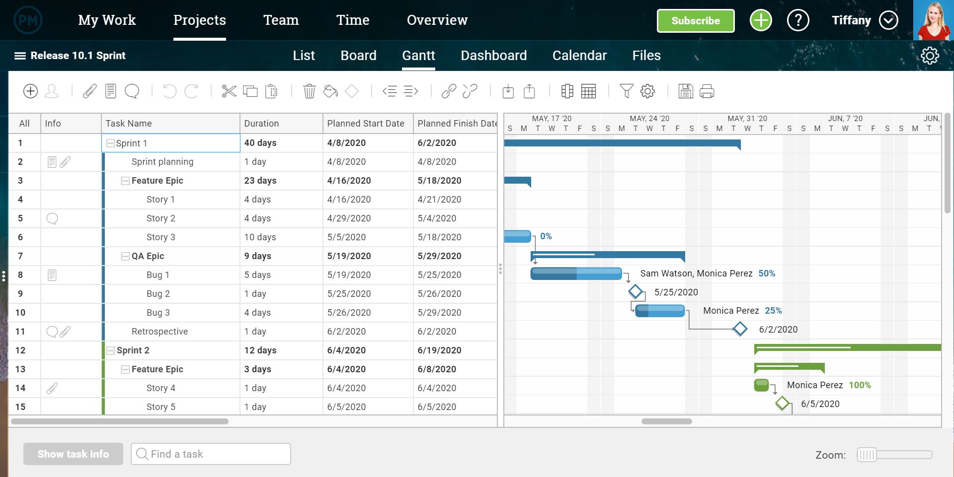
Total Addressable Market (TAM): What It Is & How You Can Calculate It
In college, I interned at a MarTech company that sold email marketing optimization software. With their software, brands could finally gain visibility into their email program’s deliverability rate or inbox placement, which most email service providers, like Constant Contact or MailChimp, can’t do.
The business’ largest revenue stream was a channel partner program that enabled email service providers to sell my old company’s software to their own customers. And one day, at an all-hands meeting, our CEO showed us a slide that listed every single email service provider we partnered with and the amount of customers they all had.
He told us this was our total addressable market. Then, he showed us a slide of how much of the market we had captured — it was a single digit percentage. Even though we generated $100 million in revenue per year, we were shocked at how little of the market we had secured. But it also helped us realize that we still had plenty of room to grow, which motivated us to win as much of the market as possible.
Whether you want to start a new company and gauge its industry’s profit potential or forecast a realistic revenue growth goal for your business, measuring your total addressable market is a crucial first step you must take. To help you do this, we’ve put together a guide that’ll teach you exactly what total addressable market is and the best way to calculate it.
Total Addressable Market (TAM)
Total addressable market or TAM refers to the total market demand for a product or service. It’s the most amount of revenue a business can possibly generate by selling their product or service in a specific market.
Unless they’re a monopoly, most companies can’t capture the total addressable market for their product or service. Even if a company just has one competitor, it would still be extremely difficult for them to convince an entire market to only buy their product or service.
That’s why most companies also measure their serviceable available market to determine how many customers they can realistically reach with their marketing and sales channels. Additionally, they gauge their share of market to understand the size of their actual target market.
However, total addressable market is still useful because businesses can use TAM to objectively estimate a specific market’s potential for growth.
How to Calculate TAM
There are three ways to calculate your business’ total addressable market.
1. Top-Down
The top-down approach uses industry data, market reports, and research studies to identify the TAM. In this approach, you might use industry data from Gartner or Forrester to identify which subsections of your industry align with your goals and offering — and just how big those subsections are.
However, there are limitations here. Data generated by industry groups may not always be kept up to date and may not reflect niche elements of your market. You may want to hire a market research consulting firm to conduct fresh research that is focused on your need areas.
2. Bottom-Up
The bottom-up approach to TAM calculation is based on previous sales and pricing data. First, multiply your average sales price by your number of current customers. This will yield your annual contract value. Then, multiply your ACV by the total number of customers. This will yield your total addressable market. Let’s see what this looks like in an example.
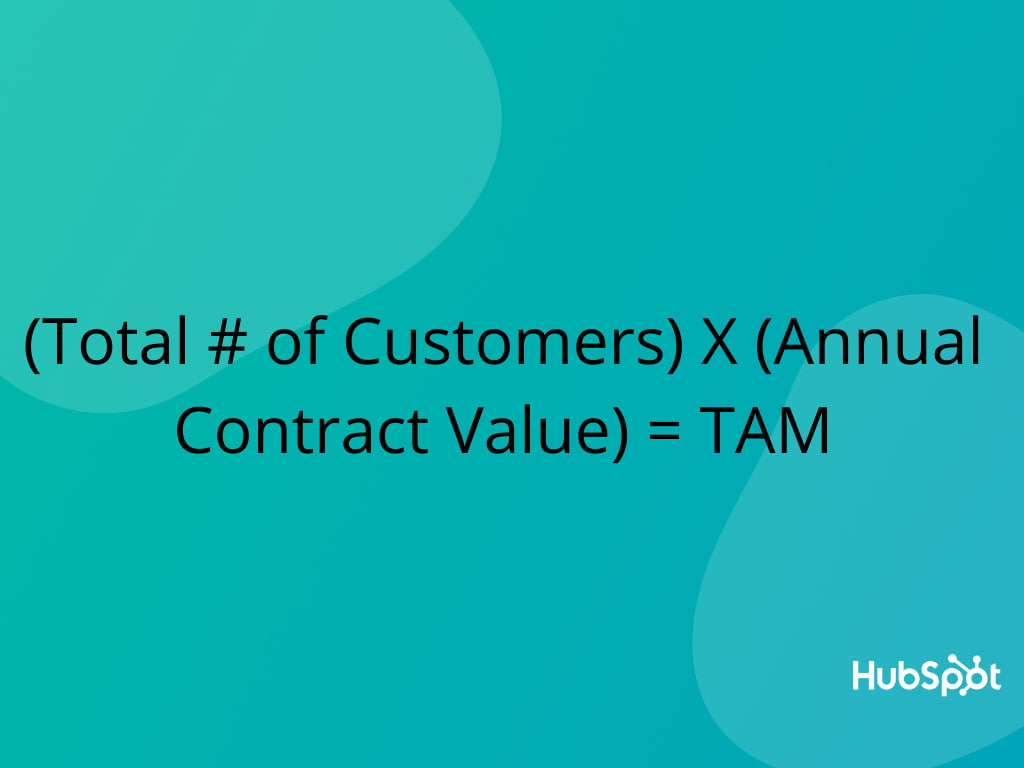
Say you sell scuba fins to dive shops in the state of California. You might sell an average of 60 pairs of fins, at $35/pair, to dive shops in California. 60 multiplied by $35 equals an ACV of $2,100. Then, you’d multiply your ACV ($2,100) by the total number of dive shops in California (125) for a total addressable market of $262,500.
3. Value-Theory
The value-theory approach is based on how much value consumers receive from your product/service and how much they’re willing to pay in the future for that product/service.
To return to our scuba example, let’s say you manufacture a type of fin that’s lighter than your competitors and has patented technology that makes them easier to get off than anything else in the market. You’d identify your value-theory by estimating how much dive shops would be willing to pay to carry your superior product. If normal fins are being sold at $35 a pair, would dive shops pay $40 or even $45 for a pair of your ultra-lightweight fins?
After you calculate your total addressable market, it’s time to determine whether it’s worth entering the industry or not.
An industry with a market size ranging from $30 million to $200 million per year might be worth entering. However, if the industry’s market size is under $5 million per year or over $1 billion per year, it’s probably not.
In both situations, it’d be challenging to persuade investors to back your company — an industry with a market size of $5 million per year would likely be too niche and an industry with a market size over $1 billion would likely be too saturated.
Know Your TAM Before You Take Action
Starting a business or projecting next year’s revenue growth is always thrilling. But if you want to follow a realistic path toward success, you need to first understand what’s actually possible. So let your total addressable market be your North Star and guide you through a journey that’s rooted in reality, not hype.

The Ultimate Guide to Landing Pages
As you browse and maneuver around the internet, you visit landing pages all the time.
A landing page can be the designated page you’re taken to when you click on an ad. It can also be the page that follows a call-to-action button or serve as the homepage of a website.
Regardless of how you “land” on a landing page, its purpose is to encourage you to convert to a lead or customer. For that reason, landing pages are uniquely powerful components of a business’s digital marketing strategy.
What is a landing page?
A landing page is a website page with a specific purpose — the objective of a landing page is to convert visitors into leads. While there are many types of landing pages the intent the same — get more leads.
Landing pages contain lead forms that ask visitors for their contact information in exchange for something of value, otherwise known as an offer.
The video below will help drive that definition home.
Now, think about how protective you are of your personal information. What would make a person want to give up their contact information over the internet?
Well, that’s where landing page best practices come in. A targeted, well-crafted landing page with a solid format and sound copy will get almost anyone to submit their information.
First, why do you need a landing page?
Why would you create a special page just for people to fill out a form? Why not just use your homepage or about page? Great questions.
After reading this article, you’ll likely be able to answer those questions yourself, but the short answer is this: A landing page eliminates distractions by removing navigation, competing links, and alternate options so you capture your visitor’s undivided attention. And complete attention means you can guide your visitor where you’d like them to go, i.e., to your lead form. In sum, landing pages are specifically designed to create conversions.
Now that you understand their importance, let’s cover landing page best practices to make sure your pages are set up to convert.
Was that a lot? We’ll break down these landing page best practices below.
1. Craft a benefit-focused headline.
For every 10 people that visit your landing page, at least seven of them will bounce off the page. To keep that number low, your visitors need to know (and understand) what’s in it for them within seconds of arriving. Your headline is the first thing they’ll read, and it should clearly and concisely communicate the value of your landing page and offer.
2. Choose an image that illustrates the offer.
Yes, an image is mandatory, and it should represent your target audience. The purpose of your image is to convey a feeling — it should illustrate how your visitor will feel once they receive your offer. Certain images may work better than others, so you should always split test your options (which we’ll cover below).
3. Write compelling copy.
Don’t spend all that time crafting the perfect headline and finding your ideal image to fall flat when it comes to the words that will actually sell your call-to-action. Your copy needs to be clear, concise and should guide your visitor to the action you want them to complete. Compelling copy also speaks directly to the visitor by using “you” and “your” to make them feel engaged. We’ll go more in-depth on copy tips below.
4. Include the lead form above the fold.
Your lead form needs to be readily accessible should your prospect want to convert right away — you definitely don’t want them searching and scanning your landing page to find your offer. “Above the fold” just means that visitors don’t have to scroll to get to the form — that it’s in view as soon as someone hits the page. This could be a form or an anchor link to the form. Even better: Design your form to scroll with the user as they move down the page.
5. Add a clear and standout call-to-action.
The call-to-action (CTA) is arguably the most important element on your landing page — it’s one of many elements that encourage conversion. The CTA button needs to stand out, meaning you should use a color that contrasts with other elements on the page. Be clear about what you want visitors to do, that is, use an action verb that spells it out for them, like “submit”, “download”, or “get it now”. More on CTA best practices below.
6. Give away a relevant offer.
Think of your landing page as a part of your lead’s journey to your ultimate offer — your product or service, that is. Your offer is the thing you give in exchange for your lead’s personal information. Not only should it be compelling enough for your visitor to provide their contact info, but it should also be relevant to your business. Say you sell horseshoes.
Your offer might be something like “10 Simple Ways to Size Your Horse’s Hooves,” because, ultimately, you’re going to ask that lead to buy your horseshoes. You wouldn’t hook them with an offer about organic farming because that puts them on a completely different path. We’ll talk more about how compelling offers below.
7. Only ask for what you need.
You want to gather as much information as possible about your lead, but how much you ask for depends on several factors: how well acquainted they are with you, where they are in their buyer’s journey, and how much they trust you. Ask for as little info as you need in your lead form to create a low barrier to entry. A name and an email are more than sufficient to nurture a new lead.
8. Remove all navigation.
Your landing page has one objective and one objective only: to convert visitors into leads. Any competing links — including internal links to other pages on your website — will distract from that goal. Remove any other links on your page to draw all of your visitors’ attention to your call-to-action.
9. Make your page responsive.
Just like every other page on your website, your landing pages need to be responsive to accommodate every viewing experience. The last thing you need is for your form to fall out of view on mobile devices. Give your visitors every possible opportunity to convert, no matter how they’re viewing your page.
You can use tools to help accomplish this. For example, HubSpot’s drag-and-drop landing page editor, available in Marketing Hub Starter, makes it easy for you to create mobile optimized landing pages and forms effortlessly.
10. Optimize for search.
Sure, you’ll be driving visitors to your landing page through email blasts, social posts and other marketing methods, but your page should also be optimized with target keywords for your paid campaigns and organic search. When someone searches for your key phrase, they should find your landing page. Similarly, when you target a keyword with paid ads, those words should exist on your landing page.
11. Remember to use a thank you page.
A thank you page is where you send leads once they’ve completed your form. Now, you could just show a thank you message on the same page or ditch the thank you altogether, but there are many reasons why that’s not the best option.
A thank you page serves three important purposes:
- It delivers the offer that you promised (usually in the form of an instant download)
- It gives you an opportunity to interest your new lead in additional relevant content
- It serves as a chance to thank them for their interest, which goes a long way in promoting them to a customer down the line.
How to Design Your Landing Page
Often times, design means creativity, colors, and pretty pictures. For the purpose of a landing page, we take design a step further to mean functional, direction-oriented, and effective. So, to craft a well-designed landing page, you’ll have to tap into both your right and left brain. But don’t get me wrong — you still need great imagery and attractive colors to convert your visitors. We’ll touch on how to incorporate all of this below.
Landing Page Structure
The good news is you don’t need to get too creative here. Most landing pages follow a very similar structure because it’s been proven to work. You can infuse your creativity through branded elements and images, but stick to a landing page format that people are used to seeing.
A good landing page has five elements (check out the landing page example below to see these elements in practice):
- Headline that grabs the visitors attention
- Relevant image that is relevant to your audience
- Lead form that sits above the fold to capture visitors’ information
- CTA that is action-oriented and compelling
- Copy and description that informs and entices your visitor to complete your form
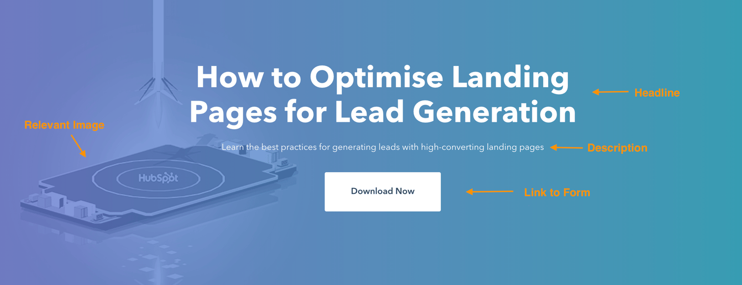
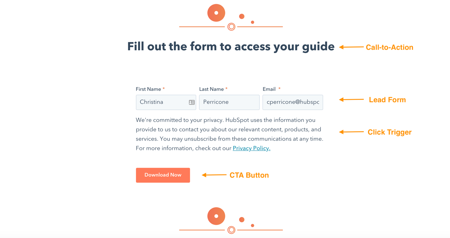
Can your landing page include more than this? Absolutely. (Think social share buttons that visitors can use to spread the word about your offer). This is simply the bare minimum. You need to know your audience, where they are coming from and where they are in their buyer’s journey to know how much you need to include. The rule of thumb is to include as much information as you need to get people to convert.
Landing Page Layout
This may come as a surprise, but most people don’t read every word of your cleverly-crafted copy. Instead, they skim through and pull out the most important tidbits. Your job is to make those tidbits stand out so your visitor doesn’t miss anything important.
That means a few things …
- Keep the most important information above the fold so your visitor doesn’t need to scroll to get to it.
- Perform a blink test on your page, meaning a visitor should be able to gather the main message in less time than it takes them to blink, i.e., less than five seconds.
- Use white (or negative) space to keep your visitor engaged, focused, and to help them comprehend your message.
- Write with bullets and short paragraphs to make your copy easy to digest.
- Try to work the important copy into an F-pattern, which is the direction that most people scan a page online. Work with the flow of visual patterns to drive people to the key points that will get them to convert.
Landing Page Colors
The design of your landing page — including the colors you use — should reflect that of your website. You’re aiming to form a long-term relationship with the people who visit your landing page, and that means they need to become familiar with your branding colors and unique style. The more they recognize your brand, the more they trust you (and the more they trust you, the easier it is to get them to do what you want them to do).
The areas where you should consider using alternate colors are on the elements of your page that need to stand out — ahem, your CTA button. Contrast is the name of the game here. Say your branded colors are mostly green … you’ll want to choose a color that can draw users attention, say purple.
Wondering what colors perform well? We did a little research for you to determine which colors convert best.
Landing Page Images
The image on your landing page is one the first things people see, and since people process visuals far quicker than they do text, it sets the tone for their entire experience. But how can you possibly choose between millions of stock photos and that company photo shoot that’s taking up all the space on your computer?
Let’s narrow down the selection with a few important questions:
Who is my target audience?
What does your persona look like? How old are they? How do they dress? What are they interested in? The answers to these questions are important in determining what image you’re going to place front and center on your landing page. If it’s going to appeal to your audience, then it needs to represent them in some way.
Where on my landing page do I want them to look?
This might seem like an odd question, but really it’s based on the idea that people follow directional cues, like where someone is looking or pointing. If you want visitors to fill out a form, consider an image that drives their attention toward that form.
Will this image reinforce my message?
Every element on your landing page serves an important purpose. Since your image is one of the first things that people see, it should help clarify what the visitor can expect from your page. Make sure that your image adds value.
Here are some other important things to consider when creating great landing page images.
Call-to-Action (CTA)
We’ve discussed your CTA a few times so far, but since it’s the most important part of your landing page, it’s worth mentioning again. When it comes to the design of your CTA, there are a few tricks will make it so alluring that visitors feel compelled to click. To clarify, your CTA includes the button and the copy you use to draw attention to it; these tips cover both.
- Give your CTA a vibrant and contrasting color
- Focus your CTA copy on the benefit to your visitor
- Get to the point — try using no more than five words
- Tell your visitor what you want them to do using action verbs, e.g. Get, Download, Click
- Make your button large enough to stand out on the page
- Give it some negative space — don’t crowd the area around your CTA
- Follow the flow of the page and place your CTA where your readers’ eyes will go, such as to the right of or below the copy
- Test your button shape, test your copy … as a matter of fact test everything (we’ll cover how to do this below)

Mobile Landing Page
More than half of website traffic comes from mobile devices, therefore, the user experience should be the same no matter the device visitors are using. By making your landing page responsive, you give them every opportunity to view and convert, whether they’re on a desktop, phone, tablet, or otherwise.
Landing Page Copywriting Tips
After design comes great copy. Your objective is to be compelling, instructive, likable, concise, effective, trustworthy and informative all at once. How? Keep reading.
1. Cover the main points.
No matter how you position it, there are a few main points that you need to hit with your copy. Those main points are your persona’s pain point, the solution to that pain point, how your solution works (features), how your solution will improve their situation (benefits), and verification that it works (social proof).
The majority of what you write needs to address how you can help your prospect, not how awesome you are (because that’s implied). Let’s go more in-depth on these points.
The Pain Point
The pain point that you focus on should be the one that your offer solves. Not to sound negative, but it’s important to touch on the problem your persona is facing so they know you understand what they’re going through. Empathy is an effective way to build trust. And if they know you get their problem, then they’re more likely to trust your solution.
Your Solution
The solution to their pain point is what you’re offering in exchange for their information. Illustrate a clear path between their problem and how your solution is the remedy they need.
Features
Just knowing what your solution is may not be enough to convert leads, so you need to mention what’s included in that solution. If it’s an ebook, what are the subjects your cover? If you’re promoting a webinar, how will it work and what will you teach? If it’s a service, what can they expect? Give your potential lead all the information they need to make a decision.
Benefits
Your copy should be heavy with benefits to the user because that’s what they really care about — what’s in it for them. While features list what your offer has, benefits tell visitors how their situation will be improved as a result. It paints a vivid picture of how much better their life could be by using your solution.
Social Proof
Studies show that social proof is effective for persuading people to take a desired action. Social proof comes in the form of logos of brands you’ve worked with, testimonials from previous clients, reviews of your product, or confirmation that others have purchased your service. In essence, people want to know that others are have used and benefited from your solution, too. By including social proof on your landing page, you’re validating your offer without even saying anything.
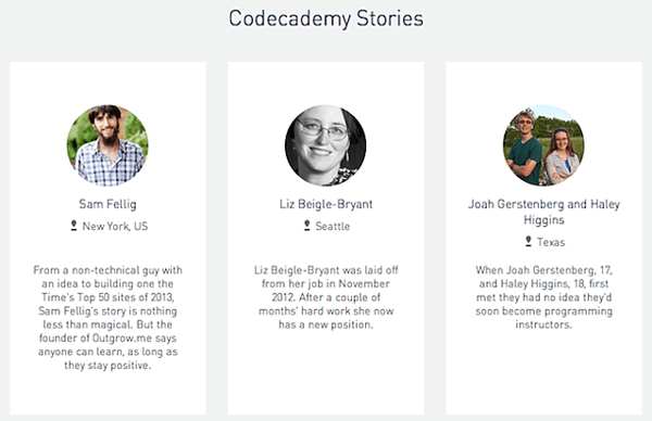
Touching on each of these points will provide you with well-rounded copy that answers all of your visitors’ questions … which brings me to my next point.
2. Preemptively respond to objections.
A key part of writing persuasive copy (copy that gets people to convert) is dismantling objections before they even come up. Now, this takes some skill … or at least some help from a friend.
Once you’ve laid your foundation by addressing all the main points, put yourself in the mind of your prospect and think about where they might protest or challenge you as they read. For instance, if you say “We’ve helped Fortune 500 companies bring in customers,” your reader might scoff or doubt it unless you follow up that statement with social proof.
Do this exercise for every section of your page (or ask an unbiased friend to help) until you’ve covered every possible objection you can think of. When you get questions from people who’ve visited your landing page, use that as feedback to sharpen your copy even further. Better yet, seek out constructive criticism from your first few converted leads to ensure your landing page is meeting every need.
3. Build trust with your prospect.
Say you were reading a sales page and the company wrote, “Our product has helped 100 people and it might work for you, too!” Meh. I’d probably pass and find a company that has a solution that can definitely work for me. Your goal is to build trust with your visitor and the way to do that is to come across as an authority.
Besides using social proof, some other ways to build trust are:
- Write in the way that you speak and address your prospects as you would a live customer.
- Cite statistics that support your message.
- Use case studies that highlight customers similar to your target.
- Be relatable. Show your audience that you’re human by admitting failures, opening up about doubts you’ve had, and being honest. The caveat is you should only share what is relevant to their struggle; don’t just divulge anything.
4. Use click triggers.
Click triggers are designed to eliminate that last bit of doubt before a visitor converts. You can think of them as lick Probability Enhancers (… yes, I made up that term). They are essentially copy positioned next to your CTA that pushes your prospect over the edge by easing their mind and mitigating the risk of converting.
Below are some effective ways to employ click triggers:
- Money-back guarantee
- Easy unsubscribe
- Quote from a successful or happy customer
- Blurb on “what to expect”
- Price slashing
- Privacy policy
- Some other creative method
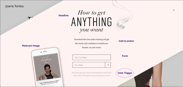
Whatever you choose, click triggers will give your conversions the boost they need.
A/B Testing Your Landing Page
Everything we’ve discussed until this point is great … in theory. But your business is different from others, and your target audience is unique. How do you know if the copy you chose is working? Or if your CTA placement is right? Or what colors perform best? Or which image to choose?
You test it. That’s how. Split testing (or A/B testing) is probably nothing new to you as a marketer, and split testing your landing page is just one more experiment to add to your list.
Let’s briefly go over how to best A/B test your landing pages.
What is A/B testing?
A/B testing is simply splitting your traffic to two (or more) variations of a page to see which performs better. While you could do this manually by launching one variation for a period of time, then another for the same amount of time, it’s far more efficient to use a software that allows you to split test and can track your results.
The main components of an A/B test are variants, or the two versions of the page, the champion, or the original page, and the challenger, or the page that you modified to test against the original.
How to A/B Test
The most important trick to split testing is to make very small tweaks with each experiment. For instance, you don’t want to split test your headline and your image at the same time because you won’t know which element garnered the results. For this reason, stick to testing one element at a time. The “winner” becomes your champion, then you can create a new challenger to test the next element. You repeat this cycle until you reach a conversion rate that you’re happy with (and that falls within realistic expectations, which we’ll cover below).
What should you test?
You can test virtually anything on your landing page. But while that’s possible, you may want to limit your test to a few of the most impactful elements of your page, like:
- Headline copy
- Image
- CTA color
- Click triggers
- Copy on the page
- Lead form length and fields
These tests will have the biggest impact on your conversion rates. Try starting with the simplest change first, like a headline or CTA color, then work your way to the larger undertakings, like your page copy.
Landing Page Metrics to Track
Metrics will tell you everything you need to know about how well your landing page is performing as well as give you some insight on how to improve it. It’s hard to know exactly what will work when you launch a page. Measure and track meticulously in the beginning until you reach a relatively good conversion rate, then you can track your metrics less frequently.
Page Visits
How many visits are you getting on your landing page? The more visits, the more you increase your probability of conversions. Try adjusting your paid strategy or redefining your keywords to drive more traffic to your page. You can also let your current followers know about your offer through emails, social media, and on your website.
Traffic Source
Knowing where your traffic is coming from will let you know where you should double down on or ditch your efforts.
Submission Rate
This is the number of people that complete your lead form and land on your thank you page. There are many tweaks you can make to your page to increase this number, but make sure to A/B test so you know what’s working.
Contacts
Contacts refer to the number of leads that you generated from your form. The reason this is different from submissions is because duplicate contacts are only counted once, meaning if a current lead fills out your form to get your offer, they don’t affect the count.
Heat Mapping
This is more of an observation of how people interact with your page as opposed to a metric. Heat mapping can show you where people scroll, what they read, and how they engage with your page. This is all useful data when thinking about your page layout and structure.
Bounce Rate
If visitors are coming to your page and immediately leaving, then you need to examine whether the content is aligned with the offer. Does your copy capture visitors’ attention and do visitors automatically know what to do when they land on your page? Is your page a reflection of the copy you used to get people to visit it?
Form Abandonment
This metric tells you how many people start filling out your form but don’t complete it. If this number is particularly high, some adjustments to consider are introducing new click triggers, shortening your form, or making it more clear what you want your visitor to do.
Benchmarks
You need to judge your landing page against industry norms and across a similar audience to know if it’s performing as expected. Check out some industry benchmarks to set as your baseline, but don’t be discouraged by other company’s results.
No matter what’s going on, it’s possible to diagnose and heal your landing pages if you pay attention to the metrics.
How to Make Your Landing Pages More Effective
There are always tweaks you can make to boost landing page performance. Below are a few great tips (if I do say so myself) to get your landing pages leveled up.
Optimize your landing page.
Optimize is such a confusing word, isn’t it? I mean, are we talking about imagery, copy, keywords, or UI? The answer is yes — we’re talking about all of it. Optimize just means to make your landing page the best it can be, and that can include a myriad of modifications. If you want to know everything you could do to optimize your landing page, you’ll need a pretty expansive guide. And, guess what, we have one here.
Present a really good offer.
You could argue that anything free qualifies as “good,” but that isn’t exactly true. Not only should your offer be free (we’re not talking sales pages here) but it also has to be good enough to warrant a stranger giving you their personal information. Let’s face it — there are a lot of companies competing for your audience’s attention, asking for their information and soliciting them via email. So, what’s going to make you stand out from the pack? An outstanding offer, that’s what.
Here are a few questions to determine if you have a compelling offer or not:
- Does my offer solve a pain point for my target audience?
- Is there a clear benefit that a lead can gain from this offer?
- Can my offer rival the competition?
Decrease page load time.
A single second delay in page load time means 7% fewer conversions and 11% fewer page views. Slow page load times can also result in customer dissatisfaction and frustration.
Needless to say, landing page load time is a metric to take seriously. If you need some tips, check out this resource on decreasing page load time.
Keep the buyer’s journey in mind.
Since you’re driving traffic to your landing page, you should have a clear idea of where your visitors are in their buyer’s journey. That means you’ll know if they’re trying to diagnose a problem (awareness), looking for a solution to their problem (consideration), or are ready to close (decision). Your copy and offer should reflect this if you want to convert. It’s no different from any other marketing materials — meet your visitors where they are.
Create a seamless experience.
No one should be surprised when they arrive on your landing page. It should be exactly as advertised, meaning be consistent with your copy. Use the same words on your landing page that you used to get people to arrive there, whether it was a paid ad, social post, blog CTA, or email. You need to avoid the bait and switch at all costs if you want people to stick around.
Create a clear path to conversion.
There should be no guesswork involved in navigating your landing page. Once someone arrives on your page, it should be clear what you want them to do — submit their info to your lead form. Your goal is to guide visitors to your form using creative directional cues.
Here are some ways to point your visitor to a conversion:
- Choose an image of a person that is either gazing in the direction of or pointing to your form
- Make your CTA a contrasting color to draw attention to it
- Use arrows that point to your lead form
- Insert anchor text that brings people back to the form when clicked
- Give your CTA some negative space on the page
- Frame your lead form with a bold color or outline
Add scarcity to your offer.
Few emotional marketing tactics work as well as fear … and the fear of missing out (more formally known as FOMO). Consumers don’t like to lose their ability to choose, and once you make it clear that your offer is in high demand and/or short supply, they’re going to clamber to get it. (Here’s a cool study on cookie jars if you want to geek out on the psychology of scarcity marketing.)
The other reason why this technique works is because people want things that are hard to obtain — that signifies value and exclusivity.
To show scarcity, mention how little of your offer is left, include a countdown timer, use words like “ends soon” or “last chance”. Obviously, we want you to be genuine, so only employ tactics that are true for your business. Bottom line: there are many ways to use and benefit from this technique.
Use video.
Video marketing is becoming increasingly popular for good reason. Not only do customers prefer to see video from companies, but 88% of video marketers say that video gives them positive ROI. The key is to create an effective video that doesn’t distract visitors from your ultimate goal: the call-to-action.
If you’re on the fence about using video, here are some reasons that might push you over the ledge.
Video …
- Increases conversion rates
- Is a more personable way to share a message and connect with prospects
- Can be more engaging than an image and will get visitors in the habit of clicking (and converting)
- Can reduce the number of support calls or tickets you receive
- Is processed 60,000 times faster than text
If you do plan to employ this tactic, VidYard has some helpful landing page video guidelines to follow.
Are you excited yet about all the ways you can improve your landing pages? Sure, there are quite a few but that just means that a poor-performing landing page doesn’t have to stay that way. Take it one tactic at a time and build as needed.
What to Do Post-Conversion: Lead Nurturing
So, you have an optimized landing page that converts like a charm. Now what? You don’t want to leave those leads hanging. Instead, you want to nurture them into becoming customers, then nurture them some more. Here’s how.
Optimize your thank you page.
I hope you’re not tired of optimizing yet. Your thank you page is the first thing someone sees after they convert, so it serves as a great opportunity to delight your new lead even more than you already have. Your objective is twofold: deliver your promised offer and get them interested in something else on your site.
Your thank you page should:
- Thank your new lead (go figure)
- Provide links to relevant content on your site
- Invite your lead to follow you on social media
- Ask your lead to subscribe to your blog
- Automate a follow-up email with the offer
Guide them along their buyer’s journey.
Your new lead is going to make their way to the decision stage with or without you. You want to be the one to help them get there. You’ve gathered some valuable information about your lead, which means you can anticipate what they need next. Provide content or resources to bring them to the subsequent stage of their journey, and you just might be their option for the decision stage. After all, we know that prospects buy from companies that they know, like, and trust.
Form a relationship.
Once someone signs up to receive information from you, they become a potential customer with whom you should work hard to build a relationship and connection. The good thing is you already know what they’re interested in and what their pain points are, so you can target them with additional, helpful content and personalized marketing.
If you’re still stuck, get some inspiration from some of the best landing pages we could find.
Grow Better with Landing Pages
Landing pages will account for a majority of your new leads, so they demand your attention. With the vast number of tweaks, additions, and variations you can implement, there’s no reason why you can’t have a landing page that converts well.
As long as you’re following the best practices we covered above, you’ll be on your way to a high-performing landing page … and if you need some additional guidance, we’re always here as a resource.
Editor’s note: This post was originally published in August 2019 and has been updated for comprehensiveness.

15 Amazing Blogging Insights Your Analytics Can Tell You
A blog is a critical component of your inbound marketing strategy — it’s the vehicle for driving traffic, generating leads, and establishing authority and trust… All in the early or middle stages of the buyer’s journey.
But how do you know if it’s working?
With all that content, traffic, and leads you’re generating, are you aware that you’re sitting on a gold mine of valuable data? Enter… Blog analytics.
In this post, we’ll cover:
- What blog analytics are
- Why they matter
- What metrics to measure
- How to measure them (Hint: With tools!)
By measuring performance based on data, you can identify what’s working, what’s not working, and why.
Why Blog Analytics Matters
Let’s say a key stakeholder in your company comes to you with this question: “How is the blog contributing to our goals?” They want to craft the marketing budget and put their dollars toward the activities that make the most difference to the bottom line.
Responding to their question with “Trust me” will not sway that individual to continue celebrating and investing in content marketing. By gathering and analyzing blog data, you can get a pulse on your blog’s:
- Search presence (such as impressions, clicks, and click-through rate)
- Traffic performance (based on total views and visits, individual post performance, and by referral source)
- Authority in your online niche (based on number of inbound links)
- Readership engagement (by measuring time on page, bounce rate, social shares and comments, and subscriber count)
- Lead generation (by measuring CTA click-through rate, goal conversion rate, number of leads, and lead-to-customer conversion rate)
All of this data is leverage as you prove the ROI of the blog and improve the performance of your blog content. You just have to know how to use it!
Let’s dive deeper on this…
Blog Analytics Metrics and Insights
Let’s break down the individual blog metrics you should be tracking so you can start making incremental improvements and generate even more traffic and leads… based on data that’s right under your nose.
1. Organic Search Impressions
An “impression” is the number of times your post or page has been seen in the Search Engine Results Pages (SERPs). The higher your blog posts rank in the SERPs, the more visibility (and, as a result, traffic) your blog can earn through organic search.
If you have a low number of impressions, your search presence may not be strong enough to get the organic traffic numbers you’re after, and it’s your job to then implement SEO best practices and create content around queries that people are searching for.
2. Organic Clicks
It’s not enough to simply be present on the SERPs, which is what impression data measures. Your content must be compelling enough to compel the searcher to click. The more organic clicks your content earns, the more traffic your blog receives.
If you’re finding that your clicks are low, first check your impressions. If impressions are low too, you must work on increasing your impressions.
On the other hand, your impressions could be lower if your content is targeting a low-volume query (i.e. you can’t change search behavior and make people search for something more).
However, if you’re finding that your SERP positions and impressions are high and your clicks are low, you may have to work on your title (blog headline) and meta-description to gain attention and earn more clicks.
3. Organic Click-Through Rate
Comparing organic impressions to clicks can be hard, but that’s where organic click-through rate comes in. This metric is the percentage of impressions that resulted in a click.
The higher the percentage, the more bang you get for your impressions buck. You can even have posts that get little traffic (because of low keyword volume) that rank highly, get a lot of impressions, and earn a high share of clicks from those impressions.
At the same time, you could rank lower for a high volume query yet still drive a lot of traffic with a low click-through rate.
4. Total Views and Visits
A visit measures the number of times your website was seen by a user. Page views refer to the number of times a page was seen by a user. It’s important to keep in mind that there can be multiple page views for every visit since users can browse multiple pages in a single session.
These overall metrics can tell you:
- Whether blog traffic is trending up or down
- Average number of page views per visit (i.e. whether a user is engaging with multiple pieces of your content when they do visit)
- Average views per post (how far your content goes on average)
(And more…)
5. Individual Post Performance
The number of views for individual blog posts can give you more granular data about how your audience responds to the different topics you’re blogging about.
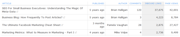
Do you notice that posts about certain topics aren’t doing as well as others? This is likely an indication that those topics aren’t as important to your audience. If this is the case, you might want to publish fewer posts on those topics and more on topics that truly resonate with your target audience.
Blog post views can also help you identify other patterns and cues in your blog content. Does a certain title structure work better than others? Do posts that are more pontificating generate a better reaction than how-to type posts? Use all of these insights to inform your future posts to increase the value of your blog and generate better results.
6. Traffic Referral Source
Your blog’s referral sources will tell you where (which sites) users are coming from and give you a sense of how people are finding your blog. Use this information to identify deficiencies in your blog’s visibility and to help diagnose why you may have low traffic to your blog.
Is the bulk of your traffic coming from social media sites per your heavy social media promotion but few visitors are coming in from organic search — or vice versa?
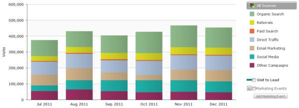
Make sure you’re optimizing your blog content with the keywords your target audience is searching for so it gets found in search engines, and allocate some resources to promoting your blog on the sites your audience tends to populate.
Continue to track your referral sources as you ramp up promotion in certain channels so you can determine the ROI of leveraging one channel over another. A lot of focus on social media promo that yields few visitors might not be the best use of your time when another channel is a better driver of blog traffic, for example.
7. Number of Inbound Links
“Inbound links” refer to the links that your blog earns from other sites. Inbound links, or links from other websites and blogs pointing to your blog content, can indicate how authoritative your blog is.
Think of inbound links as votes of confidence. If someone thought your blog content was worth linking to within their own content, it’s a good indicator that content is an authoritative resource on the subject.
Inbound links can also show you how effectively your blog is contributing to your website’s overall SEO, since inbound links are one of the most powerful factors impacting search engine optimization. They can even help you generate blog traffic from the referring website and expose you to brand new audiences.
Individual inbound links will also help you identify some of your blog’s top content that you might consider using as fodder in social media updates, new blog posts, or ebooks.
8. Time on Page
“Time on page” measures how long a user stayed to engage with the content once arriving on the page. It can* be a good indicator of how engaging the content is to your blog visitors. The idea is that the longer they stay, the more time they took to read the information rather than skim and bounce away (more on that later).
*However, take this metric with a grain of salt. Shorter posts take less time to read and, as a result, have shorter time on page averages. Also, if you take time in making your posts easy for the user to navigate and find what they’re looking for, you may get shorter times for this reason (and that’s okay!).
9. Bounce Rate
Bounce rate will tell you how frequently visitors leave your blog without visiting other pages on your blog. While this is a great indicator of the quality of your content and the stickiness of your blog overall, don’t be fooled by some implications of bounce rate. While you’d probably want visitors to stick around and read other articles on your blog, you probably wouldn’t consider it a bad thing if a visitor clicked on a CTA at the end of your post and headed over to one of your landing pages to fill out a lead-capture form, right?
That being said, if people are quickly leaving your blog for a completely different website, you’ll want to take some measures to increase the quality of your content.
To help decrease bounce rate, consider adding a sidebar widget to your blog that features your blog’s best-performing posts and switching up the homepage of your blog to show a preview of your 5 most recent posts rather than a full view of your most recent post. This will give visitors the ability to choose to read more posts that cater to their individual needs, enticing them to stick around.
10. Social Shares and Comments
Comments and social shares are good supplementary metrics to indicate the likeability of your content and the sentiment of your audience’s perception of it. In addition, comments and social shares can be a great way to identify strengths and weaknesses in your content and help you generate ideas for new content.
If you’re noticing few social shares of your content, make sure you have social sharing buttons installed on every blog article you publish. Be sure that you’re also spending time promoting on social media.
11. Subscriber Count
Your blog’s RSS subscriber and email subscriber count can indicate how much your blog’s stable community of readers is growing over time.
Visitors who subscribe will likely make up your blog’s solid readership, and it usually indicates your content’s true fan base. These readers are most likely to share your content with their own networks, expanding your blog’s reach, so you’ll want to do some work to build up your subscriber count and track its growth over time.
Make sure you display email and RSS subscribe buttons prominently near the top of your blog’s sidebar to encourage new visitors to subscribe to your content.
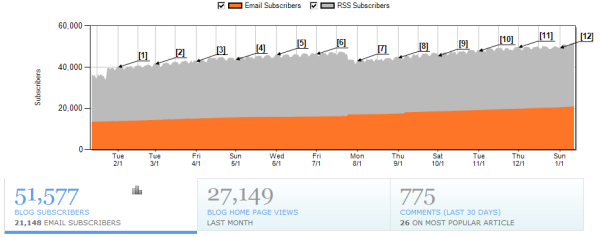
12. CTA Click-Through Rate
A view on your blog post or a social share is not the end-all be-all. You actually want your blog to make a meaningful impact on revenue… and traffic is only part of that equation.
With that in mind, if no one is clicking through from your blog to your landing pages, you’ll never generate any leads. That’s where CTA click-through rate comes in.
CTA click-through rate measures the percentage of visitors who clicked on your blog’s CTA.
The higher the CTR, the more effective your CTA is for the traffic your blog is currently generating.
But a low CTR could mean a few things:
- The offer in your call-to-action isn’t compelling or relevant enough (blog readers are there for a reason, and the offer doesn’t meet their needs or excite them)
- The CTA has not been placed in a prominent enough location for visibility
- The CTA design just isn’t attractive or prominent enough to warrant a click (whether it be because of the aesthetic design, or ineffective button copy)
To improve your blog’s click-through rate, make sure the offer you’re presenting aligns with the content of your posts as closely as possible, uses compelling button copy that clearly demonstrates the value of the offer, creates a sense of urgency, and that the button utilizes an attention-grabbing design. Conducting some A/B tests is a great way to optimize for the best calls-to-action for your blog to improve click-through rate.
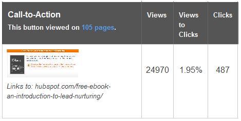
13. Number of Leads
Obviously, the number of leads generated will tell you how effectively your blog is supporting lead generation. Is it trending up or down? Are they the right kind of leads?
To make sure you have your bases covered here, tell your readers what action you want them to take. Make sure that:
- Every post you publish includes a call-to-action for a relevant offer
- The homepage of your blog itself features your best-performing CTAs in its sidebar/top bar
- You include anchor text links to landing pages within the text of your blog posts
Knowing the number of leads attributed to your blog can also help you diagnose other deficiencies in your blog’s performance.
14. Goal Conversion Rate
The goal conversion rate measures whether your blog readers completed the action you wanted them to (the goal) to convert from a visit to a lead. As opposed to the number of leads metric which tells you how much you’re generating leads for your business, conversion rate tells you how effectively you’re doing it.
Keep in mind that conversion rate is highly dependent on your existing traffic. So if you have low traffic but an amazing conversion rate, you might generate leads at the same rate as you would with high traffic but a low conversion rate. Coupled with the knowledge of your blog’s CTA click-through rate, you can gather some pretty awesome insights.
For example, if you have a high click-through rate but a low conversion rate, this means that while you’re getting visitors to click on your CTAs, they’re abandoning your landing pages before completing the form to convert into a lead. If this is the case, you likely have a conversion problem that can be due to a number of things: the messaging in your CTAs don’t align with the messaging on their landing pages or you could have a number of very landing page-specific problems. Start first with testing better alignment between your CTAs and their landing pages, and if that doesn’t do the trick, dive into landing page optimization testing.
15. Lead-to-Customer Conversion Rate
Your blog’s lead-to-customer conversion rate will tell you how effectively the leads you generated from your blog turned into customers. This insight becomes valuable when you’re examining and comparing the effectiveness of your multiple marketing channels against each other. If your blog is one of your top customer-producing channels, it might make sense to allocate more time and human resources to it. If it’s not, the opposite might be a better approach.
Now, all of the above are fantastic metrics to measure the performance of your blog. But how do you get the data? Below are blog analytics tools that can help you gather and analyze blog data.
1. Google Search Console
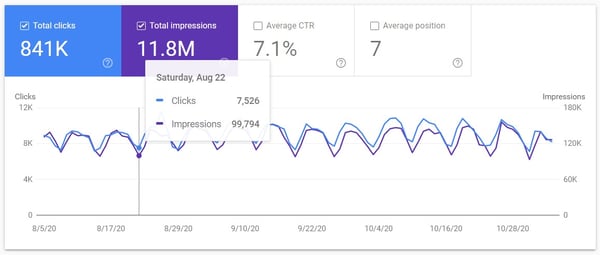
Google Search Console is a free tool that helps website owners measure and analyze their presence on Google. Based on the data that is provided by Google themselves, you’ll be able to track:
- Organic impressions from Google
- Number of clicks from Google
- Click-through rate
- Positioning (the ranking position on Google SERPs)
Google Search Console also provides the ability to segment based on individual pages, individual queries, countries, and devices. You’re also able to compare date ranges to show change over time.
The only thing you need to do to get access to this data is enable it is sign up and verify ownership of your site.
2. SEMrush
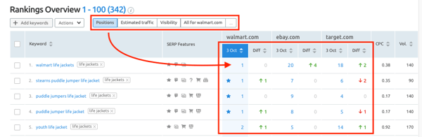
SEMrush is a third-party tool for measuring search presence and rankings. You can use it to track positioning changes over time, monitor your inbound link profile, and optimize content for SEO.
What makes it different is that SEMrush goes beyond providing the data and into helping you uncover actionable insights. You’ll be able to do keyword research and uncover strategies to help your blog perform better, and you can also do competitive analysis to understand what your competitors’ search presence is like.
3. Arel=”noopener” target=”_blank” hrefs
Arel=”noopener” target=”_blank” hrefs is a similar tool to SEMrush for tracking search performance and performing keyword research and competitive analysis. With this all-in-one SEO tool, you’ll have access to keyword data, site auditing, and rank tracking. What makes Arel=”noopener” target=”_blank” hrefs special is its SERP feature tracking, helping you understand exactly what your users are seeing when they perform a particular query.
4. Google Analytics
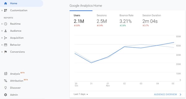
Whereas Google Search Console helps you understand and measure your positioning and performance on the SERPs, before users get to your site, Google Analytics helps you understand what happens after they get to your site.
It’s a free tool. In order to implement Google Analytics, you must set up an account and implement the Tracking ID with a JavaScript tag. Once this tag is in your site’s code and functioning properly, it can then gather data about your site’s users from that point forward (i.e. no back data is available previous to the script being installed).
Google Analytics can help you understand:
- Audience – Who came to your site? Where are they located? What are their demographics? What device did they use?
- Acquisition – Where did they come from? What referring sites sent them?
- Behavior – Where did they land (which page or post)? What did they do once they got here? How long did they stay? How did they navigate the site? What page did they exit from?
- Conversions – Did they do what you wanted them to?
There are many metrics to look at within these larger buckets, and Google Analytics also provides ways to filter, segment, and compare various metrics. This can help you determine if you’re getting the right traffic, if that traffic is trending up or down, and if they’re navigating and converting how you want them to.
5. HubSpot
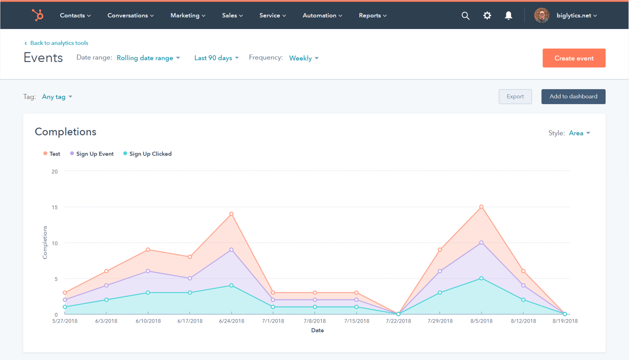
HubSpot is a CRM platform that also has marketing, CMS, sales, and service tools to help your business grow better. The advantage of using HubSpot for blogging is that you can monitor the performance of your posts and tie that data into CRM records, helping your team see all of their marketing interactions. This helps you be able to track the complete customer lifecycle from initial blog view to becoming a customer and beyond.
6. StoryChief
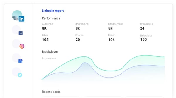
StoryChief is a tool for centralized content management ranging from publishing to blog analytics and content insights. Its analytics, reporting, and data management features help you analyze your data, track trends on top-performing content, and guide you to insights for creating buzz-worthy content. The edge it has over something like Google Analytics is its intuitive interface. (Fun fact: It also integrates with HubSpot.)
7. Tableau
Tableau is a data management software that can help you create data visualizations that can lead you to valuable insights. It works by integrating multiple sources of data and allowing you to drill-down, filter, and build graphs and dashboards to spot trends and forecast opportunities.
Whatever tools you decide to use as you focus on the metrics that matter to your blogging efforts, keep in mind that data alone is not enough to create an actionable strategy. It’s important to understand the context of the data and be able to interpret insights into the inbound marketing activities that will generate ROI.
Editor’s note: This post was originally published in January 2012 and has been updated for comprehensiveness.

How to Get More B2B Traffic and Leads With Content
Does your business serve other businesses? Wondering how to reach more people beyond LinkedIn? In this article, you’ll find a four-part plan to drive traffic and generate leads across multiple platforms. #1: Research Customer Needs to Create Relevant B2B Content With digital fatigue on the rise, how people consume content is also shifting and marketers […]
The post How to Get More B2B Traffic and Leads With Content appeared first on Social Media Examiner | Social Media Marketing.
from Social Media Examiner | Social Media Marketing https://ift.tt/3eLhk82
via socialmediaexaminer
5 Ways to Explain Inbound Marketing to Your Family This Thanksgiving
When Thanksgiving rolls around, there are a few questions that we don’t exactly look forward to hearing: “When are you getting married?” “When am I getting grandchildren?” “Have you been moisturizing?”
And yet, none of those oh-so-polite questions even come close to the complexity of explaining what, as an inbound marketer, you actually do for a living.
It’s not that inbound marketing requires a long, drawn-out answer — after all, it can easily be described in 44 words. But explaining it requires some fundamental knowledge of how technology, marketing, and the internet work. You know, the things that your grandparents might not fully grasp in one fell swoop.
Good news — all you really need are a few storytelling strategies. We found five ways you can explain inbound marketing to your family. And sure, some of these are useful, and some are just sarcastic. But hey, family is family, right? They’ll still love you.
5 Ways to Explain Inbound Marketing to Your Family This Thanksgiving
1. The Food Analogy
.gif?width=541&name=giphy%20(27).gif "Pumpkin Pie")
Source: Giphy
In the U.S., Thanksgiving typically consists of a few staples: turkey, mashed potatoes, and pumpkin pie, to name a few. And while it might sound strange, you can use that knowledge to your advantage by using food preparation as an analogy for different aspects of inbound marketing.
To explain lead nurturing, you can use the pumpkin pie. Sending unnurtured leads to sales is like giving an unbaked pumpkin pie to your guests. I suppose the pumpkin pie could be eaten raw, but … gross. Instead, you should bake the pumpkin pie — that ultimately makes it richer and more palatable.
Nurturing leads before sales contacts them works in the same way. It warms them up to your brand, and starts to qualify them with better information on what they might need. “Warm” leads, like the cooked pie, are already familiar with your business, and will close at a much higher rate than those that are “cold.”
Use whatever analogy you like to describe inbound marketing — it clarifies confusing issues by comparing them to something that, quite literally, is right in front of everyone.
2. The Real-Life Scenario
.gif?width=598&name=giphy%20(30).gif "Telemarketers")
Source: Giphy
When I’m asked about inbound marketing, I like to use real-life examples of interruptions that they’ll likely recognize, and explain how the inbound methodology pertains to it. It usually sounds something like this:
Amanda: Hey, Dad. You know how much you hate telemarketers calling you in the middle of dinner?
Dad: Yes. Hate it. Why? Is that what you do for work?
Amanda: No, actually. Inbound marketing is the exact opposite. That’s interruptive marketing. They literally interrupt you. So annoying, right?
Dad: Yes. I’m surprised they’re not interrupting us right now.
Amanda: Well, in my job, I create marketing that doesn’t interrupt what people are doing. In fact, I create content that people are actively looking for, because it’s helpful, entertaining, or informative. Instead of a telemarketer who is calling to sell you spoons, I create stuff that someone looking for information about spoons might be searching for on the internet.
Dad: So I would find you, instead of you calling to bother me?
Amanda: Yes! I provide you with actual value from my company, which makes you more interested in what my company sells.
The keys here: 1) Identify which interruptive media your dinner guests are familiar with, and 2) play into their pain points when dealing with that media. Inbound marketing is much more logical when you explain it that way — even if your family doesn’t work in marketing or communications.
3. The Theatrics
.gif?width=527&name=giphy%20(29).gif "Thanksgiving theatrics")
Source: Giphy
If you’re feeling especially creative — and you have at least one Thanksgiving guest who is willing to participate — you could set up a role play. There are lots of scenarios you can act out, but a classic one would be the telemarketer/dinner guest scenario.
Let’s use the telemarketing example above — and be warned, it might require a few minutes of planning before everyone sits down to dinner. You play the role of the telemarketer, and your dinner guest can be, well, the dinner guest. First, put his or her phone’s ringer on the highest volume possible. Then, as soon as someone asks you about your job, excuse yourself and duck out to a quiet area with your own phone.
Next, call the dinner guest, and have him or her answer the call on speaker while you pretend to be a telemarketer selling something completely unnecessary at that point: Halloween costumes.
Be sure your dinner guest uses key phrases like “You’re interrupting me in the middle of Thanksgiving dinner with this irrelevant call,” or, “Don’t you think it’s a little late to be calling me about Halloween?” or, if you really want to go nuts, “I wish you had sent me a targeted, personalized email in October about those costumes — I would have bought them.”
Then, have them slam down the phone on the table. You can return from your “bathroom break” and say, “See? Telemarketing, or any type of interruptive marketing like that, is profoundly annoying. In my job, I create marketing that helps people — not annoy them.”
End scene.
Depending on the talent of your guest, you might be able to improv the entire thing. Otherwise, you might want to type a script out and email it to the guest beforehand. And if you really want to go overboard, stay in character the entire dinner. The sight of you dressed up as a skeezy telemarketer with a headset will be just too intense to forget … that is, at least until your mother requests, “Please remove your headset from the table.”
4. The Puzzle Pieces
.gif?width=634&name=tumblr_inline_mzo5ycqJzi1qiqzxn%20(1).gif "Puzzles")
Source: Webnode
This technique boils down to an age-old philosophical question: Is the whole greater than the sum of its parts? Aristotle thought so, but when you’re describing inbound marketing to an unfamiliar audience, it’s probably okay to explain the three ways you might apply inbound marketing specifically: attract, engage, and delight.
Try explaining inbound marketing by breaking it up into those three aspects, and explaining each one individually.
For instance, you might say to grandma: “Attract means drawing in the right people with valuable content and conversations that establish you as a trusted advisor with whom they want to engage. Engage means presenting insights and solutions that align with their pain points and goals so they are more likely to buy from you. And delight means providing help and support to empower your customers to find success with their purchase.”
Of course, it’s easier said than done. And I’m willing to bet diving into how the inbound methodology serves as a strong foundation for the flywheel, which creates momentum and eliminates friction in your organization, is another feat entirely.
5. The “I Write Articles on the Internet”

Source: imoviequotes
If the previous four have all failed, you can always say, “I write articles on the internet for a living.” I mean, it’s somewhat accurate — you drive real business results with inbound marketing, and you don’t just spew out nonsense blogs about your feelings to get paid — but it can get your family off your back, especially if you’re not sure they’d be interested in hearing the whole shebang. If you choose this path, be prepared to hear how easy it is to blog, and how many of your family members wish they could get paid to do it.
Then, try to switch the subject quickly to something everyone can relate to. “Hey, Uncle Eddie, I’d love to get your amazing stuffing recipe.” Trust us … It works every time.
We’re Grateful for You
Good luck out there. And remember: There are so many people who want to know what you do — which, admittedly, is why we love writing about it every day.
We always give thanks for you, our amazing readers. And to express our gratitude, we put together what we hope is a hilarious video of what our families think we do. Happy Thanksgiving!
Editor’s Note: This post was originally published in November 2013 and has been updated and for freshness, accuracy, and comprehensiveness.
