
Welcome to My Blog
The 4 Snackable Content Formats Every Marketer Should Understand
Let’s imagine a world where I just started my own lifestyle brand called Lightning on Fire Inc.
You’re probably thinking, “Wow, that name rules! But what do you sell?”
We sell a lifestyle.
Now, you’re probably wondering, “Wow, that sounds like it rules! But what does that mean?”
Well … we don’t actually know yet. What we do know is that we want to create some content to get our marketing efforts off the ground. But our staff isn’t great with long-form articles, and Lightning on Fire’s target audience is looking for content they can consume quickly and share consistently.
In this case, we would try to produce what’s known as snackable content — which is exactly what it sounds like. It’s essentially the content equivalent of chips or pizza bagels as opposed to legitimate meals.
Here, we’ll get some more perspective on what the term “snackable content” entails and learn about four of the most basic yet effective formats for creating it.
It’s easy to assume that creating snackable content is inherently easier than long-form content, and in some ways, it definitely is. But snackable content creation comes with a host of its own challenges and strategies. It’s a different game with different rules, and its potential payoffs can be more immediate and wider-reaching than long-form content.
The object of creating snackable content is to offer immediate entertainment or enrichment, prompt social sharing, and attract new leads as a result. And certain content mediums facilitate that process particularly well.
Here are four of the easiest, most straightforward snackable content formats that can lead to meaningful, lucrative outcomes if done right.
1. Quote Graphics
A compelling quote can capture attention in itself, but supporting one with captivating visuals adds a new dimension to the interest it can generate. Think of your quote as the entree to a Michelin star meal — a cut of filet mignon (or a lentil stuffed eggplant if you’re vegetarian).
It’s the centerpiece of the dish, and it’s delicious in its own right, but some side dishes and “eye-eats-first” presentation would take it to another level. That’s the fundamental principle behind quote graphics. The engaging backdrop, distinctive font, and other engrossing visual elements fill up the rest of the plate and turn it from a tasty a la carte entree to a perfectly snackable, five-star meal.
If you can find or create quote-oriented content relevant to your business, you can command and retain the attention of potential customers. Here’s an example of a snackable quote graphic from my hypothetical lifestyle brand.
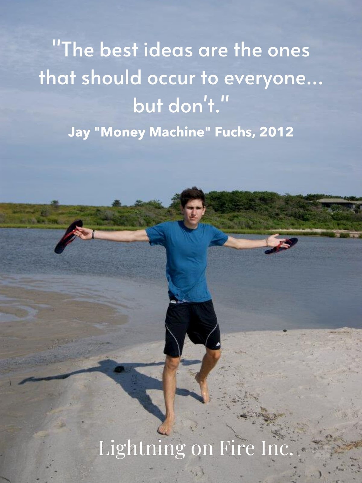
Now, this graphic is clearly in jest, and no one actually calls me “Money Machine” — no matter how many times I ask them to — but it’s still an example of an original quote graphic, specific to the nature of a brand. However, that doesn’t necessarily have to be the case.
If there are quotes you find particularly cool or inspirational that are in keeping with your messaging, use them and provide attribution. Here’s an example of a graphic centered around a quote from Muhammad Ali.

If a quote like that speaks to you or could complement your marketing efforts, use it, support it with interesting images, and cite your sources. As I said, quotes are inherently compelling, but visual support makes them engagingly snackable.
2. Memes
Here, we have my favorite format — at least the one I like making the most. Memes perfectly encapsulate snackable content as a concept. They’re immediate, specifically-tailored to be entertaining, and can be easily scrolled through and shared. Here’s a meme I made to support Lightning on Fire’s content marketing efforts:

Creating memes is a delicate art — especially for something so blunt and seemingly straightforward. If you’re using memes to support your marketing efforts, you need to be more careful than you might assume. Corporations have been known to co-opt different meme formats and run them into the ground. British TV provider Freeview even made a meme about brands ruining memes:
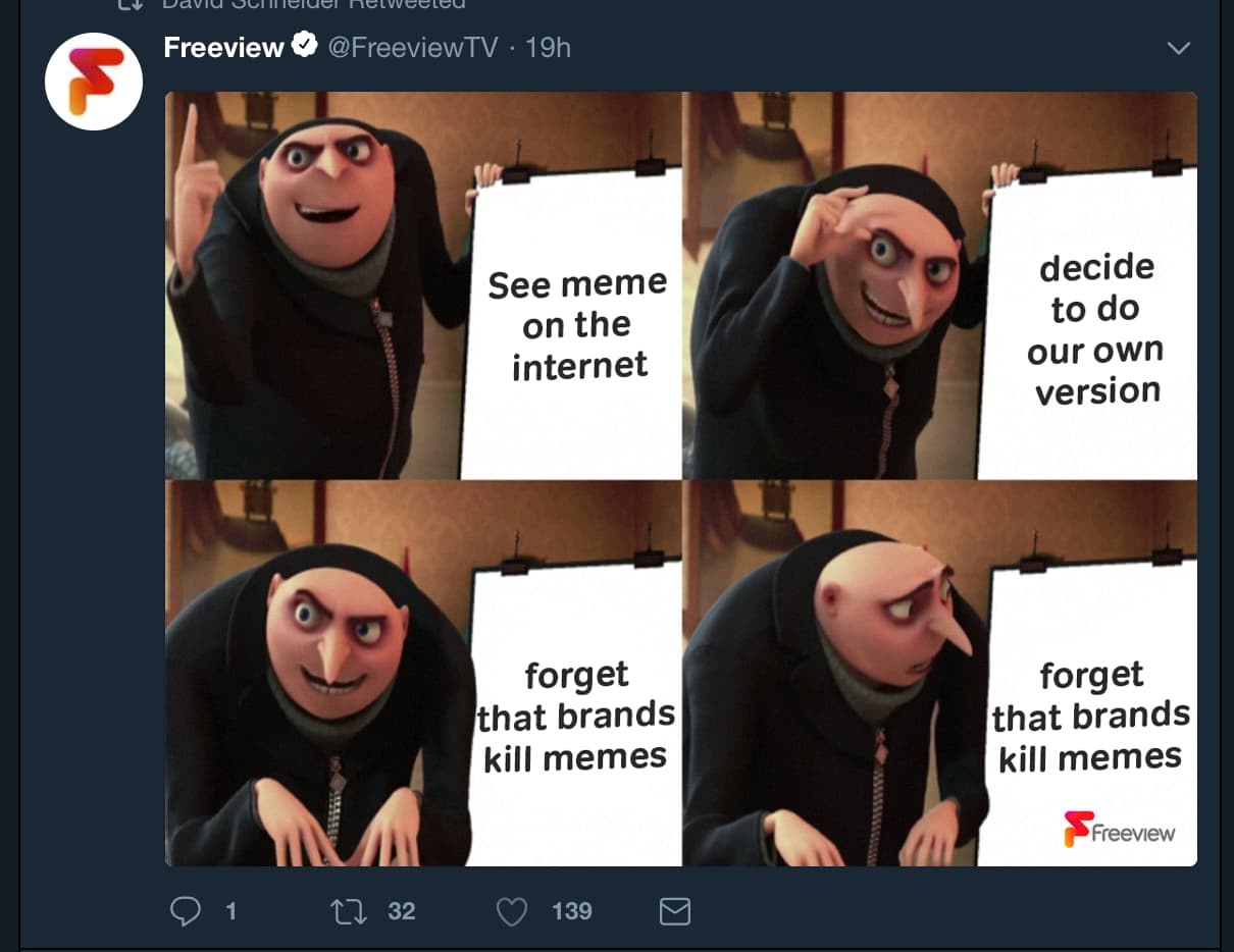
That being said, if you can consistently make entertaining memes tastefully — without upsetting or irritating the members of your audience that are really into memes — you’ll wind up with a wealth of delightfully snackable content.
3.Infographics
The infographic, as a format, is one of the best mediums for relaying informative, meaningful content without sacrificing snackability. It’s fun, engaging, and practical — with a fairly dynamic range of applications. For instance, they can be used as structured “how-to” guides for different processes, like this example from HubSpot.
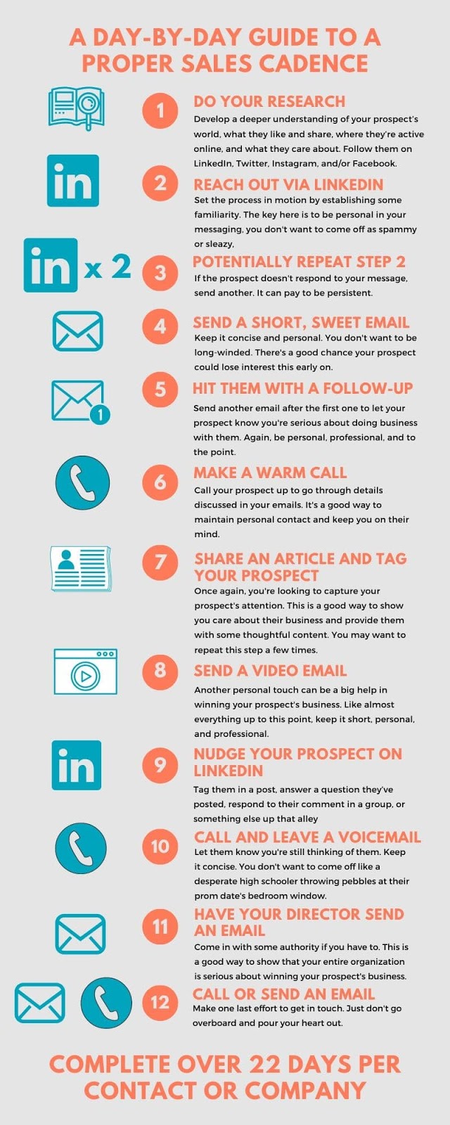
But infographics don’t have to be structured or sequential. They can also be used to convey general, interesting facts or statistics, like this example from the good people over here at Lightning on Fire, Inc.
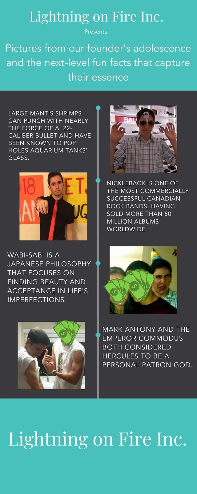
Infographics are more accessible and dynamic than conventional written text — and those qualities are the essence of snackable content. They’re meant to be straightforward and easy to gloss over while still being enriching. Though there will always be information that’s too serious or technical to summarize and set against pretty pictures, infographics might be the best way to project valuable information in a snackable package.
4. Gifs
Gifs are another type of compulsively shareable form of snackable content with tremendous potential to catch on and go viral. As a format, gifs are extremely versatile. They can be used to show short-form videos silently, show captivating images on loop, and capture the essence of specific emotions and reactions — among several other applications.
Some gifs are almost purely for the sake of entertainment. This one is a favorite of mine:

But that’s not their only function. They can be an incredibly useful marketing tool as well. Here’s a promotional gif that supported the release of Terminator: Dark Fate:

It’s an awesome, striking image and a perfect example of a company producing a high-quality, snackable gif. It’s visually compelling and could be worth sharing just for that fact, alone. The format also works well for quick how-to videos or snippets of product demonstrations.
Original gifs are similar to original memes in that they have tons of sharing potential, but just as much potential to be dead on arrival. If you intend to create and share gifs over social media or other channels, put effort, thought, and fine touch into them. And always have multiple people look them over.
A sound web presence can be mission-critical to the success of any company’s marketing strategy. If you can supplement and populate yours with solid snackable content, you’re going to be in an excellent position to expand the reach and efficacy of your online marketing efforts. You want people to share your content, so give them something easy to share.

4 Ways Small Businesses Can Advertise on Amazon [IG]
In 2020, advertising on Amazon is undoubtedly one of the most effective options for getting your products or services in front of a large audience.
In fact, 56% of consumers visit Amazon before any other site.
I’m all too familiar with the power of Amazon. It’s now the first site I visit to shop for almost anything, ranging from vacuum cleaners to Mother’s Day gifts to workout gear. Best of all, it’s a great option for discovering new brands.
Amazon offers multiple options for small businesses looking to advertise tangible products on the platform — plus, opportunities to advertise non-tangible services, as well. But oftentimes, the e-commerce giant can feel overwhelming or out-of-reach for small businesses.
Fortunately, the folks at Business Financing Co. put together the following infographic, which explores four options for small businesses looking to advertise products on Amazon, plus alternative options for small businesses with non-tangible services.
Keep reading, and then decide for yourself which option is best-suited for your own marketing strategy. Additionally, take a look at The Ultimate Guide to Amazon Advertising if you’re interested in creating a comprehensive Amazon advertising strategy.
.png)

How to Run Facebook Ads for Local Businesses: Driving Foot Traffic
Does your local business need more walk-in customers? Want to know how to use Facebook ads to drive more foot traffic? In this article, you’ll discover how to run Facebook ads with the Store Traffic objective to generate more business for your local business. To learn how to properly set up and run a store […]
The post How to Run Facebook Ads for Local Businesses: Driving Foot Traffic appeared first on Social Media Marketing | Social Media Examiner.
from Social Media Marketing | Social Media Examiner https://ift.tt/2TSv9Z5
via socialmediaexaminer
How to Transition from In-Office to Remote Work
Going into the office every day, I was comfortable. I was in a smooth routine.
I would show up every morning at 8:30 a.m., have a smoothie, eat breakfast, and make my way to my desk. Happily, I greeted coworkers as they filed into our section. At lunchtime, I would enjoy a meal at my desk or in the lobby and work from a different area in the office until it was time to leave.
Then, suddenly, I had to begin working remotely full-time.
I was comfortable with the idea. I’d worked from home a couple of times before, and I’m an introvert. In many ways, this sounded like a dream come true: I could experience a full work day from the comfort of my home every day.
Let’s talk about some things to remember when you’re transitioning from working in the office to working remotely.
1. Gather all of the materials you need to complete your work.
When you begin to transition to remote work, your work setup will change. For instance, you might not have double monitors. You may or may not have a desk, and it might not rise like your desk at the office.
In order to make the transition more smooth, think about the hardware and software you absolutely will need in order to successfully complete your job duties. Check with your company to see if they have support for necessary hardware.
If you’re used to using an external mouse, maybe you can learn shortcuts using the trackpad on your laptop.
Part of the transition is finding solutions that are applicable to your current situation. Remember, you can always use your colleagues as a resource — ask them about any hacks they may have discovered during their transition that you could leverage for inspiration.
2. Reconsider the meetings on your calendar.
Before going remote, there were “unofficial” meetings I would have with colleagues sporadically. For example, sometimes an unplanned coffee chat would happen if I spotted a coworker getting their morning latte nearby. Small, random meetings like these were the perfect way to catch up with associates outside of my direct team.
Going remote, there’s less of a chance to bump into your office buddies. Think about adding these coffee chats to your calendar once every couple of weeks. That way, you can still catch up over morning lattes.
Additionally, maybe the in-person standup meetings you have with your team eery morning won’t be as necessary as the nature of your job changes. Consider the routinized meetings you’ll have on your schedule and if you can rework or reduce them.
3. Let your team know about changes to your schedule.
Remote schedules can be unpredictable. Sometimes, you’ll have workdays that go exactly according to plan. But other times, life intervenes, and you might have to modify your schedule due to other things that are shifting in your life.
If this happens, communicate with your team about how your schedule may change. Maybe you and your roommates switch between who gets to use the living room to take meetings during the day, or you have to be away from your desk for a while to care for your family.
You may find that some situations will have to adapt to the way you work. Making the line of communication clear between you and your team would clear up misunderstandings down the line.
4. Set boundaries between your personal and professional life.
Something I’ve found with remote work is that it’s so easy to work outside of my normal hours. I tend to get in “The zone” when I’m working and this leads to losing track of time. Some days, I’ll look up and it’s 6:30 p.m. — way past how long I aim to be online.
To combat this, I set boundaries that make sense for me in a remote setting. I set alarms that let me know when I should sign off.
I make sure the last hour of my day is devoted to tasks I know don’t have to get done until later. So, if I get in my groove, when that alarm goes off at 5:30 I can feel comfortable dropping everything and signing off for the day.
5. Know that the full transition will take trial and error.
Sometimes I have good days and sometimes I have great weeks. But nearly every transition comes with its hardships. It’s not uncommon to have rocky days or weeks in tandem with the good. When this happens, remember to give yourself a mental break.
If you’re used to doing things a certain way for years, completely changing from where you do that thing is going to take trial and error. You might have to change elements of your workday that you’d never thought would be an issue.
When that’s the case, take and accept these changes. Bad days happen, but what’s important is acknowledging it and taking care of yourself so you can show up the next day. Additionally, this is another time to lean on your colleagues for advice.
One thing my colleague told me when I first transitioned into fully remote work was that “You can’t expect yourself to work at 100% when your entire environment is different.” Know that productivity might be hard to find at first, but as you become more comfortable, so will getting back into a groove.
6. Acknowledge cabin fever, and brainstorm solutions.
As an introvert who loves staying at home, I thought I was in the clear. I thought that I wouldn’t have to think of ways to get up and stretch because I love sitting in my bedroom and writing.I was wrong.
Stretching, exercising, or moving at all is necessary to your health and productivity. As you’re making this change, brainstorm ways you might get stir crazy and proactively brainstorm solutions. This will help you identify the stir craziness when it arises and take the necessary steps to remedy the feeling.
As for me, I had to learn as I went through the motions. Yoga, hourly stretch breaks, quick walks, and cooking an indulgent lunch are all methods I leverage to get up, move, take my eyes away from a screen, and replenish myself before returning to my desk.
The transition to remote work has a focus on productivity, but it also involves adapting to a huge change. Set yourself up for success in every way you can. That way, when curveballs arise, you can handle them.
Knowing you’re as prepared as you can be is one of the biggest assets you have when you’re transitioning to remote work. Also know that you have people and resources in your corner. So, even if you may be working alone, you’re never truly by yourself.

Facebook Updates Creator Studio
Welcome to this week’s edition of the Social Media Marketing Talk Show, a news show for marketers who want to stay on the leading edge of social media. On this week’s Social Media Marketing Talk Show, we explore updates to Facebook Creator Studio as well as new Twitter Camera and conversation management features. Tune Into […]
The post Facebook Updates Creator Studio appeared first on Social Media Marketing | Social Media Examiner.
from Social Media Marketing | Social Media Examiner https://ift.tt/3gBmcgi
via socialmediaexaminer
A Quick Guide to Scrum Artifacts
The Ultimate Guide to Podcast Audio, According to HubSpot’s Podcast Experts
In 2019, Google began rolling out what is arguably one of the most significant changes to its search engine since the introduction of dedicated video carousels in June 2018, or the introduction of featured snippets in October 2017: Google has begun to ad podcasts to search results.
Every minor tweak to the search algorithm can have marketers scrambling to understand how they can take advantage of this shift — or, for the more pessimistic, how to avoid getting pushed to the dreaded page two of search results.
Adding the podcast to search results is going to affect content creators, SEO specialists, marketers, and perhaps most importantly, it will also likely have a major impact on podcasts.
In this post, we’ll explore how to take advantage of the advent of audio SEO. Then we’ll dive into how you can create high-quality audio from home, if you’re creating a podcast remotely.
But before we dive into how marketers can create SEO-friendly audio content, let’s look at the primary problem Google is solving by indexing all podcast content.
The History of Podcasts Discoverability Problem
If you do any reading on the podcast industry, you will find endless articles lamenting “the discoverability problem” of podcasts.
When people talk about the discoverability problem they’re not referring to being able to find a podcast they’ve already heard of — instead, they’re talking about how difficult it is to discover new, unheard-of shows.
For the majority of podcasting, there has been one primary mechanism for discovering new shows: the iTunes Charts. The vast majority of podcast downloads occurs on iTunes.
Despite Android commanding ~75% of smartphone ownership, iTunes commands the vast majority of podcast downloads.
As Google’s PM for Podcast Zach Reneau-Wedeen notes: “It’s actually so egregious that on a device-by-device basis, the average iPhone listens to over ten times more podcasting than the average Android.”
Due to Apple’s outsized command of podcast downloads, their charts have played a critical role in helping new shows gain traction.
As a quick overview, the iTunes podcast section has Top 100 charts based on regions. There are charts for the top shows, charts for the top episodes, and then a whole collection of categories and sub-category charts such as Top 100 Business Shows. These charts are algorithmically generated.
iTunes also has a hand-curated list such as “New & Noteworthy” where they can promote interesting new shows that have yet to gain a massive following. Beyond these charts, many podcasts are discovered through word-of-mouth or social media.
The problem with Apple’s system for discovering new podcasts is the shows that tend to get traction on the charts are the ones that already have built-in audiences. This is why you tend to see New & Noteworthy being filled with shows from reputable publishers.
The one area that has never been particularly effective for finding a new podcast has been search. In 2018, Google set out to change that.
Google’s Quest to Fix Podcast Discoverability
With over 700,000 podcasts out there, millions of episodes and even more hours of content, podcast are a set of data that Google can help people sift through. However, Google is not only trying to make it easier to find podcasts — they’re also trying to rapidly grow the number of people listening to podcasts.
As Google Podcasts
Product Manager Zack Reneau-Wedeen notes, “Our team’s mission is to help double the amount of podcast listening in the world over the next couple years.”
Google’s approach to solving discoverability is two-fold: 1) make podcast discoverable via search, and 2) enable new content creators who have traditionally been excluded from the podcast world to develop new shows and attract new audiences.
Here’s what Google has done to help fix podcast discoverability:
- June 2018: Google rolls out new Google Podcast App
- October 2018: Google partners with PRX creator program to attract new creators and audiences to podcasts.
- March 2019: Google begins indexing podcasts. Google collects information including the name of the podcasts, episode titles and descriptions, and transcriptions of new episodes.
- May 2019: Podcast begins to surface in podcast results
Looking at Google’s new smartphone, the Pixel 4’s recorder app, you can see how incredibly good big G has gotten at transcribing voices. It makes sense, considering they have tons of data from YouTube videos, Google Home products, and all Android phones.
There is no company better positioned to digest massive amounts of audio data than Google.
So now that they have all of this data on podcasts, let’s explore how they’ve begun to integrate it into search results.
Google Adds Podcast to Search Results
As of writing this, the majority of search results that involve podcasts require the word ‘podcast’ to be in the search query. We are seeing podcast appear in two ways.
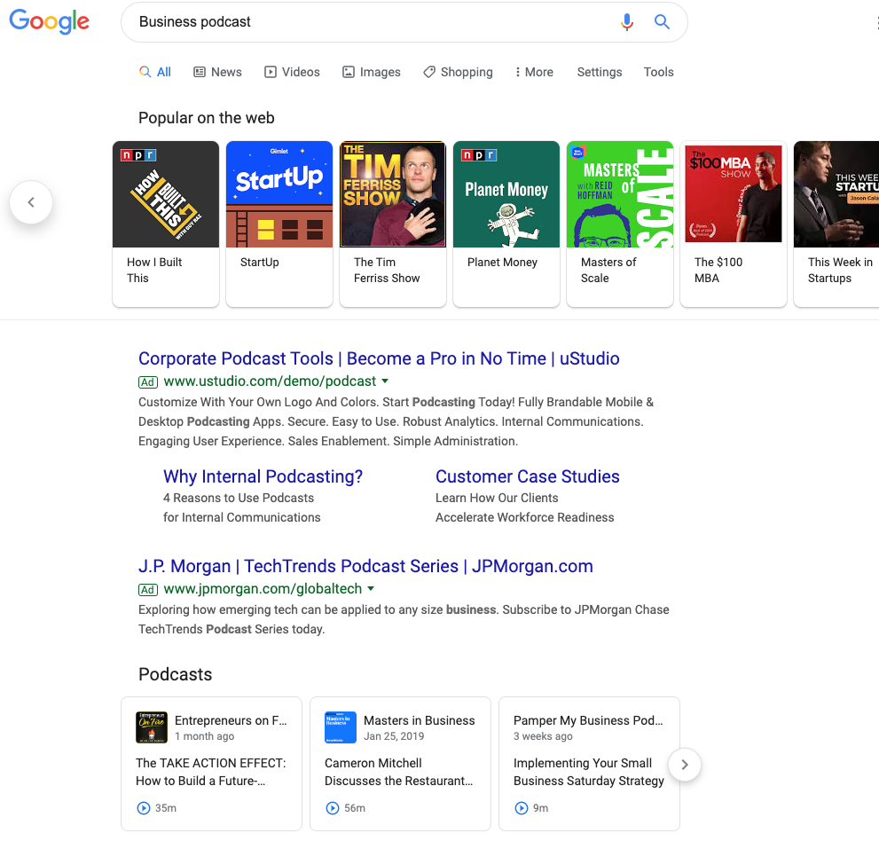
Broad Category Search aka Popular on the Web: When you search a broad topic like “business podcast”, shows will show up in a carousel at the top. Clicking on these results will simply open a new search for the name of the show.
Searching for an Answer: When you’re looking for a more specific answer and include the word “podcast” you will find a Podcast Carousel. The carousel appears to give weight to the title of the show, then the episode title, show description, and finally the actual content of the episode. In the example below, you can see a mix of shows that either including something about home building in the show, or in the episode title.
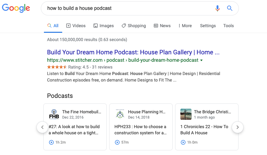
The “Popular from the Web” and podcast carousels are the two mechanisms for how Google is surfacing podcasts into search results. In terms of real estate, both these carousels occupy top positions in the SERPs.
HubSpot’s SEO strategist Aja Frost explains what the addition of podcasts will mean: “This will definitely have an impact on SEO.”
Frost says, “Search is a zero-sum game — there’s a set amount of space on the SERP, so every new search feature, like a podcast carousel, means there’s less space for the traditional blue links.”
Every marketer who cares about their position on Google should be interested in how to get their content into these coveted carousels.
What types of shows will do well?
In this new world of audio SEO who will be the winners? Here are some characteristics of shows we feel will do well:
- Lots of Episodes: The more episodes your show has, the more likely it will be to surface for a variety of search results.
- Short Episodes: Generally a show with shorter episodes is likely to have more of them, which increases ranking opportunities. Now that you can play an episode from the search results, it’s likely we will see shorter episodes become more popular when someone is looking to answer a question.
- Quality Audio: Your show will be less likely to be successfully transcribed if it does not have quality audio. This could impact your ability to appear in search queries.
- Titles Aligned to Queries: If the show title, episode title, or description aligns to a search term with a high search volume, those shows are likely to appear more often.
- Big-name guests: Elon Musk podcast is going to get a lot more searches than Sam Balter podcasts. Having celebrity guests will help you rank for more popular search terms.
Looking forward in time, we also expect shows with segments to do particularly well. We’re in the early stages of audio SEO, but we know that Google has already transcribed the content of the episode. Shows that take one topic and then have particular segments that align to the overarching search term will likely perform well.
For example, let’s say our episode is about digital advertising. We might have a segment for each show called “Overview”, where the host uses a search-friendly phrase like “Now we’re going to provide an overview of digital advertising on LinkedIn.”
Then, another episode might have the same “Overview” segment, and the host might say something like “Now, we’re going to provide an overview of digital advertising on Facebook.”
We believe show segments will help surface podcasts to page one of Google.
Optimizing HubSpot’s Podcast for SEO
We have officially relaunched our educational podcast Skill Up. The first season of Skill Up focused on SEO and had in-depth conversations with our SEO expert, Matt Barby. There were eight episodes averaging over 40 minutes long.
For the new run of Skill Up, we intend to take a different approach. We’re creating seasons based on specific topics which we identify as relevant to our core business and have high search volume. Episodes will be much shorter, averaging ~10 minutes per episode.
Additionally, individual episodes will include segments where the host mentions key phrases.
Finally, we are moving away from an interview format — instead, we want our Skill Up host to act as more of a narrator to the content.
By focusing the content of each season around a specific topic, we’re doing right by the listener by providing interesting bite-sized content that is easy to consume.
We’re also doing right by the search engines by making titles simple, descriptions keyword-rich, and integrating segments within the episode that makes it easier for search engines to identify parts of the episode.
A Word of Caution
Podcasts have evolved alongside but independent of search, social media, YouTube, and blogging. The success of podcasting today is built upon the backs of hard-working creators that have strived to make amazing shows that develop loyal followings.
Podcasts have not become successful through growth hacking, newsjacking, or search engine optimization. Keyword stuffing a low-quality show that does not inspire listeners to subscribe is a recipe for failure. No matter what changes Google makes to their algorithm, better content will ultimately rise to the top.
Above all else, remember you make shows for the listener, not Google’s web-crawler.
Next, let’s dive into how you might create a high-quality podcast from your living room.
How to Create a Podcast From Home
2020 hasn’t exactly gone as planned, which likely means your company has pivoted to remote work for the foreseeable future.
If your company has a podcast, your team is likely recording podcast episodes from home. For most producers, that means calling guests via Zoom to interview them.
But that’s probably not the best way to do it.
That’s not to say a Zoom recording won’t work out well in a pinch. But to put it into baking terms, a Zoom recording is the panko crust. Great for texture, not worth a meal.
While audiences are more forgiving of audio quality during these times, they’re even more appreciative of any production effort.
Traditionally, high-quality recordings were done through tape syncs — booking local audio producers to record your guests in-person. Once you had your host and guest’s respective tracks, you’d sync the two together to make it sound like they were in the same room all along. Magic.
In this time of social distancing, however, it’s not safe to tape sync. What you need is to have your guests self-sync.
Here, let’s dive into the best practices you can use to create high-quality audio from home.
How to Self-Sync Audio
Fortunately, it’s easy enough to record high-quality audio within your own home.
Whether your team is working from home temporarily or you’re an entrepreneur aiming to create your own podcast from home permanently, you can follow these instructions to ensure your podcast is top-notch.
Note: To ensure you have backup audio, you’ll want to call your guest on Zoom and record through Zoom’s software.
To self-sync, your guest will need three basics: a laptop, headphones, and a cell phone. They can always swap the laptop for an iPad or a second phone. With those in hand, here’s the walkthrough list I send to every guest ahead of appearing on our The Growth Show podcast:
1. Use your laptop for the Zoom call
2. Plug in headphones to your laptop
3. Take one headphone out of your ear, leaving the other in
4. Turn down the volume of your headphones/laptop
5. Put your phone on Airplane Mode — or cell data turned off
6. Open the Voice Memo app on your phone (or Google Keep if you have Android)
7. Hit record in voice memo app & turn off screen
8. Put the phone to your non-headphone ear — like talking on a normal phone call
After the interview, you’ll need your guest to email you the audio file they recorded on their phone. This will act as your clean copy, and your Zoom will work as the backup. All that’s left is to sync the phone recording with your host’s track. Go ahead and dub yourself a wizard, because you just made magic.
One More Option
Another option is to record your guests through Zencastr — a cloud-based software that records guests locally through their computer’s built-in microphone. All it takes is a simple share of a link and you’re all set up.
Your guests will still need an external microphone to get the highest-quality. Otherwise, welcome to the wide world of room noise. There’s only so much you can do to fix it in post.
Ultimately, no set-up is perfect. And sound quality aside, the last thing you want is to re-record an entire interview. That’s the stuff of nightmares.
What’s most important is that you do your best to record a clean track, making sure to always have a backup in place. That way, when chaos inevitably reigns, there’s always a second option.
To learn more about successful podcast creation, check out The Anatomy of a Perfect Podcast Episode, According to HubSpot’s Podcast Expert.

The 13 Best Email Template Builders for Any Budget
Email marketing is an undeniably powerful strategy for lead acquisition and customer retention — in fact, 59% of marketers say email is their biggest source of ROI, and 93% use email as a major channel for content distribution.
Of course, creating an email marketing campaign isn’t easy, and it might require you to build a template using HTML so you’re not designing and altering every new email from scratch.
Thankfully, there are dozens of email template builders available, all of which can help you intuitively and quickly create new email templates for your upcoming campaigns.
Then again, the fact that there are dozens of tools available can pose a challenge — how are you supposed to know which template builder will best suit your needs?
Fortunately, you’re in luck. We’ve done the homework for you, compiling a list of our 13 favorite email template builders, complete with pricing, screenshots, and a general overview of each app’s unique features. Keep reading to choose the best email template builder for your company.
But first — why do you need an email template builder, anyway?
Why You Need an Email Template Builder
Email marketing remains one of the highest-ROI marketing strategies, in part because of how easy and inexpensive it is to create a campaign, but if you’re designing and sending emails on a frequent basis, you’ll need additional support to work efficiently—and maximize your results.
An email template builder grants you several advantages:
- Better design features. Without a template builder, you may struggle to arrange your content in blocks as you want, or add videos to your email.
- Initial time savings. Most email template builders rely on intuitive mechanics, like drag-and-drop editors, so you can design your emails faster.
- Long-term time savings. Creating a library of email templates can save you a ton of time long-term, allowing you to quickly choose and lightly edit past templates for new emails.
- Replicability. Did you see impressive results with your most recent campaign? With an email template builder, you can easily replicate it with some minor tweaks in the future.
- Analytics. Most email template builders also feature built-in analytics, which you can use to study your past email marketing efforts and make improvements to your approach.
Additionally, depending on the email template builder you’re using, you may have access to even more features. Let’s dive into some of the best builders, next.
The Best Email Template Builders
1. HubSpot
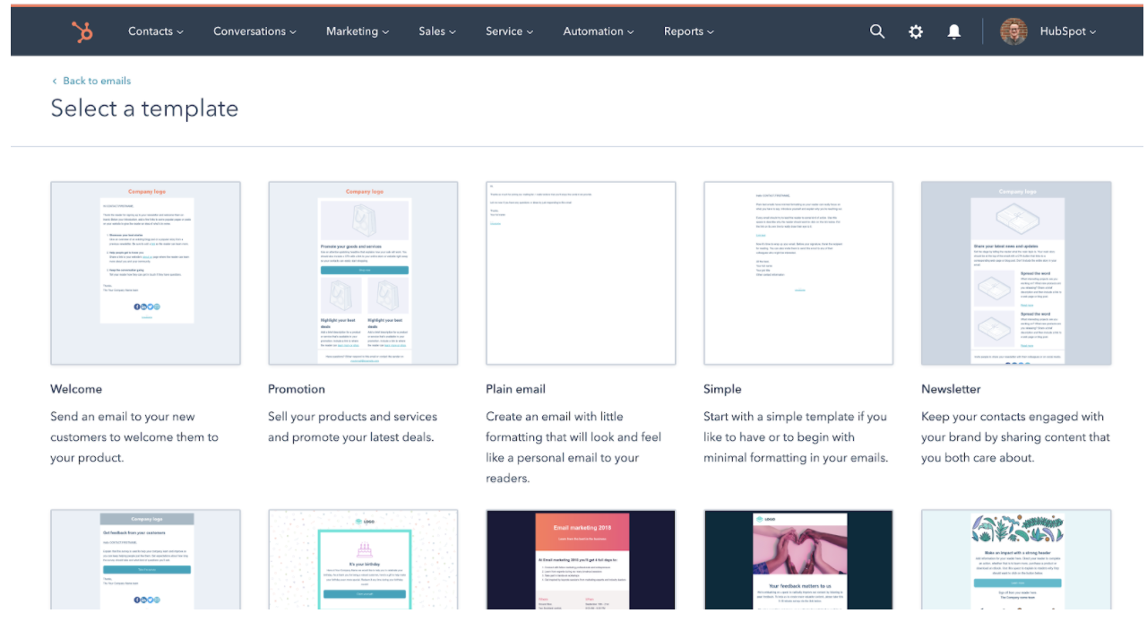
HubSpot offers a comprehensive, start-to-finish solution for all your marketing needs. You can create a sleek, on-brand email campaign using HubSpot’s drag-and-drop editor, and customize the template to match your brand and align with your goals.
Additionally, you can customize each email depending on your recipient’s lifecycle stage, list membership, or any information in their contact records to ensure each email is designed for optimal conversions. Best of all, the email tool provides top-notch analytics and A/B testing tools so you can continue to refine your marketing strategy over time.
Unique Features
- Analytics to provide deep insights into your email success rates, including open-rate, most popular links clicked in an email, who engages with each email, when and on which device, and what emails perform best.
- Tailor each email to individual subscribers based on lifecycle stage, list membership, or any other contact information to serve the best calls-to-action to segmented groups.
- Ability to run A/B tests to improve open-rates and clickthroughs.
- More than 100 email templates available by default.
- Custom landing page creation tools.
- Advanced social sharing options.
- Integrations with other marketing tools (more than 300 third-party apps).
- 24/7 support from customer service reps.
Pricing
You can get started with HubSpot’s email tool for free. Alternatively, if you’re already a HubSpot customer (professional or enterprise), the email tool is already included.
2. MailChimp
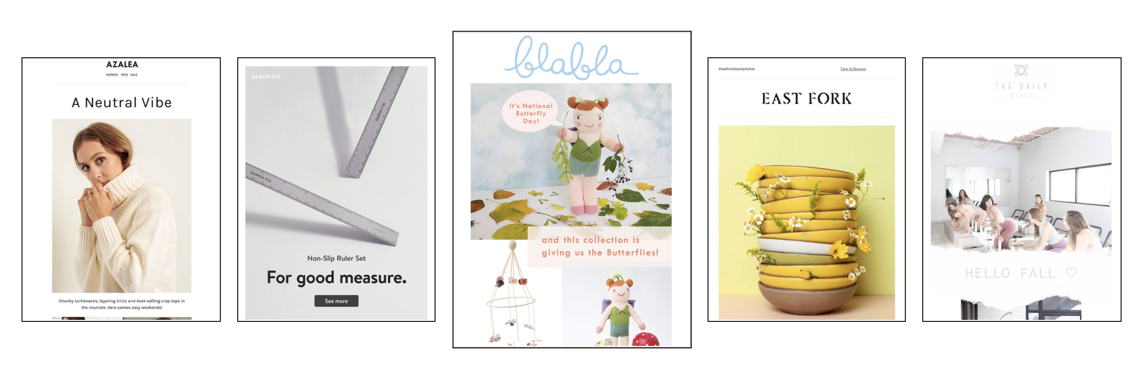
MailChimp is one of the top names in email marketing, in part because of its accessibility. It’s super easy to learn and build your first few email templates, and you can get started right now with a free plan. As you scale your business, you’ll find additional options, features, and tools for your needs.
Unique Features
- More than 100 email templates available by default.
- Custom landing page creation tools.
- Advanced social sharing options.
- Integrations with other marketing tools (more than 300 third-party apps).
- 24/7 support from customer service reps.
Pricing
MailChimp offers a free plan that provides basic templates, marketing CRM, surveys, and even website creation. At $9.99 per month, you’ll get additional support, custom branding, A/B testing, and all email templates.
To get access to custom templates, retargeting ads, and better audience insights, you’ll need the Standard plan at $14.99 per month. Advanced plans, including a Premium tier at $299.00 per month, are also available, and offer features like advanced segmentation, multivariate testing, and more.
3. BEE Free
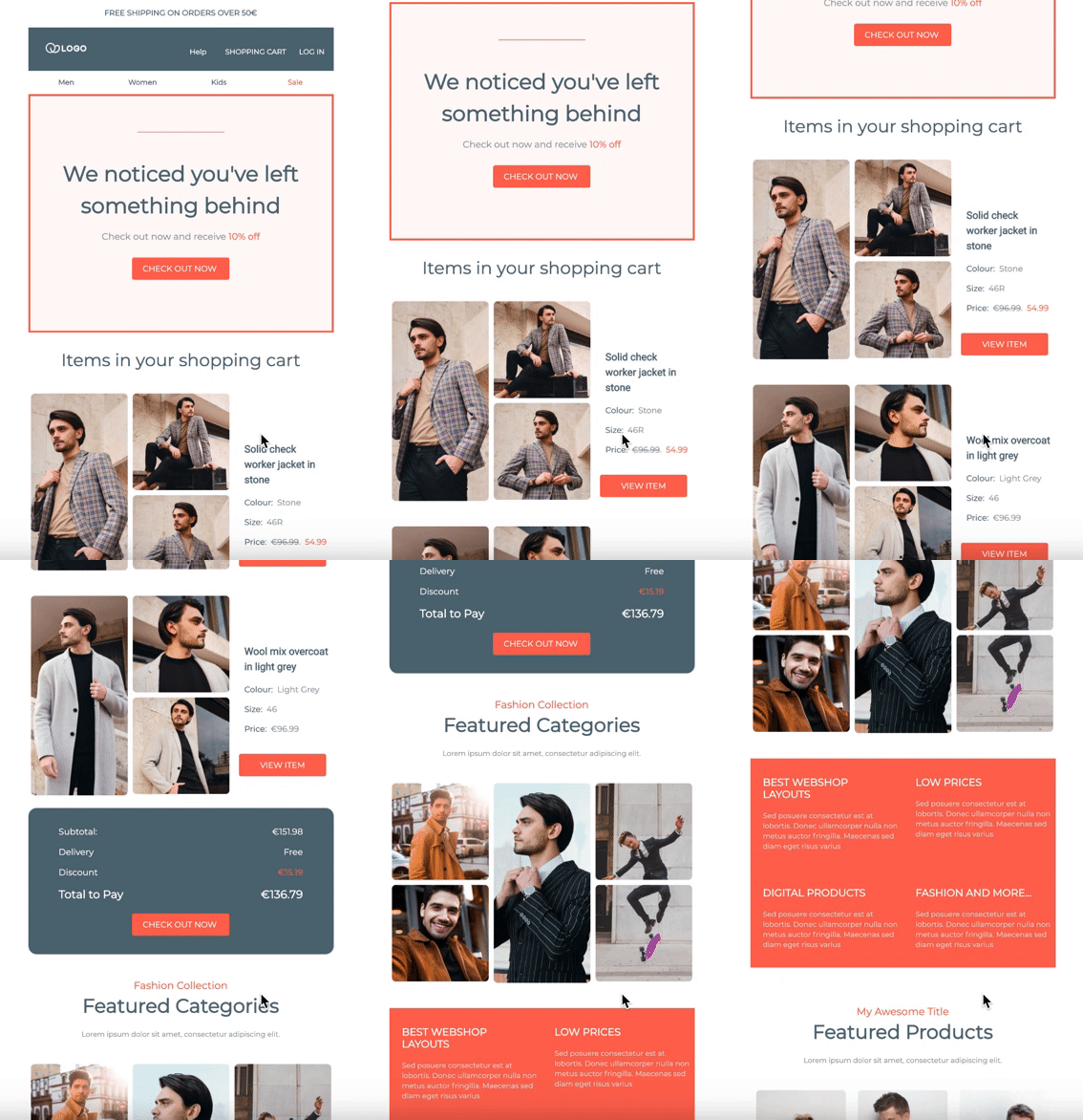
BEE Free is a free online email editor that has been used by more than a million people. In just a few clicks, you can get started designing your first email template — or use one of the 150 templates currently available by default. It also offers free design ideas on its own blog.
Unique Features
- 150 predesigned templates (and additional paid templates).
- Full responsiveness for mobile friendly designs.
- Integration with many SaaS apps.
- Options to pick up where you left off.
Pricing
BEE Free, as you might have guessed, is free. You can drag-and-drop to create emails without even needing to sign up. However, you may eventually want to upgrade to one of three BEE Pro packages, which are targeted to freelancers, marketing teams, and agencies. Pro plans start at $15 per month.
4. Mosaico
Mosaico.io is an open source email template builder, which is something of a rarity. You won’t find any predesigned templates, as you would with other email template builders, but you will be able to alter the tool however you see fit.
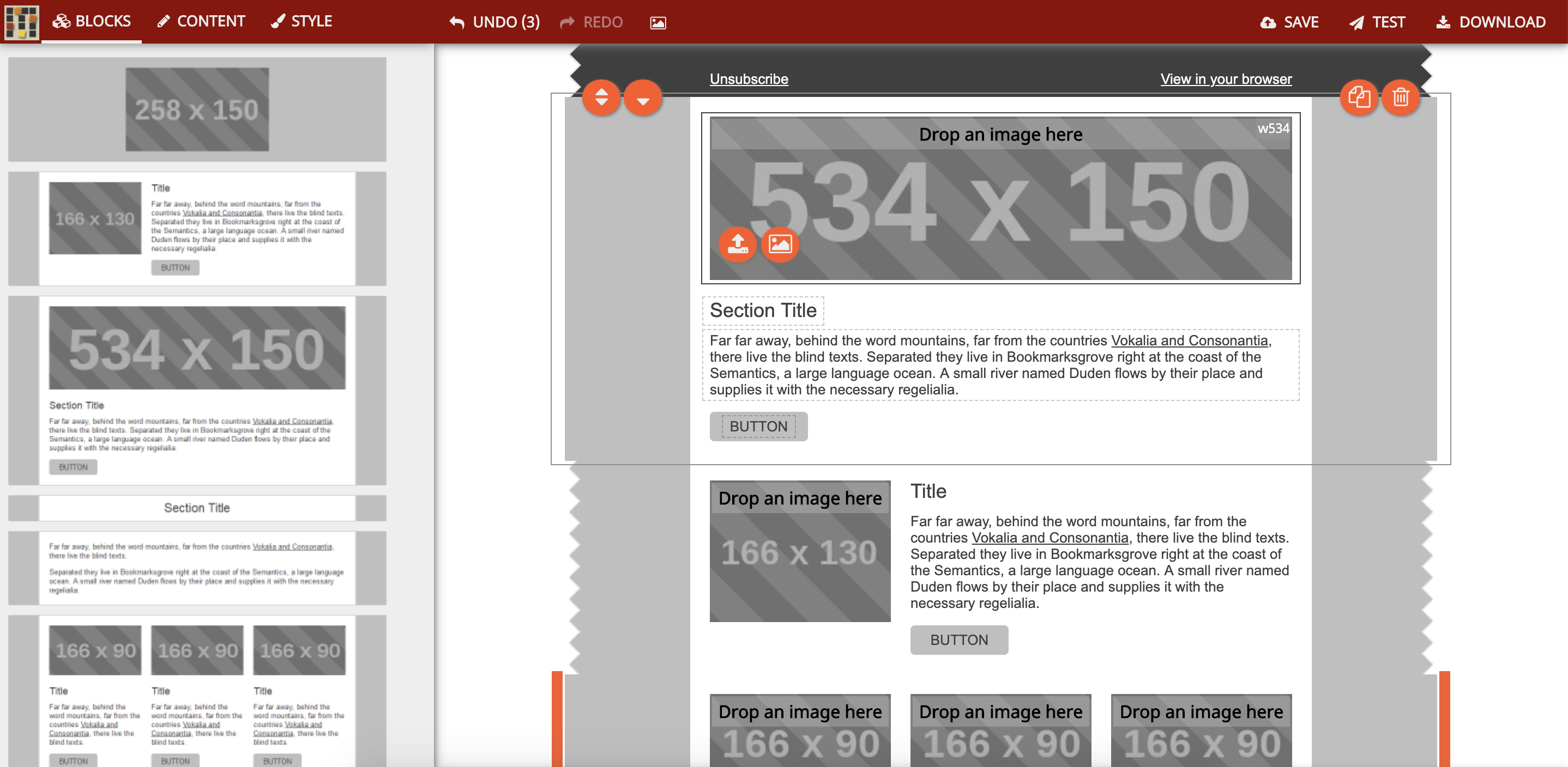
Unique Features
- A unique click-based design tool, abandoning the traditional “drag-and-drop” model.
- Community support, due to its open source nature.
- Infinite flexibility, if you’re willing to put in the work to customize it.
Pricing
Mosaico is currently completely open source, so you can use it for free. In fact, the entire code base is available on GitHub.
5. Email Monster
Email Monster is another free email template builder, with a simple, easy-to-grasp approach. You can choose any of its 100+ base kit templates and edit the template as you see fit. You can also install the free Chrome extension if you want to integrate directly into Gmail.
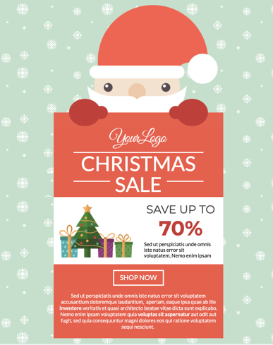
Unique Features
- Template designs are immediately available, so you can start in mere minutes.
- A free Chrome plugin so you can use the tool directly in your browser.
- The ability to save and download templates for future use.
Pricing
Email Monster is free, with no upgrades or paid plan options available at this time.
6. AWeber
AWeber is specifically designed for small businesses eager to get started with email marketing, but who might have trouble knowing where to begin. Predesigned templates, custom designs, and email automation are all available.

Unique Features
- A drag and drop AMP carousel, which allows you to add AMP image carousels to your emails.
- AWeber’s Smart Designer, which uses AI to construct and recommend email templates.
- A campaign marketplace that allows you to design and launch full email campaigns.
- 24/7 customer service.
Pricing
Pricing scales based on the number of subscribers you’re emailing. Plans start at $19 per month, which covers you up to 500 subscribers. The top tier, for 10,000 to 25,000 subscribers, is $149 per month. Pricing options for businesses with more than 25,000 subscribers are available upon request. You can also choose to be billed quarterly or annually to reduce your per-month costs.
7. Unlayer
Unlayer allows you to build email templates from scratch, but also utilize merge tags and embed customizable, dynamic content into the body of your messages. It’s designed for SaaS companies, but could feasibly be used by any industry.
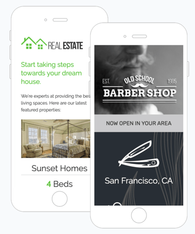
Unique Features
- Dynamic content that changes based on defined conditions.
- Large-scale template management.
- Developer friendliness, with full support documentation, for unique customizations.
- Options for landing pages and further marketing support.
Pricing
The basic plan option is free. Premium packages are available at $99 for startups, $199 for businesses, and $399 for growing businesses.
8. Campaign Monitor
Campaign Monitor is primarily focused on email marketing, but has other features you can use for a variety of other marketing and ecommerce purposes. Because it’s designed to work for teams, it’s ideal if you have many people working together on your campaigns.
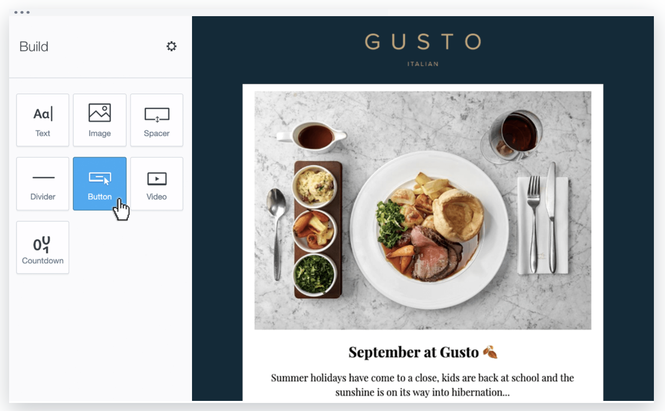
Unique Features
- Template management and collaboration for teams.
- Built-in support for surveys with unlimited questions.
- 80 predesigned email templates.
Pricing
Pricing varies based on how many subscribers you have. You can get started for free, but if you want access for more features, or if you need more support, you’ll need the Basic plan for $9 per month, the Unlimited plan for $29 per month, or the Premier plan for $149.
9. Chamaileon.io
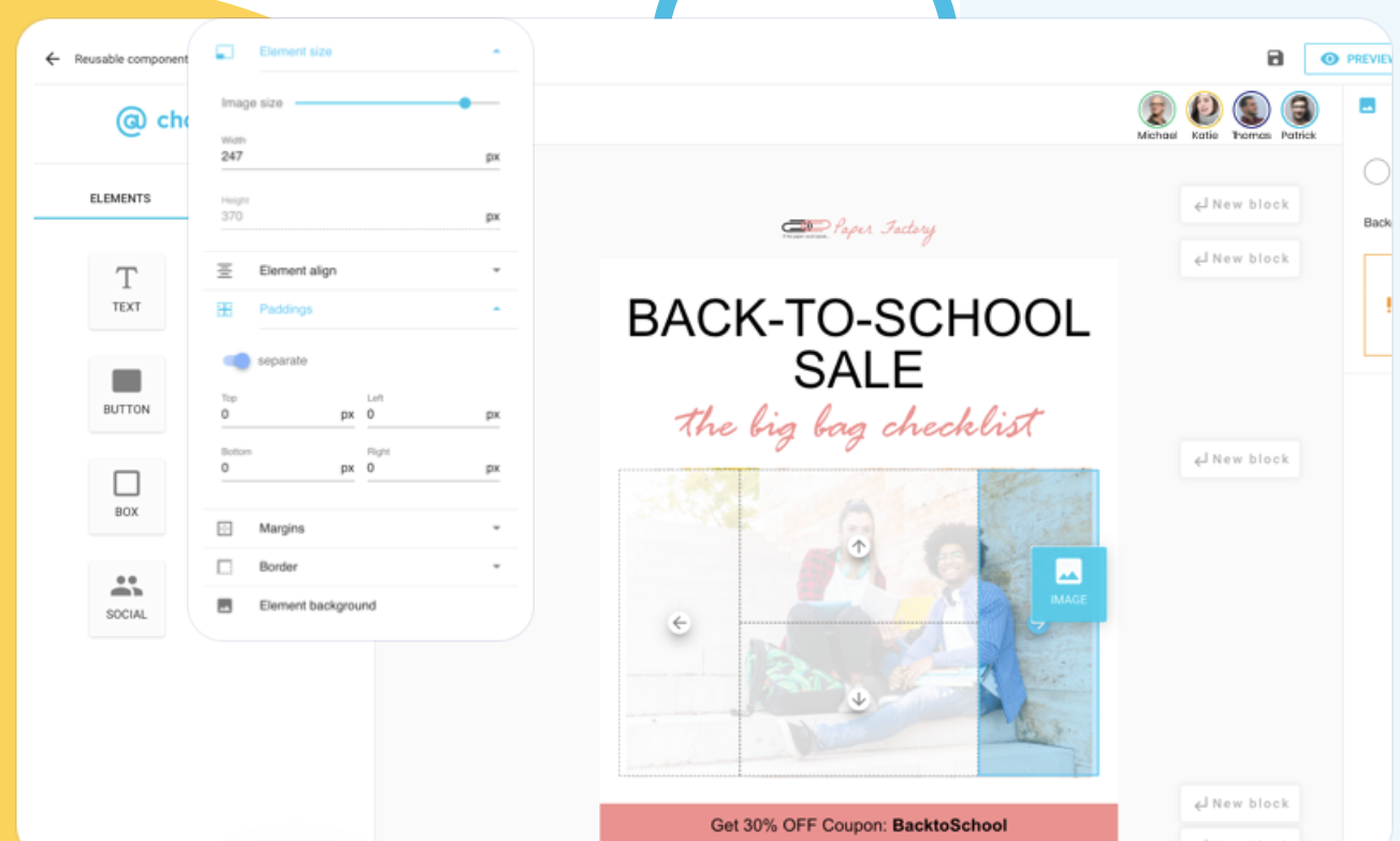
Chamaileon.io is a cleverly-named email template builder that allows your team to design emails collaboratively, complete with drag-and-drop mechanics so you never have to worry about coding. You can also design and follow a set email campaign workflow, simplifying your efforts in the future.
Unique Features
- Collaborative email design for teams working together on the same templates.
- Unique and flexible account roles for multiple levels of access.
- Replicable testing settings to allow for easy testing of new designs.
Pricing
The free plan gives you much of what you need as an individual, but as you start adding seats and getting access to more features, the cost goes up. Premium plans start at $20 per month, with the Pro plan at $40 per month, and the Pro Team plan at $200 per month.
10. Designmodo
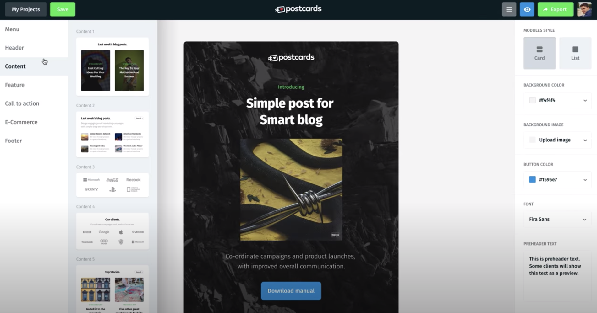
Designmodo‘s email builder is designed to bring teams together for the email template building process. You can use it to design emails however you like, then export as HTML, or to a full email service provider like Mailchimp.
Unique Features
- Modular designs that help you stack, customize, and rearrange your options.
- Long-term content management to help you revisit previous successes.
- Unlimited exports, which is ideal if you’re exporting to other services frequently.
Pricing
For a single user and 10 modules, you can use Postcards for free. Business plans start at $15 per month, and an agency plan starts at $25 per month.
11. Stripo.email
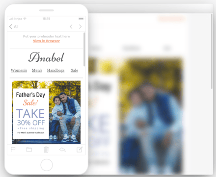
Stripo.email helps you create responsive email templates without any HTML coding skills necessary. It also features innate dynamic AMP support, and a robust testing tool to help you preview your email in more than 90 popular environments, including variants for devices and browsers.
Unique Features
- Drag-and-drop AMP blocks for image carousel and/or accordion support.
- Thorough testing in nearly 100 different environments.
- A customizable module library, allowing you to reuse past successful elements.
- Integration with many ESPs and third-party tools.
Pricing
The free plan is all you’ll need to get started. Billed yearly, the Business plan is $125 (or $10.42 per month), and the Agency plan is $400 (or $33.33 per month).
12. Taxi for Email
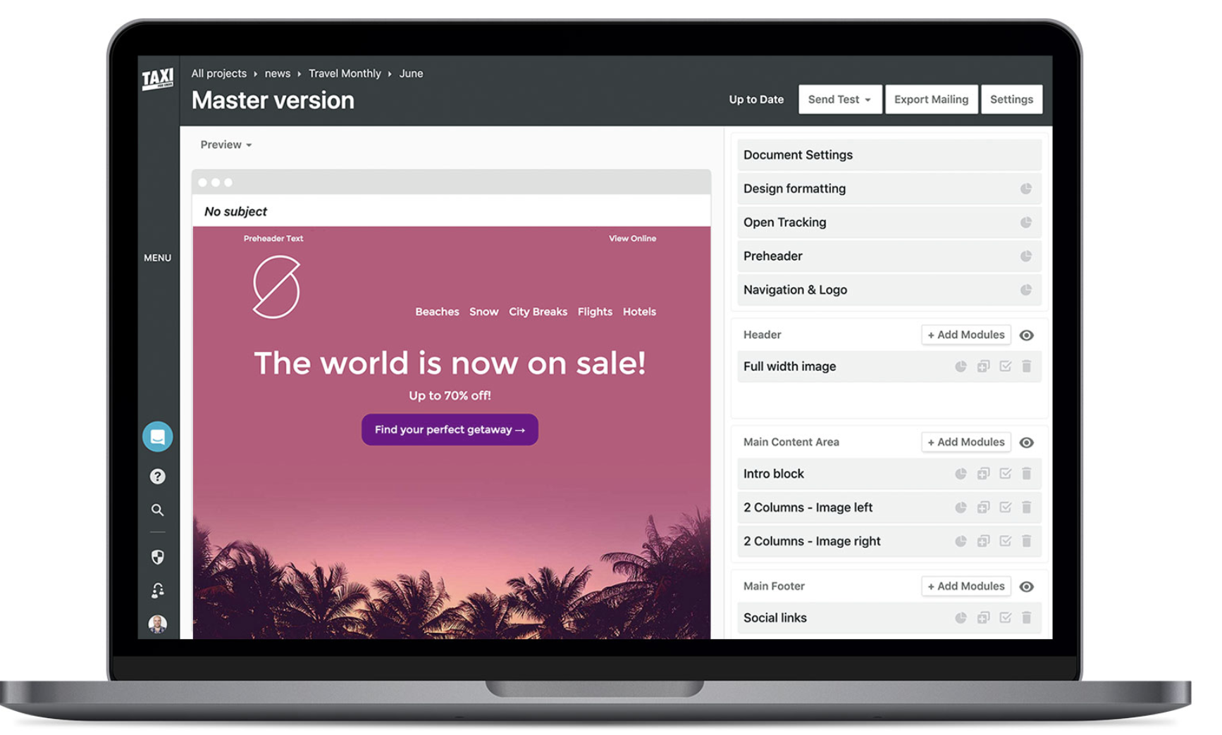
Taxi for Email provides scalable email template creation, as well as the ability to create email workflows. It also allows you to assign various tasks and permissions to your team, so each of your marketers can play a role in perfecting your email campaign.
Unique Features
- Team dynamics, including collaborative tools, access assignment, and user permissions.
- Robust testing on-demand as you design.
- Support for multiple languages and email segmentation.
Pricing
Taxi for Email doesn’t publish their pricing, but you can submit a short contact form on their website to get a free quote.
13. SendGrid
SendGrid is an email service that provides support for email template designs — additionally, it offers email functions like automatic shipping notifications and password resets. It also boasts an open API, which you can use to integrate with just about anything.
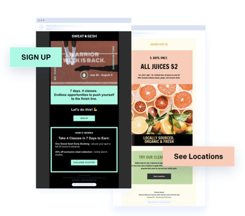
Unique Features
- A wide variety of tools, including email design, automation, signup forms, and more.
- APIs, SMTP Relay, and Webhooks.
- Delivery optimization tools so you can increase delivery rates.
Pricing
The basic version of the tool is free, and paid plans start at $14.95 per month for the essentials, or $89.95 per month for the Pro plan. Rates increase as you send more emails per month.
Choose the Best Email Template Builder for Your Needs
While it’s arguable that some of these email template builders are superior to some of the others, all of them have strengths and weaknesses. The best email template builder will be the one that most closely aligns with your organization’s goals — giving you all the tools you need, at a price within your budget.
When you narrow the list down to a few options, give each one a try (since most of these tools either offer a free trial, or a free version altogether), and get a hands-on feel for which tool might serve your organization best.

How to Use Google Analytics to Eliminate Uncertainty
Wish you had more information to guide your marketing decisions? Wondering how Google Analytics can help? To explore how to use Google Analytics to eliminate uncertainty, I interview Chris Mercer on the Social Media Marketing Podcast. Mercer, as he likes to be known, is the world’s leading authority on Google Analytics and the founder of […]
The post How to Use Google Analytics to Eliminate Uncertainty appeared first on Social Media Marketing | Social Media Examiner.
from Social Media Marketing | Social Media Examiner https://ift.tt/2AmRvL7
via socialmediaexaminer
How to Run a Successful Grassroots Marketing Campaign [+ Examples]
When I try to think of marketing campaigns that were emotional and memorable, one of the first ones that comes to mind is the Dove Real Beauty campaign.
The reason?
Dove uses grassroots marketing strategies to create targeted content that their audience wants to share with everyone they know.
As a marketer, that might seem like a daunting task. However, grassroots marketing can actually be cost-effective and achievable for any brand.
Below, let’s review grassroots marketing from the best strategies to examples that’ll inspire your own campaigns.
Grassroots marketing is similar to viral marketing because the goal is to create content that your audience wants to share. However, this might be more cost-effective since you’re building a campaign that’s targeted at a smaller, specific audience.
These campaigns will be different from your everyday marketing campaigns because your goal is to inspire a small audience to take action. With other marketing campaigns, you’re probably hoping to reach a large number of people. However, with grassroots marketing, you’re creating highly specific content with the hope that your audience will share your message for you.
1. Know your target audience.
It’s true, it’s going to be important for you to know your audience for any marketing campaign. However, with grassroots marketing it’s a necessity.
The entire concept of grassroots marketing is that your audience will share your content for you. Yet, they won’t do that if your content doesn’t inspire them to.
Before you get started with grassroots marketing, you need to know what motivates and inspires your audience. Figure out what they care about and create content surrounding that.
2. Get creative and inspire action.
Again, your grassroots marketing content should inspire your audience to take action. But you might be wondering, “How do I do that?”
One way is be creative and start a movement. Your content doesn’t have to be political, but it has to be inspiring and relatable.
3. Focus on storytelling.
While I might be biased because I’m a writer, the best grassroots marketing campaigns are focused on storytelling.
Ideally, your content will explore your audience’s emotions. For example, if your target audience is parents, you can create a video that’s focused on the parent/child relationship. This will tug at their heartstrings and make them want to share with their friends.
In fact, think about grassroots marketing as a way to tell your audience’s stories. If they feel represented by your content, they’re going to share it wildly.
4. Start hyperlocal.
It might seem like grassroots marketing is about creating viral content, however, no grassroots campaign started that way.
With grassroots marketing, your content should be laser focused on your target audience. The goal is to attain national attention by sheer shareability and word of mouth.
5. Use reviews to your advantage.
One strategy for your grassroots campaign should be to focus on getting reviews. You should spend time building your reputation on Yelp or Google reviews so you can gain organic attention online.
For example, a year ago, I started to hear all about this thing called a Hydro Flask. I saw the reviews and heard people talking about it for months. I finally decided to buy one even though I had literally never used a water bottle in my day-to-day life before.
That’s the result of a great grassroots marketing campaign.
With reviews from happy customers amplifying your message, you can reach people you weren’t even targeting originally.
6. Create YouTube content.
YouTube is one of the best channels to disseminate your grassroots marketing content. On this social media platform, you can share highly targeted content that’s educational, helpful, and emotional.
If your video continues to get shared by your audience, you can begin to reach even more people organically because your video might rank better.
Grassroots Marketing Ideas
1. Text your customer.
With grassroots marketing, it’s important to get creative with how you reach your audience. One way to do this is to use text marketing.
With SMS messages, you can have a real conversation with your customers. You can learn about them, send them one-touch surveys, or offer targeted marketing based on their feedback.
The trick with text marketing is to only send messages to customers who have signed up to receive your texts. No one wants to get a random text from an unidentified number.
2. Include visuals.
Almost every grassroots marketing campaign should be focused around the visuals.
In fact, in a 2018 HubSpot survey, 54% of consumers wanted to see more video content from a brand or business they support.
Visual content is what your audience wants to see. Plus, the main idea is that grassroots marketing is shareable and visual content is easier to share.
3. Don’t forget a call-to-action.
Not to beat a dead horse, but your grassroots marketing campaign should inspire action. To do this, you have to include a call-to-action in your campaign.
With successful grassroots marketing, your target audience has shared your content with their friends. Now that you have people’s attention, you need to decide what to do with it. For example, you can ask people to donate to a cause or purchase a product.
4. Support a cause.
A quick and easy way to implement grassroots marketing in your strategy is to support a cause that your audience cares about.
When people see that your company is charitable, they’re more likely to trust you and have positive associations with your brand.
You can support a cause by donating, encouraging your audience to donate, amplifying and representing the message of a cause, or listing the causes you support on your website.
When your content is focused around philanthropic efforts, your audience is more likely to share it.
5. Use influencers.
Influencer marketing is a modern day version of grassroots marketing.
The theory is that when influential people promote your brand, your audience is more likely to share that message and be inspired to take action.
To get started, you could send influencers in your niche free products, or discounts. Hopefully, that will inspire them to talk about your brand and spread the word.
Grassroots Marketing Examples
1. Extra Gum Commercial.
I don’t typically cry when I see commercials on TV. However, Extra Gum has made me emotional with several of their grassroots marketing campaigns.
This first commercial tells the story of a father and daughter who bonded over making origami birds from Extra gum wrappers. This hasn’t aired since 2015, but it was one of the first campaigns I thought of when I thought of grassroots marketing.
In this second commercial, we get to watch the love story of a couple who meets in high school, falls in love, and captures their love story by drawing on Extra gum wrappers. Again, this last aired over a year ago, but I remembered it because of the emotional storytelling.
Both these commercials are meant to tug at your heart strings and inspire you to share them with your family and friends.
2. ALS Ice Bucket Challenge.
In 2014, the ALS ice bucket challenge went viral. The concept was that you would take a video pouring a bucket of ice water on yourself and then challenge someone else to do the same. If you participated, you were supposed to donate money to the ALS Association.
Before this campaign went viral, people weren’t exactly talking about ALS. In fact, many people might not have even heard of the disease. That’s how you know this was a successful grassroots marketing campaign.
It started with a small idea, and grew to a national campaign.
For this challenge to be shareable, everyone who participated had to nominate a friend to do it.
This grassroots campaign started a movement, inspired action, and supported a cause. Plus, celebrities and influential people got involved.
Below are a couple of images of the celebrities that participated in sharing the grassroots campaign.


3. Dove Real Beauty Campaign.
This is one of my favorite grassroots marketing campaigns. That’s why it bears mentioning twice.
In the Dove Real Beauty campaign, Dove had a forensic artist draw women as they saw themselves and then as strangers saw them.
This is an excellent example of what grassroots content will look like when you know your audience intimately. By knowing its audience of real women, Dove was able to start a movement. In fact, this video has over 68 million views on YouTube.
The powerful video barely mentioned the product, but inspired women around the world.
Grassroots marketing is a great way to focus on reaching your audience, with the hope that they’ll share your campaign with people they know. Essentially, it’s word of mouth marketing at its best.

The Plain-English Guide to GCLID
90% of all web searches happen on Google, which means, if you’re a marketer, you should probably know the ins and outs of Google Ads
I’ve opened Google to search for something at least five times today. And every one of those times, I’ve seen at least two ads on every results page. No matter the wide range of my searches — from vegan snickerdoodles to makeup brands and HTML codes — I was met with Google advertisements.
From a business perspective, Google Ads is amazing for lead generation. It’s a pay-per-click platform that helps you boost visits to your website. With Google Ads, you can create targeted ads that will be shown to a segmented audience.
Google Ads allows you to track the traffic, metrics, and conversions of your ads without switching to Google Analytics.
Let’s begin by talking about GCLID more in depth.
What is GCLID, and how do you use it?
If you are unsure of the number of conversions you’re earning from your ad campaigns or want more insight into how to improve the performance of your ads, you may want to look into Google Click Identifier.
A GCLID is generated every time an ad is clicked and the user is redirected to a landing page. GCLID communicates data to Google that will be sent to Ads and Analytics, like the pages per visit and the amount of time spent on the website as a whole.
When you track ads, you can monitor their real-time performance. You can optimize ads for better performance. Ads can be tracked by adding tags, like GCLID.
GCLID which helps you streamline tracking ad performance and gives you end-to-end conversion performance. This post will teach you all about GCLID and how it can fit into your Google Ads strategy.
When you have GCLID turned on, you’ll be able to track extensive details of the end-to-end conversions you’re earning with specific campaigns.
If you use auto-tagging, (also known as GCLID), you’ll be able to track more dimensions than with manual tagging, including how your keyword is being matched to search queries, the ad group associated with the keyword, the URL ID, the ad format, and the distribution network.
Below is an example of the amount of features available to you with auto-tagging:

Ultimately, these metrics, available to view as a full report in Analytics, will help you improve the quality of your ads.
Let’s talk a little more about how tagging works.
Manual tagging vs. auto-tagging in Google Ads
You can tag ads manually or have Google track for you using auto-tagging.
Manual tagging is completed by adding a unique UTM code into your tracking data in Google Ads. While both GCLID and manual tagging allow you to obtain unique analytics about ad performance, there are differences.
Keep in mind this important note from one of HubSpot’s paid ads managers, Nicole Ondracek, about manual tagging: “Manual tagging overrides GCLID auto-tagging when used, but it’s good to have auto-tagging turned on so you can see all the data and dimensions possible when looking in Google Analytics.”
If you use manual tagging in Google Ads, you’ll be able to access data for these dimensions, including Source, Content, Medium, Campaign, and Keyword. Ondracek notes, “We look at all of the interactions, like clicks and impressions, in the Google Ads interface, and if we want to see further conversions, we look in Analytics using the manual UTM tracking.”
GCLID helps to keep all of those reporting features in one channel which means less back and forth for you.
Now that you have a deeper understanding of the differences between tagging, let’s talk about how to enable GCLID.
How do you enable GCLID tracking?
Setting up GCLID is pretty easy. First, access Google Ads, click “Settings,” > “Account settings,” > “Auto-tagging.” From there, select “Tag the URL that people click through from my ad,” and save your changes.
Then, make sure your Google Ads and Analytics accounts are linked. Learn how to do that in this ultimate guide. Want the abbreviated version? In Google Ads, click “Linked Accounts” under Setup, which is located in the Tools icon.
You’ll also have to activate Google signals, which will import those conversions across the two channels. From there, check your reports in Ads by creating reporting columns based on the metrics you want to follow.
To access your GCLID data in Analytics, go to the left sidebar and click “Acquisition,” > “Google Ads,” > and the type of campaign you’re checking. In this case, I chose “Video.”
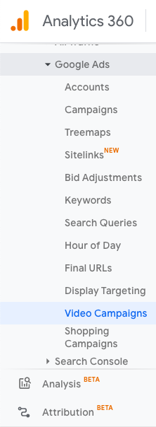
From this screen, keep track of the ROI you’re earning from each GCLID you have. Additionally, sort your GCLIDs by campaign goal, or click on a specific GCLID to learn more details about how it’s performing by the hour as well as specific web behavior concerning that URL.
GCLID is meant to help you organize and keep track of your ad performance. It’s a tool to help you optimize your campaigns so you can improve them as they’re running. When you use GCLID, you are personalizing your Google Suite dashboard to benefit your company.
How do you plan to fit GCLID into your Ads strategy?

29 Free Resume Templates for Microsoft Word (& How to Make Your Own)
No matter what industry you work in (or your experience level in that industry), a plain, black-and-white resume written in Times New Roman font can actually weaken a job application.
But just because resumes have gotten more creative doesn’t mean you need special design software to make your application stand out. On the contrary, writing your resume in good old Microsoft Word is still the perfect way to develop your personal brand, while also communicating your experience and career goals.
Read on to find out how to make your resume in word, then download one of these amazing resume templates that open directly in Microsoft Word.
How to Make a Resume in Word
- Open Microsoft Word on your computer.
- Select either “Basic Resume” or “Bold Resume” from the template menu.
- Fill in your name and contact information at the top.
- Draft a brief summary of your experience and goals.
- Enter your school and latest education.
- Describe each job you’ve held using the lines prompted on the template.
- List all relevant skills.
- Describe any relevant accolades and accomplishments.
1. Open Microsoft Word on your computer.
If you have Microsoft Word installed on your computer, open the program and let it load for a moment. There will be a couple of helpful options waiting for you on the first screen, specifically for resume creation.
2. Select either “Basic Resume” or “Bold Resume” from the template menu.
Once you’ve launched MS Word, a window of templates will appear. Scroll down until you see the template options designed for resumes — there will be at least two of them. Double-click the one that suits your style and personal brand, but don’t be too particular about design just yet … you can customize these templates quite a bit.
3. Fill in your name and contact information at the top.
When your resume template opens, you’ll see placeholder text for each line of your resume, starting with your first and last name at the top. Delete this header text and enter your name, as well as any contact information by which you want the recruiter to contact you.
4. Draft a brief summary of your experience and goals.
Use the first line below your name and contact info to describe who you are, what you do, and what you’re looking for in your career.
5. Enter your school and latest education.
List any relevant degrees or certificates you received through schooling. You can safely exclude secondary education if you’ve graduated from an accredited college.
6. Describe each job you’ve held using the lines prompted on the template.
Your professional experience is frequently the most important section of your resume, so feel free to rank this section above your skills and education, depending on how many jobs you previously held.
7. List all relevant skills.
If you have experience in certain software, exercises, problem-solving, or management techniques, use them to populate your skills. Your resume’s “Skills” section helps reveal what all of your previous jobs or related experiences have in common, based on what they taught you and what you provided them.
8. Describe any relevant accolades and accomplishments.
Finish out your resume with any personal accomplishments or accolades you think a hiring manager in your industry would appreciate. Although this section shouldn’t include a Most Improved recognition from little league, for example, it should definitely include your Marketer of the Month award from your last position.
Free Resume Templates That Download in Word
Of course, if you’re already employed full-time, it’s hard to find the time to apply to a new job opportunity, let alone update your resume to reflect your qualifications. Luckily, there are numerous publishers out there who’ve created incredible resume templates for quick editing and formatting in Word.
To keep you from hunting the internet for the resume templates that are both free and compatible with MS Word, we’ve listed 19 more options below for you to customize with your own information right now. Some of them come with variations so you can pick your favorite design. Four of them cater specifically to marketers.
They’re so nice, you won’t believe they open up in Microsoft Word once you download them.
1. Monogram Header Resume Template
We’ll start with a simple one. This is a HubSpot exclusive resume template that is simple and clean with attractive monogrammed headers to call out each section of the resume. The rest of the design relies on a simple serif font for easy reading, which is a good thing considering that hiring managers only take 7.4 seconds to evaluate a resume. You want your experience section to be easily scannable.
Download this template here.
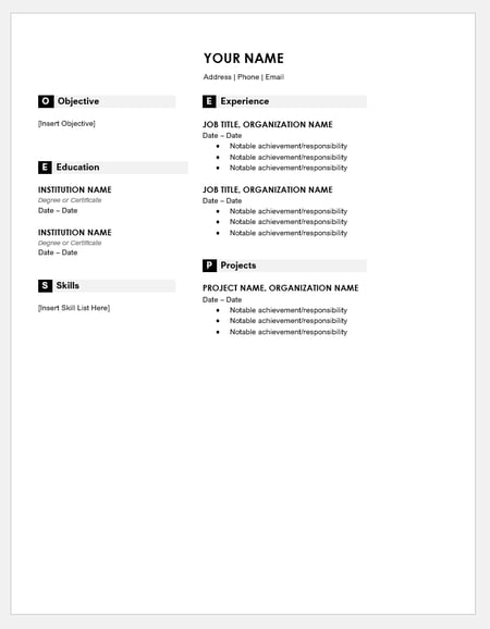
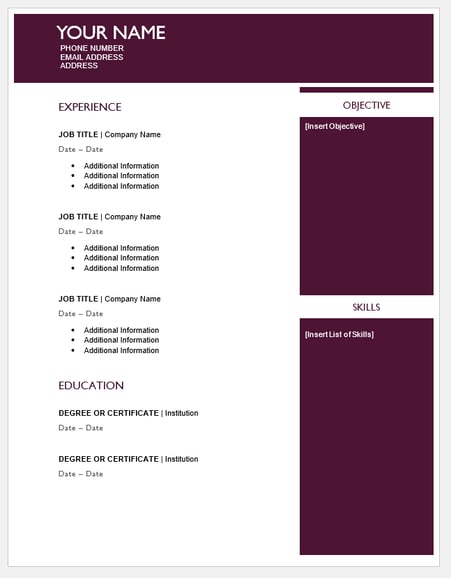
2. Maroon Sidebar Resume Template
Pulling your more text-heavy information off to the side in an attractive color-blocked sidebar, this resume lets your experience stand for itself in white space at the top. It’s also easily customizable with no difficult-to-manipulate tables or formatting. The sidebars are in movable text boxes that can even be removed if you wish.
Download this template here.
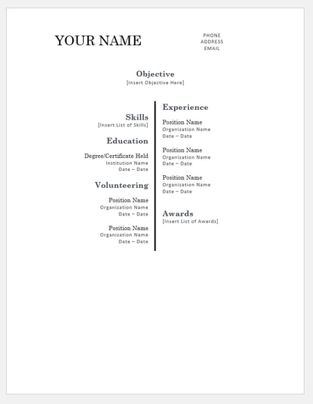
3. Centered Bar Resume Template
This resume takes on a different look than most resumes, centered around a single bar. This makes the resume more visually striking, which could draw attention as hiring managers are evaluating candidates. It also puts emphasis on the objective with your chronological experience supporting it underneath. All of this is in an attractive serif font that is elegant and classy.
Download this template here.
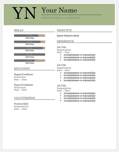
4. Bold Serif Resume Template
Speaking of serif font, this resume puts forward an element of grace and formality with its font choices. It’s perfect for individuals who are looking for more organic color than the ones more typically found in resumes, and the colors are also easily changed in Microsoft Word’s theme settings. It also includes a skill-level bar, adding a nice visual touch to the template.
Download this template here.
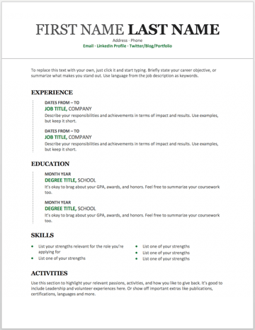
5. Modern Chronological Resume Template
This resume template is available from Microsoft itself, and it’s one of many free templates the company has prepared for those who depend on Microsoft Office tools to create content. Yes, it is written in Times New Roman — don’t freak out. Designs like this can borrow an old-school typeface and still impress recruiters with a clean layout and subtle use of color. You can also change the font if you wish (and the same goes for every template in our list).
Download this template here.
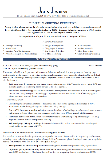
6. Digital Marketing Resume Template
The digital marketing resume below comes from our own collection of resume templates, all of which open directly in MS Word. Coming with two pages total, this sheet holds a wealth of information and offers the perfect amount of style while maintaining professionalism. Mid-level marketers all the way up to CMOs can find this template valuable.
Download this template here.
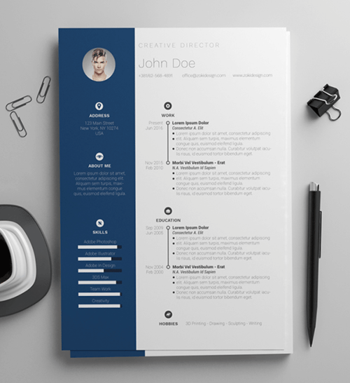
7. Simple and Clean Resume Template
This template is the perfect balance of creative and modest — best for the professional who wants to seem casual, thoughtful, but not over the top. Not only does it feature a space for a headshot on the top-left, but you can customize the color of that entire panel. Created by Zoki Design, the resume template also comes with a matching cover letter template.
Download this template here.
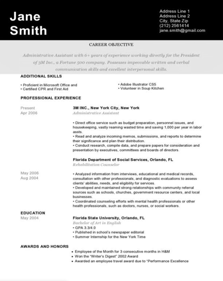
8. Black and White Resume Template
The Black and White resume template below suits professionals who prefer using color and shading to add structure to their resume. The black banner at the top contrasts the applicant’s name nicely to help make him/her more memorable to recruiters. The gray banner just below the header is perfect for a summary or career objective — it makes one’s goals known but doesn’t overpower the experience listed below it.
Download this template here.
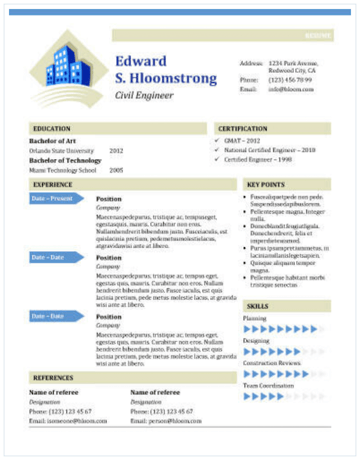
9. Urban Development Resume Template
The illustration on the top-left of this template shows who the designers at Hloom had in mind for this resume: civil engineers. But because it’s a Word document, that graphic is easy to edit and replace with an image that represents your line of work. Are you an analytics buff? Design a clever bar or line graph icon and place it next to your name in blue (or whatever color you’d like!).
Download this template here.
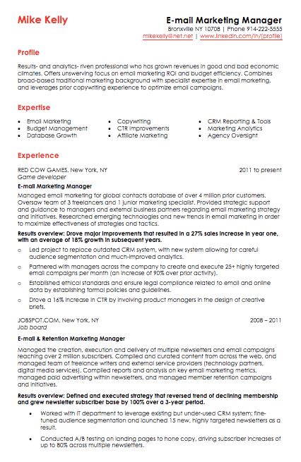
10. Email Marketing Resume Template
Red color never fails to stick out on a sheet of paper, especially if it’s included in small amounts. The resume template for email marketers, below, captures that balance. In addition to the professional title in the top-righthand corner, this template also stands out with a thin sans-serif font, helping make a lot of text easier for a recruiter to digest and read through.
Download this template here.
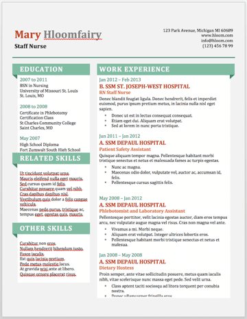
11. Info Pop Resume Template
This one, also from Hloom, gives you exactly what the name suggests: ample space for the info you need, with headers that pop just enough to get your employer’s attention. Although the template fits a ton of text, its soft color palate prevents the document from seeming overwhelming.
Download this template here.
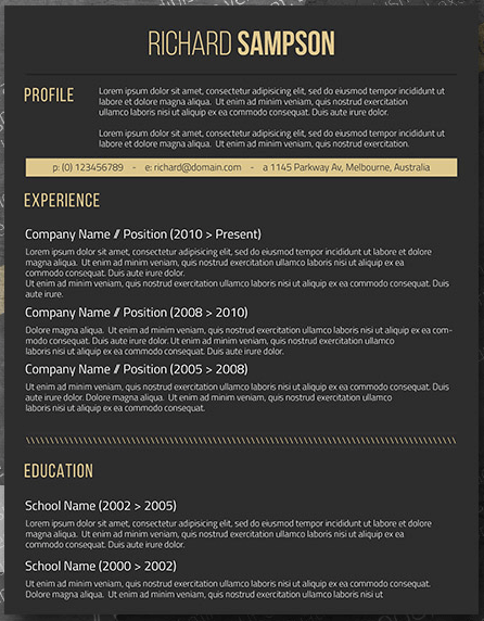
12. Dark Resume Template
Ironically, a dark background could be just the thing to ensure your resume doesn’t fall into the black hole of resumes piled on the hiring manager’s desk. Using soft, yellow font, the resume template below inverts the usual color scheme of a resume without trying too hard to be creative.
Download this template here.
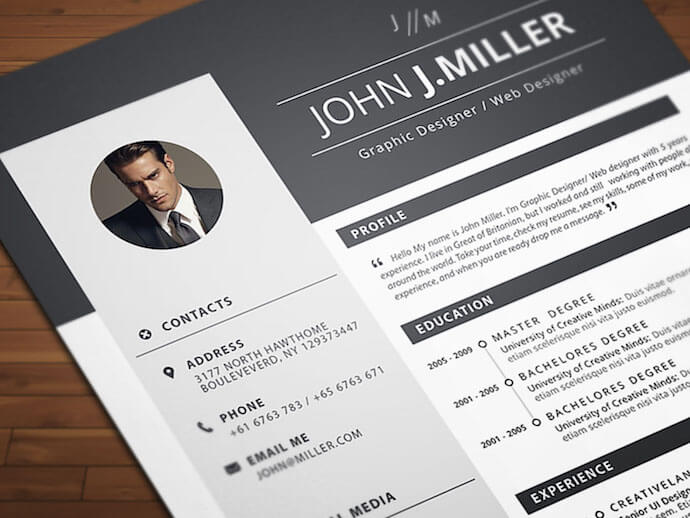
13. Neat and Confident Resume Template
Similar to the Simple and Clean template mentioned earlier, this resume design by Nowpixelse communicates a truly professional tone. The template’s muted colors work very well with the side panel layered over the top header.
Download this template here.
14. Inbound Marketing Resume Template
Here’s another resume template dedicated to the digital marketer. This sheet offers all the inbound marketing language you need to express your values as a passionate, brand-loyal professional. Similar to a few other templates on this list, it also uses just a dash of vibrant color in the applicant’s name at the top (where it matters most).
Download this template here.
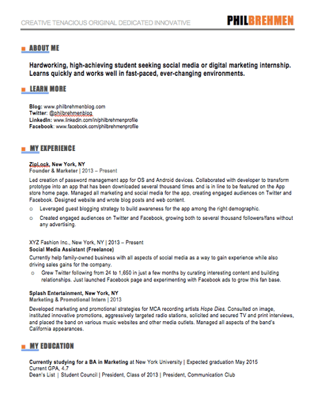
15. Smart and Professional Resume Template
This is another sharp template that offers a basic but confident design for any professional. The warm-colored panel on the right-hand side is pre-formatted for a written profile, where you can write a summary of your background or a form letter to each employer. Just be sure to personalize this messaging to each new recipient so it works for the job you’re applying to. This template is available on Freesumes, and is free to users once they share the page to Facebook or Twitter.
Download this template here.
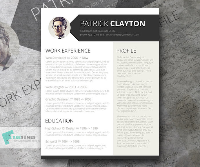
16. Spick and Span Resume Template
There isn’t a better name for the template below. The Spick and Span resume might be the cleanest-looking sheet on this list. It uses boldface, all-caps, and gray typeface to structure various headers of the document differently and maximize the hiring manager’s reading experience. And all that minimalism makes the professional headshot at the top pop off the page.
Download this template here.
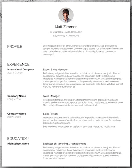
17. Timeline-Style Resume Template
Similar to the Centered Bar resume earlier in the post, Hloom’s Timeline template is a super simple but creative way to tell your story. You can convey your progression through various jobs you’ve held on one side of the vertical line, and more static elements of your background — such as skills and education — on the other.
Download this template here.
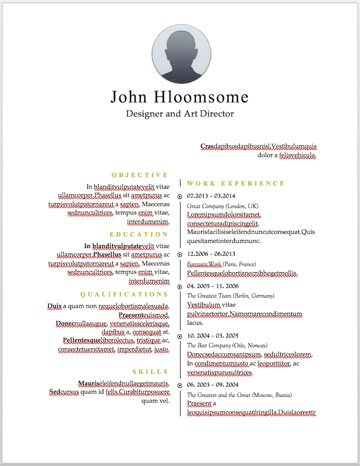
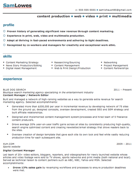
18. Content Production Resume Template
This basic resume template is suited for content producers at all stages in their career. By spreading out the header and “Skills” text horizontally, the resume below fits a lot of crucial information comfortably on one page (of course, it also comes with a second page if you need it).
Download this template here.
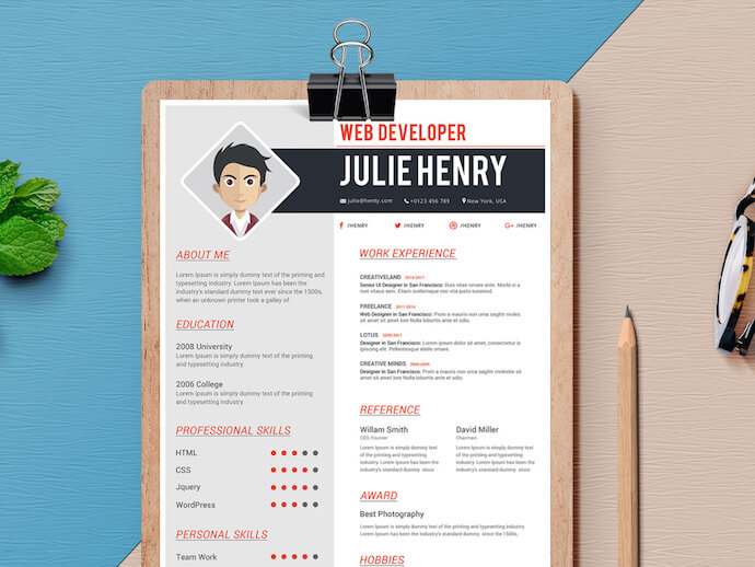
19. Fresh Resume Template
This is perhaps the most imaginative of all the Word-based resume templates on this list — with both a skills meter and a comic headshot. The template was designed by Venkata Naresh and comes with 12 different versions of the design you see below. Have you created a Bitmoji of yourself? Do you think your employer would find it creative? Match the template and add it as your photo.
Download this template here.
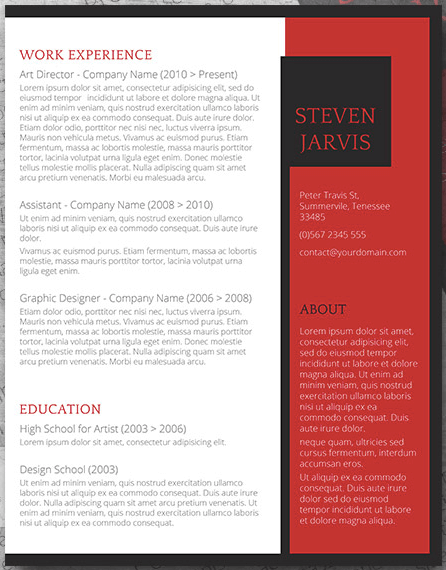
20. CV Resume Template
The curriculum vitae-style resume below flips the typical two-column resume so the basic applicant information is listed across the right side, rather than the left. Feel free to change the color of this sidebar in Microsoft Word if dark-red isn’t your thing — the template can pull off any color you wish.
Download this template here.
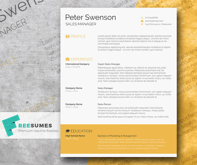
21. Goldenrod Resume Template
This template, also offered on Freesumes, dares to use yellow as the dominant color — but doesn’t sacrifice professionalism in the process. The document anchors the education section to a thick, bright banner across the bottom, but you can likely change this to a skills section with some simple editing in Microsoft Word.
Download this template here.
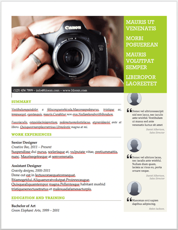
22. Resume Template With Personal Endorsements
This resume template has quite a flashy header — no photography pun intended — but it’s not just for photographers. What makes this resume unique is the space for references on the lower right-hand side. Does your field need others to vouch for your experience? This resume gives you room for three solid recommendations.
Download this template here.
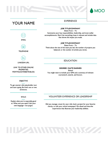
23. Creative Resume Template
This one was designed by the stationery experts at MOO and is offered for download by Microsoft. Simple but vibrant, this template hugs the text with an artistic header and footer — great for recent graduates who need to fill empty space on the page.
Download this template here.
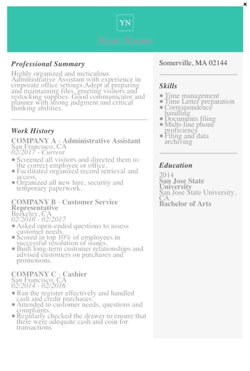
24. Modern Resume Template
This resume embraces simplicity with a slight touch of color to make things a bit more interesting. It also nicely sections off Skills and Education notes from the Work History list. With LiveCareer.com, you can generate a template with your basic information and then download it to add small details.
Download this template here.
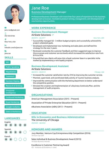
25. Functional Resume Template
This NovoResume.com template is colorful and includes a place for your headshot which could make you look both interesting and confident to an employer. A colorful format like this might be great for someone in the media or advertising industry that wants to keep their job application visually memorable to prospective employers.
Download this template here.
 26. Elegant Resume Template
If you’re looking for simplicity and efficiency rather than something colorful, consider this Elegant Resume Template from Jofibo. With Jofibo, you can select this or other similar templates on the website, enter your information, and then download it quickly and easily.
Download this template here.
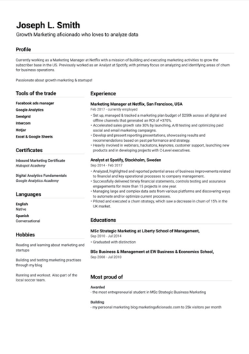 27. Blue Corporate HR Resume Template
Canva, an easy-to-use design template website, offers a few great resume templates. One of them is this simple resume with a touch of color in the background. Because of the color and image, it’s pretty memorable. But, for those who prefer a more conservative resume look, this template is fairly simple.
Download this template here.
.jpg?width=389&name=canva-blue-corporate-hr-professional-resume-MADftnj-Tj4%20(1).jpg) 28. Concept Resume
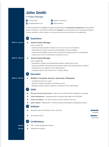
28. Concept Resume
This resume is great for people in the technical space because it adds a touch of color and feels more compact, which will force you to get right to the point about your key skills, certifications, and work experiences.
Download this template here.
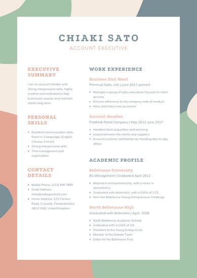
29. Cream and Green Account Executive Resume Template
This resume is also downloadable and editable on Canva. It was created for account executives but could also be great for graphic designers or people working in visual fields due to its unique, but still professional, color scheme.
Download or edit the resume template here.
How to Save Your Resume
Remember, once you’ve finished personalizing your resume, you’re not ready to submit an application yet. To ensure your resume’s format stays the same for everyone who receives it, save the document as a PDF. Best case scenario? Even the hiring manager won’t believe your resume came from Word.
Editor’s Note: This post was originally published in 2018 but was updated in May 2020 for comprehensiveness.

The Ultimate Guide to Building a Website Redesign Strategy
So… you want to redesign your website. Maybe you just finished a brand overhaul or your product was recently updated. Whatever your reason, a redesign can be a huge success — or a total flop. It can also be a long and tedious undertaking, which is why every redesign needs to start with a clear vision and/or problem to solve.
The better you are at defining that vision at the very beginning, the more successful your redesign will be — and the smoother the entire process will be as well.
Whether you’re working with an agency, redesigning your site in-house, or proposing a redesign to company stakeholders, this guide will help you strategize your website redesign and ensure it turns out to be a huge success — not a total flop.
Many organizations opt to redesign their website to welcome more traffic as their business grows and scales; others invest in a website redesign as part of a larger rebranding initiative. Regardless of why your company is interested in a website redesign, the project itself is a massive undertaking. Not to mention an important one to get right considering the critical role your website plays in your marketing and brand image.
In fact, 80% of consumers say the experience your company provides is as important as the products or services you sell — including the experience they have with your website.
How Often Should You Redesign Your Website?
According to Business 2 Community, the average lifespan for a website is 1.5 to 2.5 years. Because design trends change and technology advances, this is the average amount of time that a redesign will feel “fresh” and competitive. However, that time frame is only a benchmark, so you will need to determine what works best for your organization.
The following factors will determine how often you should redesign your website:
- How often your brand or goals change. When you’re itching for a new site, first ask yourself, “Does this website still represent who we are as a company?”
- How much budget you allot to design and development. Ask yourself, “Can a site design wait, or do I have reasons to use the budget on our site now?”
- How long your website stays functional and fast. Step into your customers’ shoes and see if you can navigate the site well and find everything you want to find without encountering errors or long page load times.
- The performance of your website. Ask yourself, “Is this site converting a reasonable amount of traffic? Do people stay on the page for a reasonable amount of time, or do they bounce?”
- Changes in the industry. For example, when Google announced that it would be changing to mobile-first indexing, it necessitated that sites be mobile-friendly, or they’d lose organic traffic from Google.
Your website is where visitors and customers go when they want to ask questions, read content, or purchase products or services. For that reason, it’s best to be extra prepared when committing to a website redesign.
You may spend more time building your website redesign strategy than you will on the redesign itself. If you’re wondering what should go into your website redesign strategy, start with the steps below.
Let’s unpack eight critical steps to take when redesigning your website.
1. Benchmark your current performance metrics.
Before you begin planning your website redesign, document your current performance metrics. This will give you a good idea of where your current website stands and what metrics you can improve upon through your redesign.
Analyze your existing website’s monthly performance in the following areas. The importance and relevance of each may vary depending on your website redesign goals, but it’s helpful to pull each metric before you dive into your redesign.
- Number of visits, visitors, and unique visitors
- Bounce rate
- Time on site
- Top-performing keywords in terms of rank, traffic, and lead generation
- Number of inbound linking domains
- Total new leads and form submissions
- Total sales generated (in dollars)
- Total pages indexed
- Total pages that receive traffic
If you don’t have access to this information, I recommend adding tools like Google Analytics and HubSpot’s Marketing Analytics for better tracking and visibility into your website’s performance.
Furthermore, make note of which tools you used to measure each of these benchmarks in the past. Ideally, you’ll want to use those same tools when collecting your post-redesign metrics. Otherwise, you’ll be comparing apples to oranges.
2. Determine your website redesign goals.
What’s the “why” behind your website redesign? When considering a redesign, there should always be a good reason behind it.
If you’re answering with “well, it’s been a while since we’ve done one” or “my competitor just did a redesign,” those reasons aren’t good enough on their own.
Remember: It’s not just about how your site looks, but rather how it works. Be crystal clear about why you’re doing a website redesign, and tie those goals to measurable results.
Then communicate your goals with your team, designer, and/or agency. Consider the following data-driven objectives for your own website:
- To increase the number of visits and visitors (both are important as one visitor could visit more than once)
- To reduce bounce rate
- To increase time on site
- To improve domain authority
- To increase the total new leads and form submissions
- To increase the total sales generated
- To enhance current SEO rankings for important keywords
Many of these goals are dependent on one another. For example, in order to generate more conversions, you may also need to increase traffic while decreasing your site’s bounce rate.
Also, take a look at the metrics you pulled out in step one. Are there any metrics you can improve upon with your new website? Perhaps you use your old website metrics to inspire new goals, too.
3. Define your branding and messaging.
Before crafting your new website design and content, be crystal clear about your desired branding, messaging, and unique value proposition. Doing so will ensure consistency across your entire website.
Anyone who visits your website for the first time should immediately understand what you do, how it may benefit them, and why they should stay on your site and not flee to your competitors’.
Think about whether you plan to change your branding and/or messaging, or if it will stay the same. If you plan to change it, what about it needs to change? Keep these changes top-of-mind as you redesign your website.
As you develop your messaging, use clear, concise language. Avoid using industry jargon that may alienate parts of your audience and make you sound more like a business-babbling robot than a human.
Consider the following example of how we could describe HubSpot in a “gobbledygook” way:
HubSpot helps companies across multiple countries reduce churn by backfilling the sales pipeline with highly qualified traffic that generates leads that convert into customers with high lifetime value. We achieve this by providing leading-edge software that integrates all marketing channels for a synergistic view of the data that determines and prioritizes high-value marketing activities.
Say what? Let’s translate that into the way people actually speak:
HubSpot’s all-in-one marketing software helps more than 6,000 businesses in 45 countries attract leads and convert them into customers. A pioneer in inbound marketing, HubSpot aims to help its customers make marketing that people actually love.
Much clearer! I think visitors and potential customers would prefer the second description — don’t you?
Additionally, as you develop your branding, consider what visual aspects of your website need to be redesigned and what can stay the same. Have you created a new logo, style guide, or color palette? Make sure these are applied to your new website so it remains consistent with other parts of your brand.
4. Define your buyer persona(s).
Your website is not just about you. Actually, it’s hardly about you.
When your visitors land on your website, they’re asking themselves, “What’s in it for me? How could this help me?”
Speak to your visitors in their language by crafting your website design and content around your buyer personas.
For instance, if you’re a marketing manager at a hotel looking to bring in new business, you might target five different buyer personas: an independent business traveler, a corporate travel manager, an event planner, a vacationing family, and a couple planning their wedding reception.
Make sure you clearly identify your buyer personas so you can shape your website redesign strategy around the website visitors that matter most to you.
Check out our handy buyer personas template to help you research and create detailed buyer personas.
Is your target audience changing as part of your website redesign? Do your branding and content align with this audience? Answer these questions as you’re strategizing your website redesign.
5. Protect your search engine optimized pages.
Getting discovered online is also essential to improving your website’s metrics. If no one is able to find and visit your site, how can you increase new leads, reconversions, or sales? Here are some tips for designing your new website with search engine optimization (SEO) in mind:
Document your most search-valued pages.
Use your marketing analytics to figure out which pages receive the most traffic and inbound links, convert the most leads, and ultimately cover the most influential topics in your industry. If you plan to move any of these highly valuable pages, make sure you create the proper 301 redirects.
Create a 301 redirect strategy.
Speaking of 301 redirects, these are extremely important in terms of retaining the traffic and link value associated with a given page. Create a spreadsheet to record and map out your 301 redirects (old URLs vs. new URLs). Then hand this document over to someone technical for proper implementation.
Do your keyword research.
For every page on your newly designed website, pick one keyword/topic each page will focus on. Once you determine the keyword(s), use on-page SEO best practices to optimize your website pages. Furthermore, consider adding new content and pages to your website that address those particular keywords and topics that may be neglected on your current site.
Save time and rank higher on Google with our free on-page SEO template.
6. Analyze the competition.
While we don’t recommend obsessing over your competitors, it can help to know how you compare. First, run your website through HubSpot’s free Website Grader tool to generate a report card of how well your website is performing. You can also use this diagnostic tool to evaluate your competitors’ websites, so you’re aware of their strengths and weaknesses.
Next, take a look at your competitors’ websites, and take note of what you like — and what you don’t. This process is to help you realize what you can do better on your website. Once you conduct your competitive analysis, put together a list of action items highlighting some areas for improvement and how you can set yourself apart from your competitors.
7. Take inventory of your high-performing content.
While a redesign is a great way to improve the performance of your website, there are unfortunately countless ways in which it can hurt you. Your existing website likely contains many high-performing content assets that you’ve already built up, and losing their effectiveness because of a redesign can severely damage your marketing results.
For instance, such assets might include your:
- Most-shared or viewed content
- High-traffic pages
- Best performing or ranking keywords and associated pages
- Number of inbound links to individual pages
For example, if you end up removing a page from your site that has accumulated a high number of inbound links, you could potentially lose a lot of SEO credit, which would make it increasingly difficult for you to get found on search engine results pages (SERPs).
Keep in mind that many web designers don’t consider this step because they are neither marketers nor SEO specialists. Don’t hesitate to remind them about this, and help them along by auditing your site and providing them with a list for maintaining or updating critical pages on your site.
8. Choose the right software.
The final (but arguably most important) step of the website redesign process is choosing the right software with which to create and host your website. This software is typically called a content management system (CMS), and it’s used to develop, design, and publish your website for the world to see.
CMS software is beneficial for a few reasons. Whether you’re a novice digital marketer or a master web developer, a CMS can easily help you create a gorgeous, functional website. Choosing the right CMS depends on your business, such as what CMSs you’re already familiar with and what features your website redesign requires.
There are hundreds of CMSs to choose from, including CMS Hub — the only combined CMS and CRM. Or you can review some of the best CMS platforms to learn about your options.
Get Started on Your Website Redesign Today
Whew! Now you’re ready to plan, design, build, optimize, launch, and analyze your new website. Apply these seven steps to redesign a website that attracts more consumers, wows more visitors, and converts more customers.
Editor’s note: This post was originally published in January 2013 and has been updated for comprehensiveness.

15 About Us & About Me Pages + Templates to Make Your Own
Building a website is, in many ways, an exercise of willpower. It’s tempting to get distracted by the bells and whistles of the design process, and forget all about creating compelling content.
It’s that compelling content that’s crucial to making inbound marketing work for your business.
So how do you balance your remarkable content creation with your web design needs? It all starts with the “About Us” page.
For a remarkable about page, all you need to do is figure out your company’s unique identity, and then share it with the world. Easy, right? Of course not. Your “About Us” page is one of the most important pages on your website, and it needs to be well crafted. This profile also happens to be one of the most commonly overlooked pages, which is why you should make it stand out.
The good news? It can be done. In fact, there are some companies out there with remarkable “About Us” pages, the elements of which you can emulate on your own website.
By the end of this post, you’ll be introduced to:
- The best About Us page examples (and what makes them great)
- Tips on how to write your About page
- The best About page templates (across multiple platforms)
Best About Us Page Examples
- Yellow Leaf Hammocks
- Eight Hour Day
- Joe Payton
- Apptopia
- Moz
- Aja Frost
- Cultivated Wit
- Kero One
- Nike
- Refinery29
- Sara Dietschy
- Marie Catribs
- Marc Ensign
- Bulldog Skincare
- Doomtree
1. Yellow Leaf Hammocks
Why the “About Us” Page Rocks: It tells us a story.
When you have a great story about how your product or service was built to change lives, share it. The “About Us” page is a great place for it to live, too. Good stories humanize your brand, providing context and meaning for your product. What’s more, good stories are sticky — which means people are more likely to connect with them and pass them on.
Yellow Leaf Hammocks tells users about its product by describing how the hammocks empower artisan weavers and their families. The company breaks down different pieces of the story into sections that combine words and easily digestible graphics, painting a picture instead of big chunks of text. They’re clear about why they’re different: “Not a Charity,” the page reads. And then: “This is the basis for a brighter future, built on a hand up, not a handout.”
Every company has a story to tell, so break out your storytelling skills from that random English class you took years ago and put them to work on your “About Us” page. Using descriptive and emotive copy and gorgeous graphics, an “About Us” page with a story works harder for your business than a generic one.
2. Eight Hour Day
Why the “About Us” Page Rocks: It’s human.
People tend to think that “About Us” pages have to sound formal to gain credibility and trust. But most people find it easier to trust real human beings, rather than a description that sounds like it came from an automaton. Trying to sound too professional on your “About Us” page results in stiff, “safe” copy and design — the perfect way to make sure your company blends in with the masses.
Instead, Eight Hour Day showcases the people behind the company and humanizes its brand. Introducing the founders by name and featuring the photos of them on the “About Us” page drives home the point that Nathan and Katie are — as they so astutely put it — “two individuals with a passion for creativity — creativity makes us happy.”
When you’re designing your “About Us” page,avoid industry jargon and replace it with an authentic voice — yours — to describe your product or service. Sure, it needs to be polished and free of errors, but it should always sound friendly and real.
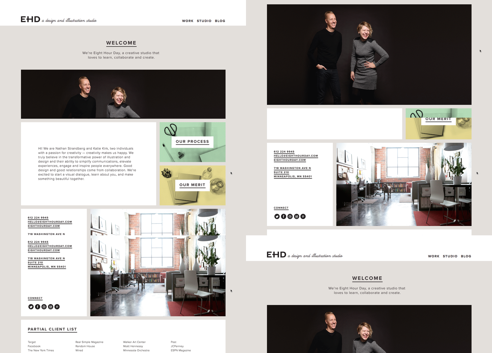
3. Joe Payton
Why the “About Me” Page Rocks: It’s confident, creative, and easy to skim.
“About Us” pages might encompass the values of more than one person or entity, but they’re no more important to the image of a business than your personal about page. Take Joe Payton’s “About Me” page, below.
Not only does Joe’s illustrative self-portrait give him a personal brand that customers will remember, but it also demonstrates his expertise as a designer and animator. His website visitors can learn not just what he does, but why he does it, in an easily digestible way. Being able to express his values as a creative professional in such a well-organized page is something to be desired by anyone creating their own about page.
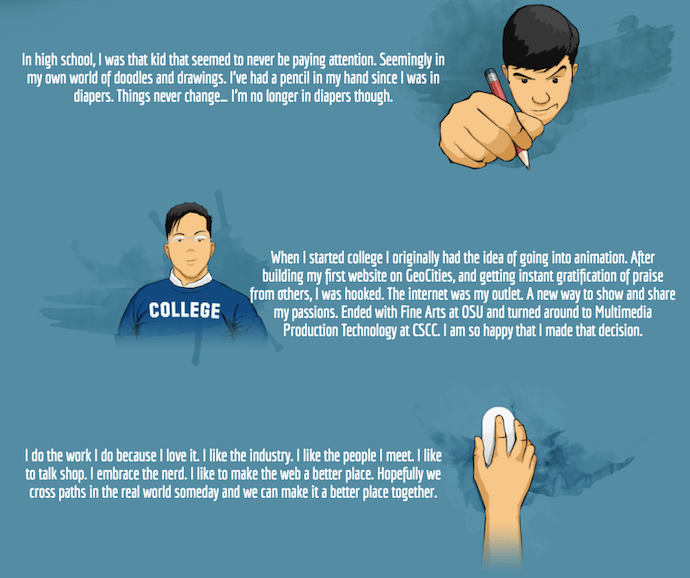
4. Apptopia
Why the “About Us” Page Rocks: It skips the business babble.
We know — no industry jargon. If you think it makes you sound super smart on your “About Us” page, think again. People want and appreciate straight talk about what your business does. After all, if people can’t figure out what you do, how will they know they need your product or service?
So, skip the industry lingo — that’s what Apptopia does on its “About Us” page. The startup’s simple but polished language effectively communicates the company’s offering while still allowing the Average Joe to understand it.
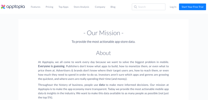
The moral of the story: Try to get rid of jargon on your “About Us” page whenever possible. Use short and punchy sentences to explain complex products and ideas in a way that isn’t patronizing, but rather, is empathetic.
5. Moz
Why the “About Us” Page Rocks: It’s humble.
Instead of following the classic “About Us” script and writing a few paragraphs about the company’s mission and origins, try something different — there are plenty of ways to make your brand more compelling to someone who doesn’t know about you.
Take Moz, for example. A lot has happened since it was founded in 2004, so the company chose to share those milestones using a fun and clean design that incorporates clear headers, concise blurbs, and little graphics to break up the text.
We especially love the humble references to how Moz received funding, how it switched its brand positioning — and most importantly, how it switched back to its original model. This speaks volumes to the value honesty and humbleness can play to your customers. Don’t be afraid to talk about your ups and downs; your customers will trust what you say that much more.
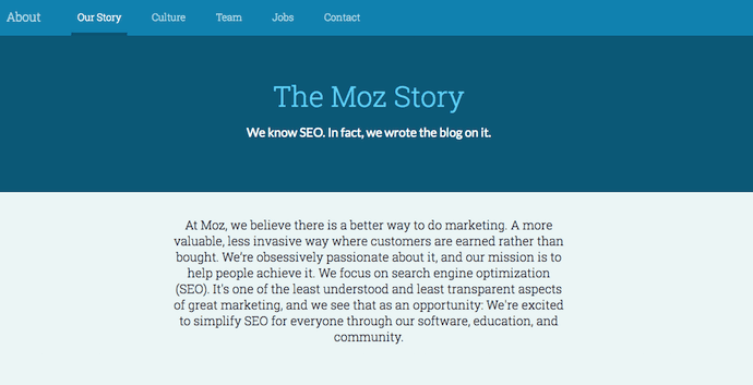
6. Aja Frost
Why the “About Me” Page Rocks: It’s data-driven.
Alright, we might be biased in highlighting this professional, as Aja is our very own SEO strategist at HubSpot. Nonetheless, the ingenuity she brings to the company isn’t lost on her website’s “About Me” page.
Being a data-driven professional, Aja knows her own clients as a freelance writer and strategist don’t just want to see what she’s written — they want to see how her content has performed. With that in mind, her “About Me” page tells a story of her career growth, which peaks — no pun intended — at an impressive line graph showing the result of an SEO strategy she implemented for the HubSpot Blog. (The graph’s sharp decline at September simply indicates when she stopped collecting data.)
Following the impressive chart, Aja closes out her about page with a personal note on what she does in her spare time — always a good way to humanize yourself in the eyes of your potential customers.
7. Cultivated Wit
Why the “About Us” Page Rocks: It breaks the mold.
Yes, this post is about, well, “About Us” pages. But sometimes, you don’t always need to wait for users to get there in order to make a statement. That’s part of breaking the mold to showcase your company’s personality.
That’s exactly what Cultivated Wit — a creative agency and media company — does, with both an edgy name and an incredibly fun story told through video and parallax scrolling … right on its homepage.

Below is the actual “About Us” page, which is a gem once you get there. But it’s great to see a company embrace its own brand of quirk throughout the site.
Even if you have a dedicated “About Us” page, there are plenty of ways to creatively showcase your company’s personality throughout your entire website. And yeah, that’s harder than filling a stock “About Us” template — but it can have a significant payoff for your brand.
8. Kero One
Why the “About Me” Page Rocks: It’s multilingual.
Kero One is a hip-hop artist and DJ from San Francisco, and his “About Me” page carries a valuable lesson to personal brands who cater to more than one audience — especially if those audiences speak different languages.
Kero One’s story starts at his childhood, when he was six years old and first discovered a passion for hip-hop. Knowing how old and genuine his love for the genre is adds tremendous value to his own music in the eyes of his listeners.
While this entrepreneur’s childhood interests help to deepen his audience, the second screenshot below helps Kero One widen it. His “About Me” page first tells his story in English, then in Japanese, then in Korean, then in Chinese. Accommodating these Southeast Asian audiences makes his brand more inclusive of all the audiences he identifies with.
…
9. Nike
Why the About Us Page Rocks: It knows its audience.
Nike might seem like a company that’s too big to inspire smaller businesses. You might even wonder if Nike even still has an “About Us” page. As a matter of fact, it does, and it hasn’t forgotten the company’s roots.
Nike began on the campus of the University of Oregon by the hand of the college’s track coach, Bill Bowerman. And even though he no longer works at the company, one of his beloved quotes still brands the bottom of Nike’s “About Us” page below: “If you have a body, you are an athlete.”
This bold sentence, referenced by the asterisked “Athlete” in the words right above it, sheds important light on Nike’s audience. The brand may be big today, but Nike is all about the rising stars — who Nike depends on to, according to the rest of its “About Us” page, “expand human potential.”
The takeaway for marketers? Know your audience, and make it obvious to that audience the instant they read about you on your website.
10. Refinery29
Why the “About Us” Page Rocks: It tells you what’s most important.
Here’s another instance where any area of your website — not just the “About Us” page — is an opportunity to break the mold.
Many companies add just a simple mission statement or company profile, but people often don’t want to ready a wall of text explaining what you do. So, Refinery29 broke it down to convey the intangible qualities that are tough to include in a basic “About Us” page.
Although Refinery29 does introduce its page with a description of its business, its goes out on a bang — four bangs, to be exact. The organization is on a “mission,” sure, but there’s also an “essence” of Refinery29, a “promise” it keeps, and a “vibe” it gives off.
These aren’t company traits you’d think to include when starting out, but they’re what your customers often make gut decisions on when buying.
11. Sara Dietschy
Why the “About Me” Page Rocks: It has variety but still aligns with her personal brand.
This professional YouTube content creator has an eclectic collection of videos related to technology and culture, and expresses that diversity all over her “About Me” page.
In addition to the vibrant self-portrait at the top of the page, Sara’s first sentence tells you just how many people subscribe to her channel: 350,000. This is an important number to know for her potential video advertisers and collaborators who want to know how much exposure they’d get by working with her or advertising on her channel.
The colored tiles lining the page — starting with the red one, as shown below — also do a terrific job segmenting her work by the types of projects she takes up and for whom she’s done them. That Intel logo in the second photo of Sara, below, is sure to turn some visitors’ heads as they’re perusing her website.
12. Marie Catribs
Why the “About Us” Page Rocks: It’s unexpected.
There’s a reason why these examples are exceptional — “About Us” pages aren’t always the most riveting parts of a company’s website. In fact, they often look like an afterthought. But even if you don’t have budget for juicy graphics, video, or parallax scrolling, there are other ways to make your “About Us” page unexpected with the copy alone.
Marie Catrib’s is a restaurant, so you might think their “About Us” page would be your typical “here’s how we started, here’s what we believe in, and here’s our food” story. Marie Catrib’s “About Us” page does tells us that — but it does so in an unconventional way. Immediately, the user’s eyes are drawn to a header that says, “It’s okay to make a mess, experiments can lead to beautiful things.” Quite philosophical, for a place to have dinner.
But next comes the story about the owner, which starts in an unexpected way — “It’s hard to imagine, but at one time Marie was banned from the family kitchen.” A line like that draws in the audience, because we know it’s not going to be typical.
So, how will you use copy to really draw readers in? It’s amazing what impression you can make on site visitors just by creatively telling your story with words alone.
13. Marc Ensign
Why the “About Me” Page Rocks: It’s funny but professional.
This branding expert does two things super well on his about page: He takes his work seriously, but doesn’t take himself too seriously. Marketers know there’s value to keeping a casual tone in the content they create, but in order to attract customers, you need to prove you have discipline and integrity. That’s a tough balance to get right.
Marc Ensign nails that balance between friendly and formal with a confident opening statement, followed by an amusing smiley photo of himself to set an inviting tone.
14. Bulldog Skincare
Why the “About Us” Page Rocks: It’s lovable and memorable.
What’s the difference between “average” marketing and lovable marketing? It’s the difference between creating generic webpages that provide great information, but in a straightforward, black-and-white kind of way — versus creating webpages that provide great information and are infused with color, personality, and stay true to a company’s unique brand voice. When you create lovable marketing, you can start a movement of brand evangelists and advocates who will help you grow.
Where does this fit into a company’s “About Us” page? The folks at Bulldog, a men’s skincare company that was named for the colloquial “man’s best friend” — a dog — could have typed up a few paragraphs about where the brand came from and how they were one of the first in the space to redefine and eliminate stereotypes around men’s grooming. But that text alone would have been a bit, well, average.
Instead, the “About Us” page is pithy, colorful, and leads with the lovable mug of an adorable bulldog — fitting the name and the brand. And it states the purpose of the products — to help customers from waking up with the (admittedly adorable) wrinkly face you see when you visit Bulldog’s website.
Play on your own words — it’s okay to have fun and pun with your brand, as it helps to inject personality and humor into your “About Us” page. It primes visitors for a story in a way that makes them immediately feel something. That’s how you create memorable, lovable marketing.
15. Doomtree
Why the “About Us” Page Rocks: Its shows, tells, and has a soundtrack.
One minute of video is worth 1.8 million words, according to Forrester Research’s Dr. James McQuivey. But what about audio and visual, too, all combined with a really cool story? Well, that’s one way to tell your story in an engaging way — through multimedia.
Doomtree is built on a bit of an innovative concept: That a group of talented artists can each have thriving solo careers, but can still come together on a regular basis to create great music. It’s not a band — it’s a crew. It’s an unconventional concept with an equally interesting backstory that “started as a mess of friends in Minneapolis, fooling around after school, trying to make music without reading the manual.” And as soon as you arrive on Doomtree’s ‘About Us’ page, you’re greeted with big, bold photos of those friends.
As you scroll down, users are treated to even more interaction with the crew’s tracks and music videos. That makes sense, because it gives visitors an instant sample of Doomtree’s product. What’s more, the entire “About Us” page is responsive, including the video. That’s important — not only because it offers site visitors a great mobile experience, but also for Google search ranking — especially now that such mobile usage has surpassed desktop.
How to Write an About Page
- Establish a mission statement.
- Outline our company story.
- Reveal how you’ve evolved.
- State your “aha!” moment.
- Explain who you serve.
- Explain what you’re offering them.
- Cite examples of who you’ve served.
- Describe your values.
It’s tough to establish one all-encompassing template for your “About Us” page — there are just so many ways you can go about telling your company story. But, per the real “About Us” pages we’ve just highlighted, there are some steps you should keep in mind when getting started.
Here are five steps to writing an “About Us” page based on some of the things that impressed us about the examples above.
1. Establish a mission statement.
Your “About Us” page can and will be much longer than a single mission statement, but in order to draw people in, you need to succinctly state your goal in the industry up front. What are you here to do? Why should your website visitors care?
2. Outline your company story.
You might not have a long history of changes and growth your company has endured (yet), but it’s a nice touch to talk about where you came from in your “About Us” page. So, isolate the milestones prior your company’s founding, and use them to give readers some backstory on your current venture.
3. Reveal how you’ve evolved.
Even if you’re a young company, there’s no shame in admitting your business strategy — or even personal way of thinking — has changed since you began. In fact, in about pages, these evolutions can improve the story you tell to website visitors.
About pages are perfect spaces to talk about where you started, how you’ve grown, and the ideals that have helped your organization mature. Use these moments to further your company story and show people that you’re always ready to change and adapt to the needs of your industry.
4. State your “aha!” moment.
Every good company was founded on an idea — something the current marketplace might not yet offer. What was your idea? Use this “Aha!” moment as a pivot point when telling your company story. What was a challenge you faced while developing your company? How did this challenge or discovery shape what you are today?
5. Explain who you serve.
As much as you want as many eyeballs on your “About Us” page as possible, you won’t do business with every single one of them. That’s why it’s crucial that you identify and mention your core customer. Who should care you exist? Which eyeballs are you here to serve?
6. Explain what you’re offering them.
As you’re explaining who you serve, make it clear what it is you’re offering. Too often companies generalize their product or service in the language of their website, making it hard to understand what it is the customer is actually paying for. They’re afraid literal explanations of their products aren’t interesting enough, or will sound unappealing in writing. And that’s a fair concern.
However, by investing just a sentence or two into telling your potential customers exactly what they’ll receive can keep them on your website for longer and interested in learning more.
7. Cite examples of who you’ve served.
Got some loyal customers in your portfolio? Use your about page to let the world know who already trusts and benefits from your work.
Knowing about your company’s past successes can influence the purchasing decision of up to 90% of today’s B2B customers, according to Dimensional Research. Even if you don’t yet have case studies to expand on the problems you’ve helped buyers solve, it’s in your interest to briefly mention who you’ve done this for. And your about page is the perfect platform for it.
8. Describe your values.
Customers want to be treated like human beings. For that to happen, they need to feel that they’re being treated by human beings. When finishing your “About Us” page, describe who you are as a person or a team, and what your personal values are. What’s your company culture like? What bigger picture in life drives your business?
An LED lightbulb maker might sell 10 different lamp styles, for example, but that might not be the most important characteristic to its primary audience. Maybe this lightbulb developer was founded on a commitment to environmental protection, and every bulb the company makes was built by people who are dedicated to making the world more energy-efficient.
Keep in mind a secondary audience of your company’s “About Us” page consists of your future employees. This is another reason describing your personal values is a good idea — the key to your job candidates’ hearts is to show them you have one too.
About Us Page Templates That Rock
Copy is an important element of an About page. However, you’ll also want to keep user experience in mind as you showcase your brand story and identity to the world. Here are some of the top About Us and About Me page templates to use or draw inspiration from:
1. Sodium v2 (HubSpot)
Tell your prospects about you using bold color and by telling your story. This template can help with that with its bold color (that can be customized) and timeline-like layout. Website visitors will know where you’ve come and where you’re going.
2. Touraza Template (WordPress)
If you want something with a little flavor, the Touraza template is a good choice. With the “meet the team” section near the top with geometric designs and striking typography, you’ll be able to showcase the humans behind your brand.
3. Logan Template (Shopify)
This template makes use of large images in a modern layout to break up the ample white space. The result: A clean and enjoyable reading experience. The top of the page puts the brand story (or other introductory text) first, supported by a large image that speaks for itself. The pops of color can be customized to your brand style, drawing emphasis to the most important elements you want to highlight.
4. Mercuric Modular Premium (HubSpot)
Make a statement with a stylish slider and smooth 3D animations. This template can be edited using user-friendly modules and other effects to catch your website visitors’ attention. It comes with counter boxes, progress bars, and animated images for you to customize. There’s also a full template pack for the other pages of your site.
5. Coax Template (WordPress)
The advantage of the Coax template is that it’s powered by Elementor, a page builder that makes customization easy. Even if you want to keep some of the defaults, though, this template is beautiful, letting the typography and copy take center stage. Ideal for a personal brand, you can choose to lay out your content similarly to a resume with big subheads on the left and descriptive text on the right.
6. Clean (HubSpot)
This template is 100% drag-and-drop ready, making setup a breeze. With an elegant header and overlay, you’ll make a great first impression as you tell your brand story. Zero coding is required, it’s completely customizable, and it’s backed by a 100% happiness guarantee.
7. Negocis (HubSpot)
Do you think that your story is best told visually? This template supports icons and other elements that appeal to website visitors who want to understand your impact. It features image sliders, social sharing buttons, and more.
At this point, we hope that creating an “About Us” page doesn’t seem like a daunting task — rather, we hope you’re ready to have some fun with it. With a good story to tell, creative copy, humility, and digestible visuals, you’re on your way to an eye-catching user experience.
Even better? You’re becoming part of the exception — and standing out from a sea of “About Us” pages. What makes you different? We’re eager to learn more … about you.

After Recent Improvement, Deal Pipelines Shaky Last Week
For the last few months, businesses around the world have had to rapidly adapt to the impact of COVID-19.
In a time where it seems like things change every day, it can be difficult to gauge whether the challenges your business is facing are widespread.
That’s why we’re publishing week-over-week benchmark data for core business metrics like website traffic, email send and open rates, sales engagements, close rates, and more. These core metrics are split by region, company size, and industry cuts, so you can explore data for companies most similar to yours. You can find the data, and more context on the dataset and sources, here.
Because the data is aggregated from our customer base, please keep in mind that individual businesses, including HubSpot’s, may differ based on their own markets, customer base, industry, geography, stage, and/or other factors.
These insights are refreshed every Thursday morning ET, and will be accompanied by this short writeup. You can find past writeups using this timeline.
We hope to establish useful benchmarks to measure your business against, and serve as an early indicator of when short- or long-term adjustments may be needed in your strategy.
What We’re Seeing
Here are three key takeaways from last week’s data:
1. After three weeks of improvement, new deals created and closed-won deals declined the week of May 18.
The volume of new deals created has trended positively for four of the last five weeks, but dropped 4% globally the week of May 18, sitting 11% below pre-COVID levels. The momentum in new deal creation appeared to be a promising sign of May and June business results, but last week’s data calls this into question.
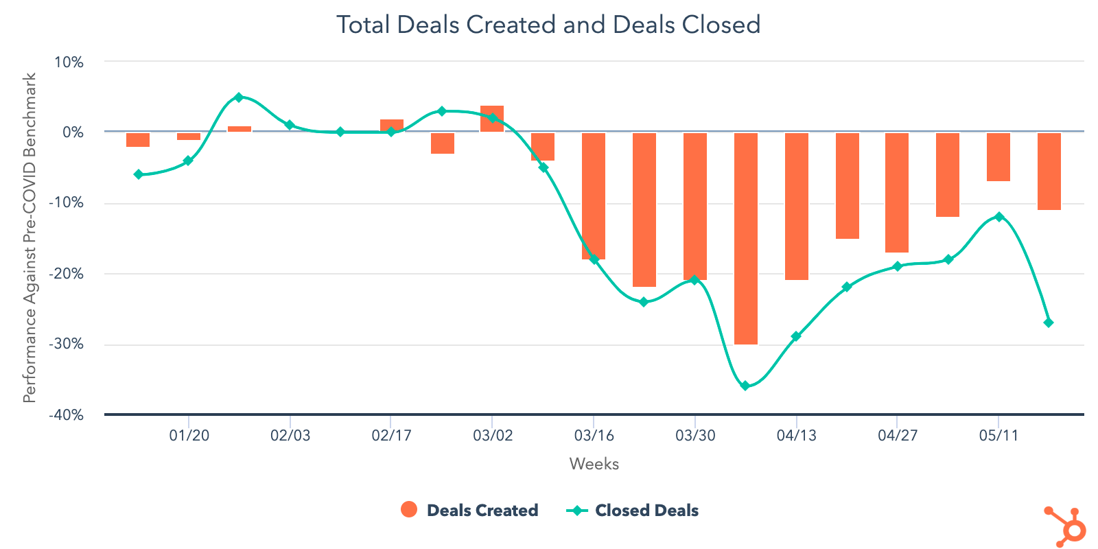
Across industries, this metric continues to vary significantly. Structurally impacted industries like entertainment and travel dropped week-over-week and remain double-digit percentages below pre-COVID averages. However, manufacturing, consumer goods, and computer software — three industries that had seen deal volume return to or exceed pre-COVID levels — saw week-over-week decreases as well.
It’s unsurprising that travel and entertainment are trending below other industries, but it’s worrisome that three industries that appeared to be less structurally impacted are seeing declines. It’s not yet clear whether the downturn in manufacturing and consumer goods is a sign of broader economic weakness, changes in buyer behavior, longer-tail slowdowns due to production environments impacted by the pandemic, or something else. We’ll be watching these industries over the next few weeks to get a clearer picture of performance.
On the other hand, construction’s new deal creation increased for the fourth week in a row and is 38% above pre-COVID levels; human resources also grew. Currently, all industries with the exception of construction are trending below pre-COVID averages.
Closed-won deals saw a significant drop week-over-week, declining by 17% and sitting at 27% below pre-COVID averages globally. This trend held in all regions and industries. Various holidays (Memorial Day, the end of Ramadan, and bank/public holidays) may have contributed to this decline, but the next few weeks of data will reveal whether this turndown is a trend or anomaly. Typically the volume of closed-won deals accelerates as we approach the end of the month, so we’re curious what next week’s data will reveal — will we see an end-of-month increase in sales activity, or is there a broader slowdown occurring?
2. Sales process metrics reveal misalignment in outreach and qualification.
Call prospecting volume decreased by 4% the week of May 18, consistent across all company sizes and regions. In the same time period, the number of meetings booked saw a small dip of 1.7%. Combined with the decline in new deal creation last week, another indication of future revenue, these declines are worrisome for sales leaders.
Sales email response rates remained flat week-over-week. All company sizes are trending below their pre-COVID response rates, but companies with 26-200 employees saw a 9% week-over-week increase in response rates. Across regions, APAC and NORTHAM saw slight week-over-week increases in response rates, while EMEA and LATAM saw declines.
Immediately following the shift to remote work after the pandemic declaration, we saw a sharp decline in call prospecting and pivot to email as sales teams adapted to their new working environment and businesses grappled with immediate instability. Email prospecting has averaged 50-60% above pre-COVID levels for the last two months, while call prospecting is down 17% compared to pre-COVID averages.
Sales teams are booking more meetings overall — total volume is 18% above pre-COVID benchmarks. However, those meetings have not converted to business at a corresponding level, suggesting that beyond the cashflow issues impacting deal volume, there’s still significant misalignment at multiple steps of the outreach and qualification process. Over time, sales teams will need to return their pre-COVID outreach strategy — calling more and emailing less — to ensure outreach is actually effective.
3. Buyer engagement continues to increase, but marketers may be missing an opportunity to engage.
With a 3% week-over-week increase, marketing email send volume has reached a historic high — 34% above pre-COVID benchmarks. All industries with the exception of travel are emailing above pre-COVID levels; even the travel industry sent 36% more email week-over-week.
Buyers continue to seek out and engage with businesses at record levels:
- Open rates are trending above pre-COVID levels for the 11th week in a row, at 17% above pre-COVID levels, but declined 3% last week.
- Website traffic is trending above pre-COVID levels for the 15th consecutive week (20% above benchmarks), with a 3% week-over-week decrease.
- The volume of buyer-initiated conversations has been steadily increasing as well, and reached a high of 34% above pre-COVID levels last week.
- The average number of contacts added to databases increased 15% week-over-week and is currently 7% above pre-COVID levels. Interestingly, travel was one of only two industries last week to exceed pre-COVID benchmarks (the other is construction), suggesting that many travel companies are effectively engaging with their market even as their core business has been stalled.
Ad spend is trending below pre-COVID levels for the 12th consecutive week, and globally declined another 4% week-over-week after increases during the weeks of May 4 and May 11. Consumer goods is the only industry that is spending more on advertising compared to pre-COVID levels, and also the only industry that increased ad spend week-over-week. Leaders in other industries would be wise to assess whether a more affordable online advertising marketplace could benefit their businesses right now.
What This Means for Businesses
Sales teams need to reinvent how they prospect.
While buyer engagement reaches all-time highs, sales results have not come close to seeing a corresponding increase, suggesting that salespeople are reaching out to poor-fit prospects. This month has seen improvements in deal pipeline metrics compared to March and early April, an encouraging sign that more businesses are reentering buying processes — but it’s too early to tell how much of this growth will be sustained. For now, it’s a safe bet that your sales team should continue prioritizing high-interest, good-fit buyers rather than indiscriminately prospecting.
Resources to Help
- Watch the replay of our Adapt 2020 webinar on selling through uncertainty
- Refresh your email outreach with these sales templates
- Start using video in your sales outreach to engage more prospects
- Use this guide to increase your sales close rates
- Lead with empathy in sales emails to build rapport and increase response rates
Free Software to Get Started
- HubSpot CRM is free and comes with included advertising and sales acceleration tools, including free 1:1 video, meetings, and chatbot tools
- Gmail and Google Calendar integrations with HubSpot
- Zoom integration with HubSpot
- LinkedIn Sales Navigator integration with HubSpot
- Check out what HubSpot’s app partners are offering at this time with this list of relief initiatives
Consider whether online advertising is a fit for your business.
The significant dip in advertising spend tells us that many businesses have paused their ad campaigns either temporarily or indefinitely. There’s an opportunity for companies to enter a more affordable market. Whether or not this approach is right for your company entirely depends on your audience and offering, but if online ads work for your business, now may be a good time to un-pause campaigns.
Resources to Help
- Attend next week’s Adapt 2020 webinar on retaining customers during difficult times like these
- Get up to speed on using Facebook Lead Ads with this beginner’s guide to building audiences and ads
- Read our ultimate guide to online advertising
- Plan your investment with this guide to budgeting for advertising
- Set up and run campaigns using HubSpot Ads, Facebook Lead Ads, or Google Ads
Invest in employees.
The last few weeks have been a volatile time for both business owners and employees. The HubSpot Research team surveyed over 1,000 consumers on their company’s COVID-19 response, and found that 33% were likely or very likely to look for a new job in the next six months. Of that group, 77% rated work-life balance as “important” or “very important” in deciding what job to take. Burnout, already a concern pre-COVID for workers around the globe, will be even more important for employers to guard against as the pandemic progresses.
Resources to Help
- Join next week’s Adapt 2020 webinar on putting employees first
- Read our ultimate guide to company culture
- Understand employee sentiment with these survey questions
- Improve team communication with these tried-and-true tactics
- Learn how employee happiness leads to higher productivity

Which Types of Live Video Are People Actually Watching? [New Data]
In 2019, global internet users watched 1.1 billion hours of live video. That equates to 12,557 decades of online content.
And the craziest part? People will probably spend even more time streaming content in 2020.
The statistic above is just one of many that shows how popular live video is becoming. And, with any social media or online video trend, marketers are taking notice and learning how to implement it in their own tactics.
If the mounting research about live video has intrigued you, you might be asking more questions about live video in the near future.
Specifically, you might be wondering, “Which types of live content are driving people to tune in?”
To figure out what’s driving the world to watch multiple lifetimes’ worth of content in one year, I decided to conduct a Lucid survey of over 400 consumers to learn which types of content they watch the most.
Which live videos do consumers actually watch?
If you’ve followed live stream trends, you might think content that focuses on entertainment such as behind-the-scenes content, or video game streaming, might make the top of the list as the most popular type of live content.
However, when I asked consumers, “Which type of live video are you most likely to watch if you see it on one of your social network feeds?”, their answers surprised me.
The top three live videos that people say they’re most likely to click on actually emphasize content that’s educational or allows viewers to learn something new.
In fact, the type of live videos consumers are most likely to view is “A Q&A with an influencer, celebrity, or expert in your industry,” which received nearly 30% of the votes.
Below is a quick look at the top four live video types that polled consumers selected:
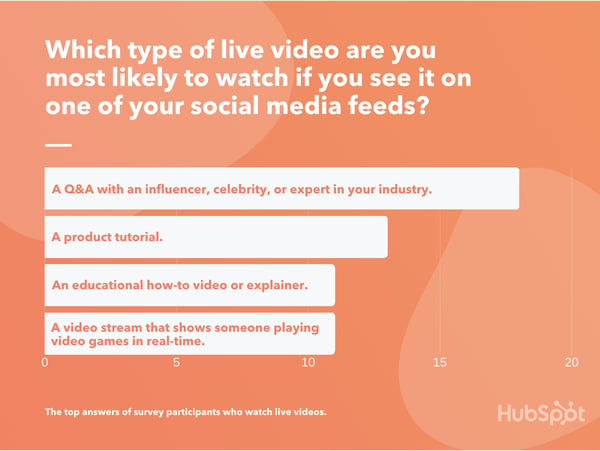
Live video formats that consumers were less interested in were behind the scenes video streams, theatrical stories with a script or plotline, and virtual conferences or events. These topics received between three to eight percent of the votes.
While the least popular types of live video focus more on gaming and entertainment, the top three formats are informational and can be used by brands to discuss their industry, grow awareness, or highlight a product online.
Below, I’ll walk you through the three most common live video formats, note how you can leverage them as a marketer, and offer branded live video examples to inspire you.
3 Types of Live Video Consumers Love Watching
Live Q&As
Live Q&As can be affordable to produce, engage multiple audiences at once, allow you to interact with your fans, and highlight your brand’s expertise at the same time.
If you host a Q&A with an influencer or thought leader, you boost the chances of their followers tuning in to comment with questions or learn more about the guest. In the process, they’ll learn a bit about you and your brand. If you appear on a Q&A, the host’s audiences will learn more about you and potentially get the opportunity to interact.
Can’t book a thought leader or influencer? You can also coordinate Q&As with experts from your own company. This will allow experts in your industry to learn about a topic your employees are highly skilled in. This provides audiences value and allows them to engage with your brand in a new way. Additionally, prospects and customers that view this type of live video will see the depth of knowledge that your team has, which might result in them trusting the quality of your product.
Product Tutorials
While brands have been recording, editing, and publishing online product demos and tutorials for years, this process can also take place on live platforms.
Although a pre-recorded product tutorial has the benefit of being edited, a live product tutorial authentically highlights a product with no added editing.
Here’s an example of a live product tutorial streamed by The Nail Prop Shop which highlights tools that help consumers paint their nails like professionals:
In the product tutorial above, you’re seeing how the product and the host authentically without edits, artificial lighting, or anything else that could boost the aesthetics of the product. Because of this, you can easily imagine what it would be like to use the product in your own life.
Educational Content
People crave knowledge. And, even when you don’t directly discuss your product or service, you can leverage your audience’s curiosity by launching live how-tos or explainers related to your industry.
For example, if you’re marketing a restaurant, you might create a recipe or food-related how-to video. Or, if you’re marketing a fitness brand, you might stream a workout that audiences can try.
Like Q&As, a how-to or explainer gives you the opportunity to show off your brand’s range of knowledge and expertise in your industry. Audiences who see this content might value your expertise and trust your brand because its team has shown a strong understanding of the industry and what audiences want to learn about.
Here’s an example of a live how-to streamed by Planet Fitness. Rather than discussing what customers can get from a gym membership, a trainer from the gym shows audiences workouts that they can use to stay in shape — even outside the gym.
Creating Your First Live Video
If you’ve been inspired by the data or the videos above and are interested in coordinating your first live video, here are a few things you should consider before going live:
- Picking the Right Plattform: Platforms like Instagram, Twitter, Reddit, Twitch, TikTok, and LinkedIn offer a live video feature. Before you go live, research the audiences of each platform to determine which will best align with your own targets.
- Planning and Rehearsing: Once you go live, people will immediately be able to watch your content. To prevent any major blunders, you might want to rehearse prior to streaming or create an outline of what you plan to do while live.
- Including Interactive Elements: To engage with audiences further, consider encouraging them to ask questions or share their thoughts in the video stream’s comment section. Try to answer a few of these questions or respond to one of the comments to show viewers that you’re interested in what they have to say.
To lean more about the things you should check before going live, check out this helpful guide.

24 LinkedIn Stats That Marketers Need to Know in 2020
With nearly 700 million active users in 2020, LinkedIn’s expanded from a networking site for professionals to one of the top social media platforms.
By now, most of us have used LinkedIn to market our brands, post industry thought leadership, or look for our dream jobs.
As LinkedIn’s continued to evolve by adding new features, like live video, it’s steadily grown its user base. While the LinkedIn audience still skews towards career-minded professionals, the industries, interests, and demographics represented on the platform have become much broader since its launch.
Aside from LinkedIn’s user growth, it’s also continued to expand on advertising opportunities, which has helped make it the second most used platform of B2B marketers.
Today, it’s becoming quite clear that LinkedIn isn’t just for people in executive corporate roles. With millions of company pages and individual members, there’s a discussion, post, or professional network for almost anyone on this channel.
But, despite LinkedIn’s growth and advertising opportunities, many marketers or brands still worry that the platform is still too formal or corporate for their audiences.
The truth is — LinkedIn could very well be one of your most underrated marketing channels.
If LinkedIn’s growth has caught your attention and you want to determine if it’s audiences and ad offerings are right for you, it’s important to do some research before devoting more time and resources to this network.
To get you started on your LinkedIn research, here are 24 need-to-know stats about the platform’s audience, growth, and most common marketing tactics.
LinkedIn Stats to Know in 2020
General LinkedIn Stats
- In Q2 of 2020, LinkedIn revenue increased 21 percent year-over-year (LinkedIn)
- In 2019, LinkedIn made more than 6.8 billion in revenue. (LinkedIn)
- LinkedIn has more than 690 million active users. (LinkedIn)
- In Q1 of 2020, LinkedIn sessions increased 22 percent year-over-year. (LinkedIn)
- Marketing Solutions is LinkedIn’s fastest-growing segment. It grew 44 percent year-over-year in Q1. (LinkedIn)
- LinkedIn received 30 billion sessions from its members in 2019. This was a year-over-year increase of 27 percent. (LinkedIn)
- In 2019, LinkedIn was voted the most trusted network. (Business Insider)
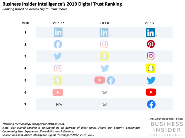
- In March of 2020, professionals watched more than four million hours of LinkedIn Learning content — a nearly 50% increase month-over-month. (LinkedIn)
- LinkedIn Live streams have increased by 158% since February 2020. (LinkedIn)
- More than four million LinkedIn members were hired through the platform in 2019. (LinkedIn)
- LinkedIn’s Talent Insights service, launched in 2019, got more than 1,300 customers in its first year. (LinkedIn)
LinkedIn Demographics
- 57% of global LinkedIn users are male. (Statista)
- 25% of U.S. internet users say they use LinkedIn. (Pew Research Center)
- While 34% of those between 25 to 30 and 33% of those aged 30 to 49 say they use LinkedIn. (Pew Research Center)
- 45% of internet users who make more than $75,000 annually use LinkedIn while only 25% of those in the $50,000 to $74,999 range use the platform. (Pew Research Center)
- 50% of internet users with a college degree or higher use LinkedIn. (Pew Research Center)
- Four out of five LinkedIn members drive business decisions at their companies. (LinkedIn)
Marketing Tactics and Lead Generation
- LinkedIn is the second most popular platform of B2B marketers, followed by Facebook. (Social Media Examiner)
- As of January 2020, 663.3 million users have been reached by LinkedIn Ads. (We Are Social)
- Data shows that the most engaging LinkedIn posts are published on Wednesdays between 8 a.m. to 10 a.m. and noon, Thursday at 9 a.m. and 1 p.m. to 2 p.m., and Friday at 9 a.m. (Sprout Social)
- LinkedIn’s lead conversion rates are 3X higher than other major ad platforms, including Google Ads. (LinkedIn)
- Roughly 15% of marketers are creating content for LinkedIn. (HubSpot)
- Only 10% of marketers say they’re investing in LinkedIn. (HubSpot)
- In a study of over 5,000 businesses, HubSpot found that traffic from LinkedIn generated the highest visitor-to-lead conversion rate at 2.74%, almost three times or 277% higher than both Twitter (.69%) and Facebook (.77%). (HubSpot)
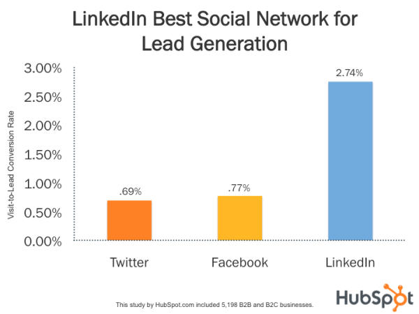
Mastering LinkedIn Marketing
Because LinkedIn is a slightly different audience from other major platforms like Facebook, Twitter, or Snapchat, you’ll want to understand the audience before investing time or resources into a campaign or advertisement. Be sure to keep the stats above, as well as emerging research about the platform and its audiences, in mind as you prepare your next social media strategy.
If you’re looking for more inspiration or hard research to help you guide your LinkedIn strategy, check out this great post which highlights the most engaging topics and posting strategies on the platform. If you’re more interested in boosting your personal profile and network on LinkedIn, here’s a guide on how to become a LinkedIn thought leader.

Can You Really Drive Traffic With Clickbait Articles?
Last week, my favorite fitness YouTuber, Sydney Cummings, posted a video with a title that left me absolutely devastated.
Quickly I pressed “play.” From the title and the opening sequence — complete with sad piano music and ominous text in the beginning (“Trust us — we hate this too … this is hard for us both,”) I prepared myself for the sad realization that this was Cummings announcing the end of her YouTube channel.
I’ll admit, as the video kept progressing, I was sliding into a slight panic. I thought, “How else am I going to get the same results?!”
But then, the music stopped. The black screen filtered out to reveal Cummings in an empty room. She and her fiance took the time to somberly explain that the time had come for them to finally say goodbye … to their old fitness studio in lieu of an upgrade.
It was then that I realized that I’d been clickbaited.
Cummings expertly played with a vague title and introduction to draw me in and keep my attention — and emotions — at a high. Clickbait is a powerful way to deliver a message to readers, whether the intent is good or bad.
What is clickbait, and how is it so effective? This post will fill you in, so let’s get started.
If you’ve ever been “clickbaited” before, think about what drew you in. Was it the mention of a topic you’re interested in or a certain emotion you felt?
As for the video from my favorite fitness YouTuber, it was the terror I experienced when reading the video’s title. I had to know what was going on and how I was possibly going to continue without her instruction. That emotional connection kept my eyes glued on the video until I had an answer.
Clickbait is successful because the content often follows a formula. It leaves readers on a cliffhanger and uses a buzzy keyword, celebrity, or known phenom to attract attention. You can often spot clickbait by the strong, reactive language that’s used in its titles.
Take this headline from The New York Post, for example:

NASA scientists are a reputable and known source of information about space. This title suggests that they’ve found evidence of a parallel universe, and that by clicking on the article, you’ll find an explanation of their findings.
However, when you read the article, you find a summation of parallel universes, the experiment used to detect the existence of an alternate universe, and the conclusion that no concrete evidence was found. The article ends with the quote, “‘We’re left with the most exciting or most boring possibilities,’ said Ibrahim Safa, who also worked on the experiment.”
Because the content didn’t deliver what the title alluded to, the headline can be seen as clickbait.
Let’s go over clickbait titles in a little more detail.
Clickbait Titles
Clickbait titles are generally vague, imply a great benefit to readers, and invoke emotion.
In the NASA example, the vague title suggested that the benefit of reading the article through to the end would reveal a brilliant, groundbreaking discovery. It inspired a sense of wonder and intrigue. In reality though, when reaching the end of the article, most readers probably feel just as let down as I did.
Clickbait is great for raising click-through rates, but you’ll likely leave readers feeling deceived. If you continuously use clickbait titles and mislead readers, it could damage your brand’s credibility. Readers could start to believe that the content you’re providing isn’t valuable, but instead created to drive traffic.
Common clickbait titles include phrases like, “You won’t believe this,” or “This is how …”. If the headline implies a great value from reading further, it’s a good contender for clickbait.
Clickbait titles don’t have to be deceptive. They can allude to valuable content while still following the rules of clickbait. This is why, though clickbait is considered false advertising, it doesn’t have to be — it can still be truthful about the post’s content.
For example, let’s look at this title from BuzzFeed:

This title conveys to the reader that they’ll most likely enjoy the list of knick knacks in the post that are under $40. It still expresses the emotional value, is slightly vague, and implies a great benefit. The content within the post backs that title up — you’ll find a list of 33 items underneath $40 that readers may or may not love.
The goal of clickbait is to increase clicks and bring readers to a webpage by using an engaging title. Let’s go over some examples of clickbait in the next section.
Clickbait Examples
Generally, if your title compels web browsers to engage with your content because of the benefit you allude to, it’s most likely clickbait. Additionally, clickbait titles tend to use absolutes, such as “Always,” or “Never.”
Keeping in mind some other clickbait commonalities, like the use of a celebrity, phenomenon, cliffhangers, or the promise of relatable content, let’s see how they’re used by brands:
1. “OMG! You’ll Never Believe These Talents”
Popular talent reality show, “America’s Got Talent,” showcases the unique talents of its contestants for the grand prize of $1 million dollars. This compilation uploaded from the show’s official YouTube channel boasts a clickbait-y title for the ages.
In the video, the talents include gymnastics, acrobatics, and magic. If you’ve ever seen AGT or a show similar, this is usually what contestants do to show their skills. Although the title suggests that viewers will “never believe” the talents displayed, a regular watcher of the show can easily guess the type of contestants in the video.
While the competitors do express unique abilities, they’re not out of the ordinary from other types of talent shown on the show. Thus, the title, alluding to audience members not being able to comprehend the talent shown, is an example of clickbait.
2. “This app uses the power of karaoke to teach you new languages.”
In an article from The New York Post, readers will learn about Beelinguapp, a tool designed for mobile users who want to learn a new language. Similar to Duolingo, the app combines reading and listening, as well as vocal recording, to provide an immersive educational experience for its students.
While most of the title is technically true, the use of the term “karaoke” can be seen as slightly misleading. Karaoke often describes the popular group activity of singing your favorite songs with friends. When I clicked on this article, I was intrigued to know how singing along to Britney Spears’ smash hit, “Toxic,” would help me learn German, for example.
Although the use of the word “karaoke” can be misleading, the title isn’t entirely malicious. The content of the post did, in fact, inform readers about an app that uses karaoke-like tools to learn new languages. This is an example of how clickbait can be used ethically.
3. “Baby Yoda’s official life-size figure is here, and it’s fabulously expensive.”
Polygon’s article about a viral character is a wonderful example of clickbait. It uses a popular culture reference, Baby Yoda from the “Star Wars” franchise, and is relatable to readers who are fans without giving the big benefit of the article away — the price of the item.

Rather than spoil the big reveal of the article in the headline, this post has readers hooked until the very end to learn the price. This is an example of benign clickbait that hooks readers effectively.
Spoiler alert: The figure costs $375.
4. “30 things that’ll basically give you no choice but to stay organized.”
BuzzFeed listicles often have vague titles like the example above. From this headline, readers can infer that they’ll read 30 items related to organization. Readers desperate for a little organization in their lives will definitely feel compelled to click on this post and see what the article has in store.
Readers will find a shopping list of products that organize items, like tabletop device holders, vacuum storage bags, and drawer dividers. Though the things in the listicle do promote organizational structure, it’s almost impossible to guess what the article will contain. Because it’s not easy to guess the benefit of the piece from the title, this headline is clickbait.
We’ve now seen that clickbait can come in a few forms: video content and editorial content. Recently, I’ve even spotted clickbait subject lines. Another common form of clickbait is through advertisements.
Clickbait Ads
Clickbait is great for raising CTR, so it’s a no-brainer for brands looking for new ways to advertise.
You may have encountered clickbait ads while scrolling through social media, or even have interacted with some. The ads you see are formatted in a similar way to headlines. They can be vague, inspire emotion, relatability, and imply a great benefit from interaction.
For example, this ad from Goodful on Facebook asks viewers a question, implying that they’ll provide the answer in the video:
Clickbait ads are made to bring web browsers to a website or to introduce someone to a brand. For instance, while scrolling through CNN’s website, I came across the paid content section. This section had numerous clickbait ads, including this one from Wikibuy:

Once again, because the title infers the uncovering of a useful, secret way to save money, this paid content is considered clickbait.
However, clickbait isn’t the only way to earn traffic for your content. You don’t have to deceive readers in order to compel them to interact with your content. Let’s talk about how to obtain that traffic without using false advertising.
How To Get Traffic Without Using Clickbait
You don’t have to use clickbait maliciously. Webpages can still have interesting titles that pull the reader in, which is how clickbait gets its audience. Let’s go over a few ways to brainstorm interesting titles that won’t deceive readers.
1. Use the most interesting part of your post in the title.
What’s the most interesting element of your blog post or web page? Is there a shocking statistic that turns heads? You can use this portion of your article in the title to boost traffic without being misleading.
For instance, let’s say you interviewed an industry thought leader for your piece and gathered amazing tips about building an incredible remote work routine. Your title could highlight this by saying, “5 Remote Work Myths Debunked, According to a Marketing Manager.”
This title still follows the basic build of clickbait. It hints at valuable content for readers. It also plays to emotions by telling the reader that misconceptions about remote work will be answered.
Most importantly, this title isn’t deceptive, it’s informative.
2. Leave your title on a truthful cliffhanger to entice readers.
Like the example above, leaving your title on a truthful cliffhanger is one way to ethically use clickbait to your advantage. Let’s say you’re writing a roundup of SEO tips. For the title, you could use the most helpful tip to pull readers in. For example:
“Increasing ROI and 10 More Reasons SEO Why Boosts Your Business.”
This title communicates to the reader why your post will be valuable to them: It hints at numerous helpful tips and puts the most valuable one at the forefront. More than that, the title doesn’t give everything away — it merely hints at the helpful content readers will find within the post.
3. Use emotions in your headline to connect with readers.
Emotions are a way to tap into the interests of your audience. You can either use them deceptively, like with clickbait, or tie them back to the content of your story. Let’s illustrate the latter with an example.
Imagine that you’re writing a product page for marketing software that automates the duties of marketing professionals. The goal of this software is to make marketers’ jobs easier. For that reason, the title can cater to emotions of relief and ease:
“Email Marketing Can Be Hard. Your Design Shouldn’t Have to Be.”
Understanding why the audience will find your content helpful is the key to writing a title that relates to emotions. This title highlights how email marketing can be difficult, but automation software will make the process a breeze for marketers.
This way, you’re alluding to how your software alleviates some of the challenges email marketers face without being unethical.
4. Be relatable in your heading so you can draw in broad audiences.
One of the ways clickbait titles grab the attention of readers is by using relatable language in the title. Consider a title such as, “Only Sales Professionals Will Understand This.” This title will immediately draw the attention of those in sales.
Additionally, relatable titles are more shareable. If one sales professional clicks on that post and thinks of their team while reading, they might be compelled to share the post with their colleagues. That way, this post is organically getting more attention without having to sacrifice value or intent.
Sometimes, I get clickbaited and find an awesome surprise, like an entertaining article that provides functional advice about organizing. Other times, I feel slightly misled and let down by clickbait. When deciding how to use clickbait in your content, think about what will delight your readers.
Clickbait can be fun as much as it can be deceptive. If you plan out how you use it, you don’t have to worry about your credibility being at stake every time you come up with a title. How do you plan to use clickbait to drive traffic?
