
Welcome to My Blog
The Beginner’s Guide to Facebook Messenger Ads
With two billion messages on Facebook Messenger sent between people and businesses each month and 53% of people willing to buy from a company they can directly message Facebook Messenger, Facebook Messenger ads are one of the best ways to leverage the popularity and convenience of the app to generate more brand awareness and revenue.
If you need a rundown of what Facebook Messenger ads exactly are, the different types of Facebook Messenger ads you can leverage, and some of the best Facebook Messenger ads that can inspire your own, read on.
Facebook Messenger Ad Types and Examples
Sponsored Messages
Sponsored messages are ads that show up in your chat box with brands. As a brand, you can only send a sponsored message to people who have already messaged you. Sending sponsored messages are ideal for re-engaging people who’ve lost touch with you on Facebook Messenger, nurturing your engaged audience members, and up-selling existing customers.

Image Credit: Facebook
In Jasper’s Market’s sponsored message, they entice their audience with an attention-grabbing first line. “Great news!” sparks their curiosity and “For a limited time…” leverages the scarcity principle, triggering a sense of urgency to potentially take advantage of their deal before it’s too late.
Once people click through to their ad, Jasper’s Market also makes it easier for people to use their coupon by providing them with their stores’ location and hours inside Facebook Messenger.
Destination Ads
Like most Facebook ads, a destination ad shows up in your newsfeed. But, unlike most Facebook ads, if you click on a destination ad, the brand will send you a message on Facebook messenger, usually aiming to start a conversation with you rather than convincing you to take their desired action.

Image Credit: MobileMonkey
In MobileMonkey’s destination ad, they offer people a quick and easy guide to building a chatbot without any coding knowledge. Their copy clearly and concisely states their guide’s benefits and their call-to-action, “Type: ‘Send Me the Secrets’”, further persuades to send them a message to access their guide.
Home Screen Ads
Home screen ads are like display ads in your Facebook Messenger inbox. Even though they can seem intrusive, a relevant home screen ad can attract positive attention.

Image Credit: AdEspresso
For example, in Original Coast Clothing’s home screen ad, they create urgency for their fall favorites and entice people to click through to their ad by highlighting how spending over $20 on a single purchase will get you free shipping.

The Best 14 Landing Page Builders for Any Business
Lead generation is essential for driving sales and growing an online business.
There are plenty of different methods for generating leads, but one of the most effective options is a well-designed landing page.
Building a fully-optimized landing page has never been easier — in fact, it’s now possible to create a lead generation gold mine using drag-and-drop tools without seeing a single line of code.
Whether you’re managing one or multiple pages, there are now so many options available that it can be tricky to find the best one of your needs.
More than likely, the hardest part of designing a landing page is choosing the right tool to get started — plus, you don’t want to waste months designing a landing page before realizing the software simply isn’t up-to-speed with what you need.
To ensure you’re able to choose the best landing page builder for your team’s goals, we’ve cultivated a list of the 14 best — but first, let’s explore some key features to look for in a landing page builder.

Key Features of a Landing Page Builder
Although there are many landing page builder options with unique strengths and weaknesses, there are certain features you’ll want to see in any landing page builder.
Here are four:
1. Easy-to-use visual builder.
These days, users demand ease-of-use, and landing page builders tend to feature a drag-and-drop interface which makes it easy for anyone to build a landing page quickly — without coding. You’ll want to ensure your landing page builder offers a simple and intuitive interface. If it doesn’t, you should check out alternatives.
2. Integration with CRM software.
The point of a landing page is to generate leads or make sales, so it’s vital that your landing page builder integrates with software that can store those leads and allow you to analyze data on potential prospects.
Ideally, a landing page builder will link to a powerful CRM that can pull together a customer’s data and integrate with marketing, sales, and customer management software.
3. A/B testing and optimization.
Testing and optimizing your landing page is an integral part of the process.
It’s unlikely you’re going to nail it on the first try, so you want software that enables testing customer behavior and optimizing the content and layout to maximize conversions.
This can either be a part of the product itself, or provided by a third-party, as long as your landing page builder offers the option to integrate with third-party A/B testing tools.
4. Analytics tools.
Most services offer built-in, specialized landing page analytics tools which enable you to dig into your user data.
Whether providing detailed reports, heat maps, or plain old page-views, analytics tools are essential in assessing how your landing page is doing.
Now that we’ve explored four key components of any landing page builder, let’s take a look at 14 of our favorite options.
1. HubSpot Landing Pages
Price: From $800/month
Capterra Rating: 4.5/5 | 3309 reviews
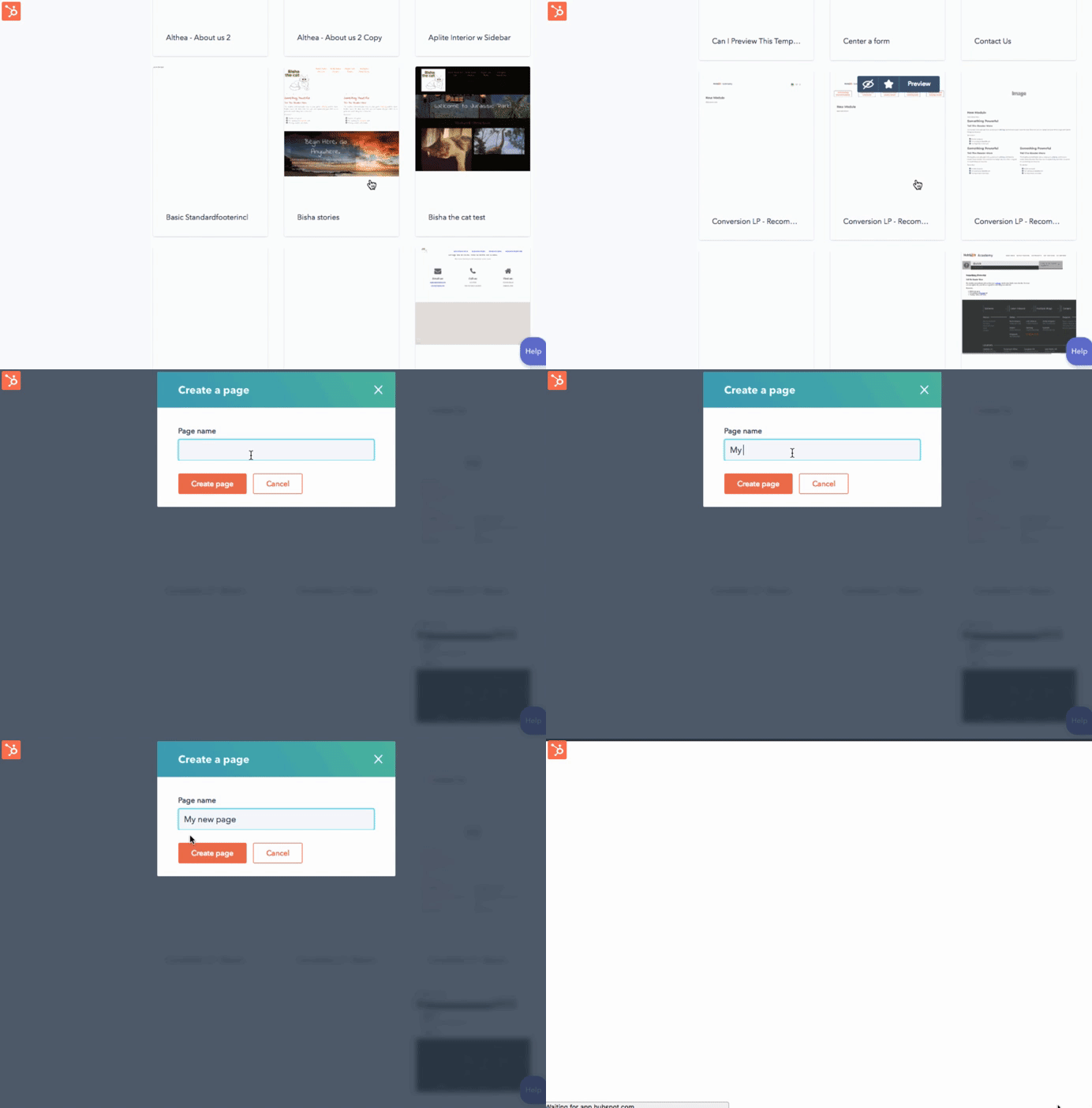
HubSpot offers one of the most feature-rich, intuitive landing page builders on the market — which becomes even more useful when combined with HubSpot’s free CRM. As with most things HubSpot, the landing page builder is slick, easy-to-use, and powerful.
The software is suitable for single users, small teams, large teams, and even agencies managing multiple pages. You can simply add more paid features as you need them.
For beginners, the software walks you through the process of building a fully-customized landing page, starting with one of the hundreds of tried-and-tested templates.
For more advanced users, there are a host of tools and technologies to play with. One of the most advanced features is the capability for personalization to individuals, utilizing your existing HubSpot contacts and data. The builder also features HubSpot’s advanced analytics tools and testing software so you can optimize your page to capture as many leads as possible.
Pages are fully responsive on all devices, as you would expect, and it’s possible to create professional looking pages in minutes.
2. Landingi
Price: From $29/month
Capterra Rating: 5/5 | 47 reviews
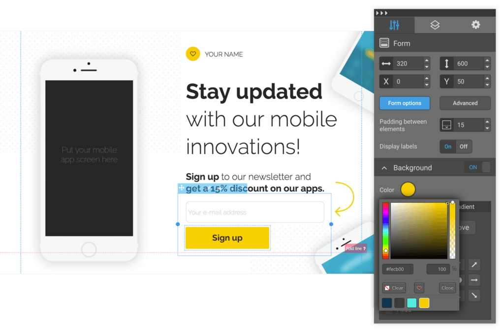
Landingi bills itself as the “landing page builder for non-programmers” — it’s all about ease-of-use, and offers more than 200 templates. The interface is drag-and-drop, which enables you to build a page in minutes. It also offers A/B split testing and optimization features.
This is a cheaper option and one that’s good for beginners, but if you are looking for more advanced features or scalability, the premium tiers quickly bring you up to the price of more powerful tools without offering the same functionality.
3. OptimizePress
Price: From $97 one-off
Capterra Rating: 3.5/5 | 7 reviews
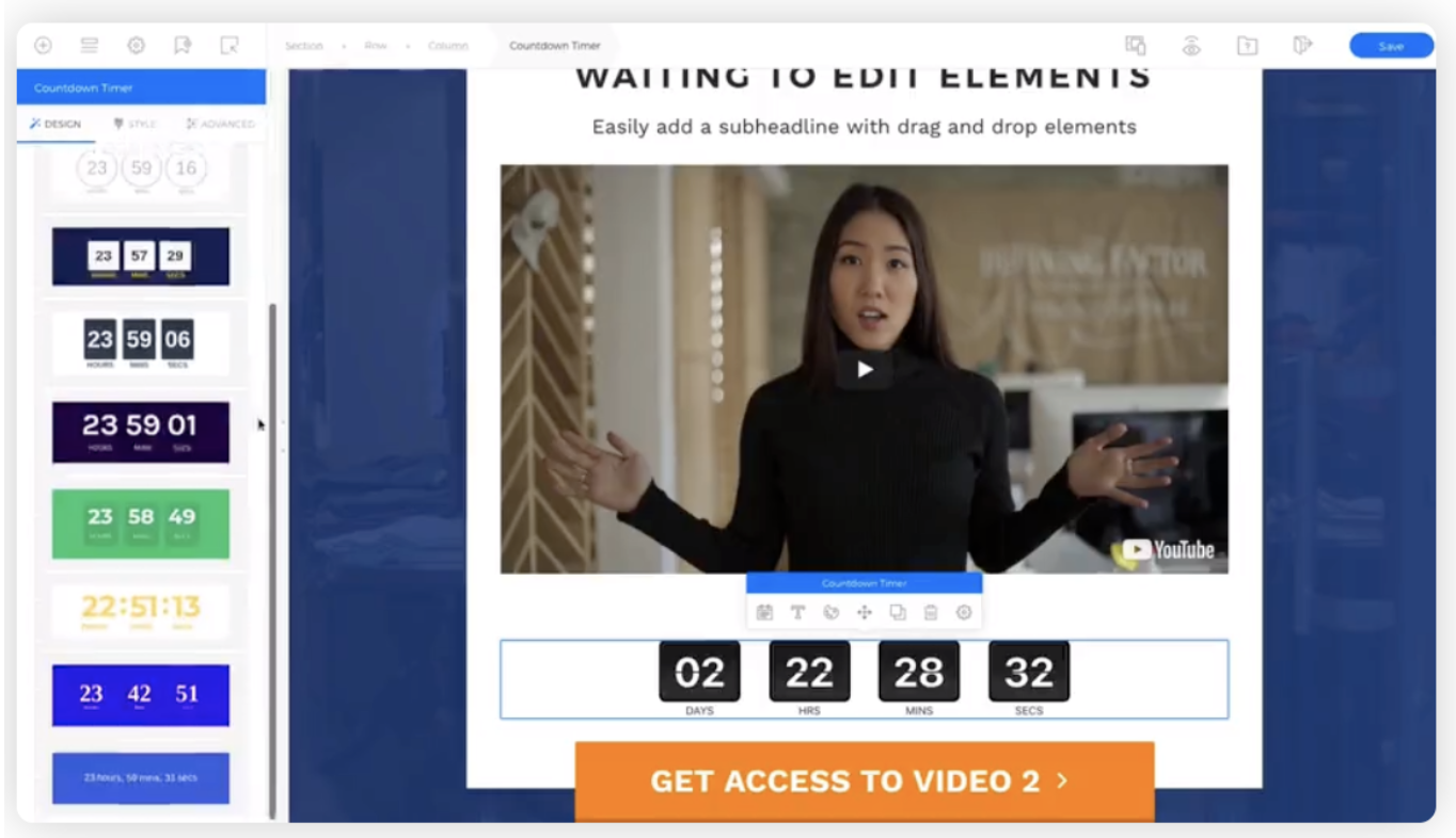
OptimizePress is a WordPress-based landing page builder with hundreds of templates for lead generation pages, sales pages, and more. It has a library of graphic elements and useful plugins for easy customization, and also integrates with email marketing services like Mailchimp or ActiveCampaign.
It operates on a one-off fee structure, which includes one year of support and updates. This means you only pay for the features you need as you grow.
4. GetResponse
Price: From $15/month
Capterra Rating: 4/5 | 172 reviews
GetResponse is a good option if you want to quickly build optimized and responsive landing pages. It has a user-friendly interface and allows you to publish your page to your own domain.
Along with landing pages, you can also create webinars and email marketing campaigns. Additionally, GetResponse has built-in analytics features and the ability to add a PayPal button for easy mobile payments.
Although it offers an intuitive landing page builder and an all-in-one marketing suite, landing pages are not what GetResponse specializes in — but it’s still a good option for marketers at this price point.
The most basic option offers email marketing and landing pages for up to 1,000 responses. If you grow beyond this point, you will have to go for the more expensive Pro tier, which offers the full landing page building capabilities.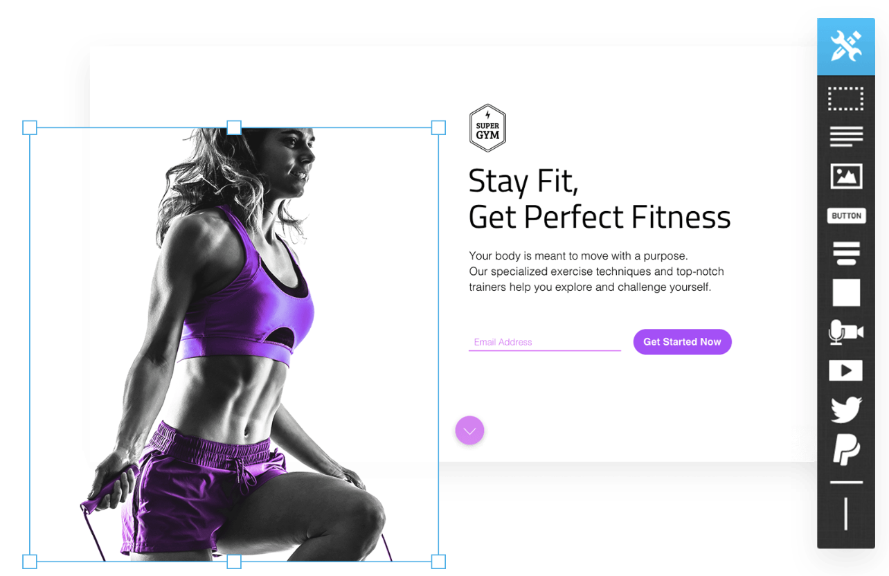
5. Mailchimp
Price: From $10 per month
Capterra Rating: 4.5/5 | 9767 reviews
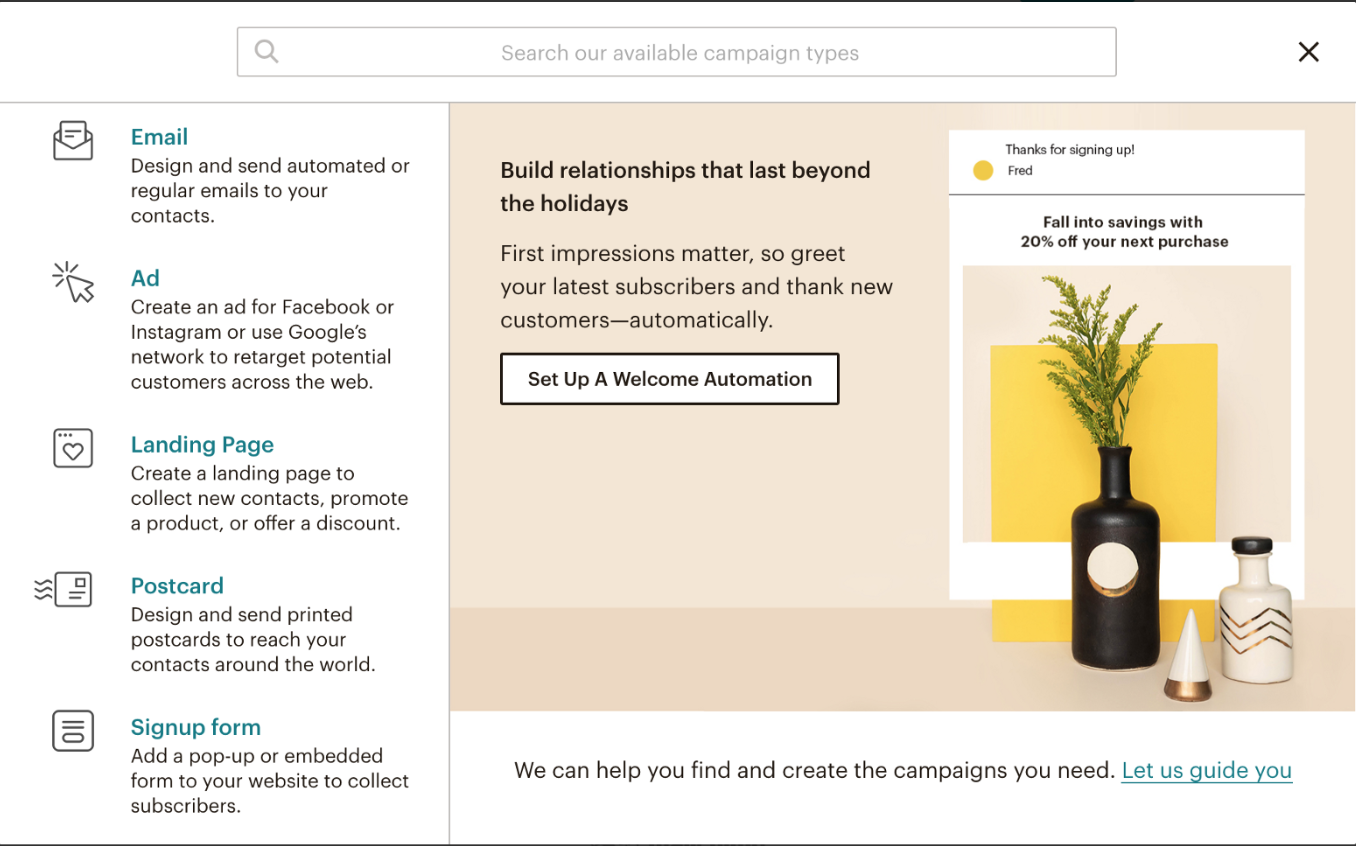
Mailchimp’s landing page builder, unsurprisingly, is geared towards email marketing. It’s all about building pages that visually match your Mailchimp email campaigns, and enable you to easily add contacts to your existing lists.
The software is easy-to-use and offers impressive support with a ton of troubleshooting content available. The seamless integration with the Mailchimp suite is a plus if you already use the software, but landing pages are not Mailchimp’s main focus, so the editor is limited. In fact, it’s not much more advanced than Mailchimp’s simple email creation tool.
It is good for email campaigns but a bit limited as a landing page builder. More advanced users will want to go with the optimization, testing, and analytics features of some of the other options in this list.
On the plus side, for novices, you can get a landing page built for free on the most basic tier and build up from there.
6. Unbounce
Price: From $79 per month
Capterra Rating: 4.5/5 | 142 reviews
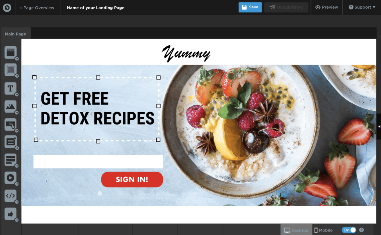
Unbounce was one of the first dedicated landing page builders to come to market and remains one of the leaders. It features an easy-to-use drag-and-drop editor, custom plugins, mobile optimization, and the ability to add pop-ups and sticky bars.
The product is feature-rich — it offers WordPress integration, A/B testing, and dynamic keyword insertion for SEM campaigns. While it doesn’t offer its own analytics tools, it can be integrated with other services like Mailchimp, HubSpot, or WordPress to achieve this.
Overall, Unbounce is one of the best tools out there — but it comes at a premium. It is favored by larger marketing agencies with a focus on search engine marketing, but doesn’t have the all-rounder capability of tools like HubSpot.
7. Instapage
Price: From $99/month
Capterra Rating: 4.5/5 | 239 reviews
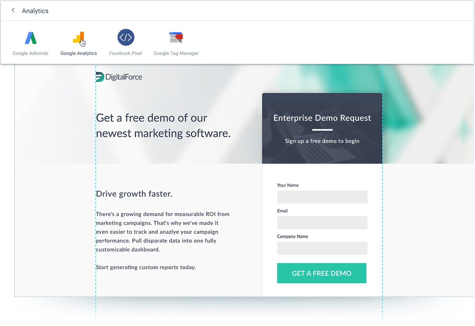
Instapage is another leader for landing pages, with a user-friendly drag-and-drop builder and the option to easily integrate your landing pages into your website without coding. It is one of the easiest tools to use, comes with a host of plugins for maximum customization, and offers a simple analytics tool and report generator.
For optimization, there are heatmaps, A/B split testing, dynamic keyword insertion for PPC campaigns, and codeless integration with Google Analytics and Facebook ads. For more advanced options, you’ll have to contact the sales team for a tailored price, but you’d be looking at upwards of $175 per month for an agency or team plan.
8. Squarespace
Price: From $12/month
Capterra Rating: 4.5/5 | 976 reviews
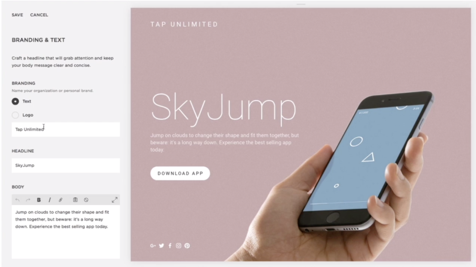
Although Squarespace is considered a website builder, not a specific landing page tool, it has all the functionality of a landing page builder — including the benefits of hosting your site and providing you with analytics, G Suite, integration with other CRM’s, and much more.
Squarespace is a great option for beginners who don’t need all the specific optimization features of a dedicated landing page builder. With the Cover Pages tool, it’s easy to create a page using one of the hundreds of templates and drag-and-drop tools.
There is a built-in analytics tool. Additionally, you can hook up Squarespace with a CRM software to use the CRM’s optimization and email marketing tools on your Squarespace page.
9. Leadpages
Price: From $25/month
Capterra Rating: 4.5/5 | 89 reviews
LeadPages is a cheaper option with a fairly easy to use drag-and-drop builder. However, the interface is a little awkward to use at times and looks a little outdated.
If you want to publish to your own URL, it’s not as easy, although if you are a WordPress user there is integration with your site. Overall, it’s a reasonable value option if you don’t need the higher-end functionality and support of the market leaders — but it’s tricky to get the page looking exactly as you want. 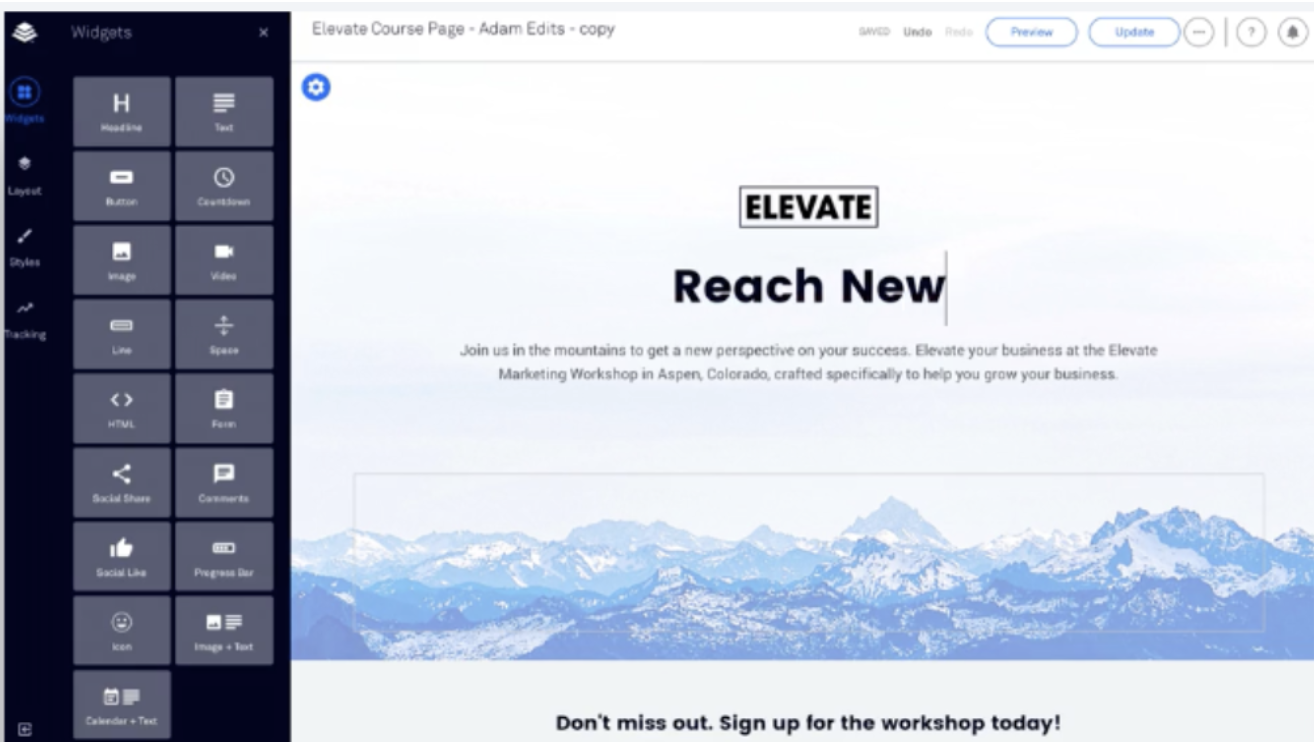
10. Thrive Architect and Thrive Optimize
Price: From $19/month
G2 Crowd Rating: 4.1/5 | 10 reviews
Another WordPress-based builder, Thrive Architect is probably the best bargain option available, especially when combined with Thrive Optimize, its optimization tool.
It offers a simple drag-and-drop builder with 250+ templates and a number of conversion elements including testimonial blocks, timers, and CTAs to choose from. This makes it a good option for a quick build at a low price.
Best of all, you can get it for life for a one-off fee.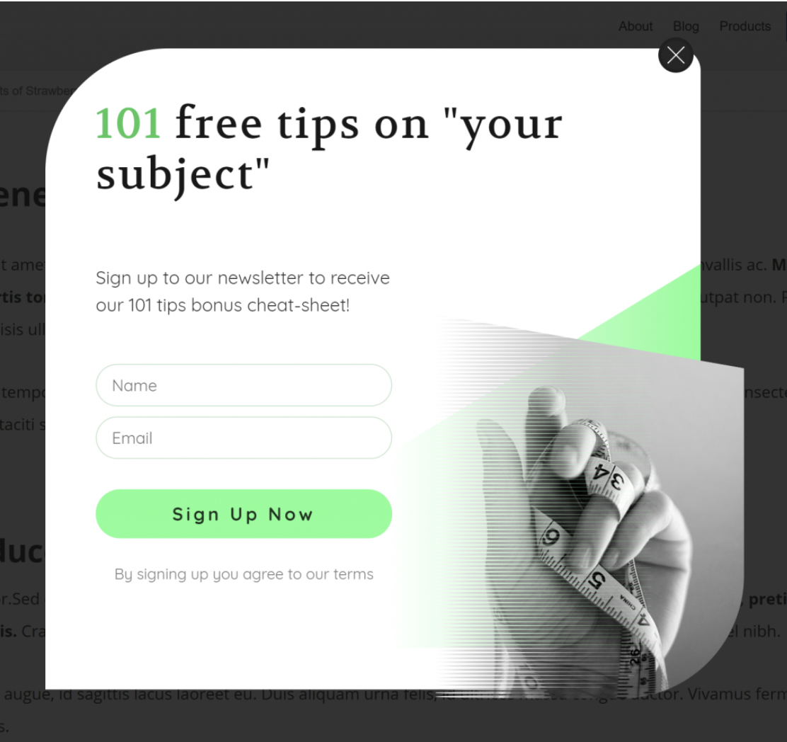
11. Lander
Price: From $16/month
Capterra Rating: 4/5 | 3 reviews
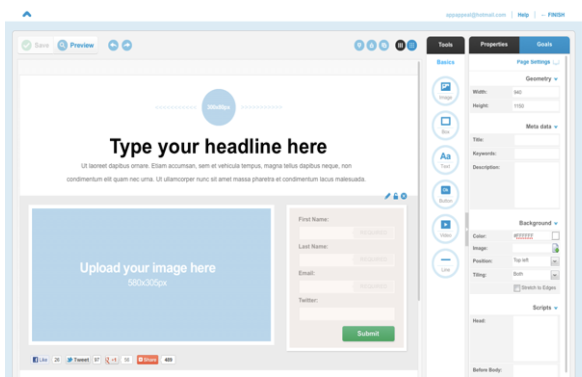
Lander targets small businesses and entrepreneurs with a rock-bottom price point and simple builder. Although it doesn’t offer the best customization or advanced features like some of the others in this list, it’s nonetheless a good option as a simple landing page at a low price.
The app offers over 100 SEO-optimized templates, and supports A/B split testing. It also offers a rare feature among landing page builders — Facebook integration. Without any coding, you can build your own Facebook tabs and connect them with your account.
Pricing tiers are limited by the number of visitors and domains, so it’s prohibitive to larger businesses and agencies.
12. LaunchRock
Price: Free
G2 Crowd Rating: 3.7/5 | 6 reviews
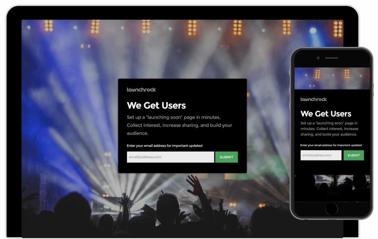
If you’re looking to quickly create high-converting landing pages for free, LaunchRock is the most basic option in this list.
With a focus on simple but impactful visuals, it comes with loads of customizable templates and is an effective starting point for small businesses to jump into the world of landing pages and lead generation forms. Plus, it includes promotional features for running competitions.
It lacks A/B testing and customization is limited, but the super-quick builder is perfect for those who need a landing page without all the bells and whistles, fast.
13. KickOffLabs
Price: From $19/month
Capterra Rating: 4/5 | 1 review
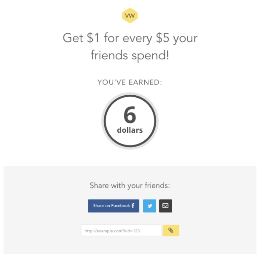
KickOffLabs is based on the idea of generating leads via viral marketing campaigns — it allows you to run appealing contests, sweepstakes, and product launches.
It also happens to be a decent landing page builder in its own right, but focuses its marketing efforts on the promise of viral traffic generation.
The templates are mostly geared towards coupon giveaways, referral rewards and the like, so if this is something you’re interested in, KickOffLabs helps you quickly and easily create a professional-looking landing page. Whether or not it will go viral — who knows?
14. ShortStack
Price: From $29/month
Capterra Rating: 4.5/5 | 53 reviews
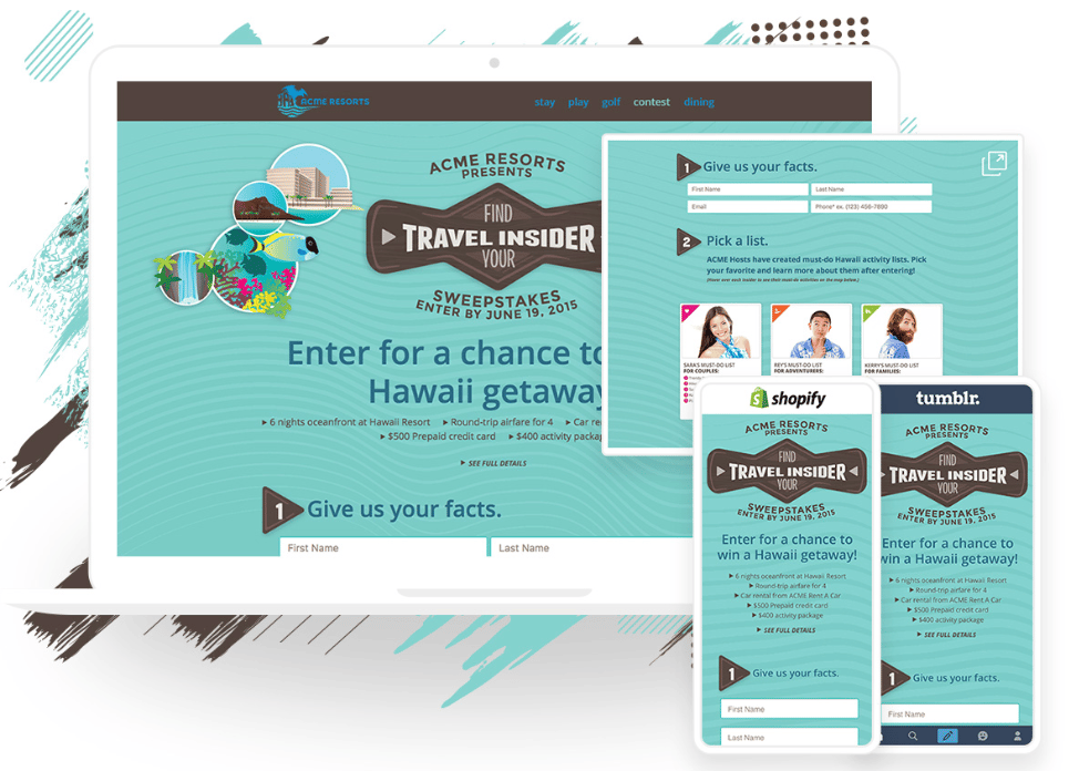
Shortstack specializes in landing pages for contests, giveaways, and quizzes.
It includes email marketing tools to run the competitions and keep contact with participants. The drag-and-drop builder is focused on speed and offers a multitude of templates.
With built-in analytics, you can keep track of your campaigns. Plus, integrations with email services like Mailchimp make it easy to store the leads you collect.
You can build all the pages you want with the free tool, and upgrade at any time for additional features and tools.
There are so many tools available to build landing pages, but it ultimately comes down to which is right for your specific purpose.
If you’re looking for a user-friendly landing page builder that integrates all your customer data and analytics tools from HubSpot’s market-leading software suite, get started with Hubspot Landing Pages today.


How to Measure Your Instagram Stories ROI: Advanced Techniques
Are your Instagram stories helping you reach your business goals? Wondering how to dig deeper into your Instagram stories’ performance? In this article, you’ll learn how to combine Instagram Insights and Google Analytics to better report the ROI from your Instagram stories. Why Combine Instagram Insights With Google Analytics Data? From a social media marketing […]
The post How to Measure Your Instagram Stories ROI: Advanced Techniques appeared first on Social Media Marketing | Social Media Examiner.
from Social Media Marketing | Social Media Examiner http://bit.ly/2JeG5f4
via socialmediaexaminer
13 of the Best Facebook Ad Examples That Actually Work (And Why)
On average, Facebook is home to 1.45 billion daily active users — from CEOs, to students, to companies. And while the community is clearly there, connecting with them from a marketing standpoint isn’t always easy.
For brands, posting on Facebook alone isn’t enough anymore — especially for ones just starting out. Sure, you can throw money at your efforts to drive people to your Facebook Page and send them to your website, but that only works if you’re smart about it.
One way to do just that is to create optimized Facebook Ads targeted at the right audience. Optimized ads can help you spend your PPC budget wisely and see a positive return on your investment.

So, what does optimized Facebook advertising actually look like? If you’re looking for some great examples, you’ve come to the right place. In this post, we’ll quickly go over the following things about the best Facebook ads. Click a link below to jump to that section of the article:
- Facebook Ads Best Practices
- How do Facebook Ads work?
- Facebook Ad Templates
- Examples of the Best, Most Effective Facebook Ads We’ve Ever Seen (with some insights to apply to your own Facebook marketing)
Before we get to the Facebook ad examples outlined above, let’s discuss what makes a great Facebook Ad — regardless of the format and template the ad is using.
4 Facebook Ads Best Practices
1. It’s visual.
Visual content is not only treated more favorably in the Facebook algorithm, but it’s also more likely to be shared and remembered than written content. The lesson for Facebook marketers? No matter what type of ad you create, your image needs to be visually appealing.
Check out this blog post for a detailed guide to image sizes for various ad units on Facebook along with some tips on posting visual content.
2. It’s relevant.
Relevance is critical for success when using Facebook advertising. Remember, you are spending money when someone views or clicks on your ad (depending on the settings you use). If you’re showing ads that aren’t relevant to your target audience, you’re wasting your time and money and will likely not see success with any kind of advertising.
Back in February 2015, Facebook launched a feature in the Facebook advertising platform that rates your ads and gives you a relevance score, similar to Ad Rank in Google AdWords. The more relevant your ad image, ad copy, and destination page is to your audience, the higher your score is — and the more favorably Facebook will treat your ads.
3. It includes an enticing value proposition.
A value proposition tells the reader why they should click on your ad to learn more about your product. How is your product or service different from any other? Why should the viewer click on your ad to see your website?
Your value proposition should be believable. For example, saying you have the greatest sandwiches in the world will not make people come to your business’s Page, but maybe offering 20% off will. Or, perhaps adding social proof will help — something like, “Sandwiches loved by over one million people every year! Come try yours today and get 20% off your order with this coupon.”
4. It has a clear call-to-action.
A beautiful and relevant ad is great, but without a call-to-action (CTA), your viewer might not know what to do next. Add a CTA like “Buy now and save X%,” or “Offer ends soon” and add a sense of urgency to your viewer. Your CTA should encourage people to click on your ad now.
To invest in Facebook Ads effectively, you first need to know whom your ads are directed toward. When creating a new ad on Facebook, you can create a new audience that includes many customizable characteristics. Among them are:
- Location.
- Age.
- Sex.
- Languages spoken.
- Interests and behaviors.
- Their connections to your other business-related pages on Facebook.
You can also create what’s called a Lookalike Audience, which permits Facebook to create an audience for you that best resembles a particular “source.” This source can include some or all the information listed above.
After customizing your ad’s audience, you need to consider how the ad will look on both desktop and mobile. This ensures you design your ad for easy viewing no matter where it appears on Facebook. Here are three different places you can see your Facebook Ads show up:
Facebook Ad Placements
Placement 1: Right Column
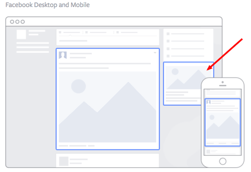
Image via Facebook
This type of ad is the most traditional on Facebook, it appears on the right side of a user’s Facebook News Feed. This is the first type of advertising Facebook had, and it still exists today.
Although ads in the News Feed are likely to get higher engagement metrics due to its native advertising features, right column ads shouldn’t be forgotten. We often see less expensive clicks and conversions when using these ads. In order for a right column ad to be successful, it needs to be relevant, have a value proposition, a good visual, and have a call-to-action.
Placement 2: Desktop News Feed
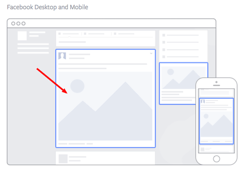
Image via Facebook
This type of ad appears directly in a user’s News Feed when they access Facebook on a desktop computer, and it looks more like native advertising. In our experience, these ads have a higher engagement rate than right column ads, but they can also be more expensive. These ads must follow organic Facebook posts best practices and be both engaging and visual.
Placement 3: Mobile News Feed
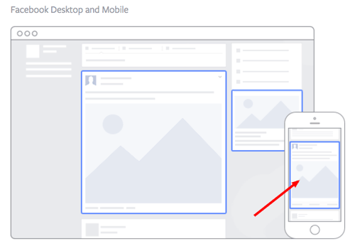
Image via Facebook
Like the desktop News Feed ad, this type of ad appears in the user’s mobile News Feed and displays like an organic post from the people and Pages they follow.
Facebook Ad Formats
Next, you’ll choose a format for your Facebook Ad, and there are eight options to choose from:
Format 1: Photo Ad
Photo Ads are still images that can help to promote a product or event you want to specifically call attention to. If you have a special promotion going on, for example, this ad format puts a crisp snapshot of your product or venue at the center of your ad.
For ads shown in a Facebook News Feed, the recommended image resolution is at least 1080 x 1080.
Format 2: Video Ad
Video Ads have a GIF or video as the centerpiece of the advertisement, and can be used to demonstrate a product or event. Video Ads help you form deeper connections with your audience by aligning your brand with a type of content online users are quickly consuming more of (nearly 80% of all data consumed on mobile devices will be in video form by 2021, according to a Facebook study).
There are six types of video ads you can invest in on Facebook:
- Short Videos and GIFs
- Vertical Videos
- Instagram Stories
- Video Carousels
- Video Collections
- In-stream Videos
Format 3: Stories Ad
Stories Ads are a part of Facebook Stories, one of the newest content types rolled out by Facebook that allows users to post temporary clips and images of their day for their friends to see. This type of ad is fitted to the dimensions of a mobile device, and can be played on both mobile and desktop.
As users browse their friends’ Stories, these ads can appear in the same format inside a stream of Stories. For this reason, it’s best to create Stories Ads that reflect the same candid and entertaining look and feel that people see from their friends. Stories Ads can be placed on Facebook, Messenger, and Instagram.
Format 4: Messenger Ad
A Messenger Ad appears as a direct message in a user’s message list when they’re inside Facebook’s Messenger app. These ads allow you to interact with your audience, showing them offers you think they would like and listening to their responses so you can better tailor your next message to their interests.
Let’s say your ad’s first message is “What product might you be interested in?” The user can then select from three different responses, triggering your ad to produce a more specific product offer directly in the message thread.
Format 5: Carousel Ad
Carousel Ads contain a series of images or videos that users can rotate through, all of them helping to describe a single product, service, or event the ad is promoting. Each Carousel Ad can contain to 10 images or videos at a time and link to their own individual webpages. Because these ads carry so much media, according to Facebook, they’re ideal for:
- Endorsing multiple products.
- Promoting multiple features of the same product.
- Telling a story or sequence of events that unfolds over the course of multiple pictures or videos.
- Explaining a process to potential customers.
Format 6: Slideshow Ad
Similar to Carousel Ads, explained above, Slideshow Ads segment your ad into individual images that users view one after another. The difference between these two ad formats is that Slideshow Ads only play images (not videos), and the ad compiles these images into a slideshow that plays automatically in the form of a video. According to Facebook, Carousel Ads are ideal for:
- Creating a video-like experience for users quickly and with a small budget.
- Advertisers who want to choose from a library of pre-created images and music (a unique perk of Facebook’s Slideshow Ad).
- Simplifying an otherwise complicated concept or process for potential customers.
- Reaching people who have slower internet connections (Slideshow Ads use five times less data than video ads on Facebook).
Format 7: Collection Ad
A Collection Ad allows advertisers to bring the buying process directly into Facebook, so potential customers can move from “discovery” to “purchase” more easily when they see a product they like. This ad format features a central image or video promoting a product, with a collection of four smaller images below it that viewers can click on to learn more about the product. There are four types of Collection Ads you can invest in:
- Instant Storefront: This ad is ideal for displaying multiple products as part of the same ad campaign, and driving traffic to each product’s respective product page.
- Instant Lookbook: This ad is ideal for demonstrating or modeling a product in various contexts for your audience.
- Instant Customer Acquisition: This ad is ideal for driving traffic to, and a specific action on, a product’s landing page.
- Instant Storytelling: This ad is ideal for telling a story about your brand or helping your audience learn more about the business.
Format 8: Playables
Playables cater specifically to app developers. This ad format allows your audience to watch, preview, and even play an abbreviated version of your new app directly from inside the ad.
8 Facebook Ad Templates
Facebook Ads can be used to accomplish a number of different goals for your business. Here are a few real ads that you can use as templates of inspiration when creating an ad that targets the same goal:
Template 1: Video Product Demo Ad
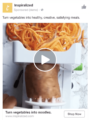
Image via Facebook
Video ads appear fairly large in the user’s New Feed and offer more engaging content than static posts. And with 8 billion videos being watched on Facebook every day, it serves as an interesting — and potentially profitable — ad type for marketers to try out.
How can you create your own video ad? First, understand Facebook video ad requirements including length and video size. We suggest keeping your video as short as possible, even though Facebook allows you to upload a much larger video. Create a video that displays your product or service, and upload directly to the Facebook ads manager by following these instructions.
Template 2: Photo Model Ad
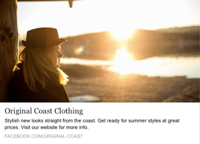
Image via Facebook
Another type of rich media advertising on Facebook is a post of an image. This is one of the most popular types of ads ever since Facebook began favoring visual content. The optimal size for News Feed photo ads is at least 1080 x 1080 pixels, otherwise your image will get cropped. Adjust your image based on the target audience’s needs and by what will appeal to them the most.
Template 3: Multi-product Ad
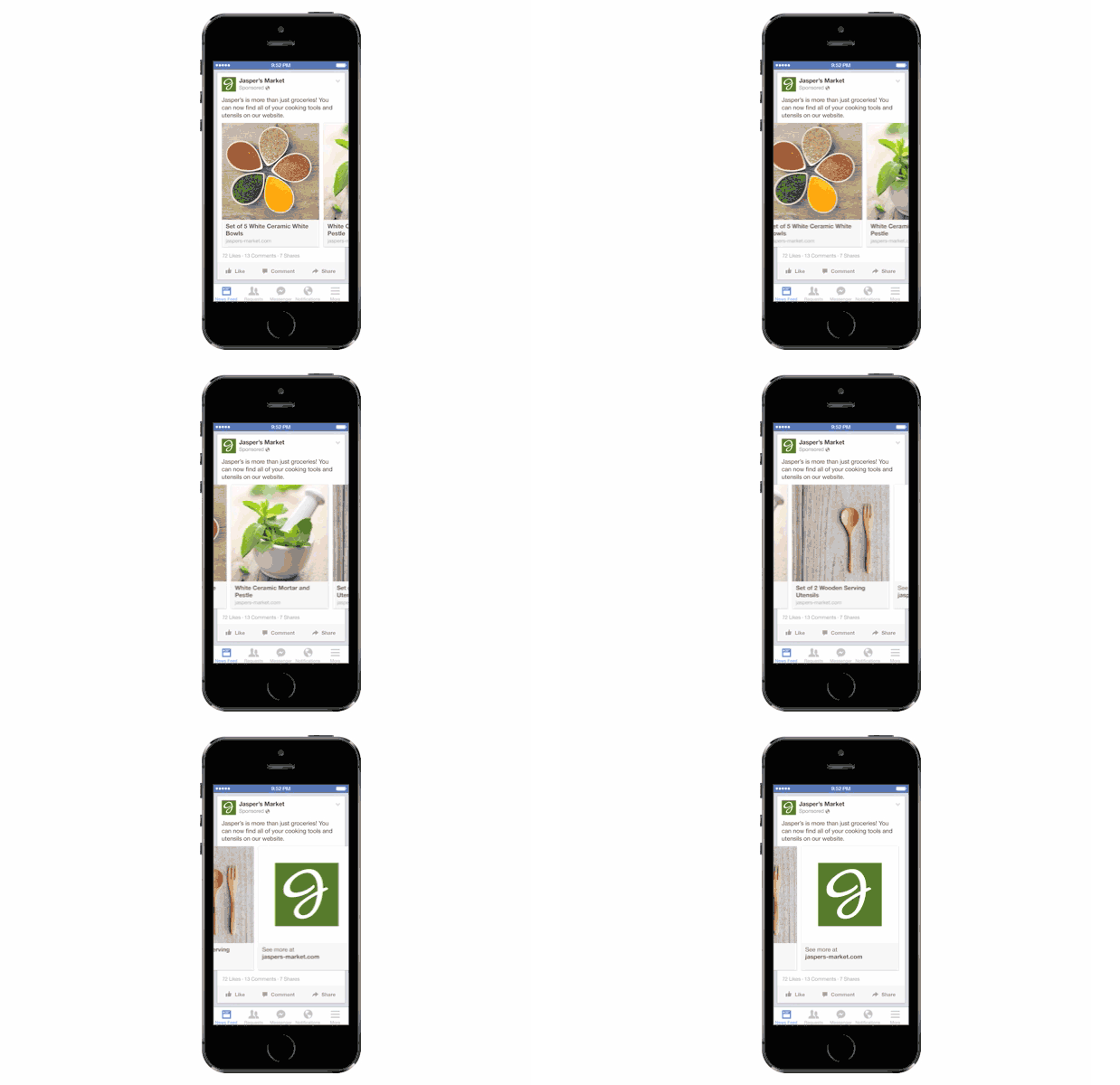
Image via Facebook
Multi-product ads allow advertisers to showcase multiple products within one ad. Viewers can scroll through the images and click on individual links to each product. You can promote multiple of anything, not just products — like different blog posts, ebooks, or webinars. These ads can be created in the Facebook Power Editor.
Template 4: Reach Ad
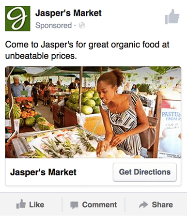 Image via Facebook
Reach ads on Facebook are designed for to grow your local awareness. They only work if your business has a physical location to which you’re trying to drive real foot traffic. If you fall into this category, locally targeted Facebook ads might be a great fit for you, as you can hyper-target on Facebook down to the mile.
If your business has an offer or event going on at your store, set up a few Facebook Reach ads that appear only to people within a short distance of your store. Have these ads appear a few days prior to the event and on mobile devices while the event is happening. You may want to reach some people the day of the event who happen to be in the area and checking their Facebook account on their smartphones.
Template 5: Special Offer Ad
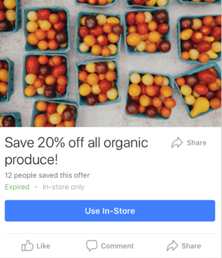 Image via Facebook
An offer ad is a form of Facebook advertising wherein a business can promote a discount on a product or service that can be redeemed on Facebook. The benefit of this? It eliminates one step in the buyer’s journey, which ultimately increases sales.
The offer ad has many benefits. First, it drives the user directly to the offer. The user claims it directly on Facebook, removing any added friction of needing to go to your website for the offer. You also can reach any type of audience that you want, as all the Facebook targeting options are possible.
Finally, you can include all the information needed for the user to decide if they want it or not, including the time period it is usable, the number of people who has already claimed it, and the exact amount the offer is. This will eliminate any unqualified clicks, which cost you money.
Template 6: Event Ad
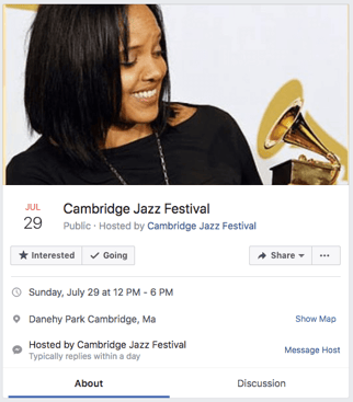
Event ads promote a specific event. The CTA on these ads usually send users directly to the ticket purchase page, wherever that happens to be hosted.
Using this type of ad will help drive a targeted group of people to attend your event. These will show up in the News Feed of the specific audience you’ve chosen. Events are a big part of most businesses, but getting people to attend even a small event, can be tricky. Promoting your event to a targeted specific audience on Facebook can help drive the right kind of attendees.
A good ad in this format will clearly show the benefit of attending the event: the price, dates, and a clear CTA to purchase a ticket.
Template 7: Boosted Ad
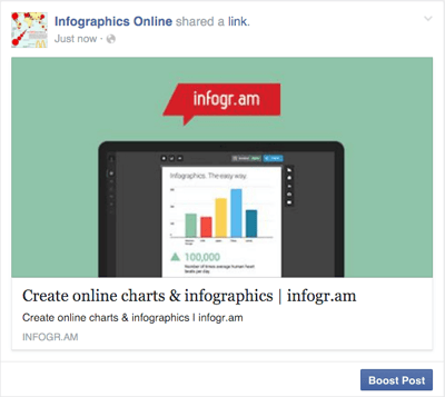 Image via Stealth Seminar
A boosted post is an organic Facebook post that was originally on the homepage of a company’s Facebook, and that later was boosted with advertising money.
This is different from the above ads because it’s not created in the Facebook Ads Manager. You can include more in the description, as there is no limit to word count on boosted posts like there is in ads. You can also have a link in the copy.
The cons? Boosted posts leave you fewer options for bidding, targeting, and pricing. You also cannot run any types of A/B tests because you’re promoting a post that has already been created; you’re not creating one from scratch.
Template 8: Retargeting Ad
A retargeting ad promotes an ad to a specific list of previously identified people. Have you ever seen ads follow you across the internet after visiting a certain website? Then you’ve seen a retargeting ad.
Facebook has the same capability. An advertiser can advertise to a list of leads or customers by uploading a list of email addresses it already has into the Power Editor to make a custom audience. A good retargeting ad acknowledges that the brand knows you’re already interested in its product. (Because, let’s face it … retargeting can be a little creepy.)
Now that we’ve covered the main ad best practices, formats, and templates, let’s dig into a sampling of the best Facebook ads that embrace the above guidelines.
1. Kay Jewelers
Video Ad

This Facebook video ad from Kay Jewelers tells a quick but moving story — something Kay Jewelers is well-known for — using just a few seconds of your time. You don’t even need the sound on in the video above to know what’s happening and the message Kay is sending.
If you’re advertising a product with sentimental value, like Kay Jewelers, video ads are the way to go. Just be sure your video has a clear (and happy) ending — people view videos more passively on Facebook than they would on YouTube, and don’t have time to interpret your ad if it’s too long or complex.
Why This Ad Works
- It’s visual. Even though this is a video, I have a general idea of what I will be watching, thanks to the screen capture it started with. Additionally, I can understand the gist of this ad without playing with the sound on, which is important given that 85% of videos on Facebook are now viewed without sound.
- It’s relevant. It’s relevant to me because I was recently scouring jewelry websites, specifically for necklaces like the one in the ad.
- It’s valuable. Kay shows potential customers the value of purchasing with the help of the happy reaction from the woman receiving the gift in the ad. Plus, who doesn’t love dogs?
- It has a solid call-to-action. This ad is set up to drive Page Likes, which is an easy, one-click way for me to get more relevant content served up to me.
2. Monday.com
Photo Ad
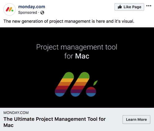
Monday.com is a task-management tool that caters to multiple operating systems, both desktop and mobile. But in the photo ad above, the company used its compatibility with Mac computers to remix its own logo in the original rainbow colors of the Apple brand.
For growing businesses like Monday.com, it’s a smart idea to pivot off the brand awareness of household names. By filling the Monday logo with Apple’s famous rainbow color-way, the ad above captures the attention of Mac users who’d recognize those vintage rainbow stripes anywhere (and could use a new task-management tool that works on their computer).
Why This Ad Works
- It’s visual. The rainbow colors filling the Monday logo are both eye-catching against the black background and familiar to any Mac user.
- It’s relevant. For Mac users, and those who need to organize their tasks on a regular basis, this ad is relevant to their lifestyle in more ways than one.
- It’s valuable. The ad calls attention to Monday’s compatibility with Mac computers, making the product’s user experience more valuable to Mac users as a result.
- It has a clear call-to-action. The “Learn More” CTA on the bottom-right of the ad is a clear invitation to find out more about this product’s usage on Apple hardware.
3. Amazon
Event Ad
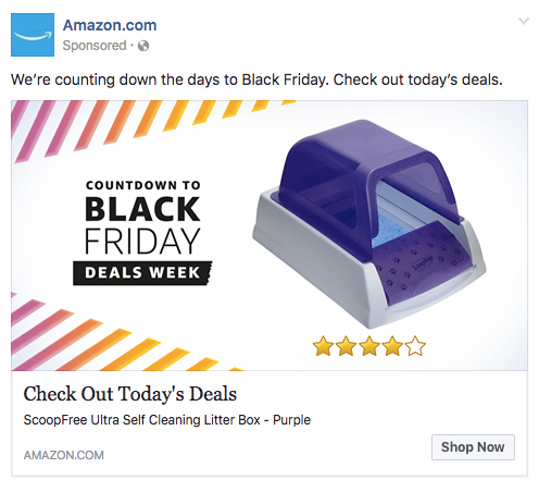
This is how an event ad from Amazon looks in the News Feed on a desktop. This ad works well on a few different levels: A sample product is clearly displayed, the ad shows an impressive (but honest) rating of that product, and you know which event Amazon is promoting right away — Black Friday.
Ecommerce companies like Amazon use event ads to boost sales at specific points during the year, and Facebook event ads make this easy. When investing in event advertising, build a list of the holidays, shows, conferences, and awareness months your business cares about. That way, you know exactly which marketing campaigns line up with these occurrences and when to promote it on your Facebook Business Page.
Why This Ad Works
- It’s visual. Not only is this image larger than the right column ad display, but it also uses warm colors, white space, and directional lines, which drew my eye towards the featured product.
- It’s relevant. As a cat mom, this offer is clearly tailored to my consumer needs.
- It includes an enticing value prop. Amazon has advertised a self-cleaning litter box here, which is of tremendous value for any cat owner. Additionally, it shared the strong customer ratings below an image of the product. (Social proof, anyone?)
- It has a clear call-to-action. Amazon instructs me to click on its ad today, after which point the deal for the litter box will presumably disappear. “Now” is strong CTA language that compels clicks.
4. NatureBox
Photo Ad
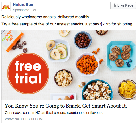
This photo ad by NatureBox features a creative point-of-view shot that is perfect for the angle at which you’d dive into the company’s various health snacks. The ad makes you imagine your next house party … I thought the peanuts spilling out onto the table was a nice touch.
In your next Facebook photo ad, play around with live-action photography and digital design in the same image. As you can see in the ad above, NatureBox was able to design a vibrant “free trial” icon right on top of an image that would’ve worked just as well on its own.
Why This Ad Works
- It’s visual. The image shows you exactly what you’re getting, and it calls out the “free trial” CTA well.
- It’s relevant. Everyone likes to snack. In all seriousness, the person who saw this is a fan of several lifestyle subscription companies, which is what NatureBox is.
- It’s valuable. This ad is full of value. First, the “free trial” callout is the first thing your eyes go to when looking at the image. Second, it clearly mentions the healthy aspects of the goodies in its product.
- It has a clear call-to-action. NatureBox is asking you to try its free sample. It couldn’t be easier to know your next step.
5. Winc
Retargeting Ad
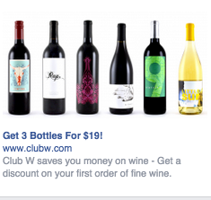
Here’s an example of a short and sweet (literally) retargeting ad from Winc (formerly known as Club W). This ad is displayed on the right column of Facebook specifically for users who browse wine-related content online. When your ad caters to people who you know would be interested, modeling the product the way Winc does above can be a home run for your brand.
Why This Ad Works
- It’s visual. The visual is clear, simple, and appealing to all types of wine-lovers.
- It’s relevant. This came up in my wine-obsessed colleague’s News Feed. Need I say more? Two thumbs up on relevance.
- It includes an enticing value prop. Three bottles for $19? What a steal. They also pull the viewer in with an additional value: a discount on their first order of wine.
- It has a strong call-to-action. The word “get” is strong call-to-action language, and it’s used twice here. A time limit on this offer would have made it even stronger.
6. Shutterfly
Multi-Product Ad
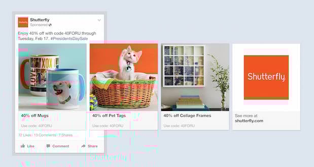
Here’s an example of a multi-product ad from Shutterfly, along with the additional images that are used in the ad. Each image has a different offer, to appeal to many different demographics in one ad.
In each image, the product being promoted is consistent in the look and feel of the Shutterfly brand — this an important quality of ads that showcase more than one item and picture.
Why This Ad Works
- It’s visual. This series of images leans on a consistent color palette, making it feel both cohesive and on brand. (Having a cute cat doesn’t hurt either.)
- It’s relevant. The person who saw this loves taking photos and creating sentimental gifts. Spot on, right?
- It’s valuable. There is a very clear value for the user, 40% off each of the products being advertised. The code and sale end date are also clear in the ad description. This ad also has an added level of value, it is showing the many different ways people can use Shutterfly, in ways many may not be aware of.
- It has a clear call-to-action. I know I need to use this before February 17th when this deal expires, so I would be encouraged to take action right away.
7. MU Campus Dining
Reach Ad
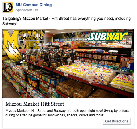
This Facebook reach ad from Mizzou Campus Dining promotes amenities at the University of Missouri, using two familiar logos and a marketplace that anyone on campus might recognize.
The ad copy beneath the image invites customers in “after the game” — a reference to campus life that helps Facebook users imagine when they might want to stop in for a sandwich.
Why This Ad Works
- It’s visual. This image has college pride, a variety of salty and sweet treats, and a well-known logo to attract hungry college students.
- It’s relevant. This ad is likely only being shown to students on campus who are in its target audience. It also mentions the sports game that was going on at the time, and plays to the student’s current needs: snacks and Subway sandwiches.
- It’s valuable. Mizzou Market is telling hungry college students that it has everything students need for the big game.
- It has a clear call-to-action. This ad has the option to show directions, making it extremely easy for a college student on the go to follow the walking directions to this market.
8. Boston Sports Clubs
Offer Ad
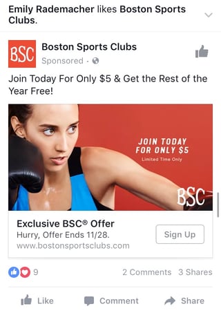
All consumers really need to see is the boxer pictured above to know what this ad by Boston Sports Clubs (BSC) is offering. The woman in the photo even looks like she’s staring at the text to her left, getting viewers to shift their attention to the promotion right away.
This Facebook offer ad makes it obvious what customers would be signing up for when they click the “Sign Up” CTA button below the picture. Offer ads can easily mislead viewers into pressing their CTA just to get them to click on it, but it ultimately doesn’t convert viewers into customers. BSC’s approach above is clear and upfront about what it’s offering throughout its conversion path.
Why This Ad Works
- It’s visual. The featured photo uses bold colors and clear typography to draw my attention to the details of the offer, and the woman exercising gives me an idea of what I could gain from purchasing the offer.
- It’s relevant. I recently moved to Boston and have been searching for gyms in my area online, so this ad is highly relevant to my recent Facebook and search activity.
- It’s valuable. Paying $5 for a monthly gym membership is a great deal. Even though the price may increase in the future, the low price definitely makes me want to click.
- It has a clear call-to-action. The CTA emphasizes that the discount offer is limited and should be claimed quickly using the word “hurry” and telling me when the offer expires.
9. Allbirds
Video Ad
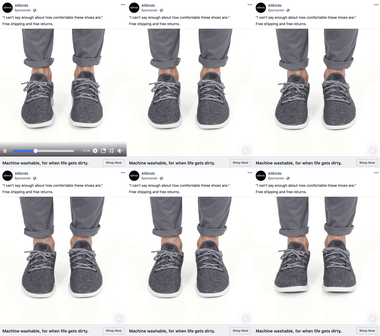
This video ad by Allbirds, a shoe maker, uses simplicity and whitespace to its advantage. The video only lasts nine seconds, but Allbirds demonstrates the product in a way that catches your attention and resonates with the individual wearer.
There’s a lot of ad content on Facebook, and when Facebook users scroll through their News Feeds, that content start to blend together. Sometimes your best chance at sticking out on Facebook is by using subtle movements and details — like Allbirds did, above. Let every other video on Facebook be quick and flashy, and yours will be a breath of fresh air to your audience.
Why This Ad Works
- It’s visual. The video has a clear focus on a subject, and that subject is engaging in a movement that means something: These shoes are comfy. I subconsciously started wiggling my own toes as I saw this ad for the first time.
- It’s relevant. I’m always interested in finding new shoes — I probably search or click on something related to footwear once a week. This ad feeds that interest in a unique way.
- It’s valuable. The opening quote above the video is reason enough for me to want to learn more about why these shoes are so comfortable. Allbirds also sweetens the deal with “free shipping,” “free returns,” and a note below the video that the product is “machine washable” — all without taking the focus away from the video itself.
- It has a clear call-to-action. If I want these shoes, there’s a “Shop Now” CTA button to the bottom-right of the ad, waiting for me take a closer look at them.
10. The New York Times
Photo Ad
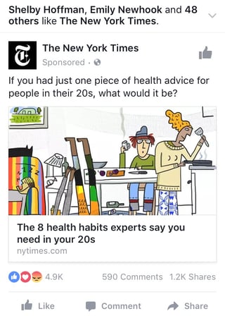
This photo ad by the The New York Times is driving traffic to a written article with an intriguing illustration. The drawing literally depicts the article’s ideal audience — millennials. For young readers who are even a little interested in health and fitness, this cartoon (along with the enticing headline) pokes just enough fun at them to get their attention.
When publishers advertise on Facebook, they need to be especially creative with their featured images — if their main product is a reading experience, the photo they choose has to complement their written content perfectly. The New York Times’ ad above is an example of photo ads done right.
Why This Ad Works
- It’s visual. The quirky cartoon drew my eye as I scrolled on my mobile News Feed through lots of text and photography. The nontraditional illustration pulled me in for a closer look at the content.
- It’s relevant. I’m a person in my 20s, and I used to write about health care. This is an article I would definitely be interested in reading, and it helps that the ad appears like a native post promoting an article in my New Feed.
- It includes an enticing value prop. The ad shows me which of my Facebook friends also like, and presumably read, The New York Times. This social proof makes me more likely to click and read the article.
- It has a clear call-to-action. This ad is dedicated to increasing the page’s Likes, and by asking a question in the ad, the call-to-action makes me want to click the article to learn more.
11. Tortuga Music Festival
Event Ad
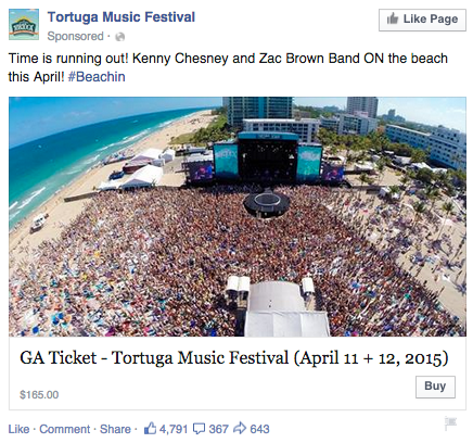
Successful event ads have at least two important qualities: the event’s schedule and something to justify why people should attend. The event ad above for the Tortuga Music Festival accomplishes both of those things — it displays the date and time and the bands playing, and shows you a picture of the amazing time you’ll have if you come.
Why This Ad Works
- It’s visual. The picture alone is worth a thousand words about how much fun this concert would be. Not only is it on the beach, it was also taken on a gorgeous day and the stage looks amazing. Also, it clearly represents what to expect during the event, and it catches the eye as someone scrolls through their News Feed. (The beautiful ocean water definitely helps.)
- It’s relevant. The person who saw this ad is a fan of Kenny Chesney and has been to his concerts before. They’re also originally from Florida, which is where this event takes place.
- It’s valuable. Since the image was taken on a beautiful day, it looks like an ideal place to be — especially to those of us viewing it from our office desks. It also clearly tells you the cost of the ticket so you know before you click. (This is also good for the advertiser: By including the price, the ad allows users to self-select based on whether they can afford the ticket. If they can’t afford it, they won’t click through, thus saving the advertiser money on unqualified clicks.)
- It has a clear call-to-action. The CTA is clear: “Buy.” The advertisers also add urgent wording with the title “Time is running out!”, encouraging you to purchase your ticket now before it’s too late.
12. Adrianna Papell
Retargeting Ad
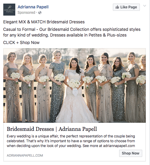
Last week, I started shopping around for a bridesmaid dress for an upcoming wedding I’ll be in. Today, the ad above appeared in my News Feed.
Retargeting ads enable you to get in front of those viewers who are already looking for what you’re offering. This retargeting ad by Adrianna Papell doesn’t just show me what I’m on the market for — it excites me about how beautiful our own wedding party pictures will look on my friend’s big day.
Why This Ad Works
- It’s visual. The image gives me a good idea of what to expect from the designer’s website, and it definitely helps that the gowns are both unique and stunning. Talk about a showstopper.
- It’s relevant. The ad called out that I was already shopping for bridesmaid dresses, and what’s more, I had previously looked at dresses on this exact website, so this ad is highly relevant to my search.
- It’s valuable. The variety of dresses in the ad’s image and in the description make this website worth a visit for someone trying to find the perfect gown out of thousands of options.
- It has a clear call-to-action. The CTA is “Shop Now,” which encourages me to click to purchase the beautiful dresses in the ad’s image.
13. Bustle
Boosted Post
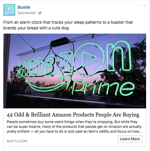
Here’s an example of a boosted post from Bustle, who promoted one of its articles on Facebook. Paying to “boost” a post you already posted organically to your Facebook Business Page can greatly benefit content that has mass appeal — versus a post that targets a specific segment of your audience. Bustle’s choice of boosted post here falls into that first category.
From Amazon’s vibrant neon sign in the photo, to the high number of examples included in the article (42, to be exact), Bustle’s boosted ad is sure to pique the interest of many Amazon and Bustle followers.
Why This Ad Works
- It’s visual. Lots of people are familiar with the Amazon Prime logo, but not in neon lights in a window display. It made me do a double-take while scrolling through Facebook.
- It’s relevant. As we’ve already learned from earlier examples, I like shopping on Amazon and also read Bustle, so this article is a combination of those two behaviors.
- It’s valuable. “Brilliant” is a strong adjective to describe products, which makes me curious to learn more about purchasing them.
- It has a clear call-to-action. The ad entices me with information about useful and “brilliant” gadgets I can get delivered to my door within two days, which I’m happy to click to learn more about.
There you have it: A list of all the different types of Facebook posts and a few examples of awesome ones from all different brands. The Facebook Ads Manager platform will walk you through how to set these up with simple, step-by-step instructions — so don’t feel overwhelmed. Or, watch this short video for tips on creating and optimizing Facebook ads.
You can
integrate Facebook Ads
reporting into the
HubSpot Ads
App to make reporting and analyzing your advertising ROI easier. You’ll be able to easily see which Facebook Ads generate leads and increase your ROI without having to analyze the data yourself. You can also use this integration to edit Facebook Ads from directly within your HubSpot portal. Customers can sign up to
test this integration here
.
Now, stop reading and start creating.
Want to see how HubSpot uses Facebook? Like our Facebook Page here.

New Facebook F8 Announcements and What They Mean for Marketers
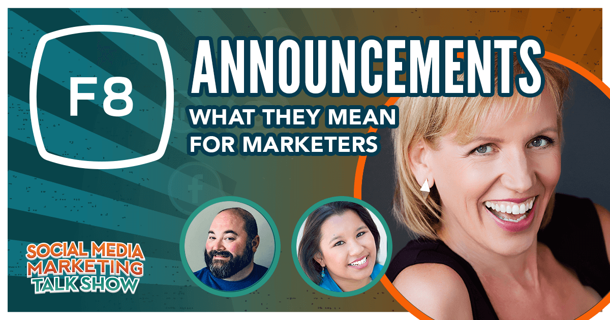
Welcome to this week’s edition of the Social Media Marketing Talk Show, a news show for marketers who want to stay on the leading edge of social media. On this week’s Social Media Marketing Talk Show, we explore the Facebook desktop and mobile redesign and new Messenger business tools announced at the F8 Developer Conference, […]
The post New Facebook F8 Announcements and What They Mean for Marketers appeared first on Social Media Marketing | Social Media Examiner.
from Social Media Marketing | Social Media Examiner http://bit.ly/2VeAmNn
via socialmediaexaminer
Cloud Integration Explained, and 6 of the Best Cloud Integration Platforms
As marketers, smashing our department’s silos is crucial for truly understanding our customers and catering to their needs. If we understand each team’s challenges and initiatives, we can align our entire department to send the most relevant content to our audience and achieve a common goal.
In regards to your tech stack, the same principle applies. The average small to midsize business has 13 different applications in their stack and they usually don’t integrate with each other. This silos organizations’ data, making it difficult to track their customers’ touch points and understand their true buyer’s journey.
Fortunately, there are cloud integration platforms that can connect your distinct cloud-based applications together, let you manage their data, and even automate your business processes all in one interface.
Read on to learn what exactly cloud integration is and the best cloud integration platforms on the market, according to G2.
1. JitterBit
G2 Rating: 4.7/5.0 (150 Reviews)
As one of the leaders in the iPaaS space, JitterBit lets you fuse thousands of SaaS, cloud, and on-premises applications into one interface. You can also leverage their pre-built templates and workflows to automate your business processes. Additionally, you can create new APIs from your existing enterprise applications or data on their API platform. You can even blend your newly created APIs with external APIs to roll out new business solutions.
2. PieSync
G2 Rating: 4.6/5.0 (216 Reviews)
PieSync leverages their Intelligent 2-Way Sync technology to update any customer’s information in one app after it changes in the other. The cloud integration platform also gives you complete control over the apps you choose to sync, consolidates customer information from multiple apps, and stores and updates all your data in one place so you can access it and make the most accurate data-driven decisions for your business.
3. Zapier
G2 Rating: 4.5/5.0 (371 Reviews)
With the ability to connect to and share data with over 1,000 web apps, like Facebook, QuickBooks, and Google Drive, Zapier can automate almost any type of business process. All you have to do is build a workflow in their editor, pick the apps you want to include in your workflow, and design it.
4. MuleSoft Anypoint Platform
G2 Rating: 4.4/5.0 (479 Reviews)
Trusted by over 1,600 enterprise companies, MuleSoft Anypoint Platform lets you manage all your APIs and integrations on one platform. You can also build and integrate your APIs, integrate with any application, data, or device, deploy on-premises integrations to the cloud without rewriting any code, and protect your data and administer access to employees by leveraging edge gateways and encryption.
5. IBM App Connect
G2 Rating: 4.3/5.0 (193 Reviews)
With IBM App Connect, you can integrate your data between on-premises and cloud-based applications, build APIs on an intuitive, code-free interface, and build workflows that automate your business processes within different apps. You can also deploy IBM App Connect in any cloud or on-premises environment.
6. Dell Boomi
G2 Rating: 4.2/5.0 (170 Reviews)
Trusted by over 8,000 brands, Dell Boomi lets you fuse all your digital platforms into one. By uniting all your data, applications and processes, Boomi essentially stores all of your technology systems and assets in one place. With Boomi, you can also manage your APIs, data quality, and B2B network, build workflows with minimal coding knowledge, and develop applications.

How to Test Your Facebook Ads for Optimal Results
Do you want to optimize your Facebook ads? Wondering what the best audience, creative, and placement are to use for your message? To explore how to test your Facebook ads for optimal results, I interview Andrea Vahl. Andrea is a Facebook ads expert, the author of Facebook Ads Made Simple, and she runs a course […]
The post How to Test Your Facebook Ads for Optimal Results appeared first on Social Media Marketing | Social Media Examiner.
from Social Media Marketing | Social Media Examiner http://bit.ly/2UXPXvJ
via socialmediaexaminer
9 of the Best Professional Bio Examples We’ve Ever Seen [+ Bio Templates]
Is your professional bio as good as it can be?
In this article, we have nine real bio examples you should definitely compare yours to — and a series of free bio templates you can use to perfect it.
Most people don’t think about their professional bio until they’re suddenly asked to “shoot one over via email,” and have approximately one afternoon to come up with it. That’s when we scramble, and our bio ends up reading like this:
Rodney Erickson is a content marketing professional at HubSpot, an inbound marketing and sales platform that helps companies attract visitors, convert leads, and close customers. Previously, Rodney worked as a marketing manager for a tech software startup. He graduated with honors from Columbia University with a dual degree in Business Administration and Creative Writing.”
Woof, that was dull. Are you still with me? I swear, not even adding a tidbit about his cats would liven that bio up.

To be fair, in certain contexts, your professional bio does need to be more formal, like Mr. Erickson’s up there. But in many cases, writing a bio that’s readable — even conversational — is actually a really good thing. That means dropping that traditional format of listing your accomplishments like a robot and cramming as much professional-sounding jargon in there as you can.
1. Create an ‘About’ page for your website or profile.
Before you can publish your professional bio, you need a living space for it. Here are a few to consider (some of these you might already have in place):
- Facebook Business page
- LinkedIn profile
- Instagram account
- Personal website
- Personal blog
- Industry website
- Industry blog byline
As you’ll see in the professional bio examples below, the length and tone of your bio will differ depending on which of the above platforms you choose to be on. Instagram, for example, allows only 150 characters of bio space, whereas you can write virtually as much as you want on your personal website — or even your Facebook Business page. But once created, this bio should represent who you are in the eyes of your audience.
2. Begin writing your bio with your first and last name.
If your readers don’t remember anything else about your bio, make sure they remember your name. For that reason, it’s a good idea for your first and last name to be the first two words of your professional bio. Even if your name is printed above this bio (hint: it should), this is a rare moment where it’s okay to be redundant.
For example, if I were writing my own bio, I might start it like this:
Lindsay Kolowich
Lindsay Kolowich is a Senior Marketing Manager at HubSpot.
3. Mention any associated brand name you might use.
Will your professional bio represent yourself, or a business you work for? Make sure the brand you want to be associated with is mentioned in your bio. If you’re a freelancer, perhaps you have a personal business name or pseudonym you advertise to your clients. Here are a few examples:
- Lindsay Kolowich Marketing
- SEO Lindsay
- Kolowich Consulting
- Content by Kolowich (what do you think … too cheesy?)
Maybe you founded your own company, and you want its name to be separate from your real name. Don’t be afraid to keep it simple: “Lindsay Kolowich is the founder and CEO of Kolowich Consulting.”
4. State your current position and what you do.
Whether you’re the founder of your company or a mid-level specialist, use the next few lines of your bio to describe what you do in that position. Don’t assume your audience will naturally know what your job title entails. Make your primary responsibilities known for the reader, helping them paint a picture of who you are during the day and what you have to offer the industry.
5. Include at least one professional accomplishment.
Just as a business touts its client successes in the form of case studies, your professional bio should let your own audience know what you’ve already achieved. What have you done for yourself — as well as for others — that makes you a valuable player in your industry?
6. Describe your values and how they inform your career.
Why do you do what you do? What might make your contribution to the market different than your colleagues? Better yet, what values do you and your colleagues share that would make your business a worthwhile investment to others? Start to wrap up your professional bio by simply explaining what gets you up in the morning.
7. Briefly tell your readers who you are outside of work.
Transition from describing your values in work to describing who you are outside of work. This may include:
- Your family
- Your hometown
- Sports you play
- Hobbies and interests
- Favorite music and travel destinations
- Side hustles you’re working on
People like connecting with other people. The more transparent you are about who you are personally, the more likable you’ll be to the people reading about who you are professionally.
8. Consider adding humor or a personal story to add flavor to your professional bio.
End your professional bio on a good note — or, more specifically, a funny note. Leaving your audience with something quirky or uniquely you can ensure they’ll leave your website with a pleasant impression of you.
It’s important to follow the steps above when writing your bio, but don’t obsess over any one section. Remember, the people reading your bio are suffering from information fatigue. If you don’t hook ’em in the first line, you’ll lose them quickly.
(P.S. Want to give your professional brand a boost? Take one of HubSpot Academy’s free certification courses. In just one weekend, you can add a line to your resume and bio that’s coveted by over 60,000 marketers.)
Why Good Bios Are Important for a Professional
Alright, I know what you may be thinking … So what? It’s just a bio. I mean, how many people actually read professional bios, anyway?
The answer: A lot of people. More importantly, though, there’s no way to tell exactly who is reading it — and you always want it to be ready for when the right people to come across it. And when they do, you want it to catch their eye. In a good way.
You see, while your resume is only useful for when you’re actively applying for specific positions, your professional bio is much more visible. It can live on your LinkedIn profile, your company’s website, your guest blog posts, your speaker profiles, your Twitter bio, and many other places.
And, most importantly, it’s the tool that you can leverage most when you’re networking.
Bottom line? People will read your professional bio. Whether they remember it, and whether it makes them actually care about you, is a matter of how well you present yourself to your intended audience.
So, what does a top-notch professional bio look like?
Below, we’ve curated some of the best real professional bio examples we’ve ever seen on Twitter, Instagram, Facebook, LinkedIn, and the various websites where you might describe yourself.
Check ’em out, and use them as inspiration when crafting your own.
9 of the Best Professional Bio Examples We’ve Ever Seen
1. Ann Handley
Bio Platform: Personal Website
If you’re a marketer, you’ve likely heard of Ann Handley. Her list of credentials is lengthy, and if she really wanted to, she could go on and on and on about her accomplishments.
But when people list out all their accomplishments in their bios, they risk sounding a little egotistical. Sure, you might impress a handful of people with all those laurels, but many people who read your bio will end up feeling either intimidated or annoyed. Think about it: Is that how you want the majority of your readers to feel when they read your bio?
To minimize the egoism that comes with talking about yourself, think about how you can list out your accomplishments without sounding like you’re bragging. Ann does this really well, choosing a tone in her bio that’s more approachable.
It starts with the excerpt in the footer of her personal website. Give it a quick read, paying close attention to the opening and closing lines:
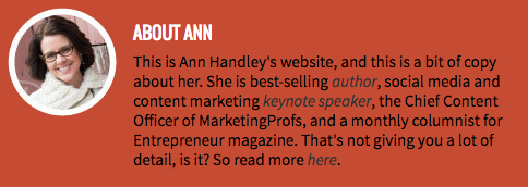
“This is Ann Handley’s website, and this is a bit of copy about her … That’s not giving you a lot of detail, is it? So read more here.” This is the kind of simple, friendly language that invites the reader in rather than shutting them out.
Follow the link and you’ll be led to a page dedicated to a fuller bio, which she’s divided into two parts: a “short version” (literally a bulleted list of key facts) and a “long version,” which includes traditional paragraphs. There’s something in there for everyone.
2. Rebecca Bollwitt
Bio platform: Instagram
Instagram is a notoriously difficult platform on which to write a good bio. Similar to Twitter, you simply don’t have room for a professional bio that includes everything about you. And because Instagram is primarily a mobile app, many viewers are reading about you passively on their mobile device.
Instagram’s limited bio space requires you to highlight just your most important qualities, and blogging icon Rebecca Bollwitt does so in her own Instagram bio in an excellent way.
Rebecca’s brand name is Miss604, and cleverly uses emojis in her Instagram bio to tell visitors exactly what makes her a valuable content creator. Take a look in the screenshot below.
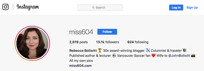
Starting with a trophy emoji, Miss604 says she’s won more than 30 awards for her blogging services. I haven’t even looked at her pictures yet and the introduction of her bio has already sucked me in.
The rest of her bio follows suit, breaking up the text with an appropriate emoji and a perfect collection of nouns to tell me who she is as a person. She even links out to her husband’s Instagram account after the heart emoji (an adorable addition), and assures her followers that all of her pictures are authentically hers.
Take a lesson from Miss604, and show your personal side. Just because you’re branding yourself as a professional doesn’t mean you have to take your human being hat off. Often your most personal attributes make for the best professional bio content.
3. Mark Gallion
Bio Platform: Twitter
As a venture capitalist and an executive at several start-ups, Mark Gallion has different versions of his bio all over the internet. You can imagine some are more formal than others. But when it comes to his Twitter bio, he carefully phrased his information in a way that helps him connect with his audience — specifically, through the use of humor.
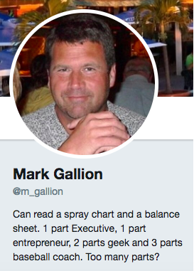
Why would he choose humor when he runs four start-ups and constantly seeks funding for them? Well, Mark’s tactic is totally intentional: it’s a lever he pulls to refresh his brand while maintaining his already impressive and established identity as an entrepreneur.
Mark leverages his Twitter bio because it’s place where he can be human. And it helps him relate to his followers and potential investors.
When crafting your own Twitter bio, consider your audience and the personal brand you’re trying to create for yourself. Use it as an opportunity to be relatable. (And check out this list of amusing Twitter bios for inspiration.)
4. DJ Nexus
Bio Platform: Facebook
This New England-based DJ has single-handedly captured the Likes of more than 2,000 people in and beyond Boston, MA. And even if you don’t listen to the type of music he produces, it’s hard not to listen to his compelling Facebook bio.
Stage-named DJ Nexus, Jamerson’s professional bio makes use of nearly every Page field inside the About tab. Right away, his audience knows which genres he plays in, where he’s from, and who else he’s worked with. The latter — under “Affiliation,” as shown in the screenshot below — is unique and seldom mentioned in professional bios today.
Our favorite part about DJ Nexus’s bio? His tagline, under “About” — “Quiet during the day. QUITE LOUD at night!” DJ Nexus tells you when he works in an awesome way. I got goosebumps just imagining a dance club he might play his music in.
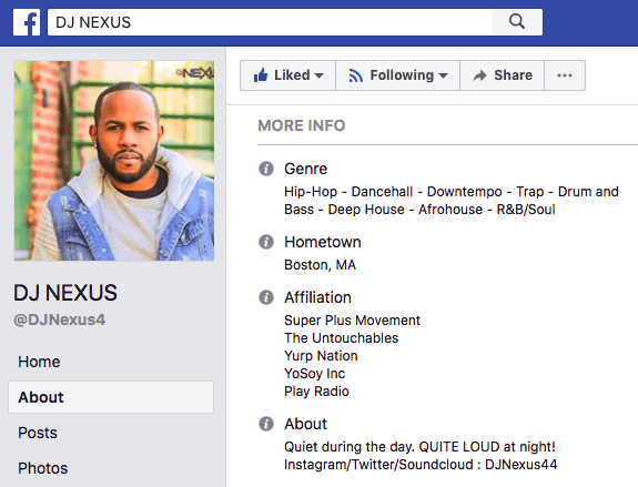
DJ Nexus’s bio brilliance doesn’t stop there.
The great thing about Facebook Business Pages is that you can write as much as you want without overwhelming your Page visitors. For those who just want Jamerson’s basic info, they have the four categories shown above. For those who want to learn more about him, he tells an excellent story of his career. Here’s just a preview of his story, below:
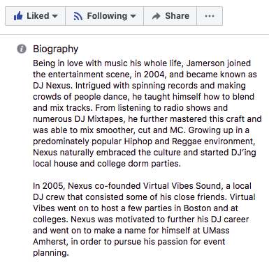
In this story, DJ Nexus describes both when he “became known as DJ Nexus” and a company he founded shortly afterward — all before going to college. This is a terrific lesson for Facebook Businesses today: customers want to learn about you, and as Facebook increasingly becomes a place for meaningful interactions, there’s no better place to tell your story than on your Facebook Business Page.
5. Lena Axelsson
Bio Platform: Industry Website
When it all comes down to it, your professional bio is no different than any other piece of persuasive copy — no matter where it lives. One of the most common mistakes people make is thinking of it as its own beast, separate from other pieces of writing. If you think about it that way, you’re far more likely to write something painfully uninteresting.
When you sit down to write your professional bio and you’re watching that cursor blinking on the screen, think about how you would introduce a blog post. You don’t just dive right into the meat of the thing, now, do you? No. You start with an introduction.
The best bios are often concise (around 200–300 words), so you don’t have a lot of room to play around. But a single sentence that tees your reader up and provides context for the accomplishments that follow could make the rest of your bio that much more persuasive.
Take Lena Axelsson’s bio, for instance. She’s a marriage and family therapist — a job where empathy and compassion are a big part of the job description. That’s why she chooses to open her bio with a great introductory sentence: “When human beings experience trauma or severe life stressors, it is not uncommon for their lives to unravel.”

Then, she goes into why she’s passionate about her job, how she helps her clients, and how she caters her approach to each individual patient. The necessary educational information is left for the end, after the reader has been hooked.
Your bio doesn’t have to be super serious, nor does it have to start with a joke. This bio shows how you can capture your reader’s attention by being empathetic and showing how that empathy shapes a valuable professional.
6. Mark Levy
Bio Platform: Personal Website
Mark Levy is a small business owner who’s taken a more traditional approach to the professional bio on his website — but in a way that takes care to speak to his intended audience.
What we love about his bio is the way he’s set it up: On his business’ “About” page, he’s listed two biographies, which he’s labeled “Mark Levy’s Biography #1” and “Mark Levy’s Biography #2.”
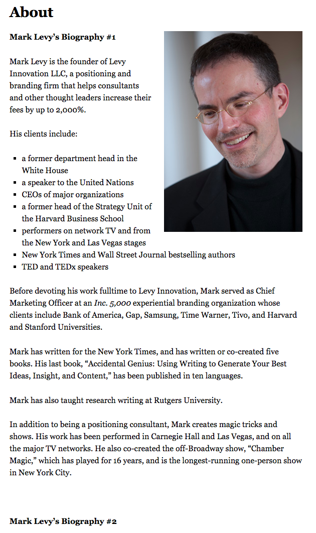
Click here to see the full version.
Like Ann, Mark’s given his readers two different options. The first biography is a “short version,” which includes a combination of bullet points listing his credentials and a few short paragraphs.
The second is the “long version,” which is actually even more interesting than the first one. Why? Because it reads like a story — a compelling one, at that. In fact, it gets really funny at parts.
The second sentence of the bio reads: “He was frightened of public school, loved playing baseball and football, ran home to watch ape films on the 4:30 Movie, listened to The Jam and The Buzzcocks, and read magic trick books.”
Here’s another excerpt from the middle:
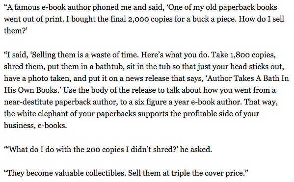
Of course, the fantastic copywriting isn’t a surprise, given that this guy wrote several books. But the conversational tone and entertaining copy let his quirky personality (and great writing skills) shine.
7. Corey Wainwright
Bio Platform: Blog Byline
Finally, we have Corey Wainwright, who’s the director of content here at HubSpot. She’s written content for HubSpot’s Marketing Blog for years, and her blog author bio has caught my eye since before I ever started working for HubSpot. (Back then, it started with, “Corey just took a cool vacation.”)
What I love most about Corey’s bio is that it’s a great example of how to deliver information about yourself without taking things too seriously. And in this context, that’s totally appropriate.
Despite having a number of impressive accomplishments under her belt, she simply doesn’t like displaying them publicly. So, she prefers making her author bio a little more “light.”
Her bio (pictured below) reads, “Corey is a Bruce Springsteen fan who does content marketing, in that order.”
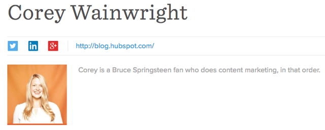
It works in this particular context because, at HubSpot, our blog authors often prefer to make themselves as friendly and approachable as possible — while letting the content speak for itself.
It helps that authors’ social media accounts are located right below our names and above our pictures. For folks who really do want a list of Corey’s credentials, they can click the LinkedIn button to go to her LinkedIn page. (You can read this blog post to learn how to create social media buttons and add them to your website.)
8. Marie Mikhail
Bio Platform: LinkedIn
Marie Mikhail checks off nearly every box for what makes an excellent bio. A professional recruiter, she expresses her “passion for recruiting” upfront, in the first sentence, while using that sentence to hook her profile visitors into a brief story of her background.
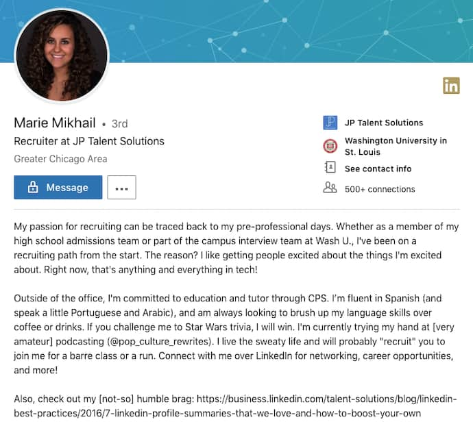
But there are a lot of recruiters out there, and Marie knows that. So, to differentiate herself, she closes the first paragraph of her bio explaining that she likes “getting people excited about the things [she’s] excited about.” It’s a well-put value proposition that sets her apart from the rest of the HR industry.
Marie Mikhail finishes off her bio by including a smooth mixture of professional skills, such as her Spanish fluency; and personal interests, such as podcasting and Star Wars (she mentions the latter with just the right amount of humor).
9. Wonbo Woo
Bio Platform: Personal Website
Wonbo Woo is the executive producer of WIRED’s video content, and he has a number of impressive credits to his name. What does this mean for his professional bio? He has to prioritize. With this in mind, Wonbo opens his bio with the most eye-catching details first (if the image below is hard to read, click it to see the full copy).
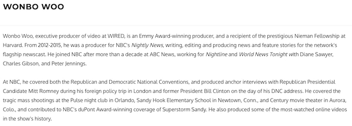
Not only does Wonbo’s bio start strong, but he also takes readers on a suspenseful journey through some of his most harrowing assignments — where he was when news broke and how he responded. You can see this quality below.
 The accomplished journalist concludes his gripping bio as strong as it began, measuring his experience by the number of states, countries, and continents to which he’s traveled in his career. See how this looks above. All in all, it’s a fantastically concise bio for as much detail as it holds.
Want more? Read How to Write a Cover Letter That Gets You the Job [Bookmarkable Template + Examples].

The 7 Best WordPress Email Plugins in 2019
If your business has a blog, sending out an email newsletter is essential. Not only is it a simple way to distribute your content, but it can also help you better understand what type of content is resonating with your target audience so you can optimize your content strategy.
Beyond content distribution, an email newsletter can also help generate paying customers for your business. An email newsletter brings engaged customers back to your site on a regular basis — which can increase your revenue by up to 23%.
WordPress is quickly becoming a one-stop-shop for businesses looking to establish their presence online. Roughly 75 million websites active today are built on WordPress, meaning that WordPress alone powers about 27% of the internet.
So, you’re cranking out content on your WordPress blog, and you know you can grow your business through an email newsletter … Wouldn’t it be great if you could send this newsletter directly within WordPress?
Fortunately, with plugins, you can. Using plugins, you can extend the functionality of WordPress beyond just a website building tool. You can install plugins to help you with SEO, protect your email from SPAM, and much, much more.
Some of the most popular plugins available on WordPress are for email marketing and newsletters. With an email plugin, you can generate leads, segment your contacts, and nurture them into customers — all within WordPress.
To ensure you’re able to use WordPress for all your content distribution and email marketing needs, we’ve cultivated this list of the seven best WordPress email plugins.

1. MailPoet
MailPoet is the most popular free newsletter plugin on WordPress. To manage your subscribers, you can easily import an existing list from your CRM or another marketing automation tool, or create forms and add them to your site using widgets. Plus, their drag-and-drop email editor lets you quickly create responsive emails that look great on any device or email service.
MailPoet is free for anyone with less than 2,000 subscribers, but becomes more powerful upon upgrading. Premium users can see exactly which subscribers have opened an email and what links people are clicking on within your email, among a number of other advanced features.
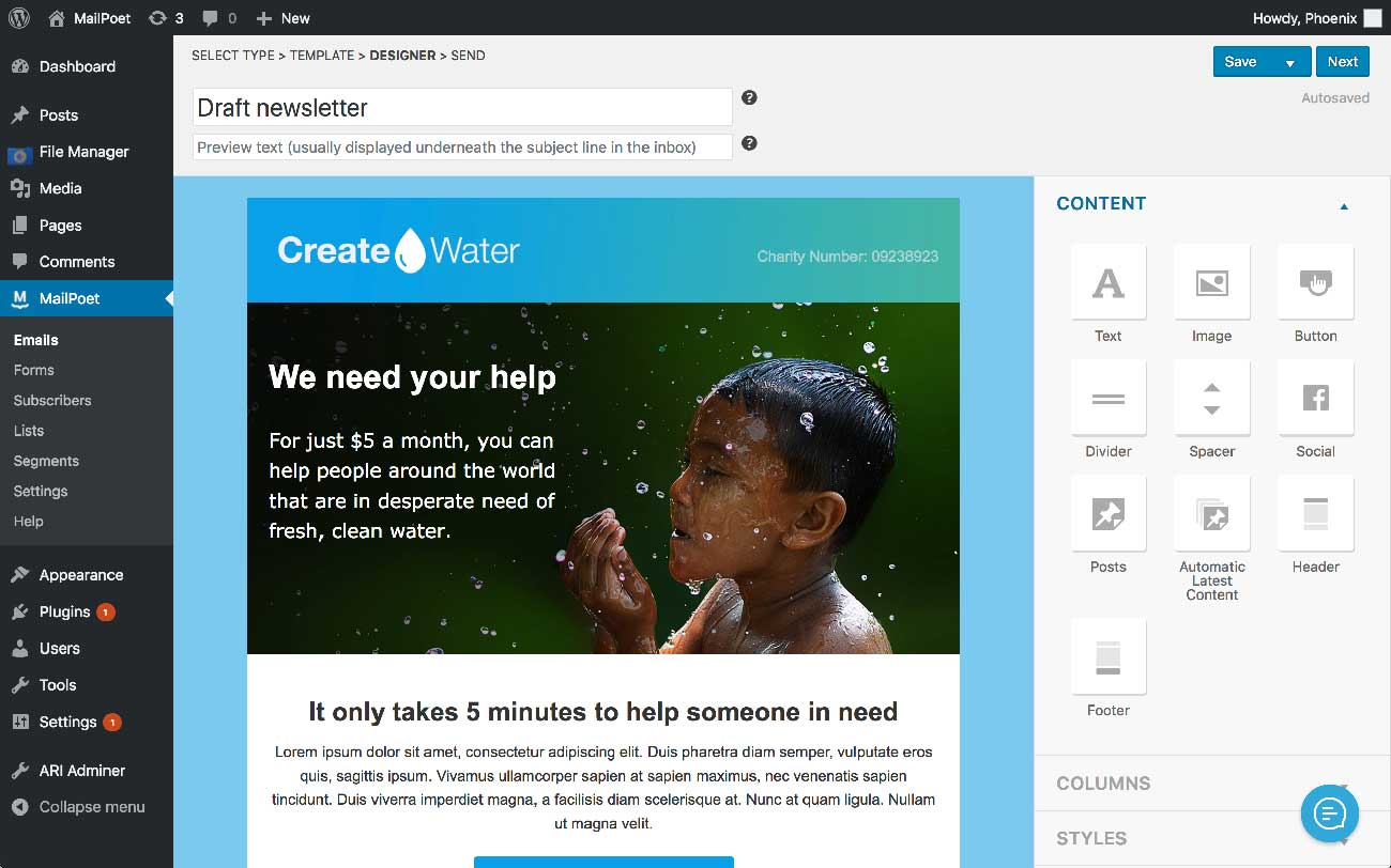
Image courtesy of MailPoet
2. Newsletter
Newsletter is an email marketing tool built specifically for WordPress, and everything you need to get started is included. The plugin allows you to add a subscription form or pop-up to your site, segment your leads using multi-list targeting, and send newsletters to distribute your blog content.
Additionally, the tool has built-in reporting, so you can see exactly how your emails are performing. You can even automate newsletters to go out on a regular cadence to ensure you are consistently engaging with your subscribers. Newsletter also integrates with other tools, such as Mailgun and Spark Post, so you can optimize your email strategy based on your needs.
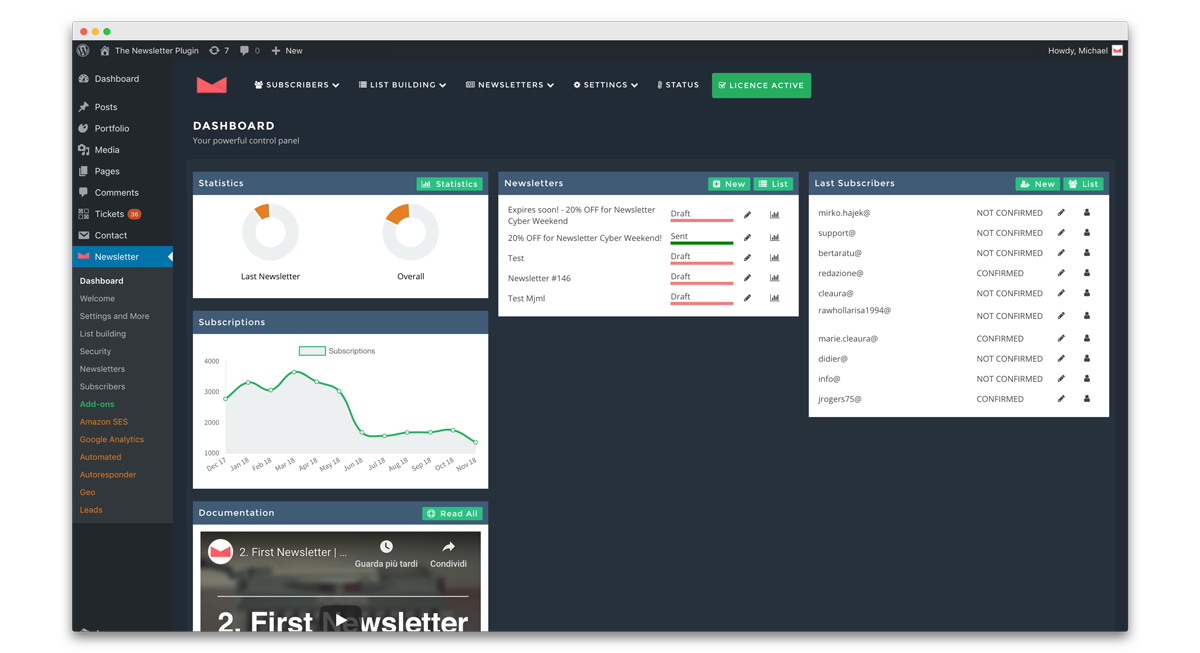
Image courtesy of Newsletter
3. SendinBlue
SendinBlue offers cloud-based digital marketing tools to over 50,000 growing companies around the world, and their plugin brings the power of their platform directly into WordPress. With the SendinBlue WordPress plugin, you can create forms, manage lists of subscribers, create and send email marketing campaigns, and measure your success over time using the included reports. The plugin features a drag-and-drop email editor, and you’re able to personalize components of your email to increase engagement with your subscribers.
The SendinBlue WordPress plugin also includes transactional email. Using the wp_mail function, you’ll be able to send transactional emails using SendinBlue’s SMTP. This feature is great for sending order confirmations, or updating your customers on important changes to their accounts.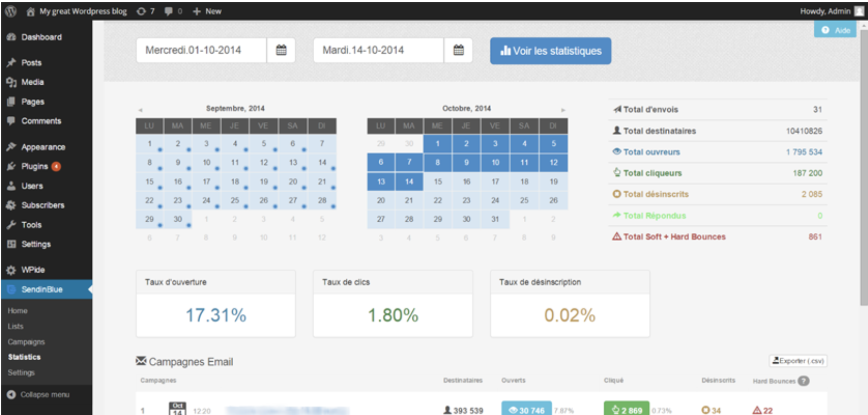 Image courtesy of SendinBlue
4. Sumo
Sumo has over 100,000 active installations within WordPress — and for good reason. Beyond just pop-ups, welcome emails, and automated drip campaigns, they also have a number of other features to help you grow your business.
The plugin also features a “share” button that you can add anywhere on your site, which allows your site visitors to easily share your content on social. The plugin integrates directly with WooCommerce so you can create discounts and unique offers to increase your order value, and minimize the amount of abandoned carts you have.
On top of all the plugin’s features, Sumo offers free customer support, and even one-on-one onboarding for all customers (free and paid) to ensure you’re getting the most out of the plugin.
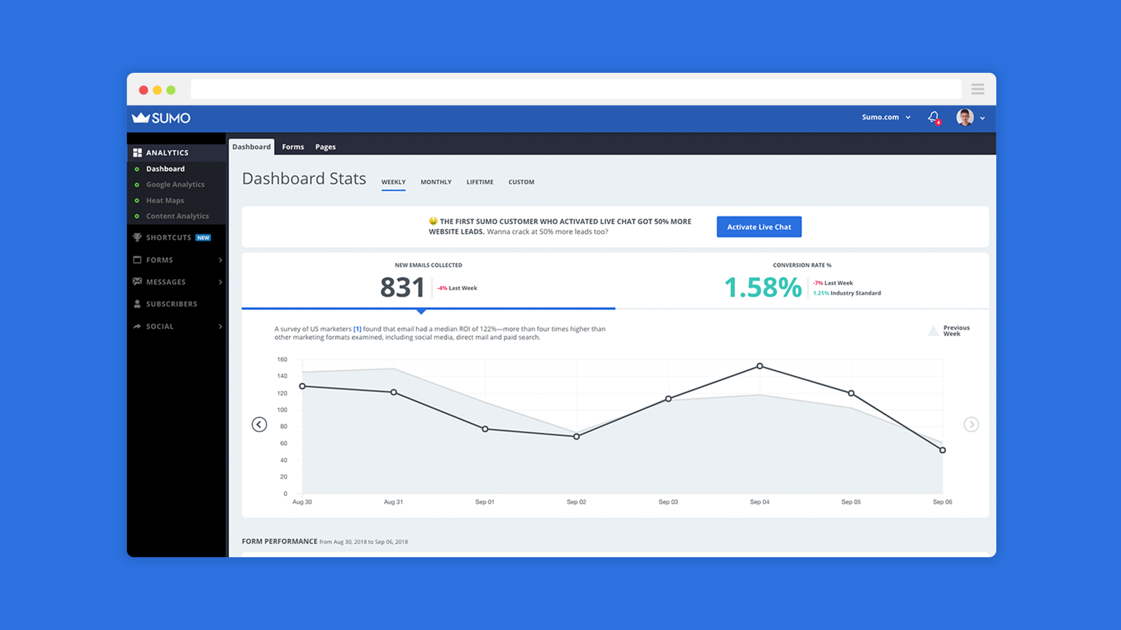
Image courtesy of Sumo
5. Email Subscribers and Newsletters
Email Subscribers and Newsletters is a plugin that lets you easily notify your subscribers when you have new blog content available. With it, you can add a subscription box to your site, and get notified every time someone signs up for your newsletter. You can then notify your subscribers whenever a new post is published, or create a custom newsletter to share your content.
Email Subscribers and Newsletters is also serious about the health of your email lists. They offer double opt-in functionality so you can ensure that you’re only reaching out to people interested in what your company has to offer. You have the option to add captchas to your subscription box to prevent bots from ruining your email lists. The tool offers list cleanup and spam testing services, as well.
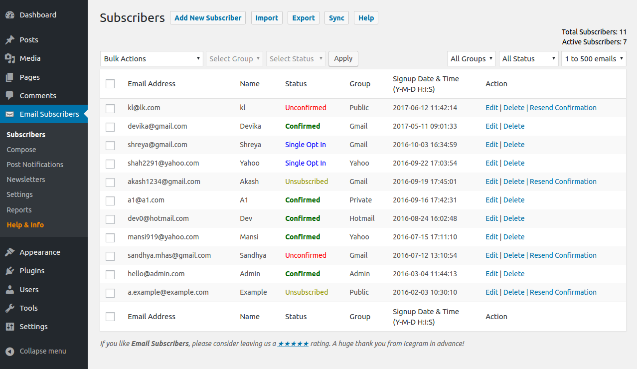
Image courtesy of Email Subscribers and Newsletters
6. Subscribe2
Subscribe2 lets you send either simple notifications to your blog subscribers whenever you post new content, or a recurring digest of posts. Through their plugin, you can also exclude specific categories of posts from being included in your emails, or even exclude posts on an individual basis. The tool lets you create simple plain text emails, or create custom HTML emails. You can also upgrade to their paid service (MailOptin) to send emails to your contact lists in Mailchimp, AWeber, or other email service providers.
Image courtesy of Subscribe2
7. SendPress
SendPress is an easy-to-use email newsletter plugin. With SendPress, you can import contacts and content from your WordPress site directly into the plugin, making it easy to create a blog notification email. The plugin features a number of styling and editing options so you can send professional emails without any coding skills. They also have a service called AutoCron, which will check your site on a regular schedule to make sure your scheduled emails are being sent. 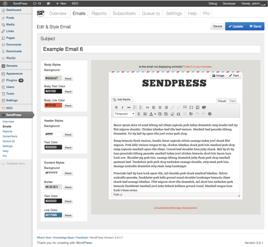 Image courtesy of SendPress
Ultimately, it’s critical you choose the WordPress email plugin that works best for your business, and your audience’s needs. Ideally, one of these tools will have the features you need to nurture leads into prospects, and cultivate a more powerful content marketing strategy for 2019.

How HubSpot’s Recruitment Team Aims to Use Greenhouse to Mitigate Interview Bias
Diversity, inclusion, and belonging are major points of growth for most businesses right now, and for good reason — diverse teams can help companies increase revenue by 19% and enable companies to outperform industry norms by 35%.
In the tech industry, we’re seeing a particularly strong focus on diversity and inclusion, particularly since both women and people of color are largely underrepresented in the tech space.
However, making a meaningful impact isn’t easy — it requires taking a microscope to a business’s embedded culture and structure and being open to some major changes.
As recruiters at HubSpot, we tend to be on the “front line” for bringing in remarkable talent. So, in 2019, we knew we needed to step up our game when it came to ensuring our recruitment process was fair, consistent, and inclusive of a truly diverse candidate pool.
If you’re a recruiter, you know that recruiting is both art and science. So enabling our teams through technology to decrease the opportunity for bias was critical for creating scalable solutions.
Ultimately, we needed to incorporate scientific guardrails to help our recruiters, hiring managers, and interviewers decrease mental shortcuts — while still innovating and excelling in what they do best. No small task, right?
That’s where Greenhouse Inclusion and HubSpot meet.

Why choose a pilot program?
HubSpot is one of the first companies to pilot the new Greenhouse Inclusion technology. The platform allows us to reduce mental shortcuts, mitigate bias, identify problem areas, and measure success — all big changes. But the prospect of implementing thought-process change across our entire global organization was beyond daunting.
Ultimately, to reduce risk, we decided to initially run two pilot programs for specific departments so we could refine the process before sharing it with everyone at HubSpot. We needed a few test cases to help uncover flaws, get stakeholder buy-ins, and evaluate if using the tool was the right decision for the team.
How We Ran Our Pilot Program
This was an exciting time to get some of our teammates into the sandbox to play around with the new process and technology. However, we recognized early that setting some clear expectations and goals was critical to ensure we stuck to a timeline and didn’t disrupt too many of our day-to-day operations.
When meeting with the pilot teams, we were open, honest and transparent on what we predicted could be road bumps and difficult muscles to stretch in implementing a new process to their hiring teams. First, we explained this was going to be time-consuming and could take multiple meetings with stakeholders to get off the ground.
Additionally, we told these pilot teams that the value these changes could bring wouldn’t be immediately visible, but would ultimately impact our hiring processes long-term. We wanted teams to go in with eyes wide open.
We also wanted to remain transparent about the inner-workings of the process with HubSpot employees. Since we want to use Greenhouse Inclusion as a global tool in the near future, it was imperative we socialize the technology with the non-pilot teams early.
To do this, we embarked on a marketing roadshow and shared the “coming attractions” with business leaders, interview teams, front-line teams, and our employee resource groups. We decided it was imperative to start sharing the ‘why’ behind this technology early to help grease the wheels for future roll-outs.
Three Things We Learned
1. Sharing the “why” with your team is critical.
Ultimately, the Greenhouse tool is good leverage, but the learning curve extends beyond just showing users how to build scorecards in Greenhouse.
When implementing change with a new piece of technology for a recruitment team, sharing the ‘why’ behind your method is really important.
Both interviewers and our recruitment team yearned for additional conversations on the root cause of biases, how they could personally work to mitigate them in their day-to-day, and how they could track whether the tool was working.
2. Put your pilot teams in the driver’s seat.
We purposefully avoided being overly prescriptive on the step-by-step formula for using some of the structure scorecard tools. By sharing the ‘why’ (as mentioned above), we gave our pilot teams the destination while depending on them to build the best path there.
We found we got much better output when the pilot groups got their hands dirty and tried things first. This helped us build out training materials for the global launch.
3. Be diligent about quality assurance.
It’s understandable and easy for users to lean back onto muscle memory when launching into a new tool. We could have been better about reviewing scorecards immediately, and course-correcting any errors quickly. This would have allowed us to catch confusion with the tool early, before it snowballed.
Ultimately, we realized we needed to be more diligent about holding ourselves accountable to the new process, and ensuring data integrity.
Whether or not you choose to implement bias-mitigating technology at your own company, it’s critical you dedicate time and resources to train your interviewers to be more thoughtful about the role they play in driving an effective and empathetic hiring process for candidates. This will help your company build a stronger employer brand, and attract better talent down the road.
If you’re not a part of your company’s recruitment team, take a look at 53 Little Things You Can Do to Impact Diversity at Your Company for other ways you can help.

Why Customer-Centric Brands Should Avoid Stealth Marketing
If there’s something that can unexpectedly evoke some of your fondest childhood memories, it’s the shopping cart. Whether it reminds you of shopping with your parents at the grocery store or riding one down the parking lot, the shopping cart can trigger some major nostalgia.
But what if told you the widespread use of the shopping cart and, in turn, some of your memories associated with the supermarket staple never would’ve happened if it weren’t for some cunning marketing?
In the mid-1930s, Sylvan Goldman, the owner of the Humpty Dumpty supermarket chain in Oklahoma City, noticed his customers would stop shopping once their basket got too heavy. To lighten his customer’s load and, in turn, grow his company’s profits, Goldman teamed up with a mechanic to develop the first shopping cart, and in 1937, he introduced his invention to all of his stores.
But initially, the shopping cart didn’t explode in popularity like Goldman thought it would. It actually repelled some of Goldman’s customers from his supermarket chain. According to his male customers, the idea of pushing a cart around turned them off because they didn’t think it was masculine enough. And it offended women because they thought his shopping carts looked like a baby carriage.
Instead of banishing his invention from his stores to win back his miffed customers, though, Goldman started thinking outside of the box (or the cart) and devised one of the slyest yet most successful stealth marketing plans in history.
At each of his stores, he hired attractive male and female models to push his carts around and pretend to shop for groceries. When a real customer would spurn a shopping cart near each entrance, he directed one of his employees to peer pressure them to use one by focusing the customer’s attention to all the “people” pushing the carts around and telling them that “everyone else” was using one.
Three years later, the shopping cart became a supermarket staple and store owners even catered the design of their stores for them by widening their aisles and check-out counters. Since Goldman licensed his shopping cart design, he became a multi-millionaire.
Needless to say, the shopping cart’s origin story is incredibly interesting. But, for customer-centric marketers who value authenticity and integrity, it’s more of a cautionary tale than an inspiring one. Because even though stealth marketing might seem like a clever tactic to subtly promote your product or service, being honest and genuine is the only way to win over consumers, especially when only 4% of them believe marketers practice integrity.
Stealth Marketing Examples (And Why They’re Bad)
1. Sony Ericsson
In 2002, Sony Ericsson released their first camera phone and hired actors to pretend to be tourists and ask passersby to take their picture. The actors would then boast about the camera phone’s features to the tourists, essentially giving them a demo of the product without them consenting to or being aware of it.
2. BlackBerry
 Image Credit: New York Daily News
In 2010, BlackBerry hired actresses to flirt with men at bars and tell the clueless bachelors to put their numbers in BlackBerry phones that the company gave to the actresses. No actress ever called any of the men.
BlackBerry pulled this stunt because they wanted the sight of their phones to trigger the emotions the men felt when they were interacting with the actresses. And by manufacturing a positive brand association that would compel the men to buy their product, they essentially manipulated their feelings to peddle a phone.
3. Wal-Mart
When Jim Thresher and Laura St. Claire hiked the Grand Canyon, Bryce Canyon, and Slot Canyon in 2006, they learned that RVs could stay overnight in Wal-Mart parking lots for free. So when the couple decided to road trip across America, they wanted to spend every night in a different Wal-Mart parking lot and write about their adventures. They called their blog “Wal-Marting Across America”, and in each entry, they interviewed Wal-Mart employees about how much they loved their jobs and raved about their friendly interactions with them.
However, Walmart Watch, a non-profit organization that studies Wal-Mart’s impact on society and challenges the corporation to practice better corporate social responsibility, investigated Jim and Laura’s blog and discovered that they were actually freelance journalists and Wal-Mart’s public relations agency paid for their RV, meals, and all other expenses. In a nutshell, the blog was fake.
After Wal-Mart’s “flog” or fake blog was exposed, the corporation and their public relations agency, Edelman Worldwide, faced harsh backlash — many bloggers demanded that Edleman’s CEO resign and Wal-Mart’s reputation was tarnished.
4. Whole Foods Market

Image Credit: Wikipedia
In 2007, John Mackey, the co-founder and CEO of Whole Foods Market, was caught criticizing Whole Food’s rival, Wild Oats Markets, on Yahoo Finance forums for over seven years under a pseudonym.
When he was caught, Whole Foods was actually in the process of acquiring Wild Oats Markets for around $670 million. The Federal Trade Commission wanted to terminate the deal. However, Whole Foods ended up winning a federal appeals court case and acquired their rival.
Who knows what would’ve happened if Mackey wasn’t able to biasedly smear Wild Oats Market for so long or at all. Maybe they would still be a standalone company.
5. Fyre Festival
in 2017, entrepreneur Billy McFarland and rapper Ja Rule organized a music festival called Fyre Festival in the Bahamas. To generate as much buzz as possible for the event, they paid some of the most notable social media influencers, like Kendall Jenner, Bella Hadid, and Emily Ratajkowski, to fly down to the Bahamas, act in their promo video, and post the video to their Instagram profiles. But none of the influencers disclosed the fact that their Fyre Festival posts were actually ads. With the help of some promotion of the festival’s stellar acts, luxury villas, and gourmet meals, Fyre Festival sold over 4,000 tickets.
Unfortunately for the attendees, Fyre Festival’s marketing materials and the event itself were a complete scam. Instead of the luxury villas and gourmet meals their guests paid thousands of dollars for, McFarland and Ja Rule gave them tents and cheese sandwiches. Worst of all, there was no cell phone service, portable toilets, or running water at the festival, so thousands of people were basically left stranded on the island. And once the truth about Fyre Festival started circulating throughout social media, all of the festival’s acts cancelled.
Shortly after Fyre Festival’s epic failure, its parent company, Fyre Media, shut down and Billy McFarland was sentenced to six years in prison and forced to repay $26 million to his company’s investors.

What Is Digital Marketing?
With how accessible the internet is today, would you believe me if I told you the number of people who go online every day is still increasing?
It is. In fact, “constant” internet usage among adults increased by 5% in just the last three years, according to Pew Research. And although we say it a lot, the way people shop and buy really has changed along with it — meaning offline marketing isn’t as effective as it used to be.
Marketing has always been about connecting with your audience in the right place and at the right time. Today, that means you need to meet them where they are already spending time: on the internet.
Enter digital marketing — in other words, any form of marketing that exists online.
At HubSpot, we talk a lot about inbound marketing as a really effective way to attract, engage, and delight customers online. But we still get a lot of questions from people all around the world about digital marketing. So, we decided to answer them. Click the links below to jump to each question, or keep reading to see how digital marketing is carries out today.
- What is digital marketing?
- Digital Marketing Examples
- What does a digital marketer do?
- Inbound Marketing vs. Digital Marketing: Which is it?
- Does digital marketing work for all businesses?
- What is the role of digital marketing to a company?
- What types of digital content should I create?
- How long will it take to see results from my content?
- Do I need a big budget for digital marketing?
- How does mobile marketing fit into my digital marketing strategy?
- I’m ready to try digital marketing. Now what?
So, how do you define digital marketing today?
A seasoned inbound marketer might say inbound marketing and digital marketing are virtually the same thing, but there are some minor differences. And conversations with marketers and business owners in the U.S., U.K., Asia, Australia, and New Zealand, I’ve learned a lot about how those small differences are being observed across the world.
How does a business define digital marketing?
Digital marketing is defined by the use of numerous digital tactics and channels to connect with customers where they spend much of their time: online. From the website itself to a business’s online branding assets — digital advertising, email marketing, online brochures, and beyond — there’s a spectrum of tactics that fall under the umbrella of “digital marketing.”
The best digital marketers have a clear picture of how each digital marketing campaign supports their overarching goals. And depending on the goals of their marketing strategy, marketers can support a larger campaign through the free and paid channels at their disposal.
A content marketer, for example, can create a series of blog posts that serve to generate leads from a new ebook the business recently created. The company’s social media marketer might then help promote these blog posts through paid and organic posts on the business’s social media accounts. Perhaps the email marketer creates an email campaign to send those who download the ebook more information on the company. We’ll talk more about these specific digital marketers in a minute.
Here’s a quick rundown of some of the most common digital marketing tactics and the channels involved in each one.
Search Engine Optimization (SEO)
This is the process of optimizing your website to “rank” higher in search engine results pages, thereby increasing the amount of organic (or free) traffic your website receives. The channels that benefit from SEO include websites, blogs, and infographics.
There are a number of ways to approach SEO in order to generate qualified traffic to your website. These include:
- On page SEO: This type of SEO focuses on all of the content that exists “on the page” when looking at a website. By researching keywords for their search volume and intent (or meaning), you can answer questions for readers and rank higher on the search engine results pages (SERPs) those questions produce.
- Off page SEO: This type of SEO focuses on all of the activity that takes place “off the page” when looking to optimize your website. “What activity not on my own website could affect my ranking?” You might ask. The answer is inbound links, also known as backlinks. The number of publishers that link to you, and the relative “authority” of those publishers, affect how highly you rank for the keywords you care about. By networking with other publishers, writing guest posts on these websites (and linking back to your website), and generating external attention, you can earn the backlinks you need to move your website up on all the right SERPs.
- Technical SEO: This type of SEO focuses on the backend of your website, and how your pages are coded. Image compression, structured data, and CSS file optimization are all forms of technical SEO that can increase your website’s loading speed — an important ranking factor in the eyes of search engines like Google.
Content Marketing
This term denotes the creation and promotion of content assets for the purpose of generating brand awareness, traffic growth, lead generation, and customers. The channels that can play a part in your content marketing strategy include:
- Blog posts: Writing and publishing articles on a company blog helps you demonstrate your industry expertise and generates organic search traffic for your business. This ultimately gives you more opportunities to convert website visitors into leads for your sales team.
- Ebooks and whitepapers: Ebooks, whitepapers, and similar long-form content helps further educate website visitors. It also allows you to exchange content for a reader’s contact information, generating leads for your company and moving people through the buyer’s journey.
- Infographics: Sometimes, readers want you to show, not tell. Infographics are a form of visual content that helps website visitors visualize a concept you want to help them learn.
Want to learn and apply content marketing to your business? Check out HubSpot Academy’s free content marketing training resource page.
Social Media Marketing
This practice promotes your brand and your content on social media channels to increase brand awareness, drive traffic, and generate leads for your business. The channels you can use in social media marketing include:
- Facebook.
- Twitter.
- LinkedIn.
- Instagram.
- Snapchat.
- Pinterest.
- Google+.
Pay Per Click (PPC)
PPC is a method of driving traffic to your website by paying a publisher every time your ad is clicked. One of the most common types of PPC is Google Ads, which allows you to pay for top slots on Google’s search engine results pages at a price “per click” of the links you place. Other channels where you can use PPC include:
- Paid ads on Facebook: Here, users can pay to customize a video, image post, or slideshow, which Facebook will publish to the newsfeeds of people who match your business’s audience.
- Twitter Ads campaigns: Here, users can pay to place a series of posts or profile badges to the news feeds of a specific audience, all dedicated to accomplish a specific goal for your business. This goal can be website traffic, more Twitter followers, tweet engagement, or even app downloads.
- Sponsored Messages on LinkedIn: Here, users can pay to send messages directly to specific LinkedIn users based on their industry and background.
Affiliate Marketing
This is a type of performance-based advertising where you receive commission for promoting someone else’s products or services on your website. Affiliate marketing channels include:
- Hosting video ads through the YouTube Partner Program.
- Posting affiliate links from your social media accounts.
Native Advertising
Native advertising refers to advertisements that are primarily content-led and featured on a platform alongside other, non-paid content. BuzzFeed-sponsored posts are a good example, but many people also consider social media advertising to be “native” — Facebook advertising and Instagram advertising, for example.
Marketing Automation
Marketing automation refers to the software that serves to automate your basic marketing operations. Many marketing departments can automate repetitive tasks they would otherwise do manually, such as:
- Email newsletters: Email automation doesn’t just allow you to automatically send emails to your subscribers. It can also help you shrink and expand your contact list as needed so your newsletters are only going to the people who want to see them in their inboxes.
- Social media post scheduling: If you want to grow your organization’s presence on a social network, you need to post frequently. This makes manual posting a bit of an unruly process. Social media scheduling tools push your content to your social media channels for you, so you can spend more time focusing on content strategy.
- Lead-nurturing workflows: Generating leads, and converting those leads into customers, can be a long process. You can automate that process by sending leads specific emails and content once they fit certain criteria, such as when they download and open an ebook.
- Campaign tracking and reporting: Marketing campaigns can include a ton of different people, emails, content, webpages, phone calls, and more. Marketing automation can help you sort everything you work on by the campaign it’s serving, and then track the performance of that campaign based on the progress all of these components make over time.
Email Marketing
Companies use email marketing as a way of communicating with their audiences. Email is often used to promote content, discounts and events, as well as to direct people toward the business’s website. The types of emails you might send in an email marketing campaign include:
- Blog subscription newsletters.
- Follow-up emails to website visitors who downloaded something.
- Customer welcome emails.
- Holiday promotions to loyalty program members.
- Tips or similar series emails for customer nurturing.
Online PR
Online PR is the practice of securing earned online coverage with digital publications, blogs, and other content-based websites. It’s much like traditional PR, but in the online space. The channels you can use to maximize your PR efforts include:
- Reporter outreach via social media: Talking to journalists on Twitter, for example, is a great way to develop a relationship with the press that produces earned media opportunities for your company.
- Engaging online reviews of your company: When someone reviews your company online, whether that review is good or bad, your instinct might be not to touch it. On the contrary, engaging company reviews helps you humanize your brand and deliver powerful messaging that protects your reputation.
- Engaging comments on your personal website or blog: Similar to the way you’d respond to reviews of your company, responding to the people who are reading your content is the best way to generate productive conversation around your industry.
Inbound Marketing
Inbound marketing refers to a marketing methodology wherein you attract, engage, and delight customers at every stage of the buyer’s journey. You can use every digital marketing tactic listed above, throughout an inbound marketing strategy, to create a customer experience that works with the customer, not against them. Here are some classic examples of inbound marketing versus traditional marketing:
- Blogging vs. pop-up ads
- Video marketing vs. commercial advertising
- Email contact lists vs. email spam
What does a digital marketer do?
Digital marketers are in charge of driving brand awareness and lead generation through all the digital channels — both free and paid — that are at a company’s disposal. These channels include social media, the company’s own website, search engine rankings, email, display advertising, and the company’s blog.
The digital marketer usually focuses on a different key performance indicator (KPI) for each channel so they can properly measure the company’s performance across each one. A digital marketer who’s in charge of SEO, for example, measures their website’s “organic traffic” — of that traffic coming from website visitors who found a page of the business’s website via a Google search.
Digital marketing is carried out across many marketing roles today. In small companies, one generalist might own many of the digital marketing tactics described above at the same time. In larger companies, these tactics have multiple specialists that each focus on just one or two of the brand’s digital channels.
Here are some examples of these specialists:
SEO Manager
Main KPIs: Organic traffic
In short, SEO managers get the business to rank on Google. Using a variety of approaches to search engine optimization, this person might work directly with content creators to ensure the content they produce performs well on Google — even if the company also posts this content on social media.
Content Marketing Specialist
Main KPIs: Time on page, overall blog traffic, YouTube channel subscribers
Content marketing specialists are the digital content creators. They frequently keep track of the company’s blogging calendar, and come up with a content strategy that includes video as well. These professionals often work with people in other departments to ensure the products and campaigns the business launches are supported with promotional content on each digital channel.
Social Media Manager
Main KPIs: Follows, Impressions, Shares
The role of a social media manager is easy to infer from the title, but which social networks they manage for the company depends on the industry. Above all, social media managers establish a posting schedule for the company’s written and visual content. This employee might also work with the content marketing specialist to develop a strategy for which content to post on which social network.
(Note: Per the KPIs above, “impressions” refers to the number of times a business’s posts appear on the newsfeed of a user.)
Marketing Automation Coordinator
Main KPIs: Email open rate, campaign click-through rate, lead-generation (conversion) rate
The marketing automation coordinator helps choose and manage the software that allows the whole marketing team to understand their customers’ behavior and measure the growth of their business. Because many of the marketing operations described above might be executed separately from one another, it’s important for there to be someone who can group these digital activities into individual campaigns and track each campaign’s performance.
Inbound Marketing vs. Digital Marketing: Which Is It?
On the surface, the two seem similar: Both occur primarily online, and both focus on creating digital content for people to consume. So what’s the difference?
The term “digital marketing” doesn’t differentiate between push and pull marketing tactics (or what we might now refer to as ‘inbound’ and ‘outbound’ methods). Both can still fall under the umbrella of digital marketing.
Digital outbound tactics aim to put a marketing message directly in front of as many people as possible in the online space — regardless of whether it’s relevant or welcomed. For example, the garish banner ads you see at the top of many websites try to push a product or promotion onto people who aren’t necessarily ready to receive it.
On the other hand, marketers who employ digital inbound tactics use online content to attract their target customers onto their websites by providing assets that are helpful to them. One of the simplest yet most powerful inbound digital marketing assets is a blog, which allows your website to capitalize on the terms which your ideal customers are searching for.
Ultimately, inbound marketing is a methodology that uses digital marketing assets to attract, engage, and delight customers online. Digital marketing, on the other hand, is simply an umbrella term to describe online marketing tactics of any kind, regardless of whether they’re considered inbound or outbound.
Does digital marketing work for all businesses?
Digital marketing can work for any business in any industry. Regardless of what your company sells, digital marketing still involves building out buyer personas to identify your audience’s needs, and creating valuable online content. However, that’s not to say all businesses should implement a digital marketing strategy in the same way.
B2B Digital Marketing
If your company is business-to-business (B2B), your digital marketing efforts are likely to be centered around online lead generation, with the end goal being for someone to speak to a salesperson. For that reason, the role of your marketing strategy is to attract and convert the highest quality leads for your salespeople via your website and supporting digital channels.
Beyond your website, you’ll probably choose to focus your efforts on business-focused channels like LinkedIn where your demographic is spending their time online.
B2C Digital Marketing
If your company is business-to-consumer (B2C), depending on the price point of your products, it’s likely that the goal of your digital marketing efforts is to attract people to your website and have them become customers without ever needing to speak to a salesperson.
For that reason, you’re probably less likely to focus on ‘leads’ in their traditional sense, and more likely to focus on building an accelerated buyer’s journey, from the moment someone lands on your website, to the moment that they make a purchase. This will often mean your product features in your content higher up in the marketing funnel than it might for a B2B business, and you might need to use stronger calls-to-action (CTAs).
For B2C companies, channels like Instagram and Pinterest can often be more valuable than business-focused platforms LinkedIn.
What is the role of digital marketing to a company?
Unlike most offline marketing efforts, digital marketing allows marketers to see accurate results in real time. If you’ve ever put an advert in a newspaper, you’ll know how difficult it is to estimate how many people actually flipped to that page and paid attention to your ad. There’s no surefire way to know if that ad was responsible for any sales at all.
On the other hand, with digital marketing, you can measure the ROI of pretty much any aspect of your marketing efforts.
Here are some examples:
Website Traffic
With digital marketing, you can see the exact number of people who have viewed your website’s homepage in real time by using digital analytics software, available in marketing platforms like HubSpot.
You can also see how many pages they visited, what device they were using, and where they came from, amongst other digital analytics data.
This intelligence helps you to prioritize which marketing channels to spend more or less time on, based on the number of people those channels are driving to your website. For example, if only 10% of your traffic is coming from organic search, you know that you probably need to spend some time on SEO to increase that percentage.
With offline marketing, it’s very difficult to tell how people are interacting with your brand before they have an interaction with a salesperson or make a purchase. With digital marketing, you can identify trends and patterns in people’s behavior before they’ve reached the final stage in their buyer’s journey, meaning you can make more informed decisions about how to attract them to your website right at the top of the marketing funnel.
Content Performance and Lead Generation
Imagine you’ve created a product brochure and posted it through people’s letterboxes — that brochure is a form of content, albeit offline. The problem is that you have no idea how many people opened your brochure or how many people threw it straight into the trash.
Now imagine you had that brochure on your website instead. You can measure exactly how many people viewed the page where it’s hosted, and you can collect the contact details of those who download it by using forms. Not only can you measure how many people are engaging with your content, but you’re also generating qualified leads when people download it.
Attribution Modeling
An effective digital marketing strategy combined with the right tools and technologies allows you to trace all of your sales back to a customer’s first digital touchpoint with your business.
We call this attribution modeling, and it allows you to identify trends in the way people research and buy your product, helping you to make more informed decisions about what parts of your marketing strategy deserve more attention, and what parts of your sales cycle need refining.
Connecting the dots between marketing and sales is hugely important — according to Aberdeen Group, companies with strong sales and marketing alignment achieve a 20% annual growth rate, compared to a 4% decline in revenue for companies with poor alignment. If you can improve your customer’s’ journey through the buying cycle by using digital technologies, then it’s likely to reflect positively on your business’s bottom line.
What types of digital content should I create?
The kind of content you create depends on your audience’s needs at different stages in the buyer’s journey. You should start by creating buyer personas (use these free templates, or try makemypersona.com) to identify what your audience’s goals and challenges are in relation to your business. On a basic level, your online content should aim to help them meet these goals, and overcome their challenges.
Then, you’ll need to think about when they’re most likely to be ready to consume this content in relation to what stage they’re at in their buyer’s journey. We call this content mapping.
With content mapping, the goal is to target content according to:
- The characteristics of the person who will be consuming it (that’s where buyer personas come in).
- How close that person is to making a purchase (i.e., their lifecycle stage).
In terms of the format of your content, there are a lot of different things to try. Here are some options we’d recommend using at each stage of the buyer’s journey:
Awareness Stage
- Blog posts. Great for increasing your organic traffic when paired with a strong SEO and keyword strategy.
- Infographics. Very shareable, meaning they increase your chances of being found via social media when others share your content. (Check out these free infographic templates to get you started.)
- Short videos. Again, these are very shareable and can help your brand get found by new audiences by hosting them on platforms like YouTube.
Consideration Stage
- Ebooks. Great for lead generation as they’re generally more comprehensive than a blog post or infographic, meaning someone is more likely to exchange their contact information to receive it.
- Research reports. Again, this is a high value content piece which is great for lead generation. Research reports and new data for your industry can also work for the awareness stage though, as they’re often picked-up by the media or industry press.
- Webinars. As they’re a more detailed, interactive form of video content, webinars are an effective consideration stage content format as they offer more comprehensive content than a blog post or short video.
Decision Stage
- Case studies. Having detailed case studies on your website can be an effective form of content for those who are ready to make a purchasing decision, as it helps you positively influence their decision.
- Testimonials. If case studies aren’t a good fit for your business, having short testimonials around your website is a good alternative. For B2C brands, think of testimonials a little more loosely. If you’re a clothing brand, these might take the form of photos of how other people styled a shirt or dress, pulled from a branded hashtag where people can contribute.
How long will it take to see results from my content?
With digital marketing, it can often feel like you’re able to see results much faster than you might with offline marketing due to the fact it’s easier to measure ROI. However, it ultimately depends on the scale and effectiveness of your digital marketing strategy.
If you spend time building comprehensive buyer personas to identify the needs of your audience, and you focus on creating quality online content to attract and convert them, then you’re likely to see strong results within the first six months.
If paid advertising is part of your digital strategy, then the results come even quicker — but it’s recommended to focus on building your organic (or ‘free’) reach using content, SEO, and social media for long-term, sustainable success.
Do I need a big budget for digital marketing?
As with anything, it really depends on what elements of digital marketing you’re looking to add to your strategy.
If you’re focusing on inbound techniques like SEO, social media, and content creation for a preexisting website, the good news is you don’t need very much budget at all. With inbound marketing, the main focus is on creating high quality content that your audience will want to consume, which unless you’re planning to outsource the work, the only investment you’ll need is your time.
You can get started by hosting a website and creating content using HubSpot’s CMS. For those on a tight budget, you can get started using WordPress hosted on WP Engine and using a simple them from StudioPress.
With outbound techniques like online advertising and purchasing email lists, there is undoubtedly some expense. What it costs comes down to what kind of visibility you want to receive as a result of the advertising.
For example, to implement PPC using Google AdWords, you’ll bid against other companies in your industry to appear at the top of Google’s search results for keywords associated with your business. Depending on the competitiveness of the keyword, this can be reasonably affordable, or extremely expensive, which is why it’s a good idea to focus building your organic reach, too.
How does mobile marketing fit into my digital marketing strategy?
Another key component of digital marketing is mobile marketing. In fact, smartphone usage as a whole accounts for 69% of time spent consuming digital media in the U.S., while desktop-based digital media consumption makes up less than half — and the U.S. still isn’t mobile’s biggest fan compared to other countries.
This means it’s essential to optimize your digital ads, web pages, social media images, and other digital assets for mobile devices. If your company has a mobile app that enables users to engage with your brand or shop your products, your app falls under the digital marketing umbrella, too.
Those engaging with your company online via mobile devices need to have the same positive experience as they would on desktop. This means implementing a mobile-friendly or responsive website design to make browsing user-friendly for those on mobile devices. It might also mean reducing the length of your lead generation forms to create a hassle-free experience for people downloading your content on-the-go. As for your social media images, it’s important to always have a mobile user in mind when creating them as image dimensions are smaller on mobile devices, meaning text can be cut-off.
There are lots of ways you can optimize your digital marketing assets for mobile users, and when implementing any digital marketing strategy, it’s hugely important to consider how the experience will translate on mobile devices. By ensuring this is always front-of-mind, you’ll be creating digital experiences that work for your audience, and consequently achieve the results you’re hoping for.
I’m ready to try digital marketing. Now what?
If you’re already doing digital marketing, it’s likely that you’re at least reaching some segments of your audience online. No doubt you can think of some areas of your strategy that could use a little improvement, though.
That’s why we created Why Digital Marketing? The Essential Guide to Marketing Your Brand Online — a step-by-step guide to help you build a digital marketing strategy that’s truly effective, whether you’re a complete beginner or have a little more experience. You can download it for free here.

Tips & Tools for Project Roadmaps
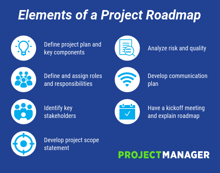
5 Marketing Channels to Focus On In 2019
Even though Field of Dreams is one of my favorite movies, the saying “If you build it, they will come” sadly doesn’t apply to content marketing. Too often, we forget that content marketing consists of two keywords — content and marketing. Creating content is usually the most fulfilling and enjoyable part of a marketer’s job. But distributing that content is just as crucial for your marketing success because if no one sees your content, they definitely won’t come.
To help you determine which marketing channels you should distribute your content through, we’ve put together a list of the marketing channels to focus on in 2019. Read on to learn about the marketing channels that can amplify your reach, resonance, and revenue.
1. Word of Mouth
Only 4% of consumers believe marketers practice integrity. So what’s a marketer to do when the very people they need to persuade don’t trust them? They need to rely on their customers’ recommendation of their brand.
People trust customers over marketers because marketers have an agenda — they promote their product or service to generate sales. On the other hand, customers will only rave about a product or service if it truly benefited them.
To create as much word of mouth marketing as possible, you need to stay laser-focused on developing the best product or service possible and providing top-notch customer service. In other words, you need to serve your customers needs before your own. Only then will your customers turn into a loyal, passionate tribe that will recommend your brand to their friends and family.
2. Podcasts
According to a content format study conducted by Edison Research and Triton Digital, people age 12 and older are listening to online audio content at unprecedented levels. On average, people spend 17 hours per week tuning into their favorite podcasts, online radio shows, and audiobooks. There are also 14 million more weekly podcast listeners this year compared to last year, which is more than Guinea’s entire population.
The demand for audio content has exploded, but that doesn’t mean people will listen to your branded podcast just because it’s a podcast. In reality, they’ll only listen to it if it can hold their attention and, ultimately, entertain them. Otherwise, producing yet another interview-an-expert podcast like everyone else will only add to the noise flooding the internet.
One of the best ways to slice through all that corporate clutter is by creating a show that has a unique concept and tells stories of real professionals in your industry. According to researchers in the neuroscience field, storytelling is the best way to capture people’s attention, bake information into their memories, and resonate emotionally with them. The human brain is programmed to crave, seek out, and respond to well-crafted narrative — that’ll never change.
3. Email
Wasn’t email supposed to die this year? And last year? And the year before that? As much as marketing gurus claim the final nail of email’s coffin is forthcoming, the data tells us it’s not even close. In the U.S., email usage has grown every single year since 2012 and 91% of American internet users use email.
As of now, subscribing to your favorite online publications through email is the best way to keep up with their latest stories and news. And since it takes an average of six to eight touch points to generate a qualified sales lead, persuading people to subscribe to your emails and, in turn, constantly consume your content will generate more leads and revenue for your business.
Growing an engaged, loyal subscriber base also speaks volumes about the quality of your content and its emotional resonance. Even though hoards of content saturate the internet and most people’s inboxes today, people are still actively engaging with your content, which is a clear sign that they actually value it.
4. Social Media
Most people surf social media to escape everyday life, entertain themselves, and connect with others. Sometimes, though, brands forget why people use social media in the first place, blindly pushing their content to as many people as possible.
With over 2.7 billion social media users across the globe today, millions of brands have promoted their content on these platforms for years. But the popularity of social media has flooded each platform with heaps of articles, photos, and videos, skyrocketing the supply of content while the demand for it has plateaued.
So how can brands cut through the noise? One strategy is to publish engaging videos, interact with fans as much as possible, and post content that doesn’t direct users to another website, like insightful status updates instead of links.
5. SEO
Search engines are arguably the best marketing channel for acquiring attention — most people discover new brands and publications through Google. In fact, according to Google, 89% of B2B buyers and 81% of online shoppers use search engines to research new products and services.
Search engines are also one of the highest converting marketing channels. Since people actively search for answers to their questions and solutions to their problems on Google, they’re likely to download your offer or sign up for a free trial if you can provide them with what they’re looking for.
To build a thriving organic presence online, consider implementing the pillar-cluster model into your blog. Using this strategy, you’ll create a single pillar page that provides a high-level overview of a topic and hyperlinks to cluster pages that delve into the topic’s subtopics. This signals to Google that your pillar page is an authority on the topic.
Hyperlinking all of the cluster pages to the pillar page also spreads domain authority across the cluster, so your cluster pages get an organic boost if your pillar page ranks higher, and your cluster pages can even help your pillar page rank higher if they start ranking for the specific keyword they’re targeting.

Reputation Management: How to Protect Your Brand Online in 2019
A positive brand image can undoubtedly influence a consumer’s decision to buy a product — and, for virtually every business, a positive brand image starts online.
Nowadays, your reputation is largely dependent on social media and online review sites. For instance, consumers need to read an average of 10 online reviews before they feel they can trust a local business.
Since brand image makes such an impression on someone’s decision to purchase, it’s critical you regularly monitor your reputation online.
Additionally, an unfavorable online reputation can have an extremely negative impact on your company’s bottom line — in fact, businesses risk losing up to 22% of their customers when users find just one negative article about the company.
However, monitoring and influencing your reputation can feel like a daunting task, particularly when so much of it — including online reviews — is out of your control. Fortunately, there are plenty of tools and strategies you can implement to ensure you’re protecting your brand in 2019.
Here, let’s explore reputation management software you can use to monitor your brand’s reputation online, as well as strategies you can implement to manage your corporate reputation.

Reputation Management Software
To start managing your reputation online, it’s helpful to use reputation management software. Particularly if you work for a small-to-medium sized business with limited PR resources, software can help you keep track of what people are saying online about your brand.
By using one of these software systems, you’re able to mitigate negative reviews by responding to customers online, and even use their feedback as an opportunity to make your brand or product better.
1. Yext Reviews
Since inconsistent information can negatively affect your local SEO, it’s critical you ensure your business’s information is listed consistently across each site. Fortunately, Yext lets you fix any inconsistent business information in one place.
Additionally, the software enables you to manage your social media accounts and respond to authentic customer reviews, ensuring you have a good grasp on your brand’s true online reputation. Yext is ideal for small-to-medium sized businesses as well as major enterprise companies — some of its impressive customers include Marriott Hotels and T-Mobile.
Price: Starts at $199/year

Image courtesy of Yext.
2. ReviewTrackers
ReviewTrackers collects online reviews from over 100 third-party review sites, including Google, TripAdvisor, and Facebook — best of all, you get a notification whenever a customer leaves a review, ensuring you’re up-to-speed on customer feedback. The cloud-based reputation and review management software also allows you to track trending issues and topics to show you the bigger picture regarding customer issues, and provides competitor tracking and performance analytics.
The tool, used by customers such as Sears and Triple A, is available for enterprise companies as well as small-to-medium sized businesses.
Price: Custom depending on your size and business needs (request a demo here).
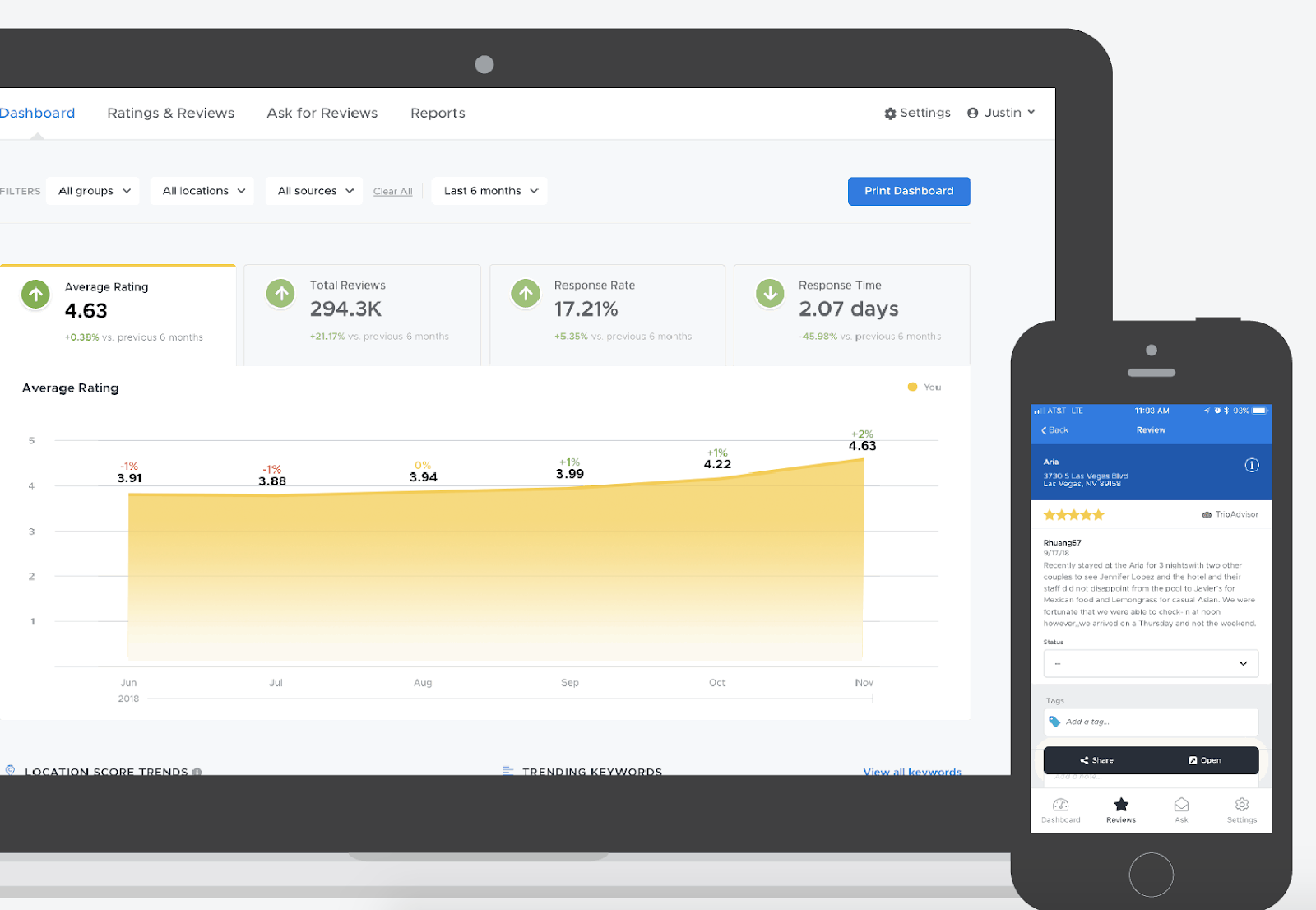
Image courtesy of ReviewTrackers.
3. Podium
More than likely, the idea of managing your reputation on different sites ranging from Facebook to Google to Yelp is a stressful and overwhelming one — fortunately, software like Podium allows you to see all customer interactions and online reviews in a single dashboard. Your employees can use Podium to request reviews, respond to reviews in real-time, and even send text messages with potential customers.
Podium’s support team is available via phone, online chat, or email, ensuring you have the help you need to properly implement their tool. The software works best for small-to-medium local businesses who have the time and resources to manually send texts to customers or leads.
Podium is a customer interaction platform that utilizes text messaging to help businesses manage customer relationships and build an online reputation on a variety of websites.
Price: Custom depending on your size and business needs. (Ask for quote here).

Image courtesy of Podium.
4. BirdEye
BirdEye, a SaaS reputation management tool used by more than 50,000 businesses, collects feedback from over 150 online review sources to ensure you have the full-picture regarding your brand’s online reputation. You can monitor, promote, and respond to reviews within one dashboard — additionally, you can use BirdEye to request reviews from customers on both desktop and mobile devices, or on BirdEye’s own messenger tool.
Along with review monitoring, BirdEye provides features to manage your social accounts, gain insight into your competitors’ customers, and create surveys and tickets to further improve your customer’s overall experience with your brand.
Price: Custom depending on your size and business needs. (Ask for quote here).
Image courtesy of BirdEye.
5. Cision
Cision Communications Cloud lets you track your brand mentions across millions of online stories, as well as any social media mentions. Best of all, Cision helps you reach audiences across traditional, digital, and social platforms, ensuring your brand is consistently successful across all marketing channels.
While Cision provides tools to ensure you’re able to monitor and protect your online brand, its features are particularly impressive for strategic, proactive PR outreach. For instance, Cision helps you find media outlets and specific contacts within the industry to reach out with pitches, or figure out which industry influencers can best help spread your message and positively impact your brand’s image.
Cision also provides automated analysis to help you translate your campaigns into valuable global insights. The tool is used by companies such as Comcast and Bayer.
Price: Custom depending on your size and business needs. (Ask for quote here).
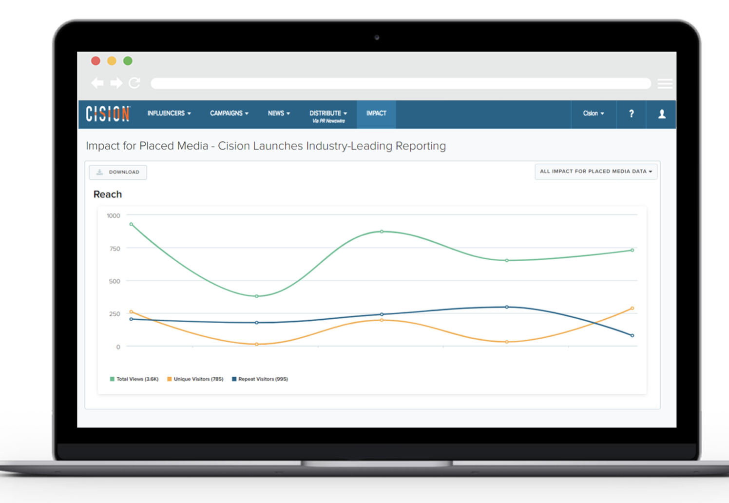
Image courtesy of Cision
Corporate Reputation Management
To understand how a business might implement a reputation management strategy, I spoke with Ellie Flanagan, Senior Corporate Communications Manager at HubSpot.
She told me — “The first step in shoring up your brand’s presence online is making sure that all of your owned channels reflect your current imagery, messaging, and values. Check for out-dated logos, company descriptions, or mission statements. It’s also helpful to do regular audits of other places where your logo or brand might be in use — such as on partner or customer websites.”
To conduct regular audits, you might use one of the software tools listed above. Additionally, you can use a reputation management software to check for inconsistencies, such as Yext. Alternatively, there are tools such as Express Update or My Business Listing Manager that help you monitor for out-dated information (check out A Comprehensive Guide to Local SEO in 2019 to learn more).
Flanagan also suggested, “Make sure you have clear language on your own website that outlines your company’s trademarks and sets guidelines for how others can use your brand assets. That will be a helpful reference in the event that you need to reach out to someone who’s using your brand incorrectly or without permission.”
I also spoke with Alice Sol, a Public Relations Specialist at HubSpot. She told me — “Protecting your brand has never been more important, and that goes hand-in-hand with customer trust. We live in a world where information travels rapidly and we can get a response in seconds at the touch of a button. Technology has enabled us, as consumers, to get in-touch with brands quickly — at the same time, it’s given brands the ability to form deeper connections and resolve issues faster.”
Ultimately, it’s critical you respond to negative feedback to ensure high customer satisfaction. Responding to negative reviews will help you maintain trust and loyalty among your customers. Additionally, it could actually help you grow your business — 45 percent of consumers say that they’re more likely to visit a business if it responds to negative reviews.
When responding to a negative review, it’s important you provide actionable, helpful solutions whenever possible. Avoid getting defensive or making excuses — at best, tell your customer you’re sorry they were disappointed in the service you provided.
Sol also advises businesses to do their best to meet customer needs and ensure a seamless experience, start-to-finish. She says, “The stakes [on delivering a good experience] are getting higher. 80% of consumers say they have stopped doing business with a company because of a poor experience. If a customer has a bad experience, technology allows information about that experience to travel quickly. At the same time, if a customer has a very positive experience, that creates a strong brand reputation and forms trust.”
“Your customers are your biggest asset and it’s critical to take those needs very seriously by responding in a timely manner and communicating effectively.”
To sum it up, when protecting your online reputation, you’ll want to focus on the following tactics:
- Make sure all your owned channels reflect your current imagery, messaging, and values
- Ensure all online information regarding your business is up-to-date and consistent
- Use clear language on your own website to outline your company’s trademarks and set guidelines
- Cultivate a positive user experience, start-to-finish
- Listen to customer feedback and respond to negative feedback with helpful, actionable solutions when possible
If you want further information regarding how to cultivate a comprehensive, cohesive customer experience, take a look at How to Define a Customer Experience (CX) Strategy, which provides you with the six areas of a successful digital customer strategy.

A 6-Step Workflow to Create Video for Multiple Platforms
Is video an important part of your social media marketing? Looking for an efficient way to create video for multiple social platforms? In this article, you’ll discover a six-step video workflow to produce more social media video content for your business. Why You Need a Social Video Workflow You’ve heard the news: Video is king […]
The post A 6-Step Workflow to Create Video for Multiple Platforms appeared first on Social Media Marketing | Social Media Examiner.
from Social Media Marketing | Social Media Examiner http://bit.ly/2ZN5S3W
via socialmediaexaminer
31 Call-to-Action Examples You Can’t Help But Click
Think about all the times you’ve signed up for things in your life. Did you once download Evernote? Dropbox? Spotify? Maybe you’ve even taken a class on General Assembly.
Each one of these signups is likely a result of an effective call-to-action (CTA).
It’s really important to guide your visitors through the buying journey using strategic CTAs.
Think about it: If you hadn’t been drawn in by the copy or design of the CTA, or been guided so eloquently through your sign-up process, you would probably use a lot fewer apps and websites than you do now.

Here are a few different actions an audience can get called to carry out:
Sign up.
In this type of CTA, the audience might be invited to sign up for a free trial, an online course, a future event, or even a software product. It all depends on the CTAs context on an ad or website.
Subscribe.
This CTA doesn’t commit a person to a purchase. Rather, it invites them to receive updates from the company. “Subscribe” CTAs are common to company blogs, for which the business wants to develop a readership.
Try for free.
Nearly every company website has a free trial offer today. Each of them are CTAs of this variety, and they allow people to demo a product before deciding if it’s worth the cost to them.
Get started.
This CTA can drive a variety of behaviors for a company, from a free trial to virtual reality experience.
Learn more.
Sometimes, all you want is to give your potential customers a little more information so they’re prepared to buy something. That’s what this CTA is for.
Join us.
Do you manage an online community. Is your product built on collaboration between users? You might find yourself placing “join us” CTA somewhere on your website.
Learn more about the purposes CTAs can serve in this blog post.
The above types of CTA all serve a designated purpose, but keep in mind the language they use can vary. And today, marketers everywhere have put some creative spins on their calls to action to generate the leads their businesses depend on.
To help you identify what’s effective and what’s not, we’ve listed out 31 examples of CTAs that totally rock. These call-to-action examples are broken out into three categories:
- Simple and effective CTAs
- CTAs with great call-to-action phrases
- CTAs that balance multiple buttons on one page
Simple & Effective Call-to-Action Examples
1. Evernote
CTA Button: Sign Up
“Remember Everything.” Visitors can immediately understand that message the moment they land on this page. The design on Evernote’s website makes it super simple for users to see quick benefits of using the app and how to actually sign up to use it. Plus, the green color of the main and secondary CTA buttons is the same green as the headline and the Evernote logo, all of which jump off the page.
2. Dropbox
CTA Button: Sign up for free
Dropbox has always embraced simple design with a lot of negative space. Even the graphics on their homepage are subtle and simple.
Thanks to that simple design and negative space, the blue “Sign up for free” call-to-action button stands out from everything else on the page. Since the CTA and the Dropbox logo are the same color, it’s easy for the visitor to interpret this CTA as “Sign up for Dropbox.” That’s one effective call-to-action.
3. OfficeVibe
CTA Button: Subscribe
Here’s a slide-in call-to-action that caught my attention from OfficeVibe. While scrolling through a post on their blog, a banner slid in from the bottom of the page with a call-to-action to subscribe to their blog. The best part? The copy on the slide-in told me I’d be getting tips about how to become a better manager — and the post it appeared on was a post about how to become a better manager. In other words, the offer was something I was already interested in.

Plus, I like how unobtrusive slide-in CTAs are — as opposed to what my colleague Rachel Sprung calls the “stop-everything-and-click-here-pop-up-CTA.” I find these CTAs offer a more lovable experience because they provide more information while still allowing me to continue reading the blog post.
4. Netflix
CTA Button: Join Free for a Month
One big fear users have before committing to sign up for something? That it’ll be a pain to cancel their subscription if they end up not liking it. Netflix nips that fear in the bud with the “Cancel anytime” copy right above the “Join Free for a Month” CTA. I’d venture a guess that reassurance alone has boosted signups. Also, you’ll notice again that the red color of the primary and secondary CTAs here match Netflix’s logo color.
5. Square
CTA Button: Get Started
To achieve effective CTA design, you need to consider more than just the button itself. It’s also super important to consider elements like background color, surrounding images, and surrounding text.
Mindful of these additional design components, the folks at Square used a single image to showcase the simplicity of using their product, where the hovering “Get Started” CTA awaits your click. If you look closely, the color of the credit card in the image and the color of the CTA button match, which helps the viewer connect the dots of what to expect if/when they click.
6. Prezi
CTA Button: Give Prezi a try
The folks at Prezi are also into the minimalist design look on their website. Other than the green dinosaur and the dark brown coffee, the only other color accompanying the predominantly black-and-white design is a bright blue — the same blue from their main logo. That bright blue is strategically placed on the homepage: the main “Give Prezi a try” CTA, and the secondary “Get Started” CTA, both of which take users to the same pricing page.
7. Full Bundle
CTA Button: Our Work
Full Bundle is another company that uses negative space to make their primary CTA pop. The white “Our Work” call-to-action stands out against the dark greys of the background. Their choice of CTA is strategic, too. Given that they primarily exist to build out clients’ online presences, it’s important for them to showcase their work — and that’s what most folks are going to their website for.

8. Panthera
CTA Button: Join
The folks at Panthera are looking for users who really care about wild cats around the world and want to join a group of people who feel the same way. To target those people in particular, we love how they use language that would speak to big cat-lovers: “Join the pride today.” The page itself is super simple: an on-page form with two, simple fields, and a button asking folks to (again) “Join.”
CTAs With Creative Call to Action Phrases
9. EPIC
CTA Phrase: ‘Let’s start a new project together’
The folks at the agency EPIC use their homepage primarily to showcase their work. When you arrive on the page, you’re greeted with animated videos showing some of the work they’ve done for clients, which rotate on a carousel. While there plenty of other places users might click on their site — including their clients’ websites — the main call-to-action stands out and always contrasts with the video that’s playing in the background.
I love that it features friendly, inclusive language — “Let’s start a new project together” — which gives a hint to users looking for a creative partner that they’re an especially great team to work for.
10. Aquaspresso
CTA Phrase: ‘Send Me Specials Now!’
The whole point of a call-to-action is to direct your site visitors to a desired course of action — and the best CTAs do so in a way that’s helpful to their visitors. The folks at coffee company Aquaspresso really nailed that balance here with the pop-up CTA on their main blog page.
Here, the desired course of action is for their blog readers to check out what they’re actually selling (and hopefully buy from them). There are many ways they could have done this, including putting out a CTA that urges people to “Check out our most popular products!” or something very direct. But we love what they’ve done instead: Their CTA offers blog readers something much more helpful and subtle — an offer for “today’s specials” in exchange for the reader’s email address.
Adding that the specials are for today only is a great example of a psychological tactic called scarcity, which causes us to assign more value to things we think are scarce. The fear that today’s specials are better than tomorrow’s might make people want to fill it out and claim their offer while they can.
(The call-to-action above was created using HubSpot’s free conversion tool, Leadin. Click here to learn how to easily create CTAs like this one using Leadin.)
11. QuickSprout
CTA Phrase: ‘Are you doing your SEO wrong? Enter your URL to find out’
No one wants to be wrong. That’s why a call-to-action button like QuickSprout’s slide-in CTA on their blog is so clickworthy. It asks the reader, “Are you doing your SEO wrong?” Well, am I? All I have to do is enter my URL to find out — seems easy enough. It’s language like that that can really entice visitors to click through.
Plus, having the CTA slide in mid-blog post is a great tactic for catching readers before they bounce off the page. Traditionally, many blogs have CTAs at the very bottom of each blog post, but research shows most readers only get 60% of the way through an article. (Click here to learn how to add slide-in CTAs to your blog posts.)

12. Grey Goose
CTA Phrase: ‘Discover a cocktail tailored to your taste’
Here’s a fun, unique call-to-action that can get people clicking. Whereas site visitors might have expected to be directed to product pages or press releases from the homepage, a CTA to “Discover a Cocktail Tailored to Your Taste” is a pleasantly surprising ask. People love personalization, and this CTA kind of feels like an enticing game. The play button icon next to the copy gives a hint that visitors will be taken to a video so they have a better idea of what to expect when they click.
13. Treehouse
CTA Phrase: ‘Claim Your Free Trial’
A lot of company websites out there offer users the opportunity to start a free trial. But the CTA on Treehouse’s website doesn’t just say “Start a Free Trial”; it says “Claim Your Free Trial.”
The difference in wording may seem subtle, but think about how much more personal “Claim Your Free Trial” is. Plus, the word “claim” suggests it may not be available for long, giving users a sense of urgency to get that free trial while they can.
14. OKCupid
CTA Phrase: ‘Continue’
OKCupid’s CTA doesn’t seem that impressive at first glance, but its brilliance is in the small details.
The call-to-action button, which is bright green and stands out well on a dark blue background, says, “Continue.” The simplicity of this term gives hope that the signup process is short and casual. To me, this CTA feels more like I’m playing a fun game than filling out a boring form or committing to something that might make me nervous. And it’s all due to the copy.
15. Blogging.org
CTA Phrase: Countdown Clock
Nothing like a ticking timer to make someone want to take action. After spending a short amount of time on blogging.org’s homepage, new visitors are greeted with a pop-up CTA with a “limited time offer,” accompanied by a timer that counts down from two minutes.
As with Aquaspresso’s example in #10, this is a classic use of the psychological tactic called scarcity, which causes us to assign more value to things we think are scarce. Limiting the time someone has to fill out a form makes people want to fill it out and claim their offer while they can.
Curious, what happens when time runs out? So was I. Hilariously, nothing happens. The pop-up CTA remains on the page when the timer gets to zero.
16. IMPACT Branding & Design
CTA Phrase: ‘What We Do’
CTAs can feel really pushy and salesy if the wrong language is used. I like IMPACT‘s educational approach, where they challenge visitors to learn what the company does before pushing them to take any further action. This call-to-action is especially intriguing to me because they don’t even use an action verb, yet they still manage to entice people to click.
17. Huemor
CTA Phrase: ‘Launch (Do Not Press)’
If you went to a website and saw a “Launch” CTA accompanied by the copy “Do Not Press” … what would you do? Let’s be honest: You’d be dying to press it. The use of harmless reverse psychology here is playful, which is very much in keeping with Huemor’s brand voice.
18. Brooks Running
CTA Phrase: ‘Find out when we have more’
How many times have you hotly pursued a product you love, only to discover it’s sold out? Well, as you might know, it’s no picnic for the seller either. But just because you’ve run out of an item doesn’t mean you should stop promoting it.
Brooks Running uses a clever call to action to ensure their customers don’t bounce from their website just because their favorite shoe is out of stock. In the screenshot below, you can see Brooks touting an awesome-looking shoe with the CTA, “Find out when we have more.” I love how this button turns bad news into an opportunity to retain customers. Without it, Brooks’ customers would likely forget about the shoe and look elsewhere.
When you click on the blue CTA button depicted below, Brooks directs you to a page with a simple code you can text the company. This code prompts Brooks to automatically alert the visitor when the shoe they want is available again.
19. Humboldt County
CTA Phrase: ‘Follow the Magic’
Humboldt County’s website is gorgeous on its own: It greets you with a full-screen video of shockingly beautiful footage. But what I really love is the unconventional call-to-action button placed in the bottom center, which features a bunny icon and the words “Follow the Magic.”
It enhances the sort of fantastical feel of the footage, making you feel like you’re about to step into a fairytale.
What’s more, once you click into that CTA, the website turns into a sort of choose-your-own-adventure game, which is a fun call-to-action path for users and encourages them to spend more time on the site.
Balancing Multiple Call-to-Action Buttons
20. Uber
CTA Buttons: Sign up to drive | Start riding with Uber
Uber’s looking for two, very distinct types of people to sign up on their website: riders and drivers. Both personas are looking for totally different things, and yet, the website ties them together really well with the large video playing in the background showing Uber riders and drivers having a good time in locations all over the world.
I love the copy of the driver CTA at the top, too: It doesn’t get much more straightforward than, “Make money driving your car.” Now that’s speaking people’s language.
21. Spotify
CTA Buttons: Go Premium | Play Free
As soon as you reach Spotify’s homepage, it’s pretty clear that their main goal is to attract customers who are willing to pay for a premium account, while the CTA for users to sign up for free is very much secondary.
It’s not just the headline that gives this away; it’s also the coloring of their CTA buttons. The “Go Premium” CTA is lime green, making it pop off the page, while the “Play Free” CTA is plain white and blends in with the rest of the copy on the page. This contrast ensures that visitors are drawn to the premium CTA.
22. Ugmonk
CTA Buttons: Send me the coupons | I’m not interested
Exit CTAs, also known as exit intent pop-ups, are different than normal pop-ups. They detect your users’ behavior and only appear when it seems as though they’re about to leave your site. By intervening in a timely way, these pop-ups serve as a fantastic way of getting your reader’s attention while offering them a reason to stay.
Ugmonk has a great exit CTA, offering two options for users as a final plea before they leave the site. First, they offer a 15% discount on their products, followed by two options: “Yes Please: Send me the coupon” and “No Thanks: I’m not interested.” It’s super helpful that each CTA clarifies what “Yes” and “No” actually mean, and I also like that they didn’t use guilt-tripping language like “No Thanks: I hate nature” like I’ve seen on other websites. Finally, notice that the “Yes Please” button is much brighter and inviting in color than the other option.
23. Pinterest
CTA Buttons: Continue with Facebook | Sign Up
Want to sign up for Pinterest? You have a couple of options: sign up via Facebook or via email. If you have a Facebook account, Pinterest wants you to do that first. How do I know? Aesthetically, I know because the blue Facebook CTA comes first and is much more prominent, colorful, and recognizable due to the branded logo and color. Logically, I know because if you log in through Facebook, Pinterest can pull in Facebook’s API data and get more information about you than if you log in through your email address.
Although this homepage is optimized to bring in new members, you’ll notice a very subtle CTA for folks with Pinterest accounts to log in on the top right.
24. Madewell
CTA Buttons: Take me there | What’s next?
Madewell (owned by J.Crew) has always had standout website design, taking what could be a typical ecommerce website to the next level. Their use of CTAs on their homepage is no exception.
When you first arrive on the page, you’re greeted with the headline “I’m Looking For …” followed by a category, like “Clothes That’ll Travel Anywhere.” Below this copy are two options: “Yes, Take Me There” or “Hmm… What’s Next?” The user can choose between the two CTAs to either browse clothes that are good for travel, or be taken to the next type of clothing, where they can play again.
This gamification is a great way to make your site more interesting for users who come across it without having a specific idea of where they want to look.
25. Instagram
CTA Buttons: Download on the App Store | Get it on Google Play
Since Instagram is a mainly mobile app, you’ll see two black CTAs of equal size: one to download Instagram in Apple’s App Store, and another to download it on Google Play. The reason these CTAs are of equal caliber is because it doesn’t matter if someone downloads the app in the App Store or on Google Play … a download is a download, which is exactly what Instagram is optimizing for. If you already have Instagram, you can also click the CTA to “Log In” if you’d prefer that option, too.
26. Barkbox
CTA Buttons: Get Started | Give a Gift
The two CTAs on Barkbox’s homepage show that the team there knows their customers: While many people visiting their site are signing up for themselves, there are a lot of people out there who want to give Barkbox as a gift. To give those people an easy path to purchase, there are two, equally sized CTAs on the page: “Get Started” and “Give a Gift.”
As an added bonus, there’s an adorable, pop-up call-to-action on the right-hand side of the screen prompting users to leave a message if they’d like. Click into it, and a small dialogue box pops up that reads, “Woof! I’m afraid our pack is not online. Please leave us a message and we’ll bark at you as soon as pawsible.” Talk about delightful copy.
27. t.c. pharma
CTA Buttons: Find out more | View products
Turns out Red Bull isn’t its own parent company: It’s owned by Thailand-based t.c. pharma, a company that makes popular energy drinks, electrolyte beverages, and functional drinks and snacks.
Its homepage features two call-to-action buttons of equal size: “Find out more” and “View products” — but it’s clear by the bright yellow color of the first button that they’d rather direct folks to “Find out more.”
28. General Assembly
CTA Buttons: View Full-Time Courses | Subscribe
As you scroll through the General Assembly website, you’ll see CTAs for various courses you may or may not want to sign up for. I’d like to point your attention to the CTA that slides in from the bottom of the page as you’re scrolling, though, which suggests that you subscribe to email updates.
Although this feels like a secondary CTA due to its location and manner, I actually think they try to sneak this in to become more of a primary CTA because it’s so much more colorful and noticeable than the CTAs for individual classes. When you create your own CTAs, try using bolder colors — even ones that clash with your regular stylings — to see if it’s effective at getting people’s attention. (Click here for a tutorial on how to add slide-in CTAs to your webpages.)
29. charity: water
CTA Buttons: Give by Credit Card | Give by PayPal
Charity: water’s main goal is to get people to donate money for clean water — but they can’t assume that everyone wants to pay the same way.
The CTAs featured on their homepage take a really unique approach to offering up different payment methods by pre-filling $60 into a single line form and including two equally important CTAs to pay via credit card or PayPal. Notice how both CTAs are the same size and design — this is because charity: water likely doesn’t care how you donate, as long as you’re donating.
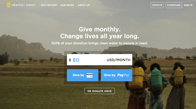
30. Hipmunk
CTA Buttons: Flights | Hotels | Cars | Packages
When you land on the Hipmunk site, your main option is to search flights. But notice there are four tabs you can flip through: flights, hotels, cars, and packages.
When you click into one of these options, the form changes so you can fill out more information. To be 100% sure you know what you’re searching for, Hipmunk placed a bright orange CTA at the far right-hand side of the form. On this CTA, you’ll see a recognizable icon of a plane next to the word “Search,” so you know for sure that you’re searching for flights, not hotels. When you’re on the hotels tab, that icon changes to a hotel icon. Same goes with cars and packages.
31. MakeMyPersona
CTA Buttons: Grab the template! | No thanks
Here’s another example of a great pop-up with multiple calls-to-action — except in this case, you’ll notice the size, color, and design of the users’ two options are very different from one another. In this case, the folks at MakeMyPersona are making the “Grab the template!” CTA much more attractive and clickable than the “No, I’m OK for now, thanks” CTA — which doesn’t even look like a clickable button.
I also like how the “no” option uses polite language. I find brands that don’t guilt-trip users who don’t want to take action to be much, much more lovable.
There you have it. By now, we hope you can see just how important little CTA tweaks can be.
Full Disclosure: We don’t have data to know if these are all scientifically successful, but these examples all follow our best practices. If you decide to recreate these CTAs on your site, please remember to test to see if they work for your audience.
Want more CTA design inspiration? Check out some of our favorite HubSpot call-to-action examples.

The State of Content Marketing 2019 [Infographic]
The results of the third annual State of Content Marketing Survey are now in — the findings include victories, challenges, and trends. With three years of data behind us, we can see just how much growth the content marketing world has achieved.
But we haven’t reached perfection yet.
Three years ago, only 6% of marketers felt they knew what a successful marketing campaign really looked like — in 2019, that number has increased to more than a third of marketers.
Additionally, if we
look back to 2017, just 70% of marketers found marketing to be effective for their brand. Much of that was driven by a distinct lack of knowledge around its use. Now, 96% of marketers say their deeper understanding is translating to results — and into a fully integrated marketing strategy.
You can see some of the highlights from the survey in the infographic below.
If you’d like to read the full results, you can download them here.

