
Welcome to My Blog
7 Key Metrics Every Business Should Track
If you follow professional sports, you know that you can’t just boil a player’s value or ability to perform down to a single statistic. One metric can’t reveal that much about them — analytics is more complicated than that. It’s only when you examine numerous statistics or metrics together that you can get a full picture of a player’s ability to perform and truly gauge their value.
In business, the same principle applies. You can’t just use one metric to measure a business’ financial performance. To truly gauge its value, you need to track numerous metrics together to get a full picture understanding of the business’ ability to perform.
In this blog post, we’ll cover the seven key metrics every business should track, allowing you to gauge your business’ performance from a more holistic point of view and measure your growth in a multitude of ways.
7 Key Metrics Every Business Should Track
1. Revenue Growth
Revenue is the amount of product your business sells in dollars minus the cost of returned or undeliverable items. It’s the key metric every business uses to measure their financial performance. Obviously, earning the highest amount of revenue possible is ideal, but the metric that’s more indicative of your business’ financial performance is year-over-year revenue growth.
You must remember that your business’ situation is completely different than your competitors’, even though you contend for the same customers, so it’s better to compete against yourself and compare your current revenue and revenue growth to your past financial performance than it is to compare it to your competitors’.
Otherwise, you could set a revenue or revenue growth goal that’s not attainable within your particular context, causing you to miss your goals, pressure your employees to cut corners in order to hit their numbers, and, ultimately, burn everyone out.
2. Average Fixed Costs
Fixed costs are your business’ costs that stay constant regardless if your business sells more or less of its product. For example, your rent on office space, website hosting costs, utility bills, manufacturing equipment, small business loans, property tax, and health insurance are all fixed costs because regardless of how much product you develop, ship out, and sell, these costs stay the same each month.
To determine how much your business will have to pay for each unit of your product before you account for the variable costs needed to actually produce them, you need to calculate your average fixed cost, which is your total fixed cost divided by your total number of units produced. This will help gauge the level of impact your fixed costs have on your product’s potential for profitability and how much you should spend on variable costs in order to turn a profit.

3. Average Variable Costs
Variable costs are the cost of all the labor and materials used to produce a unit of your product. Your variable costs directly depend on the amount of product you sell, so the more units you sell, the higher your variable costs, and the less units you sell, the lower your variable costs.
Some examples of variable costs are physical materials, production equipment, sales commissions, staff wages, credit card fees, online payment partners, and packaging and shipping costs.
To determine the amount of variable costs your business will have to pay to produce each unit of your product, you need to calculate your average variable cost. To do this, add each of your product’s unique total variable costs together and divide them by the total number of units of product made.

4. Contribution Margin Ratio
Contribution margin is calculated by subtracting the variable costs required to produce one unit of product from the revenue it generated. Since your variable costs are directly linked to producing your product and fixed costs are directly linked to keeping your business in operation and not producing your product, contribution margin helps you understand how profitable each of your products are. But to truly understand how they individually impact your bottom line, it’s better to calculate each of your product’s contribution margin ratios.
To do this, subtract each product’s total variable costs from their total sales revenue and divide that number by their total sales revenue. Your contribution margin ratio will be expressed in a percentage.

Once you know each of your product’s contribution margin ratios and, in turn, their profit potential, you’ll understand which products will generate more profit if you produce more units of them, and which products will generate less profit if you produce more units of them. These insights will help you develop a product mix capable of generating the highest level of profit for your business.
5. Break Even Point
Your business’ break even point is the quantity of product you must sell so that your total revenue equals your total costs. Knowing your break even point is crucial because it serves as the minimum goal your business should try to achieve in order to not lose money during a specific time period. Even better, if you surpass your break even point, your business will turn a profit during that time period.
To calculate your break even point, add up all your fixed costs and divide them by your contribution margin or the difference of your total sales revenue and total variable costs.

For example, if you sell baseball bats and your fixed costs are $500,000 and contribution margin is $50 for the year, you’ll need to sell 10,000 baseball bats to break even. If you sell more, you’ll turn a profit.
6. Cost of Goods Sold
Your business’ cost of goods sold is the cost of acquiring or making the products you sold during a certain time period, like material, manufacturing, and labor costs. In other words, they’re your cost of sales or cost of doing business.
Tracking your cost of goods sold, or COGS, is important because they directly affect your business’ bottom line. For instance, when your COGS increase, your profits will decrease, and when your COGS decrease, your profits will increase.
To calculate your COGS, you first need to pick an accounting method. Most businesses usually decide between three: First In, First Out (FIFO), Last In, Last Out (LIFO), and the Average Cost Method.
If you use the FIFO method, you’ll sell the oldest products you purchased or manufactured. Prices tend to rise over time, so the FIFO method will allow you to sell your cheapest inventory, which will decrease your COGS and increase your profit.
If you use the LIFO method, you’ll sell the newest products you purchased or manufactured. Prices tend to rise over time, so the LIFO method will allow you to sell your most expensive inventory, which will increase your COGS and decrease your profit, but you’ll also pay less taxes, which could help you offset or even overcome that initial loss in profit.
If you use the Average Cost Method, you’ll calculate the mean cost of your inventory, completely disregarding the recency or latency of their purchase or manufacture date. This method prevents periods of high inflation from influencing the level of your COGS.
7. Gross Profit Margin
Your gross profit is calculated by subtracting your COGS from your total revenue and reveals your business’ production efficiency or ability to optimize your material, manufacturing, and labor costs. However, since gross profit is a pure dollar amount and not a percentage of your revenue, it can grow even when your financial performance declines.
So to truly understand your business’ financial performance, it’s better to measure gross profit margin, which is your gross profit as a percentage of your revenue, instead of measuring gross profit. If your gross profit margin continues to climb over time, it’s a good indication that your business’ financial health is in good shape.

Image Credit: Investopedia

What Amazon Can Teach You About Email Marketing: 4 Key Lessons
Amazon is currently one of the world’s most valuable companies. From humble beginnings in Jeff Bezos’ garage in 1994, Amazon has grown into one of the most valuable companies in the world, as well as the second US company ever to reach a $1 trillion market valuation.
While Amazon’s journey from startup to essential world domination is the result of a combination of factors (including a bit of luck), there are easily observable lessons businesses of all sizes can learn from the e-commerce giant — particularly when it comes to its email marketing.
For the uninitiated, a few quick facts:
- Amazon currently captures about half of all online retail sales in the United States — and reported revenue of $232.89 billion in 2018.
- Amazon’s highly-optimized recommendation engine is responsible for a whopping 35 percent of revenue it generates, and emails Amazon sends are a big part of this recommendation engine.
- Amazon’s emails convert significantly more than Amazon’s on-site recommendations — which is a big deal considering that Amazon’s on-site recommendations conversion to sales ratio can be as high as 60 percent.
With these facts established, the big question is what is Amazon doing differently when it comes to email marketing? How does Amazon’s approach to email marketing differ from that of other major online retailers?
Below are four key lessons from Amazon’s approach to email marketing:
What Amazon Can Teach You About Email Marketing
1. A Focus on Not Interrupting the Email-to-Website Flow
A key lesson you can learn from Amazon’s approach to email marketing is how much of an effort it puts into ensuring that email-to-website user flow isn’t interrupted: for Amazon, email isn’t just another component — it’s an extension of the Amazon website — and moving from a particular email to a desired action on the Amazon website is often a click away.
Below is an email Amazon sent to me:
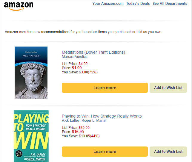
A few things are instantly noticeable from the above email, but I want to pay attention to two in particular:
- Amazon made sure that the look and feel of the email is similar to that of its site; when I got that email, I had no doubt I was dealing with Amazon — I was on Amazon.com.
- Beside each of the recommended book was an “Add to Wish List” button — clicking that button automatically adds each book to my Amazon Wish List; no extra step required.
This experience continues even after a purchase has been made. Here’s another email I got from Amazon:
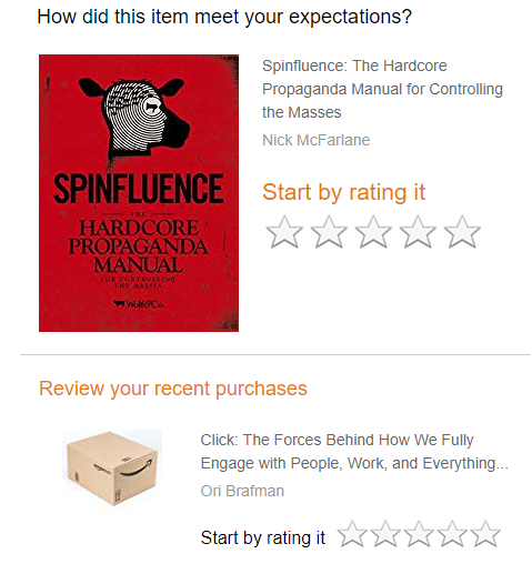
Shortly after purchasing some items on Amazon, the ecommerce giant sent me an email asking me to review my purchase: right from my inbox, I could click on the number of star I want to give the product and I’ll be automatically redirected to the reviews page on Amazon.
Research has indeed shown that interrupting user flow by adding unnecessary extra steps that affects user action can kill conversions; Amazon is aware of this and is careful about ensuring that steps users have to take from the email to action phase is as direct and straightforward as possible.
Key lesson: Reduce email-to-website friction by ensuring that CTAs in your emails lead users directly to the action you want them to take. Your CTA shouldn’t lead to more information; it should lead to an action.
2. Reliance on a Well-Optimized Targeted Follow-Up System That Leverages the Familiarity Principle
One of the biggest weapons in Amazon’s email marketing arsenal is its ability to repeatedly follow up until a customer purchases — premised on the psychological principle of the mere-exposure effect (also known as the familiarity principle).
The familiarity principle says that we tend to like and take something more seriously, even if we didn’t initially, after repeated exposure to it.
One of the most popular experiments that demonstrate the effectiveness of the familiarity principle was conducted by a professor called Charles Goetzinger in the year 1968. For the experiment, Goetzinger had a student come to class dressed in a large black bag with just the student’s feet visible. He then carefully monitored other students’ reaction to this “black bag.” As expected, and in line with the familiarity principle, Goetzinger found that other students were initially hostile to the black bag. After having the student repeatedly come to class dressed the same way, however, other students started to become curious about the black bag, gradually began to engage it, and eventually developed a liking for it.
A classic example of just how relentless Amazon can be when it comes to email follow ups can be seen in a case study of a user that looked up point and shoot cameras on the site; after spending just two or three minutes researching cameras, and Amazon established intent.
What Amazon did next is a key lesson for all email marketers: in just 12 days, Amazon had sent nine emails featuring different cameras in an attempt to get the user to buy.
Here’s the very first email Amazon sent to the user:

On the fourth day, Amazon sent another email trying to offer a 50 percent discount on a Canon PowerShot camera:
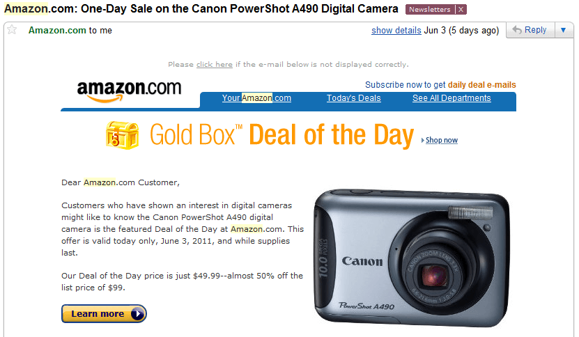
The eight email happened to coincide with Father’s Day in the US, so Amazon sent another follow up promoting a Father’s Day deal for cameras:
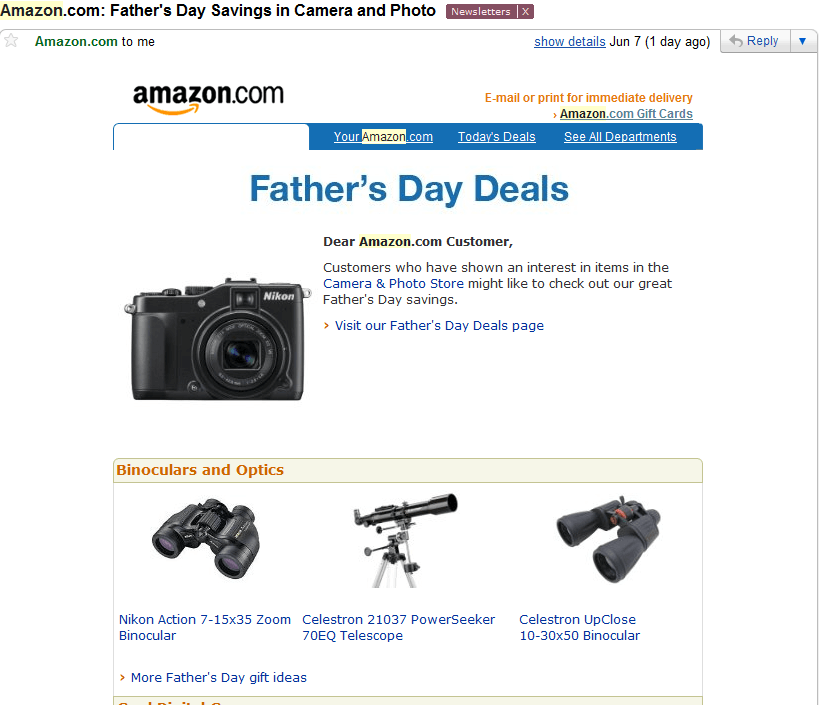
Nine emails, within 12 days, all about cameras.
Key lesson: In most cases, a single email isn’t going to be enough to convince a prospect to act. Repeated, targeted follow ups is going to make a lot of difference, however. Most email marketing services can now be integrated with your website, making it easy to kickstart campaigns based on actions users take on your website. Be sure to leverage this and take follow ups more seriously.
3. Leveraging A Very Effective Personalization and Recommendation Engine
Amazon’s personalization-based recommendation engine is one of the keys to its success not just with email marketing, but with e-commerce in general. As earlier stated, Amazon’s recommendation engine is said to be responsible for 35 percent of what consumers purchase on Amazon.com.
Amazon doesn’t employ its recommendation engine on its website alone; it also relies on it when it comes to its email marketing. Shortly after purchasing a book about stoicism on Amazon, I started to get emails like the one below:

Amazon doesn’t just send emails for the sake of sending emails; sometimes, as evidenced by the case study of the user that got nine emails in 12 days after searching for cameras, you might get a lot of emails all around the same time from Amazon. At other times, Amazon might be silent for weeks.
One thing instantly clear about Amazon’s emails, however, is that these emails are influenced by your activities on Amazon’s site as well as your interests — ensuring a higher likelihood of you responding to the emails.
A particular study by MarketingSherpa found that sending targeted, segmented emails can yield as much as a 208 percent increase in conversions compared to simply sending “batch-and-blast emails.”
Key lesson: Segment your subscribers based on interest, and only send them emails relevant to their interest and activities on your site.
4. A Less is More Approach to Email Content
Finally, what makes Amazon stand out when it comes to email marketing is its “less is more” approach.
Once Amazon has established what a user’s interest is based on activities on its site, it goes straight to the point: no wordy emails trying to convince you to take a certain action.
Amazon’s emails are often simple emails like this one:

The only information included is the title of the recommended product, an image, the price, and a link to learn more. That’s all you need to know. No wasting your time or waxing lyrical on you trying to convince you.
When it comes to getting users to review products they purchased, too, Amazon uses a similar approach.
Key lesson: Don’t waste users’ time in your emails. Wordiness does not necessarily equate with persuasiveness. Provide only the information necessary to make a decision, and ensure that your CTA stands out so that users can easily see it and head over to where they need to do what you want them to do.
Your Mileage May Vary
In conclusion, your mileage may vary: most of what Amazon does is influenced by a lot of tests and large data sets. However, it is important to note that several things make Amazon different: these include its brand value as well as the fact that it is an everything store. You might have to adjust a few things depending on your business model. However, most of what Amazon does when it comes to email marketing isn’t by accident, and the same principles can be used to help grow your business.

Google Maps Marketing Strategy: The Ultimate Cheat Sheet
A couple years ago, I used TripAdvisor or Yelp to learn about new restaurants in my area. Nowadays, I use Google Maps as the primary decision-maker, instead.
If I’m on my phone, I’ll simply open the Maps app and click the “Food” or “Drinks” icon to begin perusing options near me.
Alternatively, on desktop, check out what happens when I Google “Chinese food near me”:
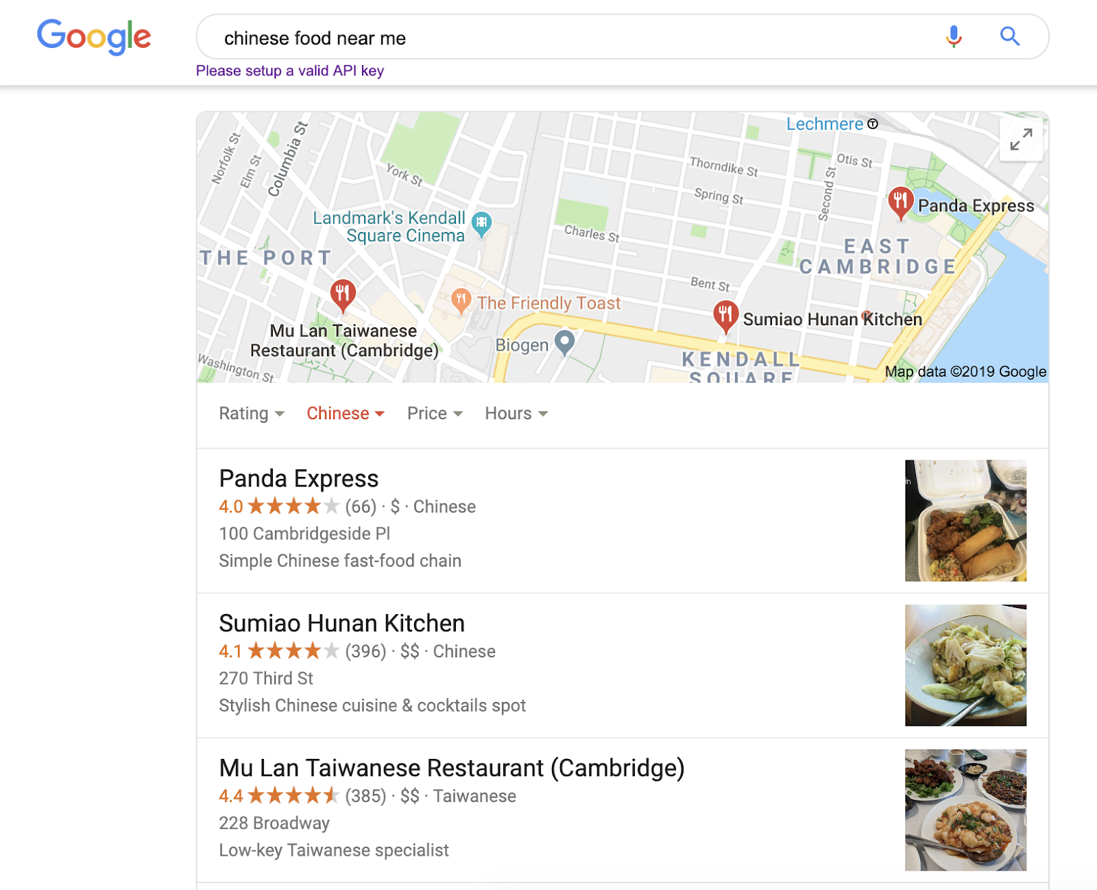
More than likely, most users will find what they’re looking for within the Google Maps results, and won’t even scroll to the organic results underneath — which is why it’s critical you optimize your website to appear on Google Maps.
Here, we’re going to cover how you can optimize your Google My Business account to ensure you appear on Google Maps, as well as marketing tactics you can employ to improve your local SEO.

How to Optimize Your Google My Business Account
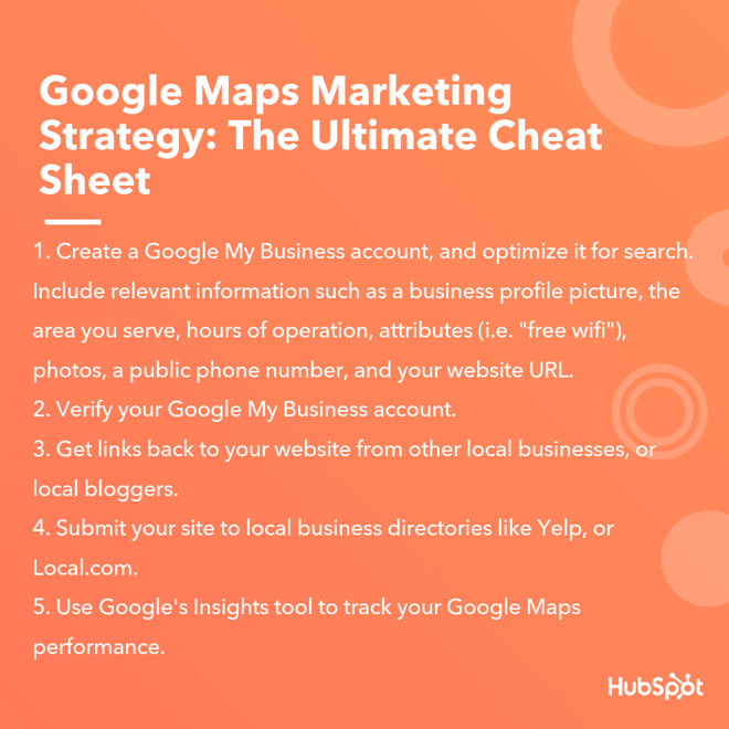
To appear in Google Maps, you’ll need to create a Google My Business account and ensure all the information is up-to-date. Once you’ve created a profile, it’s critical you include as much relevant information as possible — including a business profile picture, the area you serve, hours of operation, attributes (i.e. “free wifi”), a public phone number, and your website URL.
Additionally, according to Google, businesses with photos receive 42% more requests for driving directions to their location, and 35% more click-throughs to their website. To optimize your account for search, then, it’s vital you provide pictures of your physical store as well as images of your products or services.
Google also recommends responding to online reviews of your business, which enables new people to find you online, and also demonstrates to existing customers that you value their feedback. You might consider asking happy customers to leave reviews, or even incentivizing them with a coupon in exchange.
Alternatively, if someone leaves a negative review, it’s still important you respond. Look at Google’s guidelines for how to respond to a negative review.
To learn more about how to optimize your Google My Business account, check out The Ultimate Guide to Google My Business.
Marketing Strategies to Improve Local SEO
Google Maps is the most popular navigation app by a landslide, with 67% of total navigation users — second to Maps is Waze, with only 12% of total users.
This means it’s a critical tool for ensuring local consumers can find your business.
Google Maps can help bolster your online presence in local search results, which demonstrates your legitimacy and relevancy as a company — you wouldn’t be able to rank #1 for “nail salons near me” if you’d closed down months ago. Additionally, ranking high in search will ideally convince consumers to choose your business over a competitor’s.
To improve local SEO, try these three tactics:
1. Get links back to your site from local businesses or bloggers.
To improve your local SEO, consider crafting a strategy to get links back to your site from other local businesses. You could create a deal in which you link to another business’ site in exchange for a link from them.
Alternatively, depending on your industry, try reaching out to local bloggers to ask for reviews — for instance, if you run a Bed & Breakfast, you might ask travel bloggers to stay for free in exchange for an online review.
2. Submit your site to local business directories.
Try submitting your site to local business directories like Yelp, Local.com, and Superpages, and ensure all information across each of the sites is accurate — ultimately, the more websites that reference your business, the better.
To submit your site to Yelp, for instance, go to https://biz.yelp.com/signup_business/new and fill in the form. Once the site is verified and approved by moderators, you’ll receive an email on how to claim your business page.
3. Keep track of performance via Google’s Insights tool.
Once you’ve created a Google My Business profile and optimized it for Google Maps, you’ll want to track analytics using Google’s Insights tool.
To access Insights on a desktop, sign into your Google My Business account, open the location you’d like to manage (if you have multiple locations), and click “Insights” from the menu. On mobile, open the Google My Business app, click “More”, and then tap “Insights”.
Insights allows you to see how many times people have seen your business information, how many times people have requested driving directions to your location, and how customers are able to find your listing.


3 Analytics Tools That Help Measure Your Marketing Results
Need better ways to analyze your social activities? Looking for tools to prove your marketing efforts are working? In this article, you’ll find three tools to analyze and report on your social media marketing efforts. #1: Evaluate Keyword Mentions and Sentiment Awario is a social media monitoring and analytics tool that finds mentions of your […]
The post 3 Analytics Tools That Help Measure Your Marketing Results appeared first on Social Media Marketing | Social Media Examiner.
from Social Media Marketing | Social Media Examiner https://ift.tt/2VcpfQV
via socialmediaexaminer
11 Best Practices for Facebook Cover Photos & Videos [+ Templates]
When people arrive at your Facebook Page, where do you think they first look?
I’ll give you some hints. It’s a visual piece of content that sits at the top of your Page. Its dimensions are 820 pixels wide by 312 pixels tall. It takes up almost a quarter of the screen on most desktop browsers.
That’s right — it’s your Facebook cover photo.
Sometimes called your Facebook banner, this graphic is one of the most noticeable parts of your Page. It’s therefore crucial that you follow Facebook cover photo best practices.
Facebook Cover Photo Size
Optimize your cover photo for the right dimensions: 820 pixels wide and 312 pixels tall for desktop, 640 pixels wide by 360 pixels tall for mobile. If your uploaded image is smaller than these dimensions, Facebook will stretch it to fit — making it look blurry.
Whether you’re using Facebook to generate leads, close your next sale, or create a customer community, knowing how to make and optimize your cover photo is very important. And when you consider the Facebook cover photo dimensions above, it can be tough to balance creativity with the requirements of the platform.
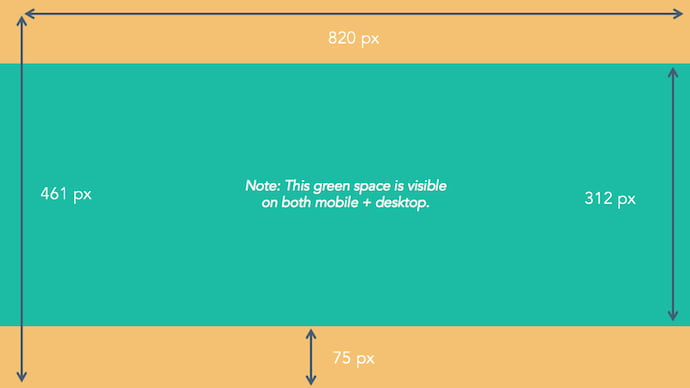
As you can see from the figure above, there’s a lot of space that you can risk cutting off of your final cover photo design depending on where your audience is viewing — mobile or desktop. Therefore, it’s best to focus the brunt of your content in that green space, where everyone can see your cover photo regardless of the device they’re using.
Need help getting started? Below, you’ll find 11 Facebook cover photo templates, and just as many best practices to guide you when designing your brand’s banner artwork. At the bottom of this post, find out how to turn your cover photo into a cover video, and check out a few examples to see what others have done.
11 Facebook Cover Photo Best Practices
1. Do abide by Facebook’s cover photo guidelines.
It seems like a no-brainer, but obeying Facebook guidelines is crucial to your Facebook Page existing in the first place. I’d highly suggest reading through the full Page Guidelines, but here are a few important things to keep in mind for your Facebook banner:
- Your cover is public.
- Covers can’t be deceptive, misleading, or infringe on anyone else’s copyright.
- You can’t encourage people to upload your cover to their personal timelines.
If you get caught violating the above terms, Facebook could take action against your Page. And while Facebook doesn’t explicitly say what will happen if you violate their Page guidelines, it’s probably not smart to get your Facebook Page taken down over a cover photo infraction, so read the guidelines in full and adhere to them.
2. Do make sure your Facebook cover photo size is right.
As stated at the beginning of this article, the best Facebook banner size is 820 pixels wide by 312 pixels tall for computers, and 640 pixels wide by 360 pixels tall on mobile devices.
You don’t want to spend all this time designing a cover photo only to have it look weird when you upload it to Facebook.
If you upload an image smaller than those dimensions, Facebook will stretch it to fit the right size, as long as it’s at least 399 pixels wide and 150 pixels tall.
If you want a no-hassle way to make sure your cover photos are the right size, download our pre-sized template for Facebook cover photos here.
3. Don’t worry about the old ‘20% text’ rule, but still try to stay visual.
Back in 2013, Facebook removed any reference to the 20% rule on text in cover photos … but that doesn’t mean you should go wild with using text in your cover photo. The previous rule said that only 20% of your cover photo could be text. Personally, I thought that was way too restrictive for marketers, but the sentiment behind the rule was a good one.
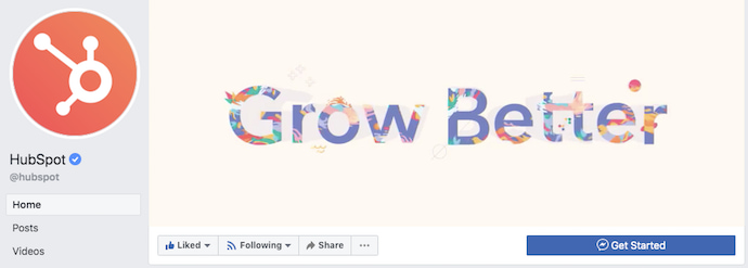
If you’re going to use text in your cover photo, keep that text concise. Your photo will be much more informative and engaging. You can see how we’ve tried to strike that balance on HubSpot’s Facebook Page below.
4. Do give your cover image a focal point and colors that match your brand.
Think of your cover photo as the portion of your Page that’s “above the fold.” If it’s distracting or confusing, people will be more likely to click off the Page.
Many of the best Facebook cover photos include a centerpiece to focus visitors’ attention, along with a color scheme that aligns with the rest of their brand. Remember, your social media accounts are extensions of your business, and should give that impression to visitors right away.
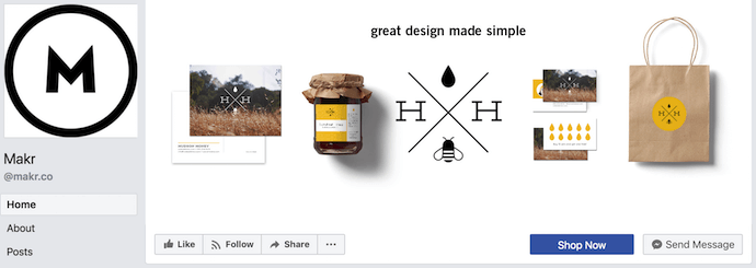
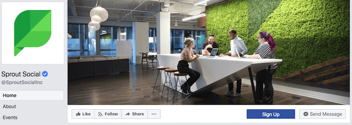
They also use negative white (i.e., empty) space as an advantage to make the subject, any copy on there, and other elements unique to Facebook (like the CTA button on Facebook business Pages) stand out even more.
Here’s an example from Makr:
And one from social media management platform Sprout Social:
5. Don’t try to blend the contents of your cover photo with your profile picture.
With some clever design tweaks, you used to be able to manipulate your profile picture and cover photo so they appear as if they’re two parts of the same canvas. You can still do this on your personal profile, but Facebook no longer sets up Business Pages this way.
One of Paris’ former cover photos did this nicely:
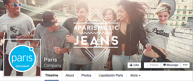
Now, as shown in the examples earlier in this article, the profile picture is completely separate from the cover photo.
We admire your creativity, but don’t prepare your design this way if you haven’t yet launched a Business Page — you’ll be disappointed.
6. Do draw attention to the action buttons on the bottom right.
You might’ve noticed in a few of the cover photo examples above that their primary call-to-action (CTA) buttons were different. Makr’s says “Shop Now,” while Sprout Social’s says “Sign Up.”
Depending on your business, you can launch a Page on Facebook with a unique CTA button to the bottom right of your cover photo. Take this button into consideration when designing your cover photo, and make it clear in the photo that this is a visitor’s next step.
Hotel Urbano does this is a charming way below, using the girl in goggles to draw your eyes toward the buttons she seems to be swimming toward …
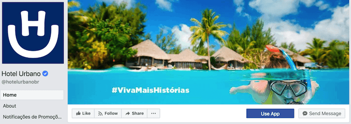
Note: While it might seem like a good idea to add directional cues like an arrow to get people to click on the CTA buttons, note that those CTA buttons don’t appear the same way on the mobile app. In other words, it might be confusing to mobile users if you directly integrate the cover photo design with the buttons.
I’ll show you how Business Pages look on mobile devices in just a minute.
7. Do right-align the objects in your cover photo.
Since your profile picture is on the left, you want to add some balance to your Facebook cover photo design by having the focus of the image be on the right.
Take a look at these cover photos. Which one looks more aesthetically pleasing?
Right-aligned focus:

Left-aligned focus:
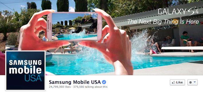
Doesn’t the right-aligned cover photo look better? The biggest design elements (the profile picture, the text, and the Statue of Liberty) are evenly spaced. In Samsung’s old cover photo, your attention goes immediately to the left side of the page, completely missing the name of the product on the upper-right side.
Not only is adding balance a crucial element of design, but it also allows for your cover photos to be more visually effective on mobile. Which brings me to my next point …
8. Do keep mobile users in mind.
As of 2019, reports Statista, 96% of Facebook’s user base accesses the social network from mobile devices like smartphones and tablets. That’s huge — and it’s exactly why it’s so important to keep mobile users top-of-mind when designing your Facebook cover photo.
On mobile, a much larger portion of your cover photo is blocked out because the profile picture and the Page name are on top of the cover photo.
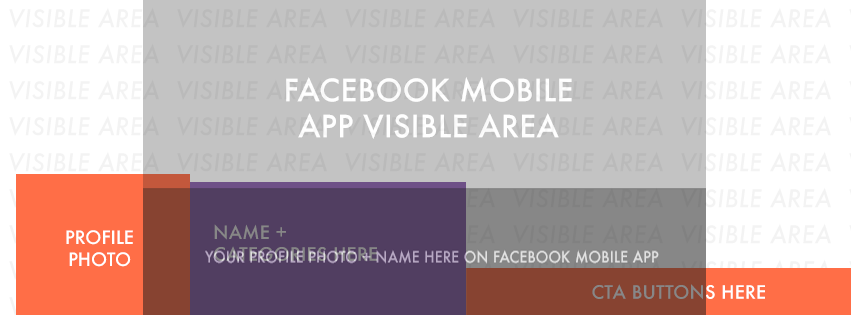 Image Credit: Twelveskip
Let’s take a look at a real-life example. Below, take a look at what Cisco’s Facebook Page looks like in a desktop browser versus on Facebook’s mobile app.
Desktop:
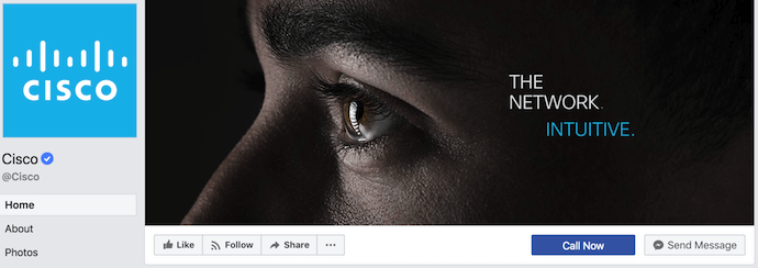
Mobile:
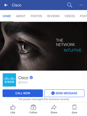
Notice that the sides of the photo are cut off on mobile. Whereas your cover photo displays at 820 pixels wide by 312 pixels tall on desktop, it displays only the center 640 pixels wide by 360 pixels tall on smartphones. Take a look at this Facebook help document for more information.
Notice, by the way, how the text in Adobe’s cover photo is cut off on the right-hand side. While it looks best to right-align your visual elements, be careful not to put important content so far to the right that it gets cut off on mobile.
9. Do include a shortened link in your cover photo description that aligns with your page CTA.
If you want to use your cover photo to support a Page CTA, make sure your cover photo description also includes a text CTA and link to the same offer. This way, any time people view your cover photo directly, they can access the download link.
Here’s this practice in action on Adobe’s Facebook Page:
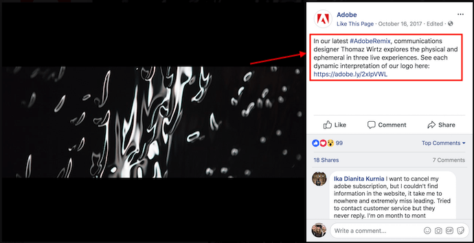
Make sure you shorten your links and add UTM codes so you can track clicks on them. Shortening and tracking features are available in the HubSpot Marketing Platform and in tools like bitly.
(If you want to learn more about how to write effective call-to-action copy for your cover photo description, click here to download our free ebook on creating compelling CTAs.)
10. Do pin a related post right below your Facebook cover image.
Have you ever “pinned” a post to your Facebook Page’s Timeline? Basically, pinning a post allows you to highlight a typical Facebook post on the top of your Timeline for seven days. It’s signified by a small blue push pin on the top right of the post, like on Fashion Nova’s Page below:
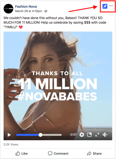
How does this relate to optimizing your Facebook cover photo? Well, if you’re spending time aligning your Facebook Page CTA, your cover photo design, and your cover photo description copy, you should also make sure to post about the same thing directly to your page, and pin that post to the top of your Timeline.
That way, you’re giving people one very clear call-to-action when they arrive to your page (albeit in several different locations) — which should help conversions.
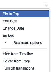
To pin a Facebook post: Simply publish the post to Facebook, then click the three dots on the top right corner of the post and choose “Pin to Top.”
11. Do consider publishing a Facebook cover video.
You read that right. Facebook Business Pages now have the option to add a video in lieu of a static cover photo, provided they meet certain requirements — which we dug up for you:
How to Make a Facebook Cover Video
Post a Facebook cover video by saving a video file at 820 pixels wide by 426 pixels tall to your desktop. Open your Facebook Business page, click “Change Cover” at the top-left of your cover photo, and select “Upload Photo/Video.” This allows you to format and publish the desktop file to your Facebook page.
Facebook currently supports cover videos that are between 20 and 90 seconds long, and a minimum of 820 pixels wide by 312 pixels tall. The maximum (and recommended) size is 820 by 462 pixels with a video resolution of 1080p.
Keep in mind that Facebook cover videos play on a loop — once it ends, it automatically starts over if the viewer is still on your Facebook page. With that in mind, make sure whatever you post is pleasant if seen more than once. Extreme, action-packed videos might appear exhausting when played over and over …
Once you pull the file from your desktop, you’ll click “Next” where you’ll be asked to select from 10 thumbnail versions of your video. The thumbnail you choose will display for users who hover their cursor over your profile photo before visiting your full Business Page.
Facebook Cover Video Examples
Cover videos are a terrific option for the video-inclined, and brands across numerous industries have already taken advantage of it to hold their visitors’ attention. Here are some great cover videos to inspire you:
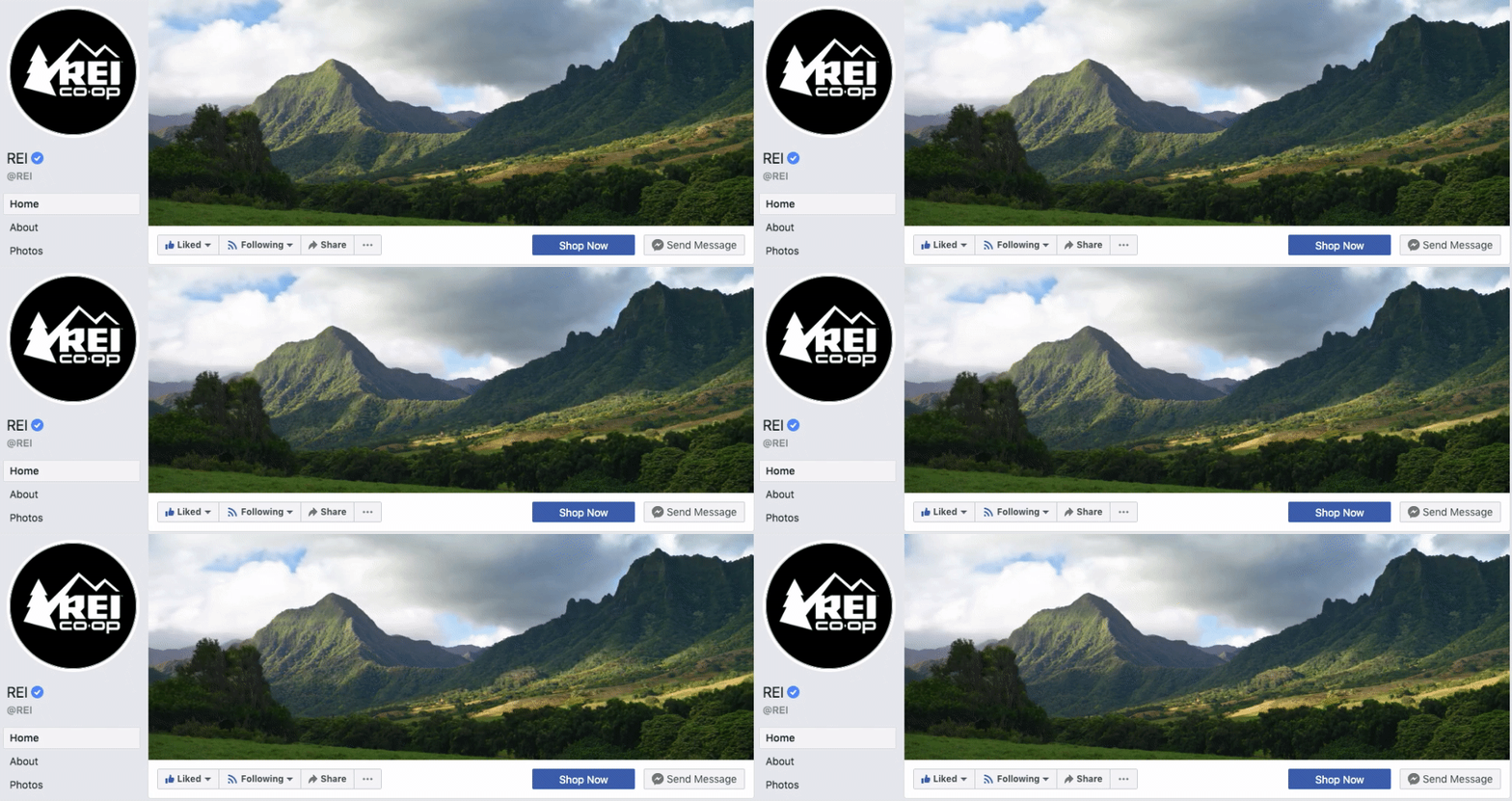
REI
REI sells outdoor equipment for activities like camping, hiking, running, boating, and biking. The company’s subtle cover video reflects its products, all in one peaceful time lapse of the scenery it knows its audience craves.
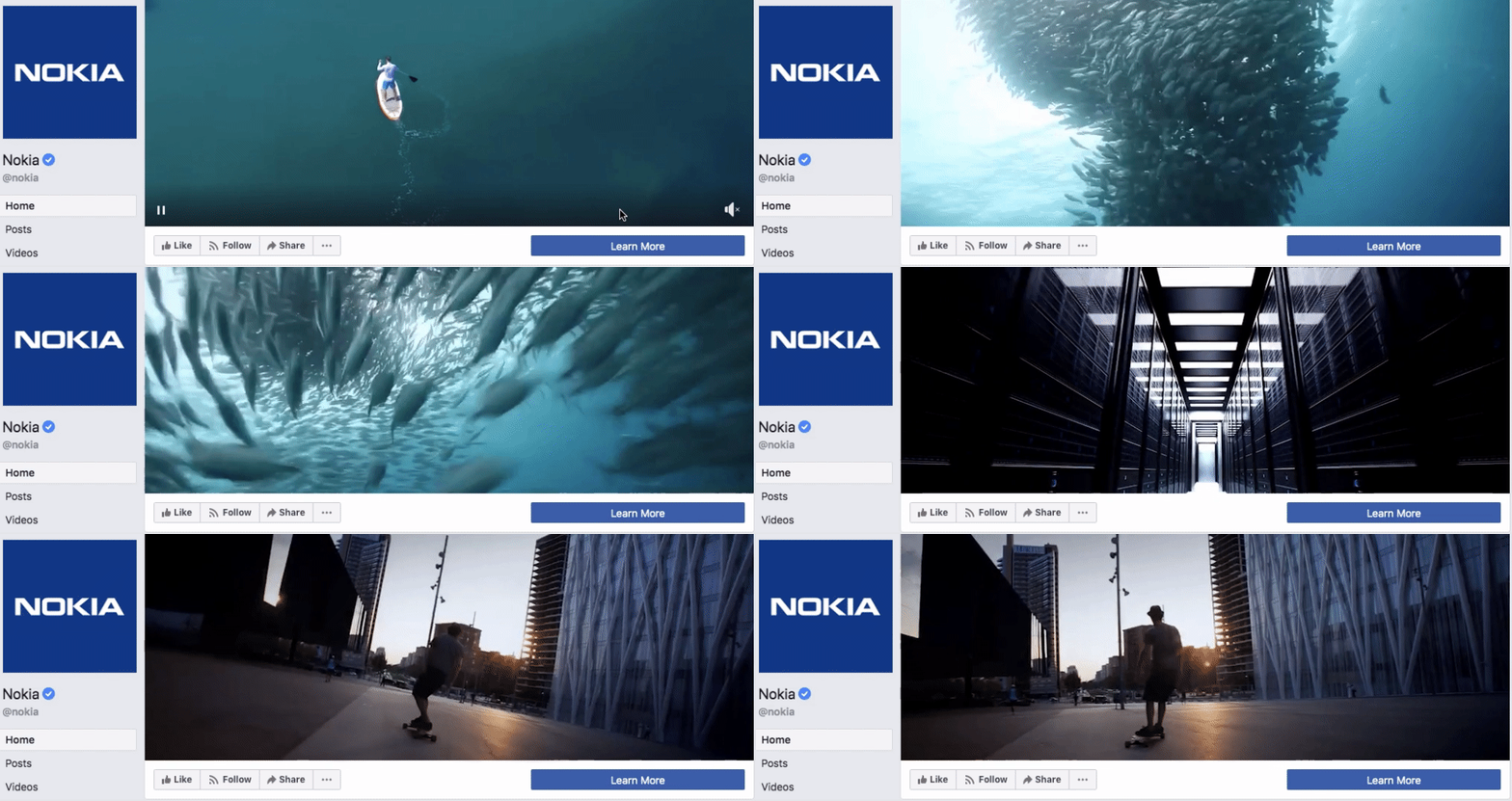
Nokia
Nokia wants to be everywhere its users are — whether they’re paddle-boarding, scuba diving, skateboarding, or working. Its Facebook cover video embodies its core customer in a visually pleasing way.
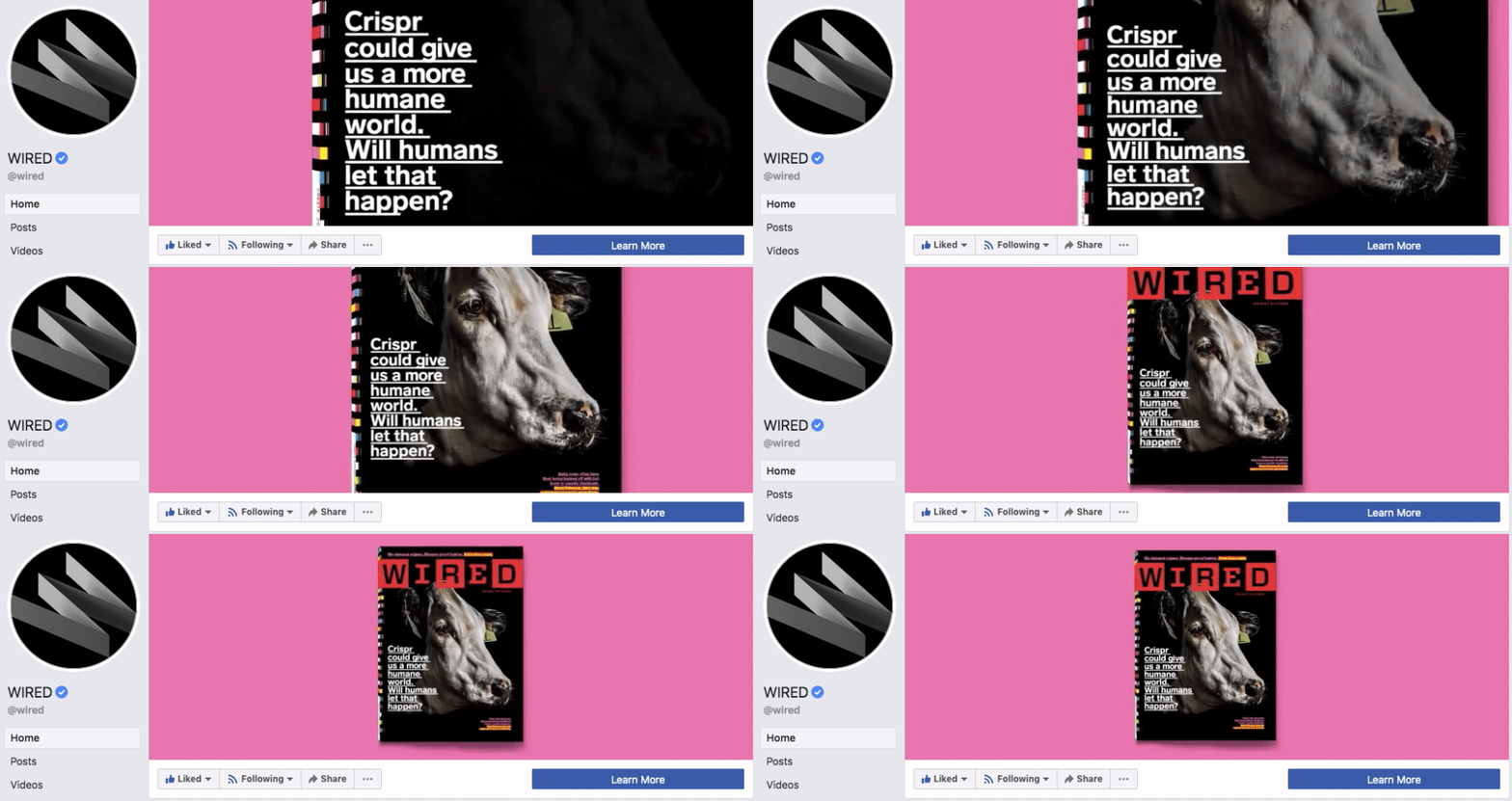
WIRED Magazine
When your publication changes as fast as the news cycle, it can be hard to keep your readers focused on the stories you feel deserve extra attention. WIRED Magazine uses its Facebook cover video for just this purpose, as shown in the example below.
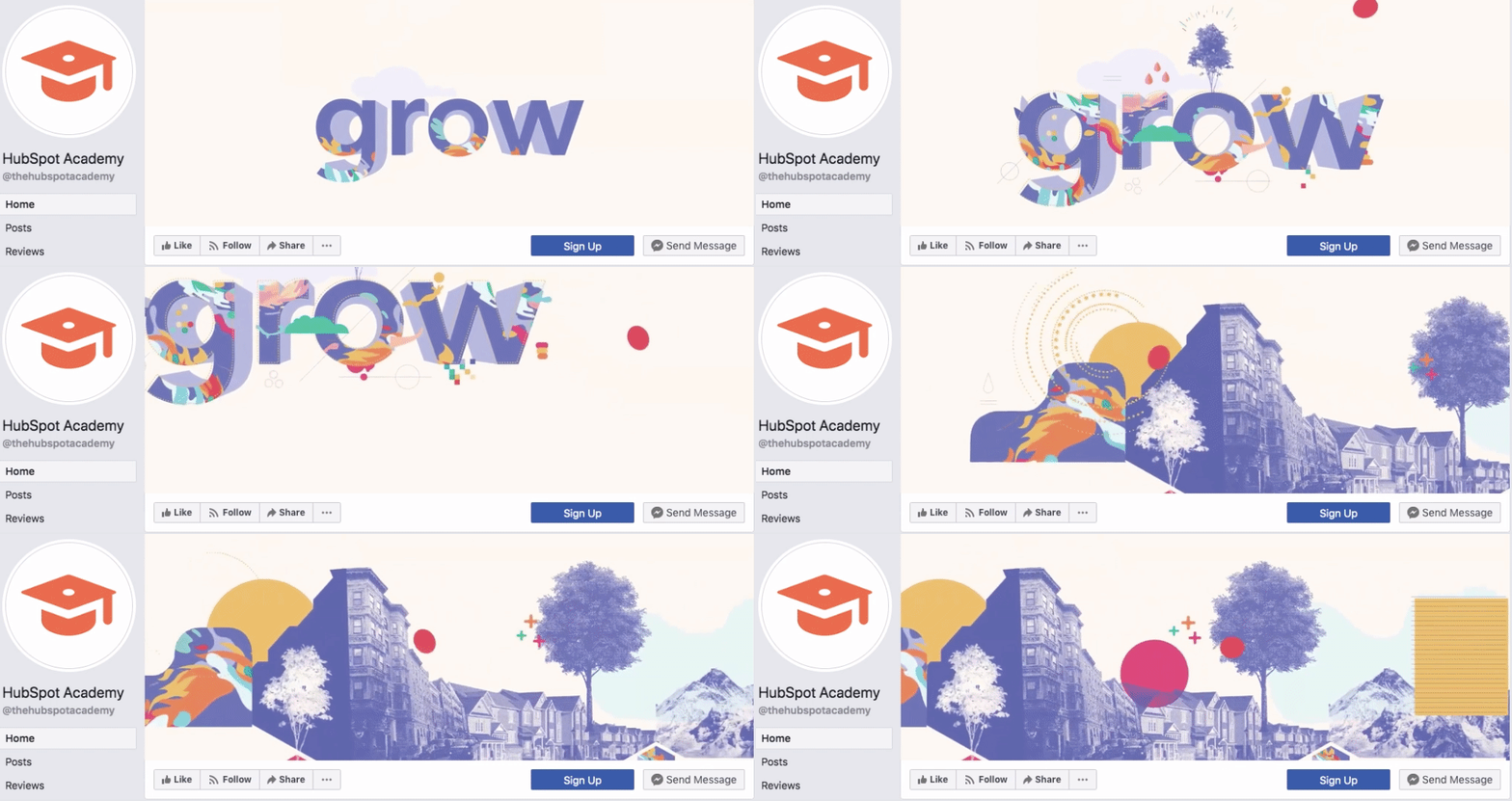
HubSpot Academy
Alright, maybe we’re biased, but our brilliant creative team crushed it with the video below, made for HubSpot Academy. Sometimes, animation is the best way to capture the essence of your brand.
As you can see from these examples, your video should be just as simple as a cover photo. Keep in mind the same guidelines outlined in best practice #1 apply to cover videos as well.
Want to see how HubSpot uses Facebook? Like our Facebook Page here.

Seven Priorities for Project Managers in 2019
7 of the Best Affiliate Programs for Making Real Money
Out of all the ways you can make money creating content, affiliate marketing is one of the best ways to do it. You don’t have to build, market, or sell a product or service. You just have to insert affiliate links or ads in your content, which usually doesn’t cost any money, and then wait for people to click on them and buy something, earning you a commission.
Once you partner with an eCommerce platform or business that has an affiliate program, you can pick out relevant products to promote on your website. Your partners will then send you custom links to their product pages that can track customers referred by your website.
But what are the affiliate programs that can actually supplement your income or even become your main source of income? To help you partner with the best affiliate programs out there, we’ve put together a list of the affiliate programs that’ll help you make some real money.
Best Affiliate Programs
- Amazon Associates
- Google AdSense
- eBay Partner Network
- Rakuten Marketing Affiliates
- Shopify’s Affiliate Program
- SEMrush’s Affiliate Program
- HubSpot’s Affiliate Program
1. Amazon Associates
One of the most popular affiliate marketing programs around is Amazon Associates. It’s free to join once they accept you into the program, you can choose from over one million of Amazon’s eCommerce products to advertise on your website, mobile app, or Facebook, Instagram, Twitter, YouTube, and Twitch profile, and you can earn up to 10% in commission if someone clicks on your affiliate link and buys an Amazon product.
To get started with Amazon Associates today, check out our blog post on how to become an Amazon Associate.
2. Google AdSense
Google AdSense is a program that lets web publishers open up small portions of their website for advertisers to display their ads on. Just like Google Ads, advertisers bid on publishers’ ad space in the Google Ads auction. They bid on certain keywords, and if a publisher’s content has the same or similar keywords, Google will sell their ad space to the highest bidder and pay the publisher 68% of the advertising revenue that the ad campaign generates.
However, AdSense doesn’t optimize the ads that they display on publishers’ website for a maximum return on investment like Google Ads does for its advertisers when they want to optimize their ad campaigns. So, essentially, the amount of money a publisher can earn with AdSense hinges on how well advertisers can craft their ads.
Publishers do have control over the types of ads that display on your website, though. They can choose from text ads, display ads, rich media ads, and more. They can also customize their ad’s style or create their own, which gives them the ability to change the size, color, textual, background, and border details of the ads that display on their website. Additionally, they can only place three content ads, three link ads, and two search boxes on each of their web pages.
3. eBay Partner Network
WIth over 1.1 billion listings from a multitude of product categories that you can advertise on your website, Facebook page, or Twitter profile, the eBay Partner Network supplies you with plenty of items you can refer and earn commission on. Once eBay approves you, they’ll give you access to simple link generators that let you add a few items to your site. If you want to advertise a higher quantity of products, they’ll let you implement product feeds right on your website.
Depending on the product category you refer, you can earn between 50-70% of eBay’s revenue when you direct someone to the eCommerce platform and they buy the product within 24 hours after the auction ends. If you refer a sale to a shopper who hasn’t bought a product on eBay within the past 12 months, eBay will reward you with additional referral revenue.
4. Rakuten Marketing Affiliates
Rakuten is the largest eCommerce website in Japan, earning almost $9 billion in revenue last year. Their affiliate program, Rakuten Marketing Affiliates, has been crowned the number one affiliate network for eight years in a row, enabling more than 110 million annual orders in 202 countries and 25 currencies.
When Rakuten accepts you into their affiliate program, you can choose to advertise products from over 1,000 merchants, customize the product feeds on your website, automatically convert product links into commissionable tracking links, display personalized offers to your audience using Rakuten’s proprietary API, and earn a commission on sales you influence during the beginning or end of the customer journey.
5. Shopify’s Affiliate Program
Shopify is one of the most lucrative affiliate programs around. With no monthly charges or minimum sales requirements and an average commision of $58 for every user you refer who signs up for a paid plan and $2,000 for every user you refer who signs up for their enterprise product, Shopify Plus, you can really maximize your bang for your buck.
After Shopify accepts you into their affiliate program, they’ll assign you a dedicated affiliate manager, give you access to partner education, provide you with their own blogs, webinars, and video tutorials that can expedite your referral process, and offer you exclusive discounts and business tools.
6. SEMrush’s Affiliate Program
Since SEMrush sells subscription-based software, their affiliate program, BeRush, lets you earn a 40% recurring commission for every new customer you refer. Not only is a 40% commission rate a hefty sum, but SEMrush will pay you every month that your referred customer stays subscribed to one of their software packages. So if you refer a customer who becomes a loyal user of SEMrush, you could earn a commission off them for years.
After joining BeRush, you also get access to promotional materials in English, Spanish, French, German, and Russia that can help you refer customers to SEMrush, as well as top-notch customer support.
7. HubSpot’s Affiliate Program
If you have a large audience of small-to-midsize businesses, HubSpot’s affiliate program could be a perfect fit for you. By embedding affiliate links in your content and driving purchases of one of our products within 90 days of landing on our site through your website’s affiliate link, you can earn $250 for referring a starter/basic customer, $500 for referring a professional or CMS customer, and $1,000 for referring an enterprise customer.
HubSpot’s Affiliate Program doesn’t have a minimum sales quota or commission limit, gives you access to demo videos, banners, and copy examples to help you earn as much commission as possible, and dedicates their Affiliate Team to help you with your program.

The Ultimate Guide to Branding in 2019
Products are never just products, right?
Coca-Cola is more than a soda. Starbucks is more than a coffee. Ray-Ban is more than a pair of sunglasses. Glossier is more than a tube of concealer.
Interacting with these products provide experiences, and we buy them with that experience in mind. Better yet, the companies that create and market them know exactly the experience they want you to have when you make (or consider) a purchase. That’s why they create a brand.
From the language in their Instagram caption to the color palette on their latest billboard to the material used in their packaging, companies who create strong brands know that their brand needs to live everywhere. They know their names extend far beyond the label.
The result? These brands are known, loved, and chosen out of a long lineup of options.
Who doesn’t want that? I know I do. That’s why we built this guide — to equip you to create and manage a strong brand that’ll help your business be admired, remembered, and preferred.
Use the links below to jump ahead to sections of interest, and don’t forget to bookmark this guide for later.
What’s a brand?
Before I dive into the importance of branding and how to build a brand, let’s go back to basics: What is a brand?
A brand is a feature or set of features that distinguish one organization from another. A brand is typically comprised of a name, tagline, logo or symbol, design, brand voice, and more. It also refers to the overall experience a customer undergoes when interacting with a business — as a shopper, customer, social media follower, or mere passerby.
What is branding?
Branding is the process of researching, developing, and applying a distinctive feature or set of features to your organization so that consumers can begin to associate your brand with your products or services.
Branding is an iterative process and requires getting in touch with the heart of your customers and your business. It’s important for a variety of reasons — I dive into these next.
Branding can be the deciding factor for consumers when they make a purchase decision. In a 2015 global Nielsen survey, almost 60% of shoppers said they actively buy from brands they know, and 21% said they bought a product because they liked the brand.
Branding gives your business an identity beyond its product or service. It gives consumers something to relate to and connect with.
Branding makes your business memorable. It’s the face of your company and helps consumers distinguish your business across every medium (which I discuss later).
Branding supports your marketing and advertising efforts. It helps your promotion pack that extra punch with added recognition and impact.
Branding brings your employees pride. When you brand your company, you’re not only giving your business identity, you’re also creating a reputable, highly-regarded workplace. Strong branding brings in strong employees.
Branding Terms to Know
Here are some other brand-related buzzwords you should know. They further demonstrate the importance and value of branding your business.
Brand awareness
Brand awareness refers to how familiar the general public and your target audience is with your brand. High brand awareness leads to brands being referred to as “trending,” “buzzworthy, or “popular.” Brand awareness is important because consumers can’t consider purchasing from your brand if they’re not aware of it.
👉🏼 Strong branding makes your business known.
Brand extension
Brand extensions are when companies “extend” their brand to develop new products in new industries and markets. Consider Honda lawn mowers or Martha Stewart bedding. Brand extensions allow companies (or individuals) to leverage brand awareness and equity to create more revenue streams and diversify product lines.
👉🏼 Strong branding brings in more money.
Brand identity
Brand identity is the personality of your business and the promise you make to your customers. It’s what you want your customers to walk away with after they interact with your brand. Your brand identity is typically comprised of your values, how you communicate your product or service, and what you want people to feel when they interact with it.
👉🏼 Strong branding gives your business more than a name.
Brand management
Brand management refers to the process of creating and maintaining your brand. It includes managing the tangible elements of your brand (style guide, packaging, color palette) and the intangible elements (how it’s perceived by your target audience and customer base). Your brand is a living, breathing asset, and it should be managed as such.
👉🏼 Strong branding requires consistent upkeep.
Brand recognition
Brand recognition is how well a consumer (ideally in your target audience) can recognize and identify your brand without seeing your business name — through your logo, tagline, jingle, packaging, or advertising. This concept goes hand-in-hand with brand recall, which is the ability to think of a brand without any visual or auditory identifiers.
👉🏼 Strong branding keeps your business top-of-mind.
Real-life brand example: Want to test your brand knowledge? Take this Logo Quiz by Business Insider to see how well you know your corporate brands. This is brand recognition at work.

Brand trust
Brand trust refers to how strongly customers and consumers believe in your brand. Do you deliver on your marketing promises? Do your salespeople and customer service go above and beyond? These things can create trust among your customers, which is important in a world where a mere 25% of people feel confident in large businesses.
👉🏼 Strong branding builds trust with your customers.
Brand valuation
Brand valuation is the commercial valuation of your brand derived from consumer perception, recognition, and trust. This concept goes hand-in-hand with brand equity. A powerful brand can make your business invaluable to investors, shareholders, potential buyers.
👉🏼 Strong branding increases your business’s value.
Want to build an effective, measurable brand? Download our free guide on How to Build a Brand in 2019.
Here’s how you can create a brand — or begin the process of rebranding your current one.
There’s a lot that goes into a brand, and there’s a lot to consider when building a strong one. So, grab a notebook and jot down ideas as you move through this section. Recognize that branding is an iterative process, so you might be repeating some of these steps as you brainstorm and build your brand.
1. Determine your target audience
Branding leads to awareness, recognition, trust, and revenue. We’ve talked about that. But let’s take a step back and understand where those stem from: consumers. And not just any consumers — your target audience and customers.
If your brand doesn’t resonate with your audience, it won’t lead to that awareness, recognition, trust, and revenue. That’s where target market research comes in.
Before pressing pen to paper (or cursor to digital document), you must understand to whom your branding will be speaking. Who does your product serve? Who is your ideal customer? Why did you create your business in the first place?
What you learn about your target market and buyer personas will influence your branding decisions down the line, so make this step your first priority.
Download our free Persona Templates to easily organize your target audience research and strengthen your marketing.
2. Establish your mission statement
Let’s return to a question I asked in the previous step: Why did you create your business? Answering this will help you build your mission statement, which defines your purpose and passion as an organization.
Before you can craft a brand that your audience recognizes, values, and trusts, you must be able to communicate the purpose that your business provides. Then, every part of your brand (logo, tagline, imagery, voice, and personality) can reflect that mission and vision.
Your mission statement is a building block of your brand manifesto, which encompasses why your organization exists and why people should care about your brand.
Download our free guide to Defining Inspiring Mission and Vision Statements and learn the ins-and-outs of two of the most valuable strategic planning elements for businesses.
3. Define your unique values, qualities, and benefits
There are probably lots of businesses in your industry and niche. It’s easy to focus on your competition (and there’s a time and place for competitive analysis), but, for now, let’s focus on you.
What’s one thing that your business has that no one else can mimic (er, legally)? Your brand.
Because of that, you must ensure that your brand is comprised of and inspired by elements that are solely yours: the values, benefits, and qualities that make your company unique.
Take a moment to jot down a list of what sets your business apart from others. I’m not talking about product features (like appearance, components, or capabilities); I’m referring to how your products or services improve lives and contribute to success.
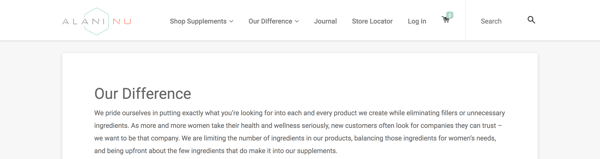
Real-life brand example: Alani Nutrition
You’ve probably never heard of Alani Nu; they’re a nutrition company based in my hometown of Louisville, Kentucky. I order their vitamins because 1) they’re proven to work, and 2) I trust and respect the brand (and it’s gorgeous!). On their website, they’ve clearly and simply outlined their unique values and benefits as part of their overall brand. Highlighting these makes it easy for customers like me to trust their products and choose them over competitors.
4. Create your visual assets
At this point, you should understand your target audience, your mission statement, and the unique qualities that make up your business.
If you can say with confidence that you’ve mastered these steps, it’s time to move onto one of the more exciting parts of branding — the visual design. We’re talking about your logo, color palette, typography (fonts), iconography, and other visual components.
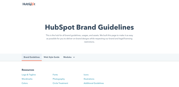
As you create these elements, build a set of brand guidelines (or a brand style guide) to govern the composition and use of your visual assets. This will ensure that whoever uses your new branding does so accurately and consistently. Check out HubSpot’s brand guidelines for reference.
Note: Design can be just as intimidating as it is exciting. Consider hiring a professional with logo and identity design experience or starting with a few helpful design templates.
5. Find your brand voice
Next, consider the auditory component of your brand. What would your brand sound like if you had a conversation with it, or if it texted you?
How you communicate with your target market is also considered part of your branding. You want to define a brand voice that connects and resonates with your audience — otherwise, they probably won’t pay attention. Because of that, don’t hesitate to return to step one to get familiar with to whom you’re speaking.
From your advertising campaigns and social media captions to your blog posts and brand story, ensure your tone is consistent throughout all of your written content. Give your audience a chance to get familiar with your brand and learn to recognize the sound of your voice. Better yet, master a fun, entertaining voice, and your customers will look forward to your social media and email updates.
Real-life brand example: MailChimp
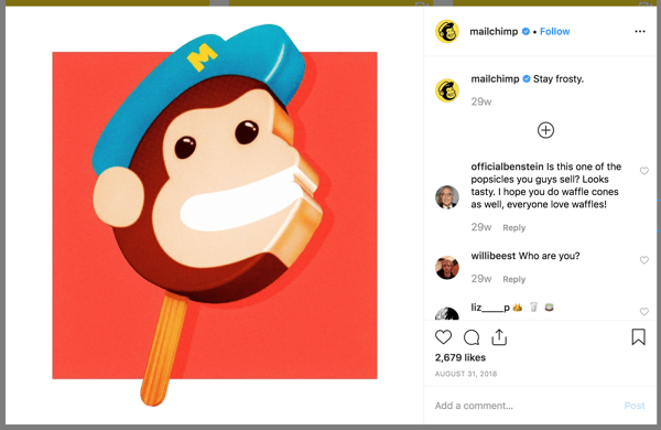
MailChimp is a great example of a brand that speaks with a clear, consistent tone. When I used their free plan for my small business, I always chuckled when receiving their emails and working in their interface. From its web copy to its email blasts and social media captions, MailChimp has established a brand voice and personality that is personable, fun, and accessible — it can be hard to explain the technical parts of a software product (like A/B testing), but MailChimp has mastered that, too.
6. Put your branding to work
Your brand only works if you do. Once you finish designing and creating your new brand (or rebrand) integrate it throughout every inch of your business. Pay extra attention to ensure it’s displayed anywhere your business touches customers. Here are a handful of tips for applying your brand across your organization.
Website
Splash your logo, color palette, and typography across your website. Don’t use anything but your predefined assets in your brand guidelines. Your website is a major part of your company identity — if it doesn’t reflect your brand, it will only provide a jarring customer experience. Also, be sure that all web copy, calls-to-action, and product descriptions reflect your brand voice.
Social media
All profile photos, cover art, and branded imagery should reflect your brand. Consider putting your logo as your profile photo — this will make it easier for customers to recognize your business. As with your website, be sure all profile information, posts, and captions reflect your brand voice.
Packaging
If you have a physical products business, your product is probably the most tangible way that customers interact with your brand. For that reason, your packaging should reflect your new branding — in its design, colors, size, and feel.
Real-life brand example: Chobani
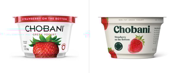
I love Chobani yogurt (confession: I’m eating it right now). Their new branding immediately tells me that they produce authentic, healthy Greek yogurt. That’s one of the main reasons I buy Chobani. Recently, I realized that their yogurt packages are made with a very earthy, textured material — an intentional decision that supports the overall experience they’ve paired with purchasing and eating the Chobani brand.
Advertising
Because advertisements (digital and print) are often used to establish brand awareness and introduce consumers to your brand, it’s critical that they reflect your branding. In fact, your branding should make the ad creation process easier — with your brand style guide, you already know how your ads should appear and what type of copy to write.
Sales and customer service
A brand is only as powerful as the people behind it, and if your people aren’t putting your brand to work, it won’t work for you. Moreover, your brand applies to more than your marketing. Inform your sales and customer service folks of your brand guidelines and tell them to use it, especially when they engage directly with customers. Whether they are sharing a branded product demo or answering customer support inquiries, encourage them to use your logo, tagline, imagery, and brand voice.
Treat your brand as a person
To best wrap your head around the branding process, think of your brand as a person. Your brand should have an identity (who it is), personality (how it behaves), and experience (how it’s remembered).
Ask yourself these questions about your brand:
- How would your brand introduce itself? If it had to describe its appearance, how would it do so?
- How would your brand talk about your products or services? Would it be serious and professional, or would it be humorous and edgy?
- What would someone say about your brand after “meeting” it for the first time? What are a few sentences they’d use to describe it?
The purpose of branding is to create relationships with your customers. The easiest way to do this is to treat your brand as a person and understand that you want your customers to do the same.
Real-life brand example: Whiskey Riff
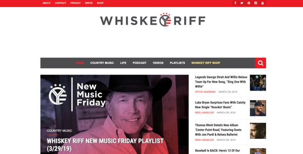
Whiskey Riff is another brand you’re probably not familiar with. It’s a two-man media company based here in Chicago that’s dubbed themselves “the most entertaining country music site ever”. I’m a fan because I love country music, enjoy their written and podcast content, and proudly wear some of their awesome apparel.
If Whiskey Riff was a person, here’s how I’d think it would answer the questions above:
- “Hey, I’m Whiskey Riff. I love country music and, you guessed it, Whiskey. My logo was inspired by the Y in the circle on the Chicago Theater marquee, and I’m adorned with horizontal red stripes and stars — which represent the American and Chicago flags.”
- “I publish in-your-face content about what’s going on in country music today. If you don’t like it, don’t read it. My podcast featured my founders interviewing country music artists and telling hilarious stories. Check out my apparel line; my t-shirts, tanks, hats, and accessories can be seen at country music festivals (and on stages) nationwide.”
- “Whiskey Riff is like that first shot of Jack Daniels — that much-needed, refreshing drink after a long day. Its a break from that cookie-cutter way of life, and you immediately appreciate — and trust — its candidness. There’s absolutely nothing like it in the industry.”
Prioritize consistency
Inconsistency is the number one branding mistake that companies make. Inconsistency undermines your brand and confuses your customers. Recognizable, valuable brands prioritize consistency — and they reap the benefits. When your brand is a unified presence across mediums and platforms, customers can easily get familiar with, recognize, and come to prefer your brand over time. Brand guidelines can help with this initiative.
Build and follow a brand strategy
A brand strategy is more than your brand guidelines; it’s a plan with specific, long-term goals that can be achieved as your brand evolves. These goals typically revolve around your brand’s purpose, emotion, flexibility, competitive awareness, and employee involvement.
Remember how I said that branding is a continuous process? There’s a lot that goes into it. A brand strategy can help you turn that process into a well-oiled practice that keeps your brand moving toward success and recognition.
Don’t let inspiration turn into imitation
Competitive analysis is important. Not only does it educate you on where your competition stands and how they are excelling, but it can also give you ideas on how you can improve or further set apart your brand.
However, be conscious to not fall into an imitation trap. Keep your competitive research limited and focus on what your organization brings to the table. Just because a competitor (or two) has branded their company in a certain way doesn’t mean that you have to follow suit. New, unique, provocative brands are memorable brands.
Use branding to hire
Strong branding makes your employees proud. I know I’m proud to be associated with HubSpot, much less work there. Leverage your branding to attract talented people. If hiring is a strong initiative for your organization, dedicate some of your resources to employer branding. Employer branding is how you market your company to job seekers and current employees. If you’re publically proud of your organization, others will be, too.
Ready, Set, Brand
Branding is your organization’s name, logo, color palette, voice, and imagery. It’s also more. It’s that intangible feeling your customers have when they interact with your brand. You know … that experience we talked about in the beginning.
That’s how powerhouse brands deviate from all the others. The tangible components contribute to this — a gorgeous logo, a clever tagline, an authentic manifesto, and a clear brand voice — but truly strong brands thrive when they focus on the big picture of their brand. Get to the heart and soul of your target audience and your organization, and a successful brand will follow.

The Ultimate Guide to iPaaS (Integration Platform as a Service)
You’ve likely heard of Software as a Service, or SaaS.
A SaaS company sells software to an end user as a subscription. Along with that subscription, the software company provides technical support, customer service and upgrade options to maximize their customers’ ability to use their software.
HubSpot is an example of a SaaS company. We sell (darn good) marketing, sales, and service software so you can use them to grow your business. But there’s just one problem …
Over time, we’ve learned that things aren’t so linear and consumers rarely use just one software to satisfy all of their needs. Instead, they find a plugin here, some software there, and maybe even a widget until they have a smorgasbord of options that, together, create the perfect solution.
Consumer expectations have changed — they want instant feedback, immediate solutions, and access to everything they need to solve their problems.
From a company’s standpoint, it can be costly to add more tools to your existing software. An ever-increasing demand makes it hard to accommodate every customer need.
Additionally, most software companies have segregated systems themselves, pulling in data from the cloud and on-site systems to complete their own stack. Ascend2 found that 57% of marketers recognize integrating disparate technologies as the biggest barrier to success.
What happens when you have different systems operating on separate platforms that each play an integral role in your business? You become subject to data loss, disjointed information, and misalignment.
Between consumer expectations and internal systems, we need to find a way to create a more frictionless experience.
iPaaS is the solution.
iPaaS acts as a conduit for communication between multiple systems — allowing for integration and data sharing. iPaas is a platform that connects otherwise disjointed systems to deliver a unified solution to customers.
iPaaS gives platforms unlimited potential, and as we deepen our cloud dependency, iPaaS becomes integral to nearly every business model.
This guide will give you an overview of iPaaS, how it works, and its key benefits. Read on to discover why you might consider iPaaS as a solution for your business.
Most companies run on various systems, especially between their sales, marketing, and service departments. iPaaS is a solution that improves communication between different silos by integrating software to better share data within the organization.
iPaaS also allows a company to expand its offering without the need to build out more services. Instead, it can integrate with another software that already provides that service and offer it as a unified, more robust solution to customers.
For example, say you sell a scheduling software that helps hairstylists book, manage, and send appointment reminders to their clients. After developing your product, you realize that stylists also want their clients to be able to leave reviews and make payments through your software. To meet your customers’ needs, you could either build out and add these features to your product, or you could use iPaaS to connect your software to existing review and payment software. The latter allows you to save time and money while also expanding your service offering and providing your clients with what they want.
How does iPaaS work?
A software company will rely on iPaaS to supply the infrastructure for creating connections and deploying software applications within the cloud.
The software company will set the parameters for the types of connections that are allowed on the platform. These parameters could be in the form of an application programming interface (API), prebuilt connectors, or some other rule.
Once these rules are in place, iPaaS creates a central ecosystem to view, manage, and modify all data, infrastructure, and operations. This, in turn, allows entities to easily modify their product, share information, and provide solutions to their market.
iPaaS-Related Terms to Know
How do you distinguish between all service-oriented architecture (SOA)? Let’s cover the common cloud-based service business models out there to help you get a better grasp on what makes iPaaS unique.
Platform
A platform is the centralized component of all connections. HubSpot’s VP of Platform Ecosystem Scott Brinker defines a platform as a “hub, with spokes connecting other products to its center. The hub binds those disparate products together and orchestrates them in a common mission.”
Integration Platform
An integration platform creates connections between different applications and systems. This type of platform creates an environment for engineers to build upon.
Platform as a Service (PaaS)
A PaaS is a platform where the provider houses all of the elements that users need to deploy a particular software. Those elements include the servers, network, memory, database, and operating system.
Software
Software is a program that performs a specific set of tasks for an end user.
Software as a Service (SaaS)
SaaS is a system where the end user is provided with software to use on demand. All maintenance, hosting, and deployment of that software is the responsibility of the software provider.
Integration as a Service (IaaS)
IaaS is a cloud-based model that allows for data integration between systems and third-party vendors. IaaS keeps all connected parties from having to create complex interdependencies and minimizes delays in data sharing.
Electronic Service Bus (ESB)
Electronic Service Bus is not denoted “as a service,” but it’s important to distinguish between this offering and iPaaS. ESB is similar to iPaaS in that it enables data and application sharing across an organization. There are many differences, however, that make ESB a less-viable solution when dealing in cloud-based environments. ESB solutions exist on-premise only and, therefore, work less efficiently with remote or cloud-based integrations, they do not support multitenancy, and their response time can be slow when compared to iPaaS.
Benefits of iPaaS
The rise of SaaS over the past two decades created a gap in the ecosystem that needed to be filled. That gap — the need for more integrated systems — has only become more apparent. iPaaS arose out of a need for an organized solution for deploying quick and seamless cloud-based solutions.
You can think about the benefits of iPaaS as two-fold: benefits to the company that employs iPaaS (internal) and benefits to the customers of the company that employs iPaas (external).
External Benefits
Software companies that employ iPaaS technology as part of their offering to consumers reap benefits from increased customer satisfaction. Consumers benefit from iPaaS in a number of ways.
A Single Solution
Instead of piecing together separate software to solve their needs, consumers can use a platform that connects to all of their software in one convenient cloud-based location, thereby eliminating the need to source and deploy their technology in different environments.
Organized Data
Consumers can access all of their data in one place and set rules for how that data is organized and accessed. So, while they’re working with different systems, all of those systems will render data in an easy-to-interpret manner. All of this makes data analysis, interpretation, and application easier and more accurate.
Improved Communication
One platform means a single source of truth. Data is being shared within the same ecosystem so no important information is lost and everyone has the same access which leaves less room for misinterpretation.
Better Workflow
Less time switching between tools means more time for work and a central place where all of that work is done. A platform creates a more efficient environment for team dynamics and workflows.
Internal Benefits
Consumers aren’t the only ones who need integrated solutions. Companies also use disparate tools to run their businesses — think email providers, marketing software, document sharing, the list goes on. iPaaS brings these tools together to increase internal efficiency and improve workflows.
Here are some of the internal benefits to iPaaS.
Eliminate Silos
Third-party integrations can be created and deployed in various environments. This might not be an issue when there are only a few connections, however, as a company develops its offerings to become a more robust entity, integrations can become scattered, creating a mess where information is hidden from view or difficult to access and preventing a business from realizing critical insights.
Real-Time Processing
iPaaS allows for real-time data sharing and processing thereby eliminating delays in access and providing a quick and accessible solution.
Increased Efficiency
iPaaS mitigates confusion, data loss, and inconsistencies by creating a centralized system for the management of all parties involved.
Centralized Management
iPaaS creates a single, virtual view for managing all connections across the platform. Instead of having one individual or team manage different integrations, all of them can be accessed from a single console.
Multitenancy
Typically, each tenant that calls upon software requires its own instance. Similar to how every person on a call needs their own phone connection, an instance is created each time someone accesses the software. iPaaS allows for shared instances among tenants, eliminating overload, reducing costs, and increasing the speed of use.
Improved Security and Compliance
Security threats are inevitable in any environment, especially the cloud. iPaaS solutions offer fraud detection and intruder alerts. But the real benefit is that a centralized platform makes it easier to see where these threats are and respond adequately. In addition, a platform makes regulation compliance simple by implementing changes in a single environment.
Gartner iPaaS Magic Quadrant
Being that iPaaS is a newer technology, we look to objective opinions to check the validity, safety, and potential longevity of iPaaS vendors. Gartner iPaaS Magic Quadrant is that resource.
Gartner is an IT consulting firm and trusted resource for objective, qualitative industry research. According to Gartner, “Magic Quadrants offer visual snapshots, in-depth analyses and actionable advice that provide insight into a market’s direction, maturity, and participants.”
The Gartner Magic Quadrant for Enterprise Integration as a Service looks at several iPaaS vendors in the space and details the strengths and cautions of each provider. It compares vendors like Boomi, Jitterbit, MuleSoft, Oracle, and SAP among several others to provide an objective view on the iPaaS environment and to give readers perspective on which solution would best fit their needs.
iPaaS Vendors
iPaaS is a great solution to improve connection to and communication between all data and applications within your company. We’ve compiled this list of iPaaS vendors to help narrow your search for the perfect iPaaS partner.
Dell Boomi
Dell Boomi offers a complete iPaaS solution with application and data integration, workflow automation, application deployment, API design, and B2B management all within a single master hub.
Informatica
Informatica boasts customer loyalty and top-ranked iPaaS provider as their main advantages over other solutions. With a nod from Gartner and over seven thousand customers worldwide, the iPaaS vendor holds a top spot in the industry.
Jitterbit
Jitterbit understands the stress of building APIs between on-premise and cloud-based systems. The company has done well to empathize with businesses that lack the resources to build these integrations on their own and offers quick integrations with their platform as a result.
Mulesoft
Mulesoft offers cloud integration through its product called “CloudHub.” This solution offers multitenancy for integrations and API. The solution allows for deployment in eight different regions around the world, a number of workers, and out-of-the-box cloud security, and compliance. It also offers insights based on various metrics.
Zapier
Zapier is a well-known solution for connecting apps, automating workflows, and sharing data between otherwise disjointed systems.
iPaaS providers don’t stop there. You can view and compare dozens of vendors through a bit of research. Otherwise, Gartner has already done the work for you.
Get Integrated
As we continue to move towards cloud-based options, iPaaS becomes the most viable solution to eliminate the friction associated with disparate systems, and for connecting all applications and data between your organization and third parties. A single source that connects all of the systems we use to grow our businesses is an important step toward growing better. When we’re connected and in-sync, we can go further together.

How to Conduct a Twitter Audit of Your Account in Under 20 Minutes
With 275 million monthly active users, Twitter is an undeniably good tool for engaging with an audience and expanding your brand’s online reach.
But it can be tricky to know whether you’re truly successful on the site — which is when a Twitter audit comes in handy.
While auditing your business’s Twitter account doesn’t sound fun, if you’re using Twitter for business, it’s necessary to have a deep understanding of your content and performance.
Social media marketing is constantly changing and growing. Even if you think you’re 100% certain of the role Twitter plays for your business, it’s necessary to check in with your performance and audience to optimize your presence, especially since business presence on Twitter outranks YouTube, Instagram, Pinterest, and Snapchat.

What is a Twitter Audit?
A Twitter audit is a diagnosis of your account. It helps you analyze the performance of your Twitter account by looking at your audience, analytics, content types, posting times, and consistency, as well as overall sentiment.
Since auditing your Twitter account is something you should be doing regularly, it shouldn’t take up a ridiculous amount of your time. That’s why we’ve put together this step-by-step guide on conducting a Twitter Audit in under 20 minutes.
A Twitter audit should answer the following questions:
- Who is our audience?
- What types of content are we posting?
- What types of content does our audience enjoy?
- Is our posting consistent?
- When are our followers active?
- Are we seeing a Return of Investment (ROI)?
- What can we do to improve our presence?
- Who has access to our account?
Ultimately, there are two things your audit should cover — traditional metrics, and general sentiment. Metrics measure if your marketing efforts are driving business results, and sentiment lets you know how your audience feels both about your business, as well as your content and presence online.
How to Download Your Twitter Audit Report
The first step to conducting a Twitter audit is to gather your data. Once you’ve logged into your Twitter account, click your profile picture in the top right corner.
Select “Analytics” from the drop-down menu.
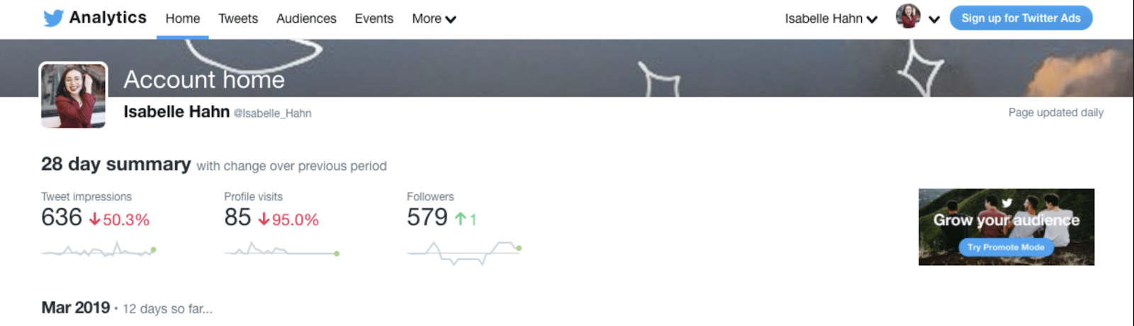
You’ll be automatically taken to a new tab on your desktop. This is your data dashboard. At the top, you’ll see your analytics broken down into Home, Tweets, Audience, Events, Videos, and Conversion Tracking.
In the “Tweets” section, you’ll see a breakdown of your Tweet Activity, as well as a button to “Export Data” at the top right. Choose your date range, and export.
Now you have a document that breaks down each of your tweets from your chosen time period. Here, you’ll find your engagement rate, profile clicks, URL clicks, follows, and more. You’ll also be able to see your promoted tweets’ data.
The next step is to create an audit document to put your Twitter’s data. This will help you track your metrics over a long period of time. Google Sheets is an easy and effective way to do this. Just copy and paste your document’s data into the sheet, and create a new page each month.
Laying each month out side-by-side will make evaluating post performance easy, and allow you to determine the subtle differences in your copy, as well as which content performs best.
Next, we’re going to dive into how to find your audience demographics.
Twitter Follower Audit
There’s a reason “audience” is listed first in terms of what a Twitter audit should accomplish. Without followers, your voice has no volume. A Twitter audit needs to focus on audience insights to ensure you’re publishing the most relatable content for your intended audience.
In your “Audience” tab, you’ll see a large amount of data for your audience breakdown.
While there is plenty of information to digest here, focus on what is helpful for your business. If there is a large decrease or increase in followers on a certain day, reference your audit report to see what you tweeted. Your audience was likely responding to something you said or did — and you can rectify the situation if their reaction was negative.
Where are your followers located? Are you engaging in regional or global conversations? If you’re missing the mark on this, start paying attention to what’s happening where your audience is.
Here are some additional steps to take when auditing your Twitter account:
1. Review your budget and calculate ROI
Calculating Return on Investment (ROI) has everything to do with user traffic. Ultimately, you’re using Twitter to bring in new customers, so it’s vital to see if your audience is growing month by month, engaging with your content, finding your website, and ultimately converting into a customer.
Depending on your KPIs, there are different ways to calculate ROI. If you’re looking to create sales leads, a Visitor-to-Lead Rate can be pulled through an analytics tool like HubSpot or Google Analytics. Here, you can close the loop between your Twitter marketing efforts and sales — making the entire process more inbound.
2. Twitter Visitors / Twitter Leads = Visitor-to-Lead Rate
This is a foolproof way to ensure your social tactics are bringing people to your website. You can set goals by deciding on the number of leads you want to generate monthly. Then, divide that number by the number of business days in that month –that will give you your daily goal.
Remember, Twitter can be used for more than just creating a positive brand image. You should be testing and analyzing your content regularly to understand how vital Twitter is to your conversions and sales.
You shouldn’t be investing a ton of time and effort on Twitter unless you can measure the results of your activities. Be smart about the way you prioritize your marketing initiatives, and keep an eye on the specific benefits this social network can offer your business.
3. Sort Out the Details
These are the elements outside of metrics that are just as important to organize. For this reason, you’ll want to know who has access to your account. Your social strategy may fall apart if everyone in your organization has access to the password. Mistakes happen. Make sure you have people taking care of your account from the inside. Do this quickly by clicking the account name on your Analytics page, and selecting “Edit access to your account”. You should also be changing your password regularly for privacy.
Additionally, have you updated your logo lately? What about your messaging? Remember to change your profile logo and your bio as well, so your branding is consistent.
4. Lastly — repeat!
An audit isn’t just a one-time thing. The social landscape is constantly changing, so auditing should become regular maintenance for your Twitter account.
Try setting a quarterly audit goal to make sure you’re keeping in tune with your audience, you’re producing content that is engaging, and your actions result in good ROI. Regular audits are also extremely helpful in outlining your overall strategy and goals.

How to Create Instagram Stories People Love to Watch
Want more views for your Instagram stories? Looking for tips to create stronger Instagram Stories content? In this article, you’ll find six ways to enhance your Instagram stories for better audience engagement. Why Instagram Stories Engagement Tactics Matter If you look through Instagram Stories content from brands, you’ll find that most story content just isn’t […]
The post How to Create Instagram Stories People Love to Watch appeared first on Social Media Marketing | Social Media Examiner.
from Social Media Marketing | Social Media Examiner https://ift.tt/2CP9oRb
via socialmediaexaminer
How to Optimize Your Landing Pages for Long-Term Lead Generation
One of the great things about inbound marketing is that your content keeps paying dividends over time, long after it was originally promoted.
Often, here at HubSpot, we discover that as much as 90% of the new leads we generate each month actually converted on offers we didn’t create or actively promote that month. Furthermore, up to 70% of new leads have come from offers we hadn’t touched in over three months.
That’s a pretty nice spot to be in, don’t you think?
What if the campaigns you’re working on this month were still generating leads for you six months later? What about three years later?

Similar to the offers we create, we here at HubSpot have also found that more than 65% of the leads we generate from our blog each month come from older articles that weren’t published in the last six months.
In other words, old content and offers you’ve created months — even years — ago has a huge potential to continue generating new leads now and in the future. (Doesn’t inbound marketing rock?)
SEO and Lead Generation
The content you’re creating now shouldn’t only consider your current campaigns and goals; it should also be optimized to generate leads months and years into the future.
But how do you make sure your content is getting found and generating leads long after you’ve stopped promoting it through channels like email, calls-to-action, and social media? The same way you’d make sure of it on a blog post: by optimizing it for search engines.
Organic search traffic is considered the most consistent source of quality leads across all the traffic channels available to you. At times, it’s up to seven times more likely to convert a visitor than a traffic source you paid for. Why?
I’m sure you already know that millions of people turn to search engines every day to solve their problems. About two-thirds of the search traffic we see coming into HubSpot.com is from non-branded terms like “lead generation” and “marketing software” — both of which are viable keywords for which to optimize landing pages that can offer people more information on these topics.
People are looking for answers to their problems, and they are finding our content. And for us, having web pages that rank well for these terms generates thousands of new leads for us each and every month, without any additional effort on our part.
That’s why it’s so critically important to keep SEO best practices in mind whenever you’re creating a new piece of content or offer. Because doing the right things now will pay dividends long into the future.
Below are eight tips to optimizing your landing pages for organic traffic and lead generation.
Landing Page SEO Best Practices
- Create a short but keyword-optimized page title.
- Structure your landing page URL correctly.
- Create a heading tag that matches the page title.
- Write a clear and direct meta description.
- Optimize the title. (wait, what?)
- Use structured data to qualify for rich snippets.
- Be careful with how many form fields you have.
- Have a link-building strategy.
When looking to optimize your website for lead generation, landing pages are especially great targets, since a high-ranking landing page will almost certainly drive new leads for you each month. After all, that’s what landing pages are for: to help the people who are already looking for your information actually find it in a portable, downloadable format.
Let’s walk through some of the most important parts of a landing page that you should be focusing on from an SEO standpoint so you can start turning your landing pages into long-term conversion points for your business.
1. Create a short but keyword-optimized page title.
The most important element for any on-page SEO is the title of the page, according to data from Moz. The page title is the description of the webpage that shows up at the top of your browser (or in the tabs if you have more than one open in your browser window):
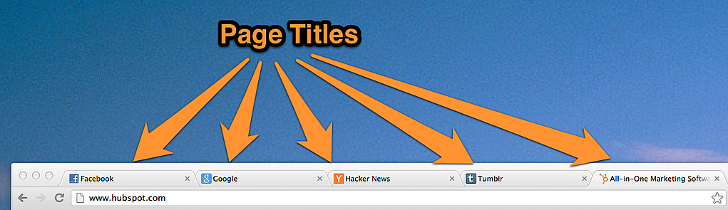
Page titles are one of the most effective ways to indicate what the content on a given page is to search engines, and they’re also a key component to consider when following SEO best practices. Specifically, follow these rules when creating page titles for your landing pages:
Keep it short.
Search engines generally only show the first 60 characters in search results, and your page title doesn’t need to be the full title of the content or offer you’re promoting. Instead, focus on keywords by removing any unnecessary words. Just be sure it’s also still easy to read and clear to a human what the content of the page is all about.
Include high-quality keywords first.
Search engines place more emphasis on keywords that appear closer to the left of the page title. Because this is the case, you should start your page title with your most important keywords first, and include your less important ones later.
Use vertical pipes to separate concepts and phrases.
This is a good best practice since it helps search engines break apart multi-word phrases and figure out which keywords go together. For example, you’ll notice that we use a vertical pipe in the page title of this blog (“Internet Marketing Blog | HubSpot”).
Don’t include your company’s name in every single page title.
You should aim to optimize your landing pages for long-tail search visitors who are simply seeking information on a topic and haven’t necessarily heard of your company. Don’t worry, even if you leave out your company’s name, you can still rank well for branded searches because of your root domain name and the rest of the page authority your site has built up. There’s no need to waste valuable SEO real estate on things you’ll already rank for.
2. Structure your landing page URL correctly.
The URL of our landing page is its next-most important on-page SEO element. Your URL helps communicate even more information to search engines about the content on the page. Furthermore, URLs also convey site structure and how this page fits among the other content on your site.
The rules for landing page URLs are actually similar to page titles:
Keep it short.
Most search engines only show about 65 characters in the URL portion, and some of these will be taken up by your domain name (e.g. http://www.hubspot.com…), leaving you with only a few dozen characters to work with if you don’t want your URLs truncated in search results.
Use slashes to separate concepts and phrases.
Ideally, each level of depth in your URL has its own page that visitors can check out. So, for example, if you’re promoting an offer about generating leads through social media in 2020, your URL for the landing page might be:
/lead-generation/social-media/2020-predictions/
According to the above URL, you’d also have a page on generating leads through social media at the following URL:
/lead-generation/social-media/
Then, the most more general page you have published on lead generation is at this URL:
/lead-generation/
The examples above show how you can “nest” your landing page inside more general webpages from which you can navigate to your landing page. In web development, the paths of text between each forward slack are known as subdirectories, or subfolders, and they help search engines understand how your content is organized.
Information architecture is a key part of landing page SEO. Making sure your landing pages — and all the rest of the content on your site — are well organized helps both search engines and humans find the content they’re looking for, at the level of depth and specificity they expect.
Put more important keywords closer to the left.
Just like with page titles, keywords that appear earlier in a URL are given more weight than ones that appear later. This follows from the last point about nesting concepts in your URL. If someone is searching for “lead generation,” you want to make sure they find your /lead-generation/ page and not necessarily one of the other, more specific pages.
3. Create a heading tag that matches the page title.
There should always be a single “H1” heading tag on your landing page. It should succinctly describe your offer and explain what the page is about. But be forewarned: Don’t try to stuff your keyword into this page element — Google is wise to it.
In fact, a keyword for a headline, with no other context, can confuse your visitors and cause them to bounce back to the search engine result page. When a search engine detects that people clicked on your website, but then came back to the search results and clicked on another result, the search engine takes that as a sign that your content probably didn’t answer their question, and thus, doesn’t deserve to rank for that term.
That’s why it’s important to make sure search engine visitors can figure out exactly what you’re offering on your landing page very quickly, before they lose interest and bounce back. A good way to ensure readers stick around on your landing page — something that can increase your ranking over time — is to make your H1 heading as similar (if not identical) to the page title as possible.
You should also consider using a subheading, graphics, and bulleted lists to help visitors understand your offer quickly and keep them engaged with your content.
4. Write a clear and direct meta description.
The content of a webpage’s meta description is not a direct ranking factor for Google, but what you put here can greatly influence a person’s willingness to click on your search result. And the more people who click through to your content, the more likely search engines are to take that as a signal to rank you higher.
So, write a meta description for your landing page, and make it snappy.
We use the word “snappy” on purpose, here. Landing pages have much greater lead-generation potential than blog posts and other educational content. This means people who are looking for landing pages can be much more skittish when reading a result’s meta description. If this description doesn’t promise exactly what someone is looking for, they’ll move on.
When writing a meta description, tell your readers what they’ll receive. Are you promoting an event? Tell them they’ll be able to register as an attendee. Are you offering an ebook? Tell people what’s inside that ebook. Here’s an example of a meta description for a HubSpot landing page promoting an ebook about basic SEO. (Psst: You can download that very same guide right here.)
 5. Optimize the image. (wait, what?)
Visual content is much harder for search engines to scan and understand, but that doesn’t mean you can’t use images to help your page rank for certain keywords.
Plus, many topics common to landing pages are highly searched for in image form. For example, If the landing page is promoting an event, for which you want people to register, consider the fact that many people might be searching for snapshots of this event — and therefore their search is taking place in Google Images.
How do you get Google to find these images? Well, because it’s so difficult for search engines to “read” visual content on a webpage, many search engines take clues about what an image contains from its file name and the alt text you provide.
The file name should be short and include words separated by dashes. The alt text should describe either the content of the image, or the content the image is illustrating. Alt text is used by screen readers and is displayed when an image fails to load, so it should clearly describe the images on your page so viewers know what they’re missing. For example, if we included an image of the sales and marketing funnel on a landing page for an offer about sales and marketing alignment, the file name might be sales-marketing-funnel.jpg, and the alt text might be “sales and marketing funnel.” Read more about alt text best practices here.
An image’s alt text and file name can also be great places to include synonyms or variations of your keywords (as long as they appropriately describe the image). They’re not content that visitors usually see, but they can still help you rank for permutations and variations of your targeted phrases.
6. Use structured data to qualify for rich snippets.
Rich snippets enhance search engine result listings, like the ones pictured below. They give searchers more information about your content — such as authors, music, reviews, events, products, etc. — making your page stand out from the other pages provided in search results, and thus, garnering you more search traffic.
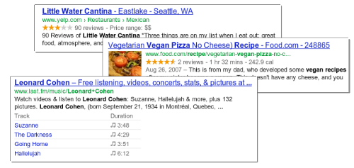
To see if your page qualifies for rich snippets, run it through Google’s free structured data testing tool. The tool will automatically scan your page and generate a preview of what it could look like in search results. What this tool is looking for is specific markup in the HTML of the page that helps search engines identify the content of a given page, like an image, a video thumbnail, a star rating, or a price. The type of rich snippet generated depends entirely on the content of the page. For example, a listing for an ecommerce site might have the product’s price, category, and 5-star rating, while a listing for a video streaming service might display a video thumbnail and the length of the video.
The specifics of the markup are defined on schema.org, which is a joint effort by Google, Bing and other major search engines to come up with a common set of markup that they’ll all use for generating rich snippets. If you’re comfortable editing HTML, then it’s definitely worth reading the specification on schema.org and figuring out how to best mark up your content to create the appropriate rich snippets.
7. Be careful with how many form fields you have.
Remember when we talked about the concept of bounce rate in tip #3, earlier in this blog post? A high bounce rate indicates that your readers are “bouncing” from the webpage at a high frequency, and this can drop your ranking on search engines over time. Well, here’s another tip to prevent people from leaving your landing page too soon.
Landing pages typically have forms for readers to fill out with their contact information in exchange for an asset — like an ebook, an event ticket, or a lottery entry. However, keep in mind forms aren’t the most beloved part of a buyer’s journey, and a form that asks for too many things can scare your readers off.
If your landing page has a form, minimize the type of contact information you’re asking of your readers. If you find yourself with a form longer than the one below, examine the page’s organic traffic and bounce rate, and consider if you’re asking for too much of potential leads.
8. Have a link-building strategy.
Of course, while it’s a good idea to follow all of these on-page SEO guidelines, you still might not make it to page one of the search results for your targeted phrase(s). That’s because the majority of a page’s authority comes from off-page sources. The most important thing search engines consider when ranking a given page is whether or not other people on the internet are vouching for that piece of content by linking back to it. This includes actions like linking to your page from within a blog post, or sharing that page on Twitter.
Since these off-page signals are so valuable, it’s important to design your landing pages in a way that encourages people to link back to them. This can include things like offering a “Tweet to Download” option or some other kind of social sharing trigger like social media sharing buttons. Another option to consider is allowing your offer to be embedded on other websites, and ensuring that the embed code you provide includes a link back to your landing page.
There are many other tactics for building inbound links that we’ve written about in dedicated posts like this one. It’s always a good idea to spend some time thinking about how you can build more links into your landing pages to get more SEO juice out of them.
Following these tips will help your content to rank high in search engines for months and years into the future. As a result, you’ll be able to turn each new landing page you create into a long-term asset that keeps driving leads long after your initial campaigns around them have ended. Talk about a return on investment.



The Two-Step Process for Getting Genuine Reviews on Amazon
Ever since I started playing guitar in elementary school, the only online tablature I’ve trusted to teach me how to play my favorite songs have the highest quantity and quality of ratings. To me, a substantial amount of people vetting a certain tab for accuracy and giving it a five-star rating means that it’s the best tab out there. It also saves me a ton of time from having to compare every single tab’s accuracy to one other.
If you sell products on Amazon, the same principle applies. Reviews are crucial for driving sales on Amazon. Humans evolved to follow the crowd and assume that the majority is always right, so the more reviews you have and the better their ratings, the more credible and trustworthy customers will perceive your products to be.
However, according to analyses conducted by the Washington Post and Fakespot, a tool that leverages artificial intelligence to assess the trustworthiness of reviews left on Amazon, Yelp, TripAdvisor, Best Buy, Walmart, and more, over 60% of customer reviews in the electronics, beauty, sneakers, and supplements product categories on Amazon are fake or paid for.
The quantity and quality of your customer reviews have a huge impact on your rankings and ability to sell on the platform, so Amazon is starting to crack down on merchants who manufacture their products’ reviews. If they catch you manipulating your customer reviews, they can suspend your account, ban it, and even sue you.
To avoid Amazon’s wrath and start garnering the most organic reviews on the platform, we’ll show you a two-step process that can convince your customers to leave genuine reviews on your product pages. Read on to learn how to get Amazon reviews with integrity.
How to Get Reviews on Amazon
1. Sell a product that’s worth getting reviewed.
Today, we operate in a world where a lot of people prioritize gaming the system over providing the best brand experience possible. Fortunately, in regard to their customer review system, Amazon has caught on to this hollow tactic.
In 2016, Amazon banned incentivized reviews — which were customer reviews given to brands in exchange for a free or discounted product as long as the reviewers revealed they received an incentive for their feedback.
These incentives were artificially inflating brands’ average ratings, so Amazon decided to level the playing field. Like we mentioned before, if they catch you manipulating your customer reviews, they can suspend your account, ban it, and even sue you. In fact, they take their customer reviews’ integrity so seriously that they don’t even allow your family members to leave reviews on product pages.
With this in mind, don’t even think about incentivizing or selling a positive review on the eCommerce platform. Instead, to get the best reviews possible, focus on crafting a high-quality product and providing top-notch customer service. This is what will truly convince customers to leave genuine five-star reviews on your product pages.
2. Send follow-up emails to customers.
Amazon lets you send automated follow-up emails that ask for product reviews to customers after they order one of your products. However, Amazon also requires you to follow a strict set of guidelines when using follow up emails, which don’t allow you to include marketing messages, link to other websites, or ask for, demand, or incentivize positive reviews in these emails. So when you’re drafting your follow-up email, it’s best to just politely ask for a candid product review.
According to JumpSend, an Amazon email automation and coupon distribution tool, sending more than three emails per order will annoy your customers and lead to diminishing returns. At the most, JumpSend recommends sending a delivery confirmation email to get your customers excited about your product, an email two days after delivery that asks for an early review when the product is still fresh in your customers’ minds, and an email a week after delivery as a last ditch effort to convince your customers to leave a review if they haven’t already.
In marketing, integrity trumps all.
Nowadays, trust, not attention, is a marketer’s currency. You can attract all the eyeballs in the world, but if people don’t trust you, you’ll never sell anything. So even though our two-step process won’t help you garner the highest quantity of reviews or possibly even the highest quality of reviews, it’ll help you gather the most organic and genuine reviews. And in a world where only 4% of consumers believe marketers and advertisers practice integrity, being authentic isn’t only the right thing to do, it’s the best thing to do for your business.

The 9 Best Free Portfolio Websites for Creating an Impressive Digital Portfolio
Whether you’re a UX designer, freelance writer, or photographer, an impressive online portfolio is critical for impressing potential clients, and landing future jobs.
A digital portfolio enables you to cultivate and display your very best work — additionally, if you don’t have a ton of prior experience in the industry, a portfolio can help you display your skills and talent with mock projects.
But crafting a good digital portfolio can feel like a daunting task, especially when you aren’t even sure which website you should use to create one. Here, we’ve created a list of the nine best portfolio websites for designers, freelancers, and photographers, to ensure you’re able to showcase your best work in any industry.

Best Free Portfolio Websites for Freelance Writers
1. Journo Portfolio
On Journo Portfolio you can create a sleek, modern digital portfolio easily. The site offers six distinct themes, and adding an article is as easy as pasting a URL and clicking add — the site takes care of incorporating the title, publication, date, content, and image. Features include the ability to integrate with Google Analytics or use Journo’s built-in analytics tools to measure visitors. Additionally, your site is automatically mobile-ready.
You can also blog straight from the platform, which could be useful if you want to showcase freelance work and your current blog in one place. Journo lets you create multiple pages, so you can have a Contact Me or About Me page, as well as your freelance portfolio.
Note: It’s free for a name.journoportfolio.com URL (10 articles max), but for a custom domain URL and unlimited articles, you’ll need to pay for a Pro version ($5-$10 per month).
Image courtesy of Journo.
2. Muck Rack
Muck Rack is a free media database that helps connect journalists with PR professionals, so if you use the site, you’ll have good opportunities to network and receive PR pitches. You can even include specific topics you don’t want to cover, which will filter out unfit pitches.
Additionally, for true ease-of-use, Muck Rack creates and maintains your portfolio for you by automatically compiling articles and social media profiles. Once it’s finished, you have the option to customize your bio, or choose to spotlight certain pieces.
Muck Rack also offers a news alerts system, which enables you to track stories or tweets about a company, brand, or specific story angle. With their news alerts system, you can see when other journalists share information or publish stories related to your work, which will help you stay on-top of trends.
Image courtesy of Muckrack.com/ggreenwald.
3. WordPress
WordPress, a major content management platform, lets you create a blog on their platform for free. While not specifically geared towards freelance writers, WordPress offers plenty of impressive responsive themes to craft a unique blog and showcase your work. If you want complete creative control over your portfolio, this is a good option for you.
Additionally, you might choose to use WordPress if you want to showcase your writing along with other skills — if you want a page for Writing and a page for your photography, for instance, WordPress offers a variety of themes and is flexible enough to enable you to demonstrate various pieces of creative work.
Image courtesy of Wetheparents.org.
Best Free Portfolio Websites for Designers
4. Behance
With millions of UX/UI designers, artists, and photographers on the site, Behance is one of the most widely-used online portfolio websites. It’s also extremely simple and easy to use — you can organize your work based on project, list projects under construction, and ask followers for feedback. Additionally, the site allows you to link your portfolio to your social media accounts.
Behance’s massive digital community makes it a good option to get your name out there, particularly since recruiters and interviewers peruse the site to find talent, as well. However, Behance displays the number of people who have viewed your work and liked it, making it riskier than a more straightforward website portfolio.
 Image courtesy of Behance.
5. Adobe Portfolio
Adobe Portfolio offers options to create a single-page website, or a full gallery of your work. With Adobe Portfolio you’re able to set up a sleek and customized portfolio in minutes, and each of the platform’s themes are automatically optimized for any device.
Additionally, Adobe Portfolio offers users a free Creative Cloud subscription service as part of the package, as well as the ability to integrate with Behance to import your projects for greater visibility.
 Image courtesy of Garrett Byrum.
6. Crevado
One of the easiest free portfolio websites, Crevado lets you use a simple drag-and-drop tool to upload your projects and rearrange on the screen for true ease-of-use. The site is also automatically optimized for any device, so your portfolio can be viewed on a smartphone or tablet as well as a desktop. Best of all, you can customize your design to suit your preferences without writing any code.
Image courtesy of Kmbillustration.com.
Best Free Portfolio Websites for Photographers
7. Flickr
Undoubtedly one of the most well-known portfolio sites with billions of photos and millions of members, Flickr is a good site to share your own work, connect with other photographers, and find inspiration for future projects.
However, Flickr’s community-oriented platform can make it difficult to showcase your best work and appear professional — particularly since the site is typically used to share images with friends and family. For this reason, many designers also suggest creating a more polished portfolio website, and then linking to that website from Flickr. 
Image courtesy of Flickr.
8. Portfoliobox
Portfoliobox is a website builder specifically designed for photographers, and it’s a good option for crafting a professional-looking responsive gallery of your best work. Additionally, Portfoliobox offers an e-commerce link which allows you to sell your prints or other artwork directly from the site. With the free sign-up, you’ll receive a domain name, and a blog to further attract visitors to your site.
Best of all, Portfoliobox doesn’t make you use a standard theme — instead, you can integrate any style for any page to cultivate a unique, one-of-a-kind website. With more than one million users, it’s a good option for both professional and novice photographers.

Image courtesy of Mika Suutari.
9. YouPic
YouPic’s users include famous photographers like Joel Meyerowitz and Julia Fullerton-Batten. Another site specifically designed for photographers, YouPic enables you to craft a free stunning portfolio to showcase your work.
Additionally, the site offers trainings to improve your photography skills, as well as a Pinterest-style “Explore” page that lets you check out popular photographs, new artwork, and stories to inspire your own gallery. And, most interesting to note, YouPic allows users the opportunity to copyright their photos on the blockchain, and is the first decentralized photography platform.
Image courtesy of YouPic.
For further inspiration, check out 21 Memorable Photography Portfolio Websites to Inspire You or The 12 Best Graphic Design Portfolios We’ve Ever Seen, & How to Start Your Own.

How to Lower Your Facebook Ad Costs: 4 Tips
Worried you’re paying too much for Facebook ads? Wondering how to lower your Facebook advertising costs? In this article, you’ll discover four tips to help you spend less on Facebook ads. How Does Facebook Charge for Ads? When you set up a Facebook campaign, you have two choices of how you’re charged: impressions or link […]
The post How to Lower Your Facebook Ad Costs: 4 Tips appeared first on Social Media Marketing | Social Media Examiner.
from Social Media Marketing | Social Media Examiner https://ift.tt/2I6BwCT
via socialmediaexaminer
27 of the Best Website Designs to Inspire You in 2019
Every once in a while, I’ll come across a website that really draws me in. So, I found 27 of them to show you.
These sites push the boundaries of what is known to be possible on the web. Whether it’s the design aesthetic, usability, interactivity, sound design, or value that the site provides, each one is a masterpiece in its respective industry, and something to be inspired by.
Not surprisingly, many organizations exist to highlight these sites and the contributions they make to the web. To help surface some of the most inspirational designs, I gathered 21 award-winners that have made their way through several key awards organizations — including Awwwards, UX Awards, The Webby Awards, SiteInspire, Best Website Gallery, and FWA.

Click the links below to jump to a group of website designs that crushed it in the last several years:
- Best Website Designs from 2014 – 2015
- Best Website Designs from 2016
- Best Website Designs from 2017
- Best Website Designs from 2018
Below this list, I also found six more websites whose homepage designs are just plain cool and worth learning from.
As you browse through the list, know that each site excels in its own way and seeks to serve a unique purpose. While one site may be an excellent example of visual design, another may be an excellent example of interactivity. This means that not all of these sites may be “conversion machines” or blueprint ideas that you can easily copy over to your site.
Rather, they’re great ways to gain some website design inspiration and see the cutting-edge marketing that’s happening in the different corners of the web.
Best Website Designs
- Virgin America
- Feed
- ETQ
- Mikiya Kobayashi
- The History of Climate Change
- Beagle
- Woven Magazine
- JOHO’s Bean
- World of SWISS
- Rainforest Guardians
- Protest Sportswear
- The Teacher’s Guild
- Inside Abbey Road
- Simply Chocolate
- NOWNESS
- Citrix: The New Mobile Workforce
- crypton.trading
- Southwest: Heart of Travel
- Reductress
- Overflow
- Frans Hals Museum
- Minimums
- MovieMark
- Guillaume Tomasi
- The District
- Tej Chauhan
- Amanda Martocchio Architecture
Beautiful Award-Winning Websites
And the awards go to …
Best Website Designs from 2014 – 2015
1. Virgin America
Award: Most Significant Industry Evolution, 2014 UX Awards
In a world where airline websites are known to be riddled with major usability issues, Virgin America has one of the best websites that pushes usability, accessibility, and responsive design forward. In fact, it’s been named as the first truly responsive airline website, a new precedent in the industry.
2. Feed
Award: Site of the Day (6/6/2015), Awwwards
Not only is Feed an interesting concept, but it also has a stunning execution that challenges our understanding of what is possible on the web. Through a creative blend of animation and video, the site immerses the user into a very engaging experience. As an atypical site, it contains several unique usability elements as well, including a navigation that doubles as a scroll progress bar.
3. ETQ
Award: Site of the Day (5/19/2015), Awwwards
ETQ takes a very minimalistic approach to ecommerce with their stripped-down site with big, compelling visuals of their product. Simple, flat, color-based backgrounds accompanied by strong typography help to keep the focus on exactly what the user came there to see: shoes.
4. Mikiya Kobayashi
Award: Site of the Day (7/4/2015), Awwwards
Mikiya is a Product Designer with a minimalistic portfolio that showcases his work through strong photography and subtle animations. His full site was originally created in Japanese and then translated into English, helping demonstrate the international scalability of his design.

5. The History of Climate Change
Award: Site of the Day (6/23/2015), Awwwards
Follow the footsteps of Luc Jacquet as Wild-Touch takes you along this visual and educational journey about the history of global climate change. A mixture of historical media and unique animations help tell the story.
6. Beagle
Award: Site of the Day (4/19/2015), Best Website Gallery
Beagle does an exceptional job of visually and progressively telling the story of their product in a simple and easy-to-digest way. This is a major challenge for many startups, especially when they’re introducing new concepts to existing markets. People want to know, “What is your product? How does it work? Why do I care?” Beagle answers all those questions while simultaneously showing off their product and compelling the user to purchase. Plus, they’re one of few sites that actually implemented “scroll hijacking” correctly.
 Featured by Best Website Gallery
7. Woven Magazine
Award: Site of the Day (4/4/2015), Best Website Gallery
Woven is an online publication that celebrates artists, craftsmen, and makers alike. To me, they represent a confirmation that publications can (and should) have beautiful, engaging sites with easy-to-read content. Free of distractions like pop-ups and obtrusive ads, this site all about the experience of the content itself.
 Featured by Best Website Gallery
8. JOHO’s Bean
Award: FWA of the Day (8/7/2015), Favorite Website Awards
The website for JOHO’s Bean has incredible imagery, interactivity, story telling, visual design, and most of all, sound engineering. These all come together to create a compelling, emotional, and engaging site that tells the story of a coffee bean’s journey.

9. World of SWISS
Award: Best User Interface, 2015 Webby Awards
Another airline?! What is happening?! Yep, SWISS airlines built an incredibly immersive site that tells their story and describes what it’s like to fly with them — and they simply did too great of a job to be ignored. Strong visuals and animations introduce the user to different sections of the site that are packed with information beyond the usual sales and marketing pitch that is so common today.

Best Website Designs from 2016
10. Rainforest Guardians
Award: Best Activism Website, 2016 Webby Awards
Rainforest Guardians became one of the most immersive nonprofit websites of 2016. Seeking to build awareness around deforestation, the site allows users to “visit” the various villages, natives, and waterways that make up the Amazon Rainforest. The site puts interactivity at the center of its user experience — a wise choice if your goal is to get people to connect with your cause and convert into volunteers.
11. Protest Sportswear
Award: Site of the Year (2016), Awwwards
The Awwwards calls Protest Sportswear a “shoppable look book,” and that’s exactly what this site is. As a clothing outfitter, this website has reinvented the way they market their product: Rather than promoting garments of clothing, Protest Sportswear promotes “looks.” This makes the company’s product the most appealing part of the website itself, using a collage of styles to design a homepage that changes as often as its customer’s styles do.
12. The Teacher’s Guild
Award: Best Association Website, 2016 Webby Awards
The Teacher’s Guild is a professional community of educators whose website publishes content that addresses today’s most critical challenges in education. What makes this website award-winning is how it balances diverse content types — programs, solutions, approaches, and collaborations — without overwhelming its visitors. Not only are its background visuals prominently placed, but they also use white space to emphasize the written calls to action at the center, as shown in the screenshot below.
13. Inside Abbey Road
Award: Best Music Website, 2016 Webby Awards
Google knocked it out of the park with this highly interactive site, which allows users to step into the Abbey Road Studios. Brilliant sound design, navigation mechanics, and visuals mixed with the usual “Google flair” all help draw visitors in to this well-made web property.
Best Website Designs from 2017
14. Simply Chocolate
Award: Site of the Year (2017), Awwwards
You’ll get a craving for chocolate just looking at this website — and in a way, that’s Simply Chocolate‘s website working as designed.
This appetizing website is that of a Denmark chocolate maker named Simply Chocolate. Its website uses a variety of colors (and creative product names) to promote each chocolate bar. And as you scroll from one product to the next, they all seem to remain consistent in brand. The three-dimensional appearance of each chocolate bar makes you feel like you can grab it off of your computer screen, while the “Add to Box” CTA to the top-left is ideally placed for users to select the products they want while browsing.
15. NOWNESS
Award: Best Cultural Blog/Website, 2017 Webby Awards
Nowness is perhaps the coolest crowdsourced video blog on the internet today. That was a mouthful … what does all that mean?
NOWNESS‘s “crowdsourced” nature is part of what makes it an award-winner. This means most of its content comes from independent creatives — an increasingly popular way for businesses to publish content. NOWNESS is also a video blog, meaning all of its blog content is in video format. Together, these qualities help make Nowness a captivating hub for the stories that brands everywhere strive to tell.
16. Citrix: The New Mobile Workforce
Award: Site of the Day (11/23/2017), Best Website Gallery
This website — dedicated to Red Bull’s partnership with Citrix, a cloud-based software company — is amazing.
The New Mobile Workforce, a site owned by Citrix, uses panoramic photography to show visitors how Citrix is supporting Red Bull Racing’s new race car. Even if you’re not a car-racing enthusiast, the website’s clever animations to explain a complicated automotive technology are hard to ignore.
 Featured by Best Website Gallery
Best Website Designs from 2018
17. crypton.trading
Award: Site of the Day (4/3/2018), Awwwards
Meet crypton.trading, your robot accountant.
Crypton.trading is a trading hub for cryptocurrencies such as Bitcoin, using artificial intelligence to predict changes in a currency’s value and identify key buying and selling opportunities. The website was rated high for its development and design, as it gradually explains more of the developer’s methods the further down visitors scroll.
This award-winning website makes tech-savvy visitors feel right at home the moment Crypton’s greeting appears across the homepage, one letter at a time.

18. Southwest: Heart of Travel
Award: Best Visual Design – Aesthetic, 2018 Webby Awards
When Southwest Airlines wanted to prove its customers were “more than just a dollar sign,” the company created a website whose design was assembled using the shapes of their customers’ flightpaths.
The website, called Heart of Travel, even allows visitors to create their own artwork out of a trip they might plan on taking. In this way, Southwest’s website is a product of their most loyal passengers.
19. Reductress
Award: Best Humor Website, 2018 Webby Awards
It’s not that hard to make someone laugh on the internet; so much of what we read and consume online is meant to be entertaining. But it is hard to do it consistently for a large audience. Reductress is a satirical magazine whose headlines and general reading experience are top-tier in the humor department — making the website itself a quality property.
 Featured by The Webby Awards
20. Overflow
Award: Site of the Day (3/20/2018), Best Website Gallery
Overflow is a design tool that allows people and businesses to create story-like flow diagrams of their ideas so they’re easier for others to understand. Aside from this being just a good service, the Overflow website practices what it preaches: Along with vibrant red call-to-action buttons for downloading the tool, this website promotes its product the best way it knows how — using a flow diagram.
The website delivers this flow diagram in the form of a video. And while embedded videos can look rather clunky sitting in the middle of a website’s other design elements, Overflow’s is perfectly placed and exactly what you’d want to see when landing on the site for the first time.
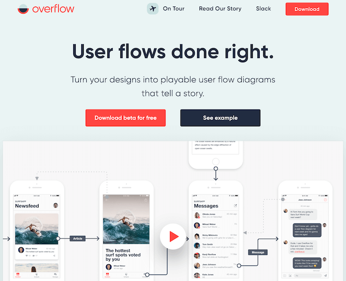
Featured by Best Website Gallery
21. Frans Hals Museum
Award: Site of the Year (2018), Awwwards
It can be tough for a museum, whose brand is predicated on a variety of incredible artwork, to bring it all together on a cohesive website. That’s what makes the website of the Frans Hals Museum so impressive.
Located in the Netherlands, this museum has created a website that uses a combination of digital design elements and its own exhibits. This mixture helps visitors understand what they’ll see, when they can see it, and where else they can get a taste of what this museum has to offer. Speaking of the latter, the museum promotes its Instagram account directly on its homepage — a brilliant move for a museum looking to expand its audience across its online channels.
Other Cool Website Designs
22. Minimums
Minimums takes a very bold approach to the way that they display their content, leveraging a grid-based website design, big typography, and full-width, high-quality images. Their site serves as a really nice example for how to properly execute a grid structure while still maintaining a nice visual hierarchy in the design.
23. MovieMark
MovieMark is a growth marketing agency and HubSpot Partner, whose website is covered head to toe in the service it offers: digital storytelling. Located in Colombia, the agency makes video a core focus of its brand, so it’s only fitting that MovieMark‘s website follows this theme. And oh, how visually pleasing the videos on its website are …
24. Guillaume Tomasi
As a Photographer in Montreal, Guillaume Tomasi has built a portfolio that’s truly fit to house his unique and awe-inspiring photography. His surreal photo style is juxtaposed by his simple, flat, empty, and minimalistic portfolio design that places all of the focus on the work itself.
His unique series navigation coupled with art-gallery-inspired work introductions and perfect scrolling interactions yield an experience reminiscent of that of a real gallery.

25. The District
This branding agency takes its imagery seriously, and it should — it handles all channels of media for their clients. The District’s website, alone, is a journey through some of the most beautiful artwork and photography you’ve ever seen.
These provocative tiles change rapidly as you explore the website, and the wackier they seem, the more interested you become in learning about their past work.

26. Tej Chauhan
Tej Chauhan has turned impressionist artwork into a business model with this intriguing website. Each image on this product developer’s homepage slides out to cover the previous image, offering little context around the object you now see in front of you.
But isn’t that lack of context exactly what makes you want to learn more? The tagline, “Souvenirs of The Near Future,” suggests these objects are a part of their product line — and an opportunity for you to get these innovative objects into your life.

27. Amanda Martocchio Architecture
An architecture firm might not specialize in web development, but its website should still demonstrate its commitment to visually pleasing design. Amanda Martocchio took that to heart with this gorgeous website.
It’s no secret that Amanda Martocchio Architecture loves its work — each picture on the homepage of its website is an enchanting shot of the houses the company designs. The website labels every house you scroll through with the type of design that was intended, along with numerous angles to each building.

Want more website design examples? Check out these amazing product pages you’ll want to copy immediately.

Checkout on Instagram and Sponsored Stories Polling Stickers
Welcome to this week’s edition of the Social Media Marketing Talk Show, a news show for marketers who want to stay on the leading edge of social media. On this week’s Social Media Marketing Talk Show, we explore Instagram’s new in-app checkout and polling in sponsored stories with our special guest, Rebekah Radice. Watch the […]
The post Checkout on Instagram and Sponsored Stories Polling Stickers appeared first on Social Media Marketing | Social Media Examiner.
from Social Media Marketing | Social Media Examiner https://ift.tt/2JRkKdD
via socialmediaexaminer
An Introduction to Brand Dilution, Extensions, and Cannibalization
You might know Cadbury for their high-end chocolate and candy, but did you know they sold instant mashed potatoes from the early 1960s to the mid 1980s?

Image Credit: Geek Goes Vintage
Smash, their instant mashed potato brand, surprisingly reached mainstream success. But, unfortunately, it was at the expense of lowering their flagship product’s perceived quality.
Cadbury is a premium confectionery company, so when they started producing low-end food products, like instant mashed potatoes, it’s not shocking to learn that their association with the finest chocolates weakened. Eventually, in 1986, Cadbury sold Smash, only 20 years after they introduced their instant mashed potatoes to the world.
Cadbury’s expansion into instant mashed potatoes created a new revenue stream and even generated more sales for them, but it damaged their brand as a whole. This phenomena is called brand dilution, and, below, we’ll dive into it, as well as other related concepts called brand extensions and brand cannibalization.
Brand Dilution
Brand dilution is when a company’s brand equity diminishes due to an unsuccessful brand extension, which is a new product the company develops in an industry that they don’t have any market share in, like Reese’s Puff Cereal or Gerber’s baby clothes.
Brand Extension
Companies leverage their existing brand awareness and equity to develop brand extensions that create new revenue streams. However, an unsuccessful brand extension, like Zippo’s perfume for women or Samsonite’s outerwear, can attach undesirable associations to their brand, weaken its existing associations, and hurt its established products’ perceived quality, which can all lead to brand dilution.
When does brand dilution occur?
According to two marketing professors from Dartmouth College and UCLA, brand dilution usually occurs when a company’s failed brand extension is closely related to their flagship product — consumers will start questioning the company’s expertise and dedication to quality within their main product category.
On the other hand, when a company develops a brand extension that’s unrelated to their flagship product, consumers will expect differences in the extension and distance it from the brand’s main product category, leading to significantly less brand dilution if the extension fails.
Amongst a company’s most loyal customers, however, an unrelated brand extension can lead to brand dilution because they have a deeper understanding of the company’s brand identity. So even if the unrelated brand extension is successful and attracts new customers, the company’s most loyal customers may feel like the unrelated extension is inauthentic, causing them to think less of the brand.
Brand Dilution Examples
Pillsbury’s Frozen Microwave Popcorn (Closely Related Brand Extension)

Image Credit: YouTube
Even though Pillsbury is known for producing foodstuffs, their frozen microwave popcorn couldn’t compete with Orville Redenbacher or General Mills’ Pop Secret because their product positioning of being “frozen for freshness” didn’t offer enough value. Sure, sticking your popcorn in the freezer is convenient (I guess), but that benefit pales in comparison to enjoying a better-tasting popcorn, and it diluted Pillsbury’s brand equity.
Levi’s Tailored Classics (Unrelated Brand Extension)

Image Credit: Pinterest
When Levi’s introduced their Tailored Classics in the early 1980s, they already owned a large share of their target market, so they wanted to enter some new markets to sustain their high growth rate.
One of these markets was men’s suits, but since their brand was heavily associated with a casual, rugged, and outdoorsy lifestyle, Levi’s new product line conflicted with their core identity and failed to catch on.
Consumers trusted Levi’s to produce durable clothing that could endure the wrath of mother nature, but, for that very reason, they didn’t trust them to produce high-end tailored suits, leading to a loss of trust in their brand as a whole.
Brand Cannibalization
Brand cannibalization is when a company develops a brand extension that competes with one of its established products and takes a portion of its market share. Even though brand cannibalization sounds like a counter-intuitive business strategy, companies do it because they think their new product’s sales will be greater than their older product’s loss in sales, leading to a boost in total revenue.
For instance, when Apple released the iPad, the original Macintosh’s sales decreased, but the iPad’s sales were greater than the Macintosh’s loss in sales, so Apple actually grew their total revenue. However, brand cannibalization can also backfire, prompting customers to purchase the new product instead of the older product, leading to a stagnation or decrease in the company’s total revenue.
Extending your brand can be a double-edged sword.
Every business wants to capture as much market share as possible. But before you start developing a brand extension, make sure you truly understand your brand’s core identity and, more importantly, make sure you stick to it. Because if you don’t, you could release a brand extension worse than Eva Longoria’s Steakhouse for Women, wreaking havoc on your brand as a whole and diminishing your total revenue.
