
Welcome to My Blog
Making Your Own Font Is Way Easier Than You’d Expect
If you’re attempting to personalize branding materials or impress a client with a unique design, you might want to consider creating your own font.
It’s easier than it sounds. I have limited (read: none) design talent, and I was able to create a font in ten minutes using Prototypo.io, a Typedesign software. There are plenty of alternative tools you could also consider, such as Fontself, Yourfonts, and Metaflop.
To quickly learn how to create your own font, follow these ten easy steps.
Disclaimer: With Prototypo.io, you cannot export your font to use on marketing design materials or documents unless you pay for Prototypo’s Pro subscription. However, if you want to create your own fonts to use for personalized branding purposes, it might be worth the money. The Pro account is only $8.25 a month, and if you sign up for one year, you get four months free.
How to Make Your Own Font
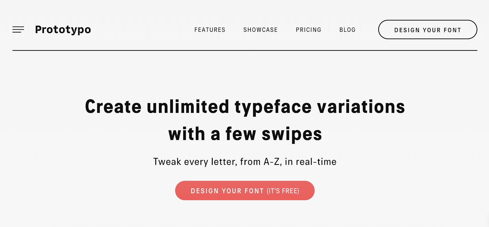
1. Go to Prototypo.io, and click the “Design Your Font” button.
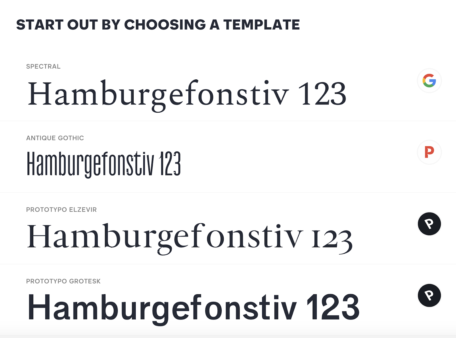
2. Once you fill out the sign-up form (You can sign up with your Facebook, Google, or Twitter accounts), you must choose a pre-made template. For my purposes, I chose “Prototypo Elzevir”.
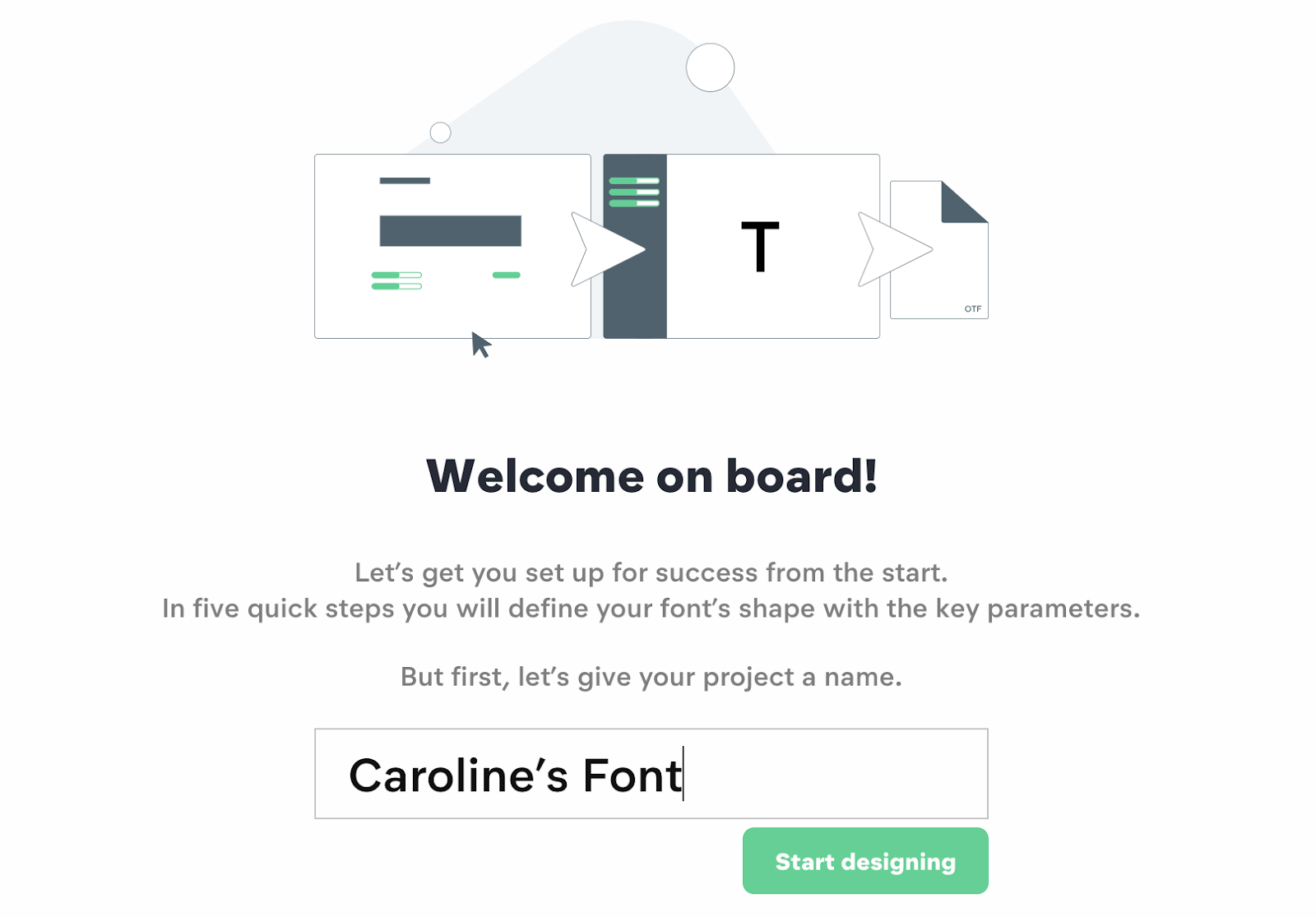
3. Next, name your project. Then click “Start designing”.
4. You’re now instructed to change height and width dimensions of your font by moving the green bar to the left or right. When you’re happy with the proportions, click “Next”.

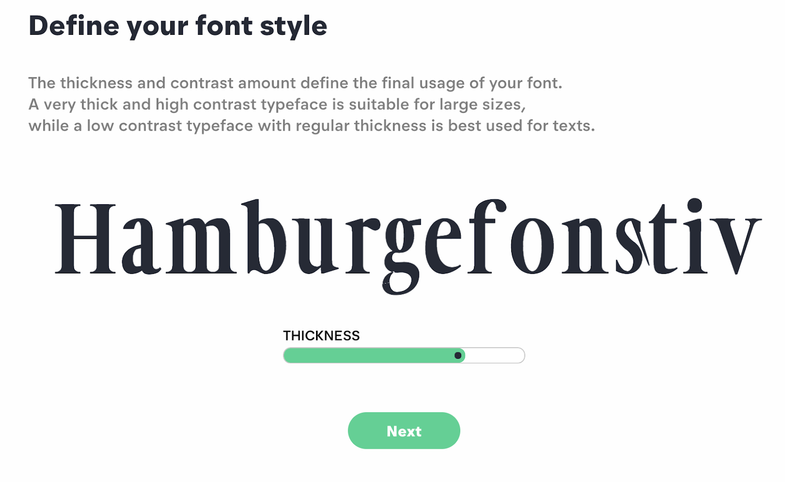
5. Now, adjust your font’s thickness. When you’re satisfied, click “Next”.
6. Move the green bar to the right or left to adjust “Ascender” and “Descender” of your font. When you’re happy with it, click “Next”.

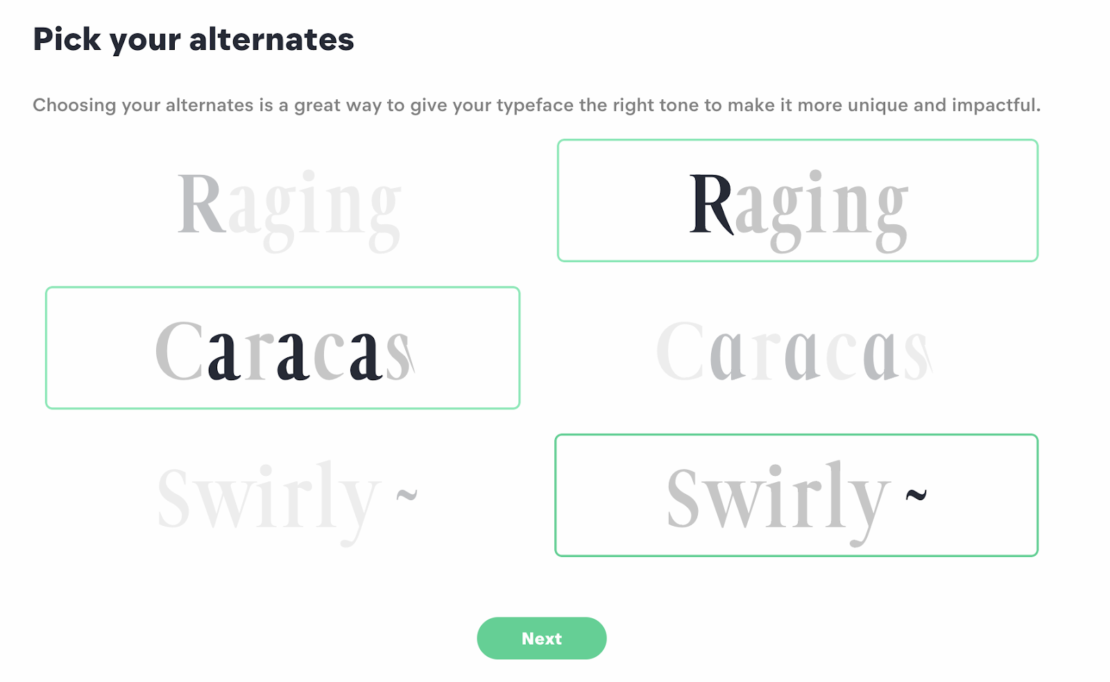
7. Now, choose one option in each row you prefer to solidify your font’s uniqueness. For instance, I chose the “Raging” font on the right, the “Caracas” font on the left, and the “Swirly ~” font on the right to change how the “R” “A” and “~” will look in my font alphabet. When you’re done, click “Next”.
8. Move the green bar from left to right or vice versa to adjust your Serif height, width, and median. You’ll see your font change on the screen, and when you’re happy with how it looks, click “Next”.

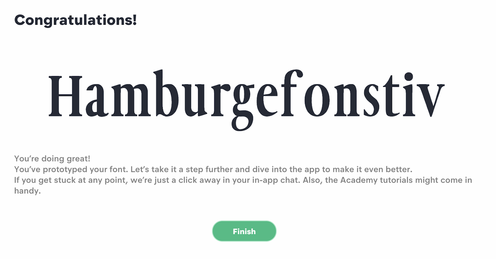
9. Now, you’ll see the final result of your font. Click “Finish”. You’ll be given the option to watch a tutorial next, but you can skip the tutorial if you’d like to go straight to your dashboard.
10. Here’s your account dashboard. You’ll see all the choices you selected for your font on the left, such as capital height, width, and spacing. You can still adjust if need be. Additionally, there’s a text box on the right, where I typed “Caroline Forsey’s Font”. You can type a paragraph to see if you like how your font looks.

11. If you pay for a Pro subscription, you can click “File” –> “Export font” to use anywhere you’d like.

Phone Photography 101: How to Take Good Pictures With Your Mobile Device
Before the days of smartphones — if you can remember such a time — taking a great photo was a labor-intensive process. You’d have buy a fancy camera and editing software for your desktop computer, and invest some serious time and energy into learning how to use them.
But, thanks to our mobile devices and the editing apps that come with them, we can now take high-quality photos and edit them without too many bells and whistles — all from the same device that we use to make calls.
Brands are catching on, too — the kinds of visuals remain important to marketing. But make no mistake: Taking a great photo on your smartphone is not as simple as pointing and shooting. There are plenty of bad smartphone photos out there — I’m sure you’ve seen at least a few.
What’s the secret to taking great pictures with your smartphone, then? As it turns out, there are a few of them. Check out these tips below to improve your smartphone photography game. (And once you have the photo-taking part down, check out some of the best photo editing apps for mobile.)

How to Take Good Photos With Your Phone: 25 Tips & Tricks
1. Use gridlines to balance your shot.
One of the easiest and best ways to improve your mobile photos is to turn on the camera’s gridlines. That superimposes a series of lines on the screen of your smartphone’s camera that are based on the “rule of thirds” — a photographic composition principle that says an image should be broken down into thirds, both horizontally and vertically, so you have nine parts in total.
According to this theory, if you place points of interest in these intersections or along the lines, your photo will be more balanced, level, and allow viewers to interact with it more naturally.

Source: Digital Photography School
To switch the grid on …
- iPhone: Go to “Settings,” choose “Photos & Camera,” and switch “Grid” on.
- Samsung Galaxy: Launch the camera app, go to “Settings,” scroll down and switch the “grid lines” option to “on.”

Source: Lynda.com
2. Set your camera’s focus.
Today’s phone cameras automatically focus on the foreground of your frame, but not every picture you take on your phone has an obvious subject. To adjust where you want your camera lens to focus, open your camera app and tap the screen where you want to sharpen the view.
If you’re taking a photo of something in motion, for example, it can be difficult for your camera to follow this subject and refocus as needed. Tap the screen to correct your phone camera’s focus just before snapping the picture to ensure the moving subject has as much focus as possible. A square or circular icon should then appear on your camera screen, shifting the focus of your shot to all of the content inside that icon.
3. Focus on one subject.
Many of the best photos include just one, interesting subject. So when taking a picture of one, spend some extra time setting up the shot. Some professional photographers say that the subject shouldn’t fill the entire frame, and that two-thirds of the photo should be negative space — that helps the subject stand out even more.
But be sure you tap the screen of your smartphone to focus the camera on your subject — that’ll help to ensure that it’s focused and the lighting is optimized.
Pro Tip: Once you’ve taken your photo, you can use filters and apps to make the subject even more vivid, or to crop it to frame the subject correctly. The brightness, contrast, and saturation of the photo can also be adjusted accordingly — all from your phone.


Source: Patrick Janelle
4. Embrace negative space.
“Negative space” simply refers to the areas around and between the subjects of an image –and it can take a photo from “good” to “great.”
When you include a lot of empty space in a photo, your subject will stand out more and evoke a stronger reaction from your viewer. And what does negative space looks like? It’s often a large expanse of open sky, water, an empty field, or a large wall, as in the examples below.


Source: Eric Christian
5. Find different perspectives.
Taking photos from a unique, unexpected angle can make them more memorable — it tends to create an illusion of depth or height with the subjects. It also makes the image stand out, since most mobile photos are taken either straight -on or from a bird’s eye view.
Try taking a photo directly upward and playing with the sky as negative space, like in the first photo below. Or, you can try taking it at a slight downward angle.
Pro Tip: If you take a photo and find the perspective is a little askew or tilted, use the SKRWT photo editing app to make the lines look clean and square.


Source: iPhone Photography School; Paul Octavious
6. Play with reflections.
There’s something so idyllic about seeing the sky reflected in a body of water. There’s a reason why we love seeing that — our eyes are drawn to reflections. So look for opportunities to play with them in photos.
There are plenty of out-of-the-box places to find reflections — puddles, larger bodies of water, mirrors, sunglasses, drinking glasses, and metallic surfaces are just a few.


Source: Joshua Lott; Carlos Copertone
7. Use leading lines.
In some photos, there’s a line that draws the viewer’s eye toward a certain part of the frame. Those are called leading lines. They can be straight or circulinear — think staircases, building facades, train tracks, roads, or even a path through the woods.
Leading lines are great for creating a sense of depth in an image, and can make your photo look purposefully designed — even if you just happened to come upon a really cool shape by accident.


Source: Carlos Copertone; Paul Octavious
8. Look for symmetry.
Symmetry can be defined as “a vague sense of harmonious and beautiful proportion and balance.” And pictures that contain symmetry can be incredibly pleasing to the eye — it’s also one of the simplest and most compelling ways to compose a photo.
In photography, symmetry usually means creating an image that can be divided into two equal parts that are mirror images of each other. That’s a bit different than reflections — symmetry can be found “in the wild,” as per the staircase picture, or you can set up your photo accordingly, like photographer Eric Christian did in the first photo below.
And remember — use those gridlines from tip #1 to line everything up perfectly.


Source: Eric Christian; Carlos Copertone
9. Keep an eye out for repetitive patterns.
Repetitive patterns are very pleasing to the eye — they appear whenever strong graphic elements are repeated over and over again, like lines, geometric shapes, forms, and colors. These patterns can make a strong visual impact, and photographing something like a beautiful, tiled floor can be enough to create a striking image. Other times, it’s more fun to keep an eye out for where they appear naturally or unintentionally, like with the congruent fire escapes on the left.


Source: Patrick Janelle
10. Play around with color blocking.
Isn’t it cool when an entire photo is black and white, except for a single object? It turns out that yes, indeed, there are apps for that. One of our favorites is Touch Color — an app that automatically converts a picture to grayscale and lets you fill in the parts you want to colorize.
Color blocking can help to highlight the elements of a photo that you want to stand out, like a plant or something else with a bold hue. It achieves a similar goal as negative space, in that it can help a single subject stand out — but with color blocking, the photo’s other elements remain intact for a cohesive image.

Source: Coloring Pages
11. Avoid zooming in.
When you take a photo from a distance, it’s tempting to zoom in on something specific you’re trying to capture. But it’s actually better not to zoom in — doing so can make the photo appear grainy, blurry, or pixelated.
Instead, try to get closer to your subject — unless it’s a wild animal, in which case we would advise keeping your distance — or take the photo from a default distance, and crop it later on. That way, you won’t compromise quality, and it’s easier to play around or optimize a larger image.

Source: Obama Pacman
12. Capture small details.
You may have heard the phrase, “It’s the little things.” Sometimes, that also applies to photos. Close-up images that capture small, intricate, and delicate details can make for really compelling visual content. Keep an eye out for textures and patterns like peeling paint, a gravel road, or a tile tabletop.
Pro Tip: Use the “sharpen” tool in your favorite photo editing app to (conservatively) sharpen the details of your photo. You might also download the Camera+ app and use its Clarity filter, which is what The Wall Street Journal‘s Kevin Sintumuang calls the app’s “secret sauce — it adds pro-camera crispness to almost any shot.”


Source: Paul Octavious; Eric Christian
13. Use natural light.
It’s hard to find a great smartphone photo that was taken with a flash. Most of the time, they make a photo look overexposed, negatively altering colors and making human subjects look washed out. In fact, even the iPhone 7’s flash is rumored to have some flaws.
Take advantage of the sources of natural light you can find, even after dark. This gives you a chance to play with shadows, like in the second image below, or create a silhouette with other ambient sources of light, like traffic and surrounding buildings.
Once you’ve taken the photo, play with the “Exposure” tool in your favorite photo editing app to see if you can make the image slightly brighter, without making it too grainy.


Source: Patrick Janelle; Paul Octavious
14. If you use flash, only do so during the day.
Sometimes, using your camera’s flash can improve a photo — but rarely does it do so at night. Because dark shots reveal a much sharper contrast against your phone’s flash, it can make any flash look look invasive and uneven
In already well-lit spaces, however, a flash can help to soften some dark shadows behind or beneath your main subject.
When framing your next shot, look on the ground or against vertical surfaces for any dark shadows you might want to remove. If you see any, flip on the flash manually in your camera app. Setting your phone’s camera flash to “auto” won’t guarantee that your phone will notice the shadows you want to get rid of. Just remember to turn the flash off again when you’re done.
Check out the difference in the two mobile photos of a metal figurine, below. You can see the desk shadow is considerably softer in the flash-based photo on the right. The flash even brings out more details in the body of the subject. Consider this difference next time you’re shooting product photography.


15. Consider buying a mobile tripod.
Although mobile devices make it easy to snap any photo on the go, there’s never been an easy way to ensure the shot stays level and balanced when you shoot — especially if you want to be in the picture and not just take a typical selfie with your extended arm.

Source: Joby
Mobile tripods give you the freedom to mount your smartphone for quick hands-free shots without lugging any heavy equipment with you. Most mobile tripods are barely bigger than your mobile device, and can bend to any angle. Check out one of them from Joby, above, and learn how these miniature tripods can help enhance your mobile video experience below.
16. Set your camera app’s exposure manually.
Another mobile camera feature you’ll want to set manually is your exposure. Tapping your screen when your phone’s camera is on doesn’t just refocus the lens on a new subject — it also automatically adjusts how much light the camera lets in. This, too, won’t always look just right. It’s best to adjust it by hand.
To change your mobile camera’s exposure by hand, open your camera app and tap the screen. When you see the lens refocus, you’ll see a very small sun icon and a vertical scale. Slowly swipe your finger up and down this scale to adjust the light level.
17. Create abstracts.
Abstract photos are meant to capture the essence of an object, or a series of them, without revealing the entire landscape as a whole. In other words, they serve the purpose of creating unique, surprising images from ordinary subjects.
This look can be accomplished by cropping an abstract portion of an otherwise normal photo, or by taking close-up shots of objects that leave the viewer wondering — in admiration, of course — what the subject might be. And subjects with patterns or repetition are great candidates for abstract photography, like in the photo of sliced figs below.


Source: iPhone Photography School; Patrick Janelle
18. Take candids.
Posed photos can be great for the sake of memories — happy moments with friends, family, or the occasional run-in with a celebrity. But sometimes, candid shots of people doing things, or people with people, can be far more interesting.
That’s because candid photos are better able to effectively capture the emotion and essence of a moment. One of the best ways to capture this kind of shot is to just take as many photos as possible. You’ll have more to choose from, and the best photos often happen when the “stars align,” so to speak, in a single moment — everyone’s eyes are open, one person is tilting their head just so, and you finally got a shot of your chronically closed-lip friend smiling with his teeth.


Source: Patrick Janelle
19. Be non-conventional.
Composition is a huge part of what makes a photo great, but so is the photo’s subject. Some of the most delightful and remarkable photos come out of cool, unique ideas. Images are more effective than text at evoking emotion from your viewers — that often means getting your photos to say something.
Try thinking outside of the box when it comes to what you’re capturing — your viewers could be pleasantly surprised by a cool or unexpected subject.


Source: Paul Octavious
20. Make ’em laugh.
Speaking of evoking emotion, sometimes the most memorable photos are the ones that make us giggle. The image below of an older woman wearing a brightly-colored shirt stating “Hi hater” is funny because it’s unexpected — and there’s a part of us that admires her, too. The second image of the dog toy on a dinner plate pokes fun at classic Instagram food shots, but it’s from a dog’s perspective. If you can make your audience laugh, they’re likely to enjoy your photo.


Source: Baddie Winkle; Jeremy Veach
21. Clean your phone’s lens.
A smartphone camera might be more convenient to carry around than a full-fledged photojournalist’s camera, but it comes at the cost of protection.
Your phone is usually in your pocket or your bag when you’re out of the house. All the while, the device’s camera lens is collecting all kinds of dust and lint. Be sure to clean this lens with a soft handkerchief before taking a photo. You might not be able to tell just how dirty the lens was until you start editing your picture, and making sure the lens is crystal clear before taking a shot can keep you from starting from scratch.
22. Attach an external lens.
Want to get really fancy? External lenses are for you. There are actually several out there that can be attached to the top of your smartphone’s native camera lens — from fish-eye to wide-angle lenses, these add-ons can bring an entirely new quality and perspective to your photos.
According to Wirecutter, the best camera lenses for iPhone photography are made by Moment, a manufacturer of mobile lenses. Start there, or do some research to find the lens add-ons that fit your smartphone photography needs.

Source: MobileFun.co.uk
23. Don’t be afraid to edit.
Composing and taking your smartphone photo is just the first step to making it visually compelling. Editing your photos is the next step — and a very critical one, at that. Filters can be a valuable photographic tool, particularly when it comes to two goals: 1) Removing blemishes from a picture, and 2) making food look even more delicious.
For the first, InStyle magazine compiled a fun list of “The Best Instagram Filters for Every Beauty Complaint” — and now, the iPhone photos app offers many similar filters. There are also apps like Pho.to, which can automatically retouch facial photos without a lot of work. And when it comes to those photos of your daily meals? One of the latest apps available is Foodie, which comes with its own set of filters optimized for different types of food.
But there are many other great photo and video editing apps out there for mobile devices — check out this post to see some of the best ones out there.

Source: LINE Corp.
Want more tips on creating visual content? Check out these examples of explainer videos.

How to Write a Business Letter That Won’t Get Ignored
Nowadays, writing a letter can seem completely archaic. I mean, do people even send mail anymore or do they only communicate through email and messaging?
In the business world, letters are actually still crucial for collaboration. To convince someone to offer you a job, you need to write them a compelling cover letter. And to persuade someone to speak at your company’s event, you need to write a gripping pitch.
A lot of professionals overlook the importance of writing high-quality business letters because they seem outdated. As a result, most people don’t actually know how to write one.
Fortunately, if you’re in the same boat, we’ve got you covered. Below, we’ll teach you how to craft a persuasive business letter for any purpose and situation.
How to Format a Business Letter
- Write the date and your recipient’s name, company, and address.
- Choose a professional greeting, like “Dear,”.
- Craft a compelling introduction.
- State your intent in the letter’s body text.
- End your letter with a strong call-to-action.
- Choose a professional closing, like “Sincerely,”.
- Physically sign the letter with your signature.
- Type your name, address, phone number, and email address.
To teach you how to write a business letter in more detail than the snippet above, let’s take a look at a letter I wrote to Dharmesh Shah, HubSpot’s CTO, when I was a wide-eyed college student trying to convince him to speak at my school.
I’ll analyze the most important parts of my letter — the introduction, body text, and call-to-action — and explain how and why they can strengthen your own business letters.
Business Letter Example
October 1, 2016
Dharmesh Shah
HubSpot
25 First Street,
Cambridge, MA 02141
Dear Mr. Shah,
When my freshman year of college ended, I was fortunate enough to work as a digital marketing intern at a startup called SlideBatch. They were introducing a new content marketing tool to the market, and my job was to apply that tool to their clients’ social media marketing campaigns and prove that SlideBatch was an effective marketing solution. I was so excited to get to work, but I had one small problem. I didn’t know what content marketing was. So, I did some research on the Internet and discovered HubSpot’s Marketing blog.
Fast forward a year and half, and I’m still reading HubSpot’s Marketing blog and leveraging its insights at my third digital marketing internship. Reading your blogs changed my life. I entered college believing financial advising was my destiny. But, after learning about HubSpot’s inbound marketing philosophy — how helping people is the ultimate way to increase brand trust and engagement — I was hooked. Shortly after my internship with SlideBatch ended, I decided to pursue digital marketing instead of financial advising. I’ve haven’t looked back since.
HubSpot’s influence on my life is the reason I’m writing to you today. I’m certain if you spoke at my school, DePauw University, about your life, HubSpot, and the inbound marketing philosophy, there would be hundreds of undecided students who start pursuing digital marketing. I know this because DePauw’s McDermond Speaker Series is one of the best platforms for business leaders to showcase their passion for their industry, company, and work. Brad Stevens of the Boston Celtics, Angie Hicks of Angie’s List, and Bill Rasmussen of ESPN have all successfully used the McDermond Speaker Series to inspire the world’s next generation of business leaders, and I know you could, too.
We would be honored if you spoke at our school. Thank you for your time and consideration, and we look forward to hearing from you!
Sincerely,
Clifford Chi
313 South Locust St.
Greencastle, IN 46136
555-555-5555
cliffordchi@aim.com
Introduction (first and second paragraphs)
To instantly grab Dharmesh’s attention and entice him to read the rest of my letter, you’ll notice I didn’t lead with the standard “I’m writing to you today because…” introduction. Instead, I engaged him with a story about how I discovered HubSpot and how his company changed my life. I thought this would strongly resonate with him because I assumed, as a co-founder of HubSpot, he would love to see how his life’s work has benefited others.
In your own business letters, you don’t necessarily need to tell a story to immediately hook your reader and persuade her to read on. But you should definitely describe how she’s made an impact on your life. This is what will truly grab and hold her attention.
Body text (third paragraph)
After my introduction, I swiftly segued into why I was writing to Dharmesh — to ask him to speak at my school. Personal anecdotes are an effective way to engage readers, but I’d lose Dharmesh’s attention if I didn’t cut to the chase.
Once I stated my letter’s intent, I quickly pitched the benefits of speaking at my school and bolstered the reputation of my school’s speaker series. By emphasizing how speaking at my school could inspire hundreds of students to pursue digital marketing and highlighting the group of impressive speakers Dharmesh could join, I focused on the dividends he would reap from being a McDermond Series Speaker, rather than how my school would benefit from his guest appearance.
So whether you’re trying to convince someone to hire you or speak at your school, you must first persuade your reader that doing what you ask of them will ultimately benefit them and be in their best interest.
Call-to-action (fourth paragraph)
In my last paragraph, I politely ask Dharmesh to speak at my school again. Even though I already asked him this earlier, it’s important I end my letter with a clear next step. It packs more of a punch and crystalizes the desired action in his mind.
Strong call-to-actions are a crucial element of a persuasive business letter. Because if you don’t tell your reader what to do next, you might as well have never written your letter in the first place.

How to Repurpose and Syndicate Your Blog Posts for More Exposure
Need more exposure for your blog content? Wondering what your options are? In this article, you’ll learn how to republish your blog posts on social networks and other platforms while protecting your original content’s search rank. Why Repurpose Your Blog Posts? Repurposing blog content can be a confusing task for even seasoned content creators. On […]
The post How to Repurpose and Syndicate Your Blog Posts for More Exposure appeared first on Social Media Examiner.
from Social Media Examiner https://ift.tt/2Jxvb1S
via socialmediaexaminer
4 Talent Acquisition Strategies to Find the Best Employees
In 2018, almost 75% of employers struggled to fill positions with the right candidates.
Unfortunately, this talent shortage is only worsening — research by Korn Ferry predicts by 2020, the technology, media, and telecommunications industries alone could be short over one million skilled workers globally.
To succeed long-term, it’s critical your business is able to hire and retain the best, most talented employees. But it’s a daunting task, which is why you need a talent acquisition strategy.
Talent acquisition vs. recruitment
Recruitment is used to fill a specific role with a qualified candidate, and is typically a short-term strategy to fill a vacancy. Talent acquisition, on the other hand, is a long-term HR strategy meant to attract the best, most qualified people and convince them to bring their unique skills to your company. Talent acquisition aims to attract talent regardless of specific vacancies.
Your pursuit of top talent shouldn’t solely rely on traditional, short-term recruitment strategies like sending LinkedIn messages or attending Job Fairs. To ensure top talent acquisition and retention, you’ll need to devise a strategic long-term plan.
Here, we’ve cultivated four critical talent acquisition strategies to ensure you’re finding the best people.
Talent acquisition
Talent acquisition is a long-term HR strategy that aims to fulfill organizational needs by finding top talent, and convincing them to bring their unique skills to your company. To succeed long-term, it’s critical you attract and retain talented employees regardless of vacant roles. Talent acquisition can help you do this, while solving for long-term organizational needs.
1. Align with your business goals.
Consider your business goals for the next one to five years, and use those objectives to tailor your acquisition strategy to meet those needs. While recruitment tends to focus on filling vacancies within departments, talent acquisition is more about considering how your company is going to expand long-term, and then finding employees who can help take you there.
For instance, are you planning on expanding into Latin America? If so, perhaps your HR department should focus on attracting candidates with international or regional experience. Or, maybe you’re planning on creating a new product, in which case, your HR efforts should focus on attracting talented software developers and coders.
Certain roles might not even exist yet, but you’ll want to consider what type of talent you’ll need to hit your business’s long-term goals. Remember, investing in the right candidates will pay off for your company, long-term.
2. Use data and marketing to create better acquisition material.
You wouldn’t create a marketing campaign without data, so why should you recruit without it?
Talent acquisition should be treated with just as much importance as any of your marketing campaigns. Convincing people to join your company is just as necessary as incentivizing people to buy your products.
There are plenty of different opportunities to use data to strengthen your talent acquisition strategy. For instance, you might use data to figure out where your top talent came from, and use that information to focus your talent acquisition efforts on certain academic programs or professional networking sites.
Additionally, your HR team should partner with your marketing department to refine job descriptions, career pages, emails, and more.
Using data, you can figure out if certain questions are deterring candidates from filling out job applications, and eliminate those questions. Alternatively, perhaps you’ll find adding images or videos to highlight company culture incentivizes more candidates to fill out job forms. Or, maybe more candidates apply for a job with description A over description B.
By using analytics and data, you’re able to ensure your job descriptions and career pages aren’t deterring qualified people from applying.
3. Expand outreach strategies.
To find better talent, you’ll need to expand your sourcing strategies. Different skill sets require different methods of outreach. You’ll find your best marketers in a different place than your best programmers, so you’ll want to diversify your sourcing approach.
Rather than spending all your time on LinkedIn, consider other specialized job boards, academic programs, or networking events where you might find a specific group of talented professionals. For instance, to attract talented coders, Deloitte’s recruiters attended a hackathon and found prospective candidates.
It’s critical you identify where you can find the vast majority of your top talent, whether that be professional events, conferences, online forums, or social networks. Then, focus on strengthening relationships and networking with the right people — not only will you grow your pool of potential hires, but you’ll also grow brand awareness for your company, which will help you attract talent in the future, as well.
4. Focus on better employer branding.
Employer branding is critical for creating a successful talent acquisition strategy — in fact, 62% of professionals across 26 countries rank employer brand as the deciding factor when applying for a job.
When talented candidates are comparing companies, they’re going to choose the one with the best values, culture, and work-life balance. By cultivating an impressive employer brand, you’ll attract better talent and find more long-term success.
To succeed with talent acquisition, you’ll need to be able to answer the question, “Why your company, over all the others?” This is why employer branding is a critical strategy for finding the best employees.
Consider how you can reframe your branding to focus on the best aspects of your company’s values and culture. It isn’t just about mentioning health benefits or compensation — you’ll also want to convey your impressive company culture, in which employees collaborate efficiently and enjoy spending time with one another. You might mention your flexible remote policy and other work-life balance perks, or your company’s emphasis on growth opportunities.
It’s important you broadcast these unique attributes through employee review sites like Glassdoor, as well as your “About Us” page on your company website. When highly qualified people are contemplating your company over your competitors, it just might be those reviews that end up convincing them.

7 Digital Marketing Strategies and How to Plan Your Own Campaign [Template]
There’s no question that, in the modern landscape, a big part of your marketing strategy is digital. Consumers and businesses alike are almost always online — and you want to be able to reach them and observe their behavior where they spend the most time.
But when you’re growing a business, it seems like this ever-evolving landscape can quickly become overwhelming. There’s already enough to do — how are you also supposed to create, fine-tune, and maintain an agile digital marketing strategy?

We’ve compiled a list of seven digital marketing strategies that marketers can adapt to help their teams and businesses grow, as well as a crash course on the meaning of digital strategy and marketing campaigns. Then, grab your free collection of digital content marketing templates at the end of this post.
What is digital marketing strategy?
Your digital marketing strategy is the series of actions that help you achieve your company goals through carefully selected online marketing channels. These channels include paid, earned, and owned media, and can all support a common campaign around a particular line of business.
The term “strategy” might seem intimidating, but building an effective digital strategy doesn’t need to be difficult.
In simple terms, a strategy is just a plan of action to achieve a desired goal, or multiple goals. For example, your overarching goal might be to generate 25% more leads via your website this year than you drove last year.
Depending on the scale of your business, your digital marketing strategy might involve multiple digital strategies — each with different goals — and a lot of moving parts. But coming back to this simple way of thinking about strategy can help you stay focused on meeting those objectives.
Despite our simplification of the term “strategy,” there’s no doubt it can be difficult to get started actually building one. Let’s see what a digital marketing campaign looks like, and then, we’ll jump into those seven building blocks to help you create an effective digital marketing strategy to set up your business for online success.
What Is a Digital Marketing Campaign?
It’s easy to confuse your digital strategy with your digital marketing campaigns, but here’s how to distinguish the two.
As we’ve already outlined, your digital strategy is the series of actions you take to help you achieve your overarching marketing goal. Your digital marketing campaigns are the building blocks or actions within your strategy that move you toward meeting that goal.
For example, you might decide to run a campaign sharing some of your best-performing gated content on Twitter, to generate more leads through that channel. That campaign is part of your strategy to generate more leads.
Here a few other well-known examples of digital marketing campaigns and the strategies they employ.
Digital Marketing Campaign Examples
- GoPro
- Delta Airlines
- Geico
- Wayfair
- Mastercard
- ETF Securities
- Red Bull
1. GoPro
Digital strategy: Earned media, user-made video
GoPro is famous for its incredible point-of-view style action footage, all taken from the company’s classic fisheye lens. What you might not know is that so much of the video content you see on its YouTube channel wasn’t made by GoPro, but rather by its most loyal users.
By populating its YouTube channel with user-made video content, GoPro has encouraged an entire fanbase of outdoorspeople to take amazing footage of their adventures and post it online — often with credit back to GoPro. This ongoing digital marketing campaign has championed the use of video to spread the word about the GoPro product line — and a lot of the content is created by the customers themselves.
Check out the video below, which GoPro republished, awarding the video’s original shooter with being one of the best videos in its category.
2. Delta Air lines
Digital strategy: Owned media, Twitter stories
You wouldn’t think of an airline as a leader in creative digital marketing, but don’t underestimate the stories they can tell on social media (emphasis on “stories”).
Delta Air Lines is a prolific user of social media, specifically on its Twitter handle. The brand uses this account to engage potential passengers in a variety of ways that are both timely and emotionally stimulating. Last month, in honor of Breast Cancer Awareness Month, the company began sharing personal stories from Delta employees directly through the company’s Twitter feed. Here’s the beginning of one story’s thread, below.
In honor of Breast Cancer Awareness Month, we’re sharing the stories of the survivors and fighters of our Delta family.
Amanda Ross, a Customer Care Supervisor, has been a Delta employee for 13 years and is actively fighting breast cancer. Read about her battle below. pic.twitter.com/WSp6ZyBw36
— Delta (@Delta)
October 19, 2018
3. Geico
Digital strategy: Paid media, YouTube Preroll ads
All you need to hear is the word “Geico” to remember you can save 15% or more on your car insurance. But even a company with such a memorable tagline can risk annoying its buyers if its marketing campaign is too longwinded.
That’s why Geico launched a series of preroll ads on YouTube that admit to the ad’s brevity in the videos themselves.
Preroll ads are a form of paid content on YouTube wherein you pay YouTube to roll 15- to 20-second ads ahead of videos that have the same audience as the advertiser. While some companies try to squeeze as much messaging as they can into that short slot, Geico has taken the opportunity to make fun of itself for taking up your time in the first place. In this way, its YouTube preroll commercials are actually entertaining. Check out one of them below.
4. Wayfair
Digital strategy: Owned media, Instagram tags
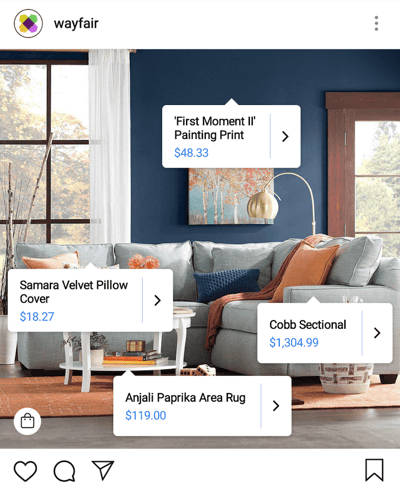
Wayfair, a home furnishings and decor merchant, has a truly innovative Instagram strategy. Let’s just say its photos aren’t just photos.
Instagram gives companies an opportunity to show their followers a more intimate side of the brand, lifting the curtain on the business to show off the employees and events that make the organization what it is. For Wayfair, however, Instagram isn’t just a culture play — it’s a purchase page.
Using Instagram’s product tags, Wayfair has taken some of its prettiest home interior shots on Instagram, and tagged them with product and price labels. It’s a digital marketing campaign that shows people exactly how much each item in the photo costs, helping Wayfair generate buyers right from its Instagram account. Check out an example, below.
5. Mastercard
Digital strategy: Owned media, Travel blog
Mastercard bases its brand on the stories and adventures that cardholders go on. But what good is a travel-based brand without a travel-based digital marketing campaign to go with it?
Priceless Cities, Mastercard’s travel blog, gives readers a travel resource to go along with the credit cards that help pay for these readers’ destinations. It’s a pretty good idea, as it allows the company to better align itself not just with the things its customers buy, but with the places its customers go. Check out the blog here.
6. ETF Securities
Digital strategy: Paid media, LinkedIn Sponsored Content
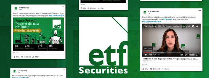
ETF Securities is a small, asset management service based in Australia catering to wealth managers and investors in Europe. Because the service they provide is so complex, the company found where its customers hung out the most — LinkedIn — and sponsored paid content on this platform that drives more interest in investments and helps customers make smarter financial decisions.
With this digital campaign, ETF Securities saw 95% year-over-year growth in its LinkedIn followers.
7. Red Bull
Digital strategy: Owned media, Lifestyle news
Red Bull has become more well known for its sponsorship of extreme sports than the energy drink it sells. It’s a natural fit for the types of people the drink appeals to. But instead of creating digital content on the energy drink industry, Red Bull captures its audience with articles and videos all about the latest happenings in the extreme sports community.
In this digital marketing campaign, Red Bull teaches us that what you sell isn’t always the ideal content strategy. Rather, it’s the lifestyle that your customers live. Check out the company’s website here.

It’s important to note that even if a campaign runs over the course of a couple of years, it doesn’t make it a strategy — it’s a tactic that sits alongside other campaigns to support a larger marketing strategy. For example, ETF Securities (cited above) hosted a campaign to increase its followers on LinkedIn, using the digital strategy of sponsored content (a form of paid media). This one strategic campaign might be one small part of a larger digital marketing strategy that serves to generate more leads for one of its products or business lines.
Now that we’ve gotten to grips with the basics of digital strategy and digital marketing campaigns, let’s dig into how to build your strategy.
How to Create a Digital Marketing Strategy
- Build your buyer personas.
- Identify your goals and the digital marketing tools you’ll need.
- Evaluate your existing digital channels and assets.
- Audit and plan your owned media campaigns.
- Audit and plan your earned media campaigns.
- Audit and plan your paid media campaigns.
- Bring it all together.
1. Build your buyer personas.
For any marketing strategy — offline or online — you need to know who you’re marketing to. The best digital marketing strategies are built upon detailed buyer personas, and your first step is to create them. (Need help? Start here with our free buyer persona kit.)
Buyer personas represent your ideal customer(s) and can be created by researching, surveying, and interviewing your business’s target audience. It’s important to note that this information should be based upon real data wherever possible, as making assumptions about your audience can cause your marketing strategy to take the wrong direction.
To get a rounded picture of your persona, your research pool should include a mixture of customers, prospects, and people outside your contacts database who align with your target audience.
But what kind of information should you gather for your own buyer persona(s) to inform your digital marketing strategy? That depends on your businesses, and is likely to vary depending on whether you’re B2B or B2C, or whether your product is high cost or low cost. Here are some starting points, but you’ll want to fine-tune them, depending on your particular business.
Quantitative (or Demographic) Information
- Location. You can use web analytics tools like Google Analytics to easily identify what location your website traffic is coming from.
- Age. Depending on your business, this may or may not be relevant. It’s best to gather this data by identifying trends in your existing prospect and customer database.
- Income. It’s best to gather sensitive information like personal income in persona research interviews, as people might be unwilling to share it via online forms.
- Job Title. This is something you can get a rough idea of from your existing customer base, and is most relevant for B2B companies.
Qualitative (or Psychographic) Information
- Goals. Depending on the need your product or service was created to serve, you might already have a good idea of what goals your persona is looking to achieve. However, it’s best to cement your assumptions by speaking to customers, as well as internal sales and customer service representatives.
- Challenges. Again, speak to customers, sales and customer service representatives to get an idea of the common problems your audience faces.
- Hobbies and interests. Speak to customers and people who align with your target audience. If you’re a fashion brand, for example, it’s helpful to know if large segments of your audience are also interested in fitness and well-being, as that can help inform your future content creation and partnerships.
- Priorities. Speak to customers and people who align with your target audience to find out what’s most important to them in relation to your business. For example, if you’re a B2B software company, knowing that your audience values customer support over a competitive price point is very valuable information.
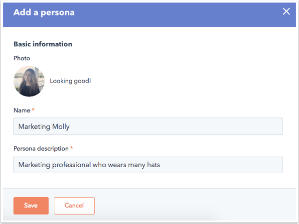
Take this information and create one or more rounded personas, like Marketing Molly below, and ensure they’re at the core of your digital marketing strategy.
2. Identify your goals and the digital marketing tools you’ll need.
Your marketing goals should always be tied back to the fundamental goals of the business. For example, if your business’s goal is to increase online revenue by 20%, your goal as a marketer might be to generate 50% more leads via the website than you did last year to contribute towards that success.
Whatever your overarching goal is, you need to know how to measure it, and more important, actually be able to measure it (e.g., have the right digital marketing tools in place to do so). How you measure the effectiveness of your digital strategy will be different for each business and dependent on your goal(s), but it’s vital to ensure you’re able to do so, as it’s these metrics which will help you adjust your strategy in the future.
If you’re a HubSpot customer, the Reporting add-on in your HubSpot software brings all of your marketing and sales data into one place, so you can quickly determine what works and what doesn’t.
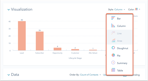
3. Evaluate your existing digital channels and assets.
When considering your available digital marketing channels or assets to incorporate into your strategy, it’s helpful to first consider the bigger picture to avoid getting overwhelmed. The owned, earned, and paid media framework helps to categorize the digital ‘vehicles’, assets, or channels that you’re already using.
Owned Media
This refers to the digital assets that your brand or company owns — whether that’s your website, social media profiles, blog content, or imagery, owned channels are the things your business has complete control over. This can include some off-site content that you own, but isn’t hosted on your website, like a blog that you publish on Medium, for example.
Earned Media
Quite simply, earned media refers to the exposure you’ve earned through word-of-mouth. Whether that’s content you’ve distributed on other websites (e.g., guest posts), PR work you’ve been doing, or the customer experience you’ve delivered, earned media is the recognition you receive as a result. You can earn media by getting press mentions, positive reviews, and by other people sharing your content on social media, for instance.
Paid Media
Paid media is a bit self-explanatory in what its name suggests — and refers to any vehicle or channel that you spend money on to catch the attention of your buyer personas. This includes things like Google AdWords, paid social media posts, native advertising (like sponsored posts on other websites), and any other medium for which you directly pay in exchange for visibility.
Gather what you have, and categorize each vehicle or asset in a spreadsheet, so you have a clear picture of your existing owned, earned, and paid media.
Your digital marketing strategy might incorporate elements of all three channels, all working together to help you reach your goal. For example, you might have an owned piece of content on a landing page on your website that’s been created to help you generate leads. To amplify the number of leads that content generates, you might have made a real effort to make it shareable, meaning others are distributing it via their personal social media profiles, increasing traffic to the landing page. That’s the earned media component. To support the content’s success, you might have posted about the content to your Facebook page and have paid to have it seen by more people in your target audience.
That’s exactly how the three can work together to help you meet your goal. Of course, it’s not compulsory to use all three. If your owned and earned media are both successful, you might not need to invest in paid. It’s all about evaluating the best solution to meet your goal, and then incorporating the channels that work best for your business into your digital marketing strategy.
Now you know what’s already being used, you can start to think about what to keep and what to cut.
4. Audit and plan your owned media campaigns.
At the heart of digital marketing is your owned media, which pretty much always takes the form of content. Every message your brand broadcasts can generally be classified as content, whether it’s your ‘About Us’ page, your product descriptions, blog posts, ebooks, infographics, or social media posts.
Content helps convert your website visitors into leads and customers, and helps to raise your brand’s profile online — and when it’s optimized, it can also boost any efforts you have around search/organic traffic. Whatever your goal, you’re going to need to use owned content to form your digital marketing strategy.
To build your digital marketing strategy, you need to decide what content is going to help you reach your goals. If your goal is to generate 50% more leads via the website than you did last year, it’s unlikely that your ‘About Us’ page is going to be included in your strategy — unless that page has somehow been a lead generation machine in the past.
It might more likely that an ebook gated by a form on your website drives far more leads, and as a result, that might be something you want to do more of. Here’s a brief process to follow to work out what owned content you need to meet your digital marketing goals:
Audit your existing content.
Make a list of your existing owned content, and rank each item according to what has previously performed best in relation to your current goals. If your goal is lead generation, for example, rank them according to which generated the most leads in the last year. That might be a particular blog post, an ebook, or even a specific page on your website that’s converting well.
The idea here is to figure out what’s currently working, and what’s not, so that you can set yourself up for success when planning future content.
Identify gaps in your existing content.
Based on your buyer personas, identify any gaps in the content you have. If you’re a math tutoring company and have discovered in your audience research that one of your persona’s biggest challenges is finding interesting ways to study, but you don’t have any content that speaks to that concern, then you might look to create some.
By looking at your content audit, you might discover that ebooks hosted on a certain type of landing page convert really well for you (much better than webinars, for example). In the case of this math tutoring company, you might make the decision to add an ebook about ‘how to make studying more interesting’ to your content creation plans.
Create a content creation plan.
Based on your findings and the gaps you’ve identified, make a content creation plan outlining the content that’s necessary to help you hit your goals. This should include:
- Title
- Format
- Goal
- Promotional channels
- Why you’re creating it (e.g., “Marketing Molly struggles to find time to plan her blog content, so we’re creating a template editorial calendar”)
- Priority level (to help you decide what’s going to give you the most “bang for your buck”)
This can be a simple spreadsheet, and should also include budget information if you’re planning to outsource the content creation, or a time estimate if you’re producing it yourself.
5. Audit and plan your earned media campaigns.
Evaluating your previous earned media against your current goals can help you get an idea of where to focus your time. Look at where your traffic and leads are coming from (if that’s your goal) and rank each earned media source from most effective to least effective.
You can get this information from tools like Google Analytics, or the Sources Reports in your HubSpot software.
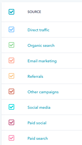
You might find that a particular article you contributed to the industry press drove a lot of qualified traffic to your website, which in turn converted really well. Or, you might discover that LinkedIn is where you see most people sharing your content, which in turn drives a lot of traffic.
The idea here is to build up a picture of what earned media will help you reach your goals, and what won’t, based on historical data. However, if there’s something new you want to try, don’t rule that out just because it’s not yet tried and tested.
6. Audit and plan your paid media campaigns.
This process involves much of the same process: You need to evaluate your existing paid media across each platform (e.g., Google AdWords, Facebook, Twitter, etc.) to figure out what’s likely to help you meet your current goals.
If you’ve been spending a lot of money on AdWords and haven’t seen the results you’d hoped for, maybe it’s time to refine your approach, or scrap it altogether and focus on another platform that seems to be yielding better results. (Check out this free AdWords guide for more on how to leverage it for business.)
By the end of the process, you should have a clear idea of which paid media platforms you want to continue using, and which (if any) you’d like to remove from your strategy.
7. Bring it all together.
You’ve done the planning and the research, and you now have a solid vision of the elements that are going to make up your digital marketing strategy. Here’s what you should have so far:
- Clear profile(s) of your buyer persona(s)
- One or more marketing-specific goals
- An inventory of your existing owned, earned, and paid media
- An audit of your existing owned, earned, and paid media
- An owned content creation plan or wish list
Now, it’s time to bring all of it together to form a cohesive strategy document. Let’s revisit what digital strategy means: the series of actions that are going to help you achieve your goal(s) using online marketing.
By that definition, your strategy document should map out the series of actions you’re going to take to achieve your goals, based on your research to this point. A spreadsheet is an efficient format — and for the sake of consistency, you might find it easiest to map out according to the owned, earned, and paid media framework we’ve used so far.
You’ll also need to plan your strategy for a longer-term period — typically, something like 12 months is a good starting point, depending on how your business is set up. That way, you can overlay when you’ll be executing each action. For example:
- In January, you might start a blog which will be continually updated once a week, for the entire year.
- In March, you might launch a new ebook, accompanied by paid promotion.
- In July, you might be preparing for your biggest business month — what do you hope to have observed at this point that will influence the content you produce to support it?
- In September, you might plan to focus on earned media in the form of PR to drive additional traffic during the run-up.
By taking this approach, you’re also creating a structured timeline for your activity, which will help communicate your plans to your colleagues — not to mention, maybe even help keep you sane.
Your Path to Digital Marketing Strategy Success
Your strategy document will be very individual to your business, which is why it’s almost impossible for us to create a one-size-fits-all digital marketing strategy template. Remember, the purpose of your strategy document is to map out the actions you’re going to take to achieve your goal over a period of time — as long as it communicates that, then you’ve nailed the basics of creating a digital strategy.
If you’re eager to build a truly effective strategy to help grow your business, check out our free collection of content marketing templates below.


What You Missed Last Month in Google
Welcome one, welcome all to November 1st — and to another recap of the month’s top Google news items.
What You Missed Last Month in Google
1. New Measures for User Data Control
Until recently, Google users would have to visit a separate account settings page to clear their search history. Now, the company says, that data can be accessed directly from the search page, via a hamburger menu that appears above the query bar.
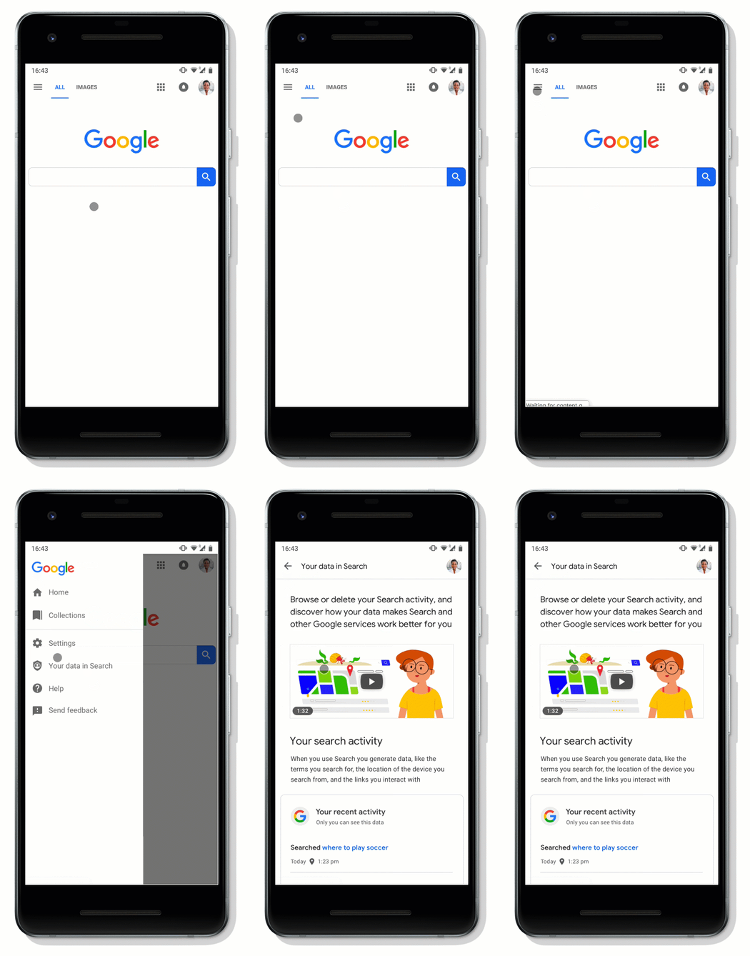
Source: Google
After tapping on this menu option, users can view recent search activity, and choose what to delete — their searches over the past hour, or all search activity. On this same page, users can also access privacy settings for voice search, as well as those pertaining to ad personalization.
Next year, Google says, these easy-to-access data controls will roll out to Maps and other Google products. Read more >>
2. “No Robocalls, Please”
Google made waves in May when it announced Duplex: its new Assistant that’s (artificially) intelligent enough to make phone calls on a user’s behalf to book appointments, make reservations, and more.
After some controversy, Google could be adding an option for business owners to indicate that they do not want to receive phone calls from Assistant. The alleged option was discovered by a search strategist who saw the option while creating a Google business listing for a client. Read more >>
@GoogleMyBiz dashboard is now asking if your business is okay with accepting Google Assistant Calls @mblumenthal @localseoguide pic.twitter.com/H8RVcxDO7S
3. Search Console Stats Take Center Stage
Several users have reported seeing Search Console statistics displayed directly within Google’s search engine results page (SERP), according to SEO Roundtable.
These stats have appeared in a “brief dashboard” for certain users who are verified owners of a site that appears in the SERP. Read more >>
Not seen this before – Google displaying keyword performance data from Search Console (when logged in) directly in search results. @Marie_Haynes @rustybrick ? Only appears to invoke for queries relating to GSC properties verified under subdirectory, E.g. https://t.co/7qmeNkJo1a pic.twitter.com/LgqwKuhy3C
— Andrew Gloyns (@gloyns)
October 4, 2018
4. The Google+ Data Breach
In October, a bug discovered in March may have granted access to the private data of nearly half a million users of Google+: the search engine giant Google’s social network, which since its 2011 inception was often the butt of jokes for being a largely unused attempt to copy Facebook. Here’s what happened. Read more >>
5. How Marketers Can Take Advantage of Google Assistant’s New Tools
Last month, Google gave its Assistant a “makeover.” But did you know that it came with new tools for marketers? Here’s a rundown of what they are, and how to make the most of them. Read more >>
6. Google Wants to Take Over Your Home (And the Rest of Your Life)
Google is standing at your front door, asking, “Can I come in?” But that might not be a bad thing. Here’s how that came up at October’s Made By Google event. Read more >>
7. New Rules for Gmail App Developers
Google announced last week that Gmail app developers will have to abide by a strict set of new rules — in the name of user privacy. What can marketers learn from these changes, and how should they prepare? Read more >>
Until Next Month
As always, we’re watching all things Google. We’ll continue to pick out top news items, algorithm updates, and trends.
See you next month.
Featured image credit: Google

Resignation Letter Examples & Tips

Unriddled: Messenger’s New Look, Apple’s Latest Products, and More Tech News You Need
“Unriddled” is HubSpot’s weekly digest of the tech headlines you need to know. We give you the top tech stories in a quick, scannable way and break it all down. It’s tech news: explained.
Unriddled: The Tech News You Need
1. Messenger Has a New Look
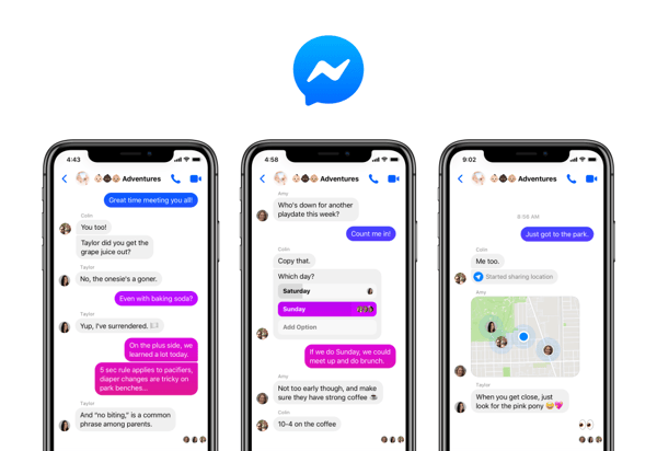
Facebook announced last week that it will soon roll out Messenger 4: the latest edition of its instant messaging platform that, among other new features, will be more personalized and easier to navigate.
Source: Facebook
Instead of its current nine tabs, Messenger 4 will only have three: chats, people, and discover. Plus, the company says, it’s added new personalization features to group chats (like customizable dialogue bubble colors), while also keeping features like bill-splitting and games.
Messenger says the changes will roll out incrementally. Read full announcement >>
2. Apple’s New iPad Pro and MacBook
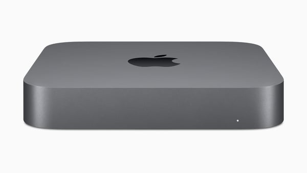
In addition to releasing iOS 12.1 yesterday, Apple held a special event to debut the the latest editions in its line of iPad Pro and MacBook products. Among them: a new retina MacBook Air (the design of which hadn’t been updated since 2010), as well as a bring-your-own-monitor-style Mac Mini.
Source: Apple
Also unveiled today were the two latest additions to Apple’s line of iPad Pro devices, available in 11-inch and 12.9-inch models — which are the first iPads to come with FaceID technology. Emily Bary of MarketWatch has more. Read full story >>
3. Walmart-Owned Sam’s Club Will Open a Cashierless Store
In what could be interpreted as an attempt to keep up with ecommerce rival Amazon, Walmart announced that it will open a somewhat cashierless store, Sam’s Club Now, in Dallas next week.
The store is largely serving as a test-run for some of the emerging, tech-driven concepts Walmart hopes to use, including augmented reality, and what Sarah Perez of TechCrunch describes as “artificial intelligence-infused shopping.”
Rather than traditional cashiers, the stores will feature “Member Concierges,” who could serve similar roles to those staffing Amazon Go stores to help shoppers understand the concept. Read full story >>
4. Facebook Removes 82 Pages, Groups, and Accounts in (Another) Coordinated Misinformation Campaign
Facebook said last week that it uncovered evidence of another coordinated misinformation campaign from its site, and removed over 80 pages, groups, and accounts in response.
The campaign appears to have originated in Iran, and largely involved the distribution of politically-oriented content on both Facebook and Instagram. Over one million users were following one or more of the Pages removed to take down the campaign. Tony Romm and Craig Timberg of the Washington Post share more details. Read full story >>
5. Oculus Rolls Out Options for Reporting Abuse
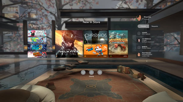
Oculus, the Facebook-owned maker of virtual reality (VR) hardware, announced last week that it’s implementing new ways for users to report abuse — in the form of content or other user behaviors — from within any of its apps or games.
Source: Oculus
By allowing users to report directly from a VR experience, video is captured that provides reviewers with more detail around what, exactly, happened. Adi Robertson of The Verge has more. Red full story >>
6. Want to Know What Amazon’s Cashierless Stores Are Like? We Went to One.
Haven’t made it to one of Amazon’s cashierless Go stores yet? We checked out the newest one. Read full story >>
7. In a Land of Automated Milk and Honey, Marketers Are Presented With an Opportunity
In what might be the tech capital of the U.S., robots are checking us out of supermarkets and making our lattes. But while this growing technology leaves many starry-eyed, it leaves others wondering about the road it paves. Read full story >>
8. 25% of People Think All Searches Will Be Done by Voice in the Next 5 Years
When it comes to voice search overtaking text in the future, many internet users seem bullish. But today, that doesn’t necessarily line up with search preferences. Read full story >>

The Ultimate List of HR Interview Questions
As a job seeker, you can often expect to speak with an HR professional before moving onto interviews with employees within the department for which you’re applying.
It’s critical you prepare well for your HR interview. Oftentimes, a company uses their HR department to screen candidates and decide which candidates are most qualified to move forward in the interview process.
But an HR professional has different goals when interviewing than your direct hiring manager does. While your hiring manager will ask questions specific to the role, the HR professional is interested in gaining broader insights regarding culture fit and whether you demonstrate the company’s values.
I spoke with Alexa Matthews, a recruiter here at HubSpot, who pointed out some additional benefits to the screening process — “It’s an opportunity for a great first impression. In the first call, a candidate can often convey things that are not written on their resume. We take that information so that we can be their advocate and make recommendations to hiring managers throughout the process.”
Additionally, Alexa mentioned initial interview screens help candidates learn more about the role and evaluate their interest in the company. At the same time, these initial interviews help HR professionals set a candidate up for success, by learning what is required of the role, and providing the candidate with feedback throughout all stages of the interview process.
To help you prepare for any questions you might receiving from an HR professional, we’ve cultivated a list of nine, along with the best sample answers.
HR Interview Questions and Answers
1. Tell me about yourself.
One of the more traditional questions in this list, “Tell me about yourself” is nonetheless a helpful question for HR professionals to get a sense for how this conversation will go, and in which direction they should steer future questions.
Ultimately, you’ll want to be prepared to describe past roles, how those roles demonstrate your strengths, and what you want in a company and role moving forward. Additionally, make sure to include why you believe this role is a good match for your talents.
You might say something like, “Well, I graduated from ABC University in 2015. Since then, I’ve worked my way up at Company X, from an intern blogging on the content team to an Associate SEO Strategist. Along the way, I’ve learned I work best in collaboration with a team, as opposed to more solitary roles. As an SEO strategist, I’ve discovered I enjoy the analytical side of marketing, and possess strengths that allow me to excel in those types of roles — in fact, as a result of my SEO efforts, traffic to our site has increased 13% over the past two years. I’m now looking for new challenges and believe your company, and this role, is a fantastic next step.”
2. Why are you interested in this position?
This question is a critical indicator as to whether you’re interested in this company and role in particular, or whether you’re simply applying to any role in the field. For instance, it’s not a good sign if you say, “Well, I’m interested in social media, so this role seemed like a good fit.” Instead, you want to mention specific qualifications of the role itself, and demonstrate how those qualifications align with your personal strengths. Additionally, it’s important you mention how you can help drive results for the team.
For instance, you might say, “Through my last role I’ve learned I’m passionate about creating content for social media. I’ve managed to grow our Instagram audience by 7%, and with my team I created a successful Facebook campaign that cultivated an increase in sales by 12%. I’ve followed your business on Instagram and Facebook for a few years and appreciate your brand — more importantly, I see this role as one in which I’d truly be challenged and able to use my strengths. In particular, I believe I’d excel in the client-facing aspect of the role. Meeting with clients to collaborate on social media marketing objectives and goals is something I believe I’d find exciting and purposeful.”
3. Why are you leaving your current job?
This is an opportunity to outline positive benefits you hope to gain by transitioning into a new role. However, one of the biggest mistakes you can make when answering this question is focusing on negative aspects of your current employer, rather than discussing positive aspects of the new company.
An HR professional will mark it as a red flag if you talk poorly about your current employer or company. It illustrates someone who isn’t very professional, has a negative attitude, and could bring toxic energy into their new work environment.
To avoid those traps, say something like this — “I appreciate everything my current employer has done to help me grow, and I believe working for a small start-up over the past year has helped me develop leadership skills earlier than I could’ve at a larger corporation. However, I am now interested in transferring the skills I’ve acquired here to a larger organization, where I believe I’ll find more growth opportunities in the future.”
4. Can you describe a work or school instance in which you messed up?
This is an intentionally tricky question. It’s meant to glean insight into whether you can learn from past mistakes. If you can’t think of any past errors, it could be an indicator you aren’t capable of accepting responsibility for your own mistakes. However, creating a long list of past mishaps could make you look unqualified for the role.
You’ll want to answer this question succinctly, and point out an error that doesn’t represent a lack of character. Consider one, well-intentioned error you’ve had in the past, mention it, and then talk about how you grew from that experience.
For instance, you might say, “In my prior role when I first became manager, I took on too many tasks myself and quickly became both overwhelmed, and less efficient in my role. Additionally, my team members were frustrated because they felt there was a lack of collaboration on our team. I quickly recognized I needed to learn to delegate tasks and collaborate on projects with teammates, and became a more successful manager as a result.”
5. Tell me about a time when you experienced conflict with a co-worker and how you dealt with it.
The HR professional isn’t interested in hearing about that time your co-worker said something snide about you in the kitchen, or when your manager overheard you gossiping about a client to a friend.
Instead, this question is asked to gain insight into how you handle professional conflict. At the office, conflict is bound to arise, particularly when you’re working closely with many different people. It’s critical you know how to handle conflict without pointing fingers. Your answer should primarily focus on the solution, and should show a level of empathy towards your colleagues, rather than focusing on the problem.
You might say something like, “I had a deadline I needed to meet, and I was working with a designer who promised me her designs in time. When the deadline approached, my designer wasn’t ready. It made us both look poorly in front of our clients. To resolve the issue, I discussed the problem privately with my designer. She told me she was stressed out and overwhelmed, and simply needed another week on the project. I told her that was fine with me, but in the future, we needed to be transparent and honest with each other. Moving forward, we established guidelines and became more efficient teammates.”
6. What do you know about our company?
This is a fantastic opportunity to impress the interviewer. Ultimately, this question aims to gauge your level of interest in the company. The more you’ve researched prior accomplishments, company values, and basic information regarding the product or service, the more you can demonstrate a genuine desire to work there.
For instance, you might say, “I know your company is ranked the number one web design firm in Massachusetts. Your mission statement in particular appeals to me. I also know your company emphasizes continual learning and growth, two aspects I find incredibly exciting. I’ve spoken to Jen and Mark, two marketers at your company, and they’ve described the work environment as one full of passion and innovation — which is something I hope to find in my next role.”
7. How would you improve our current product or service?
An HR professional wants to know whether you’re innovative, a quick-thinker, and if you’ll bring new ideas to the role. There isn’t necessarily a wrong answer, here — you just need to show some creativity, and planning in advance will help. Consider potential problems they might be experiencing with their product or service, and how your unique skill set can fill that void.
For instance, you might say, “I’ve noticed your product is in English, without current translation options. I believe your product could benefit from multilingual translations, which would help you appeal to a wider demographic. This could help you become more of a global leader. As someone who is fluent in French and Spanish, I’d like to potentially help spearhead a project that moves the product in that direction.”
8. How would your current manager describe you?
It can be awkward to brag about yourself, so while this question may seem weird, it’s really the HR professional’s tactic for hearing how your current boss views you in a work environment. To feel less uncomfortable answering this question, thoughtfully consider your last performance review, and use direct quotes from your boss in your answer.
For instance, you might say, “Well, during my last performance review, my current manager told me she appreciates how quickly I take constructive feedback and use it to improve in my role. She’s grateful that she never needs to repeat areas of improvement to me — once she gives me feedback, I take it seriously and make sure she never needs to bring it up again. She has also described me as diligent and trustworthy, two aspects I believe are critical for excelling in any role.”
9. What questions do you have for me?
When an HR professional asks you this question, you might be eager to end the call and say, “Nope, no questions.” This would be a mistake. Having thoughtful, smart, strategic questions demonstrates your interest in the role, as well as your potential value as a future employee. They want to hire candidates who will ask questions and move the company forward, and this can’t happen if you accept everything as-is.
At this stage, you should consider what your genuine concerns are regarding the role. You might ask the interviewer, “What are the company’s values? What characteristics do you look for in candidates in order to represent those values?” Or, perhaps you’ll say, “What do you enjoy most about working at Company A?”
Additionally, you might ask questions regarding the role specifically, like “What do you see as the most challenging aspect of the role?” or “Are there opportunities for professional development within the role and department as a whole?”
Ultimately, an interview isn’t just about allowing an HR professional to form an opinion of you — it’s also a chance for you to get a strong sense for whether you even want to work for the company. So use this last question to your advantage.

How to Combine Facebook Ads and Email Marketing for Better Conversions
Do you want an effective way to get more leads? Wondering how to nurture leads into becoming customers? In this article, you’ll discover how to use Facebook ads with email marketing to improve your conversions. Why Your Business Needs Both Facebook Ads and Email Marketing For as long as I can remember, marketers have hailed […]
The post How to Combine Facebook Ads and Email Marketing for Better Conversions appeared first on Social Media Examiner.
from Social Media Examiner https://ift.tt/2Q55rwt
via socialmediaexaminer
Everything You Need to Know About Using the Waterfall Methodology
Ask any professional athlete or business executive how they became successful, and they’ll tell you they mastered a process. By figuring out which of their habits led to success — and which didn’t — they could improve their efficiency, effectiveness, and productivity at work.
The same logic applies to teams and project management. If your team follows a process while working on a project, you’re more likely to develop products or services that effectively solve your customers’ problems.
The waterfall methodology is one of the most widely-used software development processes in project management, and it’s rooted in logic and sequence. So if you want to leverage a proven process for your project management efforts, read on.
The Waterfall Model
The waterfall model is a process for software development. It’s a linear-sequential life cycle model, which means you need to complete each stage of the model before you can start the next stage. Since it follows a logical sequence of steps throughout the software development life cycle, similar to how a waterfall flows down a cascading set of rocks, it’s called the waterfall model.
The waterfall model has six stages: requirements, analysis, design, coding, testing, and deployment.

Picture Credit: Software Testing Material
During the requirements stage, developers write down all the possible requirements of a system in a requirements document. The document defines what the system should do, but not necessarily how it will work. Developers will base all the software’s future development on the requirements document.
In the next stage, analysis, developers use the requirements document to examine and flesh out the logical or theoretical design of the system without accounting for its hardware or software technologies.
The project will then move onto the design stage, where developers alter the logical design of the system to make sure it works with the system’s hardware and software technologies.
Once developers finalize the system’s physical design, the project enters the coding stage. In this stage, developers will reference the system’s requirements and logical and physical specifications to write its actual code.
After coding the system, quality analysts, beta testers, and other testers will use the system and report any bugs they find. Developers will patch the most pressing issues. This is known as the testing stage.
Finally, the project enters the deployment stage, where developers release the system to their market, support their customers, maintain the system, and upgrade it to meet their customers’ evolving needs.
Advantages of The Waterfall Method
If you’re considering using the waterfall method for your next project, here are the five main advantages your team will most likely experience:
- Developers can catch design errors during the analysis and design stages, which helps them avoid writing faulty code during the coding stage.
- The project has clearly defined milestones, so developers can work toward concrete goals and easily measure their progress.
- Developers who join the project can easily get up to speed — all the system’s requirements are in the requirements document.
- The waterfall method structures and organizes the project. From design to release, developers know exactly what to work on.
- Developers can accurately estimate the project’s cost — all the system’s requirements are defined during the first stage of the model.
Disadvantages of The Waterfall Method
Like every other project management process, the Waterfall Method has its disadvantages. Here are the three main ones to consider before using the method for your next project.
- It’s challenging for customers to define the exact functionality of a system they prefer during the early stages of development — they must wait until developers finish building the system to see if it actually fits their needs. If the final product isn’t up to par, developers must redesign the system, which is extremely challenging and expensive.
- Since developers finalize the system’s requirements during the first stage of the waterfall method, they can’t change or refine the requirements during the next stages of the development cycle. This non-stop tunnel vision can sap creativity and innovation during development.
- Developers can’t move onto the next stage of development unless they complete the previous one, so the waterfall method can take longer than other project management processes like the agile method, which allows developers to iterate an entire system in short bursts of time, called sprints.

10 Tips That Can Drastically Improve Your Website’s User Experience
Website User Experience
Your website is the core anchor for your digital marketing efforts. Designing a great website user experience requires understanding the problems different visitors have to solve.
In today’s marketing landscape, your website has become a more powerful tool than ever. Your website is a 24/7 salesman, and as such, it has the potential to be your most powerful asset and the centerpiece of your marketing efforts.

However, rapidly changing digital trends can make your website feel old and outdated. While sometimes a redesign might be ideal, you may not have the time or money to invest in such a large project. To help you overcome this challenge, we’ve put together a list of 10 simple ways you can improve your website to make it more helpful and useful.
How to Improve a Website
- Use white space.
- Optimize your page speed.
- Use attractive calls to action.
- Use hyperlink differentiation.
- Segment key information with bullet points.
- Use images (wisely).
- Include well-designed and written headlines.
- Keep your website pages consistent.
- Catch your 404s.
- Be responsive and mobile-friendly.
Your website is the core anchor for your digital marketing efforts. Designing a great website user experience requires understanding the problems different visitors have to solve.
1. Use white space.
On more than one occasion I have heard clients complain that there was too much white space on their site and that this unused real estate ought to be used for advertising more of their services. However, white space is essential to good design. White space makes your content more legible while also enabling the user to focus on the elements surrounding the text.
According to Crazy Egg, white space around text and titles increases user attention by 20%. White space can also make your website feel open, fresh and modern and if your branding is consistent with these then it can help you communicate that feeling to the user. One downside of white space to keep in mind, however, is that it does indeed take up space.
If you’re trying to get a lot of content above the fold (above the part that is immediately visible without scrolling) having too much white space might be replacing some valuable information. The key is to find the balance between what is most important to communicate at the top and surround that with some space to highlight the image and/or text.
Consider the website, Sara Does SEO, by Sara Dunn. In her UX, there is a lot of white space right from the start, pulling your attention to what Sara looks like and what can do for you. This allows the reader to focus her attention on the most important things. Each section of the homepage also provides one clear header and a few supporting points, making it easier to digest information.
Check out her website below.
2. Optimize your page speed.
One of the most frustrating experiences for users of the web is waiting for a page to load for too long. With the rise of the mobile devices, people are accessing content all over the world on many different platforms. While browsing online at Starbucks or while watching TV on their laptop, they expect a fast result for the content that they want.
When they don’t get it, they usually bounce. Slow page load is an interrupting experience for the user and it can be a source of frustration and often users simply don’t have the time to wait.
According to Section.io, an extra five seconds of page load time can increase your website’s “bounce rate” by more than 20%. Whoa.
So, where do you go from here? Get your score. Google offers a free service where you can get information on your page speed. Google will also offer you some suggestions for improving your load time on Mobile and Desktop.
To improve your page speed, start by compressing all your images before loading them onto your website. Image file size is one of the leading causes of a slow page speed — using websites like compressor.io can help you dramatically speed up each webpage you own.
Learn more about decreasing your website’s bounce rate in this blog post.
A great example of speedy load is Barnes and Nobles. No matter what device your own Barnes and Nobles loads quickly. Taking the extra caution to load some important elements first so that you know that the content is on its way. See for yourself.
3. Use attractive calls to action.
Your customers are already accustomed to following visual cues to determine which content is important to them. Calls to actions (CTAs) that are clearly marked with an action word enable your website users to more easily navigate your site and get exactly what they want in the location they expect to find it.
In creating buttons for your website you should think about color and the psychology of color. In a study done by Maxymiser, researchers were shocked to find that hey achieved an increase of 11% in clicks to the checkout area of the Laura Ashley website, by testing color variations and action messaging. Different colors evoke different messages. Think about the message that you want to evoke for a user (trust, experience, intelligence) and choose your colors wisely.
A second thing to consider is the actual words you use for your buttons. The words should include a verb or an action word that excite the user to do something. Choosing the right words or psychological triggers is highly determined by the level of emotional identification that word prompts. No emotional connection means no action. So make your words bold, time sensitive and action-oriented.
A great example of the good use of calls to action is WUFOO. The company’s entire page is action-oriented and uses buttons to encourage the user to go to the next step. At the end of the page, you’ll see the use of time-sensitive language like “Sign Up Now” and action-oriented language like “Get Started.” These are active action words that prompt and guide the user to move forward.
4. Use hyperlink differentiation.
When you add a link to any page, you’re saying you want the user to click there. Make sure links are easily identifiable by visual cues. Underlined text and differently colored text draws the attention of the reader and lets him or her know this is a link to be clicked on.
In a study done by Karyn Graves, she shows that the regular web user sees blue and underlined text as links and knows to click on them. Exploiting user expectations and what they already know about using the web is tantamount to success.
When it comes to hyperlink differentiation, you do not need to reinvent the wheel. Sticking to convention can be your best ally here. A simple way to test how effective your links are is to blur and remove the color from the design and see what stands out.
When hyperlinking, also stop to think about the length of the hyperlink. The longer the link titles the more easy to identify they are. For example: “To check out the GE Website click here.” vs. “Check Out the GE Website here.“
5. Segment key information with bullet points.
Bullet points will enable the user to quickly get all the information they want: benefits, ways you solve their problem, and key features of a product/service — all in a short amount of time. This will make your propositions more attractive and enable your user to get all the information they need. Additionally, you do not have to go the traditional route with a simple circle.
With tons of cool icons out there, you can also get creative with your bullet and help the reader further with images that represent your point. Why do this? Because it forces you to isolate the most important points you’re trying to make without getting caught up in terminology or specifics.
One great example of non-conventional bullets comes from One.org. On this page, they use icons as bullets to highlight their accomplishments in a way that is easy to read. Also, notice the white space surrounding the bullets that allow you to focus on each section.
6. Use images (wisely).
People across the Internet are getting smarter and faster at judging company websites before deciding if they want to browse the site further. When they first visit your site, they can easily pick out a generic stock photo they’ve already seen elsewhere or that resembles the non-personal style of stock photography. Using stock photography can decrease trust and also stand out as generic and non-unique. Unfortunately, these associations carry over to your business as well.
In a case study done by Spectrum, Inc. of Harrington Movers, a New Jersey and New York City moving company, they were able to increase conversion on a page by simply replacing a stock photo with an image of the actual team of movers. They got the same increase in conversion and confidence to the page by adding a picture of their actual moving truck versus the stock photo. (Read the full study here.)
Bottom line? While stock photography can be high quality, it fails to create a connection between the user and the brand.
Ultimately, no stock photography will be as capable of conveying your brand, services, and products the way that you want to. Only your own actual images can do that while also speaking clearly to your potential customer. Use images strategically and place them in your website to support the content and allow the users a visual break from text, but make sure they are relevant and non-generic.
Check out this infographic on real images versus stock photography.
7. Include well-designed and written headings.
Your headings and content should be driven by what your potential customers are looking for. Including keywords in your title is also very important for targeting your message and attracting the right audience.
Search engines typically give headings more weight over other content, so choosing the right heading and making it stand out can significantly improve your search ability. But more importantly, headings guide your user through the site, making it easy to scan through and find content that speaks to them directly.
A great example of well-designed headings with consistent content comes from Tilde. Here you can see that the headings stand out in size and color and accurately describe the content that follows.
8. Keep your website pages consistent.
Consistency means making everything match. Heading sizes, font choices, coloring, button styles, spacing, design elements, illustration styles, photo choices — you name it. Everything should be themed to make your design coherent between pages and on the same page.
In order to provide your user with a beautiful experience as they navigate through your site, it is important that they know they are still in your website. Drastic design changes from one page to the other can lead your user to feel lost and confused and to lose trust in your site.
“Am I in the right place?” Is a question I often find myself asking when navigating through inconsistent sites, and when I do, I usually end up leaving. Inconsistencies in design lower the quality of the products and services you’re providing, according to the user.
Winshape Foundation is a great example of consistent design. All of its pages follow one common pattern: navigation on the right, big header, sub header with a background image and some content below. I know that no matter where I click, I’m still on their website, as all their styling is consistent. Check it out here.
9. Catch your 404s.
While search engines don’t punish you severely for soft 404 errors (page not found), a user will. When a user approaches a link or an image, they are expecting this link will take them to the next place they want to go.
Simply put, encountering a 404 error page annoys your user, and makes them rethink spending their time on your website (when they probably could go elsewhere for a faster solution). Next to slow page load time, running into 404s is another highly frustrating event for a user and it completely disrupts their journey throughout your website.
To check if you have any 404s you can set up Google Webmaster tools on your website and check crawl errors. Here’s how. You can also use this free 404 checker.
As an additional resource, you can also make sure that when your user lands on a 404 it provides them with the option to get back on track. Check out these cool examples of 404 pages.
10. Be responsive & mobile-friendly.
Technologies have advanced to meet our needs to be mobile. Websites are also a significant part of this evolution. It’s imperative that your website is mobile-friendly and easy to navigate no matter what type of device they use to access it.
Recently, Google started penalizing sites that aren’t optimized for mobile devices, making the need for responsiveness even more crucial. This is probably the single-most valuable way in which you can improve your website’s usability. If you’re not sure whether your website is mobile, you can use this free tool.
I hope these tips have given you some ideas on how you can revamp your website to be more user friendly without shelling out the dollars on a complete redesign. To see more examples of useful websites, check out our free guide below.



22 of the Best Website Homepage Design Examples
You never get a second chance to make a first impression — that’s why your homepage is undoubtedly one of the most important web pages on your website.
For any given company, the homepage is its virtual front door. If a new visitor doesn’t like what they see, their knee-jerk reaction is to hit the “back” button.
That’s right — unfortunately, a lot of people still judge a book by its cover.

What makes a website’s homepage design brilliant instead of blah? Well, it takes more than looks alone — it also has to work well. That’s why the most brilliant homepages on this list don’t just score high in beauty, but also in brains.
But before we dive into the examples, let’s dissect some of the best practices of homepage design.
What Makes a Good Website?
A good website clearly answers “Who I am,” “What I do,” and/or “What can you (the visitor) do here.” It also resonates with your audience, has a value proposition, calls visitors to action, is optimized for multiple devices, and is always changing to adapt to new design trends.
All of the homepage designs shown here utilize a combination of the following elements.

Not every page is perfect, but the best homepage designs get many of these right:
1. The design clearly answers “Who I am,” “What I do,” and/or “What can you (the visitor) do here.”
If you’re a well-known brand or company (i.e., Coca-Cola) you may be able to get away with not having to describe who you are and what you do; but the reality is, most businesses still need to answer these questions so that each visitor knows they are in the “right place.”
Steven Krugg sums it up best in his best-selling book, Don’t Make Me Think: If visitors can’t identify what it is you do within seconds, they won’t stick around long.
2. The design resonates with the target audience.
A homepage needs to be narrowly focused — speaking to the right people in their language. The best homepages avoid “corporate gobbledygook,” and eliminate the fluff.
3. The design communicates a compelling value proposition.
When a visitor arrives on your homepage, it needs to compel them to stick around. The homepage is the best place to nail your value proposition so that prospects choose to stay on your website and not navigate to your competitors’.
4. The design is optimized for multiple devices.
All the homepages listed here are highly usable, meaning they are easy to navigate and there aren’t “flashy” objects that get in the way of browsing, such as flash banners, animations, pop-ups, or overly-complicated and unnecessary elements. Many are also mobile-optimized, which is an incredibly important must-have in today’s mobile world.
5. The design includes calls-to-action (CTAs).
Every homepage listed here effectively uses primary and secondary calls-to-action to direct visitors to the next logical step. Examples include “Free Trial,” “Schedule a Demo,” “Buy Now,” or “Learn More.”
Remember, the goal of the homepage is to compel visitors to dig deeper into your website and move them further down the funnel. CTAs tell them what to do next so they don’t get overwhelmed or lost. More importantly, CTAs turn your homepage into a sales or lead-generation engine, and not just brochure-wear.
6. The design is always changing.
The best homepages aren’t always static. Some of them are constantly changing to reflect the needs, problems, and questions of their visitors. Some homepages also change from A/B testing or dynamic content.
7. The design is effective.
A well-designed page is important to building trust, communicating value, and navigating visitors to the next step. As such, these homepages effectively use layout, CTA placement, whitespace, colors, fonts, and other supporting elements.
Now, get ready to learn about excellent homepage design through the following 22 real-life examples.
Best Web Designs
- FreshBooks
- Airbnb
- Mint
- Dropbox (Business)
- 4 Rivers Smokehouse
- Cobb Pediatric Therapy Services
- Melyssa Griffin
- Jill Konrath
- Evernote
- Telerik by Progress
- eWedding
- Basecamp
- charity: water
- TechValidate
- Chipotle
- Medium
- Digiday
- KIND Snacks
- Ahrefs
- A24 Films
- Ellevest
- HubSpot
1. FreshBooks
Why It’s Brilliant
- It’s easy to consume. There is much debate on whether short or long homepages work better. If you choose to do the latter, you need to make it easy to scroll and read — and that’s exactly what this site does. It almost acts like a story.
- There’s great use of contrast and positioning with the primary calls-to-action — it’s clear what the company wants you to convert on when you arrive.
- The copy used in the calls-to-action “Get Started for Free” is very compelling.
- FreshBooks uses customer testimonials on the homepage to tell real-world stories of why to use the product.
- The sub-headline is also great: “Join over 10 million small business owners using FreshBooks.” FreshBooks expertly employs social proof — 10 million is a big number — to compel its target audience to join their peers and try the tool.
2. Airbnb
Why It’s Brilliant
- It includes the destination and date search form that most visitors come looking for, right up front, guiding visitors to the logical next step.
- The search form is “smart,” meaning it’ll auto-fill the user’s last search if they’re logged in.
- The primary call-to-action (“Search”) contrasts with the background and stands out; but the secondary call-to-action for hosts is visible above the fold, too.
- It offers suggestions for excursions and getaways Airbnb users can book on the same site as their lodgings to get visitors more excited about booking their trip on the site. It also shows which of these offerings are most popular among other users.
3. Mint
Why It’s Brilliant
- It’s a super simple design with a strong, no-jargon headline and sub-headline.
- The homepage gives off a secure but easy-going vibe, which is important for a product that handles financial information.
- It also contains simple, direct, and compelling call-to-action copy: “Sign up free.” The CTA design is also brilliant — the secured lock icon hits home the safety message once again.
4. Dropbox (Business)
Why It’s Brilliant
- Dropbox carries over its simple design and branding. It includes only what is important: A large, relevant image with supporting copy, and a “Try free for 30 days” call-to-action button
- Dropbox’s homepage and website is the ultimate example of simplicity. It limits its use of copy and visuals and embraces whitespace.
- Its sub-headline is simple, yet powerful: “The secure file sharing and storage solution that employees and IT admins trust.” No need to decode jargon to figure out what Dropbox really does.
5. 4 Rivers Smokehouse
Why It’s Brilliant
- Drool. That’s what I think when I arrive at the website for 4 Rivers Smokehouse. Combined with great photography, the headline “Brisket. 18 years to master. Yours to savor.” sounds like an experience worth trying.
- The parallax scrolling guides you on a tour through the services, menu, and people having a great time — a great use of this popular design trend.
- The only negative? I don’t live close enough to this place. Boo.
6. Cobb Pediatric Therapy Services
Why It’s Brilliant
- The headline and sub-headline appeal to the visitors’ emotional side: “Work With a Company That Gets It”; “Trust us. We’ve been there too! We’ll find jobs where you can thrive.” That value proposition is unique and compelling.
- It’s hard to tell from the screenshot above, but the headline is on a rotating carousel that caters to specific personas, from job applicants to people searching for a therapist for their schools.
- There are several pathways visitors can take when they arrive on the page, but the calls-to-action are positioned well, worded simply, and contrast with the rest of the page.
7. Melyssa Griffin

Why It’s Brilliant
- Melyssa immediately demonstrates social proof “Join over 200,000 others…”
- She qualifies a visitor’s reason for visiting her website with a quick survey, and each option links to a different content offer.
- She adds a face to her brand. She isn’t just a random website; she makes it clear she’s a human whom people can connect to.
- The page uses bright colors without being overwhelming and makes it easy to understand what Melyssa’s central business offerings are.
8. Jill Konrath
Why It’s Brilliant
- It’s simple and gets straight to the point. From the headline and sub-headline, it’s clear exactly what Jill Konrath does (and how she can help your business).
- It also gives easy access to Jill’s thought leadership materials, which is important to establishing her credibility as a keynote speaker.
- It’s easy to subscribe to the newsletter and get in touch — two of her primary calls-to-action.
- The pop-up subscription CTA uses social proof to get you to join her thousands of other fans.
- It includes news outlet logos and testimonials as social proof.
9. Evernote
Why It’s Brilliant
- Over the years, Evernote has turned from a simple note-saving app into a suite of business products. This isn’t always easy to convey on a homepage, but Evernote does a nice job packaging many potential messages into a few key benefits.
- This homepage uses a combination of rich, muted colors in the video and its signature bright green and white highlights to make conversion paths stand out.
- Following a simple headline (“Remember Everything”), the eye path then leads you to its call-to-action, “Sign Up For Free.”
- Evernote also offers a one-click signup process through Google to help visitors save even more time.
10. Telerik by Progress
Why It’s Brilliant
- “Stuffy enterprise” isn’t the feeling you get when you arrive at Telerik’s website. For a company that offers many technology products, its bold colors, fun designs, and videography give off a Google-like vibe. Just one important aspect to making visitors feel welcome and letting them know they’re dealing with real people.
- I love the simple, high-level overview of its six product offers. It’s very clear way of communicating what the company does and how people can learn more.
- The copy is lightweight and easy to read. It speaks the language of its customers.
11. eWedding
Why It’s Brilliant
- For those love birds planning their big day, eWedding is a great destination to building a custom wedding website. The homepage isn’t cluttered and only includes the necessary elements to get people to starting building their websites.
- The sub-headline “Over 800,000 wedding websites built!” is great social proof.
- It’s included excellent product visuals, a great headline, and a call-to-action that reduces friction with the copy, “Start website.”
12. Basecamp
Why It’s Brilliant
- For a long time, Basecamp has had brilliant homepages, and here you can see why. It often features awesome headlines and clever cartoons.
- The call-to-action is bold and above the fold.
- In this example, the company chose a more blog-like homepage (or single page site approach), which provides much more information on the product.
- The customer quote is a bold and emphatic testimonial speaking to the benefits and results of using the product.
13. charity: water
Why It’s Brilliant
- This isn’t your typical non-profit website. Lots of visuals, creative copy, and use of interactive web design make this stand out.
- The animated header image is a great way to capture attention.
- It employs great uses of video and photography, particularly in capturing emotion that causes action.
14. TechValidate
Why It’s Brilliant
- This homepage is beautifully designed. I particularly love the use of whitespace, contrasting colors, and customer-centric design.
- The headline is clear and compelling, as are the calls-to-action.
- There’s also a great information hierarchy, making it easy to scan and understand the page quickly.
15. Chipotle
Why It’s Brilliant
- The homepage is a great example of agility and constant change. Chipotle’s current homepage is all about the forthcoming holiday, which it uses as a unique value proposition to get you to start clicking through your site. When I think Chipotle, I don’t necessarily think about catering, but the site is a great reminder to consider different uses for the burritos you already know and love.
- The food photography is detailed and beautiful, and it actually makes me hungry looking at it. Now that’s an effective use of visuals.
16. Medium
Why It’s Brilliant
- This is perhaps one of the best uses of whitespace I’ve seen. It allows Medium’s app tagline and photo to take center stage while still drawing your eye to the darker section titles on the site.
- Medium makes it easy to sign up — on the site, or with a simple text message to your mobile phone. I’m much more responsive to a text than an email, so this is a great strategy to keep people engaged in the signup process.
- The homepage uses social proof to get visitors to start clicking around: The “Popular on Medium” and “Staff Picks” sections let me know where to find high-quality content.
17. Digiday
Why It’s Brilliant
- Unlike other online news publications that inundate homepages with as many headlines and images as possible, Digiday’s first section showcases just one article. Its featured image (in this case, a scary one) is eye-catching, and the headline is just asking to be clicked now that the visitor has an idea of what they’re going to read.
- The top of the homepage, where websites normally showcase a ton of different sections and options to click through, only has one icon to click — which leads you to a subscription page.
18. KIND Snacks

Why It’s Brilliant
- The bold colors produce contrast, making the words and images stand out on the page.
- The CTA — “Shop KIND” — is clever. It urges the visitor to click to learn more while making a play on the word “kind” — implying that it’s a good choice to shop there.
- KIND Snacks’ tagline is straight up brilliant — when I read it, the message immediately resonated and made me want to read the snack bar’s label.
19. Ahrefs
Why It’s Brilliant
- The color contrast between the blue, white, and orange colors is eye-catching and makes the headline and CTA pop.
- The sub-headline and CTA are a compelling pair: To be able to start tracking and outranking competitors for free is a great offer.
- The homepage presents a multitude of options for the visitor, but it isn’t cluttered thanks to the solid background and simple typography.
20. A24 Films

Why It’s Brilliant
- The film company’s homepage is made up of only trailers for its new films. We know video content is format audiences want to see more of, and this is a great strategy to showcase A24’s work in a highly engaging way.
- At the top of the homepage, A24 immediately offers a myriad of ways to get in touch via social media and email — something I appreciate as a visitor when so many other sites bury contact information at the bottom of the page.
21. Ellevest
Why It’s Brilliant
- “Invest Like a Woman: Because money is power.” These headlines are powerful and make me want to learn more about the product — both as a woman, and as someone interested in making smart financial choices.
- The images show, rather than tell, one of the company’s value propositions: a desktop site and mobile app that move with you.
- “Get Started” is a great CTA — in fact, we use it ourselves here at HubSpot. When clicked, it takes visitors through a few simple steps to set up a profile and start investing.
22. HubSpot
Why It’s Brilliant (If We Do Say So Ourselves)
- The LEGO characters catch your attention (because they’re cute), then they cleverly illustrate and reinforce the messaging in the headline and sub-headline.
- It bears another eye-catching “Get Started” CTA — with bonus microcopy detailing our free versions users can choose to upgrade in the future.
- Throughout the homepage, our bright blue and orange color themes keep returning to draw your eye to links and CTAs.
Looking for more inspiration? Check out these incredible About Us pages.

The Last Guide to Google Data Studio You’ll Ever Need
As a marketer, data is your lifeblood. To gain support for your new idea or prove the value of your most recent campaign, you need data backing it up. But, for many people working in a primarily creative role, pulling and analyzing data can be a challenging task.
Not only do you have to export your data, which really means opening up a jumbled spreadsheet bursting with an endless amount of metrics, but you also have to configure the data to report it correctly. If you don’t filter out the unnecessary metrics, your data becomes much more difficult to analyze.
Data analysis can be a taxing process, requiring a ton of time and energy. But in an industry that moves as fast as marketing, there’s no time or energy to waste. Fortunately, Google offers a solution to this prevalent problem.
Their data visualization tool, Google Data Studio, can pull and visualize your data into engaging reports within seconds, saving you countless hours on configuring a bottomless spreadsheet and analyzing a bunch of numbers packed into Excel.
And since Google Data Studio can produce easy-to-understand reports, the tool will help you accurately extract insights from your data and prove that you’re producing results.
What is Google Data Studio?
Google Data Studio is a data visualization tool that lets you create engaging, digestible data reports from sources like Google Analytics, Google Ads, Google Sheets, Google Search Console, YouTube, MySQL, and more.
With Google Data Studio, you can visualize your data in numerous charts, graphs, and pivot tables, like time series, bar charts, pie charts, tables, heat maps, geo maps, scorecards, scatter charts, bullet charts, and area charts. The tool also lets you customize your reports and dashboards’ logos, images, shapes, background, font, object properties, and more.
If you want to share or collaborate your report or dashboard with someone, you can do it all on Google Marketing Platform. Google Data Studio even has templates to help you quickly and easily set up reports and dashboards.
To learn how to use Google Data Studio, better understand your data, and present it to your team in a more visually appealing way, check out the tutorial below.
Google Data Studio tutorial
1. Login to Google Data Studio.
Just like Google Analytics, Google offers a robust free version of Google Data Studio. To access Google Data Studio, visit datastudio.google.com and sign in with the same account that you use for Google Analytics and Google Search Console.
Google Data Studio is part of Google Marketing Platform, so its interface will look like Google Drive’s interface. Your Data Studio portal will only store your Data Studio documents, which are separated into two categories: reports and data sources.

2. Create a new report.
In the reports section, click the “+” button at the top left or bottom right of the screen. A blank page should appear.

If you want to quickly create a data report from Google Analytics, Search Console, Google Ads, YouTube Analytics, Google Sheets, or Google BigQuery, you can use one of Data Studio’s report templates.

3. Connect your data.
To connect data to your report, click the “Create New Data Source” button at the bottom right corner of the screen. You can connect your report to 18 Google data sources and 98 partner data sources, if you already use a Data Studio partners’ tools.

Once you choose your data source, you need to let Data Studio connect to your Google Analytics account. After that, select your account, property, and view.

Next, a spreadsheet of fields or metrics that your data source tracks will pop up. Press the “Add To Report” button at the top right corner of the screen to connect the data to your report.

4. Customize your report.
Your report will be a blank grid that you can add different types of visualizations to. Before you add your visualizations to your report, though, you can customize its layout and theme.

If you want to add another data source to your report, click the “Resource” button and then press “Manage added data sources”.

Click the “Add a Data Source” button and pick the data source you want to connect to your report.

5. Add a visualization.
There are a ton of different ways you can visualize data in Data Studio. You can create a time series, bar chart, combo chart, pie chart, table, geo map, scorecard, scatter chart, bullet chart, area chart, and a pivot table. You can also add text, images, and shapes to your report.

Once you choose your visualization, drag its preferred size on your report and release. Your visualization should immediately appear.
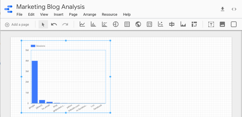
6. Edit your visualization.
In the right sidebar of your report, you can edit your visualization’s data source, dimension, metric, and date range.

You can also sort your data, filter it, add another Google Analytics segment to your visualization, and edit its style.

Additionally, you can turn one visualization of a certain data set into another visualization. For instance, you can change a bar graph into a time series of the same exact data.


Once you finish your first visualization, you can add as many as you want to your report.
Data Analysis Made Easy
Data analysis might be the last task on your to-do list every day, but with Google Data Studio, you can pull and configure your data much faster than you can with Excel. This gives you more time to extract insights from your data, proving your campaign’s results and — most importantly — green lighting your next idea.

25% of People Think All Searches Will Be Done by Voice in the Next 5 Years
Watch any commercial break in full, it seems, and you’re almost guaranteed to see an ad for some sort of voice assistant device.
In the past two months alone, Amazon, Facebook, and Google have all announced the release of either new or new versions of their own video smart speakers: voice-assistant-enabled devices that are also equipped with video capabilities.

Portal, Facebook’s video smart speaker
But before the video smart speakers came along, there were the voice assistants themselves: the Siris, Alexas, and Google Assistants of the world that with a touch of a button or a simple vocal command can answer our questions, make phone calls on our behalf, or schedule reminders.
It’s that first task — answering our questions — that may have the greatest long term potential. At least 20% of all mobile search queries on Google, for instance, are done by voice: a number that many predict will continue to rise.
But where do internet users themselves see voice search going — and how does it align with how they prefer to seek information online today? We decided to find out.
Voice Search Predications: Current and Future Preferences
We asked 800 internet users across the U.S., UK, and Canada: How do you think searches for information online will change within the next five years?
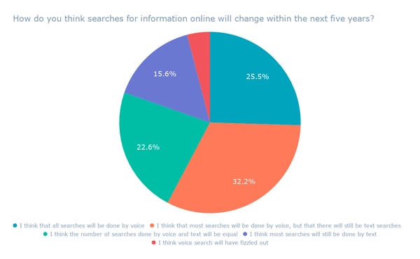
About a third of respondents believe that, while most searches will be done by voice, text searches won’t be completely eradicated.
But when it comes to a future where voice search overtakes text completely, about a quarter of respondents identified that as their predictions.
-1.png?t=1540897212614&width=600&name=Responses%20by%20Region%20(4)-1.png)
That was especially true among respondents in the U.K., where the highest number of respondents — 35% — said that they believe most searches will be performed by voice within the next five years.
That most respondents foresee a future where most searches will be done by voice, but text search will still remain, is reflected in some moves by the companies that build voice assistants.
When Google recently revamped its Assistant app, for example, it made it easier for users to enter commands or search queries by voice and touch — after discovering that nearly half of all interactions with it included both.
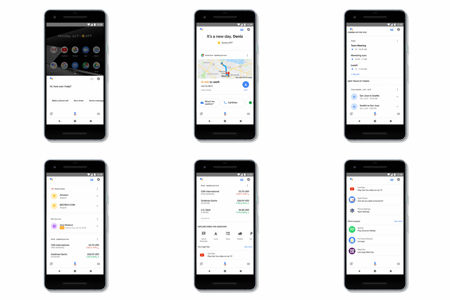
Source: Google
It also aligns with what appear to be current user preferences, which we discovered when we asked another set of 800 internet users across the U.S., UK, and Canada: How do you prefer to search for online information?
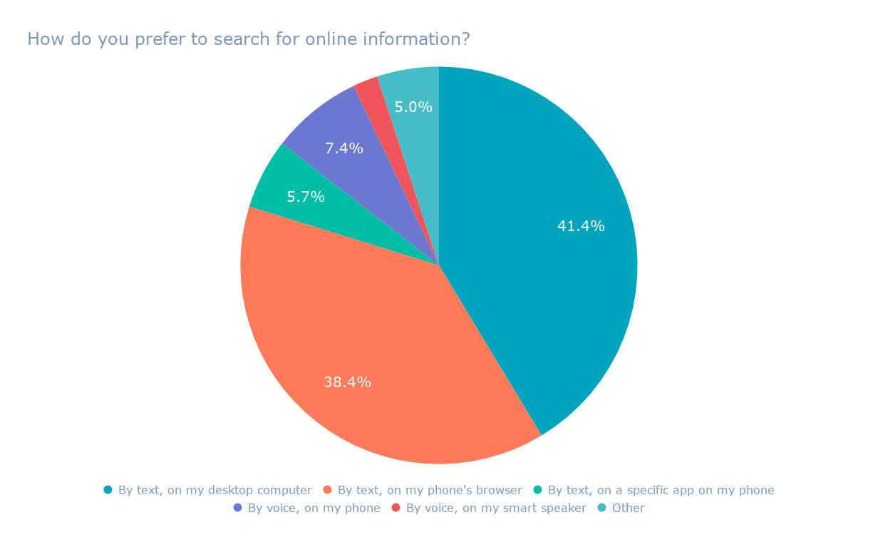
Interestingly, most users still prefer to search by text — on their desktops — while a slightly smaller number prefer to search by text on mobile.
If most users still prefer to search by text, how can voice overtake it as the preferred method of seeking information online?
It could be a matter of scale. As automation begins to appear in a growing number of facets in our day-to-day lives — such as in cars, restaurants, and retail — consumers will adjust according to the “new normal.”
Historically, this phenomenon has repeated itself with many advancements in technology. Just as millions of consumers have acclimated to an increasingly digital world — with the permeation of things like social media, streaming entertainment, and online video potentially replacing cable — the trajectory of voice search adoption could follow a similar path.
“I think a lot of consumers are frustrated with poor voice experiences,” says Senior SEO Content Strategist Aja Frost. “As the technology gets better, it’ll be easier and easier to get the right answer on the first try.“
That trajectory may also play out with the growing adoption of voice-equipped devices, such as smart speakers. According to Nielsen, 24% of households reporting having a smart speaker, which is an incremental increase from the previous year.
“As people become more comfortable with voice assistants on their phones … they’ll also become more accustomed to basic voice searches,” Frost explains. “It’s not a huge transition from, ‘How many tablespoons in 1/4 cup?’ and ‘What’s the weather outside?’ to, ‘What are the best Indian restaurants in X neighborhood?’ and ‘How do I unclog the dishwasher?'”
As always — stay tuned.

7 Ways to Create Better Instagram Engagement for Businesses
Are you looking for ways to get more Instagram engagement? Wondering how to build stronger consumer relationships? In this article, you’ll discover seven ways to improve your Instagram engagement. #1: Follow Through on Follower Engagement to Stay in Step With Your Community While it’s the first rule of social media marketing, lots of brands and […]
The post 7 Ways to Create Better Instagram Engagement for Businesses appeared first on Social Media Examiner.
from Social Media Examiner https://ift.tt/2zcThdG
via socialmediaexaminer
The 36 Best Instagram Captions for Every Type of Post
If you’re anything like me, you take about four minutes choosing a filter for your Instagram photo, and about four hours deciding on a caption.
Worst of all, after much creative effort and advice from friends, I’m usually barely able to write a caption that goes beyond, “Had a fun day with friends!”.
And I’m a writer — go figure.
Next time you’re contemplating a caption to go with your Instagram photo, take a look at our complete list of captions for any mood you need to evoke.
Funny Instagram Captions
- My favorite exercise is a cross between a lunge and a crunch … I call it lunch.
- I need a six month holiday, twice a year.
- I tried to be normal once. Worst two minutes of my life!
- Started from the bottom now we’re … still at the bottom.
- There are 16 year olds competing at the Olympics and I still push on pull doors.
- Namast’ay in bed.
- That awkward moment when you’re wearing Nike’s and you can’t do it.
- I’m just a girl, standing in front of a salad, asking it to be a cupcake.
- What if I told you, you can eat without posting it on Instagram?
Clever Instagram Captions
- Patience — what you have when there are too many witnesses.
- Maybe she’s born with it, maybe it’s the Clarendon filter.
- It’s okay if you disagree with me. I can’t force you to be right.
- Life is short, false … it’s the longest thing you do.
- There may be no excuse for laziness, but I’m still looking.
- You have stolen a pizza my heart.
- Seven billions smiles, and yours is my favorite.
Savage Instagram Captions
- What’s a queen without her king? Historically speaking, more powerful.
- Be a little more you, and a lot less them.
- I’m an acquired taste. If you don’t like me, acquire some taste.
- Well behaved people don’t make it into history books.
- I’m sunshine mixed with a little hurricane.
- I do a thing called what I want.
- They say good things take time… that’s why I’m always late.
- I’m not bossy, I have leadership skills.
Song Lyrics for Instagram Captions
- “I’m gonna live like tomorrow doesn’t exist.” — Sia, “Chandelier”
- “I live for the nights that I can’t remember, with the people that I won’t forget.” – Drake, “Show Me a Good Time”
- “I hope you never lose your sense of wonder.” — Lee Ann Womack, “I Hope You Dance”
- “You may say I’m a dreamer, but I’m not the only one.” – John Lennon, “Imagine”
- “Feeling good living better.” — Drake, “Over My Dead Body”
- “Say oh, got this feeling that you can’t fight, like this city is on fire tonight” — OneRepublic, “Good Life”
- “Time makes you bolder” — Fleetwood Mac, “Landslide”
- “If I fail, if I succeed, at least I’ll live as I believe” — Whitney Houston, “The Greatest Love of All”
- “The rest of the world was in black and white, but we were in screaming color.” — Taylor Swift, “Out of the Woods”
- “Lightning strikes every time she moves” — Calvin Harris, “This Is What You Came For”
- “We aren’t ever getting older” — Chainsmokers, “Closer”
- “Sing with me, sing for the years, sing for the laughter, sing for the tears” — Aerosmith, “Dream On”
