Welcome to My Blog
What Is Cloud Storage and How Are Innovative Companies Using It?
6 Tips for Writing Compelling Bullet Points
Bullet points are arguably the most versatile tool in a writer’s arsenal. They break up your writing, making it easier to digest. And by drawing more attention to your ideas, they can also inspire action.
Whether you’re writing landing page copy that aims to convert visitors into contacts, or a work report that aims to persuade your team lead to pursue your proposed strategy, crafting compelling bullet points is crucial for making your ideas easier to understand and encouraging your desired action. Here are six ways you can do that.
6 Tips for Writing Compelling Bullet Points
1. Keep them brief.
The more unnecessary words your trim from your bullet points, the easier they are to understand. Concise writing is lean. And readers can zip through it with little effort. To sharpen your bullet points, follow the three writing tips below:
- Avoid linking verb phrases like, “Justin was writing about his cross-country trip.” “Justin wrote about his cross-country trip,” sounds more forceful. Linking verbs have a passive effect, which is why they can’t pack much of a punch.
- Change prepositional phrases like, “The decision of the executive team was final,” to “The executive team’s decision was final.” Prepositional phrases make sentences longer and harder to follow.
- Reduce verb phrases like “The results are suggestive to the fact that on-page SEO still works.” to simple verb phrases like “The results suggest that on-page SEO still works.” The latter sounds much smoother.
2. Start your bullet points with a verb.
To hook your audience and persuade them to keep reading, your bullet points’ first word needs to immediately capture their attention. Starting a bullet point with a verb, which reveals the most information about your bullet point, can instantly pull an audience into your writing.
For example, which of the following bullet points immediately grabs your attention?
If we distribute blog content through Facebook Messenger, we can:
- Leverage a distribution channel with high-engagement rates and rely less on email.
Or
If we distribute blog content through Facebook Messenger:
- We can leverage a distribution channel with high engagement rates and rely less on email.
Even though there’s only a slight difference between the two bullet points, the one that starts with a verb can engage an audience quicker and prompt them to read the rest of the bullet points.
3. Keep them consistent.
Keeping your bullet points consistent makes it easy for your readers to fall down the page and easily digest its information. To do this, stick to the same number of lines per bullet point, start each bullet point with the same type of speech, like a verb, and maintain the same grammatical form.
For instance, consider the two examples below. One keeps its bullet points consistent and the other one doesn’t.
Pivoting to an organic-only blogging strategy will:
- Boost our blog’s short-term traffic.
- Sustain our blog’s long-term traffic.
- Build our website’s domain authority.
Pivoting to an organic-only blogging strategy will:
- Boost our blog’s short-term traffic.
- Sustain our blog’s long-term traffic.
- Finally, we’ll be able to build our website’s domain authority.
The second example has incongruent bullet points. It throws the reader off and confuses them, increasing the likelihood that they’ll disengage with the writing.
4. Use bullet points in the right place.
Bullet points give your audience a refreshing break from blocks of text, but if you make your copy or report look like a shopping list, they’ll want a break from your bullet points.
To effectively engage and persuade your audience with bullet points, use them in moderation — highlight essential information and list items that would look jumbled if you wrote them in paragraph form.
5. Lead with the benefits.
There’s a copywriting adage that goes “features tell and benefits sell”. And it’s a timeless truism that can be applied to any form of writing. Why? Because a list of features doesn’t specify how your audience will directly benefit from your product or ideas. Highlighting the benefits can help your audience visualize a better future, one that includes your product or fleshed out ideas in their lives.
For instance, a job ad that describes how you can “Arrive and leave work comfortably, thanks to a heated garage,” will resonate with candidates more than a job ad that states the company has a “Heated parking garage.”
6. Sell a feeling.
Psychology tells us that emotions drive our behavior, while logic justifies our actions after the fact. Marketing confirms this theory — humans associate the same personality traits with brands as they do with people. Choosing between two alternatives is like choosing your best friend or significant other. We go with the option that makes us feel something.
This is also the reason why pitching a product’s features is a lousy attempt at persuasion. Features only appeal to the logical part of your brain, which we know doesn’t drive action nearly as well as appealing to the emotional part of your brain does.
So if you’re writing social media copy for the grand opening of your new sporting goods store, don’t write a bullet point about the number of gloves you have in stock. Write a bullet point about the lasting family memories your customers will make playing catch with their kids — they’ll never forget those moments.

We Launched 3 Podcasts in 3 Years: Here’s What We Learned
Several years ago we launched The Growth Show because we fell in love with audio as a way to inform, inspire, and engage an audience. There was something special about the medium, something immersive but also adaptable to the busy lives that people lead. Podcasts fit into our commutes, our workouts, our in-between times in a way that other formats just can’t.
We were not alone in this love for the medium. A few mile-marker facts: Nearly 1 in four americans, roughly 68 million people are listening to podcasts on a monthly basis. Outside of the United States podcasts are being consumed at similarly a rapid rate. The average podcast listener skews younger with 44% of podcast listeners being millennials (18-34) and 33% being Gen Xers (35-54).
That means there are over 52 million people in the US in the early-to-prime portions of their careers listening to podcasts. The podcast audience tends to have a higher education level with over 57% having a bachelor’s degree or above.
We launched 3 different podcasts, with 3 totally different approaches.
So if you want to start a podcast, good news is the water’s warm. There’s a strong and growing appetite for audio content. But what sort of podcast should you start? That question is a little harder.
The answer is highly dependent on what you want the podcast to achieve for your audience and company — and most people aren’t exactly sure. Plus podcast analytics are a little behind the times still so you get less insight into what’s actually resonating in a show. Over the last three years we used three very different approaches to better understand the role that podcasting would play in our company. Here’s what we found.
The Editorial Podcast
Our vehicle: The Growth Show (New season comes out today!)
Goal: Brand
Purpose: Use storytelling and guest selection to advance HubSpot’s point of view.
In 2015 we launched our first podcast, The Growth Show. It started as a straight interview show with business leaders we respected and morphed into what it is today: a blended editorial podcast on unique approaches to growth.
Over the years, The Growth Show has garnered over 1.5 million downloads, been featured on iTunes New & Noteworthy, and consistently named a top business podcast. We have had unforgettable guests such as Alec Baldwin, Julie Zhuo Vice President of Product Design at Facebook, Jonah Peretti founder of Buzzfeed, and Kristen Kish a winner of Top Chef. And there have been no shortage of pivots and lessons along the way.
What’s special to me about The Growth Show — beyond the fact that I host it — is that it has become a platform for us to use storytelling to highlight a different kind of business growth.
HubSpot has long espoused the idea that to make a legacy impact, it’s not enough for your company to just grow bigger, you have to find a way — and make the sacrifices — to grow better. You have to pursue the sort of growth that hitches your success directly to the success of your customers.
The Growth Show is a platform for us to tell that uncommon growth story. Season three, which goes live TODAY, is all about companies that relied heavily on the advocacy and loyalty of their customers to fuel their growth.
The Mass-Appeal Podcast
Our vehicle: Weird Work
Goal: Reach
Purpose: Develop a mass-appeal podcast to bring entire new new audiences into the fold
In 2017, we added to our podcast docket with the launch of the very quirky Weird Work. (You can read more about Weird Work in my post Why We’re Starting a New Podcast That Has (Almost) Nothing To Do With Our Company).
The question we were pursuing was whether developing a mass-appeal show that had little to do with our core brand would help us tap into new audiences and create an opportunity for us to reach those audiences through sponsorship spots or related content.
With Weird Work, we tried our first attempt at monetizing a podcast by running HubSpot sponsor ads amid the content. We kept the ad relevant. Because the concept of the show often involved people making major career shifts to follow a (weird) passion, we ran ads for HubSpot Academy in the hopes that listeners interested in career pivots would also get value out of professional development classes.
We gave listeners a special URL, and set our expectations conservatively. We were hoping to get 100 visits to HubSpot Academy off the podcast. We ended up with 245 for the season. Nothing to hang the business on, but a sign that podcast listeners will take action on an ad.
The Tactical Podcast
Our Vehicle: Skill Up
Goal: Search Traffic
Purpose: Prepare for an uptick of Google search as a driver of podcast discovery.
Google has been leaning into audio content lately in its quest to organize the world’s information. It has a new partnership with PRX International to remove barriers for people wanting to start podcasts, it introduced a new podcast app on android phones, and is on a mission to automatically transcribe podcasts and surface them in search results.
Seeing this sea change of opportunity in what has historically been the toughest nut to crack in podcasting — discoverability — we launched a new podcast this summer geared toward a common search query in our industry: SEO. Millions of people search Google every day looking for how-to advice, and for a number of them, audio may be the better format for that advice. The very tactical, Skill Up podcast is an attempt to be the answer those people seek.
So, where are we now?
Well, today we release our the third season of The Growth Show. Each week beginning October 17th we will be releasing an episode that explores the inspiring stories behind how people grow a business, an idea, or a movement. Scattered in between our normal weekly releases we are going to create short episodes that focus on hyper specific topics and trending news stories. I’ll leave you with a teaser and then I’ll hopefully find my way to your eardrums as a result.
A few of the upcoming episodes:
- How Glossier is creating the future of brands with its customers
- I turned down $30 Million from Mark Cuban on Shark Tank
- How Spartan’s Joe De Sena Fueled a Movement
- Finding confidence in Founding ClassPass
- What MoonPie can teach you about social media marketing
This is where I encourage you to subscribe to The Growth Show on Apple Podcasts, Spotify, Google Podcasts, Stitcher or wherever you get your podcasts. And you think: “Meghan, I know how podcasts work.” You’re right. You’re right, but I had to say it.
Here’s something you might not know. If you have a smart speaker like an Amazon Alexa or Google Home, you can also listen just by saying, “Play the podcast: The Growth Show”
Thank you all for those who do tune in to any of our podcast and to those of you who have shared our shows with a friend or left a review. We’re all figuring out this evolving podcast world together and I truly truly appreciate the support.

How We Topped Product Hunt (Overnight)
Nothing summons the old imposter syndrome monster quite like the moments before a big project launch. All at once, you begin to question every decision you’ve made along the way — from the name of the project down to the comma placements.
For me, these nervous feelings are still fresh. Back in August, my team and I released a totally revamped version of our buyer persona tool, Make My Persona.
We’d been hard at work on the project for months and were all in agreement that it’d shaped up to be something uniquely valuable — something different than we’d worked on before. Nonetheless, I proceeded with caution as I began green lighting the promotion plans we’d put together.
Email? Check. Social media? Check. Blog post? Check.
The feedback started to roll in almost instantly … and it was positive.
Users loved the tool. And that’s when I knew it was time to spread the word a little further. So I pulled up Product Hunt, spun up the tool details, and set it free for the community to have at it. I gave the listing a courtesy upvote from myself and closed my laptop. It has been a long few months — and even a longer few days.
What happened next? Something special.
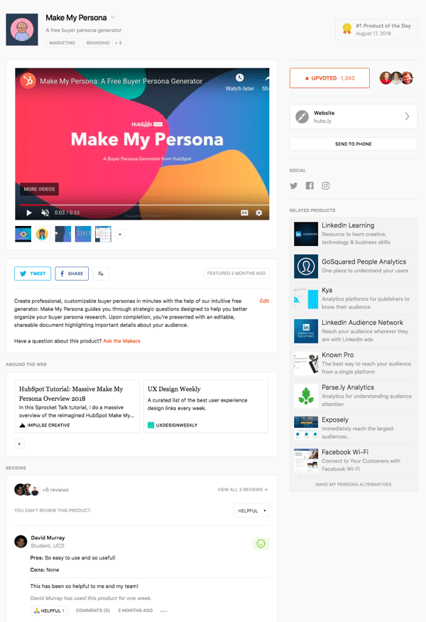
Make My Persona: The #1 Product of the Day
The great thing about having team members in Dublin is that they are up and at it hours before we’ve had our coffee here at HubSpot headquarters in Cambridge, MA. This means I often wake up to surprises from the designers and developers I work with — from updated wireframes to development progress to reimagined solutions for project blockers.
Though, I can confidently say that the Friday morning after our launch brought about my favorite surprise yet: A Slack message from my colleague claiming that Make My Persona had been featured as the #1 “Product of the Day” on Product Hunt.
I rushed to the site to confirm and was delighted to see that my single upvote had grown into nearly 200 upvotes overnight. We were topping the charts and new upvotes were being tacked on by the minute.
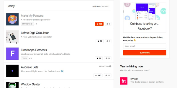
In an attempt to understand exactly how we landed ourselves in this situation, I started reading articles from other teams that had seen success on Product Hunt. From what I could gather, this wasn’t something that was supposed to happen by accident. People had calculated plans. They’d researched the best time and date for launching. They’d done their homework.
I’ll be the first to admit that I wasn’t as strategic about the launch as I could have been. I’d launched a couple of lead generation tools on Product Hunt in the past, but our strategy still needed refining. I was learning. Though, the listing did check a lot of the launch “best practices” suggested by Product Hunt:
- We had a great explainer video heading up the gallery
- An animated thumbnail
- Quality screenshots of the tool’s experience
- A clear and concise description
- Links from features around the web
But I also missed a lot of opportunities:
- I hunted the tool myself
- I didn’t have all of our Makers in order before launching
- I failed to have one of the Makers post a comment to invite feedback
- I didn’t arrange any reviews
- I asked no one to upvote it — in fact, I didn’t even tell anyone I’d posted it yet
Suddenly, I could feel the imposter syndrome monster bubbling up again. Did we deserve this recognition? Was this a mistake?
I silenced that internal dialogue quickly. Of course we deserved this. This tool was unique, helpful, and visually stunning. I was proud of it for a lot of different reasons, so I decided to focus on that instead. And after tracing back the steps we’d taken to get here, it became clear why we’d been so successful. Allow me to explain …
The Hidden Success Ingredient: Over-Investing in the User Experience
We had a kickoff for the project back in May where we drew up this list of improvements we wanted to make to the existing tool:
- Offer a solution for everyone
- Reduce friction in the conversion process
- Make the experience more engaging
- Encourage collaboration and customization
- Make the avatars more diverse to better represent all people
We referred to this bulleted list as our “rebuild objectives” and they all had one thing in common: they solved for the user. That was the hidden success ingredient. It suddenly felt so obvious. People were upvoting this tool because it was simple and engaging and entirely free. We over-invested in making it the best it could be for the end user and it was starting to show.
Here’s how each of those rebuild objectives shook out within the tool itself:
Offering a solution for everyone.
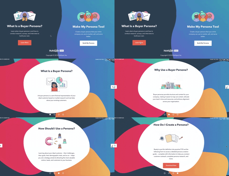
Make My Persona was a tool that we launched several years ago and made the decision to update this year. When we took a look at the tool’s organic performance, we found it was ranking for a variety of buyer persona-related terms — from “what is a persona” to “buyer persona templates.” To ensure we met the needs of everyone that discovered the tool, regardless of their intent, we split the tool into two parts:
- Path #1: This conversion path was designed to help those who were just getting started with personas. Here we provided a brief intro to what a persona is, followed by a beginner’s guide to walk them through how to conduct persona research.
- Path #2: This was the main conversion path that walked visitors through the creation of an actual persona. Visitors that chose this path would have already completed their persona research and be ready to document it.
Reducing friction in the conversion process.
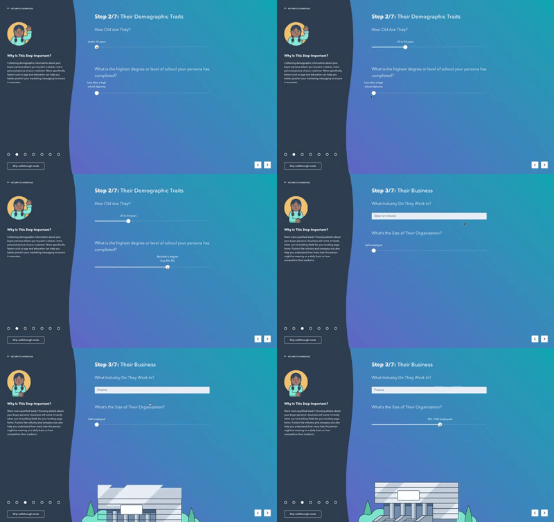
Persona creation requires a lot of information. And in most cases, the more detail you can provide – the better. With that in mind, we set out to balance the need for context with the even greater need for a simplified user flow.
To do that, we combined similar questions to form seven steps. In each step, we incorporated sliders and dropdown menus to help users input information faster, with less typing.
We also introduced a CTA that allows a user to skip the step-by-step process entirely and head straight to the editable template for an all-in-one view.
As a result, the new version of the gives users the freedom and flexibility to input information and work through the creation process on their terms, without restrictions or roadblocks.
Making the experience more engaging.
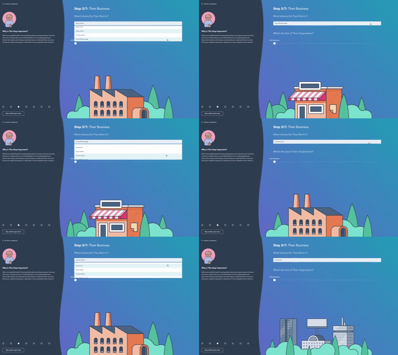
There are a ton of lovable “micro-moments” throughout the tool that are intended to make the experience more engaging – and more human.
For example, your avatar reacts to your inputs in the walkthrough mode (giving a thumbs up, winking, etc.) and confetti falls from the screen to help you celebrate when you complete your persona.
All of these gamified elements create an experience that is fun for the user, encouraging them to continue through to the next step.
Encouraging collaboration and customization.
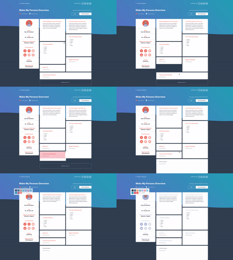
Buyer persona creation isn’t always a one person job. And persona documents are not one size fits all. With these two things in mind, we introduced shareable links that users can send along to their colleagues to make edits to the persona and collaborate on the positioning.
This shareable link creates a copy of the master persona to ensure nothing gets deleted, while still providing the flexibility for others to rework the persona data.
To provide greater control over the actual look and feel of the document, we made the persona editor full customizable: users can drag, drop, resize, and reorder the modules to ensure the information that’s most important to them is front and center. They can also adjust the color scheme to align with their branding.
Making the avatars more diverse to better represent all people.
The stock photo selection within the old tool was not a good look. There was only one-person of color represented – and an uneven amount of men and women.
In the 2018 version, we made the conscious decision to remove gender from the equation by introducing avatars that represent people – plain and simple. We also aimed to include a variety of skin tones, hair types, and age identifiers. While these were small acts of inclusion, they went a long way in terms of ensuring that everyone felt represented.
The Results: What Happens When You Top Product Hunt
At this point, you’re probably ready for me to skip ahead to the numbers. What impact does getting featured in the #1 slot have on the performance of your project?
Well, the Product Hunt win helped to shape our numbers in a few different ways:
Our upvotes skyrocketed. Being featured on the Product Hunt homepage = visibility. As a result, we ended the day we got featured with 600+ upvotes, though that number continued to grow over the next few days as we remained on the homepage. We also saw a second wave of upvotes from an inclusion in the daily digest email that followed. As it stands, the tool has 1.3K+ upvotes, making it the most successful HubSpot Product Hunt launch in history.
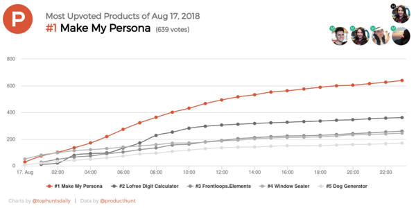
We saw a big increase in traffic. All said and done, we generated roughly 10K views from Product Hunt. Again, these numbers climbed steadily days after being featured thanks to continued homepage visibility and subsequent emails. We also saw an uptick in traffic from social media, as the listing spawned a lot of love on Twitter, LinkedIn, and Facebook.
We generated some leads. While the conversion rate from the traffic was nothing to write home about, we did pull in some leads from Product Hunt. Note: Because these people likely stumbled upon the tool on the homepage without searching for any terms, there’s no guarantee they actually have a need for it. We’re keeping this in mind as we evaluate the quality of those leads and expect that those who find us through a deliberate search in the future will have more intent.
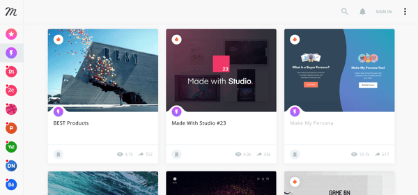
We got a lot of shout outs. As I mentioned before, the uptick in traffic from the feature earned us recognition via the Product Hunt email and on social media. But there were a few other unexpected surprises. For example, the tool was also picked up by InVision’s design inspiration extension, Muz.li. This extension curates content from hundreds of sources, including Product Hunt, which is where I suspect we got on its radar. This brought in another 7K+ views.
Setting the Flywheel in Motion
If you think about these wins in relation to the flywheel, it all adds up.
By investing in the delight stage — the overall user experience of the tool — we were able to build enough momentum to set the rest of the flywheel in motion.
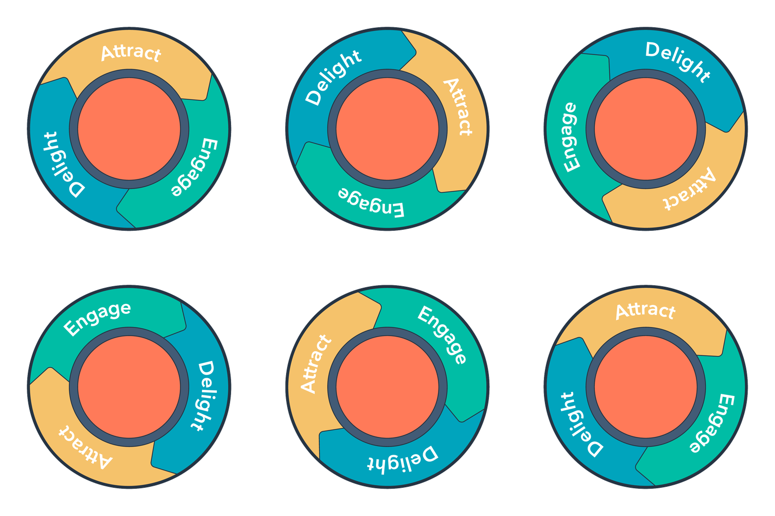
Delighted users shared and upvoted the tool
↓
Those shares and upvotes helped us attract a larger audience
↓
Drawing in a larger audience gave us more people to engage and convert
So while we enjoyed basking in the our fifteen minutes of Product Hunt fame, we’re excited to watch this tool continue to build momentum. If you haven’t already checked out it out, you can give it a spin here.


4 Ways to Use LinkedIn Video for Your Business
Want to do more with LinkedIn video? Looking for ideas and inspiration for your LinkedIn video marketing? In this article, you’ll discover four ways to publish LinkedIn video when you don’t know what to talk about. #1: Share Curated Resources With Your Viewers You don’t need to share brand-new ideas or concepts to be successful […]
The post 4 Ways to Use LinkedIn Video for Your Business appeared first on Social Media Examiner.
from Social Media Examiner https://ift.tt/2ROSuIx
via socialmediaexaminer
19 of the Best Examples of Mobile Website Design
Now more than ever, businesses are focusing on creating delightful mobile website experiences.
After all, Google has been heavily favoring mobile-friendly websites since 2015 when it updated its ranking algorithm in April 2015, and then started indexing mobile sites in March 2018.
And that’s crucial, seeing as there have been more Google search queries on smartphones than on desktop computers and tablets for over a year now.
Going forward, Google will only continue to raise the bar for what it considers to be mobile-friendly (including page load time) and reflect that in its algorithm updates. So if you haven’t been focusing on improving your mobile experience, you’d better prioritize it now, or your search ranking could really suffer. Additionally, HubSpot Research found that half of US consumers are going online on their phones more than on their computers or tablets. 
To help inspire any mobile website design changes you’ll be making, here’s a list of 19 companies who really nailed their mobile web experience.
Best Mobile Websites
- Shutterfly
- Google Maps
- Typeform
- Etsy
- Adrian Zumbrunnen
- Elf on the Shelf
- BuzzFeed
- Evernote
- Huffington Post
- Express
- Nationwide Insurance
- Squaredo
- Zappos
- ABC
- Lean Labs
- SAP
- KISSmetrics
- idig Marketing
- IndiaMART
1. Shutterfly
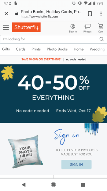
Shutterfly is an online service that allows users to create photo books, personalized cards and stationary, and more. Because more and more people are taking photos and then accessing them using their smartphones, Shutterfly recognized the need to create a great mobile experience for their customers — and they delivered.
Shutterfly accomplishes two key goals on their mobile website:
- It’s easy for users to find out information about their offerings.
- They’re selling that information by way of beautiful imagery.
When you arrive on their mobile site, you’ll see Shutterfly’s latest promotion front and center, as well as a large finger-sized sign-in button for returning members — neither of which overpower the user experience.
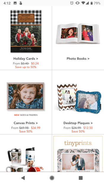
Scroll down, and users will see large buttons that make it easy for users to quickly select which type of product they’re interested in. Once users click through to one of those options, they’re greeted with large photos showcasing what Shutterfly is capable of for easy browsing.
2. Google Maps
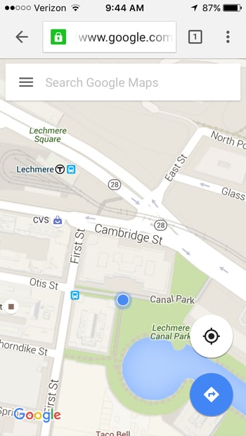
Everyone has their favorite map or directions application. Mine is Google Maps, which I use whether I’m walking, driving, biking, or taking public transportation. What’s special about their mobile website is that it’s virtually indistinguishable from their downloadable mobile app.
The screenshots below are taken of their mobile website, but if you’re familiar at all with the app, you’ll notice they look exactly the same. Not only is the appearance identical, but the mobile website has the speed and functionality of the app.

3. Typeform
Typeform is a Barcelona-based tech company with one simple mission: to “make forms awesome.” Their desktop website is really beautifully designed, greeting visitors with succinct copy, high-definition videos, relevant animations, and other, more complex design components.
But for mobile users, they recognized that complex design components like video and animations could significantly affect page load time, among other difficulties. That’s why they actually removed many of them — which decluttered the site and simplified the overall mobile experience. The mobile website is a simpler version of their desktop website, and it’s still beautifully designed.
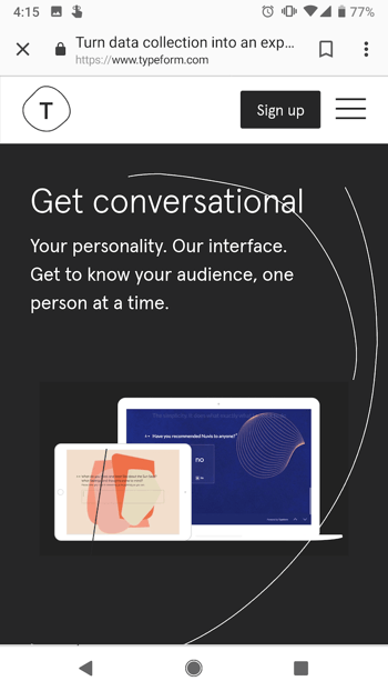
Take note of the large buttons on their menu page — perfect for tapping with your finger on a mobile screen.

4. Etsy
Etsy is an ecommerce website where people can buy and sell vintage or handmade items. Most buyers who visit Etsy’s website are there to do one of two things: Either they’re searching for a specific item, or they’re browsing items in categories that interest them.
The mobile website caters to both types of visitors from the very beginning. When you first go to their mobile website, you’re greeted with an option to search for specific items, shops, or categories.
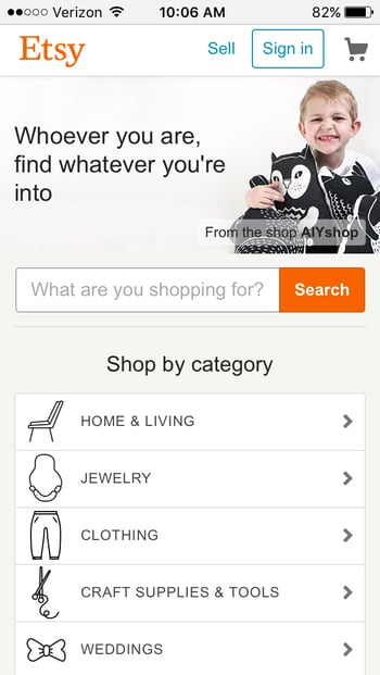
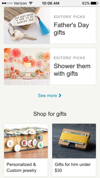
Immediately below the search bar are thumbnail images of trending items that showcase some of the most popular things you can buy on Etsy. Mobile users can view these trending items in a collage format, and the images are big enough for them to easily tap with their finger.
5. Adrian Zumbrunnen
This is the personal website of Adrian Zumbrunnen, a UX designer, writer, and speaker. When you visit his website, you’ll notice right away there’s something very unique about it: It’s a conversational website.
It almost looks like a text message conversation you’d normally have on your phone — including the ellipsis to show he’s “typing.” Users are given two response options at the end of every exchange, so it’s kind of like a “choose-your-own-adventure” experience.
While the mobile and desktop experience are very similar, the desktop website feels like it was made primarily for mobile — which could be the direction sites will go in the future.
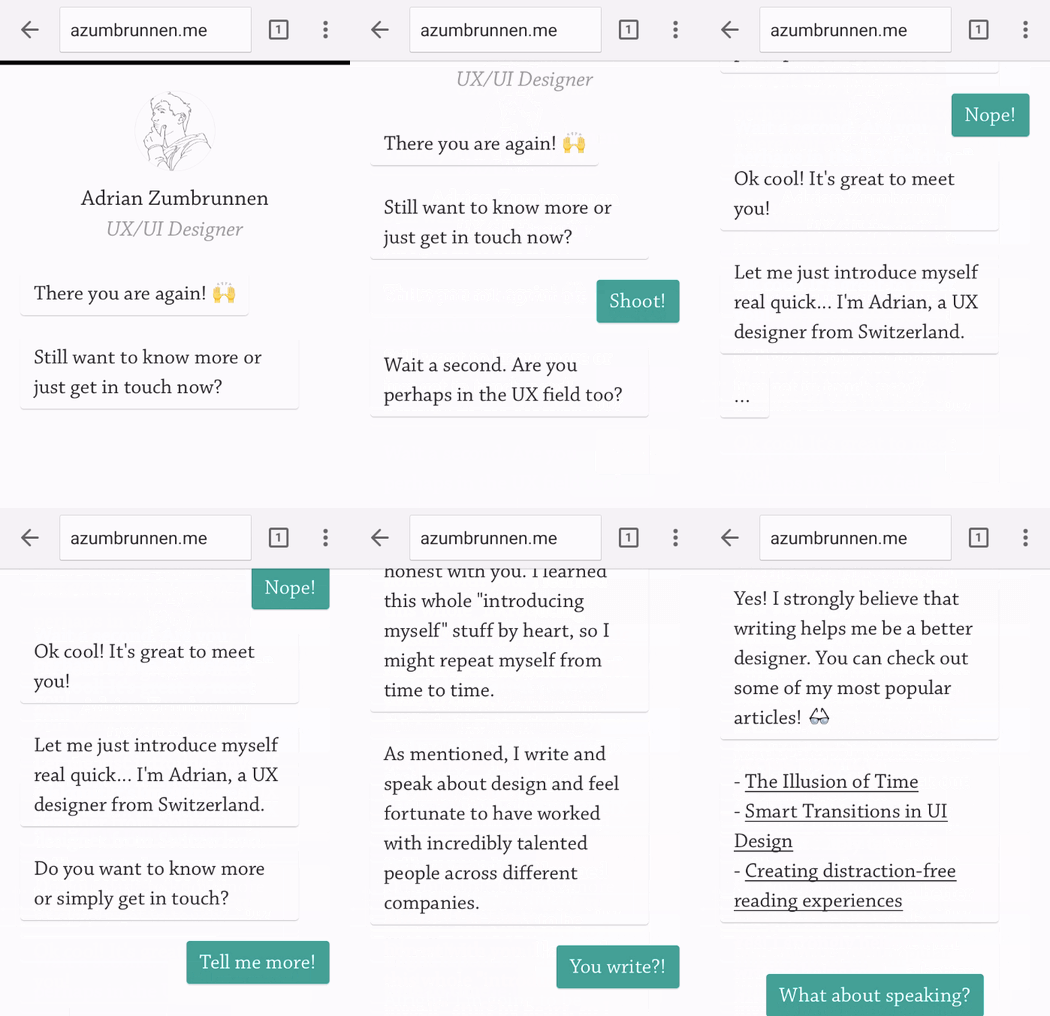
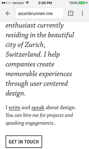
And if you’d prefer not to engage in the conversation-like exchange, you can simply scroll down for details.
6. Elf on the Shelf
Elf on the Shelf is, relatively speaking, a fairly new Christmas tradition based on a children’s book. If you’re unfamiliar, the basic premise is this: The book tells the story of Santa’s scout elves, who are sent by Santa to watch over children in their homes all over the world and report back to Santa.
Along with the book, parents can purchase an elf figurine, which they’ll subtly place somewhere in their house where their kids can see it. Every night leading up to Christmas, parents move the elf to a different location around their house to “prove” to their kids that the scout elves are real and always looking over them.
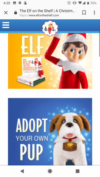
When you first arrive on Elf on the Shelf’s website, you’ll see there are actually numerous types of Elf on the Shelf products you can purchase. But instead of forcing users to scroll through each product individually, the web designers package each product into a large, enticing tile describing the goal of each buyer’s journey, with the featured item displayed on the front.
You’re not buying your own elf or pup — you’re adopting it. It’s a truly empowering experience on such a small screen.
7. BuzzFeed
BuzzFeed is a news company known for it’s viral content and popular quizzes. It also happens to be one of my favorite sources of entertainment during my commute to and from work.
And where do you think I’m checking BuzzFeed during my commute? You guessed it: on my phone. BuzzFeed knows that a lot of their visitors are visiting their site on mobile, so they’ve taken great care to create a smooth experience for their on-the-go readers.
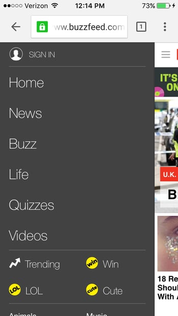
When you arrive at BuzzFeed’s mobile website, the first thing you’ll see is some of their most popular pieces of content displayed in a simple, collage-like format using large images that are easy to tap with your finger.
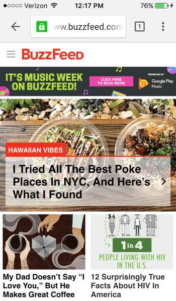
For users interested in specific categories, there’s a clickable menu in the top left-hand corner of the screen that lists out all the post categories.
8. Evernote
Evernote is an application that allows you to store notes, images, and web articles and then access them across all your devices. Because users tend to download the app or access the website on multiple devices including desktop computer, smartphone, and tablets, it’s essential that Evernote get the mobile experience right.
If you look at Evernote’s homepage on your desktop computer, you’ll notice how clean the design is. The value statements are short and to-the-point, and the graphics add to the brand’s positioning but don’t clutter the page.
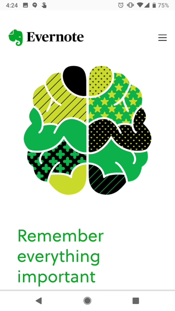
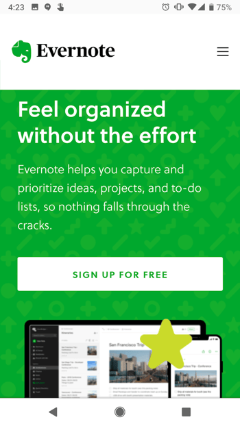
When you look at Evernote’s mobile website, you can see they’ve kept their color palate and general brand style entirely intact. The company’s mobile website is clean, simple, and doesn’t detract at all from the value of the app. Evernote’s conversion path is obvious from the centered call-to-action: “Sign up for free.”
9. Huffington Post
The Huffington Post is a well-known news outlet that reports from everything from politics and current events to entertainment and technology. What makes their mobile website unique is that they actually alter their headlines slightly for mobile users so their content is more easily scannable.
If you compare the desktop versus mobile websites, you’ll notice that the mobile website has fewer words on the homepage. The headlines are shorter and much more digestible — perfect for someone skimming or reading on a small screen.

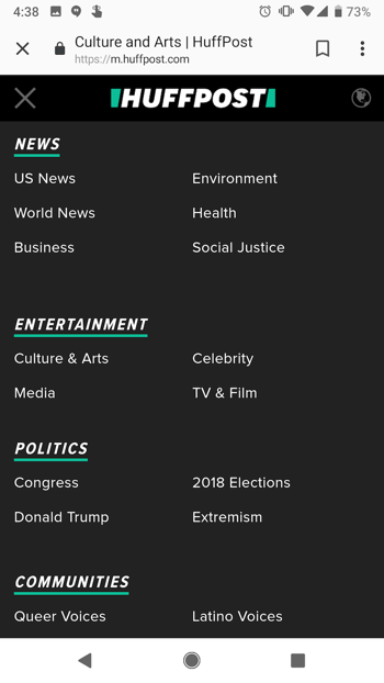
As with BuzzFeed, you’ll find a clickable menu in the top left-hand corner of the screen listing out all the post categories.
10. Express
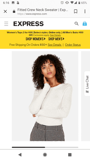
Express is a clothing store that caters to young men and women. Because their audience often comes to their website to browse clothing, it’s important for their website to include big, clear images of their clothing — especially on mobile devices, when users will need to tap items on the screen with their fingers to click through for purchase information.
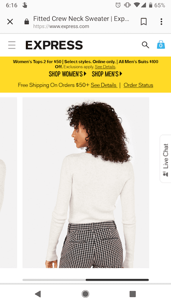
Express takes their mobile experience a step further than most online retail sites. If you slide your finger from left to right across an image showing a piece of clothing, the image will change so you can see the clothing in a different view. In other words, users don’t have to load another page to see multiple pictures of the same article of clothing.
Look at the image on the top right in the following two images to see how it changes when you swipe to one side:
11. Nationwide Insurance
Nationwide Insurance provides insurance and financial services. You might think a financial company would have a really complicated website, but on mobile, Nationwide Insurance nails down the simple user experience.
When you arrive on Nationwide’s mobile site, you’ll see two tabs at the top allowing you to identify as one of two types of users right away to customize your experience: Personal or Business. Or, alternatively, you can “Find an Agent” or “Find an financial advisor” to learn more information about their services.
Although limiting the experience to these two options excludes Nationwide’s more in-depth features, it makes for a much easier experience for visitors using small screens. This is a great technique to lead potential customers in the right direction if they’re not yet account-holders and are visiting the website for the first time.

12. Squaredot
Squaredot is an agency based in Dublin, Ireland that helps marketers build out their inbound marketing strategies. Their mobile website is colorful, simple, and makes for easy navigating.
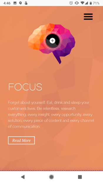
What sticks out to me most is the visually pleasing color combinations and three-dimensional texture to their homepage — as well as the large clickable dots at the center of each section you can scroll to.
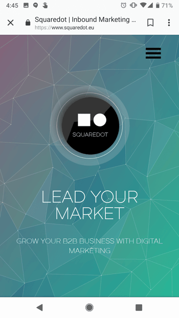
These dots are animated call-to-action buttons, and the tapping the ones below the home screen will produce a pop-out page with more information on Squaredot’s approach to marketing.
13. Zappos
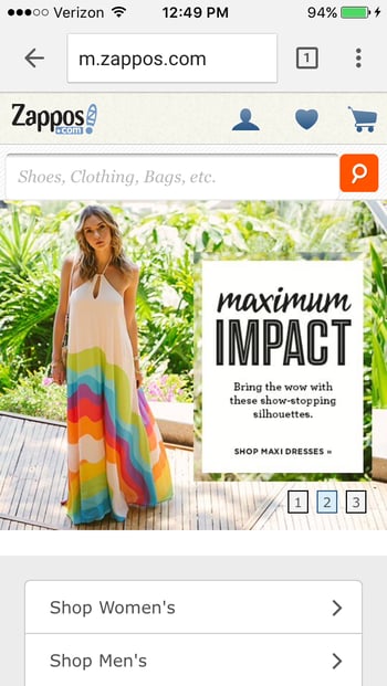
Zappos is an online vendor for shoes and clothing known for their stellar customer service. Their top priority on mobile is to help users search easily for the items they’re looking for on their website, so they’ve put a large search bar at both the top and bottom of their mobile website to make it super easy for them.
This is what the top of their mobile site looks like:
14. ABC
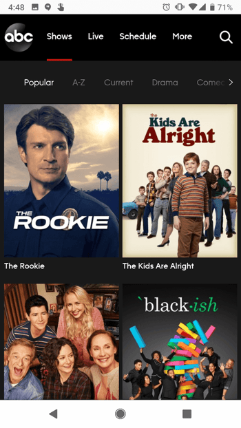
ABC is a television broadcasting company known for popular shows like “The Bachelorette,” “The Rookie,” and “General Hospital.” Users visiting ABC’s desktop website are greeted with these options and more. View the network’s television schedule, check out the most recent Emmy winners, watch some of your favorite television shows, or even look at entertainment news relating to those shows.
But because nearly every household today is a multi-screen household, ABC knows its experience on a mobile device should be both simple and ready for viewing.
When you visit the ABC website on a mobile device, you’ll see a dark background for a theatre-like experience with tiles for each program you might want to stream. Users can scan through these options and click into any show they want based on genre, alphabetical order, what’s popular, and similar categories you’d also find on your TV’s streaming platform.
15. Lean Labs
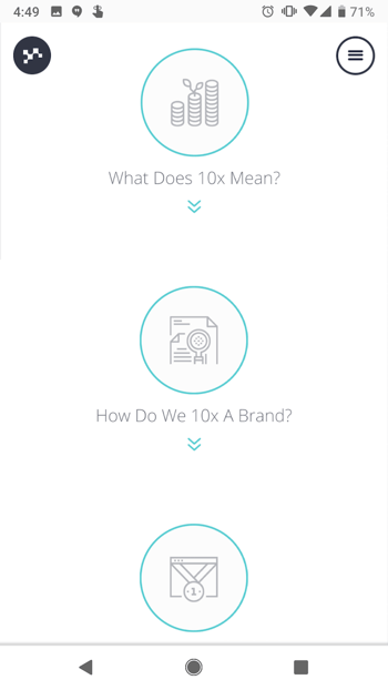
Lean Labs is a marketing agency that creates engaging, responsive, and high-conversion web solutions. (They were also featured on ABC’s hit TV series Shark Tank.) The folks over there do a great job of providing a smooth experience for their mobile users, especially with regard to their design techniques and the emphasis they place on their “10x formula” — which is apparent to visitors within seconds of landing on their mobile site.
Notice how Lean Labs’s mobile website uses scale, contrast, and typeface to distinguish certain elements of their page. You can even see the subtle photo of a mountain set to the website’s background, eliciting the heights your brand can reach as a Lean Labs customer.

And, as explained above, their core “10x” formula is clearly visible and broken down into easy steps for mobile users scrolling through the homepage, with relevant icons to match.
16. SAP
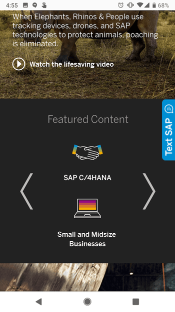
SAP is an enterprise software company that manages business operations and customer relations. The business enhances its mobile experience by condensing information, specifically into one important video case study, playable from the homepage on a mobile device.

SAP also combines some of their calls-to-action into sliders, whereas their desktop website has these CTAs laid out horizontally. This helps keep things simple so mobile users aren’t overwhelmed with a lot of information at once, and it also ensures none of the CTAs are too small to read.
17. KISSmetrics
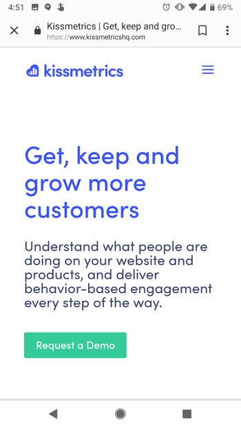
KISSmetrics provides analytics software for businesses. On their homepage, there’s a lot of information explaining what the software does along with a testimonial.
But their mobile site is displayed a little differently: On a mobile device, the information on their site is shown in a list with alternative dark and light modules. This makes it easy for users to skim the page without getting lost in text.
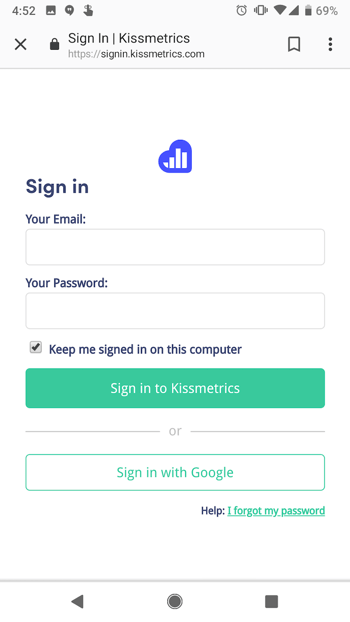
They’ve also made the text and fields on their forms large and easy to read:
18. idig Marketing
idig Marketing is a development and communications provider. Their mobile website is laid out similarly to their desktop website, but I especially liked how they incorporated the interactive heart icons into their blog posts so users can “Like” their posts.
This mimics the “Like” heart icon in Instagram and Twitter, which is easily recognizable for mobile users familiar with those platforms.

19. IndiaMART
IndiaMART is the largest online B2B marketplace in India, and its simple category-based mobile store makes it one of the best mobile websites we’ve ever seen in the ecommerce industry.
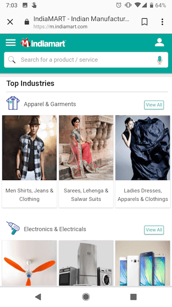
The company’s mobile homepage puts the search bar right at the top so you can always retreat to a custom search if browsing no longer suffices to find the item you’re looking for.
But, IndiaMART makes it easy to peruse its digital aisles by sorting each item by item type, and then sub-types within each item type — a smart design move to encourage users to explore your site further. Under “Apparel & Garments,” for example, you have easily clickable tiles to check out more specific categories of clothings, such as menswear, women’s dresses, and even suits, sarees, and similar garb native to India.
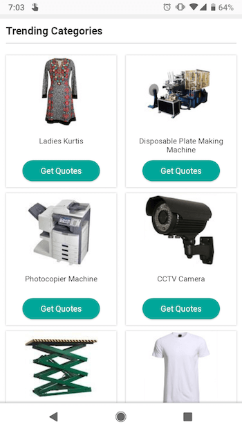
Underneath IndiaMART’s browsing tiles, the company has its own trending section specifically for merchandise people are paying most attention to — similar to a trending list of news on a social media platform. Each trending category has a mobile-friendly call-to-action button allowing users to get price quotes for the product they’re interested in.
Want more information on how to optimize your business for mobile devices? Download the free kit on mobile marketing below.


9 Ads With Subliminal Messages You’ve Probably Missed
David Ogilvy, the modern Father of Advertising, once shared this great quote: “A good advertisement is one which sells the product without drawing attention to itself.”
Advertising is supposed to be impactful and clever, but not overpowering. There are plenty of examples you’ve likely seen many times without realizing it at the time, but still managed to change your perception of the brand. Why? They reached you on a subliminal level.
Subliminal Messages in Advertising
Subliminal messages in advertising are designed to engage people subconsciously. These ads use various colors, shapes, and words that enable customers to make small but powerful associations between a brand and an intended meaning.
In short, be subtle.
And advertisements have a long history of being subtle. Whether they’re hiding a double-meaning in a logo or working some Photoshop magic, subliminal ads definitely meet the criteria of clever. And the more clever the ad, the better we feel about “getting” it — and the better we feel about the product.

Here’s our list of eight ads and logos with subliminal messages you’ve probably missed.
9 Subliminal Advertising Examples That Deliver a Subtle Message
1. Pepsi vs. Coca-Cola Halloween Ad
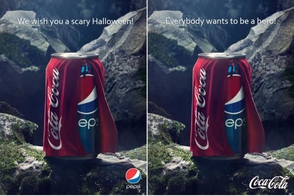
This is subliminal messaging at it’s core — subtle, but still clever. Pepsi released the image on the left and Coca-Cola responded with the image on the right. Pepsi’s original ad is subliminal in that it makes the viewer think and chuckle a bit: it’s funny to suggest that getting a Coke when you wanted a Pepsi is scary. Coca-Cola’s response is perfect, as well, and becomes a great learning tool: sometimes, the tagline really does make the image.
2. Milwaukee Brewers
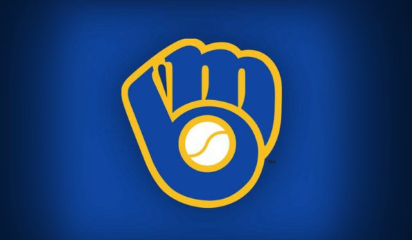
The MIlwaukee Brewers logo from 1978 to 1993 is an iconic example of a subliminal logo. Composed of an M and B to make a catcher’s mitt, this logo was designed by University of Wisconsin art education student, Tom Meindel.
3. Pirates of the Caribbean

Disney’s Pirates of the Caribbean bridges the gap between family-friendly and adult action movie, and did it well — the franchise has earned over $3.7 billion in box office sales alone. While I can’t say subliminal messaging — and the visual overlap between the skull-and-crossbones and Mickey Mouse’s ears — are the reason why, I still love finding this secret.
4. Baskin-Robbins
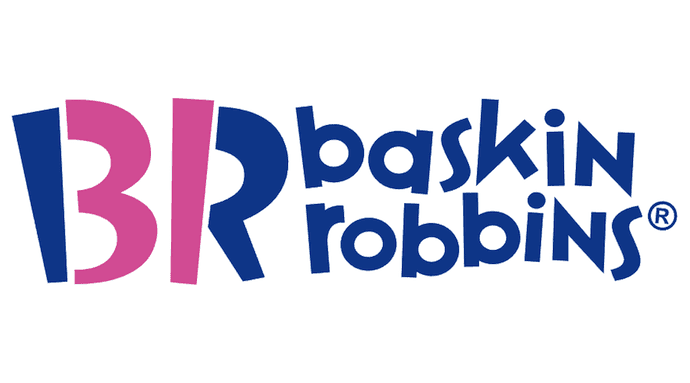
Baskin-Robbins isn’t just famous for its ice cream — it’s famous for having 31 flavors of it. See how the end of the “B” and the beginning of the “R” in the logo above form the number “31”? The color contrast, and positioning the brand’s initials just right, expose this subliminal message just the right amount to help you remember what makes Baskin-Robbins different from other ice cream parlors.
5. Amazon
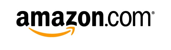
An oldie, but a goodie, many don’t see the subliminal message in Amazon’s logo — the current logo has been in use since around 2000 and it doesn’t seem to be going anywhere. Why should it? The cute arrow connecting A to Z, while forming a grinning face, works so well to make you feel happy and see Amazon as an all-inclusive resource.
6. SFX Magazine

SFX is a sci-fi magazine that began in 1995. The mag focuses on sci-fi and fantasy news — and some subliminal messaging to attract readers. Many sites have reported that the SFX logo often appears different when women are on the cover, making the reader view the title as “SEX.” How much does sex sell? SFX has a circulation of about 26,000.
7. Tostitos
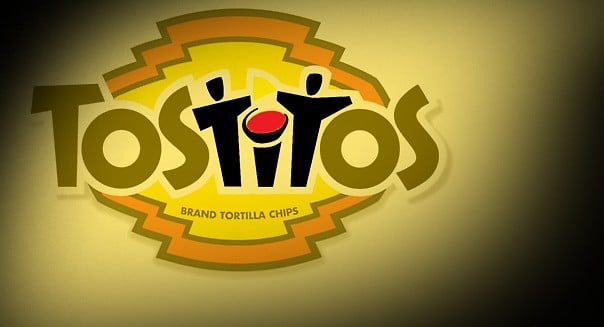
The Tostitos logo is fairly well-known, but you may have missed the subliminal message in it (and in every Tostitos ad that shows the logo). Notice how the fourth, fifth, and sixth letters in the brand name also make two friends sharing chips and salsa? I did, too — and I wondered why it took me this long to find them.
8. Spartan Golf Club

While an advertising campaign might last for a quarter, a logo can last for years — which gives a long shelf life to a well-designed logo. This Spartan Golf Club logo is, in my opinion, one of the best.
The design is just the right amount of subtle: The black silhouette of a golfer’s backswing also looks like the face of a Spartan warrior, while the trail pattern of his swing also makes the shape of the classic trojan helmet.
9. FedEx
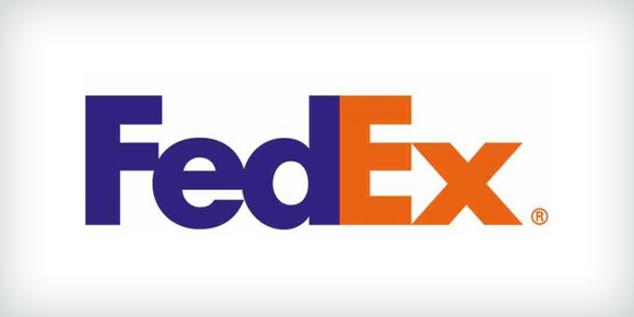
Another oldie-but-goodie subliminal message can be found in the FedEx logo. Whitespace in the logo clearly shows an arrow — an indication of the company’s speed and ability to get your delivery from Point A to Point B.
Subliminal messages can do a lot of legwork for you well after the campaign is done. Great ads will be shared, and reach a near-viral status, if the message is clever and subtle.
But of course, even the best ad will eventually fall out of style. If you’re looking to make a lasting impression on your prospects and customers (and make the most of your marketing spend), be subtle and clever with all your content.
Learn more about context marketing in this free ebook from inbound marketing agency Cleriti.

10 Conflict Resolution Strategies that Actually Work
Google Has New Rules for Gmail App Developers. Here’s What You Need to Know.
Google announced last week that it would be making major changes to Gmail API platform.
Moving forward, the company said, any Gmail Add-on apps that request access Google user data must adhere to a new set of security standards, limiting the purposes for which this data can be used.
The timing of this announcement closely coincided with last week’s news of a Google+ data breach, in which a bug may have granted unauthorized access to the private data of nearly half a million Google+ users.
Here’s a closer look at the new rules — and what marketers should know about Google’s growing privacy efforts.
Google’s New Rules for Gmail App Developers
Perhaps the biggest change to stem from these new rules is the data usage restriction. Google has previously faced some controversy over how it uses Gmail user data, including user email content.
In 2017, the company said that consumer Gmail content wouldn’t be used or scanned for any ad targeting purposes after this change. But in September, it was revealed that third-party Gmail apps were still permitted access to these emails for the purposes of ad personalization — with user consent.
First, Gmail has changed the way users are asked for their consent for these apps to access their data. Instead of a single “sign in with Google screen,” each item to which the app is requesting access — e.g., Google docs, Google calendar, Gmail, et cetera. — will have its own permission dialog box.
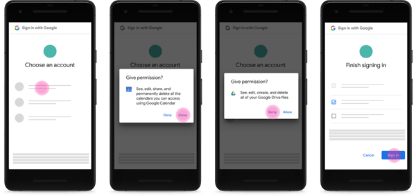
Source: Google
But the biggest change may lie within which apps are still allowed to even ask for permission in the first place. Google has strictly limited the type of app that can access this data — and among those who can, the use of that data is limited.
According to Google official user data policy, the types of apps listed below are permitted to request access to Gmail user data:
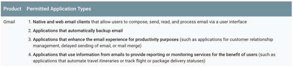
Source: Google
Essentially, only apps that directly apply to regular email functions — like reading, writing, or sending messages — or otherwise aid email “productivity” are considered “appropriate access” to Gmail user data. However, these app developers must still comply with data usage standards — listed in full here — including some that ban humans from viewing or reading this data without clear-cut, direct consent from users.
What is not allowed under the new rules, Google says, is accessing user data by any app for the purposes ad targeting, market research, or email campaign tracking.
Buried in Google’s security updates today: big, big changes to Google’s data policies re: Gmail access. Google will expressly prohibit apps from scraping inboxes for ad targeting (ahem @Unrollme ) https://t.co/hMLMSXofL4 pic.twitter.com/JS3w8Z51T0
— Karissa Bell (@karissabe)
October 8, 2018
The new rules will take effect on January 9, 2019, leaving developers just under two months to make necessary changes.
What Marketers and Business Should Know
To put these changes into context, one example of an app that could be impacted is the aforementioned aforementioned Gmail plug-in Unroll.me.
Originally designed to help automate the process of unsubscribing users from newsletters with which they weren’t engaging, the New York Times reported last April that the app actually collected email content data — like ride-hailing app receipts — from the users who had installed the plug-in. That data was then reportedly used for market research on behalf of Unrolled.me’s parent company, Slice Intelligence.
That type of app behavior and data access, under Google’s new rules, is no longer permitted.
If I understand it correctly, this change to gmail APIs is major. It means services that scrape your inbox to track flights, receipts, coupons, etc. — and then aggregate and sell that data — are now prohibited. https://t.co/tRsK3NPZpO
— Eitan Bencuya (@ebencuya)
October 8, 2018
Any app that does not wholly abide by the permitted types and capabilities (and corresponding data access rules) dictated by Google will have to be re-submitted for review by a third-party security assessor — which the company estimates to cost developers anywhere between $15,000 and $75,000.
If developers don’t agree to the security assessment, Google says, their “access to all covered API scopes will be disabled for consumer accounts.”
While that might seem an excessive and inaccessible price point for startup or emerging developers with limited budgets, overall, these changes could represent a broader step in the right direction.
Google is hardly the first to enforce API and app developer restrictions of this kind. Facebook, when faced with the improper harvesting of personal user data by voter profiling firm Cambridge Analytica, enforced a somewhat similar app review process — in the name of, the company said, user safety and security.
“It’s not surprising to see a crackdown on this sort of data usage, given the level of privacy risk in the market right now,” says HubSpot VP of Marketing Jon Dick. “Although it may be painful for some developers, I think it’s positive that Google is prioritizing end-user experience.”
As for what steps marketers and small-to-midsize businesses (SMBs) can take — both proactively and in response to this growing number of privacy-oriented changes by Big Tech companies — Dick says there are a few key takeaways.
“One of them, which is not new, is that it’s risky to build your business solely based on data from another company,” he advises. “We’ve seen platform changes from Facebook and Twitter impact SMBs before, and now, you can add Google to the list.”
But there’s also an upshot to developers, marketers, and SMBs here — and it comes in the form of gaining your audience’s confidence in your product, service, or brand, even if it means reformulating strategies and plans now.
That’s what Google appears to be aiming for with these changes.
“By ensuring that users get value back when they provide their data,” Dick says, “Google can start rebuilding trust with customers.”
We are evaluating this news and its implications on HubSpot and its ecosystem.
Featured image credit: Google

How Bitcoin’s Blockchain Technology Works
It doesn’t matter if you’re Bitcoin evangelist or a fierce opponent of the cryptocurrency, with a market capitalization of over $100 billion, it’s clear that Bitcoin is one of the most valuable and sought-after cryptocurrencies on the market.
Bitcoin isn’t a legal tender backed by any government, though, and only a tiny fraction of the world’s customers and merchants transact with it. So if most consumers don’t use the cryptocurrency as a currency, which is its intended use, why does it have so much value?
It’s because of Bitcoin’s underpinning technology — Blockchain.
You’ve most likely read about Blockchain on the internet or reluctantly listened to your office’s crypto guy rave zealously about the revolutionary use cases of the technology. But learning how Blockchain actually works can still be a challenge if you’re not well-versed on the topic of cryptocurrency.
To help you understand how Bitcoin’s blockchain technology works and why it’s been able to propel Bitcoin to the top of the cryptocurrency market, we decided to write a blog post about it. And hopefully, you’ll be able to grasp the nuances of Bitcoin’s blockchain technology, and not have to listen to your office’s crypto guy talk about raising virtual cats with Blockchain anymore.
How Bitcoin’s Blockchain Technology Works
Blockchain, the underlying technology of Bitcoin, is one of the main reasons why the cryptocurrency’s price has skyrocketed over the past year and a half. The technology acts like a public, digital ledger of every single transaction made in Bitcoin, recording each transaction of Bitcoin into a database, copying the database, and sending copies to every computer, or node, in its network.
To make sure this ledger’s true state is verified and updated, each node in its network cross-references and communicates with each other to see if all the copies are the same. This publicizes and validates every single transaction of the cryptocurrency. It also decentralizes the cryptocurrency, removing the need for a financial middleman to verify its transactions, like a bank.
If a node notices one of the ledger’s copies isn’t the same, due to a manipulation of a transaction’s record after the fact, the network rejects the transaction. This security protocol halts people from altering the ledger to spend the cryptocurrency more than once or send someone else’s digital funds to themselves.
To update a blockchain with these new, verified transactions, a new block, which is a bundle of these transactions, needs to be created and added to the chain, which is all the blocks linked together. But to create and add a block to the chain, the block needs to be validated by the answer to a complex cryptographic puzzle. So Bitcoin rewards the individuals, groups, or businesses who are first to solve the puzzle with a payout of the cryptocurrency.
These validators, who use mining software and hardware to earn Bitcoin payouts, are called miners. Once a miner figures out the correct answer to the cryptographic puzzle, which is verified by each node in the network, they earn the block reward and a new block is created and added to the blockchain. Each block has a unique code, called a “hash”, on one of its sides and the hash of the previous block in the chain on its other side, linking all the blocks together in a chronological and permanent fashion.
For Bitcoin miners, the block reward for validating one megabyte worth of Bitcoin transactions is currently 12.5 tokens. With one token’s value hovering at around $6,540 today, a successful miner could rake in approximately $81,750.
Validation methods like mining are called proof-of-work or PoW, and they’re one of the reasons why Bitcoin and Blockchain are considered so innovative.
Incentivizing miners with payouts of Bitcoin to validate its transactions makes the cryptocurrency safe, secure, and trustworthy to use. Mining also releases bitcoins into circulation, which increases the odds that consumers and merchants will be more willing to adopt, accept, and trade it, boosting the cryptocurrency’s value.
But even though mining is economically beneficial to miners, consumers, merchants, and Bitcoin itself, digging for it can actually harm the environment — Bitcoin miners are predicted to consume more electricity than the entire country of Argentina by the end of the year.
Bitcoin miners consume massive amounts of electricity because there’s a limited supply of Bitcoin. To avoid issuing the supply of Bitcoin too quickly, the cryptocurrency makes the cryptographic puzzles that validate each block increasingly more difficult to solve, allowing them to cap the number of blocks that miners can package and link to the chain each day.
As a result, the more challenging these cryptographic puzzles get, the more electricity miners have to use.
Bitcoin’s Blockchain in Action
To help further your understanding of how Bitcoin’s blockchain works, here’s a quick and simple example of a transaction made in Bitcoin:
Jack agrees to sell his motorcycle to Jill for one bitcoin. The record of this trade lists its transaction details, which includes a time stamp and a unique cryptographic signature.
The transaction then gets distributed to every computer or node in the network, who scan and cross-references every copy of the database or ledger to make sure the transaction is unique and valid.
If the network approves the transaction’s validity, miners package the transaction into a block and race to solve the cryptographic puzzle that validates the block. Once a miner solves the puzzle, the miner gets a block reward and the block is added to the chain.
Finally, Jill receives the motorcycle from Jack, and Jack receives one Bitcoin from Jill.

How to Make an Instagram Post Template for Your Business or Brand
Instagram is an undeniably powerful marketing tool, but with over 25 million businesses on the platform today, it’s critical you take the time to create well-designed and thoughtful Instagram posts to stand out.
You’ll need to apply a strategic design plan to your business’s Instagram to attract a loyal following and find success on the app, long-term.
However, creating a clean and cohesive Instagram feed takes design skills you might feel you lack. Plus, Instagram’s algorithm favors brands that post at least once a day — that time commitment could be adding to your stress.
If that’s the case, you’re in luck — there are ways you can create pre-made Instagram post templates, so you’ve got a stash ready-to-go. Plus, by ensuring you use the same templates for different posts, you’ll have an easier time creating a cohesive and aesthetically-pleasing feed.
Here are three different options to create and save Instagram post templates, so you can have stunning posts on-hand whenever you’re ready to publish.
1. Canva
Canva offers thousands of customizable Instagram post templates. To create an Instagram post on Canva, go to Canva’s Create a Design page, click “Instagram Post”, and then follow these steps:
1. On the left side, you’ll see an array of template options — some cost money, while others are free. Choose one.
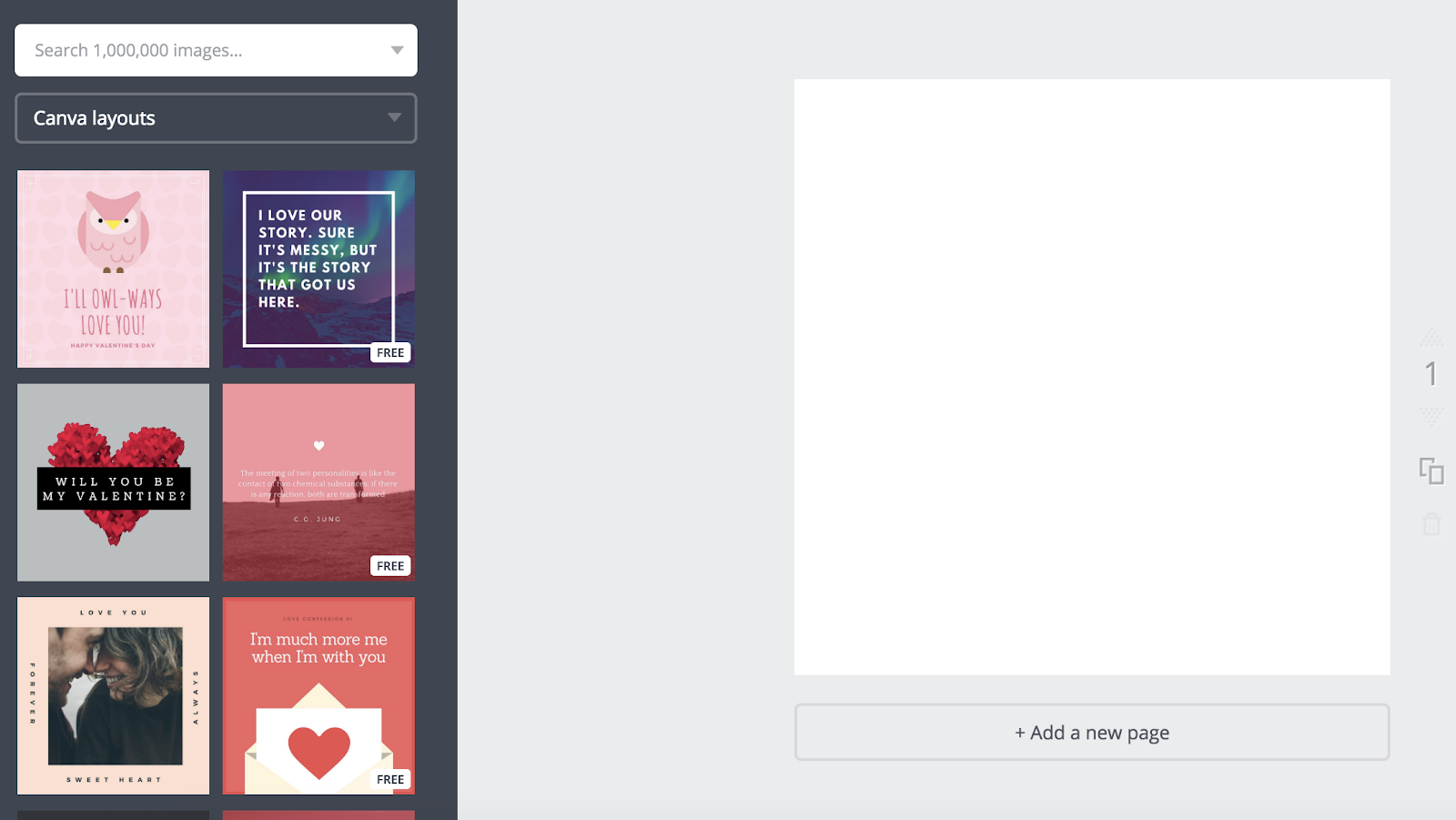
2. Once you choose a template, click on the text box to write something. There are colors at the top if you want to alternate your text color — you can also change font, size, and spacing.

3. When you’re finished with your text, click the background of your image (outside the text box). This will allow you to filter your background, adjust the brightness and contrast of the image, and more.

4. When you’re happy with your template, open up the Canva app on your phone. Click on your Instagram post design.
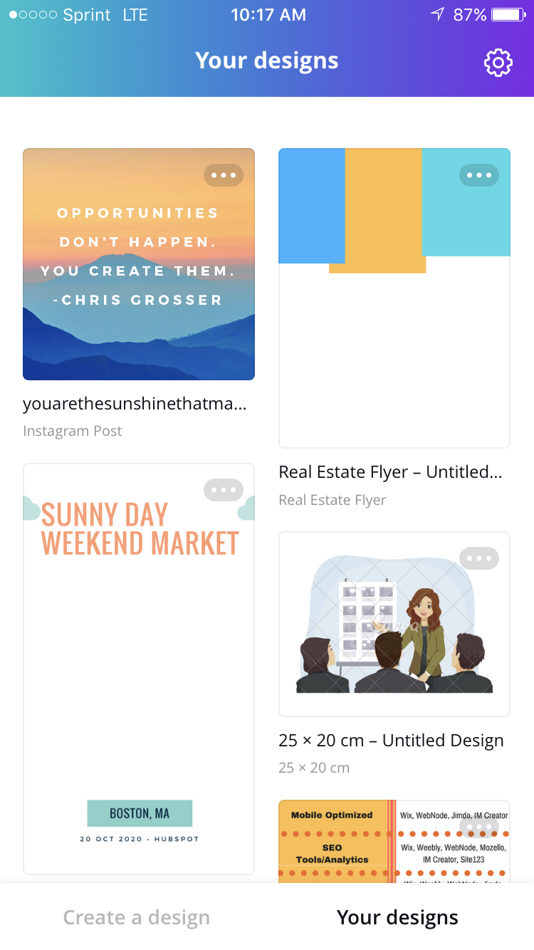
5. Click “Share” in the top right.
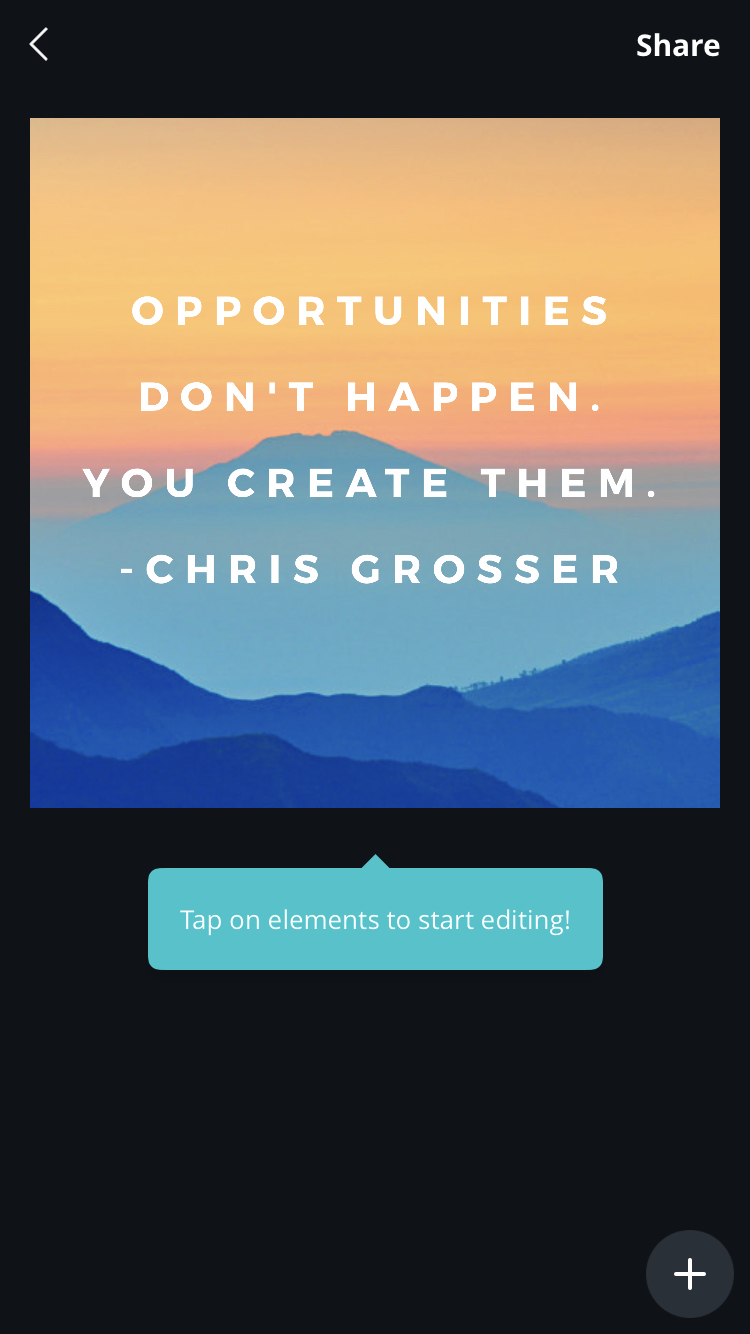
6. Now, you can post straight to Instagram by clicking “Import with Instagram”. If you aren’t ready to post it, you can also “Save Image” and it will appear in your camera roll for later.
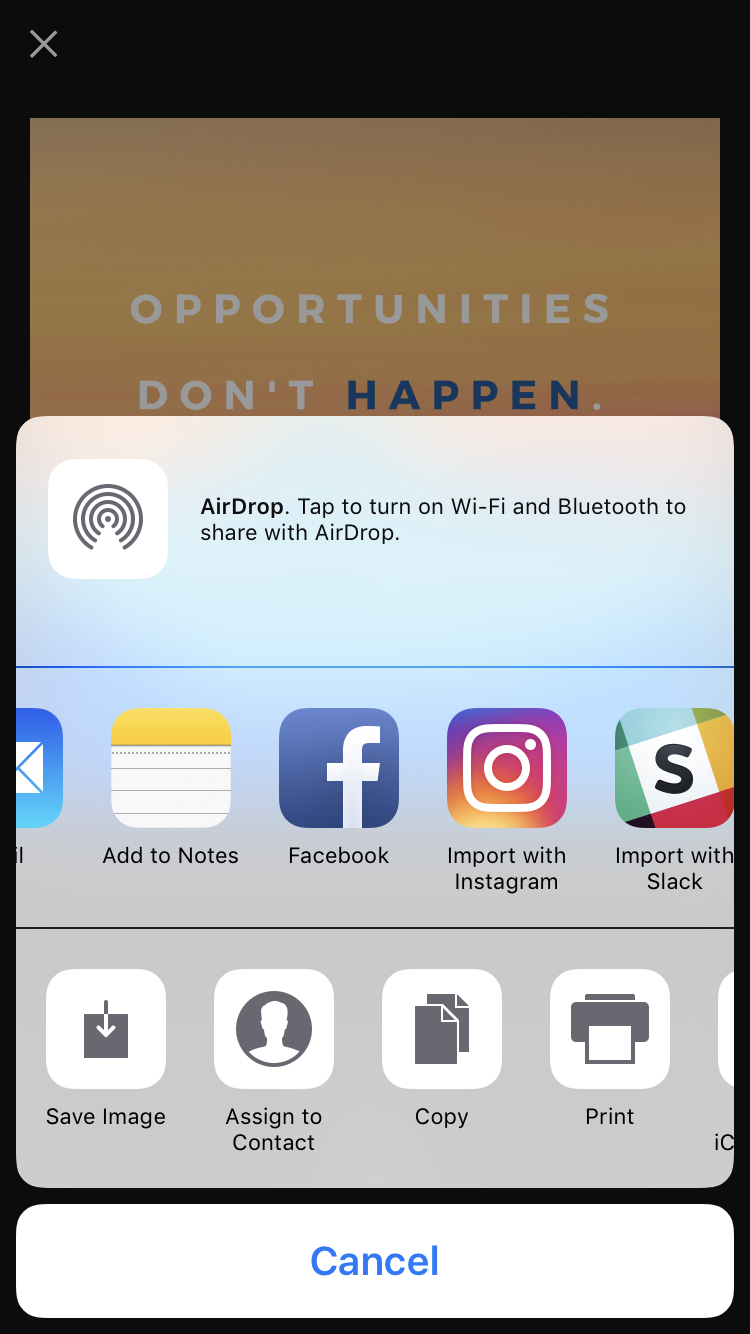
7. If you are immediately posting to Instagram, choose whether you want to upload to your “Story” or “Feed”.

8. Edit the Instagram post like you would any other post — add tags, a caption, location, etc. When you’re ready, click “Share” in the top right.
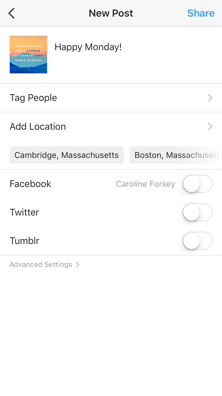
Remember, your template is automatically saved to your Canva account. You can access it in the future, on both desktop and app versions of Canva, and edit it with new text to post the same design again.
Alternatively, you might consider creating a few posts now, and then saving them to your camera roll to post them in the future.
Besides Canva, there are a few other design editors that offer free pre-made Instagram templates. In particular, here are three tools you might consider:
2. ReciteThis
If you’re interested in creating a template for quote posts, it’s easy to do — in fact, we’ve already curated a list of nine apps to help you make quotes for Instagram.
For our purposes, we’ll try just one — ReciteThis.
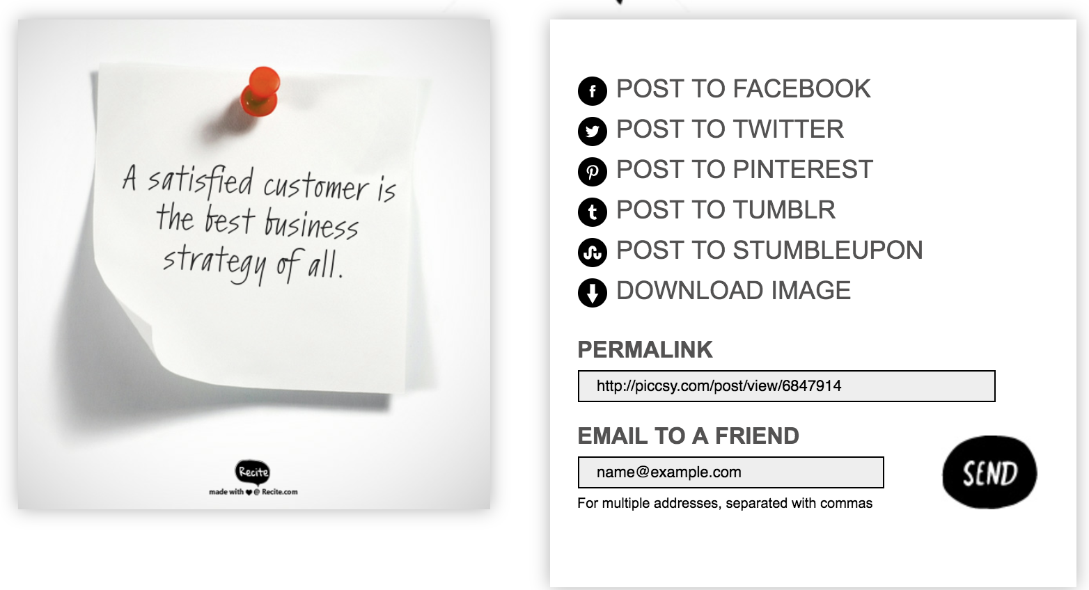
To create a quote template for Instagram, go to ReciteThis, then follow these three easy steps:
1. Enter your quote in the text box.
2. Below, click the left or right arrows to peruse templates and choose one you like. Once you’ve chosen a template and written your text, click the “Create” button in the text box.

3. Click “Download Image” to post to Instagram’s desktop version, or email it to yourself to post on your phone.
3. Creative Market
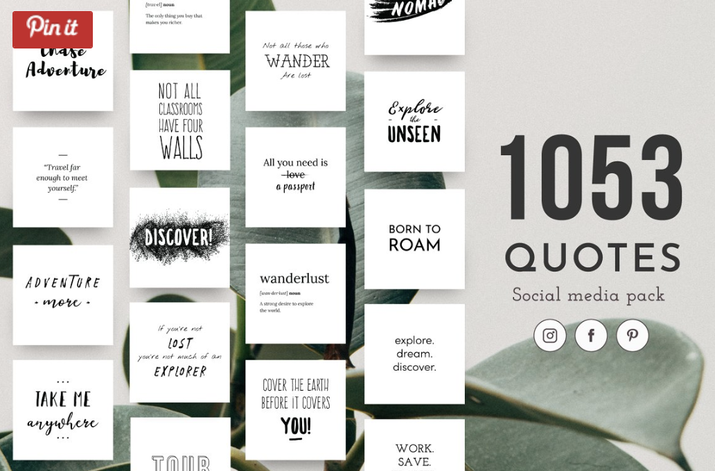
If you’re willing to shell out the cash, you might consider buying one of Creative Market’s Instagram Template bundles.
For instance, you could purchase this 1053 Quotes social media pack.
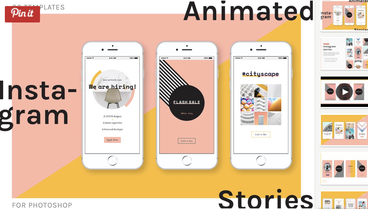
Alternatively, you can purchase a bundle with Instagram Story content, like this Animated Stories bundle.
Finally, you might consider purchasing a bundle to help you create a cohesive theme for your Instagram feed, like this The Grid template.
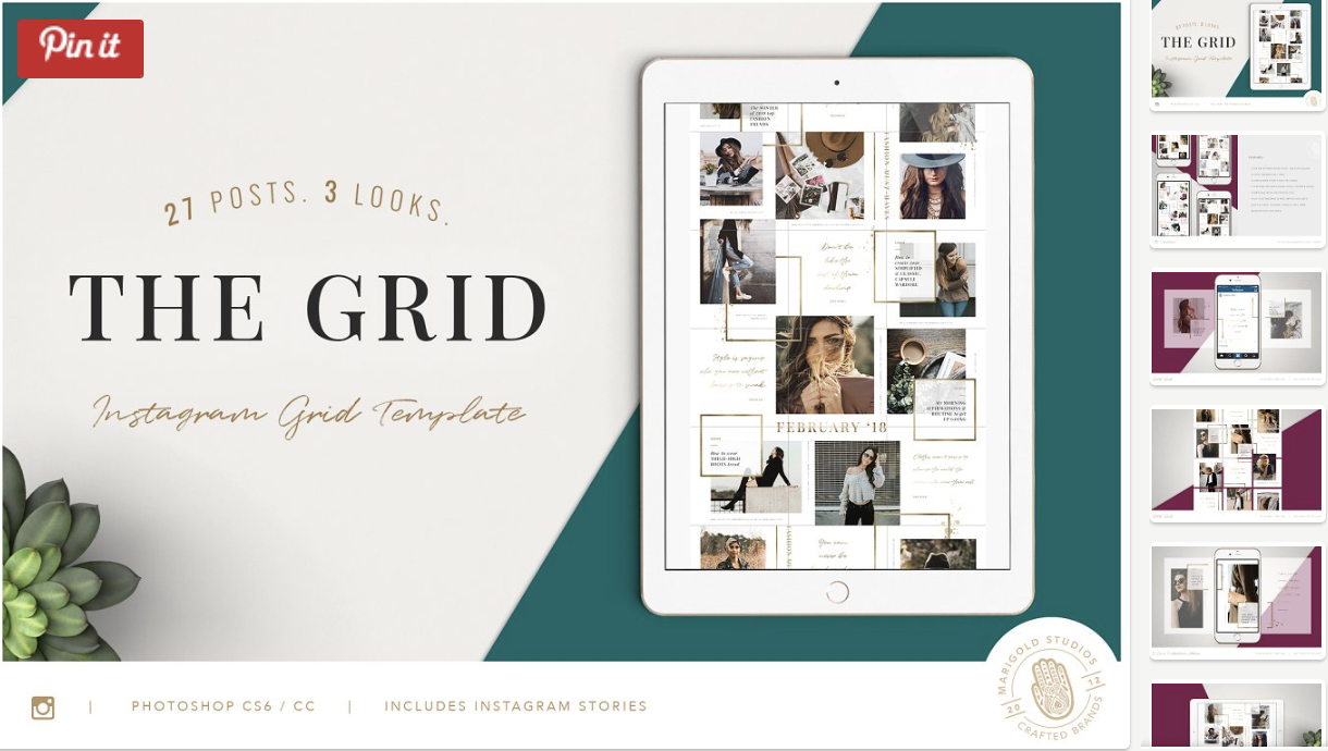
And that’s it! You’re all set to create and save pre-made Instagram templates, so you can focus on attracting a loyal following without tediously designing a post from scratch every day.
Check out our Instagram Marketing: The Ultimate Guide for more Instagram tips and tricks.

How to Use Instagram Quick Replies for Direct Messages
Are you using Instagram Direct Messages to communicate with your audience? Looking for an easy way to provide quick replies to common questions via Direct Messages? In this article, you’ll discover how to create multiple Instagram quick replies to your Instagram Direct Messages. What Are Instagram Quick Replies? Instagram has relatively quietly rolled out the […]
The post How to Use Instagram Quick Replies for Direct Messages appeared first on Social Media Examiner.
from Social Media Examiner https://ift.tt/2J3Pjc0
via socialmediaexaminer
How to Write Good Instagram Captions: 8 Bookmarkable Tips for Perfecting Your Copy
Instagram marketing is all about the visuals. The quality of your photos will be the differentiating factor when it comes to gaining Instagram followers, getting them interested in your brand and what it’s about, and showing off the human side of your business.
But the hard work doesn’t end once you’ve taken that beautiful photo and edited it to perfection. The caption of your post is where you can give a voice to that visual content.
A good Instagram captions explains what the photo is about, tells your followers to take action, or cracks a joke that makes your content all the more delightful and shareable.
If you think of the caption on your Instagram posts as an afterthought, you’re losing out on an opportunity to engage and delight your followers in ways you can’t with just a visual. Here are some tips to help you write better Instagram captions.
How to Write Instagram Captions
- Write several drafts first.
- Front-load the important stuff.
- Include a call-to-action.
- Limit yourself to four hashtags.
- Meld your brand voice with Instagram’s lighthearted tone.
- Use emojis.
- Cross-promote your other social channels.
- When in doubt, keep it brief.
1. Write several drafts first.
Ever thought of the perfect joke after it was a little too late to tell it? We’ve all had a similar feeling when we come up with the perfect Instagram caption once we’ve already published the post.
The lesson? Don’t rush the process. Instead, write a few ideas for captions down, sit on them for a bit, poll coworkers on which one is best, and generally take your time.
You might be asking yourself at this point, “But aren’t timeliness and chronology important on Instagram?” They can be, depending on the subject of your post. For example, professional Instagrammer Patrick Janelle says he uses Instagram as a kind of chronological journey of his activities and lifestyle. He likes to post in real time to document what he’s doing at a given moment.
But thanks to the impending Instagram feed algorithm change, the level of engagement your posts receive will soon matter more than chronology. Soon, our Instagram feeds will be ordered to show the moments Instagram thinks we’ll care about the most. The visibility of your posts in your followers’ feeds will depend on the number of Likes and comments a post has, your relationship with the user posting, and other factors.
That’s why it’s important to take your time constructing a great caption that’ll keep your followers around, delight them enough to share with their friends, and encourage them to engage with your content.
2. Front-load the important stuff.
The maximum character count for an Instagram caption (2,200 characters) is basically a formality. But the important thing to note is that captions cut off in users’ feeds after three to four lines of text.
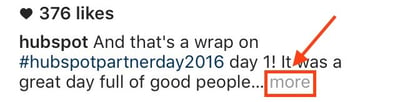
That doesn’t mean you should keep your captions super short so users can see 100% of it without having to click “more.” Instead, frontload your captions with the important content or text calls-to-action — and leave any hashtags, @mentions, or extraneous information for the end.
Here’s an example of an enticing, front-loaded caption from coffee-based skincare company Frank Body:

3. Include a call-to-action.
The best way to increase the share potential of your Instagram post and engage your followers is to have some sort of call-to-action in the captions of your photos. That means using action verbs to prompt people to do something, instead of just passively scrolling by. We found that verbs generate more shares on Twitter than nouns and adjectives — the same can be true for Instagram.
For example, you might say, “double-tap if you find this funny” or “share your story in the comments.”
Here are a few other action-based ideas to get you started:
Ask a question.
Encourage people to comment with their own experiences. You might be able to draw on these experiences to shape your Instagram strategy moving forward, or to come up with new content ideas. To increase engagement and delight your followers even more, respond to users’ answers to make it like a conversation.
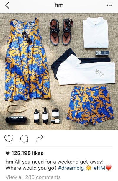
H&M: “All you need for a weekend get-away. Where would you go?”
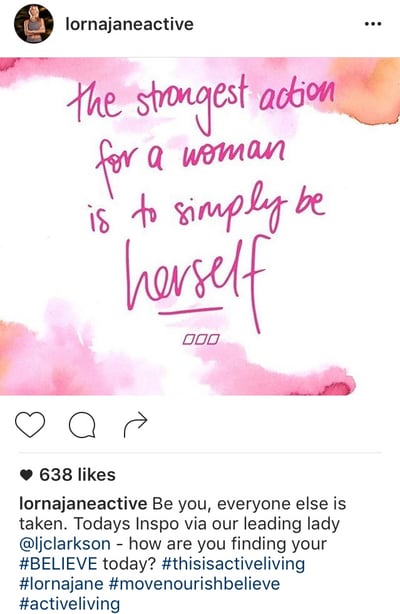
Lorna Jane: “Be you, everyone else is taken. Today’s inspo inspired by our leading lady @ljclarkson – how are you finding your BELIEVE today?”
Direct people to a link in your bio.
Clickable URLs aren’t allowed anywhere except the single “website” box in your bio. That’s why optimized Instagram profiles update that URL frequently to point to their latest blog content, YouTube videos, products, or offers — and then refer to that link in their Instagram captions.
For example, are you running a contest, or want to increase subscribers to your blog? Just change the link, and then post a photo that mentions the new link in its caption.
Pro tip: Use shortened links that include UTM tracking codes so you can see how much of your traffic came from your Instagram page. (Learn how to create UTM codes to track your URLs here.)
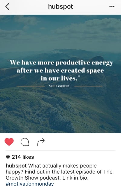
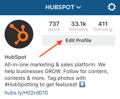
To change the link in your bio, go to your profile page and click “Edit Profile.”
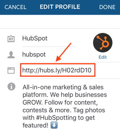
Then, simply insert the URL of your choosing into the URL box.
Invite people to tag their friends.
Encourage your followers to share your post with friends by inviting them to tag their friends. Here are a few examples of fun, clever ways brands have asked followers to tag friends.
Frooti: “It’s scrabble day! Tag some friends you’d like to play with.”

H&M: “Planning for a luxe escape with your bestie? Tag your travel partner in crime!”

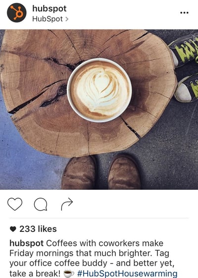
HubSpot: “Coffee with coworkers make Friday mornings that much brighter. Tag your office coffee buddy – and better yet, take a break!”
Invite people to enter a contest.
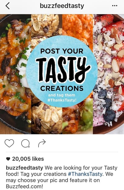
Contests are great for increasing engagement and brand exposure on Instagram.
Simply invite people to post their own pictures and tag them in the caption using a hashtag, like BuzzFeed Tasty does below.
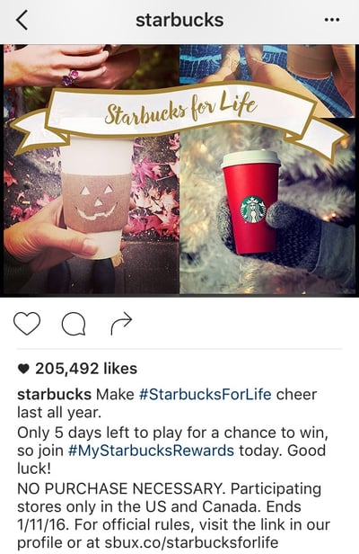
Consider including the contest’s official rules in your caption for folks who are interested, and even a link in your bio.
4. Limit yourself to four hashtags.
On Instagram, a hashtag behaves the same way as it does on Twitter and Facebook: It ties the conversations of different users into one stream. As long as your account is public, anyone who does a search for that hashtag may find your Instagram post. (Read this blog post to learn more about how hashtags work on Instagram, Twitter, and Facebook.)
Hashtags are great for connecting users who aren’t otherwise connected to one another, but who are talking about — and interested — in the same topics, events, brands, and so on. They’re also a great way to add some fun and coy humor to your posts, like FOMU did below.

But, use hashtags sparingly. Some Instagram users include a string of searchable hashtags as a way to get more followers — but the fact is, it looks spammy to the followers you do have. If you use a ton of hashtags, people will notice, and they will think it’s lame. Limit your hashtags to three or four, tops.
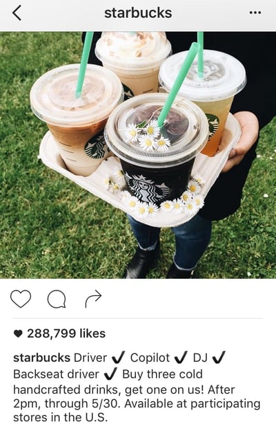
And remember, you don’t have to include any at all if you don’t want to. You don’t need a hashtag to have an awesome Instagram caption. Here’s an example of a good caption with no hashtag from Starbucks:
Use hashtags at the end of your caption.
Unless the hashtagged phrase fits naturally into a sentence, don’t list any hashtags until the very end of the caption. That way, the part of your caption that’s more appealing to humans will come first, making it more user-friendly.
Plus, if your caption is long enough to get cut off, the hashtags that are there to connect people (as opposed to delight people) will be hidden. So the hashtags in this caption …
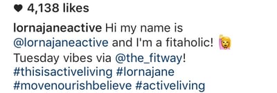
… will be hidden from folks scrolling by in their Instagram feeds — which is totally fine, since they’re just there for search reasons.

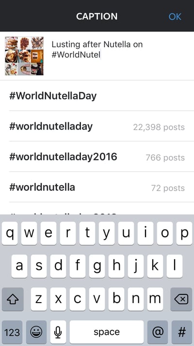
Pro tip: Need inspiration for a hashtag that’s already popular? Instagram will suggest hashtags to you based on their popularity when you open up a new post and type out the # symbol followed by an incomplete search. Here’s an example of that in action:
5. Meld your brand voice with Instagram’s lighthearted tone.
Every social network has a different tone that works best. While serious, jargon-heavy copy may work well on LinkedIn, for example, that same copy won’t work as well on Instagram. The best Instagram posts tend to have a lighthearted, fun tone, showing off the more authentic, human, and personable side of a brand.
That’s why you’ll want to adapt your brand voice for Instagram’s more lighthearted tone. This’ll be easier for brands whose brand voices are already lighthearted and fun, like Wistia’s:

For others with a more serious brand voice, find a balance between sincerity and relatability.

Being relatively consistent in your Instagram voice can help you build your brand on the channel. For example, think about how long you’ll typically want most of your posts to be. Do you want to be a storyteller who writes a paragraph or more?
Or do you need the space to write out instructions, or a recipe?
Or do you favor a minimalist approach with just a few words?
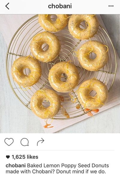
When in doubt, be punny. Cleverness tends to perform quite well on social media, especially Instagram. People love when brands crack a joke or include a play on words. JetBlue, for example, is always an excellent source of puns:

Here’s another one from Chobani:
If you’re experience caption writer’s block, the Wall Street Journal‘s Elizabeth Holmes suggests playing a word association game or brainstorming with a friend.
6. Use emojis.
Emojis, the cartoon-like emoticons available to most smartphone users, can add some personality to an Instagram caption. That’s why a lot of brands use them in their captions — even the more “serious” brands.
There are a lot of different ways to use emojis in your posts. For example, you can use them at the beginning of post to catch people’s eye, like this:

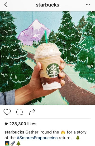
You can also use them in the middle of sentences to replace words, or at the end of a post as a sort of “punchline,” like this:
7. Cross-promote your other social channels.
You can also use your caption to cross-promote your other social media accounts. This is a great way to let your followers know where else on social media they can find you — so that your Instagram followers can become your Twitter followers, your Facebook fans, your Snapchat audience, and so on.
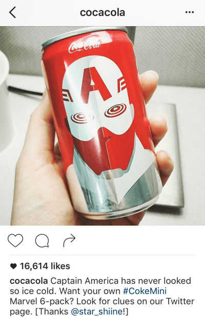
For example, you might promote a campaign that’s taking place on another channel, like Coca-Cola did here:
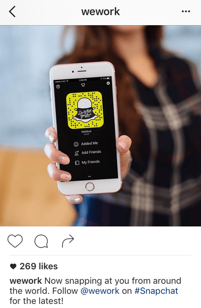
Pro Tip: If you have a Snapchat account, Snapcodes are perfect for cross channel promotion on your other social media profiles. Every Snapchat user has a unique Snapcode, which is an image that looks like the Snapchat logo but with a unique pattern of dots. To follow you on Snapchat, all users will have to do to is open the Snapchat app, take a photo of your Snapcode, and tap their screen.
Here’s an example from WeWork:
8. When in doubt, keep it brief.
Depending on your audience, your captions might need to be longer than a few words or a sentence. For example, if you’re a food company, you might post entire recipes in your captions — and that’s OK, as long as you’re front-loading the caption with the most important information (like the name of the recipe) so it doesn’t get cut off.
But if you’re not sure what your brand voice is yet, a good rule of thumb is to keep it brief. Some of the best Instagram captions are short punchlines, or in some way make their point quickly and let the visual content do most of the talking.
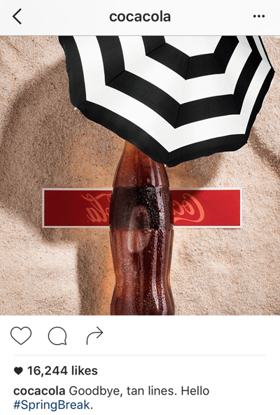
Coca-Cola: “Goodbye, tan lines. Hello #SpringBreak.”
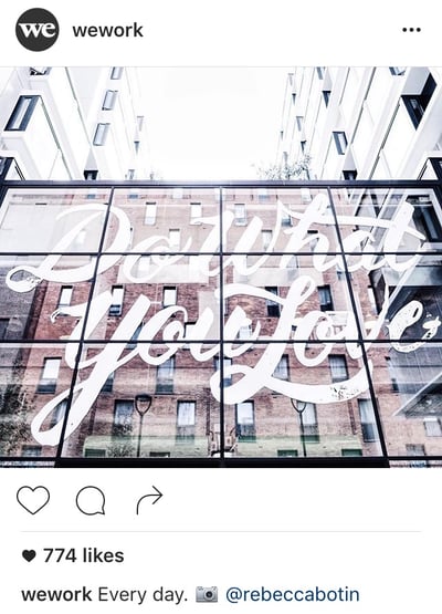
WeWork: “Every day.”
BuzzFeed Tasty: “Whip it good.”
Good Instagram Captions
So, what makes a good caption on Instagram? Let’s recap:
- Leading with the good stuff
- A call-to-action (CTA)
- A healthy number of hashtags
- A lighthearted tone
- Emojis
- Cross-promoting other social channels
- Brevity
The companies cited in the steps above all have their own way of engaging their followers on Instagram, but how can you apply their approach to captions of your own?
Let’s take a look at some more Instagram captions that celebrate these important qualities and that you can apply to your business’s Instagram strategy.
Captions that lead with the good stuff
“That’s a wrap on [company event], day 1! It was a great day of good people, sessions, and keynotes…”
“[New product] is now live! Get your free 30-day demo right now and see for yourself…”
“We’re working with [partner/company] on a new initiative to [shared goal]. Our staff can’t wait to get started…”
“We’re here at [industry event]! Come say hi at [booth #] and see our CEO before he takes the stage at [panel discussion]…”
“Congrats to our own [employee name] for winning [award]! A well-deserved honor for someone who crushed it this month…”
Captions with CTAs
The best [product] for this time of year. What’s your favorite part of the fall? Let us know in the comments!
We’ll be closed January 1, but back with an exciting announcement after New Years … where will you be on New Years Eve? Share your plans, below!
[Podcast] episode 1 is now available for listening! Couldn’t be happier with our guest, [name of guest]. Link in bio.
Team synergy is crucial to a great company culture. Tag a coworker you love working with in the comments below.
We’re so excited to launch [new product], but every great [type of product] needs a great name. Submit your name suggestions and the best one wins a year of free service! Link in bio.
Captions with one to four hashtags
We’re here at Mile 17 of the #NYCMarathon cheering on our company running club! Amazing day for 26.2. #ILoveNYC
[Event name] attendees: Join us at the 3 PM panel to learn how #NewTrend is changing the industry. #EventHashtag
Surprised the marketing team with donuts for hitting their #LeadGeneration goal and because they’re free today! #FreeDonutDay #FridayFeeling
Captions with a lighthearted tone
High fives to everyone who hit their goal for the quarter! If not, get psyched to crush it this quarter. You’re gonna’ do great. #goals
Recycling isn’t just a requirement in our office park — it’s the right thing to do. Happy Recycling Day! #RecyclingDay
Happy Monday! Don’t dread the week, embrace it! Happy employees make for happy customers. 🙂 #MondayMotivation
Captions with emojis
Spotted 👀 the [company name] logo downtown! Love seeing the community give us some love. ❤️
Everybody contributes to the health of our planet. To be successful at [company name], we need to be respectful of 🌎. Happy #EarthDay!
#MarchMadness has begun, and we’re cheering for our state team at [name of college] tonight. Let’s do it, [team mascot]! 🏀
🏆 ALERT! 🏆 Excited to be named in the Top 20 Best Places to Work in [State] for [year]! We owe it all to our hardworking employees and loyal customers. You all rock.
Captions that cross-promote other social channels
At 11 AM tomorrow, we’ll be live tweeting from our CEO’s keynote at [industry event]. Follow along on our Twitter page! Link in bio.
We’re so sorry if you couldn’t log in to your [company name] account yesterday, and want to make it right. Check in with us on Facebook Messenger and get your redeemable discount code.
We’re up and running on LinkedIn, and so are our employees! Find and connect with us now (we don’t bite). Link in bio.
Brief captions
New year, new logo.
We’ve moved! Check out our new office.
Happy #Thanksgiving! What are you thankful for?
#TGIF.
Happy New Year!!
[Your slogan or tagline].
As you test out different types of posts on Instagram, keep track of how different post types work — including your captions. Instagram doesn’t have a whole lot to offer in terms of analytics, so you’ll have to do this manually.
Try listing each post on a spreadsheet and keeping track of its URL, the time it was posted, how many Likes and comments it got, and the types of feedback you’re getting from your followers.


The 7 Best Smartphones for Business in 2018
We rely on smartphones to connect with our friends and family and stay informed about current events. But it seems like the only time we use smartphones for work is when we check our email.
Today, smartphone technology has advanced to the point where you can get a substantial amount of work done with just your thumbs — smartphones can now access your work documents, take professional-grade photos, and even translate signs that are in different languages.
If you want to be more productive during your commute or be able to work on the go, check out these seven smartphones for business.
Best smartphones for business
- iPhone Xs
- Google Pixel 2 XL
- Samsung Galaxy S9+
- BlackBerry KEY2
- Microsoft Lumia 950
- OnePlus 6
- LG V35 ThinQ
1. iPhone Xs

Image Credit: Digital Trends
Apple’s latest iPhone isn’t just a slightly bigger yet marked-up version of the iPhone 8. It’s on the pricier side for good reason.
Armed with a Gigabit-class LTE, 512 GB of storage, and an intelligence A12 bionic chip that has a neural engine, the iPhone Xs can deliver up to 50% faster graphics performance, 15% faster performance cores, and 50% lower power usage in efficiency cores. In other words, it’s one of the fastest and powerful smartphones on the market.
The iPhone Xs also has one of the most powerful smartphone cameras on the market. You can shoot 4K videos in up to 60 frames per second and take professional-grade pictures with the camera’s larger and deeper pixels and sophisticated portrait mode.
2. Google Pixel 2 XL

Image Credit: Forbes
Google might not be able to get a social network to catch on, but they can definitely build a phone. Powered by Google Assistant, the Pixel 2XL can listen to your commands and text and set reminders for you, turn on Bluetooth, and activate Google Lens, which can identify landmarks, objects, and even scan business cards to add contact information into your smartphone.
The Google Pixel 2XL is also incredibly powerful and efficient — it has storage options of 64 or 128 GB and will give you up to seven hours of battery life with only a 15-minute charge.
3. Samsung Galaxy S9+

Image Credit: Trusted Reviews
The Samsung Galaxy S9+ might be one of the best smartphones for business travel and security. Powered by Bixby Vision, the Galaxy S9+’s camera can translate up to 54 languages on signs and menus to help you navigate any foreign country you’re traveling through.
The smartphone’s camera also features intelligent scan, which combines face recognition and iris scanning to instantly recognize you in any light and even when you’re wearing sunglasses.
You can buy the Samsung Galaxy S9+ in two storage options: 64 GB and 128 GB.
4. BlackBerry KEY2

Image Credit: The Verge
Even though BlackBerry has lost its dominance in the business smartphone market, the company still pioneered the trend of working on your phone and develops some of the most advanced smartphones for business.
The KEY2, powered by Android, is branded as “An Icon Reborn” because BlackBerry kept their classic physical keyboards on the smartphone but also upgraded it by making the keys 20% bigger and adding a Speed Key button that can activate 52 custom shortcuts to apps and specific actions.
The KEY 2 also offers some of the strongest smartphone security with the BlackBerry DTEK app, giving you the ability to see and alter which applications have access to your camera, microphone, location, and personal information.
You can also keep files and photos completely private with BlackBerry Locker, a pre-downloaded app that hides your files and photos from anyone who could access your phone.
BlackBerry’s KEY2 has up to 256 GB in storage space and its battery can stay powered for up to two days on just one charge.
5. Microsoft Lumia 950

Image Credit: CNet
The Microsoft Lumia 950 is like a mini PC. Powered by Windows 10, the smartphone syncs with all your other Windows 10 devices, so you can access any of your Office documents, presentations, spreadsheets, notes, and photos.
You can also connect the Lumia 950 to a Microsoft Display Dock and use it like a computer to access your files from any Windows app, letting you work comfortably from home, even if you forgot your laptop at the office.
The Lumia 950 has up to 200 GB in storage space, OneDrive cloud storage, and built-in wireless charging.
6. OnePlus 6

Image Credit: CNet
By developing their own operating system, OxygenOS, OnePlus’ flagship smartphone will help you get more work done in less time. Whether you’re working, browsing, or shifting through apps, the OnePlus 6’s smart software can optimize your experience based off your habits on your phone.
You can buy the OnePlus 6 in two storage options: 128 GB or 256 GB.
7. LG V35 ThinQ

Image Credit: CNet
Another smartphone powered by Google Assistant, the LG V35 ThinQ’s can assist you in real-time, identify objects you hover your phone over, and pick up your voice in noisy environments.
The V35 ThinQ also has an Artificial Intelligence camera that can recognize the subject and environment in your frame and suggest the best filters and angle for your photo.
You can store up to 64 GB on the smartphone.

The Future of Content Strategy
Content marketing has seen a lot of changes during the past few years. Many of these changes can be attributed to the rapidly evolving search landscape, as well as a huge shift in the way people are actually discovering content. New, more sophisticated search algorithms, changes in the way people use search engines, and new ways that marketers go about actually developing their content are just a few of the contributing factors and outcomes.
All that said, many marketers still experience the same pain points that were commonplace more than five years ago:
- “I struggle to measure the ROI of the content I create.”
- We create great content, but we still don’t seem to rank high in Google for our target keywords.”
- “So, I’ve done my keyword research. Now what?”
As a response to these problems — specifically the second one — a lot of marketers will create more and more content. Unfortunately, creating larger volumes of the same underperforming content will often result in the same underwhelming results — just at a greater expense.
In fact, adding more content to a poor existing site architecture can make it even harder for Google to find and rank your content. That’s not a situation any marketer wants to find themselves in.
The answer to these problems spans way beyond the number of blog posts being pushed out each week; the real problem lies in the way that most content strategies are being developed and organized.
SEO is evolving, and marketers need to change with it.
Fortunately, there are ways to overcome these obstacles and drive high-performing results for your marketing team.
Here we’ll discuss the changing state of search and how marketers can keep up. Continue reading this page or use the links below to jump to a specific section.
Search Engines are Changing
Before we jump into solutions for finding success in the changing world of content marketing, let’s spend some time looking a bit deeper into the driving forces behind that change.
First, we need to chat aboutsearch engines. Updates to the way search engines process and evaluate content have created drastic changes in recent years for SEO. As a result, the old metrics of success aren’t as reliable as they once were.
For example, one of the ways in which content producers evaluate the performance of content is by looking at keyword rankings within the search engines. However, there’s been a lot of debate around the actual credibility of keyword rankings as a metric, and the reason for this largely stems from the fact that rank changes depending on context.
To put it simply, depending on how and where you’re searching from, you’ll see different search results, which makes it difficult to evaluate success based on keyword rankings alone.
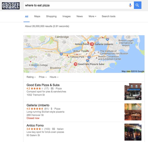
A simple search for the term “where to eat pizza” illustrates this perfectly. If you’re searching for this query from Boston, you’ll receive a completely different set of results compared to someone searching in San Francisco. In fact, the results page for this query probably has thousands of different variations at any one moment in time.
With this in mind, how do you accurately determine your ranking for this keyword?
Outside of keyword ranking problems, the search engines have also been dictating how content should be structured, most notably with the increased appearance of featured snippets.
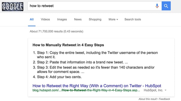
Google has been rolling out more and more featured snippets within the search results — one study found that of 1.4 million queries, 30% showed a featured snippet. These boxes try to answer the question that the searcher has without them needing to navigate through to the content.
The reality is that content ranking within the featured snippet section often gets a much greater share of the traffic for the given query when compared to non-featured snippet SERPs.
Publishers now have to restructure their content to try and appear within these featured snippets, of which Wikipedia reigns supreme — owning an estimated 11.2% of all featured snippets.
On a more general level, Google in particular has been making big investments in machine learning and has introduced RankBrain into the core algorithm it uses to index and rank content. Ultimately, RankBrain enables Google to better understand the intent behind specific queries without the search query explicitly stating them — all with the goal of providing more relevant results to the searcher.
This brings us to the next big change in search: the searcher.
Searchers are Changing
More significant than the way in which search engines themselves are evolving is the way that searchers are communicating with search engines.
Amplified by the rise of mobile and voice search, queries have become more and more conversational. A few years ago many people entered fragmented terms into search engines. Now, it’s more common for people to ask complex questions using full sentences. Google’s updates over the past 2-3 years have focused on understanding these types of queries better through natural language processing, most notably with the rollout of Hummingbird in 2013.
The introduction of this new search algorithm, which began analyzing phrases instead of solely relying on keywords, marked a major switch for the search giant from keyword to topic-focused SEO. In 2016, Google CEO Sundar Pichai announced that one out of five queries on its mobile app and on Android devices were voice searches. Based on these new developments, the increasing importance of search topics shows no signs of slowing.
The takeaway here for marketers? The traditional view of “keywords” in search has changed. Where a few years ago there were maybe 10-20 “big keywords” that would be sought after for ranking within a topic, there are now hundreds or thousands of long-tail variations that are regularly searched within a topic and change based on location. Simply dominating a few words is no longer enough to produce successful results.
Content Strategy in 2018 and Beyond
Considering the advancements in the ways that both the search engines and searchers are evolving, there needs to be a shift in the way marketers determine their content strategy — especially when focused on driving organic search.
The way we approach this at HubSpot is to look at our visibility across a topic, as opposed to a specific keyword. By organizing content within topic clusters instead of individual disjointed posts, we’re able to capture a large amount of search traffic across an ever-increasing pool of relevant keywords. This also allows us to align our brand with several recognizable core topics. Embracing the topic cluster model has allowed us to completely transform how we create and organize our content.
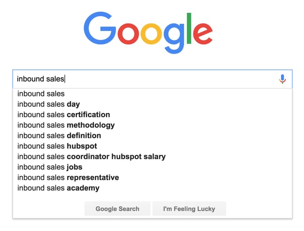
A great example of this is around “inbound sales,” an area that we’ve been covering a lot. You can see from Google’s autocomplete section that there are a number of big links to HubSpot — with our Inbound Sales Day, Certification, and Methodology being the top three, as well as a direct mention of the HubSpot brand.
We’ve managed to align our brand with topics that directly relate to our buyer personas, and as a result of this topic cluster model, we generate millions of relevant visits to our web properties.
What’s a Topic Cluster?
The basic premise behind building a topic cluster content program is to enable a deeper coverage across a range of core topic areas, while creating an efficient information architecture in the process.
You’re probably thinking, “This sounds difficult to implement? How can I start using this strategy for my own content marketing?” Don’t worry, it sounds more complicated than it really is.
In simpler terms, a pillar page is a broad overview of a specific topic. You can think of it like a summary or road map. We built pillar pages for each of our major focus areas. Linking into the pillar content is a range of content that covers individual, more specific subtopics, otherwise known as cluster content. Each cluster topic page for the pillar focuses on providing more detail for a specific long-tail keyword related to the main topic. The pillar links to each cluster page and each cluster page links back to the pillar with the same hyperlinked keyword.
The benefit of this model, in addition to organizing your site architecture, is that one high performing cluster page can elevate search rankings for all the other pages linked to the same pillar.
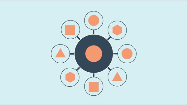 By aligning sets of web pages this way into topic clusters, you can manage the internal linking between each page more efficiently, boost your search ranking, and also provide a better user experience for visitors.
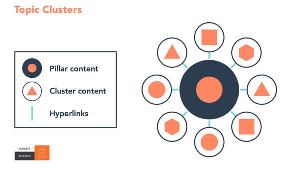
Building a solid information architecture is incredibly important for ranking well in organic search across a broad topic area. Creating hyper-focused clusters of content geared around a specific topic will not only help solve for that, but also enable you to keep focused on creating content that your target audience actually cares about. That means higher efficiency for your search marketing and less time wasted on producing repetitive content that doesn’t help advance your search goals.
The typical way to structure a topic cluster of content, which we outlined earlier, is with one larger piece of content that broadly covers the core topic, otherwise known as pillar content. Here’s an example to illustrate this:
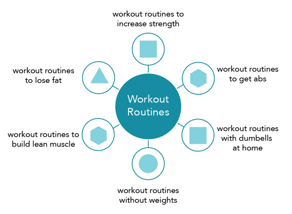
In the above example, the core topic is “workout routines.” Each of the surrounding subtopics focuses on a more specific branch of the core topic, for example, “workout routines to build lean muscle.”
The role of the pillar content is to cover the core topic broadly while also converting visitors into leads (or whatever your conversion goal is). The cluster organization also signals to search engines that the content has more in depth information on the topic, in turn giving your pillar page a higher level of authority on the topic while gaining higher search placement from orderly linking.
The beauty of this model is that you can spend a lot more time optimizing your pillar content for conversions and your cluster content for traffic. This saves a lot of time compared to the traditional model of optimizing each individual post. It also makes it easier for you to give a better user experience while sending a positive signals to the search engines with this site architecture.
For example, the typical organization of a blog may look like the below, with lots of overlapping and repetitive posts on a few focus topics:
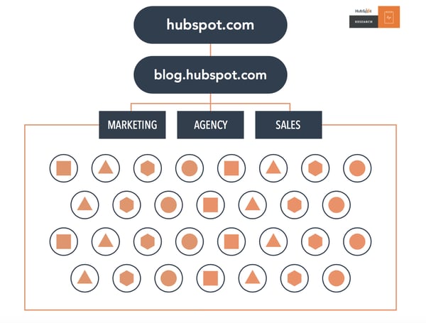
A blog using topic clusters would look like this, with multiple posts all linking back to their respective pillar pages for each core topic:
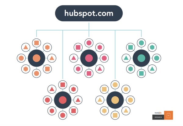 An example of pillar content that we’ve produced at HubSpot would be our Blog Topic Generator tool.
This pillar content brings in a substantial amount of new leads every month and gets a considerable amount of traffic. Tools work particularly well for pillar content because they’re often evergreen content and get shared a lot.
We’ve built out a wide range of cluster content that ties into specific subtopics. An example of this would be our blog post titled, “How to Think Up a Year’s Worth of Blog Post Topics in an Hour,” which has an internal link pointing to the Blog Topic Generator tool. For more inspiration, check out these great pillar page examples.
This content will drive traffic to the pillar content and push positive link signals to the search engines in the process, increasing both the organic search visibility and leads generated from the overall topic cluster.
How to Create a Topic Cluster Plan
Before you get started creating new topic clusters of your own it’s important to determine if this is the right approach for your site. You can figure this out by asking yourself three simple questions outlined in the chart below.
- Does the topic you want to rank for have enough search volume to be worth the time and effort?
- Do you already have content covering the topic? If so, you may be better off using what you have and adding internal links.
- Is the topic something you want to cover in detail? If you’ve made it this far and the answer is “yes”, you can start creating your own topic cluster.
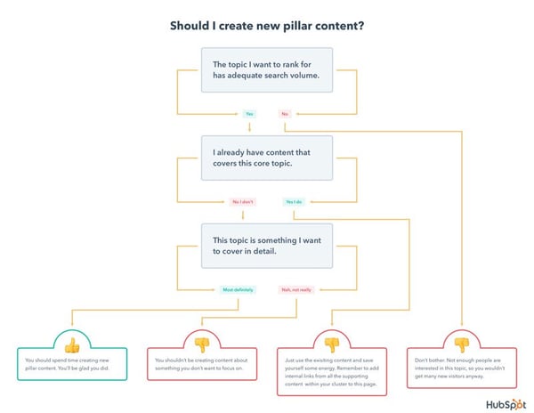
When it comes to actually mapping out topic clusters, there’s a general process that works particularly well. Follow these steps to create your own pillar page:
- Map out 5-10 of the core problems that your buyer persona has (use surveys, run interviews, and do some secondary research within online communities).
- Group each of the problems into broad topic areas.
- Build out each of the core topic with subtopics using keyword research.
- Map out content ideas that align with each of the core topics and corresponding subtopics.
- Validate each idea with industry and competitive research.
- Create, measure, and refine.
This is a simple overview but should help you to begin to prioritize content ideation and production. Following this process will help you to structure your editorial calendar for the topic cluster content model.
But how do you figure out what content to focus on? This is where keyword research comes into play. Keyword research is a helpful way to determine what content your target audience already is looking for so you can reach them in a way that is relevant and impactful to them.
To get started, create a list of broad topics that are important to your business. Then fill in each topic with potential keywords you think your audience will search for. It’s better to not self-edit during this stage and write out as many keywords as you can think of. For example, if your main topic is Instagram marketing, your subtopics might include Instagram business accounts, Instagram captions, Instagram hashtags, and Instagram analytics.
Once you have your list, search for these terms or use a tool such as Ubersuggest to find related keywords and terms you may not have initially included in your list. Make sure you have a mix of long-tail and short-tail keywords.
Now that you’ve finalized your keyword list, see how your competitors rank for each of them using a service like SEMRush. This will allow you to find gaps in their search strategy as well as single out important words and phrases to aim for in the pillar content you create. After all of those steps are complete, use Google’s Keyword Planner or HubSpot’s keywords toolto narrow down the keyword list.
Once you’ve developed your pillar topic and cluster content, create a tracking document to keep track of your existing content and cluster strategy. Tracking documents can help organize your clustering process to make sure all of your content has been linked correctly. For HubSpot customers, you can automate clustering using HubSpot’s content strategy tool.
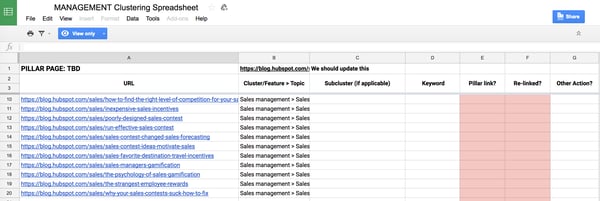
How to Measure the Success of Your Topic Cluster
You’re probably wondering, “how do I measure the success of a piece of content?”
The answer to this question is complicated because, for the most part, it’s not a great idea to evaluate the success of your campaign on a content-by-content basis. Just looking at the success of one blog post is difficult at the best of times, but more often than not, the definition of success is too narrow to account for indirect benefits that it has.
A good example of this would be with more brand-driven content. The focus here isn’t around generating sales or even capturing email addresses, but instead it can be around elevating the brand, attracting new talent, or even earning backlinks or press coverage.
If we based the success of our “Our Story” page on the number of leads it generated, it would appear to be performing terribly. However, this page has over 5,000 backlinks from external websites and gets a huge amount of traffic from potential hires looking to join our company.
Luckily, this problem can be solved by evaluating success on a topic cluster level instead.
Measuring the entire topic cluster against all of your core business metrics will enable you to include residual benefits coming from content that doesn’t align with direct conversion goals. Let’s say one of your blog posts is a study with a bunch of original data that gets thousands of backlinks — this page will pass on authority across all the pages in the topic cluster and grow the search visibility across the cluster. That’s difficult to measure in isolation, but can be done on a topic level.
Using this framework for measurement, you’ll be able to understand the following:
- Which topics perform better at driving traffic to your web properties?
- Which topics earn you the most leads?
- Which topics drive the most revenue to the business?
- Which topics earn the most backlinks/coverage?
Conclusion: Search Engines Aren’t Searching for Your Content, People Are

How to Improve Your Facebook Ads Relevance Score: 7 Methods That Work
Want to raise your Facebook ads relevance score? Wondering how to create Facebook ads that drive positive engagement and social proof? In this article, you’ll discover seven ways to quickly and significantly lift your Facebook ads relevance score. What Is the Facebook Ads Relevance Score? Facebook’s relevance score is a rating on a scale of […]
The post How to Improve Your Facebook Ads Relevance Score: 7 Methods That Work appeared first on Social Media Examiner.
from Social Media Examiner https://ift.tt/2NHVdQF
via socialmediaexaminer
15 Fun, Weird, & Unexpected Interview Questions (With Sample Answers)
As a hiring manager, you probably ask similar questions to most of your candidates — “What’s the greatest challenge you’ve overcome? What interests you in our company?”
Most of these questions are standard and evoke similarly typical responses. In fact, if a candidate has plenty of experience interviewing, she can probably answer without much thought.
Now, imagine you ask your candidate this — “If you were a pizza delivery person, how would you benefit from scissors?”
This question changes the conversation a bit. Suddenly, you’ve caught your candidate off-guard. She’s not sure how to answer, but after a pause, she says, “I suppose I would use scissors the same way anyone else would. I wouldn’t necessarily use it on the job, but I could use it at home to cut things.”
You might be thinking you haven’t gained much insight into your candidate from this question, but that isn’t true. Weird, unconventional questions like this one allow you to investigate how quick-thinking your candidate is and how well she handles stress. Additionally, it helps you get a glimpse of your candidate’s true personality.
In fact, funny and unexpected questions have proven so useful during the interview process that big corporations like Apple and Hess tend to use at least one during their interviews.
To provoke a more honest, insightful conversation during your next interview, consider asking one of these weird, unexpected questions.
Funny Interview Questions
1. “How would you solve problems if you were from Mars?”
This question, asked by Amazon, helps you see if your candidate can think outside what’s traditional or normal. You’ll want your candidate to demonstrate an ability to problem-solve even under bizarre circumstances. Her answer can show you whether she’s capable of entering a new workplace environment and evaluating it fairly before offering solutions.
For instance, an ideal candidate might say, “If I were on Mars, they’d likely have their own problems separate from those on Earth. First, I’d conduct research to determine cause and effect, and then I’d offer potential solutions.”
With this answer, your candidate has shown an ability to be thoughtful and analytical when making decisions.
2. “What do you think of garden gnomes?”
This question, asked by Trader Joe’s, is a ridiculous and silly question. More than anything else, it’s intended to loosen the candidate up, see a glimpse of their personality, and gain insight into culture fit.
There’s no right answer to this question, but if your team likes to be sarcastic with one another, you might want a candidate to say, “If I could get a job as one then I probably wouldn’t be here today talking to you.”
Ultimately, if your candidate is able to handle this curveball with ease, it shows an impressive ability to react quickly to bizarre circumstances.
3. “Why are manholes round?”
UBS, a Swiss multinational investment bank, asks this sneakily insightful question in Operations interviews. At first glance, it seems like another funny, “loosen the candidate up” question — but, in actuality, it’s a good indicator of your candidate’s intellect.
An ideal candidate will think the question through and provide a thoughtful answer like this one — “A round manhole cover can’t fall through the round manhole opening. A square cover, on the other hand, could fit diagonally through the opening and fall through. Additionally, a circular cover fits easily, and can be removed easily, without much precision or rotating.”
This answer demonstrates your candidate’s ability to see the necessity of certain solutions, and ideally apply those same problem-solving skills to her own role.
4. “You’ve been given an elephant. You can’t give it away or sell it. What would you do with the elephant?”
This ConnectWise question helps you get a better sense for your candidate’s reasoning skills. Of course, there’s no “right” answer to this funny question, but it allows you to get insight into how your candidate thinks, prioritizes, and problem-solves. Additionally, it can loosen the candidate up and allow her to show you a more authentic side.
Your candidate might say, “Since I don’t have a place to put an elephant, I’d probably send it on vacation”, or “I would feed it, and then ride it to work.”
It’s important to note, you aren’t looking for a specific answer here — you’re determining how your candidate thinks on her feet, and how she handles herself in unexpected situations.
5. “If you were a tree, what kind of tree would you be and why?”
You might ask this bizarre Walgreens question to test your candidate’s creativity. However, ideally your candidate’s answer will give you insight into her strengths related to the role, and what kind of person she is.
Your ideal candidate should say something like this, “I would be an oak tree, because I’m strong and dependable.” Of course, it doesn’t matter what tree she chooses — as long as she uses her answer as an opportunity to show you why she’s a good fit for the position.
Creative & Interesting Interview Questions
6. “We finish the interview and you step outside the office and find a lottery ticket that ends up winning $10 million. What would you do?”
This is a fantastic question to find out your candidate’s true motivation in a role. You don’t want to hire someone who only wants the job to make money — you want a candidate who also finds genuine fulfillment in the role. Since corporations whose employees are engaged perform over 200% better than companies whose employees are not, it’s critical you hire a fully engaged performer.
Your ideal candidate will say, “I’d use the $10 million to travel, donate to charity, and provide for my family. However, I’d still want to work for your company. I’ve always enjoyed working in marketing, and I think this company puts a great emphasis on creativity and storytelling to help brands’ spread their message. So while I’d love to get $10 million, it wouldn’t change my career goals.”
Ultimately, you’ll want a candidate who mentions why she’s genuinely interested in the role, regardless of her income.
7. “What’s the color of money?”
This might sound like a trick question — or related to monopoly — but in actuality, it’s a good gauge for whether your candidate has a well-rounded view of the economy.
PolyOne asks this question to its financial candidates. While you might be expecting “green” to be the right answer, you’ll actually want your candidate to say, “It depends on the country.” This type of awareness for the world at large could be critical when evaluating markets and making global financial decisions.
8. “If you had to be shipwrecked on a deserted island, but all your human needs—such as food and water—were taken care of, what two items would you want to have with you?”
This question, asked by companies like Yahoo, encourages the candidate to demonstrate creativity and innovativeness. Additionally, it helps you determine your candidate’s priorities. For instance, a candidate who mentions needing “a kindle with unlimited books, and my laptop” shows different values from a candidate who says he wants, “music, and a boat.”
While there’s no right answer, you’ll want a candidate who showcases an ability to prioritize and think logically through tough situations. For instance, maybe your candidate says, “I’d like to bring a wifi-enabled laptop with wind generator to charge the batteries, and a lighter. I can do my work and keep in contact with friends on my laptop, and I can use the lighter to start fires and keep warm at night.”
9. “Are you a hunter or a gatherer?”
If you aren’t hiring an anthropologist, this might seem like a ridiculous question. But companies like Dell ask this question to gain critical insights into a candidate’s strengths and weaknesses.
You want your candidate to focus her answer around qualifications of the specific role. For instance, if you’re hiring for a content creator role, you’ll want your candidate to say, “I’m a gatherer. I enjoy collecting critical SEO data and insights over time, and tailor my content to reach long-term goals.”
Ultimately, hunters and gatherers are two very different categories of people. This question can help you quickly discern what types of strengths and weaknesses your candidate is likely to display in the role.
Weird, Unusual, & Random Interview Questions
10. “How much do you charge to wash every window in Seattle?”
While this might seem like an odd question, it’s actually an effective one to ask if you’re trying to determine how well your candidate can problem-solve. Particularly if you’re hiring for a client-facing role, you’ll want to see how your candidate handles questions to which she doesn’t immediately know the answer.
Ideally, your candidate will say something like this — “Well, let’s say Seattle consists of 10,000 city blocks, with 1,000 windows per block. That’s 10 million windows. If I charge $5 per window, I’d make $50 million.”
The answer itself doesn’t matter. It’s more important your candidate can apply logical problem-solving skills, and remain calm, when dealing with challenging or unexpected questions.
11. “Design a spice rack for the blind.”
Your candidate’s answer to this random question shows a lot about how she makes decisions.
For instance, perhaps your candidate tells you she wants to interview blind people first and do competitive research before making a decision. This tells you she’s someone who places value on research and analytics.
Alternatively, maybe your candidate says she’d create braille labels on each of the shelves. This tells you she’s someone who trusts her instinct to make fast judgment calls.
Neither answer is wrong — it simply depends on the type of person you need to fill the role.
12. “How many pennies would fit into this room?”
Ipreo asks this question for Product Analyst interviews. A brain teaser like this one is a good opportunity to see how a candidate can use logic to solve seemingly impossible challenges.
You’ll want your candidate to say something like this — “I’d need to measure how many pennies fit length-wise, width-wise, and height-wise. Then I’d simply multiply those three numbers.” This answer demonstrates an ability to use simple math to create formulas for more difficult problems.
However, it’s also impressive if your candidate asks you questions in return. Perhaps she’d say, “Well, will this room still have furniture in it, or would we remove it? Also, what’s the volume of the room? Once I have that information, I could do the math based on the volume of a penny.”
Asking questions like these shows your candidate thinks outside the box, and likes to ask second-level questions, before delivering a solution to a problem.
Unique interview questions
13. “If you had a choice between two superpowers, being invisible or flying, which would you choose?”
On the surface, this sounds like a question you heard at sleepaway camp when you were 12. But Forbes found it to be an indicator of potential leadership ability, with 72% of surveyed leaders choosing the ability to fly over being invisible.
If you think about it, this question is really asking, “Do you prefer to be in the spotlight, or more behind-the-scenes?” Of course, this shouldn’t be the only question you ask to determine a candidate’s personality and culture fit, but it’s nonetheless a good initial indicator of where someone will have the most impact on your team.
14. “What was the last gift you gave someone?”
If your candidate is very stiff and formal, you might consider loosening her up with a question like this one, asked by Gallup during a Data Analyst interview. It should reveal something about your candidate’s personal character. Ideally, it will illicit a warm, emotional response, helping you form a deeper bond with your candidate.
For instance, if your candidate says something like, “My brother loves baseball, so a couple weeks ago I bought him tickets to a Red Sox game”, you have information to help you create a connection to your candidate, and ideally create an environment in which she feels more comfortable.
15. “How many square feet of pizza are eaten in the U.S. each year?”
This is a tricky question asked by Goldman Sachs during a Programmer Analyst interview. The question aims to test your candidate’s logical reasoning skills. While you don’t need a candidate to get the “right” answer, you’ll want a candidate who remains composed and thoughtful when providing an educated guess.
For instance, your ideal candidate might say, “Well, a pizza is roughly one square foot. If the average American eats one-third a pizza, and eats pizza three times a month, that would mean 12 square foot a year. Then, multiply that number by 200 million Americans, and you get 2.4 billion square feet.”
16. “If you could compare yourself with any animal, which would it be and why?”
Similar to the tree question, this question helps you see a candidate’s innovativeness, creativity, and quick-thinking skills. Your candidates should use this question as an opportunity to mention their strengths and highlight their good character.
For instance, an ideal answer might be, “I’d be a horse. Horses are very strong and capable of functioning well both independently, and as a part of a team. Additionally, they are often fast-learners.”

49 of the Best Snapchat Drawings We’ve Ever Seen
Adding a caption, emoji, or even a cool filter to a Snapchat before shipping it is usually enough to satisfy a Snapchatter’s creative needs. And that’s perfectly fine. There are plenty of people and brands doing really cool things on Snapchat without going all “Van Gogh” on their pictures and videos.
But there are also people who prefer to go that extra mile when it comes to dressing up their Snaps.

You see, Snapchat lets you draw on your pictures and videos before you send them to your friends or your Story, like this:
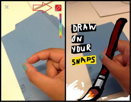
Image Credit: Mashable
While most of us (myself included) use Snapchat’s drawing tool for crude drawings and scribbling extra words, there are folks out there who see this as an opportunity to create incredible works of Snapchat art. And some of them are really darn good at it.
We searched far and wide for the best Snapchat drawings out there and created the list below. This collect serves as a mix of artwork from “professional Snapchatters,” brands, and just normal folks who happen to be really good at drawing on their phones.
Check ’em out, and get ready to be inspired to create your own Snapchat art. You may not become the next Picasso … but you might at least make someone laugh. (And read this blog post to learn more about how to use Snapchat, including a detailed look into HubSpot’s own Snapchat strategy.)
Looking for Things to Draw on Snapchat?
Check out 49 of the funniest and most amazing Snapchat drawings we’ve ever seen, below. Included on this list are some of the easiest (but still awesome) Snapchat sketches you can draw yourself, and what you’d need to nail it.
Funny Snapchat Drawings
1. Presidential pals.

Image Credit: emgarber
2. On cloud nine.

Image Credit: Snapchat Mi
3. Plug puns.

Image Credit: emgarber
4. SWIM!

Image Credit: Dbatsnap
5. Can this be real life?

Image Credit: @geeohsnap
6. Saving the world one Snap at a time.

Image Credit: Dbatsnap
7. The name’s Gatsby. Jay Gatsby.

Image Credit: Michael Platco
8. It was him!
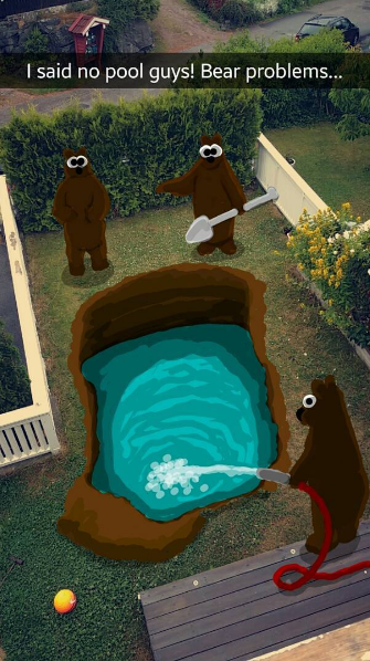
Image Credit: @geeohsnap
9. Another year older, another year wiser?

Image Credit: emgarber
10. IT GOT SUPERMAN.

Image Credit: @geeohsnap
11. This guy is more excited than you.

Image Credit: Tech Insider
12. He’s in it for the marshmallows.

Image Credit: Dbatsnap
13. Yo, what’d you do to my eggs?

Image Credit: @geeohsnap
14. We mermaid for each other <3

Image Credit: Smosh
15. Mad (cat) scientist.

Image Credit: Tech Insider
16. No, I am the walrus.

Image Credit: Dbatsnap
17. Hmm. Just humans.

Image Credit: @geeohsnap
Amazing Snapchat Drawings
18. Ahhhhhh zabenyaaaa.

Image Credit: Snapchat Mi
19. Ah! Get it off of me!
Image Credit: @geeohsnap
20. Oh hey there.

Image Credit: Tech Insider
21. Getting abstract.

Image Credit: Dbatsnap
22. This needs a caption contest.

Image Credit: @geeohsnap
23. That right angle though…

Image Credit: Dbatsnap
24. Oh hey, Bacchus.

Image Credit: Snapchat Mi
25. Better than Ellen’s Oscar selfie?

Image Credit: Tech Insider
26. Once you go Dunkin’, you never go back.
Image Credit: Dbatsnap
27. Single and ready to flamingle.

Image Credit: Dbatsnap
28. Squad goals.

Image Credit: thetrinitykiller4
29. To the Alps, by unicorn!

Image Credit: Snapchat Mi
30. Hey there, lil guy.

Image Credit: Dbatsnap
31. Seeing dots.

Image Credit: Tech Insider
32. And then I woke up.


Image Credit: Michael Platco
33. Feel FRIDA call me.

Image Credit: Dbatsnap
34. Are we sure this is a drawing?

Image Credit: Dbatsnap
35. Getting literal.

Image Credit: Michael Platco
36. That eye will haunt my dreams.

Image Credit: Reddit
37. Mer wine, please.

Image Credit: Dbatsnap
38. Better than a face tattoo.
Image Credit: Dbatsnap
39. Do you want to build a snowman?

Image Credit: Snapchat Mi
40. The deep blue sea amber ale.

Image Credit: @geeohsnap
41. Go fish.

Image Credit: Dbatsnap
42. Un-BEAR-ably cute.

Image Credit: @geeohsnap
Easy Snapchat Drawings
43. Making breakfast a little more interesting.
Colors needed: black, white, blue, pink
This drawing would be easy to recreate on your own because it uses just four colors, and bases most of its artwork on the words at the top and the actual photo of bananas at the bottom.
Image Credit: Dbatsnap
44. You’ve got a friend in me.
Colors needed: brown, red, blue, black, tan, yellow, orange, white
Many Disney characters are pretty easy to draw on your own — even on Snapchat. With a little crosshatching on the sleeves and a fine-pointed stylus to draw the hat, you can turn yourself into Woody from Toy Story, as Michael Platco did, below.

Image Credit: Michael Platco
45. He asked for it, amirite?
Colors needed: yellow, blue, teal, pink, green, red
Here’s another Disney character — or rather, couple — that you might also find to be a simple Snapchat project. The next time you catch your friend sleeping, pull up this awesome picture of Snow White (on the left) or Aladdin (on the right), and redress him in the basic garb of our favorite prince and princess.

Image Credit: Smosh
46. Tigers are the best princess sidekicks.
Colors needed: teal, blue, yellow, white, orange, black, gray
Jasmine, from the movie Aladdin, is yet another Disney character whose outfit can quickly take shape on a photo of your body. As you can see, below, the blue dress and black hair are as basic as they come. Her tiger, Rajah, might take a finer stylus and a bit more time to sketch.

Image Credit: Snapchat Mi
47. Rock climbing.
Colors needed: white, gray, tan
Get really good at drawing cartoon eyes, and the rest of this quirky Snapchat practically draws itself.

Image Credit: emgarber
48. THIS IS SPARTA.
Colors needed: red, orange, yellow
The helmets of Spartan warriors might look heavy and impressive on the movie screen, but they’re one of the easiest things to draw onto your own head in a Snapchat. Add some yellow shine to an orange face mask, and use your index finger to slice some red flare across the top.

Image Credit: Smosh
49. You can stand under my umbrella.
Colors needed: black, pink, gray
Notice how blue isn’t included on the list of needed colors above? The raindrops in the Snapchat drawing below are actually Snapchat stickers. Select them from the app’s sticker menu, scatter them across your screen, and all you have to do is carefully draw the rounded edges of the pink umbrella.
Image Credit: Snapchat Mi