
Welcome to My Blog
10 Great Examples of Welcome Emails to Inspire Your Own Strategy
We’ve all heard how important it is to make a good first impression. Show up late for a job interview? That’s a bad first impression. Eat a ton of garlic and forget to brush your teeth before a first date? Also a bad first impression.
It turns out that the “make a good first impression” principle holds true not only in face-to-face encounters, but in email interactions as well.

What is a welcome email?
A welcome email is the first impression a company makes with a new customer, blog subscriber, or newsletter subscriber via email. Welcome emails can deliver videos, special offers, a sign-up form, or just a friendly hello to establish a relationship with a new contact.
When you send a welcome email to a new blog or newsletter subscriber, or to a new customer, you’re making a first impression on behalf of your brand. To help ensure you’re making the best first impression possible, we’ve rounded up some examples of standout welcome emails from brands big and small.
As you’ll soon discover, each example below showcases different tactics and strategies for engaging new email subscribers. Let’s dive in.

10 Examples of Standout Welcome Emails
1. Virgin America
Type of welcome: Get Started
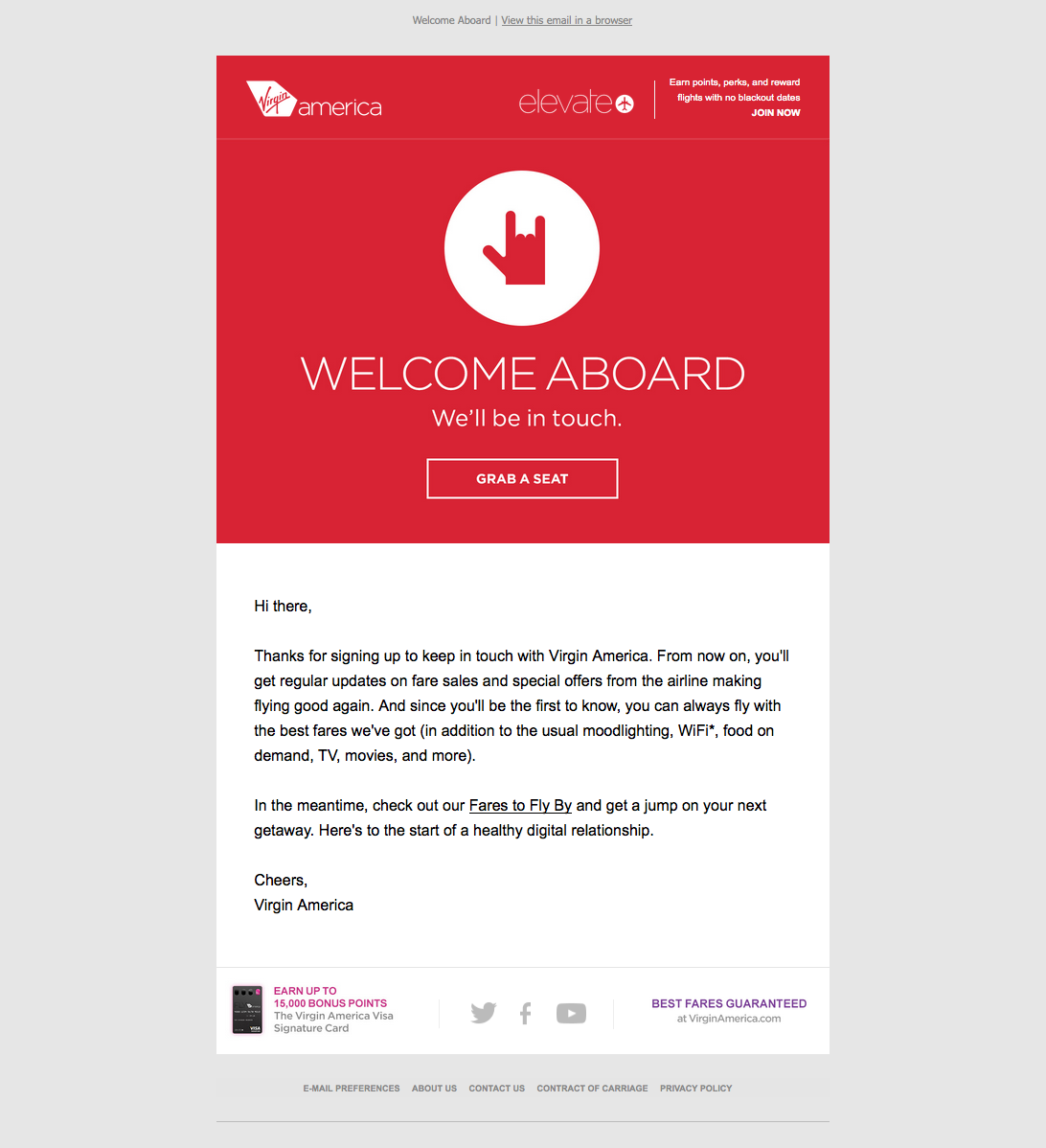
A welcome email is the perfect medium for introducing folks to the characteristics (and eccentricities) that make your brand unique.
For Virgin America, that means putting the “I love you” hand symbol front and center. This small gesture signals to the recipient that the folks atVirgin America really care about their customers. The playful accompanying copy, “Welcome aboard,” and casual call-to-action, “Grab a seat,” also help to position Virgin America as a hip, fun-loving brand right off the bat.
2. Food52
Type of welcome: Get Started
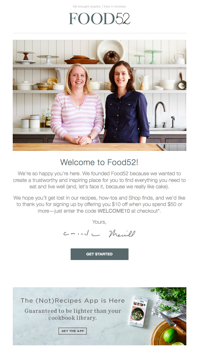
Sometimes the tiniest of elements in a welcome email can speak volumes about a brand. And when it comes to Food52’s welcome email, their preview text at the top of the email, “We brought snacks,” definitely accomplishes this.
Also known as a pre-header or snippet text, preview text is the copy that gets pulled in from the body of an email and displayed next to (or beneath) the subject line in someone’s inbox. So when you see Food52’s welcome email in your inbox, you get a taste of their brand’s personality before you even open it.

Food52’s welcome email also does a good job of building trust by putting a face (make that two faces) to their name. As soon as you open the email, you see a photograph of — and welcome message from — the company’s founders.
3. Monday.com
Type of welcome: Video
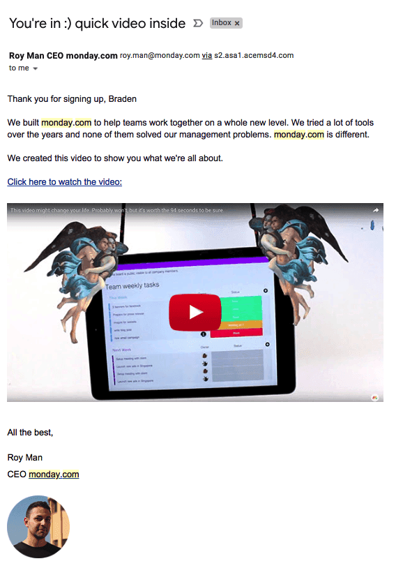
From the subject line to the conversational tone in the email body, the welcome email above keeps it friendly and simple so the focus stays on the introductory video inside.
Monday.com is a task management tool for teams and businesses, and the welcome email you get when you sign up makes you feel like the CEO, Roy Man, is talking directly to you. The email even personalizes the opening greeting by using the recipient’s first name — this is well known for increasing email click-through rates (especially if the name is in the subject line).
The closer you can get to making your email sound like a one-on-one conversation between you and your subscriber, the better. If you have just so many details you need to inform your new customer of, follow Monday.com’s lead and embed them in a video, rather than spelling them all out in the email itself.
4. Kate Spade
Type of welcome: Thank You
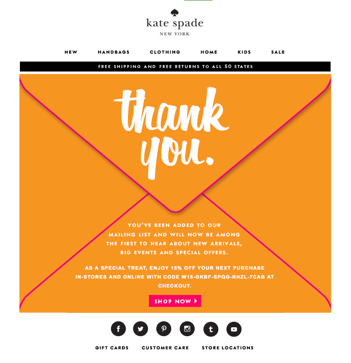
Let’s face it: We, the internet-using public, are constantly bombarded with prompts to sign up for and subscribe to all sorts of email communications. So as a brand, when someone takes the time to sift through all the chaos in order to intentionally sign up for your email communications, it’s a big deal.
In order to acknowledge how grateful they are to the folks who actually take the time to subscribe, Kate Spade uses a simple — but effective — tactic with their welcome emails: They say “Thank You” in big, bold lettering. And by placing that “Thank You” on an envelope, Kate Spade recreates the feeling of receiving an actual thank-you letter in the mail. (The 15% off discount code doesn’t hurt either.)
5. Lyft
Type of welcome: Get Started

If there’s an ideal “attitude” that welcome emails should give off, Lyft has got it.
The company’s simple but vibrant welcome email, shown above, focuses entirely on the look and feel of the app, delivering a design that’s as warm and smooth as the lifts that Lyft wants to give you. At the same time, the email’s branded pink call-to-action draws your eyes toward the center of the page to “Take a Ride” — inviting language that doesn’t make you feel pressured as a new user.
6. IKEA
Type of welcome: Offer
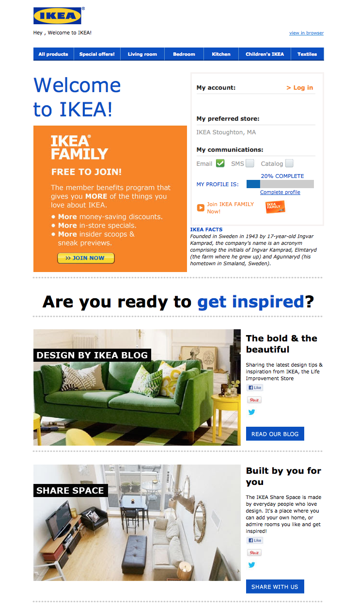
It might not be the most beautifully designed email on this list, but that doesn’t mean IKEA’s welcome email isn’t effective.
Instead of going for the hard sell (e.g., “By stuff now!”), or explaining what it is they do (which is something IKEA probably assumes most people already know), IKEA uses its welcome email to turn folks onto its other, lesser-known programs and content channels. For example, there’s a call-to-action right at the top that explains the value of its member benefits program. There are also prompts to visit their design blog and to contribute to their collaborative “Share Space” site.
Of course, if you’re not interested in any of that stuff, IKEA’s welcome email also makes it easy for you to simply log in and start shopping (there’s a login field right up top).
7. Michaels
Type of welcome: Offer
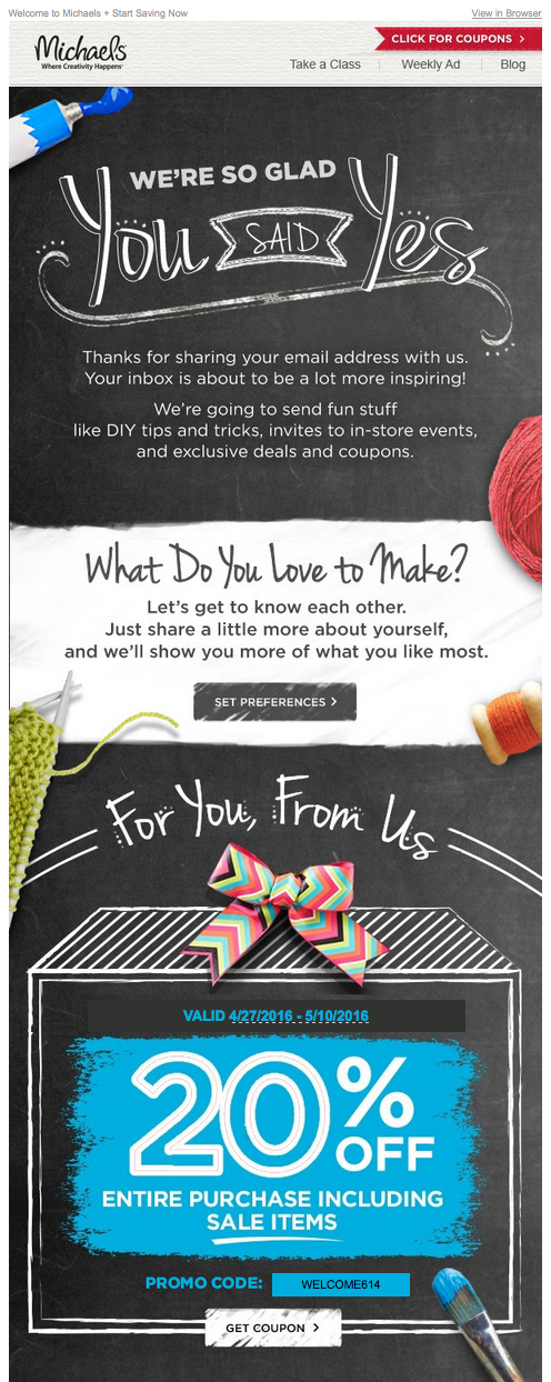
The Michaels approach to the welcome email borrows elements from both Kate Spade and Virgin America. In addition to expressing gratitude to the folks who took the time to sign up, Michaels uses its welcome email to showcase the brand. And the company does a great job: The lengthy email feels like one big arts and crafts project, complete with paint, yarn, and chalkboards.
Another standout feature of this welcome email is that Michaels makes it immediately clear what value its future email communications are going to provide. After thanking subscribers, there’s this nice bit of copy that sums it up:
“We’re going to send fun stuff like DIY tips and tricks, invites to in-store events, and exclusive deals and coupons.”
8. Sphero
Type of welcome: Hello

Sphero’s welcome email might in fact be the cutest one we’ve seen recently — and it was sent from a galaxy far, far away.
If you purchase a bluetooth-controlled BB-8, the friendly Droid from Star Wars, it was probably made by Sphero. And if it was, you’ll have an email similar to the one above waiting in your inbox when you activate your new rolling companion.
This email’s subject line is what qualifies it for this list — “A little Droid told us you wanted our emails.” By cleverly personifying the product, and being somewhat candid about its email marketing newsletters, Sphero develops a relationship with their recipients through the product you just bought from them.
Besides showing you how to use your new BB-8 Droid with your smartphone, all this welcome email wanted to do was say hi — just like BB-8 himself.
9. InVision
Type of welcome: Video
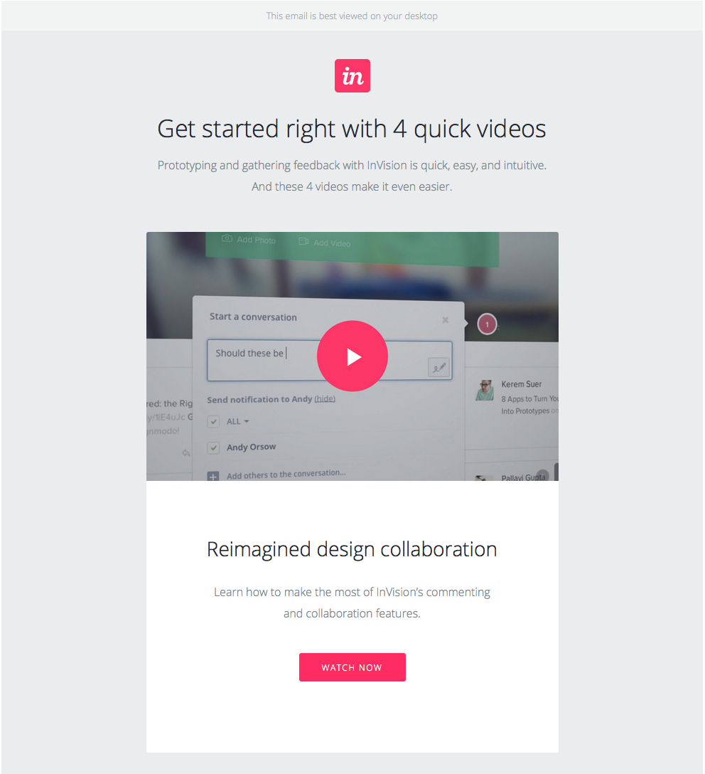
When you sign up for InVision’s free prototyping app, the welcome email makes it very clear what your next step should be: using the app.
To facilitate this action, InVision’s welcome email doesn’t simply list out what you need to do in order to get started. Instead, it shows you what you need to do with a series of quick videos. Given the visual, interactive nature of the product, this makes a lot of sense.
10. Drift
Type of welcome: Get Started
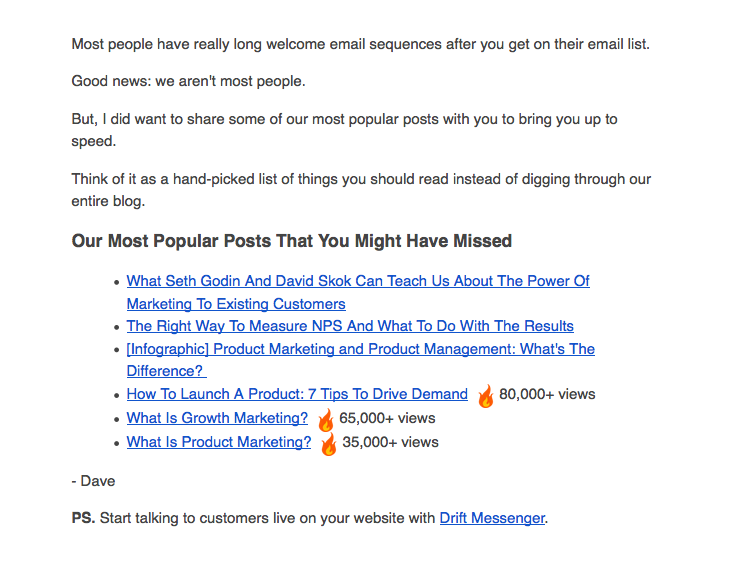
No fancy design work. No videos. No photos. The welcome email Drift sends out after signing up for their newsletter is a lesson in minimalism.
The email opens with a bit of candid commentary on the state of email. “Most people have really long welcome email sequences after you get on their email list,” Dave from Drift writes, before continuing: “Good news: we aren’t most people.” What follows is simply a bulleted list of the company’s most popular blog posts. And the only mention of the product comes in a brief post-script at the very end.
If you’re trying to craft a welcome email that’s non-interruptive, and that’s laser-focused on adding value vs. fluff, this is a great example to follow.

Instagram Founders Leave Facebook
Welcome to this week’s edition of the Social Media Marketing Talk Show, a news show for marketers who want to stay on the leading edge of social media. On this week’s Social Media Marketing Talk Show, we explore the Instagram co-founders’ departure from Facebook and updates from the fifth-annual Oculus Connect Conference. Our special guests […]
The post Instagram Founders Leave Facebook appeared first on Social Media Examiner.
from Social Media Examiner https://ift.tt/2IKQr48
via socialmediaexaminer
16 of the Best Shopify Stores to Inspire Your Own
Ecommerce is predicted to account for 17% of all U.S. retail sales by 2022. As ecommerce grows, so does competition, making it hard to differentiate your website from everyone else’s.
It isn’t enough to have a one-of-a-kind product: to attract your ideal audience — and more importantly, to turn that audience into passionate brand ambassadors — you need a one-of-a-kind website.
A sleek and captivating Shopify website can attract a large audience and even act as your start-to-finish marketing pitch.
But you need to know what makes one Shopify website better than the rest. Here, we’ve curated a list of 16 best of the best Shopify stores to inspire your own.
Whether you’re new to ecommerce and about to design your first website, or an ecommerce veteran considering a redesign to outshine your competitors in 2018, this list offers plenty of creative ideas.
Top Shopify Stores
- UgMonk
- Pipcorn
- Taylor Stitch
- Happiness Abscissa
- Skinny Teatox
- HELM Boots
- BioLite
- Pop Chart Lab
- Luca and Danni
- Harris Farm Markets
- So Worth Loving
- Great George Watches
- Choose Muse
- Brilliant
- Holstee
- Kylie Cosmetics
1. UgMonk
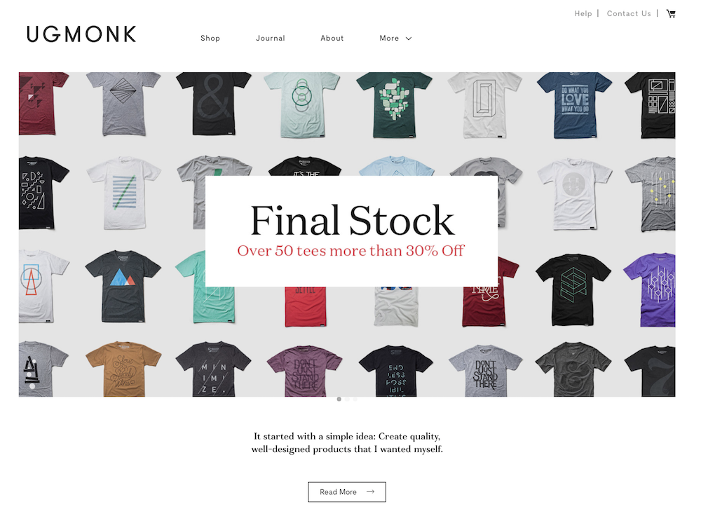
Jeff Sheldon starts the “About” section on his UgMonk website with a simple question: “Why was it so difficult to find fresh, high-quality, unique items in a modern aesthetic?” His Shopify site is simple and fresh, and exhibits UgMonk’s clothing, workplace items, bags, and prints in the same modern aesthetic style he sought while designing his unique products.
2. Pipcorn
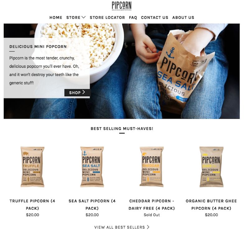
When you think about popcorn, I’m betting the first concern that comes to mind isn’t “is it healthy?” Pipcorn knows this, so their homepage features a simple slogan: “Most tender, crunchy, delicious popcorn … and it won’t destroy your teeth like the ‘generic’ stuff.” The best websites know their target audience’s primary concerns (in this case, the taste of popcorn and the kernels in teeth), and sell them on those solutions upfront.
If you look on their “About Us” page, you’ll find Pipcorn’s products are also non-GMO, vegan, gluten free, and whole grain. Even though this could have easily been incorporated into their slogan, they chose to exclude it in favor of tackling our bigger concern: Does it taste good?
3. Taylor Stitch
The inner child in me loves Taylor Stitch’s website because of the creative alternatives displayed when you hover over a product: a jacket, for instance, flips to an image of a model posing with the jacket on a motorcycle.
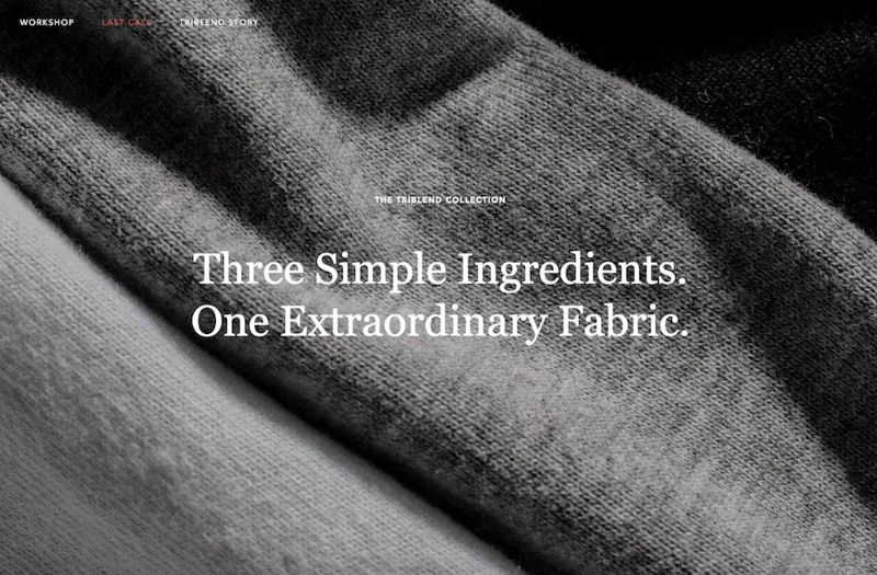
The Taylor Stitch website does something else really cool, too: it almost immediately calls more attention to its message than its products, with “Three Simple Ingredients” written across most of the images you see on the homepage. Taylor Stitch doesn’t just make high-quality clothing. It also aims to reduce waste and help the environment by creating clothing with recycled or 100% natural products.
On their website, you can’t miss their environmental efforts, and I’m betting this is a differentiating factor for most buyers when they come across the site.
4. Happiness Abscissa
Many of the websites I mention on this list have clean, straight lines. Happiness Abscissa is unique. It shows a playful side by displaying a layout with bright abstract images, and even products hanging from different angles.
The company’s logo, a crooked “Ha,” draws in the viewer’s attention, and then they use Ha in a sentence without defining the word, further stimulating viewers’ curiosity. You get the sense they don’t take themselves too seriously, affording the viewer a cheerful and fun experience.

5. Skinny Teatox
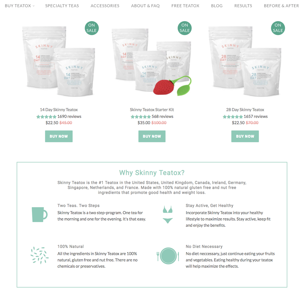
I myself was tempted to purchase the Teatox product when I checked out this site (in my defense, they were having a one-day flash sale I did not want to miss). The Skinny Teatox homepage immediately confronts your biggest concerns (“Is it natural? Yes. Will it work? Yes.”), and uses pastel colors and cute icons of bikinis and mugs to convey a fresh vibe.
As I’ve noticed with a few other Shopify websites, Skinny Teatox places its products on the homepage with an easy “buy now” call-to-action. For a company that isn’t too complex to figure out (“All Natural Detox Weight Loss Tea” is written beside the company name in search engines), I think it makes sense to offer the viewers what they want upfront.
6. HELM Boots
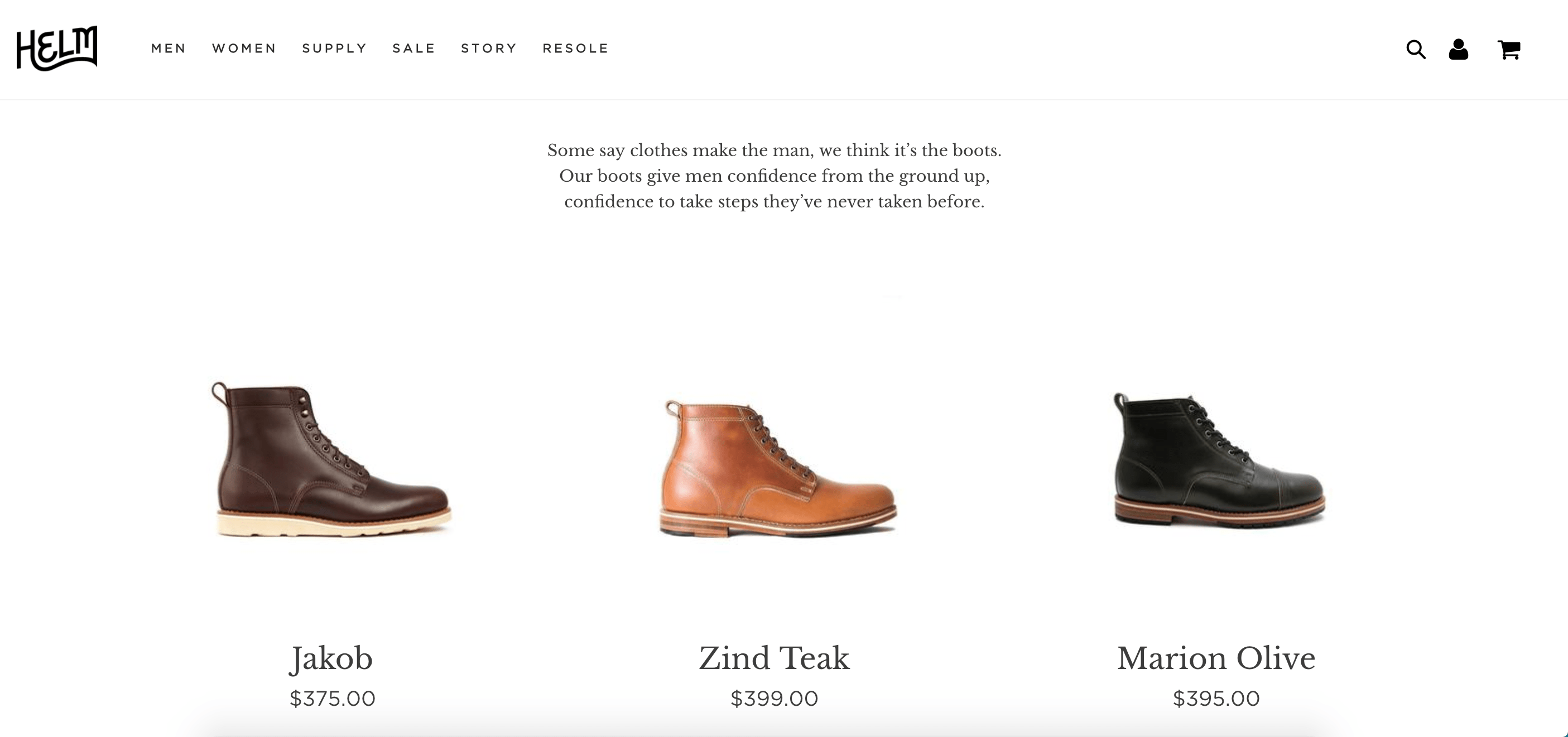
“Our boots give men confidence from the ground up, confidence to take steps they’ve never taken before.” Immediately, HELM incentivizes viewers through emotion: I might just be a guy looking to buy some boots, but yes, I’d definitely also like some confidence and bravery while I’m at it. The website looks elegant, and you can find everything from the homepage, which is designed to convert viewers at various stages of the buyer’s journey and assuage doubts as you scroll.
7. BioLite
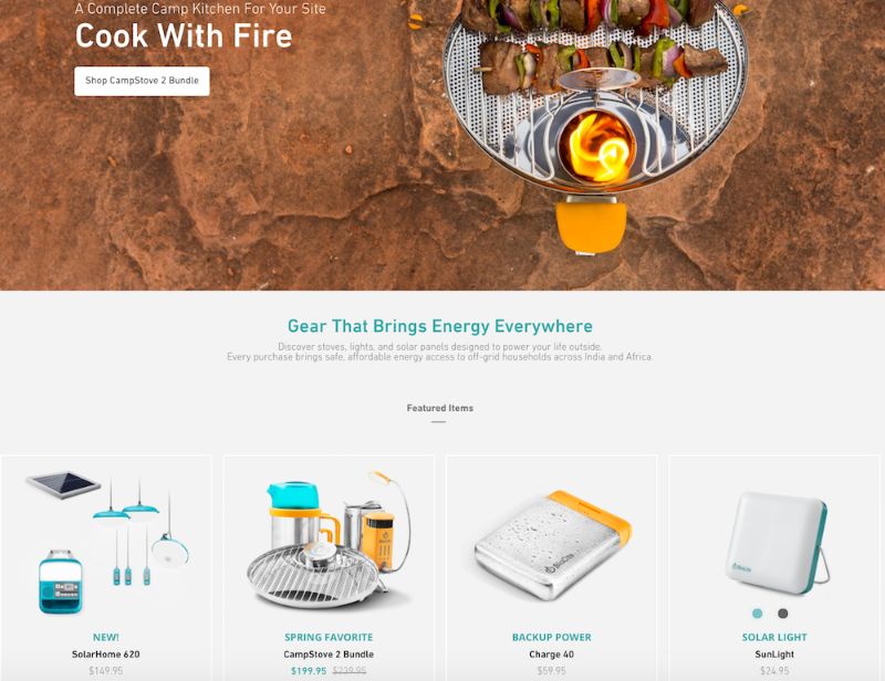
I might be a sucker for the little details, but the product images on BioLite’s website are enough to make me want to buy something (they look 3-D and illuminated, and some even look wet from rain!).
Since BioLite’s major selling point is its humanitarian impact (the products bring affordable energy access to places in India and Africa), the first thing on the homepage is their slogan, “Gear That Brings Energy Everywhere,” which will appeal to their target audience. The navigation bar at the top also has a clever twist: beside each product title, there are little black-and-white cartoon drawings of the product.
8. Pop Chart Lab
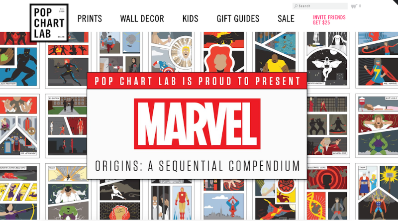
This site looks like one of the vintage and trendy prints they sell. It’s also organized in different categories depending on a viewer’s browsing preference.
First, Pop Chart Lab’s Shopify store has a scroll-down navigation with sub-categories ranging from, “NYC” to “Kids” to “Hip Hop” to “Wine.” They also have a carousel with some of their top prints on display. Below the carousel, they offer “wholesale,” “gift guides,” and “scratch-off” collections, for viewers who are having a difficult time discerning what they want. The shop manages to appear simple, despite its vast array of different print products, which is no easy feat.
9. Luca and Danni
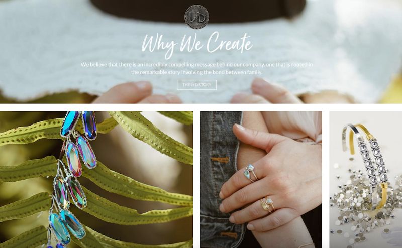
There’s something addictive about an ecommerce store that changes as you scroll. Luca and Danni’s page is highly interactive: as you scroll, some images get bigger and others get smaller, boxes of bracelets open up within images, and some images follow you down the page. It can be tricky to offer so much movement on a page while remaining coherent, but somehow, Luca and Danni accomplish this. There’s also a very zen vibe to the whole layout, with images of palm trees and cactuses, and calls-to-action with language like “brighter days: shop soil to sky,” and “find what speaks to you.”
10. Harris Farm Markets
This is a family-owned company, something you can’t miss from the homepage. It’s casual and playful, with text that looks like a child’s handwriting and colorful drawings of fruit (there’s even an adorable drawing of a bee with animated wings!). Even the calls-to-action sound laid-back, like “What’s nature been up to?” It’s so genuine, you can imagine a family building the site together.

11. So Worth Loving
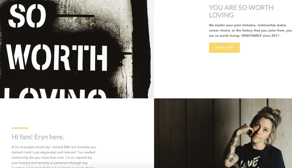
Sometimes, being evasive pays off. While it’s not always a good idea to hide your products from the viewer, it can be a very smart move if your product doesn’t make sense without understanding the backstory. With So Worth Loving’s site, you don’t even see the t-shirts for sale until a third of the way down the page. By that point, you’ve already read their slogan, a little bio from the founder, Eryn, and a full narrative about how the site began.
The site leans into personal touches, with handwritten-looking quotes scrawled across images and very normal looking images of people posing in t-shirts. This is a great example of knowing your audience enough to break the rules.
12. Great George Watches
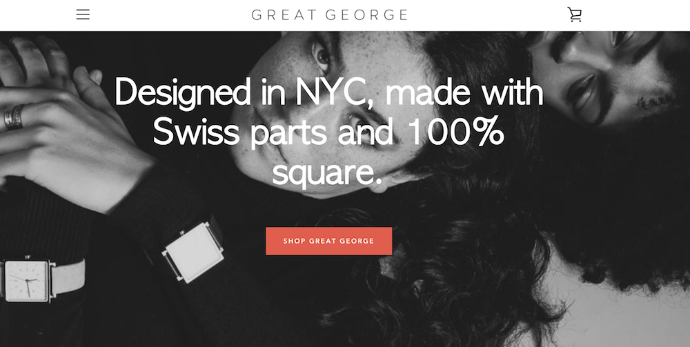
I’m not an experienced watch shopper, so when I first read, “Made with Swiss parts and 100% square,” on Great George Watches’ homepage, I thought maybe “square” was a fancy term I’d understand if I knew watches. But as I scrolled and read, “Think outside the circle,” I realized these terms were unique to Great George Watches, which are all square-faced.
By emphasizing what makes their product unique before even showing the produce, Great George Watches captivates the viewer. I love this shop because it has a refined and polished look, with black-and-white photos and an attention-grabbing red call-to-action button.
13. Choose Muse
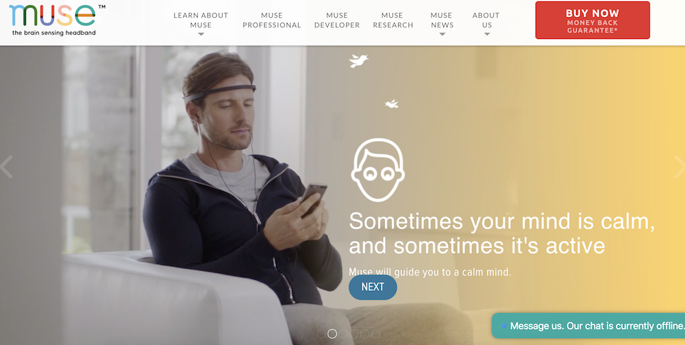
Choose Muse incorporates a full-display video of a man putting headphones on and using Choose Muse’s product right from the homepage. The video starts playing immediately (as opposed to offering a play button option), which is especially eye-catching. I usually think simple is better when it comes to design, but Choose Muse proves me wrong, incorporating compelling designs with a ton of images and text, while still retaining a clean and enjoyable viewer experience.
14. Brilliant
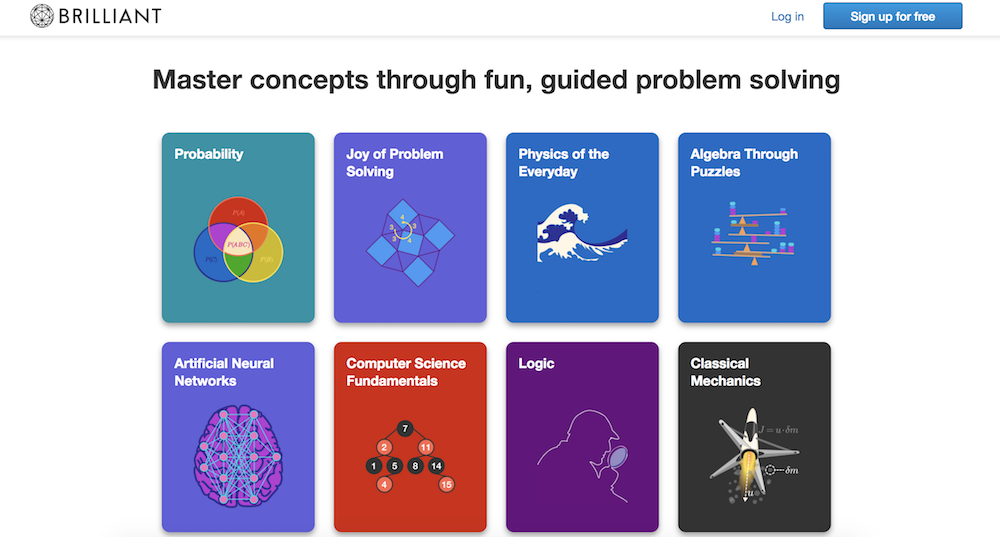
For a math and science website, Brilliant is surprisingly easy-to-navigate (even for someone like me, an English major … ), with big, colorful block buttons to choose the math concept you want to learn. This shop is also a fantastic example of using a call-to-action button wisely: there’s a big “sign up for free” button prominently displayed in the top right, and then another at the bottom of the page, after you’ve scrolled past the information you need.
The site doesn’t have a navigation bar, but instead uses the web page to answer all the questions a viewer might have.
15. Holstee
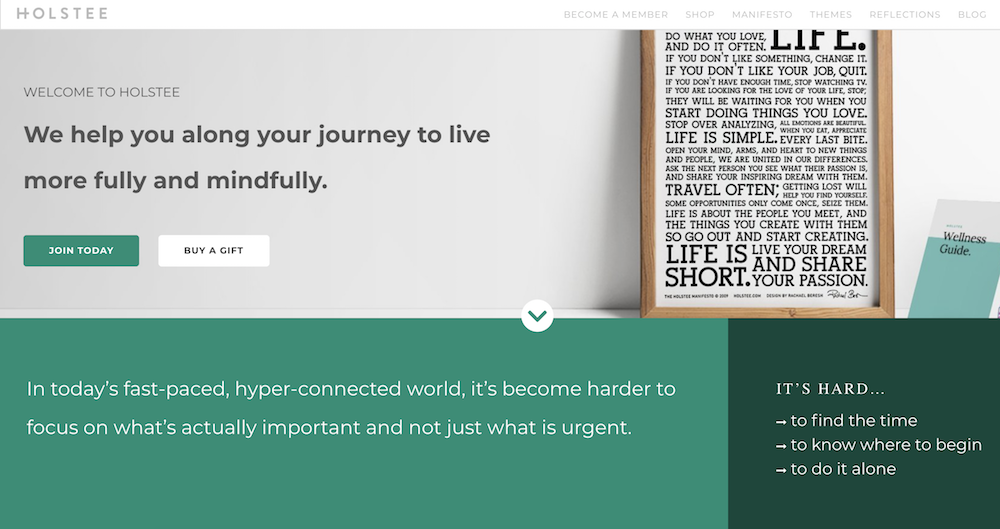
Holstee does a fantastic job of designing their site in tiers depending on a person’s initial level of interest in the product. For starters, you see the text, “We help you along your journey to live more fully and mindfully.” If you’re already convinced, you can click “Join today” right below the text. If not, you can continue to scroll down the homepage to find pain points this product reduces, read a “Holstee Manifesto,” see Membership benefits, check out testimonials, and find publications Holstee’s been featured in.
Throughout the page, there are various calls-to-action, like “Choose a plan that’s right for you,” and then, at the end, “Become a member today.” I love this site because it becomes increasingly convincing and in-depth as you scroll: it’s clear they use their homepage as a start-to-finish marketing pitch.
16. Kylie Cosmetics
As one of the top 10 most followed accounts on Instagram, Kylie Jenner’s Cosmetic brand is one of the bigger brands using Shopify today. Her site has a very distinct girly-girl vibe, with a bubble-gum pink background showing off her lip kits and gloss.
Kylie’s site is also well-organized for her audience: the lip kits, her best-known items, are shown first on the homepage, with “top sellers” below that. I didn’t feel overwhelmed looking through the various cosmetic products like I thought I would, and what really stood out to me about Kylie’s site is the fun, colorful layout. It might not be everyone’s cup of tea, but I’m betting it appeals to her target audience.

See a store design above that you like? First, grab the guide below to find out how user-generated content can give your business the gusto it needs to attract and retain online shoppers.

7 Comma Rules Every Writer Should Know
In the beginning of 2018, one missing comma in a Maine state law cost Oakhurst Dairy five million dollars.
The absence of the Oxford comma made two overtime-exempt tasks, packing and distributing food products, read like one activity, so any worker who distributed but didn’t pack any food products or vice versa sued the dairy company for their unsettled overtime pay. The workers won the suit.
As you can see, commas might seem insignificant in the grand scheme of things, but one small error can cost you millions of dollars.
As a writer, correct comma usage is especially important because writing a piece packed full of comma errors could damage your professional reputation.
Commas are tiny yet potent details you must pay a laser-like attention to, so check out the seven comma rules every writer should know. Hopefully, re-learning how to correctly use commas will help you eliminate the chance of embarrassment from making these dangerous grammatical errors.
7 comma rules every writer should know
- You can only connect two complete sentences with a comma if there’s a coordinating conjunction (for, and, nor, but, or, yet, so), which are also called FANBOYS, between them.
- Use a comma to link an incomplete sentence with a complete sentence.
- Use the Oxford comma.
- Use a comma between two coordinate adjectives that describe the same noun.
- Use a comma to highlight additional, non-essential information about a noun.
- Make sure you place commas correctly in quotes.
- Put a comma before “while” to contrast two things.
1. You can only connect two complete sentences with a comma if there’s a coordinating conjunction (For, And, Nor, But, Or, Yet, So, or FANBOYS) between them.
A complete sentence has a subject, verb, expresses a complete thought, and it can be its own sentence. For example, “We found a lost dog.” and “We took her home.” are both complete sentences.
But, if you place a comma between the two, like in the sentence “We found a lost dog, we took her home.” you end up writing a comma splice.
To fix this, you need to insert a coordinating conjunction or one of the FANBOYS after the comma, like this: “We found a lost dog, so we took her home.” This is how you correctly use a comma to connect these two complete sentences.
2. Use a comma to link an incomplete sentence with a complete sentence.
An incomplete sentence can have a subject and verb, but it doesn’t express a complete thought, so it can’t be its own sentence. For instance, the sentence “Even though I tell my friends I hate Nickelback” doesn’t express a complete thought and can’t stand alone. Therefore, it’s an incomplete sentence.
To make it complete, you need to add a comma and a complete sentence to the clause, like “I went to their concert”. When you do this, you’ve used a comma to connect an incomplete sentence and a complete sentence together: “Even though I tell my friends I hate rock music, I went to Nickelback’s concert.”
It also doesn’t matter whether your incomplete or complete sentence comes first. For example, “I went to Nickelback’s concert, even though I tell my friends I hate rock music.” is also a correct use of a comma.
3. Use the Oxford comma.
The Oxford comma might be one of the most controversial topics in the history of grammar. For years, people have argued whether it’s necessary or not, but a lot of publications, including HubSpot’s blog, believe it’s crucial for clarifying sentences that separate items in a list.
For example, the sentence, “Today, I watched a documentary about Babe Ruth, a New York City mobster, and the founder of New York-Style pizza.”, expresses that I watched a documentary about three famous people who lived in New York City.
If you neglect the Oxford comma in this sentence, though, you end up with something like, “Today, I watched a documentary about Babe Ruth, a New York City mobster and the founder of New York-style Pizza.”
Unless Babe Ruth also lived a secret life of crime and thin-crust pizza, you can see how the absence of the Oxford comma in this sentence could confuse readers.
4. Use a comma between two coordinate adjectives that describe the same noun.
Adjectives are considered coordinate when your sentence still makes sense after swapping the adjectives and placing an “and” between the two.
For instance, you can rewrite “I saw a tiny, adorable puppy when I drove to the store” as “I saw a tiny and adorable puppy when I drove to the store”. Since the adjectives “tiny” and “adorable” are interchangeable and you can place an “and” between them without muddling the sentence’s meaning, the adjectives are coordinate, so you should place a comma between the two.
Sentences with non-coordinate adjectives, like “I just ate some pungent chicken soup.” don’t need a comma. In this example, “chicken” is an adjunct noun, which means it acts like an adjective describing the noun “soup”. But since it’s technically still a noun, you don’t need to put comma between “pungent” and “chicken”.
5. Use commas to highlight additional, non-essential information about a noun.
In the sentence, “I saw tons of Ospreys, also known as Sea Hawks, when I went to the Everglades.”, the words isolated by the commas give additional information about the noun, Ospreys, but they’re not essential for the sentence to make sense.
For example, you could write “I saw a ton of Ospreys when I went to the Everglades” and the sentence still makes sense. Consequently, including any additional, non-essential information about a noun requires you to isolate it from the rest of the sentence with commas.
If any additional, non-essential information is at the end of your sentence, you need to put a comma before it, like, “When I went to the Everglades, I saw a ton of Ospreys, also known as Sea Hawks.”
6. Make sure you place commas correctly in quotes.
When you write a sentence with a quote, the placement of a comma depends on whether the attribution is before or after the quote.
For instance, when the attribution is before the quote, like in the sentence “The cook said, ‘I need more cheese.’”, you need to place the comma outside of the quotation marks.
When the attribution is after the quote, like in the sentence “‘I need more cheese,’ said the cook.”, you need to place the comma inside the quotation marks.
7. Put a comma before “while” to contrast two things.
Putting a comma before “while” is the equivalent of saying “whereas”. So if you want to contrast two things, like “I like working on more analytical projects, while my brother likes working on more creative projects”, you need to put a comma before “while”.
Leaving the comma out before “while” will describe two events that occur simultaneously. In the sentence “I ran to the drug store to get ice while Greg drove to my house to get our cooler”, I’m expressing that Greg and I went to different locations to grab ice and a cooler at the same time.

How to Get Customers to Evangelize Your Business
Want to increase your business’s exposure in social media feeds? Curious how word of mouth can help you overcome algorithm changes? To explore how talk-triggers encourage customers to evangelize your business, I interview Jay Baer. More About This Show The Social Media Marketing podcast is designed to help busy marketers, business owners, and creators discover […]
The post How to Get Customers to Evangelize Your Business appeared first on Social Media Examiner.
from Social Media Examiner https://ift.tt/2E7S0ds
via socialmediaexaminer
How Many Hours Is Full-Time vs. Part-Time
In high school, I worked for Winfrey’s Candy Store. I worked three hours a night, on Monday, Wednesday, and Saturday.
Needless to say, I understood it was part-time.
But distinguishing the difference between full-time and part-time hours isn’t always easy. For instance, the Fair Labor Standards Act (FLSA) says, “This is a matter generally to be determined by the employer.”
If you’re an employee, it’s critical you know whether you’re working full-time or part-time. The classification has major implications, including your options for health insurance, how much paid time-off you get, and whether you’re eligible for childcare reimbursement.
It’s equally critical to distinguish the difference if you’re an employer — failing to properly label your employees as full-time or part-time could result in fines or penalties.
To learn how many hours full-time versus part-time is, keep reading.
How many hours is full-time?
Full-time typically ranges between 32 and 40 hours per week, but is ultimately up to your employer. If you work within this range, you should be eligible for the company’s full-time benefits. More specifically, the IRS defines a full-time employee as anyone who averages 30 hours per week, or 130 hours per month.
How many hours is part-time?
If you work less than 30 hours a week, you are likely classified as a part-time employee, although it’s up to your employer to determine the exact number of hours required to be part-time. If you are part-time, you are likely ineligible for any of the company’s benefits.

Web Forms: The Ultimate Guide
Have you ever ordered an item online?
Considering the fact that 1.66 billion people worldwide shopped online last year, there’s a good chance you answered “yes” to that question.
Whether you know it or not, you used a web form when you placed your online order. Not only are web forms necessary for you to receive the information, goods and services you’re interacting with or buying, but they’re also crucial for the businesses that create them and embed them on their sites.
Without web forms, marketers would have a tough time obtaining information on potential customers and tracking data regarding purchases, customer feedback, new leads and survey responses. In a highly digital world, it’s hard to think of a successful business that doesn’t have at least one web form on their site.
Marketers use web forms (such as contact forms, surveys, shipping forms, registration forms and quizzes) for a number of reasons — to complete an order, keep track of a customer’s personal information or collect lead information. Web forms also help businesses increase conversions by taking potential customers through the lead flow process.
This happens when a person visits your site and submits their information in return for something (such as a product, service or free trial). Once a web form is submitted by a lead, it’s then sent to a server for processing.
Web forms vary in length, format, content type and appearance — there’s no “one size fits all.” They should simply fit your business’s needs and help you gather the information you want from your leads. This also means there’s no single way to create a web form. We will review several tools and software programs that will help you create your forms later on, but first, let’s dive into why you should create web forms.
Why Should I Create Web Forms?
Web forms allow you to collect and manage information easily and efficiently. They’re embedded right into your website, which makes it easy for your leads to provide their information. Once a lead completes a form on your website, their information is stored until it’s ready for analysis. Web forms are crucial tools for businesses to obtain the information they need from their potential customers.
Use Cases for Web Forms
There are several instances in which web forms can be used. There are web forms that allow you to collect contact information, shipping information, survey your customers and more. They can really be used to easily get any information you need from your leads and keep it for analysis or manage it in any way you see fit.
We will talk about the various types of web forms below, which will give you a better idea of specific use cases and which forms would fit best in certain instances.
How To Make a Web Form
Let’s discuss how to build a web form. As you follow the steps below, think about what information you really need from your leads. If your web form doesn’t make sense to your leads —if it’s complicated or asks for too much information —potential leads may lose interest and leave your site. Consider how much the offer at the end of the form is worth and adjust your web form accordingly.
Creating a web form starts with determining its purpose.
Make the Purpose of Your Form Clear
It’s crucial to make the purpose of your web form clear. Your leads should know exactly what your web form is for and why they are completing it. Here are a couple of ways to do this.
Include straightforward headers
By including straightforward headers, your leads will know exactly how to complete your form. Headers help avoid confusion and ensure your leads spend the minimum required time on your form. Examples of straightforward headers include “Contact Us”, “First Name” and “Preferred Method of Contact”.
Provide clear instructions
Clearly communicate what information you need from your leads while using the fewest words possible. At the top of your form, include a sentence or two about what you’re going to ask from your leads. You can also include a short statement about why you need that information to remain transparent with your leads.
Consider the appearance of your form
By keeping your form organized and clean, you’ll also provide your leads with an easy end-to-end experience. Nobody wants to waste time reading long paragraphs of information just to find whatever it is they’re looking for. Additionally, cluttered text simply looks unprofessional. Within seconds, your leads will know whether or not you took the time to thoughtfully create your form.
Why should you improve web form usability?
- You create a simple transaction.
- You will build trust.
- You will appear more professional.
- You will increase conversions.
By clarifying your web form’s purpose, your visitors will know exactly which form they need to complete and why specific questions are being asked of them. Whether it’s a shipping form, a sign-up form, a survey or quiz, you want your visitor’s experience to be easy.
You should always state the purpose of your form fields. They could say something like, “This web form will be used to get some more information about you so we can tailor our newsletter content towards your background, experiences, and interests.” By ensuring your web form’s purpose is clear, you build credibility and trust between your business and lead.
When you visit another company’s website that’s designed in a way that screams “customer first,” you’re likely to feel that the business is professional and thoughtful. The same goes for web forms. Stating the purpose of your web form avoids confusion, shows that you’re a forward-thinking company, and communicates that you care about your visitors’ experience on your site.
By increasing web form usability and creating a positive overall web form user experience, your business will experience a greater number of conversions. By simply making your form easy to use, clear and visually pleasing, your leads will want to complete it and become customers. Fixing small issues related to user experience helps businesses experience an improvement in their conversion rates by 75%.
By improving your web form usability and prioritizing the design and context of your form, you’ll enhance user experience and get website visitors excited and about completing your form and converting.
Choose Your Web Form Type
The purpose of your web form informs what type you should use, as well as which questions to ask and how you should format your responses.
Here are some common types of web forms to consider. (We will review examples of each of these types of web forms shortly.)
Contact form
Contact forms are used for leads to ask your business a question, voice a concern or even explain their need for a refund. These web forms typically contain fields that require leads to list their name, contact information and order number. They may also have a drop-down or text-entry field for leads to explain their reason for reaching out and their preferred method of contact.
Lead generation form
These web forms convert your website visitors into leads. They typically require personal information, such as a name, company, email address, phone number and sometimes a username and password for return visits to the site.
Order form
Order forms do exactly what you’d expect them to do — they allow your website visitors to place orders. They also provide customers with a way to pay for items and have the products they have ordered sent directly to them (or to whomever the item is for). Order forms are detailed, as they often require a credit card, shipping and billing information, and your contact information.
Registration form
A registration web form is similar to the two forms listed above but is used for a different purpose. A lead would complete a registration web form if they were interested in signing up for your service. This is common on sites such as Craigslist, Ebates, and eBay. If a lead was looking to list an item on one of these sites, they would complete a registration form to create an account and then post the item.
Survey form
Survey web forms may include multiple choice, fill-in-the-blank and long-form responses. They are used to learn more about your customer’s experiences with your products and services. They also help you improve future interactions with your customers, as well as educate leads about the ways in which your business can help them.
Incorporate Your Form Fields
Think about what responses you need from your leads when you begin creating your form fields. By starting with the answers you need, you’ll be able to determine how to title your form fields, what questions to ask and which types of fields you actually need your visitors to complete. Regardless of what you’re asking your visitors, you should always require their basic contact information (such name and email address) so you can identify individual submissions.
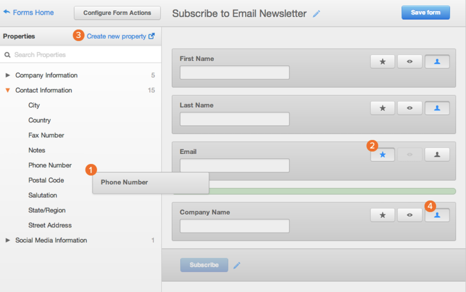
Form fields on a software like HubSpot are predefined, meaning you have several previously created options to pick from and add to your form. In HubSpot, drag-and-drop features allow you to easily build your form however you want. Once you determine which type of form you want, review the predefined form fields and begin creating your form.
Source: HubSpot
If you are asking your leads questions that require detailed answers, you can create short or long-text entry fields that accept one sentence up to a paragraph or two. There are also several other field-entry types for you to include in your forms such as multiple choice, drop-down menus, check boxes, radio buttons and more.
Embed Your Web Form On Your Website
Once you create your web form, it’s time to embed it on your website. This is how your website visitors will access your form. Start by determining where you want your form located on your website.
Decide where to embed your form
Determine which page of your website should include the web form. For example, do you want your email signup located on the bottom of your main landing page? If you have a contact form, is there a page on your website solely meant for visitors who want to contact you? And if someone purchases an item, do you have your web forms in an order that makes sense (first shipping, then billing and payment)?
Source: HubSpot
How to embed your form
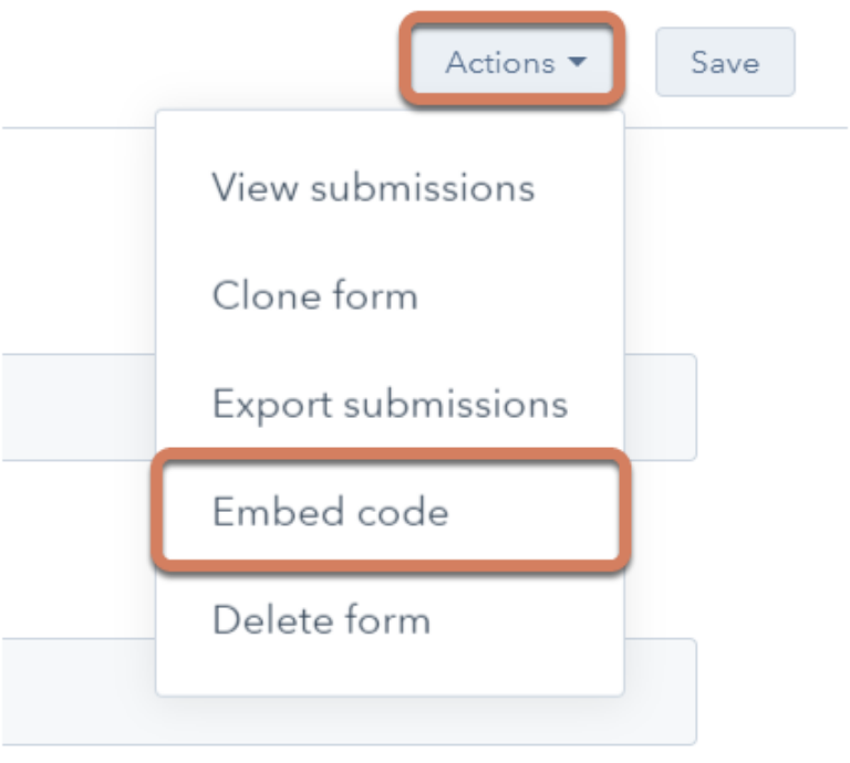
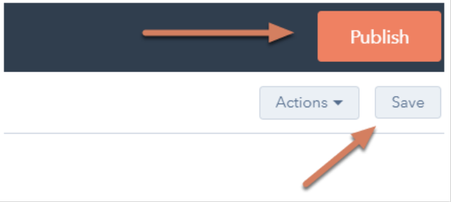
To embed your form, software programs like HubSpot simply require you to copy and paste the form’s code into the desired location on your site. When web forms are embedded published, website visitors can start the completion and submission process. You will then begin receiving data about your leads that will be crucial for maintaining a healthy business.
Source: HubSpot
If you are using a website creator or external website, you can still embed your code from HubSpot’s form builder into your site’s source code (the collection of code used to build your website).
How to Make Your Web Form Secure
Data protection has become a top priority for businesses and consumers alike. A secure web form that ensures your leads’ data is protected will result in more submissions. With HubSpot’s form builder, creating a secure form for both your business and your leads is easy.
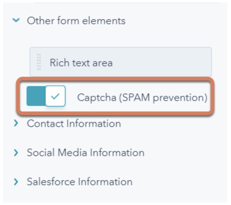
The form builder stops spam submissions from coming through with an email address validation process. This ensures only real email addresses can be submitted in your web forms. HubSpot also allows people to add CAPTCHAs, which are the questions at the end of a form that require people to confirm they’re not a robot. These act as a second layer of protection against spam.
Source: HubSpot
Lastly, HubSpot allows you to block specific email providers and domains that you determine are unnecessary to receive submissions from.
Test Your Web Form and Analyze Your Results
Once you create your web form and embed it on your website, make sure it works! Think about things from your visitor’s point-of-view. Do they have enough space to respond to a question in the short-text entry field? If not, try switching over to the long-text entry field and see how their responses change.
If you receive the same feedback repeatedly from your website visitors, try altering the form or adding different form fields to improve the experience for your leads. Your customers and leads should be your top priority when it comes to all of your marketing tactics, including your web forms.
If you set up email notifications on your web form creator software, you should double check that these are working as well. You can do this by going to the web form on your website, completing it as a lead would and making sure you receive an email notification about the form being completed. If it doesn’t work, try working through the email notification set up again.
Congrats! You have just completed the creation of your web form. Now, let’s review some design tips that will enhance the user experience of your web form.
Web Form Design Tips
When creating and reviewing your web form, consider some of the following design tips that will make your form easy-to-use, effective and helpful for both your business and your leads.
Be Direct
By keeping your web form as direct as possible, you make the experience better for your leads. You will also avoid any possible confusion. To be more direct, you can create a web form header, use clear form field titles, place your web form in a location on your website that makes sense and remove non-essential wording.
Use Correct Form Fields
Use form fields that make sense to your leads and provide you with the answers you’re looking for. If your leads need to give you information in paragraph format, then include long-text entry fields. If they only need to write a few words or a sentence, include short-entry fields. For something like a survey, add multiple choice responses, and for any questions that could have several answers, use checkboxes or radio buttons.
Using input constraints
Consider using input constraints for specific form fields. For example, if you know you only need one sentence in your short-entry form field, add a constraint that ensures your lead can only provide you with one sentence. This will save time for your lead and the form reviewer.
Add a Form Submit Button
By adding a form “Submit” button, your website visitors will be able to complete the web form and send it to the server without any hesitation or confusion. It will also make them feel confident that you and your fellow employees will receive their submission and listen to whatever it is they have to say.
Organize Your Form
If you have a long and detailed web form, make it easy to read and complete for your leads by keeping everything in one column. The only time you’ll want to keep form fields on the same line is when it makes sense to the reader. For example, keep information such as a date (day, month and year) on one line. By keeping all other form fields in a single column, you’ll avoid your lead feeling overwhelmed or bombarded by questions.
Make Your Form Visually Appealing
As mentioned earlier, appearance matters when it comes to all of your marketing content. Did you know that it takes an average of 50 milliseconds for a website visitor to look at your website’s landing page and determine whether or not they want to stay?
Web form first impressions matter, too. Brand your forms to make them look professional from the moment a lead lands on your page. They should match your company’s aesthetic to ensure consistency and promote a polished look. Consider colors, text font and size, and layout. Keep things clean and organized to ensure a positive experience for your leads.
Use Smart Fields
Imagine you already have an account on a website and you are completing a different web form on that same site. If that form field asks you some of the same questions that a previous web form asked, wouldn’t you feel as though you are wasting your time?
Smart fields are a great feature to keep your leads from having to do any unnecessary work. HubSpot uses smart fields to remove form fields that a customer or lead has previously submitted. Smart fields make your business and website appear more professional by providing a smooth process for your leads or customers, and removing the frustration of filling out the same information multiple times.
Using smart defaults
Have you ever started completing a web form that automatically filled in your zip code based on your current location? That’s a smart default. This feature also speeds up the web form completion process and creates a seamless user experience.
Include Error Messages
When a lead is completing your web form, you should tell them whether or not they are doing it correctly. Include error messages if they accidentally provide you with an area code that doesn’t exist, add their state to the “Town” field or are exceeding the character limit.
Again, this not only saves time for your leads but it also keeps things simple when you need to review the submitted content. HubSpot’s form builder does this and even gives leads suggestions based on the information they submitted.

Source: HubSpot
Explain Why You Are Asking For Specific Content
Imagine you were completing a web form on another business’s website and you notice a question that asks for your credit card information … but you aren’t buying anything. You might find yourself thinking, “Well, this is sketchy … ” or “Am I going to be charged for something without even knowing it?”
This is an easy way to lose a lead or compromise your credibility.
To avoid this, include information on your web form that explains why you’re asking for specific information. By anticipating questions your leads may have, you will come off as professional, thoughtful and customer-oriented.
Web Form Examples
Examples are a great way to get inspired and improve your own marketing practices. Here are some examples that demonstrate each of the five web form categories mentioned above.
Sun Bum’s Contact Form
Source: Sun Bum
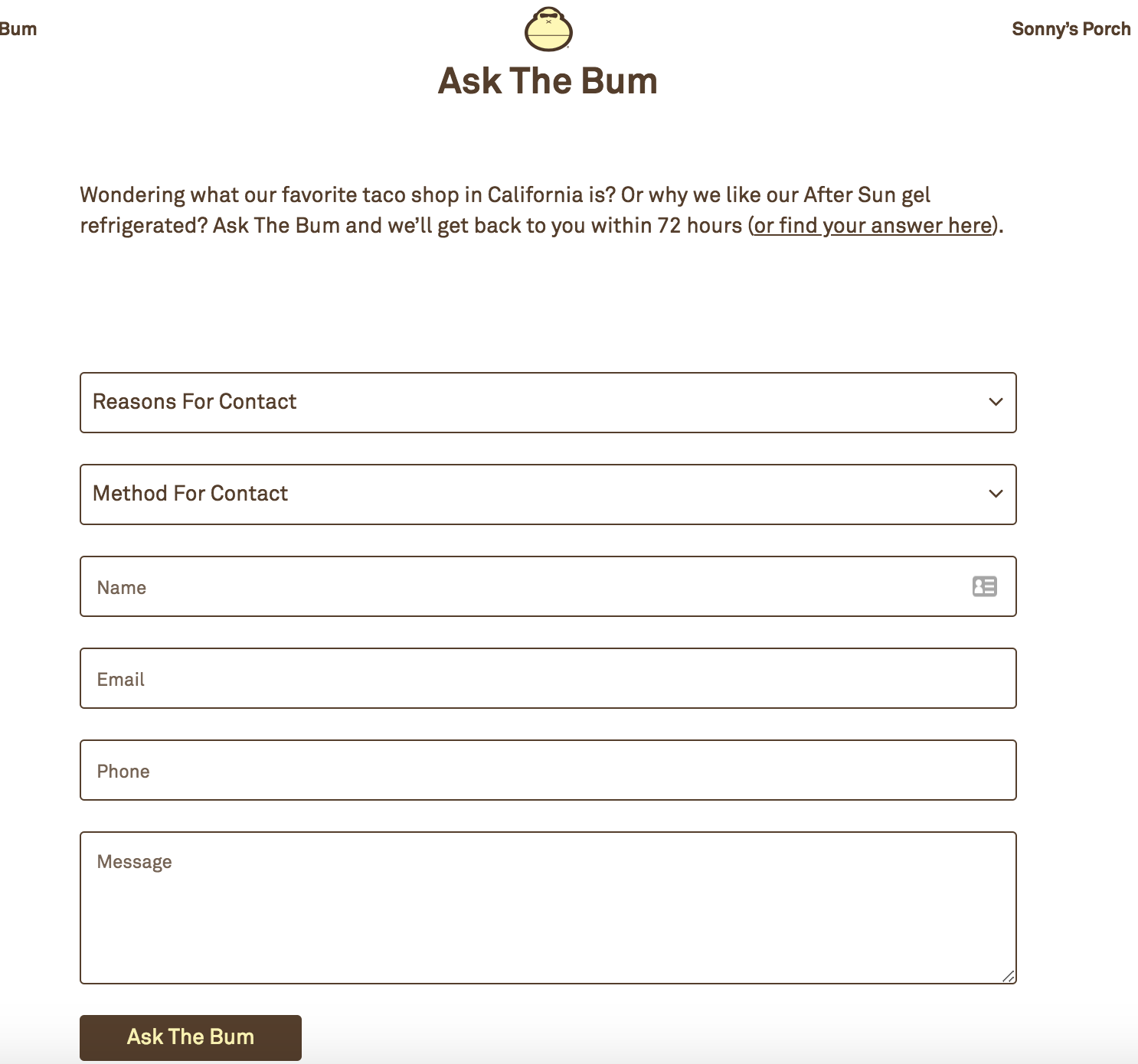
Sun Bum has a contact form on their website that enhances user experience. The form is on a contact landing page. The web form looks clean and organized, and the form fields make sense for the form’s purpose. Users are able to select the reason why they are contacting Sun Bum, how they want to be contacted by the company, provide their contact information and write the company a message (in a long-text entry form field).
Sun Bum even has a unique name for their contact form, “Ask the Bum,” that meshes with their brand and resonates with users. The submit button, or the “Ask the Bum” button, is easy to see and reminds users that they are interacting with a company that has personality.
Help Scout’s Lead Generation Form
Source: Sun Bum
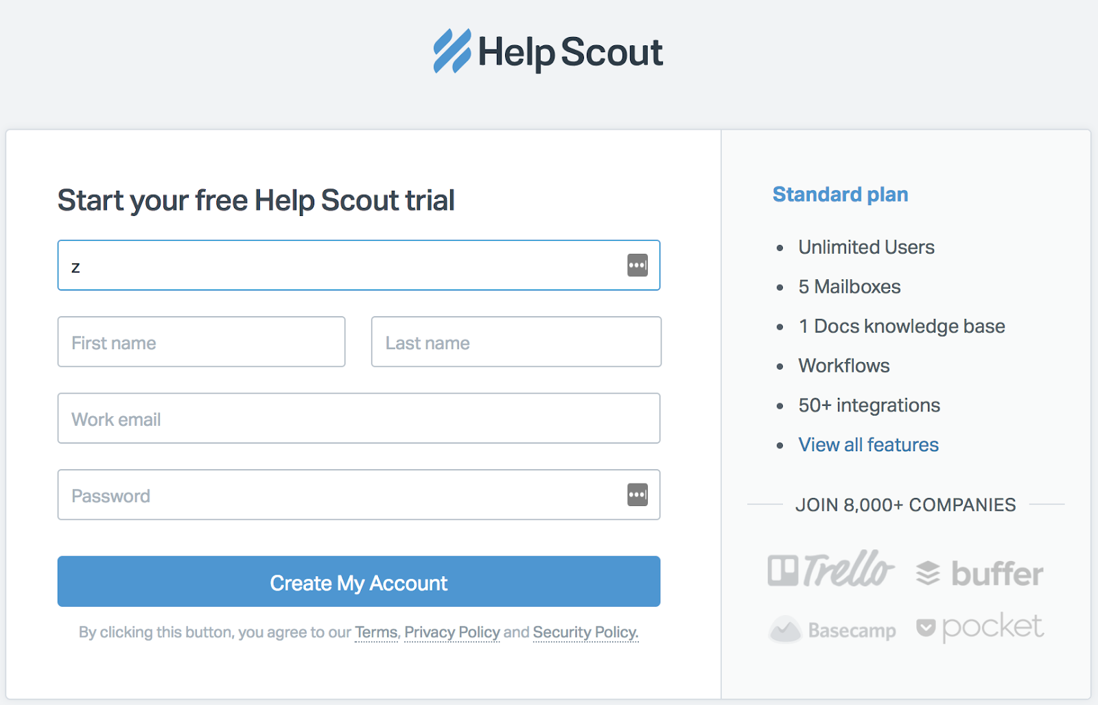
Help Scout has a lead generation form on their site that allows leads to quickly create an account. The web form has a header that states what the form is for and it only requires a few pieces of personal information (company, name and work email) to create an account.
This Help Scout web form has a nice layout for users and keeps all fields contained in a box. The layout of the form fields makes sense as well — the fields for a lead’s first and last name are side-by-side and the rest is in a column format, which helps visitors work through the form step-by-step.
Starbucks’ Order Form
Source: Starbucks
Source: Starbucks
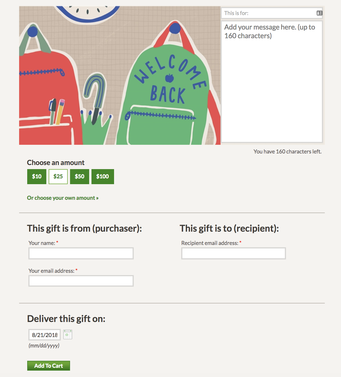
Starbucks has two online order web forms that customers complete when they want to send a gift card. The first web form introduces the chosen gift card and includes a toggle button, a few fill in the blank short-text entry form fields and a calendar to select the date in which the gift card should be delivered.
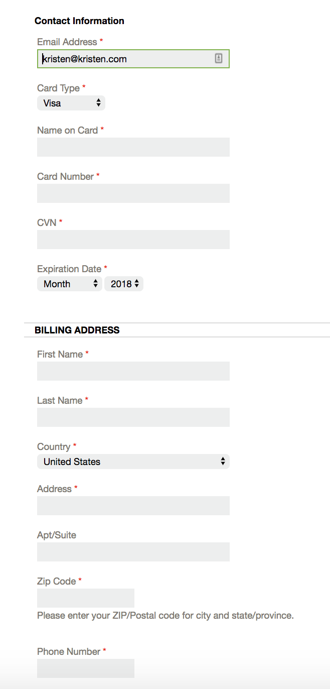
Once that information is submitted, customers are brought to a second page with a detailed order form. This one includes form fields in a single column (except for the date fields which make more sense to be placed next to each other) and ask for the customer’s shipping and billing information.
The use of multiple web forms allows customers to take things one step at a time. They are straightforward, have clear headings and state why Starbucks needs certain information like the customer’s email and the recipient’s email. Although the second web form is long, customers can easily follow along.
Airbnb’s Registration Form
Source: Airbnb
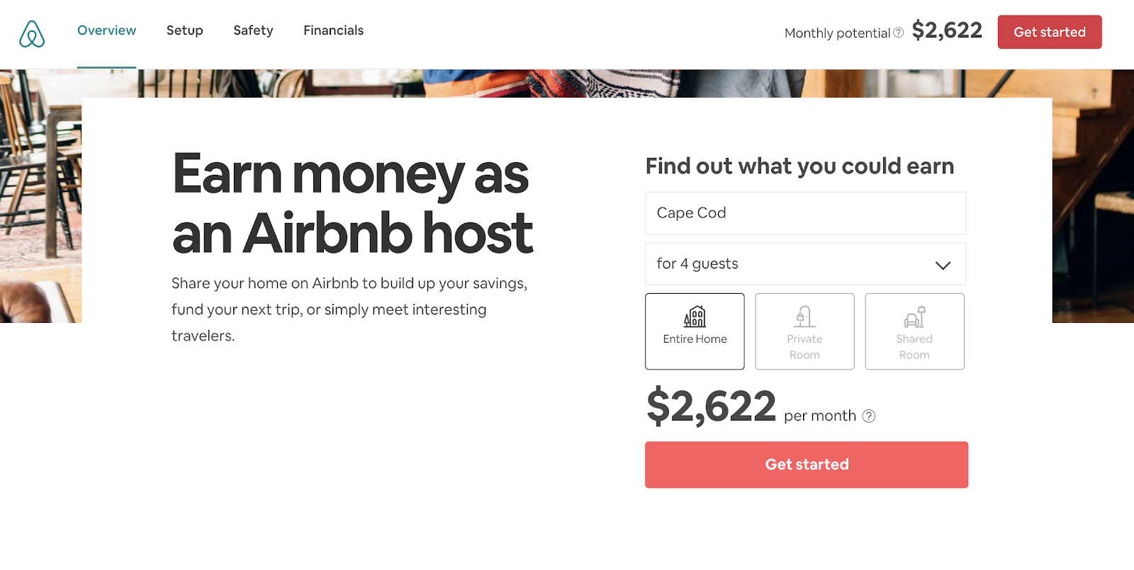
When someone wants to list their home on Airbnb, they first need to register for an account. Airbnb has simple registration web forms that get hosts excited about listing their space on the site — allowing potential hosts to discover how much money they could make through their listing. Who wouldn’t want to make an extra $2,622 per month?
Airbnb takes their potential hosts through several web forms and allows them to work through the process at their own pace. The web forms are also visually pleasing and match the company’s look and style.
WebMD’s Survey Form
Source: WebMD
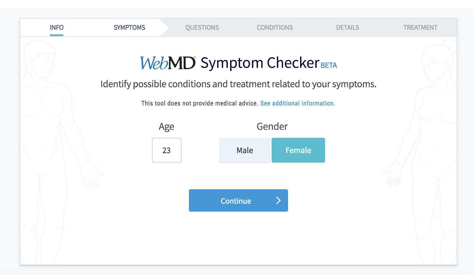
WebMD has a symptom survey that allows website visitors to self-diagnose through a series of questions. The survey includes several web forms with various form fields. The final web form submission takes patients to a landing page that includes a possible diagnosis. The web forms are an efficient and effective way for patients to get the answers they are looking for.
Now that we have reviewed the ways you can create your own web forms, as well as examples that you can learn from, let’s review some tools and programs that will help you build your desired forms.
Web Form Tools and Software Programs
There are a number of online form creators and software programs that businesses can use to get information from their leads. Some form builders are free, some require a subscription fee and some have features that work for different types of forms and businesses.
JotForm
Source: JotForm
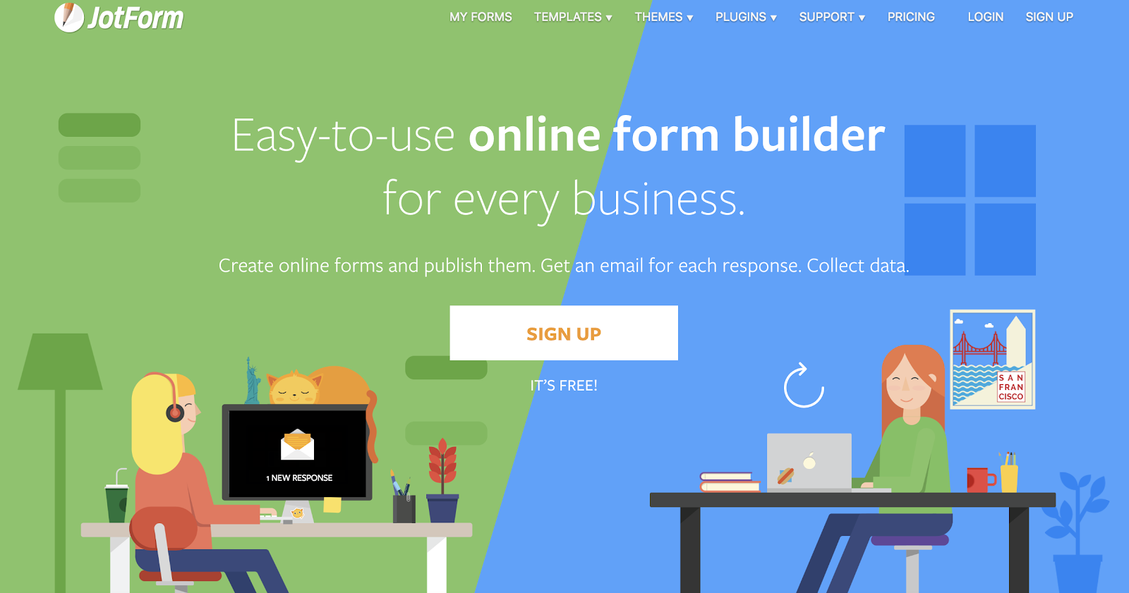
JotForm is an easy-to-use web form software. It’s is a free online form builder that allows businesses to not only create and embed their web forms but to also receive notifications via email whenever a form has been completed. With JotForm, anyone can create their desired, customized web forms in a matter of minutes.
Formstack
Source: Formstack
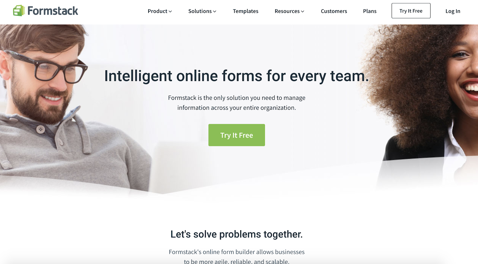
Formstack allows businesses to build their web forms, monitor them, and use conversion tools to analyze data received through the forms. Companies are able to brand their forms and integrate them with other apps they may be using to control their workflows (such as MailChimp, Google Sheets, PayPal or Hubspot).
WPForms

Source: WPForms
WPForms is the WordPress contact form plugin. This plugin has a drag-and-drop feature that easily moves your contact form from the plugin to your website in a matter of seconds, making it one of the most straightforward contact form builders available.
With multiple contact form templates to choose from, businesses can create a form that works for their needs. Additionally, the plugin notifies you when a lead completes your form, has a mobile-friendly design and integrates with a number of other apps.
Drupal

Source: Drupal
Drupal is an open source CMS (content management system) that contains a web form creator module called Webform. The module allows Drupal users to create surveys and forms and manage the results on a spreadsheet application. The module also has basic statistical review features so businesses can keep track of what is working and what needs to be modified.
Type Form
Source: Type Form
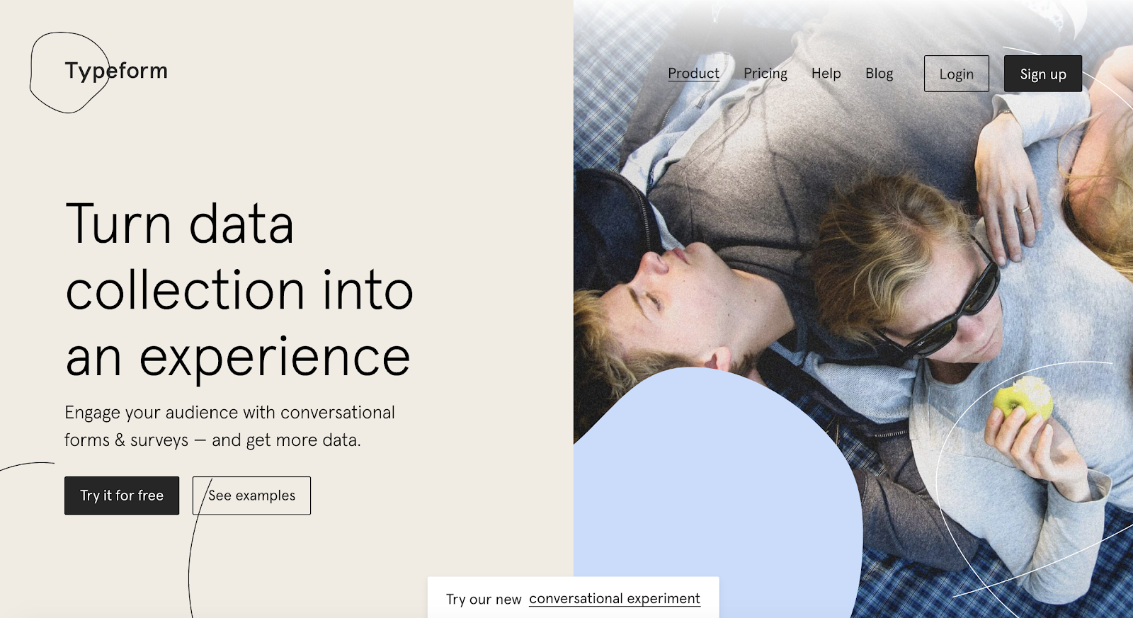
Type Form allows business to create forms, surveys, quizzes and more for their websites. The software also has a sophisticated way of keeping track of data and results from all forms across a given site. The web forms are not only easy to create, but they can be quickly embedded and are compatible on all devices.
HubSpot

Source: Type Form
HubSpot’s form builder has easy-to-use, drag and drop features that allow you to efficiently create, embed and publish your ideal form. One feature that is unique to HubSpot’s form builder is that it uses progressive profiling.

Source: HubSpot
Progressive profiling prevents anyone from having to complete the same form fields multiple times, ensures your business is not getting duplicate responses and keeps things as simple and professional as possible for both the lead and the business using the form builder.
Create Your Own Web Form
Source: W3Schools
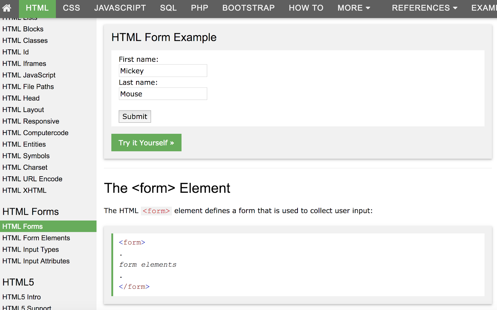
You can also create your own web forms using HTML form, CSS form, Php form or Javascript form.
Conclusion
Web forms will help you track online leads, follow up with clients and potential customers, learn more about your buyer personas, enhance user experience and provide your leads with the information, services and products they are searching for. Your web forms should be straightforward, simple to use and visually pleasing. This is how your business will ensure a professional, user-friendly experience on your website.
A successful web form will lead to an increase in your number of leads and conversions. So, why not get started creating web forms that’ll help you grow your business and expand your network today?

18 of the Best Product Page Design Examples We’ve Ever Seen
If you look at how product pages take shape across different companies, it’s clear they run the gamut. Some go for the direct approach, displaying an image of a product and explaining why someone should buy it.
Other companies create elaborate pages with moving parts and fancy, interactive elements.
Still other companies create delightful product pages that give users an authentic experience as they browse through what the company has to offer.

Believe it or not, not all of the most captivating product pages have enterprise-level programming behind them. To give you an idea of what’s possible — from the small business all the way up to the household name — we scouted out 18 examples that we find truly admirable.
The pages below have mastered their messaging, value propositions, and general product descriptions such that these sites resonate with their unique buyer persona.
(And after checking out these pages, you might want to buy their products, too.)

18 of the Best Product Landing Page Designs
1. Bellroy
Bellroy sells thinner-than-typical wallets. There’s value to that — but what is it, and how do you get the consumer to understand it?
To answer those questions, Bellroy divided its product page into three stages of the buyer’s journey — understanding the problem, how to fix the problem, and how Bellroy can resolve the problem.
There’s even an interactive section that shows how the skinny wallet will fill up in comparison to a different wallet. As users move a slider back and forth along a line, both of the wallets fill up with cards and cash, visually displaying the very problem Bellroy’s skinny wallet solves.
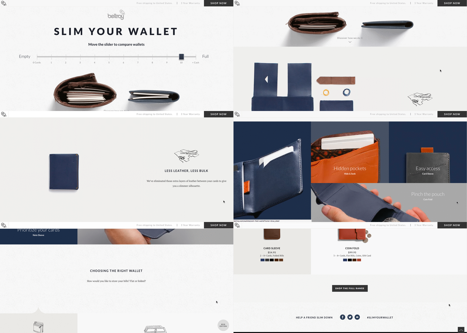 [Click here to see Bellroy’s full product page.]
2. Wistia
Wistia is a video hosting and analytics company that provides users with detailed video performance metrics. It might sound like a snooze-fest, but let’s dive into what really makes this product page stand apart.
First, we’re presented with five, colorful graphics illustrating their tools’ value propositions. And in case that’s all the user really needed to see, those graphics are followed by two calls-to-action.
But, if you continue scrolling, you’ll see a video with information about Wistia’s capabilities for that video — calls-to-action, email collectors, video heatmaps, and viewing trends.
One of the best ways to explain a visual platform’s features is to demonstrate them on a product page. This one shows users all of Wistia’s features and how they work, day-to-day.
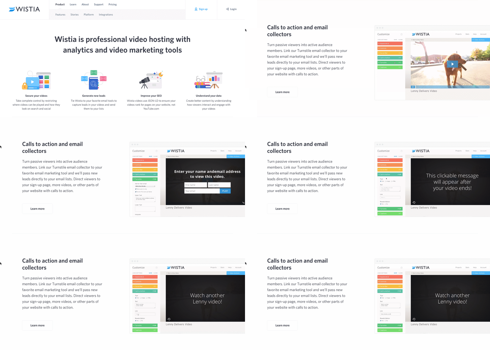 [Click here to see Wistia’s full product page.]
3. Square
Square is a mobile transaction company that merchants can use to collect payment from customers — anywhere, any time, as long as they have a compatible phone or tablet.
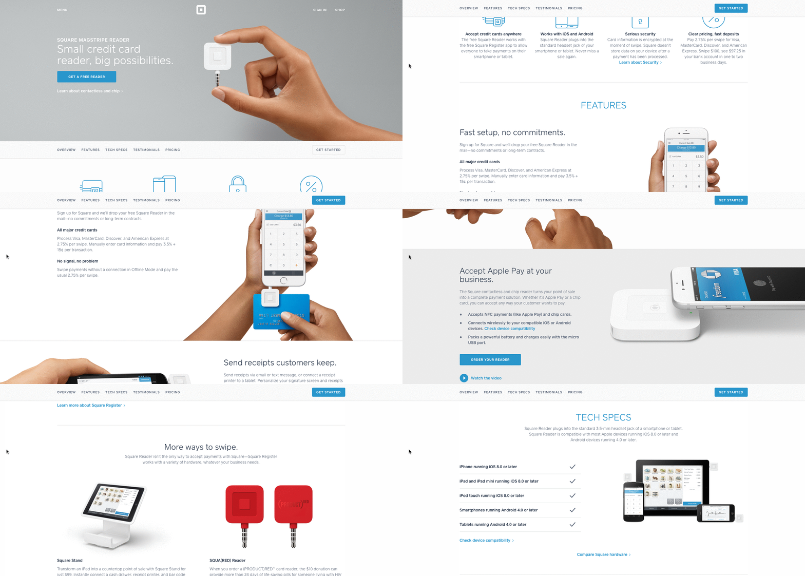
The product marketing challenge here is to show why Square is an easier alternative than a typical cash register — and its product page displays those reasons in a visually captivating way.
Product Description
The main headline of each section of this product page has bold, succinct copy:
“Small credit card reader, big possibilities.”
The rest of the page is clearly organized headlines — which kind of read like answers to frequently asked questions — plenty of white space, succinct copy, and appropriate images. Anyone looking into each section can understand exactly how Square works at every stage of a transaction.
4. Rent the Runway
Some companies — especially in ecommerce — can have up to thousands of product pages. Rent the Runway, an online dress rental company, is one of them.
Rent the Runway has an individual product page for every dress it carries, with all the information a customer could want — images, measurements, fabric, price, and reviews. So what sets them apart? The exceptional detail of the “Stylist Notes” and “Size & Fit” sections.
Product Description
These details are clearly and carefully curated from stylists and reviewers. They don’t just explain what a dress is made of and how it looks — they cover how it fits on every part of the body, which undergarments should be worn with it, and for which body types it’s best suited. That kind of information not only delights customers and encourages their trust, but it also makes for a more confident buying decision.
Also, notice how there’s plenty of white space surrounding the product images and description. According to research by ConversionXL, that white space creates a higher perceived value — in this case, price — of the product in the user’s mind.
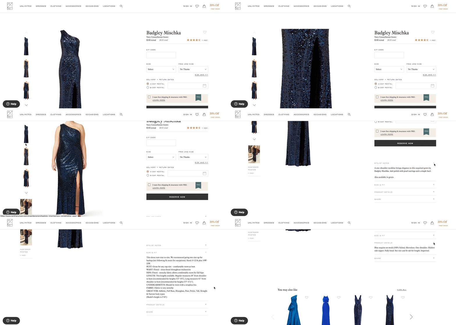 [Click here to see Rent the Runway’s full product page.]
5. Daily Harvest
Daily Harvest develops superfoods in the form of smoothies, soups, and more, and delivers them to your doorstep. What makes these foods’ product pages so outstanding? They show you exactly what makes these foods so super in a format that’s both clear and digestible — no pun intended.
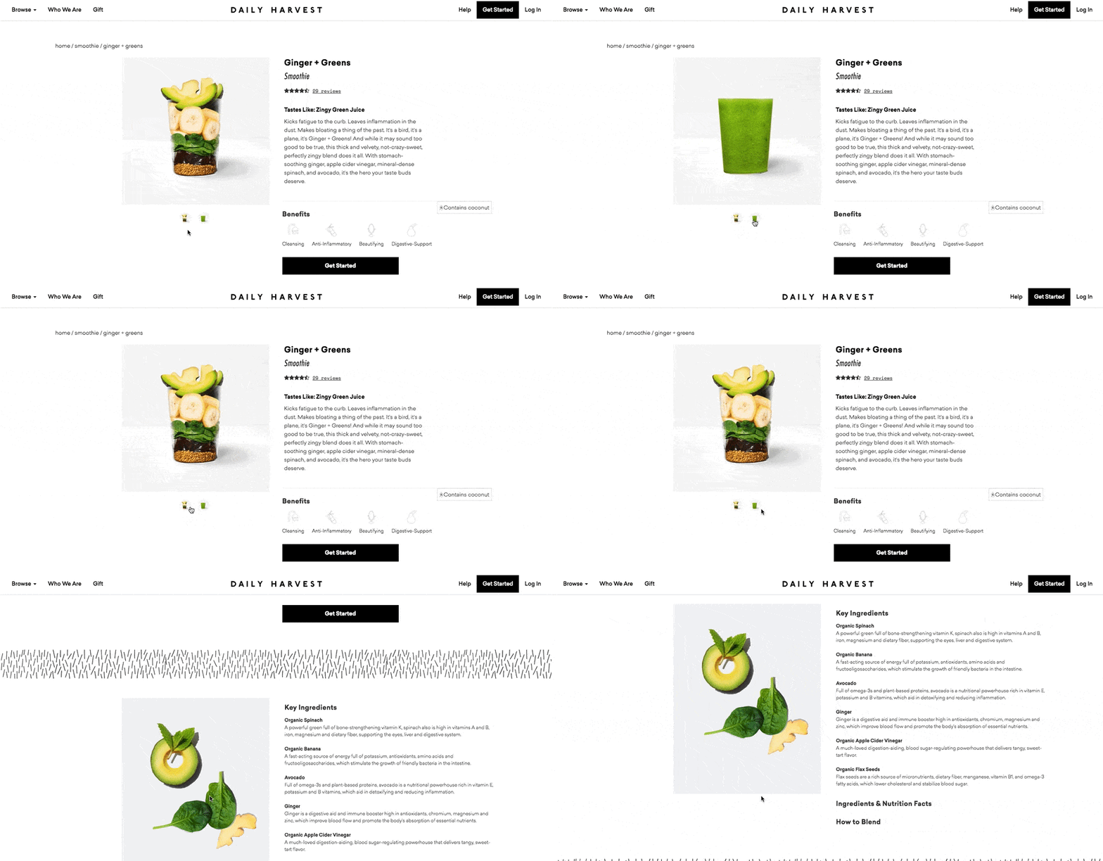
Check out one of the Daily Harvest’s smoothie product pages, below. Not only can you see what the smoothie looks like, but hovering over the lefthand preview icon, below the main image, shows you the foods used to create this drink. Scroll down, and you’ll see each ingredient and a simple description of each one.
Product Description
The product description of this smoothie is just as creative as the landing page itself.
“Kicks fatigue to the curb. Leaves inflammation in the dust. Makes bloating a thing of the past. It’s a bird, it’s a plane, it’s Ginger + Greens!”
 [Click here to see Daily Harvest’s full product page.]
6. Oreo
If you’ve seen any of Oreo’s marketing, you shouldn’t be surprised they’re on this list. But sometimes, being well known can actually make it harder to create a product page. So how did they do it?
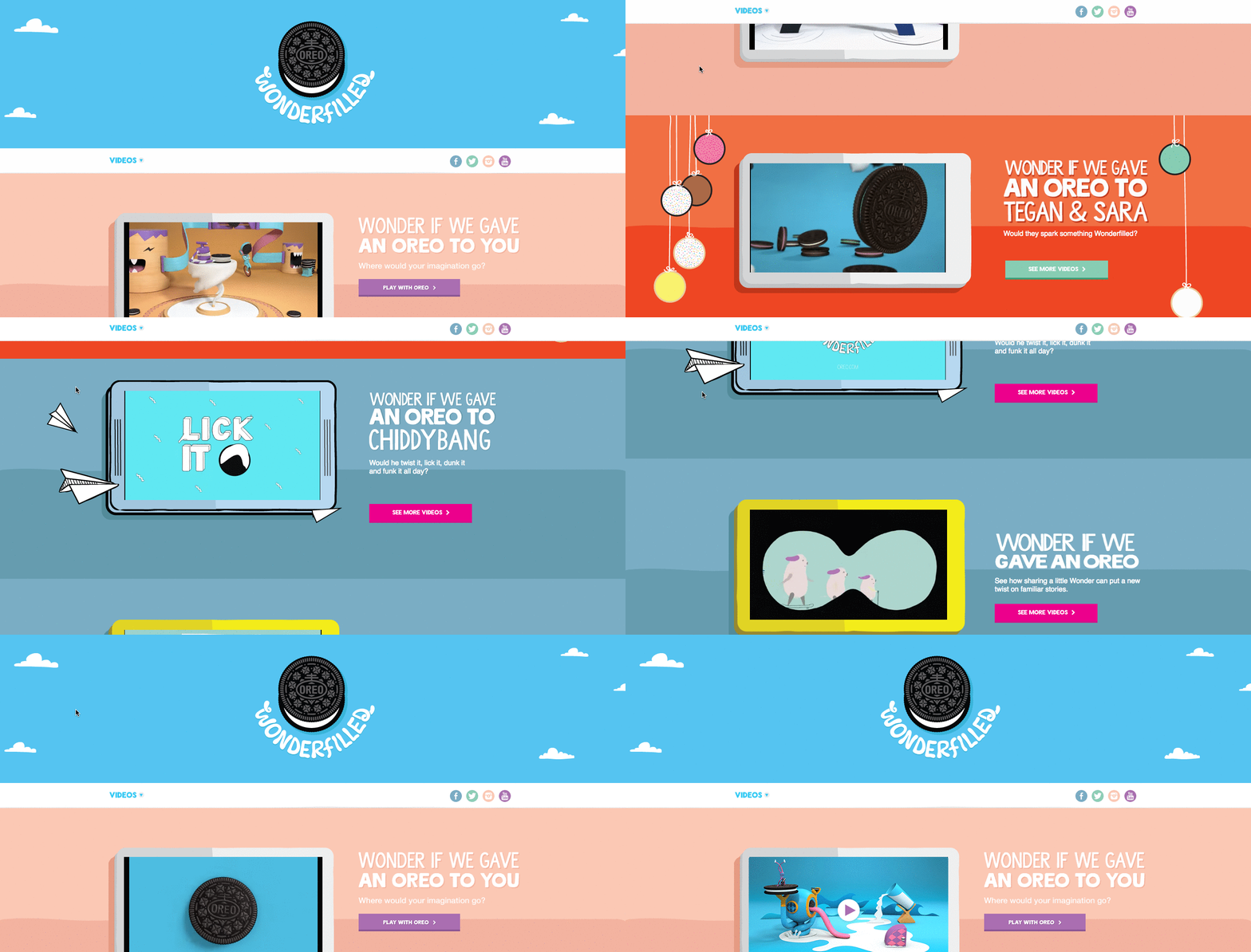
The focus of Oreo’s product page is how these simple, classic cookies can help people unleash their imaginations, dare to wonder, and become generally happier. It features a series of videos, one after another. One is accompanied by the lyrics, “It’s so easy to let your imagination go when you play with Oreo,” paying tribute to the age-old discussion about the “best” way to eat them. The page takes a creative, bold approach to marketing with what might otherwise be thought of as an ordinary snack.
Oreo also took a unique design to this page. Even though the cookies themselves are monochrome, the page is wonderfully colorful, from the videos, to the backgrounds, to the graphics.
 [Click here to see Oreo’s full product page.]
7. Fitbit Charge
When I took on this blog post, I asked a few people for their favorite product page suggestions. I was amazed how many people immediately recommended Fitbit — and after checking out the site, I can see why.
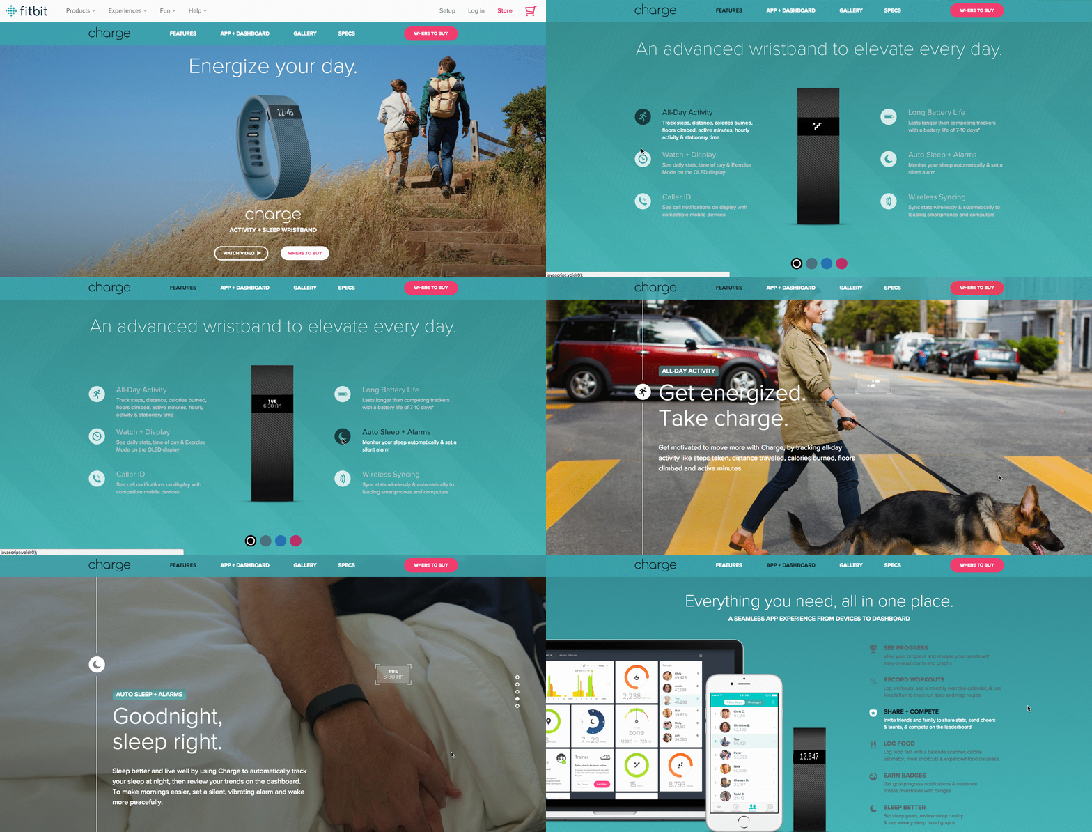
The page below helped unveil the original Fitbit Charge — now succeeded by the Fitbit 3 — and starts off with a value proposition, rather than a list of features. It’s a hero image of people hiking a mountain, who we can imagine are wearing Fitbits, with the copy, “Energize your day.”
As you scroll down the page, it goes through four quick steps explaining how the product works. What’s more, a lot of these are interactive — the section under “Everything you need, all in one place” allows users to hover over different features to see how they appear on Fitbit’s mobile app.
But the page also explains why these features are valuable. For example, one tracks everything you do from walking, to running, to sleeping. Why does that matter? Well, you can have your current records on hand, and try to beat them.
Knowing that users might not remember all of the specifics when they leave the page, Fitbit was sure to focus on how these features will actually make a difference in the visitors’ lives. Well played.
 [Click here for Fitbit Charge 3’s new product page.]
8. Volkswagen
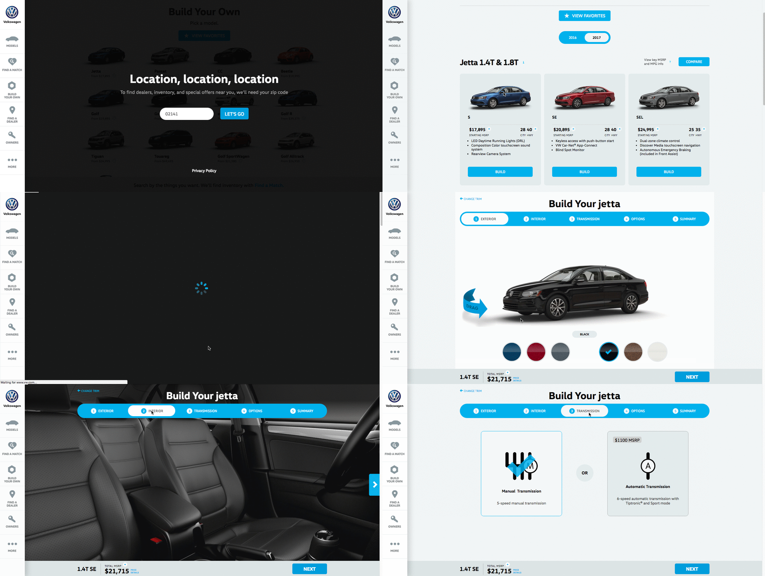
Volkswagen takes an interactive approach to its product marketing. Instead of listing out all of the features you can have in a car, the company walk you through the process of actually building your car. As you go through that process, Volkswagen highlights the different features you could choose, then gives you a preview of what the car will look like and how that will affect the price.
Even though I’m not currently in the market for a new car, I personally had fun tinkering with the different customization features on the page. What color do I want? Do I want premium audio? (Yes.) It’s an interesting way for the brand to eliminate the notorious connotations of “car salesmen,” by allowing users to learn about and select features independently.
Plus, there’s a nifty matchmaking feature that allows you to see which nearby dealerships have the car with all of your preferences in its inventory.
(If you want to see a regular product page, they’ve got that, too.)
 [Click here to see Volkwagen’s full product page.]
9. Seattle Cider
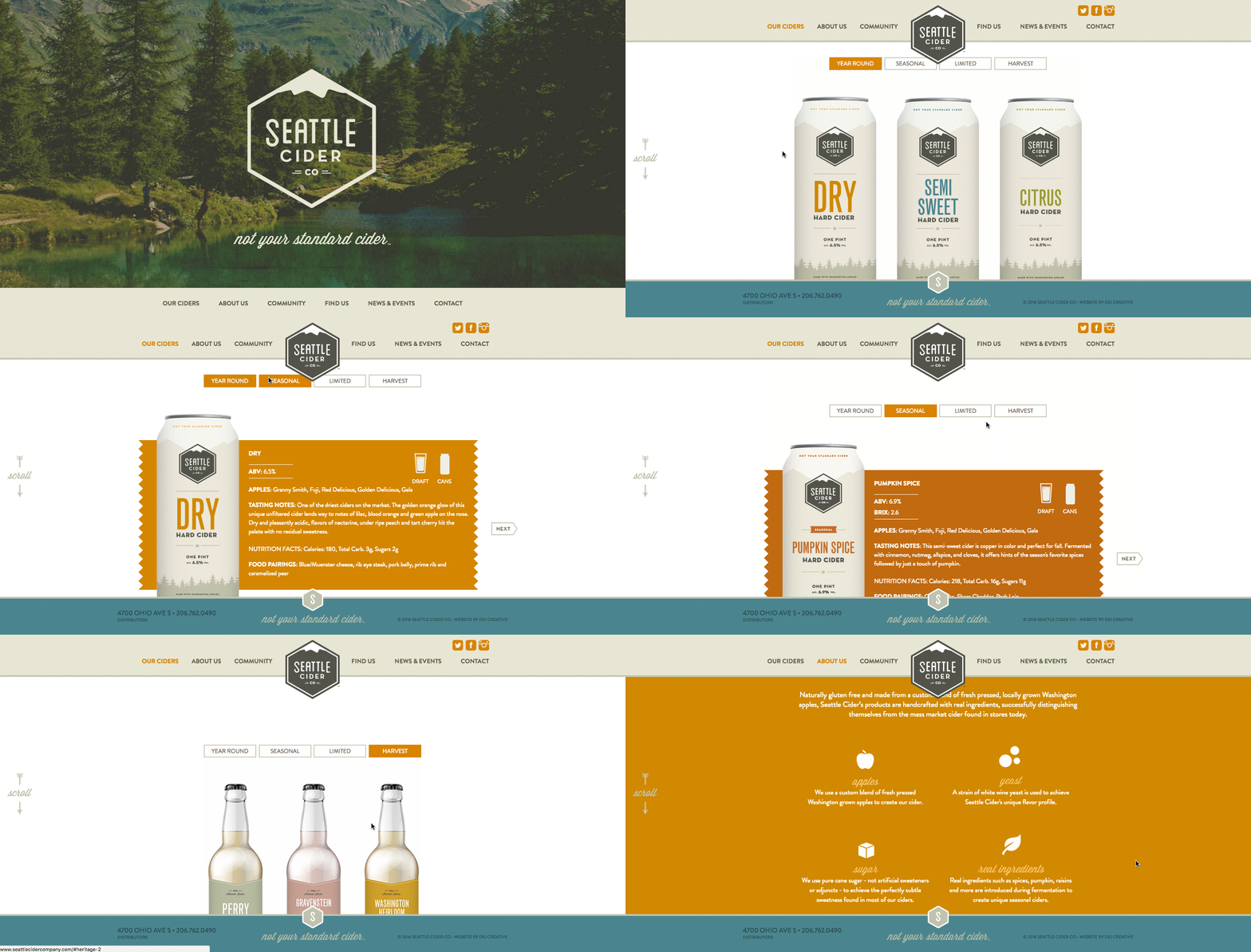
The folks at Seattle Cider claim their cider is “not your standard cider.” Well, neither is the product page. It reads like a story, beginning with attractive, high-definition images of the cider selection, which happen to have really cool label designs. As you hover, an explanation appears of what differentiates Seattle Cider’s products from others, and what makes each variation special.
But my favorite part is what comes next: a really cool, interactive display of how cider is made from start to finish, which plays for users as they scroll. It’s a surprising and delightful user experience that goes above and beyond the typical product page, because it doesn’t just display the products. It shows where they come from, and how.
 [Click here to see Seattle Cider’s full product page.]
10. OfficeSpace Software
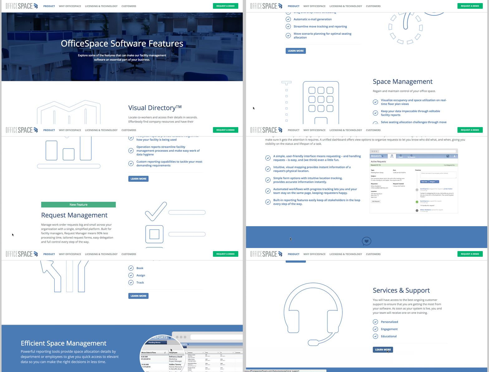
OfficeSpace sells facility management software to help folks manage, well, office spaces. Like the name, the product page is very clear and direct.
Each section of this product page is dedicated to a different feature of the software. The headline explains the feature, and the subheadline explains why this feature is important as you evaluate different software.
That makes it easy for prospects to quickly digest what the product offers, but also read more details on its value proposition, if they choose to. And, if someone wants to learn even more about a particular feature, there are clear calls-to-action to do so.
 [Click here to see OfficeSpace’s full product page.]
11. Orangina
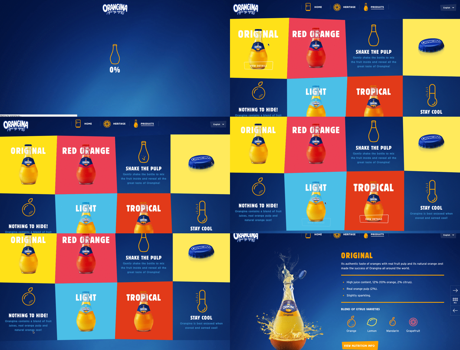
This carbonated citrus drink has been around since 1935, and it has exactly four products — original, red orange, light, and tropical. So, how does Orangina keep its product page both current and special?
For one, it’s fun to explore. When you hover your mouse over any of the blocks, the picture or icon animates — the bottles dance around, the orange slices in half, and the thermometer drops. The animated images and bold colors fit in perfectly with the Orangina brand’s bold, fun personality.
Also, you might notice that some of the blocks are actual products, while the others are simply tips and details about their products. If you don’t have a lot of products to sell, consider interspersing them with tips and information about the products you do have available.
 [Click here to see Orangina’s full product page.]
12. Mango Languages
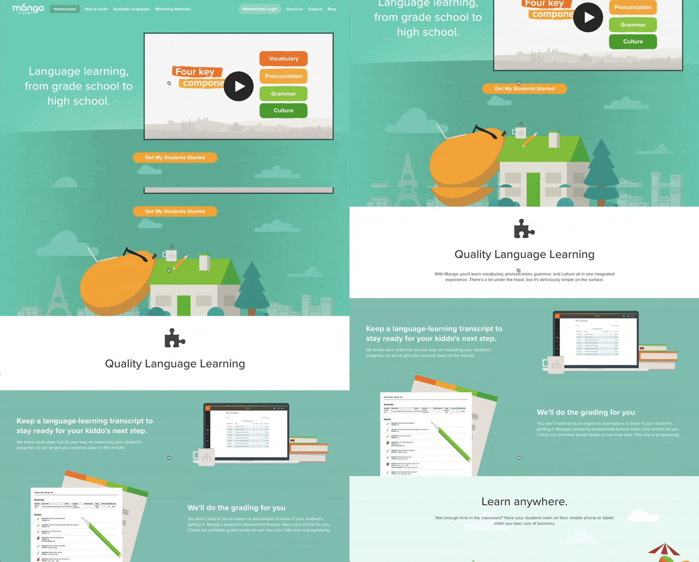
Mango Languages creates “lovable” language-learning experiences for libraries, schools, corporations, government agencies, and individuals. Its homepage has illustrated calls-to-action for each of these buyer personas — from public libraries, to government offices, to those who are homeschooling their kids. Each of those calls-to-action leads to a different product page that’s colorful, clearly written, and very comprehensive.
Take a look at the example for homeschool teachers below. Like every other part of the website, it exudes Mango’s friendly, approachable, and helpful brand personality. The video couldn’t be more delightful. I mean, a guitar-playing mango in a top hat? Yes, please.
As you scroll, you’re greeted with clear value propositions that use playful language that’s true to brand. Everything about the page says “simple to use,” “fun,” and “effective.”
 [Click here to see Mango’s full product page.]
13. Helix Mattresses
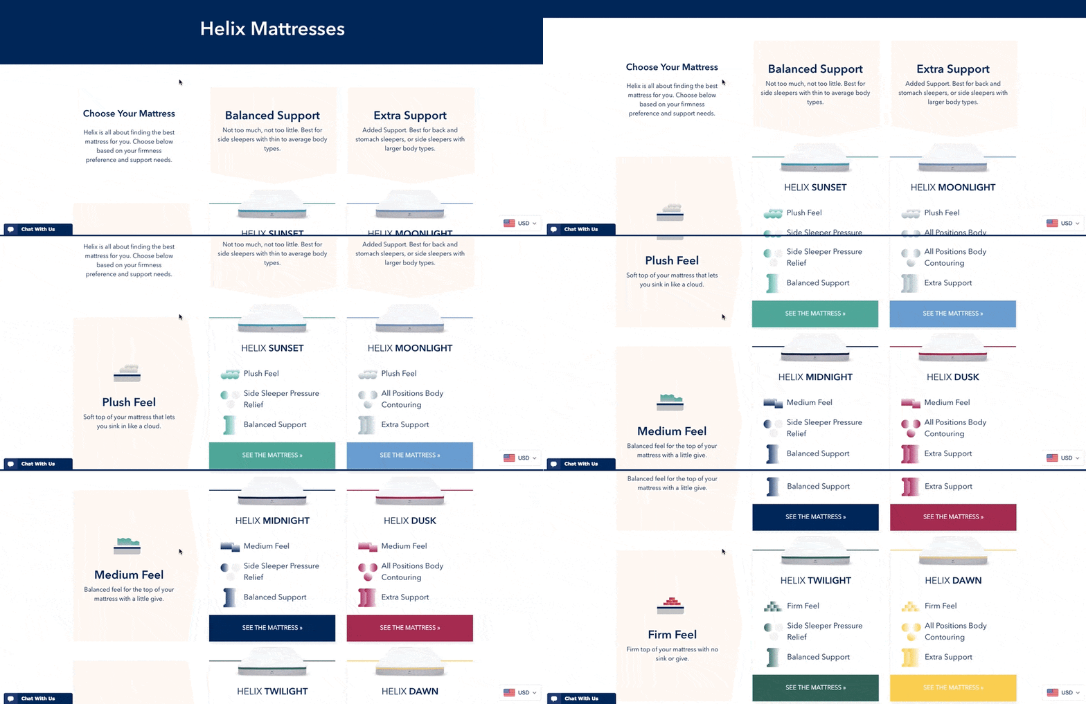
It’s one thing to sell a mattress — it’s another thing to sell a good night’s sleep. Helix Mattresses is laser-focused on the latter, having designed a product page that organizes each mattress by its level of plushness and support.
By looking at Helix’s product line in chart form, website visitors don’t have to examine each mattress individually to find the attributes they’re looking for. Simply find the row and column that matches your bedding needs, and click through to your chosen mattress’s product page to learn more.
Product Description
It can be difficult to know what “plush,” “firm,” or “supportive” really mean in a mattress — they all seem so subjective. For that reason, Helix is all about brevity in its product descriptions, using evocative explanations of each category a mattress might belong to.
“Plush Feel: Soft top of your mattress that lets you sink in like a cloud.”
“Balanced Support: Not too much, not too little. Best for side sleepers with thin to average body types.”
“Firm feel: Firm top of your mattress with no sink or give.”
 [Click here to see Helix’s full product page.]
14. Minwax
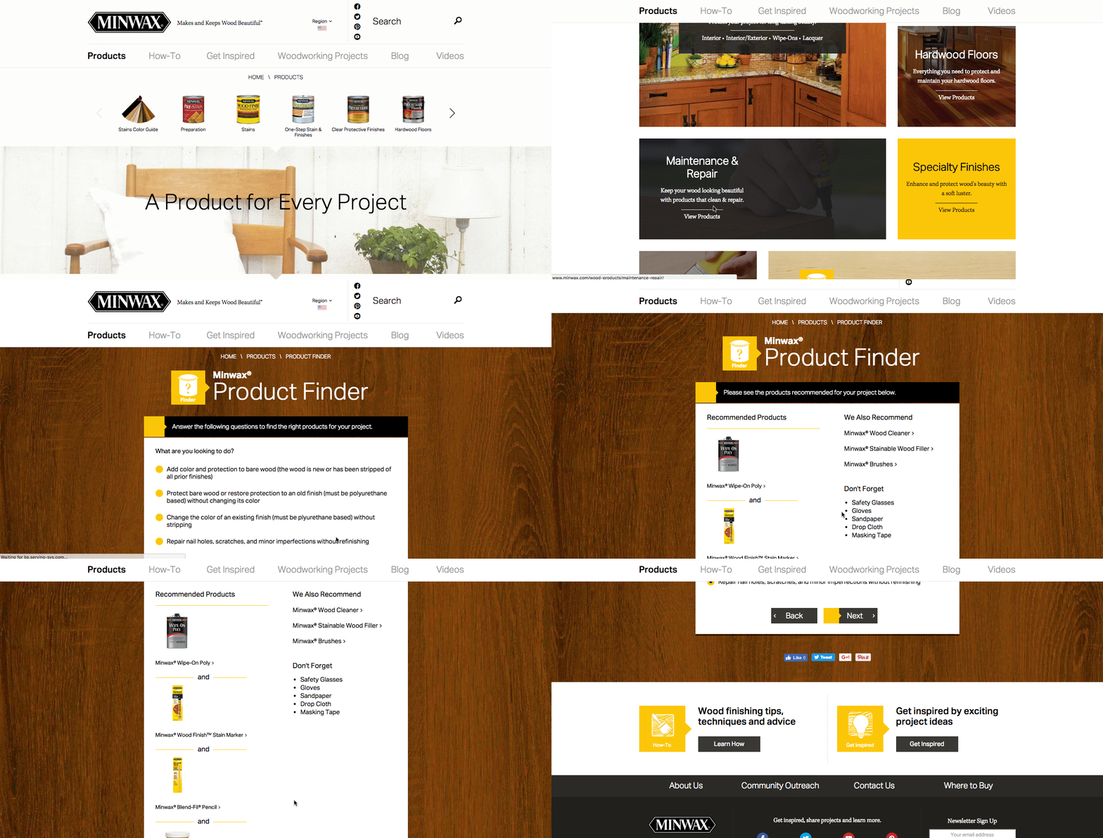
Minwax makes products to help people care for their wood furnishings and surfaces. Riveting, right? But the brand has managed to create a product page that’s not only relevant, but also, helps users quickly and easily find what they’re looking for.
That’s thanks partly to the Minwax Product Finder module. It functions like a quiz, asking a series of multiple-choice questions, like “What kind of project is it?” and “What are you looking to do?” Once you answer the questions, the quiz generates recommended products, which includes a handy “Don’t Forget” list with the tools you’ll need to get the job done — things like safety glasses, gloves, and sandpaper. Helpful tips like this go above and beyond a normal ecommerce product page.
 [Click here to see Minwax’s full product page.]
15. Ministry of Supply
Ministry of Supply specializes in comfortable formal wear, and it shows you just how comfortable in any one of its garments’ product landing pages.
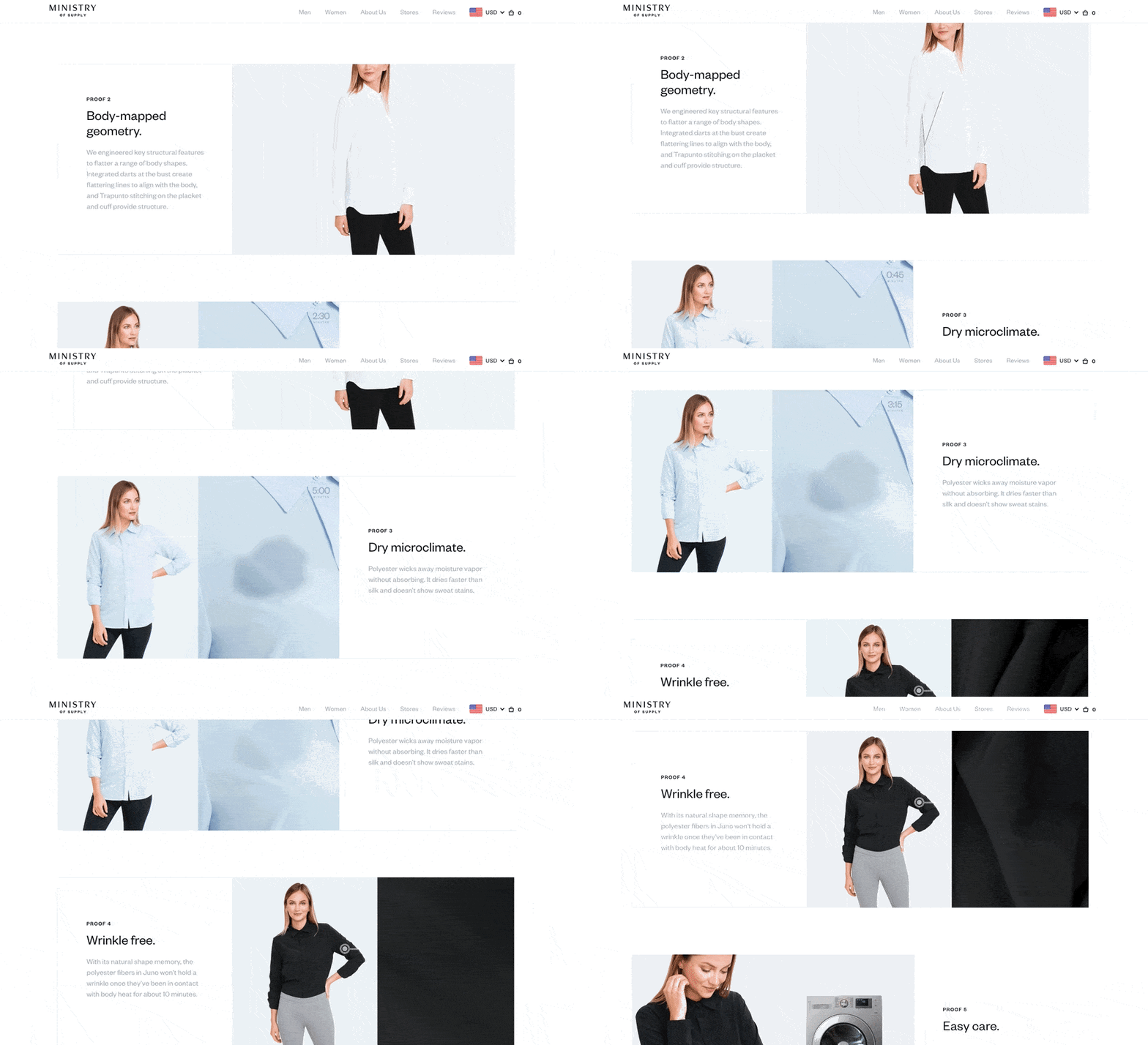
Take the product page for the Juno Blouse, below. Below the photo gallery of a woman modeling the product, Ministry of Supply gives visitors “proofs,” revealing the blouse’s thread count, materials, and other key qualities that make the product unique.
The product page’s best trait might actually be its motion graphics, using basic looped videos that demonstrate the clothing’s resilience and flexibility.
Product Description
Ministry of Supply describes its products’ technical benefits but without sacrificing a friendly tone:
“Unlike silk, Juno is designed for everyday performance without the fuss. It’s moisture-wicking, breathable, and wrinkle free, so you can dress your best without specialized care.”
 [Click here to see Ministry of Supply’s full product page.]
16. Liulishuo
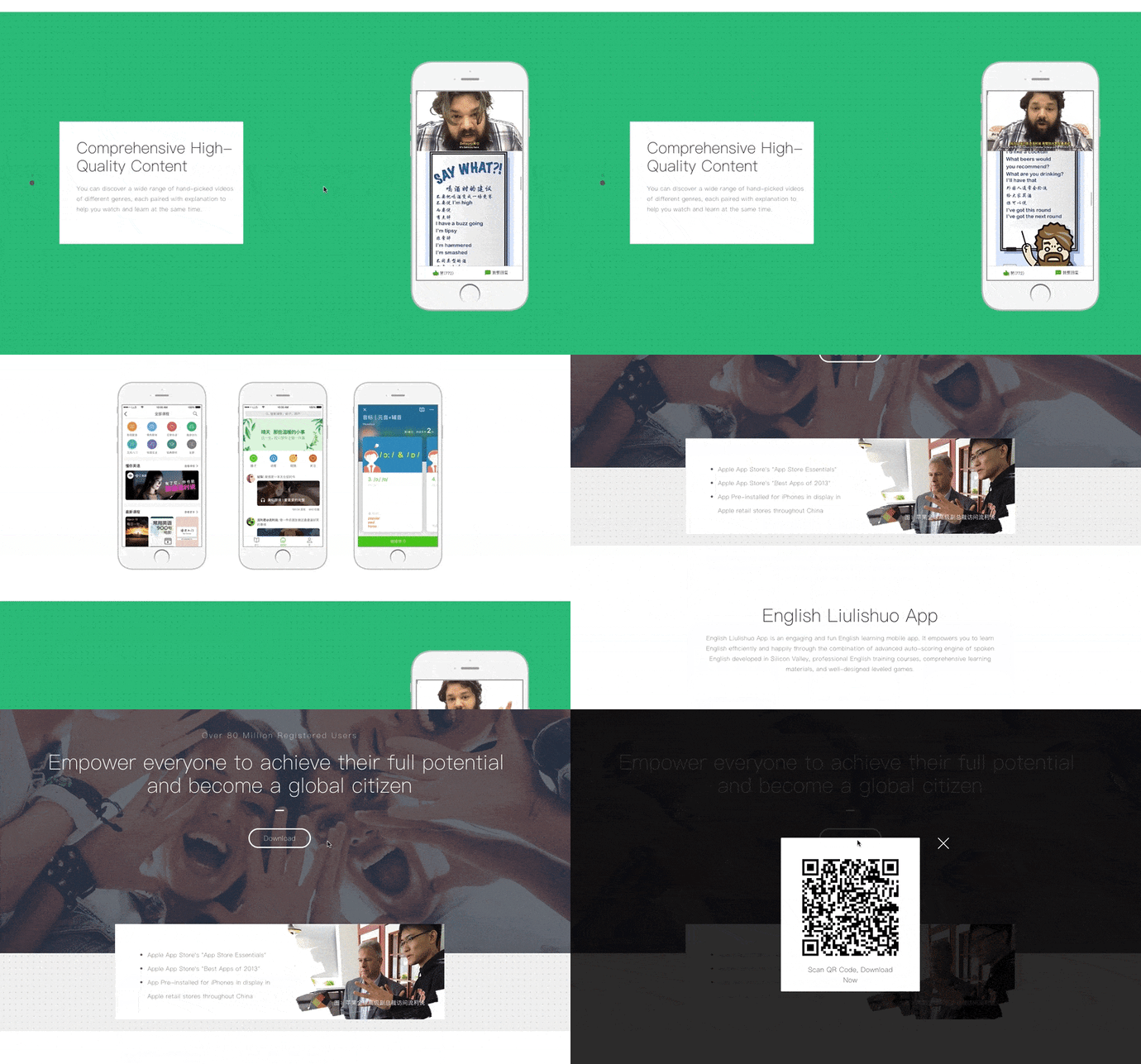
Liulishuo is a China-based startup that builds English language learning tools for personal development and test prep purposes. The company’s mobile app product page offers a clean but media-rich overview of its curriculum.
As you can see below, the bottom of the page plays a crisp motion clip of the video-based coursework in action on a smartphone. It’s essentially an app demo before users even download the app.
At the top of page, Liulishuo makes cool use of QR codes by allowing users to download the app just by scanning the app’s QR code on their mobile device. Presenting a software product in this way is a smart effort to increase customer acquisition simply by making the product easier to get.
 [Click here to see Liulishiuo’s full product page.]
17. Metavrse VR Photobooth™
Metavrse, a virtual reality (VR) consultancy and product developer, has just about the most immersive product page we’ve ever seen. The company sells not just VR insight, but also VR tools to help modern businesses better engage their customers in their goods and services.
One of those tools, which has a killer landing page, is the VR Photobooth™.
Metavrse’s VR Photobooth™ features both a VR headset and an actual cube-shaped room that people enter while wearing the headset for a 360-degree, branded experience. And what better way of demonstrating this experience than right there in the center of the product page? Check it out, below.
Metavrse displays its VR headset facing away from the website visitor, with a moving panoramic background that gives businesses a nearly firsthand demo of what’s waiting for them (or, more specifically, their customers).
Product Description
Metavrse elaborates on its VR Photobooth™ via a full PDF, which website visitors can download for free at the bottom of the product page. Regarding the cube-shaped room itself, the company has some enticing but informative product copy:
“Up to 4 guests can enter the booth at once to have their photo taken among a dazzling display of video imagery and mirror magic.”
 [Click here to see Metavrse’s full product page.]
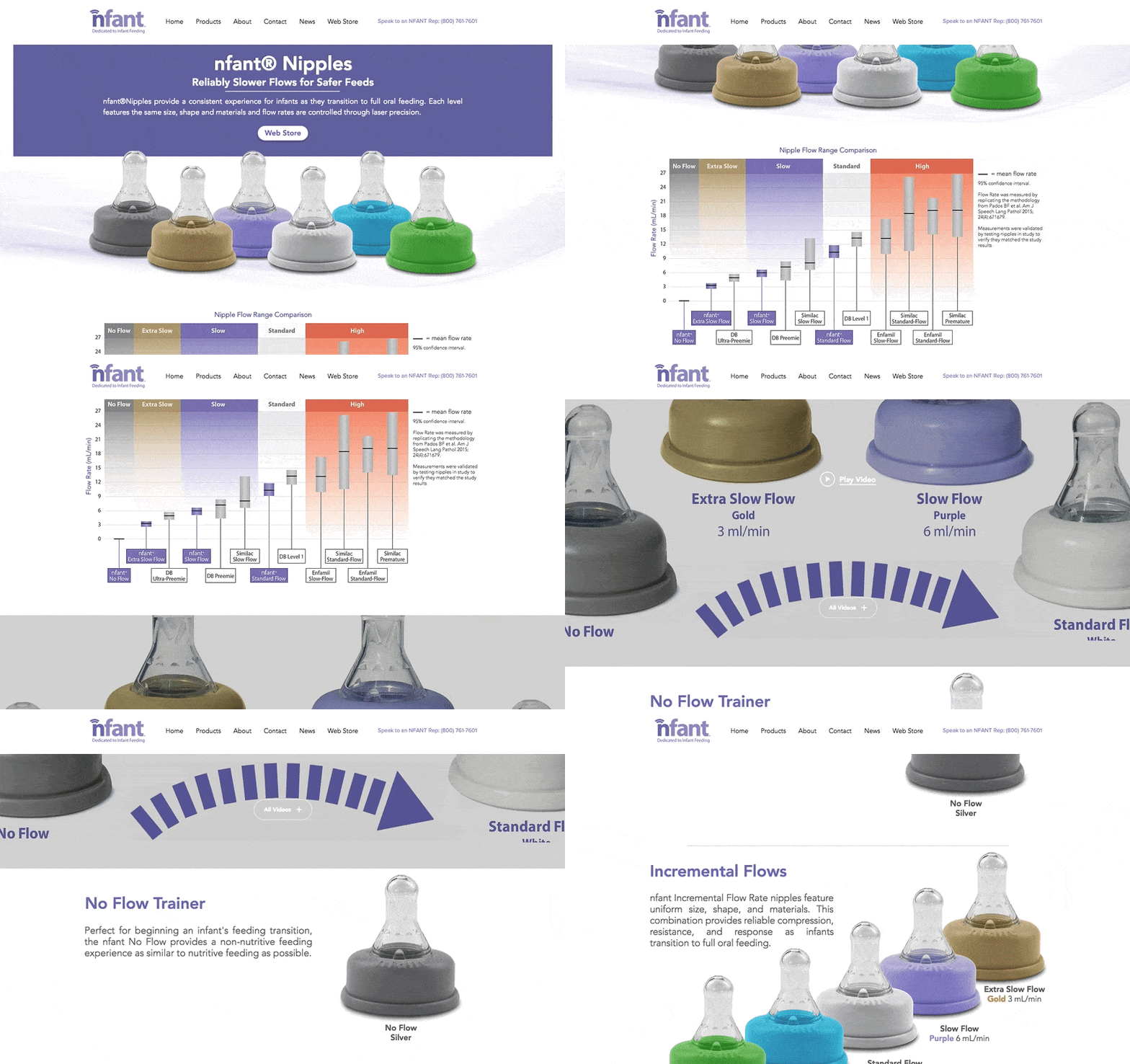
18. Nfant®Nipple
Nfant®, an infant nursing product, takes the transition from breastfeeding to oral feeding seriously — as is evident on the company’s product page for the Nfant®Nipple.
What sets this small business apart from other nursing and parenting services is its use of data to attract customers.
The product page below touts several types of bottle top-shaped nipples, and each one offers a different level of flow when the baby is drinking. As involved as the conditions of each product are, however, the product page delivers the information gracefully using color coordination, a video demonstration, and even a graph comparing each product’s flow range that nursing mothers can refer back to.
Nursing moms are always educating themselves on the resources they have for keeping their children healthy as they develop. With that in mind, Nfant’s detailed but easy-to-understand product page knows its buyer persona well.
 [Click here to see Nfant’s full product page.]
Product Page Best Practices
So, what have these brands taught us about product pages? It boils down to a few must-haves:
- Make it interesting and fun, especially if you have a less-than-riveting product.
- Make it easy for visitors to find what they’re looking for.
- Make it personal. Allow users to “build their own” product, to show them that you can meet their preferences.
- Make it informative. Without bogging it down in detail, be sure to include the right pieces of information that will show users what sets your products apart.
Want more website design examples? Check out creative 404 error messages.

60% of People Are Sticking With Facebook, Even After the Latest Data Breach [New Data]
When Facebook announced last Friday that tens of millions of user accounts had been compromised in a data breach, many of us wondered: Is this the end of the social network giant as we know it?
It’s not exactly the first major PR crisis involving user privacy to happen — not even the first in a while.
Over the past two years alone, Facebook has been repeatedly weaponized by foreign actors in coordinated misinformation campaigns. The personal data of 87 million of its users was improperly harvested by an app developer. And now, thanks to hackers taking advantage of three separate site bugs, at least 50 million Facebook users have had their accounts compromised.
The hack was complicated. It was technical, and involved several layers of vulnerabilities that are tricky to understand — which is why we broke it all down here.
And as few additional details about the full impact of the breach have been revealed since the news first broke nearly a week ago, we wanted to measure the public understanding of what happened — as well as the impact on Facebook use.
So, we ran a few surveys — and here’s what we found.
Do People Understand What Happened?
We wanted to measure three things:
- How many people believe their accounts were affected by Facebook’s latest data breach.
- To what degree people understand exactly what happened.
- If people are taking action (for example, deleting their Facebook accounts) in response.
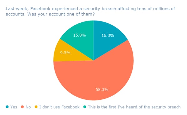
First, we asked 754 internet users across the U.S., UK, and Canada:
Last week, Facebook experienced a security breach affecting tens of millions of accounts. Was your account one of them?
Over half of respondents don’t believe their accounts were compromised by the breach, with 58% responding “No.”
Facebook hasn’t revealed any details about the composition of the accounts affected, including a geographical distribution, but here’s a breakdown of the responses by region.
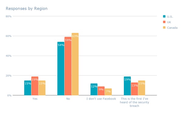
Then, we asked another 782 internet users across the same three countries: Last week, Facebook experienced a security breach affecting tens of millions of accounts. How well do you understand what happened?
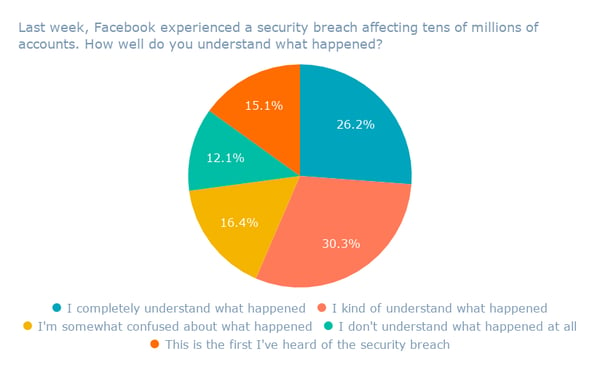
Despite the complex nature of the breach, the smallest percentage of respondents indicated that they don’t understand what happened at all — while the second-highest, 26.2%, said they completely understand it.
Behind the Numbers
It may be true that over a quarter of respondents fully comprehend the nature of one of Facebook’s largest data breaches to date. But the results might also reflect a general lack of clarity and detailed information around its full extent.
For example, how well do most Facebook users understand the potential impact of the breach on third-party apps that they might use, like Tinder and Spotify?
The stolen credentials of the aforementioned 50 million accounts directly compromised by the hack could extend beyond their logins to Facebook alone. “Those stolen credentials could have been used to gain access to so many other sites,” reads a New York Times article published on October 2 titled, “Facebook Hack Puts Thousands of Other Sites at Risk.”
“Companies that allow customers to log in with Facebook Connect are scrambling,” the story continues, “to figure out whether their own user accounts have been compromised.”
Jason Polakis, an assistant professor of computer science at the University of Illinois at Chicago, was one of the first experts to bring up this potential added risk.
More importantly, once attackers gain access to those 3rd parties, they can maintain access to user accounts in those websites using the cookies set by those sites. No matter what FB does, they can’t do anything to prevent attackers’ from accessing those accounts. (9/n)
— jason polakis (@jpolakis)
September 29, 2018
On the evening of October 2, Facebook released a statement indicating that its “investigation has so far found no evidence that the attackers accessed any apps using Facebook Login.”
And while Polakis called those findings “good news,” he also emphasized that the overarching issue is far from resolved.
“Attackers accessing private FB user data is a major concern and privacy risk in and of itself,” he tweeted. “This attack is a clear warning of … the need for better remediation options across all 3rd parties that rely on identity providers,” like Facebook.
The (Non) Impact on Usership
To reiterate: This most recent Facebook security breach is a somewhat technically complex one — parts of which even those of us who have been poring over the story since it broke are still trying to figure out.
And Facebook has released little information about who was impacted or how far back the potential account compromise goes. Independent investigations into the breach have been launched, including one from Ireland’s Data Protection Commission (DPC).
Investigation commenced into Facebook data breach. @DPCIreland statement beneath. #dataprotection #GDPR #eudatap pic.twitter.com/7eHKUigTq5
— Data Protection Commission Ireland (@DPCIreland)
October 3, 2018
That general lack of clarity could help explain the results we found next, when we asked 732 internet users across the U.S., UK, and Canada: Have you stopped using Facebook or deleted your account as a result of this security breach?
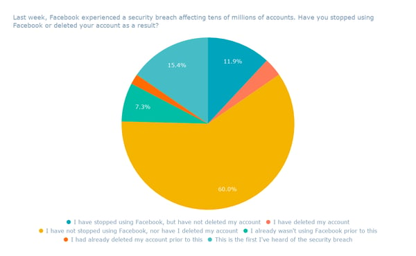
More than half of respondents (60%) said that the breach has not caused them to stop using Facebook, or delete their accounts.
The results raise another question: Are people still using Facebook because they don’t completely understand the full extent, impact, and nature of its security breach? Or is it because they simply don’t care?
I asked two of HubSpot’s VPs of marketing, Jon Dick and Meghan Keaney Anderson, to weigh in. The verdict: At this point, people no longer expect their data or privacy to be protected — and they’re not willing to exchange what they get out of using Facebook for that protection.
“People just assume that their data is constantly breached,” Dick told me a few days after news of the breach first broke. That’s why it’s possible that “the Facebook news didn’t even alarm people.”
It’s also hard for many social media users to feel the effects of an online security issue unless their lives are tangibly compromised — especially when its cause is a social network that they might use day-to-day.
Facebook “is a primary connection point to family members, to news, to society at large,” Keaney Anderson said. “And for now, there is no viable replacement to that.”
We’ll continue to cover the issue as more details come forward.

5 Ways You Can Run More Effective International Meetings
Global teams bring perspectives from various cultures and mindsets, but they also bring obvious challenges: different time zones, language barriers, social norm differences, and communication styles.
These are common challenges for nearly any global team, so it’s important to be empathetic and consider how your coworkers around the globe may be experiencing a certain challenge — and how they may not have the same resources as you
That’s easier said than done, though.
One of the biggest challenges for global teams is conducting effective meetings. Specifically, how you can consistently and effectively bring everyone together, talk through action items, and build rapport while everyone is so far away from each other.
Read on to explore some of our best tips for running more effective global meetings.
5 Ways You Can Run More Effective International Meetings
1. Consider Each Team’s Time Zone
Trying to schedule a meeting across multiple time zones is difficult, but leaving out team members from other regions due to a scheduling conflict is never the solution.
One way to approach this is by sending out a quick survey to figure out each team’s time preference. You may discover that your team in Singapore prefers calls later in the day, whereas your team in Ireland likes to meet earlier in the day. Involving each region in planning will help you make sure that your meeting is at the best time possible for all parties.
If there isn’t a convenient time that’ll work for every team, try rotating your meeting time to accommodate each team every few meetings. If you need a meeting scheduler tool that can pick the optimal meeting time for all your global teams, try using Time and Date.
2. Use Technology to Your Advantage
One of the biggest challenges for remote teams is how the difference in time zones can delay productivity.
For example, if you’re based in New York and send a blog post to a coworker in Dublin for edits, they’re actually five hours ahead of you and have most likely stopped working by the time you send your post to them.
Time zone delays like this can lead to simple projects taking three or four times as long as they normally do. But if you leverage the technology listed below, your global team can be agile and efficient.
Instant messaging software
Slack or Skype
Instant messaging apps are a great way to communicate with your team. You can use them for one-time requests and even every day banter.
Slack, the most popular team collaboration software, is the most widely used instant messaging app for a reason — it allows you to see what time zone your coworkers are in, update your status, and catch up on group conversations.
Video Conferencing Software
Zoom
Whether you’re halfway across the world or only 10 miles away from each other, you can always communicate with your teammates through video chat. Video chat enables global teams to facilitate relationships and work directly with others who do not share an office.
But be sure to communicate that a meeting will include video so you don’t catch a remote employee off guard. Another video chat idea your global team could implement is mounting a monitor that live streams another team in a different location to your office’s wall. By seeing your international teammates faces everyday, your global team will feel more connected with each other.
Smart Conferencing Camera
Meeting Owl
The best way to make teammates feel connected during team meetings is by capturing as much of the human element as possible, like facial expressions and body language.
These small yet powerful details strengthen communication and make the conversation feel more natural, even if you’re halfway across the world from each other.
Today, 360° smart conferencing cameras do a great job of picking up everything that’s happening on both ends, so everyone feels more connected with each other.
Shared Documents
Google Drive
Shared, real-time editing in Google Drive eliminates a lot of back-and-forth discussion when you work on projects with your international team. The editing feature is also one of the best tools for easily collaborating on content and seeing what changes your teammates have proposed.
Project management software
Trello or Basecamp
Even though project management is the core of all content and product teams, any type of team can use project management software. Tools like Trello can keep your global team moving fast while staying nimble, allowing anyone to jump into the tool at any time and learn about the recent changes to all your projects.
Calendar
Google Calendar
Shared calendars offer your team the ability to see what’s going on with each employee, team, and office. Knowing each team’s specific calendar also lets you know if another location may have a national holiday or if a team member is out of the office, without having to ask them.
3. Build Your Cultural Competence
The first step towards developing your cultural competence is awareness. Being aware of your own perceptions, culture, background, and biases is essential to understanding how you view other cultures. To strengthen your awareness, start doing some self-reflection and try understanding how your upbringing and culture have shaped the lens through which you see the world.
You should also try to learn more about other cultures. Set up time with a team member from another part of the world to simply get to know them and learn about their culture. If you have time, consider traveling to each team’s specific location to learn about their way of life. Additionally, you could read books written by authors who have the same cultural background as your teammates.
When learning the nuances of different cultures, you also have to consider other things like how each of your teams perceive vacation time, remote work, and professional communication.
According to a survey conducted by Owl Labs this year, which explores how Americans and Europeans perceive vacation policy and vacation guilt, U.S. workers take an average of 15 vacation days per year while European workers take an average of 22 vacation days. Americans also are 50% more likely to feel guilty when they go on vacation compared to Europeans.
Even though Americans and Europeans are right across the pond from each other, there’s still big differences between their perceptions of work and vacation. And if you make a concerted effort to understand how different cultures and regions think about these important topics, you’ll be able to shape the tone and approach of your communication and become a better teammate.
Plus, by immersing yourself in other cultures and staying humble about your own, you’ll not only be able to work better with your global teammates, but you’ll also grow and develop as a person.
4. Do Team Bonding Activities
Global teams need team bonding as much as single region teams do. When your team feels connected, they are able to work better together. Even if your team is scattered around the globe, you can still promote cross-team and cross-continent bonding through the internet. Here are some fun and effective digital bonding strategies you can use today:
- Set up virtual coffee chats with team members from each office.
- Encourage the use of Slack or other messaging platforms to casually communicate on a daily basis.
- Have each office pick a day where they can share their culture with the rest of the team, where you can do the following:
- Order lunches that are native to each team at every office and set up a virtual hangout during breakfast, lunch, or dinner, depending on each team’s time zone.
- Elect a representative from the office who is sharing their culture that day to do a short presentation about their culture.
- You can set up these virtual events during holidays like Thanksgiving, Holi, Boxing Day, or St. Patrick’s Day.
- If international team members are able to travel to your office, make sure you set up fun and engaging team bonding activities like escape rooms or scavenger hunts.
Global team bonding doesn’t have to be complicated. As a global team manager, all you have to do is encourage your team to communicate with other offices, ask them to help with other teams’ challenges, and think of the whole team as one group.
5. Ask Your Team What Their Preferences Are
Working with global teams means you have to deal with a lot of different opinions and values. If you try to assume what each team is thinking without getting their feedback, you’ll never have productive international meetings and won’t be able to build trust with your global team.
If you are creating, joining, or managing a global team and want to learn what your team members’ preferences are, try sending out an anonymous survey to them, with questions like:
- What is your preferred communication style?
- Are there any holidays or local events that we should be aware of and add to the team’s calendar?
- What software programs do you use?
- What are your preferred times for team meetings?
- What are your preferred times for individual meetings?
- What, if any, challenges have you faced while working on a global team?
Directly asking your team members about their preferences is the best way to improve team bonding and collaboration. To collect this information, try using a tool like TINYpulse, Survey Monkey, or Google Forms. Afterwards, share the data with your team so they can understand how everyone feels about the same issues. Just make sure the answers are anonymous, so you’ll get honest answers.
Build a Global Team that Can Actually Collaborate With Each Other
Diverse teams are the most successful types of teams. But they’re also more challenging to manage. Fortunately, these actionable tips for running more effective international meetings will help you improve your global team’s collaboration and culture.

How to Plan a Successful Ask Me Anything (AMA) Experience
Have you ever wanted to do your own Ask Me Anything (AMA) event? Wondering how to run these online Q&A sessions on social media? In this article, you’ll learn how to organize and manage an online AMA experience on Facebook, Instagram, or Twitter. Why Run an AMA on Social Media to Support Your Marketing? The […]
The post How to Plan a Successful Ask Me Anything (AMA) Experience appeared first on Social Media Examiner.
from Social Media Examiner https://ift.tt/2ycDHhH
via socialmediaexaminer
Minding The Message: The Journey, Season 2, Episode 5
Have you ever struggled refining the messaging for a launch? Then watch The Journey, Social Media Examiner’s episodic video documentary that shows you what really happens inside a growing business. Watch the Journey In episode 5, Michael Stelzner (founder of Social Media Examiner) and his team work on tapping into emotional messaging for their launch. […]
The post Minding The Message: The Journey, Season 2, Episode 5 appeared first on Social Media Examiner.
from Social Media Examiner https://ift.tt/2NlenM8
via socialmediaexaminer
What Organizational Culture Is & Why It Matters
You’ll often hear someone, when speaking to a friend about work, say, “So, what’s the company culture like?”
In response, you might hear something along the lines of, “Really friendly people. Ping pong tables. Free pizza on Friday’s.”
Culture is a critical component of any organization. As the HubSpot Culture Code states, “Culture is to recruiting as product is to marketing.” To attract and retain talented people, you need to create a culture people will love.
But organizational culture is more than friendly people or a cool office space. Here, we’re going to define organizational culture and describe different types, so you can get a sense for what it is — and why it matters.
What is organizational culture?
Organizational culture is an inherent part of any workplace.
Essentially, organizational culture is the values, behaviors, and shared vision that contribute to the environment of an organization.
Let’s focus on one aspect of that for a moment — “values”. In this instance, we’re using values as an umbrella term over the whole organization, but also as a label to define the daily interactions between individual employees.
For instance, your company might value autonomy. On a larger scale, you might implement autonomy by allowing leaders to manage their own teams with little interference. However, to truly infiltrate the culture, you’ll want each employee, from intern to VP, to feel autonomous over their own schedules and workload.
For our purposes, it’s important to distinguish the difference between “value” and “behavior”. Your company might value kindness, but to truly create a compassionate culture, you’ll need to ensure each employee follows certain behaviors. Kindness can mean anything from being inclusive during team outings, to remaining open to new ideas during meetings.
If your values don’t play out in your employees’ daily behavior, you’ll never create the kind of culture you want.
Finally, it’s critical your company have a shared vision. Without a shared vision, it’s difficult for your employees to work together towards a common goal, make effective decisions, and move the company forward. Additionally, your vision is the motivating factor that can keep employees engaged when times get hard.
For instance, consider Life is Good, a company with an impressive 4.0 rating on Glassdoor. From an outsider’s perspective, Life is Good sells t-shirts and other apparel. But their vision is bigger than that — “To spread the power of optimism.”
A vision helps a company grow, but it also enables individual employees to stay on track and make the right decisions for the brand. When faced with challenges, Life is Good’s employees might ask themselves, “Well, does this spread optimism, or does it go against our mission?” Ideally, the vision acts as common ground and enables leaders to take a step back and allow for greater autonomy across the organization.
Types of organizational culture
University of Michigan business professors Robert E. Quinn and Kim S. Cameron developed the Organizational Culture Assessment Instrument, or OCAI. Using their research in the field, they came up with four different organizational cultures — but, it’s important to note, most organizations are a combination of these cultures. Here, we’ll break them down.
1. Clan Culture
Clan Culture is a “family-like” culture. People are friendly and respectful towards one another, and leaders are seen as mentors. There’s an emphasis on team-building and employee involvement. Clan Culture organizations prioritize their Human Resources department, and implement long-term HR approaches to encourage teamwork and inclusion. There’s also a strong emphasis on loyalty and tradition.
Smaller companies are typically good examples of Clan Culture. For instance, Propellernet, a Brighton-based marketing agency consistently named a top UK Place to Work, has said they “prioritize the health and well-being of our team, work hard to challenge, engage and inspire them, and have a business plan that focuses on making their dreams come true.”
2. Adhocracy Culture
This is an innovative, dynamic, and creative work environment. Above all else, a Adhocracy Culture promotes freedom and individual innovation. Employees are encouraged to experiment and offer new ideas, and leaders are seen as risk-takers. Ultimately, the organization aims to grow and create new products. Their metric of success is whether they are able to anticipate market needs and develop new solutions to meet that demand.
Apple is a good example of Adhocracy Culture — Steve Jobs, Apple’s founder, once said, “We hire people who want to make the best things in the world.” Apple puts an emphasis on invention and creativity.
3. Market Culture
A Market Culture emphasizes getting things done. There’s a competitive nature both among employees and even between leaders. Employees are motivated by rivalry and reaching goals, and there’s a steadfast focus on winning. Leaders are both hard drivers and rivals. Ultimately, success is measured by market penetration and stock.
Oracle is a good example of Market Culture. Oracle’s executive chairman and co-founder Larry Ellison has said, “I’m addicted to winning. The more you win, the more you want to win.”
4. The Hierarchy Culture
Strict institutional procedures are adhered to closely in a Hierarchy Culture. A leader’s job is primarily to ensure employees follow procedures correctly. In a Hierarchy Culture, there’s a strong emphasis on efficiency and uniformity. Ultimately, the organization’s goals revolve around smooth execution, results, and low costs. A Hierarchy Culture relies on systematic problem-solving and process control to operate effectively.
Bureaucratic organizations like the Department of Motor Vehicles, or Burger King, are good examples of a Hierarchy Culture. These organizations follow corporate procedures to ensure consistency and results.

What a HTTP 500 Internal Server Error Means and How You Can Fix It
Troubleshooting a HTTP 500 Internal Server Error is like solving a mystery. You don’t know what exactly happened or why it happened — all you know is that something’s wrong and you need to fix it.
To guide you through the hassle of troubleshooting the dreaded HTTP 500 Internal Server Error, let’s go over what it exactly means and its most common causes and solutions.
What does a HTTP 500 Internal Server Error mean?
A HTTP 500 Internal Server Error means your web server is experiencing problems, but it can’t pinpoint the specific error or its root causes. When this happens, your website will serve up a general internal server error web page to your site’s visitors, like the photo below.

Image Credit: CheckUpDown
Fortunately, there are three common and effective solutions for fixing most HTTP 500 Internal Server Errors: troubleshooting popular software problems, debugging server-side scripts, and asking a server administrator for help.
Troubleshooting Popular Software Problems
If your server runs popular software like WordPress, bad installations, incompatible versions, and incorrect server permissions can all cause a HTTP 500 Internal Server Error. Here’s how you can fix this issue:
- Check to see if your recently installed or upgraded software actually failed to install or upgrade. To refresh your software, check the vendor’s website for instructions.
- Newly activated plugin or themes might conflict with your current plugins or themes. Deactivate them one at a time to identify the exact plugins or themes causing the internal server error.
- If you just upgraded your software, your current plugins or themes might not be compatible with the new upgrade. Deactivating plugins or themes one at a time until the error disappears is the best way to find the root cause of your problem.
Debugging Server-Side Scripts
Custom scripts that are currently getting developed and tested can cause an HTTP 500 Internal Server Error. Here’s how you can fix this issue:
- Wrong permissions on a file or folder that has a script, like a PHP or CGI script, won’t allow the script to run. Check your permissions and make sure you set them correctly on your server.
- Programming errors or unavailable resources can cause one of your scripts to run in an endless loop and make it time out.
- Coding errors of an .htcaccess file and custom scripts can also cause an HTTP 500 Internal Server Error.
Asking a Server Administrator for Help
If troubleshooting popular software problems or debugging server-side scripts doesn’t fix your HTTP 500 Internal Server Error, you should read about the most common causes for this type of issue in your server’s documentation — an HTTP 500 Internal Server Error can occur in different operating systems for a multitude of reasons. You can also ask your server provider to access your error logs and find evidence for the root cause of your problem.

How to Create a Sign Up Form That Converts
“A simple and affordable way to increase leads and create more conversions through your website.”
Sounds intriguing, right? But what could I possibly be describing?
I’m referring to sign up web forms. In addition to increasing leads and conversions, sign up forms also help businesses grow their mailing lists and learn more about the people interested in their company and products. They only take minutes to make and can be embedded anywhere on your website.
By the end of this blog post, you will know how to create an impactful sign up form for your website and what to include to achieve the greatest impact possible.
13 Tips to Create a High Converting Sign Up Form
The point of your sign up form is to provide a way for website visitors to opt into your communications or gain more information about your business. A good form makes the opt-in process simple and increases the number of conversions. But what makes a good sign up form?
These tips will help you create an impactful sign up form that gets you closer to your desired result: more leads.
Keep It Simple
Keep your form simple and easy to fill out. Exclude the fluff, unnecessary wording and extra fields. When it comes to web forms, the more fields, the less likely a person is to want to complete the form. In fact, one instance, less fields can lead to a 120% increase in conversions.
Use One Column, Not Two
When a lead is completing a sign up form, you want to provide them with an easy end-to-end experience and a single column form is the best way to do that. Two-column sign up forms may disrupt reading or cause leads to misinterpret the fields.
The only time you should place multiple fields on one line is when the questions are so closely related that it makes more sense for your leads to complete them next to one another. For example, first and last name form fields should be placed next to each other.

Source: W3layouts
Don’t Ask For Information Twice
Have you ever filled out a form and been asked to enter your password twice? Sure it helps to ensure accuracy and validity on forms, but asking leads for duplicate information is unnecessary, especially since there are alternatives that will make the process less cumbersome.
For example, you can unmask passwords so that users can double check their entry before submitting the form.
Advanced form builders use progressive profiling, which prevents returning users from being asked the same questions when they revisit a website. For example, if a lead signed up for one of your offers and returned to your site at a later date to fill out another form, your form builder would remember the lead and either auto-fill their known information or remove redundant questions from the form altogether. Not only does this keep the form completion process as efficient and easy as possible, but it provides a positive user experience.
Use a CTA Button That Stands Out
You should provide your leads with a clear call-to-action, or “submit” button. The main reason CTA buttons are so important is that they make it clear how a lead should submit the form they just completed. The CTA button itself should be wide and bold so it is easy to see and use — a CTA button should make your leads feel confident that the information they are submitting is going to be seen by the right people.
Eliminate Distractions
Sign up forms should serve one purpose: generate leads. That means eliminating distractions like ads, extra wording, photos or videos. Consider a pop-up, dedicated landing page, or a clean area on your site to keep your users focused on the task at hand — completing your form.
Use Inline Form Validation
Inline form validation stops leads who type incorrect information in the form fields with an error message so they are unable to submit the form until they fix the error.
For instance, maybe someone types a password that doesn’t meet the requirements, enters an invalid phone number or is missing a few digits in their zip code. If your forms were submitted with this misinformation, they wouldn’t be useful for you or your leads. Inline form validation ensures that only accurate information is submitted and, thereby, saves time for everyone.
Consider Text and Form Field Box Alignment
When you create your sign up form, align your text so it’s easy to read and follow. Place text above your form fields (not below or to the side). When your leads see “Name”, they will know they should write their name in the form field directly below. People are traditionally used to reading left to right, and completing forms in a single column format, so maintaining consistency is important.
Make the Value of Signing Up Clear
Whether you’re offering a free trial, first-time purchase discount, weekly newsletter, or important company information on new products and services, you should state the value of signing up on (or around) your form. This will get your leads excited and provide them with an incentive to complete all those form fields.
Show Social Proof
Social proof is a way to show potential leads that other people are taking action by filling out your form and they should too.
70% of online consumers look at a product review before making a decision to buy something. That’s exactly why marketers often use social proof to encourage visitors to complete their sign up forms.
Providing proof works — in fact, studies have shown that product reviews written by real customers are 12x more trusted than product descriptions written by companies and manufacturers. Social proof could be a testimonial quote, a product review or a submission counter.
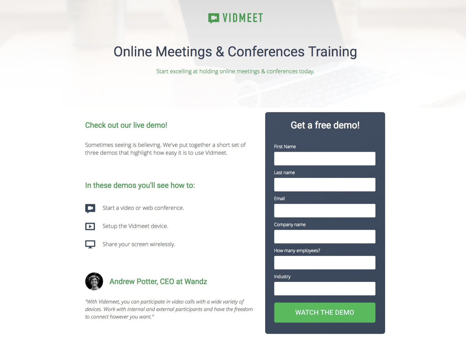
Source: Instapage
For example, when an eBook author added social proof (in the form testimonials) to his website, he experienced an increase in downloads and email sign ups by over 64%… not bad! When people see social proof, they have a reason to trust you and your business which leads to an increase in conversions.
Make Your Form Look Nice
Did you know that 38% of people will stop engaging with a website if the content and layout are visually unattractive or unpleasant?
People care about your sign up form design. Make your form look professional, visually appealing and ensure it matches the look of your other brand. If you put in the time to create a beautiful form, you will leave a lasting impression on your leads.
Tell Your Leads What Happens After They Sign Up
Once someone completes your sign up form, let them know what to expect next. Whether it’s a weekly email, future product announcements, quarterly company news, or an annual check-in, your new lead should know how and when they will hear from you.
A common way to do this is by sending your new lead to a “thank you” page or providing an inline message once they submit the form. After all, they did just stop whatever it was they were doing to voluntarily provide you with their information.
Don’t Use CAPTCHAs On Forms
CAPTCHAs are the tests that ask you to enter a code or identify images in a photo before submitting a form. Their purpose is to detect bots and decrease SPAM.
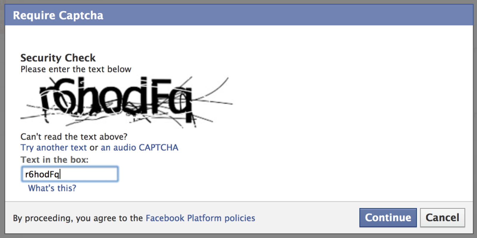
Source: BeSpecular
However, completing a CAPTCHA is sometimes tricky, takes time and often frustrates leads. Not to mention, CAPTCHAs are less helpful than they once were since computers have become better at imitating humans. If you’re worried about SPAM, you can try the reCAPTCHA, which allows leads to simply check a box that says, “I’m not a robot” and carry on with their day.
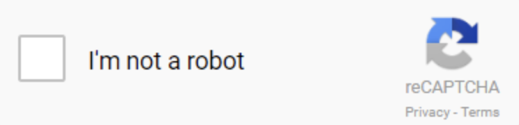
Source: Google
Test Your Sign Up Forms
First, test that your form works. Your leads should have no issue providing their information and submitting it to your server. Then, test which variation of your form is most effective through an A/B test.
Four Great Sign Up Form Examples
A great way to create an impactful sign up form is to look at other successful examples. Although each business has different needs and requirements, there are still common elements shared among successful web forms that you can learn from. Here are four examples to consider:
Netflix
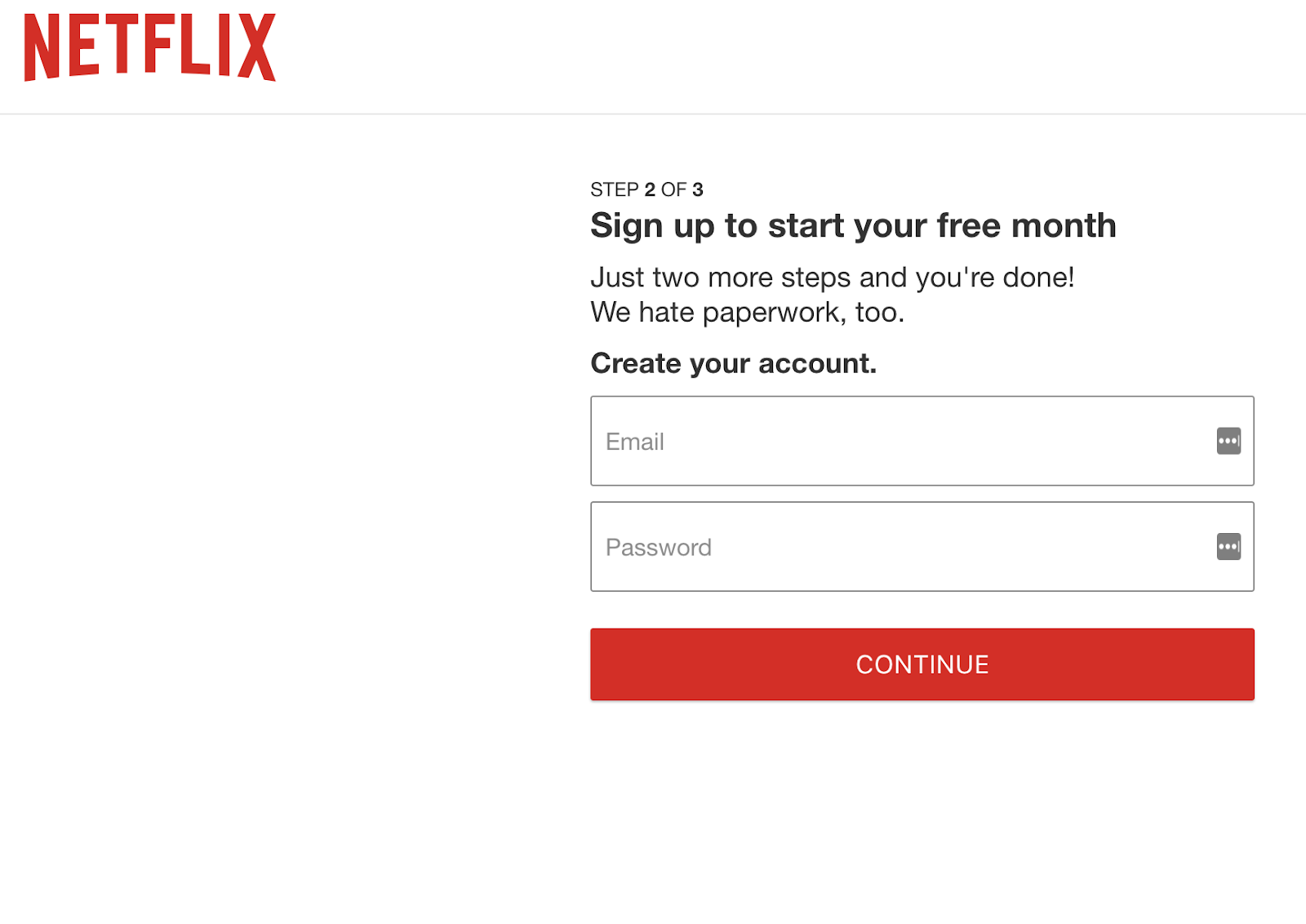
Source: Netflix
Netflix has a quick and easy sign up form with a clear incentive: a free, one-month trial. All new users need to do to get started is create an account with an email address and a password. It’s quick and simple, which is key to increasing conversions. The copy about hating paperwork doesn’t hurt either — it shows how Netflix relates to their customers.
Grubhub
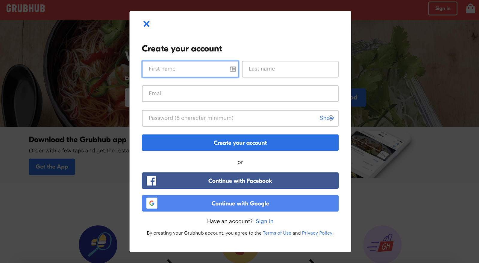
Source: Grubhub
Grubhub uses a pop-up sign up form, which eliminates distractions by darkening the background to bring the form into focus. Leads are asked for just three pieces of information that they can either fill out manually or automatically using their Facebook or Google account. Grubhub knows how to create an efficient and easy experience for their visitors.
Equinox
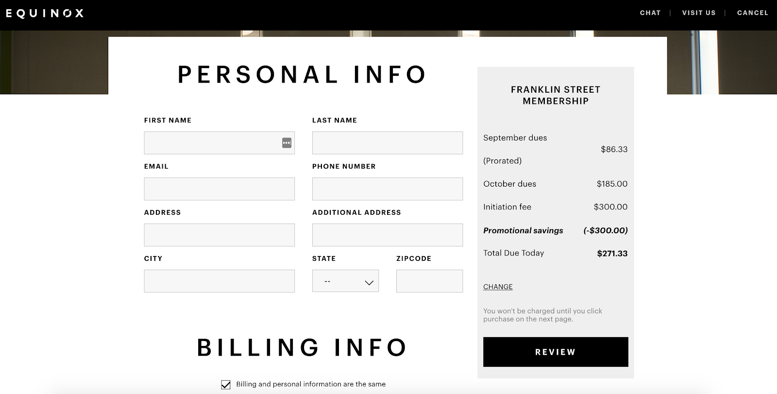
Source: Equinox
Signing up for a gym membership requires a lot of personal information, but Equinox knows how to keep the process simple. The club has separate forms for personal, billing and account information that are displayed as a user progresses. Not only that, but their selections are displayed alongside the form, which allows leads to confidently hit “Submit” at the end of the form.
HubSpot CRM
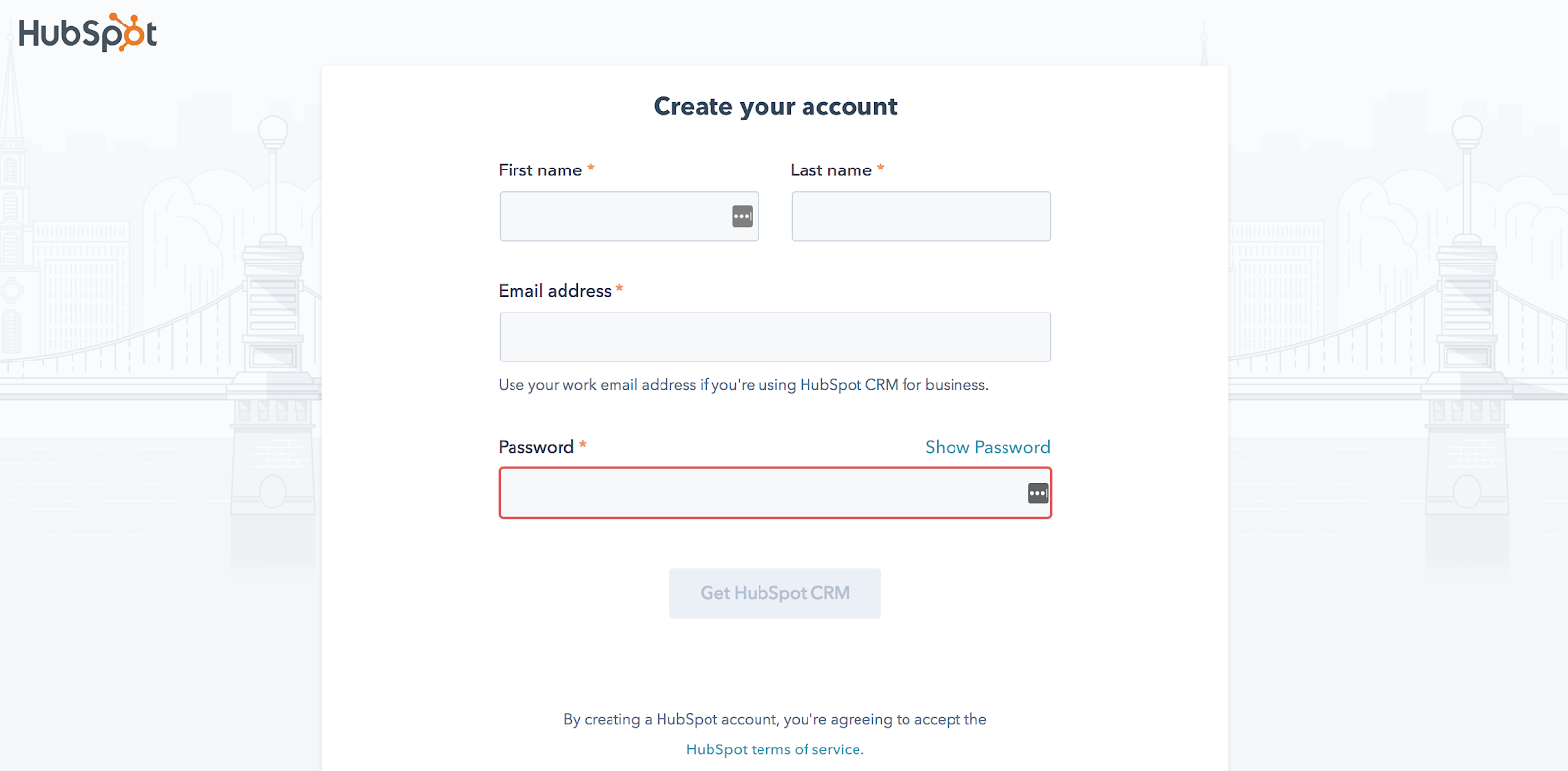
Source: HubSpot
The HubSpot CRM sign up form only requires leads to complete four fields — first name, last name, email and password — before submitting. HubSpot places the first and last name form fields side by side to shorten the form. Lastly, the form is branded, looks nice and matches HubSpot’s aesthetic.
A Google Sign Up Form Template You Can Use Right Away
Now that we’ve reviewed some great sign up form examples, let’s check out a couple of (free) templates you can use to create your own sign up form. All you need is access to the Google Suite (if you already have a Gmail account, you’re good to go).
Picnic Sign Up Form: Google Sheets
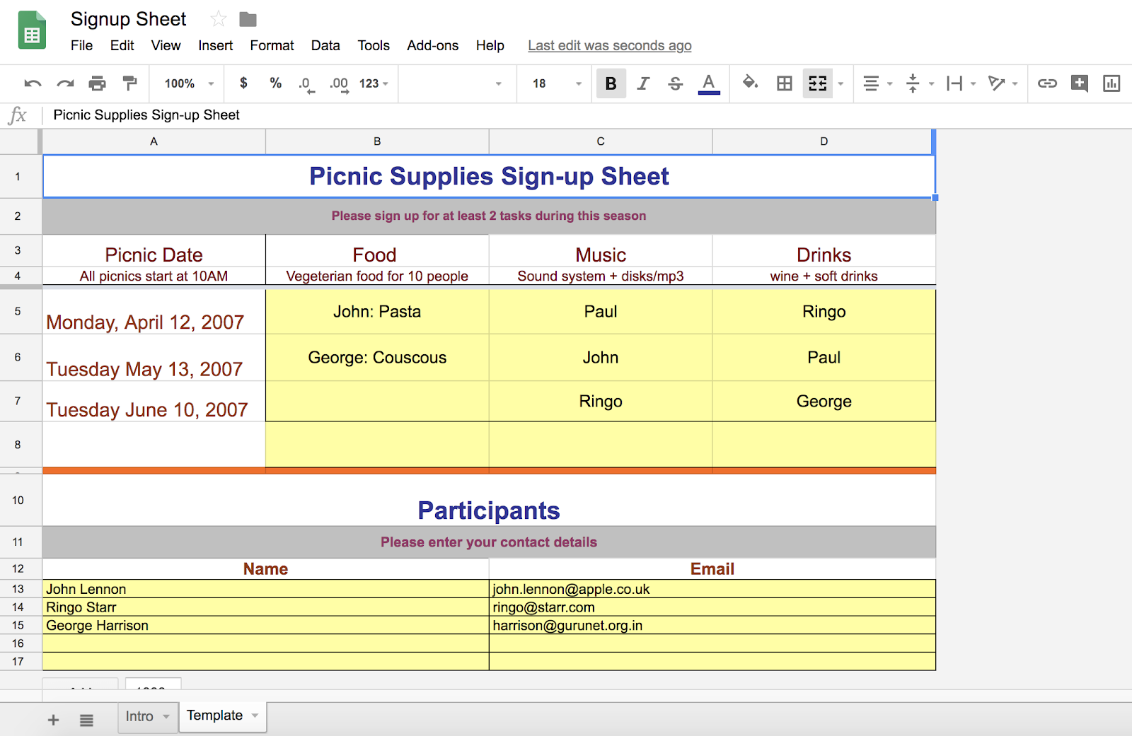
Source: Google Sheets
This form in Google Sheets is clearly color coated, labeled and organized. Google Sheets allows you to make spreadsheet forms that are as in-depth as you want them to be. You can also share your forms publicly with the click of a button and design them in any way they see fit.
T-Shirt Sign Up Form: Google Forms
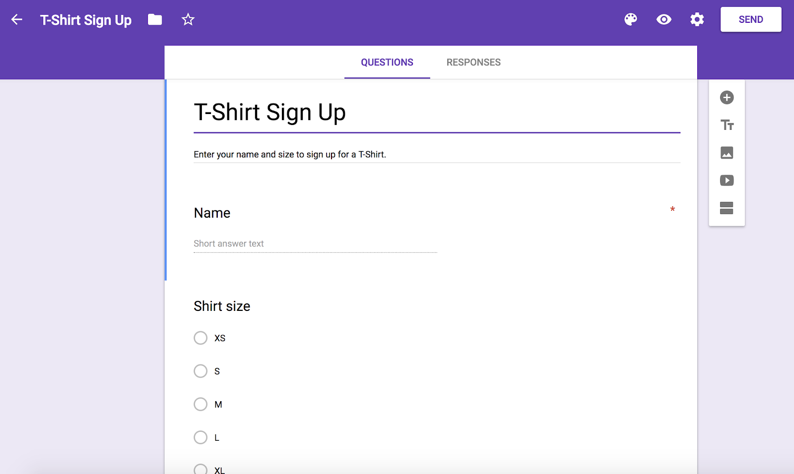
Google Forms is another quick way to create sign up forms. With this free software, you can build a professional-looking form and share it publicly. Google Forms has a large selection of templates to choose from and this T-Shirt sign up form is just one of them. Google Forms allows you to collect information in a variety of ways, such as large and short-entry text fields, multiple choice, checkboxes and more.
Conclusion
Sign up forms are a way to generate leads and build your mailing lists. They also allow you to learn more about the people most interested in your brand, products and services. With a simple, visually appealing and easy-to-follow sign up form, you will increase your conversions.

Your Guide to Colors: Color Theory, The Color Wheel, & How to Choose a Color Scheme
When you’re sifting through your News Feed, what tends to catch your attention? More likely than not, it’s YouTube videos, pictures, animated GIFs, and other visual content, right?
While text-based content is always important when seeking answers to a question, creating visuals such as infographics, charts, graphs, animated GIFs, and other shareable images can do wonders for catching your readers’ attention and enhancing your article or report.
I know what you might be thinking: “I don’t know how to design awesome visuals. I’m not creative.”
Hi. I’m Bethany, and I will be the first to tell you that I’m not naturally artistic. And yet, I found a strength in data visualization at HubSpot, where I’ve spent most of my days creating infographics and other visuals for blog posts.
So, while I wouldn’t say I’m naturally artistic, I have learned how to create compelling visual content. So can you.

While there are many tools out there to help even the most inartistic of us to create compelling visuals, some parts of graphic design take a little more background knowledge.
Take picking the right colors, for instance. It’s something that might seem easy at first, but when you’re staring down a color wheel, you’re going to wish you had some information on what you’re looking at.
Consider this your introductory course to color theory. Read on to learn about the terms, tools, and tips you should know to pick the best colors for your designs.
Color Theory 101
Let’s first go back to high school art class to discuss the basics of color.
Remember hearing about primary, secondary, and tertiary colors? They’re pretty important if you want to understand, well, everything else about color.
Primary Colors
Primary colors are those you can’t create by combining two or more other colors together. They’re a lot like prime numbers, which can’t be created by multiplying two other numbers together.
There are three primary colors:
- Red
- Yellow
- Blue
Think of primary colors as your parent colors, anchoring your design in a general color scheme. Any one or combination of these colors can give your brand guardrails when you move to explore other shades, tones, and tints (we’ll talk about those in just a minute).
When designing or even painting with primary colors, don’t feel restricted to just the three primary colors listed above. Orange isn’t a primary color, for example, but brands can certainly use orange as their dominant color (as we at HubSpot know this quite well).
Knowing which primary colors create orange is your ticket to identifying colors that might go well with orange — given the right shade, tone, or tint. This brings us to our next type of color …
Secondary Colors
Secondary colors are the colors that are formed by combining any two of the three primary colors listed above. Check out the color theory model above — see how each secondary color is supported by two of the three primary colors?
There are three secondary colors: orange, purple, and green. You can create each one using two of the three primary colors. Here are the general rules of secondary color creation:
- Red + Yellow = Orange
- Blue + Red = Purple
- Yellow + Blue = Green
Keep in mind that the color mixtures above only work if you use the purest form of each primary color. This pure form is known as a color’s hue, and you’ll see how these hues compare to the variants underneath each color in the color wheel below.
Tertiary Colors
Tertiary colors are created when you mix a primary color with secondary color.
From here, color gets a little more complicated. And if you want to learn how the experts choose color in their design, you’ve got to first understand all the other components of color.
The most important component of tertiary colors is that not every primary color can match with a secondary color to create a tertiary color. For example, red can’t mix in harmony with green, and blue can’t mix in harmony with orange — both mixtures would result in a slightly brown color (unless of course that’s what you’re looking for).
Instead, tertiary colors are created when a primary color mixes with a secondary color that comes next to it on the color wheel below. There are six tertiary colors that fit this requirement:
- Red + Purple = Red-Purple (magenta)
- Red + Orange = Red-Orange (vermillion)
- Blue + Purple = Blue-Purple (violet)
- Blue + Green = Blue-Green (teal)
- Yellow + Orange = Yellow-Orange (amber)
- Yellow + Green = Yellow-Green (chartreuse)
The Color Theory Wheel
Okay, great. So now you know what the “main” colors are, but you and I both know that choosing color, especially on a computer, has much wider range than 12 basic colors.
This is the impetus behind the color wheel, a circle graph that charts each primary, secondary, and tertiary color — as well as their respective hues, tints, tones, and shades. Visualizing colors in this way helps you choose color schemes by showing you how each color relates to the color that comes next to it on a rainbow color scale. (As you probably know, the colors of a rainbow, in order, are red, orange, yellow, green, blue, indigo, and violet.)
When choosing colors for a color scheme, the color wheel gives you opportunities to create brighter, lighter, softer, and darker colors by mixing white, black, and gray with the original colors. These mixes create the color variants described below:
Hue
Hue is pretty much synonymous to what we actually mean when we said the word “color.” All of the primary and secondary colors, for instance, are “hues.”
Hues are important to remember when combining two primary colors to create a secondary color. If you don’t use the hues of the two primary colors you’re mixing together, you won’t generate the hue of the secondary color. This is because a hue has the fewest other colors inside it. By mixing two primary colors that carry other tints, tones, and shades inside them, you’re technically adding more than two colors to the mixture — making your final color dependent on the compatibility of more than two colors.
If you were to mix the hues of red and blue together, for instance, you’d get purple, right? But mix a tint of red with the hue of blue, and you’ll get a slightly tinted purple in return.
Shade
You may recognize the term “shade” because it’s used quite often to refer to light and dark versions of the same hue. But actually, a shade is technically the color that you get when you add black to any given hue. The various “shades” just refer to how much black you’re adding.
Tint
A tint is the opposite of a shade, but people don’t often distinguish between a color’s shade and a color’s tint. You get a different tint when you add white to a color. So, a color can have a range of both shades and tints.
Tone (or Saturation)
You can also add both white and black to a color to create a tone. Tone and saturation essentially mean the same thing, but most people will use saturation if they’re talking about colors being created for digital images. Tone will be used more often for painting.
Adding and Subtracting Color
If you’ve ever played around with color on any computer program, you’ve probably seen a module that listed RGB or CMYK colors with some numbers next to the letters.
Ever wondered what those letters mean?
CMYK
CMYK stands for Cyan, Magenta, Yellow, Key (Black). Those also happen to be the colors listed on your ink cartridges for your printer. That’s no coincidence.
CMYK is the subtractive color model. It’s called that because you have to subtract colors to get to white. That means the opposite is true — the more colors you add, the closer you get to black. Confusing, right?

Think about printing a piece of paper. When you first put a sheet in the printer, you’re typically printing on a white piece of paper. By adding color, you’re blocking the white wavelengths from getting through.
Then, let’s say you were to put that printed piece of paper back in the printer, and print something on it again. You’ll notice the areas that have been printed on twice tend to colors closer to black.
I find it easier to think about CMYK in terms of its corresponding numbers. CMYK works on a scale of 0 to 100. If C=100, M=100, Y=100, and K=100, you end up with a black color. But, if all four colors equal 0, you end up with true white.
RGB
RGB color models, on the other hand, are designed for electronic displays, including computers.
RGB stands for Red, Green, Blue, and is based on the additive color model of light waves. This means, the more color you add, the closer you get towards white. For computers, RGB is created using scales from 0 to 255. So, black would be R=0, G=0, and B=0. White would be R=255, G=255, and B=255.

When you’re creating color on a computer, your color module will usually list both RGB and CMYK numbers. In practice you can use either one to find colors, and the other color model will adjust accordingly.
However, many web programs will only give you the RGB values or a HEX code (the code assigned to color for CSS and HTML). So, if you’re designing digital images, RGB is probably your best bet for choosing colors.
How to Choose a Color Scheme
- Consider your color context.
- Refer to a color wheel to identify analogous colors.
- Refer to a color wheel to identify complementary colors.
- Focus on monochromatic colors in the same hue.
- Use a triadic color scheme to create high contrast.
- Create a split complementary color scheme.
- Think beyond the presets, but start with just one color.
Now that we’ve got all of the basics of color theory down, let’s talk about how to actually use this newfound knowledge to form designs that perfect your brand and resonate with your audience.
You’ve probably noticed before that some colors look great together and others, well, just don’t. The colors we choose can help enhance a design, or it can take away from a design.
When you’re figuring out how to design a graphic, it’s important to remember that how we perceive colors depends on the context in which we see it.
1. Consider your color context.
Color context refers to how we perceive colors as they contrast with another color. Look at the pairs of circles in the example below to see what I mean.
The middle of each of the circles is the same size, shape, and color. The only thing that changes is the background color. Yet, the middle circles appear softer or brighter depending on the contrasting color behind it. You may even notice movement or depth changes just based on one color change.
This is because the way in which we use two colors together changes how we perceive it. So, when you’re choosing colors for your graphic designs, think about how much contrast you want throughout the design.
For instance, if you were creating a simple bar chart, would you want a dark background with dark bars? Probably not. You’d most likely want to create a contrast between your bars and the background itself since you want your viewers to focus on the bars, not the background.
Choosing colors with high contrast, however, isn’t always as hard as choosing colors that look good together.
For me, this is where choosing color is trickiest. I could spend hours choosing colors for an infographic simply because it takes awhile to get a feel for what looks best together.
In reality, though, I usually don’t have hours to spend just choosing colors. (And that’d probably be a waste of time even if I did have a few hours.)
Luckily, there are logical rules for how to create color schemes that work together.
2. Refer to a color wheel to identify analogous colors.
Analogous color schemes are formed by pairing one main color with the two colors directly next to it on the color wheel. You can also add two additional colors (which are found next to the two outside colors) if you want to use a five-color scheme instead of just three colors.
Analogous structures do not create themes with high contrasting colors, so they’re typically used to create a softer, less contrasting design. For example, you could use an analogous structure to create a color scheme with autumn or spring colors.
I like to use this color scheme to create warmer (red, oranges, and yellows) or cooler (purples, blues, and greens) color palettes like the one below. There isn’t a high contrast between these colors, but don’t they just look nice together?
I’d probably use this palette to design an image rather than an infographic or bar chart as I would want all of the elements in the image to blend together nicely.

3. Refer to a color wheel to identify complementary colors.
You may have guessed it, but a complementary color scheme is based on the use of two colors directly across from each other on the color wheel and relevant tints of those colors.
The complementary color scheme provides the greatest amount of color contrast. Because of this, you should be careful about how you use the complementary colors in a scheme.  It’s best to use one color predominantly and use the second color as accents in your design.
The complementary color scheme is also great for charts and graphs. High contrast helps you highlight important points and takeaways.
However, if I were to use these colors in an infographic, I’d probably need to use a much lighter color for the actual background. Can you imagine choosing one of the oranges as a background with blues as accents and text? That’d probably be too overpowering and difficult to read.

4. Focus on monochromatic colors in the same hue.

Using a monochromatic schemes allows you create a color scheme based on various shades and tints of one hue. Although it lacks color contrast, it often ends up looking very clean and polished. It also allows you to easily change the darkness and lightness of your colors.
I like to use monochromatic color schemes for charts and graphs, but only when creating high contrast isn’t necessary. However, monochromatic schemes don’t tend to “pop,” so if you’re looking for a color scheme that’s bright and attention grabbing, this one isn’t your best bet.
Check out all the monochromatic colors that fall under the red hue, a primary color.

5. Use a triadic color scheme to create high contrast.
Triadic color schemes offer high contrasting color schemes while retaining the same tone. Triadic color schemes are created by choosing three colors that are equally placed in lines around the color wheel.
Triad color schemes are useful for creating high contrast between each color in a design, but they can also seem overpowering if all of your colors are chosen on the same point in a line around the color wheel.
To subdue some of your colors in a triadic scheme, you can choose one dominant color and use the others sparingly, or simply subdue the other two colors by choosing a softer tint.
The triadic color scheme looks great in graphics like bar or pie charts because it offers the contrast you need to create comparisons.
However, if I were using this color scheme to create an infographic, I’d be more likely to choose one color as the background color, such as the yellow or light green, and a darker contrasting color as the dominant color. I then might use the other three colors as accents throughout. By changing up the intensity of the colors in the design, I can highlight important points and takeaways.

6. Create a split complementary color scheme.
A split complementary scheme includes one dominant color and the two colors directly adjacent to the dominant color’s complement. This creates a more nuanced color palette than a complementary color scheme while still retaining the benefits of contrasting colors.
The split complementary color scheme can be difficult to balance well because unlike analogous or monochromatic color schemes, the colors used all provide contrast (similar to the complementary scheme).
I can imagine using the following split complementary color scheme in a variety of ways. I could use this in an chart or graph because it gives me the contrast I need and the colors remain visually appealing.
I could also imagine using these colors in an infographic, although I’d play around with the colors a bit more to see which pairs look best together.
The positive and negative aspect of the split complementary color model is that you can use any two colors in the scheme and get great contrast … but that also means it can also be tricky to find the right balance between the colors. As a result, you may end up playing around with this one a bit more to find the right combination of contrast.

No matter which color scheme you choose, try and keep in mind what your graphic needs. If you need to create contrast, then choose a color scheme that gives you that. On the other hand, if you just need to find the best “versions” of certain colors, then play around with the monochromatic color scheme to find the perfect shades and tints.
I’ve found that simply understanding how color schemes are built goes a long way for helping me choose the right color scheme. If I just think: “What is the goal of this graphic?” I can start to determine how much (or how little) contrast I need.
Remember, if you build a color scheme with five colors, that doesn’t mean you have to use all five. Sometimes just choosing two colors from a color scheme looks much better than cramming all five colors together in one graphic.
7. Think beyond the presets, but start with just one color.
Before I send you off to create amazing images to improve you blog and social posts, let me give you a few extra tips for choosing colors:
- Don’t stick with presets. Almost every program you use will automatically give you preset colors. Get past the presets and explore color on your own. Don’t let the program decide how you use color in your design.
- Start with one color you like. Every time I design something, I start with one color and build the color scheme from there. If you try and start with more than one color, you’ll have a harder time finding harmony between your colors.
- Save your color schemes. If you find a color (or color scheme) you like, it’ll probably be useful to you later. I wouldn’t suggest using the same color scheme for every chart or graphic you create, but you can always use different schemes in different ways later on.
- Practice makes perfect. The more you play with color and practice design, the better you get. No one creates their masterpiece the first time around.
Color Tools
There’s been a lot of theory and practical information for actually understanding which colors go best together and why. But when it comes down to the actual task of choosing colors while you’re designing, it’s always a great idea to have tools to help you actually do the work quickly and easily.
Luckily, there are a number of tools to help you find and choose colors for your designs.
Adobe Color
One of my favorite color tools to use while I’m designing anything — whether it’s an infographic or just a pie chart — is Adobe Color (previously Adobe Kuler).
This free online tool allows you to quickly build color schemes based on the color structures that were explained earlier in this post. Once you’ve chosen the colors in the scheme you’d like, you can copy and paste the HEX or RGB codes into whatever program you’re using.
It also features hundreds of premade color schemes for you to explore and use in your own designs. If you’re an Adobe user, you can easily save your themes to your account.
Illustrator Color Guide
I spend a lot of time in Adobe Illustrator, and one of my most-used features is the color guide. The color guide allows you to choose one color, and it will automatically generate a five-color scheme for you. It will also give you a range of tints and shades for each color in the scheme.
If you switch your main color, the color guide will switch the corresponding colors in that scheme. So if you’ve chosen a complementary color scheme with main color of blue, once you switch your main color to red, the complementary color will also switch from orange to green.
Like Adobe Color, the color guide has a number of preset modes to choose the kind of color scheme you want. This helps you pick the right color scheme style within the program you’re already using.
After you’ve created the color scheme that you want, you can save that scheme in the “Color Themes” module for you to use throughout your project or in the future.
Preset Color Guides
If you’re not an Adobe user, you’ve probably used Microsoft Office products at least once. All of the Office products have preset colors that you can use and play around with to create color schemes. PowerPoint also has number of color scheme presets that you can use to draw inspiration for your designs.
Where the color schemes are located in PowerPoint will depend on which version you use, but once you find the color “themes” of your document, you can open up the preferences and locate the RGB and HEX codes for the colors used.
You can then copy and paste those codes to be used in whatever program you’re using to do your design work.
There’s a lot of theory in this post, I know. But when it comes to choosing colors, understanding the theory behind color can do wonders for how you actually use color.


Get Inspired: 13 Creativity Exercises for Non-Creatives
The Ultimate Guide to Ecommerce
The first ecommerce sale was made in 1994 … and can you guess what it was?
It was a Sting CD.
Dan Kohn, a 21-year-old who ran a website called NetMarket, sold Sting’s Ten Summoner’s Tales CD to a friend who purchased it with his credit card for $12.48 plus shipping costs. These exchanges are what we know as ecommerce today: Sales of services and goods made through the internet.
Ecommerce has come a long way since 1994, and it’s growing as more shoppers turn to devices and computers as the primary tools for discovering and buying new products. Let’s take a deeper look at what ecommerce is and the growth trends around it, as well as some basic getting started tips.
Ecommerce Trends in 2018
The biggest trend around ecommerce right now is growth — and that growth extends far and wide.
U.S. Ecommerce Growth
Ecommerce has seen tremendous growth within the U.S. in the last 10 years. In fact, data from the U.S. Department of Commerce shows that in 2017, U.S. ecommerce sales grew faster than it had since 2011 and that it represented 49% of the growth in total retail sales. That growth trend isn’t slowing down, either. Statista data predicts that ecommerce revenue will surpass $638 billion in the U.S. by 2022.

Global Ecommerce Growth
Global ecommerce is rapidly growing, too. Emarketer trend data indicates that retail ecommerce sales may exceed $4.058 trillion by as soon as 2020. As more shoppers look for products across borders and from international marketplaces, an uptick in ecommerce sales is evident around the globe.
The Nielsen Connected Commerce report said, “Shoppers are increasingly looking outside their country’s borders, as 57% of online respondents in the study who made an online purchase in the past six months say they bought from an overseas retailer.”
Ecommerce Growth by Category
ComScore data indicates there are a few particular industries seeing rapid change in regard to retail ecommerce growth. Jewelry and watches was at the top of the growth chart (as of 2016) with 39% growth, followed by furniture, appliances, and equipment (26%), and video games/accessories (24%).
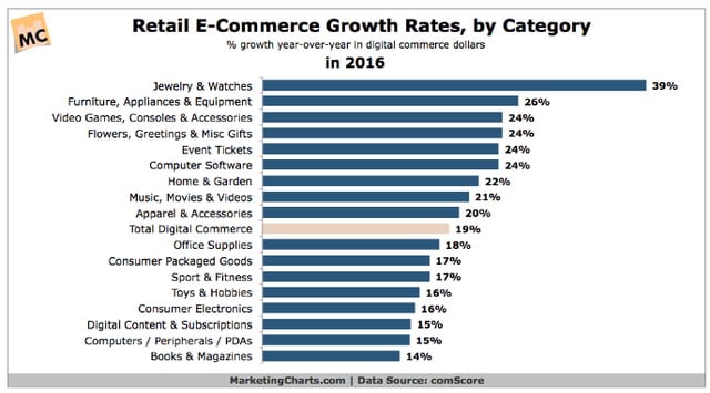
With this foundation of understanding around ecommerce, let’s now move on to some best practices and tips around the world of online sales.
Benefits of Ecommerce
Ecommerce is not a trend, and it isn’t going away any time soon. The reason is that selling goods and services on the internet highly benefits both the seller and the buyer. Here’s why.
Benefits to the buyer:
- Convenience
- Quicker and easier transactions
- Informed purchasing decisions
- Easier price and product comparisons
- Improved delivery process
- Targeted communication
Benefits to the seller:
- Lower overhead costs due to the elimination of brick and mortar locations
- The ability to sell goods around-the-clock (versus traditional store hours)
- Ability to reach customers beyond geographical location
- More control over the selling process and tracking, especially if there’s one portal that handles point-of-sale (POS)
- Greater visibility to potential customers via SEO
- More control over personnel costs and inventory management
Types of Ecommerce
There are three classifications of ecommerce. The classification depends on who is selling to who.
Business to Business (B2B)
Goods and services are sold from one company to another. For example, HubSpot provides products to other companies that are looking to grow better.
Business to Consumer (B2C)
A business sells to a customer. This is one of the most common types of ecommerce. An example would be an online clothing store or the online segment of some popular brick and mortar business, like Walmart or Target.
Consumer to Consumer (C2C)
As you may have guessed — consumers sell directly to consumer via online marketplaces. Craigslist, Ebay, and Amazon are all examples of C2C ecommerce.
Best Practices for Ecommerce Websites
When you’re ready to build an inbound ecommerce website, there are a few best practices to keep in mind that will help you get results out of your time and effort.
1. Select and customize a mobile-friendly theme.
BrightEdge data shows that more than half (57%) of web traffic now comes from mobile devices like smartphones and tablets — which means it’s essential to use a mobile-friendly theme when building your ecommerce website.
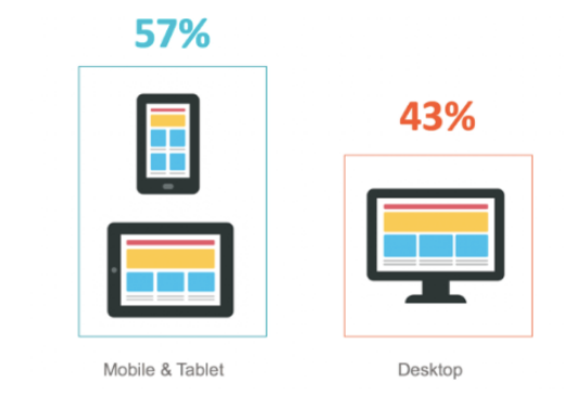
On ecommerce platforms, you can browse a selection of free and premium themes (all of which are mobile-optimized) and find one that’s best suited for your needs. Plus: From there, you can customize the templated website theme. By adding your color scheme and branding elements (like your logo), you can make your ecommerce website look 100% custom-made.
Take a look at this Shopify template example:
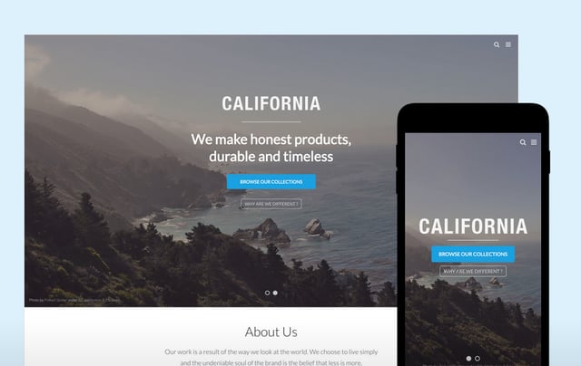
2. Optimize for the web.
Web optimization encompasses a wide range of strategies and tactics that help convert more site visitors into customers, but let’s focus on two in particular:
- Write enticing product descriptions. Use persuasive copywriting triggers to make your product descriptions sell. That means tapping into psychological tactics like fear of missing out, reciprocity, exclusivity, and more — all of which encourage site visitors to buy (and to buy NOW).
- Add beautiful product images. When it comes to marketing, visuals are extremely important — especially for online buyers who can’t see or touch products before making a purchase. Along with static product images, add context by incorporating images of models using the product and videos that give customers a 360-degree view.
3. Create a stellar customer experience.
Research indicates that customer experience will overtake price and product as the primary brand differentiator for sales by 2020. This means it’s important to focus on creating an impressive customer experience across all of your brand’s various touchpoints.
A few ideas to get you started:
- Add a FAQ page. Answering frequently asked questions on your ecommerce website helps potential customers quickly and easily find the information they need to complete a purchase.
- Reduce image sizes for quick load times. Survey data shows more than half of website visitors expect a page to load in less than two seconds. At more than three seconds, they leave the page (and aren’t likely to return.) Reduce the size of your on-site images so it loads quickly.
- Leverage user-generated content. Including user-generated content (think customer reviews, images from social media, and testimonials) on your ecommerce site means adding elements of social proof — which can improve the overall buying experience for customers.
Ecommerce Marketing Best Practices
What do you need to know about marketing for an ecommerce business? Here are a few best practices that can help jumpstart your efforts.
Test social media ads.
With 1.18 billion daily active users, Facebook has a huge audience that can be tapped. Consider targeting your audience with social media posts and videos and experiment to see what works best and drives sales and revenue.
Collect email addresses and stay in touch.
Recent data shows that three-quarters of companies agree that email marketing offers “excellent” to “good” ROI. By collecting email addresses on-site and asking customers to opt-in to future communications from you, you can give visitors a reason to keep coming back to your ecommerce site again and again via offers, sales, VIP discounts, and more.
Use personalization to tailor offers/messaging.
Personalization is more important than ever for online shoppers. In fact, research shows 74% of online consumers get frustrated with websites when offers, ads, and promotions appear that have nothing to do with their interests. Make sure you’re leveraging personalized product suggestions, personalizing your email marketing efforts, and generally striving to make each customer feel like you’re speaking only to him or her.
Gather feedback via surveys.
The best way to keep a finger on the pulse of what your audience wants is to ask them. Leverage online surveys to gather feedback on everything from product to your marketing efforts to customer service interactions.
How to Choose the Best Ecommerce Software
When searching for the best ecommerce platform and software to meet your needs, there are many factors to consider. Look for:
- Themes and customization abilities: You should be able to customize ready-made themes that allow you to personalize and add company branding.
- Domain name customization: Make sure you can get a custom domain name and URL (so you don’t have to include the platform’s name in your website URL).
- Expert, 24/7 support: Take the time to explore the platform’s service in detail. If an emergency crops up down the road, you want to be sure you’ll have fast, reliable support at a moment’s notice.
- Flexible payment options: Customers want to pay in a variety of ways today — from credit cards to digital wallets and beyond. Look for an ecommerce software solution that is flexible enough to support many different secure payment options.
- Multiple language abilities: Your customers may be coming from all over the world, so you need to be able to speak their language. It’s a good idea to work with a tool that supports many different languages.
If you’re looking to start a business or want to switch from your current platform, consider the software options below:
Examples of Inspiring Shopify Ecommerce Stores
Not sure what your ecommerce store should look like? Here are a few examples of inspiring stores to help get your creative wheels turning.
Tattly
Because Tattly offers a product that’s highly visual in nature, they’ve opted for a theme that’s photo-centric. This lets new visitors quickly get acquainted with the product offering and provides a few different paths for deeper product exploration, too.
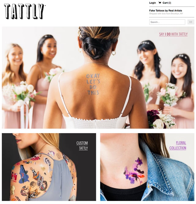
Graydon Skincare
Graydon Skincare uses a website layout with a large rotating header image that helps communicate a feeling around the brand and product. The images feature different products sold by the brand, and the simple top navigation makes it easy for customers to quickly find what they’re looking for.
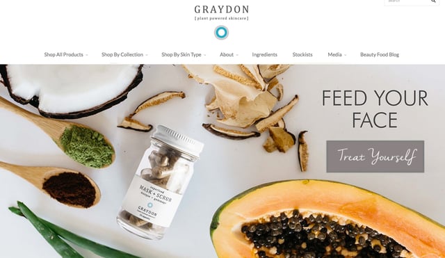
18Waits
18Waits also uses large rotating photos on the home page of their ecommerce store — but they sometimes integrate them with promotional offers. This helps shoppers visualize themselves wearing the product, while also enticing them to check out a special sale going on, too. Overall, the theme they’ve used is fairly minimal, which puts all the focus on the photography.
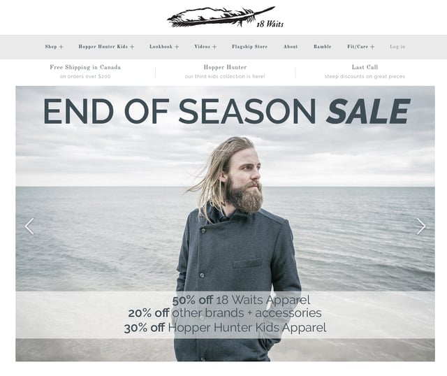
Easy Tiger
Speaking of minimal … Easy Tiger takes minimal design to the extreme. With a clean white background and no distracting design elements, all the focus is on their products. The red text also pops from the screen, making it easy to read and consume.
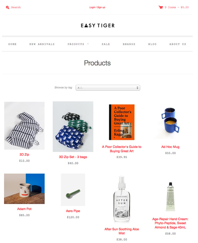
BluKicks
BluKicks also uses an image-centric approach on their homepage with quick navigation to product types. The lifestyle-type images they spotlight here communicate a certain feeling to shoppers — and ups the beachy charm of their product.
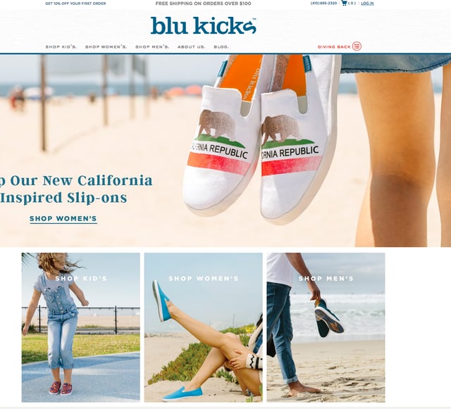
Sales Tax
Now, you might be worried about how sales tax should be incorporated into your online sales. Let’s look at a state-by-state breakdown of sales tax. There are five states that do not currently collect sales tax: Delaware, Oregon, Montana, New Hampshire, and Alaska.
Sales Tax by State
|
State |
Tax Rate |
|
Alabama |
4.00% |
|
Alaska |
0.00% |
|
Arizona |
5.60% |
|
Arkansas |
6.50% |
|
California |
7.25% |
|
Colorado |
2.90% |
|
Connecticut |
6.35% |
|
Delaware |
0.00% |
|
Florida |
6.00% |
|
Georgia |
4.00% |
|
Hawaii |
4.00% |
|
Idaho |
6.00% |
|
Illinois |
6.25% |
|
Indiana |
7.00% |
|
Iowa |
6.00% |
|
Kansas |
6.50% |
|
Kentucky |
6.00% |
|
Louisiana |
5.00% |
|
Maine |
5.50% |
|
Maryland |
6.00% |
|
Massachusetts |
6.25% |
|
Michigan |
6.00% |
|
Minnesota |
6.875% |
|
Mississippi |
7.00% |
|
Missouri |
4.225% |
|
Montana |
0.00% |
|
Nebraska |
5.50% |
|
Nevada |
6.85% |
|
New Hampshire |
0.00% |
|
New Jersey |
6.625% |
|
New Mexico |
5.125% |
|
New York |
4.00% |
|
North Carolina |
4.75% |
|
North Dakota |
5.00% |
|
Ohio |
5.75% |
|
Oklahoma |
4.50% |
|
Oregon |
0.00% |
|
Pennsylvania |
6.00% |
|
Rhode Island |
7.00% |
|
South Carolina |
6.00% |
|
South Dakota |
4.50% |
|
Tennessee |
7.00% |
|
Texas |
6.25% |
|
Utah |
5.95% |
|
Vermont |
6.00% |
|
Virginia |
5.30% |
|
Washington |
6.50% |
|
West Virginia |
6.00% |
|
Wisconsin |
5.00% |
|
Wyoming |
4.00% |
|
D.C. |
5.75% |
Source: Based on 2018 Data. Refer to State’s Department of Revenue for up-to-date rates.
The Future of Ecommerce
Sales tax is a hot topic in the news right now — and the Supreme Court may be making changes to the policies for ecommerce retailers. Be sure to stay up-to-date on the latest laws and regulations.
The future of ecommerce is a bright one, and with the right strategy and tools, launching an online business can be easier than you ever imagined. Tap into the audience of engaged online shoppers and get your piece of the growing ecommerce pie.
