
Welcome to My Blog
BofA: Slow iPhone 7 sales hurting retail tech spending, somehow doesn’t factor Note 7 meltdown
Apple releases watchOS 3.1 beta 3 to Apple Watch developers
Apple has just started seeding watchOS 3.1 beta 3 to developers today. Those looking to grab the new release can head over to the Watch app on their iPhones, select General and then Software Update. The watchOS 3.1 beta is available to download as a Configuration Profile from the Apple developer center for newer users looking to test out the upcoming system. Release notes fixes are now at the bottom of the post.
Filed under: Apple
How to Write a Winning Project Plan
There are quite a few things that are going to make tremendous impression to the client and your project plan is without a doubt one of them. Now that you’ve managed to get their attention, it’s absolutely vital that you follow up with a project plan which is tailored to the needs of the client. It should encompass everything of importance and it should place the proper emphasis in order to convince the client that it’s what his company needs. With this in mind, we’ve prepared a few tips on how to properly craft convincing and marketable project plans which are definitely going to help you close more clients.
Start the plan with research
The first thing that you need to show your client is that you are well aware of all the variables. You need to impress them in order to gain their trust. Thorough research is definitely paramount for the success of the venue. Dive into the documents and into the communications which are relevant to the project and get the scope of your work lined up.
Identify the goals of the project
A common mistake that a lot of people tend to make is they provide solutions before they’ve identified the problems and the goals. This is a gradual process which requires a lot of aforethought and consideration. Identifying the problem areas of the project and setting relevant goals is something which is going to give the client a concise idea of what’s going to be done.
Lay out reasonable solutions
You shouldn’t mix these parts. Presenting solutions need to come after you’ve properly identified the problems that actually need to be resolved. This is going to give the client a concise idea of what to expect. Furthermore, by identifying the solution and laying down the course of action, you are essentially setting the scope of the work you will be providing. This is especially important as it’s without a doubt the cornerstone of your framework.
Other Important Considerations
Of course, putting down a successful business strategy and project plan is without a doubt more complicated than this. There are tough questions that you’d need to get answers to. For instance, who the owner of the project is has a tremendous impact on the overall process. Working with third parties or representatives is usually more complicated as they need to get the necessary approvals. Account for that when formulating the price and offer alternatives.
You need to set up a comprehensive deadline which is tailored to the preferences of the client yet realistic enough so you do not get behind it. Doing so is going to result in cut-backs and that’s definitely something that you don’t want. Furthermore, being on-point and punctual is going to enhance your brand’s reputation and it’s likely to bring you a lot of trust. In any case, there are quite a few things that you’d have to consider when it comes to it.
The post How to Write a Winning Project Plan appeared first on Project-Management.com.
from Project Management Articles – Project-Management.com http://ift.tt/2dS22zX
via Project-Management.com
Tips on Forming an Outsourcing Development Team
When outsourcing software development, the customer naturally wants to be confident of success and satisfied with the result. Unlike with an in-house development team, the customer cannot keep an eye on the outsourcing team, and everyday work is not always visible. This is why choosing suitable people and forming an effective team is a significant challenge.
What really matters
For successful software development, it is not just technical experience that matters: the following should also be considered:
- Communication skills are one of the core aspects for an outsourcer. Miscommunication and misunderstanding can result in the failure of an iteration or even the entire project.
- Personal soft skills of each team member may have considerable meaning for the entire team.
- Ability to work in a distributed environment is another core quality for an outsourcer.
- Self-discipline is required to perform satisfactory work on time, without being permanently monitored.
- Problem-solving skills allow developers to not only be not task performers, who stop working as soon as an unexpected problem arises, but to understand the problem, find out what has caused it and be able to overcome it.
These qualities are required for each developer in an outsourcing team. When forming such a team for software development, it is not only the skills and qualities of each developer that are important, but also their synergy.
How to choose
The BusinessDictionary gives the following definition of the term team: “A group of people with a full set of complementary skills required to complete a task, job, or project… A team becomes more than just a collection of people when a strong sense of mutual commitment creates synergy, thus generating performance greater than the sum of the performance of its individual members.”
I would highlight two approaches to forming an outsourced IT development team:
- Choosing individuals—Under this approach, the customer interviews every candidate and forms a team from the chosen developers.
- Choosing the team core—The customer interviews and chooses core specialists (team lead (TL), tech lead, etc.). Later, the team lead forms the development team according to the project requirements.
Both approaches are widely used in our company. Below, I will to describe the process of forming the team in each case in detail.
Choosing individuals
During the pre-contract negotiations, we offer the customer the delivery manager with expertise in the domain of the project (FinTech, Mobile development, Telecom & Networks, Enterprise software, etc.). The customer talks to each delivery manager and starts to work with one of them. The customer then gives us a list of developers and other specialists required for the project, or the delivery manager suggests what the team should look like based on project requirements. We select people relevant to the customer’s requirements. The customer reviews their resumes, interviews those who seem to correspond with expectations, and then makes their selection chooses the proper ones. The team lead works with the team formed by the customer.
If after the project has started, a developer leaves the team—for personal reasons, because he/she can’t integrate into the team, or because the customer is disappointed with his/her performance—then we offer new resumes, and the customer interviews new candidates.
This approach has its pros and cons.
Pros:
- The customer feels more confident about the chosen developers because each of them was interviewed personally.
Cons:
- Selecting and interviewing each candidate takes time and delays the project development.
- Separate individuals cannot always generate the synergy required for effective performance.
- If the team lead does not participate in forming the team, he/she may not be able to guarantee the best result. In this way, an IT development team can be compared with a soccer team: the coach cannot guarantee the result if the team players are chosen by the club’s president.
Choosing the team core
Similar to the approach described above, in this case, the customer first chooses a delivery manager with the relevant expertise. Then, according to the project details, the delivery manager identifies whether the project needs aTL or a project manager, or any other core specialists (business analyst, technical lead, quality assurance lead). The requirements for core specialists are defined by the customer in accordance with suggestions made by the delivery manager.
The process includes the following steps:
- If core specialists who meet demands of the project are unavailable, we find candidates from the market.
- The delivery manager interviews all available candidates and selects the several of best. Their resumes are offered to the customer.
- The customer chooses, interviews, and approves the most proper specialists. Work on the project starts.
- The customer subsequently works with the TL to form requirements for other team members.
- Based on the requirements, the TL forms a development team for the project.
This approach assumes that after the customer has chosen the core specialists, he/she will trust them to form the team and ensure the project development. If a developer needs to be replaced, new candidates are interviewed and chosen by the TL. This replacement can even go unnoticed by the customer: he/she sees the result (another iteration is successfully completed), and doesn’t delve into how and by whom it was done.
To use the soccer team analogy again, this approach corresponds to a case in which the coach chooses the team players and thus guarantees the result. The club’s president doesn’t interfere in the team building process, but instead he/she demands results from the coach. The same situation applies to a development team formed by the TL without the customer approving each candidate.
This approach also has its pros and cons.
Pros:
- The customer doesn’t have to spend time interviewing every candidate. Only core specialists are selected by the customer, and other developers are hired by the TL according to the project requirements.
- Having formed the development team, the TL can be confident he/she will be able to make the team create synergy and perform as highly as possible.
- Having selected people personally, the TL can rule out the possibility of incompatibilities between team members.
Cons:
- The customer may have doubts about the project success.
To mitigate any doubts customer has about the TL’s ability to work and create an effective team, we offer to provide a trial mini project to demonstrate the TL’s ability.
Interviewing a TL
In my experience, the TL is one of the most important roles in a development team. The TL influences the entire team’s work, and the project success depends on the TL’s effective work with the team.
This is why I want to discuss interviewing the TL in detail. In addition to possessing technical skills, the candidate should be able to form an effective team and have enough experience of managing teams. To identify the TL’s suitability in this regard, it is worth examining him/her:
- Experience in starting a development team—The candidate should be able to describe how he/she formed teams for various projects. What was the candidate’s best experience in forming a development team and starting a project?
- Ability to comprehend his/her own mistakes—What mistakes have been made in terms of choosing team members? What were the consequences of these mistakes?
- Ability to draw conclusions from his/her own experience—The candidate should be able to give advice about forming and managing a team, and share his/her best practices regarding establishing communication and providing an effective working environment.
- Ability to act in a conflict situation—What actions does he/she take if a team member is inefficient? How does he/she minimize the loss from replacing the team member?
- Strategy to provide team stability—How does he/she seek to minimize the possibility of personnel turnover in the team, and to stabilize the performance indicators?
- Approach to building the development process inside the team—How does he/she facilitate effective communication between team members, code review, mentor ramp-up of new specialists, etc.?
- Approach to ensuring transparency in teamwork—The candidate should describe what forms of reporting can demonstrate the teamwork and results.
- Use of key performance indicators—Which indicators show whether the team is efficient?
- Approach to providing feedback—How would the candidate ensure effective and rapid development, without quality loss?
I would emphasize the importance of technical skills for a TL, in addition to team management experience.
Conclusion
He who pays the piper calls the tune. When hiring an outsourcing team, the company-customer chooses the most convenient way to form the development team. Each of the above-described approaches has its advantages, but at the same time, each has its drawbacks.
The following issues should be noted when forming an outsourcing development team:
- Not only do the skills of every team member matter, but so too does their ability to show better performance when working together.
- Speaking English is very important for core specialists, but not so important for other developers. Communication mostly occurs between the customer and core specialists. Sometimes it is better to pay the same wage for a developer with more experience but poorer English skills, than a developer with intermediate English but worse technical skills.
- If a TL has shown his/her best qualities during a trial mini-project and further work, he/she can be trusted with forming the development team.
Which of the above-described approaches do you use to form outsourcing teams? Maybe you use a completely different approach? Share your experiences in the comments—I would appreciate the chance to discuss your ideas.
The post Tips on Forming an Outsourcing Development Team appeared first on Project-Management.com.
from Project Management Articles – Project-Management.com http://ift.tt/2e7MmpS
via Project-Management.com
5 Keys to Being a Productive Project Manager
If you’re marketing yourself as a project manager, you need to make sure that you have the skills to get it done and get it done right. While there are dozens of things that project managers should be able to do to get things done, they almost all fall into one of the following 5 categories. Breaking your skill set down to these basics will show you what you are good at, and where you need to improve to be a solid project manager.
Team Building
The most important step in project management is to select the right team to get the job done. Focusing your energy up-front on making sure you have the right people in place will save you undue stress and frustration later on. Not only do you need to make sure that they have the knowledge and know-how to complete their task, you also need to make sure that they have the soft skills to collaborate with other team members and to stay on track for completion.
Delegation
Once you’ve picked the right people for the job, it’s critical that you step back and let them do what you’ve hired them for. If you chose qualified people with the skills you wanted, you shouldn’t need to micromanage them. You hired them to do a particular job, and you need to trust them to do it. Delegate responsibilities and hold them accountable, but let them get the job done their way. One of the biggest downfalls to getting a project done is by building resentment within your team- by not trusting them or by trying to tell them how to do their jobs.
Organization
After you’ve delegated project responsibilities, you need to know how to track the progress, and to make sure that the project is staying on task. Knowing who is working what angle and how everything is supposed to come together in the end depends on your ability to stay organized and to have a system for following up on tasks. Whether you use project management software or design your own system for keeping up with things, staying organized will determine whether your project succeeds or not.
Communication
Having great communication skills is also critical to keeping the gears turning correctly. You need to know how to approach people in a non-threatening way when criticizing, and you need to make sure that you are effectively communicating your expectations. You aren’t just managing your direct communications with individuals, you’re setting the stage for how the group collaborates and focuses. It’s up to you to make sure that information gets distributed appropriately, and that nothing falls through the cracks.
Attitude
If you want to keep a project moving forward, you need to have a positive attitude. Being able to motivate your team members and inspire enthusiasm for the project is essential to making sure that they are producing quality work and meeting deadlines. Someone who is negative and is constantly harping on people is going to sap them of motivation and lead to frustration and resentment for everyone, slowing things down. Your attitude will set the stage for how the project goes from start to finish, so it’s critical that you pay attention to your demeanor and how you interact with your team members.
Keeping these 5 key points in mind throughout your project will help you to keep your team productive and motivated. While you may find different tricks and techniques to enact these keys, they are the foundation of being a great project manager.
The post 5 Keys to Being a Productive Project Manager appeared first on Project-Management.com.
from Project Management Articles – Project-Management.com http://ift.tt/2eg8sf6
via Project-Management.com
9to5Toys Lunch Break: High-End Apple 27-inch Retina 5K iMac $1,900, AirPort Extreme (refurb) $100, Threes! iOS App $1, more
Keep up with the best gear and deals on the web by signing up for the 9to5Toys Newsletter. Also, be sure to check us out on: Twitter, RSS Feed, Facebook, Google+ and Safari push notifications.
TODAY’S CAN’T MISS DEALS:
Apple’s high-end 27-inch 5K Retina iMac is on sale for $1,900 shipped (Reg. $2,299)
Apple AirPort Extreme 802.11ac Wireless Base Station (cert. refurb) drops to $100 at Best Buy (Orig. $199)

The Apple Award winning Threes! puzzler is now available for $1 on the App Store (Reg. $3)
You can now download both Hitman & Lara Croft Go on iOS for just $1 ($10 value)
App Store Free App of the Week: IMPOSSIBLE ROAD minimal arcade racer free for the first time (Reg. $3)
9to5Toys Specials: One-Day Price Drops on Lytro Camera, HideMyAss VPN, PDF Expert, more
Apple’s 15-inch Retina MacBook Pro 2.2GHz/16GB/256GB is back down to $1,600 shipped (Reg. $1,999)
Epic Best Buy sale knocks 25% off rarely discounted tech accessories from Apple, Logitech, Belkin & others when you buy 3 (or more) items
The best metal USB 3.0 flash drives for your MacBook Air or Retina Pro
MORE NEW GEAR FROM TODAY:
Daily Deals: ChugPlug External Battery Pack for MacBooks $10, 11.6-inch MacBook Air (Refurb) $300, more
- Add Honeywell’s Smart Thermostat to your home and start saving money: $150 (Reg. $180+)
- Save big on DSLR cameras in Canon’s refurb sale: Rebel T6i Kit $530 (Orig. $720), more
- TaoTronics Pulse X Bluetooth Speaker $20 Prime shipped (Reg. $36), more
- Games/Apps: Star Fox Zero + Guard $22, Shadow of Mordor $12, freebies, more
- This Silhouette Cameo Cutting Machine Bundle is down to $159 (Reg. $220+)
- Pick up ‘Power of your Subconscious Mind’ as a Kindle eBook for $0.30 (Reg. up to $15)
MORE DEALS STILL LIVE:
Teach your smart home new tricks w/ discounts on several GE Z-Wave products: In-Wall Outlet $32 (Orig. $40), more
Give your 42mm Apple Watch a new leather band for $14 Prime shipped (Reg. $20)
Filed under: Apple
Quick Review: You probably shouldn’t buy this awesome MacBook Pro MagSafe 2/ 5-port USB Charger
After a lot of abuse, my MacBook Pro’s 85W MagSafe 2 adapter finally died last week. Often Apple adapters fray at joints and this one did to an insane degree but somehow it kept working for 3 years through tons of travel, work and even some fun.
So what to do? Typically I’d buy a new Apple Magsafe 2 adapter. But clearly Apple has some redesigned MacBook/Pro/Airs coming later this month and they will likely be charged via USB-C, at least in some cases. So that means I only need MagSafe to power this 2013 MacBook Pro for at least a few more weeks before it gets relegated to backup machine, kid’s computer or sold off when I get Apple’s new OLED/USB-C creation.
So I thought I’d get a little creative and save a few bucks at the same time. As I was looking for options on Amazon, I came across an interesting product: The “BND 85W MagSafe 2 Replacement Power Adapter Charger w/ 5 USB Ports for Apple MacBook Pro”. For less than half the price of a discounted $77 Apple MagSafe Adapter this $37 charger includes 5 USB ports and gets solid 4.3/5 star reviews. What the heck, I’ll give it a try… more…
Filed under: Apple
PSA: Security vulnerability discovered, update your Experian and myFICO Mobile iOS apps ASAP
If you’re not one to use iOS’ automatic updates feature, make sure to grab the latest updates for Experian – Free Credit Report and myFICO Mobile. A security vulnerability discovered by Verify.ly shows that attackers would have been able to intercept user login credentials on older versions of the clients. After having disclosed the vulnerabilities to both companies, it appears that the security holes have been fixed appropriately.
Filed under: Apple
This month’s critical Flash vulnerability gives attackers control of a Mac …
Quick Look: Sense ThermoPeanut, the $30 wireless thermometer you can affix anywhere
With smart thermostats like Nest and Tado, it’s easy to set a temperature for your home and let the technology take care of it. We’re also starting to see the introduction of individual smart thermostats for each room – at a price, of course.
But if you just want a low-cost way to monitor the temperature of a particular room, getting iPhone alerts if it falls outside your chosen range, the $30 Sense ThermoPeanut may be for you …
Filed under: Apple
14 of the Best Product Page Design Examples We’ve Ever Seen
If you look at how product pages take shape across different companies, it’s clear that they run the gamut. Some go for the direct approach, displaying an image of a product and explaining why someone should buy it. Other companies create elaborate pages with moving parts and fancy coded elements.
Of course, some companies fare better than others at creating delightful product pages.
But since we prefer to focus on the positive, we scouted out 14 examples that we find truly admirable. From messaging, to value propositions, to general product promotions, these brands nail these features in a persona-friendly way.
And after checking out these pages, you might want to buy their products, too.
14 Remarkable Product Landing Page Designs
1) Bellroy
Bellroy sells thinner-than-typical wallets. There’s value to that — but what is it, and how do you get the consumer to understand it?
To answer those questions, Bellroy divided its product page into three stages of the buyer’s journey — understanding the problem, how to fix the problem, and how Bellroy can resolve the problem.
There’s even an interactive section that shows how the skinny wallet will fill up in comparison to a different wallet. As users move a slider back and forth along a line, both of the wallets fill up with cards and cash, visually displaying the very problem Bellroy’s skinny wallet solves.
[Click here to see Bellroy’s full product page.]
2) Wistia
Wistia is a video hosting and analytics company that provides users with detailed video performance metrics. It might sound like a snooze-fest, but let’s dive into what really makes this product page stand apart.
First, we’re presented with five, colorful graphics illustrating their tools’ value propositions. And in case that’s all the user really needed to see, those graphics are followed by two calls-to-action.
But, if you continue scrolling, you’ll see a video with information about Wistia’s capabilities for that video — calls-to-action, email collectors, video heatmaps, and viewing trends.
One of the best ways to explain a visual platform’s features is to demonstrate them on a product page. This one shows users all of Wistia’s features and how they work, day-to-day.
Click here to see Wistia’s full product page.
3) Square
Square is a mobile transaction company that merchants can use to collect payment from customers — anywhere, any time, as long as they have a compatible phone or tablet.
The product marketing challenge here is to show why Square is an easier alternative than a typical cash register — and its product page displays those reasons in a visually captivating way.
The main headline of each section of this product page has bold, succinct copy: “Small credit card reader, big possibilities.”
The rest of the page is clearly organized headlines — which kind of read like answers to frequently asked questions — plenty of white space, succinct copy, and appropriate images. Anyone looking into each section can understand exactly how Square works at every stage of a transaction.
4) Rent the Runway
Some companies — especially in ecommerce — can have up to thousands of product pages. Rent the Runway, an online dress rental company, is one of them.
Rent the Runway has an individual product page for every dress it carries, with all the information a customer could want — images, measurements, fabric, price, and reviews. So what sets them apart? The exceptional detail of the “Stylist Notes” and “Size & Fit” sections.
These details are clearly and carefully curated from stylists and reviewers. They don’t just explain what a dress is made of and how it looks — they cover how it fits on every part of the body, which undergarments should be worn with it, and for which body types it’s best suited. That kind of Information not only delights customers and encourages their trust, but it also makes for a more confident buying decision.
Also, notice how there’s plenty of white space surrounding the product images and description. According to research by ConversionXL, that white space creates a higher perceived value — in this case, price — of the product in the user’s mind.
5) Coin
Coin is like a credit card, but better — it actually keeps the information from all of your credit cards in one place. In other words, instead of filling your wallet with two credit cards, a debit card, three gift cards, and two rewards cards, you can fill your wallet with one: Coin.
Some product pages depend on text to highlight product differentiation. But Coin invites the viewer to visually consume all of its elements. That starts with a video at the top of the page to show how Coin works — and how cool it is, of course.
But keep scrolling. Coin displays its product positioning and differentiation through a visual journey of the Coin card. Just check out that fun animation — what a great way to represent how a product works.
6) Oreo
If you’ve seen any of Oreo’s marketing, you shouldn’t be surprised they’re on this list. But sometimes, being well known can actually make it harder to create a product page. So how did they do it?
The focus of Oreo’s product page is how these simple, classic cookies can help people unleash their imaginations, dare to wonder, and become generally happier. It features a series of videos, one after another. One is accompanied by the lyrics, “It’s so easy to let your imagination go when you play with Oreo,” paying tribute to the age-old discussion about the “best” way to eat them. The page takes a creative, bold approach to marketing with what might otherwise be thought of as an ordinary snack.
Oreo also took a unique design to this page. Even though the cookies themselves are monochrome, the page is wonderfully colorful, from the videos, to the backgrounds, to the graphics.
[Click here to see Oreo’s full product page.]
7) Fitbit Charge
When I was assigned this post, I asked a few people for their favorite product page suggestions. I was amazed how many people immediately recommended Fitbit — and after checking out the site, I can see why.
The page starts off with a value proposition — not a list of features. It’s a hero image of people hiking a mountain, who we can imagine are wearing Fitbits, with the copy, “Energize your day.”
As you scroll down the page, it goes through four quick steps explaining how the product works. What’s more, a lot of these are interactive — the section under “Everything you need, all in one place” allows users to hover over different features to see how they appear on Fitbit’s mobile app.
But the page also explains why these features are valuable. For example, one tracks everything you do from walking, to running, to sleeping. Why does that matter? Well, you can have your current records on hand, and try to beat them.
Knowing that users might not remember all of the specifics when they leave the page, Fitbit was sure to focus on how these features will actually make a difference in the visitors’ lives. Well played.
[Click here for Fitbit Charge’s full product page.]
8) Volkswagen
Volkswagen takes an interactive approach to their product marketing. Instead of listing out all of the features you can have in a car, they walk you through the process of actually building your car. As you go through that process, Volkswagen highlights the different features you could choose, then gives you a preview of what the car will look like and how that will affect the price.
Even though I’m not currently in the market for a new car, I personally had fun tinkering with the different customization features on the page. What color do I want? Do I want premium audio? (Yes.) It’s an interesting way for the brand to eliminate the notorious connotations of “car salesmen,” by allowing users to learn about and select features independently.
Plus, there’s a nifty matchmaking feature that allows you to see which nearby dealerships have the car with all of your preferences in its inventory.
(If you want to see a regular product page, they’ve got that, too.)
[Click here to see Volkwagen’s full product page.]
9) Seattle Cider
The folks at Seattle Cider claim their cider is “not your standard cider.” Well, neither is the product page. It reads like a story, beginning with attractive, high-definition images of the cider selection, which happen to have really cool label designs. As you hover, an explanation appears of what differentiates Seattle Cider’s products from others, and what makes each variation special.
But my favorite part is what comes next: a really cool, interactive display of how cider is made from start to finish, which plays for users as they scroll. It’s a surprising and delightful user experience that goes above and beyond the typical product page, because it doesn’t just display the products. It shows where they come from, and how.
[Click here to see Seattle Cider’s full product page.]
10) OfficeSpace Software
OfficeSpace sells facility management software to help folks manage, well, office spaces. Like the name, the product page is very clear and direct.
Each section of this product page is dedicated to a different feature of the software. The headline explains the feature, and the subheadline explains why this feature is important as you evaluate different software.
That makes it easy for prospects to quickly digest what the product offers, but also read more details on its value proposition, if they choose to. And, if someone wants to learn even more about a particular feature, there are clear calls-to-action to do so.
[Click here to see OfficeSpace’s full product page.]
11) Orangina
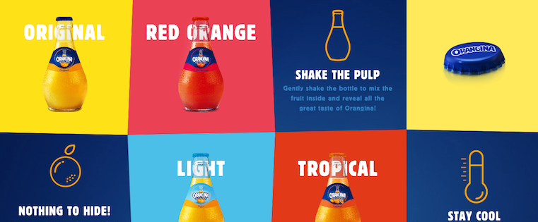
This carbonated citrus drink has been around since 1935, and it has exactly four products — original, red orange, light, and tropical. So, how does Orangina keep its product page both current and special?
For one, it’s fun to explore. When you hover your mouse over any of the blocks, the picture or icon animates — the bottles dance around, the orange slices in half, and the thermometer drops. The animated images and bold colors fit in perfectly with the Orangina brand’s bold, fun personality.
Also, you might notice that some of the blocks are actual products, while the others are simply tips and details about their products. If you don’t have a lot of products to sell, consider interspersing them with tips and information about the products you do have available.
[Click here to see Orangina’s full product page.]
12) Mango Languages
Mango Languages creates “lovable” language-learning experiences for libraries, schools, corporations, government agencies, and individuals. Its homepage has illustrated calls-to-action for each of these buyer personas — from public libraries, to government offices, to individuals who want to learn something. Each of those calls-to-action leads to a different product page that’s colorful, clearly written, and very comprehensive.
Take a look at the example for individuals below. Like every other part of the website, it exudes Mango’s friendly, approachable, and helpful brand personality. The video couldn’t be more delightful. I mean, a guitar-playing mango in a top hat? Yes, please.
As you scroll, you’re greeted with clear value propositions that use playful language that’s true to brand — for example: “Useful stuff. Zero fluff.” Everything about the page says “simple to use,” “fun,” and “effective.”
[Click here to see Mango’s full product page.]
13) PaletteApp
Like Volkswagen, PaletteApp, a maker of flooring products, took the interactive approach to its product page. It helps make designers’ lives easier by leveraging the world’s largest digital database of architectural products and materials. There are a lot of them — from flooring to countertops — and the goal of the product pages is to make it painless for designers to find and collect the products they like.
Notice below how users can hover their mouse over each product to request a sample, add it to their library, or add it to their personal palette. Options can be filtered by application, price, product type, color, and manufacturer, too, which is important with so many products available. PaletteApp does an impressive job of making it easy to whittle down your choices.
[Click here to see PaletteApp’s full product page.]
14) Minwax
Minwax makes products to help people care for their wood furnishings and surfaces. Riveting, right? But the brand has managed to create a product page that’s not only relevant, but also, helps users quickly and easily find what they’re looking for.
That’s thanks, in part, to the Minwax Product Finder module. It functions like a quiz, asking a series of multiple-choice questions, like “What kind of project is it?” and “What are you looking to do?” Once you answer the questions, the quiz generates recommended products, which includes a handy “Don’t Forget” list with the tools you’ll need to get the job done — things like safety glasses, gloves, and sandpaper. Helpful tips like this go above and beyond a normal ecommerce product page.
[Click here to see Minwax’s full product page.]
Ready to work on your product page?
So, what have these brands taught us about product pages? Well, we think it boils down to a few must-haves:
- Make it interesting and fun, especially if you have a less-than-riveting product.
- Make it easy for visitors to find what they’re looking for.
- Make it personal. Allow users to “build their own” product, to show them that you can meet their preferences.
- Make it informative. Without bogging it down in detail, be sure to include the right pieces of information that will show users what sets your products apart.
What other great product pages have you seen, and what makes them great? Share with us in the comments.
Editor’s Note: This post was originally published in March 2014 and has been updated for accuracy and comprehensiveness.
Apple announces plans for second R&D center in China to ‘work more closely with manufacturing partners’
Even before Apple has built its first Chinese R&D center in Beijing, Tim Cook has announced that a second one is on the way. Reuters reports that the second one will be in the country’s largest manufacturing district, Shenzhen.
Apple said that this center will be specifically focused on allowing Apple to work more closely with its manufacturing partners in the country …
Filed under: Apple
Samsung looks likely to win Supreme Court appeal against damages in Apple patent case
The never-ending court battle between Apple and Samsung over three iPhone design patents finally reached the Supreme Court yesterday. It had earlier been found that a total of 11 Samsung phones copied three design elements patented by Apple – including the famous ‘black rectangle with rounded corners.’ Lower courts ruled that Samsung should have to pay 100% of the profits earned from those phones, while Samsung thinks it should pay less.
Remarks by two of the Justices seem to indicate that they are leaning heavily towards Samsung’s side of the argument. Samsung’s position is that the patented features represent only part of the reason for purchase, and that they should accordingly have to hand over only part of the profits earned from them …
Filed under: Apple
Amazon launches its own $9.99/month music streaming service to compete with Apple Music, with discounts for Prime/Echo users
Amazon has launched its own music streaming service today called Amazon Music Unlimited for $9.99/month, adding another worthy competitor to Apple Music and Spotify. The service offers access to tens of millions of songs from major labels like Sony, Universal and Warner. Music Unlimited features a 30 day free trial so you can give it a go without committing any money for the first month. On iOS, users access their streaming libraries through the Amazon Music app.
Amazon is incentivizing signups with some discounts for loyal Amazon users. If you subscribe to Amazon Prime, then Music Unlimited is cheaper: just $7.99 per month. If you use Amazon Echo smart speakers in your home, you can also sign up to a dramatically cheaper $3.99 monthly plan, but this option limits music streaming to only Echo devices.
Filed under: Apple
11 Examples of Instagram Ads We Love
What makes you click on ads? Is it the cute picture of a puppy, the funny caption, or are you only motivated by a great deal?
While there are plenty of studies and articles that allude to what makes social media advertising successful, ad performance depends largely on your ability to create ad content that feels natural or organic (aka native advertising). According to the Mobile Marketing Association, users spend 40% more time interacting with native ads than traditional display ads with double the brand recall.
Advertising on Instagram presents businesses with a unique opportunity because the Ads appear on the 500 million monthly active users’ Instagram feeds without interrupting user experience, similar in appearance to the organic posts their friends are sharing. Additionally, Instagram Ads are displayed based on user Likes and Follows on Instagram and Facebook, giving marketers the opportunity to target their advertising efforts even more precisely.
In this post, we’ve featured Instagram Ads that impressed us (and in some cases, made us click) with actionable suggestions for your next Instagram Ads campaign.
Why Launch an Instagram Ad Campaign
HubSpot Co-Marketing Intern Ellen Bartolino penned a comprehensive checklist of the steps to take to launch a great Instagram Ads campaign on the Facebook Ads platform. It’s still early to evaluate their effectiveness in terms of results and revenue, but some agencies and researchers are already seeing positive signs for marketers.
Brand Networks found that the overall cost per thousand impressions (CPM) on Instagram decreased from $7.04 in the latter half of 2015 to just $4.16 in the first quarter of 2016, and MarketingLand found that Instagram Ad costs are slightly lower than on Facebook with higher levels of engagement.
With Instagram Ads, marketers can target users to increase views of blog posts and other content, direct traffic to a web page, promote lead conversions, encourage app installs, or generate video views.
11 Examples of Instagram Ads We Love
1) Instagram for Business
Here’s a somewhat meta example from Instagram’s own Instagram for Business account, advertising the new capability to advertise on the platform. They use recipe website Food52 as an example of what their ad content might look like so users can visualize it for their own business Instagram accounts.
If you check out Food52’s Instagram, you’ll notice that the ad below isn’t much different than the organic content they post, which helps ads blend in with the rest of the photos and videos their friends are posting.
Why it works:
- It’s a great food photo, using texture, contrasting colors, and lighting to actually make the viewer hungry. Food photos are some of the most popular on Instagram, with over 189 million photos under the #food hashtag alone.
- It uses geometric shapes and lines to draw in viewer interest and engagement.
- It’s inspiration-driven: According to an EventBrite survey, 78% of millennials (who make up more than 50% of Instagram’s user base) would rather spend on experiences than things, making this type of image more appealing than a shot of the website alone.
2) Samsung Mobile
Check out this ad featuring Samsung Mobile’s new Galaxy S6 Edge Plus smartphones, specifically the manual controls built into the camera to enable more precise photography.
The image shows three phones mid-shot to demonstrate new features and give people an idea of what it’s like to actually use the product. The photos captured on each screen highlight diverse locations, which suggest that the camera can help you capture a variety of stunning shots — no matter where you are.
Why it works:
- The phones were shot on a white background, which helps the product stand out. According to the folks at SteelHouse, “This [shooting on a white background] is a common practice because, quite frankly, it works.”
-
The photos in the ad
represent a simplified product demonstration. This approach lets viewers dive into the new control features by showing each phone mid-photoshoot, with the unique white manual controls along the bottom of each screen. -
The
clever — and slightly humorous — caption features a play on words that makes it more memorable and helps to draw the viewer’s attention to the new feature: the manual camera controls.
Ads that invoke emotion, such as happiness and laughter, are more likely to be shared and engaged with by viewers.
3) Amy Porterfield
Amy Porterfield is a marketing and social media consultant who produces educational resources for businesses and other marketers. In this ad, she’s promoting a free webinar training in an effort to generate new leads and customers for her business.
Why it works:
- The ad features a clear photo of the face of the company, which Wordstream suggests as an easy way to humanize and add personality to your brand.
- The call-to-action (CTA) is clear: “free training” presents a clear benefit to users who have already demonstrated interest in marketing webinars, as Instagram Ads are served based on Facebook and Instagram interests. The ad presents an opportunity for viewers to hone their marketing skills at no cost.
4) New York Times
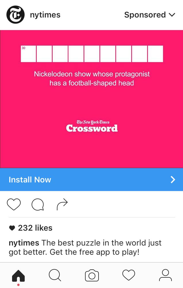
Here’s an Instagram Ad featuring the famous New York Times crossword puzzle. The ad challenges viewers to solve the puzzle, which draws them in to read more about the offer the New York Times is advertising and gets them excited about their achievement if they can solve the puzzle, putting them in a better mood and making them more likely to share or click the ad.
Why it works:
- The ad is static, but it prompts an interaction when viewers want to solve the puzzle. This interactivity leads to greater levels of ad engagement among all of the other content on Instagram.
- It employs nostalgia marketing for the 90’s Nickelodeon TV show, “Hey Arnold!” This marketing tactic that makes your audience feel good about your content and your brand.
5) Monster
Monster helps job-seekers match with organizations seeking talent worldwide. In this video ad, Monster uses humor to show job-seekers how to explain gaps in employment to future employers using the movie Castaway: instead of complaining about being abandoned at sea, the fictitious job-seeker explains that he managed a “crew” while on the island.
Why it works:
- The ad features video content, which research shows users want to see more of, particularly on social media.
- It uses the curiosity gap to intrigue users and prompt them to learn more, because really, what does the movie Castaway have to do with job hunting? Not much, but by using this friendly demo featuring a well-known story to demonstrate how to fill in resume gaps, they’ve made the topic easy to understand and memorable.
6) Headspace
Headspace offers daily 10-minute meditation and mindfulness sessions with the help of their app. This simple but effective ad features a countdown clock that shows viewers that their app can help take away anxiety in as little as ten minutes — we’re not sure if that’s actually the case, but it’s an appealing thought considering the fact that anxiety disorders affect 40 million people in the United States alone.
Why it works:
- The ad uses warm, bright colors, which can prompt feelings of “courage and energy,” according to the Blur Group — useful sentiments for a company trying to prompt mental wellness app downloads.
- The ad is cartoon-style, which Wall Street Journal cartoonist Stu Heinecke encourages due to its memorability and brand “stickiness.”
- It features provocative, emotional words, such as “anxiety,” and “happier,” which Harvard Business Review notes can drive campaign virality and memorability.
7) Blinkist
Blinkist helps readers gather key passages and lessons from nonfiction books that take only 15 minutes to consume. In this ad, they’re promoting one of the books on their service that users can get condensed, and the book title is overlaid over an image of a person on their cell phone, presumably using it.
Why it works:
- The ad uses geometric shapes to center user focus on the central element of the ad. Shapes like squares, diamonds, and rectangles convey conformity and symmetry that’s visually pleasing and helps it stand out on an Instagram feed.
- The caption appeals broadly to the many people who feel like they don’t have enough time to read. Empathy is a great marketing tactic to make ads universally applicable and brands more memorable for responding to their needs.
8) bfresh
This ad from bfresh — a market dedicated to fresh preparation and whole foods — is designed to inform locals that a new store opening in the Boston area. The simple, straightforward ad features a snapshot of the new location, which will likely catch the eye of folks that are familiar with the area.
Why it works:
- This ad is geographically targeted, which adds another level of personalization to the ad, and this audience segmentation helps drive Instagram advertising ROI.
- It promises future benefits, such as discounts and recipes, to its followers, who they’re hoping are younger and interested in saving money and DIY food preparation.
9) ClassPass
ClassPass grants fitness enthusiasts access to multiple gyms and classes in their area within the same booking system. This ad cleverly communicates the discount promotion they’re running while also giving viewers an idea of what they can expect from the service.
Why it works:
- The cool color scheme (greens, blues, and purples) is widely preferred over other color themes by both genders, according to the American Journal of Psychology.
- The graphics show, rather than tell customers how they can use the product with cool visuals of people doing different workouts.
- The call-to-action is bold, clear, and compelling: Users can get a significant discount on ClassPass for a limited time only. This language employs the scarcity principle, wherein consumers associate a higher value if the product is in short supply.
10) Method Home
Method Home produces eco-friendly cleaning products made from non-toxic ingredients that are also effective at home cleaning, and their playful branding is on display in their video Instagram Ad here. The video promotes a sweepstakes Method Home is currently sponsoring that is contingent on user engagement with the ad.
Why it works:
- The ad is eye-catching: it’s unusual to see plates, cups, and food traveling midair, and its uniqueness makes the ad, and the product, more memorable.
- It uses empathy to relate to viewers. A lot of people can relate to the sight of dirty dishes piled in the sink, and the ad features the solution — dish soap — in a fun and interactive way. Ads that elicit emotion and positive feelings result in stronger brand relationships, which can ultimately improve your Net Promoter Score (NPS).
11) HubSpot
You’re already reading our blog, but in case you don’t know, HubSpot is a sales and marketing software company designed to help businesses grow. In this ad, we’re promoting INBOUND 2016, our annual inbound marketing and sales event in Boston.
Why it works:
- The ad uses celebrity social proof in its caption by name-dropping well-known industry leaders who will be speaking at INBOUND 2016. This marketing strategy compels viewers to learn more about hearing from famous people they may already know and love.
- The branding is subtle: Remember, these ads are meant to look and feel like Instagram content so they aren’t scrolled past quickly on users’ feeds. The interesting shot of the INBOUND-inspired hedges does a great job of promoting the event without using our company logo or name.
Now that you’ve read our tips and seen examples in action of strong Instagram Ads, take a look at your Instagram and check out the Ads you’re being served. What makes you click? Then, take the lessons and start applying them to your own Instagram advertising strategy.
What tips do you have for running a successful Instagram Ads campaign? Share with us in the comments below.
Social Ad Spend Surpasses Television: New Research
Is your company wondering where to allocate its advertising budget? Are you on the fence about whether jumping into social media advertising is worth it? New research shows that for the first time, digital and social media ad spending has surpassed that of TV. Marketers everywhere may revisit their strategies, leading to big changes in […]
This post Social Ad Spend Surpasses Television: New Research first appeared on .
– Your Guide to the Social Media Jungle
from http://ift.tt/2dIKpTW
via socialmediaexaminer
The Outlook for Digital Advertising Talent [Infographic]
Marketing agencies are becoming increasingly reliant on digital skills, but the pool for digital marketing talent might not be growing fast enough to meet the demand.
The State of Advertising Talent Report — a comprehensive assessment of surveys from thousands of agency employees compiled by smith & beta, a talent development company — found that agency talent is not currently skilled enough to meet the needs of clients.
Many agency employees are not confident in some of the industry’s most critical digital skills, such as social media, mobile, and data analytics.
To stay relevant when social media and mobile are considered standard services central to business growth and opportunity, agencies must address the significant digital skill gaps of their employees.
Since formal learning is infrequent at agencies, intentional talent development is more important now than ever before. The skills necessary for employee and agency success are changing, so the methods of employee education must change too.
What are the specific talent shortcomings? How prevalent are they? To learn more about the state of the industry, check out the infographic below, or see the full report here.
Following its $1B investment, Apple got a seat on Didi Chuxing’s board
Earlier this year, Apple invested $1 billion in Chinese Uber competitor Didi Chuxing, and at the time, there was some discrepancy as to whether or not Apple got a board seat with that investment. Didi Chuxing itself said that Apple didn’t have a seat, but now The Information reports otherwise…
Filed under: Apple