I’m willing to bet you already know what kerning is — you just don’t realize it.
While you might not recognize when kerning is done well, you certainly see it when it’s done poorly.
Here’s an example of bad kerning: M a rk e t i ng .
Kerning is adjusting the space between letters, and either increasing or decreasing the distance to ensure better readability or appearance.
Interestingly, it’s not always best to have equal spacing between each letter. Each letter has different shapes and curves, so sometimes kerning actually helps the letters look less conspicuous. For instance, a “cl” can sometimes appear to be a “d”, so you might use kerning to space them further apart.
What is kerning?
Kerning refers to the space between letters to ensure better readability. Since not all letters are created with equal curves and shapes, you might need to increase or decrease the distance between one letter and another, to create more legible text. Kerning improves the appearance and design of your text, which might otherwise look awkward.
No matter what your job title, it’s important to understand the power of kerning. Kerning can help you create better designs, produce more visually appealing copy, or construct better presentations. Kerning is one of those actions that can push your deliverables from ordinary to exceptional.
If you don’t know how kerning works, don’t worry. Here, we’ll show you how to use kerning in Photoshop, Word, and Illustrator. Plus, we’ll provide examples of bad kerning, so you know what to avoid when using kerning for your own text.
Kerning vs. Tracking
Kerning is the adjustment of distance between two letters. You’d use kerning if you felt a word looked funky because the letters A and B were too close together. Tracking, on the other hand, is adjusting the spacing equally between each letter, to either spread apart or bring together an entire word.
Kerning in Photoshop
Kerning in Photoshop is incredibly easy, once you figure out where the “Kerning” tool is. If you’re designing a presentation or email template in Photoshop, and your words look a little sloppy, this is an easy way to clean up your text to improve the appearance.
1. First, ensure your cursor is in between two letters. Next, select the “Character” panel, as highlighted by the red arrow below (If you can’t find it, try searching “Character” within the Photoshop search tool).
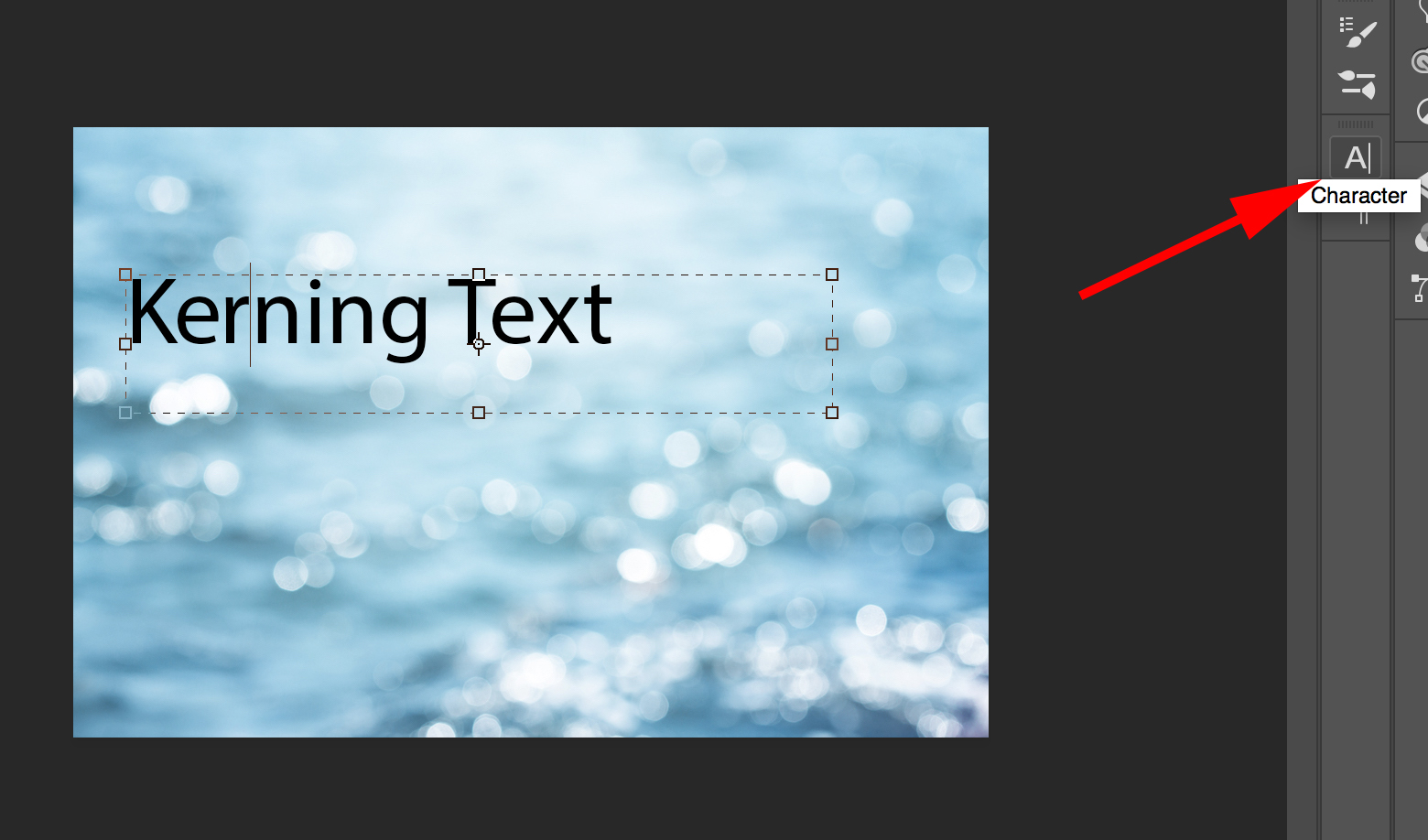
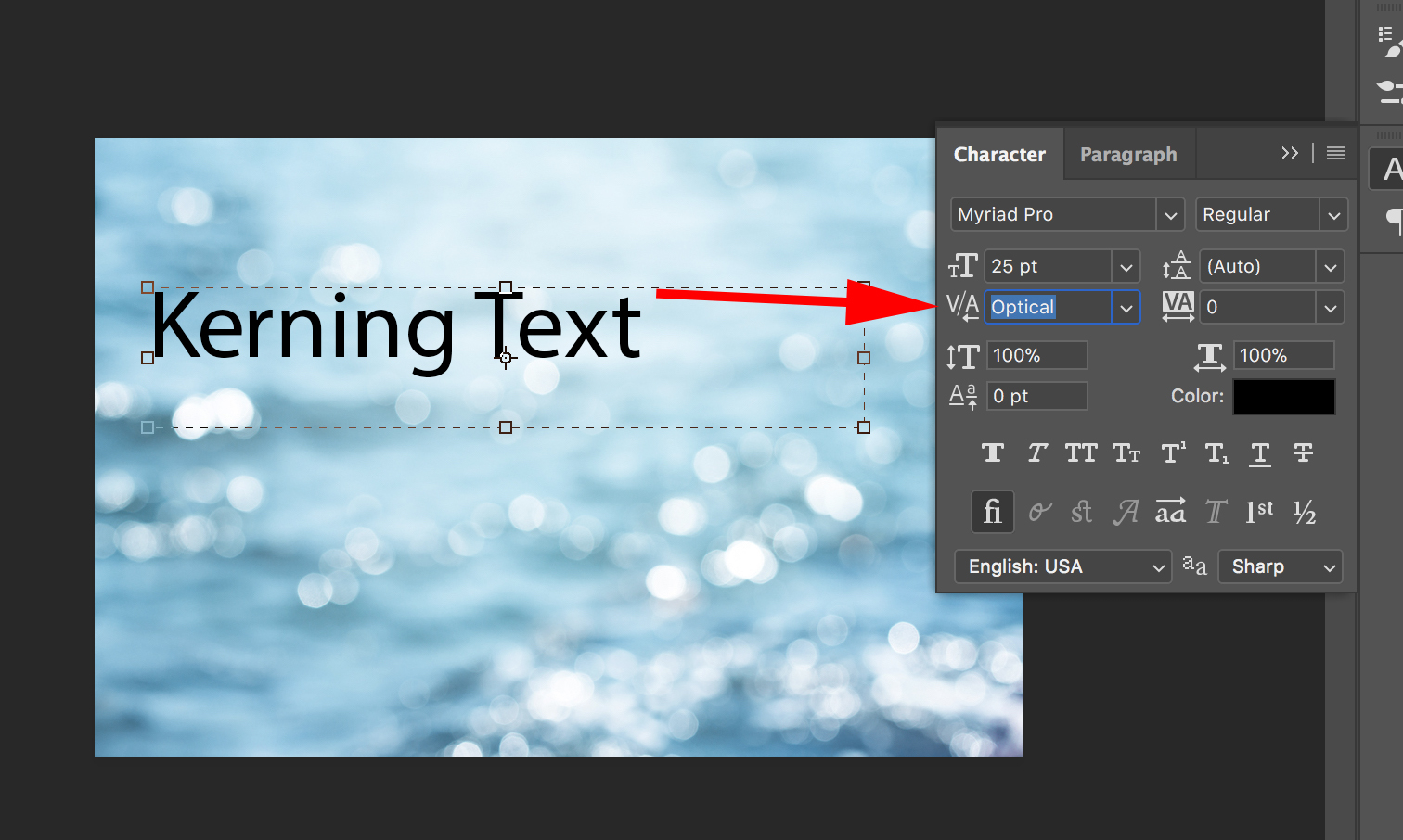
3. Within the “Character” panel, you’ll see a V/A (with a little arrow below the A). That’s the “Kerning” tool. It’s automatically set to “Optical”. Click the down arrow to see your options for kerning.
4. For instance, I chose the number “75”. If you’re unsure how much space you want between your letters, test out a few different options. The negative numbers make your letters closer together, and the positive numbers create more space between the letters.
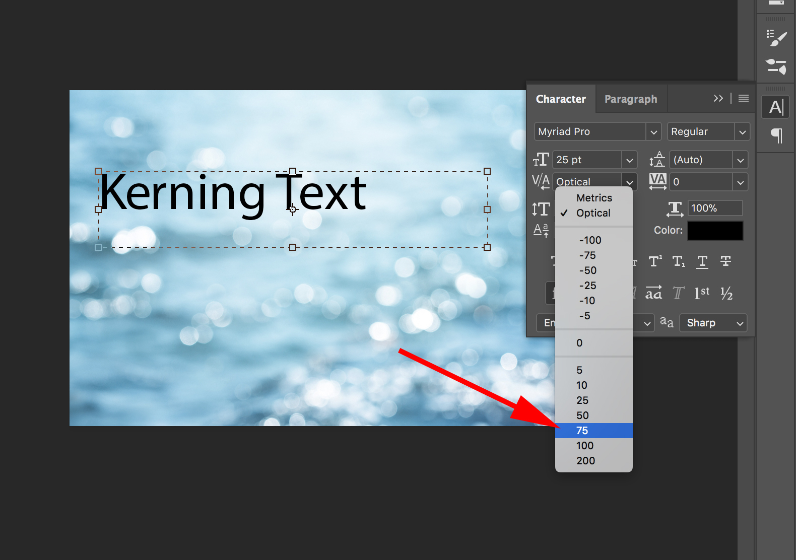
5. Now, there’s a nice “75” point space between my “K” and “E” (of course, this is probably an example of bad kerning … ).

Important note: There’s a quicker option to use the “Kerning” tool in Photoshop. If you click in between two letters, you can hit “Option” and then hit the “Right” arrow. This will create more distance between letters.
Kerning in Word
If your writing copy in Microsoft Word, or using Word to design a poster, you might want to use kerning, especially if your font is bigger and the letters look awkward.
Fortunately, it’s easy to do.
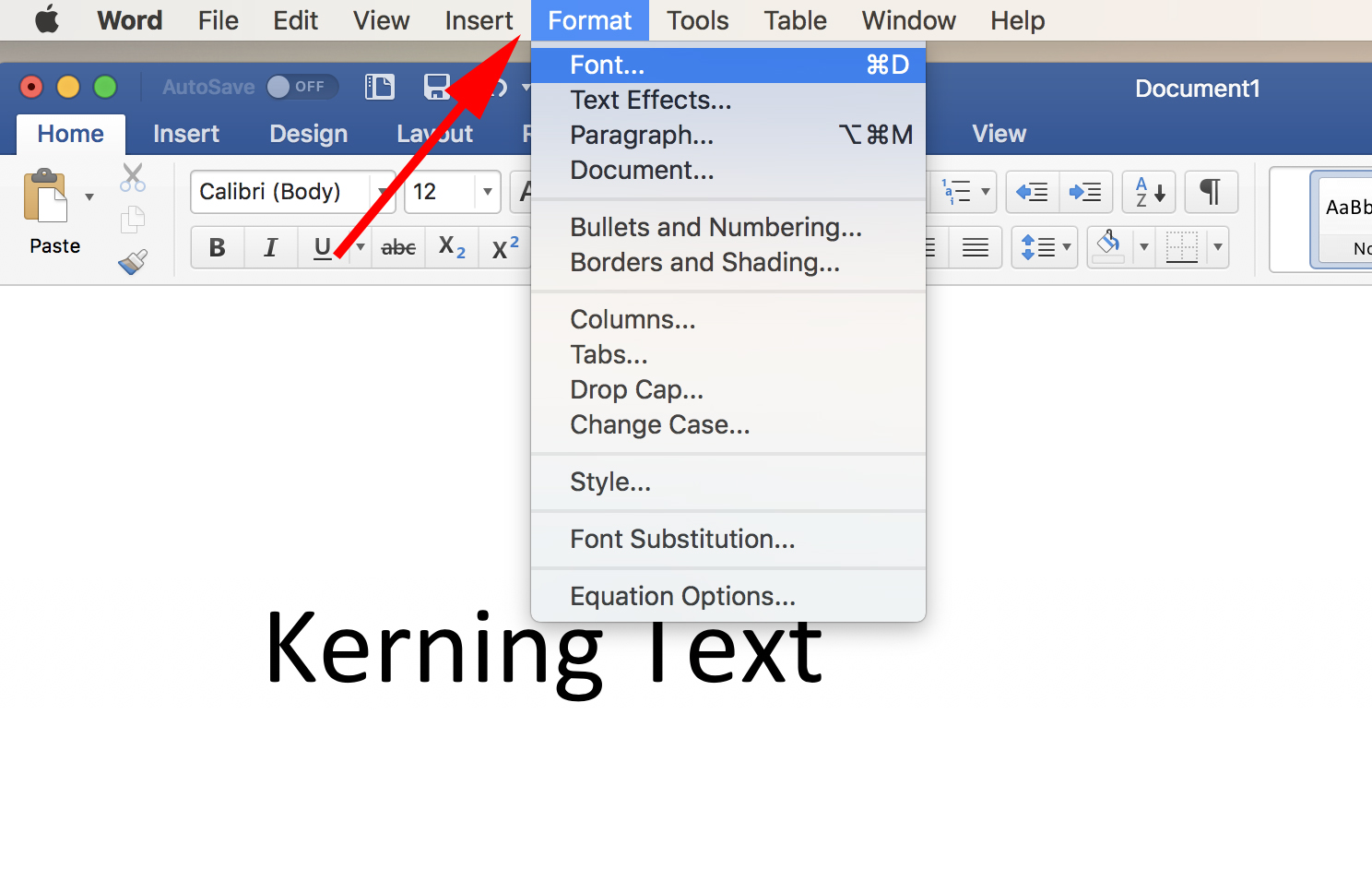
- Within a Word document, go to “Format” and then click “Font”. FYI, I left my cursor in between the “K” and the “e” in the document, because that’s the space to which I wanted to apply kerning.
2. Next, click “Advanced” within the Font panel.
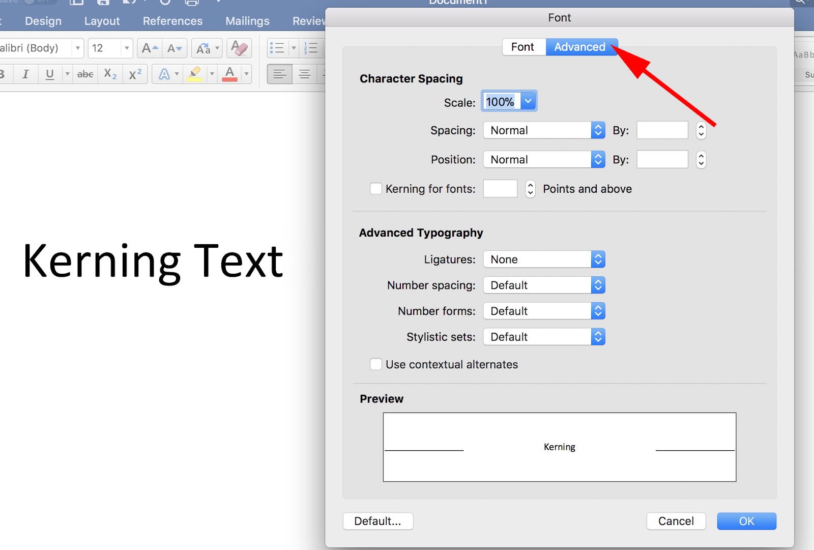
3. Under the “Advanced” section, you’ll see “Kerning for fonts” with an empty box to the left of it. Check that box. Then, input a number (I put “20”, which you’ll see circled). The number you choose will depend on how much space you want between the letters.

4. There’s now “20” points of kerning in between the “K” and the “e”.
Kerning in Illustrator
Finally, let’s take a look at kerning in Illustrator. Since many designers and marketers use Illustrator for clients or for personal projects, it’s important to know how to apply kerning to your letters.
Kerning in Illustrator is an almost identical process to how you’d do it in Photoshop (which makes sense, since they’re both Adobe products). Nonetheless, here’s how you do it.
- First, click the “Text” tool and put your cursor in between two letters — I put mine in between the “K” and the “E”. Then, find your “Characters” panel.
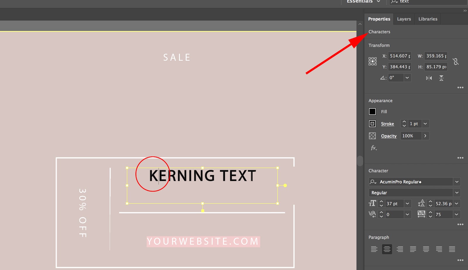
2. Similar to Photoshop, there will be a “V/A” tool, with a little arrow underneath the “A”. That’s the kerning tool. With your cursor placed between two letters, increase or decrease the number beside the kerning tool — as you can see, I set mine to “200”.
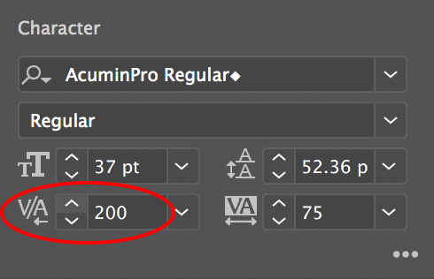
3. Now, I have a (admittedly, very ugly) space between my “K” and my “E”.

Examples of bad kerning
I’ve probably already shown you plenty of bad kerning examples throughout this piece, with my own attempts at kerning on various software.
But if you’d like to see more, don’t worry — we’ve got some hilarious real world examples, to show you just how important (good) kerning is.
Here are a couple examples of bad kerning:
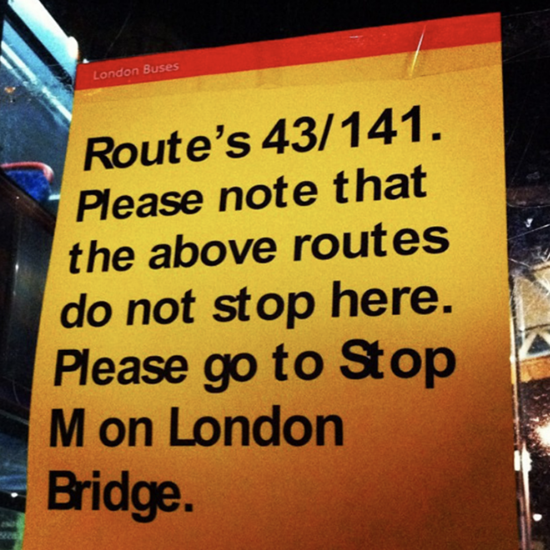
1. Bus sign gone wrong.
2. What’s up with this spacing?

3. I think fixing this sign would be worth the investment.

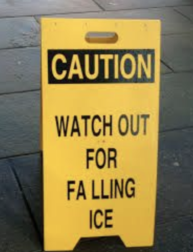
4. Watch out for bad kerning, too.
5. This gives me a headache.

![]()
Keep this going please, great job!
Kalau menngacu pada PMK Nomor 187/PMK.
whoah this weblog is great i like studying your articles.
Keep up the great work! You know, lots of people are hunting round for
this information, you could help them greatly.
Hey There. I found your weblog the use of msn. This is a really well written article.
I’ll make sure to bookmark it and come back to learn extra of your helpful info.
Thanks for the post. I will definitely return.
I do accep as true with all of the ideas you have presented for your post.
They are really convincing and will definitely work. Still, the posts are very quick
ffor newbies. May you please extend them a little from subsequent time?
Thank you for the post.
Pump muscle web site pump muscle
A fascinating discussion is definitely worth comment.
I do believe that you need to write more on this subject matter, it may not be a taboo matter but usually folks don’t discuss such subjects.
To the next! Many thanks!!
Yes! Finally someone writes about 검증사이트.
Hello, i think that i saw you visited my web site so i came to “return the
favor”.I am attempting to find things to enhance my website!I suppose its ok to use some
of your ideas!!
I think that is among the such a lot signiuficant information for me.
Annd i’m happy reading your article. However want to statement onn few ormal issues, The web site style is wonderful, thhe articles is inn reality nice : D.
Just right process, cheers
how tto train muscles web site how to pump muscles
Evvery weekend i used to go to see this web page, foor the reason that i wish for enjoyment,
for the reason that this this web site conations really nice funny
stuff too.
Bodybuilder training web page how too pump muscles
Hi, yeah this piece of writing is truly good and I have lesarned lot of
things from it concerning blogging. thanks.
Biceps muscles web page how to
train muscles